Case Study


The Pears Centre for Autism
Typology School & Center

Location London, United Kingdom
Architect Penoyre + Prasad

 Figure 16 : The Pears Centre for Autism [12]
Why this case?
As the categories of the proposed project, this case design for autism and design in a way that help children with autism and their families.
The case show that the design of space could really help with teach and treat children with autism, which focused on the connection with natural environment, sustainable design strategiesandonthecirculationsystem within the interior space.
Location


The school located in a quite zone in England, London, UK. In a residential zonewherelessnoiseandtraffic,alsoit is set back from the street. we can notice the greenery site that surrounding the project. which this obviously show the connectivity with nature and the outdoor environments
The surrounding buildings of the project are: two primary school, a farm land, Green Pumping Station and a wood trees land which is part of conservation project.
The land is flat with area of 14000 sq meter and the interior space about 5000sq meter.[5]
Accessibility
From the main street
 Figure 17 : Site plan from google earth
BEYOND THE WHITE Context
1. Residential housing
2. Primary School
3. Small farms
4. Green PumpingStation
5. Highgate Wood


Site plan
The model is a one piece, a rectangle shape surrounding with some greenery and trees .it also has a small outside court as a play area and the parking is the last component. This way of design makes it easy to understand, just a few times and student will get the sequence of it.[13]


 Figure 20 : Site plan from google earth
School Philosophy
ABA-AmbitiousaboutAutism-Through education we seek to transform the lives of children with autism and the lives of their families.[5]
The design of the school based on the hope that we have to change and fix what we already missed. The simple design and net organization aim to fit the need of people with ASD perfectly. A school that seeks to help autism people to reach a point where it can show to the world the ability and skills that autisticpeople had.
What special about this school is that it combines an educational area and a training center, as it is the first of its kind inUKthatincludesthesefunctions together in 2008. The school was developed over many years in cooperationwiththechildren’sparents and their vision of what is best and what can become better.[13]
After analysis the main challenges of ASD architects Penoyre and Prasad tried to create the balance for every individual of autism using the difference between what we already know and we are familiar with and the sensory input or what we can call stimulator. One of the biggest challenges faced by the architect was themethodoflinkingtheprojecttothe external environment while maintainingcalm.[13
The school designed for 80 students with age of (4 – 18) years old, it is capturing the majority, so architects designthebestspacewheretheycould feel comfort, ease to use, simple to process from inside or outside. The design was respectful of the environment and the context in many respects.[13]

Program
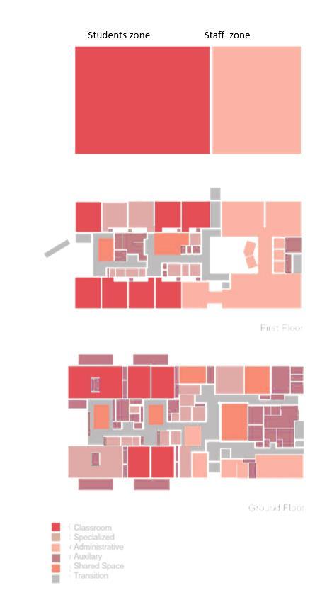
The project istwo floorsbuildingwhich organized in different zone referee to the type of project user’s, they are: students, parents, teachers, staff and visitors. The program split in two main zone the first one focused on the students (school) and the other one focused on staff (center). (Headquarters of -ambitious about autism-, a national charity and the treehouse schoolfor autism). [13]
These zones are also reflected in the design in two side the right side for administration zone and the left side forteachingzone.thisorganizationhad been copied in the second floor, so the student doesn’t have to rethink or reunderstandthenewzonesoftheupper level. The students learning zone include class room, workshops, gathering space. Training areas, and also area for life skills environments such as kitchen, bathroom and laundry.” Even back of house areas such as delivery or maintenance have been designed to accommodate opportunistic learning potential for children.[6]The design of thiszonewas simple,flexible,repetitivespaceswhich make it easy to use and process. The staff zone includes administration offices, training rooms and shared spaces such as painting and music rooms.

Program
The design of this zone was simple, flexible,repetitivespaceswhichmakeit easy to use and process. The staff zone includesadministrationoffices,training rooms and shared spaces such as painting and musicrooms.
The rest room was associated with the main program, as we can notice from the figure below, every class room had its bathroom and it isalso placed in the main circulation zone and the services areas.


Circulation
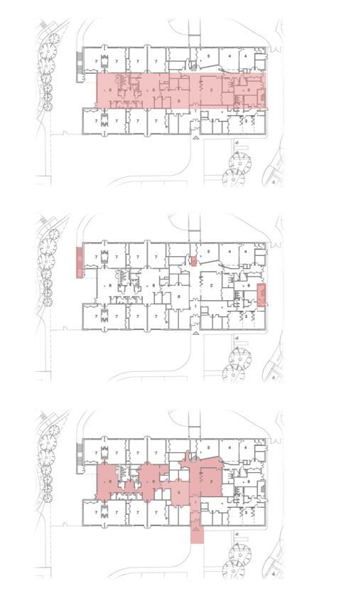
The circulation is mainly liner paths which start where the core end, the core divided the circulation as the zoningwhichislocatebetweenthetwo zones, the multipurpose hall located in the heart of the building offer more flexible zone for gathering and other activity. [60

The horizontal circulation had been designed as the main gathering and sharingspace,allservicesareprojected in thiszone.


The transition
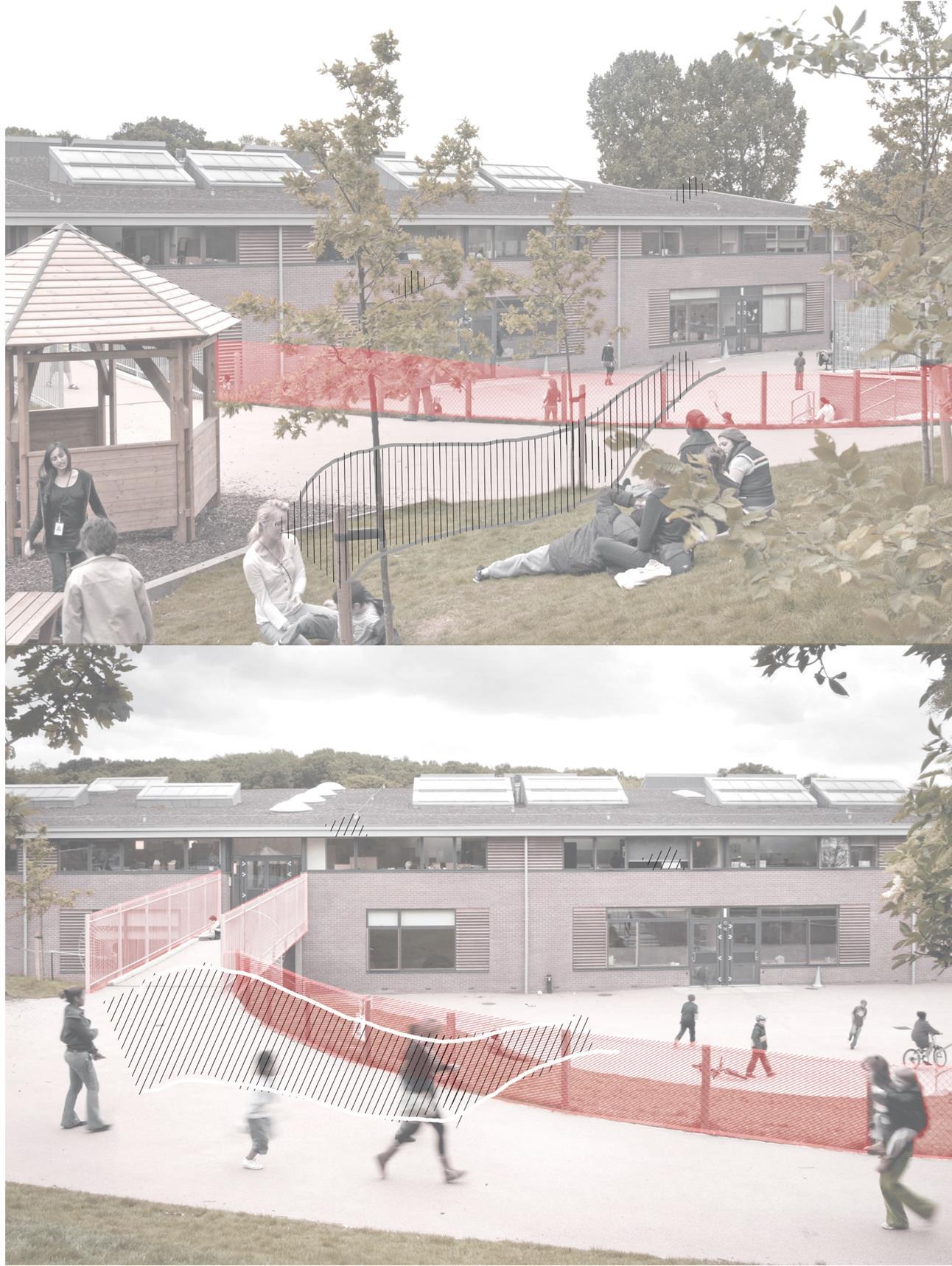
The transition from outdoor to word indoor was design smoothly. The outdoor areas play a great role in the concept, because it where student connect with nature. And the outdoor environment and sensory.it is offer many spaces for play, learning and rest and there is an entrance to the second floor from the outdoor area, this creates a cool experience of students and make it easy to transit between spaces. In order to make parents fully aware of the development of their childrenandhowtheyinteractwiththe external environment, a greenery rest area had been added around outdoor court and they also could come and spendtimewiththeirchildreninmiddle of natural environment.


Form
The longitudinal tringle shape what specialized the school with a green inclined roof, The facade design in a way that respect the linear shape, The windows projected from the two long sides of the rectangle in linearly lined, with the least number of openings on the short sides.” The delicate balance between a lifeaffirmingdegreeofsensorystimuluson the one hand, and calm on the other has remained a key issue in design. “[12]

Suitability
The building design with sustainable strategies which ensurethe used ofthe available natural resources, wind, sun and rain. These strategies represented in the use of sun reflectors, skylights which play a big role in daylight and passive cooling and heating system, double ceiling atrium spaces, Louvered on the façade storage direct sunlight and use to block outdoor to ensure there isno distraction while class,Solar energysystem,greenroof,naturaldaylighting, high thermal mass and natural ventilation system. [13]
The passive coolingand heatingsystem happen through the day, in morning summer day the high thermal mass represented with concrete absorb the heatwithsunlighthelpwithcoolingthe innerspacewhereatnightskylight play a role with cooling. The heat gain happens through the window that placed all out the building and skylight, the inclined roof shape helps also with daylight and heat gain The building is predictedtouse67%lessenergy10%of the energy will be derived from renewable energy sources (ground coupled air pipes).'

Light and view
The daylight and views can be addressed in four categories: skylights, overhangs, double height ceilings, and an open facade. The skylights designed in deafferents size and shape based on the location of it, the function of the space and orientation of the building. Which all of these kinds serve to bring the light into the center and take advantage from natural recourses. The ceilings are double-height where the light wells extend down to the bottom floor. Overhangs provide shade in the summer, and their perforated nature allows for a gradient of daylight yearround. The windows are located in a ribbon around the whole building, making the facade open, and with the aid of shutters and overhangs, they provide distilled views and light. ?[12]


Materials
The materials were chosen in sustainable and friendly strategies and related to context, such as: warm orange brick, the natural timber, glassclad building and a green roof.
The transparency is used to maximize daylight. Steel is used to hold up the transparent elements.[13]

Color palate
The color palette seems to correlate to thematerialsused:transparent,earthy, or neutral. The neutral colors are usually grayscale.
The earthy colors are the wood and brickparts.Thetransparentincludethe louvered overhangs and the light wells. The earthy colors seem to be articulated in the facade and also in atrium or shared spaces, highlighting the spaces that serve as links to the outside world. This is shown in wood flooring, wood louvered shutters, and brick used in the facade.
The neutral colors are present in the individual classrooms. All permanent architectural elements in those individualizedspacesareneutral:white orgray.Thisincludesthefinishesonthe walls, and the bare concrete. [13]

Details
In the classrooms, the space was divided into more than one zone, and lockers or cabinets were used as a separation element. It was also found that the use of rug carpets is useful, whether in defining an area or improving the child's senses, touch or sight. We can also notice the repetition of the idea of multi used space in the shared spaces. the openings were designed with respect for the child’s scale. The cylindrical column was used as a structural element and an appearance element, as it was noted thatchildrenwithautismtendtorotate around it
The used of the double volume in the visual connectivity and for the natural light from the roof.
 Figure 33 : interior design elements


Conclusion
In this case, architect has emphasized the simplicity of the design, which seems to work perfectly with autism cases. less is more, the simple form, simple and net organization of the spaces within the project have shown goodresultsandopportunitieswiththe treatment process. A specially designedcirculationareaasaonezone, where all other services and support areasarelocated,toenhancechildren's activity with others.
Naturally,autisticchildren'sbrainstend to overcomplicate things and that's what getsthem into difficult situations, so one of the powerful and crucial elementsofdesignforautismistokeep it as simple as possible.
