

AXDesign Portfolio Fall 2023
human-centered design. Ashley Xiang

A dreamer and a visualizer


ashleyxiang888@gmail.com
ashleyxiang.com
https://www.linkedin.com/in/ ashley-xiang/
I’m an human-centered designer studying Design and Environmental Analysis with a minor in UX design at Cornell University.
I strive to share new ideas, learn from diverse perspectives, and expand the horizon of what defnes design. Delving into multiple mediums, my design journey is focused on the user experience and is human-centered.The way people connect and interact draws my interest and is what I would like to continue exploring in my education and future career.
2
prioritizing
3


4 Ashley Xiang 01 03 02
FLBM
| 2022
Exhibit Design, Interior Design ParkDown | 2022 UX/UI Design
Music Mood | 2022 UX/UI Design


5 Table of Contents 03 04 05
Groove that Goob | 2023
Game Design, UX Design 2022
Other Works | 2020-2023
Renderings, Graphic Design, Etc
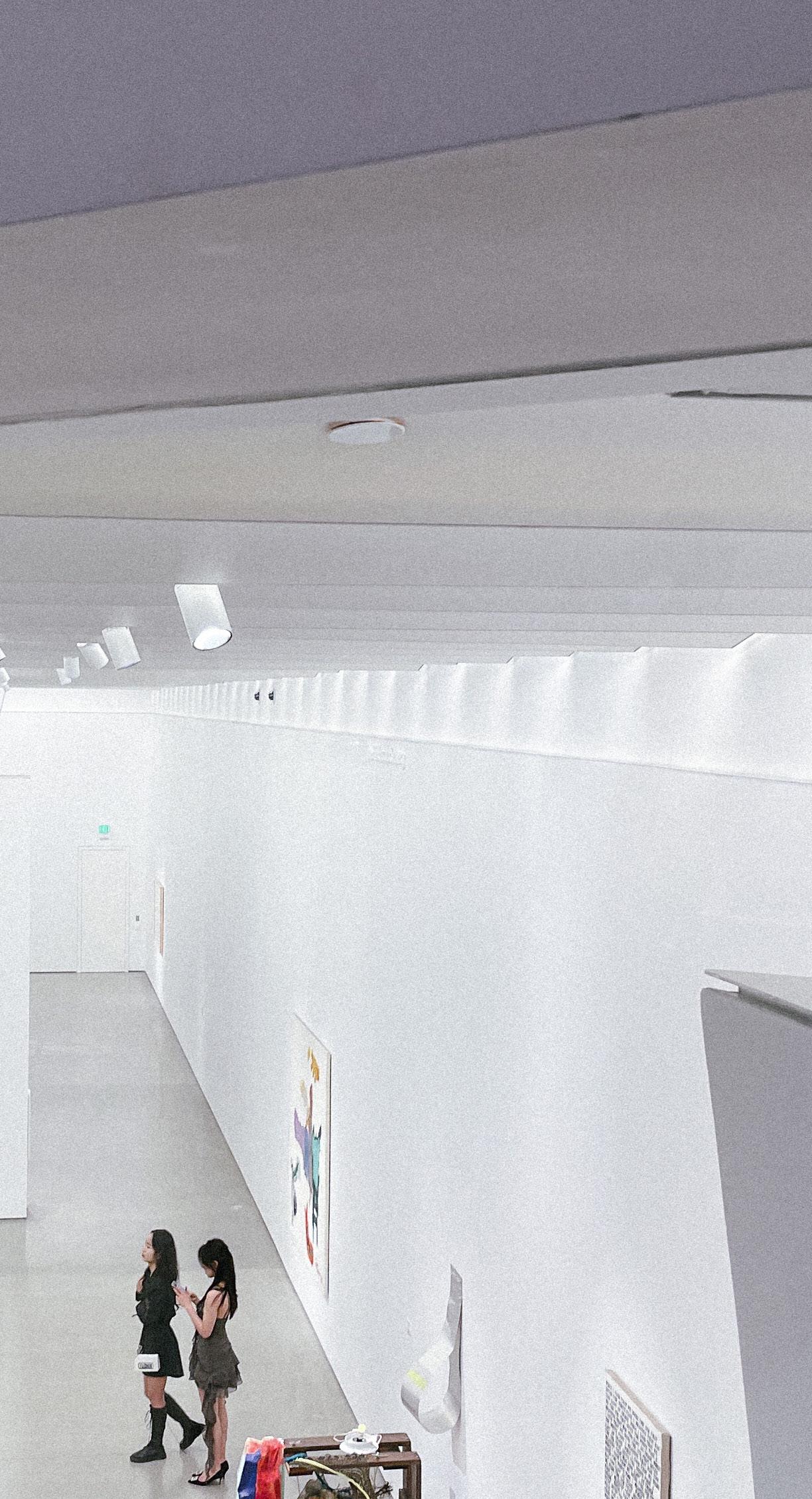
Finger Lakes Boating Museum
A nostalgic, immersive experience
Scope User Research, UX/UI Design
Date Fall 2022
Project Team 6 student designers, Mainly individual
This new exhibit in the Finger Lakes Boating Museum provides a unique, sensory experience, presents the audience rich history, and incites feelings of nostalgia. It is a captivating space to observe, feel, and learn from.

6 Ashley Xiang
01
FINGER LAKE S BOATING MUSEUM

7
Interior Design
Ashley Xiang
Concept
The goal is to create an immersive, deep lake experience by engaging the user while keeping the historical elements of the Finger Lakes alive. Dark, rich walls and spot lighting highlight individual boats and showcase their details and beauty. At frst, the space feels like a mystery, waiting to be explored and pieced together.
Narrative

Immersive

Historical

8
A

BUser Experience Journey
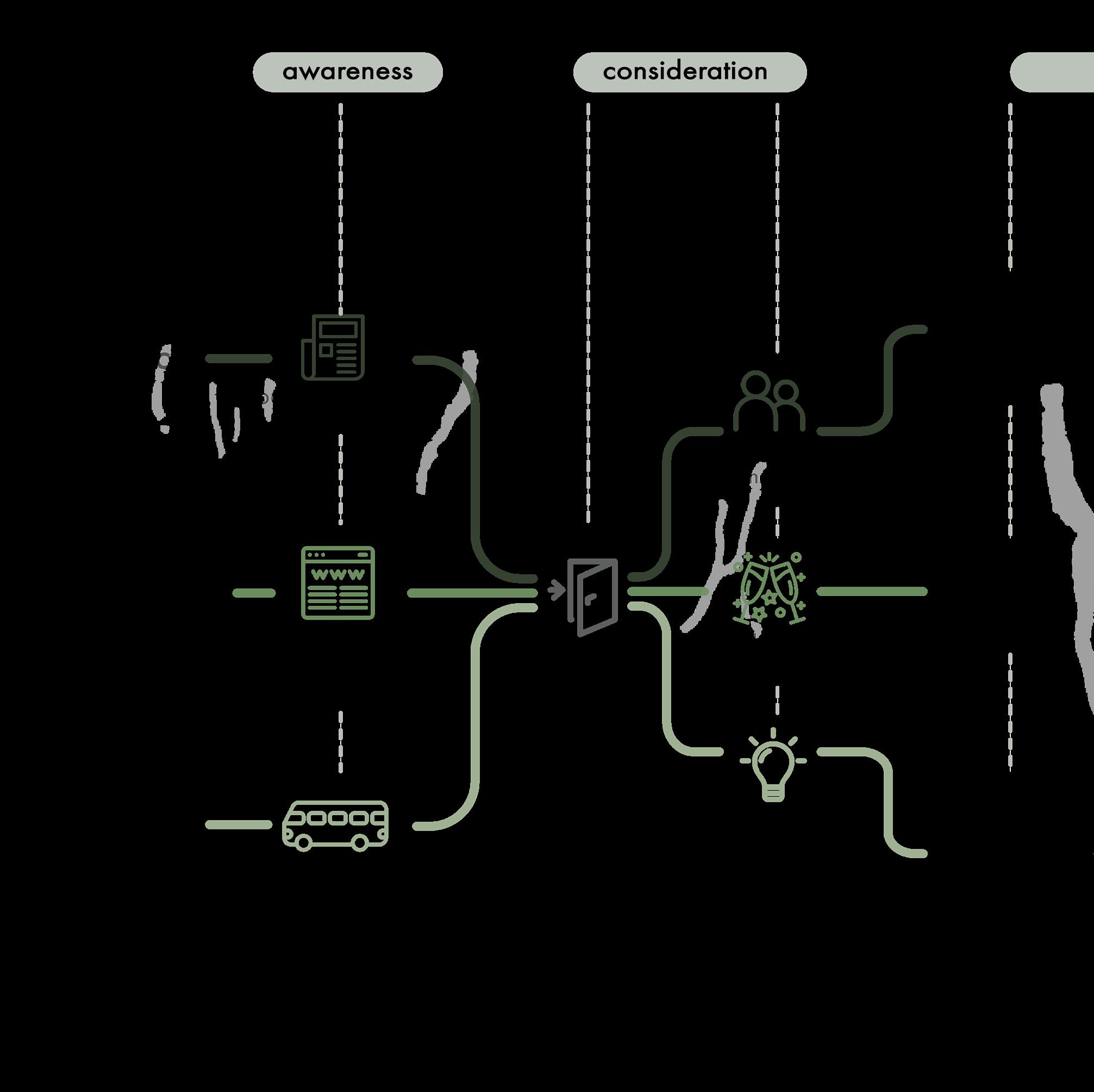
Different user journeys of visitors coming to the Finger Lakes Boating Museum new exhibit and how they will interact or experience the space.
A
Three distinct target audiences that visit the experience for separate reasons.
B
The exhibit has an activity or intent for all three visitor types but all visitors will leave with something benefcial.
9 Interior Design
Ashley Xiang
Blocking Diagram + Floorplan
To separate the open warehouse space, a large interactive screen of a map is the frst thing you see. The map of the Finger Lakes will have all boating past boat makers and bring nostalgia to those who love boating. The visitors are encouraged to walk different paths and explore the exhibit. The lighting will highlight and focus on certain areas of the room, adding to the immersive experience.
An important aspect that was included from the beginning was a secure viewing platform or raised display for prospect and allows visitors to take in the entire room. B


The circulation remains the same with two primary central routes because the displays come outward.
A larger mezzanine is added for more display potential and a variety of views. A children’s area is added as well to provide more interactions.
10
A
B
A
Built Model

Glass textured partition to divide up the space and different types of boats
Central children interaction zone with raised walls and seating
Mezzanine to provide an overlook area and opportunity to view the whole exhibit all at once
Large map of Finger Lakes right in the beginning to separate space and bring nostalgia
11 Interior Design
Ashley Xiang
Rendered Elevations A
Photoshop renderings of West cross-section and South wall.


12
B


A
In the dark space, spotlights highlight information and guide the visitor.
B
A large expanded boat display in front of the interactive map to introduce boats and history altogether.

AThe circulation remains the same with two primary central routes because the boats are stemming from the wall.
13 Interior Design
A
Ashley Xiang
Finishes FF&E
Physical material samples and furniture examples.

Special glass partitions which divide certain sections of boats but still permit visibility
Functional and not visually distracting in a space
Dark blue, soft upholstery and colors that blend into the background and add depth to the space
Sleek, track lighting

14


15 Interior Design
Model Detail Shots
02ParkDown
Parking Solutions on the Go
Scope User Research, UX Design
Project Team 5 student designers
Date Fall 2022
Parkdown is the only innovative app that delivers timely, updated information about parking availability, regulations, and pricing in a manner that fts into Cornell students’ existing habits and busy lives.
We help students park by providing parking options in their immediate area and consolidating parking information in one place.

16 Ashley Xiang

UX/UI Design
Straightforward, simple interface which is easy to interpret and use while slowly driving and fnding parking.
17

Cornell students who are new to driving in the Ithaca area have trouble determining public parking spot availability and regulations, leading to stress and legal punishment.
18
Ashley Xiang
Design Goals
User Research
We conducted six contextual interviews, asking students to drive around Collegetown and actively fnd parking. After the interviews, we collected sentiments and created an affnity diagram together. From the grouping and diagramming activity, we found four main user insights.
Simple
User Insights
Effcient
User-friendly

Reliable

19 UX/UI Design
Ashley Xiang
Ideation Sketches
Fast, design ideation and brainstorming.
Hologram car display with directions
Special headphones with audio cues
Smart navigation band Website with constant parking updates

Smart parking app with alerts
Ithaca rule updates with clear consequences
Special parking lot signs with information
Stacking car parks to add parking
20
Chosen Design Sketches
Custom profle and side menu if you want to look for specifc parking options
Redirect from any navigational app to ParkDown when near your destination

Sound and audio cues so there are minimal distractions
Carplay compatible app
Illegal parking pop-ups to prevent users from getting tickets
21 UX/UI Design
Ashley Xiang
Final Design
Main features and use cases for ParkDown.
Main onboarding
Default map view
Preference sidebar

Progress bar
Confrmation and continue button
Green and red color coding to show illegal vs legal parking
Card pop-ups with surrounding parking options’ information (price, hours, etc)
Notifcation settings
Parking option preference checkboxes
22
Illegal parking warning

Pop-up when you are approaching or about to park in an illegal area.

ParkDown notifcations

Lockscreen notifcations that remind you when your parking time is almost over.

Easily tap in and see where you parked.
23 UX/UI Design


Scroll to set time you paid for parking
Reminder for how much time is left
24
Ashley Xiang
Paid parking reminder

Checkboxes and text are larger to allow for better visibility and to prevent misclicks or mistakes

“Finish” button is replaced with “End Session” and a proper timer or countdown is added
For a more fuid onboarding experience, “Submit” and “Start” buttons progress the user through the fow in addition to the swiping motion

25 UX/UI Design
03

Music Mood Spotify: Redesign
Connecting with others through curated music
Scope User Research, UX/UI Design
Date Fall 2022
Project Team 6 student designers, Mainly individual
Music Mood is a new added feature which analyzes user weekly listening trends and the top 25 songs they listen on repeat. Every song is assigned to a emotion or feeling and each user has a combined “mood” by the end of the week. They receive a weekly, updated custom playlist which they can use to customize their profle and connect with others.

26 Ashley Xiang

UX/UI Design
Bright, captivating visual design that allows for personalization and connection with others.
27
Problem Statement
When I listen to music, I want others to know what I’m feeling, so I can express who I am better, but I can’t do that because:
Music platforms don’t have enough ways to express your musical taste other than making playlists.
Creating playlists about one theme or story can take too much effort.
Songs are linked to specifc memories/emotions but there’s no way to track them.
Design Solution

Featured on Home page to gather attention and interest
Each “mood” contains a blend of two emotions and colors based off Spotify Aura
Ashley
Xiang
1
2 3
Research
Methods
We conducted six interviews and asked participants how they felt about music and what streaming platforms they used.
Analysis
There was a group affnity diagramming (Figure A) session where we combined sentiments and examined common themes across all participants.

Interview Insights
From user research, music and music sharing is personal and important, but current sharing music features lack personalization and interesting elements.


29 UX/UI Design
Figure A
Ashley Xiang
Feature Idea Sketches
Designing features that could connect people with their friends and family through music.
Music sharing and messaging within the app


Custom profles based off music
Music aura and identity based on music taste
Generated AI group playlist covers
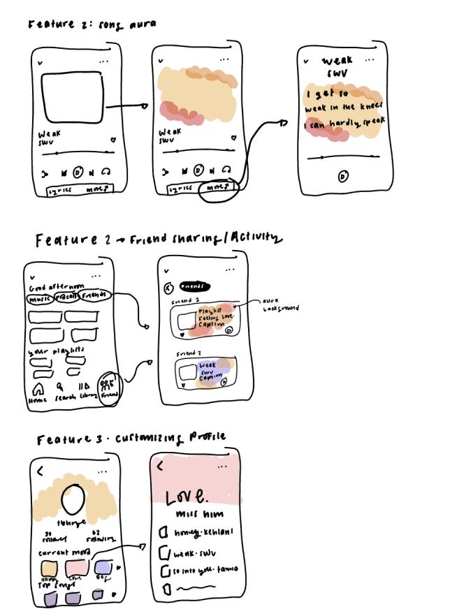
Sharing music to friends on a specifc page
30
Information Architecture
Information architecture allows us to see where the feature should exist within the app and how it can be integrated.

UI Kit
Creating a UI Kit allows us to study Spotify as an app and do visual design with the same guidelines.

31 UX/UI Design
Final Design Features
Personalization Connection with others


Self-discovery

Weekly customized playlists
Adapted banner and unique profle based off Music Mood
Easy to fnd your friend’s playlist on their profle
Follows current UI and is easy to add to your profle
Fun stories to look through and discover more about yourself and your music taste
32
Ashley Xiang
Final Design Flows and Interactions

Flow 1
Sharing playlists with friends will include a special message format and design. It generates interest and motivates others to look at their Music Mood.

Flow 2
An extra “Add to Profle” option is added to the playlist settings panel so users can quickly customize their profile and sharing components.
33 UX/UI Design
Flow 1: Sharing Mood with a friend
Flow 2: Adding Mood to your profle and banner


Flow 4
In addition to adding the customized profle from the playlist, users can also edit their profile and have the option to “Add Music Mood”. The unique profle is more personal and adds a connection to the music.
Ashley Xiang
Flow 3: Viewing the Music Mood story for more details
Flow 4: Adding Mood to your profle from your profle

Flow 3
Music Mood shows up on both the Home and Search page to increase visibility. Additionally, interactive stories help users learn more about the meaning behind their mood

Flow 5
Friends can check each other’s special profles and weekly Music Mood playlists. It helps with bonding in relationships and promotes music sharing.
35 UX/UI Design
Flow 5: Checking your friend’s weekly mood
04 Groove that Goob
A unique rhythm, stealth game that’s fun for all
Scope Game Design, UX Design
Date Spring 2023
Project Team 4 student designers, 4 student programmers

The party-loving Globulons shattered their precious Oracle Jukebox, leaving the Mixolydian Galaxy devoid of music. To bring their music back, Goob sets its sights on abducting the Milky Way’s source of sound. To do this, Goob must sneak to the top of Astral Ace’s penthouse party. In this top-down, rhythm-stealth game, players groove their way across vibrant dance foors, avoid getting spotted by wild party goers, and absorb dancers to inherit their unique rhythms.

36 Ashley Xiang

37
Game Design
Ashley Xiang
Game Design
Groove that Goob is a top-down 2-D game that combines rhythm with strategy. It is a unique and fun game because it requires the player to stay on beat while also fnd a way to escape each level safely. It requires accuracy and quick thinking, but is also forgiving so that people who aren’t familiar with rhythm games can succeed.
The initial game ideas were tested with players with a non-digital prototype and a turn based system was used to emulate staying on beat. The game went through several rounds of play testing and iterations.
Initial Gameplay Finalized Gameplay
• Dancers are scattered around each level
• Players avoid alternating danger light tiles
• Levels are time based
• Goob absorb dancers to create paths or escape the light
• Dancers move at a separate rhythm from Goob and have danger vision tiles in front
• Players have no time limit
• Goob absorbs dancers to gain their rhythm and pass special dance tiles (Figure A)


38
Figure A Gameplay Example. To navigate deadly dance tiles, Goob absorbs a faster dancing party-goer. Goob copies their rhythm, allowing it to pass safely and reach the elevator.
Design Concept
The game will have a dramatic setting and take place in the center of a busy city. There are three main design elements that will be incorporated into the design of the game.
Progression in Time

Levels will transition from a bright, daytime city setting to a cyberpunk, night setting, teeming with life and illuminated throughout. This creates a lively atmosphere, refecting the increasing complexity of the levels.
Character Design
Dramatic Lighting

The game will include strong colors and contrast in lighting, placing emphasis on certain characters.
Retro Party


Although the city is futuristic, the interiors feature retro designs and disco elements which pushes the urge to groove.
Goob has no gender-defning traits and isn’t designed to be anthropomorphic. We also had goals to create a simple, friendly character, which is loved by all.

Earliest ideas of Goob include jelly-like glob forms.

Cartoon and early simple exploration of Goob.

Pixelated style and color experimentation.

Final Goob design with new adjusted color palette that strays away from stereotypical alien colors.
39 Game Design
Ashley Xiang
Designed Game Screens
Title/Home

Simple, yet fun title screen with an animation of Goob moving towards the dancer. “Play” and other buttons are easily accessible and straightforward.

Pause screen freezes where player left off so they can keep track of where they are.
Settings

Settings screen following retro disco concept and color scheme. The main interactions are slider buttons.

Level designs change with progression. UI elements are still recognizable.
40
Pause Level
Game Design
Tutorials
The game includes fve tutorial levels that review and focus on individual mechanics in the game. In each tutorial level, there are cards with graphics that explain how to play and pass each level. Many follow Goob’s character or are placed next to a specifc UI element it is explaining or referring to.

Tutorial card displays which keys are used to move the character. The second card explains the function of the beat indicator.

Tutorial card explains how to recover after being caught.

Many of the tutorial cards have simple animations that explain more complex mechanics without overwhelming the player and having too many cards on screen.
The cards alternate in one place.
41
Ashley Xiang
UI Elements
The Groove Bar shows the player when they have unlocked absorption and how many attempts at absorption they have left. The music note and bright blue border appear for visual emphasis and clarity.
Having a level label makes it clear to the player what level they are on and shows their progress. It also helps them measure level diffculty and not repeat the same level.

The beat indicator includes moving vertical lines that correspond to the speed of the rhythm. Players are taught to move when the lines meet and hit the star in the middle.
This indicator is visually distinct and noticeable but not too distracting. It helps the player stay on rhythm and gives newer players extra support.
42
Game Design
Marketing
Created a promotional banner and icon for the game design website which features all of the games for the GDIAC showcase.
Produced a large scale poster that draws people in and gives a glimpse into the setting and emotions of the game.
Designed the logo for the game and all materials.


43
05 Other Works
Date 2020-2023

Coming from a diverse design and art background, I have delved into many forms and mediums of design. Although I have a strong passion for human-centered design, I love experimenting with graphics, trying new softwares, and drawing for fun.

44
Xiang
Ashley
Scope Renderings, Graphic Design, Fine Art, 3D Modeling, Sculpture, Etc

45 Other Works Photoshop self portrait
Fine Art


46
Ashley Xiang
Still life | Charcoal
Outcast | Chalk pastel
Interior Rendering | Marker
Sakura House | Enscape rendering


47 Other Works
Sculpture (3D + Physical)
A New Perspective | Sculpture, Installation
Eclipse | 3D modeling


48
Ashley Xiang Graphics
Self Dissection | Mixed Media
Self Refection | Graphic


49 Other Works MDC Promotions | Graphic
|
Medium
Design Collective, Issue 2.998 x 10^8
Mixed media

dreamxvisual.com
ashleyxiang888@gmail.com
AX
