Aboff's At Home Spring 2017

Page 1

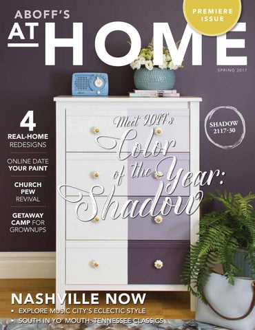
A B O F F’S

PREMIERE ISSUE

SPRING 2017

4

REAL-HOME REDESIGNS ONLINE DATE YOUR PAINT CHURCH PEW REVIVAL GETAWAY CAMP FOR GROWNUPS

Meet 2017 's

Cof tohle or Year:

w o d a h S

NASHVILLE NOW

• EXPLORE MUSIC CITY’S ECLECTIC STYLE • SOUTH IN YO’ MOUTH: TENNESSEE CLASSICS

SHADOW 2117-30

SALE!

RDAY, SUNDAY & COLUMBUS D

$10 OFF *

F

LIST PRICE

LIST PRICE

ON PREMIUM BENJAMIN MOORE INTERIOR & EXTERIOR PAINTS & STAINS INCLUDES ALL REGAL PRODUCTS, BEN, ARBORCOAT *AURA NOT INCLUDED | PER GALLON

SALE! 4 DAYLOCATIONS 31 LONG ISLAND

S & STAINS

OCTOBER 7 - OCTOBER 10

SUFFOLK COUNTY LOCATIONS

PER

*

25% OFF* LIST PRICE

ALL BENJAMIN MOORE PAINTS & STAINS *AURA NOT INCLUDED

plus

35% OFF SELECT WALLPAPER

NASSAU COUNTY LOCATIONS

Bay Shore (631) Centereach (631)665-1117 285-7230 Baldwin (516) 223-6045 Centereach (631) 499-2200 285-7230 Commack (631) Bellmore (516) 785-0200 Commack (631)775-7435 499-2200 Coram (631) East Meadow (516) 731-3100 (631)(631) 775-7435 EastCoram Hampton 324-3930 Glen Cove (516) 671-6598 EastNorthport Hampton (631) East (631)324-3930 261-5000 Hicksville (516) 931-2880 East Northport(631) (631)698-9892 261-5000 Farmingville Long Beach (516) 442-2176 Farmingville Hampton Bays(631) (631)698-9892 594-5070 Plainview (516) 777-7588 Hampton Bays(631) (631)427-2000 594-5070 Huntington Rockville Centre (516) 766-1600 Huntington (631)(631) 427-2000 Huntington Station 427-8034 Syosset (516) 364-9440 Huntington Station (631)242-5800 427-8034 North Babylon (631) Valley Stream (516) 825-0619 North Babylon (631)475-4800 242-5800 Patchogue (631) Wantagh (516) 221-4343 Patchogue (631) 475-4800 West Hempstead (516) 481-6464 Port Jefferson (631) 473-2360 Port Jefferson (631)727-1150 473-2360 Riverhead (631) Woodmere (516) 374-0717 Riverhead (631) Smithtown (631)727-1150 265-2409 Smithtown (631) 265-2409 Southampton (631) 283-6116 Southampton (631)537-9700 283-6116 Wainscott (631) WainscottBeach (631) 537-9700 West Hampton (631) 288-6605 West Hampton Beach (631) 288-6605

LOCATIONS

a location near you.

7 - October 10

Visit Aboffs.com to find a location near you.

30 CONVENI LONG ISLAND LO

Store hours vary. Ca your local Aboff’s for mor


HOW MUCH PAINT DO I NEED? Follow this formula to estimate the paint requirements of your project. You’re nearly finished painting when you look down into the almost empty can and realize – yikes! You won’t have quite enough paint to finish the job. Estimating the amount of paint you need is as important as choosing your color scheme. Save yourself time and a panic attack by taking the guesswork out of your paint requirements using a calculator similar to the one on this page. It’s as simple as measuring the dimensions of the room being painted to find the surface area. STEP 1: Measure the Walls

STEP 4: Add Total Doors plus Total Windows to = Surface Not to Be Painted.

STEP 5: Subtract Surface Not to Be Painted from Total Wall Surface = Total Surface To Be Painted.

Wall 1 Width: ___ ft. X Height: ___ ft. = _____ ft.

STEP 6: Divide Total Surface to Be Painted by

Wall 2 Width: ___ ft. X Height: ___ ft. = _____ ft.

the Spread Rate* = Amount of Paint Needed

Wall 3 Width: ___ ft. X Height: ___ ft. = _____ ft.

For Each Coat.

Wall 4 Width: ___ ft. X Height: ___ ft. = _____ ft. Add together to find Total Wall Surface = _____ ft.

*SPREAD RATE: The spread rate is the recommended yield you can expect from a can of paint. Typically, a U.S. gallon of paint will

STEP 2: Measure the Doors Door 1 Width: ___ ft. X Height: ___ ft. = _____ ft. Door 2 Width: ___ ft. X Height: ___ ft. = _____ ft.

cover 350-400 square feet. As coverage may vary depending on paint product and thickness of application, check your paint can label to determine the spread rate before purchasing.

Add together to find Total Door Surface = ____ ft. PRO TIP: It’s wise to buy a bit more paint than STEP 3: Measure the Windows Window 1 Width: ___ ft. X Height: ___ ft. = _____ ft. Window 2 Width: ___ ft. X Height: ___ ft. = _____ ft.

you think you will need for the job. This way, you can ensure you will not run out of paint before the job is done, plus you’ll have leftover paint for touch-ups.

Add together to find Total Window Surface = _____ft.

Don’t run out! Let ABOFF’S help calculate the right amount for you


Espresso Espresso

Aged Aged Oak Oak

Weathered Weathered Wood Wood


“ Color is a power which directly influences the soul.” ~ Wassily Kandinsky

SPACES: Real-home redesigns with wall-to-wall ideas you can use.

32

SPACIOUS AND GRACIOUS IN LITTLE HOLLYWOOD This Nashville stunner is a modern take on traditional Spanish style.

38

ENGLISH COUNTRY KITCHEN Renovation puts a new twist on tradition.

44

TIMELESS APPEAL, CONTEMPORARY STYLE A striking black and white aesthetic is all at once cool, current and classic.

51

MODERN AMUSEMENT Happiness is just a color away.

Products featured in AtHome are available at Aboff's, some by special order.

S P R I N G 2 0 17

5


Wedge_AtHome_Ad-FINAL.pdf

1

1/19/17

10:50 AM

CO NTRI BUTO RS

Patented

APPLICATORS UNIQUE

WEDPGEE

The Wedge™

Innovative trim brush technology.

SHA

ARTHUR LIFFMANN BARB CHABAI RACHAEL KING BRIAN JOHNSON CHRIS ZIELKE JIM TAYLOR MANNY MARTINS-KARMAN

• Paints Faster • Paints Straighter • Paints Longer

SCOTT ZIELKE

Love the designs within our pages? Need to reach out to the talented folks behind the gorgeous spaces... Watch a video about this innovative trim brush @ https://www.youtube.com/watch?v=f1pbpyeTvMI

All New Design

SPACIOUS AND GRACIOUS IN LITTLE HOLLYWOOD

PAGE 33

MARCELLE GUILBEAU marcelleguilbeau.com marcelle@marcelleguilbeau.com ENGLISH COUNTRY KITCHEN

PAGE 38

TAMARA ECKSTEIN ecksteindesigngroup.com tamara@ecksteindesigngroup.com

Our new 20 brush table top display was specially designed for the new Wedge™ trim brush with a small footprint to maximize exposure without taking up a lot of space.

TIMELESS APPEAL, CONTEMPORARY STYLE

MODERN AMUSEMENT ENVY PAINT AND DESIGN LTD envypaintanddesign.com info@envypaintanddesign.com

Work Tools International Email: Whizz@whizzrollers.com 12595 71st Court • Largo, FL 33773

PAGE 44

A homeowner’s own design... she’s talented, but not for hire! PAGE 51


CO NTEN TS

SPRING 2017

Bahia Taylor Editor in Chief Co-founder Leigh McKenzie Creative Director Co-founder Barbara Chabai Managing Editor

Graphic Design Styling Gallon Creative www.galloncreative.com Owned and Published by: Gallon Creative For inquiries, please contact us at hello@galloncreative.com 5 Scurfield Blvd #25 Winnipeg, Manitoba R3Y 3G4 www.galloncreative.com hello@galloncreative.com Cover Photography - Scott Zeilke While every effort has been made to ensure that advertisements and articles appear correctly, At Home Magazine cannot accept responsibility for any loss or damage caused directly or indirectly by the contents of this publication. All material is intended for informational purposes only. The views expressed in the magazine are not necessarily those of its publisher or editor.

20

ORIGINS: Adding subtext to today’s trends. The Blessed Bench Seat; Farnsworth House Set for the Silver Screen.

22

CRAFT TABLE: DIY? We say Y-E-S! FLORA MEETS FAUNA Easily transform plastic animal toys into decorative planters.

26

HOT SPOT: Creative places and faces with unique POVs. SUMMER CAMP FOR GROWNUPS Wisconsin’s no-frills Camp Wandawega promises one luxury: the complete absence of pretense.

56

CHOW: Just thinking about it is making us hungry. SOUTHERN COMFORT

63

EXPLORER: Pack your sense of adventure and let’s go. NASHVILLE BOUND This ain’t no honky tonk. The Gateway to the South is one of the hottest travel destinations of 2017.

68

TOOLBOX: Cool tools and clever tech to make the job easier.

72

THE TRENDSETTERS

78

GET THIS LOOK

80

WELCOME THE COLOR OF THE YEAR INTO YOUR HOME

84

PARTING SHOT: A final bit of inspiration. A-TISKET, A-TASKET

All rights reserved. Reproduction in whole or part prohibited without written permission from the publisher. Typeset in Adobe Garamond and Avenir Printed in Canada Publications Mail Agreement No. 42575014 Return undeliverable Canadian addresses to hello@galloncreative.com

22 Easily transform plastic animal toys into decorative planters S P R I N G 2 0 17

7


TEN

EASY UPDATES YOU CAN MAKE WITH PAINT!

EMBRACE the season with simple tips and tricks, as cool meets cozy in our fall issue.

LOOK FOR AT HOME MAGAZINE AGAIN THIS FALL

8

ISSUE 1


WELCOME

I

n naming this magazine At Home, we realize it may have triggered a controversy: how exactly do we define what makes one feel at home? After all, the mere mention of the word “home” stirs something deeply personal within each of us. Of course, home is not a place, but a feeling. It’s where we connect with the people who mean the most. It’s where we are able to be ourselves and nourish our body and spirit in meaningful ways. Home is made up of an infinite amount of sights, sounds, scents, memories and other magical intangibles as unique to us as our thumbprint. Yet, when it comes to home, one thing we all have in common is the desire to surround ourselves with color, beauty and style. We want the place we live in to not only be warm, safe and cozy, we want it to reflect who we are and fit the lifestyle we lead. Over time, that will likely change and at some point, your home will need to change along with it. Whether you’re moving to a new address or wanting to turn your current abode into the home of your dreams, we have plenty of design inspiration. Turn the pages to tour real homes professionally redesigned into sigh-worthy spaces – and discover how you can achieve the same looks starting with a visit to Aboff's. They have all of the expert advice, products and design services you need to achieve the “wow factor” and successfully complete your next home design project. So while we won’t attempt to define what makes one feel at home, allow us to offer a few ideas that might help feather your nest and truly make it your own. After all, when it comes to home, Dorothy was right – there’s no place like it.

AB OFF’S

4

repels stains and cleans up amaging walls.

GETAWAY CAMP FOR GROWNUPS

LIST PRICE

Shadow

BRE OBENJAMIN W N MOORE ON AKD PREMIUM

INTERIOR & EXTERIOR PAINTS & STAINS INCLUDES ALL REGAL PRODUCTS, BEN, ARBORCOAT

O F TH I S CO VE R

LIST PRICE

s plu35% OFF SELECT WALLPAPER

*AURA NOT INCLUDED | PER GALLON

SALE! 4 DAYLOCATIONS 31 LONG ISLAND

*AURA NOT INCLUDED

OCTOBER 7 - OCTOBER 10

O N P. 78

SUFFOLK COUNTY LOCATIONS

25% OFF* LIST PRICE

ALL BENJAMIN MOORE PAINTS & STAINS * A U R A N O T IN C L U D E D

us 35% OFF plSELECT WALLPAPER

30 CONVENIENT LONG ISLAND LOCATIONS.

Store hours vary. Call or visit your local Aboff’s for more information.

NASSAU COUNTY LOCATIONS

Bay Shore (631) Centereach (631)665-1117 285-7230 Baldwin (516) 223-6045 Centereach (631) 499-2200 285-7230 Commack (631) Bellmore (516) 785-0200 Commack (631)775-7435 499-2200 Coram (631) East Meadow (516) 731-3100 (631)(631) 775-7435 EastCoram Hampton 324-3930 Glen Cove (516) 671-6598 EastNorthport Hampton (631) East (631)324-3930 261-5000 Hicksville (516) 931-2880 East Northport (631) 261-5000 Farmingville (631) 698-9892 Long Beach (516) 442-2176 Farmingville Hampton Bays(631) (631)698-9892 594-5070 Plainview (516) 777-7588 Hampton Bays(631) (631)427-2000 594-5070 Huntington Rockville Centre (516) 766-1600 Huntington (631)(631) 427-2000 Huntington Station 427-8034 Syosset (516) 364-9440 Huntington Station (631)242-5800 427-8034 North Babylon (631) Valley Stream (516) 825-0619 North Babylon (631)475-4800 242-5800 Patchogue (631) Wantagh (516) 221-4343 Patchogue (631) 475-4800 West Hempstead (516) 481-6464 Port Jefferson (631) 473-2360 Port Jefferson (631)727-1150 473-2360 Riverhead (631) Woodmere (516) 374-0717 Riverhead (631) Smithtown (631)727-1150 265-2409 Smithtown (631) 265-2409 Southampton (631) 283-6116 Southampton (631)537-9700 283-6116 Wainscott (631) WainscottBeach (631) 537-9700 West Hampton (631) 288-6605 West Hampton Beach (631) 288-6605

30 LONG ISLAND LOCATIONS

Visit Aboffs.com to find a location near you.

ISSUE ONE

riangle “M” symbol are registered trademarks licensed to Benjamin Moore & Co.

FRIDAY, SUNDAY & COLUMBUS DAY SHADOW eet 2017 's SATURDAY, M 2117-30 FI ND A *

ALL BENJAMIN MOORE PAINTS & STAINS

or call. e to help!

ONS VISIT ABOFFS.COM TION NEAR YOU

ONLINE DATE YOUR PAINT

P. 22

SALE!

$10 OFF Cof tholoe r * 25% OFF Year:

REAL-HOME REDESIGNS

CHURCH PEW REVIVAL

®

P.62

PREMIERE ISSUE

SPRING 2017

ABOFF’S AT HOME

No Other

SPRING 2017

e Than 50 Years

P. 44

NASHVILLE NOW

Sale Dates: October 7 - October 10

• EXPLORE MUSIC CITY’S ECLECTIC STYLE • SOUTH IN YO’ MOUTH: TENNESSEE CLASSICS

Visit Aboffs.com to find a location near you.

9


WHAT YOU MUST KNOW BEFORE HIRING A PRO … and why a coupon shouldn’t be the only criteria for choosing your paint contractor! Certain painting jobs are too big, too complex or simply out of reach for the average homeowner. That’s when it’s time to call in a professional. While it may be tempting to do an online search for local painters, redeem a handy coupon or contact the last company to stuff a sales flyer in your mailbox – hiring a good professional painter requires some forethought and due diligence. Don’t reward your painting job to the first person to answer their phone. Seeking out a qualified, experienced and reputable contractor will save you migraines down the road. It is important to find a professional painting firm that will deliver quality from start to finish. A happy, satisfied customer should be their ultimate goal and upholding their reputation and workmanship should be essential to them. Start by asking neighbors, family and friends to recommend local painters who have recently completed jobs for them. Would they hire the same company again? Before making your decision, collect at least three quotes. A good contractor will visit your home before giving you a written cost estimate. This is a perfect time to learn more about their company by asking several pertinent questions: • How long have you been in business? This is not the same as “How long have you been painting?” so ask both questions. You should hire someone who has been in operation for some time.

10

ISSUE 1

• Who will do the work? The company owner may do the project estimating, but not the job itself. Ask whether employees or subcontractors will be assigned to paint your home and how much experience they have. This also opens the door to verifying their safe practices, licenses and insurance coverage.

• How much? You get what you pay for, which is why the lowest bid is never the only consideration in hiring a pro painter – just as the highest bid doesn’t make that company the best contractor. Instead of hiring on price alone, look at the bigger picture to see the value of what is being offered.

• What kind of preparation work will you do? Proper preparation is more than just providing drop cloths to protect floors and furniture. Will the contractor clean and prime the walls, remove switch plates and outlet covers, mask trim and mouldings with tape and otherwise prepare the area as necessary?

• Can you provide references? Don’t be shy about asking for multiple referrals – and they should be as recent as possible. Follow up by calling the names on the list and asking what it was like to work with the company: did they show up on time every morning and tidy well before leaving in the evening? How long did it take to complete the actual job compared to set expectations and did they charge the price quoted on the original bid? If there was a difference, ask why.

• What kind of paint do you use? Unless you work with an interior designer, choosing the wall color is up to you. However, find out what brand or brands of paint the contractor works with and if they have recommendations on other materials, colors or finishes that would work best.

Ask ABOFF’S which local house painting pros they recommend


A TRADITION OF EXCEPTIONAL SERVICE

A

boff’s, New York and Long Island’s color expert, was founded at a time when paint only came in white. In the 1920s, colored tint had to be mixed into a white base to create custom paint for customers. Few reliable color experts existed back in those days, leading entrepreneur David Aboff to realize there was an opportunity to serve Long Island’s local trade and Gold Coast. David and wife Beatrice moved from New York City to Huntington, New York in 1929 and opened the first Aboff’s White Paint Store. Aboff’s often delivered paint by horse-drawn carriage to the mansions being built on the Gold Coast’s lavish estates. Over time, their sons joined the business and helped it to expand by growing its number of store locations as well as by acquiring local chains. Now with 31 locations serving Long Island’s Nassau and Suffolk counties, Aboff’s Paint continues to be a family-owned and operated business, with the third and fourth generation of Aboffs proudly carrying on the tradition of delivering exceptional products and service. As the largest independent dealer of Benjamin Moore Paint in the United States, Aboff’s supplies Long Island and New York contractors and homeowners with quality

Benjamin Moore paint, interior and exterior paint, stains, paint primer, and supplies. The proven experience and know-how of Aboff’s in-store professionals ensure their customers always choose the right paint colors and take home everything they need to finish their projects successfully. In addition to their outstanding selection of paints and stains, Aboff’s offers custom decorating services. Their expert designers are able to help transform any room into a designer showcase. Aboff’s Design Studios carry all the top design names in wallpaper and fabrics as well as window treatments, including Hunter Douglas. Above all, as an independently-owned business, Aboff’s continues to highly value customer care. Visit any one of their locations, and you’ll receive the kind of specialized attention, personal service and one-on-one, helpful advice that simply can’t be found in most of the larger chain stores. Quality, selection, expertise and service: it’s why Aboff’s continues to be The Painter’s Choice.

S P R I N G 2 0 17

11


A FRESH COAT OF CURB APPEAL A vibrant, welcoming front door turns your home into the new kid on the block Let’s address your address. By that we mean taking a good, long look at how your house appears from the street. If you believe the exterior is in need of a refresh, there’s an easy and inexpensive DIY project that really packs a punch: giving your front door a facelift! No matter the color, your front door is more than a transition from the outdoors in. That’s why choosing a bright shade of “hello” elevates the appearance of your home and makes a bold statement amidst everyday surroundings. Paint your front door and get ready for the neighborhood to take notice. YOU WILL NEED: • Painter’s tape • Sponge • Fine grit sandpaper • Paintable filler • Good quality paint brushes • High-density foam rollers • 1 quart adhesion primer • 1 quart satin or semi-gloss exterior paint see “Choosing a Sheen”

Choose moderate and dry weather for painting. You’ll have to keep your door open for a few hours, so pick a day when the temperature is neither too hot nor too cold. Avoid windy days because of all the dust and debris swirling in the air. You should also have a temporary replacement to protect your house while you are completing this project. A heavy tarp, an existing storm door or even a large piece of plywood will deter insects, birds and other unwanted visitors. STEP 1: Remove the door and all of the hardware (wedge a screwdriver in the joints between the hinges and the hinge pin, then tap lightly with a hammer until the hinge pins come loose). Rest the door on a pair of sawhorses outside. Remove any remaining hardware, such as the door handle. STEP 2: Wipe the door clean, then scrape off any blistered or peeling paint. Use sandpaper until the surface feels smooth.

Open the door to more fresh ideas at ABOFF’S

12

ISSUE 1

If there are cracks in the door, repair them by working small amounts of paintable filler in with a putty knife. Let it dry and then sand until smooth. Before priming, wipe away the extra dust with a damp cloth. STEP 3: Use painter’s tape to protect and cover anything you want to keep clean and free of paint, such as glass accents or windows. STEP 4: Priming prevents the door from absorbing moisture, smooths out the texture and keeps the paint from seeping in to the wood so don’t skip this step. Apply a coat of primer with a foam roller or a wide paintbrush. Be sure to cover the front and all the side edges. STEP 5: Once the primer is dry, it’s time to paint in this order: 1) Bevels, 2) Panels, 3) Center stile, 4) Rails, 5) Outer stiles. One common question is how to paint edges. When a door is painted two colors on either side, the two side edges get a different color. The hinged edge gets the exterior color when the door swings in. If the door swings out, the side with the knob gets the exterior color. STEP 6: Apply a second coat of paint for a smooth finish and truer color. Once the door is completely dry (it will no longer be tacky to the touch), the hardware can be reattached and the door reinstalled.

DOORSTEP PALETTES MADE TO POP • Red – Feng Shui’s bold symbol of happiness, strength and positive energy. • B lack – The ultimate contrast color is as dramatic as it is elegant. • T urquoise – Romantic Tiffany-inspired color against an otherwise all-white exterior. • L ime Green – Greens, even lime green, pick up natural colors from the surrounding landscape. • Y ellow – An irresistibly sunny entryway hints at a home’s warm energy

CHOOSING A SHEEN The sheen describes the glossiness of your paint’s finish. For doors, choose a satin, semi-gloss or high gloss paint. Satins are more lustrous and have a greater warmth and depth than flat paints. Semi-gloss are slightly glossy, sleek and radiant, offer good stain resistance and are easy to clean. High-gloss paint is the shiniest because it has the highest light-reflective characteristics.


SEE US FOR ALL YOUR DECORATING NEEDS

WALLPAPER Aboff’s Design Studios carry one of the largest selections of wallpapers and fabrics

WINDOW TREATMENTS Aboff’s carries a broad range of quality window treatment solutions including Hunter Douglas and other major brands.

HOME & INTERIOR DESIGN SERVICE Aboff’s offers the ability to shop in the comfort of your own home through our Home Design Service.

CUSTOM TREATMENTS At Aboff’s we are proud to offer our customers all aspects of custom work and design.

35% OFF SELECT WALLPAPER Aboff’s experts can answer all of your decorating questions and assist you in designing the room of your dreams. WWW.ABOFFS.COM


USING A PAINT ROLLER Put down the brush and pick up a roller for a smooth, even finish.

When painting walls, ceilings and other flat surfaces, a good roller will make your job quicker and easier. Because they can apply paint at about three times the rate of brushes, a roller cuts down on painting time and leaves behind a smooth and even finish. But before you get rolling, here are a few things to consider:

BUYING THE RIGHT ROLLER

• If you are applying latex paint, choose a roller cover made with a synthetic “nap” or fiber surface. If you are applying an oil-based paint, choose a natural fiber cover or a synthetic cover. • When selecting a roller, you should consider the length of the nap. They range from 1/8” (short) to 1” (long). Short naps are suitable for smooth surfaces, while long naps are best for rough surfaces such as stucco or brick. • While it may be tempting to go with a cheap roller that you can throw away after, a high quality roller is a worthwhile investment. They will apply paint more easily, hold more paint, and have less tendency to leave nap fibers on the surface being painted.

EASY CLEAN UP

• For latex paint, wash the roller sleeve in soap and water, using your hand to squeeze and push the paint off the fibers. • For oil-based paints, pour solvent into the paint tray and dip and roll the cover into the solution. • Stand the rollers on end as laying them flat will cause the fibers to mat on one side and create an uneven roll next time they are used.

THE PROPER TECHNIQUE

• Before painting, moisten the cover of the roller with water when working with latex paints or with a bit of paint thinner for oil-based paints. Lightly blot the roller cover with a paper towel to remove any excess moisture. • Do not submerge the roller in paint. Roll it in the tray until it is half coated, then up onto the grid of the tray and then back down into the paint. Do this a few times to ensure the sleeve is well saturated but not overloaded with paint. You want as few drips as possible. • Don’t start against an edge with a roller full of paint or you may get lumps. Instead, start about 6” from the edge so you can gradually unload the heaviest paint and then work your way toward the edge, where you can overlap areas already cut in by your paint brush. • Roll the wall in a straight line from top to bottom to coat the surface. Work quickly, lapping newly applied paint onto paint that is still wet. • Remember, the roller should sound wet; when you can no longer hear that crinkly, moist sound, it’s time to reload it in the paint tray. • It’s important not too press too hard. Too much pressure can leave a “fat edge” or roller mark on the wall. After each stroke, lightly lift the roller away from the wall to avoid causing an edge.

ABOFF’S has the paint & accessories you need to succeed 14

ISSUE 1


Ranked “Highest in Customer Satisfaction for Interior Paints” in the U.S. by J.D. Power.

ABOFF’S YOUR PAINT AND DECORATING EXPERTS WWW.ABOFFS.COM


PUT YOUR COLOR TO THE TEST Color, color on the wall – which paint sample is fairest of all? ISOLATE YOUR COLOR CHOICE

You fell in love with a paint chip. Hey, it happens. But as enamored as you may be with that particular shade of awesome, how appealing will that color be when it’s painted on a wall, fills an entire room or covers the outside of your house? Luckily, before you invest in an entire can of paint, there are ways to test out your love to see if it’s real – and if that love will last.

NORTHERN EXPOSURE

A color card will have a number of similar but different color options on it. Avoid the temptation to hold them up and evaluate them at once. Instead, isolate the one color you are considering (either by concealing the others or cutting it out). Viewing only one color at a time will give you a more authentic feel for the bigger picture: how it will look once applied.

STOP! DON’T PAINT YOUR SAMPLE ON THE WALL

Consider where sunlight comes into the room you are painting: does the window face north, south, east or west? North-facing rooms get less direct sun and are cooler so you may want to choose a warmer color. South-facing rooms may benefit from a cooler hue while east-facing rooms need a warmer palette to offset a lack of natural light in the afternoon and evening. West-facing rooms get a warm glow in the evening so a cooler color will help tone down the light.

Always try paint samples in your space before deciding on a color. However, consider not painting your sample directly on the wall. The existing paint can affect or alter the accuracy of the new paint’s true color. Instead, paint a poster board with two coats of your sample. This way, you can tote it around day or night and see how it will look amidst your home furnishings in all types of light.

A LIGHTBULB MOMENT

LIGHT SWITCHING

MULTIPLY THE INTENSITY

Light is never consistent; it varies by time of day, season and even the weather outside. Of course, paint color will look different depending on the type of light it is exposed to, which is why samples should be examined in both natural (daylight) and artificial (evening) lighting. This is especially important when choosing interior paint as some colors will take on dramatically different appearances in different light.

The lightbulbs you use around the house can also influence the way colors look. LED bulbs look good with most paint colors. Incandescent bulbs give off a warmer light that enhances reds, yellows and oranges while florescent bulbs have a cooler glow that enhances blues and greens. Halogen light most closely resembles daylight, so colors stand out more.

It’s important to remember that any color will look more intense over large surface area than it is on a paint chip or color card. A bright yellow paint sample might inspire you, but painting an entire room that color may require wearing sunglasses! The faint of heart or less courageous may want to lean toward more neutral colors when painting a room all one color, or save the bold choice for an accent color instead.

The bright folks at ABOFF’S have a huge selection of paint color tools to help with your project.

16

ISSUE 1


AVAILABLE AT THE INTERIOR DESIGN GALLERY

6 Long Island Locations Visit Aboffs.com to find a location near you

Glen Cove | Plainview | Rockville Centre | Syosset Commack | Huntington


KENDALL CHARCOAL HC-166 P.34

DESIGNER

inspiration

Left: Rich, deep, and luxurious, this gray is the perfect counterpoint to the white linens of this grandly stylish canopy bed. Gaining in popularity all over the home,

deep gray offers a softer contrast than black and still

plays well with so many color combinations. Embracing a

handsome and dramatic color in the bedroom is the stuff dreams are made of.

Below: Bright white walls set the stage for, well, anything!

Nothing looks quite so clean and confident as a superwhite white. So put it anywhere and everywhere, because an allwhite room is a blank canvas just waiting for you to make

it your own. Like a good friend, it's easy to be around and happy to make you and your dĂŠcor look terrific.

OXFORD WHITE CC-30 OR 869 P.50

18

ISSUE 1


P.38 HANCOCK GREEN HC-117

GRANT BEIGE HC-83

Above: The pastel green paint on the cabinets of

this modern country kitchen is simultaneously fresh Color accuracy is ensured only when tinted in quality Benjamin Moore(R) paints. Color representations may differ slightly from actual paint

and soothing. The subtle complement to the quiet

creams used throughout allow the stunning details

of the custom cabinetry to stand front and center. A great all around color that can act as a neutral, yet

evokes a sense of history as in a French Monarch's

silk dress. Green, that isn't too blue or too yellow... c'est magnifique!

P.48

Right: Warm, soft and with a subtle strength, this

medium beige is an ever-steady and easy to work with color. If everything you test is coming up

roses, give this fan-tan-stic neutral a whirl. Not too light and not too dark, this just-right beige has a

modest green undertone that makes it a solution color for areas that tend to pull pink.

S P R I N G 2 0 17

19


O R IG IN S

THE BLESSED B E N C H S E AT

20

ISSUE 1

Joan Heaton Architects; The Landschute Group; Renae Keller Interior Design

R

epurposed church pews offer a unique type of sanctuary in the home. In an entryway or mudroom, it’s an instant invitation to say hello, untie your laces and stay a while; as seating at the dining table, it’s a spot for everyone to slide in, grab a bite and share their day. While they aren’t made for comfort the way a deep, soft sofa might be, these long, wooden bench seats have a distinctly antique visage, are built to last and serve a practical function. So if you’re wanting to extoll the virtues of church pews – you’re preaching to the choir. In its first 1,000 years, the church did not use pews because congregations met in homes within the community. When the first church building was constructed around 300AD, it was modeled after the Roman Basilica, where there was no seating because worshippers stood for the entire time. It wasn’t until the 13th Century that backless stone benches began to appear against the walls of English churches. Wooden pews were introduced in the 14th Century, but did not gain popularity for another 100 years when the Reformation was taking place. This is when the pulpit made its debut as the architectural focal point; churchgoers were encouraged to take a seat in one of the front-facing benches to listen to the sermon. As pews began to take on more prominence, more ornate appearances emerged, with flowers or animal designs carved into the bench ends. Church pews have not escaped controversy. From the 1600s through the mid-1800s, people were seated according to social rank with the demographic having the highest social standing and greatest wealth placed in more desirable seats closest to the pulpit. This seemed to reflect the perception that social rank was a divinely-sanctioned hierarchy. In the 1800s, the church rented out seating to families as a means of tithing, and many pews were handed down from one generation to the next. Having one’s own pew was a sign of prestige in the community, and formal box pews enclosed in oak or pine-paneled walls provided privacy, and often warmth, for the family sitting together. Across the United States, churches would set aside seating specifically for the poor, the widowed, the disabled, and for black people. Slave owners would purchase separate pew space for their slaves as they did for themselves. After the legality of pew rentals caused a rift in the Church of England, houses of worship began shifting from private pews to free, open seating. Today, many churches have done away with traditional wooden bench seating, making them available as reclaimed furniture. Surging in popularity due to the demand for vintage farmhouse décor, antique pews can be easily refinished with a little sanding, stain and varnish, then repurposed with decorative throw pillows to create a revered spot in any home, porch or cottage.


FA R N S W O R T H HOUSE SET FOR THE S I LV E R S C R E E N

flickr.com/photos/marco2001/2705244066

C

onstructed as a floating glass box of “almost nothing,” the famous Farnsworth House in Plano, Illinois is already a vital part of American iconography and soon, it will become part of movie history as well. It was recently announced that Jeff Bridges is set to star in an upcoming film about the relationship between architect Mies van der Rohe and his client, prominent Chicago doctor Edith Farnsworth, during the design and construction of the modern wonder. Dr. Farnsworth commissioned the dwelling as a getaway where she could relax and enjoy the pastoral surroundings. While her relationship with Mies began as amicable and bloomed into romance, their partnership later soured, resulting in a contentious court battle over rising building costs. Designed in 1945 and later built in 1951, the 1,500-square foot home is considered to be an important example of the international style and one of Mies’ most revered works, even if it is the

only noteworthy house he completed in the United States. “The Farnsworth house with its continuous glass walls is an even simpler interpretation of an idea,” wrote modern architect Philip Johnson in describing Mies’ defining project. “Here the purity of the cage is undisturbed. Neither the steel columns from which it is suspended nor the independent floating terrace break the taut skin.” Undoubtedly, the streamlined structure’s most striking feature is its floor-to-ceiling glass windows, which form the external walls. These provide panoramic views of the organic landscape, and allow visitors to see straight through from one side to the other. “When you see nature through the glass walls of the Farnsworth House, it gets a deeper meaning than outside. More is asked from nature because it becomes part of the larger whole,” Mies once said. “I myself have been in the house from morning until evening. Until then, I had not known how colorful nature can be.

One must be careful to use neutral tones in interior spaces, for outside one has all sorts of colors. These colors are continually changing completely, and I would like to say that it’s simply glorious.” The Farnsworth House remained a private residence for more than 50 years. It was added to the U.S. National Register of Historic Places in 2004 and now serves as a museum.

S P R I N G 2 0 17

21


CR A FT TABL E

FLORA MEETS FAUNA 22

ISSUE 1


Easily transform plastic animal toys into decorative planters

A

dding living greenery to your indoor decor is not only on trend and beautiful but good for you to boot! Who knew decorating could have added health benefits? These creature characters bring new life and function to inexpensive plastic toys and are not only filled with air purifying greens but expression and character too. A perfect point of personality for any nook, mantel, ledge, desk, bookcase or even in the powder room, they also make a great gift for youngsters and provide an excellent lesson on the care and keeping of botanicals for green thumbs in the making. Make a solitary statement with just one or assemble an entire herd, brood, gaggle, pack or flock by utilizing the same type of animal en masse. Use one color or a variety. YOU’LL NEED: • Hollow hard plastic toy animals • A power drill with a hole saw or a utility knife • Spray paint (brush on paint can also be used – it’s just a bit more labor intensive) • Small plants of your choosing • Small rocks, soil and moss THE STEPS: 1. Begin with hard plastic toy animals from a local craft or dollar store. Be sure to opt for hollow varieties – these have an instant cavity perfect for planting. 2. Using a hole saw drill bit attachment, drill a hole through the back of your plastic animal, creating an opening and revealing the hollow cavity for your plant. Choose a hole size only slightly bigger than your plant including soil and roots so that not too much of the soil is visible. 3. In a well-ventilated area (preferably outdoors) and over a protective covering like cardboard, newsprint or dropcloth, apply thin and even layers of spray paint to coat the outside of the animals. If you are brushing on paint instead of spraying just jump right in. You will get painty fingers so choosing a latex product that cleans up with soap and water is best. 4. Experiment with different sheens of paint and be sure to consider metallics too. 5. Allow painted animals to dry completely overnight. 6. Once paint is completely dry begin with a thin layer of rocks in the bottom of your animal to allow drainage, then nestle your plant inside. Pack quality indoor soil with good draining properties or sand around it. You can finish by putting Spanish moss around the opening of the planter to help secure things and hide the soil or sand. Depending on the foliage of your plant this may or may not be necessary.

S P R I N G 2 0 17

23


CHOOSING AND CARING FOR YOUR GREENS

Air plants require the least amount of care and don’t need any soil. You can simply pop them into the hole without any soil, although they do very will in sand. A light misting with a spray bottle every so often is all they need.

24

ISSUE 1

Tropical houseplants make lovely full plumed creations but will require regular watering and sunshine to thrive.

Succulent varieties adapt well for indoor use and require minimal care. Give them a healthy spray of water when soil feels completely dry to the touch and let them do their thing.


NEW

BLUE NEW YOU

With a comprehensive color palette, Graber custom window treatments will set a fresh tone for any décor. Available at your local independent paint and decorating retailer—stop in today!

©2016 Rust-Oleum

S P R I N G 2 0 17

25


HOT SPO T

S U MM ER CAM P FOR G ROW NUP S

26

ISSUE 1


Wisconsin’s no-frills Camp Wandawega promises one luxury: the complete absence of pretense

I

f you were a lucky kid, you went to camp during the summer. You slept on a lumpy mattress, froze your private parts in an icy lake, hiked into unknown wilderness not knowing if you’d return, tiptoed through patches of poison ivy and skirted by curious skunks and raccoons. At night, you’d sit around the campfire under a canopy of stars, completely exhausted but excited to do it all over again tomorrow. And now, campers, you can relive those sweet-as-burnt-marshmallowon-a-stick memories all over again at Camp Wandawega. Slogan: where five stars are four too many. Located 90 minutes north of Chicago near Elkhorn, Wisconsin, Camp Wandawega is not your typical summer resort – and it’s certainly not for everyone. In fact, owners David Hernandez and Tereasa Surratt have spelled out exactly what kind of threadbare camp experience folks are in for with their Manifesto of Low Expectations. “Everything you’ve heard is true. Our bath and guest rooms haven’t been updated since the Hoover Administration. Not much has, actually. A trip to Wandawega is a trip back in time,” the Manifesto says, describing ladybugs on the pillow, windows that are a pain to open and the occasional toad hopping into the old-school camp showers. “For many, this is a new definition of hell. Welcome.” Hernandez, who attended camp here as a kid, convinced Surratt to take the leap in 2003 and buy the camp. “The first time I saw it, it was like, you’ve got to be kidding me – the place was already half in the ground. But I could see that preserving it was important to David and so we made a deal to tackle it together,” Surratt says. Six months after buying the camp they were married on the spot. “In the beginning, we were reluctant innkeepers. We really had no intention of doing outside rentals because we feared that pretty photos would not accurately reflect the reality of the place,” she recalls. “We had a couple of incidents when people arrived expecting a hotel and that was entirely our fault for not putting it out there that we don’t have amenities. There’s no modern plumbing, no concierge, no ice machine.” So what’s the attraction? Why do so many people book a stay at Camp Wandawega up to a year in advance? For starters, the secluded 25-acre camp is in the middle of nowhere and for many, that’s enough. The lake sees very little boat traffic, making it perfect for fishing or swimming, and there’s an assortment of archery bows, Schwinn bikes, horseshoes and other vintage sporting equipment if you’re recreationally inclined. There’s no TV and the WiFi is spotty at best, so you might as well get outdoors in the fresh air and enjoy it. Another part of the camp’s charm is its 100-year history – even if Wandawega’s checkered past sounds like an outrageously strange-but-true campfire tale of sinners and saints. In the 1920s, the modest resort was a prohibition-era den of iniquity for Chicago gangsters who’d outfitted it for the distribution of bootleg liquor, prostitution and gambling. A decade later, the hideaway became known as a brothel until the madam got busted for running a “bawdy house of ill fame.” It was re-opened in the 1950s and operated as an affordable family getaway until it was purchased in 1961 by the Catholic Church as a refuge for Latvian priests fleeing Soviet occupation. The Church turned it into a cultural retreat center and a summer camp for kids.

S P R I N G 2 0 17

27


28

ISSUE 1


HELLO MUDDAH

For a getaway transported in time, Camp Wandawega offers a selection of vintage* guest rooms, cabins, bunkhouses, tipis and tents as well as an aluminum trailer affectionately known as “Canned Ham.” However, the owners’ primary focus is on private, all-camp group events. No spur of the moment walk-ins are accepted and any surplus vacancies are made available only on AirBnB. *(“By ‘vintage’ we mean old and unimproved. This is not a modern luxe joint designed to look old: it’s just plain old. That’s the way we like it, but it’s not for everyone.”) Before requesting a booking, carefully read the Manifesto of Low Expectations on the Camp’s website: wandawega.com.

S P R I N G 2 0 17

29


30

ISSUE 1


Today, people come to Camp Wandawega for a number of reasons. To relive the dog-eared, postcard nostalgia of youth’s simple pleasures in simpler times. To find solitude, a sense of connection or simply to be inspired. “I think the one thing that’s consistent is that people love to go to places that are fun or interesting in the way they’re put together. They love to be inspired by interior design and get ideas,” says Surratt, who has decorated the resort with period-appropriate finds from junk stores, thrift shops and flea markets. Cabins are outfitted with a carefully-curated array of rustic cottage chic and retro sporting gear, kitschy taxidermy and antique camping gear. “We have a saying that nothing crosses the threshold that’s newer than 1960. Other than that, everything here is DIY and designed on a dime. That makes it accessible. We hope guests look around and say, hey, I can do this in my own home.” Surratt and Hernandez live and work in Chicago, relying on a part-time housekeeper and the kindness of a neighbor to let guests in to the cabins during the week. “We’re the definition of a mom-and-pop shop. We don’t have the staff or infrastructure to run like a typical hotel, so we book groups of people for a minimum two-day rental. Weddings, corporate events, bachelor parties, reunions, retirement weekends – we’re open to all groups,” she says. “We love sharing Wandawega and people seem to really embrace being part of it. Whenever we’re up there, it feels very communal in that guests are always happy to lend a hand. If we’re painting the pier, clearing brush or planting geraniums, they’re out there with us. That’s certainly not your regular hotel-type experience.”

S P R I N G 2 0 17

31


SPA C ES

32

ISSUE 1


SPACIOUS AND GRACIOUS IN

LITTLE HOLLYWOOD This Nashville stunner is a modern take on traditional Spanish style Text: Barbara Chabai Photography: Gieves Anderson

This family-friendly living room is spacious and functional, featuring a two-sided fireplace shared with the outdoor entertaining patio on the side deck. A media room next door has enough room for everyone to cozy in and share the popcorn whether there's a movie, a big game or a glitzy awards ceremony on the marquee.

S P R I N G 2 0 17

33


H

is taste is very clean, minimal and Zen-like. Hers is warmer; symmetrical, but with an underlying sensuality. The two very different styles might have presented an impasse, but designer Marcelle Guilbeau found plenty of middle ground in creating a modern but comfortable home for the couple in East Nashville’s Little Hollywood neighborhood. Known for its Spanish Mission-style homes, many of the small flat-roofed bungalows in Little Hollywood were built in the 1930s and ‘40s with adobe clay block and stucco, creating a distinct California feel. While the couple loved the location and appreciated its historic architecture, they wanted to build a contemporary space for their growing family. Situated on a hill overlooking a golf course and greenway, this massive 4,300-square foot, two-storey house could have easily dwarfed the smaller, Spanish-inspired homes in the neighborhood. However, exterior design details by architect David Baird (Guilbeau’s husband) such as the flat roof, stucco walls and chunky wooden front trellis scale down its enormity and ensure it fits in with its surroundings. Because the wedge-shaped home is on an elevated, wedge-shaped lot, the main living space sits above the ground-level garage, foyer and guest suite. This gives the homeowners a perfect view and vantage point. “The open-concept living room, dining room and kitchen are on the front of the house, with large windows that provide this amazing, sweeping view of the neighborhood,” Guilbeau says. “I think the home is just so gracious because of the way it has been laid out.” Inside, Guilbeau orchestrated a harmonious blending of the couple’s divergent design tastes into what she calls “a modernist take on a timeless space.” This included incorporating elements of Spanish-Mediterranean aesthetic to soften the sleekness of the home’s clean lines and angles. “There’s a bit of elasticity when you’re doing a modern take on a Spanish-style home. We wanted to bring the warmth and earthiness of the exterior inside, but the clients did not necessarily want chunky ceiling beams in their living room,” she recalls. “So our solution was to install rustic, dark planks across the ceiling, which almost act as a reflection of the wood floor below.” As the couple loves to entertain, the flow between the living room, dining room and kitchen was imperative. White walls and natural materials unite the uniquely-functional spaces. For example, the white textured subway tile on the kitchen backsplash is echoed in the thinglazed brick covering the two-sided fireplace across the room. A floating mantel is also painted white so as not to disrupt the visual effect. “It’s just this beautiful, white, pristine box, except for the overdyed Oushak turquoise rug in the living room and the matching mid-century bar stools at the kitchen island adding that pop of color,” Guilbeau says. “But what really sings is the artwork.” The collectible artwork in the living room and stairwell reflects the influence of both homeowners. For him, an expansive Kit Reuther original in whites and grays, and for her, a hazy pastel painting from contemporary artist Kathleen Holder. Another piece, titled Soul Brother 007 by Thomas Saliot, suavely greets visitors in the entryway.

The homeowner indulged in a modern canopy bed, featuring ceiling-hung curtain rods and billowing linen drapery. Velvet chairs and antique bronze lamps on the side tables round out the sensual look.

34

ISSUE 1


Metal accents in the master bath, including the pivoting shower door, fixtures and framed mirrors, gives it a romantic, European feel. The cowhide throw rug on the white marble floor adds color and whimsy.

S P R I N G 2 0 17

35


The bedroom is a dreamy sanctuary envisioned by the homeowner. In a reverse play of the all-white living area, the bedroom walls are painted deep gray, its alluring window drapes dyed to match. She found antique mahogany doors with crystal knobs and insisted on the linen-draped canopy bed, bringing a softly sensual compromise to the modern, masculine-colored space. White textured subway tile makes a reappearance in the master bath, a sigh-worthy space that Guilbeau considers to be a highlight of the home. The creamy soaker tub and shower are offset with metal accents as an unexpected but welcome bow to the rustic industrial trend. Antique brass faucets and cabinet pulls complement a stunning, pivoting shower door by Nashville metal artisan PJ Maxwell, who also crafted the framed mirrors above the vanity. Maxwell made the metal stair railings in the home too, another example of natural texture softening hard modernism. “Finding a compromise between two very different design perspectives is really all about creating balance,” Guilbeau says. “He is a modernist and she is a sensualist at heart, and as a result, I think their home is warm, contemporary and celebrates them both.”

36

ISSUE 1


S PA C ES

English Country Kitchen Renovation puts a new twist on tradition

Text: Barbara Chabai Photography: Gabrielle Touchette

D

espite appearances, this isn’t your grandma’s kitchen. Although you’d be forgiven if the vintage design conjures up the nostalgic clang of her cast iron skillet and the aroma of freshbaked cinnamon rolls – because that’s just what the homeowner wanted. “She's a young woman with an old soul who loves things that are traditional in style,” explains designer Tamara Eckstein of Eckstein Design Group. “She bought a home originally built in 1911, so wanted to create a look that was contemporary, yet respectful of its charm and of the character of the well-established neighborhood.” Drawing inspiration from an English country cottage, Eckstein worked with the homeowner to find time-honored elements that would bring their vision of a fully functional kitchen to life. The starting point of the design was the owner’s vintage-looking AGA range, constructed on a heavy cast iron frame with a biscuit enamel finish. “It was important that the appliances did not bring a distracting ‘newness’ to the space,” Eckstein says. “We decided to enclose the refrigerator in a built-in cabinet so as to not take up valuable real estate with a big stainless steel appliance. Even the farmhouse sink has a biscuit finish so it didn’t detract from the beauty of the custom cabinetry.”

38

ISSUE 1


S P R I N G 2 0 17

39


Refurbishing a century-old kitchen was not without its challenges. “Years and years of renovations built over renovations had left things in a bit of a mess. Once we had gutted the existing kitchen, we realized that we first needed to add a support beam in the ceiling and reinforce some of the existing joists that had been cut away during previous renovations.” During the demolition, Eckstein’s team found a 40-year old letter hidden in the wall. Titled “Posterity,” it offered a brief history of bygone renovations, explaining that a past homeowner had used reclaimed maple wood salvaged from a building in the city’s historic business district. “That inspired us to use some of the reclaimed wood and even make some wood pens for the homeowner as a special touch,” Eckstein says. Creating storage solutions for the 190-square foot kitchen needed to be an integral part of the design plan. A custombuilt island made from quarter sawn white oak is reminiscent of a vintage harvest table, and deep cookware drawers feature antique-style bin pulls as a fun throwback to the brass hardware of yesterday. The striking cabinetry, painted in a soft sage, are a standout. The eye-catching arches on the door front were inspired from a gothic-design hutch Eckstein spotted online, a motif that is echoed in the cut-outs framing the walk-in pantry just off the main kitchen. “We wanted to mimic the arches on the cabinet doors outside the pantry,” she says. “The homeowner makes her own preserves and so the rustic, open style allows her to accessorize the pantry beautifully with her own homemade goodies.” As the pièce de résistance and what Eckstein calls “a labor of love,” her carpenter recreated all of the millwork around the doors and windows to replicate the existing trim in the house. The flooring was one of the final decisions, but an important one that could not afford a misstep. “The homeowner originally thought she’d like to continue the home’s hardwood floors into the kitchen, but I was hesitant,” she says. “Although beautiful, hardwood in the kitchen is not always the most durable choice. I was also concerned about being able to match new hardwoods with those in the rest of the house, which are filled with character and well-loved from years gone by. At the same time, the homeowner was not keen on using a standard tile.” Eckstein went back to the look of old English country cottages, discovering that many of them had brick floors. It lead her to selecting a porcelain tile that looks like reclaimed brick. With cut-outs reflecting the gothic arches of the kitchen cabinet door fronts, the walk-in pantry is neatly accessorized with gem-like jars of homemade preserves. The “antiqued” subway tile on the backsplash has a crackled-type finish with some risking and undulations to give a clean look with a vintage feel.

40

ISSUE 1


The custom island, made from quarter sawn white oak, provides extra storage space as well as a handy spot for working, serving or gathering while entertaining.

S P R I N G 2 0 17

41


“It was a scary choice as I’d never done a floor like that before,” she admits, adding that once the tile was installed, she breathed a sigh of relief. “As soon as we put it in, we loved it. The herringbone pattern adds interest and the color brings warmth and enhances the character of the space.” From the subtle touches to the attractive finishes, it’s the little things that bring together the retro-modern look of this kitchen and truly makes this relaxed but gracious space the heart of the home. The lighting fixtures glow with a beautifully-embossed milk glass. “We wanted a vintage feel but with more oomph than the standard schoolhouse light fixture. This is a throwback without being typical.”

42

ISSUE 1


No do-overs. Get your job done right with our full line of masking products.

Indoors. Outdoors. Walls. Trim. Archways. Large surfaces. Whatever you’re masking, save time and rework by choosing the right tape for your project. With easy unroll, sharp paint lines, clean removal and protection from paint bleed, our full line of products gives you incredible results the first time. Find the right tape at ScotchBlue.com.

Pull Off a Better Paint Job © 3M 2017. 20 All rights reserved. 3M, ScotchBlue, Edge-Lock and the BLUE color of the tape are trademarks of 3M.

PRODUCTION Job# SBLU-16-1764 Round: P1-1 Date: 10/12/16

PLATINUM PORTFOLIO PLUS PPP HALF PAGE ISLAND AE: NP PM: JA AD: MB CW: MB PA: SJ CLIENT: Zach Miller PUBLICATION: In Home Magazine 2017 TRIM SIZE: 7" x 4.5" INK: 4c ®

•••• NEW FROM PURDY !

Brushes

ULTIMATE PERFORMANCE & EXCELLENT CUT-IN • Proprietary trimming process for superior edge and straight lines. • Ultra Stiff formulation for better paint flow and control with low VOC and heavy-bodied coatings. • Durable filaments maintain form after every use.

purdy.com

S P R I N G 2 0 17

43


S PA C ES

A striking black and white aesthetic is all at once cool, current and classic

TIMELESS APPEAL

CONTEMPORARY STYLE Text: Barbara Chabai Photography: Tracey Ayton

44

ISSUE 1


Opposite: Laurie has a keen eye for design and her home reflects an appreciation for a wide range of styles, including farmhouse, industrial and mid-century modern. This page: The classic combination of sleek black and plush white never gets stale. In fact, the homeowners’ palette looks as dramatic and fresh today as when it was first chosen.

S P R I N G 2 0 17

45


One of the things the homeowner loves most about her choice of furnishings is that they are above all functional. “We don’t want to live in a museum where things can’t be touched or used. Nothing in our home is so important or fragile that it can’t be replaced.”

46

ISSUE 1

H

omeowners Laurie and Randy didn’t set out to build their Vancouver-area dream home from the ground up, but that’s the hand they were dealt. And it couldn’t have turned out better. “Originally, we planned on finding a house we could renovate. We loved our neighborhood and wanted to stay here, so we sold our place and started looking for something to work on,” Laurie says. “We finally found a property for sale that we loved, so we put in an offer and ended up getting it within 24 hours.” At first, Laurie and her firefighter husband, Randy, an electrician by trade with experience framing houses, thought everything had fallen neatly into place – until Randy was able to get a much closer inspection of their new purchase. “He told me there simply was no way we could just go in

and renovate. It wasn’t structurally sound. We had no choice but to start all over with a new home build,” Laurie recalls. Caught between permanent residences with the clock loudly ticking, Laurie remembered a magazine photo she’d saved of a craftsman bungalow that might be suitable for the couple and their then four-year-old son. “I’ve always been interested in interior design and in the days before Pinterest, I would keep a file folder of magazine clippings that caught my eye. I remembered some interior and exterior shots of a home I liked and asked Randy what he thought of it. Being a builder, he said that it was doable,” she says. “So, we took the photos to a local architect and had her draw up a plan.” That was 15 years ago. Today, their house looks just as fresh and new.


Laurie and Randy reside 20 minutes south of Vancouver in the seaside community of Tsawwassen, which means “looking toward the sea” in Coast Salish. “We live only two blocks from the beach, so that definitely influenced our home’s flow and functionality as well as its classic design. I didn’t want to do anything that would become dated,” says Laurie, a retired cosmetics departmentmanager. “At work, I dealt with so much color that I was saturated with it. When I came home in the evening, I just wanted to be met with a clear, calm palette; nothing jarring.” Invoking a sugar sand beach oasis, the home’s milkcolored walls, cabinetry and lighting fixtures set the timeless tone for the living space, anchored in striking black and white furnishings and decorative accents. Laurie curated the eclectic mix of contemporary pieces and antique furniture from a wide variety of sources – online deals, auction houses and used building material centers.

A visuallystimulating collage of framed photography and handcrafted art can be easily rearranged or replaced with new images on a whim.

S P R I N G 2 0 17

47


The floor to ceiling bookshelf in the main-floor office, filled with a collection from admired authors, inspires creativity. A subtle use of earthy colors on the second floor enhances the textures and patterns of the upstairs space. The homeowner considers the ensuite to be one of her favorite rooms. “There’s no marble or extravagance, but I do love the size of the shower, the rainhead faucet, and the character built into the vanity and tall beadboard moulding.”

“I think the warmth and personality of our home really comes through in the wood,” she says. “Our interior doors are antiques. Our hardwood floors are reclaimed fir from a warehouse in downtown Vancouver and we love that there is so much character in them. Our vintage dining table and the large island in the kitchen are the same way – any extra nicks, scratches or burns they get from every day use only adds to their charm.” The main floor living space is bathed in natural light thanks to several generously-sized windows, which also provide the homeowners with a tranquil view of their picturesque yard without giving away their privacy. “Our living area is at the back of the house, so I don’t have to worry about privacy as much as I would with a

48

ISSUE 1

picture window in the front room,” Laurie says. “We have blinds on the doors and decorative drapes in the living room and dining room, but they’re never closed. Our windows are always open.” Despite how quickly the home build and design had to come together, Laurie says there is very little she would change today about her home. “This was my vision. I may not have always been able to see how it was all going to turn out, but my husband knew what he was doing so I just had to have the confidence in him that he would be able to create what was in my head, and he did,” she laughs. “He talks about moving or maybe doing it all over again, but I keep putting him off. I’m just so happy here.”


with

PRO-MASK BLUE® with BLOC-It™ is a fine blue crepe paper

advanced formula!

masking tape with a specially formulated pressure-sensitive

TM

synthetic rubber adhesive. Our proprietary BLOC-It™ Clean Line Technology delivers clean, crisp paint lines every time, giving you the confidence to tape, then paint like a pro!

• hardwood floors, lacquer, laminated surfaces • no adhesive residue

STOPS PAINT BLEED!

Blocks paint from seeping under the tape!

SCAN TO VIEW VIDEO.

Get to know IPG’s products & capabilities.

T A P E S & F I L M S • P A C K A G I N G P R O D U C T S & S Y S T E M S • B U I L D I N G M AT E R I A L S • E N G I N E E R E D C O AT E D P R O D U C T S

888-898-7834

w w w. i t a p e . c o m | E - m a i l : i n f o @ i t a p e . c o m


S PA C ES

A spectacular collection of vases displayed in the living area echoes the soundwave patterns of the wool rug, creating a perfect harmony of texture living in the otherwise subdued space.

50

ISSUE 1


MODERN AMUSEMENT Happiness is just a color away

Text Arthur Liffmann Photography Tara Craigon and Shandra Hees

S P R I N G 2 0 17

51


52

ISSUE 1


“ Envy Paint and Design Ltd. took us further than we’d ever have gone on our own. The result is simply outstanding – we love it.” (The Homeowners)

W

hen the homeowners of this new build first walked through the doors of the house that was to become their new home, they knew they’d found “the one.” Backing onto a lake in a newly-developed neighborhood, the home’s open floor plan featured highly desirable architectural features like 10-foot ceilings and a walk-out lower level. But that was it. “Essentially, it was a white box,” laughs the homeowner. “I knew that I wanted a neutral and classic envelope, something that would work on its own and still allow us to decorate and redecorate as time went on without worrying about having to change the big stuff like cabinets or flooring.” And so, they quickly got to work selecting their hard finishes and having the house completed. In went the oiled hardwood floors, the custom millwork, glass-paneled interior openings, and a six-burner Wolfe cooktop. But even with all that in place, it still didn’t feel quite like home. “We were thrilled with the light and the openness. It was lovely, but we wanted to add a sense of fun,” the homeowner recalls. She called upon design firm Envy Paint and Design Ltd. to help inject the space with some inspired and vibrant decorating. Creating a space that delivered the vibrancy the clients were seeking while complementing the existing high-end finishes was a dream project indeed. Upon entering the home, guests are greeted by a vignette that beautifully demonstrates the dream fulfilled. Envy designed a custom bench made from a slab of walnut and steel hairpin legs, they plucked an original canvas by Kal Barteski off the artist’s own living room wall and installed it over the bench in lieu of a mirror. A shot of color and humor is delivered by a fabulous yellow-dipped coat rack from modern design powerhouse Blu Dot. Together, the design elements represent the sensibility that now infuses the entire home. The selection of a bold area rug to ground the living area of the great room not only introduced visual texture to the space, but also determined the color palette that was used throughout. The bold blues and yellows mix beautifully with the neutral envelope of the home’s hard finishes and allude to the bright An original canvas by artist Kal Barteski hangs above a custom bench in the grand foyer; a quirky coat rack by Blu Dot injects a bright shot of color. Top: A playful series of bowls mounted on the wall descending to the lower level softens the hard edges of the millwork; a trio of classic metal stools by Harry Bertoia offer a casual yet stylish place to perch at the oversized kitchen island.

S P R I N G 2 0 17

53


Clockwise from top left: Custom cushions, button-tufted and piped in the same colors pulled from the area rug, make for awesome snuggling on the comfortable leather sofas in the great room. A built-in sideboard in the formal dining area provides abundant closed storage and excellent space on top for serving or display; A new menagerie of ceramic sculptures is proudly displayed in the living area. Shell chairs by mid-century icons Charles and Ray Eames surround an ultramodern table in the casual eating area off the kitchen.

sunshine and wide prairie sky outside the banks of massive windows around the house. Two large leather sofas providing comfortable seating are complemented by a pair of sculptural Barcelona chairs in white leather, while a steel and glass table anchors the area without hiding the rug from view. Across the massive mantelpiece dance a newly-curated collection of vases, creating a gentle yet dynamic focal point without detracting from other elements in the large space. In the informal dining area off the kitchen, the designer selected a bright yellow and brushed stainless steel table from Blu Dot, surrounding it with Eames shells on metal Eiffel bases. Illuminated from above by an airy Kina fixture, the dining area is now one of their favorite places to gather. “I would never have chosen a round table on my own, let alone a bright yellow one,” the homeowner says with a smile, “but our designer instinctively knew not only what was going to work, but what would work for us. It was like working with a magician.” And what could be more fun than that?

54

ISSUE 1


YOUR WOOD STAIN PROJECT…

PERFECTED

It’s the Cabot way. ®

Get all the beauty and protection you deserve, plus help every step of the way and a can’t-miss guarantee. Take the first steps at CabotWFPG.com

S P R I N G 2 0 17

55


CHO W

Southern Comfort Photography, Styling and Recipes Brian Johnson

Rich in history and in heart, southern cuisine is a beloved, bubbling pot of strong cultural influences and seasonal ingredients. It’s simple but satisfying fare, made well and made with love. Our chef, Brian Johnson, was inspired to celebrate the traditional flavors of Tennessee by putting his own twist on some good, down-home cooking. Pull up a chair and dig in!

56

ISSUE 1


S P R I N G 2 0 17

57


58

ISSUE 1


PULLED PORK RUB Combine the following ingredients in a bowl: 4 tbsp brown sugar 2 tbsp garlic powder 2 tbsp onion powder 2 tbsp smoked paprika 1 tbsp celery seed 1 tbsp cumin 1 tbsp salt 1 tbsp pepper 2 tsp sage 1 tsp cayenne 1 tsp ground bay leaf This makes more rub than you need, but you can put the remaining mixture in an airtight container as it is equally delicious on chicken or ribs. SLOW COOKED PULLED PORK 1 boneless pork shoulder (3-4 pounds) Pulled Pork Rub (see recipe above) Apply the rub to the pork shoulder and let sit overnight in the fridge. 1 large onion, roughly chopped 4-5 cloves garlic, roughly chopped 1 cup cider vinegar 2 cups chicken stock Add pork, onion, garlic, cider vinegar to the slow cooker. Add chicken stock so that pork shoulder is at least 3/4 covered. You may need to add more chicken stock depending on the size of the pork shoulder. Cook in slow cooker on high for 5 hours. Alternatively, can you also cook on low heat for 8 hours. Remove pork from slow cooker and let cool long enough to be able to handle. Shred pork with a fork. Mix in barbecue sauce (recipe below) once all meat is shredded. Reheat in oven before serving on a brioche bun topped with coleslaw. BARBECUE SAUCE 1 small onion 4 cloves garlic 1 tbsp minced ginger 1 tbsp butter 1 1/2 cup cider vinegar 1/2 cup water

5 tbsp brown sugar 2 tbsp dry mustard 2 tbsp Worcestershire 2 tbsp smoked paprika 1/2 tsp oregano 1/2 tsp thyme salt + pepper Puree onion, garlic and ginger. Add butter to a saucepan, once melted add puree mixture and sautĂŠ for 2 to 3 minutes. Add remaining ingredients and simmer for 2530 minutes.

COLESLAW 1 cup mayonnaise 3 tbsp Dijon mustard 2 tbsp cider vinegar 2 tbsp sugar 1 tbsp grated onion 2 tsp celery seed 1/2 tsp salt 1/2 tsp pepper 1 bag of coleslaw mix Combine all ingredients, then add to coleslaw mix.

S P R I N G 2 0 17

59


60

ISSUE 1


MAC & CHEESE 3 tbsp flour 3 tbsp butter 1 tsp salt 1 cup evaporated milk 1 cup milk 2 tbsp dijon mustard 2 cups shredded old cheddar 1/2 block of 450g Velveeta, cut into cubes 3 1/2 cups uncooked elbow macaroni 2 cups bread crumbs 3 tbsp melted butter For the cheese sauce: Preheat oven to 350°C. Cook macaroni according to directions and drain. In a saucepan, melt butter over medium heat. Whisk in flour, stirring until smooth. Slowly add milk, whisking constantly over medium heat until sauce thickens. Add both cheeses and Dijon mustard, stirring until the cheese melts. Add cooked macaroni. Pour mixture into a cast iron skillet and top with bread crumbs. Drizzle melted butter over entire dish. Bake for 30 minutes until bread crumbs are browned and crispy. MOON PIE COOKIES Cookies: 1/2 cup softened butter 1 cup sugar 1 egg 1 cup evaporated milk 1 tsp vanilla 2 cups all-purpose flour 1/2 tsp salt 1/2 cup cocoa powder 1 1/2 tsp baking soda 1/2 tsp baking powder Heat oven to 400°C. Cream butter and sugar together. Add egg, milk, vanilla and mix well. Set aside. In a separate bowl, mix flour, cocoa, salt, baking powder and baking soda. Slowly combine dry mixture to first mixture. Scoop a rounded tablespoon of dough onto cookie sheet, spacing them about 2 inches apart. Bake for 8-10 minutes and cool for 1 hour.

Filling: 1/2 cup softened butter 1 cup icing sugar 1/2 tsp vanilla 1 cup marshmallow creme Combine ingredients and mix well with hand blender. Assemble by spreading filling between 2 cookies and sandwiching together. Enjoy!

Brian Johnson spends his free time experimenting with flavors. Although he loves being adventurous with food, this selftaught cooking enthusiast truly appreciates a simple meal made of fresh ingredients and thoughtful preparation. Brian enjoys making soul-satisfying meals for his family and community of friends who happily clean their plates then ask, "When are you opening your own restaurant?" While that dream may someday be in the works, Brian's recipes continue to transform his kitchen into a chefowned eatery that gives his wife and three children the best table in the house.

S P R I N G 2 0 17

61


E XPL O R ER

62

ISSUE 1


NASHVILLE BOUND This ain’t no honky tonk. The Gateway to the South is one of the hottest travel destinations of 2017

And I’m watching the sun go down this evening And soon it will wake this town that’s made of dreams But before it does, a new star will be shining That’s the way it is on the Nashville scene –“The Nashville Scene” by Hank Williams Jr.

S P R I N G 2 0 17

63


Every single day, an estimated 85 people move to Nashville. While a good many arrive in Music City with stars in their eyes and a guitar case full of dreams, most choose to transplant themselves here because of the creative, cultural and culinary landscape. In fact, despite its legendary roots, it appears that Tennessee’s capital is only now hitting its stride. Nashville was recently named one of the Top 50 places in the world to visit by Travel + Leisure Magazine and topped Frommer’s list of best destinations in 2017. It’s a stellar year to plan a trip, too, with the hallowed Ryman Auditorium marking its 125th anniversary, the Country Music Hall of Fame and Museum celebrating 50 years and the Bluebird Café, the famous songwriters haunt, turning 35. Even the planets appear to be aligning – Nashville will be the only U.S. city in direct viewing line for the total solar eclipse this August. Nashville is, of course, a music mecca and so melody, rhythm and harmony remain the top draws. The newly-expanded Country Music Hall of Fame is home to “America’s music” and the world’s largest popular music museum with more than 2.5 million artifacts following the evolution of country music to its present day form. Southwest of downtown Nashville is Music Row, still the heart of the entertainment industry. Among the must-see highlights is RCA’s historic Studio B, where Willie, Waylon and Dolly all recorded – and even Elvis lay down tracks for over 200 songs. Country music is not the city’s only art form, however. Despite its deep regional roots, Nashville has experienced something of a cultural revolution in recent years as evidenced by its contemporary art, theatre and a rapidly-expanding visual and performing arts scene. The Frist Center For the Visual Arts hosts a spectacular array of art from across the region and around the world, while the Tennessee Performing Arts Center is home to the Nashville Ballet, Nashville Opera and Nashville Repertory Theatre. The Hatch Show Print, established in 1879, is one of America’s oldest working

64

ISSUE 1


letterpress poster shops. It has used the same wood and metal type for over four generations, creating print advertising for the Grand Ole Opry and many of the performers that have graced her stage. Artistically-inclined tourists will also be drawn to the 5th Avenue of the Arts, a group of downtown art galleries that host a wildly popular “art crawl” once a month.

Talk show host Jimmy Kimmel once flew from L.A. to Nashville just for a meal in celebrity chef Jonathan Waxman’s restaurant Adele’s, and he’s not alone in his jonesing for authentic southern comfort fare. Condé Nast Traveler said that Nashville has "enough going on food-wise to warrant a trip solely for eating.” Like its music, the city’s explosive culinary scene is hot

S P R I N G 2 0 17

65


66

ISSUE 1


and happening, earning it a #6 ranking on Zagat’s prestigious list of America’s Next Hot Food Cities. If you like your tea sweet, your chicken hot and your biscuits fluffy, buttery and plentiful – you’d be hard pressed to find better eats elsewhere. Nashville has successfully doffed its gaudy, rhinestone-studded, mechanical bull of a reputation to blossom into one of 2017’s fastest-growing cities and most desirable tourist destinations. Thanks to the influence of native Nashvillians and the influx of newcomers, the most exciting reason to visit is to experience the way Nashville respectfully but comfortably mashes up the old and the new, small town quaint and cosmopolitan glam, in everything its creative spirit touches from music and food to the eclectic mix of architecture in its distinct neighborhoods. Nashville is a rock ‘n’ roll band at a roots revival – a fun and totally unexpected but altogether delightful juxtaposition of the past and present.

BEYOND COWBOY BOOTS: NASHVILLE’S HOT SHOPS Trendy Music City has no shortage of stylish boutiques to get your shop on, including: DRAPER JAMES (draperjames.com) – Actress Reese Witherspoon’s affordable luxury lifestyle brand features clothing, handbags, home accessories. Raised in Nashville, she started the company to honor her southern heritage and the 12th Avenue South boutique is their flagship store. WILDER (wilderlife.com) – A design shop and art space for home and life, Wilder is the Tennessee-made furniture and home goods brainchild of Ivy and Josh, two artists and performers who relocated from NYC to bring their unique vision for creating provocative spaces to Nashville. NADEAU (furniturewithasoul.com) – Founded on the idea that great furniture should be attainable by everyone, Nadeau’s offerings are handcrafted, exotic and never mass produced. Owners Tom and Angel Nadeau scour the globe to curate their collection of “Furniture with a Soul.” WHITE’S MERCANTILE (whitesmercantile.com) – A

Tools: Benjamin Moore/Houzz Color Picker

general store for the modern day tastemaker, White’s is owned by singer/songwriter Holly Williams (Hank Jr. is

ONLINE DATING FOR PAINT

her father) and reflects her impeccable style. Customers, including A-listers Gwyneth, Faith, Martina, Taylor and Nicole, can’t get enough.

S P R I N G 2 0 17

67


TO O L BO X

a-tisket, A-TASKET As versatile as they are decorative, woven baskets are a must-have fixture in any interior, from traditional to contemporary. These workhorses can be used to stash away a multitude of unsightly everyday stuffs from laundry and electronics to toys and beyond, or called into action to neatly display the likes of firewood, bolts of fabric and florals. So, go ahead, bulk up on baskets of all shapes and sizes – the more the merrier. A word to the décor-wise, though… maybe skip the green and yellow basket!

68

ISSUE 1


ONLINE DATE YOUR PAINT New tool matches the Benjamin Moore paint colors of your favorite Houzz photos

T

Your Adventure option.) This will take he only drawback to browsing the you to the Benjamin Moore website for 12 million interior design photos on Houzz.com is falling head over heels for a a full description of the color along with a number of exciting options: what gorgeous paint color, only to be unable to find it goes with, what shades it comes in, out what it is or where to get it. Until now. Benjamin Moore has announced which colors look similar, which colors share the same palette and, perhaps best of its sponsorship of a brand new tool for exploring online color inspirations. Thanks to all: what it looks like in a variety of different the new Color Picker, available on all Houzz room layouts. images uploaded to the photo lightbox, users Besides auditioning wall colors, The can discover which Benjamin Moore paint Color Picker also allows users to match color matches any part of their favorite photo Benjamin Moore colors to any nonsimply by hovering over the “+” sign. painted areas within a Houzz image such as hardwood floors and fabrics. It’s a great way It’s like online dating for paint. If you’re to get better acquainted with the color before suddenly attracted to a particular color and sense a potential connection, click on it. you commit. The Color Picker will open with the full Take a chance and swipe right on Houzz’s name of the Benjamin Moore paint color new Benjamin Moore Color Picker. Just don’t be surprised if it leads to a date at your local along with a link to “Explore This Color.” (Take a chance and do it! It’s like a Choose paint store.

S P R I N G 2 0 17

69


WALLS: Shadow 2117-30, AuraÂŽ, Matte

Color Trends 2017 70

ISSUE 1


ALLUSIVE AND ENIGMATIC Shadow is a master of ambiance. It ebbs and flows with its surroundings and light brings it to life. Rich, royal amethyst can fade into the soft lilac-gray of distant mountains or morph into lustrous coal. Indulge your mysterious side. Let Shadow set the mood. — Ellen O’Neill

Creative Director, Benjamin Moore

S P R I N G 2 0 17

71


I N SID ER

THE TRENDSETTERS How Benjamin Moore chose Shadow 2117-30 as its 2017 Color of The Year

It’s a rich, royal amethyst with mysterious gray undertones. Meet Shadow 2117-30, the moody hue chosen as Benjamin Moore’s Color of the Year. “Allusive and enigmatic, Shadow is a master of ambiance,” said Creative Director Ellen O’Neill in a statement related to the unveiling last October. “Shadow is sophisticated, provocative and poetic; it can bring energy to a space or harmony and a moment of respite.” To find out how Benjamin Moore’s Color Studio forecasts its annual trends, we asked the company’s resident Color and Design Expert Andrea Magno about the selection process and the criteria that singled out Shadow to wear this year’s crown.

72

ISSUE 1

AT HOME: HOW WOULD YOU DESCRIBE SHADOW? Andrea Magno: It’s a really interesting and complex color; a deep aubergine that falls into the violet color family. In dim light, it can look almost like black, but when you view it in brighter daylight, you can really see the purple undertone. Quite intriguing. We were pleasantly surprised to discover that Shadow is much more versatile than one might think and works well paired with other colors. AT HOME: DOES SHADOW COME FROM BENJAMIN MOORE’S EXISTING PALETTE? AM: Yes it does. We curated all 23 hues in our Color Trends 2017 palette from the current collection. Our team selects the Color of the Year annually along with another 22 colors that are complementary in their own unique way.


AT HOME: ELLEN O’NEILL SAID THAT SHADOW “EBBS AND FLOWS WITH ITS SURROUNDINGS AND LIGHT BRINGS IT TO LIFE.” DOES THAT MEAN IT WORKS BETTER IN ROOMS WITH PLENTY OF NATURAL LIGHT? AM: It’s funny, but one of the things we hear about Shadow is, “Oh, I really love that color but I don’t have the right room for it.” The truth is, we’ve been able to play with it in small rooms and in larger rooms – and Shadow works beautifully in both spaces. I think people assume they can only use it in a large room with tons of light, but it’s a color that will work even in a dramatic powder room without any natural light. Balanced with enough lighter colors, it’s very useable in that space.

One of the more prominent images we put together for the 2017 card is a living room. In that particular home, we had Shadow on the wall balanced by a lot of white trim, lighter-colored furniture and then this really strong black mantel around the fireplace. So, it’s a matter of balance and figuring out how to make it work for your home. AT HOME: HOW DOES THE COLOR OF THE YEAR SELECTION PROCESS BEGIN? AM: Our Color Studio, made up of five or six design professionals with unique perspectives, puts a full year of research into choosing the Color of the Year. We travel to industry events around North America, Europe and Asia, collecting anything and everything that catches our eye. We pick up cues and clues from what’s happening in our world culturally, including societal influences, cultures, fashion, home furnishings and architecture. This year, fine art was our main inspiration. You can see how Shadow hints at the way an artist uses color and light to create a sense of mood. We bring all of our ideas back to the studio and pin them to a 20-foot wall. It can be overwhelming to look at thousands upon thousands of pictures at once, so we group them by key color families until common themes slowly begin to emerge. Eventually, we reach a point where everyone in the room is moving in the same general direction. A great deal of work and discussion goes into this process. Our team wants to make sure that the color is indicative of the research we’ve done, but ultimately, it comes back to making sure it’s about the paint that goes on the wall. Will this be a good color for people to consider using in their home? AT HOME: THAT SOUNDS LIKE IT TAKES QUITE A BIT OF TIME. AM: It’s a year-round process. We’re already in the midst of researching the Color of the Year for 2018. AT HOME: IS THERE A RISK FACTOR IN FORECASTING NEXT YEAR’S BIG COLOR TRENDS? AM: Sometimes people worry, “Uh oh, trends. Does that mean they’ll be out of style next year?” Not at all. We just view trends as offering up a different way to approach a painting project. When you’re researching color trends, particularly with paint and home design, it’s not about what’s in this year and out the next. Here’s why: most people don’t paint their home every year; it’s more of a five to seven year cycle. So, we want to make sure that whatever we choose for the Color of the Year, it will be able to stand up in the years to come. Another thing to remember is that our Color Trends are only a suggestion; it’s sharing our insight into what’s happening around the world color-wise. This year’s palette happens to be a move toward darker colors. People tend to shy away, but I think with great imagery they can see how dark colors don’t have to be scary or intimidating. That it’s possible to paint a room in a darker color, then step back and say, “I never thought I’d use that color, but I really, really love it.” Our hope is that the Color of the Year and the Color Trends palette expands people’s ideas and gives them a chance to think about paint color in a new way.

S P R I N G 2 0 17

73


Select the ideal Benjamin Moore product for your project.

The most advanced way to bring color to life, Aura® uses proprietary Color Lock® technology to create richer colors that stay true over time.

AUDITION YOUR COLORS

There’s no better way to find the one you love. That’s why all of our 3,500 Benjamin Moore colors are now available in pint samples. Visit your local Benjamin Moore store and take yours home today.

A trusted premium brand that delivers consistent and dependable performance and is washable in a wide variety of colors and finishes.


A luxurious matte finish that can repel moisture and maintain color integrity.

The perfect introduction to premium paint, benÂŽ offers easy application and great touch-up characteristics.

An interior/exterior door and trim enamel that creates a rich, lustrous finish as durable as it is beautiful.

A premium interior paint that offers a full line of durable, high-end finishes ideal for kitchen cabinets, trim and all types of interior woodwork.


C OL OR OF T H E Y E A R 201 7

SHADOW 2117-30

Wet Concrete 2114-40

Shadow 2117-30

Wish AF-680

Cloud Cover OC-25

Night Shade 2116-10

Ebony King 2132-20

Pink Bliss 2093-70

Iceberg 2122-50

C


Wet Concrete 2114-40

Shadow 2117-30

Wish AF-680

Pink Bliss 2093-70

Cloud Cover OC-25

Night Shade 2116-10

Dinner Party AF-300

Knoxville Gray HC-160

Gentleman’s Gray 2062-20

Dark Burgundy 2075-10

Sea Star 2123-30

Chalk White 2126-70

Stormy Monday 2112-50

Etruscan AF-355

Porcelain 2113-60

Amulet AF-365

Guacamole 2144-10

Salamander 2050-10

Ebony King 2132-20

Sandlot Gray 2107-50

Color accuracy is ensured only when tinted in quality Benjamin Moore® paints. Color representations may differ slightly from actual paint.

Iceberg 2122-50

Sea Life 2118-40

Grandfather Clock Brown 2096-30


COVER F ORM U L A

SHADOW 2117-30

Use books to lift A vintage element and a pop of color is a double décor whammy.

78

ISSUE 1

Get This Look

objects. Multiple planes of view are interesting.

Plants make a space breathe… visually and literally.


As the saying goes, what’s old is new again, and this couldn’t be more true with the current resurgence of hip vintage decorating, upcycling and the desire to reduce and reuse. It’s easy to update an old hand-me-down dresser, a flea market find or even a box store basic with a lick of paint. We created an ombre effect by choosing a color we loved and then selecting lighter and darker versions from its gradient chip strip.

THE HOW: 1. Sand your dresser lightly to give it a tooth for a new finish to grab onto. Make sure to remove any flaking or peeling old finishes. Wipe clean. 2. Prime with a high-adhesion primer. 3. C hoose a high-quality paint appropriate for furniture and apply with a brush for any raised panels and low crevices and a roller for flat parts. Let dry between coats. 4. You may want to apply a clear top coat if your dresser will see a lot of wear and tear.

THE WHY: This project uses a monochromatic color scheme, which utilizes tints, tones, and shades of a single hue. It works one hundred percent of the time because it provides a visual cohesion and is soothing no matter what color you’re working with. It’s a no-fail scheme, so pick a color and go with it! Find one you love and then choose its brothers and sisters that are above and below it on the strip at your local paint store. Voila – monochromatic scheme chosen!

THE WHAT: Top Drawer Benjamin Moore Winter Grey 2117-60 Second Drawer - Benjamin Moore Spring Violet 2117-50 Third Drawer - Benjamin Moore Tropical Dusk 2117-40 Bottom Drawer – Benjamin Moore Shadow 2117-30 Repetition of color, in this case the use of the darkest tone on the bottom drawer and on the wall, creates a cohesive look.

S P R I N G 2 0 17

79


S T YL E TO ST EA L

WELCOME THE

Color of the Year INTO YOUR HOME

S

hadow, Benjamin Moore’s enigmatic Color of the Year, reminds us of that perfect little black dress that can be styled for day or night: it’s surprisingly versatile and fits in all the right places. Deep eggplant purple with complex charcoal undertones, the beauty of Shadow is that it shifts the mood of a room and appears to change personality depending on its surroundings. There’s definitely a reason it’s known as the “Master of Ambiance.” Shadow’s most alluring quality applies whether it is used in a small space with a single hanging light fixture or in a large room with floor-to-ceiling windows. Shadow makes for a great accent, offering pops of drama that bring energy and harmony to a space. Or, it can be treated as the main act – an allover smoky neutral with curious color properties that steal the show. Paired with a coral, aqua, green or yellow, Shadow’s jewel tones sparkle in their supporting role.

80

ISSUE 1

Violet may be one of the more challenging sections of the color spectrum, but it’s easier to work with than you might think. For instance, Shadow balances beautifully with complementary grays and neutrals. Next to black, it is sophisticated and ultra-contemporary, and when combined with creamy whites, the contrast comes off crisp and fresh. Take a closer look at the four unique design schemes on this page: a nursery, a kitchen, a powder room and a living room – each featuring the Color of the Year in a distinctly different way. Although Shadow is a strong, saturated tone that makes a color-confident statement, these four inspirations show that there’s really no reason to shy away from using dark colors in your home once you understand how to play up their power. Try experimenting with Shadow and you’ll see that, just like your favorite LBD, it’s a timeless choice appropriate for every setting and flattering for all seasons.


Painterly floral wallpaper

Coral Spice 2170-40 Inspiration color for towels

POWDER ROOM

Shadow 2117-30

Give classic white fixtures and brushed nickel hardware a dramatic shot of trend: painting a small powder room a deep, dark purple and adding splashes of coral and white with hand towels and wallpaper delivers an unexpectedly fresh and vibrant look.

Color accuracy is ensured only when tinted in quality Benjamin Moore(R) paints. Color representations may differ slightly from actual paint

NURSERY This gender-neutral palette of cream, purple, teal and green is at once modern and retro-inspired. Three walls painted in your favorite off-white with one dramatically deep purple wall create a perfect high contrast background for a mix of patterns and clean-lined furnishings, creating a chic space any baby would be proud to call their crib.

Floral White OC-29

Shadow 2117-30 Area Rug

Wallpaper S P R I N G 2 0 17

81


Wallpaper

KITCHEN

Add softness to a sleek, linear kitchen with a tonal mixture of grays, creams and purples; mix in some distressed wood finishes and rounded edges, and boom: you have a new style that’s totally of the “mauvement.” The key to achieving this look is to stick to a narrow range in your depth of tones; seek out a fabulous fabric or wallpaper as your inspiration!

Revere Pewter HC-172 A great inspiration color for accessories

Backsplash

Shadow 2117-30

Move over, diamonds: this season, emeralds, amethysts and pearls are a decorista’s best friend. Adorn your living room in a modern mix of traditional colors: combine smoky purples, grayed-out greens and pearly whites with some huge abstract canvases and any mix of polished metals and you’ll be looking royal.

Shadow 2117-30

Tarrytown Green HC-134

Area rug Wallpaper

82

ISSUE 1

Color accuracy is ensured only when tinted in quality Benjamin Moore(R) paints. Color representations may differ slightly from actual paint

LIVING ROOM


SHOP LOCAL S H O P L OCAL LY. S U PPORT IN D EPEN DE NT BU S I NE S S .


PA RT IN G S HO T

A nod of nostalgia is always in style.

Treat yourself to some pretty new bowls or mugs. While utilitarian by nature don't miss the opportunity to cash in on how pretty they are by showing them off. Keep them on display on a pretty tray or open shelf instead of behind cupboard doors.

Use a fun and vibrant fabric to lighten the mood in your kitchen this season. This fresh floral, grounded by a dark navy background, would make a fantastic kitchen window treatment, think flowy kitchen curtains, a cafe style treatment or a casual Roman shade. An added bonus that comes with selecting a colorful print are the many opportunities to pull various colors for accents and accessories.

A bold injection of color need not always be for an all-over wall application. Try a quart in a color far outside your comfort zone and use it on your kitchen window frame only. Quick to apply and easy to change when you feel the need for something new. Royal Fuscia 2078-30

New hardware is an instant update for tired looking cabinets, changing out handles and hinges is an easy DIY update and will do wonders for your cabinets. Consider it a nip tuck for the kitchen.

84

ISSUE 1


Trusted for More Than 50 Years

Paint Like No Other

®

The workhorse. Regal Select repels stains and cleans up easily without damaging walls.

Stop by or call. We’re here to help!

31 LONG ISLAND LOCATIONS VISIT ABOFFS.COM TO FIND A LOCATION NEAR YOU ©2017 Benjamin Moore & Co. Benjamin Moore, Paint like no other, REGAL and the triangle “M” symbol are registered trademarks licensed to Benjamin Moore & Co.


Turn static files into dynamic content formats.

Create a flipbook
Issuu converts static files into: digital portfolios, online yearbooks, online catalogs, digital photo albums and more. Sign up and create your flipbook.