CHILLIWACK






COLORADO'S ALPINE MAGIC FROM GOLDEN ASPEN GROVES TO URBAN-MEETSMOUNTAIN IN THE MILE HIGH CITY GET CRACKING IN THE MORNING WITH THESE EGG-SPIRATIONAL BREAKFAST BITES

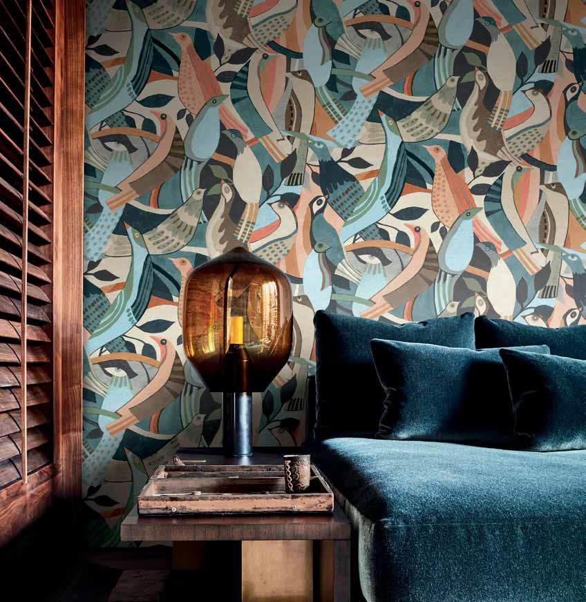
one space, three looks the transformative power of peel-and-stick wallcoverings


ARBORCOAT® Exterior Stain in Solid brings beautiful Benjamin Moore® color to outdoor wood surfaces while letting a hint of the natural wood grain to still show through. The waterborne stain o ers maximum protection against the elements while creating a striking aesthetic.
ARBORCOAT solid is available in 3,500-plus Benjamin Moore® colors. But if you’re not sure where to begin, consider one of these popular hues, curated by the color experts at Benjamin Moore.
Benjamin Moore set out to do the impossible—make AURA®
Interior paint even more beautiful, more durable and longer-lasting.
Benjamin Moore elevated this ultra-premium paint, which was already in a class by itself for deep, rich color that lasts.
Benjamin Moore set out to do the impossible—make AURA®





Interior paint even more beautiful, more durable and longer-lasting.
Benjamin Moore elevated this ultra-premium paint, which was already in a class by itself for deep, rich color that lasts.
Call or visit us today for more information.
<Retailer Name>
<Address Line>
<Retailer Logo>


<City, State Zip Code>
<Phone Number>
Call or visit us today for more information.
<Retailer Name>
<Address Line>

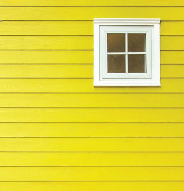


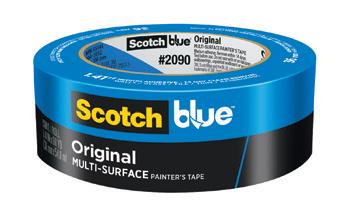
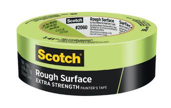
No two surfaces are alike — that’s why starting with the right prep can make all the difference. With a family of tapes designed specifically for your surface, Scotch® Painter’s Tape helps you prep right for professional-looking results.



Check out more colorful and inspiring spaces starting on page thirty.
can use.
30
CALIFORNIA DREAMIN’
A 1950s home goes from disjointed to airy and modern thanks to a reimagined renovation courtesy of Amy Friedberg Design
38
COUNTRY MEETS
CONTEMPORARY
Crystal Blackshaw Interiors weaves patterns, colors and textures together in this charming summer home
46
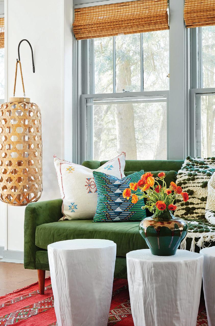
SPIRITED SUMMER HOUSE
Lucy Penfield brings her penchant for color, prints and plenty of pretty to this waterfront summer house in Minnesota
54
ESCAPE TO ELEANOR
A new cottage built upon old memories and the Canadian Shield makes for a wonderful weekend getaway, year-round
Products featured in At Home are available at Chilliwack Decorating Centre, some by special order.


✓ Superior Taper


✓ Advanced Flagging
✓ Exceptional Quality


✓ Holds &


ANDREA DANELAK
ARTHUR LIFFMANN
OLIVIA HIEBERT
MIKYLA MILLER
TWILA DRIEDGER
JIM TAYLOR
AUBREY TAYLOR
DARREN GRUNERUD
IRA VAN DEN BERG
Love the designs within our pages? Connect with the talented folks behind the gorgeous spaces.
CALIFORNIA DREAMIN'
PG. 30
Amy Friedberg Design
Amy Friedberg
amyfriedbergdesign.com

@amyfriedbergdesign
COUNTRY MEETS CONTEMPORARY
PG. 38
Crystal Blackshaw Interiors




Crystal Blackshaw
crystalblackshaw.com

@crystalblackshaw
SPIRITED SUMMER HOUSE
PG. 46


Lucy Interiors
Lucy Penfield
lucyinteriordesign.com
@lucyinteriordesign
ESCAPE TO ELEANOR
PG. 54
Envy Paint and Design


Bahia Taylor
envypaintanddesign.com


@envypaintanddesign

22
FALL 2023

Bahia Taylor
Editor in Chief
Co-founder
Leigh McKenzie
Creative Director
Co-founder
Twila Driedger
Contributing Writer & Editor
Olivia Hiebert
Graphic Designer
Melanie Truman (on leave) Project Management
Graphic Design Styling
Gallon Creative www.galloncreative.com
Owned and Published by: Gallon Creative
For inquiries, please contact us at hello @ galloncreative.com
5 Scurfield Blvd #25
Winnipeg, Manitoba R3Y 3G4
www.galloncreative.com hello @ galloncreative.com
Cover Photography - Aubrey James Projects aubreyjamesprojects.com
While every effort has been made to ensure that advertisements and articles appear correctly, At Home Magazine cannot accept responsibility for any loss or damage caused directly or indirectly by the contents of this publication. All material is intended for informational purposes only. The views expressed in the magazine are not necessarily those of its publisher or editor.
All rights reserved. Reproduction in whole or part prohibited without written permission from the publisher.
Typeset in Adobe Garamond and Avenir
Printed in Canada
TOOLBOX:
Helpful resources for any homeowner

CONFESSIONS OF A COLLECTOR
Follow these guidelines and make meaning within your collections
24
HOT SPOT: Shining a spotlight on the world's hidden gems
FORAGING THE FOREST FLOOR
From porcini, chanterelles, morels and more, gourmet mushrooms are ripe for picking
62 CHOW: Just thinking about it is making us hungry
GET CRACKING
Egg-cellent ideas for a lovely brunch or family meal
72 EXPLORER: Pack your sense of adventure and let’s go
EXPLORING THE MILE HIGH CITY
Get away to the gateway to the Rockies and explore Colorado
80
CRAFT TABLE: DIY? We say Y-E-S!
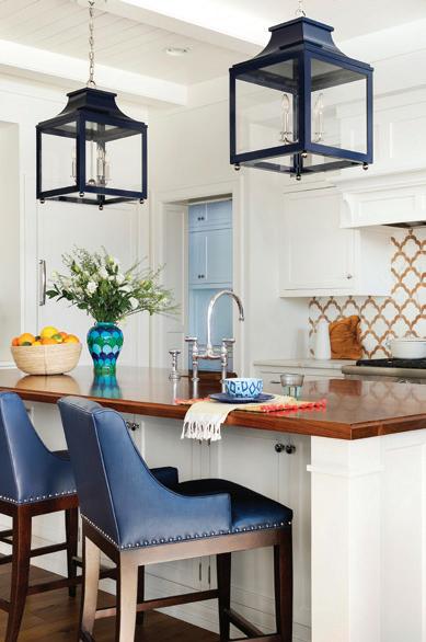
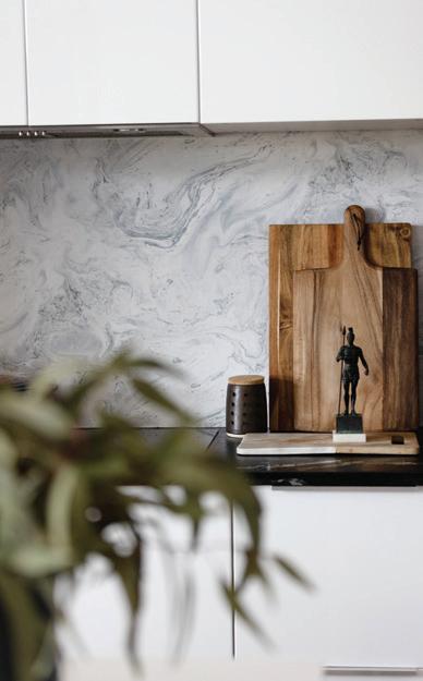
CLUSTERCORE
Put your personality and passions on display


discovered after a long and arduous search or stumbled on by surprise. Sometimes they’re passed down from generation to generation, a priceless heirloom that’s been in a family for years. Other times it’s an item, like a piece of art to hang above the living room sofa or the next addition in a personal collection that you uncover on a weekend away. If you’re a decor enthusiast, maybe it’s flipping through a multitude of wallpaper books just to find that vibrant pattern that will go perfectly in the master bath. Or perhaps you unearth a patch of gourmet mushrooms and add them to a sizzling hot pan after a day of foraging (PG. 33).
This issue is all about the hunt. Starting, carrying on or inheriting a cherished collection of items - everything from crystal stemware, license plates and stamps to driftwood, postcards and seashells. Though meaningless to some, priceless to the collector (PG. 22). Style your treasures in clusters, creating an eclectic arrangement that adds personality and warmth to your space (PG. 80). And infuse charm into your renovation with artifacts of importance, like a repurposed dining table built by a beloved family member (PG. 54), grandma’s china and mother’s painted artwork (PG. 46) and vintage lighting from the ‘70s (PG. 38).
As we enter into autumn, and fall back into a regular rhythm and routine, we hope these pages encourage you to continue to explore (PG. 72), or to slow down and soak it all in. Take time to watch the leaves change from gorgeous green to radiant red and exquisite orange and yellow, and to sleep in and enjoy eggs and toast on a Saturday morning (PG. 64).
is season, whatever you’re hunting, we hope you find what you’re looking for.


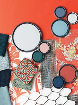




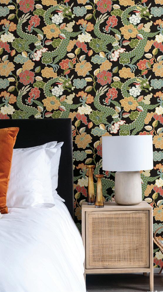

Even if you haven’t been dancing on the ceiling, there’s a good chance it will still need a fresh coat of paint every few years.
Painting a ceiling isn’t much different than painting a wall, but there are a few things you can do to make the job easier and faster. Take a peek at the steps below for our favorite tips and tricks.
Prep: Don’t forget to put down a drop cloth — painting ceilings can be a very messy job, so it’s wise to plan ahead and make sure you have something to cover the floor and furniture. Also, consider wearing a hat; you’ll be happy you did later on when you don’t have to spend the night washing paint out of your hair.
Tape: If you’re not planning on painting the walls, you can tape around the edges of the ceiling for a nice, clean line. Then you can cut in using a 2-inch sash brush and a smaller cup of your paint (one that is easier to hold going up and down a ladder than the full can) and begin to stroke away from the edge and work the paint back toward the tape, painting a few inches onto the ceiling and feathering the edge.
Roll: Now it’s time to rock ’n’ roll — emphasis on the roll. For smoother ceilings use a low-nap roll cover, but for textured ceilings or the more dramatic popcorn ceilings, you’ll need a roller sleeve with a deeper nap which will hold more paint to get into those grooves.
Paint: Attach that roller to an extension pole and start painting from the corner of the ceiling nearest to a window, so you can see where you have already painted (the light will reflect onto the wet paint). Roll in the direction of the light source and not across it. Don’t press too hard on the roller — that may cause some splatters and drips — and be sure to roll slowly as you get closer to the walls to avoid hitting them.
Keep your roller loaded up with paint. When you have to re-load, start up again in an unpainted area of the ceiling and work toward the wet area. Do the whole ceiling in one session so that it dries evenly and wait until the first coat is completely dry before adding a second.
IN OVER YOUR HEAD WHEN IT COMES TO PAINTING CEILINGS? TAKE A TRIP TO CHILLIWACK DECORATING CENTRE FOR ALL THE INFORMATION AND SUPPLIES YOU’LL NEED TO GET THE TOP OF YOUR ROOM IN TIP-TOP SHAPE.
ADVANCE KITCHEN CABINETS:
How to create a flawless finish with ADVANCE Waterborne Interior Alkyd Paints
• Formica and other Laminates
• Hardwoods (oak, cherry, maple, etc.)
• Fabricated Woods
For a perfect finish, apply a primer coat and finishing coat (Extra top coats are optional depending on the substrate and desired look).
1. PREPARATION:
First, you’ll want to ensure you’re working in the ideal climate conditions. Since you’re working with an alkyd, you’ll want to keep the ventilation fl owing (keep windows open, fans blowing) to assist with the drying process. High humidity or low temperatures may negatively impact results. In the right conditions, ADVANCE will dry to the touch within 4-6 hours. You can apply your second coat after 16 hours.
Remove any cabinet drawers, shelves, or doors as well as all hardware. Avoid the confusion of re-installation by marking each piece with a pencil in a discrete location (like around the hinges). If you’re planning a spray application, cover all countertops or fl ooring with plastic or paper. Consider wearing protective eyewear or a breathing mask.
It’s crucial to clean cabinets prior to sanding, as sanding over dirty surfaces will just push dirt and grime deeper into the surface and disrupt the adhesion of the paint to the surfaces. Wash all surfaces thoroughly to ensure they are stripped of all dust, oil, grease, soap, mildew, and wax. To remove grease stains, apply a small amount of de-greaser to a clean, lint-free rag.
Sand all surfaces using 100-150 grit sandpaper, going with the grain until the existing fi nish is rough to the touch. You can use a sanding block or palm sander on fl atter surfaces, and use a small piece of sandpaper around tricky corners or crevices. Take care to be gentle on these more delicate areas to prevent gouging.
After sanding is complete, vacuum all surfaces and wipe with mineral spirits to remove dust.
Fresh Start High-Hiding All Purpose Primer (K046) is a high adhesion multi-surface primer suitable for most wood or laminate surfaces.
DO NOT USE lacquer-based primers or undercoats, as they will impede adhesion. Talk to an expert at Chilliwack Decorating Centre to ensure you are selecting the right primer for your cabinetry.
After your primer coat has dried completely, use a 220-grit sandpaper or fi ner and sand all surfaces lightly. Focus on areas that may have pooled or dripped to ensure a smooth fi nish.
Spray Application: ADVANCE sprays on slightly thicker than a latex paint but thinner than conventional oils, so we recommend utilizing an HVLP spray gun with a fi ne-fi nish tip (specifi cally designed for furniture or cabinetry application). ADVANCE can be thinned using water up to 6% by volume. Spray a thin, even coat on all surfaces (keep an eye on those corners!).
Brush + Roller Application: Apply the paint using a premium nylon or polyester brush and/or a fl ocked foam mini-roller. Natural bristle-brushes absorb too much water and may result in an uneven fi nish. Work from top to bottom, fi rst painting frames and recesses that only a brush will reach. Next, roll any fl at panels, rails, and stiles. Apply a generous layer of paint—don’t be skimpy or so heavy-handed that you have runs and drips. Go over any brushed areas as closely as you can with your roller to blend the two fi nishes. Try to paint any two-sided pieces in a horizontal position.
Sand Between Coats: use a fi ne-grit sandpaper to sand and smooth all surfaces once the fi rst coat has completely dried. Vacuum and wipe with denatured alcohol to remove any dust.
Once you apply your fi nal coat, let dry for several days before you reassemble the cabinetry. Note that paint that is dry to the touch is not necessarily cured. For best results wait until paint is cured to reassemble, rest items on, or put into service. Th en you’re all set to enjoy your new rejuvenated, furniturelike fi nish!
WITH THE RIGHT PREPARATION, ADVANCE CAN HELP REIMAGINE MOST CABINET SURFACES:





The initial design consultation of any project is always an exhilarating and often overwhelming experience. It’s difficult to know exactly how to communicate what it is you want out of your space, and that’s why we’ve put together a list gathered from the experts that will help you and your design team maximize your time and your space. These helpful hints will have you looking like the pro and will ensure your initial meeting is as productive and as seamless as possible.
1. FIGURE OUT YOUR BUDGET: Be honest about the amount of money you are able to spend on your project(s). This way you and your designer can have an open conversation about what is feasible and what may have to be accomplished at a later date. This gives you the opportunity to decide on a timeline to achieve all of your projects in a way that makes sense to you and your lifestyle. Additionally, this will help your designer prioritize where they need to try to cut costs, and offer materials/ideas accordingly.
2. OBSERVE AND (OVER)SHARE: The more you tell your designer about the space you’re looking to makeover, the more suggestions and ideas they might have to enhance your vision. Take note of these subtleties in the days leading up to your consult. Does the room get a lot of natural light at certain times during the day? Does it feel colder than normal? Your designer might have ideas on how to work with these natural elements of the room to have it functioning optimally.
3. DO YOUR HOMEWORK: We are living in the age where millions of ideas are just a few clicks away. Make sure you take advantage of this wealth of information and inspiration by checking out websites like Pinterest and Houzz to get a clearer picture of what you want (and what you don’t). Focus on everything from functionality to color; texture and print. You’ll be surprised how quickly your own ideas come into focus. The more research you
do, the better you’ll be able to articulate what exactly you want from your consult to the professional you’re working with, and the better they’ll be able to execute your vision.
4. NAIL-DOWN YOUR NEEDS: Make a list of your have tos: these are the things that are most important to you or certain functions you rely on. This can be anything from a “family control center” that helps keeps everyone in the household organized to a walk-in closet. Having your priorities clearly in order at the start of this process will help ensure the most important aspects of your home’s makeover do not fall victim to compromises in case you meet any unexpected road blocks. This also means deciding what aspects of your home (furniture, accessories, artwork, etc.) that you are willing to part with, and what has to stay.
5. BE OPEN MINDED: Of course, at the end of the day the designer understands that you are the one that will be living in your home, and therefore you get the last word, but it is important to keep an open mind. Remember the years of experience these professionals have under their belt and understand that they may bring some insight to the table that you may not have considered. Listening and being open to new ideas can ensure your space maintains a cohesive overall aesthetic that works in your home. Another way of saying this is trust your designer: trust that they will hear what you want to bring to life and find a way to make it happen.
TALK TO THE DESIGN TEAM AT CHILLIWACK DECORATING CENTRE TO DISCUSS WHAT ELSE YOU CAN DO TO PREPARE FOR YOUR DESIGN CONSULT AND MAKE THE MOST OUT OF YOUR RENOVATION!
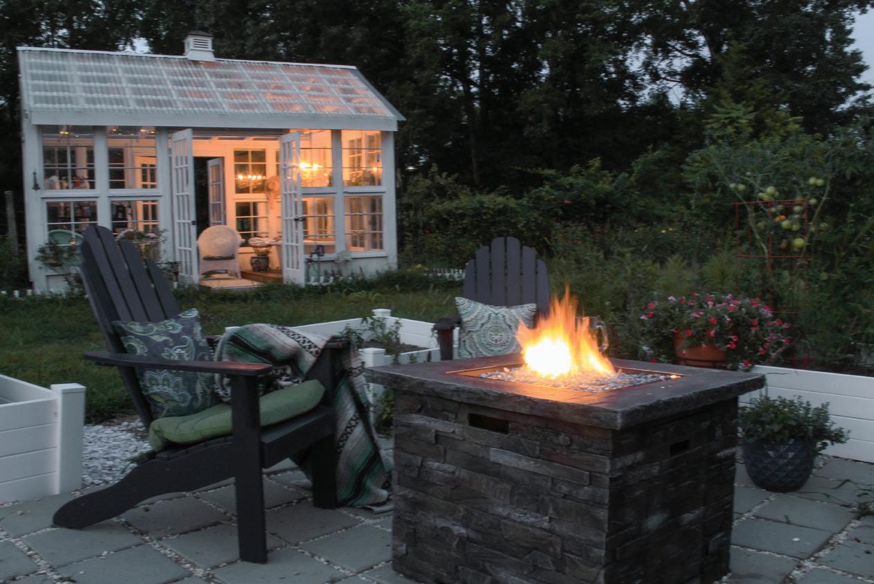
Crackling flames, good conversation, and toasty s’mores comprise the recipe for a perfect fall evening. There are few things more soothing than an open firepit in the crisp autumn air. It’s the
BASE –– Pick up some unfinished Adirondack chairs or prepare your existing furniture to accept a new coat of paint. Lay them out on a drop cloth on a flat surface and in a well-ventilated area. Ensure each is free of splinters, clean, and free of any chipping or peeling previous coatings. Sand all over to make for a good tooth for the new coating to adhere to.
COAT –– Using one coat of exterior oil-based wood primer, apply your first coat to the chairs and wait for it to dry.
perfect setting for a good story, a good drink, and good company. Make your backyard the place to be this season by updating fireside chairs with fresh paint and a new color!
PAINT –– Apply two coats of your finish coat, letting paint dry in between each coat. Leave to dry for at least 72 hours before returning to service.
ALL SET –– Arrange each chair a safe distance from the fire pit and you’ve got yourself the perfect new perches for friends and family to gather over the flames.
TALK TO THE EXPERTS AT CHILLIWACK DECORATING CENTRE TO START BUILDING YOUR BACKYARD BLISS!
If your vinyl siding is in good condition but lacking curb appeal, consider adding a coat of paint and giving your siding a second lease on life.

Are you itching to reinvigorate your home’s vinyl siding with a new color but without the price tag of a complete exterior overhaul? Paint your vinyl siding! With premium exterior paints available and a variety of colors specifically selected for vinyl, a facade facelift is an easy and cost-effective choice.


Refresh your outdoor oasis with customerfavorite Benjamin Moore colors for vinyl siding - all tested and proven to perform well under all weather conditions.
Hazy Skies OC-48
Seashell OC-120
Simply White OC-117
White Wisp OC-54
Horizon OC-53
Stonington Gray HC-170
Alexandria Beige HC-77
Hawthorne Yellow HC-4
Manchester Tan HC-81
Mt. Rainier Gray 2129-60
Louisburg Green HC-113


Amherst Gray HC-167
Did you know that most paint manufacturers have a product that is perfect for painting over siding? By using premium paint that resists fading, cracking, and peeling, you can ensure the best adhesion and long-lasting results. Read the label and talk to your local independent paint retailer for expert insights into which type of premium exterior paint products are right for your project.
While any of Benjamin Moore’s exterior paints will take your siding from drab to dynamic, the paint experts have a carousel of popular colors perfect for performing under all weather conditions. From beautiful Boothbay Gray HC-165, to rich Mountain Moss 2142-30, to classic and contemporary Simply White OC-117, Benjamin Moore has a color to complement your house style. Stuck on shade selection? Consider a color that goes with the shingles, other brick or stone on the exterior, or talk to the design experts at your local paint retailer.
Before applying the paint, give your vinyl siding a thorough cleaning to ensure your paint job looks professional. Th is includes removing the mold, mildew, and debris with either a purchased or homemade cleaning solution. Because it’s an exterior product, vinyl collects everything from spider webs and insect droppings to rust, caulking, and driveway sealant. And since there is no way to fi x siding that has been broken or warped, you’ll need to replace those pieces before putting on your fi rst coat.
Darker colors naturally absorb more heat from the sun, causing the vinyl panels under the paint to reach higher temperatures than they were designed to withstand. Avoid vinyl siding warp by selecting a shade lighter than the original siding.
Often the set up and clean up can turn out to be the most time consuming, but it’s important not to skip ahead, as you’ll want to protect plants and other surfaces from paint splatters and ensure you’re working in a stable and safe environment. Before your fi rst coat of color, check to see if a primer is recommended.
Now that your vinyl is clean, your primer is dry, and your ladder is stable and secure, it’s time to apply the paint! Using either a roller or a paint sprayer, apply an even coat to the entire surface, waiting for it to dry before adding another coat. While two coats may do the trick, you may fi nd that in certain sunlight, you need an additional coat.
VISIT CHILLIWACK DECORATING CENTRE TO VIEW OUR EXTERIOR COATINGS AND EXTENSIVE COLLECTION OF PAINT COLORS AND TRANSFORM YOUR HOUSE TODAY.Whether you’re planning to sell or simply wanting to improve the space you’re living in, these simple DIY hacks can instantly bring up the value of your home while providing more functionality to its residents.
Storage is always an important feature that people look for when purchasing a home, and there’s nothing more attractive than a customized look that fits seamlessly with its surroundings. Take a trip to your local hardware store and create a built-in storage solution on a vacant wall or inlet.
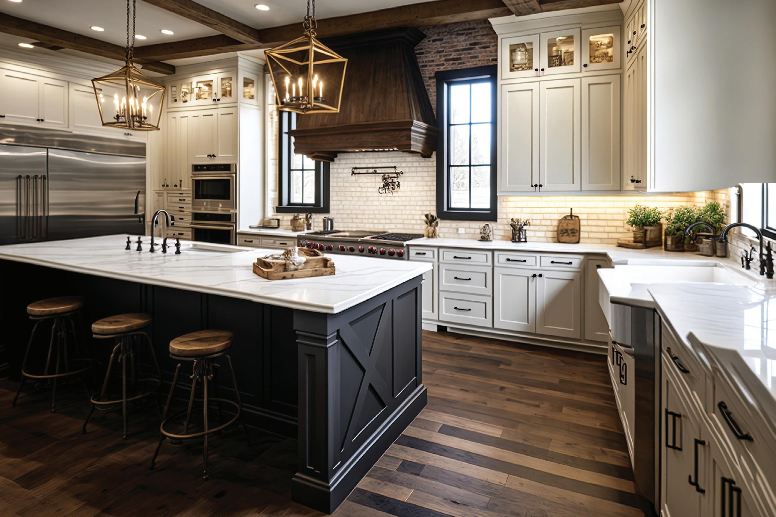
For many, the kitchen is the heart of the home, but it’s also one of the most expensive areas of the home to renovate due to all the appliances and tilework typically required. If you’re not ready to invest in that big of a project, painting or re-staining your cabinets can be an excellent compromise.
Even though they are a relatively inexpensive aspect of an overall design concept, light fixtures can have a huge impact on the impression of your home. Updating old fixtures to more modern pieces can have a dramatic effect on increasing interest in your property. If you’re looking to save in this area while still providing an upgrade, try spray painting your fixtures in a matte black for a modern edge.
Have an office or den? You can instantly bump up the value of your home by installing a closet in it, transforming it into another bedroom (so long as there is a window that meets regulation). You can use bookcases and tension rods to create any dream closet, all while staying within budget.
As much as new home owners fantasize about block parties and backyard BBQs with neighbors in their prospective new home, there’s no deterrent quite like open sightlines in your backyard oasis. Everyone values a little bit of privacy. Rather than waiting years for foliage to grow, build a privacy fence. There are a ton of cool designs and ideas on Pinterest that keep things simple enough to do with relatively little skill.


Challenge yourself to create one accent wall with texture on the walls. Installing a board and battan wall or wainscoting is a lot easier than you think, and it gives that extra boost of character that helps people fall in love with a space.



Collectively, in the design world we’ve moved away from skinnier, moulded baseboards and towards the flat, wider type. If you can, upgrade your home, but only if you’re able to do them all uniformly, otherwise it will appear disjointed.

Chat with the experts at Chilliwack Decorating Centre to find out which upgrades are best suited for your home, and to find all the materials you’ll need to make them happen.
Applying paint on a wall using a roller may seem like an idiot-proof method, but believe it or not, there is a right and wrong way to do it.


The first thing you need to consider is the type of roller cover you use. It may be very tempting to grab the cheapest option, but using a poor-quality roller can actually result in a poor finish, even if the paint you’re using is of higher quality, so don’t risk it!
In most cases, a 3/8-inch nap roller will be your applicator of choice; if you have a glossier paint, however, a 1/4-inch nap roller is best, and if your wall is textured or rough, you’ll want a higher one, such as a 1/2-inch or 3/4-inch. Another item that’s great to have on hand is an extension pole. Normally, you would probably associate one of these poles with painting a ceiling, but using it on the wall as well allows you to paint from ceiling to floor in one steady motion, plus it removes the need for a step ladder which is always a bonus.
To actually start the painting process, roll your roller in a paint tray filled with your paint and give it a couple of good runs through to make sure it picks up enough product. Be generous.
Directionally, you always want to paint from the top of the wall down with each pass overlapping the next by a few inches.
Don’t push too hard on the roller while you’re painting — really, the roller and the paint should be doing all the work! If you put too much pressure on it, you’ll get heavy lines of paint on the wall and annoying little drips that cause more trouble than they’re worth. If you have to push harder to get paint off the roller then it is time to reload the roller.
When you reload your roller with paint, start from an unpainted area and work your way back toward the wet area to make sure there is an even coat of color on all surfaces. If another coat is needed, make sure to wait until the previous one is dry before you start going over it a second time.


The nap of a roller refers to the length of the fibres on the roller cover. Generally the rougher the surface, the longer the fibres need to be. So, for example, painting a stucco-covered wall would require a pile depth of 3/4 -1 inch, whereas a perfectly smooth surface would take 1/8 or 1/4-inch nap roller.
IF YOU’RE JUST ABOUT READY TO ROLL, POP INTO CHILLIWACK DECORATING CENTRE AND SEE ONE OF THE PAINT PROFESSIONALS WHO ARE ALWAYS AT THE READY TO LEND THEIR EXPERTISE — WE TALK NAPS ON THE JOB, BUT WE DON’T TAKE THEM.
As elegant as they are resilient, wood blinds add natural color, character and warmth whether your taste runs from classic to contemporary. When shopping for window coverings to style your home, you will be faced with the choice between authentic wood blinds and faux wood blinds. Other than the obvious, is there much of a difference? In short, yes.
WOOD BLINDS: REFINED QUALITY, NATURALLY
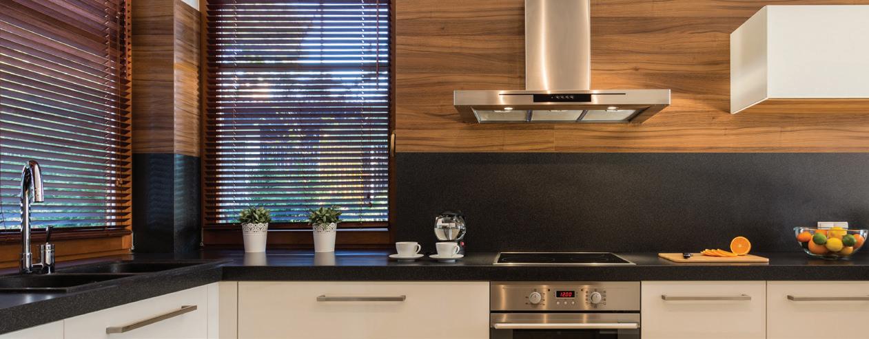
If you’re seeking to add genuine organic elements to your décor or prefer eco-friendly alternatives, wood blinds are for you. Like a refined piece of furniture, wood blinds do not go out of style; their distinct fine grain and natural texture bring a sense of sophistication to any space.
It’s important to find out where wood blinds are sourced, as most are made out of North American hardwoods from sustainable forestry practices.
What most people love about wood blinds is that their attractive patina and unique details are undeniable and cannot be exactly replicated. Because of their naturally strong construction, they provide effective insulation all year around, while offering excellent privacy and protection from harsh sunlight. They are lightweight, durable and available in a wide variety of sizes and stain colors.
The drawback to genuine wood blinds is that they do require some extra care to prevent scratches or damage when cleaning, as they cannot be wiped with harsh chemicals. However, wood only improves over time, ensuring that with the right amount of care, they can last throughout the lifespan of your home.
FAUX WOOD: EVEN BETTER THAN THE REAL THING
“Faux” means imitation or artificial. While faux wood blinds are designed to look like what’s only found in nature, they are made entirely out of composite wood material, PVC/vinyl material, or have a wood core coated in a high-tech synthetic polymer. There are many benefits to this.
For one, these materials are very durable, shielding your blinds from warping, fading or cracking if exposed to too much moisture or sunlight. This resistance makes them especially suitable for rooms with high humidity – bathrooms, laundry rooms, basements and kitchens, as well as in coastal or tropical climates.
Secondly, and often most important, faux wood blinds are affordable. They are an economic way of incorporating a “natural” look that fits your budget. Lastly, they are also easy to clean with water and home cleaning products without worrying about causing damage.
As versatile and as inexpensive as faux wood blinds are, one downside is that they tend to be heavier than their real wood counterparts. This can make them slightly more difficult to raise or lower on a large window.
“WOOD” YOU BE LOOKING FOR BLINDS? VISIT CHILLIWACK DECORATING CENTRE TO VIEW OUR WIDE SELECTION OF MODERN WINDOW COVERINGS.
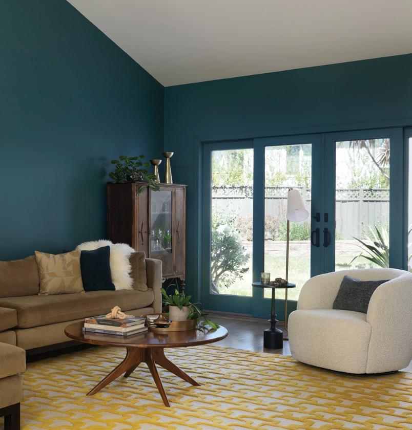
When green and blue meet and fall in love, teal is born – we are proud as peacock blue to announce it everywhere from kitchen cabinets, to work spaces, to laundry and mudrooms and on and on and on. A real statement shade that revives dull spaces instantaneously and conjures thoughts of Caribbean waters, Moorish architecture and the most instagramable Palm Springs locales, with a presence this geographically vast we’d say you can safely turn to a teal color treatment here, there and just about anywhere!


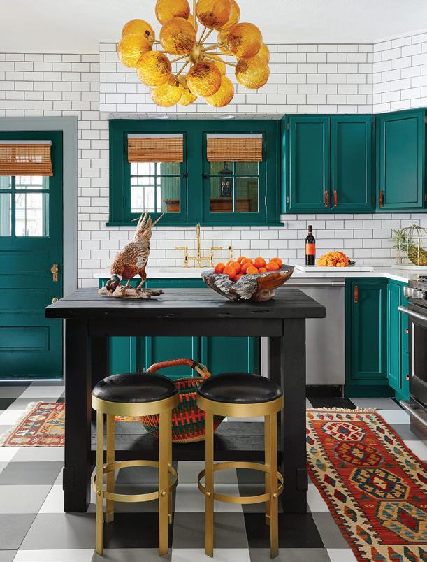
Big impact from bright and vibrant pops of colours need not always come from a feature wall or an all-over paint job. DIY projects like painted furniture, frames and accessories, doors, or small alcoves and passthroughs can result in big visual impact and satisfy the creative itch of the weekend warrior in one fell swoop. Sunny yellow is a happy and radiant choice that can bring a joyful vintage vibe great for cottages and retro spaces but also has the range to cross the design spectrum and partner with black and white for an ultra-modern look.


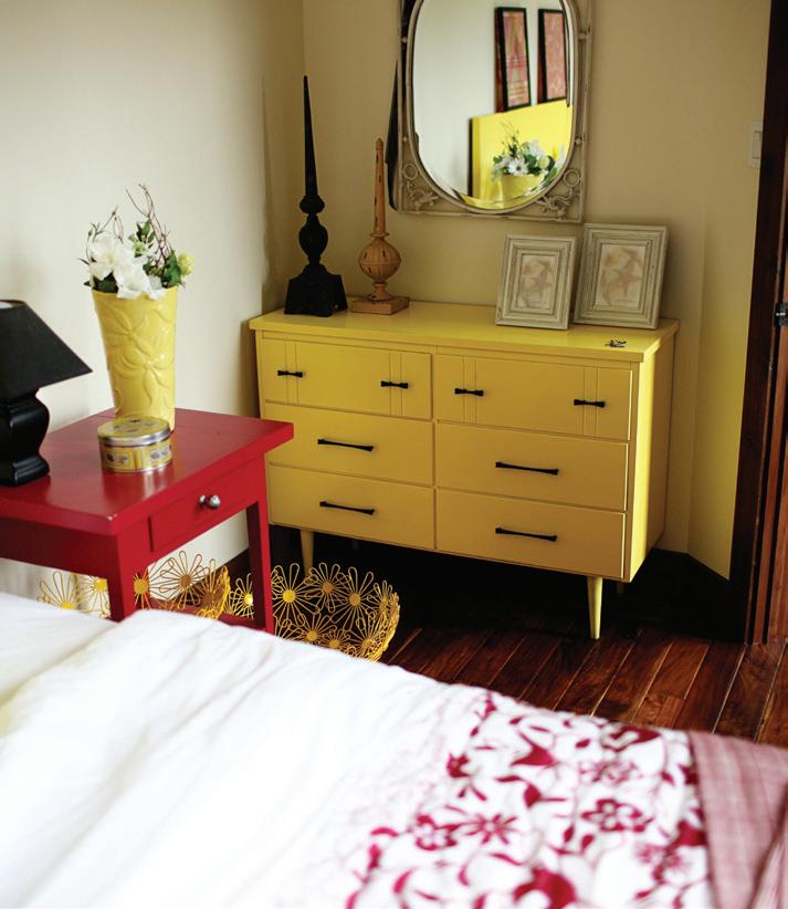


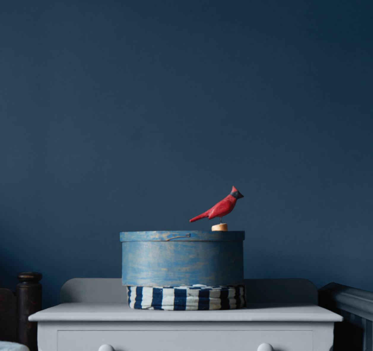
A deep blue, almost green, reminiscent of the sea or a grove of blue spruce. Rich and dramatic while surprisingly versatile, this color works in both traditional spaces as well as modern ones, and every style-stop in between. Pair with old world red or orange brick for a modern country kitchen, offset transitional cinnamon wood tones or period details, or opt for modern glamour with a high gloss finish in a sleek space – the options are as endless as the deep blue sea.
Ask any designer their top list of go-to-whites for a no-fail application and we bet our bottom dollar this classic ranks on each and every list. A perfect fresh white that elicits images of fluffy cotton, billowy clouds and pure silk. An excellent choice for an all-over drench of crisp white – utilize the power of paint sheen to differentiate areas and for practicality choosing flat for ceilings, washable mattes or eggshell for walls and durable satin or glosses for trim, doors, and millwork.
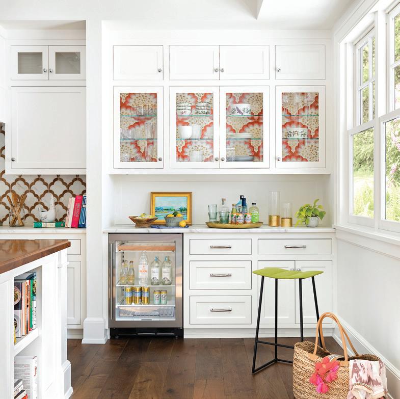
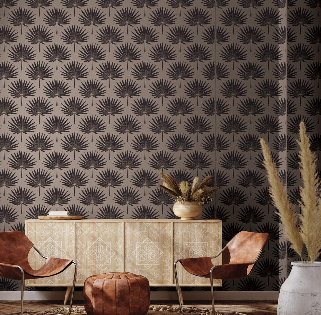






The act of collecting treasures from afar has long been a part of human history. There are documented personal collections as early as the 16th century. These were known as “cabinets of curiosity” and were often assortments of unique items acquired through adventure, travel or by way of gift. The objects found in these early collections were not necessarily useful; they were often objects that served as a reminder of an experience or a place representing a foreign culture.
In the 21st century, the word “collector” shares a fine line with “hoarder.” However, there are many ways to start a new collection, or maintain an existing one, which does not take over your living space or life. Follow these strategies to make meaning within your collections and demonstrate why collecting is important.
The trickiest thing about starting new collections is enjoying the hunt and not amassing an entire collection in a few weeks! That is buying, not collecting!
Collections should also connect thematically, or they aren’t really a collection but rather a bunch of “things.” Whether you are collecting watercolor paintings or mid-century furniture, it is important to set guidelines for yourself as to the limits of acquisition. Is it one piece per year? A maximum set dollar amount? The psyche of the collector is one of obsession, so limits are key. One further piece of advice: be subtle about your collecting, or you will suddenly be the person for whom everyone buys snow globes (or turtles, or whatever) and that isn’t always a good thing; true collectors enjoy the quest for the object.
Most of us have gained some inalienable wealth from the passing of a family member or friend. This is a difficult issue because we can’t really get rid of these objects. There are always ways to honor these collections, to give them meaning and life.

Another way to keep these collections alive is by adding to them. For example, I received a random assortment of Cross and Olive crystal stemware (nothing near a full set) but slowly I am finding pieces to build it up to be something more substantial and full – increasing its value and meaning, and maintaining the original integrity and goal of the collection.

Collecting never goes out of style, but our connection to objects has become a more detached one in our disposable society. Some things are disposable, sure, but others should be cherished. The idea of collecting for pleasure, memory or for monetary value teaches many lessons. I think all people, including children, benefit tremendously from the idea of a collection: something important, something special. Investing time, interests and a sense of responsibility to a collection is a wonderful experience for everyone.
An object to mark an occasion or something as simple as collecting beach glass as a family on a trip can turn into a jar full of memories. Collections don’t have to cost money as the importance of the collections is the meaning we attach to the objects. It is the memories that we are taking care of when we dust them off and use them for a tea party. That is what makes them priceless.
If you’re an avid collector, clustercore could just be the design trend of your dreams. Bring your collections to life by layering items in a space without making the corner look chaotic. Add layers and heights for your objects and decide on how you’ll group and display your treasures.

From porcini, chanterelles, morels and more, gourmet mushrooms are ripe for picking. Explore wooded areas, go deep within wild fields and hunt in your own backyard.

For Frank Hyman, that saying couldn’t be more accurate. Hyman ditched his day job in 1992 and makes his living pursuing his hobbies. From gardening and photography, to sculpturing and writing, Hyman has nine avocations that he’s brought up to a professional level.
Hyman’s latest passion, foraging for mushrooms, started as a simple walk in the woods.

“My wife and I were on vacation and somebody was leading a mushroom walk,” he explains. “And so, we went and learned about mushrooms, brought some home and cooked and ate them. And I distinctly remember thinking, ‘Frank, this is going to be one of your new hobbies that you never make a dime from.’”
What Hyman didn’t know was that foraging was mushrooming and the activity was gaining traction. “I had no idea that [foraging for mushrooms] had started blowing up,” Hyman says. “Chefs were wanting mushrooms and people wanted to learn about mushrooms and take classes and go on walks and buy books and read about them in magazines.”
Together with the trend in foraging and his own fascination for fungi, the multipotentialite turned his interest into another occupation. Before long, he was teaching others about edible mushrooms, writing about the activity for publications and selling gourmet mushrooms for profit.
Hyman became such an expert on the topic that he found his largest gourmet fungi without even foraging. While attending a meeting at a local photography club, Hyman caught a closeup of a lion’s mane mushroom billowing out of an oak tree. While almost everyone in attendance was disgusted, Hyman was
Do what you love, and you’ll never have to work a day in your life.

“One of the techniques that I’ve learned that novel foragers and chefs are using is what’s called a dry sauté,” Hyman explains. “Ideally, use a cast iron pan on the stove, medium heat. You clean and slice up your mushrooms and throw them into the hot pan without any butter, oil - anything. You just throw your mushrooms into a dry, hot pan and then you use a metal spatula with a very straight, smooth edge and you keep stirring the mushrooms around, so they don’t stick. As they heat up, they get hot enough for steam to come off. Then after a minute or two, the volume of steam will decline, which tells you that you’ve driven off most of the moisture in the mushrooms. That’s when you throw in some butter, olive oil or bacon fat. Then they will brown and get more of a meaty texture, with better flavor because you’re not drowning them in their own juices.”
delighted. After getting the go ahead from the photographer, Hyman cut down the voluptuous mushroom and sold 29 pounds of it to five chefs within two hours.
“I had learned what to look for from a pro just a couple of months before,” Hyman says. “That’s the ideal way to learn - to be introduced one-on-one by someone knowledgeable.”
If having an edible mushroom expert educate you through your foragescapades is out of the question, Hyman suggests investing in a pocket-sized guidebook that provides a beginner’s guide to identifying wild, edible mushrooms. The author’s most recent title, “How to Forage for Mushrooms without Dying,” covers common mushrooms that you’ll want to eat, use or avoid.
“[Before foraging for mushrooms you] need to have a good enough judgement that you don’t eat anything until you’re 100% certain of what it is,” he says, adding that while many people in English-speaking countries have a fear of mushrooms or believe mushrooms are dangerous, they’ve gotten a bad rap and they’re really not that risky. “Only about 1% of the mushrooms out there are what I call ‘killers,’” Hyman explains. “But the question is - which ones are they?”
Some mushrooms are so common, Hyman says you probably grew up kicking them around your yard. Others are obscure with varieties and characteristics that need to be inspected before being ingested. Another important task when taking edible mushrooms home for your dinner table is ensuring they’ve been kept fresh or by using some common sense.
“Most people who get sick eating mushrooms have eaten edibles but get food poisoning from leaving them in the back of a hot car, or they get sick from eating them raw, as many edibles need to be cooked before eating.”
Mushroom etiquette for novice foragers

• Be kind, leave some for others.
• Share the wealth with other foragers and leave the small ones to find in the next few days.
• While it doesn’t really matter if you pick or cut, some studies show that picking has a slightly higher production rate than plots that have been cut or controlled. But, if you cut, you’ll have less dirt in your basket!
• Only collect mushrooms ripe for the picking. Anything you won’t use, leave and let it enrich the ecosystem.
• Leave as small of a footprint on the area as possible when foraging.
• Forage respectfully and with permission.
Interested in learning about mushrooms but would rather veg than forage? Check out these three mushroom documentaries on fungi and mycology.
FANTASTIC FUNGI
Now streaming on Netflix, Fantastic Fungi features the work of Paul Stamets and the fascinating network of fungi beneath our feet. A descriptive time-lapse journey, the documentary delves into the magical world of mushrooms and their power to heal, endure and contribute to the regeneration of life.
KINGDOM:
Legendary Canadian biologist David Suzuki and a team of fungi researchers take viewers through the fungi kingdom, revealing how fungi have survived and thrived through the earth’s most hostile conditions.
While edible mushrooms are most common in the Midwest and on the coasts, they can be found almost anywhere in the world. Start foraging in spring when the harvest is most plentiful but keep an eye out any time of year (even winter), especially during the cooler weather in autumn. “The high season is summer and fall,” Hyman suggests. “That’s when the greatest number of species are out because it’s warm and there’s rain in the Eastern U.S.”
Before you book a trip to forage the forest floor (Copenhagen and Cape Town are among the top destinations) or register for an expert class on wild edibles (of which Hyman delivers with rave reviews), he recommends getting out in nature to explore.
“You don’t have to go on a safari,” Hyman says. “You don’t have to go out into the woods or fields for mushrooms. There can be edible mushrooms in your yard.”
This documentary, available on YouTube, explores the sacramental use of mushrooms, examining the evidence for their use around the world, including Ancient Egypt, India and China.
Like a really good treasure hunt, the gold at the end of the journey is a basket full of edible and tasty mushrooms. If you’re hoping to prepare a pot of wild mushroom soup, interested in tasting the differences between the varieties or simply desiring to live seasonally and become more self-sufficient, start by searching for these popular, safe and easy to hunt mushrooms.
Known as the darling of many edible mushroom foragers, the morel is one of the easiest mushrooms to identify. Morels have a distinct look that makes them easy to spot - a pitted and deeply ridged cone-shaped cap that looks like a honeycomb. When you slice it open, if it’s a true morel mushroom, it’ll be hollow inside. When to forage - A rare treat, morels only appear from late March through May and love moist, slightly cool conditions.
Where to hunt - Take a hike through the forest or a nearby nature park and start looking on the edges of wooded areas. This delectable variety grows around the base of decaying elm and ash trees, or areas of the Midwest and west that have been disturbed due to a forest fire.
What to serve - Morels will make you sick if uncooked. Use this delicacy on top of your pizza or sauté them dry in a single layer and then add fat to bring out the earthy, nutty flavor.
Also commonly known as porcini mushrooms, the bolete is famous for its delicious addition to Italian cuisine. One of the safest varieties of mushrooms, some boletes will make you sick, like varieties that turn blue when cut or bruised, or boletes with bright red or yellow pores. Boletes lack gills, instead showcasing a yellow or brown surface of pores and a thick stem.
When to forage - Boletes burst onto the scene in late spring, summer or fall depending on the area.
Where to hunt - Like morels, bolete mushrooms are commonly found in woodland areas particularly under oak, birch, aspen, pine and hemlock trees.
What to serve - The king bolete was given his name for a reason: he’s handsome, dense and rich with flavor. Sauté this gourmet mushroom with herbs and garlic to amp up the complex and nutty components. Serve it with a brown sauce or add it to the side of a steak.
If you are lucky enough to find a lobster mushroom, you’re actually getting a two-forone treat. This mushroom has been attacked by another fungi. The fungus grows on a certain species of mushroom, enveloping its host. The lobster mushroom gets its name from its distinct and striking hard red to orange exterior and white interior, thus resembling the marine crustacean. When to forage - The lobster mushroom season starts mid-summer and can run all the way through September, October and into November.
Where to hunt - Throughout the continent, lobster fungi grow in mixed wooded regions. What to serve - A Mexican delicacy, the lobster mushroom is boiled, then fried with tomatoes and onion, and eaten with tortillas. The meaty mushroom can also stand up to grilling.
This mushroom is as pretty as its name. Bright yellow to orange in color and shaped like a goblet, chanterelles have very shallow gills that run down the stalk making V- and X-formed crosses. Naturally, to complement its sunshine shade, chanterelle smell fruity, like apricots or pumpkin, and taste nutty and spicy, making them one of the most sought-after stems.
When to forage - Hunt for these honeys in the fall after the first rains or throughout the summer in regions with high humidity.
Where to hunt - Chanterelles are found in old forests with moist floors and often pop their beautiful heads after heavy rains. Keep your eyes peeled in mossy and damp forest clearings. What to serve - Sauté them in butter with fresh thyme and let them shine as a stand-alone dish.
Beginner foragers have fun hunting the oyster mushroom because it’s one of the easiest to find, often growing in large clumps up off the ground. While the different varieties can be white, gray or brown, they all have white or light-colored gills down their stem.
When to forage - While oysters grow year-round, it’s best to harvest these clustered large cap mushrooms during cooler weather, as they’re easier to see in the winter when tree leaves have fallen.
Where to hunt - The fungi thrive on hardwoods - either dead logs, dead deciduous tree trunks or living trees.
What to serve - With a traditional mushroom flavor, add this variety to stroganoff, stir-fry or pan fry with butter and garlic.

WITH FIVE IDENTIFIABLE, FAIRLY COMMON AND SAVORY MUSHROOMS








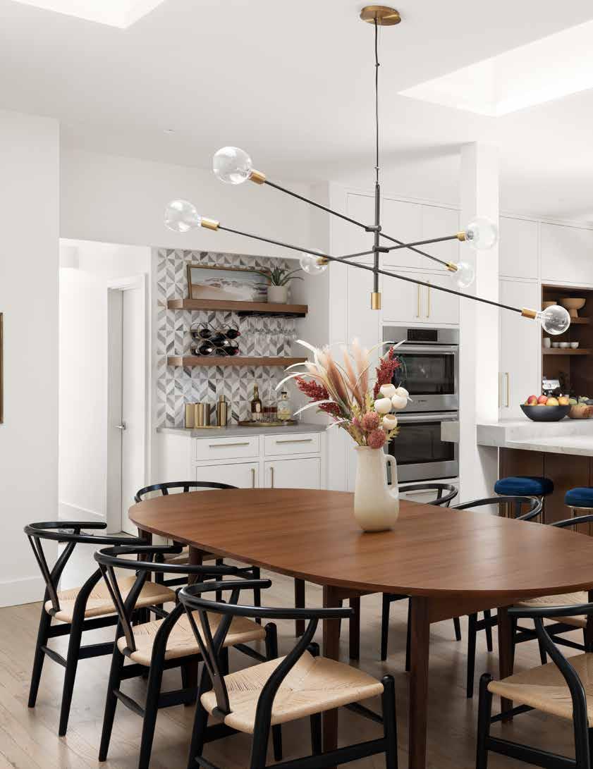
Amy Friedberg took on the challenge of remodeling a 1950s home in Portola Valley, California that had undergone several extensive renovations through the decades, leading to a disjointed design. Through her design firm, Amy Friedberg Design, she reimagined the home to be an airy, modern space that is as functional as it is inviting.
 Design: Amy Friedberg Design | Photography: Jen Bai Photography | Text: Andrea Danelak
Amy Friedberg first became intrigued by the design world while working in the commercial furniture industry in Los Angeles. After remodeling several homes, she decided to take the plunge and explore a new career in design—and hasn’t looked back.

Friedberg places great importance on the collaborative process to achieve a final design that satisfies her clients. She attributes this approach to her success in the industry.
“I believe that’s part of the reason why I get the jobs I do—I connect well with my clients. I am able to help guide them with a design that captures their vision, as well as how they want to live and function in their home,” says Friedberg, principal at Amy Friedberg Design, which offers full interior design and space planning services. “A unique design is created for each client by asking the right questions, listening carefully and working together as a team.”
When Friedberg took on this California ranchstyle home as a remodeling project, she also took on the gargantuan task of updating a space that had seen several iterations since its construction in the 1950s. Accounting for the three large-scale renovations completed over the decades, she sought to connect the disparate spaces and bring a more modern spin to the overall design.
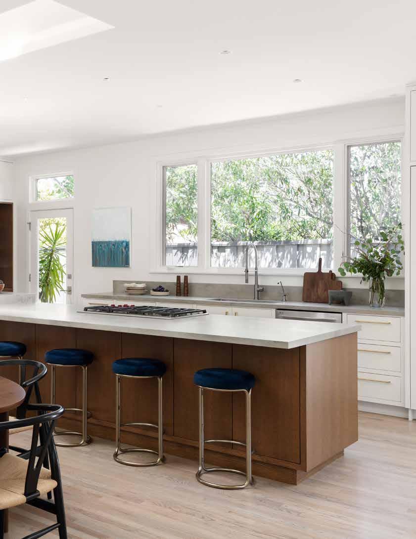
In the airy and bright kitchen of this revamped California home, a tall wall of white cabinets hides pantry staples, while a rich silhouetted coffee bar showcases the couple’s tastes - for both warm woods and warm drinks.


“All of the renovations looked completely different, and the house didn’t flow well together. For example, the kitchen was a drab room with limited natural and artificial light—it was dark and uninviting,” she says. “The cabinetry was oak with a shiny golden finish, while the countertops and backsplash were all tiled in a four-inch by four-inch brown tile with hand-painted flowers.”
The team was able to add more natural light to the room by choosing not to use any upper cabinets and placing a larger window over the sink. They also opted for a more European-style kitchen, relying heavily on drawers for storage. “All of the dishes, glasses, pots and pans were designed to fit inside drawers. You don’t see that design often in the U.S., but it worked well here,” says Friedberg. “The cabinets were built to the way the client lived—every drawer had a purpose and there were organizational systems placed inside of each of them.”
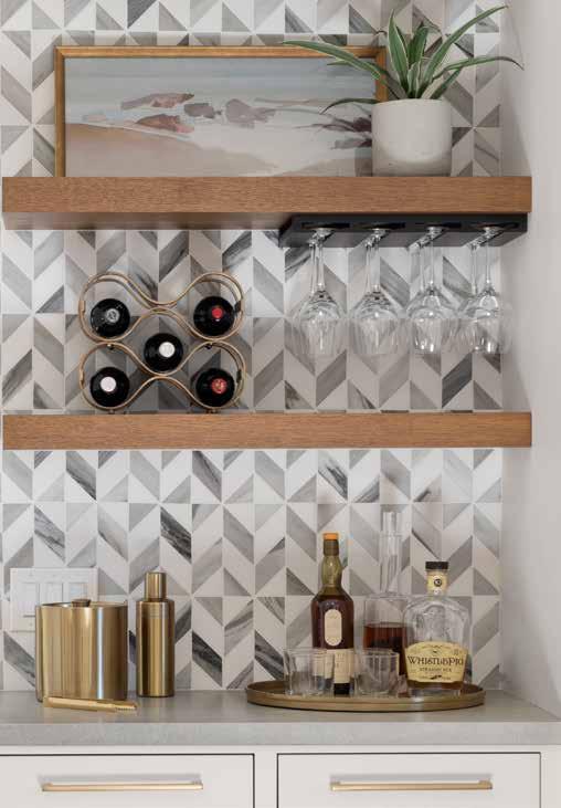
Because the homeowners drink a lot of coffee and tea, Friedberg also suggested creating a dedicated space for a small coffee bar, replacing the laundry machines that had previously blocked the natural light in the kitchen,

separated only by a wall with a pocket door. “We moved them to another area of the home and were able to provide a nice tall wall of storage and a coffee/tea nook.”
Another goal was to create an open floorplan that provided a feeling of airiness with a clean design. Prior to the renovation, a wall separated the dining room from the kitchen, with only a small pass-through between the two. Friedberg considered how best to connect the rooms and ultimately decided to remove the wall altogether, adding a large island in its place.
“As a family with three children, they wanted to communicate without walls blocking them. Also, because of that wall, there was very little counter space in the kitchen. Entertaining-wise, we thought it would be great to open it up to see the double-sided fireplace in the dining room and at the island,” she says. “The island offered so much storage, counterspace and a place for people to congregate. This was also ideal for the children to do their homework. We wanted to make the kitchen a place where everyone could spend time together.” The countertops and backsplash were also given a refresh via a sintered stone slab material that resembles a light-colored concrete.
Another key element of the remodel involved raising the ceiling over the kitchen and dining room, which allowed the team to remove the exposed wood ceiling beams that made the room feel cramped and dark. They also added a flood of natural light via two large custom skylights. “Because this part of the home had a flat roof with exposed beams, all of the electrical had been fished through and recessed lighting could not be easily added as a result. Once we raised the ceiling with trusses, we were able to add LED recessed lighting over the dining room and kitchen.”
They also removed a large concrete wall with old Spanish arches and terracotta tile in the entry that didn’t flow with the rest of the house. “We removed those four arches and placed smooth columns for structure, where needed. This opened up the space, modernizing the look of the foyer, dining room and living room.”
The result: the kitchen was transformed into the true hub of the home. “When you
A narrow look-through nook brings deep teal from the living room into the dining space, adding character and giving the client shelves for accessories like books, vases and decor.

walk in, the first thing you see is the dining room and kitchen. We tried to make it as spacious and inviting as we could, while making it a showstopper.”
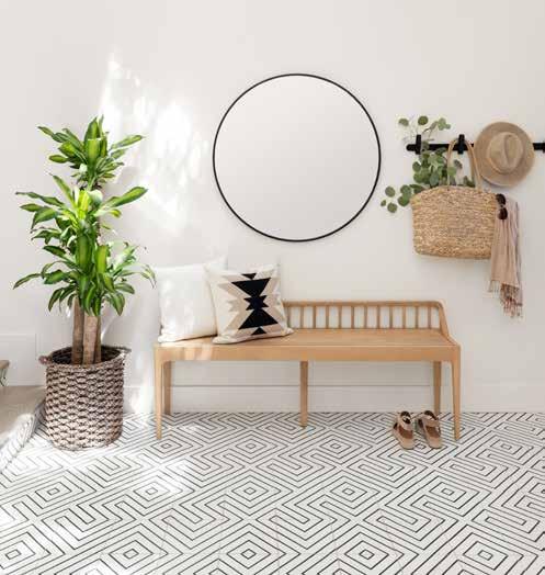
A mix of finishes, colors and materials create unique pops of personality throughout the home, including in the flooring. “The red oak floors were original, but we bleached them and had them stained so we could achieve a light floor look. We also installed a playful Clé tile in the entryway to give it a little snaz when you walk in the door, while keeping the calm and elegance of the home.”
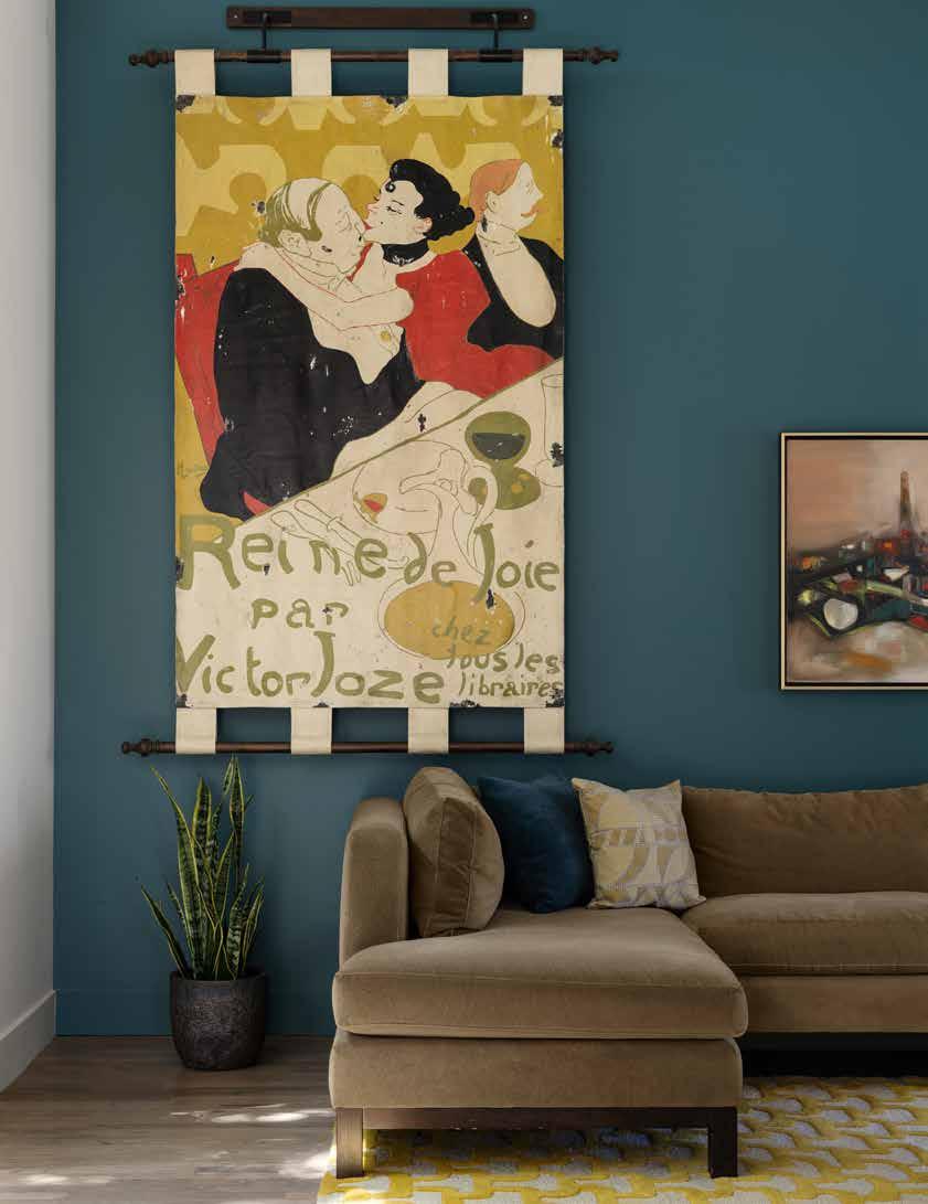
Color also played a pivotal role in Friedberg’s vision for the remodel. In the living room, a peacock hue adds life to the space, giving it a touch of personality and elegance. “We mixed it with a mustard yellow/gold and had a little fun with that room,” says Friedberg, who also painted the exterior a striking grey with green undertones. “In the valley, there is a lot of nature, so we wanted the trees, plants and flowers to really pop. The darker we went, the more the house popped against the landscape. It gave it more curb appeal.”

Upon completion of the 10-month project, the homeowners were thrilled. The remodel also garnered recognition from industry experts, including two gold medals for Residential Modern-Contemporary Kitchen and ModernContemporary Singular Space from the American Association of Interior Designers.
Friedberg couldn’t be more thrilled with the result. “Now, the rooms all unite together and it looks like one house, with one modern design.”

Gorgeous shades of green and gold, graphic fabrics and plenty of playfulness transform this kitchen from dull and drab to exuberant and unforgettable.

The owners of this charming summer home enlisted Crystal Blackshaw Interiors to bring her unique spin to a redesign. And so she did, producing an elegant countrymeets-contemporary design that weaves patterns, colors and textures throughout the home, along with the clients’ personal artwork. The result: A feast for the eyes, no matter where you look or which room you’re in.
Design: Crystal Blackshaw Interiors
Photography: Dustin Halleck
Text: Andrea Danelak
SINCE OPENING HER CHICAGO-BASED STUDIO, INTERIOR designer Crystal Blackshaw has garnered a well-deserved reputation for taking an individualized approach to her clients’ homes, making them a true reflection of their personality and passions.

When she initially started designing 16 years ago, she stuck mainly to the Chicago area, but her work now takes her across state lines, including for this Indiana home. Her careful planning and attention to detail are displayed in the modern Midwest farmhouse that acts as a summer home for Blackshaw’s clients, for whom she has already designed four homes.

“The location of this house is in the woods, so we went with a woodland theme — with an artistic twist,” she says of the renovated home, originally built in the late 1930s. “There is a really cool juxtaposition between the country theme with a very contemporary feel.”
As with any of her projects, Blackshaw — owner and principal of Crystal Blackshaw Interiors — kicked off the design process with a consultation, walking through the home with the family to envision, together, how they wanted it to look and function. A family focus was a key consideration, as the homeowners use the space for weekend getaways, as well as for hosting family and sleepovers for their child and her friends.
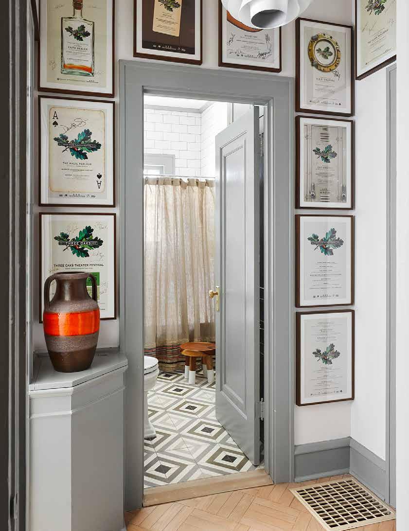
TOP: This cottage in the woods is elevated with eclectic accents. In the dining room, an African wallpaper and plated art hangs on the wall, while a sturdy and stunning tree trunk table grounds the space.“In my consultations, I’ll typically ask questions like, ‘How many people do you imagine fitting into this space? Will it be more formal or informal?’ After the verbal interview, I like to ask the clients to pull a few images they gravitate toward, in terms of the overall feel. That gives me a jumping-off point on where they want the design to go,” says Blackshaw. “Some clients may pull more traditional spaces, while others may pull super contemporary clean ones. If I can get a little insight into what they want their home to look like, I can put my own spin on it and elevate it.”
In the case of this home, she combined patterns, textures and colors to create an eclectic space that stands out among other contemporary styles. Black-and-whitecheckered floor tiles in the kitchen, for example, play against white brick and deep emerald green cabinets. In the living room, white walls look anything but boring thanks to a black brickwork fireplace and funky décor pieces picked out specifically for the clients.

“I’m known for pattern play and putting colors together that don’t usually go together, mixing styles, eras and elements,” says Blackshaw. “As long as you have a good base — in this case, a fairly neutral base — you can layer in interest through pops of color, interesting wallpaper, classic tile choices and plays on the same color palette in an interesting pattern.”

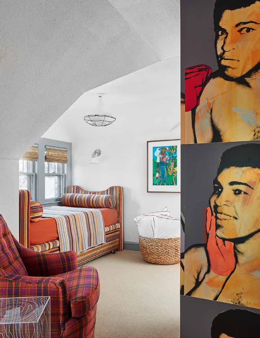
The mainly neutral palette of grays and blacks is made more exciting through vibrant blasts of orange, something Blackshaw hasn’t seen much of in design. “The orange was a running theme or thread through the home, whether through fabric, lighting, wallpaper or art,” she says. “We wanted that continuity when you’re walking through the house.”


Blackshaw is also known for her affinity for incorporating found objects into her designs, exemplified in pieces like vintage lighting from the ‘70s. As avid art collectors, the homeowners also contributed many pieces of artwork that held special meaning for their family. Their art features distinct African elements as well as influential people, including professional boxer Muhammad Ali.
“In the dining room, instead of Victorian toile, there are African [elements] in the wallpaper,” says Blackshaw. “All of the art is from artists who are local to Chicago…Art is such a subjective thing, so I ask the clients to pick out the art and then I’ll work it into the space and help them place it.”
Though the project ran smoothly from a design perspective, it was not without its share of hurdles in terms of logistics. One of the biggest challenges for Blackshaw was the physical distance between her and the home, as well as its more rural location.
“They hired their own contractor and because it was out of state, it was [tough] to get the materials to the location, which is about three hours from Chicago,” she says. “Because of that distance and the non-proximity to hardware stores, it took longer than expected — about nine months from start to finish.”
The end result, however, was worth the additional time, and the homeowners are thrilled. “They wrote me a very nice letter, saying they go out to their second home and feel like it’s always been there,” says Blackshaw. “That’s the best compliment — when your work is comfortable enough that they can just go out to their home and relax.”
RIGHT: The cloudy grey wallpaper was the jumping off point for the colors in this house project.The next generation small application airless sprayer— designed to deliver higher quality results faster and easier with water-based, solvent and flammable architectural coatings.


Design: Lucy Interiors
Photography: Spacecrafting
Text: Twila Driedger
From designing collections in New York’s fashion district to transforming interiors in Minneapolis, designer Lucy Penfield has always had an eye for color, prints and plenty of pretty. Penfield brings her penchant for delightful design to this waterfront summer house in Minnesota.
“I’m always on the hunt for pretty,” Lucy Penfield, founder and design principal of Lucy Interiors shares. “I love to entertain, I love to style and design and I am just always on the hunt.”
The designer followed her passion and proclivity for all things beautiful, diving headfirst into the world of design before sidestepping into the fashion industry. “I went to design school, in interior design and art history, and just loved the world of color, the world of culture, layers and history,” Penfield tells. “When I got out, there was a little lull in the design world and I ended up, for the first decade of my design foray into the world, in the fashion business.”
Penfield spent time working in women’s fashion in Chicago, Boston and on 7th Avenue in New York, designing silk collections and prints for Bendel’s and Bloomingdale’s. The detour in fashion design introduced Penfield to the artistic quality of style and design and established the importance of color mixing and color statements, setting the stage for her success in interiors.
“The prints that you could wear, you could wrap yourself in, you could also put on your walls,” she explains. “It was that energy of color and print.”
Now back home in Minneapolis, Penfield brings the same pizazz to her interior design projects. One step into the airy and uplifting summer home Penfield and her team transformed for a couple of close friends is a radical display of just how pretty Penfield’s designs can be. Oozing with personality and charm, the three-generation summer house combines family-friendly fabrics and furnishings with enchanting prints and traditional elements.
“They wanted to create a place for all the little ones to come gather,” she says. “We wanted to create spaces that were family friendly, that were easy flowing, that were entertaining, so we opened up walls,” Penfield says, adding that the original house was a little more traditional and buttoned up. “And they wanted to invite a little more comfort - the pitter patter of feet, feet up on the ottoman in the family room. So, while it’s pretty, it’s not precious. It’s livable.”
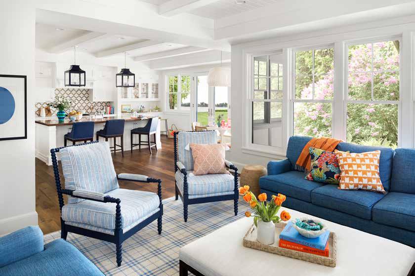
The Lucy Interiors team worked collaboratively with the client to carefully construct a color palette and design that would complement rather than compete with the charisma of color and pops of print bursting in every room. With Benjamin Moore’s White Dove as the canvas, Penfield’s art-infused masterpiece takes center stage.
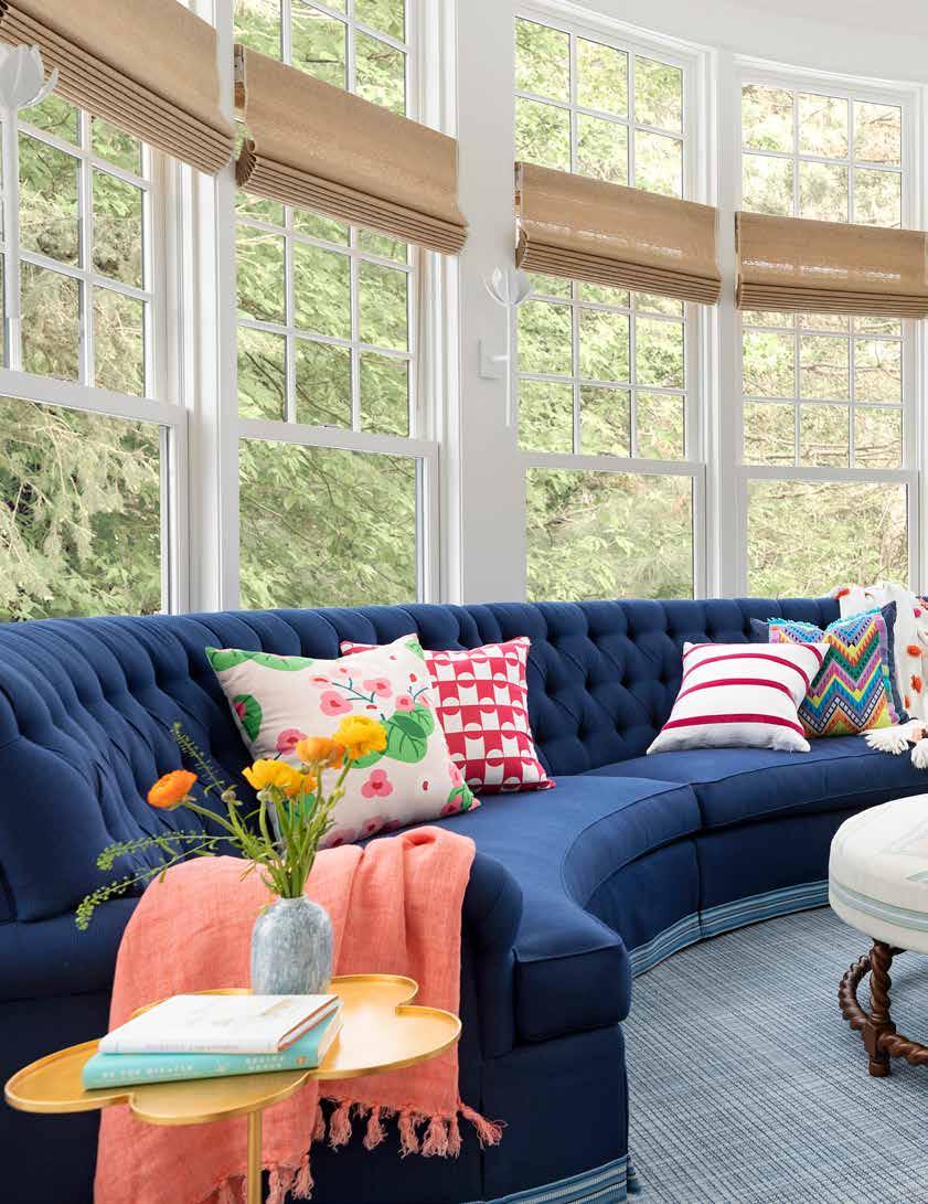
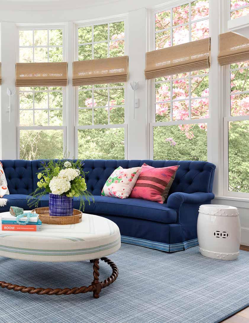
In the enchanting sunroom-slash-family room that cantilevers over the garden and includes a TV and fireplace, a custom blue horseshoe sofa wraps around the room, enveloping family members and guests “like a big hug,” Penfield enthuses. “It’s the gathering room, the sunroom and the family plop-down room.”
The rich blue hue was used as a nod to the client who loves blue, a color that was used in various shades and patterns to highlight her vibrant personality and affection for vintage. “She loves tradition,” Penfield says. “Her grandmother was a collector - she loved chinoiserie and just beautiful pieces.”
From luxurious bathrooms, warm hardwoods and more than 10 wallpapers rich with history and heart, every intricate detail is a celebration of color, pattern and a true collaboration of Penfield’s artistry and the client’s taste. To further infuse her friends’ identity, the designer repurposed pre-existing items, telling a compelling and sentimental story.
“We love repurposing,” Penfield says, impressing the importance of taking inventory before starting on the project. “Find out what the client can’t give up. And sometimes we find the diamond in the rough. We may say, ‘Well maybe this has lived its time, but what if we repainted or recovered it?’ And we did that
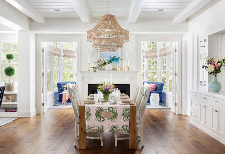
ABOVE: Sit down for the sweetest soiree in front of the hearth and right in the heart of the home. Natural textures and fresh flowers create a heavenly tablescape for a dinner party or a light luncheon.
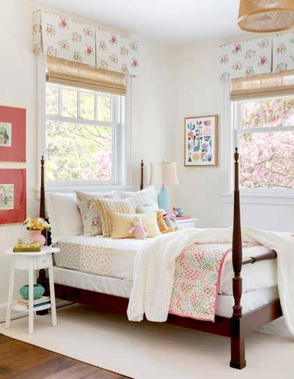
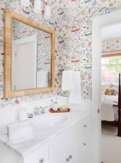
RIGHT: Sweet dreams are a step away in these darling bedrooms. A pirate-themed wallpaper in the kids’ bathroom inspires little ones to get out and enjoy their very own adventure.

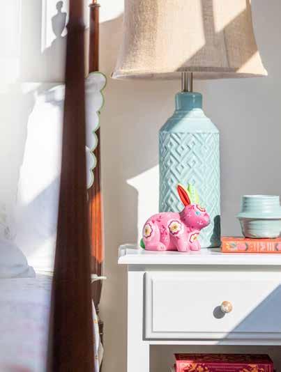
together a lot in this house. I think it feels right and sustainable. It feels representative of the family and tradition. And then you have your storyline of your grandparents scattered through the house and on the walls.”
Penfield reupholstered the client’s grandmother’s little boudoir chair in a pink and white pinstripe and added her mother’s painted artwork to the walls. “We used English garden colors,” she details. “The client is a gardener herself, so the colors were pretty pinks, greens and yellows.”
Another acknowledgement to the ways of the past is the powder blue pantry, tucked behind the welcoming white kitchen cabinets.
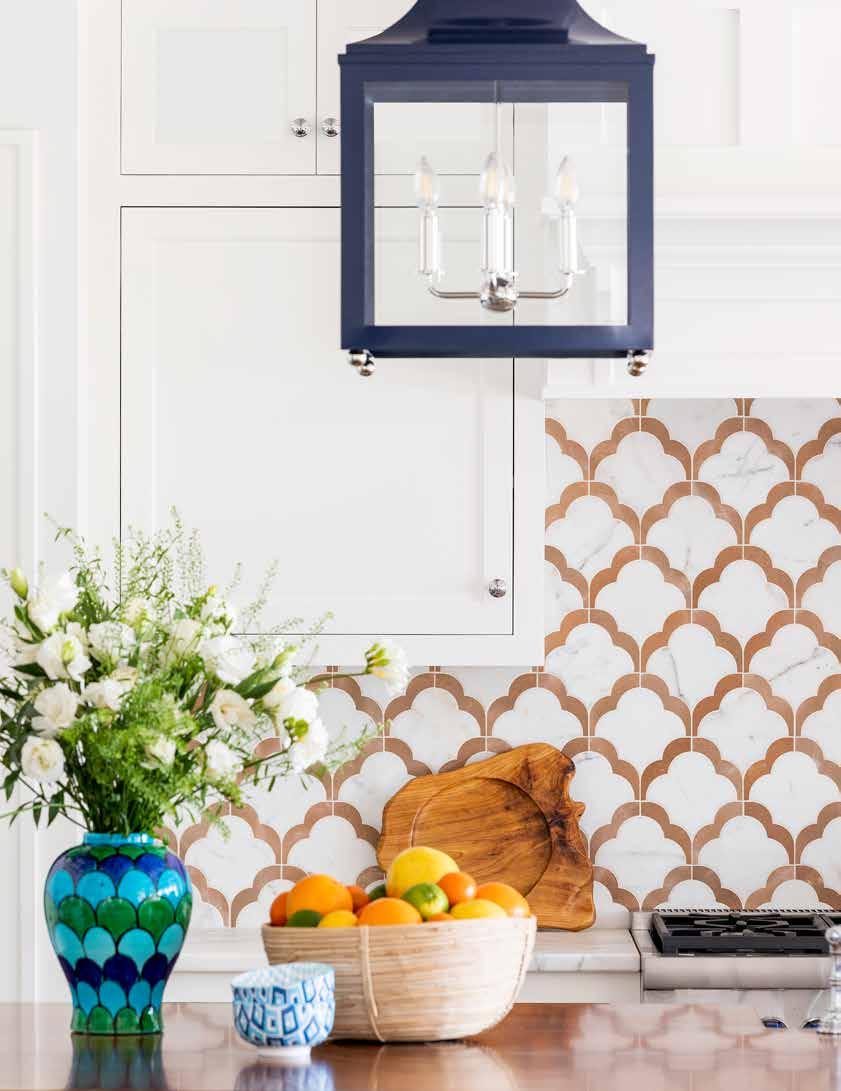
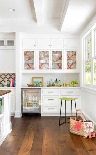
“They called it the back kitchen because there’s a beverage fridge, a coffee maker and it has the pantry,” Penfield explains. The galley space is accentuated with a whimsical floral wallpaper, marble countertops and chrome fixtures. “How do you make a hearty workstation beautiful? Doll it up with beautiful powder blue and throw on a spirited wallpaper and all of a sudden you have a little treasure of a room that could have just been yawn yawn, match the kitchen. Why not be creative in that back space?”
A similar splash of color exists on the coral kitchen banquette - a playful place for eat-in breakfast or a kids’ dining nook. In the kids’ bath, a quaint paper provides the perfect backdrop for daydreams and the day’s explorations.
“We picked the map [wallpaper] in the ensuite bathrooms because it was kind of voyeuristic storytelling. You know, kids, where have you been? Where’s grandma? Where can you go?”
Beyond the summer home’s radiant color and pattern play, the getaway is also stacked with books, includes a perfect spot for their pup and features the client’s grandmother’s china, which is set and ready for weekend dinner parties, family celebrations and many memories waiting to be made.
“They’ve done wedding planning, they’ve had baby showers, they are entertaining,” Penfield says. “It’s party mode, family mode, it’s keep your shoes on and come on in.”
A light and airy entryway has a modern touch of whimsy and introduces elements of cohesion around the home - a dusty blue hue, a geometric carpet runner, pretty petals and floor to ceiling white walls.


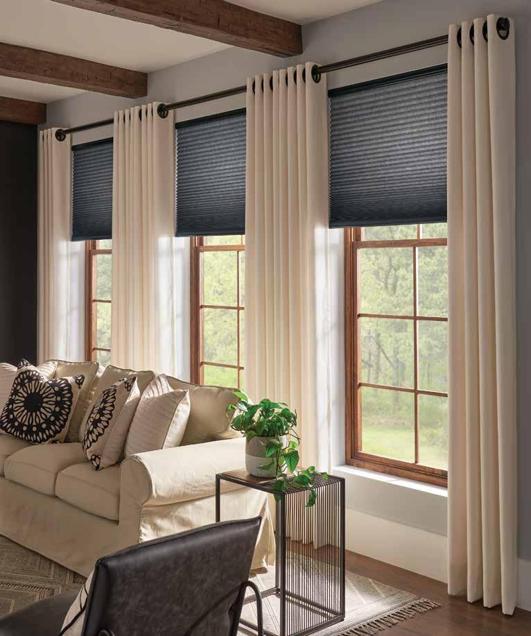
Wander into energy-efficient style, lush fabrics, and sophisticated layers of drama with Graber Cellular Shades and Drapery. They’re everything you want in a custom window treatment—for less.
Design: Envy Paint and Design

Photography: Rachael King Johnson
Text: Bahia Taylor
Jack Winters’ grandparents found their family cottage plot on Eleanor Lake in 1956. The gang spent their first weekend in their new 800-squarefoot two-bedroom cottage on Victoria Day weekend in 1957. As their family grew, the need for more space prompted an addition of 240 more square feet. For more than 50 years, the Winters clan vacationed and played, grew up and grew in numbers in that cottage, on one of the 200 lakes that can be found in Manitoba’s Whiteshell Provincial Park. The cottage changed hands as it was passed down to Jack’s father and sister; it now rests in the care of Jack and his wife Diane, and Jack’s sister Rosemary.
Opposite: A front-to-back view of the cottage shows the kitchen with woven wicker lighting, embroidered roman shades and a custom-built island. The chenille couch is a dream to relax on.
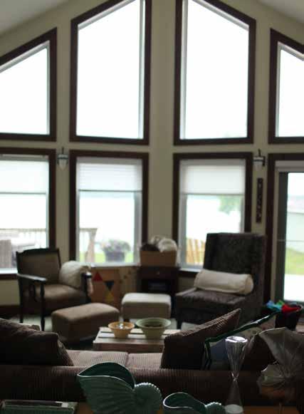
Above: A pair of these glass-topped driftwood tables are unique conversation pieces.

A new cottage built upon old memories and the Canadian Shield makes for a wonderful weekend getaway, year-round.

In the early 2000s the family decided that the shifting family cottage, constructed on post and pad, had come to the end of its useful life. Unlevel, water damaged, leaning and with the addition separating from the original structure, they decided that it would be more efficient to start from scratch than to try to repair the time-worn building. Plans were chosen and a builder selected. Diane, an architect by trade, went straight to Bahia Taylor of Envy Paint and Design Ltd. to assist with the finishes for the new cottage. Taylor had worked with the Winters previously on portions of their city home. This, however, was going to be different. Who wants to leave the city only to be met with that from which they were escaping? A lovely, transitional-style home, that definitely says ‘city,’ is what the Winters enjoy Monday to Friday. For their weekend retreat, a comfortable, charming, cozy space that felt like the old family cottage was the mandate.
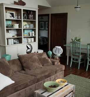
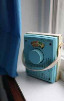
It’s hard to see a place that’s jam-packed with so many fond memories go, even in its dilapidated condition; it was important to make the new space everything the Winters wanted, but to pay homage to the cottage built by their grandparents. The dining table, with its classic 1950s top, was original to the cabin in 1956. In fact, Opa Winters himself constructed it. The sea foam green top was the jumping off point for the main area’s color scheme. The sea foam banana fibre carpet was the perfect find to anchor the scheme, and reference the table. Neutral shades
 of beiges
Each bedroom has its own palette. The Winters children made some color requests, and Taylor delivered rooms that are unified in feel, but that are easily identifiable for guests to the cottage.
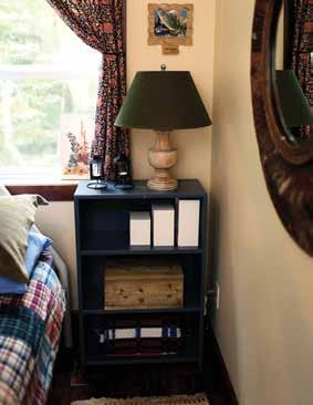
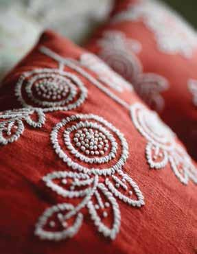


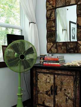
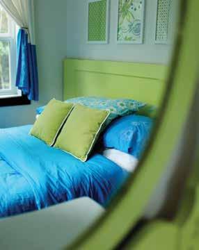

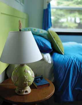
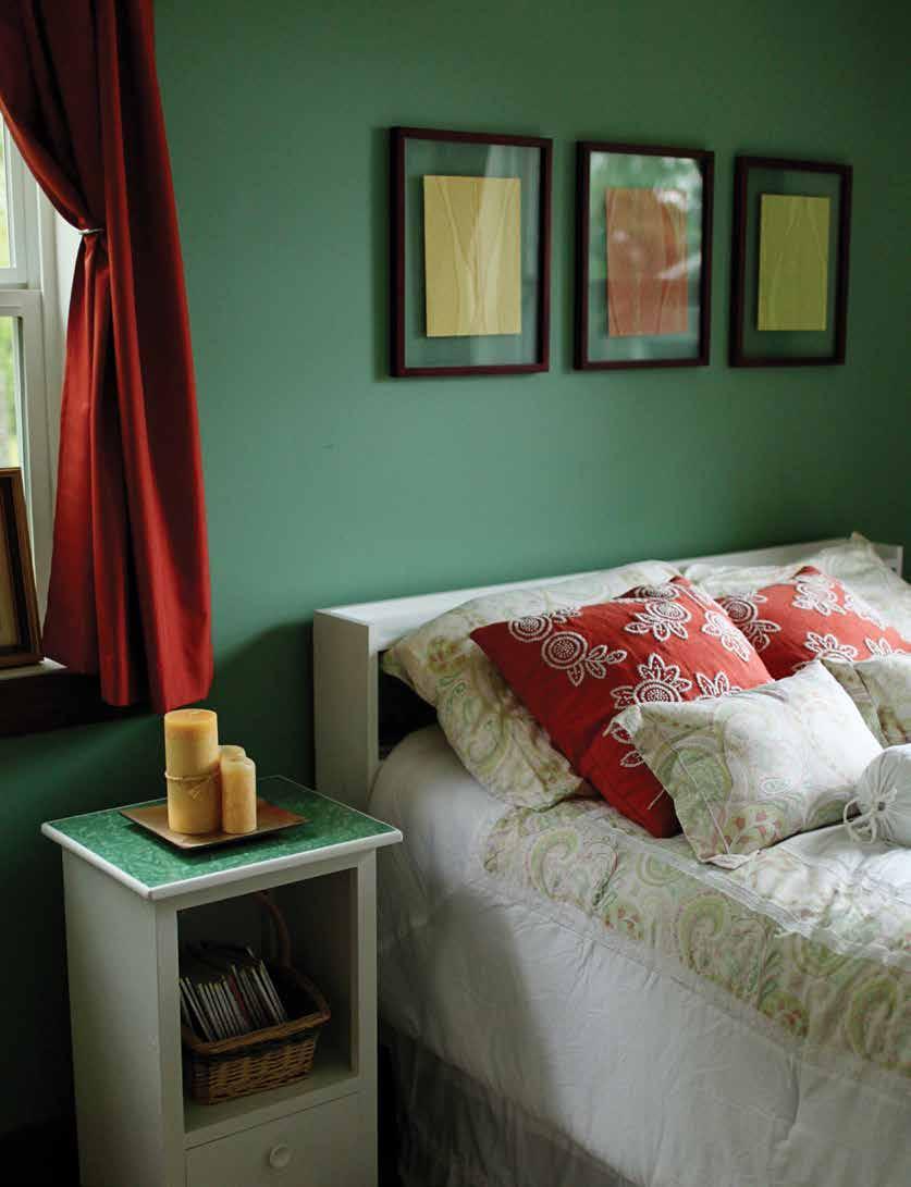



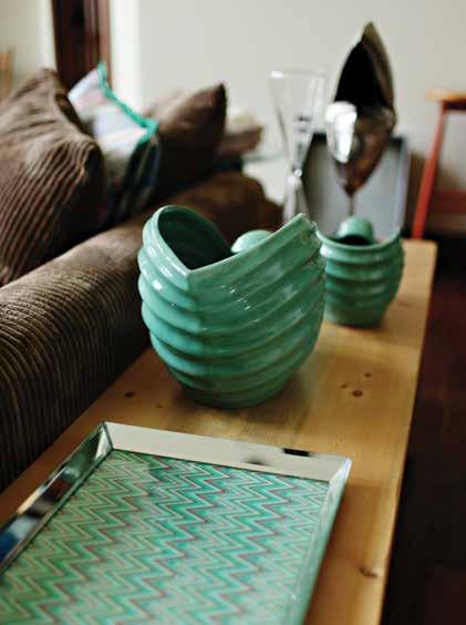

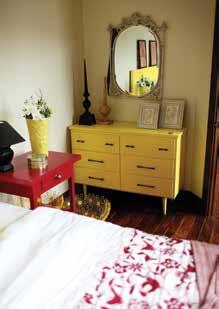
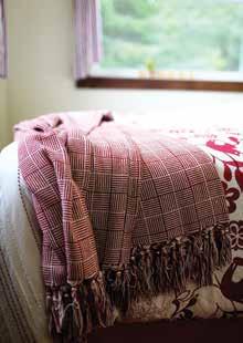
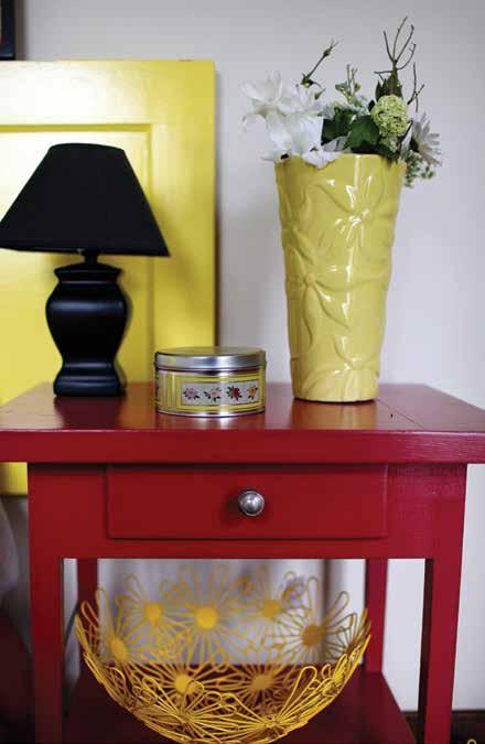
and browns counter the sea foam, and make for a restful atmosphere. The headboards in the bedrooms are doors from the original cottage, painted out in fresh shades that give each room a definite color scheme. This was custom-picked to the tastes of the main occupant of each room, but also gives guests to the cottage a clear idea of where to make camp during their visit – the red room, the plaid room, etc. Some amazing new pieces were added by Taylor to compliment the many that she and Diane had culled from the old cottage. The driftwood end tables, the uber-comfortable chenille corduroy sofa, the bark dresser and mirror and the dining hutch are all new. They fit in seamlessly with the painted bedroom dressers (one of which used to belong to Oma Winters), Opa’s horsehair chair (which was reupholstered) and the paddles and steering wheel from the first boat the family enjoyed on Lake Eleanor.

The Winters love their new four-season retreat. It’s incredibly inviting, texture-filled and relaxing. A bowl of crystal doorknobs, saved before demolition, grace the coffee table. Old dishes from meals gone by are still used, and conjure flashbacks as strong as the currents. It’s safe to say that Grandpa Winters built more than furniture and a dwelling, when he pounded that first nail 56 years ago. He laid the foundation for memories, good times, and tradition that have endured over three generations, and will for many more to come.
• We’re your local paint store. Each of us is part of a cooperative of over 1,700 independent, family-owned paint and decorating stores.
• Since 1960 we’ve built a network of retailers who believe in the entrepreneurial spirit, community, hard work, and determination.
• By working together we’re able to thrive in an ever increasingly competitive market. Spending less time focused on the business of business and more time focused on you.
• So next time you have a painting project or need decorating expertise, shop your local ALLPRO retailer.

To find the retailer nearest you, visit our website at www.allprocorp.com/locator

We love eggs, and with good reason: Often said to be the perfect protein, they are quick cooking, economical and delicious to boot! Symbolically, eggs embody the essence of life, birth and new beginnings, springtime and of course, Easter. From simply boiled, fried or scrambled, to deviled, souffled, folded and meringued, eggs are staples in our kitchens. Debut these eggciting recipes for a lovely brunch gathering or family meal.

One 8-inch, store-bought, unbaked tart shell
Filling:
3 eggs
1 cup whipping cream
¼ cup milk
1 teaspoon Dijon mustard
⅛ teaspoon cayenne pepper
½ teaspoon salt
8 bacon slices, cooked and crumbled
1 cup Swiss cheese or Gruyere
Preheat oven to 350°F.
Place the unbaked tart shell on the baking plate. In large bowl, beat eggs, cream and milk together. Add mustard, cayenne, salt and pepper. Mix well.
Sprinkle cheese and bacon in the bottom of the tart. Slowly pour egg mixture into shell. Bake until center is set and the top is golden brown, about 25 to 30 minutes. Remove from heat and cool slightly. The quiche can be made in advance and reheated in a 250°F oven for 7 minutes.

2 cups quick tomato sauce
(recipe below)
4 eggs
¼ cup freshly grated Parmesan cheese
Coarse salt and freshly ground pepper
Fresh bread, to serve
Preheat oven to 325°F.
Grease 4 medium size ramekins. Spoon in ½ cup tomato sauce. Crack 1 egg into each dish. Season with salt and pepper and sprinkle with Parmesan cheese. Cover ramekins with foil and bake for 6 to 8 minutes, until eggs are cooked but centers are soft. Serve with fresh bread. Serves 4.

¼ cup extra-virgin olive oil
1 clove garlic, whole
1 28-ounce can diced tomatoes, drained, juice reserved ½ teaspoon salt
Dash freshly ground pepper
Heat oil in large skillet over medium heat. Add garlic and cook gently until fragrant, about 2 minutes. Add tomatoes, breaking up with spoon and bring to boil. Reduce to simmer and cook, uncovered, stirring occasionally for 10 minutes. Discard garlic and season with salt and pepper. Makes 1 ½ cups. The sauce can be stored in an airtight container in refrigerator for up to 3 days.
This is an easy method that produces perfectly cooked eggs each time. The type of center you desire is determined by the cooking time.
• Place eggs in a small sauce pot of cold water: cover eggs by an inch of water.
• Bring water to a rolling boil.
• As soon as the water comes to a boil, turn off the heat and remove the pot from heat. Cover the pot.
Do you want soft-boiled or hard-boiled eggs? Leave eggs in the covered pot and set your timer for the desired amount of time for the right style.
See the times below:
• For runny soft-boiled eggs (barely set whites): 3 minutes
• For slightly runny soft-boiled eggs: 4 minutes
• For custardy yet firm soft-boiled eggs: 6 minutes
• For firm yet still creamy hard-boiled eggs: 10 minutes
• For very firm hard-boiled eggs: 15 minutes
To peel your eggs, remove from water with a slotted spoon. Place eggs in a bowl of ice water.
Tap the cooked eggs gently, peel and eat! Eggs keep in the fridge for up to 3 days.

Boil your water, adding a tablespoon of vinegar. Meanwhile, crack your eggs into a small cup so they’re ready to go when the water reaches the right temperature. Eggs poach quickly, so you have to move fast.
When the water reaches a boil, reduce it to a gentle simmer. Dip the bowl with the egg into the water, and let the water cook the egg for a moment before you let it drop into the water. This will help prevent any wispy whites. Drop in more eggs in the same way, and try to keep track of the order they went in. The first egg in should be the first egg out.
Gently keep the water moving with a spoon while the eggs cook. Take the eggs out after 3 minutes for soft poached, or let them cook to 5 minutes for a more solid yolk. Remove with a slotted spoon and drain as much of the water as possible. Place the cooked egg on a paper towel to dry slightly before serving.
Opposite: A classic Italian dinner that only requires some leftover sauce and a few eggs – this is a simple quickcook recipe for when the cupboard is bare. Caution: Make this once and you probably won't wait until necessity forces you to make it for dinner again. You'll make sure to always have the ingredients on hand!

½ pound lean ground beef
2 cloves garlic, minced
1 teaspoon chopped fresh thyme
⅛ teaspoon cayenne pepper
½ teaspoon coarse salt
2 tablespoons extra virgin olive oil
1 small onion, chopped
8 baby potatoes, precooked
1 cup canned black beans, drained and rinsed
1 cup cherry tomatoes
¾ cup quick tomato sauce
6 eggs
½ cup shredded old cheddar
Heat large skillet or cast iron pot over medium
– high heat, add ground beef, garlic, thyme, cayenne pepper and salt. Cook until browned, drain fat and set aside.
In same skillet, add olive oil and onions. Cook until slightly soft, 5 to 7 minutes, stirring occasionally.
Add potatoes, beans and tomatoes and cook for 5 minutes. Add beef and tomato sauce and simmer for 3 minutes longer. Crack eggs over mixture. Reduce heat to low and cover pot. Cook until eggs are slightly set, about 4 to 5 minutes. Sprinkle with cheese and serve directly from pot. Serves 6.
This hearty and comforting skillet with beef, black beans and potatoes is perfect for game day or those evenings when you just need breakfast for dinner!

6 slices white bread, crusts removed
6 eggs
6 slices proscuitto
¼ cup freshly grated Asiago cheese
Coarse salt and freshly ground pepper to taste
Preheat oven to 325°F.
Grease 6 large muffin cups. Press a slice of bread into each muffin cup. Brush bread with butter.
In a medium skillet, cook proscuitto over medium, until almost crisp, 2 minutes. Lay 1 proscuitto slice in each bread cup and crack an egg over each. Season with salt and pepper. Bake until egg whites are just set, 20 to 25 minutes. Run a small knife around cups to loosen toasts. Serve immediately. Serves 6.
Bacon and egg cups are so simple to make yet look like mini masterpieces! Betcha can't eat just one!
4 slices country bread
2 tablespoons unsalted butter
4 tomato slices
½ cup shredded white cheddar
2 eggs
1 tablespoons water
Coarse salt and freshly ground pepper
Toast bread and spread with butter. Top one bread slice with tomatoes and sprinkle with cheese.
Heat non-stick skillet over medium heat. Add remaining butter and melt. Crack eggs into skillet. Add water to pot, reduce heat to low, cover and cook 1 minute. Uncover and season with salt and pepper. Place eggs on tomato bread half and top with toasted bread slice. Serves 2.
Thick and delicious toasted bread is the perfect vessel for cheese, tomato and fried eggs.



With some of the most stunning views in the U.S., it’s no surprise Colorado tops the bucket lists of many a traveler. Dating back to the Gold Rush, Denver is quickly growing in popularity as a destination known for its lively spirit, proximity to the Rocky Mountains and opportunities for adventure for all.


Sitting a mile above sea level, Denver has amassed a reputation as the gateway to the Rockies.
But Colorado’s bustling capital city is so much more than its moniker — namely, it’s a hub of rich history dating back to the Gold Rush in the Old West, world-class attractions, a thriving food and dining scene and majestic scenery that must be seen to be believed. No matter what time of year you visit, Denver offers the perfect combination of urban-meets-mountain, with about 200 named peaks visible from the city.
Weather is generally dry, mild and sunny. Though it’s considered a highly walkable city, visitors can also get around using public transportation or renting a vehicle to explore beyond the city limits. Wherever your destination, make sure to stay hydrated to avoid the effects of altitude sickness (and don’t forget to pack comfortable shoes and sunscreen).
Denver is truly an outdoor enthusiast’s paradise. Whether you consider yourself an experienced hiker looking to feel the burn or want to enjoy a more leisurely trek in nature, there are plenty of trails and outdoor adventures waiting for you, both within city limits and a few hours’ drive.
The city boasts more than 200 parks, many of which connect via bike trails. Extending 71 miles through Denver — one of the longest continuous urban trails in the U.S. — and passing through several parks, the High Line Canal Trail is especially picturesque in the autumn when the cottonwood trees turn a brilliant yellow.
The Cherry Creek Regional Trail remains a favorite for locals and tourists alike. The 40-mile route begins downtown in Confluence Park, otherwise known as Denver’s birthplace.
For those who want to venture outside of the city, premium hiking spots can be found in Rocky Mountain National Park, only an hour and a half from Denver. With a third of the park above the treeline, it offers more than 350 miles of hiking trails that lead adventurers to breathtaking lakes and aspen groves that change colors in the fall, moving down in elevation until the entire park undergoes a magnificent natural transformation. Don’t forget your camera, because autumn is also a prime time of year for spotting wildlife like elk. Make a stop at bordering resort town Estes Park for dining, shopping and even more outdoor attractions.
If you’re visiting Denver from late fall to late April, hit the slopes at a nearby ski resort. Loveland Ski Area, just over an hour away, is a popular choice due to its proximity to the city. A little further from Denver, the massive Vail Ski Resort has more than 5,300 acres of terrain waiting to welcome skiers and boarders. Spread out over five mountains, Breckenridge Ski Resort features the highest chairlift in North America at nearly 13,000 feet.
Love nature but hiking and skiing aren’t your thing? Stop and smell the flowers at the Denver Botanic Gardens in Cheesman Park, where North America’s largest collection of plants from cold temperate
climates greets nature-lovers. Plan out your visit to take full advantage of its programming, which includes live music and traveling art installations and displays.
Music fans won’t want to miss Red Rocks Park, where an openair amphitheater now sits grandly in the natural historic landmark. Through the decades, concertgoers have had the chance to groove to some of the world’s biggest musical acts, the all-natural acoustics delighting ears while the red sandstone acts as a stunning backdrop. Take a walk down the Trading Post Trail, a 1.4-mile journey through the giant rock formations.
Fishing fans will want to check out the South Platte River for prime trout fishing. Cheesman Lake in Deckers, Colorado also offers some of the best fishing in the area.
Pay a visit to Coors Field, smack dab in the heart of downtown Denver, to take in an MLB Colorado Rockies ball game. Sports fans can also watch the Denver Broncos at an NFL game, the NBA’s Denver Nuggets shoot some hoops or the Colorado Avalanche take the ice in an NHL game. Fun fact: Population-wise, Denver is the smallest U.S. city with professional teams in the four major sports—but is arguably one of the most passionate!
No matter your interests, a museum is waiting to be discovered. One of the largest art museums between Chicago and the West Coast, the Denver Art Museum showcases more than 70,000 works of art from cultures around the world. Architecture aficionados will marvel at the museum’s awe-inspiring Frederic C. Hamilton Building, inspired by the peaks of the Rockies and covered in 9,000 reflective titanium panels.
History buffs, take note — Denver is a wonderful place to soak up the past. Start your journey at the History Colorado Center, which features more than 15 interactive exhibits that will delight the entire family. Hear the story of the Ute people, Colorado’s longest continuous residents, and dive deep into accounts of the state’s bygone era.
Everything from Egyptian mummies to gems and minerals to wildlife are on display at the Denver Museum of Nature & Science, worth a stop for its exhibitions, films and planetarium.
The Molly Brown House Museum tells the story of American socialite, activist and philanthropist Molly Brown, a Titanic survivor better known as the Unsinkable Molly Brown. Explore the houseturned-museum, restored to its original splendor, to learn more about Brown’s life, including her journey on the doomed ship.
See Amelia Earhart’s bright yellow 1923 Kissel Speedster at the Forney Museum of Transportation, which showcases a display of cars, buggies, locomotives and other forms of transportation from across the centuries.
The Denver Mint produces billions of coins each year. Explore the historical building with a free guided tour, then hit the gift shop for souvenirs.
Beer fans, rejoice — Denver is home to about 150 breweries to wet your whistle. To sample a slew of suds, join a local guided tour or map out an itinerary based on the Denver Beer Trail on your own. Located just outside the city in Golden, Colorado, the Coors Brewery is the world’s largest single-site brewery. Take a guided tour — which includes sampling— to see where millions of barrels of beer are brewed each year. If you’re visiting Denver in late September, imbibe in your favorite brews and discover new flavors at the Great American Beer Festival.
On top of Denver’s many breweries, don’t be surprised to see cannabis dispensaries in every neighborhood. As one of the first U.S. states to legalize recreational marijuana, Colorado has embraced cannabis culture.
Denver is also known for its thriving dining scene, with awardwinning chefs dazzling tastebuds across the city. From casual spots with burgers and tacos to elevated dining experiences, there is cuisine to satisfy any craving. Green chiles, lamb, bison and fresh Palisade peaches are some of the most common ingredients making appearances on Denver menus. Those with an adventurous palate will want to try Rocky Mountain oysters. Fair warning: This delicacy is not made of seafood, but deep-fried bull testicles.
Lower downtown Denver — affectionately referred to as LoDo — is adjacent to Larimer Square, which holds the titles of first city block, commercial district and city hall, among others. Visit the string of Victorian buildings in the historic district for a unique shopping experience, vibrant nightlife options and good ol’ people-watching at one of its outdoor cafés.
If you have access to a vehicle, prioritize a day trip (or two) and pay a visit to one of the nearby mountain towns and attractions.
Located a short drive from Denver near Morrison, Colorado, Dinosaur Ridge marks the site of famous dinosaur bones, tracks, fossils
and history, including the world’s first Stegosaurus discovery — a mustvisit for any Jurassic Park fan! Explore via a self-guided audio tour or reserve a spot on a walking tour with a guide or geologist.
Plan a day trip to Colorado Springs, Colorado, where you can embark on an adventure at the Garden of the Gods Visitor and Nature Center or step aboard a nine-mile train tour to the summit of Pikes Peak. Pack a picnic lunch and head an hour south of Denver to Roxborough State Park, which offers thousands of acres of dramatic red rock formations and a variety of flora and fauna.
Evergreen, Colorado lives up to its name, surrounded by trees and situated next to a tranquil alpine lake. Nearby Maxwell Falls hiking trail and Alderfer/Three Sisters Park are worth a visit for their colorful fall views. The mountain town also has art galleries, golfing, museums and much more, making it a perfect day trip from Denver. Cap off your adventure with a visit to Little Bear Saloon for a fun experience that will make you feel like you’ve traveled back in time.
For incredible views, drive the 40-mile Lariat Loop National Scenic Byway in the foothills west of the city. Combining two historic routes, it connects multiple communities like Golden, Morrison and Evergreen, and is dotted with plenty to see and do, including the Buffalo Bill Museum and Grave, Colorado Railroad Museum, Lookout Mountain Preserve and Nature Center and many of the aforementioned attractions.
Another day trip option is Denver’s smaller — but rapidly growing — neighbor, Boulder. You could easily spend a few days exploring its parks, trails and lakes, but make sure not to miss the iconic Flatirons — striking slanted sandstone formations. While you’re there, drive up Flagstaff Mountain for sweeping views and great photo ops. Wind down on Pearl Street, home to first-class dining, shopping and breweries. Bonus: You can schedule a day trip to Boulder even without access to a vehicle, as the Flatiron Flyer leaves regularly from Denver.
A four-season city, Denver has one of the longest periods of fall colors in the country, and a trip to Colorado would not be complete without


viewing the fall foliage. From mid-September to mid-November, watch the aspens turn spectacular shades at different elevations. Golden Gate Canyon State Park is worth the 45-minute drive for the bright gold aspen groves and exquisite views. Or, for a one-ofa-kind viewing experience, ride the train on the Georgetown Loop Railroad between Georgetown and Silver Plume and wind your way through the canyon.


In 2022, Denver welcomed more than 31 million visitors from around the world, a number only expected to grow. Whether you are there for work, play or a combination of both, the sunshine, inviting atmosphere and some of the best views in the country will ensure your first visit to Denver will not be your last.


Text: Twila Driedger
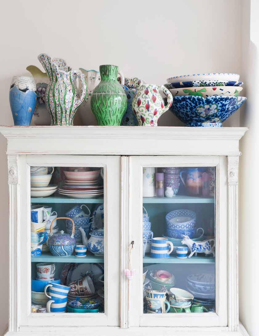
Your grandmother’s antique candlesticks, a framed watercolor from your child’s kindergarten year, a piece of fine china used as a jewelry dish and wildflowers poking out of a champagne bottle from a special celebration. The grouping may seem haphazard, but for the curator, each piece tells a story, and together, the eclectic arrangement becomes meaningful and beautiful.
Coined clustercore by TikTok creator @acnugs, her vision was to bring together knickknacks and intimate objects - books, travel trinkets, perfume, candles, a favorite mug - into a purposeful and charming presentation.
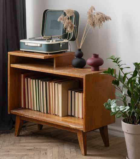
If you’re one of those people who finds solace in a clean, minimalistic space, and believe that the fewer tchotchkes and clutter, the better, then this look is probably not for you. For many people, a streamlined, uncluttered space promotes peace, focus and room to breathe. Clustercore creators, on the other hand, thrive on bringing a warm personalization to their space, adding collections and curating vignettes that spark interest and infuse belonging.

Think of clustercore as a display of your most cherished items, mementos and memories. Or consider it a scene from your latest season - shells from the beach, the trophy from a big win and a handwritten note from a good friend. Instead of keeping your prized possessions tucked in drawers or boxed up in the basement, clustercore celebrates your stuff by encouraging you to set them out in groupings.
But before you dump all your keepsakes onto the mantle, beware. If you go too far, a special vignette starts to look sloppy. Refined cluster can look like random clutter if you’re not careful. “Clustering is an art form, and it’s hard to pull off because if you do it wrong, it can veer towards just mess,” Avery-Claire of TikTok fame said in the now-viral video about clustercore, inspired by the aesthetically eccentric apartments lived in by your favorite film and TV characters. She suggests curating little ornaments, souvenirs and everyday items into “the movie set of your own life.”
Think about your interests and personality and how your most prized possessions express who you are and what you care about. Find that dusty bin of childhood keepsakes hiding under the stairs, open the cupboard with the handcrafted pottery and walk around your home picking up items that are extra precious or particularly ‘you.’ Wine corks from your getaway to Niagara on the Lake, glitter nail polish or a leopard print scrunchie that speak to your style, your mother’s pearls that you’ll probably never wear but are too beautiful to part with and that gold angel figurine that represents healing. While none of your items may connect or go together, play around with the pieces to create an aesthetic that sparks joy, infuses rich character and showcases your personality.
While it seems as if there are no rules when it comes to clustercore, following a few simple steps will take your space from feeling superficial and cluttered to charming and heartfelt.

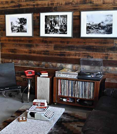
If you love to dig in the dirt and spend your weekends gardening, communicate your hobby with a cluster of items that show affection for your green thumb. Recently back from a vacation? Stack your tourist books, baubles bought along the way and a framed photo of your adventures in a collection that tells of your travels. Remember a loved one with memories from your shared experiences - a knickknack from your childhood, keys to an old apartment, wine corks from a celebration and a candle to light when you miss them. Think about the story you want to tell before you compile your items and let it be the motivation when building your scene.
While trendy trinkets bought in bulk at your nearest big-box store may be cute, steer clear of cheap or cheesy items that make your aesthetic unauthentic. Instead, only collect objects that you truly care about and convey who you are. Consider heirlooms entwined with rich history and beautiful ornaments that express your taste and traits.
Create an effortlessly beautiful display in any room of your home - on tables, bookcases, mantels, even on the walls, or wall shelves. A gallery wall with an assortment of artwork, photographs and a wall hanging is a creative way to use vertical space and feature your curations.
Add interest to your vignette by mixing up the height of your items. Pair tall candlesticks with a small succulent and use stacks of your favorite books to add layers. Incorporate textures with items such as a handwoven doily, rattan tray or eucalyptus leaves. Play around with the composition of the cluster, matching soft items with metals or something more colorful and structured.
Change up your cluster with the time or year - or the season of your life. Since it’s a reflection of who you are and where you’re at, allow your vignette to grow with you. Frame that beautiful butterfly card from a dear friend, add some sunflowers in the fall or let it collect a bit of dust when your days are full. When time and life changes, curate a new collection with newly found trinkets or recently recovered gems.


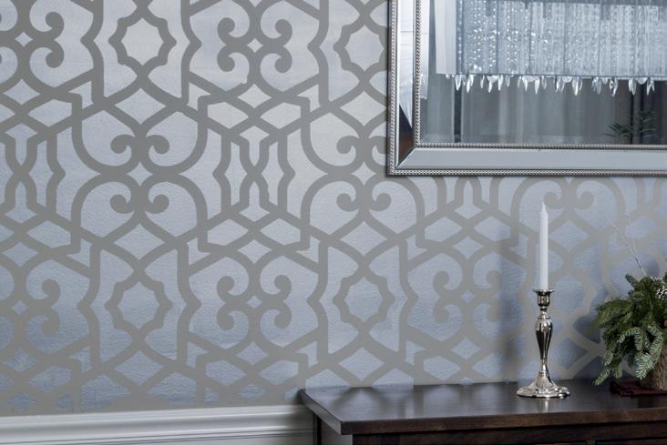



SIDING: Stonington Gray HC-170, Regal® Select Exterior High Build – Low Lustre
TRIM: White Wisp OC-54, Regal Select Exterior High Build – Soft Gloss
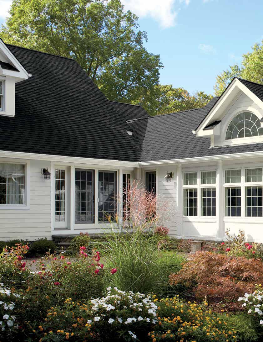
New color doesn’t have to mean new siding: Refresh your vinyl with these popular Benjamin Moore® colors—all tested and proven to perform well under all weather conditions.

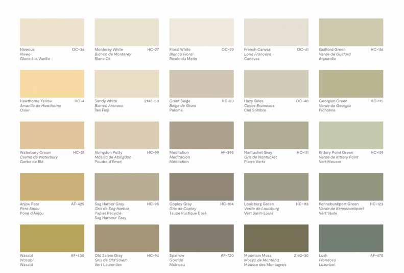
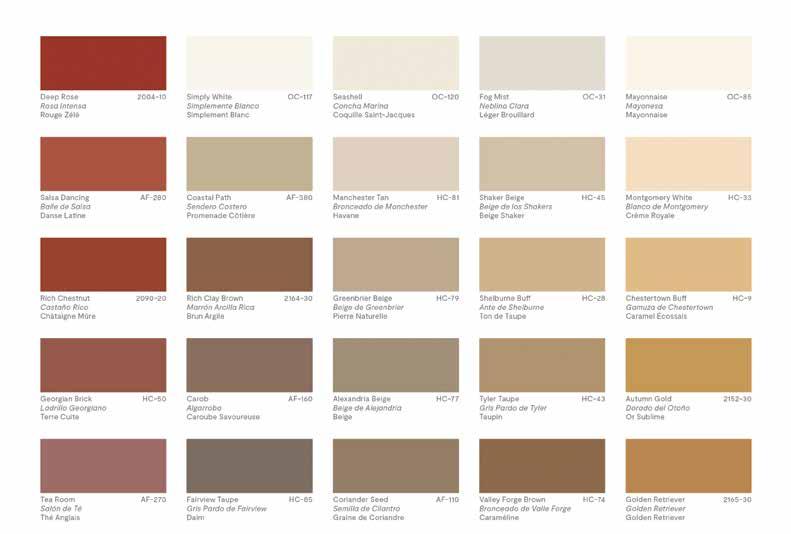
SIDING: Stonington Gray HC-170, Regal Select Exterior High

Build – Low Lustre TRIM: White Wisp OC-54, Regal Select
Exterior High Build – Soft Gloss BACK COVER: SIDING:
Mt. Rainier Gray 2129-60, ben® Exterior – Low Lustre TRIM:
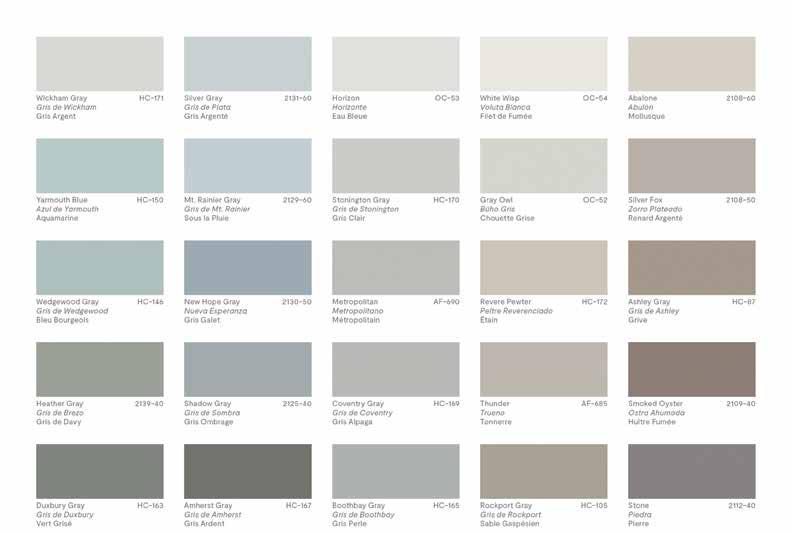
Horizon OC-53, ben Exterior – Soft Gloss SHUTTERS:
Horizon OC-53, ben Exterior – Soft Gloss
SIDING: Mt. Rainier Gray 2129-60, ben®
Exterior – Low Lustre TRIM: Horizon OC-53, ben Exterior – Soft Gloss
SHUTTERS: Horizon OC-53, ben Exterior – Soft Gloss
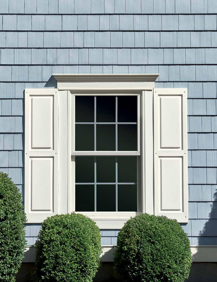







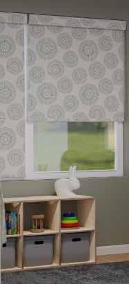

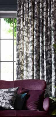


Have a small backsplash area, coffee bar alcove or workstation niche that could use an easy update? Peel and stick your way to a simple and stylish update!
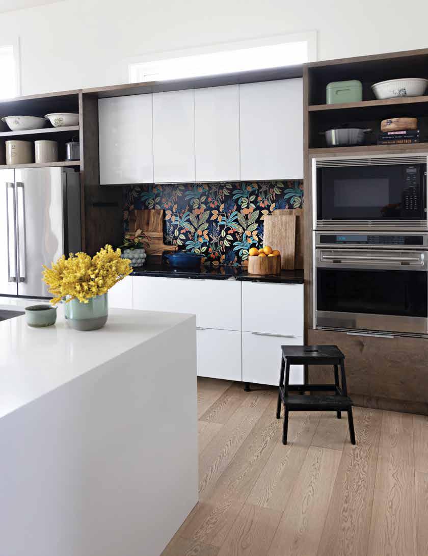
Step aside subway tile. Move over marble, granite and quartz. There’s a new kitchen backsplash that’s all the rage: wallpaper.
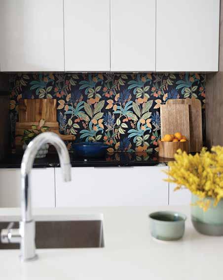
Give your kitchen new energy, a pop of print or a dramatic edge with an easy and affordable update. With everything from pompous prints and classic graphics to subtle textures and whimsical designs, you can showcase your personality without the cost and long-term commitment of tile, stone or a slab. Wallpaper is turning heads as the new trend in kitchen backsplash.
Perfect for a renter, a DIYer whose style shifts with the seasons or the budget conscious, peel and stick wallpaper provides a perfect way to reinvent your kitchen. As the popular entertaining space takes a turn from the all-white way of the past and toward a more personal style, wallpaper walks in with all of its colorful, graphically enchanting and textural glory to steal the show.
Unleash your adventurous spirit and go all-in on the tropical trend with Funky Jungle Peel and Stick Wallpaper from York Wallcoverings. A fresh take on a botanical print, the verdant style adds just the right amount of drama to amp up an otherwise monochromatic kitchen. Juicy coral, leafy green, and lively blues jump off the wall and beg to be styled around. Showcase your colorful stoneware, display your fresh produce, and add warm tones with useful wood cutting boards. With its easy up and smooth to remove formula, adding a bright, bold and oh-so-beautiful large-scale statement backsplash is a super low commitment. Tired of the tropics in a year or two? The product is guaranteed to come off walls in full strips.

With the magic of peel and stick wallpaper, achieving your Carrara marble dreams is closer than you think. If splurging on extravagant marble, granite, or quartz isn’t in your budget, but you still want the classic and expensive look of stone, get rocking with this eco-friendly Oil & Marble Premium Peel + Stick Wallpaper by York Wallcoverings. The pattern is described by the paper company as a ‘dance of colorful marbling inspired by the Persian art of oil on water known as clouded paper.’
With simple installation, making it easy to remove and reposition the paper, you can save yourself the cost and the heavy lifting of stone. Just like a luxury mineral, you’ll want to protect your paper with a waterproof varnish. The finish will help it hold up to the wear and tear as a backsplash in a busy kitchen. With three beautiful shades (white/grey, clay/ taupe, and blues), the hardest part of the process will be selecting the color!
With a black background and myriad lush and leafy accent colours to choose from Funky Jungle provides ample opportunity to flex your stylish accent muscles. Pick a color, any color (or two) and go wild with beautiful ceramics, fresh tropical fruits, and wonderful wood grains. York
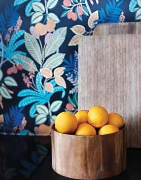
This Marrakesh-inspired style is for those who prefer monochrome. It has all the exotic appeal of an ancient, artisanal city with a neutral palette. Let the eclectic shapes and intricate patterns hold court by opting for a deep and dramatic off black or space gray

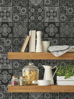

Elegant and worldy, marble never goes out of fashion. Its wispy movement and reserved nature make it the perfect backdrop for modern spaces and those who fall into the minimalist camp. Use white to keep the overall space quiet enough to speak volumes without raising its voice. Simple and special artifacts are all you need to crank the

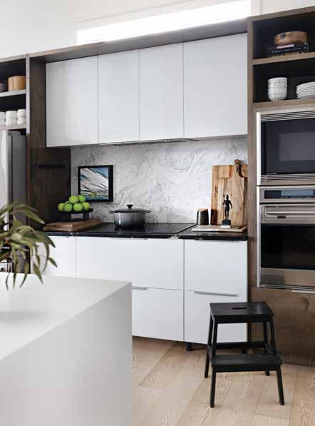
Combine the hazy and swirly medium of watercolor with a classic Moroccan tile in the hands of an internationally known artist like Paul Brent and you have a soft yet geometric backdrop perfect for vintage metal finds and orchard-inspired accents like fruit and branches.


Nothing says timeless style and nostalgic appeal like the distressed glamour of old-timey brick. Have your cake and eat it too with an easy care smooth and durable installation void of rough texture and problematic pits and pores. A whitewashed finish highlights potted herbs, farm fresh produce and well-loved cookbooks while evoking the sense there’s a potager garden just outside the kitchen.


The train that is the terrazzo trend, bringing the Venetian substrate out from under foot and onto, well, everything, is still chugging along. This earthy palette of grown-up confetti offers a lot of design tracks to venture along from creamy white, to warm sand, milky latte, buff, terracotta, to mocha and beyond. Pick one and punch your ticket or mix a melange of color destinations.
If lavish and ornate florals a la Victorian era masters are what your botanical dreams are made of then a floriferous papered niche is just one DIY day away. Instead of going gilt, modernize your blooming backsplash (or otherwise) with accents of bright white and clean lined shapes.


With great rooms and gathering spots at large islands more popular than ever, the ideal counter stool has become a crucial component of the kitchen. From sanding and re-staining age-old counter stools to finding cool cognac stools that coordinate with your mid-century vibe to splurging on woven ones from your favorite designer, it can be tricky to select the right style of stool for your space. Plus, you also need to consider height, comfort and function. Follow our simple, three-step system for selecting the counter stool that works best in your kitchen.
STEP 1: DETERMINE YOUR HEIGHT
If you’ve ever sat at an island with your knees touching the underside of the countertop, you’ll know how important the proper height of your stool is for top performance. Standard countertops measure 34-39 inches high and standard residential bars are 42 inches high. You’ll want to allow for approximately 10'' between the bottom of the table or countertop and the top of the stool so that it slides nicely underneath the counter, with optimal space to sit.

STEP 2: CONSIDER COMFORT & FUNCTION
While you may love the look of a low back counter stool, if comfort is higher than style on the priority list, consider stools with a full back, arms and upholstery. If you have kids and don’t want to obsess over spaghetti sauce ruining your woven wicker seats, opt for a finish that is easy to clean. Or perhaps your husband needs to turn to watch the game – then select a stool with a swivel. Whatever you choose, ensure that the stools function well for life in your house.
STEP 3: ADD SOME STYLE
Once you’ve determined height and function, find the stool that speaks to your style. While you may have worked hard to create beautiful combinations in your kitchen, coordinating countertops with cabinets and hardware, feel free to add some dichotomy to your kitchen design with your choice of counter stools. Create interest by going against the grain – adding a traditional stool to a modern design, or a unique stool to an otherwise basic kitchen build. Incorporating elements of texture and color, playing with materials and mixing and matching old and new stools will add personality and encourage camaraderie around the counter for years to come.

Forget soft pastels and bright white, instead embrace a nursery thats enveloped in a rich and bold color that’s both sophisticated and stylish. These genderneutral ideas will inspire your own space.
Try an all-over charcoal for depth, dimension and drama. Repeating the color on the feature wall, crib, chair and dresser maintains the serene and restful mood the color creates.

Accenting with muted color choices that share the same undertones is key. A soft and slightly murky pink is the perfect accompaniment.


Fresh greenery is literally a breath of fresh air in any space, with the uplifting qualities of plants boosting moods, reducing stress and decreasing pollutantsthe perfect companion for late night feeding and changing.

