MAHER'S PAINT


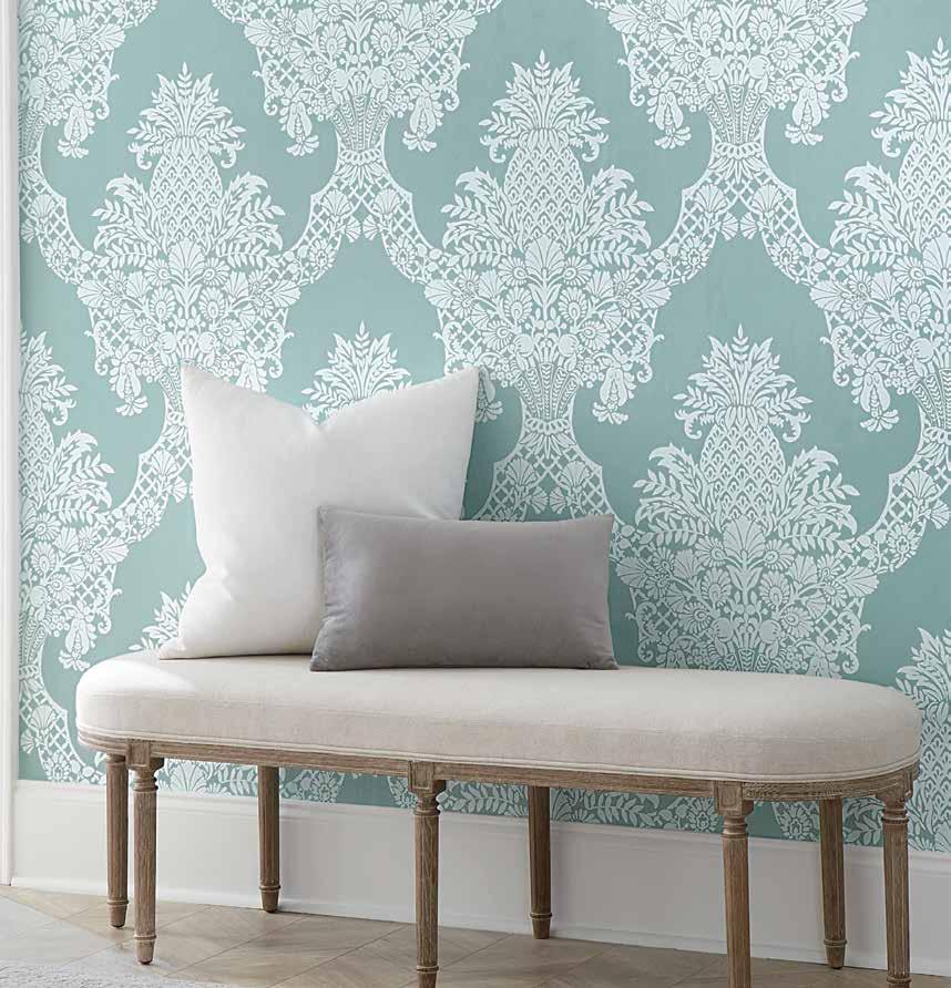
T HAT'S A GREAT PAIRIN G MIX AND MATCH WITH PATTERNS AND TEXTURES





T HAT'S A GREAT PAIRIN G MIX AND MATCH WITH PATTERNS AND TEXTURES


THE URGE TO PURGE THE QUEST FOR A LIFE WITHOUT CLUTTER BACKYARD DINING SET THE TABLE WITH SLIDERS AND SLAW

THE QUEST


VISIT THE PCH AND BEYOND


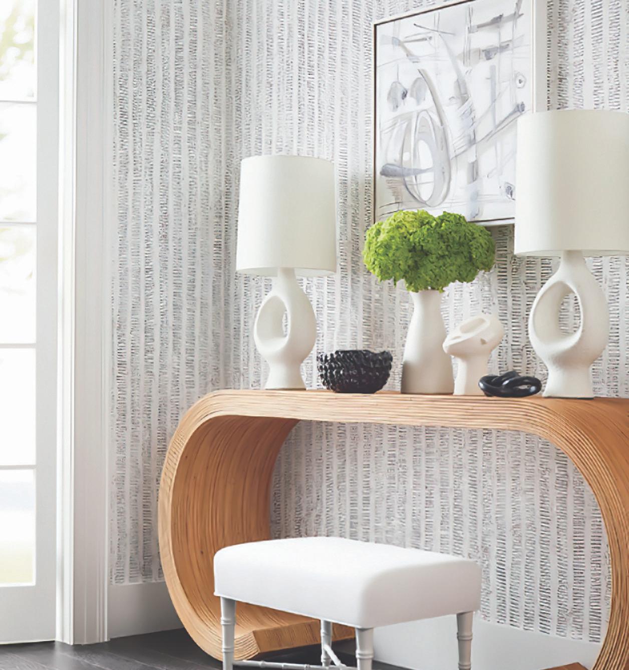


Before you buy wallpaper, it’s important to make a generous estimate of how many rolls you’ll need. That way, you won’t run short during installation and risk not being able to order the same color or pattern – plus you’ll have a little left over in case you need to patch damaged walls down the line.
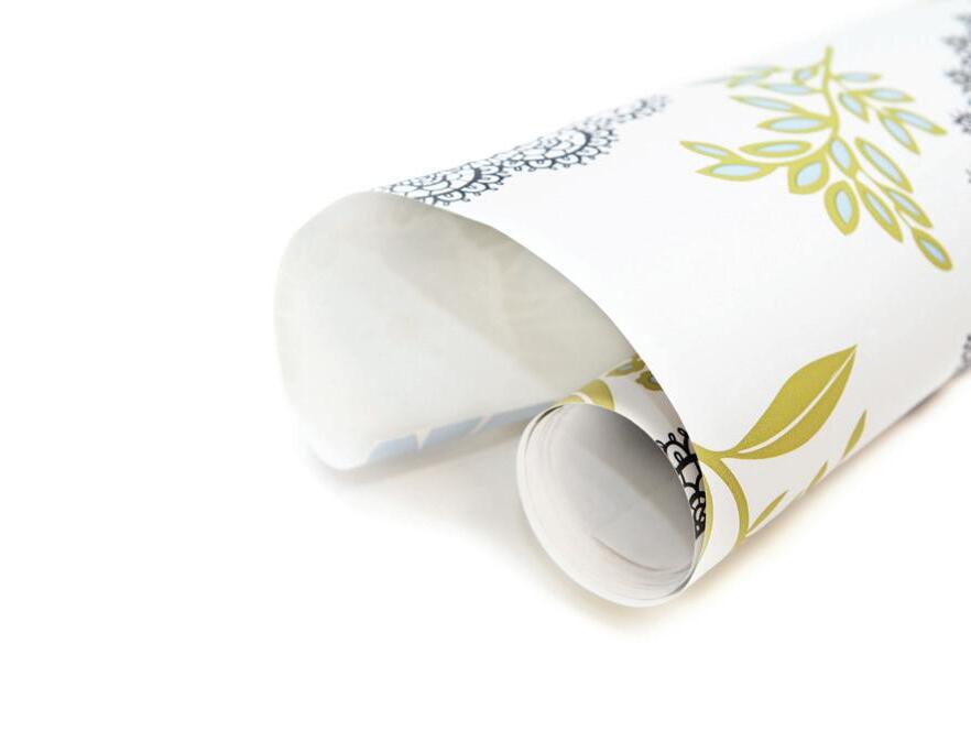
GENERAL MEASUREMENTS:
Roll Length: Yards: ________ Inches: ________
Roll Width: ________ Repeat :________
Measurements: Width: ________ Height:________
CALCULATE WORKING HEIGHT PER STRIP:
Height: _____" Repeat _____" = _____ Round up = _____ x Repeat _____" = _____ " Working Ht
CALCULATE STRIPS PER ROLL:
Length Per Roll: _____ Working Height per Strip _____" = _____ Round down = _____ Strips per Roll
CALCULATE # STRIPS TO COVER WIDTH OF WALL:
Width of Wall _____" Roll Width _____" = _____ Round Up =_____ Strips to Cover Wall Width
CALCULATE # ROLLS TO COVER WALL:
# Strips to Cover Wall ____ # Strips per Roll _____ = _____ Round Up =_____DBL Rolls Total


Check out more colorful and inspiring spaces starting on page thirty.
30
ALL ABOUT BALANCE
New design features blend harmoniously with this L.A. home’s original architectural style
38
COZY, CHARMING ENGLISH COUNTRYSIDE
A quaint home on a quiet street in the Chicago suburbs is an English countryside oasis for a busy family, thanks to Kate Marker Interiors
46
RUSTIC, MEET MODERN
Tays & Co. Design Studios blends rustic warmth with modern vibes in this Minnesota lakefront cabin

52
REIMAGINING SPANISH STYLE
A Spanish-style home in the Sunshine State receives a striking upgrade that seamlessly blends dramatic and vintage for a sophisticated space to live, relax, and entertain
Products featured in At Home are available at Maher's Paint, some by special order.


✓ Superior Taper








✓ Advanced Flagging
✓ Exceptional Quality









ANDREA DANELAK
ARTHUR LIFFMANN
OLIVIA HIEBERT
MIKYLA MILLER
TWILA DRIEDGER


JIM TAYLOR
AUBREY TAYLOR
DARREN GRUNERUD
IRA VAN DEN BERG
Love the designs within our pages? Connect with the talented folks behind the gorgeous spaces.
ALL ABOUT BALANCE
PG. 30


Kelly Martin Interiors
Allie Duncan allisonpduncan.com @allisonpduncan
COZY, CHARMING ENGLISH COUNTRYSIDE
PG. 38

Kate Marker Interiors




Kate Marker katemarkerinteriors.com @katemarkerinteriors


RUSTIC MEETS MODERN
PG. 46 Tays & Co.


Laura Tays taysandco.com
@taysandcodesign
REIMAGINING SPANISH STYLE
PG. 54 House of One


Brittany Farinas Houseof1.com
@houseofone_

22
SPRING 2023
Bahia Taylor
Editor in Chief
Co-founder
Leigh McKenzie
Creative Director
Co-founder
Carlee Baigrie
Contributing Writer & Editor


Olivia Hiebert
Graphic Designer


Melanie Truman Project Management Graphic Design Styling Gallon Creative
www.galloncreative.com
Owned and Published by: Gallon Creative
For inquiries, please contact us at hello @ galloncreative.com
5 Scurfield Blvd #25

Winnipeg, Manitoba R3Y 3G4
www.galloncreative.com hello @ galloncreative.com
Cover Photography - Aubrey James Projects aubreyjamesprojects.com
While every effort has been made to ensure that advertisements and articles appear correctly, At Home Magazine cannot accept responsibility for any loss or damage caused directly or indirectly by the contents of this publication. All material is intended for informational purposes only. The views expressed in the magazine are not necessarily those of its publisher or editor.
All rights reserved. Reproduction in whole or part prohibited without written permission from the publisher.
Typeset in Adobe Garamond and Avenir
Printed in Canada
CRAFT TABLE: DIY? WE SAY Y-E-S!
WITH A TRACE
Create a wall design with a few easy steps

24
HOT SPOT: Shining a spotlight on the world's hidden gems
RAINBOWS OF RANUNCULUS
A kaleidoscope of voluminous blooms covers the coast of Carlsbad, California
62 CHOW: Just thinking about it is making us hungry
SAVOR SUMMER
Grownup twists on standard summer fare
72 EXPLORER: Pack your sense of adventure and let’s go
PACIFIC COAST CALLING
Mapping out one of the most iconic road trip routes in the world
80
TOOLBOX: Helpful resources for any homeowner

GET A LOAD OF THIS Level up your laundry room





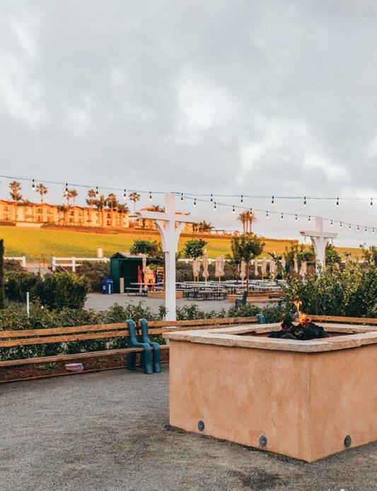

crisp apricity of winter and the abundance and fullness of summer. It’s the space between cozy throws and fireside games, winter boots and crunching snow, to the heat of the sun and a warm, gentle breeze. Spring awakens our senses with new optimism — the smell of freshly turned soil, laundry that’s been hung out to dry, and burgers on a sizzling grill. We welcome vibrant shades that lift our spirits — the return of rich green grass, bright red tulips, and freshly squeezed lemonade. And we turn our ears to the songs of the birds, squeals of children playing, and pitter-patter of rain as it hits the ground, washing away the winter and welcoming a new season.
As we greet spring, we also anticipate summer’s greatest adventures, whether a long-awaited road trip (PG. 72) or barbecues in the backyard with close friends and neighbors. These seasons give new life to our social calendar, allowing us to entertain outdoors and enjoy leisurely hours lakeside. We hope these pages inspire you to explore the exuberance of new life, whether it be rows and rows of ranunculus (PG. 24) or aisles and aisles of vegetation at your local greenhouse. Make space to savor both spring and summer and elevate your entertaining game and party portfolio with simple steps for a warm summer soiree (PG. 62).
No matter where you are — enduring the end of a long winter season or alive with expectancy for a refreshing arrival — our hope is that this issue will arouse joy for all that you have around you and an expectancy for all that is to come. Enjoy the season’s splendor with bright eyes, open ears, and warm welcoming hearts. FIND A
We’re your local paint store. Each of us is part of a cooperative of over 1,700 independent, family-owned paint and decorating stores.
• Since 1960 we’ve built a network of retailers who believe in the entrepreneurial spirit, community, hard work, and determination.
By working together we’re able to thrive in an ever increasingly competitive market. Spending less time focused on the business of business and more time focused on you.
So next time you have a painting project or need decorating expertise, shop your local ALLPRO retailer.
To find the retailer nearest you, visit our website at www.allprocorp.com/locator
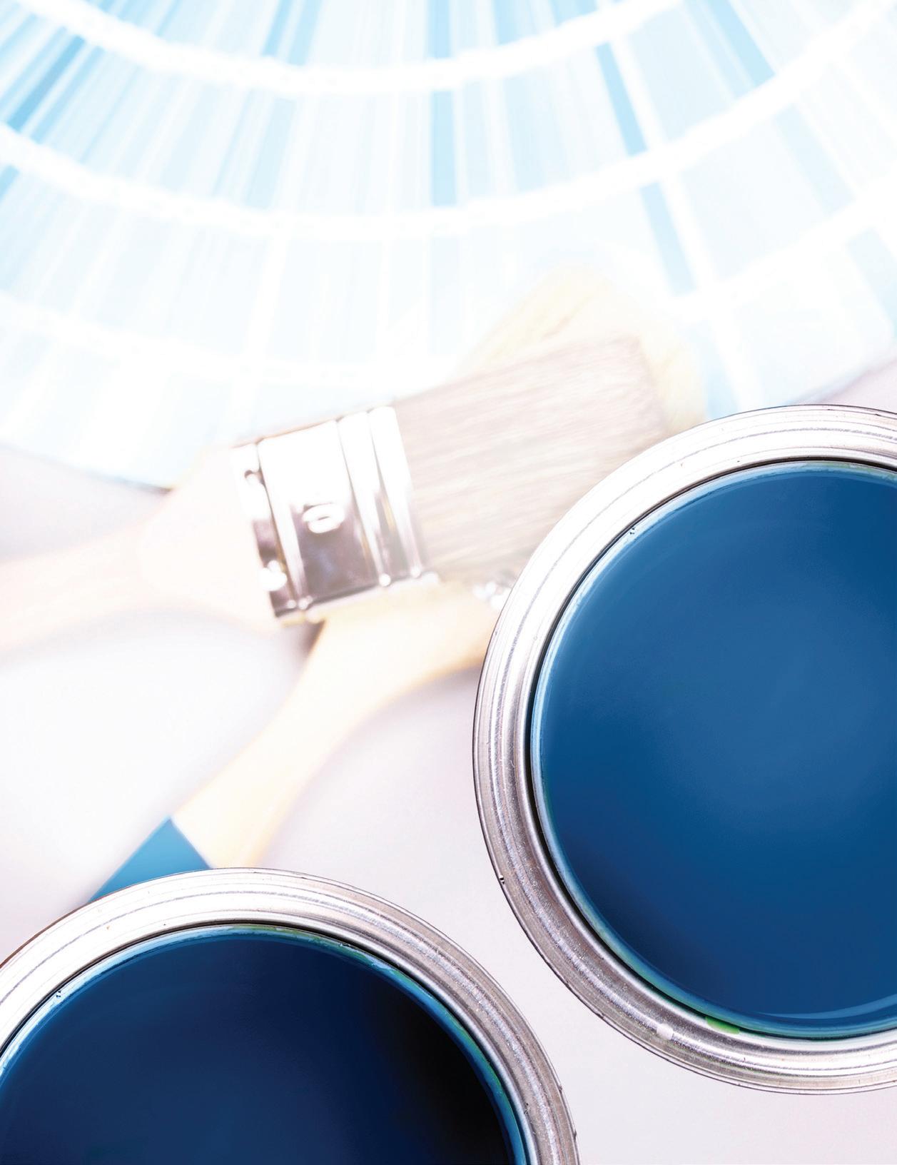
ADVANCE KITCHEN CABINETS:
How to create a flawless finish with ADVANCE Waterborne Interior Alkyd Paints
• Formica and other Laminates
• Hardwoods (oak, cherry, maple, etc.)
• Fabricated Woods
For a perfect finish, apply a primer coat and finishing coat (Extra top coats are optional depending on the substrate and desired look).
First, you’ll want to ensure you’re working in the ideal climate conditions. Since you’re working with an alkyd, you’ll want to keep the ventilation fl owing (keep windows open, fans blowing) to assist with the drying process. High humidity or low temperatures may negatively impact results. In the right conditions, ADVANCE will dry to the touch within 4-6 hours. You can apply your second coat after 16 hours.
Remove any cabinet drawers, shelves, or doors as well as all hardware. Avoid the confusion of re-installation by marking each piece with a pencil in a discrete location (like around the hinges). If you’re planning a spray application, cover all countertops or fl ooring with plastic or paper. Consider wearing protective eyewear or a breathing mask.
It’s crucial to clean cabinets prior to sanding, as sanding over dirty surfaces will just push dirt and grime deeper into the surface and disrupt the adhesion of the paint to the surfaces. Wash all surfaces thoroughly to ensure they are stripped of all dust, oil, grease, soap, mildew, and wax. To remove grease stains, apply a small amount of de-greaser to a clean, lint-free rag.
Sand all surfaces using 100-150 grit sandpaper, going with the grain until the existing fi nish is rough to the touch. You can use a sanding block or palm sander on fl atter surfaces, and use a small piece of sandpaper around tricky corners or crevices. Take care to be gentle on these more delicate areas to prevent gouging.
After sanding is complete, vacuum all surfaces and wipe with mineral spirits to remove dust.
Fresh Start High-Hiding All Purpose Primer (K046) is a high adhesion multi-surface primer suitable for most wood or laminate surfaces.
DO NOT USE lacquer-based primers or undercoats, as they will impede adhesion. Talk to an expert at Maher’s Paint to ensure you are selecting the right primer for your cabinetry.
After your primer coat has dried completely, use a 220-grit sandpaper or fi ner and sand all surfaces lightly. Focus on areas that may have pooled or dripped to ensure a smooth fi nish.
Spray Application: ADVANCE sprays on slightly thicker than a latex paint but thinner than conventional oils, so we recommend utilizing an HVLP spray gun with a fi ne-fi nish tip (specifi cally designed for furniture or cabinetry application). ADVANCE can be thinned using water up to 6% by volume. Spray a thin, even coat on all surfaces (keep an eye on those corners!).
Brush + Roller Application: Apply the paint using a premium nylon or polyester brush and/or a fl ocked foam mini-roller. Natural bristle-brushes absorb too much water and may result in an uneven fi nish. Work from top to bottom, fi rst painting frames and recesses that only a brush will reach. Next, roll any fl at panels, rails, and stiles. Apply a generous layer of paint—don’t be skimpy or so heavy-handed that you have runs and drips. Go over any brushed areas as closely as you can with your roller to blend the two fi nishes. Try to paint any two-sided pieces in a horizontal position.
Sand Between Coats: use a fi ne-grit sandpaper to sand and smooth all surfaces once the fi rst coat has completely dried. Vacuum and wipe with denatured alcohol to remove any dust.
Once you apply your fi nal coat, let dry for several days before you reassemble the cabinetry. Note that paint that is dry to the touch is not necessarily cured. For best results wait until paint is cured to reassemble, rest items on, or put into service. en you’re all set to enjoy your new rejuvenated, furniturelike fi nish!
WITH THE RIGHT PREPARATION, ADVANCE CAN HELP REIMAGINE MOST CABINET SURFACES:


With the resurgence of wallpaper and the recent development of an aesthetic that Gen-Z is calling “Cottage-Core” – a style that features rustic materials and eclectic decor with an emphasis on coziness – it should come as no surprise that a renewed interest in toile (pronounced twal) has also come to light.
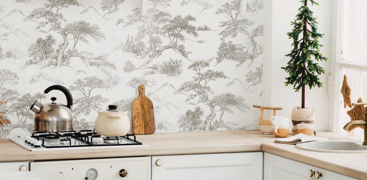
Toile is a shortened term from ‘Toile de Juoy’, which is a literal translation of cloth from ‘Jouy-en-Josas’, the French town where the printed fabric was originally manufactured in the 18th century. The fabrics often featured floral motifs, maidens or heroes in the typical provincial landscapes, and usually had a strong sense of place embedded into their imagery, giving original prints a sense of historical significance. You might recognize these monochromatic prints from your grandmother’s china—always rendered in a single shade.
Today, toile has regained some design traction. While many gravitate towards traditional incarnations of this famed artform, modern manufacturers are putting a contemporary
spin on the classic look. Just as original designs told stories of their lived realities, we’re seeing modern prints pop up that feature depictions of city life, expanding the colorways and narratives woven into them. Some of the sketch-style drawings are offering artists a way to construct powerful social commentaries, challenging the austerity of the form with unexpected inclusions like UFOs and Banksy-style subversions.
Whether you’re interested in toile for its historical charm or creative flare, it provides homeowners and designers an exciting new way to infuse a space with a classic edge that feels anything but boring.
From flat and matte to eggshell, pearl or satin, semi and high-gloss, it can be hard to know which sheen will work best for your space. For newbies who are just dipping their toes into the sheen pool, your best bet is to chat with the professionals at Maher’s Paint, who can point you in the right direction, but before you go shopping it never hurts to have a basic idea of what you’re after.
Generally speaking, the sheen spectrum — from low to high sheen — goes flat, matte, eggshell, satin or pearl, semi-gloss and high-gloss. Check out the sheen cheat sheet below to get the details on each of these options and see which one sounds like the perfect fit for your project.
FLAT: Low-sheen with a non-reflective finish. Ideal for very low-traffic areas and ceilings.

MATTE: Low-lustre finish, relatively durable, easy to clean and hides minor surface imperfections well.
EGGSHELL: Has a soft, smooth appearance, very much like its namesake, an eggshell; slightly reflective. It’s a moderately durable sheen and is a safe choice for most types of walls in your home.
More sheen means more durability: One rule of thumb is the higher the sheen the better it will be in a high-traffic area that requires a bit more durability. Flat and matte sheens that have little or no shine can be quite easily scratched and marked up, so bedrooms and home offices or similar, lower-traffic spaces would probably be the only places you’d want to use those sheens in. at said, some manufacturers have developed matte finish products with durability equal to that of their eggshells. Moderate sheens like eggshell, satin or pearl, and higher sheens such as
SATIN OR PEARL: Has a lustrous fi nish, and is a good option for high-traffi c areas due to its durability. It can also stand some exposure to moisture.
SEMI-GLOSS: Super sleek, shiny appearance, and best for hightraffi c areas and spots that get touched or bumped a lot, such as doors and trims.
HIGH-GLOSS: Creates a bright, ultra-shiny and reflective finish that almost resembles glass. Suitable for surfaces in a high-use environment.
semi or high-gloss, however, can stand a lot of abuse, so they are great for busy areas. Moisture-prone areas such as the bathroom or kitchen are great candidates for paints made specifically for those conditions, ask your local expert.
Sheen affects room mood: It’s important to base your sheen selection on the function of your room and using the sheen that will accommodate that, but you should also consider how it will look in that room and the overall feel you are after. For example, lower sheen paints soak up light, which helps hide imperfections, and high-gloss sheens do the opposite, reflecting light to make darker rooms feel brighter and lighter and emphasizing imperfections.
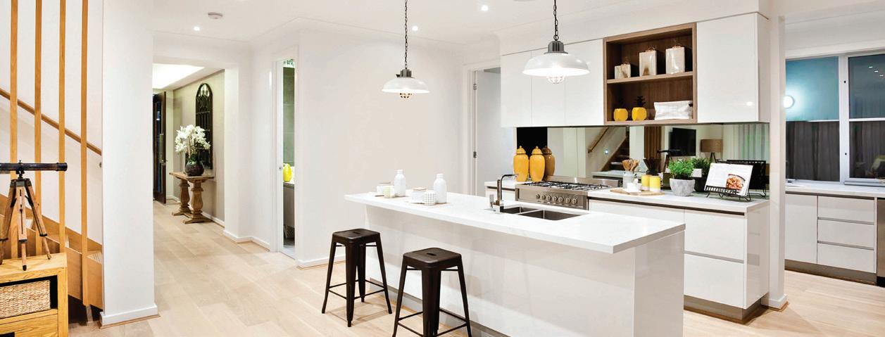
Our feeds have been filled with people moving to the dark side lately — hopping on the matte black trend. While we love the concept and swoon over a well-styled space with depth, a dark shade void of shine can easily miss the mark if it’s not executed properly. e idea is to balance the depth of the black with other elements, which should be easy since everything pops more against black and the lack of sheen allows other textures to shine. Remember these tips after you’ve completed your coat to make sure your new matte black wall reaches its full potential!


Use lighter wooden hues or accents to create contrast and avoid overwhelming the scene with too much color. These lighter tones will help to soften the sharpness of the black and provide character. Use rattan, terracotta, and plenty of crisp whites!
Incorporate as many plants as you can — the black backdrop will help the greenery pop, softening the heaviness of the black and bringing life to the darkness. Choose planters with woven textures to complete the look.
Because a black backdrop shines a spotlight on anything in front of it, it’s a good idea to pay extra close attention to which décor items you choose to showcase. Pick your best, trendiest items, and avoid doing too much. A few key items will work to personalize the space.
Black can feel a little cold at times, so if you’re looking for a cozy feel, you’ll need to rely on other features, like a good rug. Choose a lighter color, a woven texture, or a bold pattern.

A bare black wall will look a little strange. It’s a good idea to incorporate some artwork (go for white or neutral frames with large art mats). Avoid darker colors — any pieces you choose should either be understated and neutral in tone or bold and colorful.

STOP BY MAHER’S PAINT TO GET STARTED ON YOUR NEW MATTE BLACK STATEMENT WALL!


If you’ve spent any time in a paint store, watching home renovation shows on TV or browsing through Pinterest, you’ve likely come across the instructions, “Prime, then paint,” more than once. But do you know what the function of primer actually is?
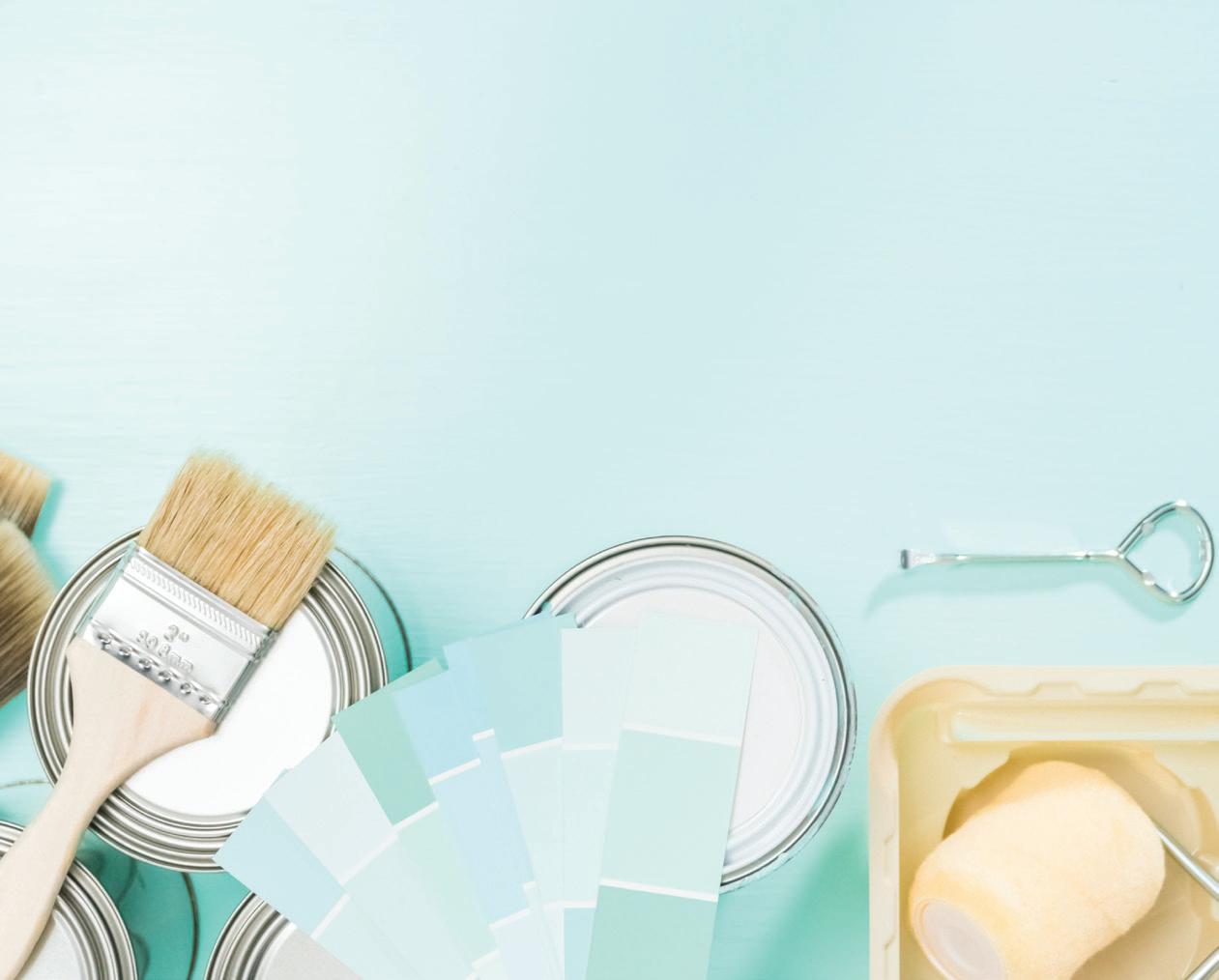
Primer is a prep coat, or undercoat, that goes on your wall or materials before you paint them. It helps paint adhere to the surface properly and evenly, increases paint durability and also provides an added layer of protection from water, tannin, grease and smoke stains that can soak through your topcoat. That being said, there are many different kinds of primer which have various properties that work with some surfaces better than others. Keep reading for a breakdown of five primer categories and why each one is designed for its specific use.
DRYWALL PRIMER: New drywall is a sponge when it comes to paint, which can result in a very uneven finish. Drywall primer will seal the porous surface and make it more receptive to new paint.
WOOD PRIMER: Clean, bare wood is hard for paint to cling onto, so an oil-based primer that will soak into it, fill the pores of the wood but not raise the grain, is the best option for a smooth, even finish.
METAL PRIMER: Once water hits bare metal, oxidation will begin and rust will form. A metal primer has components in it that will help guard against corrosion; its main function is to shield metal from moisture.
HIGH-ADHESION PRIMER: is primer is ideal for surfaces such as tile, ceramic, plastic and vinyl — basically all the slipperiest, glossiest spots that need a bit of extra help to get paint to stick. High-adhesion primer, or bonding primer as it’s sometimes called, will ensure your topcoat stays put.
STAIN-BLOCKING PRIMER: Who wouldn’t want some extra stain protection on their walls? Stain-blocking primer is great for keeping water and smoke stains from bleeding through the topcoat and revealing itself on your freshly painted surfaces.
THE EXPERTS AT MAHER’S PAINT ARE IN A PRIME STATE OF MIND, SO DON’T HESITATE TO POP IN WITH ALL YOUR PRIMER AND PAINT QUERIES.

With more people than ever before working from home and the restrictions placed upon seeing people in person, our screens have become our new portals for connection, whether it be for social interaction or business. Although video calling is by definition a way of connecting without actually connecting, there’s also a certain intimacy to it. We get a rare glimpse inside other people’s
STUNNING 826
This shade is versatile and appears crisp and professional on camera (and off!). It also increases productivity and focus so you can stay aligned with your to-do list.

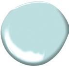
DOLPHIN’S COVE 722
This hue is perfect as a background color because it goes well with nearly all hair colors and skin tones, but it also has a calming and centering effect, keeping you on task and zen at the same time.
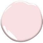




COTTON CANDY 1268
A millennial pink is always a good way to make a statement. Soft enough to use as a neutral but packed with enough personality to prove you’re on trend.
homes, some that we would never have the opportunity to see. Which in turn, creates pressure for us to have our backgrounds picture-perfect, too. Because whether we like it or not, these subtle details play a role in how others view us—and potentially our work. We’ve rounded up the best colors for your home office for your coworkers or pals to fawn over in your next video chat.
FAIRMONT GREEN HC-127

Green is energizing, relaxing, and sophisticated. It also presents a polished and sophisticated aesthetic to any onlookers.

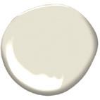
MUSKOKA TRAIL 974
A warm white is a sophisticated choice, and it’s a better option to a stark white which lacks personality. It’s no nonsense, which makes for less distraction when you are speaking, but it still offers character.




Time is money – and having to constantly touch up high-traffic public areas like hallways and stairwells, lobbies, gyms and other busy spaces is both costly and time consuming. That’s why Benjamin Moore has introduced Ultra Spec® SCUFF-X™, a revolutionary, single-component latex paint that resists scuffing before it starts.
This high-performance product is specifically engineered to deliver outstanding protection in the toughest areas, delivering superior durability and scuffresistant properties without the strong odor, pre-mixing, short pot-life and other application issues related to similar products. Best of all, SCUFF-X will retain its high quality appearance much longer and with minimal maintenance.

Imagine the possibilities of using SCUFF-X in a wide range of facilities and environments where it is important to make a good first impression and maintain a professional appearance, such as:

HOTELS AND RESTAURANTS: In an industry defined by exceptional customer service, extended downtime due to painting and touch ups is not acceptable. SCUFF-X allows guest rooms, hallways, lobbies, stairwells and dining rooms to be painted and rapidly returned to service with minimal disruption.
SCHOOLS AND UNIVERSITIES: From dodgeball to dorm life, student activities can take a toll on primary, secondary and high education learning spaces. SCUFF-X keeps the walls of corridors, lecture halls, gymnasiums, locker rooms and dorms looking fresh and resistant to scuffs and stains.
HOSPITALS AND HEALTHCARE: For environments in which patient health is of primary concern, maintaining clean, unsoiled walls is key. SCUFF-X is low-odor, low-VOC and its anti-microbial additives makes it an ideal choice for busy waiting areas, exam rooms and medical laboratories.
OFFICE AND RETAIL ENVIRONMENTS: Projecting a professional image directly impacts the customer experience. SCUFF-X’s high-performance coating can protect walls from unsightly scuff marks appearing in occupied areas ranging from conference rooms to dressing rooms.


• Proprietary scuff-resistance formula

• Single-component paint
• Washable
• Quick dry
• Great touch-up
• Spatter resistant
• Easy application
• Low odor
• Qualifies for LEED® v4 credit
• Collaborative for High Performance Schools (CHPS) certified
• Contains anti-microbial additives that inhibit the growth of mold and mildew on the surface of the paint


SEE THE BENJAMIN MOORE EXPERTS AT MAHER’S PAINT TO LEARN MORE ABOUT THE SCUFF-X™ ADVANTAGE IN COMMERCIAL, RETAIL AND INSTITUTIONAL ENVIRONMENTS.
Often in situations where space is in short supply, people will automatically gravitate toward crisp whites to make a room feel more open. This is a good, tried-and-true tactic for creating the illusion of expansion, but it also leaves little room for character and personality to shine through. While a nice clean
white is never a bad idea, don’t concede too soon! There are plenty of shades in the color wheel that can have a similar effect without sacrificing the much needed punch that a bold shade can pack, or making it feel like the walls are closing in on you. A few general rules of thumb to keep in mind:


GO OVER TO THE DARK SIDE:
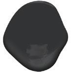
Dark colors won’t always make a room feel more compact. In fact, a darker hue can actually make a space feel bigger by drawing the eye inward. Try using a deep shade of black in your powder room—the darkness can actually be your friend, creating the perception of depth.
GO BOLD OR GO HOME:
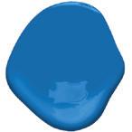
Smaller spaces can present the perfect opportunity to experiment with colors outside of your comfort zone. Because smaller spaces are usually more secluded from the rest of the home, you have more freedom to play with the atypical. Choose a brilliant blue in a bedroom to make it feel simultaneously relaxing and exciting.
BRING ON THE BEIGE:
Neutrals are always a safe bet in smaller spaces, bringing warmth without overwhelming the eye. This is perfect for those that aren’t willing to settle with white and want to incorporate some color, but aren’t ready to commit to anything too bold or bright. This shade is perfect for a smaller-scale living room or sun room.
GET COZY WITH CONTRAST:
One of the most important aspects of decorating a smaller space is ensuring there is plenty of contrast. Try a lighter pastel on your walls and pair it with white décor or furniture. The de nition will help make the space feel more dynamic, while the lighter tone of the pastel will keep things from feeling too weighed down.
WHEN IN DOUBT, GO GRAY:
Gray is one of those timeless neutrals that never seems to go out of style. Go for one with a lighter tone and a little bit of luminosity in it. The color will uctuate slightly with the changing natural light throughout the day, keeping you on your toes. This is a great option for a high-traf c areas like a hallway or entryway.
Painting your walls and ceiling the same color give the illusion of a bigger space. Because there is nowhere for the eye to stop, the room will feel more expansive.
If you’re working with a smaller space and want to choose shades that create the illusion of expansion, talk to the experts at Maher’s Paint to choose the perfect Benjamin Moore color.

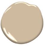
With all of the whites, how do you know this is the right one? This refreshing white is a pale, gray, sepia white with an umber undertone, making it inherently sophisticated and versatile. Apply this shade to rooms with plenty of sunlight or as a trim paired with deeper toned walls.




ivy. Inspiring thoughts of history, this shade is PG.30

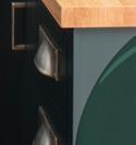
Dive into a deep, deep green with a shade that is reminiscent of a spruce forest at its darkest hour, or an old stone building overflowing with ivy. Inspiring thoughts of history, this shade is designed to create a calm atmosphere and classic respectability. Ideal for an accent wall or wall-towall cabinets, this dark neutral compliments white marble, wooden hues, and rich camel tones.


 PG.38
PG.38
Go gray with this crisp mid-tone color that can be described as clean and adaptable. Consider using this smokey shade in a variety of applications, including cabinets, trim, or on the walls of a master bedroom for a calm, relaxing ambiance. Comparable to a soft cloud, this gray hue is a perfect complement to white trim, offering a nice contrast without adding too much visual weight.
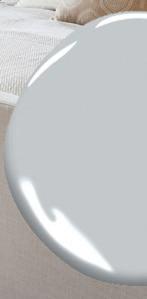

This warm gray borders brown in its rich and varied undertones. Known as a dark neutral, it pairs elegantly with a wide range of colors. Steadily gaining popularity in recent years, this slate grey brings depth and luxury to its surroundings. Use it to coat kitchen cabinets, in a moody bedroom color scheme, or on exteriors.


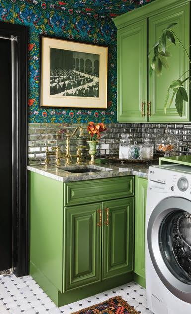
This dewy green is expressive and fanciful, begging to be the burst of energy in a sunny garden space or eclectic dining room. The bright grassy hue has been brightened thanks to the lightest touch of yellow undertone, elevating this juicy green apple hue from the vibrant rest. Pair this fresh shade with white in a laundry room or use it in a kid’s playroom to inspire imagination.


CSP-685

An alluring dark teal color distinguished by twilight blue undertones, this vibrant shade is equal parts tropical and refined, making it a cozy and comfortable choice when you still want to make a statement. Pair this breezy bay aqua-blue with lighter aqua and a soft yellow in a bathroom or go bold with a pop of color on your front door.


 PG.54
PG.80
©2021 Benjamin Moore & Co. Benjamin Moore and the triangle “M” symbol are registered trademarks licensed to Benjamin Moore & Co.
Color accuracy is ensured only when tinted in quality Benjamin Moore paints. Color representations may differ slightly from actual paint.
DUSTIN HALLECK, KRIS TAMBURELLO


SUPPLIES
Wall Paint Sample
Pencil Paintbrush Projector
Digital Art to Trace
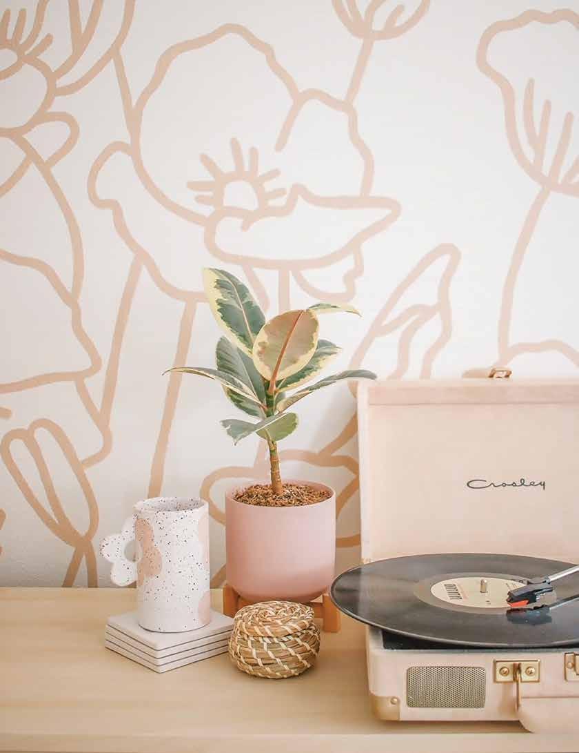
Find your design. I made my own design that you can feel free to use, but really you can use ANY design.

Project your design onto the wall and trace it with a pencil. If you don’t have a projector, borrow one or consider purchasing onethey make for the best movie nights!

Go over your pencil lines with paint! I used a large paintbrush on the entire design so that my lines were always the same width.
Touch up any spots that need it.
That’s it! So simple and such a HUGE impact!
While I had a million ideas of how to fill this big wall above our coffee bar, I found inspiration photos and showed five options to my family. They didn’t really get excited about any of them, so I mumbled that I wanted to paint flowers on the wall, but that I would never actually do that because we weren’t planning on staying in this house for long. My family all immediately told me to paint the flowers! They convinced me that painting was better than putting holes in the wall – so I went for it and I’m so happy that I did!
This is your sign to paint the flowers if they make you happy –just make your home a place that you love. You can always paint over it!

Hopefully this will convince you that you DON’T need artistic talent to paint a mural! Why? Because you can use a projector!
P.S. This mural only took me two hours to paint!
Move over, tulips. Step aside, sunflowers. So long, lavender. There’s another flower field that’s all the rage: ranunculus.
Text: Twila Driedger

The ranunculus fields in Carlsbad, California are one of the most spectacular and coordinated displays of natural color and beauty anywhere in the world.

“I’ve traveled everywhere, and I don’t know if there is a manmade floral experience as impressive as The Flower Fields,” Fred Clarke, general manager of The Flower Fields, says. “There are some pretty nice gardens in Europe and the tulip fields [in the Netherlands] but The Flower Fields are truly unique. We’re on a slope overlooking the Pacific Ocean so it looks like a rainbow of color on the hillside.”
The nearly fifty acres of Giant Tecolote Ranunculus flowers that make up The Flower Fields are in bloom for approximately six to eight weeks each year – from early March through early May. According to Clarke, the bands of blooms have multiplied in shades, starting in hues of red and yellow, and now encapsulating thirteen colors including picotee, a mixture of variegated colors.
“We have been breeding, selecting, and developing different colors over the years,” Clarke details. “So, every year, we select the plants, we let them cross pollinate, we harvest the seed, and then we plant that seed. And so, it’s quite a big farming operation.”
Once the fields are finished flourishing, the team digs up the corms (also referred to as bulbs) in June, levels the ground in July, and adds compost to the soil. They then form raised beds - three feet wide by 10 inches tall and install two drip irrigation lines on top of each bed.
“We are in Southern California,” Clarke shares. “You know the song, right? ‘It never rains in California.’ So, we use drip irrigation so we can be really efficient in our utilization of water. We put the water right where the plant is.”
According to Clarke, it takes about three months from the date of sowing until the plant starts to produce its first flower. “Then the plant produces blooms that we harvest for about a month.”
Every season, Clarke says The Flower Farm sells seven to eight million ranunculus stems and five million corms. Recently, the interest in the ranunculus has risen, with the flower trending just below roses and one of the most desirable flowers for bridal bouquets, arrangements, and as stand-alone stems.
“Our first harvest usually starts at the tail end of February,” he explains. “And then we’re open March 1 to Mother’s Day. And so, in March, April, and May is when ranunculus are being harvested and sold all around the country. In early springtime, the ranunculus are just beautiful. They have great color and they’re becoming really popular with florists these days.”
Known for its brilliantly colored, paper-thin petals, the ranunculus has origins in Asia Minor, another reason the flower is perfect for growing in the Southern California area, where it’s hot and dry in the summer and cool and wet in the winter.
The kaleidoscope of voluminous blooms, which has become part of Southern California’s local heritage, has a rich history, going all the way back to the 1920s. A Dutch florist named Luther Gage settled in the area just north of San Diego,

planting ranunculus seeds he brought with him. Soon, Gage’s neighbors, the Franzee family, expanded their vegetable farm to include the ranunculus and the flower operation blossomed. At the current site since 1965, the colorful fields are a direct result of decades of cultivation.


Visitors eager to experience the radiant rows can visit The Flower Fields at Carlsbad Ranch in spring when the ranunculus are in peak bloom and ranch activities are in full swing. A regional tourist attraction as well as a national jewel, The Flower Fields features a variety of opportunities to eat, learn, relax, and enjoy – perfect for a day trip destination.
“We grow sunflowers; we have a five-acre field with sunflowers. It was a huge hit last year - super popular,” Clarke recalls. “They’re shorter cut flower varieties, so they grow about five feet high. Then we have blueberry picking every other Sunday. And we have a sweet pea maze - old fashioned sweet peas like your grandma used to grow. They’re super fragrant.”
In addition to the sea of sunflowers and one-ofa-kind sweet pea maze, guests are invited to take a wagon ride through the vibrant fields, stroll through the artist gardens and bird aviaries, visit the cymbidium orchid greenhouse and historic poinsettia display, learn from master gardeners at the demonstration garden, and wander and wonder in a butterfly garden that celebrates the butterflies that help make flowers bloom.
For couples set on celebrating their wedding with rows of ranunculus, lush greenery, or an exquisite array of flower gardens, The Flower Fields offers special event venues available year-round. From an indoor barn to an outdoor pavilion, the setting is ideal for fundraisers, birthday parties, and work events.
“We have a big barn that we built as these barn weddings have been super popular,” Clarke explains. “We have a school program that will get 7,000 elementary school kids through the fields, usually 400 to 500 at a time - they come four days a week. They plant seeds and they learn about composting and saving water and recycling. They learn about bugs, good bugs and bad bugs. They go on a hayride; it’s a half day program for the school kids. Then we have musical events on the weekends, and we do after-hours wine tasting. There’s all kinds of stuff.”
For those unable to attend the activities or experience the annual array of color in spring, The Flower Fields harvests and sells corms from their horticultural site so others can create the color at home.


Ranunculus are cool loving flowers which thrive in growing temperatures between 37-68 degrees Fahrenheit.
Your growing zone determines when your corms should be planted. In zones 7-10, plant the corms in fall for late winter/early spring blooms. In zones 3-6, start soaking and pre-sprouting the corms in very early spring, about three to four weeks before the last frost. Then plant the corms in early/late spring when daytime temperatures are still cool and night temperatures don’t go much lower than 0 degrees.
FOR ZONES 3-6
PRE-SPROUTING
Submerge the corms under cool water and let them soak for four hours. Stir the corms every half hour and refresh the water. Placing your corms in a mesh or vegetable bag will help this process. After four hours, let your corms drain by placing them on a paper towel. Your corms should be much plumper and fuller.
PLANTING
Plant your corms with tuberous fingers pointing down in potting soil or high-quality growing mix an inch below the soil. The soil should be kept slightly moist but not over-saturated. Store planted corms in a cool place out of direct sunlight. They will start to sprout in approximately 10 days.
Once the corms show some roots, re-pot them into bigger pots, keeping the new leaves above the soil line, or transplant them to your garden if temperatures are above freezing. Plant the corms two inches deep and nine inches apart. Ranunculus can withstand a slight frost but should be covered if temperatures dip below freezing.
Ranunculus will start to flower approximately three months after planting. To keep them blooming, cut the ranunculus at the base of the plant. Continue to give the plant consistent water and ensure the soil is well drained.
Florists love ranunculus because they have a long vase life. Display your stunning stems for up to 10 days.
Once these beauties have stopped blooming and the foliage has died back, pull the corms out and allow them to dry in the sun. Store the corms indoors in a dry location over the winter in order to restart the process the following spring.
SHOP LOCALLY. SUPPORT INDEPENDENT BUSINESS.
Designer: Kelly Martin Interiors

Photography: Meghan Beierle-O'Brien
Text: Andrea Danelak
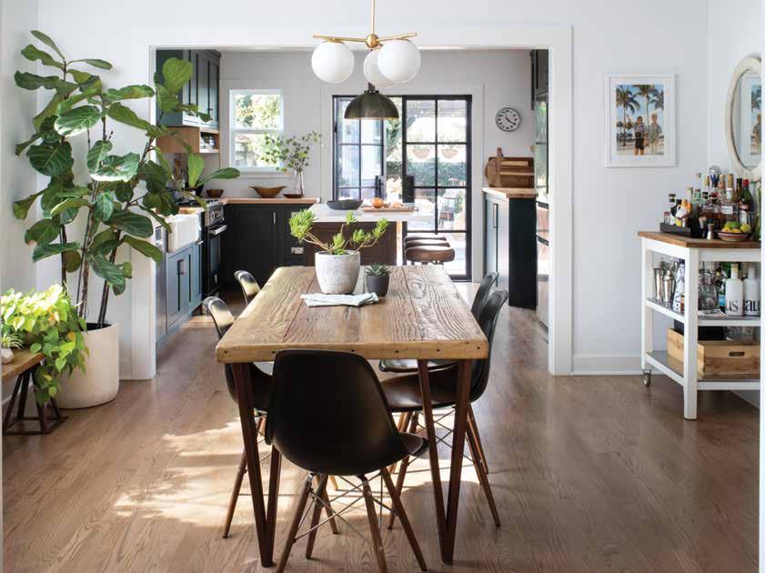
Balance was the name of the game when renovating this gorgeous craftsman-style home. Kelly Martin Interiors took on the challenge of balancing new design features and the home’s original architectural style, along with the homeowners’ distinct preferences. The result: a bold, clean vibe with charming accents.
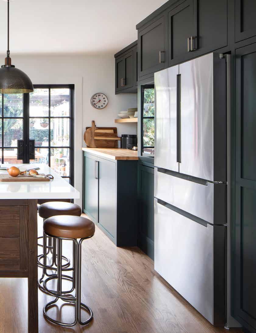
When Kelly Martin first met with the homeowner couple, they had been living in the small craftsmanstyle home for about a year. Their collaboration started out modestly, with an initial plan to redesign the kitchen—which needed a substantial makeover. “The original kitchen was falling apart; it was in terrible shape, including the appliances,” says Martin. “It all needed to be ripped out.”

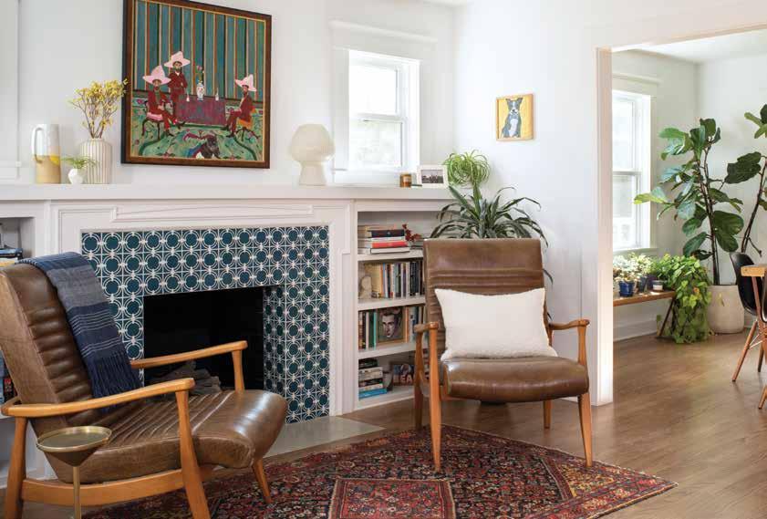
Located in a West Hollywood neighborhood in Los Angeles, the home sits alongside others also steeped in history and character. “It’s now a fun, trendy, walkable area with great restaurants and shopping. It’s urban but still has that quaint neighborhood feeling,” says Martin, who originally started out on the build side of the design industry before opening Kelly Martin Interiors in 2014.
Though the kitchen remained the biggest priority, the project soon expanded into the rest of the home. Martin looked to marry the couple’s distinct tastes while keeping the design elements true to the house’s architectural style. “One person was a bit more classic in what they liked and the other was a bit more industrial in their style,” she says. “Some of the classic, clean elements [represent] half of the couple, while a lot of the iron, more
The earthy chairs perfectly complement the jewel-toned ceramic tile on the fireplace. A vibrant vintage rug grounds the rich colors and pulls the room together.masculine features catered to the other half.”
Because of the nature of the construction and craftsman style, the rooms were starkly divided. The only living space was a tiny living room at the front of the house, with a guest bedroom right beside it. To create a larger living area, they decided to tear down the wall between the two rooms. “They lost a guest room but essentially gained a more casual living space, including a cozy reading nook next to the fireplace,” says Martin.

The overall tone of the project’s design came from an unexpected place: a colorful ceramic dish set. “When we were talking about the design, the couple said, ‘We have these beautiful dishes from our wedding.’ That kind of set the tone because we wanted the design to feel a little bit earthy but also a little bit classic. That was one of the things that inspired me.”

As part of the creative process, Martin looked for ways to improve upon some of the home’s stunning original features. “Generally, I like to take a walk through the house to see what they already have. I tell [the client] to point out what they really love and what they’re embarrassed about,” she says. “From there, I can get a sense of their personality

While backsplash tile remains neutral and timeless, the cabinet color adds a dash of drama. A complementary cookbook nook adds interest as well as a place for favorite recipes and easy-to-find cutting boards.
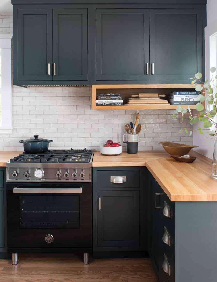
and their lifestyle […] so I can pull things they’ll really love and be excited about.”
Two features they opted to keep: “the boxy, clean, craftsman style to the molding” and iron doors leading onto the back patio, which were previously sliding doors. “The homeowners love the free airflow when the doors are open. They entertain a lot, so we wanted to make sure they still have the [pathway] from the patio to the kitchen,” says Martin. “We preserved the opening but made it better.”
Though they originally wanted a blue kitchen, Martin convinced the couple to consider an alternate color scheme for the focal point of their home, landing on a shade of green. “I think it was really a blessing in disguise, because they ended up being more excited about the deep green,” she laughs. “I wanted to make sure the green we chose had some subtle blue undertones to it, so it did end up a bit more on the cooler side.”

To create a crisp, clean look throughout the home, Martin went with a versatile and clean white for the walls and trim. She gravitated toward bolder, deeper—but grounded—tones for pops of contrast, featured on items like the kitchen cabinetry. “There was some play between the clients and me about how to keep it deep and rich without going too moody,” she says. “The rest of it kind of fell into place because we had to find ways to let that be the anchor and let everything else be kind of airy around it.”
The couple’s taste in art also influenced the process, with the homeowners adorning the walls with several new pieces of artwork, like the commissioned painting above the fireplace. “Art
Natural elements, such as cool stone tile, play happily with warm wood tones and metal bowls.

is very inspiring to me,” says Martin, who also launched her own custom furniture collection, ATELIERxKM, in 2020.
With the design kicking off in winter 2019 and a projected construction start date of March 2020, the team faced an unexpected—and massive—hurdle that ground the project to a halt: the global pandemic. They delayed construction until June 2020 but continued to face supply issues. After many setbacks, the last piece they were waiting on—the range—was finally installed in October 2020.
The couple, who had been living in the house through the construction and the pandemic, breathed “a sigh of relief and excitement” upon the completion of their new home, citing the end result as well worth the wait. “In comparison to what they had before, it was a complete turnaround,” says Martin. “They were so happy to cook and entertain again.”
The homeowners opted to bring the outdoors in and vice versa with lots of vibrant plants and iron doors that prop open leading to the back patio.

The Illinois-based Kate Marker Interiors sought to create an oasis for a busy family. Marking a fresh start for the homeowners, the quaint home can easily fit right in with the rolling hills of the English countryside — even though it’s located on a quiet street in the Chicago suburbs. We’re taking a look at this striking home that seamlessly blends modern and rustic.

After graduating from design school, Kate Marker worked as a merchandiser for several years before deciding to branch out on her own. Beginning her solo journey in an upstairs home office, she has since grown Kate Marker Interiors to a team of about 12, including four designers. Now principal designer, Marker is known for her fresh, timeless looks that uniquely reflect each client’s personality.
One of those clients wanted to make a fresh start in a quaint home on an overlooked corner lot, located on a quiet street in Barrington, a suburb of Chicago. Marker’s team had previously worked with the builder, Grand Traditions Homes, so when the homeowner approached them about the project, they recommended the two join forces.
While the ground hadn’t yet been broken, the floorplan was nearly complete. A large family in tow, the homeowners sought to create a functional space that made everyone feel welcome and considered all of the children’s styles and needs. Their main criteria: functionality for a busy lifestyle.
“They knew they wanted an English style or influence—sort of an old-meets-new [vibe], like it could be a house on the English countryside,” says Marker. “We went with authentic, moodier materials but also a farmhouse-fresh look.”
With no existing architectural elements to preserve, Marker’s team took the opportunity to start from scratch. The homeowners gave them free reign on the design—with some must-haves like a breakfast nook, where they could sit down as a family, and an open family room and kitchen.

A reclaimed wood ceiling breathes history and warmth into an otherwise crisp, clean entryway. Unique light fixtures and a colorful rug add a sense of whimsy to the welcoming space.


To kick off the creative process, the team started planning the plumbing fixtures and cabinet design, looking for inspiration from photos the family shared and possible color palettes. “They wanted darker cabinet colors for a timeless look, as well as brick around the fireplace. They also wanted reclaimed wood on the island, ceiling and in the entryway hall,” says Liisa Gent, design communication manager at Kate Marker Interiors. “We needed to come up with some of those materials and identify the architectural finishes for certain areas.”
The juxtaposition of rustic and modern led to a striking combination of textures and colors. In the kitchen, the team landed on a multidimensional cabinetry color that appears grey in some light, and green in others. “Everyone was all about the white kitchens at this time, so this was a very refreshing and grounding colour. That color, mixed with the wood tones, is a bit masculine but then [it’s paired with] the more feminine counter stools. The lighting fixtures were just the icing on the cake,” says Gent.
The fireplace, too, seamlessly blends the two genres for a refreshing take. “Instead of painting it, we used limewash on the interior and exterior of the brick fireplace. It was more authentic to the actual stone and that way, we could control how much color went on,” says Gent. Tying into the kitchen and reclaimed wood features, the rustic mantle boasts decorations like an antique-looking mirror for a pop of personality. “It’s those final little touches that make a house a home,” Marker adds.

To maintain a classic look, timeless elements were built into the home, including large windows that flood the space with light and stunning stone flooring. The builder also incorporated an “X” motif throughout the interior as well as on the exterior, seen on the window shutters and cabinetry.
“If you choose the right authentic materials, you can bring in pattern in subtle ways and it can still look very timeless,” says Gent. “Having a clean, classic foundation is never going to look dated. You can bring in more personality with the finishings and accessories.”
To that end, the homeowners’ personalities were most exemplified in the dining room, which was driven by their style preferences. “There were formal lines in the table and chairs, whereas they wanted it
While wall colors remain neutral, textiles offer personality in spades.


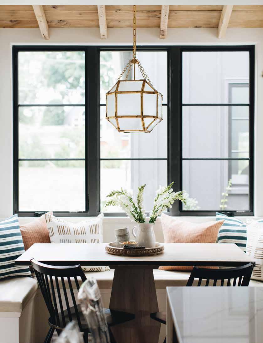
to be more casual in the family room,” says Gent. “Their master bedroom is also softer, muted colors—very relaxing, as they wanted a bit of an oasis—while the rest of the house is a little more saturated.”


For an extremely personal touch, the homeowner chose to incorporate a bird motif to honor and remember a close family member who had passed away. “Birds reminded her of her brother, so she wanted to integrate an homage to him,” says Gent. They applied soft, subtle bird wall coverings in the powder room and found pillows with a bird motif for the master bedroom.
After an 18-month process, the homeowners were thrilled with the end result, the comfortable, accommodating open floor plan meeting their vision. “They were very grateful to have everyone together and a space to call their own. Though it’s an open floor plan, there are kind of quieter, more compartmentalized spaces,” says Gent. “They loved their bedroom the most—it felt like such a sanctuary for them with their busy lifestyles.”
Farmhouse modern meets English countryside in this new build that features timeless landscaping and classic exterior colors.


Design: Tays & Co.
Photography: Spacecrafting Photography
Text: Andrea Danelak
Laura Tays of Tays & Co Design Studios faced a unique ask when designing a new cabin: balance traditional rustic and modern looks for an inviting, retreat-like feel. We’re taking a look at the Minnesota lakefront property that brings the outdoors in—with stunning results.

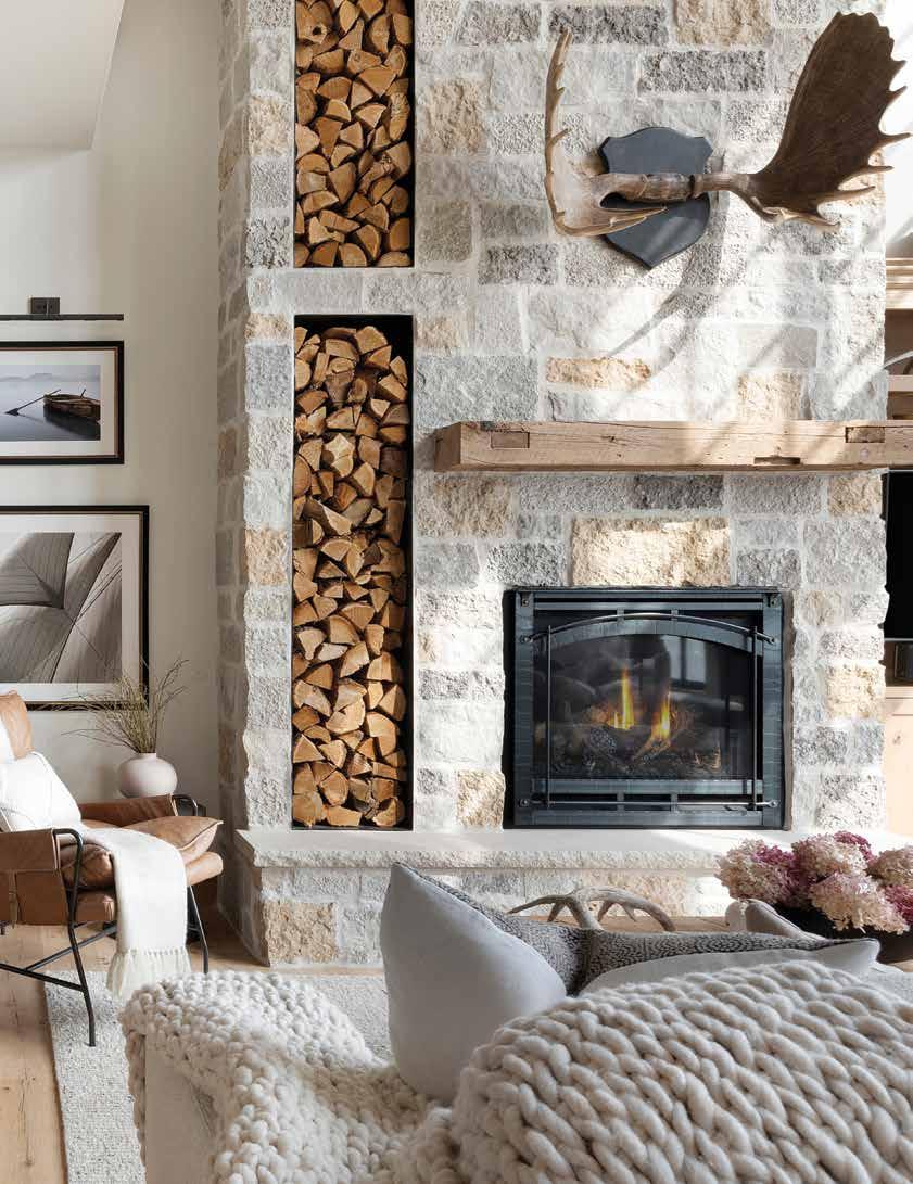
Picture yourself in the early morning, the rising sun peeking out above the tops of the trees. Steaming cup of coffee in hand, you gaze out the window to the expansive lake in front of you, its waves gently crashing against the shore. Thanks to Tays & Co. Design Studios, that’s the reality for one couple, whose collective dream was brought to life by founder and principal designer Laura Tays.
The couple sought to retire to their lakefront property after they made the space their own. “This is their legacy property—their home away from home now that the husband has retired,” says Tays.
Located on a peninsula in Nisswa, Minnesota and surrounded by stunning waterfront views, the property marks a space where the entire family can gather, incorporating the landscape and surrounding elements wherever possible. Next to the main cabin is a property for the couple’s adult children, along with a rambler remodeled as a rental property and a new bar.
“The couple for whom we designed the cabin wanted it to feel like a lake cabin—without getting too literal,” says Tays. “The space is very textural, bringing the outdoors in. It’s warm and cozy but not too busy, with a lot of natural elements throughout the entire house.”
After tearing down the original structure, the owners intended to rebuild to their specific vision on the same lot. Tays took on the challenge of creating a design that was fresh, without feeling like a brand-new home. “A lot of thought went into all of the different elements to make the home feel like it’s been lived in,” she says.
Collaboration with the homeowners marked an integral part of the design process and its ultimate success. The husband-and-wife duo had different visions in terms


Rich textures, classic patterns, and natural organic elements combine to add a warm, inviting, lived-in look to this new build.

of what they wanted to see in the space, so Tays kept the lines of communication open to ensure everyone was on the same page.
“The husband’s original idea was a literal cabin—very rustic—but his wife wanted it to feel a bit more modern. It was really two different styles getting married,” says Tays. “I think that’s what makes the home really unique. It’s also what brought the design to a whole new level when it was all put together.”
Tays incorporated her signature look into the design, integrating wood and stone elements to make the home feel lived-in and warm. The limestone-wrapped pantry in the kitchen—emulating a stone cave that has stood for years, the house simply built around it—is one of her personal favorites. “I always try to design in a way that keeps things fresh but still timeless, which won’t be dated in a few years,” she says. “I lean into design elements that will remain beautiful for years.”
She also stuck to neutral tones and rich textured elements to add to the overall warmth and prevent the home from feeling too stark. “We typically go for organic, natural looks and when you walk into a home, you can just feel it. It feels very elevated and inviting,” she says. “That’s what many people have gravitated toward in recent years—that fresh, light, airy feeling that is also warm and inviting.”
The end result sees the natural elements and textures complement each other for a one-of-a-kind feel. “Everywhere you turn, there’s something unique to see in each space, but it all flows from room to room.”
From the moment they enter the great room, guests are flooded with natural light and a sense of grandeur, thanks to the 10-foot ceilings and open concept design. Reclaimed wood is featured prominently through the home, lending to the
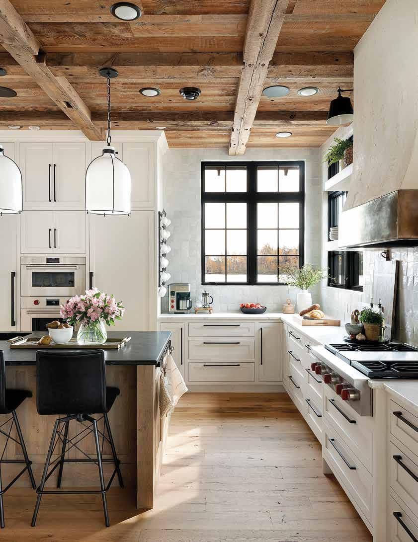
While wall colors remain neutral, countertops, backsplash tile, and flooring offer plenty of personality.


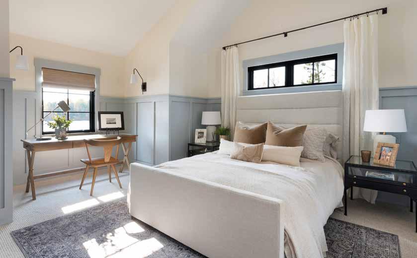

organic feel. A striking feature staircase leads guests to a bonus loft upstairs, adorned with a shou sugi ban accent wall, a Japanese wood-burning technique that adds texture and depth. The home also boasts plenty of spots to cozy up with a book, including a sunroom and reading nooks.

While the design came together beautifully in the end, Tays encountered a few hurdles through the process. Attempting to incorporate the family’s wishes while staying within the property’s physical boundaries proved an interesting—but fun—challenge for the team.
“We had to stay within the same footprint, so there was a bit of struggle to make sure that we still included everything while following the size and capabilities of the space,” she says. Building a two-storey structure allowed for more square footage, which clocks in at just shy of 3,000 square feet. “It’s quite cozy when you’re inside,” adds Tays. “The tall ceilings make it feel bigger than it is.”
This marks Tays’ fifth time working with the same couple, who are thrilled with their new home away from home and are excited to build new memories with their family in the years to come.
“We put our whole hearts and souls into this property,” she says. “Throughout the process, I made sure that all parties were happy, and I feel most proud of that. In the end, the space was representative of both of them and their wishes.”
The two-storey home has plenty of bonus space, including an upstairs loft and sunny reading nooks.

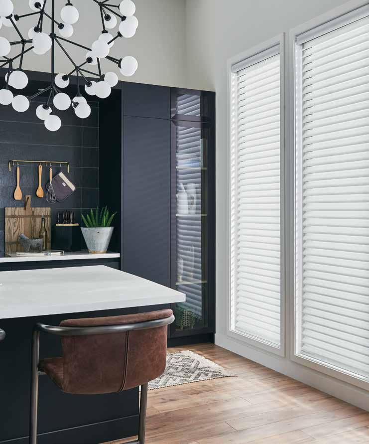
Nothing says chic like rich wood cabinetry and deep stone countertops.
Design: House of One Miami

Photography: Kris Tamburello
Text: Andrea Danelak
Miami-based design firm House of One took on the challenge of reviving a Spanish-style home in the Sunshine State, preserving certain existing elements while introducing striking custom features. We’re taking you on a tour of the completed redesign, which seamlessly blends dramatic and vintage for a result like no other.
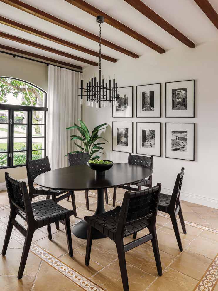
Situated on the desirable North Bay Road enclave in the heart of Miami Beach, this Spanish-style home was already bursting with character when designer Brittany Farinas took on the redesign.


“The architecture of the home was the design inspiration,” says Farinas, chief executive officer and creative director of House of One. The Miami-based design firm specializes in one-of-a-kind, curated luxury residential, hospitality, and commercial categories and has launched several lines in wallcoverings, textiles, and furnishings, some of which have been incorporated into the residence. “Its bones really drove the aesthetics of the interior, material selection, and furnishing.”
In reviewing the floor plan, Farinas decided to honor the existing layout, modifying “50 to 60 percent” of what was in each space and blending contemporary and SpanishMediterranean styles for a moody, yet timeless, aesthetic. As part of their mission to design spaces that tell a story, Farinas and her team preserved some of the home’s original elements like the arches, crown molding, and flooring for a new-meets-old-world Spanish style.
Essentially broken into three different sections, the home features a private master wing, private guest suite, and common areas, such as the kitchen. The master wing marked one of the spaces Farinas most wanted to focus on.

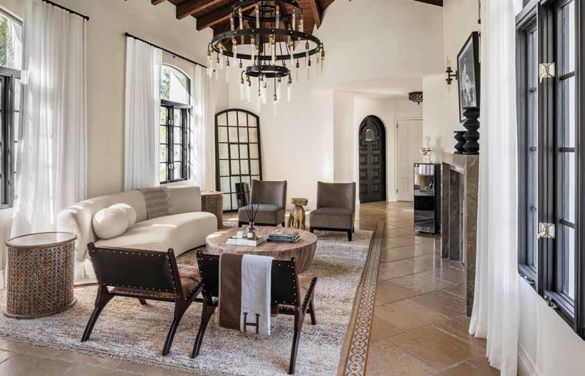
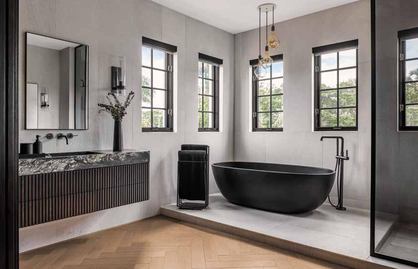
“We knew we wanted to really modernize that space,” says Farinas, who founded House of One over five years ago and now leads a team of five. To that end, she took advantage of an existing pair of structural columns to construct a magnificent double-sided fireplace that separates the main sleeping area from the sitting area, bearing the same romantic theme found in other elements in the home.

Paying homage to the homeowners’ shared passion for art—their collection displayed prominently—Farinas also added a personal touch above the fireplace, enlarging an image of the client and framing it specifically to the space. “We designed the fireplace to be able to hold that piece, and it turned out very well,” she says.
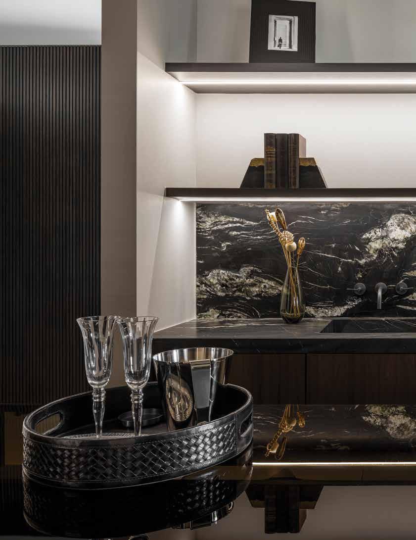
Adding to the dramatic feel, stone features make a statement in several rooms. To play off the vintage rose quartz slabs preserved in the guest washroom, Farinas sourced Calcutta vintage slabs for the kitchen countertops, also creating a custom vanity in the same stone for the powder room.

“Something I really enjoyed was selecting the new stone because I had to pick a stone that looks lived in and vintage, with an older feel,” she says. “These types of stones only apply to a certain aesthetic, and we tried to pick out different materials for a balance of old and new throughout the home.”
Another priority for the redesign was to maintain a sense of continuity and flow from the indoor to outdoor spaces. “We took a lot of the elements from the interior and brought them outside, such as incorporating metal elements from the dining table into the outdoor furniture pieces,” she says.
A spectacular pool sits grandly in the corner lot’s backyard space, a favorite gathering place for visiting friends and family. “Everyone wants to hang out by the pool area,” says Farinas, who brought in a specialist to recreate a floral emblem in mosaic tile for the pool, a motif also embedded into a fountain. “That created such a focal point.”
Prior to beginning the project, Farinas walked through the space with the homeowners as part of her usual design process. “I like to talk about the clients’ plans for the house—how they will use it, whether it will be their forever home and so on,” she says. “I also hone in on anything they are unhappy with in the current design to understand them better. I want them to have a say about every single space.”
Farinas prides herself on developing close relationships with her clients, encouraging them to become creative collaborators to make the space their own. “We really focus on a bespoke design experience and on creating custom pieces like lighting and furniture for our clients,” she says. “They’ll receive the VIP service no matter the scope of the project. We want to give them a turnkey product.”
Given the age of the home, which was built nearly a century ago, Farinas and the homeowners knew they might encounter some surprises along the way. “We found some restrictions in terms of electrical and plumbing, but we knew coming in that would likely happen,” she recalls. “It’s very common for us—you can’t really anticipate what you’re going to find [in older homes].”
The added hurdles, however, didn’t delay the project. From initial conception through completion, the project took about eight months, with the homeowners eager to resume entertaining in their refreshed space.


“They were absolutely in love with it,” says Farinas. “The pool was the number one thing because it was such a transformation from what was originally there. It’s a great property and a one-ofa-kind project.”
Art is a simple yet sophisticated way to add a stunning elegance and personal flair to any room.
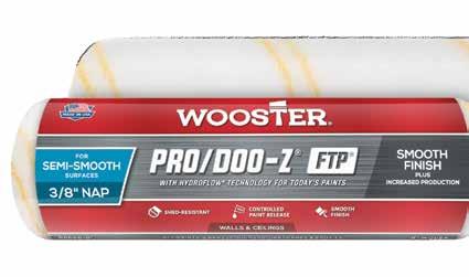
Achieve the look you want with Pro/Doo-Z® FTP ®. Its premium, woven fabric provides increased production with better paint flow in today’s paints and delivers a smooth, lint-free finish. When results matter, trust them to Wooster ® .
We Take Pride In Your Results TM

Recipes & Food Styling: Marisa Curatolo
Photography: Brian Johnson
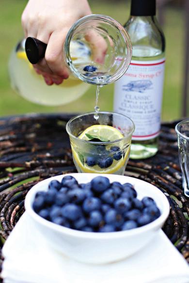
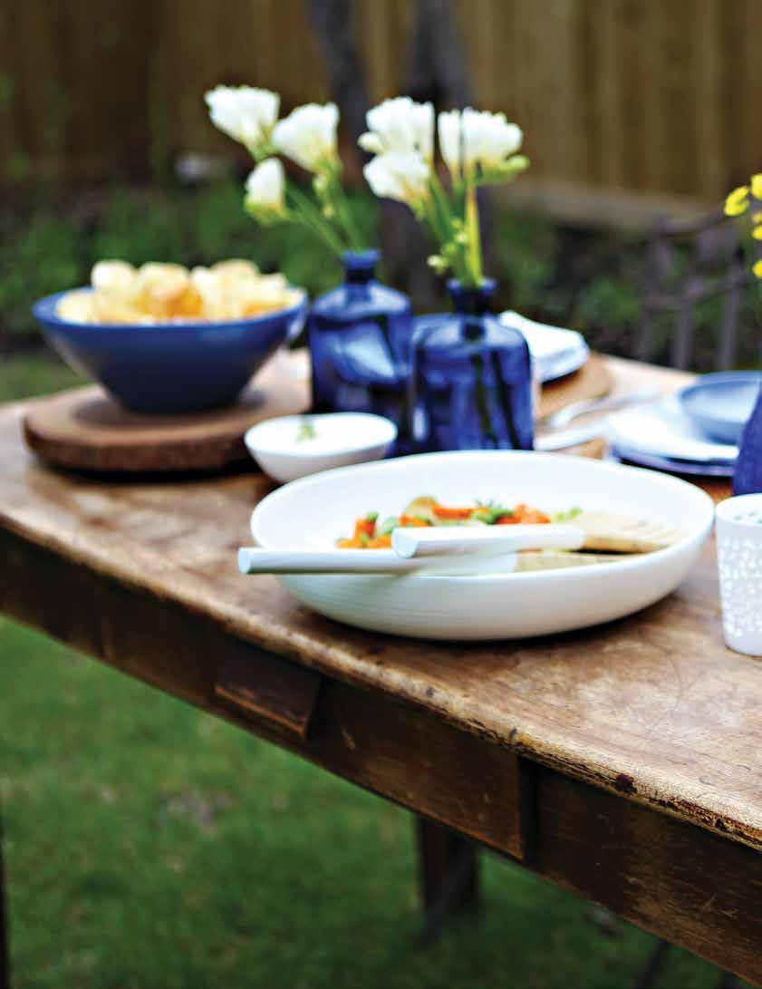
Backyard summer dining steps up to the grownups table with gourmet twists on standard summer fare.

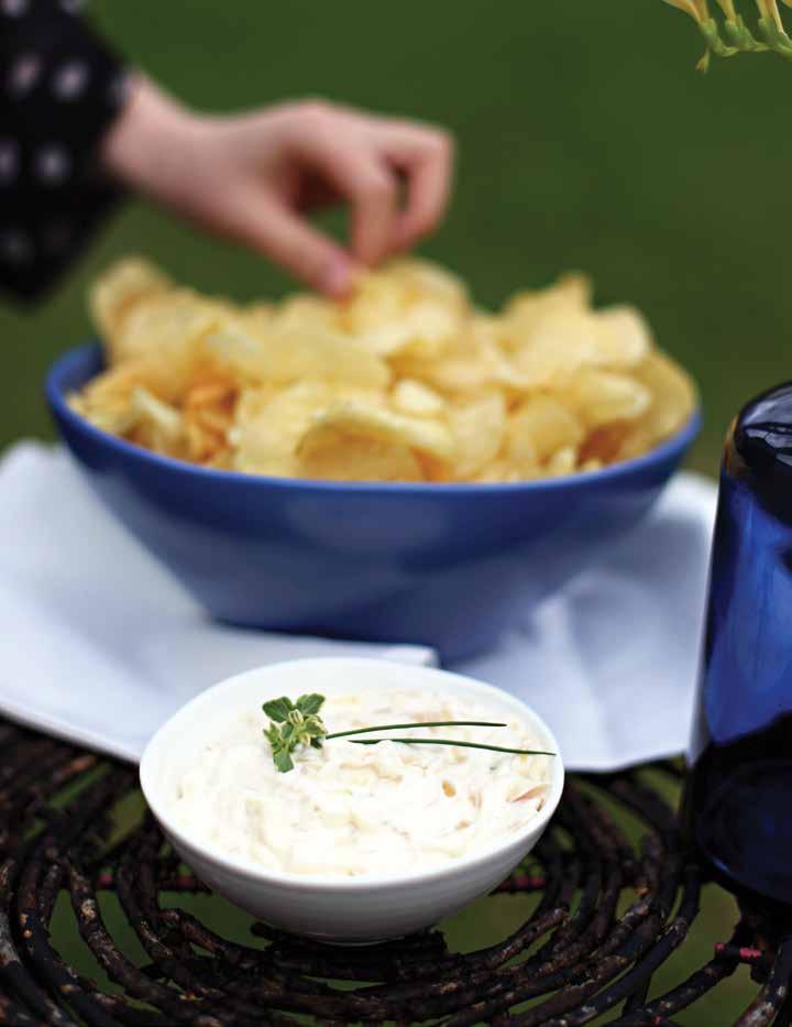
three onion dip
Makes 1½ cups
2 tablespoons olive oil
1 medium white onion, chopped
1 tablespoon minced shallot
½ cup sour cream
½ cup mayonnaise
1 teaspoon fresh lemon juice
¼ teaspoon Worcestershire sauce
Coarse salt and freshly ground pepper, to taste
1 tablespoon finely chopped chives
In large skillet, heat olive oil over medium-low heat. Add onions and shallot; cook until onions are very soft and golden, about 25 to 30 minutes. Remove from heat and cool slightly.
In small bowl, combine sour cream, mayonnaise, lemon juice, and Worcestershire sauce. Add cooked onions and mix well. Season with salt and pepper. Sprinkle with chives, serve with kettle style chips.
roasted yams , brussels sprouts and edamame salad
Serves 6 to 8
1 medium yam (about 2 cups), peeled and cubed
2 tablespoons olive oil
Coarse salt and pepper, to taste
1 cup Brussels sprouts, trimmed and halved
1 leek, white top only, sliced
1 cup shelled frozen edamame
2 teaspoons fresh oregano leaves
maple lime dressing
2 tablespoons maple syrup
1 tablespoon fresh lime juice
1 tablespoon cider vinegar
2 tablespoons extra virgin olive oil
1 teaspoon Dijon
1/8 teaspoon salt
Preheat oven to 400°F.
For dressing, in small bowl, whisk together all ingredients: set aside.
Add color to your outdoor dining table with vibrant roasted yams, brussels sprouts, and edamame.

For salad, toss yams with 1 tablespoon olive oil in small bowl. Spread on parchment-lined baking sheet. Season with salt and pepper and roast 20 to 25 minutes or until tender.
In same bowl, toss Brussels sprouts and leeks with remaining 2 tablespoons olive oil; season with salt and pepper. Arrange on another parchment lined baking sheet. Roast, tossing occasionally, until sprouts are
tender, about 15 to 20 minutes.
Meanwhile, bring small pot of water to boil, add edamame and cook 3 minutes, drain and rinse under cold water: set aside.
To assemble salad, mix together yams, sprouts, leeks, and edamame. In a large bowl, toss with dressing and sprinkle with oregano.
pulled pork with chipotle aioli and barbecue sauce
Serves 8
1 teaspoon ground paprika
1 teaspoon ground chili powder
1 tablespoon ground cumin
2 tablespoons dark brown sugar
1 teaspoon freshly ground pepper and sea salt
1 (3 to 4 lb) boneless pork butt (shoulder) roast
1 recipe barbecue sauce (see below)
1 recipe chipotle aioli (see below)
8 soft rolls
Mix together paprika, chili powder, cumin, sugar, salt, and pepper. Rub pork all over with spice mixture. Refrigerate at least 3 hours or overnight.
Preheat one burner of a two burner barbecue to high; reduce to medium. Temperature should read 250°F to 300°F. Place pork on oiled grill over unlit burner. Close lid and cook pork for 3 to 4 hours and until meat thermometer reads 160°F.
Transfer to cutting board, tent with foil and let stand 20 minutes. Using two forks, pull pork into shreds; place in bowl. Warm sauce and pour 1 to 1 ½ cups over meat; toss to coat. Serve on buns with remaining sauce and chipotle aioli.

chipotle aioli
¾ cup mayonnaise
1 tablespoons extra virgin olive oil
2 tablespoons chipotle peppers, chopped
Mix together in small bowl. Cover and chill.

Makes 3½ cups
2 tablespoons canola oil
2 cloves garlic, minced
1 small onion, finely chopped
2 cups canned diced tomatoes
1 cup ketchup
1 teaspoon ground cumin
½ teaspoon paprika
1 teaspoon Worcestershire sauce
1 tablespoon molasses
1 tablespoon cider vinegar
1 tablespoon Dijon mustard
2 tablespoons brown sugar
1 teaspoons coarse salt
Heat oil in medium saucepan over low heat. Add garlic and onion; cook until fragrant, about 5 minutes. Add rest of ingredients. Bring to boil. Reduce to simmer and cook, uncovered, for 20 to 25 minutes, stirring occasionally. Remove from heat and let cool. With handheld blender, blend sauce until smooth. Store in refrigerator up to two weeks.
planning is key
A successful gathering starts with simple, delicious food, a casual and warm atmosphere, and a pretty table set with fresh flowers. Spend some time organizing yourself the day before. Even if it’s just pasta and salad, a little planning will make the event/party go smoothly. I like to keep a small journal where I write down the menu, shopping list and serving pieces I will use. By keeping notes in one place, it allows me to check off lists. Your iPhone works great too, and you can take pictures of items you may want to purchase.
Hosting a great dinner party has more to do with creating a warm, and welcoming environment and having fun with your guests than an overdone table and lavish food.
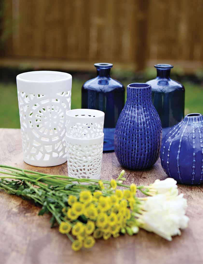
Pick a color scheme. We chose blue and white with a hint of lavender. A good rule to remember is more than two or three colors can make the look busy.
Melamine plates are inexpensive and a great addition to the summer table. There is no need to worry about breakage and they are great to use in a picnic setting.
Rattan chargers or fabric placemats add texture and color.

1. Melamine plates, rattan chargers, white cotton napkins, cutlery
2. Candle holders, colored vases, monochromatic flowers
3. Ceramic and wooden bowls, salad tongs
Wooden cutting boards, lacquer tray, carafe, and glasses.
Pick a signature cocktail and mix it in a decanter or carafe. Fill bowls with lemon slices or fresh fruit. Offer a choice of one red, and one white wine to guests.
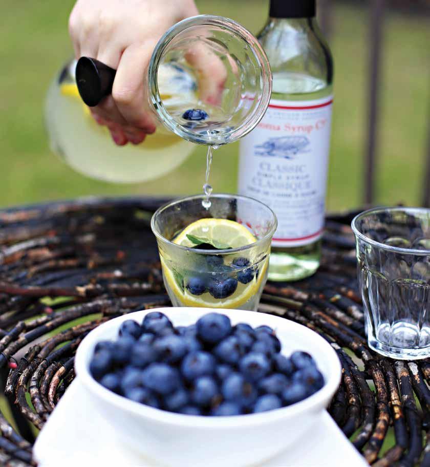
Try to have dishes that can be made ahead. Our pulled pork on a bun with chipotle aioli is perfect to feed a crowd. Leftovers can be wrapped and frozen for a quick weekday meal.
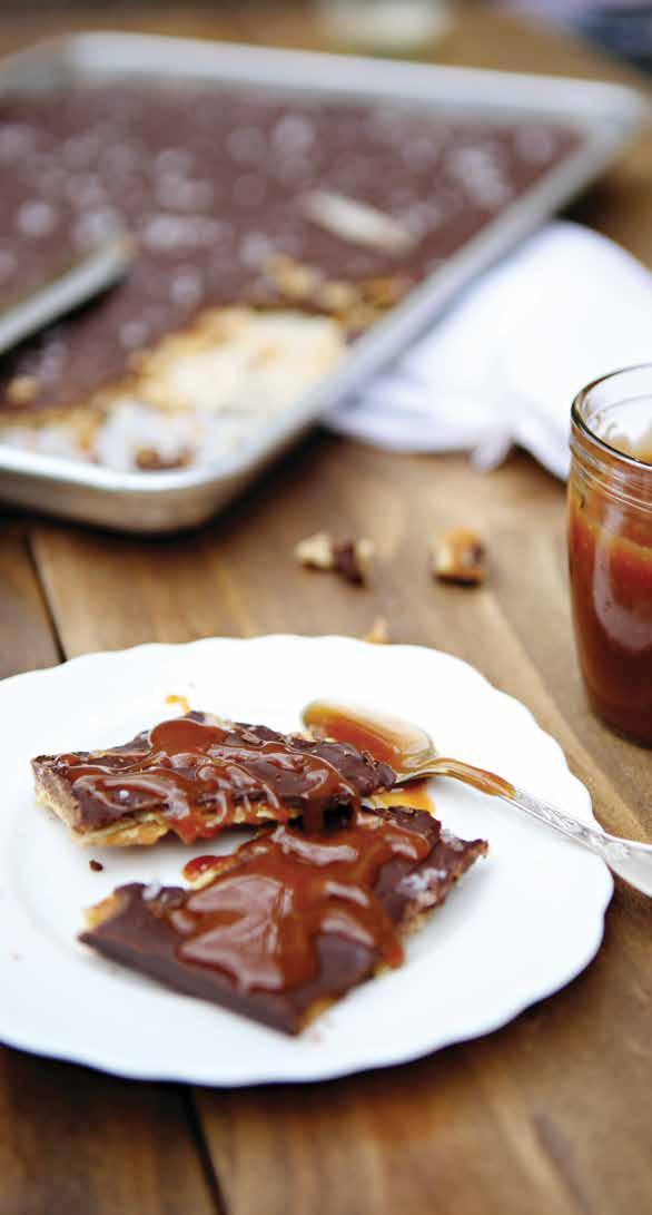
toffee chocolate
bark with caramel sauce
Serves 10
40 saltine crackers
1 cup unsalted butter
1 cup brown sugar
3 cups semi sweet chocolate chips
2 tablespoons French sea salt
Caramel sauce
½ cup sugar
¼ cup water
½ cup 35% cream
2 Tablespoons unsalted butter
In a small heavy bottom saucepan, heat sugar and water over medium-low heat until goldenbrown, stirring constantly with wooden spoon. Remove from heat and slowly add cream and butter (mixture may seize up). Return to heat and stir until smooth, about 2 minutes. Mixture will thicken as it cools.
Preheat oven to 400°F. Line cookie sheet with parchment paper and arrange crackers in single layer. Make sure pan is filled.
In medium saucepan, combine sugar and butter. Bring to boil and cook for 3 minutes. Remove from heat and pour over crackers.
Bake for 5 to 6 minutes. Remove from oven and sprinkle chocolate chips over top. Return baking sheet to oven for 3 to 4 minutes.
Spread melted chocolate evenly over crackers and sprinkle with French sea salt.
Let cool in refrigerator 1 hour or overnight. Break chocolate into pieces. Serve with caramel sauce.

Pack your bags, rent a convertible, and get ready to smell the ocean air, eat all the seafood, and experience everything that makes the Pacific Coast Highway one of the most iconic road trip routes in the world. From dipping your toes into the picturesque waters of Lake Crescent south of Seattle, to taking in the endless splendor of the Pacific Ocean, to lying on the surf-side beaches of Orange County, California, consider your itinerary complete.

While the stretch from Dana Point in Southern California up to Mendocino County is considered the official route, many travelers take in the incredible sights along the entire length of the Pacific Coast Highway – all 1,700 miles from Seattle, Washington down to San Diego, California.
It may be difficult to decide on your starting point, however, if you’re driving southbound, you’ll likely be escaping some rain in Washington and trading it for the warmth and sun of California. Plus, heading this direction will ensure you’re on the right-hand side of the road, an optimal spot for taking in the view of the coast.
When thinking about an ideal road trip, you probably imagine the tunes blaring, top down or sunroof open, and the wind in your hair. For weather that is conducive for Instagram-worthy Thelma & Louise-style posts, plan to drive between June and September so you have lots of sun during the daytime and stunning sunsets in the evening.
A road trip is just as much about the journey as it is the destination. So, stop and smell the roses, sip Starbucks, and soak in everything the sojourn has to offer. These are our top stops along the Pacific Coast Highway.



Before hitting the open road of the Pacific Coast Highway, make your first stop outside of Port Angeles at Lake Crescent and take in the grandeur of Olympic National Park. For those extra adventurous, hike the majestic Mount Storm King Trail and experience the amazing views of the Olympic Peninsula.
Road trip tip: Swing by and check out Sol Duc Falls, a short trail that leads to one of the most stunning waterfalls in Washington state. It’s a small detour on your way to Highway 101, but highly worth it.

Eat your weight in seafood in this quaint little town on the Washington coast. While relaxing is the name of the game in this laidback beach town, activities abound. Choose from horseback riding, kite flying, or exploring the canals on paddleboard or kayak.
Road trip tip: Save room for sweet treats at Murphy’s Candy & Ice Cream Shop. Murphy’s offers more than 30 flavors of homemade ice cream and lots of fun taffy and candy.
This foaming collapsed sea cave is one of the many natural wonders along the Oregon coast. A cavernous rock formation, the ceiling of the cave collapsed, likely due to the forceful waves of the persistent Pacific Ocean, leaving this popular and impressive phenomenon. The rock formation is too good to be missed, and easily accessible from Highway 101. Take the Devil’s Punchbowl Trail, an easy 0.8-mile trek from the parking lot to the viewing area to watch the tide rush in and out of this exposed crater.

Road trip tip: Keep your eyes peeled for whales who often come offshore to feed.
SAMUEL H. BOARDMAN STATE SCENIC CORRIDOR, OREGON

Cliffside views, secluded beaches, and sand dunes are on full display at Samuel H. Boardman State Scenic Corridor in southwestern Oregon. Stop and experience the splendor of the waves as they crash into the dramatic offshore rock formations. Road trip tip: Schedule your pitstop during the latter part of the day so you can watch the sun dip down into the Pacific Ocean to fully appreciate this magical location.
HUMBOLDT REDWOODS STATE PARK, CALIFORNIA
Drive through the Avenue of Giants, a 31-mile stretch of road through the dense redwood forest. The Humboldt Redwoods State Park features some of the oldest and tallest redwood trees in the world – up to 1,800 years old and 25 stories high – that have tunnels carved out of the trunks.

Road trip tip: Tunnel through the Chandelier Drive-Thru Tree in Leggett, California.
GOLDEN GATE BRIDGE, SAN FRANCISCO, CALIFORNIA
If you’ve never driven over the world-famous Golden Gate Bridge or seen the iconic orange structure, join the more than 10 million visitors a year that add it to their itinerary. The tremendous 746-foot-tall towers and sweeping main cables can be viewed by car, bike, tour, or by hiking along one of the many trails across the bay in the Golden Gate National Recreation Area.
Road trip tip: For history buffs, free walking bridge tours are offered twice weekly (Thursdays and Sundays) by San Francisco City Guides, a non-profit organization associated with the San Francisco Public Library.


Navigation App - In addition to a good paper map, a navigation app will help keep you on the right track. It also comes in handy when you need gas, a rest stop, or some good grub.
Questions & Card Games - A little silence can be good, but when things get a bit too boring, have a list of random road trip questions to get the conversation going. You might want to throw a pack of cards into the glove compartment just in case you are stopped in traffic and have some time to waste.
Car Charger & Batteries - Keep your phone, laptop, and tech gear charged and ready for capturing every moment and connecting with people home and afar.
First Aid Kit - Pack everything from Band-Aids and headache meds to vitamins and ointment.

To understand what is so special about Big Sur, schedule a full day at this national treasure and immerse yourself in the rugged and mountainous section of the Central Coast of California. This landmark boasts idyllic coastlines, an undeveloped stretch of road, beautiful bridges, and 5,000-foot mountains rising up from the Pacific Ocean.
Road trip tip: After navigating the narrow, twisting, and probably packed drive along Highway 1, stop for a cold drink and enjoy the captivating views at one of the very few restaurants along your route.


Join the beautiful people, sunshine lovers, and surfers at this hip and hot spot just south of Los Angeles. After a long drive, you’ll be ready to play and splash in some of the best beaches in the OC. Capture postcard worthy pictures at Crystal Cove State Beach or take a dip at Corona Del Mar State Beach. While sunbathing, you can watch the yachts pull in and out of the harbor. Hoping to see some surfing? Across the harbor entrance from Corona Del Mar State Beach is The Wedge, a famous surf spot known for waves that tower up to 30 feet.
Road trip tip: If you’re on the south end of Crystal Cove State Park, get in line for the Shake Shack, a fun cliffside restaurant with the best views around and the tastiest milkshakes in town.
Top your road trip off with a visit to the infamous San Diego Zoo. From cheetahs and chimpanzees to penguins and pandas, view more than 650 species of animals in Balboa Park.

Road trip tip: In addition to the wonderful wildlife, the zoo is also home to a botanical garden, with more than 700,000 individual plants. It’s a stunning send off to an unforgettable journey.
Podcasts & Playlists - If you’ve ever searched through static trying to find a good radio station, you know how important it is to have a few of your favorite tunes downloaded. Not only does music keep your mood light, but the songs will be attached to meaningful memories down the road.
Headphones - When he wants to listen to the game and you need a bit of Adele, slip on your headphones, and say hello to a bit of space for yourself. Some higher-end headphones have noise canceling capabilities if you’d rather opt for peace and quiet.
Anything to Keep Comfortable - It’s a long drive, so comfort is key. Bring a cozy blanket, a neck pillow, and clothes that are breathable and stretchy.
Snacks - Nobody wants a hangry passenger. Load up on all your favorite and filling foods, including fresh fruit, nuts, and lots of water. Save the sweet and savory snacks for when you stop to stretch your legs and fill your stomach along the way.
Travel Mugs - Bring a thermos or travel mug that can keep your coffee warm and use it instead of disposable cups from gas stations and restaurants.
Emergency Car Kit - Be prepared for any situation on the road with items like a flashlight, jumper cables, oil, and antifreeze.
No road trip would be complete without tasting the culinary offerings of the countryside. Make reservations and come with an empty stomach to the following establishments.

COASTAL KITCHEN IN DANA POINT, CA
Come for: The broad menu
Stay for: Jumbo lump crab cakes
PACIFIC COAST GRILL IN CARDIFF, CA
Come for: The ocean view
Stay for: Fresh sushi
BANDERA IN CORONA DEL MAR, CA
Come for: The massive wood-fired rotisserie
Stay for: The chicken
MARCHE MODERNE IN NEWPORT BEACH, CA
Come for: The Michelin stars
Stay for: Coq au vin
CAPTAIN JACK’S SUNSET BEACH IN SEAL BEACH, CA
Come for: The unlimited sides (salad, rice, & bread)
Stay for: Surf & turf combo with loaded baked potato
NOBU MALIBU IN MALIBU, CA
Come for: The celebrity sightings
Stay for: Wagyu steak
SEA SHANTY IN CAYUCOS, CA
Come for: The kitschy, vintage atmosphere
Stay for: The Shanty Pie, a mint chocolate chip ice cream pie with hot fudge & a chocolate cookie crust
WHALE WATCHER’S CAFE IN BIG SUR, CA
Come for: The glimpses of gray whales Stay for: The shrimp scampi
BRIDGEWATER BISTRO IN ASTORIA, OR
Come for: The waterfront view under cute, covered pods
Stay for: The curried clam & mussel chowder
Design: Crystal Blackshaw
Photography: Dustin Halleck
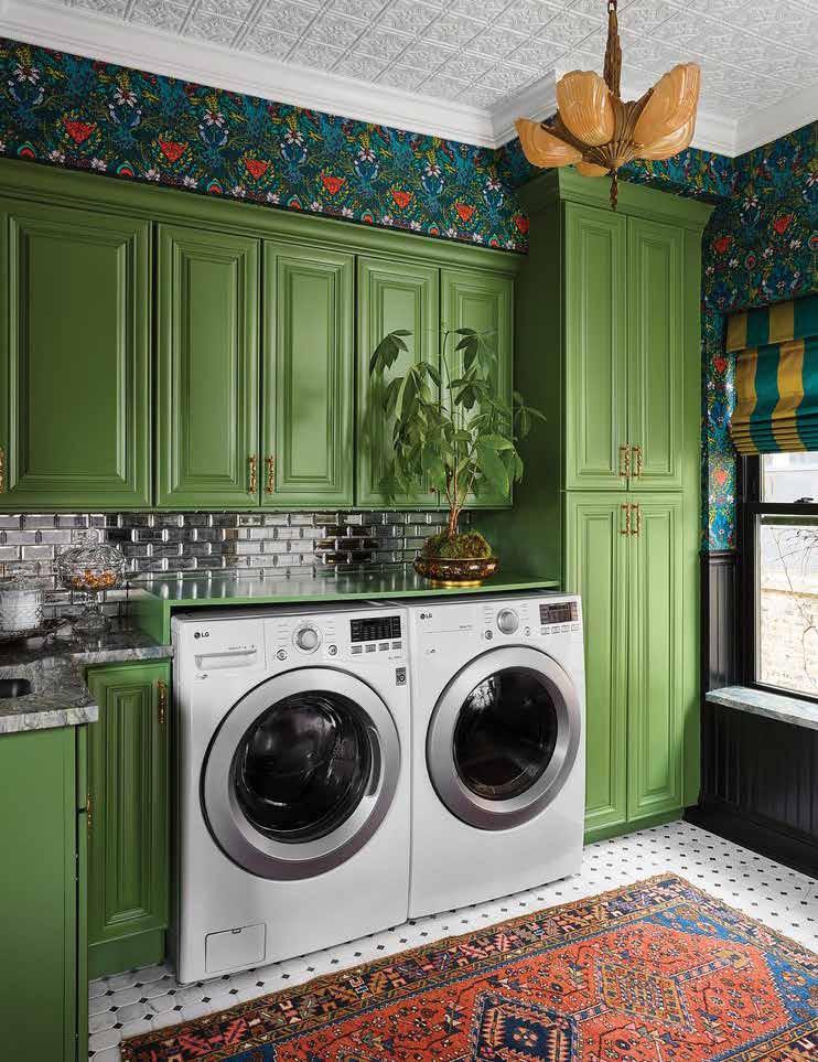
Laundry rooms are often ignored when it comes to tackling clutter and creating an organized space. They tend to be one cup chaos with a pinch of catch-all, lost socks, lint bunnies, and emergency cash pulled from the pockets of an unlucky family member. Considering the amount of time you spend doing the laundry, leveling up your space will make this chore more bearable. Try some of these tips to tidy and organize your laundry room so that some of those lost socks might meet up with their onceforgotten mate.
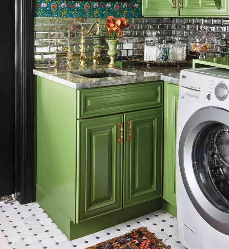
1. Put up a pegboard. Utilizing wall space for ironing boards, drying racks, mops, and irons gets them off surfaces or the floor and in a place where they will always be an arm-reach away.
2. Assign a ‘put-away’ basket to each family member with strict instructions that once complete, the basket must make its way back to the laundry room for the next batch.
3. Install a folding station. Not only will this help you corral clutter, but it provides a perch to match, fold, and stack those freshly tumbled items.
4. Hang a drying rod for your delicate items or workout clothes. Accordion racks are cumbersome and can be a hassle. Consider putting delicate items right on their hangers and leaving them to dry in your laundry room overnight.
5. Add some art. Give this functional room a bit of flair with art that makes your space as stylish as it is useful. Play around with patterns, color or any print that gives you either peace of mind or a bit of pep in your step as you toss items from one machine to the next.

Laundry rooms don’t need to look like a minimalist haven but spending some time creating a functional and organized space will breathe new life into the never-ending chore of separating, matching, and folding.
TOSS PRODUCTS THAT ARE SMALL INTO EASY-TO-GRAB STORAGE CONTAINERS THAT COMPLEMENT THE OVERALL LOOK AND FEEL OF THE ROOM. DISPLAY THINGS LIKE LAUNDRY PODS, CLOSE PINS AND DRYER SHEETS IN CLEAR CONTAINERS, COLORFUL CANISTERS, BEAUTIFUL BOWLS OR ON TRENDY TRAYS.
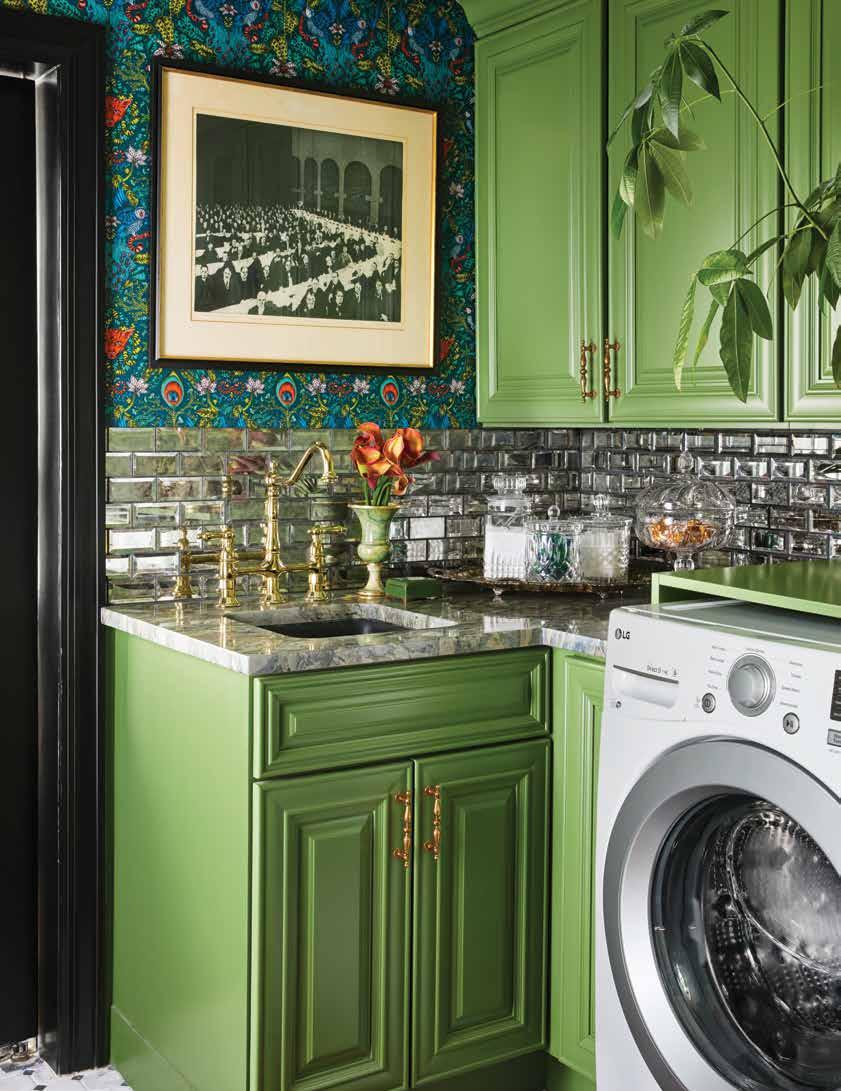
ADD LIFE TO YOUR LAUNDRY ROOM WITH ART CURATED ESPECIALLY FOR THE SPACE. A PUNCHY BLACK AND WHITE PRINT THAT FEATURES WASHING SYMBOLS, OR A BOLD COLORFUL GRAPHIC PIECE IS AN APPROPRIATE WAY TO ADD INTEREST, AND EVEN HUMOR, TO THE WALLS. OR INCORPORATE SOMETHING MORE UNCONVENTIONAL AND HANG AN ANTIQUE WASHBOARD. DON’T FORGET TO SET SOME FRESH FLORALS ON THE COUNTER OR A PLANT ON THE WINDOW SILL FOR THAT FINISHING TOUCH.

Sure, it’s a small space that not many people, especially guests, enter. So why not have some fun? Don’t shy away from color and patterngo bold and let your personality shine!
• Make yourself smile while doing household chores with cheery wallpaper that boosts your mood.
• Go bold with a geometric or mosaic patterned tile, a vintage throw rug over a classic floor, or a playful backsplash.
• Use a pop of paint on your cabinets. It’s not the kitchen so no need to be practical - energize your laundry room with a flashy fuchsia, an earthy green, or a beachy blue.
• Have fun with fabric. Use patterns and prints to add an element of interest to your small space. Drapes for the window or a fabric skirt for a sink or open shelf covers the clutter and infuses personality.
• Showcase your style with hardware that makes you smile. Just like jewelry you wear, the knobs, pulls, hooks, hangers, faucets – basically all the bits and baubles – can elevate the space and make it shine.

YES to READY SEAL means

NO laps, runs or streaks
NO backbrushing required
NO cracking or chipping
NO flaking or peeling
NO temperature restrictions
The professional’s choice for paint and drywall tools











• Innovation developed from real world needs

Innovation developed from real world needs
Setting the quality standards for the industry
• Family owned and industry leader since 1927
Committed to providing outstanding products, value and service

• Commited to providing outstanding products, value and service


 WOOD STAIN & SEALER


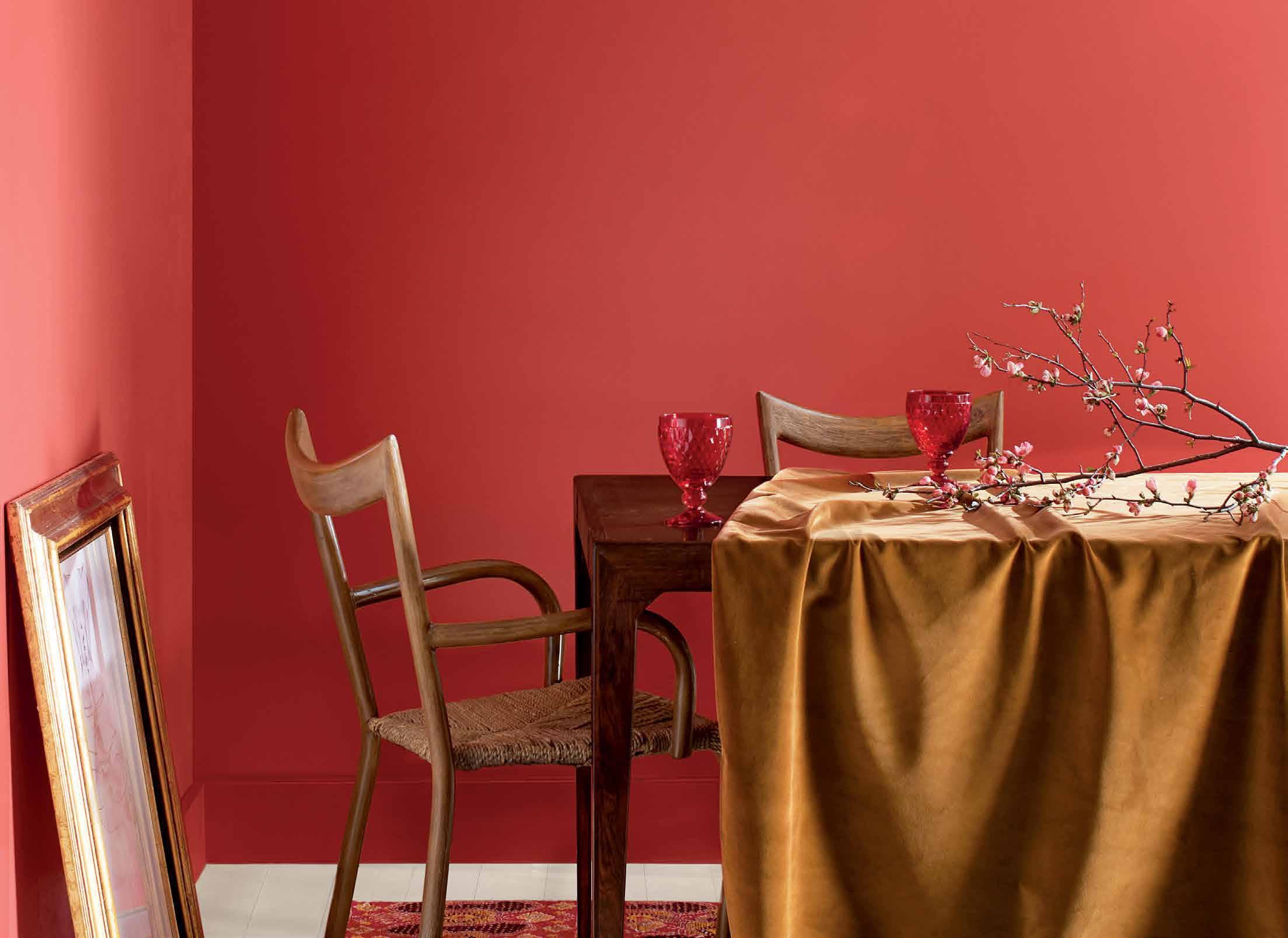
Joie de Vivre
A vivacious shade of coral tinged with pink, Raspberry Blush enlivens the senses with an electric optimism.

Our Color Trends 2023 palette was chosen for its distinct presence and personality. Each of these eight confident hues offer inspiration and creativity, while encouraging a push beyond the traditional to experience truly exceptional color.
Bring individuality to your space and discover the transformative power of paint with sumptuous hues inspired by the bold strokes of modern art, the natural changes that occur in metal overtime, and the desire to express ourselves through color.
Wenge AF-180 Wengé Wengé Conch Shell 052 Caracola Marina Tofino Sunset CC-156 Crépuscule de Tofino North Sea Green 2053-30 Verde del Mar del Norte Vert de la Mer du Nord Cinnamon 2174-20 Canela Cannelle Raspberry Blush 2008-30 Colorete Frambuesa Tourbillon de Framboises Starry Night Blue 2067-20 Azul de Noche Estrellada Bleu Nuit ÉtoiléeA deep chocolate with hints of brown, black, and violet in its undertone, this enigmatic hue combines both comfort and drama. Warm and engaging, Wenge is ideal for amping up saturation in rooms with predominantly neutral walls or bringing balance to a space with a lot of color.

STAIRS
PARED
ESCALERA
MUR
ESCALIER
WALL: Wenge AF-180
PARED: Wengé AF-180
MUR : Wengé AF-180
Soft and ethereal, this light purple is grounded by a drop of gray. It emanates a soft spiritual sensibility, leaning into the softer side of our Color Trends 2023 palette. Appearing both gray and lavender, depending on the lighting, infuse a touch of color into any space with this engaging hue.

TRIM
PAREDES:
MARCO
RIGHT WALL: New Age 1444 & CEILING: White Heron OC-57 DERECHA: Nueva Era 1444 Y TECHO: Blanco Garza OC-57 DE DROITE : Nouvel Âge 1444 ET PLAFOND : Blanc Tourterelle OC-57 WALLS: New Age 1444 & CEILING BEAMS: White Heron OC-57 Nueva Era 1444 Y VIGAS DEL TECHO: Blanco Garza OC-57 MURS : Nouvel Âge 14442053-30
Sink into this saturated shade, which blends the relaxing vibes of gray-blue hues and the simmering pleasure of blue-green. Engaging and deep, this soothing teal has a delicate gray undertone that enrichens this moody hue.

Cinnamon
2174-20
A rich brown touched by orange undertones, this warm hue will have you questioning the very definition of a neutral. Cinnamon is an excellent bridge between neutrals and more saturated shades. If you find you’re looking for a bolder neutral, or a more neutral hue that still feels like a focal point, Cinnamon is the spice for you.
 WALLS: Cinnamon 2174-20
CEILING: Etiquette AF-50
BOOKSHELF: White Heron OC-57
PAREDES: Canela 2174-20
TECHO: Etiqueta AF-50
ESTANTERÍA: Blanco Garza OC-57
MURS : Cannelle 2174-20
PLAFOND : Étiquette AF-50
BIBLIOTHÈQUE : Blanc Tourterelle OC-57
WALLS: Cinnamon 2174-20
PAREDES: Canela 2174-20
MURS : Cannelle 2174-20
WALLS, CEILING & TRIM: North Sea Green 2053-30
RIGHT WALL & WINDOW TRIM: White Heron OC-57
PAREDES, TECHO Y MARCO: Verde del Mar del Norte 2053-30
PARED DERECHA Y MARCO DE LA VENTANA: Blanco Garza OC-57
MURS, PLAFOND ET MOULURES : Vert de la Mer du Nord 2053-30
MUR DE DROITE ET MOULURES DE FENÊTRE : Blanc Tourterelle OC-57
WALLS: Cinnamon 2174-20
CEILING: Etiquette AF-50
BOOKSHELF: White Heron OC-57
PAREDES: Canela 2174-20
TECHO: Etiqueta AF-50
ESTANTERÍA: Blanco Garza OC-57
MURS : Cannelle 2174-20
PLAFOND : Étiquette AF-50
BIBLIOTHÈQUE : Blanc Tourterelle OC-57
WALLS: Cinnamon 2174-20
PAREDES: Canela 2174-20
MURS : Cannelle 2174-20
WALLS, CEILING & TRIM: North Sea Green 2053-30
RIGHT WALL & WINDOW TRIM: White Heron OC-57
PAREDES, TECHO Y MARCO: Verde del Mar del Norte 2053-30
PARED DERECHA Y MARCO DE LA VENTANA: Blanco Garza OC-57
MURS, PLAFOND ET MOULURES : Vert de la Mer du Nord 2053-30
MUR DE DROITE ET MOULURES DE FENÊTRE : Blanc Tourterelle OC-57
2067-20
BEDROOM WALL: North Sea Green 2053-30

FAR WALL: Savannah Green 2150-30

CEILING: White Heron OC-57
PARED DE LA HABITACIÓN: Verde del Mar del Norte 2053-30
PARED LEJANA: Verde de Savannah 2150-30
TECHO: Blanco Garza OC-57
MUR DE LA CHAMBRE : Vert de la Mer du Nord 2053-30
MUR DU FOND : Vert Savane 2150-30
PLAFOND : Blanc Tourterelle OC-57
A radiant navy akin to the dark indigo of dusk, this inky color breathes romance into any space. Depth and dimension define walls painted in Starry Night Blue, a captivating hue with just a touch of violet in its undertone.

WALLS: Starry Night Blue 2067-20
PAREDES: Azul de Noche Estrellada 2067-20
MURS : Bleu Nuit Étoilée 2067-20
A gentle pink reminiscent of sepia tone, this dusty hue brings to mind thoughts of dusk captured by a vintage film camera. Tofino Sunset may bring a blush to your space, but this hue is not shy. This comforting color balances out the bold vibes of this palette, appearing almost neutral alongside such striking shades.

A rich ochre, yellow and green undertones balance out this unique hue. Similar to gold leaf for your walls, Savannah Green is a statement-making shade that plays well with neutrals and saturated hues. Offering both whimsy and drama, explore higher sheens for a lustrous take on this sprightly color.

Raspberry Blush 2008-30
Colorete Frambuesa
Tourbillon de Framboises
Starry Night Blue 2067-20 Azul de Noche Estrellada Bleu Nuit Étoilée
Savannah Green 2150-30 Verde de Savannah Vert Savane
New Age 1444 Nueva Era Nouvel Âge
Noir Absolu NEUTRAL PAIRINGS | EMPAREJAMIENTOS NEUTROS | DUOS NEUTRES Color accuracy is ensured only when tinted in quality Benjamin Moore® paints. On-screen and printer color representations may vary from actual paint colors. La exactitud del color se asegura solo cuando se tintan pinturas de calidad Benjamin Moore® Las representaciones del color en pantalla e impresas pueden diferir ligeramente de los colores de la pintura real. L’exactitude des couleurs est assurée uniquement avec l’utilisation des peintures de qualité Benjamin MooreMD Les couleurs représentées à l’écran et sur les documents imprimés peuvent différer des couleurs en contenant. Colour accuracy is ensured only when tinted in quality Benjamin Moore® paints. On-screen and printer colour representations may vary from actual paint colours.
PROVIDING


Selected for its charismatic color, Raspberry Blush’s showstopping red-orange bursts with boldness. Consider it your inspiration for a complete room makeover. Pair this trendy hue with complementary patterns, textures, and accessories. A statement rug, a playful wallpaper, geometric shapes, and varied saturations bring the look together in a harmonious way.
Take a sample of the shade shopping as you select throw pillows, window coverings, even vibrant and eclectic wall or floor tiles that marry the motif and showcase your style. Let your imagination and creativity run wild as you allow this saturated shade to embolden you to take color to new and unexpected places.
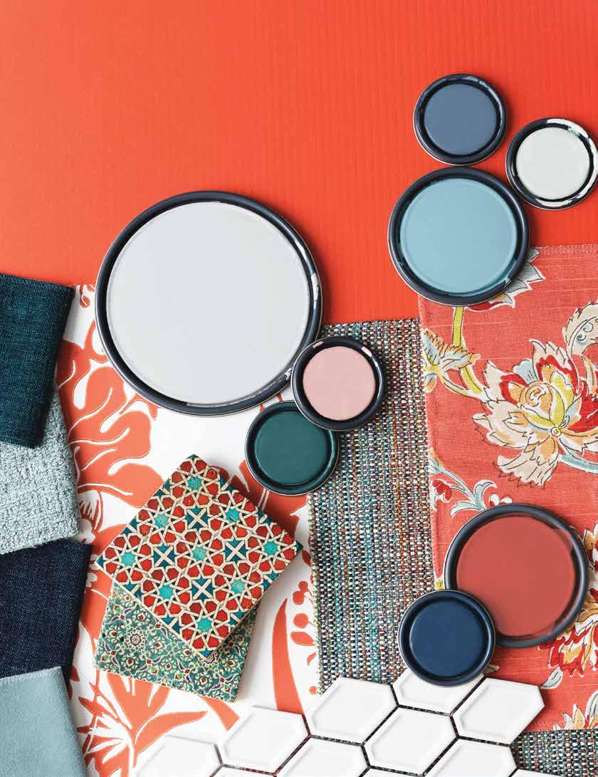
Raspberry Blush sets the stage for a bold and vivacious backdrop. Pair this crimson color with neutral hues in the Color Trends 2023 palette, including Etiquette AF50, White Heron OC-57, Gray Owl OC-52, and Onyx 2133-10. From a cool and eclectic dining room to a lively pop of color in your powder room or en suite, this rich coral is sure to make a statement in your space. Talk to the experts at your independent paint store to learn how to bring the 2023 Color of the Year into your home.

When it comes to influencing your interior decor, your walls provide the greatest opportunity for adding significant impact. And while experimenting with paint color saturations, depth of tone, and types of sheen can deliver amazing results, nothing ups the design ante quite like wallcoverings. With nearly limitless options for incorporating pattern, color, and texture, wallpaper offers unique opportunities to make a statement with your space!

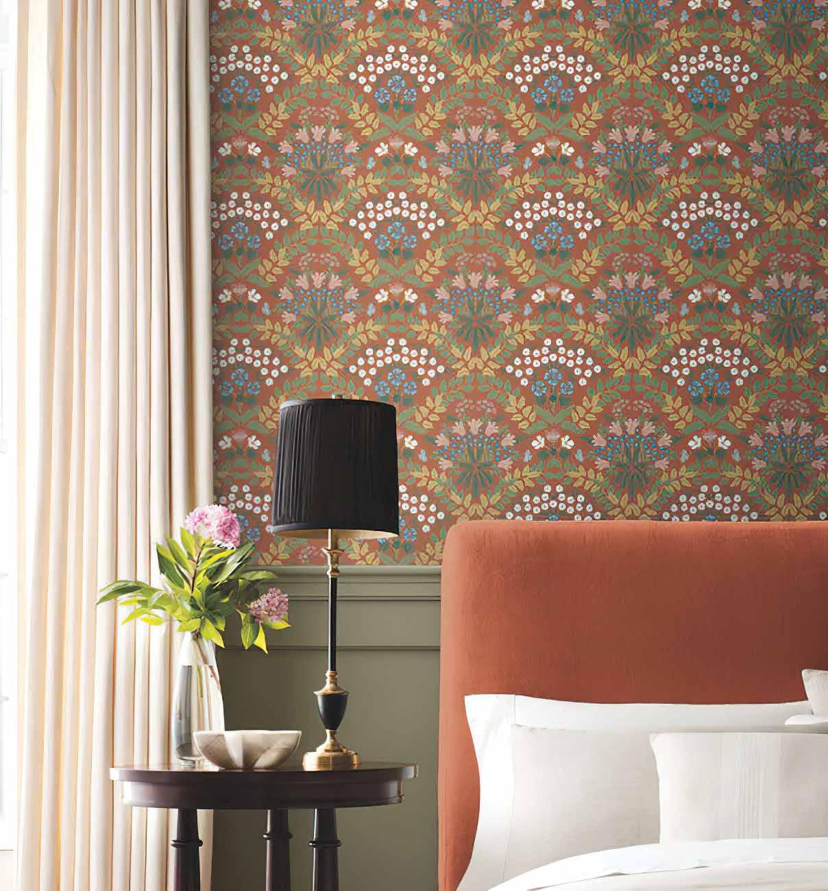


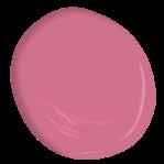
Decorating with natural fabrics, woods, and silhouettes is an enduring classic that never goes out of style. To elevate your organic look and add a dash of drama, consider adding a wallcovering that carries the theme up the walls. This example, with an undulating pattern inspired by anemones, delivers deeptoned drama without overpowering the other elements in the space.


The success of this neutral room stems from the reversal of a tried-and-true design trick. A simple palette and clean-lined furnishings create a calm and serene space that acts as a neutral foreground to a knockout pattern that wraps every wall of the room with color and texture… proving that when a wall’s covered by a forest, everybody cheers.
York Wallcoverings RMK11424RL York Wallcoverings #65005R WHITE OPULENCE 0C-69Forget the lion and the witch - everyone will be too busy reading the look of this cleverly upcycled wardrobe! Utilizing wallpaper to cover damaged panels, cracked mirrors or drilled holes from old hardware is a brilliant way to breath new life into an old favorite, while maintaining and enhancing the charming character of the piece.


We’re loving everything about this space: the subtle Asian vibes of the vintage rattan furniture and ginger jar lamp look sensational against a confident asymmetrical raindrop wallpaper. Strong shots of color, like the complimentary shades of green and fushia, are grounded by the strength of the pattern against a crisp white background.

Benjamin Moore & Co. Benjamin Moore and the triangle “M” symbol are registered trademarks licensed to Benjamin Moore & Co. Color accuracy is ensured only when tinted in quality Benjamin Moore paints. Color representations may differ slightly from actual paint.





Famed Italian fashion house Missoni’s home collection includes fantastical over-the-top patterns; favorites like Oriental Garden, a bouquet embroidered in purple, pink, peach, and yellow-orange colors and grey shadows, brings the haute couture out of the closet and sends it right down the hallway.

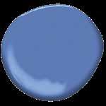
Design darling Rifle Paper Co. has done it again! Peonies and delicate buds in periwinkle and sage are tossed on a clean white background for a casual, optimistic feel. This modern take on traditional patterns with updated colorways, is particularly well suited to both midcentury designed spaces and the modern farmhouse look.
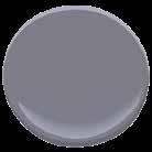
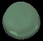
 York Wallcoverings #PSW1404RL
York Wallcoverings #ri5148
WATERDROP CC-902
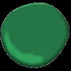
“Simple, elegant, yet bold. You will die.” - Edna Mode

For decades, decorating fully embraced the layered mix of neutrals. Creams, greiges, and brushed cool metals felt modern and luxurious; the look was easy, and it worked everywhere. But now, as design swings back towards colorful spaces, the once-bold espresso feature wall just feels like it’s falling short. Bringing color back into our neutral lives is challenging, as is the fear of making a spectacular color misstep. How to break through? Embrace the power of paint. Choose a room and lavish the walls - all of them - with color: saturated, bold and rich. Grab a complimentary quart to breathe new life into an old piece of furniture. Nervous? Just channel Edna and repeat: “I never look back, darling. It distracts from the now.”


No two surfaces are alike — that’s why starting with the right prep can make all the difference. With a family of tapes designed specifically for your surface, Scotch® Painter’s Tape helps you prep right for professional-looking results.
