5 minute read
HOME FEATURE
a perfect blend


when they built their family’s dream home in East Memphis 19 years ago, this couple loved everything in the house. Fast forward to early 2020, and the same family, a married couple with three now-grown children, still lived in the home and still loved a lot about the brick Tudor. However, they were ready to refresh the decor.
Enter designer Cindy McCord, owner of Cindy McCord Design in Collierville, who gave the home a look that is fresh and new—but not entirely new. McCord’s vision resulted
in a design plan that kept many of the homeowners’ most loved pieces, some left as is and some rethought, mixed with new finishes and pieces.
Thanks to the original architecture conceived by Charles Shipp, the renovation was almost entirely cosmetic. “It was just a facelift, because the bones were so good,” says McCord. Ditto with the design elements. Rather than reimagining the decor from floor to ceiling, McCord’s work highlighted many of the original features.
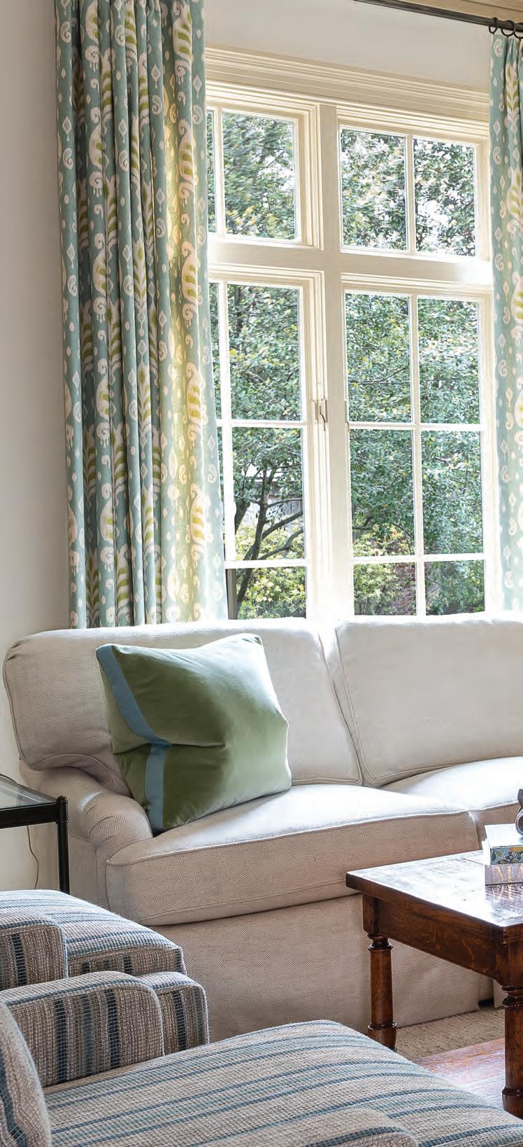
color was the main focus for the homeowner. She says, “The whole house was kind of a creamy yellow, and I’d had yellow in my previous home too, so it had been around much longer than 19 years. I was tired of yellow! I wanted to lighten things up a lot and I told Cindy I like blues.” McCord brought the new palette to life by bathing the walls in a coat of white that is fresh yet not stark, the perfect counterpart to the home’s original dark khaki painted trim, which she opted to leave intact in many rooms.
Once the lighter backdrop was established, the designer turned to the business of making everything else feel new—without necessarily having to be new. The family room is a perfect example. New drapes, sofa, chairs and tables blend seamlessly with the original fireplace and hardwood floors, as well as the homeowner’s treasured pieces, including an antique armoire. A favorite chair from her former office as a buyer for Helen of Memphis, now restuffed and reupholstered, holds place of pride.
The living room is decidedly newer, but still anchored by the family’s much-loved grand piano. McCord added a new sofa and easy chair plus accent tables in metal, glass and marble, to bring an “of-the-moment” touch to beautiful Martha Washington chairs and dark wood pieces from the previous decor. A portrait of the couple’s three children gives the room the most personal feel.
Shipp’s traditional plan still shines in the kitchen. The natural brown tones of original stone floors that the homeowner has always loved blend perfectly with the stained wood exposed beams and trim around the eye-catching plaster vent hood. The existing layout, appliances, tile backsplash, even the cabinet hardware, are still in place, proving that a kitchen refresh doesn’t always have to involve a to-the-studs gutting. Newly painted white cabinets, topped with gracefully patterned quartz countertops, give the space an all-new feel.


the adjacent breakfast room is still home to the family’s original table, chairs and plate rack. Also remaining in place is the light fixture sourced from the now-closed Frankum Antiques in Germantown. When the home was under construction the couple purchased the piece, along with the dining room chandelier, from Linda Frankum, who imported antiques from Europe. A watercolor and graphite pencil work by local artist Hailey Roaten reflects both the black of the iron chandelier and the blue tones of the home’s new color palette. Bold wallpaper gives the adjacent butler’s pantry a punch of excitement, the perfect marriage of the existing khaki trim color, newly painted cabinets and countertops in the same stone as in the kitchen.

in the formal dining room, McCord’s work retained the timeless elegance while continuing the keep/replace/ repurpose theme she carried throughout the home. Gone are the dark, heavy drapes with elaborate valances. The designer instead opted for lighter panels that are still functional, but allow more light in through the full-length windows. The furniture is the same, perked up with new upholstery on the dining chairs. The salmon-toned oriental rug remains, as well, and looks as though it were always meant to be in the newly imagined room. The same can be said for a painting formerly hung elsewhere in the home. It now sets off the dining room decor thanks to its new placement and a new frame made by Chris Garner of Garner Framing Co.
A pair of lamps once in the dining room now provide light in the primary bedroom. Reshading them created a new look style for the freshened space. “It’s amazing how different they look with new shades,” says the homeowner. “We reshaded several lamps and it was fun to use them again.” Those renewed lamps sit atop new nightstands that flank the owners’ bed, a holdover from the previous decor. New bedding, drapes and rug give the room a fresh feel. McCord continued the spruce up into the attached bath, where botanical wallpaper, light fixtures and goldtone hardware lend a warm, modern touch to the original cabinets, counters and flooring.
The project, originally conceived as a single bedroom renovation, extended into a downstairs guest bedroom and bath in addition to the home’s office, powder room and cheerful laundry room, where McCord painted the pine cabinets and added wallpaper and a cute cafe curtain. “I love coming in here,” the homeowner says, adding that the room is also a favorite for the family’s cats. “That’s where their food is,” she admits with a laugh.

from dark wood, yellow walls, rust tones and elaborate drapes to lightened paints, cool-toned accents and cleaner lines, McCord has blended a family’s cherished treasures with the perfect amount of today’s best looks to create a design that will serve the home and family well through the next 19 years and beyond.


