3 minute read
LOOKING UP Local interior design experts on the decorative ceiling trend.
Things Are Looking Up Designers Never Forget the “FIFTH WALL” By Kathryn O-Shea Evans


PHOTO: DAVID PATTERSON, COURTESY COOK DESIGN HOUSE
PROFESSIONAL DECORATORS often rely on their friends in high places to make a statement. Really high places: the ceiling. For some, leaving what the industry has lovingly deemed “the fifth wall” naked is akin to donning a perfect, Instagram-worthy gala dress without any jewelry. There is something just “off” about it.
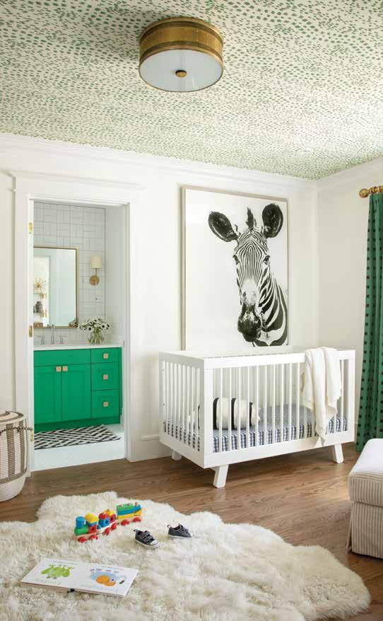
“I always think of the ceiling as an opportunity to finish out the room,” says Denver designer Jodi Cook, owner and principal of Cook Design House. “If we’re doing a room with wallpaper and a lot going on, I like the classic approach of a white, simple ceiling with crown molding (or not, if it’s a contemporary home). But if the room doesn’t have a lot of action in terms of pattern or texture or color, the ceiling can be a great way to add interest in an unexpected way.” Case in point: Cook recently added a subtle animal-print wallpaper, Les Touches, to the ceiling of a nursery in Denver with light white walls. “It’s really fun with little ones if they’re in a crib, staring at the ceiling.”

Batya Stepelman, a Denver wallpaper consultant and owner of wallpaper boutique WallTawk, is a huge fan of going wild on ceilings, as evidenced by her own eye-candy powder room. “Wallpaper
— Jodi Cook, Cook Design House
is definitely an adventurous leap for some, but if you’re already comfortable with patterns why not add some to the ceiling!” Stepelman says. “It’s just an unexpected pop and a little bit more out-of-the-box.” She advises that abstract patterns—like geometrics and botanicals—often look fabulous on ceilings, but would steer clear of landscapes, which “look great on feature walls because they ‘read’ top to bottom, but do not work well on ceilings.”
And for the intrepid, there’s more to do than hang some wallpaper overhead. “A couple of our favorite ways to make a ceiling feel special


PHOTO: KIMBERLY GAVIN, COURTESY COOK DESIGN HOUSE
— Batya Stepelman WallTawk
is with lacquered paint, textured, or patterned wallpaper,” says Mary Knape of Knape and Zibell Interior Design. “We often ask our clients what statement they want to make in the space [whether it is] rich and cozy, dark and moody, light and fresh, or bright and dramatic.” One of Knape’s go-to hues? Benjamin Moore’s White Dove. “It’s classic and fresh, and it will work with any wall color. Sherwin-Williams Naval is another favorite for its rich and dramatic appeal. For a softer look we love a color like Farrow and Ball Oval Room Blue. It adds a pop of color without being overly bold.”
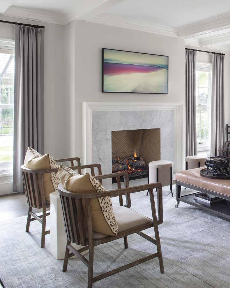
Cook often likes to play with architectural millwork above, “adding a series of beams to create a nice rhythm to a space,” a tactic that can help visually divide large rooms. “Coffered ceilings are the most classic approach [on that].” To cozy up an office in Cherry Hills Village, Cook ran a plaid-patterned millwork up the walls and onto the ceiling itself. “It enhances the overall experience of being in the room ... The aim was to have this feeling of envelopment and make it more den-like and snug.” So instead of thinking outside the box, look above and see where you can add a little unexpected style to your home.
COOK DESIGN HOUSE 720.398.9788; cookdesignhouse.com
KNAPE AND ZIBELL INTERIOR DESIGN 303.393.0747; knapeandzibell.com
WALLTAWK 720.588.3268; walltawk.com


