Hello,I am Yu-Tung Chen. I am studying as an interior designer, and I am a graduating student.
I want to discuss with people from different professions, and re-enter the design from a new perspective.


Hello,I am Yu-Tung Chen. I am studying as an interior designer, and I am a graduating student.
I want to discuss with people from different professions, and re-enter the design from a new perspective.

E D U C A T I O N
Chung Yuan Christian University
BACHELOR OF INTERIOR DESIGN
Fudan Senior High School
HIGH SCHOOL DIPLOMA
EF International Language Campus Bristol
LANGUAGE COURSES
W O R K E X P E R I E N C E
INTERN MOREART CO., LTD.
2019-2023
2016-2019
+886-978965575
b49713064@gmail com
No 98, Ln 60, Fumin Rd Sanxing Township, Yilan Taiwan (R O C )
I N T E R E S T S
h a r m o n i c a
t r a v e l
p h o t o g r a p h y
l i t e r a t u r e
2017
L A N G U A G E S
M a n d a r i n ( n a t i v e )
E n g l i s h ( i n t e r m e d i a t e )
2021-PRESENT
Followed the case in full during the internship Including Measure, Floor Plan, Sections, Perspective, Cost estimate, Construction schedule, etc.
DESIGNER / EXECUTOR STUDIO
2022
Designed reception display wall Main wall design with embroidery thread as material
A W A R D
FIRST PLACE STUDENT DESIGN EXCELLENCE AWARD
S K I L L S
A u t o C A D
S k e t c h u p
I l l u s t r a t o r
P h o t o s h o p
P r o c r e a t e
R h i n o
I n d e s i g n
R e v i t
2022
This contest is a student interior design competition runned by Steven Leach
E n s c a p e
L u m i o n
Taiwan is a country with rich ecological diversity. Because of the colonization of different cultures, there are many different cultures overlapping in this small island. Influenced by these, my design is keen to explore the relationship between people and space.
These projects can see many different design styles, I want to use different perspectives to explore more possibilities of presentation.
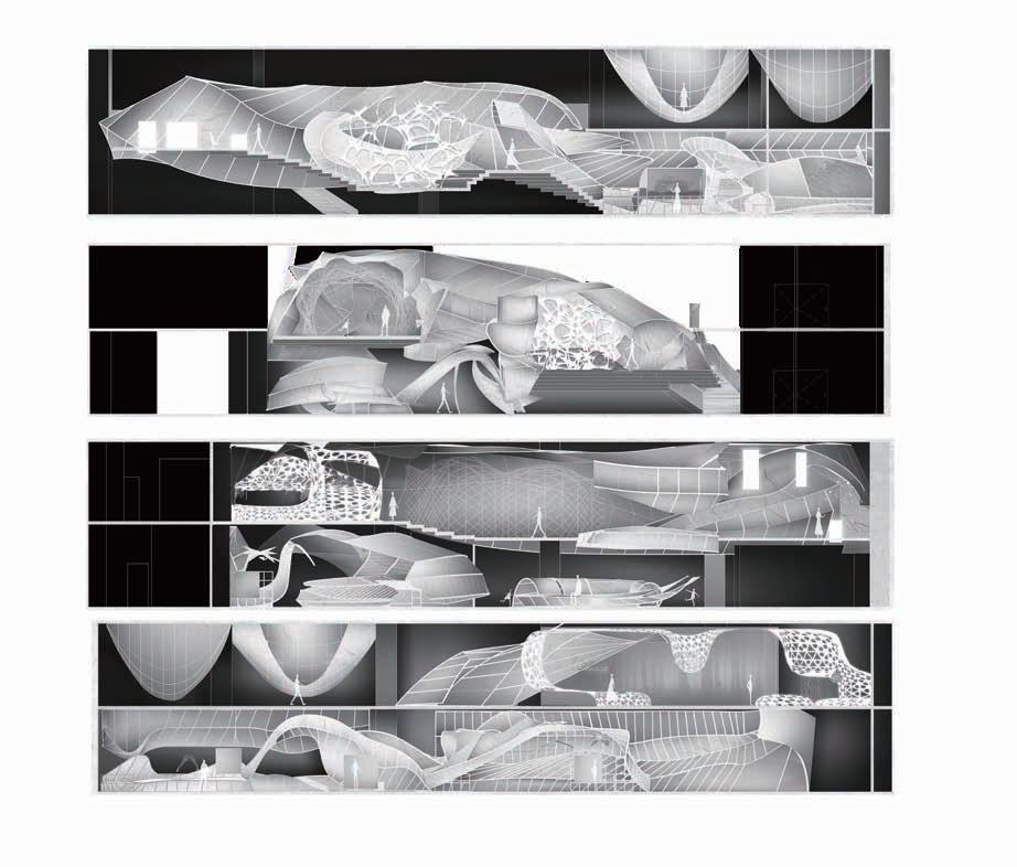
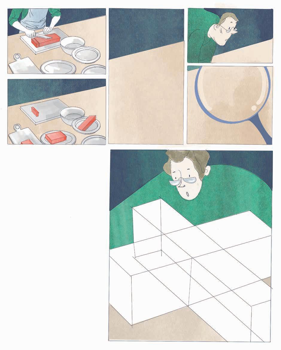
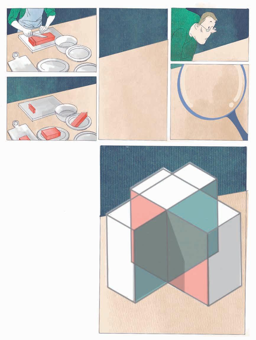
First project is about the design of exhibition space. The way I did for the space is using positive and negative space transformation to explore the relationship between nature and bionics. I used the story board to discuss the changes of people's sight in the space.
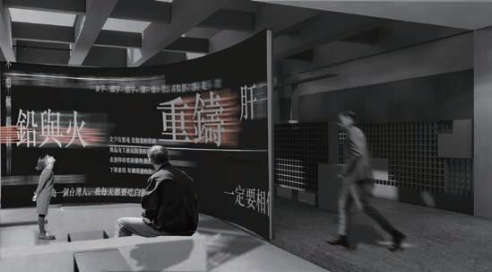
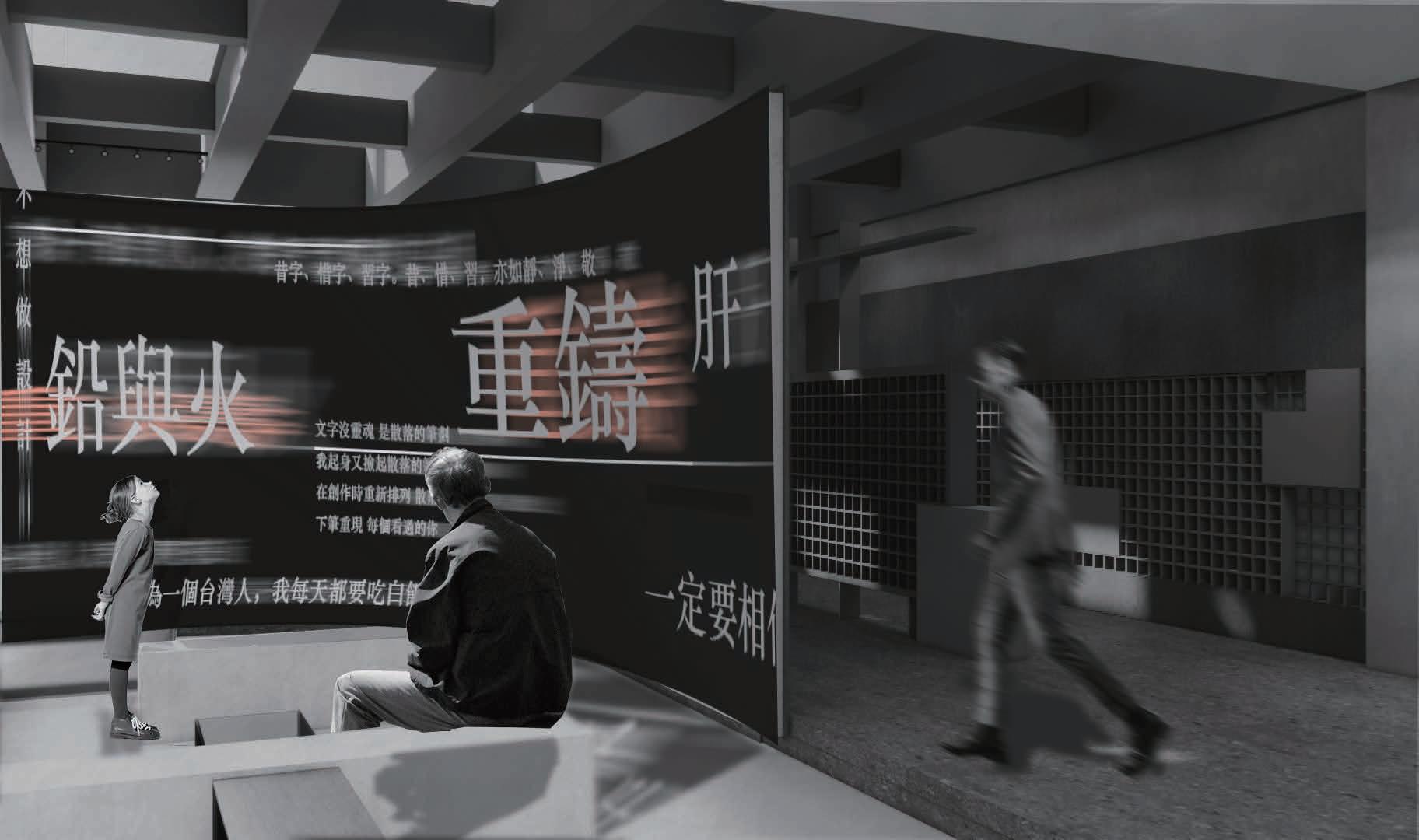
The next design is about culture. The tour factory discusses how to preserve culture and innovation, and echoes typefaces through moving lines and stacked volumes in the space.
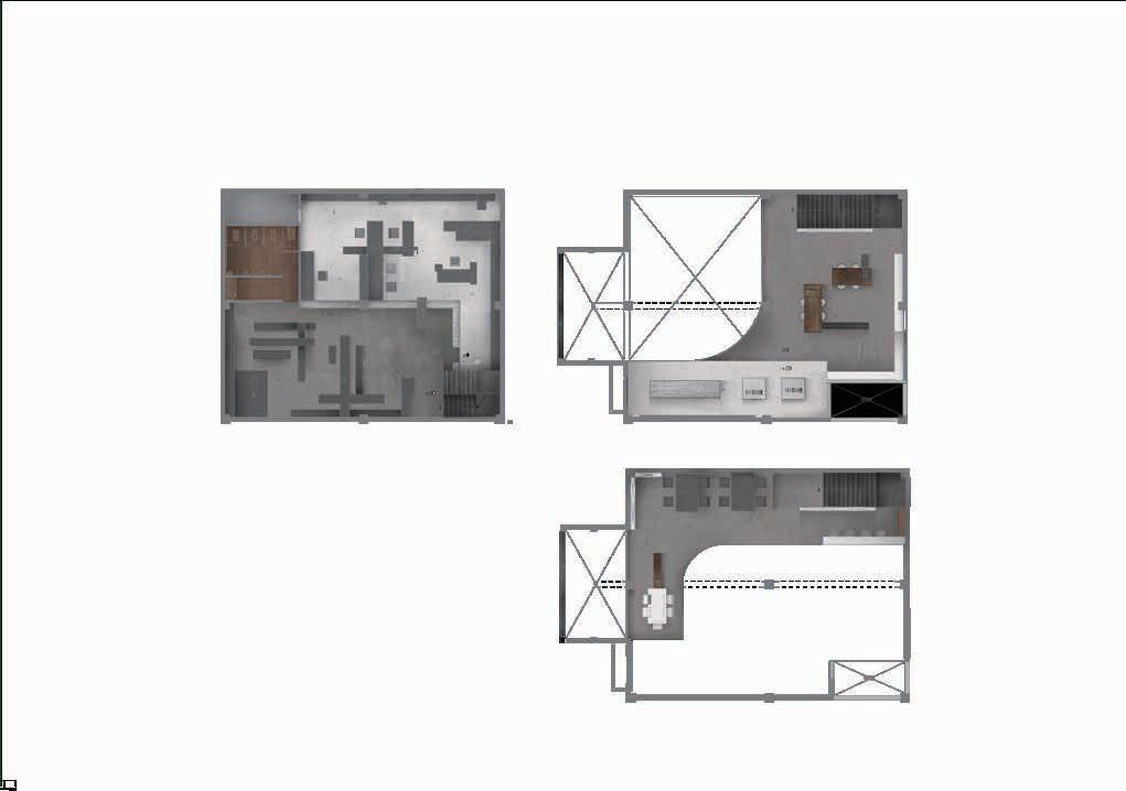
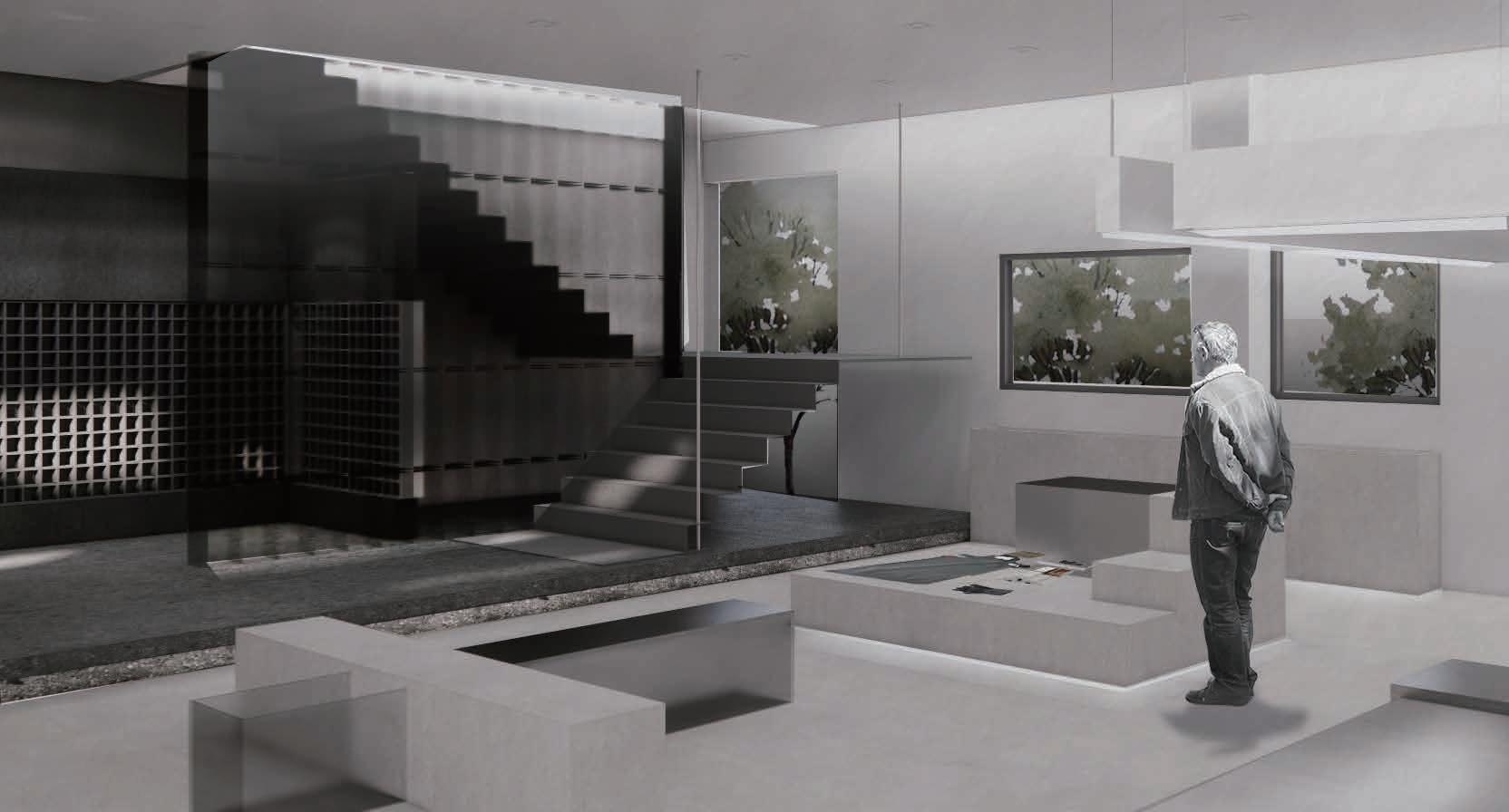
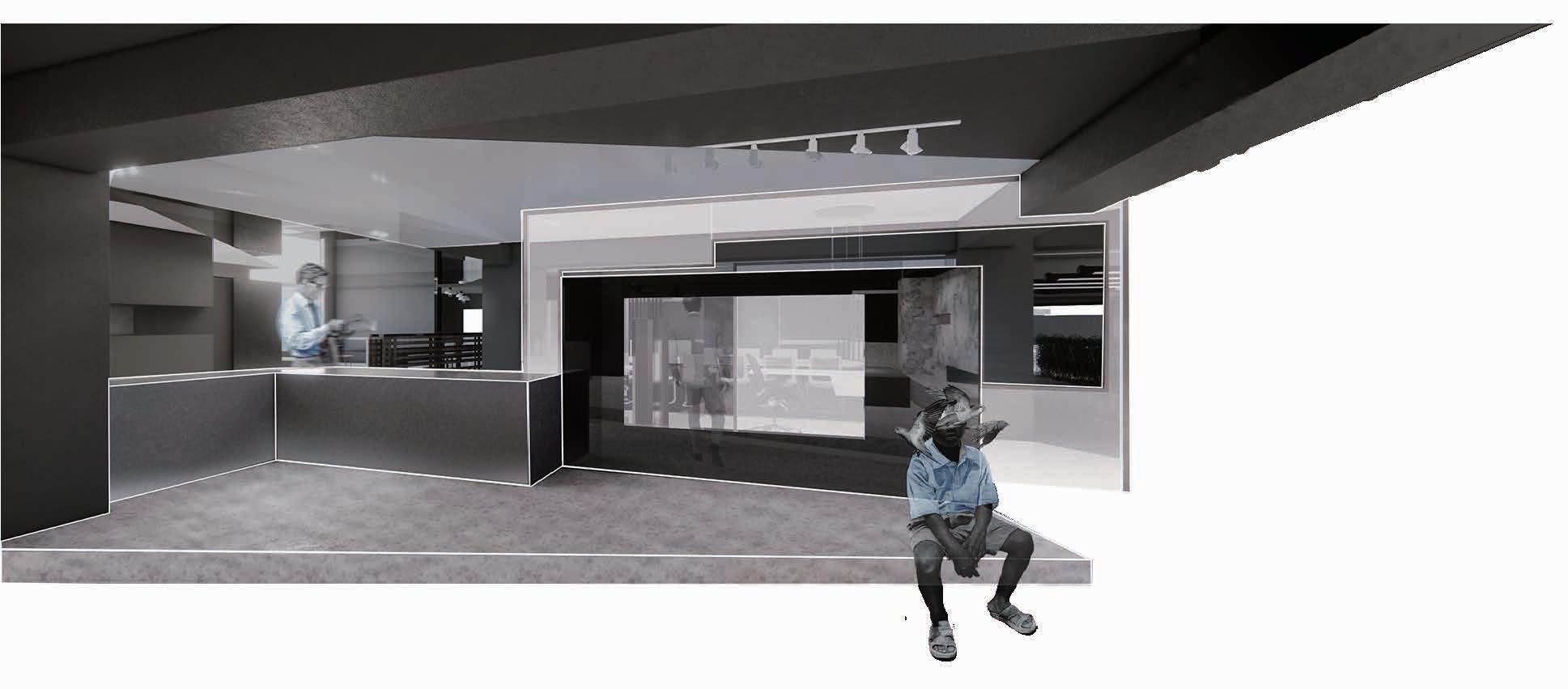
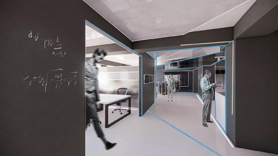
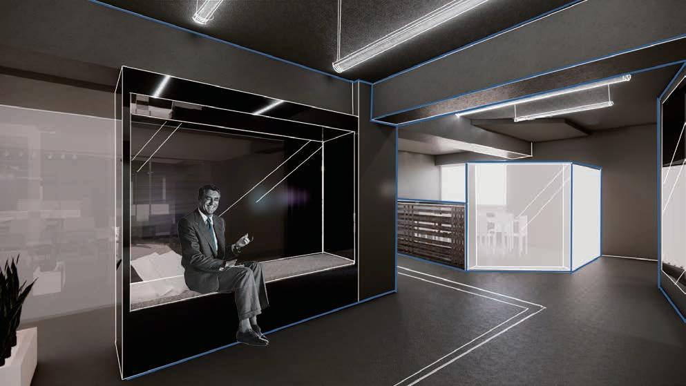
The third one is about the office design. In this case, I combined the traditional shadow play culture in Taiwan and changed the original design thinking mode, used the floor plan to discuss.
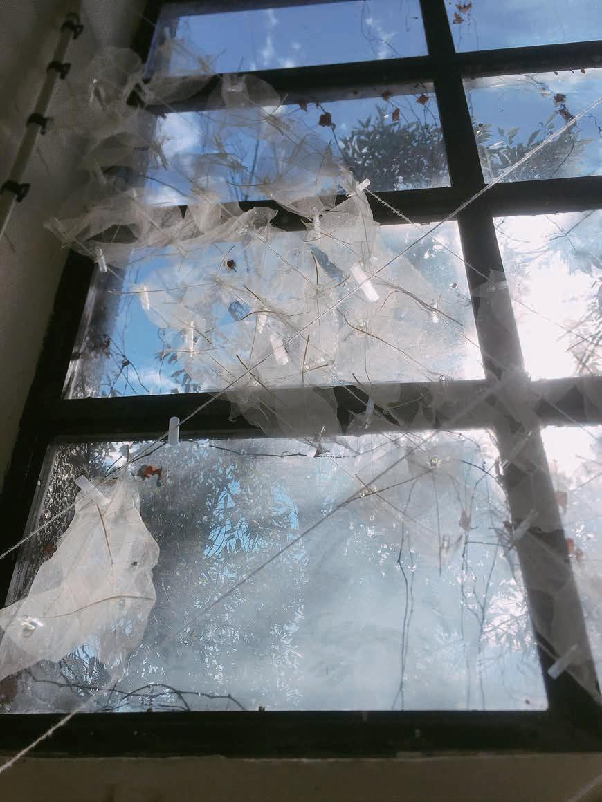
Finally, the installation and sketches fully illustrates my thoughts.
I demonstrate that I have flexible design thinking and sufficient ability to execute designs.
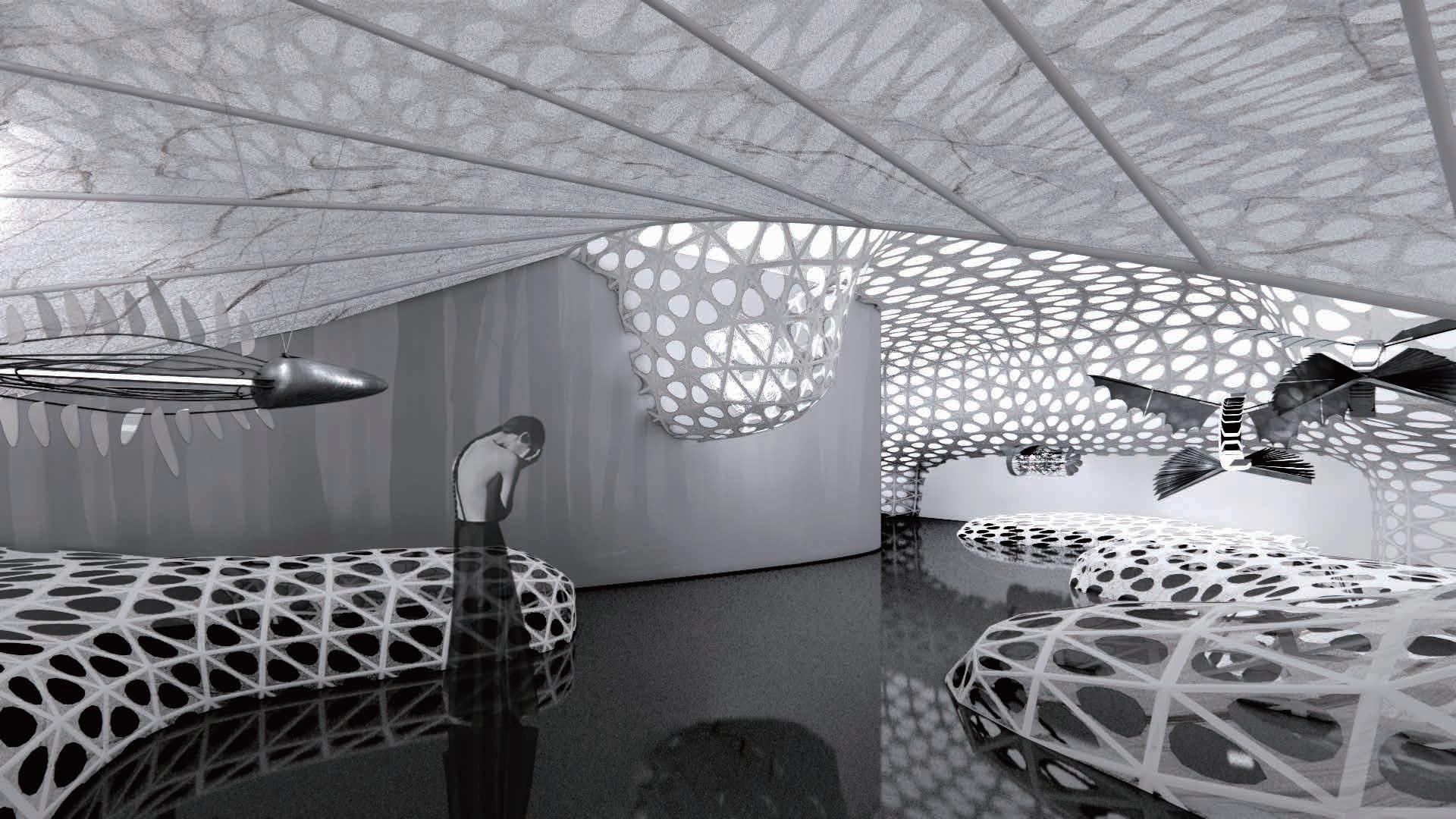
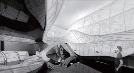



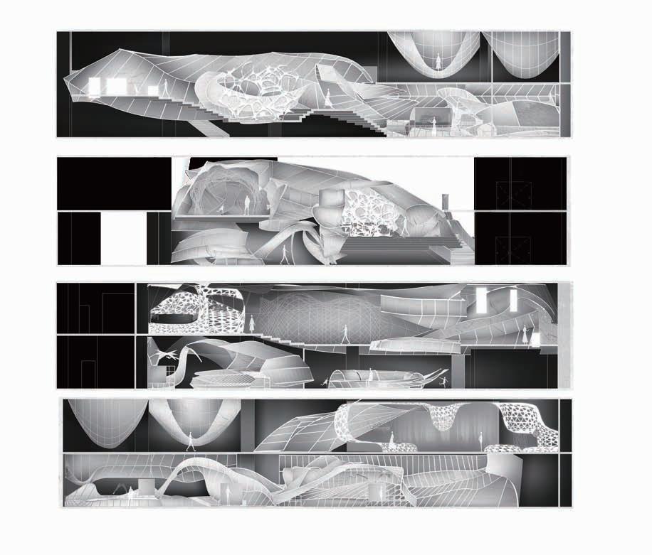
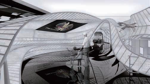
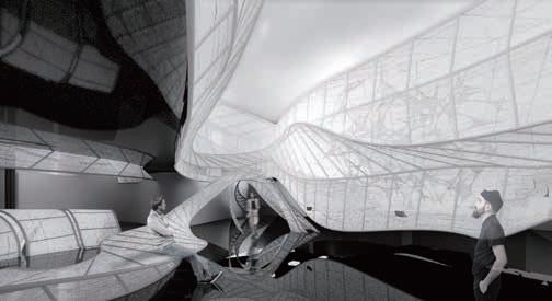
This project is about the design of exhibition space, the exhibition is about the theme of bionics, using positive and negative space transformation to explore the relationship between nature and bionics

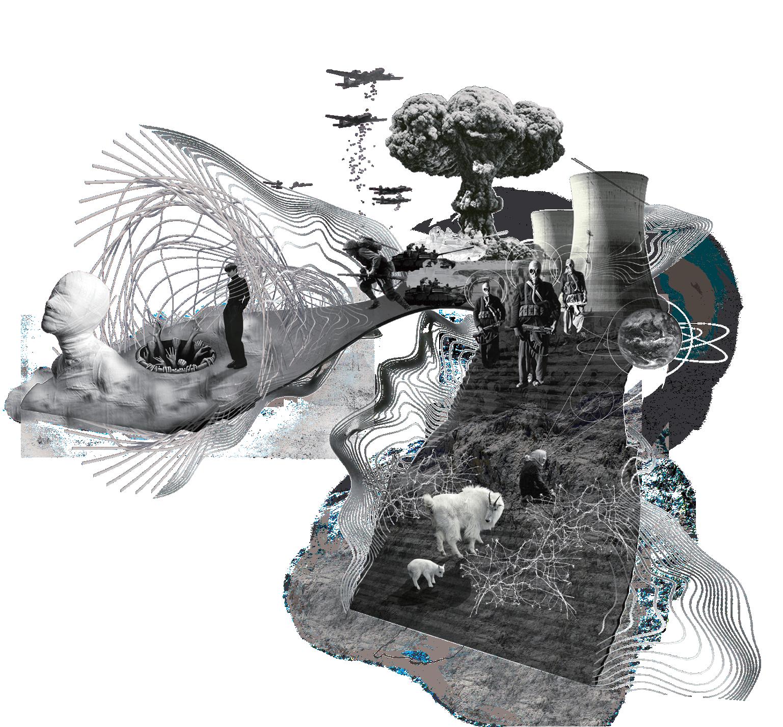


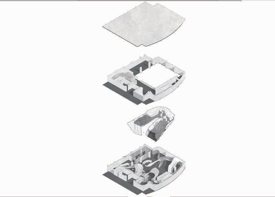
The base is located in the northern metropolitan area of Taiwan. It is a natural science museum. The design scope is a cross-floor
Explore the relationship between bionic behavior and ecology. Through the exhibition, the audience rethinks the meaning of bionics.
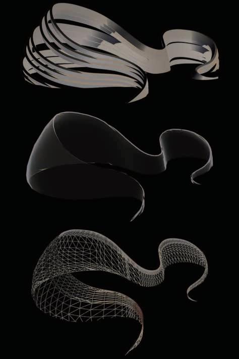

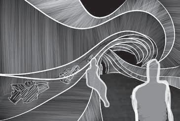

CONCEPT/
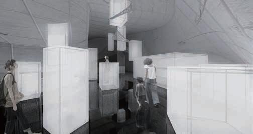
By strengthening the relationship between positive and negative space, users can twist their perspective and rethinking by switching between positive and negative in space
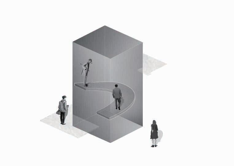
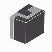
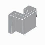
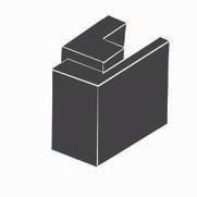

SOLID VOID RELATIONSHIP


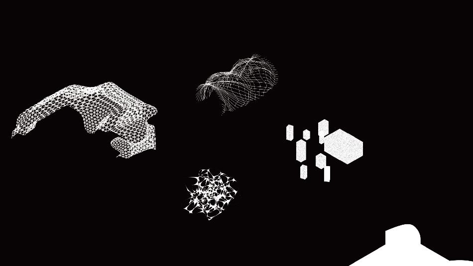
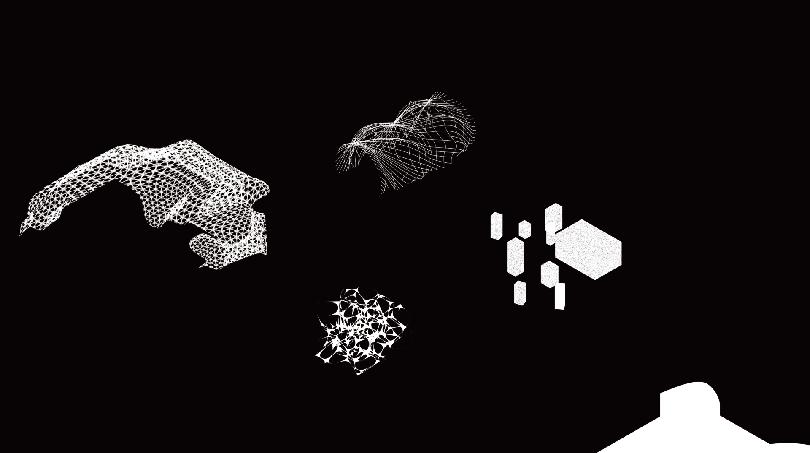
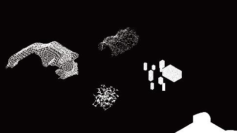
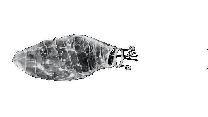
In terms of the construction methods and elements of the space, we use two opposing elements, curved and vertical and horizontal, to shape the space, emphasizing the integration and conflict of nature and artificiality, and interpreting the symbiotic relationship in the imitation ecology with the distortion of the structure as an echo.


CH3 BIOMIMICRY


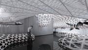


CH3-3 PREDATION
CH3-1 PARASITISM

The ground uses a highly reflective material to reflect the curved surface to avoid the space being limited by the original building frame; the curved surface is also supported by a metal structure, and the surface is made of a material with high transparency. The space uses black and white as the main color of the space, making people more focused on the positive and negative space conversion and exhibits.
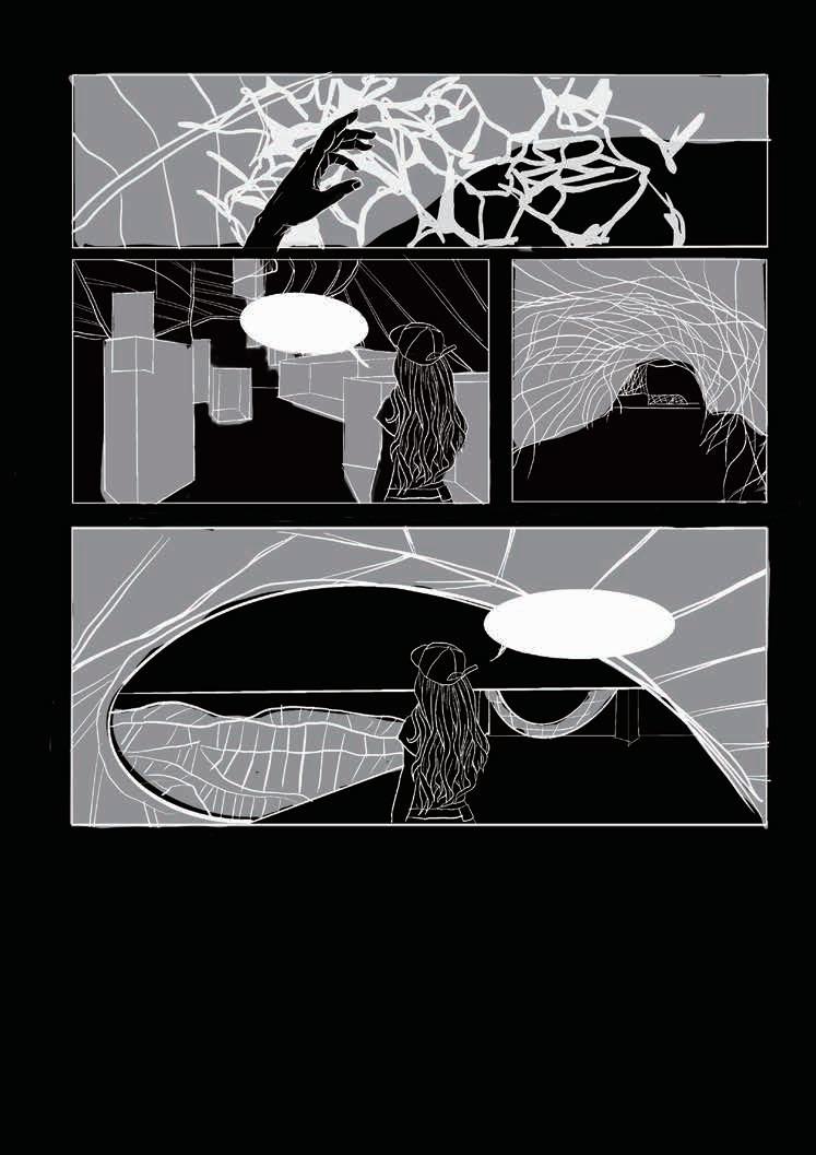 SPACE EVPERIENCE PARASITISM
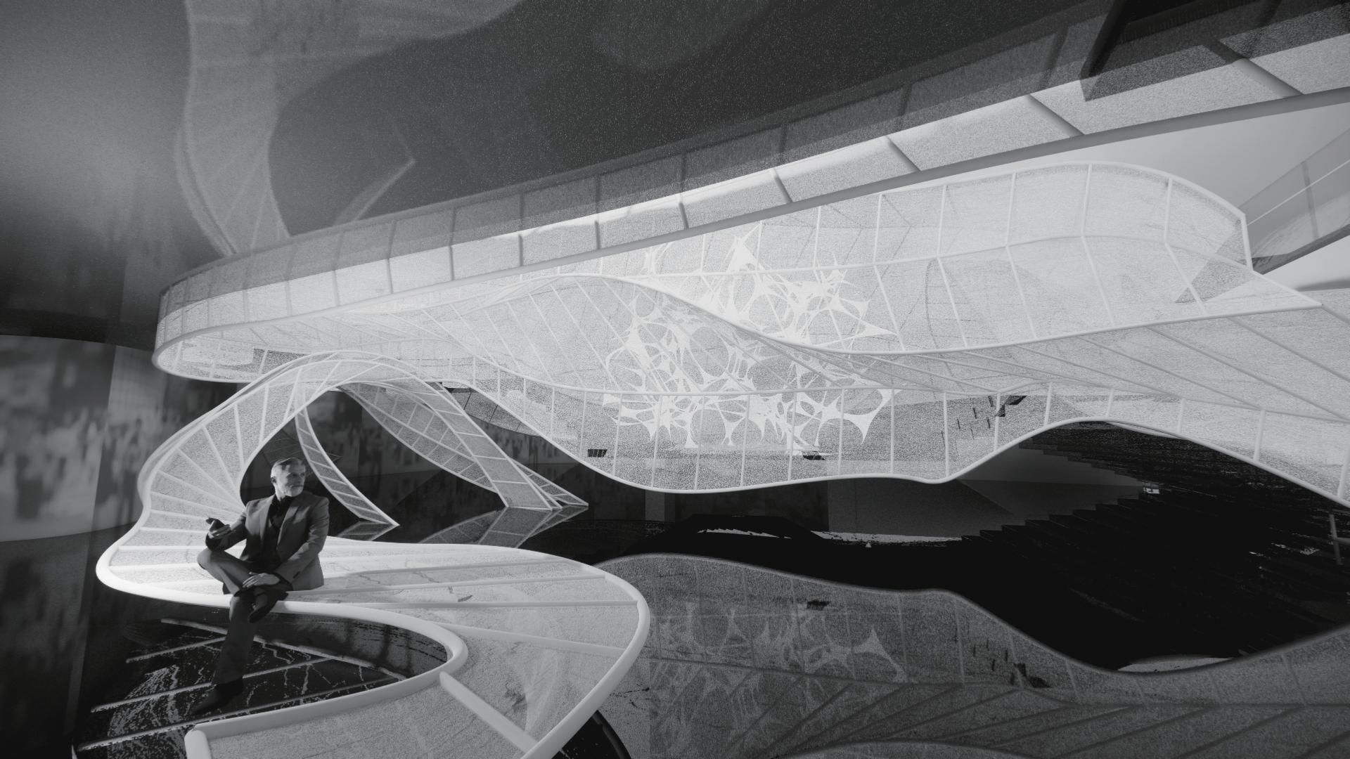


NOV 2021-DEC2021
tourism factory, Commercial space design

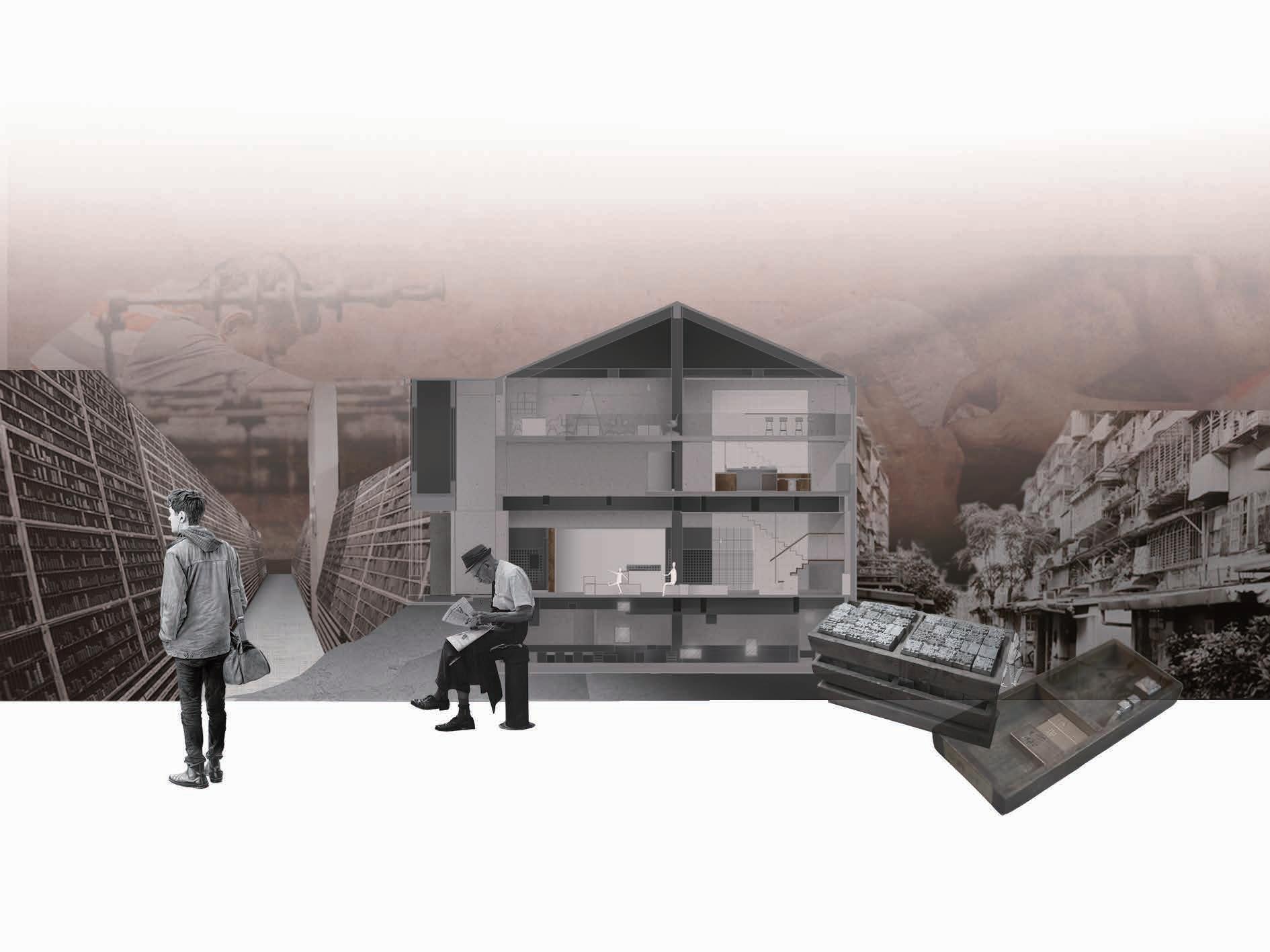
The brand is committed to inheriting and continuing the traditional casting culture in a new form.
This project considers the fusion and innovation of old and new, how users and spaces are connected.
NOV2021-DEC2021
About the brand/

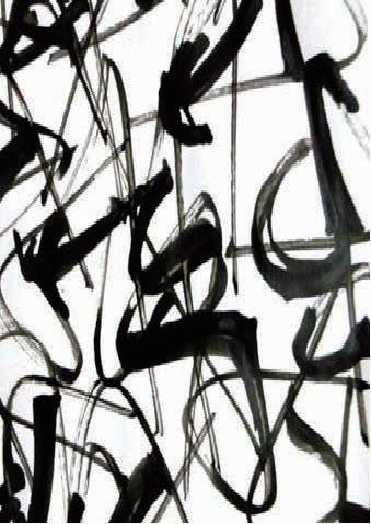
Taiwan's letter-printing industry has seen a sharp recession since 1980s. Till 2008, there were only 4 lead type manufacturers that existed throughout Taiwan. Currently, Ring Xi is the only one remaining. With the future of the type foundry industry so uncertain, Ring Xi is still adamant about keeping the tradition alive.
Ri Xing Type Foundry is currently the only foundry in Taiwan that does typecasting, typesetting, and printing in the traditional way.



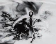
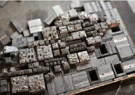 The process of casting/ broken lettering melting
/issue/
At the moment when character connections between people through can intersect in space and use


concept/ Taking recasting as the concept the relationship between people spatial techniques through the tion of units.
fragments overlap
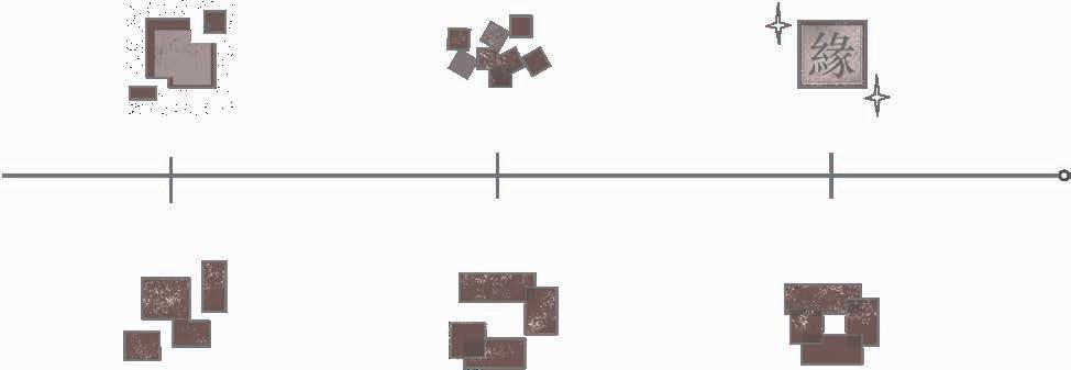

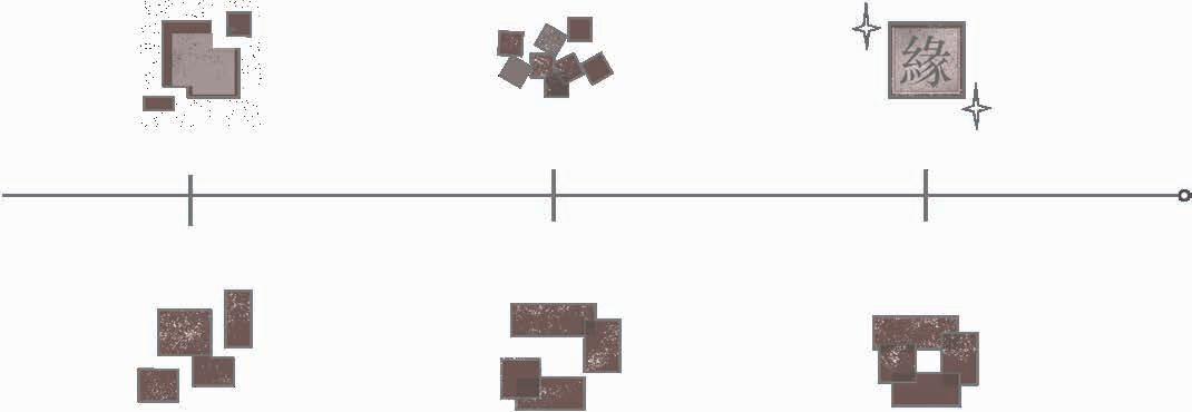


is fragmented, how to create through space so that people use words to resonate.


concept to make ideas, reinterpret people and space, and develop convergence and reorganiza
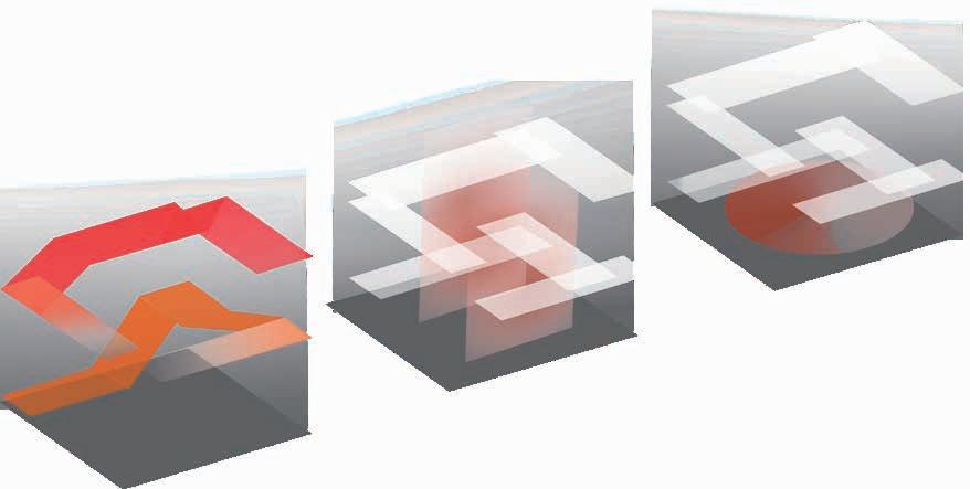


OVERLAP


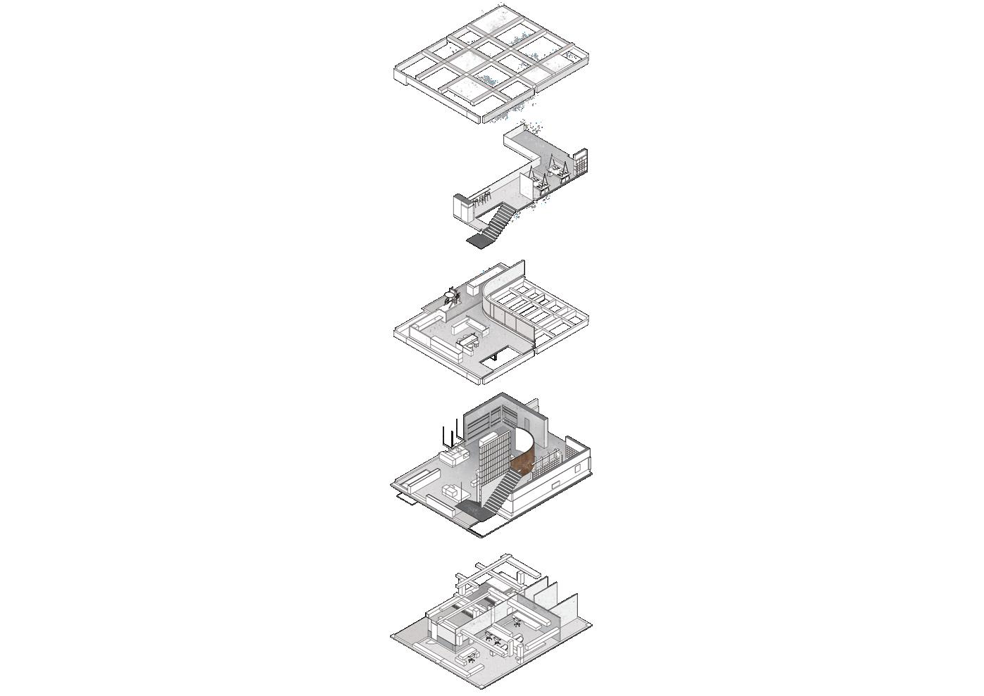







The detailed space structure also realizes the unit ganization by stacking the volume to realize the design


 01/ Diagram
unit element reordesign concept.
other. The final floor. Resonate screen.




May 2021

MAY
I
site
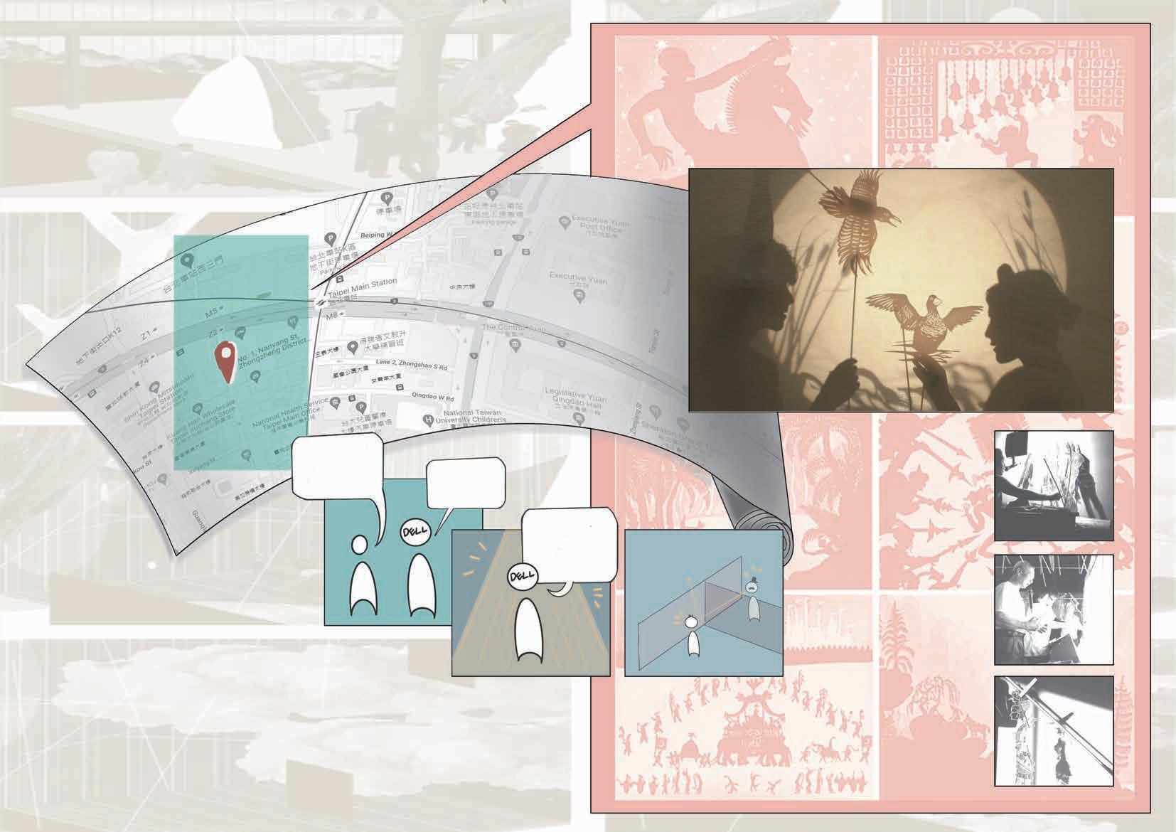
The base is located in the city center of Taipei,Taiwan. Foreign companies set up branches in Taiwan, and discuss how to combine the local characteristics of Taiwan and the original spirit of the company in this design.

It is a Taiwanese traditional culture, using curtains and paper dolls to present a story, using light and shadow to express.
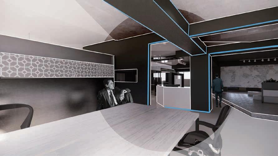
Use shadow play to discuss people's sight in space
01cube (space)
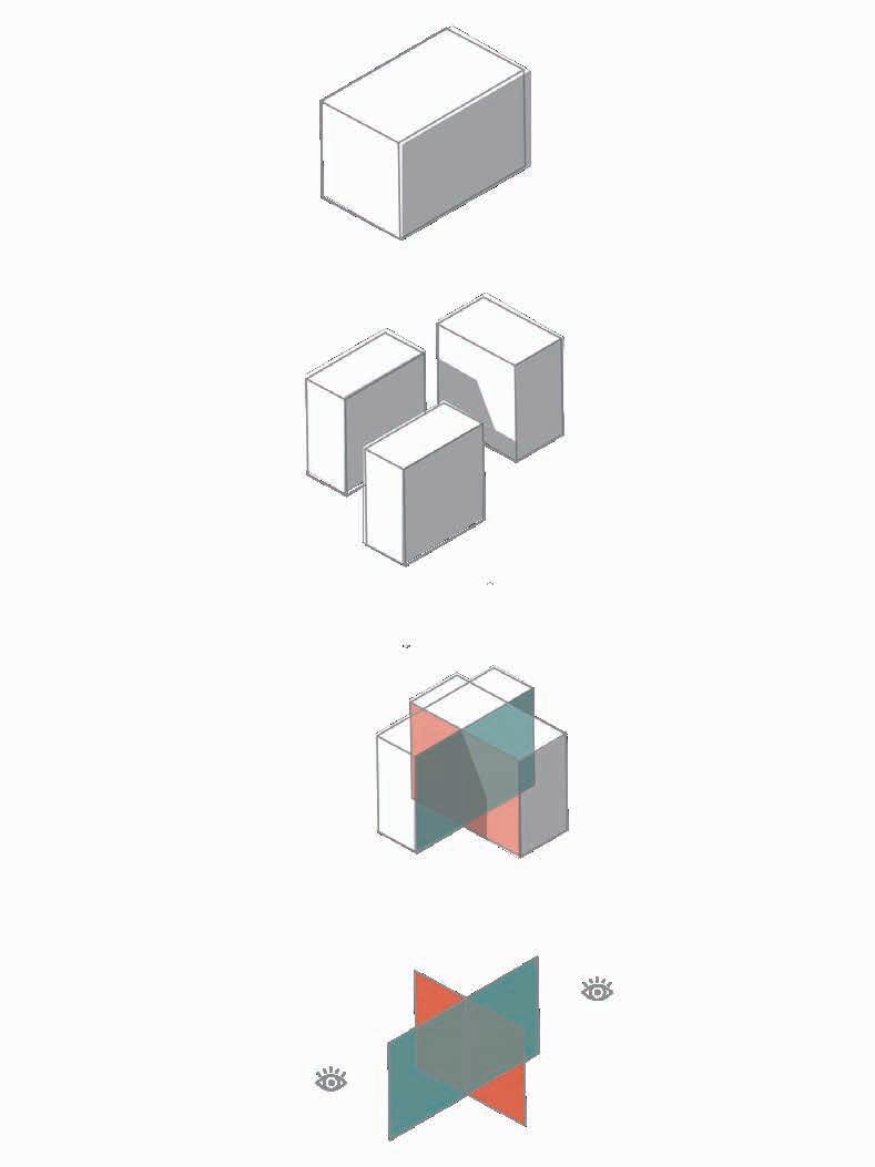
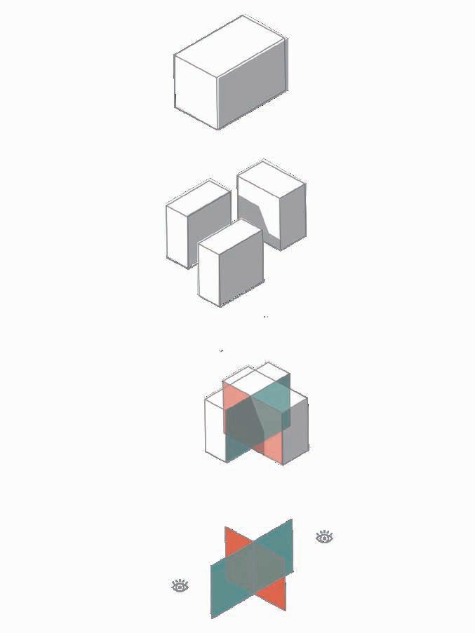


02Cut Create more facets
03Interspersed
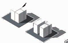
The interspersed spaces make the original one-sidedness of viewing into a multi-faceted one
04Line of sight
Surfaces with different transparency create different visual experience
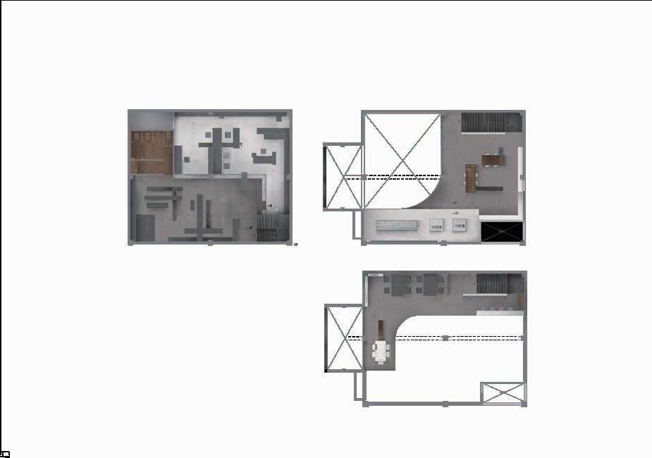
Use the floor plan to arrange and discuss the moving lines and sight lines. The multi-facetedness created by the interspersed faces guides the sight line to achieve the design purpose.

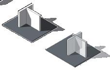
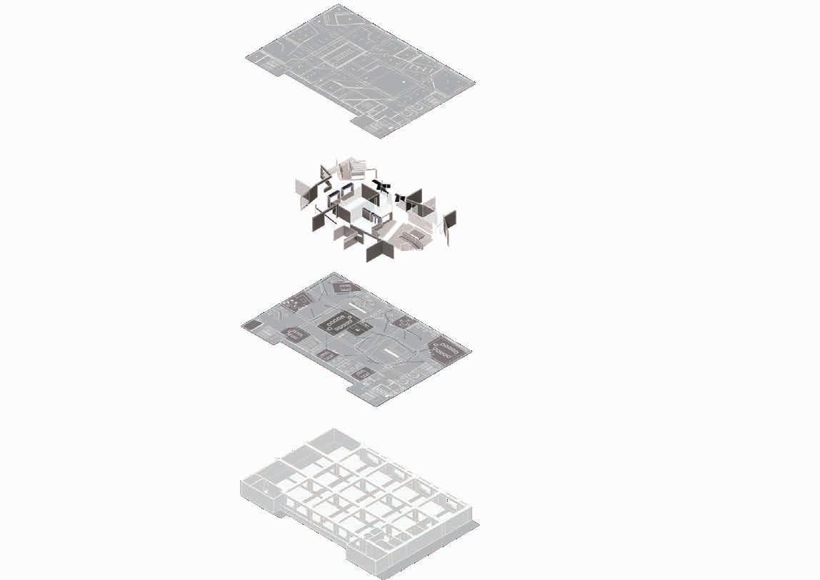


The frame and the face are interspersed, It is divided into cortex and skeleton along the moving line, Contrasting conflict shapes old and new.







This is my first space design, and the question I want to ask is "Is the space of solitude necessarily a closed area?"
When discussing solitude, I think about whether the space we need is really closed and cannot be broken? Imagine creating spatial independence but at the same time maintaining the possibility of communication.

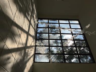
I chose leaves as the space material, and formed a basic unit through three leaves, and used ropes to connect them to form an open space. The location is selected on the crowded stairway, and the relationship between solitude and space is discussed through design.



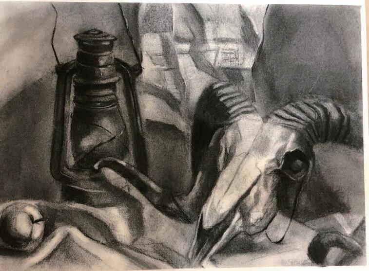


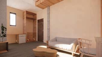
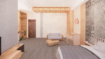
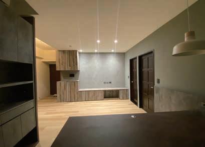
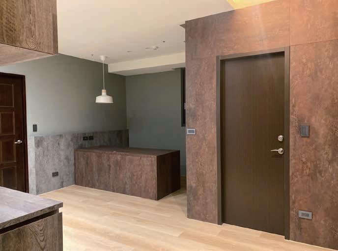
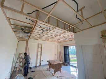
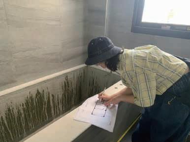
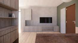
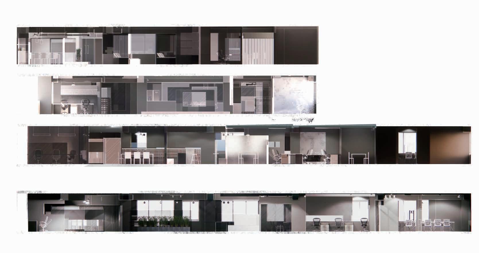
This is my actual involvement in interior design as an intern, from spatial measurements to floor plans, material plans and sections.

