BRAND GUIDE


The primary visual element of the Balistreri Real Estate is our logo. It’s this element that represents us and should be used in all communications.
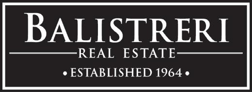
When using a white background, the black version of the logo should be used.
DOWNLOAD HERE
The white version of the logo should be used when using a black background.

DOWNLOAD HERE
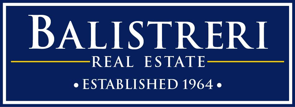
The white version of the logo should be use when using a “Balistreri Blue” background.
DOWNLOAD HERE

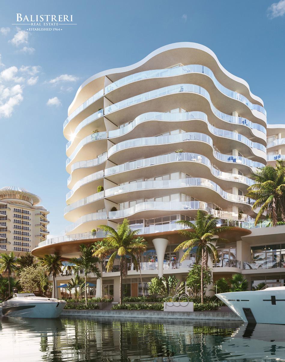
When using on top of a picture, make sure you’re using a version of the logo that is visible enough.
Both examples below are using the right example of the logo.
We encourage you to use the Main Logo showed before as your first option for marketing. Our classic Balistreri logo, is still valid. Use in case the logo is not visible enough when using on top of a pattern or a photo.
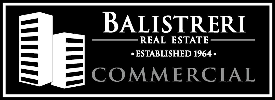
Our Balistreri Real Estate commercial logo is meant to use only for Commercial listings.

Please leave plenty of space around the logos so they stand out. The example below show the minimum amount of space required.

Below are examples of outdated Balistreri Logos. If you are still using these logos, please replace them immediatley.

WRONG USE OF COLOR


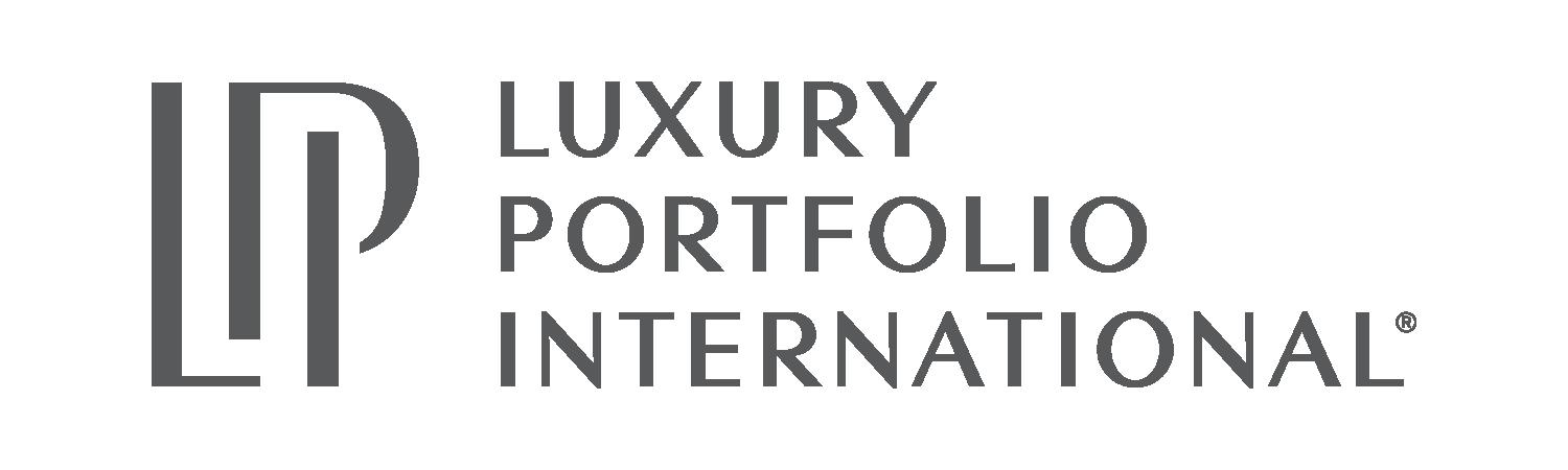


When using logos of our partners, make sure to not use our previous merged version. Instead, use the logos by separate.

IMPORTANT: MAKE SURE BALISTRERI’S LOGO IS BIGGER THAN THE OTHERS.


INCORRECT USE
CORRECT USE
When using Luxury Portfolio and Leading RE logos, make sure you’re using both vertical versions or both horizontal versions of them


HORIZONTAL VERSION
VERTICAL VERSION
INCORRECT USE
HORIZONTAL VERSION
HORIZONTAL VERSION
CORRECT USE
VERTICAL VERSION
HORIZONTAL VERSION
INCORRECT USE
HORIZONTAL VERSION
HORIZONTAL VERSION

CORRECT USE