Portfolio
NATALIE MILES Illustration & Design

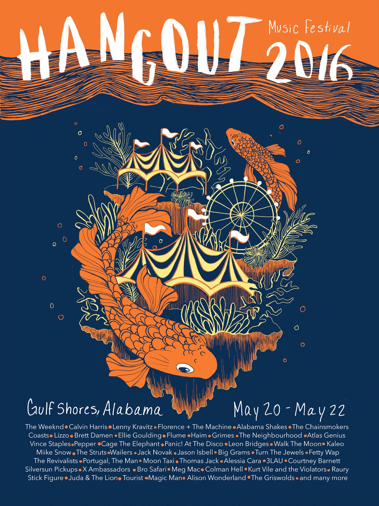
Hangout Festival Poster (2016)
Printed on orange paper
Hangout fest is a carnival themed music festival that takes place on the beach. For this poster, I illustrated the carnival underwater to create an interesting combination of the theme and location of the festival.
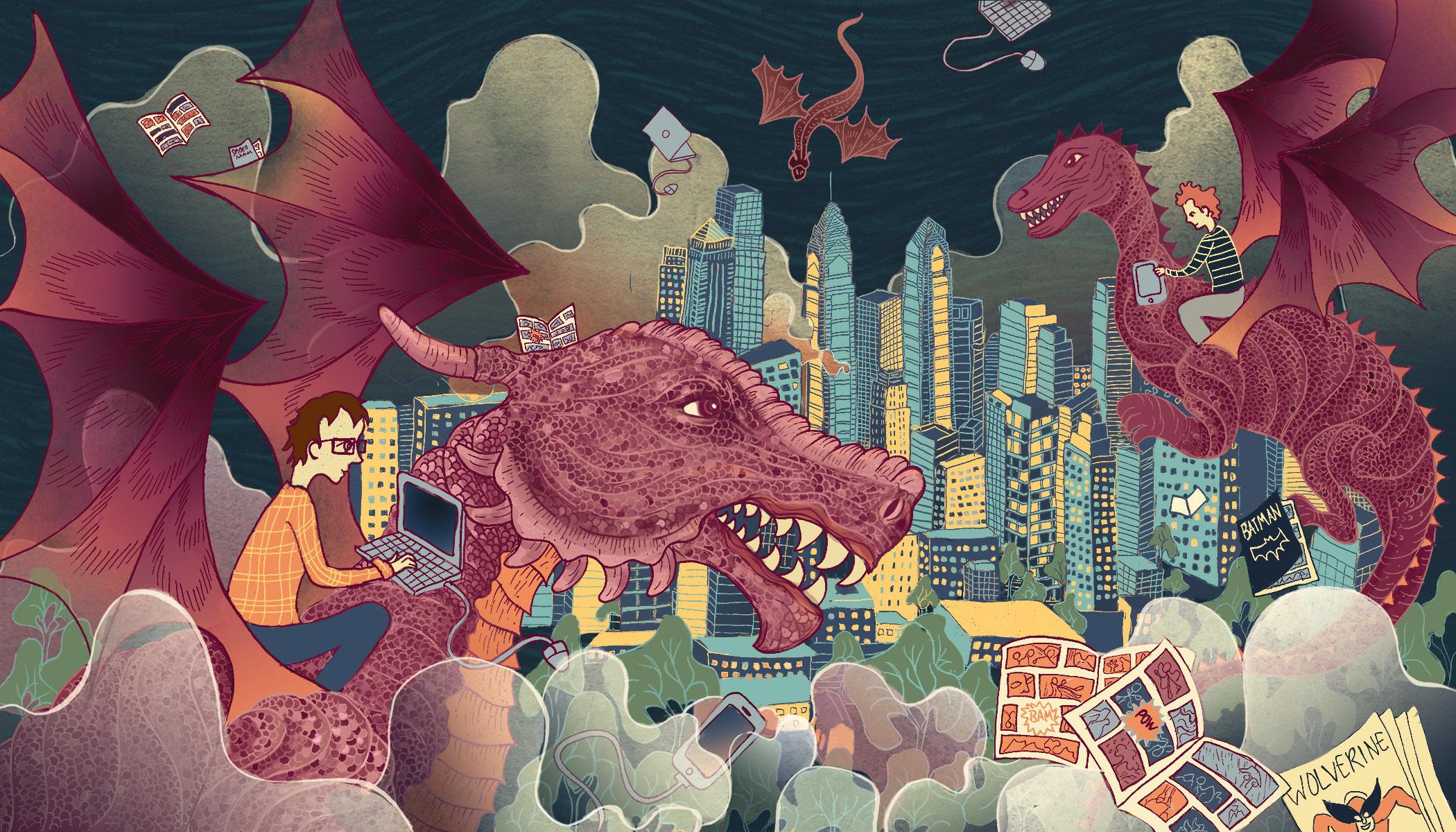
We’re All Nerds Now (2016)
This editorial illustration is for an article discussing how nerd culture is increasingly becoming interwoven with mainstream culture. In this piece, I illustrated the nerds riding into the mainstream city/culture on their dragons and bringing their gadgets and comics along with them.

The Shins Album Cover Redesign (2016)
This entire album revolves around a spirit or other-worldly being on their journey to the afterlife. This concept is what inspired me to draw a familiar, yet strange figure, being carried by and iris flower on its journey. I incorporated an iris as part of the journey because in my research I found that they are symbolically believed to guide a spirit on their way to heaven.


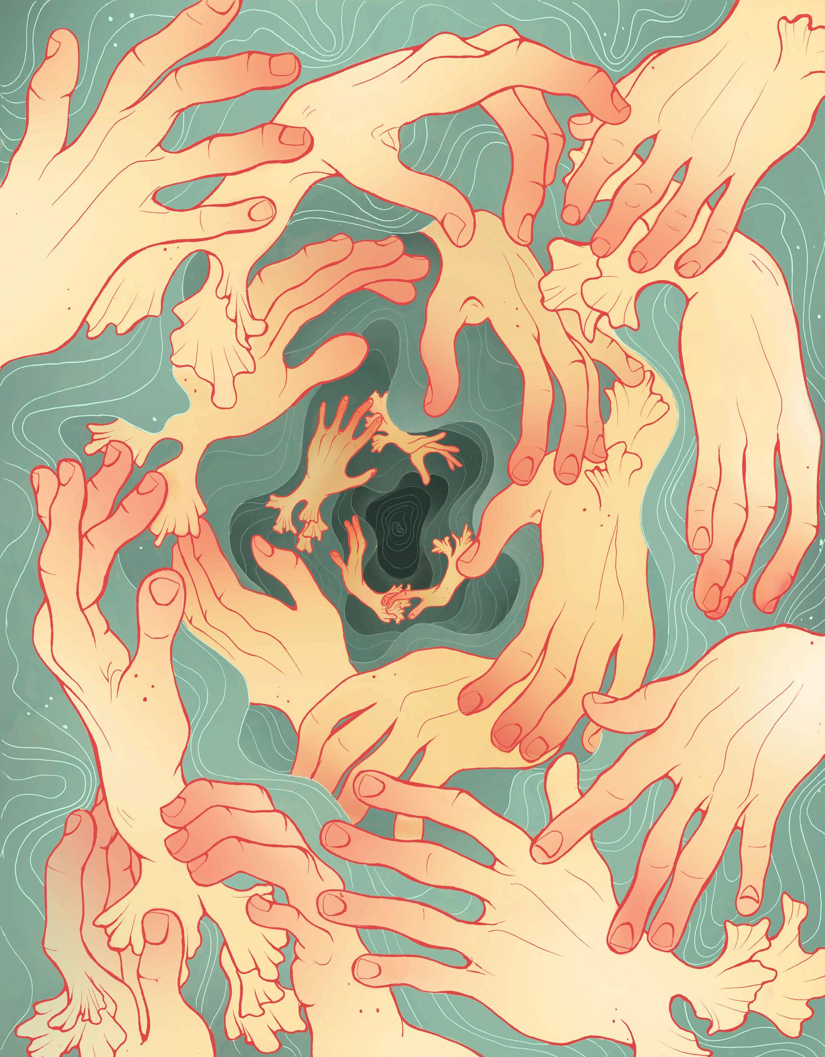
Lust (2016)
Illustration I created based on the idea of lust. The swirl composition of the piece represents the unending cycle of dissatisfaction often caused by lust.
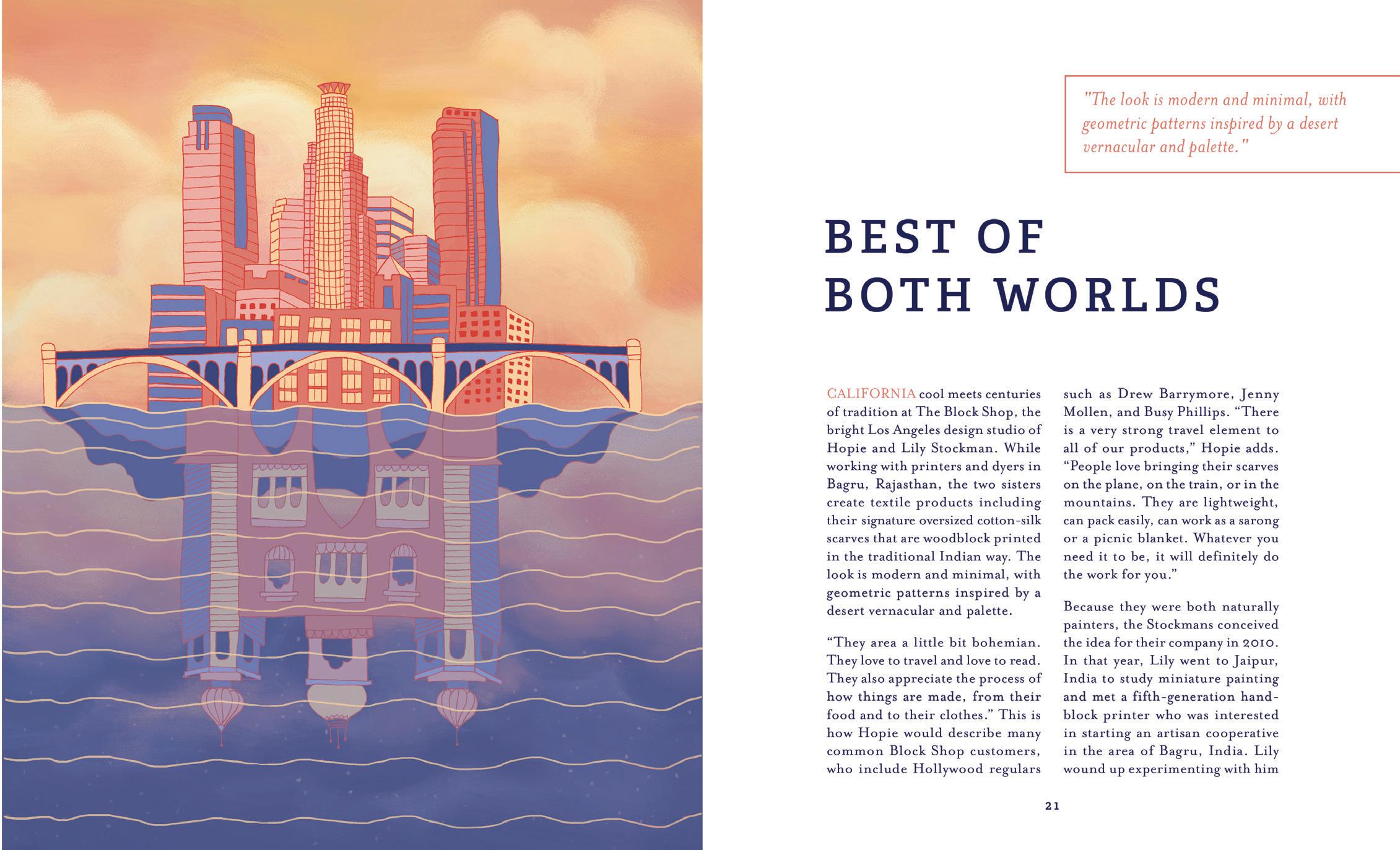
Magazine Spread (2017)
This article is about The Block Shop, a textile design studio that uses traditional Indian block printing techniques to create their modern, geometric, “California cool” textiles. In the illustration I reflected India in Los Angeles as a way to combine them because The Block Shop brings a taste of India to LA and owners of their products experience a taste of both at the same time.


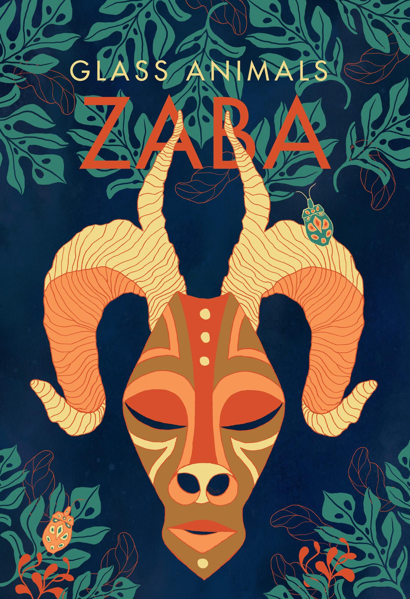
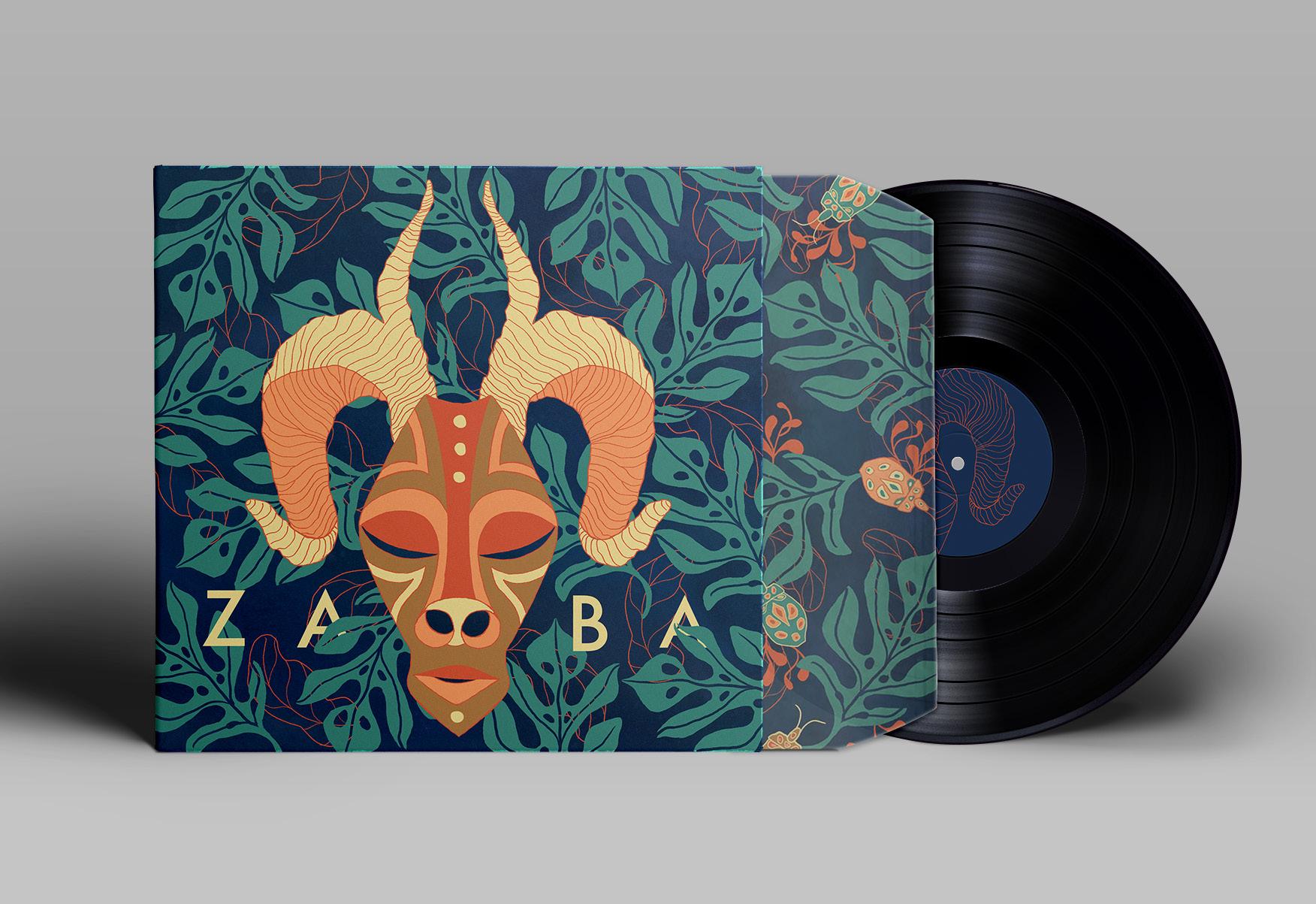
Glass Animals Album Cover & Poster (2015)
The artist of this album writes his lyrics as if they were complex riddles. The actual stories and characters are disguised with weird words and anthropomorphic animals. These are accompanied by ambient jungle noises, and this is a running theme throughout the album. I decided to create a cover that focused on this strange jungle theme and convey the idea of camouflage/disguises through the leaf pattern, the beetles and the mask.


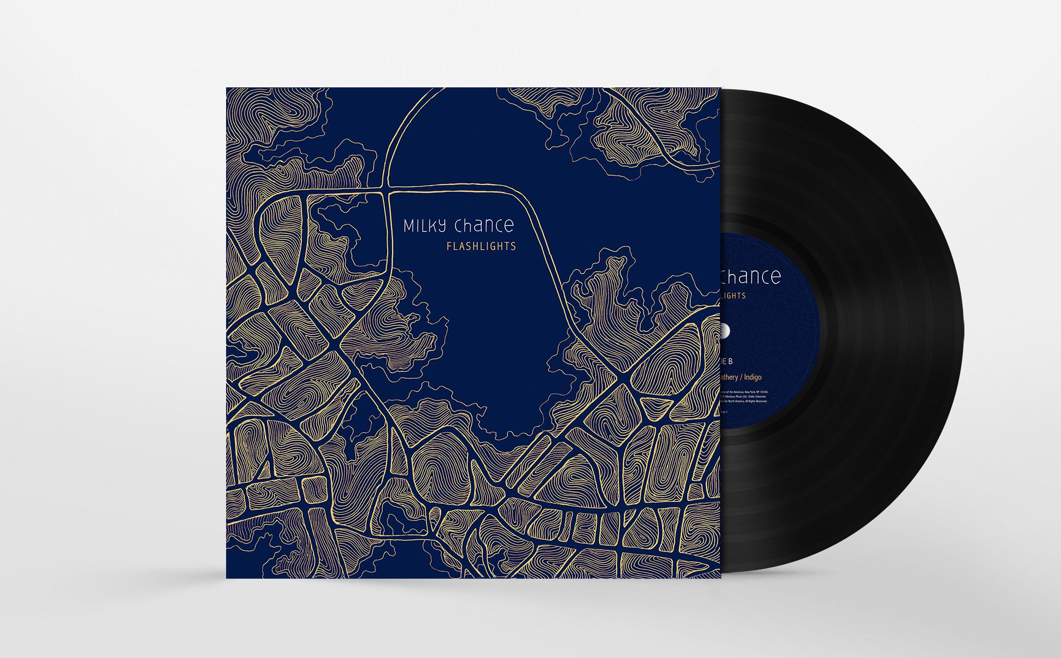
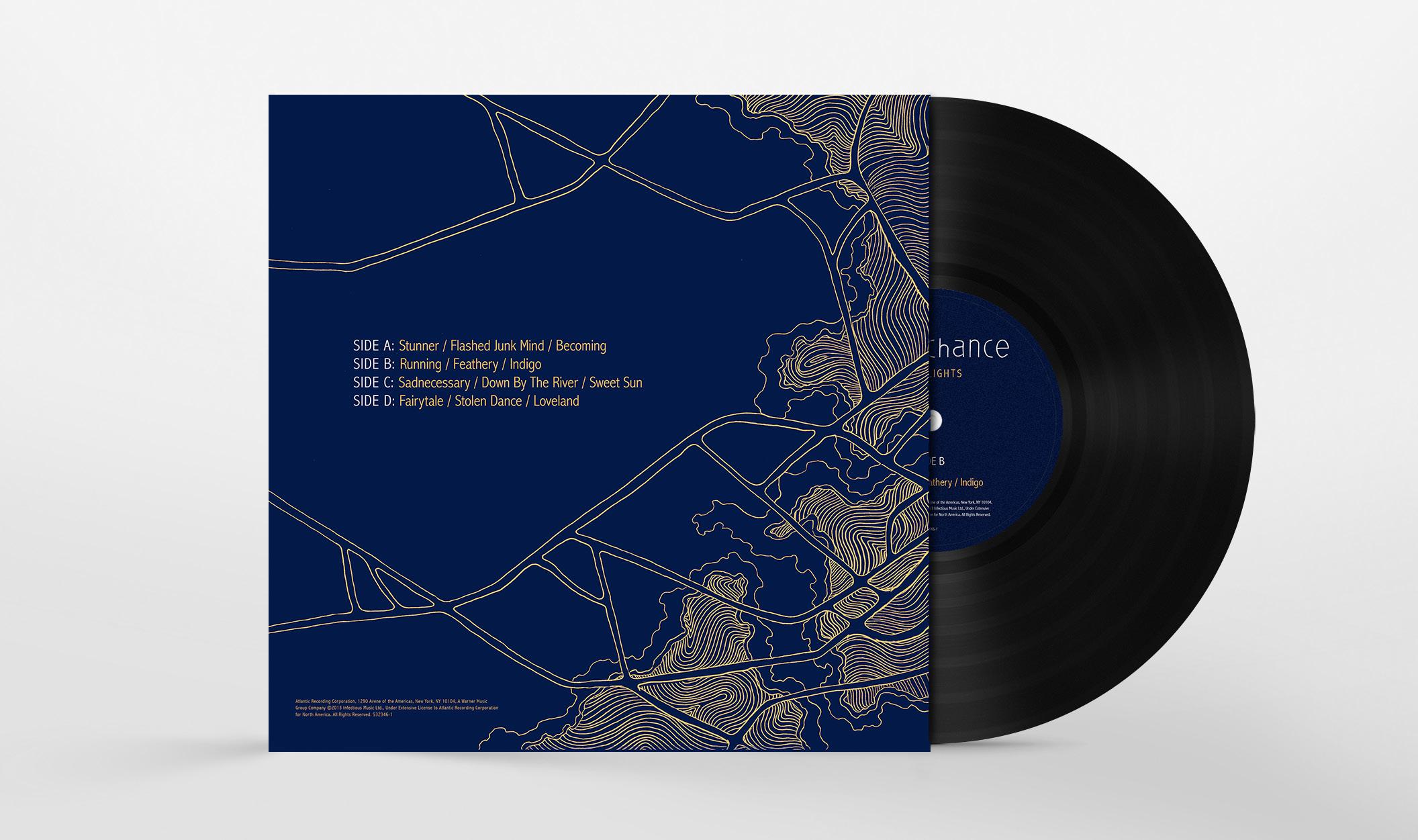
Milky Chance Album Concept and Design (2016)
The concept and design of this album, titled “Flashlights,” was developed from listening to the lyrics of songs by Milky Chance. Flashlights are referred to in one of the songs as the city lights surrounding the singer as he fell in love. I chose to illustrate this city that is significant to him illuminated at night from an aerial point of view.


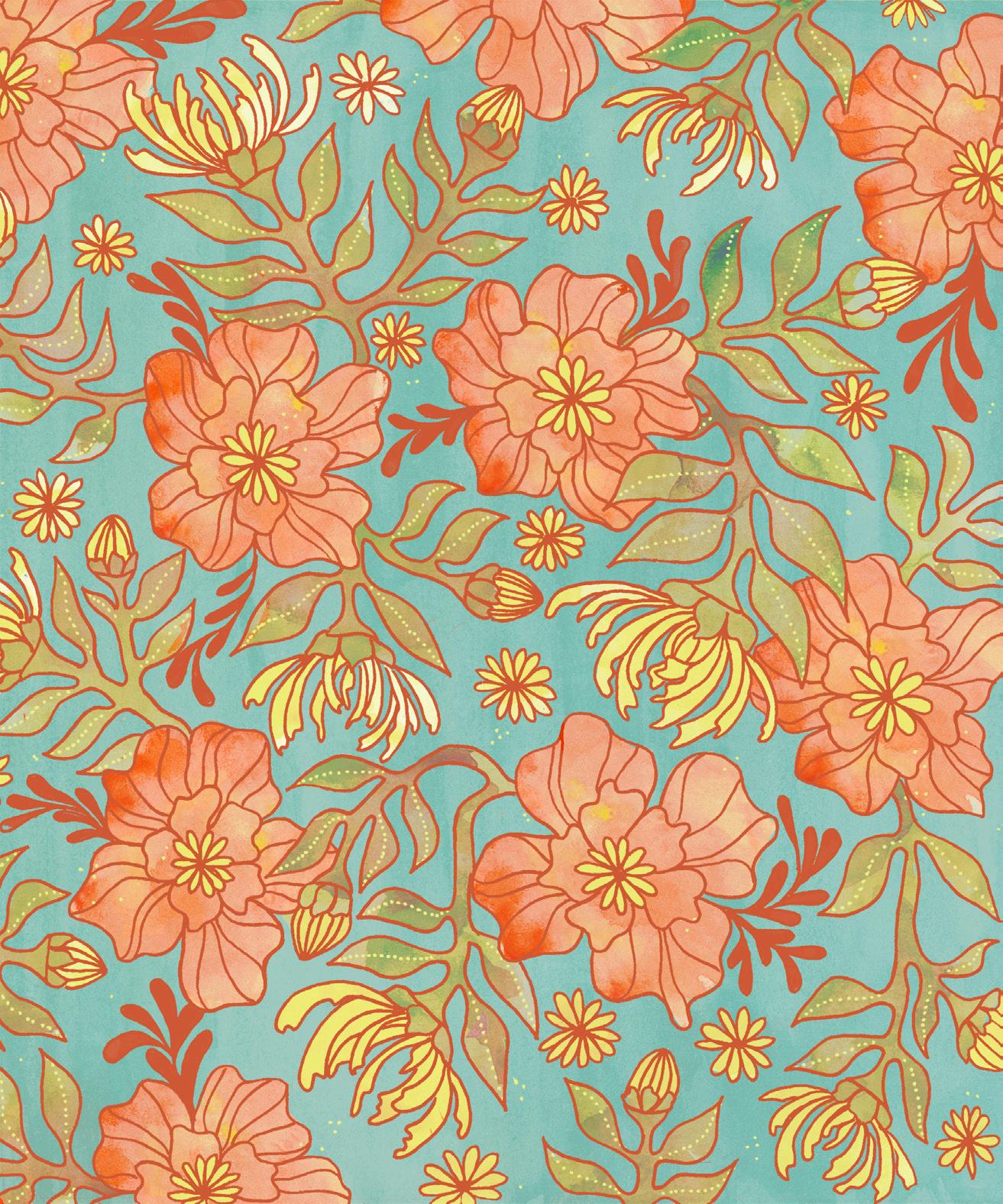
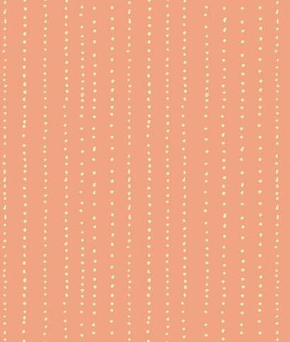
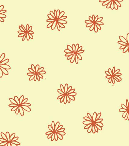
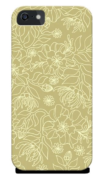
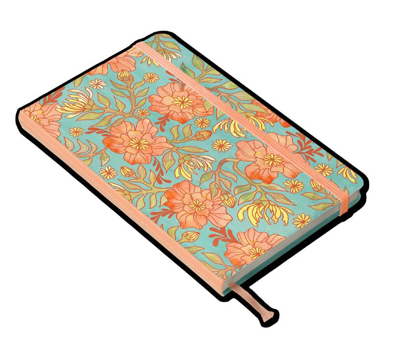
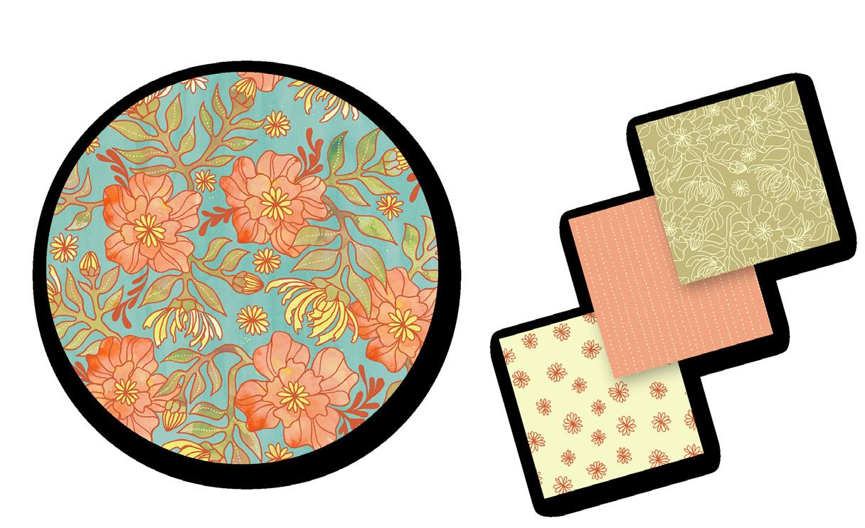
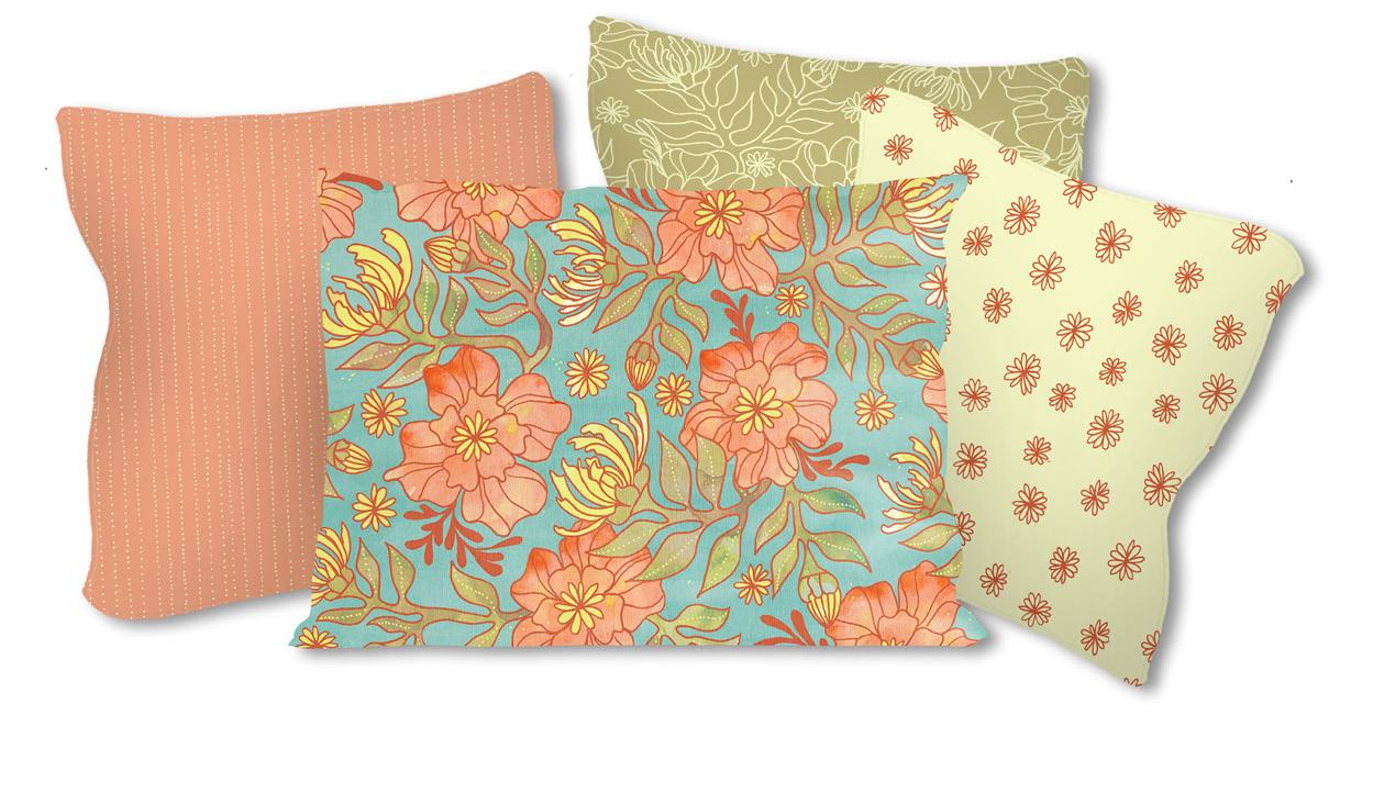
Licensing Pattern and Coordinates (2016)
This floral pattern set was created to be used on a variety of products. The set includes one main floral pattern and three coordinates to compliment it. Below, I have mocked up ways this pattern and coordinates can be used together or separately, displaying its diverse usability.


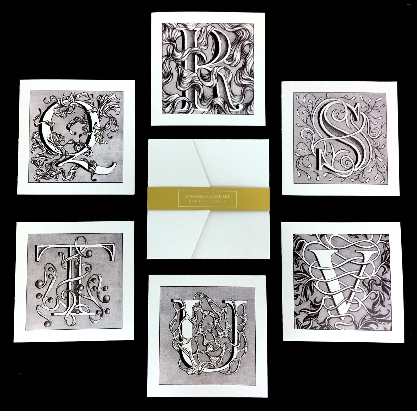
Monogram Card Set (2015)
A set of hand-drawn monogram greeting cards that can be used for any occasion and given to someone whose name starts with that letter.

Student Addys Poster (2017)
Printed on gold metallic paper
An Addys poster inspired by The Vienna Secession. In this poster I am portraying the Addys as a chance for students to get their work in the spotlight and have more people and professionals see their work. I created a flat floral pattern that combined natural and geometric shapes which reflects the characteristics of the art movement I am referencing.
