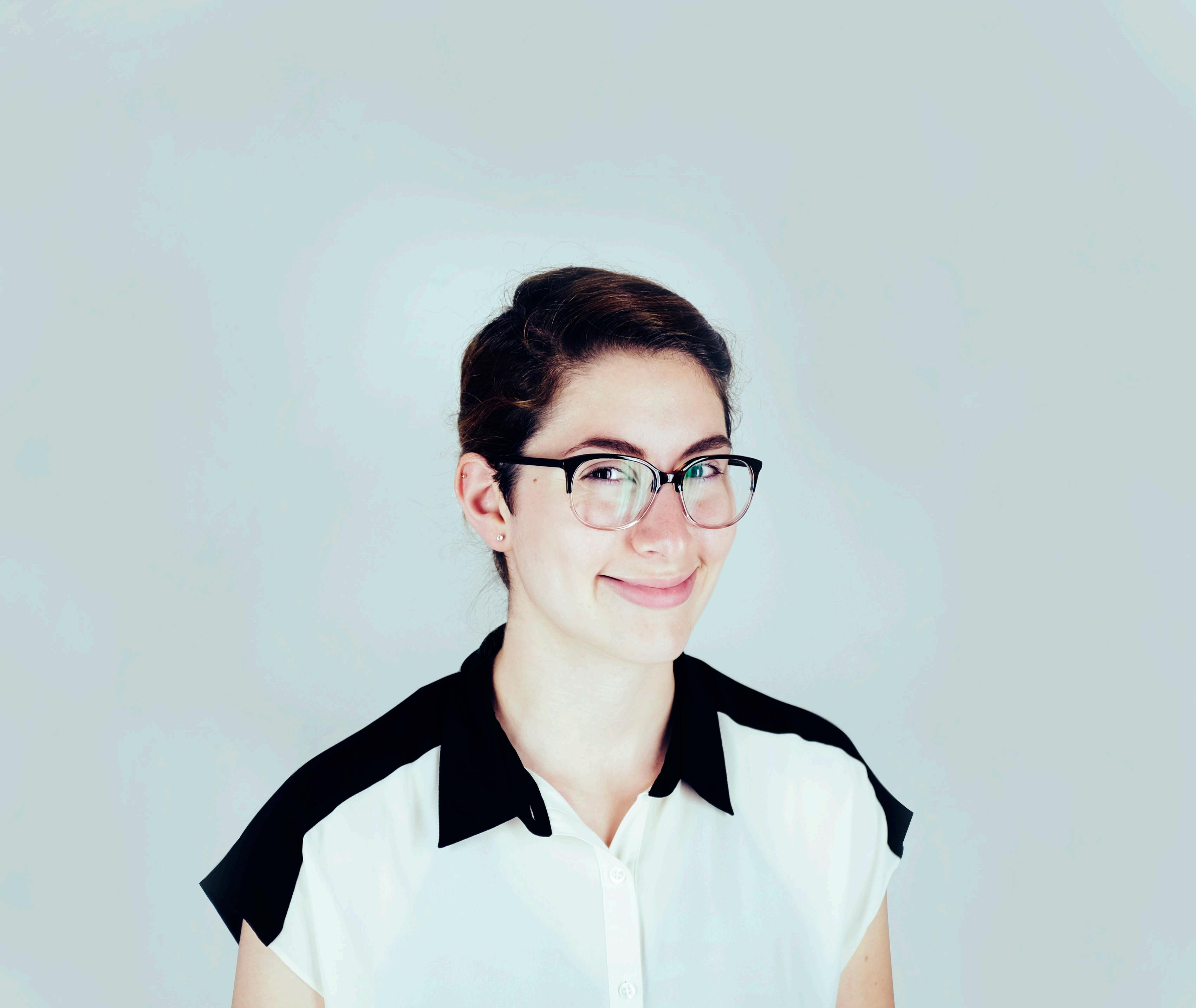
ANGELIQUE CAMACHO
Graphic Designer | Illustrator | Collagist
This book is a compilation of major projects I created at Watkins College of Art, Design & Film. This will give you a closer look into my creative process from start to finish. Each project presented a new set of challenges and problems to solve. This book is designed to let you see how I arrived at each finished product. Thank you for taking the time to look at my work.
I’m Angelique Camacho and this is my process.
TABLE OF CONTENTS
Eko Magazine // 10
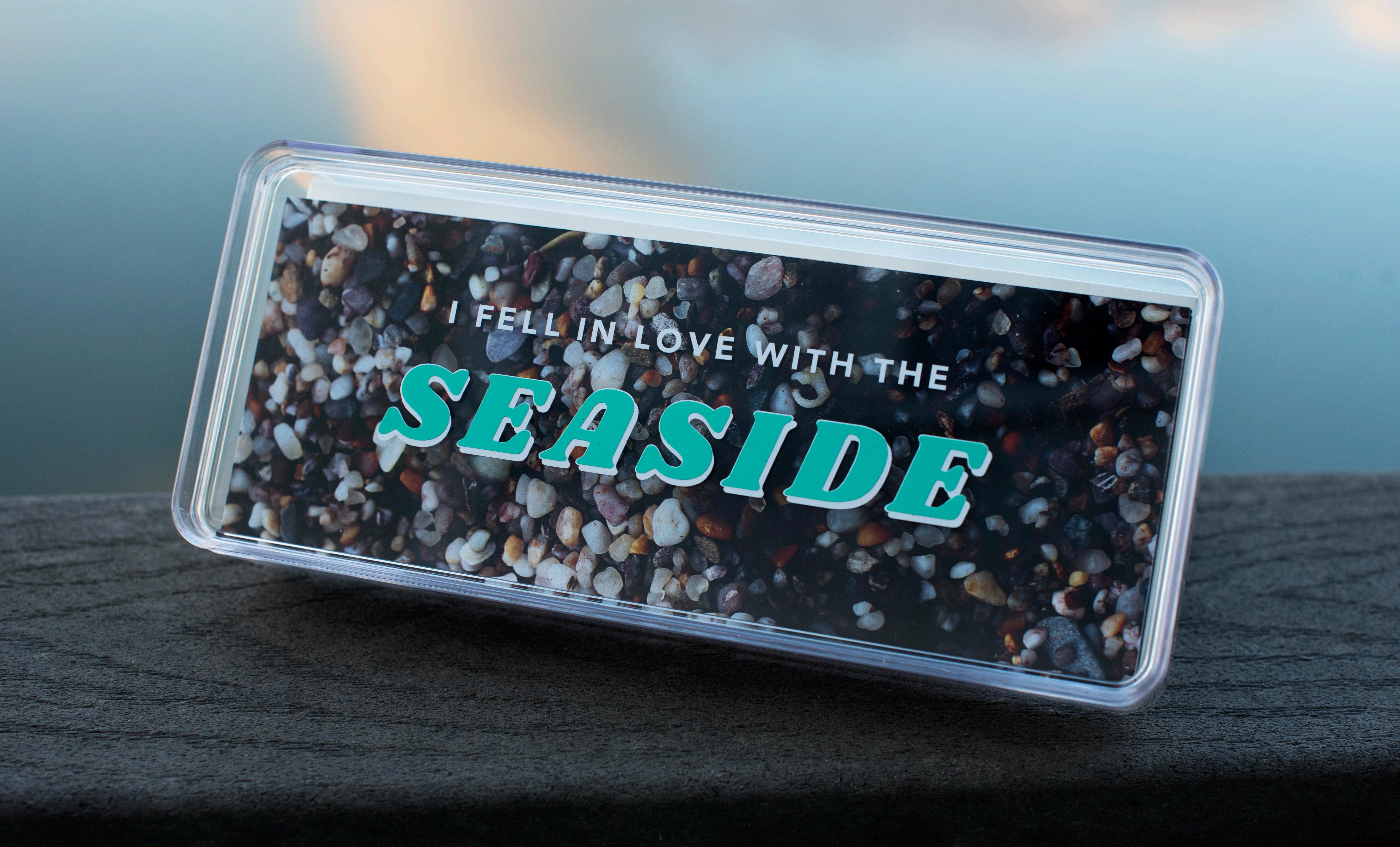
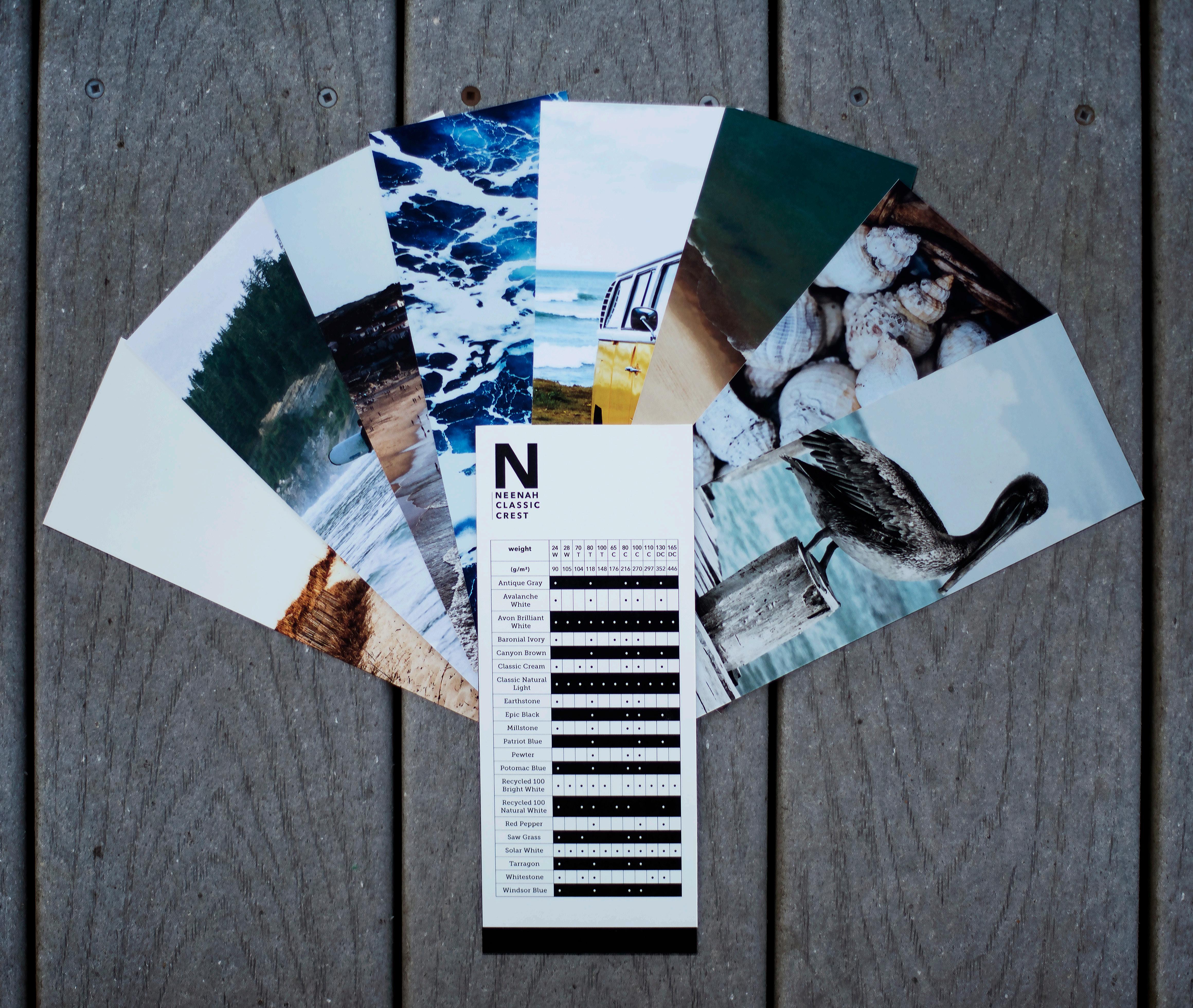
I Fell in Love with the Seaside // 20
Laszlo Moholy-Nagy Brochure // 24 Logo Design // 36
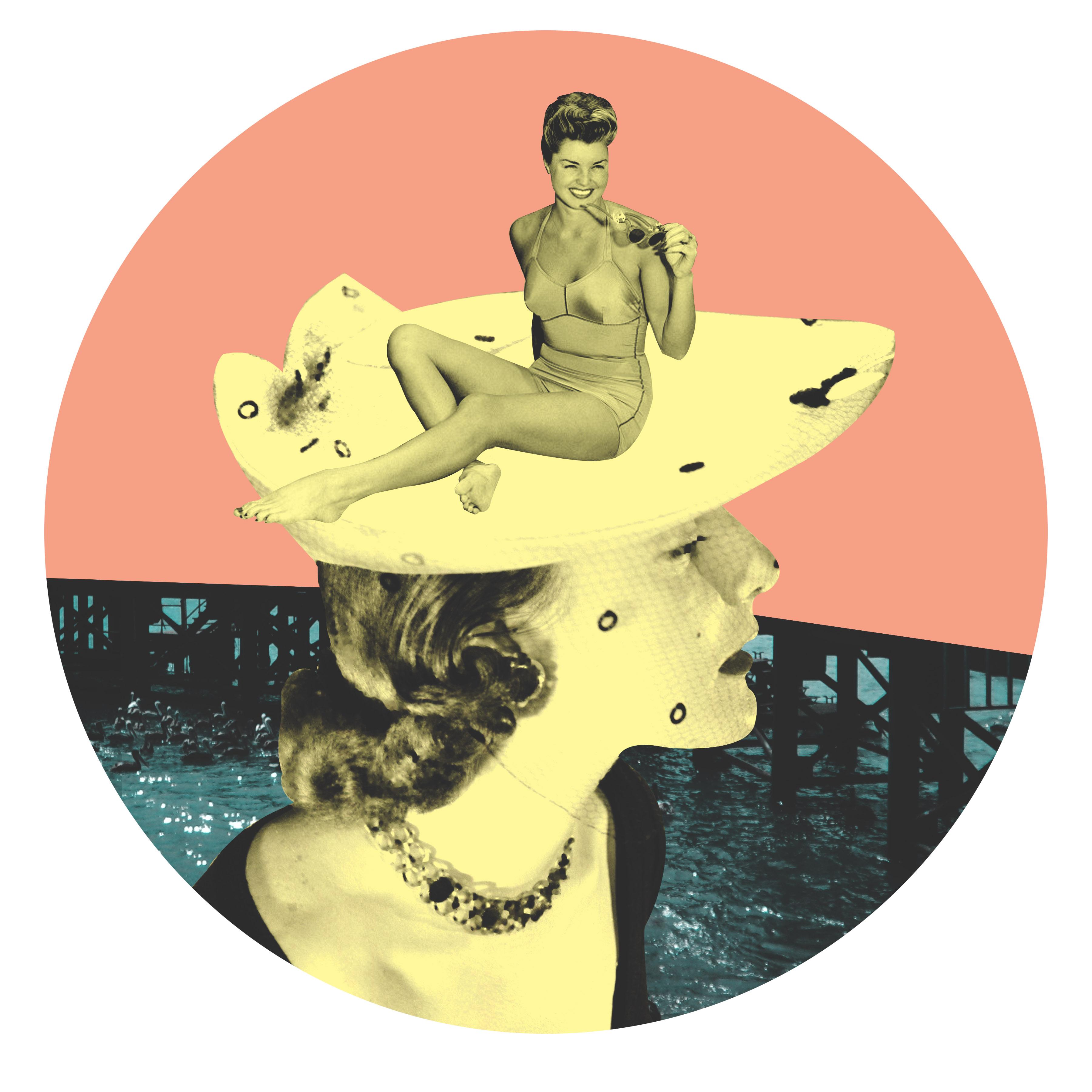
Surreal Collages Book // 30 Me // 46
Honest Herbs // 4 So Jealous Campaign // 16
HONEST HERBS
Package Design Branding Identity
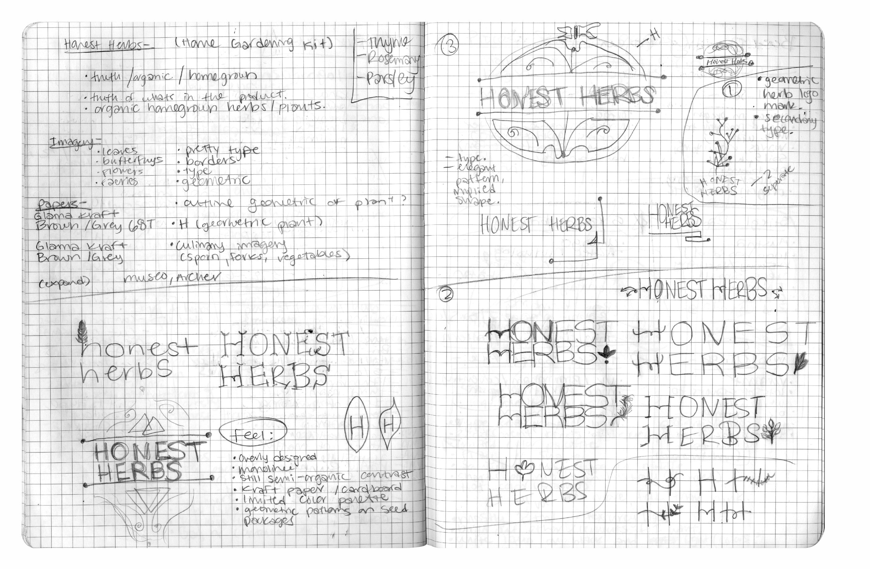
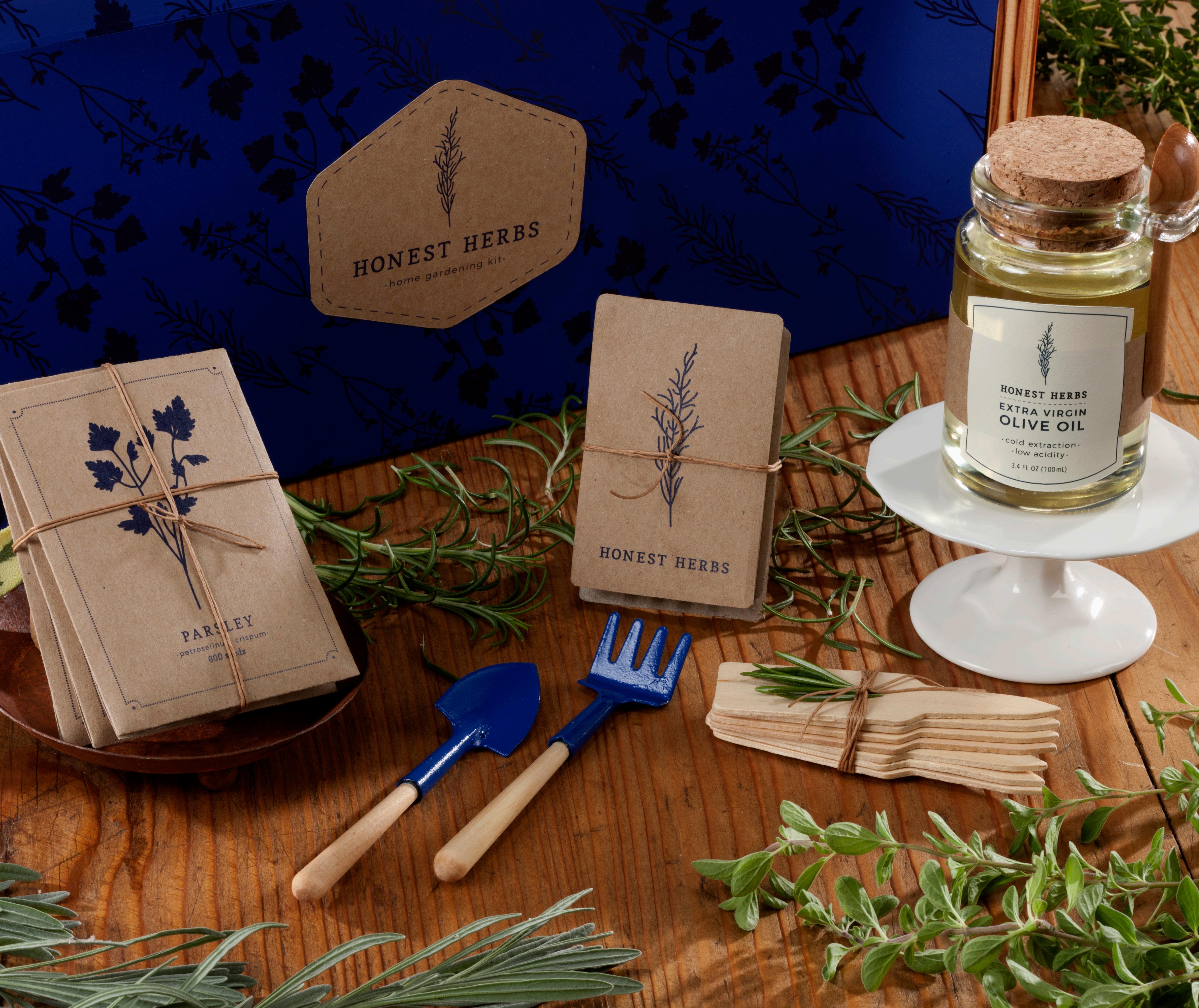
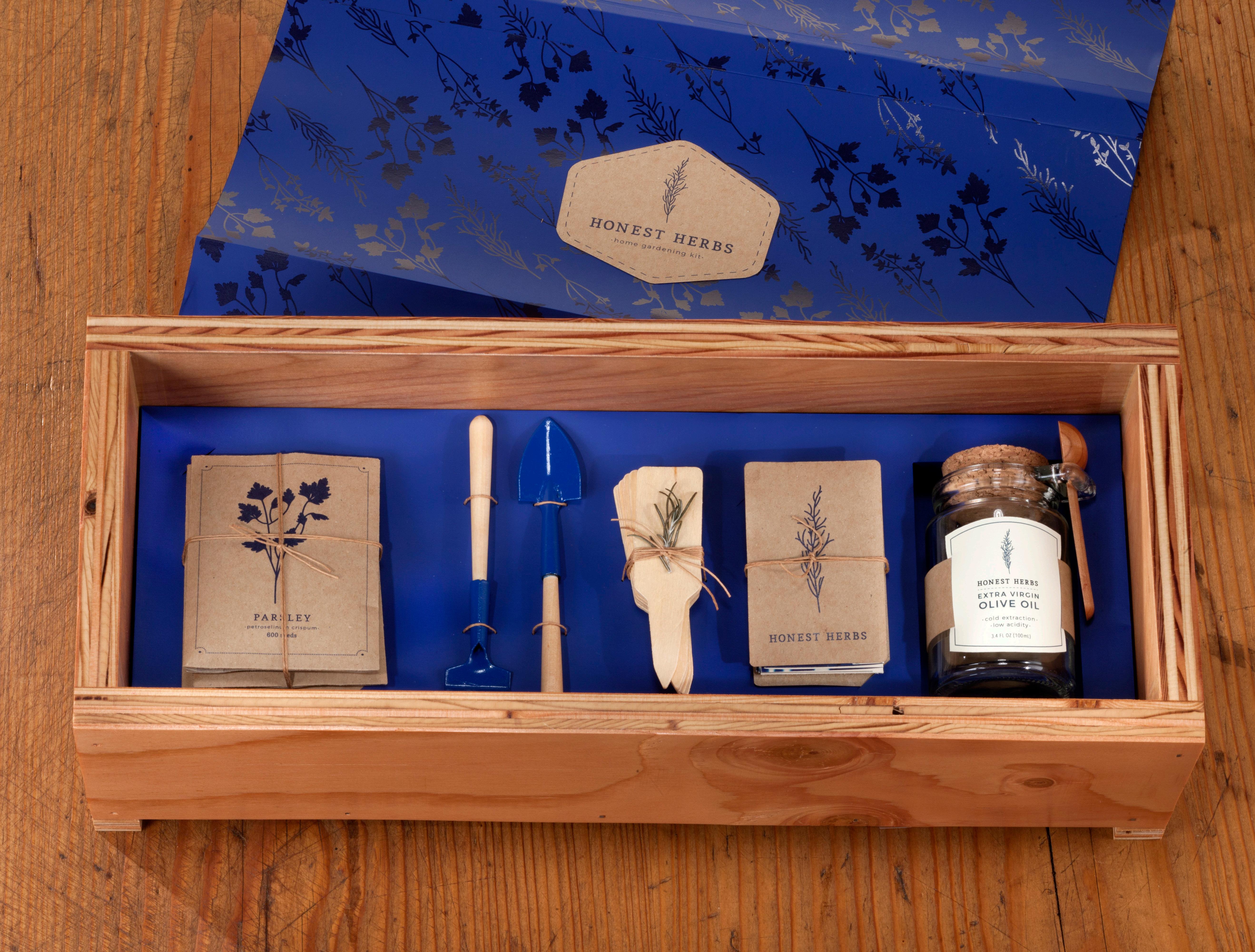
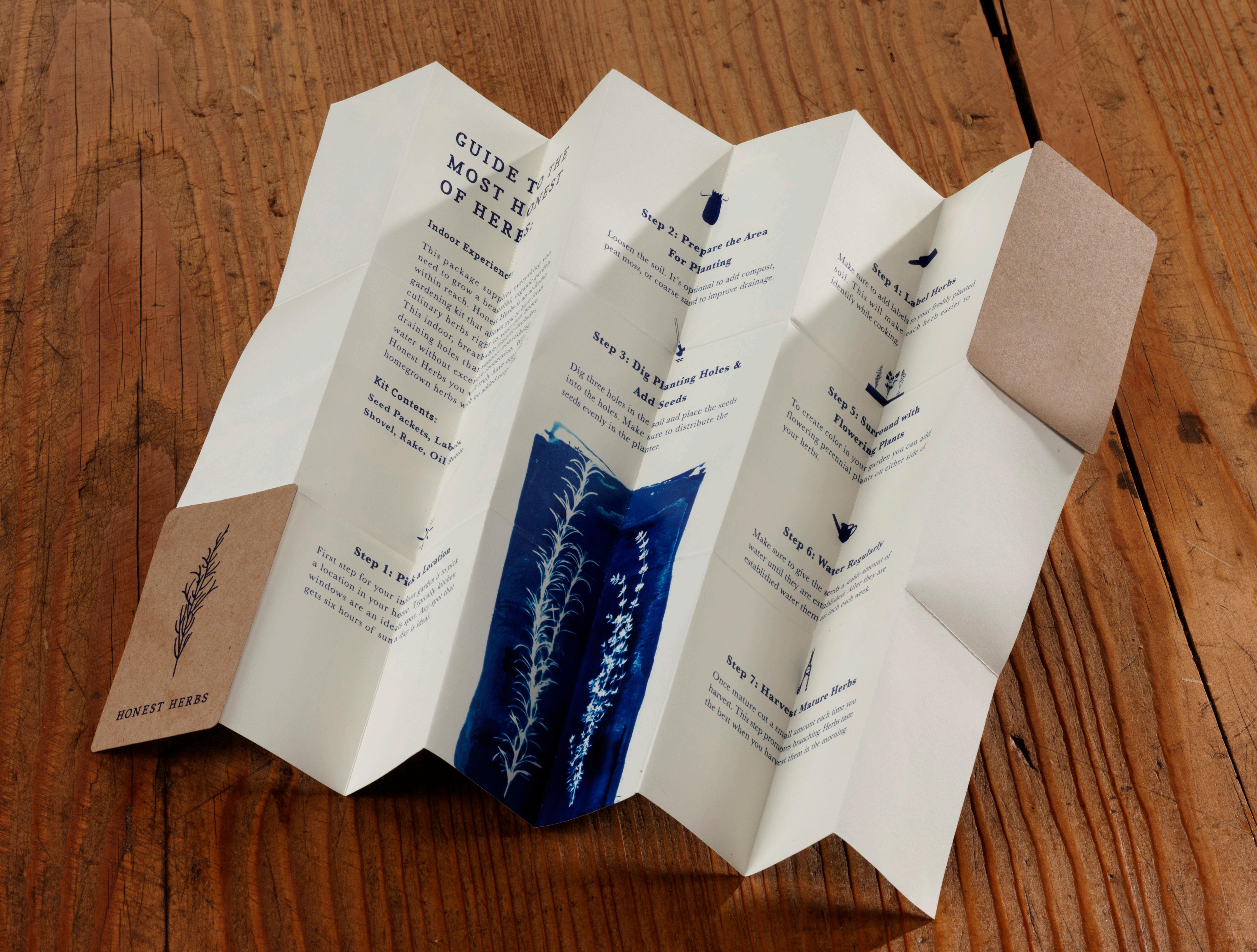
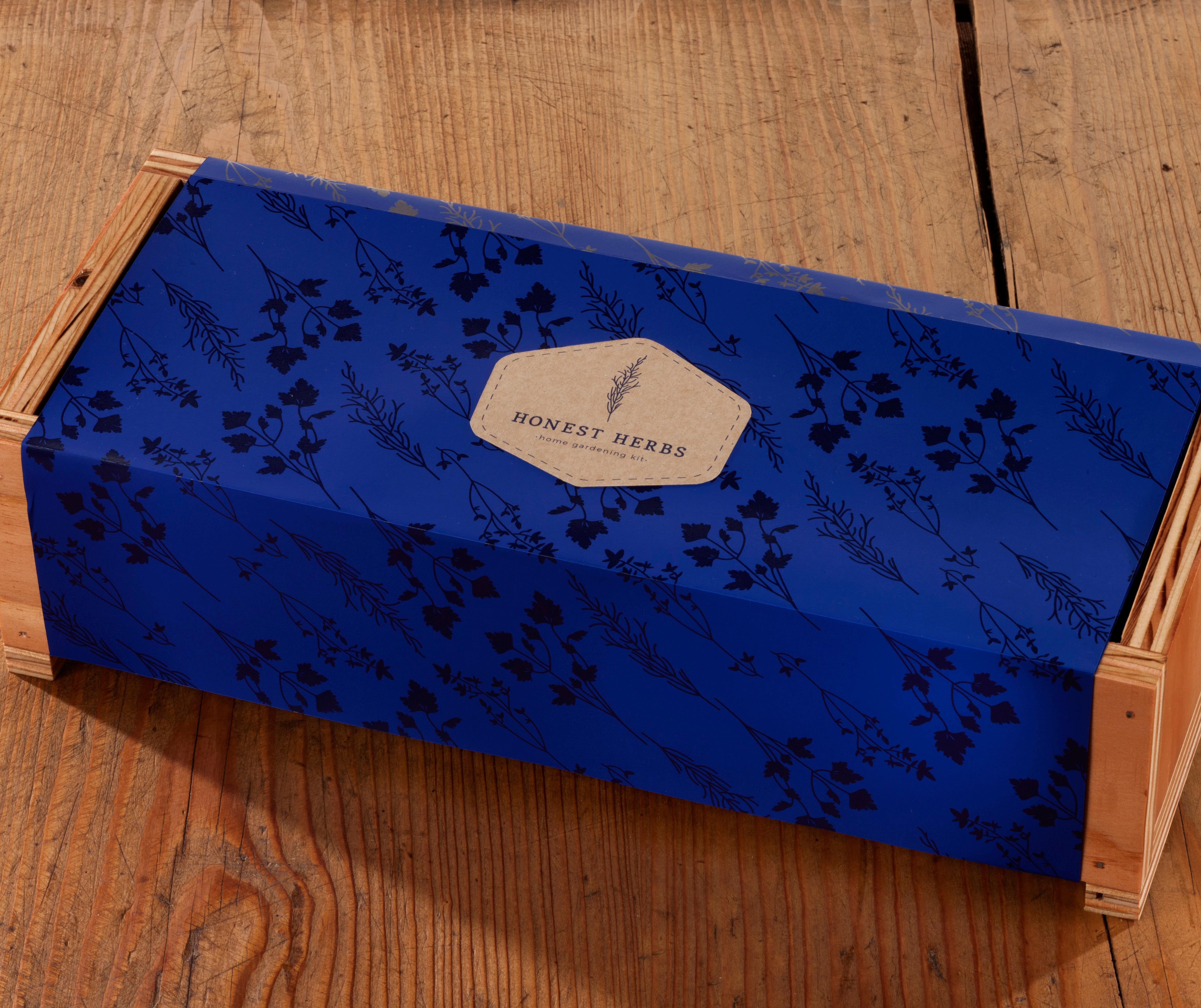
Honest Herbs is a home gardening kit that supplies you with everything you need to grow a beautiful, organic herb garden within reach. The main components to the style and brand are inspired by modern monoline illustrations. During this process I made cyanotypes for the instructional brochure.
photography by Mike Rutherford
EKO MAGAZINE
Editorial Design Branding | Identity
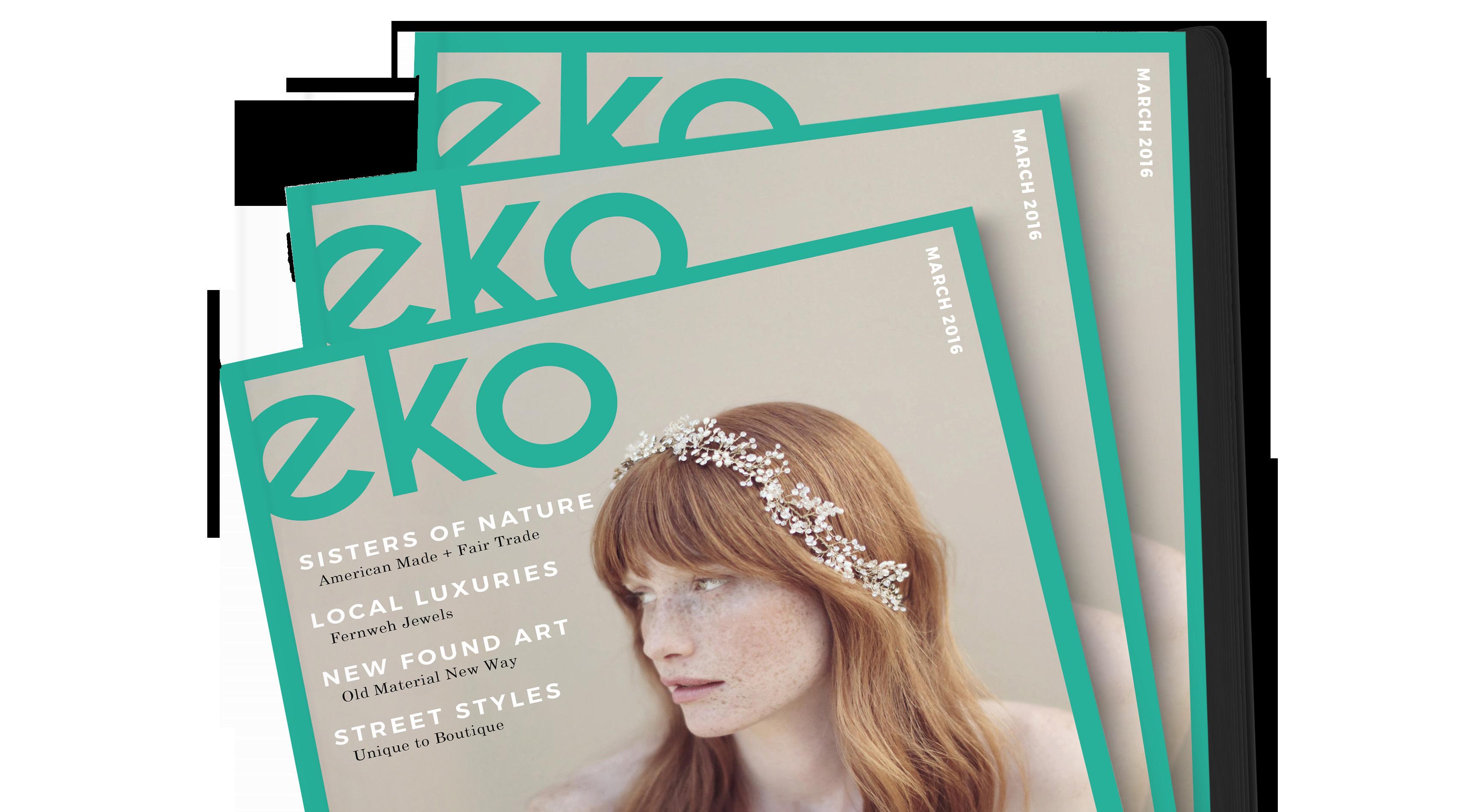
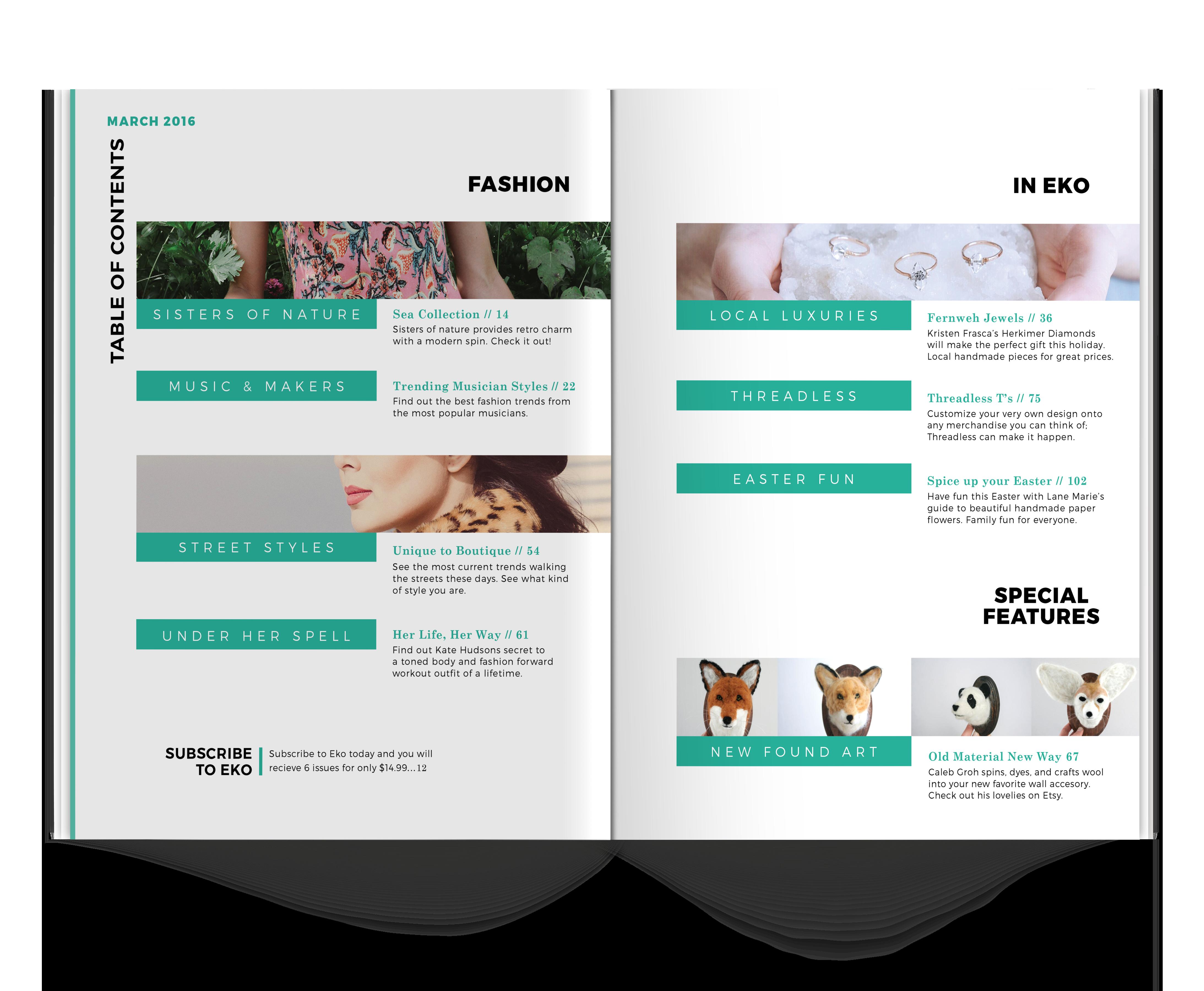
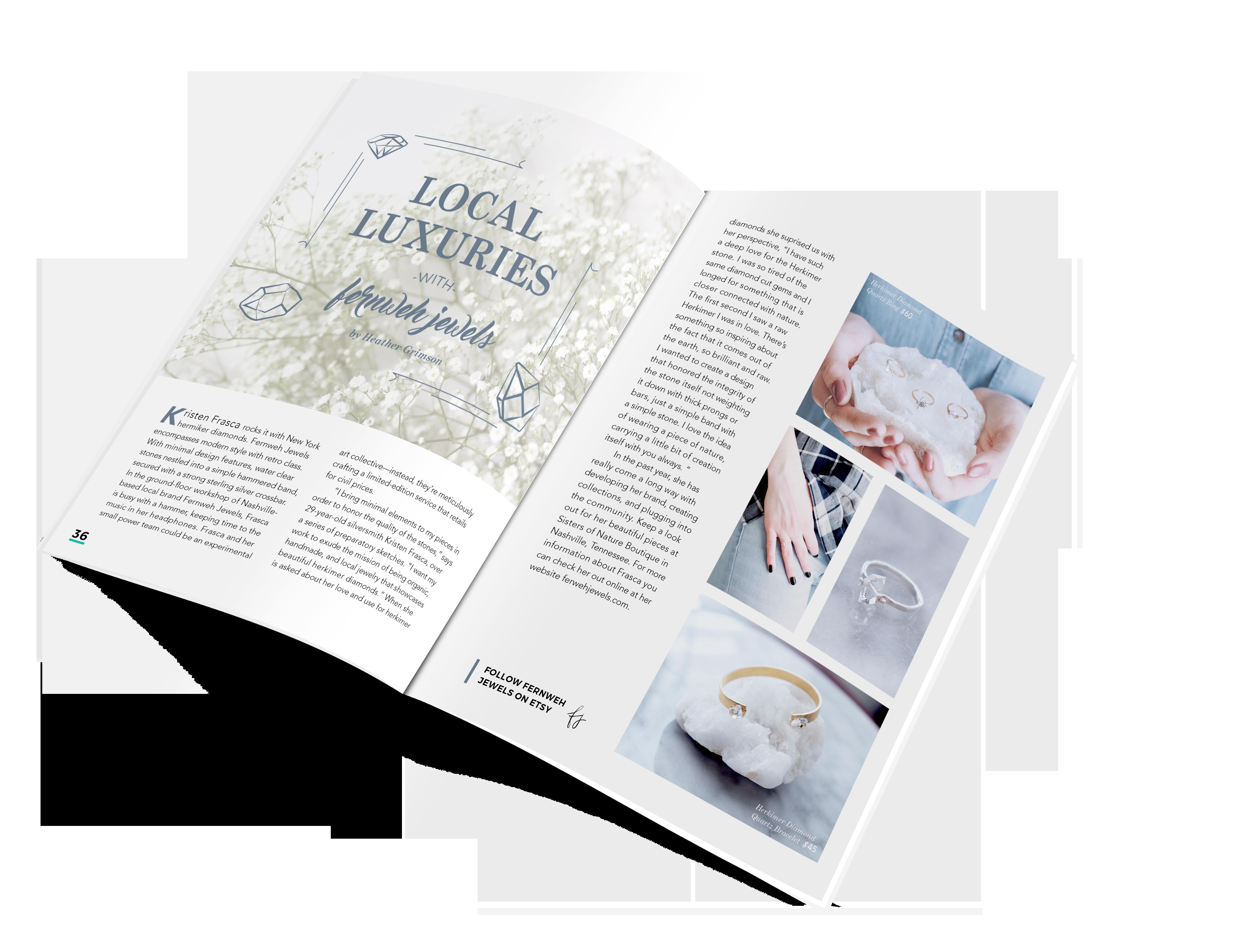
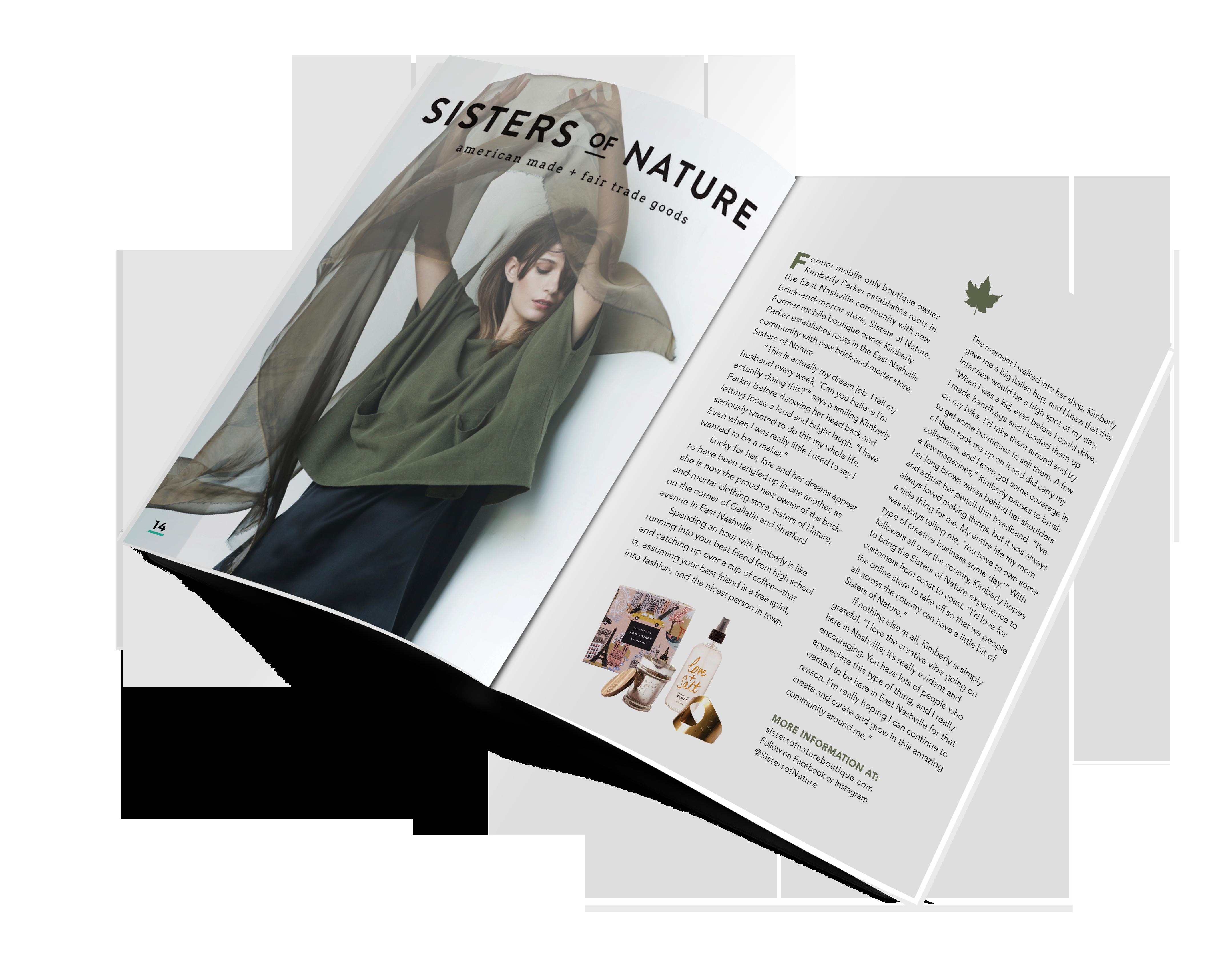
Eko magazine is a local street fashion magazine that features artists and businesses. I designed a masthead, cover, table of contents, and two editorial spreads. The name eko is based on of fashion trends recurring throughout culture.
SO JEALOUS ALBUM DESIGN
Packaging Advertising
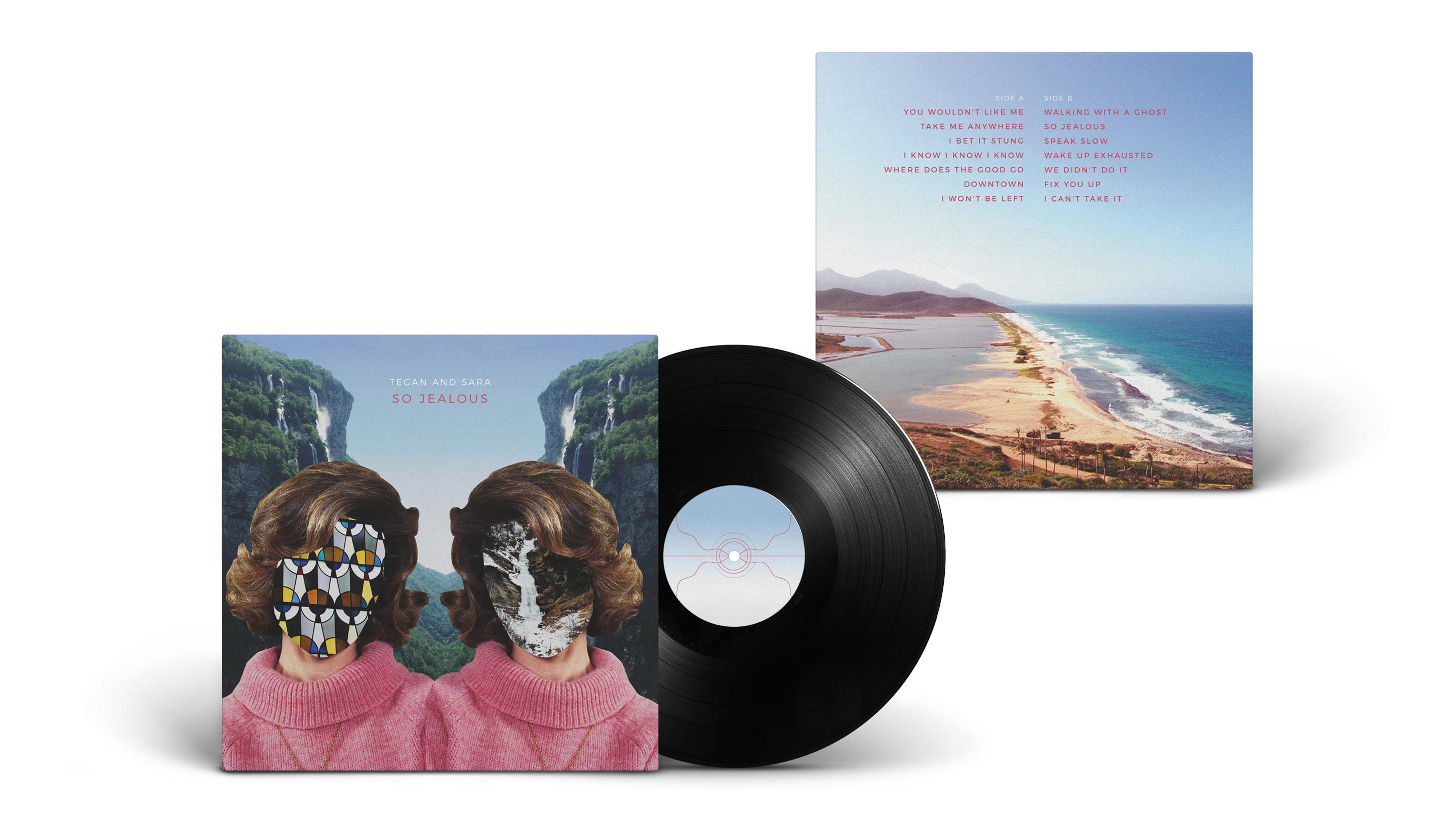
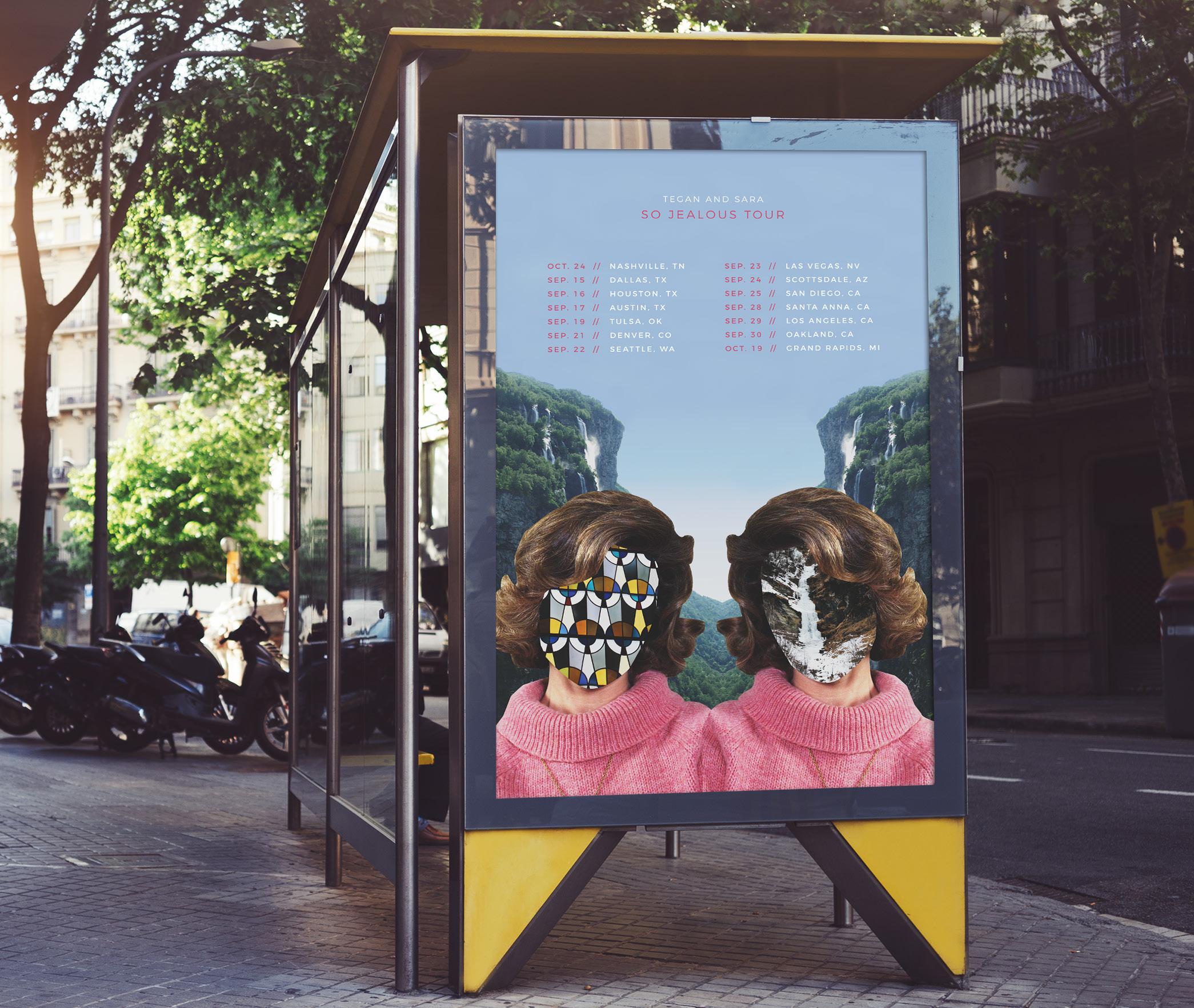
So Jealous is the fourth album by the indie rock band twin sister act, Tegan and Sara. It was released in 2004. I wanted to evoke a feeling of mystery reflected in the album’s content while also appealing to a modern audience by combining digital collage with modern typography.
LASZLO MOHOLY-NAGY BROCHURE
Editorial Design | Exhibition Collateral
LASZLO MOHOLY-NAGY BROCHURE
Editorial Design | Exhibition Collateral
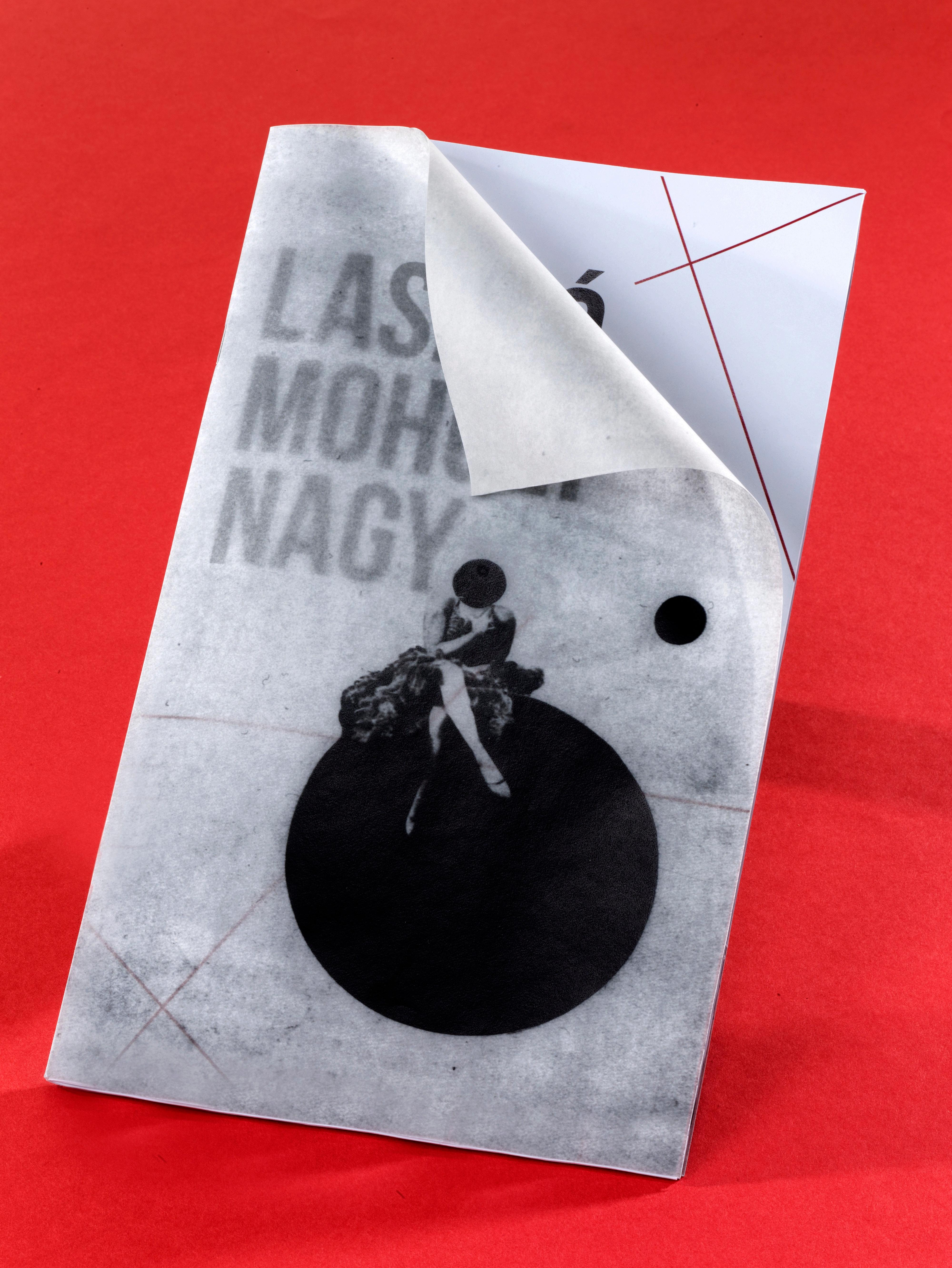
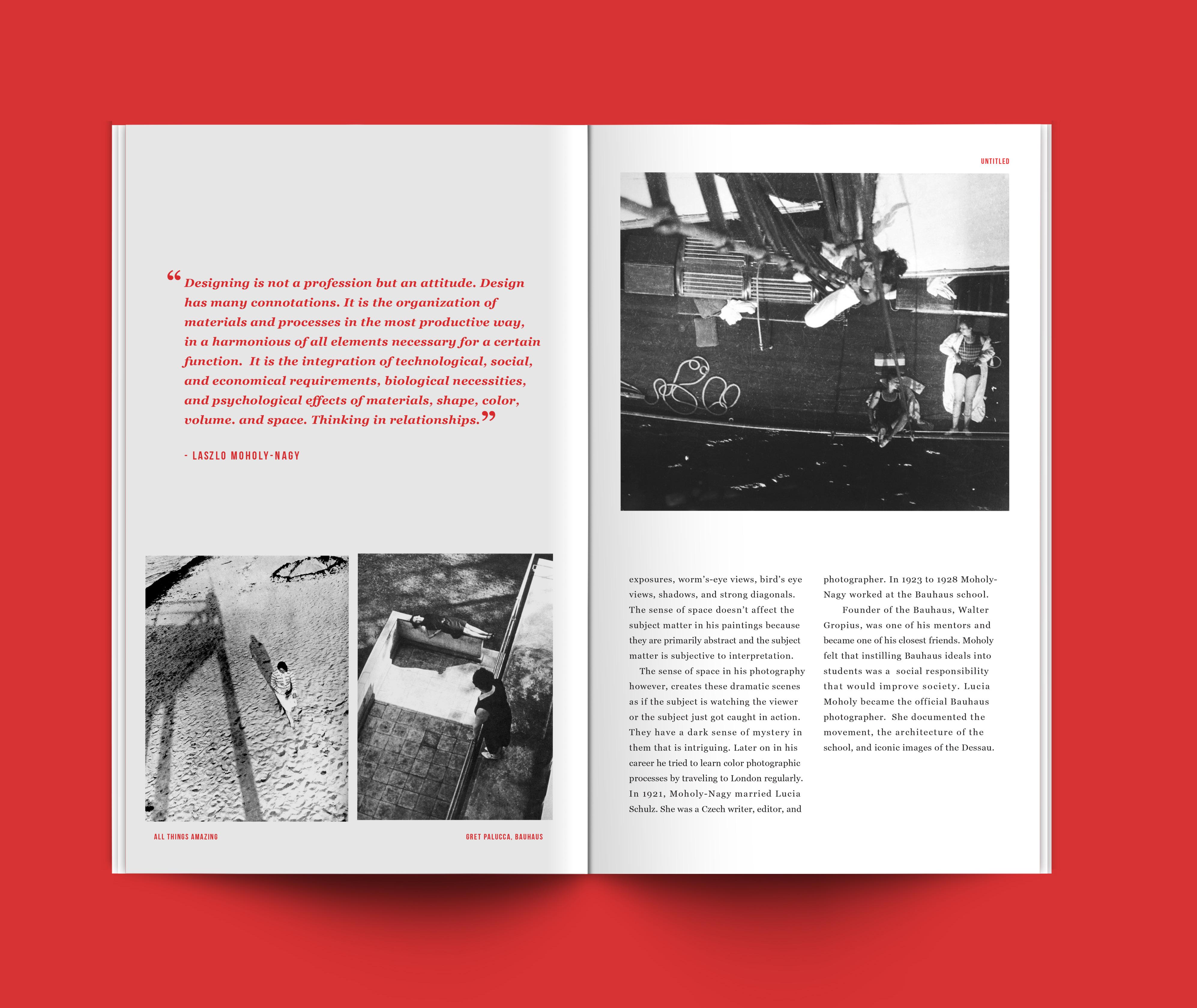
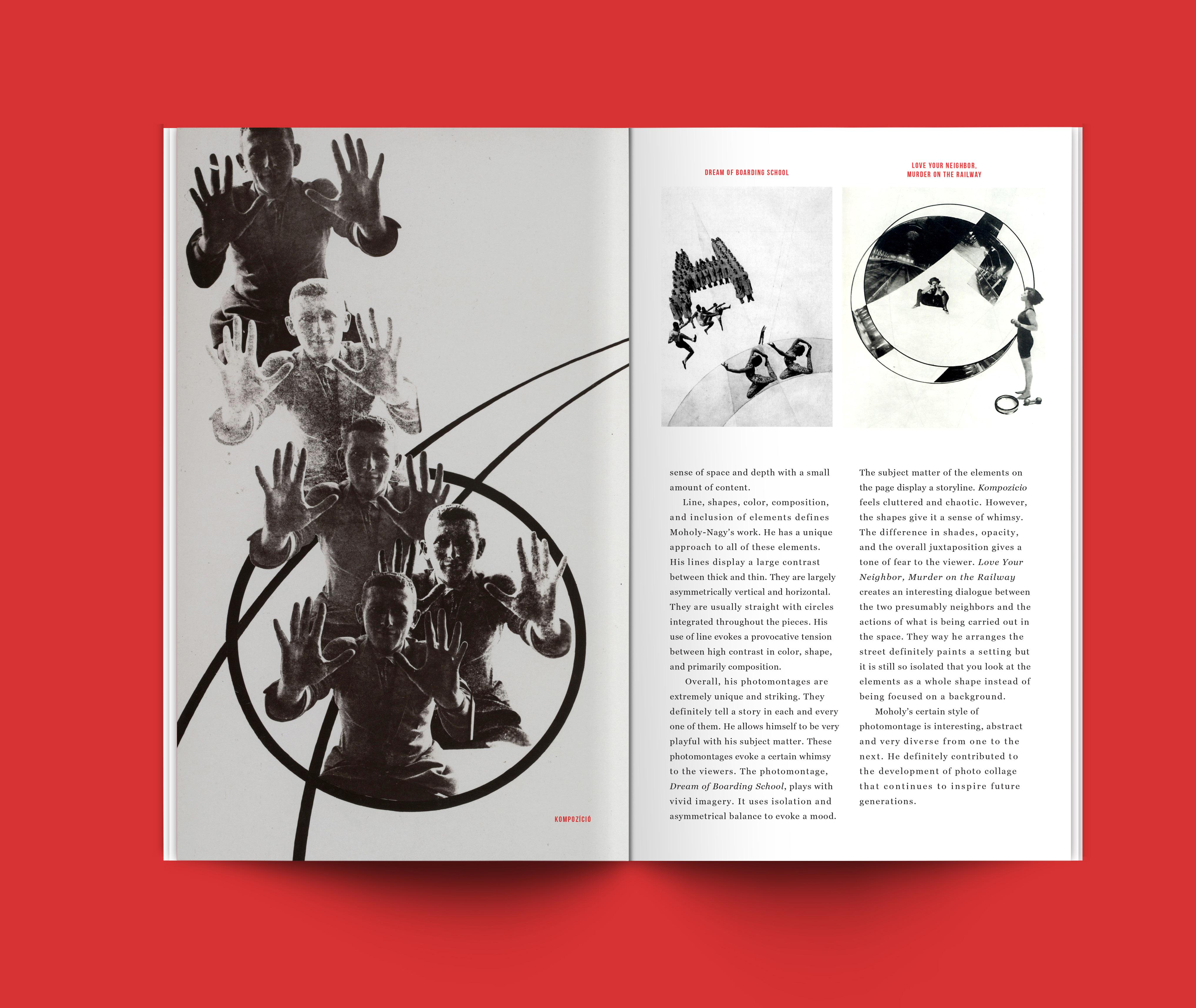
This is a brochure for the Laszlo Moholy-Nagy retrospective exhibition at the Frist Center for the Visual Arts in Nashville, Tennessee. The exhibition is a compilation of his photographic work. It is organized in three separate categories: Photography, Photomontage, and Photograms.
SURREAL COLLAGES BOOK
Book Design | Collage
SURREAL COLLAGES BOOK
Book Design Collage
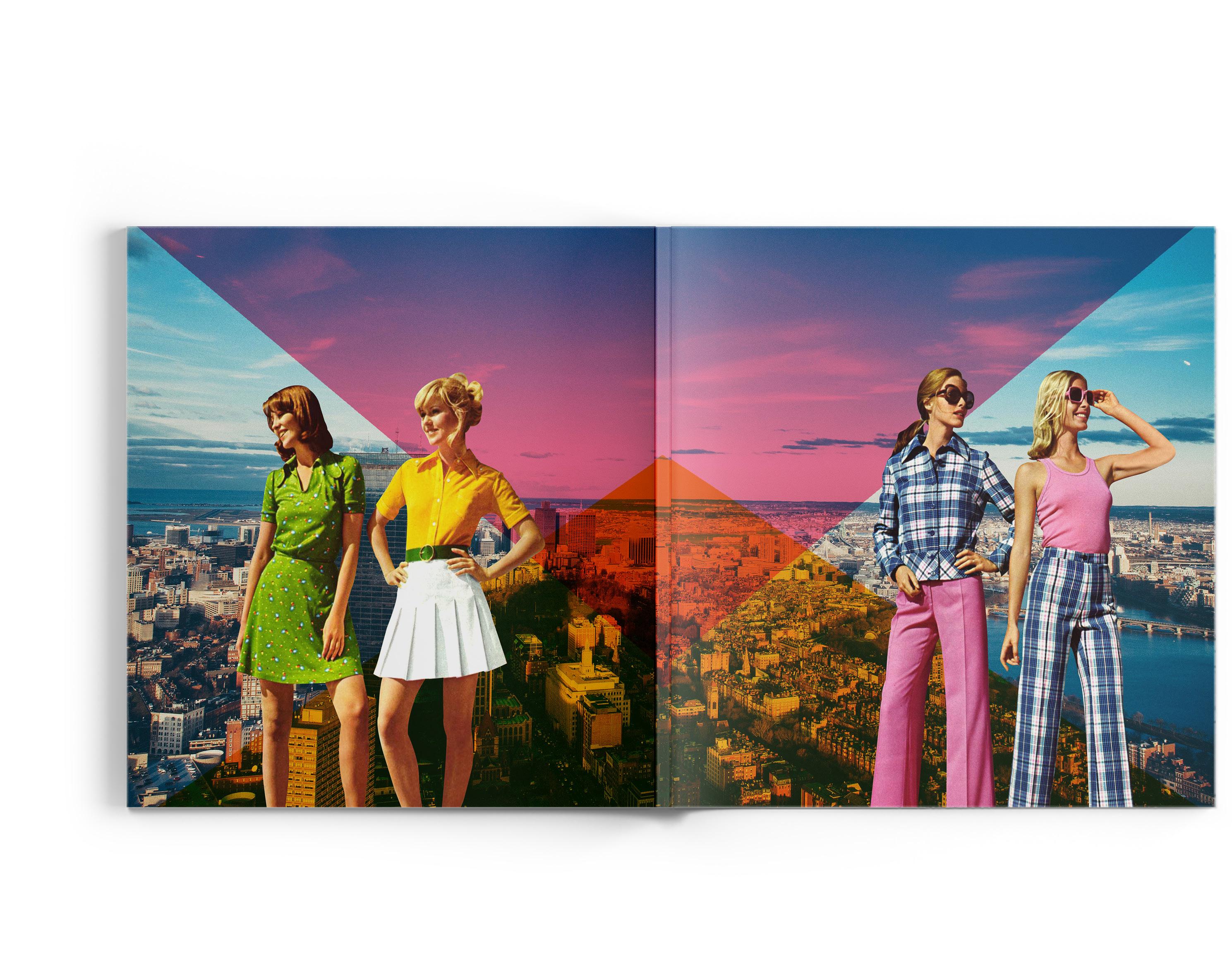
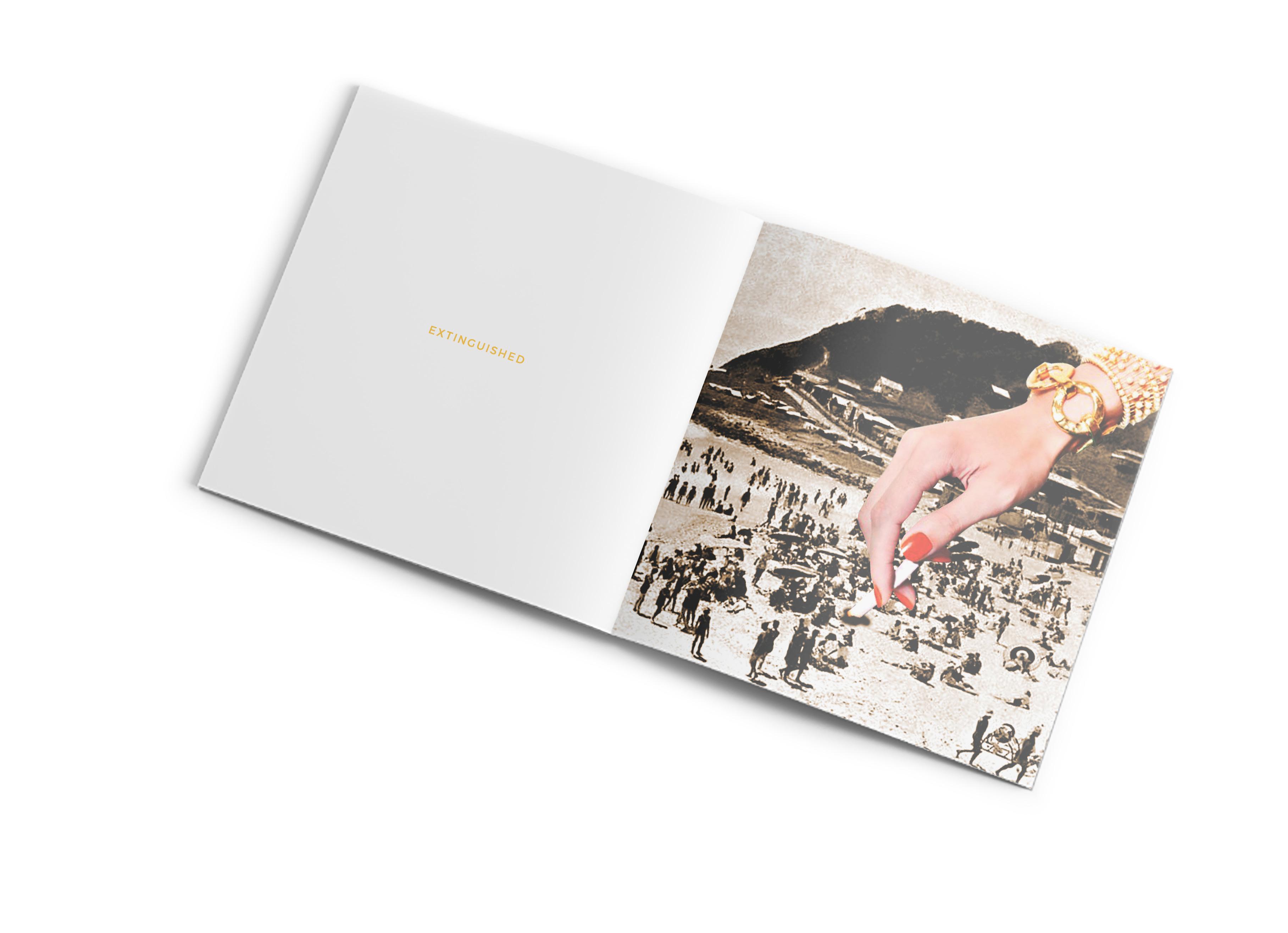
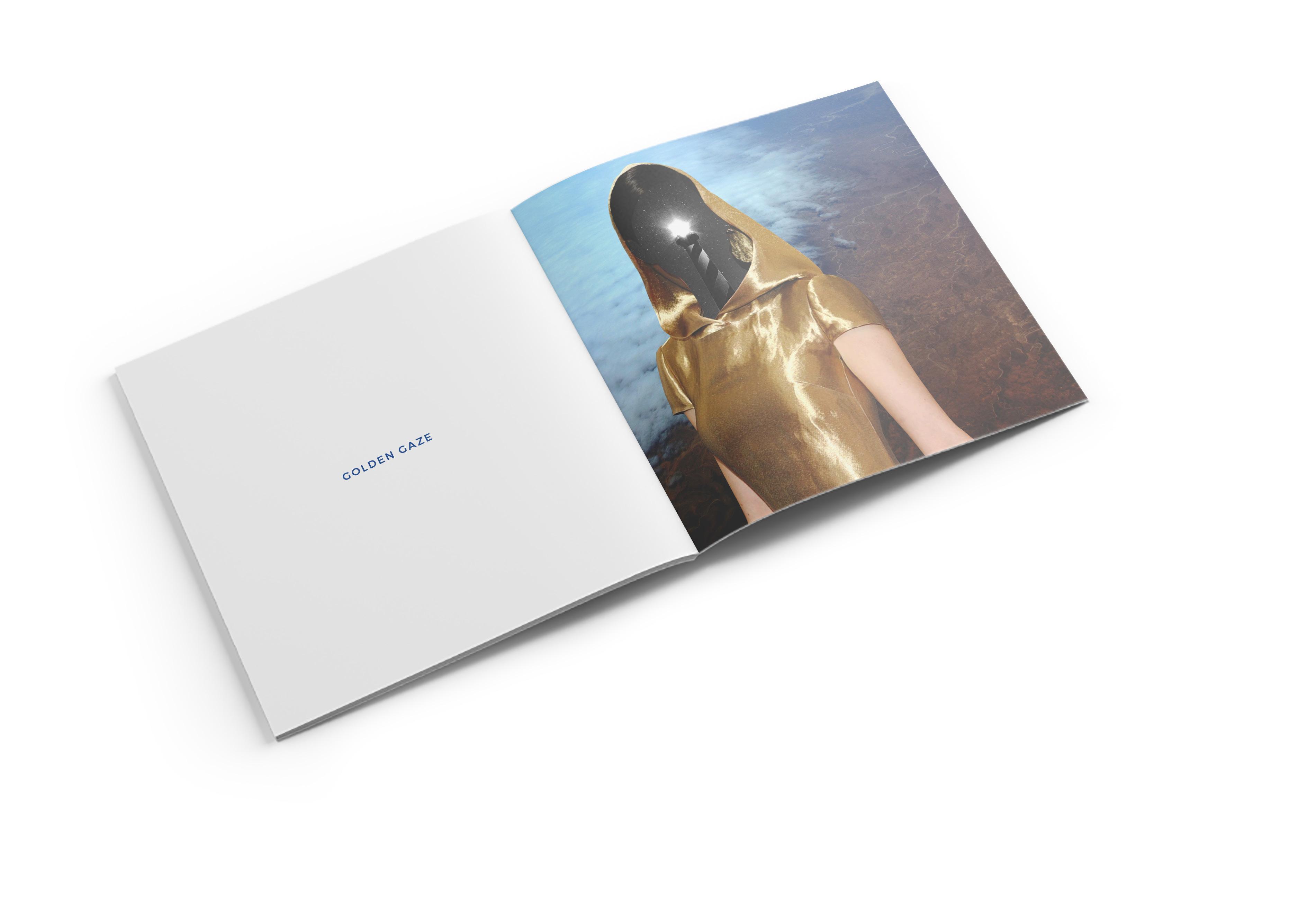
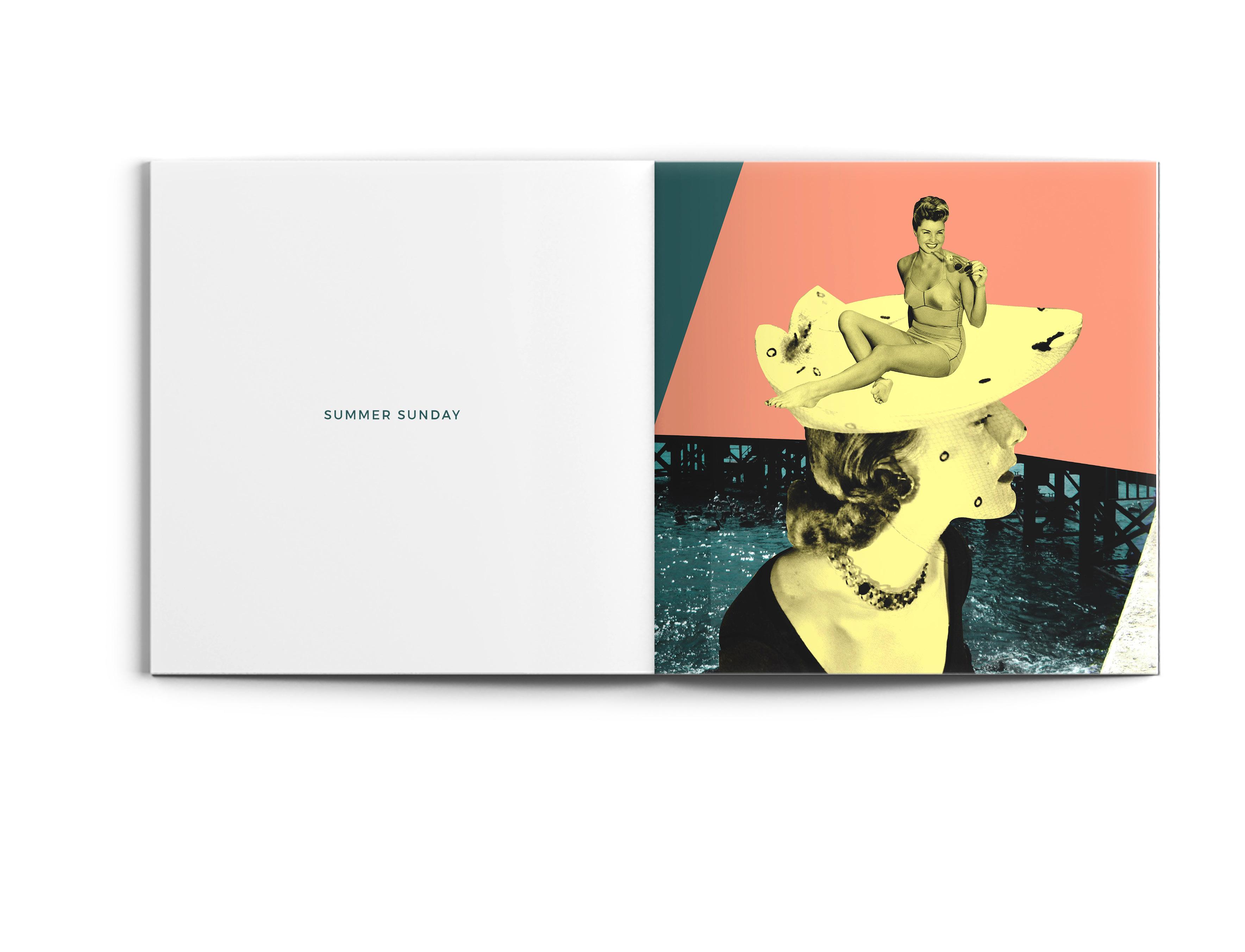
This book is a compilation of surreal digital collages I produced during the summer of 2016. It is an exploration of myself as a collage artist and a transition from manual to digital collage.
HITCH CAR SERVICE
Hitch Car Service is an American transportation network company based in San Bernardino, California. The arrow references the act of getting picked up and also reflects the mountains in California.
JORDON WELLS YOGA STUDIO
Jordon Wells is a yoga instructor who conducts private lessons out of his home in Brentwood, Tennessee. The logo is inspired by the yoga pose Salamba Sarvangasana, also known as a shoulder stand. It also resembles the letterform of a J.
primary color palette
KRONA ONE primary typeface
primary color palette
AVENIR NEXT CONDENSED primary typeface
CHEEKWOOD GARDENS
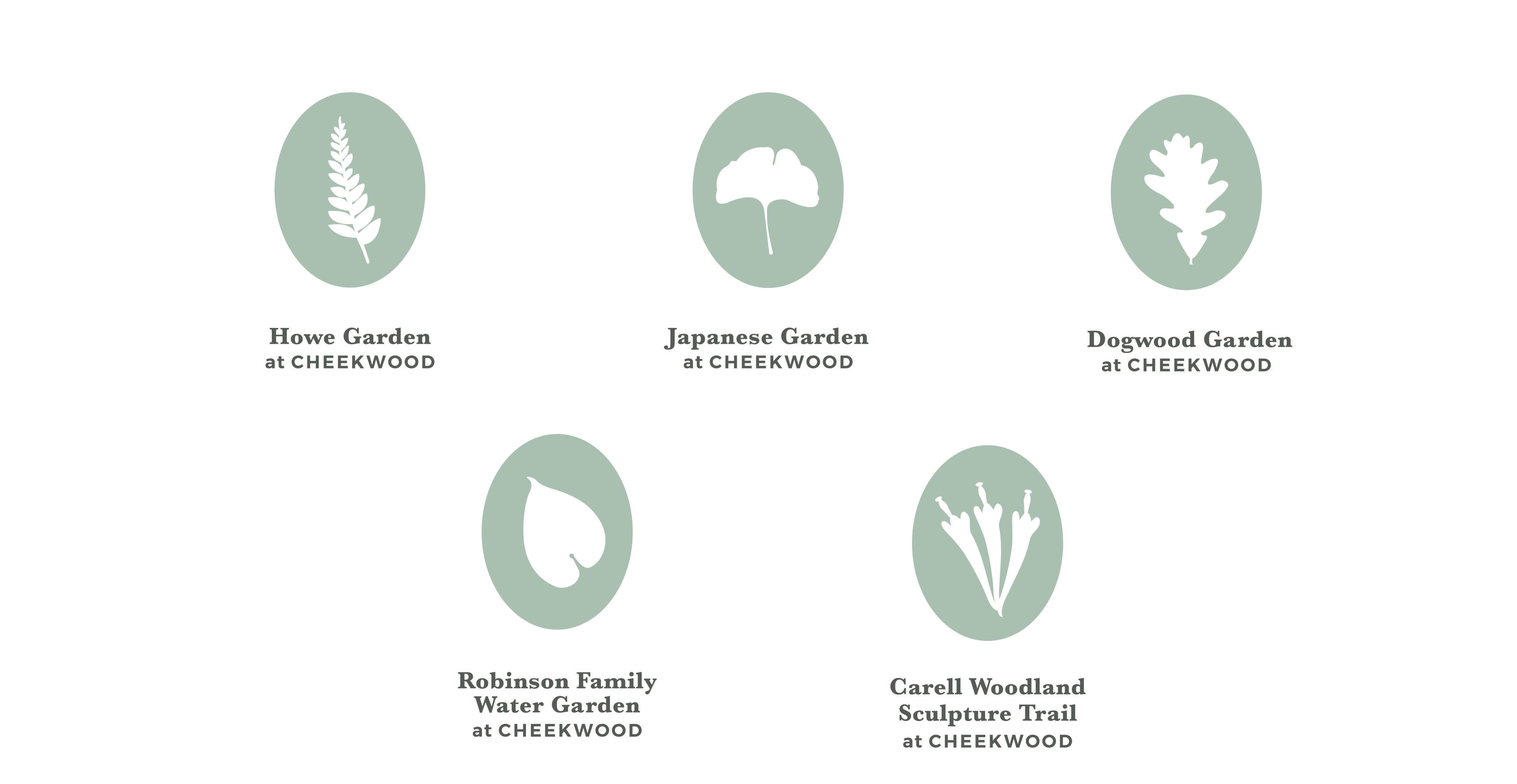
Cheekwood is an art museum surrounded by 55-acres of botanical gardens in Nashville Tennessee. It is located on the historic Cheek estate. This is an identity system for five of the gardens on the property based on which plants grow in each garden.
primary color palette
SPLIT & TWISTED
Split & Twisted is the annual juried graphic design show at Watkins College of Art, Design & Film. As a workstudy I had the opportunity to brand the show and create the theme.
vidaloka
MOONSHOT MINDS
Moonshot Minds was my proposal for the senior show theme. The senior class decided that the theme of the show should pertain to conceptual space or outerspace. I choose to focus on the moon and play with moon cycles in the logo. Moonshot means launching a spacecraft to the moon. It represented the seniors launching themselves into the creative market.
HAVEN HOTEL
The Haven Hotel is a small boutique hotel located in the Germantown neighborhood of Nashville, Tennessee. The logo is inspired by the German heritage and architecture in the area. While representing history, the mark emenates modernity.
primary color palette
ALEO SLAB primary typeface
primary color palette
FRIZ QUADRATA primary typeface
RELEVÉ
Relevé is an elegant, high-quality dance and active wear store based in Boston, Massachusetts. Relevé is a ballet term which means “to rise up” in french. That idea of raising up is reflected in the mark.
color palette
HONEST HERBS
typeface
Honest Herbs is an at-home gardening kit that supplies you with everything you need to grow a organic herb garden. The mark is sophisticated, non-traditional, and minimal.
typeface
ME
I’m a graphic designer, collagist and full-time daydreamer with a keen eye for wonder. Currently based in Nashville, Tennessee. I enjoy creating brand identities, editorial design, and poster design. As a designer and illustrator I try to approach the diverse world of design from a unique perspective through illustration and collage. I am always looking for new projects and experiences, and would love to collaborate with you.
COPYRIGHT ©2016 BY ANGELIQUE CAMACHO ALL RIGHTS RESERVED.
PREMIUM MATTE 100 LB.
AVENIR BOLD & ALEO REGULAR TYPE USED IN BOOK
ANGELIQUECAMACHO.COM
