This book is an overview of projects completed at Watkins College of Art, Design & Film. Every project poses its own set of challenges and problems. Through my process you will see the routes I took to arrive at the finished product.
Yanet Mireles
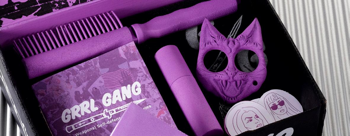
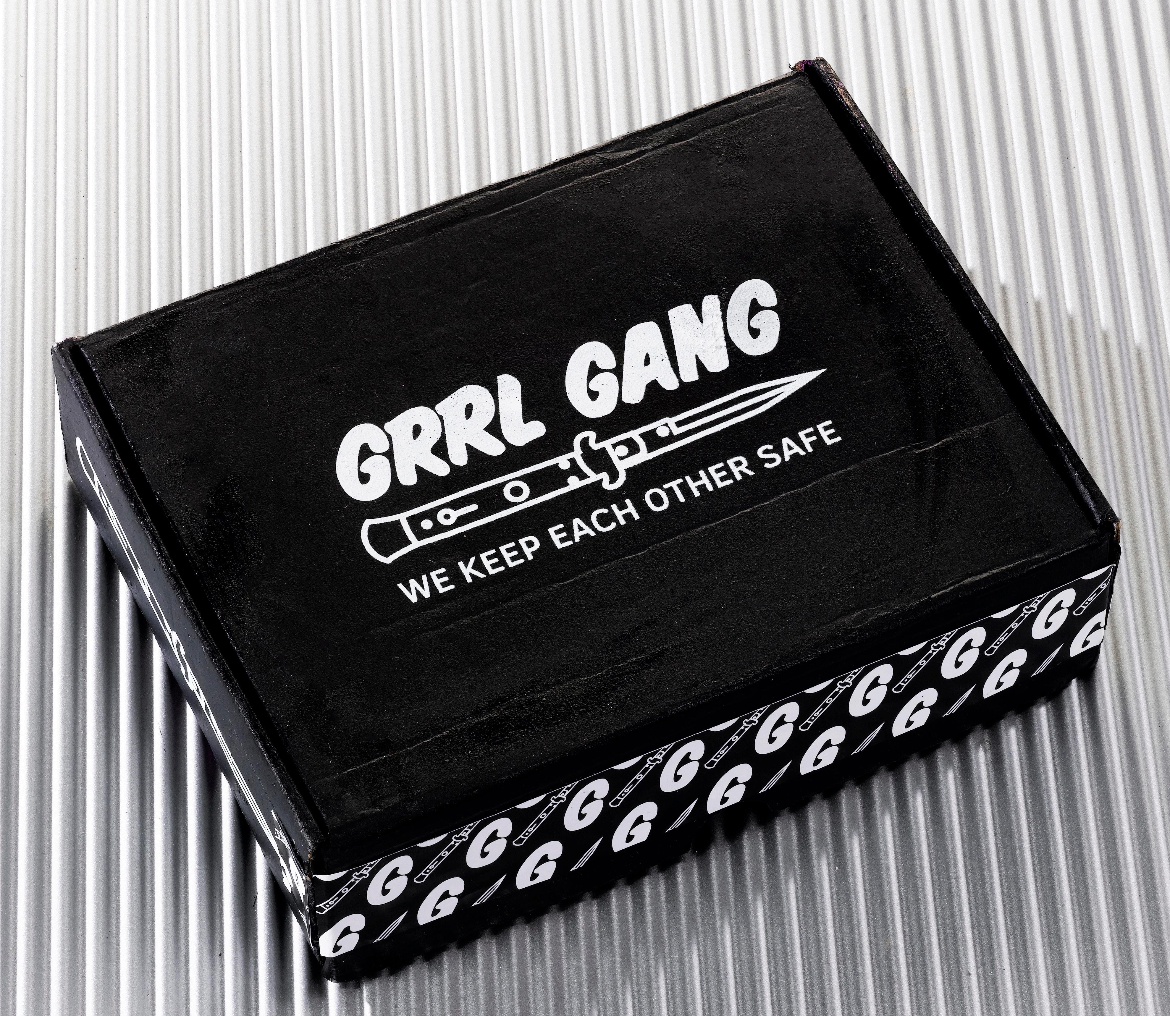
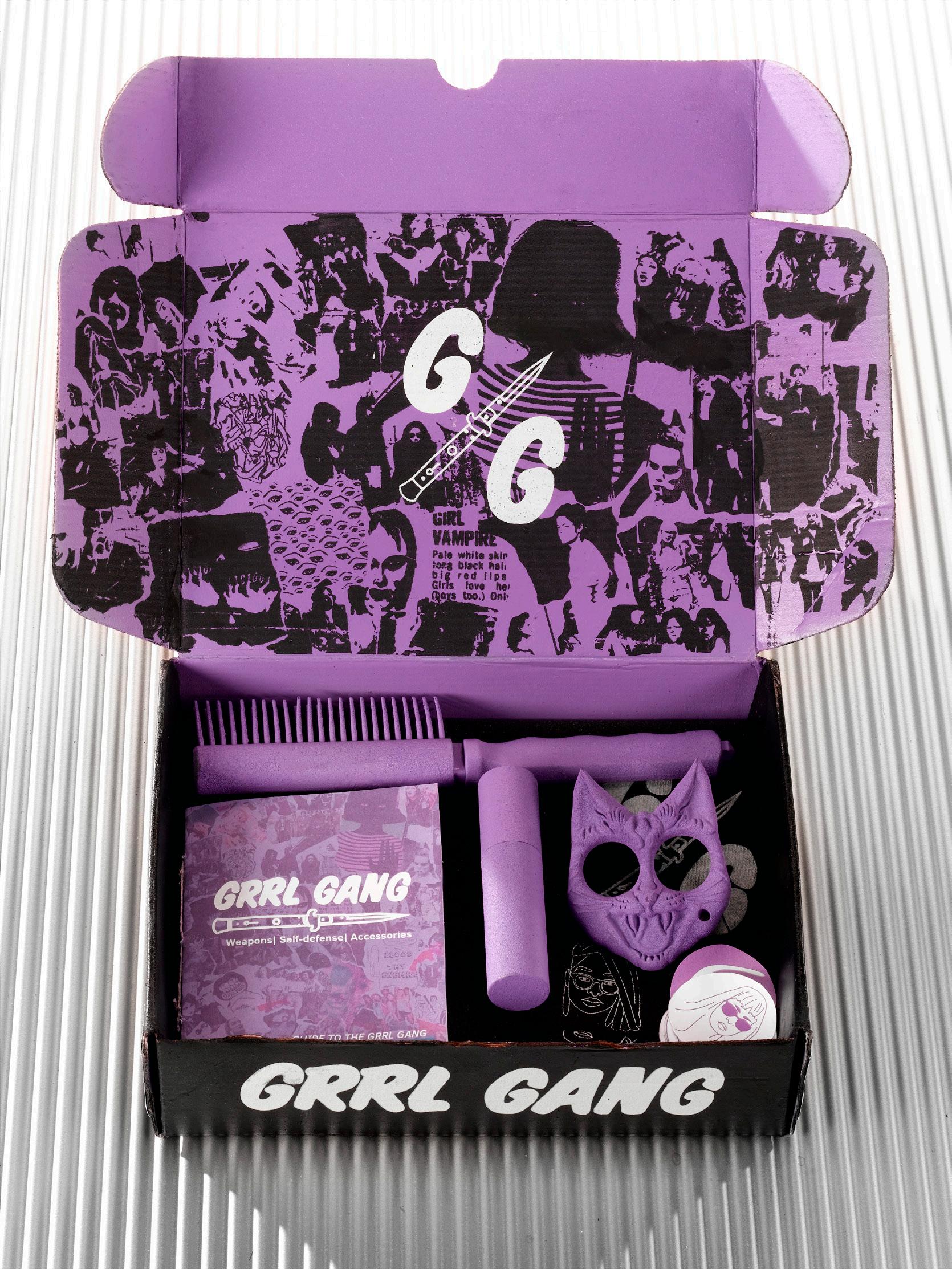
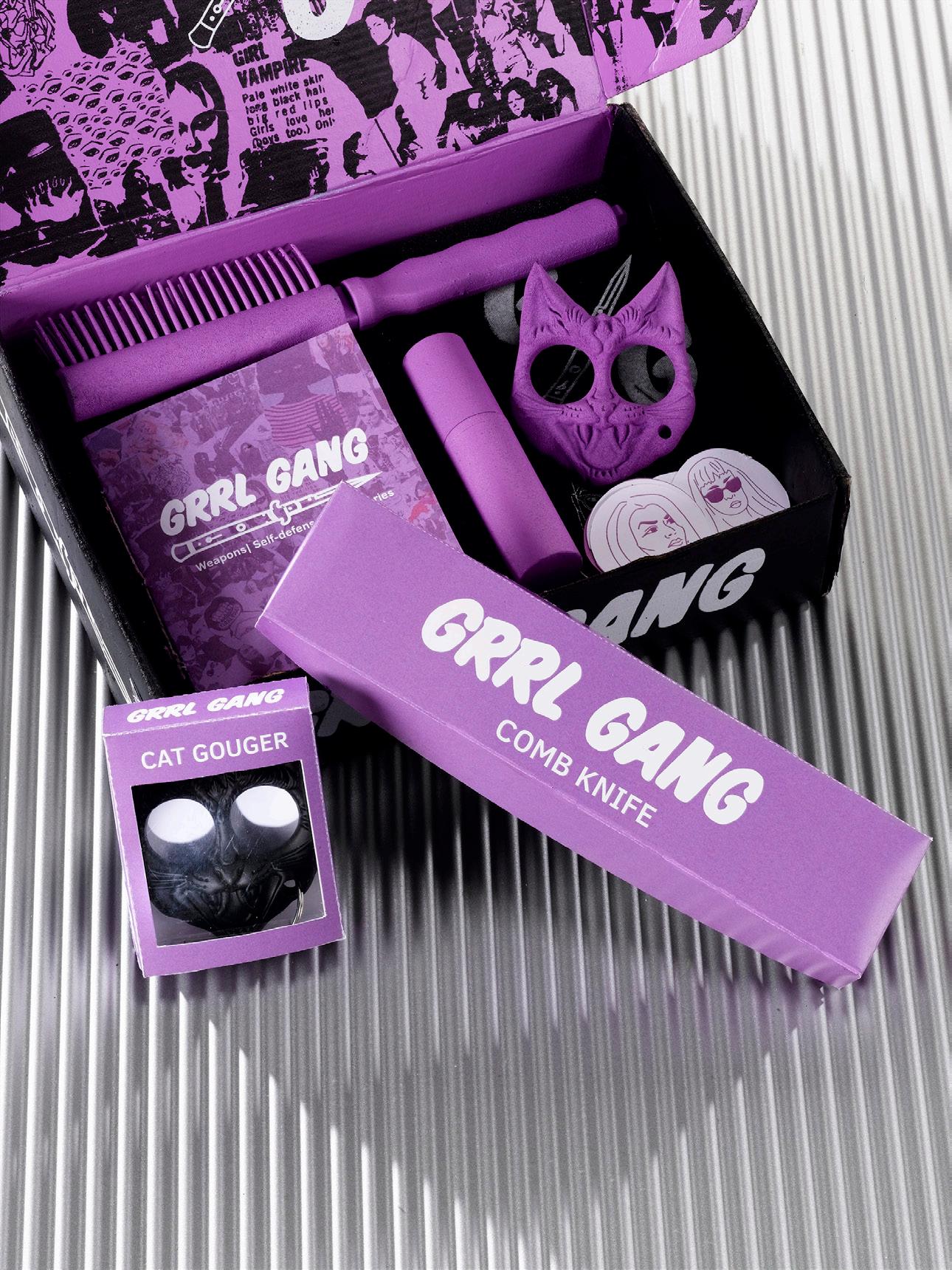
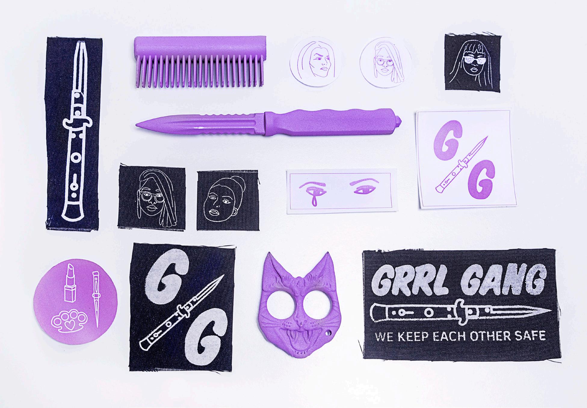
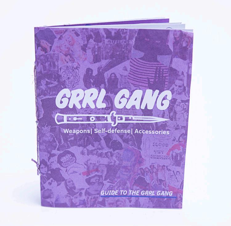
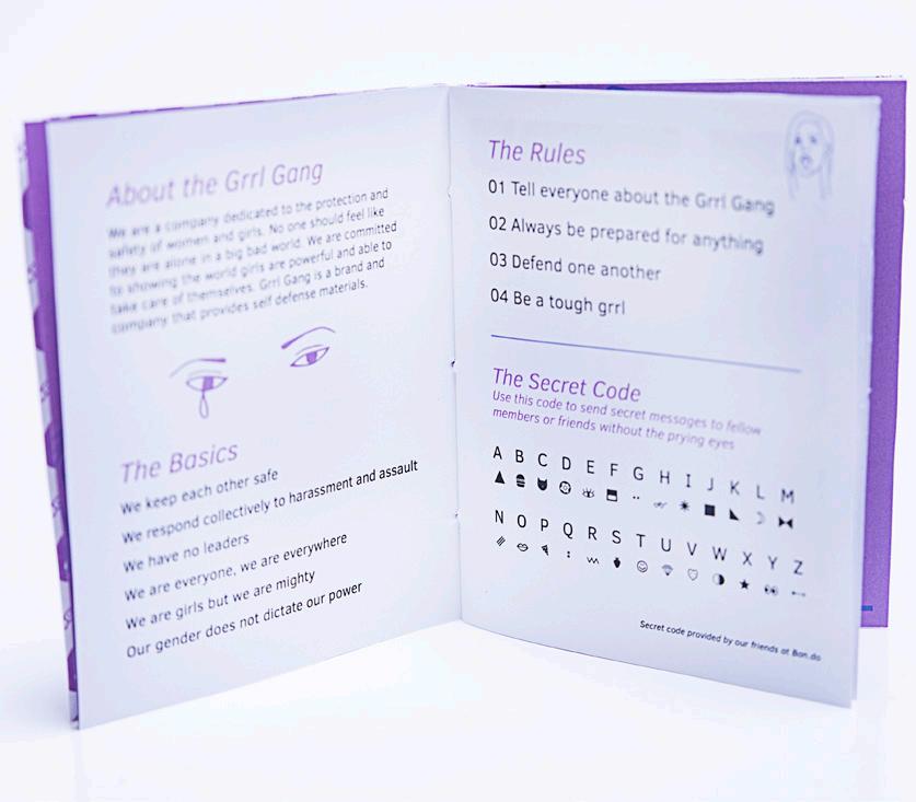
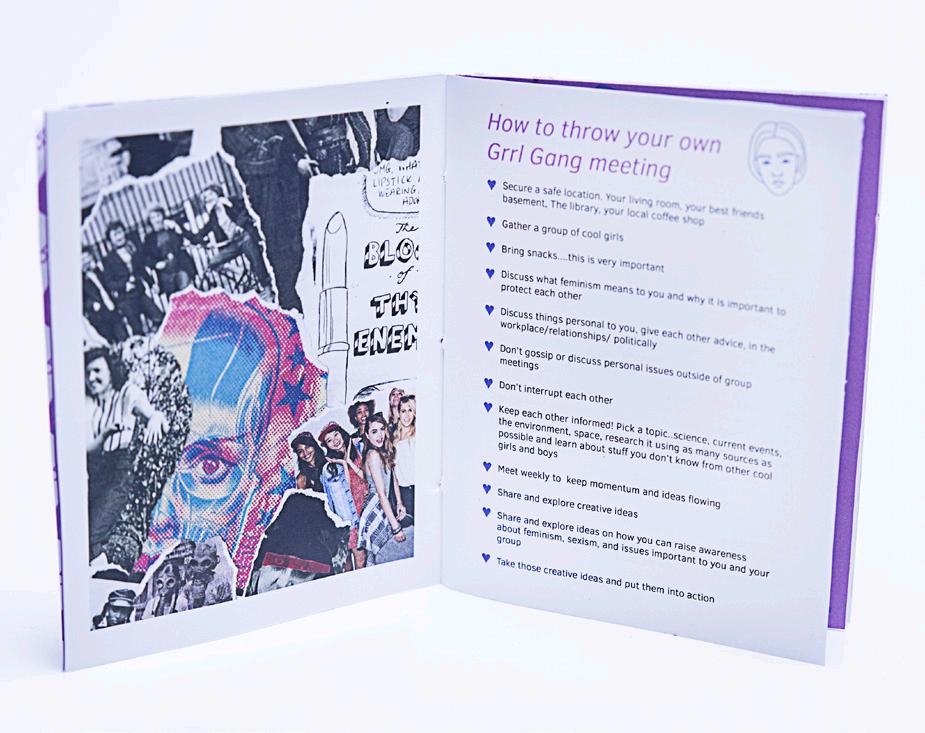
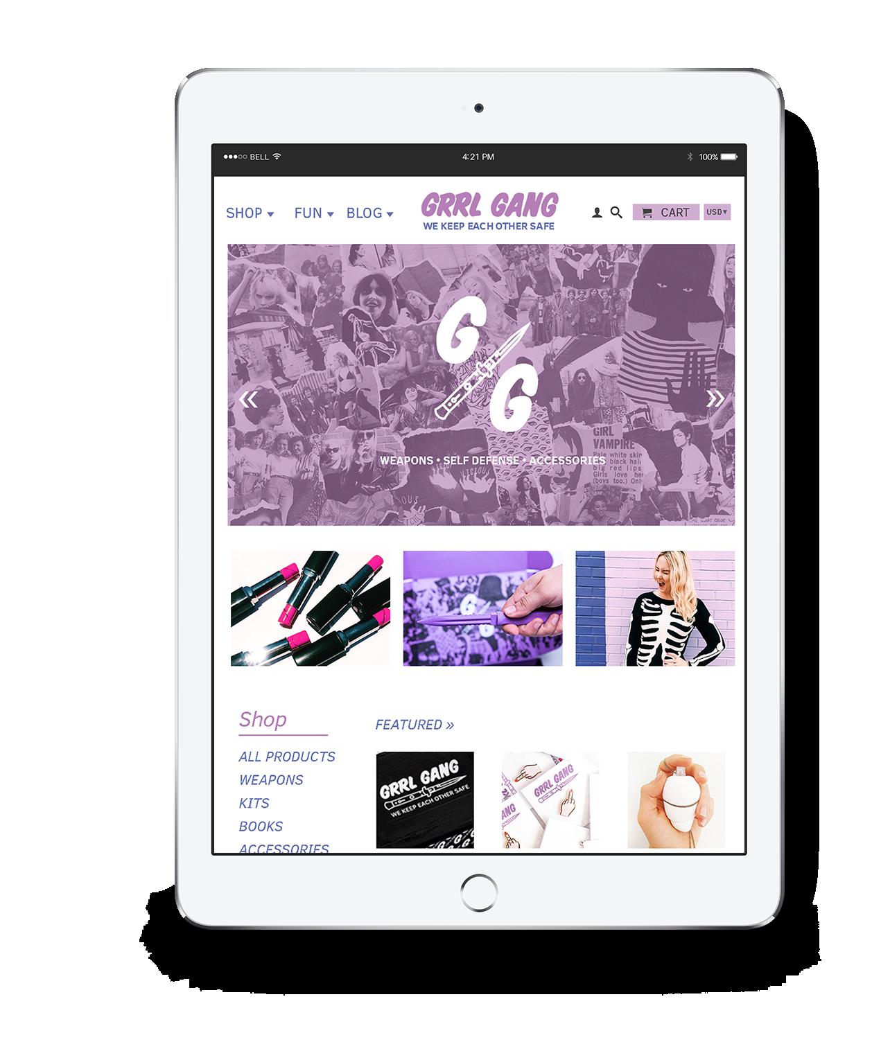
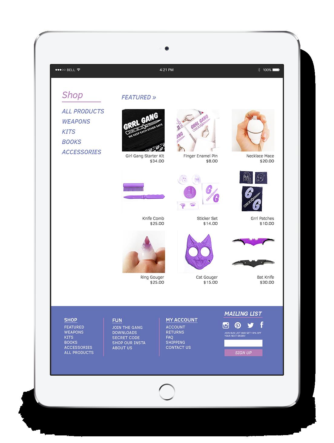
GRRL GANG
Branding | Identity | Packaging
Through this project I was given the opportunity to design something which I have always been drawn to, girl power. As girls we are taught to always rely on others for safety. The modern girl doesn’t have time to be dependent on others. This kit and this company were created to provide girls and women with tools they can use to protect themselves. The name stems from a small subculture online which refers to itself as a girl gang where females give each other advice, support, and style tips. Another big component to the style and name of the brand is derived from the third wave feminist movement in the 90’s called Riot Grrrl.
TOUGH GIRLS
The look and feel for Grrl Gang is a composite of d.i.y., Punk, and young feminist aesthetic. Within the main imagery of collage the brand required a more subdued typeface and illustrations. The target audience of this company is directed mainly to girls in college or high school. With this in mind the logo was constructed to embody a more urban yet edgy feel. Along with the kit, which can be bought through the online shop, items are available for sale separately.
C//29 M//58 Y//0 K//0
C//68 M//58 Y//0 K//0
C//0 M//0 Y//0 K//100
Typefaces: Clear Sans Hand Rendered
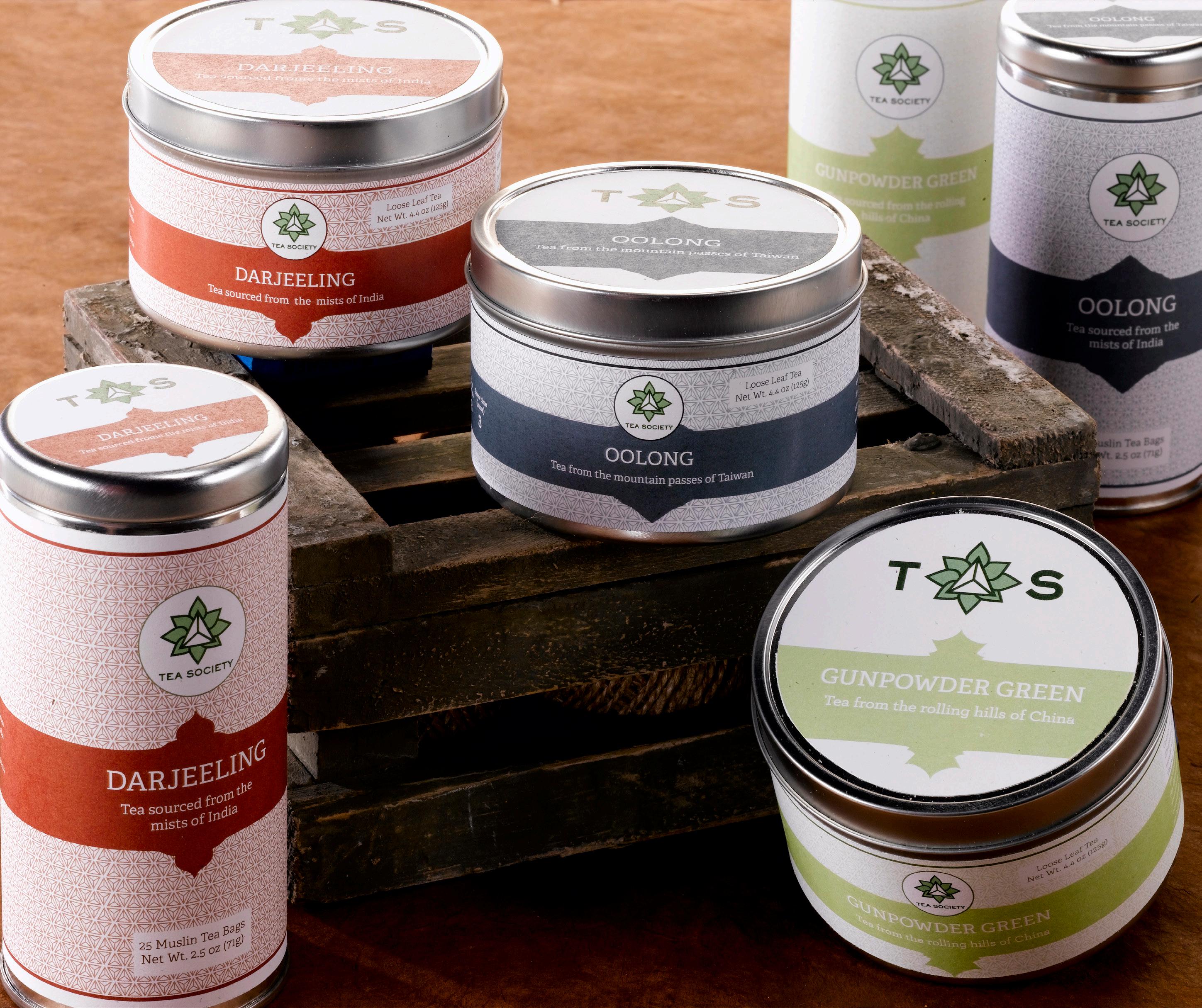
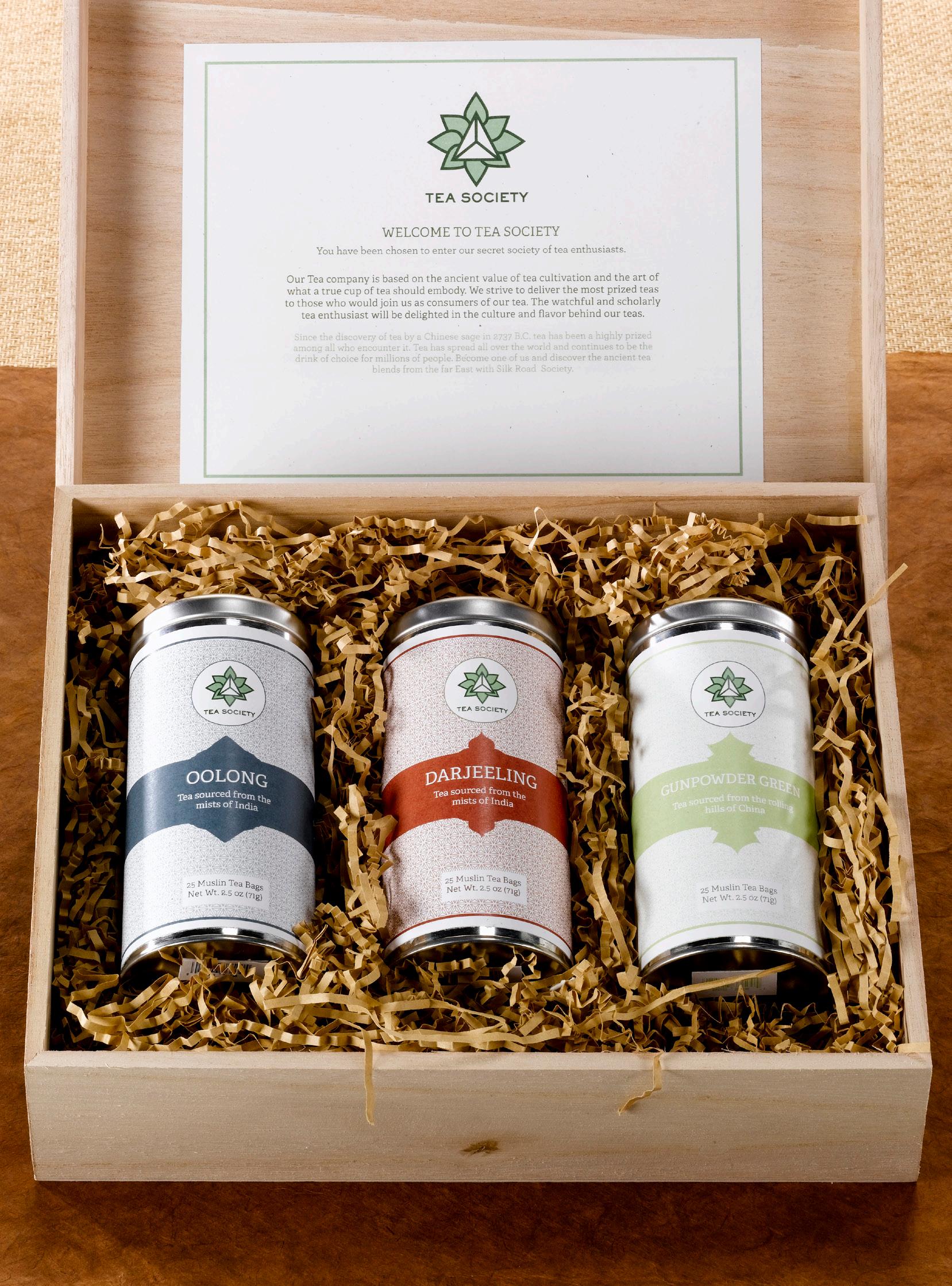
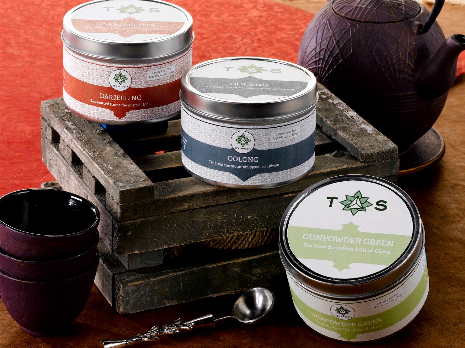
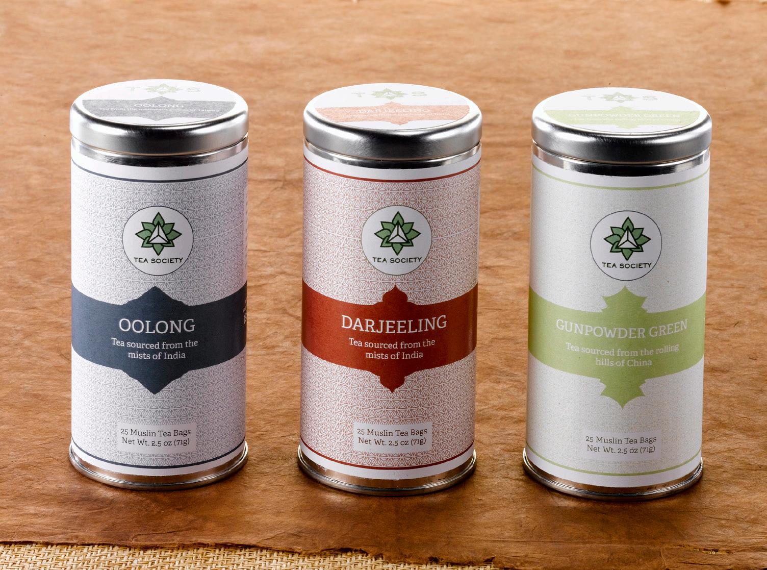
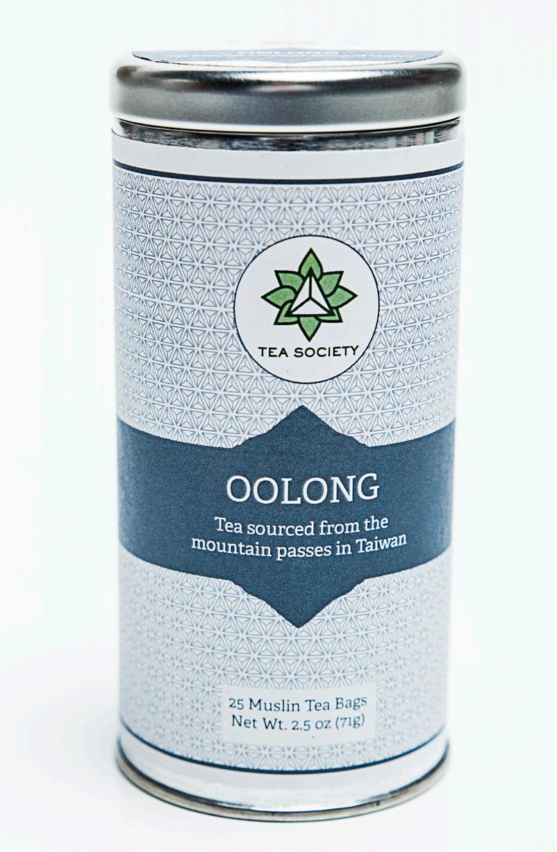
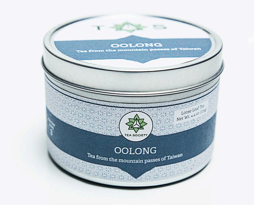
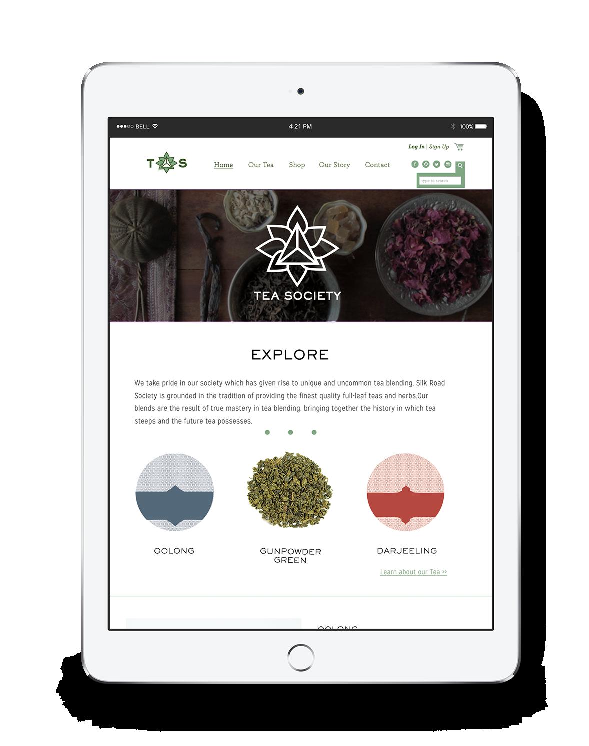
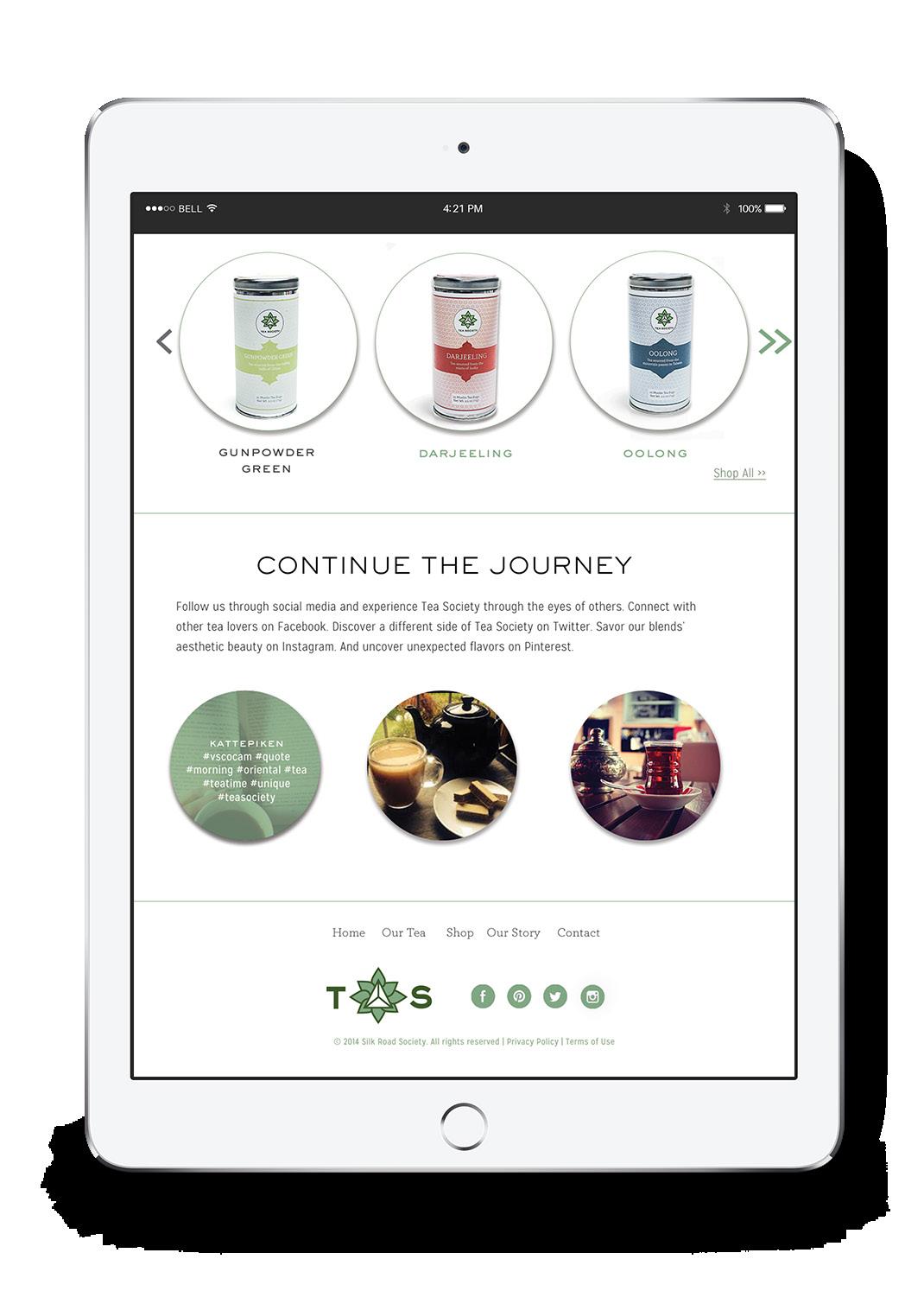
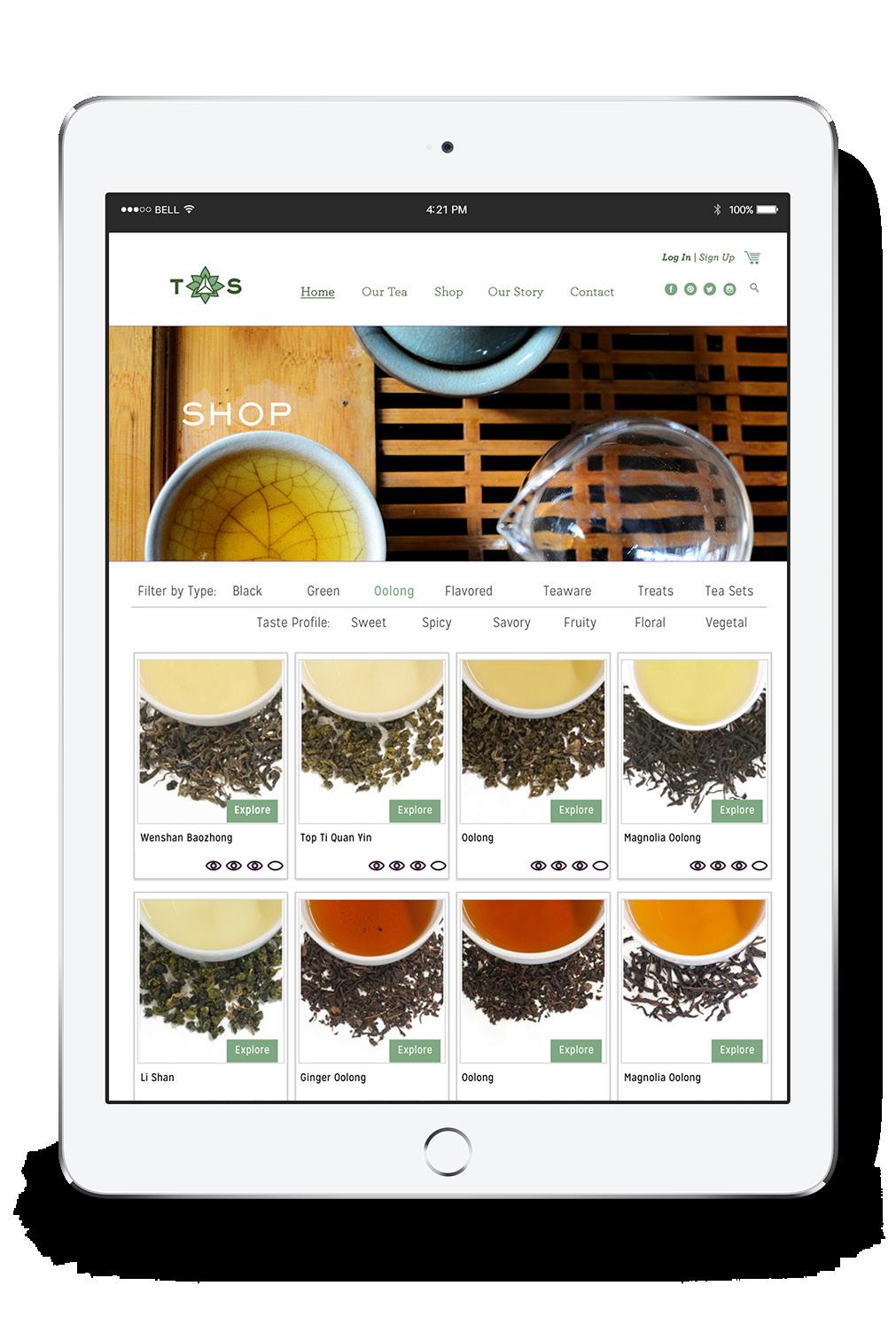
TEA SOCIETY
Branding | Identity | Packaging
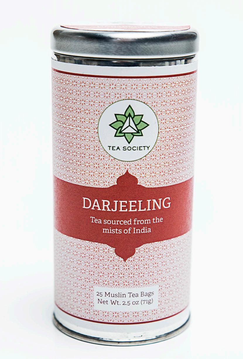
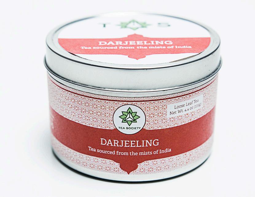
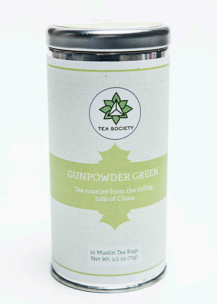
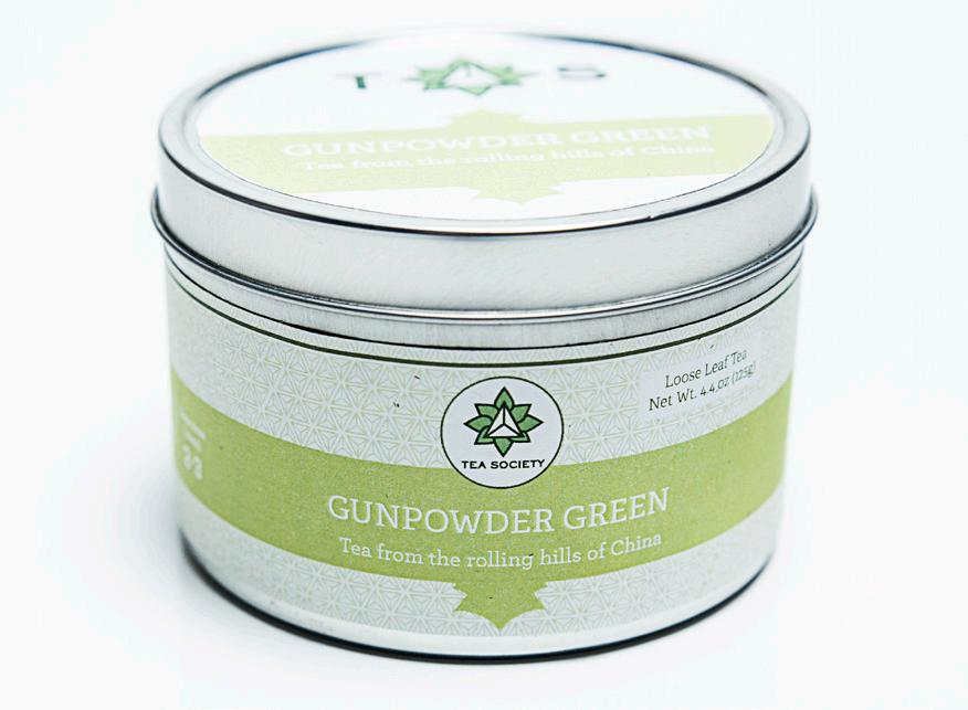
Tea has always been a staple around the globe. In my case this drink has been a constant throughout my entire life. Tea is something which can be energizing, soothing, or healthy. Many people, like myself, are always on the look out for good quality tea at an affordable price. Tea society is built upon the value of a good cup of tea and the sense of community people who enjoy this beverage feel when they meet a fellow tea drinker. It may seem like something so insignificant to share but this common trait allows people to talk freely about the blends they enjoy and have a companion which to share tea-time with. Tea society evokes exclusivity, taste, and quality without seeming too stuffy or pricey.
YANET MIRELES // PROCESS
TEAS OF THE WORLD
The feel of Tea Society was intended to be much like a club which anyone can join, the only requirement is a love for a good cup of tea. In this way the need to showcase different blends and regions allows the consumer to feel closer and more knowledgeable about what they are drinking. The packaging needs to represent these regions while also feeling clean and modern. This selection of tea caters to wide audiences from the casual quick tea drinker to the expert afternoon tea maker. The packaging has two versions of each tea, one that is in sachets for easy brewing and a loose leaf version for those who enjoy a more methodical hands on approach.
C//75 M//41 Y//100 K//37
C//54 M//19 Y//58 K//1
C//3 M//78 Y//67 K//26
C//67 M//46 Y//34 K//22
C//24 M//1 Y//48 K//11
Typefaces: Adelle Sackers Gothic
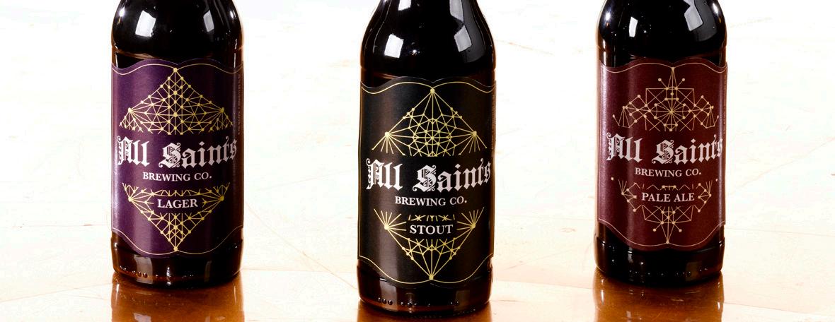
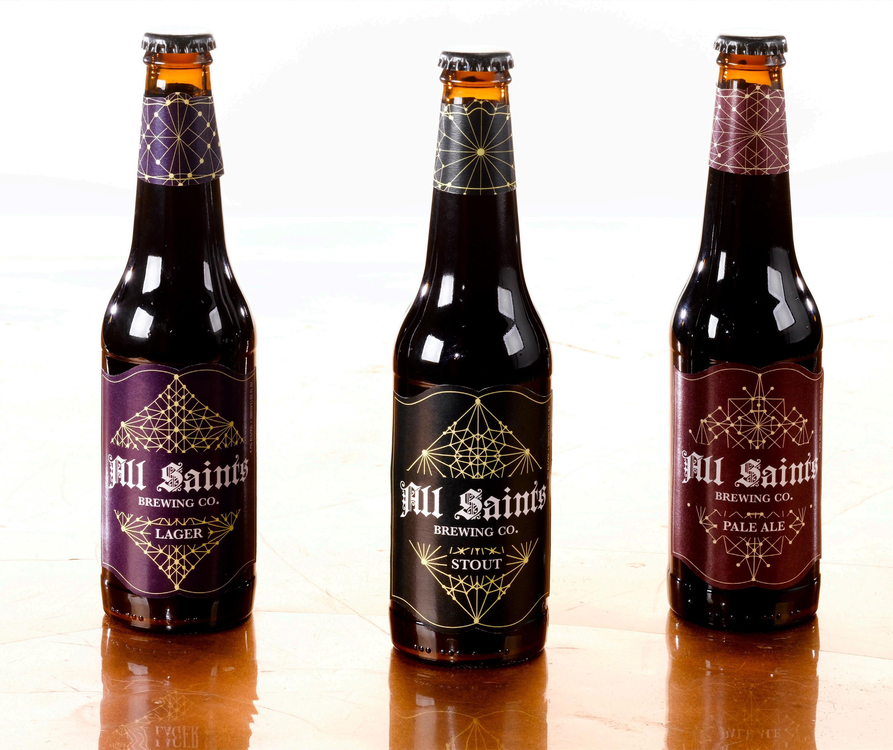
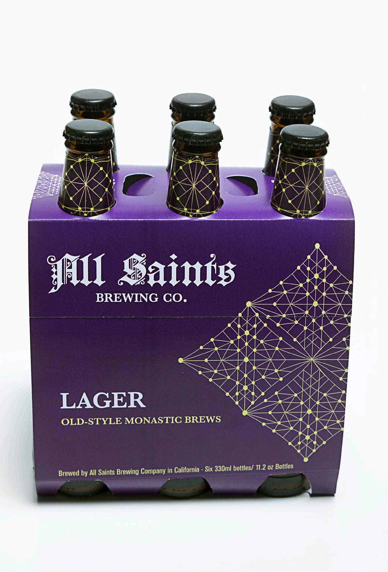
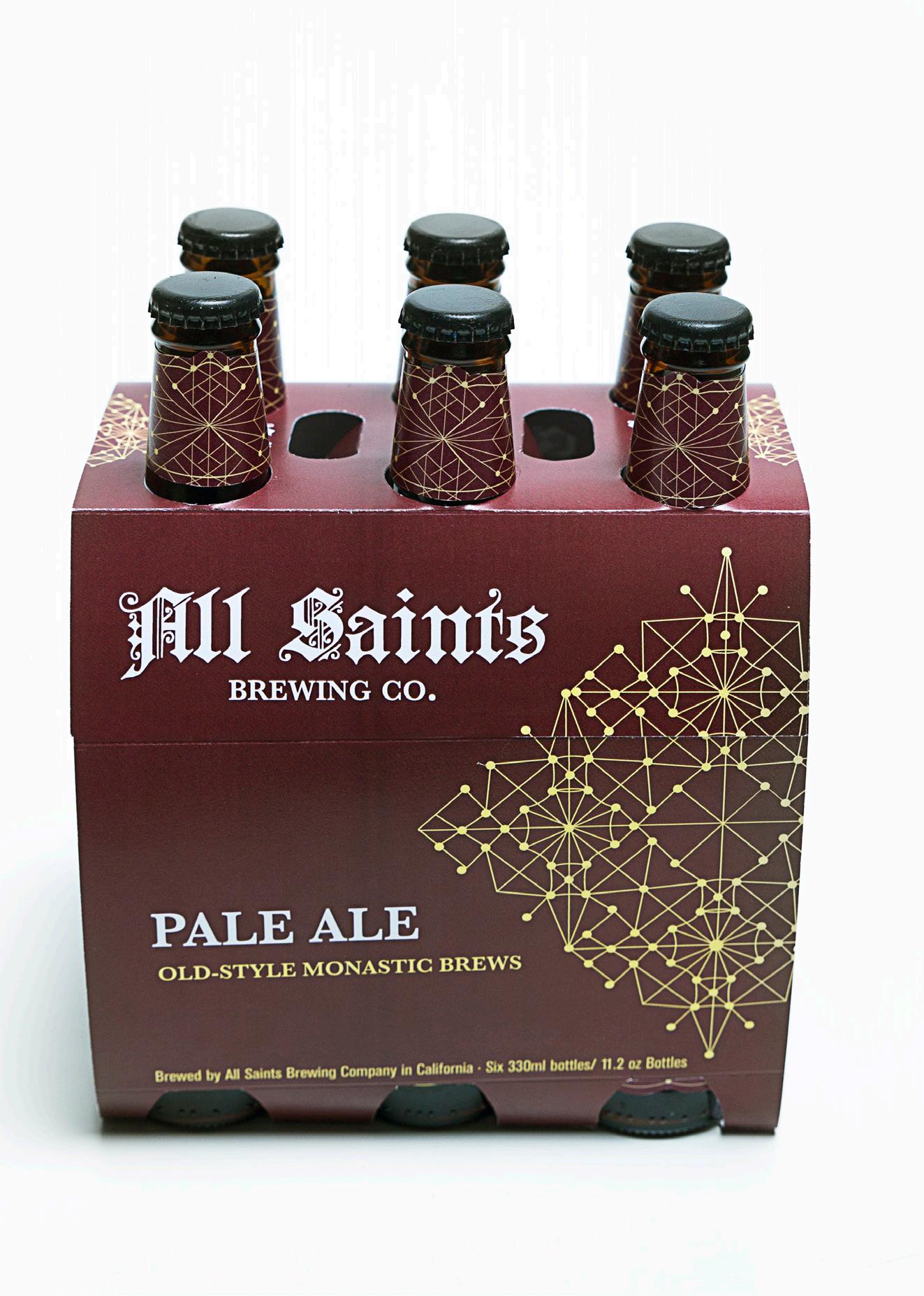
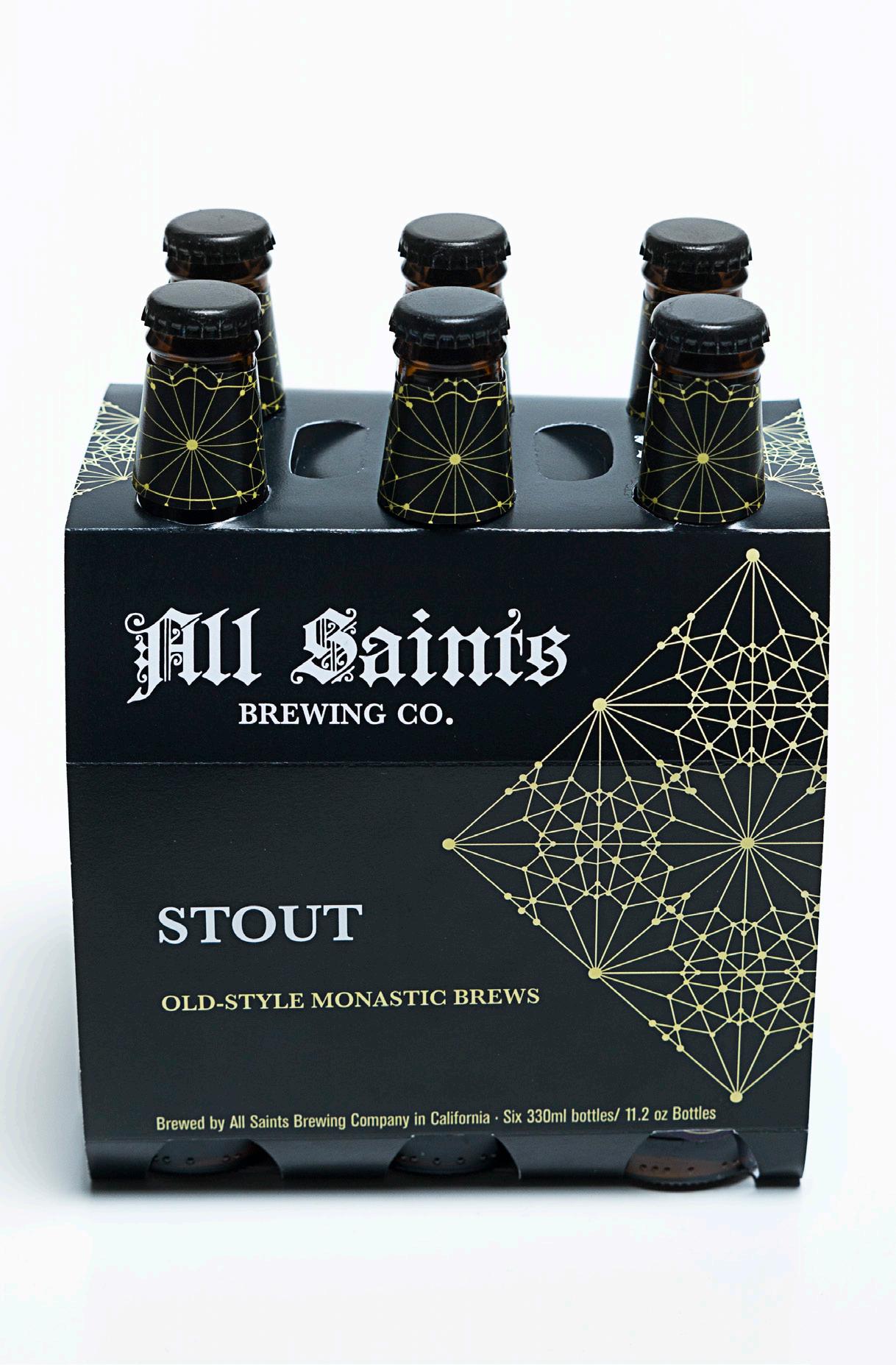
ALL SAINTS BEER CO.
Identity | Packaging
Beer never goes out of style. Through this project I wanted to explore the ways in which old style brewing traditions can be brought into our current century. All Saints pays homage to old-style Trappist brewing which occurred as early as 1664 in Monasteries across Europe. While the product is influenced by this history it is also a mix of modern methods. The name All Saints originated from the Catholic Feast Day in which a large celebration is held to remember all those who are deceased.
A SAINTLY BREW
The design of the identity and packaging has an old style feel combined with modern patterns to emulate a mix of old and new. Although the patterns seem modern they are in fact stylized illustrations of historical church ceilings found throughout Europe. All Saints is a mix of modern beer trends and old style sensibilities.
C//3 M//10 Y//53 K//37
C//24 M//1 Y//48 K//11
C//3 M//78 Y//67 K//26
C//67 M//46 Y//34 K//22
YANET MIRELES // PROCESS
Typefaces: Baskerville
Berthold Akzidenz Grotesque
STEVE MADDEN // 17
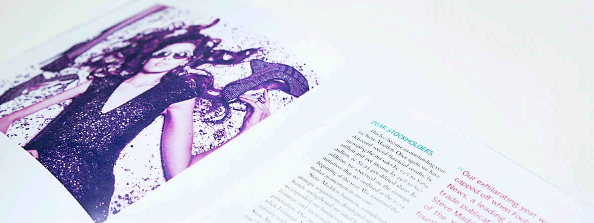
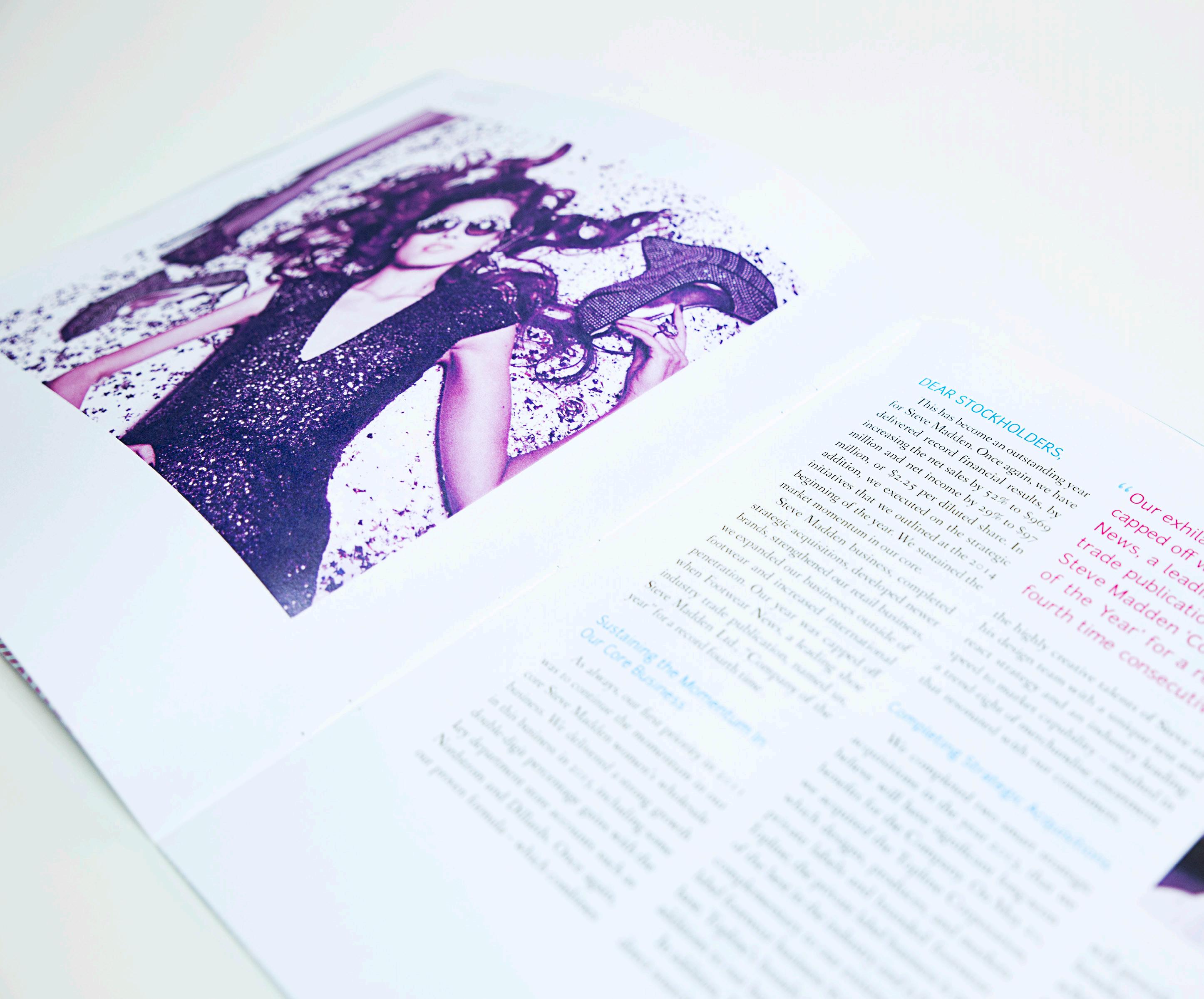
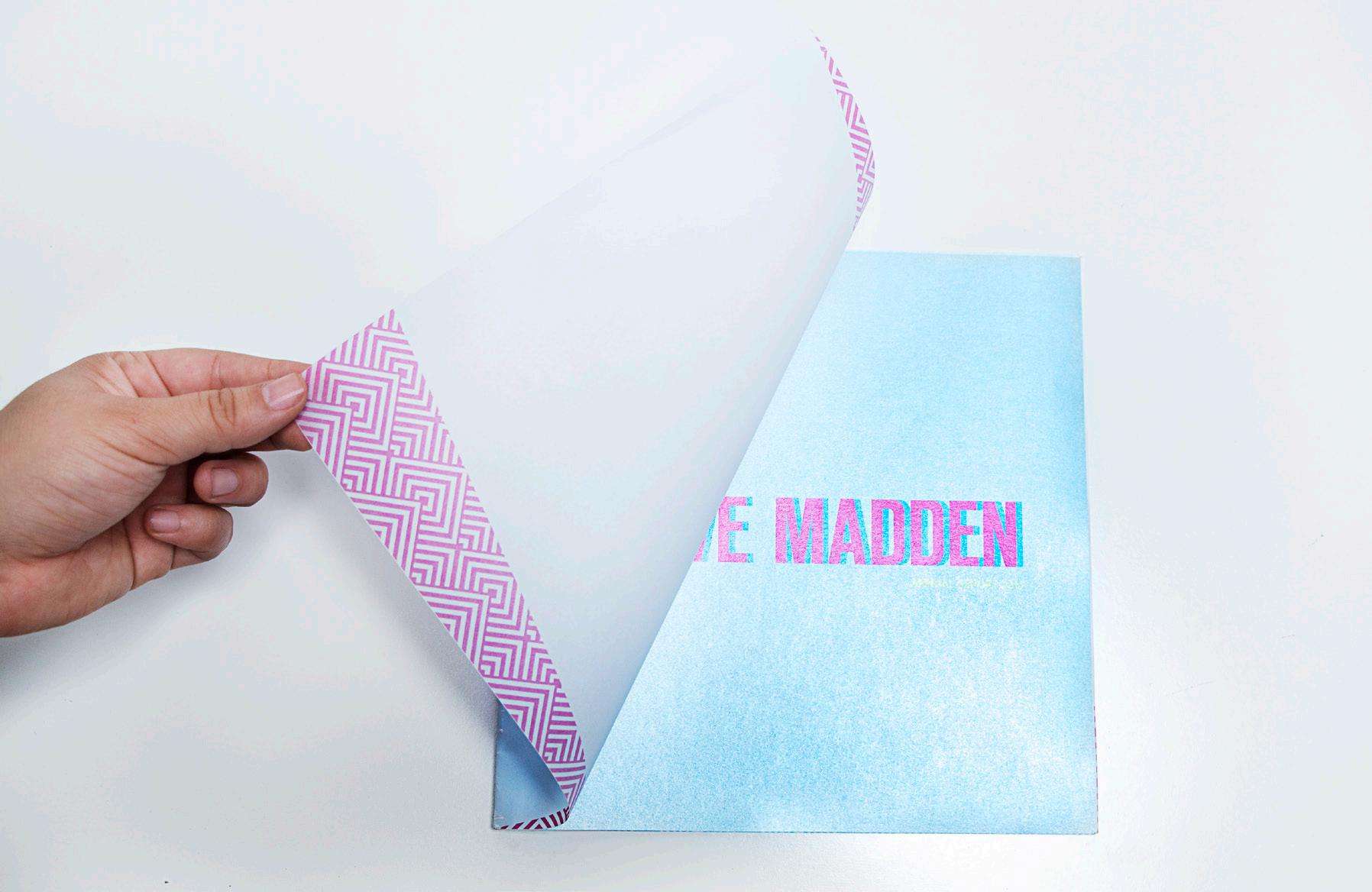
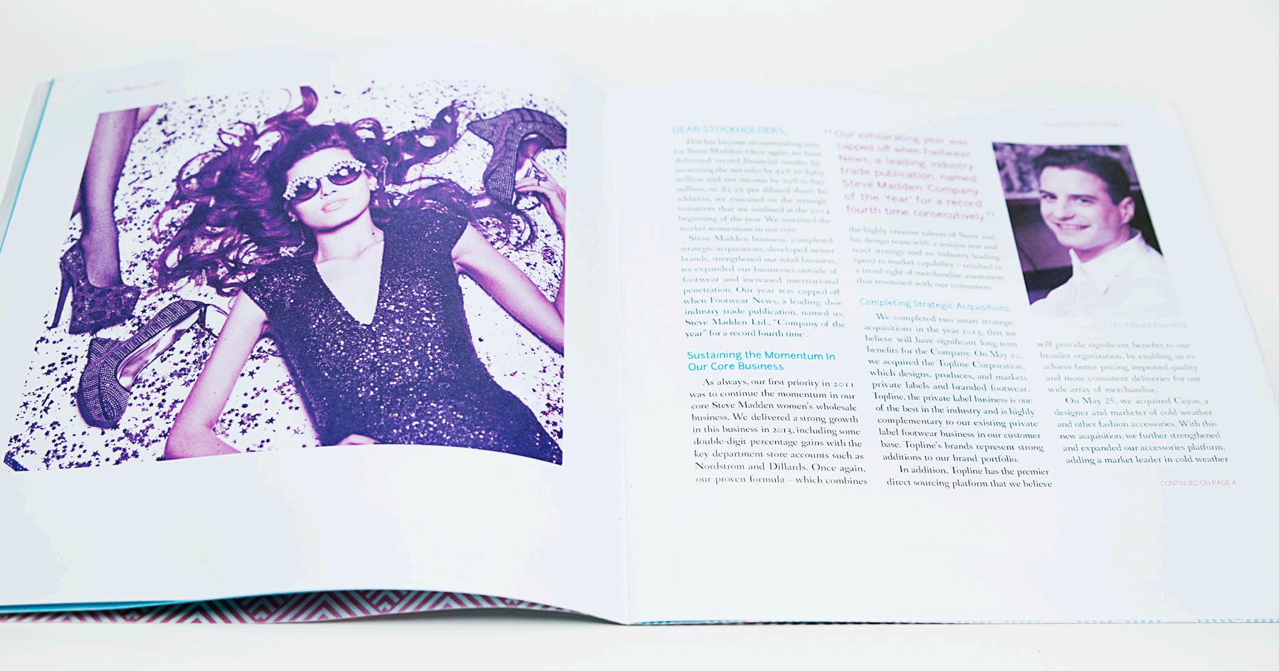
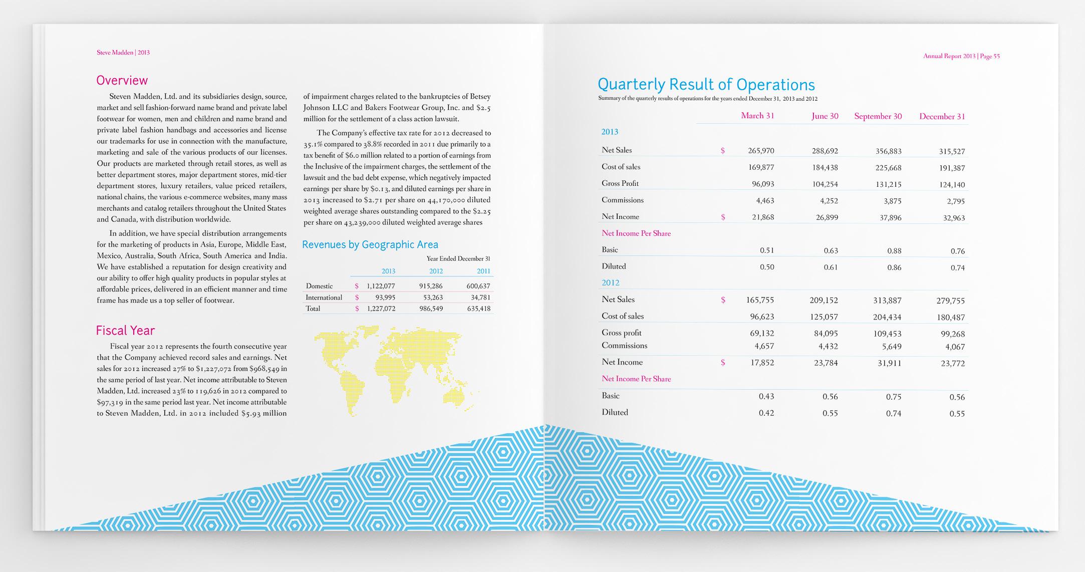
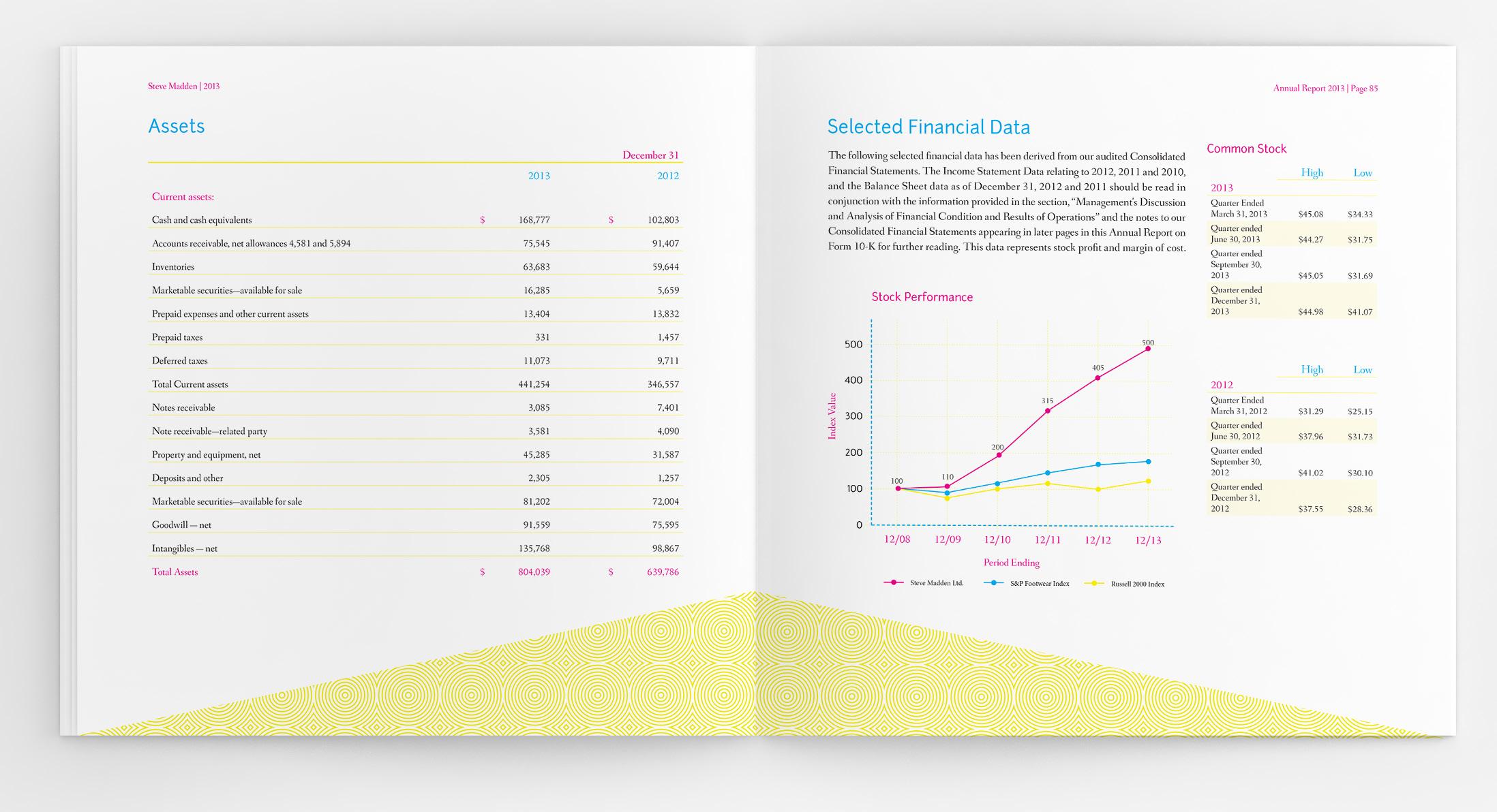
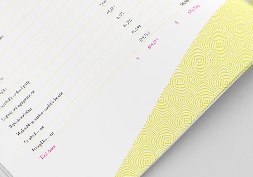
STEVE MADDEN ANNUAL REPORT
Publication
Steve Madden is no small player in the shoe industry. The company is known for affordable footwear that is bursting with creativity. The company is famous for its edgy, modern, and risk-taking style. Which lead me to think, why should this only be restricted to their shoes? Thus the Steve Madden annual report became another fashion statement in the world of boring financials and color-less 6pt type. A brand known for its edgy behavior should demonstrate that attitude in their print material as well. The solution became patterns, bright color, and eye-catching photo filters. Edgy or not, the report still had to be readable, which was accomplished by setting bodycopy in a clean serif typeface which was matched with a good dose of white space.
C//0 M//100 Y//0 K//0
C//0 M//0 Y//100 K//0
C//49 M//0 Y//0 K//0
C//100 M//0 Y//0 K//0
Typefaces: Fanwood Junction
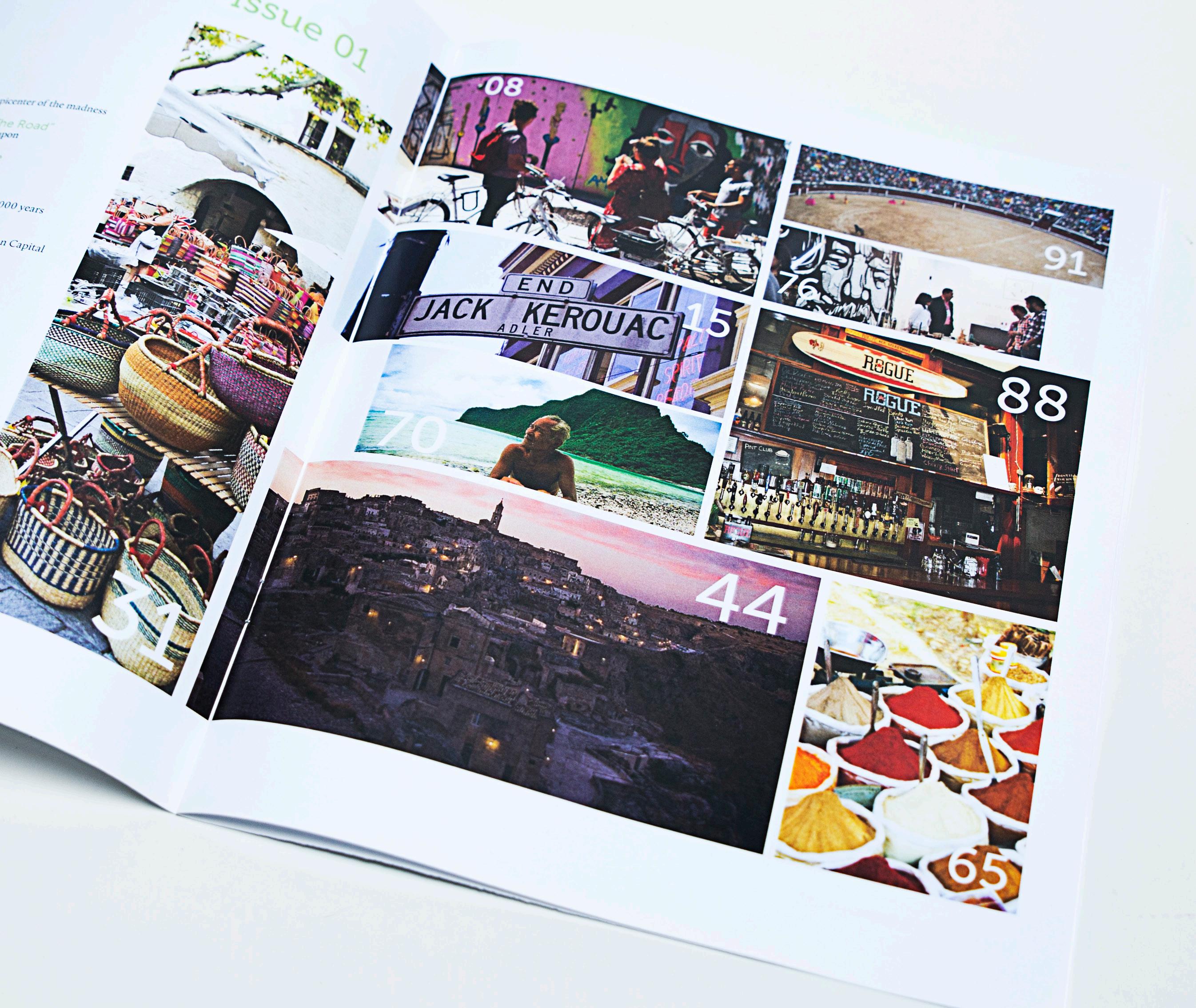
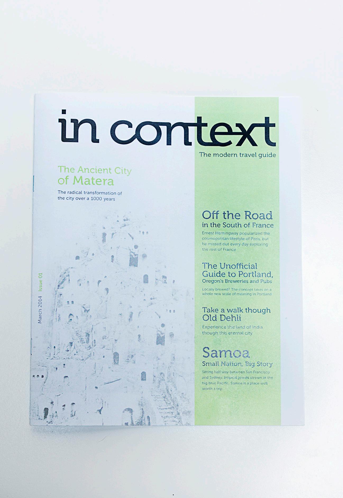
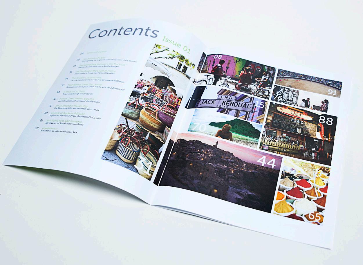
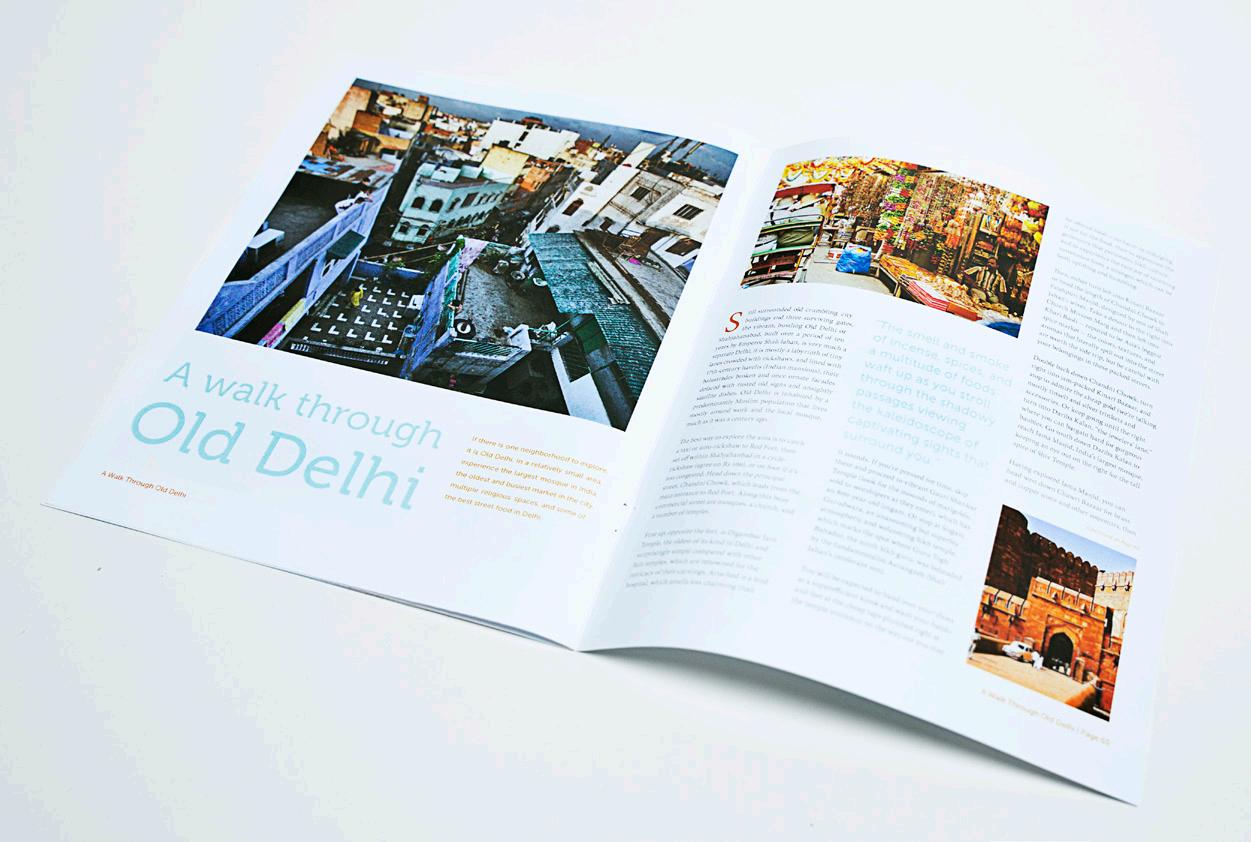
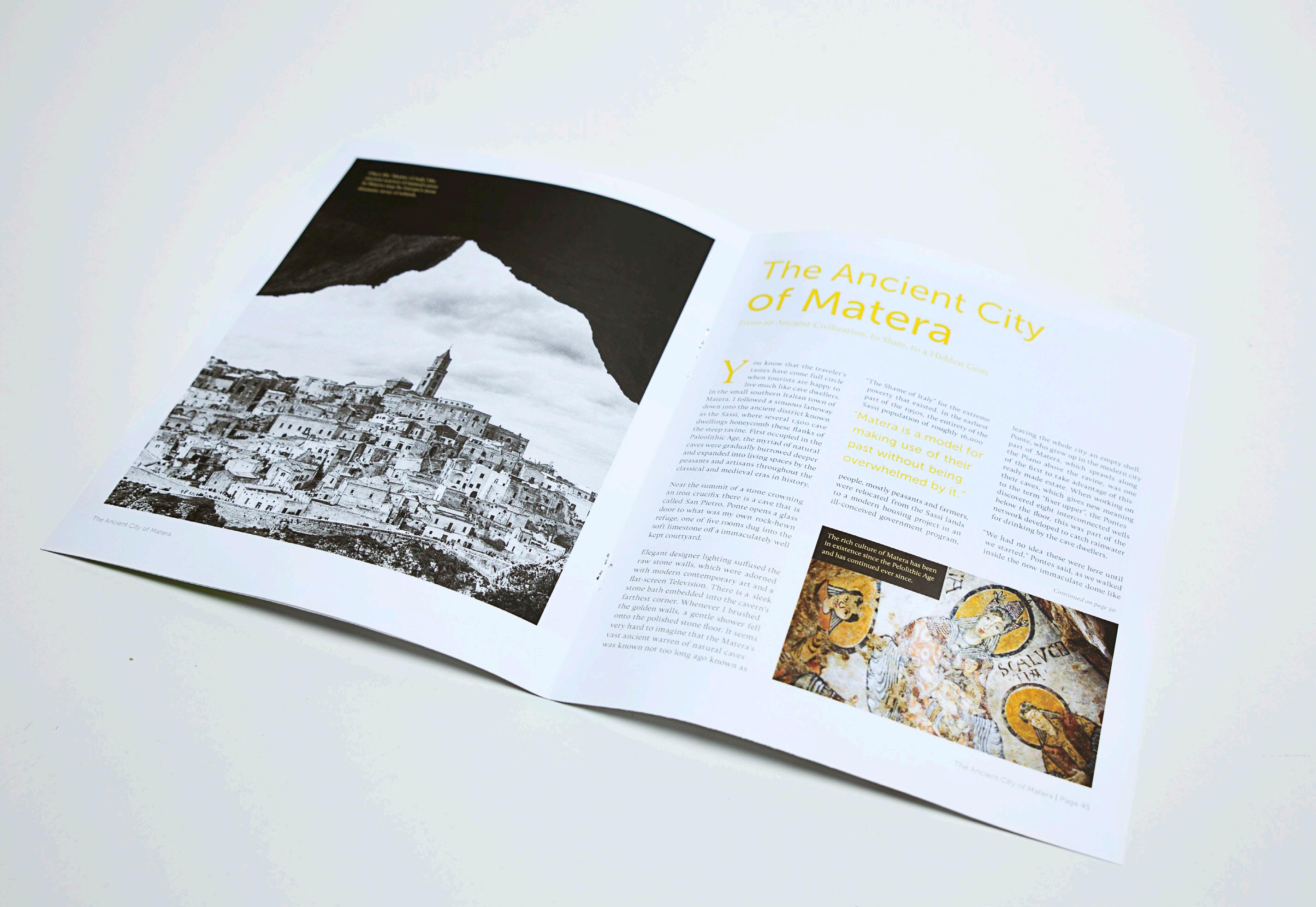
IN CONTEXT MAGAZINE
Editorial
This editorial design project was a great way to delve into the world of magazine publication and to feed my need to explore new places, even if it was through a computer. When the assignment to create a magazine was given I knew what I wanted to do. A clean, modern, and content-rich magazine that the cultural traveler could enjoy. The copy and titles where kept bright but secondary to the wonderful imagery of places across the globe. In Context magazine is quite different from many travel magazines that anyone would encounter, for a purpose. Magazine shelves are bursting with bright and lush photography that gives away too much at a glance. This magazine was created for those who value the culture and hidden gems of a city or country without cliché photography.
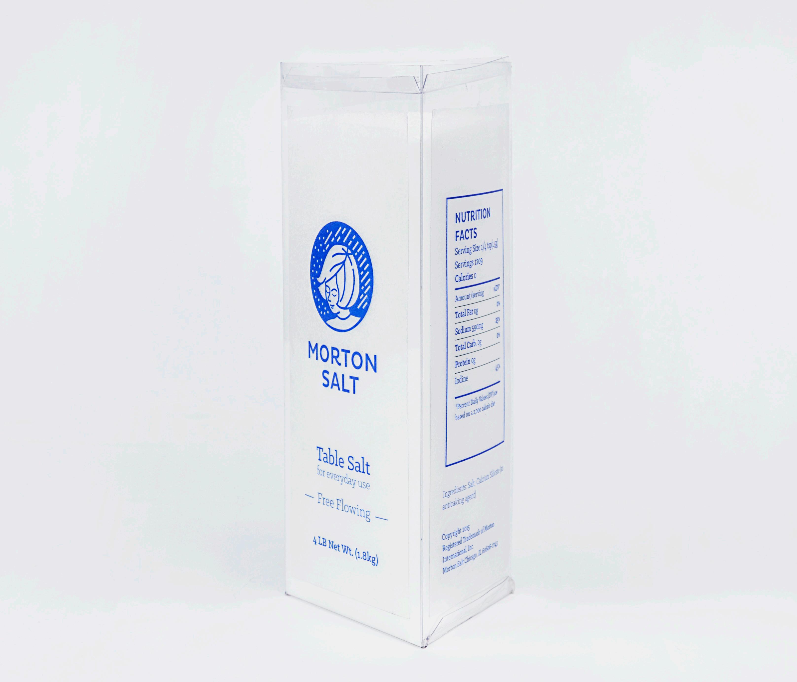
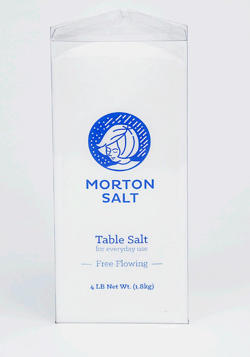
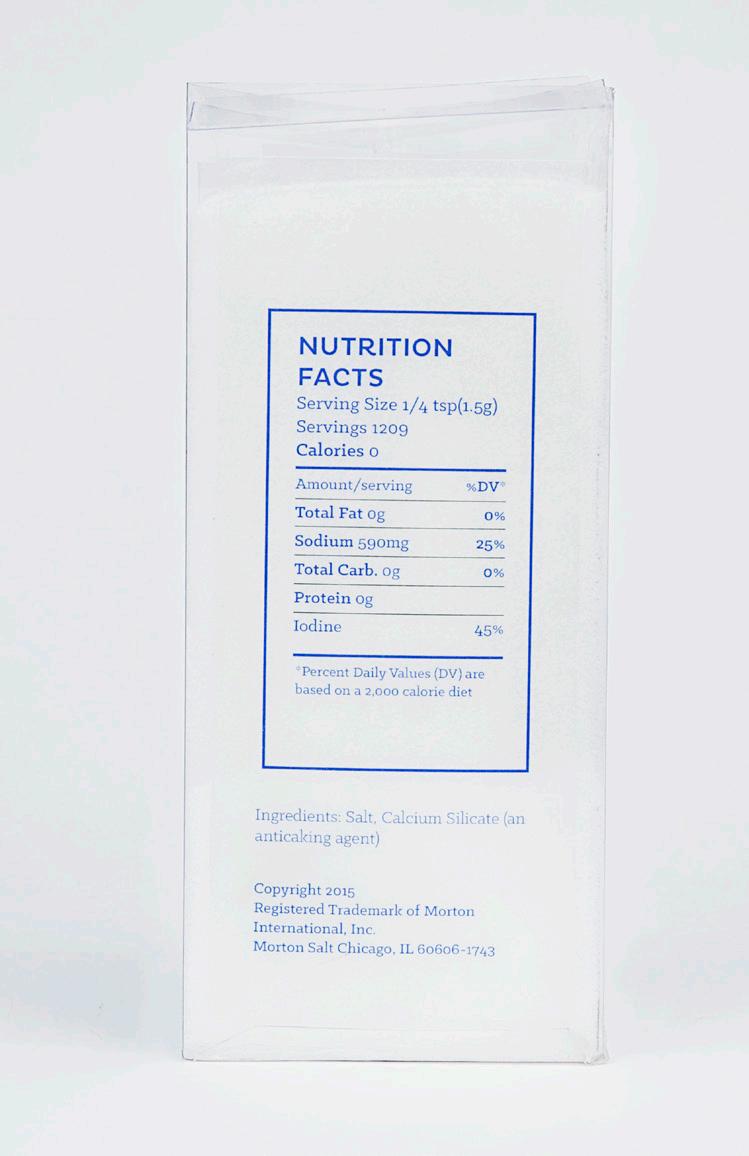
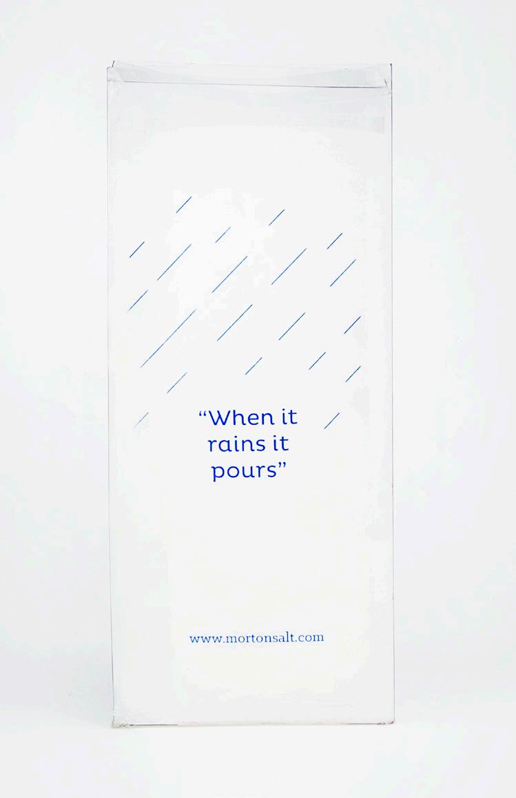
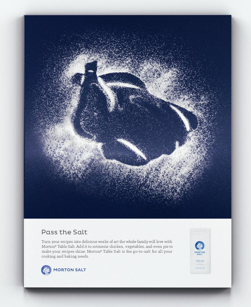
MORTON SALT
Branding | Identity | Packaging
The name Morton Salt always evokes images of a girl under an umbrella and a round blue and white salt container. Through this project I tried to change some of that. The Morton Salt Girl is iconic and beloved, but she needed a re-vamp. The logo needed to convey the same message Morton was trying to say with her all along, but in a modern way. Her face has been kept relatively the same from the most recent logo. She now has a different mission, to be transformed into a mark. Along with the logo re-design, Morton Salt was taken to another level with the translucent triangular package and a new set of ads to introduce the consumer to this new modern phase.
MORTON
Logo Variation:
C//95 M//88
Y//2 K//0
Typefaces:
Archer Pluto
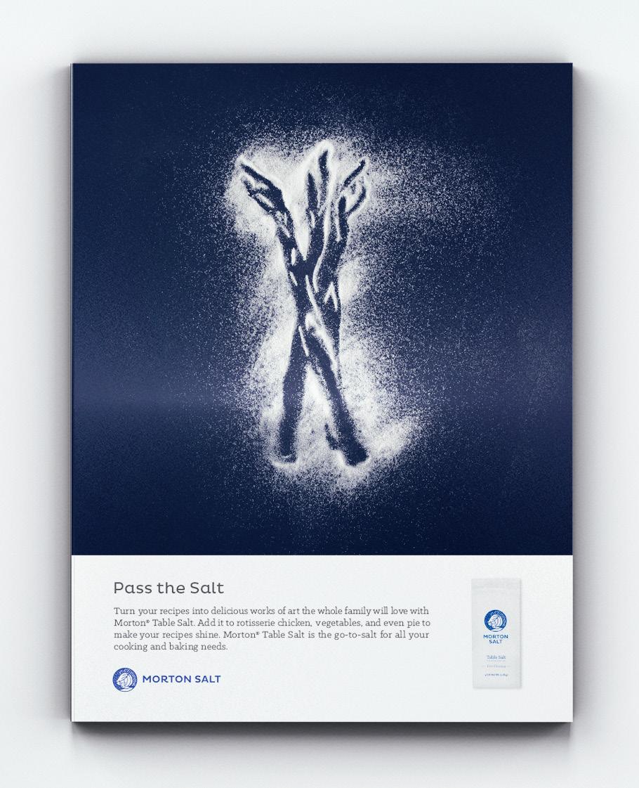
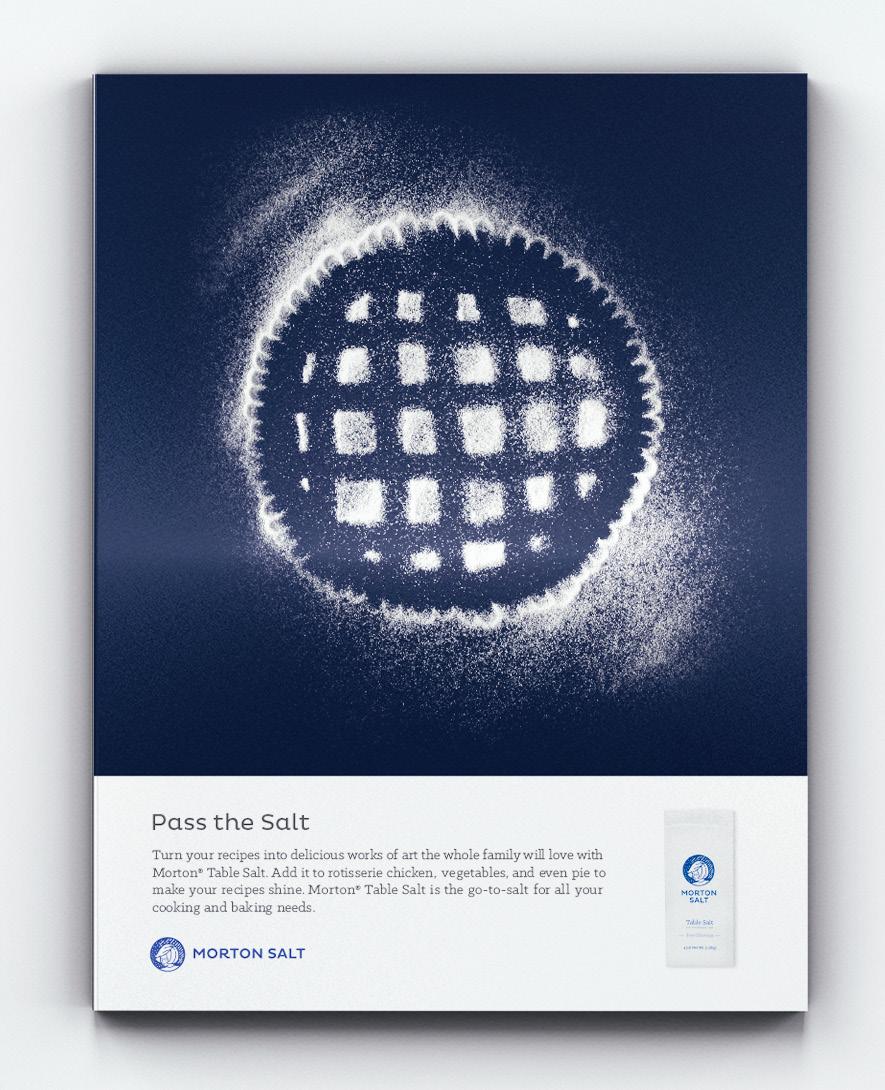
A CLASSIC BRAND
With the new logo modern and refreshed, Morton Salt needed to change its advertising. I chose to stay loyal to tradition by continuing to use the Morton blue with the new packaging. However I decide to contrast the past by creating advertising that is more experimental. The imagery is salt art made by hand and photographed by a colleague.
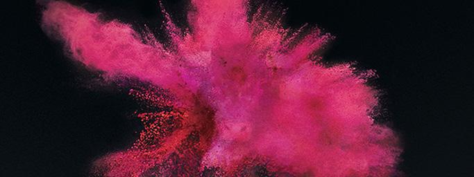
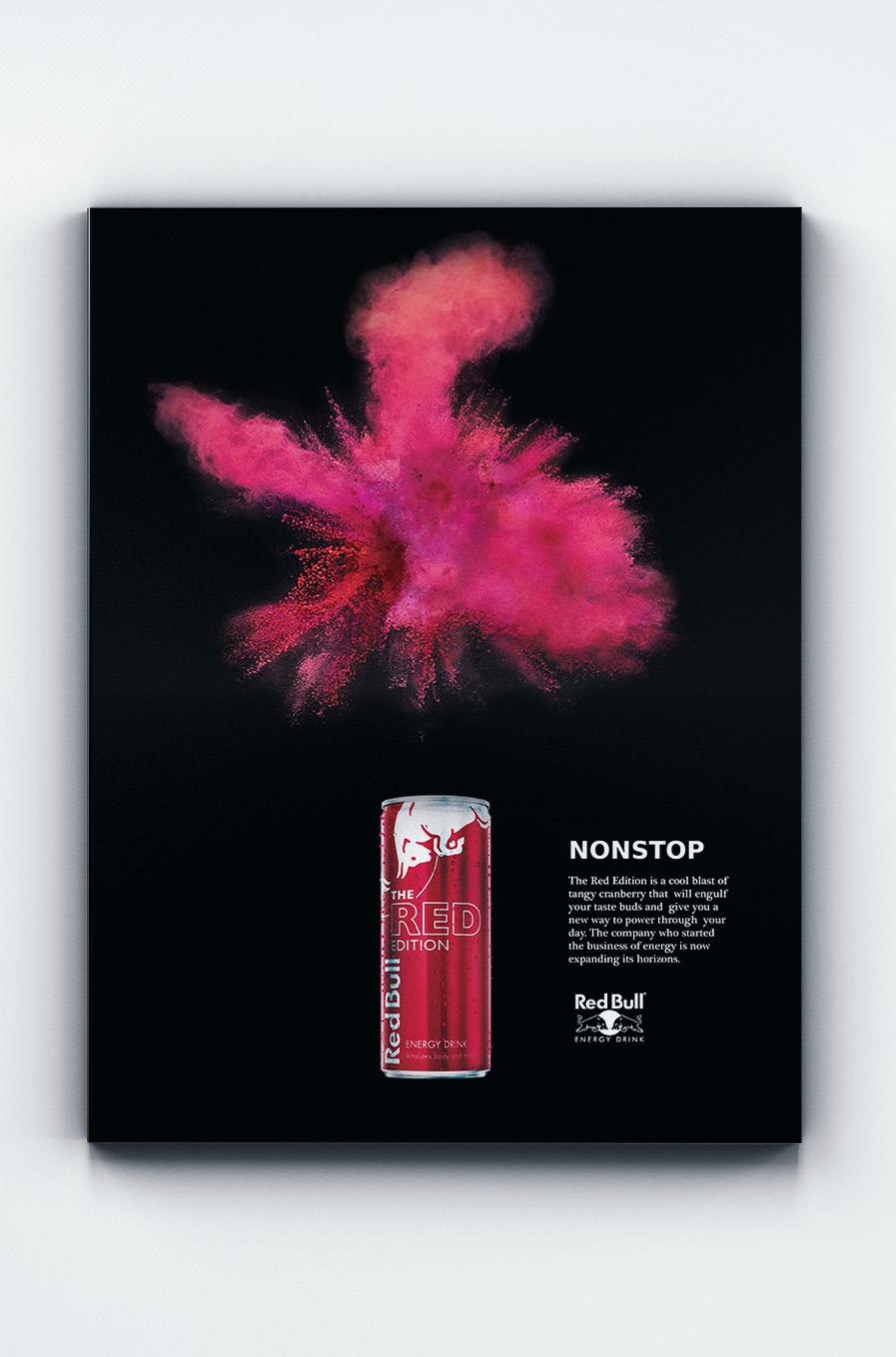
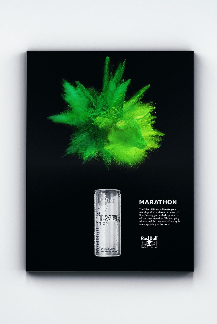
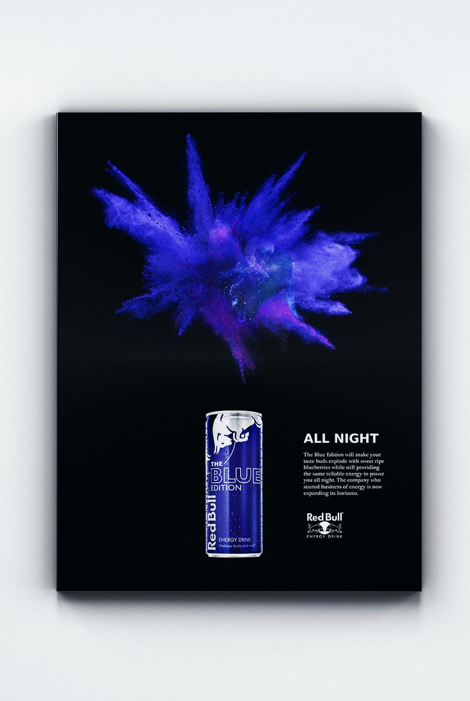
RED BULL
Advertising Campaign
As a student, the need to pull long hours occurs more often than I’d like. Red bull has always pulled me through an all-nighter and gotten me through to the other side. When Red Bull released their new flavor editions I was so excited that I took the opportunity to design and ad campaign that showcased this new endeavor. I decided to keep the ads simple on a black background, while showcasing the can, and setting the scene of this flavor explosion with colored powder photography and with the image of a bull overlaid on each one.
YANET MIRELES
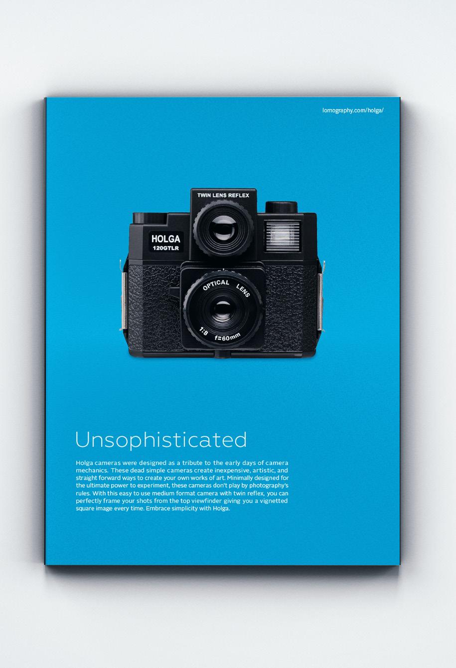
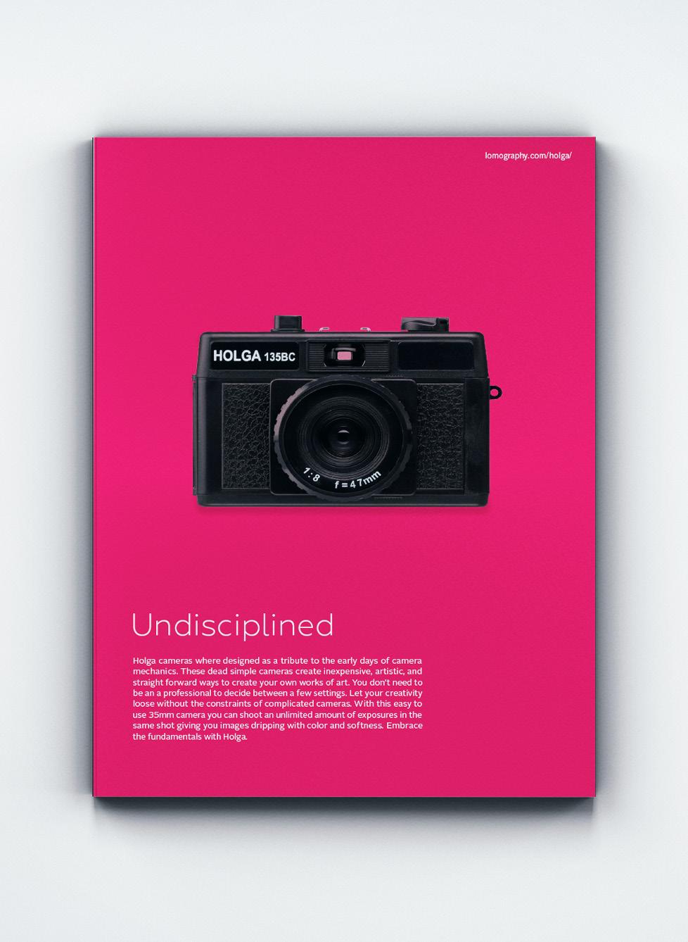
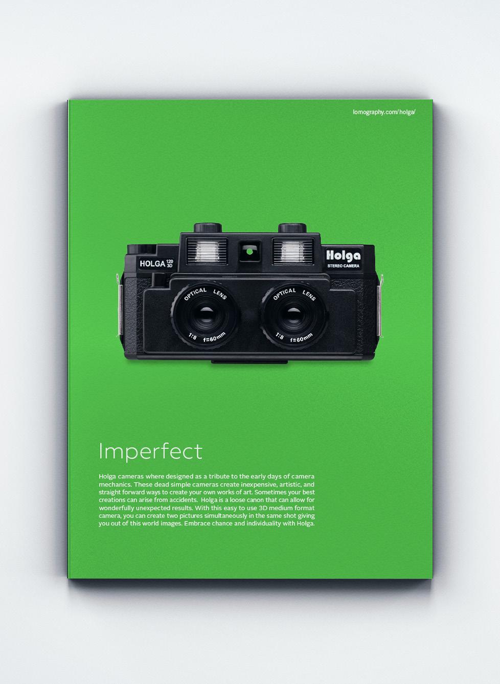
HOLGA
Advertising Campaign
Recently the Holga Camera has experienced renewed consumer interest in its toy cameras, and a continuing counterculture response to the increasing sophistication of modern cameras. Young generations of artistic and trendy people have created a cult following for Holga. With these ads I wanted to showcase the camera itself rather than the photography which they produce. The ads are bright, simple, and clean. This is juxtaposed with a negative headline that sparks interest in the copy.
YANET MIRELES //
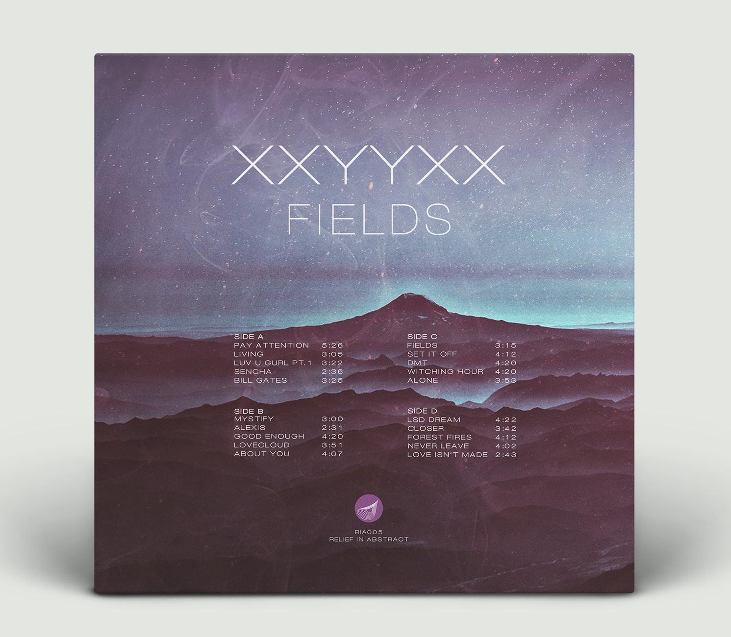
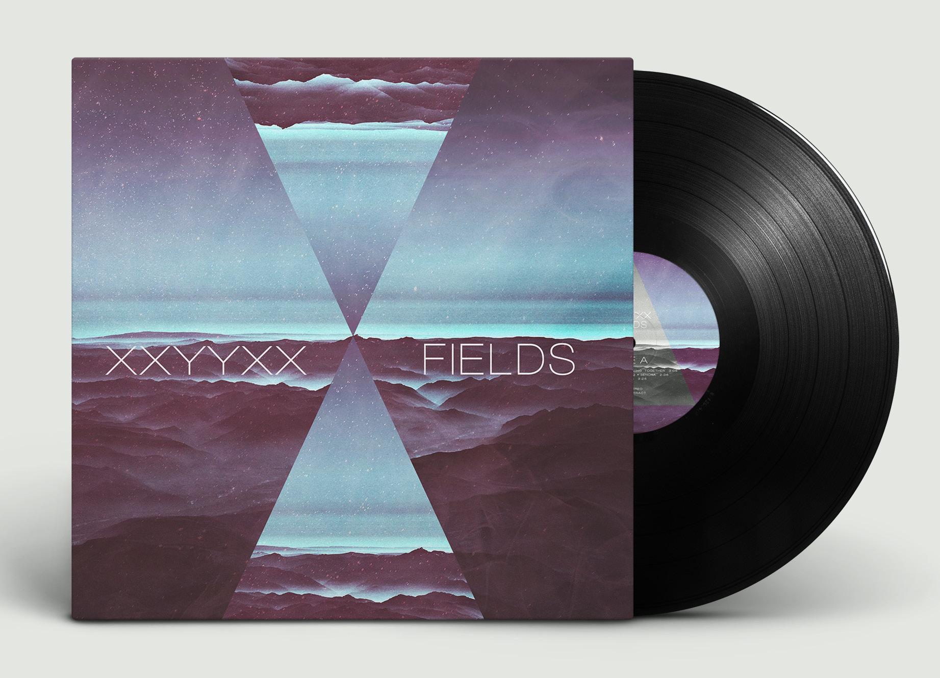
XXYXXX ALBUM
Packaging
The age of cds is long past and digital music has come to the forefront, but many young people have gravitated toward the age old vinyl record. I created a vinyl design for the electronic artist XXYYXX. The music he creates is a very ambient electronic soundscapes which is juxtaposed with slow hip-pop beats. The design evokes a subdued, ethereal, and fictionalized landscape.
YANET MIRELES // PROCESS
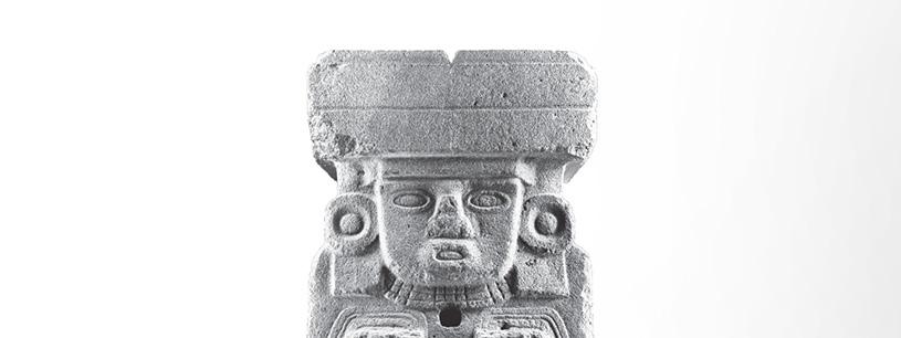
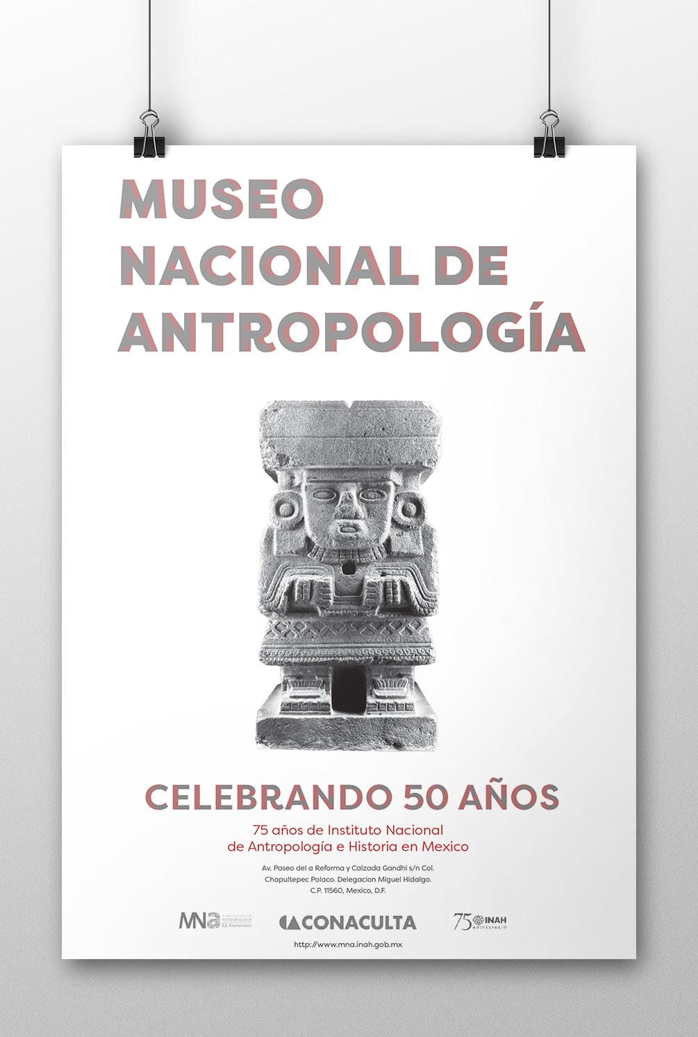
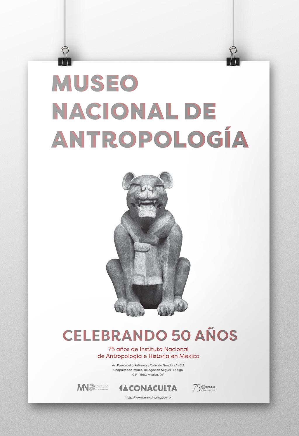
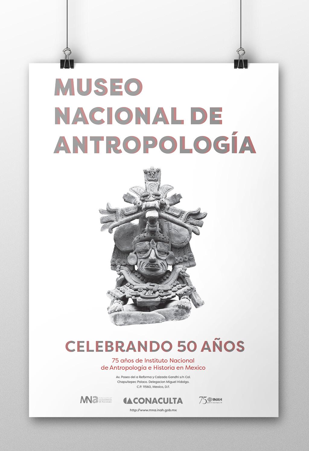
MUSEO NACIONAL DE ANTROPOLOGÍA
Poster Series
This poster series was created to celebrate the 50th anniversary of the National Anthropology Museum in Mexico City. I am a first generation Mexican-American, so this project is a nod to my culture and heritage. More often than not posters try to include as many elements as possible, but I wanted to let the sculptures be the main focal point. I elected to showcase ancient statues in the museum because they have strong links to anthropological discoveries. The subdued notes of red were added to emulate the current branding of the museum without taking attention away from the sculptures.
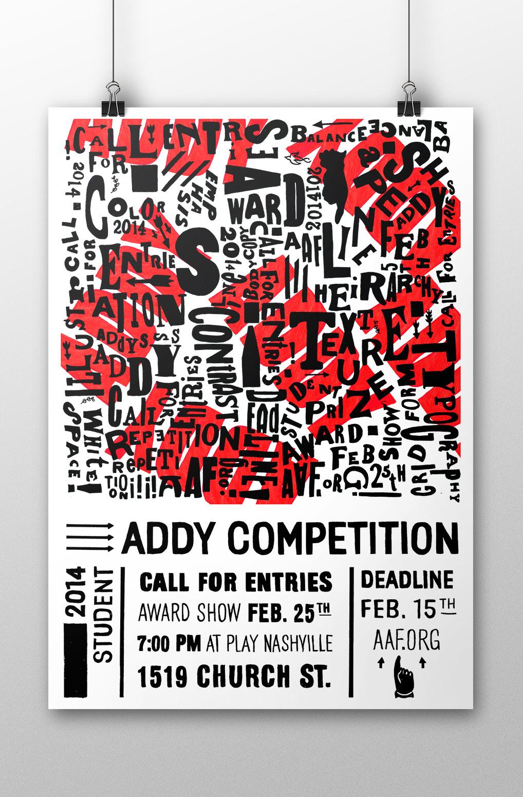
STUDENT ADDY COMPETITION
Poster
The American Advertising Awards or the Addys are important on a professional and student level. The assignment for this project was to create a poster for the Nashville Addys which took inspiration from an art movement. I chose to create a Dada inspired poster that was created with all hand rendered typography taken from several Dada publications. The pertinent information for the show was kept clean for readability purposes.
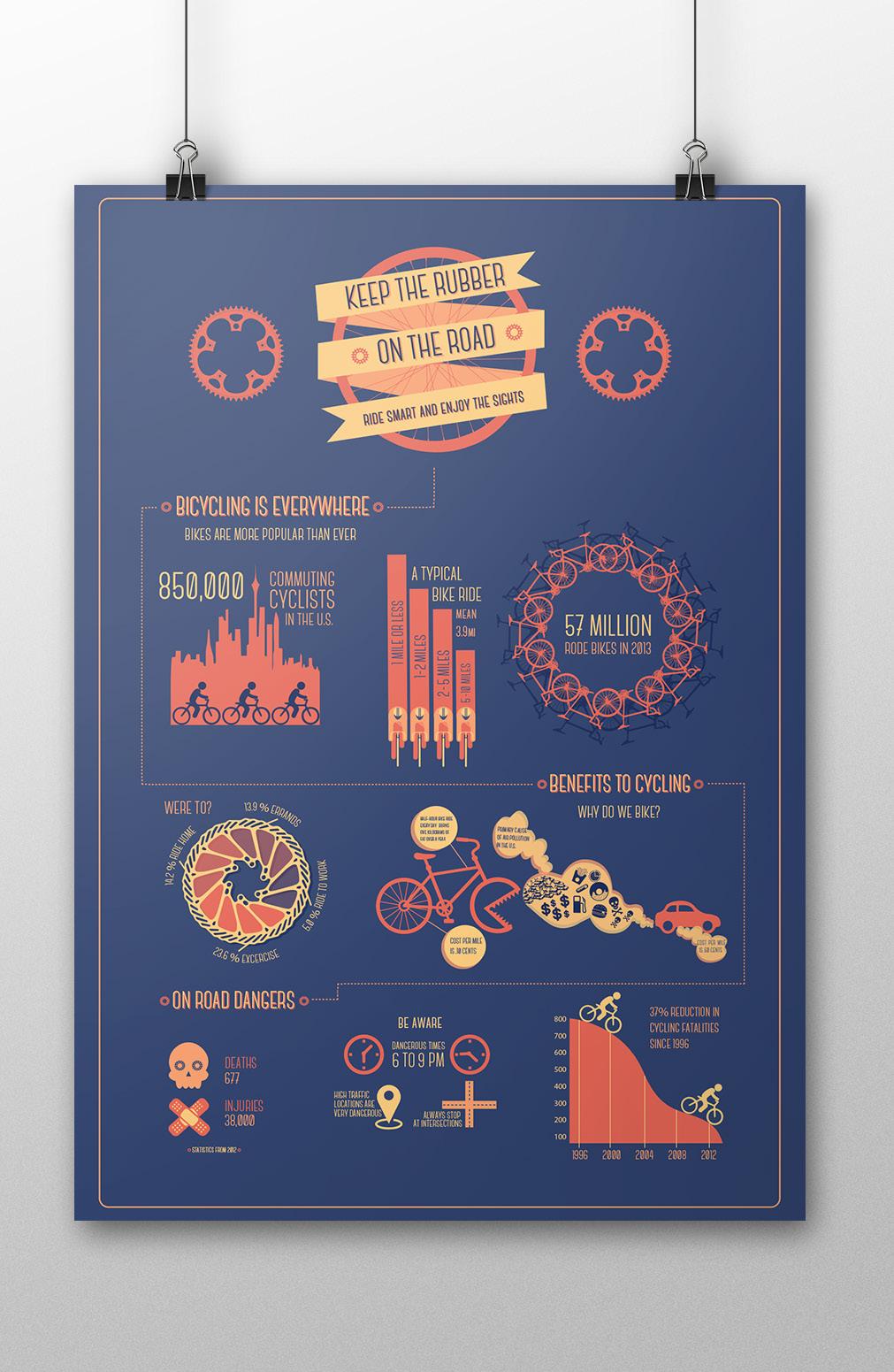
KEEP THE RUBBER ON THE ROAD
Poster | Infographic
This infographic poster shows the benefits and dangers of riding bicycles on the road. Along with this information the infographic also showcases the number of people who currently ride bicycles. I decided to keep the work to three colors to further link all the graphics together. The colors and the typeface allow the poster to feel fun and positive.
ATELIER ZURICH
Atelier Zurich is an interior design studio based in Zurich, Germany which specializes in modern spaces and conceptual designs. The mark exudes modernity and sophistication. The logo represents thinking outside of the box and modern geometric spaces. Within the square a diagonal has been added to suggest a Z.
C//20 M//0 Y//100 K//0
C//0 M//0 Y//0 K//70
Typefaces: Solex
Logo
Cardinal Healthcare
Typefaces: Filson Pro
CARDINAL HEALTHCARE
Logo
This logo is a redesign of a healthcare company that specializes in providing medical supplies to hospitals and doctor’s offices. I opted to keep the warm red tone of their previous logo and the bird motif. The result is a minimal, clean, and vibrant logo that removes the cold unfriendly aesthetic that many healthcare company logos contain.
FELT PAPER CO.
FELT PAPER CO.
Logo
Felt Paper Co. is a paper company which provides small-batch specialty paper to individuals and companies. The logo is clean, classic, and modern. The company logo is inspired by stationery, monograms, and simple forms. It can easily be used for a wide array of applications and it is recognizable at various sizes.
Typefaces: SACKERS GOTHIC
C//5 M//74 Y//80 K//0
C//1 M//17 Y//99 K//0
C//25 M//99 Y//97 K//21
C//93 M//94 Y//20 K//8
ANDALUCÍA
Andalucia is a tapas restaurant that specializes in the culinary traditions of Andalucia, Spain. The logo is inspired by Spanish Majolica plate designs. These artisan folk plates are used for special feasts in Spain during the year. The logo represents the vibrant culture, traditions, and food of Spain.
C//37 M//37 Y//8 K//3
C//74 M//75 Y//16 K//6
Typefaces: Hapna Mono
ABOUT ME
I am a graphic designer and long time resident of Nashville, TN. As a designer, my primary passion is creating brand identities and packaging. I am inspired by hand-lettering, typography, vintage advertising, and all things printmaking. In my free time I like to read, travel, photograph, and fill my sketchbooks with anything and everything.