
COLOR VARIATIONS
Be wise and choose appropriately.
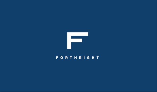
White Version
This is the preferred version of the logo. This approach of the logo should be used first before any other attempt to other versions.
Color Version
This version is to be used against lighter colors/backgrounds when necessary.
Black Version
This version is meant to be used only if a black/white version of the logo is necessary for external use.
SIZE VARIATION
It’s not about size, it’s how you use it.
The logo is pretty much going to stay in it’s standard version size until you approach 1” in scale. Below 1” is when the type should be dropped from the logo because it’ll become too illegible to read.


Standard Version
This version is recommended to be used at least 1”, no smaller.
Smaller Version
At 1”, the logo can still retain the type or use the version with no type. However, any use below 1” must use version with no type.
Everyone needs some space.
When using the logo along other things please ensure the logo does not bump or clash with other objects. Ensure the logo has enough space to breathe, this proper amount of space needed is shown on the diagram below. Since the logo has a lot of vertical movement, it needs a lot of horizontal space or else it’ll begin to look cramped.
PRIMARY COLOR PALETTE
These are our favorite colors.
These are the that represent us the best. These colors should be used with moderation, so don’t go painting the walls navy and white. We chose these colors because they’re neutral and cool which fit with the attitude of the brand best, they’re very understated colors.
PMS 534 C
#546456
R22 B63 G108
PMS WHITE
#FFFFFF
R225 B225 G225
SECONDARY COLOR PALETTE
We have some more options as well.
With our secondary color palette, we wanted them to be fun but not too saturated. These color help add some liveliness to the primary color palette. These colors should be used to accent the primary colors, or to being emphasis to the primary colors.
PMS 727 C
#E0AE86
R225 B175 G134
PMS 727 C
#6BB8D6
R108 B184 G215
PMS 474 C
#F2C6A8
R243 B199 G169
PMS 177 C
#F48789
R244 B135 G137
TYPEFACES
Let’s break down it down for you.
For fonts, we decided if it was best just to stick to one. Galaxie Polaris is very clean and legible sans-serif that can easily transform into a font for copy into a font for display just with the change of the weight and size.
Galaxie Polaris Book
ABCEDEFGHIJKLMNOPQRSTUVWYZ abcedeghijklmnoqrstuvwyz 1234567890
Galaxie Polaris Medium
ABCEDEFGHIJKLMNOPQRSTUVWYZ abcedeghijklmnoqrstuvwyz 1234567890
Galaxie Polaris Bold
ABCEDEFGHIJKLMNOPQRSTUVWYZ abcedeghijklmnoqrstuvwyz 1234567890
GalaxiePolarisHeavy
ABCEDEFGHIJKLMNOPQRSTUVWYZ abcedeghijklmnoqrstuvwyz 1234567890
Body Copy
Fine Print Copy
Headlines
Headlines
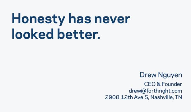
Less of the talking, more of the action.
Here are some examples of print applications of the branding. Below we have business cards and a print ad for reference.


This is who we are.