What follows is a collection of work created over the course of my education at Watkins College of Art, Design & Film. Through a variety of projects I was given the opportunity to hone my skills, play with concepts, and create pieces that showcase my aesthetic sensibilities. I hope you have as much fun checking them out as I did making them!
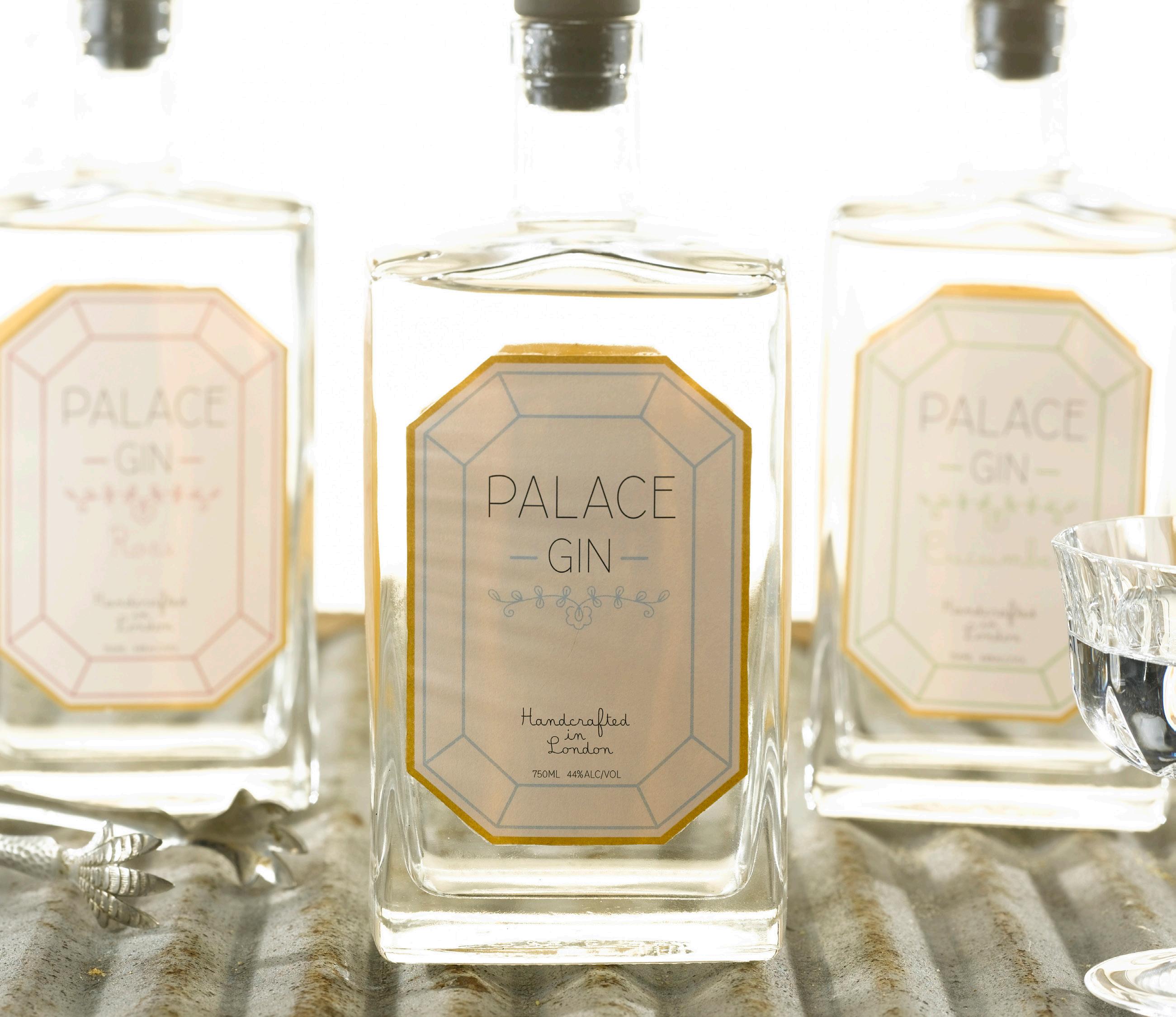
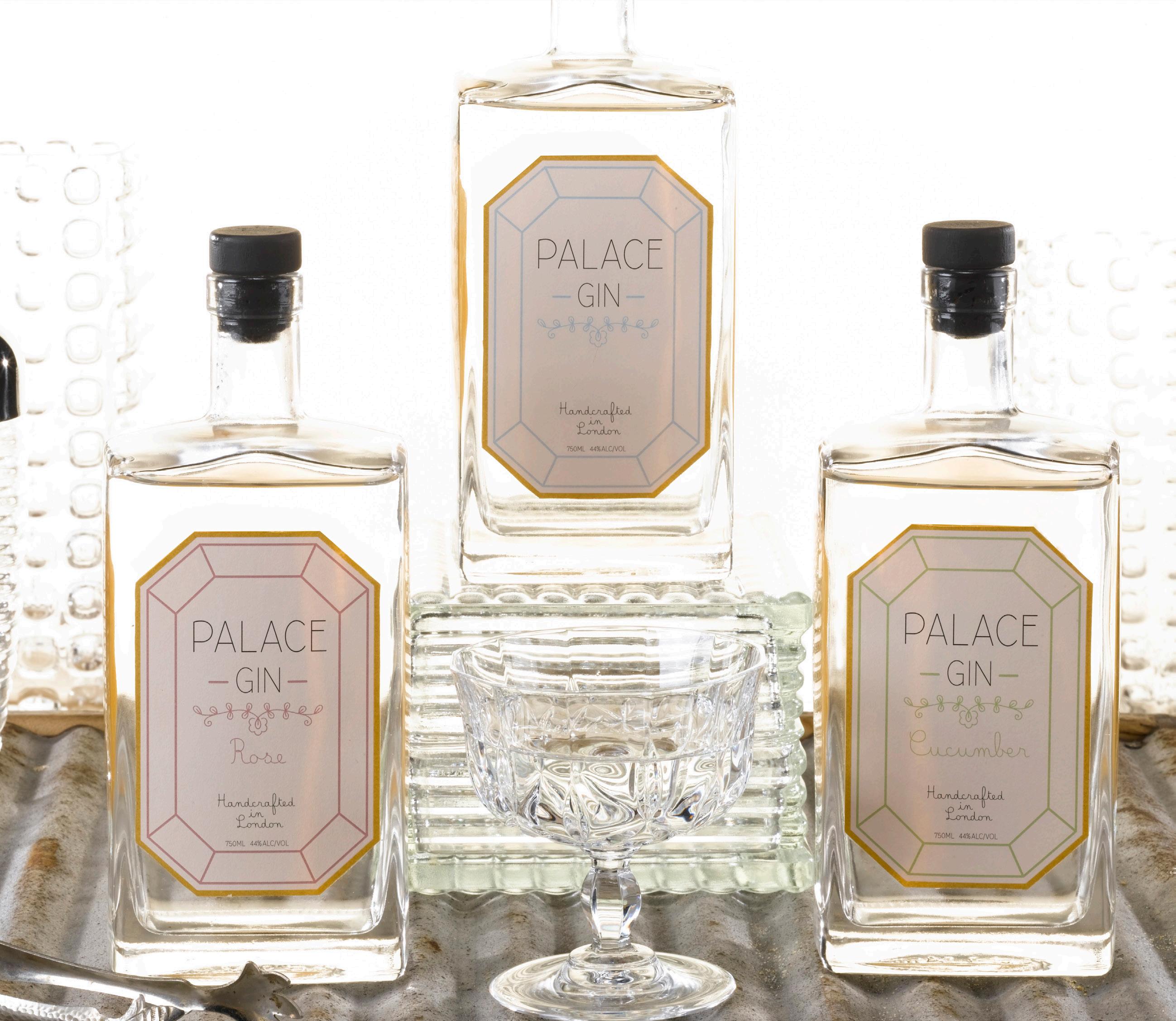
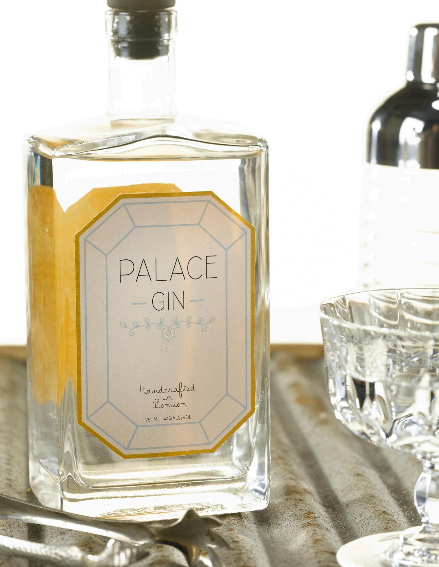
Palace Gin
Palace Gin is a top-shelf, small-batch liquor inspired by the opulent gin palaces of the Victorian era; drinking establishments and distilleries that were ornately decorated and illuminated by the newly-introduced electric lighting that sparkled like jewels off of engraved mirrors and metallic accents.
I approached the branding for this project in a way that paid homage to these bygone institutions in an updated and fresh style featuring mono line type and decorative flourishes, metallic touches, and a subdued and delicate color palette.
Elements Corals
Belle Allure Comfortaa
The ABCs of Astrobrights
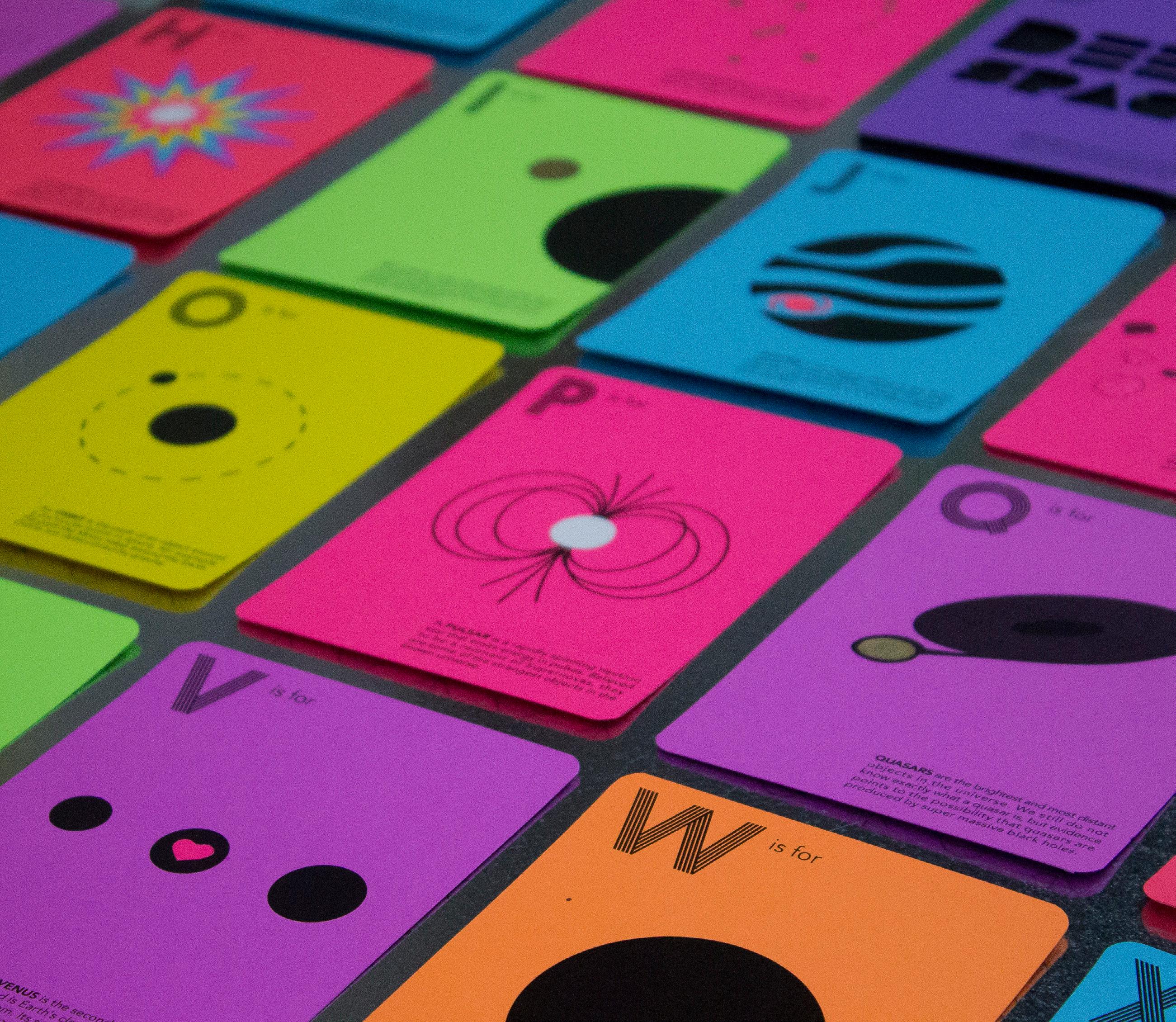
The ABCs of Astrobrights is a flash card deck full of neat facts about the various objects and phenomena found in outer space. This project also serves as a promotional sample of Neenah’s Astrobrights paper line.
I wanted to showcase the paper’s versatility while still keeping the attention on the line’s brilliant color spectrum. This was achieved by using an extremely minimal color palette of black combined with a variety of finishing techniques such as gold-foiling, embossing, and die cuts. The end result retains a sleek futuristic feel while maintaining the fun personality of the paper.
Elements Moriston
Prisma
70/68/64/74


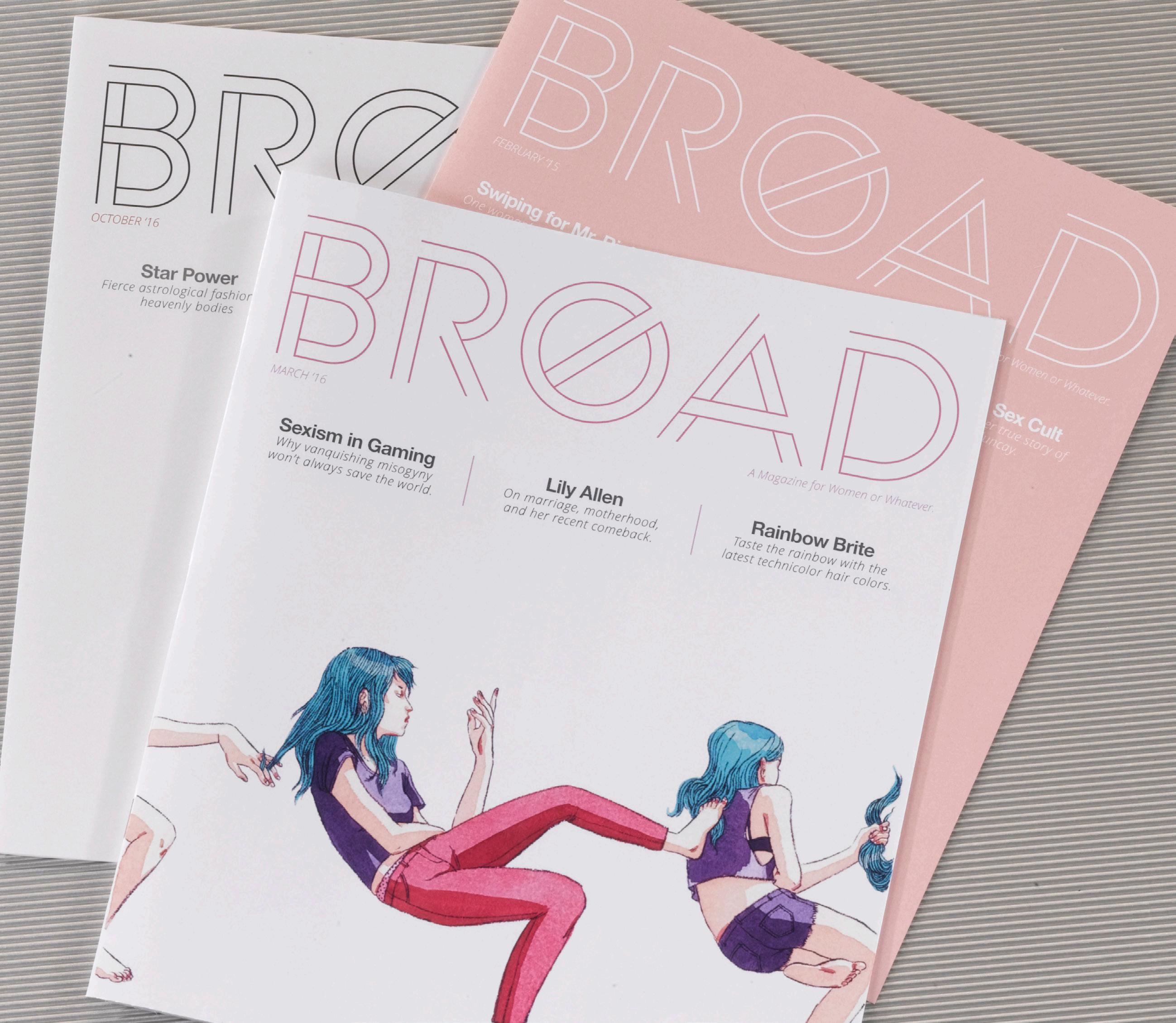
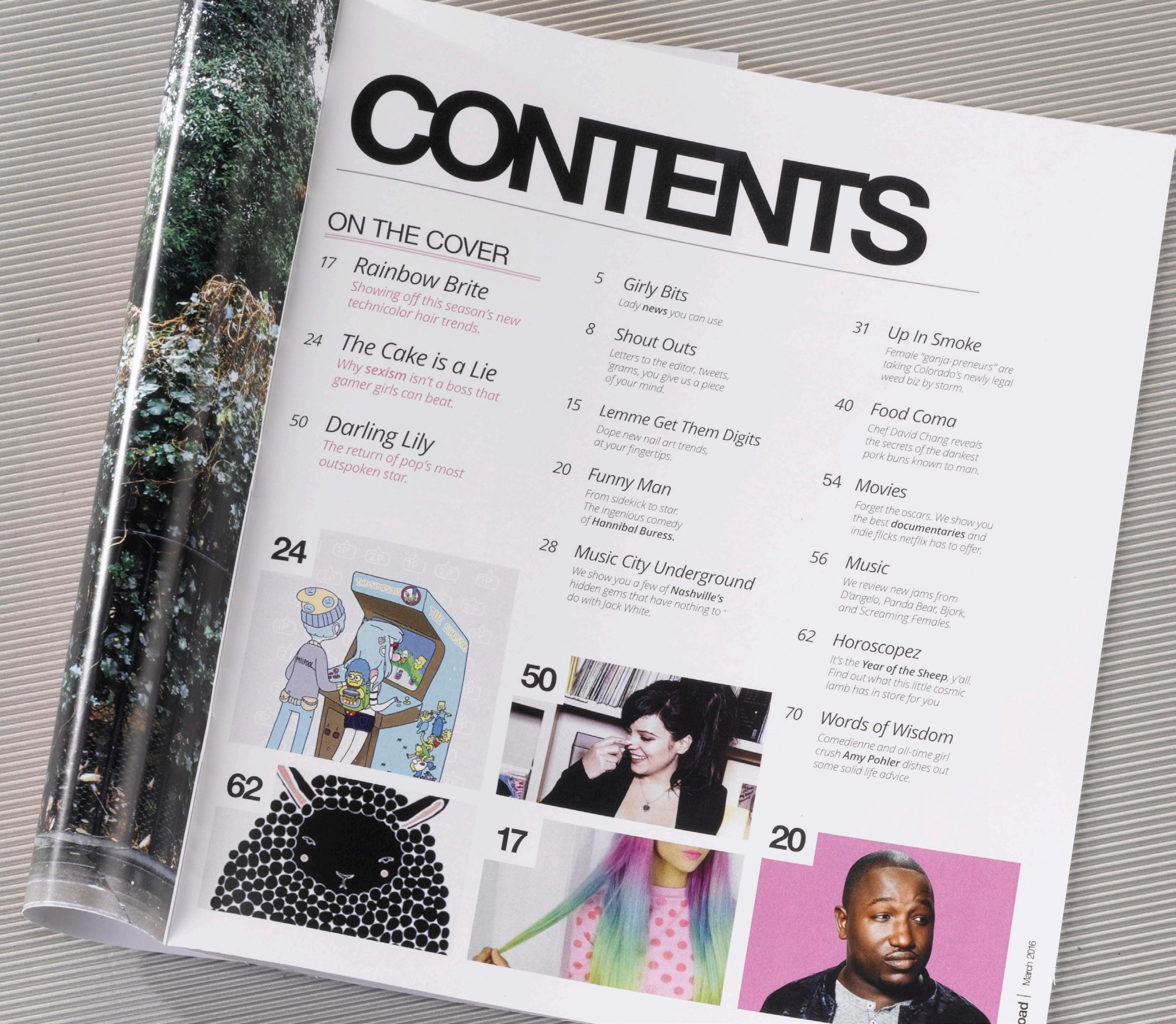
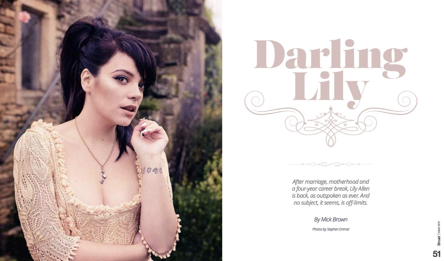
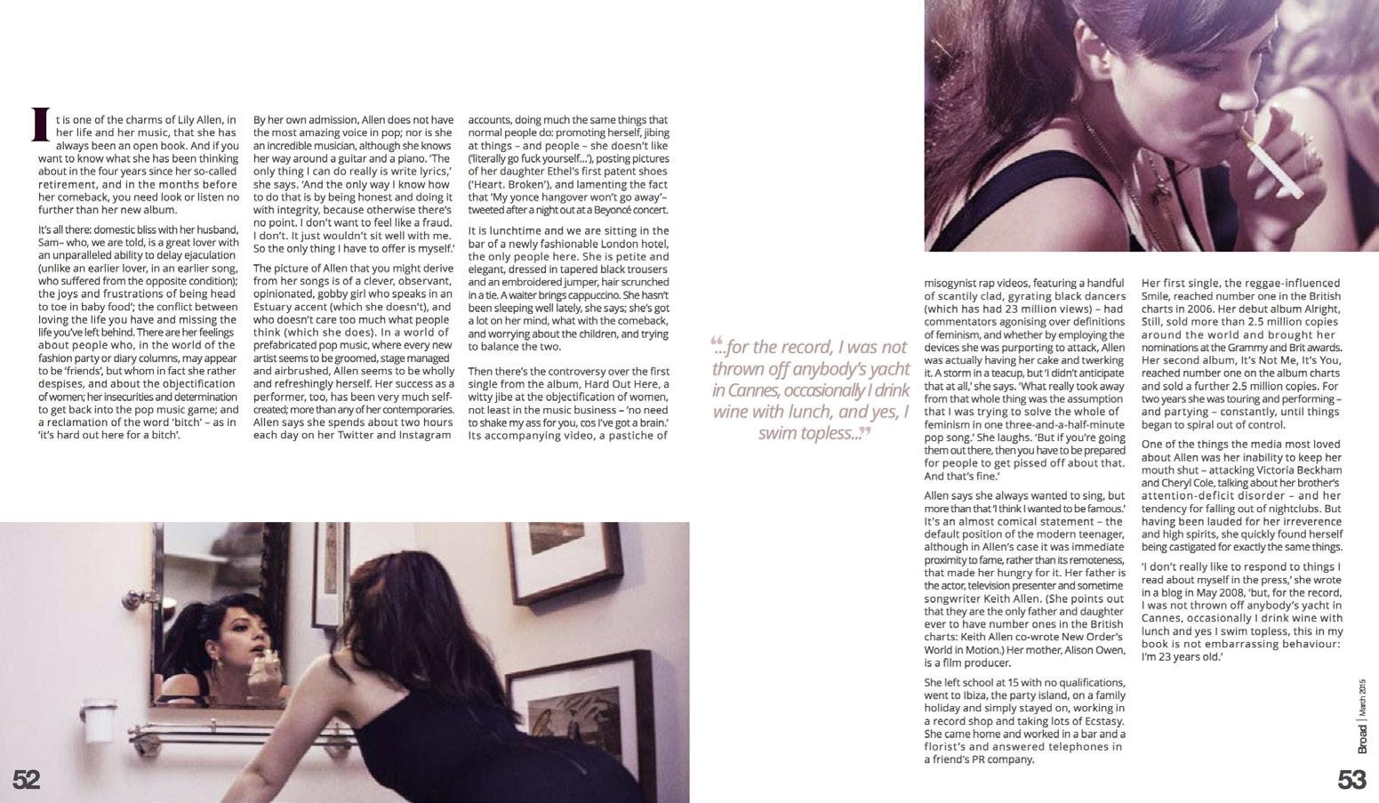
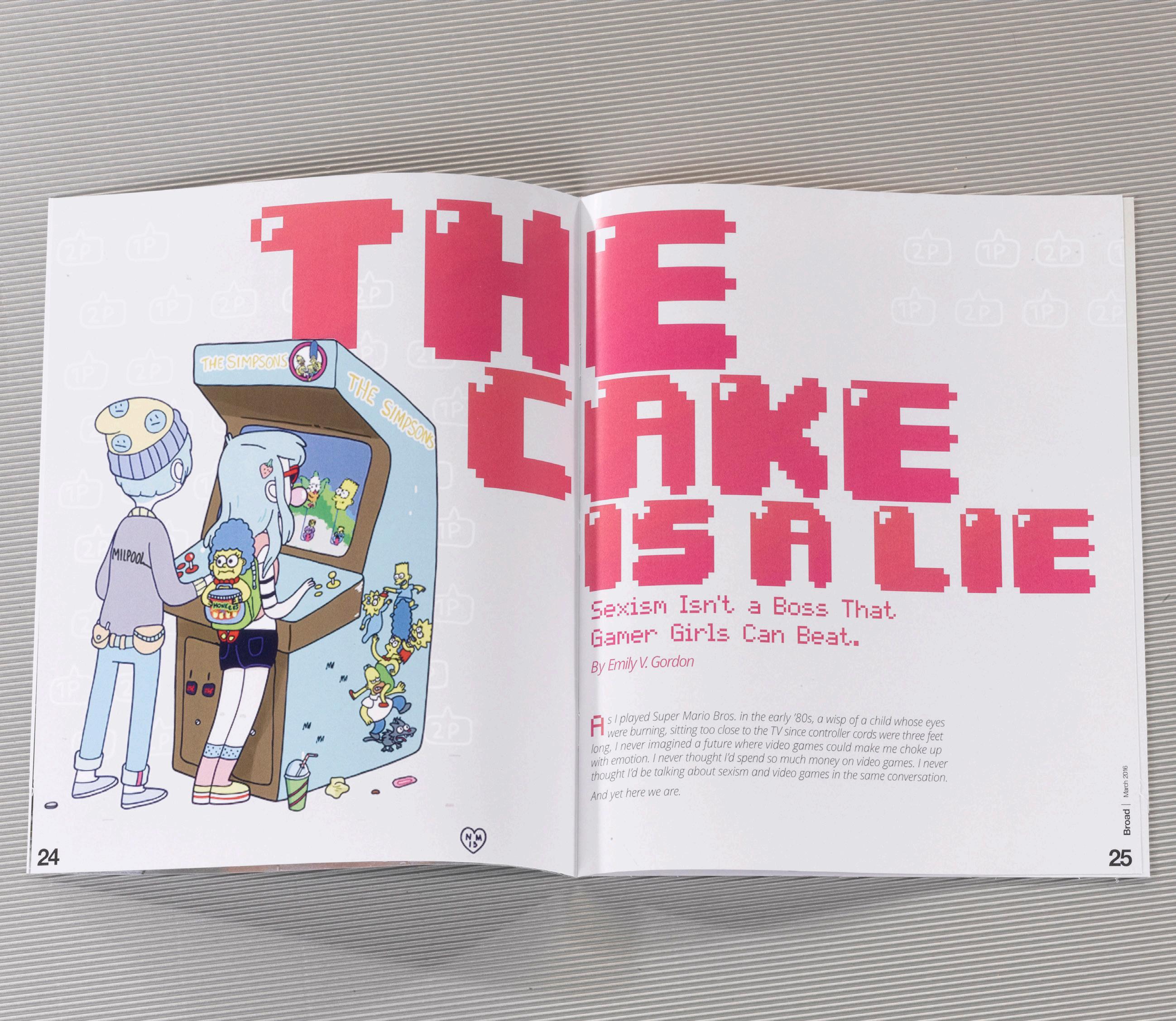
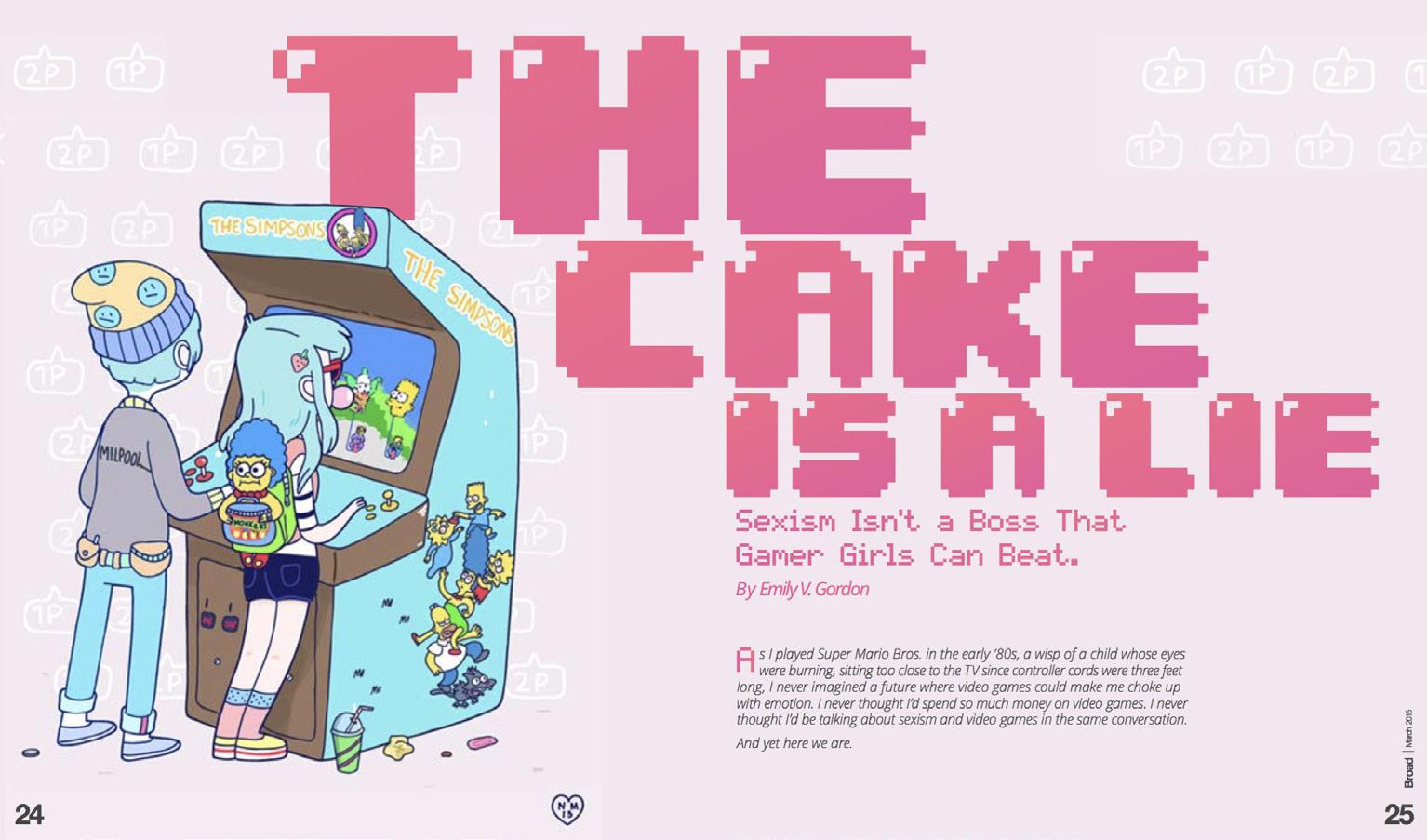
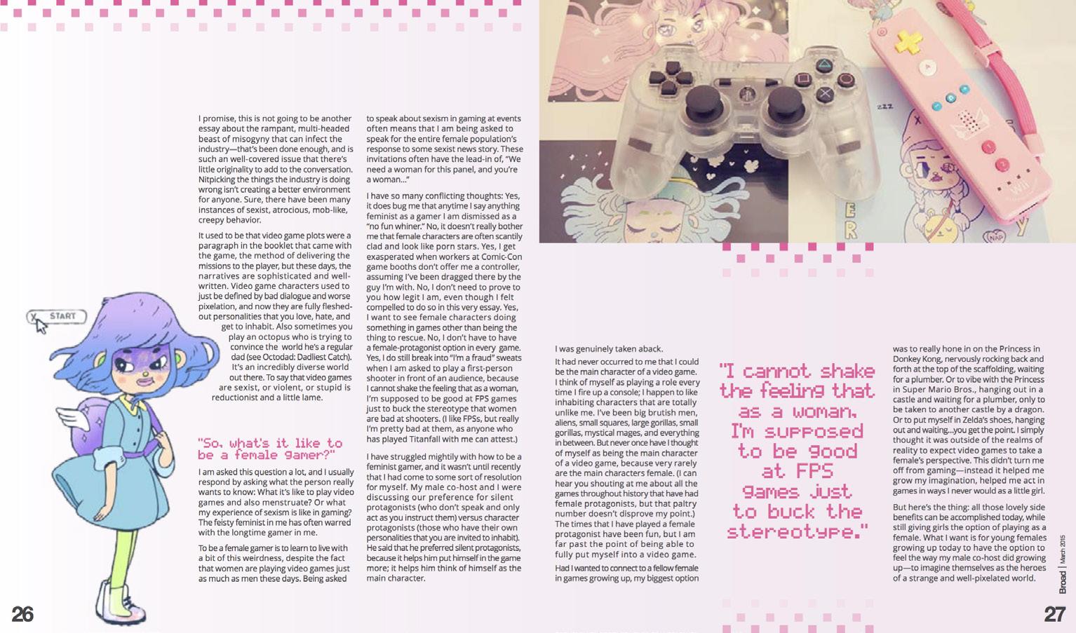
Broad Magazine
Broad is a magazine for a young, hip, and feminist demographic in the vein of Bust that seeks to empower, educate, and entertain. In keeping with the publication’s values of celebrating the multi-faceted scope of femininity, the overall aesthetic is decidedly girly but possesses a good bit of clean-lined, modern, snarky edge. The magazine heavily features illustration work from female artists, predominately on the cover, which spotlights a different piece each month and dictates the issue’s color palette.
Elements arenq
Helvetica Neue
Open Sans
0/64/3/0 3/0/0/0 67/60/57/41
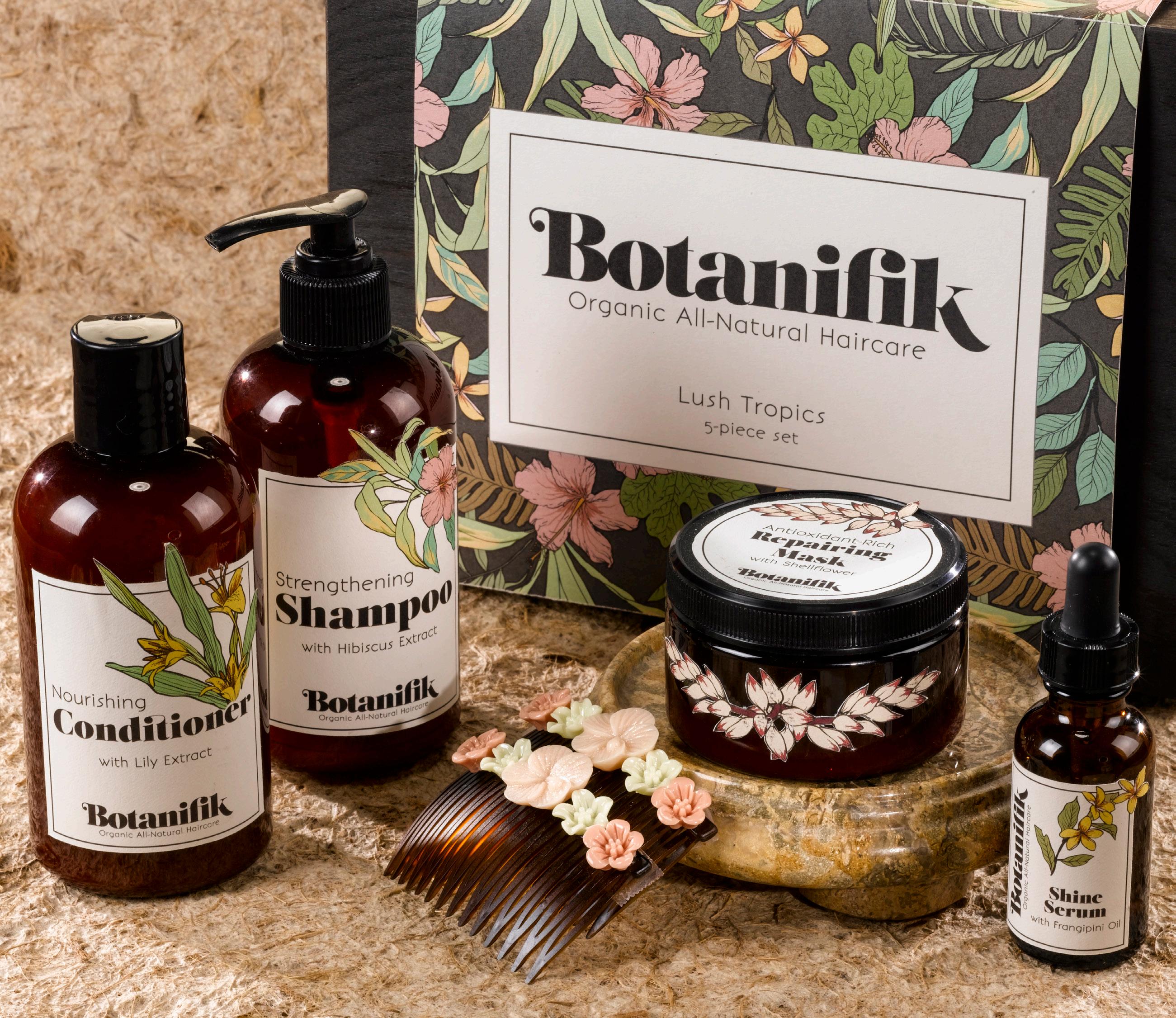
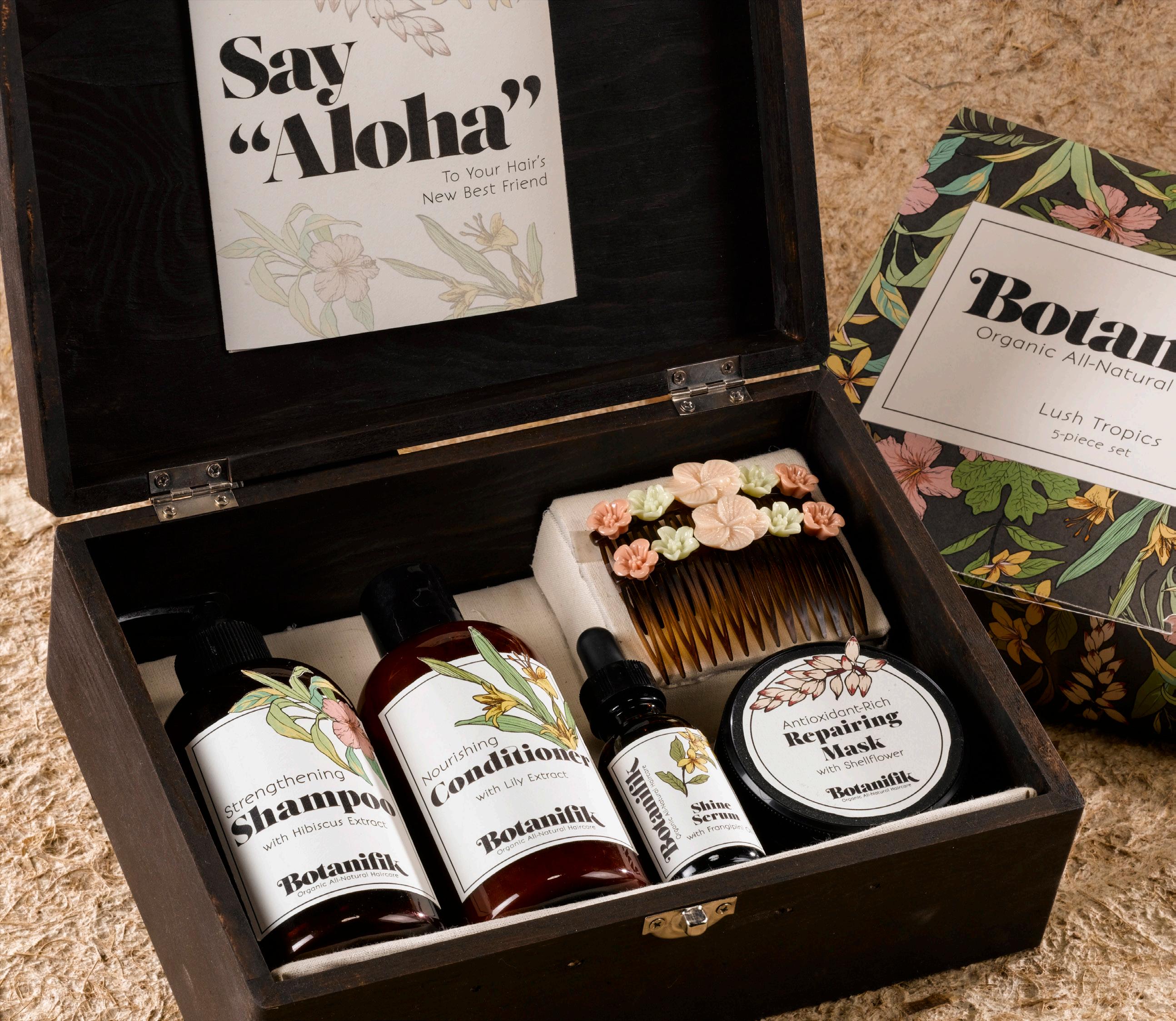
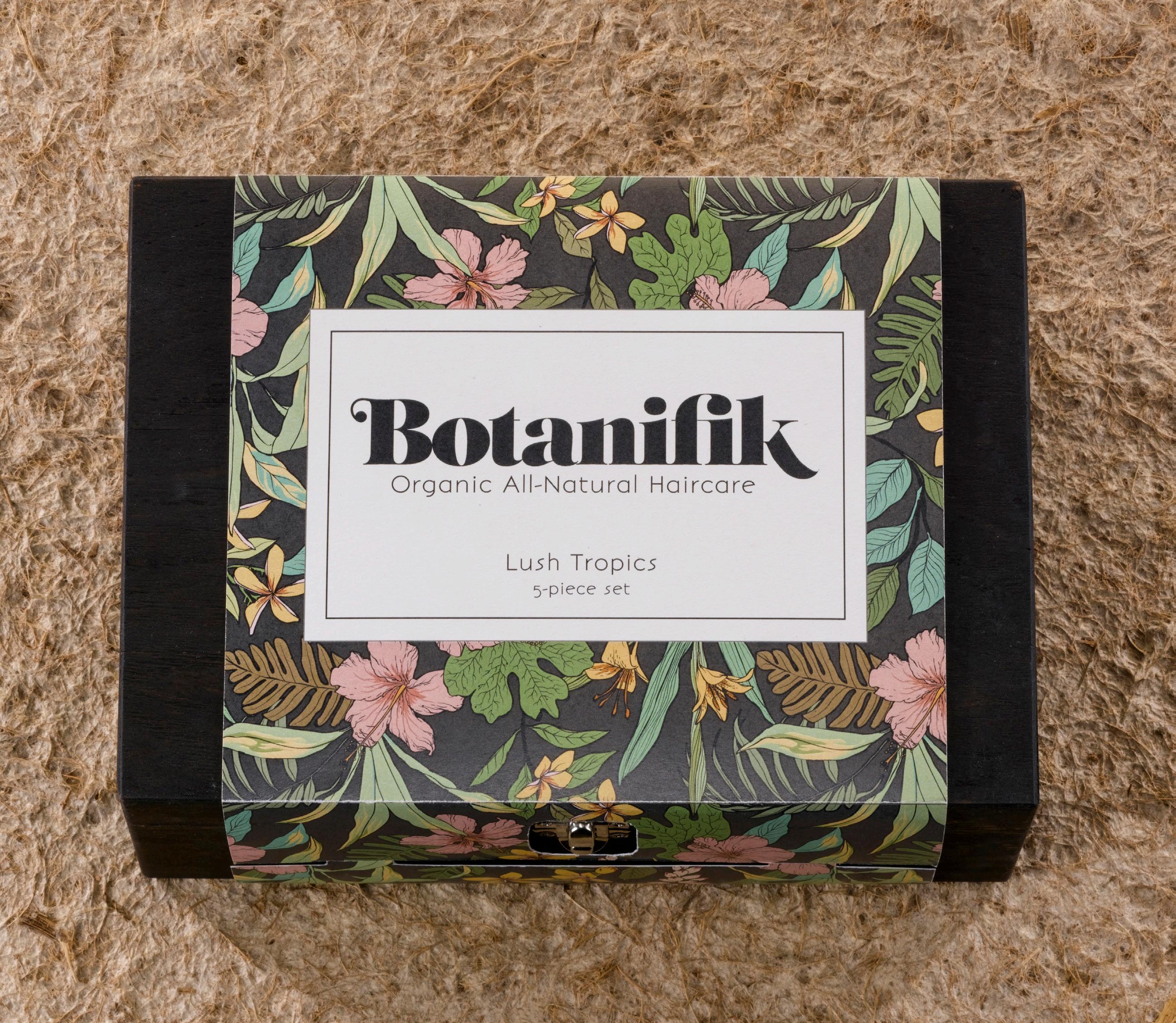
Botanifik Haircare
Botanifik is a line of mid-to-high-end haircare products with a focus on using all-natural, organic ingredients. The brand emphasizes the power of nature in the form of plants and botanicals valued for their various properties. This package is a gift set of a range of haircare products grouped together by the region that the ingredients are native to (in this case, Hawaii and other surrounding islands).
The box is made of wood with a sleeve of recycled paper, printed with a floral motif featuring the product’s ingredients. These illustrations are also carried into the labeling on the bottles. The main typeface is lush and flowing, reminiscent of blooming nature, as well as healthy, soft hair. The branding is natural, feminine, and elegant, which sets itself apart on the shelf from other high-end products that aim to be ultra sleek and modern.
Elements
Salome
Bonveno
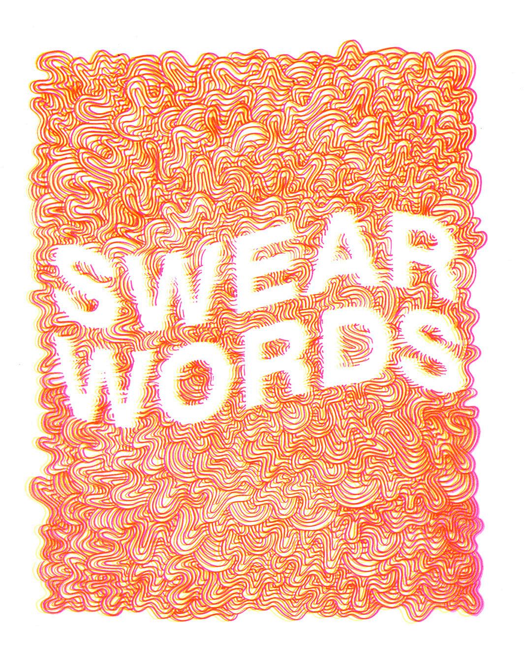
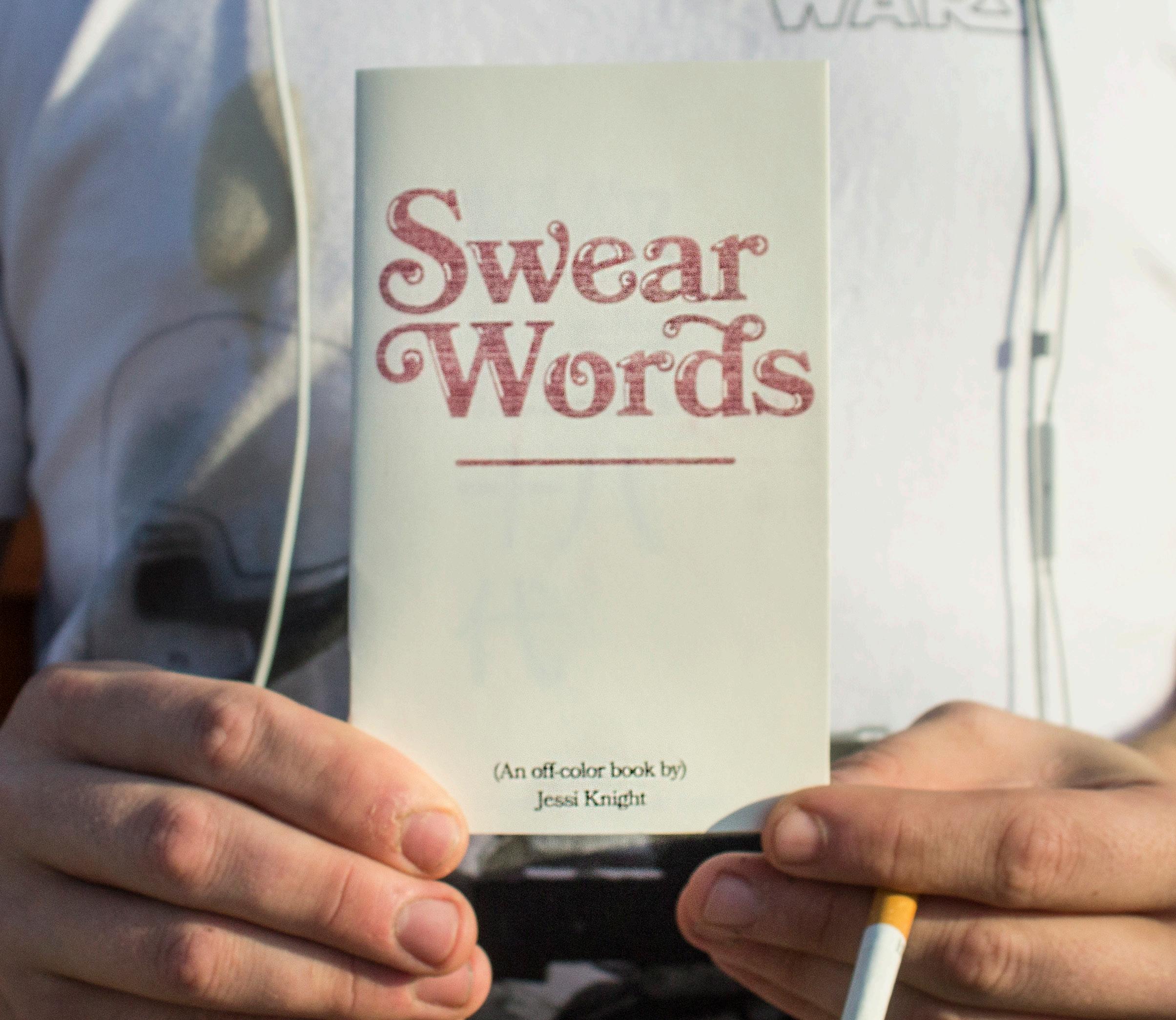
Swear Words
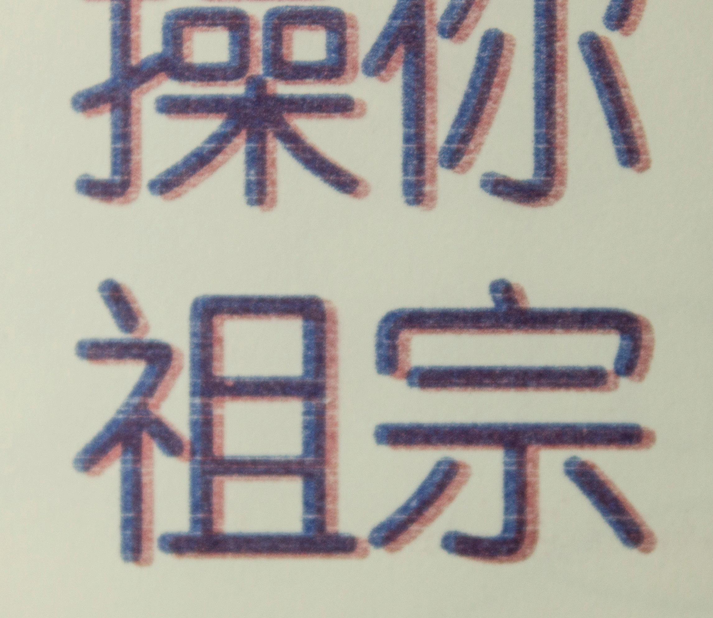
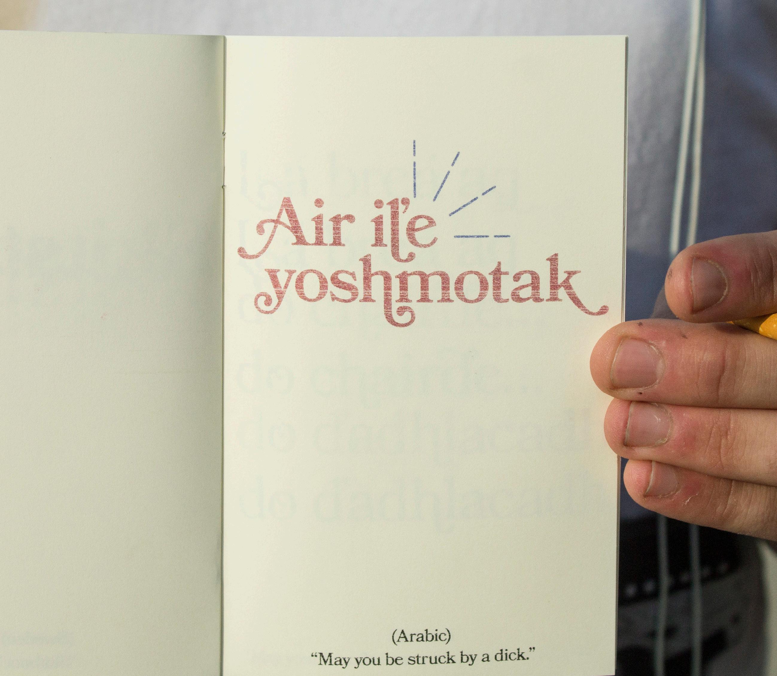
As somewhat of a personal endeavour, I wanted to dive into the world of lo-fi zines with a project that combined my love of typography, D.I.Y culture, and profanity.
Consisting of expletives and insults from around the world, this book is an exploration of the dichotomy of a lush, refined, meticulous aesthetic and the words we use behind closed doors that tend to be viewed as unseemly or vulgar yet often provide so many unique outlets for expression.
The vintage nature of the typeface as well as the counterculture associations of the medium are exaggerated by the risograph printing method that makes each copy unique and imperfect.
Elements
44/75/48/22 88/84/39/33
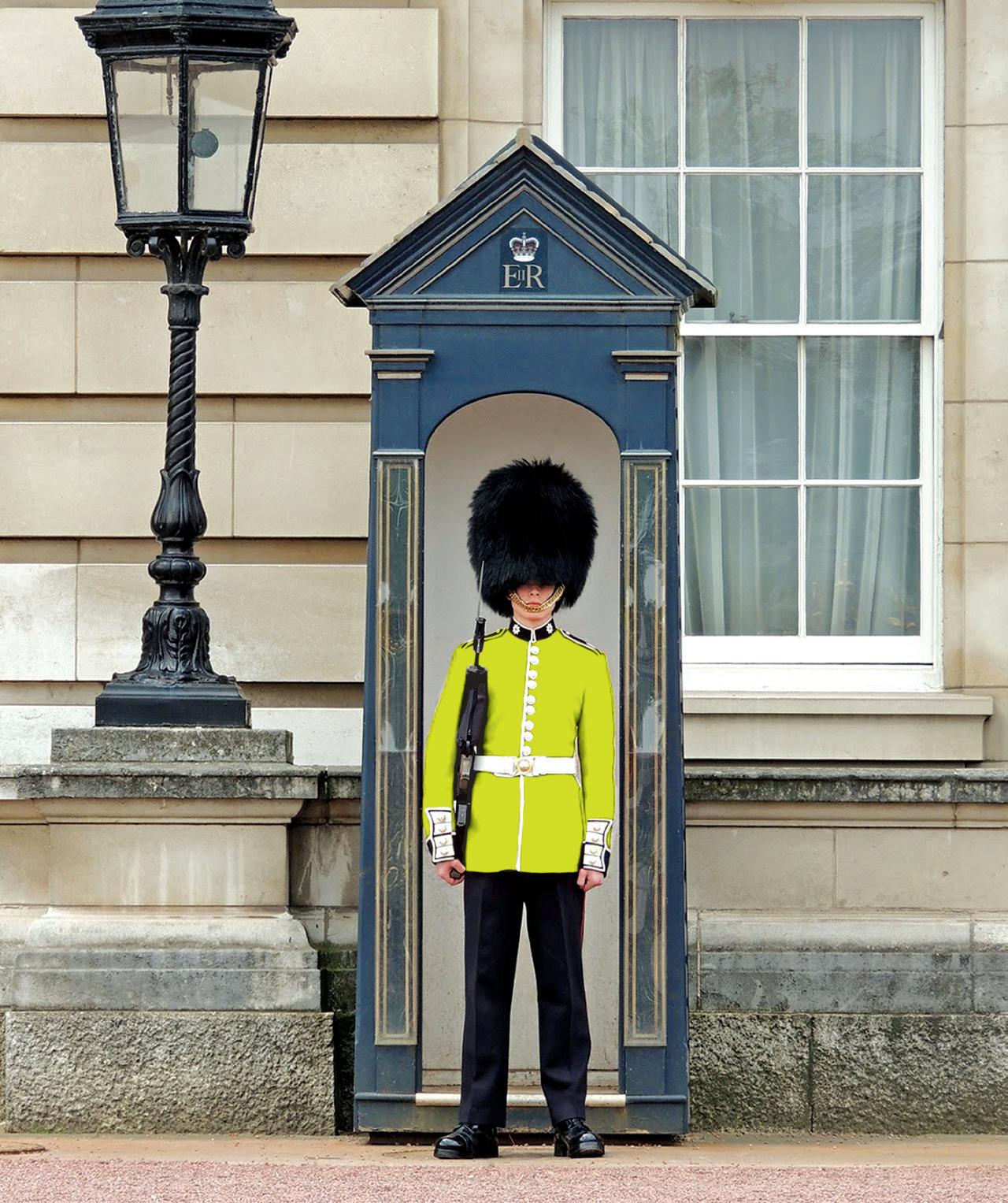
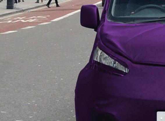
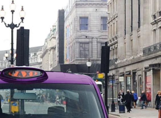
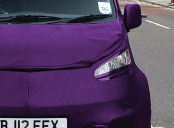
London Color Campaign
Butter London is a high end beauty brand that produces nail polish and cosmetics with an emphasis on vivid, fashion-forward colors.
In creating the London Color campaign, I wanted to represent the brand’s playful rebelliousness in shaking up stuffy tradition. I decided to utilize classic shop window lettering and bold photography featuring classic London icons (the phone booth, the Queensguard, and the ubiquitous black taxi) repainted with a bright color taken from Butter’s product line to emphasize the concept.
Elements
HAND SHOP TYPOGRAPHY
Fanwood
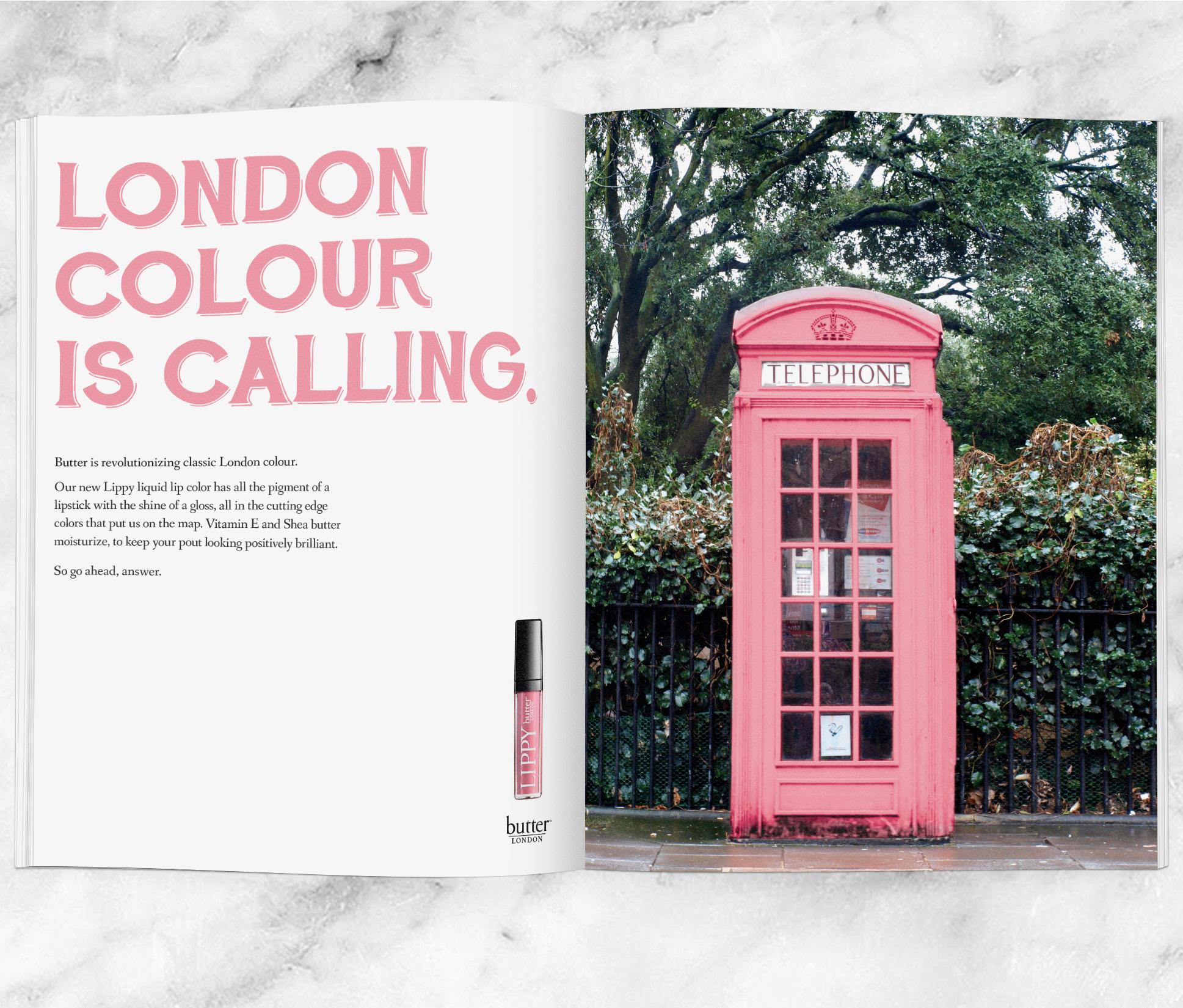
LONDON COLOUR GETS TOUGH�


Butter is shaking up traditional London colour. With 112 eye-catching shades, durable fi nish, and no harsh or harmful chemicals, your nails will look positively brilliant with no chipping or cracking, no matter what you throw at them. Go ahead and try it, we dare you.


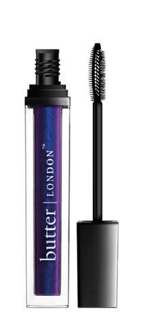
LONDON COLOUR IN A FLASH�

Butter is transforming dull London colour.
Add a streak of boldness to your lashes. Our new Electralash Mascara is at your service. Shimmering color in a long-lasting, flake-free formula delivers mesmerizing lashes and leaves your eyes looking positively brilliant. Now that’s service.
Logos
Over the course of my time at Watkins I was tasked with creating a variety of logos. Some were for fictional companies of my own conception, while others were re imagined for existing brands. The next few pages are a collection of some of my favorites.
Treehouse is a children’s book and media store with an eco-friendly, kid oriented vibe. The tree shape reinforces the brand values of growth and learning, while the rounded typeface and bright color is friendly, playful, and youthful.
Created in partnership with Warner Music Group Nashville, this was a proposed logo for the country duo Walker County. As part of an overall visual direction created for the band that mixes elements of classic 60s country songstresses with a more modern, youthful vibe, it pulls inspiration from classic county album covers while still feeling fresh and on trend.

Circe is a high-end cosmetics line inspired by the legacy of some of mythology’s most legendary women. The name Circe refers to the powerful witch of the same name from Homer’s The Odyssey. The braided circle in the logomark is inspired by her moniker “Circe of the Braided Tresses” which conjures images of feminine mystique and power. The typeface is clean and modern, but recalls ancient letter forms and runes, and has a little bit of a devious personality.
Ohana is a Nashville-based food truck serving up the classic Hawaiian dish Poké. The word Ohana refers to the idea of a “chosen”, extended family. Though poké has a long history, it’s set to become the emerging food trend of the year. With this in mind, the logo treatment called for something modern and on-trend, while still retaining elements of a classic style.
AstroOrbit is a consumer-level space travel agency that specializes in outer space excursions for recreation and tourism. The logomark is an abstract representation of an “A” and an “O” that suggests the shape of a spacecraft as well as rising movement, representative of both literally moving upwards into space and metaphorically moving forward into the future.
Printmaking
During my education I was introduced to screen printing and immediately fell in love with the medium. I quickly created a body of work that distinguishes itself from my ventures in other mediums and is made up solely of personal projects. Bringing my design background to the printmaking process, I delved further into illustrative territory with a bold, graphic aesthetic.