BHAVINDU ADHIHETTY
ARCHITECTURE PORTFOLIO | 2023


BHAVINDU ADHIHETTY
ARCHITECTURE PORTFOLIO | 2023


Pené House is a personal habitat for an occupant who wants to live off-grid. It facilitates the basic requirements for off-grid living including heating/cooling, water management, etc. Since Pené House is embedded in nature, its design is inspired by biomimicry.
Individual Work
OCAD University Location: Toronto, Ontario Duration: 3 Months
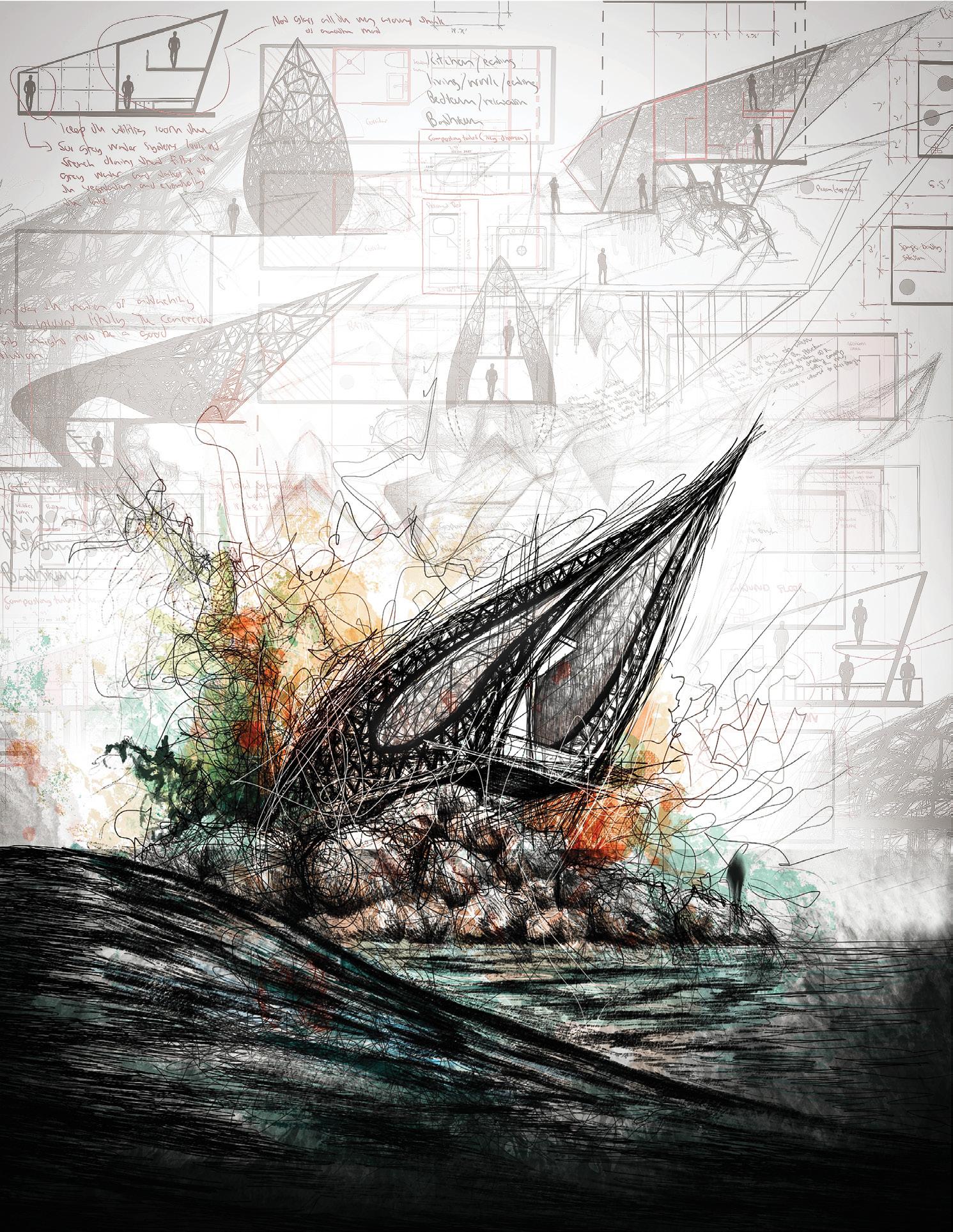
Pené House is situated at Scarborough Bluffer’s Park neighbouring Lake Ontario. Its design language. Like the foam that wraps around a rock, the design imitates the fluidity

design was inspired by the natural behavior of foam water, known as ‘pené’ in the Sinhalese fluidity of the fractal patterns in foam water as it folds over natural rock formations.

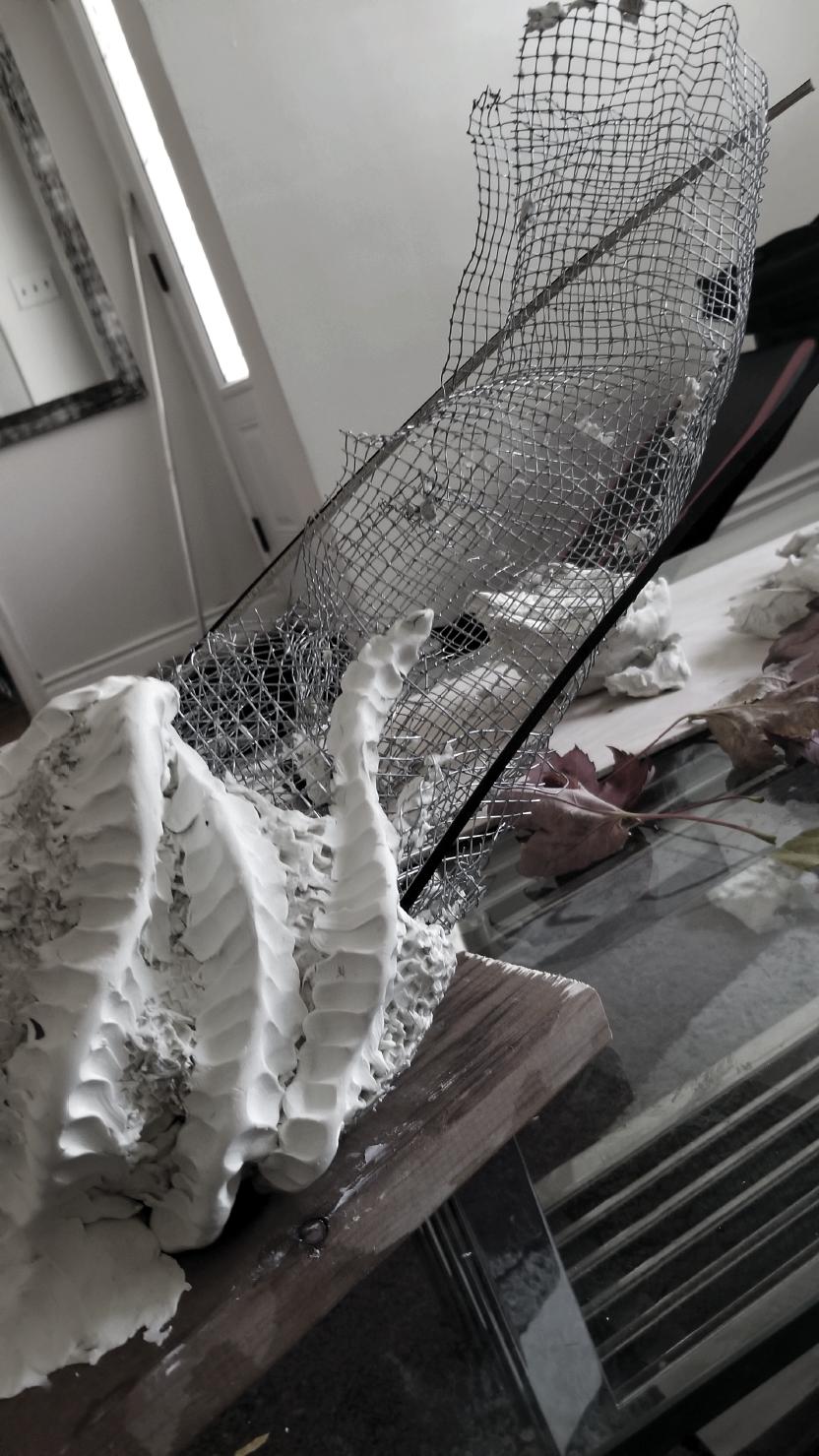
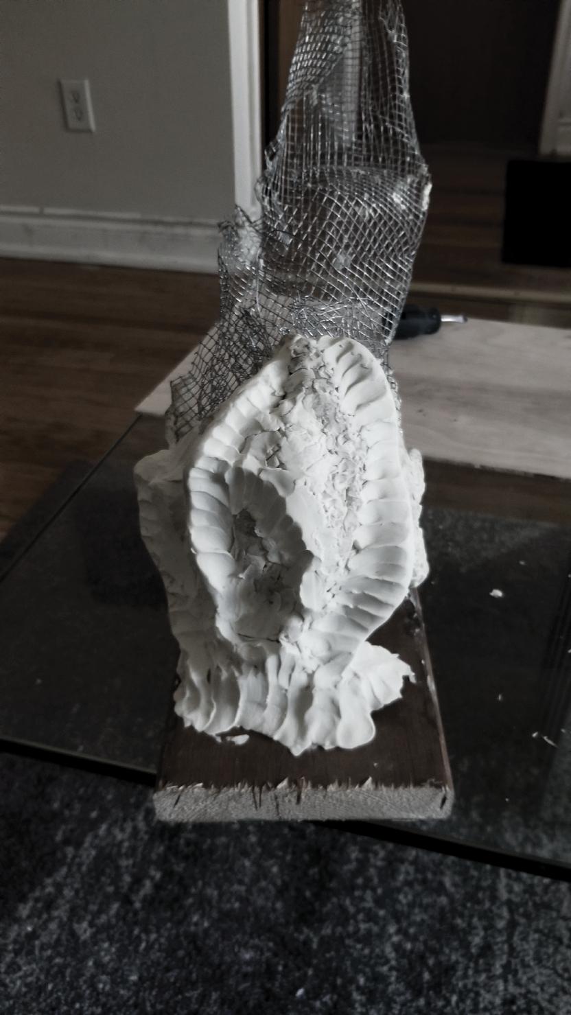
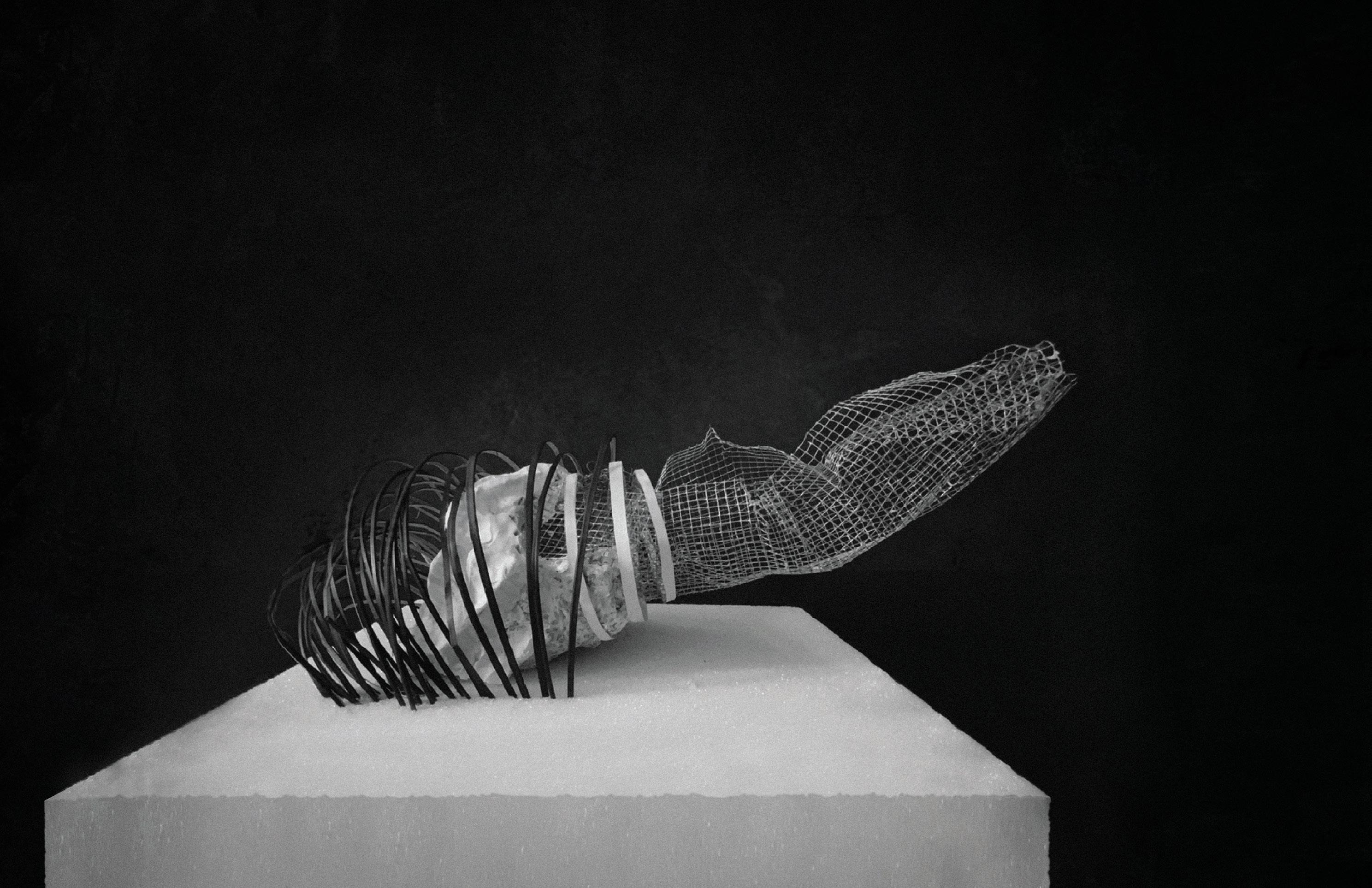
This abstract model explores Pené House’s distinctive architectural form. design: the angular protrusion which cantilevers outward; the quality of enable strong winds to pass through
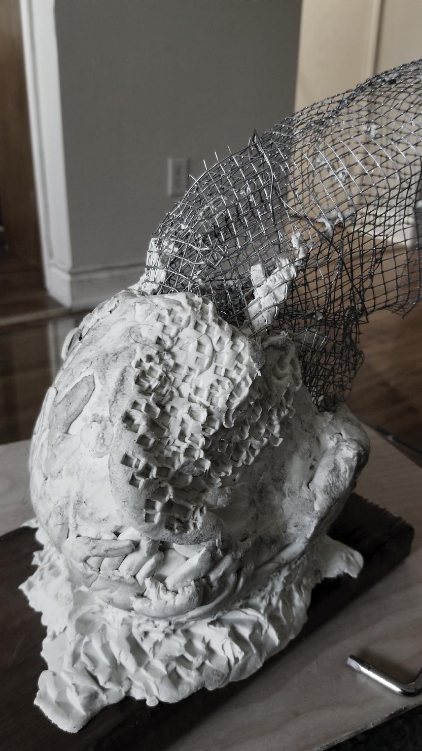
form. It demonstrates several key ideas that informed the final of being anchored at its base; the puncturing of the façade to through the design.


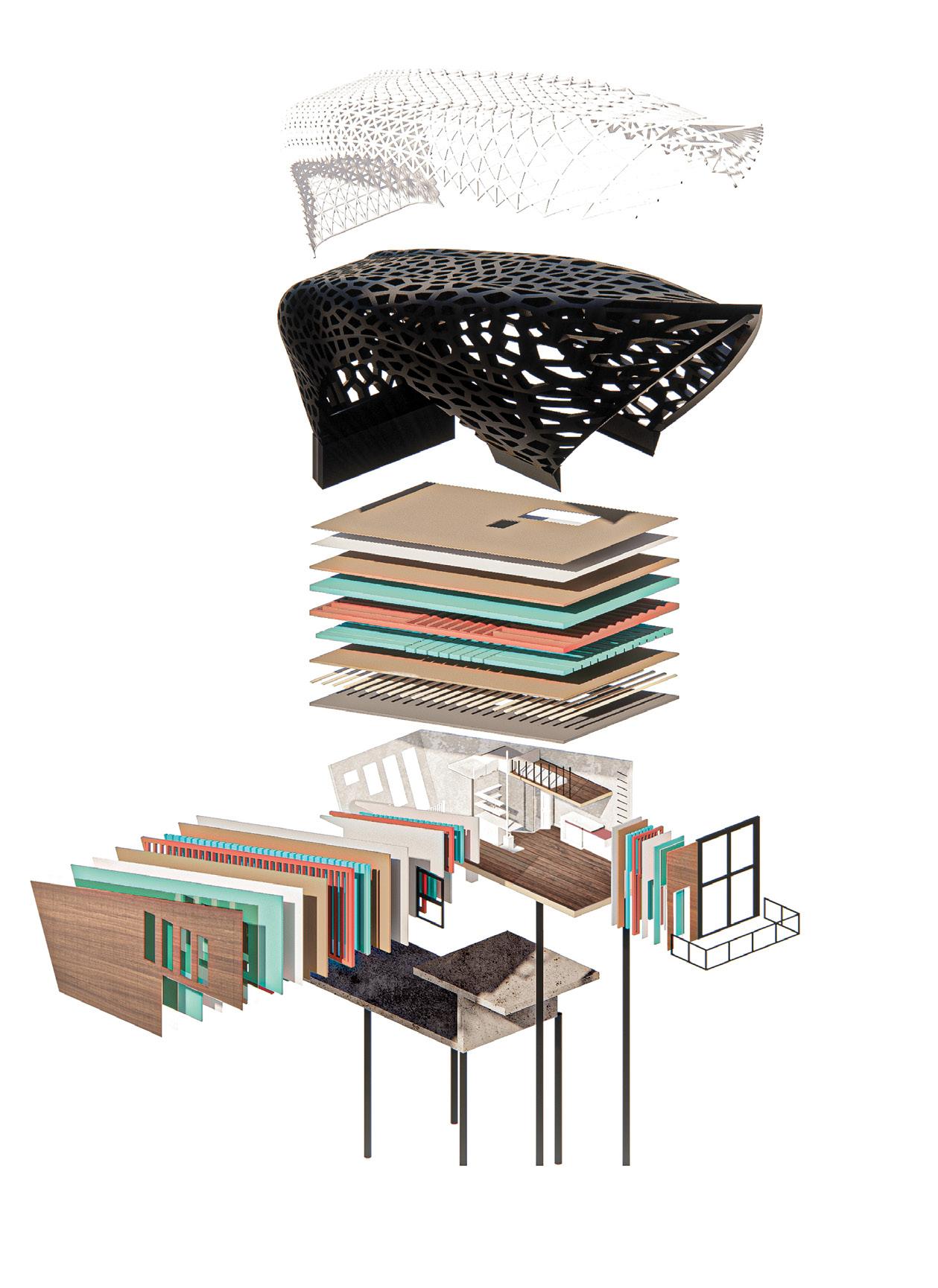
SHELL ASSEMBLY | EXTERIOR STRUCTURE
Outermost Skin Layer
Structural Skeletal Layer
Façade Steel Structure
WALL ASSEMBLY | INTERNAL STRUCTURE
5/8” Drywall Finish (Gypsum)
4” Open-Cell Spray Foam Insulation
2X4 Wood Studs
5/8” Drywall Finish (Gypsum)
1/2” Drywall Finish (Gypsum)
1/2” OSB Sheathing
6” Open-cell spray foam insulation
2X6 Wood Studs
1/2” OSB Sheathing
6.5 MIL Tyvek Moisture Barrier
2” Rigid Polystyrene Insulation
1” Air Space
1/2” Exterior Wood Cladding
Window R.O.
ROOF ASSEMBLY | INTERNAL STRUCTURE

3/16” Asphalt Shingles
Water-Resistant Roof Underlayment
Self-Adhered Waterproofing Membrane
1/2” OSB Sheathing
2” Rigid Polystyrene Insulation
2X12 LVL Roof Rafters
12” Open-Cell Spray Foam Insulation
3/8” OSB Sheathing
1/3 Wood Furring

1/2” Drywall Finish (Gypsum)
DIAGRAM | WATER MANAGEMENT
FLOOR ASSEMBLY | FOUNDATION
Slab on Grade
Steel Pile
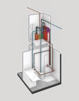
Pené House considers the following to faciliate comfortable off-grid living: (i) food gathering & storage, (ii) heating & cooling, (iii) personal hygiene, (iv) energy gathering & distribution, (v) waste management, (vi) water management, (vii) light, (viii) security & life safety, (ix) transportation. The diagram on the right explains how Pené House manages incoming and outgoing water. The diagram below breaks down the movement of water into eleven sequential steps.
ENDPOINT | GROUND
Tankless Water Heater
UV Water Purification System
Water Pump
Aqua2use Grey Water System
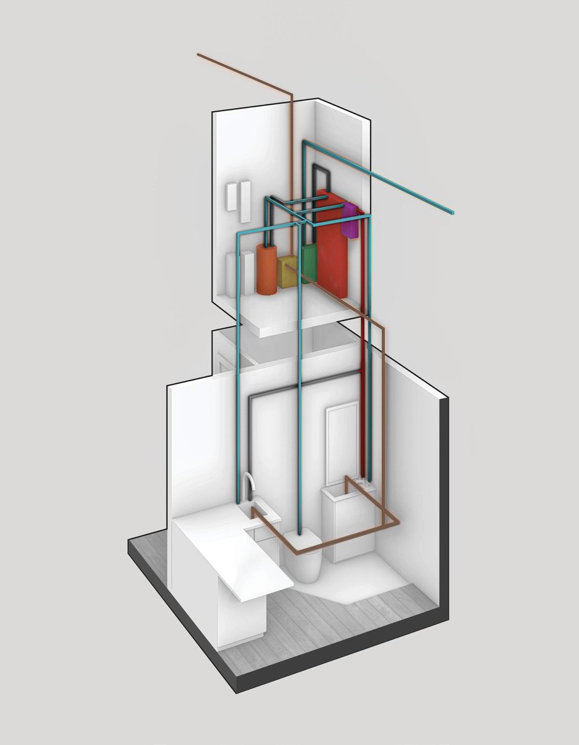
Pressure Tank
SOURCE | LAKE ONTARIO
Cold Water Line
Hot Water Line
Grey Water Line


Keller House is a home for Hellen Keller, who suffered from deaf-blindness. This disability makes most traditional architectural solutions impractical. Keller House challenges typical design conventions in residential architecture using the theoretical framework of deconstructivism The result is an artistically expressive functional home that embodies Helen Keller’s story.
OCAD University
Individual Work
Location: Toronto, Ontario
Duration: 3 Months
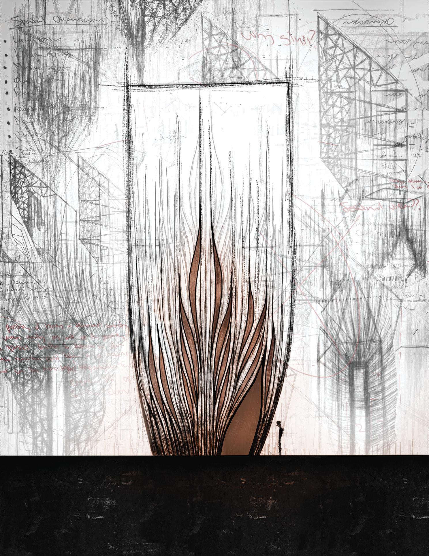
According to critical disability theory, disability is socially constructed by physical, institutional, and attitudinal environments that exlclude disabled people. Informed by deconstructivism, Keller House strives to change the built environment to allow deaf-blindness to fade into the background.

Most traditional residential spaces have a rectilinear form. I had to challenge this form to accommodate Helen Keller. The above diagrams show how I moved away from the traditional rectilinear form toward one that emphasizes tactility, which is a deaf-blind person’s primary way of interacting with the world.
1. Rectangular Base 2. Angular Roof 3. Prominent Curvatures 6. Embedding Identity 5. Tactile Perforations 4. Curvilinear Shape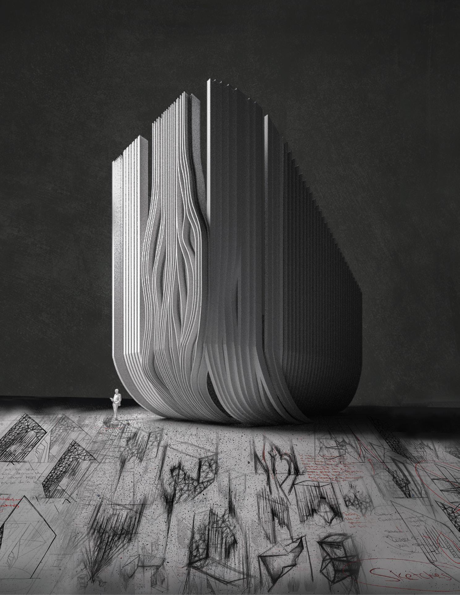
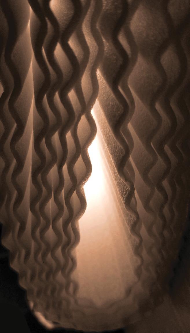
According to cognitive psychology, exposure to light enhances brain activity and improves cognitive function, even in the absence of vision.
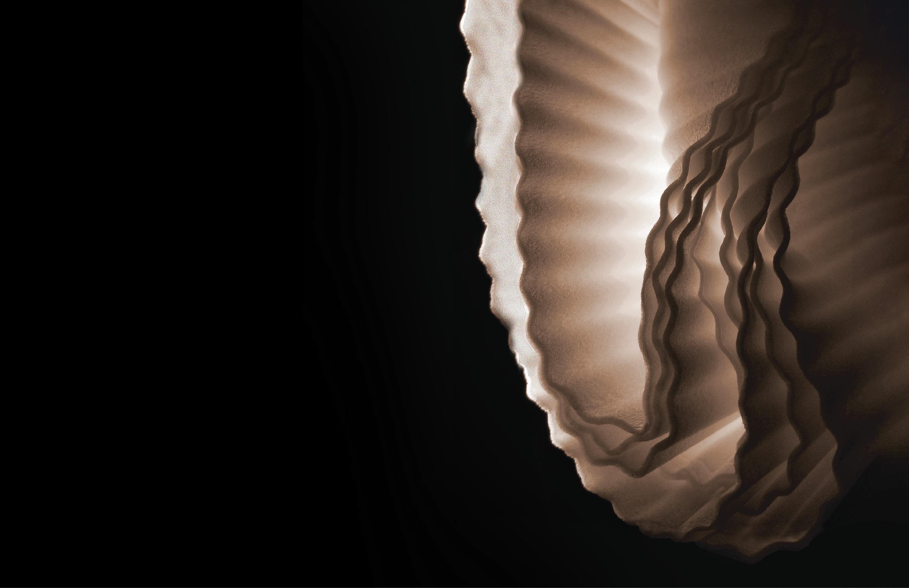

This conceptual model mimics Keller House’s form to complex curvilinear

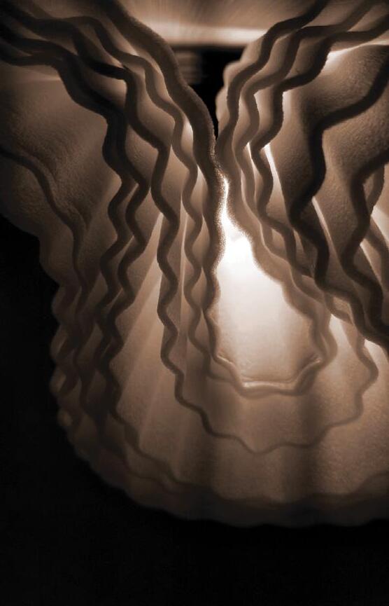
LIGHTING EXPLORATION
understand how artificial and natural light interacts with curvilinear surfaces.

METAL CAP W/ CONTINOUS DRIP EDGE
TORCHDOWN MEMBRANE W/BITUMEN CAP
CONTINOUS METAL FLASHING W/ DRIP EDGE
WOOD CANT AROUND PERIMETER
PLYWOOD SHEATHING
2X4 WOOD PURLINS
2X10 LVL RAFTERS
1X3 WOOD FURRING 5/8" DRYWALL (GYPSUM) DOUBLE TOP PLATE
WOOD BLOCKING STEEL JOIST
CURVED STEEL H-BEAM VERTICALLY LAID
STEEL STRUCTURAL PANEL
STEEL CONNECTOR
STEEL SPLICE PLATE CONNECTION
SPIDER FITTING
ROUTEL CONNECTION INSULATED TEMPERED GLASS PANEL
ROOF DETAIL | PARAPET FOCUS 1
2" RIGID POLYSTYRENE INSULATION 1/2" OSB SHEATHING
ROOF DETAIL | TRANSITION FOCUS 2
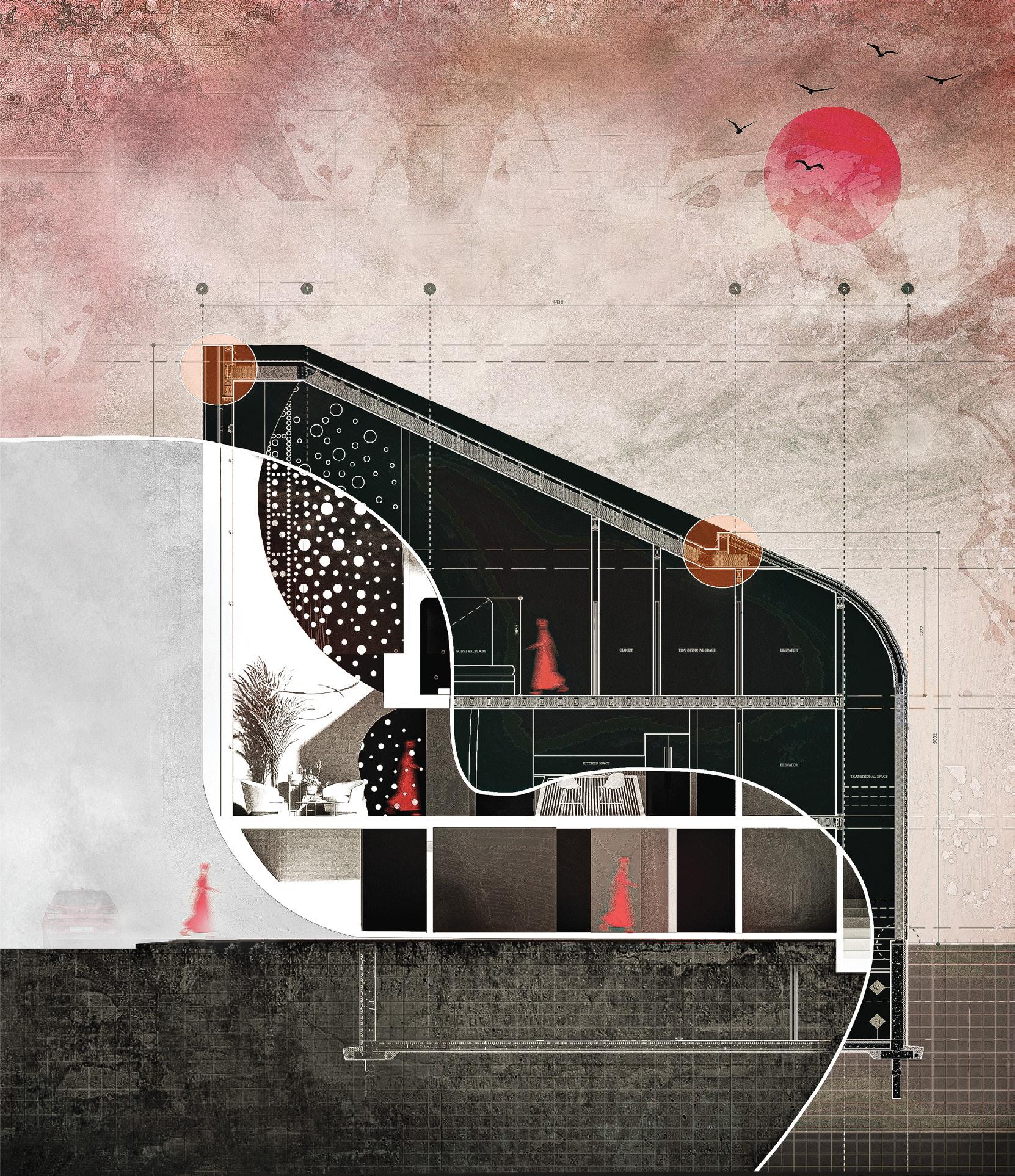
Keller House has a clear functional hierarchy for each floor Each floor also has an embedded
Area of Interest Point of Interest
SECOND
level to accommodate Helen Keller’s behavioural patterns. embedded navigation system for guidance.
Directional Cue Curvature on Wall


The architecture of Toronto’s Little Tibet is nondescript. Informed by critical regionalism, which strives to challenge placelessness and architectural homogeneity, Tibetan Revival is a communal space whose distinctive architecture celebrates Tibetan identity and culture.
Individual Work Competition | CultureFORM
Location: Toronto, Ontario
Duration: 3 Months

The above notes reflect the feedback members of the Tibetan Canadian Cultural Center gave during my interviews with them. Under professor Colleen Reid’s guidance, I revised Tibetan Revival to incorporate their comments. See next spread for the revised design.
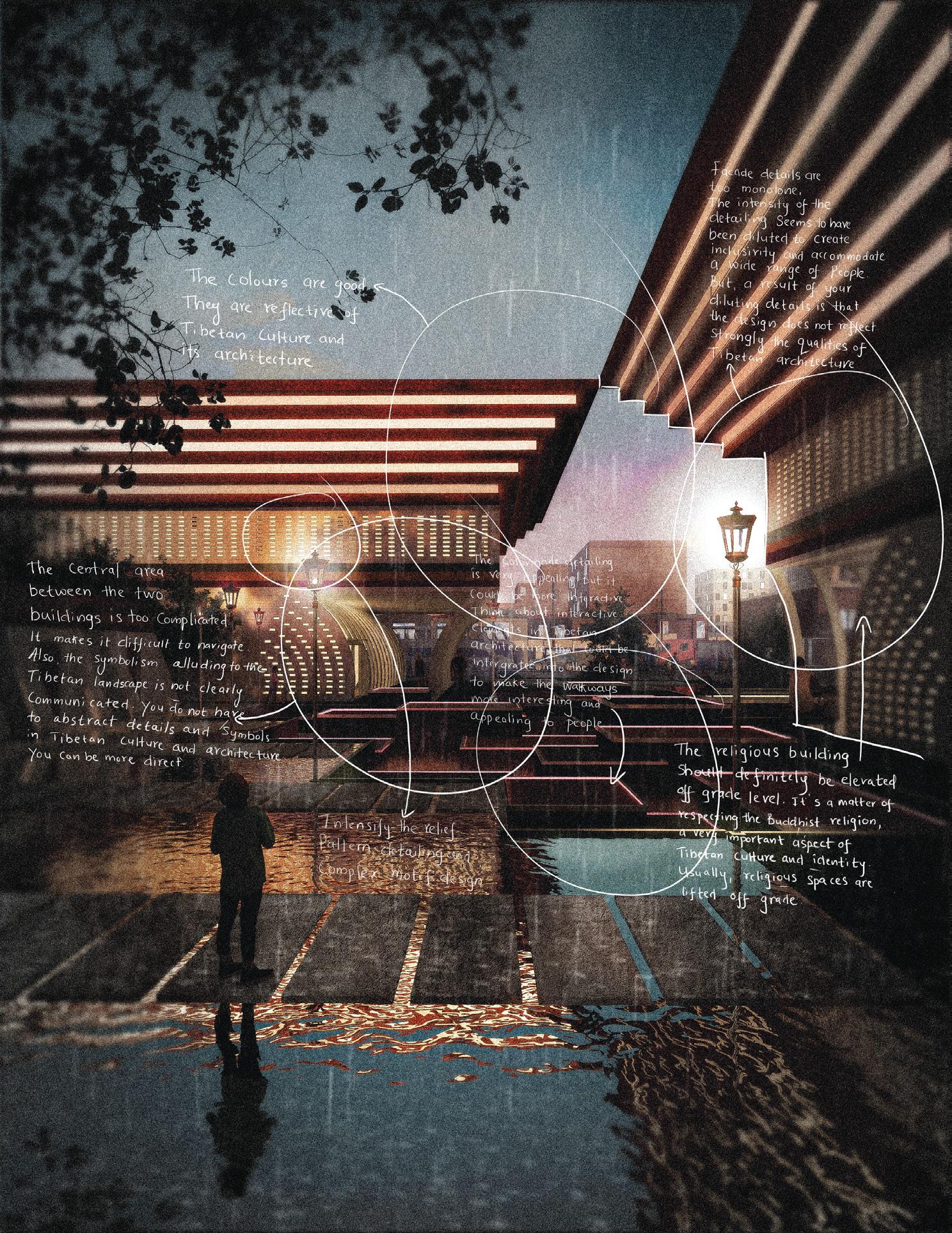
INITIAL DESIGN | SITE PLAN



REVISED DESIGN | SITE PLAN
REVISED DESIGN | SITE PLAN
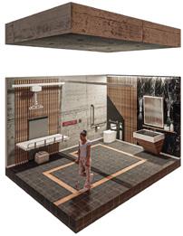

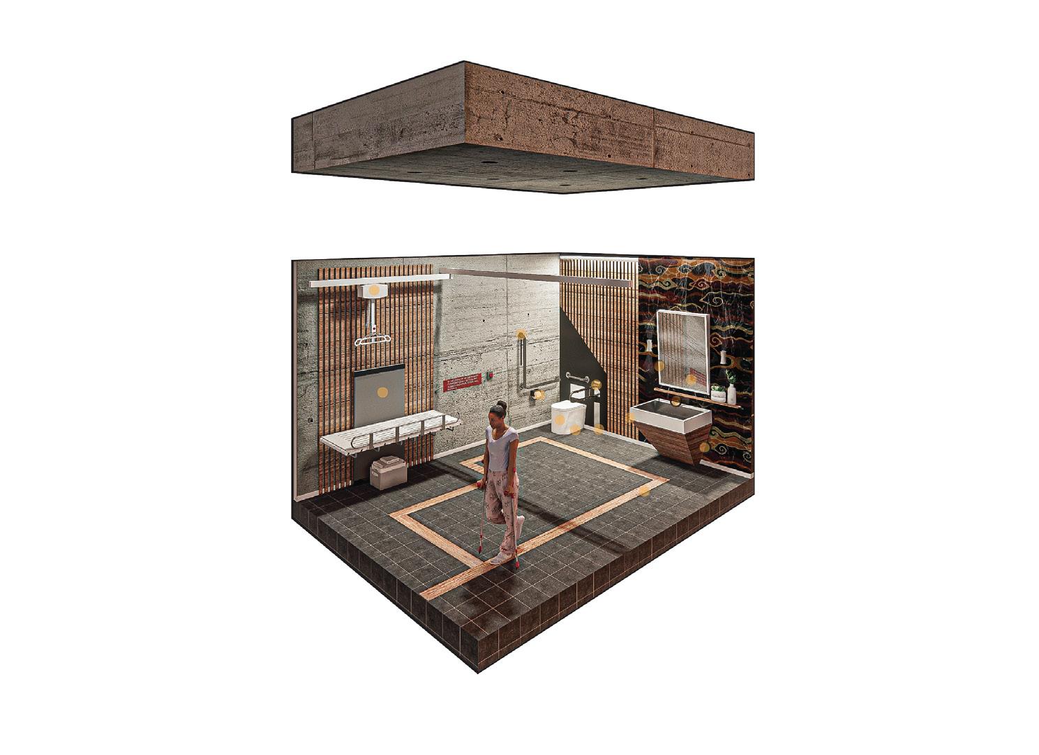
Enhanced longevity for lifting tape. No tools required for emergency lowering.
Supports upto 500lbs. Textured rail makes gripping easier.
Electronically operated. Offers a broad height range for ideal working height.
Friction holds the bar past 90° in a vertical position to ensure it’s out of the way when not in use.
A slight slant makes design more accessible for users in wheelchairs.
High colour and texural contrast where possible for clear visibility and increased safety.
Designed to hold one roll of tissue and has a pivoting arm for easy replacement.
Strategically located sensor at the tip of the spout for instant response time. The Americans with Disabilities Act compliant.
Multiple wash options with adjustable water pressure. Hands-free operation with automatic flush.
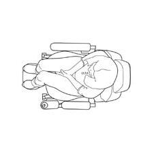
The above diagram visualizes key design considerations of the proposed universal washroom. The surrounding text explains how these considerations contribute to the accessible and inclusive nature of the washroom.
SHELVING UNIT
SOAP DISPENSER UNIT
HAND DRYING EQUIPMENT

COAT HANGER UNIT
DOOR SYSTEM
POWER DOOR OPERATOR
AUTOMATIC FLUSHING MECH.
BUILTIN WALL MOUNTED GARBAGE UNIT
ATTENTION INDICATOR SIGNAGE
CLEAR TURNING CIRCLE
CLEAR TRANSFER SPACE

TACTILE FLOOR INDICATOR


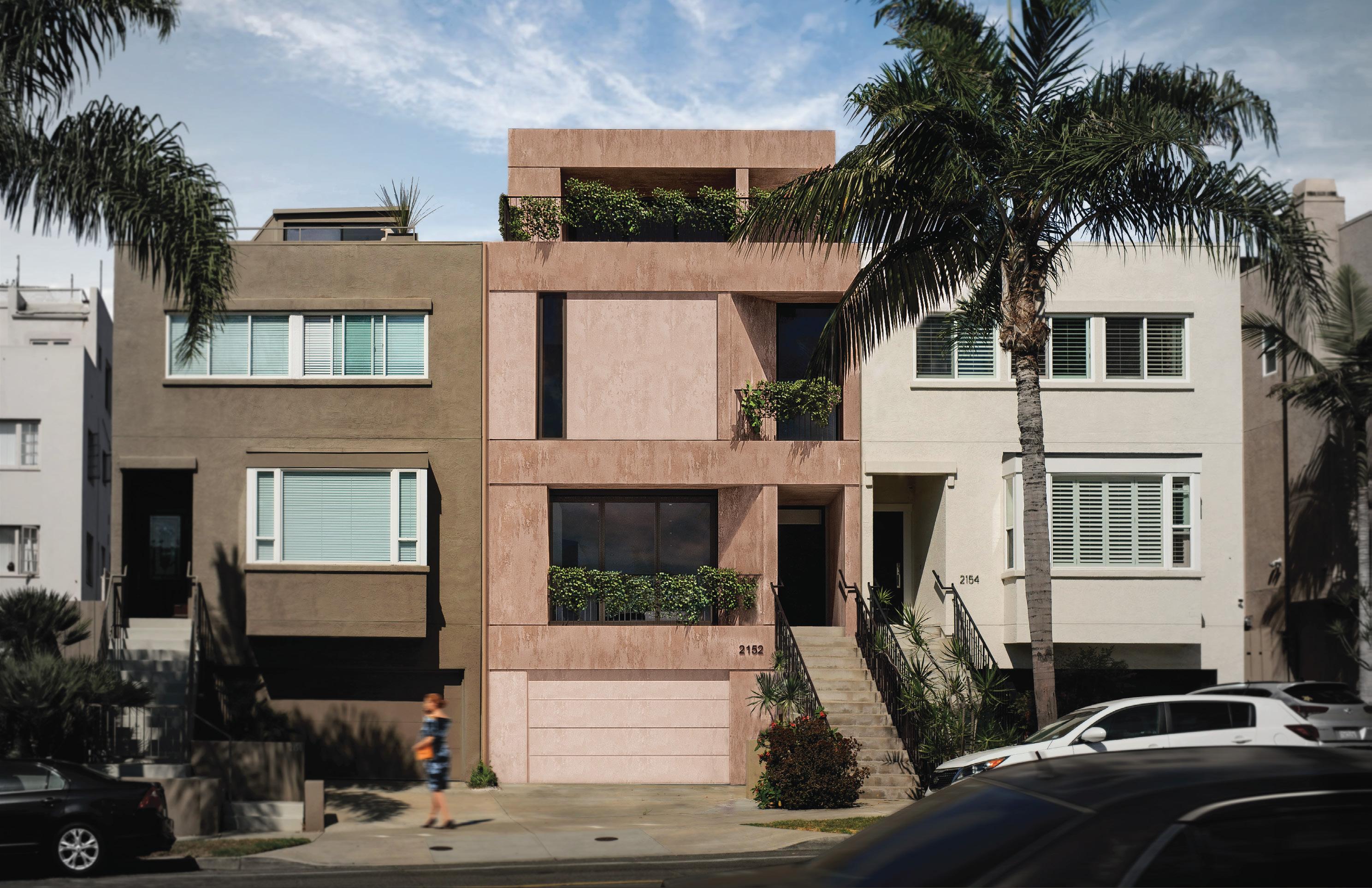

At PHAEDRUS Studio, I worked closely with principal architect David Grant-Rubash to re-design 2152 Bankers Hill. Our design proposal revitalizes the local vernacular to explore the intersection between interlocking horizontality and angular indentation. What culminated was a uniquely sculptural form that balances bearing a dynamic outward presence and being unobtrusive to the existing site.
PHAEDRUS Studio
Professional Work
Location: San Diego, California
Duration: 5 Months
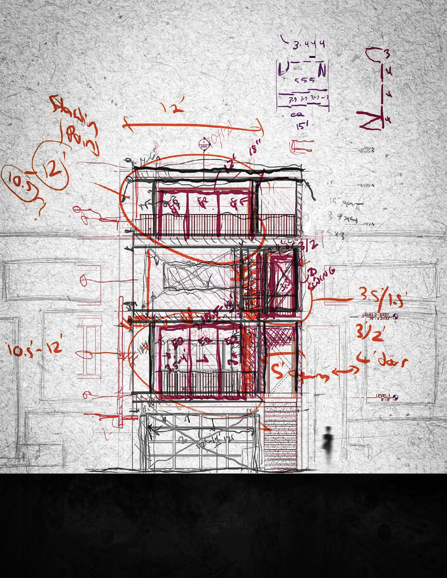 Bhavindu Adhihetty completed the sketch above collabaratively with David Grant-Rubash
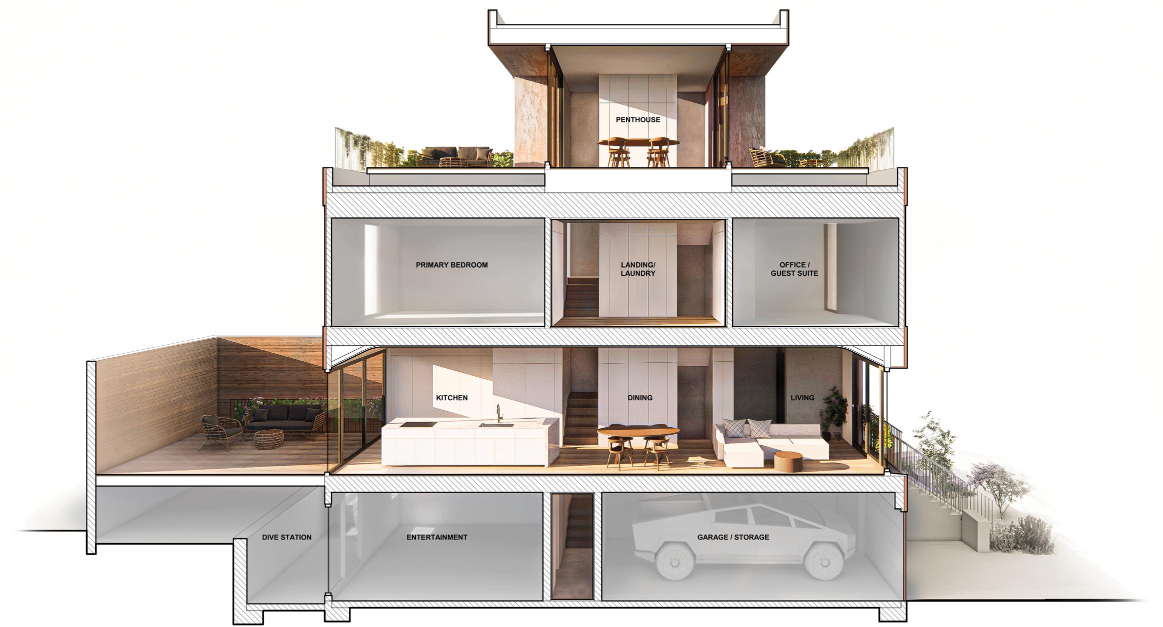
This project had a restrictive budget. So, PHAEDRUS Studio’s designs had to be clear, effective, intervention. Dashed areas mark pre-existing walls, floors, and roofs; white-shaded areas mark Grant-Rubash’s
Existing Walls

effective, and minimally disruptive to the building’s existing condition. This diagram highlights our mark new additions. Bhavindu Adhihetty completed this diagram and rendering under David Grant-Rubash’s supervision.
New Walls

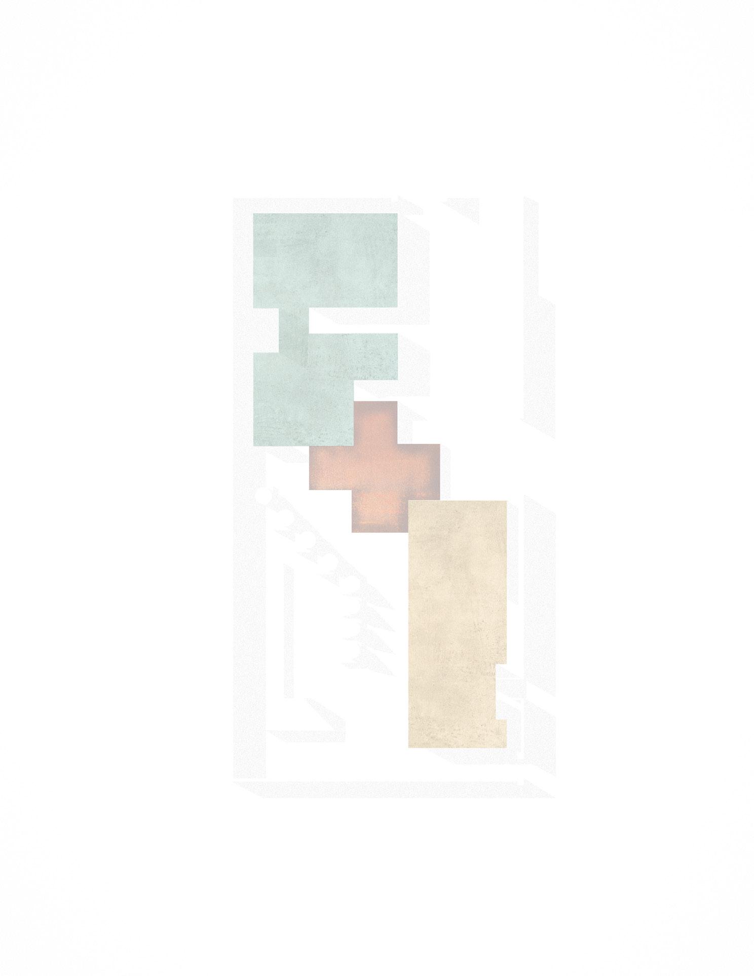
PHAEDRUS Studio focused its design interventions on the floor plan for level 1. The interventions connect interior zones with one another. The cohesiveness between exterior and interior place within the spatial design to further accentuate the different interior zones. Bhavindu
Existing Walls New Walls Venetian Plaster
interventions defined spatial zones and revised previously cluttered paths of circulation to interior design was crucial. Angular wall indentations and contrasting textures all find their Bhavindu Adhihetty completed this floor plan collabaratively with David Grant-Rubash.
