TYPOGRAPHY BEYOND BORDERS
DESIGN WITH MULTISCRIPTUAL TYPOGRAPHIC ELEMENTS
Sherry Muyuan He
BIS Publishers
Timorplein 46
1094 CC Amsterdam
The Netherlands
bis@bispublishers.com www.bispublishers.com
ISBN 978 90 636 9943 7
Copyright © 2025 Sherry Muyuan He and BIS Publishers
All rights reserved. No part of this publication may be reproduced or transmitted in any form or by any means, electronic or mechanical, including photocopy, recording or any information storage and retrieval system, without permission in writing from the copyright owners. Every reasonable attempt has been made to identify owners of copyright. Any errors or omissions brought to the publisher’s attention will be corrected in subsequent editions.
to all the people who write in
ARABIC
ARMENIAN
BURMESE
CHINESE
CYRILLIC
DEVANAGARI
GE’EZ
GEORGIAN
GREEK
HEBREW
JAPANESE
KHMER
KOREAN
LAO
MONGOLIAN
PERSIAN
THAI
The Latin alphabet has remained the same for eight centuries, while other writing systems, such as Chinese, have undergone periods of significant—even radical—changes as recently as the twentieth century. These changes have ranged from eliminating letters and changing the reading direction to redesigning characters and even inventing entirely new alphabets. This book addresses how historical, cultural, and political shifts have altered letterforms and native speakers’ relationship with type.
Before computer, handwritten letters played a prominent role in communication. People had more physical relationships with writing and access to the tools and practices of literacy was deeply tied to social status and gender. The ubiquity of handwriting—by chisel, quill, or brush—in early written communication resulted in an abundance of manuscript styles. A literate person with the physical writing tools could create “fonts” merely by writing in their own style.
The first books were produced by hand-copying content onto a surface—be it animal skin, bamboo, silk. European moveable types in the Early Renaissance era sped up printing and increased distribution, revolutionizing writing. Gutenberg’s moveable type famously changed the fifteenth-century Western world in this way, but Chinese printers were already working to accommodate the thousands of characters of their own extensive language eight hundred years before Gutenberg, and the technologies they deployed were quite different from those of their European counterparts. Due to the large number of characters in Chinese writing, inserting type into a frame was not significantly faster than carving a block of passages for one page. Printers occasionally inserted the wrong type, because a character frequently shared the same components as others, and the intricate details in each character could easily get distorted when pressed. Despite the attempts to cast types in various materials, moveable types had never dominated printing in China until the twentieth century.These printing histories are just as intriguing as those of contemporary font design; equally fascinating, is how political, religious, and economic factors have shaped publications and technologies.
There is a clear distinction between a script and a language. Arabic is a language, but Arabic script is also used in Persian, Urdu, and other languages. Persian and Urdu use a few more letters than Arabic does, but most are the same. Likewise, Chinese script is used in many languages, both Chinese (e.g., Mandarin, Cantonese, Taishanese, Hakka, Hokkien) and others, such as Japanese (kanji) and Korean (hanja). Because this book concentrates on the diversity of scripts and similarities among languages using the same scripts, I refer, unless otherwise specified, to scripts rather than languages. For example, the word Arabic in this book denotes the Arabic script used in writing Arabic-, Persian-, and Urdu-language texts; Chinese, the script used for various languages across mainland China, Taiwan, Hong Kong, Japan, and Korea; and Latin, the script used for English, Spanish, German, and many other languages.
To research more widely accessible non-Latin scripts like Arabic, I studied language instruction books. By experimenting with writing in different scripts and typing in different fonts, I analyzed how letterforms transformed from one style to another. To complete such in-depth typographical and calligraphical research, I also purchased research-based books for specific writing systems. Scripts in some countries, such as Japan and South Korea, use native descriptive terminologies, but for comparative analysis, this book avoids highly localized words and instead emphasizes the evolution of type cross-culturally.
A typeface is a family of fonts that may include regular, bold, and italic forms, which is a specific style within that family. For example, Helvetica is a typeface, but Helvetica Italic is a font that explicitly refers to the italic style of the Helvetica typeface. This book uses both terms because complicated scripts can sometimes have only one typeface due to the large number of characters. Chinese, for instance, has more than four thousand characters, while Japanese has about eighty hiragana characters, eighty katakana characters, and more than two thousand kanji characters; Korean uses more than two thousand characters.
AMHARIC ARABIC
ARMENIAN BAYBAYIN
BERBER
BURMESE
GEORGIAN
GREEK
HEBREW HINDI
KOREAN
MONGOLIAN
PERSIAN
RUSSIAN
TAMIL
THAI
As a violin maker creates the instruments that a violinist plays, type designers create typefaces that graphic designers use in their work. Type designers invest time designing individual letters, punctuation, numerals, and ligatures. Other essential duties include embedding kerning pairs (i.e., the adjustment of spacing between two glyphs) and finetuning anchor points in each glyph. The author does not identify as a type designer but as a type researcher who analyzes the similarities and differences among typographic elements in various scripts. Therefore, this book is intended to help graphic designers appreciate the labor and understand current technological limitations involved in designing and displaying non-Latin types so that they can use them correctly and creatively.
Most typography books focus on the anatomy of the Latin alphabet, with additional quick overviews of other popular scripts like Japanese. Books dedicated to other scripts tend to target native users, and the creative treatments of type are complex for readers who cannot read the scripts to digest. This book proposes a new method of comparatively exploring typographic elements across different scripts.
Whereas standard typography books move from the micro to the macro—beginning with letterform details (e.g., serifs) and moving on to each line of text until ultimately reaching the paragraph— this book moves from the macro to the micro. Much like how we get to know a person—first remembering how they make us feel, then how they dress, and, after some time, their peculiarities and preferences—this book first introduces specific writing systems, then dives into the details of each letter.
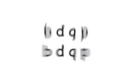
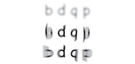
In some countries, writing scripts is like drawing pictures, though most other parts of the world have developed alphabets for writing. Besides the most common left-to-right orientation of text, there are also other possibilities for text direction, some of which are compromised in digital devices. Inside each line of text, some scripts have tall heads and long feet that require more line space to be displayed correctly. The many methods of setting character space depend on the construction of the letters. Letter shape also determines the spacing between individual letters. Combining letters and constructing new glyphs
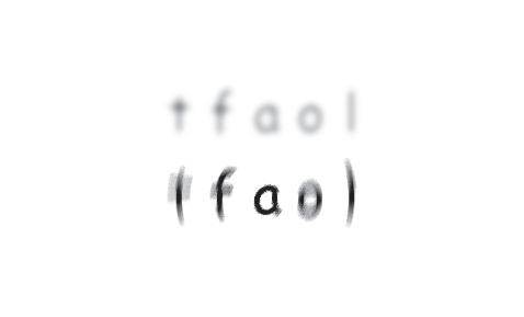
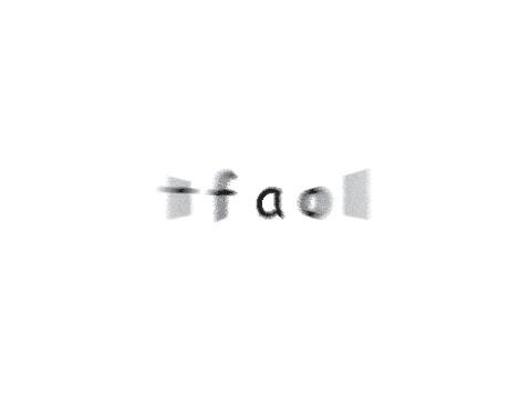
is essential to type design, even though ligatures are not the priority in designing Latin type. Stretching is atypical in Latin but quite common in Arabic. Likewise, the style for displaying emphasis is not always italic as in Latin but can include letter spacing as in Greek.
Throughout the book are interactive exercises. I invite readers to experiment firsthand with non-Latin writing to facilitate a deeper relationship to the concepts covered and to enable the reader to imagine new design possibilities and goals for crosscultural collaboration. In learning about these diverse writing systems, readers should develop their own take on good, non-Latin type design.