6 minute read
Rebranding
LOGO-ING WHAT’S ON?
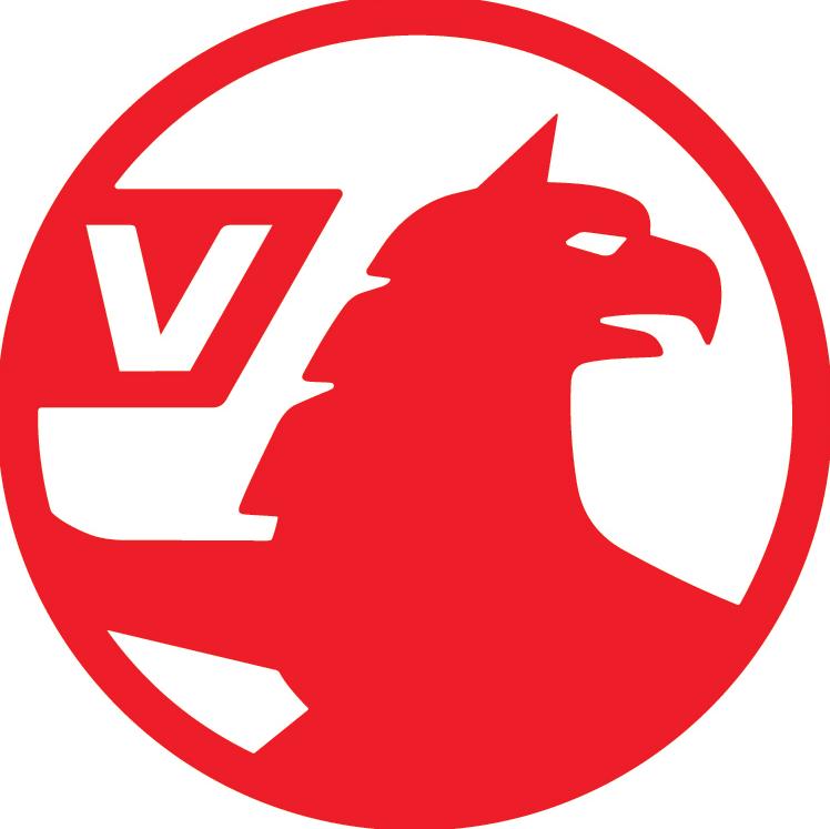
Vauxhall has just announced a wholesale rebrand, with a simplified red logo replacing its ornate chrome one. But why shake things up right now?
Vauxhall’s logo has been a challenge for several years. Unlike other car brands, it’s a UK-only badge, making it truly unique – no other manufacturer has the market volume to have a Britain-only brand, but rebranding Vauxhall as Opel in the UK has never got past the starting line, such is the long-term familiarity with Vauxhall here.
Then there’s the griffin itself. It was originally part of the coat of arms of Sir Falkes de Bréauté, who was Lord of the Manor of Luton in the 13th century – a title that many of us would probably politely turn down today.
But the obscure logo has come in for criticism by some in recent times, its historical significance lost to the idea of it being a ‘backward-looking chicken’, to quote one former marketing manager from the Luton-based firm.
So what, then, is the point of a rebrand, why now, and will it be a success?
Why rebrand?
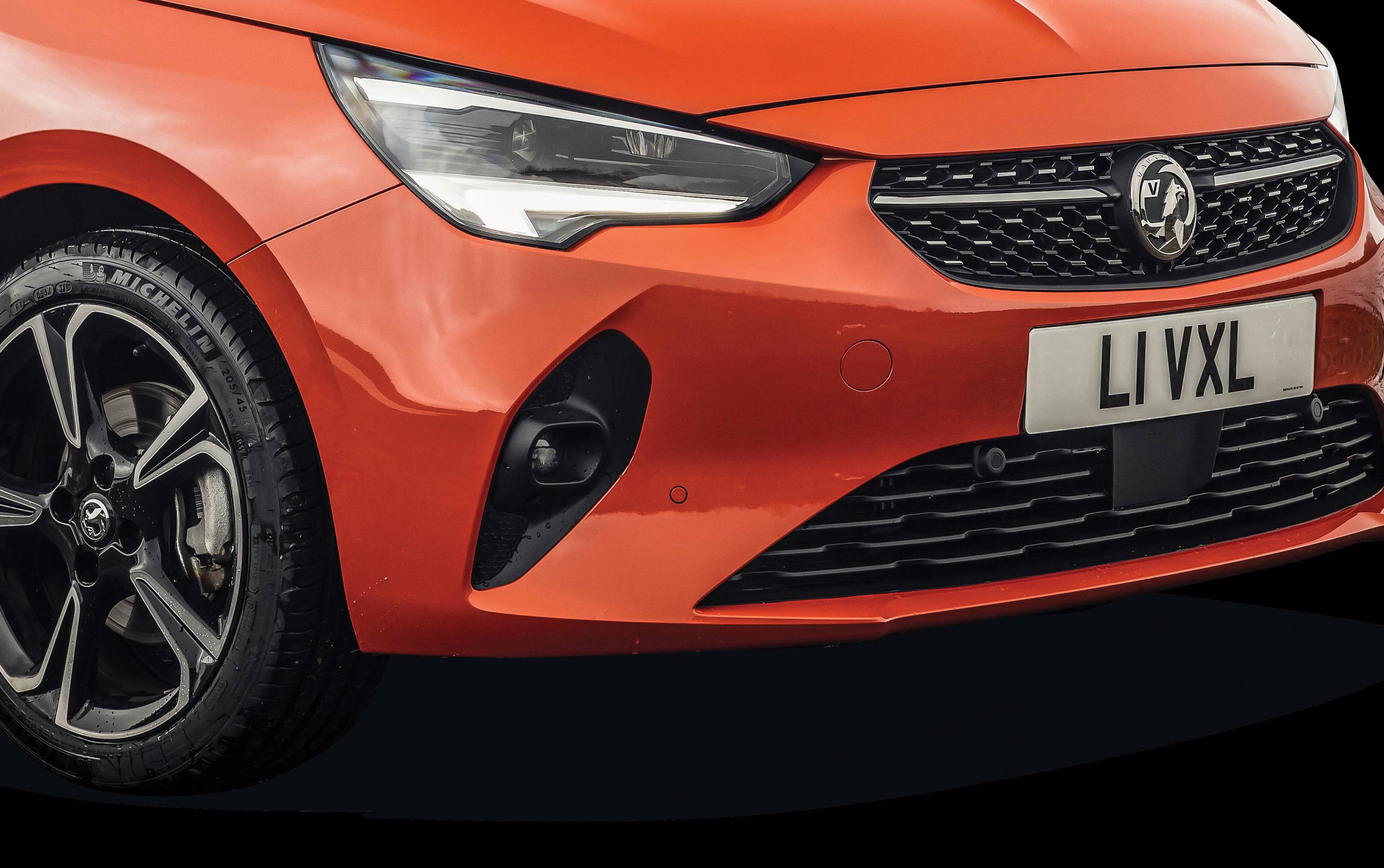
The new Vauxhall logo first appeared quietly on Twitter back in June and very few people noticed, but with it set to ‘properly’ debut on the new Mokka SUV, Vauxhall has gone public with the redesign, which it describes as ‘confidently British’.
‘Constantly evolving and innovating, the brand continues to reinvent itself, with these most recent updates a reflection of Vauxhall’s commitment to ingenious design and modernisation,’ said Vauxhall Motors managing director Stephen Norman – although we wonder if he sounded as unconvinced as both we and the dealer network were when he spun that line to the press officer.
One Vauxhall salesman in the east of England, who asked not to be named, told us: ‘The logo looks cheap and nasty, whereas the old black and silver one was quite classy. When the last rebrand happened with the first Insignia we welcomed it, as it looked much smarter than the old one, but this takes it right back – and have they even considered the costs of rebranding everything from dealerships to business cards?’
The answer is actually yes. Much as Vauxhall would like to hide behind the veneer of ‘confident, British and modern’, the reality is that it’s both cheaper and far easier to produce and reproduce two-dimensional logos for digital use, which has been by far the biggest shift over the past decade in how brands across all areas of marketing communicate. It’s not the only carmaker to do so, either, with Volkswagen, Audi, Nissan and Toyota all returning to flat 2D designs in recent times.
Simplicity also aids recall. A survey carried out by van sales platform Van Monster earlier this year showed that Vauxhall’s logo had the lowest level of recall (behind even Alfa Romeo) when people were asked to draw it from memory – something that may also have been behind the decision to simplify it, not least because of some of the hilarious results.
Other car brands that have changed their logo

Audi
Nissan
Toyota
Volkswagen
Vauxhall’s new logo


What does this mean for dealers?
Vauxhall has been very keen to point out that any changes to corporate identity at its dealerships will be carried out ‘over a period of time’ and ‘as part of our normal maintenance and visits cycle’, but the brand can’t hide behind the fact that its changes will create costs for its franchise partners at a time when such things will be welcomed least.
It’ll be a big challenge for Vauxhall, which was third from the bottom in this year’s Car Dealer Power manufacturer survey with an overall score of 52.0 out of 100 (see page 16).
Meanwhile, a raft of senior management changes and rationalisation at parent group PSA’s head office has seen a number of redundancies and staff roles reassigned, leading to mass confusion around the network. This is partly countered by the introduction of the new Mokka, which at last gives Vauxhall a replacement for what was its second-best-selling model behind Corsa until it was deleted after the PSA takeover.

So what is Vauxhall playing at – and why now of all times?
Well, the reality is that the wheels of change turn slowly in the car industry, so while nobody from Vauxhall will openly say as much, it’s likely that the decision to redesign the logo was taken well over 12 months ago, before Covid-19 was a global concern and car dealers were under lockdown.
‘I recall working for GM during the Chevrolet logo redesign of 2011,’ said Craig Cheetham, former PR director for the now-defunct in the UK brand. ‘There was a good two years of toing and froing and indecision around whether or not to add a shadow to the Chevrolet badge and if so how big to make it.
‘Had it not been for an urgent need to get the new logo ready for the brand’s centenary in 2011, I’m not sure they’d have ever made their minds up. And remember, this was a huge global brand – in the USA it has as much instant recall as the likes of Pepsi or Nike.’
Chances are that the creative agency behind the new Vauxhall logo had already been appointed, contracts signed and money handed over well before the car industry faced its biggest challenge in living memory – and that probably explains why Vauxhall didn’t go big Click here for more on the new logo back in June, when it first trickled its way on to Twitter. But does the fact that barely anyone noticed back Vauxhall logos drawn from memory then tell a story of its own?
Why change a logo at all?
ACCORDING to the business networking app Slack, which recently brought in a more simplified logo, the need for change comes about for a number of reasons – brand fatigue, new leadership, awareness and recall, or a poorly done original. Of these, Vauxhall ticks at least the first two boxes. The most famous example of the last one, meanwhile, is Apple computers – its ‘apple with a bite taken out’ logo is one of the most famous in the world, but until 1989 it had an ornate, almost Georgian-looking logo featuring Isaac Newton sitting beneath a tree and about to experience one of the most famous moments in physics.
Very few people remember it, even though it was originally designed to position the brand as a game-changer in science and technology. The instantly recognisable apple is so much easier to recall, even if it doesn’t tell that story.
But former Netflix marketing man Barry Enderwick warns against just changing logos for the sake of it.
‘Brand fatigue is when a company simply grows tired of its current logo. They’ve seen it day in day out and are, frankly, bored with it,’ he said in an interview with Slack.
‘It may be tempting to look down your nose at these companies but we had to fight that battle internally at Netflix more often than you would imagine.
‘This, of course, is a terrible reason to change the logo. Why? In the case of an older, more established company, it can destroy brand recognition that the logo helped build.
‘It is a needless distraction and diversion of resources to something that is not going to really move the needle.’


