REBRANDS
WHAT’S
LOGO-ING ON?
Vauxhall has just announced a wholesale rebrand, with a simplified red logo replacing its ornate chrome one. But why shake things up right now?
V
auxhall’s logo has been a challenge for several years. Unlike other car brands, it’s a UK-only badge, making it truly unique – no other manufacturer has the market volume to have a Britain-only brand, but rebranding Vauxhall as Opel in the UK has never got past the starting line, such is the long-term familiarity with Vauxhall here. Then there’s the griffin itself. It was originally part of the coat of arms of Sir Falkes de Bréauté, who was Lord of the Manor of Luton in the 13th century – a title that many of us would probably politely turn down today. But the obscure logo has come in for criticism by some in recent times, its historical significance lost to the idea of it being a ‘backward-looking chicken’, to quote one former marketing manager from the Luton-based firm. So what, then, is the point of a rebrand, why now, and will it be a success?
Other car brands that have changed their logo Audi
Nissan
Why rebrand?
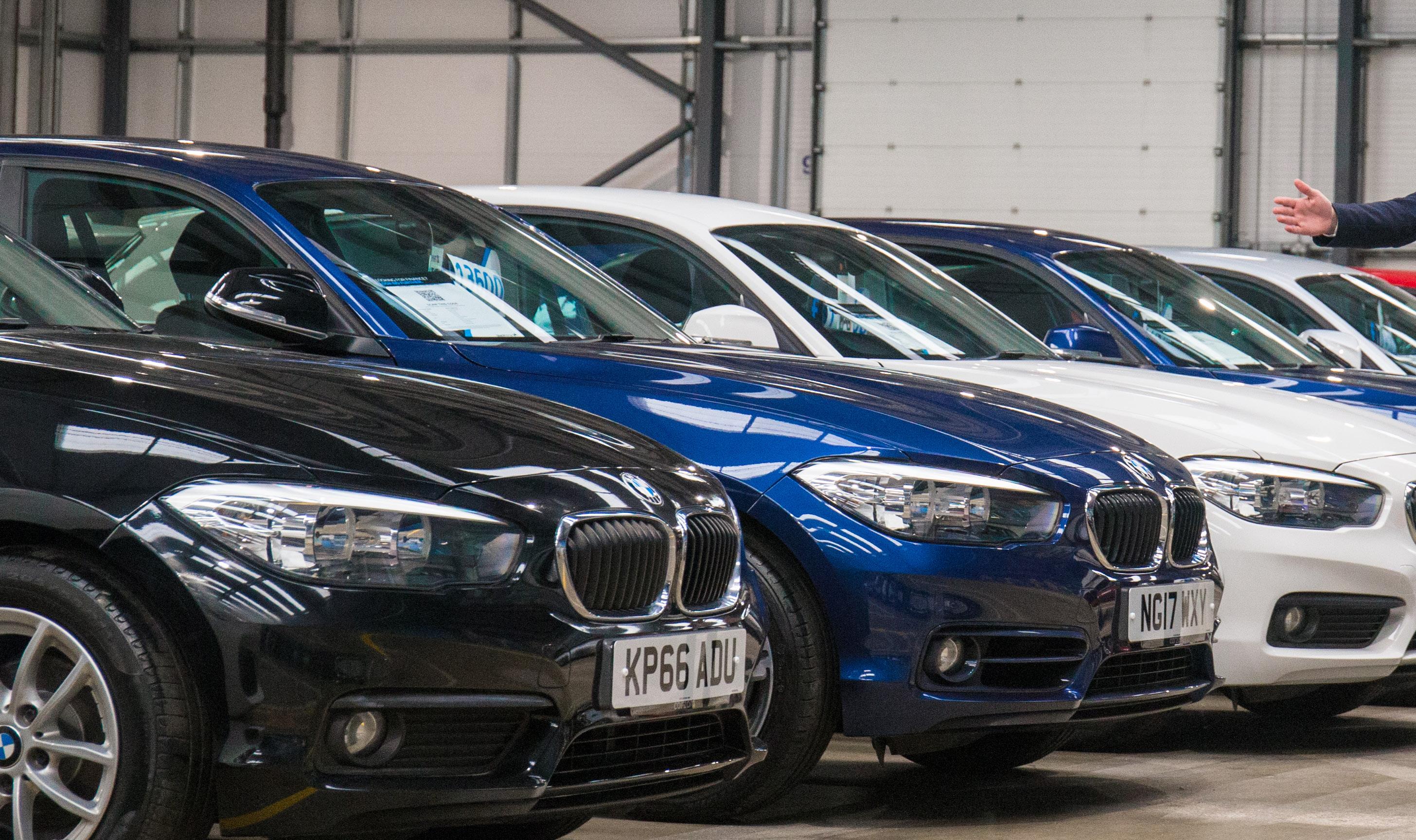
The new Vauxhall logo first appeared quietly on Twitter back in June and very few people noticed, but with it set to ‘properly’ debut on the new Mokka SUV, Vauxhall has gone public with the redesign, which it describes as ‘confidently British’. ‘Constantly evolving and innovating, the brand continues to reinvent itself, with these most recent updates a reflection of Vauxhall’s commitment to ingenious design and modernisation,’ said Vauxhall Motors managing director Stephen Norman – although we wonder if he sounded as unconvinced as both we and the dealer network were when he spun that line to the press officer. One Vauxhall salesman in the east of England, who asked not to be named, told us: ‘The logo looks cheap and nasty, whereas the old black and silver one was quite classy. When the last rebrand happened with the first Insignia we welcomed it, as it looked much smarter than the old one, but this takes it right back – and have they even considered the costs of rebranding everything from dealerships to business cards?’ The answer is actually yes. Much as Vauxhall would like to hide behind the veneer of ‘confident, British and modern’, the reality is that it’s both cheaper and far easier to produce and reproduce two-dimensional logos for digital use, which has been by far the biggest shift over the past decade in how brands across all areas of marketing communicate. It’s not the only carmaker to do so, either, with Volkswagen, Audi, Nissan and Toyota all returning to flat 2D designs in recent times. Simplicity also aids recall. A survey carried out by van sales platform Van Monster earlier this year showed that Vauxhall’s logo had the lowest level of recall (behind even Alfa Romeo) when people were asked to draw it from memory – something that may also have been behind the decision to simplify it, not least because of some of the hilarious results. 8 | CarDealerMag.co.uk
Toyota
Volkswagen