M.Arch Candidate: University of Pennsylvania 2025
Weitzman School of Design
 Ebbi Boehm

M.Arch Candidate: University of Pennsylvania 2025
Weitzman School of Design
 Ebbi Boehm
Mobile: 651-263-9053
ebbi.boehm@gmail.com
eboehm@design.upenn.edu
University of Pennsylvania: Philadelphia, PA: GPA 3.97
• Master of Architecture Candidate 2022-2025
Smith College: Northampton, MA
• Bachelor of Arts: Architecture and Urbanism 2022
Architectural Intern: Phillips Win Architects: Oakland, CA
• Summer: 2019, 2020, Year-round 2020-2021
• Worked on the design and revisions of commercial and affordable housing projects through the creation of architectural drawings and details.
• Assisted in product research and material selection as well as maintaining studio relationship with vendors.
Research Assistant: Smith College Architecture Department: Northampton, MA
• 2018-2019
• Organized and led the design of a reference book detailing the presentation of architectural and diagrammaticdesign.
Architectural Intern: TIA Architects: Amherst, MA
• 2018
• Worked closely with principal in drawing revisions of residential projects and performing site visits.
• University of Pennsylvania: Merit Scholarship
• University of Pennsylvania: Pressing Matters Publication Nominee- granted to top studio projects
• 2021 Smith College Sherred Pedagogical Partnership: Selected Student
• 24-Hour Smith College Architectural Design Competition: 1st place 2020
• Golden Nugget Grand Award and Award of Merit: Best Affordable Housing Community – under 30 du/acre: Phillips Win Architecture: Drafting Member and Award Recipient
• NEWMAC Cross Country Academic All-Conference
• Cross Country NCAA All-Academic Team Member
• Of Juliet Magazine Spotlight Artist 2020
• Smith College Summer Work Praxis Grant Recipient
• Gabrielle Russomagno: Tell of Grass: Student Collaborator
• Rhino 3D
• AutoCAD
• Adobe Creative Suite
• Houdini
• SketchUp
• Keyshot
UPenn Fall ‘22
Suffused Volumes
Critic: Na Wei
Project Length: 4 weeks
Exposing Dystopian Futures
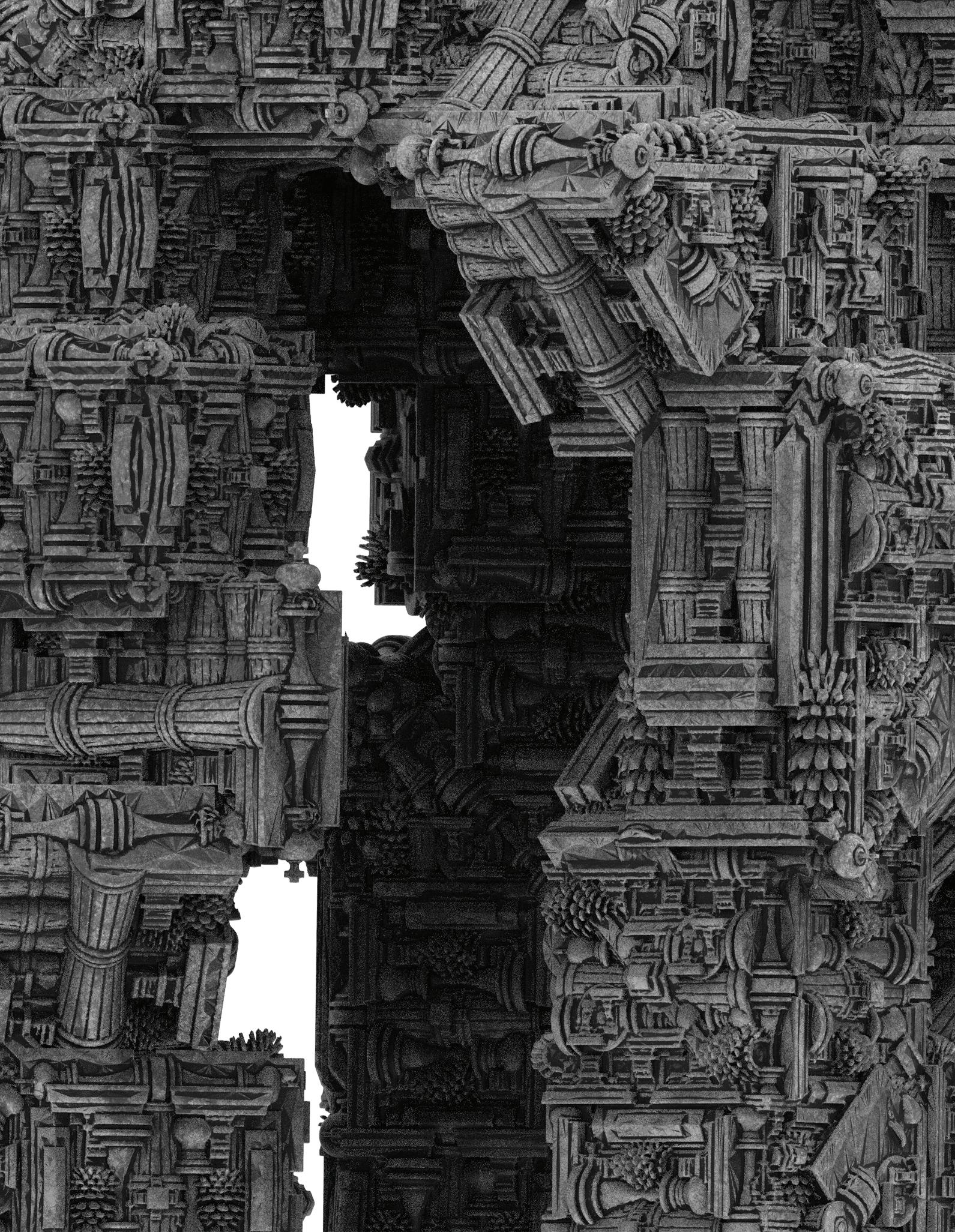
How can an extension of an institution married with the lineage of colonialism- the Philadelphia Museum of Art, attempt to decolonize the land it resides upon? This question may seem counterintuitive at face value- it is. That said, any extension of a colonial system under the guise of decolonizing intentions acts as a wolf wearing sheep’s clothing. This project takes the advice of “make the invisible, visible,” and employs it to reveal the wolf.
This extension serves its role as a monument of questioning. That isquestioning its own purpose and- in applying the transitive propertythe intentions of the Philadelphia Museum of Art as an agent of decolonization.
 Site Rendering Museum extension situated along the Schuykill River
 Chunk Model interlocking physical model revealing piping details

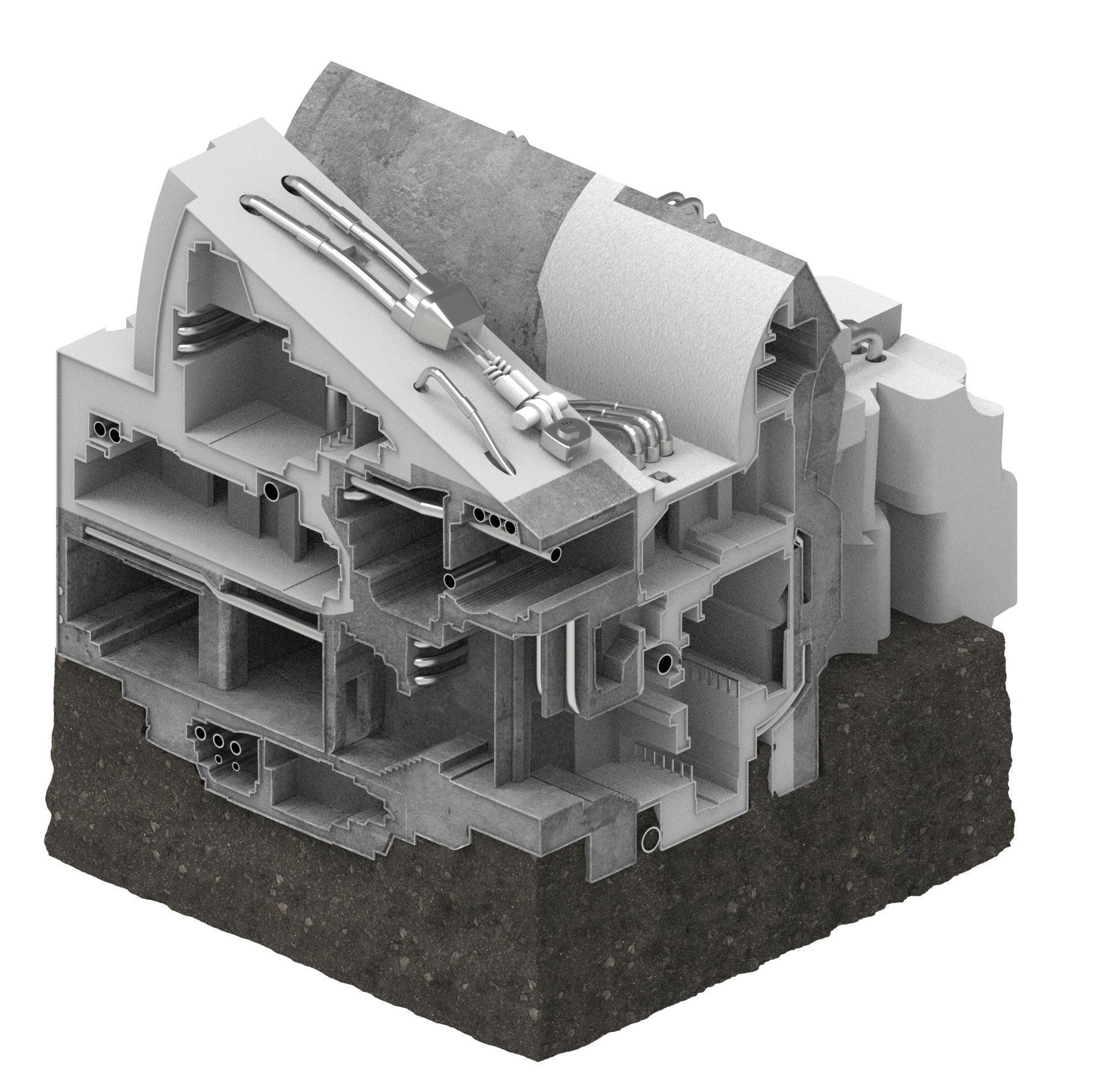
The design nods to the relevance of movements like structural expressionism, which celebrate and expose utilitarian building components often hidden behind walls. This project offers a slight departure from that legacy. While the use of these specific kitbashed objects- the components of a camshaft pulley, engine block, drive belt, and piston- pay homage to Philadelphia’s industrial relationship with the Schuylkill River, they also work to symbolize the legacy of imperialism which accompanied these periods of industrializationpart of that history resulting in works of art found in the PMA.
 Chunk Detail Render Piping incorporated within building poche
Isometric Render
Section Carved interior and pipework revealed
UPenn Fall ‘22
Suffused Volumes
Critic: Na Wei
Project Length: 4 weeks
Collaborators: Ria Zhang, Kai Chen, Shane Bugni
Deja Vu is best described as a sum of many parts. Found objects such as a trash can, chess piece, pinecone, and observed architectural components are arranged to create a unified whole. The basic contours of the assemblage are extracted from silhouettes of the human body. Using these outlines, the voided space is extruded and then encased with the object poche, enabling and encouraging specific movements through the pavilion. As one approaches Deja Vu from a distance, the individual objects blur together as a singular structure. Closer inspection brings the common objects into focus, revealing a space which is uncannily familiar.


More than just a digital assemblage exercise, the Deja Vu project is a challenge in physical fabrication. The Deja Vu assemblage is composed of 7 distinct foam panels, all of which were made into molds plaster negative molds. The molds are filled with expandable foam, left to dry and expand, and eventually removed from the plaster.


 Panel positive renders 7 distinct panels to be assembled
Plaster Negative Mold
Plaster poured over CNC foam positive
Expanding Foam Foam sprayed into negative
Pressure Wood placed on top of foam and pressure is applied
Expanding Foam Positives Collection of foam panels

 Physical Model 1:1 Panels fully assembled
Physical Model Final Critique Model size welcomes physical interaction


 Plan Section
Elevation Section
Suffused interior reflects the objects seen clearly on exterior
Plan Render Kitbashed objects radiate about a central axis
Elevation Render
UPenn Spring ‘23

Project Length: 1 week
Collaborator: Yousef Almana
This project plays with machine learning technology and its misinterpretation of prompts, resulting in the creation of novel objects within a preset typology. Viktor Shlovsky’s literary trope of defamiliarization hinges on one essential element, the perception of strangeness. This feeling can be brought about by challenging habitual, over-automotized object perception. Error 404 employs Leo Tolstoy’s literary defamiliarization tactic, which disorients readers by describing objects rather than naming them. This tactic does away with our conceived notions of well-known objects by increasing the difficulty of recognizing the object for what it is- forcing the reader to digest the “essence” of the object more slowly.
Error 404 uses Tolstoyesque descriptive language in programs like Dalle-2 and Midjourney to defamiliarize five structural components which repeated throughout the Callowhill neighborhood. These objects are colorfully described to ai, but never named, leaving the computer with space to slightly misinterpret their form. The result of these errors is our project.
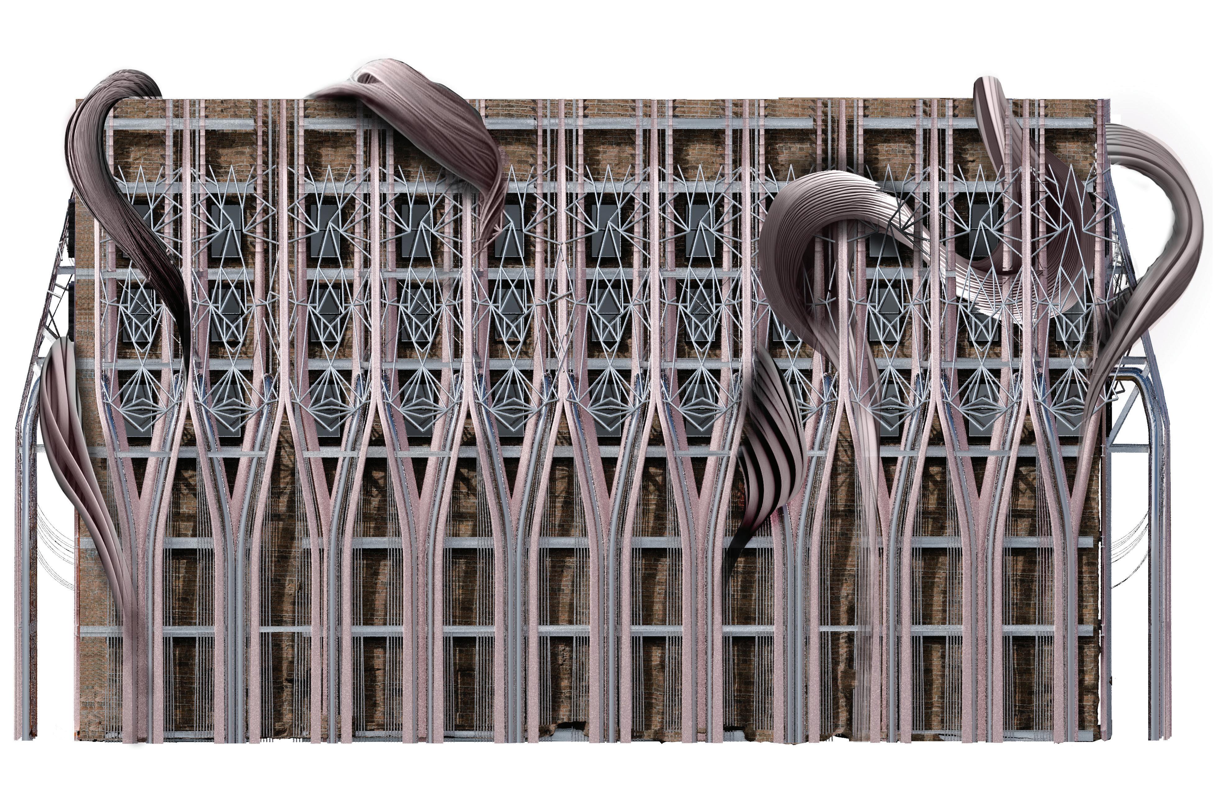
 Facade Exterior Detail


By employing Tolstoy’s method in AI prompts, the product of AI’s misinterpretation of the written descriptions is a defamiliarized structural object. This process of slowing down habitual perception through confusion allows viewers to take in each structural object as a whole rather than as its assumed form, advancing the aesthetic experience of the space.


These specific construction objects are indicative of the neighborhood’s history in large-scale fabrication. These “confused objects” are reintroduced into their original context, paying homage to their industrial home. The objects are then reassembled according to their initial placement and utility- resulting in a largely structural facade.

 Interior Rendering
UPenn Spring ‘23
Critic: Ryan Palider

Project Length: 2 weeks
The abstract architectural project aims to defamiliarize architectural motifs in Philadelphia’s Callowhill neighborhood by creating hybrid forms through the connection of architectural objects. The defamiliarization process involves taking familiar architectural elements and reconfiguring them in ways that create a novel design language through their restructuring. By blending forms, materials, and styles, the project creates a new language of architectural expression that challenges the viewer’s perceptions and expectations.
The resulting hybrids are arranged in a bas relief, where the shapes and forms are sculpted and assembled to create a dynamic composition. This bas relief becomes the foundation for a high relief, which acts as the massing site model. This iteration borrows and distills the formal language of the bas relief, creating a succinct site model.


Throughout the project, the defamiliarization process is carefully considered and executed, emphasizing the relationships and interconnections between various architectural elements. The resulting design is a complex and visually engaging work that challenges conventional architectural thinking and invites the viewer to experience familiar forms in new and unexpected ways.
 Line Drawing: Callowhill Motifs Architectural motifs rearranged
Three-Dimensional Bas Relief
High Relief Design Language of Bas Relief Simplified
High Relief Model Positioned on Site
Contemplating Borges’ Infinite Library
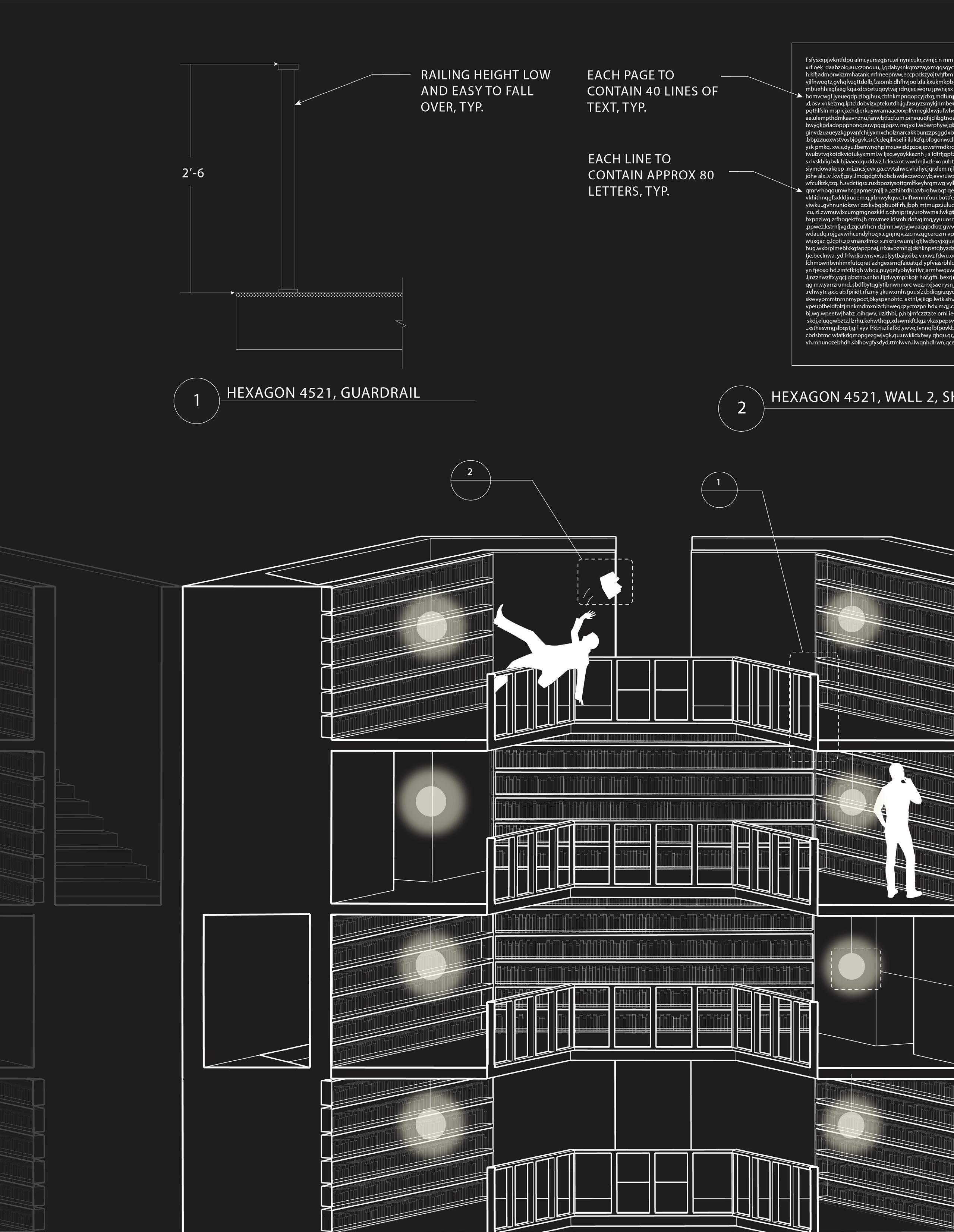
Jorge Luis Borges’ Library of Babel proposes the idea of a structure which contains an ever-expansive wealth of knowledge. Borges questions how we can visualize continuously increasing wealths of knowledge. In the short story, we imagine this space as a dystopian maze wherein its inhabitants find themselves lost in their quest for knowledge and purpose. This project is an attempt to visually solve Borges’ architectural proposition and breathe life into its form.
Personal Project ‘21
Library of Babel
By this art you may contemplate the variation of the z3 letters. . . .
Anatomy of Melancholy, Pt. z, Sec. II, Mem. IV
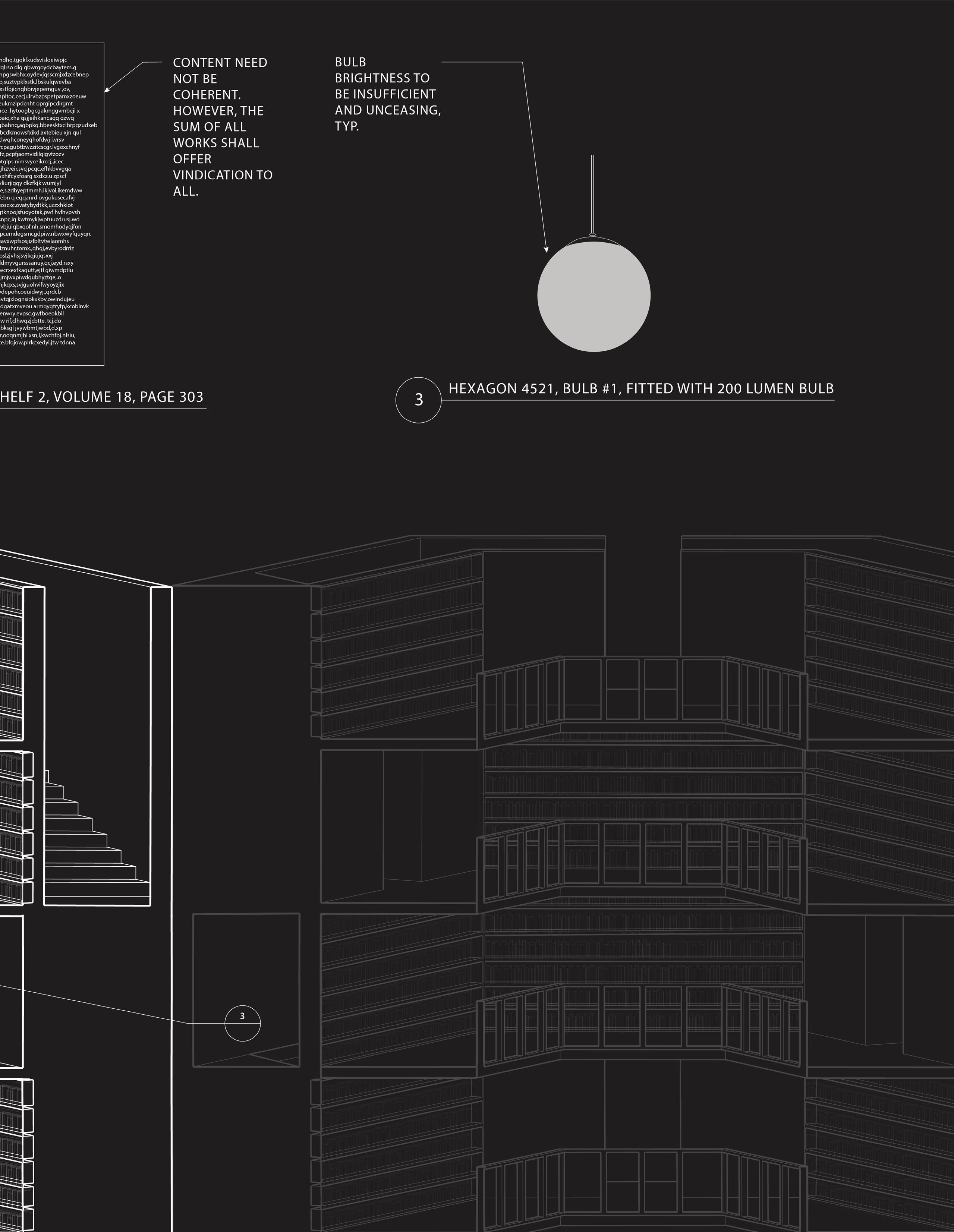
The universe (which others call the Library) is composed of an indefinite, perhaps infinite number of hexagonal galleries. In the center of each gallery is a ventilation shaft, bounded by a low railing. From any hexagon one can see the floors above and below-one after another, endlessly. The arrangement of the galleries is always the same: Twenty bookshelves, five to each side, line four of the hexagon's six sides; the height of the bookshelves, floor to ceiling, is hardly greater than the height of a normal librarian. One of the hexagon's free sides opens onto a narrow sort of vestibule, which in turn opens onto another gallery, identical to the first identical in fact to all. To the left and right of the vestibule are two tiny compartments. One is for sleeping, upright; the other, for satisfring one's physical necessities. Through this space, too, there passes a spiral staircase, which winds upward and downward into the remotest distance. In the vestibule there is a mirror, which faithfully duplicates appearances. Men often infer from this mirror that the Library is not infinite-if it were, what need would there be for that illusory replication? I prefer to dream that burnished surfaces are a figuration and promise of the infinite. . . . Light is provided by certain spherical fruits that bear the name "bulbs." There are two of these bulbs in each hexagon, set crosswise. The light they give is insufficient, and unceasing. Like all the men of the Library, in my younger days I traveled; I have journeyed in quest of a book, perhaps the catalog of catalogs. Now that my eyes can hardly make out what I myself have written, I am preparing to die, a few leagues from the hexagon where I was born. When I am dead, compassionate hands will throw me over the railing; my tomb will be the unfathomable air, my body will sink for ages, and will decay and dissolve in the wind engendered by my fall, which shall be infinite. I declare that the Li-
Single Hexagon: 4 sides of the room are lined with bookcases and two sides act as dedicated passageways. This unit, when multiplied and attached to itself, creates an infinite line of rooms.
Key:
Example: path of travel from hexagon #1 to #4
Parallel Hexagon Lines: these hexagon lines cooperate with Borges’ description of uniform units. stacked hexagons are rotated 60 degrees to allow movement between rooms.
Stacked Hexagon: borges’ “spiral staircase” is situated within the walls, in effect, spiraling around each hexagonal unit. this allows for circulation throughout the library. see key for details.
Smith College Spring ‘20
Critic: Elisa Kim
Project Length: 6 weeks
Observing Hyphal Architecture

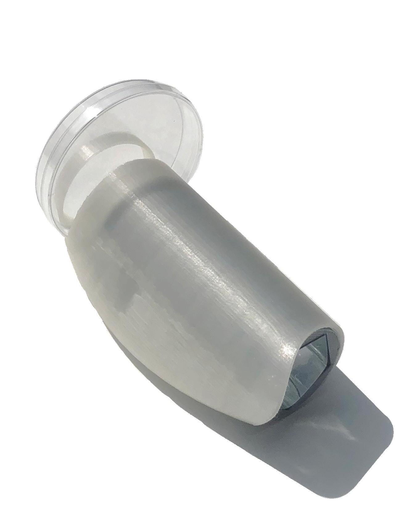
As a means of understanding the growth proccesses which came with the Covid-19 pandemic, the Mycelial Kaleidoscope works as an object for close study. The kaleidoscope allows its user to observe organic growth patterns as not only a scientific medium, but an artistic medium as well.
At the end of every kaleidoscope is an object chamber containing materials which are fractured by a mirrored tube. Replacing a traditional bead-filled object chamber with a mycelium petri dish challenges conceptions of aesthetic engagement; this positions the unpalatable and potentially biohazardous as an alluring display which mesmerizes and entices.

Mycelium is the visible mass of compounded hyphae, which are the exploratory, nutrition scavengers found in fungi. Stemming from a singular thallus, individual hyphae will radiate outwards in search of nutrition. These exploratory tubes will diverge (hyphal branching) only when the filaments have reached their extreme when searching for nutrients.

 Petri Dish
Kids’ Viewfinder Telescope
Binocular Eyecup
Ergonomic Eyecup
Mirrored Tube
Kaleidoscope User Elevation User demonstrates the kaleidocsope in use
Inoculated Petri Dish Hyphal branching of Blue Oyster Mushroom
Kaleidoscope Design Precedents Design informed by related typologies
Day 0:
Malt agar plate is inoculated with Blue Oyster Mushroom liquid culture.


Day 2:
Blue Oyster mycelium form is visible. Uncontaminated mycelium is white and cloud-like.This indicates that the initial phases of hyphal branching has taken place.
Day 5:
The Mycelial White cloud takes on a more crisp, stringy texture as the hyphae spread in search of nutrients.
Day 9:
Well-developed mycelial body has been formed. The mycelium will branch into the substrate and strengthen its foundation with time
Kaleidoscope User View
Mycelial forms reflect, creating galaxies of bacteria

Smith College Spring ‘19
Critic: Elisa Kim
Project Length: 6 weeks
valley hill
 valley hill
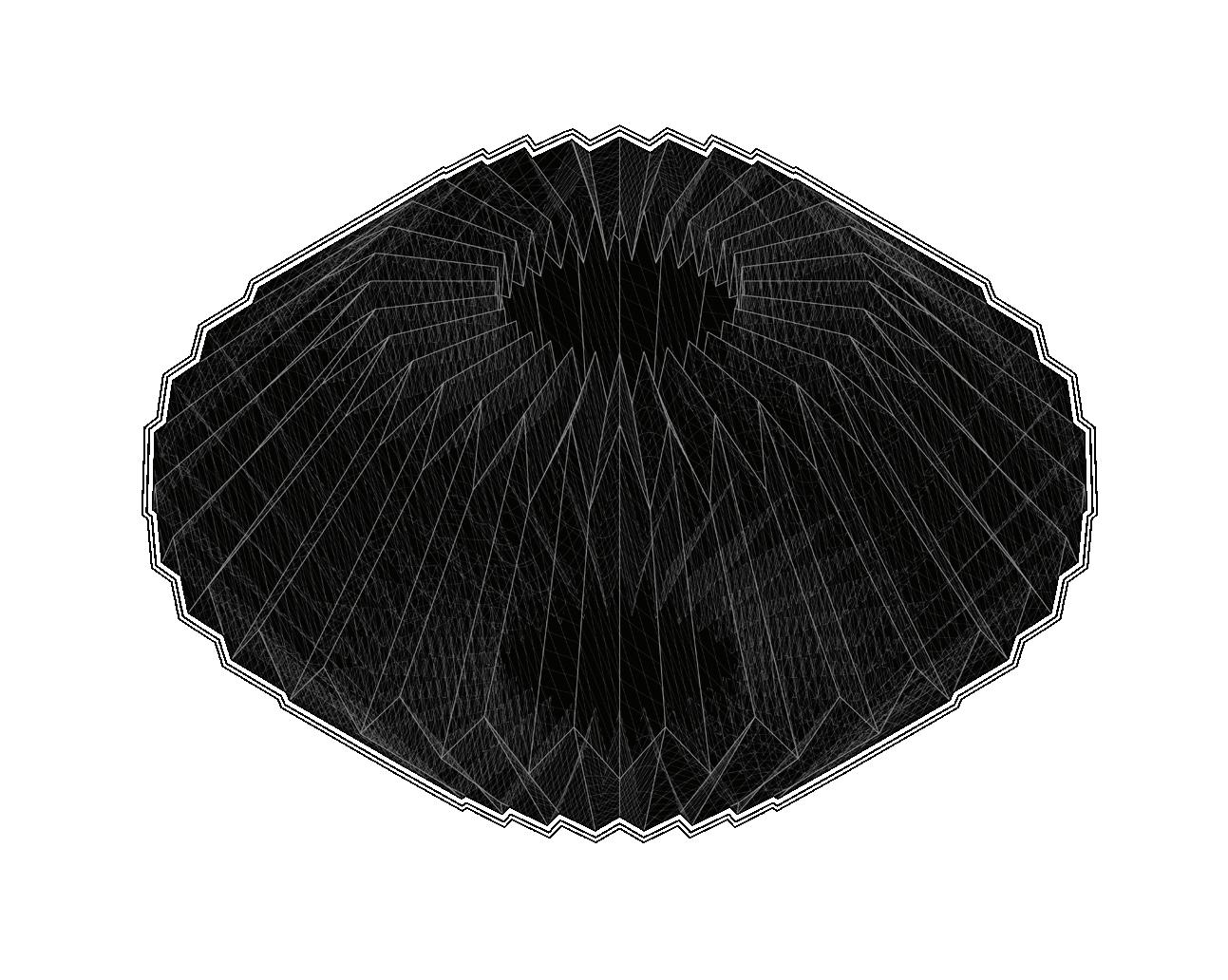
1. Accordian fold the length of the paper
2. Fold at an angle at the middle
3. Fold “top” towards the center
4. Fold towards center from bottom
5. Unfold completely
5. Pleat the paper, creating valleys and hills where indicated*
6. Rotate the paper, 365 degrees and attach
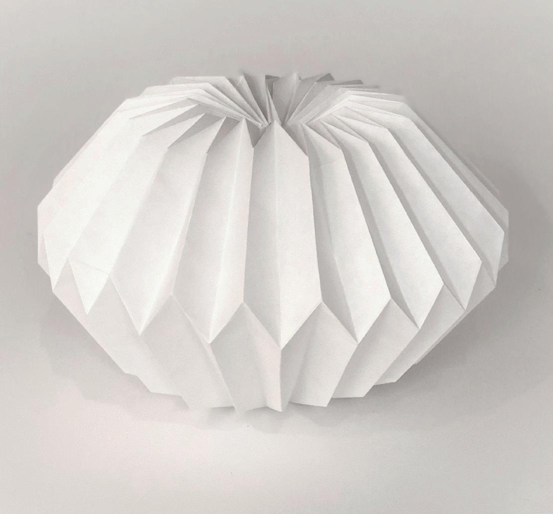
Physical Model
Pleats revolved upon themselves
valley hill
valley hill
1. Accordian fold the length of the paper
2. Fold at an angle at the middle
3. Fold “top” towards the center
4. Fold towards center from bottom
5. Unfold completely
5. Pleat the paper, creating valleys and hills where indicated*
6. Rotate the paper, 365 degrees and attach
Physical Model
Pleats revolved upon themselves
UPenn Fall ‘22
Visual Studies
Critic: Daniel Markiewicz
Museum Plan Exercise
1.) Roof Structure:
• Roof tiles 528/240/37 mm
• Counter battens 30/50 mm
• Battens 35/50 mm
• OSB board 18 mm
• Rafters with doubling 80/80 + 80/200 mm
2.) Edged copper drainage channel
3.) Clinker brick and concrete connected to the reinforced concrete wall via console bolts
4.) Floor structure attic:
• Screen reinforced and sealed 65 mm
• Drainage mat PP 16 mm
• PE foil, sealing membrane FPO
• Thermal insulation PU on a gradient of at least 200 mm
• Vapor barrier bitumen membrane on bitumen primer
• Reinforced concrete ceiling 250 mm
5.) Facade structure:
• Front shell clinker 305/105/65 mm and 145/105/65 mm
• Horizontal joints 15 mm
• Rear ventilation 45 mm
• Thermal insulation mineral fiber 150 mm
• Reinforced concrete wall 250 mm
• Lime cement plaster 15 mm
