6 minute read
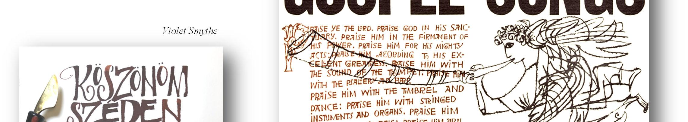
Bensgothic with Violet Smythe

from Reflections 2021

October brought the Guild’s first Zoom workshop. We twenty participants were privileged to have Violet Smythe share her expertise in her Bensgothic lettering style. One morning a week for three weeks Violet led us from an understanding of who Ben Shahn was and the basics of his hand to newer, more decorative variations.
To start, Violet explained how she became inspired by Lithuanian-born Ben Shahn (1898 -1968) after seeing the work done by a friend who was enrolled in a year long calligraphy workshop taught by Carol DuBosch which also included this hand. Investigation led her to realize Ben Shahn
Advertisement

Ben Shahn
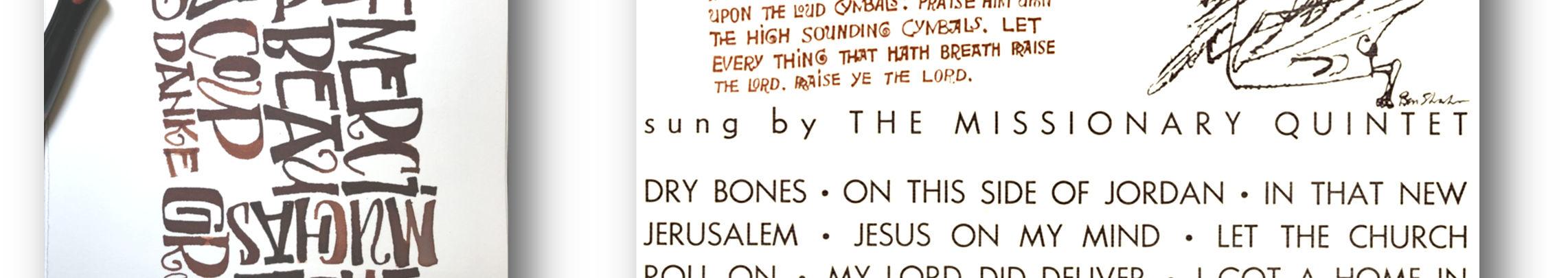
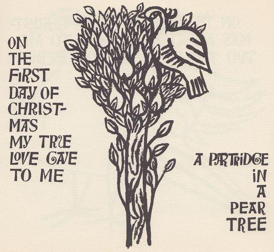
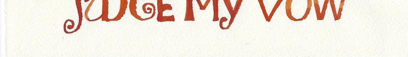
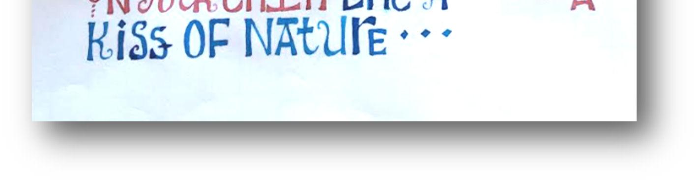
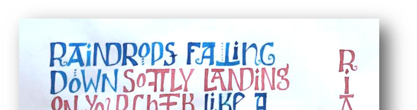
was a notable artist who had studied at New York’s National Academy of Design. She showed us samples of his work that exemplified how Shahn blended his artwork with calligraphy, such as his beautifully designed and illustrated book Partridge in a Pear Tree. Following our session, Violet emailed us her demo sheets so that we could study them more carefully. Along with the samples of Ben Shahn’s work images she included in our exemplar, Violet sent a sample of the carved letters from the 8th & 9th century as well as a sample of letters by David Jones for comparison. This drawn lettering offers great opportunity for differing forms and having given us this background, Violet then moved on to teaching us her own interpretation. As with any creative venture, having the right equipment is the first step. One method of doing Bensgothic is to draw the letters. This can be done with a stiff pointed nib, a Brause 3/4 mm nib or a B5 or B6 nib followed by flooding and filling in the letter. A gel pen is also a useful tool as is a multicoloured pencil or even a plain pencil (Violet uses a mechanical pencil that has a flat lead, like a carpenter’s pencil). However, Violet usually works with a folded pen. She suggested that the Luthis Libelula (Dragonfly) pen from John Neal Books is a good choice, but her favourite is the New Horizon nib from Paper & Ink Arts. Equally as important as the pens and pencils used are the papers, inks and paints. Violet’s paper suggestions were Hot or Cold Press Watercolour paper, Arches Text Wove, Bordens & Riley Layout Paper, Neutech or Genoa bond or Strathmore 400 series sketchbook or any paper that works with our ink. As well as using ink, watercolour paint, liquid watercolour like Pebeo Colorex or Ecoline and gouache were mentioned as good choices for the letters. With so many options to choose from, many hours of experimentation lie ahead. This discussion of equipment led into Violet demonstrating the hand. Working with her folded pen, Violet showed each step from the strokes achievable with the pen, to specific letterforms, and on to words. The letters were introduced in family groups: ILEFTH, OQGCSU, DPBR, MNZ, and lastly AVWXYKJ. This allowed us to see similarities of


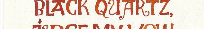
Carolynn Dallaire shape. There was plenty of oppor- tunity to practice what we had been taught, referencing the handouts Violet had previously emailed. The last step was to put it all together using a pangram (a sentence using all the letters of the alphabet). Violet had provided us a list of pangrams, my favourite being “The dark risqué gown makes a very brazen exposure of juicy flesh.”
Denise Rothney
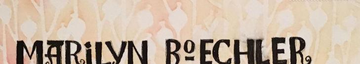
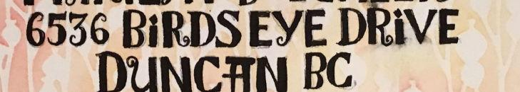
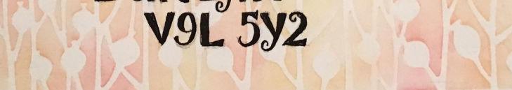
With the close of our first class it was time to assign homework. Violet asked that we do a pangram and create a postcard to send to a partner she had chosen for us. The card was to have the name and address lettered on one side and a design on the other side. Before mailing it, we each photographed our work and emailed it to Violet so she could discuss them the following week. Our next session began with a social time as, one by one, we joined our Zoom classroom. When we had all gathered, Violet showed an example from a previous class to illustrate how Bensgothic can be varied and then she moved on to our homework.
She showed work from each of us, the pangrams and the postcards. It was particularly fun to see the postcards with their colourful designs and
Having taught us the basic Bensgothic alphabet, Violet began to teach variations. She went over each letter and showed alternate forms, encouraging us to experiment and find our own variations. Next she showed us ligatures, a way of joining letters. When there is a strong diagonal or
Violet Smythe

vertical stroke, a letter can be joined to its preceding or following letter, for example, A, N, and D can all be joined together. Our homework assignment was to create a piece using ligatures as well as stacking and nesting words, writing sentences of different sizes and writing them on curved lines. To begin our last class, Violet demonstrated by creating a birthday card for Judy Lowood. Then she went over our homework, using it as a means to point out ways to refine our work. One suggestion was to use only enough ligatures to add interest, as too many would create monotony and distraction. Other tips were to bounce our letters or use lines of different heights to add emphasis. She also pointed out, though, that a balance should be found between variety and readability. For the remainder of the class Violet showed various ways to work creatively such as changing colour as you go, using masking fluid for the letter and then painting over it, and even spritzing or pouring splashes of bleach on black paper to bring out an under colour.
Despite the social limitations of learning on Zoom, such as no opportunity to chat with a table partner, it was a very enjoyable workshop. There were many handouts giving us the history and development of Bensgothic as well as exemplars with the letters. All of Violet’s demonstration pages were emailed to us and by emailing her our homework we were able to see what others had done and learn from the comments she made. Violet’s organization and friendly demeanour made it a very successful workshop.
- Kathy Bedard


Violet Smythe Ria Lewis