Published in the United States of America by Cal Poly, San Luis Obispo TAGA Student Chapter
1 Grand Ave
San Luis Obispo, CA 93407-0381
Printed in the Graphic Communication Department at California Polytechnic State University, San Luis Obispo
AUGMENTED REALITY
This journal features augmented reality experiences powered by Adobe Aero. To access them, open your camera app to scan the QR code in the corner of the divider page.
Open Adobe Aero, and tap the blue “open” button to launch the Aero App through your camera. Once it’s open, press the blue “continue” button to scan the illustrated divider page and then view or tap through the AR experience to interact with dynamic elements and explore hidden details.
You can then explore the illustration in augmented reality without needing to download the Adobe Aero app.
AUDIO TRANSCRIPTS
To ensure accessibility for users with vision impairments, we have created audio transcripts for all five articles using Descript®. Simply scan the QR code below to access the audio transcripts.
CAL POLY TAGA
WEBSITE
PRESIDENT’S LETTER
Dear Reader,
We are proud to represent the 2025 Helmut Kipphan Cup Journal Competition entry for California Polytechnic State University, San Luis Obispo’s TAGA student chapter. I am thrilled to welcome you to this issue of our journal, themed around “Conscious Creativity.” The creation of this journal has been a collaborative effort from our executive board members, but could not have been accomplished without the support of our department’s faculty and general club members.
Within these pages, you will find an array of articles, projects, and case studies that illustrate how conscious creativity can transform not only our work, but also our industry as a whole. From sustainable design practices to representative production, these contributions reflect the diverse talents and perspectives that make our chapter vibrant and unique.
Thank you for your unwavering support and commitment to our chapter. I would like to specifically thank our faculty advisors Rachel Ma and Donna Templeton. They helped to encourage our creativity throughout this process, and have supported us every step of the way. I would also like to thank the entire Graphic Communication department for their commitment of time and resources that allowed us to produce a product we are all proud of.
Sincerely,
Kaia Salverda
OUR 2025 THEME:
CONSCIOUS CREATIVITY
Our chosen theme of Conscious Creativity stems from the unification of all five articles, as well as the overall feeling we want to convey. The use of rough edges and organic design shown through a collage style within the journal helps us to embody a sense of intentionality. By embracing imperfections and organic elements, we aim to highlight the beauty in process and exploration, encouraging readers to reflect on the interconnectedness of creativity, mindfulness, and the raw world around them, especially as designers.
1
Art by Janelle Asato and Alex Nishida
BING’S BAO BUNS
Phoenix Challenge
Meet the Client
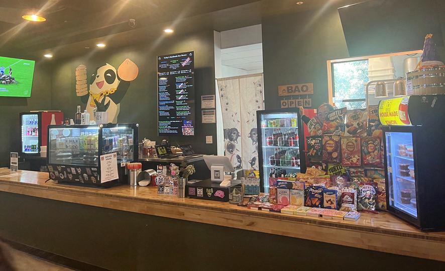
Bing’s Bao Buns, situated exclusively within the SLO Public Market, is a small restaurant that brings foreign flavors through its handmade steamed bao buns, fried rice options, kimchi, noodle dishes, and other delicious sides. The restaurant is located 5 minutes away from San Luis Obispo Airport on the corner of Tank Farm Road and S. Higuera St. Before establishing a business at the SLO Public Market, co-owners Sam and Mike Whittakers had only run a food business informally out of their home kitchen. The Whittakers delivered amazing dishes to friends and family, sourcing their ingredients and cultivating spices to guarantee the freshness of their food. Their mission is to produce a locally sourced analog of their favorite tastes. Sam and Mike successfully transformed their passion for crafting handmade bao buns and other delicious sides, officially launching Bing’s Bao Buns in December 2021 (Martin, 2022). Since opening, they’ve consistently sold out within hours, gaining a reputation for their artisanal bao buns. Their baos appeal to customers seeking a taste reminiscent of their own experiences and newcomers eager to explore their unique flavors. Along with their infamous bao buns, the menu features a variety of other dishes that change weekly, encouraging customers to discover and savor new and exciting flavors!
Why Bing’s Bao Buns
We reached out to several businesses in San Luis Obispo with the potential to assist with rebranding and repackaging. We discussed various challenges each business faces, from packaging functionality to aesthetic improvement. After narrowing down our choices, our team expressed interest in partnering with Bing’s Bao Buns to help redesign their food packaging and better communicate their brand personality.
We saw this as an opportunity to contribute to the growth of a small, local business owned by a wife and a husband from diverse backgrounds. We wanted to elevate the brand and make their valuable assets more distinguished to consumers. Following thorough research into the business’s brand values and customer base, our team aimed to redesign packaging that securely holds the product and better represents the brand as a whole. While there are no legal claims for sustainable packaging, the next step would be to consider the type of packaging material if they were to manufacture our redesign on a larger scale to make it more environmentally friendly.
We believe this is an excellent opportunity to develop new packaging that differentiates Bing’s Bao Buns from using generic packaging, creating a stronger brand image. By incorporating more unique branding throughout their products, we hope to increase brand awareness and sales for the business.
Research industry research
In recent decades there has been a rise in the Asian food industry, with “nearly three-quarters of all U.S. counties (73%) now having at least one Asian restaurant of some kind” (Beaton, 2023). This has opened opportunities for food enthusiasts to explore authentic Asian flavors. Restaurant menus initially introduced a variety of Asian cuisines to U.S. consumers, turning dishes like ramen, sushi, kimchi, pho, and adobo into household staples for millions of Americans (Food Navigator, 2022). These classic dishes on menus expanded across the country in the late 20th century, increasing the popularity of Asian cuisines. The Pew Research Center reported that “some 12% of all restaurants in the United States serve Asian food” (Shah and Widjaya, 2023). As seen in
Figure 1, Chinese, Japanese, and Thai foods are the highest proportion of Asian restaurants.
The Asian cuisine industry has also grown in popularity on several social media platforms. Especially with bao buns, a popular steamed bun in East Asia, online searches increased by 15% over the past year, reaching a monthly volume of 35,000 searches as of last month. This rise in popularity can be attributed to the younger demographic’s active engagement on TikTok, where bao buns are frequently discussed, suggesting a growing appeal among the youth to explore diverse and traditional Asian cuisine (Glimpse, 2024). In the Picky Eater Blog shown in Figure 2, Asian cuisines were ranked highly on Instagram based on hashtags in 2023. Italian cuisine was ranked first, followed by Japanese with around 20 million hashtags, Indian with over 12 million tags, and Korean with almost 10 million hashtags (Shah, 2016). “Eight of the top 10 most popular cuisines on the platform were from Asian cultures” (Yam, 2023). The article further reports that “Chinese, Thai, Indian and Korean food are among the top five most searched cuisines in the U.S.
According to World Review, “the Asian American population in the United States is estimated to be approximately 20 million, which is 5.6% of the total population”. As the U.S. continues to grow and diversify, the U.S. Census data predicts a “23.8% increase in the Asian-American population from 2016 through 2026,” expanding the interest in Asian cuisine (Food Navigator, 2022). With the rise of Asian food markets, the growth of the Asian-American population, and the widespread influence of social media, the global Asian cuisine market is expanding. According to the Digital Journal, “the global Asian cuisine market size was valued at USD 149,008,000 in 2022 and is expected to expand at a CAGR of 7.33% during the forecast period, reaching USD 227,800,000 million by 2028” (Digital Journal, 2022).
71% OF ASIAN RESTAURANTS IN THE U.S. SERVE CHINESE, JAPANESE, OR THAI FOOD % of restaurants in the U.S. that serve...
other food
1: Percentage of Asian Restaurants That Serve different Asian Cuisines
Figure
MOST POPULAR CUISINES WORLDWIDE
Based on Instagram tags as of 2023
Instagram tags in millions
Italian
Figure 2: Most Popular Cuisines Worldwide: Picky Eater 2023
demographic research — national
A 2020 Mintel study revealed that over 70% of US consumers enjoy trying new experiences and exploring new food and drink flavors. This demographic is mainly comprised of Gen Z and millennials (Danley, 2020). The millennial generation closely follows Gen Z with the most growing taste for Asian food (Grabarkiewicz, 2023). The surge in Gen Z’s preference for Asian foods can be attributed to the 81% increased growth of the Asian American population between 2000-2019, making up 7% of the US population in 2021 (Pew Research Center, 2021). As seen in Figure 3, Civic Science reports that 39% of Gen Z favors Japanese, Chinese, and Thai cuisines compared to 34% of millennials. Gen Z exhibits the strongest preference for Asian cuisines compared to other generational groups.
which one of the following types of food do you most prefer? by age
3: Age Range Preferences for Different Ethnic Cuisines
demographic research — local
The current population of San Luis Obispo County is approximately 272,357 with a median age of 39.3 years old (San Luis Obispo Chamber of Commerce, 2024). The city of SLO has around 49,530 residents with the median age of 25.2 years, 24.5 years for males, and 27.2 years for females (World Review, 2024). Since Bing’s Bao Buns is solely located in the SLO Public Market, their primary market segment comprises SLO residents living near this local busi-
Figure
ness. Residents living in the same zip code as Bing’s Bao Buns, the 93401 zip code, contain 28,033 SLO residents with a median age of 34.1 (BuzzFile, 2024). Our Qualtrics research, with 74 respondents, indicates that the largest segment of SLO residents that purchase at Bing’s Bao Buns falls within the 25-34 range (42%), followed by those aged 35- 44 (26%), and lastly, college students aged 18-24 (22%). Although SLO is commonly known as a college town, Bing’s Bao Buns attracts an older demographic, though many college students live closer to campus. If residents go to the SLO Public Market, they may need to commute by bus or car to reach the restaurant if they do not reside nearby.
While on a national level, Asian cuisine tends to appeal to a younger demographic ranging from 18 to 24, Bing’s Bao Buns attracts an older demographic locally, predominantly those in the 25-34 age range. According to the San Luis Chamber of Commerce, SLO County residents aged 15-24 account for 24.1%, 25-44 age represents 29.7% of the population, and the 45-54 age range makes up 14.5% of the SLO population. Areas with a more concentrated Asian population, such as Los Angeles and San Francisco in California, have a more diverse array of Asian cuisines that appeal to a younger demographic (Asian American Market Report, 2023). Specifically, 34.8% of San Francisco’s population is Asian, compared to 11.8% in Los Angeles and 5.5% in SLO (Zip Atlas, 2024). Within these metropolitan areas, SF and LA were the “top 10 major U.S. cities with the highest estimated concentration of east and southeastern Asian restaurants (population> 500k).”
top 10 major us cities with the highest estimated concentration of east and southeast asian restaurants (population >500k)
Percentage of East and Southeast Restaurants out of Total
customer
People working or living near the SLO Public Market can easily purchase Bing’s Bao Buns within a reasonable time. Our team conducted a Qualtrics survey to collect demographic data from a sample of Bing’s Bao Bun customers, revealing that 42% of respondents fall within the 25-34 age range, with an additional 26% in the 35-44 age group. Based on our Qualtrics survey, approximately 54% of customers reside in the same zip code as Bing’s Bao Buns, indicating a higher proportion of regular customers than new ones. These findings are consistent with Sam’s observations that most of their customers are regulars. However, most other customers come from areas somewhat close to SLO, suggesting visits from families of college students or tourists seeking Asian cuisine. Sam mentioned that visitors, including those from Paso Robles (around 35 minutes away) and some from Los Angeles and San Francisco, visit the restaurant or stop by while passing through. The pie chart illustrates the distribution of respondents based on the first 3 digits of their zip codes in California: those starting with 913 denote Southern California, 934 represent the Central Coast, and 936 represent Central Valley. According
Figure 4: Restaurant Concentration
to our Qualtrics survey data, 93% of the respondents are located on the Central Coast, 6% in Southern California, and 1% in Central California (see Figure 5). Additionally, Table 1 provides a detailed breakdown of respondent frequencies by zip code and Table 2 showcases their corresponding regions within California. While Bing’s Bao Buns attracts an older demographic that already live close to this restaurant, our goal is to broaden their target market to include younger consumers, particularly college students from California Polytechnic State University and Cuesta College, while maintaining our existing customer base. By creating visually appealing packaging with a strong emphasis on sustainability, we can expand our target market to college students since they already reside near this business. Bing’s Bao Buns can achieve greater brand awareness and increase sales by targeting Gen Z and millennials.
Figure 5: Bing’s Bao Buns: Regional Distribution of Customers in California Pie chart
bing’s bao buns: regional distribution in california
Table 1: Respondents Frequencies By Zip Code respondents frequencies by
Table 2: Corresponding Regions Within California
target market research
The target audience comprises an older demographic, falling within the 25-34 age range that is mostly female. Sam, co-owner of Bing’s Bao Buns, also observes that their customer base consists mainly of individuals of white ethnicity, a diverse mix of races, and Asians. According to our Qualtrics survey, 58% of the respondents are Caucasian, 22% are Asian, and 14% are of two or more races (see Table 3). Her observations align with the racial composition statistics of the city of SLO in SLO County, where the population is 79.13% white, with two or more races accounting for 10.29% and Asians at 5.5%
(World Population Review, 2024). Since Bing’s Bao Buns is located near the airport, this location may attract tourists exploring SLO for a bit or between connecting flights. It can also attract college students who are leaving or going to SLO. Compared to the SLO population, California has 38,889,770 people with a more diverse racial composition (World Population Review, 2024). According to PPIC 2023, “40% of Californians are Latino, 35% are white, 15% are Asian American or Pacific Islander, 5% are black, and 4% are multiracial” (PPIC, 2024). Since there’s a high percentage of the white population in California, it may explain why Caucasian people make up a large portion of Bing’s Bao Buns customer base. Although a small percentage of the multiracial population in California, Bing’s Bao Buns has a higher consumer base among multiracial customers since SLO contains over 10% of them.
q3 - what ethnicity do you identify most closely to?percentagescount
Table 3: Racial Composition
consumer insights and behavior
Based on consumer insights and an analysis of the buying habits of our target market–millennials–our audience considers health, diverse flavors, sustainable packaging, and convenience as the main factors shaping their choices.
Asian restaurants are expanding across the U.S. compared to other ethnic cuisine types. The growth in establishing Asian restaurants can be attributed to U.S. consumers diversifying their palates and increasingly seeking diverse ethnic cuisines. Consumers seek Asian cuisine for its comforting feelings but also for lighter and healthier dishes with exquisite flavors (White, 2022). Asian cuisines align with the preference for foods that promote a healthier lifestyle, making them a popular cuisine choice for those looking for a nutritious and unique culinary experience (Linkedin, 2023). In a recent Mintel study, “over 60% of participants associated Asian cuisine with offering a good variety of flavors, and 42% perceive Asian foods as being healthy” (Food Navigator, 2022).
Asian food is also notable for its distinct and enticing flavors, using aromatic, fresh ingredients for variety and depth. Penn State records a Mintel study, showcasing that “24% of participants between 18 and 24 years of age go out of their way to try new flavors; even more, 25-to 34-year-olds (42%) and 35-to-44-year-olds (40%) do so” (Penn State Extension, 2023).
The prevalence of sustainable packaging has grown significantly in recent years as consumers recognize sustainability as a critical factor influencing their purchasing decisions and its impact on the environment. In fact, “82% of consumers across age demographics showed a willingness to pay more for sustainable packaging, up to 4 points from 2022 and 8 points from 2021” (PR Newswire, 2023). Specifically, “54% of consumers ages 44 and under consider sustainable packaging when purchasing a product, leading the charge in this trend. Within that age group, 83% have said they’re willing to pay more for products sustainably packaged” (Dillon, 2022). For millennials, in a survey, “94% of them say they would likely order an expanded variety of to-go foods if there were improved packaging to maintain food temperatures, taste, and quality” (Engelhardt, 2023).
Lastly, “the U.S. food carryout and delivery market is projected to expand at an average rate of 7.8% annually, reaching $1.0 trillion in 2026” (Market Research). Millennials are dining out more for both convenience and experience. According to SevenRooms 2023, millennials spend $95 per week on average. 43% of millennial respondents said they dine out for convenience, while 49% said they eat in restaurants because it provides a social setting (Mayer, 2023). Mad Mobile research indicates that millennials make up 51% of fast-casual restaurant customers who value convenient pickup and delivery.
swot analysis
Strengths
• Locally sourced ingredients
• Handmade and fresh bao buns
• Different menu options
• Gluten free & vegan options
• Merchandise
• Relatively good prices
Weaknesses
• Lack of branding
• Menu different each day/inconsistent
• Only local to SLO
• Lack of advertising, mostly through word of mouth
• No online ordering system (not on Doordash, Grubhub)
Opportunities
• New product lines
• Social media marketing
• Increase presence in SLO, possible downtown location
• Advertise their company during
• Farmer’s market
• Expand target market
Threats
• Industry competition
• Rising input costs
• Small target market
• Other Asian Cuisine restaurants located in SLO
• Government regulations
• Small amount of employees
perceptual maps
family owned low price
bing’s bao buns
panda express slo asian markettrader joe’s
corporate
high calorie
jay bird’s nashville hot chicken
brooks burgers
todo bueno
low variety high variety
low calorie
oki kohi espresso bar
golden gong
bamboo bamboo chinese restaurant
baht
humble oven
bing’s bao buns
competition and positioning
Several Asian-cuisine restaurants are in SLO, ranging from family-owned businesses to large chain establishments. On a smaller scale, Bing’s Bao Buns faces competition with other family-owned Asian restaurants, such as Bamboo Bamboo, Golden Gong, and Oki Kohl. On a larger scale, they compete with well-known chain restaurants like Panda Express and even grocery stores, such as Trader Joe’s, offering Asian-inspired foods that cater to a broader consumer base at a more economical cost. Despite the competition, Bing’s Bao Buns is highly positioned, offering consumers a diverse range of affordable goods. Their use of locally sourced ingredients, weekly menu customizations, and handmade bao buns contribute to their high positioning. Using locally sourced ingredients aligns with customer preferences for healthy foods. The weekly menu changes allow customers to explore various Asian cuisines. Their handmade bao buns signal the effort and dedication invested in crafting unique and appealing foods for many customers.
As mentioned earlier, Bing’s Bao Buns is only located in the SLO Public Market, which features a diverse array of restaurants, retail shops, a market hall, and a brewery. Visitors can enjoy the best culinary experiences on the Central Coast. Within the SLO Public market, consumers can visit Bing’s Bao Buns or explore other dining options such as Baht, Brooke’s Burger, Humble Oven, Jay’s Birds, Todo Bueno, and more, offering distinct ethnic cuisines. Like its competitors, Bing’s Bao Buns has diverse menu options similar to those offered at a similar price range. They are ranked as a lower-calorie option by offering several healthy appetizers like salads and edamame. They also have vegan and vegetarian options for consumers with dietary restrictions. Although they’re ranked similarly to their competitors, they’re the only place offering handmade bao buns in the SLO market. Compared to the other places where some menu items may overlap, such as Brooke’s Burgers and Todo Bueno, both offering hamburgers, Bing’s Bao Buns remains unique in its specialty. Customers living near the SLO Public Market or those with layovers near the SLO airport can get high-quality and flavorful bao buns without extensive travel.
fda regulations
Since Bing’s Bao Buns does not sell its products at the retail level, they are exempt from certain food labeling requirements. According to FDA regulations section 101.2 regarding type-size requirements, “individual serving-size packages of food served with meals in restaurants, institutions, and on-board passenger carriers and not intended for sale at retail, are exempt from typesize requirements, [including] package has a total area of 3 square inches or less available to bear labeling and insufficient area on the package available to print all required information in a type size of 1/16 inch in height” (U.S. Food and Drug Administration, 2024). As a micro-business with fewer than 10 full-time employees that does not have an importer and mainly gets its ingredients from Amazon and its meat products from local companies, it is also excluded from nutrition labeling requirements. However, if Bing’s Bao Buns claim nutrient content (low fat, sugar-free, good source of vitamin C), they are no longer eligible for the nutrient label exemption (Trust Well, 2016). They must submit a completed notice to the FDA annually (U.S. Food and Drug Administration, 2024) Regarding barcodes, no government regulatory agency requires micro-businesses’ food packages to have a barcode.
breadth and depth of research
The research conducted for Bing’s Bao Buns involved a comprehensive analysis of the Asian cuisine industry. This included national and local demographics and interviews with industry experts. We collected relevant information and statistical data to provide qualitative and quantitative evidence. We sourced market and demographic research from credible food industry sources, including the Food Institute, International Food Council, Pew Research Center, Digital Journal, and more. Utilizing data from these sources, our team gained valuable insights into the expected market growth of the Asian cuisine industry and identified prevailing customer preferences. Our team also used information from the SLO Chamber of Commerce to gather information on the local demographic of SLO residents, helping us identify a target market for our products. Expanding our scope to a broader consumer demographic, we utilized the 2023 Asian American Market Report and Zip Atlas to obtain information about other California cities with significant Asian cuisine markets. To delve into the preferences of Asian cuisine consumers, particularly Millen-
nials and Gen Z, we relied on credible information from sources such as the World Population Review, Food Navigator, and Penn State Extension, with a specific focus on health consciousness and sustainability packaging. This data further evaluates consumers’ purchasing decisions. Finally, we interviewed industry experts to help us learn and navigate the product development process regarding laws, material use, and machinery aid.
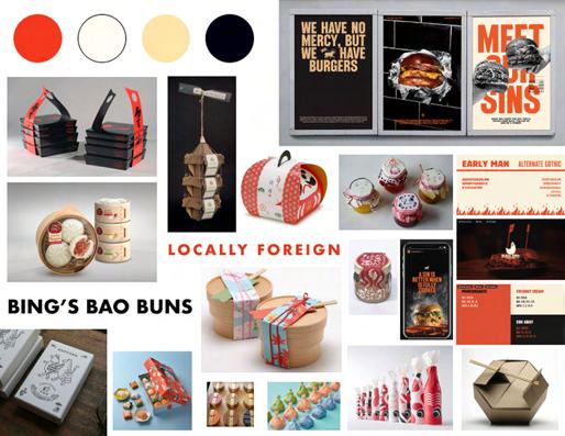
Concept
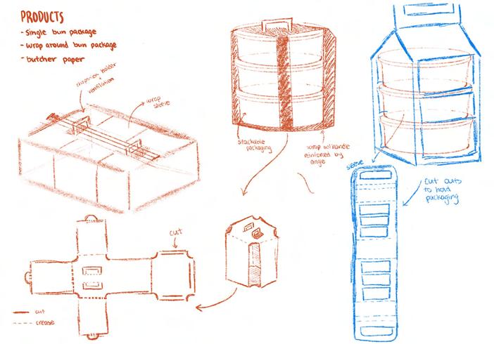
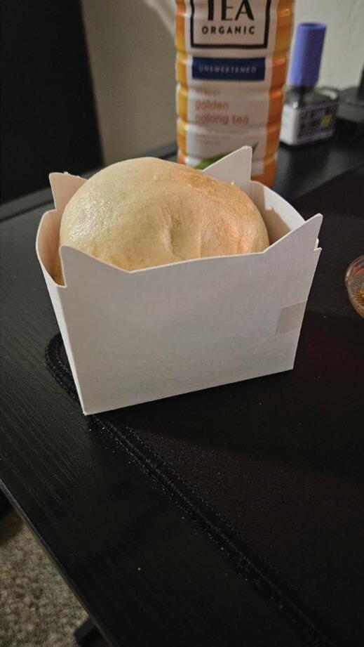
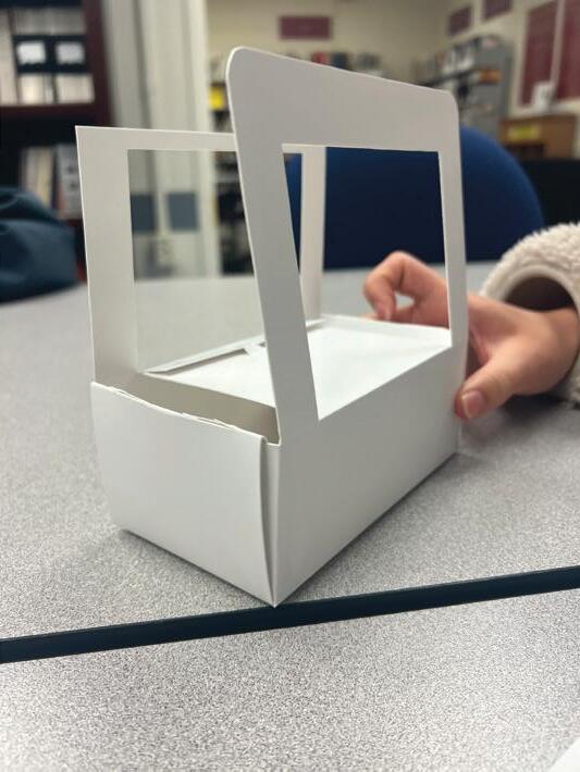
The original aluminum tin packaging exhibited a few pain points, one of which being that it would get notably hot (to the point where it would be difficult to hold), once the bao were placed in the container. To address these problems, we began brainstorming ideas to reduce the heating of the container and improve brand recognition. Our research for references mostly involved other Asian-inspired takeout containers to further emphasize Bing’s “locally foreign” brand and aesthetic. Throughout our brainstorming process, stackability often came up as a potential feature of the packaging. This idea of stackability eventually changed to a row of smaller packages, one for each bao. Because they are sold as either a single bao or a set of three, the client would be able to sell both using a single set of packaging products.
Figure 6: Concept Sketches
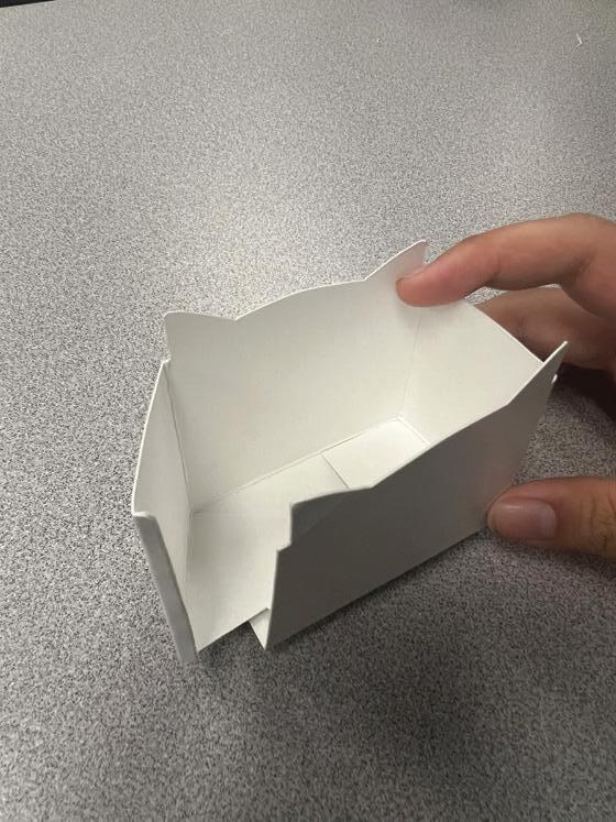
Once we reached a consensus on the sketch, we developed a few different prototypes, though most exhibited problems in dimensions and fitting.
Figure 7: Concept Iterations
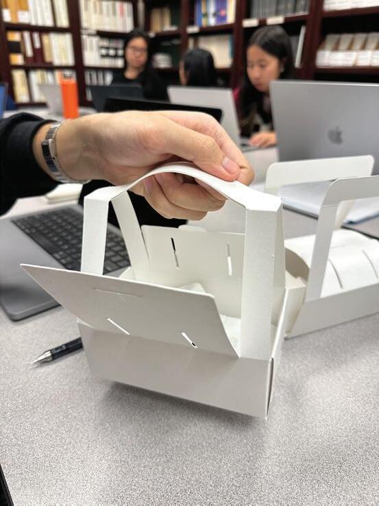
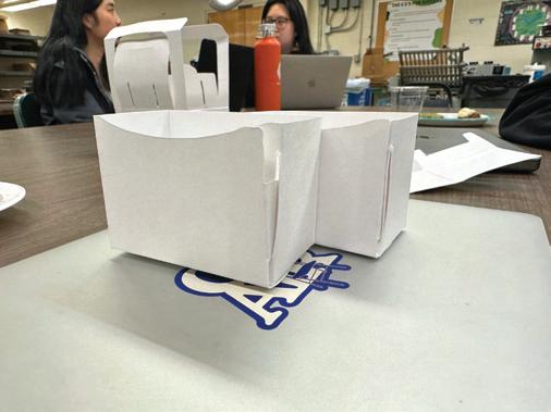
Multiple changes were made to the cover and handles of the wraparound box in each prototype iteration. We also made the decision to continue further with an auto-bottom design for the bao packaging. Although auto-bottoms increase costs slightly due to the use of glue, they ease the process of shipping/manufacturing and client assembly. After brainstorming with one of our industry experts, we added a locking system to the sides of the wraparound to allow the single packages to be mounted to it. This increases the total amount of bao that can be put in the package, while also giving extra space for other items such as sauces or utensils.
Before making printed prototypes using the digital files, we were able to create 3D renders of our designs using the Esko Studio Visualizer plugin for Adobe Illustrator. This allowed us to see what a converted package would look like without having to use materials or time for printing. A three-dimensional render provides other advantages, allowing us to spot any issues which may not have been apparent in a flat image.
Figure 8: Cutting Prototypes
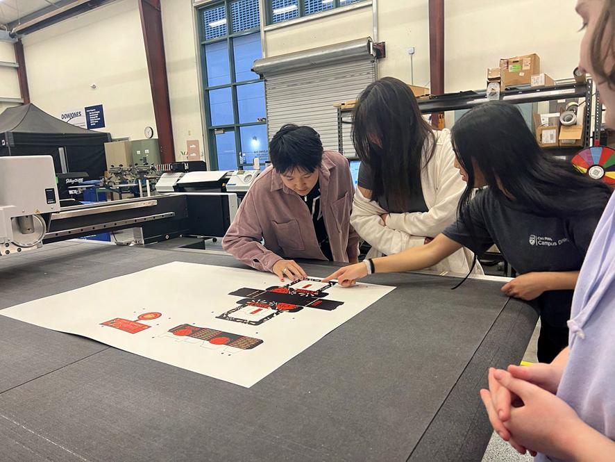
Throughout the development process, our team made sure to check in with the client every 3-4 iterations to ensure the product would align with their needs and integrate well into their existing workflows. After showing demos of the latest prototypes, we opened up a discussion to get their direct feedback on features, functionality, and overall usability. They appreciated our collaborative approach and transparency during the building process.
When showing our initial prototypes with a snap-lock bottom, the client expressed that it would be no concern assembling the packaging and that it would give them something to do during their free time. However, when user testing the product, it proved to not be as intuitive as we hoped. After changing up the dielines to include an auto-bottom, the clients also expressed a positive reaction to the change.
At each check-in, the client provided encouraging and constructive commentary, often highlighting aspects they liked about the current version.
The wraparound’s final design was adjusted to accommodate the press width by shortening the length of the bottom flaps. Despite the reduction in material, the wraparound remains stable, effectively supporting the single packages. This stability is achieved by distributing the weight and points of
Figure 9: Esko Renders
contact towards the edges rather than the center. Additionally, a bao-shaped top flap was incorporated into the dieline to minimize steam escape, thus maintaining the warmth of the buns. Ventilation holes were also introduced to prevent steam buildup, thereby preventing sogginess and maintaining the integrity of the packaging.
Design understanding the brand
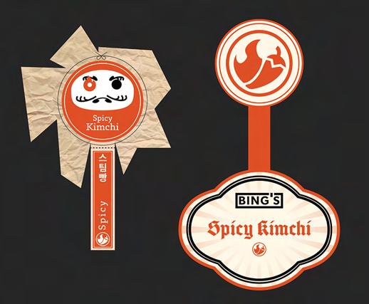
The original branding for Bing’s demonstrated their friendliness and attitude showing the fusion of cultures. Yet this branding only extended to in store stickers and the physical location.
As previously mentioned the actual food and product packaging itself were bare, blanks ordered from a restaurant supply store online.
There were no labels or graphics to communicate Bing’s branding. Similarly, the kimchi jar was also unbranded, using only a simple red sticker to indicate the level of spice. In researching and deciding to work with Bing’s Bao Buns, we saw a great need and opportunity to help the business improve its unique value proposition and positioning through its packaging and branding.
Figure 10: Current Packaging
There was great room for improvement. Since the small business relying on friends and acquaintances to do the design work. So across all their media the brand required consolidation — from color, to multiple logos, and mascots.
The original brand mark was abstractly modeled after the beloved owner’s cat “Stir-fry”, very aptly named. Further, the brand color across their website included — seemingly unrelated brand colors of green blue red white black etc. — not furthering the message behind Bing’s actually further confusing it. The former brand had a generalized Asian association with colors (Red, Black, green, white and more) and disparate branded images that clouded the message — with few relatable brand elements to lead back to the Korean-American fusion which the brand is founded on focusing on their slogan locally foreign.
By interviewing the owners on the values and history behind their business and brand, we were able to identify key elements of the brand to develop. Identifying key aspects such as the hand-crafted nature, and asian fusion, helped us develop and consolidate the brand.
Figure 11: Bing’s Bao Buns Physical Location
Throughout the process we contacted the owners on a frequent basis to get updates and feedback.
brand exploration
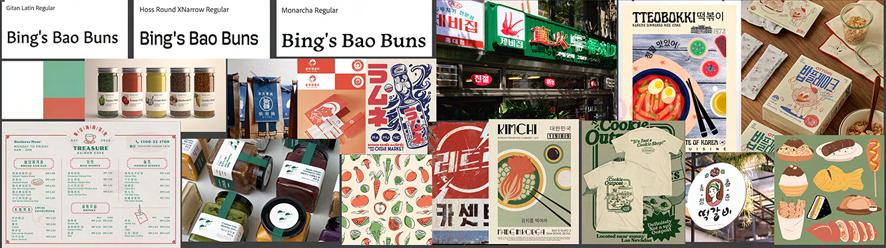
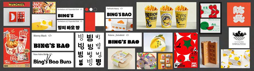
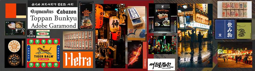
After identifying and discussing these key values we went through various stages of brand exploration. Eventually narrowing from moodboards with feedback from clients identifying their likes and dislikes. We went through further rounds narrowing 9 to 3 ideas each taking the brand in different directions — the final direction one we are calling “night market”, we believe best communicates the brand’s essence in a new and evolved version.
Figure 12: Initial Moodboard
Figure 13: Exploration Rounds
iterations
We then went through rounds of design which we validated by using customer feedback surveys, which we shared iterations and revisions of the product, which in turn helped us find places we needed to pivot. We were able to identify unconsidered aspects of the branding to further distill the design style and reach untapped areas key to brand recognition, mainly the friendliness of the brand.
As we got deeper into the product development stage, we had to make sure we maintained open communication with all departments of our team, especially concept and execution. With concept we had to create a design
Figure 14: Design Iterations Before Customer Survey
that would be unique in its graphics and structure that worked in harmony to achieve effective design. With execution they kept us on point by working with us to keep the design within the limitation of our press and stations. In doing so we distilled and adopted a more streamlined design to fit the changes in size and application of structure.
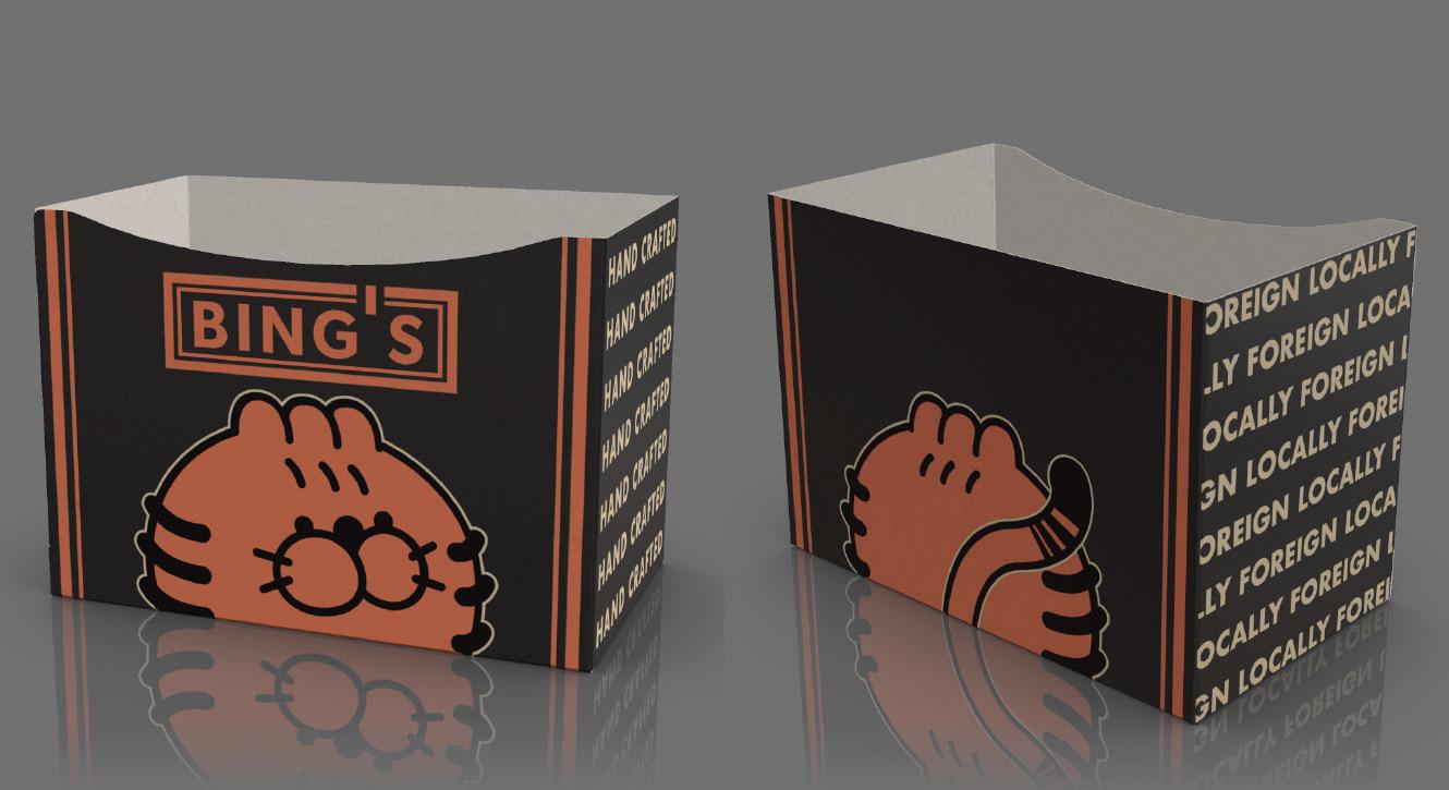
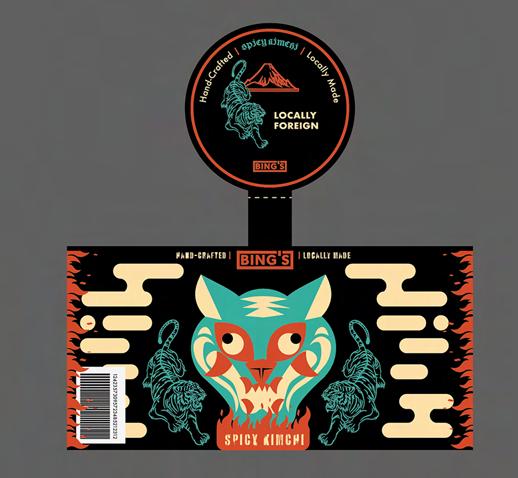
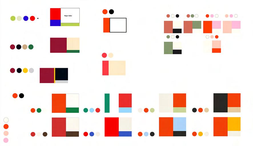
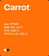
In choosing the final palette for the branded packages we wanted to incorporate elements from brands the owners liked as well as colors that are similar to fast food brands. We wanted to do so without devaluing the hand crafted, high quality and fresh nature of the food Bing’s Bao Buns served. We chose the colors of tan orange and black — Pantone 7401 C (tan), Pantone 1501 C (orange), and Process Black. Tan (similar to the hunger from yellow) and orange to create that hunger and black to maintain the elegance and quality of the handcrafted food. Further the orange uses a striking hue and saturation to help the brand further differentiate itself as the color combination is uncommon to most restaurants, as generally businesses in the area.
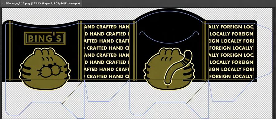
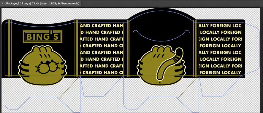
To make sure the colors that we were using were accessible in their contrast, we also made sure to test the colors for contrast for the 2 most common types of color blindness using the Photoshop digital Protonopia and Deuteronopia proofs.
Figure 15: Palette Iterations
Further to distinguish the brand as unique, we included certain brand type and imagery to further illustrate the distinct qualities of the brand. We worked with, de-generalizing the brand, evolving existing mascot characters and further refining the word-mark of the logo. The brand which we learned from customer feedback and our own research was confused as to what the ethnic origin of the business was trying to illustrate — in the development we created a variety of solutions to differentiate the unique qualities of the brand, now through ethnic origin. This was done via the inclusion of color, Korean language text: Hangul, and the refinement of the mascot and word-mark.
Figure 16: Colorblindness Testing
This writing was researched to make sure the actual characters were meaningful and correct. The phrase here “maekomhada” is used to describe food with a spicy kick, as a generally positive descriptive verb, to indicate the spice level is not boring.
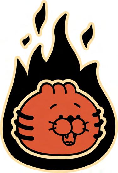
Originally the mascot was a more geometric and abstract caricaturization of the family cat. In this challenge we chose to develop into a friendly tiger character, both maintaining the friendly recognizability, yet narrowing the distinction and regionality of the brand. Further in the new iteration of the word mark, what seems like a simple addition of stroke and a cleaner typeface, is actually hearkening back to the old restaurant style menu of east Asian cuisine. Using the Korean written type language as a background element on the pressure sensitive label for the kimchi jar, we moved the message to insinuate the Korean background. The aforementioned “locally foreign” slogan was added to with “hand-crafted” to help further the sense of quality and small business aspect of the Bing’s Brand.
Figure 17: Maekomhada Element
Figure 18: Character Evolution
design elements
Execution
sustainability efforts and food safety
Sustainability was one of our focuses when creating our project. We considered a few different substrates such as paperboard, compostable materials, and plastic. Due to our design, plastic was not as easily feasible because it is not as easily malleable and able to be die-cut within the our facility. Furthermore, plastic containers are often not recyclable unless they have been properly cleaned out and dried. The U.S. Environmental Protection Agency states that plastic has only a nine-percent recycling rate as opposed to the sixty-eight percent recycling rate of paper. Thus, we decided to consider paper as our primary option as it can be recycled at a higher rate and composted which makes it the more sustainable option. However, Mike di Milo, a recycling expert, stated that composting sites generally do not want to process packaging/paper with the exception of food-soiled paper such as coffee filters, tea bags, or any other material that is primarily covered with liquids or food grease; paperboard is preferred more to be recycled rather than composting. Because of this, we decided to consider the recyclability of paperboard. Through research, we found that the vast majority of paper and cardboard is recyclable as long as it is not lined with a plastic film, coated with wax, or covered in embellishments. C1S paper (coated on-side) like the one used in our press runs are safe for direct contact with food and recyclable (“C1S packaging papers,” UPM Communication Papers).
Additionally, we were concerned about the use of glue in our design pieces as the designs ended up including minimal glue to aid in the structural integrity of the pieces. According to di Milo, glue on food packaging that is recycled has not been an issue. Furthermore, considering the type of glue was an important element. There are a number of food-safe glue options as certified by the FDA such as hot melt, hide glue, liquid-base glue, epoxies and silicone adhesives. Epoxies and silicone adhesives are common and can be found at hardware stores, but it is important to make sure it is a certified product.
Since the printed elements are on the outside of the design, there is not any direct food contact, however, there may be some indirect food contact. Therefore, food safety in regards to ink was also an important factor. The
flexographic ink that we used is water-based; water-based inks are food-safe, odor-free and nontoxic. According to Amgraph Packaging, once water-based inks dry, they are solvent-free thus producing no danger of solvent migration or leeching. Additionally, Bing’s Bao Buns intends to have a wax paper barrier which minimizes the chances of indirect food contact between the bao buns and the ink for the single bao bun packaging and the wraparound. Furthermore, the kimchi jar labels have no foreseen contact with the food as the label is applied on the outside of the jar.
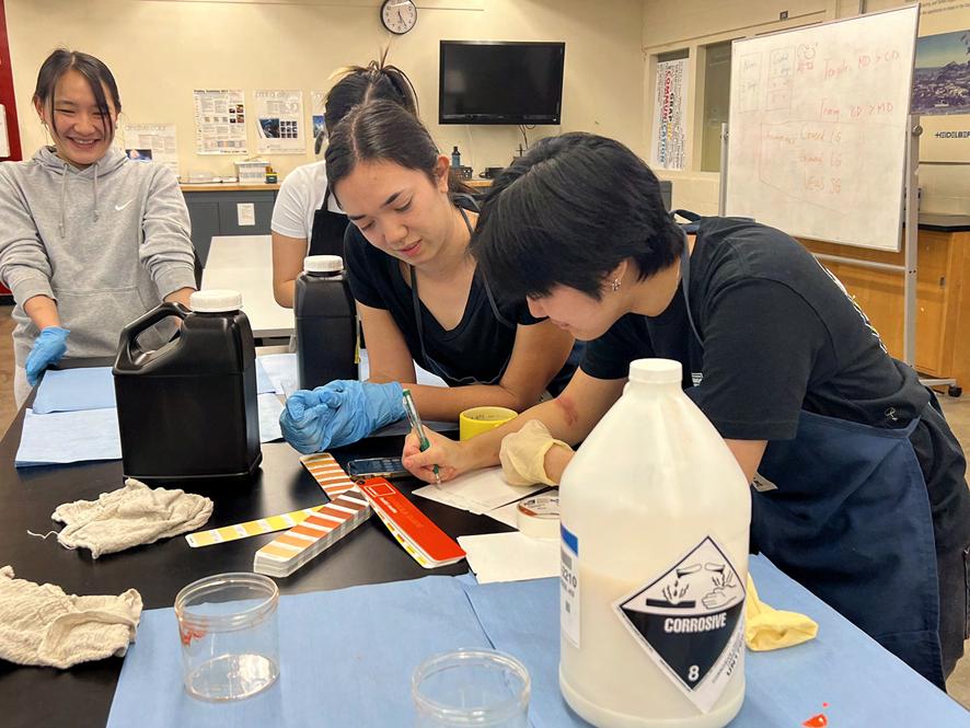
mixing our own inks
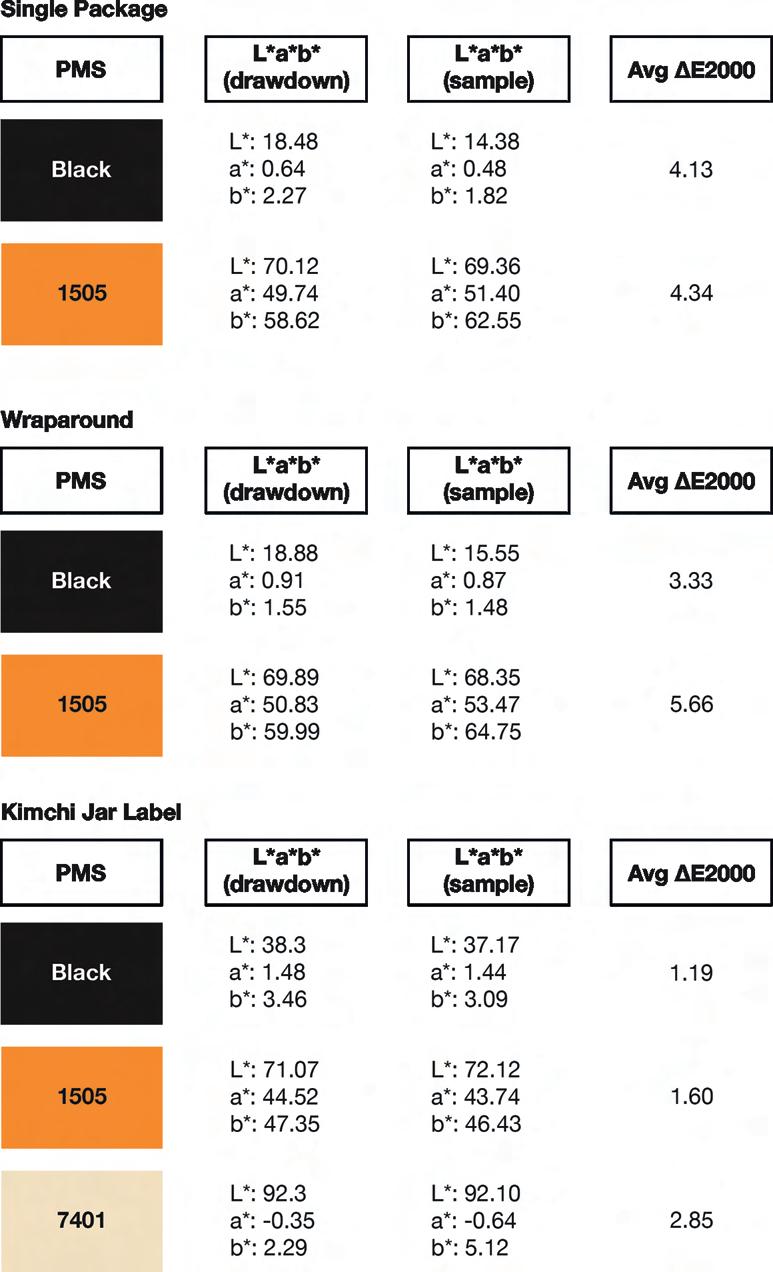
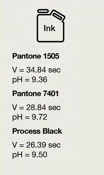
Due to some supply chain issues, our team was not able to obtain the specific spot color inks we wanted. Due to this, we ordered Pantone base colors and mixed the inks ourselves using the ratios found in the Pantone Matching System books. The inks we used in the design were Pantone 1505, Pantone 7401, Pantone Black, and a gloss UV varnish. The two inks that had to be mixed were Pantone 1505 and Pantone 7401. In order to mix these inks, we used Pantone Orange 021, Transparent White, Yellow, and Red 032. According to the PMS book, the mixing ratio for Pantone 1505 was fifty-percent Orange 021 and fifty-percent Transparent White. Using this ratio, we mixed six pounds of the ink by measuring out three pounds each of the Orange 021 and Transparent White. For both inks, we weighed the exact amount meaning our percent error was 0%.
We had more difficulty mixing the Pantone 7401 color; the ratios for this color were a little more specific. Pantone 7401 required 1.04% of the Yellow, 0.36% of the Red 032, and 98.60% of the Transparent White. We calculated the necessary weight for these inks to create three pounds of ink—the respective measurements equaling 0.0312 lb, 0.0108 lb, and 2.958 lb. However, the scale we were using only measures to the thousandth place, so anything past the third decimal place (namely, the Red 032) became difficult to measure accurately and precisely. Additionally, the Red 032 posed a challenge to use because of its potency. Since the Transparent White makes up a majority of the Pantone 7401 color, we had to be very careful with measuring out the Red 032. Because of this, we had to remix our ink a few times as well as use a pipette to carefully add in the Red 032 in tiny drops to ensure our ink ratio would not be inaccurate.
Figure 19: Mixing and Measuring Inks
prepress
When creating the designs, we ensured that the stroke width and type size were within FIRST specifications to allow for smooth press runs. We limited our frequent usage of thin lines to improve registration during our press runs and made the stroke widths larger to ensure they were compliant with FIRST specifications. Additionally, we made sure to compare our small type with the specifications to ensure our printed pieces would produce well.
For our prepress procedures, we decided to impose the kimchi jar labels two-up in order to maximize the area of the plate and reduce waste. For our single bao bun packaging, we could only impose them one-up. Due to the limitations of our in-house Mark Andy flexographic press being a narrow-web press with only seven inches maximum of plate width, we had to split our wraparound design in half in order to accommodate our design. Because of this, each bao bun carrier piece requires two printed pieces to be combined together with minimal glue. We also made sure the design files included trapping to help with registration and avoid unwanted gaps between colors.
Figure 20: Draw-downs
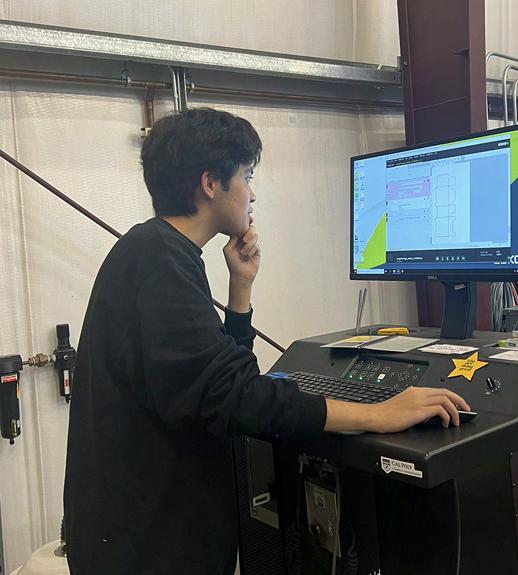
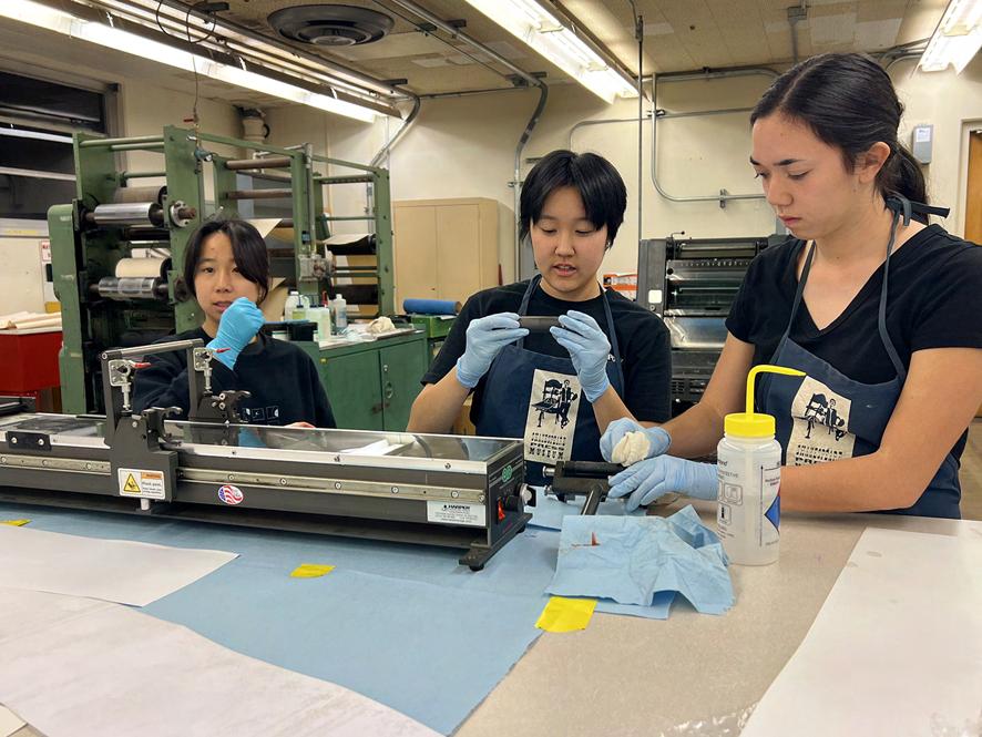
When setting up our plate files, we made sure to integrate i-cut registration marks (eye marks) as the Mark Andy press does not have custom dies to produce the finished pieces of our design. Thus, we had to set up the plates so that we could utilize the Esko Kongsberg to diecut our finished printed pieces.
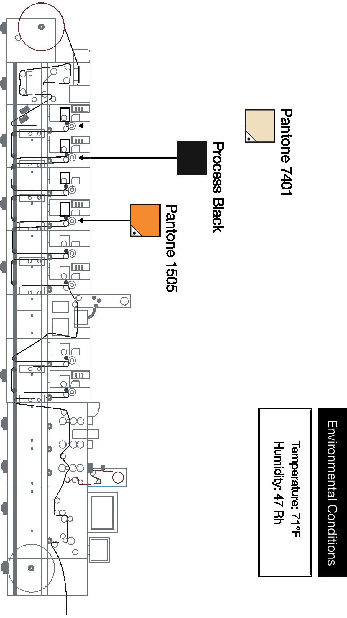
At the time of our project, the Esko CDI Spark plate imager was removed from our lab. As a result, our files were sent to the Multi-Color Corporation in San Luis Obispo to create our plates. Once we received our plates, our team mounted the plates onto the cylinders. We decided to experiment with different mounting tape for our press run. For the Process Black, we decided to use the 447 double liner silver-backing tape that is better for more solid printing as the black tended to cover larger areas of the design. For the Pantone 1505 and 7401, we used the standard combination printing mounting tape that is suitable for a blend of solid and detail printing. In total, we had three plates per press run: Process Black, Pantone 1505, and Pantone 7401.
Figure 21: Reviewing Prototypes
With the help of Nick Cooper, a lecturer in the Graphic Communication department and an expert on the Mark Andy flexographic press, we took production efficiency into consideration. Since all of our designs utilized the same color, we eliminated ink changes between press runs as we kept the same ink stations. Instead, we only had to change the plates and substrate for each press run.
press limitations and issues
During the three press runs, we encountered a few challenges including printing quality and substrate size. For our first press run, we printed the kimchi jar labels. We decided to use a white, matte label stock we found in the basement of our press lab. However, we neglected to measure the width of the substrate. Due to press limitations, we are only able to print on up to 7 inch substrate, however, the substrate we had chosen was wider than our given parameter. Thus, we were forced to make last minute changes to the substrate and retrieve an uncoated stock that was available in storage. Since our replacement stock was not as intended, the colors did not come out as bright and saturated as it would have on our previously chosen substrate.
Another issue we encountered during this press run was our substrate getting stuck on the sticky back tape of the plate cylinder. Because our plates were maxed out, registration of the substrate to the plate was difficult as it gave way to very little wiggle room. Due to this, any drastic changes in registration caused the substrate to make contact with the sticky back and eventually, the substrate rolled itself around the plate cylinder itself and rendered one of our color stations unable to use. In this process, we had to move printing to one of the other color stations which put a hold on our process. We adapted from this issue and began cutting off the excess sticky back from the plate cylinder for subsequent press runs to ensure this problem did not occur again.
In our wraparound print, there was some mottling that occurred in the solid black areas. Although we used the same inks between the single bao bun packaging and the wraparound, because the wraparound used a slightly thicker substrate which may have affected the print quality. Additionally, as the press runs went on, the ink was left in the ink trays on the press for an
extended amount of time which may have affected the quality. We tried to adjust with changes in pressure and impression as best we could.
quality control report
production specifications
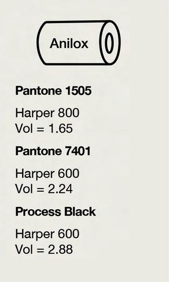
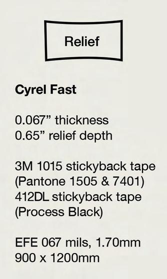
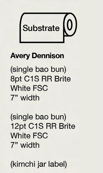
Figure 22: Anilox, Ink, Relief, and Substrate Specifications
on production specifications
We utilized three different types of substrates for our printed pieces. The substrates for the single bao bun packaging and the wraparound are essentially the same, aside from the point thickness. The wraparound is a thicker substrate to help with the structural integrity of the piece as it is designed to hold three of the single bao bun packaging, each with individual bao buns inside. We chose the label stock because we liked the appearance of the stock as it provides a more high-end appearance. Additionally, as kimchi is a refrigerated food, the jar and label will most likely face condensation; the linen finish increases resistance to tearing and shriveling in moist environments.
The anilox rolls we chose gave us the densities we needed based on the drawdowns based on the limited number we had in our inventory. While mounting our plates onto the cylinders, we decided to use two different types of mounting tapes to produce the ideal result. We used 412DL stickyback tape for the process black plates which is more suitable for solid printing. For our Pantone 1505 and 7401 plates, we used the 1015 stickyback tape which is better for combination printing and can better suit a mixture of solid and detailed printing.
Teamwork & Leadership
The team this year was formatted differently than previous years with each lead having a shadow, increasing the typical team size from six to eleven students. The aim of this was to provide more opportunities for students to learn more about flexographic printing and to gain hands-on experience with working with a real client. This was also to help with the workload of the team leads.
Due to the size of the team, there were scheduling difficulties, leading to the team meeting twice a week. There were general team meetings in person and remote Zoom meetings for those who could not make it to the general meetings every week for two hours each. Both were held by the team lead and meeting notes were taken to be reviewed.
All the files relating to the team were kept in a shared team Google Drive folder, with each team having their own folder within the drive too. The meet-
ing notes were accessible in drive as well as quarterly timelines. The timelines were created for each of the teams and shadows (graphics, research, execution, and concept) to keep them on schedule and to know assigned work for each week.
The main method of communication for the team was Slack and the main method of communication with the client was over text and email.
Industry Experts
eric greenberg j.d.
Lecturer, Industrial Technology and Packaging at the Orfalea College of Business, FDA Experience
irene carbonelle m.a.
Lecturer, Industrial Technology and Packaging at the Orfalea College of Business, Industry Experience
lorraine donegan m.a.
GrC Professor, Professional Designer
donna templeton ph.d.
GrC Professor, Professional Designer
javier de la fuente ph.d.
Chair of Industrial Technology and Packaging at the Orfalea College of Business, Industry Experience
Citations and Sources
Asian Cuisine Market Growth by Region, Application, Top Companies, Driver, Trends & Forecasts to 2030. (2023, November 27). www.digitaljournal.com. https://www.digitaljournal.com/ pr/news/prwirecenter/asian-cuisine-market-growth-by-region-application-top-companiesdriver-trends-forecasts-to-2030#google_vignette
Beaton, K. (2023, June 9). Analysis: Asian Food Winning Over America. The Food Institute. https:// foodinstitute.com/focus/analysis-asian-food-winning-over-america/#:~:text=New
Beth. (2017, December 1). Water-based inks meet FDA standards and advance sustainability. AMGRAPH Packaging, Inc. https://www.amgraph.com/water-based-inks-meet-fda-standardsand-advance-sustainability/
Bradley, J. (2022, March 14). Are Restaurants Legally Required To Provide Food Allergy Warnings? Verywell Health. https://www.verywellhealth.com/do-restaurants-have-to-provide-food-allergy-warnings-1324482
Budiman, A., & Ruiz, N. G. (2021, April 9). Asian Americans are the fastest-growing racial or ethnic group in the U.S. Pew Research Center. https://www.pewresearch.org/short-reads/2021/04/09/ asian-americans-are-the-fastest-growing-racial-or-ethnic-group-in-the-u-s/#:~:text=Asian%20 Americans%20are%20the%20fastest
Buzzfile (2024). Bing’s Bao Buns. https://www.buzzfile.com/business/Bing’s-Bao-Buns,-LLC-609-744-3321
California’s Population. (2024, January). Public Policy Institute of California. https://www.ppic. org/publication/californias-population/#:~:text=No%20race%20or%20ethnic%20group
CompanyBox. (2021, June 22). Water-based ink: Why is it a game changer? https://companybox. com/blog/water-based-ink-why-is-it-a-game-changer/#:~:text=Water%2Dbased%20inks%20 are%20food,needed%20to%20prevent%20ink%20contamination
CFR — Code of Federal Regulations Title 21. (2024). Www.accessdata.fda.gov. https://www. accessdata.fda.gov/scripts/cdrh/cfdocs/cfcfr/CFRSearch.cfm?CFRPart=101&showFR=1
Demographics | San Luis Obispo Chamber of Commerce. (2014). San Luis Obispo Chamber of Commerce. https://slochamber.org/supporting-business/data-center/demographics/
Despite Rising Prices. (2023, April 24). new data reveals consumers increasingly choose products in sustainable packaging globally, despite rising prices. www.prnewswire.com.
Dillon, M. (2022, July 8). Sustainable Packaging Statistics: Why Eco-Friendly Packaging Matters. Meyers. https://meyers.com/meyers-blog/sustainable-brand-packaging-statistics-why-eco-friendly-packaging-matters/
Engelhardt, C. (2023, February 2). The 411 On Generational Eating Habits. Mad Mobile. https:// madmobile.com/blog/generational-eating-habits/
Food Trends 2023. (2023, March 30). Extension.psu.edu. https://extension.psu.edu/foodtrends-2023
From Matcha to Sriracha: Asian Flavor Trends from the World’s Leading Expert in Eastern Food & Beverage Flavors. (2022, February 28). Food. https://www.foodnavigator-usa.com/News/ Promotional-Features/From-Matcha-to-Sriracha-Asian-Flavor-Trends-from-the-World-s-Leading-Expert-in-Eastern-Food-Beverage-Flavors
Grabarkiewicz,Chris. (2023, December 13). Understanding Gen Z’s Unique Food Preferences . The Food Institute. https://foodinstitute.com/focus/understanding-gen-xs-unique-food-preferences/#:~:text=In%20contrast%2C%20Gen%20Z%20has,part%20to%20changing%20USA%20 demographics.
Gerrit Wunsch, N. (2023, May 24). Food cuisine preferences of consumers in the United States (U.S.) in 2022, by age. Statista. https://www-statista-com.calpoly.idm.oclc.org/statistics/1413483/ food-cuisine-preferences-of-consumers-in-the-united-states-by-age/
Gosselin, S. (2024, February 23). What exactly is a food-safe adhesive?. LD Davis Glues & Gelatins. https://blog.lddavis.com/what-exactly-is-a-food-safe-adhesive
IWMA. (2024, January 12). Recycling guide. San Luis Obispo County Integrated Waste Management Authority. https://www.iwma.com/recycling-guide
Lau, A. (2022, February 21). Food grade ink: All you need to know - michael package blog. Michael Package. https://www.michaelpackage.com/post/food-grade-ink-all-you-need-toknow
Martin, M. (2022, April 7). San Luis Obispo can’t get enough of Bing’s Bao Buns. New Times San Luis Obispo. https://www.newtimesslo.com/food/san-luis-obispo-cant-get-enough-of-Bing’sbao-buns-12351140
Percentage of Asian Population in California by City | Page 5 | Zip Atlas. (2024). Zipatlas.com. https://zipatlas.com/us/ca/city-comparison/percentage-asian-population.5.htm
San Luis Obispo, California Population 2022 (Demographics, Maps, Graphs). (2024). Worldpopulationreview.com. https://worldpopulationreview.com/us-cities/san-luis-obispo-ca-population
Scarsdale. (n.d.). Paper & Cardboard: What can (and cannot) be recycled. Scarsdale. https:// www.scarsdale.com/DocumentCenter/View/4016/CAC-Sustainability-Articles---Recycling-PartII-Paper-and-Cardboard---Dec-2018
Shah, A. (2016, April 2). Exploring The Richness Of Popular Cuisines Around The World. The Picky Eater. https://pickyeaterblog.com/popular-cuisines-around-the-world/
Shah, S., & Widjaya, R. (2023, May 23). 71% of Asian restaurants in the U.S. serve Chinese, Japanese or Thai food. Pew Research Center. https://www.pewresearch.org/short-reads/2023/05/23/71of-asian-restaurants-in-the-u-s-serve-chinese-japanese-or-thai-food/
The Q & A. (2024). Bing’s Bao Buns. https://www.Bing’sbaobuns.com/faq.html
Top Trends of 2023. (2024, January 7). Glimpse. https://meetglimpse.com/trend/bao-bun/
White, L. (2022, April 1). Asian Segment Shows Few Boundaries. Foodservice Equipment & Supplies. https://fesmag.com/topics/trends/20194-asian-segment-shows-few-boundaries
Why Asian Food So Popular? (2023, May 4). www.linkedin.com. https://www.linkedin.com/pulse/ why-asian-food-so-popular-qasim-bilal/
Wiklund , J. (2020, July 27). Gen Z’s influential food preferences . The Food Institute. https:// foodinstitute.com/focus/gen-z-preferences/
World Population Review. (2021). California Population 2020 (Demographics, Maps, Graphs). Worldpopulationreview.com. https://worldpopulationreview.com/states/california-population
Yam, K. (2023, May 15). How kids of immigrants made Asian food the most popular cuisines on social media. NBC News. https://www.nbcnews.com/news/asian-america/kids-immigrantsmade-asian-food-popular-cuisines-social-media-rcna82006
6 Ways Millennials Are Wasting Money in 2023. (2023, April 19). Yahoo Finance. finance.yahoo. com https://finance.yahoo.com/news/6-ways-millennials-wasting-money-110052874.html
2022 Food and Health Survey (2022). International Food Information Council. foodinsight.org/ chrome-extension://efaidnbmnnnibpcajpcglclefindmkaj/https://foodinsight.org/wp-content/ uploads/2022/06/IFIC-2022-Food-and-Health-Survey-Report-May-2022.pdf
ABOUT THE AUTHOR
jasmine lee
Jasmine Lee is a Graphic Communication major with a concentration in UX/UI at California Polytechnic State University, San Luis Obispo. She was team lead for the 2023-2024 Phoenix Challenge club at Cal Poly. Phoenix Challenge is a national design competition, helping small businesses redesign and market their brand through sustainable packaging. Jasmine has been a part of the team for two years, starting as the team shadow. Being part of the challenge has helped her explore her interests in packaging design and project management. Jasmine led her team to win first place in the 2024 National Design Competition with their redesign of Bing’s Baos Buns.
2
Art by Andrew Kidd, Oscar Cervarich, Bhavi Dillon, and Reilly Yuen
CREATING A REUSABLE BAG SERVICE FOR INSTACART
Marissa Hageman
Abstract
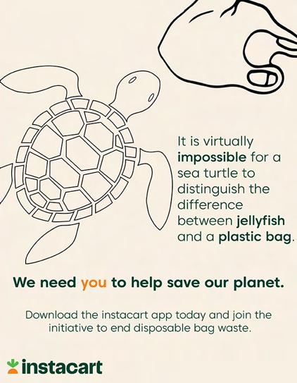
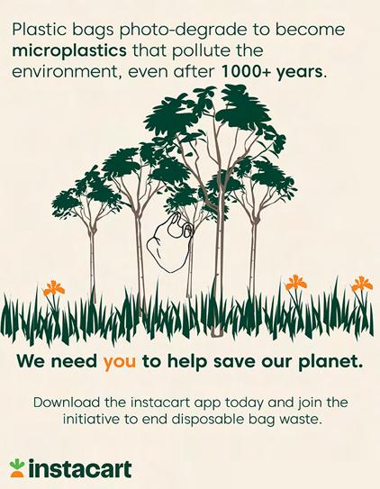
My senior project is focused on sustainability, specifically in the sector of plastic waste. It looks into an existing brand and program, Instacart, and explores ways to increase Instacart’s sustainable efforts which can, in turn, change how grocery stores and other delivery services run their operations. For this project, a new service for Instacart is created where they can reduce, and hopefully eliminate, their contribution to excess plastic waste within the grocery industry and in our planet.
Problem Statement and Objective
Instacart, a grocery delivery service, currently delivers groceries to customers using store provided bags, which are typically made of plastic or paper. There is a hidden “option” to have no bags be used, however this must be specified
in the comment section between the customer and Instacart shopper, as it is not a feature in the app, making it easy to be overlooked, forgotten about, or be unknown to customers. This can be a hassle for the Instacart shopper as they must either bring their own bags to temporarily store groceries, which they then must unload where the customer designates, or they must carry each item individually. Customers who use Instacart may own reusable bags for when they choose to shop in person; however, when using Instacart they receive paper or plastic bags, which they may not know what to do with. This makes their reusable bags useless and increases use and waste of disposable bags. Given these issues, there is an opportunity to create a service that allows for Instacart to use reusable bags. By using bags that can be reused not only is waste is limited, but the extra work that Instacart shoppers put in when customers opt in to use no bags is eliminated.
The Process
To begin, I needed to plan how my project would look. Since Instacart is a set brand, they already have branding guidelines. I did not have too much creative freedom with the design, but I was able to go off what Instacart already had set. This included logos, colors, and a typeface family.
brand guidelines
making app mockups
To create mockups for the app, I was able to take screenshots of the screens on the existing app and use applications, such as Illustrator and Photoshop, to include my added features. This process helped me to illustrate how the features I wanted to add would look in the interface that Instacart already uses.
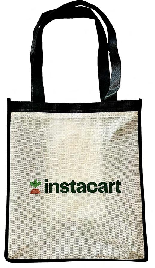
making the bag
Using Instacart’s branding guidelines, I was able to design how I wanted the bag to look using Adobe Illustrator. Since the bag was not created for marketability, there is a simple design to clearly show the brand name. Once the design was ready, I uploaded it to a website called Snapfish where I was able to choose a product, in this case a reusable grocery bag, input my design, and order it.
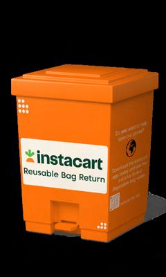
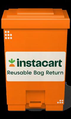
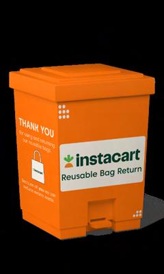
making return station mockups
To make the mockups of the return stations, I first had to search for mockups online. Once I found one that I liked, I designed the different faces and sides of the station on Adobe Illustrator. I used Instacart’s branding guidelines to base the stations, and included some eye-catching information to entice shoppers and spread the word of the service.
The Results
After completing the planning, sticking to my timeline, and completing my processes, I had the four deliverables I had set out to create in the beginning. The results of this project are the breakdown presentation of the service, the physical bag, return station mockups, and some marketing material.
The Breakdown
instacart reusable bag service
A breakdown of how the service would look and work:
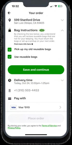
Step One: Placing the Order
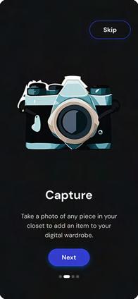
• The customer selects a store, adds their items to cart, and then proceeds to the checkout
• Before placing the order the customer inputs delivery informations
• This includes their address, phone number, payment information, delivery instructions and time, and the new bag instructions
• Under the “Bag Instructions tab,” the customer can check a box that they would like reusable bags to be used
• They can also check a box indicating that they have old reusable bags, from a previous order, and would like for them to be picked up during this order
• The order is then placed
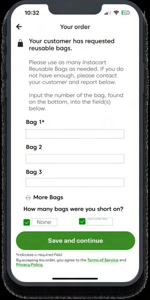
Step Two: The Shopper is Notified
• When the Instacart Shopper accepts an order, they will receive a notification that they are to use reusable bags
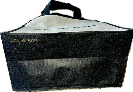
• To track the bags, the shopper will input the bag number, located on the bottom of the bag, into the app
• If they do not have enough reusable bags in their possession, they must indicate how many they were short on and let their customer know
• They will then take the bagged groceries to the customer’s address
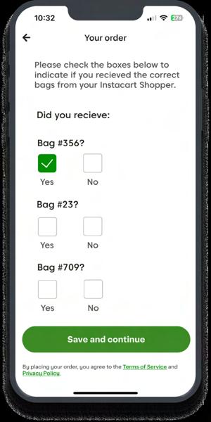
Step Three: Customer Receives the Order
• The customer receives their order in the reusable bags from the shopper as indicated
• Once the shopper indicates on the app that they have dropped off the order, the customer is brought to a screen to verify the bags
• The screen shows the numbers from the bags that the shopper inputted
• The customer then checks the box yes, that they received the bag(s), or no that the bag(s) indicated were not received
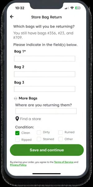
Step Four: The Bags are Returned
• When the order is complete, the customer will have to return the reusable bags from the order
• This can be done when placing a new order, by checking the box that they want old bags to be picked up
• The shopper for the order will either pickup the bags off the porch of the address if contactless drop-off is selected, or from the customer if there is a face-to-face interaction
• If the customer wants to return the bags without placing an order, they
must select the feature in the app where they will indicate what bags they are returning, to where, and the condition of them
Frequently Asked Questions
How does the Instacart Shopper get the bags for the orders?
Upon signing up to be an Instacart Shopper, or by already being one when the service is implemented, each person will receive 5 Instacart reusable bags. If a shopper wants more, they can be requested through the app. Once they use their bags for an order, they can be replenished by picking up old ones during an order, or contacting Instacart support.
How will customers, and potential ones, be incentivized to use the service?
At this point, there are no incentives yet. In order to put these in place, we would have to be in contact with Instacart, determine their budget, and see how they want to proceed. However, some ideas are a certain amount or percentage off for using reusable bags, or a point system where using reusable bags earns points, and points can be used to get free items or discounts on future orders.
Where will the bags be returned?
Return stations will be located in grocery stores for customers to place bags in. This is the alternative to having an Instacart shopper pick them up on a future order.
How
will
the bags be tracked?
Currently, a system is in place to have each bag assigned a number. This number will be inputted into the app, by the Instacart shopper, to let Instacart and the customer know which bag will be used. The customer will then verify this number in the app once receiving the order. The number will be noted when the bag is returned so its availability is known and it can be let back into the cycle.
How will the bags maintain good condition and/or be washed?
Unfortunately, the logistics of this have not been worked out. Originally, the idea was for each bag to be washed after each use, but this may not be
feasible. Water consumption can negatively contribute to sustainability, so Instacart would need to research a way to wash the bags sustainably. At the moment, the condition of the bags is noted when returned so bags can be reused without wash if in proper condition.
Flow of the Service
instacart shoppers are provided with branded reusable bags
the customer receives their order in reusable bags and verifies that they got the correct bags
the customer returns the bags by selecting a pickup option on a future order, or by going to a return station instore
the customer places an order and selects that they want reusable bags to be used
the shopper is notified to use reusable bags and they record the number(s) of bag(s) used
instacart shoppers are provided with branded reusable bags
Results from an Anonymous Survey
92.3% found the deliverables to be aesthetically pleasing, given the guidelines
100% found the deliverables to be coherent with Instacart’s branding guidelines
46.2% had never used Instacart or any other grocery delivery service but...
76.5% rated that they would be “very likely” to use this service if they were getting their groceries delivered
Visuals
mockups
the bag
return station mockups
Citations
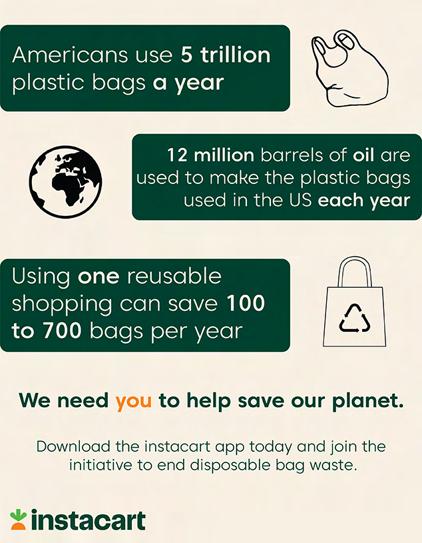
10 facts about single-use plastic bags. 10 Facts About Single-use Plastic Bags. (n.d.). https:// www.biologicaldiversity.org/programs/population_and_sustainability/sustainability/plastic_bag_facts.html
F, J. (2022, June 21). 8 reasons you should use reusable grocery bags. Tote Bag Factory. https:// totebagfactory.com/blogs/news/8-reasons-you-should-use-reusable-grocery-bags
How many plastic bags are saved by using one reusable bag?. Factory Direct Promos. (2019, April 30). https://www.factorydirectpromos.com/blog/how-many-plastic-bags-are-saved-byusing-one-reusable-bag/#:~:text=You%20can%20have%20a%20big,to%20700%20bags%20 per%20year.
Marissa Hageman is a 2024 graduate of California Polytechnic State University, San Luis Obispo. With a degree in Graphic Communication, and a concentration in Graphics for Packaging, she became interested in all that the industry has to offer — specifically, sustainability. Using her own life experiences and knowledge from her degree, Marissa was drawn to create a solution for one of the many problems we face when it comes to plastic. She hopes to continue to use all she has learned for future careers and endeavors.
3
Art by Elisha Lee and Kevin Manni
RENTBUDDY
Anais Gomez
Abstract
How might we create an easy-to-access mobile application that provides a reliable and trustworthy platform for Cal Poly students to find potential roommates and off-campus housing? This project introduces RentBuddy, a digital solution to the off-campus housing crisis in San Luis Obispo County. The following pages will explore the reasons why Cal Poly students experience housing insecurity and how a mobile application like RentBuddy can greatly improve the lives and safety of Cal Poly students.
Problem Statement
Finding housing and roommates remains one of the number one issues for Cal Poly students in San Luis Obispo. Instead of prolonging this issue, there is an opportunity to act now and remove the barriers that make the housing search process difficult and stressful. There are few online resources available to students that highlight reliable and available housing, leaving students to scour the internet for untrustworthy sellers and outdated/inaccurate reviews. Finding roommates is also painstakingly difficult when the only options to find roommates are through social media platforms like Facebook, which are highly susceptible to scams, or through on-campus events, which can
be difficult for introverted students navigating college life for the first time. Creating a mobile application that aims to improve the Cal Poly housing crisis can ensure all Cal Poly students have the resources and opportunities to find housing and roommates in San Luis Obispo safely and effortlessly.
Background Research
unimate — a ux/ui case study on college housing UniMate is a mobile application that also aims to streamline the housing and roommate search process for college students. It is merely a student project, but it includes several features that I find useful and would like to implement into my own mobile application design, with some changes and improvements. One strength that I found of UniMate is the way it allows its users to personalize their profile and take surveys that will cater the app to their specific needs and preferences. Since personalization is key when it comes to making a good impression on users, I hope to adopt these features into my own design. A weakness that I discovered from this article was that it lacked a social communication feature, or at least failed to display how direct messaging would look like on their interface. The social communication feature was also not included in the nav bar. Having easy access to direct messaging is important, particularly in a roommate finding app that requires you to communicate with potential roommates. I hope to improve on this weakness by implementing a direct messaging feature that is easily accessible to users.
housing insecurity comparative case study analysis
I found this source to be particularly helpful in my research as it allowed me to understand the pain points of college students dealing with housing insecurity and homelessness. By understanding the pain points of the users of my mobile application, I will be able to implement designs that will effectively address these issues and further improve the housing search process. The main purpose of the article was to highlight the recurring themes across different colleges and universities regarding their responses to housing insecurity on their campuses. As well as highlighting the ways in which these schools have failed to support their students, particularly due to their inability to admit that a housing crisis even exists and listen to the issues of their students. This is a weakness I hope to address in my own project by making each user feel
like their concerns have been heard. Designing with empathy and listening to the pain points of users is something that I hope to prioritize in my project. A strength that I found from this source is its use of a survey to evaluate the impact of homelessness and housing insecurity on college students. This survey allows colleges and universities to collect data about these issues and identify areas of improvement. I hope to implement surveys into my mobile application design, possibly in the on-boarding screen of the app. This will ensure that the app is catered specifically to each user’s needs.
user research survey
My first task was to design an anonymous survey aimed towards finding the pain points regarding the search for off campus housing and roommates in San Luis Obispo. I used Google Forms to create my survey. To narrow down pain points according to housing and roommates, I divided the survey questions in two categories. I asked questions such as what platforms do students currently use, what criteria is used to select roommates and housing, and what features would be helpful in a mobile application. Most respondents found the housing and roommate search difficult and believed a mobile application would be helpful.
Number of Respondents
housing search difficulty for cal poly students 1234567 1 = Very Difficult 7 = Very Easy
roommate search difficulty for
Number of Respondents
1 = Very Difficult
7 = Very Easy
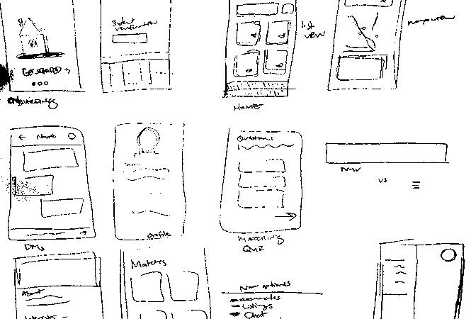
solution sketches
I spent 20 minutes sketching different screens and features that I would like to include in the mobile application. To illustrate the user journey, I sketched each screen from log in to log out.
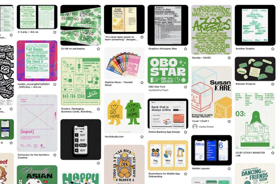
Branding moodboard
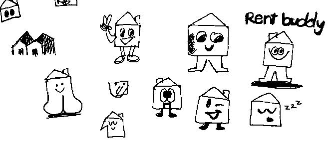
This is a screenshot of a mood board I created on Pinterest. For the branding, I wanted to create something that was friendly and reminiscent of vintage poster designs. I liked the idea of designing a mascot to fulfill the role of a friend or buddy that would guide users through the app. I also wanted to stick with the color green to match Cal Poly’s school colors.
initial logo designs
final logo designs
For my logo design, I was inspired by 90’s mascots and various character logos. In my initial sketches, I played with the idea of turning a house into a mascot with human features. I wanted the mascot to look friendly and cute. Having a friendly mascot would entice users, develop brand awareness, and trust.
color palette
Although I chose to stick with the color green, I decided to use lighter shades of green that seemed friendlier and more welcoming.
typeface
Aa
Nunito Sans ABCDEFGHIJKLMNOPQRSTUVWXYZ abcdefghijklmnopqrstuvwxyz
1234567890!@#$%^&*()
Nunito Sans was the typeface I selected because it was a sans serif font. Sans serif fonts are perfect for increased readability and legibility. It is also inviting and casual.
Final Prototype
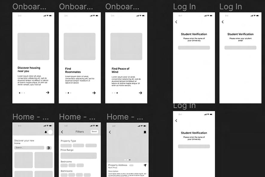
mid-fidelity prototype
After creating user sketches of the user journey I used Figma to prototype mid-fidelity screens. For these screens, I focused on the layout, structure, and organization of each feature. I used placeholder text and images to simulate the final look. I also made sure to use only black, white, and grey in each screen.
california polytechnic state university
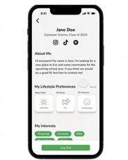
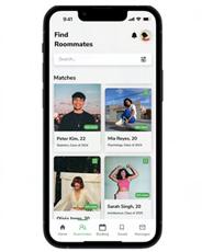
high-fidelity prototype
customizable profile
• Bio
• Lifestyle Preferences
• Social Media Profiles
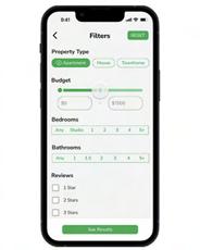
advanced search options
• Reset Button
• Variety of Filtering Options
roommate matching
• Bookmarking
• Compatibility Feature
• Filter Options
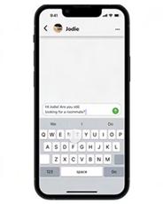
direct messaging
• Simple, Clean UI
• Easy Navigation
• Message Sellers and Roommates
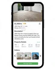
property listings
• Reviews
• Property Details
• Filter Options
Citations
Almeida, Balaji, H., & Tiwari, M. (2022). DORMMATE - A Room-Mate Personality Matching Application. The Institute of Electrical and Electronics Engineers, Inc. (IEEE) Conference Proceedings. https://doi.org
Burke, M. (2022, September 29). How California is responding to dire student housing shortage. EdSource. https://edsource.org
Davis. (2023). Responses of Colleges and Universities on Meeting Homelessness and Housing Insecurity Impacted College Students’ Needs and Its’ Impact on Students’ Academic Success: A Comparative Case Study Analysis. ProQuest Dissertations Publishing.
Interactive, D. (2021, June 23). Unimate — A UX/UI case study of college-housing. Medium. https:// davisdesigninteractive.medium.com
Jones, S. (2002). The internet goes to college how students are living in the future with today’s technology. Distributed by ERIC Clearinghouse.
New Roommate-Matching App Launches Solutions for Renters During COVID-19 Crisis: ROOM8’s new in-app video calling and virtual property tours allow users to find roommates and apartments safely and securely while social distancing. (2020). In PR Newswire. PR Newswire Association LLC.
Pisupati, A. (2023, September 15). Cal Poly’s off-campus housing program partners with EDUrain to ease the hunt for housing. Mustang News. https://mustangnews.net
Sherman, S. (2021, October 12). Enrolled and unhoused: Students struggle to find housing weeks into Fall Quarter. Mustang News. https://mustangnews.net
Smartphone and app usage among college students: using smartphoneseffectively for social and educational needs. (2016). Issues in Information Systems. https://doi.org
Tikoo, Jain, R., Sheth, P., & Dalvi, H. (2022). MyRoomie: A Roommate Finding App. International Journal for Research in Applied Science and Engineering Technology, 10(3), 1937–1943. https:// doi.org
ABOUT THE AUTHOR
anais gomez
Anais Gomez (she/her) is a multidisciplinary designer passionate about designing intuitive, accessible solutions and crafting meaningful experiences that inspire, entertain, and empower diverse communities. In June 2024, she earned her Bachelor’s of Science in Graphic Communication with a concentration in UX/UI from California Polytechnic State University, San Luis Obispo. The mobile application “Rent Buddy” was designed to improve the lives of Cal Poly students affected by the off-campus housing crisis in San Luis Obispo—the paradigm of Anais’ commitment to understanding users’ needs and providing accessible solutions to real-world challenges.
Art by Kaia Salverda, Cloe Webb, and Reilly Yuen
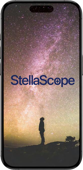
STELLASCOPE
Jake MacConnell, Andrew Herby, Angel Gaytan, Sarah Kelly
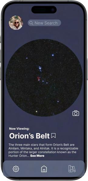
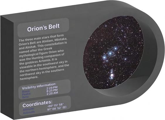
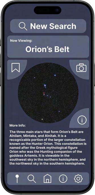
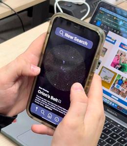
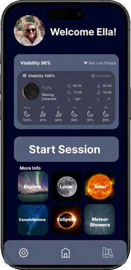
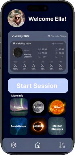
What is Stellascope?
Stellascope envisions a revolutionary astronomy app combining celestial wonders with cutting-edge technology. At the core of our proposal is a userfriendly interface that leverages the power of augmented reality, allowing users to record and explore detailed information about celestial objects through their state-of-the-art viewfinder which hooks up to a telescope. All information can be viewed, recorded, and streamed on the Stellascope mobile app allowing for social networking and community building for all astronomy lovers. This innovative app aims to create an immersive and educational experience, catering to astronomy enthusiasts, educators, and casual stargazers.
Project Overview
Stellascope aims to develop a revolutionary astronomy app that seamlessly merges celestial wonders with cutting-edge technology. The core focus is on creating a user-friendly interface powered by augmented reality, providing users with the ability to record and explore detailed information about celestial objects. The app will integrate with a state-of-the-art viewfinder designed for telescopes, enabling users to enhance their stargazing experiences.
Mission
Stellascope envisions a revolutionary astronomy app combining celestial wonders with cutting-edge technology. Our team at Stellascope aims to create an immersive and educational experience, catering to astronomy enthusiasts, educators, and casual stargazers.
Objectives
user-friendly interface
Design and implement an intuitive and visually appealing interface for the Stellascope mobile app, ensuring ease of use for astronomy enthusiasts, educators, and casual stargazers.
augmented reality integration
Develop a robust augmented reality feature that allows users to superimpose information about celestial objects onto their real-time telescope view through the Stellascope app.
telescope viewfinder compatibility
Design and manufacture a high-quality viewfinder compatible with various telescopes, seamlessly connecting to the Stellascope app for an immersive stargazing experience.
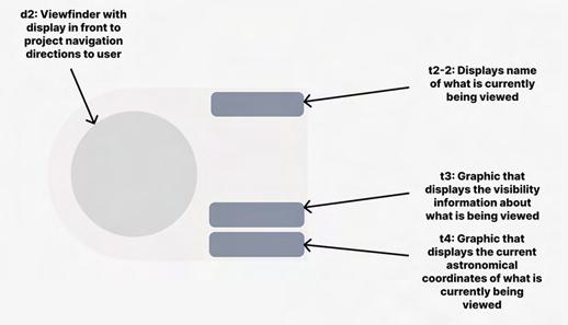
data recording and exploration
Enable users to record, store, and explore detailed information about observed celestial objects, fostering a personalized and educational experience.
social networking and community building
Implement features for social networking within the Stellascope app, facilitating community building among astronomy enthusiasts. Users should be able to share their observations, discoveries, and experiences with the community.
immersive and educational experience
Craft an app that provides an immersive and educational experience for users, catering to the diverse needs of astronomy enthusiasts, educators, and casual stargazers alike.
Design Guidelines
SF Pro
Competitive Landscape
vixen optics astronomical telescopes
The astronomical telescope gathers light effectively to view faint stars. It also allows for magnifying celestial objects. This telescope can view the moon and bright celestial objects using an astronomical telescope.
takahashi optics refractor and reflector optics
This astronomical refractor has the ability to view sharper images, however it requires more maintenance and alignment. It is best for deep-sky objects like galaxies and nebulae. It is suited for experienced users.
technological advancements
Technological advancements in telescope technology, including improvements in optics, materials, and manufacturing processes, are enhancing the performance and capabilities of astronomical telescopes. This could include innovations such as adaptive optics, which correct for atmospheric distortions, or advancements in mirror coatings to improve light-gathering efficiency.
emerging markets
Market expansion is also fueled by the emergence of new markets, both regionally and globally. As interest in astronomy grows in developing countries and regions previously untapped by the astronomical equipment market, there’s an increasing demand for telescopes.
accessibility and affordability
As manufacturing processes become more efficient and economies of scale come into play, astronomical telescopes are becoming more accessible and affordable to a broader range of consumers. This accessibility is likely driving increased adoption and market growth.
increasing interest in astronomy
With the growing interest in space exploration and astronomy among enthusiasts, professionals, and educational institutions, there’s a rising demand for astronomical telescopes for observation and research purposes.
educational and research applications
Astronomical telescopes play a crucial role in both educational settings and scientific research. They are used in schools, universities, and research institutions for studying celestial objects, conducting astronomical research, and inspiring the next generation of astronomers and scientists.
rising demand for amateur astronomy
The hobbyist and amateur astronomy market segment is growing steadily, with more individuals seeking telescopes for recreational stargazing and astrophotography. This trend contributes to the overall expansion of the astronomical telescope market.
The Stargazer’s Viewfinder the genesis of an idea
After a previous attempt, the current Stellascope device was sketched out by hand. It included the initial design of the LCD Panel and UI, as well as the housing for the device’s battery pack and bluetooth connectivity circuitry. an innovative lcd panel
Using a custom shape, state of the art screen design, the StellaScope device utilizes transparent LCD technology to display information both next to and optionally on top of devices viewfinder. The panel uses a thicker design to allow necessary space for equipment to capture viewfinder imagery to send to the user’s phone in real time.
Figure 1: Initial Device Sketch Image
Figure 2: LCD Panel Design Wireframe Image
the final result
By capturing the viewfinder in real time, the StellaScope device’s second screen application allows the sky to be shown in real time, where it can be shared with students or friends! It also allows the user to take advantage of telemetry and navigation data, capture beautiful photos, and save specific spots in the sky to share with others in the community or come back to later.
Figure 3: Viewfinder Render and Application View
Design Process wireframes
first iterations
guerilla testing
Guerilla testing, also known as guerrilla usability testing, is a method used in UX/ UI design to quickly gather feedback on a product or prototype from real users in an informal setting. It’s called “guerrilla” testing because it’s fast, inexpensive, and often conducted in an ad-hoc manner, similar to guerrilla warfare tactics.
final high fidelity sketches
Figure 4: User Guerrilla Testing
Designed and curated to provide the ultimate interactive stargazing experience, the Stellascope app wirelessly connects to the viewfinder to stream exactly what you are exploring as well as more detailed information about the various constellations, eclipses, and other astrological anomalies you may find on your journeys into the night sky. The interface is laid out to be as simple as possible while still providing all the necessary functions of a stargazing app. The Stellascope app has features to capture each of your explorations as well as save your favorite views and locations. Stellascope also offers a vast community of other engaged explorers through our in-app social and networking features; as well as streaming capabilities to various other platforms for those who wish to share their adventures with a wider audience.
user flow and app interface
Scan to view the final Stellascope prototype
ABOUT THE AUTHOR
jake macconnell
Jake MacConnell, a June 2024 graduate from California Polytechnic State University, San Luis Obispo, earned his B.S. in Graphic Communication with a minor in Packaging. He is currently working as a Project Manager at Pacific Southwest Container located in Modesto, California. Outside of his professional and academic life, Jake is an avid learner, spending his time reading, refining his UX skills, and exploring the outdoors. His passion for adventuring in nature and collaboration inspired the design of the mobile application “Stellascope,” with the help of fellow Cal Poly students, Angel Gaytan, Andrew Herby, and Sarah Kelly.
5
Art by Olivia Copeland, Ella Erdem, and Ethan Sautto
10% of global carbon emissions is contributed by the fashion industry
85% of textiles end up in the landfill every year despite the growing popularity in secondhand clothing consumption
>70% of consumers resort to purchasing new instead of leveraging items in their existing wardrobes
Opportunities
The existing fashion landscape, juxtaposed with the accelerating trend cycle and the surging consumption of fast fashion clothing, has left consumers struggling to manage their wardrobes while the earth endeavors to safeguard its existence. Despite the growing popularity of purchasing secondhand clothing, consumers still struggle to make sustainable fashion choices, largely stemming from overconsumption and underutilization of their existing closets.
The current state of the sustainable fashion app market still promotes some sort of consumption, whether renting clothing or offering a secondhand virtual marketplace. The fashion industry is responsible for approximately 10% of global carbon emissions, highlighting the urgency of changing the sustainable fashion sentiment. Consequently, there is an imperative need for a fashion app that reorients the fashion landscape towards leveraging clothing items already present in our closets to actively promote mindful fashion consumption and adopt sustainable practices such as rewearing what we already own.
The fashion industry is grappling with the challenge of high consumer demand for rapidly changing trends, leading to significant environmental impacts due to overconsumption and underutilization of existing wardrobes. Current market solutions, including sustainable fashion apps, primarily focus on promoting further consumption through secondhand sales or clothing rentals, rather than encouraging the reuse of clothes already owned. There is an urgent need for an innovative app solution that shifts the focus towards maximizing the use of existing wardrobe items, thereby fostering sustainable consumption practices and reducing the fashion industry’s environmental footprint.
Abstract
“Clueless” revolutionizes sustainable fashion by combating wardrobe overconsumption and the industry’s carbon footprint, using AI to suggest personalized outfits from existing wardrobes tailored to weather and wear history. It enhances user engagement through features like outfit ‘shuffle’ and provides insights into wardrobe utilization and carbon impact.
It’s more than an app; it’s a step towards a greener wardrobe and a healthier planet.
Scope & Objectives
To ensure viability to the storytelling intended to be achieved with this project to a 10 week senior project, the scope encompasses design and testing of a conceptual mobile application. The application will empower users to create and utilize a virtual wardrobe while gaining inspiration on how to style clothes users already own through AI algorithm-generated outfit recommendations.
Due to time constraints, the project will solely encompass a thoroughly researched prototype along with the research regarding possible coding implementation.
Background Research
factors that make a fashion app successful
This article discusses the findings regarding what factors make fashion apps successful and what causes users to be dissatisfied and uninstall them. Researchers concluded that any application’s number one chance of success is customer satisfaction and ensuring it was designed to meet their needs. The actual interactions built on apps were crucial for users to even engage with the app, let alone make any purchase. Another core value for consumers is the ability to personalize the app for their needs. Providing personalized recommendations was proven to be a great way to achieve satisfaction.
behavioral research on consumer behavior around sustainable fashion
This study aimed to determine how consumers engage with sustainable fashion brands on Instagram. The understanding of consumer engagement with sustainable brands online reflects on a broader scale of their sentiments and motivations towards personal sustainable fashion initiatives and changes. The research reveals that consumers look for perceived benefits from these brands on their social accounts, such as product quality, ethical practices, environmental responsibility, and social impact. The study used key data points to determine the dynamics between consumers, sustainable fashion brands, and purchasing. One is called “warm glow,” where people feel moral satisfaction by contributing to environmental good.
When brands or platforms highlight the ethicality and sustainability of their brand or initiatives, studies show that regardless of altruism or not, people are more invested in initiatives and the brand as a whole.
digitizing your wardrobe app
The article describes Drest, a fashion styling game that allows users to style clothes onto virtual models from real-time luxury collections. The app aims
for users to style clothing to reduce consumption using items they already own. The article also highlights that platforms like this are meant to inform and change users’ habits by making better choices. Despite this, the fashion industry still aims to sell, and if users are going to buy, it might as well encourage them to shop secondhand.
exploring digital transformation of the fashion industry
The article discusses innovative ways the fashion industry can benefit from adopting new digital technologies. New technologies like VR/AR and 3D modeling can disrupt the fashion supply chain model from production to distribution. Brands are scrambling to research ways to incorporate this technology into their supply chain due to research revealing consumers’ need for innovation and sustainability. Many of these brands who have been successful have launched their internal product and are now pitching their intersection technology to large luxury brands such as Gucci and Louis Vuitton. The article discusses how there are already widely used open-source machine algorithms and technology for 3D body scanning to aid in the virtual try-on of garments.
interrelationship
between sustainable consumption and consumers
This journal clearly states that we are in an ecological crisis, and our current consumption patterns are one of the leading causes. As discussed, one key aspect of consumption that is often missed is the product lifecycle of apparel products and how the textile industry should be responsible for creating longer lifecycles. Research shows a weak association between intention and behavior in consumer consumption: consumers are aware of the negative consequences of over-consuming but will continue to do so. One study revealed that consumers do this unconsciously and do not even pay attention to their consumption until after. Resnik’s specific study evaluates mindfulness’s role in shaping sustainable consumption. When participants in the study were interviewed, they discussed how if something is taught about being mindful, they will simply have mindful consumption. This means that if they have shared knowledge about the impact of their purchases, they are more likely to make better ones. Once participants are mindful and not ignorant, they believe that once they engage in sustainable consumption, they have a multitude of positive impacts: a sense of achievement, spending less money as they are buying higher-quality clothes in less
quantity, and more time since they are content with the wardrobe they have and do not need to shop and search for more.
best ux practices
Despite studying UX in class, it is vital to research what other people have done outside the world in real projects and the UX skills they have picked up. Bibik describes the best UX practices to improve user experience in this article. Her first point is to keep your design simple and have minimum cognitive load, such as simple actions, design, and maximum usability._ She also discusses how users interact with an app in the physical world: how they hold their mobile gadgets. It is essential to remember where you place key design components, such as navigation concerning how the user holds the phone and how they touch it. Bibik also discusses the blurring technique, where you blur the prototype to see what comes up at first glance. This helps the designer understand which elements have the highest hierarchy and if it is the ideal hierarchy for that element.
building a customer-facing app like a saas company
This article highlights key attributes a designer can learn about building a customer-facing app as a non technology company while supporting a Saas product. Before building an app, Sacolick believes that the best practice is to target an audience and define a value proposition. This means looking at the market and creating clear target customer segments and personas. Another essential attribute is a business methodology of product-led growth. The product should drive user acquisition, expansion, conversion, and retention. To achieve that, you have to communicate in some way with the user within the app, such as prompting for customer feedback and prioritizing features that users utilize the most and look for. Finally, Sacolick states that it is important to define the short term scalability of the app, how many people you think will use it, and how many it can support in the short term. Finally, defining KPis like agile performance metrics, customer satisfaction, and cohort analysis is essential.
sustainable fashion apps
This article discusses a variety of fashion apps that promote sustainable fashion through different paths. One app, 30 Wears, is a sustainable fashion app
that focuses on lower fashion consumption rather than promoting buying secondhand clothes. Users simply make a tally of how many times they wear a piece of clothing in your closet, and if they wear it thirty times, they can purchase something new or replace it. Other apps in this article also focus on extending the life of your clothing, such as saving your wardrobe, which connects you to local repair and tailors for your clothing that needs mending.
green carpet fashion awards with drest
This article in WWD discusses current news on how the Green Carpet Fashion Awards partnered with Drest, the fashion styling game, integrating looks from previous awards into the app. It continues to discuss how Drest works and how people can create outfits from pieces previously used in the game. This app has been an incredible success, with a 50% month-over-month increase in organic installs. The app also provides a platform for fashion houses and marketplaces to have more diversity in their business model, as they can place digital versions of their clothes in the app.
This article discusses the viability for Gen Z to continually invest in the secondhand market, such as online resellers like Depop, or if these sustainable consumption patterns are temporary. The article reveals key statistics, such as how 64% of Gen Z have purchased secondhand clothing and 73% are willing to pay more for sustainable fashion. There is no doubt that Gen Z is educated about the impact of fast fashion and sustainable consumption and is highly motivated to continue to be. The study about Gen Z’s consumer habits revealed that 75% of participants had acquired preowned items from local thrift or vintage stores. In contrast, only 50% acquired them from online resell. Gen Z places a high value on efficiency and accessibility to obtaining secondhand clothing.
Selected Resources
green carpet fashion awards with drest
Despite not describing the sustainable fashion app Drest in detail, the article opened my eyes to how leaps have encouraged people to maximize the items in their wardrobe. However, the approach to solving this problem has yet to be tackled in a non-consumerist way. As stated in this article and numerous other articles about Drest, no matter what, even if fashion is slowly taking strides toward sustainable choices, brands are still money-hungry, and that is their primary goal.
Weaknesses:
Clothes in-app are pre-set and loaded into the app from runways and other resources: they are physical articles of clothing people can buy online. Brands like FarFetch want to place their pieces in the app as an advertisement to diversify their portfolio. Therefore, it is still promoting consumption of clothing as people can be inspired to buy a certain item in real life once seeing it in the app. The app is not personalized to your own wardrobe, rather you are styling a virtual wardrobe they give you. You are not actively learning to use the clothes in your own closet.
Strengths:
The app is built around a game where people style virtual models based on virtual events. Drest has gamified its app, making it more digestible for users learning about the sustainable fashion realm and creating a more timeless closet. Users can only use items acquired in their digital wardrobe, requiring them to reuse. It is a great tactic to ripple the water into educating those with minimum sustainable fashion knowledge.
examining generation z consumer online fashion resale participation and continuance intention through the lens of consumer perceived value
This article was crucial for me to learn what exactly Gen Z is looking for sustainably. Sustainable fashion is trending, as highlighted: 64% of Gen Z have purchased secondhand clothing, and 73% are willing to pay more for sustainable fashion. However, their research discovered that they will take more action if sustainable fashion is easily accessible and efficient.
Weaknesses:
Something I can not avoid is that my app can never be a storefront. It solely functions on the internet. Most people prefer to thrift in person, which is an inherent weakness. I have to make my app as user-friendly as possible by conducting numerous A/8 and quantitative tests on my screens. Therefore, the app should be more accessible as it creates ease of introduction to its usage. Apps like Depop and TheRealReal, are challenging to navigate, and the user is overloaded with knowledge and choice, which inherently makes them to not use them at all.
Strengths:
Gen Z, and in general people, are self-oriented selfish shoppers. The app should have a personalized experience based on the person which is the basis of the entire value proposition of the app. The screens and interactions are built based on the user, making the home personal to the items they own and their outfits.
Market Analysis
market segmentation
Geographic
Location:
• Big cities (higher density of fashion-forward)
• Fashion capitals (ex: NY, LA)
• US Based initially due to language barrier
Demographic
• Age: Gen Z, Millennial, 15-40
• Gender: women & non-binary
• Income: higher disposable income (more income = more substantial closets)
Psychographic
Values:
• Already purchase plenty of clothing
• Interesting in learning about sustainable fashion
• Enjoy dressing up for the mundane
Goals:
• Need a way to organize their closets
• Want to learn ways to make more sustainable choices
• Can not figure out how to style all their clothes
Behaviorial
Purchasing Habits:
• Often purchase secondhand clothing
• High rate & low rate of consumption
• Capsule wardrobe mindset
• Often hold alliances to certain brands
Initial Survey
840 TOTAL RESPONSES
63.1% report that their closet organization could be better
86.5% rated some level of “interest” in a clothing app that helps visualize and organize your wardrobe
46.3 % report they lack sufficient knowledge in sustainable fashion choices as one of their biggest sustainable fashion challenges
45.1% report they struggle finding outfit inspiration with clothes in their closet as one of their biggest sustainable fashion challenges
77% report that outfit recommendations based on weather & previously worn outfits are key features they are searching for
SANS
Design System
Components are elements you can reuse across your design.
Information Architecture
Home
• Weather
• Recommended outfit of the day shuffle
• Regenerate recommendations
• Add item
Build
• Shuffle outfit “game”
• Canvas-based styling
Add item
• Add item flow
• Onboarding on how adding item works
• Categorizing item & adding tags
Closet
• Visual display of all your items
• Filtering & searching through closet and boards
• Add item CTA
Me
• Profile photo + name
• Key statistics related to user: % of wardrobe worn, number of new items, graphical depiction of item distribution, items worn
• User settings
Prototype
Prior to iterating screens, it was important to draft out a few key use-case flows to ensure fitting the length of my prototype within the scope of the 10-week project.
• Case 1: Adding item to closet + onboarding
• Case 2: Shuffle + Build outfit with closet
• Case 3: Home / AI outfit recommendations
• Case 4: Organizing closet and lookbooks within
Onboarding
Canvas/Shuffle
Coding Plan
Tapping into my minor in Computer Science, I wanted to draft a possible coding plan if I was to carry this project to completion.
removing background of an image:
Novita.AI: API for background removal
outfit recommendation based on tags and previously worn/saved:
Cloud Vision API: Learning model that analyzes every pixel of an image and converts to text metadata
best language for implementation:
Ruby On Rails + Python
Ruby as a web application framework for quick building & Python with Tensorflow (simplifies API & handles more complex computations) as a Machine Learning microservice
Explore the Clickable Prototype
Scan to view the final Clueless prototype
Citations
Bibik, K. (2023, January 26). Mobile UX: 10 best practices that will help you improve app user experience. Medium. https://uxplanet.org/mobile-ux-10-best practices-that-will-help-you-improve-app-user-experience-c6ae1090b101
Casciani, D., Chkanikova, 0., & Pal, R. (2022). Exploring the nature of digital transformation in the fashion industry: Opportunities for supply chains, business models, and sustainability-oriented innovations. Sustainability: Science, Practice, & Policy, 18(1), 773-795. doi:https://doi.org/10.108 0/15487733.2022.2125640
Choi, T. R., & Ahn, J. (2023). Roles of Brand Benefits and Relationship Commitment in Consumers’ Social Media Behavior around Sustainable Fashion. Behavioral Sciences (2076-328X), 13(5), 386. https://doi.org/10.3390/ bs13050386
Doyle, M. (2021, April 11). It’s time to digitise your wardrobe, just like in clueless. Digital Wardrobe Apps Like Clueless. https://www.refinery29.com/en-gb/organise wardrobe-apps-clueless
Lee, A. (2020). Green Carpet Fashion Awards Partners With Drest Game App: Looks from the Green Carpet are hitting the virtual plane -- in more ways than one. WWD: Women’s Wear Daily, 3.
Liu, C., Bernardoni, J. M., & Wang, Z. (2023). Examining Generation Z Consumer Online Fashion Resale Participation and Continuance Intention through the Lens of Consumer Perceived Value. Sustainability, 15(10), NA. https://link-gale- com.calpoly.idm.oclc.org/apps/doc/A75099 5934/ AONE? u=calpolyw_csu&sid=bookmark-AONE&xid=f8e108ab
Resnik, S. (2022). A qualitative study of mindfulness, sustainable consumption and consumer well-being and their interrelationships. Economic and Business Review, 24(4), 260-277. doi:https:// doi.org/10.15458/2335-4216.1313
Sacolick, I. (2022). Build a customer-facing app like a Saas company.
InfoWorld.Com, Retrieved from https://calpoly.idm.oclc.org/login?url=https:// www.proquest. com/trade-journals/build-customer-facing-app-like-saas company/docview /2 7581297 53/se-2
Spoljaric, S. (2023, February 3). These 7 fashion apps will help you curate a sustainable wardrobe. The Good Trade. https://www.thegoodtrade.com/features/ best-lashion-apps/
Trivedi, Jay & Trivedi, Hemani. (2018). Investigating the Factors That Make a Fashion App Successful: The Moderating Role of Personalization. Journal of Internet Commerce. 17. 1-18. 10.1080/15332861.2018.1433908.
ABOUT THE AUTHOR
tanya ravichandran
Tanya Ravichandran is a 2023 graduate from California Polytechnic State University, San Luis Obispo. After earning a B.S. in Graphic Communication with a concentration in UX/UI design and a minor in Computer Science, her goal is to bring a unique perspective to create designs that are both accessible and user-centered. Aspiring to be a photographer and artist in the luxury fashion world, Tanya has worked on projects for Vogue India, Prada, and Gucci. This inspired the creation of the mobile application “Clueless,” with the goal of creating a sustainable solution for consumerism.
MEET THE TEAM
KAIA SALVERDA
president
Kaia Salverda is a fourth-year student studying Graphic Communication with a concentration in Graphic Communication Management. Originally from Seattle, WA, she enjoys spending time outdoors with friends and family, and cooking. As chapter president, Kaia oversees all aspects of journal production and advises the executive board while managing the club’s administrative duties. She takes great pride in the dedication and effort her team has invested in creating this journal and has thoroughly enjoyed being part of this collaborative experience.
ELLA ERDEM
vice president
Ella Erdem is a third-year student studying Graphic Communication with a concentration in UX/UI and a minor in Media Arts, Society, and Technology. She is from Moraga, CA and enjoys thrifting, spending time with friends, and going to the beach in her free time. In her role as Vice President, she facilitates weekly meetings, tracks expenditures and coordinates travel plans, and collaborates with the President to ensure the team stays on track with their timeline. She is passionate about fostering a fun and communicative environment for her team and is so grateful for this hands-on experience.
REILLY YUEN
design coordinator
Reilly Yuen is a fourth-year Graphic Communication student with a concentration in Design Reproduction Technology. She is from Moraga, CA and fills her free time cooking or trying new foods, spending time with friends and family, or exploring the nature around San Luis Obispo. As Design Coordinator, Reilly oversees and executes the overall design of the 2025 journal. She curated the vibrant, edgy, and organic visual identity for this journal in collaboration with her team and works closely with the Web and Communication Coordinators to ensure consistency across social media and web platforms. Reilly has the pleasure to bring the team’s ideas to life!
JANELLE ASATO communications coordinator
Janelle Asato is a fourth-year student studying Graphic Communication with a concentration in Design Reproduction Technology and a minor in Packaging. She is from Torrance, California and enjoys painting, going to the beach, and spending time with friends. As the Communications Coordinator, Janelle serves as the voice of TAGA. She networks with students, faculty, alumni and industry professionals, collecting high-level GrC technical papers from students or faculty, and reading and editing these papers as needed to steer the thematic direction of the project. She is also responsible for collaborating with the Web Coordinator on social media promotion.
ELISHA LEE
web coordinator
Elisha Lee is a second-year Graphic Communication student with a concentration in User Experience/User Interface design. She is from Los Angeles, California and splits her time between caffeine-fueled reading sessions and trips downtown with her friends. As Web Coordinator, she focused on incorporating the unique, contemporary elements of this year’s journal with practical functionality and user ease in order to create this year’s TAGA website. She utilizes TAGA’s inventive voice to curate engaging interaction with a distinctive interface that captures their journal of this year. She is grateful to work with such a creative and innovative team.
BHAVI DILLON
ar coordinator
Bhavi Dhillon is a third-year student studying Graphic Communication with a concentration in User Experience/ User Interface and minoring in Industrial Technology. She is from San Jose, CA and she enjoys spending time with her friends and family, drawing, and visiting new places. As the AR Coordinator for the 2025 journal, Bhavi develops augmented reality experiences for the journal by utilizing Adobe Illustrator, After Effects, and Aero. Her goal is to enhance the journal by animating illustrations to merge digital experiences with printed products. She is thankful for this collaborative and creative experience with the team.
CLOE WEBB
production coordinator
Cloe Webb is a fourth-year student studying Graphic Communication with a concentration in Graphics for Packaging. Since her upbringing in Redwood City, California, she has entertained an interest in everything packaging. As she walked through stores as a kid, she couldn’t help but adore every eye-catching package on the shelves. Years later in college, she decided to bring that passion to TAGA as the Production Coordinator, delegating the journal’s physical output, including binding and finishing processes. She strives to unite function and aesthetics through employing care and precision into every step, from choosing substrates to binding the journal.
DR. RACHEL MA
chapter advisor
Dr. Rachel Ma is an Associate Professor in the Graphic Communication Department at Cal Poly. She earned her Ph.D. in Paper and Printing Science from Western Michigan University. At Cal Poly, Dr. Ma teaches undergraduate courses such as Materials for Graphic Communication Applications, Offset and Digital Printing Methods, and Senior Project. As the advisor for Cal Poly TAGA, she is passionate about mentoring students through hands-on projects. In her free time, Rachel enjoys hiking, cooking, and spending time with her dog, Merly.
DR. DONNA TEMPLETON
chapter advisor
Dr. Donna Templeton is an Assistant Professor of Graphic Communication at Cal Poly State University, bringing over 15 years of teaching experience to the academic arena. She teaches courses in printing, quality, design, digital publishing, and emerging technologies. Dr. Templeton earned her PhD in Communications with an emphasis in Strategic Media, which has fueled her passion for research in visual communication. She says that advising TAGA students is a dream role — it is a joy to help top-achieving students brainstorm, create, produce, and compete!
GENERAL MEMBERS
The 2024-2025 TAGA general members assist the executive board with the design and production of this year’s journal. Their work is featured throughout these pages within each article’s art. Our general members collaborate with the executive board and shadow their positions to explore the possibility of being on next year’s board. This journal would not be the same without their efforts!
Pictured, from left to right: Ethan Sautto, Andrew Kidd, Kevin Manni, Oscar Cervarich
Not pictured: Olivia Copeland and Alex Nishida
ACKNOWLEDGMENTS
The 2024-2025 Cal Poly TAGA Student Chapter would like to thank you to the following individuals and organizations for their support and contributions:
Sponsors and Supporters
A&G Engraving
Ian Flynn, Visual Media Alliance
Lou Caron, Printing Institute of America
KellySpicers
PGSF
California Polytechnic San Luis Obispo Graphic Communication Department
Lorraine Donegan, Professor
Brian Lawler, Professor
Dr. Rachel Rouxi Ma, Chapter Advisor
Dr. Donna Templeton, Chapter Advisor
Colleen Twomey, Department Chair
COLOPHON
Design
This journal was designed in Adobe InDesign 2025 in tandem with Adobe Illustrator 2025, Adobe Photoshop 2025, and Adobe Lightroom 2025. All illustrations in this journal were created by the TAGA executive board and general members, and all type and layout was set by Reilly Yuen.
The text is set in two typeface families: Salo and Niveau Grotesk. Salo, the bold, geometric typeface seen in the main headers, was designed by Capitalics Warsaw Type Foundry in Poland. Niveau Grotesk’s fresh, sans serif type that makes up the majority of text throughout this journal was created by Hannes von Döhren.
These two typefaces paired with the vibrant, scrapbook graphic aesthetic aim to communicate our Conscious Creativity theme and highlight the playfulness and honesty in design.
Production and Finishing
The cover stock was printed on Neenah Classic Crest® Eggshell 100lb stock in Bare White. The book block pages were printed on Neenah Classic Crest® Smooth 80lb stock in Bare White.
The packaging was produced using Neenah Environment® Raw 130lb stock in Grocer Kraft. All production and finishing of Cal Poly TAGA’s 2025 journal was completed in-house at Cal Poly San Luis Obispo. This journal was printed using EFI’s Fiery Command Workstation and the Konica Minolta AccurioPress C12000. This journal was bound, in-house as well, by Cal Poly TAGA students. We embossed both the cover and the packaging using the Klugy EHD Press with dies donated by A&G Engraving. This journal was created under the guidance of Dr. Rachel Rouxi Ma and Dr. Donna Templeton, the chapter’s advisors.
Electronic Publishing
This journal was electronically published on Issuu, which is linked on the Cal Poly TAGA website. The Cal Poly TAGA website can be found at calpolytaga.com, as well as on page 7, and was designed and published on Squarespace. Additionally, all augmented reality elements were created using Adobe Aero, Adobe Photoshop, and Adobe Illustrator, as noted on page 6.