


VISUA L AR T FOR Q U EE NSLAND
SEN IO R SECONDARY ST UD ENTS
SECOND EDITION

Shaftesbury Road, Cambridge CB2 8EA, United Kingdom
One Liberty Plaza, 20th Floor, New York, NY 10006, USA
477 Williamstown Road, Port Melbourne, VIC 3207, Australia
314–321, 3rd Floor, Plot 3, Splendor Forum, Jasola District Centre, New Delhi – 110025, India
103 Penang Road, #05–06/07, Visioncrest Commercial, Singapore 238467
Cambridge University Press & Assessment is a department of the University of Cambridge.
We share the University’s mission to contribute to society through the pursuit of education, learning and research at the highest international levels of excellence.
www.cambridge.org
First edition © Angela Brown (McCormack), Jo-Anne Hine, Andrew Peachey, Julie Seidel, Leanne Shead, Dani Towers 2019
Second edition © Jo-Anne Hine, Christine Larsen, Andrew Peachey, Julie Seidel 2024
This publication is in copyright. Subject to statutory exception and to the provisions of relevant collective licensing agreements, no reproduction of any part may take place without the written permission of Cambridge University Press & Assessment.
First published 2019
Second Edition 2024
Cover and text designed by Jenny Jones
Typeset by Integra Software Services Pvt. Ltd.
Printed in China
A catalogue record for this book is available from the National Library of Australia at www.nla.gov.au
ISBN 978-1-0093-2536-3
Additional resources for this publication at www.cambridge.edu.au/GO
Reproduction and Communication for educational purposes
The Australian Copyright Act 1968 (the Act) allows a maximum of one chapter or 10% of the pages of this publication, whichever is the greater, to be reproduced and/or communicated by any educational institution for its educational purposes provided that the educational institution (or the body that administers it) has given a remuneration notice to Copyright Agency Limited (CAL) under the Act.
For details of the CAL licence for educational institutions contact:
Copyright Agency Limited
Level 12, 66 Goulburn Street
Sydney NSW 2000
Telephone: (02) 9394 7600
Facsimile: (02) 9394 7601
Email: memberservices@copyright.com.au
Reproduction and Communication for other purposes
Except as permitted under the Act (for example a fair dealing for the purposes of study, research, criticism or review) no part of this publication may be reproduced, stored in a retrieval system, communicated or transmitted in any form or by any means without prior written permission. All inquiries should be made to the publisher at the address above.
Cambridge University Press & Assessment has no responsibility for the persistence or accuracy of URLs for external or third-party internet websites referred to in this publication and does not guarantee that any content on such websites is, or will remain, accurate or appropriate. Information regarding prices, travel timetables and other factual information given in this work is correct at the time of first printing but Cambridge University Press & Assessment does not guarantee the accuracy of such information thereafter.
Please be aware that this publication may contain images and the names of Aboriginal and Torres Strait Islander people who are now deceased. Several variations of Aboriginal and Torres Strait Islander terms and spellings may also appear; no disrespect is intended. Please note that the terms ‘Indigenous Australians’ and ‘Aboriginal and Torres Strait Islander peoples’ may be used interchangeably in this publication.
Cambridge University Press & Assessment acknowledges the Aboriginal and Torres Strait Islander peoples of this nation. We acknowledge the traditional custodians of the lands on which our company is located and where we conduct our business. We pay our respects to ancestors and Elders, past and present. Cambridge University Press & Assessment is committed to honouring Aboriginal and Torres Strait Islander peoples’ unique cultural and spiritual relationships to the land, waters and seas and their rich contribution to society.
About the authors vi About the cover viii
Overview and assessment advice (digital-only)
The following digital-only chapters are available in the offline and interactive versions of the book.
Chapter 1 Essential knowledge (digital-only chapter)
1.1 Inquiry learning
1.2 Making and responding in Visual Art
1.3 Contexts in Visual Art
1.4 Investigating art through reverse chronology
1.5 Case study: reverse chronology
1.6 Twenty-first-century art practices
1.7 The role of audience in 21st-century art practice
1.8 Twenty-first-century art media
1.9 Using art media safely Chapter summary
Chapter 2 How to make and communicate meaning through art (digital-only chapter)
2.1 Know your ‘tool’ kit
2.2 Making meaning with your own original ideas
2.3 Communicating meaning by documenting your inquiry process
2.4 Making meaning through display
2.5 Making meaning with your artist’s statement
2.6 Creating meaning from research to resolution Chapter summary
Chapter 3 Responding to art (digital-only chapter)
3.1 From novice to expert
3.2 Authentic experience and the role of the art gallery
3.3 Approaching art criticism
3.4 Responding as artist and audience
3.5 Symbols and metaphors
3.6 Academic rigour
3.7 Genres of art writing for assessment Chapter summary
Chapter 4 Assessment (digital-only chapter)
4.1 Unit 3 Assessment
4.2 Summative internal assessment 1 (IA1): Investigation –inquiry phase 1
4.3 Summative internal assessment 2 (IA2): Project – inquiry phase 2
4.4 Unit 4 Assessment

4.5
8.4 Case study: Jonathan Tse
8.5 Case study: Kyra Mancktelow
8.6 Case study: Sancintya Mohini Simpson (digital-only interactive)
Chapter 9 Constructing knowledge as artist and audience
9.1 Area of study: Developing
9.3
9.4
Chapter
10.1
Renata Buziak
Case study: Jemima Wyman
Case study: Phoebe Paradise
10.6 Case study: Martin Smith (digital-only interactive)
Unit 4: Art as alternate
Chapter
Case study: Helen Pynor
12.7 Case study: Hiromi Tango (digital-only interactive) 12.8 Case study: Michael Candy (digital-only interactive)

Jo-Anne Hine is a passionate advocate for Visual Art education. A dedicated classroom teacher for 40 years, Jo was one of the first in Queensland to earn LEAD teacher certification. Jo has experienced a range of diverse teaching settings including Brisbane Girls Grammar School and 10 years at Cannon Hill Anglican College. Jo has a strong interest in authentic learning experiences in galleries and museums and she has worked extensively in curriculum development and as Teacher in Residence at the State Library of Queensland. She has contributed to leadership of Queensland Art Teachers Association in various ways and was proud and surprised to receive the QATA Life Membership Award in 2021. Jo takes every opportunity for learning, growing, sharing and making connections between artistic practice and the classroom.

Christine Larsen has over 25 years of experience in Visual Art education within Public and Independent schools across the Brisbane, Moreton Bay and Ipswich regions. Her role as Curriculum Leader The Arts at Marist College Ashgrove provides ongoing opportunities to work collaboratively alongside passionate Arts educators and students from Years 5 to 12. Christine has had extensive involvement working with the Queensland Curriculum and Assessment Authority in the positions of Lead Confirmer, Lead Endorser, Lead External Assessment Marker and has been part of the expert writing teams for the Visual Arts in Practice Syllabus and the Senior External Examinations. In 2019, she presented at the InSEA (International Society for Education through Art) World Congress, University of British Columbia, Vancouver. Christine holds a Bachelor of Arts degree in Fine Art from Queensland College of Art, a Graduate Diploma of Education in Secondary Visual Art and English from Queensland University of Technology, a Certificate IV in Training and Assessment and a Master of Education from Australian Catholic University.


Andrew Peachey is a Visual Art teacher and has held a variety of roles, including many years serving as Head of Department. Andrew feels privileged to have worked with so many young creatives over his 37 year career. He has been involved in writing and assessor roles for the Queensland Curriculum and Assessment Authority and has been on numerous arts committees, including the QAGOMA Teacher Advisory Group, Redland Art Gallery and the Regional Arts Development Fund. Andrew has a Bachelor of Education and Master of Visual Art from the Queensland College of Art. He has held numerous exhibitions of his artistic works over the past 25 years.
Julie Seidel has worked in secondary art education for over 35 years in Queensland, New Zealand and the International Baccalaureate System. In her role as Curriculum Leader of the Arts at St Peters Lutheran College, Brisbane, she continues to develop innovative strategies and resources to nurture students' personal confidence, creative growth and understanding of the benefits of a problem-solving mindset. Julie has contributed to QCAA resources and workshops. She enjoys mentoring teachers, designing innovative visual art projects and engaging in national and international Arts forums. Julie values collaboration with artists and educators to build rich creative experiences for individuals and communities. Julie has a Master of Education Studies (Art) and advocates for the benefits of lifelong learning through the arts. She considers it a privilege to help develop creative young minds.
The authors and publisher wish to gratefully thank Dani Towers and Kimberley Kovacevic for their valuable feedback in reviewing the manuscript, we greatly appreciate their time and contributions to this book.

GLORIA TEH, 喜鵲飛 (Magpies in flight), 2020, hand-cut paper, 96.5 cm x 104.5 cm
Within China, two magpies mirroring each other can mean double happiness, harmony and marriage. Using paper and a scalpel, I created an image of two magpies mirroring each other inside a pair of wedding rings, lending to my Australian mother and Chinese father.
Due to my father leaving home to go to school in England at a young age, half of my identity has been hidden from me. Neither my father or I feel connected to our Chinese heritage, creating a feeling of dissonance and loss. I wished to show this through the imperfect mirror of the Australian and Eurasian magpies, as well as the juxtaposition of double happiness and the monotone colour scheme. By displaying my work within a clear frame and projecting a shadow behind it I wanted to convey a sense of uncertainty, and the non-physical; the culture and knowledge lost to me.
Gloria Teh is a Brisbane-based Australian artist specialising in monochrome illustration, and since graduating from high school in 2020 has been studying animation and life drawing at Griffith University.
Growing up, Gloria was heavily influenced by cartoons and comics. At 16, she discovered the wider world of art through Visual Art classes. A year later, she moved in with her paternal grandmother, who was born and raised in Hong Kong. Her grandmother’s house was filled to bursting with beautiful old paintings and figures, each with their own story to tell. Influenced by both her studies in class and this closer connection to her Chinese heritage, Gloria began her work 喜鵲飛 (Magpies in flight).
This chapter is available in the digital versions of this textbook.
Chapter 1 contains the essential knowledge and processes for success in Visual Art. This chapter explores the framework of the Visual Art Syllabus. It presents examples of artists and artworks to illustrate the key understandings that shape the syllabus. These include:
• The importance of the inquiry learning model and processes to refer to as you develop and resolve ideas
• The importance of the interconnectedness of making and responding in Visual Art and that all internal assessment instruments include this interconnection
• The four contexts: personal, contemporary, cultural and formal and how they are used in the construction of meaning as both artist and audience. The context
guiding questions are explored through an analysis of Daniel Boyd’s work
• Using a reverse chronology approach to historical influences and precedence when investigating concepts, focuses, contemporary artists and media areas. A case study of Joachim Froese’s photography practice is presented as an example of this approach
• 21st-century art practices that include diversity of viewpoints, approaches and ways to construct meaning
• The importance of audiences to the construction of meaning in 21st-century art practices
• 21st-century art media, techniques and processes, including digital, cross-media and multimedia.

This chapter is available in the digital versions of this textbook.
Artworks can make us laugh and cry by stirring up strong personal emotions. Art can mesmerise us and entertain us. For these things to occur, artists and viewers share an understanding of how we make meaning through art.
Chapter 2 explores how you, the artist, can make meaning and communicate it to your audience. It will also demonstrate how you, as audience, can analyse and interpret meaning from artworks. In this chapter we consider the importance of:
• visual language and expression in the construction of both literal and non-literal meaning
• generating your own original ideas with suggestions for approaches to help get started
• the meaning inherent in art media
• display in the construction and communication of meaning
• communicating to your audience through an artist’s statement
• communicating key points in your making process through your choices of documentation of ideas.
This chapter includes a case study that follows Simone Eisler through the processes of the Inquiry Learning Model to illustrate how an artist will authentically follow this non-linear approach in their studio practice.

This chapter is available in the digital versions of this textbook.
Responding to art is in the realm of both artist and audience. Chapter 3 explores the approaches you might use to respond to artworks. Responding can occur in an art gallery setting, in the classroom, as written or spoken works or even as creative works. Responding can be formal as in your Visual Art external exam, or it might be through a casual conversation with a friend. When we respond to art, we construct meaning by tapping into the clues artists provide, as well as our own knowledge of visual language and expression.
This chapter considers:
• how you might extend your knowledge of Visual Art by engaging with the world of art outside of the classroom
• the role of the art gallery and how you might investigate artworks at a gallery
• the importance of seeing original artworks
• the genres of writing you will need to know to complete your assessment in both internal and external assessment instruments in Units 3 and 4
• how to write about artworks using PEEL paragraph structure.

Unit 3 requires you to complete two internal summative assessment instruments that contribute to your body of work. The first instrument, Investigation – inquiry phase 1 (or IA1), leads to the second instrument, Project – inquiry phase 2 (or IA2).
In this section:
• IA1 and IA2 are explored and unpacked through the syllabus assessment descriptions, specifications and conditions
• strengths, limitations and implications are examined and examples provided
• authentic student examples of IA1 and IA2 submissions are examined through inquiry learning and discussion activities
• a comprehensive checklist is provided for IA2 submissions
• annotated illustration examples are examined and strategies for making them are provided.
In Unit 4 you will be assessed twice. The first is the summative internal assessment 3, also known as the IA3. This is the third phase of the self-directed inquiry that began with the investigation in the IA1 and was developed in the IA2 project. The IA3 is a project and has specific documentation requirements, which are outlined in this section.
The second assessment item in Unit 4 is the summative external assessment (EA), which is an examination. Although the examination occurs during Unit 4, learning in both Units 3 and 4 is relevant in the external assessment.
This chapter contains important and relevant examples and resources to assist your submission of IA3 and preparation for the external assessment, such as:
• description of and comprehensive list of what to include in the IA3 submission
• examples of authentic student IA3 submissions
• examples showing how to document your work and notes on displaying your work
• comprehensive IA3 checklist
• comprehensive suggestions about how to plan for and approach the external exam
• extended response, graphic organiser resources
• examples of introductions, conclusions, analytical and evaluative paragraphs
• examples showing how to understand and use the information given in the artwork context statement.

Through Unit 1 you will look at your ‘material’ world through the concept of ‘art as lens’. A lens is a viewpoint, and there are many ways of looking at, understanding and responding to the world. You will explore how artists create new ways of thinking, and processes to represent meaning about what they perceive in the world. Beginning with the focus of people, places and objects as inspiration or stimulus, you will produce your own unique figurative and non-figurative artworks.
To develop a better understanding of the way artists work, you will examine their personal and contemporary influences in the context of their time and place in history. You will be exposed to multiple viewpoints or lenses, by examining the artist’s value systems that underpin or influence the way they perceive and represent subject matter. Using a range of materials, techniques and processes you will create a folio of experimental work in response to artist research and personal observations.
You will experiment with a range of approaches to improve technical skills, foster curiosity and creative thinking, and inspire innovative art practices. Your teacher will guide you through the inquiry learning process to develop, research, reflect and resolve questions about the making of art and application of key terminology to talk and write about art.
As audience, you will consider your connection to the images and objects artists use, and how artists’ viewpoints and representations challenge audience perspectives. As an artist, you will consider how different lenses might filter or distort viewpoints, and through these lenses you will communicate how you look at and respond to the world.
Visual Art 2025 v1.1 General senior syllabus © State of Queensland (QCAA) 2024
By the end of the unit you will:
1 Implement ideas and representations to generate individual solutions for the depiction of the material world
2 Apply literacy skills to communicate understanding of visual language, expression and meaning in the work of self and others
3 Analyse and interpret art practices through the personal and contemporary contexts
4 Evaluate influences to explore diverse figurative and non-figurative representations of the material world
5 Justify representation of artists’ personal viewpoints
6 Experiment in response to artists’ contemporary representations of people, place and objects
7 Create visual responses using knowledge and understanding of a range of 2-dimensional, 3-dimensional and/or time-based materials, techniques, technologies and art processes
8 Realise responses to communicate meaning through multiple viewpoints.
Visual Art 2025 v1.1 General senior syllabus © State of Queensland (QCAA) 2024

This chapter introduces:
• art as lens or viewpoint
• what is a lens?
• reacting to the material world: figurative and non-figurative representations
• art as lens: a conceptual challenge
• research and critical reflection
• focus: people, places, objects
• context: the personal and contemporary
• devising an inquiry question through practice-based research
• how do artists develop personal responses?
• how do artists use visual language to communicate a narrative?
• how do students respond to the work of artists?
It is all in the eye of the beholder!
Through the lens of visual art, we view, understand, and communicate ideas about the world and ourselves. Artists develop an astute capacity to observe, analyse, examine, explore and construct representations of the world. They comprehend and devise meaning in response to personal and contemporary contexts that mirror the culture and society in which they live. Artists identify and develop unique and individual viewpoints or perspectives; that is, the position from which things are judged and represented. Art as lens explores how visual literacy, critical literacies and visual language underpin the processes that generate responses to the material world.
Through inquiry learning you will be exposed to new ways of thinking and diverse or multiple viewpoints that challenge your perspectives and understanding of visual representations. Approaches such as direct observation, personal experiences of or connections to people, places and objects generate visual responses. The materials and techniques associated with the practices of drawing, painting, printmaking, collage, sculpture assemblage, photography, video and animation, in 2-dimensional, 3-dimensional formats combine with a personal lens to inform visual statements.
The student responses to the portrait as shown in Figures 5.3, 5.4 and 5.5 are examples of different and personal approaches to the focus of people.
Through the eyes of my family was painted for the Little Darlings Portrait Prize, in response to the theme Me and My Place. This work was selected and exhibited in the National Portrait Gallery in Canberra in 2023. The full-face portrait of the artist’s brother engages the viewer through the simple composition. A playful red contour line on the soft hat and the cute penguin on the shirt offers an honest interpretation of childhood innocence. The composition and colour palette are considered traditional, while the brush marks are loose and energetic conveying a sense of family connection.
Refer to the definition of critical literacy and write a personal checklist, identifying how you might explore this set of ideas when developing your experimental folio. To develop the list, research how artists have applied traditional and contemporary methods and techniques when responding to the focus of people, places and objects.
Themes such as the portrait, still life, and the scape are established responses to people, place and object and will assist in linking your ideas to modes of expression exploited by artists in a contemporary context.

critical literacy the active analysis and interpretation of codes and conventions of aural, digital, kinaesthetic, oral, visual and written texts scape a view or picture of a scene, usually used as a suffix to the describe the setting
still life one of the principal genres (subject types) of Western art –essentially, the subject matter of a still life painting or sculpture is anything that does not move or is dead

Embracing a contemporary approach to portraiture, in Beyond (Figure 5.4) this student explored light painting using a digital camera and torch light in a dark room to convey a moody sense of the introspection. The dark space invites the viewer into what feels like an impenetrable or personal space. The tonal density of the dark space contrasts with the coloured light. The significant scale of the image is powerful as a visual language device.
“Beyond allows viewers to create their own narrative as they view the work –the circles of light mimic religious iconography, the subject’s gaze is directed away from the audience, beyond the frame. The shifting light captures moments in time, a metaphor for the uncertainty of our future and my shifting identity at a pivotal point in my life.
LUCINDA YEE

Ngulunhdhul (Figure 5.5) is a personal intimate study of the artist’s brother captured using digital painting yet successfully communicating a sense of nostalgia or memories from a treasured time in the past. There is a storybook aesthetic as
the child conveys a curious joy and playfulness reminiscent of childhood that people remember through a personal lens.
The student responses to places as shown in Figures 5.6, 5.7 and 5.8 examine the simplicity of place and consider the endless possibilities when linked with the design principle of space. Personal and contemporary approaches to the focus of place tap the audience’s experience and understanding of both physical and imagined spaces and places.
The monochromomatic image in Figure 5.6 draws heavily on a literal interpretation of loneliness and melancholy in urban settings. Scale is manipulated to create a large, exaggerated figure that seems alone, despite the smaller repeated figures with faces turned away from the camera and the viewer. The composition and stark environment isolate the viewer.

“The large industrial structures present an exaggerated urban landscape, of pipes, chains, brick surfaces and factory-esque buildings. The figures look small or insignificant through the large shadows cast over rusted metal and concrete. The feeling of being overshadowed and overwhelmed by urban life and the intrusiveness of technology in contemporary society is communicated through the space. The unusual aesthetic of pattern and black and white creates a code for introspection, timelessness, or removal from reality.
5.7 is an example of how to define and represent place using the traditional conventions of perspective and tonal values.


The imagery in Figure 5.8 explores place as a dreaming where the traditional notion of the consolations along with a sense of being in place is explored from a personal and cultural lens. It counters the European practice of how to define and represent place using the traditional conventions of perspective in favour of markers that suggest a relativity.
The student responses to objects as shown in Figures 5.9, 5.10 and 5.11 are examples of how significant the still life genre is in art. Personal connection to objects can represent our desires, interests, and identity. Objects can be loaded, meaning they carry memories and cultural symbolism. They can be tactile, functional, or simply appreciated for their natural or aesthetic form.
A study of the cello as a counter to still life (Figure 5.9) focuses on colour, light, and movement to represent sound. It references the warm glow often found in vanitas paintings

in the European Baroque period 1585–1730. As the artist is an instrumentalist, they have an affinity with the creative power and all the possibilities that the instrument can convey when played. The composition suggests a lyrical feel that communicates the trills and flourishes of string music.
Nostalgia (Figure 5.10) is a collection of usually functional, now solidified objects that reference the genre of still life with a contemporary twist. The surfaces of objects have been pressed into clay and preserved with plaster creating a decorative, intaglio surface to suggest a fossil or reclamation of a memories from a past childhood.
intaglio a method of printing using a surface with lines cut into it

“Greening the Wheels of Progress amplifies the need be part of the solution and tend the environment for a better future.
The depleted garden reflects the reckless environmental decisions we make as a society. The artificial technology sits within a rusted immovable wheelbarrow, constrained with its wheel locked by a twisted hose suggesting a lack of nourishment.
An installation of objects associated with gardening and flowers made from recycled plastic pots, Greening the Wheels of Progress (Figure 5.11) develops a viewpoint through the visual language of colour and rusted surfaces to communicate meaning. The old wheelbarrow contrasts the bright plastic hose and CDs that represent artificial intelligence and modern technology.
People, place and object together can also offer a start point for thinking about how we understand and perceive our world. The manipulation of shapes and textures can enhance meaning by assembling new imagery with a focus on juxtaposition; in Figure 5.12, water and the human silhouette develop meaning and interpretation.


These collages (Figures 5.12 and 5.13) are examples of how exploring the similar and disparate through people, place and objects can be manipulated to create a new meaning. The simple figure symbolising humanity is a shape cut from a magazine photo with water or smoke added to the void; an element required to survive. Humanoid eyes puncture Earth’s surface, proposing that we all need to see or take notice of what is happening environmentally to the planet. The vibrating red/orange brings the negative space forward and is indicative of technological advancement, leaving the audience to determine their own viewpoint on the state of the place and solutions.
Figure 5.14 references the work of artist Waratah Lahy, who explores reverse glass painting in her Glass Half Full series, using imagery from a personal, domestic context. Here the inverted glassware carries meaning suggesting the Victorian era 1820–1901, when the bell jar contained a miniature world of preserved or replicated specimens. The light contrasts the dark making the flower glow, a symbol for the beauty of nature.

lens noun [ C ] (GLASS)
(1) a curved piece of glass, plastic, or other transparent material, used in cameras, glasses, and scientific equipment, that makes objects seem closer, larger, smaller, etc.
a camera with a zoom lens
(2) the part of the eye behind the pupil (= the black hole at the front of the eye) that helps you to see clearly by focusing (= collecting) light onto the retina
Art is generally associated with optics – the science of light. The camera, like the eye and its retina, focuses and captures refracting light to form a readable image on a sensor.
The Merriam Webster dictionary defines ‘lens’ from a more sensory perspective: It is something that facilitates and influences perception, comprehension, or evaluation.
Art as lens acknowledges the potent combination of how the eye and brain work together to form
and relay images and effect emotional responses. Science and art combine to offer tools that assist in developing powerful visual communication. Art as lens has the potential to position or locate our personal self within the contemporary world. The camera has proven to be visually influential in the contemporary world; however, it projects a fixed and sometimes flattened viewpoint of the world. Innovative artists continually investigate and create methods aimed at broadening the singular lens, the most common and most recent of these being the use of video, time-based media, digital tools, sound, light, engineering and programs including AI.
“Lenses are important because they subconsciously shape our perceptions …
DOUG MARMAN
In this unit, you will investigate how artists use the process of experimentation to create new ways of thinking, meaning and representations. ‘Tangible forms’ offer inspiration and information that you can respond to in a personal and contemporary context.
Experimentation requires you to step outside your understanding of how artworks are generated
and what art as lens might look like. Creativity and innovation emerge from challenges and problemsolving. To inspire and discover your creative self, it is not always necessary to make resolved artworks or begin with a clear image in mind. The focus of people, place and objects is a useful tool that directs and shapes your personal and unique lens or viewpoint.
An easy way to start your creativity flowing is to always document your ideas and responses. Grab a camera, phone or sketchbook and organise any responses to the simplest of objects. In this example
below, the student has noted ideas about the link between time and their watch. Try this process and establish a regular practice that best suits you.

Graphic organiser
Chart of ideas and recurring themes with links to the idea of object, place, people, connection and problems in society. This digital sketch unpacks the object of a watch as a marker of the ephemeral nature of time and the different stigmas associated with smart watches. This map explores the idea of art as lens and how different people view objects.
Ting Ting Wang
FIGURE 5.15 Documenting ideas can be done in several ways

This photographic image explores the use of angles, lighting and scenery to depict a contrast between the object and place. The photographs were not altered, rather in the spirit of art as lens, the phone lens replaces the eye (people view the outside world through a phone lens these days). The smart watch was photographed outside in the natural environment, a literal depiction of what it looked like. The background represents how even something we view in 2D (on a screen) is the material world. The materials the watch is made of originate in nature, even though technology is usually thought of as quite opposite to nature. This image conveys the resourceful world and how everything made comes from the natural world.
Figurative imagery is generally understood as something we visually recognise and understand, and it is often judged on criteria such as accurate representation or realism.
Collaborative activities away from the classroom, if well planned, can immerse students into a process-based experience, while exploring the figurative and non-figurative modes of expression, the latter often known as abstraction, to broaden their lens or understanding of the world.
The collaboration Soundscape (Figure 5.16) requires art students to visually respond with their
entire body on a large drawing surface to sound and light, during a concert performance in front of an audience. In this activity, sound is used as an abstract stimulus, challenging students to respond visually to a live music performance with a focus on gesture as interpretation culminating in a mixed media work.
figurative images or objects clearly derived from real object sources, representational and recognisable in origin abstract (non-figurative) art that does not attempt to represent external reality, but rather seeks to achieve its effect using shapes, colours and textures
The students negotiate the resolution or pulling together of marks, colour and layered surfaces, exercising their understanding of media, techniques and processes over a two-hour period. Here the process of imagery development in response to the music was projected onto the large screen behind the performers.
This project requires a preparation and research process where students experiment with
materials to effectively build imagery in layers using the stretching dimensions of their arms and gestures of the body. The class practiced how scale and pressure creates marks and discussed a planned sequence of colour and media to develop an image in layers. This innovative project demonstrates how art students learn through interrelated, non-hierarchical, and non-sequential reflective inquiry.


Research and critical reflection can be experienced through purely process-driven activities. Photographing each stage of a developing image is a useful tool for reflection and negotiation purposes. The camera summarises the image into a core structure making it easier to analyse the compositional framework and critique the elements and principles of art and design. The use of photo editing tools such as Photoshop enables the artist to work in camera or on the computer to adjust and manipulate tonal value, contrast, light and exposure, to create a focus and problem-solve in a creative space. Risk-taking must outweigh a


resolved outcome. You need to be comfortable with the unpredictable and then problem-solve what you don’t like. This will encourage you to take risks, try new ideas and let the imagery establish a conversation with the artist.
Through digital manipulation, the two photographic versions of the one large format image explore changes in tonal value as weight and stability and an emphasis on a mesh of layered energetic lines.
Notice the change in visual qualities that occur when imagery is photographed. Surface and texture can change. It is important to acquire photographic skills using your camera or device to ensure that you represent your work authentically for your assessment.
‘Form must be balanced by means of space’, Hofmann wrote in 1932, ‘… form exists because of space and space exists because of form.’ In any work of art, he looked for a visual unity and form that stimulated interest in the viewer, whether pleasing to the eye or not.
Research offers some direction when developing art-making activities. The St Peters students researched the work of Heather Hansen, Tony Orrico and contemporary performance artists to establish what might be a workable response for their group and context.

FIGURE 5.19 Artists Heather Hansen and Diogo De Lima create a piece during the Venice Family Clinic’s Annual Art Walk and Auctions, at Google Los Angeles on 22 May 2016, in Venice, California.

FIGURE 5.20 In the spirit of reverse chronology, no concept or idea is entirely new. Picasso used body movement and a penlight to create photographs in 1949.

5.21 Thomas Parrott uses a bush brush and paint to develop a texture or ground with the intent of drawing over the top later.
This intuitive approach to making imagery first emerged as a significant component of the Abstract Expressionist art movement and can be further developed by making bush brushes, long handled mops, poles or sticks with bespoke ends that require the artist to stand and stretch to manipulate the mark using various materials. Researching artists such as John Olsen and Jody Graeme will reveal how this approach is commonly used by many artists who work on a large scale.
In response to the Soundscape experience, the non-figurative artwork ‘Bagaa-muugu-warra’ was resolved by student Mijili Pearson, a Guugu Yalandji and Guugu Yimidhirr woman from Cape York, who personally embraced the process and combined
it with a personal concept, developing links to her cultural context (Figure 5.22).
intuitive able to know or understand some thing because of feelings rather than facts or proof
Abstract Expressionism a style of art, music, or writing, which began in the 1900s, that tries to express feelings and emotions rather than trying to accurately represent how things appear
Later in the course you will be required to write an artist’s statement about your resolved work, applying a similar structure to the following example.
5.22 Mijii Pearson, ‘Bagaa-muugu-warra’, mixed media, acrylic, ink and image transfer on canvas, 250 x 120 cm
Bagaa-muugu-warra is the Guugu Yimidhirr word for my clan (People of the Red Flying Fox).
This work expresses connections between the people of my community in Hopevale – a small Lutheran mission in Cape York. To convey the strength of Indigenous and First Nations cultures through time, the coastal landscape of my home in Cape Bedford where the crossing over between land and sea in the bay of Cape Bedford occurs is symbolised using complementary colours. This offers a metaphor for how culture transcends history despite the many social obstacles faced by First Nations people. The Guugu Yimidhirr people of Cape Bedford have shared the land for thousands of years. Traditional symbols of water express the continuous flow of First Nations culture through history and how, like all bodies of water, we are connected in some way to each other. Traditional symbols for meeting places are located across the canvas, emphasising interconnection and the importance of Indigenous traditions and histories.
MIJILI PEARSON
In Unit 1, you will consider the role of art in providing tools and processes that diversify, interpret and express how we engage with and respond to the material world through a focus on people, place and objects. Representations of people, place and objects, individually or collectively, offer infinite pathways that can be refined into the inquiry question. The inquiry question directs your understanding, generates ideas and assists you in working towards communicating a viewpoint. So where does one begin?
Create your personal table using the list found in Table 5.1. Add some new topics in response to the focus of people, place and objects: you can use mind mapping, brainstorming apps and websites to construct and refine charts, notes, sketch books and photographs.
Artist Gerhard Richter has collated his extensive practice and inquiry in the form of the visual atlas, where imagery, thinking, knowledge, experimentation and problem-solving with annotations is recorded. Traditionally a specialised book of maps, plant species, world population data etc., this information can now be found on the internet using a variation of the atlas format.
atlas a book containing maps showing where particular things are made, found, etc
Often exhibited on a wall as hundreds of small panels, these extensive documents often start as notebooks or sets of photographic files. This extensive and rich resource can be found on Richter’s website, which he has organised into media, subject matter and generic topics. He uses micro folders to further record the depth of research and development of a concept.
Engaging with this chart can trigger the beginning of your creative flow.
Visit the Gerhard Richter website to see how Richter threads multiple ideas together with a loose timeline, which is interesting to study and adapt.
TABLE

Identity
Relatives
Siblings
Twins Cousins
Self-portrait
School mates
The team Health
Gender
The
Scientists
Figureheads
Historic
Inventors
Mentors
Philosophers
Royalty
Politicians

Artists
Actors
Architects
Shopping


Activists
Celebrities
Cultural
Historians
Inventors
Musicians
Sportspeople
Environmental
Genetically
Coral
Forests
Hair
Rock
Animals Birds
Insects
Industrial
Machinery
Technology
Mechanical
Appliances
Equipment


Cultural
Artefacts
Crafted
Obsolete
The
Vessels
Photographs
Books
Clothing
Personal
1 Select an image that summarises people or self. Search through family archives or social media to locate images that resonate with your personal identity.
2 Experiment with the tessellation of imagery using graphics, collage or digital software. Aim to manipulate the key characteristics of people and their connection to place.
3 Research how artists have explored the portrait in photography and film.
4 Reconstruct your response using an alternative media – for example, animation, projections, plastic, aluminium, wood – and resolve the presentation of the form.
5 Consider how the hammer as object has been interpreted as an object with both positive and negative connotations in Figure 5.23.
tessellation (of shapes) to fit together in a pattern with no spaces in between
Burning memories (Figure 5.24) is a complex multimedia work that combines people, place and objects to communicate a complex personal concept.


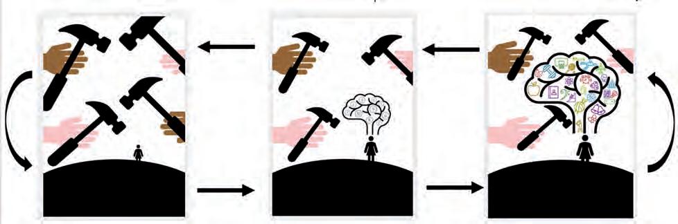
Figure 5.25 is a graphic approach to thinking through ideas and responding through ideation. This student researched connections to the
commercial world of design evident in the works of Jasper Johns, Andy Warhol, Barbara Kruger and Robert MacPherson.

Tools are used to create and destroy things. The hammer is a symbol of destruction and creation. The tools represent all the things in our life, good and bad. The hammer specifically represents the destructive things such as pain, loss, and disappointment. If we start to focus on all the negative things in our lives, it can overwhelm us. The hammers represent all the negative thoughts and feelings we experience. The hammers are heavy; however, they are also a metaphor for rebuilding.
KAYLA BRYANT
Methods of museum presentation such as labelling, arrangements in boxes or purposebuilt containers, conservation and storage are often appropriated by artists for art installations. Collection can be an obsessive process. Joseph Cornell (1903–72) is one artist who dissolved
the barriers between botanical collection and ‘assemblage sculpture’ through his box collections. Postmodernism embraces the repurposing and relabelling of the object.
assemblage a work of art that is made of different things put together
Collect, collate and present a meaningful or disparate set of objects relating to nature. (Refer also to Unit 2: Art as code.) Consider responses that explore a similar idea but generate diverse solutions through an alternative approach to media and form; for example:
• Marion Gaemers, Pod 6, 2014, installation of forms made from lomandra leaves
• Fiona Hall, Tender, 2003–06, US dollars fashioned into 86 bird nests (see Fiona Hall discuss this work online via the link at http://cambridge.edu.au/redirect/8165)
• Simryn Gill, Roadkill, 2000, found run-over objects and toy wheels, Art Gallery of NSW
• Luke Roberts, Wunderkammer/ Kunstkamera, 1994, found objects with artist’s labels, Queensland Art Gallery.
Art practice involves identifying and connecting with your personal understanding of the world by referencing authentic experiences. The contemporary context informs how artists generate visual responses that communicate diverse viewpoints and layers of meaning through art.
Experimentation or practice-driven research involves a continuous cycle of observation and reflection on personal viewpoints. The reflective process challenges and refines a personal lens.
“Perception is conditioned by a context from which observation and evaluation are made. Instead of general models of understanding, it is conditioned by numerous factors, including political, social, cultural, gender and racial. It affects how we see art and what meanings we attribute to it but is also an active factor in artistic creation.
ELI ANIPUR, WRITER AND EDITOR, WIDEWALLS
The contemporary context is often cited as the key driver of visual art, as contemporary art is the art of today, globally influenced, culturally diverse and embracing technologies. The contemporary artist employs a dynamic combination of materials, methods, concepts and subjects that challenge traditional boundaries and create meanings that reflect a changing world.
As a viewer, you will have personal visual preferences. Art has always presented a challenge to audiences. The manipulation of visual imagery to evoke pleasant, confronting or emotional responses has, for centuries, been a powerful disruptor of cultural frameworks that define beauty or aesthetics.

viewpoints through your representations of the material world. In summary, representations in visual art build upon sensibilities, experiences and interpretations that communicate meaning. They do this through figurative and non-figurative representations, some aesthetically beautiful and some quite confronting. This unique three-panel artwork by Leigh Schoenheimer embraces all three.
These multi-panelled works investigate the relationship between perception (seeing a subject) and meaning (knowing a subject).
The starting point is an abstract assemblage painted in stripes. A realist description of the 3D abstraction on the left begins the ‘storyboard’ with a visual pun. The subsequent panels move beyond realism to explore text and a gentle deconstruction offering alternative interpretations of the object.
Your own perceptual and conceptual responses will provide a tantalising glimpse into the creative space where experimentation with materials, techniques and processes can empower you to implement ideas and generate meaningful imagery that is relevant in the contemporary world.
The process of creative inquiry aims to alter, change, distort, challenge or justify your authentic
Embedding the painted object into a repeated background similar in colour and pattern collapses spaces and plays with how we perceive form, in the same way that the Modernist art movement explored form.


about
Try this experiment by making your own simple object using polymer clay or using a found object that you can paint. Repeat a pattern and limited set of colours and the create a simple backdrop. Photograph from different angles using different lighting effects.
Research signature patterns and colours (reverse chronology). Artists such as Yayoi Kusma, Roy Lichtenstein, Cezanne and Bridget Riley are relevant artists to reference.

it after a
Shaping a viewpoint through a specific lens while referencing traditional visual forms is the purpose of contemporary art. It is in this creative space where possibilities are infinite and problem-solving is considered an inspirational process.
Personal and contemporary contexts require you to work with a focus that feels familiar so you can begin from a personal or authentic starting point, by referencing things in your everyday life. As the artist, you will aim to communicate ideas that rely upon an honest voice, ensuring that you have something meaningful to communicate.

Practice-based research means that you will continually engage in the act of making art and manipulating materials while researching and reflecting upon your work.
A feature of this process is that the work itself generates new ideas and raises questions that direct the investigative artist around and through the concepts and focuses, developing a web of connections and interests. It is essential to record or map the journey so you do not get lost in the search!
A metaphor for the inquiry learning in Units 1 and 2 is the iceberg. The diagram by artist Daniel McKewen reminds us that the foundations of creative inquiry form the base of the iceberg (Figure 5.30). It develops and culminates in the work produced at the end of the course. Underneath the waterline is rarely visible to the audience. However, it is here where inquiry learning develops a depth of understanding and unique viewpoint or lens.

The following are some useful questions to ask yourself in relation to practice-based research.
• What makes you unique and who you are?
• Do you have a particular expertise?
• What are you interested in?
• What do you find intriguing and would like to learn more about?
• Are there specific cultural or social issues that interest you?
• Are there histories or stories associated with your ancestry or family?
• Do you have firm religious or political views?
• Which artists or artworks inspire or confound you?
• Have you seen an artwork that you absolutely love?
The list of useful questions is a short one. Organise a class Q&A session around the questions on the list. Discuss and explain any additional questions that might be useful or enlightening.
Practice-based research reflects the inquiry learning process, as it is multidimensional and continuous. The acquisition of skills and technique might appear linear at times. However, the process of developing, researching, reflecting and resolving may be simultaneous, cyclic, multilayered and self-generating.
The artist case studies in Chapter 6 present sections of the artists’ extensive practice that appear to flow naturally from one idea or concept to the next. Connections can be mapped with layers of meaning revealed during the process of reflection.
Artists offer varying models as to what this process or lens might look like. Artists Leigh Schoenheimer and John Honeywill place a specific focus on how visual imagery and aesthetics function in art. In contrast, the student examples often begin with a personal narrative, sometimes conveying a story expressed through symbolism and the emotional power of colour and space developing a specific lens or code that the artists have revealed when researching their work.
The inquiry question becomes a common thread that directs the work; however, the visual language is often refined as new ideas emerge from the work itself.
A reverse chronology or ‘artworks of precedence’ maps a cause-and-effect or thematic pathway to reveal historic, cultural and traditional conventions in art that have been influential and continue to inform and shape contemporary art practice. Learning about artworks and analysing how they visually function is essential. Venturing beyond one’s immediate understanding assists
in developing a more diverse lens. Reverse chronology recognises bodies of knowledge that have informed art and audiences for many centuries while remaining relevant.
1 See the reverse chronologies provided in the case studies. Look at the referenced images that may be relevant in forming inquiry questions.
2 Research similar works and the context in which the works were made, making links between ideas, content, context, concepts, aesthetic theories and visual language conventions.
3 Consider the following themes within these works in relation to your own research:
• the figure as self
• the environment or scape
• the object as a treasure.
Artists have always been interested in the collective power of science, art and perception, so it is interesting to look at or research how the artists’ unique lens influences their response to the material world.
Brisbane artist John Honeywill composes everyday items into elegant arrangements that communicate presence, beauty, humour. He uses light, colour and space with a focus on the visible and stillness, through still life – a genre that links the intimate with the audience. Unlike a photograph that captures an image in a fraction of a second, each layer of brush work builds on time spent with the subject.

Art as lens is the start point for the process of creativity and diversity reinventing itself in the form of developing and resolving, something that often takes many years to achieve. Researching artists such as Honeywill reveals a glimpse into how this process might work.
“What I love about still life is that there is always an abundance of things to paint and since childhood, I have had a love for objects, the stories and meaning they can hold. Still life can be dramatic or sublime – it can explore any subject, any emotion or state of the human condition. Like many people, since my twenties I have collected simple objects as memories of a visit to somewhere or a walk on the beach etc. My current works are about the presence and beauty of the object/s themselves, avoiding any narrative that implies an ongoing domestic environment.
JOHN HONEYWILL
Honeywill paints realism, a process that takes time and requires a meticulous layering of colour and observation of light.

“I paint simple, everyday subjects that I set-up using artificial lighting so that the subject remains ‘paintable’ for however long is needed in the studio. Initially, I make simple, journal drawings, to observe and become familiar with the subject. I take many photos of slightly differing viewpoints of a possible subject and give it a period of time to see if it feels right. Just because it looks ‘good’ doesn’t mean it deserves to be painted.
JOHN HONEYWILL
Analytical inquiry questions play a significant role in process.
“I ask myself: What does it bring? Does it have visual qualities, e.g. light, potential luminosity of colour, spatial relationships etc? Does it have the feeling I want? Does it have an ‘otherness’? The printouts of a photographed subject are purposely not of high quality and the background colours are always altered to experiment with the feeling that I am after. After drawing a subject up, I paint the background in and let that dry – I might have up to 3 paintings on the go at once. I then paint the actual subject. I consider the ‘background’ very much of equal importance to the ‘subject’ as the relationship of surrounding space to the subject is very important.
JOHN HONEYWILL
Developing visual language to communicate a personal viewpoint takes time and requires total immersion to open up possibilities and tap into a sense of creative flow. Honeywill offers this advice:
“Don’t over-think what you do, play around with ideas/ images/processes so that you can feel what you are doing.
JOHN HONEYWILL

“More recently it has been objects from around the house, often with flowers or fruit that have resulted in a focus on a relationship between colour and the organic.
I use stretched linen that I get professionally made. I always put a thin under-colour on; in recent years on the works that have a lighter palette, it has been a coat of Naples Yellow. Generally, I work from an easel. While lighting is important, I have increasingly worked from photographs that I take –something that has been quite liberating in many ways.
JOHN HONEYWILL
“2011 – I did introduce furniture. These works also included fabrics which is a love of Trish’s and she would bring offerings of possible subjects (which she still does – this fish is an example).
JOHN HONEYWILL

Honeywell’s work continually reinvents itself communicating both a personal and contemporary context that exudes a pensive quietness in our busy lives and visually packed environments.

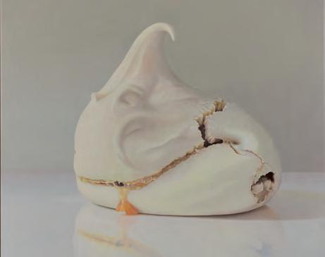
“I hope for a quiet beauty, a luminosity of colour and sometimes a sense of ‘otherness’ – a vague term to describe how my interest in some objects is about capturing a feeling that doesn’t directly have to do with the physical reason of the subject, e.g. the sweets such as Turkish delight, meringue, rocky road. It might be about its colour, it’s form or how it might suggest miniature worlds, e.g. the rocky road paintings have a cliff face and landscape feel.
JOHN HONEYWILL

A body of work can signal how the artist engages with perception as a tool, and how they have developed or refined their focus and responses throughout their art practice.
This student has explored the application of light and a personal context in a similar manner to John Honeywill.
At first glance, artist Leigh Schoenheimer shares some similarities with Honeywill, as they both explore place, space and objects through the lens of still life.
Schoenheimer employs varying degrees of realism and selectively references art theories and techniques from well-established traditions as part of the storytelling. Her imagery explores aesthetic engagement and how to connect with and stimulate the viewer in a contemporary world saturated with media imagery.
A painter and sculptor, Schoenheimer is best known for her expanded still-life works, assemblages and her more recent series, ‘An Unnatural History.’ She focuses on devising engaging multi-panelled paintings known as a triptych to captivate the viewer and set up dialogues about the phenomenon of how we ‘perceive conceive’ imagery.
triptych (pronounced trip-tick) usually three closely related panels or images of the same size

FIGURE 5.38 Leigh Schoenheimer, Ways of Seeing/Ways of Knowing: Construction #13, 2019, oil on plywood triptych and free-standing polychromed timber assemblage, 32 x 73 cm (painting) 25 x 8 x 8 cm (assemblage). Schoenheimer is also interested in pixelation or tessellation of imagery, pattern and vibrant colour, which stimulates the brain and challenges the ‘bottom-up processing’ that predicts what the viewer hopes to see. Her venture into still life, landscape, and abstraction is also about how to reset or challenge the singular lens.
Schoenheimer overlays conversations between perception, representation, and interpretation with a broad range of styles, ideas, symbols and viewpoints that reference art itself. Her sculptures made from found objects are sometimes paired with paintings and utilise the same personal visual vocabulary that brings wit, humour and a bowerbird curiosity to the hybrid works that simultaneously connect the aesthetic and intellectual realms.
People, place and object are present in the traditional sense, yet contemporary environmental concerns can be read and understood by a diverse audience. She enjoys a play on words and double meanings such as ‘still life’ and ‘still scape.’
Schoenheimer’s response to a place suggests that things are not always as they first appear!
FIGURE 5.39 Leigh Schoenheimer, Still-Scape: Tweed Weeds #4 – return, acrylic and oil on plywood. Each panel 30.5 x 40.5 cm. Featuring Rag Weed, Lance-leaved Rattlepod, Verbena Bonariensis
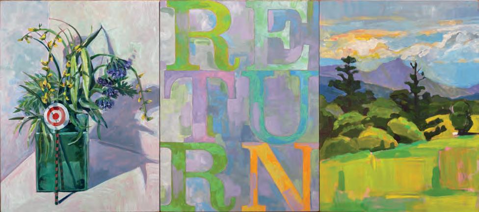
The Tweed Gallery is located high on a hill south of Murwillumbah and takes in panoramic views across the verdant Tweed Valley to Woolumbin / Mt Warning. While in residence, I sipped my morning coffee each day blissfully soaking up those views, before going on a daily bicycle ride down through the valley. In amongst the landscape, it became evident that the roadsides and beyond were populated by camphor laurel trees and a proliferation of low growing, flowering weeds – a truth not seen from a distance. The idea for ‘StillScapes’ was born from this realisation.
This series of ‘expanded still life’ paintings feature arrangements of pretty weeds picked from the district’s roadsides, and words appropriated
Exotic plant species have shaped our landscapes, in a variety of pretty ways. The extinction of native flora and fauna has been the unintended consequence of this importation. The still life arrangement features the collected weeds that have shaped the landscape. Words appropriated from a computer keyboard are inserted between the two observations symbolising our digitally mediated lives and understanding. These words take on new meanings in this context. The application of colour to form structure and distance is reminiscent of a Cezanne landscape. How artists respond to place and develop ideas is demonstrated through this work.
In summary, John Honeywill talks about avoiding the narrative while skilfully adapting and mastering classical techniques to paint objects in spaces that mine our emotions through the dramatic, sublime or beautiful.
from the computer keyboard (control, escape, return, save as, etc), which take on new meanings when inserted between these micro and macro views of the area. The various readings suggested by the text elements create shifts in understanding.
If invasive enough, weeds ultimately cause the collapse of local ecosystems, which are in part responsible for the mass extinction process that is currently underway in Australia. Since completing the Tweed-Weeds StillScapes, I have begun looking at the invasive weeds in my local Brisbane area – Toohey forest. Different place, same story! …
LEIGH SCHOENHEIMER
Leigh Schoenheimer focuses on environmental issues building on her personal response to both objects and place, while referencing the story of art from Modernism through to Contemporary art, to communicate an environmental message.
Both artists communicate a viewpoint that challenges how we see and understand the material world.
In Unit 1, you explore representations of people, places and objects that make up the material world. The lists in Table 5.2 show how each of these artists draws inspiration from multiple aspects of their material world to inform their focus. For example, Leigh Schoenheimer considers plants as both still life, responding to aesthetic qualities, and a transmitter of knowledge, reminding the viewer that not all is as it sometimes appears. Context and knowledge are significant tools for the artists to employ.
John Honeywill
Leigh Schoenheimer
Nostalgic representational
Symbolic deconstruction using the language of Modernism and Contemporary art
Collaborate and brainstorm to identify other possible links in Table 5.2.
• Take photographs regularly of your work mid process.
• Compare what you see physically with the image on the screen and observe how scale and resolution are altered. Some imagery may become the process work for developing future photographic images.
• The space between the work and the viewer plays an important role in perception. Some contemporary artists aim to deconstruct this space altogether by making works interactive or controlling space in the form of an installation.
• View the work of Leigh Schoenheimer, noting the dimensions of the work. This demonstrates how critical it is that you always indicate the scale and materials when recording your imagery for assessment and an audience.
“VISUAL LANGUAGE
The artists have a common interest in the power of composition, the still life genre, and the manipulation of form.
Lenses are ways of seeing that frame everything we perceive. They make sense of the situations we find ourselves in, the people we meet – even the ways we see ourselves. They allow us to understand everything from science and art to relationships and teamwork.
DOUG MARMAN, INNOVATOR, JOURNALIST AND PHOTOGRAPHER
Technology potentially offers new possibilities and may ultimately redefine art as lens. Discuss innovations such as timebased media, four-dimensional imaging, digital platforms and communications. How might they influence how art is made in the future? Consider the role of the contemporary art gallery in the future and what it might look like. What are some locations and public spaces where audiences view and participate in artworks / forms?
• Identifying similarities and differences assists in analysing the artist’s intent and the manipulation of perception. Create a comparative table and with reference to a selection of images that appear to have a similar subject matter. Describe the connections between visual perception and application of the elements and principles of art and design that the artist(s) have applied as a result of their focus.
Art as lens directs and embraces the analytical process of critical and creative thinking and reflection, culminating in independent viewpoints expressed through visual language and communicated through art. It aims to challenge the subconscious and develop a more mindful engagement with the artwork so the viewer can critically reflect upon what they see, understand and consider to be a valid representation of the material world.

FIGURE 5.40 Bianca Van Zyl, Alone in the Feed, 2023, digital photograph printed on canvas and stretched onto frame, 91 x 61cm. In this work, the student, Bianca Van Zyl, explores the 2D into 3D concept and the idea of a story board.

FIGURE 5.41 Student process page. Here the use of pattern and bold primary colours is adapted into the image while pursuing the inquiry question – what do we really perceive?

5.42
Ways of Seeing/Ways of Knowing: Construction
, 2017, oil on plywood – triptych with free-standing, polychromed timber assemblage, triptych: 50 x 122 cm, assemblage: 26 x 12 x 12 cm
Artists devise unique viewpoints and representations that challenge the audience to consider their connection to images, objects
and perspectives. Specific lenses potentially filter or distort a viewpoint and influence how we communicate a viewpoint about the world.

x 92 cm, assemblage: 61 x 17 x 11 cm
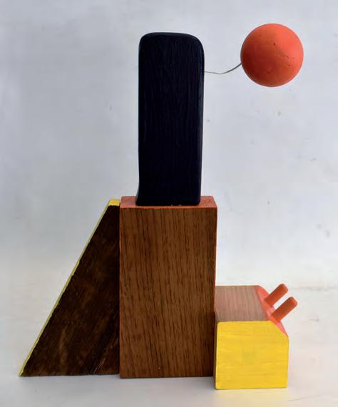
Tabitha Holland’s series of three paintings and three sculptures experiment with abstraction and the deconstructed shapes of memories. This is evident in the three sculptures, Suburban Afternoon, Sunrise Over the City, and Night in the Bush. The flat colours contrast with the wood grain, and the defined shapes exhibit a beautiful abstraction of form and the ambiguous nature of memory. Likewise, the paintings Memoryscapes 1, 2 & 3 refine the components of memories into vibrant colours, shapes and patterns, exemplifying the conceptual perception of personal memories of these scenes. By sharing space, the paintings are positioned in connection with the sculptural works. The three paintings and three sculptures have a matching partner, and alternate perception of the same moment in time. The viewer can position themselves to create a viewpoint that collapses the 3D colour into the 2D surface of the images. Memoryscapes is a set of three canvases, each abstracting the personal idea and memory of the specific scapes: (from left) the city, suburbia and the bush. The deconstructed shapes, patterns and vibrant colours develop clarified and conceptual characteristics of the specific scene: respectively, skyscrapers, a house and streetlamp, and a green and brown forest. A focus on colour and line over texture was deliberate in fabricating an emotional and entangled memory of these scapes.
The story board format builds an interesting use of multiple panels and viewpoints to explore what is perceived and conceived when investigating suburbia as we know it. The structures are simple and the colours vibrant.

Each component of the work stands alone as a resolved image or form; however, together they tell the story of the specifically designed and repeated blocks of housing found in new suburban developments where the only variation is the time of day and how inhabitants perceive their place and space.
The sculptural form examines memories of cityscapes and synthetic beauty. The positioning of the 3-dimensional planes creates a balance in the composition of the work, with the weight of the wooden triangle countering the floating orange ball. The angled forms and contrasting colours are reminiscent of a city skyline, with a ‘floating’ rising sun. The orange and yellow tones contrast the polished wood, creating an artificial glow from the rising sun.


This sculpture explores the abstraction of memory, specifically of the suburbs I grew up in. There is a strong emphasis on the aesthetic correlation between the forms found in the suburbs and the arrangement of the discarded wooden pieces. As a deconstruction of suburbia, the wood mimics that of a house, lamppost, and fencing. The bright colours create a contrast with the wood grain, connotating a childlike perception and memory.
The colours are low in value, apart from the striking blue representative of a waterhole. The deconstructed form separates light and dark in memory, with purple as a night shadow and a strip of green abstractly reflecting on the water. The colours harmonise with the woodgrain, blending the conceptual and literal. It features a discarded piece of wood turning, contrasting the natural and representing human interaction.

• In Unit 1, art as lens is used as the concept or key organiser in identifying and shaping an inquiry question. The model of development, research, reflection and resolution has been applied to clarify what the influence of art as lens might look like.
• To develop your research further, it is essential to visit art galleries and museums, search artist websites, follow Instagram pages, read print resources and publications, and connect with local artists.
• To investigate context further, refer to the reverse chronology and references at the end of the case studies and research the influential art movements, theories and artworks of precedence. Collate and record a personal reverse chronology as your inquiry project develops.
• All artists in Creative Inquiry have produced extensive bodies of work, worthy of further research.
• You have learned that:
• Art as lens explores how visual literacy underpins the process that generates responses to the material world.
• Personal and contemporary contexts are influential in comprehending and devising aesthetic meaning in responses that mirror culture and society.
towards communicating a viewpoint.
• Artists Leigh Schoenheimer and John Honeywill have modelled for students the process of devising an inquiry question through practice-based research.
• The focus of people, places, objects assist in identifying and developing unique and individual viewpoints or perspectives; that is, the position from which things are judged and represented.
• The inquiry question directs your understanding, generates ideas and assists you in working
• They have implemented ideas and generated visual responses that may appear diverse in content but effectively create and communicate meaning by embracing objects and still life as a start point for personal ideas. The interpretation communicated is closely linked to the artists’ lens through application of media, techniques and processes.
• All case studies in Units 1–4 provide insight into how artists have generated solutions to visual problems and how they have reacted to stimulus.
• Student examples demonstrate formats and ideas that are useful starting points for your personal development.
• Collectively, artists:
• explore cultural context, and representations of the material world through personal philosophies and beliefs, and an evaluation of traditions, culture and theories
• communicate meaning by applying differing lenses that filter and distort, while diversifying our understanding of the material world
• identify and articulate specific intent in the form of an inquiry question
• apply an inquiry question that frames the development of visual language and expression to communicate meaning through the work
• visually describe, examine and synthesise information through
visual, written and spoken responses
• reflect on and refine the inquiry question as part of the creative process.
1 Identify how artists generate solutions to visual problems.
2 Summarise the nature of stimulus and how different individuals respond to it.
3 Identify a variety of stimulus with focuses on people, place and object that offer connections to your personal context.
4 Create a small folio of works using any media, and problem-solve how to respond to multiple lenses or viewpoints.
5 Use artist research as stimulus. Search for potential links by experimenting with media.
You can read about other case studies in the different chapters of the book. Some examples from this chapter are listed below.
• John Honeywill paints meticulous renditions of still life to develop sensitive, insightful imagery.
• Leigh Schoenheimer explores how we perceive and conceive imagery to communicate ideas.
6 Communicate your ideas and responses through visual, written or spoken forms.


“Contemporary research regarding way-finding technology, such as navigational systems, indicates negative effects on brain capacity to remember routes, icons and places, a concern that this work explores. The imagery is founded on non-literal meandering patterns and text inspired by personal memories of place, and those of others. Delicate textiles and paper encourage reflection on the fragility of memory. Bold motifs represent our brain’s memory centre capacity. The inability to remember is symbolised through the pattern breaking free. Repurposed wooden reels juxtapose the contemporary monochrome palette reminding us of bygone eras before technology.

What does an artist’s practice look like? Art as lens develops an understanding of the artist’s intent through artist case studies. The artists have selected works from their extensive practices with the concept of art as lens in mind and to demonstrate the process of creative inquiry and how artists generate and produce a body of work. The development, research, reflection and resolution of ideas is multilayered, not always sequential and influenced by stimulus, as explored in Chapter 5.
The case studies provide a springboard for investigation, experimentation and further research. To develop your research further, it is essential to visit art galleries and museums, search the artist websites, follow Instagram pages, read print resources and publications and connect with local artists. To investigate context further, refer to the reverse chronology and references at the end of the case studies and research the influential art movements, theories and artworks of precedence.
The artists have many other works and personal projects that you might research or investigate to guide or inspire the development of your personal inquiry question.
The areas of study provide the guiding questions:
• How do artists generate solutions to visual problems?
• How do artists react to stimulus?
• How do artists consider ideas and information, media techniques and processes?
• How do artists communicate individual ideas as visual, written or spoken responses?
Adapted from Visual Art 2025 v1.1 General senior syllabus © State of Queensland (QCAA) 2024
The case studies offer further information and examples of the concepts and skills introduced in Chapter 5.
Chapter 6 investigates the foregrounding of the personal and contemporary context through case studies. Applying the focus of people, place and objects explores how different lenses or multiple viewpoints are a powerful dynamic and add complexity.
The personal commitment to an inquiry question reflects the artist’s philosophies, experiences, beliefs, personal interests and value systems. These underpin or influence the way the subject matter is perceived, generated and represented. The case studies in this chapter foster curiosity, creative thinking and inspire innovative art practices.
Artist Deb Mostert has a passion for drawing every day and these observations fuel her art practice. The images she captures are incredibly diverse in subject matter, and personal. She is completely immersed in visually depicting the material world and communicating experiences, knowledge and viewpoints with an emphasis on her engagement with people and nature. Often in the museum documenting, sketching a moment with friends around the campfire or drawing her grandchild, Mostert expresses an authentic reverence for nature, the environment

and everyday experiences. These stimuli inform her diverse practice, which is a continual dialogue with the viewer about life and truth, communicated through paintings, assemblages, murals and sculptures.
Andrea Huelin has built an inquiry question around conveying the essence of objects, people and places with a sense of familiarity and nostalgia. Primarily a painter, she focuses on materials and techniques through the controlled yet direct use of colour, form and brushwork.


Huelin references some traditional principles of painting such as composition, colour theory, light and the rendering of surfaces. She selects the ordinary, experiments with the dynamic of colour, pattern and paint and makes connections with local places, people and the domestic. Her personal context informs the process of devising meaning through visual language in response to the material world.
Sarah Rayner works sculpturally, exploring the reproductive organs of plants and the by-products of plant reproduction, fruits and seedpods. Creating delicate collections of porcelain objects and applying the aesthetics of museology, she introduces and reveals microcosms that are not always immediately noticed. Her contemporary context results in unique specimens, resolved as pristine forms, organised into carefully curated exhibits to inform and foster awareness of the cyclic metamorphosis and adaption that plants undergo within environments. Rayner also collaborates with like-minded artists including Sophie Carnell to develop and expand on forms, materials and her practice.
Dan Elborne utilises clay and the secondary materials of ash, bone, lead and reclaim to reference specific objects that come with a narrative or history. Elborne exploits materiality in tandem with memory, time and labour, exploring the preciousness and permanence of materials. His inquiry is based around events, themes and dichotomies such as survival against suffering, preservation against decay and the intricacies of remembering. The extensive collections of handbuilt multiples result in subtly distinctive forms that are installed as a collective or installation in diverse spaces with the intent of enticing viewers into a gentle space of contemplation and reflection.
Christopher Bassi, an artist of Meriam, Yupungathi and British descent, engages in speculative storytelling or the theatrical, by reframing archetypal models of European representational painting to create portraits of plants. Being from the Torres Strait Islands, tropical flora symbolises shared climates, cross-cultural experiences and shifting ideas of place, belonging and home. Questions of history, place and collective identities reflect his personal context with a focus on culture, heritage, alternative genealogies and colonial legacies in Australia and the South Pacific. Bassi considers painting to be both sociological and historical text that provides critical re-imagining.


Chantal Fraser uses a multimedia approach to examine the structures of capitalism from a Samoan perspective. Her practice explores ornamentation and cultural adornment with references to her lived experiences, a personal context. Her work is sometimes witty, multilayered and celebrating the subversive nature
of contradictions within the context of cultural exchange. Beautiful materials are manipulated to create optical overload, an assault on the senses, with meaning emerging from a persistent and cumulative experimental process.
The inquiry learning process – develop, research, reflect and resolve – is an interconnected, non-linear practice.
Practice-based research is a process of inquiry learning. Through research, the artist is immersed in ongoing experimentation, absorption of knowledge, the gathering of first-hand experiences and artmaking. Inquiry learning results in visual forms that communicate with the audience through works that respond to diverse stimuli in the material world.
• Audiences consider and navigate the responses produced.
• Artists consider how different lenses might filter or distort viewpoints.
• Diverse lenses direct how artists make sense of the material world.
The student works in Figures 6.9 and 6.10 demonstrate how responses to an inquiry question can be effectively developed when the ideas, processes and knowledge evidenced in a specific set of works by artists are researched and reframed.


Under the scrutinous gaze of society, one dreams of escapism – to rewrite one’s story and be in pure harmony and joy with one’s inner self. In the absence of this ideal, one must look through the layers of one’s own life to catch glimpses of their inner self.
The arrangements of artificial flowers offer a symbol for humanity focusing on the present and replacing natural objects with human-made ones. The flowers preserved in a dome of resin is ironic, as the natural is replaced with convenient human-made alternatives. The forms reference the sentimental use of flowers in cultural rituals.
When reading the case studies, create a flow chart to organise information. Select a set of connected works within each case study to analyse and research.
• Identify the symbolism or meaning evident in the works.
• Examine the relevance of materials.
• Investigate the personal or contemporary context of the work with a focus on how it might be interpreted.
• Research how the artist communicates specific information or viewpoints.
• Reflect on how visual language develops the inquiry question.
• Write a 100-word summary on a specific form or approach that is evident across a body of work, to evaluate and justify how the artist communicates meaning and engagement for the audience.
This is a substantial task and can be repeated multiple times since the case studies contain more than one theme.
Context: Personal
Focus: People Place Object
Deb Mostert generates informative imagery that records how we culturally encounter and understand the natural world. Intimate and immediate observations of people, places and objects are woven together to communicate diverse interactions with nature by intuitively linking science with cultural and personal contexts. This starts conversations about the objectifying of nature and the importance of capturing and acknowledging the everyday and the ordinary. Mostert’s imagery offers a window into intensely private places with a reverence for the natural world and its inhabitants, communicating knowledge and authenticity by the artist sustaining a daily routine of drawing that later develops into painting, assemblage and sculptural responses.
“Through my work I am searching for ways to talk about my concerns using gentle, offbeat narratives and a crisp aesthetic that lean towards grace and truth.
DEB MOSTERT
“Mostert takes her sketch book everywhere and has an almost scientific approach to documenting and recording. Deb blurs the lines between artist, historian, and scientist in creating her own archive.
IPSWICH ART GALLERY
The virtual sketchbook project available online offers a lens into Mostert’s very personal observations and drawings where she records and distils the essence of people, place, and object.
‘Animal as Object – nature and culture’ is a body of work that visually explores the paradoxical ‘objectness’ of animals in the context of the museum, where the scientific process of taxidermy is used as preserver of knowledge while creating an educational and cultural souvenir.


“Frog as Object, 2022, is one of a series of mashups based on the formal format of early scientific taxonomy charts and illustrations, museum taxidermy, pop culture and the mass-produced souvenir. Suggesting a timeline or process of development the chart is read as a sequential set of data that once fully absorbed, questions the significance and function of artifice, collection, consumerism, mimicry, wonder and beauty. The audience readily recognises the objects that are most familiar, the beginning of the gentle conversation.

DEB MOSTERT
Shark as Object features multiple watercolour studies organised as a formal chart reminiscent of reference posters found in science labs at schools and museums, and taxonomy charts in reference books.
At the top of the composition, the grey nurse shark dominates in its natural form, establishing ‘the alpha’. The chart flows into layers of recognisable objects, symbolic of development and our cultural estrangement from the original, with popular culture characters offering a satisfying recognisable conclusion: Beta.
Beta is a biology reference where dominant hierarchies (formerly and colloquially called a pecking order) map a type of social hierarchy that arises when members of animal social groups interact, creating a ranking system where the submissive lower-ranking individual is referred to as a beta.
A key is provided at the bottom of the chart to ensure a standardised cultural reference. The process of chart reading engages the audience as they read the rows looking for the familiar, discovering the forgotten and renewing a sense of nostalgia. One might also realise that there is much that we know little or nothing about.
Shark The work references a ‘de-evolution’ of animal as object from the important and valuable holotype specimen of the endangered grey nurse shark through to cheaply mass-produced frivolity. The concept is specific information interpreted to create a new but still connected object.
Frog All the ‘charts’ start with a very specific endangered animal that looks real (but is still just a taxidermy object) and follows the ‘evolution’ into a commodity and an entertainment. The artist chased down pop culture objects, from Disney characters to cereal mascots.
Koala The koala proved the hardest chart to curate as the proliferation of the koala as souvenir meant there were an abundance of objects for the artist to include or select. So much koala merchandise! Yet still we are seeing their numbers decline due to habitat destruction.
Mostert’s research develops into imagery that communicates information through a forensic process of discovery. The artist’s lens is refined through purposeful inquiry questions, and a focus.
Inquiry questions frame the process of observation
• How has knowledge that previously existed changed over time?
• How does culture form nostalgic memories?
• How do nostalgic objects symbolise our personal identity?
• How does the mass production of objects impact nature?
• What role has culture played in the demise of the natural object over time?
• What informs cultural connections with nature and the environment?

1 Identify and analyse all the items on the charts.
2 Look for objects you recognise: What memories do they trigger?
3 Consider what materials are used to manufacture the toy objects and the environmental impact.
4 Compare the charts and summarise the use of symbolism.
5 Research animal classification charts and appropriate the format using collage to organise a set of symbols that communicate meaning.
6 Create your own animal chart mashup –choose an animal that has some relevance to you or your family.
In Crayfish cast collectible, the artist seeks to employ a ‘gentle dialogue’ where natural organic material is contrasted with mass-produced plastic objects, both represented as visually beautiful and appealing. This work seeks a redemptive lens with which to view this paradox:
“I want to lean towards a future of ‘flourishing for all’. We have and are creating facsimiles and profiting from these copies despite the real risk of losing the originals. How can we work towards healing?
Mostert devises imagery that focuses on individual elements to communicate knowledge and connect people to nature. The visually alluring commodification of animals as plastic toys is available in crisp, sparkling packaging at museum gift shops. The attractive and well-intended carrier of knowledge is ironically destined for landfill. The idea of using objects to communicate meaning can be traced back to a period of art referred to as Dada (1915 to mid 1920s). Artist Rene Magritte, renowned for many satirical
Think about the replicas of animals or nature you played with as a child. Many kids enjoy building a dinosaur collection. What were some of the positive things you remember learning? Is there a balance between the environmental impact of creating objects that replicate nature and the sharing of knowledge?
Can you think of some alternatives that might fill the role of the replica or souvenir?

FIGURE 6.15 Rene Magritte, The Treachery of Images – This is Not a Pipe, 1929. A symbol of surrealism. On the original work, under the image of the pipe, the artist has written in French: Ceci n’est pas une pipe
works including The treachery of images – This is not a pipe, 1929, explores how an object carries the capacity to undermine one’s philosophical assumptions about reality, through a nonsensical yet witty question which, after consideration, proves to be potent. Mostert searches for a similar but more gentle approach by appropriating this thinking in the title This is not a Bilby (after Magritte). The image asks, ‘what do we really know about this endangered yet emblematic species?’
“None of these animal objects conveys the sheer miraculous presence of this wondrous little endangered marsupial but they have gone some way to helping conservation efforts by education and advocacy.
DEB MOSTERT
In the artwork Moose Mount (one of many works in this series), Mostert comments on the cultural practice of hunting where the catch of the hunt becomes the trophy, a displayed sought-after object valued for its unique natural beauty. The familiar but foreign moose, observed at the museum, combined with the whitewashed plastic replica, symbolises the end for many worldwide species with only the remnants or replicas remaining.
Mostert practises insightful social observation through the practice of drawing, anytime and anywhere, exploring subject matter in a manner unlike the cursory snapshot on Instagram.
Mostert is committed to compiling “sketch books as an incubator for ideas and a creative habit for life”.
Being present with the subject is a reflective mindful process that generates concepts and ideas that are later developed into resolved works. Mostert combines her whimsical sketches and collection of objects into observations that communicate a passion for nature and our connections with the natural world. Her
environmental viewpoints are informed by regular sketching visits to the bird and mammal collections at the Queensland Museum.


FIGURE 6.17 The concept of people and their connection to place is insightfully unwound through references to birds and their migratory patterns in Mostert’s paintings and sculptures. The contemporary issues of war, conflict, persecution, environmental degradation and poverty remain relevant and deeply personal. This series of sketches are a type of story board or window into the characters, activity and the long journey to Australia from Europe in the 1950s by ship.

FIGURE 6.18 Deb Mostert, Facing the Future – Bartailed Godwits (detail), 2017, 81 x 96 cm, oil on canvas. The exhibition Australien Future – tales of migration, tells stories of Mostert’s family’s migration in the 1950s and weaves together the migratory patterns of bird and human conceptually.
The concept of people and their connection to place is insightfully unwound as it reveals that “place, memory and emotion are inextricably linked”, as noted by Deb Mostert.
Encouraged to leave their native Netherlands for another place, Mostert’s paternal grandfather recorded film footage of the departure, shipboard travel and the bald realities of their arrival in a new country called Australia. The family’s journey, its upheaval, and the meaning vested in the personal objects carried, elicit empathy.
Migration journeys of shorebirds informed some of the narrative in this exhibition.
“Birds travelling alongside the ship are captured on silent film and one can almost hear their cries, plaintive, mournful, and freewheeling.

FIGURE 6.19 Deb Moster, Still Life Tabelau – Trekvogels op Tassen (Migratory Birds on Bags), 2018, wire, styrene, epoxy, found objects, paint. Photo credit: Louise Martin-Chew
A sculptural installation titled Trekvogels op Tassen (Dutch for migratory birds on bags) creates a dramatic finale. Luggage appears like an island rising from the floor, a refuge for those in need, suitcases offering both
potential and familiarity. Birds stand within the sanctuary yet, in ghostly white, memorialise those lost at sea and the ongoing presence of their precarious narratives.
Focus: Objects, place
• Builds on a passion for the natural world and environmental issues.
• Places the observer in the centre of nature and our connection with it.
• Examines the role of institutions such as museums, and practices such as taxidermy.
• Examines human relationships and the everyday as an exploration into who we are, and what we value.
Visual language
• Contemporary approach to astutely recording and collating visual statements: artist books, journals, assemblage, sculpture.
• Recontextualises traditional illustration found in the sciences.
• References the museum environment by using a crisp, white background.
• Texture, colour and detailed observation creates a familiar but slightly uncomfortable message.
Symbols
• Emphasis on the cellophane bag, reflected light, and crisp, clean, white background replicates an enticing shop display where objects are purchased.
• Composition references museum layout, common in displays with use of text and codes.
Media/techniques/processes/technologies
• Framed watercolour on paper board.
• Watercolour techniques are fluid and direct, capturing instantaneous moments.
• Delicate, colourful images that entice the viewer to search the content for hints and clues.
Display
Formal framing presents an opposite to plastic objects in a bag. It suggests a valued artwork that requires close inspection of intricate details. In similar works sometimes a physical plastic object is added.

Personal, contemporary
• Direct observation of domestic objects /plastic toys as a symbol to create awareness of the plastic rubbish created with the intent of saving the environment and specific species.
• Communicating personal viewpoint about environment, nature and the commercial world.
• Disparate items are juxtaposed to play with the literal yet contemporary approach.
Marine science, museum, traditional illustration, assemblage, collage, painting, sculpture.
Collaboration
• Queensland Museum
• Portrait using some traditional methods of representation.
Display
Formally framed with reference to the painters of the European Old Masters. Referencing a personal context. This links to other case studies in the book.
FIGURE 6.20 Deb Mostert, Crayfish Cast Collectible, 2022, watercolour on paper on board
Many families and individuals have stories of migration or relocation. Maybe you have experienced this yourself. Consider what information is available through researching family trees, or local history.
When interviewed in 2016 – 17 for her exhibition Australien Future – Tales of Migration, Mostert says, “Birds don’t identify as Russian or Australian...”
Through her work, she investigates how the migratory patterns of birds and people connects us to nature through our knowledge and understanding of animal as object.
How do artists communicate meaning by applying different lenses to the material world?
Connections to other artists / Artists of influence
Some information might be recorded in the form of photographs, film, video, letters, diaries or an oral history. How do specific people, places or objects contribute to this memory or experience?
Mostert pursues a diverse artistic practice, regularly mining the content of her sketchbooks for projects and commissions. Many examples of her bronze sculptures, murals and installations are available on her website and in public spaces around Queensland.
Charles Bell G.B.W.C #4
Käthe Kollwitz Call of death
Through the lens of visual art techniques and materials, how do artists explore diverse practices to develop an understanding of the material world?
Rien Poortvliet Dogs Norman Rockwell Triple self-portrait
Vincent Van Gogh In the orchard
Leonardo da Vinci's anatomical studies Rembrandt Elephant
John Singer Sargent
Responding to the material world requires a process-based approach, where visual records can be quick, in the moment and authentic without too much concern for where the journey might lead. Regular drawing and photography routines assist in developing skills and confidence. It is important that you always record and annotate collections of images and experiences for potential development and reflection in the future.

People’s connection to their surroundings is a significant part of the human condition and the experience of being human. Heart’s Garden takes the audience on a journey through the flora and fauna of a thriving garden, exploring the connection that people have to significant places in their lives and the meaning they derive from such connections. To me, a garden is a meaningful place in my life as it is
a symbol of growth, a means of selfexpression and a culmination of hardwork and dedication. To make a garden flourish, people put in time and effort. To make a garden beautiful, people fill it with the things they love. Audiences are encouraged to observe the delicate layers of paper and imagery of plants and animals and make their own connections between the various drawings.
ALICIA WEN


Excursion to Southbank and QAGOMA
Anobjective of this series is to develop responses to the material and natural world Artist Deb Mostert guided us on how to develop natural responses to live stimulus and create imagery that is a personal expression of my perceptions in daily life
Watercolours andink were manipulated to implement elements of flowingline and a playful tone, underpinning the entire series witha sense of imagination and youthful exploration.
A variety of colours and line techniques meant that each drawing captured different tones of expression producing individual perceptions expressed creatively through the individuality of the illustration.
I was inspired by Deb Mostert’s sketchbooks and explored common subjects found in her work such as animals, while practicing to develop from instinct and impression rather than methodical planning, honest observations and immediate responses.


Exploration of line creates a looser sense of emotion between subjects and the overall
Concept: A lens to explore the material world or communicating through diverse lenses
Context: Personal and Contemporary
Focus: People Place Object
Andrea Huelin is a Cairns-based artist who is best known for her colourful still life paintings of fruit, glassware and everyday household items that she views through a lens of nostalgia. Interested in vibrant colour, form and capturing the elusive qualities of lustre and light, she explores gestural paint application with economic brushwork, and composition as a response to the material world of domestic objects.
Huelin is an accomplished portrait painter who also responds to the urban landscape. Her portrait Clown jewels was awarded the Archibald packing room prize 2023, and features an elaborate headdress made by the sitter, the late comedian Cal Wilson, who during the Covid lockdown period played with assembling objects such as toys and ornaments with a hot glue gun and posting them on Instagram. Huelin painted the comedian wearing the headdress, teamed with purple silk, employing her signature sense of colour and energy to communicate the character of the sitter.

‘Her poses reminded me of my sister and me making ourselves laugh by pulling funny faces in the mirror as kids and I could tell we share a similar sense of humour,’ she said.
‘I posted a congratulatory comment and Cal wrote back and admired my paintings, so I asked if she’d sit for a portrait.
The formal composition mocks the 19th-century style portrait in which women were once painted, while capturing her cheeky expression and sparkly head piece.’

Winner: Packing Room Prize 2023. Andrea Huelin’s first Archibald painting features the late Cal Wilson, an Aotearoa/New Zealand–born, Melbourne-based stand-up comedian. Wilson was well known for her appearances on TV shows such as Spicks and Specks and Have you been paying attention?


Huelin collects domestic or ‘cultural generational’ items from the 1970s or earlier as a personal investigation into our ‘throw away’ culture. She asks: ‘What do we keep and what do we throw away?’ and ‘Are people sentimental about objects anymore?’ These questions frame her practice.
The sense of the familiar and the domestic entices the viewer to recognise objects that are culturally symbolic, often awakening a delicious pang of nostalgia. She says, “I am drawn to things that are part of our shared experience as Australians – that willow Esky blue, a jar of Vegemite or other common pantry items, distinctive cups or plates”.
The Esky and Vegemite are considered Australian cultural symbols.
• What memories or experiences do they represent?
• What items do you have in the kitchen at home that you might personally think of as symbolic or meaningful?
• What are the cultural items in your family kitchen?
Unit 2 explains how these objects carry meaning as symbols or code.
Huelin says, ‘In my first exhibition, a painting of a shiny toaster led to the idea of painting a little series of things in my kitchen – a blue esky, some tomatoes, some stacked bowls’. The intention was to capture the surface and form with only few brushstrokes and apply paint with a sense of energy.
In the painting Passionfruit and fig in green bowl the artist responds to the splendid glass, the juicy fruit and the tropical flowers by ‘dialling up the volume’ or elevating colour saturation.

“I choose objects based on their form or material, ones that spark a response for me –like a tangy fruit, or something that looks amazing when you pull it apart like a fig or a pomegranate, or those little juicy pods in a passionfruit.
ANDREA HUELIN
Initially the process of painting accidental observations and objects captured on her phone camera resulted in works that Huelin felt were honest and not contrived. She now sets up vignettes in the studio, trying not to think too much about how objects go together, but rather responding to colour and form, lustre, transparency and composition.
“My paintings are as much about the act of painting as the subject matter and the composition. I choose imagery that will present a challenge or a joy to paint. I am most happy with my paintings when they achieve that quality of capturing the object accurately, but with as few brush strokes as possible. When you make the right brushstroke, the object emerges on the canvas and you feel like you could touch, smell, or taste it.
ANDREA HUELIN
Huelin uses an intuitive process in her approach to developing compositions for paintings. She unconsciously, even playfully arranges and combines the unique surfaces and forms. The uniquely shaped lusterware vases and organic fruit begin to talk the same language as the composition and personal response develops. The paintings offer an authenticity, connecting with audiences because they are being true to our own experiences and memory of people close to us. They talk of domesticity, motherhood and unpaid work by presenting moments in time. The colour and energy place emphasis on the role of the senses in awakening memories. There is also a feminist lens at play through the domestic nature of the objects.

All sorts features vintage coloured glassware, lusterware and crockery forms sourced from op shops.
“
I feel like these objects do not get the attention they deserve! I have been collecting vintage glassware and crockery that remind me of my grandparents, old houses that I have lived in, people I have known, and the things I looked at as a child, that I thought were amazing.
ANDREA HUELIN
The artist reflects on her personal context:
“Initially I wanted my paintings to reflect the reality of my day-to-day life, which was not chic, nicely arranged or colour coordinated. There was Tupperware, stacked cups and plates, things in the sink. It felt honest to be showing the stuff that I would probably try to hide if someone was coming over, and it was true to my life at that time.
ANDREA HUELIN
Connections to objects or scenes that we know and share as human beings are communicated in a stylised or abbreviated way, allowing our minds to fill in the gaps. Non-literal qualities like the beauty of colour combinations, a pleasing composition, or the texture of creamy oil paint are manipulated to describe complicated or intricate things in as few brushstrokes as possible. Playing with lost and found edges stimulates the viewer’s response. Colour clarity and a calligraphic line combine to achieve a visual sharpness and light intensity that have become a personal signature for Huelin.
Huelin’s paintings are a result of a considered and researched developmental process. She starts by experimenting with one object, exploring colour, tone and composition. Colour studies are researched using the iPad or computer to design colour systems that might work with reference to fabric designs and cultural patterns. The images are vibrant and the application of colour as complementary sets, and highly saturated hues is balanced with chromatic neutrals, and the creamy quality of the oil paint. Huelin describes her technique:
“I paint on smooth, primed board, standing at an easel to maintain spontaneity. I check my work from a distance regularly. I listen to different music for different stages of my paintings.
I do a quick painting sketch – 5 minutes or so – onto the board just to work out where things will sit in relationship to each other. I then block in with a layer of paint that is thinned down with lean medium. I then add a layer of thicker paint, but still working with medium, and leave the details until right at the end.

ANDREA HUELIN
In Amber cup and mushrooms the transparent qualities of the glass have been built using layers of paint and painting mediums to create a glow. Here the intention is to have smooth, sharp edges, using good-quality flat brushes. Huelin prefers painting on panels as the texture and weave of
canvas interferes with the delicate brushstrokes. The still life paintings are approximately life-sized, so more complicated compositions result in larger paintings. She says, “My brushwork can be loose, and sometimes there is a quality of calligraphy to the marks – I like them to be fluid where possible with the paint applied thinly.”
Huelin always uses the same colour palette: Titanium white, a cool and a warm of each of the primaries, and a few ‘special guest’ colours, red ochre and Paynes grey depending on the painting. She aims for the clean use of colour to install a dynamic and energy even though the objects are still.
“Many Australian still life artists enjoy painting everyday things like I do, which I think reflects a quality of being ‘real’ and not pretentious. The things we live with, we eat, we bring in from the garden, we wear – we have a relationship with are these things. There are memories attached to them, we recognise them through our senses, they reflect a time in our lives, they make pleasing patterns when you put them together or when they catch the light. Why wouldn’t you want to paint them?
ANDREA HUELIN
1 Search for interesting, obscure, or forgotten objects around home, school or op shops. Experiment with quick, intuitive responses that exploit the media and tap into memory: use graphite, pastels, watercolour, ink, pen, or digital tools such as Procreate.
2 Organise objects to form a composition. Use your phone camera or a paper viewfinder to check how objects sit within a frame.
3 Set up a coloured background using painted paper, card or fabric to unify the objects.
4 Look at directional lighting and observe shadows.
5 Draw, photograph or paint objects individually or as a composition, responding to colour, form, surface. You might also create a surreal themed collage in response to the objects with reference to the domestic environment.
6 Construct a functional assemblage of found or recycled objects into an object such as a headdress, hat, garment or instrument. Photograph or paint the object in situ as Huelin did in the Clown Jewels portrait.
7 Investigate and analyse how artists use the genre of still life and manipulate the compositional values of the imagery to communicate an idea with an emphasis on colour.
8 Observe how a sense of energy is visible in Huelin’s paintings.
9 Compare this with the paintings of artist John Honeywill in Chapter 5.
10 Practise applying paint using similar brushwork to Huelin or Honeywill (brush size and shape makes a difference).
Art as lens considers how artists engage in the ongoing process of experimentation and investigation sometimes venturing outside their usual practice or safe zone. Huelin responds to people and places as she travels around her local environment.
“Sometimes when I travel, I do Plein-air and enjoy the challenge of a speedy proposition. If I take too long on a painting it loses a bit of spontaneity. I live in Cairns, the gateway to the Great Barrier Reef, a rainforest as a backyard, yet I choose to paint Council workers fixing a footpath.

Marie Mansfield: Use of a limited palette, and skilled development of tone.
Lucy Culliton: paintings about her environment and favourite things.
• Personal Contemporary
• A collaborative project in response to Covid lockdown, where the two met via online posts and formed a personal connection as creatives
• Explores the character of the sitter who has her own fascination with objects that are recycled, whimsical and fun
• The vibrant colour reinforces a personal connection to costumes and the entertainment industry
• Replicating the contemporary Instagram moment.
Visual language
Formal pose with traditional curtain. The colour purple has a history of status and emphasises the synthetic found objects that glitter with intrigue. The brushstrokes and composition evoke a sense of intimacy and a character who, as a comedian, is full of life and energy.
Symbols
Toys are assembled into a decorative headdress reminiscent of royalty. There is a hint of the Thai chada and mongkut, a pointed cloth headdress of Persian origin during the Ayutthaya period, that features a distinctive tall, pointed shape. The textures and saturated colour of the fabric and armchair are luscious. Together they establish an enticing focus on the sitter.
Materials/media/processes

Andrea Huelin – artist, reacted to the humour and responded by inviting her to sit for the portrait painting.
Cal Wilson – comedian, assembled the objects using plastics and her hot glue gun, posing on a home-made stage, with a haughty expression.
Scale, proportion and lighting combine to make a personal portrait using some traditional methods of representation.
Display
Formally framed with reference to the painters of the European Old Masters, the scale of 120x120cm is immersive.
• How do artists communicate character through the portrait genre?
• How does culture and history influence imagery that explores celebrity?
• How do materials and construction result in creative imagery?
FIGURE 6.32 Evaluation of Andrea Huelin’s work Clown Jewels. Develop and refine this chart based on your research and understanding of art as lens.
Connections to other artists / Artists of influence
A reverse chronology has several purposes.
The first is researching historic knowledge about art.
The second is to construct an inquiry question that is relevant to contemporary art. How have artists looked at and responded to the material world?
What visual and theoretical art traditions can be challenged or appropriated to create relevant imagery in the 21st century?
A useful chronology is not necessarily based on sequential dates as significant art theories often occurred simultaneously in different regions of Europe – a feature of early Modernism that continues today. This example demonstrates how visual clues might collectively reveal concepts such as manipulation of colour theory or the relevance of common subject matter that offers insight into cultural context. This then opens a pathway for further research.

In Figure 6.33 Hugh Ramsay shows demonstrates wonderful use of tone and simplification, great description of fabrics so that you can feel and hear the rustle of the silk. The artists shown in Figures 6.33 to 6.39 all explore composition and the connections between colour, shape and placement.


Angles, backgrounds and colour theory are all significant.
A study of light is also a common focus that many artists embrace.
In Figure 6.39, Rembrandt has painted the lush fabric and beautiful headdress, devising a composition in portraiture that continues to be referenced in contemporary art.


This painting was based on a photograph I took that was inspired by the hot weather of Summer. In this arrangement, I have featured warm colours, seen in the bright yellow sunflower and tulips, that harmonise with the warm brown pinecone.
The gold light was intended to enhance this warm theme, and was tested and developed prior to painting, using Photoshop. This assisted in nicely developing the theme inspired by weather.


FIGURE 6.43 Bianca Van Zyl, Breakfast for one, digital photograph of painted and handmade items: cardboard, paint, plastic tablecloth, found objects
Supporting Evidence 1

and
Set up: I used a DSLR camera to take my photos and tried different hand positions to select the best composition.
Ultimately I decided that two images would convey a sense of movement through my series and create a narrative
ning of the
Before taking the photos I experimented with different compositions for each item to gage which compositions would work best with regards to lighting, natural shadows and the photographic rule of thirds These factors contributed to the aesthetic design of the image and worked harmoniously with the bright colours.

This experiment, by Bianca Van Zyl, in response to objects and still life as a genre utilises some of Andrea Huelin’s ideas about the domestic, familiar and nostalgic.
Composition, colour and a sense of spontaneity results in a whimsical and fun artwork.
There is a message revealed in the process evidence page that has influenced the manipulation of materials and final composition.
A painting can evoke many responses from students: digital images, sculptural work using clays or found objects, drawings and prints and time-based media.


Side and back view of tea set depicting the true depth of each 3D item. The objects were placed
This image is about making the real, artificial by manipulating forms and

a 21st century lens and contemporary context, I moved from the concept of personal isolation that occurred during the COVID-19 pandemic, to the social isolation caused by the introduction of new technologies and social media ,that breaks connections between communities of people Through the pandemic we had no choice but to isolate, but with technology, we choose to isolate ourselves and instead communicate through forms of media.

I painted my hand using warm tones for the base and darker shades for the shadows. I experimented with different angles of my hand and painted the black lines to flatten the image. A challenge I had with this was my skin would sometimes twist and effect the outcome with the black lines on the edges. This made it challenging to create a fine black line on my 3D hand with paint to make it appear flat. I also experienced the challenge of the paint sticking to the other items and coming off of my fingers and skin.
This photo was not selected for the final work as I felt that holding the teacup like this didn’t make sense because it had to be lowered to fit in frame which ended up overshadowing the other items. There were also many items in one frame which made the photo too busy. I moved the water jug and pushed it back but this caused it to be in shadow behind the hand
6.44 Process page for Bianca Van Zyl’s Breakfast for one – evidence with annotations
Concept: Communicating through diverse lenses
Context: Personal Contemporary
Focus: People Place Object
“The exhibition Distance of a whisper by Sarah Rayner is a series of unfolding stories … a significant and exquisite body of work that honours the resilience of


Australian native plants and the slow methodical resistance of the process of the handmade. Rayner’s enduring and distinctive sculptural vocabulary introduces the viewer to a world of fragility and strength, extraordinary beauty and menace, empathy, and care.
ANNE-MAREE REANEY, 2023


Sarah Rayner has always been intrigued with the life cycle of Australian native plants, developing observations into visual responses based on seeds, pods and flowers. She enlarges tiny structures, taking a micro view that reveals a fascinating world of intricate and complex things, and makes them more visible. Her refined application of diverse materials has resulted in collaborative textile works, ceramic objects, sculptures and installations.
“As an artist I respond directly to my immediate environment, my interior and exterior spaces. I am a collector of many things, and our home is filled with objects – Australian ceramic ware, wall vases, glasses, haberdashery items such as buttons and buckles, vintage fabrics from the 1940s-50s, and more generally, bones, artworks and found objects of interest. This interior space has a huge influence on my arts practice. I arrange our collection and continually change pieces around, playing with their relationship to one another and creating new dialogues.
SARAH
RAYNER
Rayner enjoys the engaging process of collecting from native Australian plants, fallen fruit, and seedpods, the by-products of plant reproduction, on her property near Maleny, in the Sunshine Coast hinterland.

6.46 A thoughtfully curated collection of sculpture,
Lucy-belle Rayner, 2022–2023
“Close observation of my natural environment, a micro view, leads to a fascinating world of tiny, intricate, and complex things, the understated and overlooked in hidden spaces and places. I feel incredibly lucky to live where I do and to have the opportunity to closely observe plants, insects, birds, and animals in their ongoing cycle of reproduction and survival. It is a truly humbling experience.
SARAH RAYNER
Rayner explains her research, and the process of responding:
“
I have always collected small objects discovered within my immediate surroundings. The tiny things that draw me in and require close observation such as seedpods, bones, galls on sticks, tiny native flowers and dead insects are scrutinized and dissected revealing amazing little structures. I examine the form, textures,

and
cracks, and crevices observing the way layers peel back to reveal sensuous interiors, which cradle the precious seeds. The cyclic nature and metamorphic growth patterns of these miniscule forms is a source of wonderment and informs my arts practice.
SARAH RAYNER
The pristine white, smooth organic forms contrast with patterns and textures that emerge from detailed observations.

FIGURE 6.47 Sarah Rayner, ‘Flowerbones’, 2018, a series of seven organic forms crafted in delicate white porcelain clay with terra sigillata. Image credit: Greg Piper
“I am inspired by the sheer ingenuity and tenacity of plants, the clever methods they have evolved to attract pollinators and the defence mechanisms devised to repel and ward off parasites and predators. My particular interest lies in the reproductive organs, primarily the Gynoecium which is a collective term for the parts of a flower that produce ovules and ultimately develop into the fruit and seeds.
SARAH RAYNER
These images demonstrate how porcelain, a soft, white clay body, contributes to the curved, smooth forms and intricate textures communicating a sense of the organic.
“The white porcelain pods are so refined that they defy the term ‘hand built’, yet that is how they have been formed. Shaped like pods, seeds, twigs, and stamens, these sculptures morph from familiar to deeply strange, objects drawing the viewer in. Their satinwhite terra sigillata surface highlights the tiny pinholes covering the outside of the pods. Viewed individually, the sculptures reveal hidden details, tiny, beautiful clefts and crevices, a speckling of fine pinholes, interior cavities filled with miniscule, porcelain balls. Collectively the sculptures pull viewers from one mysterious object to the next, capturing the sense of wonder and discovery found in beachcombing or foraging.
SHANNON GARSON
terra sigillata roughly translates from Latin as ‘sealed earth’, or ‘clay bearing little images’). It also has archaeological connotations
1 Research the diverse definitions and history of terra sigillata. Investigate how the context and purpose of what is commonly called ‘clay slip’ has changed throughout history.
2 Investigate a range of clay types and alternative mediums, such as airdried clay, polymer clay, white raku and porcelain clays, and determine the techniques required and their potential use.
3 With a focus on form, colour, pattern, texture and surfaces, make drawings or take photographs that record intricate details based on objects found in your environment.
4 Source some resources such as science charts, botanical illustrations and marine biology publications and identify interesting imagery. Look for the unfamiliar or unique and make your own organic forms to convey a message of awareness.
5 Collect natural materials from the environment and assemble them into new forms. Photograph the objects and use Photoshop to place them in diverse environments to manipulate meaning.


porcelain with terra sigillata and large, flat lay panel
and flowers.
Regional Gallery. Sarah Rayner, small flat lay panels of collected native seedpods, sticks and flowers. Image credit: Sarah Rayner 2023
The formal arrangement of natural organic objects grouped on the gallery wall suggest calligraphic forms, which echo the beauty of Persian text and are adjacent to the objects on the table, offering the audience insight into the process of observation and the significance of the stimulus.
Collected Landscapes is an installation that makes a collective statement. As Rayner says, “the sculptures are familiar yet morph into the deeply strange as the viewer is drawn through the interconnectedness of objects within the work.”
The installation is exhibited in a pristine white gallery space, through which the audience moves and observes, mimicking the artist’s experience of discovery and scrutiny. The aesthetic of the white porcelain and the details revealed within the peeling layers of the forms contrasts with the natural colours of the found materials.
This work is based on the Ficus coronata, predominantly found in southern Queensland, and on Sarah’s property. Its colloquial name, ‘Sandpaper fig’, is derived from the tree’s roughly textured leaves.


The coronata produces a fleshy, un-ripened fruit that can only be fertilised by a species of fig wasp. The female must push through a small opening in the fruit, losing her wings and antennae in the process, to reach the flowers inside. The wasp then lays her eggs inside the fruit before dying. After the male larvae hatch, they mate with the females laid in the same fig by other wasps. The wingless male offspring bore a hole in the fig, clearing a path for the young female wasps to carry the mature pollen to another tree. The males, having no wings, cannot leave, and so die inside the fig in which they were born. Carbon dioxide is subsequently released through the opening made by the male wasps, allowing the fig’s fruit to ripen.

The material is an important component of the forms. Rayner works with porcelain at a leatherhard stage and carves back into it, revealing her interpretations of the form.
“My work is slow, contemplative, and meticulous in its construction. Many layers of musing are stored inside these little objects as the pieces are small and intimate, held and shaped within the curves of my hands and fingers.
SARAH RAYNER
Another artist who works with porcelain is Dan Elborne, whose practice you will learn more about in the section 6.5 Case Study.
Porcelain has a beautiful duality, fragility, and strength with an almost bone like quality making it a perfect medium in which to represent my translations of the natural world.
It has historical and cultural references to drawing rooms, aristocracy, purity and luxury, its precious nature, correlating to my subject matter and acting as a constant reminder of nature’s delicate and tenuous balance.
DAN ELBORNE
porcelain a hard but delicate, shiny, white substance, created by heating a special type of clay to a high temperature, used to make cups, plates, decorations, etc

Rayner is fascinated with the aesthetics of museum processes, the way objects, butterflies, beetles and plant specimens are pinned, labelled, displayed and categorised in order to help viewers understand the natural world.
“Vintage science equipment and laboratories lined with glass vessels have great appeal to me. This intersection between art and science is where much of my practice lies as I observe, research, dissect and document my specimens.
SARAH RAYNER
Display is about presenting diverse responses to reveal the rarely seen and to categorise information. Review artists’ case studies Deb Mostert and Helen Pynor (see Chapter 12) and investigate how they organise the process of observation to communicate information.
Artist collaborations have assisted Rayner in developing a diverse skillset and the opportunity to explore and apply alternate processes which have broadened her art practice.
In 2001, Sarah undertook a collaboration with Andrew MacDonald where both hard and soft materials were explored. This exchange of ideas, methods, materials and problem-solving processes resulted in the work Involvo Evolve 2021.


This series of objects was inspired by our immediate environments. At the time I was living in Ravensbourne, east of Toowoomba on a bush block close to the Ravensbourne National Park. The sculptures created were mysterious mutations crafted from a combination of artificial and natural materials including recycled aluminium, wood, silk, inner tyre tube, glass beads, haberdashery items such as zippers and hooks and eyes. These works were displayed in purpose-built glass cases like museum specimens.
SARAH RAYNER
This exhibition was shown at the Toowoomba Regional Gallery and Artisan Gallery in Brisbane. A smaller section then went on to the SOFA exposition in Chicago, USA and Sageese Gallery in Singapore. As a direct result of this exhibition, the artists were commissioned by the Brisbane City Council to create public artworks for Melbourne Street in West End, Brisbane.
“I have a love of pattern, design, texture, and the ancient techniques associated with fibre such as weaving, spinning and stitching. I am particularly drawn to vintage clothing from the 1940s and 50s and the clever tailoring, tiny intricate features such as piping and bound buttonholes, which are time consuming and skilful details on these garments.
SARAH RAYNER
The 3-dimensional quality of clothing, and the way a flat piece of cloth is moulded, darted and shaped to fit the curves of the body is essential sculptural knowledge. The textile forms evoke a sense of soft outer shell yet natural purposeful form.
“Many textile processes such as knitting, crochet and sewing are no longer passed down through generations and a renewed interest in learning and using these techniques in many forms is exciting to see.
SARAH RAYNER


FIGURE 6.54 A small selection from Sarah Rayner and Sophie Carnell, Florilegium … traversing the poetry of plants, 2020, entire piece consists of 42 pairs of porcelain and silver brooches. It has been acquired by the Toowoomba Regional Art gallery. Image credits: Greg Piper
A collaboration between Sarah Rayner and Sophie Carnell brought together different interpretations of the same topic through the impact of materials. The artists worked together on a series of wearable pieces for CERAMIX, an exhibition of interdisciplinary projects by ceramic artists and their peers organised by Australian Ceramics and presented at the Manly Art Gallery & Museum, Sydney.
“Initially our proposal for CERAMIX was to create an installation of wearable pieces from porcelain and silver, exploring crossovers in our separate practices. However, this collaboration evolved into a compelling dialogue – between us as artists, our chosen materials and between the created forms themselves.
While our original concept was to create wearable pieces, our focus became less about functionality and more about bodily references, echoing the arches and curves and the sensuousness found in the jewel like fruits and flowers of plants.
into 3-dimensional tactile, sensual and compelling works. We have allowed our media to communicate, to whisper, to breathe; and created forms that converse with each other. The resulting installation … like a line of text … is a poetic anthology that speaks of the beauty, allure and mystery of plants.
SARAH RAYNER AND SOPHIE CARNELL
Our shared quest is to morph and form porcelain and silver from inert matter
The exhibition Anthologia offers dual meanings, as Carnell’s and Rayner’s individual and shared responses to their subject matter facilitate an appreciation of the unique. These objects amplify bodily associations, echoing the curvaceous forms of the fruits and flowers of plants. Displayed in pairs, the small-scale porcelain and silver works establish a dialogue between chosen materials and created forms.

FIGURE 6.55 Sarah Rayner and Sophie Carnell, Florilegium Whispered conversations 1, collaborative work from Anthologia exhibition 2020, porcelain with terra sigillata and fine sterling silver. Image credits: Greg Piper
anthologia a collec tion of artistic works that have a similar form or subject. Anthos is the Greek word for flower, while logia is a Greek word for collecting. It can be roughly translated as ‘flower gathering’
The artists have continued that dialogue and are in regular contact via email and Facetime, where they share documentation of particular species of flora in which they are interested. When one artist completes a work, they mail it to the other, for them to observe and respond to so they are both engaged in a process cycle of experimentation. The opportunity to respond to stimulus or species from
Personal Contemporary Formal
CONNECTIONS to other artists
Collaborative work
Sophie Carnell: Silversmithing
Sarah Rayner: ceramics
Fiona Hall
Janet Laurence
Earnst Haeckel
outside their immediate area enhances viewpoints of the fascinating lifecycle of native plants. The artists make work that speaks to the complexity and richness of native flora; however, the forms are not faithful representations, rather they are subjective interpretations that foreground the precariousness of our delicately balanced ecosystem.
Australian native plants, unique structures. Life cycle reproductive systems: Small delicate forms featuring curvature.

Working in collections and series, the intricacies of species and their rarity.
INQUIRY QUESTIONS
How do artists communicate an awareness of the natural world?
How might artists interpret the intricate or barely visible structures of nature?
How do artists collaborate to broaden their understanding and viewpoints?
How might materials influence the artist‘s dialogue about form?
6.56 Evaluation of Distance of a whisper exhibition by Sarah Rayner. Develop and refine this chart based on your research and understanding of art as lens.
Connections to other artists / Artists of influence
Yayoi Kusama Pumpkins
Bronwyn Oliver Karl Blossfeldt Urformen der Kunst
Ernst Haecke
TetracorallaBierstrahlige Sternkorallen
The Shovelled Forest captures the beauty and essence of a mushroomdominated forest. This setting may often be disregarded due to a lack of vibrance and ‘life’. This work suggests that all forms of life and ecosystems have beauty and account for other living creatures. The viewer is invited to see the actual dirt intensify into a brown and gold world of mushrooms and ladybugs. The contrast between dull brown colours and bright red ladybugs demonstrates that this ‘forest’ holds a home for its inhabitants. The diverse shapes and detailed forms offer a sense of inclusivity and life. At first glance, The Shovelled Forest is a bland miniature world of brown, however the patterns and contrasting colours capture the viewers’ attention and guides them to engage with this home, and creatures who inhabit it. Sadly, human nature judges a book by its cover, so what we see is what we get! Perhaps if we took off our sunglasses of judgement, we might see the significance of what is underneath the forest.


SOPHIE LAMBOURNE
Inspired by the work of sculptor Stephanie Kilgast, Epiphany captures the mind of the little man who is hiding in the handle of the tin cup. The sculpture represents the imagination of this man as it floats behind his head. His epiphany is communicated through his imagination. Mushrooms on the side of the tin are repeated in sequence to lead the viewer on a trail around the cup. Warm pastel colours flow and contrast with the turquoise on the caterpillar creating a captivating place.


Bleached Future responds to the fragile beauty of marine life. Our reef contains ecosystems that are the largest living entity on our planet. Corals are stressed by changes such as temperature and light. Nutrients that they expel, the symbiotic algae living in their tissues, causes coral bleaching which leaches a reef of its yellow, greens and pinks,


•

representing
and rarity. Varying rod heights suggest different stages of degradation of our living
leaving behind a graveyard of brittle white. We will soon be writing an obituary for the vast coral ecosystems. Bleached Future explores the past and questions the future. Conversations and actions need to occur to protect the fragility of this fading underwater world.
SOPHIA JORGENSON


Overlapping forms of contrasting colours create a sense of fluidity found in the reef.
Layers suggest different levels of decay with the reef.
• All the shapes are different sizes because no two reefs are the same.
• Different colour ratios because most reefs are impacted at different time periods and impacted at different amounts.
Concept: A Lens to explore the material world
Context: Personal and Contemporary
Focus: People Place Objects
“I design, produce, and exhibit my work to invite viewers into a gentle space of interpretation, contemplation, and actionable reflection.
DAN ELBORNE
The earthenware forms were based on standard issue ammunition given to Dutch soldiers during their service in the Indonesian war in 1945–49.
Elborne creates ceramic installations and sculpture, informed by personal memories and experiences. He explores the process of making multiples that require an investment of time and melds this with the fragility of materials. The work also references broader-reaching subjects and historic events. Conscious of the history of ceramics and the qualities of the clay, Elborne utilises the inherent vulnerability, preciousness, permanence and transformational possibilities of his chosen material to address sensitive and profound topics from a personal context.
Dan Elborne creates work that builds on the ‘intersecting foundations of memory, time, labour and materiality.’
Elborne responds to the technical qualities of ceramics and extends this process by

experimenting with the addition of secondary materials such as ash, gold, lead, bone and demolition-site reclaim. His manipulation of materials and their qualities results in physical connections to the material world. This reveals concepts and ideas about how we process cultural stories and personal events through forms.
“I reference events, themes, and dichotomies such as survival, against suffering, preservation against decay and the intricacies of remembering.
DAN ELBORNE
Five Hundred explores an intentional contradiction between the historical relevance of the work and the delicate visual appearance through the material quality of the clay. Elborne purposefully aligns the brutality of military forms against the precious, fragile and pristine white material formed with a sense of precision, yet communicating the notion of violence and fear. The harsh realities of war are contrasted with the sensitivity of memories related to it, symbolic of the personal conversations between Elborne and his Opa. (Dutch for Grandfather). In this work, Elborne has appropriated signature patterns and figurative forms different to the traditional Dutch ceramics to convey the cultural context of an object.

Five Hundred uses symbolic objects to represent my Dutch Grandfathers’ (Opa’s) service during the Indonesian War of Independence (1945–1949).
Directly after serving in WWII, he was one of five hundred men initially drafted from Holland to the conflict in Indonesia. Each of the five hundred bullets are individually made and explore a balance between contemporary art practices and traditional ceramic production. The objects are cast from .303 bullets, the standard issue ammunition given to Dutch soldiers during my grandfather’s service in Indonesia. Significantly,
they are cast using earthenware: the material traditionally used for the creation of Dutch ‘blue and white’ Delftware ceramics. The floral design has been produced using photographs of the hand-painted detailing on original Delftware plates acquired by my grandfather to commemorate his military service.
Delftware includes pottery objects of all descriptions – such as plates, vases, figurines and other ornamental or decorative art forms such as tiles. The cultural value of these objects contrasts significantly with the custom-made
Delftware a generic name for tin-glazed earthenware that originated in Antwerp, Belgium as early as 1512
bullet, which appears pristine yet is considered deadly. This form of ceramics is still used domestically and continues to be referenced by artists.


Remains is an ongoing experimental series, begun in 2014, which explores the intrinsic and extrinsic meaning communicated through materials. In this arrangement, the use of scale and placement of the forms is reminiscent of a spine. The contrast between the bone-like material and the reflective surface emphasises a clinical austere uniformity as an interpretation of what remains.
Remains is a work about the continual process of inquiry, experimentation and fragility. The artist is happy to reconfigure elements placing them together in the gallery setting or individually as simple engaging forms, suggesting that we personally grapple with the connections between time, decay and memory.
Remains S4.3–S4.12 offers a contrast in curatorial practice, the singular object as opposed to the strategic placement of a set of forms.
Figure 6.66 demonstrates the use of secondary materials such as gold. The works continue to develop and appear in various exhibitions in differing configurations, an example of process and reflection.
Series 4 preserves both found and assembled animal bones in a mixture of ash, lead and pulverised ceramic reclaim, sourced from earlier works and failed experiments. This becomes a cyclic process of halting natural decay. Selected works are then finished with 22-carat gold leaf detailing. The theme of mortality and questions of legacy link past works with new works.


“I dedicate a lot of time to the development of work; making maquettes, running material tests and asking my community and mentors what they think before committing to a certain aesthetic and process. I officially start work on something new (production) with a clear idea of what the resolved work will be and how to present it.
DAN ELBORNE
Elborne refers to many ‘iterations’ of an idea with his process being exploratory and highly productive rather than linear. He tends to work on projects over long periods of time and engage with interest groups and community issues along the way. Raising awareness, empathy and opening a dialogue with the audience is important to Elborne and drives his practice.
“I hope that the work speaks in delicate, reverent terms, as a marker for my long-standing study of commemorative traditions and practices. The iterations of Remains continue to inform all aspects of my studio practice.
DAN ELBORNE
Before starting to work with materials in the studio Elborne responds to specific experiences or historical events, with reading and research an important part of the development process. Asking key questions that link to broader themes, Elborne would develop inquiry questions such as:
• How does time impact memory?
• What does the cross over of personal and collective experience look like?
• How can ideas of decay and permanence be combined in the same form?
Nineteenth-century German Jewish poet Heinrich Heine’s play Almawnsor (1820–21) was burnt in 1933 in Germany: Heine wrote: ‘Where they burn books, they will also ultimately burn people.’
“Where They Burn Books references the power, resilience and preciousness of knowledge, despite forces against it. By strengthening these porcelain objects through the firing process, they stand as martyrs to spoken, written, and remembered language; and in a contemporary context, they celebrate society’s unprecedented and exponential access to stories, testimony, and ideas.
DAN ELBORNE

6.67 Where They Burn Books, 2016 – ongoing, porcelain, glaze, gold lustre and book ash. The set of books is part of an ongoing series, made during a 2016 residency at Guldager Gaard International Ceramic Research Centre in Denmark, and was influenced by the stark symbolism of historic book burnings.

FIGURE 6.68 Dan Elborne, Where they burn books (detail), 2016
The books have been individually hand-carved and carefully dried over several months. Displayed as if grouped in a bookcase, the white forms unify to make a formal arrangement that appears blank, unwritten and not yet read suggesting a lost history or knowledge. The contrasting dark forms created from an experimental composite material that suspends reclaimed porcelain in compressed paper ash, accentuate cracks in the porcelain pieces emphasising the contradiction of the worn yet unread book.

FIGURE 6.69 One Drop of Blood (detail), 2013, porcelain and glaze, varying interactive dimensions. This project is partnered with the National Breast Cancer Foundation, Australia.
“[One Drop of Blood] comprises individually handmade porcelain cells, mimicking a high ranging white blood cell count. Both in its materiality and presentation, One Drop of Blood echoes sentiments of vulnerability and preciousness, which have been informed by personal memory. Audience participation is intended to emulate my mother’s dropping white blood cell count during chemotherapy. In the tradition of artist Felix GonzalezTorres, viewers are invited to take portions of the work away with them in exchange for a donation to the National Breast Cancer Foundation raising awareness and funds for Breast Cancer Research.
DAN ELBORNE
Statistical data translated into time, labour and multiples along with series and the interactive nature of installation is a common thread that facilitates insight as the viewer navigates the space and reflects on a broad range of human experiences. There is a powerful juxtaposition, the visual language of the beautifully delicate, and the distressed remnants that both reference material world.
series a number of similar or related events or things, one following another
1 Devise inquiry questions that resonate with your personal experiences.
One Drop of Blood presents the white blood cell equivalent to one drop of human blood. These cells have the primary function of attacking disease and infection. One drop contains a number that ranges between 7 and 25 000, which often indicates the seriousness of whatever the body is trying to expel.
2 Discuss how a collection of forms and interactive works can promote dialogue and discussion about social issues.
Deathgate (2015–18)
48 Hours, 24 Minutes & 15 Seconds (2018–19) https://danelborne.studio/
• Personal
• Contemporary
• Grandfather’s narrative and experience of war
• Lethal weaponry as a contemporary symbol
• Mother’s battle with chemotheorapy
Visual language
Symbolism
Bullets made using white porcelain with Delftware patterns has a sensibility of opposites.
History and the loaded object, valuable, precious powerful yet lethal.
Could be understood as a miniature missile. The cultural practice of collecting objects such as figurines shape cultural identity.
Materials / media / processes
Scale, proportion and lighting combine to make a collection that is both delicate and beautiful yet sinister in its function: using traditional methods of working with porcelain.
Representation and uniformity.
Display
Multiples that coincide with data.
Mass arrangement of objects engages the audience within the space.

Community: able to collect and take a small part of the work home
To other artists
Works with organisations such as the national Breast Cancer Foundation to raise awareness
Alexis Tacey (Queensland), ceramicist who introduced Elborne to ceramics
David Usher (Queensland), ceramicist and painter
Ursula Haines (France), sculptor
Changing arrangement of components in the exhibition space
How might surface, patterns and materials suggest cultural context?
How do artists communicate culture and history through objects?
What methods successfully suggest changes in time and memory?
How do artists reframe the meaning of objects?
FIGURE 6.70 Evaluation of Dan Elborne Five Hundred, 2016, installation view. Develop and refine this chart based on your research and understanding of art as lens.
How artists explore ideas, knowledge, media, techniques and processes
1 Explore available materials, including found objects, to craft symbolic multiples, and design an interactive activity that will engage the viewer.
2 Research artists who commonly use multiples in their work. Begin with political activist Ai Weiwei and his contemporary installation Kui
Connections to other artists / Artists of influence
A reverse chronology can represent a diverse practice. Artworks or imagery of precedence or influence can be found through multiple sources.
“It is of enormous benefit to surround yourself with people and consult with those who have a long-standing
Hua Zi, Sunflower seeds, first exhibited at the Tate Modern art gallery in London from 12 October 2010 to 2 May 2011. This work is made of millions of sunflower seeds that have been individually sculpted and painted by specialists working in small-scale workshops in the Chinese city of Jingdezhen.
creative practice, who know you as a person and appreciate what you make. Looking broader to the field of international contemporary ceramics and art, the list is too long for who informs my work as it depends on how I’m feeling about the project or series I’ve got directly in front of me.
DAN ELBORNE


Everything has been designed for us, the convenience of being able to travel wherever you desire. This work explores the evolution of the industrial technology that we take advantage of.
Dream Cars explores the materialistic and the evolution of urban living through a focus on transportation.

The relationship between people and object is the desire in one’s dreams to possess something reliable and enduring. Growing up it has always been a dream of mine to own something for myself, my own car. Although it is materialistic, it is significant to people and transport.
HAN TRINH
This work is an introspection into suburbia and familial ties, and the impact of memories as remains. The entire work is solidified in concrete, developing the fossilisation of family dinners as only existing in the past. The neutral palette and monochromatic colouring of the installation emphasises this absence. The single table setting exhibits the singularity of memory as remnants of what would have been, a large, full table now obscured and shrouded by the fabric of memory.


“
The materials and surfaces suggest more than one possible metaphor. Time, destruction, isolation, urban environment, to name a few. The installation of the recognisable objects within a closed space suggests an internal environment for the viewer to interpret. The recognisable objects are a folly, their functionality disguised by cement render. Way Stones #2 are an experimentation with the concept of remnants.
Way Stones explores the significance of moments in time and the effort of our consciousness to preserve them. In Way Stones #1, the rugged concreted objects are solidified in the past, offering waypoints to look back on. The dynamic lighting highlights the textures on the forms, and the composition where the rocks obscure the objects, represents the selective nature of memory; these objects are a cluster of memories waiting to be revealed. Succumbing to shadow and blocked from view, they enable the creation of new memories.
In Way Stones #2, the moulded concrete stones exemplify distinct and unobscured points in memory. They are both metaphorical and literal markers of time, as the rocks are the excess discarded in the artistic process, marking points in development and creation. The arrangement is purposeful as it places emphasis on the material as an object without connections, a fragment or remnant, capturing the moment and challenging what we know.
Concept: Lenses to explore the material world
Context: Personal Contemporary Focus: People Object Place
“I see my practice as a critical inquiry into the Western art historical canon through the medium of painting. I approach painting as a language rich with historical and cultural significance and am interested in painting as technique as well as academic tradition.
CHRISTOPHER BASSI
Living and working on Turrbal and Yuggera country (Meanjin, Brisbane), Christopher Bassi is an artist of Meriam, Yupungathi and British descent, known for his representational style. Incorporating archetypal models of representational painting, his work engages with the medium as sociological and historical text and as a means of addressing issues surrounding cultural identity, alternative genealogies, and colonial legacies in Australia and the South Pacific.
What drives Bassi’s practice is a commitment to truth-telling and the reclamation of Indigenous narratives. He is motivated by the potential of art to act as a catalyst for change and understanding. The need to correct historical misrepresentations and to contribute to the decolonisation of Australian art and history is a central force behind his work. By weaving together traditional and contemporary elements, his aim is to create a visual language that speaks to both the past and the present, advocating for a more inclusive and accurate portrayal of Australia’s shared history. Bassi proposes that exploration of the history of painting serves as a starting point for personally engaging with the medium and its cultural evolution. Painting, in this context, is a way of allowing individuals to engage in a type of atemporality: that is, to connect with the present, whilst also embracing the historical lineage and potential future possibilities. As an artist, Bassi’s interest in painting provides an avenue for how he
tells stories about himself and his culture; it opens a possibility for authors to construct and depict worlds that either diverge from or reinterpret dominant narratives. His artistic intentions aim to follow the traditional style of painting, while delving into its rich history and exploring the potential to break new ground through pushing its boundaries into new territories. He is propelled by the opportunity to communicate ideas of history, culture, nationality, place and belonging through his work and to contribute meaningfully to the ongoing narrative of visual culture. The potential of painting to serve as a tool for world-making, to question and redefine the way we perceive our surroundings and to tell stories that speak to the artist and to his experiences, becomes a question of agency. It is what motivates him to continue exploring and creating within this medium.
“To be a painter today is to grapple with both the weight of historical precedence and the boundless possibilities offered by the modern world. The discourse of painting carries with it a tapestry of stylistic evolutions, philosophical discourses, and cultural implications. For me, it is not a matter of simply applying pigment to canvas, but rather actively engaging in a dialogue with centuries of artistic tradition. To paint today, is to be acutely aware of this historical backdrop.
CHRISTOPHER BASSI
canon the general criterion or principle by which something is judged that involves a level of acceptance and recognition within a specific discipline
archetypal classic representation of universally recognised themes or patterns that recur in forms of human expression across different cultures and periods of time genealogy line of descent that is continuously traced through reference to ancestry atemporality timelessness; being unaffected by or independent of time agency a course of action or intervention to produce a desired effect
Bassi embraces his cultural context and creates conversations about what shapes one’s personal viewpoint and understanding, with references to works from the past and present. His work is a direct engagement with painting’s stylistic and philosophical dimensions that have shaped the Australian art historical narrative.
“As someone with Torres Strait Islander heritage it becomes an opportunity then to engage with and contribute to a reshaping of an ongoing narrative; to enter a dialogue in hope, that through a type of re-imagining one might be able to contribute something new.
CHRISTOPHER BASSI
A central aspect of Bassi’s artistic practice is exploring painting as a method of storytelling. The process of creating a painting, which unfolds over time, provides a valuable space for contemplation and reflection. This period of creation is not just about the physical act of painting. It is also a meditative yet cathartic journey that allows him to probe deeply into themes close to his heart, particularly those concerning his family and heritage.

As a Meriam and Yupungathi person with connections to the Torres Strait and North Queensland, these elements of his identity are integral to his narrative. The act of painting becomes a way to weave together personal and cultural stories with his lived experiences, and reflect on his lineage and the rich tapestry of his ancestry through a thoughtful, time-imbued process. His paintings become carriers of personal history and cultural legacy.
In Small Monuments to the South West Waters of a Great Ocean (2023), exhibited as part of Primavera 2023, Bassi has monumentalised a collection of shells from the Torres Strait and Far North Queensland in a series of nine oil on canvas paintings. The reference to ‘monument’ indicates the extensive history of shell trading and pearling from the Arafura Sea, an area of ocean between the Gulf of Carpentaria and the south coast of Papua New Guinea. The shells have been elevated in status to reflect the representational nature of traditional European portraiture and are a narrative tool which examine Bassi’s connection to place and Country. He has reclaimed the significance of the shells as cultural items which historically have been relegated to museums, yet in contemporary times have been significantly devalued through tourism. These commonplace objects have been transformed into something grand, elevated by Bassi’s meticulous attention to detail.

FIGURE 6.76 Christopher Bassi, Small Monuments to the South West Waters of a Great Ocean, 2023, oil on canvas, two of a series of nine paintings, 50 x 60 cm. Image courtesy of the artist. Exhibited as part of the Primavera 2023: Young Australian Artists exhibition at the Museum of Contemporary Art in Sydney
• How does the physical act of painting allow Bassi to develop a more profound exploration of themes around family, heritage and identity?
• Consider whether the medium of photography might offer the same possibilities.
Bassi’s 2023 installation, Island Revelation, collates a collection of motifs which are linked to the Torres Strait landscape. It serves not only as a reflection of nostalgia tied to a specific place, but it also infuses significant personal memories. The inclusion of an Australian pied imperial pigeon and a red hibiscus plant are both sentimental and emblematic of Bassi’s grandmother. A painting of a giant clam shell also forms part of the installation, along with a triptych of coconut palms which have been re-imagined as an altarpiece, creating a sense of cohesion between all components, thus providing access to Country from a distance.
A sculptural element which highlights historical reference to the Christian Missionary Societies in the Straits and the way they have transformed culture is symbolised in the architectural structure that is positioned on the floor in front of the palm trees. The structure portrays a chapel ruin from Moa Island, which is close to where Bassi’s grandmother was born. It draws a sense of

the spiritual and the sacred into the work, which is further enhanced by the white-tiled surface, associated with the way that tombstones are tiled for Tombstone Opening Ceremonies in the Straits. Bassi’s process of thinking and working resembles a theatrical experience, whereby the installation may be likened to a stage setting that allows the viewer to enter the space and become immersed in the fusion of culture, history, memory and time.
The ideas for Bassi’s artworks originate from a variety of sources. Family stories tied to his heritage in North Queensland provide a cultural and personal context to his work. Personal experiences also significantly influence his art, serving as direct inspiration for many works. Additionally, he draws ideas from literature and poetry, which offer a thematic richness, and science fiction, which opens doors to imaginative and speculative themes. Popular culture is another important source, providing contemporary and relatable elements. These diverse influences collectively shape the content and direction of Bassi’s artwork and transport his viewers into his life through referencing connections to family and his cultural heritage.
How do Bassi’s paintings represent parts of specific memories of place and fragments of culture, whereby the audience is able to enter an installation space and be transported to a different time and place?

Visual language
Bassi’s colour palette (consisting of a backdrop made up of a combination of ochre, umber and sienna) is reminiscent of the hazy warmth of Far North Queensland, a place where frangipanis thrive.
His combination of familiar natural objects radiates a theatrical glow of strong light and shadow. The subject matter, which reflects a tropical narrative, has been developed with subtle detail to create intricate threedimensional forms.
Symbols
Tropical flora is a recurring theme in Bassi’s work. Through the use of imagery featuring symbols of exotic and coastal undertones (a frangipani tree growing in a steel drum referencing the repurposing of objects that is characteristic of island societies; a bailer shell and two trochus
shells), the audience is invited into Bassi’s home, which forms a connection to his Torres Strait Island heritage.
Media/techniques / processes / technologies
Bassi builds thin layer upon layer of warm washes of oil paint with precision and sophisticated detail; the light-drenched subject matter casts a shadow on the backdrop, similar to the technique of chiaroscuro (which stems from Italian words, chiaro (clear/bright) and oscuro (obscure/dark).
A dramatic balance of light and shade has been developed to illuminate the subject matter and to portray extreme tonal contrast and depth.

CONTEXT
Personal
• Represents link to ‘place’, associated with the artist’s ancestry and cultural heritage –(the tropics, Torres Strait)
• Personal response based on the artist’s memories, senses.
Display
Frangipani Land is part of a body of work that was exhibited in his 2022 exhibition, Northern Verses, at Yavuz Gallery in Sydney. Each artwork in the body of work represents a strong link to the tropics – pearls, the lush foliage and fruit of pawpaws, palm trees, mangoes and frangipani, intertwined with the presence of human participants.
Collaboration
Bassi draws continuous inspiration from his peers in Brisbane, a city with a strong community of artists and thinkers. This community plays a crucial role in providing support, inspiration and challenge to his daily practice. He reflects on the contributions of artists like Judy Watson, Richard Bell, Gordon Hookey, Tony Albert, Megan Cope, D Harding, Elisa-Jane Carmichael and Sonja Carmichael. Their influence has assisted in Bassi’s navigation of the complexities of being an artist in the Australian Colony today, shaping his understanding of our cultural and political landscape.
How do artists use models of painting to speak to a history, place and time that resonates with the audience?
Focus – history / culture / place / belonging / home / nationality / family / memory / connection.
FIGURE 6.78 Evaluation of Christopher Bassi, Frangipani Land, 2022. Develop and refine this chart based on your research and understanding of art as lens.
Examine the role that family stories and personal experiences play in shaping how artists represent a personal narrative through their work. Start by developing a connection to ‘place’.
• Develop an extensive list of places / locations that hold personal memories for you.
• Next to each place, identify at least one object or image that you associate with these locations.
• Take yourself back to the moment and describe a personal or family experience, story or connection that may be linked with
each of the locations. Include reference to sensory experiences also (smells, sights, sounds, tastes, touch plus feelings/ thoughts/ emotions).
• Gather objects, collectables, images, artefacts, memorabilia, trinkets, souvenirs that may relate to the time and place you have described.
• Select one specific place, associated objects and recall experiences, and then create an artwork which draws together ideas you have brainstormed.
Consider incorporating text to enhance the representation you develop.
Judy Watson mudunama kundana wandaraba jarribirri
Megan Cope Whispers
Richard Bell
A white hero for black Australia
D Harding
The Leap/ Watershed
A passing storm, 2023
Shell Song, 2022
History of an ocean, 2022
Gordin Hookey Murriland
Tony Albert Unpacking History - A Native Australian Bouquet for New York
Elisa-Jane Carmichael Wagari Djagun (carry country)
Sonja Carmichael Deranji Dabayil (Rocky place, healing waters): Baskets of culture
Twin Paw Paw, 2022
Shade from the sun, 2022
The garden and the sea (series), 2021
Mango Flower, 2020
Looking beyond, 2020

The slightest creak in the stool reminds me of a time when I was young and would watch her, brushing her hair in the mirror. Passed down through four generations, this piece, Intergeneration Creaks, features a much deeper meaning than simply a lady seated on a stool. It was originally my Great Grandmother’s from the 1940s and came along with its own duchess and mirror. The installation has been presented in a way that
invites the audience to take a seat, then to picture the painting as a mirror which captures an image of my Great Grandmother. When the viewer sits on the stool, they will also hear a slight creak which represents the same creak that has extended across the six decades of time that has passed, since its original owner, my Great Grandmother, sat in the very same position.
ELIJAH SMITH
Concept: Lenses to explore the material world
Context: Contemporary, personal
Focus: People Object Place
Born in Aotearoa/New Zealand, Chantal Fraser is a Meanjin-based Sāmoan interdisciplinary artist working in the media areas of photography, performance and sculpture. Informed by her lived experience, Fraser’s practice examines and challenges the structures of capitalism and state authorities, often by using ornamentation and personal adornment. Fraser’s work has been included in numerous exhibitions within Australia, and in Canada and France.
As a visionary, Fraser’s artistic intentions transcend conventional boundaries, yet are not always clearly defined. She sees her art-making as a language in itself and an intuitive extension of her mind and body. She reimagines and recontextualises a world where subversion and the components that form the pillars of neocolonialism are key areas of focus in her work. Fraser’s practice sheds light on the intricacies of power dynamics, cultural appropriation and exploitation that continue to infiltrate our world. Her work dismantles oppressive practices and confronts the status quo, through envisioning a future which is more equitable for all. She moves beyond the conventional and embraces the use of contemporary materials including stitching, fabric, found objects and even hair, weaving them all into thought-provoking narratives that contests pre-conceived notions of art. There is an ongoing compulsion to use artistic mediums to tell stories, reframe context and to navigate her own experience of life, in order to share culture and to stimulate discussion.
capitalism an economic system where private ownership controls the production of goods or services for profit
subversion undermining the power and authority of a government or political system or established institution
neo-colonialism the continuation o f economic or political dominance or influence which perpetuates inequality and undermines the progression of less developed countries or societies
cultural appropriation the inappropriate use of ideas or images belonging to one culture by individuals from another culture without showing respect for the historical, social or cultural context from which the elements originated status quo existing state of affairs, especially of a political, social or economic nature
colonise to claim or take control of an area or a group of people as an extension of power
“I have always been interested in non-traditional art materials (for example, waxed paper, items from the discount store, objects of adornment, screws/earrings/ found trinkets, fabric). By virtue, these objects will bring their own histories and complexities to the work as they’re recontextualised.
CHANTAL FRASER
Fraser’s artwork, The Way, responds to the trend of capitalising on Indigenous knowledges for one-directional gain. It prompts the audience to assess ideas of consumption and the dollar figure attached to cultural knowledge. We see the desire for Indigenous or ‘holistic’ methods of health, wellbeing and education particularly in the wellness industry. One must question, however, if this is a result of the over-pillaging of the environment and constant desire to find the production value in all things. Is our lens so colonised that we see no value unless it contains material quality?
Currently we are observing a worldwide obsession with Indigenous knowledges. The Way is a three-metrehigh fully working wind turbine covered in glass and acrylic rhinestones. It stands as the ‘rhinestoned elephant’ in the gallery by bringing to the surface the often-unacknowledged one-sided transaction between Indigenous artists, knowledges and the industry of art. Absurdly sitting dormant in a white gallery context, the sculpture has the ability to be powered with a significant expulsion of energy


from the audience and ‘art world’. However, having been transplanted from its natural environment, the wind turbine’s functionality is limited. Ultimately, The Way turns art on its own head, interrogating what, as an artist, one has to benefit from, in an art market currently obsessed with markers of identity, diversity, and difference. Opting not to be a passively consumed other, The Way asks of the contemporary art world for a multidirectional transfer of energy.

When developing artworks, Fraser is often led by materials and process, particularly when making works that are labour intensive and require extensive physical input. Her ideas evolve from conversations, reading, news trends on social media and thoughts, and they often come when working on other work in the studio. Fraser can be inspired when viewing other works of contemporary art but, generally, her work is dictated by the concept; this defines the material and scale.
“Often, I start with a full visual of how I want the work to look and how I want it to be experienced. For example, does the concept require the audience to raise their heads and ‘look up’ so the work feels greater in scale? Do I want people to pause for a while and ponder?
CHANTAL FRASER
Sometimes Fraser feels called to use just one material and therefore the relationship between the hand and the material decides the final outcome of the work. For example, some photo collages she has produced have come from a
Often the most successful artworks come from experimentation and by allowing the materials to dictate the direction that an artwork follows.
• How might the spontaneous interaction with media and materials influence the creative process for artists?
• How does this challenge the traditional notion of meticulous pre-planning?
• Can the unpredictability of materials lead to more authentic and dynamic artistic responses?
desire to ‘make art’ again, following a period of performance, video and photography so she feels compelled to cut the photos up and construct.
The Ascended is a five-channel moving image work projected at large scale. It explores the aesthetics of power and reflects on the experiences of class-based discrimination. Addressing the myth of Australia as an egalitarian society, in a powerful demonstration of love, The Ascended raises up the ordinary body, the working class, to the upper echelons of the extraordinary. The work bridges the realms of


heaven and earth, through the depiction of Moana Nui people as the highest of Atua. As the title suggests, all performers in the video represent an inverted view of societal hierarchies, whereby ordinary people are elevated and are positioned as deities.
Atua deities of the Polynesian peoples; Atua is a Polynesian word which translates to ‘power’ or ‘strength’
Moana Nui Polynesian name for the Pacific Ocean
Fraser’s 2009 photographic portraits, Annal beads, and her Maiden anti-portrait series, Maiden Milita, showcase a collection of neckpieces (Ula) received from her Samoan family, gifts of significance, ceremony and value, alongside a collection of Mardi Gras beads thrown from the balconies of Bourbon St, New Orleans, read often as a debaucherous ritual that rewards the female tourist more beads on exposure of their breasts.
“Reinterpreting the significance of adornment, the work presents and plays with the disparate
meanings of what it means to
receive such objects from
these heavily tourist promoted regions through

flamboyancy, titillation and parody. The stills valiantly coerce the female body to become another ‘object’ within the work dispelling the visceral idea of the Gauguin-esque female ‘muse’ and/or Dusky Maiden by presenting it in an ambiguous, and sometimes, grotesque manner. It explores themes of body adornment through the female tourist as subject by using intrepid poses and cultural contradiction and a complete refusal of true identity.
Fraser’s ongoing sculptural series, Riot Gear, which she began in 2015, presents a playful armoury stocked with embellished welders’ gear, riot shields and makeshift self-defence equipment. The welding helmets are adorned with rhinestones and glass mosaics, a labourintensive application process to show glory and care towards objects which protect and shield the body, as well as the powerful role that the ‘worker’ holds in society. The artworks further interrogate themes of power and discrimination by giving agency to individuals who form the foundational elements, crucial to the functioning of society.


• Source recycled textiles and jewellery from the local community. By reflecting on the history, stories, and memories contained in these materials, be guided to create unique and imaginative adornment such as masks, shields, pendants, headpieces.
• Research ideas to create a piece of wearable art or costume using these upcycled and thrifted materials.
Through a sociological analysis that suggests that individuals at the bottom are there to serve and support the existence of the regal, the wealthy and those in power, Fraser works towards challenging
this narrative, instead nurturing and promoting the ordinary, the blue collar, to positions of admiration and esteem. Fraser’s work is inspirational as a driving force to prompt cultural change through encouraging a shift in such mainstream ideologies and celebrating the contributions of individuals who keep the cogs of society moving.
To be humble, 2017 #Traditional #Blurredlines, 2013 Green Volume, 2020
Connections to other artists and theorists / Artists of influence
Doris Salcedo Untitled
Felix Gonzales-Torres 52nd International Art Exhibition
Archie Moore Iner t State
Eva Hesse Portrait of artist
Visual language
The artwork began with students from the local state school engaging in an artist-led workshop to develop their own piece of wearable art. Collectively the group produced a range of colourful, clashing and textural wearable pieces that represented the uniqueness and diversity of the community from which the materials had been drawn. Like part of a costume, the objects of adornment that the students made combined features from animals, plants and humans to embody a new hybrid creature. The process encouraged different ways of seeing and experiencing the world, strengthening empathy, understanding and care for everyone in the community, whether they are people different from us, animals that live alongside us, or plants that we have a responsibility to protect. The outcome is a captivating, lively floral and botanical sensation that depicts a diverse assortment of shapes based on a colour palette of green, gold and tangerine.
Symbols
Masks, shields, pendants, headpieces and accessories were produced by combining features from animals, plants and humans to embody new hybrid creatures. When images of these were digitally manipulated, the
Contemporary
1 Use of non-traditional technologies, processes and development of ideas.
2 Ideas promote diversity and challenge mainstream thought.
3 Promotes care for environment and aesthetically enhances urban space.
final artistic response instils freshness, renewal, and growth to the space. The optical formations resembled rare or ‘undiscovered’ (in a colonial sense) species like plants, pods, butterflies, fish and eyes. Media / techniques / processes / technologies
Students used recycled textiles and jewellery sourced from the local community to create hybrid creatures. They were prompted to reflect on the history, stories and memories contained within the materials and guided to create their own unique and imaginative adornment through a process of creative play. Fraser photographed these and printed multiple images which were then deconstructed and rearranged in repeated symmetrical sections of shape, texture and colour. Through experimentation with collage and repetition, precise floral forms were developed which were then digitalised, informing the final design of New Bloom Display

4 Large-scale artwork displayed in a public place.
Students from Coorparoo State School were invited to participate in an initial workshop; the project was commissioned as part of Brisbane City Council’s Village Precinct initiative, which aims to create vibrant neighbourhoods around the city. The project involved extensive engagement and consultation with the community.
Large-scale public artwork (pavement surface treatment) in Tarlina Lane, Coorparoo which aims to promote a sense of belonging and bring community together in a shared zone for vehicles and pedestrians in a welcoming, safe and stimulating environment.
How can our experiences impact how we understand each other globally?
How can our experiences connect us as custodians of our environment?
How do artists encourage the vital need for new perspectives?
Focus – identity, cultural adornment, ornamentation, individuality, connection, stewardship of the environment, co-existence, protection.
FIGURE 6.84 Evaluation of Chantal Fraser, New Bloom, 2022, Tarlina Lane, Coorparoo. Develop and refine this chart based on your research and understanding of art as lens.
Referencing a contemporary context

The Divine has evolved both aesthetically and symbolically from the corset and draws upon the ideas of social constraints as well as the stereotyped view that females are seen to be the more fragile of the genders, represented through the use of delicate tissue paper. The light within the form illuminates the interior and creates depth to enhance the identity of the body and its shape while also reflecting contrast, movement and texture. The base of the corset was built from the measurements of my own waist to contradict the themes of oppression and the negative connotations which come with the garment, as often the value of women was dependent on the circumference of their waist. The use of wire to construct the foundations of the sculpture presents a dual purpose: to enhance the symbolism of patriarchal oppression, as well as to highlight the immobility the corset produces.
The Corset – Oppression portrays the constrictive nature of a corset. The corset was introduced into French society in the 1500s as an undergarment to contain the form of the woman’s body. Originally embraced as a fashionable item, the corset eventually became a symbol of women’s oppression. However, the contemporary world has welcomed contradictory messages regarding the corset. With messages of dominance and submission, or power and oppression, The Corset - Oppression presents the torso of a woman, recognised by the curvature of the body and its bust. The work draws from the contemporary context, in a time where women are speaking out against the injustices and inequality they face because of gender. Made entirely of wax, the texture of the surface plays an indispensable role in completing the work. The wax reveals imperfections and non-uniformity which contrasts the ideals of the male gaze.
SAM JENSEN

• In Chapter 6, the personal and contemporary context has been foregrounded through artist case studies that emphasise the process of creative inquiry to generate solutions to visual problems.
• Art as lens has been explored through the focus of people, place and objects showing the diverse artist practices that reflect multiple viewpoints and result in dynamic artworks.
• The artists are immersed in practice-based research as a process of inquiry learning. Research is core to their ongoing art-making, absorption of knowledge and the gathering of first-hand experiences. This has resulted in visual forms and resolved works that communicate personal and contemporary responses to stimuli in the material world.
• We have observed that the inquiry learning processes – developing, researching, reflecting and resolving – are interconnected and non-sequential for both artist and audience:
• Audiences consider and navigate the responses produced.
• Artists consider how different lenses might filter or distort viewpoints.
• Diverse lenses direct how artists make sense of the material world.
• How do artists consider ideas and information, media techniques and processes?
• How do artists communicate individual ideas as visual, written or spoken responses?
• The guiding questions explored in Chapter 5 and expanded in Chapter 6 remain relevant in all chapters of the textbook:
• How do artists generate solutions to visual problems?
• How do artists react to stimulus?
• Artworks in the case studies have been specifically selected from the artists’ extensive art practices to demonstrate the concept of art as lens.
• Personal commitment to an inquiry question and the willingness to reshape the question reflects the artist’s philosophies, experiences, beliefs, personal interests and value systems. These have underpinned and influenced the way subject matter is perceived, generated and represented. The case studies in this chapter foster curiosity and creative thinking and inspire innovative art practices.
• The artist case studies explore the material world through the lens of people, place, object or any combination. The focus when applied clarifies or reveals ideas and interpretations that are validated through connections to the personal and contemporary contexts of the artist and viewer.
• The diverse layers of meaning embedded in the works also open up new ways of thinking, enhanced communication of meaning and representations that acknowledge multiple viewpoints.
• In the next chapters, art as lens remains relevant. New concepts can build and develop your practice as an artist. This reflects the multidimensional nature of inquiry learning.
1 Experimenting is central to the process of researching and reacting to stimulus. Select a work from the case studies and generate a personal response. Draw from some primary sources and personal experiences to generate responses to the stimulus.
2 Making – experiment with the following processes:
• recontextualise objects
• combine disparate objects
• alter object combinations that occur naturally
• play with the manipulation of scope
• cut and paste found imagery, creating voids and layers
• generate projections onto surfaces of objects
• transform an object by changing its function
• replicate objects to make a new form.
3 Responding – select three artworks from the case studies. Research, analyse and interpret the artworks to identify connections and discuss how the artists have responded to the material world. Formulate a simple inquiry question:
a consider representations that depict the material world
b examine the use of visual language to depict meaning
c analyse the context: what is personal and contemporary
d evaluate traditions or cultural influences
e justify the artist’s viewpoint.
4 Suggested focus: objects – still life genre; people – applying a historic or cultural lens; place – personal connections to interior and exterior.
5 Thinking about assessment – refer to the section in the textbook that explains the assessment requirements. Ensure that you are recording your experimentation and process using organisers such as a journal, digital folio or physical folio. Review the Glossary and Area of Study descriptors to ensure you are developing the appropriate literacy skills associated with visual language and expression.
6 Start to devise artist’s statements and reflections on your work.
7 The syllabus frameworks that are important for Unit 1 are:
• Inquiry learning is non-sequential – it doesn’t matter where you start and how many times your inquiry question is reviewed or modified. Keep lots of visual records and notations, using an approach that works for you, so you can reflect on your progress often.
• Inquiry learning is non-hierarchical – experimenting with media, looking at artworks and investigating ideas and experiences are all of equal importance.
Framing inquiry questions through a concept and focus provides a structure that supports reflective inquiry and ensures that the four processes are utilised.


Through Unit 2 you will explore the concept of ‘art as code’ to learn how visual language is capable of expressing complex ideas. Although both spoken language and visual language vary by culture, visual language has the potential to transcend and communicate across cultures, time and geography.
You will apply the contexts, foregrounding the formal and the cultural contexts to analyse and interpret visual communication and meaning in artworks. As you make and respond, your teacher will unpack the art processes of creating a body of work. You will be guided through the development of an individualised focus through learning experiences that facilitate more student-directed investigation and experimentation. You will need to use a range of art materials, techniques, technologies and processes to create a folio, including experimental work, artist research and at least one resolved artwork.
Through the inquiry learning process, you will explore how visual language, symbol systems and art conventions can express ideas and feelings in images, objects and experiences. You will experiment with language in art that can be verbal, inaudible, literal or implied, narrative, metaphoric, persuasive, or decorative. You will employ a range of materials, techniques, processes and technologies to make artworks that may be ephemeral or permanent, physical or digital.
As audience, you will examine the art practices, and read and interpret artworks of Australian and international artists who innovatively exploit cross-cultural meaning and communication through visual language. As an artist, you will communicate fluently and expressively through visual forms and engage with audiences to express your ideas.
Unit objectives are drawn from the syllabus objectives and are contextualised for the subject matter and requirements of the unit. Each unit objective must be assessed at least once.
1 Implement ideas and representations to decode artworks and communicate in visual forms.
2 Apply literacy skills to communicate understanding of visual language, expression and meaning in the work of self and others.
3 Analyse and interpret artworks and art practices through the formal and cultural contexts.
4 Evaluate influences to examine how diverse symbol systems are used by artists to communicate meaning.
5 Justify viewpoints using evidence of communication in artworks.
6 Experiment in response to symbol systems used by artists to communicate meaning.
7 Create visual responses with multiple meanings and representations using knowledge and understanding of media.
8 Realise responses to demonstrate how meaning is communicated through art forms.

When we first think of codes, we associate them with secrecy, to be able to send a message to a recipient without other people knowing what the message is. We use codes every day. The words on this page are codes: they are shapes on a page, but when you see them, your brain interprets them as having a meaning. The words on this page can also have a sound when you read them out aloud. If the recipient can understand the English language, they can read and hear the words and understand them.
Quite simply, a code is a system representing information used to convey a message. In visual art, codes are used extensively, the combination of codes forms the visual language and expression in an artwork.
Visual language and expression are at the heart of communicating in visual art. Visual language is constructed through the elements of art, which are organised by the principles of design. This can result in infinite possibilities for expression of ideas, as you can see when you look at the many examples of artworks in this text. Due to common understandings of visual language and expression, artworks have the power to bring us to tears, make us question our values or beliefs, call to us to take social action, make us laugh at ourselves and so much more.
Visual language is a type of code used by artists to make meaning in artworks. However, for an exchange of meaning to occur, artists must have an understanding of how an audience is likely to react to the artwork. The elements of art and the way they are organised have the ability to impact us emotionally, intellectually and spiritually. Artists capitalise on this.
observe the elements of art and interpret them when analysing meaning. You will be required to decode, analyse, evaluate and reflect on how you and other artists create meaning using visual language and expression in each of the internal and external assessment items in Years 11 and 12.
You should actively practise using visual language terminology when talking and writing about your own and others’ artworks. The more you engage with the terms, the easier it will be to
Artists express their ideas in complex ways. While the art elements and the principles of design are the basic building blocks of all artworks, artists arrange and exploit this visual language to express their intentions. Artwork components such as subject matter, images, objects, mark-making, display and exhibition, stylistic conventions and materials can also contribute to the creation of meaning. The term expression refers to the creation of visual symbol systems through any of these components, including elements and principles, to communicate meaning.
It is important to note that visual language and expression differ between cultures and traditions, so be aware that you also need to consider the cultural context of the artist when decoding and interpreting meaning from artworks.
For instance, space and depth have been communicated using a range of different art conventions throughout history and in different cultures. In Europe, the device of linear perspective was developed in the early 1400s to create an illusion of depth on a flat surface.
meaning in the arts, this refers to what an artist expresses in an artwork; or what a viewer understands and interprets from an artwork
symbol something that stands for something else or represents an idea; may be in the form of visual forms, gestures, words or sounds art conventions established procedures used by artists to represent or organise ideas, convey meaning and create aesthetic value; for example, one-point and two-point perspective
language is capable of expressing complex ideas

In this system, which artists in many cultures, including Australia, continue to use, parallel lines converge at a vanishing point on the composition’s horizon line. See the example by Domenico Veneziano in Figure 7.3. The scene is depicted from a single viewpoint using overlapping, while objects decrease in size and detail as they recede into the distance.
In European art, prior to the discovery of linear perspective, compositions were organised using multiple viewpoints, and this is evident in Figure 7.4. The women are viewed from one angle as if we are looking into the painting, towards the scene. Conversely, the backgammon board is depicted from above as if we are looking down on it to see the details of the game. The lines on the striped carpet and cushion are parallel rather than converging and do not extend behind the figures.
Artists in different cultures invented different conventions for the arrangement of space. Notice in Studying scholars in a garden (Figure 7.5) that the spatial arrangement is vertical. This device was a feature of traditional Chinese scroll paintings. The subject matter is presented in an upwards direction rather than overlapping

in the European style. The mountains are in the distance at the top of the scroll rather than behind the middle ground and foreground as we would expect in linear perspective. Buildings and fence lines don’t converge at a vanishing point but remain parallel. This way of composing a landscape allows the viewer’s eye to wander between the scenes and become immersed in the experience of the journey through the space.

What else do you notice about the size and details in Studying scholars in a garden (Figure 7.5) compared to those in Annunciation (Figure 7.3)?
Australian First Nations and Torres Strait Islander artists often depict space in a completely different way to the previous examples. Ninjilki, (Figure 7.6) by Mirdidingkingathi Juwarnda Sally Gabori refers to the south-eastern coast of her Country on Bentinck Island. It is painted from a birds-eye view, like a map, as if looking down on the Country from the air. There is no horizon line or foreground or background. This painting expresses much more than simply the physical place. Gabori’s painting is imbued with her deep spiritual connection to Country.
Research and evaluate how spatial conventions have been applied in other cultures such as Māori and Japanese art.

Chapter 7 Visual language is capable of expressing complex ideas
Meaning can be considered literal if the artwork is understood by a viewer to be what it appears to be, without any hidden meaning. In contrast, non-literal meaning is arrived at when a viewer interprets symbolic meaning inherent in the components of the artwork.
For example, Ninjilki (Figure 7.6) by Mirdidingkingathi Juwarnda Sally Gabori can literally be appreciated and understood as a beautiful arrangement of shapes, colours and mark-making, or even as a map of geographical features of the island, such as the lagoon. Nonliterally, the painting can be understood as a spiritual expression of the artist’s Country.
Elements of art are evident in all artworks in varying combinations and levels of complexity. They are the basic components of artworks. They include but are not limited to line, shape, colour, tone, texture and form.
Line is a mark that connects two points. Lines have more length than width. They can lead the viewer’s eye: it may be an actual line, for example, a positive mark on a surface; or an implied line; for example, a negative linear space between two shapes.
Horizontal lines suggest calmness, vertical lines suggest strength and stability, diagonal lines suggest excitement and movement.
Line vocabulary
Aggressive, arcing, bold, broken, chaotic, continuous, contour, convergent, delicate, diagonal, energetic, feathery, fine, fluid, horizontal, implied, incised, linear, longitudinal, loose, nervous, outline, parallel, perpendicular, radiating, regular, repetitious, scratched, searching, sensitive, serpentine, spiralling, squiggle, sweeping, tentative, undulating, uneven, uniform, vertical, wispy, zigzag …
Gabori paints to Country rather than about it. Her work references her birthplace, her husband’s Country, significant features of the landscape, memories and family. They are expressed through shapes, colours and mark-making that are deeply symbolic to the artist.
We can discover and make informed and justified statements about the non-literal meanings in artworks by reading about artists’ practices and their intentions, and also by developing and practicing a vocabulary of symbols in our own artmaking and responding.
symbolic representing or identified by a symbol or symbols

FIGURE 7.7 Albrecht Durer (1471–1528), Self-portrait with a Bandage, 1492, pen drawing on paper 204 x 208 mm. Durer’s self-portrait, created with minimal use of flowing lines, gives us a sense of the pain and misery he might be feeling. Hatching and cross-hatching has built up three-dimensional form and details around the eyes, hand and mouth, allowing viewers to interpret the emotions of the sitter. The rest of the figure is implied with sketchy contour lines.
Each element of art in this section has a useful list of vocabulary to assist with building your knowledge of visual language terminology and descriptive vocabulary. Take some time to look up definitions for words you are unfamiliar with and find or draw examples to illustrate them. Practise using the vocabulary when talking and writing about your own and others’ art.
Tone refers to light and shadow or how dark or light something appears. Tone depends on a light source such as the sun or a light bulb, but this may not be visible in the artwork. Tone can range from black to white with many grey tones between them, as might be seen in a black and white photograph. Tone also refers to the darkness and lightness of colour and sometimes this is referred to as value.
Tone can be used to create the illusion of form in two-dimensional artworks. This is evident in Chuck Close’s portrait Fanny/Fingerpainting (Figure 7.8) which appears three dimensional.
Tone can suggest or evoke various moods. Artworks containing dark shadows may evoke melancholy or anger while those which contain a lot of light may suggest opposite emotional responses.
Blended, blurry, bright, chiaroscuro, crosshatched, dark, dense, dramatic, ethereal, flat, grey, grungy, hatched, hazy, highlights, light, luminous, mid, monotonous, muted, radiant, realistic, scribbled, shadowy, smoky, smudgy, stippled, subdued, subtle, tonal, tonal gradation, tonality …

FIGURE 7.8 Chuck Close, Fanny/Fingerpainting, 1985, oil on canvas, 259.1 x 213.4 x 6.3 cm. Close’s large-scale tonal painting of his mother-in-law was created in an unconventional way, by dabbing the canvas with his paint-covered fingertips. From a distance the painting resembles a black and white photograph.
chiaroscuro Italian for ‘light-dark’ using juxtaposition of darkest and lightest tones to emphasise a focal point. Girl with a Pearl Earring capitalises on chiaroscuro to create a dramatic portrait. The brightly lit face abuts the dark shape of negative space, creating maximum contrast.
tonal gradation a gradual lightening or darkening

FIGURE 7.9 Johannes Vermeer, Girl with a Pearl Earring, 1665, 44.5 x 39 cm. Vermeer was famous for his mastery of tone, seen here in his use of chiaroscuro to draw attention to the girl’s face.
Colour is determined by the range of light that is reflected off objects and perceived by the human eye. In Visual Art, we refer to a colour wheel to understand colour relationships. Artists use their knowledge of the colour wheel when
Search online for examples of tonal techniques such as hatching, crosshatching, stippling and blending. Use these techniques to draw simple forms, such as a piece of crumpled paper. Explore a range of unconventional art materials, techniques, technologies and processes for making tones, like fingerprinting as Chuck Close did in his portrait of Fanny in Figure 7.8. Compare your emotional responses to Fanny/Fingerpainting (Figure 7.8) and Girl with a Pearl Earring (Figure 7.9). How does tone evoke mood in each case? FIGURE 7.10 The colour wheel is a valuable tool that will assist you to
making colour choices to achieve their intentions. In other words, decisions about what their work will look like and how they would like an audience to react.
The colour wheel is constructed around three primary colours: yellow, red and blue. All the other colours are derived from these three colours. Primary colours cannot be made by mixing other colours.
Mixing two primary colours results in a secondary colour:
• red + yellow = orange
• red + blue = purple
• blue + yellow = green.
Mixing a secondary colour with the primary colour beside it results in an intermediate colour. These are: blue-green, yellow-green, red-orange, yelloworange, blue-purple, red-purple.

The colour wheel contains the purest and most saturated version of each colour. These bright colours are sometimes referred to as hues. To desaturate a colour or take the brightness out of it, artists might add white, black or the colour opposite it on the colour wheel.
Black and white are not on the colour wheel but they are used to mix with colours to make them lighter or darker.
• Tints are created when white is added; for example, red and white make pink, a tint of red.
• Shades are created when black is added. For example, black and blue make navy blue. Navy blue is a shade of blue.
Brown is not on the colour wheel. Sometimes brown is referred to as a tertiary or a neutral colour. Mixing complementary or opposite colours together in varying amounts can result in a range of desaturated tones of a colour, including browns and greys. These are useful for painting shadows, skin tones and creating a variety of colours.
Once we understand the mechanics of the colour wheel, we can use it to determine which colours to use to create visual and emotional effects.

Complementary colours sit opposite each other on the colour wheel. For example, red and green. When placed beside each other they provide maximum contrast and appear brighter than they actually are. Using complementary pairs creates vivid and visually interesting and exciting imagery, as in Figure 7.11. The orange building in Mont Sainte-Victoire and Château Noir is emphasised due to its contrast with the predominately blue landscape and is therefore the focal point.
Colours that sit beside each other on the colour wheel are called analogous. An analogous colour scheme may include between 3 and 5 colours that all sit beside one another. They are similar because they are made with the same or similar primary colours and we refer to their effect as harmonious. The effect on a viewer is pleasing and calming. An example is blue, blue-green, blue as seen in the mesmerising installation by Spencer Tunick in Figure 7.12. The analogous colour scheme of various blues and greens painted onto naked volunteers reflects the colours found in marine paintings in Hull’s Ferens Art Gallery.
When tints, shades and tones of one colour are exclusively used in an artwork, we refer to it as monochromatic (mono means one and chroma means colour in Ancient Greek).

Monochromatic colour schemes are harmonious and unified because of the similarity of the colours. This is evident in Mark Rothko’s painting in Figure 7.13. Rothko (1903–1970) explored the nuances of colour and its effects in large-scale abstract paintings, known as colour fields. He applied thin layers of colour to build up rich monochromatic surfaces.
It is easy enough to look at the colour wheel and determine which colours are warm and which are cool. We can do this by thinking about the associations we have, and audiences might have, with particular colours.
Warm colours such as yellow, orange and red, as in Figure 7.14, remind us of fire, deserts, heat and summer. Depending on the experiences of your audience they might evoke excitement, or energy. Warm colours create an illusion of advancing forward in the picture plane of a two-dimensional work. So, to maximise depth, use warm colours in the foreground.
Cool colours remind us of cool weather, ice, snow, rainforests, rivers and the ocean. These are greens,

blues and blue-purples. These colours are more likely to create an emotion of calmness. Cool colours create an illusion of receding into the background of a two-dimensional work. So, using them in the background will add to the illusion of depth.

Paint brands have their own formulae, so when mixing paint pigment the hue and tone may vary from what you expect, causing some frustration. The reason is that colours have a warm or cool temperature depending on the product additives and the pigment tone. Some red pigments, like cadmium red, tend to have warmer undertones, while alizarin crimson tends to have a cooler undertone. Cerulean blue is perceived as warm when compared with ultramarine blue, which is generally considered a cool blue. A useful strategy is to mix colour using the warm and cool versions of the same hue separately, and also together when referencing the colour wheel.
hue the most saturated version of a colour is referred to as hue. It is also interchangeable with the word colour.
Colour can be associated with rituals and spiritual beliefs and may mean different things in different cultures. For instance, green in Western cultures, like Australia, is a cultural symbol for fertility, and sustainability but in some South American countries, which are rich in rainforest, green is a symbol of death. In Asian cultures, red is considered a positive colour; however, it can also carry mixed messages in a cross-cultural context. For instance, in Chinese culture, red is interpreted as a colour of good luck, happiness and prosperity. However, in certain situations and in Western culture, red is used to indicate danger or a warning, potentially causing confusion between cultures. The use of white to represent purity, mourning, funerals and weddings is another example of how a specific cultural context might change the symbolism of colour.
Colour systems in digital artmaking
RGB and CMYK are also systems that each have their own way of producing colour. They differ to the colour wheel. RGB stands for Red, Green, and Blue. Colours are made by mixing different amounts of light on a screen. CMYK stands for Cyan, Magenta, Yellow, and Key (which means black). This system is used for digital and offset printing. The four colours are mixed in different amounts so we can create many hue variations on paper. So, when you draw on a computer, you use RGB, and when you make digital prints or prepare for offset printing, you use CMYK. Each system has its own way of making colours, and they are all important for creating effective imagery.
Bright, brilliant, broken colour, calming, colourless, dappled, deep, discoloured, drab, earthy, emotional, explosive, flat, flecked, fluorescent, glowing, harsh, hue, intense, layered, limited, loud, muddy, muted, pale, pure, radiant, realistic, sickly, sombre, stimulating, subdued, symbolic, tinged, translucent, transparent, unconventional, unexpected, unnatural, vivid, washed out …
Use online sources to research the symbolism associated with colours in different cultures. Explore the paints in your school. Do these paints have a range of warm and cool undertones? Make your own colour wheel by mixing paints to arrive at the secondary and intermediate colours. Experiment with paints to make tints, shades and neutrals. Use online sources to find examples of complementary, analogous and monochromatic colour schemes.
Activity: COLOUR AS CODE
You are to go on a scavenger hunt and find images that represent the following. The catch is that each image needs to represent the same colour (you may choose whatever colour you wish).
• Danger
• Industrial
• Flow
• Between the gaps
• Retro
• Head first
• Vacant
• Beyond repair
• Repetition
• Something that moves
• Calm
• Mirror
• Stretched
• Natural
• Architecture
• A sign
• Noise
• The letter ‘S’
• I don’t like Mondays
• Into the dark
It is up to you how you present your collection of photographs. It could be in a sequence based on lightest to darkest, for example; or using a collage app such as PicCollage; or removing backgrounds and placing objects / images side by side to form a shape, such as a spiral.

Shape refers to a two-dimensional area enclosed by line. Shapes can be described as geometric or organic.
• Geometric shapes are based on the principles of mathematics, such as a triangle, square, circle. They suggest order, organisation, predictability.
• Organic shapes are similar to those found in nature. They are irregular in appearance. They may seem imperfect, flowing or unpredictable.
Angular, blob-like, circular, clean, complex, concentric, convoluted, curvilinear, curving, cutout, deformed, distorted, elliptical, elongated, filled-in, flat, flowing, geometric, graceful, natural, negative, organic, positive, realistic, regular, relaxed, rounded, silhouette, silhouetted, simple, snaking, solid, tapered, triangular …
Form refers to three-dimensionality. Form can be actual or implied.
• Actual forms, such as sculptures, have height, width and depth.

• Implied forms are illusions of 3-dimensionality on a 2-dimensional surface. For instance, when tone is used to create the illusion of realism in a drawing.
Search through the textbook to find examples of implied form in 2-dimensional artworks.
Mass and volume
Mass and volume are characteristics of 3-dimensional artworks.
• Mass is the impression that the volume of the form is solid and occupies space. Judenplatz Holocaust Memorial, Figure 7.17, appears solid and weighty because it is made from concrete and steel, is grand in scale and solid. In comparison, Do-Ho Suh’s diaphanous fabric toilet in Figure 7.18, seems weightless because it is transparent and made with a flimsy material.
• Volume is the amount of space occupied by a physical object. Even if an object is not completely enclosed with a solid material it can be described as having open volume. The sculpture, Maman, Figure 7.19, has open volume. While it occupies a large area, viewers can interact with the form by walking through the open spaces within the work.

has used circles as a recurring motif in her artworks throughout her lifetime.
FIGURE 7.17 Designed by UK artist Rachel Whiteread, the Judenplatz Holocaust Memorial, also known as the Nameless Library is located Vienna, Austria. It commemorates the 65 000 Austrian Holocaust victims. Unveiled in 2000, it is a steel and concrete construction with a base measuring 10 x 7 metres and a height of 3.8 metres.
Visual language is capable of expressing complex ideas

FIGURE 7.18 Do-Ho Suh poses with his sculpture, Specimen Series: 348 22nd Street, APT, New York, NY 10011, USA – Toilet, 2013, stainless steel frame and sheer polyester fabric

FIGURE 7.19 This enormous cast bronze sculptural form of a spider was temporarily exhibited at the Kunsthalle Museum in Hamburg, Germany in 2012. Louise Bourgeois, Maman, 1999, bronze 9271 x 8915 x 10 236 mm
Ancient, architectural, balanced, bulbous, closed, concave, contained, convex, dense, diagonal, draped, effigious, effigy, ephemeral, feminine, figurative, figurine, fine, floppy, flowing, fluid, free-standing, grotesque, hand built, handmade, hollow, horizontal, hybrid, kinetic, leaning, maquette, masculine, massive, mechanical, misaligned, misshapen, monumental, movable, muscular, narrow, natural, open, organic, ornate, pierced, recognisable, relief, scattered, spiralling, structural, tall, tilted, traditional, transient, vertical, voluminous, voluptuous, wide, wobbly …
Texture relates to how something feels or appears to feel; texture can be both actual and implied.
• Actual texture exists on any real, threedimensional textured surface.
• Implied, also known as simulated or visual texture is the illusion of texture on a twodimensional surface; can be created using tones, lines and colours.

FIGURE 7.20 Rising 6 metres into the air, a giant, scaled-up cast of artist César Baldaccini’s (1921–1998) thumb is displayed outside the Centre Georges Pompidou art centre in Paris, 2017. The surface of the massive sculpture, named Le Pouce (The Thumb), is covered with expected textures of an ordinary thumb, such as creases at the knuckle, fingerprint swirls and a smooth fingernail. At the same time the shiny texture of bronze communicates a sense of importance and wealth. The towering scale of the thumb and its golden colour contribute to our understanding of its importance.
Abrasive, bristly, chalky, cheesy, coarse, corroded, corrugated, diaphanous, feathery, fibrous, fine, flaky, fluffy, glassy, granular, hairy, hyper-realistic, industrial, leathery, linear, metallic, natural, papery, perforated, pitted, realistic, regular, rough, rugged, scratchy, silken, slippery smooth, spongy, synthetic, threadbare, undulating, unnatural, velvety, woolly, woven, wrinkled …
FIGURE 7.21 Stefano Torelli (1712–1784), Portrait of Empress Catherine the Great, late 18th century, oil on canvas. The coronation robe of Catherine II, Empress of Russia, has been painted with such incredible detail and realism that the luxurious textures of her richly bejewelled crown and flowing silken robe seem life-like and attest to her great importance.

Principles of design are guidelines used to arrange the art elements into 2-dimensional or 3-dimensional compositions. They are not limited to those listed here. There are many useful and accurate online sources to support your learning of the principles of design.
composition the arrangement of ar t elements using art principles to create an artwork. Refers to the way the elements and principles are combined to communicate ideas to a viewer
Balance refers to the organisation of elements to create a sense of stability, equilibrium or visual pleasure. Unbalanced artworks make a viewer feel uncomfortable and might be deliberately composed to do so, although they
are rare. Artists usually aim for a visually pleasing sense of balance.
Symmetrical (formal) balance is when an image or form is equally weighted on both sides of a central axis: it can apply to vertical, horizontal or diagonal symmetry. We think of each side being a mirror of the other. Symmetrical compositions it can appear static, predictable and not very visually interesting.
Radial symmetry describes an image or form that is symmetrical on opposite sides around a central point, as if radiating from that point. Think of a bike wheel. It can generate interest and is visually appealing because it usually involves diagonals, it although can be predictable.
Chapter 7 Visual language is capable of expressing complex ideas
Grids are a useful way to arrange elements to create balance and order. Elements of the composition arranged between equidistant, actual or implied grid lines will create a steady, calming and harmonious composition. They can be static and predictable if variety is lacking.
Asymmetrical (informal) balance is the most dynamic way to organise compositions. It is achieved when the distribution of visual weight on either side of the central vertical axis is not mirrored but is dependent on various factors, including:
Position
Elements near the outside edges of a composition appear heavier than those near the centre.
Size
Larger elements appear heavier than smaller elements. A group of smaller objects will balance a larger object.
Colour
Bright colours appear heavier than muted colours; a small area of bright colour will balance a larger area of muted colour.
Darker tones appear heavier than lighter tones; a small area of dark tone will balance a larger area of lighter tones.
Texture
Busy texture appears heavier than sparse texture; a small, detailed area will balance a larger less detailed area.
The recurrent use of art elements in a work of art often creates movement, pattern, unity or rhythm.
Focal point refers to the specific part of an artwork the viewer’s eye is drawn to first. More than one focal point can draw the viewer’s eye around the composition creating a sense of movement or rhythm. Focal points can be clues to understanding an artist’s intended meaning. Focal points can be created by isolation, position, contrast and directional lines.
Contrast
Refers to visual difference. Dramatic contrast between elements in close proximity to each other draws the viewer’s attention to a particular part of a composition, creating a focal point through emphasis.
Similarity between the elements in an artwork creates harmony. Harmony is calming because there is no element or component that dominates. It contributes to a sense of unity. The opposite of harmony is variety. Varying an aspect of the artwork will create interest. Too much harmony can be boring while too much variety may be confusing.
Unity, or oneness, is achieved when the arrangement of all of the parts of the artwork creates a feeling of visual completeness, coherence and wholeness. Strategies for creating unity include placing elements in close proximity to each other, similarity between the elements, reducing variety and continuation. Continuation occurs when parts of the composition point to, or lead the viewer’s eye, to another part.
Scale refers to the overall physical size of an artwork or objects in the artwork, in relation to the human body. Therefore, we can talk about artworks being large-scale, scaled-up, smallscale, scaled-down, life-sized or realistic in scale. Artists manipulate scale to create a visual impact and an emotional response.
Artists manipulate space in two and three dimensions to communicate meaning.
• Three-dimensional artworks are surrounded by space. For example, sculptures may protrude into space, enclose space or contain open spaces or voids.
• Space in two-dimensional artworks:
• We can talk about positive space as the subject and negative space as the area around it.
• Space can also refer to the illusion of depth on a flat surface, created through the use of techniques such as overlapping shapes or forms, linear and aerial perspective.
In three-dimensional art works, movement can literally refer to the way a kinetic sculpture moves.
In two-dimensional works, it is achieved when art elements lead a viewer’s eye through an artwork, creating rhythm, direction, or unity.
When making and responding to time-based media there is a range of elements that can be organised according to the principles of design. There is a wealth of online sources to draw from when researching time-based media conventions. Students are encouraged to use the following suggested elements as starting points to enhance their work and to consider the impact, meaning and emotional responses they may contribute.
Manipulating time can include slow-motion footage, sped-up footage, time-lapsed footage, real-time footage or durational performances, as

in Marina Abramović’s practice (see example in Figure 7.23). Each is characterised by its own visual aesthetic and engages the audience in different ways. For instance, slowing a very fast activity down forces the audience to see it in great detail, with fresh eyes, and changes our perceptions of time.
Movement of the subject or camera can impact an emotional response. For instance, a shaky hand-held camera following a running figure may maximise the generation of anxiety and fear, while moving shot-types, such as panning and tilting build anticipation in a viewer.
Depending on the artist’s intention, silence can be as powerful as sound, especially if they are juxtaposed in a soundscape. Volume, rhythm, layers of sound, white noise, ambient noise, can all be exploited to strengthen and add meaning to visual information.
When filming or editing, emotional impact can be added and manipulated by lighting choices. Different effects can be achieved by natural light, artificial light, spotlights, daylight, candlelight, back lighting, lack of light.

7.22 Nick Cave, Heard, performance and installation at Carriageworks, Sydney, 2016. Cave’s time-based artwork involves dancers wearing elaborately decorated costumes he calls sound suits.
7.23 Performance artist Marina Abramović carried out an extended durational performance, The Artist Is Present at New York’s MoMA in 2010. The artist, seen in this image in the red dress, invited audience members to sit in silence with her, for as long as they wished, looking into her eyes.
As in two and three-dimensional artworks, colour can generate calculated emotional responses.
Sequence refers to the way the idea is presented to the audience. Traditional, linear or chronological narrative may suggest predictability and generate a sense of safety and calm. In comparison a reverse sequence may require more viewer participation and engagement.
Pace
Pace refers to the speed with which ideas and images are presented. Fast and furious pacing might generate anxiety and stress in a viewer while slower paced information may seem less chaotic.
Sharply focused imagery looks trustworthy and believable. Deliberately unfocused footage can
Choose 3–5 emojis to express how you are feeling. Perhaps draw the emojis or copy this chart, cut out the emojis that symbolise your feelings and place them in a straight line from left to right.
• Swap your emoji message with a ‘partner’.
• Decode your partner’s emoji message.
• What were elements and principles of design you used to decode the emojis?
• What are the features of the emojis that helped decode the message?
• How did the emojis work together to provide an overall indication of your ‘partner’s’ feelings?
suggest confusion or the inability to see clearly. Focus can be narrow, creating a focal point or wide and expansive.
Black and white and sepia tones can make historical references.
Useful film-making conventions
• 180-degree rule is a rule in continuity editing that states the position of the camera should never change the rightto-left relationships of characters in a scene.
• 30-degree rule is a shift in camera angle between successive shots of the same subject should exceed 30 degrees.
QCAA, Film, Television & New Media General Senior Syllabus 2019, v1.2
Glossy Black #1 and Glossy Black #2 build a story to convey a message, with the consequences growing as the images are viewed together. Schoenheimer aims to capture attention through stylistically diverse images, shared symbology and carefully calibrated colour harmonies that oscillate between distinctly different yet visually coherent narratives.

“Beyond its attention-grabbing graphic-design power, the target symbol has evolved as a metaphor in my environmentally themed paintings. It appears often in my work, as a way of saying ‘look here! – ‘pay attention!’ – ‘focus on this’ – ‘we need to target this issue’.
LEIGH SCHOENHEIMER ON USING TARGET MOTIFS AS A CODE (IN CONVERSATION)
The glossy black cockatoo, found across eastern Australia, is the smallest of the five species of black cockatoo living here. Due to a decline in habitat and seeds, C. lathami or the glossy black cockatoo is listed as vulnerable by the Queensland Department of Environment, Science and Innovation.

Identify the symbols and objects in the imagery and chart what they communicate as codes.
As a starting point what might the hand suggest about human intervention in the environment?
Looking at the pixelated central panel of Figure 7.26 – which modernist art theory does this technique approach reference?
Schoenheimer’s body of work, The Meaning of (Still) Life: An Unnatural History, presents ecological narratives about Australia’s threatened species and environmental issues via a set of expanded, conceptual, still life paintings that feature symbols, metaphor and text to present narratives around biodiversity issues.
In each work, a realistic, still life painting is juxtaposed with a set of appropriated clip art equivalences sourced from Google searches. Text panels provide another interpretive layer in many of the works.
“Utilising a panoply of sources, styles and symbols these works are simultaneously a study in semiotics – inviting a decoding of visual language and ideas – and a precautionary tale about the plight of our natural environment.
LEIGH SCHOENHEIMER (IN CONVERSATION)
Viewing the three-panel works becomes a decoding process as the viewer searches for clues that are both literal and conceptual. New languages are continuously developing through the impacts of technology on our connectivity and visual environment. Emojis, clip art and words from the computer keyboard (Control, Shift, Return, Escape, Alt etc) are codes that take on new meanings in Schoenheimer’s compositions. Codes are key organisers of knowledge in areas such as science or a cultural form of dialogue that continually changes, reflecting an identity that is not necessarily accessible to all and therefore motivate further enquiry.
Investigate artworks where text is referenced in or as imagery and consider its function and purpose. Does it convey coded knowledge or cultural meaning?
Schoenheimer cites American artist Robert Indiana as influential in her decision to explore text as code, form and colour to communicate messages in her works. Research the history of Indiana’s Love sculpture being recognised around the world and discover how people have responded to the image being replicated around the world!
As language is technically a code, interesting questions arise around appropriation and when it is valid.
Australian artists Tony Albert and Jon Campbell offer diverse examples of the application of text.
Albert’s Sorry is an Australian political statement steeped in the search for reconciliation, while Campbell uses snippets of conversation, vernacular words and phrases typically associated with Australia yet not always understood outside the country.
Like Schoenheimer, Campbell transforms the original function of the words by applying the conventions of formal abstraction to both confuse and to elevate them to a pictorial object.
FIGURE 7.27 Robert Indiana’s Love – stacked serif capital letters with the tilted o, remains publicly acclaimed around the world. People felt they owned the concept. In response, Indiana has authorised over 50 versions in many languages.
Experiment with the use of text or words as visual elements that communicate meaning. Numbers, and short words such as eat, hug, die and hope, remain embedded in Robert Indiana’s visual repertoire. A simple cut and paste exercise using recycled printed material, photocopied multiples or a design function on your computer will get you started.
Research Schoenheimer’s use of code across her practice. Explore the commonly featured target and trace the links back to Jasper Johns.
Brisbane artist Leigh Schoenheimer engages in a multidisciplinary contemporary art practice, emphasising vibrant paintings and assemblage constructions. Her work frequently explores the codes in the images she creates, through
colourful, multi-panel still-life compositions, often addressing environmental themes.
Schoenheimer’s distinctive sculptures, which often share the visual language of her paintings, add a playful and inquisitive element. Her art seamlessly blends aesthetic appeal with intellectual depth.
The role of the artist is to use codes, symbols and signs that are often unconscious to the everyday person and bring them into their conscious thinking. The artist may purposely combine what
appear to be unrelated signs in an attempt to jolt the viewer’s thinking; to make them ask: ‘What is this about?’
Your aim through your art-making is to find signs and symbols that have meaning to you and combine them with art making conventions to create an impact on your audience.
Experiment with language in art that can be verbal, inaudible, literal or implied, narrative, metaphoric, persuasive, or decorative.
Visual Art 2025 v1.1 General senior syllabus © State of Queensland (QCAA) 2024
Metaphoran expression, often found in literature, that describes a person or object by referring to something that is considered to have similar characteristics to that person or object
Metonyma word or expression that refers to something using the name of one of its qualities or features


Simpson substitutes the meaning of the lota vessel from an everyday object to that of a human or boat.
Allegorya story, play, poem, picture, or other work in which the characters and events represent particular moral, religious, or political qualities or ideas

Tse uses a passport with personal images printed on each page as a representation of all immigrants to Australia
This style of miniature watercolour paintings was traditionally done for wealthy families or to tell a religious story, but Simpson has employed this process to change the narrative to tell of the stories of those that were indentured workers on sugar cane farms.
(Continued)
Visual language is capable of expressing complex ideas
TABLE 7.1 METAPHORS, METONYMS, ALLEGORIES, ICONS, SYMBOLS, MYTHS AND OLD SAYINGS ( Continued )
Icona very famous person or thing considered as representing a set of beliefs or a way of life
Bruce Reynolds, Bullet points, 2021
Symbolanything used to represent something else, such as a sign or mark, a person or an event

Glen Skien, Umbrella, 2008, etching (detail)
Reynolds combined three iconic objects: a spear head, a small boat and a cypress pine. The three ‘bullet points’ can be found in most cultures and countries; they tie together most peoples of the world.
Myth a traditional story, especially one which explains the early history or a cultural belief or practice of a group of people, or explains a natural event

Urs Fischer, A - Z, 2019, Edition of 2 & 2 AP © Urs Fischer. Courtesy of the artist and Gagosian. Photographer: Stefan Altenburger
The umbrella, for Skien, is symbolic for when he moved to Brisbane. He had never owned an umbrella before. The black umbrella is also symbolic of European middle-aged men.
Fruit is good for us, yet in many stories fruit is a symbol of human weakness and poor decisions. Fruit is depicted as a point of temptation and once consumed there is no ability to reverse the decision.
sayingsa well-known expression or wise statement

While the work could be read as an ironic view of 1980s consumer excess, closer inspection reveals the artist’s layers of meaning against a background lifted from Pieter Bruegel’s painting Parable of the blind, 1568 (Collection: Museo e Real Bosco di Capodimonte, Naples).
Each of the protagonists in Blinded by the light (played by the artist himself) is blinded or masked by an element of his or her own personal paraphernalia: a baby is covered in heavy lacy clothing, an artist is weighed down by his tools of trade, a soldier wears a pair of hand grenades in lieu of field glasses, and, most conspicuously, a flamboyant parody of a Ginza shopper is outfitted in designer garb, groaning under an abundance of jewellery and shopping bags. One of these bags is labelled ‘Morimura’, suggesting a self-referential critique of the commodification of art and of the successful artist as an identifiable ‘brand’.
Source: QAGOMA website, ‘Blinded by the light’
Source for definitions: Cambridge English Dictionary
The cultural context informs the analysis and interpretation of the social influences and representations of time, place, politics, purpose, ethnicity, gender, spiritual and secular beliefs on artwork, and how these contribute to engagement, communication and meaning. Through:
• making, students explore cultural values, historical or current events, social pressures, and attitudes that impact on them and others, and determine the origins of social meaning communicated in artwork
• responding, students consider Aboriginal perspectives and Torres Strait Islander perspectives; regional, national, international, social and cultural identity of artists and audiences; and how artists use their work as a vehicle to invite change and provoke conversation.
Visual Art 2025 v1.1 General senior syllabus © State of Queensland (QCAA) 2024
Let’s focus on one object and consider how it can be employed symbolically across varied cultures and throughout history. Vessels are universal, they transverse all cultures. They have functional and decorative qualities. Their functionality varies depending on the task required, but all vessels hold or carry something such as, people, objects, food and liquids. The decorative qualities are achieved through many different processes depending on what the vessel is made from. Their overall form can vary greatly from ornate, tiny jewellery boxes to giant silos.
Watercraft are a specific type of vessel which have been used in compositions over millennia. Early representations portray events that would have occurred on a regular basis. The images are
symbolic of a time, a place and a culture, yet they have very similar qualities. Some of the earliest depictions can be seen in Indigenous rock art across northern Australia.
Visit the Western Australian Museum website at https://cambridge.edu.au/redirect/10785 to read the report titled Aboriginal watercraft depictions in Western Australia. Compare the image Rock painting of a canoe from the Kimberley with the engraving from 2360 BC on the wall of the tomb of Princess Idut of Egypt (Figure 7.28) and the early 14th century medieval painting (Figure 7.29). Each image shows a group of men, from side perspective, in a small boat, fishing. The more recent images show some detail of clothing and equipment being used, the medieval painting features a greater spectrum of colour. The Indigenous rock painting appears as a monochromatic ochre silhouette painted onto the rock surface, whereas the Egyptian etching, also monochromatic, captures the light with its raised surfaces and creative shadows with deeper carved areas to generate a greater tonal range.

7.28 A wall engraving in the tomb of Princess Idut at the Necropolis of Saqqara, Egypt, depicts a scene of fishing on the Nile. The tomb dates to around 2360 BC.

The medieval painting has framed the scene as if in an ornate building, with patterned wallpaper as sky and an ornate filigree across the top of the frame. As much as the artworks are very similar in their content, the processes are extremely different and typical for the culture at the time. The utilisation of sailing ships can be traced back to the ancient Greeks, Phoenicians, Romans and Chinese, which were used for trade and transport. From the 16th to the 18th century, water-faring vessels became more advanced with multiple masts and sails. Ocean travel became faster, which increased the movement of people and products from country to country. Throughout history, people have also been treated as a commodity, traded as slaves or cheap indentured labour. The JMW Turner painting Slave Ship (Figure 7.30) is

based on an 18th century poem that described the horrific true story of a slave ship, the Zong, which was caught in a typhoon. The captain of the ship commanded the dead and dying slaves be thrown overboard so he could claim insurance for those ‘lost at sea’. Turner’s use of warm colours coupled with tumultuous brush strokes captures the horrendous scene, with glimpses of hands appearing out of the water in the foreground with the ship disappearing in the distance. Turner’s Slave Ship acts as a metaphor for man’s inhumanity to man.
Thirty years after Turner’s tumultuous work Slave Ship was exhibited, the French impressionist Manet created the work Boating (Figure 7.31) showing very little of the actual boat and more of the finely dressed occupants and the beautiful calm turquoise water. The man steering the boat appears to be looking directly at the viewer, as if to engage the viewer in a more intimate conversation. The viewer is positioned as if they are also on the boat in this tranquil setting. The focus point created by Manet of the man’s eyes draws the viewer into the composition, then the man’s white clothes, which are centre in the composition, leads the viewer down the man’s right shoulder to the woman’s white hat. Manet’s use of a cool analogous colour scheme creates a calm and serene atmosphere, inviting the viewer to be part of the boating activity.

Chinese artist Ai Weiwei’s 70-metre-long black shiny inflatable lifeboat, Law of the journey (Figure 7.32) has a menacing mood. The giant inflatable lifeboat is a metaphor for the number of displaced people from war-torn countries attempting to find refuge in safer territories. Created during the greatest migration in human history, Weiwei first exhibited this work in Prague’s National Gallery in 2017 when the Czech Republic refused to accept any refugees. He then exhibited the work on Sydney’s Cockatoo Island to direct attention to the Australian government’s immigration laws where refugees were maintained offshore, as Eve Sullivan (2018), states:
“... these faceless figures mirror the void of Australia’s own bureaucratic minefield of maintaining a policy of mandatory offshore detention and relocation through applying the full letter of the law to a relatively small number of individuals that might just as easily have been absorbed into our daily population intake coming in by plane.
EVE SULLIVAN (2018), ‘EDITORIAL: HUMAN FLOW’, ARTLINK
Uncertain journey (Figure 7.33) by Japanese artist Chiharu Shiota depicts a series of small black wire boats arranged to be facing the same direction. Emerging from within each boat are thousands of strands of red threads moving web-like toward the ceiling. The threads appear like smoke and

connect each of the boats. Each of the elements in Uncertain journey has a meaning. The red thread symbolises blood and the bloodlines that connect individuals to their family. The boats appear to be moving in the same direction, yet as the title suggests the journey is uncertain. As Shiota (cited in Kataoka, 2020, p. 64) states:
“Threads become tangled, intertwined, broken off, unravelled. They constantly reflect a part of my mental state, as if they were expressing the state of human relationships.
M.
Uncertain journey is a metaphor for our journey through life, we can have goals and make plans but there are also situations we cannot control. The future brings many uncertainties, such as: What shall we do for income? Where shall we live? Will my friendships continue on? How will my health be in 10 years’ time?
Euan Macleod is not so much interested in the landscape or the figure, but is interested in the figure in the landscape. The stark figures in his works are usually without clothing and are in a landscape that appears void of any human population. The figure is often with objects such as boats, shovels, wheelbarrows, paintings or coffins. The landscapes appear harsh and foreboding,

containing fire or rain or desert or scrub or ice. The figure appears to be constantly in a struggle within the landscape, often they are working or are solitary and appear contemplative. As Wilson states,
“Macleod takes us back to a time before colonial settlement of the land, when it was still free of the strictures of ownership and progress. He asks us to ponder the power of the environment around us and our own personal responses to it.
Wilson, G. (n.d.), Surface tension: The art of euan macleod 1991–2009, Tweed river gallery, Murwillumbah
Macleod, Carrying Leaking Boat Darling River 2019 (Figure 7.34) flips the narrative. We would normally see a river with flowing water, a boat on the water with someone in it. Carrying Leaking Boat Darling River shows a dry, arid riverbed with six men carrying a dinghy filled with water. The scenario appears unpleasant and hard work, forcing the viewer to ask questions. As Wilson states,
“The figure can be read as the artist himself, or as a symbolic representation of humanity. Macleod often includes elements such as fire and water, as well as objects such as boats and shovels which have personal significance to the artist. These elements also speak to the historical relationship of human interaction with the world, and our desire to conquer and tame our surroundings. His work ultimately resonates with a universal need to understand and belong to an environment.
Wilson, G. (n.d.), Surface tension: The art of euan macleod 1991–2009, Tweed river gallery, Murwillumbah

Macleod’s artworks are a metaphor for the human condition and the constant struggles we have in life with our attempts to control what life throws at us.
Within Brian Robinson’s Fishing from the Milky Way, 2019 (Figure 7.35) he has represented a traditional Torres Strait Island fishing boat, which resembles
the ancient First Nations fishing boat rock painting of the Kimberley. A descendant of the Kala Lagaw Ya and Wuthathi language groups of the Torres Strait and growing up in a Roman Catholic family, Robinson amalgamates many traditional Torres Strait Island stories with religious iconography and Western kitsch culture. In many of Robinson’s works the stars are a significant compositional element as Hart (2019) explains,
“Robinson prefaces his studio time with a stroll through the backyard, his head tilted back to read the maps, calendars and histories in the glittering night sky above. ‘I’ve been a stargazer for many years,’ he says. ‘I look up and I start connecting the dots. As a child, I learnt about what the stars meant in my community, to navigate, hunting, planting. These same constellations are described in contemporary astronomy and the antique zodiac; in black and white cultures from opposite ends of the earth. It’s an amazing thing to contemplate.’
Hart, s. (2019, November 18), in the stars,

An iconic vessel that has been depicted over time and across cultures is the Coca Cola bottle. Coca Cola has been the world’s number one soft drink for decades. Andy Warhol produced a series of Coca Cola screen prints and paintings during the 1960s, an example is Green Coca-Cola
bottles, 1962 (Figure 7.36). The repeated motif of the bottle became a commentary on mass consumerism.
Political artist and activist Ai Weiwei branded a Han dynasty (206 BC – 220 AD) jar with a Coca Cola logo. Merging two icons changes the meaning of the original urn. Ai created a hybrid of Chinese antiquity with capitalism; a comment on the shifting political nature of China in the early 1990s toward a manufacturing hub for the West.

Chapter 7 Visual language is capable of expressing complex ideas
The formal context informs the analysis and interpretation of formal visual art elements and principles, the application of materials and techniques, the stylistic qualities relative to historical periods or iconology seen in artworks, and how these contribute to engagement, communication and meaning. Through:
• making, students focus on the formal organisation and placement of visual components, experimenting with codes, symbols and art conventions, and the communicative value of art materials, techniques and processes
• responding, students decode artworks by reading the relationships between specific visual language, signs, symbols, codes and conventions that are used to transmit information and ideas in artworks.
QCAA, Visual Art 2025, v1.0, General senior syllabus, January 2024
The study of colour is a science on many levels: each colour reflects a different light frequency; creating new colours is almost endless, and colours evoke emotions. Psychologist Professor Robert Plutchik developed the ‘Wheel of emotion’ (Figure 7.38) to help people articulate how they are feeling during counselling sessions.
The psychological research into colour has found colour has a strong effect on people’s moods; for example, some people may feel anxious in a room with yellow walls, or feel calm in a room painted light green. Colour can also affect how a person purchases items, they may be more attracted to commodities with certain colours. According to psychologist Kendra Cherry (2022),
“While perceptions of colour are somewhat subjective, some colour effects have universal meanings.
Cherry, K. (2022, November 29), Can colour affect your mood and behaviour?, Verywell mind

Analyse the following Bruce Reynolds’ artworks then answer the questions below.


• What predominant colour scheme does Reynolds use in each of the artworks?
• Which artwork do you find most aesthetic? Why?
• Describe the mood of each of the artworks.
• What colour/s create the mood in each of the works?
As can be seen in the ‘The psychology of colours’ (Figure 7.39), the colour of a composition can affect its mood or the feeling you have toward the artwork.

FIGURE 7.39 The psychology of colours
Combining colour with line and shape can increase emotional responses, as demonstrated in the following inquiry learning activity.
• Compare the two artworks Slave Ship (Slavers Throwing Overboard the Dead and Dying, Typhoon Coming On), 1840 by JMW Turner (Figure 7.30) with Edouard Manet’s Boating, 1874 (Figure 7.31).
• Compare the brush strokes of each of the artworks.
• Compare the colour schemes.
• How do the brush strokes and colour scheme affect the mood of the works?
• Compare the use of the human figures in each composition.
• How do the human figures affect the mood of the composition?
Visual language is capable of expressing complex ideas


FIGURE 7.44 Dora Grabkowska, Bernadette Sheridan, What made me, a participatory artwork which explores the fundamentals of what shapes us as individuals. It an interactive and collaborative artwork which asks five questions: What made you: Think, Happy, Angry, Create and Change? The questions correlate with different coloured thread. The thread connects relevant words together which answer each question. Once the work is finished, the thread builds patterns of colour, line and shape, which provides a visual response creating an overall pattern.
Artist Bernadette Sheridan has always seen letters and numbers as colours. This is a type of synaesthesia (a neurological condition where a sensory input is associated with another sense) called grapheme-colour synaesthesia where symbols such as letters are translated into colour in her head. As Sheridan (2023) states:
“When I meet new people, I forget their name immediately. Don’t get me wrong, I hear the name, but my mind is distracted. In my head, I am counting the number of letters in the name, visualizing the colors of each letter.
Sheridan, B. (2023), ‘What colors is your name?’, HTTPS://SYNESTHESIA.ME/ABOUT
On Sheridan’s website, synesthesia.me, participants can type their name into a dialogue box, and the website will immediately generate a striped coloured rectangle (Figure 7.45)


FIGURE 7.45 What color is your name? Four names generated at the interactive website https://synesthesia.me. Sheridan, B (2023), What color is your name?.
• Visit synesthesia.me and type your name.
• What colour pattern does your name generate?
• Using a photocopier or digital printer, print your name pattern onto five or seven sheets of paper. On each sheet draw the silhouette of a significant object, ensure each object is different, then cut them out and arrange them into a new pattern.
• How else can you apply your name colours to shapes and forms?
Artist couple Alfredo and Isabel Aquilizan build sculptures and assemblages with everyday objects. Last Flight, 2009 (Figure 7.46) is made of found flip flops (thongs) into the shape of a pair of wings. The arrangement of the flip flops radiates from where the wings meet near the top of the structure, creating a beautiful flow of ‘feathers’ analogous to a bird’s wing. The colours transition from light to dark as the flip flops flow toward the ground.
The Aquilizans have a great interest in the plight of ordinary people and they work in collaboration with particular communities to find out more about their struggles. The flip flops sourced for Last Flight came from the fishing village of Bagasbas, Philippines where the Aquilizans worked with the local community to collect and sort personal belongings that had accumulated on the shoreline due to cyclone damage. The angel wings act as a symbol of hope for the community.
Another artist couple, Ken and Julia Yonetani, address environmental concerns in their artworks. Combining specific environmental research with their ability to create highly realistic objects which they populate forms or environments, the Yonetanis create highly textured ornate forms. Dysbiotica (Figure 7.48) addresses an imbalance within microbe systems, as the Yonetanis state:

“This series of works is titled Dysbiotica, from the term ‘dysbiosis’, meaning an imbalance in microbial systems. Based on the notion that ecosystems on a global scale as well as humans rely on microbial systems, [the series] questions the role humans have played in causing a systemic imbalance in the micro-world and our own microbiomes.
DREAMING WITH: KEN + JULIA YONETANI, ASIA SOCIETY. (N.D.)

It is important to have clarity of the process and materials that you wish to use when beginning your making. It is also important that you allow the process to drive your thinking. As part of the artmaking process, ensure you experiment with your chosen materials and be open to successes and mistakes, allow them to inform you of what you do next. When it comes to making decisions about which materials to employ, start with materials that are readily available.
Working in two dimensions – a monochromatic colour scheme is a good starting point, you can then clarify the tonal range on your palette.
Choose an image or object that is iconic (big picture), and another image or object that has personal symbolic meaning to you. For example, experiment with different ways of combining the objects.
Some suggestions:
• Draw the outlines of the objects and place them beside each other.
During NAIDOC week, St Peters Lutheran College unveiled the First Nations Light Towers in the Campus Heart, with a formal smoking ceremony.
Once you have worked out the tonal range for your composition, then introduce one or two colours.
Working in three dimensions – when starting, limit the material you are using to the one material, such as clay. Then concentrate on the form, size, scale and texture.
“
St Peters Lutheran College stands on the Traditional Lands of the Turrbal and Jagera
Rather than starting your making process by having a clear image of exactly what you want in your thinking, ensure you have references of some aspects you wish to include in your composition. Have two-dimensional or three-dimensional references in front of you; in other words, have a photograph or the actual person or object in front of you.
• Draw the shape of one of the objects then place the image of the other object inside it; this could be done as a collage or drawing, painting or monoprint.
• Flip the shape and the image around.
• Repeat each of the images so that you have seven to nine works.
• Arrange them, photograph the composition.
• Continue to arrange the images into new compositions and photograph them.
peoples who have walked and cared for this land since before recorded time. As a Christian School in the Lutheran tradition we thank God for the land’s Traditional Custodians and pay our respects to Elders past, present, and emerging as we travel this journey of reconciliation in Australia.
St Peters Lutheran college, Indooroopilly

St Peters carries a tradition built on an inspirational story of learning, growth and knowledge with a commitment to academic excellence where every student has agency and learns every day.
The tree of knowledge symbolises diversity, innovation and enhancement of the curriculum through the process of critical inquiry, creative and selfregulated thinking and innovation.
St Peters devised an outdoor sculpture project to acknowledge cultural context and their Centre for Learning and Innovation (Figure 7.48)
Applying art conventions to devise code appropriately, visual art students and staff at St Peters Lutheran College, collaborated with Urban metal, Cre8tive Nations and First Nations artist Luke Mallie in consultation with Aunty Kerry Charlton (traditional owner, Elder and language specialist). The three pillars pay respect to the Jagera and Turrbal people, acknowledges their Gospel heritage and references innovation and creativity through the curriculum.
The tower’s surfaces are covered with symbols that represent the learning (Tower 1, Figure 7.49), the environment (Tower 2, Figure 7.50), and community and people (Tower 3, Figure 7.51).
Magandjin Warrar Dreaming (Brisbane River Dreaming) Artist statements can assist with decoding imagery.
“Magandjin Warrar Dreaming (Brisbane River Dreaming)
The Centre for Learning and Innovation marks a physical meeting place where the synergy of community, environment and knowledge is acknowledged through visual code.
The three pillars that emanate light are connected by Yinduurupilly, the gully of running water, which flows as a constant, sustaining life, growth, connection, and hope.
Students and the community embrace a global knowledge and understanding of who we are, our role in the world and how to make a difference.
Tree: solid roots are foundations for the branches of learning, connections between the college sub schools and growing community.

Seeds: nurture growth, develop connections and culture
Dandelion: blows in the wind dispersing and sharing knowledge
Pebbles, rocks, fish: cycle of life and change in the natural environment
Atom swirl: the orbital paths of teaching and learning connected through a community of research and learning with scientific analysis and inquiry that
is capable of expressing complex ideas
progresses humankind and ensures a secure future.
Technology tree: is a visual representation of the multiple pathways that underpin our contemporary world through constant change and developments in technology.
The First Nations People hold the historical significance of the land as place and remain custodians entrusted with past, present, future.
Running water flows through the bedrock as a source of nourishment, part of the intricate ecological balance of a place where harmony, connection and sustainability are valued.
The typography influences interactions, meeting spaces and natural places.
The canopies of the rainforest, the campus heart, the crows, possums and people all echo an engagement in the energetic rhythms and cycles of life.
The Ironbark story enriches an understanding of living on and caring for the land through a positive relationship with the environment.

The Rock, a biblical reference, is the highest point on campus, with the Chapel spire and cross a beacon of spiritual sanctuary that is central to the core values of faith, connection, and community.
The Luther rose, found on the college badge, symbolises a collective identity where community and collaboration is fostered.
The natural environment, flags, pebbles and people are intertwined, embracing layers of diversity, ceremony and interaction across all age groups through a sense of connection and acceptance. Cultural mindfulness and empathy for all underpins the rhythms and energy of learning and community.
ST PETER’S LUTHERAN COLLEGE, INDOOROOPILLY

Symbol systems have been imbedded in cultural understanding throughout history. A particular symbol that has been represented over time is iconic, it carries deep and wide-reaching meaning. An example of this is the way fruit and vegetables have been represented throughout the past 500 years. Fruit and vegetables can symbolise significant choices humans make which can affect life, death and wealth, they can represent fertility. Or dominions conquering countries , or how wealthy a person or society is. Instead of ‘reinventing the wheel’, artists will look back at artists throughout history to see how they created compositions and how they employed symbolism in their artworks.
Fruit is good for us, yet in many stories it is a symbol of human weakness and poor decisions. Fruit is depicted as a point of temptation and once consumed there is no ability to reverse the decision.
The bronze hyperrealist sculpture A–Z, Figure 7.52, depicts an eaten pear and a once-bitten apple. When viewing this work, stories of temptation to consume forbidden fruit come to mind, such as Adam and Eve tempted by the tree of knowledge or Snow White tempted by the wicked queen dressed as an old woman.
The last supper, 2014, Figure 7.53, by Ken and Julia Yonetani, was created after an artist residency in the Murray–Darling basin in Victoria. Large areas

of farmland have salination problems due to the overuse of the water from the rivers. The area used for farming produces much of Australia’s food, but with production comes the negative effects of salination, which in turn will have significant negative impact on food production. All of the objects in The last supper are made from salt.
Joachim Froese’s, Rhopography #15, 2000 (Figure 7.54) shows two flies, one on a dried lemon, the other on the floor. The floor is scattered with debris, akin to that seen behind a refrigerator. The fruit appears insignificant, as Froese says:
“Rhopography refers to the Greek word rhopos, meaning trivial objects, small wares, trifles. This old-fashioned term for still life painting is the title for a series of images, which depicts dead insects and food left and references the tradition of the Baroque still life.


Still life with skull (Nature morte au crâne), 1890–1893 (Figure 7.55) by Paul Cezanne references memento mori (‘remember you must die’) with skull, rotting and new fruit. Cezanne painted this work in the last 10 years of his life, referencing his own mortality.
Christopher Columbus’ tomb, created by sculptor Arturo Melida in the Cathedral of Seville, is being carried by four allegorical figures each representing the four kingdoms of Spain during Columbus’ life. The figure at the right front holds a spear which is piercing a pomegranate on the ground. The pomegranate is symbolic of Granada (granada is pomegranate in Spanish). It was the last kingdom to be conquered, hence the symbolism of it being subdued by the spear.
Vermeer’s Allegory of Faith, 1671 (Figure 7.57) is full of religious symbolism. The woman represents the Catholic church and below her left foot is

a once-bitten apple, symbolic of original sin, the temptation of the fruit from the tree of knowledge.
The very simple but stark composition of Quince, Cabbage, Melon and Cucumber, 1602 (Figure 7.58) by Cotan, represents each of the foods that were introduced into the Americas from Europe – a poignant allegory of the movement of empire across the Atlantic Ocean.


Within Carlo Crivelli’s, Madonna and child, 1480 (Figure 7.59), multiple symbols represent good and evil. The apples and fly represent sin, while the goldfinch and cucumber are symbolic of redemption.
Academic and anthropologist Mircea Eliade was Professor of the History of Religion at Chicago University for 30 years from 1956. He was one of the greatest religion scholars of the 20th century, who studied cultures and religions across the world from Indigenous communities to major religions such as Judaism, Islam, Christianity, Hinduism and Buddhism. Eliade was a prolific writer with many published books. In his publications Eliade
outlines symbolism across cultures and religions, including topics: the Sky and sky gods, the Sun and sun worship, the Moon and its mystique, water and water symbolism and the Earth, woman and fertility.
Water and water symbolism is one concept that artists from different cultures have focused on.
United States artist Bill Viola has created multiple time-based artworks such as:
• Ocean without a shore (2007);
• The Messenger (1996);
• Tristan’s Ascension (The Sound of a Mountain Under a Waterfall) (2005)
Chinese artist Zhang Huan created time-based works including:
• To raise the water level of a fish-pond (1997);
• 12 square metres (1994).
New Zealand artist Angela Tiatia created the time-based artwork Holding On (2015). Australian artist Michael Zavros painted Bad Dad (2013).
Australian Indigenous artist Judy Watson sculpted
• Tow Row (2015)
• walkurrji kingkarri wamami (string over water) (2019) (mixed media)
Australian First Nations artist Megan Cope created the sculptures Re formation I and II (2016).
7.13
Research two of the artists who have created works about water. Choose one artwork from each artist.
• Compare the focus, contexts, media and meaning.
• How have the artists used the media to express their personal viewpoint?
• Choose one of the artworks from one of the artists.
• How would you appropriate their work through a different context and media?
With a strong surfing family, I have been board riding on Minjerribah many times. Meeting artist Delvene Cockatoo-Collins highlighted the Quandamooka’s care for Mother Earth. This resonated with my own environmental concerns. The surfboards show the cause and effect of pollution by humans in the environment. The bleached corals, displaying the organic flow of a branching coral, were created with paper clay reflecting the effect of pollution. Whilst the rubbish on the pollution board displays found objects from beaches arranged into an industrial order, reflecting the cause of ocean destruction.
ELOISE GILBERT

Key artists for Gilbert were Ken and Julia Yonetani, in particular their work Dysbiotica: The Age of Imbalance, 2020
Contexts: Personal, cultural, formal, contemporary
After exploring how the Quandamooka culture has been preserved through generations, I was challenged to consider why my cultural knowledge of my Slovakian heritage was so limited. My research concluded that the pressures of assimilation after my grandparents immigrated to Australia, combined with a lack of familial support, adversely affected my family’s ability to maintain their cultural
identity. My sculpture expresses this ‘loss of cultural knowledge’, represented with forgotten traditional Slovakian customs of tinkering and embroidery, while simultaneously acknowledging my personal growth and awareness. Inspiration was derived from a family heirloom dress with embroidered flowers, forming the basis of my floral sculptures. The inclusion of hand-made string
both metaphorically and physically ties my feminine homage, while the masculine connection to my heritage is represented with Tinker-like items that form the base of each flower.

A combination of recycled and new metals identifies both forgotten culture while accenting my ‘blooming’ knowledge.

A key artist for Jemima was Lorraine Connelly Northey (Waradgerie artist) with her use of discarded rusting and weathered materials.
Contexts: Personal, cultural, formal
This body of work is based on my Nana Nicol, a Birri-Jurru woman at a significant moment in her life.
She has left her legacy on our family and her story to all Indigenous Australians. A strong independent woman who let her voice known as she fought for her freedom against the Aboriginal Protection Act (1945). After my experience on Stradbroke Island (Minjerribah) and time with Delvene Cockatoo Collins as she had relearnt her cultures traditional weaving, she connected family with a contemporary art process which inspired my process.
Learning about what my Nana had
to go through during the time of the stolen generation was all interwoven within this series. The past was juxtaposed with a shirt that she used to wear, the roses are very significant to Nana’s symbolism, she loved roses. The maps in some of the shirts are from her birth place (Yacumanda) and now resting place (Bowen). Adding liquid transferred images. This series marries past knowledge and a contemporary process. It’s my Nana’s history interwoven with the current knowledge of her story and how I wish it to be shared.
MIKAYLAH PARKER


A key artist for Mikaylah was Judy Watson (Waanyi artist), with her references to her Grandmother, Great Grandmother and Great Great Grandmother.
Contexts: Personal, cultural, formal and contemporary
Close your eyes and say a prayer, And surely you can find a kiss to spare.
Though you are far away, she’s with you night and day, Goodnight children everywhere.
Sung at nights to Britain’s World War II evacuees, code name Operation Pied Piper saved those sent away with only a mask, pair of pants and a single toothbrush. My prints explore my Grandad’s experience as a World War II evacuee, expressing the dark and novelty occurrence at the time.
Labelled like a parcel, the tags symbolise the disparaging identities only seen as a name and destination. The daunting mask triggers calamity with its haunting appearance – as an icon object for the period. The colour palette symbolises colours of a bruise – a metaphor for the healing of Britain and the life-long evocative and immortal memories held, juxtaposing the soft watercoloured edges symbolises Britain’s clouded skies, in cultural and formal contexts.

• Codes can be a colour, an image or object that represents something else.
• Art as code is conveyed through the cultural and formal contexts.
• Cultural contexts inform the analysis and interpretation of social influences and representations of time, place, politics, purpose, ethnicity, gender and spiritual and secular beliefs on artwork, and how these contribute to engagement, communication and meaning.
• Formal contexts inform the analysis and interpretation of formal visual art elements and principles, the application of materials and techniques, the stylistic qualities relative to historical periods or iconology seen in artworks, and how
these contribute to engagement, communication and meaning.
• Artists convey their ideas through visual language and expression.
• Visual language and expression are achieved by the manipulation of the elements and principles of design.
• Artists use many different processes such as drawing, painting, print-making, photography, digital programs, installation, sculpture and time-based media to convey visual language and expression.
• Artists use and combine metaphors, metonyms, allegories, symbols, icons, myths and old sayings to convey visual language.
• Artworks can be decoded by analysing their visual language.
1 Name the elements and principles of design.
2 How can colour be used to create emotion in a composition?
3 How can different colour schemes of the same composition create different responses?
4 How can you use everyday objects to express environmental concerns?
5 Why is reverse chronology important in art-making?
6 How can you employ reverse chronology into problem-solving your composition?
7 Compare a metaphor with a metonym.
8 How can metaphors or metonyms be used to express a political viewpoint?
9 What are some objects in your life that hold significant meaning?
10 Why are some of the objects in your life more significant than others? What or who do the objects represent?
11 How could you use an everyday ‘throwaway’ object to represent a significant social issue?
12 How can changing the scale or colour or texture or media of an object create greater emphasis?


Concepts: Art as coded visual language
Contexts: Formal, Cultural
Identity, materiality and heritage are at the core of Jenna Lee’s artmaking practice. She says:
“While there are repeating forms within my practice (dilly bags) it is the material they are made of and the process of deconstruction and reconstruction which give them their meaning. In this way, I feel like I am presenting a translated book which you are able to ‘read’ in a new way, as opposed to a functional dilly bag which could be used in its traditional way.
JENNA LEE
A Gulumerridjin (Larrakia), Wardaman and KarraJarri Saltwater woman with mixed Japanese, Chinese, Filipino and Anglo-Australian ancestry, Jenna Lee creatively investigates her rich heritage through sculpture, installation and body adornment. Lee interrogates the concept of identity through language, labels and objects.
Lee is interested in the preservation and transformation of First Nations Languages – in particular, Larrakia language. Combining the wisdom of her father’s Larrakia stories and the paper-making processes of her mother, Lee sculpts delicate Indigenous objects from selected repurposed paper. An example of her work is the installation of Dilly Bags, Their Words Vol.2, 2022.
Lee found dictionaries of First Nations Languages which homogenised more than 250 Indigenous languages, with over 850 dialects, into one
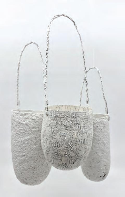
8.2 Jenna Lee, Their Words Vol.2, 2022, pages of ‘Aboriginal words and Place names’, varnish, garramal-wa (Gulumerridjin white ochre). Courtesy of the artist and MARS Gallery
single listing of words. Lee describes this as, ‘removing any connection to people or place’. The list of words signified the objectification of groups of people with distinct identities into a homogenised list with a single identity. In doing this, the identity of these diverse peoples was consolidated, and empathy for their cultures and languages was lost.
At this pivotal moment, there was a shift in her interpretation of a book. Lee uses themes of
transformation or translation in her work. She deconstructed the book and used water to turn the pages into pulp, to be reconstructed into another form. Once the book transformed from bound pages between a front and back cover into a three-dimensional form, it became part of material culture, a dilly bag, a symbol of a specific people, a symbol of subjective identity. A form that a people could understand and connect with.
Lee has a postgraduate degree in Museum Studies and has worked in the United Kingdom. Material Culture is part of the terminology that is representative of objects kept in museums worldwide. Lee aims to turn potentially harmful books into objects of beauty that cannot harm anyone anymore. The meaning behind her works has maintained areas of identity and have taken on further layers challenging notions of history.
Lee continued to find source materials of Aboriginal words and places and translated them into objects of adornment as seen in Self adorned (Figure 8.3) The collection aims to question our inclination to label and categorise the world dichotomously.
The body adornments represent self-expression and identity, yet the works are not fully complete until they are worn, the black labels are symbolic for the wearer to provide the missing information. As it is determined by the individual, the label can evolve and change.
Self: adorned throws into question what happens when objects, culture, identity and sexuality have multiple overlapping labels causing confusion where we as individuals struggle to make sense of self in a dominant binary system. The use of body adornment objects represents self-determined acts of expression of individual identity.

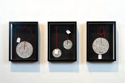
FIGURE 8.3 Jenna Lee, Self: Adorned #1-4. Pages of ‘Aboriginal words and Place names’, Chinese knotting cord, bookbinding thread, entomology display case, entomology display pins, label. 210 x 293 mm. Image credit: Installation view, Victorian Pride Centre. Photo: Victorian Pride Centre. Courtesy of the artist and MARS Gallery
After researching Gulumerridjin (Larrakia) ancestral material culture in the Melbourne Museum, Queensland Museum, and Pitt Rivers Museum in Oxford UK, Lee continued to produce wearable artworks culminating in doedoet: to tie up, 2021 (Figure 8.4), which consists of six neck adornments that bring together her family history. Using wax casting, every item bears impressions of either a sewing trim or the weaving pattern from a childhood danala (dilly bag). These textures symbolise the transfer of intergenerational knowledge in Lee’s practice. Kumihimo silk cord is added to make the silver bags wearable.
Red symbolises familial ties such as blood lines, tartan patterns and silk. Red is important in First Nations, Chinese and Japanese cultures. Lee incorporates it throughout her work including when she is editing books.

FIGURE 8.4 Jenna Lee (Gulumerridjin (Larrakia), Wardaman and KarraJarri), doedoet: to tie up 1–6, 2021, recycled 925 silver, red kumihimo silk cord. Collection of the artist. Photo credit: Fred Kroh
1 How much of your family history do you know?
2 How can you find out more about your family history?
3 Do you know the occupations of previous generations?
4 What object/s and colour/s would you choose as symbols of your family?
5 What do the object/s and colour/s represent?
Using the object/s that are symbolic of your family, either photograph them or draw them. Create multiples of them and compose them into another shape that is symbolic of you. Choose the colour/s that symbolise your family, employing three tones of the colour/s to draw or paint into the objects.
/ill-lustrous/, 2021, is a body of work combining multiple artworks that speak with one voice combining Lee’s personal family history. One of the works within /ill-lustrous/ is Bound by thread, 2021 (Figure 8.5), an installation situated in a pitch-black room; the viewer sees a single vertical shaft of light which tracks along the vertical red silk thread culminating in a circular pool of light on the floor. The circular red thread emulates the shape of the light. As if the viewer is placed deep underwater, Bound by thread imitates a line travelling from the surface of the water to the bottom of the sea providing a glimpse into the world of a pearl diver. Buttons are threaded onto the red pearling thread. The buttons signify the bounty for the pearl divers, not the pearls but the shell, which was used in the manufacturing of buttons. Part of Lee’s family were employed as pearl divers. However, this is not a tranquil history. Pearl diving was a thriving industry from the mid 19th century to the early part of the 20th century in Shark Bay, Onslow and Cossack in Western Australia. With the allure of creating financial opportunity, pearl-diving businesses imported divers from Japan, China, Malaysia and the Philippines (see ‘Pearl diving

in Western Australia’ box). As shallow areas became depleted, the pearling companies demanded pearl divers go into deeper waters, which resulted in 50% of divers dying and 100% of divers receiving terrible injuries caused by ‘the bends’. With the decrease in workers, pearling companies procured First Nations workers by deceiving them, which was referred to as ‘blackbirding’. With so many First Nations people forced into pearling and the high mortality rate, First Nations populations diminished significantly. The authorities at the time deemed that the First Nations people had worked of their own free will, but many including missionaries, government officials and citizens accused the pearl-diving businesses of slavery.
Included in the body of work /ill-lustrous/, 2021, are the works Painting with papers of many origins (Figure 8.6), which amplify Lee’s position as an Australian woman with cross-cultural connections. The media chosen to create Painting with papers of many origins speak directly of Lee’s heritage, with each layer speaking to each of her family connections. For Lee /ill-lustrous/, 2021, is a self-portrait.
When we think of the pearling industry, we often think of pearls used for jewelry, but in the late 19th and early 20th century, the focus of the industry was the collection of pearl shell for buttons, buckles and ornamental items. Western Australia’s commercial pearling industry started in the 1850s in Shark Bay and, although Onslow and Cossack also had thriving industries attracting large numbers of immigrants seeking employment, by 1910 Broome was the largest pearling centre in the world. Between 1900 and 1914, Australia was supplying over half of the world’s pearl shell to places such the United Kingdom, America and Japan.
In the early days of the industry, shell was collected in shallow waters but with such an influx of ‘pearlers’, the shallows became depleted. Mariners began sourcing the shell from deeper waters using far more dangerous methods that involved cruelly exploiting First Nations and Asian crews. The effects of fatal diseases and abuse by pearlers significantly depleted First Nations populations. This led
pearlers to venture to unregulated areas to procure First Nations labour through ‘blackbirding’ – the use of force or deception to obtain workers. Such practices were often sanctioned by authorities, who insisted that the First Nations people had volunteered their services. Nevertheless, various missionaries, government officials and ordinary citizens alleged that pearling was based on slavery. With the onset of diving suits, businesses imported cheap labour from Asian countries such as Japan, China, Malaysia and the Philippines. These workers were required to spend hours under water collecting pearl shell and endured a mortality rate as high as 50%.
Almost all divers suffered from ‘the bends’ (diver’s paralysis) at some time. By 1900, of the 1295 people working in the Western Australian pearling industry, 38% were Malays, 20% Philippine, 18% Japanese, 0.9% First Nations and 0.8% Chinese. By 1920, Japanese divers comprised one-third of the workforce and by World War II, nearly half were Japanese.
Source: State library of western australia, Pearl divers – WA Migration stories

FIGURE 8.6 Jenna Lee, Painting with papers of many origins, 2021, wooden painting panels, gesso, Australian South Sea pearl oyster (Pinctada maxima), various pigments including: China red, garramalwa (Gulumerridjin white ochre), bijeji-ba (Gulumerridjin yellow ochre), Smoked oyster, Iridescent medium, Pearl white, Pearlescent white (coarse), papers of many origins including: inkjet print of altered pages of the Immigration Restriction Act of 1901 on Awagami washi, found papers, Chinese rice paper, Origami papers, mother of pearl shell backing cards, Kaishi (tea ceremony paper), Torinoko, Lace Uzumaki, Awagami Unryushi, Awagami Ginwashi, Awagami Tea paper, pages of ‘Aboriginal Words’. Image credit: Janelle Low
Personal stories are a starting point for much larger issues. Highlighting her own family history, Lee has uncovered overarching narratives. These narratives create a dialogue into many other difficulties First Nations and migrant communities faced due to Australia’s colonisation. As much as turning the pages of First Nations dictionaries into First Nations objects comes from a personal history, it is also a history relevant for the First Nations community at large. The objects are a metonymy , they are representative of all First Nations communities. Lee has taken this thinking further with the transformation of a Ladybird book, The Voyages of Captain Cook, into an installation un/bound passage , 2019.
metonymy substitution of a name by an image or word that represents the thing (e.g. ‘the Crown’ instead of ‘the king’)

This was part of an exhibition at Queensland University of Technology (QUT) titled Rights of Passage. Lee deconstructed the book and reconstructed it into the installation.
Cook’s arrival was a pivotal moment in Australian history. There had been many visitors to Australia before Cook, mainly those from nearby countries such as Indonesia for trade purposes. The first documented landing in Australia of a European was Dutch explorer Willem Janszoom in 1606 on the west coast of the Cape York Peninsula. Another Dutch explorer, Dirk Hartog, landed on the west coast of Australia in 1616. The Dutch had sailed along the north, west and southern shorelines because they had also established trade with the East Indies (Indonesia). However, it wasn’t until over 160 years later that Cook sailed the east coast of Australia in 1770. Cook had with him the old Dutch maps and he continued to travel to the east coast. Cook had been given instructions from the Royal Navy Admiralty:
“
You are also with the Consent of the Natives to take Possession of Convenient Situations in the Country in the Name of the King of Great
Britain: Or: if you find the Country uninhabited take Possession for his Majesty by setting up Proper Marks and Inscriptions, as first discoverers and possessors.
LIBRARY OF NSW, EIGHTEEN YEARS EARLIER, JOURNEY OF THE FIRST
Cook’s voyage and his actions have been controversial and the consequential actions since have affected many people. First Nations Australians have been affected the most by these events. It was not long ago that local communities went from living freely in this land, as they had for thousands of years, to being colonised and controlled by foreign settlers. Aboriginal and Torres Strait Islander peoples have deep and integrated knowledge of this country including a spiritual connection to it, which has been passed down through generations. This knowledge and their way of life were severely damaged during colonisation, with some of their language, customs and traditions irreparably damaged or lost forever.
Jenna Lee’s investigations into her family heritage speaks of a much larger narrative in Australian history. Lee’s work through deconstruction and reconstruction of materials brings into the light the flux and misunderstandings in Australia’s history. Her artworks convey another perspective of the interchange of Indigenous peoples and migrants, their connections and mistreatments.
Connections to other artists / Artists of influence
Jenna Lee Lindy Lee D Harding Jonathan Jones
Visual language/symbols/media/techniques/processes/technologies/display
• Deconstruction of books to reconstruct Indigenous objects
• Pulped old books pertaining to Aboriginal language to be formed into objects
• Traditional paper-making techniques are employed to reconstitute old books
• Traditional sewing and weaving techniques used to make objects
• The colour red connects in all aspects of family heritage
• Works are displayed in various ways:
• some are like they are artifacts in a museum such as Their Words Vol.2, 2022
• others within a darkened environment so the viewer becomes part of the installation, such as in Bound by thread, 2021
CONTEXTS
Formal
Personal
Cultural

INQUIRY QUESTIONS
How can objects be reconstructed to speak to cultural history?
OR
How can historical events be expressed through the reconstructed contemporary objects?
FIGURE 8.8 Evaluation of Jenna Lee’s work, Their Words Vol.2, 2022. Develop and refine this chart based on your research and understanding of art as code.
Concept: Art as coded visual language
Contexts: Formal, Cultural
Since childhood, Tamika Grant-Iramu has had a fascination with nature. The beautiful repeating patterns within the connectedness of plants has inspired Grant-Iramu to create her own motif. The motif is like her signature, appearing in many of her artworks. For Tamika Grant-Iramu, place is very important.
Growing up in Western communities in innercity Brisbane, Grant-Iramu felt disconnected from her Papua New Guinean and Torres Strait Islander heritage. As an adult she investigated this further which strengthened her motif. Grant-Iramu’s child-like fascination with the natural environment has made her look closer at the repeating microscopic patterns. These tiny patterns appear in her exquisitely vinyl cut prints. The highly detailed prints are assembled together to create a landscape where the viewer can see a high contrasting panorama but then as the viewer moves closer, they can walk along the landscape observing the detail. Carving Memories: propagation by roots , 2019, is a series of 34 individual prints which, when assembled, create a multiple perspective landscape two metres by almost three metres

in size. The viewer looks down onto the earth surface at the roots protruding from the ground, then moving up the multitude of tree trunks skyward to the delicate branches and leaves. Beautiful, and at times, jagged lines traverse the landscape. Grant-Iramu employs high-contrast black and white, with protruding cell-like structures moving across the surface creating a curiously contemplative mood.
Similarly in Carving Memories: continued line, continued place, 2019, Grant-Iramu employs strong, fluid lines which traverse the panels that symbolise our story from one place to the next. As Grant-Iramu says:
“How we are influenced by our previous encounters can affect how we inform the rest of our path to grow. Throughout the carving process and exploration of organic forms, the piece creates its own language as the play of movement, rhythm and propagation of linework develops its own conversation.
TAMIKA GRANT-IRAMU
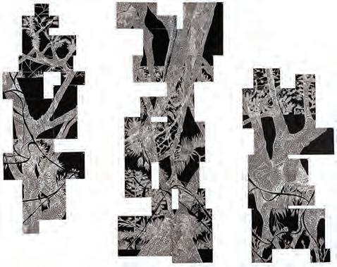
8.10 Tamika Grant-Iramu, Carving Memories: continued line, continued place, 2019, vinyl-cut print on paper, triptych installation, 200 x 280 cm. 2AP + Edition of 3. Photo credit: Louis Lim. Courtesy of the artist and Onespace


Playing with variations in the composition aims to move the audience out of their comfort zone and engage with the shift of horizon or the intricate patterns that continuously unfold with new adventures hidden within the landscape.
Carving Memories: a new dialect, 2018, was selected as a finalist for the Haugesund International Festival for Artistic Relief Print at the Haugesund Art Gallery (Norway) in 2019, as well as being acquired by the Griffith University Art Museum and Moreton Bay Regional Council. The floral motif in Complex Ecologies explores Brisbane’s environments that Grant-Iramu has experienced throughout her life. Grant-Iramu’s use of positive and negative space places the viewer under a tree with a foreshortened trunk leading from the lower edge to the centre of the image creating depth and placing them in the foreground. This along with intricate pattern suggests a tall, lush tree canopy.
What early memories do you have of playing in the garden or bushland or when camping? Where was this place? Does it hold any special memories regarding other people, friends, parents, grandparents, cousins?
Memories on monoprint leaves
Equipment
• Flat acetate or plastic sheet to roll out ink
• Ink roller (brayer)
• Block printing ink or oil paint
• A spoon or palette knife
• Large spoon or baren
• Newsprint paper
• Choose three or four dry leaves from your garden or close environment.
Process
Place a small amount of ink onto a flat sheet of plastic.
Use the brayer to roll out the ink, you do not need a lot of ink on the roller.
Arrange the leaves under the newsprint. Lightly roll the ink over the paper.
Grant-Iramu’s process when creating her works involves taking photographs as she walks through a particular environment. She then selects some of the photographs to collage together which in turn create hybrids of particular plant species. The plant motifs are carefully composed to fit within a large landscape defined by the specific location where the photographs were taken. The compositions are then translated into the language of relief print through the process of stylistically carving the designs into vinyl or linoleum. Once printed with black ink, Grant-Iramu decides whether colour needs to be included in the composition to reflect the landscape.
This is evident in her work Complex Ecologies: Summer Haze I, 2023 (Figure 8.13), which highlights through repetitive mark-making the
The impression of the leaves will appear in ink on the newsprint paper.
Do this onto multiple sheets of newsprint paper so you have many images of leaves.
Allow the ink to dry overnight.
Cut the leaves out.
Write onto the leaves special memories from your childhood. Mention places and people from those times.
Repeat the whole process so you have many leaf shapes with special memories on them.
Arrange the leaves in a specific shape. They may be arranged geometrically such as a circle or organically such as the shape of a tree trunk or leaf.
Reflect
Has the process of making helped prompt more personal stories from your past?
What other organic matter could you use to monoprint which is reminiscent of your past?
diverse ecologies of the surrounding mountains of Townsville. As Grant-Iramu says:
“There is a heat that permeates this landscape, the natural colours of the flora subdued, capturing a moment in time as the sun sets behind the mountains.
TAMIKA GRANT-IRAMU
The idea of capturing the essence of a place is important to Grant-Iramu.
Grant-Iramu is interested in how art, nature and the health-care sector can combine to create positive experiences for anyone, which in turn


can have a positive impact on overall wellbeing. Being immersed in the landscape, then immersed in printmaking has also helped Grant-Iramu to connect to her heritage, a melding of nature, making and personal history in one place. GrantIramu is driven by the desire to understand more about her heritage, so the intention is to express her personal stories through her work. The physical engagement with place becomes an emotional connection and an opportunity to explore her cultural identity.
Fragments of Redlands: the eucalyptus delves into the significance of an iconic Australian tree. As someone who grew up surrounded by eucalyptus trees, for Grant-Iramu it evokes personal nostalgia and connects her with others who share the experience of Australia’s native environment.
Since 2021, Grant-Iramu has been invited to run workshops for multiple schools and at the Pine Rivers and Caboolture Regional Galleries and for Flying Arts.
Connections to other artists / Artists of influence
Grant-Iramu
Formal
• Importance of positive and negative space
• Repetitive line work to create one shape
• Composition + Perspective
Cultural
• Explores cultural identity though connection to place
• Importance of country: the natural environment
• Focusing on the minute aspects of that landscape to bring it into focus –amplifying connection to place
• Visceral experience of place – what is my emotional engagement with nature
• Exploration of heritage and culture through arts practice
Visual language/symbols/media/ techniques/processes/technologies/display
• The intricacy of patterns in nature
• Organic material such as trees, leaves, roots
• Relief print
• Deconstruction of organic imagery reconstructed to create large installations

To other artists/collaboration
Tamika Grant-Iramu has collaborated with Brian Robinson.
Installation works align with Brian Robinson and Irene Keckes
How can emotional engagement with nature be portrayed through contemporary art?
How can memory of place be depicted through contemporary art?
FIGURE 8.15 Evaluation of Tamika Grant-Iramu’s work, Carving Memories: propagation by roots, 2019. Develop and refine this chart based on your research and understanding of art as code.
Concept: Art as coded visual language
Context: Formal Cultural
“Paintings are healings; portals to the past, creating a physical space like a temple. Canvases are representations of dancing … graffiti dancing.
I love mistakes and I love errors in my paintings, I like to give them their own voice.
JORDACHE
Jordache recalls an upbringing that was not limited by boundaries. In primary school he’d be up at 5am to ride his skateboard, go to school, come home and skate until 9pm. There were no strict rules. He was free. He’d play basketball, breakdance, listen to hip hop, punk and hard-core metal and watch MTV until late. As a 12-yearold, he knew 20-year-olds. He was immersed in a culture akin to that of the 1999 Woodstock festival, full of energy and aggression. His heroes were Rage Against the Machine, Korn, Fred Durst from Limp Bizkit, and skaters Tony Hawke and Bam Margera. Jordache reminisces,
“
It was a beautiful thing to not have any privilege. The beautiful thing about not having privilege is that you value everything. Little things like going to the video shop and choosing a video to watch. It’s a very humbling experience which I’ll
never forget. I’ll never forget where I came from.
In his early graffiti works (Figure 8.16) it was all about the energy and movement. The movement was twofold, the movement of the line work in the composition and his physical movement, like a dance across the painting surface. Jordache references how Jackson Pollock would dance around his canvases as he created his action paintings in the 1950s.
At the heart of all he did in his growing up was the freedom and the energy. He has carried that through to his current art-making practice. When Jordache left home, all he had was his painting; he thought, ‘I’d better make this work.’ Jordache is a risk-taker, he’d been taking risks his whole life, but it was normal, it’s how he grew up.
Jordache developed a style using repetition and colour. Building the composition as lines are repeated onto the wall or canvas. Prior to beginning a painting, he prefers to select the colours first. He finds it crucial to establish the colour palette as it aids in comprehending depth and shadows. Emotions and feelings are often


8.17
Energy and movement demonstrates a monochromatic colour scheme of an abstracted form with dynamic movement of line and shape against a gradient background from dark to light. The form appears to be standing on a platform due to the dark area below it.

associated with colours he employs. While he has a general idea of his painting’s direction, he avoids being overly constrained by it, opting for a more fluid approach to applying the paint.
Jordache has also created large-scale murals as an extension of his graffiti works.
Jordache wanted to move from graffiti to fine art. The graffiti compositions were often a response to the space, but also to the unconscious accumulation of colour and movement onto the space. A bit like skating, moving backwards and forwards through space, but this time creating a traceable path with the spray can or brush. He wanted to say more through his artwork, there was a lot from his past he wanted to get out. Devil’s blues (Figure 8.19) was the first painting onto canvas Jordache created, the energy and the dance of movement is still very evident. Devil’s blues is a reference to the Robert Johnson blues song Me and the Devil Blues, recorded in 1937 in Dallas Texas. The song tells the story of Johnson being woken by the devil one morning and the conversation that occurred between the two of them. Johnson’s life was short, passing away in 1938 at the age of 27 years old, one year after Me and the Devil Blues was recorded.

Jordache’s reference to the Devil’s blues is an acknowledgment to Johnson’s exceptional musical talent and the extremely difficult life he led.
In your journal write down a recent situation you were involved in.
List the emotions you felt at this time. Beside each of the emotions, place a colour to represent the emotion.
Beside each colour draw a line which represents the emotion.
On the next page of your journal, make a series of lines combining the colour with the line that represents the scenario you were involved in.
After creating many artworks, Jordache started reading about Modernist art movements. He saw that his work was analogous to Cubism and Futurism, with his use of repetition, breaking the surface up with iterations.
There are patterns all around us in both man-made and natural environments. Mindless mirage (Figure 8.20) shows rigid patterns, akin to architectural patterns but it also shows movement breaking
out of those patterns. It is symbolic of the nine to five workday, the rigid environment people work in, the rigid work week and tasks done in that time. Jordache’s perspective about how we interact with the environment was affected after reading some of the writing of Indigenous academic Aunty Mary Graham.
“The two most important kinds of relationship in life are, firstly, those between land and people and, secondly, those amongst people themselves, the second being always contingent upon the first. The land, and how we treat it, is what determines our humanness. Because land is sacred and must be looked after, the relation between people and land becomes the template for society and social relations.
AUNTY MARY GRAHAM, 1999
Mindless mirage is an abstracted work that references how we are constantly stuck in

rigid individualistic patterns, and we need to consciously aim to break out of it.
More recently Jordache has included the figure in his composition. There was so much more to consider when creating the structure. The process started the same as earlier painting with colour and movement, then the figures evolved; but there were more considerations to make with the compositional elements such as contrast and form, where to position the light source, consideration of the placement and scale of the figure and what posture they assume on the canvas. The first painting including the figure references the beginning of Jordache’s relationship with his partner. The Look of Love, The Rush of Blood, 2022 (Figure 8.21), is a monochromatic composition with two hidden figures. Jordache is on the right, his partner on the left. The background texture shifts from left to right. The left is busy with lots of movement, the right is plain and very flat. The texture represents what each person brought to the relationship. Jordache saw that his partner brought a lot of richness and energy but what he brought was an empty void.
Red can be associated with blood and family. Jordache was influenced by the holy love and

devotion depicted in Renaissance paintings of families and couples. One such work is Messer Marsilio and his wife, 1523, by Lorenzo Lotto, where the composition shows a tightly cropped image of a couple who were members of the wealthy textile merchants, the Cassotti family. The couple are embraced by a cherub, signifying their love for each other whilst their rich textured clothing contrasts against the textured dark background. Jordache is attracted to the Renaissance because of its use of colour and energy and because it is about the human experience ‘there’s holiness; whatever it was, it was energy and they added faces to it’. The Look of Love, The Rush of Blood, was part of Jordache’s first exhibition and based on the first photograph of him with his now ex-partner.
A year after his separation from his partner, Jordache was not in a good place emotionally. He reconnected with one of his old mates from childhood, Jake. As a child Jake had no risk management. Back then, Jordache saw him as the person that went above and beyond, but Jake did it because he had no stability in his life, it was a way for Jake to try and make sense of the world and where he belonged. After growing up, Jordache and Jake had gone their separate ways with no contact for 20 years. It ended up that both Jordache and Jake lived a similar journey, and both had emerged as creatives. Jake made an album, Cognitive Dissonance. The album helped Jordache to understand what he was going through in his life; Aesop, 2023 (Figure 8.23) is a work about Jake. He is playing his guitar in Jordache’s studio. The work is called


Aesop referring to ‘Aesop’s fables’. Aesop was a legendary figure: some argued he never existed, that he himself was a fable, others believe he had been a slave and created fables as a way to teach morals. The point is, little is known about Aesop, but much is known about his fables. Jordache saw Jake as an Aesop figure, a storyteller through his music, but few people know who Jake actually is. ‘Jake never gave himself the full credit for his own creative works’, Jordache says. Jordache wanted to portray Jake as a shimmering spiritual figure. When Jordache was at school, he’d get into trouble for not paying attention, he’d be in trouble for daydreaming and looking out the window, particularly from years one to three. Secluded dreams Figure 8.24 is based on the school of dreamers, those children who dream beyond their immediate environment.
When Jordache was in class he was reprimanded by the teacher for colouring over the lines. This drove him to do it more; to go against the grain with defining how art should be done. As a child, and into his teens, he wanted to dream and go above and beyond. In Secluded dreams Jordache uses the

repetition of line and the iterations of shape to create a dynamic out of mind figure which is analogous to Gino Severini’s Dynamism of a Dancer, 1912.
“The older you get you realise it’s about other people’s insecurity. Secluded dreams is about being boxed in but the fractal aspects of the mind coming back to the being rather than being allowed to be out there.
JORDACHE
Building the composition with repeated markmaking and allowing it to build up, unsure of the final product, Jordache wanted to create a ‘divine’ figure;

an ‘out of body’ figure as seen in Meeting Divine, 2023 (Figure 8.25). Inspired by Klimt’s The Kiss, an image of love, like meeting the divine, someone that is beyond this world. This was Jordache reaching out to find something he had never experienced throughout his growing up, the love from his mum or dad. The embrace of someone special in his life.
Reverse chronology
Connections to other artists / Artists of influence
Jordache
David Hockney
Gino Severini
Francis Bacon
Pablo Picasso
Ben Quilty
Jackson Pollock
Wassily Kandinsky
Lorenzo Lotto
Formal Personal Cultural Contemporary
Visual language/symbols/media/techniques/ processes/technologies/display
• Movement and energy are an essential part of the human condition
• Colour symbolises emotion
• Movement symbolises mood
• Oil and enamel paint on canvas, wall
• Slowly building the composition with repeated lines and changing tones

To other artists/collaboration
‘Jake ...’ whose music/album informed Jordache’s work
How can personal experiences be expressed through line and colour?
FIGURE 8.26 Evaluation of Jordache’s work, Meeting Divine, 2023. Develop and refine this chart based on your research and understanding of art as code.
Concept: Art as a coded visual language
Context: Cultural
Focus: Codes, symbols, signs and art conventions
Sometimes artists are humble, but we are proud of the joy that we can give to others through our work. If my work speaks and touches someone, then I feel I have accomplished what I set out to do.
Art is a visual record for future generations to enjoy.
JONATHAN TSE
Jonathan Tse is a Brisbane-based artist and printmaker who works across different media areas including screenprinting, monotype, etching and artist’s books, as well as sculpture, design, digital media, installation and public art. A continuing theme in Tse’s work for over 20 years has reflected on nostalgia and memorabilia. The joy of collecting an inventory of objects like photographs and postcards has provided an invaluable resource for his practice and contributed to
the autobiographical storytelling that filters through most of his artworks. These items have a connection with memory and childhood that has compelled Tse to create meaningful work. Nostalgia serves as a powerful tool for exploring the passing of time, evoking memories and emotions and connecting to the past.
As an artist, Tse’s role is not only to inspire others but also to enrich and educate them. As creative thinkers and cultural ambassadors, Tse believes that artists have a moral obligation to voice their thoughts and ideologies through art and bring awareness to an audience on a national and global level.
About 25 years ago Tse was given a box of black and white photographs. The photos were taken by his father in Hong Kong. He kept the box with the forethought that he might use them one day. In November 1996, he screenprinted a Christmas card using one of the early portraits of his family and sent them to friends. They complimented Tse on the idea and suggested that it should become an annual occurrence. After printing another card, the following year, he compiled his favourite photos in a diary and that was how his idea for the printed artist’s book was developed.
artist’s book a work of art in book form which focuses on media and techniques

FIGURE 8.27 Jonathan Tse, Portrait of an Australian, 1998, hand screenprinted artist’s book (32 pages, 13 x 9 cm), Edition: 10 + 2 artist’s proofs. Self-Published in Brisbane, Qld. Image courtesy of artist


In 1975 my family emigrated from Hong Kong to Brisbane. Adjustment to a new country was difficult not just for a child migrant but also for the parents. My brother and I were the only Asian students at our school. Language was a barrier and assimilation into a new environment was a struggle. For this reason, my mother thought it would be in our best interest to repeat a grade and so we did.
In the 1970s no foreign language classes were taught at school and

my mother did her best to tutor my brother and I with Chinese lessons at home, after school. We are fortunate to be able to still speak conversational Cantonese, our native language, but the reading and writing was lost when I started 6th grade.
JONATHAN
assimilation the process whereby individuals or groups of differing ethnic heritage are immersed into the dominant culture of a society


Prior to the creation of his major artwork, Portrait of an Australian, Tse produced a series of postcards which provided a narrative around his day-to-day experiences as an immigrant. These led to Portrait of an Australian which presents an autobiographical reflection of Tse’s personal journey and experiences merged with broader social and political themes and is based on the format of an Australian passport. The word ‘Passport’ is replaced with ‘Immigrant’ in gold lettering and the appropriation of the
Australian Coat of Arms, as the focal point, has been included in an altered sense with symbols from Tse’s own life replacing the state emblems in the centre of the shield. The artwork reflects themes of identity, cultural integration and the impact of political events on people’s lives. Pages of a school exercise book are juxtaposed in the background, with a passport motif and blurred black and white photographs taken by Tse’s father which mimic customs and immigration stamps. The pages contain transcripts of the artist’s
handwriting as a child in traditional Chinese and English script. The passport layout serves as a canvas which documents Tse’s arrival in Australia from Hong Kong, whilst serving as a metaphor for the complexities, challenges and transformations he and his family experienced, in the process of becoming Australian citizens.
“Semiotics is an important element to my practice. Using screenprinting, I can combine photographic and hand drawn mark-making together. This process is challenging but rewarding and allows me to compose handwriting and photos to imitate the appearance of an official document, like my passport.
JONATHAN TSE
Further imagery incorporated within the artist’s book also represents significant historical events and commentary of political developments. Additionally, it alludes to a pivotal moment in history, when in 1997, the sovereignty of Hong Kong, a former British Colony was handed back to mainland China, ending 156 years of British rule. At the time, Tse was finishing Portrait of an Australian Snippets of screenprinted colour near the end of the book aim to transport the viewer back to that time, with reference to the rise of Pauline Hanson’s One Nation Party, and the anti-migration policies highlighting her controversial views on multiculturalism and immigration that formed her vision of Australia. Tse says of his work,
“I love the hand-made and in the form of an Australian Passport, Portrait of an Australian presents the migrant experience through words and pictures and challenges the notion of what it means to be an Australian.
political environment. The ten copies of Portrait of an Australian have been acquired by public collections in Australia and overseas and this artist book still has much relevance to contemporary times, even though it was printed some 25 years ago.
semiotics an investigation of how meaning is created and communicated sovereignty the authority of a state or a country to govern itself
It invites the viewer to consider the complexities of immigration, citizenship and identity within a constantly changing
Passports as keepsakes: How does a passport evoke feelings of nostalgia and contribute to reminiscence about a particular moment in time, memory or experience?
The art of collecting is a routine human behaviour that Freudian psychologists believe is a way that individuals are able to create structure in their lives and impose order on the world. One of the biggest reasons that people collect is nostalgia and their objects of desire are ones that they may have admired since childhood. Gathering and curating objects is not only a satisfying hobby but also holds major benefits for mental health and wellbeing and forges social connections.
Tse’s obsession with collecting began with Made in Hong Kong toys. He has been an avid collector of toys for many years. About 30 years ago he found an old toy at a garage sale, which was the same toy he had when growing up in Hong Kong and it brought back such great memories. Like many migrants, they were only able to pack essentials, so many of Tse’s belongings, prized possessions and childhood toys had to be left behind. Although art and collecting may not have a great deal in common, preserving the history of an object is important to Tse.
Consider items that you collect or may have collected in the past; stamps, stickers, figurines, toys. How could these be used as a starting point to develop a body of work?


Why do people engage in collecting?
If ‘code’ is a system of words, letters, figures, symbols or principles used to represent others, could a collection be seen as a type of code?
What are some objects that people collect? Is hoarding a form of collecting?

Tse’s interest in collecting is further demonstrated in Go back to where you came from which he produced in 2016. It consists of a thousand Australian postage stamps placed in the shape of a map of Australia and one early Hong Kong stamp of Queen Elizabeth II. Following the theme of immigration, the installation symbolises a sense of cultural alienation that goes hand in hand with the life-changing and momentous act of migrating to another country as a child. It also demonstrates the mindset and mental journey that one must navigate in order to assimilate into a new culture and country while also learning a new language. His Master’s Voice references an 1898 painting by English artist Francis Barraud of a dog, Nipper, listening to the voice of his master through a wind-up disc gramophone. This is the same image that was taken on by the major British record label HMV for its logo, created in 1901 by the Gramophone Company Limited. Tse’s screenprint (Figure 8.32) features a dog pushing a ball which depicts the colours of the Iraqi flag. The image is a reinterpretation of an antique toy which he came across, that had been stamped, ‘made in the US Zone, Germany’. What piqued Tse’s curiosity were the markings on the toy, which prompted him to further research its history. After the German surrender at the end of World War II, the
American-controlled sector of Bavaria promoted the production of numerous items including toys, with the revival of various industries. Tse has recontextualised the toy in his 2003 screenprint, to present a strong political message, despite it being a seemingly simple yet timeless representation.
Vintage toys have been an inspiration in my work for the past two decades. They have a quality and visual appeal unlike any of today’s toys. This windup tin toy of a performing circus dog with ball was made in the U.S. Occupied Sector of Germany, for a foreign market. After World War II, Allied Governing Bodies encouraged the rebuilding of industry in the defeated Germany. The juxtaposed Allied flags on the little dog’s apron is a subtle intervention by the artist, along with the ball showing the colours of a pre-90’s Iraqi flag. The toy dog reminds me of the little Nipper from the now famous HMV label, ‘His Master’s Voice’ sitting inquisitively beside a phonograph. It was originally a British icon but was widely used by RCA Records in America in later years.
JONATHAN TSE

8.33 Jonathan Tse, His master’s voice, 2003, screenprint on 300gsm Magnani Incisioni, (35.8 x 25.8 cm), Australian War Memorial Collection, Canberra. Images courtesy of the artist + Original Tin Toy
Lure, 2002, screenprint on Magnani Incisioni 300gsm, 35.8 x 26 cm, Australian War Memorial Collection, Canberra
Subtitles, 2001, The Letter that was Never Sent, 2008, Nowstalgia, 2012, It’s a Small World Afterall, 2020, The Year of the Mask, 2021, Sisters, 2007
“Tse encourages aspiring artists on their own journey to be authentic in their approach, to not be restricted by conventional ideas and materials, but rather being open to many opportunities through exposure to different styles and techniques.
My art is inspired by objects from my collection: souvenirs from travel, early family photographs, and children’s toys. Before the making, I do preliminary sketches, but nothing is really planned. The layers of colour, the edition size, all these things can change during printing. The process itself is informing the work and I have to trust my intuition. I research the objects, to get a better understanding of the history and this helps to cohere and generate a connection between the chosen object and the art. Printmaking can be a long process, but it is also a rewarding one.
JONATHAN TSE
Visual language
Pattern and texture appear on the ball and garment worn by the dog which contrasts against the paler blue background and wispy white clouds; the colour and combination of the flags connotes cultural and political reference.
Symbols
Cultural and political references, flags –Union Jack and Iraqi flag, symbolic colours, reinterpretation of vintage toy.
Media / techniques / processes / technologies
The process of printmaking has always been attractive to Tse. Unlike painting, if the artist sells their work, a photograph or a slide could be their only record of that piece, but with printmaking there is the edition, and the artist can keep an original even if they sell their work.
His master’s voice is a 10-colour screenprint with the lightest colours printed first, then layered with darker colours on top. The printing process is done by hand, with the aid of photo-stencils
on the screen. Areas where no colour is to be printed are masked. Then each colour is carefully registered to line up with the previous layer. Sometimes when colours are layered on top of another, a tint variation may occur. This is always a surprise, even for artists with years of printing experience; there is no such thing as total control during the editioning process. Just like developing film in a darkroom, the outcome is often unpredictable. Opaque and translucent colours are used in His master’s voice. The inks are tinted to match the colours on the toy. The artist’s use of photographic and autographic techniques together helped to create this multi-coloured work.
Display
Edition of screenprints – edition of 33 + 2 artist’s proofs.

Cultural
• Reflects cultural and community identity and popular culture
• Symbolism referencing time, place, traditions
edition a series of identical impressions made from the one printing surface or plate autographic produced entirely by a specified artist
How can I visually represent cultural nostalgia and childhood memories?
Focus – family memorabilia, childhood memories, toys, nostalgia, collections and collectibles, identity, cultural integration, personal experience as an immigrant, social and political issues.
FIGURE 8.34 Evaluation of Jonathan Tse’s work, His master’s voice, 2003. Develop and refine this chart based on your research and understanding of art as code.
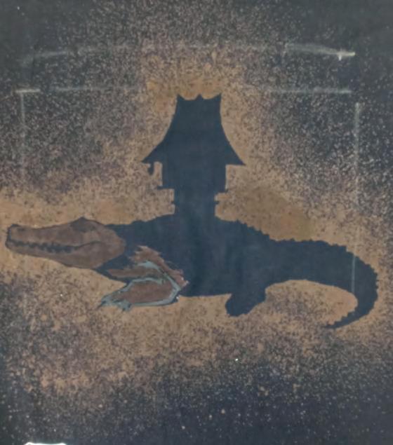
FIGURE 8.35 Dino Lopes, process work for Individualidade, showing planning, development of ideas and progress images


Connections to other artists / Artists of influence
Normana WightDarren BryantMathew Newkirk
Student work –referencing a cultural context

The use of T-shirts as canvas and the use of bleach as a mark-making tool is an alternative way of communicating the meaning of this artwork. The installation represents cultural identity and includes a self-portrait, a crocodile, traditional hut and a map of East Timor. The imagery on each T-shirt depicts my cultural heritage and includes the outline of my homeland East Timor, a crocodile which is part of my culture’s legend, a traditional Timorese hut and a portrait
Michael Schlitz
of myself. Without speaking a word of English, I left my country to come to Australia for the opportunity to gain an education. The word ‘Individualidade’, meaning ‘individuality’ translated from Tetum (the language of Timorese), appears underneath my self-portrait and summarises the fact that I will always be an individual with a strong cultural identity and with links to my home country.
DINO LOPES
Concept: Art as a coded visual language
Context: Cultural
Focus: Codes, symbols, signs and art conventions
Quandamooka artist Kyra Mancktelow lives and works in Yugambeh (Logan) and Meanjin (Brisbane). With links also to the Ngugi Nunukul people of Minjerribah (North Stradbroke Island) and Mulgumpin (Moreton Island), the Mardigan people of Cunnamulla and the southwest Pacific Island of Vanuatu, her art practice is deeply engrained in her rich Indigenous heritage and her identity and represents a strong connection to Country. Mancktelow’s multi-disciplinary approach in the media areas of printmaking, ceramics, painting, weaving and sculpture provides an avenue for exploration of concepts which acknowledge Indigenous histories, colonialism and the intergenerational trauma which has come about from forced assimilation within colonial missions.
Her work draws upon First Nations histories, to keep alive the stories and traditions of her culture, and to educate and raise awareness of the ongoing impact of colonial intentions. What drives her practice is recognition, developing an understanding of local history, acknowledging and imparting knowledge to her audience, thus allowing the viewers to reflect and be drawn to continue their own research.
Propelled and inspired by the influence of members of her family who have formed deep connections to Indigenous art and culture through their own art practice, Mancktelow is forging ahead with a successful artistic career. Her work is held in various collections around Australia; she has a number of public artworks in Brisbane, Logan and Ipswich, and her talents have been recognised with numerous awards, including winning the Emerging Artist Award in the Telstra National Aboriginal and Torres Strait Islander Art Awards in 2021.
into images and the historical events which have affected her people and the land on which they live. Underpinned by her own identity as an Indigenous woman, her work presents a sensitive understanding for her audience, an awakening which prompts them to take the lead and research further into the issues she presents. Using garments which she has sewn as a metaphor for assimilation, her approach to the materiality of the fabric has become the focus of many of her works. Through a process of experimentation, Mancktelow has developed a unique method of printmaking which simultaneously draws on the techniques of intaglio, collagraph and monoprinting. What began as developmental work for a collagraph, through the process of inking up the garments, then rubbing back the ink with tarlatan, the outcome has been a highly symbolic print. Mancktelow discovered that the physical act of removing the ink could be likened to assimilation and the notion of cleansing, erasing or rubbing away cultural identity. She utilised fabric as a poetic representation, a metaphorical expression aligning to colonisation without explicitly providing a literal explanation.
In developing her artworks, Mancktelow’s methodology begins with returning to Country, being in the presence of her people, ‘yarning’ to Elders, whilst also accessing archival research
colonialism where foreign power directly controls a territory intergenerational trauma occurs when original traumatic experiences are transferred through generations
yarning a casual, non-structured conversational process which helps build relationships in a safe space and is a means to share knowledge or pass on stories or information
collagraph a method of printmaking that involves gluing or attaching a collection of textured materials to a base plate to build up the printing surface, which is then inked, rubbed back and printed through a printing press
tarlatan a thin open weave cotton fabric stiffened with starch, used in printmaking to wipe excess ink from the surface of an etching or collagraph plate
Mancktelow’s Moongalba series references the experiences of First Nations people who were sent to Moongalba for assimilation. Through researching archives and sifting through numerous archival images, Mancktelow recreated


the garments and school uniforms that the children were forced to wear. In doing so, they were stripped of their identity and all reference to their Indigenous heritage was suppressed. The ethereal impressions of these printed life-sized
garments signify the unjust process of enforcing individuals to conform to Western protocol based on European cultural practices and values, within the confines of the rigorous regime of Myora Mission.
Moongalba, an area on the northern tip of North Stradbroke Island (Minjerribah), was established as a mission station in 1892, known as Myora Mission in the colony of Queensland. In 1896 its purpose shifted and it was labelled as an industrial and reform school which served as a source of inexpensive labour and it ultimately ceased operations, closing in 1943.


How would you approach the challenge of visually representing historical narratives while maintaining sensitivity and respect for the individuals and communities whose stories are being told?
How can art contribute to preserving and honouring cultural knowledge whilst also acknowledging the trauma associated with such histories?
How does Mancktelow’s art practice serve as a tool for raising awareness about historical injustices and contribute to ongoing conversations about cultural identity and heritage?
Gubba Up is a colloquial term used by Indigenous people, which loosely translates to ‘whiten up’. This series from 2022 documents the actions of naval officers on the First Fleet ‘gifting’ their military jackets to First Nations people so they could cover up, based on the empty assumption that it would be beneficial to them. The work consists of Blak Skin – Blue Jacket, 2021, a
split-tailed officer’s jacket printed in blue and embellished with impressions of gold buttons and gold trim on the sleeve cuffs and Blak Skin – Red Coat, 2022 reflecting a scarlet-coloured military coat also with highlights of gold on the edges of the sleeves and for the buttons. Along the bottom edge of each garment is a silhouette of a club and a boomerang respectively; both are brown to emulate the timber from which the actual artefacts are made. Part of this body of work also includes the ink-infused garments that were used to form the two prints, draped over supporting plinths, and next to these a timber boomerang and club form part of the installation. The duality of meaning is visible not only through the physical act of covering up one’s skin, that is, the skin of First Nations people, but is also indicative of the progression towards the gradual erosion of Indigenous culture, tradition and self-esteem. Further contrasts are evident when witnessing the full installation which combines the physicality of the textiles and timber combat weapons, alongside the haunting, translucent quality of the blue and red garments in print. Additionally, there is a cultural contrast presented in the print of the dilly bag overlapping the Western-style women’s purse.


FIGURE 8.40 Kyra Mancktelow, Gubba Up, 2021–2022. Images courtesy of the artist BLAK SKIN – Blue Jacket, 2021, ink impression and gold leaf on paper, 80 x 120 cm BLAK SKIN – Red Coat 2022, ink impression and gold leaf on paper, 80 x 120 cm NO PERCEPTION, 2021, ink impression on Hahnemühle paper, 120 x 40 cm
Mancktelow’s practice also involves traditional Quandamooka weaving methods which have informed a number of her artworks including her dilly bags and the wearable artwork One continuous string produced in 2021. Mancktelow travels to Quandamooka Country to source natural fibres, ungaire , as well as fibres from tawalpin (cotton tree, also known as Beach Hibiscus), strengthening her relationship to Country. She combines these natural fibres with ethically sustainable natural raffia, ensuring the use of eco-friendly materials and avoiding waste and over-harvesting of traditional materials. The construction of One continuous string, combines traditional Quandamooka weaving with the pattern of a ‘Western-style’ dress. The artwork not only bridges the gap between the past and the future by inserting her culture back into this important historical space, but it also highlights the resourcefulness of First Nations people in their ability to create such items of beauty that are also functional, using materials from the land.

FIGURE 8.41 Kyra Mancktelow, One continuous string, 2021, handmade garment and dilly bag – Quandamoooka traditional weave, woven from natural fibres collected from Quandamooka Country, 97 x 75 x 40 cm
Quandamooka weaving is an intergenerational activity that was a daily occurrence as ritual, for ceremony and for making functional objects such a fishing nets and bags for collecting seeds, nuts and fruits. The weaving was constructed from a loop and coil method which was uniquely developed by the Quandamooka people using ungaire (pink and green swamp reeds), collected from the
Collect a range of natural fibres, fine sticks and bark from your local area.
Engage in your own research into fibre art and weaving.

Through the body of work created for her 2023 solo exhibition, We’re Marching, Mancktelow subtly addresses the shift in narrative associated with garments and clothing. In colonial times, the forced wearing of Western clothing was a vehicle for undermining the identity of Indigenous people and suppression of their rights; this is in stark contrast with contemporary times whereby clothing takes on a new role, often one of protest,
banks of freshwater swamps and waterways on Minjerribah. With colonisation, the traditional cultural events of corroboree, song and weaving were ‘lost’, when the attempt at assimilation in the government controlled Myora Mission restricted all cultural practices. In recent years, however, contemporary artists have been heavily involved in the regeneration of this traditional weaving method.
Develop an experimental form (this could be 2-dimensional or 3-dimensional and functional or aesthetic) using natural found materials.

allowing First Nations people to embrace their cultural identity and stand up for their rights. This latest collection of prints of T-shirts and shorts features contemporary messages of resistance observed by Mancktelow during protests on ‘Invasion Day 2023’. This is her third body of work which investigates garments and the historic and cultural role they play in the lives of First Nations people.


FIGURE 8.43 Kyra Mancktelow, Australia not young not free, 2023, and Blak Queen, 2023, ink impression and acrylic paint on Hahnemühle paper, 80 x 120 cm each
Connections to other artists / Artists of influence
Sonja Carmichael Elisa-Jane Carmichael Kim Ah Sam D Harding
Mancktelow’s hope is to provide an avenue to recall and accurately document our past and, in doing so, foster resilience to maintain Indigenous identity and culture. Through the presentation, her compelling narratives her work provides perspective on First Nations histories, traditions and beliefs and opens up a conversation.
Gulagulabu, 2022, unique bronze sculptures of dilly bags
Sequence, 2022
Unfolding Nature, 2022
Chester Park Water Tower, Boronia Heights, 2019
Beenleigh Town Square upgrade, Our Way, John Lane, 2021
Visual language
The extensive public artwork follows a walking trail which has been informed by consultation with local Elders to display the First Nations culture and local history of the area. It consists of three main components:
• Pavilion – which displays a mural, entitled Trade Routes, painted on the underside of the roof. The contemporary Indigenous patterns and organic shapes are painted in a combination of earthy tones and with the addition of various tones of green.
• Water play space – which includes a waterfall.
• Cultural garden – The purpose of the garden, located near the library, is to promote storytelling and provide educational opportunities to build upon cultural knowledge within the natural environment.
The mural references local people and the connections they made through song, story and dance which was shared along the traditional pathways through the Ipswich region. Bronze Indigenous fish traps, and two pairs of platypuses cast in bronze are located in the water play space near a waterfall and there are three Brush Tailed Rock Wallabies positioned near large sandstone blocks amongst native plantings to represent their natural habitats.
Media / techniques / processes / technologies
Mural painting and bronze sculptures cast from original clay forms.
Display
The public artwork is part of the Ipswich Civic Square Redevelopment and Indigenous Walking Trail designed for ongoing public engagement and to foster community identity through the creation of a sense of place.

Cultural
• Explores First Nations culture through depictions of narrative and traditions
• Identifies cultural influences on the artists such as history
• Communicates through symbols and metaphors
• Reflects community interests
Kim Ah Sam, iAM Projects and Ipswich City Council
How do we remember and acknowledge our Indigenous histories?
Inquiry question for other featured works
How does my art practice reinforce the Western perception of Indigenous garments?
Focus – Indigenous culture, history and traditions / identity / place.
FIGURE 8.44 Evaluation of Kyra Mancktelow and Kim Ah Sam, Tulmur Place Civic Centre, Trade Routes, 2020. Develop and refine this chart based on your research and understanding of art as code.

“I have crocheted a twopiece suit comprising a pair of trousers and a jacket made of raffia. I have woven raffia coils of various sizes from 3cm to 10cm and arranged these into flowing patterns on the front and back panels of the jacket. After crocheting each piece separately, I sewed them together using raffia to create the suit.

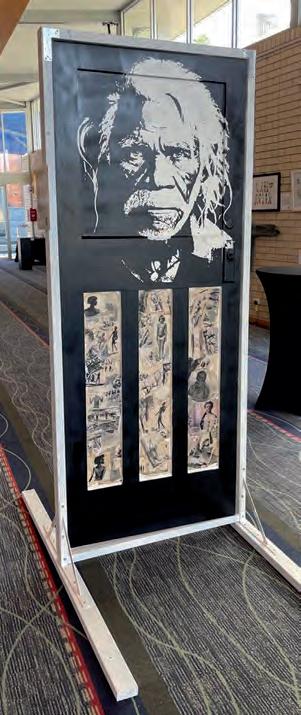

Indigenous people have been resisting since the moment the ships arrived, standing strong against massacres, land-theft, disease and racism. Resistance is about the persecution of the First Nations cultures and resistance throughout time. It uses a personal context to communicate a contemporary issue. The portrait on each side of the door depicts the same Elder warrior spirit overseeing resistance using different tools, from spears and shields to words and political protest.
The artwork is painted on two sides of a door to show a passage through time, with the images of resistance in early colonisation being black and white and modern resistance in colour. The white side of the door includes engraving with a wood burning tool, to reference Indigenous deaths in custody. The viewer interacts with the artwork by opening the door to see how First Nations resistance began and has continued into the modern day; it isn’t something new but has been there since the beginning of colonisation.
GABRIEL DINNEEN
This interactive case study can be accessed online in the Interactive Textbook

FIGURE 8.58 kūlī / karambu, 2020–2021, watercolour and gouache on handmade wasli paper, 15 panels, 88 x 63cm (irreg.) each panel. Museum of Contemporary Art Australia Collection. Photo credit: Carl Warner. Courtesy of the artist and Milani Gallery, Brisbane
• Artists have used symbols and signs to create codes of meaning throughout history.
• Artworks can be decoded by analysing how the artist has combined symbols and signs, the materials, techniques and processes with the elements and principles of design.
• Art as code is viewed through the formal and cultural contexts.
• The formal context informs the analysis and interpretation of formal visual art elements and principles, the application of materials and techniques, the stylistic qualities relative to historical periods or iconology seen in artworks, and how these contribute to engagement, communication and meaning. The cultural context informs the analysis and interpretation of the social influences and representations of time, place, politics, purpose, ethnicity, gender and spiritual and secular beliefs on artwork, and how these contribute to engagement, communication and meaning.
• Signs and symbols can be the content and/or form in a composition.
• Content is the subject matter such as a person, place or object.
• Form is the elements and principles of design such as the colour or texture or shape or 3-dimensional qualities.
• Each of the elements of design can be used as a code, such as the colour of an object or canvas, or the use of space, or the texture of a surface or the scale of the artwork.
• Artists use signs and symbols to represent something else; for example, the colour red can represent blood or family connection.
• Artists use and combine a variety of materials to express meaning such as canvas, recycled paper, ceramics, found objects, metal, old documents and books.
• Symbols vary depending on the intended message; for example, a symbol could be a metaphor or metonym or allegory.
• Signs and symbols in artworks can be a statement or a story or a warning or a group of people, or a community, or an individual, or a memory.
1 How has artist Jenna Lee used old books to transform their meaning?
2 How has Jenna Lee used the colour red in her artworks?
3 What is the predominant symbol in Sancintya Mohini-Simpson’s artwork?
4 What does the symbol in Mohini-Simpson’s artwork represent?
5 Why does Jonathan Tse re-create a passport as an artwork?
6 Name the motif in Tamika Grant-Iramu’s artworks.
7 Why does Grant-Iramu create artworks that are fragmented?
8 Why does Jordache align himself with the Futurist art movement?
9 How does Kyra Mancktelow use garments to symbolise injustice associated with First Nations history?
10 Choose an artwork from two artist case studies and compare how they have used one element of design, such as scale or colour or texture.


In Unit 3, students frame a self-directed inquiry question in response to a teacher-facilitated direct stimulus or first-hand experience. Through independent investigation of their inquiry question and application of critical thinking skills, students build knowledge about art, artist and audience to generate a personal focus and commence a body of work. They explore the concept ‘art as knowledge’ as they employ new knowledge inspired by their personal interests, beliefs and observations of the world.
Students use the contemporary, personal, cultural and/or formal contexts to study selected artists and explore expression, different layers of meaning and diverse interpretations of artworks. In this unit, students enrich their knowledge and aesthetic experience of their world through making and responding. Informed by their knowledge of art practices, experiences, history and influences, they embark on a body of work that visually and intellectually engages the audience perhaps through sensory experiences, or by provoking conversation, inspiring action or challenging expectations.
Students use inquiry learning to Develop, Research, Reflect and Resolve artworks using visual language, media areas and approaches selected for effective communication of intended meaning and their acquired knowledge. They recognise that art knowledge can be constructed and imaginative. Constructed knowledge challenges perceptions and the status quo, is intellectually engaging, innovative, provocative, can present alternative futures and may involve interpretation from a different context. Imaginative knowledge can entertain, express, record, invent, encapsulate the human condition, and may require the suspension of disbelief. Students may connect to other learning and subject disciplines to enrich their intellectual inquiry and approaches.
As audience, students consider what one can learn from works of art and how prior knowledge of culture and society influences our systems of decoding visual language. As artists, students consider what knowledge an artist requires to inform their art practice, and what knowledge and understanding an artwork can convey. Visual Art 2025 v1.1 General senior syllabus © State of Queensland (QCAA) 2024
By the end of this unit, you will:
1 implement ideas and representations to communicate knowledge gained through selfdirected inquiry
2 apply literacy skills to communicate knowledge of art practices and individualised ideas
3 analyse and interpret visual language, expression and meaning in contemporary and traditional artworks and practices using the contemporary, personal, cultural and/or formal contexts
4 evaluate influences to inform student-directed making and responding
5 justify decisions and informed viewpoints using knowledge gained through self-directed inquiry
6 experiment with visual language, expression and media in response to a self-directed inquiry
7 create visual responses using knowledge and understanding of materials, techniques, technologies and art processes gained through self-directed inquiry
8 realise responses to communicate meaning defined by the self-directed inquiry.

“All knowledge is connected to all other knowledge. The fun is in making the connections.
ARTHUR C AUFDERHEIDE (1922–2013), PALEOPATHOLOGIST
The concept for this unit is art as knowledge: constructing knowledge as artist and audience. This unit will allow you to gain and employ new knowledge, then enrich this understanding further through an aesthetic experience of the world and exploration of art-making.
Knowledge is based on observation, facts, information, descriptions, analysis and skills that are acquired through an understanding of a subject. It develops an awareness or familiarity of a particular experience or situation and can be acquired by perceiving, discovering or learning both theoretically and practically. In this course, you gain knowledge through making and responding. The idea is to acquire new knowledge that inspires your own personal interests, beliefs and observations of the world. Your knowledge will ultimately inform and expand your existing viewpoints.
Think about the knowledge you have in other learning areas. Connections can be made to enhance your visual representations and communicate new links and knowledge across subject disciplines. Visual Art requires you to implement ideas and representations that communicate knowledge.
During this unit you will engage with a range of ideas, experiences, artists, artworks and types of knowledge. In your role as both artist and audience member, you are required to use your critical thinking skills as you work through the processes of inquiry learning to generate your focus and inquiry question, develop your inquiry and make and respond to your own and others’ artworks. Critical thinking skills are:
• analytical thinking
• problem-solving
• decision-making
• reasoning
• reflecting and evaluating
• intellectual flexibility.
Apply these skills when researching, developing, reflecting and resolving your work.
Within the assessment instruments of Unit 3, you will be investigating different types of knowledge that relate to the stimulus experience and to your self-directed inquiry. You will be building your own knowledge as you develop your ideas and make your artworks. The unit concept ‘knowledge’ is used in a broad way to mean areas of interest that you can research and explore, and can be constructed or imaginative.
Tapping into the knowledge of your other school subjects, or your passions and interests, can present you with a range of knowledge areas that

can be connected within your art-making. Play to your strengths and personalise your approach to constructing knowledge. Connecting knowledge in unexpected ways can generate impact, challenge perceptions and provoke us to think about the world in different ways. For example, the painting in Figure 9.3, Cicadas hatching by the chain of ponds-Bibbaringa by John Wolseley, is typical of the artist’s lifelong practice of working in and with nature as a collaborator. This work uses knowledge of a locality and depicts it from above like a map. The artist is interested in nature and biodiversity. The insects are depicted with the accuracy of scientific drawings in various positions, so we can appreciate them from all angles. When you observe this painting carefully, parts of the landscape morph into insect shapes. Wolseley’s painting is a construction of new knowledge to alert the viewer to the links between animal habitat, biodiversity and land use.
Drawing on your sensory reactions, thoughts, dreams, emotions and other intangible
ideas, feelings or sensations can lead to the construction of imagined knowledge. This may also involve knowledge from other disciplines or interests. As a surfer and skater, Shaun Gladwell has consistently explored the physicality of movement and how it can be represented as artforms. He ties this with art history to create mesmerising and imagined scenarios such as Pataphysical Man (Figure 9.4) and Storm Sequence . He works with video; manipulating speed and orientation of imagery to immerse viewers in his imagined world.
Search the internet to watch videos by Shaun Gladwell. Why are they good examples of imaginary knowledge?
Research Gladwell’s work and find out how he injects them with ideas from art history to add meaning.

Direct stimulus or first-hand experience
Information is not knowledge. The only source of knowledge is experience.
ALBERT EINSTEIN
Unit 3 begins with a direct stimulus or experience that your teacher will facilitate. Your personal reactions to this stimulus will become the inspiration for your own inquiry question and investigation, which will lead to your focus for your body of work. The purpose of the direct stimulus or first-hand experience is to stimulate your curiosity and critical thinking about divergent ideas.
divergent to move in a different or opposite direction; to be different
Compile a list of your own personal interests. What beliefs, issues or observations of the world intrigue, frustrate or inspire passion within you?
Your direct stimulus could stem from one of the following options as provided by your teacher:
• video, documentary, TED Talk, story, poem, literature
• motivation from an expert lecture, editorial, article or symposium
A first-hand experience involves viewing, reading, listening, interacting or responding to written, visual or physical evidence such as a documentary, film, talk, event or journey. It is organised by the teacher in order to provide opportunities for you to view the world in new ways and to use your critical thinking skills as you engage in the experience.
• personal reaction, interest or story relevant to a specified text
• learning in another area
• an excursion to a familiar or unfamiliar place. Such excursions can be diverse and not directly art-related, but interesting and complex enough to generate a range of art ideas. These experiences may broaden your scientific, philosophical, environmental, social, historical and/or cultural knowledge, and could include a day trip or an overnight immersion.
“If we would have new knowledge, we must get a whole world of new questions.
SUSANNE
K. LANGER (1895–1985), AMERICAN PHILOSOPHER OF ART
Following your stimulus experience you are required to develop and then ‘frame’ a selfdirected inquiry question. The investigation of your inquiry question will generate the focus that will guide your body of work. Through independent investigation of your personal, intellectual inquiry question, you will apply critical thinking skills, independently build a depth of knowledge about art, artists and audience, and identify areas for further investigation. The inquiry question should present a visual problem that you aim to solve through your body of work and it should express your enthusiasm or passion for a specific subject or focus.
Think about what you noticed and how you felt and reacted during the stimulus experience. Consider these questions:
• what interested you intellectually?
• what gave you a sensorial reaction?
• what do you want to know more about?
• what might you like to discover?
• what are you passionate about and how could you tap into that?
Brainstorm focus areas that could be explored based on your answers to these questions. For instance, you might have been surprised at how much walking was required during your stimulus experience and how energised that made you feel. The resulting mind-map might look like Figure 9.5.

excursion along Brisbane River: Nudgee Beach, Boondall Wetlands, Nudgee Waste Transfer Station, Pinkenba, Northshore, (City Cat to Southbank) – GOMA
Frame your inquiry question so that it provides opportunity for exploration by using an openended question. Open-ended questions are structured to encourage a meaningful response using new knowledge. They require an in-depth and lengthy response. Typically, they begin with terms such as ‘how’ and ‘why’. It is very important that you ask a question, not write a statement. Your inquiry question needs to deepen your critical thinking. It should provide you with the opportunity to define a focus and synthesise existing and new knowledge, which informs your own art practice. It will also allow you to analyse and interpret artists’ works and art practices in different contexts (personal, cultural, formal and contemporary), and evaluate and draw conclusions as you resolve your artwork.
• comes from genuine curiosity about the world
• can be traced back to the stimulus experience
• makes you think about something in a way you never considered before
• invites both deep thinking and feeling through gathering evidence, data and information
• should provide you with the opportunity to define your focus
• should allow you to synthesise existing and new knowledge and draw conclusions through your resolved artwork
• will frame, inform, inspire and drive your investigation to answer the question
• will not be applicable to almost any artist.
Some example inquiry questions that might come out of the mind map in Figure 9.5 could be:
• How can the sensations of the moving body be translated into visual experiences for audiences?
• How might artists interpret and communicate the data from the different energies of moving bodies in different places, times and locations?
• What will happen when humans have bodies that are machine assisted?
You will generate your own self-directed focus, which will inform your own art practice and allow you to solve visual problems. Your focus should allow you to implement ideas and representations to communicate knowledge. Make sure that your chosen self-directed focus allows for the innovative application of visual language and
possible multiple solutions. Basically, your selfdirected focus should allow you to develop an aesthetic that becomes increasingly personal and selective.
The terms ‘innovative’ and ‘visual language’ are important in the sentence about developing a focus. What is your understanding of these terms?
Table 9.1 lists a sample range of possible selfdirected inquiry questions arising out of the stimulus experience.
The case studies in this book include the artists’ inquiry questions. Look back over these inquiry questions and consider how they invite new knowledge through investigation.
9.1 POSSIBLE FOCUS IDEAS AND INQUIRY QUESTIONS ARISING FROM THE STIMULUS EXPERIENCE
Natural environment land-based
For example: rainforests, parklands, caves, deserts, mountains, cane fields
Natural environment water-based
For example: ocean, beach, wetlands, Great Barrier Reef, islands, rivers, creeks, waterholes, marinas
Built environment
For example: historical buildings, factories, mills, shopping centres, markets
Growth, movement, nature and abstraction, ecology, environment, biology, change, rhythms of nature, science, fossils, prehistoric and mythological flora and fauna, human relationship to nature, decay, natural cycles: death–life, seasonal, ecosystems, environmental disasters, deforestation, toxic pollution, climate change
Growth, movement, ecology, biology, change, decay, natural cycles: death–life, seasonal, ecosystems, environmental disasters, toxic pollution, coral bleaching, climate change
Construction, manufacturing, history, industrial age, pollution, overcrowding, waste, population growth and density, blueprints, urban design, labour, trade unions, workers conditions, engineering, robotics, people, place, objects, consumerism, materialism, chaos, censorship, commodity, agoraphobia, femininity
What if a mythological beast from the rainforests of North Queensland is proven to be true?
What is the impact of consumer culture on the environment and animal life?
How might artists express the complex relationship between humans and marine ecosystems?
How has the urban landscape along the riverbanks changed through time and how can this be communicated though art-making?
How can I make artwork that expresses the stress, emotions and fears of coexisting as a human?
( Continued )
Utility venues
For example: recycling centres, power stations, police stations, courts, churches, graveyards, libraries, theatres
Transportation
For example: train stations, bus stations, airports, ferries, ships
Health centres
For example: hospitals, nursing homes, mental rehabilitation centres, headspace
Sporting and leisure centres
For example: stadiums, gymnasiums, skate parks, aquariums, zoos, botanical gardens
Consumption, waste, deconstruction, decay, transformation, advocacy, freedom, spirituality, symbolism, trust, rules, government, narrative, propaganda
Location, dislocation, movement, place, time, travel, journey, borderlines, cartography, landscape, time travel, science fiction
Death, life, family, mental illness, loss, depression, anxiety, euthanasia, emotions, growing up, adolescence, identity, anatomy, loneliness, germs, microorganisms, contagion, medicine
Mateship, persistence, glory, struggle, strength, heroes, loyalty, power, collaboration, victory, masculinity, kinaesthetic, movement, memory, play, nostalgia, physics of playground equipment, ergonomics
How does culture and heritage play a role in the history of our town?
How might artists depict undiscovered worlds and prove them to be true?
How might the narrative of a family’s history and struggles be expressed?
What is masculinity in contemporary art?
How can I create drawing apparatuses and kinaesthetic sculptures that use natural forces as power sources?
Do not confuse your inquiry question with inquiry learning, but understand that they go hand in hand. Inquiry learning requires you to solve problems through guiding questions that have more than one possible resolution, and emphasises the process of investigation when making and responding.
Inquiry learning includes four processes: Developing, Researching, Resolving and Reflecting. When you are framing your inquiry question, consider how it will trigger you to work through and revisit each of these processes.
• Developing: How do artists generate solutions to visual problems?
• Researching: How do artists react to stimulus?
• Reflecting: How do artists consider ideas and information, media techniques and processes?
• Resolving: How do artists communicate ideas as visual, written or spoken responses?
The formulation of an inquiry question will allow you to take responsibility for your own learning and move beyond the acquisition of facts to metacognition.
You have learned that contexts are frames of reference that allow visual communication and meaning to evolve. The four contexts provide alternative ways of analysing and interpreting artwork. Remember that they can be employed individually or in combination when understanding and appreciating artists’ work.
The four contexts are contemporary, personal, cultural and formal. These are fully explained in Chapter 1 in the Interactive Textbook. Refer
to section 1.3 for the context guiding questions and consider how they can be used to construct meaning in your work.
Through your inquiry question, you will investigate key artists and consider what knowledge artists require to inform their own art practice, and what knowledge and understanding their artwork communicates. You will examine how they challenge, reinforce or manipulate ideas, beliefs and meaning through making and displaying their artworks. You will need to synthesise information and ideas about key artists that include background knowledge, their influences and aesthetic choices. The study of other relevant artists will in turn support, influence and inspire your own art-making and allow you to take into consideration both contemporary and traditional artworks and practices. Choose key artists who reflect your own inquiry and self-
directed focus and examine how your key artists acquire and transmit knowledge through their current art practice.
Use the reverse chronology approach to investigate influences on key contemporary artists. Each of the artist case studies in this book is presented with a reverse chronology summary that shows how their art practices have been influenced.
Artists start with an area of interest, passion or prior knowledge that informs their art practice, and their research often goes beyond art-related learning. For example:
• literature – written texts linked to their idea; for example, Charwei Tsai’s Mushroom Mantra, 2005 (Figure 9.7)
• historical – investigation of a historical event, past significant events or issues; for example, Daniel Boyd’s Bitter Sweet exhibition, 2017, and Defying Empire exhibition, 2016

• environmental – assess how location and surface impact their ideas; for example, the artist Madeleine Kelly produced the work Spectra of Birds, 2014–2015, looking at the impact of consumer culture on birdlife and the environment (Figure 9.8)

FIGURE 9.8 Madeleine Kelly, German/Australian b. 1977, Spectra of Birds, 2014–2015, encaustic on cardboard with paper and text, 40 parts ranging from 8 × 11 × 11 cm to 27 × 9 × 9 cm (installed dimensions variable). Purchased 2015 with funds from the Josephine Ulrick and Win Schubert Diversity Foundation through the Queensland Art Gallery & Gallery of Modern Art Foundation. Collection: Queensland Art Gallery. Photo credit: Natasha Harth, QAGOMA
• social concerns – the impact of current social issues on their ideas and work; for example, Ai Weiwei’s investigation of the refugee crisis through his 2017 documentary and the re-creation of the drowned Syrian toddler in 2016.
Use the online link at http://cambridge.edu. au/redirect/8179 to read the interview by Lesley Ma with artist Charwei Tsai. What new knowledge about the artist did you gain from this interview?
Research the work of Charwei Tsai and explain how her body of work links written text with her idea.
As you make and respond to artworks in Unit 3, you will be reflecting on your investigation, your own art-making and the artwork of the key artists you choose to explore. Reflecting includes both evaluating and justifying
evaluate make an appraisal by weighing up or assessing strengths, implications and limitations; make judgements about ideas, works, solutions or methods in relation to selected criteria; examine and determine the merit, value or significance of something, based on criteria
justify give reasons or evidence to support an answer, response or conclusion; show or prove how an argument, statement or conclusion is right or reasonable
primary sources direct , original evidence, such as artworks and objects, artefacts, experiments, collected materials or observations of experience through moving image and visual forms
The evaluation of a range of both primary and secondary sources is an important part of your investigation.
Primary sources are direct, original evidence. They include artworks by the key artists. They include the evidence that you generate, such as your experimental artworks and objects, artefacts, experiments, collected materials or observations of your experiences. While engaging with the direct stimulus or experience, it is important to compile evidence of your observations for reflection. Depending on the nature of the stimulus, the way you observe and the primary sources you gather will vary, but starting points may include observing by:
1 annotation and/or drawing
2 collecting objects and/or data
3 visually recording using photography and/or video documentation
4 conducting interviews
5 recorded sound or conversation.
Reading about artists and artworks, listening to podcasts, watching documentaries are ways of learning about artworks and artists’ practices. Explore a wide variety of secondary sources so that you are learning about your focus and key artists from more than one viewpoint. Ask your teacher and school librarian for advice.
secondary sources another author or creator’s response to primary sources; discussion, description, analysis, interpretation, evaluation found in sources such as books, articles, journals, reviews; representations of someone else’s ideas
The new and enriched knowledge you gain through your investigation will prepare you to embark on a body of work. Remember, the outcome of your investigation is a clearly articulated focus that will guide your body of work. Think about how your art-making can:
• visually and intellectually engage an audience
• inspire action or challenge expectations
• present an innovative approach
• develop your personal aesthetic.
At all times, you should reflect on, explore and thoughtfully consider alternatives that will guide your future research, development and resolution of your body of work.
Media areas are organisers of knowledge, skills, techniques and processes. You are required to make personal choices about media through knowledge, understanding and application of materials, techniques, technologies and art processes. Think about the qualities and characteristics of suitable materials, techniques, technologies and art processes for your own art-making. Ensure you work towards the exploitation of media to give form and meaning to ideas, images and objects, and also consider their limitations. With your use of media, you need to refine the application of knowledge and art media through the making process.
Two-dimensional media include collage, drawing, painting, photography and printmaking.


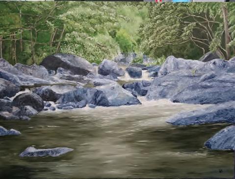

Three-dimensional objects include ceramics, fibre art, installation, sculpture, wearable art and body adornment. See Figures 9.14–9.18 for examples.


Time-based media include electronic imaging, film and animation, sound art, performance art and virtual reality.
You need to establish a system that allows you to document all the processes that make meaningful connections and inform your
investigation, self-directed student focus, experimentation and making.
Using a sketchbook or visual diary is an effective way to chronologically document your processes. Digital documentation using photography and video is another excellent way to record the progressive development of your work. Other modes of documentation could include a folder, container for threedimensional objects, digital files, website and/ or a blog. For assessment, the syllabus states that you must include supporting evidence as visual support, and that includes experimental artworks, sketches, annotated diagrams and images, notes, ideas, photographs and/ or collections of stimuli with reflective commentary.

How do artists communicate individual ideas as visual, written or spoken responses?
What is an artist’s statement?
Your artist’s statement assists the audience with understanding your body of work and your selfdirected focus. It should convey the reasoning behind your work, stating why you chose a particular focus and why you worked within a certain medium. You will need to use literacy skills to construct an artist’s statement that allows your understanding of intended meaning to be established. A well-written artist’s statement shows the relationship between you and your artwork, and helps to create a connection with the viewer.
Why do you need an artist’s statement?
In Unit 3: Art as knowledge and Unit 4: Art as alternate, both summative internal project assessments stipulate that an artist’s statement must be completed as part of the assessment
conditions. If you create a single artwork, one artist’s statement is required. If you create a collection of artworks, you can choose to write multiple statements for individual artworks or one statement for the entire collection.
Artist’s statement content
As a precursor to your written artist’s statement, you should include the following details, which are not included as part of the maximum 150 words stipulated in the assessment conditions.
1 your full name
2 the title of the artwork format in italics
3 media used
4 the size of the artwork, following the convention of height x width x depth.
Titles can be literal or expressive and may help to demonstrate layers of meaning. Some artists deliberately leave their work untitled to avoid influencing the audience’s interpretation of the image.
Information about media or materials gives clues about how an artwork was made, which may add to our understanding of non-literal meanings.
Your artist’s statement should:
• assist the audience to understand the body of work focus and your critical and creative thinking
• include literacy skills and language conventions to describe and communicate the concept and your self-directed focus.
• the unit concept Unit 3: Art as knowledge, Unit 4: Art as alternate
• invite a dialogue with the audience by acknowledging that viewers bring their experiences with them when they view artworks. For more information about how to create a dialogue with the audience through your artist’s statement, refer to section 2.5 in the Interactive Textbook.
You might elaborate on your personal response to any of the following:
• direct stimulus or authentic experience
• primary and/or secondary sources
• inquiry question posed and/or possible response to this question
• reference to contexts as they apply to your work (contemporary, personal, cultural, formal)
• media choices that elaborate on materials and techniques
• influence of key artists.
Constructing an artist’s statement requires literacy skills that allow your understanding of intended meaning to be established. A wellwritten artist’s statement shows the relationship between you and your artwork, and helps to create a connection with the viewer. A list of tips is provided below.
• Make sure you proofread your artist’s statement for grammar, spelling, punctuation, clarity of expression and audience engagement.
• Write in first person and refer to your artwork in present tense; for example, ‘My experience with …’, ‘My painting approach explores …’, ‘I am exploring …’
• Address the audience to include them, for example, ‘we adopt a view …’, ‘our hearts break …’. Ask them questions, ‘what/how do you …?’ or ‘what is your …?’. These strategies assist in creating a dialogue.
• Your writing should be concise, simple, clear and to-the-point.
• Use as few words as possible; try to communicate your artistic intentions in less than the syllabus-specified maximum of 150 words per statement.
• Avoid using fancy, creative fonts or design layouts.
• Align the font to the left so it is easy to read.
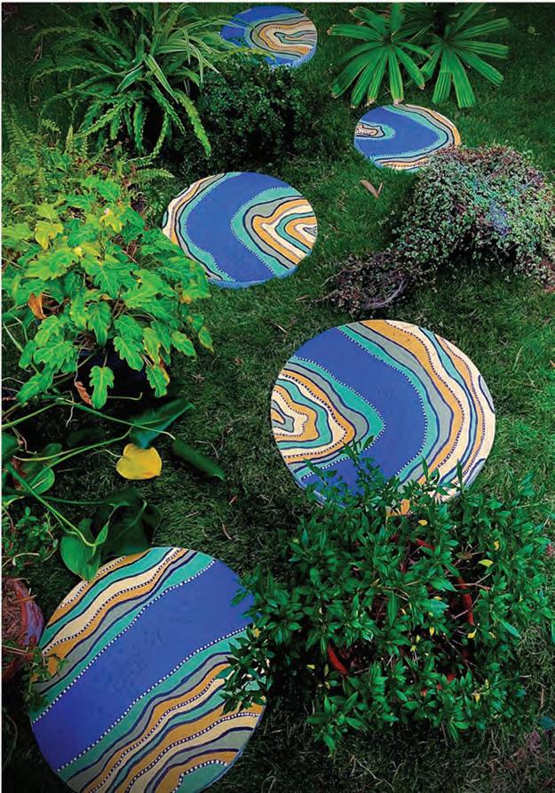
River Stones, focuses on the Brisbane River (Meanjin) in the distant past, drawing on knowledge of the river’s significance to the original inhabitants. The artwork depicts the stretch of the river from Hamilton to the city Botanic Gardens and imagines the journeys and pathways of my ancestors.
The artwork is a bird’s-eye view, as many Indigenous landscapes are and is installed on the ground, so the viewer looks down at it. From above, the bird’s-eye perspective is enhanced
and the linkages between each stone are more easily understood. Painting techniques reference the style used by First Nations peoples. The white dots create pattern and texture so that when walking on the stepping stones in bare feet you can feel different textures, as you would if walking barefoot around the river. This work has been installed into a beach house at Minjerribah, the traditional lands of my people, the Quandamooka people.
Directly addressing the audience by using ‘you’ invites them into a dialogue about the intended meaning. By using ‘my people’ viewers understand that the artwork is a personal response to the focus and they feel included in the dialogue.
Gabriel Dinneen River Stones 2023
Paver paint on 5 hand-made concrete stepping stones 30cm, 40cm and 50cm in diameter
River Stones, focuses on the Brisbane River (Meanjin) in the distant past, drawing on knowledge of the river’s significance to the original inhabitants. The artwork depicts the stretch of the river from Hamilton to the city Botanic Gardens and imagines the journeys and pathways of my ancestors. The artwork is a bird’s-eye view, as many Indigenous landscapes are and is installed on the ground, so the viewer looks down at it. From above, the bird’s-eye perspective is enhanced and the linkages between each stone are more easily understood. Painting techniques reference the style used by First Nations peoples. The white dots create pattern and texture so that when walking on the stepping stones in bare feet you can feel different textures, as you would if walking barefoot around the river. This work has been installed into a beach house at Minjerribah, the traditional lands of my people, the Quandamooka people.
FIGURE 9.21 Analysing the parts of an artist’s statement
Use of terminology to identify artworks
Description of focus
Communication of concept Art as knowledge, and focus. Visual art terminology
Application of literacy skills and language conventions are evident throughout the artist’s statement
Exhibiting your work through display is a vital component of your art practice. Musicians write music so that it can be played for an audience. Visual art serves the same purpose; artists create artwork so that an audience can view it to engage with the work. Audience reaction is a pivotal part of the art-making and responding process and this allows for the realisation of your intentions. To achieve the highest levels on the marking guides you need to demonstrate that you have implemented ideas and representations that enhance reading and engagement for the audience. The display can add considerable meaning to the work.
pivotal of crucial impor tance
Therefore, when developing your idea it is important to think and plan for how you ideally want audiences to read the work. If you can’t actually achieve this display, you need to demonstrate your consideration of it in your planning. For instance, will the work be displayed on the floor for audiences to walk around or through? How will you create a pathway? Do you want audiences to look up at the work like Doh Ho Suh’s Staircase - V, 2008 (Figure 9.22)? If so, how will it be secured in place? Will the work be hung on a wall in a traditional manner? If so find

out at what height artworks usually hang and why. How will you attach the work to the wall? Will it be framed, pinned or attached with magnets? Is the work multi-modal? Does it have a projected video or light component? If so, how will that be connected? Will electrical cords be a feature or will you hide them? Is there a sound component? What device will you use to make that audible for listeners?
You might have the opportunity to display your work in a student exhibition. This is the perfect opportunity to document your work while it is displayed. It might not be possible to display your work physically, or you might choose an alternative method of display that adds meaning in other ways. For example, digital, virtual or online display and exhibition modes might be more suitable for artworks that employ new technologies or involve remote audience interaction.
You need to consider how display possibilities can enhance your intended meaning.
Student Elijah Smith’s wall-hung installation (Figure 9.23) is an example of capitalising on display to enhance meaning. The artist’s statement refers to the juxtaposition of nature and industrialisation as sources of mark-making and imagery. Smith’s use of found objects arranged with the various abstract images he created has enhanced reading and engagement for the viewer because as we

9.23
audiences by demanding that they look upwards to the ceiling and by challenging their understanding of the solidity of architecture.
Smith, Unburdened Mind, 2023, found objects, lino printing, digital photography, etching, LaserJet printing, Perspex, aluminium air duct, fishing line, collagraph, collage, photogram, frames
examine the work, we make connections between all the components. We automatically seek similarities between textures, tones and colours as we attempt to decipher the origins of the imagery and ask ourselves, are they man-made or natural? When an object overlaps an image in a display, we are compelled to interrogate it, seek connections and visually follow new pathways.
Read the artist statement by Elijah Smith and answer these questions:
1 How does Elijah Smith use terminology to identify his artwork?
2 What was the focus of Smith’s inquiry?
3 How has Smith worded his engagement with the concept, art as alternate?
Unburdened Mind is an immersive art installation, focusing on embracing creativity beyond conventional boundaries. This artwork challenges our knowledge of what art is, providing alternate suggestions. I have been influenced by contemporary influences in our forever evolving and adapting world. The subtle featuring of dynamic and diverse materials and techniques symbolise the constant flux, or adaptation, we see in our contemporary society with each element of the work representing a unique facet of my own artistic evolution. The fusion of nature and industrialisation is suggested through juxtaposed elements, implying the opening of new pathways in our ever-shifting world. Dark and earthy, monochromatic tones have created a harmonious yet enigmatic atmosphere, inviting you to immerse yourselves in the sensory experience rather than searching for a predefined narrative. In this absence of clear narratives, let your imagination roam freely, with an unburdened mind and reflect on the essence of artistic expression.
ELIJAH SMITH
4 Find some examples of visual art terminology within this statement. How do they add meaning?
5 Comment on the way Smith has used language conventions to invite a dialogue with his audience about his intended meaning.
6 Use the instrument specific marking guide (ISMG) for resolving in the IA2 or IA3 and consider how you would assess this artist’s statement. Remember to start at the bottom and work upwards.
9.6
1 List ways that you are able to display your work within the school environment and suggest ways your work could be displayed within the community or other domains for audience engagement.
2 Why do you think display is such an important part of the making and responding process?

• Acquiring new knowledge will enrich your understanding and provide a platform for you to discover and learn, to think beyond what you already know and build upon your existing knowledge.
• Make links and research beyond art-based subjects to assist in establishing and expanding your knowledge base. Consider scientific, environmental, historical and social concerns as areas of reference.
• A direct stimulus or first-hand experience is central to the development of this unit and is used as a catalyst and starting point for making and responding.
• Develop a self-directed focus which allows for the innovative creation of ideas that are personal and selective.
• Establish a self-directed inquiry question that is reflective of the stimulus or experience, and that aligns with a personal focus. Ensure this self-directed inquiry question is open-ended, intellectual and has scope for extended research to guide and build your knowledge.
• Primary and secondary sources are compiled evidence of your making and responding processes in response to your personal focus and inquiry question. Primary sources such as drawing, photography and recording can be employed and secondary responses utilise the primary sources and become multiple solutions to visual problems.
• Documentation of all evidence and sources is a vital process to allow movement through ideas from both primary and secondary sources. This foundational work leads to the development of a body of work.
• Writing an artist’s statement forms part of the whole work and shows the relationship between your intentions and the physical artwork. Ensure it uses correct visual terminology and literacy, is succinct and clarifies ideas with purpose.
1 In relation to your chosen focus, what new knowledge did you acquire prior to completing extended research?
2 Reflect on the impact that the teacher-facilitated direct stimulus or first-hand experience had upon the initial starting point for the development of your selfdirected focus.
3 Review the four contexts: contemporary, personal, cultural and formal in the digital Chapter 1. Select one question from each context to apply to your own artwork and then respond to each question.
4 Compile a list of key artists that parallel your personal focus and inquiry question and find examples of their work that utilise two-dimensional media, three-dimensional objects and/or time-based media.
5 Compare your primary sources with your secondary source research. How does the secondary source material build on your initial responses? What challenges or roadblocks occurred with each artwork and how will you overcome these to move forward?

Concept: Constructing knowledge as artist and audience
Contexts: Formal, Cultural, Contemporary, Personal
“Don’t overlook the obvious.
Bruce Reynolds’ artworks are in between: in between art and decoration, in between the past and the present, in between reality and ambiguity, in between the known and the unknown, in between East and West, in between 2-dimensional and 3-dimensional, in between laborious high energy and refined mark-making, in between architecture and fine art, in between deep knowledge of art history, artmaking processes and playful, spontaneous and, at times, aggressive gestures, in between gravity and levity.
Materiality and history are at the core of Bruce Reynolds’ works. Drawing with chainsaws and extremely sharp knives, mixing large quantities of plaster and meticulously pouring it onto carved surfaces, immersing himself fully into his artmaking processes. It is because of Reynolds’ deep knowledge of history and artmaking processes that he can be spontaneous, as the accumulated knowledge bursts forth through his multitude of practices.
Bruce Reynolds has travelled extensively to pursue the historic migration of ideas and forms linking Europe and Asia. Throughout his career, Reynolds has aimed to advance his knowledge of European history, in particular the expression of designs and patterns. During his travels through Italy, Reynolds became aware that the rubble he found on demolition sites represented centuriesold constructions. Finding ancient artifacts amidst modern urban debris left a lasting impression and prompted him to contemplate what the discards from Australian culture could be that would reflect its urban history in the future.
‘Queenslander houses and linoleum’). This was a major shift in how Queenslander houses had been decorated in the past. The debris comprised of different eras of linoleum (see the text box ’Linoleum: a brief history‘) and carpet. Reynolds immediately saw how this mirrored his previous experiences in Italy, seeing the discards of everyday patterns from across millennia, but the patterned debris on Brisbane suburban streets represented décor and design which spanned approximately 100 years of Brisbane history.
When Reynolds returned to Brisbane from a trip in the late 1980s, the Brisbane suburban footpaths were littered with piles of debris from the frantic renovations being made to convert Queenslander houses into modern chic dwellings with white walls and polished floors (see the text box on
Queenslander houses and linoleum
Queenslander houses had evolved through many design and décor transitions since their inception in the 1840s. Built on top of stumps predominantly to keep the occupants cool, with the floor off the ground so air could flow under it, the Queenslander became the staple family home. New products were being developed for the changing design trends including different types of floor covering such as carpet and linoleum, colloquially known as lino. Over the years, as new trends became available, it was common for the new lino to be laid directly over the top of the old lino. When the flooring was eventually taken up, it became like an archaeological dig, pulling back the layers of history, each layer characterising a certain era in Australian history, representative of different eras dating back almost 100 years.
Reynolds has concurrently incorporated photography and collage in his work throughout his career. He was influenced by assemblages and collage works by artists such as Picasso, Braque and Gris, particularly in how Cubism changed perceptions of perspective. Lino’s malleability, textured surface and diverse range of patterns offered itself as a material that could be used in collage. Based on his understanding of the history of linoleum, in the late 1980s Reynolds began to experiment with juxtaposing lino patterns to create ambiguous surfaces. Hence, Reynolds’ works are multilayered through the history of their materiality and the history of the imagery that is portrayed within them.
Linoleum: a brief history
By accident, in 1860 engineer Fredrick Walton discovered that linseed oil oxidises, resulting in the oil becoming a glutenous mass. This oil when applied to a fabric and dried, resulted in a flexible water-repellent floor covering called linoleum. Due to its water-repellent qualities, linoleum became important for keeping surfaces hygienically clean. Walton established a factory in 1863 to begin mass production of linoleum. Twenty years later, German merchants from Bremen transplanted the linoleum industry to Germany. Within another 20 years linoleum was seen as being a revolution in architecture, with manufacturers employing artists to create modernist designs. With these modernist designs, linoleum became popular worldwide in households, hotels and hospitals. Linoleum began to be imported to Tasmania in the early 1890s and by 1899 was advertised regularly in home journals and catalogues. Linoleum production was established in Australia in 1927. It declined in the 1970s and had a renaissance in the 1980s. Thanks to renewable materials and ecologically sound production, linoleum is currently again in demand. Within art-making itself, linoleum has been used as a printmaking tool. There is no clear point when lino-cut prints were first produced; however, it became a rival to wood cut, lithography and mezzotint due to its ease of manipulation, having a soft homogenous surface with no grain to contend with.
When presenting to a secondary visual art class, Reynolds showed the work Bullet points, 2021 (Figure 10.2) and asked the students; ‘What do you see?’
‘Three pointy things’ was one response, ‘Is that a boat?’ was another, ‘Different green patterns’. Beautiful ambiguity, it makes the viewer question ‘What is this that I am looking at?’

Using these three objects within one artwork, Reynolds has traversed history and cultures across the planet. The cultural and artistic freedom that has allowed Reynolds to roam provides almost limitless possibilities of concepts to explore. His knowledge of history, both ancient and modern, serves to link his exploration back and forth through time, juxtaposing historical imagery with traditional and experimental artmaking processes.
Rehang, 2021 (Figure 10.3) explores spaces in between modernist movements and creates a new dialogue of representation from 3-dimensional metal sculpture into 2-dimensional lino.

Reynolds explained to the class that these three shapes, a spear head, a boat and a cypress pine tree, are found in most countries and cultures of the world.

In Rehang, two modernist sculptures are represented side by side. They are rehung next to each other in a new curatorial variation within a 2-dimensional lino collage to pose new questions about sculpture (and painting). The image of the sculpture on the left is a 2-dimensional representation of the experimental ephemeral sculpture Prop, 1968 (Figure 10.4) by New Yorkbased artist Richard Serra. In the 1960s, Serra wrote a list of verbs of potential actions he could do with one material. The list included actions such as: to roll, to splash, to drop, to lean. Working in the metal yards at the time provided Serra with access to sheets of lead and steel. At this point in Serra’s career, he dedicated himself to the process with no regard for the outcome, his artworks at this time were completely experimental. The processes guided Serra to continue investigating materials, which led to large-scale works that challenged the notions of art and architecture.
The image depicted in Figure 10.5 is a 2-dimensional representation of Swiss artist Jean Tinguely’s Méta mécanique, 1954. A decade before Serra was creating his experimental works, Tinguely, influenced by Duchamp’s ready-mades, was creating sculptures from discarded materials. Rehang sums up the process Reynolds employs. He allows the process to guide his thinking and is influenced by the materials that are available. When Reynolds began his lino works, a chance moment occurred where he saw a piece of lino

10.5 Jean Tinguely, Méta-mécanique (Méta-Herbin), 1954, painted steel, electric motor, 174 h x 81.7 w x 108.7 d cm. NGA –National Gallery of Australia, Canberra. © Jean Tinguely. ADAGP/ Copyright Agency
that looked like a painting he had done at age 17 and asked himself, ‘can lino be a painting?’ Regarding Rehang, Reynolds says: ‘Revisiting the imagery of modernist sculpture drives a wedge between the objects depicted and the new objects that translate steel into lino.’ New meanings are created when appropriating photographs that represent avant-garde sculpture into experimental collage materials of lino and painting. Reynolds continues to allow the process to drive his thinking and asks himself ‘What’s next?’
Originally from Canberra, a first-generation Australian child of migrants, Reynolds was constantly motivated to make things. When visiting his old hometown, prior to the popularity of aerial drones, Reynolds rode in a hot air balloon over Canberra and photographed the landscape not toward the horizon but straight down. Reynolds would then print the photographs onto lino collages he specifically created for each image, as can be seen in Wet Road North, 2011 (Figure 10.6). The patterned frontality of the lino related to the aerial view. Most lino was sourced from floors and bench tops. Reynolds invites correlation between the intimate domestic home environment and the broader cultivated

landscape. He says: ‘There are questions of how we treat the floor beneath us as an echo of how we treat the landscape.’
Reynolds developed his sculptural practice in the studios of The British School at Rome. In order to address the complexities of history there, he chose a simple new material to work with: plaster, abandoning the found materials of collage. Plaster is white and clean, unlike linoleum, which is patterned, often colourful and in various stages of decline. He observed elements in the architecture and sculpture in different states of repair. Reynolds used his time in Italy to break from working with found materials. Beginning with a completely blank slate was the beginning of a period of working from blankness, with white materials instead of found materials. He experimented with the texture on the surface of the plaster to create a relief pattern. The relief patterns Reynolds employs translate across time and place.
What type of building do you live in?
What patterns do you have in your place of abode?
Are there patterns on the building for example, in the brickwork or walls or flooring?
Are there patterns in the furnishings, for example, the cushions or bed covers or plates and cups?
How do these compare with older homes and furnishings?
Photograph the patterns in your home.
Particularly photograph the patterns you take for granted because you see them every day.
Print out the photographs onto A4 paper. Working intuitively, tear the printed patterns into different shapes.
On a new piece of paper, arrange the torn patterns. Don’t think about it too much.
Once you have arranged them, glue them down onto the paper.
Do this process three or four times, so you have multiple works.
Now look around your home and see if there are places where patterns come together; for example, patterned concrete against patterned bricks.
How are these patterns indicative of the time the building was built?
What modifications have been done to the property that combines old patterns with new ones?
Migration, 2018 (Figure 10.7), is devoid of colour and depicts a textured surface inside the confines of a quatrefoil. The quatrefoil dates back to Gothic and medieval periods. It was often used as a repeated architectural feature. It has symmetry and is symbolic of four leaves, a symbol of good luck. The texture within the quatrefoil of Migration


is divided through the horizontal centre. The texture on the lower half reduces in scale as it moves from the bottom of the quatrefoil to the centre, creating perspective as if the viewer is looking into the distance. The texture is reminiscent of waves on a body of water. The texture in the upper half of the quatrefoil is more ambiguous but has either the suggestion of looking at a mountain range or potentially as if the viewer is looking down onto the landscape from above. With the title of the work combined with the imagery, the viewer may interpret Migration as a physical diaspora. It also could be interpreted as a metaphorical diaspora of ideas traversing from continent to continent.
Reynolds has won a number of public art commissions throughout his career.
A commission for the Ipswich Magistrates Court was created in collaboration with the architect and the construction company. He researched icons of Ipswich and discovered it is well known for strong and fast machinery, considering its history of coal mining and racing cars. Consequently, Reynolds went to the graveyard of old tyres at the disused New Chum open cut mine, making moulds from various patterned tyre treads of large earthmoving machinery to domestic vehicles, motorcycles and racing cars. The treads were placed into the formwork of the cast in situ prior to the concrete pour. Each of the treads created a relief pattern embedded in the concrete, binding the building to the culture of the city.
Reynolds is represented in the collections of the Queensland Art Gallery, Museum of Brisbane, Artbank, QUT and UQ Art Museums, Canberra Museum and Gallery and regional art galleries.
Juan Gris Max Ernst
Bruce Reynolds
Umberto Boccioni
Pablo Picasso
Giotto
Connections to other artists / Artists of influence
Bruce Reynolds, Rehang, 2020
Pablo Picasso, Guitar, Paris, October–December 1912
Juan Gris, Bottle of Anís del Mono (La bouteille d’anís), 1914
Max Ernst, Two children are Threatened by a Nightingale, 1924
Giotto, Scrovegni Chapel
Umberto Boccioni, Synthèse du dynamisme humain (Synthesis of Human Dynamism), 1913, sculpture destroyed
CONTEXTS
MEANING
Assemblage Personal Formal Cultural Contemporary
Visual language / symbols / media/ techniques / processes / technologies / display
Old patterns
Recycled materials
CONNECTIONS
to other artists / Collaboration
Donna Marcus

Ancient imagery in a contemporary context Collage
INQUIRY QUESTIONS
How can ancient iconography be altered into a contemporary context?
FIGURE 10.9 Evaluation of Bruce Reynolds’ work, Bullet points, 2021. Develop and refine this chart based on your research and understanding of art as knowledge.
Concept: Constructing knowledge as artist and audience
Contexts: Formal Cultural Contemporary Personal
For most of her life Renata Buziak has had a keen desire to spend time in nature.
“Curiosity in nature and passion for photography and experimentation drive my practice.
My intention is to engage with nature. I aim to inspire people to recognise nature as integral to our existence, fostering a reconnection so we can live in harmony with the environment. We are inherently intertwined with it, we are nature.
…
I focus on plants. Knowing more about plants not only enriches my experience of life, it helps me to connect with the living world on a deeper level. This could be true for others. My intention is to share stories, exchange knowledge, care and feelings, and get more familiar with various types of natural environments, to get a better understanding. The more we appreciate, the more we care.
Connection with others and helping them to connect with nature, particularly plants, is at the heart of Renata Buziak’s art practice. For Buziak, growing up in rural Poland, the natural environment was her life. She would often explore the forest near her parents’ house. Her mother and grandmother taught her about the healing powers of plants, which intrigued her and came to be a significant factor in her artistic pursuit.
makeshift photographic darkroom in their parents’ house. The magic of photography captivated Buziak. As digital technology was still to arrive, she used analogue photography, which took time. A roll of film is placed into the back of the camera, usually for either 12, 24 or 36 exposures (photographs). Once the photos were taken, the film was rewound into the canister and usually sent off to be developed. Buziak wanted to develop her own photographs and not rely on anyone else for this process, so she learnt from her sister how to develop the film and expose it onto photographic paper, then use chemicals to develop the image.
Buziak would often spend time in the forest to take photographs of the landscape and plants, then develop the film and print the images. It was a natural progression for her to study photography at tertiary level. With a strong understanding of the history and techniques of conventional analogue photography, Buziak continued to extend her knowledge of photography; in particular, experimental camera-less photography, such as the cyanotype.
When Buziak was young, she also developed a passion for photography. Her sister created a
Her fascination with camera-less techniques led Buziak to experiment further and to develop her own technique, which bends the rules of traditional photography and allows photographic materials to interact with plants, going deeper into the life and characteristics of plants, and allows for closer observation and deep connection and appreciation of nature. Buziak calls this unique process ‘the biochrome’. As part of her research, she discovered that microbes will eat the gelatine surface of analogue paper. As you can see from Figure 10.10, the gelatine and colour layers amount only to 1/100 of a millimetre (mm) thick. Compared to the photographic paper’s core, which is ¼ of a mm, the gelatine layers are minuscule. Gelatine’s predominant ingredient is protein, which the microbes easily eat through and in turn exposes the different colour layers.
The biochrome process involves Buziak exposing colour analogue photographic paper in the photographic darkroom, then developing, and fixing it. She would place plant matter (leaves) onto the paper, then place them into a plastic bag
Before processing
After processing
Protective gelatine and UV absorbing layers
Red sens halides + colourless Cyan forming coupler, suspended in gelatine
Inter-layer
Green sens halides + colourless Magenta coupler, suspended in gelatine
Blue sens halides+colourless Yellow forming layer, suspended in gelatine
Inter-layer Adhesion layer
White pigmented polyethylene
Paper core
Clear Polyethylene
Anti-curl & antistatic layer
FIGURE 10.10 Typical colour paper – layer structure
Source: Siegfried Manietta, QCA, Griffith University
and store them in the dark for up to three months. Over the time the paper and plants were kept in the dark, microbes would grow just as they do in a compost. They would help decompose the plant matter and gradually eat into the surface of the analogue paper. The results of the images on the analogue photographic paper are diverse, dependent on several factors including the species of plant, type of photographic material, temperature, and the interactions of the microbes on the decaying material and photographic paper. As Buziak says:
“The biochrome process which I developed to create my art is of significant value to me, it is based on the combination of plants and photography two of my passions, and allows me to closely experience nature’s processes and help others to reconnect with the natural world. It fuses nature and photography in an experimental, ever evolving and serendipitous process. It provides me with a huge array of possibilities and results, as nature is not static, it’s in constant flow, and I keep learning from it.
1/100mm ¼ mm
RENATA BUZIAK
After Buziak has left the plants to process on the analogue paper for up to three months, wearing a mask and gloves, she removes the photographic paper and the remnants of the plant from the bag to let them dry. Sunlight sterilises bacteria on the plates so they are safe to handle. Once the paper is dry, Buziak uses a high-resolution scanner to create a digital image. This image is printed onto high-quality paper at whatever size she thinks is appropriate for the plant. Buziak notes, ‘the process and materials are just the means of achieving a goal of connecting with nature. It doesn’t mean that if those materials were not accessible, I would cease my activities of connecting with nature and helping people to do that too.’
Many artists begin their experimentation with what is close to them and Buziak is no exception. When she began her research, she worked with what was available and close to home, her garden. She created a body of work which was very close to her, both geographically and personally; Biochrome No 1 (Figure 10.11) from The Biochromes My Garden series in 2004, is the very first biochrome Buziak created. Within this rich image the viewer is positioned as if looking through the dense foliage toward a clearing, but due to the microbe action on the paper, the third layer of yellow appears between the plant matter, creating space.


herself a series of questions: What do I want to learn? What do I want to explore? What’s special or specific about the site I’ll be working on or about the flora I might work with? What will I focus on and why?
She aims to continually increase her knowledge about an area and its plant life. In the environment, she is constantly familiarising herself with it by walking, observing, listening,
Buziak continued her experimental photographic research in an environment close to her heart, the country of her birth, Poland. She produced a body of work from the places she explored in her childhood. An example from this series is Ice Pond from Arterimage series (2009), Figure 10.12
As part of Buziak’s Doctoral research through the Queensland College of Art, Griffith University in Brisbane, she developed a strong working relationship with the Quandamooka community on Minjerribah (Stradbroke Island) in Moreton Bay, Queensland. Echoing back to her childhood with the knowledge she learned from her mother and grandmother about medicinal plants in her town in Poland, Buziak worked closely with the Quandamooka people to learn about their medicinal plants. An example of the Medicinal Plant series is Figure 10.13 Sesuvium portulacastrum, Carpobrotus glaucescens, and Ipomoea pes-caprae … stings remedial … Buziak has continued to connect with communities and scientists to research the plant life in particular environments and build knowledge. Before beginning projects, she asks


feeling and spending time with it, and where possible she works with the local community, experts and First Nations custodians. Buziak has spent time near Stanthorpe on an artist residency with the Harrigans Lane Collective, where she researched the plants on the Granite Belt. Her body of work Granite Belt Wildflowers explores the beautiful floral diversity of the region, working on a forested property near Stanthorpe represented in Harrigans Lane I, from Flickering Overtones series (Figure 10.15).
YIMBALI, LISTENING is a way of healing (2020) (Figure 10.16), featuring Umbi Umbi

10.15 Renata Buziak, Granite Belt Wildflowers, Harrigans Lane I, from Flickering Overtones series (2016–2018)
Gumby Gumby medicinal plant, was a twochannel projection with layered soundscape collaboration that encompasses traditional Gungarri knowledge, eco-acoustics, time-lapse videos, poetry and music.
In 2022, Buziak was the inaugural Artistin-Residence on the Binna Burra Cultural Landscape located within the World Heritage Gondwana Rainforest of Australia, which is part of Lamington National Park South-East Queensland. Buziak’s research focused on Gondwanan lineage flora and she worked with local paleobotanist Dr Ray Carpenter, who advised and helped her locate Gondwanan plants. A recent work, Rhodamnia maideniana, Elliptic, 2022 (Figure 10.14) features a Gondwanan lineage plant in the Gondwanan Biochromes series.

10.16 Renata Buziak, Umbi Umbi Gumby Gumby, Day 1, Day 6, Day 23, 2020, time-lapse stills, from Yimbali, listening is a way of healing, audio-visual installation
Janet Laurence
Edward O. Wilson
Fred Williams
Renata Buziak
Daro Montag Susan Derges
Gottfried Jäger
Anna Atkins
Connections to other artists / Artists of influence
Edward O. Wilson, The biophilia Hypothesis
Daro Montag, Bioglyphs
Susan Derges, Willow Taw River, 2019
Janet Laurence, Glass Garden Novartis
Medical Maze, 2016
In my studio research I create Biochrome images that help me and others to reconnect with nature. I often work with specifically selected plants, for example healing plants, Gondwanan flora or bushtucker, some of which overlap by theme or location. I endeavour to research the plants and their uses, and where possible engage local communities, Indigenous Custodians, and scientists in my projects.
Learning about cyanotype processes is a valuable approach to creating personal imagery, however, if this method is not available, a colour photocopy, photoshop, image transfer, mono printing or gel plate printing also offer start points for developing some potent imagery.
Margaret Iversen
Fred Williams, My Garden, 1965–67
Gottfried Jäger, Pinhole Structures, 1967. Margaret Iversen, Publication: Chance
Anna Atkins, Delesseria sinuosa (in fruit), 1853
Buziak has visited Redlands College several times, giving artist talks and providing
I call my process the Biochrome, because I create biochrome art in collaboration with natural processes by fusing plants and photographic emulsions over time. This technique preserves the plant’s characteristics while addressing the metamorphic power of natural decomposition, and results in an array of colourful pigmentation arranged in complex and detailed compositions, aided by nature’s own creative skill.
RENATA BUZIAK
biochrome, cyanotype and chemigrams workshops. The students explored various processes and incorporated nature and found objects in their work. They were eager to experiment, ask questions and explore further possibilities of conveying their messages through their work. Students have taken the process further to producing larger bodies of work, using photography and cyanotype on textiles and ceramics.
Formal Personal Cultural Contemporary
Visual language / symbols / media/techniques / processes / technologies / display
Humans are part of nature but over time have become more removed from nature. Photographic process is a means to collaborate with others and connect with nature. Deconstruction of plant matter on photographic paper.

CONNECTIONS
Harrigans Lane Collective Gungarri Elders to other artists / Collaboration
Quandamooka artists
How can photographic process help the individual to connect with nature?
FIGURE 10.17 Evaluation of Renata Buziak’s work, Granite Belt Wildflowers, Harrigans Lane I, from Flickering Overtones series, (2016–2018). Develop and refine this chart based on your research and understanding of art as knowledge.
Concept: Constructing knowledge as artist and audience
Contexts: Formal Cultural Contemporary Personal
“I’ve always been really interested in the journey materials take and the changing value
of objects. Cheap and throwaway
doesn’t
make
it
any less beautiful.
DONNA MARCUS
Donna Marcus is a prolific artist who works between her two studios in Brisbane and Tamborine Mountain. She is an award-winning artist who has produced many sculptures that are held in private and public collections in Australia and internationally. Marcus is best known for
her collected discarded aluminium kitchenware with original uses in post-war kitchens, recalled and extended by the process of assemblage. The materials themselves generate another layer of reference through her practice, further extending the modernist impulse to regularity, repetition and dream.
Donna Marcus knows a lot about aluminium; when it was first manufactured, how it was used throughout industry, in military equipment and in households. Unlike many metals, such as gold, silver or iron, aluminium does not exist in nature. The manufacturing process of aluminium requires large amounts of electricity, which became readily available late in the 19th century. When aluminium was produced in 1886, it was deemed a wonder product and worth more than other precious metals. Aluminium is lightweight, yet strong, can be made into any form needed and is used in many applications.
10.2
We take electricity for granted, it is everywhere, yet we rarely notice it. We particularly notice it when it is not available, through the many things that rely on electricity.
When your house or school has lost power, what happens to compensate? Are other energy sources employed that are not normally used?
Research the impact of electricity historically and how it changed the world: contrast historical changes with future trends.
replaced with stainless steel pots or Teflon-coated pans and plastic cooking utensils and storage containers. Today, many households continue to use aluminium in the form of drink cans, cooking foil, medicinal packaging or building materials. Many of the domestic aluminium products from its heyday went out of fashion and were thrown away, recycled or given to second-hand stores for resale.
The aluminium production process can be broken down into three stages:
1 bauxites, which contain aluminium, are extracted from the ground.
2 bauxites are processed into alumina or aluminium oxide
3 pure aluminium is produced using electrolytic reduction, a process in which aluminium oxide is broken down into its components using electric current.
About 4–5 tonnes of bauxites makes
2 tonnes of alumina from which approximately 1 tonne of aluminium can be made.
Source: aluminiumleader.com
In the 20th century, aluminium became synonymous with modernism. Aluminium objects were standardised, to minimise production costs. They were modularised to be easily packed and transported. Aluminium was perfect for mass production, and made good economic sense. Aluminium is odourless and tasteless and posed no health risk. Most households in Australia throughout the 1950s, 60s and 70s would have used aluminium cooking products such as: pots and pans, vegetable steamers, cake tins, cups, plates, jelly moulds, ice trays and cooking utensils. As technology advanced, aluminium cookware were
In Donna Marcus’ home were beautiful aluminium jelly moulds, their form and texture capturing the light. She says, ‘When my first child was born, I was going to make a very tonal drawing of jelly moulds. I love the aesthetic of the domestic and the industrial.’ This attraction to the aesthetics of the form and patina of the jelly mould was a catalyst in the pursuit to find out more about aluminium products. When Marcus went into second-hand stores, she would collect discarded domestic aluminium products and back in her studio she would arrange them into iterations of their original form.
Central to Marcus’ artworks is the quantity of the same product. She says, ‘My work relies on this critical mass of objects and they really become my palette both colour and form, the results are often quite minimal and repetitive.’ The sculpture Pivot (Figure 10.18) is a beautiful example of Marcus’ process. Pivot consists of 220 long loaf aluminium baking trays arranged into squares that are stacked on top of each other but with each layer slightly rotated. Marcus reconfigures the objects whilst preserving their essence. Transforming them into something distinct, yet maintaining their authenticity. Pivot was a finalist in the 2022 Bondi Sculpture by the Sea.

Marcus creates geometric forms which radiate from the original form of the manufactured product resulting in tessellations, hexagons, pentagons, spirals, spires, icosahedrons, truncated icosahedron (soccer ball) and dodecahedrons. She says, ‘I try very much to keep them as they are and to use the patina of age and use so the fact these things come from people’s homes and lived this life is important.’ Each object has its own history. They beg the questions: ‘What are the stories behind this object?’, ‘Who owned this?’, ‘Where did they live?’ Consequently, many of Marcus’s works are not just about the arrangement of the original form, they carry deeper stories, some of which are from her own past.
The SS Gabo (Figure 10.19) was a comfortable and popular interstate passenger sailing and steam ship, built in Scotland in 1883. During its 40 years of service, the Gabo was known for its speed. Today, we wouldn’t think of travelling interstate by commercial boat, but in the early 20th century, most people did not travel. Commercial flights were very rare and extremely expensive, most people did not own a car, roads were rough and were made of dirt, interstate steam trains were available but slow. The Gabo made travel possible and pleasurable.
At the end of its life, the Gabo was anchored in a quiet bay in North Sydney and was slowly salvaged. It was a well-known ship, to the extent that Australian Impressionist artist Percy Lindsay produced an oil painting of it: SS Gabo. Berry’s Bay, Sydney (Figure 10.20). Berry’s Bay is an idyllic place with beautiful light, and in the early 20th century was a location that attracted many artists.


SS GABO was a significant vessel in Donna Marcus’s family history. At the end of the Gabo’s life, Marcus’ great-grandfather, Captain John Andersen, lived on the ship and slowly salvaged it; in other words, he slowly destroyed his home. Whilst Andersen lived on the Gabo, he invited his daughter, Mrs Nielsen, to come and live on the ship with her young daughter Thora, who is Donna Marcus’s mother. Marcus’s grandmother, Mrs Nielsen, added her feminine touch to the Gabo creating a comfortable and aesthetic living area. The Gabo was comfortable to live on as it had a large upper deck, and below deck leather seating in the passenger area, which was converted to a living space, a kitchen and bathroom. Thora later recalled her mother’s handmade lace curtains beautifying the portholes, transforming the living space into a haven away from the demolition. It was cheap to anchor in Berry’s Bay for the year, with no rent, providing both home and income for Captain Andersen. Over time, he was able to salvage most of the ship, selling the steel engine parts and brass fittings but he had trouble selling the timber. Eventually, the ship became unliveable and was sold to carry coal, eventually being scuttled off Sydney Heads in 1933.
Within the Gabo were many stories, but one which stood out to Marcus was the change in its value: as a luxury passenger ship, a home, the value of its parts, to transport coal and now as a dive site.
Marcus created the work Gabo, 2022 (Figure 10.21) with domestic aluminium pizza trays, shower
roses, parts from coffee percolator parts and various other sieves. The shapes are reminiscent of her grandmother’s lace curtains on the Gabo and combine Marcus’ attraction to the industrial. The first iteration of this work was titled Five Tattings (Figure 10.22), a site-specific work installed at the Coal Loader site in North Sydney very close to Berry’s Bay where the Gabo had been moored. Tattings refers to decorative handcrafted lace, yet Marcus has been able to replicate the appearance of the lace with readymade aluminium objects.


Another work which has multiple references to the SS Gabo is Waist, 2023 (Figure 10.23). The midships portion of a sailing ship used to be known as the waist. The SS Gabo had both an engine and sailing capacity with two masts.
The colours and shape of Waist allude to shipping signals as Marcus (cited by Littley in Creyton, 2023, p. 58) states:
“The cross formation is used on the flags that comprise the alphabet in International Signals Code, denoting Mike, when featured as a white ‘X’ on a blue ground and Victor when featured as a red ‘X’ on a white ground.
The artwork’s form and title also refer to the body and dressmaking. Finally, the ship became waste, it was slowly pulled apart and sold and the section that could not be salvaged was sunk at sea.

FIGURE 10.24 Donna Marcus, Pulse (Synchromy in green minor), 2023, aluminium, adhesive, steel, 100 X 87 x 7 cm
Pulse (Synchromy in green minor), 2023 (Figure 10.24) appears as if a component of Waist, where Pulse holds positive space to the external negative space of Waist and carries the same shimmering greens of the anodised aluminium cake tins. When the viewer moves across Pulse (Synchromy in green minor), the colours vibrate as the light shifts and bounces off the conical forms. Pulse was inspired by a conversation Marcus had about the green light at the end of the jetty in The Great Gatsby.

FIGURE 10.25 Roland Wakelin, Synchromy, in orange major (Synchromy in orange red), oil on canvas
Pulse is also a reference to the works of two early Australian modernist artists, Roy de Maistre and Roland Wakelin, whose respective works Synchromy, Berry’s Bay 1919 and Synchromy in orange major (Synchromy in orange red), 1919 (Figure 10.25) capture the colours of Berry’s Bay. de Maistre and Wakelin’s works were inspired by American Synchronist artists Morgan Russell and Stanton Macdonald-Wright who experimented with connecting colour to music.
Marcus was part of a group of eight artists who were invited to engage with the Great Victorian Rail Trail (GVRT), which is a walking and bicycle path where the train line used to run. In her usual approach, Marcus researched the particular site and town where her artworks would be installed. The town she was allocated was Tallarook.
She says, “There is an old saying about Tallarook, “ things are crook in Tallarook ”, an Australian colloquialism, speaks to a time when ‘makingdo’ with great ingenuity and resourcefulness was a necessity.” Part of Marcus’s research was about the people who lived in Tallarook and built the original railway, itinerant workers who tended to move from job to job with very few possessions, and swagmen who travelled the track. One type of item Marcus saw repeatedly in her research of old photographs were the vitreous enamel plates (Figure 10.26) the workers would use for meals.


In the late 19th and early 20th century, people in remote locations and with limited financial resources would make ends meet with whatever they could find, often building their own shacks and furniture. Home-built cotton-reel furniture (Figure 10.28) was commonly made to help make life a little more comfortable.
Combining the forms of the vitreous bowls and plates with the vertical stacks of cotton-reel furniture, Nook (Figure 10.29) was conceived and created by working with a company in Geelong. Glass Metal Industries (GMI) is the company that created all the original signage for the Victorian Railway in the 19th century and also made all the signage along the GVRT. Nook are fabricated ‘bowls’ which are joined to shape the sentinel forms, connecting the domestic plates and cups with the industrial vintage signage of the railway.
“In material, form and pattern, Nook recalls the domestic and the industrial, the railway signage and the metal kitchenware both finished in vitreous enamel by the same Victorian company that has operated continuously since the 1890s. Nook marks a new beginning, the start of the trail and a restful corner to contemplate earlier paths.
In 2022, Marcus was commissioned to create a sculpture for Kambala Girls School in Sydney. To equip herself for the task, she spent time researching the archives of the 135-year-old school. The achievements of the school’s Old Girls were a significant influence on the design of the artwork. The materials and overall form of Stride (Figure 10.30) represent achievements across many spheres such as arts and science and, in particular, aviation. Stride also speaks of the multifaceted aspects of the curriculum.

FIGURE 10.30 Donna Marcus, Stride, 2023, 6mm aluminium with marine-grade spun domes and hemispheres, LED lights
Sonia Delaunay
Donna Marcus
Mark Dion Cornelia Parker Rachel Whiteread
Robert Rauschenberg
Roy de Maistre and Roland Wakelin
Marcel Duchamp
Connections to other artists / Artists of influence
Mark Dion, Theatre of the Natural World, Whitechapel Gallery, 1999
Cornelia Parker, thirty pieces of silver, 1988
Rachel Whiteread, Untitled (One Hundred Spaces), 1995, an installation of 100 jewel-like resin casts of the underside of chairs in Tate Britain’s iconic Duveen Galleries
Robert Rauschenberg, Odalisk, 1955
Sonia Delaunay, Rhythm Colour No 1076, 1939
Roy de Maistre, Syncromy, Berry’s Bay, 1919, oil on canvas
Roland Wakelin, Syncromy in orange major (Syncromy in orange red), 1919, oil on canvas
Marcel Duchamp, Fountain, 1964 (after porcelain original, 1917)
Formal Personal Cultural Contemporary
Visual language / Symbols / Media/ techniques / processes / technologies / display
Repetition of form and colour Iterations of the industrial and the domestic Recycled domestic aluminium products
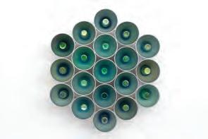
to other artists / Collaboration
Bruce Reynolds
Assemblage
Sculpture
How can recycled materials be transposed into a contemporary context?
FIGURE 10.31 Evaluation of Donna Marcus’ work, Pulse (Synchromy in green minor), 2023. Develop and refine this chart based on your research and understanding of art as knowledge.
Concept: Constructing knowledge as artist and audience
Contexts: Contemporary Formal
Appearance is profound!
What we choose to cover our bodies and faces with each day is a deep pursuit with long historical, economic, scientific and cultural roots. Often decoration and adornment has been denigrated as superfluous and passive (especially by art history). My practice argues that surface treatment can be the deference between life or death. Camouflage or body coverings are defence devices employed for survival.
JEMIMA WYMAN
deference willing to consider a differing perspective
Palawa woman Jemima Wyman was born in Sydney, Australia, and grew up in regional Queensland. With paternal descendants from the Pairrebeener people of Tebrakunna and Poredareme and maternal descendants from England, she now lives and works in the United States, in Los Angeles. Her art practice extends across varying disciplines including installation, video, performance, photography and painting. Wyman makes works that utilise these mediums to specifically focus on the visually based resistance strategies employed within protest culture and zones of conflict. She is fascinated by camouflage and protective coverings: pattern, masking, textiles and smoke, used by
marginalised groups to gain power during conflict and protest. Her works aim to explore the formal and psychological potentiality of camouflage and masking as a social, formal and political strategy in negotiating identity. Through her hand-cut photograph collages, she preserves universal acts of protest and confrontation, exploring themes of upheaval, uncertainty and distress. These events are extensively documented by Wyman’s artwork titles, which capture collective histories of global demonstration and are multi-page records detailing each constituent image with the associated protest, location and date, gathering disparate historical moments into a partial, yet sweeping account of global unrest.
What drives Wyman’s practice is investigating and making sense of the world around her. Her innate desire to make and build on her previous works provides the challenge to extend her ideas and scope for materials and processes. As an artist, her intention is to create compelling works that generate new knowledge by exploring unique and idiosyncratic ideas. Working from a feminist perspective in the 1990s, Wyman was interested in trying to ‘equalize the gaze’. By utilising a mask during performance, she realised that power could be acquired by meeting the gaze of others, her audience, while still maintaining anonymity.
For the past 15 years, Wyman has been creating artworks based on the concept of protest, with many of her exhibitions centring around ‘camouflage used in protest’. During this time, she recognised that protesters choose their coverings with purpose. If a person in Brazil wears a Guy Fawkes mask and someone in Poland chooses to wear the same mask, for example, they are connecting themselves to a collective psychological and ideological history. By simultaneously embodying two identities, they are linking themselves to one collective face. This practice also serves to not only evade facial recognition technology but also to safeguard the face from projectiles. On the surface, appearances can be deceptive but the act of visual unification from a distance sends a powerful signal. The use of camouflage in
protest allows individuals to stand out, but also concurrently blend in with the group. Camouflage may also serve the purpose of providing a protective covering. Sometimes that protective covering could be in the form of a gas mask to protect from tear gas; it could also be a covering that ensures anonymity so that an individual’s identity is not revealed to an authority through surveillance or social media.
From a broad perspective, the scope of Wyman’s art practice is generated from a place of self-reflexivity and wondering about how she can know and assert her place in the world. Understanding her place in the world is determined partially through embodiment (being) and partially through spectacle (seeing). One of the first questions she asked based on this practice was ‘how to represent a body that is non-autonomous?’ (a body that is not discrete by being separate and sealed off, but a body that opens out onto space and that space opens into.) This is reflective of a phenomenological understanding of subjectivity.
With this interest in mind, she focuses on the border between self and others, the skin, the mask, the garment and the eye. Visual metaphors that start to illustrate this non-autonomous body usually involve exaggerating or dissolving the border between bodies. As a practitioner, she is also consciously shifting her focus to think about how a viewer surveils an artwork, as well as the power dynamics of surveillance in general. Because Wyman is interested in how the self is located in relation to other bodies,
self-reflexivity process of reflecting on one’s own actions or processes
embodiment someone or something that is a tangible form of an idea, feeling or quality
non-autonomous dependent, lacking the power to make your own decisions
phenomenological an approach or enquiry based on lived experiences of a particular phenomenon or construct subjectivity the quality of being based on or influenced by personal feelings, tastes or opinions
visual resistance is a key theme in her work. Her reference to visual resistance relates to techniques and strategies that resist the eye: masking, camouflage and pattern, disguise and transformation. Wyman engages in the exploration of various iterations of these in her exhibitions as follows:
• Protesters utilise various masks such as Guy Fawkes, black and brightly coloured ski masks, superhero-themed masks, skulls, gas masks and masks based on world leaders. These masks serve symbolic and tactical purposes and are used globally for different agendas and causes.
• Patterned clothing is employed by protesters as makeshift camouflage, including tie-dye, keffiyeh, paisley and dazzle camouflage, which disrupt visual perception.
• Aposematism is a biological camouflage with high-contrast colours and repeat patterns to signal toxicity, which has inspired protests, notably the yellow and black colour combination in movements like Yellow Vests and the various colour and
Visual resistance is at the core of my practice. I make work that investigates camouflage as a social, formal and political strategy. I work with various mediums in order to detail the playful subterfuge present in the dynamics of camouflage. My recent work explores the theme of visual resistance through patterning and masking, especially when it is used by marginalized groups to gain power in zones of conflict. I have collected and archived a vast amount of images of masked protesters engaged in this very subterfuge of counterpower. As I pull images and create various groupings, different ‘collective skins’ are emphasized.
pattern representations used in the Umbrella Revolution, Black Lives Matter and Extinction Rebellion protests.
• The use of smoke as protest camouflage can mask a whole group. Flares can visually amplify a group and tear gas is used by police and military to make a group dissipate. The word ‘camouflage’ stems from the French word camouflet, which translates as ‘a whiff of smoke’.
visual resistance use of visual media as a form of activism or protest
keffiyeh symbolising a yearning for freedom, a keffiyeh is fashioned from a square cotton scarf and is a traditional headdress worn by males in the Middle East
dazzle camouflage known also as razzle dazzle and dazzle painting, is a family of ship camouflage that was used extensively in World War I, with the intention not to conceal but to make it difficult to estimate a target’s range and speed
aposematism a biological camouflage, found usually on toxic animals, where high-contrast colours like yellow and black combined with repeat patterns function as a siren to warn off predators and let them know they are poisonous
A paisley bandana, a Keffiyeh , a balaclava, or a Guy Fawkes mask unites these imaginary collectives, even when they have divergent ideological positions or are made up of protesters who live millions of miles apart. The members of these imaginary collectives share the same social camouflage. This social camouflage is permissive and facilitates collective visual resistance and the imagination of different futures beyond now. The mask creates a social imaginary space under and despite the watchful gaze of networked surveillance.
JEMIMA WYMAN
1 Research the history of dazzle camouflage.
a What is it?
b Why was it used?
c Find some examples of its use throughout history.
d How does it relate to Op Art? (Identify similarities and differences.)
e Where do you see this type of camouflage in nature?


2 Research aposematism.
a How is it beneficial to the predator and the prey?
b Identify several species which have evolved this anti-predator adaptation as a means of survival.
c Print a range of images from the internet of species that you have identified and

develop a collage which focuses on pattern, repetition and colour.
d Colour, sound and odour are all warning signals which are characteristic of aposematic organisms. How could you incorporate each of these into the development of an artwork which appeals to the senses extending beyond vision only?

Thronging Bluff Face is a multi-masked cape/ tent/quilt made for a live performance which has been documented in video form, and continues to exist as a sculptural textile work which can be exhibited as a quilt, a tent or freestanding sculpture. It combines thrifted ‘protest’ garments, online protest images custom printed on fabric, masks, performance and music to make a new object that can be used on the streets or in the gallery. During the live performance, the textile work is modified with spray-paint and markers and Wyman incorporates her voice to occupy each mask, inviting the audience to experience various modes of resistance necessary to wrestle with power. The underside of the work contains a visual essay of images featuring masked protesters highlighting the use of ‘hybrid’ masks that show overlaps between different protest movements (for example, a Guy Fawkes mask painted black by black bloc). The top side consists of repurposed protest attire, including masks, bandanas, scarves and T-shirts patchworked together, which align with the visual essay on the underside.
subterfuge act of deception in order to achieve one’s goal black bloc a movement where protesters dress tactically in black and wear face-concealing items with the aim to obscure their identities, making it challenging for authorities to differentiate individuals and prosecute them. The attire also serves to shield their faces from pepper spray commonly used in protests or civil unrest.
contemporaneousness existing synchronously or occurring in the same period of time

Collage allows Wyman to bring together different images from different locations, times and contexts to make a new ‘world’ and create new knowledge related to the individual images that are constructed into a collective formation. Collage and patchwork as techniques are linked to feminist and political histories because of the analogue, affordable, do-it-yourself nature and contemporaneousness of the images, materials and process. Wyman’s 2021 exhibition Fume investigates the focus of camouflage, featuring collages created from plumes of smoke arising from protests and consists of three different series of collages, Haze, Plume and Billow. The Haze series of works from within the exhibition, weaves images of smoke together to form nebulous landscapes that mimic the abstract shapes found in the designs of camouflage textiles. The titles for the works continue to be a list detailing the protest information relating to the collaged pieces. The full title for Plume 20 details a vast 13 000-word list which also serves as an archival document of global unrest for moments that have already passed.
“Ephemeral, and sometimes noxious, the particles caught in the air of these collages also contain rage. Smoke is a siren, a signal of past, current and future distress.
JEMIMA WYMAN


The full title of this artwork can be accessed at https://cambridge.edu.au/redirect/10642
“When I was looking at the ‘Yellow Vest’ movement they were using yellow flares during protests. The smoke was a great collective covering and made their bodies operate on an architectural scale in the landscape. I wondered where else was smoke in protest used and why? When I made the first smoke collage, there was a global outcry because the Amazon rainforest was burning and all the images

I saw online looked like the smoke scapes I was making in the studio. I could also smell smoke in my Los Angeles studio from nearby wildfires. So even though the collages only use smoke from protests, they appear to be wildfire smoke scapes that also speak to this contemporary awareness of climate crisis and interest in Air (spurred by Covid-19).
JEMIMA WYMAN

The full title of these artworks can be accessed at https://cambridge.edu.au/redirect/10643

10.37 Jemima Wyman, Flourish 6, 2020, 132 x 101.5 cm, hand-cut digital photos on paper. Photo credit: Ed Mumford. Image courtesy of the artist
The full title of this artwork can be accessed at https://cambridge.edu.au/redirect/10645
In the photo-collage series, Flourish, Wyman investigates the use of yellow and black in protest and biology, as it relates to aposematism. The chromatic and luminous contrast of yellow and black increases visibility and warns of a potential danger for both animals and humans alike. In the artwork, she highlights how countless individual protesters and collectives have employed this optical strategy as a device, warning of past, current and future hazards.
As Wyman works with images to create various groupings, different ‘collective coverings’ are emphasised. Her hand-cut photo collages often become what she calls ‘ideological textiles’: wallpaper, curtains, fabric swatch books and installations. Her interest in the history of decoration as a visual tool for communicating political messages prompts her to continue to develop these surface designs. From 2014–2017, Wyman worked on an ongoing series inspired by Soviet textiles from the 1920s and 30s that culminated in a fabric swatch book called Propaganda Textiles . The aim was to research and create a fabric for our times. The project

resulted in a commercially produced artist swatch book consisting of 40 unique custom fabric patterns. The patterns were developed as a series of works on paper using collage, painting and drawing. These works were then digitised and photoshopped into larger repeat patterns for bolts of fabric. In the final stage of producing the book, Wyman worked closely over a number of months with a company that specialises in fabricating swatch books in the United States. Each pattern featured one or more masked protesters and archived the related information specific to the protest: cause, date and country. This contextual information was listed on the reverse side of the fabric swatch along with the type of fabric, the width of the fabric and the swatch code. At the back of the book, a world map records where each of the protests had occurred (related to the images used in the fabrics) with an explanation of the archive and scope of the project.
Aggregate Icon (RBW) is a two-metre diameter collage comprising hundreds of hand-cut photographs. For this particular work, the MAS-archive was curated using the filter of
MAS-archive (referencing en masse, in a group together) is the name Wyman has given to her extensive and growing collection of images of masked protesters and documentation of fires and protest movements online. The archive was started in 2008 and is housed in Los Angeles on hard drives. From the archive, Wyman selects a range of photographs which she resizes and reshapes and after removing the backgrounds, she arranges the remaining fragments into colourful collaged compositions
protesters wearing paisley, keffiyehs , dazzle camouflage, within the palette of red, black and white. The title for this work is two-pages long and lists each individual image with the related information specific to the protest (reason for protesting, place and date). In this collage, images date from 2002 to 2016, and span the globe (Chile, Egypt, Prague, Thailand, Bahrain, China, Spain). The protesters are ideologically divergent in their positions. They stand for various causes ranging from labour and fiscal reform , Indigenous land rights, unjust police shootings, air pollution, mass-student deaths,
anti-fascism and pro-government support. Compositionally, what could be considered to be a contemporary mandala based on a kaleidoscopic arrangement, Aggregate Icon (RBW) mimics a rose window, reminiscent of a Gothic cathedral in Europe.
fiscal reform changes in the expenditure and revenue policies of a government mandala a circular configuration of symbols, often used in Hinduism and Buddhism where they are considered sacred representations of the cosmos

Aggregate icon (RBW), 2017, hand-cut digital photographs, 200 cm. Photo credit:
Image courtesy of the artist The full title of this artwork can be accessed at https://cambridge.edu.au/redirect/10646
Research some of the major world protests that have occurred: for example, Yellow Vests, Umbrella Revolution, Black Lives Matter and Extinction Rebellion.
• Select one and describe how colour, textiles and masks/masking are utilised by the participants to uphold a collective identity as the protest plays out.
• Find images from the protest you selected; print in colour and develop a collage, giving consideration to repeat pattern and radial symmetry (symmetry which extends from a central axis).
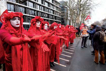

Wyman’s practice is an act of piecing together contemporary events and images from a growing global protest culture, whether this is through fragments of photos in her hand-cut collages or pieces of custom-printed textiles that are patchworked together or poured paint blobs that sit adjacent to one another to make an image. As an Indigenous woman, her art-making through her personal lens is politically informed, which is integral when considering the nuances of her work. For Wyman, it isn’t about pictorial depth, it is more about the complexity of a multi-faceted optical surface that provides an opportunity for awareness of one’s own body through the act of looking and thinking.
Wyman’s advice is to balance modes of thinking, researching, experimenting and making so that all four areas are evolving and developing, thus enabling discoveries to be made that will feedback into the other modes. The goal with every new project is to extend upon previous approaches to keep work innovative and progressive. She uses the synchronicity of what is happening in her studio and how that overlaps with her observations of world events and what she is researching.
Visual language
Wyman investigates the transformative and protective potential of patterned textiles, clothing, and masking with a collective focus on visual resistance.
Transformative textiles and recombinant forms, including spatial installations with protest symbol patterns, seek social camouflage, providing a versatile collective space which depict turbulent times.
Symbols
Combining military-style preparedness with protester’s protective symbols, motifs and images have been selected from Wyman’s ongoing MAS-archive of clothing and costuming of masked protesters from around the world. The work projects a complex social message where makeshift actions and talismanic imagery come together to ward off evil.
Media / techniques / processes / technologies
Wyman paints on Zeltbahns to create a series of double-sided recombinant paintings. These triangular pieces of fabric, used as shelter-halves by various militaries, became a testing ground for military camouflage graphics. Wyman focuses on do-it-yourself painterly effects applied by street protesters to banners, signs, clothing and masks. Four
• Contemporary Formal
double-sided Zeltbahn paintings accompany three large-scale textile works: a monument built from quilted panels of silver material bearing photos of chrome-masked protesters, and two spatial installation featuring patterned swatches of protest symbols, spray-painted using stencils cut from photographs. These transformative textiles and recombinant forms aim for social camouflage, offering a manifold cloak for the resistant body – a provisional, repurposable, collective space in highly volatile times.
Display
Installation of banners and printed and painted textiles.
recombinant produced by combining genetic material from different places
talismanic representative of a particular group
Zeltbahn multi-buttoned triangular pieces of fabric, also known as a shelter-half when translated from German shelter-half a partial tent used by the military, designed for concealment and temporary shelter; when one or more sections are combined, they can serve as a poncho, tent, floatation device, stretcher or a sling and have many additional uses

• Challenges mainstream ideas about boundaries of art
• Uses non-traditional materials and new technologies
• Borrowing of imagery
• Represents ideas as a system of symbolic objects and motifs which may be decoded as evidence of the artist’s intention
• Emphasis on process, elements, principles, materials and media
Collection of banners, painted textiles, images and photographs from other unknown craftspeople and photographers from around the world
manifold cloak a cape that is aimed at protecting the body through keeping it dry and safe (reflective in the dark)
How can woven fabric and pattern be used as modes of counterpower for marginalised groups in conflict zones?
Inquiry questions for other featured works – Where/ why/ how do people use camouflage (masks, patterned textiles and smoke) in the everyday in order to have power? Are there connections between these choices of camouflage?
Focus – resistance / camouflage / pattern / protest / history of surface design in textiles.
FIGURE 10.42 Evaluation of Jemima Wyman’s work, Deepsurface Fray Rage, 2018, custom sewn shelter-quarter spray-painted with original metal buttons, painted-photographs, metal armature, painted moving blankets, various painted fabric, approx. 297.2 x 3910.4 x 91.4 cm. Photo credit: Ruben Diaz. Image courtesy of the artist. The full title of this artwork can be accessed at https://cambridge.edu.au/redirect/10647
A haze descends (exhibition), 2022
Haze (series), 2022
like a siren it repeats (exhibition), 2019
Iconography of revolt (exhibition), 2018
Pattern Bandits (exhibition), 2014

Reservoir Daydream explores the convergence of alternate art-making processes through unconventional mediums, challenging the boundaries of traditional artistic expression. The sizeable circular bowl, filled with black liquid, symbolises the reservoir a profound wellspring of creativity. Each photograph not only exemplifies the beauty found in divergence and innovation but also serves as the fragmented echoes of our multifaceted realities. This altered reality is a profound concept I wish viewers to share with me in a journey of boundless creativity and selfdiscovery. The work explores themes in a contemporary context that break the barriers between traditional and conventional art-making processes. This artwork embodies the fusion of the tangible and intangible, embracing chaos and harmony simultaneously. Reservoir Daydream beckons its audience to peer upon the gloomy surface, forcing their contemplation of a false reality.
ELIJAH SMITH

Concept: Constructing knowledge as artist and audience
Context: Cultural Contemporary
“My practice often explores the tension between humanity and nature recurring motifs include Queensland architecture, mangroves, flooding and climate change, colonialism and the Australian underground punk subculture, represented both in current realities and speculative science-fiction futures. A technicolour, subtropical Australian Gothic.
PHOEBE PARADISE
Phoebe Paradise is a Meanjin, Brisbane-based, self-taught, multi-disciplinary artist, designer and musician, who works in the media areas of illustration, drawing, digital media and textiles and is also known for her engaging public art installations and murals. Her work explores the multiplicities of Brisbane’s visual identity and history, through a lens which reflects a focus on popular culture, fashion, sultry summer days and the medley of architectural styles in houses and buildings. In describing the various visions of her hometown, Paradise refers to the rusted-on cultural cringe, the tombstones of Modernism in the textured, concrete Brutalist buildings juxtaposed with the lush, subtropical landscape. Her love of the suburbs has become a common presence in her evocative illustrations and artworks, which authentically capture what it is about Brisbane that makes it
one of the most liveable cities in the world: the laid-back attitude and sense of community in the suburbs, the humidity and sunshine interspersed with afternoon thunderstorms.
Paradise’s artistic career has its origins in somewhat unconventional beginnings and she entered the professional scene as an illustrator and designer for indie labels, punk bands and venues, creating merchandise, gig flyers and record covers. Consequently, a significant influence on her work and style has stemmed from lowbrow art and art movements.
lowbrow art (also known as Pop-Surrealism) is a populist art movement which began in Los Angeles in the 1970s, with its cultural roots in punk music, underground culture, graffiti and street art, skate and surf culture and design, tattoo art, comic book design, poster art, digital art and kitsch
The housing crisis, the effects of climate change, and the disruption of flooding blend to form a recurring theme in her work. Paradise alludes to the inevitability of flooding, and the unfortunate, long-lasting effects that are still observable many years later, particularly with water-level marks still visible on the sides of houses and buildings. Most recently, Paradise has been developing artworks that investigate the diverse assortment of architecture of the city, visually documenting Brisbane’s history of urban development. Queenslanders, and their characteristic architectural features, are of particular focus in Paradise’s work. What sets a traditional Queenslander style of house apart from houses is the defining trait of being raised on stumps. Lifting the main living spaces off the ground, it appears to be floating above the terrain, not only a stylistic feature, but also for practical purposes, in allowing air to circulate underneath and cool the house. It also protects the main structure from structural pests and pre-empts the effects of flooding, enabling the natural flow of water underneath during torrential rain.
Foundation pays homage to the ubiquitous suburban icon of the Queenslander, a beloved and enduring feature of Brisbane’s urban landscape. Built for the subtropics and a cherished element of Brisbane’s history, these familiar forms stand on stilts, which sometimes appear to be disproportionate to the overall balance of the structures. Paradise’s houses are not only a symbol of historical nostalgia, but they also reference adaptation and the global crisis of climate change. She visualises a suburban Brisbane lifestyle where extreme weather events are so frequent, that floods have become commonplace. Flickering lights and the glow of inhabited interiors communicate resilience against the unsettling stillness of the water beneath. Reflections of the stilts and house above on the surface of the water adds a gothic twist, evoking the quiet calm that pervades the atmosphere after the rain when residents wait for the floodwaters to recede. The scaled-down houses are lit from the inside at night as though the residents are going about their daily lives, oblivious to the weather outside. These sculptural houses were fabricated with aluminium that had been laser-cut from Paradise’s computer-rendered designs, then welded and mounted onto stilts before being installed in the lagoon.
Situated in the lower lagoon of Brisbane Botanical Gardens, Paradise’s 2023 installation
Process and materials are significant to Paradise when developing a response to a public art project or installation. This large-scale installation was part of Botanica: Contemporary Art Outside, an annual public art exhibition melding art, science and technology and reflecting themes of sustainability. Paradise explains that the large budget and highprofile location also came with many challenges. For a sculpture of this magnitude, the role as visual artist blurs with the boundaries of project manager. Planning the budget for the build and materials began six months before the work came to fruition. Researching and engaging with contractors and industry professionals to develop the project was a necessity to guarantee seamless execution.

Foundation,

10.46 Angel Butten, Torrential Grasp, 2021, Plaster of Paris and cardboard, plaster casting, plasticine, hot glue, impasto gel medium, acrylic paint, dowel, black card paper, skewers and metallic corrugated cardboard sheets, 80 x 30 x 30 cm

Informed by flooding in Brisbane, Torrential Grasp is a sculptural piece inspired by the concept of mortality and the versatility with which its intricacies can be presented. I challenged myself to create a piece that demonstrates the sense of mortality that is permeated even by the destruction of an inanimate object that never has nor ever will ‘live’. Through the use of crude and rough construction methods, the house aspect of the sculpture has been made to feel as if it is in a state of decay. In contrast, the hand, made of plaster, is living and full of vitality, produced by the rich tones and the writhing surface created by impasto gel medium.
ANGEL BUTTEN

Paradise also enjoys the comfort and ease of digital art observation, and the lens through which she views the world is the most important tool for these works. Her architectural drawings and tableaux are often generated from thousands of reference images and personal experiences, usually obtained during long early morning walks around the quiet suburban streets of Brisbane. For Paradise, her walks become a game, similar to the children’s picture book, Where’s Wally , providing opportunities to examine people’s complex internal lives, through the exterior of their suburban share houses and apartments. Paradise also acquires inspiration from items of Australian kitsch : vintage postcards, tourism posters, lost merchandise and film advertising, which contributes to the ‘sunshine state’ vibe that permeates her artworks. Additionally, she considers font choices, compositional elements, print quality and artistic intent as important elements in her creative process.
kitsch a German word which translates to ‘worthless trashy art’; usually associated with mass-produced items and considered poor taste due to its garish nature and superficiality
voyeuristic the watching of others in violation of privacy
“My phone is full of strange, voyeuristic photos of house exteriors zoomed in to strange textures or details that entranced me in the moment which often find their way into my sculptures and illustrations in one way or another. Bursting gutters packed with leaves from a storm, a particularly beautiful bloom of black mould on an ageing air conditioning unit, a rotten staircase with missing steps all worthy of documentation to help construct my illustrations.
My work is usually developed for its site-specific context. I must always ask myself:
Where will this work be primarily viewed? What medium will best convey the intent of the work?
Who is the audience most likely to be reached by this work? How will the work live on after its initial exhibit? How can I best document the work for digital spaces?
Paradise’s 2022 solo exhibition, Sunburnt in the Suburbs, at Pine Rivers Art Gallery in the Moreton Bay Region, was inspired by her exploration of the streets of Strathpine, Bray Park and Albany Creek and the beauty found in observations of the mundane. The exhibition included a mix of illustrations, sculptures and installation pieces and provided Paradise with an invaluable opportunity to push the limits of her practice into larger and more complex concepts, which included programming for the public through community engagement activities, such as digital drawing workshops and the painting of miniatures. A remarkable outcome of the full project was the universal quality that it revealed. While the exhibition focused specifically on imagery representative of the Moreton Bay region

through its unique architecture and character, the relatability of the narrative meant that the full exhibition experience was appreciated by national and international audiences.

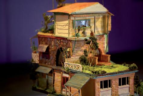
Castle, a centrepiece in the Sunburnt in the Suburbs exhibition, is a sculptural collection of suburban houses which have been stacked on top of each other to form a fantastical tower. Each layer within the tower depicts a representation of an individual house, in keeping with the
appearance of a Queenslander style of house. The arrangement of the composition also hints at the urban sprawl, where development is forcing suburban expansion to grow upwards, in light of the limited availability of spare land.


Portrait of a house consists of six houses in a style that is characteristic of many in the suburbs that form part of the Moreton Bay region. As depicted in this body of work, the houses were often lowlying, brick or weatherboard, with coloured glass, bold paint choices and sometimes came with

renovations that clearly demonstrated a do-ityourself aesthetic. The homes give off a sense of familiarity which draws the audience in to exploring the surface colours and textures. The full collection of this series can be viewed in the Interactive Textbook.


Research how the architectural styles of houses in Queensland have changed over the years.
Search Google Streetview for your place of residence. Does it fit into a style or type you have researched? (E.g. Queenslander, Colonial, Victorian, Federation, Edwardian, Ashgrovian, Californian Bungalow, Art Nouveau, Mid-century modern, Interwar, or post-World War II styles.)
If you have access to digital software (such as Procreate), develop a realistic digital drawing that reflects an image of your house. (Exaggerate the use of colour, or choose the use of unrealistic colours, or limit your colour palette to a monochromatic, complementary or analogous colour scheme.) If you don’t have access to software, produce a hand-drawn image and colour with watercolour paint. Include an element in your design that you can animate (for example, a clothes-line with clothes moving in the breeze, an animal or car moving in front of the house, or lights that turn on in the windows.)

A vibrant compilation of artworks by emerging contemporary artists from Brisbane, exploring the subtropical essence, distinctive landscapes and cultural ambience of the city, formed the Sunny Side Up exhibition in 2020. The exhibition highlighted the Sunshine State’s abundance, richness and optimism and featured Paradise’s artwork Beautiful one Day, Perfect the Next , the title of which alludes to the Sunshine State’s tourism campaign slogan from the late ‘90s. Beautiful One Day, Perfect the Next was a commission for the Brisbane City Council’s Outdoor Gallery Program, which involved the production of five digital illustrations installed as lightboxes featured in Eagle Lane in the Central Business District. With collaborators, Paradise expanded this idea by incorporating Augmented Reality (AR) animations that could be activated by users’ smartphones, and became part of a citywide ‘AR Treasure Hunt’, combining art and technology.
Augmented Reality (AR) an enhanced, interactive version of a real-world environment achieved through digital visual elements, sounds and other sensory stimuli via holographic technology

The connection to Brisbane that Paradise has developed through her work is a reflection of the city’s multi-faceted identity. In her various imagined worlds, there is no attempt to smooth over the unsettling or the turbulent. Instead, Paradise embraces darkness as a form of celebration, turning
it into a negative bliss. Her 2022 digital work, Mallrats, pays reverence to Brisbane’s night life. The work captures a lively scene in Fortitude Valley, portraying a diverse crowd awaiting entry into a venue, illuminated by neon lights that shift between various shades of aqua, magenta, blue and purple. The street characters become increasingly strange and hellish, which creates an uncanny atmosphere, as a sedan drives slowly by each one. The demonisation of the space aligns with Foucault’s concept of the Gothic sublime. In the context of Phoebe Paradise’s art practice, Bris Vegas (a city that never fails to entertain), could also be appropriate to describe the Mallrats scene that is projected onto the Judith Wright Centre for the Outerface public arts programme.
Gothic sublime a sense of decline, decay and disintegration; the experience of both thrill and fear from something dark, uncertain or confused, combining revulsion with fascination

The concept of the Gothic sublime stems from literature and is found in novels such as Frankenstein, The Picture of Dorian Gray, Dracula and Wuthering Heights. It creates conflict and tension and may present contrasting views or concepts such as desire and fear, the beautiful and the grotesque, love and hatred, awe and terror. Research how other artists depict contrasting views or concepts within the same artwork. What other contrasts can you think of that represent the Gothic sublime? Develop several experimental works in your own choice of media that represent the sets of contrasts you have chosen.

In addition to her arts practice, Paradise is also the mastermind behind the curation of many events around Brisbane, which have included film programming and festivals, art shows for illustrators and fashion events. She and her work also featured in a year-long national advertising campaign for Apple, Behind the Mac in 2021, chosen by Apple as a notable emergent creative practitioner and for the unique visual lens
through which she depicts Brisbane. The multidimensional campaign centred Paradise’s visual arts journey and included original illustrations and the recently acquired Subtropical Surreal. This campaign was the start of a change in direction for Paradise’s career, and it was the impetus for expanding the reach of her practice and showcasing her work in distinct new contexts.
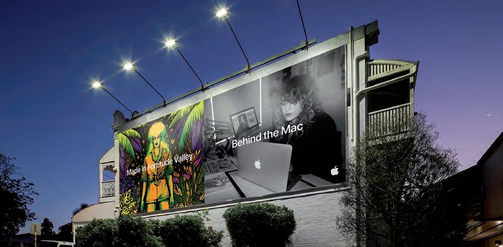

FIGURE 10.55 Aymar De Roquefeuil, Man’s Eye View of Brisbane, laser-cut panels of marine ply with hand cut stencil + aerosol, 1550 x 550 mm
Along with her portrayal of the suburbs from backyards, cul-de-sacs, pizza shops and bus stops, Paradise’s aesthetic presents a refreshing truth about her subject matter. The abundant beauty of Brisbane and Queensland shines through her work, but she also shows her audience detritus from the local grunge that extends from night life, murky river waters, shared housing and trash that can be seen in the back streets of the city and the suburbs.
Whilst responding to her immediate material world, Paradise’s intention as an artist is to elicit delight, curiosity and a familiar yet peculiar sense of unreality for the viewer. She seeks to inject a sense of folklore and tradition into Australian mundane suburbia with fanciful compositions, colours and pop surrealism. Highlighting and recontextualising the often-overlooked details of a place in time can completely alter the way an individual or community sees and appreciates the built environment around them. Paradise hopes to impact and reflect the unique zeitgeist of Australian culture, using Brisbane as a niche case study, whether it is inventing mythology around the stilt houses of the suburbs or garnering a dedicated group of appreciators for the modernist buildings dotted around Brisbane’s CBD.
zeitgeist the general, moral or cultural disposition or climate specific to a particular era
Visual language
Subtropical Surreal captures dreamy, animated snapshots of everyday life, magnifying surreal moments from around the city and always reshaping the connection with the sub-tropical surroundings. The moving images reflect the colours that are characteristic of Brisbane, particularly in the summer-time: the blue-purple haze of jacaranda flowers that drop onto the station wagon; the tropical bird of paradise flowers being struck by lightning and heavy rains; the strong complementary colour scheme of the urban skyline with five Queenslanders from various eras glowing from the golden lights shimmering in the windows forming a contrast with the purple tinge at night fall as the sun sets behind Mt Coot-Tha; the murky green floodwaters outside the doublehung window, the air so dense with humidity from the rain, that it starts to drip down the walls inside the house; the mangrove habitat of twisting roots as they extend
Cultural Contemporary
The use of nontraditional materials and new technologies
upwards from the mud flats and the bland, beige monolithic 1970s high-rise building.
Symbols
The stylised animation depicts scenes, landscapes, landmarks and everyday occurrences that are recognisable as being typically relevant to Brisbane.
Media / techniques / processes / technologies
Procreate, Photoshop (illustrations with a Wacom Tablet), Photoshop timeline animation and Adobe After Effects for additional animation; projected onto the cliffs next to Howard Smith Wharves.
Display
Subtropical Surreal is a moving image piece projected along the edge of the Brisbane River. This work became the first digital art acquisition made by the Brisbane City Council’s Public Art Collection.
Collaboration
Exhibited in public spaces rather than traditional gallery environments
Exploration of Australian culture through narrative depictions
Demonstrate influences of art movements, styles and origins of time and place
References historical framework
Commissioned by the Brisbane City Council, animated with animator and motion designer, Helen Papageorgiou
Inquiry question
Can you create myth out of the mundane?
How can hyperlocal subject matter change how we see the world?
Inquiry questions for other featured works
How can my art capture the zeitgeist of the current time and place?
Focus – The suburbs sense of place sub-tropical climate and thunderstorms / Queenslander houses and urban scape mangroves and local flora.
FIGURE 10.56 Evaluation of Phoebe Paradise’s work, Subtropical Surreal, 2020, animated digital illustrations projection. Commissioned by and acquired as part of the Brisbane City Council’s Public Art Collection. Originally projected onto the cliffside of Howard Smith Wharves, Brisbane. Illustrated and animated by Phoebe Paradise and Helena Papageorgiou. Image courtesy of the artist
Connections to other artists / Artists of influence
Noriyoshi O-Rai Raymond Pettibon Tim Jacobus Syd Brak
Daniel Clowes Hiroshi Nagai Ralph Bakshi Moebius (Jean Giraud)
Richard Corben Marylin Conover Nell Brinkley
A Moment, 2023
Sunburnt in the Suburbs (exhibition), 2022 After Us, 2021
Stumble Home, 2021 Sunshine City, 2020 Swamp City, 2020
This interactive Case study can be accessed online in the Interactive Textbook.

FIGURE 10.57 Sam Jensen, 2020, cyanotype on nine timber discs placed on Canson watercolour paper stained with coffee, size variable

• The artist case studies in this chapter have presented bodies of work exploring diverse materials, techniques, processes and technologies. They vary in the contexts through which they engage with the world. Characteristics that the artists share are a continuous immersion into researching their concept deeply and a focus that enables them to develop a highly resolved body of work.
• Bruce Reynolds works through the cultural, contemporary and formal contexts. Reynolds researches ancient and modern materials, processes, techniques and technologies. He is interested in repeated motifs through history and across cultures. It can be argued that Reynolds artworks are in between ancient and modern times, in between abstraction and realism and in between many cultures. He juxtaposes ancient and modern patterns and materials such as linoleum, photography and plaster to create contemporary works of art.
employing camera-less techniques by placing plant matter directly onto analogue photographic paper. Biochromes are created when the microbes from the plants interact with the photographic paper. Buziak works with nature to create her complex photographs.
• Renata Buziak loves to connect with nature, she explores the world through cultural, contemporary, personal and formal contexts. She has been curious about nature and photography since she was a child and her curiosity is a driving force through her research. Buziak connects with communities to understand the plant life in their environment, including the Quandamooka people, researching their medicinal plants for her doctoral studies. Buziak created the process Biochromes, an experimental photographic process
• Donna Marcus explores the world through cultural, contemporary, personal and formal contexts. Marcus is fascinated by the relationship between the industrial and domestic through recycled aluminium products and their changing value over time. The materials themselves generate layers of reference through her practice, further extending the modernist desire for regularity, repetition and dream. Marcus’ assemblages and sculptures celebrate the objects in their found state including their form and patina, their history from their past lives permeating into the narrative of the artworks created. Her works are reliant on the critical mass of objects, with Marcus manipulating them into iterations of their original form.
• Jemima Wyman challenges mainstream ideas about boundaries of art. She explores the world through contemporary and formal contexts. Wyman uses non-traditional materials and new technologies. Her practice is an act of piecing together contemporary events and images from a growing global protest culture. As a First Nations woman, her art-making through her personal lens is politically informed, which is integral when considering the nuances of her work. For Wyman, it isn’t
about pictorial depth, it is about the complexity of a multi-faceted optical surface that provides an opportunity for awareness of one’s own body through the act of looking and thinking.
• Exploring the world through cultural and contemporary contexts, Phoebe Paradise’s aesthetic presents a refreshing truth about her subject matter. The abundant beauty of Brisbane and Queensland shines through her work, but she also
shows her audience detritus from the local grunge. Whilst responding to her immediate material world, Paradise’s intention as an artist is to elicit delight, curiosity and a familiar yet peculiar sense of unreality for the viewer.
• The case studies analyse how each of the artists approach their focus, inquire into areas of knowledge and make connections between their artmaking, contexts and the wider world.
1 Summarise the six case study artists using a table format to identify each of the following points:
a How does their art practice reflect knowledge?
b What is their inquiry question?
c What is their direct stimulus or authentic experience?
2 Select one of the case study artists from this chapter that most closely aligns with or parallels your own personal focus and compare their work with one other key artist that you have selected and researched.


In Unit 4, students continue and build on their focus, knowledge and art practice from Unit 3. They refine their expression and personal aesthetic by applying skills associated with creative thinking. Students resolve their body of work through the concept ‘art as alternate’ as they imagine, generate and apply new ideas and links. Through the pursuit of an individualised response, they challenge their approaches to identify alternatives and opportunities for innovation.
Students foreground the contemporary context to develop new meanings through a lens of 21st-century art ideas and issues. They simultaneously select from the personal, cultural and formal contexts to examine and compare visual language, expression and the communication of multiple meanings in various art forms.
Students use the inquiry learning model to resolve their body of work. They challenge their own art-making practices by researching and developing new knowledge of and skills in materials, techniques, technologies and arts processes. They look for opportunities for focused experimentation and risk taking. They explore how new and multimodal technologies can alter and enhance their ideas. Students determine alternate representations or expansions of their ideas by reflecting on their work from Unit 3 and considering how exploiting existing approaches or applying new knowledge and skill may enrich meaning in their body of work.
Students consider the roles and interaction between artist and audience. As audience, students consider how alternate methods of display and exhibition, contemporary approaches with materials, and new technologies impact upon the sensory experience and engagement with art. As artists, students consider the role of art in the dialogue with audience. They evaluate how alternate approaches in a body of work can develop and expand the communication of meaning and fully realise artistic intentions.
By the end of this unit, students will:
1 implement ideas and representations that challenge, extend and refine existing knowledge
2 apply literacy skills to communicate understanding of art practices and individualised ideas
3 analyse and interpret the impact of contemporary context on visual language, expression and meaning in artworks and art practices
4 evaluate influences to inform an alternate approach
5 justify new viewpoints and evolving ideas
6 experiment with familiar or alternate media to solve visual problems informed by research of contemporary art practice
7 create visual responses using knowledge and understanding of media to support alternate approaches
8 realise responses to communicate intended meaning.

In Unit 4, you will develop your idea using alternate approaches through the contemporary context. Consciously applying creative thinking strategies will be helpful in generating your divergent responses.
“
Creativity begins with a foundation of knowledge, learning a discipline and mastering a
way of thinking. You can learn to be creative by experimenting, exploring, questioning assumptions, using imagination and synthesising information. Learning to be creative is akin to learning a sport. It requires practice to develop the right muscles and a supportive environment in which to flourish.
LINDA
NAIMAN, CREATIVITY COACH
Artists generate solutions to visual problems in countless different ways. These include the implementation of creative thinking strategies and the application of divergent approaches.
Creativity is the process of generating new ideas or knowledge. In Visual Art, we value creativity because it is the process we use to find original approaches, pathways and points of view that enrich both our making and responding. Creative thinking establishes a point of difference between your work and that of others. It helps you develop your personal aesthetic. In Unit 4, you should be aiming to express your ideas in an inventive way using your own evolved personal style. Creative thinking will assist this process.
creative resulting from originality of thought or expression; relating to or involving the use of the imagination or original ideas to create something; having good imagination or original ideas
personal aesthetic where the artist develops a particular style or expression that is individual and inventive; students take ownership of their own approaches and style even if these approaches or styles have been appropriated from or have seeds in other artists’ work
Creativity is not a mysterious attribute (talent) that only some people can attain or are born with. On the contrary, everyone can consciously develop creative traits.
Creative people are:
• curious – you should ask questions often, be inquisitive, investigate and experiment with art materials, techniques, processes, concepts
• observant – you should learn to observe details, analyse and record what you see
• persistent – you should do a little bit every day, practise, keep working through problems, don’t give up
• reflective – you should reflect on your ideas, past achievements, and feedback; consider implications for current and future projects.
• courageous – you should be willing to try things out and make mistakes because that’s how learning occurs
• adventurous and open-minded – you should challenge your own perceptions and common beliefs, make connections between ideas, be a critical thinker, analyse, evaluate and interpret information
Strategies to improve creative thinking
“The creative act does not create something out of nothing; it combines, reshuffles and relates already existing but hitherto separate ideas, facts, frames of perception and associative contexts.
ARTHUR KOESTLER, AUTHOR
There have been many books and blogs written about improving creativity. They provide activities for building your creative capacity by helping you make connections between ideas. For instance, you can access design thinking activities online through the State Library of Queensland’s Curriculum Connect site. These will help you to learn techniques that will give you confidence to reconsider your art practice and develop possibilities by combining, changing or reapplying existing ideas.
Brain warm-up: 40 uses for an object
Challenge yourself to individually think of 40 different uses for an object such as a brick, ping-pong ball, shoe or paperclip, with a time limit of 10 minutes. Then compare your list with your classmates. Reflect on how your brain worked during this brainstorming session. If you practise this activity, it should improve your divergent thinking.
Making connections exercise: Finding faces in unusual places
Facial pareidolia is the name of the phenomenon that causes us to see faces in inanimate objects like clouds, wallpaper, machinery and household appliances. Your challenge is to actively hunt for 10 faces, photograph them and share them with your classmates. This task forces you to make creative connections and be an observer. Observation is key to creativity.
Adapted from John Ingledew, 2016, How to Have Great Ideas: A Guide to Creative Thinking

Positive action: How might I?
Rephrase your task for Unit 4 into a ‘how might I?’ question. This reframes the problem and forces it into an opportunity for innovation rather than allowing you to dwell on negatives. For instance, ‘how might I create a collaborative work using my existing focus?’ Once you have a question that is suitable, brainstorm as many possible answers to it as you can. Resist the urge to edit your brainstorming; be courageous.
Adapted from ‘“How might we” questions’, Stanford University online

Invite your peers and teachers to share your problem-solving. Sometimes other people see the obvious things that you miss yourself. There are useful online brainstorming and collaboration sites that you can use to generate solutions to your problem. Ask for, listen to and act on feedback from your peers and your teacher. Survey your classmates and seek their suggestions about ways to evolve your making. Listen thoughtfully and openly to the suggestions from your teacher and act on their feedback from Unit 3.
Being creative in your art-making practice takes conscious effort, but there is also evidence to suggest that allowing your mind to subconsciously work on the problem has great advantages. So, ideally, begin the creative process early enough to allow for unconscious idea development to occur. To foster this, go for walks, swim, do the dishes and get a good night’s sleep. When you allow time and opportunities for your brain to digest the problem, you might find you have a ‘eureka’ moment that sparks your alternate making adventure.
SCAMPER: A technique to encourage divergent thinking
Apply the SCAMPER technique to your body of work to come up with some potential divergent approaches. SCAMPER stands for substitute, combine, adapt, modify, put to another use, eliminate, reverse. Record your SCAMPER ideas and then share them with your classmates.
• Substitute – is there another medium you could use, or a different art-making process you could apply to create new meaning?
• Combine – add elements from someone or something else. Can you combine some of the elements you have with others to create a redefined problem? Can you bring together different people or skills to collaborate to help you achieve a divergent approach?
• Adapt – take your existing focus and shape it using contemporary approaches but through a new context. Could new meaning be expressed through a personal, formal or cultural context?
• Modify – rework the focus. Are there dimensions of your idea you can expand/ reduce? How might you change the way
your idea is perceived – shape, scale, look, feel? Can you apply other verbs –magnify, minimise, manipulate, multiply?
• Put to another use – use your original focus in a new way. How could audiences be involved as joint constructors of meaning in a version of your idea? Could you change the method of display?
• Eliminate – get rid of unnecessary elements, or streamline the core idea. What would happen if you took away parts of the idea; what would that look like and how would people react?
• Reverse – turn your idea around. How can you make it communicate your original intention by implementing opposites? Consider parody, irony, sarcasm, binaries, wabi-sabi.
Adapted from ‘Scamper’, Innovation Portal website
parody a humorous imitation designed to ridicule wabi-sabi Japanese aesthetic that values simplicity, incompleteness, imperfection, impermanence, irregularity and nature
A stimulus is a catalyst that provokes us to act. Artists are provoked into responding to stimuli in countless ways. In your research into artists, it is important to investigate their motivation for making artwork. Often there will be an overarching issue, concept or inquiry question that continues to drive the artist. Katie HarrisMacLeod’s contemporary art practice consistently investigates our connection to natural places, drawing on a field of knowledge known as psychogeography. Her other influences are her Scottish heritage and folklore, multigenerational
narratives, femininity, loss and isolation. HarrisMacLeod is particularly drawn to nature, forests, isolated and remote landscapes. She innovatively and poetically responds to natural sites through her artworks. While her interest in these concepts is constant, her focus for different series of works evolves, allowing her to explore and produce a variety of divergent approaches to what is often an intense experience of a place.
psychogeography the influence or effect of a geographical environment on a person’s emotions and behaviour. Artists often take this approach when they interact with a city or a specific site and its history. The term was first used by French philosopher Guy Debord in 1955.
Sapworks is an ongoing project exploring the interwoven connectivities between bodies of human beings and bodies of trees focusing on the female body. It began during an Arts and Ecology residency at the Maroochy Bushland Botanic Gardens. Harris-MacLeod’s intention in this project was to intricately study Bloodwood trees, and the sap that they excrete.
Mapping stressed Bloodwood trees across the Sunshine Coast region, she made artworks from their sap as a process of reconnecting to place and country.
The sap from the Bloodwood tree visually resembles blood, and when used as a drawing ink, as Harris-MacLeod has done, results in markmaking suggestive of corporeality, light shining through skin, veins and bodily interiors, wounds or surgery. The works resonate with viewers, causing visceral responses. The project has given her a way to understand experiences and trauma from her own past.

Harris-Macleod’s innovative use of materials is also evident in her Sleep Drawings series. In an online interview Harris-MacLeod talks about how she is influenced by her Scottish heritage and the places she and her ancestors have lived. The Scottish environment has influenced her to find comfort in isolated environments, far away from people. She loves the sound of the wind and the vastness of the sky. Her Celtic/Gaelic culture, in which language and sense of place are interwoven, comes through in her use of poetry within her works as spoken word and also through the language of the marks she makes with her drawing media and implements. The artist describes the Sleep Drawing series as:
“… inspired by lucid dream memories from sleeping on the edge of mountains; mind wanderings, dreams of creatures that live within the mountains, memories, myths, speaking rocks, lichens and mosses, mountain flowers, mist and distant echoes from the human world below.
SLEEP DRAWINGS AN EXHIBITION BY ARTIST KATIE HARRIS-MACLEOD. THE TIN SHED | PALMWOODS | 9TH – 30TH SEPTEMBER 2022
Figure 11.6 is an example of this body of work in which layer upon layer of marks and inks, some made from the materials in the landscape, are built up. Residue and memory of the layers below suggest memories and the passing of time.
Harris-MacLeod’s practice includes performance and video as ways to respond to place and time and memory. Her grandmother’s poem titled Going Away, has been read and recorded by HarrisMacLeod in a video work. The poem is accompanied by vision of slow-moving seaweeds as they are washed by gentle waves (see Figure 11.7). The calls of sea birds are heard and enhance the connection to place. The artist calls this work a ‘Film Poem’.
Harris-MacLeod says of this work and her grandmother, “each time I read these words I understand her sense of longing more profoundly than before”.
Harris-MacLeod provides us with an excellent model of how a body of work can include divergent approaches.

11.6 Katie Harris-MacLeod, Sleep Drawing (Mountain Dream Drawing), 2022, copper oxide ink, cyanotype, tree sap, salt, lichen ink and acrylic ink on 300gsm watercolour paper, 29.7 x 42 cm
Katie Harris-MacLeod takes a psychogeographical approach to her art practice. Other artists who take or have taken this approach include Jonathan Jones, Megan Cope, Francis Alÿs, Jill Orr, Richard Long, Robert Smithson, James Turrell, Andy Goldsworthy, Christo and Jeanne-Claude, Ana Mendieta, Sophie Calle, Henri CartierBresson, Vivian Maier and Asger Jorn.

11.7 Katie Harris-MacLeod’s video, Going Away, a poem by Janet M. MacLeod read by Katie Harris-MacLeod. Duration, 0.42 seconds, 2023. It can be viewed on the artist’s website, https:// cambridge.edu.au/redirect/10774
With Katie Harris-MacLeod as a starting point, research the artists listed above to develop a reverse chronology showing how artists have approached psychogeographical influences in their art practice. Take care to indicate how the artists’ practices and approaches are divergent to each other.
Your new, divergent approach to your body of work should aim to create alternate meaning through the knowledge, understanding and application of contemporary art processes. Contemporary artists approach their work in a myriad of different ways. Table 11.1 outlines some approaches you could take, but it is not exhaustive. Search broadly for artists to support your ideas and affirm your practice. Use art galleries, art museum sites or artists’ own websites for research.
TABLE 11.1 POSSIBLE WAYS TO CREATE ALTERNATE MEANING THROUGH THE KNOWLEDGE, UNDERSTANDING AND APPLICATION OF CONTEMP ORARY ART PROCESSES
ALTERNATE APPROACHES
Adopting the opposing, contrary or polar point of view to communicate the same focus
Questioning ideas and representations through the adoption of a different context
Exploiting traditional materials and techniques in new or unexpected ways
• Tony Albert, Sorry, 2008
• Bindi Cole, I Forgive You, 2012
• Michael Zavros, Spring/Fall series, 2003–06
• Abdul Abdullah, Coming to Terms series, 2015
• Ricky Swallow, Killing Time, 2003–04
• Owen Leong, Infiltrator: Bone, 2011
OTHER CONTEMPORARY ARTISTS AND ARTWORKS TO CONSIDER
• Shaun Gladwell, Double Balancing Act, 2009–10
• Michael Zavros, Ars Longa, Vita Brevis, 2010; Phoebe is Dead/McQueen, 2010; The Octopus, 2014
• Louise Weaver, Guido Valdez (Vendetta for Love), 2006
• Fiona Hall, Manuhiri (Travellers), 2014–15
• Casey Chen, Big Robot 3, 2022
Employing parody or irony to communicate meaning
Changing scale, multiplying forms or changing the site or location of the work
Making a single calculated change in materials, techniques, technologies or processes to alter the way audiences read, interpret and engage with the work
• Daniel Boyd, Treasure Island, 2005
• Christian Thompson, Museum of Others series, 2016
• Ben Quilty, Livvi, 2009
• Simryn Gill, Roadkill, 2000
• Rosemary Laing, Groundspeed, 2001
• Cal Lane, Doily Dumbbells, 2020
• Mike Parr, BDH, 2016
• Richard Bell, Worth Exploring?, 2002
• Robert MacPherson, Boss Drovers, 1996–2004
• Donna Marcus, Burst, 2017
• Kathleen Ryan, Bad lemon (lichen), 2022
Exploring the digital equivalent of analogue technologies
Moving between the 2-dimensional plane, 3-dimensional form or time-based media
• Tsuyoshi Ozawa, Vegetable weapon: Nishime, Fukushima, 2011
• Hrafnhildur Arnardóttir/Shoplifter, Planets series, 2014–16
• Lucienne Rickard, Extinction Studies, 2019
• Fiona Hall, Afraid Cascade, 2020
• William Kentridge, I Am Not Me, the Horse Is Not Mine, 2008
• Claire Healey and Sean Cordeiro, Par Avion, 2011–12
• Li Hongbo, Ocean of Flowers, 2017
• Joachim Froese, Turned Towards the Firmament, 2022
• Diane Meyer, time spent that might otherwise be forgotten, ongoing project
• Fiona McMonagle, One Hundred Days at 7pm, 2015
• Renata Buziak, Centella asiatica… anti-inflammatory…, 2015
• James Barth, Gleaming, I’m shown, 2021
• Deborah Kelly, Beastliness, 2011
• Elizabeth Willing, Tastes like Sunshine, 2017
• Vernon Ah Kee, a contented slave, 2015
• Fiona Hall, Wrong Way Time, 2015
• Joan Ross, Did you ask the river?, 2019 (continued)
Inviting others in as joint constructors of meaning
Moving from high degrees of artist control and authorship of works to collaborative approaches that may require the relinquishing of some artist control
• Gosia Wlodarczak and Longin Sarnecki, 400, 2010
• Sophie Calle, Take Care of Yourself, 2009
• Hiromi Tango, Art Magic: The Climbing Plant, 2015
• Antony Gormley, Field, 1989–2003
• Alfredo and Isabel Aquilizan, Inhabit, 2012
• Imants Tillers and Michael Nelson Jagamara, The Messenger, 2014
• Ai Weiwei, Sunflower Seeds, 2010
• The One Year Drawing Project, 2005–07
• Marina Abramović, Rhythm O, 1974
Using an AI tool and engineered prompts to suggest or determine the next phase of the body of work
• Sam Leach, EV Helmet with Egret Crest, 2018
• Jessie Hughes, Soul of Sol – La Palma
• Georgie Pinn, Ripple, 2021
• Sougwen Chung, Wave Studies, 2021
Adapted from Visual Art 2025 v1.1 General senior syllabus © State of Queensland (QCAA) 2024
Casey Chen exploits the traditional techniques and forms of South-East Asian fine ceramic production through his wheel throwing and decorating of clay vessels. He unexpectedly juxtaposes images from pop culture, folklore and mythology onto the surfaces of the otherwise authentic-looking ceramic ware.
1 Read through the list of artists in Table 11.1. Choose three artists to explore further. Read about them, and analyse how they apply contemporary approaches in their practice.
2 Use mind mapping or brainstorming, either individually or as a group, to think of ways that you could apply one of these identified contemporary processes to your focus from Unit 3 that would result in a divergent approach.

FIGURE 11.8 Casey Chen, Big Robot 3, 2022, glazed porcelain, ceramic colourants, enamels and gold lustre; fired four times, 38 x 23 x 23 cm
Reflection is essential to the inquiry learning model. As a vital component of the creative process, it forces you to stop and think or evaluate how you are proceeding in terms of producing a response to your inquiry question. This provides opportunities to consider various ways to enhance, evolve and refine your art-making and communication of meaning.
In Unit 4, you will use reflection initially to evaluate how well your artwork from Unit 3 has communicated your intended meaning. Surveying audiences, such as your classmates, is a good way
Reflect on your own and others’ body of work. In an informal discussion in a small group, give thoughtful feedback and suggestions to each other about how to implement alternate approaches.
Part 1
Answer the questions and use the prompts below to help you prepare and then explain your work to your group.
1 What knowledge did you engage with in Unit 3?
2 What focus did you explore?
3 What was your inquiry question?
4 What context did you work in?
5 What media, processes, technologies and materials did you work with?
to gauge how the audience understood and responded to your work. After you have collected their ideas, you need to collate their responses and evaluate them. Add this knowledge to the mix when developing your alternate approach. Another useful exercise is to look carefully at your teacher’s feedback on your IA1 and IA2. Write the feedback into your visual diary and analyse it. Evaluate how you can improve your art-making practice. Throughout this unit you should take responsibility for your art-making and use reflection as a key tool in your making process. Reflecting
Reflection needs to occur regularly during the art-making cycle. The best way to reflect is to make a regular time and develop a habit to do so. It could be at the end of a series of
8 What would you do differently?
9 Did audiences understand/empathise/question/ challenge/learn/react? How? Why?
10 What divergent approaches are you considering?
6 Which key artists helped shape your ideas, and why?
7 Evaluate the success of your intended communication of meaning. What worked? What didn’t work?
After hearing about your work, each of the other group members writes down on a sticky note an idea they like about your work –something they wish could have been done in the work – and a question: I wonder … in response. These are given to you to stick in your book, and evaluate and reflect on.
Adapted from A. Kotahri, ‘I like, I wish, I wonder’, LinkedIn, 17 October 2013
experiments, after a session of reading about an artist, at the end of each lesson, after each one-onone consultation with your teacher or once a week. You need to show you have reflected meaningfully on your art-making at each stage –in developing, in researching and in resolving. Key evidence will need to be gathered for your IA3 assessment submission.
How to reflect and what to reflect on In Unit 4, you need to use reflection to evaluate your progress and justify your aesthetic decisionmaking and your viewpoint. Specifically, you need to ensure you reflect on:
• contemporary artists’ uses of alternate approaches to enhance and communicate alternate meaning through innovative art practice and exploitation of audience expectations
• your own initial artworks in your body of work and the intention and success of meaning communicated
• ideas for alternate methods and/or approaches to expand communication of focus and meaning
• your own experiments with media, technology, processes and materials to create alternate approaches
• the impact of key contemporary artists from diverse practices, traditions, cultures and theories to develop and inspire alternate representations and meaning in your own body of work
• your individual art practice, justifying your choices and application of alternate approaches to explain how new viewpoints or interpretations are communicated
• you will need to justify your intended outcomes by having evidence of how you evaluated or weighed up the strengths, implications and limitations of your alternate approaches to the problem
• you will need to have evidence that you have evaluated the interrelationships of visual language and influences to demonstrate purposeful problem solving and choices.
• Stop: Give yourself space and time to sit and look at your work, your experimentation, your research, your plans, your trials or whatever you have been working on at any stage.
• Evaluate: Assess how a small section of the project or the project as a whole is progressing and fits into your intentions. Ask yourself all or some of these questions and record your answers.
• What was I trying to achieve by doing this (research new ideas, experiment with new materials)?
Adapted from Visual Art 2025 v1.1 General senior syllabus © State of Queensland (QCAA) 2024
A strategy for reflecting
To make your reflection meaningful, try the Stop, Evaluate, Document strategy.
• How was it successful in relation to the inquiry question (what has worked, what are the strengths, are there unexpected results that I can capitalise on)?
• How could it be done differently (what were the limitations, acknowledge failure and learn from it, propose new experiments, solutions, options)?
• How can I use it (how will it add meaning to my alternate approach)?
• What did I learn from it (what are the implications for improving my approach, how did it affirm my pathway or challenge my thinking)?
• How does it support my intentions and the communication of meaning (what are the implications for meaning-making, how will I use this knowledge to create new meaning in my artwork)?
• How do/might audiences react to this (what unanticipated associations or readings does an audience bring to the work, how could I use this insight as an opportunity to develop new meaning, how could the audience be joint constructors of meaning or collaborators)?
• How will I move forward from this point (what’s next, based on this new knowledge, what changes do I need to make to my intentions or goals, if any; why)?
• Document: Keep a record of all reflection. This might be in a visual diary, a series of digital files, written or spoken, a website or a blog. Documentation shows your ability to make meaningful connections and informs the evolution and refining of your focus and making. It will inform the evolution
of your thinking and the refinement of the resolved work. It will help you explain how new viewpoints or interpretations are
Reflect on a range of contemporary art approaches to explore and consider alternate ideas as you construct new personalised meaning. (Refer to Table 11.1.)
1 Consider the list of alternate contemporary approaches in the left-hand column and choose five that appeal to you.
2 For each, brainstorm a series of experiments that would propel your divergent art-making. For example, if you have worked in two-dimensional media in Unit 3, you might plan a series of experiments using three-dimensional processes such as plaster casting, modelling with plasticine, building with clay or carving in wood.
communicated. It will be needed to help you to form your artist’s statement and annotated illustration for your IA3.
3 Use the Stop, Evaluate, Document strategy or create your own series of questions to help you reflect on these ideas and then answer them. For instance:
• What knowledge do I have of these materials?
• What do I need to learn about them?
• How could I construct new meaning with these divergent approaches?
• What aspects of my focus (knowledge, subject matter, meaning, use of visual language and expression) could I apply to this approach?
4 Document and save your reflection. Your reflection can be written, spoken and may even be developed into thumbnail drawings.
By the end of Unit 4, you need to resolve your body of work and are expected to realise and communicate your intentions in both your visual and written responses. This is when everything comes together.
In your written work, you need to apply literacy knowledge and skills, visual art terminology, language conventions, referencing conventions and critical literacies. Refer to the syllabus for a more detailed explanation of the subject matter. At this point in your art-making, your personal aesthetic will have evolved through your research and understanding of contemporary artists, art theories and knowledge of art media and processes. You need to use this knowledge to guide the application of your divergent approaches to achieve refinement of your art-making.
In resolving your work, you need to communicate your intended meaning through its display or virtual display and you need to consider and show understanding of how audiences will experience the work.
The role of the audience
All in all, the creative act is not performed by the artist alone; the spectator brings the work in contact with the external world by deciphering and interpreting its inner qualifications and thus adds his contribution to the creative act.
MARCEL DUCHAMP
The Dadaists, a modernist movement with which Marcel Duchamp is associated, as early as 1916 enticed the audiences of their bizarre cabarets to interact by pelting the performers with food, thus reinforcing the anti-art nature of their ideas.
Yet it wasn’t until the latter part of the 20th century that artists and theorists began to acknowledge the important role the audience plays in the creation of meaning within artworks. Fluxus artists, such as Yoko Ono, began including the audience as participants in the 1960s. Ono’s Cut Piece is a good example of an early Fluxus work that required audience participation to be fully resolved. In this work, she sat fully clothed and vulnerable, on a stage with a pair of scissors, and invited the audience to cut pieces of her clothing from her. She provided instructions for the participants to follow. This work made a statement about feminine passivity and vulnerability. There is video footage of this work available online. If you watch it, you will see that it becomes increasingly difficult to view as the audience becomes increasingly

aggressive. While Ono gives up artistic control, she nonetheless achieves a genuine response from the audience. In 2003, she reprised this work as a reaction against the pervasive, global climate of fear caused by the terrorist attacks in the United States on 11 September 2001. In this work, she asked participants to send a piece of her clothing to a loved one as a gesture of world peace.
Dada a modernist art movement originating in Zurich in 1916. It was a reaction against the horror of World War I and its devastating impact. The Dadaists created bizarre and satirical performances and happenings at the Cabaret Voltaire in Zurich and in other European cities
Fluxus somewhat founded on the ideas of Dada, but was a network of artists with an attitude of taking chances and trying new things, rather than a movement. They were against the commercialism of art and its elitist status. They used everyday materials and alternate venues to galleries. It was based in New York.
In contemporary art practice, it is acknowledged that audiences bring their own experiences and knowledge to their perception and understanding of artwork. The implication for artists is that they need to consider or anticipate the possible readings inherent in their work. Your intended meaning may not be read by the audience the way you expect. In the research, development and reflection of your project, you need to be analysing and evaluating how to manipulate visual language and expression effectively to elicit your desired response from your audience.

in a Japanese theatre.
Contemporary artists are not restricted to traditional display conventions. You should seek to display your resolved work in a way that contributes to the communication of meaning and enhances engagement for the audience. The physical or virtual display of the work should be guided by the characteristics of the contemporary context, which are explained in chapter 1.
If your idea for display of your body of work is not actually physically achievable, you are required to provide documentation of the intended display through digital or virtual forums.
Alternate contemporary innovative display could include, but is not limited, to:
• audience participation – Yoko Ono, Cut Piece, 1964, Ken + Julia Yonetani, Fumie Tiles, 2003; Super Critical Mass, Bell Field, 2014
• collaborative performance – Nick Cave, Heard, 2016 (Figure 11.12)
• immersive experience – Yayoi Kusama, Soul under the Moon, 2002; Olafur Eliasson, Riverbed, 2014; Anthony McCall, Crossing, 2016
• working directly onto gallery walls – Dale Harding, Wall Composition in Reckitt’s Blue, 2017; Elizabeth Willing, Dark, 2017, Robert Andrew, A connective reveal—nainmurra guuruburrii dhaura, 2022 (Figure 11.13)
• digital projection – onto walls, floors, other objects, exterior environments, multichannel –Pipilotti Rist, Your Room Opposite the Opera, 2017; Bill Viola, Fire Woman, 2005; Tony Oursler, Incubator, 2003; Shaun Gladwell, Double Balancing Act, 2009–10; Craig Walsh, Murujuga in the Pilbara, 2012–13, Maeve Baker, Do Your Chores, Try Not To Think Too Much, And Repeat, 7 Dec–31 Jan 2021 (Figure 11.14)
• display in exterior environment – Fiona Hall, The Barbarians at the Gate, 2010.

11.12 Nick Cave’s Heard, 2016, in Sydney. Cave constructs ‘sound suits’ that are worn in performances by dancers who collaborate with Cave to animate the costumes.

11.13 Robert Andrew, A connective reveal—nainmurra guuruburrii dhaura, 2022, National Gallery of Australia. Layers of ochres were directly applied to the gallery wall and are slowly revealed using a device programmed to spray water at the wall. This progressively reveals the text, written in a local language or the artist’s Yawuru language. The display of the work is integral to the artist’s intentions which we can interpret through the contemporary context because Andrew comments on the use of language (and denial of language) as a tool for colonising.

FIGURE 11.14 Maeve Baker, Do Your Chores, Try Not To Think Too Much, And Repeat, 7 Dec–31 Jan 2021, façade projection onto the IMA Belltower of Brisbane’s Judith Wright Arts Centre. The contemporary artwork expresses the emotional impact of living in lockdown during the COVID-19 pandemic. The work is a personal response yet it resonates with the community at large because everyone experienced those emotions. The work, displayed in such a public place, allows for maximum access for the audience. The size of the projection emphasises the enormity of the boredom and anxiety felt by everyone living through the pandemic.
• Creativity is not a mysterious attribute. Everyone can consciously develop creative traits, so apply yourself to developing yours.
• Divergent solutions can be arrived at by practising creative thinking and developing possibilities through the combination, changing or reapplication of existing ideas.
• Invite others to share your problemsolving. Sometimes others see the things you miss.
• Begin the creative process early enough to allow for unconscious idea development to occur, to capitalise on serendipitous opportunities and to provide time for reflection and feedback.
• Artists respond to stimuli in countless ways, so research broadly.
• Your new approach to your body of work should aim to create alternate
meaning through the knowledge, understanding and application of contemporary art processes.
• Reflect meaningfully on your artmaking and responding at each stage of the project – in developing, researching and resolving.
• Use your personal aesthetic to guide the way you apply your divergent approach to the body of work.
• Audiences bring their own meaning when they respond to visual art, so ensure you consider audience engagement and their experience in the resolution of your body of work.
• Consider ways to enhance meaning and engage audiences through knowledge of contemporary context and alternate display opportunities.
1 Identify the meaning of divergent pathways in artistic practice.
2 Evaluate some contemporary approaches to art-making.
3 Analyse the value of reflection in an inquiry-driven artistic practice.
4 Create and justify your own viewpoint on the importance of creativity in artistic practice.


The case studies in this chapter provide examples of contemporary art practices. They explain how artists approach particular contemporary art processes, which you could adopt as a divergent approach in your own work. The case studies relate specifically to some of the processes that are specified in the syllabus. By analysing and evaluating the way artists apply contemporary approaches, you will develop your knowledge and understanding of contemporary art and artists. This will give you the confidence to experiment and explore more widely within your own art-making. Attempt to exploit your chosen materials; be rigorous in your intellectual inquiry into your techniques and processes and look for new ways of working. Reflect on what you know and what you need to know and seek answers. This will provide a rich platform for you to communicate your intentions in an original way.
Concept: Evolving alternate representations and meaning
Context: Contemporary
“I am interested in creating collaborative artworks that blur the boundaries between the artist/performer and the audience as well as bringing together different disciplinary areas including dance, film, circus, music and visual art. Many of my live performances take place in unusual or site-specific locations and I like the idea that a passer-by can stumble across an artwork in a quiet urban side street or thoroughfare; in-between places where art is not usually expected to be found.
ZOE PORTER
Zoe Porter is a Meanjin/Brisbane-based interdisciplinary artist whose art making primarily revolves around drawing, but also extends into performance, painting, installation, sculpture, site-specific works and video. Porter’s creative practice engages in depictions of hybrid figurative forms (animal-human and planthuman forms) as a method to explore our human connection with the natural world. By crossing the boundaries between the human and nonhuman, the everyday and dreamlike, her aim is to integrate these different aspects in her work. Current ecological crises also highlight the urgent need to protect and care for non-human species and the environment, within a local and global context. The animal or the monster has often been associated with the unknown and in her work the animal represents a creative drive that potentially exists within the human psyche. Her cross-disciplinary work is largely processbased and always starts with drawing as a combination of large-scale, medium- and small-
scale works on paper, using ink and watercolour. There is an interrelationship between all areas of her practice; for example, she often translates her drawings into sculptures or costumes, which then become part of a live performance. That performance is then documented through photography and video, and post-performance she will often re-draw images as a re-creation of the process. The performance-based works bring the artist’s studio into a gallery space and allow viewers to not only view but participate in the creative process. Porter has created work in traditional gallery contexts as well as nontraditional contexts such as at festivals and in outdoor spaces. The materials she employs incorporate traditional drawing materials with found materials such as second-hand clothing, textiles, musical instruments and furniture and her performance-based works exist as temporary or ephemeral works, sometimes lasting only for the duration of an exhibition.
In her collaborative performance-based artworks, Porter’s intention is to create an immersive experience for the viewer. The performances cater to those who are visual and enjoy theatre, dance and music which she merges with art. The performances, which are playful yet hold a dark undercurrent, amalgamate a number of simultaneous experiences and can be likened to a setting within an artist’s studio, a nightclub, while being surrounded by an illogical theatre performance. Shadows are incorporated in the work through the use of strong lighting, which is suggestive of the subconscious and also mimics the dark, inky figures that are characteristic in her watercolours and drawings. The works are also multi-sensory as they bring together sound, physical performance, visual art and moving image.
Porter’s desire to create an imaginary space or otherworldly environment that brings together everyday life with the possibility to imagine another way of existing that is creative, playful, absurd and fun; this is what drives her practice.


Many of her live performance-based works focus on inviting an audience into the work, where they are able to draw on the large-scale wall works and interact with the performers. Breaking the boundary between artist and audience enhances possibilities for collaboration and allows viewers to be part of the performative nature of Porter’s art-making process. By working in performance and through working collaboratively, she hopes to stimulate and engage others in creative practice. These works allow the artist and viewers to immerse themselves in the experience, to transform the space and to imagine another reality.
The performance Wasteland (2014) incorporated everyday objects including milk crates, ladders, buckets, human bodies/performers, drop sheets, references to buildings/architecture and rubbish bins. These items from the material world are included as drawings and props within the performance and make reference to the physical, rational world alongside the performers who are engaged in dance and elements of circus performance. They are adorned in costumes and are derived from the imagination.
The Squid & Scarlett Sided Pobblebonk (2021) is a watercolour that uses a reference from the Wasteland performance. The human figures have become part sea creatures (based on squid and octopus) and part frog human creatures,
which are interacting on a simulated stage or theatre set. This drawing makes reference to reality through the inclusion of objects such as spray bottles, balloons, milk crates and ladders. In both the collage and watercolour works on paper there are depictions of everyday objects, people, animals or environments. The Driver (2018) is another example which makes reference to the material world, whereby the bird-woman hybrid form is driving a truck.
Before and After the Dive #3 (2021) is a series created in response to research into Ama divers, who are Japanese female free divers. This work specifically includes photographic imagery of female divers from the Toba region in Japan. These images have been revised and re-worked using pencil, watercolour, cut-out sections and embroidery in order to re-locate the diver into a more imaginary or unusual space.
Porter’s work begins with spontaneous and automatic drawings, which allow her to conjure up imaginary and hybrid characters or environments. This also leads her to consider which site or location she might stage a performance. When invited to create a live performance for a specific site, the imagery will evolve out of research into the space and place or as a response to a specific location or environment.


Porter’s work frequently depicts the animal-human hybrid in an attempt at crossing the boundaries between the animal and the human, real and imaginary states, chaos and order. Much of her work explores a personal mythology that presents the human form undergoing transformation, suggestive of the possibilities for other ways of being or existing. She has most recently produced a


body of work based on research into Japanese Ama divers (female free divers) and their relationship to the sea. Her performance-based works are often collaborative and site-specific, merging art, theatre, sound and physical performance in order to highlight the artistic and creative processes involved in producing artworks.

• Create a shadow projection (either a real shadow or black paper cut-out/torn paper) which merges the human body with an everyday object, for example a chair, and situate the two together to make a new hybrid form.
• Draw the outline of that shadow form, use an ink wash inside the form and let it bleed and spread within the contour line that has been drawn.
• Document the art-making/creative process to produce an artwork.
• How can art merge different disciplines or areas of interest together into a cohesive artwork?
• What are some actions or ways of making art that can be documented using photos or video?
• For example, you could ride a bike or skateboard through black acrylic paint and then ride across large sheets of paper, documenting the motion of the bike/board moving across a surface.
Visual language
The setting for this site-specific work is positioned in an otherworldly, liminal space somewhere between the human and animal worlds and the kinship that develops. The performers improvise through movement which simulates the fluidity of the Brisbane River and the organic shapes and forms of the native flora and fauna that inhabit it. The audience is able to engage with a dream-like environment which combines a sense of slow motion with physical intensity. Drawings and the bodies of the performers combine and emerge, morphed into new hybrid forms.
Symbols
The Queensland Dipnomorpha (lungfish), one of the
oldest known living vertebrate species, serves as the central inspiration for this performance project, tying together visual design, costuming and choreography. It also carries symbolic and metaphoric meaning pertaining to the Brisbane River and its ecosystem.
Media / techniques / processes / technologies
The costumes and head dresses have been constructed from Porter’s earlier performances and paintings and consist of sheep fleece, silver paper, newspaper.
Display
The artwork incorporates video, lighting, sound, drawing, painting, performance piece as part of the Brisbane Street Art Festival, Queensland Museum.

Contemporary
Use of non-traditional materials and new technologies
Exploitation of multisensory experiences (including sound and movement) and digital technology
Reference imagery from both real-life and fiction
Exhibited in public spaces
Collaboration
Dipnomorpha is a collaborative performance between Zoe Porter (artist and concept, collaborative costuming and choreography), Megan Janet White (collaborative costuming and choreography) and STORMBODIES (James Scott, Alice Gittins, Robyn Mill, Jo Booth) and Matt Dabrowski & The Many Hands of Glamour (lights and smoke installation).
How can artists present work that crosses boundaries between different disciplines or forms of media ?
How can hybrid or animal-human forms and the subconscious be explored through art-making?
Inquiry questions for other featured artworks
How can wearable elements be designed to create a surreal environment?
How can artists present a personal mythology or narrative in their artworks?
Focus – Feminist art, performance art, automatic drawing and the imagination.
FIGURE 12.7 Evaluation of Zoe Porter's work in collaboration with STORMBODIES, Dipnomorpha (performance), 2017, Brisbane Street Art Festival. Photo credit: Luke J. Going. Image courtesy of the artist
Connections to other artists / Artists of influence
William Kentridge Nalini Malani
Justin Shoulder
The Gutai Group
Fluxus –happenings, events and performances
Dream Narrative, 2010
Goat Girl, 2010/2011
Conjure, 2011
In a Landscape, 2012
Mutations, 2015
Homunculi, performance, 2016
In the Studio series, 2016–2019
The Driver, 2018 Apparitions, 2018
The Encroacher, 2018
Submerged, 2020
Ama divers’ series, 2021
Surface, 2022
Fish lane, performance, 2023

Living on the sun and Existence reflect my interpretation and exploration of the concept of ‘otherworldly’, where objects and beings do not always make sense and the mind can get lost in the imaginative, bizarre and often mystical reality of the artwork. The artworks draw inspiration from the irrational and dreamlike approach of Dadaism and Surrealism. My artwork, Living on the sun, explores the personal context and depicts my interpretation of an otherworldly dimension which seems uninhabitable yet flourishes with ethereal life. My sculpture, Existence, develops on the idea of otherworldly objects and creatures by using unique materials and techniques which immerses the audience in the imaginative reality of the artwork.
JOSH
PIGNOLET

The true reality on this earth is the endless cycle of life and death. When a life ends, death takes its place and makes room for a new life to begin. Fungi and other micro-organisms flourish on the decaying remnants of life; creating almost a twilight state between life and death. My painting and installation explore the ethereal concept of decay and the role micro-organisms play in this cycle of life. The painting portrays
mushrooms flourishing from the tongue of a decaying skull; symbolising the intertwined state between decay and growth; and between life and death. The installation of the kokedama with flowers sprouting from the top, alongside an animal skull sitting within dirt represents the ugly, yet beautiful concept that is the transition between life and death.
JOSH PIGNOLET
Concept: Evolving alternate representations and meaning
Context: Cultural, Contemporary
“All of these people have stories and it is my job as an artist to listen, interpret and create a reflection of the narrative they want the community to hear.
SARAH SCULLEY
Sunshine Coast artist Sarah Sculley is known for her energetic, large-scale murals and vibrant canvases, which are constructed with layers of pattern, bold, saturated colour and stencilled imagery. The fusion of her diverse skills in graphic design and street art paired with her solid foundation in visual communication allows her to create visually captivating works that provide commentary on a range of contemporary issues. With community, connection, education and joy as her personal and professional values, it is evident that each artwork she creates is invariably imbued with these same values.
Creating mural works in public places means working with the community to produce artworks that reflect the collective voice of specific groups. As mural works are never a solo practice, Sculley’s desire is to work with community groups that often do not have a platform to be heard: Indigenous people, women and environmental activists. Her commitment to inclusivity and community engagement provides an avenue for these groups to generate knowledge and to raise awareness of important social or environmental issues through her work. Regardless of the project, Sculley’s aim always remains the same: to inspire, to educate, to connect the community and to foster joy and hope.

The foundation for her creative process when commencing a new project is to reflect initially upon the emotional impact that she wants her audience to feel when viewing the work. This is followed by the selection of colour by pulling swatches together which align to the intended feeling or emotion she wishes to convey.
Figurative elements that support the desired emotional response are then considered: people, animals, objects. Layered elements to connect the work such as textural stencils, splashes of paint, scribbles, leaves, dots or organic shapes are added. Whilst Sculley uses a sketchbook, she often prefers the spontaneity of immediate experimentation and exploration of ideas straight onto a canvas or in a digital environment such as Procreate; and if initial attempts don’t live up to her or her client’s expectations, additional layers can always be added to enhance the output.
Working on large-scale walls, her range of media is somewhat limited due to external environmental factors, and the process of creating the mural is often restricted by the tight deadlines. The benefits of working with a combination of exterior acrylic house paint and spray paint are that they are able to be applied in layers easily due to the reasonably quick drying time. The mural design is also often dictated by conditions and other mitigating circumstances. In instances where there is a short turnaround time, there may be access issues due to road closures or poor weather, then Sculley adjusts
and simplifies her design to meet the needs of the conditions and time frame. The use of stencils in her mural projects allows her to prepare these in the studio prior to mural painting. When collaborating with community groups and schools, the use of stencils also ensures greater accuracy and uniformity of the design and it is able to be applied to the wall quickly and with relative ease. When working with other artists or students, Sculley will break down the mural into simple steps with fewer layers and less detail to ensure they don’t take weeks to complete. This differs greatly from her process when working on her canvas pieces, which are more emotive and layered and include some intricate aspects to them, often with the inclusion of text and typography.
Sculley has recently introduced Augmented Reality (AR) into her acrylic and spray-painted mural works to add depth and interactivity to the concept. She says that she refuses to be an artist who complains about what technology and Artificial Intelligence (AI) is doing to the industry and instead embraces it by intertwining new and evolving technologies with her practice through AR and Non-Fungible Tokens (NFTs) . Some of her clients who have seen her previous work which includes AR may ask for an animated component to add another dimension to the mural. Sculley either finds a stock image or develops something in Procreate to add energy and vibrancy to the mural, whereby her audience can view the mural using the Artvive app and see an animation interacting with her painted imagery.
The process starts by pitching a mural design and AR element to the client. Once the client has approved the concept, she will paint the mural and photograph the finished wall. The photo acts as a ‘barcode’ to then activate the animation on people’s phones. The community enjoys the interaction with the animations and are able to stand in between the mural and the animation and take photos and videos of themselves. An effective example which generates knowledge and educates the intended audience is Women on Wall (2018), located in Nepal. In Nepal, it is the societal norm for the women to do the domestic work and for men to act as the patriarch and
women don’t often have a voice in the smaller communities. The Women on Wall project allowed Sculley to communicate with the women in the Patan community in Kathmandu for several months leading up to the street art event. She asked them about specific issues that affected them in their everyday lives and over the months it was clear that the women spent so much of their daily lives collecting water for washing clothes, dishes and the household. There had previously been a free-flowing well that the community used but due to poor infrastructure and government corruption, the well had not been maintained and the women wanted to draw attention to this concern. Sculley designed the wall to look like the old well and the water drops were the space for women to express themselves freely. This not only educated the Patan community of the women’s struggles, but it educated other communities outside of Nepal. With the women participating in painting the mural, it was also an opportunity to educate them around painting and creative processes.
Artificial Intelligence (AI) the simulation of human intelligence processes by machines such as computer systems to perform tasks which are characteristic of humans
Non-Fungible Tokens (NFTs) unique cryptographic tokens that exist on a blockchain and cannot be replicated. They can represent digital or real-world items such as artworks.
Patan community Patan is one of the largest cities in Nepal, located across the Bagmati River from Kathmandu


“When I create canvas works, I am inspired by my own experiences and emotions. Often the painting is the therapy and when I show the works to the public, the connection happens when the viewers relate their own experiences and emotions to the ones depicted in the artworks.
SARAH SCULLEY
Good Job is a very personal artwork painted to process the loss of her former self as she foraged
her way through post-partum depression. Sculley was grieving for the independent, intelligent, athletic woman she used to be and was struggling to see the woman she was becoming as a mother. She was inspired by the portrait photos from the ‘80s with the profile photo in the background and in utilising this technique she aimed to show her ‘old’ self, fading away. The colours connected directly to her feelings of despair and torment. The inclusion of the small text was her way to ‘control’ the narrative of the artwork and the lyrics of the song ‘Good Job’ by Alicia Keys are written over and over, almost as an affirmation.
Artists respond to issues which focus on the impact of natural disaster and extreme weather conditions on the environment. Research an environmental concern and experiment with materials gathered from the natural environment to create an ephemeral artwork.

The brief for Koala: Day of creative action against climate change (2020) was to create a public artwork that brought attention to climate change. Several weeks prior, there had been devastating fires that ravaged through the Peregian Springs area of the Sunshine Coast. The media reported on the many homes that were lost but there was minimal reporting on the wildlife, in particular the koalas that perished in the fire, considerably reducing the koala population in the area. After the fire, Sculley collected natural charcoal and used it to draw a koala on a tree in Ninderry. The ephemeral nature of this piece added strength to the message due to the weather conditions causing the image to fade and eventually completely wash away; this became symbolic of Australia’s diminishing koala population.

• How does the impermanence of Koala influence and enhance its meaning and purpose?
• How can art be used to raise awareness about environmental issues?
• What other ways can artists engage with their natural surroundings?
FIGURE 12.15 Shaun Klette, Enoggera Creek, 2020, 2 panels 29.7 × 42.0 cm, pastel and binding medium on paper
The main focus of this artwork was to create a representation of a landscape that was dictated by a formal context, whilst retaining the theme of ‘exploring the unexplored’. I have utilised the notion of wayfaring, to portray my vision of Enoggera Creek, as a bridge between the reality I experienced and my medium to display my vision to my audience. This process involved me going down to the creek and absorbing myself within nature and my surroundings (known as shinrin-yoku), encapsulating the core elements which I witnessed during this specific encounter. This was done twice and through two different panels, I have depicted the creek during flooding, as well as during a dry patch. I have thus displayed the ever-changing, volatile and diverse force of nature and the transition it undergoes over time.
SHAUN KLETTE
shinrin-yoku (shin meaning ‘forest’, and yoku meaning ‘bath’ in Japanese) is a long-held tradition of immersing oneself in nature

Working with Youturn and Headspace in collaboration with local Indigenous artist Jandamarra Cadd, a mural was created for the Kawana Shopping Centre (2021). It was developed with the involvement of the Youturn men’s group to provide them with a sense of ownership, engagement and education around street art. The brief was to create a mural that connected communities and reflected the region. Jandamarra and Sculley ran a workshop with the men’s group and collected ideas to align with the
brief, through the creation of a visual narrative supporting mental health and wellbeing. The outcome, which was painted over three days with the assistance of 12 young men from the community group, depicts a supporting hand holding a youth’s hand, blending First Nations with a contemporary painting style. The Indigenous artwork symbolises community and connection as well as a reflection of local flora and fauna.
The potential value of engaging in community art projects is invaluable in promoting wellbeing and mental health. Artmaking plays an important role in building social connections to alleviate feelings of isolation and loneliness. Look for artworks that have been developed in public spaces within your community or nearby communities. Interpret the message that is being communicated and evaluate how the artwork/s forge connections between individuals within the community.


As with all of Sculley’s artworks, symbolism features strongly in the mural project produced for an external wall of the Nambour RSL Club. The use of colour plays an important role in the symbolic features of the piece as seen in the colours used in the middleground, which while adding energy and vibrancy to the work, are also indicative of the colours of the Aboriginal and Torres Strait Islander flags. The respectful representation of the three armed forces (air force, army and navy) shows individuals from diverse racial backgrounds, cultural heritage and gender identities, all working in unison for the same cause. An Indigenous naval officer, a female air force officer and an army officer combine to form the main focal point of the composition while iconography symbolic of the transport methods associated with each of the services is also visible within the layers of the artwork. Depth has been created through the darker tones in the background as an affirmation to the sullen respect associated with the ANZAC ceremonies held at the RSL each year. Sculley's overarching goal in this memorial mural was to show the pride and respect held by the community for Australia’s service men and women.
Sculley's parting advice is to make mistakes. She suggests that because street art is messy, layered and rough, it drips, smears and cracks and it is full of mistakes, which is what makes her art enriching, transformative and accessible to a wide audience.

Cultural Contemporary
Visual language
A vibrant colour palette has been utilised to represent youth, positivity and energy. The physical features of the mural, being colour, shape and the textural elements which are visible in the patterned background, contribute to the impact generated by this public artwork.
Symbols
Kawana wildflowers along the coast and hinterland region have been included to communicate that nature is an integral part of life in Indigenous culture; the central focal point is the hero image of hands reaching out and forming a strong bond or connection.
Media / techniques / processes / technologies
Aerosol / spray paint / stencilling / painting using brushes (exterior acrylic house paint).
Display
Large-scale wall in a public space (Kawana Shoppingworld, Niklin Way, Sunshine Coast), which allows for community engagement.

Collaboration
Jandamarra Cadd in conjunction with Maroochydore Headspace and Youturn Youth Support Men’s Group
How can we represent connection and community through a collaborative mural?
Inquiry questions for other featured works
What does postnatal depression look like? How can I visually connect with other people suffering from depression? (Good job canvas work)
How can I show a global audience the devastation climate change is having on the fauna in Australia? (Koala)
How can I create a mural that is respectful of our armed forces while still showing equality, diversity and that will last for decades to come? (Nambour RSL)
Focus – Community / social connection / support / inclusivity / providing an avenue for community groups to have a voice / mental health / wellbeing / hope / resilience.
FIGURE 12.19 Evaluation of the work of Sarah Sculley and Jandamurra Cadd, Kawana Shopping Centre, 2021. Photo credit: Lara Furst. Image courtesy of the artist
Connections to other artists / Artists of influence
Banksy
Jean MichelBasquiat
Dave Kinsey
Stephanie Rond
Mette Lindberg
Football Australia, 100 years of women in football mural, 2021, a collaboration with Kim Walmsey
Luke Cornish
Tears in Vain, 2006, mixed media on canvas Hayden, 2016, acrylic on canvas
Concept: Evolving alternate representations and meaning
Contexts: Cultural, Contemporary
“My work speaks to the past yet articulates a contemporary and growing relationship to Country. I build custom mechanical devices that slowly unearth language and history over the exhibition period. The work is often embedded with historical and cultural information that has been buried or denied in the written records. I research First Nations language to gain insight through their conceptual makeup.
ROBERT ANDREW
A descendant of the Yawuru people, Meanjin (Brisbane)-based artist Robert Andrew gives voice to First Nations culture and histories through his art practice. Andrew’s work often combines programmable machinery with earth pigments, ochres, rocks and soil. The work responds to First Nations histories by bringing language, culture, land and historical events to light. It communicates narratives relating to the encounter of Indigenous and colonial heritage, as well as a personal and growing relationship to Yawuru Country. Yawuru Country spans the lands and waters in and around Rubibi (the town of Broome) from Bangarangara to the yalimban (south) to Wirrjinmirr (Willie Creek) to the guniyan (north), and banu (east) covering Roebuck Plains and Thangoo pastoral leases, in the Kimberley region of northern Western Australia.
Conversations with Traditional Owners and research within the archives are key to the materials and approach he takes when developing a work. His works often combine custom-built mechanical components that facilitate chance encounters with natural materials. This means that key stages of his process sit at polar-opposite ends of the scale in relation to production methods. He uses contemporary technology to design and machine precise elements in his studio to produce the mechanical components, while also gathering natural elements and earth pigments during time spent with community on Country. These two key stages of production occur simultaneously, each informing the other while being directed by research, conversation with Traditional Owners, and engagement with Indigenous language. The artistic outcome is a display of art-making where kinetic mechanical components manipulate natural materials from the land to form wonderfully textural surface transformations and a unique sensory experience for the audience.
The starting point for many of Andrew’s works is approached through a cultural context, with consideration given to the exhibition itself, as well as the location in which it will be shown. His work also evolves through contemplation on whether the project and community is better served by communicating his growing connection to his Yawuru lineage and histories or whether he should consult with Traditional Owners to help respectfully articulate their voices and stories. He has an ongoing relationship with the Nyamba Buru Yawuru centre in Broome, Western Australia as a conduit to the facilitation of conversations with community Elders. He gives thought to how he should unearth or respectfully tell these ideas and how the work will grow and translate this information over the exhibition period. These initial thoughts innately inform how his kinetic works will operate, what natural materials will be used and what knowledge will direct the interactions between these two elements.
through research. Andrew is in the company of a number of leading Australian artists who work in conversation with community or with historical archives to uncover histories pertaining to Indigenous peoples that have been buried, hidden or denied.
Tracing Inscriptions-palawa kani (2022) draws on the ancestral knowledge held within lutruwita (Tasmania). This artwork was developed through conversations Andrew had with local speakers of palawa kani: the revived language of lutruwita’s Aboriginal people. Palawa kani is a language pieced together from community memory, colonial records and extant voice recordings from the many Aboriginal nations. The artwork is a custom-built mechanical cartesian plotting system that slowly traces palawa kani words gifted for use in this artwork. A plotter mechanism guides the movement of 100 strings with ochredipped charcoal sticks and rocks tied to each end. The slow tracing of the mechanism causes the ochre and charcoal to scrape across the wall, building large gestural drawings. A landscape of mark-making in earthy tones builds across the exhibition period, gradually translating and imprinting the ancient palawa kani words onto the gallery walls.
His practice aligns to a movement of contemporary First Nations artists who are seeking to connect with their histories by reviving cultural practices or knowledge gained
cartesian plotting system a mathematical system that describes the position of points in 2-dimensional space along an x axis and a y axis that intersect
• Andrew integrates traditional knowledge with contemporary technologies. How do his artworks seamlessly bridge the gap between the two, thus allowing his audience to engage and elicit meaning?
• As his exhibitions progress, Andrew’s artworks evolve, and text and imagery are revealed over time. Discuss how his works become a fully immersive experience for the viewer, as they witness the artworks slowly unfolding in front of them.


12.20 Robert Andrew, Tracing Inscriptions-palawa kani, 2022, string, rocks from Muwinina (Hobart) Country, charcoal and burnt branches from Melukerdee (Huon Valley) Country, ochres from Mumirimina (Lower Jordan River Valley) Country, and electro-mechanical components. Commissioned by MONA. Exhibition: Within an utterance, MONA. Courtesy of the artist and Milani Gallery. Photo: MONA/Jesse Hunniford. Image Courtesy MONA Museum of Old and New Art, Hobart, Tasmania, Australia
Tracing Inscriptions (2020) is also based on an electro-mechanically driven cartesian plotting system and robotic mechanism which controls the movements of one hundred strings, each tied to ochre and oxide-dipped charcoal branches gathered after local bushfires. Words in Yawuru language are entered into the plotter at one end

of this network and the output is a large-scale wall drawing at the other end. The words are no longer recognisable in the charcoal traces of the drawing; instead, the Yawuru words have the freedom to move and to be unconstrained by the inadequacies of literal, linear, written, word translations in English.


12.21 Robert Andrew Tracing Inscriptions, 2020, string, rocks, burnt branches, ochre, and electromechanical mechanisms, size variable, installation view, Overlapping Magisteria: The 2020 Macfarlane Commissions, Australian Centre for Contemporary Art (ACCA). Commissioned by ACCA and the Macfarlane Fund. Photo: Andrew Curtis. Image courtesy of the artist and Milani Gallery, Brisbane
• Research how to make natural pigments from foraged natural resources from the land (such as local plants, minerals, dirt, dried clays). Grind or crush collected materials to extract pigments. Experiment with different textures and consistencies by adding water and/or binder medium.
• Explore your surroundings and capture several images of landscapes or natural environments that inspire you, or find images that already exist on your mobile phone.
• Collect sticks, twine, rocks etc. and consider how they might create interesting marks onto paper in order to recreate each photograph using the natural pigments you have made.
• Display the finished artworks alongside the implements you have used to develop your mark-making.

FIGURE 12.22 Robert Andrew, Presence-within an utterance (video still), 2022, video, silent; duration 00:23:00, looped, video post–production by Sai Karlen. Commissioned by MONA. Image courtesy of the artist and Milani Gallery. Exhibition: Within an utterance, MONA.
Presence-within an utterance (2022) is a video work that draws on Robert Andrew’s conversations with local palawa kani knowledge holders. Earth pigments, ochre and natural materials shift and move translating the vocal landscape of palawa kani into visuals. Language cannot be seen nor heard but is translated into a constantly evolving and layered mineral landscape. The unheard voice speaks the name of important places around lutruwita (Tasmania), from a rainforest to an island to a massacre site. The work brings the spoken word back into the natural landscape, reflecting the idea of language being born from the Country, the earth, sea and sky that is innately entwined in the cultural make-up of its people.

A Connective Reveal-wulani yinamirlgan buru (2022) is a custom-built drawing machine that slowly unveils Yawuru language across the exhibition period. The artwork references cultural connections to the land and sea, articulating the role of water in the formation of culture. Water is accurately projected to erode layers of white chalks drawing forth the deep reds of ochres and oxides that lay. Andrew works closely with the Nyambu Buru Yawuru and for this artwork was gifted the phrase, ‘wulani yinamirlgan buru’ which means ‘water waking Country’. Yawuru language is an oral and conceptual language. Conceptual languages require expansive discourse and emphasis on experiences, ideas, abstractions and connections. The phrase ‘wulani yinamirlgan buru’ (water waking Country) underscores the role of the environment in the formation of Yawuru culture.
In conceptual languages, each word conveys a larger intangible cultural context that cannot be translated into clean English definitions. By growing his connection to language, Andrew gains insight into a larger social, philosophical, and cultural context that each word helps articulate. He engages in consultations with Yawuru Elders through the Nyamba Buru Yawuru centre who gift specific Yawuru words for use in particular artworks. He also often consults with Traditional Owners local to the exhibition region, to help bring their communities’ stories, culture and history to light.

12.23 Robert Andrew, A Connective Reveal-wulani yinamirlgan buru, 2022, ongoing, installation view, ochre, oxides, chalk, water and electromechanical devices, size variable. Commissioned by the Biennale of Sydney with generous support from the Australia Council for the Arts. 23rd Biennale of Sydney, rīvus, 2022, Museum of Contemporary Art Australia. Photo: Jodie Barker. Image courtesy of the artist and Milani Gallery, Brisbane
Visual language
Starting as a monolithic block of rammed earth, a slow drip of water precisely erodes the structure over the exhibition period to reveal a word in palawa kani
As the water releases the soil from its monumental form, the rich colours of ochre are drawn forth from beneath. Riverlets and streams form, carving out paths down the side of the structure and pooling on the plinth beneath
Symbols
The artwork was inspired by the local context of lutruwita (Tasmania) as well as conversations with Pakana (people/community) curator Zoe Rimmer, Aboriginal linguistic consultant Theresa Sainty, and cultural burning practitioner and Wakka Wakka man Luke Mabb.
The layered ochre and gravel structure and its material make-up was informed by the architecture of MONA and the 12 shell middens dotted around the gallery’s peninsula site.
Media / techniques / processes / technologies
Andrew made a number of trips to lutruwrita, to spend time on Country with Rimmer, Mabb and
Sainty, which informed his approach to the artwork and the materials used. During the time on local land around Nipaluna (Hobart), they collected small quantities of ochre for use in the artwork, in keeping with their cultural protocols. This ochre had stunning shades of lavender, pink, vibrant yellow, greys, whites and earthen red. This precious resource was combined with compressed gravel and rocks from around MONA’s grounds to form a monolithic rammed earth block.
Cultural Contemporary
Explores First Nations language and traditions
Exploits digital technologies which are combined with traditional art-making processes
Provides a unique sensory experience for the audience

A slow drip of water progressively erodes the geometric building-like form to gradually reveal a word in palawa kani over the exhibition period. The slow crumbling of this form is like an archaeological dig which seeks to ‘unearth’ ancient knowledge systems from the land. This slow reveal of what’s beneath mirrors the construction and revival of the palawa kani language. Rich coloured ochres are drawn forth and spill in rivulets down the sides of the earthen structure; each material element informs this chance encounter and pooling of colours on the plinth beneath.
Display
Large-scale artwork displayed in a gallery space.
Collaboration
A connective reveallanguage in Country was commissioned by the Museum of Old and New Art (MONA) and was produced in response to conversations with Traditional Owners as well as the history of the site.
Each word has a greater social, environmental, and cultural context that is embedded in it. How can striving to understand this larger context in First Nations languages and Yawuru language, in particular, give greater contextual insights into the culture and lived experience on Country?
Focus – the spoken word and First Nations language and the relationship it has with Country.
FIGURE 12.24 Evaluation of Robert Andrew's work, A connective reveal-language in Country, 2022, soil, rocks from Muwinina Country, ochres from Mumirimina Country, iron oxide, water, aluminium and electro-mechanical components, size variable. Exhibition view: Within an utterance, MONA. Courtesy of the artist and Milani Gallery. Photo credit: MONA/Jesse Hunniford. Image courtesy MONA Museum of Old and New Art, Hobart, Tasmania, Australia
Connections to other artists / Artists of influence
Judy Watson Gordon Bennett D Harding
Rebecca Horn
Ross Manning proppaNOW Collective
Moving beyond the line, 2022, book, rock, water, aluminium, ochre and electromechanical components
A connective reveal-nainmurra guuruburrii dhaura, 2022, ochre, oxides, chalk, water and electromechanical devices
Connective reveal-nagula, 2020, ongoing, ochre, oxides, chalk, water and electromechanical devices. Exhibition: Yokohama Triennial, Yokohama Museum of Art, 2020
Through Whose Eyes?, 2018–2020, ochres and oxides on board
Garabara, 2018, CNC milled into each granite with bronze and steel forms, façade artwork, University of Sydney, Faculty of Arts & Social Sciences Building, Build Urban Art Projects (UAP). (Note: This artwork is designed to continue to rust and form rivulets of red down the wall over time.)

FIGURE 12.25 John Murphy, Silent Riverbeds, MDF, styrofoam, airdried clay, pigment from the earth and resin, 120 x 60 cm
The parched red earth is dry, dehydrated and awaiting rain. This is rural Australia. Natural disasters, including droughts, floods and fires affect the land and for those whose livelihoods depend on the land, the effects can be devastating. The riverbed is dry and all that is visible is the natural pigment of the earth. Growing up on a cattle farm, I have seen how drought impacts farmers and their families. The artwork represents
not only my personal life where I spend a great deal of time working on the land on my family’s farm, but from a global perspective, the artwork also represents global warming and climate change. It indicates the changes in weather patterns where we are typically seeing more dry spells than wet weather. Silent Riverbeds has been created to represent rural Australia and the challenges that are regularly faced.
JOHN MURPHY
Concept: Evolving alternate representations and meaning
Context: Formal, Contemporary, Personal
“Art for me is the physical manifestation of thought through effort in time.
LINCOLN
AUSTIN
Abstract, geometric sculptures and assemblages with architectural undertones and a play on optical illusion form the core of Lincoln Austin’s practice. As a multimedia artist, originally from Adelaide and now living and working in Tulmur (Ipswich), Austin has forged a successful career through the development of compositional excellence, depicting extreme mathematical precision and microscopic attention to detail. Interlocking shapes which form complex tessellating patterns and textures exude an energy that appears to make the artworks pulsate and move. Sophisticated compositions, which are usually three-dimensional and textural in nature, revolve around the complexity of form and structure, many with recurring patterns and motifs. The logic behind the artworks, which are based on pattern, is that they have the potential to repeat infinitely. Although Austin’s works are
static, they provide a perceptual experience for the viewer in a rhythmic sensation of dazzling, illusory effects with carefully chosen colours to enhance chromatic tension, synonymous with Op Art and Minimalist compositions.
As unique individuals, each person sees situations, events or phenomena differently. Austin is interested in how perception influences our understanding and how interaction can alter perception. Most of Austin’s works, whether free-standing or in relief, require the viewer to move around and interact with the work to fully appreciate the liveliness within, and to perceive the spatial, geometric and optical qualities they possess. Some are lenticular in nature, so can at times be optically puzzling, as depending on where the viewer is positioned, the appearance can appear to be considerably different. If the viewer moves around the work and views it from all angles, they are rewarded by a shifting 3-dimensional vision.
perception one’s understanding of a situation, person or object; it relates to what is interpreted lenticular reflecting two different perspectives, angles or images at the same which change depending on the position from which it is viewed
Op Art (or optical art) is a style of nonobjective abstract art that exploits the process of visual perception, using purely geometric form, line and patterns in black and white or contrasting colours to create rhythmic or pulsating optical illusions. With Dada and the Bauhaus as historical predecessors, the movement came into prominence in the 1960s.
Op Art (or optical art) a style of non-objective abstract art that exploits the process of visual perception, using purely geometric form, line and patterns in black and white or contrasting colours to create rhythmic or pulsating optical illusions. With Dada and the Bauhaus as historical predecessors, the movement came into prominence in the 1960s.

Minimalism is a form of abstract art, characterised by simplistic, geometric shapes and hard edges. The art movement gained prominence in the United States during the 1960s and 1970s, drawing influences from Constructivism, De Stijl and the notion of Duchamp’s ‘readymades’ and rejecting narratives associated with the fluidity and freeform nature of Abstract Expressionism.
Minimalism a form of abstract art, characterised by simplistic, geometric shapes and hard edges. It gained prominence in the United States during the 1960s and 1970s, drawing influences from Constructivism, De Stijl and the notion of Duchamp’s ‘readymades’, rejecting narratives associated with the fluidity and free-form nature of Abstract Expressionism.

construction set in enamelled sheet metal, Flaine, France
Austin has exhibited nationally and internationally, has work in many public and private collections including Queensland Art Gallery, Gallery of Modern Art (QAGOMA) and has produced 19 large-scale public artworks. In 2021, a retrospective exhibition, The Space Between Us, presented a major mid-career survey of the last two decades showcasing the diversity and unpredictability of approaches in Austin’s practice. Every artwork that has
been produced across a 30-year career is so individual and so remarkably different from the next, but they all share one common feature, and that is a meticulous accuracy in design and construction. Austin has been the recipient of numerous awards, including two prizes for Art and Architecture from the Australian Institute of Architects and most recently the Queensland Regional Art Awards, Art for Life Award.
Although rigid in structure, many of Austin’s works are a self-analysis or a self-reflection of life events and experiences. Personal psychology plays a role in their work and the vulnerability that is infused into later works, along with the titles, allows for a deep dive into the way Austin thinks and feels, by letting the audience in a little more, through the additional information released in the titles.
Austin’s artistic career began after completing a generalist art course which encompassed many forms of media, such as drawing, ceramics, glass, painting, sculpture and jewellery-making. It wasn’t until they enrolled in an Advanced Diploma in Theatre Design that involved working at scale, in a very dynamic environment with a multitude of ideas, together with 3-dimensional materials and forms, that a serious career in art took off. Theatre allowed for Austin to explore a broad range of ideas and while they dabbled in painting and image-making, it was the material, space, light and optics of sculpture that was enticing. Working with industrial materials and materials used in architecture and construction allows the artist to manipulate these with a sense of discipline and truth. The use of such materials does not limit the responses based on a preconceived plan; rather, they often guide the outcome. Austin suggests that material drives process by utilising material that lends itself to certain techniques and processes, based on its properties and potential. Alternatively, there may be an idea for a form in mind, and then the search will take place for a material that would best suit the purpose and the outcome.

“Sculpture doesn’t always have to be expensive. There are always recycled materials to use, as well as hardware store materials. I like to transform industrial materials into something meaningful. Responding to how my work will condition a space and how people will experience and move through the space are important things I rely on when considering a brief. Because it’s a public space, I have to negotiate and address the concerns surrounding workplace health and safety: climb-ability, entrapment issues, longevity and environmental conditions. The concept phase and planning is vital for the whole process and it reduces risk of mishaps.
LINCOLN AUSTIN
Held by logic is a smaller piece which could be described as a copper matrix. One of the objectives in this sculpture, was for the process of the fabrication to remain visible. The overall structural composition plays with negative and positive space through the creation of different angles and layers of overlapping linear components. The work expresses a concern which encourages the viewer to engage physically, in order to fully immerse in the piece to activate both the textural, exterior surface and what exists in the layers within.
The steel mesh construction of Interloper, which is housed in the Queensland Art Gallery Contemporary Australian Art collection, reflects the formality of mathematics through interwoven geometric shapes which produce a pattern across different planes or levels. The language of mathematics is a universal one that can be shared, understood and communicated with on a global level, allowing for a common understanding to be generated, without any cultural or language barriers.

“The touchstone, for me, of the success of a sculpture is that a person feels obliged to circumnavigate it. There’s a physical experience attached to the process of looking; it’s not just a passive observation. That’s how I know whether the work is successful or not: watching people interact with it. If they’re being static I’ve done something wrong, I haven’t engaged them enough.
LINCOLN AUSTIN
• What role or influence does mathematics play in art?
• What are some conceptual tools that overlap in both disciplines (for example, symmetry, Fibonacci sequence, rule of thirds).
• Look for some examples of artists or artworks that display the intersection between art and mathematics (consider historical references).
Ebb and Flow, aptly named due to its location on the edge of the Brisbane River at Milton, was commissioned by the Brisbane City Council and Hale Street Link Alliance, as part of the
• What art movements rely on mathematical concepts?
Go Between Bridge development. Although it is painted onto a flat surface, it morphs into an almost sculptural form due to the various angled surfaces of the concrete wall across which it spans. The entire environment was built firstly as a CAD model, artificially projected onto the surface and then painted. Despite being a slightly different approach for Austin, in that it is one of only two large-scale paintings that they have produced, it is still based on the regularity of a pattern, the structure of which uses inverse or reversed perspective. A pattern, which if it were regular, would appear to get smaller at a distance, appears to remain constant. The visibility of this expansive mural from various vantage points – the Go Between Bridge, the adjacent train bridge, the southern bank of the Brisbane River, the river ferries and those using the cycle path – meant that it was important to devise a design that was successful when viewed at close range and from a distance.
CAD model (computer-aided design) through the use of computer-based software to aid in the design process, two-dimensional drawings or three-dimensional models are able to be generated inverse or reversed perspective the opposite of linear perspective; the vanishing point is positioned outside the compositional boundary, so instead of a pattern appearing to become smaller at a distance, this is reversed and the pattern or object is smaller the closer it is to the viewer


A recent work is Don’t get carried away with yourself, Lincoln, first conceptualised in 2020 and continuing to evolve and live on with time, as the vibrant, geodesic kite-like form makes its way to various locations around Australia. Designed to be deconstructed and reconstructed in various environments, ongoing documentation against various backdrops plays a major role in its display. The artwork has multiple components, comprising the sculptural object itself / the costume, photographs, the enactment of the performance, which is based upon how the public interacts with the form while placed in the various locations and the video. The environment in which it is placed affects the reading of the work and alters the way it is perceived. The intention is for it to be positioned in public places in unconventional spaces, so that it will attract the collaboration and interaction of others who are existing or moving within that environment, with the goal of providing an impetus for conversation.
geodesic with Greek origins, ‘geo’ means earth, particularly with reference to the spherical shape; ‘desic’ means to measure
Don’t get carried away with yourself, Lincoln, stems from what Austin’s mother has said, in an attempt to diminish any desire for expressing exuberance or flamboyancy. The work has been an evolving project not only in the process of documentation, but also in the sense of developing clarity in meaning, as Austin continues to interact with the work and engages others to interact with it. The prevalence of the ‘tall poppy’ mentality in Australian culture, which extends
from a national identity based on an egalitarian society, where fairness and equality are strongly valued, Austin was always encouraged by their parents to remain small and contained, to avoid any possible negative responses from others. This was also a survival technique that both parents learnt from their own experiences in life.
“The title of this project, Don’t get carried away with yourself, Lincoln, operates on various levels, each of which reflect the many roles of a mother: of nurturer, teacher, and protector. This work is very personal, it speaks of a mother who encouraged her son to be himself yet was also aware of the importance of social acceptance to a child’s development. The world has changed since my childhood. Queerness is now discussed openly and with less prejudice. However, the desire to find a balance between encouraging uniqueness and hoping for acceptance by their child’s peers and society remains a universal concern for parents. The work is also an optimistic comment on breaking free of parental expectations, of ‘getting carried away’ by the wind. Finally, the work speaks to the mother/son relationship when roles are reversed, and children become caregivers to their parents.
LINCOLN AUSTIN


At the time this work was being produced, Austin was the primary carer for their mother who had been diagnosed with terminal ovarian cancer. It was produced over many hours spent sewing and constructing at the kitchen table, with her support and input into the work. (Austin’s mother has since made a full recovery.) While the form reflects calculated precision, is very methodical in its construction and on the surface does not appear to reflect an emotional response, it will always hold a much deeper personal meaning to Austin, based on the life events that were unfolding at the time.
This artwork also provides a platform for LGBTQIA+ dialogue. One of the objectives of Don’t get carried away with yourself, Lincoln, was to create awareness of the challenges experienced by LGBTQIA+ individuals through generating public discussions inspired by participation in the project. The project endeavours to create enjoyable, colourful and lively experiences through the performances, which have been informed by the artist’s personal journey and the apprehension that has been associated with openly expressing emotion. Additionally, this has been further amplified by the complexities of growing up queer while tackling identity and masculinity matters and navigating the relationship with their mother. Austin’s hope is that this project will continue to provide joy and sustain positive conversations and acceptance in the wider community.
12.5
• Focusing purely on colour and form, develop an abstract sculpture using geometric shapes as the basis of the structure (sheets of painted polystyrene foam using pins to hold the pieces together could be your starting point).
• Research other artists who produce abstract colourful, sculptural works for inspiration.
• Consider the choice of colours to create a sense of tension or harmony in the work.
• Using digital technology, photograph the sculpture and manipulate the imagery using software that is available to you. This could also include software that will allow you to animate the work or create a mirrored or kaleidoscopic outcome.
Yesterday when I was mad is a work about experience. Depicting a system of repetitive patterns in yellow and green, it reads as a photograph and encourages movement in the audience, with the reward of gratification due to the changing point of view. The title of this work is from a Pet Shop Boys song of the same name. The song itself is a wry and sarcastic response to harsh criticism and self-reflexivity of one’s own seriousness, with the music video being set in an asylum.


After a moderate personal breakdown in 2012, resulting from burnout and exhaustion, Austin developed this work to make light of his own studiousness, aptly choosing the song title to further strengthen the purpose and meaning inherent in the artwork. Yesterday when I was mad is one of a series, where all artworks have been allocated a title based on a pop song.
Connections to other artists / Artists of influence
Austin encourages the audience to find their own meanings in the artworks. In the past, the titles often had one-word names but more recently have evolved with a balance to becoming depictive and emotional, through the use of more elaborate written language. In doing so, this delineates a little more about meaning, so as to invite the viewer into the conceptual ideas and inspirations behind the work.
Bridget Riley Louise Bourgeois
Unbecoming, 2023
Longing for the Vitruvian Man, 2021–2022
Standing, 2020
Causal Loop, 2016 Sky Door, 2016
The Impossibility of Objectivity, 2016
Habena, 2013
Abracadabra, 2013
Once again, 2009
Field of Vision, 2009
Visual language
Austin’s 2010 artwork Correlate was commissioned by St Leo's Catholic College to celebrate the centenary of the University of Queensland and a 93-year relationship between the college and the university. Through the use of mirrored, transparent and reflective surfaces, a simultaneous view of both sites (St Leo’s and the University of Queensland) has been achieved. The work responds to the space around it, as individuals must move through / between the sculptural work to enter the foyer of Leo House. An impression of movement and 3-dimensionality exists, whilst a distortion of colour and shape is reflected from each surface of the work. As is often the case with Austin’s work, there is no hidden substructure supporting the form. The full structure always remains visible and is integral and integrated into the form.
This glass and steel work is intended to reflect a dynamic and interactive relationship that exists between the two institutions. Reflecting an isometric grid pattern, it metaphorically depicts the student journey each college resident takes and produces different optical effects depending on the time of day it is witnessed.
Media / techniques / processes / technologies
Informed by previous constructed cardboard topographic experiments and connected to Austin’s Imperfect Pattern series which began in 2002, Correlation is made from manufactured glass, steel and mirrors. CAD modelling was employed early on in the development of this work, in order to scale the grid so that it would fit the available space.

CONTEXTS
Formal
Emphasis on process, elements, principles, materials and media
Represents ideas as a system of symbolic motifs
Employs imagery as a visualisation of ideas
Relies on aesthetic experience
Contemporary
The façade has been designed and constructed through collaboration with an architectural firm and forms part of the architecture at University of Queensland’s Leo House, a residential college for male students.
Display
On permanent display as part of the architectural structure of the building.
How can I create an illusion of depth beyond a 2-dimensional surface?
How can the viewer become part of an artwork through their interaction with its reflective surfaces?
Focus – geometry / precision / repeat pattern / perspective / perception.
isometric stemming from the Greek term which means ‘equal measure’; a technique known as parallel projection, where the same scale is used to draw along every axis of the design grid and the top and sides of the shape being drawn are all visible


FIGURE 12.33 Experimental student responses to the inquiry question, ‘How can artists manipulate materials and light to create and collapse space, and develop ambiguous imagery to communicate complex concepts?’, media: Perspex objects, collage, lights, digital manipulation.

FIGURE 12.34 Luca Masotti, Crystal Colours, digital photograph of glass prism and light mounted on foam core, 29.7 x 42 cm
Concept: Evolving alternate representations and meaning
Context: Contemporary, Personal
“Addressing elements of abstraction and landscape, there is a playful relationship between the sourced natural materials and the intervention of myself, the maker. As the pieces develop, they transgress obvious anatomical boundaries to reach a state of the in-between. It is neither alive nor dead nor is it exclusively animal or botanical.
CAROLYN V WATSON
Born in regional New South Wales, Carolyn V Watson is a Meanjin/Brisbane-based artist whose practice employs labour-intensive processes with a repetitive physicality to assemble and reconstruct. Her studio practice is methodical, fluid, yet slow and while shifting between two- and three-dimensional modes, Watson sees her two-dimensional work as being interconnected to her object-making; a symbiotic relationship exists with one informing the other and she learns and problem-solves by working on multiple pieces simultaneously. In doing so, works that are set aside for a period of time while she ponders their resolution are re-invented and re-purposed, with the outcome often being significantly different from what was initially planned. Watson has shown in solo and group shows throughout Australia, and her work is held in public and private collections in Australia and internationally.
Watson’s artistic process involves observing, gathering and documenting. She collects materials, text, images and strips of memories, many of which are sourced from her personal and family history. Her intention is to utilise excerpts of these gathered resources and re-animate them in ways that honour the object, the image and the memory and they are ultimately echoed in her artwork in an entirely new form. By using materials that have been sourced, traded, unearthed or donated, this
manner of collecting and renewal of purpose has become a vital part of Watson’s art-making. It becomes a process of cooperation, as an ongoing conversation involving artist and material.
The decision to incorporate materials that have had a previous life or purpose offers a connection to and an understanding of another time and place, another bank of memories, another artisan and their skill set. The inclusion of materials and objects, such as bones, taxidermy forms, antlers, fur, reclaimed timber, sheep leather, vintage photographs and medical curiosities, suggests that it is about creating life from the inanimate through exotic combinations of the impossible to promote a sense of curiosity within her audience.
This process forms a symbolic link to nostalgia and memory and her resulting bodies of work exhibit recurring motifs of natural history, found imagery and personal memory. The intricate and often decorative, yet skilfully formed assemblages that emerge from Watson’s studio, are in part representative of a revival of traditional handcrafts of stitching, sewing and the utilisation of collage and textiles which includes the use of vintage crocheted doilies Watson’s two-dimensional works and paintings take on sculptural qualities through the integration of open space, layering, textured and patterned surfaces, all held together with intersecting lines.
“For myself, an active interest in biology, modern history and practical effects, provides an insight into the outcomes of my studio practice; also looking at the way craft, especially created by women, has been viewed and valued in the visual arts.
CAROLYN V WATSON
doily with origins in the 16th century, a London cloth merchant by the name of Doiley (also spelt Doyley), sold open lace-like textiles which were used as ornamental mats or napkins. The name (now spelt ‘doily’) has continued to be used for the small decorative mats, which are usually crocheted.


• How does Watson’s use of materials align with stewardship of place and of the environment?
• By re-purposing and recycling materials that have been initially crafted through hand-made and artisanal methods (such as doilies, linen strips from old paintings), what additional qualities does this bring to Watson’s artworks, compared with if she used solely commercially-made media and materials?


• Explore second-hand stores, jumble sales, kerbside collections, recycling stations, collections of personal keepsakes and online platforms such as Gumtree and Marketplace to discover remnants of art and crafts made by artisans from different times and historical settings.
• Incorporating materials that have had a previous life and purpose adds an extra dimension of significance to your artwork, and reflects a cultural context through reference to time and place.
• Seek out two or more materials crafted by others and blend them together in an experimental artwork by drawing the historical meaning or significance of the material into contemporary times.
An example of this may be seen in Carolyn’s artwork, You forget so easy (almost plus then never), 2023, which includes 17 reconstructed doilies as part of the media.
Since 2008, Watson had adopted a process of creating objects and images that were subversive extensions of ‘self’. By cloaking or creating conduits that would appear or act in place of herself, this method became a way of directly communicating her observations and own anxieties with her audience. I am Goya’s dog (self-portrait), 2010, was a result of a gallery director’s negative reaction to a traditional self-portrait that Watson submitted for a group show. The work began as a clear-headed homage to one of her own art heroes; by directly referencing Spanish artist, Francisco de Goya’s The Dog, it was an opportunity to explore her own fears of open space and negative space within her practice. One of the compositional considerations adapted in the process of the work’s development, was to contemplate how surface and space could allow the protagonist to breathe and simultaneously be oppressed by their surroundings. The pink (Australian Grey – Art Spectrum Colourfix Primer) that creates the surface colour of the space is built up over eight to nine layers of darker earth tones to create the illusion of depth.
The ‘dog’ itself, is a faceless female figure in a costume (a fox head and cloak). The fox, like the rabbit and the crow, are reoccurring motifs in Watson’s work, alluding to themes of strength and vulnerability and the artist’s birthplace of Wagga Wagga. Watson was also thinking about the performance art and textile work of Meanjin/ Brisbane artist, Zoe Porter, and conveying the weight of costume and how it affected the posture of the faceless protagonist. The stance also echoes the shadow of Count Orlok climbing up the staircase in the 1922 film Nosferatu. The methodology of open space, gestural drawing and layered surface became the foundation for the nine paintings that comprised the 2-dimensional element of her first sell-out commercial gallery solo exhibition, Owning the bones in 2012.
homage respect or special honour shown publicly to someone or something, as an acknowledgement of their influence or importance protagonist the leading or major character in a story or event


One thing led to another (and one thing leads to another) is the culmination of three years of process and experimentation.
“To increase the scale of small polymer clay works, I had to readdress the use of armatures, how to use textiles to complement the composition and how I could use inverted fox skulls with polymer clay and bees wax to maintain the tension between the two protagonists. There was also practical consideration of how two large forms would be able to support the weight and movement. Each piece relies upon the other to remain upright; they are physically twisted into place.
CAROLYN V WATSON
In recent years, Watson has also begun to explore and research Russian formalist Viktor Shklovsky’s theory of Defamiliarisation (also known as Ostranenie), and Austrian neurologist Sigmund Freud’s concept of ‘The Uncanny’ (Das Unheimliche). Defamiliarisation is an artistic device whereby common things are presented to the audience in an unfamiliar or strange way so they can gain new perspectives and see the world differently. Art is a way of seeing and experiencing an object out of their usual context; the object
itself is not important (Shklovsky, 1917). This relates closely to Freud’s notion of ‘The Uncanny’, which pertains to a feeling of something being both strange and familiar at the same time (Freud, 1919). It is clear that characteristics of each of these theories filter through Watson’s work.
Watson’s artistic response to her influences and use of materials, techniques and processes is characterised by artworks which reflect the push and pull of conceptual dichotomies: totemic and ritualistic, the familiar and the foreign, the natural and the artificial, the abject and the poetic, beauty and the grotesque. For Watson, the notion of duality is an integral aspect to her practice and is deeply personal. Not only do these delicate intersections of contrasting dualities create tension in the work, but the output also sits in an indeterminate space that is difficult to define or categorise. They occupy a position of ambiguity, somewhere in an alternate world, on a continuum that extends to opposing outer edges of the dualisms.
Smalltown has evolved from the watercolour painting, Our plucky hero met her fate (2011), which has been the only time that Watson has recreated a sculpture from her own painting.
armature the open framework onto which a sculpture is moulded dichotomies the division or separation of two concepts, objects or categories which are depicted as two mutually exclusive and opposing parts


12.41 Carolyn V Watson, Smalltown, 2013, polymer clay, ink, flocking, beeswax, epoxy clay, modelling wire, white rabbit pelt, 63 x 42 x 28 cm. Photo credit: Heidi Stevens. Image courtesy of the artist; 2013 Moreton Bay Art Prize Finalist
“On the surface, Smalltown
could be interpreted as a piece that questions genetic engineering, biological abnormality and carnivalesque freakshows. For myself at the core of this work is nostalgia and familial bonds. Here are two siblings, twins oblivious to their surrounds and physical condition, and instead engaged in a warm interplay, suspended in time. The construction of this piece was an extension of the skills that I had taught myself from my 2012 sculpture, One thing led to another (and one thing leads to another). With an internal armature of wire and aluminium foil, the piece was built up of consecutive layers of polymer clay and was baked after each applied layer, approximately 10 to 12 times. The outer surface comprised a process of applications of inks, then sanding, followed by the final painted layer of beeswax and wax hardener.

FIGURE 12.42 Carolyn V Watson, Our plucky hero met her fate, 2011, ink, watercolour, graphite on cold pressed 640gsm Arches water paper, 56 x 76 cm. Image courtesy of the artist, Highly Commended – 2012 Marie Ellis Prize for Drawing
CAROLYN V WATSON
Student work – produced in workshop with Carolyn V Watson


Watson develops her initial responses by accumulating a collection of source material: references, objects and images. The processes of collecting, sourcing and networking provides the foundation for making and are significant to Watson in developing artistic responses, focusing on key words, lines of text or phrases. This provides a cornerstone that she is able to refer back to, add to and alter. With a stockpile of objects and images, she then begins a culling process to see what is relevant for the task ahead. From this point, an editing process occurs with these two groups of visual responses, objects and images.
“I actively encourage chance to occur through the process of making, so that I avoid illustrating a single idea. As my practice process is intensive, I actively document each stage with notes and photographs for future reference.
CAROLYN V WATSON
With an accessible accumulation of handmade components, each piece that Watson constructs is built on the skills developed from the process of previous works. The stitching and layering of found and sourced materials have become an integral component to understanding the narrative of the forms she creates. This experimentation leads to developing structures that could
simultaneously reveal internal and external components, which adds to the mystery and physical impossibility of the object.
“Trophyghosts echoes the familiar form of the mounted deer and fox, heads found in hunting lodges. It was my role to take these taxidermy foam manikins to a place where they appeared as phantasms, conversing and observing the world below. With human-like masks and a gentle interplay of placement and gesture, Trophyghosts, possessed both curiosity and pathos and marked a significant step forward in my practice.
CAROLYN V WATSON
phantasm illusion, not real, existing only on the imagination pathos a quality that evokes sadness or pity; usually refers to the element in an experience or in an artistic work that makes us feel compassion or sympathy
The titles of Watson’s artworks play a significant role in conveying a suggested feeling to the audience. They strategically align or challenge the vision of what appears on the surface, creating a dynamic interplay between the image and the title, resonating in the mind and memory of the viewers.
It reflects enough that sometimes I dream is an example of a specific way of working for Watson, which included a painting of an image/ object with a cut-out section on one side of the panel, an approach which first appeared in her 2018 exhibition, modifiedwonder (Penny Contemporary, Hobart, Tasmania). It was a process that she had long toyed with, but never had the opportunity, nor the supportive environment to conduct such a series of experiments. It was through many detailed discussions with Andy Lowrie (see his website), a highly skilled jeweller formally from Meanjin/ Brisbane now teaching at Montgomery College, MD, USA, who provided her with the confidence to extend herself into this new format of working.
The construction of the panel involved the formulation of a template that echoed the repeated shapes of the assemblage works that were to be shown with these paintings. Once determined, the negative space was removed and the panel sanded and prepared for painting. The key intent was to use the cut-out section to complement the image composition, not to make the cut out the focal point. The four cut-out panels that featured in the exhibition, Cuttings from a homecoming (Side Gallery, Brisbane, Queensland) in 2022 representing images that originated from photographs from Watson’s garden were developed into a paredback drawing of purely shape and line and then transferred onto the prepared panel. Unlike the open-ended construction time for the 32 assemblages that were also part of this show, she could not apply the same time and logic to the paintings; Watson set herself a two-day limit with each image to maintain a looseness and a level of abstraction within the small space and, most importantly, she was able to avoid overcomplicating the image. Beautiful women standing around doing empty things, 2021, is an example of Watson’s puzzle paintings. These images can take up to three months to complete, and six were created for her exhibition let’s play pretend in 2021.

FIGURE 12.45 Carolyn V Watson, It reflects enough that sometimes I dream, 2022, cut-out panel painting, pastel primer, conte, graphite, archival fixative, archival matte varnish, 31.5 x 31.5 x 2 cm. Photo credit: Carl Warner. Image courtesy of the artist

FIGURE 12.46 Carolyn V Watson, beautiful women standing around doing empty things, 2021, archival fixative, gouache, watercolour, graphite on birch panel, 52.5 x 42.5 cm. Photo credit: Carl Warner. Image courtesy of the artist


Produced in 2023, Glory crowned (The tick in time when your heart tightened...), continued a series of processes discovered and refined during the construction of History of Energies (Youswallowedmeandsetmefree), 2022, the work that directly preceded Glory crowned. The work also serves as the foundation for a twoyear endeavour for Watson, yielding a substantial body of work of over 30 individual artworks. The sculpture was built upon the skull of a pig which had come to an unfortunate end, due to
a tumour having eaten into the bone, causing a lattice-like effect. A landscape was built onto the surface, with hundreds of small glass spheres and a multitude of handmade epoxy clay clusters. By directly attaching these elements and a crown of antlers, constructed with 27 separate antler tips and pieces and 18 quartz crystals, followed by a hand-dyed doily to create a stitched shroud, the objective was to alter the once recognisable natural form into an object of otherworldliness and wonder. The artwork speaks to a recognition of Watson’s own mortality and how the body can fail. What fills her with joy each time she talks about the work relates to the process of making and how truly delicate and interconnected each action was. It became a precise form of meditation, a series of quiet, calm, small, calculated moments that led to the completion of this piece.
Watson’s advice is to be self-reliant, resourceful and inquisitive. Allow time for process as well as play and look towards other artists for inspiration. Consider working on smaller scale multiples, rather than one large hero piece that may have in-built hurdles and limitations. In reflecting upon her own work, Watson learns from each work she makes, takes from every experience she has, from each artist she admires and looks to improve, adapt and evolve with every opportunity. Her method of making revolves around the use of repetition, making mistakes, adapting, building, layering. She is driven by the quest for ongoing improvement: how to be more efficient, more eloquent with her intentions, more ambitious with the scale of her work.
Visual language
Compelling in the occupation of real space, Watson’s sculpture communicates something conjured from primordial depths, an expression of the intangible. Follow (act accordingly) is the girl aged 7, 14, 21, 28, 32, 41, reflecting an inability to escape her own history and decisions, running to a standstill. Simian in nature, there are only three feet, with the fourth leg anchored into place and a repetition of fungal growths attached and growing over the body. Watson’s intention for the sculpture was to create a sense of rhythm, movement and forward momentum, even though the protagonist was trapped, secured to a base point. Marcel Duchamp’s painting Nude descending a staircase (FIGURE 12.50) was another compositional reference for this work.
Symbols
The rabbit has been a recurring motif in Watson’s practice, in both 2-dimensional and 3-dimensional works since 2008, as an evolved, altered and changed entity which stems from its original inception in the Rabbitwemin, a series of selfportrait images where the artist’s head has been replaced with that of a rabbit's. Why the rabbit? It signifies rebirth or resurrection. The rabbit is also a symbol of fertility or sensuality. With Anglo origins, rabbits are an introduced species; they breed and
are hunted as a commodity. Extending from a personal context, a rabbit was also Watson’s first toy, which is still in her possession. She also holds memories of watching the original 1978 film of Watership Down, which inspired her with the power and possibilities of animation.
Media / techniques / processes / technologies
Built on a seated rabbit taxidermy foam form, the sculpture has been developed with various layers of materials including sheep leather, a collection of hand-made epoxy clay shapes, doilies, porcelain and glass spheres, with the sculpture mounted on a piece of painted reclaimed timber.
Display
Three-dimensional, free-standing sculpture, supported with a base of reclaimed timber.
“Follow (act accordingly) demonstrates the idea of constantly reassessing your position, your purpose, your worth. It’s about growth; the organic, the visceral gut intuition versus the analytical, the calculated and detached evaluation at a clear distance. It references action consequence and arbitrary rules, the need to run to outwit a crumbling, constructed history; the voids and the space we fill; breathing backward.

Contemporary Personal Manipulates and changes the familiar
Use of non-traditional materials
Explores the artist’s personal journey and memories
How has reclaiming / altering / acknowledging the origin of these selected works provided an alternate means of interpreting the materials implemented and how have these informed the resulting forms?
Focus – renewal, memento mori, ceremony, celebration, honouring memory, nostalgia, mortality.
CAROLYN V WATSON
simian of, relating to, or resembling monkeys or apes memento mori (Latin for ‘remember that you must die’); it is an artistic metaphor which acts as a reminder that death is inevitable
FIGURE 12.49 Evaluation of Carolyn V Watson's work, Follow (act accordingly), 2019, seated rabbit taxidermy foam form, steel rods, wire, epoxy clay, doilies, porcelain and glass spheres, reclaimed timber, sheep leather, crochet thread, size variable. Photo: Carl Warner. Image courtesy of the artist

Connections to other artists / Artists of influence
Franz Marc Otto Dix
Just out of sight, 2022
Spotlight, 2021
From the wood, 2018
Background (self-portrait), 2017
Born of beauty and fear (colony), 2015
There are known knowns, 2014
Bluevelvet (states of grace) x 9, 2013
Louise Bourgeois Bronwyn Oliver Berlinde De Bruyckere

Historically speaking, humans are prone to sacrifice, whether it be themselves or some offering to the supernatural. Many sacrifices come unintentionally and can range from selfish to selfless. At its core, sacrifice involves relinquishing control over something of value for the sake of alternate considerations that are predicted to create more benefit than the thing being sacrificed; these predictions are rarely accurate. My sculptural piece explores one of many forms alluding to the prevalence of senseless sacrifice being enacted upon
terrestrial and aquatic ecosystems as humanity continues to progressively bottleneck biodiversity without heeding the possible consequences. The empty sea-turtle shell in the centre envisions the victims of humanity’s sacrifice, garbed in coils of stained rotting seaweed, drowned in waves that made its livelihood. The ambiguity of how the shell became empty insights contemplation of the many ways in which animals are silently sacrificed by humanity’s detachment from the struggles of nature.
ANGEL BUTTEN


As the name suggests, Memento Mori – Remember that you will die displays the ever-progressing fatality of time, to provoke a sense of reality and urgency to the lives of its viewers, and incidentally, to its creator. This artwork is derived from a personal context of one’s own fatality, the belief that time is running out and that we must achieve something meaningful before time catches up with us. It is reflective of the driving force that makes many of us human, and it is this force that the work
references. The material used in creating the skull is important, with our physical being as humans being derived of the recycled remains of past physical forms on earth; recycled material is important. Using cardstock made from ground and pressed paper, the skull itself is thus recycled through the process of the materials from which it has been constructed. For this reason, Memento Mori is just as much a real skull as the one inside the viewer’s head.
RYAN KUCSAK
Concept: Evolving alternate representations and meaning.
Context: Personal, Contemporary, Cultural
Helen Pynor engages the audience by using intriguing materials and a hybrid approach where science and art intersect. Her work is imbued with deep questions about materiality and draws on her knowledge as artist, scientist and collaborator. She has a particular interest in ambiguous zones such as the life/death boundary, the inter-personal nature of organ transplantation, and the relationship between prosthetics and living tissues. Using a range of mediums from installation to video, photography, sculpture and microscopy, her works are underscored by a life-

affirming sense of wonder and curiosity about life forms, and human and non-human bodies. Access the Interactive Textbook to explore Pynor's body of work in detail.
The Hair works sculptures play with the in-between status of hair, hovering between culture and nature, living and dead, beauty and repulsion.
Pynor explains the process involved in developing the delicate 3-dimensional forms:
“In my knitted hair sculptures, I knot single strands of hair endto-end to make yarn, that I then knit into larger shapes using traditional knit stitch, to create a translucent fabric resembling a delicate filigree. I use paper patterns to guide the size of the knitted shapes, sewing knitted shapes together with hair thread. I find the process of making the works meditative, a state of flow descends as I respond to prompts offered by the hair threads. In knitting these strands together, history, memory and time are metaphorically entwined into a matrix. Up close, the sculptures reveal a surface of densely interconnecting threads, suggesting the minutiae and endurances of everyday living. Seen from a distance the works take on a ghostly quality, blurring the distinction between presence and absence, past and present, flesh and memory. I explore the imprint of personal and social memory on the physical body, the fragmentation and decay of memory over time, and the melancholy associated with a lost past.
HELEN PYNOR

The red sea blue water series is a collection of beautiful and striking photographs of embroidered home remedy recipes, with black threads drifting downwards through the watery milieu to entangle with internal organs of the body. The remedies are treatments for illnesses such as head colds, backache, ear ache, tooth abscess and headache, to name a few.
The starting point for my red sea blue water works were traditional home remedy recipes, that I sourced from a social history archive in Sydney. I bring these recipes into dialogue with the physicality of the body’s organs, creating a metaphoric conversation between the body’s materiality and ideas about its healing. The series seeks to highlight the entanglement and mutual interplay of thought, cultural practices, and the physical body. In this conversation the cultural and biological perpetually make and re-make each other.
HELEN PYNOR

12.7
The work Headache became the iconic image for the exhibition Brains: The Mind as Matter at Wellcome Collection in London in 2012 and The Museum of Science and Industry in Manchester in 2013. There was some controversy about the use of the brain in the media.
Research more about why there was a concern about the origin of the brain that was used. Look for other examples of contemporary artists using biological materials in their work. Consider personal physical or medical experiences you have had, such as headache, toothache or injury and consider how artists raise awareness of these through visual language.
Experiment with organic materials and techniques such as knitting, crocheting, weaving or sewing to build and develop structures.

FIGURE 12.56 Helen Pynor, Breathwork, 2021, archival pigment print, face-mounted on acrylic with shadow frame, 160 x 133 cm, edition of 5 + 1AP. Image courtesy of the artist
Breathwork (2021) uses photography to metaphorically capture the split second of a breath exhalation.
Breathwork conveys the body’s porosity to the world. The lungs as an open system, absorb the world into the interior of the body, and diffuses the body’s interior back out into the world. Breathwork draws on research I undertook in the laboratory of geneticist and bioinformatician Dr Jimmy Breen at The South Australian Health and Medical Research Institute (SAHMRI). As humans exhale, we release a wide variety of organic molecules from the interior of our bodies, as small particles suspended in tiny droplets of water vapour.
These exhaled molecules include DNA molecules, both our own DNA and DNA from the microbes that inhabit our respiratory tracts. Our exhaled DNA is in turn inhaled by others. We regard DNA as central to our biological identity. The casual exchange of DNA molecules through breath exhalation and inhalation highlights our material continuity with human and nonhuman others.
HELEN PYNOR

Prompted by Pynor’s hip replacement surgery, undertaken as a result of a congenital hip abnormality, Habitation explores the breakdown of the animate-inanimate boundary we are currently witnessing, due to the widespread use of prosthetics.
The work borrows philosopher Monika Bakke’s concept of ‘lithic intimacies’: life’s diverse, intimate relationships of exchange and inter-species companionship with minerals.
Habitation seeks to challenge perceptions of the body as a passive recipient of human-engineered implants. My ceramic and titanium hip implant is ‘cementless’, meaning no adhesives were used to attach the implant to my bone. Rather, the implant has a hydroxyapatite coating that stimulates my own bone cells to grow into the prosthetic coating.
Adjacent to the bone china works are lightbox images that reference the absent bone, and bodily change and transformation following surgery. The imagery is drawn from Pynor’s archive of CT scans and X-rays, which trace her bone’s dynamic adaptation to change over the course of her life.
The ongoing dynamic renewal of these cells holds my implant in place, now and into the future. I’m interested in the molecular and atomic exchanges that inevitably take place between living and prosthetic ‘tissues’ at this dynamic interface, and the way it enacts the breakdown of a clear separation of organic and inanimate material.
HELEN PYNOR
Navigating medical prohibitions, Pynor gained permission to retain the bone removed from her body during surgery, raising important questions about ownership and personal control over our own bodily materials, and what happens to them after surgical removal.
Pynor reflects:
“It felt significant to hold this small piece of bone in my hands and acknowledge all the hard work it had done for me over the course of my life, under the difficult conditions of a bone abnormality. To honour the material, symbolic and spiritual potential embedded in my excised bone, I used my bone to make an unglazed, bone china replica of my surgically excised femur head, which sits alongside white, earthenware pelvis and femur bones, the bones that remain in my body. The bone forms were cast from 3D prints of my bones, made using 3D data exported from the CT scan I had prior to surgery.
HELEN PYNOR
1 Locate x-rays, scans or imagery associated with health diagnoses in your family archive. Rescan, use as a photograph, or explore methods such as cyanotype, photographic etching or sun prints to exploit the reference image.
2 Investigate charts and descriptive imagery to record and collate knowledge from biology, ecology and other branches of science to authenticate a chosen context.
Bone china production entails an almost alchemical transformation of bone material into its mineral constituents. The bone is boiled, sun dried, and calcined in a ceramics kiln at 1000 degrees (the same temperature as cremation) to burn off the soft tissue, leaving only the mineral content of bone – calcium, iron and mineral trace elements. This bone is ground to a fine, white bone ash powder. Bone china clay contains up to 50% bone, and it is the calcium content of the bone that gives bone china its characteristic strength.
The five senses we possess: hearing, vision, taste, smell, and touch. Sensory perception involves detecting, recognizing, characterising and responding to stimuli. There are five different kinds of stimulus, which can be categorised as mechanical, chemical, electrical, light and temperature.
3 Consider how art as code and art as knowledge might frame and contextualise sensory perceptions in response to stimulus.
4 Experiment with materials that assist in replicating bones; plaster bandage, clay or natural materials treated with shoe polish or wax.
“In using my own bone material to make a bone china object, I bring two seemingly incongruent ideas into dialogue with each other: the ‘animality’ of bone china, and the ‘minerality’ of animals. This offers a metaphoric gesture that reveals underlying structures of material connectivity between living and mineral worlds, that are not immediately available to our sensory perception.
HELEN PYNOR
The Body is a Big Place is a large-scale immersive installation exploring organ transplantation and the ambiguous thresholds between life and death. Developed by artists Helen Pynor and Peta Clancy, in collaboration with scientists, clinicians
and sound artist Gail Priest, the installation includes a multi-channel video projection, a fully functioning heart perfusion device used in live performances, soundscape and single channel video. The work’s title refers to the capacity for parts of the body to traverse vast geographic, temporal and interpersonal distances during the process of organ transplantation.

FIGURE 12.58 Helen Pynor and Peta Clancy, The Body is a Big Place (2011–2013), 3-channel video projection, heart perfusion device, live heart perfusion performance, single-channel video on monitor, soundscape by Gail Priest. Photo credit: Miha Fras. Image courtesy of the artists

FIGURE 12.59 Helen Pynor and Peta Clancy, The Body is a Big Place (performance still), 2011–2013, 5-channel video projection, heart perfusion device, live heart perfusion performance, single-channel video on monitor, soundscape by Gail Priest. Photo credit: Geordie Cargill. Image courtesy of the artists

FIGURE 12.60 Helen Pynor and Peta Clancy, The Body is a Big Place (video still), 2011–2013, 5-channel video projection, heart perfusion device, live heart perfusion performance, single-channel video on monitor, soundscape by Gail Priest. Photo credit: Chris Hamilton. Image courtesy of the artists
The Body is a Big Place re-enacts certain defining aspects of the human heart transplant process. In live performances in the gallery space the heart perfusion device is used to re-animate fresh pig hearts to a beating state, revealing death to be an extended durational process, rather than an event that occurs in a single moment of time. Rather than sensationalising these performative
The performance makes apparent the heart’s own ‘mini’ oscillator; a bundle of nerve cells called the sinus node, which can initiate the heart’s muscular contractions independently of the central nervous system. This trait allows transplanted hearts to continue to beat for years without connection to the central nervous system, and the hearts in this performance to beat without external mechanical or electrical stimulation.
events, we sought to raise questions about the ambiguous status of the hearts themselves, and to encourage ‘empathic’ responses from viewers by appealing to their somatic senses and fostering identification with the hearts they are watching. This opens up the possibility of a deeper awareness of viewers’ own interiors.
The Body is a Big Place was underscored by risk and uncertainty, mirroring the uncertainties lying at the heart of organ transplantation. Collaborative research within and between the media arts and life sciences by artists, scientists and clinicians was central to the work’s development.
“The work’s realisation depended on engagement with an organ transplant community in Melbourne who were performers in the work’s underwater video sequences. These were individuals who had received, donated, or stood closely by loved ones as they received or posthumously donated human organs. The performance generates a series of metaphors that go some way towards articulating the complexity of human relations within organ transplantation, where the intimate sharing of a vital organ and the resulting bodily hybridity take place within institutional rules that prevent organ recipients and the family members of donors from meeting or knowing each other’s identity.
Habitation 2021
Unglazed bone china (made from the artist’s bone removed during surgery, supplemented by animal bone), unglazed earthenware, felt, coral, metal, acrylic, archival pigment prints, lightboxes
Dimensions variable
Photo: Helen Pynor
Habitation, a 2020 Experimenta Commission, for Experimenta Life Forms International Triennial of Media Art (2021–2024)
Capacity was supported by City of Joondalup, Western Australia
This project was supported by
The Australian Government through the Australia Council for the Arts, its arts funding and advisory body
Sydney College of the Arts, The University of Sydney Corin Group
Habitation (Capacity)
CT Scan Data, 2D Output Zoe Hart, Corin Group
CT Scan Data Postproduction Sam Sobey
Digital Image Postproduction Richard Luxton
Graphic Design Fiona Hudson Otis Design
Print and Digital Postproduction High Res Digital
Framing Graphic Art Mount
Photographer’s Model Brett Adrien
Photographer’s Assistant Tim Simon
Habitation (Load Bearing)
Bone China Ceramics Consultant Jan Guy
Medical Legal Research and Post-Surgery Bone Collection Jaden J.A. Hastings
Bone China Ceramics Assistants Allyson Adeney, Bea Maddock
CT Scan Data, 3D Output Zoe Hart, Corin Group
3D Digital Modelling and CNC Routing Andrew Southwood-Jones, Kink Fabrication
Pelvis Bone Mould Claire Tennant, Claire Tennant Workshop
Display Cabinet Design Anna Tregloan
Jeweller Erin Pearce, Mill Foundry
Display Cabinet Fabrication Thomas Creative
Grateful thanks to
Dr Michael O’Sullivan, Zoe Hart, Jan Guy, Bec Dean, Canbora Bayraktar
FIGURE 12.61 The detailed list of credits for Pynor’s work Habitation
To create multi-layered works, Pynor collaborates extensively with scientists, clinicians, sound artists, performance-makers and members of the broader community whose embodied experiences connect with the themes of her work. Her work is informed by in-depth residencies in scientific and clinical institutions; for example, The South Australian Health and Medical Research Institute, Adelaide; The Francis Crick Institute, London; The Max Planck Institute of Molecular Cell Biology and Genetics, Dresden; The Heart and Lung Transplant Unit, St Vincent’s Hospital, Sydney; and SymbioticA, The University of Western Australia, Perth. In addition, Pynor undertakes residencies in cultural institutions and organisations such as Bundanon, NSW; The Australia Council for the Arts London Studio; Performance Space, Sydney; and École Nationale Supérieure des Beaux-Arts, Paris.
The detailed list of credits for Pynor’s work Habitation offer insight into how contemporary artists draw on a diverse range of disciplines and collaborators, who contribute specialist skills and knowledge to support the realisation of complex works, which can speak authentically and authoritatively on the artist’s chosen subject.
1 Make a list of the skill sets involved in creating a contemporary installation.
2 Discuss – When is it appropriate to collaborate with others to develop an artwork?
3 Explore how sound can suggest the rhythm of a heartbeat, be recorded and used to animate an image.
93% Human, 2023
Development of the Visual Circuit of Drosophila melanogaster in 3 Acts: Larva; Pupa I; Pupa II, 2018
Fallen, 2017
The End is a Distant Memory, 2016 Slit series, 2016
The Accidental Primate, 2014
The Life Raft, 2012
Liquid Ground, 2010
Milk, 2008
4 Visit the fishmonger or butcher to source organic material that can be photographed or used to explore alternate ideas about tissue and material as we understand it
5 Explore food and disrupt its context to challenge the viewers’ expectations or familiarity with the subject matter.
Contemporary STEM and STEAM are models where science and art collaborate and make connections using alternate approaches that engage and inform the audience.
Personal
The personal context facilitates the work through Pynor's use of her own bone material. This negates some of the ethical issues associated with the use of alternate materials.
Cultural
The intersection between creative problem-solving, research, knowledge and collaboration becomes a cultural construct when developing the work.
to other artists
Collaboration
Symbols
X-rays, bone forms, clinical environment
Materials
Unglazed bone china (made from the artist's bone, animal bone), unglazed earthenware, felt, coral, metal, acrylic clay, lightbox images
With the assistance of technology, artists can communicate information about the body, giving visual form to the felt but otherwise unseen systems. The internal is revealed through technological advances.
How do we culturally and psychologically deal with this information?

note extensive list of scientists, clinicians, sound artists, performance makers, and members of the broader community to create performance work in an installation format.
How are animate-inanimate boundaries collapsing due to the widespread use of medical prosthetics?
How might artists explore philosophically and experientially ambiguous zones such as the life-death boundary?
How does experimentation and engagement with living biological entities raise awareness of internal and external functions of the body?
FIGURE 12.62 Evaluation of Helen Pynor’s work, Habitation, 2021, unglazed bone china (made from the artist’s bone removed during surgery, supplemented by animal bone), unglazed earthenware, felt, coral, metal, acrylic, archival pigment prints (drawn from the artist’s own archive of CT and X-Ray scans), lightboxes, dimensions variable. Photo credit: Helen Pynor. Image courtesy of the artist
This interactive case study can be accessed online in the Interactive Textbook.
This interactive Case Study can be accessed online in the Interactive Textbook.
• In this chapter, the practices of Zoe Porter, Sarah Sculley, Robert Andrew, Lincoln Austin, Carolyn V Watson, Helen Pynor, Hiromi Tango and Michael Candy are investigated through case studies.
• Each of these artists explores their chosen focus and ideas by developing alternate meaning and approaches. This allows them to continue investigating and extending the focus through different viewpoints and media.
• In this chapter, the case studies reveal the ways in which the audience can be considered by artists as a vital component in making meaning.
1 Compare ways that audiences can be engaged in the contemporary artworks in the case studies in this chapter.
2 Examine Table 11.1 from Chapter 11 and identify the alternate approaches taken by these eight case study artists.
3 Choose an artwork by two artists in this chapter. Compare the impact of contemporary context on the visual language, expression and meaning in the artworks. Refer to the context guiding questions in Chapter 1.
4 Select the artist that most closely aligns with your own inquiry or in whose work you are most interested. Answer the Inquiry Learning Model questions to summarise the artist’s practice.
a How does the artist generate solutions to visual problems?
b How does the artist react to stimulus?
c How does the artist consider ideas and information, media, techniques and processes?
d How does the artist communicate individual ideas as visual, written or spoken responses?

2-dimensional artworks, such as paintings and drawings, that exist on a flat surface
3-dimensional art forms, such as sculpture, which have depth abstract (non-figurative) art that does not attempt to represent external reality, but rather seeks to achieve its effect using shapes, colours and textures
Abstract Expressionism a style of art, music, or writing, which began in the 1900s, that tries to express feelings and emotions rather than trying to accurately represent how things appear acronym a prompt for remembering information that uses the first letters of words, and is pronounced as a word. For instance, FOMO – fear of missing out; ROY G. BIV – the colours of the rainbow
aesthetic considerations within the visual arts usually associated with the sense of vision; an art image or object is perceived spatially by recognised associations with form and context; the form of the work can be subject to an aesthetic as much as the content aesthetic qualities the components and characteristics that all combine to influence the mood, feeling or meaning for the viewer affective connected with the emotions agency a course of action or intervention to produce a desired effect analogue opposite of digital; technology that doesn’t break everything down into binary code (for example vinyl records or clocks with hands and faces)
anthologia a collection of artistic works that have a similar form or subject. Anthos is the Greek word for flower, while logia is a Greek word for collecting. It can be roughly translated as ‘flower gathering’ anthropocentric a viewpoint that human beings are more important than any other entity anthropomorphism the attribution of human characteristics, behaviour, emotions or intentions to non-human entities, including animals aposematism a biological camouflage, found usually on toxic animals, where high-contrast colours like yellow and black combined with
repeat patterns function as a siren to warn off predators and let them know they are poisonous
appraise evaluate the worth, significance or status of something; judge or consider a text or piece
appropriation the incorporation of a borrowed idea or image that is reconceptualised to give new meaning
archetypal classic representation of universally recognised themes or patterns that recur in forms of human expression across different cultures and periods of time
armature the open framework onto which a sculpture is moulded
art appreciation the process of judging the success of an artist’s use of visual language to communicate an intended meaning
art conventions established procedures used by artists to represent or organise ideas, convey meaning and create aesthetic value; for example, one-point and two-point perspective
art criticism the activity of writing and talking about art to express a viewpoint
art media areas overviews of knowledge, skills, techniques and processes; each area should not be viewed as distinct or limited to preconceived understandings of the visual art discipline; media areas are not separate and multi/cross-media presentations are encouraged
Artificial Intelligence (AI) the simulation of human intelligence processes by machines such as computer systems to perform tasks which are characteristic of humans
artist’s book is a work of art in book form which focuses on media and techniques
assemblage an assemblage is also a work of art that is made of different things put together
assimilation the process whereby individuals or groups of differing ethnic heritage are immersed into the dominant culture of a society
asterism a pattern or group of stars which is smaller than a constellation atemporality timeless; unaffected or independent of time
atlas a book containing maps showing where particular things are made, found, etc.
Atua deities of the Polynesian peoples; Atua is a Polynesian word which translates to ‘power’ or ‘strength’ audience engagement experience of an artwork by deliberately drawing the attention of the audience in a sensory, emotional or meaningful way; artists may consider the potential engagement or reactions of the audience when developing ideas or artforms
Augmented Reality (AR) an enhanced, interactive version of a real-world environment achieved through digital visual elements, sounds and other sensory stimuli via holographic technology authentic experience engagement with actual and original art forms through participation in a live experience; for example, a site visit to a museum or gallery; working with an artist as mentor, collaborator or artist in residence autographic produced entirely by a specified artist azimuth an angular measurement that exists in a spherical co-ordinate system representing a horizontal angle from a cardinal direction that is most commonly north biodiversity the variety of plant and animal life
Black bloc a movement where protesters dress tactically in black and wear face-concealing items with the aim to obscure their identities, making it challenging for authorities to differentiate individuals and prosecute them. The attire also serves to shield their faces from pepper spray commonly used in protests or civil unrest.
blackbirding the 19th and early 20th century practice of enslaving (often by force and deception) South Pacific islanders on the cotton and sugar plantations of Queensland, Australia (as well as those of the Fiji and Samoan islands) brushless robotic servo motors has permanent magnets which rotate and a fixed armature; robotic vehicles use servo motors to control their wheels, providing the necessary torque for movement, starting, stopping and speed control
canon the general criterion or principle by which something is judged that involves a level of acceptance and recognition within a specific discipline
capitalism an economic system where private ownership controls the production of goods or services for profit
cartesian plotting system a mathematical system that describes the position of points in two-dimensional space along an x axis and a y axis that intersect
CAD model (computer-aided design) through the use of computer-based software to aid in the design process, 2-dimensional drawings or 3-dimensional models are able to be generated
chiaroscuro Italian for ‘light-dark’ using juxtaposition of darkest and lightest tones to emphasise a focal point. Girl with a Pearl Earring capitalises on chiaroscuro to create a dramatic portrait. The brightly lit face abuts the dark shape of negative space, creating maximum contrast.
citation an abbreviated note to identify a reference as the source of a quote or other information used within a text, usually the author’s name and year of publication
cognitive connected with thinking or conscious mental processes
collagraph a method of printmaking that involves gluing or attaching a collection of textured materials to a base plate to build up the printing surface, which is then inked, rubbed back and printed through a printing press
colonialism where foreign power directly controls a territory
colonise to claim or take control of an area or a group of people as an extension of power
community of practice a group of people who share a common concern or interest who come together to fulfill a shared goal
compare display recognition of similarities and differences and recognise the significance of these similarities and differences composition the arrangement of art elements using art principles to create an artwork. Refers to the way the elements and principles are combined to communicate ideas to a viewer connoisseur a person who knows a lot about and enjoys one of the arts consider to think deliberately or carefully about something, typically before making a decision; take something into account when making a judgement; view attentively or scrutinise; reflect on
construct create or put together (e.g. an argument) by arranging ideas or items; display information in a diagrammatic or logical form; make; build contemporaneousness existing synchronously or occurring in the same period of time
Contemporary art the work of artists who are living and producing work in the 21st century contrast show how things are different or opposite cornucopia a container shaped like a goat’s horn; an abundance
creative resulting from originality of thought or expression; relating to or involving the use of the imagination or original ideas to create something; having good imagination or original ideas critical literacy the active analysis and interpretation of codes and conventions of aural, digital, kinaesthetic, oral, visual and written texts critical understanding analysis, evaluation and questioning of your approaches critique evaluate and analyse a wide variety of things, based on reasons or criteria cross-media a collection of media across disciplines (also mixed media; multimedia) cultural appropriation the inappropriate use of ideas or images belonging to one culture by individuals from another culture without showing respect for the historical, social or cultural context from which the elements originated culture diverse knowledge, beliefs, values and perspectives that members of a group share and embody in their rituals, roles, relationships and customs
curatorial decisions decisions that impact the selection, exhibition and display of artworks to engage audiences and communicate meaning cybernetics the study of communication and control in living organisms and machines
Dada a modernist art movement originating in Zurich in 1916. It was a reaction against the horror of World War I and its devastating impact. The Dadaists created bizarre and satirical performances and happenings at the Cabaret Voltaire in Zurich and in other European cities dazzle camouflage known also as razzle dazzle and dazzle painting, is a family of ship camouflage that was used extensively in World War I, with the
intention not to conceal but to make it difficult to estimate a target’s range and speed.
decode extract meaning from spoken, written or visual form
deference willing to consider a differing perspective
Delftware a generic name for tin-glazed earthenware that originated in Antwerp, Belgium as early as 1512
design produce a plan, simulation, model or similar; plan, form or conceive in the mind develop elaborate, expand or enlarge in detail; add detail and fullness to; cause to become more complex or intricate
dialogue a conversation between two or more people
dichotomies the division or separation of two concepts, objects or categories which are depicted as two mutually exclusive and opposing parts display involves presenting art images and objects through public exhibition or personal display; display is an important part of providing and responding to inherent meaning in an artwork and is an intrinsic process in art-making; display can be physically installed in a space or place, or it can be virtual or digital, particularly when used to demonstrate intended ideas that cannot be realised in a practical sense
divergent to move in a different or opposite direction; to be different
doily with origins in the 16th century, a London cloth merchant by the name of Doiley (also spelt Doyley), sold open lace-like textiles which were used as ornamental mats or napkins. The name (now spelt ‘doily’) has continued to be used for the small decorative mats, which are usually crocheted.
durational performance artworks in which the performance artist sustains or endures a physical or emotional state for a long time
edition a series of identical impressions made from the one printing surface or plate electro-mechanical technology integration of electrical and mechanical systems; combines principles and skills from electrical engineering and mechanical engineering
element a component or constituent part of a complex whole; a fundamental, essential or irreducible part of a composite entity. Elements of design are the building blocks used by artists to create a work of art.
embodiment someone or something that is a tangible form of an idea, feeling or quality
ephemera materials which are designed to be short-lived rather than for longevity and are often not retained by the recipient ephemeral lasting for only a short period of time evaluate make an appraisal by weighing up or assessing strengths, implications and limitations; make judgments about ideas, works, solutions or methods in relation to selected criteria; examine and determine the merit, value or significance of something, based on criteria
evaluating making judgments about the ideas and concepts in art forms in relation to purpose and context. In the external examination we appraise the significance of relevant similarities, differences and ideas of work expression the creation of visual symbol systems through the making of marks or objects that communicate ideas extended response an open-ended assessment technique that focuses on the interpretation, analysis, examination and/or evaluation of ideas and information in response to a particular situation or stimulus
figurative images or objects clearly derived from real object sources, representational and recognisable in origin
fiscal reform changes the expenditure and revenue policies of a government
Fluxus somewhat founded on the ideas of Dada, but was a network of artists with an attitude of taking chances and trying new things, rather than a movement. They were against the commercialism of art and its elitist status. They used everyday materials and alternate venues to galleries. It was based in New York.
geodiversity the variety of rocks, soils, minerals, fossils and landforms that provide habitats for healthy ecosystems
germicidal UV-C lamp also known as a disinfection or steriliser lamp, is an electric lamp producing ultraviolet C light. The shortwave ultraviolet light leads to the inactivation of bacteria, viruses and protozoans golden ratio is a mathematical system used for centuries in Western cultures. It can be expressed by a number equal to 1.618
genealogy line of descent that is continuously traced through reference to ancestry
geodesic with Greek origins, ‘geo’ means earth, particularly with reference to the spherical shape; ‘desic’ means to measure
Gothic sublime a sense of decline, decay and disintegration; the experience of both thrill and fear from something dark, uncertain or confused, combining revulsion with fascination gyroscopic the tendency of a rotating object to maintain the orientation of its rotation hierarchical arranged in order of rank homage respect or special honour shown publicly to someone or something, as an acknowledgement of their influence or importance Hortus Conclusus painting a genre of 15th-century European symbolic paintings depicting the Christian figure of the Virgin Mary in a closed garden hue the most saturated version of a colour is referred to as hue. It is also interchangeable with the word colour.
hypothesise formulate a supposition to account for known facts or observed occurrences; conjecture, theorise, speculate; especially on uncertain or tentative grounds iconography a particular system of types of imagery, symbols, themes and subject matter used by artists to communicate particular meanings. For example, in Christian iconography a lamb represents Jesus.
implications what may happen if you follow a particular approach, the effects or consequences on the future of your body of work, based on the choices you make as you move through your inquiry industrial revolution an economic and social transition in late 18th- and 19th-century Britain, caused by rapid advances in industry inherent existing in something as a permanent, essential or characteristic attribute inquiry learning emphasises the process of investigation as well as the production of
an image or object; it moves away from the acquisition of facts to the development, research, reflection and resolution of ideas and new knowledge; also art processes
instrument-specific marking guide (ISMG) a tool for marking that describes the characteristics evident in student responses and aligns with the identified objectives for the assessment intergenerational trauma occurs when original traumatic experiences are transferred through generations
intuitive able to know or understand something because of feelings rather than facts or proof inverse or reversed perspective the opposite of linear perspective; the vanishing point is positioned outside the compositional boundary, so instead of a pattern appearing to become smaller at a distance, this is reversed and the pattern or object is smaller the closer it is to the viewer
investigation an assessment technique that requires students to research a specific problem, question, issue, design challenge or hypothesis through the collection, analysis and synthesis of primary and/or secondary data
isometric stemming from the Greek term which means ‘equal measure’; a technique known as parallel projection, where the same scale is used to draw along every axis of the design grid and the top and sides of the shape being drawn are all visible
justify give reasons or evidence to support an answer, response or conclusion; show or prove how an argument, statement or conclusion is right or reasonable
justifying providing reasons using evidence to support a response or conclusion about artistic processes, intentions and expression
keffiyeh symbolising a yearning for freedom, a keffiyeh is fashioned from a square cotton scarf and is a traditional headdress worn by males in the Middle East
lenticular reflecting two different perspectives, angles or images at the same which change depending on the position from which it is viewed limitations the qualities of your work that reduce the communication of intended meaning or required outcomes
literal meaning is interpreted by features the viewer can see in the artwork
lota an ancient South Asian style of small, rounded vessel with a spout, traditionally used for serving liquids in both ceremonial and domestic settings lowbrow art (also known as Pop-Surrealism) is a populist art movement which began in Los Angeles in the 1970s, with its cultural roots in punk music, underground culture, graffiti and street art, skate and surf culture and design, tattoo art, comic book design, poster art, digital art and kitsch making learning about and using knowledge, skills, techniques, processes, materials and technologies to explore arts practices and make artworks that communicate ideas and intentions (Australian Curriculum, 2024); making is working in the art form as artist
mandala a circular configuration of symbols, often used in Hinduism and Buddhism where they are considered sacred representations of the cosmos manifesto a published document that gives voice to a new way of thinking and the ideology that supports it
manifold cloak a cape that is aimed at protecting the body through keeping it dry and safe (reflective in the dark)
key a simple explanation of the parts of a diagram or map
kitsch a German word which translates to ‘worthless trashy art’; usually associated with mass-produced items and considered poor taste due to its garish nature and superficiality
MAS archive (referencing en masse, in a group together) is the name Wyman has given to her extensive and growing collection of images of masked protesters and documentation of fires and protest movements online. The archive was started in 2008 and is housed in Los Angeles on hard drives. From the archive, Wyman selects a range of photographs which she resizes and reshapes and after removing the backgrounds, she arranges the remaining fragments into colourful collaged compositions materials physical resources, equipment and information meaning in the arts, this refers to what an artist expresses in an artwork; or what a viewer understands and interprets from an artwork
memento mori (Latin for ‘remember that you must die’); it is an artistic metaphor which acts as a reminder that death is inevitable
metaphor expresses the unfamiliar in terms of the familiar
metonymy substitution of a name by an image or word that represents the thing (e.g. 'the Crown' instead of 'the king')
Minimalism a form of abstract art, characterised by simplistic, geometric shapes and hard edges. It gained prominence in the United States during the 1960s and 1970s, drawing influences from Constructivism, De Stijl and the notion of Duchamp’s ‘readymades’, rejecting narratives associated with the fluidity and free-form nature of Abstract Expressionism
mnemonic prompt for helping you remember information. For instance, Richard of York gave battle in vain is a mnemonic in which the first letters of each word represent a colour of the rainbow – red, orange, yellow, green, blue, indigo, violet
Moana Nui Polynesian name for the Pacific Ocean
Modern art the work of artists from the modernist period
Modernism/modernist period a global movement in society and culture that for most of the 20th century sought a new alignment with the experience and values of modern industrial life. (Modernism is a proper noun so it begins with a capital letter; modernist is an adjective so it doesn’t require a capital letter.)
multimedia refers predominantly to computerbased artworks that may incorporate and combine images, sounds, videos and interactive components neo-colonialism the continuation of economic or political dominance or influence which perpetuates inequality and undermines the progression of less developed countries or societies
Ni-Vanuatu the indigenous people of Vanuatu non-autonomous dependent, lacking the power to make your own decisions
non-literal meaning is interpreted by drawing on the viewer’s understanding of symbols and metaphors and by making wider inferences about the artwork in connection to society observation in art, to draw or otherwise depict something as accurately as possible
oeuvre the complete works of a writer, painter or other artist
Op Art (or optical art) a style of non-objective abstract art that exploits the process of visual perception, using purely geometric form, line and patterns in black and white or contrasting colours to create rhythmic or pulsating optical illusions. With Dada and the Bauhaus as historical predecessors, the movement came into prominence in the 1960s
pantheistic in alignment with the belief that God and the universe are one and the same, thus the universe is the ultimate focus of reverence, and the natural earth is sacred.
parody a humorous imitation designed to ridicule Patan community Patan is one of the largest cities in Nepal, located across the Bagmati River from Kathmandu
pathos a quality that evokes sadness or pity; usually refers to the element in an experience or in an artistic work that makes us feel compassion or sympathy
perception one’s understanding of a situation, person or object; it relates to what is interpreted performative relating to artistic or dramatic performance
personal aesthetic where the artist develops a particular style or expression that is individual and inventive; students take ownership of their own approaches and style even if these approaches or styles have been appropriated from or have seeds in other artists’ work
phantasm illusion, not real, existing only on the imagination
Non-Fungible Tokens (NFTs) unique cryptographic tokens that exist on a blockchain and cannot be replicated. They can represent digital or real-world items such as artworks.
phenomena a fact or situation that is observed to exist or happen
phenomenological an approach or enquiry based on lived experiences of a particular phenomenon or construct
pivotal of crucial importance
planning time time allocated in an assessment to planning how to respond to items and tasks and associated assessment materials; students may make notes (in the stimulus book and on the planning paper) but may not commence responding to the assessment in the response space/book; notes made during planning are not collected, nor are they graded or used as evidence of achievement. Planning paper is provided.
porcelain a hard but delicate, shiny, white substance, created by heating a special type of clay to a high temperature, used to make cups, plates, decorations, etc.
Postmodernism a reaction against the ideas and values of Modernism precedents guiding examples primary sources direct, original evidence, such as artworks and objects, artefacts, experiments, collected materials or observations of experience through moving image and visual forms principle principles of design describe the ways that artists use the elements of design processes a systematic series of actions directed to the production of an artwork protagonist the leading or major character in a story or event psychogeography the influence or effect of a geographical environment on a person’s emotions and behaviour. Artists often take this approach when they interact with a city or a specific site and its history. The term was first used by French philosopher Guy Debord in 1955. recombinant produced by combining genetic material from different places recontextualise to change from original format into a new context for creative purposes reflect (on) think about deeply and carefully; considering ideas and information research research or investigative practices include locating and using information beyond students’ own knowledge and the data they have been given resolve in the arts, consolidate and communicate intent through a synthesis of ideas and application of media to express meaning responding exploring, responding to, analysing and interpreting artworks (Australian Curriculum,
2024); responding is working about the art form as audience
reverence deep respect for someone or something reverse chronology follows a cause-and-effect pathway to understanding influences on artists, styles and approaches
secondary sources another author or creator’s response to primary sources; discussion, description, analysis, interpretation, evaluation found in sources such as books, articles, journals, reviews; representations of someone else’s ideas secular concepts non-religious ideas such as medicine, science and politics
self-reflexivity process of reflecting on one’s own actions or processes
semiotics an investigation of how meaning is created and communicated
sentient able to feel emotions and sensory experiences, such as pain
series a number of similar or related events or things, one following another shelter-half a partial tent used by the military, designed for concealment and temporary shelter; when one or more sections are combined, they can serve as a poncho, tent, floatation device, stretcher or a sling and have many additional uses
shinrin yoku (shin meaning ‘forest’, and yoku meaning ‘bath’ in Japanese) is a long-held tradition of immersing oneself in nature
simian of, relating to, or resembling monkeys or apes
simultaneity a state of more than one thing occurring at the same time
sovereignty the authority of a state or a country to govern itself
status quo existing state of affairs, especially of a political, social or economic nature still life one of the principal genres (subject types) of Western art – essentially, the subject matter of a still-life painting or sculpture is anything that does not move or is dead strengths the positive qualities of your work that clearly and strongly communicate intentions or required outcomes
subjectivity the quality of being based on or influenced by personal feelings, tastes or opinions
subterfuge act of deception in order to achieve one’s goal
subversion undermining the power and authority of a government or political system or established institution
symbol something that stands for something else or represents an idea; may be in the form of visual forms, gestures, words or sounds
symbol systems personal, cultural or global language that communicates when read and interpreted by the viewer; artists communicate through combinations of art form conventions and symbol systems
symbolic representing or identified by a symbol or symbols
synthesis the combination of different parts or elements (e.g. information, ideas, components) into a whole, in order to create new understanding talismanic representative of a particular group
tarlatan a thin open weave cotton fabric stiffened with starch, used in printmaking to wipe excess ink from the surface of an etching or collagraph plate
techniques procedures or skills used in a task technologies digital platforms, programs, apps, software, hardware and so on, used in the creation of web-based, video, moving image, sound or other digital artworks
terra sigillata roughly translates as ‘sealed earth’, or ‘clay bearing little images’ (Latin sigilla). It also has archaeological connotations tessellation (of shapes) to fit together in a pattern with no spaces in between
thesis the main viewpoint you want to communicate through the essay. It must relate to the question and both artworks. You are required to have a viewpoint for both artworks. time-based artworks that use time as a dimension; measured in duration, e.g. film, video, animation, sound, computer-based technologies and some performance works tonal gradation a gradual lightening or darkening
triptych (pronounced trip-tick) usually three closely related panels or images of the same size
Umwelt the environmental factors, collectively, that are capable of affecting the behaviour of an animal or individual
vellum a medieval surface made from animal skins, for writing and painting on Venn diagram a type of diagram that uses overlapping circles to illustrate relationships between specific things
vernacular the everyday language or native dialect spoken by the local people of a particular region
viewpoint perspectives, contexts or positions through which artworks and ideas can be explored and interpreted
visual language constructed using art elements that are organised through design principles; together these create meaning that can be decoded and interpreted by an audience visual literacy the ability to look closely at visual texts, observing and describing visual elements to analyse and interpret form, symbols, ideas and meaning. It is also the ability to use materials, elements and symbols to create visual texts. visual resistance use of visual media as a form of activism or protest
voyeuristic the watching of others in violation of privacy
wabi-sabi Japanese aesthetic that values simplicity, incompleteness, imperfection, impermanence, irregularity and nature
yarning a casual, non-structured conversational process which helps build relationships in a safe space and is a means to share knowledge or pass on stories or information
zeitgeist the general, moral or cultural disposition or climate specific to a particular era
Zeltbahn multi-buttoned triangular pieces of fabric, also known as a shelter-half when translated from German