Architecture+ design 2014 01

Page 1

J A N U A RY 2014 ` 175

+ ARCHITECTURE DESIGN A A

N N

II

N N

D D

II

A A

N N

JJ

O O

U U

R R

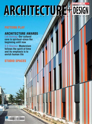
PATTERN PLAY ARCHITECTURE AWARDS Lek Bunnag: Our cultural core is spiritual–since the beginning until now S D Sharma: Modernism follows the spirit of time and its emphasis is to enrich human life

STUDIO SPACES

VOLUME 31

ISSUE 1

N N

A A

LL

O O

FF

A A

R R

C C

H H

II

TT

E E

C C

TT

U U

R R

E E


VOL XXXI A

N

I

N

D

I

A

N

J

O

U

R

N

A

L

O

F

A

R

C

H

I

T

E

C

T

U

R

NO 1

JANUARY 2014

E

EDITOR-IN-CHIEF SUNEET PAUL

SENIOR EDITORIAL ASSOCIATE NIJITA NANDAN KADAM ARCHITECTURAL ASSISTANT ASHNA PURI SENIOR SUB EDITOR POTSHANGBAM JULY

SECRETARIAL CO-ORDINATOR PRITI SHRIVASTAVA CREATIVE DIRECTOR BIPIN KUMAR SENIOR VISUALIZER JOHN ROY

MARKETING: BENGALURU: JOY TALAPATRA Tel: 080-22219578; Fax: 080-22243428 CHENNAI: D KARTHIK Tel: 044-28141816, 044-28140159 KOLKATA: SUJIT BOSE Tel: 033-22874298, 033-22805323

MUMBAI: PRAKASH ANJALEKAR Tel: 022-26053702/6; Fax: 022-26053710

34

28

NEW DELHI: SONALI ROY (GM) GANESH DIXIT (Manager - Ad Sales) Tel: 0124-4759691; Fax: 0124-4759550 PRODUCTION SUNIL DUBEY (DGM) RITESH ROY (Sr. Manager) DEVENDER PANDEY (Manager) PRE-PRESS EXECUTIVE BRIJESH KUMAR JUYAL

MANAGER SCHEDULING C P SREEDHARAN

PRODUCT SALES & CONSUMER SERVICES VIPUL JAIN (Head – Retail) ASHISH SAWHNEY (Manager – Subscription) REGIONAL MANAGERS SATHYA NARAYANA T S (South) SOMNATH PRAMANIK (East) SUBASH MISHRA (West) MANAGER – HR SONYA CAROLINE SHAH

74

EDITORIAL AND ADVERTISING OFFICE Media Transasia India Pvt. Ltd. Plot No. 323, Udyog Vihar, Phase-4, Gurgaon-122016, Haryana. Ph: 0124-4759500; Fax: 0124-4759550. E-mail: Editorial: aplusd@mtil.biz, paul@mtil.biz

FOR SUBSCRIPTION Call: Gurgaon: 0124-4759616/17 Mobile: 09899414369, Fax: 0124-4759550 Mumbai: 022-42467777, Fax: 022-26503710 Bengaluru: 080-22219578, Fax: 080-22243428 Chennai: Telefax: 044-28141816 Kolkata: Telefax: 033-22874298 Email: circulation@mtil.biz Web: www.mediatransasiaindia.com

07

ABOUT THE ISSUE

70

Articulated Workplace T+T Architects, Russia

08

REFLECTIONS

74

10

UPDATES

Art in Interiors LIJO.RENY.architects, Kerala

80

Melting Whiteness Studio Frozen Music, Nasik

86

Treasuring Tradition DD Architects Studio, Kerala

92

Vibrancy through Colours Studio An-V-Thot Architects Pvt Ltd, New Delhi

ARCHITECTURAL STUDIO SPACES

MEDIA TRANSASIA GROUP CHAIRMAN J S UBEROI

PRESIDENT XAVIER COLLACO DIRECTOR AMRITA SHAHRA

19

A Design Fort Archohm Consults, Noida

28

Spatial Expression Nicolas Tye Architects, Bedfordshire, UK

34

Abstract Forms Spaces Architect’s @ka Office, New Delhi

46

Rythmic Inside-Outside Varsha & Deepak Guggari Associates, Pune

52

Origamic Structuring Ochre Architects, Bangalore

60

A Corporate Entity Ajit Nair Architects Atelier Pvt Ltd, Vadodara

CEO PIYUSH SHARMA

FINANCIAL CONTROLLER PUNEET NANDA PRINTED AND PUBLISHED BY Xavier Collaco on behalf of Media Transasia India Pvt. Ltd., having registered office at 323, Udyog Vihar, Phase IV, Gurgaon 122016 and printed at Aegean Offset Printers, 220B, Udyog Kendra - 1, Greater Noida (UP)-201306. Editor: Suneet Paul. Opinions expressed in the articles are of the authors and do not necessarily reflect those of the editors or publishers. Material published in this magazine may be reproduced only with written permission from the editors. Every effort will be made to return submitted material if accompanied by a stamped, addressed envelope, but the editors and publishers are not responsible for loss or damage. While the editors do their utmost to verify information published they do not accept responsibility for its absolute accuracy.

114 ADVERTORIAL-SHERON PLYWOODS 114 ARCHITECTURE+DESIGN & CERA

AWARDS 2013 PROJECT FEATURE 126 Pattern Play Lycée Albert Einstein, Bagnols sur Cèze NB Architectes, France (Architects) François PRIVAT (Partner architect) 134 EXPLORING DESIGN


about the issue J A N U A R Y 2014 ` 175

ARCHITECTURE+ DESIGN A A

N N

II

N N

D D

II

A A

N N

JJ

O O

U U

R R

N N

A A

LL

O O

FF

A A

R R

C C

H H

II

TT

E E

C C

TT

U U

R R

E E

PATTERN PLAY ARCHITECTURE AWARDS Lek Bunnag: Our cultural core is spiritual–since the beginning until now S D Sharma: Modernism follows the spirit of time and its emphasis is to enrich human life

STUDIO SPACES

VOLUME 31

ISSUE 1

Lycée Albert Einstein, Bagnols sur Céze (Architects: NB Architects, France; Partner Architect: François PRIVAT, France) All drawings and visuals for the projects and articles, unless mentioned otherwise, are courtesy the architects/authors.

A N

I N D I A N

J O U R N A L

O F

A R C H I T E C T U R E

t is no doubt a much cherished happening in an architect’s professional journey to get the opportunity to design his/her own house or then the studio. In this Issue we bring across to you a few select architecture work spaces that have been self-designed by the architects and add to the diversity to the approach in design. They make definitive and individualistic statements projecting environs that have been modulated to create the desired work aesthetics. Appropriate attention to functionality, the flow of natural light, mood setting artificial lighting, internal circulation and the addressing of such other concerns makes these spaces appear pleasant, comfortable and distinctive. These studios also stand apart for their focus to bring in nature to the interiors. A commonality observed is the sensitive incorporation of art. A few of them dwell on highlighting traditional elements whereas some others explore sensuality through form, abstractness and colour. It becomes all the more exciting when the architecture of the building has also been dealt with by the same architect handling the interiors. The spaces get a newer meaning. The design section of the magazine brings you closer to contemporary expressions in product design in India. The brief profile of the Delhi-based designer highlights the multidimensional impact of an experimental and research oriented leaning in this field. His art installations have found their space in the public life of Delhi and have been well accepted nationally and internationally. And yes, a significant event that took place last month was the award ceremony of the coveted ‘Architecture+Design & CERA Awards 2013” in Bangkok, Thailand. It became all the more interesting and fruitful with the spontaneous synergies generated between the large number of prominent architects from India and the Thai architects present for this special occasion. The response from the fraternity of architects has been overwhelming for us. Both ours’ and CERA’s commitment to provide this unique platform to stimulate creativity and out-of-the-box architectural concepts has got further reinforced--. We will shortly announce the ‘call for entries’ for the eleventh edition of these awards’. We are one with our readers in ushering in 2014 with all the enthusiasm to delve further into the realm of design and architecture. We shall collectively share these joys…

I

Image

Month Photo: Amit Pasricha

of the

Inspiring motifs and patterns from history – Red Fort, Agra

Ornamentation is the principal part of architecture, considered as a subject of fine art. —John Ruskin


Reflections

Photo: Steven King Photography; Courtesy: Royale Projects: contemporary art

Interplay of Light and Reflection Entitled Lucid Stead, the installation was created by California-based artist Phillip K Smith III on a 70-year-old homestead cabin in the California high desert. He transformed the shack with mirror, LED lighting and custom built electronic equipment to create the illusion that one can see right through the structure.

8

J a n u a r y 2 0 1 4 ARCHITECTURE+DESIGN


Updates Fast Track Architecture

M

accreanor Lavington’s design for R5, a mixed tenure development, has set a new benchmark for residential development at King’s Cross in London. This highly inclusive scheme fulfils the high design expectations of the King’s Cross masterplan, currently the largest urban redevelopment in Europe. It comprises a composed ensemble of four buildings including 8/16-storey Saxon court, the 8-storey Roseberry mansions, the two-storey Eastern Building and the 8/16 storey South Block. The buildings provide a mix of tenures including generalneeds social rent, shared ownership, extra care housing for the elderly and private housing. A series of outdoor communal spaces, roof gardens and balconies bring additional inclusivity and vitality to the block. The massing has been carefully articulated in response to the surroundings, respecting the geometry of the other planned buildings in the masterplan and activating nearby streets. Taking reference to the scale of the 19th century city block, Maccreanor Lavington has created a massing with a datum level of eightstorey. From this roofline, two taller buildings project a further eight-storey up to the height limitation set by St Paul’s viewing

corridors from the Parliament Hill. In a head and shoulders configuration, the taller elements are proportioned to appear as towers rather than slabs providing the density required while reducing the overall footprint, allowing for more public amenity space and creating a more intimate street scene below. The development offers different shaped and sized outdoor amenity spaces. These include the central courtyard, roof terraces and recessed and cantilevering balconies – a variety which contributes towards a diversified facade. Many units overlook their own communal amenity spaces; the shared ownership units overlook their roof garden and the extra care flats overlook the first floor terraces. The courtyard garden is for the use of all residents, with light brickwork facades reflecting sunlight into the space. To know more, visit: www.maccreanorlavington.com

he new terminal at Shenzhen Bao’an International Airport, Guangdong, China, was recently opened. The first airport by architects Massimiliano and Doriana Fuksas is set to become an iconic landmark in Shenzhen. Won by international competition, it has undergone a remarkably rapid process of design and construction, completing within three years. The terminal encompasses 63 contact gates with a further 15 remote gates and retail space. The sculptural 5,381,955sq ft (approx) terminal evokes the image of a manta ray and features a striking internal and external double ‘skin’ honeycomb motif

T

The focal point of the design is the concourse located at the intersection of the building. Consisting of three levels – departure, arrivals and services – they vertically connect to create full height voids, allowing natural light to filter from the highest level down to the lowest. The architects have created an interior as striking and elegant as the exterior. The spatial concept is one of fluidity and combines two different ideas- the idea of movement and the idea of pause. Stand out features of the interior design include stylised white ‘trees’ that serve as air-conditioning vents, and check-in ‘islands’, gates and passport-check areas with a stainless steel finish that beautifully reflect the honeycomb patterns from

that wraps the structure. At 1km long, with roof spans of up to 80m, honeycomb-shaped metal and glass panels punctuate the façade of the terminal allowing natural light to filter through. On the interior, the terminal is characterised by distinctive white conical supporting columns that rise to touch the roof at a cathedral-like scale.

above. The honeycomb motif translates into many aspects of the interior at different scales– from the larger retail boxes to smaller 3D imprints on the wall cover. Studio Fuksas are engaged on two further phases of the airport extension, scheduled to complete in 2025 and 2035 respectively.

10

J a n u a r y 2 0 1 4 ARCHITECTURE+DESIGN


Updates Awards OI-Design has recently won two European Hotel Awards– Best Hotel Interior Luxembourg for its en vogue transformation of Le Clervaux Boutique & Design Hotel and Best Hotel Interior Germany for its verdant reimagining of the Hilton Munich Park. Part of the International Hotel Awards, it is sponsored by EY and Virgin Atlantic.

J

Le Clervaux Boutique & Design Hotel was transformed by JOI-Design into stylish destination in Clervaux, a picturesque medieval village in the mountains of northern Luxembourg renowned for its outdoor lifestyle and gourmet cuisine. The restored hotel has 22 new spa suites and completely refashioned F&B areas. The team’s design concept preserves the unique

character of the estate, in part dating back to the early 1900s, at the same time creating a stylish spa destination to attract new tourists to Clervaux. By blending stylised baroque elements with contemporary features spiced up with details, JOI-Design has conceived a “modern baroque” flair that is seamlessly integrated with the building’s heritage.

M

agén Arquitectos recently received the NAN Architectural Awards 2013 in the category dedicated to renovation. The firm was selected for its project, Transformation of a palatial house in ruins in Cultural Centre ‘Lyceum’ in Alcañiz. The project transforms the building through a reading of their tracks to retrieve unique objects and spaces and replace the changes suffered by a new intervention. A friendly dialogue between the two was established through a system of voids located in the central bay while linking historical sites and separating the new intervention, allowing a unified perception of the whole and a feeling of spaciousness to the visually and spatially different plants. The jury of the 7th edition of NAN Architectural Awards included Jordi Ludevid, Carlos Ferrater, Rafael de la Hoz, Carlos Lamela, Francisco Javier Maroto, César Ruiz-Larrea, Fermín Vázquez, Guillermo Vázquez Consuegra, Fuensanta Nieto, Ignacio García de Vinuesa, Mark Fenwick, Enrique Álvarez-Sala, Tomás Llavador, Luis de Garrido and Gabriel Allende y Teresa Batlle. More than 200 projects were presented in the edition.

Trade news ERA, one of the leading bathroom solution providers, was recently conferred Asia's Most Promising Brand award by World Consulting & Research Corporation (WCRC) at a ceremony held in Dubai. The selection criterion was done based on exhaustive research of brands in various Asian countries. CERA, which grew over percent in the last fiscal, had a topline growth of around 40 percent in H1 this year. “This growth is indeed commendable and shows the inherent strength of brand CERA” said Atul Sanghvi, chief operating officer, CERA. Well-known for its style and innovation since its inception in 1980, with the recent induction of India's fashion and style icon, Sonam Kapoor, as brand ambassador, CERA is already reckoned with international brands. The year 2013 has been particularly significant for CERA. The company won the prestigious ‘Power Brand Award’ for the second time in a row and 'Product of the Year' award for the third time. For further details, e-mail: pks@cera-india.com

C

12

J a n u a r y 2 0 1 4 ARCHITECTURE+DESIGN


PROMOTION

Exhibitions

T A Successful

DECADE

One of the fastest growing international airlines, Turkish Airlines has completed 10 successful years of flying in India. Operating in the country since 2003, Turkish Airlines has become one of the most popular airlines serving Indian travellers. Currently, it operates a daily flight to Istanbul connecting Europe, USA and Australia, flying out of two major cities of the country—Delhi and Mumbai. After a decade in the country, Turkish Airlines is optimistic about the Indian aviation sector and is planning to expand its services further. India is likely to become the third largest aviation market by 2020, thus the airline is exploring investment opportunities in the country. The airline is looking at the option of starting operations from new routes and increasing the number of flights in 20142015. Staying true to its motto “Widen Your World”, Turkish Airlines will spread its network in the country and offer better services to business and leisure travellers. Turkish Airlines has received several “Passenger Choice Awards” from Airline Passenger Experience Association (APEX). In 2013, Turkish Airlines, for the third consecutive year, was named “Best Airline in Europe” by Skytrax. A winner of the “World’s Best Economy Class On-Board Catering” award, Turkish Airlines was also the recipient of the Skytrax “Best Business Class Catering” award in 2013.

WIDEN YOUR WORLD For more information: www.turkishairlines.com

he West Kowloon Cultural District Authority is all set to open the fifth edition of the Mobile M+ exhibition series. Titled ‘Building M+: The Museum and Architecture Collection’, the exhibition will be held at ArtisTree, TaiKoo Place, Island East, Hong Kong. Starting with an overview of the processes by which the design was selected by an international jury, including a presentation of the other shortlisted design proposals by Kazuyo Sejima + Ryue Nishizawa/SANAA; Renzo Piano Building Workshop; Shigeru Ban Architects + Thomas Chow Architects; SNØHETTA; and Toyo Ito & Associates and Architects and Benoy Limited. The exhibition will showcase the ongoing development of the 60,000sq m M+ building as it progresses towards its scheduled completion in 2017. It will also showcase an installation organised in collaboration with Herzog & de Meuron that will feature models, diagrams, renderings and projections that highlight the project's core features. The exhibition will present the inaugural showcase of the museum’s growing architecture collection, the first-of-its-kind in Asia. It will present over 100 works and materials, many previously unseen, by more than 35 architects, firms and artists from Hong Kong, China, Asia and beyond, dating from the 1920s until now.

T

he Canadian Centre for Architecture (CCA) recently kicked off an exhibition titled ‘How architects, experts, politicians, international agencies, and citizens negotiate modern planning: Casablanca Chandigarh ‘. The exhibition will continue until April 20, 2014. The exhibition presented a new historiography of modern urbanism based on two major urban experiments from the early 1950s: new residential neighbourhoods in Casablanca, Morocco planned by Michel Écochard and a team of young French and Moroccan architects; and Chandigarh, the new capital of Punjab in northern India conceived by a team consisting of Le Corbusier, Pierre Jeanneret, Maxwell Fry, Jane Drew and local architects and planners. Curated by Tom Avermaete and Maristella Casciato, this exhibition revisits the relationship between local conditions and the international language of modern architecture in the context of Cold War politics and of the growing economic and political cooperation promoted by the United Nations. The exhibition and accompanying publication showcase a series of photographs commissioned by Yto Barrada and Takashi Homma, which offer a contemporary reading of these two cities and illustrate the capacity to allow for change, adaptation and transformation. The exhibition also showcase nearly 400 objects, consisting of more than 150 historic photographs, models, drawings, maps, and publications comprising experts’ reports from international organizations. For more information, visit: www.cca.qc.ca/casablancachandigarh


Advertorial

HACKER LATEST KITCHEN TRENDS 2014

L

ife is changing fast and so are the trends and the aspects. One of the latest facets that has changed completely and still undergoing the changes is kitchen. It may be a possibility that your kitchen fails to cope with the busy lifestyle of you and your family and sooner or later you decide to change it altogether for the better next of whole family. Keep in mind that the modern kitchens are nothing but the save hub of family life, serving in the form of a cozy dining area, and certainly a place of gathering at the end of the day. It may be that to do the same you have to undergo a huge project of remodeling or a simple

16

J a n u a r y 2 0 1 4 ARCHITECTURE+DESIGN

project of rejuvenation might be enough for you. Whatever has got to be done must go well with your budget and aspirations. Never forget to have a family-based discussion prior to the initiation of the project. Each family member must feel and find the kitchen as his or her own. Try to focus on three basic elements- Ideas Layout and Style. Make an online research; you can come across lots of exciting designs soon. Saving energy and the environment Environmentally-conscious homeowners are asking for ways to avoid ecological wastefulness and to be more energy-efficient. One of the best ways is to effectively light your kitchen


workspace. Work with a professional lighting designer who can help you with all the latest technology in fixtures. Kitchen lighting is changing. Consumers are looking for more energy efficient lighting options. A great way you can improve energy efficiency and realize savings in your kitchen is to start by using compact florescent bulbs. They last ten times longer than standard incandescent bulbs. Further, use two thirds less energy and provide the same amount of light output. CFL bulbs generate 70 percent less heat-- which can reduce energy costs associated with cooling your home. The trend for kitchen lighting is track lighting, pendant lighting and under counter LED lighting. Under counter LED lighting provides a more clean light that is energy efficient and unseen. Pendant lighting can be offset in different lengths to bring light at different levels. Track lighting is adjustable to put light right where you need it while you’re preparing a meal. Finding ways to save money is a trend that continues to be in style. Built-in Appliances As far as appliances go, hobs are still popular with separate double ovens installed into a wall or in tall cabinets. Energy efficient appliances are very high in demand. Microwaves that are mounted above the counter are back in style. Mounting your microwave above the counter frees up much more needed counter space. Induction hobs are growing in popularity along with the addition of indoor infrared grills with industrial exhaust hoods are also becoming more in demand. Island trends 2013 Kitchens have become the most important area of the home. Most people want a kitchen that looks stylish, boasts a warm, inviting atmosphere, but is also practical and easy to maintain. There are many different finishes and designs are available that you can get for your kitchens these days, which means that you can create the perfect space with plenty of practical features as well as

the perfect overall finish. Island kitchen have become most stylish as well practical concept over the years. Island concept gives you additional storage and added working counter space as well makes your kitchen look stylish, modern, and classy. Island concept can be customised as per adequate space available in your kitchen Flooring trends 2013 Now a days the kitchen has become the centerpiece of any house. The kitchen is a place where most of the guest of relatives likes to make a visit to help in a post party clean up. A kitchen floor is thus exposed to a lot of traffic and scrutiny. Beauty and functional qualities thus go parallel in a kitchen while deciding flooring. While selecting floor for the kitchen it is important to keep these things in mind.

The idea of owning a floor that is in sync with the latest rage in town is an attractive idea. It is also an affordable way of making a style statement. While choosing a trendy flooring do keep in mind that the trend must gel with the existing dĂŠcor scheme of your house and should have functional value. If you are not comfortable working on a floor the novelty of trendy looks will soon give place to ankle pain! Website:- www.haecker-india.com www.haecker-kuechen.com

ARCHITECTURE+DESIGN J a n u a r y 2 0 1 4

17


Architectural Studio Spaces

All the selected Architectural Studio Spaces in this segment have been designed by the architects/designers themselves...


A Design Fort Architects: Archohm Consults, Noida

A

Photo Credit: AndrĂŠ J Fanthome

rchohm's head office in India, often labelled as a design fort, reflects the 'mad and fun' design philosophy of the architects. The site is located in an extremely dense suburban area within the vicinity of the NCR. Amidst the urban city conditions, the triangulated plot is flanked by the 'Jama mosque', industrial factories and a large slum development.

ARCHITECTURE+DESIGN J a n u a r y 2 0 1 4

19


GROUND FLOOR PLAN

FIRST FLOOR PLAN

Standing tall at a height of 10m, Archohm’s Corten steel entrance door creates an intimidating first impression. Its revolving nature and access through a ramp gives the building its character and symbolising the continuity of the outer street into this ‘square’, the atrium for visitors. A moat augments the medieval modern dialogue with a revolving bridge that connects the main studio to the front garden. The

20

J a n u a r y 2 0 1 4 ARCHITECTURE+DESIGN

boundary wall is clad in red sandstone with etchings that depict the focus areas of the firm. The main building is divided into five components, each of which is defined and exaggerated by the use of distinct materials; concrete, glass, brick, stone and metal. Each component has been designed keeping in mind the climatic, contextual and functional requirements.


Photo Credit: Humayun Khan

The main studio space takes the north face, and has an economical RCC framed structure wrapped in glass. The glazed façade brings in diffused light, to create optimum working conditions. To distinguish a sense of identity within the various sectors of the studio, each department is assigned a particular colour in the building section and elevation. Architecture is brown, interiors are orange, electrical is yellow, plumbing is in blue and finance is red. The external façade is transparent and houses every department’s files, documents, physical models and material samples, creating a dynamic visual collage of materials and colours that is able to represent life at the studio. Large circular cutouts connect the floors vertically. Staggered in location, these openings visually connect across three levels. To add vitality, each cutout is equipped with its own highlight. From poles to slides, the features are varied, and they add energy and are quite well-used. Placed near the entrance, a robust, circular 'rotunda' of brick accommodates all services. Dominating the central hollow core, hangs a yellow felt manuscript, with laser cut, inspiring excerpts from the ‘Fountain Head’. The apt placement of the rotunda ensures efficient division of traffic, as visitors reach directly to the meeting rooms. At every half floor height, washrooms are placed with designed wooden benches for waiting. This service core houses the electrical substation at the base and water works on top. All services

22

J a n u a r y 2 0 1 4 ARCHITECTURE+DESIGN

Photo Credit: André J Fanthome


Photo Credit: AndrĂŠ J Fanthome

are concentrated into this block and all lines run exposed for economy and maintenance. The roof top of this rotunda, transfers into a perfectly circular amphitheatre that can accommodate up to a hundred people. Lined with white China mosaic, it helps to reflect unwanted heat and provides an excellent space to conduct formal/informal office gatherings. The southern face is obstructed with a three-meter thick stone wall. This wall is hollowed at various levels to house playful glass, transparent meeting rooms that create an internal visual dialogue. Looking onto the entrance atrium and facing the main studio, these meeting rooms add a sense of transparency to the office layout. In all, there are four such meeting rooms, each with its own colour, texture and style. The metal roof of the atrium rises three floors high, extending itself into a metal box, as it scales into a badminton court for the studio, behind the stone wall. The vastness of the court helps it double up as an exhibition and a lecture space as and when required.

24

J a n u a r y 2 0 1 4 ARCHITECTURE+DESIGN


Photo Credit: Humayun Khan

Last but not least is the triangle of concrete that gets its shape by virtue of the plot. Its basement houses fully equipped boutique studio guest rooms with their own open air theatre. On the first floor, sits the orange board room adorned at the centre with a triangular concrete table. Considered as one of Archohm’s highlights, this table was shunned by structural engineers due to its central support and extreme cantilevered design. At the terrace, the concrete triangle converges into a skylight and swimming pool, which is covered by a cooling white canopy. Beyond the pool, lies an open garden that overlooks the office cafeteria. A large triangular volume, double height and lit from the top is one of the most spectacular design studio spaces of the office. The bare concrete walls, glass roof and terracotta floors make this contemporary space fairly earthy. The space is punctuated by art and design, designer lights and furniture pieces. The entire office space is conceived as a vibrant and active space, interspersed with distinctive out-of-the box ideas that demonstrate and inspire creativity amongst Archohmites. Being used as a live canvas, the exhibit of materials, colours, textures, exposed surfaces and play of form, make the studio a three

26

J a n u a r y 2 0 1 4 ARCHITECTURE+DESIGN

Photo Credit: André J Fanthome

dimensional library. Not only does this help clients visualise designs but also helps the architects keep their design alive. Through small initiatives, creative expressions and a sheer mad and fun working ambience, the architects have made their office a thought provoking gesture, representing their journey, exposure and experience over time. At the centre of the entrance, the atrium stands as a metal sculpture, christened as ‘the hand’. Crafted out of scrap material from the studio’s backyard, this abstract art piece, radically transforms, on being subject to light. Seen in its shadow, is the exact reflection of Le Corbusier’s ‘Hand’. The sculpture encapsulates the soul and philosophy of Archohm’s studio.

FactFile Client: Sourabh Gupta Design Team: Sourabh Gupta (Principal Architect) Anindya Ghosh, Girdhar Rautella, Shivdutt Sharma Consultants: Archohm Consults Built-up area: 4000sq m Year of completion: 2011


Architectural Studio Spaces

Spatial Expression Architects: Nicolas Tye Architects, Maulden, Bedfordshire


S

et in a stretching landscape, the new studio with subtle materiality – its form rooted in simplicity – is emblematic of modern design. It is a controlled gesture, gently resting in the countryside, forming an expression of the firm’s ideology. The studio’s building strategy is based on an elegant rectangle (a form harmonious with the existing linear adjacent barn) of predominantly glazed elevations capped and enclosed at each end by larch timber clad ‘book ends’. Corten detailing further enhances the sense of place, reflecting the old, discarded agricultural machinery and steelwork of the barn.

ARCHITECTURE+DESIGN J a n u a r y 2 0 1 4

29


STUDIO PLAN

ELEVATIONS

The studio comprises a reception and seating area for its clients, a kitchen, storage, studio space, WCs, meeting rooms and a library and services pod– a continuous expanse of space defined by volumes of wenge pods containing the ancillary elements of the programme.

Frameless 3.2m high glazed panels, embellished with a slight green tint, afford panoramic views of the peaceful landscape and provide a comfortable and inspiring environment to the staff members. These glazed facades are punctured by timber clad pods – within which dedicated


functions subsist – whose floating appearance evinces a gentle tension through the contrasting properties of solidity and levity. The timber clad boxes are utilised more on the southern elevation to protect the building from overheating; while high levels of insulation ensure the building to exceed the regulation requirements on heat loss. Employing a wind turbine, rainwater harvesting, eco paint, low energy central controlled lighting and under floor heating, a central vacuum and air control systems, the studio, consciously approaches contemporary issues of sustainability.

32

J a n u a r y 2 0 1 4 ARCHITECTURE+DESIGN

FactFile Client: Nicolas Tye Architects Design team: Nicolas Tye Architects, Akera Engineers Consultants: Nicolas Tye Architects, Akera Engineers Built-up area: 220sq m Cost of project: ÂŁ250,000 Year of completion: 2012


Architectural Studio Spaces

Abstract Forms Architects: Spaces Architect’s @ka Office, New Delhi


ARCHITECTURE+DESIGN J a n u a r y 2 0 1 4

35


T

he architect’s office in the basement has been conceptualised as an open office with two levels. The office design was planned to be a leisurely place and conducive for people to work in a creative environment, a workplace to enjoy. The zoning of spaces is justified keeping the main cabin with attached conference at the rear to maintain privacy as well as visually connecting it to the front office. As the front office space is narrow in comparison to the rear area, it is used as a gallery with walls finished in cement, highlighting the project display. One moves down from the front entrance highlighted by fixing a glass roof, penetrating ample light into the interior space. An informal conference on a raised platform has been designed by fixing multiple diameter steel pipes with an abstract panel ceiling. The flooring and walls at the front office are finished in cement to give emphasis to the display panels. An abstract partition creates a space for the waiting area, and continues on the ceiling extending into multiple abstract boxes displaying different design ideologies of the firm. The lower basement has open workstations connected by

36

J a n u a r y 2 0 1 4 ARCHITECTURE+DESIGN


VIEW OF STUDIO

9

7

10

9 10

5

7 5

4

4

8

8 3

3

6

6

2 1

FLOOR PLAN

1. ENTRANCE 2. WAITING AREA 3. RECEPTION 4. CASUAL SEATING 5. WORKSPACE 1 6. WORKSPACE 2 7. ARCHITECT’S CABIN 8. CONFERENCE AREA 9. PANTRY 10. TOILET

1

2

CEILING PLAN


SECTIONS

cantilevered wooden steps, and the opening from the front office looking towards the lower floor frames it. The lower level in contrast to the upper is designed in white tone. The reception table has an interesting form with a back lit glass panel. A bookshelf displaying the firm’s projects is placed

40

J a n u a r y 2 0 1 4 ARCHITECTURE+DESIGN

opposite to it. A green space with grass flooring and elliptical seating space is used as a breakout space in the interior and used for reading books. Two workstations for senior architects are designed behind the seating. The outer partition of the main cabin is in a fluid form with


ARCHITECTURE+DESIGN J a n u a r y 2 0 1 4

43


veneer cladding continuing to the conference room ceiling. The partition is inclined at both the planes and takes an interesting form. The conference and cabin has a glass sliding folding partition which when pulled acts as individual space. The ceiling plays an important role in the studio creating a visual transition. The abstract form displays a journey of different projects and ideology of the firm. Similarly, elliptical ceiling over the reception has a hanging model inspired by the architect’s thesis project being a focus in space. The circular seating in the green area is reflected on the ceiling in an abstract pattern continuing in the rear space. Photo credit: Bharat Aggarwal

FactFile Client: Kapil Aggarwal Design team: Kapil Aggarwal, Pawan Sharma, Chander Kaushik, Karan Arora Contractors: Spaces Architects@Ka Built-up area: 1500sq ft Cost of project: Rs 15 lakh Year of completion: 2013

44

J a n u a r y 2 0 1 4 ARCHITECTURE+DESIGN


Architectural Studio Spaces

Rythmic Inside-Outside Architects: Varsha & Deepak Guggari Associates, Pune

46

J a n u a r y 2 0 1 4 ARCHITECTURE+DESIGN


T

he architects desired to create a studio which would not be bound within the walls. Simplicity and minimalism being their forte, they dreamt of creating a studio which would define what is close to their hearts, where ideas are not confined within the glass cubicles and walled premises. An open workspace which embraces the visual respites present around the premises was what the architects wanted. Though nestled in the heart of the city, the studio seems to be away from its hustle bustle. An 1800sq ft apartment on the ground floor of an existing old building was chalked out as the studio in the set backs of the apartment, which became the foci of the design. The whole studio interiors were developed in the set backs and they followed the elements of nature; the rustle of the leaves when wind blows through them, the inkling of the

raindrops, the drenching of the greens in the rains and the gurgling of water. The aromas of the Mother Nature motivated the architects to bring it all in the premises. The once dead and dirty building setbacks were brought to life. These were converted into visually appealing spaces by bringing in a lot of greens and accentuating them with statement pieces and artifacts that were collected while travelling. The collection included traditional hand-picked items from Cochin and Bali, which complemented the nature very well. The whole periphery is dotted with surprise elements which not only charm the visitors but also showcases the exhibits. The design follows a simple approach; taking one from surprise to the predictable; where the predictable becomes a surprise by itself. The entry to the studio is through a series of

ARCHITECTURE+DESIGN J a n u a r y 2 0 1 4

47


11

12

14 14

9

8

8

7

12

13 13

13

4

3

10

5

6

2

N

FLOOR PLAN 1. ENTRANCE 2. ARRIVAL 3. WAITING AREA 4. RECEPTION 5. ADMIN CABIN 6. MEETING ROOM 7. PRINCIPAL ARCHITECT’S CABIN

8. STUDIO 9. CONFERENCE ROOM 10. LOUNGE 11. PANTRY/DINING 12. GARDEN 13. TOILET 14. WATERBODY

pergolas blanketed by creepers and flanked by the lush green plants which leads one to the waiting area and reception. A 10ft wide pivoted door with interesting small details opens up to become the welcoming wall to the studio. The waiting area has IPS benches instead of the usual plush sofas and the reception is vibrant, achieved by a coloured wall, amidst the subtle IPS floors and dark wooden furniture accents. Traditional columns from Cochin frame the reception area and gels with the overall theme of the office. Architect’s cabin enjoys the panorama on its two sides. While the rear set back, that is, the east court is full with the

48

J a n u a r y 2 0 1 4 ARCHITECTURE+DESIGN

1

bamboos and a fish-pond, the side margin opens up view to the lovely frangipani trees and huge pots sourced from Bali. The studio is pulsating and sparkling on account of the north court that is seen by knocking off the rear side wall. The court has a vibrant coloured wall as the backdrop for a lot of greens and artifacts. This court exuberates energy in all seasons, be it the dark shadows it receives on harsh summer days, the soaked aromas it senses during the monsoons or the gentle warmth of the winter sun. While on one of the walls of the court, a traditional door marks a surprise as to what lies beyond, the opposite side has an outhouse converted into a dining-cum-


SECTION

ARCHITECTURE+DESIGN J a n u a r y 2 0 1 4

49


pantry. This outhouse has a series of white doors and windows with coloured glass in the cut-outs, which forms a beautiful picture altogether. The roof of the outhouse is pergolas and glass and the same is shaded throughout the year by existing trees in the vicinity. The outhouse is reached by crossing a narrow fishpond by precast concrete panels with frangipani leaf inlays forming the stepping stones. The conference is kept cozy on account of its utility. The lounge is a dark den which entertains both the visitors and becomes a reading room as well for the staff. It boasts of some

of the stylish and traditional items in terms of furniture and artifacts. All the spaces in the studio have been given an extended view to the greenery and they enjoy these vistas, oblivious of the location of the studio. The material palette for the studio comprises IPS, Basalt and Kota. The waiting area and meeting room at the entrance have IPS flooring with frangipani and Monstera leaf imprints. This IPS runs into the reception area and architect’s cabin as well. While the work space, conference and lounge have Kota floors which open up to the Basalt flooring of the courts beyond. Black aggregate has been used to fill in the voids between the Basalt steppers in the architect’s personal court. The only try was to keep the interiors simple and rustic, with no glamour of the Italian marble or the fakeness of the vitrified tiles. The architects tried to stick to the basics while designing the work abode. The material palette very well compliments the theme of the interiors. Strategic lighting throughout the studio, while highlighting some walls and artifacts and keeping certain corners dark, has helped to achieve the desirable feel. The space truly confines to a designer’s whims and fancies and satiates his hunger for exclusivity.

FactFile Client: VDGA Design team (architecture & interiors): Varsha and Deepak Guggari, Richa Khawte Built-up area: 2000sq ft Cost of project: Rs 25 lakh Year of completion: 2012


Architectural Studio Spaces

Origamic Structuring Architects: Ochre Architect, Bangalore he plot is located on the main ring road. Due to the proposed road extension, the site area available for the extension was restricted and hence a vertical development was preferred. The programme included a separate structural office, a new reception area with material library and a board room, increased number of workstations,

T

PERSONAL

PERSONAL

DISCUSSION

a stationery room, a printer and server area, a space for two principal architects and a terrace with pantry, toilet and dining space. The idea of the origami development was continued from the faรงade into the various interior components of the newly extended office. These peeled surfaces allow natural light

DISCUSSION

Principal architect needed a personal desk apart from the discussion desk

Personal Desk was planned towards the wall and discussion table was planned at the center of the space

STAIRS LEADING TO THE TERRACE PERSONAL TABLE

STAIRS SKETCHING DESK

52

Personal desk for the principal architect is tucked under the stairs leading to the terrace

A portion of staircase was designed as a part of the table. The rest of the stairs was designed as a park of the ceiling expression

Table with conventional wire manager system

A sliding member finished with leatherite was planned to conceal the slit through which the can pass through. The leatherite member also becomes place to keep the personal gadgets

Storage for pens, papers and other stationery

The sliding drawers were customized with mdf partitions for pentreys, papers and other personal gadgets.

J a n u a r y 2 0 1 4 ARCHITECTURE+DESIGN


ARCHITECTURE+DESIGN J a n u a r y 2 0 1 4

53


2

1

7

8

6

6

3

1 2

3

5 4

N

GROUND FLOOR PLAN 1. SECURITY CABIN 2. ENTRANCE 3. WORKSPACE 4. TOILET

FIRST FLOOR PLAN 5. RESIDENCE 6. WATER BODY 7. PAVED AREA 8. LANDSCAPED AREA

from the top and ventilation from below, while becoming the driving idea behind the forms for the interior furniture. Hence, the exterior design and interior development are interlinked and will have to be looked at in tandem. The proposed office slabs were staggered between the existing office slabs, allowing for a split level development, ensuring a functional space at every landing. A small triple height volume is planned at the junction of the two structures with the access stairs working around it. An indoor tree is the focus of this volume capped by a linear skylight which illuminates all levels of the office. The existing jackfruit tree and dracaena plant were retained and incorporated around the entrance water feature. This water body with the surrounding vegetation and the water plants provide a self sustainable habitat for the fishes and requires very little maintenance. The building is

54

J a n u a r y 2 0 1 4 ARCHITECTURE+DESIGN

1. RECEPTION AREA 2. MATERIAL LIBRARY 3. BOARD ROOM

mainly exposed on the south and west sides. Hence, the stores and library are located at these ends. Also, the design idea encouraged fewer openings while ensuring sufficient light, ventilation and views wherever required. Openable windows are located at the south-west and north-east to maximise the effects of natural ventilation. Sufficient greenery has been incorporated within the office due to the abundance of natural light through skylights. This provides for a better work environment. The extended office is an RCC structure with eight inch hollow concrete blocks used for masonry. The colour is predominantly white with the unplastered ceiling and PCC floor providing the contrast. Small areas of gypboard ceilings are introduced to conceal beams and to provide cove lighting which provides diffused light. A lot of existing material from the old office was used effectively in the interiors of the extension. Old MDF tables


were reused as the vertical supports for the new ones. MDF cabinetry accommodating the library and store from the old office was minimally modified and repainted to be used in the stationery and material stores. MS grill doors were resized to provide security enclosure on the terrace. Glass salvaged from the old office was cut to size and used as writing boards at the workstations. Only the principal architects’ level employed all new materials with plywood finished with laminate and corian. Glass partitions and doors without frames are used where physical access had to be restricted and visual continuity was required. Black leather finished granite was used for the staircase treads. Steel railing is employed along the stairs. Vertical stacking of the various activities allows for varying levels of privacy and interaction. Lower level is restricted to client meetings, vendors, accounts, reception and managerial spaces, including the material library. The boardroom tables are designed in a modular fashion such that they can be rearranged to form work tables in case the office expands. The intermediate floor, including the mezzanine is the architects’ level with model making, stationery store, printing and server areas. This level is broken up into groups, each comprising a senior architect and two or three junior architects. There is a central trainee station (a table for four workstations) which also caters to scanning, rendering and

56

J a n u a r y 2 0 1 4 ARCHITECTURE+DESIGN


SECTIONAL DEVELOPMENT

Photoshop facilities. The amphitheatre which was a part of the older building is central to the architects’ workspaces and is ideal for housing larger presentations. The third floor is planned for two principal architects with their individual requirements. There are two separate discussion tables with a library at one end. This level is designed to accommodate display ledges for models and awards and with its built-in seating ledges, it becomes the gathering space when the principal architects need to interact with the office as a whole. Models and awards display areas are planned throughout the office. Storage for files and drawings are accommodated. Space for music speakers is also

58

J a n u a r y 2 0 1 4 ARCHITECTURE+DESIGN

planned at all areas of the office, with individual volume controllers. The final terrace level accommodates a pantry, two toilets, a partly shaded dining area and an open area. This space allows for informal interactions.

FactFile Client: Tushar & Shruti Design team (architecture & interiors): Prutu ,Varun , Sudhamathy Built-up area: 2365sq ft Cost of project: Rs 8 lakh Year of completion: 2011


Architectural Studio Spaces

A Corporate Entity Architects: Ajit Nair Architects Atelier Pvt Ltd, Vadodara

L

ocated on Sama Savli Road, the freestanding office building aspires clarity, simplicity and precision of architectural expression. This was the architect’s dream to have an office reflecting its corporate entity, the craving for opulence in details and emphasis on theme quality. The office space is sectioned into a reception lobby with waiting area, studio and an outdoor studio on the ground level, director ’s cabin, conference room, a small pantry adjoining the meeting room and an open office space for lease on the first floor. The second floor contains additional space of 260sq m for future requirements. Underground parking of 210sq m forms a part of this 800sq m area.

60

J a n u a r y 2 0 1 4 ARCHITECTURE+DESIGN


ARCHITECTURE+DESIGN J a n u a r y 2 0 1 4

61


5

8

9

2

3 1

2 3

1

3

8

4

4

5 7

5

6 7 6

FIRST FLOOR PLAN

N

GROUND FLOOR PLAN 1. LOBBY 2. MRL LIFT 3. OUTDOOR STUDIO 4. DESIGN STUDIO 5. ENTRANCE LOUNGE

10

1. LOBBY 2. MRL LIFT 3. PANTRY 4. CONFERENCE ROOM

5. TOILET 6. DIRECTOR’S CABIN 7. BOARD ROOM 8. EXTENSION OF OFFICE PREMISES

6. ENTRANCE FOYER 7. RAMP 8. TOILET 9. AREA FOR ORGANIC FARM 10. ACCESS TO BASEMENT

Ascending up the steps, leads one to the reception lobby. The reception lobby with indirect lighting characterises the wooden false ceiling, emphasising the space and form created. Black leather sofas form a stark contrast but comfortable waiting area. A circular wooden table with six chairs creates an ideal space for small discussions. Corian, a synthetic material is used to create the reception table top and the partition separating the studio and reception space. The clear glass panels with one way film carrying project view adds an element of interest and also allows the staff to have visual connection with the lobby area. The shades of white in the studio give off a strong sense of spaciousness. The staff area has been illuminated with LEDs that provide maximum task lighting. The circular suspended light in the centre of the studio provides sufficient lighting on the meeting table.

ARCHITECTURE+DESIGN J a n u a r y 2 0 1 4

63


SECTION

ELEVATION


Following the trend of making workspaces less formal and more interactive, it was ensured that each person has a luxurious workspace. The minimalistic ambience of form and style, light and shade reflects the culture of this workplace quite simply in shades of white. In the studio, the dominant hue is white but splashes of colour in the paintings add interest to the design. The outdoor studio at the ground level is done in grey and yellow coloured sand stone from Kelwara district of Udaipur, by the local masons of Udaipur itself. The mural in the outdoor studio— that serves as an outdoor space for lunch

66

J a n u a r y 2 0 1 4 ARCHITECTURE+DESIGN

and rest for the staff, decompression area and informal meetings— forms a focal point. Works done by the firm are displayed on glass panels all along the first floor lobby. Sunlight streams in through the splayed glass to light up the staircase that leads to the first floor. Tall ceramic vases in black complement the colour scheme. The furniture of director ’s cabin though minimalistic is well chosen and forms an interactive space. The table in his cabin is made completely of wood with wooden panelling behind showcasing the personal taste of the architect.


The conference room is spacious enough for holding conferences or presentations equipped with all high tech equipments. Roll down blinds ensure that the translucent conference room caters to the privacy required during meetings. The top of this building features a landscaped roof garden with a rest room. Delicate shoots of bamboo add a touch of green to the terrace garden without obstructing the view. Walnut laminated wooden flooring is used in the rest room, with walls in tones of olive green kept in accord with the architect’s penchant for natural hues. The sand stone cladding on the front wall at the ground level serves a backdrop for a large steel plate carrying the logo and name of the company. Furthermore, the front wall in river finished granite with a corner window seems to merge with the landscaped mounds adding to the cohesive feel of the space. A raised lawn, accentuating the entrance with a backdrop of river finished granite is flanked by Dwarf Acalypha on either side, adding grace to the office, which is further enhanced by the use of specimen plants such as Ixora, Dorentta, etc. The

68

J a n u a r y 2 0 1 4 ARCHITECTURE+DESIGN

rigid edges formed by the hardscapes are softened by the line of shrubs planted along the verge and the indirect lighting below the steps further enhances the drama. The stark white exterior face of the building is punctuated by wide horizontal windows along the north-east face, while the services are clustered along the south-west face of the building. The use of earthy colours and textures create a warm and comfortable environment. The unfinished texture lends a rustic feel to the structure and the texture lends itself easily to its surrounding merging the whole building into the landscape adding to the cohesive feel of the space.

FactFile Client: Ajit Nair Architects Atelier Pvt Ltd Consultants: Ajit Nair Architects Atelier Pvt Ltd Built-up area: 840 sq mt Cost of project: Rs 75 lakh Year of completion: 2011


Architectural Studio Spaces

Articulated Workplace Architects: T+T Architects, Russia, Moscow

70

J a n u a r y 2 0 1 4 ARCHITECTURE+DESIGN


12 5

11

2

4

4

3 1

10

6

9 8 7

GROUND FLOOR PLAN

1. FREE SPACE 2. ROOF POINT BAR 3. RECEPTION 4. MEETING ROOM

5. CEO CABINET 6. KITCHEN 7. STORE ROOM 8. ACCOUNTS

9. OPEN SPACE 10. LOUNGE AREA 11. TOILET 12. ARCHITECTURE OPEN SPACE

T

he first step for the design of the studio was to remove all partitions and extensions that still existed and then to open the wooden beams of the roof, which were decided to be turned into the main design element. Rafters were cleared to retain the natural colour of the wood softening the strict graphic quality of the interiors. It was also decided to retain the original wood flooring planks that were once hidden under the carpet. The entrance area, full of light with additional skylights in the roof attracts the attention.

ARCHITECTURE+DESIGN J a n u a r y 2 0 1 4

71


PROMOTION

PROMOTION

Chefs on Board

T

urkish Airlines brings its travellers a flying experience like no other. The airline, known for its elaborate services, is introducing “Flying Chefs” on the Indian route to offer gourmet dining in the sky, at 37,000 feet. Through this service, the airline will offer a five-star restaurant-style, dining experience to business class travellers. A live kitchen on the flights and the interactive sessions with the chefs will recreate the entire Turkish food essence and provide an authentic taste of the cuisine to food lovers in India. This new catering concept by Turkish Airlines, in conjunction with its world-renowned catering partner TURKISH DO&CO, has already been used on various international routes. It has won Skytrax awards for the “World’s Best Economy Class On-Board Catering” in 2010 and 2011; and the “Best Business Class Catering” in 2013. This widely appreciated “Flying Chefs” service will soon be extended to India-Istanbul routes — Turkish’s first such service on long-haul flights. Especially selected for the Indian travellers, dishes from Turkish and world cuisines such as sish kebab, karniyarik, manti, and imambayildi will be freshly prepared and served on-board. Apart from these gourmet dishes which have never been experienced by Indian travellers before, Turkish coffee and Turkish delight will also be available. It’s safe to say, business class travellers will be provided unparalleled attention and plenty of choices based on their individual preferences.

The reception desk, an unusual shape, serves as a navigation element. Space is conventionally divided into two working areas with a central block with meeting rooms. At the end of the work area is the roof point– a place of rest, designed for meetings, lectures, discussions and companionship.

FactFile Client: T+T Architects Design team: Truhanov Sergey, Voevodina Polina Built-up area: 500sq m Cost of project: 121000 USD Year of completion: 2012

WIDEN YOUR WORLD For more information: www.turkishairlines.com


Architectural Studio Spaces

Art in Interiors Architects: LIJO.RENY.architects, Thrissur, Kerala

74

J a n u a r y 2 0 1 4 ARCHITECTURE+DESIGN


“Even though I build buildings and pursue my architecture, I pursue it as an artist. I deliberately keep a tiny studio. I don’t want to be an architectural firm. I want to remain an artist.” - Maya Lin

T

he architects aspired to design a space that would inspire them to create interesting spaces. The building houses the architect’s office in the ground floor and another design studio on the first floor. The studio was designed to accommodate a maximum of nine people. The multi-levels of the studio originated from the fact that the site was in two levels. The entry brings one to the mid level of the office, where there is a waiting area. The lower level has the designing and drafting section, a small discussion area, a pantry and a toilet. The mezzanine level has the library shelf and another discussion area. The store finds its place below the stairs that lead to the mezzanine level.


6

3 7

2

5

N

76

GROUND FLOOR PLAN

J a n u a r y 2 0 1 4 ARCHITECTURE+DESIGN

1

1. FOYER 2. WAITING/DISCUSSION 3. STUDIO 4. DINING/DISCUSSION 5. PANTRY 6. TOILET


Three main colours that are used in the office are red, black and white, for the walls, ceiling, art works, etc. Red is used for being one of those colours with most meanings, black for being stoic, bold and concealing, and white as a base/connector between the other two colours. The architects constantly experiment with these colours in their art works, thus it became the base for the office interiors. Exposed concrete is used for slabs and structural members. Flooring is done in Kota and vitrified tiles. The walls are first plastered and then finished with paints. Large mirrors on the sliding shutters of the storage units help in achieving visually double the amount of space. The growing wall in the waiting area takes the memorabilia which includes original sketches by people like architect Peter Rich, Laki Senanayake, etc. It also has several pieces from all over the world collected by the architects. Over a period of time, the compositions on the wall is

SECTION

ARCHITECTURE+DESIGN J a n u a r y 2 0 1 4

77


changed based on pieces added or removed. The art works are spread out in the interiors of the studio, including works from established artists to their own works, ranging from paintings to installations. The interiors were specifically designed to take the ever changing art works. Another interesting piece of art is something that most architectural offices have– a scale that shows the length and height in feet and meters. It has been done in black and red reflective stickers in such a manner that it registers as a scale only from the studio side and it seems like another site specific art work from the waiting area. One of the large windows opens on to a bamboo grove and as the studio level is below the actual ground level, it

78

J a n u a r y 2 0 1 4 ARCHITECTURE+DESIGN

gives the feel of sitting in the shade of a large tree. Also, there is minimum use of the lights during the daytime because of the large openings. Photo credit: Ar Praveen Mohan and Ar Lijo Jos

FactFile Client: LIJO.RENY.architects Design team: Lijo Jos and Reny Lijo (Architecture & Interiors) Consultants: Cigo G A (Structural) Contractors: Cube Builders Built-up area: 58.8sq m Year of completion: 2010


Architectural Studio Spaces

Melting Whiteness Architects: Studio Frozen Music, Nasik

W

hile designing the work studio on the ground floor, the architect intended to reflect the character of the studio that synchronised with the overall character of the building in which it resides. The design brief for the work studio was to have a simple, fresh, cozy, well lit space for working, studying and the

80

J a n u a r y 2 0 1 4 ARCHITECTURE+DESIGN

exchange of ideas. Due to the limited area, all the rigid compartmentalisation was avoided in order to enhance the continuity of the space. Though the actual floor area of the work-studio was small, the outdoor court adjacent to the studio does not make the indoor area look cramped and dull, because of its well lit character and landscape.


OPEN DISCUSSION SPACE

SPILL OVER COURT

ENTRANCE/RECEPTION

WORK STATION

PANTRY

TOILET

CUT VIEW SKETCH

ARCHITECTURE+DESIGN J a n u a r y 2 0 1 4

81


5

1

4

OFFICE PLAN

82

J a n u a r y 2 0 1 4 ARCHITECTURE+DESIGN

3

2

1. OFFICE 2. RECEPTION 3. PANTRY 4. TOILET 5. COURT


SECTION

The studio can be considered in two parts, first is the discussion space for architectural presentations and meetings, and second is the working unit. Both these areas are divided by means of a 6ft high furniture unit which accommodates the library for the studio. The workstation is conceptualised as a box within the box, which provides privacy and openness simultaneously. The top of this workstation is also used to house architectural models. There is no furniture unit that is either immediately adjacent to walls or exceeds up to the ceiling height. This makes the space look whole and complete. The furniture and the walls are painted in white with some veneer finished portions that add the warmth needed in such melting whiteness of spaces. Ancillary areas like reception and waiting, pantry and toilet are housed in a compact linear grid adjacent to the work area.

84

J a n u a r y 2 0 1 4 ARCHITECTURE+DESIGN

This office is a workspace for an architect who likes to look at things in a very informal way, who likes to work in a cozy environment, and who likes to adopt somewhat ‘lethargic’ and contemplative approach towards working rather than so called dead-line based work efficiency. It is his ‘Tao’ of working.

FactFile Client: Deepak Ramchandra Shirke Design team: Mahesh Deepak Shirke Consultants: NitinTekale (Structural), MilindShete (Plumbing) Contractors: BhupenVishwakarma (Furniture), B D Malpure (Electrical), RamSharanChowhan (Flooring), Sunil Dhuppad (Supervision) Built-up area: 450sq ft Cost of project: Rs 6 lakh Year of completion: 2012


Architectural Studio Spaces

Treasuring Tradition Architects: DD Architects Studio, Thrissur, Kerala

T

he studio is designed and built not only as a space for work, but also as an environment-friendly space for reflection, meditation and an area for people including clients to understand and experience deeper architectural values. The structure is modern/contemporary in feel, but it is inspired and built using the age old traditional expertise. The walls are built using laterite and terracotta hollow blocks. Lime mortar prepared with the help of eight traditional herbs is used

86

J a n u a r y 2 0 1 4 ARCHITECTURE+DESIGN

for wall plastering. Oxide flooring (blue, white and green), which is also a local dying art is used for flooring apart from terracotta tiles. In the staff working area, mud plastering is used. Treated bamboo is used for various purposes. Exposed concrete roofing has been used and in the concrete roof of the verandah, natural jack fruit leaf imprints have been used. The office becomes a rare showcase of many traditional techniques and skills used to create a contemporary language, still suited for Kerala and its rich culture.


1

2

5

3

4

SECTION

GROUND FLOOR PLAN 1. STUDIO 2. DISCUSSION ROOM 3. RECEPTION

4. PANTRY 5. TOILET


The structure is located at a distance from the gate and does not clearly announce itself. The entrance is through a landscaped garden and once anyone reaches the interior, the quality of the space is felt and also it starts to give fresh sensory experiences which changes with time and seasons. The building uses eco friendly materials and is a fine example for passive cooling techniques. The entire structure is designed such that the hot air from the ground floor actually escapes from the top level through the staircase passage. The details, apart from the materials used ensures that the building remains comfortable during all seasons. Light fixtures within the building are custom-designed using copper and fabric. Also, landscaping is done using local grass and tree varieties and flowering plants. The ground floor becomes a space for visitors and staff with entry, reception, staff working space, materials/brochure display, discussion rooms and pantry. Apart from this, the ground floor offers landscaped area for discussions and small meetings. The first floor is mainly the director’s room and

1 2

FIRST FLOOR PLAN 1. DIRECTOR’S ROOM 2. MEETING AREA/AV ROOM

88

J a n u a r y 2 0 1 4 ARCHITECTURE+DESIGN

SECTION


PROMOTION

Turkish Airlines Golf App The Turkish Airlines Open 2013, which was held in Antalya from November 7-10, 2013, was full of exciting moments. Many internationally renowned golf players participated in the tournament including the celebrated American golfer Tiger Woods and French golfer Victor Dubuisson, who came out as the winner of the title. To help golf lovers recapture those moments of glory, Turkish Airlines has launched the “Turkish Airlines Open Mobile Golf App” on mobile platforms. Introduced at the start of the event, the game is now available at the Apple App Store free of charge. Compatible with iPhone 3, 4 and 5 as well as iPad 2 and its subsequent upgrades, this mobile application allows players to compete with their rivals on links that are identical to the Maxx Royal course, where the game was played. With real course simulations and stunning visuals, the Turkish Open Mobile Golf App will definitely become one of the favourite applications of golfers worldwide. In addition to the iOS platform, the mobile application will also be available on Android soon. The Turkish Airlines Open is a USD 7 million European Tour event presented by the Turkish Ministry of Tourism and Culture. Inaugurated this year, it will be played annually in Turkey on the Montgomerie Maxx Royal course at Belek, Antalya. WIDEN YOUR WORLD For more information: www.turkishairlines.com

the meeting room where client/staff meetings take place. At this level, AV display facilities are arranged. At the second floor level, the building is purely designed as a personal space/library for the director, for reading, relaxing and to entertain friends and visitors. This room also opens to the balcony with a sweeping view of the tree filled landscape behind. The entire office is done with a tight budget with close site supervisions, and the on site design decisions achieves a rare quality like an art piece. It offers sensory delight to the people who visit the space and also becomes a great space for design and reflection. The space explains the architect’s attitude to design and also his belief that beauty and timelessness could be achieved through a limited budget, simple materials and local craftsmen.

FactFile Client: DD Architects Studio, Thrissur Design team: Ar Vinod Kumar (Principal Architect), Irfan, Sushil M M (Architectural Assistants) Consultants: Santhosh V V (Structural), Gopi P V (Landscape), Arshad (Ventilation) Contractors: Raghuram (Structural), Joy Pavarty (Flooring), Sivadas, Sankaranarayanan Namboodiri (Wood Work), Ravi (Paint), Biju (Electrical) Build up area: 2000sq ft Cost of project: Rs 15 lakh Year of completion: 2013


Architectural Studio Spaces

Vibrancy through Colours Architects: Studio An-V-Thot Architects Pvt Ltd, New Delhi

92

J a n u a r y 2 0 1 4 ARCHITECTURE+DESIGN


T

he designer duo always wanted their workplace to be their own world of colours and spatiality. This was the driving force for them, once they took up an office space in the chaotic urban environment of Delhi. The challenge was to design and develop the space within a very strict budget and timeline. After two months of rigorous work, multiple on-site obstacles and parallel studio, the newly done-up office was accomplished to their expectations. As the door opens, multiple frames of illusion can be felt and the spaces emerge as question marks, bringing the inquisitive youth from within. The free flowing layout leads to the view of contrasting spatial experiences where directions can be felt through eyes. The first volume of space has a junior studio with high display panels to its left, facing the library-cum-waiting area. The studio is welcoming with optimum and precise usage of the colour blue in the niche of the sunken waiting area, symmetrically positioned pigeon holes for exposed display of books and magazines while


9

3

1

4

2

LAYOUT PLAN

using white as the backdrop. The usage of dark wallpaper here adds contrast to the enclosure. The studio has been planned on a hierarchy system. This was achieved by placing a dark room in the centre, which gives birth to a junior zone and a senior zone, while an imaginary path thus created, from one end to the other end

94

J a n u a r y 2 0 1 4 ARCHITECTURE+DESIGN

10

5

6

7

1. PANTRY 2. TOILET 3. EXHIBITION CORRIDOR 4. PRINCIPAL CABIN 5. CONFERENCE

8

6. SENIOR WORKSTATION 7. DARK ROOM 8. JUNIOR WORKSTATION 9. MULTI-PURPOSE CORNER 10. WAITING AREA

of the office, takes the visitor through various volumes of spatial experiences. The third zone is created in the rear most area which caters to the services without disturbing the rest of the office. The irony of the dark room which is clad with the bands of yellow, blue and brown clearly shows the intention of the designers to add an embodied humour.


ARCHITECTURE+DESIGN J a n u a r y 2 0 1 4

95


ELEVATION

The ‘boxes of colours’ were brought to life by the result of an intention to break free with the conventional storage design, in an expression to explode with harmony, balance and colour. The space acts as a display for project models which is a model itself. A casual seating is an add-on to the space and it also acts as transitional space and focal point of the whole area. The space next to the dark room acts as a senior studio, again with high display panels to create an aesthetically pleasing environment while serving the purpose of maximum display for an architect’s studio. This area also caters to a discussion/conference area. The ‘ladder’ behaves as the floating member of the team with a flexibility to change its position and dramatically add depth, life and colour in any given frame.

96

J a n u a r y 2 0 1 4 ARCHITECTURE+DESIGN

The exhibition space is developed with a dropped down ceiling to break the proportion and give a dramatic effect to the whole area. This dark corridor with the play of light acts as a display unit and serves as the contrast to the vibrant playfulness of the rest of the studio. The principal’s cabin can be seen as a mix of youthfulness and authority overlooking the rest of the office. This was achieved through the usage of low saturated colours with a single small box of yellow to intentionally break the attitude. The use of white furniture gives importance to the vibrancy of displays all around. Apart from three visitor chairs, the linear and elongated seating here with floating supports serves the basic necessity of multiple visitors while increasing the depth of vision.


PROMOTION

FLYING HIGH Turkish Airlines has greatly expanded its place in the global aviation community and enhanced the travel experience of global flyers. With its “Globally Yours” motto, it has positioned itself as an important player in the international aviation industry. Today, Turkish Airlines offers the world’s most comprehensive network and to reinforce this status, it has introduced its new brand identity—“Widen Your World”. As a part of its new brand communication, Turkish Airlines has also unveiled its next commercial video, featuring its global brand ambassadors and international sports mega stars, Kobe Bryant and Lionel Messi. The “Kobe vs. Messi: Shootout” commercial, which is a sequel to “Kobe vs. Messi: Legends on Board”, emphasises on the global network of Turkish Airlines. Throughout the commercial, Kobe and Messi exchange “selfies” in exotic locations, all of which are Turkish Airlines’ destinations, and are also seen at various airports consulting the airline’s information boards for their flights. With already more than 105 million views, it is the most-viewed commercial in YouTube’s history. Their friendly rivalry in the ad not only highlights the global reach of Turkish Airlines but also makes the viewers smile and invites them to widen their world.

The selection and placement of various materials were decided on two main criteria; hierarchy of importance and colour, texture and reflectivity. Grey PVC flooring is used throughout the office except the principal’s cabin to add neutrality and balance the vibrancy of the studio. Wooden laminate flooring is used in the main cabin. Gypsum board partitions and false ceilings were used to cater to time constraints. The studio is undoubtedly a designer's expression of life within the boundaries, where colours add a playfulness so as to give freedom for thought and ideas to evolve with an intention of positivity. In a city that drains you with its clusters, traffic, noise and where workplaces are limited by scarcity of space and air; this place has a life of itself, where energy can be seen and felt throughout. Photo credit: Saptorshi Majumdar

FactFile Client: Studio An-V-Thot Architects Pvt. Ltd. Design Team: Studio An-V-Thot Architects Pvt. Ltd. Turnkey Consultants: Mehta Enterprises Site In-charge: Nitish Kumar Area: 650 sq ft. Completion: June 2012 Cost of Project: Rs. 7.5 lakhs

WIDEN YOUR WORLD For more information: www.turkishairlines.com


25 Architects.

STRONG YEARS

ADVERTORIAL

1 Question. Sharon Plywoods on the occasion of its Silver Jubilee brings you profiles of 25 select Architects of India in this Issue and the following one- to appreciate their contribution to the profession.

Please be on the look-out for the February 2014 Issue for more profiles...

www.sharonply.com


FIRM: O S C A R

& PONNI ARCHITECTS

PRINCIPAL ARCHITECT: P o n n i C o n c e s s a o ADVERTORIAL

Puducherry is an ideal travel destination and the Accord Hotel Puducherry is a symbol of luxurious sojourn in a city filled with nostalgic past and exciting future. The hotel is an elegant oasis of space and calm that offers spectacular views of the city from all around the complex. The architectural style is neoclassical that is reflective of colonial style prevalent in Puducherry. The sweeping Indian dressed granite driveway porte-cochere is large and inviting and is reminiscent of the French and colonial architecture.

Ponni Concessao

Landmark Projects: A leading integrated architecture, urban design and Interior design practice, since 1996, offers award winning work across a wide range of disciplines. The practice is none for its high level of service to the client and has won more than 40 international, national and state awards of architecture urban design and interiors. Current projects are large township, high-rise towers, hotels, hospitals and educational institutions.

Q:-If you were to build a house for yourself with sufficient space and budget, other than yourself, name a present day architect, to whom you will entrust it to?" The architect that I would entrust my house to be designed (other than mysef) given an utopian budget would be architect -Z Zaha Hadid

ADDRESS OSCAR & PONNI Architects: NO.2, VIVEKANANDA ROAD, SRINIVASA NAGAR,CHETPET, CHENNAI - 600 031. INDIA TEL -+91 44 2838634, +91 44 2870345, FAX - +91 44 2836771, WEBSITE - www.ociarchitects.com


FIRM: C H E T T I N A A D

DESIGN

PRINCIPAL ARCHITECT: M . M . M E Y Y A P P A N ADVERTORIAL

Landmark projects: We offer a broad range of expertise in the designing high-rise buildings, bungalows, commercial buildings, interiors and master planning. Some of our notable projects Bungalow: A High end bungalow in Kodambakkam, Chennai High rise buildings: Coasta at Ecr, Chennai; Sunnyside at Siruseri, Chennai Educational Institution: Anugraha International School, Dindigul Commercial: KV tex, Cuddalore M.M.MEYYAPPAN

The bungalow is located in one of the sprawling location in a quiet and a serene avenue with trees in the heart of Chennai. The challenge was to design an approximate of 10000sq ft home that catered to the client’s needs with numerous requirements within a space that resulted after taking into consideration the building norms yet not compromising on the feel and volume that is necessary in portraying a bungalow and also keeping in mind the ideologies expected from the client. Q:-If you were to build a house for yourself with sufficient space and budget, other than yourself, name a present day architect, to whom you will entrust it to?" Architect Benny Kuriakose

ADDRESS CHETTINAAD DESIGN “Skandhas”: No:31/14, 2nd floor, Cenotaph road ,1st street, Alwarpet, Chennai- 600 018 Ph.no:044 - 49496565, info@chettinaaddesign.com, www.chettinaaddesign.com


FIRM: A R U N

& A S S O C I AT E S

PRINCIPAL ARCHITECT: A r u n p r a s a d P r a k s h a n ADVERTORIAL

Landmark Projects: Sri Nachiammal Vidya Vani School, Avinashi, Tamil Nadu The school has hierarchy of courtyards. A large central courtyard, smaller courts and strip gardens on all floors adjacent to the classrooms. The construction of the school uses modern precast technology. All elements of the building like slabs, walls, etc were made in the factory and transported on trucks to site and erected with cranes. The walls are load-bearing RCC solid slabs and the roof is hollow core slabs. The grade of concrete used is M50. The building was completed within the time frame of five months. Q:-If you were to build a house for yourself with sufficient space and budget, other than yourself, name a present day architect, to whom you will entrust it to?" Aires Mateus, Lisbon, Portugal.

ADDRESS Arun & Associates: admin@arunandassociates.in Phone: 0422-2301387

Arunprasad Praksahan


FIRM: M O A D -

THE MADRAS OFFICE FOR ARCHITECTS AND DESIGNERS

PRINCIPAL ARCHITECT: M a h e s h R a d h a k r i s h n a n ADVERTORIAL

Mahesh Radhakrishnan

Tara's Book building

Landmark Projects: Tara's Book building, House for 2 Brothers Methodology: Our work is about creation of a place and aims to create a background for vitality of life. Q:-If you were to build a house for yourself with sufficient space and budget, other than yourself, name a present day architect, to whom you will entrust it to?" Peter Zumpthor

ADDRESS MOAD- THE MADRAS OFFICE FOR ARCHITECTS AND DESIGNERS , email id - info@moad.in, url - www.moad.in


FIRM: K A M A T

& ROZARIO ARCHITECTURE.

PRINCIPAL ARCHITECTS: S m r u t i K a m a t & L e s t e r R o z a r i o ADVERTORIAL

Landmark Projects: We have a diverse range of architecture and interior projects. To us, every project is as significant as the other.

Smruti Kamat & Lester Rozario

Methodology: Process in design is of paramount importance – even if it means you end up exactly where you started. We believe in strong ideas ideas that are native to their context. They automatically become unique! Nothing surpasses that moment in a process when a beautiful idea is born. We react instinctively to a design problem and our work is an expression of our beliefs. Q:-If you were to build a house for yourself with sufficient space and budget, other than yourself, name a present day architect, to whom you will entrust it to?" Marcio Kogan

ADDRESS Kamat & Rozario Architecture, kamatrozario@gmail.com


FIRM: D H R I S H T I C O N E

A R C H I T E C T U R A L C O M M U N I C AT I O N S P V T LT D

PRINCIPAL ARCHITECTS: V i j a y B a r g o t r a ADVERTORIAL

Landmark Projects: Façade Designing: Sri Kumaran Stores (T Nagar); Apollo Hospital, Trichy; Arihant E Park, LB Road, Adyar; Brookfield Mall, Coimbatore Faceliift: Park Sheraton Hotel; Jain Housing (High Street); Sri Palam Silks (Mylapore); Cinepolis Mall, OMR Methodology: Dhrishticone is a group of designers and visualisers offering multiple services largely to the architecture and real-estate industry.

Vijay Bargotra

Faceliift™ was initiated by Dhrishticone to extend its elevation design services to existing homes and commercial establishments. Faceliift™ now offers elevation redesign, building extensions, interior upgrades and landscaping solutions to customers under a single umbrella. Faceliift™ provides 3D visuals to allow customers to preview the design for all services making it an unmatched value proposition in the industry. Faceliift™ services are offered across the country as a web/phone interactive service to enable servicing in remote areas as well. Q:-If you were to build a house for yourself with sufficient space and budget, other than yourself, name a present day architect, to whom you will entrust it to?" Edifice Pramod Balakrishnan Architects

ADDRESS Dhrishticone Architectural Communications pvt ltd, Visit www.faceliift.com for more information on services. dhrishticone@gmail.com


FIRM: “ O F F C E N T E R E D ”

ARCHITECTS AND INTERIOR DESIGNERS.

PRINCIPAL ARCHITECTS: D . V. K a r t h i k R a j u , S . B a l a s u b r a m a n i a n , J . J e r r y M e s h a c h ADVERTORIAL

Black house for Mr.Rajesh and Mr.Bala at Chennai

Landmark Projects : Proposed music college and residence for A R Rahman at Chennai, Ongoing residence for Mr Ramesh at Neyveli(12500sq.ft), Residence for Mr Basheer at Kumbakonam(7500sq ft) Design Philosophy: We believe in conceptualising design in harmony with time component and its context, beyond the normal massing and interesting threedimensional compositions. Design tends to be timeless once the requirements and constraints are solved without compensating either one. In our attempts to achieve timelessness in our design, we would strive hard to achieve a harmonious balance in the satisfactory levels of the architect and the client. Black house: This residence for two young and innovative brothers, is located at the suburbs of Chennai. To accommodate the requirements of the clients and to create a unique residence for them in such a scenario was a huge challenging task for us than to design a huge bungalow in a vast site.

D.V.Karthik Raju, S.Balasubramanian, J.Jerry Meshach

We planned for a minimalistic yet bold design and zeroed in on the concept of staggering of wall planes, with optimum fenestration. To make it more unique and bold, we chose black as the colour theme for the entire house, in spite of black being regarded as good and bad in various sections around the world.

`WE INTEND TO MAKE A DIFFERENCE’ ADDRESS “Offcentered” architects and interior designer Flat G,Gilli flower apartments, “L” block ,23rd street, Anna nagar east, Chennai-102 Ph.: +91 9884255195,044 42660600, Email: offcenteredarchitects@gmail.com. website: www.offcentered.in


FIRM: K I N G S W A Y

C O N S U LTA N T S ,

CHENNAI.

PRINCIPAL ARCHITECTS: J . S . R A J A I S N G H & R . B E N J A M I N ADVERTORIAL

Landmark Projects: It is a multidisciplinary design and engineering practice involved in the construction of many schools and colleges. We have done projects for premier institutions in Chennai such as Madras Christian College School, Lady Andal School, Women’s Christian College, Madras Christian College, Loyola College, Christian Medical College, Vellore and Annai Mira Engineering College, Vellore. Some of their other projects include Hotel Savera, Bethesda Prayer Centre, Coimbatore and numerous churches all over South India and Andaman. We have also done various interior projects for Bharat Scans at various locations in Chennai. J.S.RAJAISNGH & R.BENJAMIN

The feather in the cap is that we have been associated with three top private Universities: VIT University; Karunya University; and Saveetha University since the inception.

Technology Tower VIT: This iconic building is the most impressive on the VIT campus. It creates a visual impact as one speed along on the Chennai Bangalore railway line. Most of the academic facilities such as classrooms, labs and seminar halls are housed in this building. Courtyards are provided on the inside to have good cross ventilation and natural lighting.

ADDRESS Kingsway Consultants, No.13, Jarret Gardens, Casa Major Road, Egmore, Chennai -8 Telephone: +91-44-28194349 Email – info@kingswayconsultants.com Website –www.kingswayconsultants.in

Proposed Church for CSI Trust Association


FIRM: T H E

DESIGN FIRM

PRINCIPAL ARCHITECT: K K r u b h a K a r a n & S u j i t M u r a l i d h a r ADVERTORIAL

Landmark Projects: Sukumar Residence, Shyam Ahuja Building, Sampath Residence, Nagesh residence Methodology: We constantly try to create spaces which generate a good responsive and conducive environment for the inmates in a building. We believe that it is possible to integrate design, contemporary technologies and context as support to good human comfort, the result is remarkable for its simplicity, sense of adequacy and economy. Sukumar Residence: The house is designed by expansively treated spaces defined by a linear plan with the entire first floor overlooking into the central sculpture court and water body. The building is contemporary in form using material and finishes selected to ensure that it sits comfortably with its existing context. The form is simple, at the same time the building is open to the sunlight. Sukumar Residence

The entire design has evolved, keeping it contemporary and functional with variation in material use, and keeping client’s requirements and budget in mind.

Sampath Residence: The house is located in a suburb of bangalore. It is surrounded by other private residences with narrow roads and plots.

Sujit Muralidhar & K Krubha Karan

Basic principle at the architecture of the residence which created its final form was to capture the functional development in the shell. The white colour of the dominant volume is combined with a textured stone of silver slate ,which covers the facade and panelled clean glass surfaces into elliptical openings which creates a modern design of the building.

Design Team: K Krubhakaran, Sujit Muralidhar, Sujith Kumar, Shubhakar, Dinesh

ADDRESS THE DESIGN FIRM: No 123, BVS Chambers, 1st Floor,13th Cross, Margosa Road, Malleshwaram,Bangalore - 560003 T/F : 91 80 2346 5906, Email: kk@thedesignfirm.in. W: www.thedesignfirm.in


FIRM: S A N K A R

A N D A S S O C I AT E S

PRINCIPAL ARCHITECTS: M r . T. S . R a m a n i S a n k a r a n d M r . S i d d a r t h G . S a n k a r ADVERTORIAL

Bannari Amman Institute of Technology

Landmark Projects: Bannari Amman Institute of Technology BIT, Sathyyamangalam, Erode Dist, established in the year 1996, located on 150 acre site, 70kms away from Coimbatore, is a state-of-the-art Engineering Institution. The campus is designed as an integrated whole, planned along a central spinal corridor which connects into department clusters. The project attempts to achieve the use of maximum daylight and natural ventilation into all spaces at all times. The campus also comes to life because its interbuilding spaces teem with activity becoming plazas, café’s, parks, etc, for students and faculty alike. Ramani Sankar & Siddarth G. Sankar

The buildings use locally available granite interspersed with painted surfaces, giving the campus a clean un-pretentious professional look.

Design Methodology: Sankar and Associates is a multidisciplinary design firm integrating master planning, architecture, interior design and structural engineering, to create campus, and structures of high interest. We are a firm that pride ourselves on our thoroughness of design and our ability to bring to life buildings which are sleek, modern and appropriate. The firm comprises multidisciplinary internal teams, which work with each other and pay particular importance to what we call the four cornerstones of design, namely: Context; Program; Cost; and Climate. The output is then translated into reality through detailed, thorough drawings, and strong systems to enable efficiency in Specifications, estimates, and project management.

ADDRESS Sankar and Associates, No.27, Senguptha Street, Ramnagar, Coimbatore – 641009. Ph: +91- 422 -2230890. Fax: +91-422-2230870. Email: admin@sankarassociates.in. Web: www.sankarassociates.in


FIRM: W E B E

DESIGNLAB,CHENNAI

PRINCIPAL ARCHITECT: K a r t h i k e y a n , M a d h u m i t h a , M a l l i S a r a v a n a n , P a d m a k s h i , S a n g e e t h a P a t r i c k , S a t i s h V a s a n t h K u m a r, U d h a y a R a j a n , Yo g e s h ADVERTORIAL

A firm started in 2010, by a group of young and inspired architects, committed to prove architecture as more than just an art of building. The Team currently involves 8 partners. We are multi-faceted yet committed to a common goal and a common sensitivity towards design in architecture, art, interior, landscape, product and graphic design. As opposed to adhering to a particular style, the design is driven by its client, context, and content. We focus on an ‘Idea centric approach’ supported by a strong research and collaborative practice, which evolves into a unique solution.

Landmark Projects: D-stijl Garden is a residential landscape project inspired from the De-stijl art which attempts to convert a two dimensional art form to a three dimensional space. The Wood House intends to recreate the forest like outdoor environment on the inside through the use of colour, art and indigenous materials Exhibit house is a residential interior project to create a modern space by contemporising the traditional Dravidian elements. Anora Resort has an introverted radial plan intended to create an inviting cosy event space that gives a sense of a sheltered scenic outdoors. Knit Box is a workspace for a garment factory where the structural grid of the building extends to the façade generating a porous volume, which reflects the respective activities of the building. Retro Love is a residential interior project with a minimal design intent of clear and bright spaces, with the pop of vintage details and color highlights to add in the drama of retro. 3 X 3 series is a Series of houses that looks at “vastu” as a science in which the nine squares are manipulated context specifically.

Top left to right: Karthikeyan, Satish, Malli, Yogesh, Udhaya Rajan Bottom left to righr: Padmakshi, Sangeetha, Madhumitha

Awards – • “D stijl “project won “IDF AWARD 2013” (INDIAN DESIGN FORUM) citation trophy under residential landscape category • “Wood house” won “Architecture+Design & CERA award 2013” commendation trophy under innovative residence interior category.

ADDRESS Webe Designlab, Chennai: New no: 6, Old no: 8, 10th Street, Nandanam Extension, Chennai-35 architects@webedesignlab.com, www.webedesignlab.com, Contact No: 044-24341833


Awards

ARCHITECTURE+ DESIGN

& CERA AWARDS 2013

T

he awards ceremony of the tenth edition of the prestigious Architecture+Design & CERA Awards 2013 was recently held in Bangkok, Thailand. These awards are the healthy outcome of the initiative taken by Architecture+Design, a premier architectural journal, in partnership with CERA, a style pioneer in the Indian sanitaryware industry, to provide a platform to appreciate intelligent architecture. Supported by the Association of Siamese


The proud awardees–


(L-R) Xavier Collaco (president- Media Transasia); Atul Sanghvi (COO, CERA); architect Reenu Uberoi; P K Shashidharan (vice-presidentMarketing, CERA); Piyush Sharma (CEO, Media Transasia)

Khun Khun Smith Smith Obayawat Obayawat inaugurating inaugurating the the exhibition exhibition (L-R) (L-R) Xavier Xavier Collaco; Collaco; PP K K Shashidharan; Shashidharan; Smith Smith Obayawat Obayawat (president, (president, The The Association Association of of Siamese Siamese Architects, Architects, Thailand); Thailand); Suneet Suneet Paul Paul (editor-in-chief, (editor-in-chief, Architecture Architecture + + Design) Design)

Khun Smith Obayawat (extreme right) with some emerging Thai architects

Deliberating Deliberating on on aa winning winning project project (L (L to to R) R) PP K K Shashidharan; Shashidharan; N N Mahesh; Mahesh; SS Gopakumar; Gopakumar; Navjit Navjit Gaurav; Gaurav; Ujan Ujan Ghosh Ghosh

Architects, Thailand, the awards’ ceremony no doubt brought in an energising rapport between the Indian architects and the architectural fraternity of Thailand. The event began with the inauguration of the exhibition by noted Thai architect Khun Smith Obayawat, president of the Association of Siamese Architects, Bangkok, showcasing

the Indian winning projects and select works of Thai emerging architects. Chief Guest Khun Lek Bunnag- renowned architect of Bangkok, Guest of Honour Jatin Das- internationally acclaimed Indian artist and Special Guest Khun Smith Obayawat, graced the occasion with their motivating presentation and thoughtful ideas.

Guests in the exhibition hall

Interactive session - Haji Saifuddin Ahmed (extreme right)


(L-R) Sonal Sancheti, K Jaisim, S D Sharma, Ashok Dhawan

Engaged in active interaction (L-R) Vaibhav Dimri, Shruti Dimri, Narendra Dengle

(L-R) Atul Sanghvi, Rasina Uberoi (vice-president, Media Transasia), Piyush Sharma

Cultural interlude- Thai dance performance

Addressing the gathering, Lek Bunnag commented that we are fortunate to have chosen the profession of architecture and are born with creativity together with life. Bunnag strongly put across that in this globalised atmosphere it is important for the architects to revive and preserve the oriental flavour in their design approach. He also said,

“When our spiritual core is at equilibrium, it produces beautiful art, architecture and urbanism. Our identity comes from within. We have never looked for our identity because it is in our soul but now we are losing it fast. We know we can shake off our past by meditation but in creating art, architecture and urbanism, past can inspire us and give us

Ar Khun Lek Bunnag addressing the august gathering

Artist Jatin Das sharing thoughts...


A section of the large audience

Master of ceremony- Nikhil Segel

Khun Smith Obayawat addressing the audience

courage. Our great grandmother reminds us that if we are not careful, the enemy of creativity is the past.� Jatin Das delivered his invigorating speech by emphasising that all architects are artists and play an important part in shaping society and in giving importance to detailing. He was also emphatic that traditional elements should go hand in

S D Sharma receiving the prestigious Golden Architect Award (India)

Live music by international band


Suriya Umpansiriratana (extreme right) accepting the Golden Emerging Architect Award-Thailand

Palinda Kannangara (centre) the Golden Emerging Architect Award-Sri Lanka

David Chan (extreme right) receiving the Golden Emerging Architect Award-Malaysia

The Hall of Fame Award being accepted on behalf of Ar Hafeez Contractor

hand with the contemporary developments. He was appreciative of the initiative of Architecture+Design and CERA for having organised the award function with a large congregation in a slick and well organised manner. On the occasion, Smith Obayawat said, “My association with Architecture + Design dates back to 2010 when I was

honoured with ‘The Golden Award for Excellence in Architecture- Thailand’. Architecture + Design has travelled to Nepal, Malaysia and Singapore. This year they got in touch with me with the proposal of holding the Awards Ceremony in Bangkok. As a president of the Association Siamese Architects, I though it is worthwhile to accept this

Tushar Tushar VV (fourth (fourth from from left) left)

Deepak Guggari (third from left)


Vaibhav Dimri (second from left)

Shruti Humane (second from left)

Nemish Shah (extreme left)

Prem Chandavarkar (extreme left) and Suman Paul (third from left)

association as this would provide an opportunity for the emerging Thai architects to expose to the international architects.� Leading to the zenith of the awards ceremony, the winners of the six diverse categories were honoured with a cash award, a trophy and a citation. The categories included

Award for Residence Design with a Difference, The Institutional Architecture Award, The Recreational Architecture Award, The Innovative Interior Design Award for Office/Commercial Utility Interior Design, The Innovative Interior Design Award for Residence Interior Design and The Young Enthused Architect Award. The winners for these

Abin Chaudhuri (second from left)

Meeta Meeta Talwar Talwar on on behalf behalf of of Sidhartha Sidhartha Talwar Talwar (third (third from from left) left)


Vikram Desai (second from left) and Prem Chandavarkar (fourth from left)

Tushar V (extreme right) and Shruti Keshavamurthy (second from right)

Rahul Deshpande (second from left) Ranjan Nadesapillai (second from right), immediate ex-president of the Sri Lanka Institute of Architects

Vikram Desai (second from left)

categories were selected after a rigorous assessment by expert judging panels consisting of 25 eminent architects from all over India and also international architects from neighbouring countries. The awards also recognised excellence in architecture in the South-East Asian belt. The recipients of these awards

were David Chan (Malaysia), Palinda Kannangara (Sri Lanka) and Suriya Umpansiriratana (Thailand) respectively. The Creative Project Thesis Medals and citations were bestowed on three students for their thesis projects from three architectural institutions. The prestigious ‘Golden Architect Award’ for excellence in

N Mahesh (centre)

Deepak Guggari (centre)


Kaushik Mukherjee (centre)

Tushar V (centre)

Gajendra Gobari (centre)

Neil Guggari on behalf of Deepak Guggari (centre)

architecture in India was bagged by architect Shiv Datt Sharma. On receiving the award, he stated, “I have been pursuing modernism and its philosophy all my life and I found it very appropriate for the contemporary society considering their lifestyles and aspirations. Modernism follows the ‘Spirit of Time’ and its emphasis is to enrich

human life. It was considered that if architecture does not enrich human life, it has no reason to exist.” He further elucidated, “I summed up modernism in three words for my easy understanding i.e. purity, simplicity and geometrical order. Purity of head and heart is necessary to create devout architecture which can only be created by

N Karthikeyan (second from left)

Sonal Sancheti (second from left)


Deepak Guggari (third from right) with parents

Abin Chaudhuri (centre)

Deepak Guggari (second from right)

Tushar V (centre)

lifelong dedication like the monks in monastery, those who have spiritual fixation and hunger for perfection. Purity is to create aesthetic charm without restoring to any superficiality. It is not a matter of fashion or of vogue; it is an attitude of mind and procedure. Only purity sustains in the high moments of history. Geometry unifies the whole universe and

it can create poetry and bring in overall order.” Another award ‘The Hall of Fame’ which was initiated this year, went to architect Hafeez Contractor. There was yet another privileged award at the global level, the “Golden Award for Global Contribution in Architecture”, which went to Netherlands-based architect Ole Bouman.

Sourabh Gupta (centre)

Aman Aggarwal (centre)


Sunil Humane (centre)

Pallavi Singla (centre)

Navjit Gaurav (centre)

The attentive audience

Emphasising on the maintenance and relevance of the architecture in today’s time, Ole Bouman in his recorded acceptance speech expressed, “Architecture is a fantastic discipline that will never perish. It will never, lets say, give way to its mandate to create monuments of our time, to materialise in space and matter our best ideas, our greatest ambitions. This lifelong almost eternal notion of architecture is still there and it will be there in decades, hopefully, centuries to come. But as we all know, also architecture is in trouble because no longer in all respects, places and corners of this world, clients are thinking about architecture to represent them, to materialise those values, to create the spaces for the society that uplift the spirit of the people. No longer clients in the world think about the architecture to accommodate their most urgent needs – may be they think about buildings, engineering but not particularly architecture as the most logical address to ask the questions in terms of

what do I want with my people, money, future and values. Architecture is in a kind of crisis to guarantee society and the decision-makers that they are the best equipped to reply to those questions. And that is why I dedicated my career and my life to make sure this relevance can be maintained and this pursuit of meaning through space and design can still be a fruitful endeavour.” The exciting part of the programme was the interactive spirit that evolved between the architects flown down from India and the large number of Thai architects present on the occasion. The evening was further illuminated by cultural interludes of Thai folk dance accompanied by music with a lively rhythm. Last but not the least, the event culminated with lively and thought-provoking discussions and interactions over cocktails and dinner. There was also a dazzling live music performance by an international band that added vigour and positivity to the intellectually charged meet.


Project Feature

Pattern Play

Project: Lycée Albert Einstein, Bagnols sur Cèze Architects: NB Architectes, France Partner architect: François PRIVAT, France

T

he school at Brassens is a vast building of the 60s. Following a strict and repetitive pattern, it is composed of large linear buildings from 60 to 80m length and large metallic workshops surrounded by large dilated and unattractive space. The site’s analysis showed several functional gaps. The architects required to change the establishment’s image by the way of idea and contemporary vision.

126

J a n u a r y 2 0 1 4 ARCHITECTURE+DESIGN


The objective was to establish a new spatial organisation of the site in order to provide students, teachers and the administration staff a workspace and a real place of life suitable for all. A restructuring strategy was established in three main points: Re-conquest strategy- ‘find scale of place’: The stake is to re-conquest the human scale in building and outdoor spaces by a better distribution of the buildings. The project draws inspiration from campus model, which presents the advantage to be flexible and to allow a better identification of education’s poles. This intervention process also allows students to find easily a way to fit into a social life while being supervised (easy reading of circulations, gratitude of

ARCHITECTURE+DESIGN J a n u a r y 2 0 1 4

127


SITE PLAN

spaces). Thereby, a centrality, a heart of establishment close to all functions is possible. The court is the major element of the project, a meeting place but also a transition space. Its location offers direct connections with the cafeteria, the restaurant place, administration, workshop, general teaching

128

J a n u a r y 2 0 1 4 ARCHITECTURE+DESIGN

and school life rooms. It allows gathering the students during their free time. That is why it is necessary to propose qualities of specific spaces, easily appropriable, playful and to bring a feature to the exterior arrangements. The landscape treatment of the court is voluntary urban type like a central place, mainly mineral, allowing a differentiation with the gardens. To find this human scale, it was also necessary to achieve low-height buildings with low influence on the ground to get a better distribution and space’s occupation. This flexibility allows an adaptation to the programme and to the discipline in constant evolution. A real landscape project: Spaces are treated and easily recognisable to assert an idea of sequences and gratitude education’s pole. Densifying the gardens between the buildings also provided a plant screen that enhances the visual and thermal comfort. Visual borderlines are wider, thanks to the preservation of the green space in the northwest of the school. The project proposes to create an alternation between dense wooded areas, buildings, places like the circulation areas equipped with benches and shade structures, and specific soil treatment which provide landscape diversity. To join over time: Restructuring an educational institution is to plan ahead and think about the long term. The


ENTRANCE LEVEL PLAN

PLAN (LEVEL 1)

PLAN (LEVEL 2)

130

J a n u a r y 2 0 1 4 ARCHITECTURE+DESIGN


Masterfully printed, hand-drawn pattern was found in an artwork archive and has been recreated on a rich linen fabric eye mask. Elegant flora and crests are printed on delicately textured cloth, while a faded and distressed finish enhances the heirloom appeal. The final process of overdying creates a vintage hue cast over the entire design.

www.maishaa.com

/maishaaindia

Bed Linen & Furnishing Fabrics

AVAILABLE AT ALL LEADING FURNISHINGS STORES & MAISHAA EXCLUSIVE STORES: AHMEDABAD: 'L', Mondeal Retail Park, Near Rajpath Club, S. G. Road, T: 66636662 HomeStop, Alpha one, Mall Near Vastrapur lake. T: 40272323/5 BANGALORE: 32, Ground Floor, RBANMS Building, Dickenson Road. T: 40920618 HomeStop, Magrath Road. T: 43401511 DELHI: HomeStop, Select City Walk, Saket. T: 46098500 GURGAON: Home Centre, DLF City Centre, Mehrauli - Gurgaon Road T: 4044111HYDERABAD: 1-10-74/1, Begumpet. T: 66312191 LUCKNOW: HomeStop, Fun Republic Mall, Eldeco Road, Gomti Nagar. T: 49101200 MUMBAI: 2, Kohinoor, 29, Hughes Road. T: 32972125 HomeStop, Inorbit Mall, Link Road, Malad (W). T: 42492600 HomeStop, R City Mall, Ghatkoper. T: 42015144 Home Centre, Phoenix Mills Compound, 462, Senapati Bapat Marg, Lower Parel T: 42304646 SURAT: 38, 1st floor, Sheetal Shopping Square, Near Turning Point, Bhatar Rtoad, Surat Tel: 0261-2232099/2230964


SECTION

architect’s intervention takes into account the educational project, the architectural flexibility, the environmental protection and the public character of the building. It is necessary to become aware of the place in which the intervention will fit and bring to the foreground its fundamental qualities. The natural elements have to become the symbols of the equipments even more when it is about places of training. The architectural project becomes itself an educational object, because it shows a conscious act of a reality but especially takes in the environmental scale, in a concern to leave with the future generations a healthy living environment. Planning a sustainable development project requires taking account of qualitative materials, technical work on energy management, but also a logical layout of workplaces. The intervention allows restoring coherence and featuring to the set by means of a new spatial scenography. The last building designed with landscaping, reflects this logic and strategy to re-conquest the place. It hosts an application restaurant as well as teaching rooms. Particular

132

J a n u a r y 2 0 1 4 ARCHITECTURE+DESIGN

attention has been given to the building envelope. Working on a set thickness of the transitional area between the inside and the outside, the skin of the building is rendered in a colourful pattern alternating between aluminium panels painted and sun breezes. The breezes offer vibrations that contrast with the concrete shell. The facilities offer specific meeting places around vegetated entity. Photo: Paul Kozlowski ©photoarchitecture

FactFile Client: Région Languedoc Roussillon Assistant of the client: Languedoc Roussillon Aménagement Design team: Elodie Nourrigat, Jacques Brion Project area: 2300sq m

Cost of project: 4.2 Millions € Year of completion: 2012


Exploring Design

Artistic Expressions Experimental and research-oriented, Delhi-based Vibhor Sogani’s works translate his ideas and expressions through the medium of art installations that are thought provoking and stimulating. Architecture+Design carries a brief profile of his creations‌

Nest The nest-like stainless steel suspension has a mirror finished steel exterior complimented with hairline copper plating inside. This LED based suspension gives a crisp shaft of down light and also provides ambient light. It is ideal for residences, hotels and corporate spaces.

134

J a n u a r y 2 0 1 4 ARCHITECTURE+DESIGN


Au tumn The piece is a wall installation, made of copper and stainless steel.

God & I. ...really

Vibhor Sogani is an established product designer from the National Institute of Design (NID), Ahmedabad. He graduated in 1992 and over the past 20 years, he has successfully provided design solutions in the arena of product, exhibition and interior design. Besides working with top architects and interior designers of the country, he has also completed projects with renowned builders, such as DLF, Kalpataru, Rustomjee, Lodha, BPTP, Unitech and India Bulls. In 2002, he became one of the country’s first product designers to launch ‘Signature Brand of Lifestyle Accessories’ triggering off a trend in the market. His interest in fine arts leads to expressions in form of wall art and sculptures, which have been showcased by various galleries in group and solo art shows. Significantly, his work epitomises functionality with quality and urban aesthetics. Public art and urban installations in public spaces are his new areas of fascination.

Created of stainless steel, it is a piece of artwork that can be installed on the wall.

ARCHITECTURE+DESIGN J a n u a r y 2 0 1 4

135


Aura Royal Cascade Inspired from the ‘Fallingwater’ by Frank Lloyd Wright, Cascade is a multil-ayered chandelier made in crushed copper. It is suitable for places with high ceiling like atriums, hotels and corporate offices.

This LED based light offers an elegant interplay of layers of gold and silver plated SS discs, glass and finely cut jali. The jali acts as a diffuser cutting all glare while subtly adding to the royal touch. The piece can be customised as per any site in terms of its size, formation and number of units.

My Neighbour G ulliver

Unti tle d

It is an art installation, made of stainless steel.

This art installation is made of copper and brass.

136

J a n u a r y 2 0 1 4 ARCHITECTURE+DESIGN


Masterfully printed, hand-drawn pattern was found in an artwork archive and has been recreated on a rich linen fabric eye mask. Elegant flora and crests are printed on delicately textured cloth, while a faded and distressed finish enhances the heirloom appeal. The final process of overdying creates a vintage hue cast over the entire design.

www.maishaa.com

/maishaaindia

Bed Linen & Furnishing Fabrics

AVAILABLE AT ALL LEADING FURNISHINGS STORES & MAISHAA EXCLUSIVE STORES: AHMEDABAD: 'L', Mondeal Retail Park, Near Rajpath Club, S. G. Road, T: 66636662 HomeStop, Alpha one, Mall Near Vastrapur lake. T: 40272323/5 BANGALORE: 32, Ground Floor, RBANMS Building, Dickenson Road. T: 40920618 HomeStop, Magrath Road. T: 43401511 DELHI: HomeStop, Select City Walk, Saket. T: 46098500 GURGAON: Home Centre, DLF City Centre, Mehrauli - Gurgaon Road T: 4044111HYDERABAD: 1-10-74/1, Begumpet. T: 66312191 LUCKNOW: HomeStop, Fun Republic Mall, Eldeco Road, Gomti Nagar. T: 49101200 MUMBAI: 2, Kohinoor, 29, Hughes Road. T: 32972125 HomeStop, Inorbit Mall, Link Road, Malad (W). T: 42492600 HomeStop, R City Mall, Ghatkoper. T: 42015144 Home Centre, Phoenix Mills Compound, 462, Senapati Bapat Marg, Lower Parel T: 42304646 SURAT: 38, 1st floor, Sheetal Shopping Square, Near Turning Point, Bhatar Rtoad, Surat Tel: 0261-2232099/2230964


Slice This lighting is an interplay of circular lines and forms, where sliced cylinders and the mirror finished rings are juxtaposed to create the outer shade. This suspension is suitable for places like residences, hotels and corporate spaces.

Re tro Be ll This 'Bell' shaped light is a handcrafted suspension in brass. The outside surface is finished in patina giving it an antique look, while the inside is a shiny polished surface giving it a rich golden feel.

St ro ll Bait

This is an outdoor art installation crafted with stainless steel finished with gold plating.

This installation is a work of art, made from stainless steel and metal. Photo credit: Shailan Parker

138

J a n u a r y 2 0 1 4 ARCHITECTURE+DESIGN


Now Join Us On

w w w. c o l s t o n c o n c e p t s . c o m

“Comfort, general appearance, great quality” Excellent emotions for two people. Choose the system you like best, pick up your relax & enjoy a pleasure trip through Waterfall.

Waterfall

Model: BEETLE Size :1850 x 1200 x 620 mm

DISPLAY CENTRES : Colston Concepts : Colston Tower, Building No. 193, Opp. Tibbitian Complex, Near Metro Station, Pitam Pura, Delhi -110034 Colston Concepts : Chitra Complex, 823/4, 13th Cross, 7th Block, West Jayanagar, Bengaluru-560070 Colston Concepts : Gala No.-21, Laxmi Industrial Estate, Opposite Laxmi Chaaya Restaurant, Andhari(W), Mumbai-400053


E-mail : info@colstonconcepts.com Customer Care No:1800-1027-789 011-49125500

w w w. c o l s t o n c o n c e p t s . c o m

Functions

Model: WISDOM Size : 800 x 600 mm

Capacious range gives you every reason to rejoice upon Multi-Function Steam Room I Sauna System I Massage Bath Tub I Spa I Shower Enclosure I Bathroom Furniture I Intelligent Water Closets I Shower Panel LIVE WELLNESS CENTRE : 21, Shivaji Marg Industrial area, Moti Nagar, Delhi-110015


PROMOTION

UV Coated Wall Claddings

Expanding Network

globally recognised brand, Turkish Airlines has strengthened its presence in Africa by adding two more destinations to its network— Kano in Nigeria and N’djamena in Chad. Turkish Airlines now has a presence at 36 destinations in 25 African countries, making it one of the leading carriers to the continent. The second largest city of Nigeria, Kano is its second destination—with existing service to Lagos. To expand its network further, Turkish Airlines has added N’djamena, the capital and largest city of Chad as its first destination in the country.

A

Kano/N’djamena flights will be operated four times a week. The schedule of the flights is as follows: Flight No.

Days

TK 585 TK 585 TK 585 TK 587 TK 587 TK 587

THU, SAT FRI, SUN FRI, SUN TUE, SUN MON, WED MON, WED

Departure

IST KAN NDJ IST KAN NDJ

Arrival

20:35 KAN 01:20+1 02:15 NDJ 03:30 04:25 IST 10:50 20:35 KAN 01:20+1 02:15 NDJ 03:30 04:25 IST 10:50

*All times are in LMT. Turkish Airlines has also announced the introductory trip fares from Istanbul to Canoe at 499 Euros upwards and to N’djamena at 549 Euros upwards. Additionally, for the first six months of service to their new destinations, Miles&Smiles members are offered a 25 percent reduction in the miles needed to redeem either award tickets or upgrades. WIDEN YOUR WORLD For more information: www.turkishairlines.com

Action TESA has launched a new range of UV coated panels for wall for the first time in India. The range includes pre-finished products and are anti-acid and anti-alkali against a variety of disinfector. The natural colour and design make these panels give a mirror finished effect. The base substrates of these claddings are HDF panels. These claddings are laminated with decorative paper, and impregnated with Melamine adhesives. The back side of wall panelling is laminated with special chemically treated craft barrier which prevents absorption of humidity.

Innovative Tiles Kajaria Ceramics Limited recently showcased their new launches of premier tiles at the Acetech 2013 exhibition. The brand showcased its latest products such as the abrasion free, skid free and germ free EShield tiles collection in 40cmx80cm and 80cmx80cm from Eternity HD, Glazed Vitrified tiles. Also on display was the newly launched Sandune collection from the 60cmx60cm Polished Vitrified tiles range, which encapsulates the sensual, flowing and organic beauty of sand. In addition, the ceramic wall and floor tile display featured an array of digital tile ranges in 30cmx60cm, inspired by natural elements as well as contemporary design facets.

Coordinated Bathroom Concept Coram recently introduced the concept of coordinated bathroom design with the launch of its collection in India. The collection comprises washbasins, bathroom furnishings, wall units, mirrors and accessories. The new designs offer the customers various options, including contemporary design inspired by cylindrical form and steel and a retro European style reflective of the urban dynamic lifestyle and classic designs highlighting minimalism and sleek compact designs.


PROMOTION

Multi-tasking Modular Kitchen

Destination

LAHORE

E

xpanding its already comprehensive airline network, Turkish Airlines has extended its services to Lahore. After Karachi and Islamabad, Lahore has become the third destination in Pakistan to be served by Turkish Airlines. Lahore is the second largest metropolitan area in Pakistan and a cultural hub. Turkish Airlines has added the city in its South Asia network to offer a comfortable flying experience to travellers. Roundtrip flights between Istanbul and Lahore will operate three times per week on Mondays, Wednesdays and Fridays from Istanbul, and Tuesdays, Thursdays and Saturdays from Lahore. Lahore flight schedule is as follows:

Flight No.

Days

TK 736

Mon, Wed, Fri

IST

Departure

Arrival

TK 737

Tue, Thu, Sat

LHE 06:05 IST

20:00 LHE 04:35+1 09:35

*All times are in LMT. Introductory roundtrip fares are available from Istanbul to Lahore starting at 448 Euros (including taxes and fees). Additionally, for the first six months of operation to the new destinations, there is a special offer for the Miles&Smiles members, with a 25 percent reduction in the miles needed to redeem either award tickets or upgrades. For more details about the flight schedules, please contact the Turkish Airlines call centre at 90-212/444-0849.

WIDEN YOUR WORLD For more information: www.turkishairlines.com

CJ Living has come up with a new concept of multitasking kitchen ‘vision’. This intelligent kitchen innovation is suitable for both small and big family kitchens. The mini modular kitchen with the unique selling point offers maximum functionality and high-capacity storage within the smallest of spaces. With the compact dimensions, it can be integrated in apartments, lofts, offices, hotels, holiday dwellings, etc. It can be integrated into an already existing living-dining kitchen as a coffee bar or serve as a practical additional kitchen in a party basement. In the office, it creates a completely new working climate, introducing stylish comfort and organised efficiency. It is available in a wide spectrum of front finishes from the rational range including melamine, laminate, soft lacquer, high-gloss lacquer as well as wood veneer. It is quick and easy to install. For more details, write to: info@cjliving.in

Flooring Solutions Ecoflex has announced its increasing tie-ups with major international players. The brand in affiliation with Herculan, offers multi-functional point-elastic floors suitable for all traditional indoor sports. They are also in partnership with BMC that will focus on upgrading and modernising BMC schools and gardens infrastructure. It also provides cushioned and hygienic flooring such as Playsafe for school play areas, Tuffloor is available in tile form specially formulated and suitable for gyms.

River Inspired Digital Tiles RAK Ceramics India recently launched a new set of river inspired designs called the SKM series from ‘Novelties Collection’. The collection not only comes in the form of tiles but also available in large format of 1000x1000mm slabs. The series is a collection of high-gloss double charged vitrified tiles and slabs that recreates the magic of the picturesque Southern French River – Seine. These tiles are ideal for both residential and commercial applications. To know more, visit: www.rakindia.com


Regd. No. R.N.I. 42924/84


Turn static files into dynamic content formats.

Create a flipbook
Issuu converts static files into: digital portfolios, online yearbooks, online catalogs, digital photo albums and more. Sign up and create your flipbook.