2 minute read
How To: Styling a Hidden Gem
Written by SHELLY AMATO Design by ADORN DESIGN GROUP, INC.
Almost every home I’ve ever designed has that space! That little cove hidden somewhere in the corner of your home screaming “Help Me!” Here are a few tips I’ve used over the years to give that wonderful but often overlooked space a makeover that works every time. If done properly, that small wonder of a space could turn out to be the go-to spot for a good book and a glass of wine! Let’s begin.
Advertisement
COLOR
Start by choosing a color palette. Make sure your colors flow from one room to the next for a cohesive feeling as you move throughout the rooms. One of my all-time favorite ways to bring an often overlooked and boring shelf space to life is simply dressing up the back with a contrast paint color, fabric, wallpaper. Yes, wallpaper!
BOOKS
Let’s talk hardcover books. Today most people are reading on their tablets, Kindle (is that still a thing?), or laptops. What to do with all those oh-so-engaging hardcover books? Take the cover sleeve off for a more vintage look; they really are kind of vintage anyway, right?
Don’t be afraid to stack your books. Vary the stacking between vertical and horizontal. Organize your shelves so that 60% of the books are vertical and 40% are horizontal to create both balance and spontaneity. Go vintage with all the old hardcover books laying around and don’t forget the rule of thumb for stacking. Layer, layer, and then layer some more.

THE WINNING FORMULA
Keep in mind this simple rule of thumb when styling a bookshelf. Take everything that is currently on the shelves off. For inventory purposes, on any size shelving unit, keep in mind this basic formula: one-third books, one-third accessories, and one-third empty space. Empty space gives way to breathing room and helps to give the appearance of less clutter. We all need less clutter in our lives, don’t we?
CHOOSE A FOCAL POINT
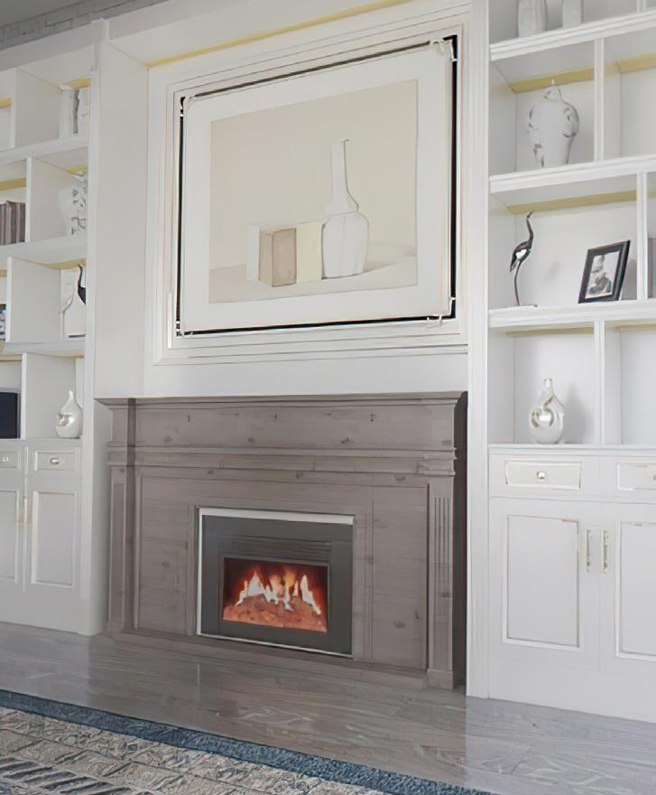
Have an awesome piece of art you want to show off? Make it the focal point by placing it in the largest area of the unit. Don’t forget to add some art to break up all those books. You can also make your books the focal point. Books have the ability to convey the personality of the owner. Show off all that knowledge.

ACCESSORIZE
So now let’s talk accessories. Place a few small pieces near the front to give all those books some depth and don’t forget to add a pop of greenery now and then. For me, it’s a personal preference but I choose not to include family photos in bookshelf vignettes. Bookshelves, if done properly, add to the room a feeling of art or architectural appeal.
So now you’re ready to clear out that clutter, dust off those shelves, and begin again. Let’s recap to keep it simple.
1. Create a backdrop with a pop of color.
2. Go vertical and horizontal and throw in some vintage.
3. Keep it simple and keep small objects to a minimum.
4. Layer, layer, and layer again.
5. Everything good happens in threes.
6. And don’t forget to add in some greenery and show off the art pieces you found on vacation that you just can’t live without.


