
4 minute read
Special Stories / G&G _ Magazine N°20
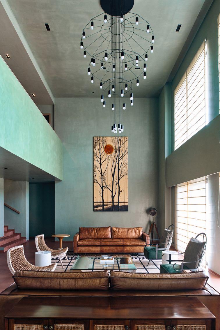
The apartment is in an apartment complex in a residential area, within a gated community There are four bedrooms, a study, a family room and a plush dining/living space with a lovely double height giving volume to the whole space. The clients wanted this house to have a modern and minimalistic look and feel. For this, FADD Studio was deeply inspired by Le Corbusier and Pierre Jeanneret –their deep sienna passage of the Villa La Roche, their Chandigarh series and the general polychromatic feel of some of their work. The purist canvases of Corbusier led to a path of somber colours for the shell. Additionally, a few bold Japanese elements used to create a little drama. At the entrance there is a simple disc in wood to emulate an eclipse just above the Chandigarh bench. This completed the Zen-meets-midcentury modern look and gave the foyer a burst of life. While for the whole home, FADD Studio opted cement finishes and surprisingly the clients were very open to this direction. The marble floor needed covering so poured cement was not only a cost-effective solution but also one that gave a large palette of colours to choose from. Grey would be too common, so the designers decided to go with a deep, unsaturated rust/sienna colour for the floor and would bring in cool grey/green in other areas to off set its warmth. This was a unique choice in colour for the floor and the vision to pair it with grey and green made it a big success. In the grey shell with the rust floor, FADD Studio made the connecting passage a refreshing leaf green to create a colour block akin to Villa La Roche. To preserve this serene and sober experience, the designers intentionally decided to have natural browns and greens in terms of fabrics. These would complement the woven midcentury modern furniture spread across the house.
Advertisement


In addition, the designers wanted to bring in bold silhouettes and some glossy texture to enhance and contrast the background respectively. So, without disturbing the understated look of the home, they used a minimalist approach while deciding the style of the central chandelier. It took something large but something that didn’t distract from the overall textural quality of the double height space. The choice was easy with the larger than life wire frame chandelier. The clients loved its simplicity because it not only filled the volume of the double height, but its simple construction of the elegant black outline also showed off at the grey that it is set against. A similar approach was taken for the dining room light. A black wire begins at the wall, hinges on to the ceiling and drops a simple black shade to softly illuminate the table. Less is more and it was all that was needed with this set up.
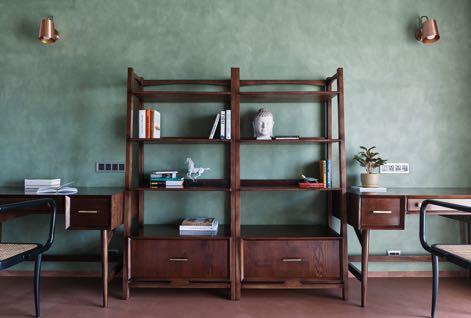
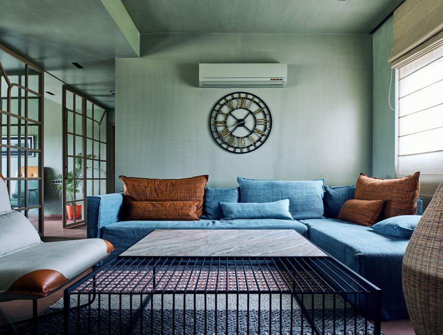
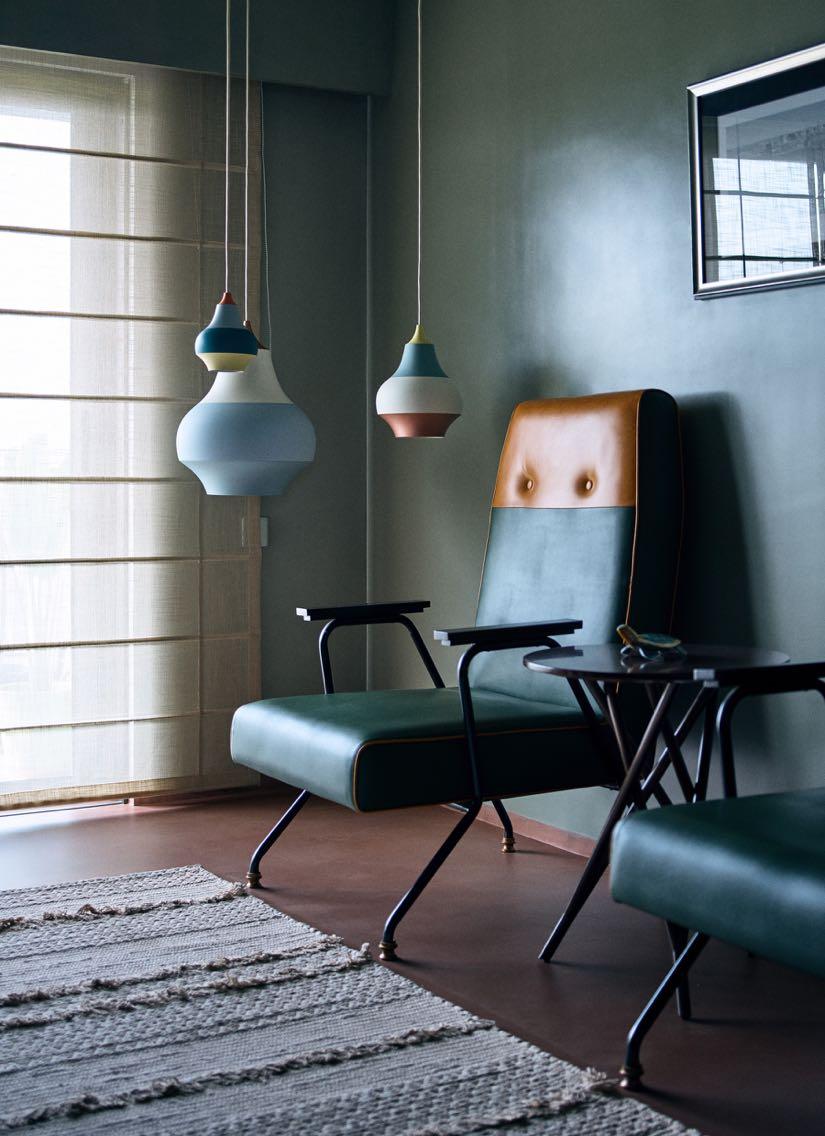
In the family room, FADD Studio chose a blend of a grey-blue sofa from Gervasoni with neutral customized chairs and coffee table from Magari. While the lovely floor lamps made out of cane add softness to area that is styled with blues and browns. Next to this room, there is the study with a midcentury modern furniture like chairs in a green and mustard leather customized from Magar and study tables against a sage green wall. Here FADD Studio brought in some colour with the hanging light in the corner.
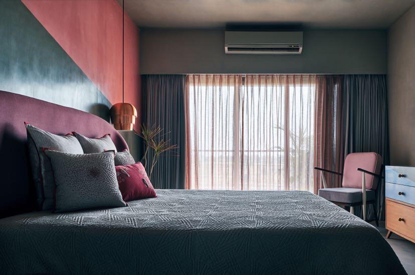
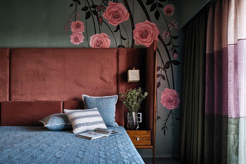
The bedrooms have a more intimate feel especially those of the daughters. The first room is downstairs, here FADD Studio used different colours in putty finish and created a geometric background to be the backdrop for a soft lilac bed from Magari. In the other daughter’s upper room, rusts, greys and olives adorn this room with a floral abstraction hand painted by a local artist.
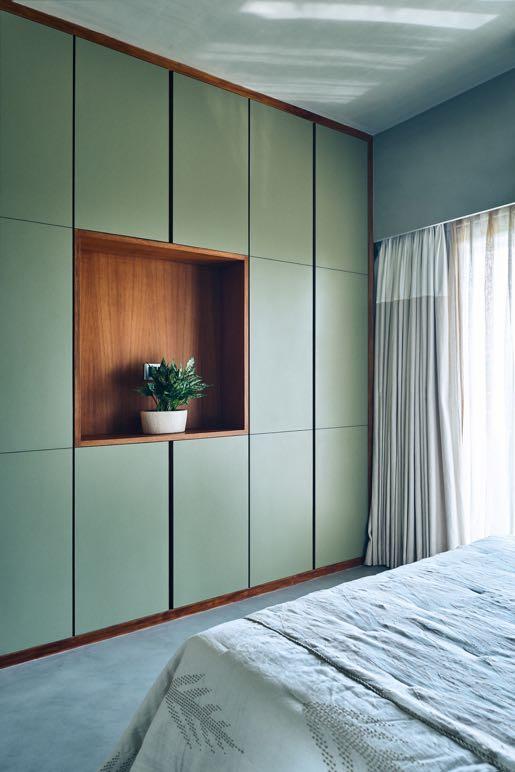
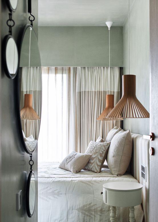
The guest room presents the light colours with a simple striped bed in neutrals and closet in a sage laminate. To attain more personal and intimate lighting, the designers decided to go with materials that create some drama and shadows: metal and paper lights in the two daughters rooms to contrast the solid bed upholstery, and wooden slated shades in the guest room to work with the stripes of the bed fabric.
The master room has an elegant grid done in grooved putty. The furniture is a mix of imported brands and locally customised. The natural colours and materials of the furniture pieces stand out vibrantly against the textured grey walls of the house giving the otherwise serious shell a dash of drama. Especially an antique red chests brings in some fire against the earthy palette.

There is also a little reading corner with an olive cane and lamp from Purple Turtle. To accentuate and highlight the space, metallic elements such as a copper border on the bedroom doors and stone and paper lights were used to contrast the cane headboard. In all, this home exudes a peaceful and understated vibe, representing the client’s personality in just the right way.


