
5 minute read
MEDITERRANEAN SPLENDOUR
Mediterranean splendour
Advertisement
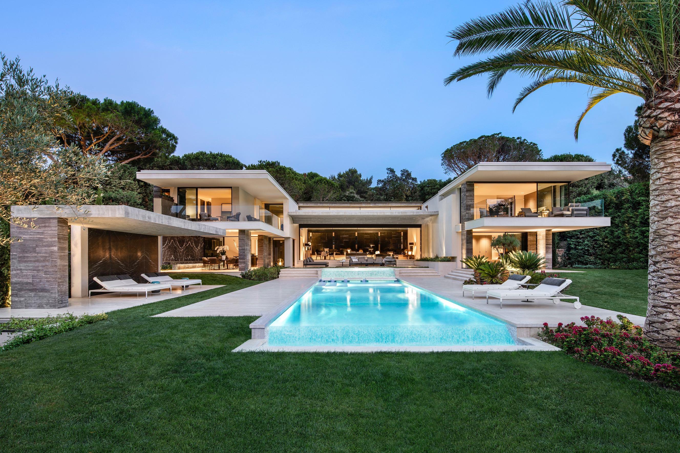
Designed by SAOTA, this family summer house in Saint Tropez, France, is a contemporary interpretation of traditional Mediterranean Riviera architecture.

“When we first went onto the site, we found it lovely that you could look up into the pine forest and experience those amazing volumes under the canopies of the pines. That became an important cue when we developed the design.” - Stefan Antoni, SAOTA Director

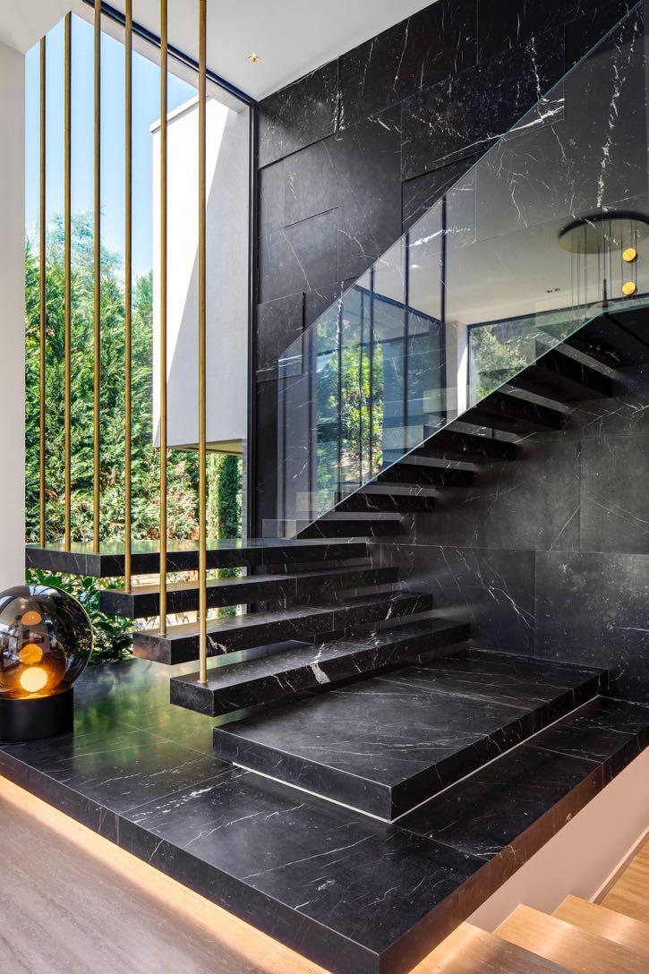
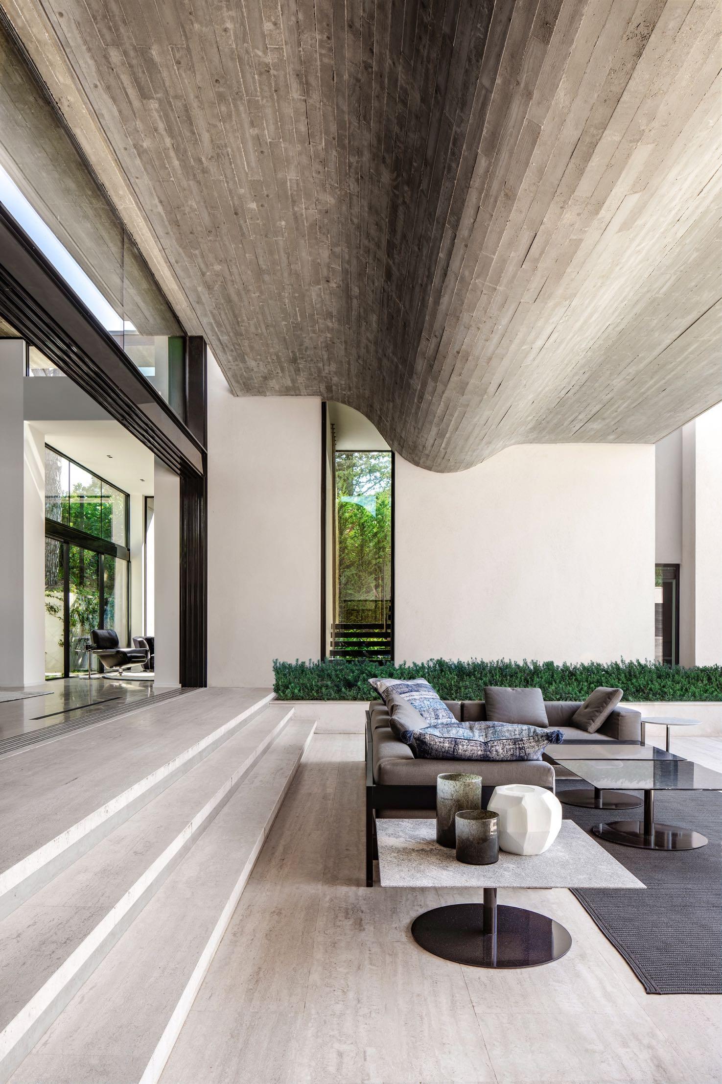
the central high-volumed void between the wings, capped with a dramatically folded floating roof, which imparts a sense ofgrandeurto the interiors. The folded shape ofthe roof, formed using raw wooded planks in a subtle reference to the pines, not only echoes the cascading terraces of the landscape but also contrasts with the straight-lined geometry ofthe wings on either side. SAOTA Director Phillippe Fouché, lead architect on the project, said that the fold in the roof plays a structural role too, enabling a 12-meterspan withoutanycolumns. Positioning the house towards the back ofthe site created the opportunity forthe living spaces to step down with the terraced landscape, seamlessly extending the useable space. SAOTA’s approach explored various strategies to maximise the perception of space, such as cavity doors to blur the distinction between interior and exterior spaces and allow the cool summer breezes to flowthrough the house. The central pool, which cascades down an incline linking a martini seating area with the main swimming pool together with the clean lines of the side wings, accentuates the lines of perspective, exaggerating the length of the property, leading the eye to the horizon and further contributing to the illusion ofspace. F ree from the constraints of the historical vernacular, the project became an opportunity to advance the expression of form, space, and lifestyle associated with the location. The house is arranged between two rectilinear side wings that embrace a central courtyard. The bedrooms occupy all of one wing, plus the top level ofthe second, while the kitchen and dining areas are located downstairs. The main suite has a dedicated staircase that provides access from a double-volume private lounge. The main living and entertainmentareas are positioned in
“Our first objective was to try to maximise the perception of space. We did that by creating generous outdoor covered spaces, which make it feel as if the interiors spill outwards and extend to the front of the site.” - Phillippe Fouché, SAOTA Director

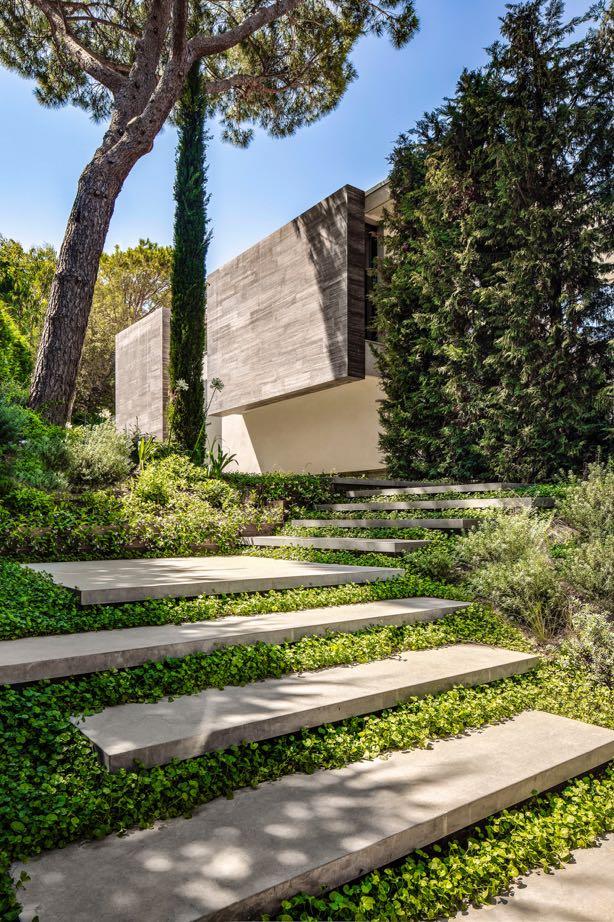
Along its eastern side, Le Pine riffs on the local architectural vernacular, which typically features thick walls and an emphatic distinction between interior and exterior. Where the entrance path ascends from the off-streetparking area belowthe house through floating platforms in the garden, the house presents an exaggeratedly weighty, solid façade with only small apertures. Not only does this create privacy for the rooms in this wing, but it also leads residents and guests on a journey of discovery towards the threshold. Fouché points out, however, that these heavy walls float above the ground in a contemporary interpretation of the traditional typology, hinting at the modern, open volume beyond the relatively understated entrance. Beyond the pivot door, the light-infused living and entertainmentspace is revealed in a momentofdrama and surprise.
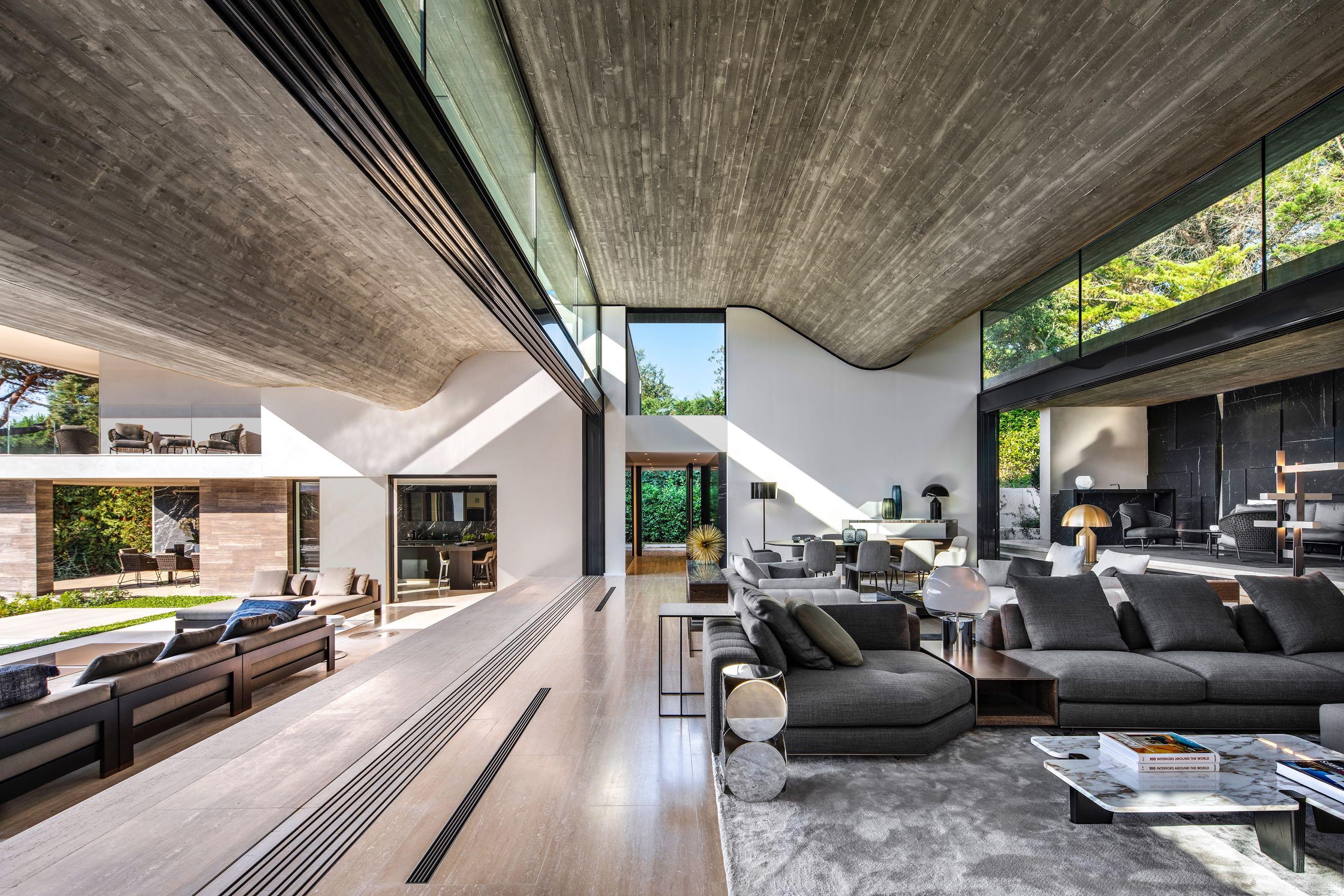
“Wherever we could, we tried to drop light into the volumes.” - Phillippe Fouché, SAOTA Director
The interior was conceived as a gallery-typed space, which involved not only creating clearopen areas butalso inviting the lightin, particularlyfrom above. Carefully placed clerestory windows wash the interior with natural light and provide framed glimpses of the canopy of pines on the slopes above the property, which also helped determine the section ofthe undulating ceiling. Other frameless windows and apertures capture views of surrounding courtyards, furtherintegrating interiorand exteriorand knitting the house into its setting.
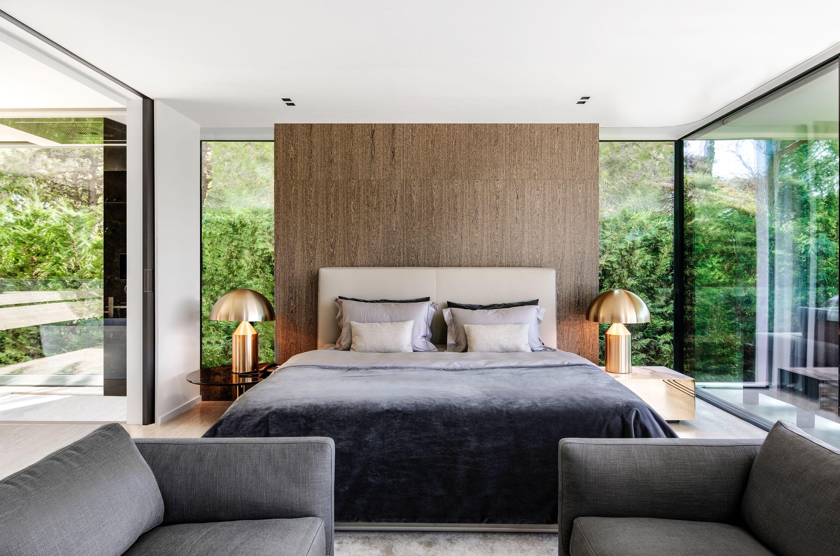

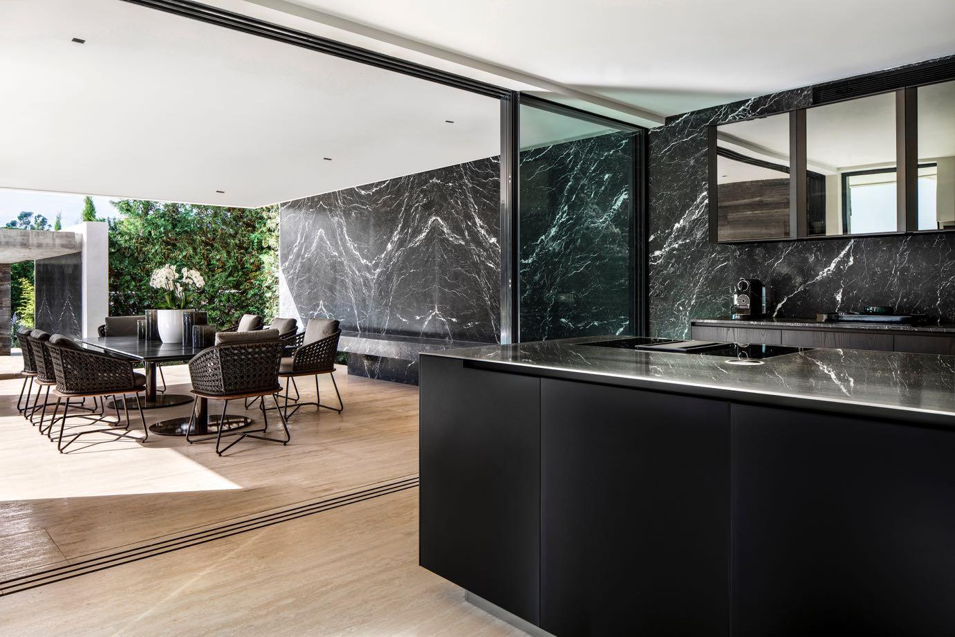
The interior finishes contrast raw, expressive concrete on the soffit, for example, with dark marble cladding on the rear walls, lighter stone towards the front of the house and vein-cut travertine floors. The natural materiality emphasises the architecture as an extension ofthe landscape, while the dark stone towards the back of the living area accentuates the illusion ofdepth, furtherenhancing the sense ofspace.


