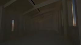
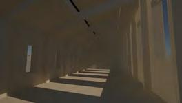
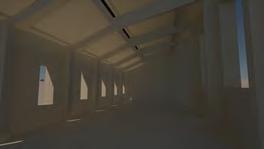
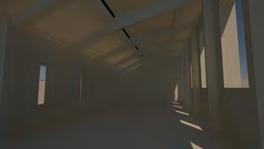
“The City with the City”
~a journey through the city
Portfolio- June 2023
 Charlotte Bell
Email: charlotterdbell@gmail.com
Contact phone number: 07736110525

Instagram: @charlotteb.archi
linkedin.com/in/charlotte-bell-architecture
Portfolio- June 2023
CHARLOTTE BELL
Seeking Part1 Architectural Assistant Opportunities in Manchester or London.
EDUCATION
University of Manchester (2020-2023)
BA Architecture student, on track for 1st Class Hons (av. 81%)
The Deans Award for Achievement nominated from the top 10% of BA3’s highest graded students
Mill Hill County High School (2013-2020)
A-level grades: Art, Craft and Design (A*), Geography (A*), Biology (B)
ACADEMIC ACHIEVEMENTS
The Deans Award for Achievement (2022-2023)
Manchester School of Architecture’s award to 7 students from the top 10% of BA3 highest graded students.
Manchester School of Architecture Student Representative (2022-present)
Student representative for the BA3 Atelier Continuity in Architecture, acting as a student voice within the cohort and focusing on inclusivity in the architectural education.
UCL and Open City Charity’s Accelerate into University (2018-present)
Apart of the Accelerate into University Programme, attended workshops and bi-weekly mentoring sessions with Grimshaw Architects, developing my model making, programme proficiency and design development skills.
Leadership Level 1 (2018)
Completed with distinction grade, leading activities with primary school students.
SOFTWARE PROFICIENCIES
Highly Proficient in:
- Adobe Creative Suite
- Rhinoceros 3D
- AutoDesk AutoCAD
- Sketchup
- Hand Drawings
REFERENCES
Available upon request.
EXPERIENCE
Cullinan Studio, London (July-August 2022)
A summer placement working with a team on a competition entry, using Using AutoCad Revit software to edit facade and build alternate options for exploring the different design proposals which i then used Enscape to create renders.
Grimshaw Architects (2018-2019)
As part of UCL’s Accelerate programme, I worked on a long-term project with a group of Architects at the practice - engaging in an entire process of an architectural project. In April 2019, I also completed a week-long placement to fully immerse into the practice’s work.
Jestico+ Whiles Architects (June 2018)
Work experience placement for a week engaging in a current project in the practice, with exposure to graphic architectural computer software (Adobe Creative Cloud Suite and Sketchup).
NBBJ Architects (July 2017)
A work experience placement for a week to shadow and understand the architectural work environment, developing my understanding of the architectural process and how a practice works.
Chartered Surveyors (2018-present)
Accounts and administrative Assistant — building professional communication skills with clients and colleagues, and gaining experience of office work related to the built environment.
SKILLS / ATTRIBUTES
Leadership
Coaching and management of the Novice Women’s squad of the University of Manchester Boat Club.
Project manager for the Continuity in Architecture end of year show, coordinating roles within printing, layout and building the exhibition.
Experience of:
- AutoDesk Revit
- Twin Motion Rendering
- Enscape Rendering
Interpersonal Skills
MSA Student Representative, communicating effectively with my peers, and between students and Heads of Year, in order to share feedback at the end of every unit and term and actively promote improvements for the atelier.
Time Management
Maintaining a high-level of attainment in both academic and sporting commitments, alongside interests in the arts and voluntary activities.
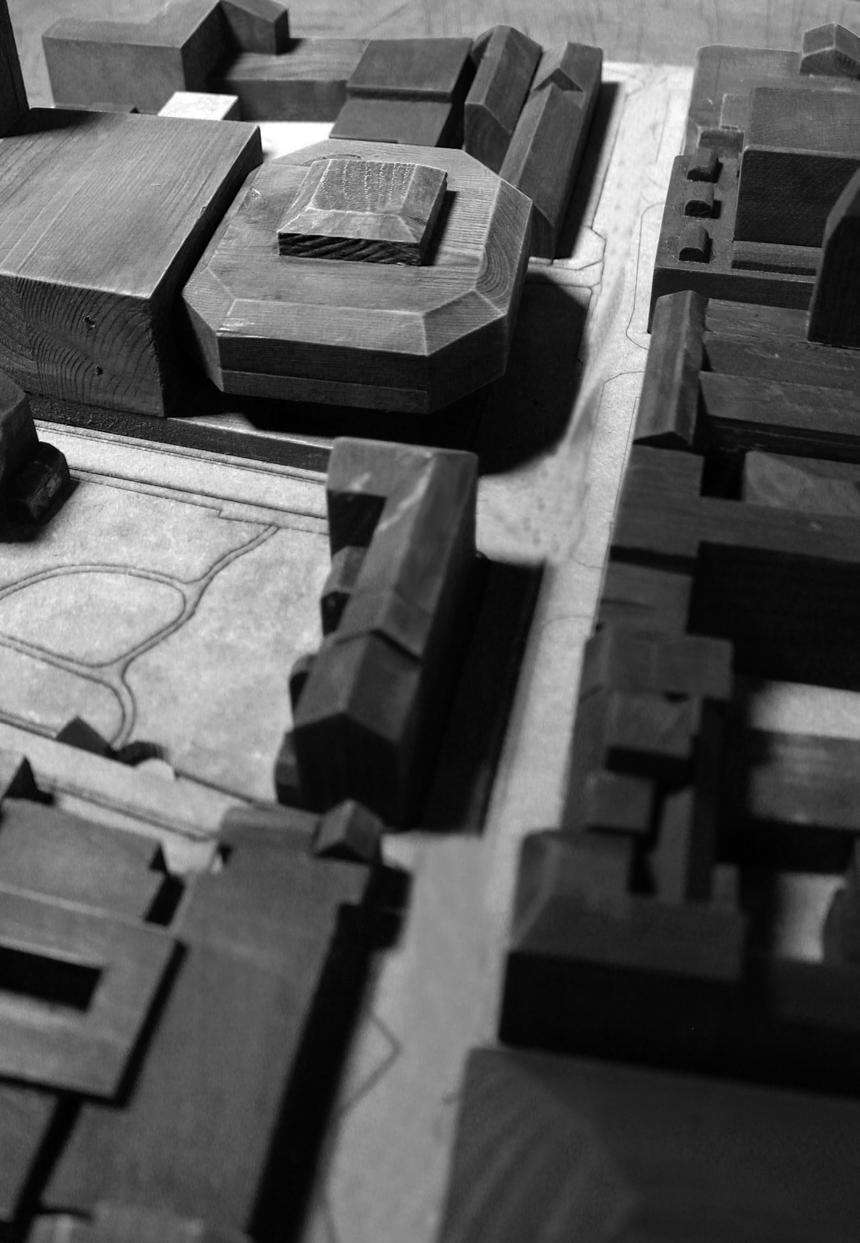
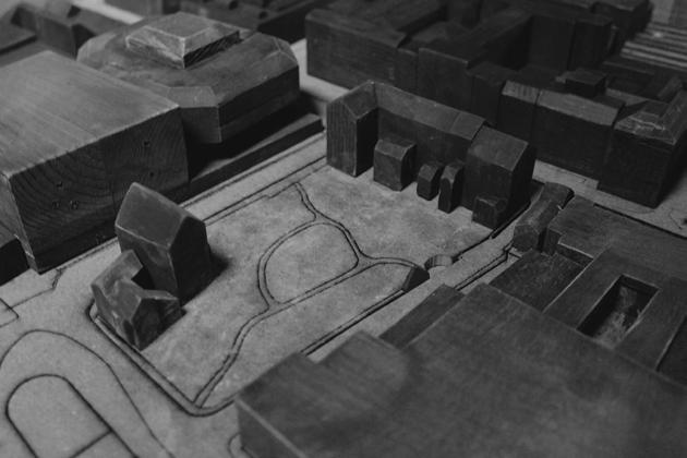 A0 Site Model Modelled using: Lazercutting, bandsaw and other wood working tools.

A City Within the City The Project Overview 08-09 Contextualising the Site 10-11 Final General Arrangements 10-13 The Theory + Resolution 14-21 Zooming in on the Arcade 22-25 Zooming in on a Column 26-31 Portal Frame Study 32-39 CONTENTS
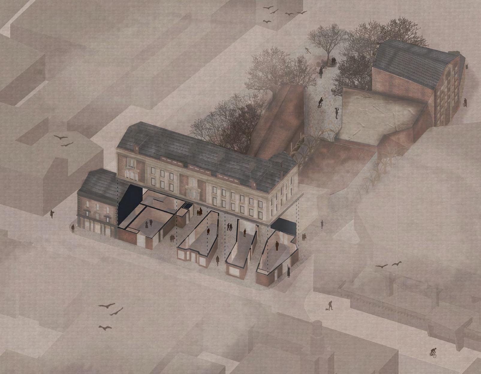
Axonometric of the Whole Scheme Illustrated using: Sketchup, AutoDesk AutoCAD, Adobe Illustrator and Adobe Photoshop.
“A CITY WITHIN THE CITY”
A City Within a City draws upon Krier Leon’s theories focusing on the urban grain of a city and the reconstruction of the status quo in terms of urban segmentation. Drawing particularly on his ideas around Urban Quarters this proposal develops ‘craft-city. It incorporates his ideas about invisible urban boundaries that are delimited by human’s natural limits. Leon’s theories are integrated into the ethos and planning of the building and encapsulates everything that is needed within ‘craft-city’. This project also takes inspiration from Barcelona’s renowned urban planning strategies. Thereby incorporating macro scale planning positions into the micro scale of a building plan enabling this proposal to embody complex and intriguing a micro urban fabric of its own.
The proposal generates the possibility of an inclusive space – to facilitate a community that shares and educates, develops and exhibits and possibly trades using the medium of craft. ‘Craft-city’ creates a permeable retail arcade; arts workshops; standalone gallery; multi-use auditorium; and café. Spaces are designed to be transient in nature allowing easy adaptation for varied future use.

The proposal utilised existing buildings and employed retrofitting and adaptive-reuse strategies. Reconfiguration of the Lancaster Road Georgian terrace creates the city’s boulevard. The site strategy was to create an axial route across the site which is informed by the desired line from Preston High Street to the Bus Station.
There were three significant drivers underpinning the proposal: ensuring its sustainability and longevity; its ability to captivate; and, that it compliments its wider environs. The conservation and listed status of surrounding buildings shaped materiality and massing decisions that incorporate the rhythm, soul and atmosphere of Preston. This proposal amplifies this hidden gem within the city of Preston while still incorporating itself into Preston’s urban grain and thus builds upon the proud character of its built environment.
Charlotte Bell June 2023 7
Serial Hand Drawings. Illustrated using ProCreate Apple.
AN INTRODUCTION
Preston and The Site
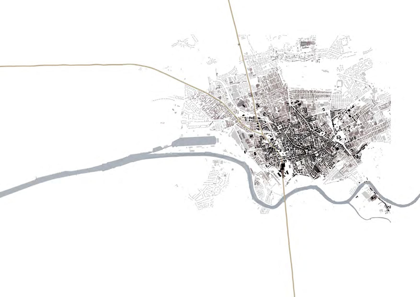
The site is located at the end of Preston High Street on the Lancaster Rd. The location is set between the commercial hubs of Preston and its civic frontage of the Town Hall, Magistrates Court and the impressive Harris Museum.
Key local proximities are the key hodoological route between the Preston High Street and Preston Bus Station. This makes the site extremely well contacted, in conjunction to the train station only 15 minutes walk along the high street.
The Brief
Our brief is to design a building with a prime function being Preston Guild – a place to establish a new craft economy in the area – a place to learn, research, make, build, and trade. It would be a dynamic and individual collection of spaces for these functions like workshops, an auditorium, teaching rooms, offices, and a small library with spaces to support the primary functions of the users. The site is a central area in Preston with predominant brick materiality.
 The Existing Elevation from Lord Street (1:200).
Illustrated using AutoDesk AutoCAD, Adobe Illustrator and Adobe Photoshop
Aerial Plan of Preston (1:1000).
Illustrated using Adobe Illustrator and Map Box
Exploring the Site using Cullen’s Theories
Cullen explores the city moving through spaces, identifying how these spaces move and work in conjunction to one another.. Through exploring the site in this what it highlighted the strong flow of Preston as a city: a route from entry at the trans station to the Preston High Street to site and onto exit at the Preston Bus Station. This key route is shown in part above. Through sketch as suggested by Cullen, the plan of site was ‘brought to life’.
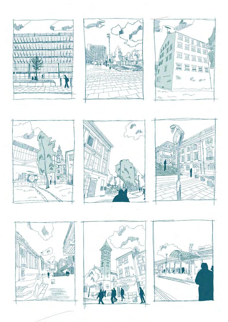
Preston’s ‘Infamous’ Bus Station A ~successful~ Regeneration Derelict but Significant?
Boarding a City Guild!? Appearance from a City Walk A Civic Centre

Charlotte Bell June 2023 9
“a series of sudden contrasted and a an impact is made on the eye, bringing the plan to life”
CASE BOOK: Serial Vision: Gordon Cullen.
Built Environment Green Infrastructure The Site Route In and Around The Site
The Commercial
Entry/Exit Point Looking on the Civic Life CULLEN’S VIEW Serial Hand Drawings. Illustrated using ProCreate Apple.
Centre


01retial units 02 arcade vessels 03 boulevard 04 atrium 05 gallery 06 cafe 07 cafe terrace 08 major stair case 09 unisex WC 10 store room 11 customer lift 12 fire stair 13 goods lift 14 staff entrance 15. Service yard 16 cafe kitchens 17 landscaped gardens 18 colonnade 19 plant room south 20 plant room north 21 service inlet/riser Lord St. Crooked Lane Tithbarn St. Lancaster Rd. 03 04 05 07 08 11 12 14 13 15 16 17 17 18 Ground Floor retail, social communities and event facilities 02 02 02 01 01 01 01 01 01 01 01 01 06 09 09 19 20 21 21 21 21 21 22 23 24 25 GENERAL ARRANGEMENTS Ground Floor Plan (1:200). Illustrated using AutoDesk AutoCAD, Adobe Illustrator and Adobe Photoshop


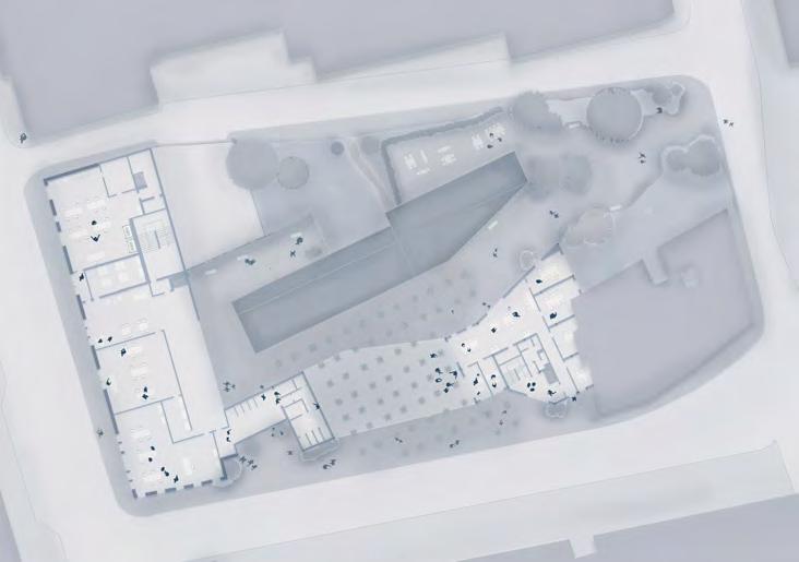
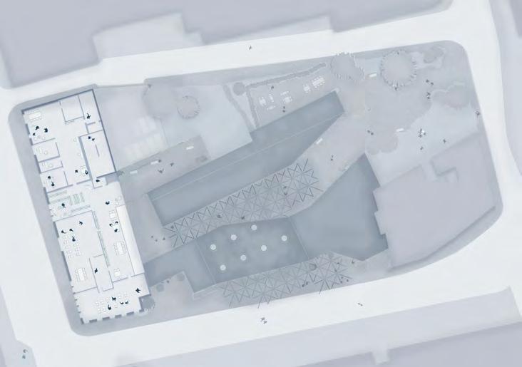


Charlotte Bell June 2023 11 First Floor social community, welfare and education facilities 03 boulevard 04 atrium 08 major stair case 09 unisex WC 10 store room 11 customer lift 12 fire stair 13 goods lift 14 staff entrance 15. service yard 17 landscaped gardens 18 colonnade 19 fine art workshop 20 textiles workshop 21 clay workshop 22 cloak room 23 informal meeting area 24 changing room 25 study areas 26 welfare centre 27 1-1 rooms 28 group study areas 39 service risers/inlets 03 04 08 09 10 10 11 11 12 13 14 15 17 17 18 19 20 21 22 25 23 24 09 26 27 28 03 boulevard 10 store room 11 customer lift 12 fire stair 15. service yard 17 landscaped gardens 18 colonnade 30 business classroom 31 art history class rooms 32 silent group study 33 small arts library 34 staff room 35 staff offices 36 staff kitchens 37 staff personal store 38 staff WC/change 39 service risers/inlets 03 10 11 12 15 17 17 18 30 31 32 33 34 35 36 37/38 39 39 39 39 Second Floor staff and education facilities
First Floor and Second Floor Plans (1:200). Illustrated using AutoDesk AutoCAD, Adobe Illustrator and Adobe Photoshop
GENERAL ARRANGEMENTS
GENERAL ARRANGEMENTS
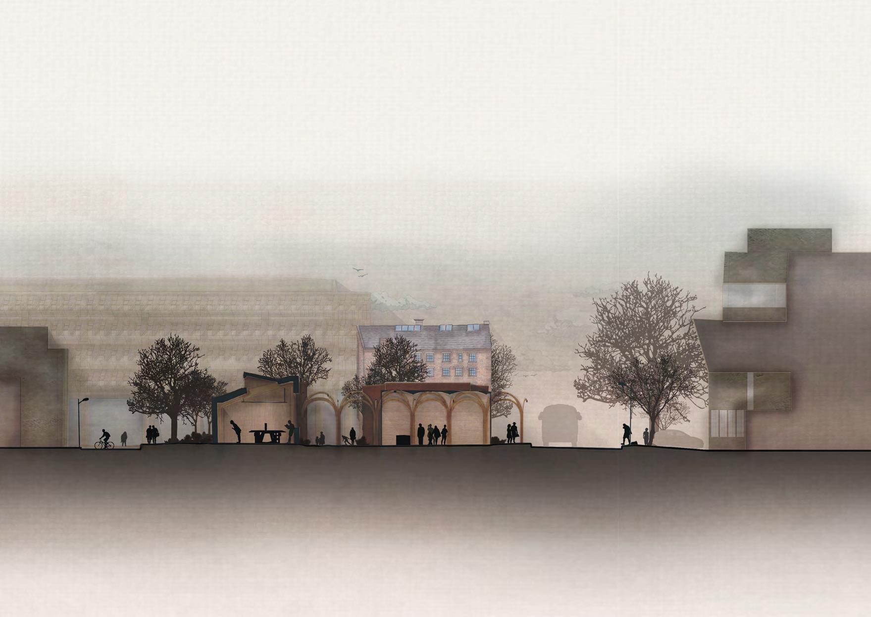
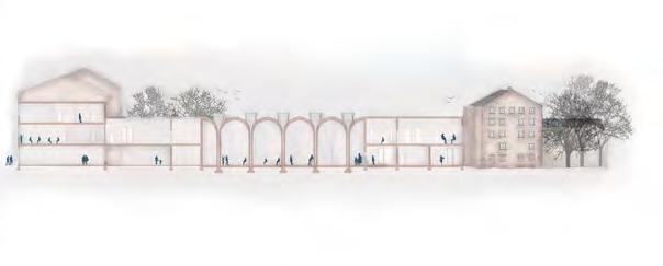
Charlotte Bell June 2023 Short Section looking East (1:200). Illustrated using Rhinoceros 3D, AutoDesk AutoCAD, Adobe Illustrator and Adobe Photoshop
GENERAL ARRANGEMENTS
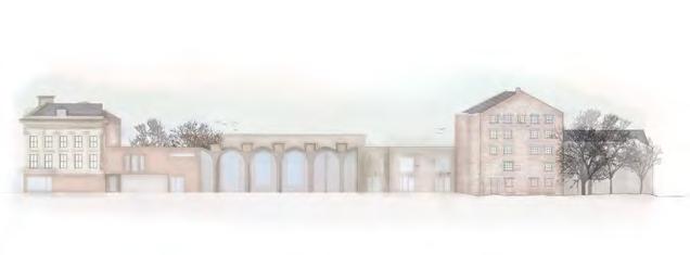
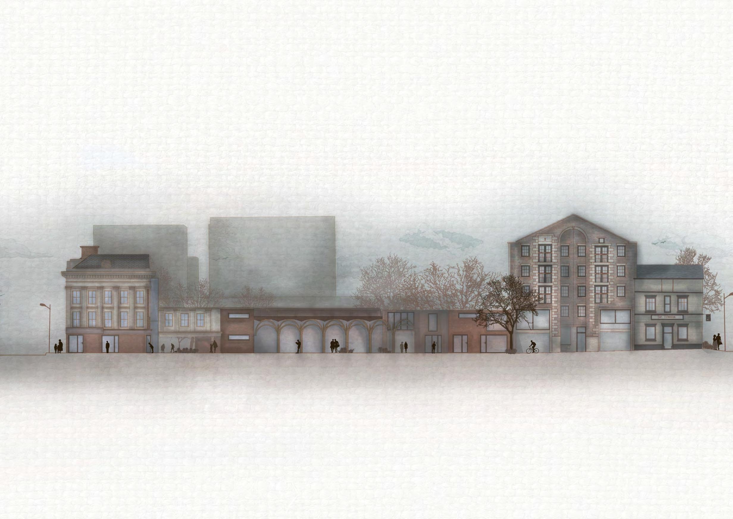 Lord Street Elevation: the Long Elevation east to west (1:200).
Illustrated using Rhinoceros 3D, AutoDesk AutoCAD, Adobe Illustrator and Adobe Photoshop
THE THEORY BEHIND THE BUILDING
Project Title Barcelona City Planning
Urban Planner Ildefons Cerdà
Year 19th Cent
Location Barcelona, Spain
Barcelona and Urban Planning
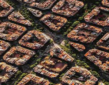
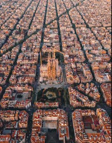
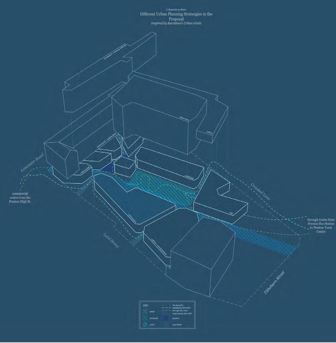
As the scheme was based upon a city, the infamous city of Barcelona was used to inspire massing placement of the programme. Key features used were the boulevard, plaza and street. These helped to create the ‘city’ within city with a dynamic composition of mass- just like Barcelona!
Block Styles and Formation Types
Identification of the different block styles and how/where these are used for different urban effect.
The Alley
Two strip building at either side of the city block to create a central alley way.
The ‘L’ Gardens
Two adjacent joining blocks leaving a large square within for gardens or other pedestrianised activity.
The ‘T’ Street
Three outer buildings arranged to create a central pedestrianised zone in the shape of the ‘T’.
The Courtyard
A perimeter con- joined building which uses a inner courtyard to create a internal pedestrianised zone.
Urban Measurement with
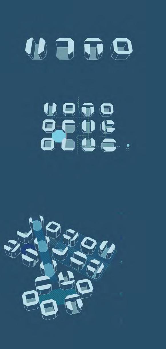
Intended Aims
The measurement of the blocks were regular and had different arrangement of types to engage the city with different pedestrianised zones and usable spaces. These include parks, pedestrianised shopping zones, courtyards and walkways to connect spaces by foot.
Implementable Design Features into Plan
The Boulevard A substantial and direct street to landmark, with the width and dimensions to allow occupation and recreational use
The Super Block A portion of he city comprising of a group of city blocks which are either pedestrianised or have limited automobiles. This promotes use of the city scape
The Plaza
A ‘landlocked’, large area enclosed by the perimeter buildings. The streets and en- trances leading to this are either significant or hidden for different impacts. Can be a courtyard only accessed by perimeter buildings
Charlotte Bell June 2023 14
The Junction A pedestrianised road meeting which is enclosed into a ‘square by the perimeter buildings
20m 20m Junction of blocks Direct circulation routes In-direct circulation routes Key
The Street Pedestrian routes between the different block. Smaller and less grand than ‘The Boulevard’, however, more significant than the pedestrianised cut through.
Analysis Diagrams. Illustrated using Sketchup, Adobe Illustrator and Adobe Photoshop.
Mirroring Precidents Schemes
Using the key ideas of the Barcelona urban grain, the 4 characterising methods were established. These can be seen to create a smooth flow from high density ‘city’ with public and private spaces. This is effective in community life and create clear urban passageway as there green spaces and public spaces did. The emergence of plazas, boulevard and junctions are clear to be present in the proposal with these iterations helping to create a more emphasised and effective boulevard and plaza area.
Charlotte Bell June 2023 15
Diagrammatic Axonometric Illustrated using Sketchup , Adobe Illustrator and Adobe Photoshop
RESOLVING THE SPACE: SPACIAL ADJACENCIES
Key: accessibility realm
` private public programme classification
educational facilities
service events facilities
social community facilities
staff facilities welfare facilities

Programming the Locations of Functions Around the Site
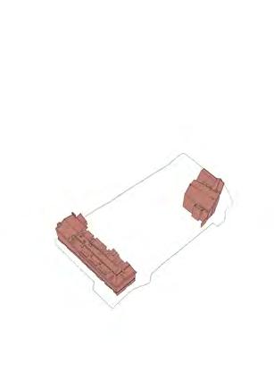
Retaining Buildings Brownfield Site
Scale and Proximities in Compilation of the Programme
The site is centralised around the ‘plaza’ and the boulevard’. This diagram helps to rationalised the adjacencies and reasoning for these placements.
The diagram is used to visualised the adjacencies whether physically or visually. It is important to remember this as the spaces would have to span over multiple storey. Spatial Adjacencies Diagram. Illustrated using Adobe Illustrator.
Charlotte Bell June 2023 16
RESOLVING THE SPACE: PROGRAMME


Public Realm Evidenced in Urban Planning Precidents
The public realm of the proposal is defined mostly between the ‘boulevard’. This is because it leads the site through route in the day- closed at night. This realm is led by three main factors of entry points (as elaborated upon below).
These all follow the idea of an ancient city. The idea through the project that there is a city within a city. As in an ancient city there is a wall that houses the city and a central square this replicating further the urban planning of Barcelona. This is effective in creating the threshold by creating the entry points to this main ‘plaza’ and ‘boulevard’ through the city wall.
Colour Block Vignettes of the Threshold Entrances
 Elevational Perspective
Illustrated using Sketchup , Adobe Illustrator and Adobe Photoshop
Illustrated using Sketchup , Adobe Illustrator and Adobe Photoshop
RESOLVING THE SPACE: LOOKING AT MASS
Scaled Masses of each Programmed Space
The size and approximate shape of each mass (all measurements in meters and are if square masses).
Building Up of Mass in Floors (GF-F1-F2, Left-Right)
Establishing a Rough Site Massing in Master Plan
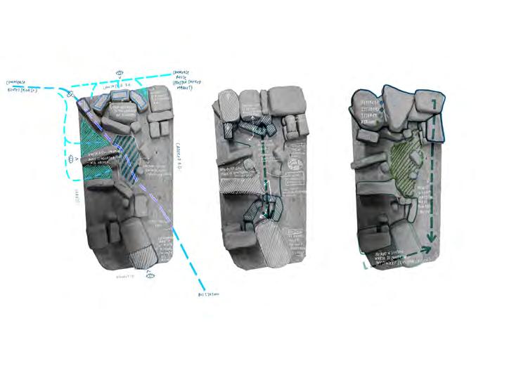
Rationalising mass in different floors to understand how these interact with the ground floor context outwardly as well as inwardly between the floors and masses
Massing Block Model (1:500).
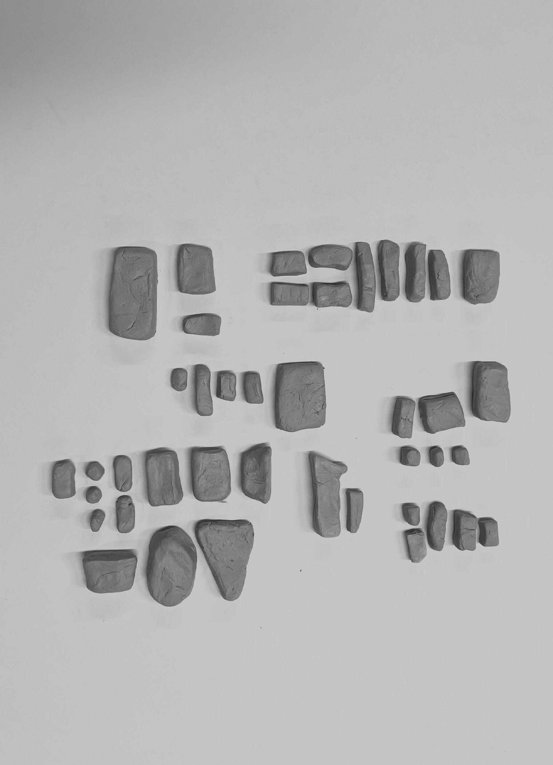
Modelled using: modelling clay.
Charlotte Bell June 2023 18
“We should realise that the right form exists only at the right scale”
Cafe no1 13x13 11.5x11.5 Kitchens + Storage 4.5x4.5 x8 Shop Units ~6x6 Staff WC 3.2x3.2 Staff Storage 4x4 Student Staff Pods 4x4 Staff Room 7x7 Small Group 5x5 Individual ~2.5x2.5 Study Study Break-Out Space x3 3.7x3.7 Art Class 10x10 Business Class 10x10 Workshop 5.5x5.5 Storage Retail Storage 5.4x5.4 Fine Art Workshop 14.8x14.8 Clay Workshop 14.8x14.8 Textile Workshop 14.8x14.8 Gallery 16x16 Gallery 6.3x6.3 Receptions x2 2.5x2.5 WC x2 6.3x6.3 Auditorium 3.5x3.5 Storage Welfare 5.4x5.4 External Courtyard 8.5x8.5 Alone Time Rooms x4 ~2.2x2.2 Office Storage
The City within a City. Krier Leon
RESOLVING THE SPACE: PROGRAMME
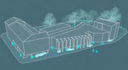
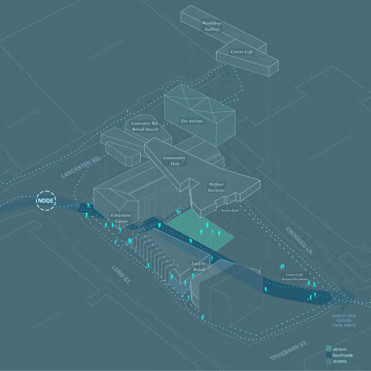
Understanding the Organisation of Programme and Massing Coordinating with Site Strategy and Occupational Use
Site Strategy and furtherProgramming
Programmatic testing creates a finalised programmatic placement for each space minor refinements in scale and design detailing. This creates the proposal as the massing is designed by the programme and then refined by further analysis into the use of each individualised function. This enables a space which is bespoke, to fit the individual users needs.
Charlotte Bell June 2023 19
Diagrammatic Axonometric Illustrated using Sketchup , Adobe Illustrator and Adobe Photoshop
RESOLVING THE SPACE: USER EXPERIENCE
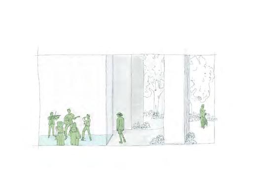
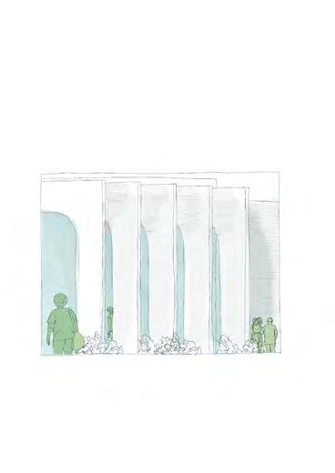
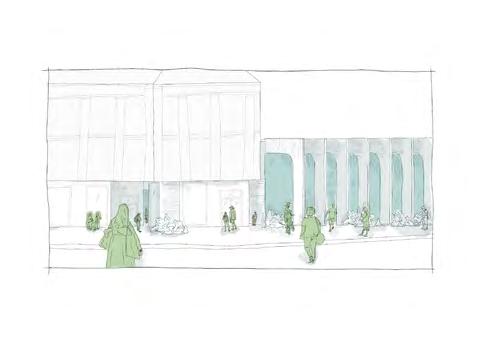
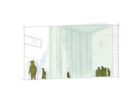
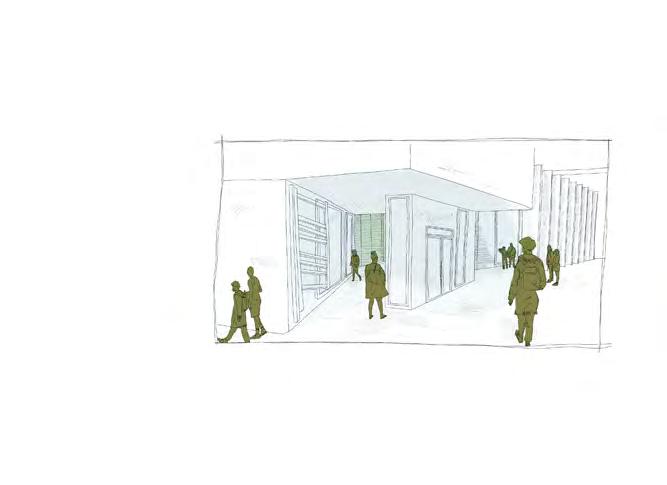
Analysising the Threshold through Experiential Iteration
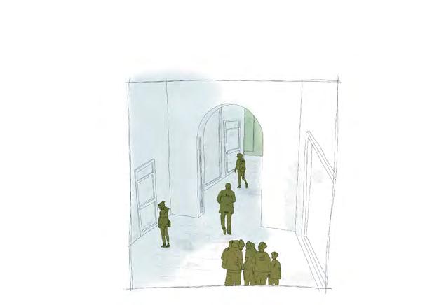
Iteration 01
Iteration 02
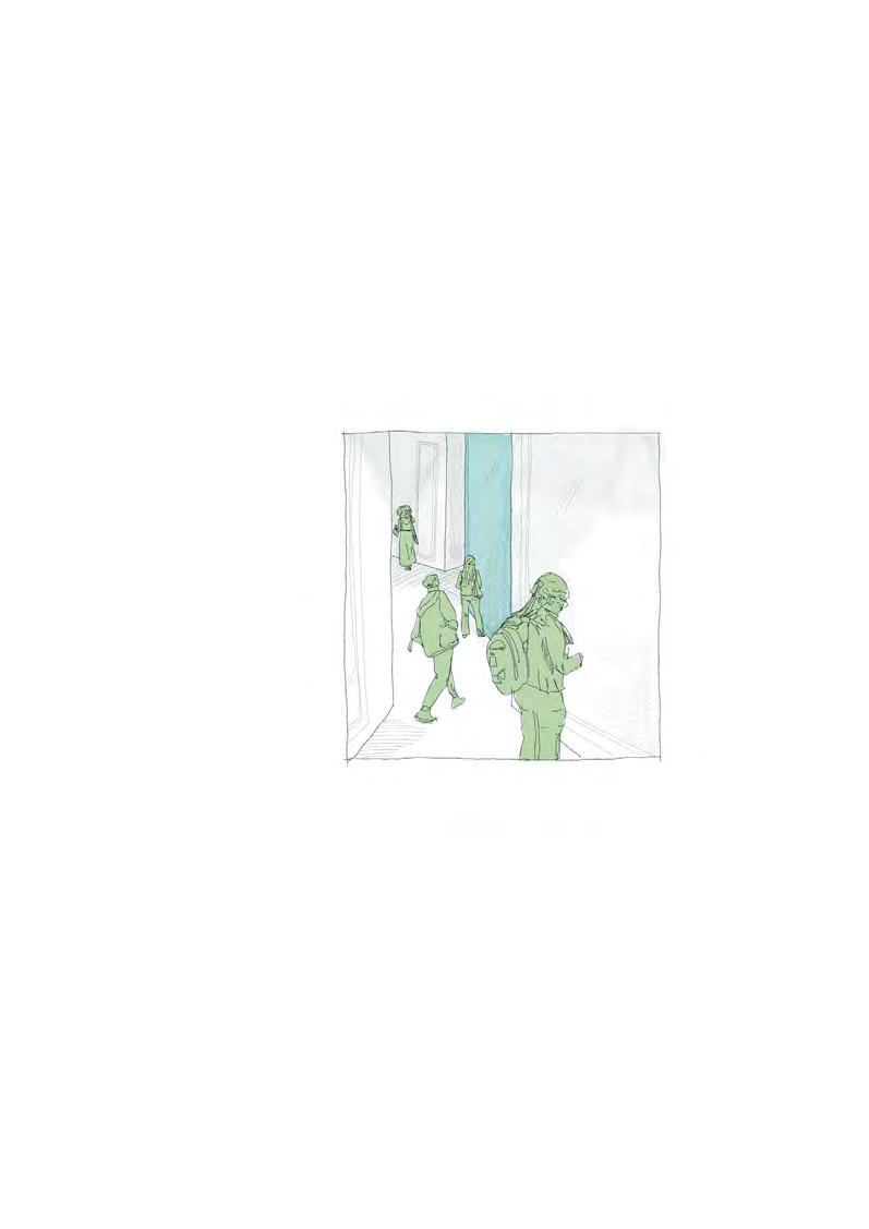
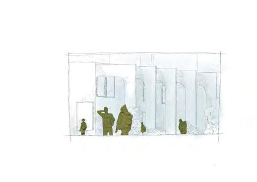
where is it?
a side access? is it worth an extra way in.
Charlotte
June 2023 20
Bell
03. main axial route through- arcade.
01. from the exterior is the Landmark Clear?
01. a landmark on approach.
02. using landmark features through the arcade. 03. maintaining the statement colonnade.
04. a flexible space for movement inside and outside.
Serial Hand Drawings. Illustrated using ProCreate Apple.
RESOLVING THE SPACE: THE STRUCTURES AND MATERIALS

The Context
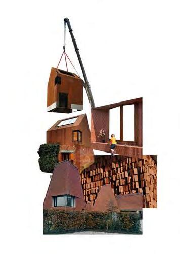
The context of the site surroundings is varied through many architectural styles and eras. Key drivers of the site style fall in the brutalist concrete of many surrounding and the conservation appraisal.
The Vernacular Material
Altering the design facade by using the historically sympathetic material of terracotta with the ornate style and finishing to the tile. The precedents used is within the same conservation area as the site- Miller Arcade. This is a exemplary precedent of the way terracotta can be used structurally and decoratively.
The Contemporary Take Terracotta has been shown to be used in modern ways in many precidents e.g. Darwin Terracotta. Use of a range of tiling size can create the same desired material design as the vernacular style- explored in a contemplate way. A mix of detail and simple tiling will enable a balanced design.

Charlotte Bell June 2023 21
Existing Terrace Structure w/ new Build Addition GF
New Build Glulam Grid Structure Glulam ‘tree’ Structure Glulam Portal Frame Structure behind
Long Cross Section - illustrating the structures of the scheme
Timber Cladding (south/west elev.) with Large Terracotta on Boulevard (north/east elev.)
Glazed Exterior walls with Terracotta Detailed tiling
Elevation on Lord St.- illustrating the materiality of the scheme
RESOLVING THE SPACE: THE ARCADE SYSTEM LANCASTER ROAD
Modelling the Arcade System
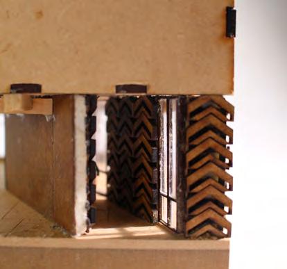
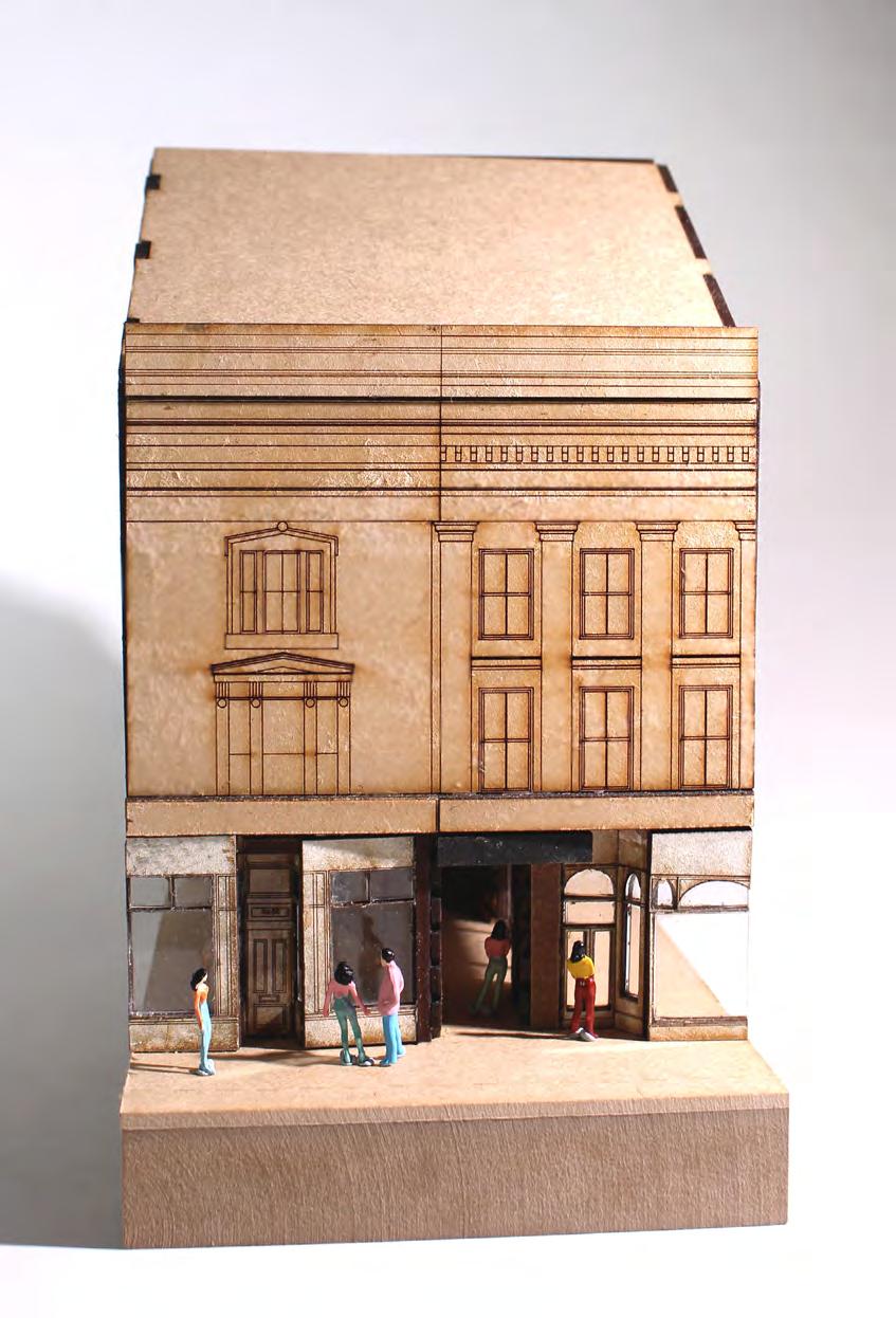
The arcade system is a landmark entrance to the site. The space is dynamic, exemplifying the programme and design details in the retrofitted building. This model shows the process of refining the ground floor intervention design though physical experimentation.

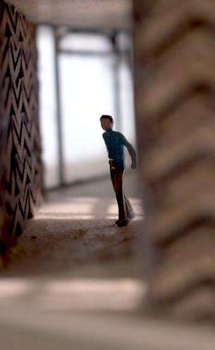
One of the key design features of the arcade is the bespoke chevron tiling. This is designed in reference to motifs found around Victorian architecture around Preston- namely Miller Arcade.

Charlotte Bell June 2023 22
1:50 Progress Model Modelled using: AutoDesk AutoCAD, laser cutter and hand modelling.
RESOLVING THE SPACE: THE ARCADE SYSTEM ON LANCASTER ROAD
1:50 Progress Model
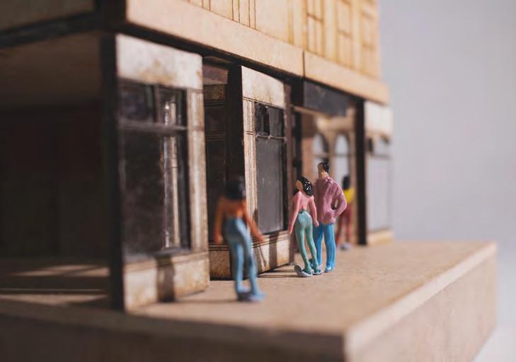
above: experiential exploration of Lancaster Road and the arcade system.
left: detail of the bespoke terracotta tile design. right: perceptive through the arcade system.
External Foundation and Paving Buildup
1- 50mm bespoke terracotta tile cladding
2- steel cladding hostile hands’ structure
3- 50mm clear cavity
4- Water Proof Membrane
5- 100mm Insulation
6- Breathable Membrane
7- 12mm Sheathing Board
8- 120mm Insulation
9- 120mm S+S Structural Steel Studs
10- Vapour Proof Membrane
11- 10mm Plywood interior cladding
12- base hinge
13- 10mm alloy base board (aid drainage)
14- 1500mm x 75mm concrete up stand
Foundation and Internal Floor Build-up
16- 10mm timber floor tiling
17- Screed with underfloor heating and cooling filaments set within
18- Vapour proof membrane
19- 2x 125mm firm insulation
20- raft concrete foundation (joint into (14)
21- continuous WPM to wall build up (4)
External Floor Build-up
22- 5mm glazed terracotta tile
23- 200mm concrete slab
24- 500mm concrete drainage retaining block
25- hardcore
26- drainage system
Charlotte Bell June 2023 23
Ground Floor Foundation to Wall Junction
1:5 Scale Detail a3 1 2 3 4 5 6 7 8 9 10 12 13 14 16 20 1918 17 21 26 25 24 23 11 25
RESOLVING THE SPACE: THE ARCADE SYSTEM ON LANCASTER ROAD
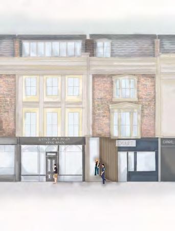
Design Chnages through
Iteration 01
Iteration 02
however front shop windows are largely still remaining for this unit.
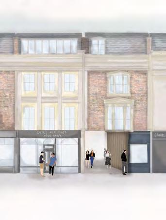
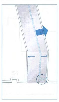
movement of the new build wall by 2.5m allowing f0r a wider arcade way.
Identification that the dimensions in plan do non create the optimum nor desired experiential effect.
the arcade becomes more of an alleyway or corridor which does not suggest to the user that it is a public route
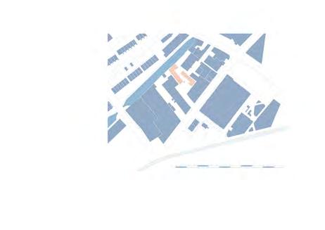
area comparable to model
Iteration 01
This shows the design shown in the model which shows progression needed by widening the arcade vessel. Under-used arcade system due to unapproachable design.
area comparable to model
Iteration 02
Vignette depicting the enlargement in width of the arcade vessel. An increase in arcade usage due to a more approachable design.

Charlotte Bell June 2023 24
Enscape,
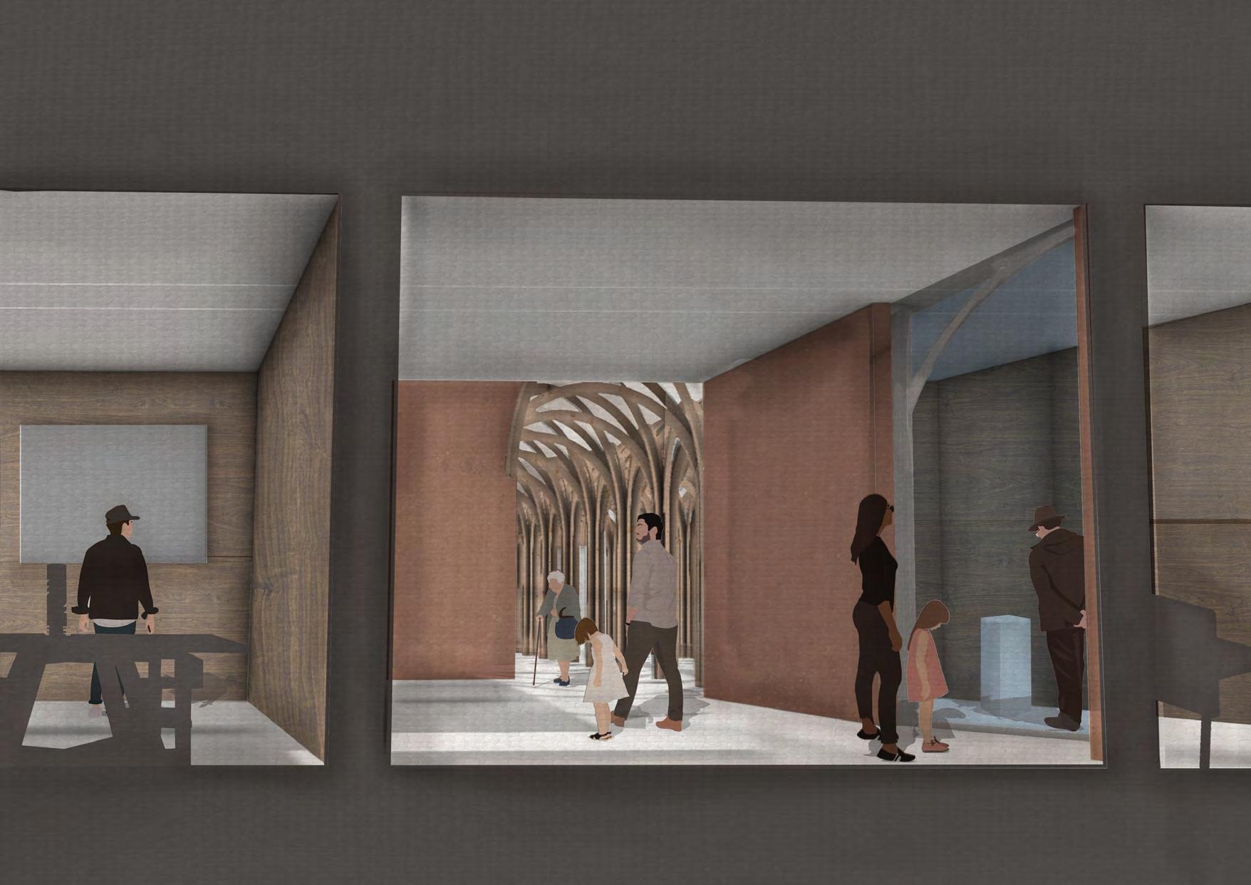
VISUALISING THE SPACE Internal Visualisation of the Arcade System Modelled using: Rhinoceros 3D,
AutoDesk AutoCAD, Adobe Illustrator and Adobe Photoshop.
RESOLVING THE SPACE: THE BOULEVARD
Establishing Two Variants of the Design (dimensions)
Project Title Cambridge Mosque
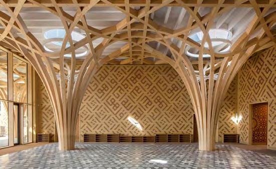
Architect Mark Barfeild Architects
Year 2016-2019
Location Cambridge, United Kingdom
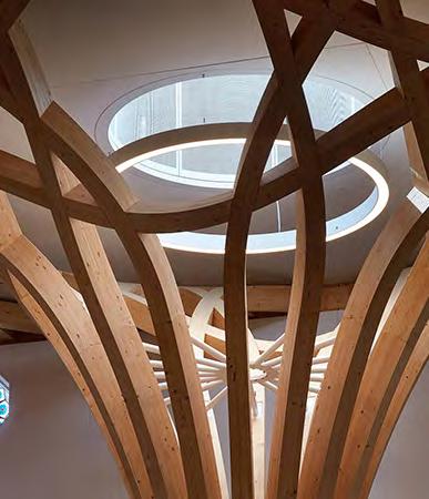
Iteration 01: Smaller 150mm Diameter
D:150mmx1500mm circle at central line creates columns which interlock to create the rib vault. Created by replicating the column base at each 450 interval clockwise. Total width of system = 600mm so can interconnect at this interval.
As the system is so small the interval s can miss a column to create a larger open space (without columns). This is enabled by a smaller span of the rib- however takes away the rib vault effect.
D:600mmx600mm circle at central line creates columns which interlock to create the rib vault. Created by replicating the column base at each 450 interval clockwise. Total width of system = 1,200mm so can interconnect at this interval.
Parallel and adjacent columns create a system by joining the ribs together. The column will connect to another 4 in one system. Where the rib does not meet another column it can maintain in the ‘hang’ as the load is dissipated by the column.
To create an internal finished ceiling line and height the measurements of peak to top of column are taken to create a shallower arc.
The inverted arc for the roofing line is determined by arc to two peaks of neighbouring ribs to join.
Charlotte Bell June 2023 26
600mm
1,200mm
300mm CL CL 150mm CL
Iteration 02: Larger 300mm Diameter
Width
of 3 system: 1,800mm
Width of 3 system: 3,600mm
640mm CL CL 640mm 470mm 600mm
“The building can demonstrate how architecture can embody cultural philosophy and traditions while utilising sustainable and contemporary materials.”
CL
Mark Barfeild. Royal Institute of British Architects Journal.
Diagram
Illustrated using: AutoDesk AutoCAD and Adobe Illustrator.
RESOLVING THE SPACE: THE BOULEVARD
Technical Detail (1:20)
Illustrated using: AutoDesk AutoCAD and Adobe Illustrator.
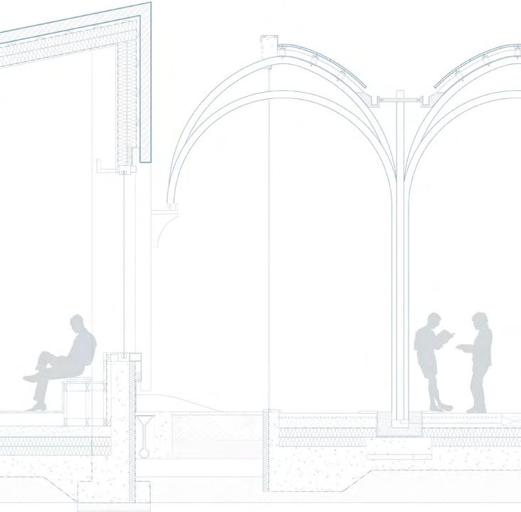
Elevational Bay Render (1:20)
Illustrated using: Rhinoceros 3D, Enscape, AutoDesk AutoCAD, Adobe Illustrator and Adobe Photoshop.

Charlotte Bell June 2023 27
Detail at 1:20 Scale a2
+5000mm +5100mm +3500mm +100mm +0mm
Envelope Render at 1:20 Scale a2
height interdependencies due to evaluational perspective of the portal frame (with skylight distortion)
RESOLVING THE SPACE: THE BOULEVARD
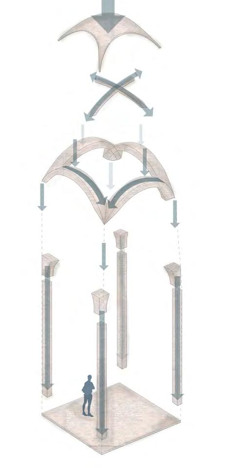
lozangel panel.
secondary structurecross bracing (transverse ridge rib)
primary structureridge rib (longitudinal)
primary structuresurcharge member
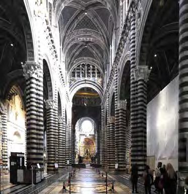
Architect Giovanni Pisano et. al
Year 1296
Location Siena, Italy
The Anatomy of the Classical Church Vaulted Ceiling
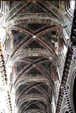
The vault analysed is the ‘rib vault’.Each component(as shown above has different terminology and all work together distribute both live, dynamic and dead load of the building. In order for the system to work the curved components are in compression in order to retain the structural integrity.
primary structurecolumn
Charlotte Bell June 2023 28
Project Title Siena Cathedral di Santa Maria Assunta
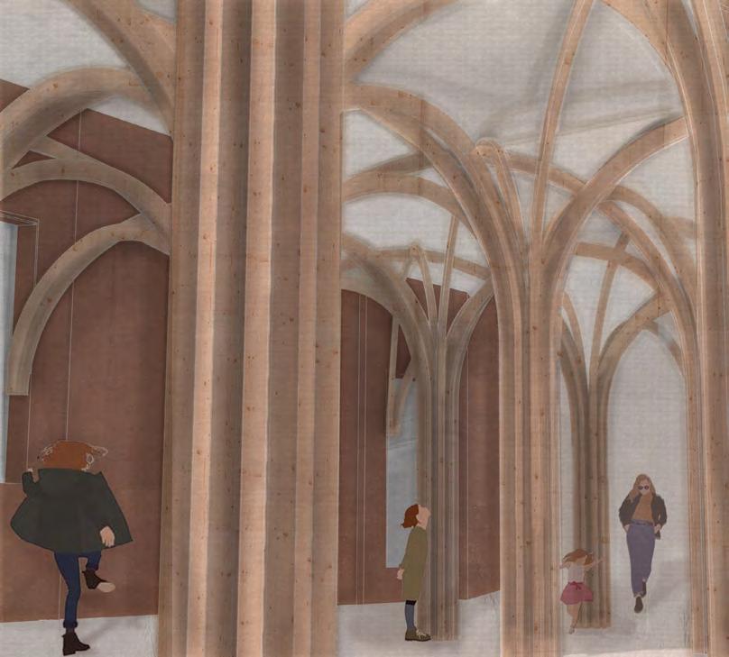
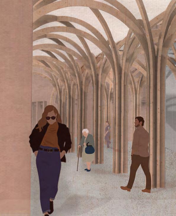
Looking into the Past with the Contemporary in mind...
Diagram Illustrated using: Sketchup, AutoDesk AutoCAD, Adobe Illustrator and Adobe Photoshop.
VISUALISING THE SPACE
Charlotte Bell June 2023 29
Looking along the
Boulevard
A View Through the Atrium
Internal Visualisations Illustrated using: Rhinoceros 3D, Enscape, AutoDesk AutoCAD, Adobe Illustrator and Adobe Photoshop.
RESOLVING THE SPACE: THE BOULEVARD
A Model to Explore the Tactile Detailing
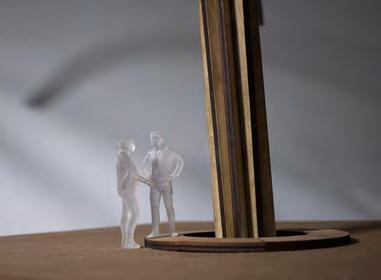

The components of the model are intended to show the structure and material system used within the rib vaulting structure. The materiality at 1:20 scale enable understanding of the tactility of material, dimension and geometry of the design. This model enables the viewer to understand the qualities of the space from a smaller scale.


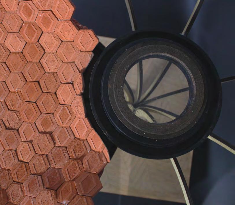 1:50 Progress Model
Modelled using: AutoDesk AutoCAD, laser cutter, jemonite casting and plaster of Paris.
RESOLVING THE SPACE: THE BOULEVARD
A Technical Study of a Singular Column Structure
Junction between Vault Structural System to other Systems.
26 25mm double glazing
27 roof guttering aluminium frame
28 water proof membrane
29 aluminium inner gutter lining 01-09roofing and structural build up
1:5 Scale Detail a3
The Foundation

19 100mm plywood floor finish ( combined into the intergrated bench)
20 vapour proof membrane
21 Screed with underfloor filament (heating/cooling)
22 2x 250mm firm insulation
23 water proof membrane
23 500mm raft foundation
24 500m PAD foundation + footing of each vaulting column
25 700mm arrogate sub soil
1:5 Scale Detail a3
15 6x 2x30mm structural columns to arch segments fanned out from the central intersect
16 lighting, fibre and electrical wiring runs through the centre of the ‘stem’. This leads down to a
17 20mm copper encasing to house the foundation set services channel. This houses a service box for electrical access.
18 guttering pipes housed separately in the centre of the ‘stem’.
01 40mm terracotta tile
02 50mm air gap
03 20mm roof perlins (dual acting as cladding attachment joints transom )
04 20mm roof mullions
05 water proof membrane
06 150mm firm insulation
(not indicated with hatch)
07 vapour proof membrane
08 25mm inner plywood cladding
09 12x30mm structural arch

Charlotte Bell June 2023 31
AutoDesk
and Adobe
The Roofing
The Stem
Technical Detail (1:20/1:5) Illustrated using:
AutoCAD
Illustrator.
RESOLVING THE SPACE: A TECHNICAL STUDY OF AN ARCHITECTURAL FRAGMENT

The Brief, Scope and Aims of the Technical Study
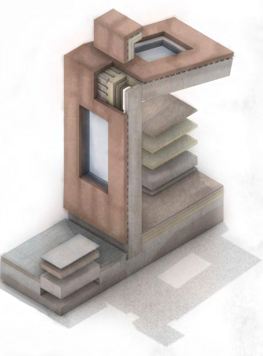
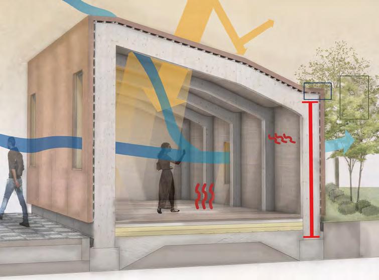
The technical study brief was to choose a significant architectural fragment with in the proposal to investigate in terms of climate change, constructibility and building and life safety.

The chosen fragment is a CLT portal frame building with the programme of the self contained gallery. I investigated to internal comfort of the space in terms of day lighting. The aim was to create a space with low solar gain, preventing glare and allowing enough natural light into the space, preventing need for additional artificial lighting.
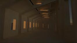
Interior Render and Diagram
Illustrated
Exploded
Charlotte Bell June 2023 32 01 02 0304 06 07 08 09 10 12 14 15 19 21 21 23 25 24 23 26 27 25 19 21 23 25 28
Diagramnumbers relevanttothe keyinthebottom left.
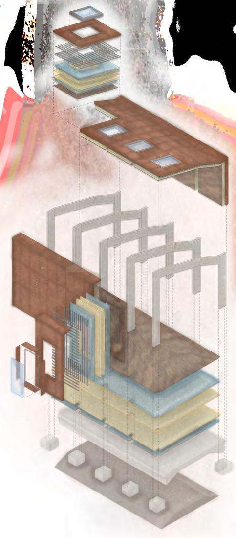
01 skylight double glazed with aluminium frame 02 400mm terracotta tiles 03 20mm roof perlins (dual acting as cladding attachment joints transom ) 04 20mm roof mullions 05 water proof membrane 06 2x 250mm firm insulation 07 vapour proof membrane 08 400mm terracotta tiles 09 20mm cladding attachment joints transom) 11 water proof membrane 10 20mm roof mullions 12 2x 250mm firm insulation 13 vapour proof membrane 14 20mm inner plywood cladding 15 700x200x3000mm CLT Portal frame comprised of beams and columns 16 20mm double glazing 17 aluminium window fare and attachment 18 30mm window box and sill additional cladding pannel 19 20mm inner plywood cladding 20 vapour proof membrane 21 2x 250mm firm insulation 22 water proof membrane 23 500mm raft foundation 24 500m PAD foundation + footing of portal frame 24 500mm screed 26 100x300x30mm clay tile 27 700mm arrogate sub soil 28 Screed with underfloor filament (heating/cooling)
Axonometric
Detail (1:5)
Rhinoceros
Enscape, AutoDesk AutoCAD, Adobe Illustrator and Adobe Photoshop. Schematic Climatic Emergency Strategy 02 03 04 05 01 06 07 08 09
Illustrated using:
3D,
using: Rhinoceros 3D, Enscape, AutoDesk AutoCAD, Adobe Illustrator and Adobe Photoshop.
Exploded Junction Depiction
Due to the right angled shape of the portal frame into the acute angel, a plate system junction is developed to ensure strength in this area. HB bolts are used t secure the overlapping plates to each other and then to the portal frame To make the system fire proof additional CLT panels are used to conceal the steel plated which are conductors. A haunch is also added for extra stability for fire precaution.

01 10mmm steel plate to separate the beam to column
02 20mm bowdalled steel plates bolted connections to the CLT portal frame
03 M25 Bolts are used in a linear formation to join the recessed plate to the CLT.
04 10mm steel panel joins the two bowdalled plates together between the M25 bolts and the CLT.

05 Steal hollowed haunch at the size specified in the calculations (left)
06 D30 bolts join the steel to the CLT.
07 30mm CLT sheet to encased the joints.
08 CLT portal frame
Location
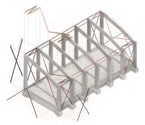
the needed locations, only at each end of building as this is a small scale building.
Horizontal Bracing
‘K’ shaped bracing on the roofing in addition to the roof perlins to give stability over the longer beams and prevent swaying between the portal frames.

Bracing
on Side Walls
An inverted ‘K’ bracing shape that will transmit the horizontal loads to the ground via these as well as the portal frame columns. Prevent warping off the weather load.
Vertical Bracing
Cross shaped bracing in the last two segments of the portal frame structure. This is used a tension members.
Charlotte Bell June 2023 33 01 skylight double glazed with aluminium frame 02 400mm terracotta tiles 03 20mm roof perlins (dual acting as cladding attachment joints transom 04 20mm roof mullions 05 water proof membrane 06 2x 250mm firm insulation 07 vapour proof membrane 08 400mm terracotta tiles 09 20mm cladding attachment joints transom) 11 water proof membrane 10 20mm roof mullions 12 2x 250mm firm insulation 13 vapour proof membrane 14 20mm inner plywood cladding 15 700x200x3000mm CLT Portal frame comprised of beams and columns 16 20mm double glazing 17 aluminium window fare and attachment 18 30mm window box and sill additional cladding pannel 19 20mm inner plywood cladding 20 vapour proof membrane 21 2x 250mm firm insulation 22 water proof membrane 23 500mm raft foundation 24 500m PAD foundation + footing of portal frame 24 500mm screed 26 100x300x30mm clay tile 27 700mm arrogate sub soil 28 Screed with underfloor filament (heating/cooling) 02 03 04 05 06 07 01-07 in modular system 09 10 08 11 12 13 14 01 15 16 17 18 19 20 21 22 23 24 25 08-18 in modular system 28 between 19-20 Underfloor heating and cooling within arrogate screed layer 250mm
01 02 03 04 05 07 06 08
of Bracing Cladding is placed at
Technical Axonometric (all on page) Illustrated using: Rhinoceros 3D, Enscape, AutoDesk AutoCAD, Adobe Illustrator and Adobe Photoshop.
RESOLVING THE SPACE: A TECHNICAL STUDY OF AN ARCHITECTURAL FRAGMENT

Record of Process
Iterative Test 01- Creating North Light


after (desired)- the light enters the interior at a low pitched angel which can be more easily design to dissipate effectively
before- the light will enter the interior at any angel- over exposure of light
What is the Change (independent variable)?

The factor tested here is change in pitch of skylight orientation. This is by optimising the north light by adding a skylight box (instead of the skylight following the roof line). The skylight faces north perpendicular to the ground.
The Desired Effect Indirect soft light from the north which will light the room well at a more appropriate angel. North Light Window Box By adding a skylight at a north angel this creates indirect light as is not directly from the sun therefore is at a consistent angel and colour throughout the day, with no sharp sun exposure points or shadows.
DIAGRAM TO SHOW THE CHANGE IN THE FRAGMENT AND THE DESIRED EFFECT OF THE TEST
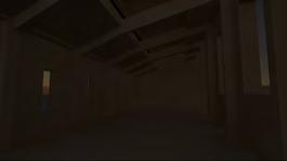
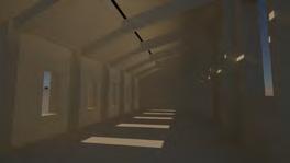
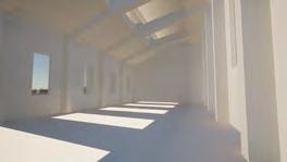
Qualitative Light Testing- Rendering Summer Solstice July 23rd Winter Solstice Dec. 23rd
reflected light off the terracotta and film due to the angel hitting the terracotta before the glazing light into the space at a low angel therefore the light is at higher exposure above the users habitable space
09:00
The lighting dull and under exposed, however is harsh with sharp shadows and light spurs.
09:00
As this is winter solstice it can be assumed at early/late hours there is low lighting/exposure. Artificial light would be needed to supplement.
12:00
12:00
Due to the small skylight aperture size, at mid day this is not sufficient in lighting the interior as there is intimal lighting. The perimeter glazing do not create much daylighting into the interior.
There is extremely low exposure- to the extent that the skylight aperture and perimeter apparatuses are making little to no difference in use of solely daylighting.
15:00
The daylight is underexposed and has no light spurs therefore the interior is unusable as would be hard to navigate. Artificial lighting would have to supplement.


15:00
There are some light spurs however, this situation would have to be supplemented with artificial lifting.
Changes carried forward into the next
04 Change to detail: the system becomes smaller and more compacted at a slightly smaller capacity
11 Change to 1 sheet of 250m sheep wool insulation in the skylight box due to accom modations of a thinner roofing system.
15 The addition of an beam which runs at the base and header of the skylight for an extra support. The I beam is CLT. The I beam is filled with 100mm insulation to keep a continuity in the insulation system.
Iterative Test 01 Results and Reflections
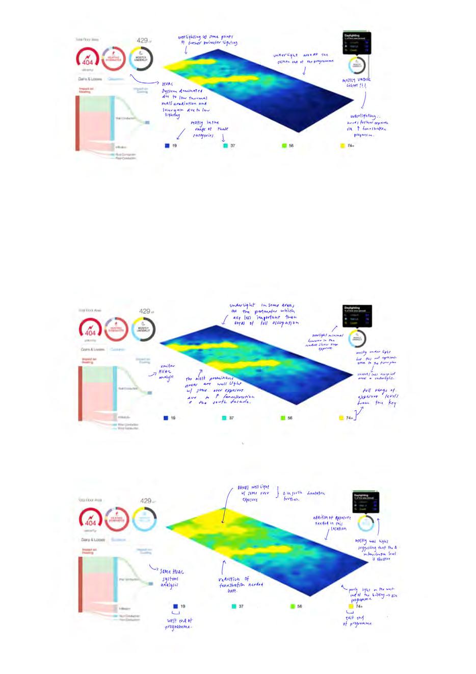
Results? The whole programme is widely under light and needs further glazing to be supported mainly by natural daylighting alone. The plan is constantly underweight except small sections of the western plan suggesting moves to designing the rest of the building like this. Improvements? Greater amount of apparatuses on all façades to light the space evenly. Increase in size of the skylight aperture in order to capitalise on the north lighting aspect.
Charlotte Bell June 2023 34
1200 01 02 04
05 05 06 07 08/09 10 11 12 13 15
Iterative Test 02- Optimising the North Light
the angel of light remains mostly the same allowing similar lighting effects (i.e. soft light)
singular angel of light (due to aperture location) at a low angel= above habitable area = reduced glare

What is the Change (independent variable)?
The factor tested here is changing the size of the skylight to allow a larger aperture and glazed area. This also impacts the pitch as the pitch has to be more obtuse to accommodate the larger glazed area. The glazed area remains perpendicular to the ground and at a north orientation.
The Desired Effect Maintaining the effects found of the light quality interns of an indirect soft light from the north however, creating a more exposed light to fill the room further with light (to prevent need for much artificial lighting).

further amount of UV/ glare reflected as the glazed area is larger. The excess removed controls the negative externalities of light further.
pitch change of skylight box allowing a larger galzed area
light into the space at a low angel therefore the light is at higher exposure above the users habitable space

Iterative Test 02 Results and Reflections
Results? More of the space is well light, however, there is now an overexposure problem as there is too many perimeter apparatuses in the room. This indicates that there is south lighting predominately over the desired north lighting. This results in an uncomfortable internal environment as there is over exposure, glare and harsh shadowing.
Improvements? Refinement of the facade fenestration pattern/size to prevent over exposure in south lighting. Further prevention of over lighting (e.g. light shelf).


1400
DIAGRAM TO SHOW THE CHANGE IN THE FRAGMENT AND THE DESIRED EFFECT OF THE TEST
01 02 04 05 05 06 07 08/09 10 11 12 13 15
Qualitative Light Testing- Rendering Summer Solstice July 23rd Winter Solstice Dec. 23rd
RESOLVING THE SPACE: A TECHNICAL STUDY OF AN ARCHITECTURAL FRAGMENT


Iterative Test 03- Well Light Spaces Using A Light Shelf
What is the Change (independent variable)?

The factor tested is implementing a light shelf into the design. The other factors changed up to this point (in itteration01/02 remain the same and become control factors in testing). The glazed area remains perpendicular to the ground and at a north orientation.
The Desired Effect In use of the light shelf theory suggests with a reflective material, the sunlight should enter the glazing, reflect of the light shelf and the light enters the space. Due to these reflections, the light reduces in UV and glare, producing a less overexposed areas.
Changes carried forward into the next
Iterative Test 02 Results and Reflections
Results? More of the space is well light, however, there is now an overexposure problem as there is too many perimeter apparatus es in the room. This indicates that there is south lighting predominately over the desired north lighting. This results in an uncom fortable internal environment as there is over exposure, glare and harsh shadowing. Improvements? Refinement of the facade fenestration pattern/size to prevent over exposure in south lighting. Further prevention of over lighting (e.g. light shelf).
Charlotte Bell June 2023 36
additional artificial lights light reflected off wall/ light shelf enters the habitable space at a low UV exposure 100% UV Exposure 70% 50% 30% 100% UV Exposure 70% 50% 30% 30% UV exposure reflected off the glazing film and cladding=less exposure enter the interior space light entering the space is at a low enough UV exposure that the angel is not a determining factor 01 02 04 05 05 06 12 07 08/09 11 13 15
Iteration
16 The addition of the light shelf. A 200mm sheet of plywood lined with a 100mm reflec tive copper. This is suspended from the CLT portal frame beams using a metal cord and securing hooks.
DIAGRAM TO SHOW THE CHANGE IN THE FRAGMENT AND THE DESIRED EFFECT OF THE TEST
01
tal frame and the plywood light shelf)
02
18 Copper Reflective Film
19 Plywood Light Shelf
20 Copper concealed guttering. Junction between two cladding tiles, leading to a blue roof system down pipe at the north, east façades.
21 Roof perlins cladding attachments. The terracotta tile has a projection which locks directly into the shape of the perlins as a ‘lock and key’ mechanism.
22 Shadow gap terracotta tile junction. Overlapping cladding segments connect in a ‘z’ junction. The small gap at wither side of the cladding junction is filled with a copper T shape stopper to ensure waterproofing of the system.
14
15
16
17
23 151x10mm Copper T shape joint filler lined with free foam for stability/waterproofing properties
24 Interior window sill 20mm plywood
25 Exterior window sill 20mm terracotta tile cast shape to prevent water stagnation
Charlotte Bell June 2023 37
double 3mm laminated sheet of glazing
Insulation
aluminium window frame and sill joint
03
reinforced concrete forcing and headings
04
mechanical louvres system
05
aluminium steel joining plates with steel bolts
06
400mm terracotta tile cladding
07
water proof membrane
08
20mm cladding attachment (dual use roof perlins)
09 20mm roof mullions 10 mechanical louvre system 11 2x 250mm
sheep wool
12
vapour proof membrane
13
20mm inner plywood cladding
700x200x3000mm CLT Portal frame comprised of beams and columns
I Beam supports for window light
Tension Cable
Eye hole hook 4’’ shank (joins to the CLT por-
01 02 05 04 15 24 25 DETAIL 03
20 21 DETAIL 02
20 06 11 07 12 13 22 23 DETAIL 04
Axonometric
20 06 11 07 12 13 DETAIL 05 Technical
(1:5) Illustrated using: Rhinoceros 3D, AutoDesk AutoCAD, Adobe Illustrator and Adobe Photoshop. DETAILING OF FINAL ITERATION
Skylight Detail Axonometric Detail- 1:5 @a3
Roofing Guttering Axonometric Detail1:5 @a3
Joint between different Terracotta Cladding Tiles Axonometric Detail- 1:5 @a3
Terracotta
Cladding Tile Junction and Mullion Attachment Junction
Detail- 1:5 @a3
Details
Charlotte Bell June 2023 38
RESOLVING THE SPACE: A TECHNICAL STUDY OF AN ARCHITECTURAL FRAGMENT

Details referenced from previous page.
Technical Axonometirc Details (1:5)
Illustrated using: Rhinoceros 3D, AutoDesk AutoCAD, Adobe Illustrator and Adobe Photoshop.
39 DETAIL 02 DETAIL 03 DETAIL 04 DETAIL 05
Charlotte Bell June 2023 39
CHARLOTTE BELL
Seeking Part1 Architectural Assistant Opportunities in Manchester or London.

Email: charlotterdbell@gmail.com
Contact phone number: 07736110525
Instagram: @charlotteb.archi
linkedin.com/in/charlotte-bell-architecture

Charlotte Bell June 2023 40

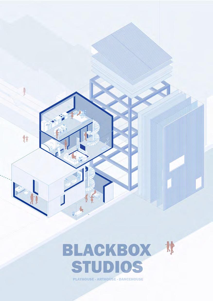
PAD BA2 Project Poster Illustrated using: Sketchup Adobe Illustrator and Adobe Photoshop.
 Charlotte Bell


 A0 Site Model Modelled using: Lazercutting, bandsaw and other wood working tools.


 The Existing Elevation from Lord Street (1:200).
Illustrated using AutoDesk AutoCAD, Adobe Illustrator and Adobe Photoshop
Aerial Plan of Preston (1:1000).
Illustrated using Adobe Illustrator and Map Box


 Lord Street Elevation: the Long Elevation east to west (1:200).
Illustrated using Rhinoceros 3D, AutoDesk AutoCAD, Adobe Illustrator and Adobe Photoshop


 Elevational Perspective
Illustrated using Sketchup , Adobe Illustrator and Adobe Photoshop
Illustrated using Sketchup , Adobe Illustrator and Adobe Photoshop


 1:50 Progress Model
Modelled using: AutoDesk AutoCAD, laser cutter, jemonite casting and plaster of Paris.
