


HOW TO MASTER CITYSCAPES LEARN TO PAINT VIBRANT PORTRAITS CREATE ENGAGING LANDSCAPES TIPS, TRICKS AND CHALLENGES 174 Paint flowers and nature in watercolour, oil and coloured pencils All the expert advice you need in one magazine BE INSPIRED! Painting BECOME A BETTER ARTIST TODAY! PAGES OF PRACTICAL IDEAS 116 made easy £9.99 2023 EDITION NEW
Haretoday...
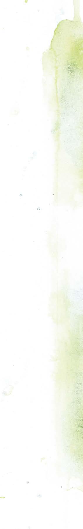
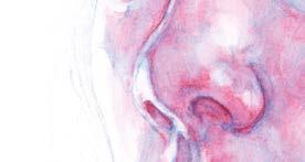
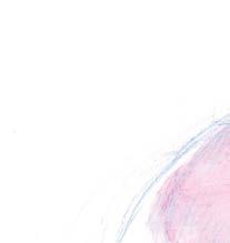
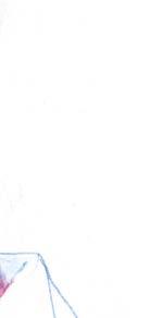
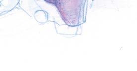
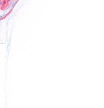
The endangered mountain hare is a popular subject for artists, a creature steeped in folklore, myth and legend.
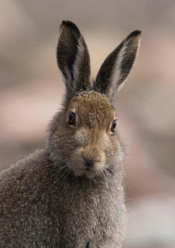
PENEL KIRK shows you how to paint one in mixed media
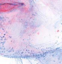
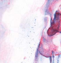
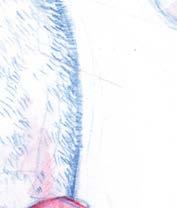
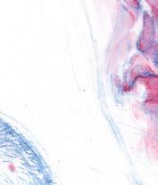
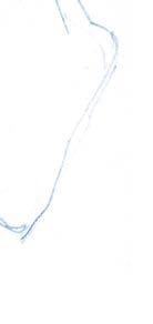
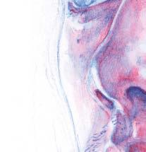
Endangered wildlife portraits have formed the bulk of my work over the last couple of years, the sales of which have included a donation to various animal charities and their vital conservation work. The subject of this painting is the mountain hare, which can still be found in the Scottish Highlands and Ireland. Sadly, the latest research suggests that the last surviving population in England’s Peak District is at risk of extinction. This species of the hare is larger than rabbits but smaller, and with shorter ears, than its cousin the brown hare. As the seasons change so does the colour of the mountain hare’s fur. In the summer, it has a grey-brown coat, making them hard to spot against the moorland heather, while in winter, except for the black on their ears, their fur goes almost completely white, a perfect camou age in the snow. ▸
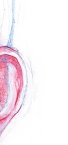
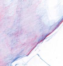
ORIGINAL IMAGE 14 PAINTING MADE EASY
HOW TO
Fabriano Artistico Extra White Hot Pressed paper Paint
Golden Heavy Body
Acrylic: Jenkins Green
Winsor & Newton
Galeria: Cadmium Yellow
Winsor & Newton
Designer Gouache: White
Coloured pencils
Derivan Liquid
Pencil: Sepia
Faber Castell Albrecht
Durer Watercolour
Pencil: Green Gold, Brown Ochre, Burnt
Sienna, Walnut Brown, Bistre, Nougat, Warm Grey IV, Caput Mortuum
Violet, Dark Sepia, Warm Grey, Terracotta, Black, Orange Glaze, Cream, Cadmium Yellow
Caran d’Ache:
Luminance 6901: White Brushes
Daler Rowney System 3
Synthetic S cript Brush
Watercolour Brush size 4 and 10
Foam/Sponge Brush 2”
HB pencil
Mono Zero Precision
Eraser Pen: Round
PENEL'S MATERIALS PAINTING MADE EASY 15
34 PAINTING MADE EASY
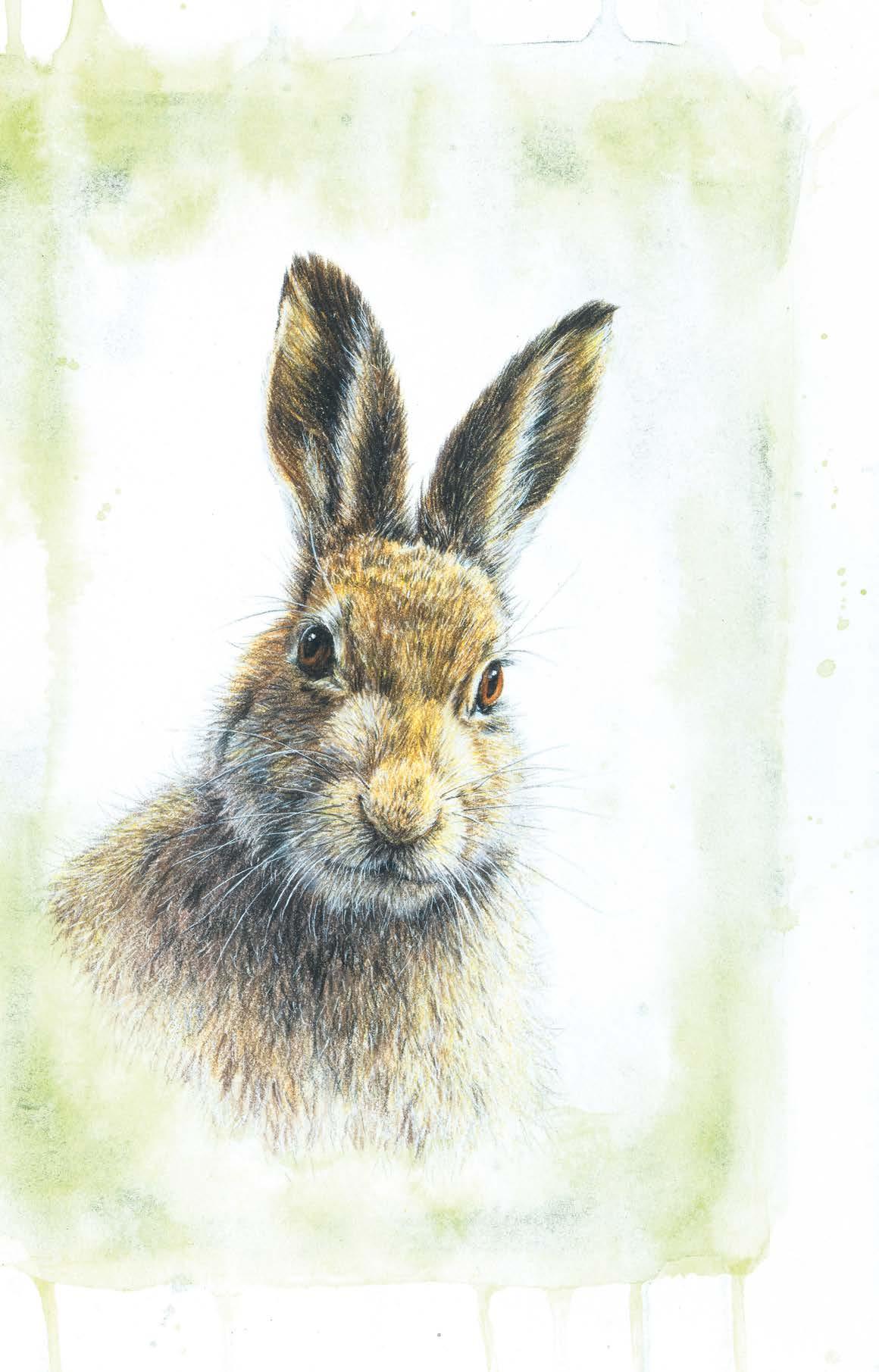
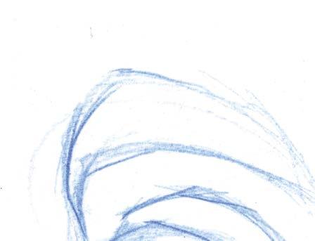
Coloured pencilportraits Aux trois crayon palette
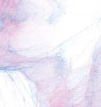
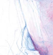
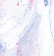
This month I’ll be using the three-colour combination favoured by artists like Jean-Antione Watteau and Peter Paul Rubens. Colloquially known as trios crayon it requires a black, a white and a coloured pencil – typically a reddish-brown – and mid-tone paper. The black, white and mid-tone paper provide a tonal range for the drawing, while the comparatively saturated red-brown pencil draws the viewer’s attention to areas of interest.

Watteau does this brilliantly in his fast and eloquent gure drawings, picking out hands and faces in red chalk amidst monochromatic drapery while Reubens uses it to guide the viewer’s attention around the features of the face. Originally applied to drawings made in a hard chalk or pastel, the colour palette predates the formulation of coloured pencils as we know them. To straddle that historical divide I used
In this second of his five-part series on exploring different coloured pencil portrait palettes, JAKE SPICER demonstrates the aux trois crayon palette


Derwent pastel pencils for a soft and smudgeable mark sharpened to as ne a point as their brittle cores allow – you could just as easily use wax or oil-based coloured pencils.

As a side note, I use the phrase aux trois crayon with my tongue rmly in cheek; English-speaking artists maintain the habit of using French or Italian turns of phrase to add gravitas to the ordinary notion of popping outside to paint or picking up three pencils to draw with. A French painter would hardly declare that they were o to paint en plein air and I doubt they’d make much of a fuss about drawing aux trois crayon. Nonetheless, the phrase encapsulates a useful idea and lacking a concise alternative, I’ll continue to use it and bear the giggles of French friends. While the business of drawing is one of profound importance, we should be careful not to take ourselves too seriously while we’re doing it.▸

WORKSHOP 2 ARTISTS & ILLUSTRATORS 35
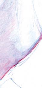
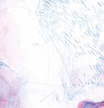
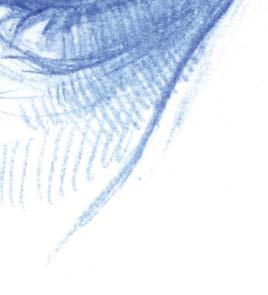
5 ADDING WATER
As you add water to the red hatching, you’ll nd the combined colours come into their own, with the liquid red forming a thin glaze that expresses the fullest intensity of its colour when it is layered over the white paper and approaches purple when it is laid over blue.
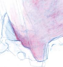
6 FINAL MARKS


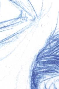
Finally, once the last layer of red has fully dried you will be able to introduce nal, drawn marks to the portrait. If you are strictly adhering to the limitations of two pencils you will need to decide whether to render areas of surface detail in red or blue. If you are allowing yourself more latitude in your pencil choice, you might want to introduce a limited amount of black to the drawing. I choose the former and used blue for the short dashes of hair and eyebrow, opting for a purple mixture of layered blue and red in the darkest parts of the face.


◂ ◂ WORKSHOP 44 PAINTING MADE EASY
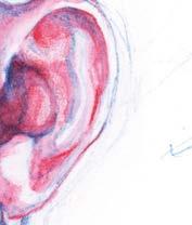
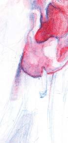
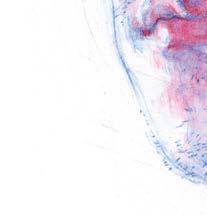
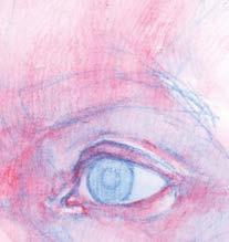
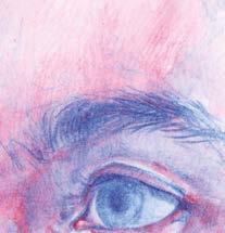
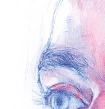
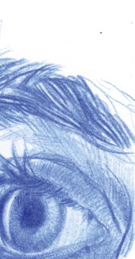
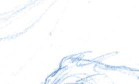
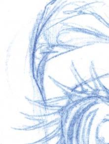
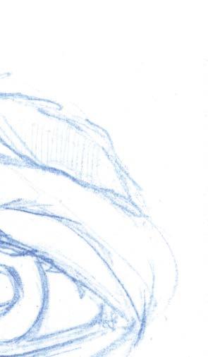
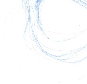
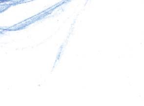
Features in focus: Eyes
While it is the disk of the iris which draws and holds our attention in a portrait, it is the shape of the eyelid and the eyebrow that lend expression to the face and orbital of the eye socket that sets it in context with the surrounding features. When you’re drawing the eye, you should be looking at it as a complete unit rather than focusing on the most attention-grabbing elements.
EYELIDS AND WHITES
Rather than drawing the pupil and iris in immediately, draw the negative spaces of the white of the eye – leaving the pupil until later will stop you from being put off by the face gazing back at you as you draw. Draw in the creases of the top and bottom eyelids.
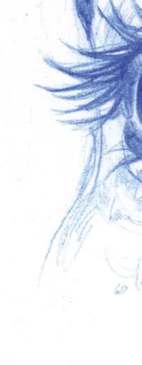
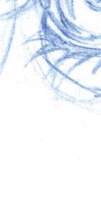

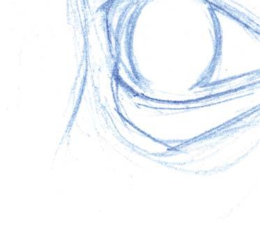
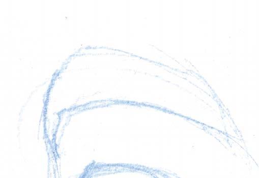
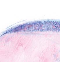
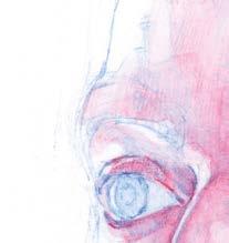
EYEBROW AND EYELASH
TONAL VALUES


Finally add darker tones to the features, framing the lighter highlights of the white paper. The pupil and the white reflection of light that sits next to it often represent the darkest dark and lightest light in a portrait, the extremity of contrast, enhanced by their proximity. ▫
Establish the outline of the eyebrow and the curve of the eyelash early, checking the shape of the negative space between them to help you focus on structure first. Notice the faint suggestions of the eye socket and feel
shape of the
its hard bony edge on your own face.
PUPIL AND EYELASH
Delineate the pupil and notice where it sits within the iris – it is a black ellipse set within a lens that sits on the front of the eyeball. Draw around the reflected highlight on the surface of the eye and elaborate on the contours of the eyelashes and the directional texture of hairs in the eyebrow.
◂ ◂ ◂ ◂ PAINTING MADE EASY 45
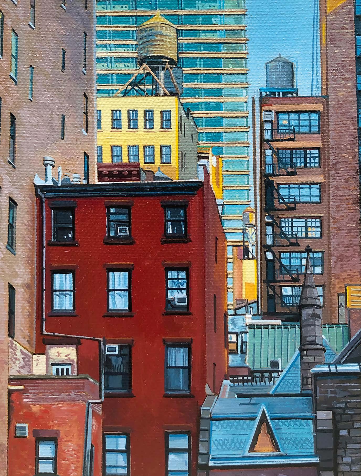
Living for the city
During the pandemic, online art teacher
CHRISTOPHER PAUL STEVENS started to make his oil paintings on a much smaller scale. Here’s a demonstration from a street
scene in New York
When Covid-19 hit, the galleries where my paintings were displayed closed and I was forced to look for new ways to sell my work. I began to focus on social media and direct sales to my followers. The best way I could think to do this was to work at a much smaller scale. The guidelines that I set for myself were that the work could easily be shipped safely at a fair rate, had a price point accessible to most people and was a standard size. Ultimately what worked best was a scale of 13cm by 18cm. This would allow me to complete a piece quickly, which reduced costs to the buyer, would fit into a standard bubble-lined envelope securely with cardboard protectors over the front of the painting, and was at a scale where I could still be detail oriented.
CHRISTOPHER'S MATERIALS
Classic cotton canvas 13 x18cm
Paint
Liquitex acrylic:Raw Sienna (for underpainting)
Winsor & Newton O ils: Titanium White, Cadmium Yellow Medium, Yellow Ochre, Burnt Sienna, Cadmium Red, Alizarin Crimson, Phthalo Blue, Van Dyke Brown, Phthalo Turquoise
Brushes
Princeton short liner 10/0, Princeton liner 10/0, Princeton 2/0, Princeton 0, Princeton 10, Gamvar varnish brush
Mechanical pencil for drawing grid lines
Mahl stick
Speedball odou rless paint thinner
Houston Art boiled linseed oil
Gamvar Gloss varnish
CAPTURING THE IMAGE
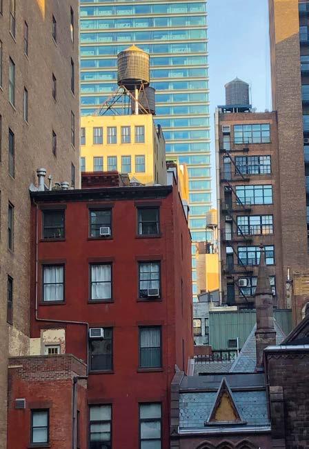
The image that I chose for this project is one that I photographed with my smartphone while walking through New York City. The best advice I can give when looking for subject matter is to take a walk around town, be observational and try to nd beauty in the ordinary. ▸
ORIGINAL IMAGE 1 STEP-BY-STEP 62 PAINTING MADE
EASY
1
1
