

Bright, cheerful and full of optimism, from soft pastel tones to vibrant golden hues, this is a colour that adds warmth and vitality whether used all over or simply as an accent to add a layer of interest FEATURE EMMA J PAGE
With tones varying from soft butter and warm primrose to bold citrus and deep mustard, yellow is a versatile hue whose roots lie in pigments first extracted from ochre in prehistoric times. A key note in art, architecture and interiors, yellow was prized by Ancient Egyptians for its association with the sun god Ra. In medieval Europe, it adorned stained glass windows, while the Renaissance saw its wider use in
frescoes and textiles. By the 18th and 19th centuries, yellow featured in wallpapers and neoclassical architecture. Reminiscent of joy and energy, it became a symbol of post-war optimism too, culminating in Nancy Lancaster’s wonderfully vibrant 1950s Yellow Room at 39 Brook Street. Today, yellow remains a popular choice for its associations with positivity and warmth, used in an array of interior spaces, from kitchens to children’s rooms.

In this sunny pantry by Salvesen Graham, scallop-edged shelving and worktops, and linen cabinet curtains, add an air of relaxed elegance.

OPPOSITE Unusual colour combinations, such as a mustard corduroy sofa set against blush pink walls, give yellow a contemporary context in this scheme by Otta Design.


From rich emerald to soft sage, bring nature’s serenity indoors and discover how this versatile colour can breathe life into interiors, whether creating a calming retreat or making a bold, fresh statement
Evocative of new beginnings, fertility and rebirth, green has enduring appeal due to its inherent association with the natural world. First used by the ancient Egyptians, who created pigmented tones from minerals such as malachite and verdigris, the hue later became popular in fashion and fabrics, as well as being a symbol of life in medieval art. By the Victorian era, the popularity of green had reached its peak, prized for its intensity and light-fastness. However, a major drawback at that time was the use of toxic arsenic and
lead in its production. These days, green has returned to its associations with nature, latterly representing environment and sustainability, as well as energy and serenity. Beloved by William Morris during the Arts and Crafts movement, this is a tone that is decorative and restorative in equal measure.
Unsurprisingly, green works particularly well in rooms that give on to the garden. “The colour amplifies

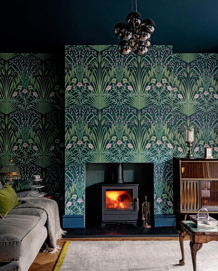
Walls in Pistachio 561 by Benjamin Moore provide a gentle backdrop to a boldly silhouetted Rameses pendant lamp by Pooky. Blue accents add energy and depth. OPPOSITE This cosseting snug by Pia Design features Cole & Son’s Bluebell wallpaper in Sage/Mint, combined with a ceiling and woodwork in Farrow & Ball’s Hague Blue.

From tranquil coastal shades to deep, dramatic tones, blue is a versatile and timeless choice for interiors. Discover how this classic hue can transform a space, bringing a sense of calm, sophistication, or bold energy to any room
Associated for centuries with art, architecture and interiors, blue is prized for a sense of rarity and prestige as well as its calming properties. Deeply intertwined with our perception of sky and sea, it is believed to be the first human-made pigment, dating back to the Egyptians, who are known to have used azurite decoratively. Blue has long been associated with wealth and grandeur, having been a difficult colour to produce, as
well as transcendence, given its historical association with the colour of the Madonna’s robe. The Middle Ages saw blue as a highly prized colour for clothing, while in the 18th century blue-and-white curtains, bed hangings and upholstery became de rigueur. Popular in Victorian interiors, it was often paired with red and gold to create an opulent look. In current interior schemes, blue can be both grounding or uplifting, fresh or cocooning, depending on its tone.


Classic yet endlessly versatile, stripes can add structure, movement or bold flair to interiors. From sleek monochrome to playful, colourful designs, discover the transformative powers of this timeless pattern
FEATURE EMMA J PAGE
Adesign that consists of long bands against a contrasting plain background, stripes are by nature eye-catching, whether they run horizontally or vertically. But although they are considered an enduring classic, both sartorially and in the interiors world, stripes have a surprisingly chequered history. In the Middle Ages, they garnered attention for controversial reasons.
Widely perceived as transgressive, striped clothing was ‘relegated to those on the margins or outside the social order’ according to Michel Pastoureau, author of The Devil’s Cloth: A History of Stripes and Striped Fabric. This negative symbolism was slowly revised over subsequent centuries – striped walls, drapes and furniture became de rigueur around the time of the American Revolution; Napoleon Bonaparte reportedly
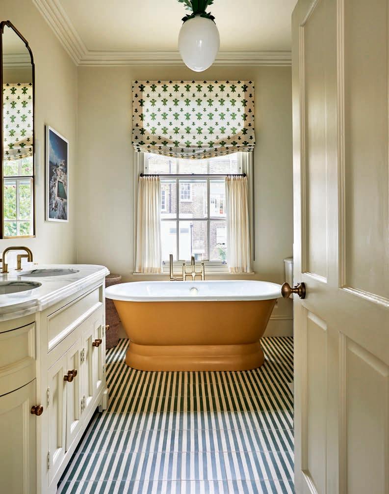
ABOVE In this elegant bathroom designed by Studio Duggan, subtle Green Stripes flooring by Otto Tiles draws the eye towards a mustard-finished bath and a window dressed in simple linens.
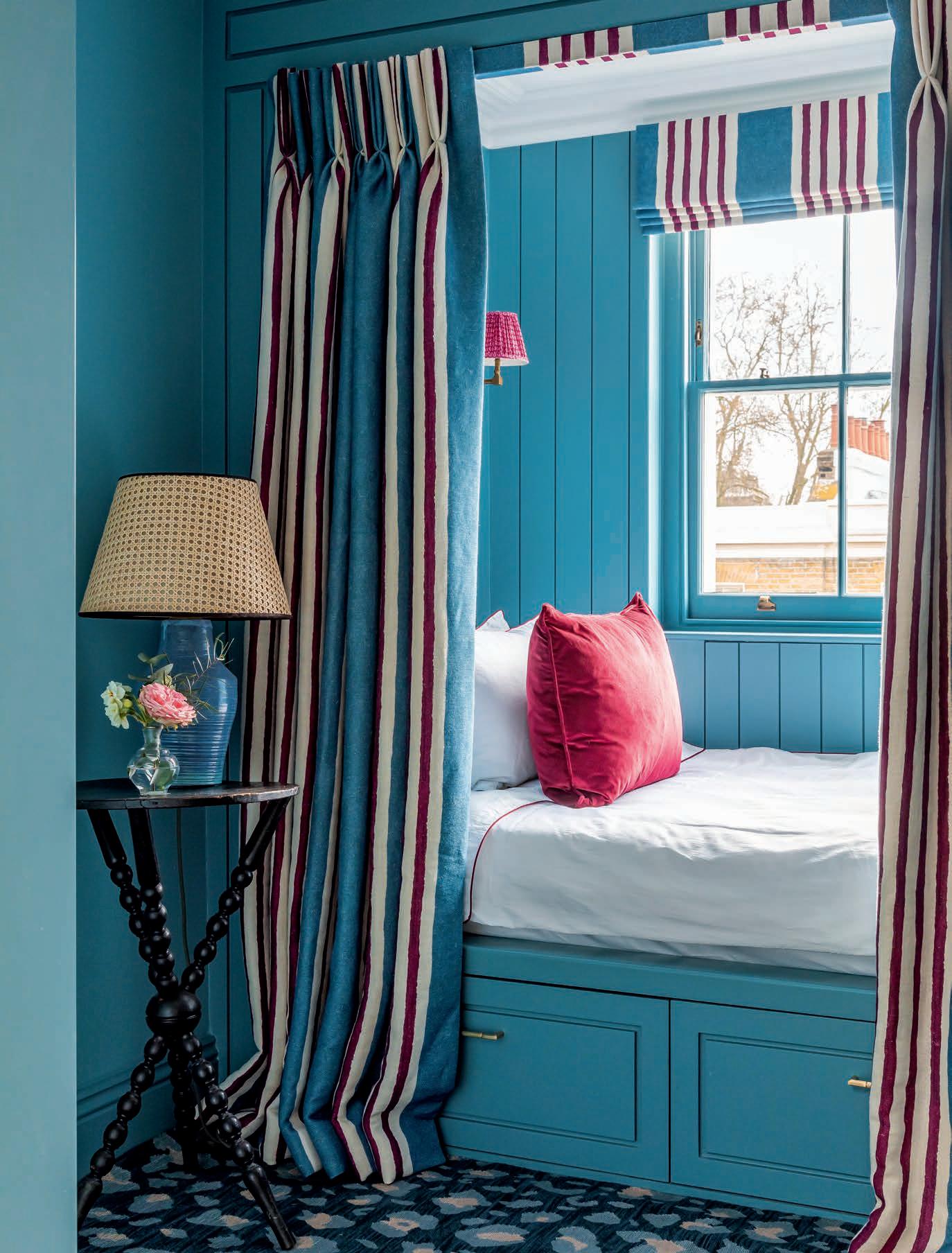
OPPOSITE Generous, striped drapes lend a cosseting feel to this cosy cabin bed designed by Barlow & Barlow.


