The English Home March/April 2022 - US Edition

Page 1

ENGLISH HOME The

Celebrating the essence of English style

BRIGHT OUTLOOK

New British design inspiration for the year ahead

EXPERT GUIDES Spring decorating Elegant hallways Embracing florals

HISTORY ON DISPLAY

Step back in time

Combining art & antiques at home

The stories behind London’s oldest shops

HOMES OF DISTINCTION Country manor, Georgian townhouse & an award-winning restoration -

April 2022


HAMISH MACKIE SCULPT URE L IFE IN B RONZ E

Catalogue available, get in touch if you would like to be sent one. Sculptures shipped worldwide directly from my UK studio. www.hamishmackie.com • hamish@hamishmackie.com • + 44 (0) 7971 028 098


CONTENTS APRIL 2022

16 44

26 Beautiful Buys 6

DESIGN DISCOVERIES Fresh colours, new updates

and stylish finds.

12 CHIC CONNECTION Trellis and lattice designs.

PHOTOGRAPHS (CLOCKWISE FROM LEFT) © RACHAEL SMITH; RACHEL WHITING; NATALIE DINHAM

14 IN FULL BLOOM Embrace florals for spring.

70 DESIGN PREDICTIONS FOR 2022 Industy experts on

the way we will be living in the year ahead.

78 FINE PAIRINGS Combining antiques with modern

pieces for an eclectic home.

88 MAKING AN ENTRANCE Design hallways and

landings that combine praticality and elegance.

English Homes

Quintessentially

16 MAKING HISTORY A derelict Northamptonshire

97 BLOSSOMING FORTH Marking the start of spring.

country manor is transformed into a family home.

26 RESTORATION MASTERCLASS The award-winning

renovation of a Somerset country house.

36 COASTAL CONNECTION A sympathetic extension

breathes new life into a charming historic cottage.

44 FINDERS KEEPERS A centuries-old house in East

Sussex provides a charming and characterful home for an antique dealer’s most treasured pieces.

52 ARTIST IN RESIDENCE A Georgian townhouse in

Bath rich in architectural and artistic credentials.

Style Inspiration 61 ECLECTIC VISION Combining global style with

a British touch.

62 THIS SEASON’S STYLE Our curation of the latest

fabrics and wallpapers to refresh interiors.

98 FROM PATCH TO PLATE: MATTHEW FORT Our food

columnist on foraging and woodland finds.

100 HISTORIC EMPORIUMS A look behind London’s

oldest and most iconic shopfronts.

106 HOUSES WITH CHARACTER Thatched cottages. 111 THE ART OF SAYING YES Mrs M on the power of

positivity and embracing new adventures.

114 ONE FINAL THING A stylish space for everyone.

ENGLISH HOME The

Celebrating the essence of English style

Regulars 4

A LETTER FROM HOME A warm welcome from

our Editor.

96 READER TRAVEL OFFER A tailor-made luxury

trip to Britain.

113 ADDRESS BOOK Useful contact details.

BRIGHT OUTLOOK

New British design inspiration for the year ahead

EXPERT GUIDES

Spring decorating Elegant hallways Embracing florals

HISTORY ON DISPLAY

Step back in time

Combining art & antiques at home

The stories behind London’s oldest shops

HOMES OF DISTINCTION Country manor, Georgian townhouse & an award-winning restoration -

April 2022

COVER IMAGE: CHRISTIAN MEURINGER / AWL IMAGES

THE ENGLISH HOME 3


Turn to page 62 for our curation of the latest collections including this hand-painted wallpaper by de Gournay and interior designer Michael S Smith

WRITE TO US AT

The English Home, Jubilee House, 2 Jubilee Place, London, SW3 3TQ, UK Tel + 44 (0)20 7349 3700 Email: theenglishhome@chelseamagazines.com

www.theenglishhome.co.uk EDITORIAL

Editor Samantha Scott-Jeffries Managing Editor Sarah Feeley Art Editors Claire Hicks, Rebecca Stead Contributing Designer Mark Bradley Sub Editor Lea Tacey Decorating Editor Katy Mclean Features Editor Eve Middleton Homes & Lifestyle Editor Clair Wayman Editor-at-Large Kate Freud Editorial Assistant Nell Whitaker

UK ADVERTISING CONTACTS

I

t’s with the advent of the new year and the promise of spring that we often look to updating our homes in England. For some, it may be time to ensure our living spaces fulfil our needs, as many homes have had to evolve to accommodate both leisure and work in response to world events. For this issue, we therefore consulted interior designers and industry experts to discover how they are rethinking space, design and decorating solutions for English homes in 2022 (p70). We’re particularly fascinated by the move to ‘broken-plan’ rather than ‘open-plan’ spaces to facilitate and close off work zones, and by the forecast for more confident use of pattern and colour. For those keen to embrace change, there’s further inspiration on the specific designs, themes and collections to refresh and rejuvenate homes this season on page 62. Not all spring updates need to be substantial or costly, however, and now is also a time to look at making the best of what we already own. Central to the idea of creating a relaxed, comfortable English home that appears to have evolved over time, is to display and use our possessions to best effect – from heirlooms to antique fair finds – and combine these with new discoveries. Fine Pairings (p78) reveals how to mix antiques from different periods with new buys, view treasured pieces with fresh eyes and judge if a new backdrop or an unexpected juxtaposition might bring a different energy to a room or make your favourite pieces sing. Whether you are craving changes big or small, we hope this issue inspires you to hone your happy, healthy home to enjoy this season.

Samantha Scott-Jeffries, Editor Follow us on Twitter @englishhometeam Pinterest at pinterest.com/theenglishhome Facebook at facebook.com@theenglishhome Instagram at instagram.com@englishhomemag The

ENGLISH HOME PODCAST

NEW – PODCAST

The English Home podcast celebrates the best of English interiors, design and seasonal inspiration. Listen now - podcast.theenglishhome.co.uk

NORTH AMERICAN ADVERTISING CONTACTS Michel Manzo mmanzo@manzomediagroup.com Office – 610-527-7047; Cell – 215-470-7075 Kim Richards krichards@manzomediagroup.com Office – 610-527-7047; Cell – 610-812-8251

PUBLISHING

Chairman Paul Dobson Managing Director James Dobson Chief Financial Officer Vicki Gavin Publisher Caroline Scott Circulation Manager Daniel Webb Senior Subscriptions Marketing Manager Luke Chadwick EA to Chairman Sarah Porter

ONLINE

Group Digital Manager Ben Iskander Email & Digital Creative Manager Jenny Choo

PRODUCTION

Reprographics Manager Neil Puttnam Printing William Gibbons Ltd Publishing Office The Chelsea Magazine Company Ltd Tel +44 (0)20 7349 3700 Email info@chelseamagazines.com

NEXT ISSUE ON SALE 19 APRIL 2022

THE ENGLISH HOME (INTERNATIONAL EDITION) ISSN 1468-0238 (PRINT) THE ENGLISH HOME (INTERNATIONAL EDITION) ISSN 2397-7086 (ONLINE) Did you know you can manage your subscription online? Oversee your print and digital subscriptions online today simply by signing up at www.subscription.co.uk/ chelsea/Solo/. Stay up to date with the latest issues, update your personal details, and even renew your subscription with just the click of a button. SUBSCRIPTION OFFICES USA The English Home, PO Box 37518, Boone, IA 50037-0518, USA Tel 1-866-926-0260 ehmcustserv@cdsfulfillment.com CANADA The English Home, 1415 Janette Avenue, Windsor, ON N8X 1Z1, Canada Tel 1-866-926-0260 Canadian GST number: 87211 8922 RT0001 ehmcustserv@cdsfulfillment.com UK The English Home, Tower House, Sovereign Park, Market Harborough, Leicestershire LE16 9EF, UK Tel +44 (0)1858-438854 theenglishhome@subscription. co.uk EUROPE & ROW As above for the UK

SUBSCRIPTION RATES USA US$39.75 (6 issues). Canada C$49.75 (6 issues). Includes GST/postage surcharge. UK £72 (12 issues) ROW £90 (12 issues) ADVERTISING OFFICES The English Home, The Chelsea Magazine Company Ltd, Jubilee House, 2 Jubilee Place, London SW3 3TQ, UK Tel +44 (0)20-7349-3700 william.bernard@chelsea magazines.com NEWS DISTRIBUTION USA & CANADA CMG, LLC/155 Village Blvd, 3rd Floor, Princeton, NJ 08540, USA UK & ROW Seymour Distribution Ltd, 2 East Poultry Avenue, London EC1A 9PT, UK Tel +44 (0)20-7429-3667

BACK ISSUES UK £4.99; Rest of World £6.25 Contact: The Chelsea Magazine Company Ltd, Jubilee House, 2 Jubilee Place, London SW3 3TQ, UK. Tel +44 (0)20-7349-3700 chelseamagazines.com/shop USA PUBLICATION DETAILS THE ENGLISH HOME (ISSN 1468-0238) (USPS 018-446) is published bi-monthly by The Chelsea Magazine Company Ltd, Jubilee House, 2 Jubilee Place, London SW3 3TQ, UK Distributed in the US by: NPS Media Group, 2 Enterprise Drive, Suite 420, Shelton, CT 06484, USA Periodicals postage paid at Shelton, CT and additional mailing offices. POSTMASTER: Send address changes to THE ENGLISH HOME, PO Box 37518, Boone, IA 50037-0518, USA

© The Chelsea Magazine Company Ltd 2022. All rights reserved. Text and pictures are copyright restricted and must not be reproduced without permission of the publishers. The information in The English Home has been published in good faith and every effort has been made to ensure its accuracy. However, where appropriate, you are advised to check prices, opening times and dates, etc, before making final arrangements. All liability for loss, disappointment, negligence or damage caused by reliance on the information within this publication is hereby excluded. The opinions expressed by the contributors of The English Home are not necessarily those of the publisher. www.chelseamagazines.com: Publisher of Artists & Illustrators, Baby, BRITAIN, Classic Boat, Cruise International, Discover Britain, The English Garden, Independent School Parent and associated Guides, Little London, Popshot, Racecar Engineering, Sailing Today, Scotland Magazine, Yachts & Yachting and Wedding Ideas.

PORTRAIT GRANT SCOTT

A letter from home

Group Sales Director Catherine Chapman 020 7349 3709; catherine.chapman@chelseamagazines.com Head of Sales Operations Jodie Green Advertisement Manager William Bernard 020 7349 3749; william.bernard@chelseamagazines.com Senior Sales Executive Alice Leeson 020 7349 3711; alice.leeson@chelseamagazines.com Sales Executive Laurna Barry 020 7349 3712; laurna.barry@chelseamagazines.com Advertising Production 01202 472781; allpointsmedia.co.uk


DESIGN DISCOVERIES

Fresh colours, new updates and stylish finds bring verve and life to the home this month SEASONAL STYLE The changing colours of the seasons afford ample opportunity for decorative updates. Blending calm hues and gold accents, Beaumont & Fletcher’s collection strikes the right note with smart choices for key pieces to lift and lighten a scheme. Devon wall light, £760; Belgrave mirror, £3,798; Alexandra sofa in Piedmont Linen, Biscuit, and Novara Linen, Biscuit, with nailing in Antique Brass, £7,967.20, all Beaumont & Fletcher

A SPLASH OF CHIC Doing the dishes brings a certain satisfaction when it comes to domesticity, not least when offset with stylish accessories. We love the unusual metal finish of Graham & Green’s new drying rack to lend elegance to an everyday task. Gold dish rack, £58, Graham & Green

SUSPENDED SCULPTURE Crafted from biscuit-finish fine bone china tiles and suspended from a laser-cut British steel frame, the new, sculptural Shard chandelier from Original BTC is finished with a base of toughened low-iron glass to softly diffuse the light from the bulbs within. Shard chandelier, from £1,499, Original BTC 6 THE ENGLISH HOME


SHOPPING

 NEW DESIGN HORIZONS Fans of interior design studio Salvesen Graham’s previous product collaborations with fellow style stalwarts Edit 58 and Jennifer Manners will be as excited as we are to peruse ‘The Collection’, its first own-brand collection including bamboo cane-style pieces alongside check pattern fabrics, gifts and accessories in their signature modern take on traditional decor. Cane side table, Ruby, £690; Salvesen Graham Great Check chair, Rose, £2,278; Edit 58 x Salvesen Graham Mini cushion, Raspeberry & Rose, £75; Salvesen Graham x Jennifer Manners Check  Rug, Midnight, from £1,540, all Salvesen Graham

THE ENGLISH HOME 7


JULIAN CHICHESTER

JULIANCHICHESTER.COM london | new york | atlanta | high point


SHOPPING

EASTERN INSPIRATION A chance find of a length of nineteenth-century silk damask inspired the creation of this new wallpaper design, featuring a modern reimagining of Levantine flowers and fruits printed in soft colourways on a grasscloth and parchment background. Damaskus wallpaper, £200 a roll, Totty Lowther

COMPLETE THE LOOK Considered style choices and an eye for colour are irrefutable tenets of family-run interior design studio Hám interiors – no surprise then, that their newly launched home store Studio Hám similarly inspires with an edit of curated and created pieces spanning antiques and homeware such as these own-design ceramics. Small bowls, £265 each; Large bowls, £395 each; Lampbases, £645 each; Hyacinth woven lampshades, £255 each, all Studio Hám

OFF THE WALL The elegance of Georgian sculleries and pantries shaped the design of five freestanding pieces that make up the new Unfitted collection from specialist kitchen company Huckleberry, each of which can be tailored to clients’ specifications and needs.  Painted two-drawer island, from £4,697, Huckleberry THE ENGLISH HOME 9


SHOPPING BATHTIME BEAUTIES COPPER FINISH As both an excellent conductor of heat and an environmentally friendly option (being made from recycled material and so fully recyclable themselves), the copper bath additions to Aston Matthews’ range fulfil function and form when it comes to soaking in style. Astonian copper roll-top bath (shown in Verdigris Effect Exterior 1500mm x 725mm), £4,537, Aston Matthews

Complemented by a wide ruffle and trimmed in one of two colourways – Violet, or Sky Blue ((as seen here) – these new bathroom textiles are individually handwoven from reclaimed cotton fabric on a wooden shuttle loom, adding charm and character. Linen Frill bath mat, £50; Waffle Cotton hand towel, £40, Matilda Goad

A SPACE OF ONE’S OWN

CUT A DASH Flowers and wildlife in harmonious colours make up the 12 designs of easy-to-use decoupage sets created by paint expert Annie Sloan inspired by the RHS’s botanical drawing collection – simply cut out, arrange and stick for a decorative update. Songbirds decoupage paper, £11.95 a set (two sheets), Annie Sloan x RHS ■ 10 THE ENGLISH HOME

FEATURE EVE MIDDLETON PHOTOGRAPH P23 ASTRID TEMPLIER

Having a space in the bedroom to perch can provide an opportunity to have a quiet moment of contemplation ahead of or following the demands of the day. This Belgian-linen-covered bench with matching pillow topper offers a quietly elegant and relaxed addition for just such an occasion. Mila upholstered bench, £559, Rowen & Wren


WESTLAND LONDON SPECIALISTS IN ANTIQUE FIREPLACES & FINE ANTIQUES SINCE 1969

295 WILLESDEN LANE, LONDON, NW2 5HY

TUBE: WILLESDEN GREEN (JUBILEE LINE)

www.westlandlondon.com

TEL: +44 (0) 207 739 8094 e-mail: westland@westlandlondon.com


SHOPPING Reseda table lamp, £156, Där Lighting Group

Curtain, Mews Trellis, Lime, £90 a metre, and all other fabrics, James Hare

Leaf Trellis fabric, Sage on White, £100 a metre, Paolo Moschino for Nicholas Haslam Carved Lattice screen, Warm Elm, £1,695, Shimu

CHIC CONNECTION Take inspiration from garden trellis with beautiful criss-cross designs on fabrics, furniture and accessories. Trellis or latticework designs most often feature a diagonal pattern of diamonds, but can include square and even circlular or hexagonal motifs. On fabrics and papers, the criss-cross pattern is a smart way to incorporate a geometric into a scheme, offering a different feel to stripes and checks. Trellis designs partner leafy and floral schemes well, drawing on the affinity with the garden, whilst latticework on accessories create a striking cutwork effect.

Treillage wallpaper in (from left) Beige, Bleu, Jaune, £106 a metre, Pierre Frey

Tablecloth, Trellis, Grass & Sky, £177 a metre, Molly Mahon

Textured Trellis vase, Black, £25, Cox & Cox 12 THE ENGLISH HOME

Treillage Lattice fabric border, Navy, £67 a metre, Samuel & Sons Lattice metal bowl, £91, Artisanti

The Kelling chair, Green, £900, KD Loves

FEATURE KATY MCLEAN PHOTOGRAPH (JAMES HARE) © HELEN RUSHTON

Fuchsia Floral hand-painted breakfast cup and saucer, £120, Nina Campbell


Tour of English Castles & Mansions A magnificent journey through the South East of England and the Heart of England Join us on a small group tour unlike any other

A 9 day tour in the South East of England with the option to extend to 14 day to include the Heart of England (Days include 3 days international travel) • 6 nights in Canterbury and 5 nights in Worcester

No daily unpacking and packing! Take to the sky and experience a flight in a WWII Supermarine Spitfire over the White Cliffs of Dover or see the Classic Malvern Hills from the seat of a Helicopter We do the unusual

The English Cotswold A magnificent journey of Gardens, Castles, Mansions, Quaint Villages and Scenery Join us on a small group tour unlike any other No daily unpacking and packing! Leave your luggage at the hotel and enjoy 7 separate day excursions in and around the Cotswold

Choose from three US departure dates • June 9th • August 11th • August 25th 2022

Other great vacation places of Great Britain are:

CHANNEL ISLES Everything for a great vacation. Island hopping to places with no cars – think of that peace and fresh air! See the history of the German occupation during WW II Images courtesy of Visit Guernsey

ISLE OF WIGHT

The holiday location of Queen Victoria and Prince Albert at Osborne House open to public. Visit the Botanic Gardens and experience the steam age which still exists. An island that has given many dinosaur fossils and is known as the Dinosaur Capital. The Royal Show! will be back on the island in 2022

ISLES OF SCILLY

The Caribbean of England with temperatures warmed by the close proximity of the ocean Gulf Stream to support sub-tropical plants and marine life not seen elsewhere in the UK. Great beaches, family run hotels and B&B’s

For brochures and more information on the above call Barry Devo on 330 284 4709 EDT Canton OH email barrydevo@prepcotravel.com or visit www.precotravel.com and click on Start Planning


SHOPPING English Garden single wall fitting in grey and gold, £66 (plus shade), by Matthew Williamson for Pooky

Hatton 2 pendant, £375, Original BTC

Chair and curtains in Gertrude, Blue/Green, £64.90 a metre, Linwood

Wildflower gold metal hook, £16.50, Oliver Bonas

Hydrangea & Snowdrop resin coasters, £10.99 for four, Gisela Graham London

IN FULL BLOOM Spring and florals go hand in hand. As buds burst forth in this new season, so does a desire to bring these natural miracles into our homes. Delicate petals, leafy fronds and full-blown blooms all have a great allure. Embrace the look with chintz or ditsy designs or adopt a sleek approach with delicate golden leaves on lighting or decorative accessories. Mellow greens and yellows soften the look, as do smudgy greens, whilst a burst of rosy pink makes for a pretty addition. Choose designs featuring native flowers to promote a quintessentially English mood.

Summer Ditsy bed linen, from £25, Sarah K

Madhya Birch velvet, £140 a metre, Designers Guild

Leaf Motif Side Table Cut out, £99, The French Bedroom Co String of Beads Turmeric bed linen, from £70 (single), Clarissa Hulse

Rapt cabinet, American black walnut veneer on a solid walnut base, £13,716, Amy Somervillle Leaf brass spoons, £16.95 for two, Nkuku

Leaf Motif side table, £99, The French Bedroom Company Bailey Loveseat in Hampton Grey, £2,300, Warner House 14 THE ENGLISH HOME

Botanical Print mango wood platter, £79, Ella James

FEATURE KATY MCLEAN PHOTOGRAPHS (LINWOOD) © DAMIAN RUSSELL

Limited Edition British Wildflowers print, from £30 (10 per cent of profits go to Plantlife’s Making Meadows Appeal), Wildflower Illustration Co


E N G L I S H RO S E S FA B U LO U S FR AG R AN C E S LON G FLOW E R IN G S E AS O N

davidaustinroses.com

S C AN F O R

Boscobel

English Shrub Rose


The two large mirrors in the drawing room were ‘mocked up’ by Molly and Hugo. “We bought the mirrored glass, had it mounted and carefully gilded the plaster decorative flowers and garlands ourselves.” Molly made the curtains and cushions, and the faux roses in the green vase on the ottoman are from Neptune. 16 THE ENGLISH HOME


MAKING HISTORY Almost 40 years of hard work, love and patience has transformed a derelict country manor into a glorious family home filled with precious memories FEATURE AMANDER MEADE PHOTOGRAPHY RACHAEL SMITH STYLING CLAIR WAYMAN STYLING ASSISTANCE FIONA DE LYS

THE ENGLISH HOME 17


‘I could see beyond the destruction and fell in love with both the beautiful rural setting and the fabulous proportions of the rooms’ ABOVE This elaborate mirror, purchased from a country house sale, required specialist mounting to support its great weight. The antique Heriz rug from Iran belonged to Hugo’s father.

S

tanding at the heart of a small picturesque village in Northamptonshire, Molly Robertson’s splendid Grade II listed manor house, approached by an impressive gravelled drive, seems to possess a distinctly French air, with its elegant symmetry and mullioned windows. The earliest records of the house date back to 1475, but the oldest parts of the present building are from the sixteenth and seventeenth centuries. “Most recent history has

18 THE ENGLISH HOME

seen the house used as a hunting lodge by the local gentry until the decline in large country houses,” explains Molly. “Substantially refurbished in 1934, the house fell upon hard times once more when it was requisitioned as a billet for paratroopers before the D-Day landings, after which it lay abandoned in a derelict state for many years.” In 1984, Molly and her husband Hugo, having sold their London home, were having no luck finding just


‘Our children are real country kids. They love playing in the woods, making camps and looking for signs of wildlife’

the right country house in which to put down roots with their two young children – Rose, who was then six years old, and Henry, then three. Having viewed dozens of properties, Molly suddenly recalled a pretty Northamptonshire manor house she had spotted years before whilst on a walk with her grandfather. Upon revisiting the village, she, together with Hugo, soon located the house, contacted the owner, who was keen to sell, and swiftly found themselves in possession of a new home. In a desperately dilapidated condition and described by Molly as a ‘delightful wreck’, the house had been left quite literally to rot. “There was no glass in any of the windows, and the kitchen had been used by

a local farmer for lambing. There were rat holes everywhere, and the smaller fireplaces and oak floor boards had all been stolen, but I could see beyond the destruction and fell in love with both the beautiful rural setting and the fabulous proportions of the rooms,” she recalls. Renting nearby for the next year, the Robertsons set about the restoration, clearing the site before bringing in the trades to install floors and restore the windows. Hugo’s father, an architect, helped enormously with the planning. Gradually, over the following months wiring, heating and plumbing were installed and the walls were plastered. Molly  remembers being thrilled at finding 300 square

ABOVE The stone fireplace creates a focal point in the winter drawing room, around which many of the couple’s favourite pieces are arranged. The painting over the mantelpiece is A Windy Day by British painter, Philip Connard.

THE ENGLISH HOME 19


Lily the lurcher in the kitchen, where the artwork contains themes around food to amuse Molly’s grandchildren. The faux dahlias are from Neptune and the antique confit pot they are in is from Fiona de Lys.

20 THE ENGLISH HOME


‘The aim was to make every room habitable with a view to fine tuning as time went on, as the needs of our family evolved’ metres of oak floorboarding in a job lot at auction, and how exciting it was seeing the house gradually finding its dignity once more. Soon, it was ready for the family to move in, with each room initially painted in a cool white to start with. The exception to this was the garden sitting room, where Molly discovered traces of the original blue wall colour and had paint mixed to match it. “The aim was to make every room habitable, with a view to fine tuning as time went on and sure enough, rooms have altered over the years as the needs of our family evolved.” Molly and Hugo happily installed the furniture and artwork from their former London home and continued to indulge their love of collecting, which is what had originally brought them together, when

Molly applied to be a partner at Hugo’s antiques business. Not only did she get the role, but a smitten Hugo soon proposed. Confirmed auction enthusiasts, the pair have spent many happy years filling their home with art, sculpture, antiques and furnishings from sales all over the UK and at times bidding by phone on lots for sale in France. Their shared love of interiors radiates through every room, with Molly able to call to mind the provenance and story behind every treasured piece. “My style was, and remains, very eclectic,” she says. “During auctions, my focus has always been about what catches my eye, never about the value of an item. If I love it, I try and buy it. Many pieces of furniture were purchased with  a plan to improve them through reupholstering or

ABOVE LEFT The pink chairs in the winter drawing room are vintage Duresta. The Chiswick reading chair from Duresta’s current collection is similar. ABOVE A central island doubles as a preparation space and a sociable hub. The Hampstead slim bar stool by Garden Trading has a similar look to the ones shown here.

THE ENGLISH HOME 21


‘Many pieces of furniture were purchased with a plan to reupholster or repair them. I suppose we were “upcycling” before it had a name’ ABOVE In the garden sitting room, the antique opium table, Chinese carpet, mirror and all the artwork were purchased at Lots Road Auction House. The flowers are from Saltbox & Co.

repair, which we always enjoyed and found very rewarding. I suppose we were ‘upcycling’ before it had a name.” The arrival of Molly and Hugo’s third child, William, added to the layers of family history they had begun to create within the fabric of the house – from the very first picture they purchased together, which hangs in a guest room, to the splendidly huge painting of the family of Judge Evans by Ambrose McEvoy,

22 THE ENGLISH HOME

which dominates the main reception hall. They purchased the latter at Bonhams and transported it home on the roof of their small car, to the amusement of passers-by. “We were so pleased it found its rightful place and scale here,” says Molly. When it came to decorating the house, unable to afford the vast cost of dressing the many windows, Molly taught herself to sew, and, using The Complete  Book of Curtains by Catherine Wrey as her inspiration,


ABOVE Rescued from an old stable, one of these chairs is reputed to have been stolen from the House of Lords, so Molly had another made to create a pair. The curtain fabric is vintage Designers Guild. LEFT With its stone-tiled roof, gabled wings and lofty mullioned windows, the house has a pleasing symmetry. This is echoed by the glorious evergreen shrubs of the parterre planned by Hugo with remarkable foresight almost four decades ago.

THE ENGLISH HOME 23


ABOVE The grand main hall is the perfect place to showcase artwork of scale. The couple uncovered the decorative stone floor underneath layers of mud after Hugo discovered the original plans. “It had originally been in the billiard room, but was moved by hand in 1934,” explains Molly. The fireplace was also moved from the oldest part of the house and is made of fossil stone from the Jurassic period.

made all the curtains and pelmets, using fabrics sourced in sales. The overgrown gardens became Molly’s special project as she painstakingly began to restore and replant the acre of ground to the rear of the house. Hugo drew up a plan for the parterre, which was trialled with brown paper before trenches were dug and box cuttings planted. “We decided that a formal garden would be much easier to maintain,” Molly explains. Carefully topiaried yews, Portuguese laurels and hawthorns are laid out symmetrically to line four lawns, whilst climbing roses and wisteria bring a softer more traditionally English appeal to the grounds. Both the house and its gardens have been the couple’s life’s work, so when their family flew the nest, they defied the expectations of many friends that they would sell up and move. “We did briefly consider moving,” Molly admits, “but with so much happiness contained here, it makes sense that for now at least, this special house continues to be home.” n

24 THE ENGLISH HOME

Country florals and a Chinese lamp provide colour and character in Molly’s pretty bedroom. The delicate antique fan is one of several Molly had framed to add a feminine touch to her schemes.


The vast four-poster bed was made to Molly’s design and comprises two doubles joined together and raised on blocks. Molly made the canopy drapes herself using vintage GP & J Baker fabric. Hydrangea Bird in Ochre from GP & J Baker’s current collection would create a similar luxurious statement.

THE ENGLISH HOME 25


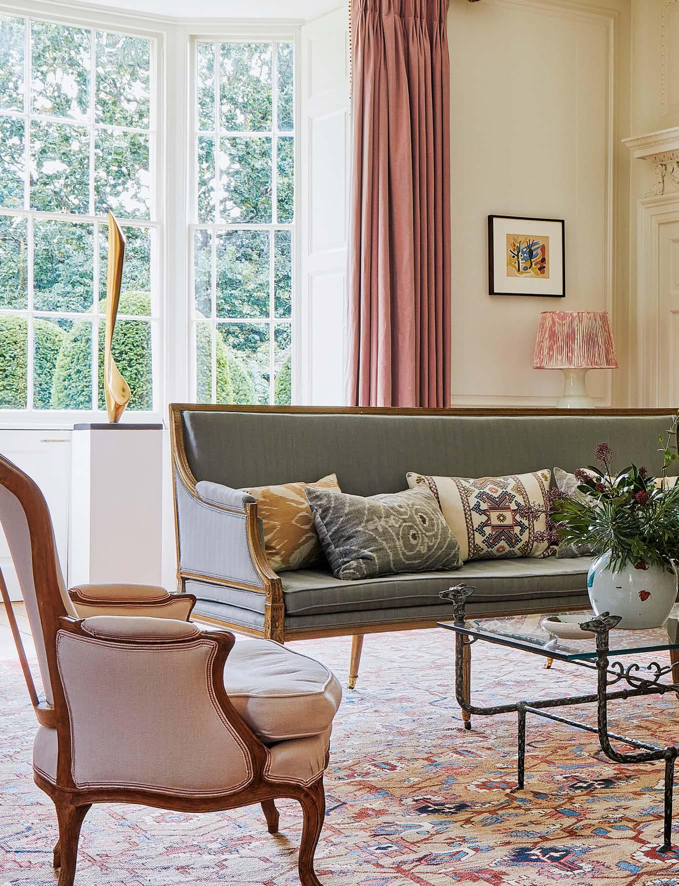
The nineteenth-century Persian Bakshaish carpet from Farnham Antique Carpets was the starting point for the scheme in the drawing room. The Fox forged-iron coffee table is from Richard Taylor Designs and the antique French sofa from Bonhams auction house has been re-covered in Old Flax Lagoon from Soane Britain.


Restoration MASTERCLASS The award-winning restoration of a splendid Georgian country house hidden in the Somerset countryside has been a labour of love for designer Sophie Hale FEATURE & STYLING CLAIR WAYMAN PHOTOGRAPHY NATALIE DINHAM STYLING ASSISTANCE FIONA DE LYS

THE ENGLISH HOME 27


In the drawing room, the sofa, covered in Old Flax Watermelon from Soane Britain, ties in with the Hellebore Linen Taffeta curtain fabric from Lewis & Wood. The walls are painted in Portland Stone Pale from Little Greene. Looking through into the sitting room, the Benaki curtain fabric, also from Lewis & Wood, highlights the warm tones in the Georgian walnut tallboy.

28 THE ENGLISH HOME

THE ENGLISH HOME 28


‘Ptolemy was like a detective, unearthing clues which enabled him to open up spaces and return rooms back to their authentic, original states’

L

ife, at times, has a funny way of diverting us off course in unexpected ways. When designer Sophie Hale and her husband had to change their travel plans due to the great Icelandic volcanic ash cloud of 2010, little did they know this would be the catalyst for a bigger adventure. Rather than going on a much-anticipated trip to Istanbul, the couple found themselves holidaying in Cornwall. As luck would have it, this last-minute change meant they were able to make a detour on their way home to view a country house for sale deep in the Somerset countryside. “If we’d gone to Istanbul, I’m sure we would have missed out because there were so many people interested in the house,” Sophie explains. “There were about five of us bidding and, after a nerve-wracking few days, we managed to pip the others to the post.”

The property in question is a Grade I listed country house, set in 70 acres of land and surrounded by picturesque meadows and woodland. The elegantly symmetrical eighteenth-century east wing looks out onto unspoilt views of a lake, mature trees and gently sloping lawns, whilst the rambling Jacobean wing, dating back to the 1550s, is situated at the rear. The house looks serenely beautiful bathed in sunlight, but on the day that Sophie and her husband viewed it, it was not love at first sight. “The property was completely rundown – there was no central heating, and the interiors hadn’t been touched since the 1950s,” remembers Sophie. Despite this, she was won over by the Georgian features, including exquisite fireplaces, original panelling and sublime stucco work in the reception rooms and staircase hall.

ABOVE LEFT A striking 1930s-style French glass coffee table from Jamb sits on a rug from Robert Kime in the sitting room. The walls are painted in Cord by Farrow & Ball and the Knole sofa is an inherited piece. ABOVE RIGHT Handmade tiles from Ann Sacks enhance the Georgian arches in the kitchen. The original Blue Lias stone floor tiles add to the rustic feel.

THE ENGLISH HOME 29


ABOVE The plate hanging on the Jacobean panelled wall in the ante room is from Iznik Classics. An antique container from Fiona de Lys sits on a Regency satinwood table picked up at a Bonhams auction.

Once the true scale of the task began to sink in, the couple called upon highly respected architect Ptolemy Dean to help them restore the house sympathetically whilst modernising it to create a comfortable family home. Ptolemy, considered an authority on historic preservation, is the Surveyor of the Fabric of Westminster Abbey and took on the challenge with enthusiasm. He and the building contractor, R Moulding & Co of Salisbury, a long-established family firm, expert in repairing listed houses, were the perfect team to take on such painstaking work.

30 THE ENGLISH HOME

A huge, tented scaffolding structure covered the whole house for 18 months and every roof tile was removed, rotten beams and floor joists were repaired or replaced, and disintegrating wattle and daub ceilings were recreated using traditional techniques. Windows were taken out and repaired, unstable staircases restored, and layers of paint covering the stucco work carefully taken off to reveal the true delicacy of the designs. “It was terrifying when we had no roof,” says Sophie. “We would inspect the progress by walking along 


An eye-catching, custom made 10 light Verona Chandelier by Richard Taylor Designs is the focal point in the dining room and compliments the rich Rectory Red wall colour from Farrow & Ball. Previously owned by the Dukes of Devonshire, the eighteenth-century table was purchased at the Chatsworth Attic Sale auction. The chairs and table were restored by Savino del Prete.


The principal en-suite bathroom feels inviting with a double vanity in a warm stone from Landford Stone on a stand from Drummonds, a window seat in Avignon Stripe Red from Robert Kime and a Roman blind in Indian Flower from Michael S Smith at Jamb. The curvaceous Vintage 2 mirror is by Richard Taylor Designs.

32 THE ENGLISH HOME


‘Curtains and rugs are often my starting point, and the schemes evolve from there.’ the scaffolding platforms because most of the stairs had been taken out.” Precious artefacts from the house that previous owners had long forgotten were recycled and salvaged. Ptolemy found abandoned windows in the cellar, which were reimagined as overdoors to let light into dark spaces. Fragments of a Tudor window tracery were discovered in a barn and mounted onto an exterior wall by the kitchen, acting as a decorative detail. Huge brass and mahogany curtain poles found in the attic now have pride of place in the reception rooms. Beautiful Jacobean oak-stud partitions that had been hidden behind a wall for decades were discovered in one of the bedrooms.  ABOVE A palette of calm blues creates a restful feel in the principal bedroom. The headboard and valance have been made using Pineapple in Aqua & Oatmeal by The Peggy Angus Collection from Blithfield. The Iliad Aegean curtain fabric is from Lewis & Wood. LEFT The sofa and ottoman in the bedroom are from David Seyfrield. The mirror is a repurposed antique Ottoman wardrobe door from Turkey. THE ENGLISH HOME 33


ABOVE The mideighteenth-century east wing of the house, made of Carey stone, looks out over sloping lawns. The re-excavated lake, fed by a spring at the top of the hill, conceals a groundsource heat pump which provides an amount of sustainable heating for the house. LEFT A glorious painting of Charles I hangs in the staircase hall. The exquisite mid-eighteenthcentury stucco work has been carefully restored by R. Moulding & Co at mouldingthebuilder. co.uk and Ptolemy Dean Architects at ptolemydean.co.uk

34 THE ENGLISH HOME

The house being Grade I listed meant that little could be done without Historic England’s approval, and any changes Ptolemy wanted to make were closely scrutinised. “Ptolemy was like a detective, forensically unearthing clues that enabled him to open up spaces, return rooms to their authentic, original states and make sense of often muddled layouts,” says Sophie. When the couple first moved in, the area where the kitchen now is was divided into a hotch-potch of tiny rooms, including a larder and pantry. Ptolemy got permission to remove walls and create a big, practical kitchen where the original Georgian kitchen would have been located. The property has had very few owners over the centuries and has been well preserved. Records show that the original Tudor farmhouse was acquired by the Watt family in 1602 and they owned it for almost 150 years. Then it was passed through marriage to the Grant-Daltons who added the graceful east wing in the mid-eighteenth century. They sold the property in the 1920s and it remained a working farm up until 1950. When she bought the house, Sophie was given a treasured photo album full of pictures taken of the property in the 1880s. This proved invaluable as she was able to show these images to Historic England. “To save money on heating bills, the servants’ quarters in the attic had been closed up for over a century and the dormer windows removed. We were able to prove


that there had been windows in the roof because they could be seen in the nineteenth-century photograph of the exterior. This meant we were able to reinstate them and create a usable space in the attic again,” she explains. A fashion and interior designer, Sophie relished the opportunity to design the room schemes. She has a natural flair for combining colours and textiles, using fabrics from Blithfield, Robert Kime and Lewis & Wood. “I inherited a lot of antiques from my mother and re-covered some pieces to give them a new lease of life,” she explains. “I’ve mixed these with furniture from Jamb and Richard Taylor Designs, along with antique, inlaid Ottoman pieces collected from trips to Turkey. Curtains and rugs are often my starting point, and the schemes evolve organically from there.” Winning the Georgian Group award in 2015, the meticulous restoration of the couple’s country house took three and a half years, and Sophie could not be prouder of the end result. “I had no idea what I was getting myself into at the beginning, but I’ve learnt so much,” she says, “and now I want to take on more projects like this. Going back to the bare bones is what I love.” For the moment, however, Sophie can enjoy pottering around the garden, gathering vegetables and keeping an eye out for the wild deer who have a habit of eating her precious roses. n

ABOVE The panelled guest bedroom has been painted in Pink Ground from Farrow & Ball. The vintage quilt is from Fiona de Lys and the prints of Greek goddesses are inherited. RIGHT Wild Iris linen curtain fabric from Robert Kime and a star lantern from Charles Edwards adds to the glamorous feel in this bathroom. The chair is covered in Jasper Fabrics Dutch Stripe in Indigo from Michael S Smith, available through Jamb. To see more of Sophie’s design work visit sophiehale.com

THE ENGLISH HOME 35


The trio of copper Deck pendants from Limehouse Lighting add a vintage touch to the bespoke Shaker-style kitchen by Plain English and echo the warm tones of the Osmo-oiled European Oak worktop. The pretty Indian Flower blind fabric from Michael S Smith brings softness and charm to the neutral scheme. The cabinetry is painted in Mash by Plain English whilst the boot room beyond is painted in Farrow & Ball’s Plummett.

36 THE ENGLISH HOME


Coastal CONNECTION A sympathetic extension has doubled the size of a charming eighteenth-century seaside cottage, creating an authentic space with an evolved feel FEATURE CLAIR WAYMAN PHOTOGRAPHY DAN DUCHARS


‘The idea was to preserve the character of the building and maintain a sense that nothing had changed, particularly outside’

F

or many years, London-based couple Charlie and Louise Fraser had dreamt about buying a holiday cottage by the sea, somewhere they could go to escape city life and enjoy with their three young children. Charlie was naturally drawn to the East Anglian coast, where he had fond memories of childhood holidays and in 2016 the couple found their dream bolthole, a late-eighteenthcentury cottage in a sleepy seaside village, in the area they both loved. “The village is very low-key, genteel and quiet, with an old-school charm,” says Charlie. “We can walk to the beach, go sailing and have lots of bracing swims in the North Sea. The children love to go crabbing and play on the village green. There’s a little store that  sells trinkets, and there’s a sweet shop and a cafe. It’s

38 THE ENGLISH HOME

ABOVE Edward Bulmer Natural Paint’s Fine Grey creates a muted backdrop on the sitting room walls. The bespoke sofa is covered in Claremont’s Serge Antique. The Rupoli fire surround is from Jamb and the antique kilim is from Rug Store Online. RIGHT The front door is painted in Oval Room Blue by Farrow & Ball.


Rustic beams in the new extension create a sense that this part of the house has always been there. Interior designer Anna Haines sourced the 1890s Arts and Crafts oval oak dining table from Harrison Antique Furniture. The chairs are from Plain English and painted in Pretty Pickle.

THE ENGLISH HOME 39


Elements that have an aged quality, such as the reclaimed tiles laid in a herringbone pattern on the hall floor, feel like they’ve always been there ABOVE LEFT Antique terracotta tiles from Artisans of Devizes bring an aged feel to the newly created hallway. The elegant bespoke staircase, with continuous oval limed oak handrails, was made by NJS Joinery. ABOVE RIGHT The antique Persian rug in the children’s bedroom is from London House Rugs and the blankets are Melin Trewynt.

absolutely charming, with a great community and we embrace it all.” Built in 1790, the house has a quintessentially English facade with a pretty latticework portico. Previously owned by the same family for over 40 years, it had been a much-loved home, but was tired and dated when Charlie and Louise took it on. For the first 18 months they and their children spent lots of fun-filled holidays and long weekends in it. “The cottage was habitable – it had an old 1960s bathroom and an Aga that just about worked,” says Charlie. “We enjoyed going there and mucking in with the kids, but the space was tiny, and it was inevitable that work needed to be done to the house.” In due course, Charlie and Louise came up with an ambitious plan to almost double the size of the

40 THE ENGLISH HOME

property whilst keeping the footprint virtually the same. “The cottage had a lot of random outbuildings and conservatories attached to the back,” explains Charlie. “Some were so dilapidated they had trees growing through them. Once they were knocked down, we had a blank canvas where we were able to start from scratch and create the new extension.” To bring their vision to life, the couple enlisted the help of a local architects Mullins Dowse, building contractors Mixbrow and interior designer Anna Haines. After planning was granted, work commenced in May 2018 and the new extension began to take shape, seamlessly blending with the original front half of the property. “The idea was to preserve the character of the building and maintain a sense that nothing had actually changed, particularly from the


outside,” says Charlie. “We were adding quite a sizable extension to the back of the existing house, but it was important that it still felt like one flowing space inside.” A traditional bespoke Plain English kitchen and boot room fill the new ground floor extension, along with a dining area that opens on to the garden, and a tranquil master suite above. The original part of the house was reconfigured with new bedrooms and bathrooms added. To connect the old with the new, a light-filled double-height hallway was designed, with a graceful staircase creating an uplifting, spacious feel. Charlie worked closely with Anna to ensure that they introduced elements that had an aged quality, such as the reclaimed terracotta tiles, laid in a herringbone pattern on the hall floor, which feel like they have always been there. Rustic beams were also incorporated into the new kitchen and dining extension, to make the space feel like it could be part of the original building. Subtle Shaker-style panelling and cabinetry have been introduced to blend in with  the simple, period features.

ABOVE Designed by Adam Calkin, the striking Jasper Peony wallpaper by Lewis & Wood was the starting point for the master bedroom scheme. A headboard, made by Adam Richardson Upholstery and covered in Tangiers Stripe from Susan Deliss, has been teamed with a kantha quilt from Rebecca’s Aix Home. RIGHT A Georgian mahogany chest sits next to a bobbin chair that Anna sourced from an antiques fair.

THE ENGLISH HOME 41


ABOVE A London bath from Burlington sits on Fired Earth’s Bold Trellis Lattice tiles, which contrast with the delicate Lewis & Wood Diamond Dot blind fabric. Shell prints from Lorfords hang on a wall painted in Edward Bulmer Natural Paint’s Sky Blue. To see more of Anna Haines’ work visit annahaines.co.uk ABOVE RIGHT The rear two-storey extension blends seamlessly with the original cottage.

Having worked with Charlie and Louise on their London house, Anna had a clear understanding of their style. “They wanted the interiors to feel muted and calm,” she says. “Their style is classic, pared back and unfussy, so it was about making sure the cottage reflected that.” The emphasis was also on creating a restful retreat where the family could come and recharge. “They do have quite hectic lives in London and this cottage cossets and comforts them, and especially did so during lockdown, when they lived in it full time,” says Anna. “Our aim was to make the space feel comfortable, understated and welcoming, but, at the same time, not overly prescriptive as a seaside cottage.” A blue-and-white bathroom and nauticalstyle pendants in the kitchen lend a subtle nod to the seaside surroundings, but the overall tone is of a cosy home from home. Anna’s eye for detail has resulted in layered, wellconsidered interiors. “A mix of antique and bespoke pieces have been combined with rich textiles in soft tones to create a sense of informality,” she says.

42 THE ENGLISH HOME

“When I stepped away from the project, I wanted it to feel like the house had been curated over time.” Rather than looking at each room independently, Anna looked at the whole space and made sure the journey through the house felt cohesive. “I’ve used colour to create a natural conversation between the rooms, choosing an edited palette of subdued corals, dove greys and gentle blues throughout the house to create a seamless flow,” she explains. The result of Anna’s design input is an inviting, liveable home that maintains the integrity of the original building. “We wanted things to be well made, well thought through and to last a lifetime,” she says. It is clear to see that the cottage means so much to Charlie and Louise, and they love to invite friends and family to stay over the summer. “The cottage is big enough to accommodate family life now,” says Charlie. “Living there full-time in the future is also a definite possibility. The idea started to take shape when we spent six months in it over lockdown – during this time we felt so happy and relaxed, it was wonderful to escape to such a special place.” n


Finders KEEPERS A centuries-old house in the historic town of Rye in East Sussex provides a charming and characterful space for an antique dealer’s most treasured pieces FEATURE SARA EMSLIE PHOTOGRAPHY RACHEL WHITING

44 THE ENGLISH HOME


OPPOSITE PAGE The solid wooden structure of the house is clearly evident from the exposed beams in the sitting room. The layout of the house did not need altering at all. Instead Jackie focused on the decor, creating a calm white backdrop for some of her favourite statement antique pieces and paintings.

THIS PAGE The shelves in the kitchen house the eclectic collection of antique and vintage signage, ceramics and earthenware Jackie has gathered over the years, including the ‘Mrs Puckhaber 1876’ chalice (towards the left, lower shelf) which provided the inspiration for the name of her antiques business.

THE ENGLISH HOME 45


The dining room has a more traditional look than the rest of the interior. A latenineteenth century French dining table is accompanied by a collection of different styles of nineteenthcentury Swedish chairs.

46 THE ENGLISH HOME


Beautiful, rare and interesting pieces are offset against a neutral palette. ‘Everything has been sourced from my love of antiques’

“T

his house really suits my lifestyle. It has a great feeling of space and light,” explains Jackie Harris of the fourteenth-century property in the historic Cinque Port town of Rye, East Sussex, she shares with partner Allan, and youngest daughter Amelia, when she’s home from university. Nestled in a conservation area amidst the town’s labyrinth of winding cobbled streets, passageways and half-timbered medieval buildings, Jackie’s townhouse is overflowing with original features. Wonderfully wonky walls, superb centuries-old wide-plank floorboards, exposed low beams and areas of patchworked bricks all point to a house that has been lived in and loved over its time and which, despite its low ceilings, really is flooded with natural light. “That is the reason I have gone for a more minimal style with this house than previous properties,” she says.

Living in nearby New Romney and wanting to move, ABOVE LEFT Jackie on her patio, Jackie knew that Rye had everything to offer someone surrounded by lush like her who is passionate about old buildings, greenery. The garden antiques and curiosities. “The historic charm of the table and chairs are house and the history of Rye all had a huge influence French turn-of-the on my wanting to live here,” she explains. “Not century pieces. Visit puckhaberdecorative needing to change the layout in any way, apart from antiques.com to find some cosmetic work to the kitchen and bathroom, out more about was a major draw, too, as I work full time in as an Jackie’s antiques. antiques dealer.” ABOVE RIGHT The interior of Jackie’s home is a testament to her The kitchen has a rustic-industrial feel 30 years of experience as a professional antiques collector, with the beautiful, rare and interesting pieces with wood, brick and steel finishes and was she has sourced sympathetically offset against a already in situ when considered palette of neutral tones. “Everything in my Jackie moved in. home has been sourced from my love of antiques,” she Similar floor tiles are available from Floors explains. She runs through the origins of some of the of Stone. pieces in the sitting room: a mid-twentieth century industrial floor lamp sits alongside nineteenth-century  THE ENGLISH HOME 47


landscape and portrait paintings, an early nineteenthcentury Windsor comb back chair and a pair of nineteenth-century tea caddies with painted numbers. Jackie has chosen the sophisticated off-white tones of Strong White in the sitting room and Old White in the dining room, both by Farrow & Ball, to create a clean and minimal studio-like space. “I have decorated with what I call a continuation of the Puckhaber style,” she explains, a reference to the antiques business she runs in partnership with her son Martyn. Specialising in country primitive and Swedish and French decorative antiques from the eighteenth, nineteenth and twentieth centuries, Jackie’s son heads up the original London Puckhaber showroom whilst she runs the second space in Rye. “It really has proved to be the perfect spot for showcasing our style,” she says. The exposed beams, whitewashed walls and stripped wooden floors of Puckhaber No1 The High Street have clearly influenced the gallery-style interiors at home. Indeed, throughout the entire house are

48 THE ENGLISH HOME


The sitting room is light and bright with views over the garden. “Even my sofas are antique. I have had them reupholstered with fabrics from Merchant & Mills, who are based in Rye,” says Jackie. The cushions are made out of vintage Hungarian grain sacks.

‘The portrait of the young lady that hangs above the chair in the living room is nineteenth-century English and quite captivating’ paintings of all styles and eras: “The lovely portrait of the young lady that hangs above the wooden chair in the living room, my son Martyn found in the UK on his buying travels. It is nineteenth-century English and quite captivating.” Not only are there paintings on the walls, but also propped up casually on cupboards, sideboards and the floor, leaning rather than hanging. “I’m a great fan of propping pictures rather than hanging – they are easy to move around which makes for a great way of refreshing a space and prevents a room looking static and cluttered,” says Jackie. Upstairs, too, in Jackie’s bedroom, strategically placed on the wall that greets the eye on entering, is a sublime French unframed oil of a nun that dates back to the mid-nineteenth century. Softly shrouded in

daylight from the nearby window and set against ABOVE Above a nineteenth-century moody grey walls, it adopts an almost ghost-like feel Windsor comb-back and imbues the room with a calm, serene feel, nicely chair and wooden complemented by Jackie’s fine antiques, of course. table is a delightful “This is my favourite room in the house and is full nineteenth-century of really special pieces,” she says. “The bedstead is English painting of a young lady Jackie’s English nineteenth-century, with its original paint son Martyn found in finish still intact. The mirror is eighteenth-century the UK on one of his French from a chateau, and the unusual inlaid buying trips. continental concave commode dates back to the early FAR LEFT Many of nineteenth century. I also have a huge collection of Jackie’s quirky finds are from local antique lovely antique French linen sheets.” fairs such as Ardingly Jackie and son Martyn source a great deal of their and Kempton Park. stock mainly in France and Belgium, and some of the very special pieces never get much further than Jackie’s  THE ENGLISH HOME 49


Jackie’s bedroom walls are painted with Manor House Gray by Farrow & Ball. The eighteenth-century French mirror originally hung in a chateau. Jackie recommends the weekly markets in Paris such as Marché aux Puces de Saint-Ouen for similar beautiful antique pieces.


The unusual inlaid French antique concave commode in Jackie’s bedroom dates from the early nineteenth century.

‘Only ever buy antiques you love because they don’t always go up in value. I have found some amazing, quirky things over the years’ front door, such as the late nineteenth-century French dining table and the lions in the inglenook fireplace. The garden table and chairs outside are also French antiques, hunted out by Jackie and Martyn’s keen magpie eyes and still loved by Jackie as much as the day she bought them. “Only ever buy things you love because they don’t always go up in value,” she advises. “Antique buying, believe it or not, is a fashion-led industry as well, so don’t just buy for investment sake. Wherever I look at home there are wonderful things accumulated from being an antique dealer for over 30 years and I have found some amazing, quirky things over the years.” Which brings us nicely to the well-worn humble china chalice tucked in amongst an eclectic mix of antique and vintage jugs, mugs and bowls on the kitchen shelves, bearing the legend ‘Mrs Puckhaber 1876’. “This simple ceramic chalice is one of my favourites and was picked up many years ago,” Jackie explains. “It has been given a new lease of life now as it inspired the name of our business.” It sits comfortably in its new home alongside Jackie’s beautifully curated collection of antique pieces. Mrs Puckhaber, whoever she was, would most likely have approved. n

ABOVE RIGHT A traditional wooden plank door, wide floorboards and beams all add character to the main bedroom. LEFT The bathroom had already been updated with a contemporary-style bateau bath and freestanding bath tap when Jackie bought the house. For similar, try Victoria Plumbing. Jackie’s addition of a tiny, framed painting, an antique stool and a French nineteenthcentury decoy duck combines old and modern beautifully. The Berber-style bathmat is from Graham & Green.

THE ENGLISH HOME 51


52 THE ENGLISH HOME


Artist in

RESIDENCE A Georgian townhouse in Bath has kept its heritage intact with extraordinary architectural detailing and rich artistic credentials FEATURE HANNAH NEWTON PHOTOGRAPHY CLAIRE WORTHY

ABOVE Artist Jean Melville Rose at work in her beloved studio, surrounded by her work. The property formerly housed Bath School of Art, which Jean attended in her youth. LEFT The library walls are painted a green created by Jean’s late husband, the artist Jasper Rose, who called the colour Tender Green Olive. A seventeenth-century wooden sculpture from Orléans in France stands on the table.

THE ENGLISH HOME 53


ABOVE The cabinet to the right in the dining room is French eighteenth-century, whilst the shelves display a variety of Dutch, English and American antique ceramics.

‘As soon as I came here I was happy. I adore the park and I love walking into Bath, along Great Pulteney Street’ ABOVE The rich terracotta colour on the walls in the kitchen was inspired by the deep reds used by JMW Turner. For a similar paint, try Sang de Boeuf by Edward Bulmer Natural Paint. The painting of the chef is by Jean’s elder son William Balthazar Rose.

H

istory, at times, has a habit of repeating itself, as British artist Jean Melville Rose discovered when she found herself back at the door of her student art studios almost 50 years after she had left. The beautiful Georgian property in the heart of Bath, that she had come to view with her late husband Jasper, used to house Bath School of Art. Opened in 1942 by Sir Kenneth Clark, then director of the National Gallery, Jean, now 93, was an art student there in the 1940s. Jean and her late husband Jasper, who sadly died in 2019, had been living in California for 25 years, where Jasper, a Cambridge Fellow, was a founding faculty member and Professor Emeritus of Art and History at the University of California, Santa Cruz. Returning to

54 THE ENGLISH HOME

England in the mid-1980s, the couple relocated to the South West, living in the countryside for a few years before deciding they wanted to live in a city and moving to Bath. Looking for a property, in 1998, Jean and Jasper found themselves viewing her alma mater and consequently buying it. The School of Art was relocated in the 1990s and the building was put up for sale. Fortunately, the city council rejected a proposal to convert the building into a warren of flats and the four-storey townhouse was largely intact. Today, Jean’s home has a genteel, unmodernised feel, with original ornamental cornicing, ceiling roses, sash windows, decorated fireplaces, Georgian columns  and a grand entrance hall emitting a gentle humility.


Velvet cushions from Oka decorate the antique sofa in the drawing room. A painting by William Balthazar Rose is above the radiator.

An elegant yellow hue is used in the drawing room, based on a Giorgio Morandi painting Jean’s husband Jasper loved. For similar, try Naples Yellow by Edward Bulmer Natural Paint. Original elm floorboards support the impressive Georgian columns. ABOVE The striking Ornate cornicing crowns of Africa, thesculpture walls in this beautiful made with paperback room. Jasper’s box of oil books, is by Kerion the paints can be seen Muller and the table alongside several blue-and-white antique ceramic bowls. plates are by Michael Chandler, both South African artists. The Cross Back dining chairs, from the Justin Van Breda collection, are covered in William Yeoward fabric.

THE ENGLISH HOME 55


RIGHT AND BELOW RIGHTJean’s late husband, Jasper, as well as being a well-known artist, was passionate about collecting books. Having started his collection in 1945, today the shelves in the library are full to bursting, and include early editions of books by Charles Darwin, Charles Dickens and William Thackeray, Venetian histories and a first English edition of one of Machiavelli’s works. Ceramic twentieth-century pots from Afghanistan, bought at Bath’s Walcot Antique & Flea Market, sit on top of the library shelves, and a rare, early eighteenth-century Flemish tapestry, bought near Versailles in 1976, hangs above them at the back.

‘It was all very primitive when we first arrived, and we spent a lot of time in the kitchen. There was a nest of baby pigeons in the bathroom’ ABOVE The grand proportions of this elegant townhouse allow Jean to display large pieces of work and collections. This seventeenth-century Dutch tapestry was bought at auction in San Francisco along with the eighteenthcentury Dutch oak bench, softened with an array of cushions from Oka.

“I felt immediately at home in this house. Normally it takes me time,” explains Jean. “But as soon as I came here, I was happy. I adore the park nearby and I love walking into Bath along Great Pulteney Street. It was all very primitive when we first arrived, and we spent a lot of time in the kitchen. There was a nest of baby pigeons in the bathroom, and some of the windows were stuck open and seagulls flew in.” Built in 1808 by John Pinch the Elder, the nineteenth-century palace-fronted development in which Jean’s beautiful house sits has a distinguished history. Brass plaques on a couple of the houses mark the occasions Queen Charlotte and William IV stayed in 1817, and Jane Austen lived in a different part of the street from 1801–1805. According to Historic England, the design of every building on the road is thoughtfully detailed; each three-bay house

56 THE ENGLISH HOME

is set slightly lower than its northerly neighbour to produce an elegantly descending rhythm. Sydney Gardens, one of England’s best remaining pleasure gardens is a short stroll away. Jean and Jasper’s first decision upon moving in was to keep the building as true to its original architectural roots as possible and leave the layout largely unaltered. Antiques and art were, of course, the foundation of their interiors. Both long-established professional working artists, their paintings as well as artworks by others are a prominent feature upon stepping into the house, where paintings hang on either side of the wide entrance hall, and the theme continues throughout. When it came to decorating the house, which was coated in white paint throughout, Jean and Jasper gradually returned it to its Georgian origins, choosing


vibrant colours, usually mixed by Jasper, that might have been used during that period. The kitchen, painted in a rich terracotta hue, has been kept deliberately simple, whilst the dining area alongside it is furnished with antique furniture and ceramics collected by the couple over the years. For both Jasper and Jean, pursuing their artistic careers was vastly more important than anything else. Jean’s studio is in a large room off the entrance hall and is liberally jammed with reams of paintings. It is flooded with daylight from the large sash windows, which was a prerequisite of Jean’s when the couple first arrived. She continues to be a prolific painter, spending the majority of her day in front of an easel, or exploring the city, capturing chronicles of daily life and carefully sketching them in her artbook. The drawing room on the first floor was once Jasper’s studio and its grand proportions lend themselves perfectly to hang large paintings, as well as easels and all the equipment that goes with creating oil paintings. This infinitely elegant Palladian room has  three generous floor-to-ceiling sash windows, lofty

THE ENGLISH HOME 57


Jean’s entire identity is intertwined with this notable building, through each painting on the wall and her lifetime as an artist ABOVE The main bedroom walls are covered in a soft pink paint mixed by Jasper, who named it Victorian Purple Moss. A painting by Elizabeth Velacott hangs between the windows. A quilted throw and blanket from Toast cover the bed. BELOW A rich ochre paint colour decorates the walls in the bathroom. For similar, try Trumpington by Edward Bulmer Natural Paint. A painting by Jean’s older son William Balthazar Rose hangs above the marble fireplace. Visit amongthepines. gallery to see more of his work.

58 THE ENGLISH HOME

ceilings and original elm floorboards with the glossy patina of age, all which conspire to deliver a sophistication and grandeur almost unseen outside of a royal palace or museum. Avid antique collectors, the couple purchased a lot of furniture when they lived in California. “We love old English furniture and Jasper also collected books, particularly first editions,” Jean explains. Their library is testimony to Jasper’s love of antique books; the walls are lined with shelving, built by a friend when they first moved in, and filled entirely with rare, first editions and antiquarian books. Jean and Jasper’s two sons, William Balthazar Rose and Inigo Rose, are also internationally recognised artists and are both often found working on a painting in one of the many studios still found in the basement. These rooms have remained largely untouched since being part of Bath School of Art, whose original kiln can still be found in the garden. For Jean, now 93 years old, her entire identity is intertwined with this notable building, through each painting on the wall, her carefully arranged easel in the studio, her sketchbook filled with drawings from the streets of Bath and her lifetime journey as an artist, which began right here in this building more than 75 years ago. n


One of the original Bath School of Art studios in the basement, still used occasionally by Jean’s artist sons William and Inigo. These rooms would originally have been the kitchen, scullery and servants’ dining areas. The paintings on the walls are all by Jean.

THE ENGLISH HOME 59


HANDMADE BY HARTLEY

THE VICTORIAN LODGE New York, USA

Discover the secret of Hartley Botanic by calling 781 933 1993 or visit www.hartley-botanic.com

HANDMADE IN ENGLAND, CHERISHED IN AMERICA The only aluminium Glasshouses and Greenhouses endorsed by the RHS ® The Royal Horticultural Society. The Royal Horticultural Society, and its logo, are trade marks of The Royal Horticultural Society (Registered Charity No 222879/SC038262) and used under licence from RHS Enterprises Limited.


STYLE INSPIRATION Our special section dedicated to interior design and decorating begins here

ECLECTIC VISION

FEATURE KATY MCLEAN

This calm, inviting dining room exemplifies interiors company Oka’s trademark style of combining classic with a touch of global influence for a quintessentially English eclectic feel. The indulgent double padded dining chairs are perfect for lingering over lunches and suppers with friends and family. We are also delighted that this English brand is now available for our readers across the pond, with stores recently opened in Dallas and Houston and another opening in Connecticut this summer. Camborne dining table, £4,295; Vasa Linen dining chair, £595, and all other accessories, Oka

THE ENGLISH HOME 61


This season’s style

Discover the latest fabrics and wallpapers to refresh, reimagine and rejuvenate interiors

T

he past year has seen plenty of opportunity, or at least a desire, to redecorate and update interiors, making our homes as special as they can be. The latest designs are sure to inspire those who have not yet refreshed tired interiors, and may even tempt those who have to add further designs into the mix. Many of the new collections draw inspiration from nature, with botanical designs aplenty, albeit in varying guises – from mellow,

A selection of fabrics from Sarah Hardaker’s pretty new Brocante collection - see page 87 for more information.

painterly depictions to deep, rich rural motifs. There are global influences, too, igniting a desire to explore further afield once more and incorporate international flavours into our homes – from toiles to chinoiserie and Persian motifs. There is a wonderful use of colour across the collections. From bold brights and pretty pastel tones to sumptuous, comforting neutrals in cosseting textures and soothing greens and golden yellows, there is a palette to suit all tastes.


NEW COLLECTIONS

1

3

COUNTRY RICHES

Deep hues, rural motifs and a touch of the eclectic combine for a modern twist on tradition 2 5

4

FERMOIE Fermoie’s new Carskiey collection focuses on distinctly striped linen in the brand’s signature bold yet gently softened colours. 1 Sofa and walls, Carskiey linen, £140 a metre, Fermoie HODSOLL MCKENZIE The 1851 collection pays homage to The Great Exhibition held that year. Here, Velocipedia depicts mainly female cyclists based on nineteenth-century paintings – a show of feminisim at the time. The collection also features innovative semi-sheers (see p67). 2 Walls, Velocipedia fabric, £101 a metre, and all other fabrics, Hodsoll McKenzie at Zimmer + Rohde JANE CHURCHILL Full of rich colour in prints and interesting weaves, the latest collection sets a cosy seasonal mood. 3 Kelso, £75 a metre; 6 Casidy, £59 a metre, both Jane Churchill at Colefax and Fowler JULIET TRAVERS Full of artistic detail, these designs are a sweet way to add country flavour to interiors. The new ranges feature several earthy, deep colours. 4 Curtain, Stargaze, £115 a metre; wallpaper, Free Fall, £120 a roll, both Juliet Travers INCHYRA The hero piece of the new collection is Sutton, a large-scale floral and bird design inspired by an eighteenth-century French block-print. 5 Curtain and cushion in Sutton, £148 a metre, Inchyra

7

6

COLEFAX AND FOWLER Inspired by a nineteenth-century, possibly French design, this enticing print is a standout piece from the new collection. 7 Fabric, Tree Poppy, £105 a metre, Colefax and Fowler

THE ENGLISH HOME 63


1

2

SOFT & MELLOW Leafy motifs and a gentle palette of greens, golds and greys create an inviting mood

2

3

5

SOANE BRITAIN Four of the new designs are inspired by renowned textile collector Karun Thakar’s personal eighteenthcentury Indian documents. This design, originated from a design for a chintz sarong. 1 Coromandel Tulip, £390 a metre, Soane Britain

3

NINA CAMPBELL Campbell often takes inspiration from global motifs, tempering them in beautiful colours for an English palette. Maracanda features a diverse range of patterns in both bolder and soft, gentle tones. 2 Anatolia, £85 a metre, Nina Campbell at Osborne & Little SCALAMANDRÉ The Folklore collection has an eclectic blend of florals, stripes and whimsical designs. This charming embroidery is based on a cross-stitch sampler. 3 Imogen Embroidery, £385 a metre, Scalamandré at Turnell & Gigon BLENDWORTH Following on from the successful Solstice fabric collection, Blendworth has translated key designs from it into wallpapers. Illustrative depictions of botanicals, woodland scenes and linear textures are combined with artisan printing techniques. 4 Sundance; 9 Thicket; 10 The Willows; 11 Fable, all £59 a roll, Blendworth DESIGNERS GUILD Along with printed velvets (see p14) the new offerings include scenic panel wallpapers. From delicate chinoiserie-style blossoms to the large-scale pastoral scene (right), the mural-like wallcoverings offer exciting character to schemes. 5 Bandipur grasscloth wallpaper panel, £690 a roll (check requirements for creating a sequence of matching drops), Designers Guild LINWOOD Capturing quintessential flowers and foliage, The English Garden collection ranges from blowsy chintzes to this more restrained oakleaf stripe. See p14 for pretty floral print Gertrude. 6 Hester, £64.90 a metre, Linwood

64 THE ENGLISH HOME

4

6


NEW COLLECTIONS

7

8

9

10

ZOFFANY The Kensington Walk collection comprises three distinct style stories: Artist’s House, a nod to the artistic residents of Kensington; Cope’s Trail (above), references Cope Castle’s Jacobean orchard: and Eastern Palace (see p68). 7 Cope’s Trail, £149 a roll, Zoffany DE GOURNAY In collaboration with international interior designer Michael S Smith, de Gournay is releasing a collection of diverse botanical designs. Different creatives have been tasked with showcasing the designs with their own works. Here we highlight two favourites. 8 Hand-painted Nordic Garden chinoiserie wallpaper, from £942 a panel (915mm width), created with Michael S Smith, shown in the Cutter Brooks ‘Shop Next Door’ pop-up in Stow-on-theWold by Amanda Brooks, de Gournay 12 Hand-painted Botanical Studies wallpaper, from £625 a 70cm Botanical section, created with Michael S Smith, shown in an interior designed by Edward Hurst, de Gournay

11

12 THE ENGLISH HOME 65


2

SUMPTUOUS TEXTURES

1

3

Every scheme needs plains and semi-plains to add contrast, and luxurious tactile comfort, in versatile neutrals FOX LINTON Always to be relied upon for sumptuous weaves, Fox Linton’s new Malmesbury fabric has a subtle two-tone geometric design that softly catches the light. 1 Malmesbury, £174 a metre, Fox Linton OSBORNE & LITTLE Much of the Empyrea collection features bold, tropical designs, but this exquisite aplliqué design caught our eye for its softer use of colour and layering of textiles and crewel-work stitches. 2 Amphora, £165 a metre, Osborne & Little MARVIC TEXTILES Combining textural fabrics such as chenille and bouclé in cotton, linen and wool with a tempting palette of natural colours, Metro Textures offers an ensemble of patterned, tactile fabrics. 3 Sofa, Vincino, £105 a metre; cushions (from left): Gavia, £80 a metre; Vincino, £105 a metre; Scalino, £150 a metre; throws in Amaro and Amiata, both £95 a metre, all Marvic Textiles KIRKBY DESIGN Known for durable, quality fabrics, Kirkby is releasing five new collections, including useful plains in rich, warming neutrals and abstract weaves, again in a palette of reddish browns, stones and buffs. 4 Motion collection, £95 a metre; 8 Burst collection (from left): Easel, Buff, £140 a metre; Blanket, Cream, £190 a metre; Easel, Powder and Brick, both £140 a metre; Studio, Sorbet, £80 a metre, all Kirkby Design

4

5

CLARKE & CLARKE The Dimora collection is a range of inspired textural fabrics, with distressed velvets and metallic embroideries as standout pieces. 5 Ricamo, £46 a metre; 10 Sontuoso, £42 a metre; 11 Tessuto, £55 a metre, all Clarke & Clarke FABRICUT As it suggests, the Luxe collection is all about opulent materials, including luscious velvets, beaded trims and plush faux furs. Clean geometrics and textured semi-plains form part of the multi-faceted collection. 6 Wazn, £158 a metre, Fabricut at Christian Lee

66 THE ENGLISH HOME

6


NEW COLLECTIONS

7

HODSOLL MCKENZIE In addition to the Velocipida design (p63), the 1851 collection features an alluring range of textured plains and semi-sheers. Playing with different yarns and techniques to create unexpected detail, the collection is tactile, versatile and luxurious. 7 Fabrics shown: Kohinoor, Millais, Winslow, Barbizon, Paxton and Holman Hunt, from £64 to £156 a metre, Hodsoll McKenzie at Zimmer + Rohde ROMO The Jacunda indoor/outdoor trimming collection is Romo’s first passementerie launch since 2015. Braids, fringes, tapes and cords allow for enlivening plains with style and flair. 9 Bench in Suva, Indium, £72 a metre with Jacuba Braid, Henna, £39.50 a metre, and all other fabrics and trims, Romo

8

9

10

11

THE ENGLISH HOME 67


1

NEW COLLECTIONS

3

1

2

4

5

PRETTY DISTINCTIVE Pastel colours combine with softly global patterns, from toiles to Indian prints. NICHOLA TAYLORSON These surface-printed papers have a gentle raised edge inspired by Indian mud-printing techniques. 1 Taraka, pink dusk, £150 a roll; 8 Taraka and Inca in a selection of colours, £150 a roll, Nichola Taylorson

7

MEG MORTON Inspired by family walks in Dorest, The River Walk collection of printed linens has beautiful depictions of flora and fauna. This toile-like design of a heron is available in two scales. 2 Edward Heron, £62 a metre, Meg Morton SARAH HARDAKER A romantic French influence is evident in the Brocante collection, a pretty ensemble of florals, trellis patterns, stripes and cartouches inspired by Hardaker’s family travels. 3 Curtain, Florence Grande; headboard, Arlette; Eiderdown, Delfine, all £68 a metre; cushions from £49 each, all Sarah Hardaker

6

ZOFFANY Part of the Kensington Walk collection (see p65), Eastern Palace has an enchanting, hand-drawn depiction of a journey across Japan as a hero design on wallpaper. Distinctive fabrics in the collection include a sumptuous embroidered linen with flowers and trees in a chequerboard pattern. 4 Nirvani embroidery, £159, a metre; 7 Eastern Palace, £149, a roll, both Zoffany CHARLOTTE GAISFORD The Stitchery collection is inspired by ancient Eastern embroideries and folk art which Gaisford has reimagined in a printed form. 5 Knot in Blizzard; 6 Emma in Blizzard, both from £64 a metre, Charlotte Gaisford ■

68 THE ENGLISH HOME

8


GREAT SAVINGS WHEN YOU SUBSCRIBE SAVE H IS ENGL 27% OFF THE MEY EDITION HO SHOP COUNTR ENGLISH PRICE HOME A MAG

The

h style Celebrating the essence of Englis

The

rating for life today

STYLE SECRETS

of country homes & interiors

as speci

a

ICAL CHRISTMA S

Set the scene for

As a subscriber you will enjoy these benefits…

LIVE THE DREAM Enjoy the best of a quintessentially rural lifestyle

SIMPLY ELEGANT ENTERTAINING Sparkling ideas with minimum effo rt

a season to rem

ember

PERFECTLY PRE PAR Create comfort ED & joy in every room

ENGLISH E’S FINEST HOBRM ITAIN

NS VIsSIO ROMANTICic home from 16th to 18th century T he

Inside five charming histor

PERSONAL TOU CH Handmade presen ts & homemade dec orations

October 2021

29/06/2021 10:48

TEH US Oct 21 Cover FinalSSJ.indd

around England’s most enchanting homes, from townhouses to country houses.

+ Insider tips and advice from

1

Celebrating

+ Discover the very best of British design, style and craftsmanship.

English style the essence of

Festive spiritCelebrating the best of British design & cr Five beautiful hom es sumptu

FREE delivery to TEH US DEC 21

Cover finals.indd

your home

ip

aftsmansh

ously decorated

December 2021

1

ROYAL L APPROVA&

27/08/2021 17:08

L NATIONA TREASURE

Brands ed designs us n ee by The Qu

’s of England Inside one rtant most impomes ho stately

leading interior designers and industry experts.

+ Never miss an issue, with

istm

Celebrating the essen ce of English style

CREATING AN IDYLLIC COTTAGE GARDEN

+ An exclusive look

hr

l

The ultimate in timeless deco

C

Subscribe to The English Home magazine and save 27% off the shop price

After noon tea

tea rooms, Favourite delicacies & traditions

ANNUAL SUBSCRIPTION TOOAST NTRY to C ROM COU F THE ENGLISH HOME MAGAZINE

free delivery direct to your home.

-ce

Sixteenth

USA $39.95 Canada $44.95 TEH US FEB

22 COVER

final.indd

ll

e, listed ha

y town- hous

e, Regenc

ide hom ntury seas

1

TO ORDER

USA all 1-866-926-0260 (quote code Home-J223S1) Or visit www.chelseamagazines.com/Home-J223S1 Postal Orders – Please send order details and cheque payment to: The English Home, PO Box 31518 Boone, IA 50037-0518

NB: Prices and discounts based on the UK cover price of $8.99. If for any reason you’re not happy with your subscription, you may cancel within 14 days of placing your order.

February 2022

03/11/2021

09:26


Design PREDICTIONS FOR 2022

We ask industry experts for their views on how the past two years have changed the way we use our homes and what we can expect to see more of in the year ahead, from easily adaptable interiors to seamless designs for gardens

DECORATING STRONGER COLOUR FOR COMFORT JOA STUDHOLME, colour curator, Farrow & Ball “There certainly has been a seismic shift in the way we are using colours in the home, with greys and neutrals giving way to

stronger tones to comfort us in our homes or sanctuaries. Defining spaces that are used at different times has become increasingly important, so that we can change the mood at the end of our working day. Most of us prefer to be in light rooms during the day and darker spaces in the evening, subconsciously working with the natural light. In 2022 we want to embrace colour to mirror the spirit of kindness we all need to make our lives and our homes more joyful. The colours we use will be strong but modest, which suits both the way we feel now and the simpler lives we are leading after a year of turmoil. They are like memories of days gone by while celebrating contemporary life. There is a great move towards using paint and colour in more unusual combinations. Checks used on floors and walls will be very popular, particularly red and white combinations. Strong colours will be used on the bottom halves of walls, with a white above to open up spaces and have an old-school feel. Lots of colour will be used on woodwork alongside white walls to create charming rooms that feel very friendly. And, of course, colour will be taken onto the ceiling to create really cohesive schemes. There is also a move back to using full gloss on joinery and the bottom half of walls – again to mimic the modest homes of days gone by.”

LEFT This charming hallway employs Farrow & Ball’s School House White for a pared-back, timeless and familiar feel, with Incarnadine below the dado rail to introduce some excitement. The door is painted in Stone Blue, used in Full Gloss, a finish which Studholme says is perfect for use in the home in 2022, and which can be introduced sparingly and in surprising ways to add a modern feel with a suitably vintage flavour.


INDUSTRY INSIGHTS

BOLDER CHOICES SARAH O’SULLIVAN, home designer, John Lewis & Partners “Spending time with loved ones will be at the forefront of our minds over the coming year, and we predict that customers will want to ensure they have the perfect set-up for entertaining both indoors and outdoors. Customers are becoming increasingly interested in the provenance of our products, and we are really proud of

our beautiful range of wallpapers that are printed in the UK. Our Palm Mural, a real show-stopping design, was designed by our in-house textile design team during the first lockdown. Customers also showed a great interest in our furniture rental trial, which we expanded on last year and will continue to offer into this year. Furniture made from beautiful, natural materials such as rattan, oak and walnut will continue to be popular with customers. Tactile designs that are handcrafted have a timeless aesthetic and an enduring appeal that mix well with existing designs. Equally, we are noticing our

customers becoming braver and bolder with their design choices. Perhaps as a reaction to the difficult years we’ve had, customers are really responding to vibrant colours, standalone accent pieces and bold patterns.” ABOVE John Lewis & Partners’ Heritage Revival look is bold, maximalist and draws on the company’s archives to reinvent the classics. The style includes antiques and inherited pieces, plush fabrics, gilt, glass and unique accessories. Tropical Palm wallpaper mural, £100 (three panels 10m x 69.5cm); Draper three-seater sofa in Charm Forest Green, £1,799; Canopy armchair in Saffron velvet, £549, all John Lewis & Partners THE ENGLISH HOME 71


“Hosting dinner parties – proper formal affairs – has become so popular and made the dining room an important part of the house once more. Tablescaping has also become huge over the past year, so the detail on tabletops is more important than ever. Bold tablecloths, colourful glassware and careful styling – we’re making real use of our dining rooms as a place to host. Our clients have wanted something a little different and quite cosy, so we have been layering patterned tablecloths with linen and mixing and matching different sets of china. A different plate for each course! Why not? It’s busy and mismatched, with lots of candlelight, and creates a very intimate and happy atmosphere.” JOANNA WOOD, Joanna Wood Interior Design RIGHT In this billiard room by VSP Interiors most items are antique, including the billiard table and pendant light. The upholstery and curtains are made from wool by Johnston’s of Elgin, which in 2021 won the Queen’s Award for Enterprise in the field of sustainable development.

72 THE ENGLISH HOME

Linen window treatments are a sustainable choice in this project by VSP Interiors. The kitchen with oak table is made from locally sourced materials by Artichoke.

ENVIRONMENTALLY CONSCIOUS DESIGN HENRIETTE VON STOCKHAUSEN, VSP Interiors

“We are much more conscious of our environmental footprint, trying to use sustainable materials, questioning where products come from and approaching these considerations with our clients. Are there options that are better for us and for the environment? Take wool, for example. It is flame-resistant, durable, water-repellent, renewable, bio-degradable, recyclable, organically produced… there is a never-ending list of good things about it. In terms of performance, wool is something of a miracle fabric to work with – and it’s a by-product that would otherwise just get thrown away. We also use a lot of antiques, which not only help in adding patina, character and a story to an interior, but are also generally better made than many new offerings. At the same time we are giving something a new lease of life. With using antiques comes a need for traditional restorers, upholsterers and other artisans, of which there are so many in England.”


INDUSTRY INSIGHTS

MURALS & MAXIMALISM REBECCA CRAIG, head of design, Sanderson Design Group “We have seen a real revival of interest in archival documents, recoloured in more contemporary colours, used in a maximalist way. Printed velvets on upholstery are extremely popular, as are stronger colours and the layering of patterns. There is a move from cooler colours to warmer tones, with soft blush and pink becoming the new neutrals, used as a backdrop in designs, as well as russets, rose reds and yellows. Green continues to flourish, from spring-like bold greens against white to deep, moody greens and emeralds. They combine with rattan and house plants for a very natural look. Mural wallpapers creating a whole wall of art are often the focal point of a room, with stripes and mid-scale coordination becoming important alongside statement patterns and tactile, surfaceprinted wallpapers. Home offices are being decorated in a “home-from home” style, incorporating texture, pattern and colour, comfortable seating and subdued lighting. Lastly, hand crafted and sustainable fabrics are also in demand.”

ABOVE Sanderson’s One Sixty collection celebrates iconic designs, with florals and countryside motifs reimagined with a

distinctive colour palette. Here, the bold, pattern-on-pattern approach creates a dramatic statement.

“Lighting for well-being is becoming very important. Something we are using more and more in high-level residential projects is full-spectrum lighting during the day – which is more stimulating, very similar to natural daylight and gives the true quality of colours – that dims to a warm light at night, imitating the quality of the old tungsten lamp, but also, as the neuro-scientists tell us, triggering the production of melatonin and enhancing your circadian rhythm. This is where it is all going: you can simply replace a light bulb and, without even thinking about it, your lighting is supporting your wellbeing.” KATE WILKINS, Home Lighting Ideas  THE ENGLISH HOME 73


USING SPACE AN UPLIFTING GARDEN JO THOMPSON, Jo Thompson Landscape & Garden Design “Over the last two years, people have very much valued the extra space that gardens offer, and have been looking to capitalise on that. I have found that people’s priority has been how to integrate their wishes within the space so that it feels ‘at home’. Seamless design is key: a water feature is also a splash area for children to play in; a five-a-side football pitch is hidden behind terraces filled with herbaceous plants; a tranquil corner with a bench is also a spot for meditation; vegetable gardens are designed

to welcome both the children and the grown-up children! I have been delighted to see how much colour in the garden has had a resurgence in popularity. The use of flower and foliage colour has never been so important as it is now: people are welcoming the move to incorporating uplifting tones to create different atmospheres as you move around the space. The idea that we are ‘custodians’ of our outdoor spaces has also been uppermost in people’s minds. Wildflower meadows, large and small, have meant an increase in pollinators, and wildlife generally, in the gardens we make. Choosing the right plant for the right place is important for sustainability, ensuring that it isn’t too

hard to maintain and reducing the need for irrigation. Grass lawns have become clover lawns for the pollinators; shrub borders are filled with plants that butterflies love. Last, but by no means least, making compost has gripped people’s enthusiasm: over the last 24 months, they’ve had the chance to use those new compost bays and bins we’ve incorporated, and to see for themselves the wonderful, almost magical, results of their very own ‘black gold’.” ABOVE Jo Thompson’s BBC Springwatch Garden for the RHS Hampton Court Flower Show 2019 demonstrated the possibilities of rewilding a garden in order to provide vital support for wildlife, including log piles for beetles, bee tubes and a bird bath.

“The walk-in pantry was enjoying a surge in popularity before the pandemic, but now it’s practically de rigeur. From a functional point of view, the walk-in pantry takes a lot of storage pressure away from the main kitchen, and also becomes its own little oasis of calm in the process. The shelves are orderly, drawers below hide snacks and treats away from the roving eyes of little ones, and there are worktops that can be used for countertop appliances that you want out of the way.” LOUISA EGGLESTON, creative director, Humphrey Munson 74 THE ENGLISH HOME


INDUSTRY INSIGHTS

ADAPTABLE ZONES PIPPA PATON, Pippa Paton Design

“People are spending more time in their homes – and they are expecting more from them. This means that rooms must be increasingly multi-faceted, to make the most of the space. Beyond the purely functional, aesthetics are ever-more important. In my experience, people need their homes to be uplifting, inspiring and perhaps even a little playful.” SARAH PEAKE, Studio Peake

“There has been a huge increase in demand for spaces to be less activity-specific and more easily adaptable. Alongside this is a rise in demand for bespoke, built-in joinery, which allows work areas, for example, to be shut away when not in use. There is also a demand for quiet, no-screen spaces, which can be shut off from a main area when required. We have also noticed a substantial increase in clients asking for two separate workspaces in their homes that are capable of supporting remote working. These need to be separate, and able to be shut off from the other spaces, so that two people can host video conferencing simultaneously. Creating flexible, broken-plan spaces can be achieved through physical dividers, at either full or half height – such as sliding, glazed screens, pocket doors or fully opening doors, or curtains which can

be drawn across to close off a space. Half-height walls or a piece of furniture such as a console with lamps also provide a physical divide. Alternatively, it could simply be a visual difference – such as a change in material at floor level, or a change in height at floor or at ceiling level. An alteration in wall colour or material, too – perhaps from light to dark or flat to very textured, particularly when going into a smaller, more cosy space, can clearly differentiate and zone the areas.” 

ABOVE A large, open-plan area is the focus of this cart-shed conversion by Pippa Paton. It comprises a dining space and two comfortable seating areas, and the furniture is grouped so that family and guests can enjoy each other’s company, share a meal, read, play a board game or relax around the woodburner. Strategically placed rugs and a console table with two large lamps delineate the different zones. THE ENGLISH HOME 75


INVESTING INTUITIVE TECHNOLOGY NATALIE STEPHENSON & JULIETTE WRIGHT, Stephenson Wright “As people spend more time at home we are seeing an increase in requests for multi-use rooms. Bringing people together for either a sports event or a movie is a desire for many of our clients. They will often have a bar within the room and would like to enjoy a sociable experience. We are finding that what used to be considered a large television size, say at 55 or 65 inches, is no longer the norm. Clients are looking at 75, 85 and even up to 100-inch, large-format screens for their

main living areas. This poses design challenges in order to hide away the large black screen in these multi-use rooms. One solution is to build the screen into a piece of beautifully lit joinery which contains decorative accessories to take your eye away from the screen. Another is to use pop-up lift mechanisms within the joinery. The framed-art TV technology has come on tremendously, too. When it comes to intuitive technology, we love working with Cornflake, as they can realise the potential of the latest technology solutions – such as a one-touch control to simultaneously dim the lights and lower a projector. We also have clients who have a dedicated cinema room kitted out with the latest in audio-visual technology, stretched fabric walling, stepped levels, a deep velvet carpet and low-level lighting controls for the ultimate home-cinema experience.”

LEFT Stephenson Wright have further disguised a framed art television by adding bronze leaf sculptures above it to create a wall of artwork in this pretty sitting room.

RIGHT Beautiful joinery houses a screen and decorative pieces to help lessen the dominance of the television in this sitting room by Stephenson Wright.

SMALL SPACES, BIG IDEAS MICHELLE KATZ, Q Design House “The last couple of years have really changed how people are approaching investing in and altering their homes, and there is a turning point now as to whether those changes are still what people really want. During the early part of the pandemic there was a lot of talk about adding one or even two home offices, home gyms, home meditation spaces and yoga studios. However, as the world is going back to normal, I think people have found an appreciation for their homes, but also a greater appreciation for the mental benefits of leaving their home to go to work or the 76 THE ENGLISH HOME

gym. Because of this, we are back to maximising the space as a more traditional home, rather than sacrificing bedrooms as offices or gyms. We are getting more and more enquiries for intelligent spatial planning without costly extensions, and people have realised the importance of maximising the use of their homes, whether that is as a multipurpose environment due to Covid, or as a traditional home. One aspect of this is that people are choosing bolder, more dramatic designs for smaller spaces, to give these rooms an identity in themselves, as well as investing heavily in built-in joinery to maximise storage.” RIGHT A sophisticated built-in vanity maximises space and complements dramatic dark walls and a bold parquet floor in this sophisticated bathroom by Q Design House.


FEATURE KATHERINE SORRELL PHOTOGRAPHS P70 (FARROW & BALL) © JAMES MERRELL. P71 (JOHN LEWIS) © DAMIAN RUSSELL. P72 (VSP POOL TABLE) © TOM BUNNING; (VSP KITCHEN) © PAUL MASSEY; (VSP PORTRAIT) © STEVE KELYNACK; (JOANNA WOOD PORTRAIT) © ASTRID TEMPLIER. P73 (SDG) © ANDY GORE; (KATE WILKINS) © ALEXANDER O’NEAL. P74 (GARDENS & PORTRAIT) © RACHEL WARNE. P75 (PIPPA PATON ROOM) © PAUL CRAIG

INDUSTRY INSIGHTS

CONTEMPORARY COUNTRY JANINE STONE, Janine Stone & Co

ABOVE This contemporary indoor pool and spa maximises the natural light from outside for a radiant and tranquil effect. It is part of a

country home that was designed and built by Janine Stone & Co in a contemporary Arts and Crafts style.

“Perhaps because country retreats, spas and clubs across the country have been closed off for much of the last couple of years, our team has been increasingly approached to make space or extend residences in a way that allows them to feature a luxurious home spa with, for example, a sauna, Turkish bath and/or swimming pool rolled into one. A positive of the pandemic for me is that people are placing greater value on their personal health and wellness than perhaps they did before. We have found that those who have made their country homes their main residence over the last year and a half are favouring a contemporary take on the classic country aesthetic. Our clients seem to have desired what they haven’t been able to access in recent times: the contemporary, zen-like spaces typically experienced in modern luxury hotel spas.” ■ THE ENGLISH HOME 77


FINE PAIRINGS Some of the most exciting and unique English interiors combine antiques of different periods or with modern pieces to create a layered look. Discover the secrets of mastering a classic, chic and eclectic English home

78 THE ENGLISH HOME


DISPLAYING ANTIQUES

S

ometimes a harmonious blend, sometimes a dramatic juxtaposition, the combination of old and new is always appealing. There is a certain kind of magic that happens when pieces from different periods are put together, adding up to more than the sum of their parts. “Older pieces create a sense of history, of belonging; newer ones stop somewhere feeling stuffy,” interior designer Nicola Harding says. “I like an unpredictable mix. The unexpected creates energy, makes for a talking point. If the ingredients and arrangement of a room are unpredictable, it means no one thing can feel out of place – which makes it relaxing, a key feature for a family home. Also, mixing pieces from different points in time makes a space hard to date, and therefore it feels timeless.” Creating this wonderful mix can, however, seem daunting. Whilst decorating rules may be restrictive and are often tricky to apply generally, a few guidelines and some expert advice are most helpful. Perhaps the key insight, however, is simply to take one’s time. “Do it slowly,” says antique dealer Lennox Cato. “It can take years to make a house into a home, and over the years it changes and you change. It’s about travelling and enjoying things. It doesn’t happen overnight. And be flexible. If you walk into a room and something doesn’t look right, take it out. Don’t be sentimental. When  it works, the whole room sings.” LEFT Here, Godson & Cole Fine Art & Antique Furniture has combined a carved, painted Kentian side table dating from around 1740 with Black, White and Ochre Figure, painted in 1959 by Sir Terry Frost, to create a dynamic that allows each piece to ‘breathe‘ on its own.


SURFACE MATTERS “It’s all about having things that feel good together in terms of texture and colour,” says Marc Weaver of Guinevere Antiques. This means taking care in choosing materials, whether it be mahogany, velvet, Bakelite or resin. A varied selection of textures is always helpful to create pleasant acoustics, enhance a sense of comfort and ease, and give a welcoming impression. Beyond that, it can be aesthetically intriguing to contrast the materials and/or textures of bygone and modern times – a 21st-century lacquer table paired with a Lloyd Loom chair, a block-printed wallpaper with a velvet headboard, or a plastic table on a slate floor, for example. Interior designer Pippa Paton advises that the key to a successful scheme is to identify the tonal palette from the fabric of the building and then introduce new and eclectic pieces in similar shades, adding textures to soften the look and add interest. “Authenticity is key, so avoid faux old pieces,” she says. “A very contemporary piece of furniture in the same colour or texture of the space can enhance the scheme, but a boldly coloured or patterned piece may feel at odds with its surroundings.” ABOVE RIGHT Despite limited colours, this room is intriguing, contrasting traditional panelling with mid-century modern furnishings, and a range of materials, including marble, steel and the opal glass and weathered brass of Original BTC’s Point pendant. RIGHT Original timber beams and exposed Cotswold stonework reveal the character of this barn, and a restrained colour palette by designer Pippa Paton showcases the structure, while old agricultural implements and paraphernalia complement upholstery in Belgian linen.

80 THE ENGLISH HOME


DISPLAYING ANTIQUES

PERFECT BLEND “The only rule is to include pieces that you love, that bring you joy,” says Harding. “Look at each item on its own and ask yourself whether you love it. Note how well made it is. Can you see the craftsmanship, the quality of the materials, the story behind it – where you found it, who made it, what it was used for in the past, what does the colour remind you of? The answers to those questions should make you smile, whether a piece is new or old.” Apply this rule, says Weaver, and the common thread of the pieces you have chosen will be enough to unify the room. “If I want to mix things, I concentrate more on the colour, the texture and the scale of the pieces as opposed to the period,” he says. “It’s about having them feel good together.” Interior designer Rachel Chudley seeks defining features in seemingly disparate items. “I love to see many styles and periods together in one home, pulled  together to create a ‘lived-in’ interior.”

ABOVE A bespoke brass four-poster bed is the centrepiece of the master bedroom in this historic Bloomsbury house by interior designer Rachel Chudley. The mix of old and new includes walnut art deco bedside tables and upholstery in Clarence House’s Tibet fabric. RIGHT In the salon of interior designer Veere Grenney’s Palladian fishing lodge, eighteenth and nineteenthcentury antiques sit side by side with midcentury accents and pieces designed by Grenney himself.

THE ENGLISH HOME 81


OPPOSITES ATTRACT Perhaps surprisingly, one of the best combinations for a beautifully layered home is of the very old with the highly contemporary. “What to me works really well is if you have things on the opposite end of the spectrum,” says Cato. “In a modern house, you could opt for medieval or early walnut pieces, for example, which are simple in their design and execution.” Conversely, period homes can look marvellous with carefully chosen modern furnishings, the latter’s spare aesthetic echoing Georgian design principles particularly well. A minimalist walnuttopped desk with an upholstered wing-back chair; a sculptural lamp on an eighteenthcentury chest of drawers – big contrasts are exciting and full of character. “Antiques have patina and resonance, and they ground an interior, which is why they work so well with just a few contemporary pieces of furniture,” says Tara Craig of Ensemblier. “They bring calmness and continuity to an environment.” To achieve a contemporary look, allow plenty of space between items of furniture, advises Weaver. “If you have one important-looking antique and give it a lot of space, it will become a focal point, and you can have some much more restrained, modern pieces in the same room.” Another way to make a statement is to introduce works of art that diverge dramatically in style from their surroundings. A large, modern painting or photograph can look wonderful as the focal point of a room filled with much older pieces or, conversely, a classic oil painting will stand out in a room in  which everything else is sleek and modern. ABOVE LEFT Older pieces such as statues or carvings can possess an interesting patina and contrast wonderfully with mid-century modern or 21st-century furnishings. Here, an interesting range of antique and new items in a tone-on-tone scheme is given added depth and comfort by the layering of textiles from de Le Cuona. LEFT Interior designer Tara Craig of Ensemblier has employed a mix of antiques, bespoke and contemporary furniture in this warm, modern apartment, the standout piece being a chest on a stand that dates to the 1660s. 82 THE ENGLISH HOME


DISPLAYING ANTIQUES A sleek, modern desk is teamed with a classic wing-back armchair in this interesting and elegant room by interior designer Rebekah Caudwell. Known as the Parlour, it was restored to be redolent of the past with nods to vintage and contemporary worlds. It is painted in Farrow & Ball’s Hague Blue.

THE ENGLISH HOME 83


DISPLAY ADVICE

CONTRASTING LAYERS Complementing a period property with furnishings from the same era can result in a sense of unity but it can end up museumlike. “I tend to choose furniture that’s in keeping with the period of a house, but create a sense of informality through textiles, flooring, wall finishes, objects and paintings,” says antique dealer and interior decorator Max Rollitt. “It’s about layering history through a scheme.” An alternative route is to choose pieces that make a contrast with the architecture. “Unless you have very high ceilings, or big windows and doorways – both of which might affect the scale of the furnishings you choose – don’t worry about the period of the house,” says Weaver. Cato reiterates the same point, adding: “If you have an older property with interesting features, let them stand out. Less is more: leave space around things. Good lighting really helps, too. In my opinion, a house always looks better when it’s mix and match, and the important thing is that it’s down to you as an individual. Don’t be bland!” 84 THE ENGLISH HOME

ABOVE Interior designer Sara Cosgrove has juxtaposed traditional furniture covered in a velvet by Rubelli with a contemporary rug, pendant light and artwork in this sitting room. RIGHT In contrast to the period quality of this room, with its beams and arched window, the kitchen is modern and minimal, with an emphasis on horizontal lines and flat-fronted cupboards, complemented by an Antique worktop, from Lundhs.


DISPLAYING ANTIQUES

BACKGROUND ELEMENTS Vivid colours and bold patterns can make superb backgrounds for antique and new furnishings alike; particularly so for schemes that include larger and more dramatic pieces. The drama and complexity of a classic pattern such as an eighteenthcentury chintz or an Arts and Crafts floral are ideal companions to strong, minimal, architectural lines, whether an old English milking stool or a modern console table. Colour, similarly, should be balanced against furnishings, says Edward Bulmer, interior designer and founder of Edward Bulmer Natural Paint. “Antiques come in so many forms, sizes and strengths,” he points out. “Balance their weight and impact by the visual weight and tone of the colours you choose. When choosing colours, first and foremost consider tonality. Old pieces require colours that are well nuanced with earth pigment to settle them and respond to the patina of the antique.” As for what colours work best, Bulmer recommends blues, stone colours and earthy off-whites to look particularly good with oak. “Yellow can work well with mahogany, but avoid using it with gilt frames, as you are in danger of creating a room of scrambled egg,” he says. “Greens, lilacs and pinks are also good with mahogany and gilt, and  always make for good-looking rooms.” ABOVE RIGHT Walls painted in Clove, a deep beige with an earthy red oxide in the mix, by Edward Bulmer Natural Paint, provide a versatile and elegant backdrop for both antique and contemporary pieces. RIGHT In this bedroom designed by Studio O & S, walls upholstered in fabric from the Wallace Collection add an enveloping feel, whilst the ornate antique Italian chest is offset by contemporary artwork by Derrick Velasquez above the bespoke four-poster beds. THE ENGLISH HOME 85


DISPLAYING ANTIQUES

The crowning glory of this drawing room in a lateeighteenth-century house revitalised by Jeffreys Interiors is a ceiling covered with a Pierre Frey wallpaper that reproduces scenes adapted from the works of Francois Boucher and Giambattista Tiepolo. The antique sofas are covered in a striking Mulberry Home fabric on the back.

86 THE ENGLISH HOME


FEATURE KATHERINE SORRELL PHOTOGRAPHS P84 (DE LE CUONA) © JON DAY. P85 (ENSEMBLIER) © SIMON UPTON. P87 (O & S) © READ MCKENDREE

MASTERING THE UNEXPECTED When mixing old and new it pays, sometimes, to go for broke. Just one fearless, eye-catching idea may be the thing that ‘lifts’ a room from conventional to remarkable. Floors and ceilings can be brought into use as areas on which to experiment, and it is possible to play with scale, proportion, colour and pattern, too, pushing the boundaries of how different furnishings work together. Unusual placements of pieces can surprise and delight: an oil painting in the kitchen where one can enjoy it on a daily basis; a deep bath in front of a set of windows; a huge rug hung on an otherwise plain wall. A bold feature light – floor, wall or pendant – is very often a marvellous addition to a scheme. “Lighting is one of the most important elements in a room, as it has a profound effect on our emotional response to space,” states Ian Cameron, creative director of Cameron Design House. “A geometric pendant light suspended effortlessly from the ceiling makes for a wonderful centrepiece. Combine with antique furniture for a stylish scheme that transforms timeless interiors into spaces with the wow-factor.” ■ ABOVE With elaborate panelling and a pair of Baroque-style consoles, this period room has highceilinged grandeur in its own right. Adding a contemporary Haara Ten pendant light by Cameron Design House, which looks beautiful whether on or off, increases the drama. LEFT The clean, curving lines of the Breeze freestanding bath from Waters Baths of Ashbourne look all the better set against period architecture, whilst its dramatic positioning in front of floor-toceiling windows is an intriguing surprise.

THE ENGLISH HOME 87


The hallway in this VSP Interiors project creates a warm welcome through a cohesive colour palette, small-scale wallpaper and flagstone flooring. Similar hues used in the room beyond, including in the antique rug, achieve a harmonious flow between the two rooms.

entrance

MAKING AN Set the tone for the rest of the home with hallways, staircases and landings that are not only practical but beautiful too


BUYER’S GUIDE

A

hallway is like a handshake. It is the introduction to a home and, as such, requires careful planning to achieve an optimal combination of functionality and inviting good looks. The same goes for staircases and landings, which, as connecting spaces, are often treated in a similar way to hallways. As with any other room in the home, important factors to consider include storage, lighting, flooring, and wall and window treatments. However, specific concerns that arise may include the narrow width of a terraced townhouse hallway, limited natural light, and, of course, the way in which these areas are self-contained yet also function as important links to other parts of the house.

FLOORING MATTERS

Hallways, stairs and landings are hightraffic areas so ideally the flooring chosen should be non-slip, durable, stain-resistant and easy to clean as well as decorative. For hallways, the best type of flooring includes stone, ceramic, porcelain, brick, unglazed terracotta or encaustic tiles. Wooden floorboards or parquet are a durable option, though may be less impervious to scuffs and scratches. Meanwhile natural flooring such as sisal is a softer, yet still durable, option and introduces interesting texture. Carpet is more prone to wear and tear and staining, however, a pattern combined with a darker colour will help with the latter. “I put a huge doormat, inset into the floor, just inside the front door,” interior designer Charlotte Crosland says. “I love wood for a hall. It’s tough, lasts, looks good and is warm. You can do so many different things with it in terms of laying patterns, too. It’s good to put something strong on the stairs; I often use patterned sisal as it lasts a longer than carpet on an area that can get worn quite quickly.”

MAXIMISE SPACE

Grand halls can be delightful ‘living’ areas in themselves, perhaps furnished with a sofa or an armchair, a desk or table, and a chest or bookcase. Furniture can also be

ABOVE The circular pendant light, table and rug echo the curve of the staircase and draw the eye inwards and upwards. Tom Raffield Urchin pendant ceiling light, £285; Trestle round dining table, £499, all John Lewis & Partners RIGHT When a hallway is large enough to feature a fireplace, it is worth making it the focus of the space. Fiorenza fireplace, £9,320, Chesneys

THE ENGLISH HOME 89


employed on a large landing to make sense of the space, Crosland explains: “Landings can be neglected. It is lovely to put a desk in front of a window, a work of art on the wall and a pair of lamps for extra lighting. It creates a room that can be used. A landing window is also a good place to fit beautiful curtains or blinds, making a stairwell more inviting.” Built-in furniture can also be particularly useful on a landing, especially where there is less room. Desk nooks, window seats, storage benches and slim bookcases (with or without doors) are all excellent options. It may even be possible to fit a slender wardrobe onto a landing, or a fitted coat cupboard into a hallway. Interior designer Robert Carslaw is a fan of jib doors concealing slim cupboards on touch-catches, whilst Crosland likes to make a feature of built-in storage, painting it to co-ordinate with wallpaper, or using brass mesh or grass fabric for the door panels and adding eye-catching handles.

DECORATIVE IMPACT

“Your hallway should shout out ‘I am home’ every time you step through the front door, that you are in your favourite 90 THE ENGLISH HOME

and most comfortable place in the world,” says David Harris, design director at Andrew Martin. “It should also give your guests an insight into who you are. Choose colours that set off your favourite piece of art, textiles, photographs or whatever you choose to adorn your walls. Colour blocks are great and add real interest to a space. Using dark colours under the dado rail, with fresh white woodwork and light colours above, works really well to hide any scuffs and marks. It adds lots of light, too.” Crosland likes using statement wallpapers in hallways. “It gives an amazing aesthetic and means you don’t have to hang any art, which a lot of people find quite hard in a hall or up the stairs,” she says. “A fabulous wallpaper does it all. I don’t think using light, bright colours is ever really going to open up a small, dark hall. I would go mad and do something wonderful, make it a big feature, with strong colours. The other thing you can do in a little hall is add panelling, with a mirror inset. It opens the hallway up and makes it feel wider.” Sometimes it may be necessary to reinstate or add period details in a hallway or on a landing. “If you have no intrinsic character, then putting in a cornice, dado 

TOP Monochrome wallpaper and plain curtains adorn this long landing with a run of bespoke real bronze windows set within stone mullion openings, allowing light to permeate the space. Windows by Architectural Bronze Casements ABOVE Building a seat below a landing window provides a place to sit and admire the views without taking up space from what may be a narrow floor area. Alternatively, a carefully sized chest or blanket box pushed into the recess will serve the same purpose. Eloise slender ottoman, £630, Neptune


BUYER’S GUIDE

In this restoration of a 1920s listed villa, interior designer Nicky Dobree installed red-lacquered cupboards to form part of the cloakroom storage, acting as the transitioning space between the entrance hall and the living spaces beyond. The black-and-white marble floor creates a dramatic entrance, with each section framed by the black panelled doors and architraves that lead through into each room.

THE ENGLISH HOME 91


This welcoming hallway by Jeffreys Interiors, features warm colours layered with pattern and texture to set the tone for the rest of the house. To maximise function, a performance fabric by Osborne & Little has been used to upholster the bench cushion. A perfect place to sit and take off muddy boots.


BUYER’S GUIDE

LEFT Offset fresh white with bold use of colour such as these striking green tones for visual interest. Rovzen lamp, £165; Cornelia O’Donovan artwork, from £975; Handwoven jute pouffe, £145, all Birdie Fortescue BELOW This vintage, pink-glass chandelier from Renaissance London is the standout piece on the landing of this historic property, providing a counterpoint to the period features.

rail, skirting boards and so on can give a boxy area definition,” says Carslaw. “It is also a good idea to change the internal doors if they are not attractive, which can make a huge difference to the look and feel of a hallway.”

LET IN THE LIGHT

In some halls, the only natural light may come via landing windows or through doorways to other rooms. To maximise light, fit window treatments that stack, fold or roll back well away from the glazing, and consider whether replacing solid doors with fully or partially glazed ones would enhance the overall space. Hall lighting should be welcoming and lead the eye inwards and may even be necessary during the day. Owen Pacey, founder of Renaissance London, recommends a statement chandelier. “It could be an ornate, rococo-style, gilt piece or a contemporary sputnik globe,” he says. “You can use a chandelier in any space, no matter how big or small – just keep the design in proportion to the area. For example, if your hall is large, pendant lights need to be sized up or used in clusters. In smaller hallways, you can create an impact with an oversized chandelier or, where the ceiling is lower, a flush-style ceiling lamp.” Staircases should always be well-lit, and have switches at the top and bottom of the stairs. When using ceiling downlights, Carslaw advises buying the type that insets the bulb into the ceiling by about 25mm, with a baffle to soften the light. “I’m not a fan of the airport runway look, so I tend not to use downlighters in rows,” he adds. The architectural properties of an open staircase can be emphasised by lighting the underside, and low-voltage halogen lights can be installed in the string at either side of a wooden staircase.

ADJOINING ROOMS

As linking spaces, halls and landings need to work well with adjoining rooms when doorways are open. Crosland reassures that this is not normally difficult. “Generally they do work together,” she says. “I just make sure that whatever goes on the floor in each room works with what’s in the hall. The rest, I think, doesn’t really matter, because it’s the floor you see more than anything else.” It does depend on how many rooms are visible from the hall  THE ENGLISH HOME 93


or landing and, of course, some may prefer to carefully co-ordinate all room colours, whilst others may enjoy a contrast. One element that is highly visible from a hallway is the staircase, always a key feature in a home. If it is not satisfactory, minor alterations can, says Carslaw, make an enormous difference. “I designed a home where there was an existing double-height staircase. We replaced the 1980s factorymade balusters and handrail with nineteenth-century spindles from a reclamation yard and a new, more suitable, handrail, and it looked like a period staircase. It completely transformed the space, at relatively little cost.” New, off-the-peg and bespoke balusters and handrails are also readily available or, as an alternative, Crosland recommends painting the staircase to refresh the look and add extra colour and interest.

STORAGE SOLUTIONS

ABOVE Tongue-andgroove panelling adds protection, whilst a built-in bench provides useful storage as well as somewhere to sit when putting on or taking off footwear. Tegola Westminster traditional oak wood flooring, £49.99 a square metre, Carpetright RIGHT This bespoke sweeping staircase by Bisca is designed to highlight the Arts and Crafts feel of the home.

94 THE ENGLISH HOME

In the absence of a separate boot room, lobby or cloakroom, the question is where to store coats and shoes, scarves and hats? “Shoes and coats are always a nightmare if you haven’t got a cloakroom,” says Crosland. “Putting in good-looking coat hooks helps. You need a well-made shoe rack directly below, with doors on the front, then it’s all neat and tidy in one area.” Storage is best when shaped around what is stored, how much space it requires and how frequently it is accessed. Bespoke, built-in features (as discussed above) are always the most efficient when space is at a premium, but freestanding cupboards, sideboards, tables, benches, dressers and baskets are flexible and can make quite a statement. Umbrella stands, wicker hampers and boot racks are ideal for spacious, country-style halls, whilst in narrower townhouses a row of hooks and a slim shelf above will be neat and useful. Somewhere to put post and keys (make sure the latter are at a safe distance from the front door) is essential, whether a bowl on a dresser or a shelf on brackets. To display books, pictures or delicate items, a shelf running the length of the hallway above head height can be invaluable and, for times when space is really hard to find, it is even possible to build storage drawers into the treads of a wooden staircase. n

FEATURE KATHERINE SORRELL PHOTOGRAPHS P89 (CHESNEYS) © LUCINDA SYMONS. P91 © PHILIP VILE. P92 © ZAC AND ZAC. P117 (RENAISSANCE LONDON) © GRAHAM ATKINS-HUGHES. P94 (BISCA) © CHRIS SNOOK.

BUYER’S GUIDE


CLASSIC AND ELEGANT BRITISH CUTLERY

White Porcelain

Made in England

from Glazebrook & Co - designed for modern living

This delightful range is Old English mirror finish stainless steel with Dishwasher Safe Cream Handle Knives. Set for six people at £395.00 (GBP) including delivery to US, this includes six 7 piece place settings (as shown) & 2 Table Spoons t: +44 (0)1538 371471

e: home@scabetti.uk.com www.scabetti.uk.com

Image courtesy of HAUS of SILVA/Richard Lankester Design Consultants: Shoal366 in a Chelsea Residence, London

For further information: visit www.glazebrook.com or call +44 (0)20 7731 7135

GLAZEBROOK 1-4 EHUS N-D16.indd 1

THE ENGLISH HOME 95

28/10/2021 11:58


Promotion for North American readers

THE ENGLISH HOME PRESENTS AN EXCLUSIVE READER TRAVEL OFFER

Hever Castle

PUTTING THE BEST OF BRITAIN AT YOUR FEET Passionately focused on small group travel for over 15 years REQUEST MORE INFORMATION BY MAIL:

The English Home Travel Offers, c/o Discover Europe, Ltd., 122 Island Street, Keene, NH 03431, USA To learn more about Discover Europe, call their toll-free number or visit their website: (866) 563-7077 | www.discovereuropeltd.com

Please send me the itineraries for your most popular trips to Britain and your free European Travel newsletter.

N���: A������: C���: S����: Z�� C���: P����: E����: □ C���� ���� �� �� ����� �� D������� E�����’� ����� ���������� ����. (Non US/Canadian residents can only receive the email newsletter.)

The English Home programmes are designed and operated in conjunction with Discover Europe, Ltd., of Keene, New Hampshire and London, England.


QUINTESSENTIALLY

Inspiration for seasonal pastimes and making the most of life at home starts here

BLOSSOMING FORTH

FEATURE KATY MCLEAN PHOTOGRAPH FLORA PRESS/ EWA

Bursting with life, cheer and positivity, the blossom found on hedgerows and trees at this time of year marks the start of spring and offers a taste of the floral bounty to come. Blackthorn is one of the first to put on a display with its pretty white petals blooming in March and April, with apple trees soon following suit. Pinker hues from cherry blossom bring delight in April and May. Gather bunches to fill vases or pitchers with an exuberant arrangement of flowers, or fashion into a wreath to add a sweet, fragrant and welcoming springtime adornment to a front door.

THE ENGLISH HOME 97


MY ENGLISH HOME

Matthew Fort FROM PATCH TO PLATE

The food writer and critic praises the art of foraging and shares his deceptively simple ideas for conjuring elegant dishes with fresh, free finds from the woodlands this month

98 THE ENGLISH HOME

plant that isn’t edible. I’ll come round to what to do with the leaves in a moment, but its flowers, which look like tiny, white, exploding supernovas, can be added to salads, and the cluster of small bulbs from which the leaves and flowers grow just below ground can be pickled. However, it is the leaves that are most likely to be come across, so here are a few ideas for what to do with them: - Chop finely and add to butter for wild garlic butter - Grind up with salt for wild garlic salt - Purée and add to mayonnaise - Make wild garlic and nettle soup - Toss whole leaves over roast potatoes fresh out of the oven - Make wild garlic risotto - Mix with eggs for a wild garlic omelette Rather rarer, and so, perhaps, more treasured, particularly by chefs and discerning gastronomes, is the great spring mushroom – the morel. It is a curious looking number, like a giant thimble, corrugated like a coral, but made of brown rubber. Even for a mushroom, it’s a bit odd, but as an eater, there’s not much to beat it at this time of the year. It is famously best combined with chicken – the flavour of chicken and morels cooked inside a sealed pot with madeira at Le Gavroche still haunts my memory like a ghost of immeasurable charm and elegance. Over the years I have heard reports of morels being found here and there in abundance, but I’ve only ever found one. And one morel isn’t really enough to feast on. However, if you’re lucky enough to stumble across a trove of them, don’t wash

WILD GARLIC GREEN SAUCE My favourite wild garlic recipe is for a versatile green sauce (not pesto, which is made with basil – or should be). INGREDIENTS Handful of wild garlic leaves (at least 40) 1 hard-boiled egg 1 tbsp capers 6 cornichons 2 tbsp white wine vinegar (or vinegar from cornichons) ½ tsp mustard powder 125ml rape seed oil salt and pepper

METHOD • Put all the ingredients into a bowl. Wizz them up until chunky cut, smooth or somewhere in between, as you like it. And that’s it. Could hardly be simpler. Use with fish and chicken. them but clean them carefully, fry them in butter, anoint them with cream, sprinkle them with parsley, pile them on toast and eat them all yourself. ■ NB When foraging for wild food, it is imperative to correctly identify what it is, otherwise it should not be eaten. About Matthew Best known as a judge on BBC2’s Great British Menu, Matthew is an award-winning food writer and critic. He was the Food & Drink Editor of The Guardian for 15 years and is the author of four books.

PORTRAIT GRANT SCOTT ILLUSTRATION EPINE / SHUTTERSTOCK PHOTOGRAPH © STOCKFOOD / MAGDALENA HENDEY

T

here’s the purple sprouting broccoli, the first unfurled leaves of sorrel, and the rhubarb, but that is it as far as my garden is concerned. In my experience, April is the month of promise rather than delivery. Expectation is high and anticipation higher, but patience is called for before the first proper harvest can begin. So what’s a chap to do? Well, we’re told we should exercise our bodies as well as our minds, and as spring is leaping into action, sap rising, rays of sunshine and hope of a less cloistered life beginning to dawn and all that, there’s all the more reason to get out and fossick about in field, hedgerow and wood looking for early foraging foods. First among them must be wild garlic – or ramsons to give its English name (from the Old English hramsan) – because it is the easiest to find. Indeed, there are parts of the country, such as where I live in Gloucestershire, where it is difficult to avoid. Sometimes I think wild garlic is taking over the world. Whisper it, but wild garlic is a bit of a bully. It is so vigorous that it takes over the ground also preferred by our native bluebells. But as you can’t eat bluebells, and wild garlic has multiple culinary uses, this may not be thought a bad thing. Personally, I like a woodland where there’s room for both. As its Latin classification, allium ursinum, suggests, wild garlic is a member of the onion family, and whilst its garlic flavour is mild, it is quite penetrating all the same. Its shiny, dark green, sharply pointed leaves are very distinctive, and can be picked in their hundreds or thousands if you have the patience, without fear of them ever going extinct. There is little of a wild garlic


RECIPE


HISTORIC EMPORIUMS Capturing a sense of permanence, craftsmanship and nostalgia for a simpler time in the city, London’s oldest shopfronts are a treasure trove of delights WORDS EMMA J PAGE PHOTOGRAPHY RACHAEL SMITH

W

hilst we may no longer be in the golden era of shopping, the pandemic has perhaps highlighted the resourcefulness of shopkeepers who have traded in exceptional circumstances, set up eye-catching ‘pop up’ stores in unusual settings or who have preserved the legacy of generations of family businesses and fine purveyors. Though many retailers have had to retreat online, there are still so many innovative as well as gloriously unexpected historic and contemporary shops that line our streets. “Shops offer a window into the interior life of the city, reflecting our own passions back to us,” says author of London Shop Fronts, Emma J Page. “Shops remain the lifeblood of our city,” she continues, “squeezed by the virtual world, yes, and sometimes at the mercy of an area’s changing fortunes, but ultimately an enduring – and beautiful – expression of a dynamic capital and its rich history.” Here, we explore some of the most historic London shopfronts and celebrate their unique stories.

100 THE ENGLISH HOME

BERRY BROS & RUDD Britain’s oldest wine merchant It is a feat to maintain a largely unaltered shopfront through three centuries, but for London’s original wine and spirits merchant, little has changed since these two Georgian terraced houses (above) were conjoined. Elegant, arcaded windows are inset into a timber facade, giving way to a wood-panelled, listed interior, complete with original shelving and fittings. Now known for its vast stock of more than 4,000 wines, the shop began life as a grocer’s and coffee house, started by a woman known only as ‘Widow Bourne’. Original coffee weighing scales still hang from the ceiling, part of a number of dusty artefacts that have accumulated here through the centuries. For years, these scales were also used to weigh fashionable visitors, including Lord Byron. The shop is still run by Bourne’s descendants, who have largely resisted displaying their wares. Wines and spirits are carefully stowed in the basement, giving the store-cum-office, with its tables and counters, the air of an old-fashioned consulting room. These days, a modern, fully stocked shop around the corner satisfies those who prefer to examine the labels. “Though we’ve contemporised our business, aesthetically, very little has changed,” says Geordie Willis, eighth generation of the Berry family. “In fact, we took a paint sample from the original facade, which was beneath decades’ worth of layers of paint. The green-black colour you can see today is a replica of the original.”


ICONIC SHOPS

FLORIS Family-run perfumery Few shops in London can claim to have occupied the same spot for nearly 300 hundred years, even less to have remained in the hands of one family, but British perfumery Floris has passed through nine generations of scent makers, and still displays its perfumes in the glass-fronted Spanish mahogany cabinets that the family acquired from London’s Great Exhibition in 1851. The building was originally home to founder and Minorcan émigré Juan Famenias Floris and his wife Elizabeth. The couple started selling perfume, combs and shaving products in 1730, inspired by the area’s reputation for enterprise. Isaac Newton had famously lived in the house next door, and over the years the premises harboured several notable faces. Admiral Lord Nelson kept a room on the third floor for his mistress Lady Emma Hamilton; Oscar Wilde regularly stocked up on products; and Cary Grant enjoyed frequent pilgrimages to the store. The shopfront was adorned with stucco work in the early nineteenth century, and the Royal Warrant that Floris received from King George IV in 1820 is still affixed and in mint condition. Though the interior of the shop was recently renovated, little has changed. The main perfume counter remains the star of the show, and ninth-generation perfumer Edward Bodenham (pictured above) runs  the family firm, along with his father and sister.

 THE ENGLISH HOME 101


BRAMBLE & MOSS Florist in a former chemist The full history of this ornate Victorian shopfront is, tantalisingly, just out of reach. Its mosaic doorstep is inscribed with ‘Blanchford’, and a recent restoration of its fascia led to the discovery of original, carved, once-gilded lettering revealing it to have been a chemist – but that is as much as can be gleaned of the building’s early life. The facade, with its elegantly curved windows, was likely added to the existing building around 1850; the same time the mysterious Blanchford is thought to have set up shop. By the time florists Ella Sarafian and Jo Antrobus moved in from the tiny store next door, a multitude of businesses had occupied the premises – from a wine shop to a picture framer’s and fabric specialist’s. Ella and Jo commissioned Ash Bishop of The Brilliant Sign Co to craft new signage, and he settled on a bespoke type based on a Victorian fascia he had seen on a Brighton pub. With a technique called glue chipping, he designed an inscribed plate-glass fascia finished with gold leaf. “Victorians were innovative and entrepreneurial when it came to their shopfronts, quickly championing plate glass when it became available,” he says. “It was a way of showing modernity and celebrating craftsmanship.” This vintage-style signage remains the shop’s calling card, complemented by original stained-glass panels and a Victorian forestgreen tile surround: a palette perfectly suited to the display of flowers, plants, foliage and vintage vessels.

102 THE ENGLISH HOME


ICONIC SHOPS

PAXTON & WHITFIELD England’s oldest cheesemonger

POSTCARD TEAS Specialist dedicated to small-estate teas Tea may well have been in the DNA of this Georgian townhouse shop since it first opened its doors. Nestled on a Mayfair side street, it once belonged to grocer John Robinson – who is thought to have added its timber-framed square bay windows in the early 1800s – at a time when tea was on the cusp of becoming a national beverage. By the 1950s, it had become a quaint tearoom called Mrs Green’s, complete with net drapes at its windows and a white-painted facade. Today, thanks to the expertise of current owner Timothy d’Offay (pictured far left), the shop offers a considered selection of small-estate teas sourced from China, Japan, Taiwan, Korea, and Vietnam, each labelled with its maker’s name and origin – a first in the world of tea-selling. In the window, a large brass teapot, formerly the shop sign of a nineteenth-century Dutch tea merchant, acts as an unofficial logo, whilst unobtrusive glass shelving showcases a precious selection of Japanese teaware. Signwriter Philip Surey, who has produced designs for HMS Victory and Westminster Abbey, created the exterior’s fine gilt lettering.

Though its roots date back to a 1742 market stall in Aldwych, this historic shop has been sited at St James’s Jermyn Street since 1835. The business was appointed cheesemonger to Queen Victoria in 1850 and has held many Royal Warrants since. Its fortunes have fluctuated over the last two centuries: during the 1940s it even reinvented itself as a grocer, because eggs, butter and cheese were in short supply. Much of the brand’s records were destroyed in a warehouse fire some years ago, but there is anecdotal evidence that poet Lord Byron dropped in regularly to stock up, whilst the store’s offering was a favourite of Winston Churchill’s. By the early nineteenth century, this enclave was becoming known for its array of shoemakers and outfitters, with several of its buildings featuring shops on the ground floor and lodgings above. These days, the store matures and sells artisan cheeses from the UK and Europe. Managing director James Rutter travels across the globe on sourcing trips, but he retains a soft spot for the original premises and intimate, low-ceilinged rooms. “When I walk down Jermyn Street and spot the black-and-gold shopfront, I’m always struck by the sturdiness of the shop’s appearance after all this time,” he says. The basement now houses state-of-the-art maturing rooms: a fitting addition for a cheesemonger that sells up to six and a half tonnes of Stilton each December alone. THE ENGLISH HOME 103


HATCHARDS HERITAGE

L CORNELISSEN Fine art materials shop Founded by Louis Cornelissen, a Flemish lithographer who lived in Paris before fleeing to London to escape civil unrest, this treasure trove of creative materials began life in 1855. Originally intended to supply engravers and lithographers, the shop has evolved to serve the needs of artists, illustrators, calligraphers, gilders and signwriters. In 1987, it was re-sited to this early Victorian building in a street close to the British Museum. The premises were once occupied by Augustus Pugin, the architect of the Palace of Westminster. “We recreated the atmosphere of the original store when we moved,” says owner Nicholas Walt, who finished the new facade in the brand’s trademark holly-bush green, complemented by 22-carat gold lettering. Inside, 150 numbered mahogany Victorian drawers from the former store have been carefully arranged. They contain an intriguing blend of specialist products, including watercolours, gold leaf, etching tools, dippers and empty tubes for colour-makers. This is a store that invites people to linger, examining shelf after shelf of brushes, pencils, paints and papers, many of which are also artistically displayed in the window to entice in both specialists and passers-by. From the pigments found in his studio at his death, it is known that Francis Bacon used Cornelissen’s Rose Madder – proof that this shop has inspired many decades of artists, providing both the sketchpads of amateurs and the palettes of professionals. 104 THE ENGLISH HOME

Historic Bookseller Reportedly the UK’s oldest bookshop, this store started life as a book-laden trolley in Piccadilly in the hands of publisher John Hatchard. By the early 1800s, he’d found a permanent site on the street, establishing the largest book trading business in London within just four years. Aesthetically, not much has changed since the shop was rebuilt in the early 1900s. Its classic fascia, complete with an imprint of Hatchard’s signature and prominent Royal Warrant, remains intact, despite the store having expanded into the premises next door. Inside, a wide oak staircase cuts through five carpeted floors, while round Georgian tables piled high with books lend a homely air. Among them, is the tea table where Oscar Wilde once sat correcting proofs of Oscariana, his book of maxims. One floor, not yet given over to public access, is devoted to second- hand books. The top floor is used for unpacking. ‘Yes, the books travel all the way to the top of the building on arrival, only to spread their way back down again,’ says manager and bibliophile Francis Cleverdon. Tradition is important to this heritage bookseller – every few years, when it’s time for a refresh, there’s a scramble to retrieve the colour code for the shopfront’s specific shade of forest green. And its approach to books, from bestsellers to rare prints, stays perfectly in tune. ‘Books are objects in their own right,’ says Francis. ‘We are not so much guided by cover price as by the idea of a truly good read – whatever the genre.’


ICONIC SHOPS

LOCK & CO London’s oldest hatters Known for inventing the world-famous bowler hat, this family-owned business was founded nearly 350 years ago and moved into its current premises, a former coffee house, in 1759. “If you stand in the middle of Little St James Street, just opposite, you’ll see how much the building has shifted to the right,” says family member Nigel Macdonald. “The building retains its original wooden frame underneath a brick facade, and is slowly leaning into its neighbour.” The fact that the premises are still intact is a minor miracle. During the Second World War, a bomb made a clean cut straight through the roof and into the basement without exploding – this is all the more remarkable given that the basement was full of ammunition stored there by nearby gunmaker William Evans. The dent the bomb created is still visible today. The building’s most impressive original feature is an oak ‘coffin’ staircase, so called because it was designed to allow caskets to be lowered through the stairwell’s open centre from the residential floors above. Though rooted in history, a modern outlook is key to this store’s longevity: recent collaborations with Vivienne Westwood and Mr Porter have imbued this classic brand with a new kind of cool. n

FURTHER READING London Shopfronts by Emma J Page and Rachael Smith, $30, published by Hoxton Mini Press, hoxtonminipress.com Visit the shops listed here: Berry Bros & Rudd, SW1A 1EG; Bramble & Moss, TW10 6UB; Floris, SW1Y 6JH; Hatchards, W1J 9LE; L Cornelissen & Son, WC1B 3RY; Lock & Co, SW1A 1EF; Postcard Teas, W1S 1AG; Paxton & Whitfield SW1Y 6JE THE ENGLISH HOME 105


PROPERTIES FOR SALE

HOUSES WITH CHARACTER This month a selection of quintessential thatched cottages full of character and history

1

FULL MARKS School House was built in 1726 as a residence for the schoolmaster of the first school in the village of Fittleton in Wiltshire. With a thatched roof, wooden casement windows and brick and flint exterior, the Grade II listed cottage reflects the Georgian vernacular architecture. Part of the interior was originally a school room and exposed ceiling timbers remain as a period

106 THE ENGLISH HOME

feature. In the sitting room, a fireplace with wood-burning stove keeps the chill at bay on cold nights. The kitchen is complete with an Aga and offers ample space for dining. On the first floor are three spacious bedrooms. Spend balmy days in the country garden, mainly laid to lawn, with two seating areas from which to choose. School House, Wiltshire, £750,000, Hamptons


2

3

2

OLD-WORLD APPEAL One of the oldest properties in the village of Hartley in Kent, Yew Cottage dates from the early eighteenth century and overlooks the village green. Full of character, this Grade II listed thatched cottage boasts exposed timber beams and original wooden windows and doors. Enter through the spacious hallway that leads to a large, pleasant kitchen which has a window seat to gaze out at the garden as well as a dining area for small gatherings. There are three bedrooms and two further reception rooms, one of which offers access to a cellar and study, whilst the other opens to the outdoors. Step into the landscaped gardens, which feature a vegetable plot, fruit trees, an ornamental pond and a secluded courtyard for quiet repose. Yew Cottage, Kent, £780,000, Fine & Country

3

COUNTRY ESCAPE Little Cottage lies on the edge of the tranquil village of Inkpen in Berkshire, located in heart of the North Wessex Downs Area of Outstanding Natural Beauty. Believed to have been constructed in the eighteenth century, the Grade II listed thatched cottage benefits from a charming sitting room with a bay window overlooking the garden. The two bedrooms upstairs also provide wonderful vistas of the garden and surrounding countryside. The kitchen is fitted with an Aga in a hearth-style range and has French windows leading out to a sunny terrace. This is an inviting spot to soak up the rural outlook and enjoy the well-tended garden that is planted with flower borders, box hedging and mature trees. Little Cottage, Berkshire, £550,000, Strutt & Parker  THE ENGLISH HOME 107


4

4

COSY COMFORT Nestled on the outskirts of the small village of Bighton in Hampshire, Rose Cottage is a charming Grade II listed thatched cottage. The property features an abundance of character, from original timber beams and exposed brickwork to the fireplace in the sitting room and the large open hearth in the kitchen. The cottage benefits from three bedrooms upstairs with a study on the ground floor that has potential for further accommodation. Outside, the expansive grounds include a delightful garden that extends to a paddock. Walkers will take pleasure in wandering the meandering lanes and footpaths in the surrounding countryside, whilst the attractions of the Georgian market town of Alresford, known as ‘the capital of watercress’, are also within easy reach. Rose Cottage, Hampshire, £899,950, Savills

108 THE ENGLISH HOME

5

6

SEASIDE CHARM Grade II listed thatched property Wellcombe Cottage in Devon has retained many of its of period features. These include a stone fireplace in both the sitting room and the dining room, as well as exposed beams throughout. The kitchen is bright and appealing and leads to the light-filled garden room, which has doors opening to the seating area of the patio. The property also has three bedrooms with a generous master en-suite bathroom on the first floor looking out onto the landscaped garden. Situated in the hamlet of Goveton, the property is ideal for those wanting to explore South Devon’s coastline and glorious beaches whilst also being able to take advantage of the activities in the surrounding countryside. Wellcombe Cottage, Devon, £900,000, Marchand Petit

6

FAMOUS SETTING Wisteria-clad Well Cottage dates from the seventeenth century and is one of the oldest houses in the historic village of Long Crendon in Buckinghamshire, recognisable from many a television location. There is no shortage of period detail in the Grade II listed residence, which features exposed timber beams, leaded windows and wooden block flooring throughout, as well as an open fireplace in the sitting room. The kitchen is the hub of the threebedroom house, with enough room for gatherings around the breakfast table. Outside there is an enclosed front garden, lawned area to the side and a paved terrace at the rear of the property for enjoying the evening sun. Above the garage is a music room which has the potential to serve as additional accommodation. Well Cottage, Buckinghamshire, £950,000, Knight Frank n

FEATURE JANINE JORGENSEN

5


NEW DECORATING GUIDE E

ID 22 GU 20

G N TI RA CO DE

INTERIOR DESIGN CREATING THE PERFECT ENGLISH HOME

OVER

85

STYLE SECRETS FROM LEADING INTERIOR DESIGNERS Paolo Moschino Joanna Wood Alidad Emma Sims-Hilditch Emily Todhunter Katharine Pooley and many more...

PROFESSIONAL DECORATING ADVICE

Paint Wallcoverings Fabrics Lighting Carpets & rugs Window treatments Art & antiques

£7.99

resources, expert insights, PLUS Essential brilliant tips & sustainable ideas

BUY YOUR COPY IN STORE OR ONLINE ONLY $14.45

Interior Design is the ultimate guide dedicated to helping readers create their dream home. From the publishers of The English Home magazine, it features invaluable advice from some of Britain’s finest designers and interiors experts on choosing all the key elements that make a house an elegant home. Available at Barnes & Noble and all good stores from March 15th 2022 or Order online for $14.45 (including shipping & handling) at theenglishhome.co.uk/interiors and have it delivered direct to your door Postal Orders: Please send order detail and cheque payment to Interior Design 2022, PO Box 207, Des Moines, IA, USA


110 THE ENGLISH HOME


Mrs Minerva writes...

The art of

SAYING ‘YES’ Passionate about quintessential English customs, our incognito columnist reminds us to do the best things in life in the most elegant fashion, always with a twinkle in her eye

BELOW I had been toying with several sophisticated neutrals for the hallway but Mr M had other ideas.

T

here is a saying that goes something like: ‘what other people think of you is none of your business’. Whilst I wish I could rise above tittle-tattle, I admit to having been a little discombobulated when I heard I have a nickname amongst the regulars in the Rose & Crown. It seems they call me Bibi. I could not understand why I had been assigned this name and initially thought it a term of endearment, and was, I confess, quite touched. This warm glow was not to last long. Cornering Mr M in the shed, I asked him if he was aware of my new moniker. He shuffled awkwardly on the spot and his cheeks took on a pinkish hue. “I’m sure they mean no harm,” he eventually muttered, toying nervously with an oily rag being used to wipe down an engine part of some description. He then admitted that Bibi was, in fact, BB, and it stood for Bossy Boots. “We need to talk,” I said, and Mr M adopted the demeanour of a schoolboy called to the headmistress’s office. I was shocked. I think of myself as helpful rather than bossy, supportive rather than interfering. I pride myself on competence – something others do not seem to value as highly. Mr M and I then spent the evening having one of our occasional ‘life assessments’, and I resolved to try to understand what might be behind the villagers’ perception of me. I eventually learned that he did “at times, just a little bit, if it’s all right to be honest, feel a little, well, um, henpecked”. This led to some self-reflection on my part, and I agreed to throw caution to the wind and allow Mr M to be in charge of everything for the following three months. Things began at home. We had been planning to paint the hallway and I was torn between four architectural shades, which Mr M described as “Beige, Beige Two, Beige Three and Most Beige”. He wanted something altogether bolder, so, in line with my new

approach, I said he should decide and I would support his choice. As DIY is neither a joint activity nor a spectator sport, he sent me off to the spa for a day whilst he got down to the painting. I had a simply lovely day being buffed and polished, but my inner calm and Zen-like glow deserted me upon opening the front door. The walls were painted in the gaudiest of blood reds, offset by skirting boards, doors, and – inexplicably – a new dado rail, in the kind of bright, clinical white prescribed for hospital operating theatres. The whole effect was of what one might imagine to be a 1980s low-rent bordello. Mr M had literally created a hallway of disrepute. I could practically smell the cheap scent. “Is that strange expression one of delight, darling?” Mr M said, his face smudged with the red paint. “Are you thrilled? Ah… Do you think it a little…” He cast around for the right word. “Brave…?” “Perhaps,” I replied, feeling cold shivers of shock run through me. After a strong cup of sweet tea, I took a deep breath and mentally scrolled through my Rolodex to come up with a decorator who could put this right at short notice. However, the problem was fixed the next day by Mr M himself. When I returned from Waitrose, I bumped into a courier on the driveway. He was delivering four tins of Most Beige. With the hallway paint disaster resolved and feeling somewhat emboldened, Mr M reminded me that during our last ‘life assessment’ he had mentioned we would benefit from a joint interest. Regular readers will know of Mr M’s passion for tinkering, spending hours taking things apart seemingly simply to put them back together, and not always successfully. His latest project is an old Norton motorbike and he suggested that perhaps I could help by holding a spanner or passing him a nut or some other vital part. I agreed,  THE ENGLISH HOME 111


Mrs Minerva Writes...

112 THE ENGLISH HOME

SUITABLE PURSUITS Having reassessed the notion of hobbies Mrs M shares some of her favourite new discoveries to help in the pursuit of creative pastimes PASHLEY PRINCESS CLASSIC

Having given up on the notion of a motorcycle, I find myself falling in love all over again with my beautiful unpowered bicycle. Made in Stratford-upon-Avon and with a design rooted in the 1920s, when Pashley was founded, the Pashley Princess Classic is easy to ride, feels sturdy and is an utter joy to look at. It really is quintessentially English cycling at its best. Plus, there are only three gears to worry about, something that could not make me happier. These bicycles cost £745, but last forever if you look after them. More information can be found at pashley.co.uk

MASILLA PAINT

In Spanish, Masilla means putty or filler, but to Mr M it means beige, a colour to which he is a new convert. The hallway has now been repainted in this gorgeous shade and it looks marvellous. I adore delicate, complex neutrals and Masilla by Fired Earth is the perfect example. It looks great against white, natural wood and bolder colours, such as greens, and offers the perfect backdrop for black-and-white photographs if you like to create a gallery wall. It costs from £48 a tin and more information can be found at firedearth.com PHOTOGRAPH P111 (PAINT POT) © FLEGERE/SHUTTERSTOCK

perhaps a little too enthusiastically, as he later suggested I learned to ride the wretched thing. I nodded in what I believed to be a non-committal way, but he interpreted this as agreement and booked us both onto a one-day compulsory basic training (CBT) course – the legal requirement to ride any motorcycle up to 125cc, I am told. The day of the course dawned, and the heavens opened. As well as the rain and the sleet, there was hail. We began with a practical session on what one should wear to ride a motorcycle, before moving on to the theory of riding safely, and then to the rules of the road. Dave, our rather brusque instructor, did not seem hugely impressed that I knew the correct answers to almost every question. In turn, I was unimpressed by the cold and draughty Portakabin that was our classroom. Next, we had to complete a number of exercises in the car park that passed as our training ground. This is where I faltered. I was shown to a sports motorcycle in a garish pink-and-orange colourway and simply could not fathom how to make it move. Dave took pity and demoted me to an automatic – a moped. Things looked up then and I whizzed around the car park doing figures of eight and emergency stops. I say ‘whizzed’ as it felt quite fast, but once we were allowed out on the road, all I could hear was Dave in my earpiece repeatedly saying “Good girl, speed up. You’re holding up traffic behind us”. We spent an hour driving around country lanes, with Dave, again, telling me to go faster: “Good girl, let’s try to get to 20 miles per hour.” Still, I thought I had it in the bag. I had been told by many people, Dave included, that one cannot fail the CBT course. Then came the wet leaves, the sharp corner, the skidding of wheels, the inevitable crash and the lovely ambulance man who scooped me up from the side of the road. “Have I failed?” I asked an ashen-faced Dave as the paramedic examined my dislocated knee. That evening, at home, as Mr M and I mused about individual strengths, and he agreed that choosing colours was not his forte whilst I conceded that I should stick to my Pashley Princess bicycle. A few days later, I limped into the pub and heard talk of someone called Mimi. “Who’s that?” I asked Tom behind the bar. “Oh, that’s their nickname for Nancy,” he laughed. “With her it’s all me, me, me. She divorced her sweet and unassuming husband after 30 years because she was tired of his lack of ambition and wanted to conquer the world. She is a tour de force within the Rotary Club but lives alone with her eight cats.” On balance, then, I have decided it is better to be a BB than a Mimi, and Mr M has confessed he feels secure in my bossiness, as it allows him to get on with tinkering whilst I worry about the practical side of life. n

THE JOY OF MAKING

I have decided to turn my hand to gentler and safer hobbies, so was thrilled to receive a copy of Mark Herald’s Raucous Invention: The Joy of Making. Filled with chapter after chapter of his distinctive collages (top), textile designs, linocut prints, wallpapers and sculptures (to name but a few), Raucous Invention is a celebration of – and insight into – Hearld’s recent work and extraordinary creativity. It is totally inspiring and has transformed my walks as I am always on the lookout for artistic inspiration. It is published by Random Spectacular and costs £35.


ADDRESS BOOK FOR READERS IN THE USA AND CANADA The English Home tries, where possible, to ensure featured items can be bought by readers in the US and Canada. Simply contact the relevant company using the details in our address book. TELEPHONING THE UK We list UK telephone numbers for companies featured in the magazine as we know that they stock the products we love. Where a UK number is listed and you are ringing from the USA or Canada, dial the international code ‘01144’, then drop the first ‘0’ of the number in the listing. Freephone numbers (0800 and 0808) do not work outside the UK. TIME DIFFERENCE British Time is five hours ahead of Eastern Standard Time in the US and Canada. POSTING TO THE UK The current rate to post a letter or postcard via air to the UK from the US starts at US$1.30, depending on weight and size. From Canada, the rate is C$2.71 for letters and cards of 30g or less. Check with your local post office for other rates. CURRENCY At the time of going to press the exchange rate is US$1.37/C$1.69 to £1 sterling. Please be aware this will fluctuate on a daily basis. SUBSCRIPTIONS Subscription rates for The English Home are: USA US$39.75 (6 issues), Canada C$49.75 inc HST/GST (6 issues). If you wish to order a subscription, please contact our subscription offices. Telephone 1-866-926-0260 or visit britsubs.com/englishhome MAILING LIST Occasionally we make our subscribers’ names and addresses available to other responsible companies. To be excluded from this list, please contact: The English Home, PO Box 37518, Boone, IA 50037-0518, USA Tel 1-866-926-0260 Email EHMcustserv@cdsfulfillment.com EDITORIAL LISTING Prices listed are correct at the time of going to press. Beds and bed linen sizes vary from country to country. Always check the item suits your requirements before ordering. ADVERTISING Some UK advertisers may not be able to ship to the US or Canada because of practical considerations or customs regulations. Please enquire direct to individual advertisers. CUSTOMER SERVICE Any queries should be directed to our subscription offices below: USA The English Home, PO Box 37518, Boone, IA 50037-0518 Canada The English Home, 1415 Janette Avenue, Windsor, ON B8X 1Z1 Email EHMcustserv@cdsfulfillment.com Tel 1-866-926-0260 For subscription details, visit britsubs.com/englishhome

Ann Sacks 020 3055 0802 annsacks.com Annie Sloan 01865 770061 anniesloan.com Architectural Bronze Casements 01476 249494 bronzecasements.com Artisans of Devizes 020 3302 9996 artisansofdevizes.com Aston Matthews 020 7226 7220 astonmatthews.co.uk Beaumont & Fletcher 020 7352 5594 beaumontandfletcher.com Birdie Fortescue 01328 851651 birdiefortescue.co.uk Blithfield 020 7460 6454 blithfield.co.uk Carpetright 0330 162 9091 carpetright.co.uk Charles Edwards 020 7736 8490 charlesedwards.com Charlotte Crosland 020 8960 9442 charlottecrosland.com Chesneys 020 7627 1410 chesneys.co.uk Claremont 020 7581 9575 claremontfurnishing.com Clarke & Clarke 020 3457 5862 clarke-clarke. sandersondesigngroup.com Clarissa Hulse 020 7226 7055 clarissahulse.com Colefax and Fowler Tel 020 8877 6400 colefax.com Cox & Cox Tel 0330 333 2123 coxandcox.co.uk David Seyfried 020 7823 3848 davidseyfried.com de le Cuona 020 7584 7677 delecuona.com de Gournay Tel 020 7352 9988 degournay.com Designers Guild 020 7351 5775 designersguild.com Drummonds 020 7376 4499 drummonds-uk.com Duresta Upholstery 0115 973 7000 duresta.com Edward Bulmer Natural Paint 01544 388535 edwardbulmerpaint.co.uk Ella James 01572 759190 ellajames.co.uk Ensemblier 07841 261220 ensemblierlondon.com Farnham Antique Carpets 01252 851215 farnhamantiquecarpets.com

Farrow & Ball Tel 01202 876141 farrow-ball.com Fermoie 01672 513723 fermoie.com Fiona De Lys 07443 429614 fionadelys.co.uk Fired Earth 01295 812088 firedearth.com Floors of Stone 01509 234000 floorsofstone.com Fox Linton 020 7368 7700 foxlinton.com The French Bedroom Company 01444 415430 frenchbedroomcompany. co.uk Garden Trading 01993 845559 gardentrading.co.uk Gisela Graham 020 7708 6396 giselagraham.co.uk Godson & Coles 020 7584 2200 godsonandcoles.co.uk GP & J Baker 020 7351 7760 gpjbaker.com Guinevere Antiques 020 7736 2917 guinevere.co.uk Harlequin 020 3457 5862 harlequin. sandersondesigngroup.com Harrison Antique Furniture 07976 001331 harrisonantiquefurniture. co.uk Huckleberry 01844 220168 huckleberryhome.co.uk Humphrey Munson 01371 821300 humphreymunson.co.uk Inchyra 01738 860066 inchyra.com Jamb 020 7730 2122 jamb.co.uk James Hare 01132 431204 james-hare.com Jane Churchill 020 8877 6400 janechurchill.com Janine Stone 020 7349 8888 janinestone.com Jeffreys Interiors 0131 247 8010 jeffreys-interiors.co.uk Jo Thompson Garden Design 020 7127 8438 jothompson-garden-design. co.uk Joanna Wood 020 7730 5064 joannawood.com John Lewis & Partners 0345 610 0359 johnlewis.com Juliet Travers 01420 617211 juliettravers.com Kate Medlicott 01458 851668 katemedlicott.com

KD Loves 01328 830449 kdloves.com Kirkby Design 01623 727017 kirkbydesign.com Landford Stone 01794 324232 landfordstone.co.uk Lewis & Wood 020 7751 4554 lewisandwood.co.uk Limehouse Lamp Company 01273 497070 limehouselighting.co.uk Linwood 01425 461176 linwoodfabric.com Little Greene 0161 230 0880 littlegreene.com London House Rugs 0208 809 2220 londonhouserugs.co.uk Lots Road Auctions 020 7376 6800 lotsroad.com Marvic Textiles 020 7352 3119 marvictextiles.co.uk Matilda Goad matildagoad.com Merchant & Mills 01797 227789 merchantandmills.com Molly Mahon 01342 825700 mollymahon.com Mullins Dowse 01394 382544 mullinsdowse.co.uk Neptune 01793 934011 neptune.com Nichola Taylorson 07947 810203 nicholataylorson.com Nicky Dobree 020 7828 5989 nickydobree.com Nina Campbell Tel 020 7225 1011 shop.ninacampbell.com NJS Joinery 01473 839704 njs-joinery.co.uk Nkuku 01803 465365 nkuku.com No.9 Thompson 020 7368 7700 no9thompson.com Oka 01235 433930 oka.com Original BTC 020 7351 2130 originalbtc.com Osborne & Little Tel 020 8812 3123 osborneandlittle.com Paolo Moschino for Nicholas Haslam 0207 730 8623 nicholashaslam.com Pierre Frey 020 7376 5599 pierrefrey.com Pippa Paton 01865 595470 pippapatondesign.co.uk Plain English Design 020 7486 2674 plainenglishdesign.co.uk

Pooky 020 7351 3003 pooky.com Q Design House 020 8798 2083 qdesignhouse.com Renaissance London 020 7251 8844 renaissancelondon.com Richard Taylor Designs 020 7351 2567 richardtaylordesigns.co.uk Robert Carslaw 020 7376 4440 robertcarslaw.com Robert Kime 020 7831 6066 robertkime.com Roger Oates 01531 632 718 rogeroates.com Romo 0845 644 4400 romo.com Rowen & Wren 01276 451077 rowenandwren.co.uk Rug Store 020 8876 0070 rugstoreonline.co.uk Saltbox & Co 07866 615 588 saltboxandco.co.uk Salvesen Graham 020 7967 7777 salvesengraham.com Samuel & Sons 020 7351 5153 samuelandsons.com Sarah Hardaker 07975 982885 sarahhardaker.co.uk Sarah K 07377084269 sarahk.co.uk Savino del Prete 020 7736 1917 delprete.co.uk Soane Britain 020 7730 6400 soane.co.uk Stephenson Wright 01932 508440 stephensonwright.com Studio Hám 01491 579371 studioham.co.uk Studio Peake 020 7736 7409 studiopeake.com Susan Deliss Tel 07768 805 850 susandeliss.com Totty Lowther 01931 712 284 tottylowther.co.uk Veere Grenney 020 7351 7170 veeregrenney.com VSP Interiors 01305 265892 vspinteriors.com Warner House 0330 055 2995 warner-house.com Wildflower Illustration Company 07541 229383 wildflowerillustrationco.com Zoffany 0203 4575 862 zoffany. sandersondesigngroup.com

THE ENGLISH HOME 113


ONE FINAL THING… Ensure everyone has a cosy place to relax whilst awaiting the true arrival of spring

114 THE ENGLISH HOME

B

e sure to include all members of the family when making deeply inviting, comfortable corners in the home. Create a perfect nook for a stylish dog bed beneath a chic console table in a hallway or boot room. Four-legged friends will feel snug and secure, whilst the console provides storage for dog leads and a display surface for foraged foliage and flowers. A dog this appealing, however, might well end up nestled on a lap in the sitting room. Luxury rattan dog bed, from £95 (small); Chantilly Dusky Black console desk, £315, both The Cotswold Company


Luxury Lighting

Custom Design

Design Studio

Made in Italy


New York | London | Dubai

Sculptures, water features and sundials made uniquely for you davidharber.com | 312.895.1586


Turn static files into dynamic content formats.

Create a flipbook

Articles inside

HISTORIC EMPORIUMS A look behind London’s oldest and most iconic shopfronts.

11min
pages 100-105

ADDRESS BOOK Useful contact details

5min
page 113

THE ART OF SAYING YES Mrs M on the power of

8min
pages 111-112

FROM PATCH TO PLATE: MATTHEW FORT Our food

4min
pages 98-99

MAKING AN ENTRANCE Design hallways and landings that combine praticality and elegance.

10min
pages 88-95

DESIGN PREDICTIONS FOR 2022 Industy experts on

15min
pages 70-77

FINE PAIRINGS Combining antiques with modern pieces for an eclectic home.

11min
pages 78-87

ECLECTIC VISION Combining global style with a British touch.

0
page 61

ARTIST IN RESIDENCE A Georgian townhouse in Bath rich in architectural and artistic credentials.

8min
pages 52-60

COASTAL CONNECTION A sympathetic extension breathes new life into a charming historic cottage.

7min
pages 36-43

RESTORATION MASTERCLASS The award-winning

9min
pages 26-35

FINDERS KEEPERS A centuries-old house in East Sussex provides a charming and characterful home for an antique dealer’s most treasured pieces.

8min
pages 44-51

MAKING HISTORY A derelict Northamptonshire country manor is transformed into a family home.

8min
pages 16-25

IN FULL BLOOM Embrace florals for spring

1min
pages 14-15

THE ENGLISH HOME

1min
page 3

DESIGN DISCOVERIES Fresh colours, new updates and stylish finds.

4min
pages 6-11

A LETTER FROM HOME A warm welcome from our Editor.

5min
pages 4-5
Issuu converts static files into: digital portfolios, online yearbooks, online catalogs, digital photo albums and more. Sign up and create your flipbook.