
WHO AM I ?
Hello, I'm Yu-Chen Cheng, a graphic designer specializing in brand and interface design, with four years of experience, including one year of freelance work and three years in a design studio.
I offer services in brand visual planning, packaging design, website design, and event visuals, having worked with clients from industries such as beauty, food, and transportation.
For me, design goes beyond aesthetics; it's about telling a brand’s story and connecting with consumers on an emotional level, ultimately boosting brand recognition and influence.
我是誰?
您好,我是鄭宇蓁,一名專注於品牌設計與
介面設計的平面設計師,擁有四年的設計經 歷,包括一年自由接案及三年在設計工作室 的專業經驗。
服務範疇涵蓋品牌視覺規劃、包裝設計、網 站設計及活動視覺等,並曾與美容、食品、運 輸等行業的多位客戶合作。
設計不僅是美學的呈現,更是品牌故事與核 心價值的深刻傳遞。我透過創意思維,幫助 品牌與消費者建立情感連結,從而提升品牌 的市場影響力與認同感。
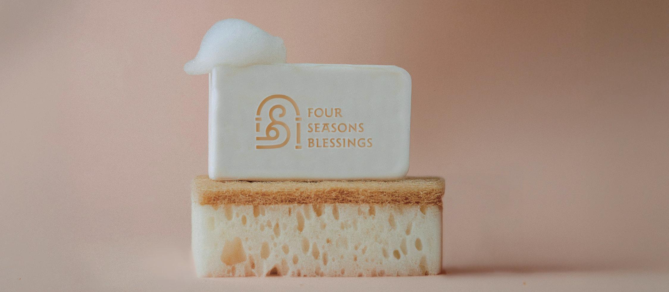
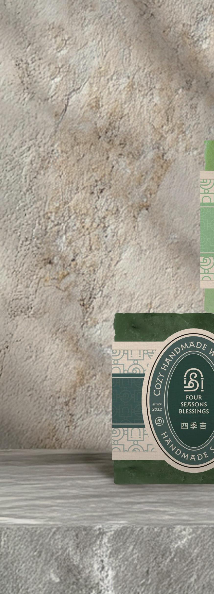
FOUR SEASONS BLESSINGS

Four Seasons Blessings creates handmade soaps, skincare, and cleaning products, and offers soapmaking workshops.Inspired by ancient Roman baths, we aim to provide a space for both skincare and the exchange of ideas. Just as Roman baths were places for both relaxation and conversation, we blend skincare with intellectual connection.Our logo features an arch and a whirlpool, symbolizing the flow of water and the spirit of Roman baths.
visual identity system / package design / interior branding element /user interface design 四季吉專注於手工皂、護膚與清潔用品的製作,並提供手 工皂教學課程。受到古羅馬澡堂的啟發,四季吉希望創造 一個不僅是清潔與保養肌膚的場所,更是知識與智慧交流 的空間。在古羅馬澡堂,人們在享受沐浴的同時,也進行 思想的分享和交流。四季吉正是這樣一個融合護膚與心靈 交流的環境。我們的商標設計以拱門為主題,裡面有小漩 渦象徵水流,這樣的設計暗示著古羅馬澡堂的文化意義。


Project from VVeBRAND
Creative Director: Ethan Lin
Visual Identity and Package Design: Cheng Yuchen
Interior Branding Elements: Cheng Yuchen


VVe QUOTES BRAND CONSULTANT
visual identity system / user interface design


VVeQUOTES is formed by the merger of VVe Brand and QUOTES, offering brand strategy and design services to help clients build strong brands. Our team combines Taiwanese and Hong Kong cultures to create better brand futures. Inspired by Hong Kong's British influence, VVeQUOTES keeps the two "V"s from VVe Brand to symbolize collaboration. We use a refined font and deep purple and gold to convey a sophisticated, high-end image.
VVeQUOTES 由VVe Brand 和 QUOTES 兩間公司合併組成。提供品牌策略和視覺設計等 服務,幫助客戶打造卓越品牌。團隊成員來自台灣和香港,融合兩地文化。除了保留VVe Brand的兩個「V」組成「W」的概念象徵共創品牌未來,VVeQUOTES 的品牌靈感來自 深受英國文化影響的香港。因服務涉及商業機密和策略規劃,我們選擇以金士曼特務的氛 圍為品牌方向,採用紳士且值得信賴的字型,搭配深紫色和金黃色,展現低調高端的形象。
Project from VVeQUOTES
Creative Director: Vince Cheung
Visual Identity System: Cheng Yuchen
User Interface: Cheng Yuchen


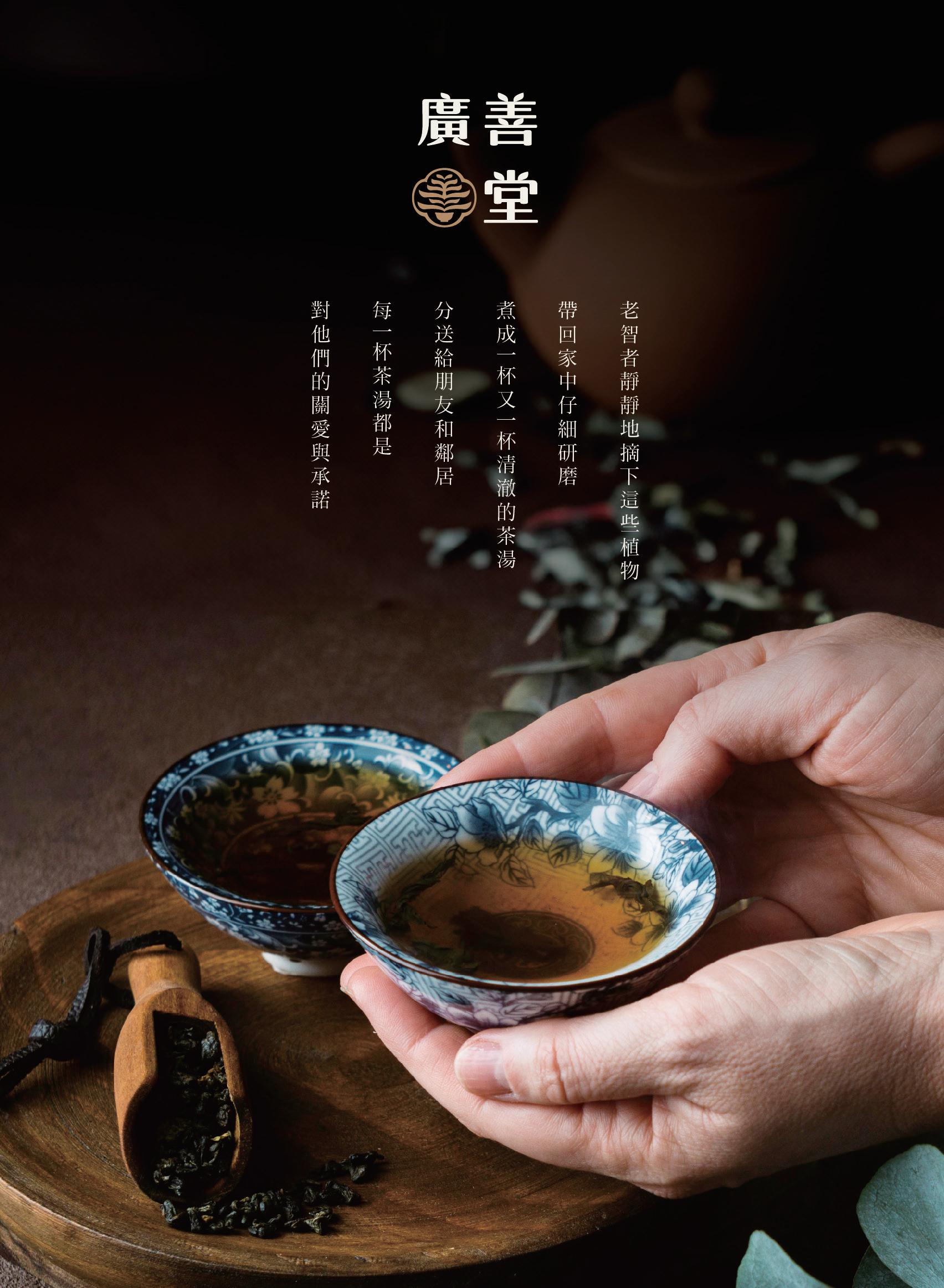
GUANG SHAN TANG
TEA SHOP

Guang Shan Tang offers wellness teas for people 55 and older, blending tradition with modern health concepts. They believe a healthy lifestyle brings happiness, using carefully selected tea leaves for well-being and peace of mind. The logo features the character " 善 " (goodness), symbolizing the essence of goodness in every cup. Guang Shan Tang wants customers to feel nature’s care and maintain inner health and kindness while enjoying their tea.
visual identity system / package design 廣善堂專注於為55歲以上的消費者提供健康、自然的養 生茶,產品包括雞角刺茶,結合傳統與現代健康理念,讓 每位品茶者感受茶的魅力。相信健康的生活是幸福的基石。
廣善堂傳承傳統養生智慧,精選茶葉和製作技術,讓每一 杯茶傳遞自然的力量與心靈的安寧。商標以「善」字為核 心,融合茶葉和茶杯,象徵將善的精華融入每杯茶。希望 顧客在品茶時,感受來自自然的關懷,並保持內心的善良 與健康。


Project from VVeBRAND
Creative Director: Vince Cheung
Graphic Design: Cheng Yuchen


泓翼國際集團
WORLDWIDE PARTNER GROUP
user interface design
Worldwide Partner Group is a global logistics company specializing in air and sea freight. As the business grows, the shareholders plan to create a new website to help partners and potential clients easily access service information and contact details.The website will use the company’s logo as the basis for design, with deep blue and light blue as the main colors. Circular elements will be incorporated to enhance brand recognition and improve user experience.
泓翼國際通運有限公司是一家全球性的國際物流貨運公 司,專注於提供空運和海運的物流服務。隨著業務的不斷 拓展,股東們希望打造全新網站,以便合作企業及尚未認 識他們的公司能更方便地了解服務內容與聯繫資訊。網站 的整體設計將以泓翼國際的商標特性為基礎,主色調為湛 藍色和淺藍色,並利用商標的圓形特色,運用圓弧形狀增 強品牌識別。這樣的設計不僅美觀,還能提升用戶的瀏覽 體驗,增添品牌識別。


Project from VVeBRAND
Creative Director: Ethan Lin
User Interface Design: Cheng Yuchen, Lu Chen
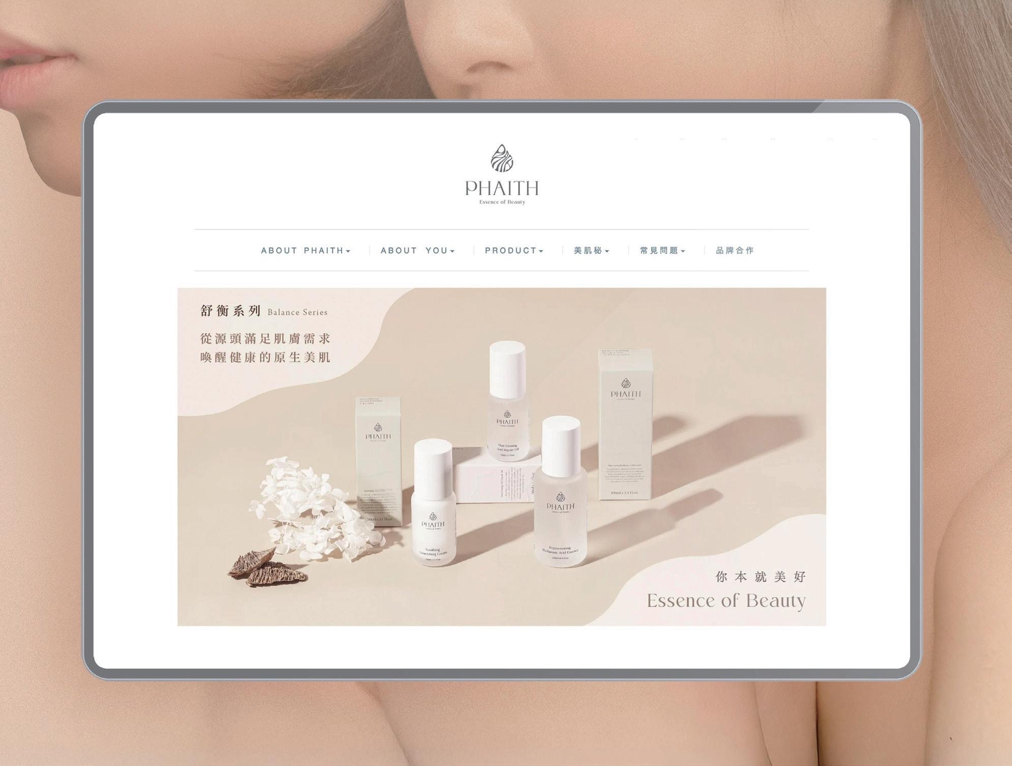
PHAITH SKIN CARE
user interface design / online commercial advertisement
PHAITH is a medical-grade skincare brand focused on delivering professional, effective solutions for healthy, beautiful skin. The website design follows the brand's light skin-toned palette, creating a warm, elegant atmosphere that highlights its refined, highend quality. The style is clean yet layered, effectively showcasing the brand’s professionalism and modern, elegant appeal, ensuring customers feel cared for in every detail.
沛希妍是一個醫美級保養品牌,專注於提供專業、有效的 護膚方案,幫助顧客實現健康、美麗的肌膚。官方網站設 計延續品牌一貫的淺膚色調,營造出溫潤、淡雅的視覺氛 圍,突顯高端、精緻的品牌質感。整體風格簡潔卻富有層 次感,無論是在網站頁面還是商業廣告的長條圖中,都能 完美呈現品牌的專業形象與獨特魅力,傳遞出既優雅又具 有現代感的品牌理念,讓顧客在每一個細節中感受到無微 不至的呵護與關懷。


Project from VVeBrand
Creative Director: Ethan Lin
User Interface Design: Cheng Yuchen
Online Commercial Advertisement: Cheng Yuchen


MANHOW EEL SHOP
user interface design
Manhao offers grilled eel (Kabayaki) and white grilled eel, with a fun, youthful brand aimed at young consumers. The user interface includes playful elements like grids, arrows, and dynamic effects to engage users.
鰻好的主打商品是蒲燒鰻和白燒鰻,品牌定位活潑有趣, 結合電玩風格吸引年輕消費者,目的是將高價食材平民化, 開拓新市場。我們將這些特色融入使用者介面,使用背景 網格、箭頭圖案和跑馬燈等元素,營造遊戲氛圍,提升用 戶體驗。
Project from VVeQUOTES
Creative Director: Ethan Lin
User Interface Design: Ethan Lin, Cheng Yuchen


NEXT STOP: NOODLES
online & offline commercial advertisement
Next Stop Noodles uses microwave bag technology, so anyone can easily cook noodles without a kitchen. We’re continuing the 'cosmic' tech theme in our online and offline promotions to share this convenient innovation with more people.
Project from VVeBRAND
Creative Director: Ethan Lin
Commercial Advertisement: Cheng Yuchen
宇宙叮拌麵採用獨創的微波袋技術,讓即使家中沒有廚房 的人,也能輕鬆透過微波爐煮出一碗美味的麵條。我們延 續品牌的宇宙黑科技概念,設計出一系列創新的線上與線 下宣傳內容,讓更多消費者體驗這項突破性的科技與便利。


The following two pages showcase the online and offline promotional posters and posts created in collaboration between Cosmic Instant Noodles and the Military Dependents' Village event. These designs differ from the original brand style, featuring warm wood elements and a nostalgic feel. The color scheme is darker and more subdued, evoking a sense of warmth and comfort while reflecting the historical significance of the Military Dependents' Village.
接下來的兩頁將展示宇宙叮拌麵與眷村活動合作所製作的 線上與線下宣傳海報及貼文。這些設計風格與品牌的原有 形象有所區別,加入了木質、溫馨等元素,呈現出一種更 具親和力與懷舊感的氛圍。色調則偏向暗沉和穩重,旨在 營造一種溫暖且舒適的視覺效果,以呼應眷村的歷史背景 和情感聯繫,並帶來一種懷舊的獨特魅力。


