→ TYPEFACES
TYPEFACES
AND
Y
ZERO CAPITALS is the first font I designed during my 2nd year in Graphic Design Bachelor as a project for the lesson “Typography II”. The goal was to design a display typeface with only the Latin and Greek capital letters and numerals. The concept for Zero is a typeface that visualises the electronic music scene. The very sharp edges, the raw mix of straight and curved lines, the loose legibility, and the stencils are some of the elements I gleaned from listening to the music and seeing the posters and visual communication of musicians and events.
TECHNO CAPITALS NUMBERS
Ω
Rhino is a serif typeface with high contrast and very expressive terminals. One of its main features is the high overshoot of the ascenders. It is a display typeface in regular style, but it is also suitable for small text.
White Indian Sumatran Javan Black
STYLE
17124 NEUE CLASSIC KEFALONIA
Neo-Humanist does not yet have an official name. It was developed as an experimental typeface to practice sans serif design. Its inspiration is classic typefaces such as Gill Sans, Futura and Akzidenz Grotesk. It supports Latin and Greek language and has Book-regular weight. It can be used for both text and display purposes. The main feature is the angled terminals.
@
Not a Revival Not a Redesign
I designed Paradoxa as a thesis for my bachelor’s degree in graphic design.
I began with extensive research on the first Greek script produced in Venice at the beginning of the Renaissance and after the fall of the Eastern Roman Empire. At that time, many of the typefaces were based on the handwritten Greek language, which consisted of many ligatures. This system proved to be very inadequate for printing, and a system based more on the Latin alphabet began to be used. This resulted in the disappearance of almost all Greek ligatures. With this concept in mind, I began to design paradoxes. I collected the most readable ligatures that can still be used today. The design style of the reference fonts proved to be too difficult to revive, so I tried to design a modern typeface with my aesthetic. The result of this research and design process is Paradoxa, a typeface with 3 styles (Regular, Bold and Blck Capitals), with Greek and Latin letters, archaic Greek letters, polytonic Greek, and most importantly, over 100 ligatures and alternate letters.


 Photos of the specimen book, digital print and hand book binding with leather cover.


PIXEL
ITALO CALVINO
A logo, a font, a fanzine, a poster and a video, all based on Italo Calvino’s book “Invisible Cities” and more precisely on the city of Penthesilia. This aligorian city has neither a beginning nor an end, you never know when you have entered it or if you are even in the city. In this idea I saw a connection to the old video games where you run for hours to the right. So I designed the entire
identity of the project around pixels. The typeface is loosely based on a 4x6 grid that supports Greek and Latin letters. There is a plan for a second weight of type on a 30x36 pixel grid. The concept is that the Penthesilea font is a serif font where you can not see the serifs because of the low resolution, so the larger the pixel grid, the more detail it has, an example of which is the project’s logo.


→ GRAPHIC
GRAPHIC DESIGN
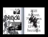
This is not Political
“This is not Political” is a fanzine created for the exhibition”CheckOut Tomorrow” on the occasion of the 50th anniversary of the AKTO School of Art and Design. The theme of the exhibition was any political issue that concerns us in our time. Being fundamentally familiar in a basic level with political and social issues, I tried to express my thoughts and experiences through calligraphy and lettering combined with typography. So I just started writing down the first things that came to my mind and thinking about what concerns me in my daily life. I do not think my opinions should have a political side, because they are just thoughts, but everything is political. So the title “This is not Political” is ironic and represents my conflict about how I evaluate political issues.

The fanzine is made out of my personal created typefaces, caligraphy and lettering made by hand then mixed with digital media.


→ PUBLICATIONS
PUBLICATIONS


HOMEBOUND-NEW WAVE
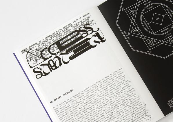
HOMEBOUND—New Wave shows the collaborative works of designers, artists, and authors, answering and visualizing the influence of the pandemic on their attitudes and projects!


The HOMEBOUND project was born when the pandemic began to cause lockdowns worldwide and many designers and artists had to cancel commissions. Cihan Tamti took the chance to act and decided to create a publication that would present the free projects of his Instagram community created during this period to use up the extra time. The result was an incredibly beautiful documentation of that time and of work that would never have been produced under normal circumstances.
Personal contribution:
Letter design on the chapters titles and organizing the typography team with the author.


→ SKETCHES
SKETCHES


