

EDUCATION
WORK EXPERIENCE
ORGANIZATIONS
RECOGNITIONS
TRAVELS
909-680-1848
cku@cpp.edu
c1kiku282@gmail.com
CALIFORNIA STATE POLYTECHNIC UNIVERSITY, POMONA
3801 W Temple Ave, Pomona, CA 91768
Bachelor of Architecture
August 2019 - May 2024
KTGY, IRVINE
17911 Von Karman Ave #200, Irvine, CA 92614
Project Associate Intern
June 2022 - June 2023
NATIONAL ORGANIZATION OF MINORITY ARCHITECTURE STUDENTS (NOMAS)
CPPNOMAS- Event Coordinator
2021-2022
GLOBAL PUBLIC HEALTH BRIGADES
CPPGPHB- Education Chair
2021-2022
TAU SIGMA DELTA (TSD) 2023
THE INTERIM
CPP AIAS
8x Interim Participant
The Interim is a biannual event held to showcase faculty-chosen students and the work they produced in the previous semester.
STUDY ABROAD - JAPAN
CPP ENV Summer 2023
3 adus and a college building...


ANIMATED OBLIQUE ELEVATION
rhino 7, vray, adobe illustrator, photoshop, procreate
A smaller scale experimentation on form and materiality in the language of accessory dwelling units, locates between the backyards of three Los Angeles site parcels designed to create its own interactive neighborhood. As each adu’s form is generated from the same initial mass, every transformation of form is influenced with unique user types in mind: an artist, a vision impaired ceramist, and a family member of the head household (following the image above, top left, clockwise). Becoming experts on the constructive process of sandcasting, the choice of materiality represents the uniformity of the separate inward-living work styles, encouraging more expression within this mini neighborhood through architectural spaces that frame specific user activities with one another. Moments of sand-casted walls are intentional through the placement of texture, providing a sensory material flow of transparency, simplicity, and roughness, the indentifier of subtracted mass. Thoughts of decorating exterior circulation also plays into the reimagination of adu living. With elements of boulders, custom pavement, and interchangeable bean-like furniture, these three adus tell a story about how smaller scale homes can be approached with uncommmon form and aesthetics.


The design curates a new building for arts, architecture and technology students, providing space that grows a community and productivity between the two polar professions as well as architecture. With research gathered from personal experiences, peers and external professors, the favorite experience of architecture school is the lively spirits of studio culture. Being able to work near friends and classmates in a free-form space has allowed for personalization. With personal workspace and other communal tables organized into studio space, there is still a lack of workspace as well as better locations for pin-up presentations. With these issues in mind, this arts and technology building is constructed under the best intentions, prioritizing students and their educational needs.
ANIMATED EXPLODED AXON


mixed-use housing...


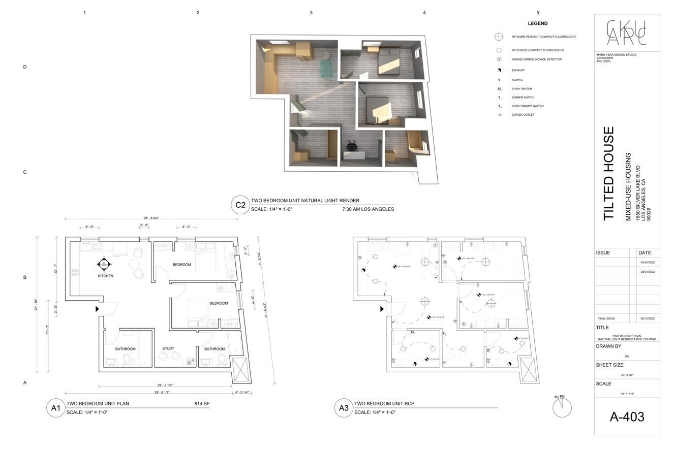
Topped by sloped roofs and a striped exterior facade, this multifamily housing complex, Tilted House, enables life through affordable living spaces. Providing studios, 1 bedroom, to 2 bedroom units, the needs from families of Silverlake, Los Angeles are prioritized by a coordinated system of units, as well as a facade system that follows the exact grid of structure. Catering towards the surrounding demographics and culture, Tilted House populates a bold public element designed to motivate the existing community to explore, gather, and rest at the grand staircase located at the corner of the project’s intersection. As this was introduced through phases of schematic design, design development, and construction documents, the Tilted House perceives an efficient flow of multifamily housing with the professional practice approach of architectural design.


EXTERIOR RENDER rhino 7, vray, adobe photoshop

INTERIOR UNIT RENDER rhino 7, vray, adobe photoshop
a tower, plinth, and a museum...


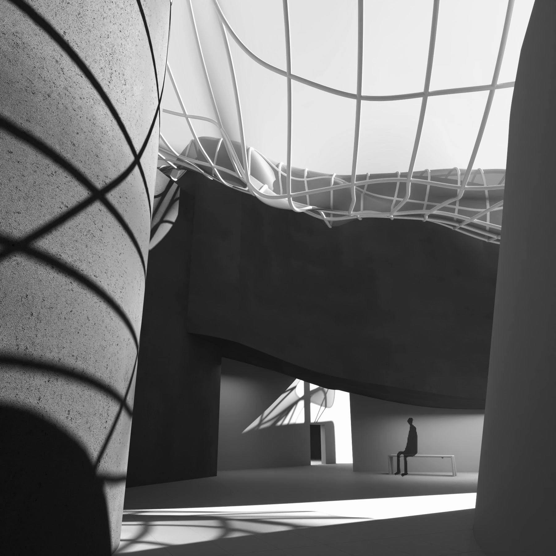
The conceptual balance between opposing senses, like flexibility vs. rigidity, transparency vs. opacity, and hidden vs. exposed are accounted. pieces of the project are strategically assigned the characteristics of reactant, reactor, or neutral form. The reactant takes the ability to melt/ soften (flexibility). the reactor forms are rigid, which introduces the duality of tension into the model. In this case the reactant elements fall onto reactor volumes, creating unique interior spaces. For transparency vs. opacity, the same process is applied to the overlaying skin-facade, acting as a physical tower-to-plinth connection as well as a conceptual element that attempts to hide or cover such odd set of volumes. in response to tension limitations, vacuformation and tearing of peaked areas further enhance the experience within the site.


With a sense of looseness, this museum is programmed to represent the liberation of space and art in the midst of Little Tokyo, Los Angeles. standing on 2 main “mother” masses, the larger volumes are assigned a role as magnified containers holding main circulation, auditorium, and private service spaces. The small masses that fill the available surface area are liberated to convince an experience of curiosity and discovery for the visitor. The liberated spaces are programmed for the museum’s main galeries, generating a free-form plan. As visitors enter through the hidden entrance, they not only can circulate from volume to volume but also witness the spatial creations dervied from the escaped volumes’ in-betweens, creating a balanced journey of outside and inside.
2nd street Azusa street
GROUND FLOOR PLAN rhino 6, adobe illustrator

mother masses

2.5 + 3RD FLOOR PLAN rhino 6, adobe illustrator


CROSS SECTIONS
extra notables...


