1 minute read
fun decorating

from Colaalfondo123
by Colafondo22

Paint shades we love and how to use them.
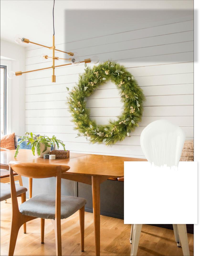
BY VALSPAR “I tested a lot of shades in different lighting before settling on this true white. It doesn’t have any undertones, so it’s nice and crisp next to the inky-blue banquette, and the shiplap adds texture.”
Advertisement
—Ashley Mayes, Bigger Than the Three of Us, Springfield, MO
BY BEHR “When my client asked me to paint her brown piano and bench, I went with the whitest white I knew for a timeless look. It took two coats of stain-blocking primer and three coats of paint! I finished by slightly distressing some of the carved wood details for vintage vibes.”
—Danielle Wrishko, Just Paint it! by Dani, Saskatoon, Saskatchewan, Canada
BY BENJAMIN MOORE

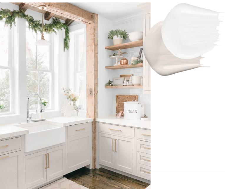
BY SHERWIN -WILLIAMS “I wanted a light and fresh look for our kitchen that still fit our home’s historic roots. I added character to the new cabinets with a supersoft gray and went with my go-to white for the walls. It’s a cooler white, so it does a good job of balancing out the warm tones of the reclaimed wood.”
BY SHERWIN -WILLIAMS “My girls’ room used to be a soft pink, but as they’ve gotten older, they’ve fallen for different colors. A soft, creamy white for the walls and white bunk beds keeps the focus on their evolving styles—and won’t be something we’ll have to paint over every year!”
—Anita Yokota, Anita Yokota Interior Design, Irvine, CA

BY BENJAMIN MOORE “Before, the walls in my office were a grayish green, the wainscoting was white, and the room always felt chopped in half. Painting everything the same hue made the space so much airier. I used all-white furniture, too, to create a coastal look that always feels like a getaway.”

—Adrienne Elizabeth Boswell, Adrienne Elizabeth Home Style Life, Advance, NC

