LEAVE YOUR MARK
Coldwell Banker Barnes
IDENTITY STANDARDS


Coldwell Banker Barnes
IDENTITY STANDARDS


Our mark features a visual icon that sets us apart a star. This star represents two distinctive elements that exemplify the Coldwell Banker® brand First, the five-pointed star is a recognized mark of excellence, one that symbolizes the quality of service that we’ve provided since 1906. Second, throughout history, the North Star has been the beacon that explorers have used to guide them to the place they most cherished home. Sitting confidently above the CB, this North Star signifies the fact that we’ve been guiding people home for over a century, longer than any other real estate brand Finally, we’ve kept our signature blue color, while revising our bounding rectangle to a sleeker, more compact square a profile more in keeping with today’s mobile-first culture
The Framed Logo uses the CB Star Mark within an in lined square This version of the logo may only be used in Coldwell Banker Blue (PMS 280), on a light background It may not be used in reverse on a dark background
HORIZONTAL
VERTICAL

HORIZONTAL STACKED

The Monogram Logo uses the CB Star mark in silhouette, without a surrounding box. This version of the logo may only be used in white, on a dark background or with transparency as a graphic effect overlapping an image or copy. It may not be used in reverse, on a light background (Any exceptions to this rule are at the sole discretion of the brand marketing department )
HORIZONTAL
VERTICAL


HORIZONTAL STACKED Click here to download
Place any other copy or graphics in or immediately around the mark Nothing else is allowed in or next to the blue box
Use the framed logo in any color other than PMS 280. Do not use the monogram logo in any color other than white
Use any texture, shading or effects for the mark



DO NOT
Reverse the marks


Stretch or condense the mark

Place the mark at an angle

Use the mark as a copy element
This home is offered by
When shown with the Coldwell Banker® logo, agent logos must be outside the safety distance around the CB logo, and must be no larger than the CB logo


Coldwell Banker® Blue is our signature color It is recognized internationally and is present in our logo, signage and all support materials White space is incorporated generously for a clean, contemporary look and easy readability. Black is our go-to for body copy and bold headlines. Our secondary and tertiary color palettes are meant to be used sparingly to highlight copy and/or graphic elements.
CMYK 68 / 34 / 0 / 0 RGB 65 / 143 / 222 #418FDE
PMS 279 C
CMYK 0 / 0 / 0 / 40
RGB 167 / 169 / 172 #A7A9AC
CMYK 63 / 62 / 59 / 94
RGB 45 / 41 / 38 #2D2926
PMS BLACK C
CMYK 40 / 30 / 20 / 66
RGB 99 / 102 / 106 #63666A
PMS COOL GRAY 10 C
CMYK 68 / 39 / 26 / 2
RGB 92 / 134 / 160 #5C86A0
CMYK 29 / 22 / 22 / 0 RGB 183 / 185 / 186 #B7B9BA
CMYK 9 / 10 / 16 / 0 RGB 230 / 221 / 209 #E6DDD1
CMYK 83 / 0 / 30 / 0
RGB 0 / 180 / 189 #00B4BD
CMYK 43 / 0 / 10 / 0 RGB 137 / 212 / 227 #89D4E3
Our primary product colors are white and black They are used to provide accessibility, simplicity, and consistency throughout all products Default surfaces are white, icons are black and the overall design should have a very generous use of white space.
Brand Blue
White should be the dominant color Shades of black may be used on text to illustrate hierarchy; grays can be used on surfaces to add shadows and depth Blue is only used for critical moments and primary calls to action. Specialty colors are only used for very specific purposes (favoriting, information callouts and alerts).
Blue is the core color of the Coldwell Banker® brand and should be used sparingly for moments of support, assurance and delight Blue should be reserved for primary interactions and to highlight key UI elements The blue used for product is a brighter derivative of the Coldwell Banker brand blue, meant to provide accessibility and project boldness while staying true to the Coldwell Banker brand.
Colors
Shades of black are used to emphasize/de-emphasize text as a means of demonstrating hierarchy Grays are used for surfaces and to create texture and depth Default text is Black High (#2B2E30).
Our specialty colors are meant to convey a specific meaning and should be used sparingly in order to maintain meaning and potency. Pink is used to indicate favorites, amber is used for information callouts, and red is used to alert the user of a destructive error 15% Black Low/Disabled
Greattypographyisthevoiceofagreatbrand Oursiscrisp cleanandcontemporary sothewordsspeakwithconfidence
TheupdatedColdwellBanker®fontfamilyincludesthreefontcollections:
HelveticaNeueLTStdisthefontfamilyusedforallbodycopy
Stdisadiversetypefamily,availablein18styles,includingvaryingweightsanditalics It’sveryreadableandcangofromawhispertoashoutdependingontheweight,size andstyling
GeometosNeueisideallysuitedtoheadlines,subheads,andwordsorphrasesthatare meanttostandout,likenamesonbusinesscards It’sstrong,graphicandisthefont seeninourlogolockups GeometosNeuemaybepurchasedonline
GEOMETOS BOLD is ideal for strong headlines, Bold subheads, and social posts Recruiting ads with powerful, confident messages can be enforced by using all caps/bold. As our brand font, it adds ownership to anything it’s applied to.
Postcards, social posts, and ads speaking to an upscale consumer are all ideal opportunities to use a font like HELVETICA NEUE LT STD 45 LIGHT, shown here with open letterspacing. When used in all caps, it implies a sophisticated voice behind the message.
For elegant events, award ceremonies, materials that promote classically beautiful homes and promotional pieces aimed at a quietly sophisticated audience, a classic, serifed font like ADOBE GARAMOND PRO REGULAR adds an air of refinement and elevated style

Posters, event materials and any messaging that is shout it from the rooftops loud is read correctly and visually powerful with a big, bold font like HELVETICA NEUE 95 BLACK.
Materials promoting community events and charity services are made more sincere and approachable by an upper/lower case headline, as in HELVETICA NEUE LT STD 55 ROMAN It implies a more personal, relaxed and inviting tone.
This look is most effective with personal promotional materials and messages aimed at a modern, contemporary audience. Using contrasting weights, in which one word or phrase of a headline or title is set in a lighter font weight and the rest is set in bold helps strengthen the main point in a message and add visual appeal. This is HELVETICA NEUE LT STD in 35 THIN and 75 BOLD.


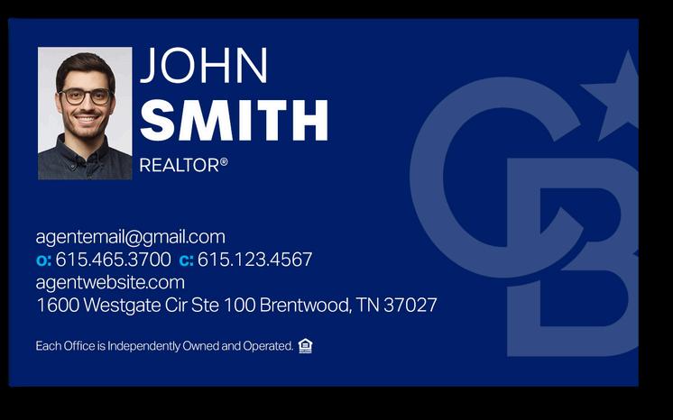
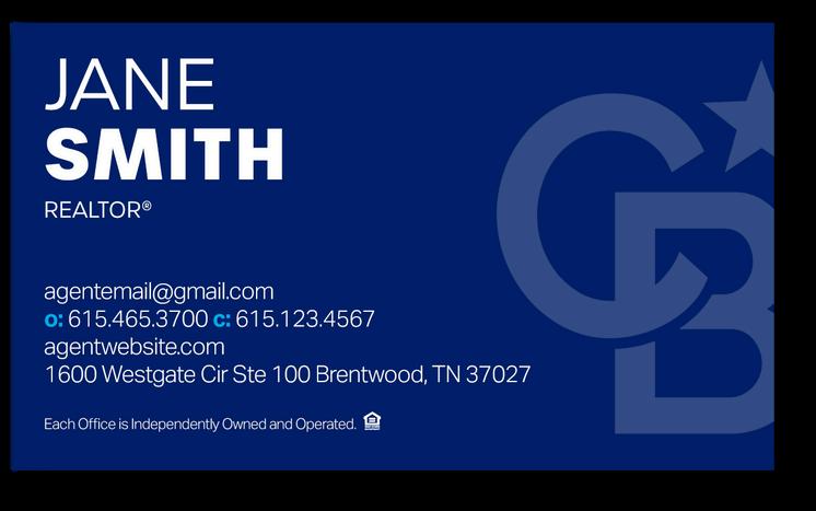


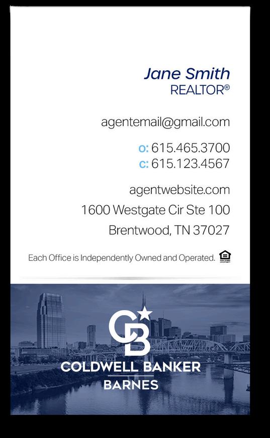

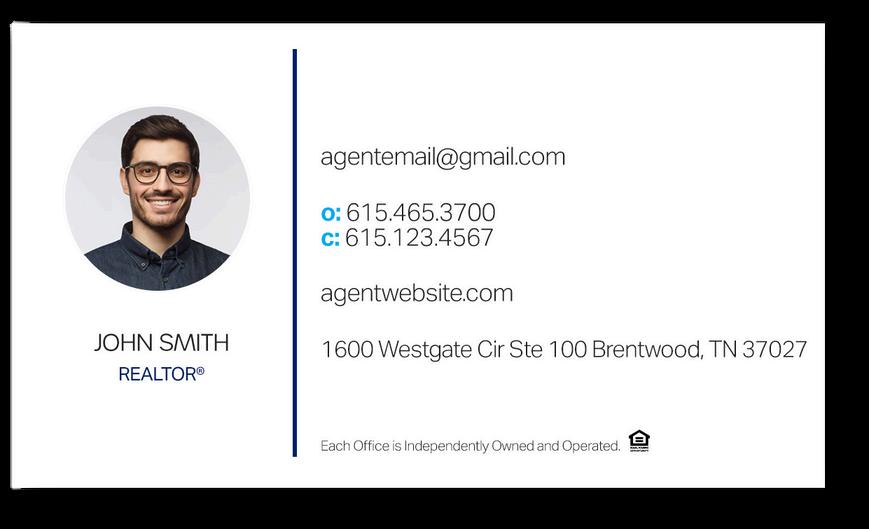

Available to order in the marketing shop: cbbmarketing.info


The Coldwell Banker Barnes Global Luxury logo uses 100% black (PMS black 6C) The logo follows the same rules of usage outlined on page 3 & 4
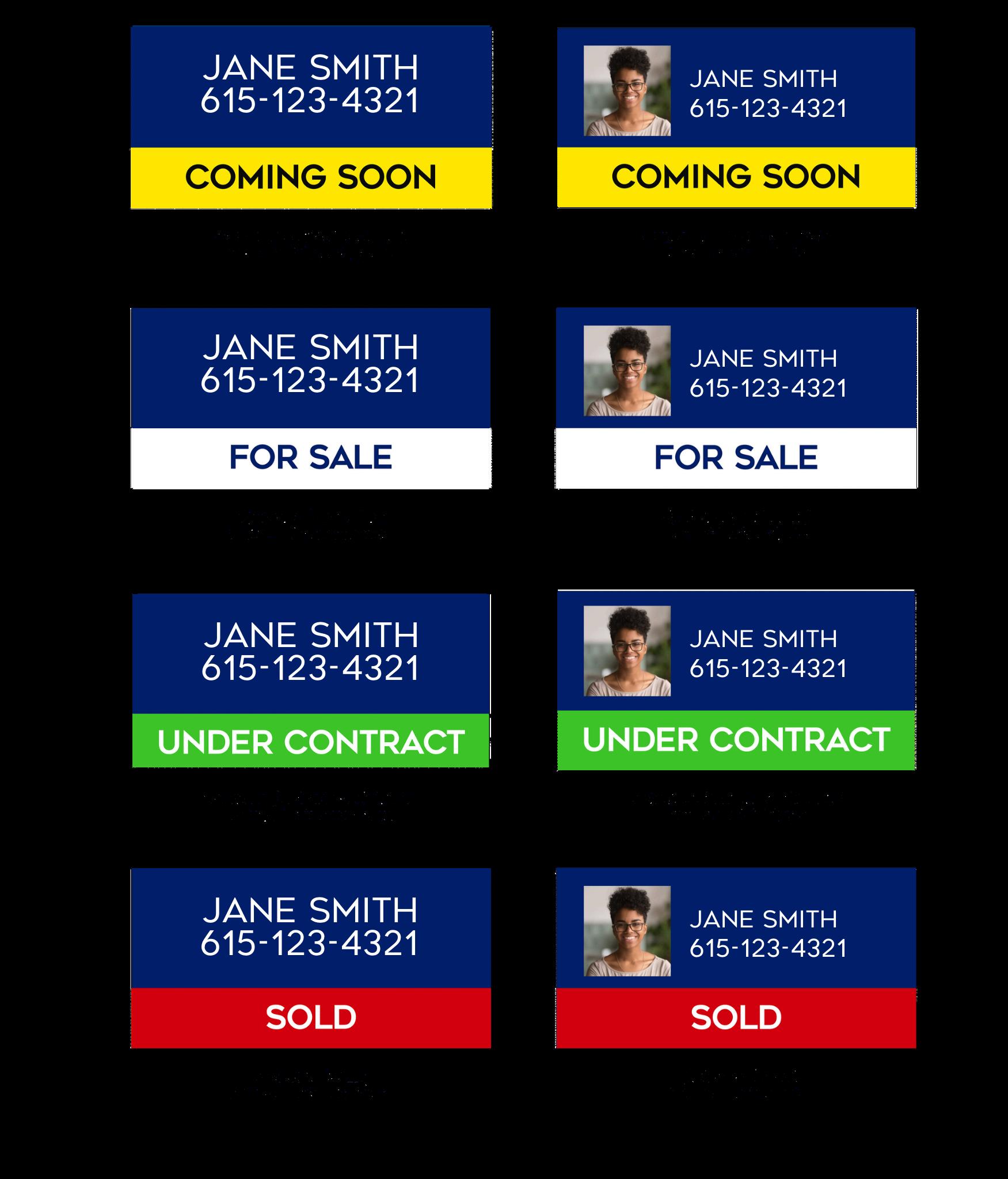
Global luxury approved fonts include Garamond 3 regular Yard signs are black signs with white logo and text, with a white post/frame
VERTICAL

VERTICAL STACKED

HORIZONTAL

HORIZONTAL STACKED
DARK BACKGROUND
VERTICAL HORIZONTAL

VERTICAL STACKED


HORIZONTAL STACKED
LOGOs are available to download from brandsrv
MODERN, AIRY, CLEAN, NATURAL WHITE LIGHT, BLUE ACCENTS AND POP OF BRIGHT COLOR, MOVEMENT, INTRIGUING CAMERA ANGLES, DOESN'T LOOK LIKE STOCK PHOTOGRAPHYTHAT'S OUR STYLE IN A NUTSHELL.


MODELS REPRESENT HOME BUYERS AND SELLERS, BOTH INDIVIDUALS AND FAMILIES THE PEOPLE AND SURROUNDINGS ARE BEING REPRESENTED AND ARE DIVERSE IN NATURE AND ALL-EMBRACING CONSUMERS


MODELS SHOULD APPEAR IN NATURAL SITUATIONS INSTEAD OF BLATANT POSES THAT SCREAM "STOCK PHOTOGRAPHY." LOOK FOR MOVEMENT AND MOMENTS THAT ARE CAPTURED BETWEEN FRIENDS AND FAMILY. SETTINGS SHOULD BE INVITING AND RELATABLE.
Realtors must disclose agency on all advertisements and social media.
Code of Ethics and Standard of Practice 12-5
REALTOR® shall not advertise nor permit any person employed by or affiliated with them to advertise real estate services or listed property in any medium without disclosing the name of that REALTOR®'s firm in a reasonable and readily apparent manner in the advertisement or in electronic advertising via a link to display
In usernames, members are allowed to use the REALTOR® marks only to indicate membership in NAR by using the marks with the member's name or with the legal name of a member broker's real estate business
In usernames, email addresses, and domain names, the realtor® marks do not need to be separated from a member's name or real estate business name with punctuation, as they do elsewhere
janesmithrealtor@gmail.com
thebestrealtor@gmail.com
TENN COMP R & REGS 1260-02- 12 - ADVERTISING
"Advertising" means all forms of representation, promotion and solicitation use in any manner by means of communication to consumers for any purpose related to licensed real estate activity
Firm Name
Licensee's Name
Must be "clearly and legibly displayed"
Business Cards
Firm Name
Licensee's Name
Contact Information (phone number or website)
Signage
Firm Name
Firms primary or branch office telephone number
Website
Licensee's Name
Firm Name
Any city and state(s) in which the licensee holds a license
REALTOR® must have a link back to website main page with all required disclosers The licensee's main page must clearly and legibly include all electronic media disclosures listed above The licensee's non-main page(s) must clearly and legibly include all electronic media disclosures on each individual page or link to those electronic media disclosures on viewable main page Therefore, it is critical to include all required disclosures on the firm or licensee main page or biography section
The minimum required disclaimers must appear whenever the Coldwell Banker Barnes logo is used. Proper copyright, equal housing, and Realtor® must be visible on all advertisements, marketing and personal promotion pieces.
Advertising
Printed Materials
being distributed to consumers, add the following statement (Farming Mail)
©2022 Coldwell Banker All Rights Reserved Coldwell Banker and the Coldwell Banker logos are trademarks of Coldwell Banker Real Estate LLC The Coldwell Banker® System is comprised of company owned offices which are owned by a subsidiary of Realogy Brokerage Group LLC and franchised offices which are independently owned and operated. The Coldwell Banker System fully supports the principles of the Fair Housing Act and the Equal Opportunity Act
If your property is listed with a real estate broker, please disregard It is not our intention to solicit the offerings of other real estate brokers We are happy to work with them and cooperate fully
Use of the Coldwell Banker Barnes “Mark” or “Trademark” may also refer to the use of the Coldwell Banker Barnes name as text in advertising copy, correspondence or other applications It does not refer strictly to the FRAMED LOGO or the MONOGRAM LOGO
Written Coldwell Banker Barnes shall be written in its entirety in any promotional copy Do not place any punctuation, such as comma or backslash between Coldwell Banker and Barnes Do not use all caps
Website
Where incorporated into a design, as or marketing piece the website address shall always be written as coldwellbankerbarnes com Never www before coldwellbankerbarnes.com. It must always appear in lower case.
All email campaigns must have the proper disclosure Coldwell Banker Barnes, without the agent name must never appear as the sender in an email campaign
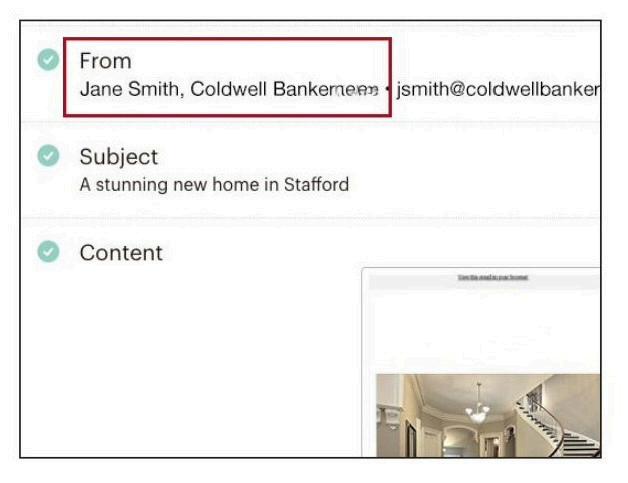

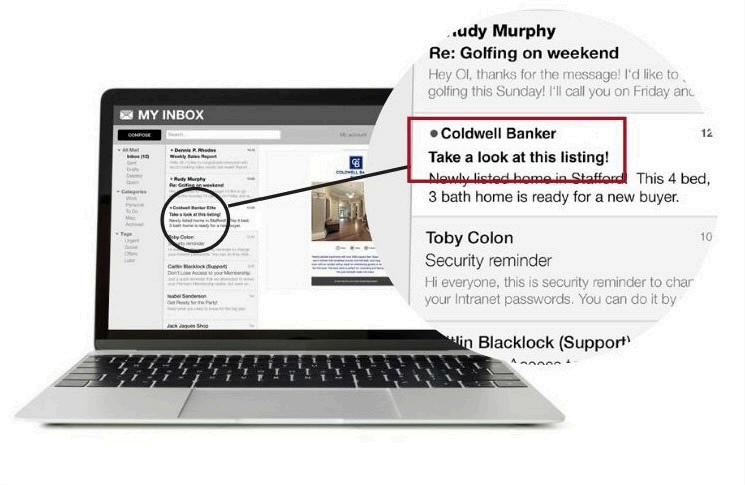
Proper representation and disclosure is required on Facebook Coldwell Banker Barnes recommends a combination of your name, REALTOR® or Real Estate and Coldwell Banker Barnes on Facebook business pages
Agent Name Title Company

MichelleJenkins,Realtor,ColdwellBankerBarnes


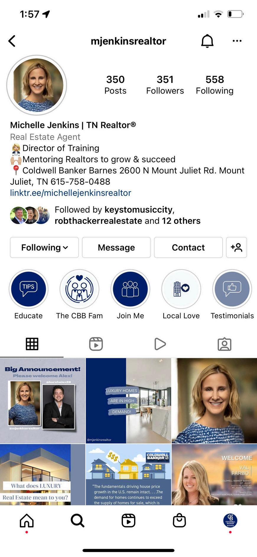
Proper representation and disclosure is required on Instagram Coldwell Banker Barnes recommends including Realtor® and your office name and phone number in your bio Agents should keep all posts advertising listing up to date to reflect the listing in MLS as well as MLS# and their Name, Contact Number and Office name If you are advertising your mentor's listing you must include the listing agents information Coldwell Banker Barnes also recommends tagging @coldwellbankerbarnestn in your posts and stories
