TYLER LINNEHAN P O R T F O L I O P O R T F O L I O
EDUCATION
Cornell University: College of Art, Architecture, and Planning
- Term: 2019 - 2023
- Degree: Master ’s in Architecture
Ball State University: College of Architecture and Planning
- Term: 2015 - 2019
- Degree: Bachelor ’s in Architecture
INVOLVEMENT
American Institute of Architects
- Public Outreach Chair
Deans List Recipient
- Years 1 through 4
ExPERiENCE
Morphosis - New York City, NY - 2021
- Architectural Intern
DkGr Architects - Indianapolis, IN - 2018
- Architectural Intern
WBRC Architects - Bangor, ME - 2017
- Architectural Intern
AwARDs
Design Communication Association International Conference
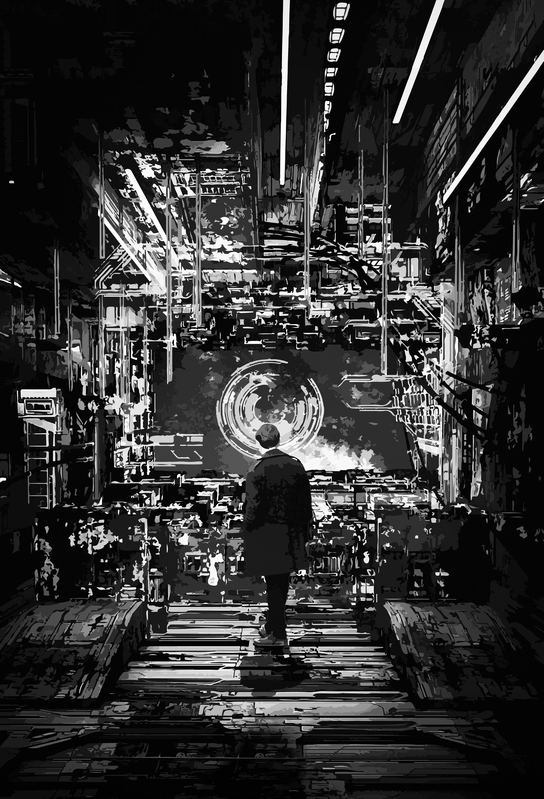
- Design Drawing Award - Ghosts of Tokyo
- Juror’s Choice Award - Ghosts of Tokyo
REFERENCEs
Mr. Ung-Joo Scott Lee - Project Manager at Morphosis
- 212-389-1171
- s.lee@morphosis.net
- 153 West 27th St. Suite 1200, New York, NY
Mr. Joshua Coggeshall - Professor at Ball State University
- 765-702-8802
- jrcoggeshall@bsu.edu
- College of Architecture and Planning, Muncie, IN
Mr. James Kerestes - Professor at Ball State University
- 765-285-1932
- jfkerestes@bsu.edu
- College of Architecture and Planning, Muncie, IN
PROFiCiENCiEs
- Rhino
- Grasshopper
- Revit
- Sketchup
- Blender
- GIS
- Z-Brush
- Keyshot
- Vray
- Photoshop
- After Effects
- Illustrator
- Indesign
- Premier
- Kuka Robot
- 3D Printing
- Cura
- Excel
qUEENs PUbLiC LibRARy 1
ZIgZAggINg ThROUgh ThE bOROUgh
RETROgRADE sARCOPhAgUs 6


hARMONy AMONg ThE CONTEMPORARy AND ThE AgELEss
sENECA FARMINg FACILITy 10
VOyEURisM, sURVEiLLANCE, AND gOVERNMENTAL AEsThETiCs

ghOsTs OF TOkyO 15
MEDiA AND sPATiAL DENsiTy
wiThiN kiTbAshED AMALgAMs
sALAMANCA sPA 19

CULTURAL REFERENTiALiTy AND ThE ThERAPEUTiC EARTh
VEsTigiAL bAROqUE 23
PARAFiCTiONAL hisTORiEs AND REACqUAiNTED MOTiFs
AFTERLiFE ChAMbER 27
UNkNOwAbLE TRUThs wiThiN iMPOssibLE ARChiTECTURE


UPsTATE LExiCON 31
hOMAgE TO LOCAL VERNACULARs

sELECTED wOR
ks
q UEEN s PU b LIC LI b RAR y
Spring 2021

Advisor: Stella Betts
Partner: Tetsuo Kobayahsi
Location: Queens, New York
1
qUEENs: ECLECTiC; ENERgETiC
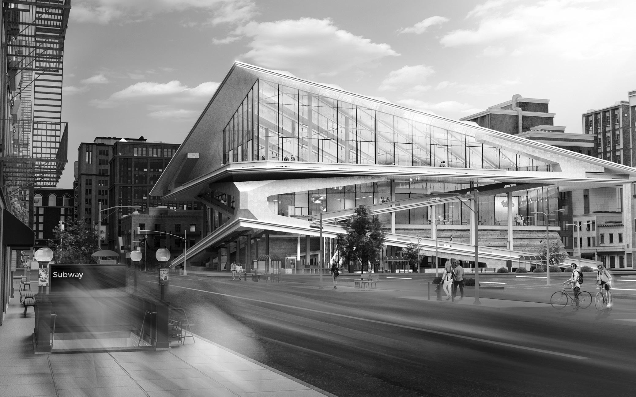
Queens, New York, has a numerous collection of large and small libraries which sit quietly adjacent to busy bodegas and multi-use mid-rises. In an effort to both facilitate an increase in local visitors and to offer a new iconic building to the borough, one of these many public libraries will be the site of a new architectural design. This new library might not only be a location for knowledge and narrative, but also a catalyst for engagement with form and space.
I’LL Zig
As this project developed, the dynamic between intricate circulatory form and aesthetic structural elements became a critical catalyst for design interventions. From the exterior, the library approximates a “Z” shape from all four cardinal directions. This effect is derived from an array of exterior switchback, or “zigzag”, ramps. These ramps, and the sculpted, volumetric objects that adorn and support them at major nexuses of the paths, unify to create the secondary structural component for the library’s floor plates.


2
bAsEMENT gROUND FLOOR FLOOR 1 FLOOR 2 DN UP UP DN DN UP DN UP DN UP UP DN DN UP DN DN DN DN DN DN UP UP UP UP UP Drawings created in collaboration with project partner: Tetsuo Kobayashi 3
yOU ZAg
The interior benefits from the unique approach to exterior circulation and structure. Beyond a central concrete core, the building’s floors are largely unhindered by structural elements unless absolutely necessary.
The skyward-pointing, planar roof rests on two of the ramp’s sculpted volumes and acts as the final “zag” in the building’s zigzagging silhouette. The lifted plane creates an open and airy space for reading and conversing. Spacious and open reading rooms, meeting rooms, and offices fill the floor below, all with access to tall windows. The ground floor is largely open to walking traffic, framing the adjacent avenue’s markets and bodegas. Storage, archives, and a small auditorium are located in the basement, which is also accessible via a continuation of the exterior ramps or interior elevator core.
Through the confluence of aesthetic circulation and embedded structural logics, the new Queens Public Library offers itself to the borough as a building that is worth exploring both inside and out, from any direction.
Special thanks to project partner: Tetsuo Kobayashi
Drawings created in collaboration with project
4
partner: Tetsuo Kobayashi


5
Summer 2020
Competition: Young Architects Competition
Location: Mojave Desert, California

IN
6
A s ARC OP h A g U s
RETRO g RADE
MOjAVE DEsERT: sCORChiNg AND sAND-swEPT
Among the resolute, sand-swept stones. Among the ancient, unyielding Creosote bushes. Below the stark and scorching sun, new architecture endeavors. This proposal for the new Hyperloop Campus, located in the Mojave Desert, will investigate the potential for a harmonious interplay between the contemporary and the ageless: a building that is reverent to the antiquity of its site and simultaneously stands as a beacon for the potential of the future.

COFFiN TO CRADLE
The base of the building is a towering colonnade, a robust, but intricate, amalgamation of the great classical architectural vernaculars. Emulating the styles of classical Greek, Gothic, and Egyptian architecture, the foundational pedestal of the campus is a love-letter to antiquity. In this way, the ageless desert coalesces with the ageless perseverance and creativity of humanity.
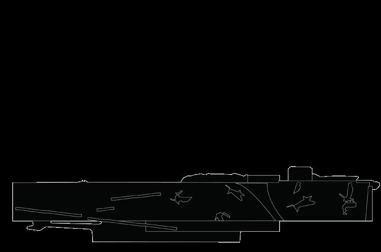
Seemingly levitating above the massive base, is a stark, shimmering metal form which approximates the shape of a sarcophagus. Large, perforated metal panels present an immediate contrast to the stone base below. It is within this metal form that the entirety of the Hyperloop Campus is located. State-of-the-art laboratories and living quarters will provide researchers and students with the tools to catalyze our modernity and propel us into the rapidly approaching future. It is a sarcophagus working in retrograde, birthing new discoveries and technologies.

7
sTEEL-CLAD OAsis


The interior is divided into three floors. The first is primarily a space for the public, containing facilities aimed at welcoming and informing guests and residents. The second floor is laid out for scientists, researchers, and students to gather, work, and learn in stateof-the-art laboratories and classrooms. The final floor houses the dormitories and fitness center for on-site residents.

The perforated metal panels—and select, key locations where these panels peel away from the inner box—provide stunning, panoramic views of the Mojave Desert from nearly every spot within the building. The interior of the building provides a welcome respite from the harshness of the wilderness outside but tactfully frames the site’s untamed beauty.

bAsE 8


9
Fall 2022
Advisor: Gary Bates
Location: Seneca Army Depot, New York

F A C i L i T y 10
sENECA F ARM i N g
sENECA ARMy DEPOT: POTATOEs/PLUTONiUM

In the heart of upstate New York sits the Seneca Army Depot. Once a military storage base; vast arrays of concrete, nuclear and explosive munitions bunkers dot the terrain like anthills and rusted steel fences enclose its perimeter. The government no longer operates on this site, but its influence is still palpable. Especially in contrast to the modest farms that surround it.
The Seneca Army Depot: Farming Facility plays upon this relationship between agriculture and government while also touching on concepts of voyeurism and panoptical surveillance. This facility is imagined as the government’s reintegration onto the site. It is an open-to-public laboratory for studying the newest developments in the agricultural and dairying sciences, such as advanced hydroponics and artificial proteins.

LiPsTiCk ON A PANOPTiCON
This building takes a critical approach to government architecture. It presents itself as a glass-and-steel-clad inversion of power dynamics. The visitors here (seem to) observe the scientists and personnel, rather than the usual inverse. This is a marketable narrative to offer to the public, but it is not wholly genuine. The building houses a central, paneled volume which can only be viewed out-of, and not in-to. Within exists “sensitive research” labs and spaces for hushed politicking surrounding the dispersal of food advancement data.
The obfuscation of what really occurs here is not lost on the public, in fact, it is presented to them directly through the architecture. If that truly makes a difference is the question. Does the alluring perception of flipping the power dynamic justify willfully embedding oneself into it? This aims a satirical spotlight at all of us who so willingly ignore blatant instances of governmental oversight when seductive narratives and pretty public faces are presented.
11


12


13
sTRUCTURE, sTRUCTURAL


In keeping with the theme of pretty faces presented to the public, this facility’s design and program attempt to convey an aesthetic sense of governmental pragmatism. The materiality of the building is constrained to steel and glass from structure to skin. The building’s main public foyer, lecture rooms, and site history exhibit sit above a grid of white I-beams, as does the enigmatic central volume. This grid extends upward to support the cantilevering glass laboratories. These are also bolstered by a series of three concrete shafts. Encircling these shafts, are panel-clad staircases, one of which is accessible to public entry and exit traffic and two of which are dedicated to faculty and personnel entry. Heads poke out above these tall-sided staircases, hinting at the secretive circulations of the facility members into and out of their hidden rooms. Further teasing occurs on the third floor. Here, the public can actually access a space within the central volume: an auditorium for lectures and screenings from the personnel. Knowing that one is inside of this secretive space - that this volume isn’t wholly impenetrable - offers confidence about one’s autonomy of experience regarding the building. But of course, the federally-curated lectures and films held here might only be further extensions of the architecture itself: prettied-up,watered-down, partial-truths.

14
gh O s T s OF TO ky O
Spring 2019
Advisor: James Kerestes
Location: Shibuya, Japan

15
shibUyA: ThE MODERN TEChNOsCAPE

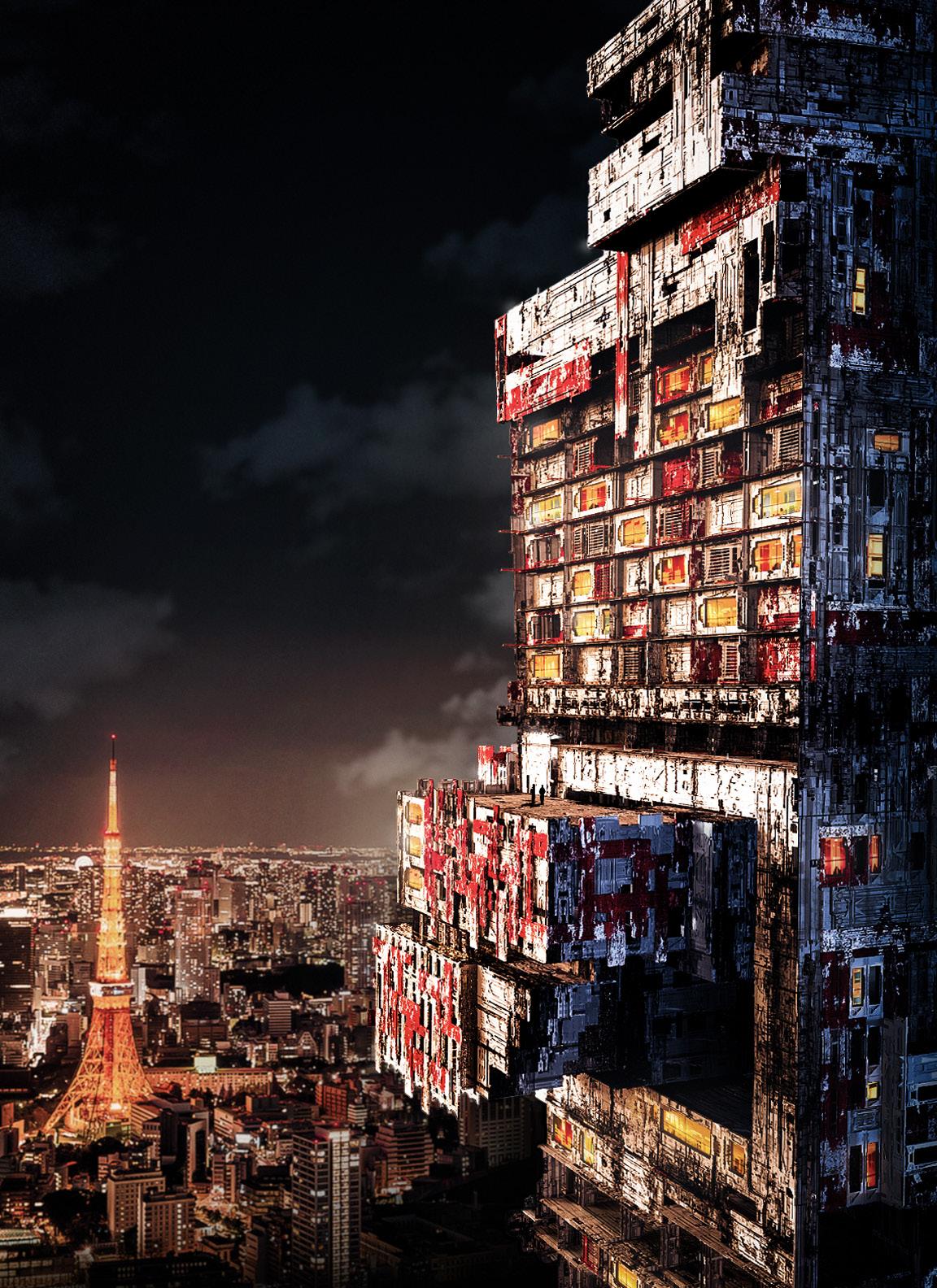
An altar to media and advertising, Shibuya, Japan is a digital haven. In this dense metropolis, the relationship between the strobing displays of digital media, the towering and congested architecture, and an enormous collection of city-dwellers, begins to define new parameters for design. Nowhere is this better represented than at Shibuya Crossing: the most trafficked crosswalk on the planet. Here, a radical new piece of architecture is imagined; one that explores the complex dialogue between prototypical private zones and spatially disrupted public zones. This is achieved through kitbashing methodologies and digital representation techniques.
FRANkENsTEiN’s LExiCON
Representationally, this project was to be translated through a series of evocative and cinematic images, inspired by chosen references from film, anime, and games. Here, inspiration draws largely from the technofuturist aesthetics of Akira, Hyper Light Drifter, and Blade Runner.
Through a series of kitbashing and reorienting exercises, a large taxonomy of archetypal plans, sections, and spaces of Japanese hotels, homes, and shops were dissected, bisected, and smashedtogether. The resultant amalgams were then classified by their respective hybrid programs and these new pieces of private-public intersection were fitted to the skeleton of a threepronged skyscraper.
16
Idiosyncratic and fragmented spatial identities arise from the building’s design methodology. The new “whole”, comprised of its conglomerate “parts” shifts and disrupts traditional ideas of public and private space. At times, dining rooms and home roof gardens flow seamlessly into open shops and theaters. These themes parallel the manner in which many buildings in Shibuya blur the lines between their own residencies with shops and restaurants. Through these maneuvers, a new, transitional language of hybridized spatiality is created that beckons for exploratory inhabitation and a re-imagining of hyper-dense living.
This tower behaves antithetically to many of its neighbors. While the majority of the architecture in Shibuya is adorned with strobing LCD advertisements, this building turns its digital persona inwards, towards its inhabitants. Rooms and terminals in the building lead to zones of digital interaction, some for one and some for one-thousand. The building’s complex and fragmented silhouette is its own statement, in direct contrast to many of the blocky skyscrapers adjacent to it. Comprised of the massive, painted and worn hulls of recycled Japanese cargo-ships the exterior mimics the digital noise of Shibuya Crossing, but its real screens and monitors are subject to the curiosities and attentions of those who explore and those who dwell within.

hEy NEighbOR! INVERTiNg ThE NOisE
17

18
s AL AMANCA s PA
Spring 2022
Advisor: Anna Deitzch
Location: Salamanca, New York

19
sALAMANCA: ATTUNED TO ThE EARTh
The Seneca Nation of Indians (SNI) is a Native American tribe composed of eight clans located in Western upstate New York, in and around the city of Salamanca.
Integration with the natural world is a quintessential component of the Seneca people’s history and culture. This proposal is a hybrid spa, bathhouse, and traditional herb garden that seeks to entwine these holistic principles through the medium of material and form. Insisting upon both a symbolic and literal closeness to the earth by virtue of its location, this building is imagined as a monument to the values and practices of the people who live in Salamanca.

ICON As ORNAMENT
In Salamanca, a recurring ornament motif can be seen on several of the buildings. The iconic Tree of Peace insignia is inlaid into the masonry and stone walls. This building pays homage to this application of meaningful iconography upon architecture, using a new set of symbols. The icons for each of the clans that comprise the Seneca Nation of Indians: Deer, Heron, Hawk, Sandpiper, Bear, Wolf, Beaver, and Turtle, are each abstracted into collections of mosaic dots. Their orientation and repetition across the facades and interior walls of the building create a gradated tapestry which affords asymmetry and visual relief to the long volume, and more importantly, which connects the building to its people and their practices. In concert with this, the building also uses locally sourced materials in its construction. Beyond the natural stone that it is embedded into, the vast majority of the building’s material composition is hemp-crete. This alternative to concrete not only boasts impressive technical improvements from its predecessor, but can be harvested from the many hemp farms within the Salamanca region.
20
gOiNg DEEPER

This hillside retreat can be accessed in two ways. The first is via an existing dirt road that leads to a hilltop parking lot for extended stays. The second, and more experiential, is via a cable car which provides beautiful, panoramic views of Salamanca and its forested hills. Both means of access lead to the roof, which is the central point of entry into the spa.
The roof meets the grade of the hill’s terrain and embeds itself into the hillside’s rocky outcropping. Here, the artificial extension of the landscape provides ideal space for a large, traditional and holistic herb garden. The actions of planting and harvesting for sustenance has deep cultural and historical ties to the Seneca peoples, and this building seeks to dedicate a portion of itself to those practices.
The experience of this building is a partially-natural, partially-artificial subterranean descent that grows increasingly spatially intimate. Floor 4 houses an herb treatment room and herbal cafe as well as offices and exhibition rooms. At floor 3 the building starts to resemble a holistic spa. Saunas, massage rooms, steam rooms, and exercise spaces can be found here. Floor 2 houses the first half of the aquatic program: a large, heated pool, hot tubs, and private baths. Finally, the lowest floor houses a “private” pool that is built into a stunning, natural grotto.


ROOF - ENTRy FLOOR 4 FLOOR 3 FLOOR 2 FLOOR 1 21
gONE sPELUNkiNg
On the East side of each floor of the building is an array of rooms for overnight guests. These rooms butt up against the site’s existing rocky outcropping, creating a cave-like atmosphere within the rooms. Overnight guests can embed themselves within the rugged earth that this building clings to.

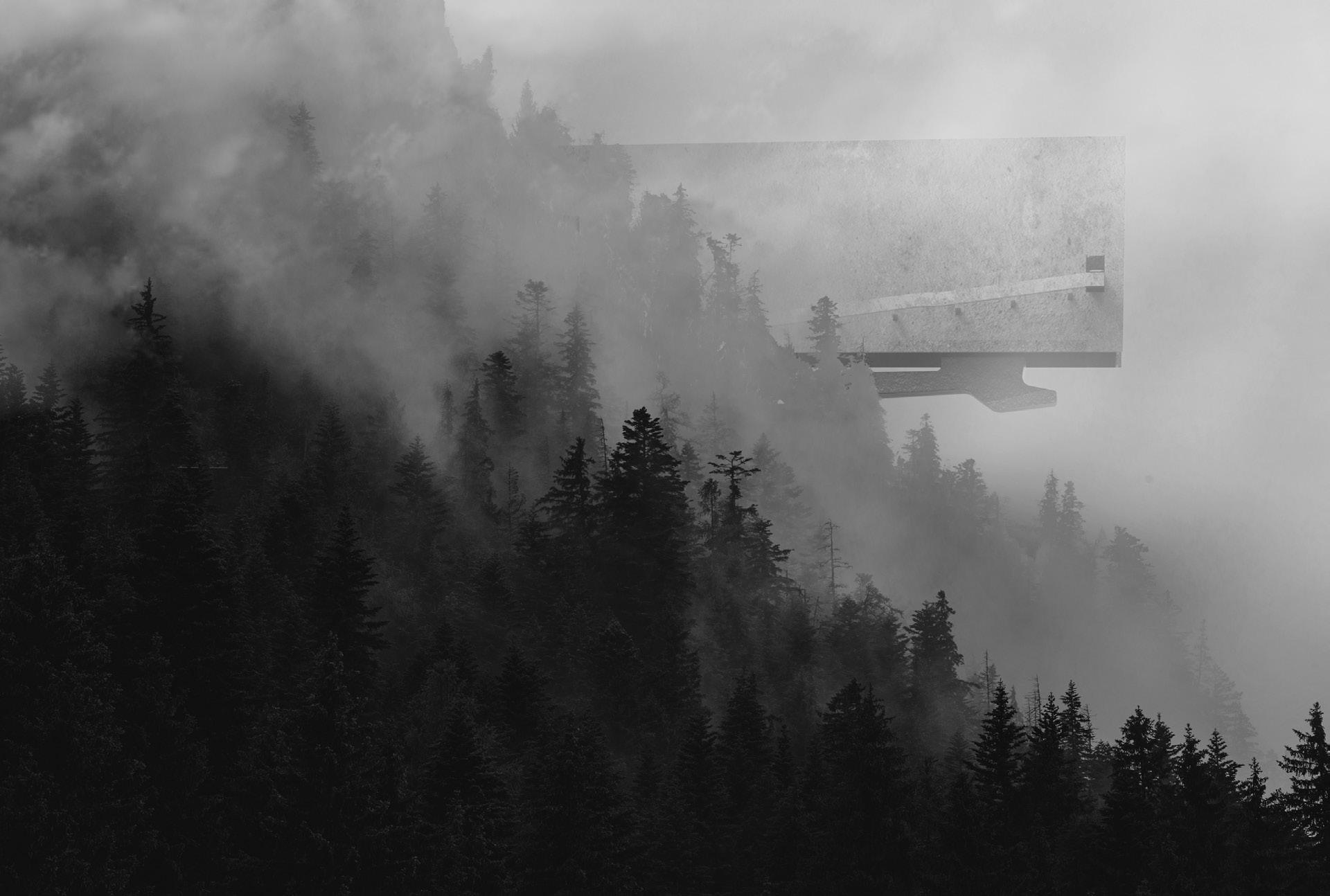
The majority of the spa extends out and over the hillside, atop a single, massive support beam. However, in other key moments - like the aforementioned basement grotto pool - the building reengages with the site’s rocky terrain. These discrete moments of material tension are discovered gradually as one explores and experiences the building’s many therapeutic amenities.

22
Fall 2022

Elective Advisor: Catherine Wilmes
Location: Cornell University, New York
23
VE s TI g IAL b ARO q UE
RENssELAER hALL: VERNACULAR PLAygROUND
Rensselaer Hall is a large but subdued Georgian Revival building on the North side of Cornell’s campus. Sand-colored bricks and simple windows stretch across its flat facade. However, in the center of this building, invariably distinct from its context, sits a vernacular amalgam. A neoclassical balcony and balustrade support two simplified Doric shafts. These terminate with Corinthian capitals. On top of these columns, sits a blank frieze, itself topped by a Baroque broken pediment. This stylistic blend of epochs and empires creates a powerful moment of architectural levity amid an otherwise categorical building.

Drawing from the broken pediment and those vernaculars that exist below it, this project imagines a fictional reality in which this central bay is redesigned in a new style: The Vestigial Baroque, or “Voque”. This style builds upon the design sensibilities of the classical Baroque era, then blends it with modern-day additive manufacturing and discrete object design. This fictional redesign is represented through a series of renders, models, and pseudo-historical taxonomies.

24 ORIgINAL REFERENCE PhOTO
Corinthian Capital:
Atypically, atop the Doric shaft, sits a distinctly dis-ordered Corinthian capital with its recognizable, flowery protrusions and depth. This asserts the building’s noncommittal relationship to one style or order.
Column Shaft:
In keeping with Greek Neoclassical vernacular, this bay-window balcony employs a simplified Doric column shaft which acts as the vertical support element for its pediment above.
Baroque Broken Pediment:
At the apex of this central bay, sits a Baroque broken pediment. Curved striations of tapering depth vie towards the central, arch gap. The center is adorned with a rectangular Tympanum above a sinewy ornamental keystone.
Vestigial Baroque Column Shaft:
The Vestigial Baroque style is not tethered to the strictures of composition, symmetry, and proportion that its seminal inspirations were. Here, column shafts, pedestals, and capitols are subject to the non-euclidean strategies of their designers above any prescribed ruleset.

Conglonorament:
In our modern age, as we witness the rise of the Vestigial Baroque, a new trend has arisen: conglomerates of ornamentation from ancient and modern eras adorning architectural objects, insisting upon a new, temporally-apathetic sense of symbolic legibility.
Vestigial Baroque Broken Pediment:
At the apex of this central bay, sits a Vestigial-Baroque broken pediment. Curved striations of tapering depth vie towards an ambiguous center. The pediment’s wings are subject to the whims of spatial orientation, pulling and slipping away from each other, yet still evocative of their opposite.
Sculpted Urn:
Atop the balcony’s two undetailed pedestals sit two smooth-sculpted urns made of sandstone. These Greek and Macedonian inspired decorations create a visual extension of the smooth balusters below.
Porch Support Brackets:
Two brackets sit under and support the porch floor, adorned with their own unique ornament. These legs taper inwards towards Rensselaer Hall’s brick facade.
Balusters and Balustrade:
An array of curved, sculptural balusters wrap around the shallow balcony, supporting a volumetric top-rail and two urns. These Mediterranean-style balusters add to this central bay’s stylistic ambiguity.
Tilted Vestigial Baroque Urn:
In the works of Vestigial Baroque designers, decorative urns are sometimes used to connote axial direction shifts with a form; tilted and dislodged from their origins, pointing in the direction of the new movement.
Balusters and Balustrade:
An array of curved, sculptural balusters wrap around the shallow balcony, supporting a volumetric top-rail and two urns. The array, however, is lopped off in service of the now-dominant column shaft that erupts through the balcony’s underside.
Vestigial Baroque Window:
One of the common techniques among “voque” designs is the replacement of some or all “standard” windows on a building with “vestigially”-styled fenestrations. Often this involves the larger, ornamental form’s absorption of portions of glass, mullion, and frame.
Doric
25


26
Spring 2021
Competition: The Big Thing Competitions
Location: The Cosmos

C
AM
AFTERLIFE
h
b ER
27
ThE COsMOs: bEyOND ThE VEiL
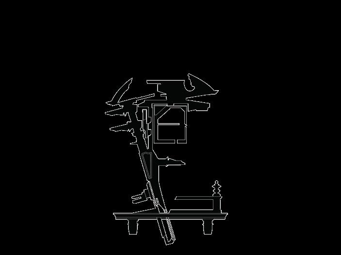
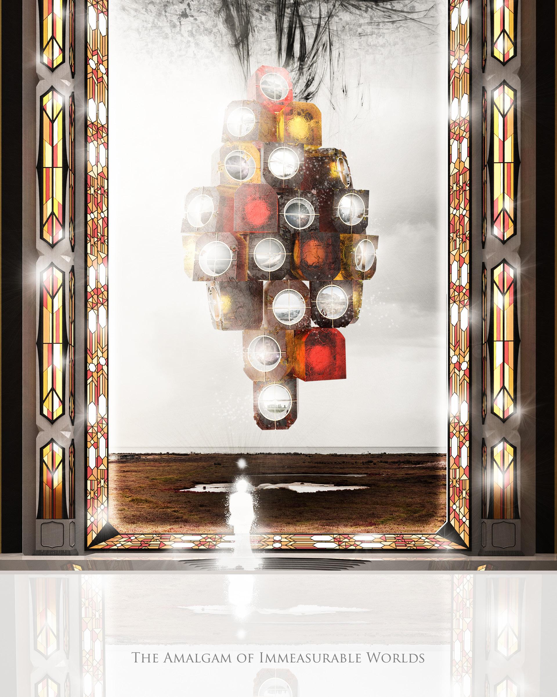
For all the many joys and wonders that can be known during our time alive, there remains so much that lies beyond the veil of our understanding. At the instant of one’s final breath, the soul is shorn from its tethered form, and transported to the Hall of The Unknowable Truths; an impossible architectural monolith that waits beyond our realm of time and space.

28
MATTER AND ENERgy
Within the magnificent walls of this form, there are four apertures. It is through these four apertures that this new soul will have their last, greatest epiphany before stepping on to their final destination beyond the veil. Matter, Space, Energy, Time; one for each window. These four incorporeal concepts are embodied with form and with spirit. The Four Entities of All Reality. The final blessing bestowed upon humanity is access to these unknowable incarnations. Thousands upon thousands of souls walk this hall every hour, and thousands of souls are deposited at the shimmering feet of the veil at the end of their walk. But each soul experiences the hall as an isolated experience, unaware of the thousands of others around them. The epiphanic nature of The Four Entities of All Reality is felt individually by each soul and intimately ties to their own personal human story.


29
None can know what lies beyond the veil, what destination the soul will ultimately reach at the end of the Hall of The Unknowable Truths. But in this moment, it matters not. In this moment all that is, is the knowing, and the enlightenment that accompanies the knowledge. What better way to move forward into the infinite tomorrow than to finally, truly understand one’s yesterday?


sPACE AND TiME
30
U P s TATE L E xi CON
Spring 2020

Advisors: Tao DuFour & Aleks Mergold
Location: Watkins Glen & Montour Falls, New York
31
UPsTATE NEw yORk: A CULTURE OF COZiNEss
Two cozy villages sit quietly in the valleys of Upstate New York. Watkins Glen and Montour Falls lie only four miles apart and share many similarities in their architecture and in their history, but they each boast their own rich sense of culture and natural splendor. Two new buildings will create a dialectical connection between the two villages while simultaneously paying homage to their shared architectural lexicons and to their distinctive cultures.


hOMAgE AND MiMiCRy
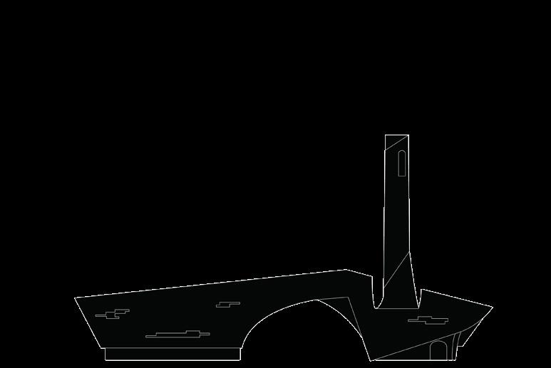
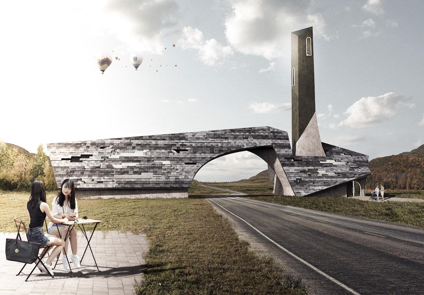
Both buildings lie at the edge of their respective villages. Both have roofs which span across the road that connects the villages. The roofs are adorned with tapestries of rectangular shingles, broken occasionally by small windows. These shingled roofs call to the quaint and often refurbished shingles of many of the important buildings in both towns. Playing upon the few elements of notable verticality within the villages: their steeples and their smokestacks, both of the buildings are given their own steeple-esque tower. In Watkins Glen, this is an accessible outlook tower. In Montour Falls, the tower is a mirrored tube for illuminating a concert and play stage. From here, both buildings begin to embody their own respective village and its context.
32
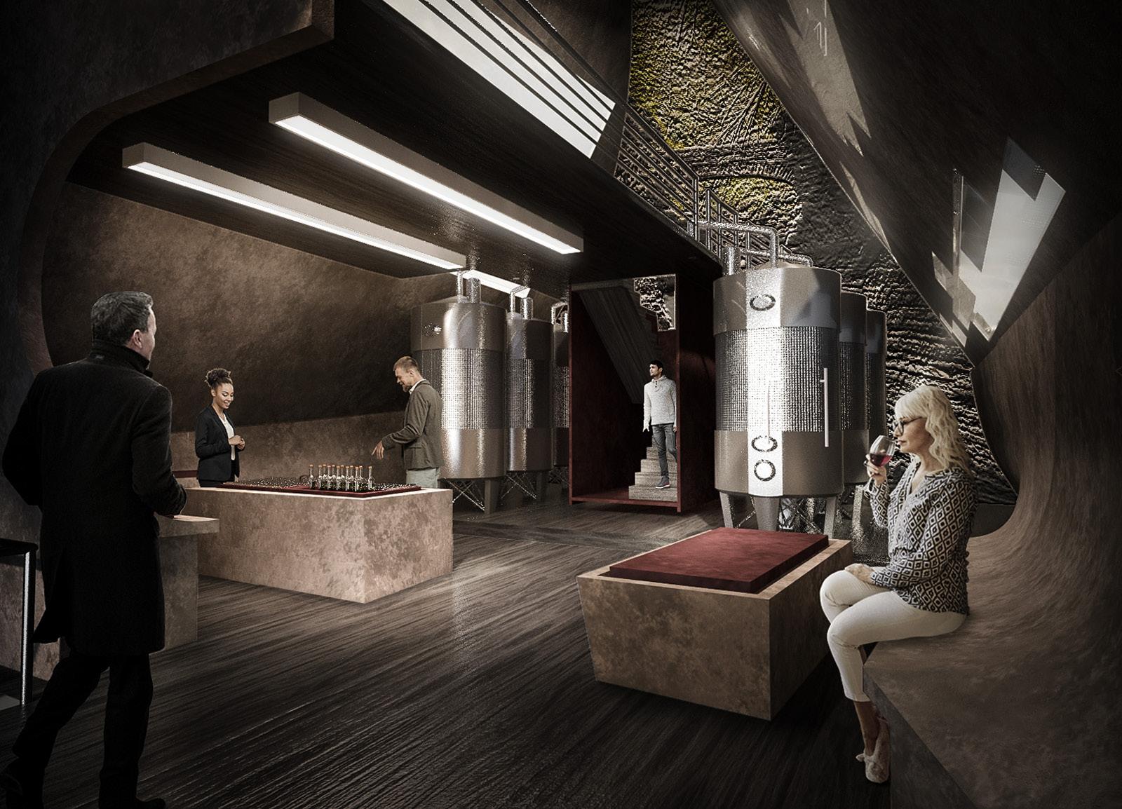
The Watkins Glen building plays upon the multitude of adjacent vineyards in the hills above it. The program is a new winery and tasting room that sponsors and samples the local flavors. Across the building’s arch is a small visitor center and access to the overlook tower. Here, visitors can gain a stunning view of the village, Lake Seneca, and Watkins Glen Park. The Montour Falls building slices away roof and wall to create a moderatelysized open-air theater. The locals of Montour Falls take immense pride in their musical and theatrical productions which are tied to the history and growth of the village. The steeple here is not an accessible tower, but a light-collecting illumination device for the performers and a lightreflecting device to announce that a performance is underway.


These buildings share many similarities in form and material, but they, just like the villages they sit outside, are defined by their own unique cultures and contexts. Together, they create a shared lexicon between the two villages while simultaneously acting as architectural manifestations of the two different stories being told, mere miles apart.

PROxiMAL sTORyTELLiNg
wATkiNs gLEN - sOUTh sECTION
33
wATkiNs gLEN - wEsT sECTION
Tyler Linnehan TylerLinnehanArch@Outlook.com
