

This is Cortica.
An autism diagnosis puts determination to the test.
It can feel like an answer made entirely of questions, compounding feelings of frustration or exhaustion, and clouding a parent’s vision of their child’s future.
But at Cortica, our team and our families never give up because we understand that love is only strengthened by adversity.
We diagnose the present and chart a clear path forward, offering medical care, behavioral therapy, developmental services, and family support all in one warm and welcoming environment.
Our personalized care plans treat the whole child, integrating entire families and communities so that progress at Cortica means progress everywhere.
Here, families find partners in determination.
A stronger sense of hope and increased peace of mind. Together, we can bring forth life-changing results, and a future full of clarity, healing, and joy.
Positioning 01
Positioning differentiates our brand from competitors and creates value for our audience.
● Strategy ● Brand Pillars
● Strategy
Our Company Strategy
● Our Vision We exist to help neurodivergent* children and their families unlock more joy, every day.
● Our Mission We design and deliver life-changing care— one child, one family, one community at a time.
● Our Promise
We unify care journeys to guide families through comprehensive, cutting edge treatments, offered all in one place.
● Brand Pillars
Our Brand Pillars
● Innovative Expertise
Our multidisciplinary team brings a progressive and rigorous approach to therapy for neurodivergent children, leveraging diverse skill sets to design ever-evolving care plans that produce superior results.
● Coordinated Services
Our centralized set of services creates a welcoming environment for children and their families and provides a therapeutic home—restoring time, energy, and confidence to caregivers and providing streamlined efficiency for referring providers and payers. Our coordination of services extends to all stakeholders, including schools, payers, and other professionals involved in the care of our clients.
● Life-Changing Outcomes
Our care has a tangible impact on the children and families we serve. Our work results in clinically proven progress and improved family wellness. The result: higher satisfaction and long-lasting change.
● Comprehensive Care
We consider the whole child and the whole family in each care plan we create. Our collaborative approach incorporates behavioral and developmental therapies, medical care and family support, and accounts for lived experiences.
● True Partnership
We bring families into the care experience, fostering education and openmindedness so that caregivers feel empowered, optimistic, and ready to embrace their child’s potential. Through trusting relationships, we help families navigate challenges and breakthroughs alike.
Voice & Tone 02
Voice & Tone is a key signifier for our brand personality, defining its character and creating an emotional connection with each of our audiences across all communications.
Voice & Tone Principles
Do’s & Don’ts
Empathetic
An empathetic voice is, by definition, a warm one. Patient and kind. A voice that, even as it does all the talking, gives the impression of being a good listener. The simple realization that someone understands is enough to lighten the load. Empathy will serve as a subtle but vital tool for convincing caregivers that they’ve come to the right place. That our approach will make an impact not only for children, but for the people who love them and strive with them each day.
Approachable
An approachable voice uses clear, concise and colloquial language to make people feel at home. It’s the voice of a friend who wants to help. As we describe the breadth of our services, they should sound like they’re being facilitated by friendly people, and positive results should feel within reach. Approachability is a virtue many websites aspire to, but it’s especially important when dealing with matters as personal, and intense, as these.
Experienced
This is no place for dispassion, or for an overly clinical tone, but it’s still crucial to sound qualified. Our voice can be warm without diluting our expertise, and no caregiver wants to doubt the credentials of the people who are treating their children. We can achieve this balance by respecting our audience’s intelligence — something people respond to even if they’re lost at sea. It’s not enough to be accessible. We also have to be the best people for the job.
Voice & Tone Do’s
Use plural first-person pronouns. Cortica is we, us, and our. Like many of the following do’s and don’ts, this will help fulfill the Approachability principle outlined” in our Voice + Tone.
Address the reader directly. Audiences are you and your.
Use a natural cadence. Contractions are our friends, lengthy sentences are not.
“Children” and “kids” can be used interchangeably, though we use “children” exclusively on the Our Services page, which is more focused on particulars.
Sentence case for headlines and subheadlines.
Oxford commas, please.
Only true proper nouns should be capitalized. For instance, “speech-language therapy” instead of “Speech-Language Therapy.”
Neurodiverse is the term we’ll use, at least for the present, to describe a range of developmental challenges in consumer-facing language. More specific terms can be substituted in appropriate situations.
When referencing our care team, indicate their earned title or degree so as to make their area of expertise as clear as possible.
Always skew positive. Hope, promise and confidence are key factors in conversion, and positivity underscores all three.
● Voice & Tone Don’ts
& Don’ts
Avoid referring to “parents,” as not all caregivers are parents (and, for that matter, not all audiences are caregivers), but references to “your child” or “your children” are just fine, given that the site’s primary purpose is to convert those who care for neurodiverse kids.
No ampersands in headlines unless it’s a stand-alone title like “Sensory & Motor.”
Avoid overtly clinical terminology except when describing specific treatments or diagnoses. Bear in mind that our audiences are probably familiar with a few specialized words that relate to neurodivergence. If we write around those words, we jeopardize our credibility.
Avoid large and uncommon words, and check copy against the Flesch-Kincaid grade goal of level 12 or under.
Design Elements 03
These are the visual pillars of the Cortica brand.
Logo
Color
Typography
Graphic Elements
Logo
The Cortica logo is the combination of a simple and modern wordmark paired with the symbol. The symbol represents many things — our areas of care, our comprehensive approach, but also unity, equality and community. Consistent use of the Cortica logo builds integrity and ensures consistent communication. The logo files are provided in various color formats and file types.
The Cortica symbol is comprised of six intersecting circles with intentional spaces to break up the combined shape. Though each could be depicted in a combined manner, the application of the ‘principle of closure’ creates a simple yet more visually interesting design.


Do not use the mark in colors other than blue/ white/ivory/black.
Do not enlarge the logo when paired with the logotype.
Do not change colors within the logo or logotype to highlight certain elements.

Do not stack the logo and logotype. Do not add a dropshadow to the logo or logotype.
Do not stretch the logo or logotype. Do not adjust the colors of the logo + logotype. They should always be the same color.
Do not change the colors of the logo. Do not rotate the logo and logotype. Do not set the logo and logotpe on a gradient. Only solid colors.
Do not set the logotype in other typefaces. Do not outline the logo or wordmark. Do not place images in the logo or wordmark. Do not rotate the logo
Do not modify the logo.
Do not outline the logo or logotype when there is a fill.
Do not use a gradient as a fill with the logo/ logotype.
Do not use the mark as a ticker or decorative element.
Do not type out the logotype in Haffer to use instead of the wordmark.

Do not create patterns out of the logo.
Color
Cortica Blue Dark Blue Blue
Pastel Blue
Green
Pastel Pink Pastel Teal Dark Yellow Yellow
Pastel Yellow
Color usage
Sensory friendly design is the central focus of the Cortica design system. The colors in our palette are inspired by nature, which have a calming effect on individuals. Off-white backgrounds are used to prevent the brand from feeling overly clinical. Cortica’s color palette uses three shades per color that provide greater flexibility and allow us to meet accessibility standards. Gradients utilizing our color palette may be used sparingly to add visual depth to designs.
Because of the different gamuts available across different color reproduction technologies, you may notice some colors in the palette will change slightly from RGB to PMS and CMYK. To compensate for this, colors have been selected that closely match the RGB values, but are achievable with PMS and CMYK technologies. Use only the provided values on the previous page for colors.
Our Brand Colors Color Application
Pastel Blue Gradient
Pastel Yellow Gradient
Pastel Green Gradient
Pastel Pink Gradient
Statistics Multicolor Gradient (Using Pink / Dark Yellow / Green)
Color Do’s & Don’ts
Accessibility Color Combinations
WCAG (Web Content Accessibility Guidelines) ensure that content is accessible by everyone, regardless of disability or user device. To meet these standards, text and interactive elements should have a color contrast ratio of at least 4.5:1. There are some pairings that work better than others.
We recommend using complimentary or monochromatic colors when creating compositions. The following page includes numerous possible color combinations.
Accessibility Color Combinations
Don’t use low-contrast color combinations that do not meet a color contrast ratio of at least 4.5:1. Do note that some text colors may not work at small sizes but may meet contrast standards as a larger size.
When combining color, do not use colors that are too similar in tone within the same composition. It is best for there to be a harmonious color combination that contrasts visually from one color to the other.
Approved Color Pairings
Typography
External Typography
Haffer is the typeface used for all Cortica materials It is a highly legible grotesque sans serif typeface with a slightly warm touch designed by Displaaay Type Foundry. The lowercase forms are friendly while the bold, angular corners give it an established well founded sensibility. It scales up extremely well to provide clear messaging The Semibold and Medium weights are used for most headline applications. The Regular weight can be used for body and utility copy
AaBbCcDdEeFfGgHhIiJjKkLlMm NnOoPpQqRrSsTtUuVvWwXxYyZz 123456790
AaBbCcDdEeFfGgHhIiJjKkLlMm NnOoPpQqRrSsTtUuVvWwXxYyZz 123456790
AaBbCcDdEeFfGgHhIiJjKkLlMm NnOoPpQqRrSsTtUuVvWwXxYyZz 123456790
● Typography – Internal Typography
Internal Typography
Internal Typeface
In cases where Haffer is not available specifically for internal usage, Helvetica Neue may be used instead Helvetica Neue is available in the M crosoft font library It should not be used in any external facing communications It should also never be used in a combination with Haffer.
Helvetica Neue is a re-working of the Helvetica typeface and is classified as a grotesk typeface, similar to Haffer.
Helvetica Neue Bold – Headlines
AaBbCcDdEeFfGgHhIiJjKkLlMm NnOoPpQqRrSsTtUuVvWwXxYyZz 123456790
Helvetica Neue Medium – Headlines
AaBbCcDdEeFfGgHhIiJjKkLlMm NnOoPpQqRrSsTtUuVvWwXxYyZz 123456790
Helvetica Neue Regular – Body Copy + Utility Copy
AaBbCcDdEeFfGgHhIiJjKkLlMm NnOoPpQqRrSsTtUuVvWwXxYyZz 123456790
Letter spacing
Below: Letterspacing or tracking should be set a bit tighter at -3% for headlines and -1% for body copy. Never add additional tracking to the typeface.
Just right
Too tight Too loose
Line
spacing
Headline text should be set in Haffer Semibold
Large subheadlines should be set in Haffer Medium
Looking for an accurate diagnosis, effective treatment, or other support for your child and family? Our one-of-a kind physicians and therapists are here for you. We offer diagnostic evaluations and evidence-based therapies for child.
We’ll discuss your child’s health and your family’s insurance, then schedule a couple of focused sessions: the first with a pediatric neurologist to determine further testing and appropriate therapies.
Medium subheadlines should be set in Haffer Semibold
Looking for an accurate diagnosis, effective treatment, or other support for your child and family? Our one-of-a kind physicians and therapists are here for you. We offer diagnostic evaluations and evidence-based therapies for child.
We’ll discuss your child’s health and your family’s insurance, then schedule a couple of focused sessions: the first with a pediatric neurologist to determine further testing and appropriate therapies.
Right: Linespacing for large headlines should be set at 100% or the same point size of the headline. Subheadlines should be set at 120%, body copy set at 140%.
Rules and circles add structure and hierarchy.
Rules Circles
Rules or lines can be used to help create hierarchy between information. This guideline document shows the use of rules in practice. Only use one weight of the line throughout the design. Do not mix various line weights.
In instances where smaller bullets or checkmarks can be used, consider using a larger circle for playful emphasis. We recommend using the circles that Haffer has built into its glyphs palette.
Developmental Therapy
● What is developmental therapy?
Lorem ipsum dolor sit amet, consectetur adipiscing elit. In sed eget augue eget nullam at. Integer bibendum blandit massa pellentesque commodo.
● Types of therapies
Lorem ipsum dolor sit amet, consectetur adipiscing elit. In sed eget augue eget nullam at. Integer bibedum blandit massa pellentesque commodo.
● The Cortica difference
Lorem ipsum dolor sit amet, consectetur adipiscing elit. In sed eget augue eget nullam at. Integer bibedum blandit massa pellentesque commodo.
● Lorem ipsum dolor sit
Lorem ipsum dolor sit amet, consectetur adipiscing elit. In sed eget augue eget nullam at. Integer bibedum blandit massa pellentesque commodo.
Graphic Elements
Foundational building blocks create consistency across various applications.
Gradients
In addition to using full color fills, gradients can be used to create depth and brightness. The use of the multicolor gradient, in particular, helps emphasize success metrics.
Stroke Styling
Light weight strokes should be set at 1 to 2px. Dotted lines should have a 4px dash and 4px gap. Marker-like strokes may be used sparingly under/around text for emphasis.

Graphic Elements
To the left you will find the graphic elements that serve as the foundational building blocks of various graphic applications within the Cortica brand, including complex symbols and data visualization. By having a breadth of elements, a variety of graphics can be created that appear visually diverse yet cohesive.
Patterns
Patterns add visual texture to otherwise flat applications of design. Diagonal lines at a 45 degree tilt with a consistent amount of minimal space between each stroke may be used or gridded patterns.
Rounded Elements
To add visual cohesion with the logo, the circle is a visual motif that can be integrated into the design as circle graphics, curved lines, and the rounding of the corner radius of rectangular elements.
Complex symbols help visualize abstractions and complexsimplifyideas.
Usage Guidelines
Using the foundational building blocks on the previous page, a custom library of complex symbols have been created for the Cortica brand. These illustrations can be used, scaled large or small, to help visualize abstractions and simplify complex ideas. The animated versions of the complex symbols can be used for social media or on the Cortica website.
ata visualization communicates Cortica’s proven and superior outcomes.
Design Applications 04
Accessible design is good design.
The following print applications are created using the visual pillars of the Cortica brand.


Digital
Cortica’s web style library is located on Figma. Please contact the brand/marketing team of Cortica for more information.
Digital Do’s & Dont’s


Do vary layouts


Do vary background colors
When stacking components, do vary the layout of the component above and below. Varying the layout of content allows for each content block to feel separate without needing to change the background color.
When stacking components, consider varying the background color. Rich background colors are preferred to highlight specific content, whereas pastel backgrounds should be used more sparingly.
Don’t stack dark backgrounds
Do not stack components with dark color backgrounds, unless they are part of the same section. Adding too much dark color to a page makes it visually heavy and can make it more difficult for the user to read long-term.
Don’t stack similar layouts
Do not stack components with similar layouts, even if separated visually by a background color change.


Every day we see children soar to new heights. Here are some of their stories
ncrease in social communication 80%
XXX
every child
XXX

Increase in social communication
Increase in social communication
ncrease in social communication
Reduction in problem behaviors over 64%
Reduction in problem behaviors over
XXX Lorem ipsum dolor sit amet, consectetur adipiscing elit. Egestas convallis scelerisque augue amet. Nisl, aliquam gravida tincidunt rutrum. Dui morbi consequat tincidunt sed nisl. Diam tempor nullam nulla pharetra consectetur in eu ac ultrices. Venenatis ut vel gravida consectetur sit malesuada ac.
Reduction in problem behaviors over XXX
Without Cortica, our child would not have the progress in her capabilities that we all en oy today. Consistent and frequent visits with the team at Cortica has allowed our child to matriculate into General Ed, independently communicate and engage with her peers appropriately, and independently problem solve and self soothe. –Caregiver of five year old
XXX Lorem ipsum dolor sit amet, consectetur adipiscing elit. Egestas convallis scelerisq augue amet. Nisl, aliquam gravida tincidunt rutrum. Dui morbi consequat tincidunt sed nisl. Diam tempor nullam nulla pharetra consectetur in eu ac ultrices. Venenatis ut vel gravida consectetur sit malesuada ac.
Reduction in problem behaviors over XXX
Phasellus ornare ac scelerisque viverra tortor, nisl suspendisse orci felis.
Lorem ipsum dolor sit amet, consectetur adipiscing elit. Egestas convallis sceleris augue amet. Nisl, aliquam gravida tincidunt rutrum. Dui morbi consequat tincidunt sed nisl. Diam tempor nullam nulla pharetra consectetur in eu ac ultrices. Venenatis ut vel gravida consectetur sit malesuada ac.
Phasellus ornare ac scelerisque viverra tortor, nisl suspendisse orci felis.
Phasellus ornare ac scelerisque viverra tortor, nisl suspendisse orci felis.
–Lorem ipsum dolor
–Lorem ipsum dolor
–Lorem ipsum dolor
We combine medical care with behavioral and developmental therapies to support neurodiverse
Average recommendation for healthcare
children more completely, 95% Families that recommend Cortica 38%


Comprehensive autism care, led by doctors
Our collaborative team provides children with personalized ABA, medical, and developmental therapies — all in one place.


Our expert physicians and therapists will get
your child through in person and telehealth evaluations. We’ll work with your family to set the right goals and create a care plan. To best meet your child’s needs, we offer therapy services in a variety settings — at your home, in our centers, in school, in the community, and over telehealth. Therapy sessions can begin as soon as your schedule allows, and flexibility makes a world of difference.
Our doctors and therapists use ob ective, evidence based tools to assess your child’s results, and they’ll meet with you regularly to review progress. At team meetings, you’ll sit down with your child’s doctor and therapists to celebrate the wins, set new goals, and plan for the future.
We ll be there for you and your whole family
Your abilities will grow along with your child’s. You’ll participate in therapy sessions, parent coaching, and team meetings. You can connect with our
Social
Social applications of the Cortica brand can lean more expressive and visual compared to the print and web applications.


1 in 4 children are lorem ipsum dolor sit amet, consectetur adipiscing elit


corticacare
corticacare
corticacare
Cortica Lorem ipsum
A life with Cortica is a life well-lived.
● Art Direction
Guidelines
● What’s Working & What’s Not
A life well-lived
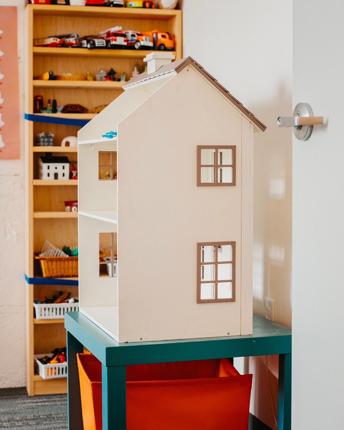
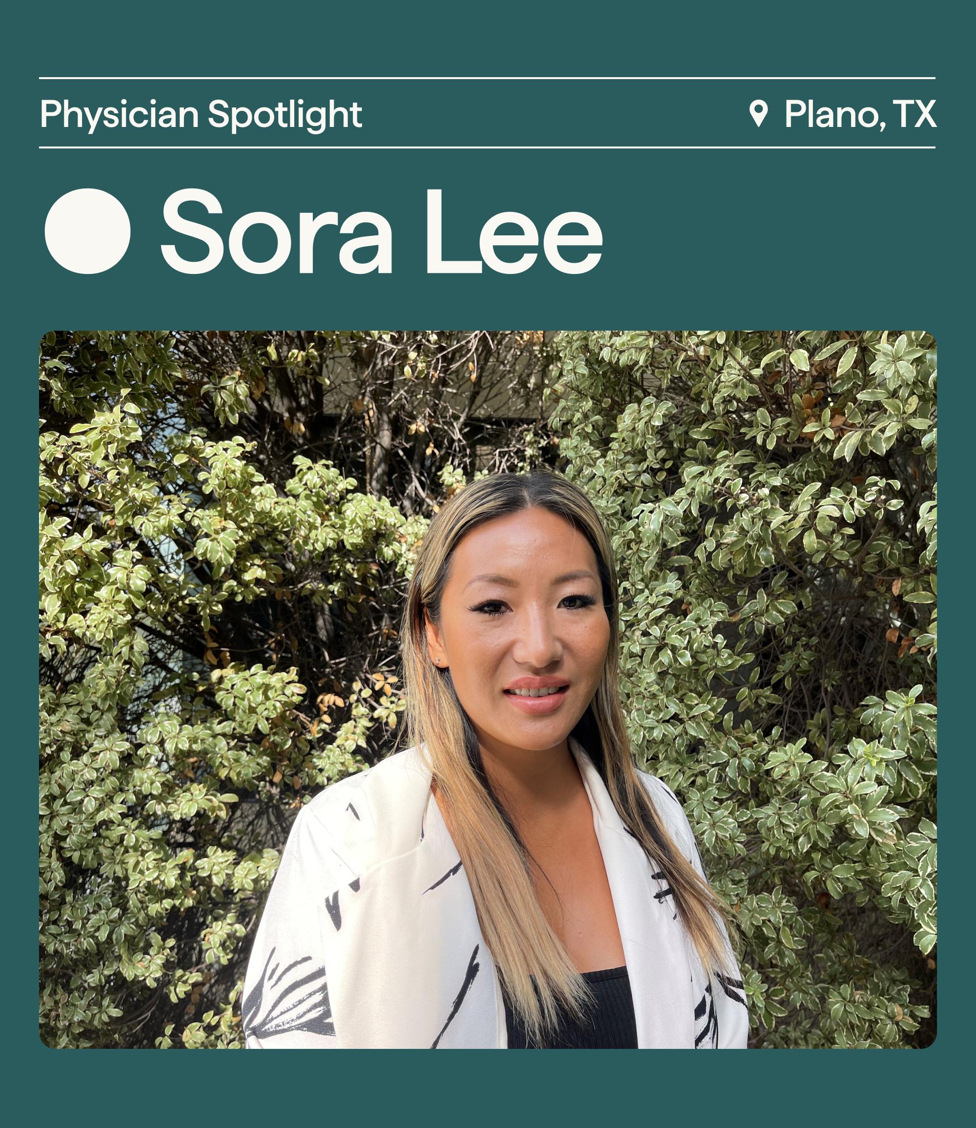
Representing and capturing approachable, authentic moments gets to the heart of Cortica's approach. Rich, human-focused photography that depicts everyday life builds an emotional connection with the audience, and conveys that life with Cortica means warmth, positivity, and healthy growth.


Image Cropping Photoshoot Recommendations
To create a cohesive visual system, images should be cropped either within a circle or with rectangular frames with a corner radius of 12px. Image ratios for rectangular images include 1:1, 5:4, and 16:9. Only use standard image sizes. Do not apply drop shadows to imagery.
When selecting stock or producing imagery, avoid using or having the models appear to be overly posed. Backgrounds should not appear to be too sterile or composed. At the heart of the Cortica photography style is a sense of authenticity and warmth.
*Images above are not Cortica owned images. For art direction purposes only.
Image Cropping

Center the subject within the frame. Crop and zoom in on your photo to focus attention.
Crop in too tightly and leave ample amounts of whitespace in the photography. Also avoid creating too wide of a crop, losing focus on the subject matter of the imagery.
What’s Working & What’s Not

What’s Working: Authentic, joyful, family interaction
What’s Not Working: Activity is difficult for some children
What’s Working: Authentic, joyful, family interaction
What’s Not Working: A lack of warmth, too wide of a shot

Please note that many of the photographic images used in these guidelines are not owned or licensed by Cortica, and are intended only to illustrate the brand mechanics.
Under no circumstance should you use any photo or example in the guide for any kind of public facing communications.
Always ensure that you have the approval of the appropriate copyright owners before using a photographic image in a Cortica communication.
If you are having touble with anything in this guide, you are missing/need brand elements from the brand package, or you are unsure if your communication best represents the Cortica brand, please contact the Cortica brand/marketing team.