PORTFOLIO PORTFOLIO
DANNY NOLAN SELECTED WORKS 2018 - 2023
dannynolan.work


DANNY NOLAN SELECTED WORKS 2018 - 2023
dannynolan.work

a futuristic take on the traditional office building
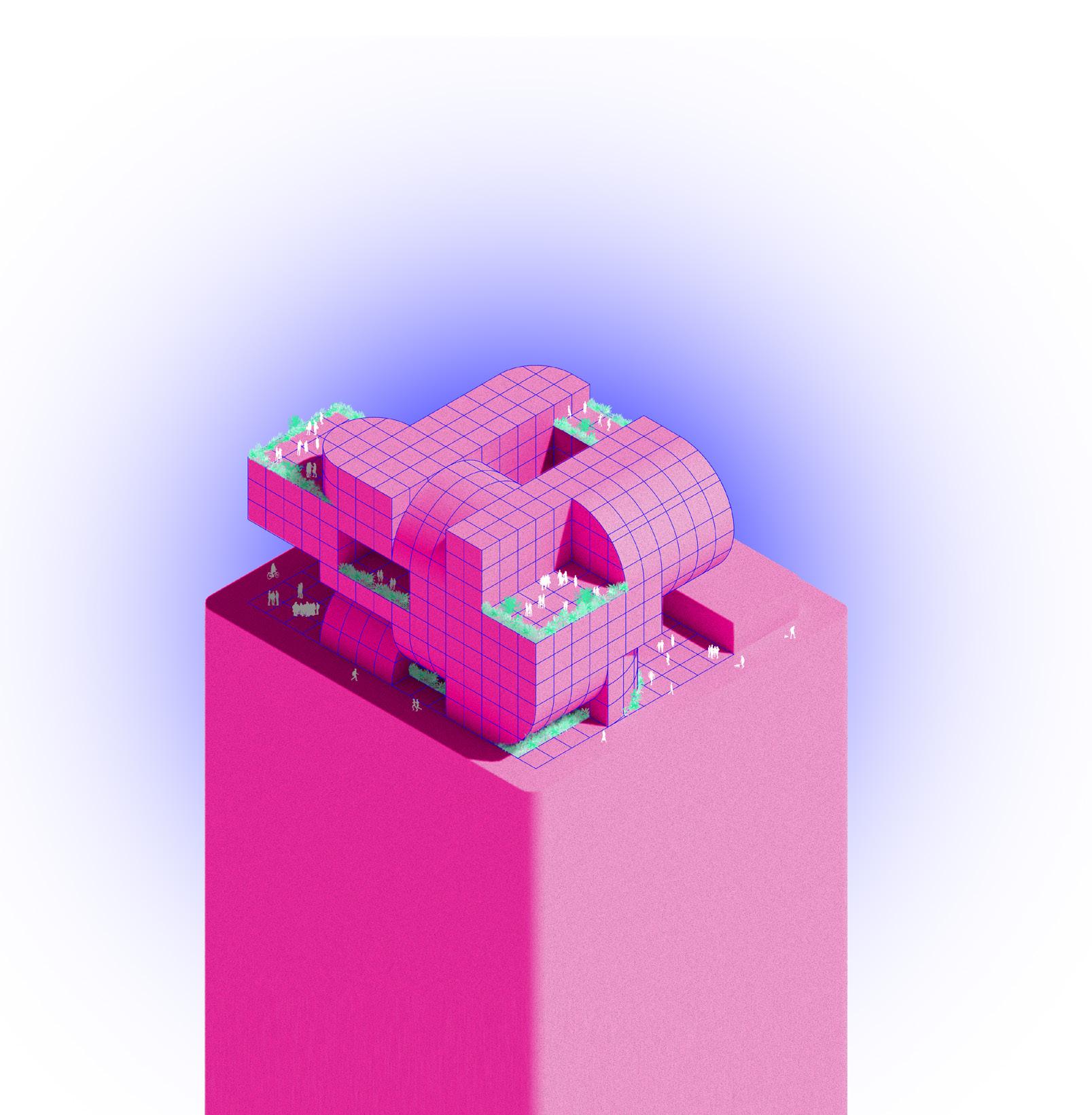
What if our work and home life were symbiotic? Mutually beneficial? What if the office could grow and adapt, bend and twist like all organisms on the planet and achieve resiliency? Through this seamless integration, could our work become so fruitful, the human race would see an acceleration of development without sacrificing core values revolving around our home, social life, and mental health? Could it become this “SUPERORGANISM?” A new contemporary take on office life rooted in the radical architecture movement, this mega office block symbiotically combines programmatic elements to create a “SUPERORGANISM.” Located in Portland, Oregon, this office building considers all the lessons learned for a (fingers crossed) post-COVID era including adequate space for social distancing, contactless food delivery drop off areas, and satisfactory access to outdoor spaces for added ventilation. Other programmatic areas to assist office work include maker spaces, various seating and working typologies, a fitness center, foodstalls, and a gregarious amount of plants. “SUPERORGANISM” seeks to create an understanding of how work and life can flow together as one not only though physical structure, but the creation of these integrated spaces through light, color, and program.
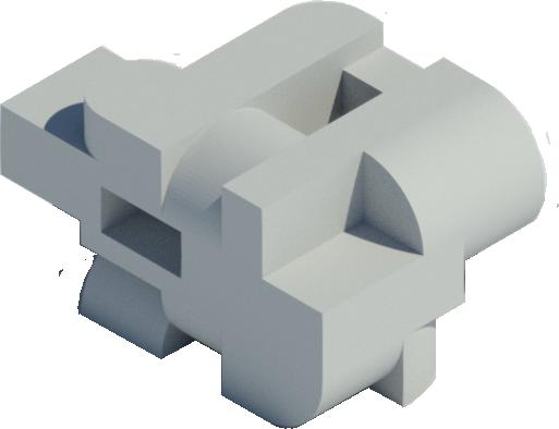

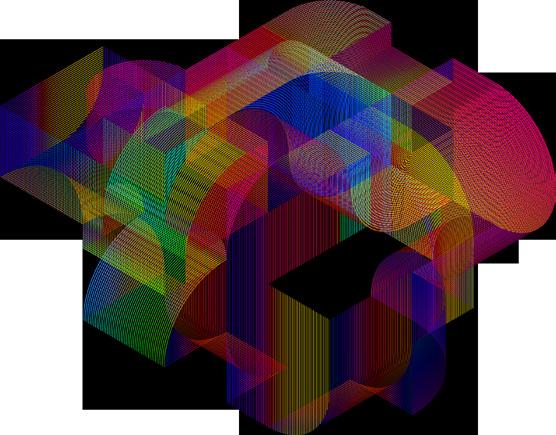


Inspired by the radical content of Superstudio and posing the question of what life looks like after the ambitions of Superstudio are achieved, these building blocks are merged and mutated with a tensile rhetoric of the rigidity of the workplace and fluidity of personal life. The unification of organic and inorganic create a provocative composition, representative of how personal life and work life can reach equilibrium.
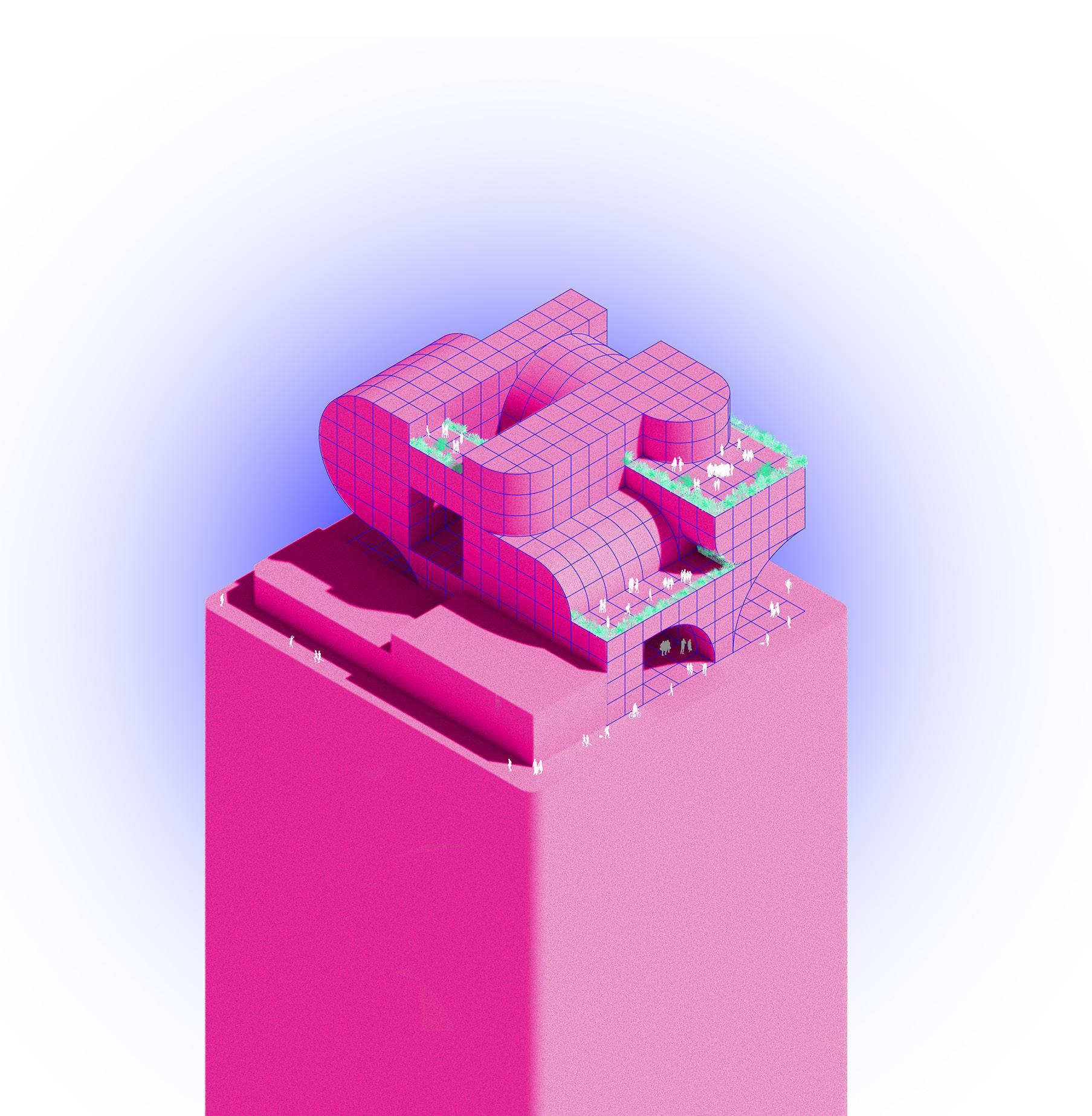
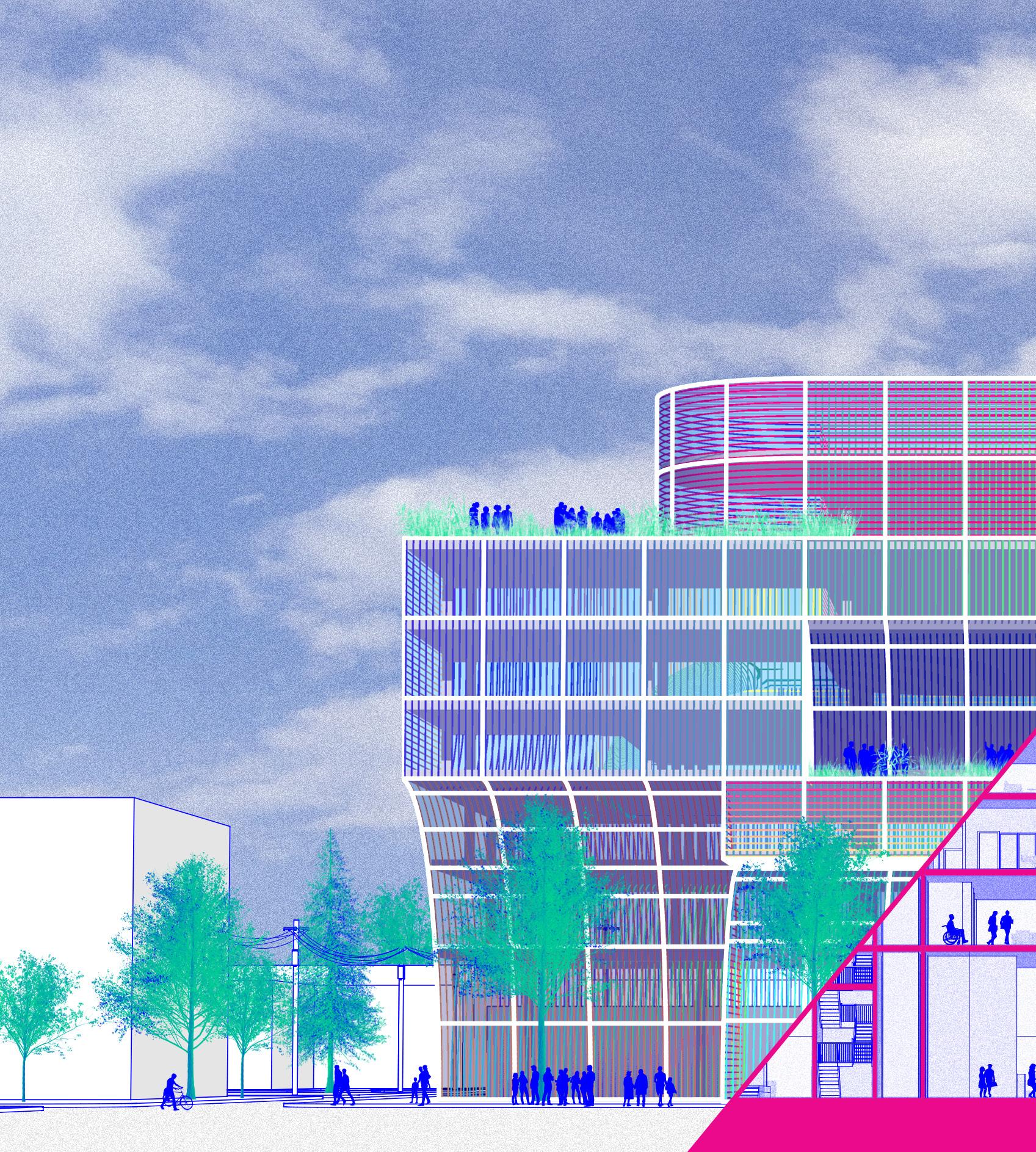
In the context of Portland, Oregon, the massing resists the vernacular and demands attention from those on the street, desiring to be seen. While the building is monolithic in its size, the twists, bends, and curves add a level of intricacy to break up the overall form and providing outdoor spaces, reducing it to a singular entity.

Welcoming visitors, guests, or individuals seeking a place to work, the ground floor lobby and food hall contains a variety of seating typologies for dining, informal meetings, waiting, and welcoming. Gender neutral restroom design increases stalls per square foot and temperature controlled lockers near reception allow for simple contactless food delivery.
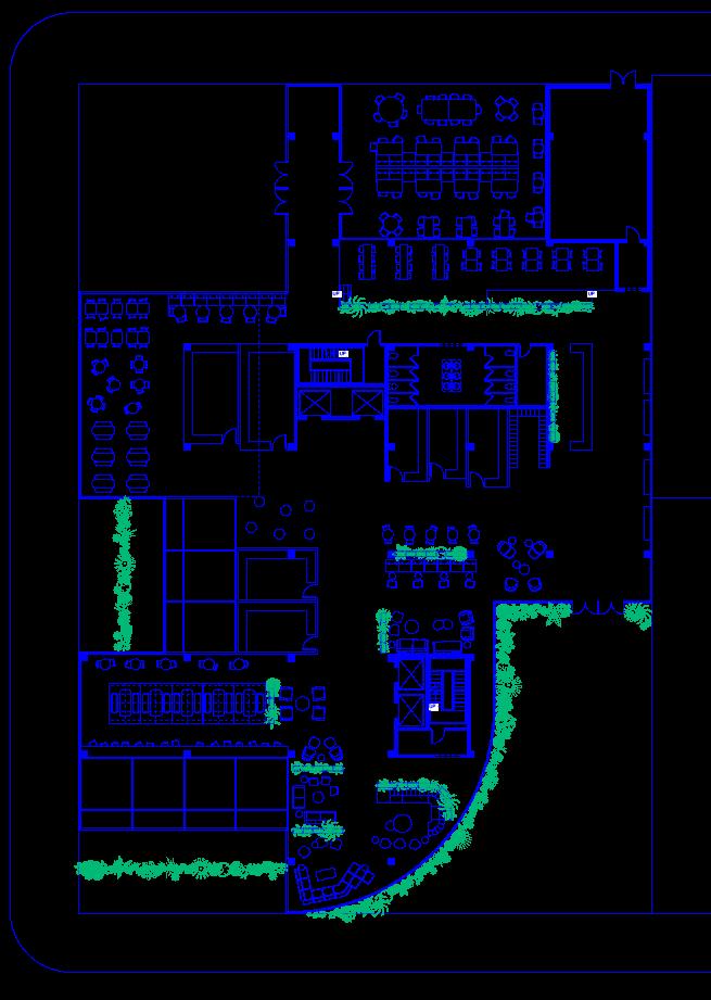
GROUND FLOOR (left)
1. OUTDOOR SEATING
2. MULTIPURPOSE OUTDOOR SPACE
3. BACK OF HOUSE / LOADING
4. DINING SEATING, bar height, group tables, single tables
5. DINING SEATING, single tables, picnic style seating
6. FOODSTALLS 4 & 5: Afuri Ramen, Stretch the Noodle
7. FOODSTALLS 1, 2, & 3: Killer Burger, AkaPDX, Bamboo Sushi
8. CONTACTLESS FOOD DELIVERY LOCKERS: UberEats, DoorDash, PostMates
9. RECEPTION, directory, check ins, general information
10. LOBBY SEATING 1, casual, formal, waiting for a friend or meeting
11. FOODSTALLS 6 & 7: Good Coffee, Sweetgreen
12. DINING SEATING, single tables, booths, bar height
13. LOBBY SEATING 2, larger group, collaboration
PERSPECTIVE VIEWS
The main entrance, located at the base right hand side of this graphic, cascades across the entire vertical of the building and creates a smooth transition from the streetscape. These curves, openings, and edges are all met at different places across form and delicately at the ground plane. Vegetation at exposed points soften the composition and add a level of familiarity.
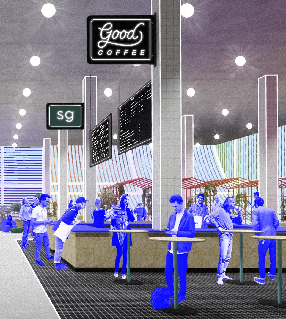
GROUND FLOOR FOOD HALL, SEATING & CIRCULATION
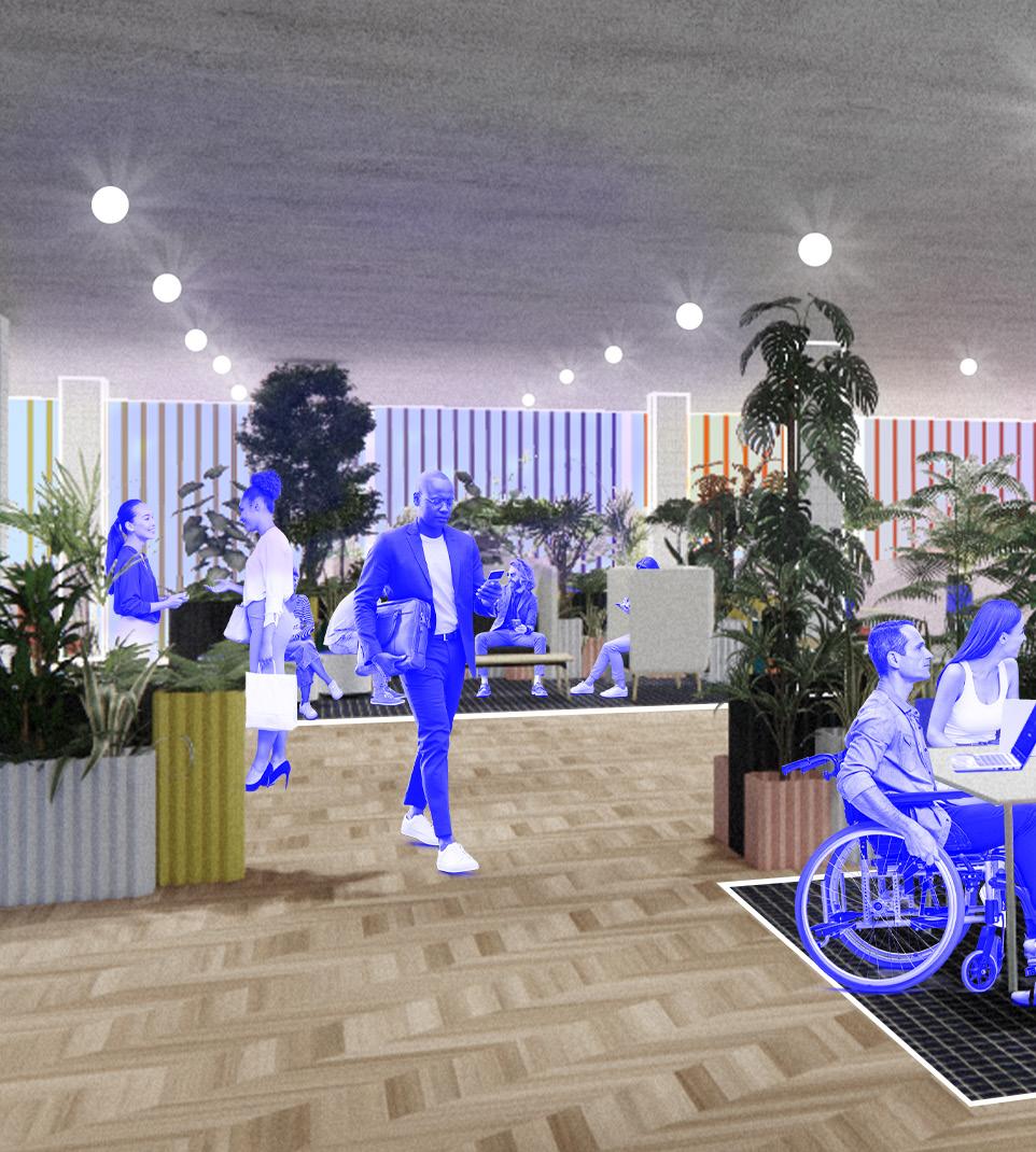
Various seating typologies in the lobby and food hall allow for people to do work, interact, or relax during their day, or take a break when needed. The multicolored dichroic glass façade distorts light entering the building, creating different micro colorful environments and atmospheres across the interior landscape, saturating, highlighting, and lowlighting different areas.

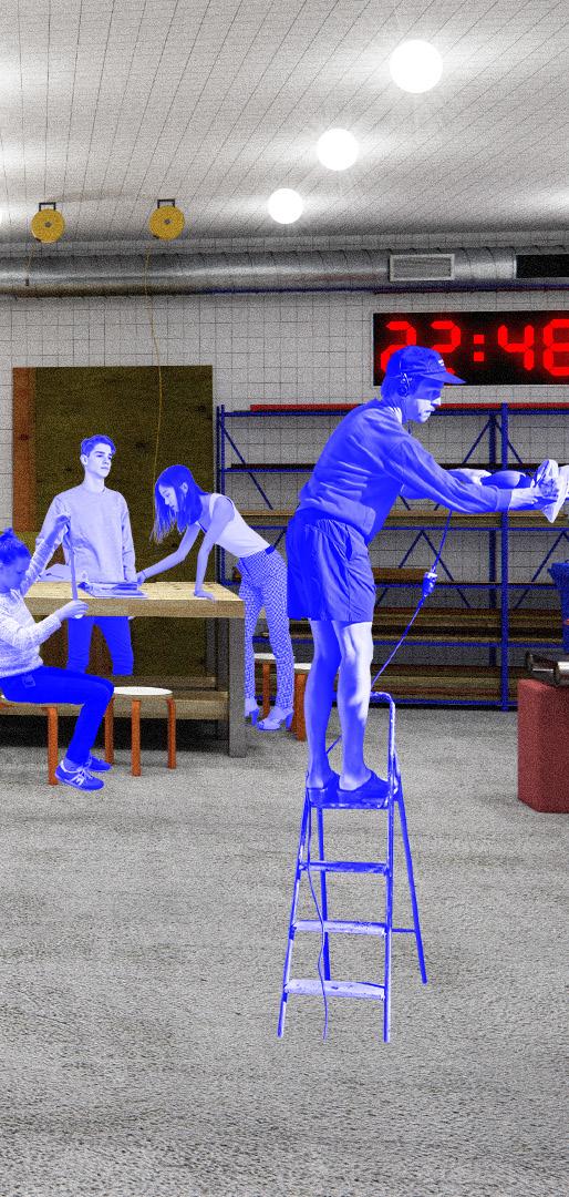
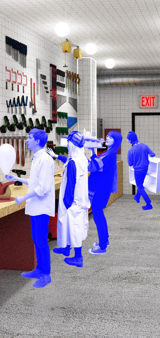
The second floor includes a variety of makerspaces to cater to any organization or company’s needs and this floor is also where several coworking spaces start to evolve. From prototyping and plotting to woodworking to phone calls and informal meetings, a superfluity of work can be accomplished across these generative and stimulating spaces.
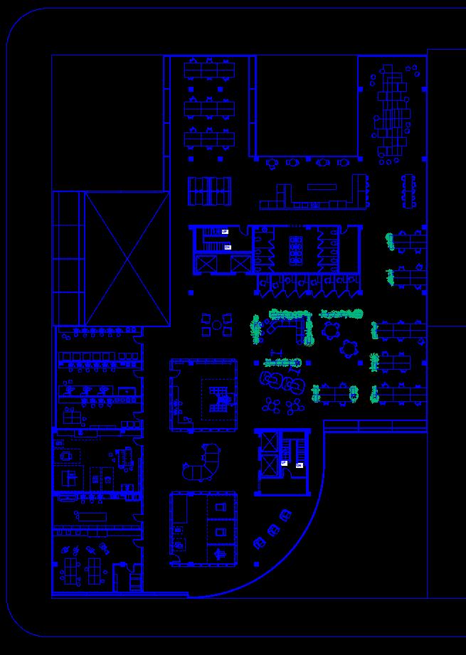
SECOND FLOOR (left)
1. WORKSTATIONS, individual work
2. BOOTH SETING, group or individual work
3. KITCHEN, breaks, snacks, meals, pick me ups
4. LOUNGE LANDSCAPE, recharging, informal meetings, breaks
5. PHONE BOOTHS, individual work
6. WORKSTATIONS, individual work
7. HUDDLE SPACES, medium collaboration work

8. RAPID PROTOTYPING, vinyl cutters, laser cutters, 3D printers, CAD software
9. CNC SHOP, shopbot PRSAlpha
10. WOODSHOP, joiner, band saw, table saw, chop saw, drill press, hand tools, work tables
11. OUTPUT ROOM, printers, plotter
12. ART STUDIO, painting, ceramic arts, coloring, arts and crafts
13. MACHINE SHOP, mill, band saws, metal shear
14. FOCUS CHAIRS, individual work
PERSPECTIVE VIEWS
The assortment of maker spaces provides collaboration across different populations of people, companies, and disciplines. Providing these resources in an open office setting allows for these various groups to learn from each other and produce advantageous methods of representation for client meetings, presentations, and other office related spectacles.
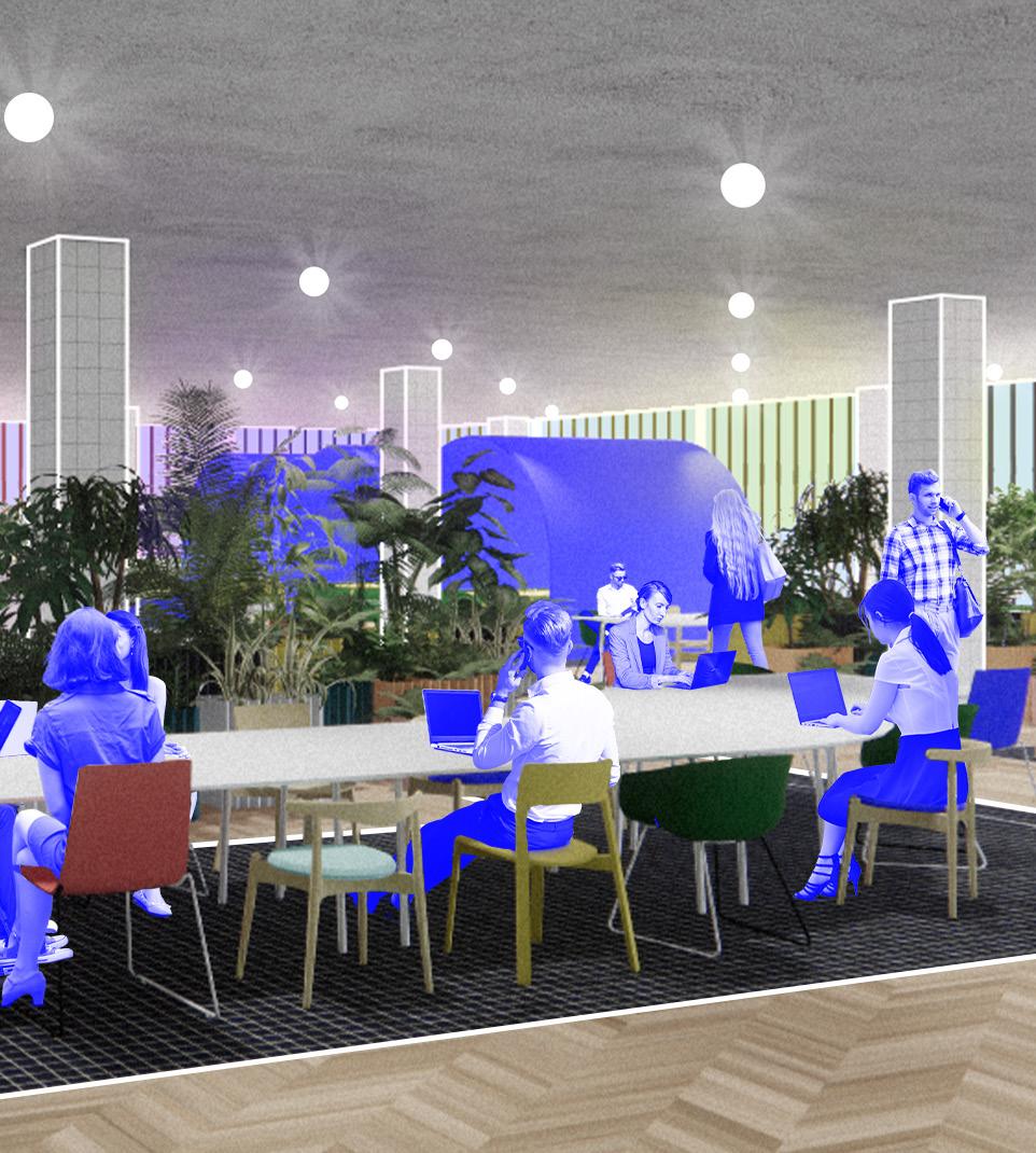
The third floor, where the magic happens, consists of conference rooms, a fitness center, and a large coworking area or “focus forest.” Curves formulated from the biology of the building shape and form contour this space, surrounded by plants, to ensure a productive work environment. With seating typologies for large, medium, and small group work to individual work, any level of collaboration can thrive on this floor.
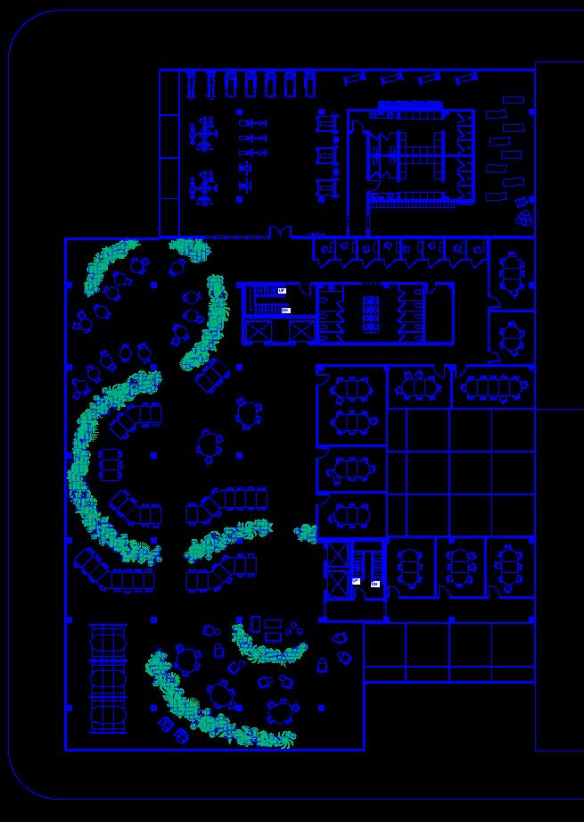
THIRD FLOOR (left)
1. FITNESS CENTER, well being, health, lifestyle, weights & machines, yoga studio
2. LOCKER ROOMS
3. PHONE BOOTHS, individual work
4. CONCENTRATION TABLES, small group work, individual work
5. CONFERENCE ROOMS, medium group work, large group work, formal meetings
6. TEAM TABLES, medium group work, individual work, informal meetings
7. COLLABORATION STATIONS, medium group work
8. FOCUS CHAIRS, individual, semi-private work
From this corner of SUPERORGANISM, a lot of the chunks and shapes are sort of synchronized with each other, as if they grew off from the previous and have merged together, synthesizing the concept that work and personal life can grow together. Some of these aspects can merge while others might stay distant and within their own element.
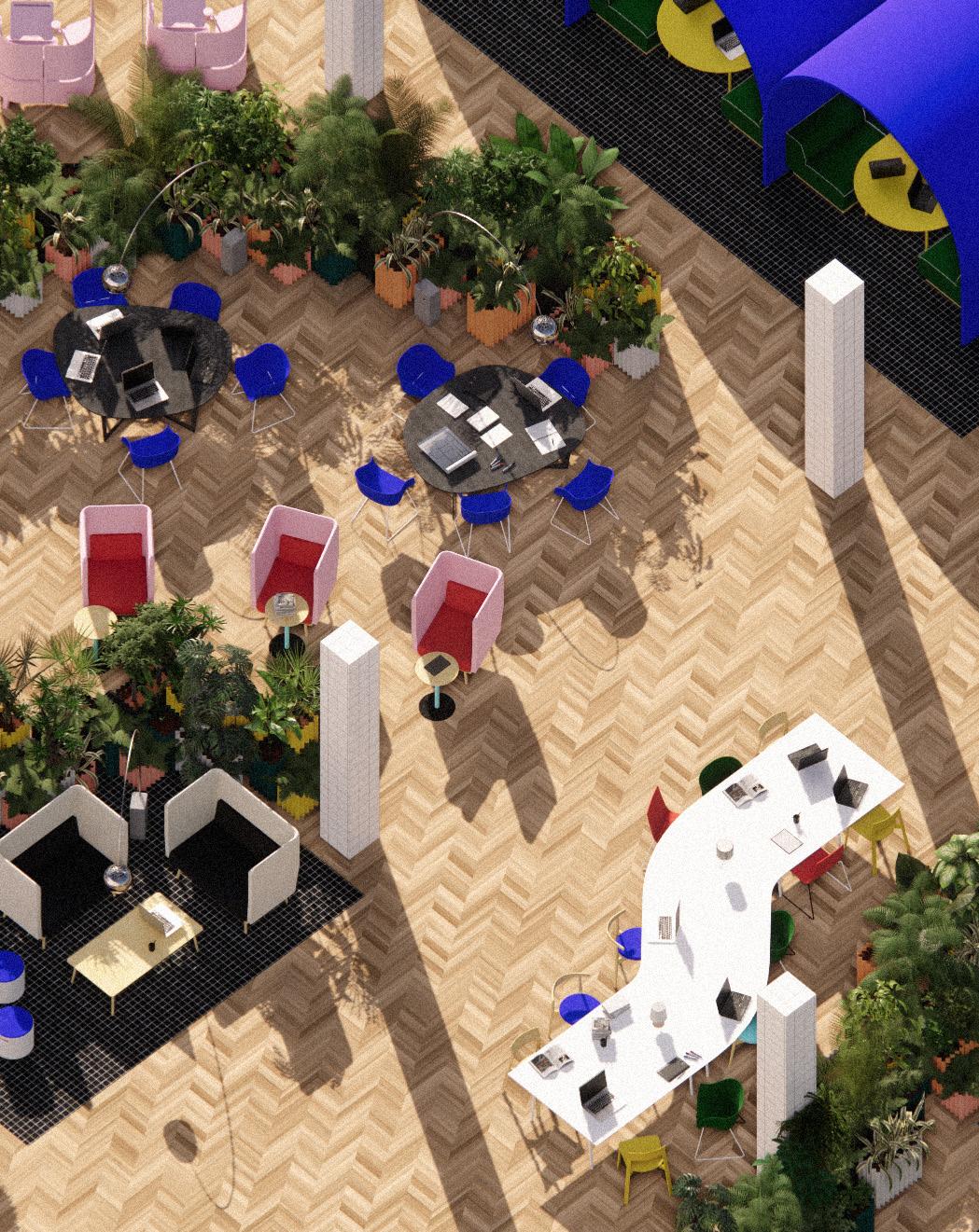
The vegetation adds a layer of camouflage and provides shade from the outside coming in through the vivid glass façade. Long curvy tables allow for any size group to efficiently collaborate if desired while enjoying the biophilic aspects of the excessive amount of plants. Textures across the interior materials add dimension, providing a fresh and invigorating office setting.
The Superstudio inspired building blocks shift and morph throughout the section, becoming a glass shell around the interior structure. Vertical elements help break up the monolithic feeling of the overall massing, yet the curves and spatial choices remain emphasized. The vertical and horizontal elements of the façade create a paracosm of a composition, revealing layers and hidden components.


a net positive attached housing development
Every year, the U.S. Department of Energy hosts the Race to Zero Student Design Competition, a sustainable building science contest focused on future oriented thinking and design. With second place recognition in the multifamily category in 2018, Wright Path to Zero is a collection of highly energy efficient attached housing units for active duty families, providing move in ready, net positive homes. This project has concentrations in universal design, efficient mechanical systems, and various green building science developments. These design principles were key for this set of homes to create a new model of urban planning and comfortable living, and successfully design homes for the people who sacrifice their lives every day, improving the lives of Wright Path’s inhabitants while working towards a guaranteed stable future. My roles included schematic design, formatting project submission documents, researching universal design implementations, and creating and editing graphics for presentation and communication materials.
was a collaborative project, all images and documents are my original work unless otherwise noted.
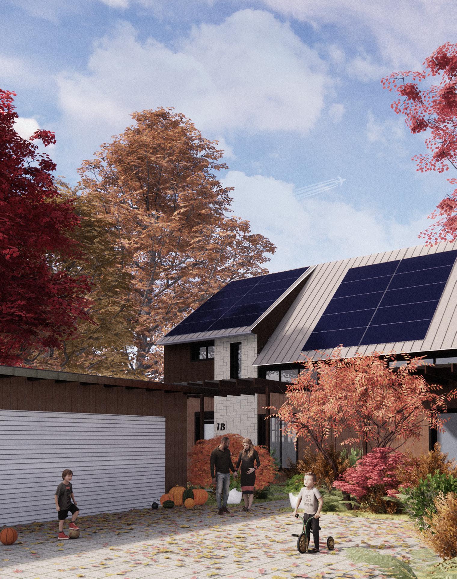
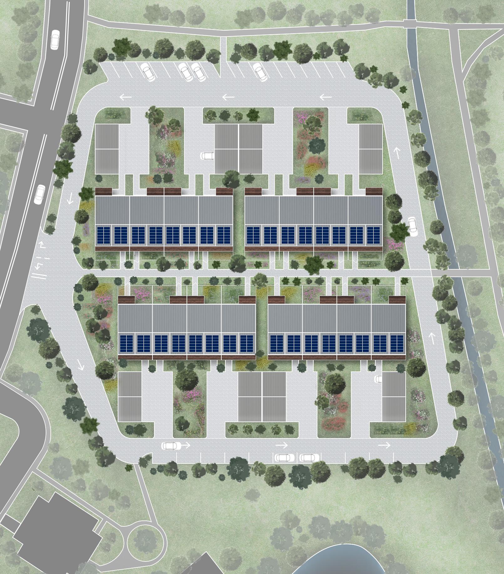
With a total of sixteen units, Wright Path to Zero focuses on creating a welcoming environment for each individual unit with landscaping around the site and a pedestrian street connecting all of the units, strengthening community ties. A one way street around the site reduces vehicle traffic and the amount of hardscape required, refocusing efforts on pedestrians.
NATURAL
LOCALLY SOURCED MATERIALS
HIGH EFFICIENCY MECHANICAL SYSTEMS

RENEWABLE ENERGY SOURCE
POSITIVE ENVIRONMENTAL IMPACT

CONTINUOUS VAPOR & THERMAL CONTROL

HOME ENERGY RATING SYSTEM INDEX (top), DESIGN PRINCIPLES (bottom)
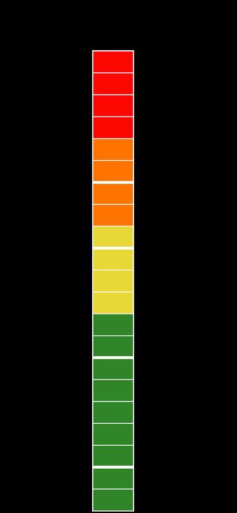
The design principles helped achieve a HERS index of -2, resulting in each unit being able to produce more energy than required to function. Positive environmental design choices include permeable pavers, absorptive landscaping, locally sourced continental materials, and pollinator friendly native plants to increase biodiversity.

PERSPECTIVE VIEWS
FIRST FLOOR UNIVERSAL DESIGN PRINCIPLES
• full clearance ramp at entrances for those with mobility limitations
• peepholes at different heights for those with different needs
• frequent 5’ turning diameter for ADA standards
• open floor plan for those with hearing limitations
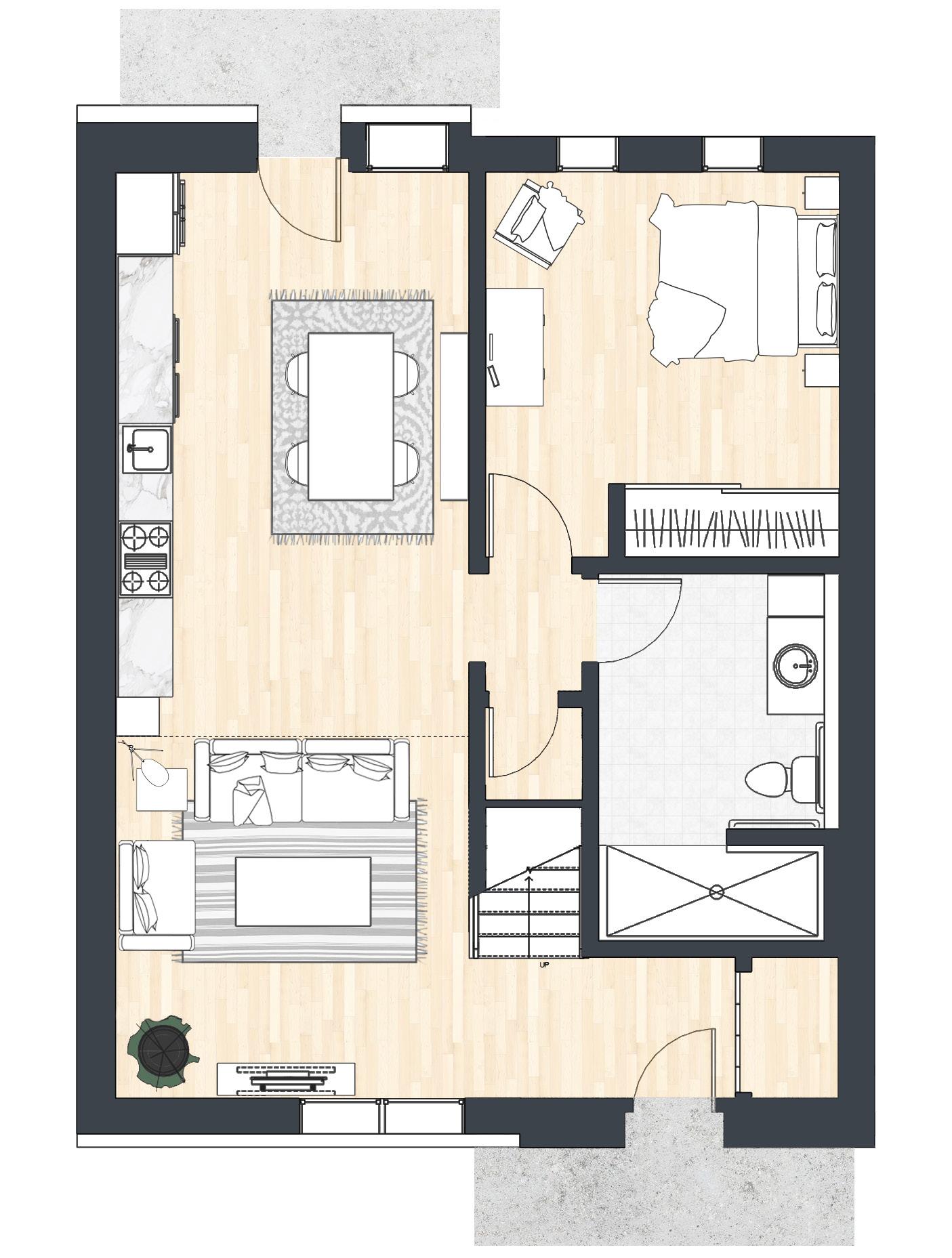
• rounded counter top edges
• adjustable height cooktop and sink
• drawer style dishwasher
SECOND FLOOR UNIVERSAL DESIGN PRINCIPLES

• adequate landing space for those with stamina or vision limitations
• flush tread and riser to minimize stumble instances
• light switches reachable from bedside and door
• extra electrical outlets near bed for medical equipment if needed
• wall mounted closets for those with difficulty bending and kneeling
• non slip wet tile area
• front load washer and dryer for those with difficulty in handling
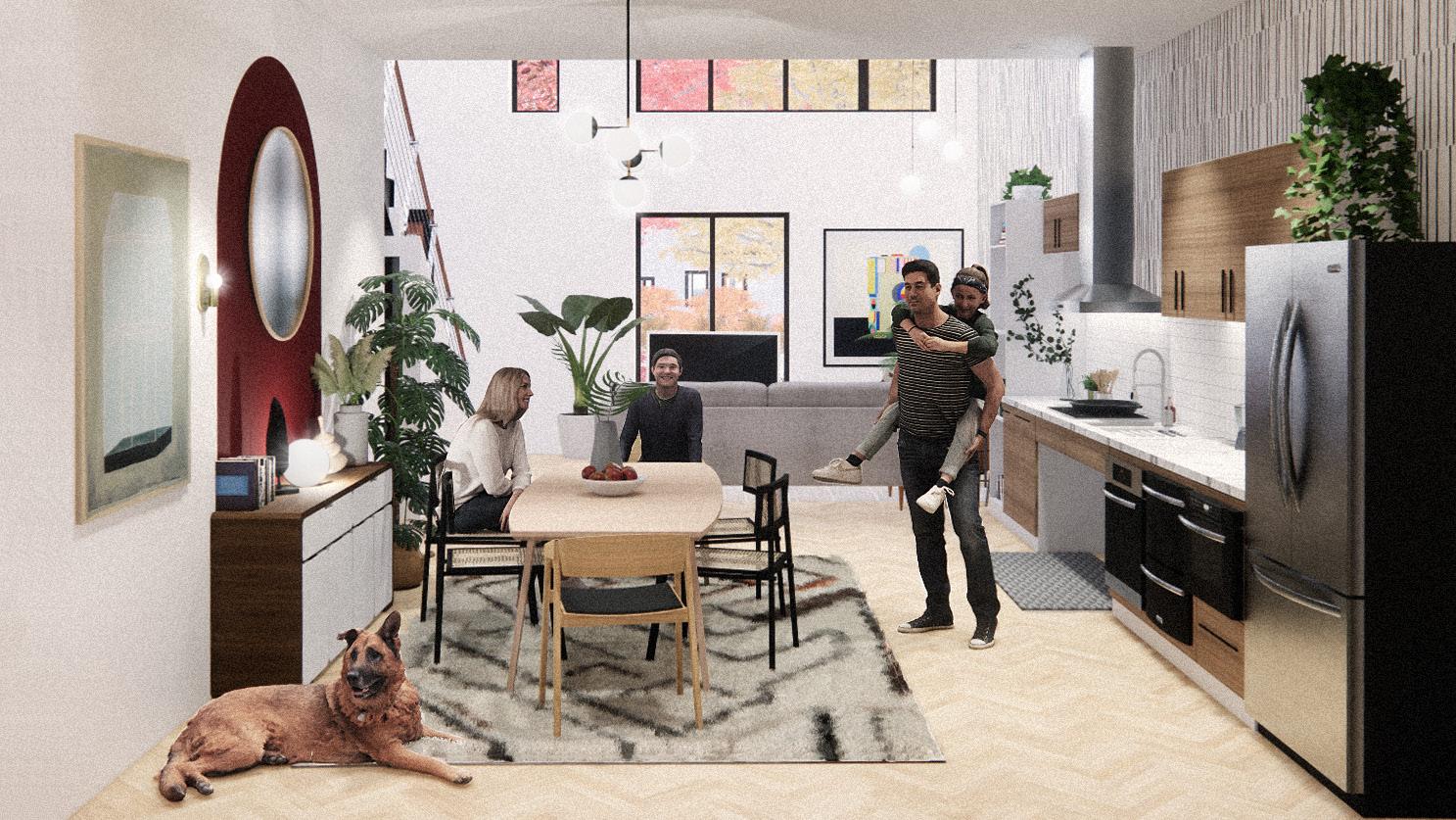
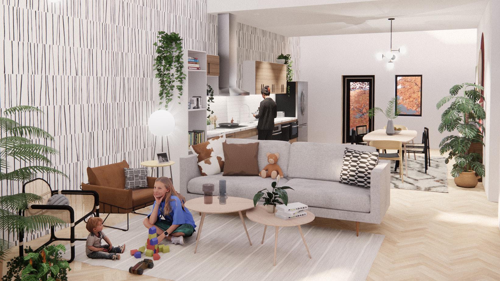
FIRST FLOOR MAIN ENTRY & LIVING (top), BACK ENTRY, KITCHEN & DINING (bottom) Southern glazing is maximized for comfortable daylighting throughout the whole day with the aid of clerestory windows. North glazing is minimal to allow for views into the central community pathway and natural light in private rooms, but to reduce wall penetrations. Electric lighting is balanced with the daylight throughout the activity zones in the home to not over light.
HUNG LARSEN TRUSS ROOF
W/ BLOWN IN CELLULOSE
R-63
WALL DETAIL FROM EXTERIOR TO INTERIOR
7in. Composite V-Groove Siding 3/4in. Air Cavity
1x Wood Vertical Furring Strips
1/2in. Plywood
8in Larsen Truss w/ Cellulose Insulation
1/2in. ZIP Panel Sheathing (air & vapor)
2x4 Stud Wall w/ Rockwell Batt Insulation
5/8 in. Gypsum
R-47
GLO A7 TRIPLE PANE THERMALLY BROKEN ALUMINUM FRAME WINDOWS
R7
Metal Flashing w/ Drip Edge
WINDOW DETAIL
1/2in. ZIP Panel Sheathing (air & vapor)
2x4 Stud Wall w/ Rockwell Batt Insulation 5/8 in. Gypsum
Window Clip
Prosoco Liquid Applied Flashing (air)
Prosoco Liquid Applied Flashing (air)
Rigid Insulation
Trim
Insect Screen
MONOLITHIC SLAB EPS INSULATED
R24
Wright Path to Zero deploys Passive House techniques to achieve the highest thermal performance and durability appropriately sized for Climate Zone 5. Passive House standards suggest an R60 roof, R40 wall, and R20 slab, however through thermal analysis, the building assemblies surpass these suggested values. Continuous insulation and careful barrier placement aids in maximizing gains and minimizing energy losses.
an adaptive reuse and mixed use city hub
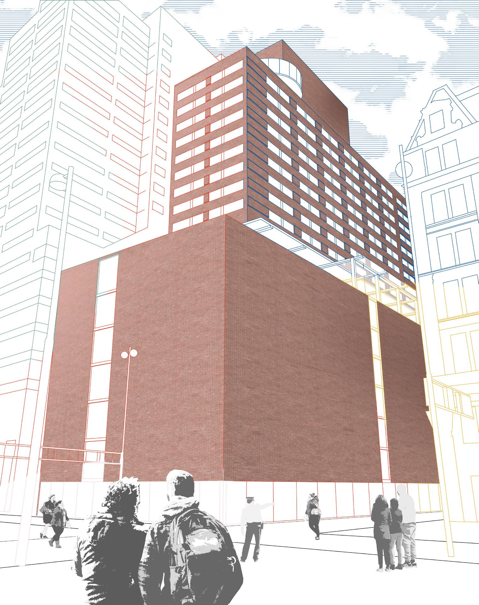
Providing a meeting plaza for a city with diverse demographics, The Districts is a collection of spaces and programs which seek to provide an inclusive space for the various residents of Cincinnati, Ohio to come together. Originally known as the Terrace Plaza Hotel, a groundbreaking manifestation of modernism by SOM, this project explores ideas to reestablish old and new communities in a unique metro area. Right in the heart of Cincinnati, the density of this urban area provides public passage and use by drawing attention from residents and visitors to allow for the growth of small startups and local businesses, while supporting the locals concurrently through various programs. Combining affordable housing, social spaces, and recreational activities, this cooperative center with localized services becomes a collaborative hub for the public. The transition between public and private spaces emit a cohesive core for the community, while providing daily services to those taking a break from work, after school, or just spending some time with friends in the city.
Team Members: Daniel Nolan, Carly Hansen, Evan Warder, Summer Nicholas, Michal Epstein While this was a collaborative project, all images and documents are my original work unless otherwise noted.
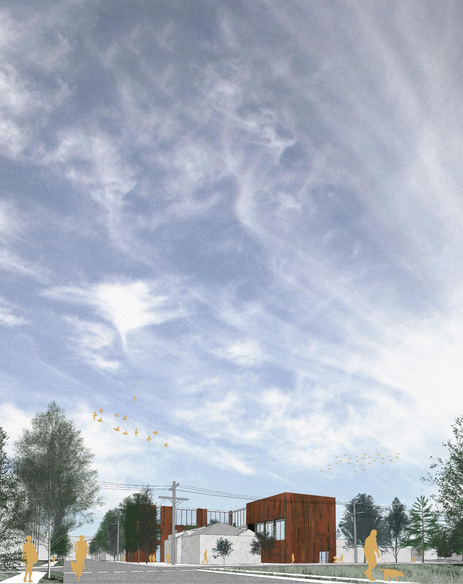
EXTERIOR RENDERING (right), in collaboration with Evan warder, team member
GROUND FLOOR LOBBY (above), LOCAL SERVICES (key, right)
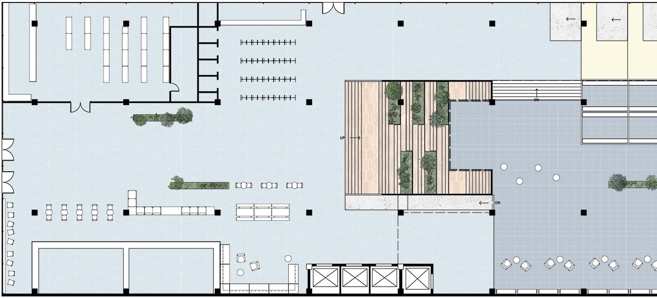
Across the lobby on the ground floor, local businesses and organizations have the opportunity to come together and provide services for the people of Cincinnati. Whether taking a coffee break, doing some quick grocery shopping, meeting up with friends, or seeking a new place to call home, these amenities accentuate the community of the city.
PERSPECTIVE VIEWS






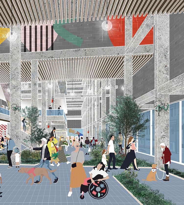
GROUND RECEPTION & GREEN PATHWAY
Murals created by local artists highlight Cincinnati’s roots and local culture, manifesting the lobby as a place for the people. Vegetation directing people as a form of wayfinding provides added positive biophilic effects. The double height entry allows users and residents to fully explore the aspects of the program and find the service best fitting to their needs at the current moment.

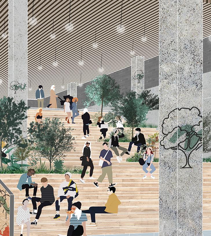
GROUND FOOD HALL, GREEN SOCIAL STAIRS, SEATING & CIRCULATION
The social stairs act as a hub for people to hang out and interact, and as an advertisement area for local businesses and community organizations. Local food vendors occupy spaces under the stairs and mezzanine for people who want a quick bite or snack, with supportive seating and alcoves surrounding. The exposed structure strengthens the idea of connectedness of one to the building and the community around them.

2019 STUDIO
an integrated health center influenced by nature
The Bio Buffer Health Center aims to provide an integrated care approach, coordinating mental health, substance use disorder, and primary care services, producing greater outcomes and effective solutions for caring for those with complex healthcare needs. Integrated healthcare leads to fewer nights spent homeless, fewer hospitalizations, fewer nights in detox, and fewer emergency room visits, inevitably lowering the cost of care and increasing quality of life. Incorporating biophilic implementations search to increase the effectiveness of these components along with three points in the quadruple aim in healthcare: improving the health of populations, enhancing the experience of care for individuals, and increasing staff engagement and retention. Located in the Buckman neighborhood of East Portland, no matter the crisis one may be going through or reason for visiting, this health center engages biophilia and natural elements as a buffer to ease patients, their families, and service providers, ensuring recovery and stability.
SITE CONDITION
CONSIDERATIONS: BIOPHILIC IMPLEMENTATIONS
VISUAL CONNECTIONS
What we see, whether natural or man implemented, which can lower blood pressure and heart rate, improve mental engagement and attentiveness, and positively impact our mood.
NON-VISUAL CONNECTIONS


Auditory, haptic, or olfactory stimuli that create a deliberate and positive reference to nature, living systems, or natural processes, increasing our cognitive performance.
NON-RHYTHMIC SENSORY STIMULI
Stochastic and ephemeral connections with nature that may be analyzed statistically but can’t be predicted precisely, clouds moving, breezes, birds chirping.
THERMAL & AIRFLOW VARIABILITY
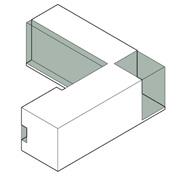
Subtle changes in air temperature, humidity, airflow across the skin, and surface temperatures that mimic natural environments, improving comfort, well being, and productivity.
BIOMORPHIC FORMS & PATTERNS
Symbolic representations and evocations of nature, whether material selections, facade choices, or graphic illustrations, improving creative performance.
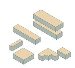
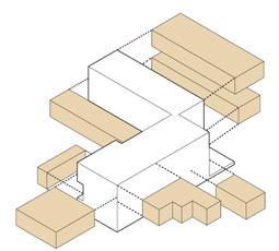
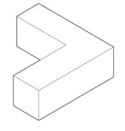

CONSIDERATIONS: MOST REQUESTED ASPECTS IN A WORK ENVIRONMENT
NATURAL LIGHT
Vital to see where we are working and what we are doing and strengthen our circadian rhythm functioning, further increasing productivity and well being.
INDOOR PLANTS
Natural elements from the outdoors, directly connecting them to the exterior environment, reducing stress and increasing concentration and air quality.
PRESENCE OF WATER
Enhancing the experience of a place through the seeing, hearing, or touching of water, enhancing perception and psychological and physiological responsiveness.
BRIGHT COLORS
Hues inspired from appealing environmental forms, likening a space to natural connections, improving user experience, and enhancing creative performance.
BUILT MODEL, basswood, chipboard, bristol, gypsophilia, my friends’ hands, 1/8” = 1’-0”
The jagged façade, iterative of arthropod exoskeletons, is a representation of regrowth with vegetation scattered throughout, changing as the seasons do. Situated on a very funky shaped site, the idea of the “journey” to improving one’s health is emphasized throughout the interior procession and program exploration.

GROUND FLOOR
1.
2.






3.
4.
7.
8.
9.
10.
PERSPECTIVE VIEWS
GROUND FLOOR
The main entrance has a generous amount of space for those entering while going through a crisis with a specific and immediate reception area, easily identifiable. All the main amenities have connections to the outdoors through the courtyard or adjacent green space, providing positive biological responses for the users. A separate entrance on the eastern side of the building provides privacy for employees.
LOBBY ENTRANCE (top), COURTYARD (bottom)

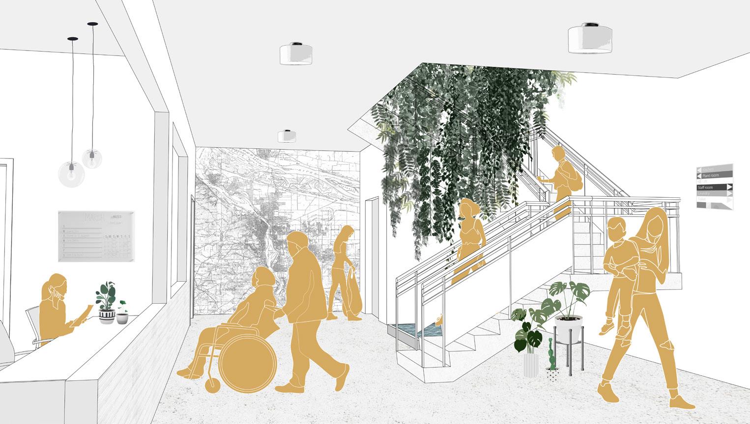
The entrance contains a hanging vertical garden and reflecting pool in the main circulation lightwell, encouraging and encaptivating patients to use the stairs, while welcoming them in. Towards the back of the building, the courtyard provides a space for patients and employees to access natural elements outdoors, promoting eco-therapy and positive healing responses.
SECOND FLOOR
1. WAITING

2. RECEPTION


3. MULTIPURPOSE


4. CONSULTATION WING
PERSPECTIVE VIEWS
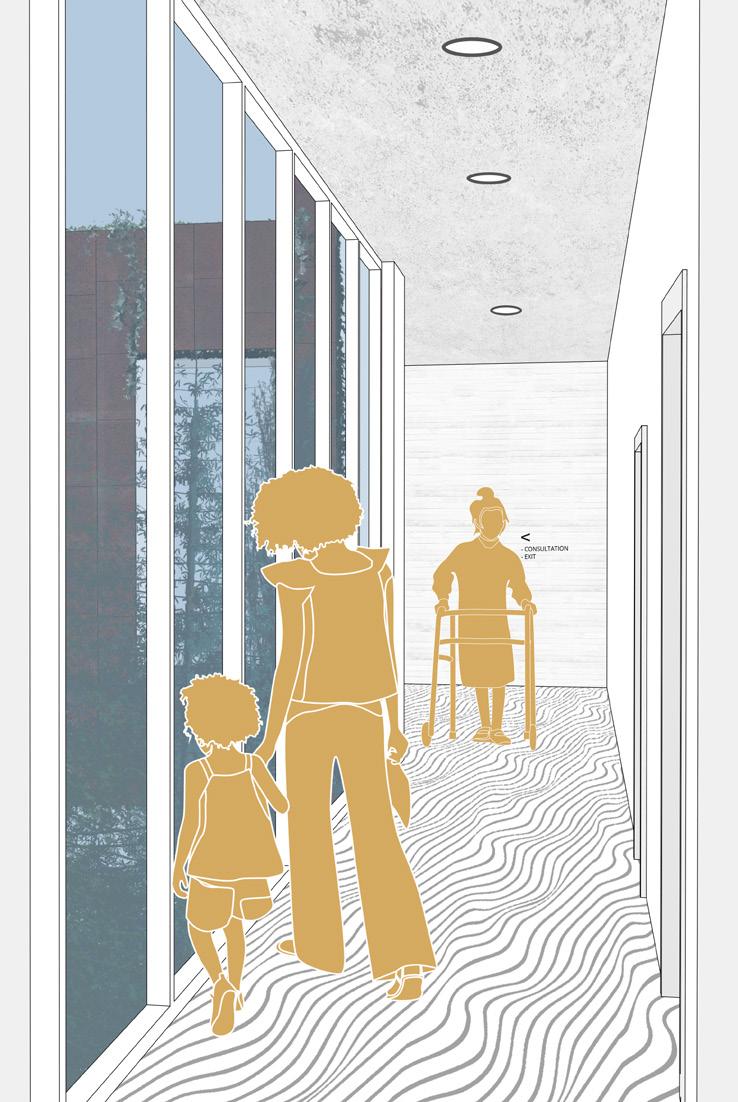
The second floor incorporates a formal reception and waiting room along with a multipurpose room for group therapy, small events, or other gatherings. The consultation wing is supported with views to the adjacent green space and ample hallways for family members or loved ones to wait if desired.
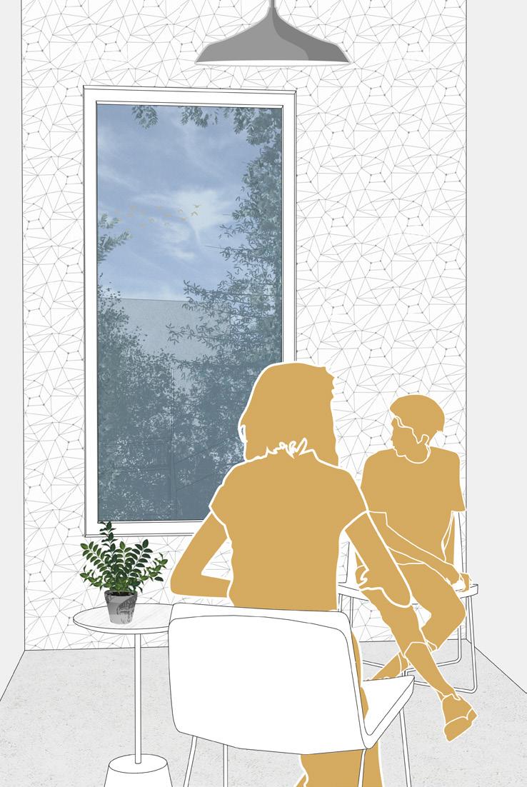
CONSULTATION WING CORRIDOR (left), CONSULTATION ROOM (right) The corridor provides views to the outdoors and natural stimulation, administering calming moments for employees if they’re feeling stressed throughout the day or patients if they’re going through a crisis and heading to an appointment. The privacy of the consultation rooms allows for patients to have their own window, increasing positive psychological responses during sessions, improving patient health.
THIRD FLOOR
PERSPECTIVE VIEWS


THIRD FLOOR


The third floor incorporates all staff related program, including a private open office, laboratory, and lounge / break room. The break room acts as a tertiary work space for employees and volunteers, giving them versatility in how they want to personally work throughout the day. All areas of work have views to the outdoors, vital for improving staff satisfaction in healthcare environments.


The open office provides two different types of work environments, a formal desk space, and a more relaxed and casual space for meetings or comfortable individual work. Natural lighting and views to the exterior help improve work quality by providing necessary controlled distraction to reduce eye strain and fatigue.

a community center rooted in social media and popular culture
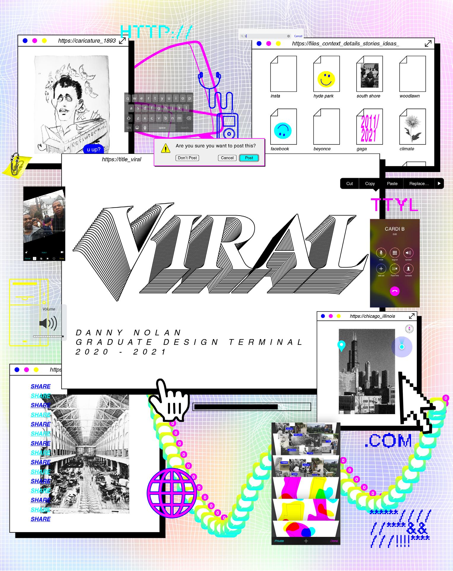
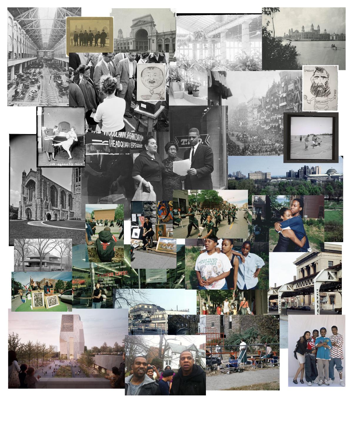
Architecture has failed the people. We’ve created a world where physical public space is constantly being monitored, limited, and taken away from specific groups of people. The internet has become the last remaining public space where people use their voices unapologetically to express their ideas, opinions, thoughts, art, anything. Anyone can have a presence. Popular culture and social media networks, the main content on the internet, have become essential to educating and informing people on current social movements and general awareness. Information is the new education in the 21st century, and this information is potently abundant, all around us, and hard to hide from. These platforms carve and create spaces for underrepresented voices and communities, giving them a platform to speak about the injustices and discrimination they face. Situated on the South Side of Chicago, where the World’s Columbian Exposition was held in 1893, VIRAL seeks to provide a space that contains and transmits culture to benefit the people locally, while bringing awareness globally, the issues technology has created for humanity.
THE BEAN THE SEARS TOWER
NAVY PIER SKYSCRAPERS


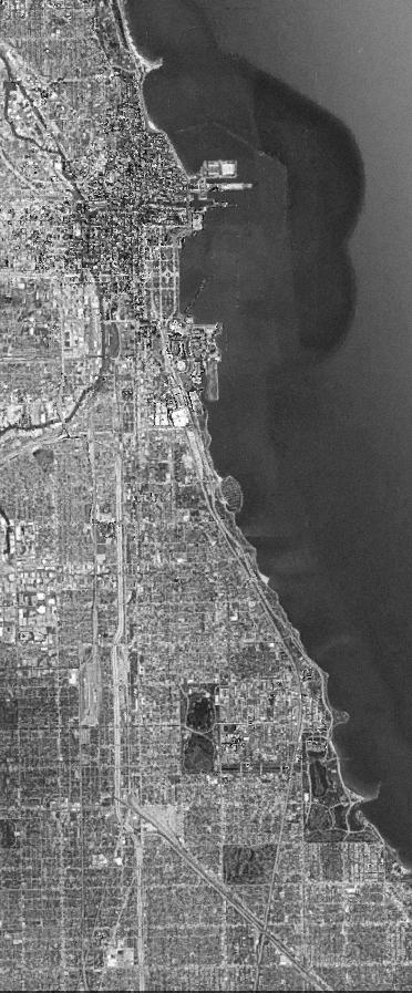
Situated just eight miles south of downtown Chicago, the site sits on the Jackson Park Golf Course, home to the World’s Columbian Exposition, hosted in 1893. VIRAL aims to be a similar spectacle of an implementation, supporting and enhancing culture, serving the local communities. VIRAL opposes the existing golf course which doesn’t directly serve those of the surrounding communities of Hyde Park, South Short, and Woodlawn.
ROUGH MASSING / SHAPE EXPLORATION / HASHTAG AS DATUM
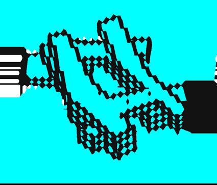
ADJUSTMENTS / MONEY MOVES / TRANSMUTATIONS
SUBCULTURE / PROGRAM IMPLEMENTATION / SPACE GENERATION

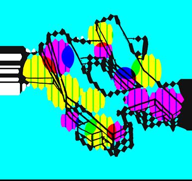
Globally recognizable and morally neutral, the hashtag symbol informs the building shape and rough massing, creating a shell, allowing culture to intensify within and amplify outwards. Abstracting the shape to add some depth and incorporating a structural “framework” inspired from the datum of the internet creates spaces where subcultures and niche communities can be supported.
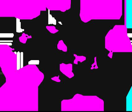
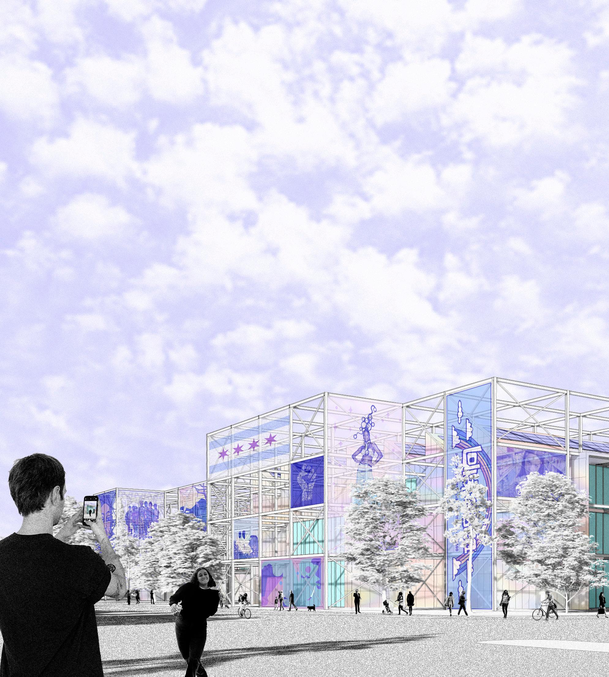
Sticky spaces, textures, and messy elements are generated across the building to get the public’s attention through the steel structure, iridescent cladding, and sawtooth skylights, similarly to how social media and internet trends work to grab the attention of others by calling out for it and being bold and in your face.

The framework grid is a nod to the radical architectural ideas of “plugging in” from SUPERSTUDIO and Archigram, yet contemporized to fit 2021, allowing technology to not limit, but further human freedom. Users can “plug in” and broadcast or portray whatever they desire across the façade, providing portions of the building or the entirety of the building to be a true representation of the people, serving them however they need.

AUDITORIUM
* Lecture
* Community Meetings
* Educational Presentations
* Various Sized Events
* Multipurpose
FOOD HALL
* Local Food Vendors
* Supportive Seating
* Additional Work / Study Space
CITY LIVING ROOM
* Informal / Formal Meeting
* Various Gathering
* Supportive Interaction
DIGITAL LIBRARY
* Workstations
* Virtual Reality Learning
* Study Areas
* Social Landscapes
INTERACTIVE
* Permanent Collection
* Temporary Exhibition
* Community Showcase
* Interactive Gallery
* Art Display
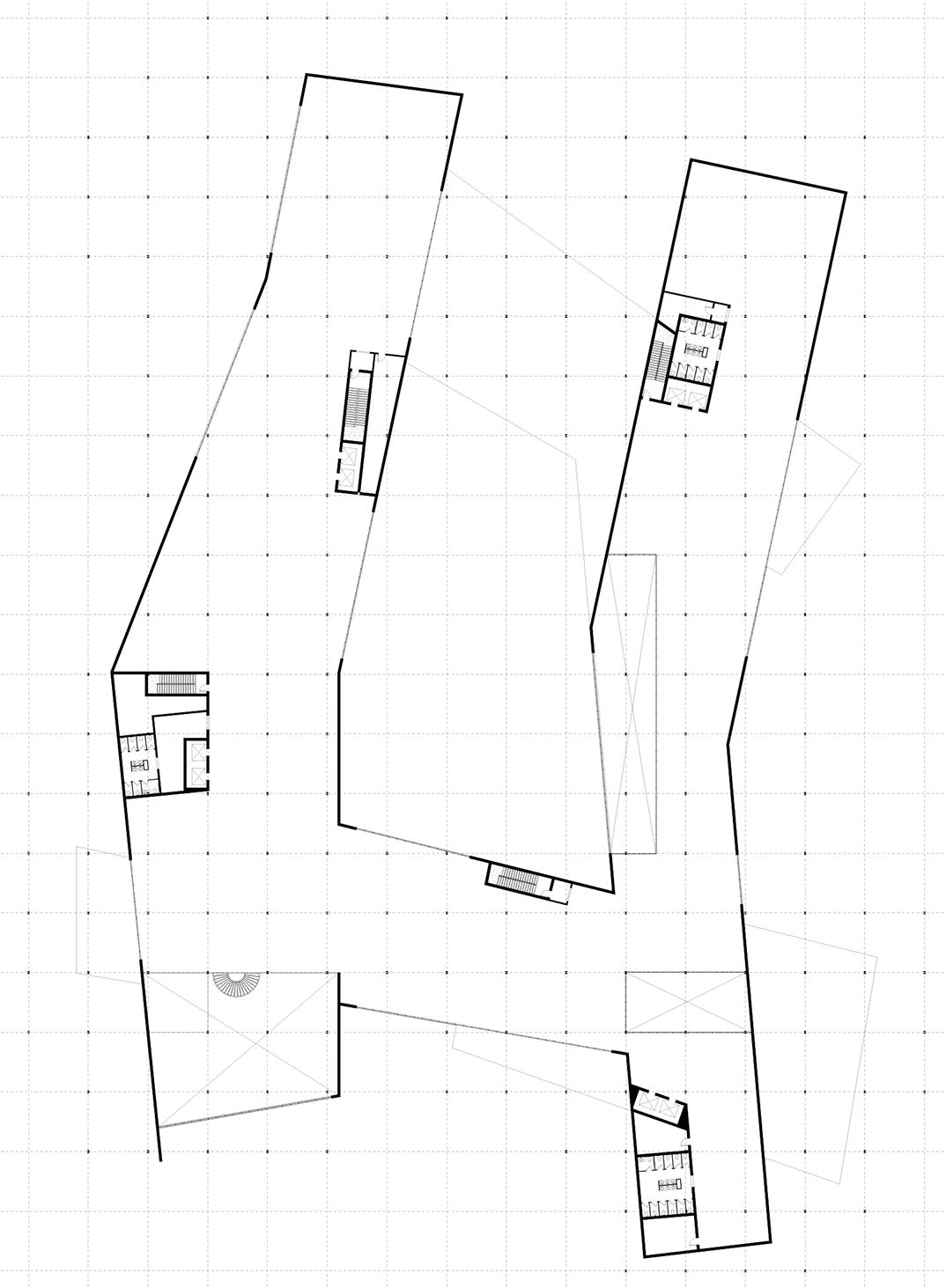
GROUND FLOOR
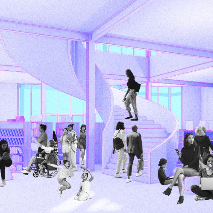
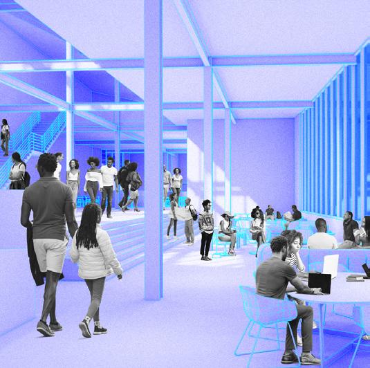
The ground floor is where a majority of the action happens, from learning about current social movements and studying in the digital library, meeting with a friend or having an informal meeting in the city living room, or engaging with an educational discussion from a community organization in the auditorium. These different spaces provide various platforms, educational services, or cultural support for anyone seeking to use their voice or listen.

These programmatic spaces explore how design can serve the communities that have been disinvested and underserved through providing support at the individual scale. Tutoring, research, and studying occurs at the digital library for those who don’t have adequate space at home. Local food establishments are supported across the food hall while casual conversational and interactive spaces are sustained by the city living room.

FOOD HALL
* Supportive Seating
COWORKING
* Various Work Stations
* Collaboration Stations
* Open Desk Areas
* Meeting Rooms
* Team Tables
* Phone Booths
MAKERSPACES
* Woodshop
* Rapid Prototyping
* Art Studio
* Output Room
DIGITAL LIBRARY
* Workstations
* Virtual Reality Learning
* Study Areas
* Social Landscapes
INTERACTIVE
* Permanent Collection
* Temporary Exhibition
* Community Showcase
* Interactive Gallery
* Art Display
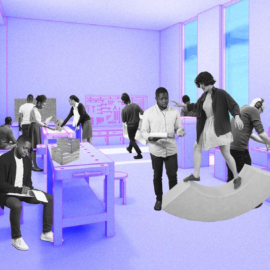
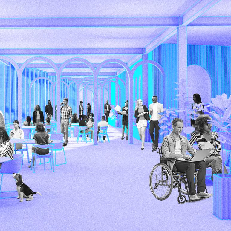
The second floor carries up the programmatic spaces from the ground floor with the addition of coworking spaces and makerspaces. All of these spaces working together create a cultural hub for users to express themselves across a variety of methods to encourage long term empowerment and engagement through culture across the greater Chicagoland area.
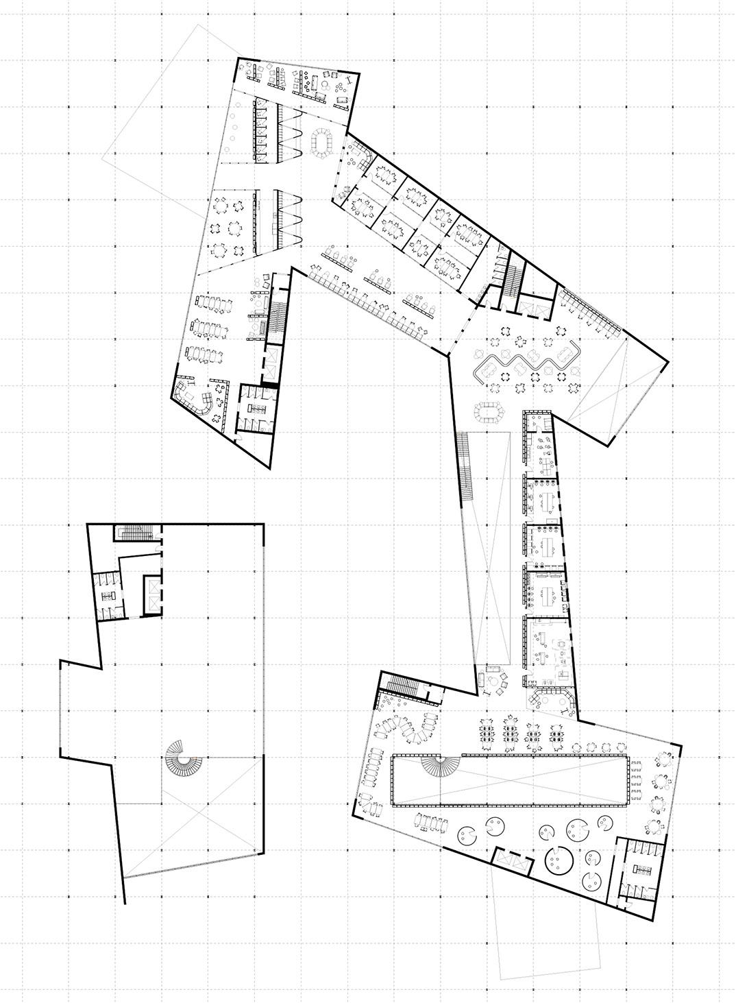
The spaces across the second floor provide adequate and stabile spaces for learning, making, and working to support the innovation and community of Woodlawn, South Shore, and Hyde Park. One of VIRAL’s main goal is to provide spaces that foster positive relationships for the wider community through these energized spaces.

INTERACTIVE
* Permanent Collection
* Temporary Exhibition
* Community Showcase
* Interactive Gallery
* Art Display
INTERACTIVE
* Permanent Collection
* Temporary Exhibition
* Community Showcase
The third floor is intentionally left undesigned with intent to allocate spaces where members of the southern communities of Chicago can fill it with their art, displays, work, and various forms of media. These decisions are solely made by the community and for the community based on current needs, conversations, and ideas they deem vital to express.
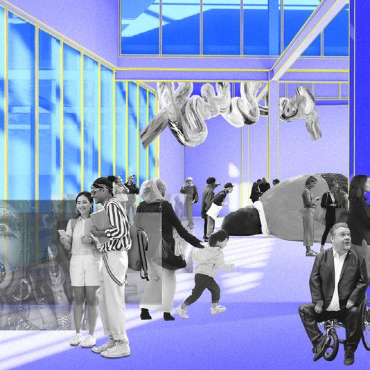
The interactive spaces have the potential to house any form of art or media by the community, working as a tool for building networks that support self-sufficiency and solidarity among the communities on the south side of Chicago. The learning methods provided by these various forms of media aim to portray work that isn’t just performative or representational, but that is impactful and inspiring.

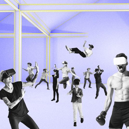
The break in the overall grid structure framework at the courtyard provides an sort of escape from the digital realm that is created throughout the interior spaces. Composed as a secondary space for people to come together, it also provides a sense of respite with the connection to the environment.


TECTONICS (left)
Steel Structure w/ Columns 25’ Oc
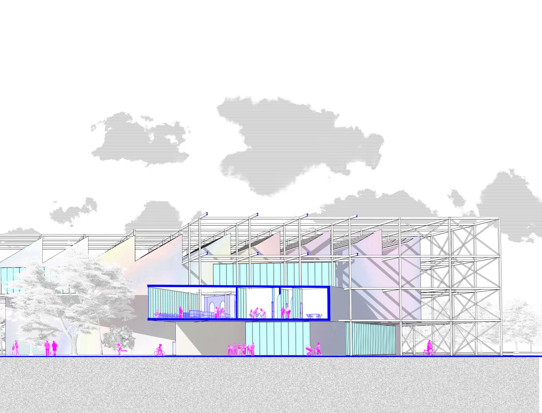
Cross Bracing @ 25% of Total Bays
WALL ASSEMBLY (interior to exterior)
Plaster Gypsum Board
2x6 Metal Stud Wall w/ Mineral Wool Cavity Insulation w/ Lateral Bracing & Shear Stiffeners
Sheathing Taped at Seams
Vapor Permeable Air & Water Barrier
Rigid Insulation Board
Structural Thermal Break Connection
Iridescent Metal Panel Cladding w/ Vertical Supports & Steel Clips Fixed to Frame
FLOOR ASSEMBLY (finish to structure)
Wood Finish Floor
Concrete Composite Deck w/ Rebar
Drop Ceiling at Certain Conditions
2022 - 2023
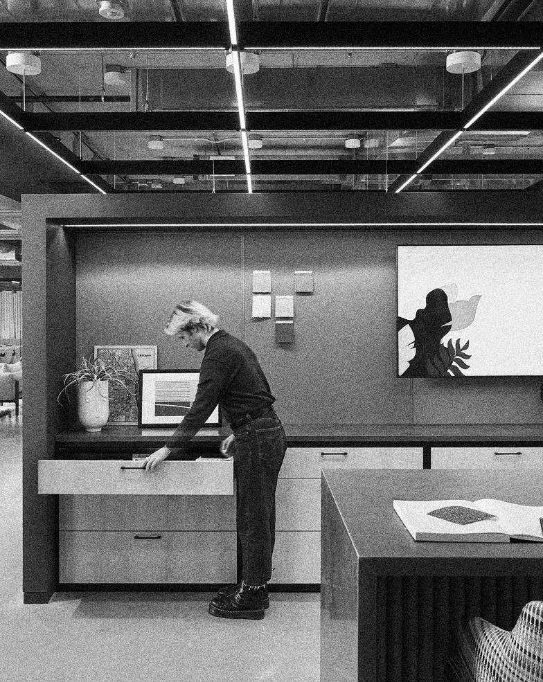
a bunch of stuff from my nine-to-fives
During my time at Eastlake Studio when not configuring space plans and test fits, you could find me tending to the rooftop garden, modeling at a photoshoot for a recently completed spec suite, assisting in illustrating marketing materials, attending business development happy hours, and most importantly, learning! The following pages are composed of various floor plans of spec suites and commercial office spaces in Chicago ranging from 3,000 square feet to 15,000 square feet.
