

Choose


Choose


WE LIVE IN A playground for grown-ups, a fact I try not to take for granted. Our place, clinging to the underside of the globe, is a natural balm that balances the dynamic forces at play when you’re building houses. For me, a recent trip to Martins Bay, a deserted sweep of beach at the end of the Hollyford Track, put things into perspective. It only takes a couple of days immersed in the wild constancy of a remote environment to recharge the body and reset the mind.
Within the New Zealand market, David Reid Homes is something of a constant itself. What began as a one-man band in Christchurch, way back in 1993, has grown into a respected brand with robust roots. Initially our franchise network spread through the lower South Island but now, after welcoming the Rodney and Wairarapa districts to the fold, we can boast locations that spiderweb across Aotearoa to form a close-knit family.
In three decades we’ve seen a lot of change. During the GFC, as the market plunged off a cliff, our share of it actually lifted as clients gravitated towards trusted builders with a proven track record. So even though
there is a current focus in the news media on economic uncertainty, we’re facing it with clear-eyed optimism. Supply-chain issues have been largely resolved, good sections are more readily available, and sought-after builders are becoming easier to secure. Our secret weapon within the design-and-build arsenal has always been our people: franchisees who deliver a quality product. We’ve been doing it for 30 years.
While escaping to the great outdoors is a tonic for the soul, being on familiar ground also has its therapeutic merits. There’s nothing like a good homecoming. For our clients, the joy of new is multifold. You may buy a house that speaks to you but when you build it yourself, it speaks of you. These personalised dwellings not only manifest our clients’ design ideas but put them into a practical form that is warmer, quieter and more efficient to run. Stepping through the doorway of a home you’ve had a hand in creating from the ground up is a feeling that can’t be beat.
In the third issue of Our Place magazine, we share the stories behind some of our recent projects and hope to inspire you with genuine lived experience, from first

homeowners to retirees and everyone in between. The owners of our cover home in Waimate had been planning the build in their heads for 15 years and it was a privilege for us to bring it to this standout conclusion with vernacular barn-like volumes and stylish coloursplashed interiors. Not too far away in Christchurch, a monopitch dwelling on a south-facing section was a triumphant second-time build with David Reid Homes for clients who appreciated being able to work with many of the same subcontractors to ensure a finish of equivalent quality. A couple who returned to New Zealand after several years living overseas has built their forever home in Wanaka, an ambitious project which includes details such as rescued red bricks and appliances bought in the UK that reflect a family history. Further north, projects include the Horowhenua home of two semi-retired poultry farmers who have discovered a whole new ease of living after downsizing to a lowmaintenance house at the beach that comprises two intersecting pavilions and is much warmer than their previous place. We pride ourselves on being able to adjust
our thinking to any situation and the Hawke’s Bay home for first homeowners on a lifestyle block in the country is pared back but perfect for a growing family. The couple say it feels surreal to have achieved their dream.

Each build brings its challenges and rewards. It’s a process that I like to frame in terms of undertaking one of New Zealand’s Great Walks. The key is a fastidious plan, to surround yourself with a good team, and acknowledging up front that there’ll be ups and downs en route. Still, with a mindful attitude, you’ll really enjoy the journey. And at the end, you may well discover your own Martins Bay. P
Ben Allan Managing Director, David Reid Homes
You may buy a house that speaks to you, but when you build it yourself, it speaks of you.
10 Slow Burn
This award-winning home in Waimate has been a long time coming ‒ but worth the wait


19 Colourful Luxe
Mid-century finds and earthy t ones
22 Ground Control
An Auckland couple found their best bet to secure exactly what they were looking for was to start from scratch
31 Modern Minimal Calming neutrals and naturals

T hese free-range egg farmers relocated to a smaller piece of land ‒ and an easier way of life
41 A ll the Power
Powder rooms that pack a punch
44 Twice is Nicer
A Canterbury couple find that building with David Reid Homes a second time is a breeze
50 O ver the Rainbow
Relocating across the globe brought this energetic family a golden opportunity to reinvent their home and their lifestyle
57 Lodge Life
Textural warmth for all seasons
58 Spotlight on Media Rooms
What to consider when you want to achieve that cinematic effect in your own home
A rural outlook and room to grow their little family were priorities for these enterprising newbie builders
69 Young Modern
Pale timbers and country chic meet
70
Don’t just think of living rooms when you design for the chilly season
76 F lying South
This big, bold house is a tribute to a big move across the world ‒ and many days of big living to come

OUR PLACE VOLUME 3 ISSN 2815-7354
ON THE COVER A Waimate home with glazed gable ends captures a view of a local icon (page 10).


 Photography Anna McLeod
EVEN THOUGH CANTABRIANS Helen Lowe and Mark Bleeker had been planning their new home in their heads and on paper for 10-15 years, when it came to the crunch, they knew they could do with some help. “There’s a difference between a dream house and a real house,” says Mark. “It’s the difference between what you want and what you actually need.”
Meeting Aaron Mackay, their local David Reid Homes franchisee, was a turning point. Straight talking, he cut to the chase, trimmed out the fairytale details – the mad ideas that pushed the budget beyond breaking point –and focused on practical solutions with aesthetic impact. Once the design was put down on paper and pegged out on the ground, the owners knew immediately that this was their blueprint. F

This award-winning home in Waimate has been a long time coming – but its precision build and arresting personality were worth the waitOPPOSITE Beyond the garden, the view from the living room is of the Hunter Hills, where a glimpse of the iconic white horse monument can be seen. LEFT Mark Bleeker and Helen Lowe decamp to the west-facing deck when the central courtyard gets too cold. “It’s a lovely place to sit on an autumn morning,” says Helen.
The land - 1.2 hectares with a renovated cottage on it - had a steep drop-off, which Helen and Mark planned to put to good use. “We could see it would be nice to build on the edge of the bank and look out over the garden,” says Helen.
A vertiginous bank does not a relaxing garden make, however, so the pair came up with a cunning plan to craft a sheltered courtyard in the wide V formed by two angled pavilions. Barn-like in appearance, one building comprises the living spaces, the other the bedroom zones and laundry. Linked by a gallery, they offer 380 square metres to play in, cousins in form but each with unique features.
While the bedroom building sports a plaster coat, the living pavilion is cloaked in weathered steel, a product that Mark, an engineer, was drawn to several years ago. “The new Waitaki Bridge which opened in 2014 used Corten beams,” he recalls. After some research, the

couple unearthed a local company which imported rolls of the steel from South Korea and had the ability to form it. “Underneath the eaves, it is still silver; you can see it gradually weathering.”
With a roof that is 6.4 metres at its apex, inserting a mezzanine level made good sense but also brought some dynamism to the volume. “It allowed the kitchen beneath it to feel more intimate,” says Helen, who can retreat upstairs to her office desk. At the far end of the pavilion, it’s a similar story: a ‘loft’ with a low ceiling is a quiet spot for reading. “I call it Helen’s time-out room,” jokes Mark.
The kitchen, tucked beneath exposed rafters between steel support beams, is like a container within the open-plan space. Here, Mark had firm ideas that stemmed from childhood. “I grew up in a messy household so became vehemently anti-clutter. I wanted symmetrical, clean lines – and nothing on the bench.” F

What they couldn’t decide on was the colour of the oak veneer cabinetry, so on ‘burger Friday’, a regular event hosted for tradies on the job, they took a vote. The mid-tone brown they landed on is a little lighter than Mark initially wanted – but it ties together the almostblack bench and the light-toned oak floors.
This flooring timber, locally sourced, is made from English oak logs more than 100 years old which Mark spotted on his travels and secured through a miller friend. It’s just one part of a tapestry of materials, colours and furniture that transform this voluminous house into a characterful home. It might be new, but it already feels well loved.

Ceilings lined in pre-finished UV-coated plywood are another distinctive feature. The precision of the negative detail between the panels is something that would warm the soul of any engineer. “It took five guys a week to do it and it is perfect,” he says. Green walls are soothing and
reflect the parklike grounds while concrete floors run straight up to oak skirting boards that wrap up the walls.
Because the couple was in planning mode for so many years prior to signing up with David Reid Homes, they already had a container-load of treasures saved up for the day when they could turn the key in their brand-new home. “We had collected a lot of art over the years, but never had the wall space to be able to hang it all at once,” says Helen.
That’s all changed here, where a treasured diptych by Ewan McDougall gives visitors a bright-purple welcome in the entry gallery, sculptural objects are displayed in built-in shelving near the kitchen and even bottles from their red-wine stash line up in an artful way in the scullery.
Here is a pair who have thought of everything and simply needed the guidance of a committed team to get them to the finish line. Both Aaron and project manager F


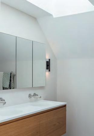
“There’s a difference between a dream house and a real house,” says Mark. “It’s the difference between what you want and what you actually need.”ABOVE LEFT Resene Mangrove is used in the living zone and stairwell, where Mark Cowden’s Golden Orb hangs. ABOVE RIGHT The en suite vanity was custom made by Firman Joinery from the same English oak as the kitchen floors. BELOW The tiler cut the vanity top to fit into the angled wall of the powder room and wrapped the lozenge-shaped wall tiles around the corner.

Brendan Montaperto were suitably pedantic about the workmanship. “We’re both quite handy but they wouldn’t even let us screw down the deck,” remarks Helen. “Although we did help to varnish the skirting boards.” Despite not being able to be as hands-on as they would have liked, they look back at the 12-month build with real fondness. “It was such a positive, happy vibe,” says Mark.
About seven years ago, the couple commissioned a work in forged and welded Corten steel from Arrowtown-based sculptor Mark Hill. For several years, the great, sinuous piece sat tied to a birch tree awaiting its time to shine. Now, it commands prime position on the lawn, framed in the hug of the living pavilion, backdropped by the Hunter Hills. Anyone would think it was planned this way but no, say the owners, this perfect pairing of weathered-steel cladding and art is just coincidence. That and a bit of fortuitous foresight. F

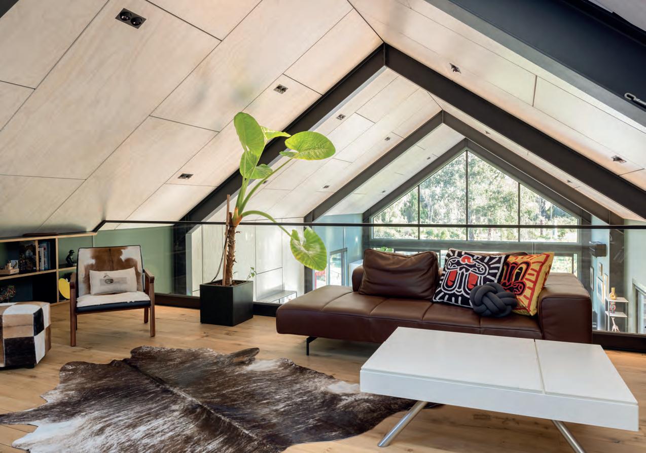
A judicious use of colour can bring out the best in design elements. Here’s how:
on’t fall into the trap so many New Zealanders do – any shade, as long as it’s white. If you like a colour, use it. In the scheme of things, paint is not a huge investment. You can always paint over it for resale. f you want colour but lack the confidence to plunge in, consult an expert. Helen and Mark asked a local interior designer for help. She suggested they go a bit darker with the green they had chosen for the living room.
arying tones of the same colour give the house a cohesive look. For instance, in the living room the walls are Resene Mangrove while the loft is Resene Paddock - both shades of olive-y green.


olour can be used unexpectedly. Whitewashed ceiling panels in the living pavilion are one example of this. But also, in the main bedroom, the negative detailing on a feature wall of ply panels is finished in pink to tie into the pale pink walls elsewhere in the room.


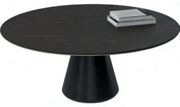
Mid-century-inspired furniture teams with earthy mustard and deep forest green tones that have organic appeal



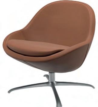
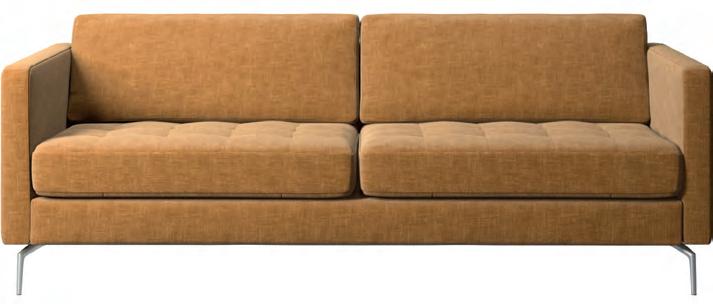
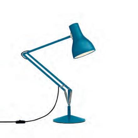
8 Osaka sofa, $6459, BoConcept. 9 Madrid coffee table, $3939, BoConcept. 10 Anglepoise Type 75 desk lamp Margaret Howell Edition, $690, Città. 11 Disc squab cushions, $215 each, klay.co.nz.


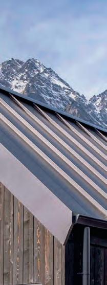
Thermally efficient frames

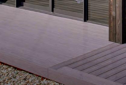
High performance glass
Centrafix™ installation
We’ve always been future-focused, and to us, that means pioneering innovative window and door solutions like ThermalHeart+®,a range code-meeting, industry-leading, thermally e cient products designed and made right here in New Zealand for exactly how we live, almost doubling the performance of standard aluminium windows and doors.* Designed to be warmer, drier, and healthier for us and the environments we live in.




The future is here. Ready now. Find out more at thermalheartplus.co.nz


An Auckland couple found their best bet to secure exactly what they were looking for was to start from scratch
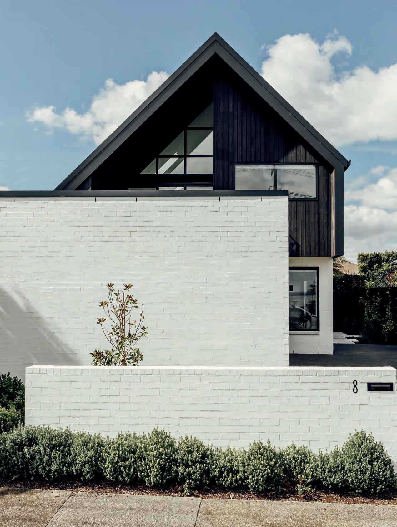
OPPOSITE An exterior wall painted Dulux Manorburn contrasts with the Abodo cladding in Ebony.
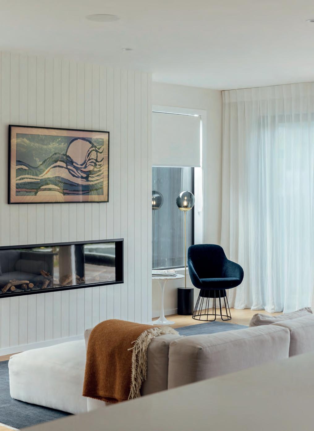
THIS PHOTO The built-in Escea fireplace is a focal point in the living room beneath a Samsung Frame TV, while a deep blue Otto Chair by Tim Webber is a sunny spot to read.
FRANCESCA WOODS AND her husband Hamish wanted a house with space – lots of space – but in a convenient spot near the city and after years of searching for their ideal (five bedrooms, two living rooms, a pool and garage), reached an impasse. This type of property was as rare as hen’s teeth. “So many big houses are not thought through properly,” says Fran. There was always a compromise: the fifth bedroom wedged into a damp basement or no separation between the two living rooms. There was nothing else for it but to build new.
The couple, who had investigated renovating their old villa, started to look for land instead. This 455-sqm site in city-fringe Westmere screamed ‘location’ and it was within budget.
Fran and her mum sketched out their thoughts for the floorplan over many iterations (and one or two wines). But what now? The pair had heard horror stories of architects producing plans that, once quantity surveyed, cost moonbeams. “We needed the experience of David Reid Homes to rein in our design expectations to align with our budget,” says Hamish.
Fran, who was wary of group builders, thinking it meant picking a plan from a catalogue, was pleasantly surprised when franchisee Brett Christie told her otherwise: they could build to a personalised brief. Through David Reid Homes, they were put on to draughtsperson Erik Nielsen of Cadviz who helped them refine their ideas.
Hamish, who works in logistics, was pleased to have cost surety and a structured construction plan bookending the project, and Fran enjoyed the flexibility of choosing materials, fixtures and fittings that fitted with their vision. F
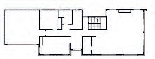
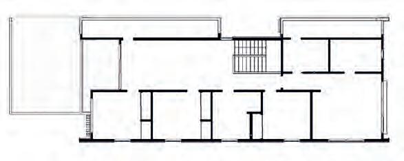
The two-level house makes maximum use of space and multiple points of connection with the outdoors mean it is flooded with light.
Her phone was already populated with inspirational Insta shots – from the form of the dwelling to cladding, kitchens, carpets and beyond. So it’s surprising when Fran says, “Actually I don’t particularly like brick or tropical gardens”, because that is exactly what the Woodses have built here. Truth is, it’s all about context. This townhouse called for just such a palette. White brick grounds the lower level and contrasts with darkstained Abodo on the upstairs gable. It’s crisp and modern, and the landscaping keys into surrounding vegetation. As Hamish points out: “If you look out the windows, you see a couple of massive palms.”
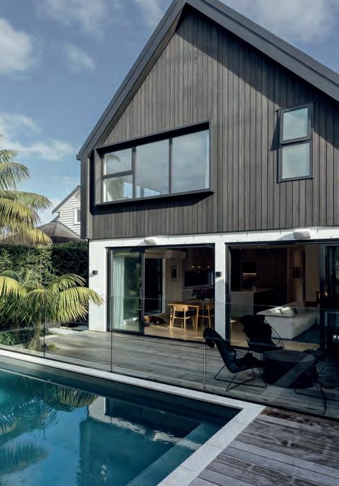
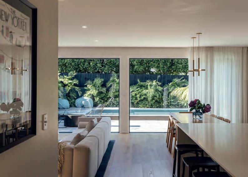
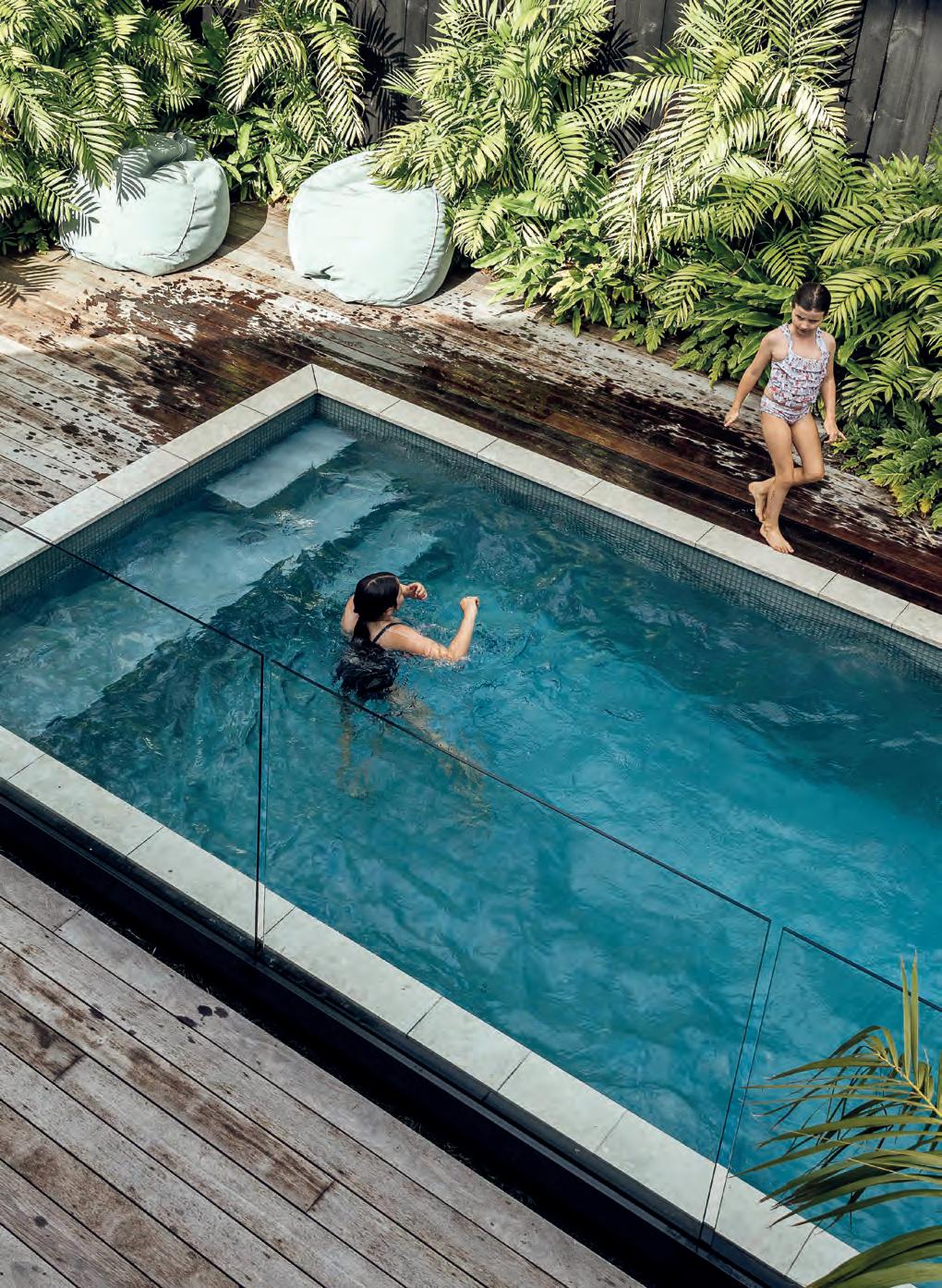
The two-level house makes maximum use of space and multiple points of connection with the outdoors mean it is flooded with light. The pool area, to the south-west, is a visual feast accessed through floor-to-ceiling sliders and, despite the abysmal summer of 2023, is a hit with the children: Phoebe (10), Margot (8) and little Hugo (3).
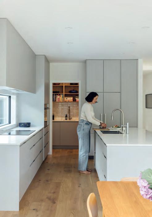
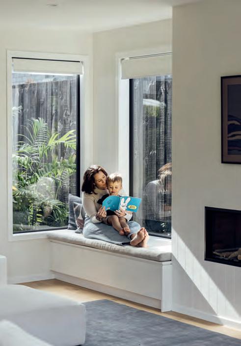
In the living room, built-in bench seating around the fireplace looks out to a pocket garden and, in time, creepers will grow up the neighbouring fence to form a living artwork that is green and serene. That has already happened on the opposite side of the room, where the kitchen bench is backed by a glass splashback. There’s a superb sense of linearity that flows through the design here, with the white-topped islands leading out to the view and French-grey cupboards at once classical and contemporary. “We wanted a calm, neutral palette,” says Fran. “With three crazy children, two pets and busy careers, our brief was for uncluttered and simple.”
That’s also why the couple opted for ceiling spots, rather than pendants or a blade. “Hanging lights above the island would have felt claustrophobic,” says Fran. F
LEFT An Arcade sofa by Simon James has room enough for the whole family. In the kitchen, Laminex Sky Scraper cabinetry and white engineered-stone benchtops keep the look fresh. There’s a hidden scullery so the main living room remains clutter free.
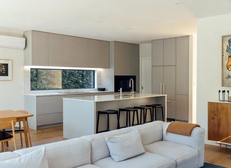
BELOW Two people can easily work side by side in this kitchen and the scullery is a happy place for the couple’s eldest daughter, Phoebe, who enjoys baking.
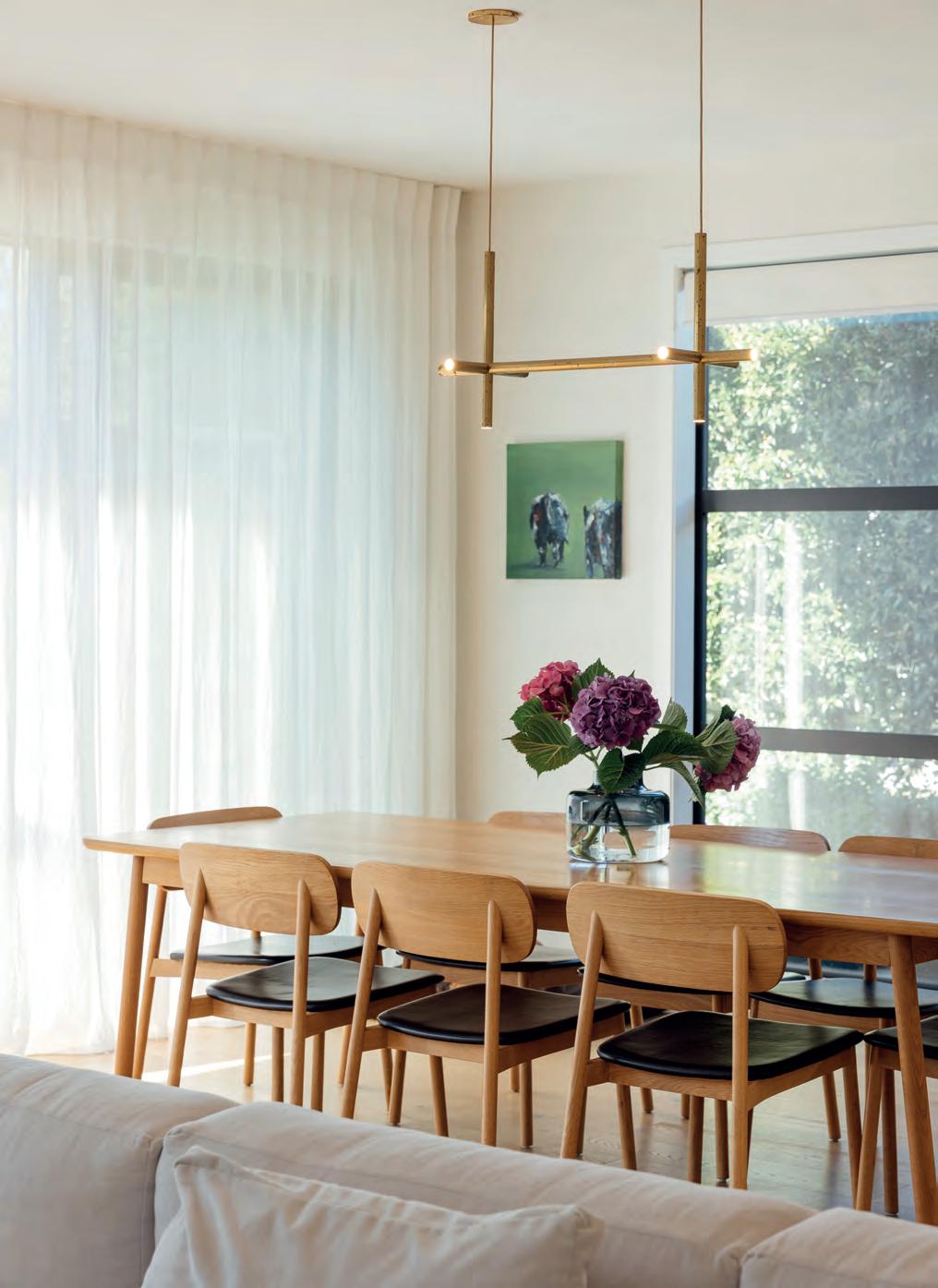
OPPOSITE A cross-shaped Petrine Double Pendant from Nightworks Studio is beautifully elegant above the Radial Dining Table from Città and an artwork by Amelia Guild lends a splash of colour.
The scullery comes in handy when Phoebe embarks on a baking mission, whipping up red-velvet cupcakes while listening to tunes on her headphones, but there are other moves that bring visual and aural tranquillity to the home.
A separate living area downstairs acts as a playroom for young Hugo – apart but not too far from his parents – and whereas initially the staircase was meant to be open and battened, closing it off gives a better sense of separation between upstairs and down.
Tucked under the eaves on the eastern elevation, a windowless cupboard runs the length of the roof. To adults it might be a mere utility for storing suitcases perhaps, but to children it’s a portal to Narnia – and is, for now, occupied by toys and wild imaginations.
On the landing alongside Fran has her office, with a vista across the harbour and hills. In the first draft of the plan, the master bedroom took pride of place here, but the couple decided they needed to share the view. So, instead, a G&T balcony hovers above the city-fringe tableau, a stage to watch the sunset.
The upstairs plan embraces one bedroom for each child (there’s another downstairs for guests) plus a main suite where the Waitakeres are a welcome outline to the west. An efficient design programme has slotted in every spatial requirement, but it’s more than just a room count that makes this dwelling so very much appreciated. The carefully considered aesthetic is essential to the package.
Although these first-time builders experienced “pockets of panic and frustration”, they are thrilled with the result. If this home was somewhere on the coast, or in a more suburban setting, or the mountainous extremes of the South Island, it would put on a different coat. And the Woodses would readily sign up for another round. F

Should you take a YOLO approach with the budget – or be more cautious? The answer is: it depends.
• Before you sign a design-and-build contract, investigate what your idea of a high, mid- or low-range budget is. Hamish and Fran’s expectations of the type of finishings a mid-range budget would deliver needed some readjustment.

• Work out what you can compromise on – and what you can’t. Fran went with wool carpets as she was averse to the feel of solution-dyed nylon and opted for the environmental credentials of a natural product. But she was happy with off-the-shelf joinery for the bathrooms.
• Active involvement during the construction stage is needed; it’s great to be on site to make the myriad little decisions and tweaks that make all the difference. For example, the negative-detail curtain rail in the living room at first only stretched to the end of the window joinery but now goes all the way to the side wall.
• W hen ordering tapware from two different brands, make sure the finishes match. You’d seldom choose brass in one room and brushed stainless in another but, be warned, not all brushed stainless finishes are created equal – they can look quite different.







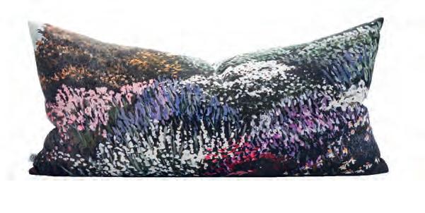
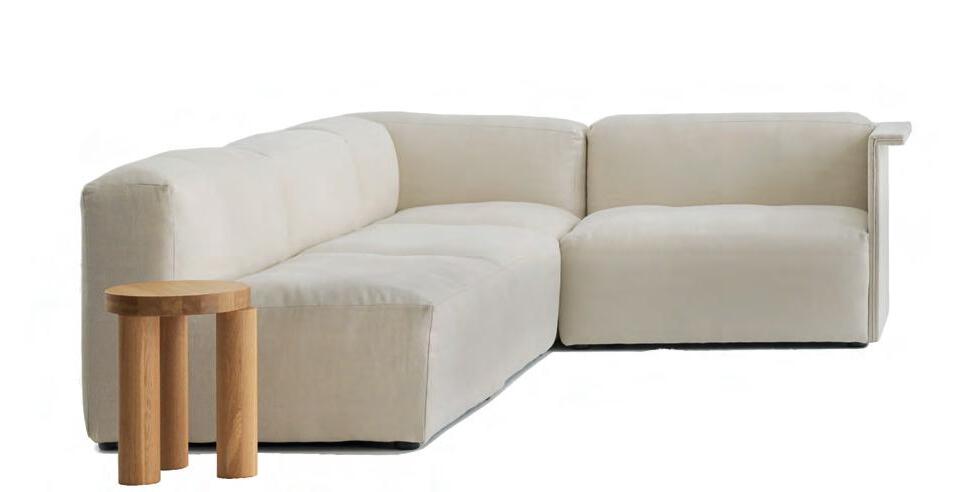
Neutral tones, natural fabrics, clean lines and local design finds make for a calm and cohesive aesthetic1 Petrine double pendant, $2350, Nightworks Studio. 2 Mist vase, $299, Città. 3 Line floor lamp, from $1425, Snelling Studio. 4 Otto chair, from $2275, Tim Webber. 5 Secret Garden lumbar cushion, $240, Thread Design. 6 Bronze incense holder, $200, Aesop. 7 Ida bolster cushion cover, $69.90, Città. 8 Offset stool, $771, Simon James. 9 Arcade modular sofa, POA, Simon James. 10 Wool throw, $239, Città. 11 Ptolemy Aromatique candle, $161, Aesop.

GET JANIE CAMERON talking about her brand-new home and she’s out of the blocks and running, clearly passionate about the adventure of building, and so obviously proud and pleased at the result.
Moving to this Waitarere Rise development was a sea change for Janie and her husband, Tony, who, up until now, had always lived on a farm. The Horowhenua locals are generational poultry farmers and leaving the land was a tough decision. They retain a hands-on role, getting up each morning to collect the free-range eggs from the part of the business they still manage.
Their decision to move was a slow burn. On Sunday afternoon drives, they’d rubberneck at the subdivision with its large tracts of land and ask themselves: “Could we live near the beach?” Turns out, once they resolved to do so, there was no stopping them. They identified the section they wanted and, although it wasn’t officially for sale, negotiated directly with the owner. “The area has a nice beachy vibe and there’s also lots of forestry around us,” says Janie.
As they set about clearing the 4000-sqm site of weeds and wilding pines and planting out a sand dune on the land to attract more birdlife, they started to research what and how to build. The pair weren’t newbies to the game, having previously built a French ProvenÇal-style farmhouse, but this time they wanted something modern and a little different. “Why have what everyone else has?” asks Janie.
They started to visit show homes as part of their research. “Many we went to see were low quality,” says Tony. “You’d open a window and the handle would fall off.” When they visited the David Reid Homes show home in Ferndale on the Kapiti Coast, and got talking to franchisee Tim Sunderland, they knew they’d found their match. The quality stood out and they loved its pavilion style. F

The couple met Tim and the architect on site and then spent a few hours at the café down the road going through the brief. Their home had to feel beachy, but special, like living in a beautiful bach. “They listened, asked us lots of questions – and then we waited anxiously for the plans to come in,” remembers Janie.
A sharply geometric form set against the dune backdrop, the Camerons’ house is made up of two intersecting pavilions and boasts a simple material palette that keeps it crisply elegant. Vertical timber cladding in a sandalwood grey is soft yet contemporary, and the design incorporates deep eaves to shade extensive glazing in robust black aluminium.
Connection to the landscape is a core focus and, from the front door, a wide gallery space zeroes in on a huge floor-to-ceiling window that frames a view of the striking flax garden. While the guest bedroom wing is tucked towards the dune, the split-level front pavilion with the main living areas and Tony and Janie’s en suite bedroom has a private but interesting aspect towards the road where they can watch neighbours walking their dogs or out on their bicycles.
The couple had made plenty of casual contacts in the development even before they moved in, for they were enthusiastically involved in the build, popping over from the farm to check on progress. “I guess you could call us discerning clients,” says Janie. “We knew we had only one opportunity to get it 100 per cent like we wanted.”

Builder Paul Deveraux was a true craftsman who did most of the job himself, his perfectionism precluding other chippies being on site. The floor-layer was just as pedantic, but a bit concerned about the ‘character’ in the distressed oak flooring before the homeowners reassured him it was exactly what they liked. The kitchen experts, too, were a joy to work with. The Camerons had many discussions with designer Rochelle Jackson of Kitchen Elements: “We used to chuckle that we’d tell her what we wanted – but she’d do it her way anyway,” laughs Janie. Her way has been great and delivered them a smart, contemporary heart of the home that juxtaposes matte black and light oak cabinetry. Off to one side, a scullery is so well equipped it’s like F


having a second kitchen, and the Dekton bench and concrete splashbacks lend a strong, masculine edge.
The couple was so impressed with the workmanship here that they asked Rochelle to design the laundry and other built-in elements such as the study nook and entrance storage, important since they’ve had to pare back their possessions to shift here.


Downsizing by no means equals downgrading: the beauty of this dwelling is that it nurtures their newfound lifestyle. Which is probably why Janie can’t help sharing the ways the house has made a difference to their everyday. Such as blinds that open at the touch of a button to let in the view of the semi-rural tapestry. Such as the treat of double glazing which they never had in their previous home. Such as the hotel-like en suite and its luxurious tub hidden behind sliding doors so it can be opened into one big space. “I had a group of guys carrying the stone bath, moving it a few inches to the left or right,” says Janie. “You only get one chance.”
Although Covid-19 put pressure on the supply chain and Janie did find it daunting to be asked to choose taps and other bathroom fittings very early on so as to avoid delays, the rest of the process went smoothly and buying all-new furniture to grace the spaces was a pleasure and a privilege. Tony, who is head of the gardening department, collaborated with a landscape designer to craft the al fresco areas. Raised beds trimmed in weathered steel sweep in curves that offset the straight lines of the architecture.
In December 2021, the couple moved in and, two weeks later, hosted a family Christmas. By then, Janie had learned to drive the kitchen appliances and, as people flowed in around the island bench and out to the sheltered decks, the gathering went off without a hitch.
Now, whether they’re eating farm-fresh, buttery fried eggs on toast for breakfast while tui flit through the greenery outdoors or walking the dogs – Poppy and Reuben – along the beach, or firing up the grill for a whole snapper caught on a longline, they feel fortunate to be here. “We have ticked all the boxes,” says Janie. “And we’re grateful to everyone along the way who helped us achieve it.” P
Tony and Janie enjoy the ‘newness’ of their home and want it to stay that way, so they chose materials with this in mind…
• A bodo cladding is an environmentally friendly product manufactured from New Zealand pine that has been treated to take the moisture out of it which makes it very stable (it does not shrink or expand).
• The distressed look of engineered timber floors is forgiving of the patter of little canine feet and the American oak is likely to last more than a lifetime.
• Ben Hoyle from Gecko Design specified mostly native plants (such as nikau palms, muehlenbeckia and pittosporums) that would withstand the wind and salt air. Eight Pohutukawa ‘Māori Princess’ will grow to flank the driveway. A few exotics such as queen palms and agaves are interspersed throughout.

• The quality of the materials – e.g. composite concrete worktops – means they are bulletproof, and a Scandinavian woodburner that burns super-efficiently will keep the couple cosy forever.
• The house has been wired for an EV so is future-proofed in that way too.

With our exterior cladding solutions. It’s Possible™.


At Rinnai, we design products to make your place feel warmer, cooler, cleaner, drier, healthier… and so much more comfortable. Like the Rinnai Linear gas fireplace you see here. Created to look more realistic and more impressive than ever before, all while keeping your home beautifully warm. So for a home you’ll love to live in, turn to Rinnai. Your experts in total home living.
rinnai.co.nz

THERE ARE MORE than 350,000 posts on Instagram with the hashtag #powderroom and they all have one thing in common: they ping with personality. In Aotearoa, we seem to have embraced this trend.

So named in the 1700s, powder rooms came into being as a private space for the upper class to re-powder their wigs. Also called a half bathroom or cloakroom, they are minimal in fittings (normally a loo and a handbasin) but maximal in impact. Without the need to incorporate a bath or shower, there’s more wall space to work with, which means more opportunity for fabulous expression. Here interior designer Kirsten Ford of KFD Interiors shares her secrets to bringing power to the powder room.
How do you tackle the planning of a powder room? As smaller spaces, powder rooms need to be well planned, considering practicalities first. Every powder room needs a basin, toilet and mirror but the best powder rooms also have a sense of luxury to them - it’s all in the details. The basin should be the centrepiece, and with so many shapes and sizes available, take time to assess the best options for your space. We love a freestanding pedestal basin! A mirror can be fun and decorative - we often consider how to add a sense of light or space in a powder room with oversized mirrors. Feature pendants or wall lights provide a flattering, ambient light, and we also think about storage - a niche or shelf or, where space allows, a vanity unit. Remember that wall-hung basins and wall-mounted tapware are space saving and make the room feel larger.
When it comes to the decorative aspects, what’s the best approach? Powder rooms are transient zones that people pass through but seldom linger in, and they are unconnected to other rooms so there are no competing furnishings or finishes. That’s why you can be bold but it’s also important to link to the rest of your home’s interior - think of it as an amplified version of your other choices, so that it feels unexpected yet still flows. Use bolder, deeper tones or patterned or coloured tiles. Add eclectic artworks and fun accessories.

Why use wallpaper in a powder room? A smaller space can handle bolder patterns and colours that may overwhelm larger rooms. We almost always wallpaper every wall in a powder room for the greatest impactand even the ceiling. Wallpaper is ideal as there is no steam or moisture from a shower, so you don’t need to use only water-resistant materials. Just consider the splashback space between the mirror and basin. You can either seal the wallpaper, use a specific paint finish to protect it from splashes, create a tiled feature or, our favourite, extend the mirror from the top of the basin all the way to the ceiling as a stylish, cost-effective solution.
Which type of paint finish is suitable? Even though a powder room doesn’t have the same moisture considerations as main bathrooms, select sheen levels which have anti-bacterial qualities and tough, wipeable finishes. Lower-sheen finishes are more forgiving on imperfections in walls and surfaces.
Inspired? Here are some examples that our clever David Reid Homes team and clients have put together: F
From pretty to jazzy to OTT ostentatious, the powder room has a lot to say
Once you’ve committed to a decorative statement, there are no half measures: push the boat out. To dial up the drama, choose dark tones but make sure they have some warmth. You could try a shade of black such as Dulux Blackwood Bay or Dulux Khandallah, or an intense blue like Dulux Moonlight Creek, but if you feel the fear, step back from the abyss by keying into the trend for nature’s neutral: green − something deep and swampy perhaps such as Dulux Motutapu Island. Teaming paint and paper in this David Reid Homes’ show home in Canterbury gives this wedge-shaped space opulent appeal. Resplendent with cranes (symbols of immortality and wisdom in Chinese culture), the Masoala wallpaper, from online store The Inside, sets the colour palette. We love the gilded negative-detail drawer pull on the vanity.
TOP TIP: Because this is a room where people aren’t showering, you can use wallpaper without a worry.


Missing your exotic holiday this year? Just pay a visit to this Queenstown cloakroom and you’ll be immersed in an exquisitely wild experience. Think of the powder room as a capsule for experimenting with colour and pattern. It’ll be a delightful surprise for visitors. Here the jazzy wallpaper in vivid orange is the (monkey) business and the wild-is-wonderful theme is picked up in the accessories such as a leopard-print handtowel and trinket box. Fitted louvre blinds also channel the colonial Out of Africa style: the window can be opened for fresh air while the timber slats can be angled to maintain privacy.
TOP TIP: Since a powder room is generally used by guests rather than family, there’s never going to be a rush on the loo roll. There’s probably no need for a vanity unit: store extra toilet paper and hand soap within easy reach.
Never waste an opportunity to plug a powder room into your programme – these small spaces are big on amenity, and punch above their size in terms of form and function. You’d be surprised at how little floorspace you need: just 1200-1500mm x 750-900mm should do it. In the planning stages, look out for leftover or ‘wasted’ space, perhaps a narrow sliver next to the entrance, or that awkward area under the stairs. Ask the experts for help as they will know exactly how much room you need for comfort, around the toilet for example. In this Pukekohe show home, a secret door, clad in the same stained vertical timber as the entrance hall, disguises a powder room. This space, lined in marble, is sleek and contemporary and as luxurious a loo as any you’d find in the foyer of a five-star hotel.


TOP TIP: A cavity slider is a designer’s BFF when every square centimetre counts.
Fittings such as basins and vanity units are now made in slimmer, smaller sizes so they can slide into the diminutive scale of the powder room and look the part. The vessel basin – once confined to white, grey or black - has made magnificent strides forward and there is freedom to be found in many colours, from palest pink, to plum, to spicy shades of nutmeg and turmeric. In the Wairarapa home above, the owners opted for a curvaceous handmade concrete vessel basin in forest green which has tactile warmth when paired with a trestle-table-style vanity stand. The custom-coloured Kakapo wallpaper, from Paper Hands, is an homage to this beloved flightless parrot and brings a unique Kiwi flavour to the design.
TOP TIP: Lighting can lean into the aesthetic aspects rather than the utilitarian – it’s an extra chance to dial up the ambience. P
 THIS PHOTO Black, white and grey tones craft a contemporary look in the kitchen where owners Steve and Barbara Parr (right) chose Caesarstone Sleek Concrete for the benchtops, Melteca Soft Touch Meringue for the cabinetry and a Dekton Trilium splashback.
A Canterbury couple find that building with David Reid Homes a second time is a breeze
WHEN OTHERS WERE struggling to define a home on this wedge-shaped, south-facing section in the Highsted Residential subdivision a 20-minute drive north-west of the Christchurch CBD, Steve and Barbara Parr thought, ‘Why not?’ and plunged right in.

Barb, who is a sales manager for the development, and Steve, whose family business supplied furniture for commercial interiors, were confident that, with the right team around them, they could come up with a plan.
Having already built with David Reid Homes in 2017, they made an assured choice to sign up with the company for a second helping.
The pair prefer a minimal aesthetic and enjoy exploring modern design trends. “We always liked the idea of a monopitch roof,” says Steve. “And, with our background in commercial furniture, we have an eye for detail.”
Nevertheless, a sharp focus on detail didn’t change the facts: due to the orientation of the section, the
customary layout, with outdoor living out back, would need to be flipped on its head. This one-off plan, designed by Hierarchy Group, locates the long pavilionstyle dwelling close to the southern boundary and pushes the al fresco entertaining north-west to face the street. Another wing, comprising the garage and master suite, projects at right angles, forming an L-shaped footprint which wraps around this decked courtyard. While the house effectively has no back garden, the 789-sqm site maximises sun and sociability. “This is a quiet cul-de-sac and the way we have designed the front wall means we still have privacy,” says Barb.
Once this big-picture concept was nailed, it was time to get down to the nitty gritty. Rigorous structural steel was required for the front portals of the home: the glazed front that speaks to the courtyard. “With the prevailing nor’wester, I didn’t want any creaking or groaning,” says Steve. Banks of sliding doors stack up for ease of access F
to the outdoors and clerestories tuck in under the roof to usher in maximum light and high sky views.
Designwise, Barb took charge in the culinary department, working alongside Finesse Joinery to map out the kitchen. “We had a black kitchen in our previous home, and it used to mark so easily,” she says. “This time we wanted white and a design that had no handles, with doors and drawers that you just push to open.”
The couple also came prepared with measurements for every stick of furniture and all the art, including one very special ‘sculpture’: a replica of a Marc Marquez Honda Repsol MotoGP bike that was earmarked as a showstopper in the entranceway. “I’d have two motorbikes inside if Barb would let me,” says Steve.
With sufficient wall space for their collection and proportions precisely defined to accommodate existing pieces, the stage was set for construction to begin. David Reid Homes Canterbury franchisee Carl Fordyce
directed every scene with seamless pragmatism. “We started the build just as all the shortages were happening but, apart from having to wait two extra weeks for some framing timber, it was plain sailing,” says Barb. For his part, Steve enjoyed being on site to make quick decisions when required and was itching to be as hands-on as possible. “The team did let me help sweep up at the end of the day,” he jokes.
Such a close working relationship has drawn rewards. Striking but simple, the house sports white-brick and plaster cladding on the main pavilion, offset by charcoaltoned vertical board on the garage block. Punchy contrasts and a skillion roof make a clearly contemporary statement within a neighbourhood where gables reign.
Inside, the light, white mood has a Scandinavian bent and thoughtful design has delivered a pared-back canvas with nothing to jar the attention. Airconditioning is ducted so no obtrusive heat-pumps puncture the walls, F

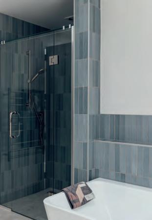
 THIS PHOTO Marble can be both classical and contemporary and is used to beautiful effect in the en suite where Galaxy Carrara Matt tiles stretch from floor to ceiling. Michel Cesar Sleek ceramic basins are elegant on the dark-toned vanity.
the TV is secreted away in a separate media room and, in the kitchen, integrated appliances (including a door that disguises the oven) and a scullery tucked in behind keep the look sharp and clean.
Anchored by whitewashed floors, the open-plan spaces embrace a cool calmness, but there are zones of textural warmth. The surround of the woodburning fireplace in the living area is cloaked in white brick that wraps around from the exterior, and patterned metallic Dekton adds a painterly touch to the kitchen splashback and above a dedicated drinks station and wine fridge.

Within the pristine palette, colour is not anathemain fact it’s at the heart of the art, popping some vibrant personality into the scheme. And it goes without saying that the Parrs’ furniture, including two stand-out white-leather sofas, fits into their new home like a glove.
The same can be said of the couple themselves. This is a lifestyle they have rather quickly warmed to. Steve and
Barb are easy entertainers and the house acts as co-host, inviting a natural flow to the deck where there’s enough room for a full lounge and dining area to echo the ones indoors. Low-maintenance landscaping means there’s no grass to mow, and the couple don’t miss it. Over two summers they’ve already adapted to having weekends completely free of the tasks of garden upkeep.
Instead of pulling up weeds, they plant seeds of friendship, making full use of their street-facing, sunny living rooms. When they’re not welcoming visitors, once every three weeks or so, they take off in the caravan. There’s a sense of freedom that comes with owning new.
Being content in the here and now doesn’t mean they don’t dream. They seem to have been bitten by the building bug. “We enjoyed the process,” says Steve. “And it wasn’t particularly stressful,” adds Barb. Should a nice section come up, they’ve already worked out what they’ll do in their next house. P
Steve and Barbara Parr had such a positive building journey, they’d do it again in a heartbeat. Here’s how to achieve a lowpressure project:
• A design-and-build company takes on all the responsibility for delivering your home on time and on budget. There’s no passing the buck if something goes wrong. Choose one that aligns with your values.
• Contractors that an established building company brings on board (project after project) are likely to be reliable and deliver workmanship that supports their standards.
• Let the experts do their job. Listen with an open mind to any advice and, if you still plan on following a different path, know that it may cost more.
• Get as much detail as possible locked in before the build. The costs of this dwelling came in at 20 per cent above the quote but mainly due to additions the owners required and finishes as specified by their interior designer.

• Make yourself available. No matter how refined the plan, things happen in the day to day. A quick decision from you can save time and money.

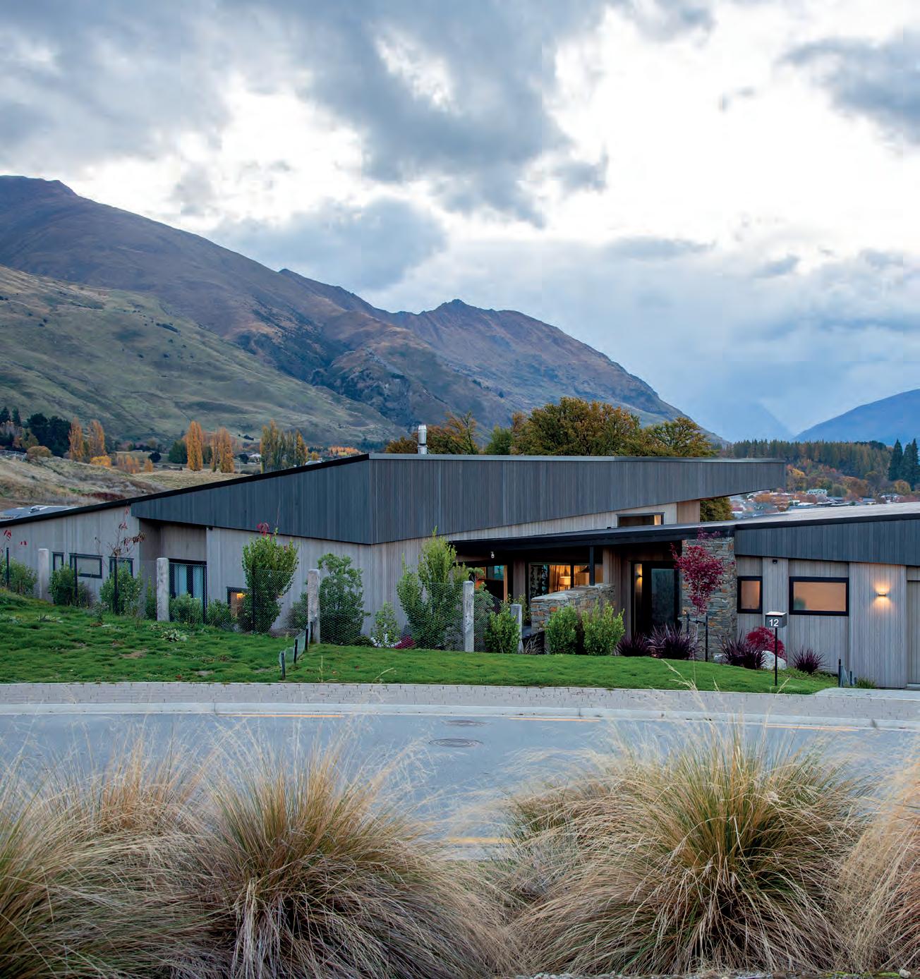
ON HER INSTAGRAM account, Melissa Hooper-Greenhill calls herself a “seasoned renovator turned new-build obsessive”. As first-time builders, you’d think she and husband, Orlando, might choose a gentle start. But no – they picked a difficult section and threw themselves into the project boots and all.
The couple, who met in London, moved to New Zealand at the end of 2017. It was time for a new adventure and a different way of life. Melissa grew up in Clinton and Central Otago had always been a favourite place for the couple to holiday when visiting New Zealand. With two young boys (Zac, now 12, and Sammy, 10), the natural beauty, outdoor lifestyle and family close by meant Wanaka felt like the ideal base.
They came across the Alpha Ridge subdivision quite by chance. With two sites still available, they asked the sales rep which one he’d pick. Why, the flat one that was easy to build on, of course. The Hooper-Greenhills went with the other.
Lot 88 was 1400 sqm with a ridge running through it. “For a long time, it was used as a road to drive stuff from the bottom of the development to the top,” explains Orlando. Having a five-metre drop bisecting the wedgeshaped tract did have its upsides though. “There’d be no roofs of houses directly in front of us.”
A friend had recommended the couple talk to David Reid Homes franchisee Chris Leith, who came to see the site – and set their imagination alight. “He had so many ideas. Given the complexities of the section, our house was never going to be a plan taken straight from a book,” says Melissa.
Working alongside architectural designer Aaron Jamieson, ideas began to form into lines, lines into volumes and volumes into a home that embraced their needs and the environment.
The concept plan showed a house broken into two wings (one for the boys, the other comprising the living spaces, office and main suite), angled to fit into that awkward wedge and oriented for light and views. A glazed entry corridor connected the two parts. It was genius. F

Relocating across the globe brought this energetic family a golden opportunity to reinvent their home and their lifestyle
Documenting the design-and-build, Melissa began to build up online followers as the diggers moved in, the foundations were poured, and the framing went up. Making so many decisions was challenging but not overwhelming. The couple found the process exciting. Scouring Pinterest for inspiration for the interiors became Melissa’s passion, Orlando was a pragmatic sounding board and even the boys got involved, with Sammy requesting a camouflage-green room and both boys agreeing on a hang-out space between their rooms where they could make as much noise and mess as they liked. The research and deep dive into detail has proven worth the while. The four-bedroom house has stand-out architecture and embraces the lifestyle the family dreamed of.
Defined by two monopitch roofs, the home is clad in vertical cedar, with a cap of darker-toned eaves that slice down on an angle − a feature inspired by a dwelling Melissa had spotted online (House Under Eaves by MRTN Architects). “We call them the ‘eyebrows’ of the house,”
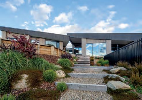
explains Melissa. Eyebrows are certainly lifted as soon as visitors pass through the schist-flanked entry. The elevated site and well-considered design maximise expansive views of the mountains and lake while the interior spaces combine to make this a welcoming family home. A 50s-style built-in dining nook gets its fair share of comments, a red-brick wall backing a wood-burning fireplace looks cosy and inviting, and the stepped-down lounge channels a mid-century mood. “That was one of Melissa’s ideas that actually proved to be a good building solution, too,” explains Orlando, “since it follows the slope of the land.”
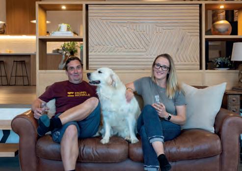
The kitchen, in shades of Scandi with pale timbers and white tops, was one spot where he had his own big ideas. Orlando is an enthusiastic and able cook, and a Lacanche oven, a French brand they’d brought over from the UK, was set to take pride of place, while converting part of a large scullery into a secret wine room just seemed like a “sensible use of space”. The pair initially envisaged they’d import a deVOL kitchen from England and install it. F

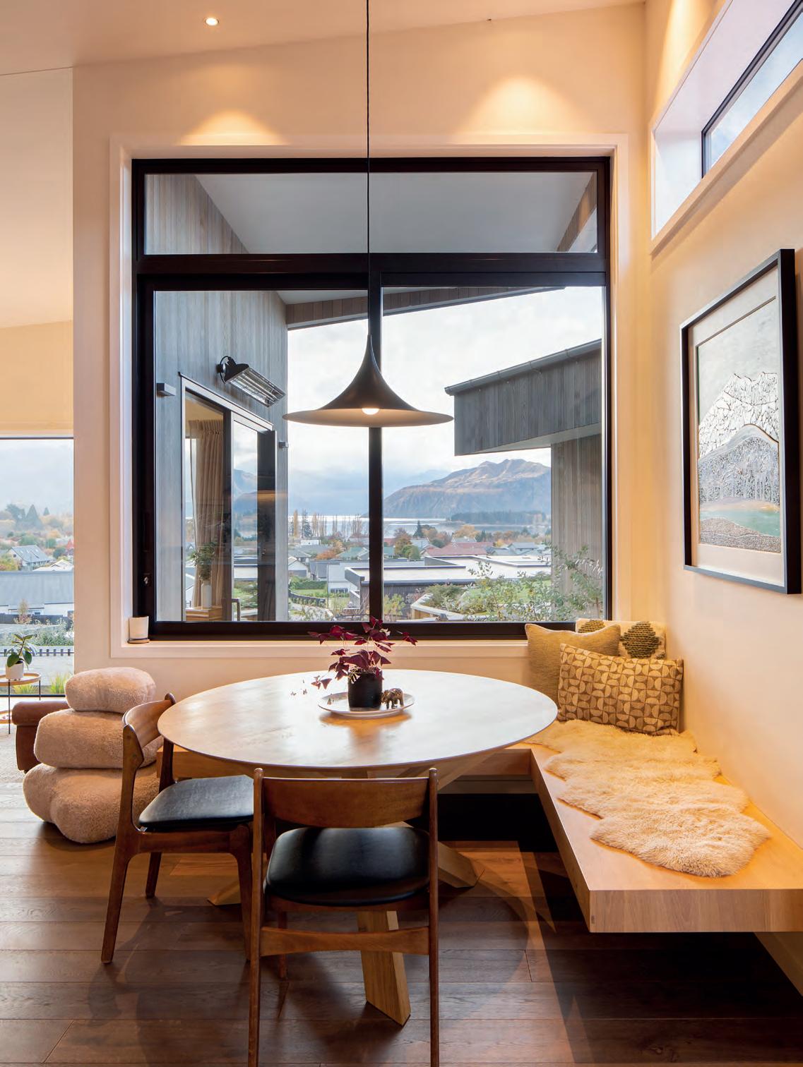
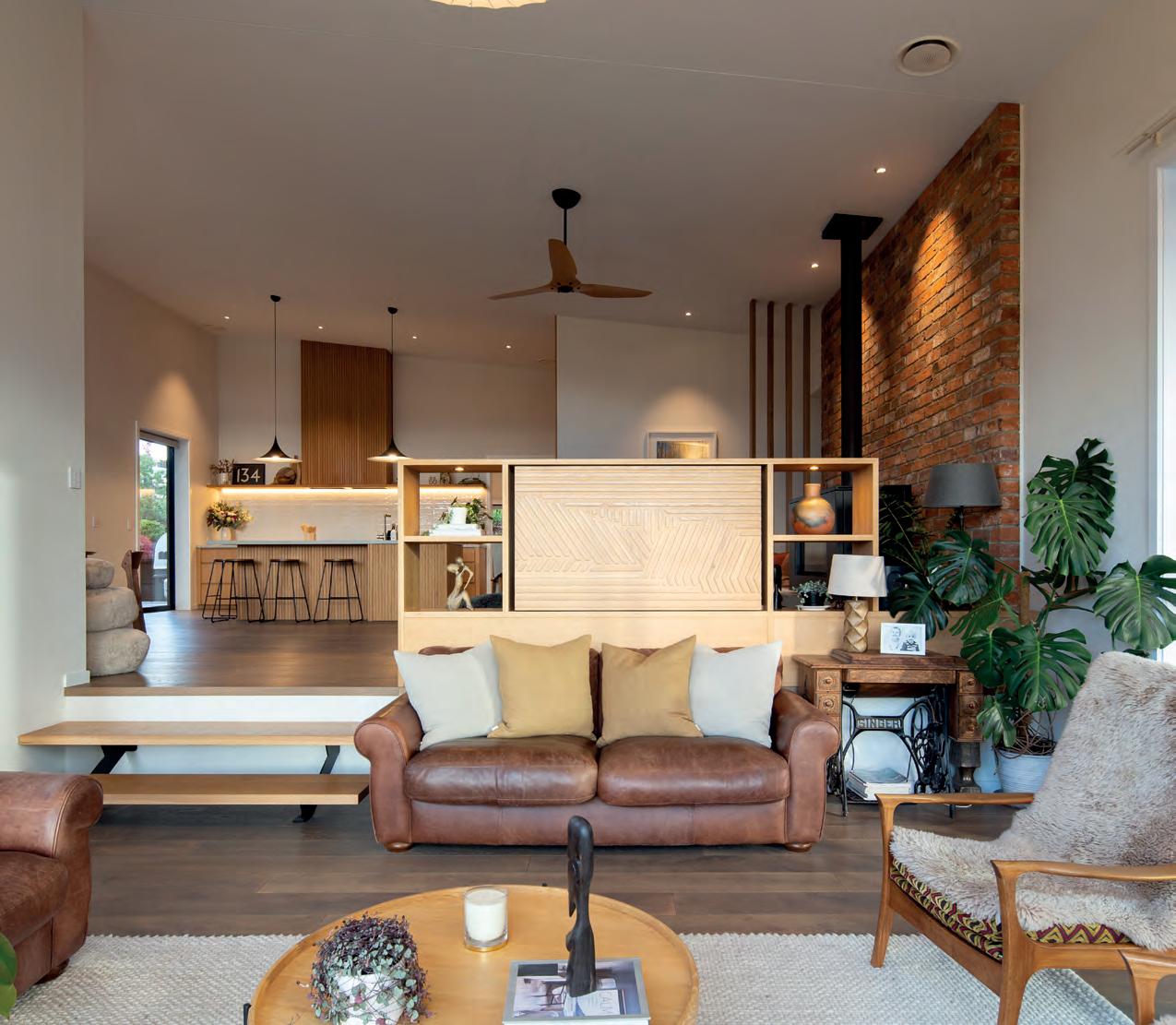
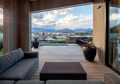
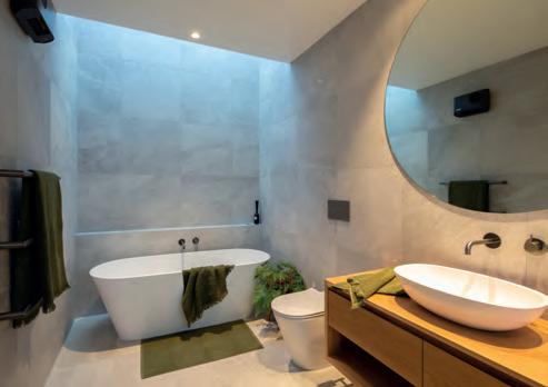
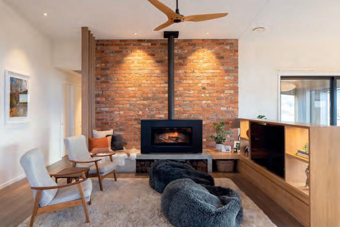
“The bricks are more than 150 years old and come from the chimney of an old house near Melissa’s parents’ home in Clinton,” explains Orlando.ABOVE Don ‘Concord’ wooden-armed chairs, a Trade Me find, pair with leather sofas for a retro-cool comfortable feel in the stepped-down lounge. The TV, currently facing the opposite direction, is integrated within the room divider and spins around so it can be watched from either space. OPPOSITE, CLOCKWISE FROM TOP LEFT Melissa fought for a skylight above the bath and is glad she did; the couple give enthusiastic support to the local wineries; a north-facing outdoor room is nice and sheltered for use at any time of the day.
“The David Reid Homes team gave us lots of free rein to run with that,” says Melissa. However, when complexities kept increasing, they changed tack and worked with local joiner Jem Culpitt, to build their vision from scratch.

Now an island and rangehood battened with American oak lend a punch of warmth which teams with composite concrete tops that are cool and solid to the touch. From watching many series of Grand Designs, the couple knew last-minute changes would impact the budget but are pleased they went with a sliding door off this space that leads to a sheltered south-facing courtyard. “Chris indulged our idiosyncrasies after warning us, ‘It’s all dollars’,” says Orlando.
That included some very personal touches. In a complete change of pace from the light, bright kitchen, the adjacent sitting area near the fireplace is backed in characterful red brick. “The bricks are more than 150 years old and come from the chimney of an old house near Melissa’s parents’ home in Clinton,” explains Orlando. Her parents climbed up onto the roof and took them down one by one, tossing them onto bales of hay for a gang of neighbours to stack up. “The brickie who laid them was so excited to be able to work with authentic old bricks.”
Plonking into a sheepskin beanbag in front of the fire with a glass of pinot and the two dogs snuggled up is one of Orlando’s favourite things to do. Melissa enjoys her early morning cuppa on the dining bench-seat surveying the lake and mountains and, come winter evenings, lying in the bath looking up through the skylight.
It has been two years since the family moved in and they’re still evolving the decorative aspects. Paintings by favourite local artists sit happily alongside sculptures by Orlando’s mum. A much-loved brown leather suite came over from England, but Melissa enjoys the adventure of discovery on Trade Me and Marketplace. “Every room has one or two chairs in it which I’ve reupholstered myself.”
Now that the planting is bedded in, the pool knits the house and landscape together and the boys love having their friends and the neighbourhood kids over for a swim.
Orlando and Melissa admit this was a hefty, ambitious project to take on as newbies. Although some suggest they might get the building bug and move on to fresh fields, that’s not on the horizon. “It was an investment of love and commitment, not to mention shifting to the other side of the world,” says Orlando. They’ll be here for a good while yet. F
This creative couple didn’t always go the conventional route. Here are some ways to personalise your project:
• Look overseas for some hero buys. Sometimes it’s better to ship something in if you truly love it. The HooperGreenhills will never regret bringing in their Lacanche range.
• Reclaimed materials, especially those that have a personal connection, can bring special meaning to your build. Antique bricks rescued by Melissa’s parents are a unique feature of the snug.
• Seek out local artisans and craftspeople who can help your vision come to life. The couple’s joiner and bricklayer had both vision and skill – a talent that built on their own ideas.
• Stick to your guns. If you love something, go for it – but be prepared to pay a little extra. As Melissa says, “If anyone ever asks, ‘do you really need a skylight above the bath?’ [and you’re working with a south-facing room] the answer is always ‘yes’.”
• Exploit your own creative talents. Can you knit, upholster, sew, paint, mosaic? If you can, you have the means to make something unique and special.

1 Sheepskin stone, $1890/set of three, Wilson & Dorset. 2 Semi pendant by GUBI, $1040, Cult. 3 Resurrection Aromatique Hand Wash, $57, Aesop.



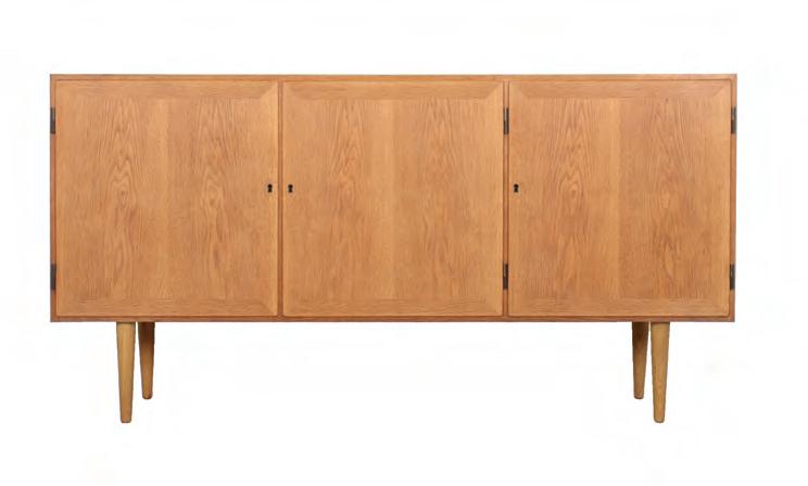
4 Mesa bowl, $259, Citta. 5 Carlo Jensen oak sideboard, $3250, Mr Bigglesworthy. 6 Marsala heavy linen cushion, $149, Thread Design.
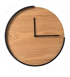
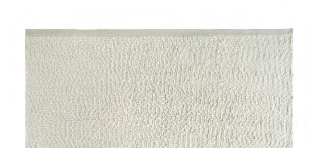
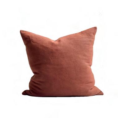
7 Terracotta heavy linen cushion, $149, Thread Design. 8 Segment clock, $209, Città. 9 Palus rug by Armadillo, from $3370, The Ivy House.
10 Daily sofa in Walnut, $5985, Città.


11 Shaggy bean bag, $1890, Wilson & Dorset. 12 Marlowe vase, $229, Author Ceramics. 10

in on cosy textural finds and warm colours to build an all-season look
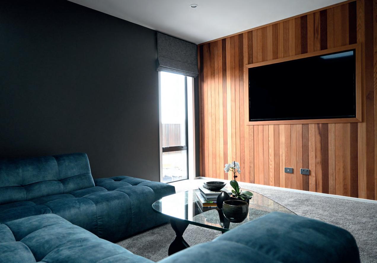
BACK IN THE DAY, New Zealanders were so keen to get their first taste of television that lobby groups were formed to give the government a hurry up. The state responded and fortunate Aucklanders lapped up the original official broadcast on June 1, 1960 – a two-hour line-up that included a performance by the Howard Morrison Quartet.
Fast forward seven decades and the digital world is a wonderland of possibility. “Some of our clients actually design their entire house around a media room,” says Ben Green, David Reid Homes franchisee for Coromandel. “Particularly after the Covid-19 lockdowns, they’ve become more passionate about stay-at-home movies and investing in the best experience possible.”
Although Ben admits it’s generally men who push for a media room, requests from clients vary. There are those who want a bells-and-whistles home theatre tucked away in the basement, others with young children who simply require a separate space near the main living area so the adults can talk without cartoon antics drowning out the conversation, and still others with older teens who require
a dedicated gaming room for big kids of all ages to be incorporated somewhere in the floorplan. “It all depends how a media room fits into day-to-day life,” says Ben.
For home theatres, soundproofing is crucial and Ben is a fan of using precast concrete walls and ceilings to deliver on this score. It’s certainly worth the investment, since plasterboard just doesn’t cut it. “We also advise using acoustic panelling on the walls and ceilings to absorb the sound, so it doesn’t bounce off hard surfaces,” he says. Solid-core timber doors are a must, and sound seals around the doors are very effective.
Ben advises using automated blinds that fit in the U-channel of the window jamb for complete black-out conditions and says many clients also choose to paint the room in dark, rich shades to lend a dramatic ambience.
When it comes to technical audio-visual knowhow, an expert certified by CEDIA (Custom Electronic Design & Installation Association) is a savvy choice. It means they are trained, tested, examined and certified to install equipment to a global standard.
We asked Brendon Reid, founding director of Automation Associates, for his ear-to-the-ground advice on setting up systems that are both sound in principle and in practice. Here’s what he had to say:
A media room is a multi-purpose space with many functions: a place to entertain, watch movies, enjoy gaming or act as a rumpus room. Its key components –the display, speaker system and control system – are often teamed with lighting control, and curtain or blind control. These days, typically, the display is an LED panel. Although projectors are used, in modern homes with acres of glass they are ill advised, as no projector lamp is brighter than the sun!
Screen size is a much-debated subject. Bigger is not necessarily better, and it’s no surprise to learn that men are the main offenders here. “If you’ve ever been to an Imax show and come out feeling a bit knackered, that’s because the width of the display affects your physiology. Too wide and the brain can’t process it,” explains Brendon. “You end up having to constantly move your eyes or head to adjust – and that’s tiring.”
When creating an immersive experience, where the aim is a suspension of disbelief, the size of the screen is easily calculated using a bio-physical relationship between the viewer and the screen. During the construction phase, sit in your media room (even if it’s just at framing stage) on the spot where you envision
your chair or sofa will be. Then extend your hands out in front of you at shoulder height as far as you can. Hold them horizontally, palms facing down. Touching your thumbs, stretch out your fingers as wide as you can. Then look at the wall; the extremities of your two little fingers will be the width your screen needs to be. Two hands together with fingers outstretched makes for a cinemalike experience, three hands is Imax territory. “Rightsizing is a phrase we use in the industry,” says Brendon. “If your display is too big, you’ll end up with neck issues and the room’s useability will drop.”
If your goal is to create an immersive experience that engages the whole household, good sound is equally as important as vision. It’s a complex arena because, of course, not everyone has the same level of hearing, but did you know that women also hear different frequencies to men? According to Brendon, if there’s an issue with sound, it’s generally clarity rather than volume that’s the cause. When it comes to dialogue intelligibility, women hear best at a slightly lower frequency to men. Astounding as it may seem, women are biologically attuned to hear men better, and vice versa. “That’s one reason why during World War Two, the radio operators were women. With all the background noise going on in a bomber, the male pilots would find a woman easier to hear,” says Brendon.
How do we translate this to the lounging-on-thecouch context? One way would be to up-spec from an off-the-shelf soundbar to one with specifications that cover all the frequencies responsible for dialogue, which go as low as 500Hz. A step up would be to invest in in-wall or freestanding speakers. Brendon explains that soundbars were created because, as screens got bigger and the bezels more streamlined, manufacturers were forced to start putting speakers into the back of the display – not ideal. “A soundbar in front of the display screen basically takes the sound out of the TV and squirts it towards you,” he says.
Nevertheless, a speaker in a soundbar is relatively small and can’t capture the rich, low-frequency sounds of, say, a baritone opera singer. So you add a subwoofer. F
“If your display is too big, you’ll end up with neck issues and the room’s useability will drop.”
But while a soundbar and a subwoofer can go a long way as a solution, it’s only the beginning of the journey. If you’d like your media room to be the one that every kid in the street wants to come to, or that’s picked for watching the ABs with your mates, there’s a whole lot more to it than that. “You can’t decently represent the variety of sound – such as all forms of music, the crowd cheering at the rugby, or the evening news – with just one speaker,” says Brendon. A combination of tweeter, woofer and subwoofer are needed to cover the range. Often homeowners install five or seven speakers in the ceiling and think, ‘Job done’. The problem is that, instinctively, humans perceive sound coming from above and behind them as a threat. The science of psychoacoustics tells us that our core brain puts a lot of emphasis on sound that emits from outside of our field of view. “It makes us feel uneasy,” says Brendon. Although ceiling speakers, up out of the way, seem like a good idea, they don’t sound as good as an in-wall speaker. Yet because in-wall speakers are built for the average depth of a wall cavity, which varies from country to country, there’s no telling how it is going to perform.
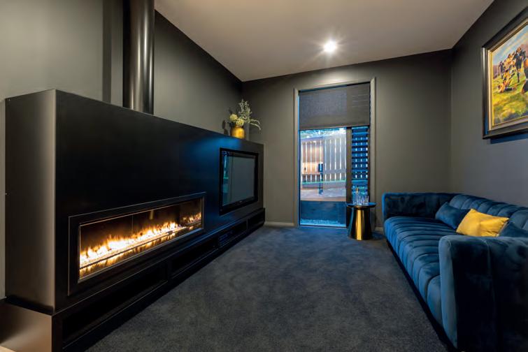
The truth is that the best-quality sound, one that is equal to any occasion, will come from a bank of incredibly large, ugly, floor-standing speakers dotted around the room. Not an option for many! At home, Brendon’s own set-up sports three speakers in the front wall, four in the ceiling and a projector. “When working within the axes of budget, time and aesthetics, there’s always compromise,” he admits.
If you stand in a squash court and clap your hands, it takes a second or more for the echo to die away. Translated into a room with lots of glass and a concrete or bare timber floor, that’s a lot of noise bouncing off the ceiling, which creates a tailing-off effect that muddies the sound. For better dialogue intelligibility, choose blinds or curtains to soak up the sound and put a rug down.
Also, be aware of ‘null’ spots – areas of silence found in rooms designed with dimensions that are multiples of each other (such as 3m x 3m square or 3m x 6m). In perfect volumetric cubes, sound waves will bounce around, cancelling each other out and, for a given frequency, the standing wave will form a null or quiet spot. “This is often the case when someone can’t hear the television in one part of the room and for the other person it is turned up really loud.” Use a bookcase, hang some art or install a piece of furniture against the wall to break up the waves. “The best rooms for home cinema have the weirdest configurations,” says Brendon.
Today there’s an app for everything, which puts the power into the palm of your hands but often you end up needing spider fingers to achieve the best AV experience: there’s an app for the TV, another for the soundbar, one to dim or turn on the lights, and a separate one for the curtains and blinds. An AV integrator puts them all into one app. An expert can advise so that next time Mum rings in the middle of the movie, one tap is all it takes. P
With blinds that open to greet the sun, a heat pump that kicks in when the temperature drops and lights that dim down as you drift off, your home can adjust to meet your needs, whatever your lifestyle.


A rural outlook and room to grow their little family were priorities for these enterprising newbie builders

THERE’S LITTLE NEED for artwork in Laura and Shaun Andrews’ new home. The rolling hills of Matuku Farm Park fill the windows with lush landscapes − bucolic scenes fit to grace any masterpiece.

The young couple, who moved to Hawke’s Bay in 2016, revel in the incredible sense of spaciousness that multiple connections to this backdrop brings to their first home. After six years of living in a one-bedroom flat, the freedom is exhilarating.
Chickens were part of the picture when they imagined their dream lifestyle and this 3000-sqm block with a glimpse of Lake Runanga could accommodate a whole brood. But the Andrewses, who own a solar installation company, are content with just three, enough for fresh eggs on weekends enjoyed on the breakfast patio, watching on as the wilder birdlife returns to the restored wetlands.
Since the pair work in the building industry, they felt qualified to recognise excellent build quality and a premium service. “But to us this was still a massive investment,” says Laura. “We really needed to feel comfortable.” Local David Reid Homes franchisee Warren Jardine listened and understood.
The brief was for “a Laura and Shaun home”. “We didn’t want cookie cutter, or the boxy group-house feel,” says Laura. Regular meetings gave them their wishlist: unique elements and materials that spoke their design language.
With solar at the top of their list, correct orientation on the land and of the rooms within the footprint was a priority. Panels installed above the garage face north, but internally Warren guided them away from their initial thoughts. “We thought we’d have the kitchen towards the east for morning sun and living to the west,” says Laura. F
Instead, the kitchen, a social hub, is on the western elevation and leads to a covered portico, perfect for casual entertaining. To the east the living room connects with a morning patio where the couple can have coffee in the sun.
Challenging their ideas was something the Andrewses were grateful for. “We didn’t want the team to just do what we said. We readily took on board good advice.”
This give-and-take teamwork, where engaged clients nut out solutions with the experts, always brings the best results, and this double-gabled dwelling on a hill is no exception. Shaun was sold on full cedar cladding, but Laura was not so sure. When Warren suggested mixing it up with a bit of plaster and some dark weatherboard thrown in, it was not only good for domestic relations but the budget too.
Respectful collaboration also brought them through the construction phase. The only hurdle was when an immediate decision was needed on the tint of the windows – and Shaun was out of phone reception. “I thought, OMG, that’s a huge call,” remembers Laura, who consulted with Warren and went with the mid-tone option.
Halfway through the 240-sqm build, it started to dawn on the Andrewses how fortunate they were to have opted for quality over quantity. “The David Reid Homes ‘standard’ was just better. For example, how good the framing timber is and smaller details like the size of the scotia and skirting – or the quality of the carpet,” says Laura, who also enjoyed the flexibility to work with one of her best friends, interior designer Toni Gale of Tones & Co.
Bringing a touch of nature into the home is a theme that is showcased in the kitchen, where Toni helped F


 THIS PHOTO Extensive glazing and interiors painted Dulux Half Haast allow the backdrop to be the hero of the living zones.
 THIS PHOTO An IO Drum Pendant picks up the natural tones in the dining table and rug. Rhino rigid-core plank flooring in Bespoke Oak has a rustic/modern appeal perfect for a new house in the country.
Halfway through the build, it started to dawn on Laura and Shaun how fortunate they were to have opted for quality over quantity.
select a soft sage green for the island cabinetry and white finger tiles on the splashback – a palette that is transposed in the scullery where the cabinetry is white and the tilework a soothing mottled green.
In the living room, timber battens wrap the windows either side of the built-in fireplace, while alongside the dining room you’d never guess that a seating area equipped with a pair of wooden shelves, where art, books and plants are beautifully curated, was an off-the-cuff feature. “We had to step out the kitchen wall a bit when the space wasn’t quite large enough for the fridge. The builder suggested we put some shelves in the alcove, so it would look like an interesting part of the design,” explains Laura.
Timber accents are also integral to the master bedroom where battens stretch up the wall behind the bed as both headboard and divider and warm up the palette. “The

en suite is almost as large as our main bathroom,” says Laura. With his-and-hers showers, there’s no morning bottleneck to negotiate, and tops made from stone offcuts, both here and in the laundry were a balm for the budget.

Now that this project is near completion, apart from the slow but steady planting of hundreds of native trees to tie in with the landscape, the couple, who seldom stand still, have ventured into a second business – marketing a new low-cal soda brand called Sundays Drinks. If that’s not enough to keep them occupied, soon Sage, the springer spaniel, will no longer be the baby of the house. A new human addition to the family is due any day.
“Some evenings when I’m feeding the chickens in the corner of our property and I look back at the house as the sun sets behind it, it feels surreal,” says Laura. But it’s not. It’s just very much a life less ordinary. F
For Laura and Shaun, putting their energy into solar power made good sense. Here they share their tips on how to make it work for your newbuild:

• W hen deciding on an exact building platform, choose an area that won’t be shaded by trees. Trees are fantastic, but not when they are shading solar panels.

• Think about how the panels will look on your roof. If you opt for a flat or gentle monopitch, the panels will likely need to be tilted north – this might not be a look you like, so perhaps a gable is better or even a garage (in a good location) with a pitched roof.

• Solar power provides electricity, so choose as many electrical items in the house as possible, over alternatives such as gas. For example, an electric hot water cylinder or hot water heat pump, as solar power can provide free electricity to those appliances.
• Incorporate solar panels into your budget. If that doesn’t quite extend to batteries, they are easy to retrofit.
• W hen choosing a solar provider, jump online and check out their reviews. There are cowboys out there − but they are usually identifiable by their Google reviews.

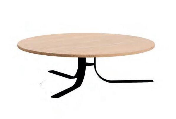

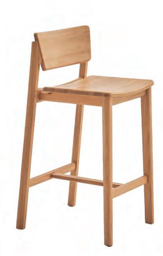
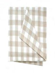

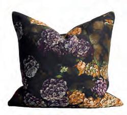
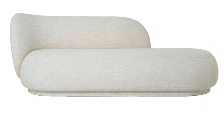
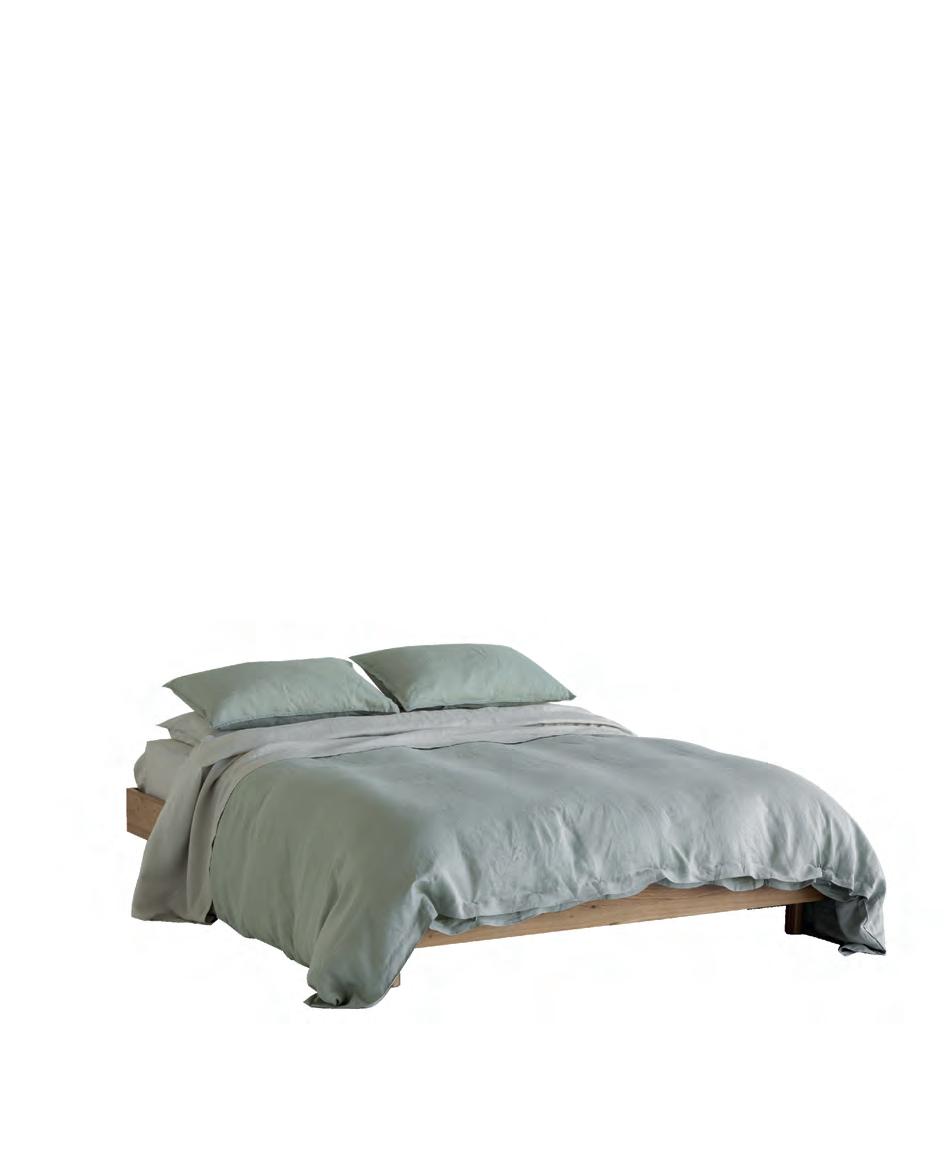
1 Lilius vase, $89, Ornament. 2 IO Drum light shade, from $409, Maker Design Studio. 3 Rectangle rattan basket, $139, Città. 4 Hydrangea cushion, $149, Thread Design. 5 A&C Linen duvet cover in Laurel, from $289.99, AC Homestore. 6 Poise barstool, $929, Bauhaus. 7 Rico Divan sofa, $8470, Slow Store. 8 Compact wall light, from $710, Snelling Studio. 9 Chord coffee table, $2358, Woodwrights. 10 Harvest tablecloth, $79.90, Wallace Cotton.

BUILDING A NEW home is often a one-off opportunity to live out your vision of an idyllic lifestyle, and there isn’t a client out there who hasn’t approached us with a mental scrapbook jammed with images that centre around barbecues on the deck and relaxed evenings spent al fresco. When it comes to a dream design, summer gets the lion’s share of attention, but what about the flip side of the coin? At David Reid Homes, we believe that winter needs some love too.
When a chill wind blows and you can’t wait to cuddle up with a cocoa (or something a bit stronger), interiors with a warm soul give winter the cold shoulder. An indoor or outdoor room centred around a fireplace is an easy win but, with the right choice of materials, every space can shun the shiver.

This open-plan living room has a feature fireplace but even without one it would look like hot stuff. The design move that makes this happen is the ‘sandwich’ of natural timber that warms up the ceiling and floors. Often homeowners are tempted to paint ceilings white for the feeling of more volume, but here in this Queenstown home, where the weather can be as bitter as a frozen lemon, warmth is the target. Exposed roof trusses lend a lodge-like ambience which, as any skier can attest, evokes an instant association with shelter and the conviviality of an après party. Lighting that washes up to the roof and down to the art retains the smoking-room mood and the home is decorated with leather, jute, velvet and sheepskins – fabrics that send Mister Frosty packing. F

White kitchens never go out of fashion. White is a ‘colour’ emblematic of cleanliness and its reflective properties bounce light off surfaces to transform a compact room into a bigger, brighter experience. However, if you don’t want your kitchen to feel a tad frigid in the vice-grip of winter, at the very least add in some texture with, say, rippled tiles, or a battened island front. White and wood are a classic pairing, as in this
Wanaka home with its cedar-wrapped bulkhead that tames the stark reality of white cabinetry and white walls, making the kitchen more intimate and welcoming (due, in part, to the lowered ceiling). Throw in a jazzy pattern on the splashback and you have a far cosier space that, with inviting lighting, acts as a visually rich backdrop for gatherings around the dining table.

An outdoor room with a fireplace as a focal point is a classic way to feel snug as you extend alfresco entertaining into the nippy months long after the neighbours have scarpered indoors. Ask for expert advice on the heat output as the last thing you want is a fire too puny to ward off hypothermia. In this Cambridge home, the minimal lines of the fireplace make a sizzling statement but the wood-storage boxes alongside it amp up the ambience. Its sheer bulk forms a ‘wall’ – or wind break - on one side of the wooden platform, and having operable louvres overhead is not only practical but reinforces the feeling of being sheltered from the elements. When designing this space, mimic an indoor living room and lend some hygge to the environment (think of it as the Danish way to say hug) with some blankets and cushions and even a floor rug to tie it all together. F


Take one look at this scene and it’s hard not to imagine being cocooned in comfort. This Beachlands home might be on the sunny Pohutukawa Coast, but the owners also briefed the team for a design that responded to the snug season. The textural warmth of timber ceilings wraps down the wall on the courtyard side to offset the coolness of the generous picture-frame windows, while having no blank plasterboard walls in the material makeup helps to elevate the feeling of warmth. A raised plinth brings some spatial intimacy to the room, and ambient lighting beneath built-in cabinetry on the rear wall, but also from lamps and the feature fireplace, keeps the mood low-key and snug.
ABOVE A cedar ceiling stained in a natural-coloured Dryden WoodOil teams with accoya-lined walls to lend real warmth to this space. Cabinetry, custom designed by Cube Dentro, contains an Escea gas fireplace and a TV all in one.

Jason Hague-Smith of Wellington Fireplace Studio has been selling fireplaces for more years than he cares to mention so he knows where he’s coming from when he says: “A fire does so much more than heat a space”. It can evoke emotion and give a room heart and purpose. Here he shares his thoughts:
• Locate the fireplace where you will get the best visual bang for your buck. Convective heat will ultimately fill a whole room with warmth, so stage a fireplace somewhere it can be seen from most of the open-plan space or even where adjoining rooms can see it.
• Recently the design of wood fires has become more streamlined; they no longer have to be a bulky box with a very large fascia. Some contemporary designs have no fascia at all, just a trim to border the glass and a door that slides up into the wall, for an unobstructed view of the burning logs.

• Gas fires originally operated with a gas-driven fan that produced a nice glow but was inefficient as they chewed through the gas (only 15-30 per cent efficiency). The good news is that they have improved in terms of technology, visual aesthetic and efficiency to throw out massive heat and are now 60-80 per cent efficient (heat input divided by heat output).
• A re you a wood fire or a gas fire person? Most people know instinctively (over the past four years, 60 per cent of Jason’s clients have opted for gas, 40 per cent for wood). If you’re time poor, have nowhere for a woodstore, or hate the thought of insects crawling out onto the rug, well there’s your answer right there.
• Don’t worry about the long-term future of gas supply. Today’s gas fireplaces are made so that they can be run on other fuel sources such as biofuels and hydrogen should the government wish to turn the gas off in its current forms. And Meridian and Contact Energy are already looking into building a green hydrogen plant in Southland. P
Ambient lighting beneath built-in cabinetry, but also from lamps and the feature fireplace, keeps the mood low-key and snug.
WHEN PROSEN GHOSH was a medical student in London drinking with mates at the corner pub, it’s unlikely he imagined that one day he’d end up on the opposite side of the world, supping a craft beer from a brewery he’s involved in… in his own bar…in his own house. Life’s a funny thing.
As a medical consultant at Southland Hospital, it’s hard to believe Dr Ghosh has much time for anything other than his career. But, won over by the unhurried lifestyle, sense of space and warm friendliness of the locals, he decided to put down permanent roots here and build.
When he moved to Invercargill 10 years ago, Prosen bought a character home, little suspecting the frigid winters would turn it into an icebox. “It was beautiful, but it was cold,” he says. Then, when he set his sights on something modern, there wasn’t much on the market. After a visit to a David Reid Homes show home, he

This big, bold house is a tribute to a big move across the world – and many days of living big to come
changed tack. “I was impressed with the structure and the design,” he says. As a first-time builder, it would be helpful to have someone like franchisee Andrew Wheeler on board. Their teamwork was cemented when they visited a north-facing, 0.4-hectare site in the Ferngrove Way subdivision, and both immediately understood that this was ‘the one’.


With a scholarly and inquiring mind, Prosen was never going to be a hands-off client. “I wanted to play a very active part in the design, not just to hand over my brief and have someone come back with plans.” Each day, alongside his busy role at the hospital, he was absorbing architecture books and websites and making notes.
He loved the gabled homes in Queenstown where he and his partner, Zephyr, frequently escape, and cedar and schist were a must-have in the make-up. Little by little, inspiration from a plethora of sources drew together. When Prosen came up with fanciful ideas, Southland directness saw to it that the plan was workable. Many’s the time Andrew and architectural designer Cory Varcoe had to steer him sideways in a brainstorming session. Such as when he wanted the roofline either side of the main north-south gable to be F
of an equal height. The pair explained that it was not possible because one roof needed to account for the ducted central heating system. Instead, they suggested clerestories reaching up into the V of the centre gable to create the pleasing sense of symmetry he so loved.
“For me, the biggest anxiety I had with this project was whether my ideas were going to translate into a house that looks good to me and to others.” He needn’t have worried. The form of the 300-sqm dwelling has great presence, the materials are elegantly balanced and inside, personalised elements ensure a house that already has a sense of history in its make-up.
Perhaps the double front door, set in a wall of schist, is twice as wide to be equal to the welcome that Prosen, Zephyr and their two dogs provide for their many visitors. Inset glass strips allow the couple and their dogs to see who has come to visit.
Once inside, the volume expands exponentially above the open-plan kitchen and living zone. It’s almost spiritual. As an extensive traveller, Prosen wanted to F

BELOW LEFT Massive glazing allows as much sunlight in as possible, and LED track lighting in the ceiling gives a unique spin to the experience at night.
BELOW RIGHT The schist for the wall in the entrance was sourced from Dennison Stone in the Gibbston Valley. Schist was always on the wishlist since the owners enjoy holidaying in the Central Otago district.


“For me, the biggest anxiety I had with this project was whether my ideas were going to translate into a house that looks good to me and to others.”THIS PHOTO The kitchen has a pleasing symmetry and features a ceramic Laminam Ossido Nero benchtop and oak cabinetry. An Enzo LED Suspension ensures enough task lighting.
emulate the feeling of religious monuments with their magnificent soaring ceilings.
Oak panelling overhead and oak floors moderate the grandeur, and inset LED lighting strips lend a touch of theatre in the evenings. “That’s one of the things Andrew and I talked a lot about: that the house should look good in the day and the night.”
The kitchen, dark and streamlined, has acres of bench space to nourish body and soul. Prosen was struggling with the design of this until Andrew gave him about 50 magazines filled with product inspiration. “Flicking through, in one was a kitchen that looks very much like mine,” says Prosen, who deems the scratchresistant ceramic benchtops both stunning and bulletproof. That’s fortunate because the pair give it a good workout. “We love to host dinner parties and to introduce our friends to the cuisines that we have encountered on our travels.”
Delicious aromas flow out to the adjoining entertaining deck, a covered space with a fireplace that can be used

year-round. But the social zones don’t stop there. A few steps further on and a cosy, timber-lined room channels happy memories from Prosen’s university days. The space is set up as a bar with American oak ceilings, wall panels and bar front, and wallpapered a rich green. The atmosphere is warm but thankfully the beer is not.
Prosen, who co-owns The Taproom Bar & Restaurant, only drinks craft beer – of course. These days when he says, “A pint of your finest, barkeep”, he knows it’s not far to get home.
There’s serious contentment in being able to partake of and share his own brew in these surrounds. “To me, this house is the culmination of 30 years of training and working in the health service. We are grateful to have it as our sanctuary.”
In the powder-room, which Zephyr had fun decorating, there’s a wallpaper print of tigers in a fantastical forest. Prosen may have travelled far from his birthplace and where he grew up but, in this new property, he plans to honour his heritage and toast the future. F
OPPOSITE
OPPOSITE
LEFT American oak panels and green wallpaper give the bar the flavour of an English pub, and Prosen has beer from a craft brewery he co-owns on tap. TOP LEFT An Escea EF5000 fireplace and music from speakers wired into the soffit make the outdoor room the perfect spot for entertaining. TOP RIGHT Tigers roam across the flamboyant wallpaper in the powder room to personalise the space. RIGHT In the en suite, Laminam Oxide Nero tiles are used on the floor and walls and brushed brass tapware, including a Finley Shower Rail Set, from ABI Interiors, lends a sense of opulence.


Equal design emphasis was put on how this Southland home looks during the day as at night. Lighting adds the magic. Here’s how:

• Up-lights either side of the front door wash up the textural schist walls, and horizontal glazed panels in the door itself are backlit from the inside to stunning effect.
• Strip lights in the gabled ceiling are a stand-out feature, and their reflection in the high glass windows gives the illusion that they carry on past the threshold into the night sky.
• You can use spots to highlight art but don’t forget other features too. In this home, a 300-bottle wine rack near the dining area becomes a point of interest.

• Backlit mirrors in the en suite appear to float free of the wall and keep the mood subdued for a relaxing ambience.
• Shelving with backlit mirrored glass adds a glam factor to built-in bars.
