YOUNGSANG KIM

PORTFOLIO

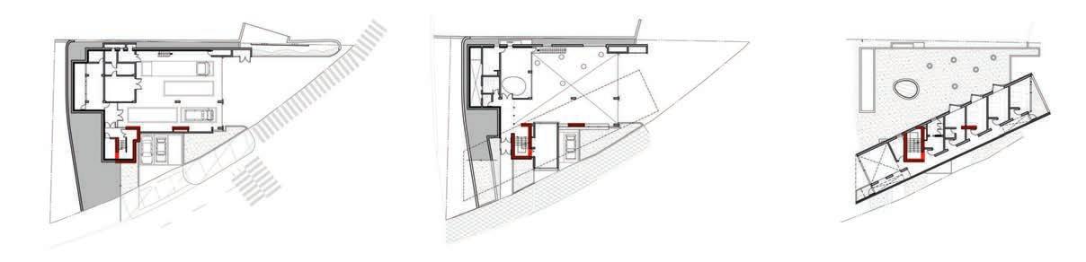
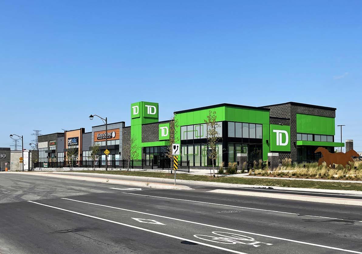
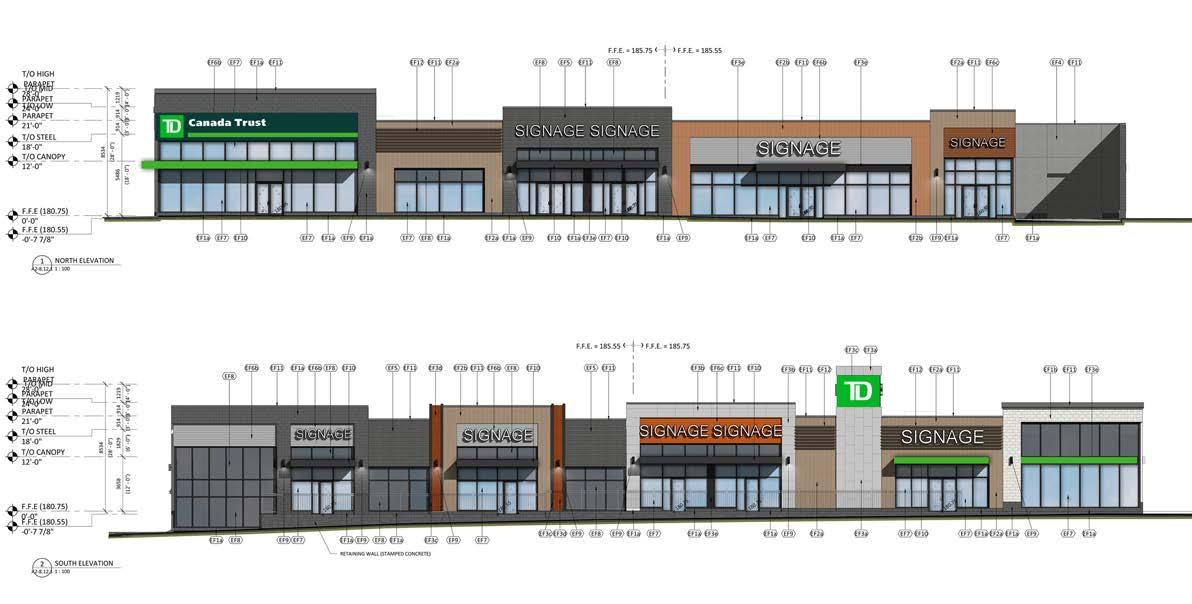
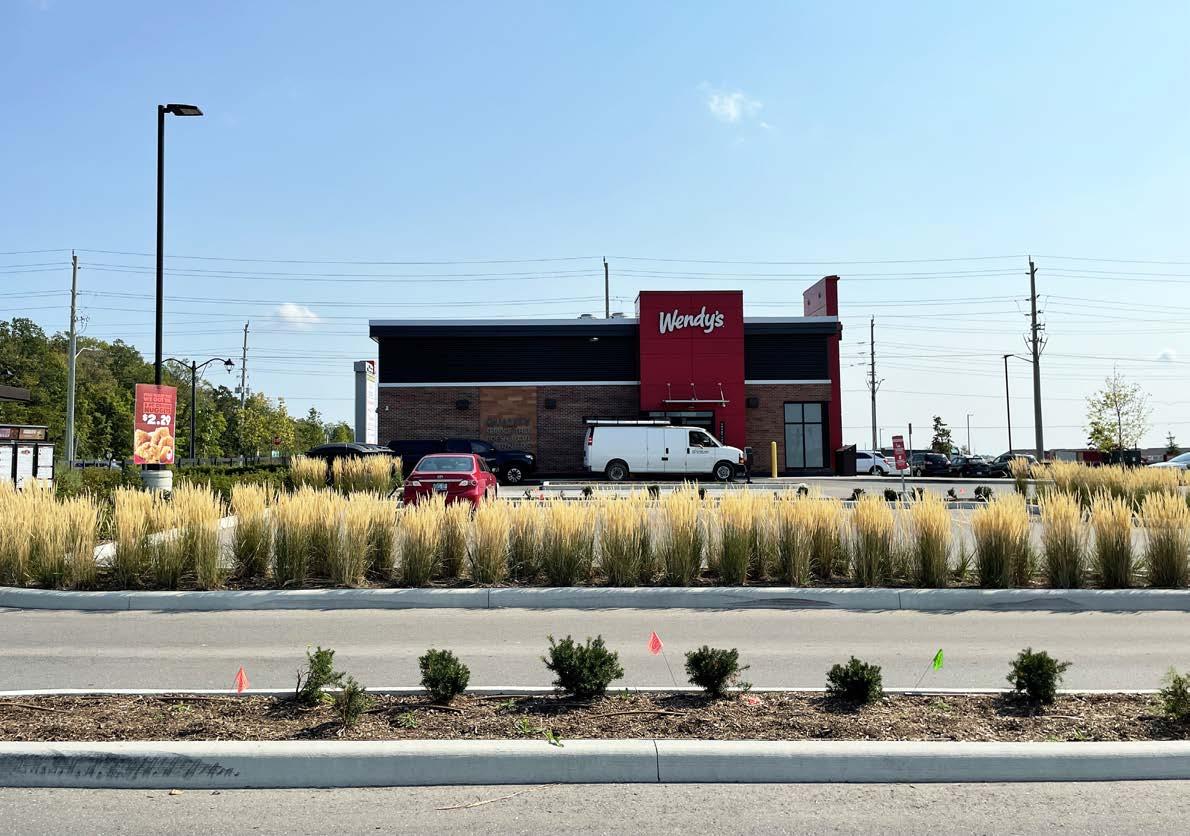
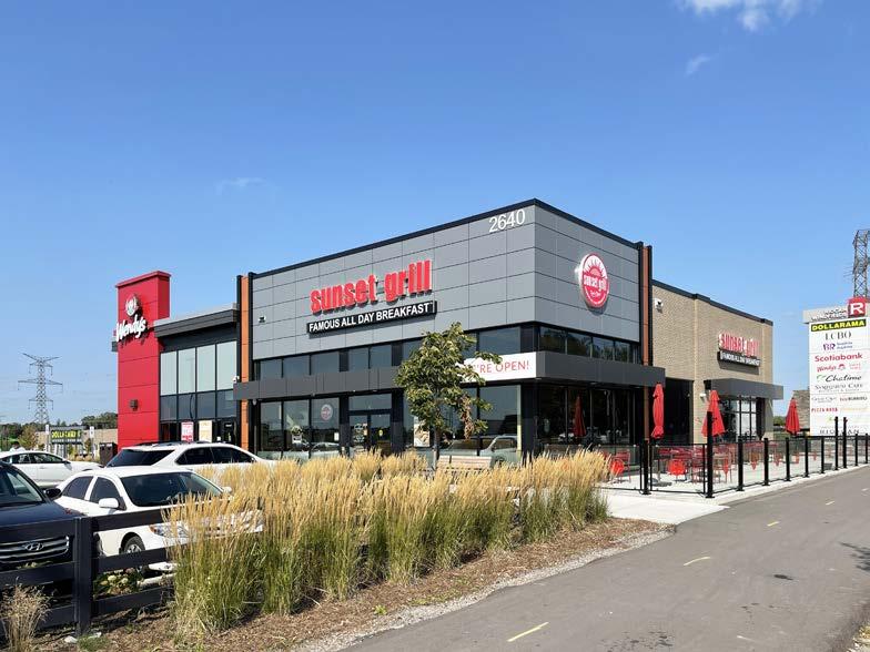
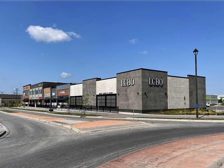
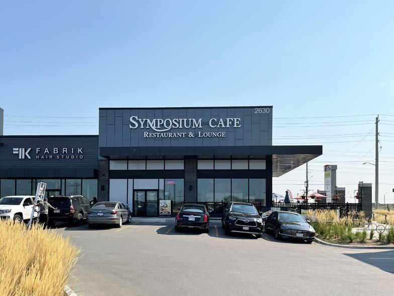
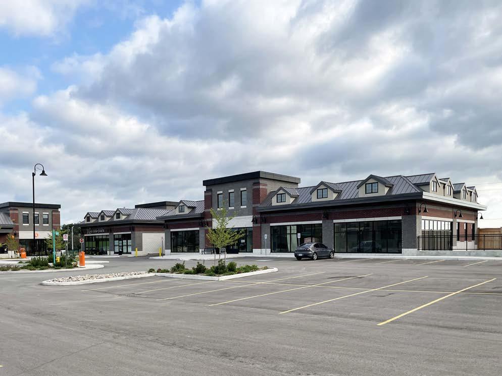
Location Oshawa, Ontario
Type Commercial
Year 2016
Status Complete
Size 13,643 sq.m. (14 Buildings)
Client Riocan
Team Turner Fleischer Architects Inc.
Ryan DeCosimo / Manager
Jongmin Kim / Project Manager
Youngsang Kim / Senior Technologist
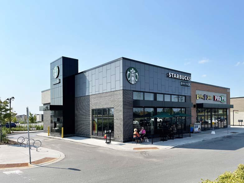
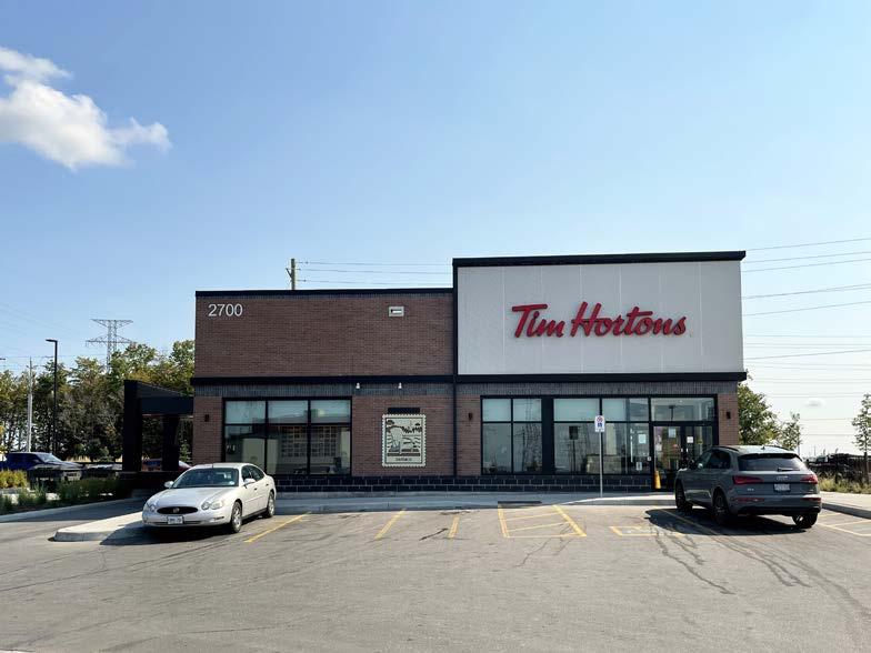
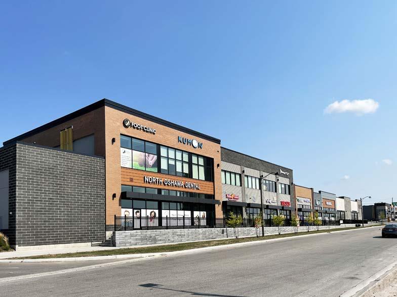
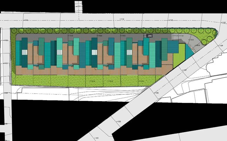
This is a large development master plan for a new town in Whitby. When I started work at Turner Fleischer Architects, my team was preparing the urban design guideline for the development area. A commercial site was assigned to me. I designed the whole site A area and the all 14 buildings.
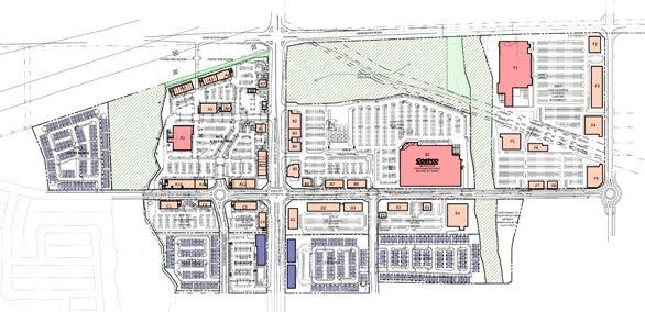
At the schematic design phase, three design options were proposed for the client to choose. Two different options were incorporate into the main design concept. Since there were 14 buildings in the site, one building was developed as a prototype design and applied to other buildings. Primary exterior materials such as clay bricks, concrete panels, stucco, and wood panels were selected for the exterior materials.
The buildings were designed based on the prototype, but modified by the tenant requirements and the site situation.
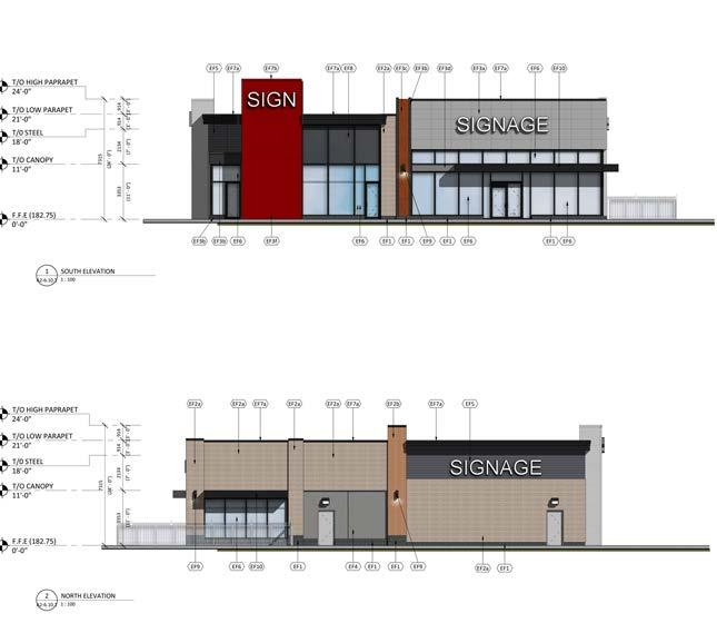
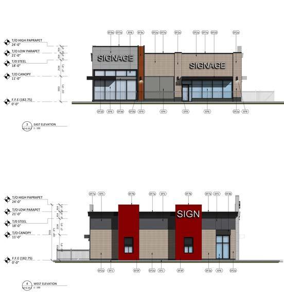
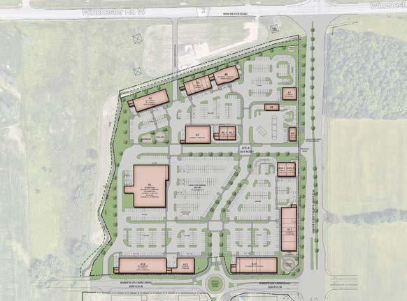
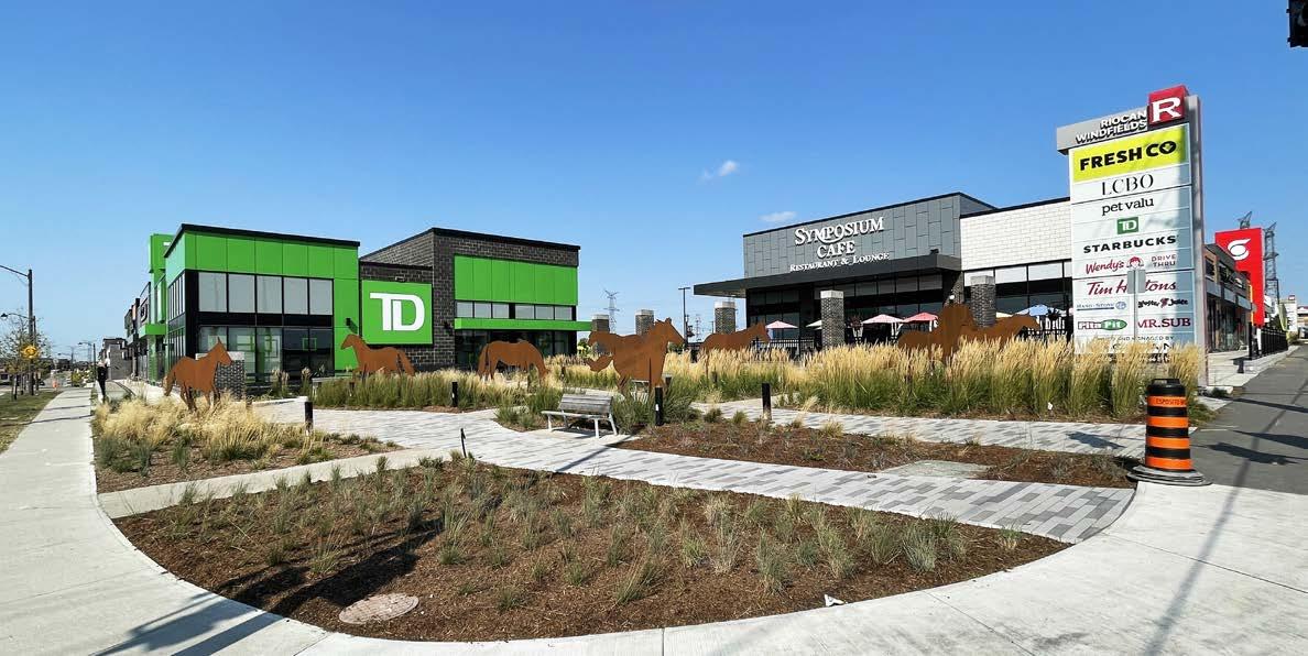
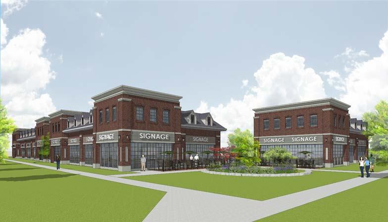
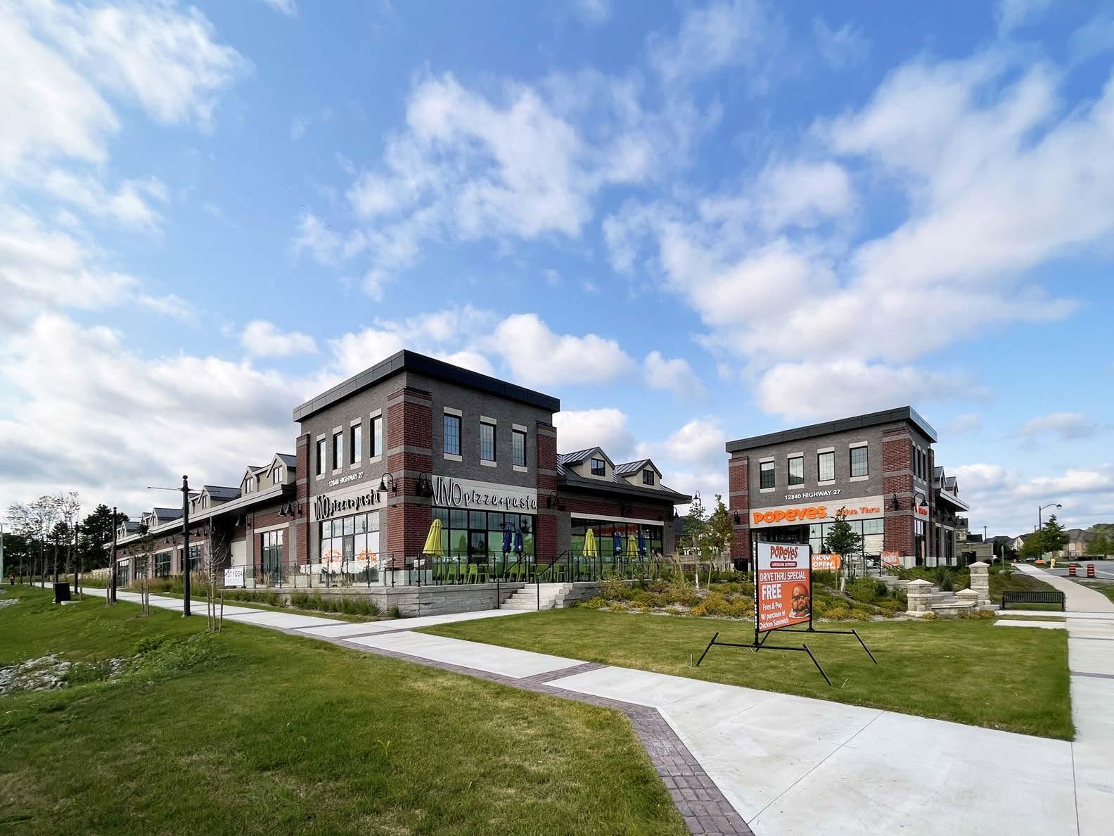
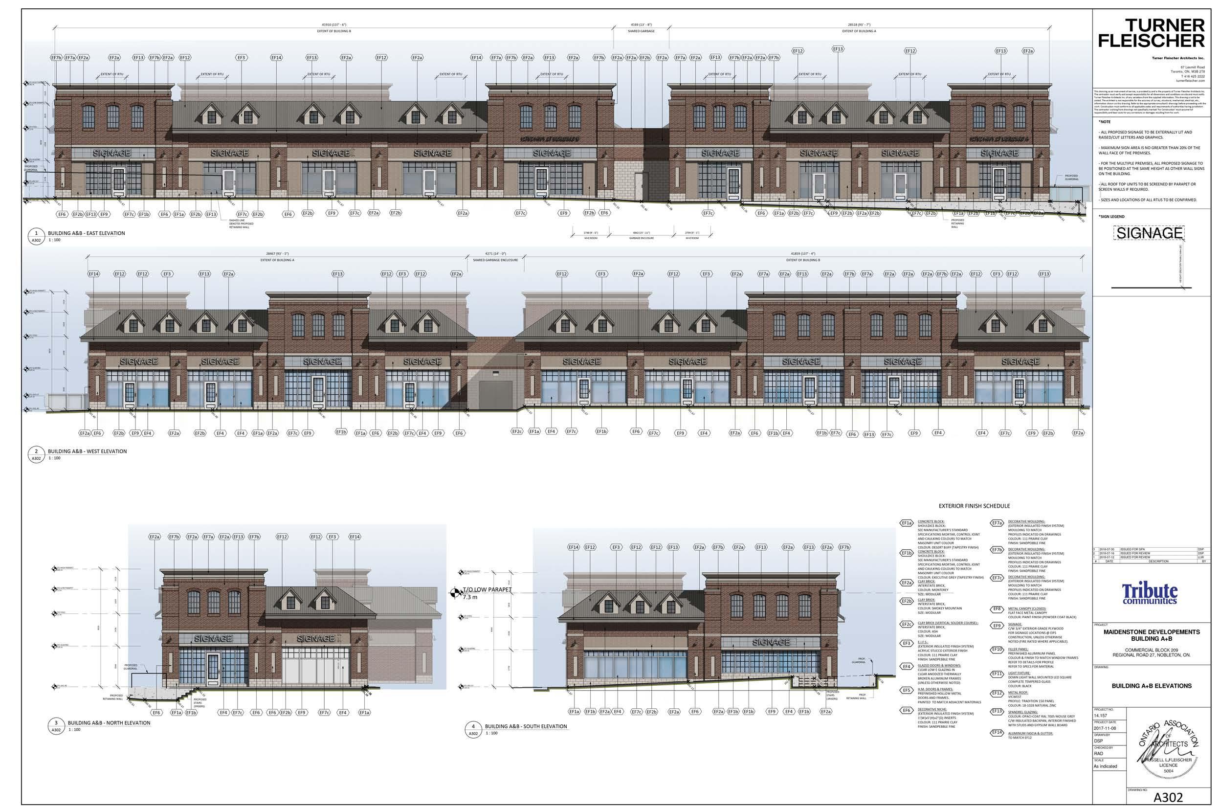
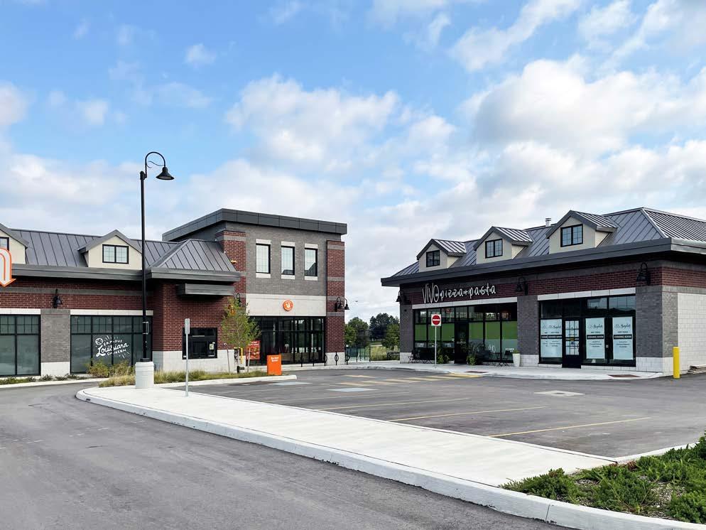
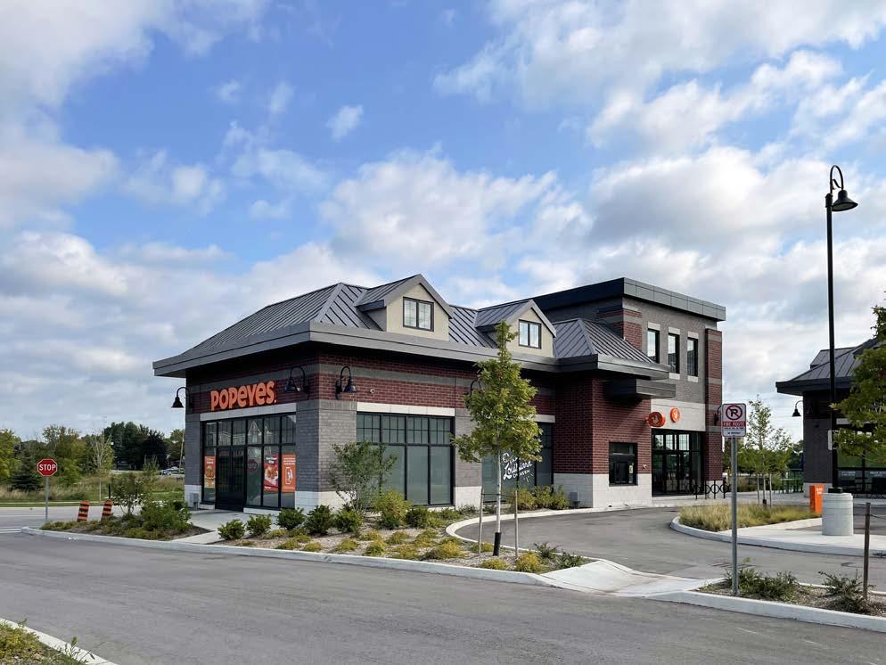
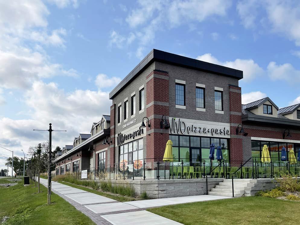
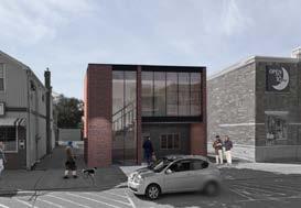
Location Nobleton, Canada
Commercial (Retail)
Status
Credit
Fleischer
Building
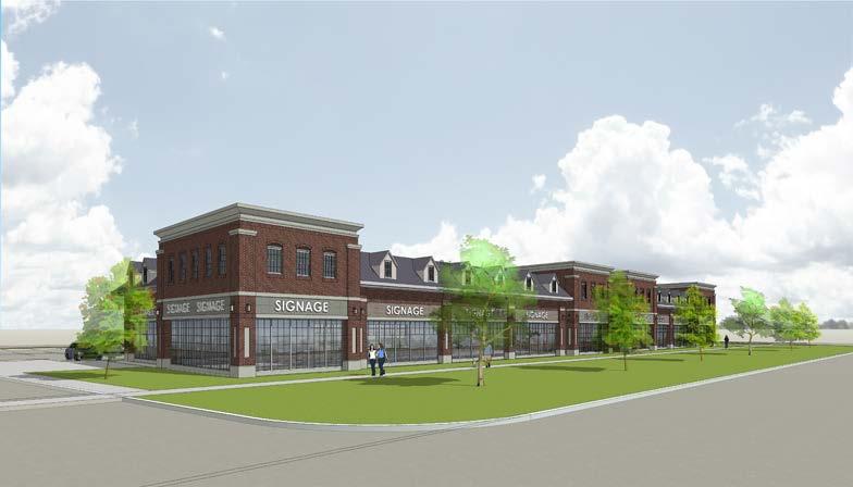
The site is a new commercial development site in a new town. The city provided a design guideline for this area, which was a heritage style brick design. It was my first time to design the heritage style building with brick. I took the research for the definition of the heritage style and applied to the commercial building. The building department of the city was satisfied with the design and it made the SPA and the permit process smooth.
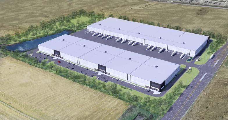
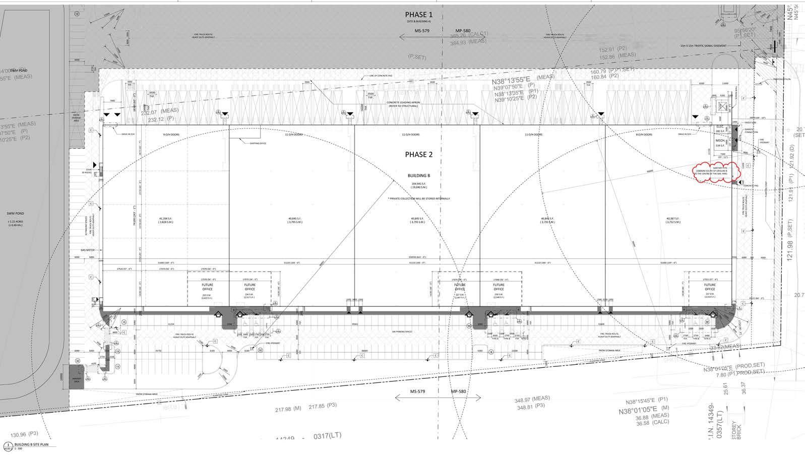
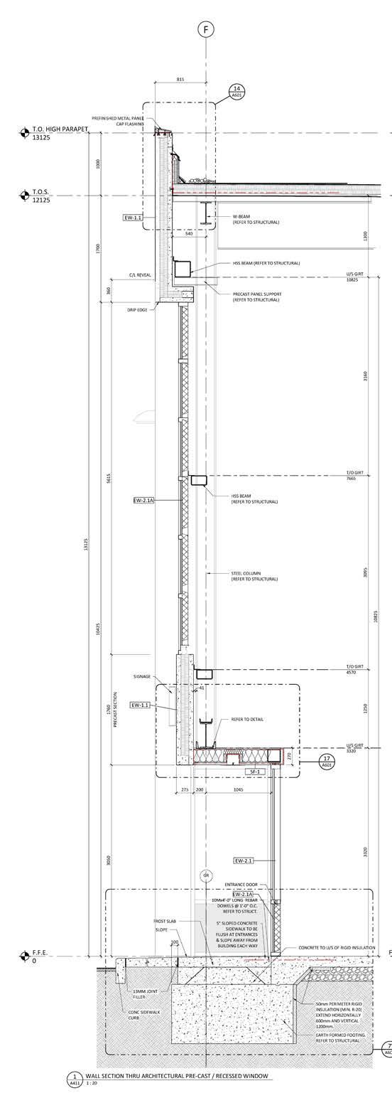
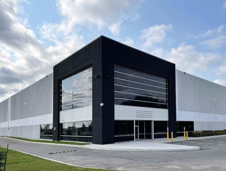
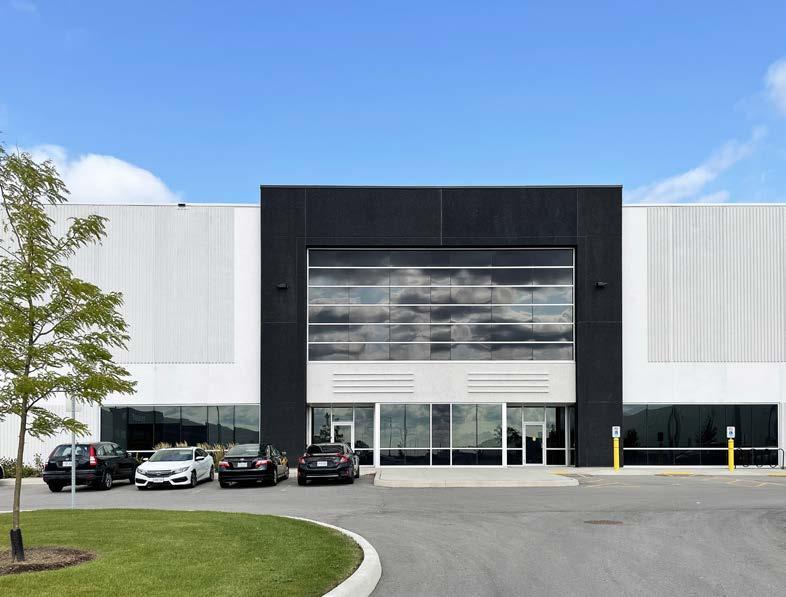
Location Bolton, Canada
Commercial (Warehouse)
Year 2020
Status
Credit Turner Fleischer Architects Inc.
/ Construction
During Covid, online shopping increased dramatically. Companies started to reduce their small retail shops and build warehouses in order to respond to the online demands. This project was the beginning of the warehouse projects.
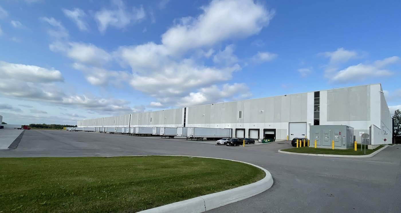
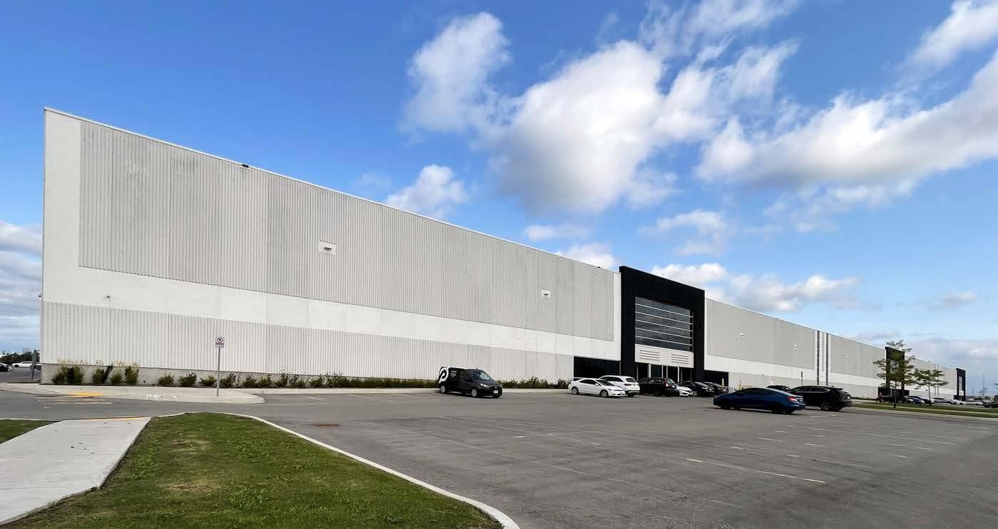
I was in charge of the site development and preparing construction documents. The client already had their own design concept and the material specs. Insulated precast concrete panel was used.
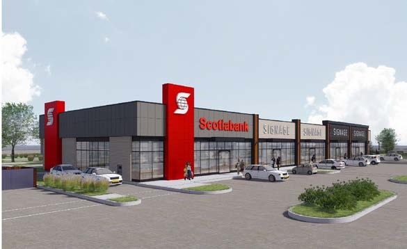
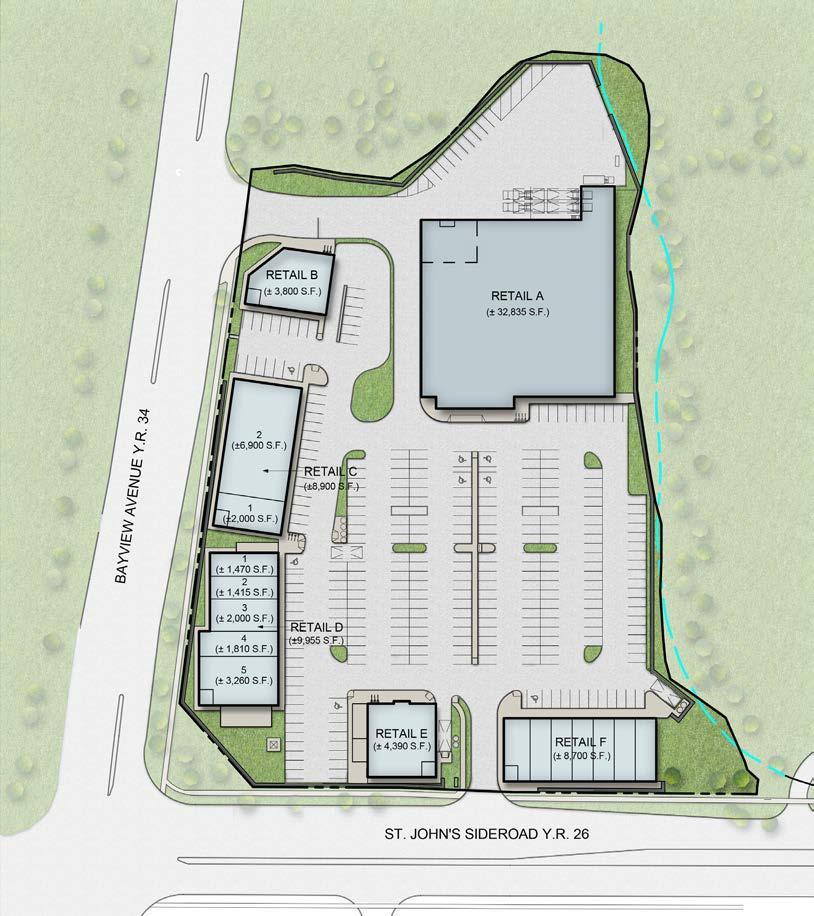
Location Aurora
Commercial
2016
Status Built
Client Rice Group
Credit Turner Fleischer Architects Inc.
/ Building design
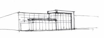
As a response of rapidly growing Aurora area, Rice Group was planning to develop a mid-size commercial site in Aurora. The requirement was one anchor building (food store) and small retail buildings along the perimeter of the site.
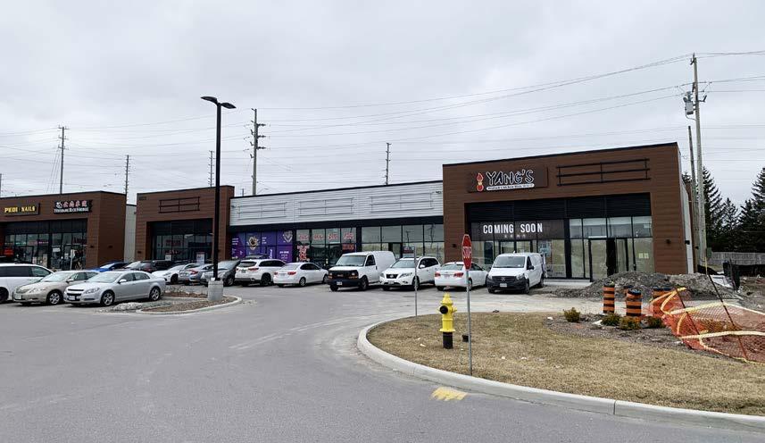
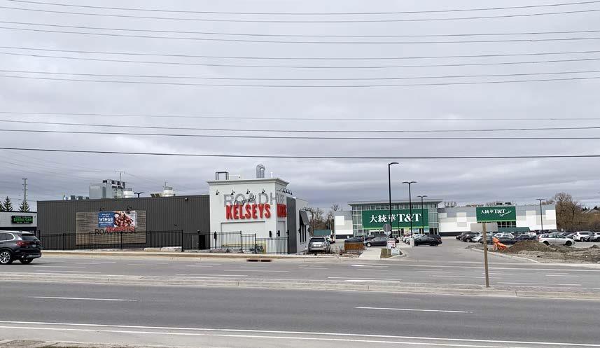
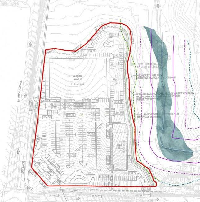
The site was located on a sloped land down to the east. I figured out the most suitable floor level of the anchor building and the parking lot accordingly. The retaining walls and storm water management area were discussed with the city throughout the design process.
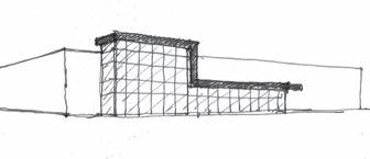
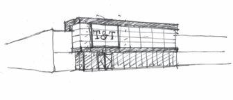
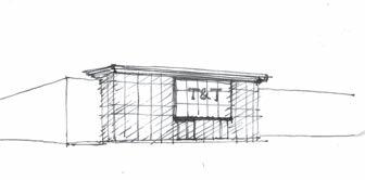
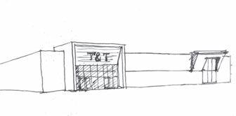
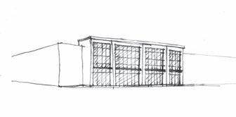
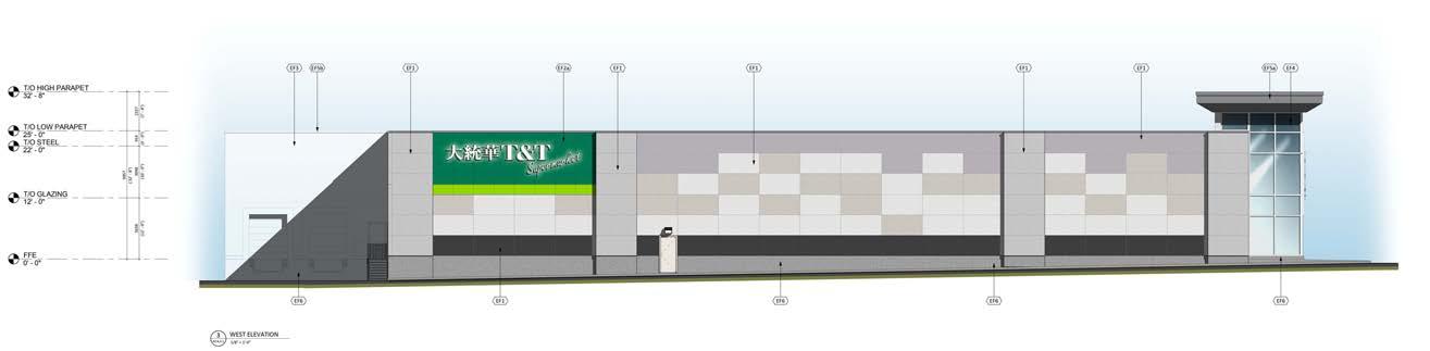
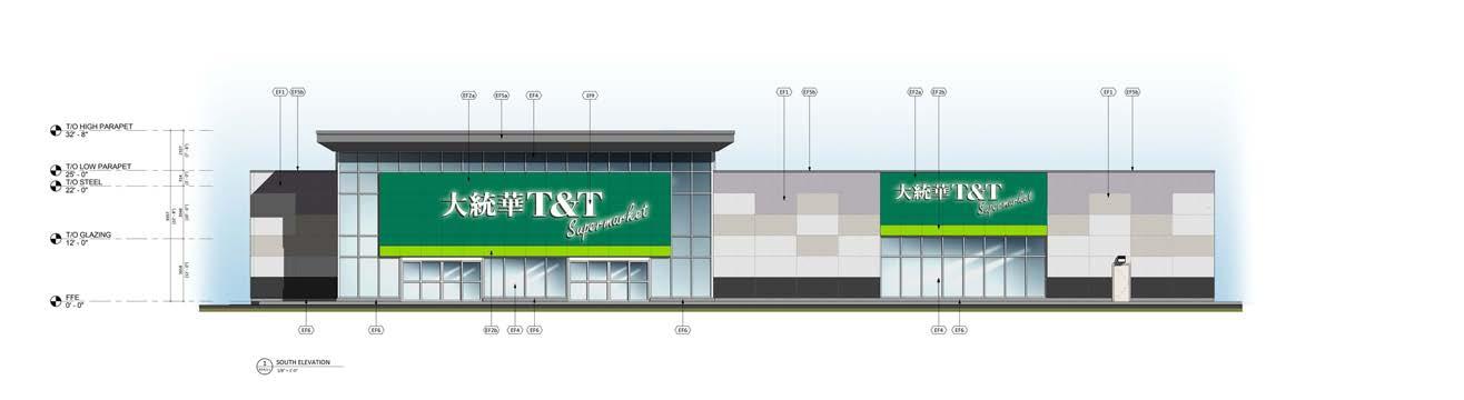
In the food store design, the front facade is the first impression and becomes an identity of the store. T&T Supermarket is the most famous Chinese food store in Canada. They wanted to make an iconic design as a Chinese food store.
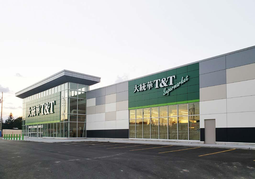
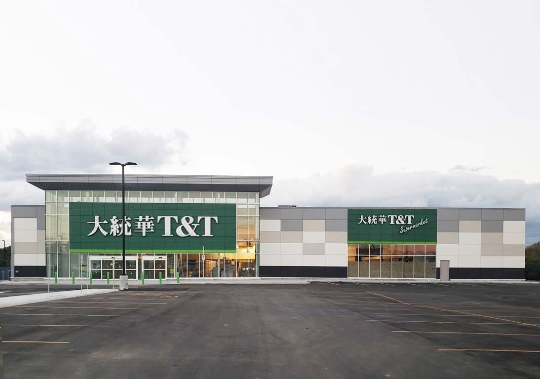
Among the unique features of the Chinese architecture, I found that the shape of the roof could be the design concept. In the traditional architecture, the eaves of the roof is raised at the corner. This is one of the most distinctive features compared to the western architecture.

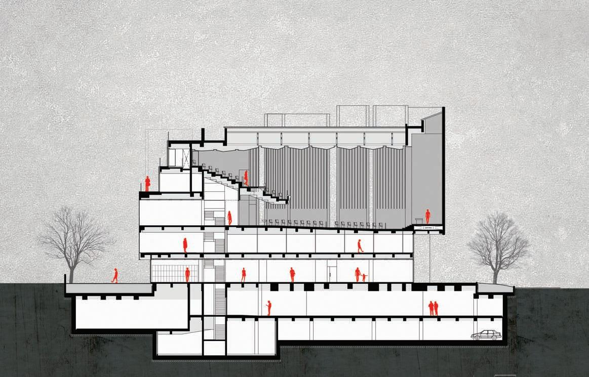
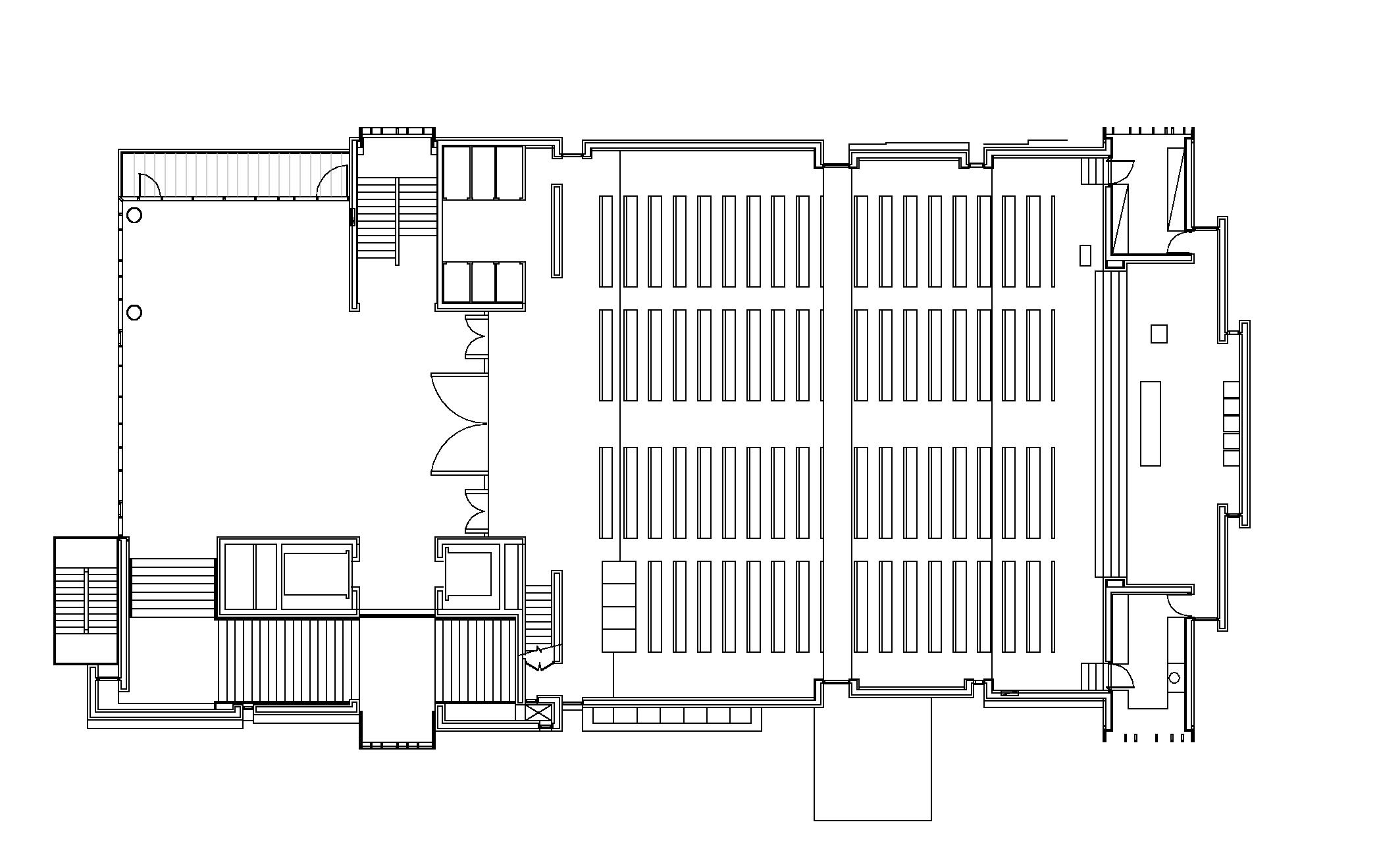
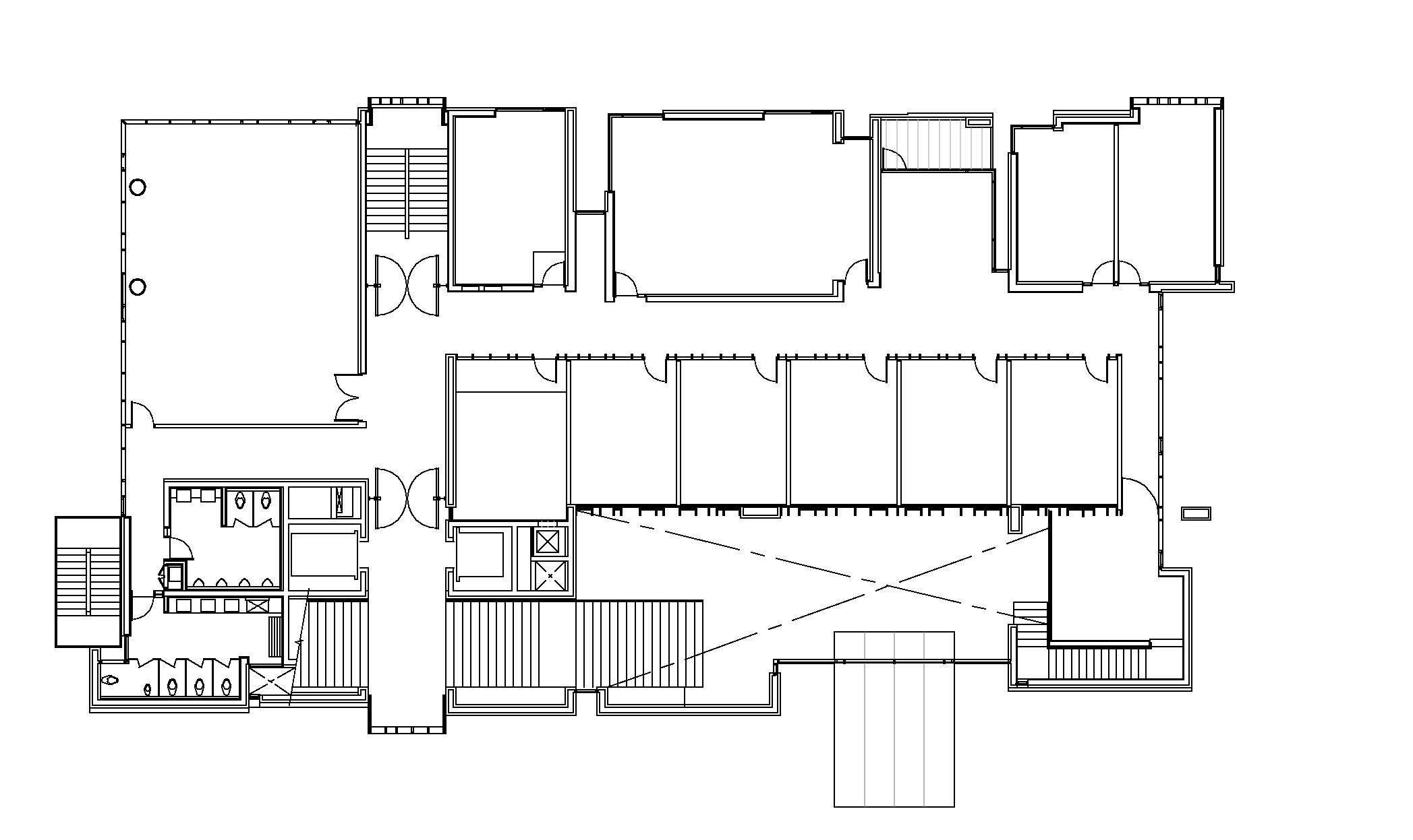
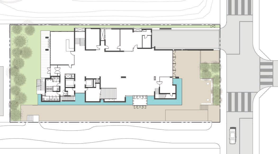
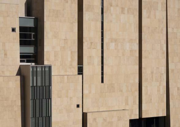
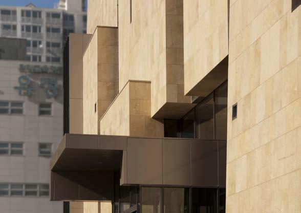
Location Aarhus, Denmark
Type Institution
Year 2016
Status Competition
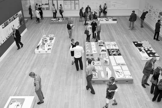
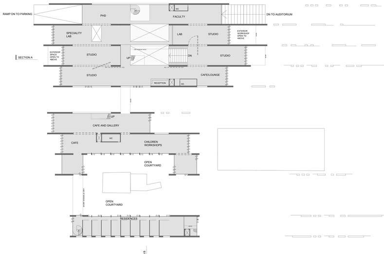
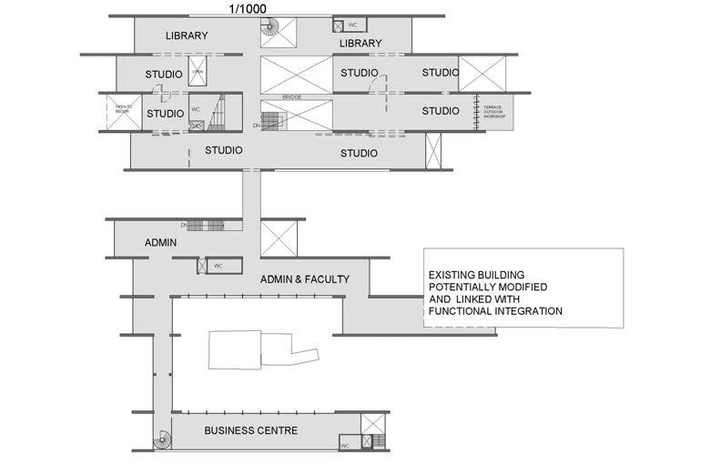
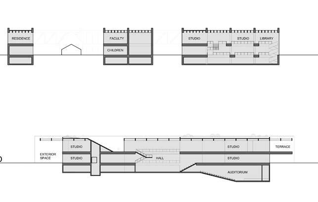
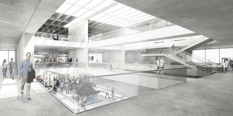
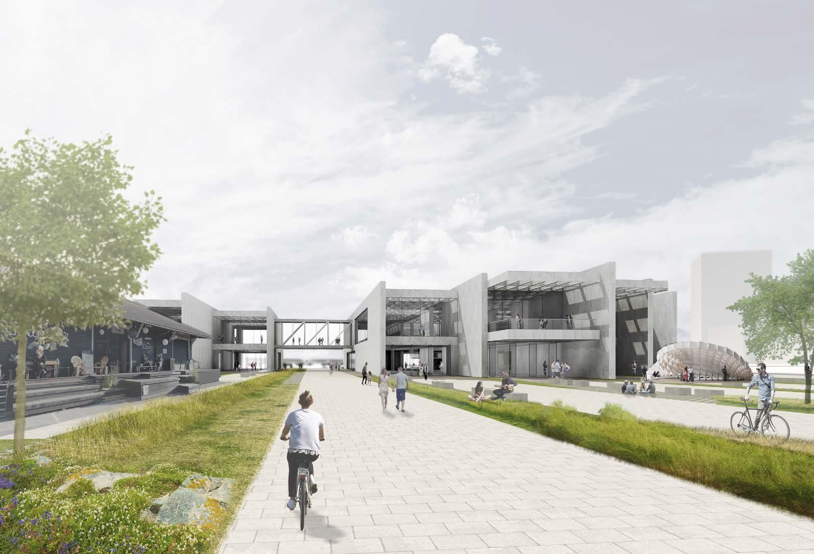
Team Hout Architecture Inc. Samer Hout / Lead Youngsang Kim / Project Captain Raymond Lee, Brian Yip, Valeriia ValchukEstablished in 1965, Aarhus School of Architecture has been Operating from a cluster of buildings, often with different addresses. The Danish Building & Property Agency and the Aarhus School of Architecture called for design proposals to consolidate the majority of the school’s activities.
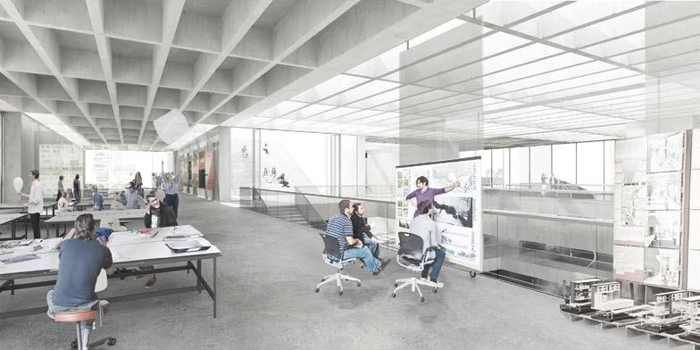
The brief set out an agenda with a vision for a flexible, inviting, and cost-effective building. The school wanted to create a place for architectural thinking and architectural experiments. A laboratory to which they can invite the city and the world and where they can work together to provide visual and physical inspiration for the architecture. It’s about providing the optimal physical framework for learning in an environment characterised by openness, community and knowledge sharing – in a physical space of high architectural quality.
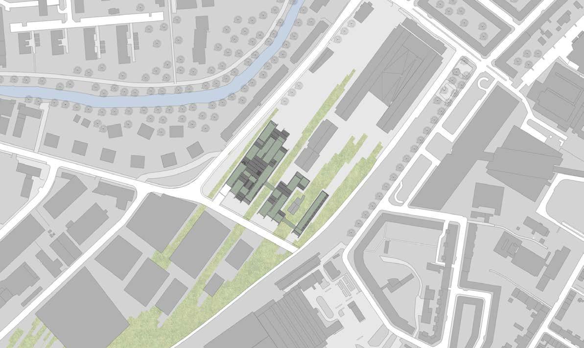
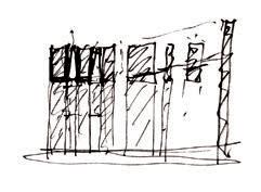
Our proposal is characterized by parallel concrete walls, running along the longer edge of the site. The walls create linear spaces that are programmable and flexible. They extend into the landscape at different length, and open up into exterior rooms at both ends of the building. The exterior rooms range in function and character, from classrooms and workshop spaces to ramps leading to the subterranean spaces.
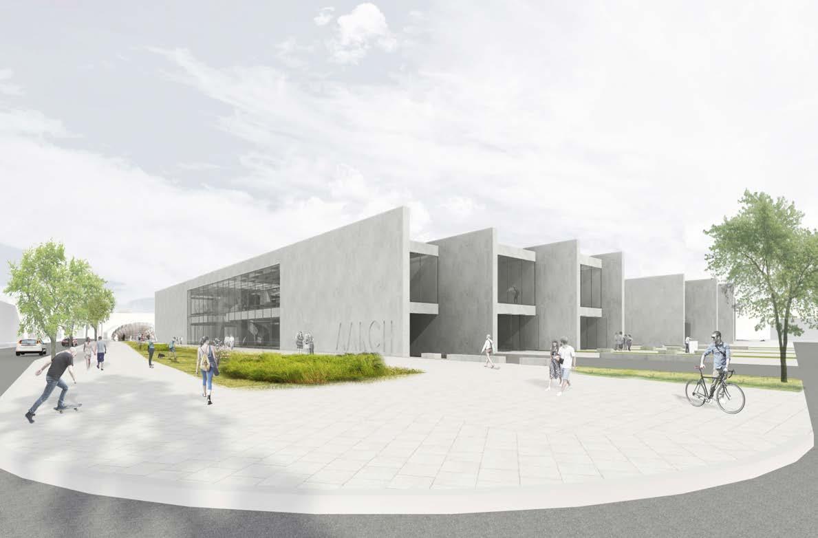
Splits and voids are orchestrated to allow for public exterior spaces to flow through the site. Atriums provide gathering areas for students, allowing for public presentations and installations to take place. On the second level, some bands (between the organizing concrete walls) transform into steps that lead to the green roof and double as congregation space. Openings in the walls are orchestrated to allow visual access from the surrounding city, giving the public glimpses of the activities taking place on the inside, while more generous openings create a reciprocal relationship with the public.
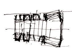
After exploring a couple of options, we learned that the traditional way of space programming was not able to achieve the level of the flexibility that we were aiming for.
We tried modulating the spaces parallel to the main axis of the site. The spaces allow the connection between two facilities located in each side of the site, Dense Area and Godsbanen (Cultural centre). Then, we opened the grid lines depending on the needs of the program and the required sizes. The openings are controlled by operable walls, so the school can create spaces on their demands and situations. We tried to keep the ends of the each grids opened to outdoor spaces in order to connect the indoor and outdoor spaces.
Based on the bubble diagram study, the primary indoor spaces were located as per the relationships, overlapped each other, and extended to the secondary spaces.
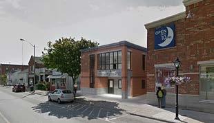
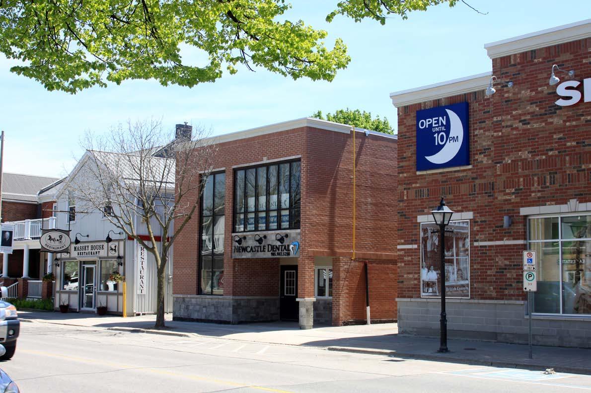
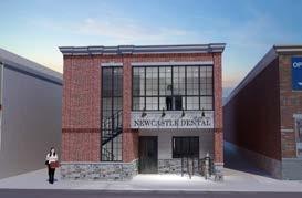
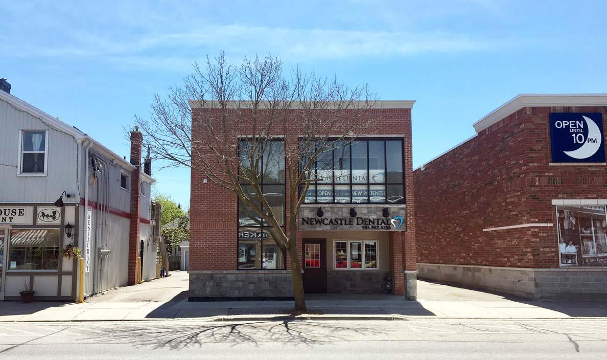
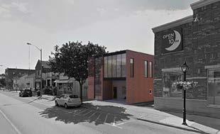
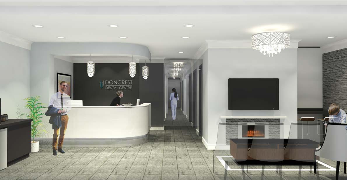
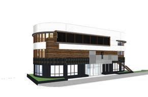
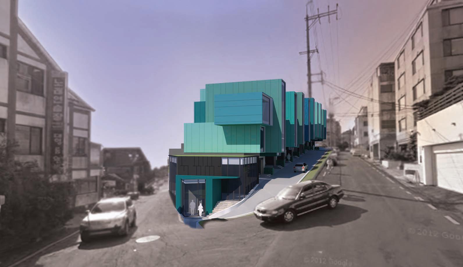
Location Newcastle, ON, Canada
Year 2015
Status Built
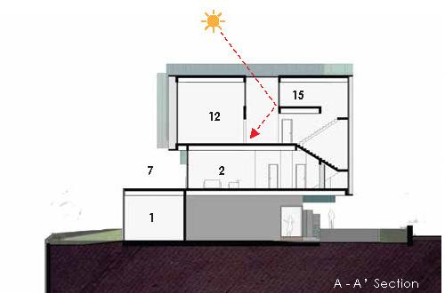
In 2014, I was working as a site manager for a general contractor. After Doncrest Dental Office, one of the co-owning doctors wanted me to design his own office in Newcastle. His wife is also dentist and she was running the office.
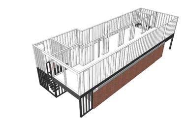
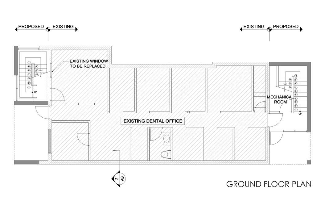
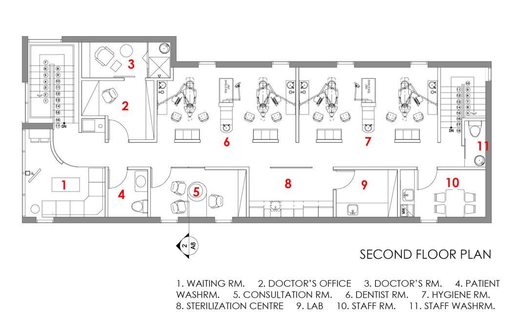
The existing building was located on a main street of the small village. It was one storey building built decades ago. There was a growing demand for more space and the doctors wanted to add one more storey on top of the existing office.
For the permit submission, a professional engineer, Richard Yoon from Yoon & Associates Inc. was involved in. I drew the permit drawings under his review.
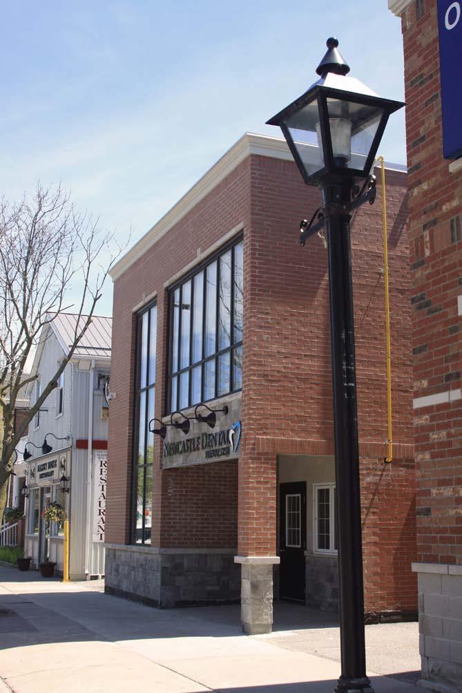
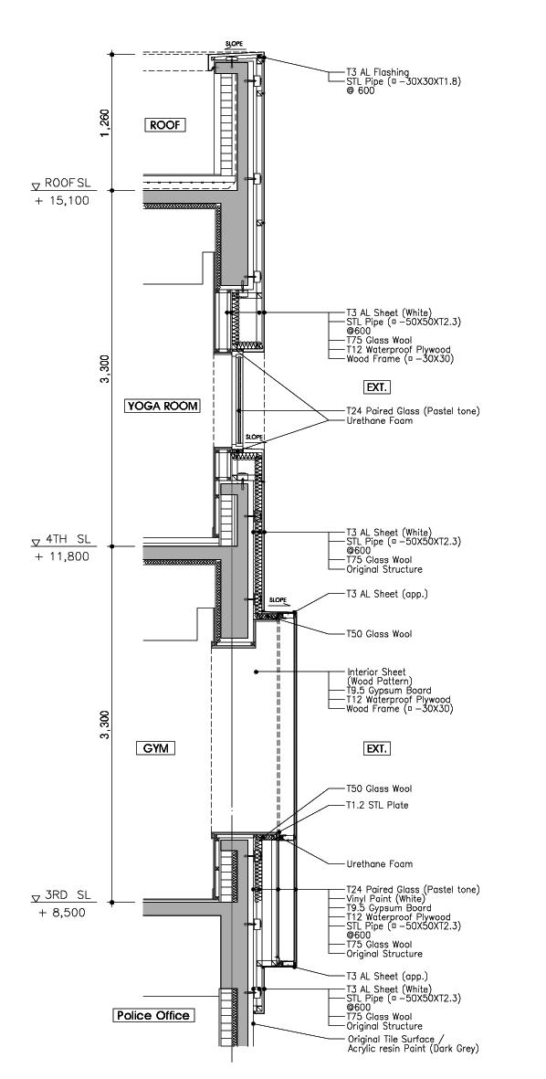
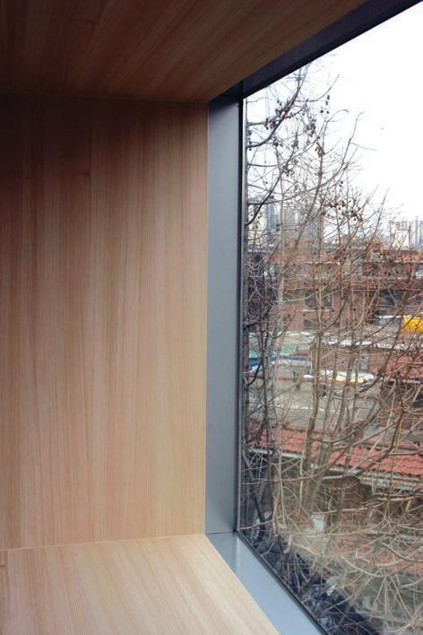
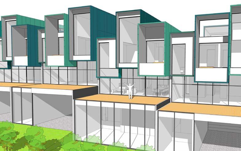
The main building material was supoosed to be brick according to the city guideline of the main street. The building was splitted into two part, brick to confrom to the city context, and clear glazing to show the office identity. The doctors loved the design, especially vertical clear glazing.
In phase1, the design was intended to show mixture of modern glazing and traditional clay brick. The glazing on the stair case cut the brick wall from top to all the way down. The second story glazing was designed with glass and metal panels only, so it also divided front facade clearly into two part, brick and glazing.
The first decision that I had to make was a location of a stair to the second floor. I did not want to take up the existing space. Fortunately, there was a space in front of the building in the context of aligning buildings. The stair case was used for a design feature of the building.
The city of New Castle was basically satisfied with the proposed building. The city, however, required more heritagestyle details such as sledge stones and large cornice to match the surrounding area.

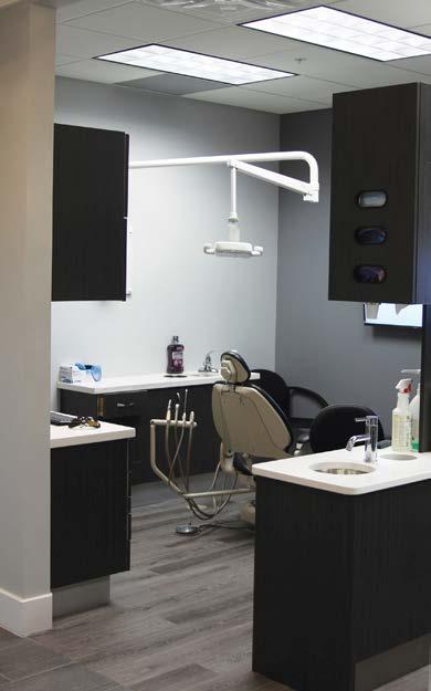
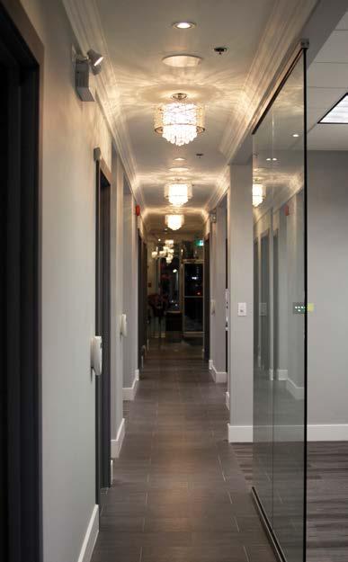
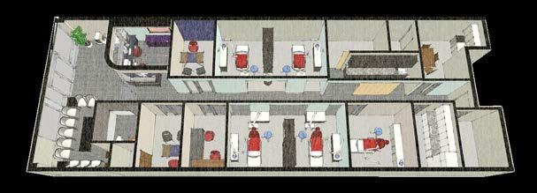
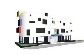
Location Richmond Hill, ON, Canada
Type Dental Office
Year 2014
Status Built
Credit Richard Yoon (Yoon & Associates.)
Professional Engineer
Youngsang Kim
 Interior design / Construction Administration
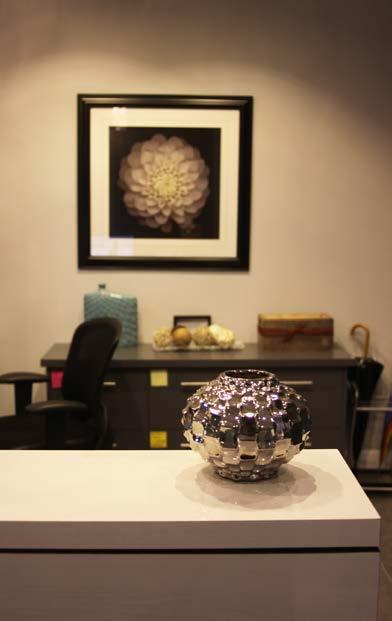
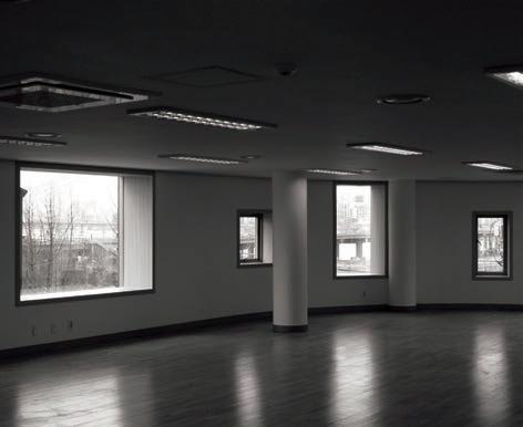
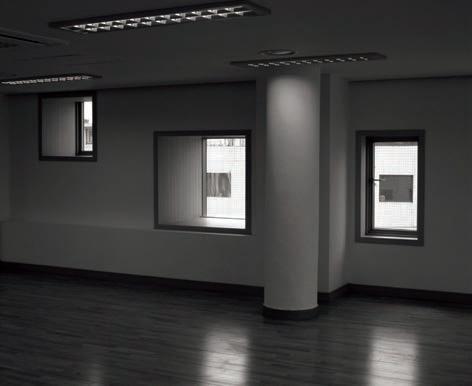
Two young doctors decided to expand their business and they were planning a luxurious dental office in a busy mall. They were aware of the importance of a good design to accommodate their clients better. They wanted to offer their client comfortable and relaxed atmosphere in the reception area.
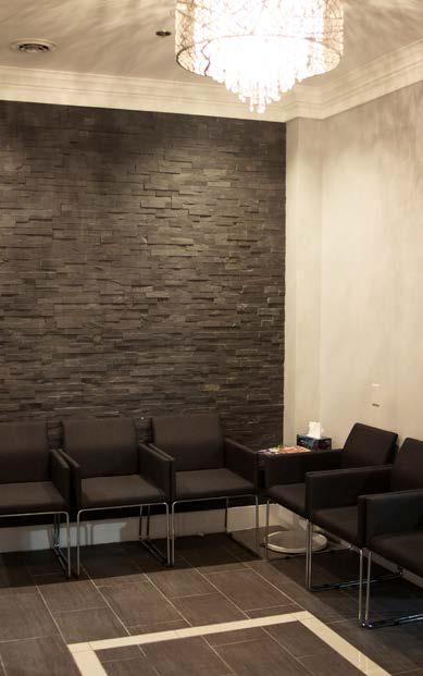
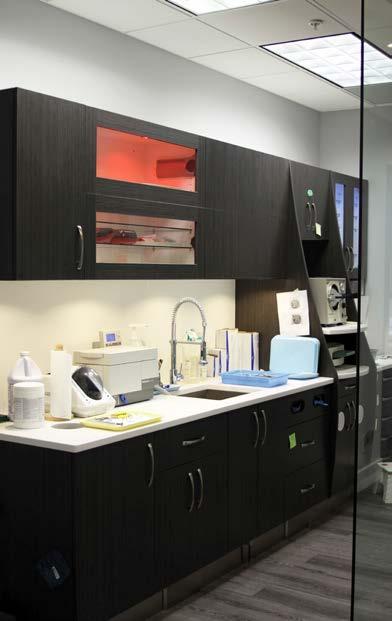
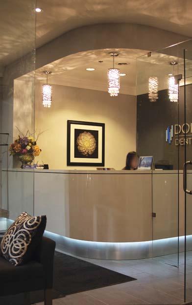
The contractor hired me to deliver the quality design. I designed the entire space and coordinated the construction until completion.
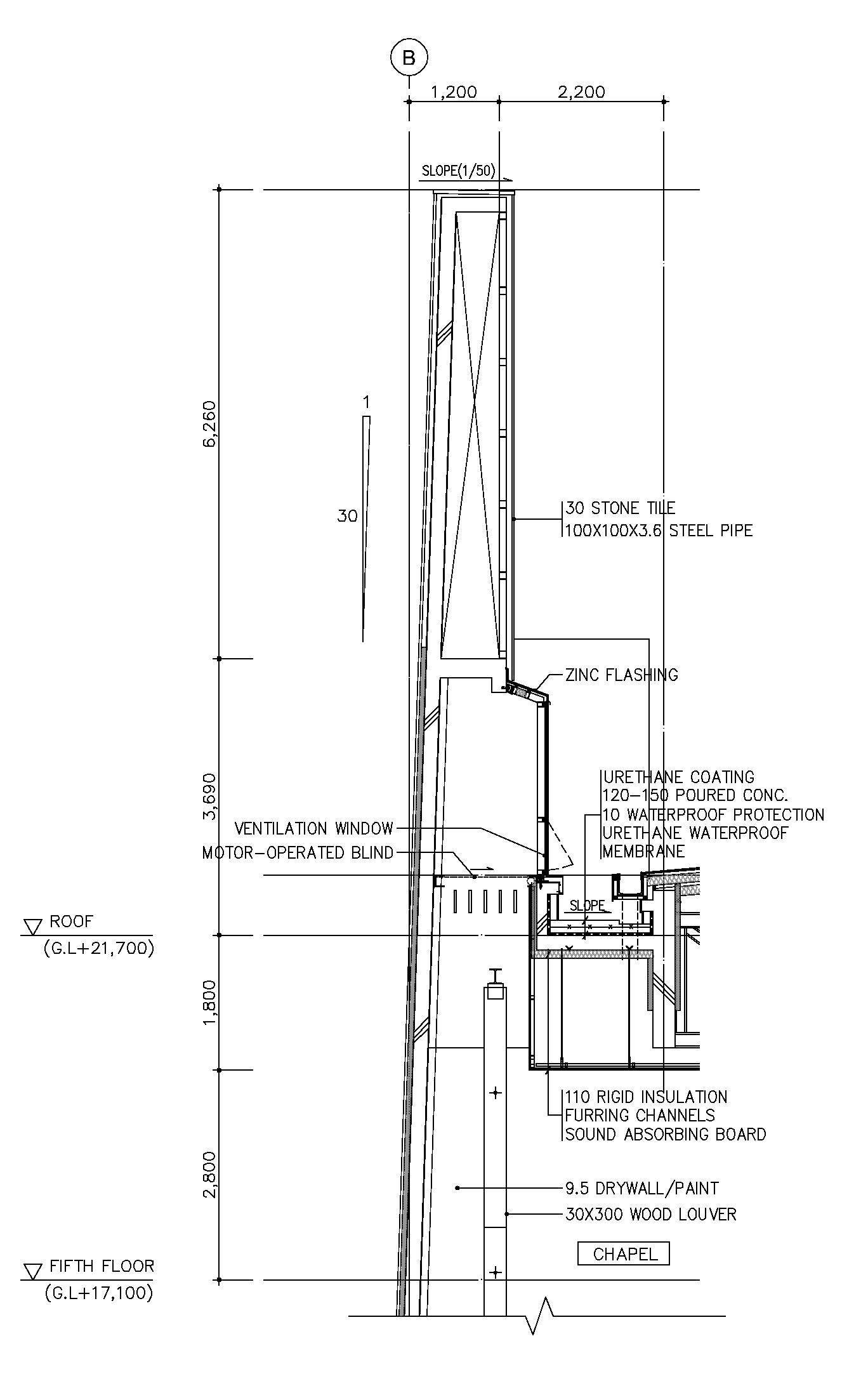
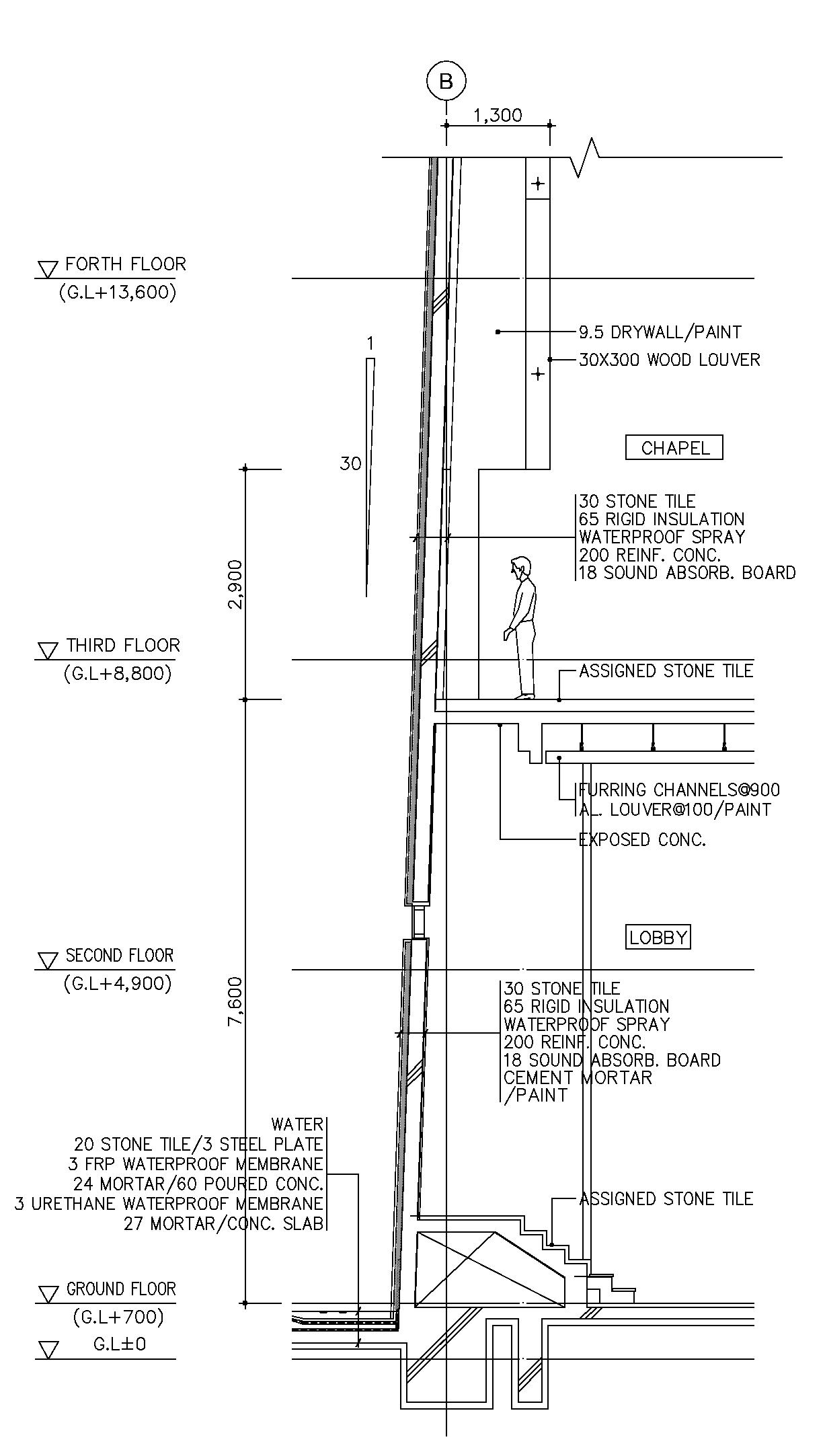
Location Yong-in, Korea
Type Institutional (Church)
Year 2010
Status Built
Credit SEE Architects Inc.

Project Captain
Building design / Construction drawing
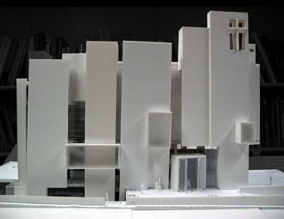
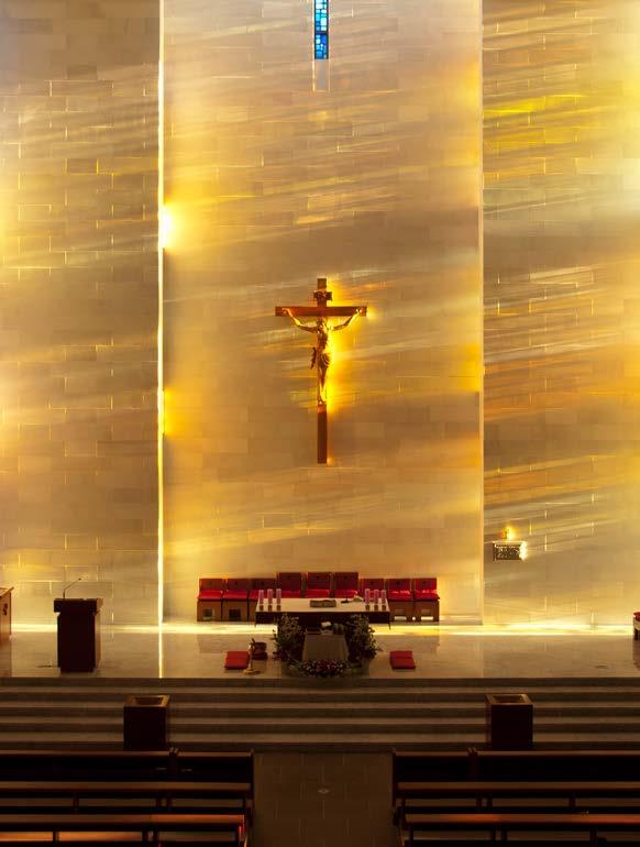
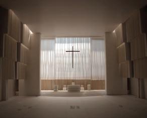
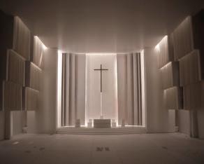
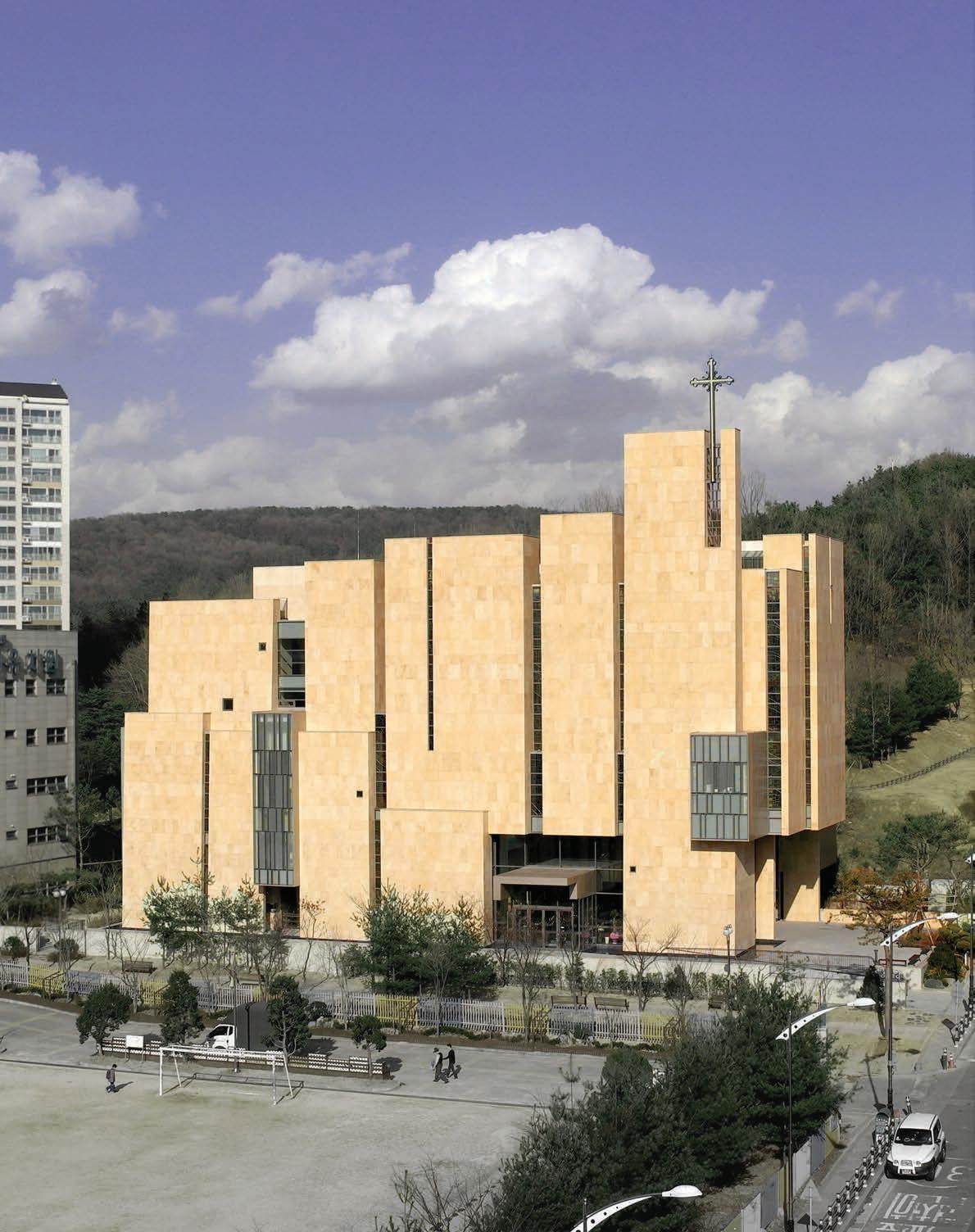
SEE Architects Inc. was invited to a competition for a new Catholic church in Yong-in new town. One of the church members had every been impressed by the company’s former work. The church was located in a new development area to be the biggest catholic church in Korea.
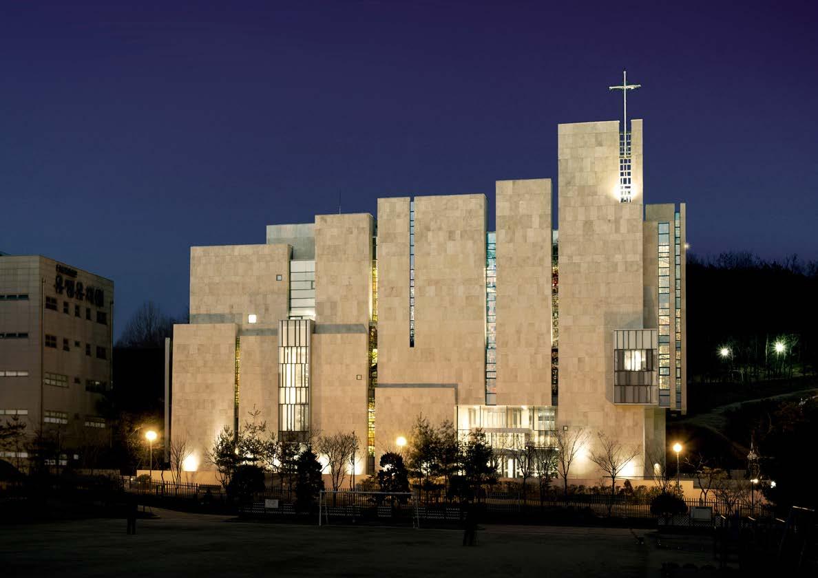
I led the competition team. It is a rare opportunity to be involved in this size of church project. We tried to find the essential elements of church architecture through the Catholicism and the historical contexts of Korean church architecture. A large amount of researches and studies were taken place throughout the entire competition process.
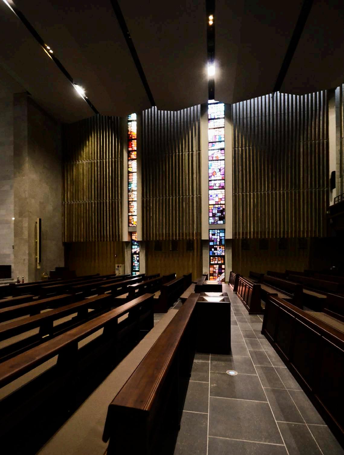
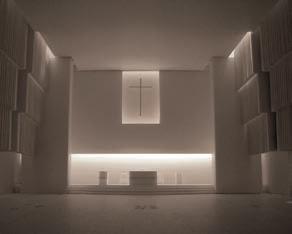
We found vertical shape of mass, depth between structures, and controlled light as the elements of the church architecture. We also realized these elements had been faded in modern architecture. We decided to revive these elements in the modern architectural languages.
Although there were debates among the church members, the project was finally granted to my company. It took two more years to compete the design and the construction documents. I worked until construction phase. The construction was completed in 2011 and received Korean Architectural Award.
In middle ages, churches became bigger to imply the absolute being. People were awed and overwhelmed by the churches’ scales and spaces. With the advent of modern architecture, churches have been losing their massiveness due the financial and methodological efficiency.
My team found a clue how to revive the feeling of traditional churchs from a church in LA. Cathedral of Our Lady of the Angels had both the verticality and the depth.
From Megalithic culture to Gothic cathedral, massive vertical structure was a principal language of architecture in order to deliver the greatness of God. Although the unrealistically high structure has gone due to the modern reasonability, it is obvious that people get impressed by the vertical structure.
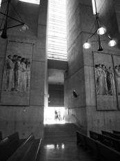
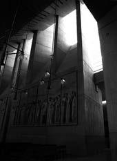
Spatial depth is generated by the thickness of the wall. The feeling of a deep space is one of the reasons why people get awed by the vertical structure. It also will fortify the sacredness of church.
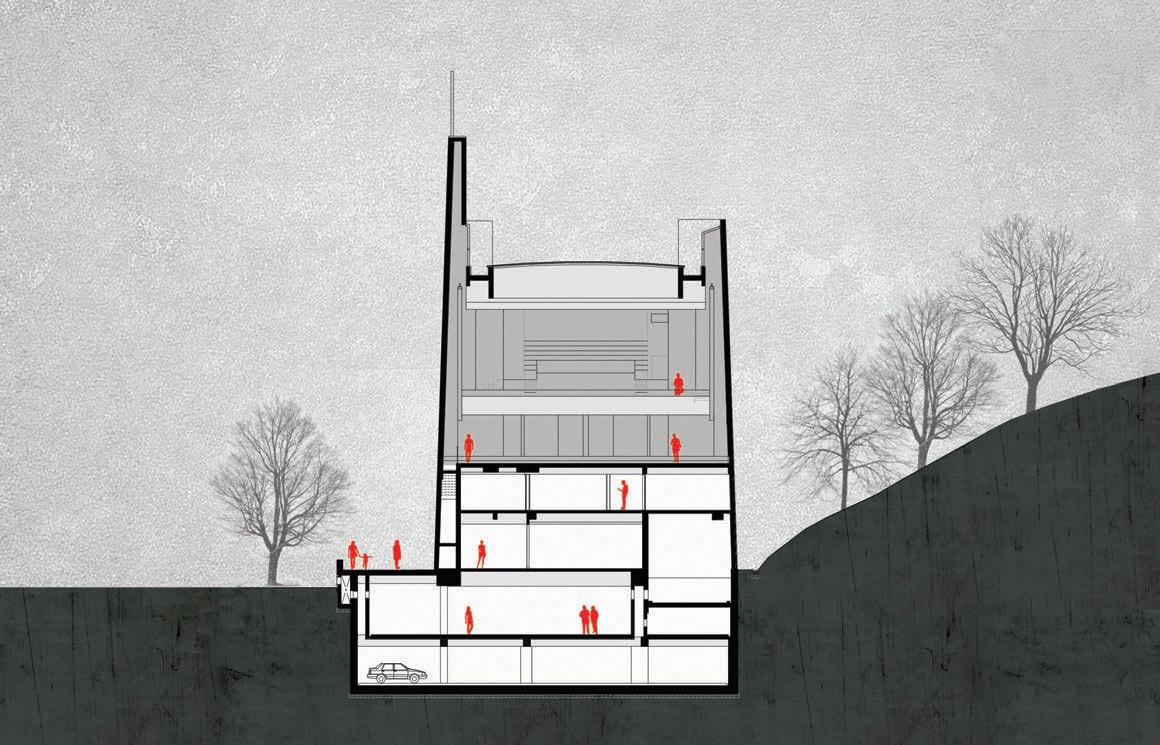
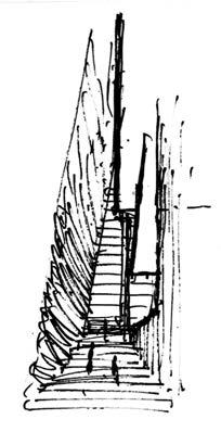
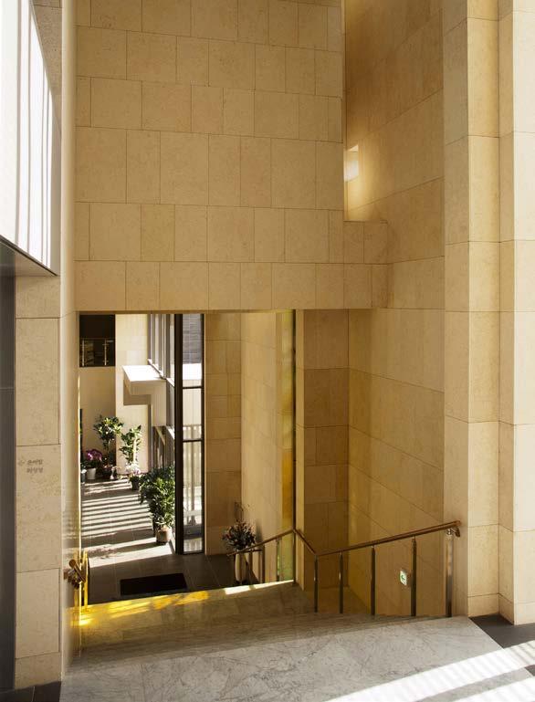
People arrive at the church chapel through a stair which connects a main entrance to the chapel on 3rd floor. While climbing the stair, massive structure of walls, dramatic gaps between the walls, and flowing lights through the gaps will sanctify their journey to the chapel.
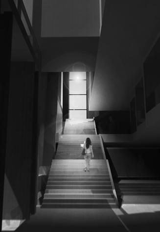
Light is the most dramatic feature in architecture. We wanted to deliver an architectural message of the church by con trolling light between structures. Altar was designed by the light control.
Year 2009
Status Built
Project Captain
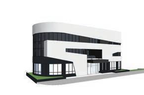
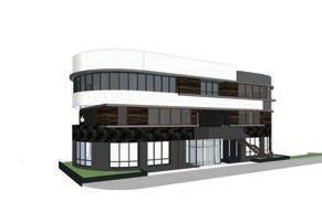
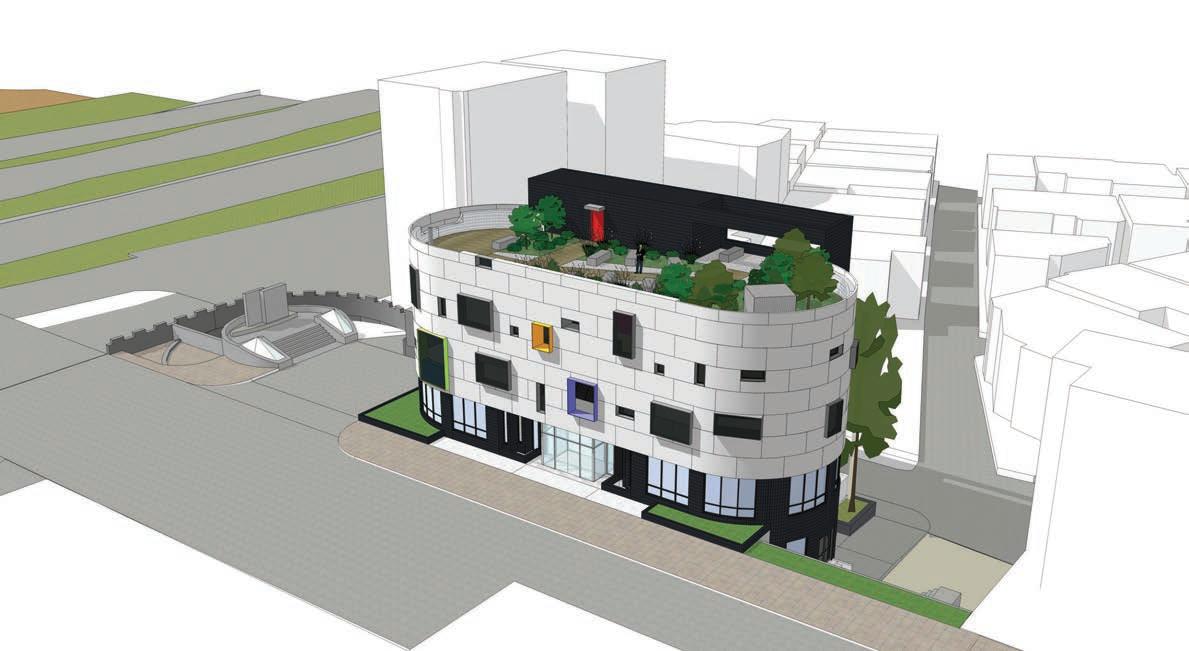
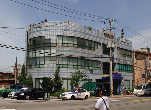
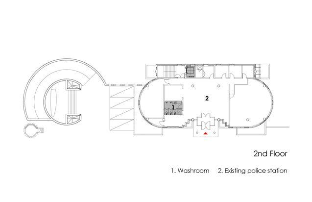
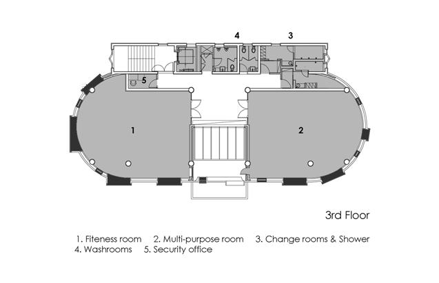
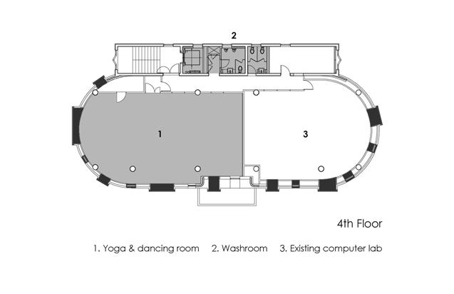
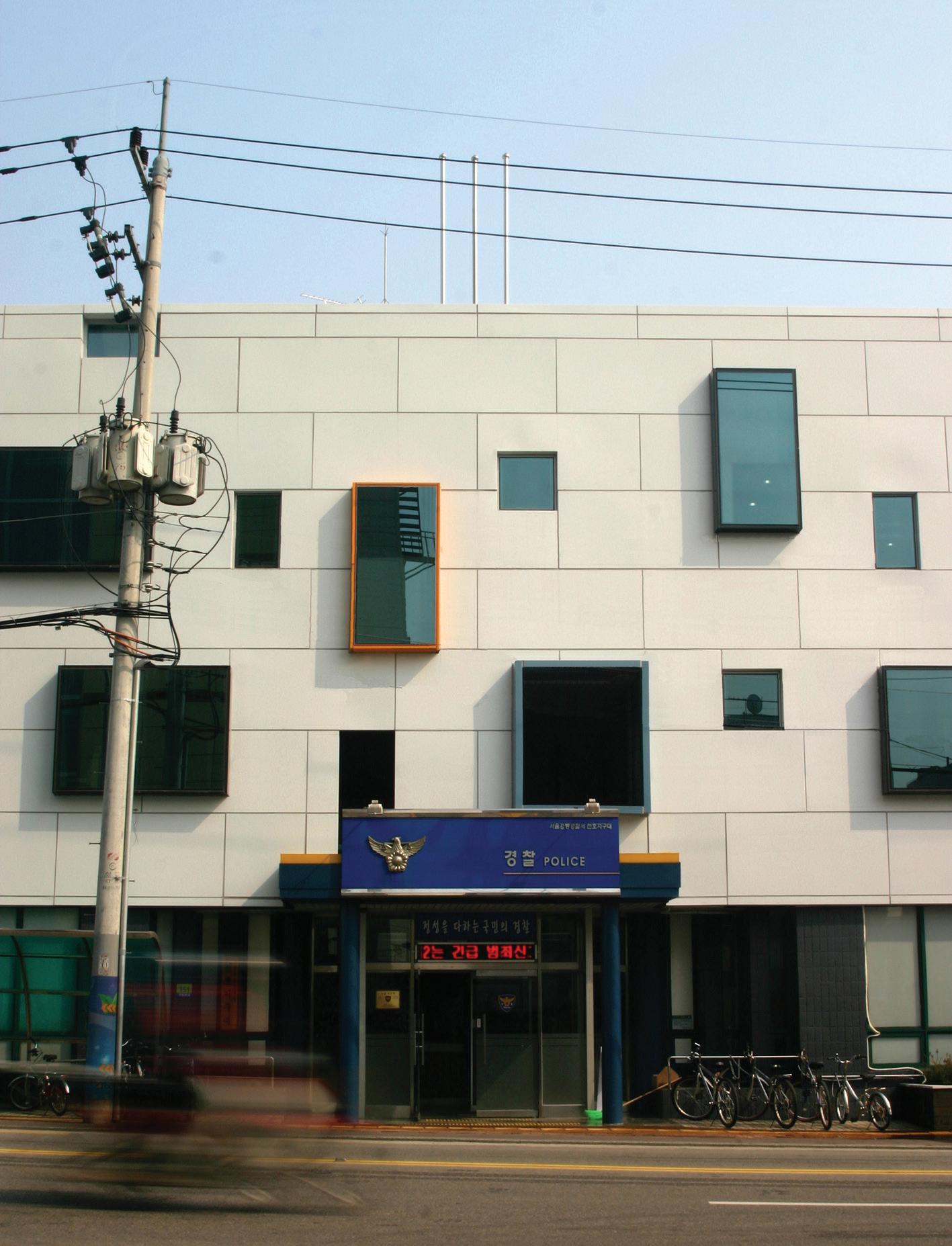
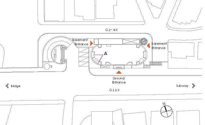
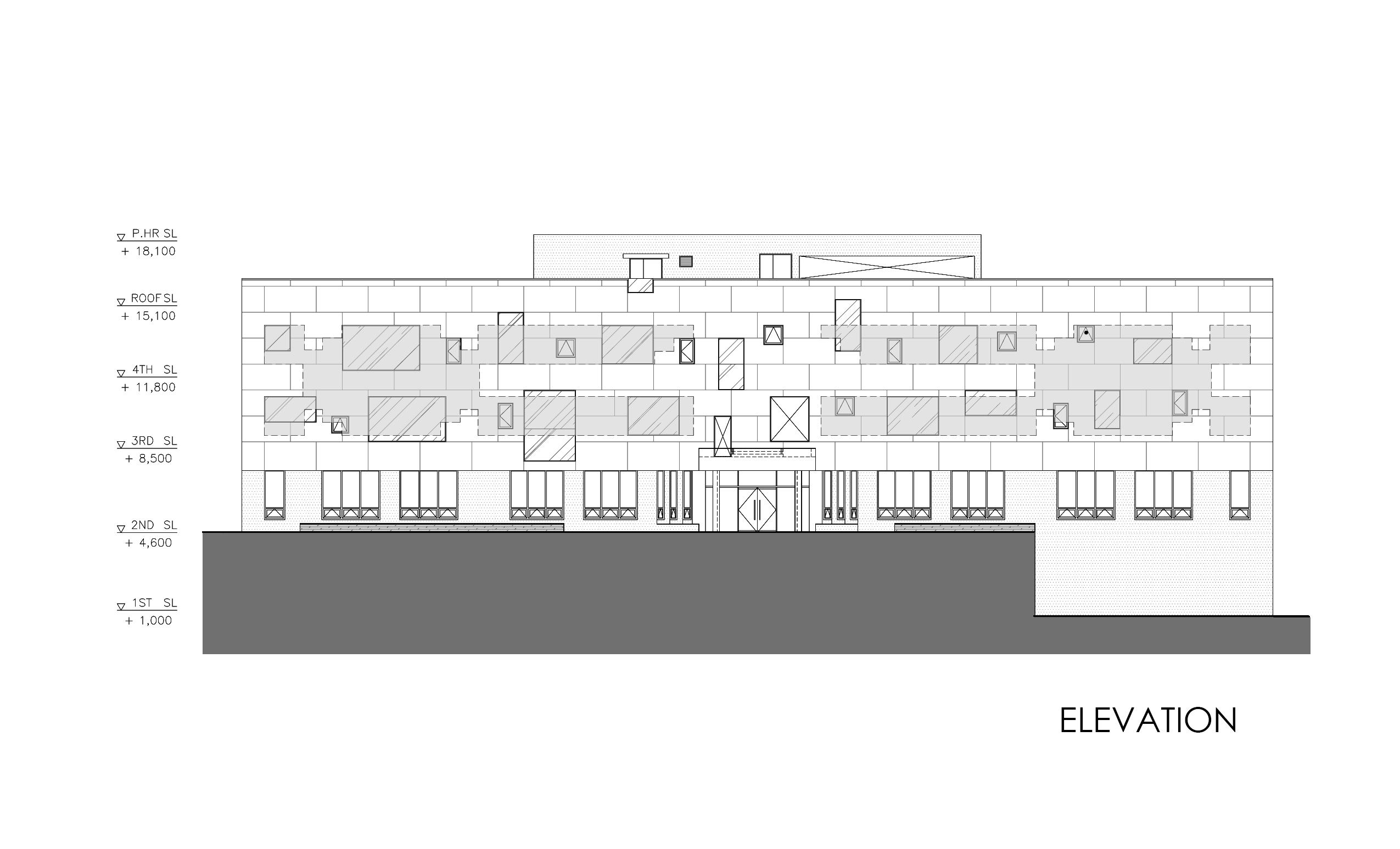
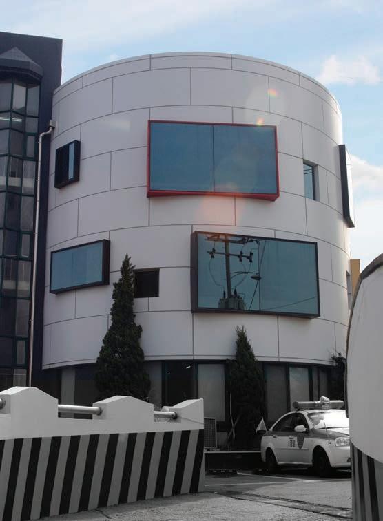
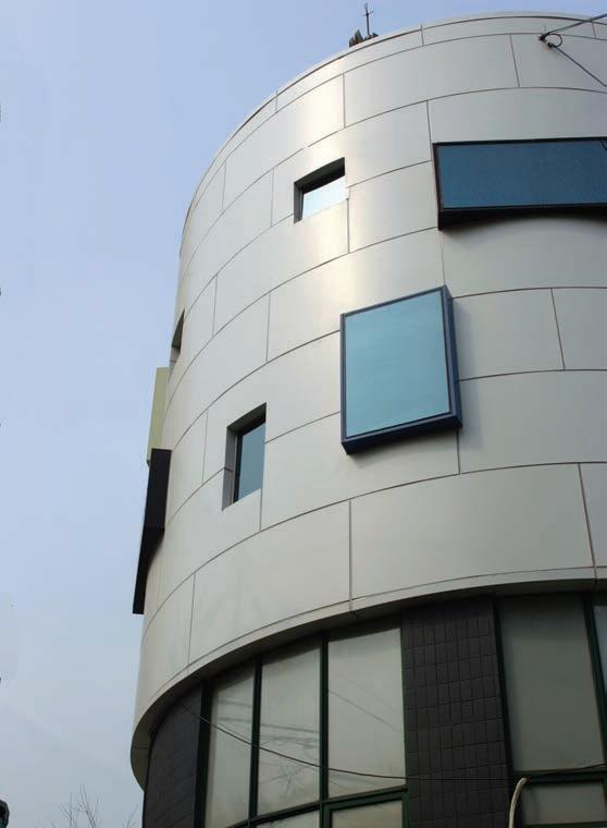
The city of Seoul assigned 18 architects to improve the cityscape. It was a renovation project turning government service offices into community centres for local residents. SEE Architects was one of the architects group, and a four-story service centre in Chunho-dong assigned to my company.
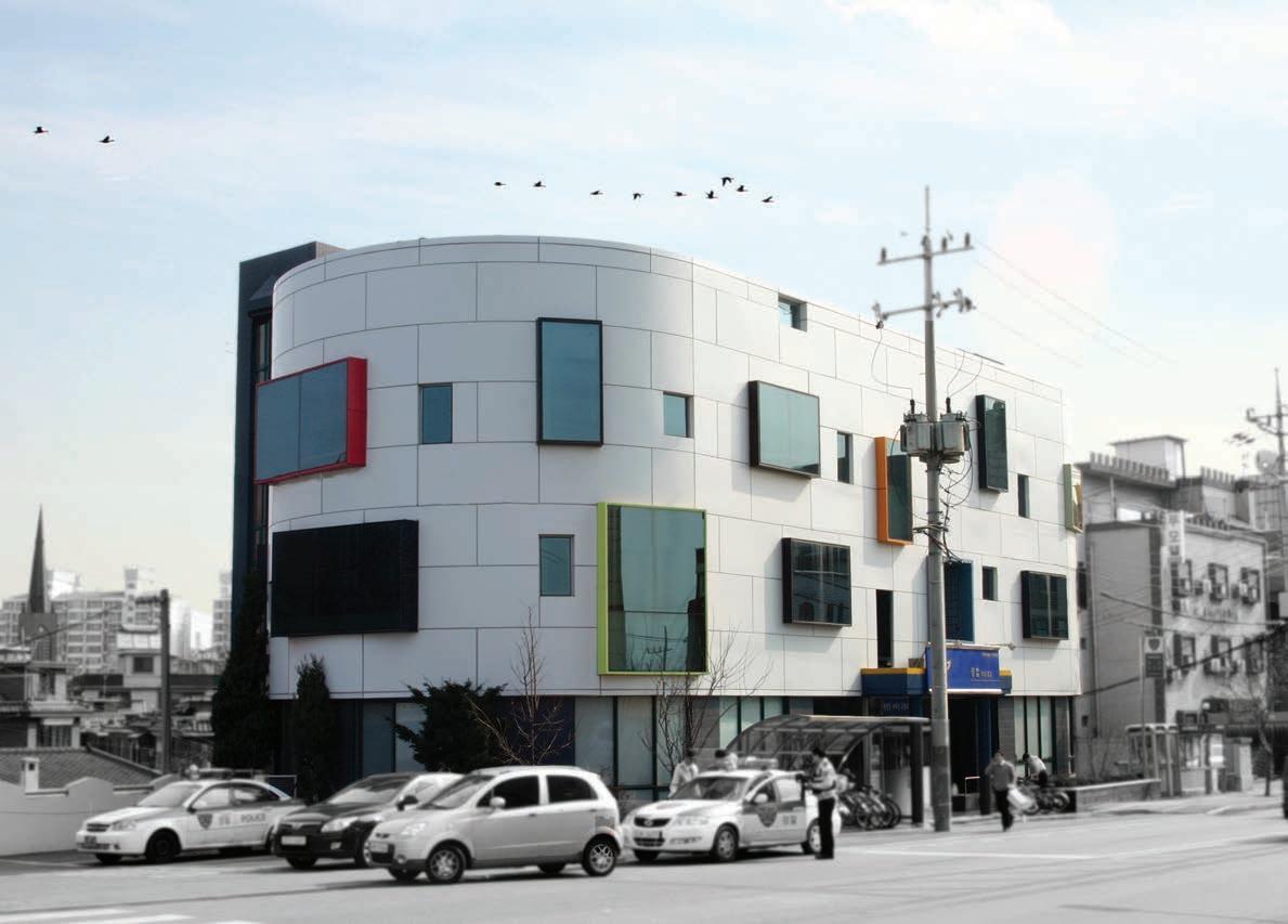
This project was given to me. I was responsible for the building design, consultation with the city, and the construction documents.
The existing building is located at the end of the Kwangjin bridge on the Han river. The Han river flows in the middle of Seoul and there are lots of parks and entertainment facilities along the river. The building is seen crossing the bridge or from the park. Moreover, the surrounding area had been designated as a new town development area by the municipality. The building will accommodate people from the new town.
It was challenging to design an oval shape building because of the strong symmetry. I tried to design the strong shape and respond to the location of the building. The building usage was also considered as a design concept because community centre contains various activities. I developed various design concepts and discussed with the principal architect.
The final design came up with different shapes of windows on a smooth white metal surface. The white surface reminds a coastal village in Greece. Windows are varied in its shape, size, and colour. It represents the various activities being taken place in the building.
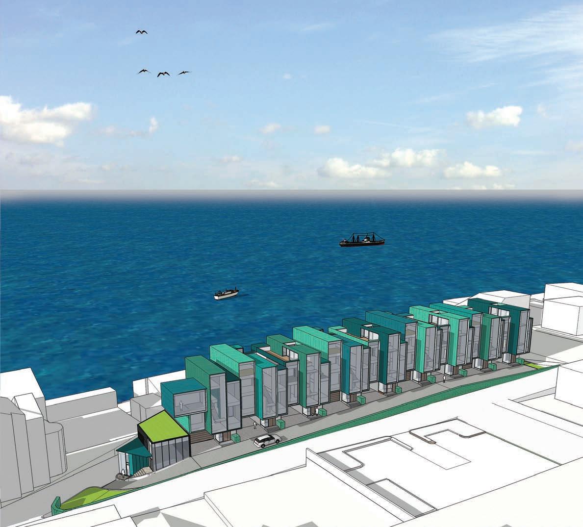
Location Busan, Korea
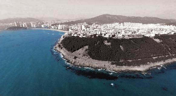
Type Residential (Townhouse)
Year 2008
This project is a townhouse for nine families. The site is located on top of a high hill overlooking the ocean. There is the most famous beach in Korea, Heaundae, near the site. The townhouse was designed to be a luxurious residential for rich people.
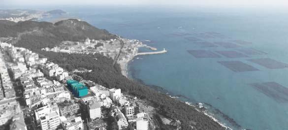
The client of the project was an owner of a big shipping company in Busan. My company had already designed a 25 storey condominium building for him before this project. He was adventurous and put his value on making something different from typical residential buildings.
My design won the internal competition. I took the project as the main designer and prepared documents for the presentation. The client liked the design. Unfortunately, the project was cancelled with the cancellation of the 25 storey condo project.
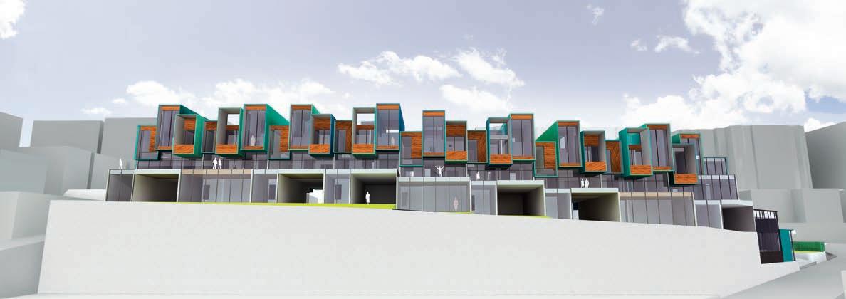
While making a mass model for the mass study, I came up with an interesting idea. Since the site was located on top of a high cliff and steep slope, the skyline of the village buildings was various. I found out that the vertical variation worked better with the surrounding context. The design concept was selected as a main idea and I developed the idea to the final design.

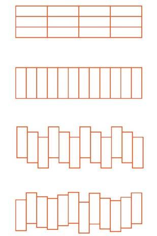
The colours of the building represents the variation of the building shape. Scheme of the colour was inspired by the colour of the ocean.
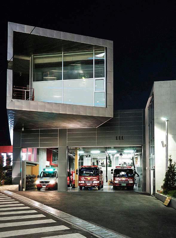
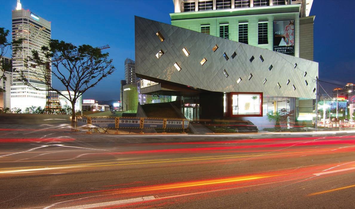
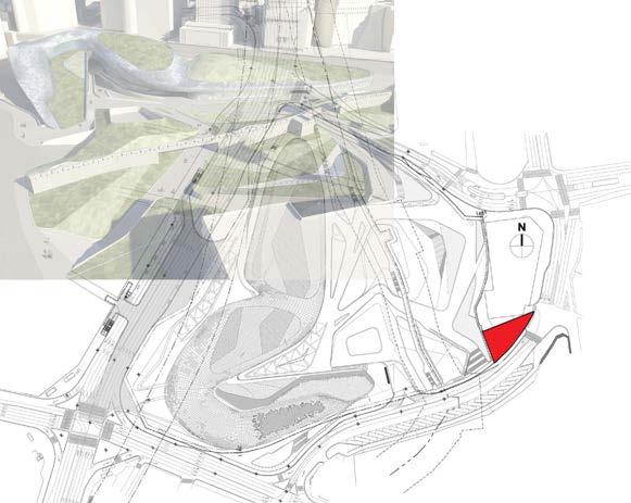
Location Seoul, Korea
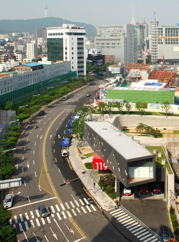
Type Institutional (Fire Station)
Year 2009
Status Built
Credit SEE Architects Inc.
Project Coordination /
Construction Documents
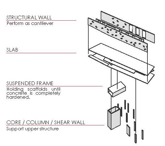
The project is located adjacent to the Dongdaemun Design Plaza (DDP), designed by Zaha Hadid. There were internal debates regarding the design concept because of the DDP’s strong exterior design. We decided to focus on our own design inspired by the mechanicality of fire truck.
The main body of the building was cantilevered on one side to clearly show the design concept. I was responsible for solving the structural problems. Three layers of walls of the main body performs as the cantilevered structure. The core structure functions as the main support for the main body. The window pattern was designed accordingly to maintain the design concept and the structural function.