6 minute read
Gallery, Norway Bridge and building in one, The Twist is architect BIG’s latest showstopper
A bend in the river
BIG’s twisted building for rural sculpture park Kistefos is part bridge, part exhibition space, creating a sense of flow amid lush Nordic scenery
Words / Cajsa Carlson Images / Laurian Ghinitoiu


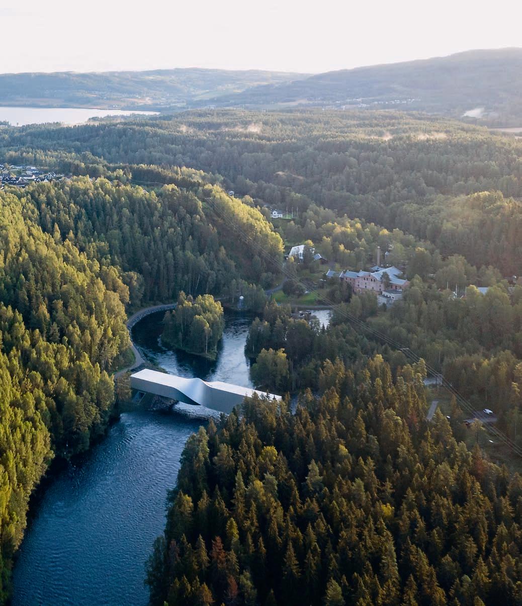
In the evergreen Norwegian forest, an hour north of Oslo, Kistefos sculpture park adorns the post-industrial site of a 19th-century wood pulp mill. The original mill is still there, its imposing red brick facade mirrored in the clear water of the fast-flowing Randselva river – but as the forest opens up, it’s another building that really catches the eye.
The Twist is the sculpture park’s new gallery, designed by Danish architecture firm Bjarke Ingels Group (BIG). It acts as both a building and a bridge, stretching across the river and connecting the mountain slope on one side with the flat woodland on the other. “From certain angles it has this kind of perfect, enigmatic form; it feels like a mega artefact that some giant has left across the river,” says BIG’s Bjarke Ingels of the gallery, which has been eight years in the making and is his firm’s inaugural project in Norway.
Christen Sveeas, the owner and founder of Kistefos, which is the largest sculpture park in northern Europe, has a familial connection to the site: his grandfather bought the land in 1888 and started producing wood pulp the following year. The picturesque mill is still in use today, as a museum and living factory, and Sveeas, a contemporary art collector, first had the idea of creating a new museum that would complement it some 20 years ago. Another architect made drawings for it in 2001 but due to a recession the structure was never built. “Luckily, I can say today, because that building was a bit more traditional and old-fashioned,”
says Sveeas. Instead, The Twist was chosen following an international competition, and opened its doors in autumn 2019.
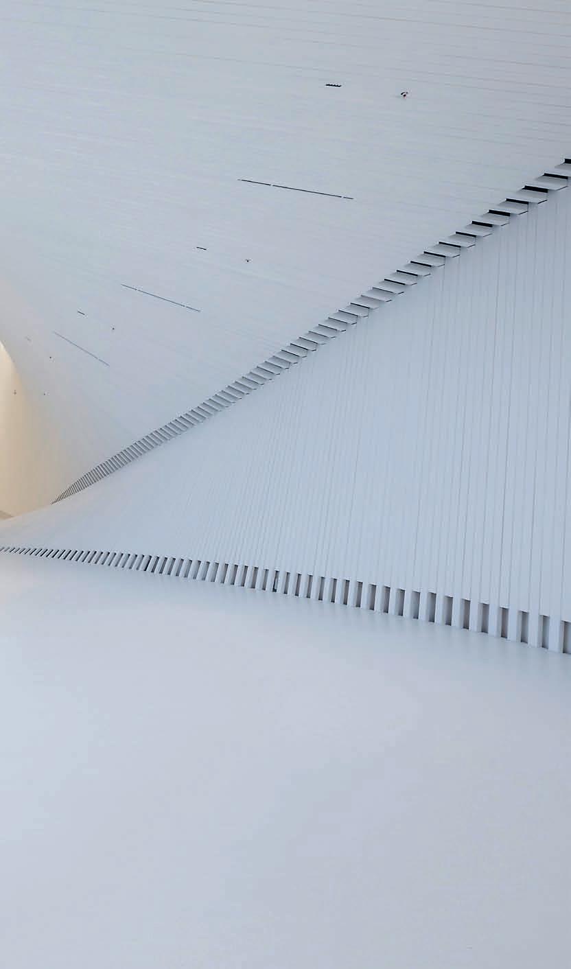
Nobody could call the building traditional. Light years away from the traditional white cube, it is conceived as a beam, warped 90 degrees near the middle: inside, the twisted central section looks like a closing camera shutter. According to Ingels, the way that people experience the sinuous building shifts depending on which side it is entered from: “It connects an introverted, vertical gallery to an extroverted, panoramic room, where you have these spectacular views of the river and the mill; the darkness to the lightness.” As a bridge, the building also closes the loop of the sculpture park, creating a natural walking route

between the sculptures sited on the two banks, a collection that includes works by Anish Kapoor, Yayoi Kusama and Olafur Eliasson. Its ambitious design, dramatic geometric shape and pure white colour contrast sharply with the dark forest, while the panoramic windows make it glint, jewel-like, upon the water.
The landscape surrounding the museum played a big part in the design, according to Ingels. The intention was for visitors to enjoy the flow of the winding river and the openness and fresh air, as well as the spectacular views of the historic mill building. Since it is a sculptural piece of architecture, The Twist creates a visual connection between the gallery itself and the artwork outside. The materials that have been used also echo Kistefos’ industrial past – the Above Panoramic views of the forest, with the mill beyond
Facing page The aluminiumclad building, torqued in the middle to create its twisting form
Previous page BIG’s first project in Norway, The Twist was won via an international competition


Left The building is rectangular in profile, so as it twists at the centre, there is a transition from a single to a double-height space
Right As a bridge, The Twist turns a visitor’s journey into a loop through the sculpture park, which is set in landscape surrounding a 19th-century wood-pulp mill
vertical entrance, with its rectangular shape and anodised aluminium exterior, evokes the look of an ordinary shipping container. “When you engage with it – when you go close and you go through it – it starts feeling more and more like an industrial shed, a barn or a kunsthall and even the twist doesn’t feel alien because it feels effortless,” says Ingels.
Though the finished result is light and graceful, the edifice’s twisted design posed a technical challenge, he continues. “We never questioned the ‘bridgeness’ [of it] but there was a moment when we were like ‘are we seriously going to not twist it?’” He uses the impeccably finished metal sculptures of Anish Kapoor to explain why it wasn’t possible to simply expand upon the techniques used to create a work of art: “I know some of the manufacturers that make them, and it’s a fortune to get a perfect object, so you wouldn’t be able to apply that on the scale of a building.” Instead, BIG came up with the idea of using straight aluminium panels for the exterior and fir slats for the interior.

“I love the fact that when you walk through you see curves everywhere, but there is not a single curve in the whole building. It’s all straight lines, just gently adjusted,” says Ingels. And by foregoing the more opulent materials sometimes associated with galleries, such as marble and brass, the building has a sobriety that suits its rural environs. The geometry is inherently dramatic, but in this setting, across the meandering river and among the existing sculptures, The Twist’s warped aluminium shape looks completely at home.

An elevated experience
Fora’s newest workspace brings a boutique sensibility and thoughtful design to the East End
Housed in a former Victorian warehouse off Brick Lane in London’s East End, premium workspace provider Fora’s ninth opening in the capital cements its reputation for turning existing architectural gems into carefully considered spaces. Architect Piercy & Company has undertaken a total refurbishment – including a two-storey roof extension and a dramatic void cut through the centre of the building – while Fora has brought its ethos of fusing hospitality, members-club style service and innovative technology.
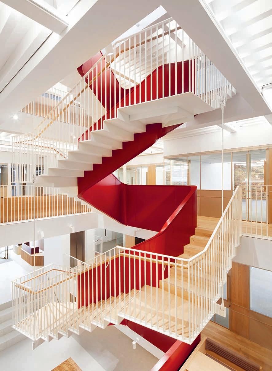
Founded by The Big Chill festival co-founder Katrina Larkin and hospitality entrepreneur Enrico Sanna, Fora’s mission has good design at its heart, not just as a means of attracting discerning tenants but to improve productivity and wellbeing. The mid-19th-century former factory now offers 2,150 sqm of co-working and flexible workspace across five floors. Slicing through the building’s light-filled new central atrium is a sculptural staircase rendered in a dramatic blood red, a focus that visually ties the building together. The communal areas that sit adjacent to this feature, meanwhile, are subtly detailed, with a palette of natural materials and neutral hues. Brick perimeter walls and some original timber and cast iron elements were kept, helping the building to maintain the spirit of its original character, especially its exterior. Inside, the spaces are layered with terraces that offer views of the surrounding area alongside a residents’ lounge, kitchens and a modern events space.
One of Piercy & Company’s partners, Pete Jennings, says that the idea was always to create a “backdrop of beautiful simplicity” for the people who inhabit the building. “Fora wanted to create the experience of a boutique hotel, and each of their locations has its own identity depending on the area, but there is a link where you know they’re part of the same group.” Words Elizabeth Choppin
Images Jack Hobhouse

156 Left Open seating and kitchen areas in muted tones sit adjacent to the private offices
Facing page A blood-red staircase fills the building’s central atrium, linking five floors of space


