

M E S S A G I N G
THE WILD WORDSMITH BRAND GUIDELINES ONE PAGE
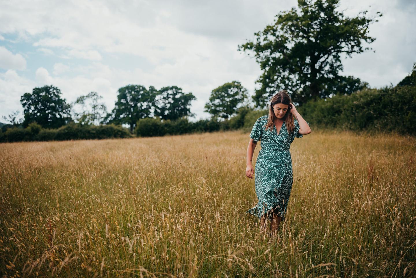
Our
story

BRAND POSITIONING
Your text here...
BRAND PERSONALITY
Your text here...
TARGET MARKET
Your text here...
THE WILD WORDSMITH BRAND GUIDELINES TWO PAGE
We stand for
VALUE 1
Lorem ipsum dolor sit amet, consectetur adipiscing elit, sed do eiusmod tempor incididunt ut labore et dolore magna aliqua. Ut enim ad minim veniam, quis nostrud exercitation ullamco laboris nisi ut aliquip ex ea commodo consequat.
VALUE 2
Lorem ipsum dolor sit amet, consectetur adipiscing elit, sed do eiusmod tempor incididunt ut labore et dolore magna aliqua. Ut enim ad minim veniam, quis nostrud exercitation ullamco laboris nisi ut aliquip ex ea commodo consequat.
VALUE 3
Lorem ipsum dolor sit amet, consectetur adipiscing elit, sed do eiusmod tempor incididunt ut labore et dolore magna aliqua. Ut enim ad minim veniam, quis nostrud exercitation ullamco laboris nisi ut aliquip ex ea commodo consequat.
VALUE 4
Lorem ipsum dolor sit amet, consectetur adipiscing elit, sed do eiusmod tempor incididunt ut labore et dolore magna aliqua. Ut enim ad minim veniam, quis nostrud exercitation ullamco laboris nisi ut aliquip ex ea commodo consequat.
THE WILD WORDSMITH BRAND GUIDELINES THREE PAGE
Our vision is
Lorem ipsum dolor sit amet, consectetur adipiscing elit, sed do eiusmod tempor incididunt ut labore et dolore magna aliqua. Ut enim ad minim veniam, quis nostrud exercitation ullamco laboris nisi ut aliquip ex ea commodo consequat.
Duis aute irure dolor in reprehenderit in voluptate velit esse cillum dolore eu fugiat nulla pariatur. Excepteur sint occaecat cupidatat non proident, sunt in culpa qui officia deserunt mollit anim id est laborum.

THE
FOUR PAGE
WILD WORDSMITH BRAND GUIDELINES
Our mission is
Lorem ipsum dolor sit amet, consectetur adipiscing elit, sed do eiusmod tempor incididunt ut labore et dolore magna aliqua. Ut enim ad minim veniam, quis nostrud exercitation ullamco laboris nisi ut aliquip ex ea commodo consequat.
Duis aute irure dolor in reprehenderit in voluptate velit esse cillum dolore eu fugiat nulla pariatur. Excepteur sint occaecat cupidatat non proident, sunt in culpa qui officia deserunt mollit anim id est laborum.

THE
FIVE PAGE
WILD WORDSMITH BRAND GUIDELINES
B R A N D I D E N T I T Y

THE WILD WORDSMITH BRAND GUIDELINES SIX PAGE
BRAND INDEX


THE WILD WORDSMITH BRAND GUIDELINES SEVEN PAGE
BRAND INDEX
THE WILD WORDSMITH BRAND GUIDELINES EIGHT PAGE
Primary logo
Your primary logo should be the first logo you try to use It should always remain centred Never left or right align the elements in your branding
NINE PAGE
Secondary logos
Your secondary logo is to be used when your primary logo is not suitable due to size or placement It can also be used when you want to change things up a bit.
These logos should never be altered, position, size and colour, along with the spatial and proportional relationships of your brands elements, are predetermined and should not be changed under any circumstances.
TEN PAGE
Alternative logos
Your secondary logos have been created for when you want to differentiate your content between your copywriting studio and the writing & wellbeing camps.
These logos should never be altered, position, size and colour, along with the spatial and proportional relationships of your brands elements, are predetermined and should not be changed under any circumstances.
ELEVEN PAGE
Submark logos
You have been provided with submarks to be used when and where you see fit Try to use this in situations where people already know your branding and who you are. Your submarks have been created to ensure your brand has depth and can be versatile in a range of situations.
TWELVE PAGE
C O L O U R S

THE WILD WORDSMITH BRAND GUIDELINES THIRTEEN PAGE
BRAND COLOUR PALETTE
Hex and Pantone Values
HEX CODE #3C3E25 CMYK: 66 53 82 61 HEX CODE #E9DDDD CMYK: 10 4 11 0 HEX CODE #807F6E CMYK: 48 37 51 23 HEX CODE #E2CFB6 CMYK: 13 19 30 1 HEX CODE #A6A493 CMYK: 36 27 40 9 HEX CODE #C6B39A CMYK: 23 27 39 6 RGB: 60 62 37 RGB: 233 221 221 RGB: 128 127 110 RGB: 226 207 182 RGB: 166 164 147 RGB: 198 179 154
THE WILD WORDSMITH BRAND GUIDELINES FOURTEEN PAGE HEX CODE #D1C9BF CMYK: 20 19 24 2 HEX CODE #BB7D63 CMYK: 22 53 58 12 RGB: 209 201 191 RGB: 187 125 99
COLOUR MATCHING & USAGE

Whilst you have been 8 colours, not all of them should be seen together When using your logo over brand colours please ensure it aligns with these guidelines
COLOURS FOR COPYWRITING STUDIO
COLOURS FOR WRITING & WELLBEING
THE WILD WORDSMITH BRAND GUIDELINES FIFTEEN PAGE
Brand patterns


These supporting branded textures/illustrations have been created to compliment your brand vibe and personality Helping you keep all of your marketing assets consistent and instantly recognisable.

SIXTEEN PAGE
T Y P O G R A P H Y

THE WILD WORDSMITH BRAND GUIDELINES SEVENTEEN PAGE
HV MUSE UPPERCASE
HV MUSE
Main heading
MONTSERRAT LIGHT
Lorem ipsum dolor sit amet, consectetur adipiscing elit, sed do eiusmod tempor incididunt ut labore et dolore magna aliqua. Ut enim ad minim veniam, quis nostrud exercitation ullamco laboris nisi ut aliquip ex ea commodo consequat.
Duis aute irure dolor in reprehenderit in voluptate velit esse cillum dolore eu fugiat nulla pariatur. Excepteur sint occaecat cupidatat non proident, sunt in culpa qui officia deserunt mollit anim id est laborum.
MANHATTAN
S U B H E A D I N G S T Y L E
Special highlighted text style
EIGHTEEN PAGE
SECRETARY TYPEWRITER UNDERLINE
SECRETARY TYPEWRITER
Main heading
SECRETARY TYPEWRITER
Lorem ipsum dolor sit amet, consectetur adipiscing elit, sed do eiusmod tempor incididunt ut labore et dolore magna aliqua. Ut enim ad minim veniam, quis nostrud exercitation ullamco laboris nisi ut aliquip ex ea commodo consequat.
Duis aute irure dolor in reprehenderit in voluptate velit esse cillum dolore eu fugiat nulla pariatur. Excepteur sint occaecat cupidatat non proident, sunt in culpa qui officia deserunt mollit anim id est laborum.
S U B H E A D I N G S T Y L E
NINETEEN PAGE
MAIN HEADING
Your subheading font is HV Muse It should always be written in lowercase It should never be smaller than 12pt. Kerning (the spacing between letters) should always be set at -30.
Adhering to the above standards when it comes to using this font will ensure a consistent brand implementation.
MAIN HEADINGA B C D E F G H I J K L M N O P Q R S T U V W X Y Z 0 1 2 3 4 5 6 7 8 9 TWENTY PAGE
HV MUSE - LOWER CASE
SUBHEADING
Your subheading font is HV Muse It should always be written in uppercase It should never be smaller than 8pt. Kerning (the spacing between letters) should always be set at 200.
Adhering to the above standards when it comes to using this font will ensure a consistent brand implementation.
- UPPERCASE A B C D E F G H I J K L M N O P Q R S T U V W X Y Z 0 1 2 3 4 5 6 7 8 9 TWENTYONE PAGE
SUBHEADING HV MUSE
BODY/PARAGRAPH FONT
Your subheading font is Montserrat Light It should always be written in lowercase It should never be smaller than 8pt. Kerning (the spacing between letters) should always be set at -15.
Adhering to the above standards when it comes to using this font will ensure a consistent brand implementation.
MONTSERRAT
A B C D E F G H I J K L M N O P Q R S T U V W X Y Z 0 1 2 3 4 5 6 7 8 9 TWENTYTWO PAGE
BODY FONT
LIGHT
HIGHLIGHTED TEXT
Your subheading font is Manhattan It should always be written in lowercase. It should never be smaller than 12pt. Kerning (the spacing between letters) should always be set at 0
Adhering to the above standards when it comes to using this font will ensure a consistent brand implementation.
A B C D E F G H I J K L M N O P Q R S T U V W X Y Z 0 2 3 4 5 6 7 8 9 TWENTYTHREE PAGE
BODY FONT MANHATTAN REGULAR
SPECIAL TEXT
Your subheading font is Secretary Typewriter.
It can be written in all caps and lowercase.
It should never be smaller than 12pt Kerning (the spacing between letters) should always be set at -15.
Adhering to the above standards when it comes to using this font will ensure a consistent brand implementation.
BODY FONTA B C D E F G H I J K L M N O P Q R S T U V W X Y Z 0 1 2 3 4 5 6 7 8 9 TWENTYFOUR PAGE
SECRETARY TYPEWRITER
F I L E F O R M A T

THE WILD WORDSMITH BRAND GUIDELINES TWENTYFIVE PAGE
FILE FORMATS
.EPS and .PDF files are vector based which means you can scale them to any size and they will not pixelate.
.JPG and .PNG files become pixelated when they are scaled larger than their original size.
.PNG files are used for web only and have a transparent background.
THE WILD WORDSMITH BRAND GUIDELINES TWENTYSIX PAGE .EPS
.JPG .PNG .PDF .SVG
PRINT FILE TYPES
SCREEN/WEB FILE TYPES
THE WILD WORDSMITH BRAND GUIDELINES TWENTYSEVEN PAGE
COLOUR PROFILE COLOUR PROFILE cmyk rgb cmyk rgb cmyk rgb transparent white white transparent white transparent vector 150 dpi vector vector 300 dpi 300 dpi BACKGROUND BACKGROUND RESOLUTION RESOLUTION .EPS .JPG .JPG .PNG .PDF .SVG
U S A G E

THE WILD WORDSMITH BRAND GUIDELINES TWENTYEIGHT PAGE
White space
White space refers to any unused or space around an object, in this case your branding White space is vital in separating your logo from other elements to ensure it does not become chaotic or crowded Using white space helps your clients quickly identify and easily understand what it is they're seeing.
Despite the name, white space does not have to be white and can be any colour. It can also be referred to as 'negative space'.
White space is a great way to balance your new design elements It has the ability to calm us and allows us to 'breathe'
So please keep this in mind when implementing and using your new branding.

TWENTYNINE PAGE
SPACING
To maintain the integrity of your branding It is vital that you ensure there is always a minimum clear space around all edges of any of your logos. In your case, this should be at least the width and height of the letter 'X'.
It is important you adhere to this spacing to ensure the branding does not interfere with elements surrounding the logo such as other logos, copy, graphics, patterns etc.
To preserve the readability of the logo it should never be sized below certain dimensions The minimum 20mm when used in print or 220px in digital environments.
x x x x 20mm THIRTY PAGE
LOGO REMINDERS

It is vital that you do not alter the logo in any way, to ensure the integrity of the brand stays intact.
Please do not stretch or skew the logo in any direction.
Please do not tilt or rotate the logo to any angle
Please do not put a logo on a nonbrand colour background. Please do not use the logo in any other colour than the ones provided.
1. 2. 3.THIRTYONE PAGE
4.
SOCIAL MEDIA POSTS
To ensure brand consistency across your online platforms, always try to use the social media templates provided to you. If you need to create more, ensure that you use your colour palette and typography as laid out within these guidelines


THIRTYTWO PAGE


THIRTYTHREE PAGE


THIRTYFOUR PAGE
BRAND GUIDELINES
APRIL 2022
