GEMMA O'BRIEN


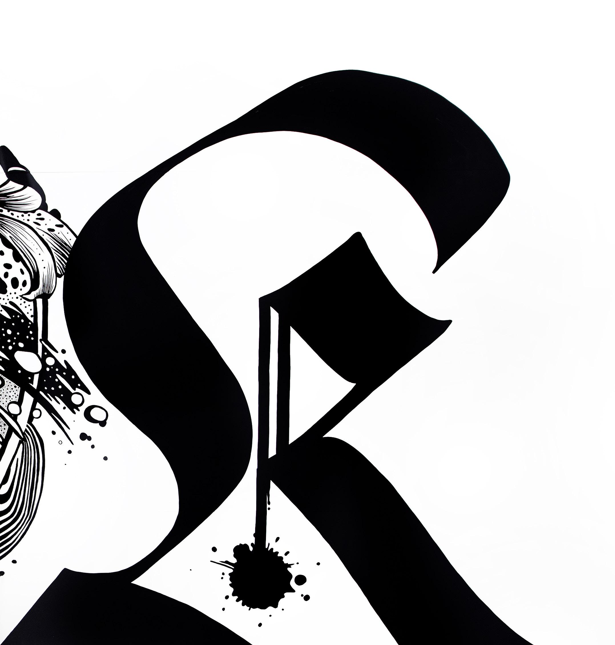
'Everything Together, Carefully Descending' (2009). Original artwork, ink on paper.
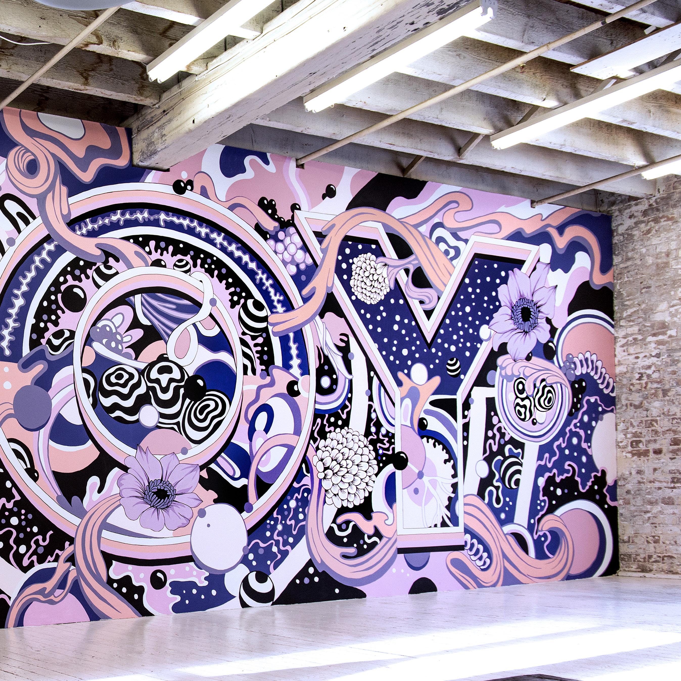
Cover: ' OK ' (2016). Wall painting, Laguna College of Art and Design, Gallery, California.
Are you busy working on a mural at the moment?
Well, I actually am in a transition right now. I just finished a big painting project last week, so I'm having a rest, just doing the minimum for a few days before it ramps up again.
Given the scale of your work, it must be pretty intense while you're painting?
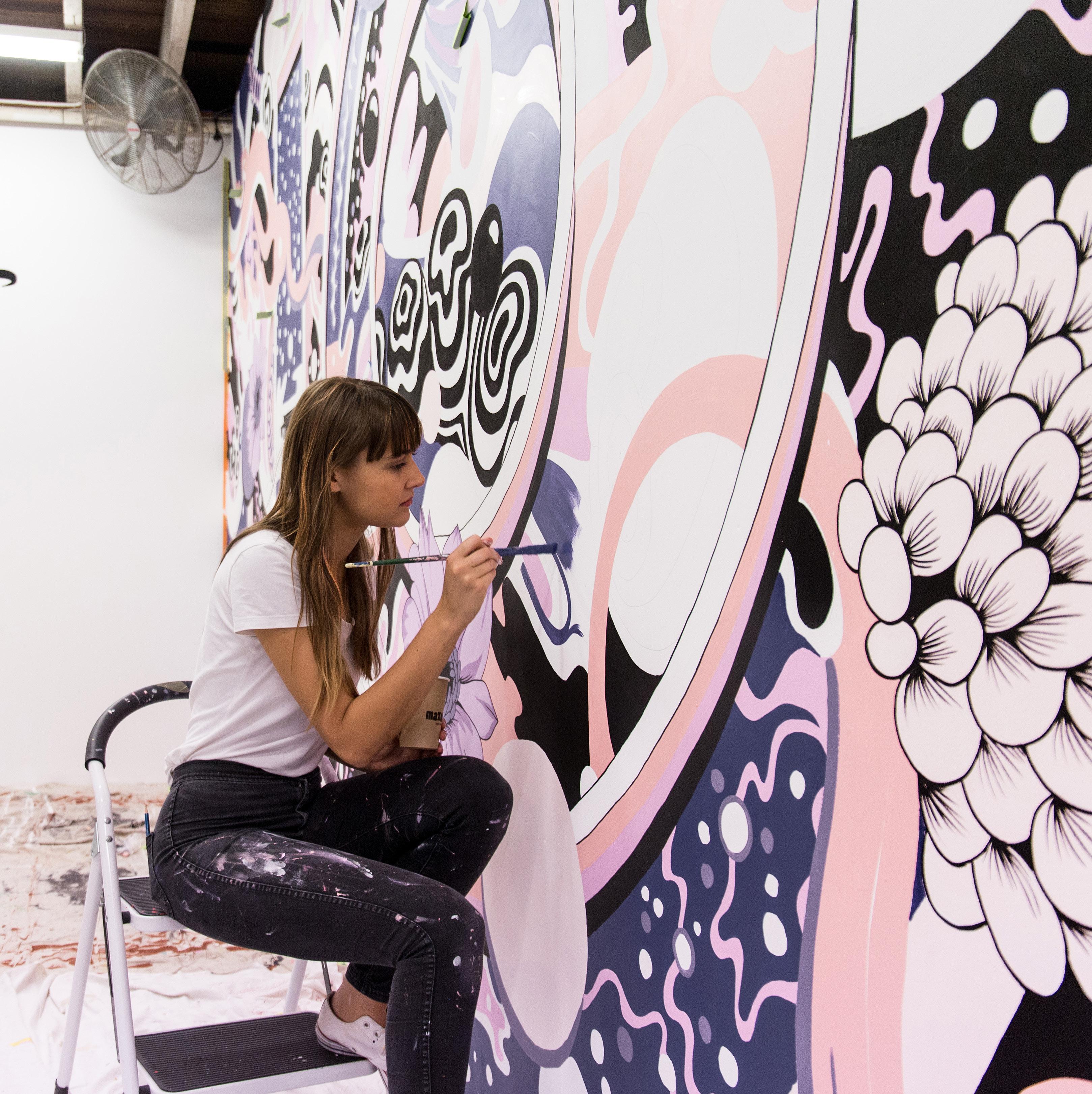
This one was a particularly unique circumstance, because it was a big piece, but it was also the last mural I will do in my studio space, here in Sydney.
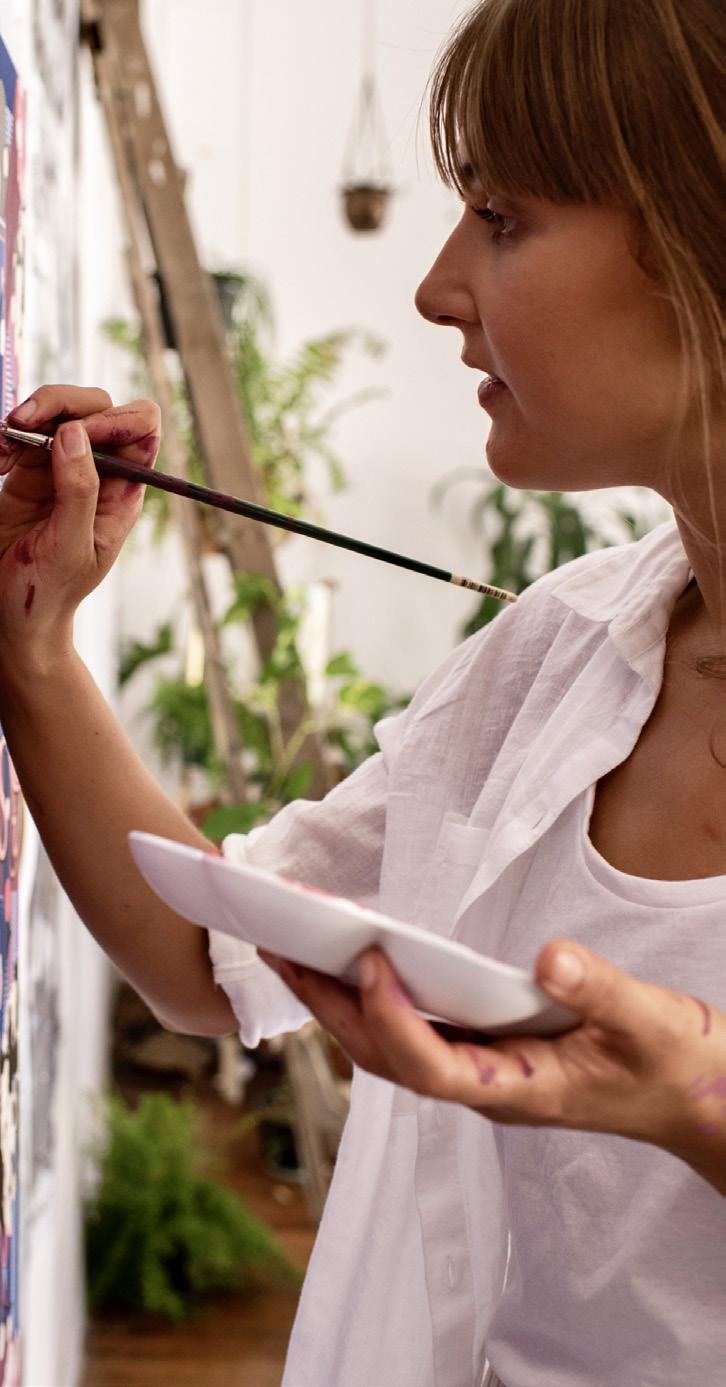
This work is very physically and mentally demanding, and it went on for a month straight. But then it was coupled with the fact that I'm moving out of the studio two days later. So I filmed it, documented it and then painted it white, and moved out. It was as if it never happened.
How can you just paint over so much work?
How does that feel?
That's what happens to most of my murals, the ones in galleries. There's a few around the world that live on. But, actually I quite like the idea that they don't exist longer than that.
I don't find it tough. There's something very freeing about it. I don't experience it as a negative feeling. It's more like, 'Wow, that just happened. That was beautiful.' And now it'll live on as a memory. That's my feeling.
Maybe that also helps you to stay fresh, creatively?
A lot of the commissioned murals live on, like the one I did for Tiffany and Co recently. That's permanent, in their retail space in Shanghai. Those ones have a different level of finish, for exactly that reason. But pieces that are more experimental, or in a gallery, that's when I like to try new things and just see what happens.
Do you integrate your experiments into your commercial work?
When I began my career I was still studying, I was still discovering my own style and my own voice. I didn't have a plan, or a strategy built around my voice or style, I just started making things.
This coincided with the rise of Instagram. So I had this instant feedback mechanism, which covered both commercially what people wanted, and also what people, other designers and artists, respected in my work. That started to shape what I did more of, but I was still experimenting.
Within the world of typography and words, I felt there was some freedom. I thought language could be the common thread, while I shifted between calligraphy or brush script and more illustrative styles.
I used that to give me boundaries. But then over time, people definitely gravitated towards the large scale work. People rotated towards this more intricate ' illustrative plus sans serif combo. '
But then I was also doing exhibitions. That was the thing that allowed me to step out and try something new. And the funny thing is, I would see that experimental stuff be the work that clients asked for maybe two years later. There ' d just be a little bit of a delay.
Did you always want to go into illustration and design?
I was always creative as a kid. I loved painting and performing and all sorts of creative things. But I was also very academic in school, and I thought I had to do a 'smart' career. That ended up with me going to law school.
A familiar story! How did you get on with the law?
I did a year and a half in law and at that point, I just thought, 'You know what, this isn't for me. ' Then I switched to design. Deep down, though, part of me wanted to choose fine art. I wanted to be an artist.
So why opt for design?
I think design felt perhaps one step safer than going to be an artist...
But then I fell in love with typography and design school. And that set me on this path of lettering, type and calligraphy. I always imagined myself as an artist that operated within the illustration and design world. Those forces are what shaped the type of work that I started to do.
When did you realise the potential in marrying art and typography?
My interest in typography was initially more in the history. So, I learned to set type by hand and then became interested in fonts... I didn't think to bring in my illustration or my drawing side at first.
But after a few years, I realised that I didn't want to be a type designer. I loved fonts. And I loved looking at typography and doing lettering. But I didn't know what the options were.
Being in Australia, being in this landscape where there weren't a huge number of influences readily available, doing crazy things with typography, it meant that I just went for it. Then I started to bring in the drawing, incorporating illustration elements with the lettering.
Then I went large scale, and something just clicked. There was this combination of things coming together. Influences from typography coincided with this moment where social media was loving seeing behind the scenes.
Just the right combination of order and chaos?
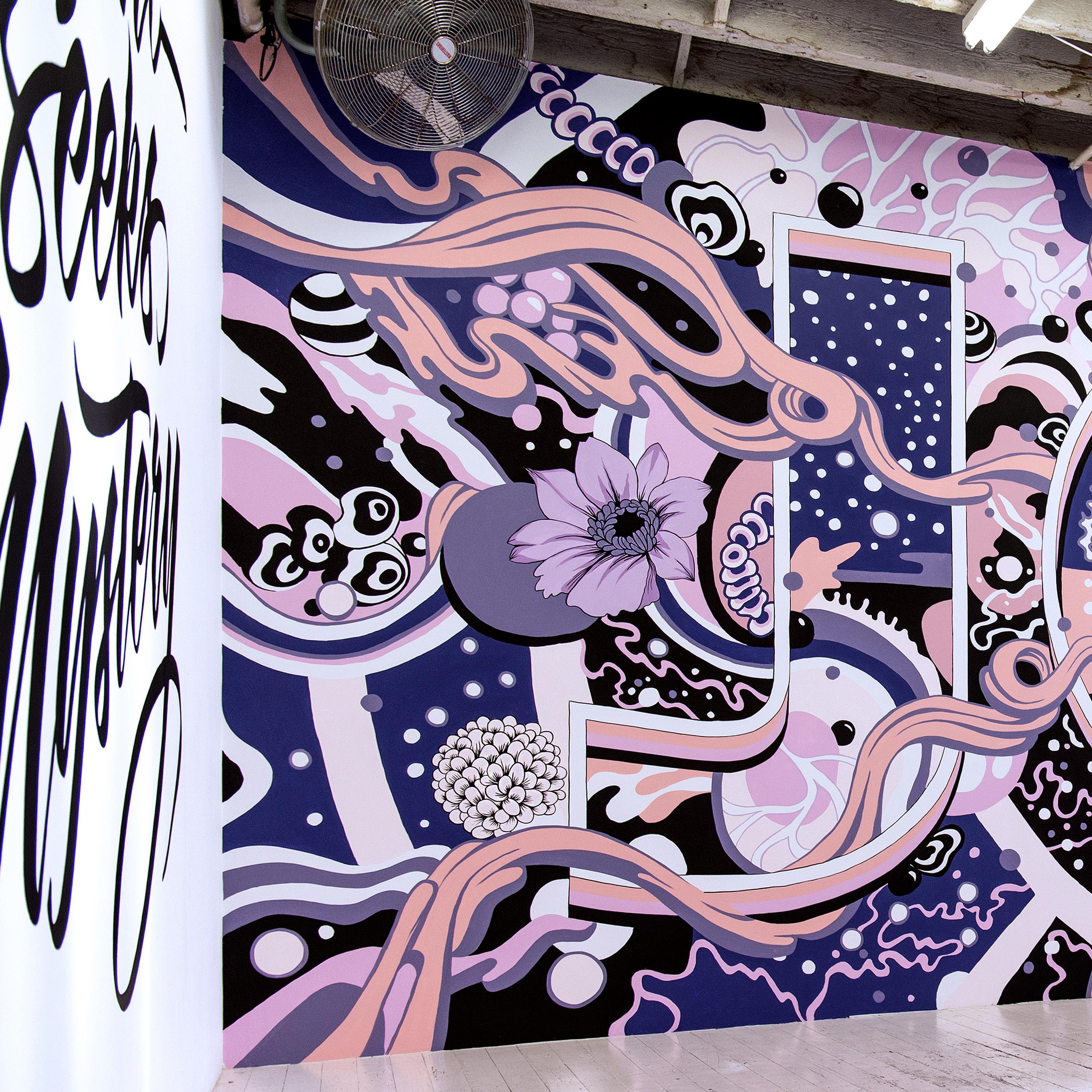
Absolutely. There ' s something I love about the rules of typography, even when I'm starting with a big piece that I know is gonna end up quite intricate and detailed. You might not actually really be able to see the kerning of the letterforms but I still start with that really strong structure, like the ' Joy ' mural, or ' OK ' .
I would make sure that the typography felt strong and sound and then move into something a bit more free. Or even start to use illustration elements in the same way that you would do custom letter spacing. " There's a gap down there, maybe we'll put a flower in there " . I would use the rules but incorporate other elements of design as well.
'Joy ' (2018).
Original artwork installed as a wall painting at China Heights Gallery.
So, it started with a lot of typography and ended up in a whole new space!
" I didn't have a plan, or a strategy built around my voice or style, I just started making things. "
" Within the world of typography and words, I felt there was some freedom. "
What are you thinking about when you're up close to a mural for a month at a time?
That is actually the best part. That is my favourite part.
Because I came from a design background where you usually had to show the design, get the sketch approved, and so on. By the time it was on the wall, I knew what was happening.
So it became a process. I would listen to audio books or music to occupy that part of my brain while I was just doing the painting. And then, as the projects got bigger and bigger, there were more parts to take care of, including scissor lifts, access, and who ' s going to be my painting team? There ' s a lot of logistics. I ' d say the first 60% of the projects require a lot of different kinds of thinking.
And then the second part was the best bit, the actual painting. What made me do it again and again.
Do you know exactly what it's going to look like when you start a big piece?
I always include a little bit of room when it's painted for experimentation, but it also depends on the timeframe. If the gallery only has a two week installation window, I have to know pretty well. And if I've got assistants who are working for me, I have to be quite specific.
But in the most recent one I did in my studio, I thought ' I want to try a big gradient on a letter. ' Maybe I can just have that structure and then experiment on the wall. But of course, the bigger it becomes, the less and less it ' s like just rubbing stuff out on paper if things don ' t work out.
Did your work gradually get bigger or was it an overnight expansion?
I started with something that would be manageable just by myself, a big-ish size wall. I prefer doing indoor spaces too.
I've done a few outdoor ones, at mural festivals. But I'm not as drawn to that for some reason. I don't see myself as a street artist or a mural artist, I see myself as more of a graphic artist that works in interior spaces. As big as you can go with a ceiling and a door!
How did you go from studying design to producing murals for clients like Apple and Tiffany and Co?
At the same time that I was studying, I started a blog called ' for the love of type ' . That was in 2009. That was just about documenting my own passion. But that ultimately led me to speak at TYPO Berlin in 2009.
I was still a student, I was 21. And off the back of that, I got some smaller commissions or pieces of custom calligraphy for commercial clients back in Sydney.
It was a weird moment, but I completed my studies and spent quite a bit of time outside of the public eye, working in bigger design firms, and in visual effects. Only after that I started working more as a solo illustrator with agents and that sort of thing.
VFX is heavily digital, do you use the computer much now?
That was probably what turned me back to analog!
I don't love digital, but they both play a part. I was a junior designer in the art department at the visual effects studio, Animal Logic. I was setting up things in Photoshop and coming up with concepts for title sequences. But even there, I was still trying to bring in analog tools or working in watercolour and scanning it, that sort of thing. So, analog was still a part of my process.
Have you abandoned digital altogether?
No, it ' s a constant, and it's definitely shifted more digital lately. I treat analog as a luxury. Any large scale paintings and installations are all done by hand. But the initial concepts or designs, I might do as a combination of digital and hand drawn.
I have a library now of hand drawn, floral and flowing elements that I've drawn from the last 10 years and scanned in. I ' ll often composite these in Photoshop, or into a drawing on the iPad.
" I filmed it, documented it and then painted it white, and moved out. It was as if it never happened. "
In the last five years, I was really tied to this idea of ' it has to be hand drawn. ' It adds this extra element. I still believe that, but there is this part of me that ' s saying, maybe I have to let go of the parts which are unnecessary and only retain the things that really are important to be done by hand. I still just love drawingwith a pencil though. I do that every day.

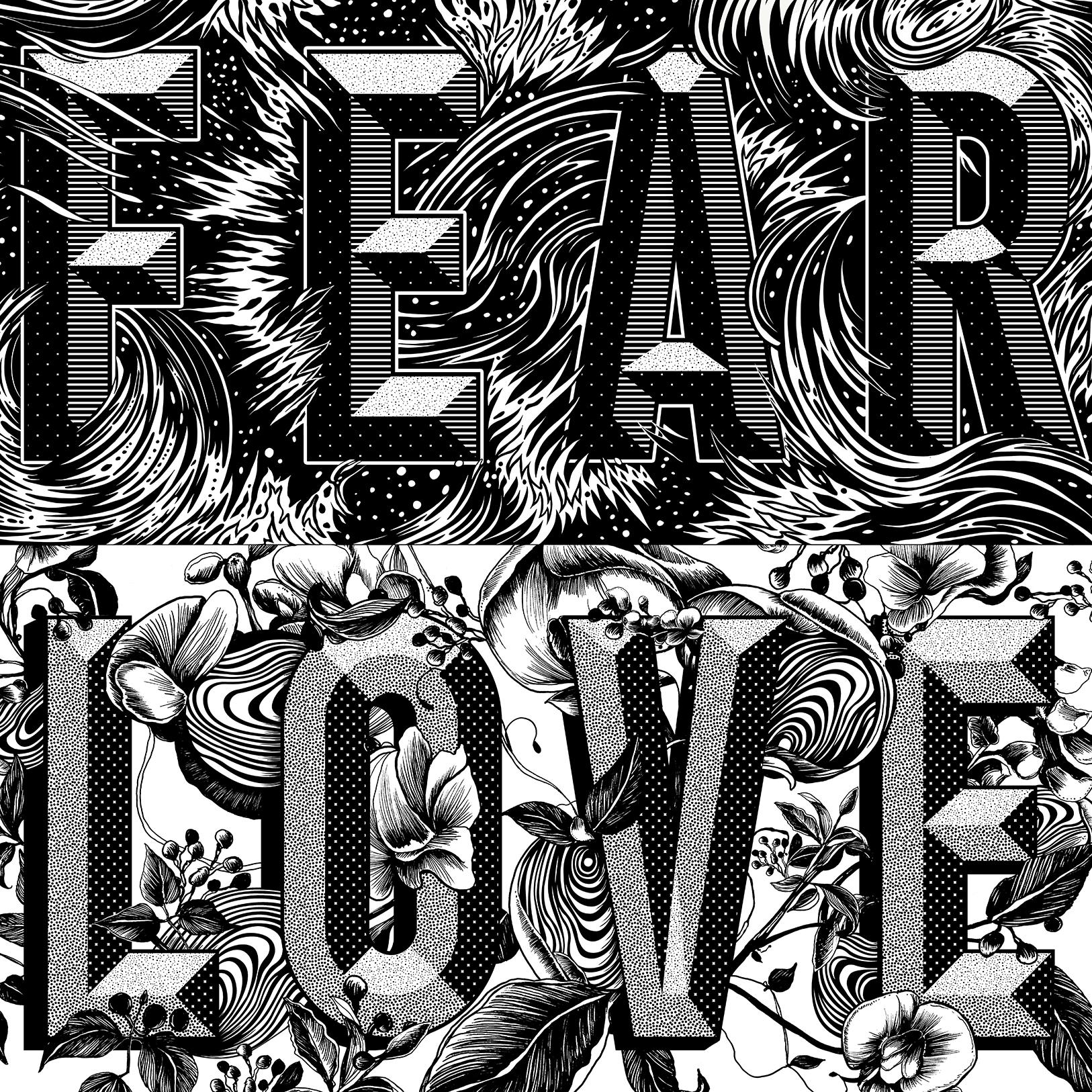
' Fear/Love ' (2015). Original artwork for installation painting (digitized).
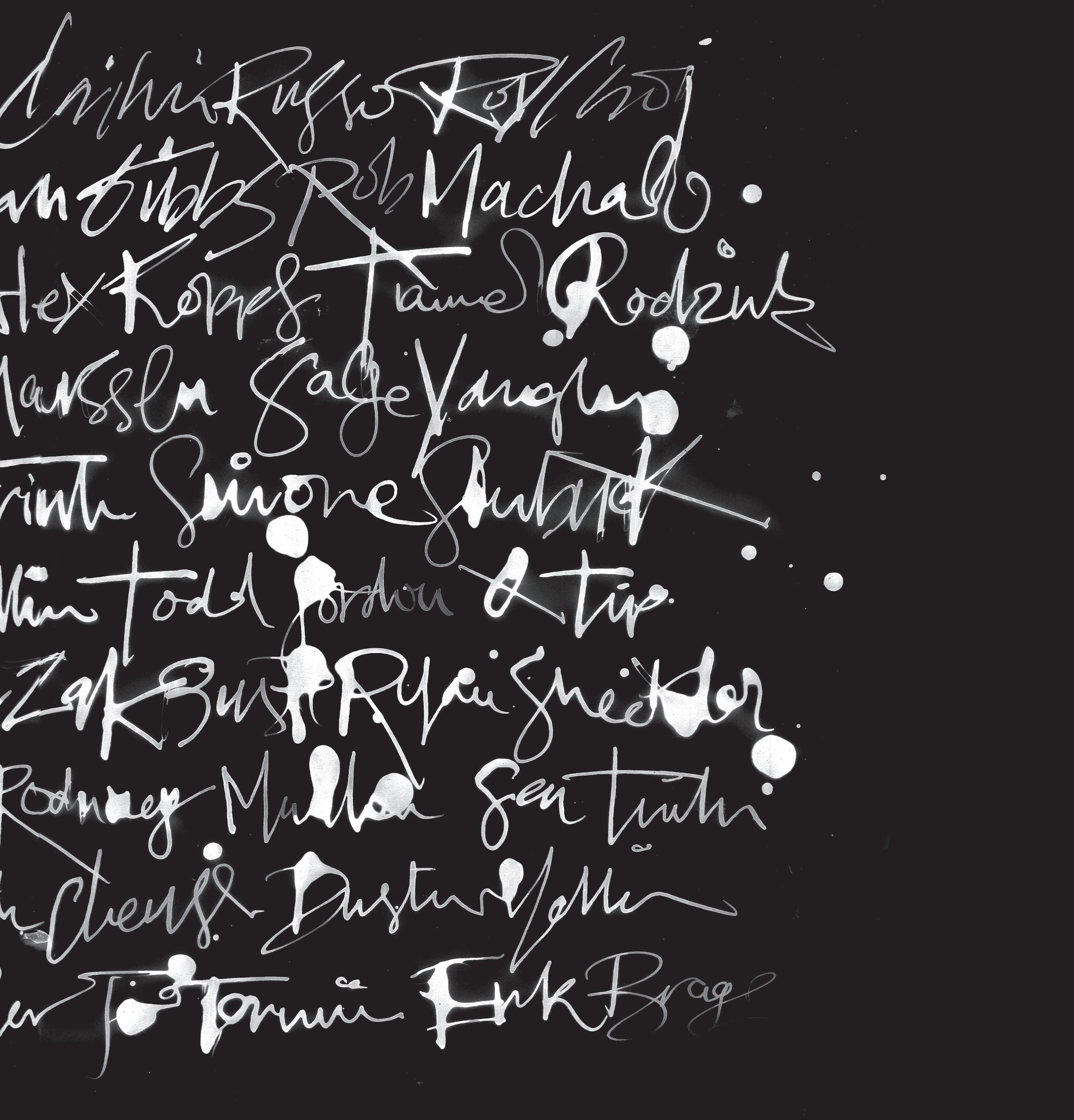
Previous doublepage: Cover Concept for Monster Children Magazine (2014). Calligraphy, ink on paper, (digitized).
You're studying painting and drawing now, too, aren ' t you?
It's kind of a remnant of my original desire to study fine art, to be an artist. I still believe that you have to be able to draw well from life and have a knowledge of art history. And those were the two things that I just didn't get from having a design degree and working in industry.
It's changed the way that I see, and that ' s been really helpful, but I haven ' t stylistically incorporated it into any of my work.
Most of my education was more conceptual. So I ' m quite enjoying this really structured approach to measuring and so on.
" I was experimenting with new ideas and finding myself again as an artist, ready for this next chapter. "
There has been talk of AI eating the lunch of illustrators the world over. What's your take on that?
I was trying to think what it is that makes it scary. One thing is obviously, the fear for your livelihood, of the work being taken away.
But then also your identity. Creatives are already such sensitive souls, who put themselves and their time into whatever they create. For that to be taken away is a big thing to process.
And then also, the quality of craft over time. When I reflect on my career, the point that I entered. The reason I started to work large scale was because I did a gallery exhibition on residency, and I had a big space and there was a projector there. I used that projector to take my sketches, and put them on the wall and paint them big.
I didn't think for a minute about how the work could be scaled up. Am I going to grid it or whatever? This piece of technology was there, that was able to make my work bigger right away. But that meant that I didn't learn other methods. Now I use a variety of approaches.
This just shows how, if you enter a field in a particular moment, you're not even aware of how the technology shapes your work. Like when I learned to draw from life, I sucked at it because I had tracing paper before, or I could work digitally and composite things together.
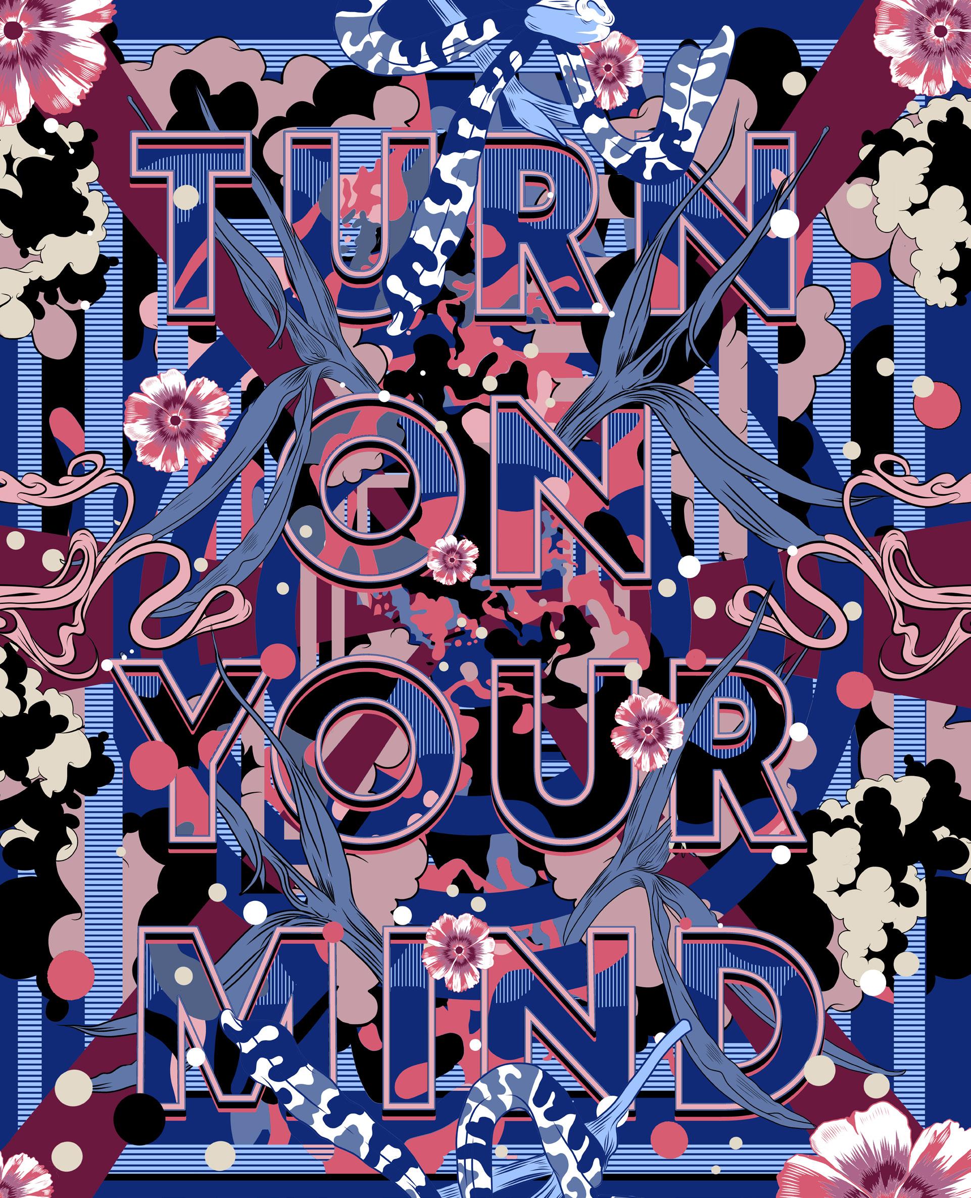

' Turn on your mind ' (2018). Original artwork. Mixed media: screen print & digital.
So, after the VFX work, you went back to doing your own thing. What happened then?
There was this five to seven year period where something switched on and my career really took off in a very fast way.
I started to work large scale, I started to share my process on Instagram, and I organically grew a following. Then I got an agent in America. So within a short space of time, I got a huge number of mural commissions, and I started to be known on a global scale. The client work just mirrored that particular moment. And I just went with it!
I was also speaking in a lot of design conferences and being able to connect with the design community in that way. The pinnacle of it happened right before Covid. The lack of travel was what stopped the large scale mural stuff.
" Then I went large scale, and something just clicked. "
What kind of clients are coming to you these days?
Pre-Covid, I was basically saying yes to everything and going from one thing to the next, traveling a lot fulfilling these big projects. COVID meant that I had a chance to sit still for a minute. I had this amazing studio space, which is the one that I just left. So in my downtime I started to explore more painting on canvases, revisiting some different graphic styles. I went back to the analog and said no to client work, just for a while, just to be able to find my voice again, at a slower pace.
Over the last five years I've done smaller commissions. Packaging, and book covers, that type of thing. That would be my bread and butter digital design work, while I was experimenting with new ideas and finding myself again as an artist, ready for this next chapter.
What is the title of this new chapter?
I'm moving to London and I'm doing a Masters in neuro-aesthetics.
That sounds amazing, what is neuro-aesthetics?
I say it's ' brains plus beauty! ' It's the neuroscience and the psychology of how we process aesthetic experiences. So I'm very excited.
London will be quite a change from Sydney
I've traveled so much with work, but I've never actually lived somewhere else. So this will be something different, closer to Europe. I'm just excited to explore something more theoretical.
I get really inspired by ideas and things that are unknown. So I'm already imagining intricate diagrams of brains, doing calligraphy with brain scanners on and just seeing what opens up in this next chapter.
I couldn't handle it. I had to take time out to recover from the intensity, and I thought, " What is going on here? "
It was almost like some drug or alcohol, and perhaps that ' s another reason why I ' m interested in neuroaesthetics. Maybe I ' ll even learn tools that could help younger creatives navigate that experience, because it is complex, it ' s not a throwaway.
You mentioned Instagram. Was that an important tool for you?
It played a huge role in the beginning. It was really important for promoting my work and sharing my experiments.
But I stepped back for about three or four years, because I started to notice how much it was taking my attention away from actually getting things done. And it was starting to shape every creative decision I was making.
I would post a mural completion and it would be just one photo for a full month of work, all this effort and energy. And the rush that would come when I engaged with the audience looking at the work,
So now, I'm ready to come back in a different way. I'm cautious, I only go on Instagram for maybe half an hour a week. I've reclaimed so much of the way that I work that I feel comfortable now working without it being a driving force. However, I do think that disconnecting from it is important.
' Lucky ' (2018). Screen-printed artwork.
" I'm moving to London and I'm doing a Masters in neuro-aesthetics. "

You ' ve used typography and illustration to make words dance. Are you tempted to make sentences sing?
Initially, my eye was drawn to this idea that was truly amazing, the alphabet. Then using short words in a lot of the installations was partly an aesthetic decision. For example, the word ' Joy ' , it can be quite a neutral word, it ' s not overloaded with meaning. So the text was a container for the illustration.
But when I had my time off in the studio I wanted to bring more of my own story or my ideas or words into what I create. And that ' s where I started to explore longer phrases. Nothing too long yet. The last one I did said, " let go. " And then there was some that were more specific to experiences in Sydney, where I was using words, like " Day Moon Over Shark Island " , to describe what I was seeing, playing around more in the contemporary art world approach to using words. But the ultimate goal is to bring in more of my experience or reflection, or philosophical thoughts, into the text that I choose. That ' s one path.
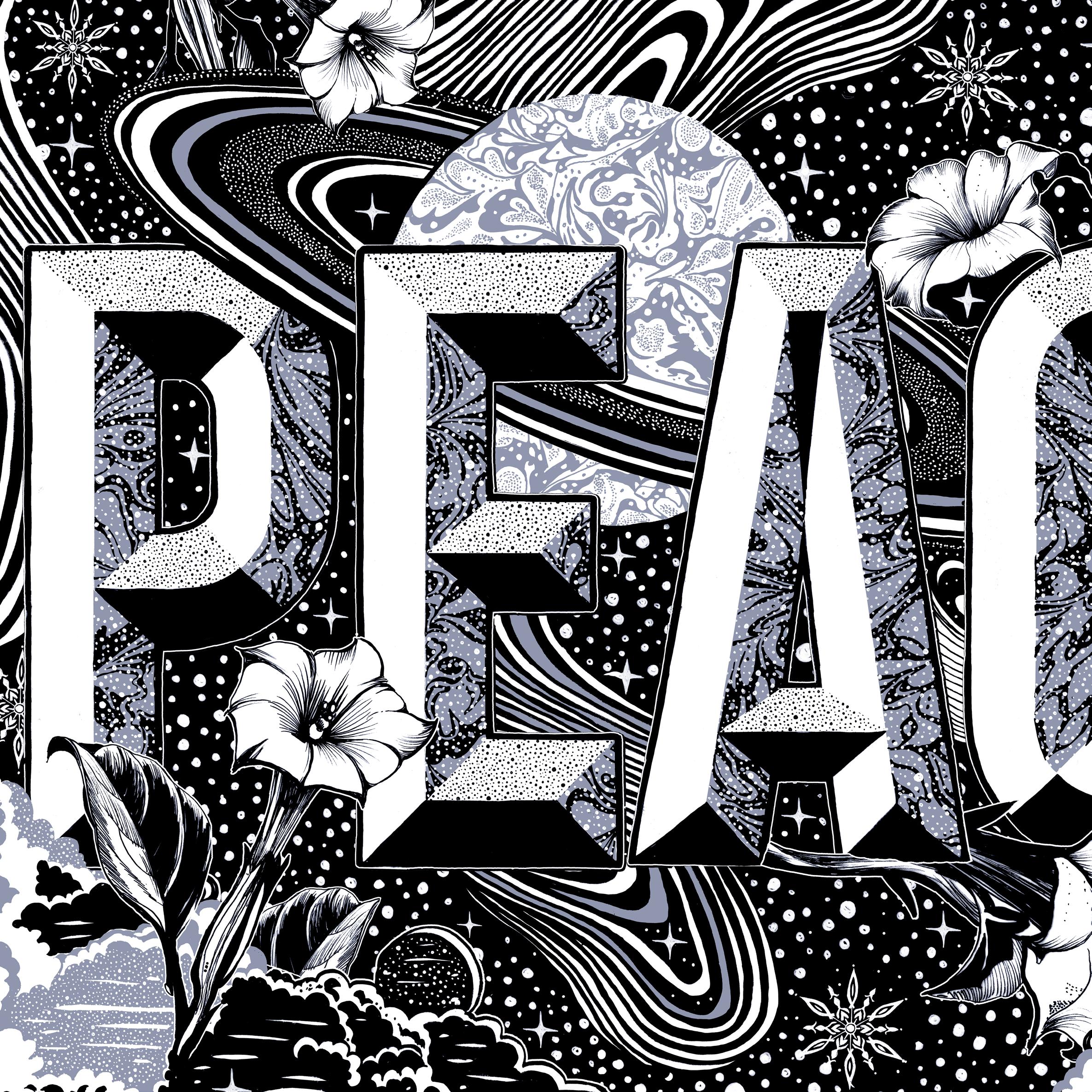
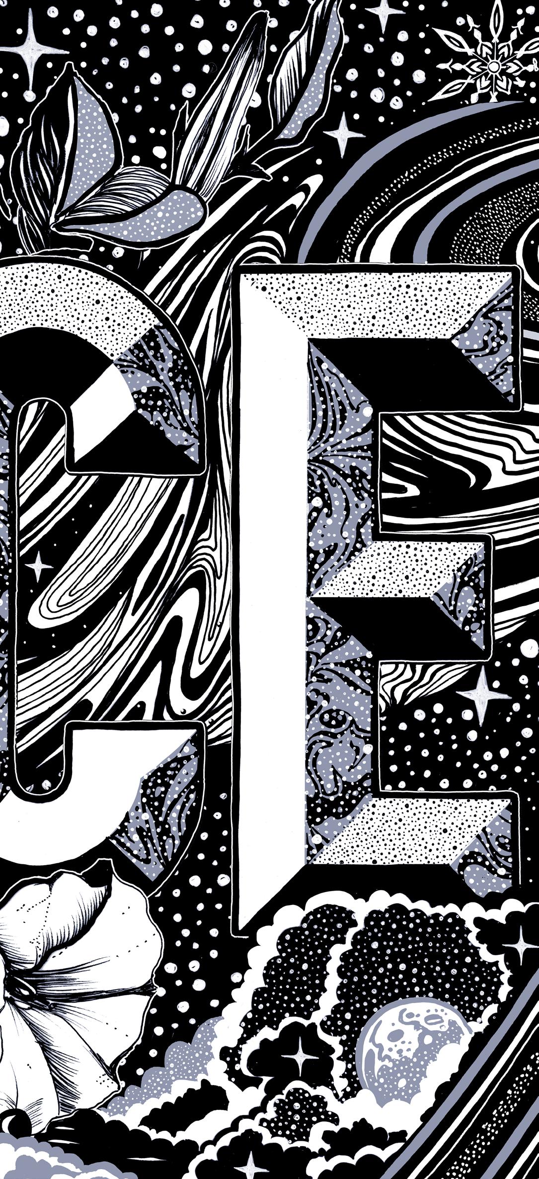
' Peace ' (2015). Original artwork, originally commissioned by Urban Outfitters USA.
Looking at it more from this neuroaesthetic point of view, it will be interesting to studying how we respond to different languages or different words in a more scientific way, while allowing the beautiful side of it to still exist in that framework. So, stay tuned!
LAURA STRAßER Product Design 2017
PHOENIX DESIGN Industrial Design 2018
43 UWE R. BRÜCKNER Scenography Design 2018
44 BROUSSE & RUDDIGKEIT Design Code 2018
45 ISABELLE CHAPUIS Photography Design 2018
46 PATRICIA URQUIOLA Product Design 2018
47 SARAH-GRACE MANKARIOUS
MARC TAMSCHICK Spatial Media Design 2020
54 TYPEJOCKEYS Type Design 2020
55 MOTH Animation Design 2021
56 JONAS LINDSTRÖM Photography 2021 57 VERONICA FUERTE Graphic Design 2021
58 CHRISTOPHE DE LA FONTAINE Product Design 2021
59 DAVID KAMP Sound Design 2021 60 THOMAS KURPPA Brand Design 2021 61 NEW TENDENCY Product Design 2022
62 MARTHA VON MAYDELL Illustration Design 2022
63 STUDIO KLARENBEEK & DROS Design Research 2022
64 JOUPIN GHAMSARI Photography Design 2022
65 LOTTERMANN AND FUENTES Photography Design 2022
66 SUPER TERRAIN Graphic Design 2022
67 EIKE KÖNIG Art Design 2023
68 CHRISTOPHER NOELLE Light Design 2023
69 DENNIS HINZE Sport Fashion Design 2023
70 KLASIEN VAN DE ZANDSCHULP Interactive Design 2023
71 VALENTIN VODEV Industrial Design 2023
72 GERMANS ERMICS Sculptural Design 2023
73 MADE BY JAMES Type & Logo Design 2024
74 SNASK Branding & Video 2024
75 CRAFTING PLASTICS! STUDIO Design Research 2024
76 STUDIO BRUCH Graphic Design 2024
Design Friends would like to thank all their members and partners for their support.
COLOPHON
PUBLISHER Design Friends
COORDINATION Guido Kröger
LAYOUT Guido Kröger
INTERVIEW Mark Penfold
PRINT Imprimerie Schlimé
PRINT RUN 250 (Limited edition)
ISBN 978-2-919829-05-7
PRICE 5 €
DESIGN FRIENDS
Association sans but lucratif (Luxembourg)
BOARDMEMBERS
Anabel Witry (President)
Guido Kröger (Treasurer)
Heike Fries (Secretary)
Vera Heliodoro, Reza Kianpour, Hyunggyu Kim (Members)
COUNSELORS
Zoë Mondloch, Hyder Razvi, Olga Silva, Silvano Vidale
Support Design Friends, become a member. More information on www.designfriends.lu
Design Friends is financially supported by
This catalogue is published for the lecture of Gemma O'Brien "Words That Bloom." at Mudam Luxembourg on 9th of October, 2024 organised by Design Friends
