


PERI, the smallest integral driver perimeter fixture, delivers 1000+ lm/ft at 90+ CRI and multiple optic options. Ideal for shallow plenum spaces, it’s compatible with multiple ceiling types, and its modular assembly allows for easy installation.




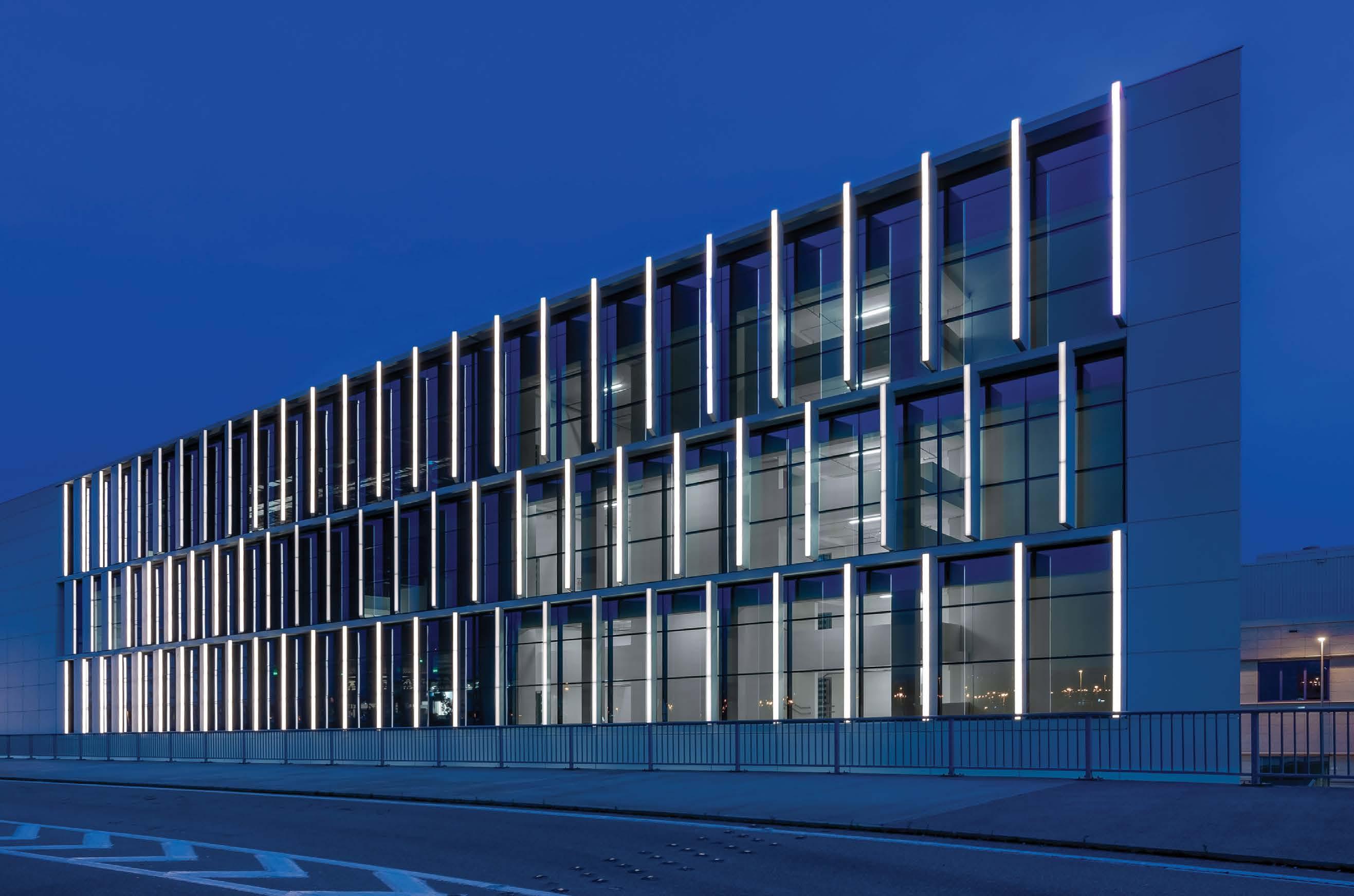





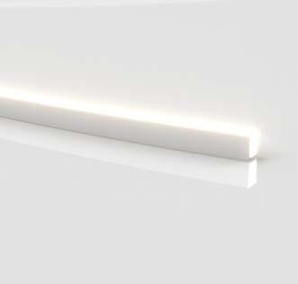
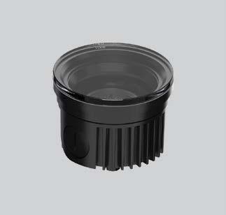




Linea Light o ers facade lighting for every need, with a wide range of available optics and outputs, white light or RGBW, glare control options, high-quality construction, AquaStop® conductor waterproofing and resistance to vibration, stress and impact.
By Mariana G. Figuiero, PhD and David Pedler, BA
Randy Reid
Vilma Barr




By David Warfel
Lighting
By Craig DiLouie, LC, CLCP
By Christina Halfpenny
Mitigating
By Jack O’Hanlon
By Parker Allen

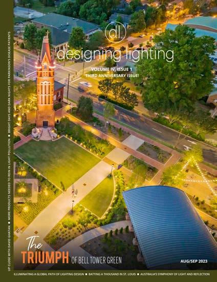

Editorial Director: Randy Reid
Publisher: Cliff Smith
Director of Audience Development: Angie Hullfish
Contributing Writers:
James Benya PE, FIES, FIALD Benya's Art & Science Contributor Principal at Design Services, Inc. and The Benya Burnett Consultancy


Shirley Coyle Up Close Contributor Principal at RELEVANT LIGHT Consulting Inc.
Craig Dilouie Get Control Contributor Principal at ZING Communications
Stefanie Schwalb
Hospitality Lighting Contributor Interim Managing Editor at Boston Magazine
David Warfel
Residential Lighting Contributor Founding Designer Light Can Help You
Staff Writers: Parker Allen
Published by EdisonReport 1726C General George Patton Dr. Brentwood, TN 37027
Phone: 615-371-0961 designinglighting.com
designing lighting is focused on the Business of Lighting Design™ and provides business information to the lighting design community. In addition to the website, designing lighting publishes bi-monthly online magazines featuring original content, interviews within the community and highlights successful award winning lighting designs. While designing lighting is based in the U.S., it has contributors from Europe and is developing a global presence.
(ISSN 2693-9223)
Statements and opinions expressed in articles and editorials in dl are the expressions of contributors and do not necessarily represent the policies or opinions of the EdisonReport. Advertisements appearing in the publication are the sole responsibility of the advertiser.
As designing lighting (dl) enters its fourth year, we express our sincere gratitude to the lighting design community for standing by our side. When we launched, we were unknown and faced some skepticism. Even our long-time friends at the IALD weren't sure what to make of us.
Now, things have changed. Today we proudly stand as advocates for lighting designers, architects, engineers and other specifiers with a strong commitment to elevating their work. Instead of us reaching out for interviews, the design community is reaching out to us.
Now manufacturers have embraced our platform, urging us to feature their work. However, our first question remains consistent: "Who is the lighting designer/specifier?" This query is a reflection of our dedication to celebrating the work of true lighting design professionals. While some manufacturers proudly handle the design themselves or opt for in-house solutions, I remind them that those in-house designs help to eliminate the professional specifier and we politely pass on those opportunities.
Because of designing lighting (dl)'s success, we recently launched designing lighting global (dlg). As the name suggests, dlg focuses on top-notch lighting project design worldwide. Our “mother ship,” designing lighting (dl), serves the North American lighting design community, while dlg caters to the rest of the world. Our dlg editor, Ray Molony, is a guru in the EU market, bringing a long track record of valuable insight.
Sometimes we are asked why we feature projects from other countries in dl. One wonders if it's better suited for the global issue. The answer is simple: North American lighting designers are interested in the best lighting design globally. So, we believe in sharing these stories across the board.
While dlg maintains its global focus and dl caters to North America, there's a bit of overlap. There is no shortage of amazing projects worldwide, more than two magazines can cover, but we're committed to showcasing as much as we can.
Moving forward, we extend a big thank you to the lighting community. Your support drives us to continue celebrating your outstanding work. We're excited to see what you'll share next, and together, we will keep shining a light on exceptional design.

By
As we practice and teach lighting design, many lighting designers employ an approach that involves combining layers of light into a composition. In my textbook, Lighting Design Basics,1 I teach my personal layering approach that includes the ambient lighting layer, the task lighting layer, the focal lighting layer and the decorative lighting layer. But I devised this system in the 1980s and 1990s, long before LEED, WELL and especially, LED lighting and networked lighting controls. In my last article, I admitted that an update was probably due because lighting design should embrace daylighting as an integral part of lighting design, so I decided to add the daylight layer to my philosophy.
I think many lighting designers consider fenestration (i.e. windows, skylights, clerestories, etc.) and their various shading systems to be a “given” with which the lighting designer is stuck. Decisions about daylighting are often made long before the lighting design for a project was ever considered, and in all fairness, daylighting choices depend significantly on architectural reasons that tend to favor overall building aesthetics, view, energy efficiency and building economics. Some spaces will enjoy plentiful natural light throughout the day, some will be in the dark, and some will need shading to reduce direct solar glare. But, for practical and economic reasons, most fenestration consists of view windows for which manually operated shades are provided, and electric lighting works to ensure adequate illumination for indoor spaces regardless of windows and skylights, and of course, on cloudy days and at night.
I like to practice lighting design that includes daylight. I love architecture and helping an architect, or an architectural team, resolve design problems. Over a number of years, I developed skills in daylighting design and analysis and learned its language and technology. We lighting designers have a definite technical advantage because we understand the radiant energy spectrum and its energy implications, and our everyday lighting software permits us to rapidly study and assess design alternatives. And I definitely think lighting designers have the artistic advantage of seeing light when others see objects, and we are at our best when we create scenes consisting of light, dark and shadow.
That said, learning technical daylighting skills is fun but challenging. To start with, daylight can have a tremendous impact on the energy use of the structure. On a clear day at noon, the sun produces 10 watts per square foot of radiant energy, which is about 50% visible light and 50% infrared light.
Welcome in the winter, this radiant energy is 20-30 times the heat load of a modern lighting system and more than 200 times the amount of light needed in most commercial buildings. A combination of energy codes and modern shading and glazing systems work to ensure that the daylight entering occupied space is limited to a reasonable amount. But codes can’t predict the shape, size or orientation of a building, and the challenge of daylighting design remains how to ensure that the right amount of daylight is allowed inside. At the top of the list, you should learn about solar heat gain coefficient and one of the greatest inventions of the 20th century, low-emissivity (“low-e”) glazing, a coating on windows and skylights that rejects infrared light. The best low-e commercial glazing systems tend to be the most expensive, so learning when to use the best and when it is not that important is a valuable skill that will save your clients’ money.
I think the second most important skill is shading and diffusing. Shading can be simple. You should learn about the alternatives, both interior and exterior. A good example is the Arbol de la Vida dormitory community at the University of Arizona.2 Completed in 2011, this 335,000 SF, 1,088-bed LEED Platinum residence hall complex features a highly efficient building envelope, watersavings systems, daylighting, and technology to reduce energy use. In addition to using the highest performance low-e glass in insulated window assemblies with privacy curtains, simple shades on the exterior are used to reduce the sunlight striking the window on sunny days. The combination reduced the energy use for air conditioning substantially, achieving a 3-year payback over the architect’s original concept and elevating the buildings from LEED Gold to Platinum.
The third skill set is perhaps the most difficult. Zero-net energy buildings beg the design team to pursue every possible avenue of energy efficiency to conserve precious alternative energy source capacity. Generally the best opportunities involve schools in temperate climates where nighttime energy use can be almost zero (see sidebar). Depending on the climate, surrounding buildings and structures, building program and project aspirations, you and the architectural team may chase a lot of possibilities. You will soon realize that LED lighting and code compliant lighting controls have become so energy efficient that it will be very easy to make electric lighting the star of the show – other than daylighting, of course. Can you design a building that does not use electric lighting at all during the day?
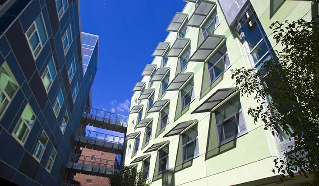
Simple perforated shades provide a significant reduction in solar heat gain while preserving view.
Photo credit unknown. Image posted without credit on the University of Arizona website https://housing.arizona.edu/dorms/ arbol-de-la-vida
To round out one’s daylighting skills, the most important lesson we have learned in the past 20 years has been that light and daylight can have a profound impact on the health and wellbeing of building occupants. Our industry rose to the challenge, and today, we have several standards including the WELL Building Standard and UL Design Guideline 24480. Both are concerned with the spectrum of light, illuminance levels, and the exposure to the combination experienced by people in each space. These guidelines can be met using electric lighting or daylight.3
But – wait. There is an issue beyond spectrum and lux. Lisa Heschong is an architect who received a 2023 EdisonReport Lifetime Achievement Award for her work in daylighting. Among her most impactful research findings was discovering and documenting the importance of view in school classrooms. It’s an honest question whether something more complex is involved with looking out the window that can’t be measured in melanopic lux. Her findings correlated student test scores with types of classroom fenestration, finding that looking out the window may in fact have significant importance in human wellbeing and learning. So, just because daylight happens to vary and change throughout the day and year doesn’t mean we need to build concrete boxes without fenestration but with technically correct melanopic lighting. While the WELL standard emphasizes spectrally correct light exposure throughout a “workday,” it should be honestly questioned whether the quality of nature’s own light provides something substantive that is hard to beat and free of charge through windows and skylights. Maybe the fourth skill set is being conscious of what we can’t measure but we know works.
Finally, there comes the question of how we move forward as an industry. Several years ago, I worked with Professor Robert Koester at Ball State University’s School of Architecture to develop and teach a semester studio called “Daylectric Lighting.” A visionary architect and fabulous teacher, Bob created a senior level architecture studio in which student teams were challenged to design a two-story civic building in Muncie, Indiana. After helping set up the design challenge and teaching what I presented here, the students were turned loose, and I returned to work with each team in a studio and crit format. I was overwhelmed by the quality of their work! This makes me think that access to daylight and one’s circadian rhythm is natural, and, with the right design direction, many architects intuitively grasp good lighting and daylighting ideas. But, they do better when the boundaries are opened, and some guidance points them in the right direction.
For sure, there remains a level of daylighting expertise well above mine. For instance, a decade ago I took a week-long seminar at Harvard’s Graduate School of Design with Christoph Reinhart (now head of MIT’s Sustainable Design Lab) and developed some valuable knowledge and skills, an investment well worth the time and cost. For quality education in daylighting, you might also check out Velux, the international skylight manufacturer, who offers live and online daylighting classes throughout the world. Kalwall, a company that makes insulated light diffusing panels for walls and skylights, offers online education and design assistance in their products and technology. And of course, advances in building computer modeling have provided a useful level of daylighting design and analysis support. With the rewards from WELL and UL for achieving daylight-quality light at appropriate times, adding daylighting to your lighting
design skills will be natural for many. You will be surprised what a difference you can make, even if your contribution is as modest as helping select the right type of fenestration and the right amount of daylight and spectrally tuned electric light to achieve melanopic goals. ■
A Zero-Net Energy (ZNE) building typically employs photovoltaic (PV) panels to support energy use by day while sending excess capacity to the grid, and then to draw power from the electric utility at night. The strategy is to minimize energy use overall to reduce the cost of the PV array, and then turn off darn near everything at night. At the Redding School for the Arts, we did everything in the book, including using motion sensors for outdoor lighting.
But, upon system startup and testing, there was a mysterious 10 kW of power being consumed all night! A long evening of sleuthing turned up four unexpected power users: an oversized sub-transformer, reptile environments with all-night heaters, an extremely inefficient commercial milk refrigerator required for schools by the state, and two high-capacity chargers for golf-carts used by maintenance personnel. Not to be deterred, more PV panels were added to the point where the School generated more net positive energy during the day to achieve Net Zero and LEED Platinum.
If you have a spectrometer or a keen eye for color, you will notice that the most efficient low-e windows increase the color temperature of the transmitted light. Because the objective of low-e windows is to eliminate infrared light, the more energy efficient they are, the more they reduce the red end of the visible spectrum. Since the short wavelengths produce the most melanopic response, I don’t think that this is a problem. Anyone for 5500K?

Each classroom employs a large central skylight with operable louvers to “dim” the light on sunny days and still provide adequate daylight on Oregon’s gray winter days. The artful shading system creates direct/indirect light. A joint effort of Kent Duffy, FAIA (then Principal of SRG), Professor Brown and me.
Image: srgpartnership.com
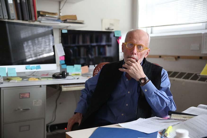
Photo Credit: https://designfacstaff.uoregon.edu/remembering-g-z-charlie-brown/
One of architecture’s greatest professors of daylighting, G. Z. “Charley” Brown (1943-2020), was both a mentor and a nemesis to me. As a member of the faculty of the University of Oregon, he worked with me on a number of projects and issues during my 17 years in Oregon. We did not always see eye to eye, but I was always better for the experience.
1 Karlen, Benya and Spangler, Lighting Design Basics, Third Edition 2017. The layering system described above was originally written for the First Edition and is essentially the same in all three Editions.
2 AR7 Architects, ME Engineers, Monrad Engineering, Inc. and Benya Lighting Design, Edison Award for Environmental Design, 2011
3 When we designed the world’s first LEED Platinum/WELL Platinum project, we employed north-facing windows to provide plenty of melanopic light almost all the time during the day. We had to fight with WELL to allow daylight to meet their first-generation standards, because when measuring melanopic light levels, WELL demanded that the window shades be closed!

New York Urban Oasis
Revitalization through ERCO
• Upgrading the exterior space of a skyscraper icon
• One luminaire, two light colors: different color temperatures for plant growth
• Sophisticated natural experience with efficient lighting
• Recreation space for all, in the middle of nature
Product Used: Kona
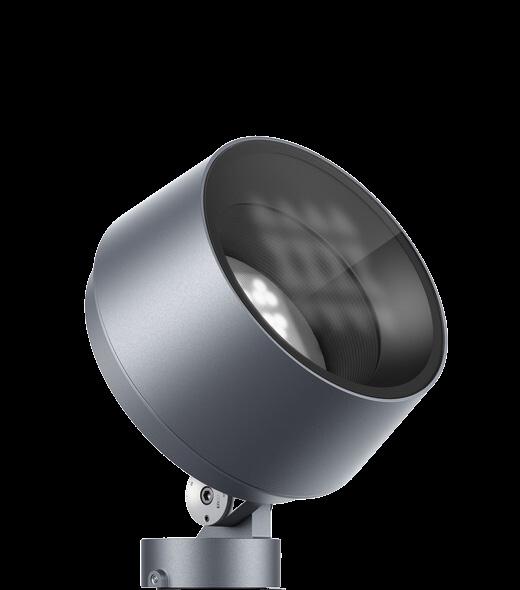
This luminaire is suitable for illuminating large buildings and objects. From focused lighting from a long distance to floodlighting and uniform wallwashing: all’s possible.



RANDY REID By

The landscape of the lighting industry, much like the kaleidoscope of architectural wonders across continents, is ever evolving. I recently sat down with Nitika Agrawal, an adept lighting designer with a unique multinational perspective. Nitika's experience spans various roles in different geographies (Europe/ India/Middle East/US), allowing her a fresh and global perspective on the Business of Lighting Design™️.
Nitika's journey began in her native India before she moved to London to broaden her architectural design perspective. Recognizing the value of a global outlook she studied at the University College London, a leader in architecture and environmental studies.
After earning her master's degree, Nitika started her professional career in London at AECOM. A market teeming with opportunities for lighting designers and the lighting industry, London provides a perfect platform for networking and collaboration. Often referred to as the heart of global lighting design, it offers a vibrant and flourishing community of lighting designers. Nitika notes, "London is a place to do a lot of socializing and affords many networking events."
Her responsibilities with AECOM in London offered her extensive experience in the UK and also exposed her to India and the Middle East. Nitika highlights the intense working conditions as the Middle East is bursting with new construction. The conditions, especially for foreign workers, can be grueling. While London is known for demanding work hours, Abu Dhabi takes it one step further.
In London, a 40-hour workweek is common, but working conditions in Abu Dhabi are more rigorous. It is not unusual to find laborers working up to 60 hours a week, often at night due to extreme daytime temperatures.
However, it's not all rosy in London. The high
concentration of designers in London has resulted in lower fees, which Nitika was unaware of when starting her career due to her focus on her passion for the city.
In a talk at the IALD Enlighten Americas, Andreas Schulz, founder of Licht Kunst Licht, explained that fees were half of what they were in 1992 when he began his career in lighting design.
After almost five years in London, Nitika relocated to Munich, Germany. Drawn by Munich's balance of urban and natural life, she desired a change from the concrete-dominated landscape of London. Munich's appeal lay in being closer to home, and the opportunity to explore the manufacturing side of lighting, particularly the specialist lighting sector.
Nitika began working for Zumtobel, where she was the only lighting designer in their Munich office. Her responsibilities spanned managing and executing projects in Bavaria, working closely with teams in Austria, and even outsourcing work if needed.
During the pandemic, she embarked on a new venture and founded her own lighting design firm, named Light Dew. With clients in the surrounding Munich area, she expanded her portfolio and adapted to a more flexible work environment.
Starting a consultancy in the midst of the pandemic was no easy task. Nitika relied on various strategies to build her client base, including launching a website and utilizing social media such as Linked In. She also sent cold emails to potential clients, primarily targeting electrical engineers, who played a key role in securing lighting contracts in Germany.
Nitika's work in Germany was predominantly with the German government, focusing on heritage projects. Collaborating closely with electrical engineers and attending government meetings, she navigated Munich’s unique market dynamics.
In many countries, architects may take the lead in hiring lighting designers, but Germany offers a different perspective. It's more common for an electrical engineer to select a lighting designer.
This approach reflects the country’s emphasis on technical precision and engineering expertise. In other regions, architectural aesthetics might lead the decision-making process, but, in Germany, electrical engineers often hold the initial contract for lighting. They will evaluate technical requirements, adherence to standards, and integration within the electrical systems before considering a lighting designer.
Unlike a traditional hourly billing system, Nitika quotes German projects as a package, offering a lump sum fee based on the time and expenses. She charged higher rates in Munich compared to London, though these rates were offset by higher expenses, including insurance.
The move to Munich required a comprehensive
understanding of market differences. Nitika observed significant differences in working with architects and engineers in Germany, as well as the contrasting cost of living between Munich and London.
When Nitika married, she and her husband moved to the San Francisco Bay where she joined the esteemed Banks Landl Lighting Design. Nitika's insights on independent lighting design firms were enlightening. These firms have a singular focus on lighting, allowing for a nuanced emphasis on aesthetics over numbers.
Later she joined AlfaTech, an MEP (Mechanical, Electrical, and Plumbing) firm, where lighting typically becomes a segment of a comprehensive package. This can make the work either invigorating or mundane, depending on project specifics. However, an MEP firm offers a broader perspective, aiming for sustainability and other engineering standards.
Nitika experienced a significant change in software when she moved from Europe to the United States. DIALux and AutoCAD reigned supreme in the Middle East, India, and across Europe. However, the US seemed more attuned to AGi32 and Revit.
"It’s fundamentally about understanding the lighting intricacies. It doesn't matter what software you wield; the essence remains in comprehending the core," Nitika shared with a chuckle when asked about the switch.
"While you might charge two to three times more in the US than in London, it balances out with living expenses," Nitika explains. Silicon Valley is understandably pricey, making services expensive.
In Germany and the UK, the approach to employee benefits, specifically sick leave, is an interesting contrast to the US. In these European nations, it's common for workers to receive between 25 to 30 days of annual leave, with up to six weeks additional paid sick leave. The focus is on worker well-being and
a commitment to balanced work-life integration.
In the US, however, while the compensation might be higher, American workers typically do not enjoy the same level of holidays and leave. The absence of this benefit is seen as a trade-off for the potentially greater earning opportunities in the US.
In Europe, especially London, designers relish a broader canvas for innovation. The US, although potentially more remunerative, tends to gravitate towards off-the-shelf solutions. Specific state regulations, like California's Title 24, also shape design choices. "In Europe, you're more liberated in your design approach," she emphasized.
The climate in a region plays a substantial role in shaping lighting design requirements. California's abundant sunlight leads to a preference for dimmer light levels. Conversely, the UK's grey winters necessitate higher light levels.
The differences in how the general public perceives and utilizes light also lead to distinctive design philosophies. In the US, there's a preference for indirect lighting, while Europe favors more direct illumination.
Nitika's perspective offers an insightful glimpse into international lighting design. Her experiences, observations of market trends, and challenges paint a rich portrait of the business as it stands today. These reflections are sure to remain essential for professionals maneuvering the multifaceted domain of worldwide lighting design.
In today's swiftly globalizing landscape, recognizing the subtleties of various markets is more vital than ever. While each region presents distinct opportunities, it's essential for designers to approach them with mindfulness and compassion. Every locale brings unique challenges and possibilities, and for those passionate about lighting design, the world becomes a stage ready to be artfully illuminated. ■

Nitika's perspective offers an insightful glimpse into international lighting design. Her experiences, observations of market trends, and challenges paint a rich portrait of the business as it stands today.
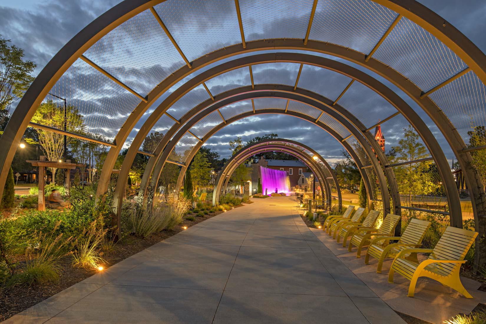
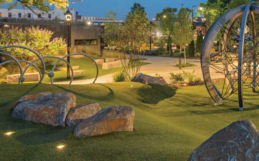
Bell Tower Green is a beautiful 3-acre public park in Salisbury, North Carolina and is the most significant downtown green space. The project features the small yet mighty JUPITER and JUPITER MINI compact inground luminaires, as well as the playful accents of the compact, direct view SATURN

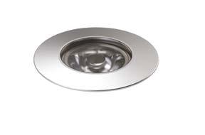

JUPITER & JUPITER
Landscape Design: LandDesign

By
For the better part of 20 years, we at the Light and Health Research Center (LHRC) have explored non-pharmacological tailored lighting interventions (TLIs) for promoting synchrony between the human circadian system and the solar day. Achieving this synchrony has been proven to alleviate the ill effects of circadian disruption among populations as diverse as Alzheimer's disease patients, shift-working nurses, school children and US Navy submariners. Our last article in designing lighting reported on the use of light tables to help Alzheimer's disease patients sleep better. Here, we report on a pilot study designed to extend our research to people with Parkinson’s disease (PD) to determine whether a TLI would improve subjective and objective measures of nighttime sleep as measured by questionnaires and actigraphy. The secondary aim was to determine whether the TLI would improve measures of mood symptoms.
Our premise is simple math: brighter days + darker nights = better quality of life. Simply put, a robust light-dark pattern delivering bright days and dark nights will help synchronize the biological clock with the solar day and foster circadian entrainment that leads to better sleep. Better sleep, in turn,
promotes well-being and improves mood.
PD is the second most common neurodegenerative disorder (behind Alzheimer's disease) afflicting American adults, usually first appearing as a slowing of motor movement accompanied by tremor while resting and rigidity later in life. These and numerous other non-motor symptoms (loss of smell, mood disorders, sleep problems, cognitive changes, etc.) profoundly impact quality of life for patients and their caregivers. There is growing evidence that the disruption of circadian rhythms — that is, bodily functions/processes that repeat every 24 hours (on average) — may also play an underlying role in PD patients' disordered sleep,1 perhaps even contributing to the development of the disease.2
Following specifications proven in our previous studies,3, 4 the TLI was carefully designed to provide a robust light–dark pattern to maximally stimulate the human circadian system based on the mathematical model of circadian stimulus (CS) developed by Rea and colleagues.5, 6 Our research has shown
Nearly 1 million Americans are presently living with Parkinson's disease, and at an estimated annual increase of 90,000 new cases that number is expected to reach 1.2 million by 2030.
that providing a criterion CS value of 0.3 improves sleep, mood and behavior in Alzheimer's disease patients.7, 8 The LHRC research coordinators who installed the lamps in participants' homes ensured that measured light levels 18 inches from participants eyes were no less than 400 lx, which was equivalent to the criterion CS of 0.3 using these particular lamps. This is also consistent with recommendations from the UL 24480 Design Guideline.9 Critically, the TLI distinguishes itself from other potentially low-compliance devices by offering participants a variety of simple, unobtrusive options for the light's delivery — in this case permitting them to use otherwise conventional table and floor lamps rather than having to remain still in front of a light therapy box.
The light source in common with both TLI lamps was an A23 LED bulb emitting 3200 lumens of 3000 K warm white light (Green Creative, San Bruno, CA, US), mounted on a rigid stand and enclosed by a 16-inch globular rice paper shade (Figure 1). The lamps were programmed to turn on at times preferred by individual participants, but by no later than 9:00 a.m. They remained on for 2 hours thereafter every morning for a period of 4 weeks.

Twenty participants with a mean age of 73.8 years (13 females) who had been living with PD for an average of 9.4 years were assessed for baseline sleep outcomes via wrist-worn rest–activity monitors over a period of one week. Their personal circadian light exposures (amount, spectrum, timing and duration) were measured using a Daysimeter.10 The same outcome measures taken at baseline were collected during the last week of the TLI, and statistical comparisons of the differences between the preand post-intervention data were made using t-tests.

Figure 2. Mean sleep start time was earlier (left) and mean total sleep time was longer (right) at post-intervention compared to baseline. Only the difference for total sleep time reached statistical significance (* p <0.05).
Compared to baseline, the participants' average sleep start time advanced by 19 minutes (p = 0.18) after the 4-week exposure to the TLI (Figure 2). This is consistent with our previous research showing that robust morning light exposures promote earlier bed and sleep start times.11 Though the difference between pre- and post-intervention was not statistically significant, the earlier sleep start time nonetheless appears to have contributed to a significant (p = 0.049) 20-minute increase in total sleep time, from 381.11 to 401.36 minutes. Overall sleep efficiency (time actually asleep ÷ time in bed × 100) in this PD cohort was 85% both pre- and post-intervention.
This pilot study demonstrates the feasibility of conducting a home-based, short-term TLI to ease the symptoms of PD and potentially lead to improvements in quality of life. In this small group, several sleep measures improved despite participants already having an overall baseline of good sleep efficiency. Additional analyses are underway to determine the TLI's effects on subjective sleep quality, daytime sleepiness, depression, anxiety and fatigue. Follow-up studies using longer intervention durations in a larger participant cohort are warranted to assess the TLI's effects, particularly in participants with poor baseline sleep.
This study also demonstrates two important points. First, light does not have to come from ceiling fixtures, nor must the light source be a cool CCT (i.e., ≥ 4000 K) to be effective. We used floor and table lamps located in the participants' sitting rooms to deliver ambient, warm color light that was brighter than that typically used in residential environments. Second, perhaps more importantly, the TLI's diffuse light was deemed comfortable and was very well accepted by the participants, which is not always the case with commercially available light therapy devices that deliver 10,000 lx at the eyes.
That a good number of participants kept the lights and continue to use them in the morning is a testament to the lamps' comfort and acceptability. Finally, this study supports the UL 24480 recommendation to deliver 400 lux at the eye for at least 2 h in the morning.9 Serving our participants a bowl of chili rather than just a hill of beans was easy and, as shown by our data, effective.
The authors would like to acknowledge funding from the National Institute of Neurological Disorders and Stroke (NINDS). The research for this pilot study was a supplement to an NINDS grant (5U01NS107016-05) awarded to Dr. Rachel SaundersPullman, Icahn School of Medicine at Mount Sinai. ■
1 Zuzuárregui JRP, During EH. Sleep issues in Parkinson’s disease and their management. Neurotherapeutics. 2020; 17: 1480-1494.
2 Verma AK, Singh S, Rizvi SI. Aging, circadian disruption and neurodegeneration: Interesting interplay. Experimental Gerontology. 2023; 172: 112076.
3 Figueiro MG, Plitnick B, Roohan C, Sahin L, Kalsher M, Rea MS. Effects of a tailored lighting intervention on sleep quality, rest–activity, mood, and behavior in older adults with Alzheimer’s disease and related dementias: A randomized clinical trial. Journal of Clinical Sleep Medicine. 2019; 15: 1757-1767.
4 Figueiro MG, Sahin L, Kalsher M, Plitnick B, Rea MS. Long-term, all-day exposure to circadian-effective light improves sleep, mood, and behavior in persons with dementia. Journal of Alzheimer's Disease Reports. 2020; 4: 297-312.
5 Rea MS, Nagare R, Figueiro MG. Modeling circadian phototransduction: Retinal neurophysiology and neuroanatomy. Frontiers in Neuroscience. 2021; 14: 1467.
6 Rea MS, Nagare R, Figueiro MG. Modeling circadian phototransduction: Quantitative predictions of psychophysical data. Frontiers in Neuroscience. 2021; 15: 44.
7 Figueiro MG, Plitnick BA, Lok A, Jones GE, Higgins P, Hornick TR, et al. Tailored lighting intervention improves measures of sleep, depression, and agitation in persons with Alzheimer's disease and related dementia living in long-term care facilities. Clinical Interventions in Aging. 2014; 9: 1527-1537.
8 Figueiro MG, Hunter CM, Higgins PA, Hornick TR, Jones GE, Plitnick B, et al. Tailored lighting intervention for persons with dementia and caregivers living at home. Sleep Health 2015; 1: 322-330.
9 Underwriters Laboratories. Design Guideline for Promoting Circadian Entrainment with Light for Day-Active People, Design Guideline 24480, Edition 1. DG 24480. Northbrook, IL: Underwriters Laboratories, 2019.
10 Bierman A, Klein TR, Rea MS. The Daysimeter: A device for measuring optical radiation as a stimulus for the human circadian system. Measurement Science and Technology. 2005; 16: 2292-2299.
11 Nagare R, Woo M, MacNaughton P, Plitnick B, Tinianov B, Figueiro M. Access to daylight at home improves circadian alignment, sleep, and mental health in healthy adults: A crossover study. International Journal of Environmental Research and Public Health. 2021; 18: 9980.
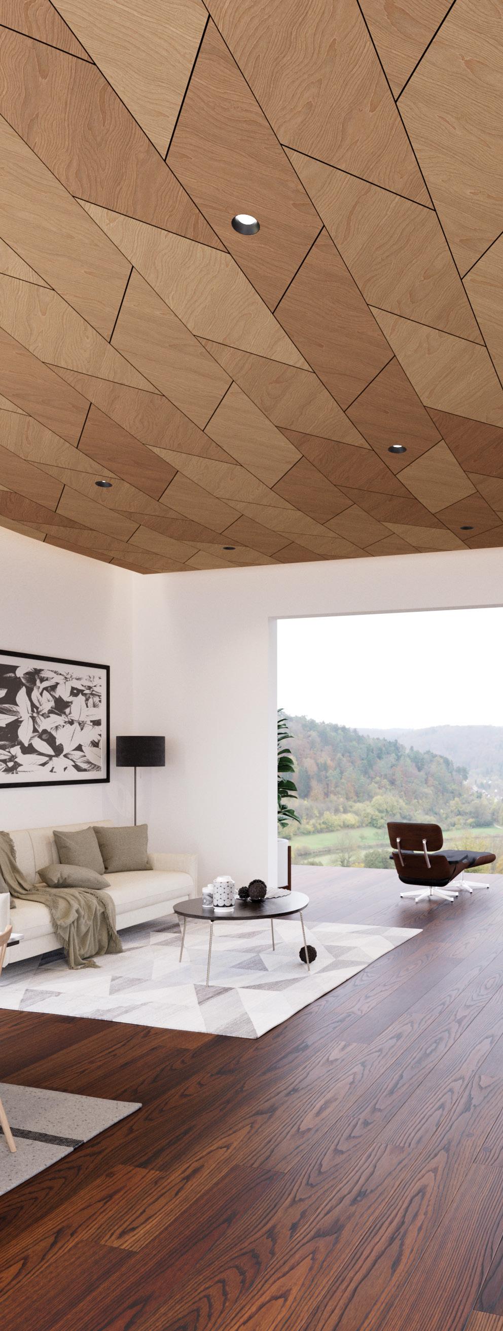
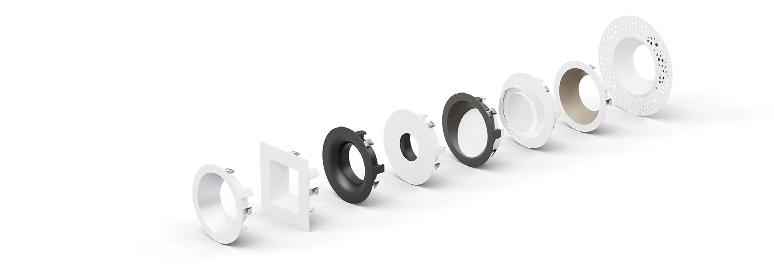
DMF Lighting’s DRD + M Series features new housings that install more easily and precisely, including flawless wood applications, and new trim colors in Bronze, Warm Diffuse and Clear Diffuse. DMF offers award-winning downlighting systems and superior aesthetics for new construction, remodel, or retrofit projects.


Historic Monument

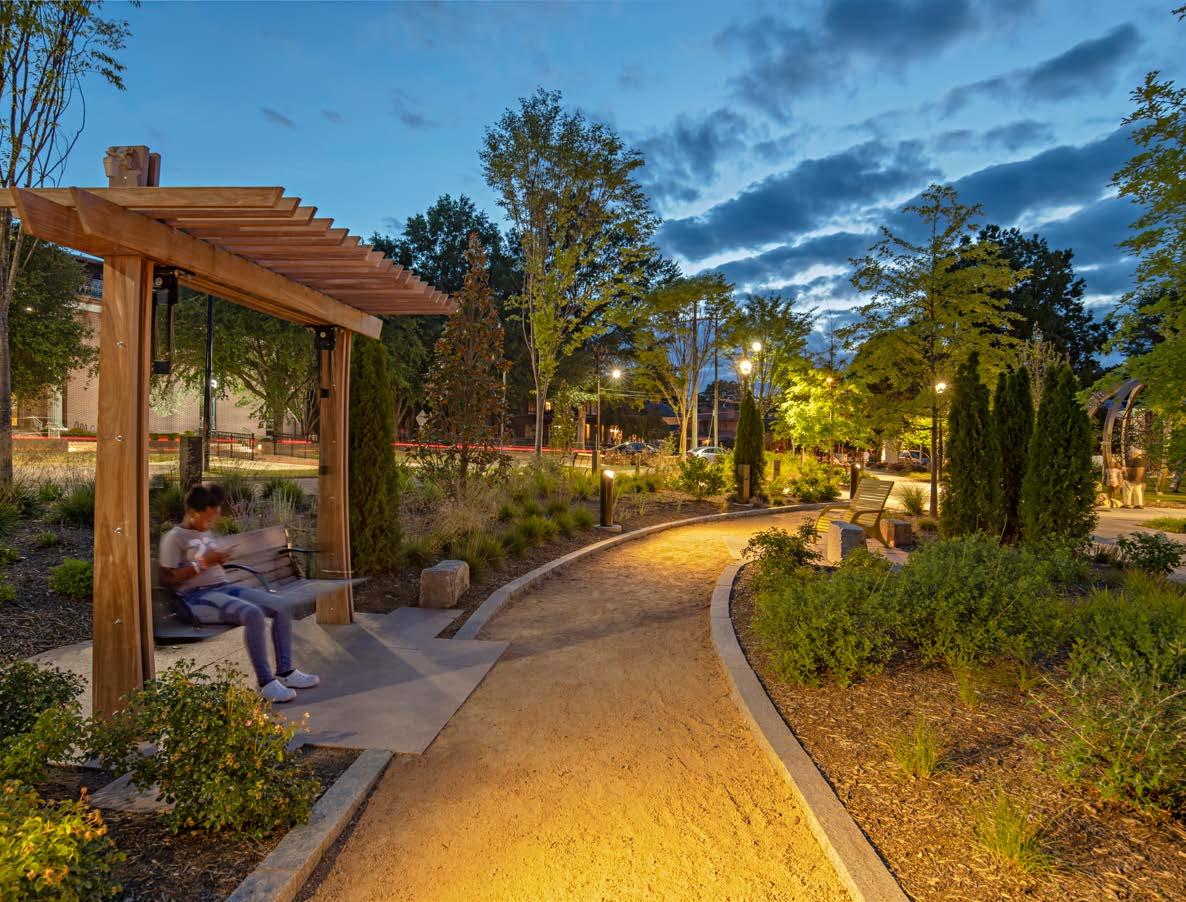
Bell Tower Green, in Salisbury, North Carolina, has been meticulously transformed into an illuminated work of art. Prior to the Bell Tower Green park, there were limited opportunities for outdoor recreation in downtown. The motto of the park fundraisers was “swapping asphalt for aspirations in Downtown Salisbury.” Those aspirations have been realized. During the IES Annual Conference, I met with Paula Ziegenbein, Principal of Hartranft Lighting Design, to uncover the careful planning and design that shaped the lighting of both Bell Tower Green and its immediate environs.
The landscape architect Land Design commissioned Hartranft Lighting Design for the project. The planning for the park's lighting commenced in March 2018, with the finalization of the lighting plans by April 2019. The lighting design, by firm Principal Andrea Hartranft, for the stage's lighting followed in 2020, culminating in the full installation amidst the COVID-19 pandemic.
The Bell Tower, erected in 1892, is not just a striking monument within the city; it is surrounded by a three-acre park that was transformed from a former abandoned parking lot into a thriving public space. Private funding of $13M came together to convert the lifeless space into a vibrant park with large lawn spaces, ideal for community events. From hosting local markets to being adorned with a Christmas tree during the holidays, the park has become a hub for various community activities—day and night.
“Three historic structures remain in the park, including the 1892 Bell Tower, the 1839 Female Academy, and the 1855 Session House. The design of the park focuses on these historic
structures and calls attention to the historic nature of the entire area," Paula shared.
The lighting of the Bell Tower is a fascinating blend of art and technology. The tower is lit from the ground using color-changing, exterior-rated fixtures. Paula was meticulous about the selection of luminaires, confirming the use of ETC's Desire D60 fixtures mounted on the ground to wash the tower. In addition, at the roof level, small color-changing lights from Insight Lighting enhance the overall ambiance.
The ground fixtures are mounted 6 to 10 feet back and operate at 124 watts. The D60 fixture from ETC features a seven-color LED array, using a medium oblong lens. The standard lighting for the tower is set at 3000 or 3200 Kelvin, with programmed scenes that allow for color changes during special events or awareness months.
There are also color changes at the very top of the tower. The roof structure is uplit by Insight Lighting's small floodlights, hidden behind the round turret fixtures. Additionally, encapsulated LED tape creates a color change effect around the turrets. The controls for the lighting are provided by ETC, with six pre-programmed scenes.
Bell Tower Green is a sizable area, with the tower located in the north corner. The stage, positioned at the upper corner of a rounded lawn, offers an enticing space for performances. An aerial view shared by Paula shows the strategic positioning of the Bell Tower and the stage, highlighting the harmony between design and functionality.
B-K Lighting was used for tree uplighting and set at 3000 Kelvin. Though some tree shadowing was experienced, the placement of the fixtures in the lawn ensured an impressive visual display. Unique lighting features, such as Aurora Light's pendant fixtures with perforated holes hanging from trees, add an artistic touch to the landscape.
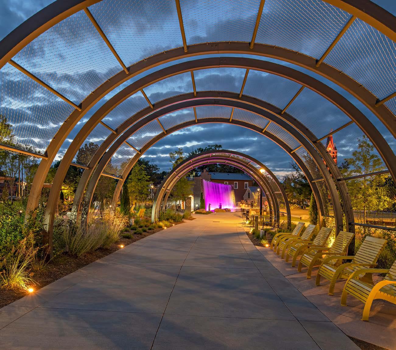
A captivating trellis structure, engineered to foster ivy growth, is artfully lit by Targetti's adjustable uplights. Each half-circle base is adorned with Targetti’s JUPITER in-ground luminaire in 3000K, utilizing a wide flood distribution. Though Paula's team did not oversee the lighting for the fountain, its design gracefully complements the overall aesthetic of the area.
In front of the tower lies a lawn trimmed with hedges laid out to replicate the footprint of a church once connected to the Bell Tower. The lighting designers chose to position miniature
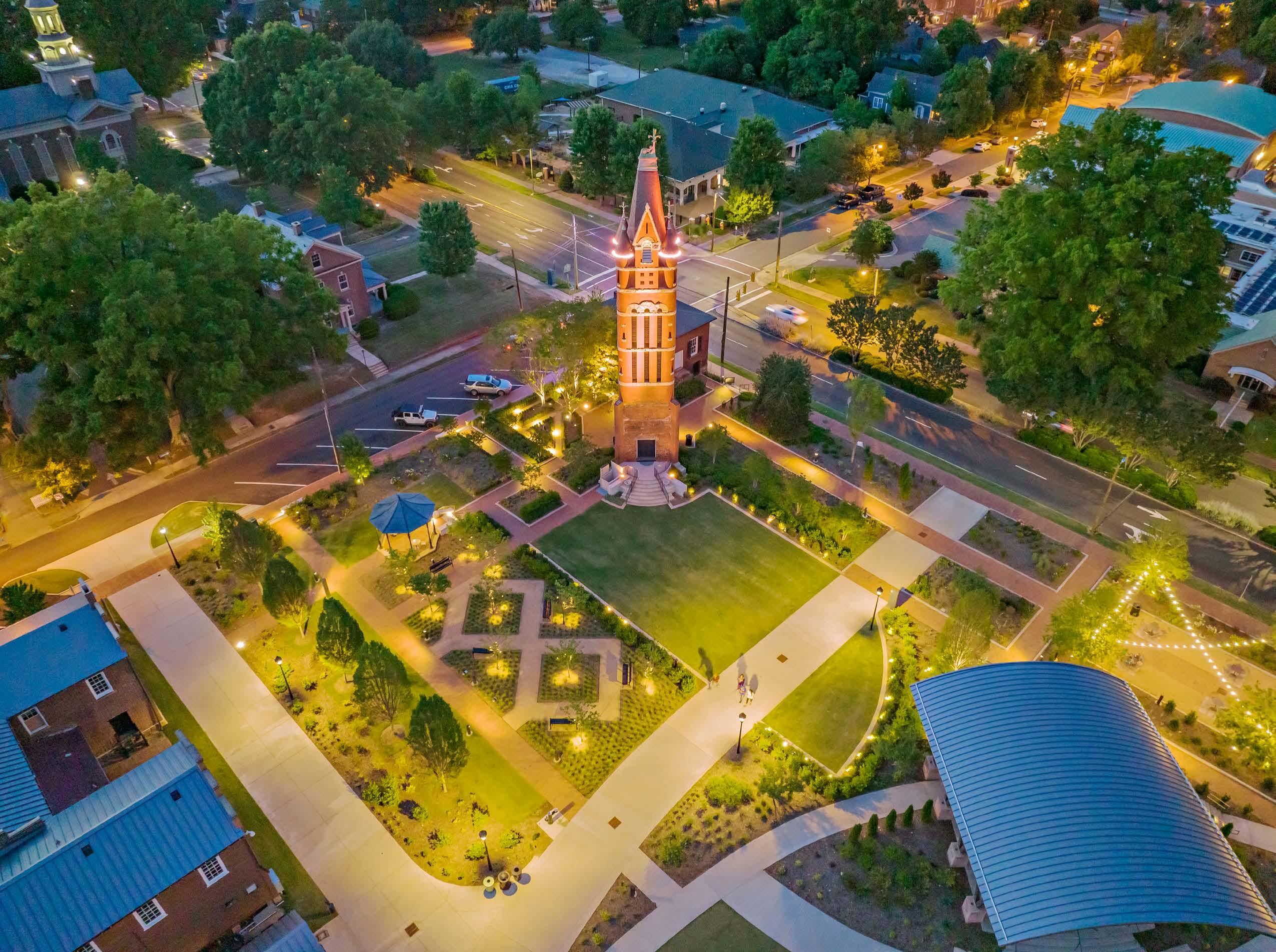
B-K Lighting flood lights within the hedges, resulting in an ethereal nighttime representation.
In the circular central lawn, the stage, a key element of the park, was designed with particular care including lighting to support performances and layers of light which accentuate the structure and it’s gracefully curved ceiling. Color Kinetics RGBW floodlights illuminate the stage, and RGBW linears graze the ceiling. Miniature Designplan projectors highlight the trusses supporting the stage. All DMX stage lighting is supported by ETC Controls.
Step lights embedded in the canopy structure's pillars, combined with linear lights and downlights, create a breathtaking effect for the stage area. The uniform and subtle blending of light transforms the stage into a theatrical space that complements the park's design.
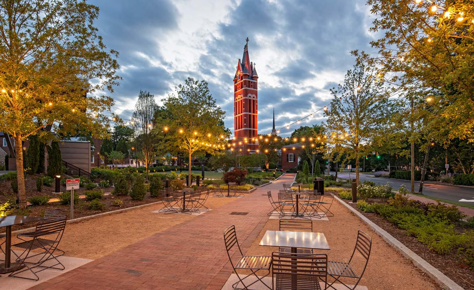
Bell Tower Green transcends being merely a visual delight, blossoming into a thriving center for varied community engagements. The large lawn caters to community events and markets, while the dining pavilions, adorned with traditional string catenary lighting, provide inviting

LINEAR WET LISTED RGBW - UPLIGHT
MINI RGB UPLIGHT MOUNTED BETWEEN SIDE TRUSSES
STEPLIGHTS BOH STAIR
STEPLIGHTS AT WALKWAY
SMALL SCALE DIRECT VIEW RECESSED INGRADE MARKER LIGHT
MINIATURE RECESSED 2 INCH INGRADE LED FIXTURE
MINIATURE RECESSED 3 INCH INGRADE LED FIXTURE
SMALL SCALE COMPACT RECESSED 3 INCH INGRADE LED FIXTURE.
spaces for meals and socializing. These seating areas become cozy gathering spots for locals and visitors alike, enhanced by food trucks that transform the vicinity into a culinary haven. For younger visitors, the children's play area offers an engaging experience with Targetti’s SATURN uplights artfully positioned in front of the boulders. These creative installations dot the turf area with light, adding whimsical touches to the landscape and contributing to the park's multifaceted appeal.
"It's really nice, and the residents are thrilled with it. It's utilized year-round, day and night. What used to be kind of a vacant void is now a focal point and anchor for the community," Paula concluded, summarizing the essence of the transformation.
Paula Ziegenbein's and Andrea Hartranft’s insights, coupled with the relentless efforts of the entire team, make Bell Tower Park an inspiring case study for the world of lighting design. The park now stands as a symbol of innovation, collaboration, and community engagement. It's not merely a place to admire aesthetically pleasing lights but a space where people gather, celebrate, and create memories. Through the tireless efforts of Paula and her team, a once bleak parking lot has transformed into an urban oasis, shining brightly as a beacon of creativity and resilience. ■
INTEGRAL LED, 25W, 1205 LM, RGBW, 28 X 84 DEGREE BEAM COLOR KINETICS 316-100022-07
INTEGRAL LED, RGB, 25W
DESIGNPLAN CP1820 N 001 6 OW
INTEGRAL LED, 3.5W, 3000K WAC WL-LED100 C
INTEGRAL LED, 11W, 701 LM, 3000K
INTEGRAL LED, 5 WATTS, 3000K CCT
INTEGRAL LED, 3 WATTS, 3000K CCT
BEGA 33168 K3
INTEGRAL LED, 3 WATTS, 3000K CCT TARGETTI JMR WF L1 30 24 SS
INTEGRAL LED, 7 WATTS, 3000K CCT
BANFF, CANADA | 2 - 4 NOVEMBER 2023
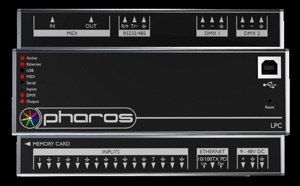
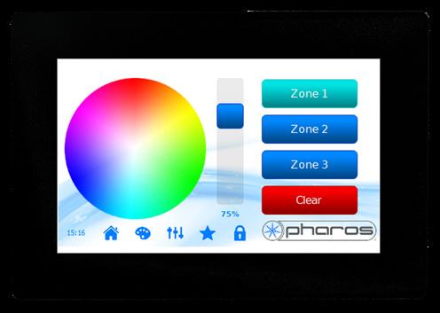
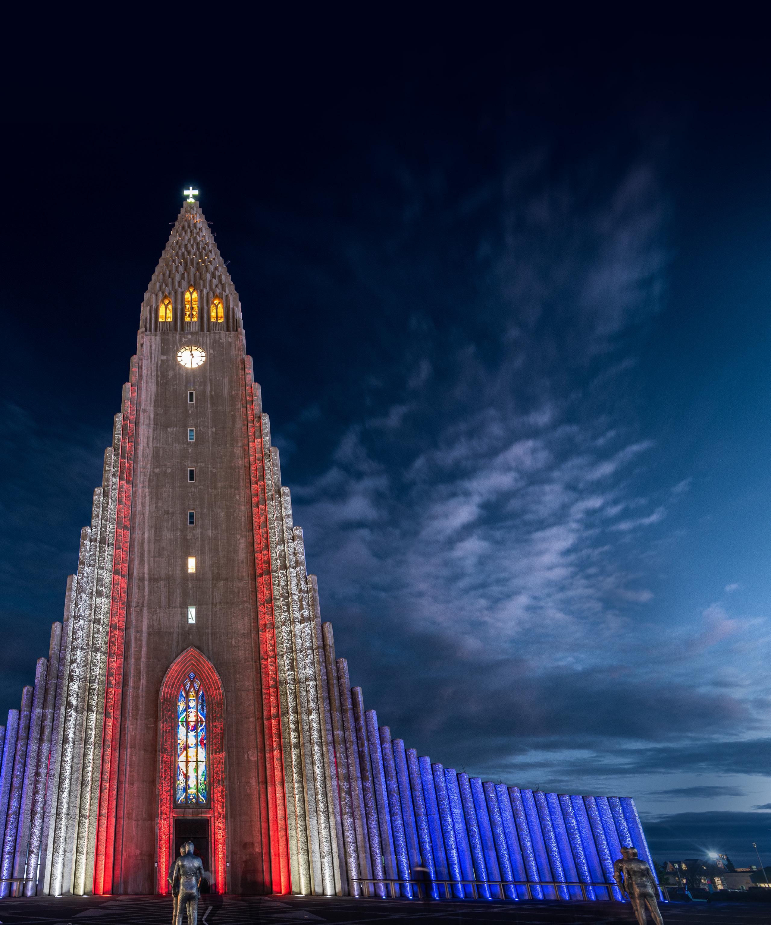
Pharos Architectural Controls is an award-winning and independently owned British manufacturer of dynamic lighting control solutions for Places of Worship and other applications. All our products are designed and built in-house, backed by a 5-year warranty, and supported by an experienced technical team.
Pharos Designer is a feature-rich range of scalable and highly versatile lighting controllers with powerful programming tools and comprehensive show control capabilities that provide the ultimate flexibility in dynamic lighting control.

RANDY REID By
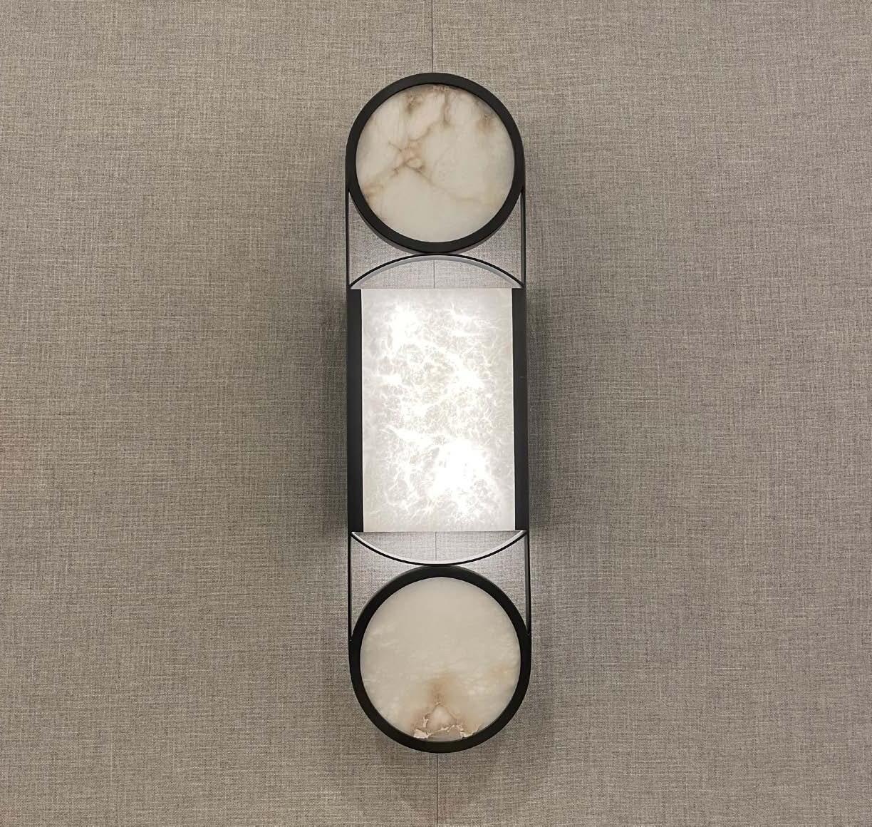

Last month, a special occasion arose – my father-in-law, Dick Thomas, was celebrated by the St. Louis Cardinals and given the honor of throwing out the first pitch at a game against the Washington Nationals.
My family and I had the pleasure of staying at the Live! by Loews hotel, located in Ballpark Village where the impressive lighting design caught my eye. The innovative genius responsible is Lisa Reed and her Envision Lighting Design team, prior to her collaboration and merger with Randy Burkett to form the lighting design firm RBLD. During the IES Annual Conference, I sat down with Lisa, who educated me on the intricacies and artistry of the Loews lighting design.
Fans of the St. Louis Cardinals recognize the iconic red banners adorning the exterior of the PwC Pennant Building, each of which displays a year when the Cardinals triumphed in the World Series.
Unlike typical fabric banners, the World Series banners are designed with one-inch-thick letters on each side, necessitating specialized lighting to ensure legibility without casting shadows. The solution? A theatrical treatment employing cross-aiming techniques.
Beneath each banner, a pair of fixtures with eight heads were installed, four of which point toward the banner on the left, and the other four pointing to the right. This cross-framing technique ensures that the fixtures under one banner light adjacent ones, creating a consistent illumination across all.
Ecosense’s RISE F080 Quad was selected for its precision and quality. Mounted underneath each banner, the fixture stands about 10 to 15 feet off the ground at the second-floor level. The precise coordination of fixtures was vital, as the pre-stressed building construction required accurate location.

The selected fixtures were 3000K, providing a warm and welcoming glow that highlights the red color. The effect is both graceful and elegant, raking across the building façade and illuminating each banner.
Above the hotel entrance, a beautiful, 6-story bas-relief presented a similar challenge – how to light the entire piece from a single vantage point.
Lisa described how this sculpture seamlessly intertwines the floor plans of both the old and new ballparks: “The sculpture represents the simultaneous construction and demolition of the old and new Busch Stadiums, because Loews sits on the

ground previously occupied by Old Busch.”
Lighting this complex design presented significant challenges, requiring meticulous planning and comprehensive studies. The sculpture seems to rise and then gradually fade away, an effect masterfully achieved by Lisa’s team through a systematic approach. "We did a lot of lighting studies. We took a three-dimensional model of the bas-relief and conducted photometrically accurate lighting studies. We looked at lighting all around it, from the top and from the bottom," Lisa explained.
In this case, two Ecosense TROV linear fixtures were mounted below—one with a tight distribution for the top and another with a wider distribution for the bottom half—to reveal the dimensionality that would surely have been lost under direct lighting. The top half was illuminated with a 10-degree beam, creating a shadow effect that accentuated the details of the sculpture.
A glowing fin, designed as a beacon for the entrance of the hotel, further added to the architectural brilliance of the space. It's a continuous element, with all the light concealed, reflecting off the back of the fin. "They wanted it to appear continuous, so all of the light is concealed," Lisa shared, emphasizing the careful detailing that went into this seamless visual effect.
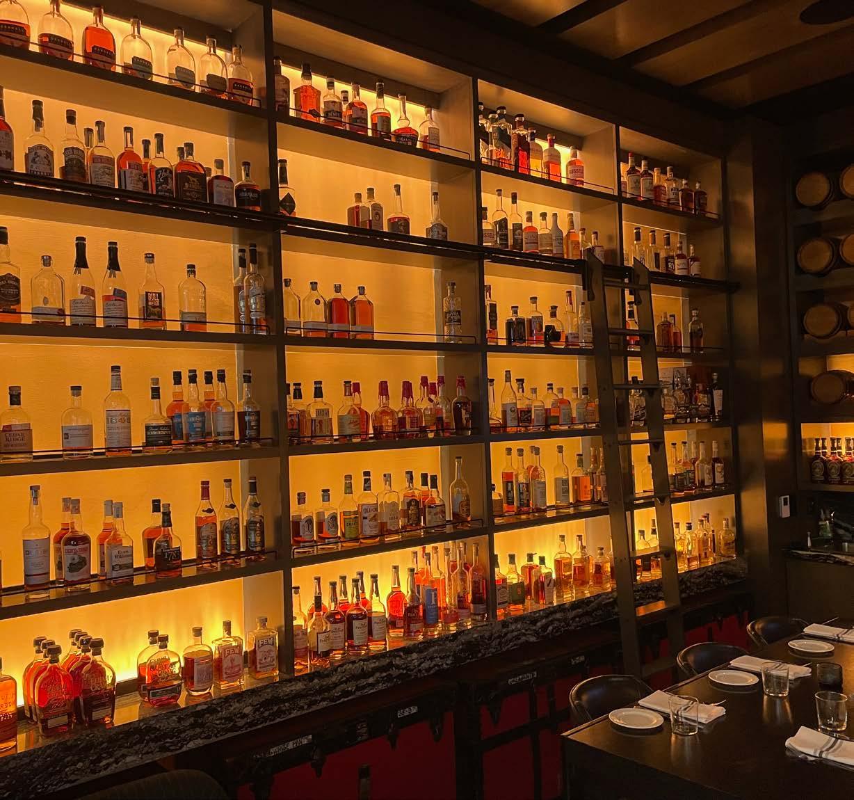
The Whiskey Room bar at Loews is a visual treat. Originally, the walls were to be backlit, but that was value-engineered out. Fortunately, through the magic of lighting design and good collaboration with the overall design and construction team, Lisa achieved the effect of a backlit room by grazing the walls.
The surprise factor was the choice of an orange backdrop, which was combined with a two-inch gap between the shelves and the wall to create the backlit effect. Through consideration of paint chips and fixture samples, the team selected the perfect paint color to complement the warm 2200K graze of Ecosense’s TROV L50 9×9 fixtures.
The strategy also proved economically advantageous. "You're spending a third of what you would have spent for backlit walls,” Lisa revealed, a substantial savings without compromising quality or appearance. Though a few imperfections in uniformity arose, the overall effect was stunning.
The success in the Whiskey Room is a testament to thoughtful planning, skilled execution, and the right lighting solution that's both visually striking and budget-conscious.


The rooftop bar, colloquially known as "The Bullock," was a significant part of the overall project. During the design phase, the bar didn't yet have a name, yet the vision was clear and ambitious. The monochrome ambiance, distinguished by a black and white background, was beautifully accented by the lighting.
Lisa explained, "There's a lot of coordination here. We've got a cove light around the top of the floating ceiling over the bar, and every one of the white stripes is a niche and nook, each with a light at the top and bottom. You can see the light at the bottom illuminating upward."
Adding to the aesthetics were two large television screens, a well-placed accent light at the bottom of the bar, and sizable living room-like outdoor lamp fixtures. The color theme was punctuated with red accents, visible even in the chairs.
In the nuanced world of hotel room lighting, the attention to detail is paramount. Within the rooms a striking element is the recurring use of red cords in decorative light fixtures, a choice made by the interior designer. Lisa and her team played a significant role in this, specifically with lamping.
"It was the hotel’s first time shifting entirely to LED replacement lamps in decorative fixtures, so we had to make sure that they were getting what they expected," Lisa noted. The goals were clear: uniformity, good color temperature, and excellent color rendering.
"The rooms were bright, unlike a lot of hotel rooms. We spent a lot of time doing calculations to ensure that they had enough light in the rooms. That was one of their goals.”
The effort put into perfect illumination pays tribute to the collaborative spirit between lighting experts and interior designers. It also underscores the importance of technology and precision in creating rooms not only aesthetically pleasing but functionally well-lit.
In the hotel's lobby, visitors can find glass cases with baseball memorabilia highlighted without overpowering the artifacts. The design utilized tiny display case track fixtures with adjustable heads from Feelux Lighting.
"They were all on the lighting control system," Lisa explained, emphasizing the precision in the setup, which was tailored to create different ambiances. There were settings for different times of the day: morning, lunch, and night, each finely tuned to provide optimal viewing. The color temperature was 2700K, and although not dimmable, the fixtures were part of a comprehensive lighting control system that allowed for exact adjustments.
A unique touch in the hotel's ballrooms is the integration of old sconces from the historic Busch Stadium, retrofitted with LEDs. While these sconces may appear average at a glance, their value lies in the nostalgia they evoke. Lisa mentioned the sentiment often felt for the reuse and repurposing of iconic elements.
Along with the sconces, the ballrooms and other spaces showcase a consistent design motif that resonates with the baseball theme. A light-colored wood stain, reminiscent of a baseball bat, is prevalent throughout, unifying interiors. From the lobby grand stair to the guest rooms and ballroom, this thoughtful design serves as a subtle yet effective nod to the sport, creating an engaging environment.
HKS, an architectural firm based in Dallas, was at the helm of the design, hiring Lisa’s lighting design team, Envision Lighting Design, LLC, now Reed Burkett Lighting Design. The process was extensive, spanning 2-3 years, a testament to the complexity and attention to detail the project demanded.
The coordination effort in this project was significant, involving numerous moving parts. Lisa's team was engaged with Ballpark Village, the Pennant Building and Loews, as well as the adjacent fitness center. However, they did not work on the residential tower, which added another layer of complexity to the project.
In total, the project required the collaboration of three different lighting designers: Lisa's team for the aforementioned areas, HLB for the grounds' lighting design, and DoublEdge Design (now ils) for the residential tower.
Perhaps the biggest challenge was the unpredictable spurts of design work. Lisa explained, "The design would go in bursts. We worked on it for two and a half years, but it would go quiet. And then suddenly they would say, okay, well we need these documents in two weeks, or we need these documents in two days." This required the team to ramp up and down quickly to meet sudden deadlines.
The unpredictable timing required the lighting design team to be nimble and do as much planning and behind-the-scenes work as possible between deadlines. The long-term commitment between design professionals played a key role in bringing an ambitious vision to life, making the hotel not just a place to stay but an experience steeped in nostalgia and elegance.
The lighting design of the entire Ballpark Village project is a remarkable intersection of art and technology. The end result is a stunning display celebrating the city's beloved baseball team and the skill of modern lighting design.
The project showcases how innovative thinking and technical precision can transform an ordinary feature into something extraordinary and elegant. The entire experience, marked by both personal celebration and professional insight, made for a memorable stay in St. Louis. ■

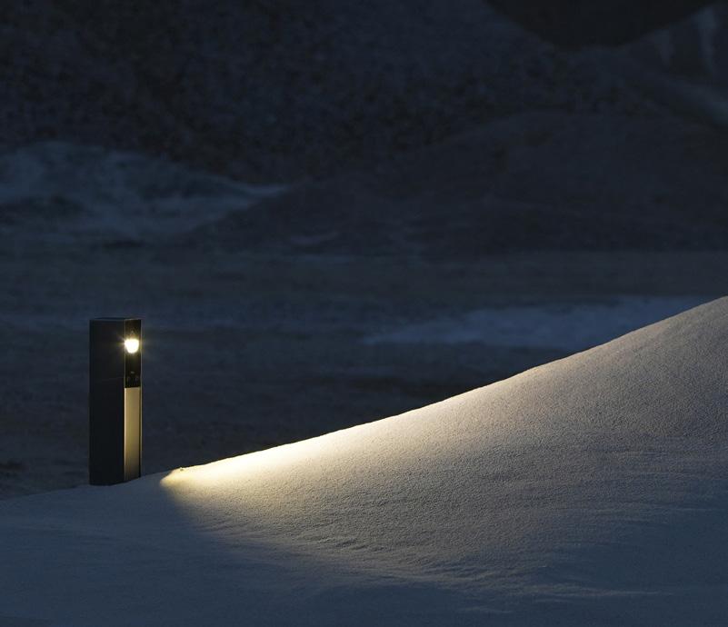
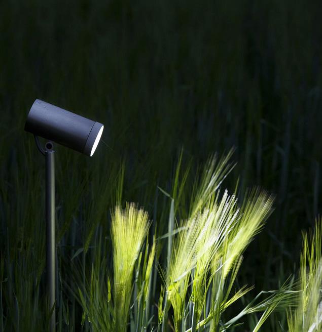

Stainless Steel Bollards with patented Hard Coating Treatment


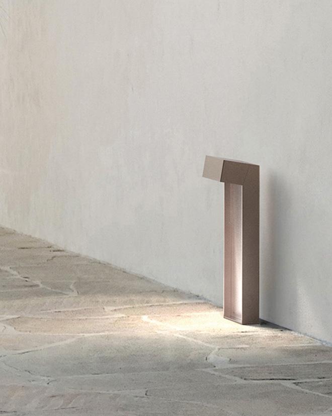
The innovative HCT (Hard Coating Treatment) finishes of the collection: lnox Graphite, lnox Bronze and lnox Natural, guarantee high surface resistance to corrosion and atmospheric agents as well as making the products anti-fingerprint and anti-stain.
The HCT finishes are not painted, but a hard coating treatment that is guaranteed for 10 years.

The NorthConnex tunnel is a new nine-kilometer long road tunnel in Sydney, Australia. It is the longest road tunnel in the country and the first to be equipped with an innovative lighting system that merges art with technology to keep drivers alert and engaged.
The lighting system, awarded the lALD Award of Excellence, was designed by Lux Populi and features a variety of elements, including:
• A flock of reflective birds that change depending on the sky that they reflect from above.
• A canopy of trees that appear to be reaching over the tunnel walls.
• A starry sky that creates the illusion of driving through an outback highway.
The lighting is not only aesthetically pleasing but it's also functional. An attention management system breaks up the monotony of driving through a tunnel to help drivers stay alert. Different colors and patterns of light are designed to be visually stimulating without being distracting.
The lighting system helps to improve visibility for drivers, reduces glare, and saves energy, and the system's low maintenance design helps keep costs down over the 31-year contract.
The entrance to the tunnel isn't adorned with traditional art or routine lighting structures. Instead, it features a flock of birds made of mirrors that reflect the changing colors of the sky throughout the day.
With about a thousand birds in place, each mounted on a custom armature to determine its unique angle, the design is both intricate and strategic. Every bird is angled to reflect the sky without casting sunlight directly into drivers' eyes.
On days when the sky is blue, the birds echo that azure hue. On cloudier days, they might take on a whiter shade, and when the skies darken, they turn into black silhouettes.
The design's true beauty lies in its complete reliance on natural light and lack of external energy. This creates a visually captivating and net-zero art piece.
Apart from the art’s aesthetic appeal, the client primarily benefits from reduced energy consumption and maintenance. Unlike conventional lighting fixtures that demand consistent electricity and periodic replacements, this design is nearly maintenance-free.
The beauty and innovation of this design didn't come without challenges. The potential risk of these birds reflecting sunlight


Photographers: Tom Simpson, Cath Bowen
Copyright: ©NorthConnex Project Company / www.comms.store
directly onto the path of drivers was a significant concern. Approximately 2,000 hours of simulation were required to determine safe viewing angles and exclude areas with sun reflection.
The result is an intersection of design, engineering and sustainability that dazzles in its simplicity and function.
The reflective birds are a nod to the local biology of the Hills District of Sydney. The city is home to a large flocks of cockatoos, which are known for their playful and mischievous nature. The reflective birds serve as a reminder to drivers to enjoy the journey, even in a tunnel, and provide a glimpse of the real forests above.
Travelers heading south are met with a striking visual of trees in alternating shades of blue and white. More than just a visual treat, this design is a strategic masterpiece. Although it looks like a canopy of trees against the sky, it's actually a stencil print on metal sheets depicting the canopy's black silhouette against a white sky.
In Australia, sound panels along highways often obscure tree trunks from view. Capitalizing on this, the design emphasizes only the upper tree sections. Illuminated panels were added to spotlight the trees, giving the illusion that the top parts of the trunks are emerging in 3D from behind the panels.
This innovative design approach simplified the project. By making the tree canopy appear from behind the sound panels, only about seven and a half feet of the tree needed to be lit vertically. This resulted in notable cost savings, increased energy efficiency, and simpler maintenance.
The chosen blue for the design is a royal blue LED, a hue grounded in quantum physics and not dependent on phosphors, which can deteriorate. This ensures color stability over time. If a luminaire ever requires replacement, the brightness might vary, but the color remains consistent – an important factor when you can see hundreds of feet of product simultaneously.
Interestingly, this shade of blue sits just outside the optimum focal range for the human eye. Remember seeing those blue-lit signs that seemed slightly out of focus? This tunnel design leans into that phenomenon to create a sense of depth, as if the trees themselves are not being lit, but rather the vast sky beyond.
At its core, this design functions as an attention management system. The primary goal isn't just aesthetic appeal but to keep drivers awake and alert. The sudden change in light color serves this purpose effectively, enveloping drivers in a new quality of light that forces them to assess their surroundings. The repeating graphics are carriers for this light, designed to be engaging but not distracting.
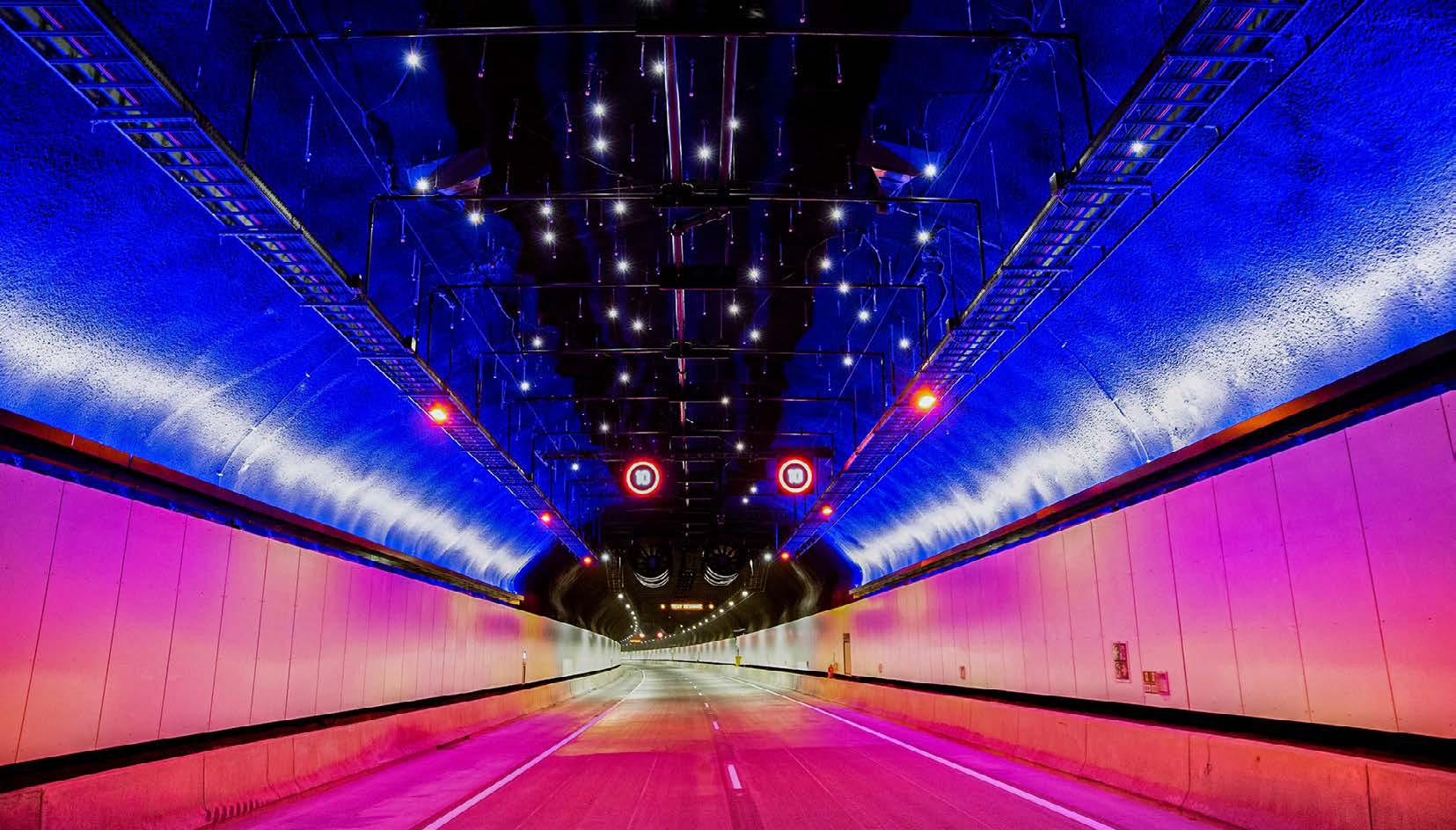
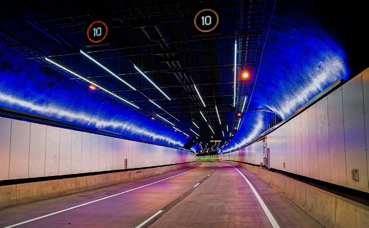
Travelers passing through the tunnel experience a visually stunning transition that simulates a starry night. This effect is accomplished through the use of three layers.
First, the tunnel lighting changes from white to amber, creating the sensation of driving on an amber-lit highway in the outer suburbs and highways. Second, the concrete-sprayed tunnel's vault is uplit with a wide-beam version of the same product used for the tree visuals. Royal blue lighting is used to create a sense of depth and vastness.
The third layer is made up of stars represented by different brightness levels and sizes of LEDs, with some oriented at varied angles and wattages to produce different brightness perceptions for oncoming traffic. The stars also include retroreflectors, similar to cats' eyes on roads, that reflect headlights and exponentially amplify the number of star points without any added maintenance or energy consumption.
The design team achieved the authenticity of their design by superimposing a public-domain NASA star photo and adjusting the contrast to yield the desired number of star points. To avoid any recognizable constellations, they intentionally chose a segment of the northern night sky for use in the southern hemisphere, preventing travelers from identifying familiar constellations and reducing distractions.
Further along the tunnel, the design introduces a simulation of the starscape at warp speed, reminiscent of a classic sci-fi
trope where the stars turn into elongated lines. In contrast to the labor-intensive star section, the linear light fixtures were easier and cheaper to install in just a few days.
Infrastructure and public-private partnerships are critical components in urban development, with the 31-year maintenance contract for this tunneling project serving as a prime example.
The project demanded a substantial investment for the lighting equipment, accounting for approximately 40% of the total cost. The maintenance contract extends over 31 years, with its cost estimated to be about 60% of the project's initial investment. This duration encompasses a 30-year operating lease, complemented by a one-year warranty handover, according to publicly available records. This structure ensures sustained functionality for the tunnel over three decades and provides a set period for necessary evaluations and updates.
The construction and maintenance responsibility rests with a joint venture among industry frontrunners: Transurban, Lendlease, and Bouygues. Transurban operates the project, Lendlease served as the builder, and Bouygues provided the tunneling. Their combined expertise ensures a holistic approach to the project.
The tunnel's design didn't just stop at merging aesthetics with safety. It became an inspirational beacon for other innovations. A recent development in Melbourne saw the inception of pacemaking lighting in a tunnel – a system where lighting chases along the tunnel at the speed one is supposed to travel, ensuring uniformity in driving speeds. While still in its early days, it underscores the possibilities that arise when design, technology, and safety converge.
Graphics and architecture surround us while driving, but we often ignore them. By contrast, lighting can capture our attention in a unique way. There is clearly a future market for tunnel attention management systems implemented in lighting. ■
The NorthConnex tunnel stands as a testament to the unbounded creativity that can be achieved when psychology, design, technology, and sustainability intersect. With its reflective birds, canopy of trees, and starry sky, the tunnel provides an experience unlike any other in the world. But more than an aesthetic marvel, it represents a commitment to safety, energy efficiency, and a reflection of culture and history. By pushing the boundaries of traditional tunnel lighting design, Lux Populi has paved the way for a future where roadways are not mere passages but immersive experiences. It serves as a shining beacon of innovation, creating a path that doesn't just lead to a destination but becomes a journey in itself.
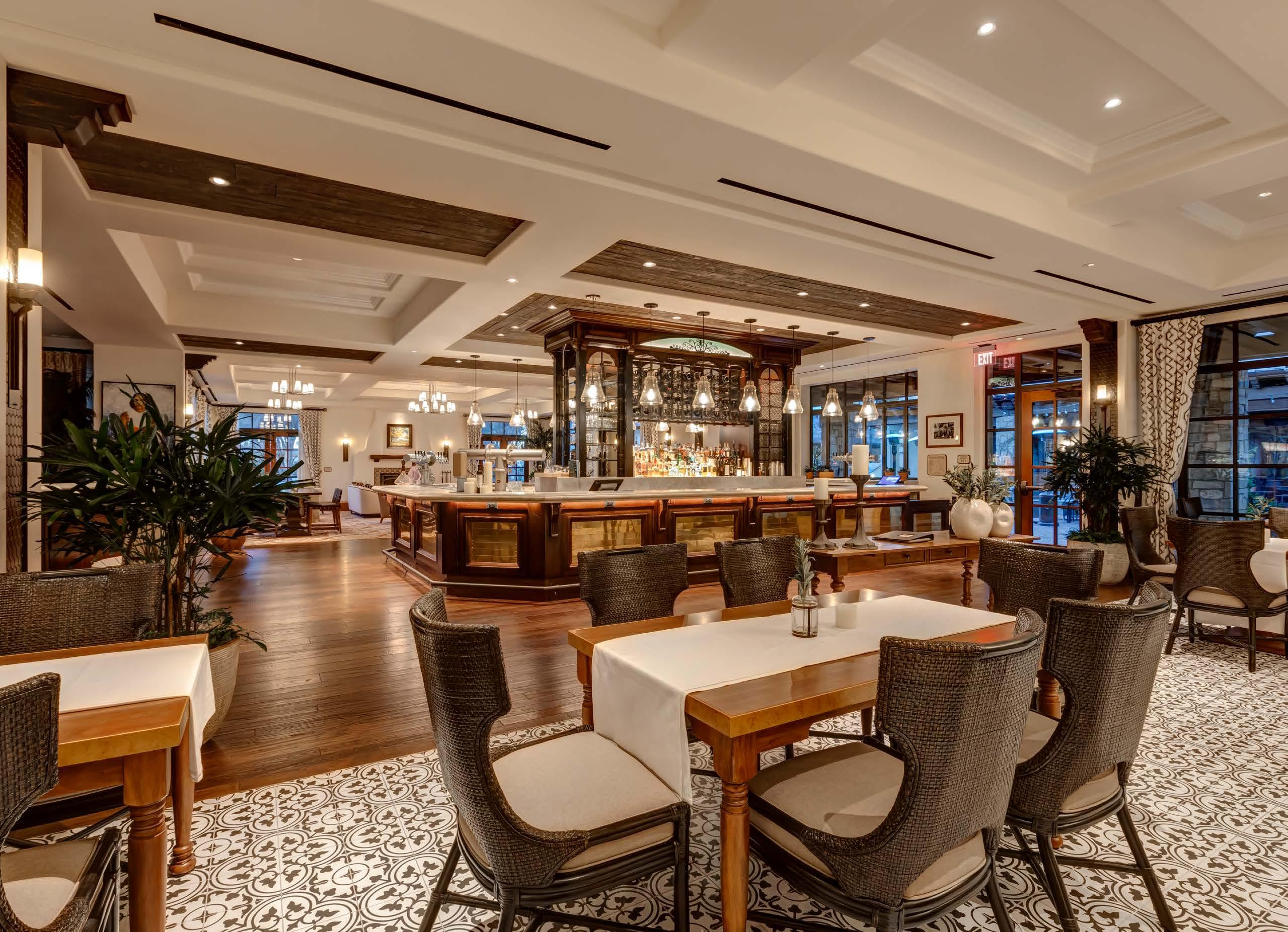
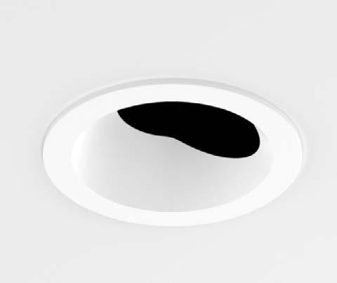
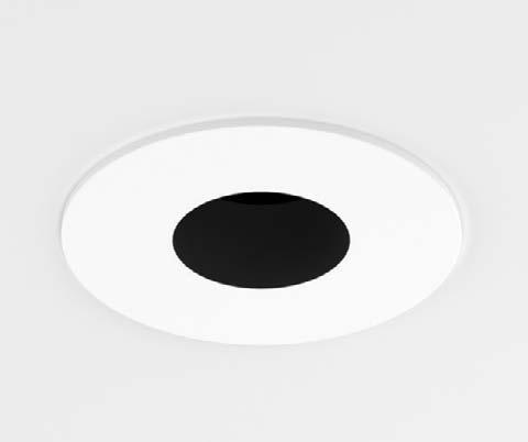
MX Downlight, Adjustable, Wall Wash & Pinhole
MX luminaires create a warm and inviting space using soft, uniform lighting in this contemporary mission-style hospitality application. A dynamic solution for consistent lighting and limitless design possibilities.
Trimmed, Trimless, and Wood Ceiling
Half inch and 2 inch Regressed
Non-Conductive and Flat Mount
Color options in White, Black, Satin Nickel, Antique Bronze, and Wheat


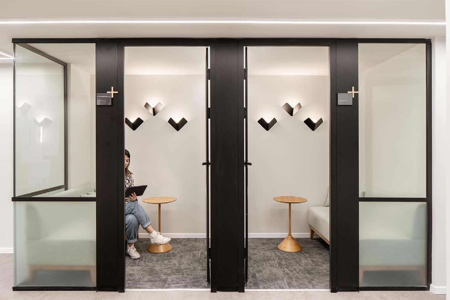
Lighting Integrated with Casually Sophisticated Workplace Design to Attract and Retain Prime Technical Staff

Top-level technology personnel are the most sought-after employees in Israel, the target of high-level strategies to identify, attract, and retain. Talented programmers, network distribution specialists, systems analysts and other technical experts are aggressively sought by organizations that depend on their brain-power. Positions to be filled promise challenging and rewarding careers with companies developing solutions to generate a profitable revenue stream.
Recruiters have found that a workplace environment that is stylish and flexible is a key attractor – a place that techies would create if interior design was their talent rather than their much in-demand personal technology specialty. “Quality office space has become like a valuable patent in the sense it is a gateway to making high quality hires,” said Ziv Shor of real estate firm JLL. “The importance of hiring and maintaining talent is the driver of the Tel Aviv office market.” He points out that it is essential for companies to present an environment that empowers people with the right spaces to work, think, and collaborate naturally.
Interior designer Shirli Zamir, who heads Shirli Zamir Design Studio, fully ascribes to making workplaces for technical talent that she says “…create an experience and feel of belonging to the company,”
to build loyalty and reduce the chances of their jumping to another company. Her firm, based in Hod HaSharon in central Israel, has built a specialty office design practice, which she describes as based on centralizing the people and their needs, considering the smallest details. “We are fascinated by including lighting, furniture, textures, and patterns in our projects,” she indicates.
Here are three projects that exemplify the Zamir firm’s application of their approach to their tech clients' critical staffing requirements.
KLA Corporation is an international U.S.-based capital equipment company that supplies process control and yield management systems for the semiconductor and related nanoelectronics industries. The Israeli operation is a key center for the company’s R&D and manufacturing operations.
“We chose a variety of natural and bright materials alongside elegant colorfulness and textures, creating a harmonic space that consists of the right dose of contrasts,” Zamir says. “By using clean lines and a calm color palette, we created a space that is harmonious, cozy, intimate, and home-like,” she indicates.
In the multi-purpose employee’s lounge, booths with open space partitions were constructed from wood crossbars mounted together for a textural semitransparent look. Wooden pins between the bars create a subtle geometric pattern. From a slated wood ceiling
in each are hung Secto’s open Kontro chandelier. Formed of pressed Finnish birch veneer, the slats are spaced and attached to plywood rings. Adding dimension to the ceiling is a suspended grid of TCI LED modules.
A section of the wall along a walkway was carved out to accommodate an upholstered banquette covered in fabric in a pale lime color. Individual platform-based work tables can be used simultaneously by one or two staff members. Divided into two sections by a slotted wood panel, each displays a fanciful group of three Fly wall lights, a modern classic design made by TossB. Measuring 10.4 in x 6.6 in x 3 in, they each contain a single 4.8 W LED lamp.
Service Now, based in Santa Clara, California, is a cloud-based enterprise IT service management platform, retained by organizations to automate and streamline information technology processes.
The initial concept of the project was born from the research of what is Israeli "Locality.” The workspace shift from cubicles to a semi open-space created the basis for the Zamir team to develop a planning and layout concept. “We researched the term ‘neighborhood’ in terms of space, and the local population,” relates Zamir. “We asked questions such as, ‘What is it like working in a neighborhood?’, and ’What is it like socializing in a neighborhood?’ In addition, the client gave us a brief which stated the firm’s sustainability practices, including the incorporation of recycled, re-used, local materials into the new offices.”


Answers by the staff to questions posed by the designers provided direction for the initial plan layout, materials, colors, furnishings, and lighting. The project was carried out in two stages. Stage 1 established the reception pattern, open phone booth, and the partitions creating neighborhood. Stage 2 integrated conference rooms, jeeting salons, open and enclosed phone stations, and collaborative work areas.
An angular geometric theme for the furnishings in the entry area contrasts with the overhead fixtures featuring clear circular shades surrounding E27 LEDs. Illumination over the extended wood-top table in the glass-enclosed conference room is provided by linear wiresuspended 3,000K, 40W LED fixtures.
Bionic, headquartered in Palo Alto, California, is an Application Security Posture Management (ASPM) source for calculating potential risk to business operations and giving clients a list of priorities to adjust for correct performance.
In Tel Aviv, Bionic occupies 6,500 sq. ft. on the eleventh floor of an office offering 360° views of the surroundings with the Mediterranean Sea on the horizon. Nurit Gil Architecture & Design served as the architect, with Shirli Zamir Design Studio in charge of creating the interior and lighting. The full-floor, open plan layout allows a round circulation, encircling the core of the building.
Both firms agreed that the project concept would reflect a lively, scienceforward, high technology-focused company. The working environment would be presented as conducive to creative innovation in a home-like

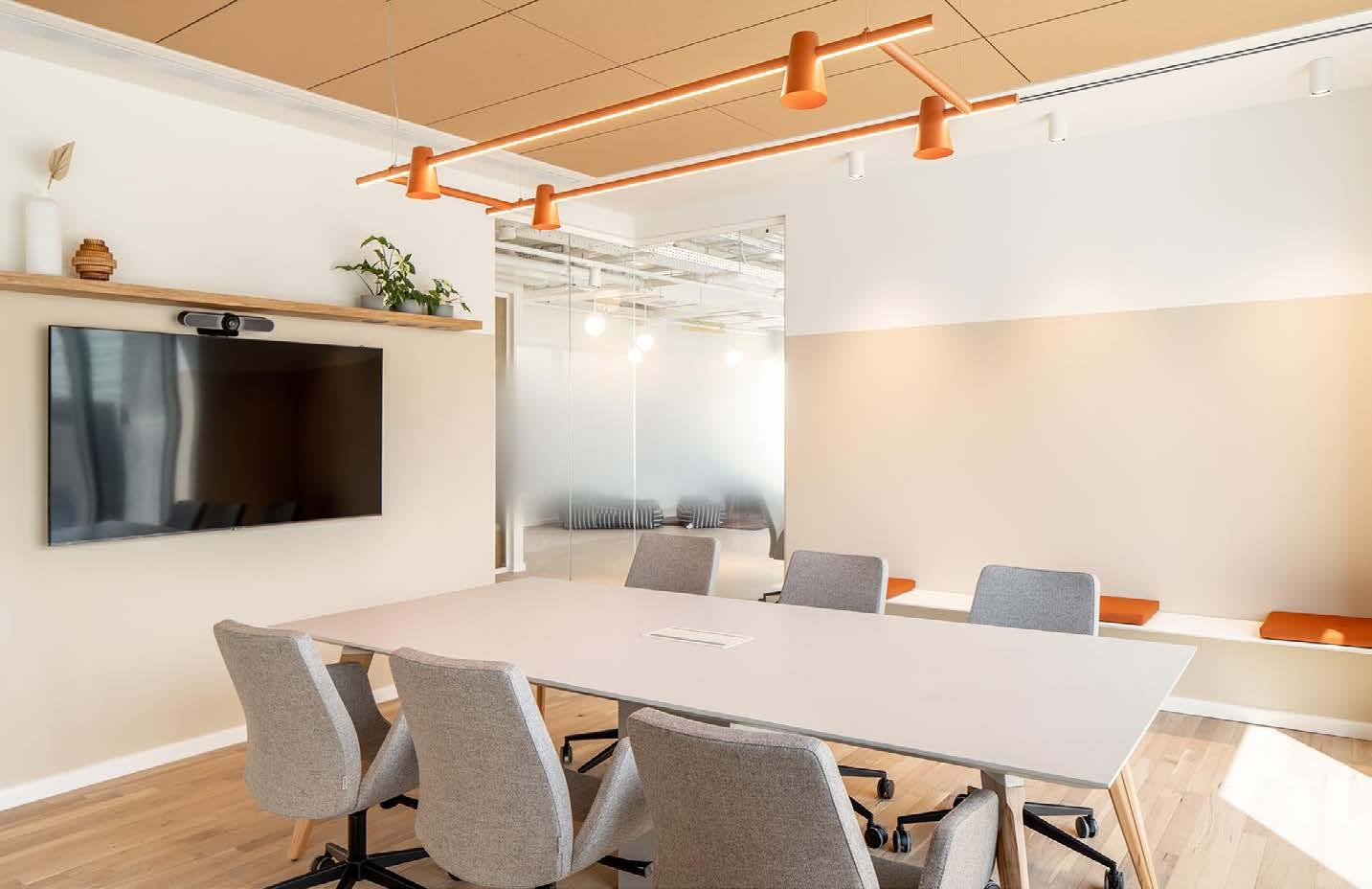
setting. Public spaces were planned to have a direct connection with the main entrance as well as sea views of the Mediterranean. Light Scandinavian wood was used for the floors and almost all furniture. Colors were used sparingly.
The office space has been designed to recognize user wellbeing. Quality lighting design, acoustic levels, and ergonomic furniture contribute to a healthy work environment that the firm’s management prioritizes. Staff members carry out their duties in quiet work-areas, one-on-one focus rooms, informal collaboration areas, formal conference rooms, or in brain-storming areas. A large dining room accommodates employees and guests for conferences and other events.
Overhead lighting in the open plan work
areas combines white globe Lolipop fixtures on dark stems and white track Planlicht Spacetubes. In the breakout space, the Lolipop style with white stems is suspended above communal dining tables. Three styles of woven shade ceiling-suspended fixtures in the lounge, two in natural rattam by Nama and a third in bamboo by Plum, coordinate with the upholstered seating, pull-up chairs, and circular area rug. A feature wall in an informal meeting room is both decorative and functional with three sizes of the circular Bali line framed by handwoven natural and black bamboo strips.
Above the open wood grid reception station are 10 custom gold metal and white globe fixtures hung at different lengths by matching gold metal covered rods. ■
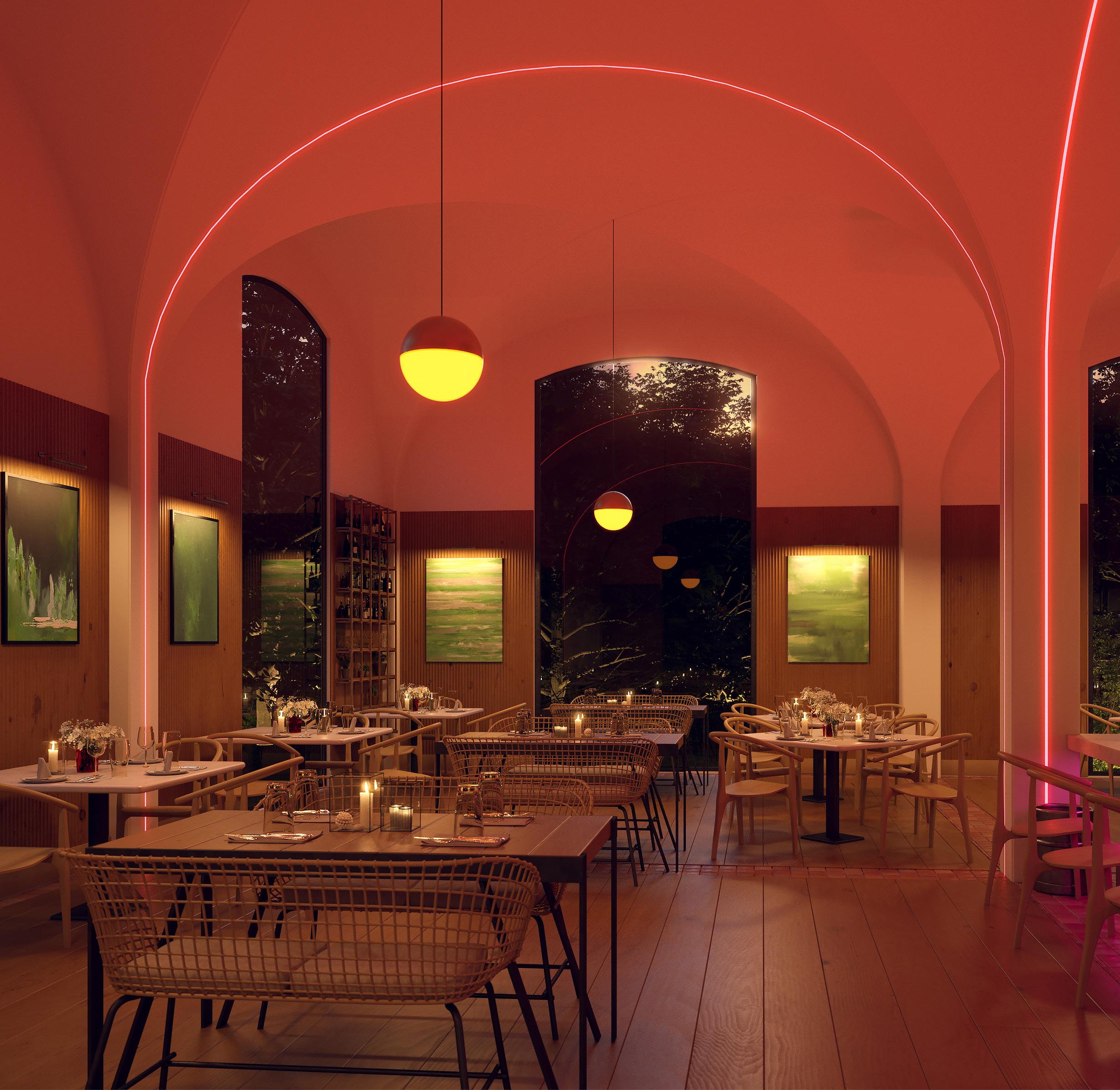
Give Interior Arches and Coves
Illuminated Curve Appeal
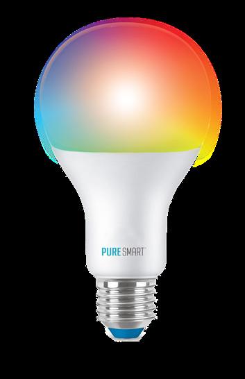
Let the drywall be your canvas! TruArch is a triumphant extension of our popular TruLine family of recessed linear lighting. Our patent-pending TruArch can be used within vertical archways or horizontally on curved walls with an inner or outer curvature that has a minimum radius of at least 8 inches. TruArch seamlessly installs into 5/8” drywall with no framing modification required. The flexible channel, LED strips, and flexible lenses are ordered in 1’ increments (up to 40’ before re-feeding) and are fieldadjustable to streamline installation. TruArch is featured in our Pure SmartTM portfolio of smart architectural lighting products connected by WiZ Pro, a global brand of Signify. Unlock the decorative flexibility and near-infinite palette of our TruColorTM RGBTW light engine (1500K – 6500K).




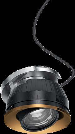

Meet ERCO's innovative Quinta recessed spotlights - a versatile addition to their lighting range. Ideal for diverse settings like museum lobbies and cafes, Quinta spotlights offer flexibility in ceilingintegrated lighting, accentuation, and wallwashing. Compact and easy to align, sizes span from 2W / 272lm to 30.3W / 4035lm, catering to various room heights. Available in black and white with customization, Quinta ensures a sleek ceiling look.

Senso by Luminii presents the Leto 11 Adjustable: a cylinder LED pendant with adjustable optics and a 360-degree rotation that complements any aesthetic. With a color temperature range from 2500K-6500K and a 30-degree tilt angle, the Leto 11 Adjustable offers end users customization options to ensure their space reflects their style.


Explore the versatile opportunities of EdisonPrice's FREEHAND Neon + Track. Select from suspended and surface-mounted options, both featuring horizontal rotation. Combine diffusers, prismatics, spotlights, downlights, and neon strips for diverse applications and captivating designs. Powered by 48VDC, the 30mm diameter track system embodies elegance and offers boundless creative potential.


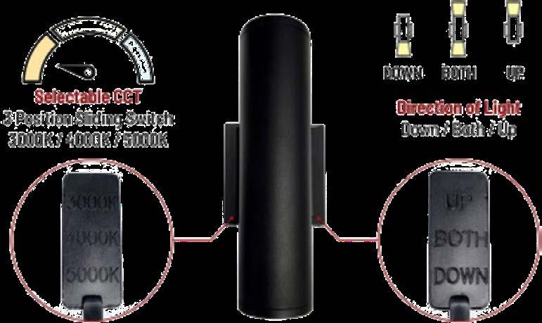
Nora Lighting introduces the 3” LED Cylinders, offering minimalist design, optimal visual comfort, and versatility. Choose from single-direction or up & downlight options, and select your preferred color temperature with the CCT switch (3000K, 4000K, 5000K). Emitting 1500 lumens per direction with a 31° beam spread, these high-performance ADAcompliant cylinders mount under 4” from the wall and are suitable for wet locations. They accommodate universal input and 0-10V dimming and are available in black, bronze, and matte powder white finishes.


CSL Lighting, introduces upgraded Cylinders and Entity™️ Cylinders designed to revitalize commercial and residential spaces. The evolved architectural cylinders feature lower profile canopies, removable bezels for easy access to internal components, and nearly double the lumen output. These versatile lights are available in round or square shapes, sizes of 2", 3", and 5" for Cylinders, and shorter lengths of 4", 6", and 12" for Entity™️ Cylinders, offering a clean, seamless look in semi-gloss white, matte black, or custom colors.

LightArt introduces an extended Ocean Coil Collection, featuring fresh designs and sizes, such as the "Marina" gradient shade, crafted from reclaimed ocean plastic. The line includes Sea Foam and Seagrass tones, both sourced from ocean-bound and nearshore plastic materials. Every pendant repurposes up to three pounds of waste and incorporates Performance Lighting Core technology. Designed for adaptability, these pendants are versatile additions to diverse environments.
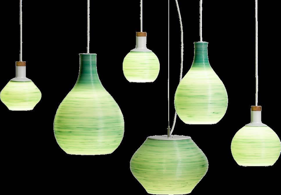
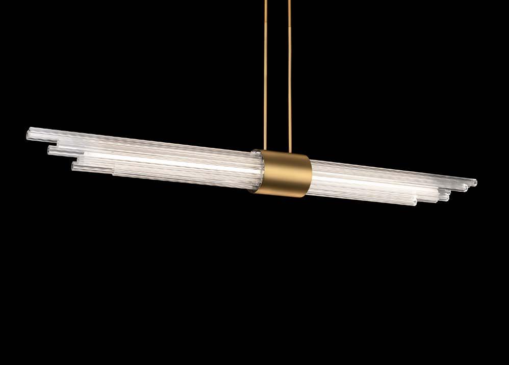

Discover elevated luxury with Modern Forms' new Luzerne Pendant. Reeded glass cylinders create a prismatic display, enhanced by aged brass and brushed nickel hardware. Advanced ACLED technology ensures a sleek architectural look, while clear fluted glass elements emit a uniform glow for a mesmerizing prismatic effect when illuminated by the ACLED light source. Emitting over 2,000 lumens, the 56-inch pendant offers seamless dimming via electronic low voltage or TRIAC dimming systems.


Amerlux, has introduced the Hornet HP Select downlight, featuring an output of over 2,000 lumens with a 75-degree distribution and Solite lensing for enhanced visual comfort. Available in round and square apertures, the Hornet HP Select is versatile, is compatible with existing infrastructure, and offers color temperature options from 2700K to 4000K with CRI choices of 83 or 90+.

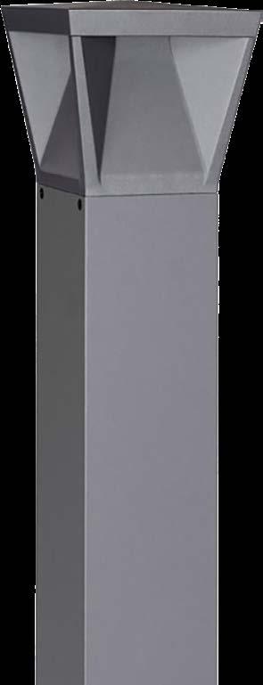
Current presents BEACON RBD Ratio rectilinear bollards, offering flexible light distribution with LED boards on each side. Heights are adjustable from 24 to 42 inches and illumination is customizable from 680 to 2700 lumens in 90-degree increments. Available in 3000K, 4000K, and 5000K CCT with 70 CRI, the bollards are designed to match other BEACON Ratio fixtures and are suitable for various applications.
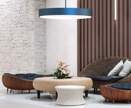
Introducing MAGELLAN™ by MARK Architectural Lighting, a new line of largeformat circular luminaires for architectural spaces. With a sleek design, MAGELLAN comes in various sizes and configurations, including pendants, ceiling-surface, recessed ceiling, and wall-mounted options. Delivering 600 to 48,500 lumens, it features nLight® and nLight AIR controls for simple setup, innovative flush and edge view lens designs, participation in the Declare transparency platform, and offers a sound-reducing acoustic solution in 19 colors.
By

Award-winning Ceramic Sconces, Innovative Design—and That’s Just the Beginning
One of the most exciting aspects of attending industry tradeshows is running into new talent and products, and because this is an amazing time for lighting, there’s so much to discover. Postpandemic, more consumers are gravitating toward high-quality investment pieces, and the importance of lighting fixtures—their impact and influence on interior design in particular—has made creativity and ingenuity the barometers for success. Finding rising stars is always enticing; it’s fun to profile professionals who you know are on the cusp of blowing up in the marketplace. Case in point: Olivia Barry of Olivia Barry by Hand, who was the winner of the 2023 NYCXDESIGN Awards in the sconce category for her Scroll Luminaire Sconces. In addition to the judges, they immediately caught my eye at ICFF, too.
The ingenious, wall-mounted style of Barry’s Scroll Luminaire Table Lamp is made from hand-rolled, furled ceramic that was designed to project light onto the lamp’s curved body while simultaneously concealing its bulb’s glare. The result is a bright, ambient light derived from a hardwired 3000K LED with dimmer driver. “I designed this luminaire as the answer to the question of how to design a table lamp that doesn’t have a lampshade. I didn’t want any visible bulbs; I don’t like the glare,” she explains. “I started making the table lamps first, and then I made a sconce version of the same idea.” But before we get into more details on that, let me provide a bit of backstory on Barry and how her work came to be.
With a professional career in industrial design as well as a
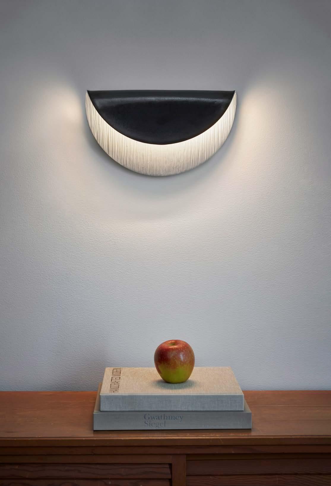
lifelong practitioner of ceramic arts—in fact, she apprenticed under Eva Zeisel for more than a decade in the latter—Barry has combined two talents into one brand to produce ceramic lighting and artwork installations at her Hudson Valley studio. “I was trained as an industrial designer, and people always joke that industrial designers just draw pretty things and don’t really know how everything works,” she says, “and I really want to prove that wrong.” How is she doing it? By continuing to evolve her business. While her background includes designing ceramic dinnerware collections for companies such as Royal Stafford and Crate & Barrel, her handmade lamps have attracted the eye of several architects and interior designers across the greater metro New York area and beyond. Some clients include architects Zack McKown + Calvin Tsao, Robert A.M. Stern Interiors, and Elizabeth Roberts Architects.
So how did lighting design begin for Barry? It all started in 2017 with a request from Robert A.M. Stern Interiors for the designer to create some lamp pieces—specifically bases. Although she had never created one classically, Barry knew she was up for the challenge. The only issue?
The shades. “I kept making these bases, but they kept having to get shades put on them,” she notes, and because she was living in Brooklyn at the time, Barry had to keep trekking large pieces to lampshade shops via the subway or her car, which got her thinking: What about designing lamps without the shades? “That’s partially what inspired the Scroll Luminaire Table Lamps

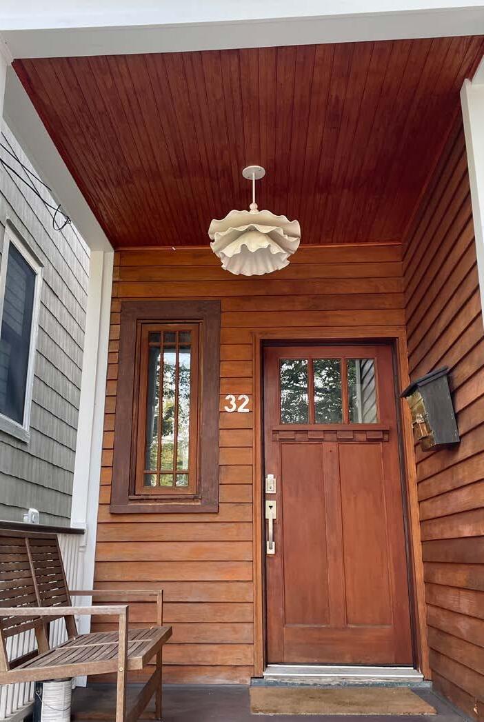

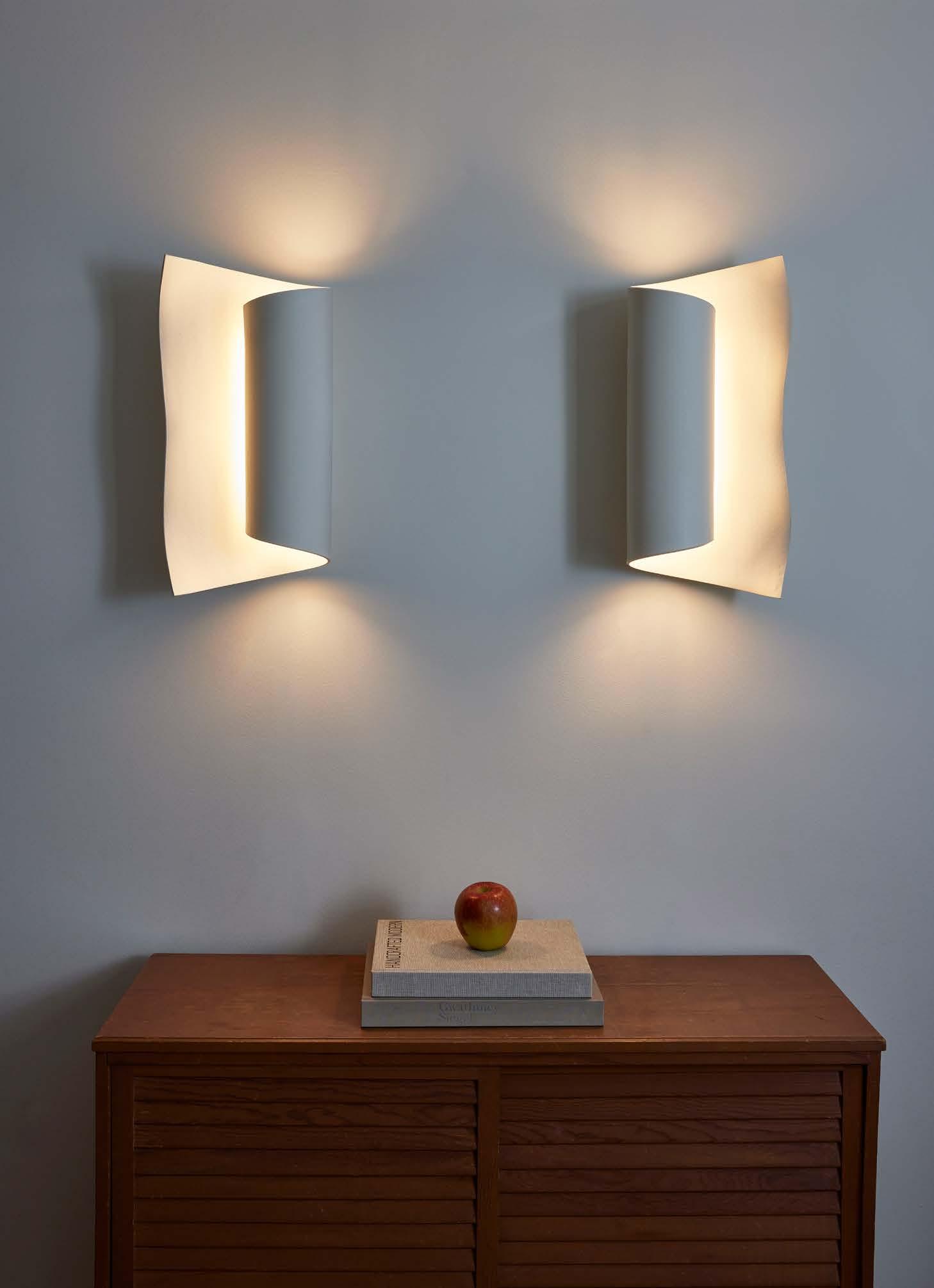
and Sconces,” she continues, “because necessity is the mother of invention, right?” Truthfully, playing with the idea of shape came to Barry about eight years ago. “I’m a lifetime ceramicist trained as an industrial designer, so there’s an overlap of the craft and the engineering,” she says. “I made a few pieces, entered one into an auction for New York Design Trust for Public Space, and at that auction there was a bidding war. Then I thought, ‘Okay, maybe I have something here.’ So I started figuring out how to produce them in small batch quantities.” The fixtures are still made one by one today, each signed and numbered in the interior, so every piece is a little different than the other, but Barry has developed a technique (design patent pending) where she can produce them in a very efficient way.
Of course, to achieve her goal of increasing product production, Barry needed more room to grow, and we saw the results of how she did it firsthand. “I was in Brooklyn for some 20 years, and I needed space for this, so I moved to Tarrytown and built my studio here,” she says as we toured the area. Now her new home doubles as her workspace. “This is my dream studio. This is where I make everything. I like having my workspace in my basement not only because I have no overhead, but I can be upstairs, put my child to bed, come downstairs, and work until midnight (if I feel like it) without having to go anywhere.” Although soon enough Barry will likely have to expand to meet increasing demand, currently her studio and the backyard kiln she constructed (all on her own) work perfectly. “I’m proud of this because I can make a lot in a small space, and with a lot of the pieces I’ve developed, I’ve had to make my own jigs,” she explains. In addition to the Scroll Luminaire Wall Sconce, some other pieces include the Illuminated Wall Leaf Sconce, Crescent Moon Wall Sconce, Mirror Light Sconce, and Blue Moon Light Sconce—all beautiful, bright, and dimmable, and a few in striking colors such as Gunmetal Glaze and Grey Ombré. Her series of art installations also sometimes feature backlighting achieved with Chip on Board LED tape.
It’s important to note that ICFF was actually Barry’s first tradeshow as an exhibitor. Although her official start on this lighting work was 2020, she’s spent the bulk of her time focused on research and design, figuring out several aspects of her process, and problem solving. Because of the pandemic, the original tradeshow that Barry was set up to do, the Architectural Digest Design Show in March 2020, got cancelled, so ICFF was her industry debut. “I’m so happy to have done ICFF and get over the other side of the hill of big achievements,” she adds, which included connecting with Kasper Larsen of Ludwig & Larsen, who performed UL testing on all of her pieces—all approved. “I haven’t been panicking about selling too much because I don’t want people coming to ask for pieces until I’m good and ready.” But of course that time is quickly approaching. Because thoughtful design and welcoming spaces have filtered into every aspect of interior design—from medical offices to airports, corporate workplaces and everything in between—we predict Olivia Barry by Hand will be one lighting designer to watch going forward. ■


monday - sept 18th @ 6 - 9 pm
all are welcome to our WILD Welcome Party to experience the skyline of downtown Dallas as well as enjoy yummy food, libations, and good times! We look forward to socializing with all our friends and allies from all corners of the industry! #SeeyouinDallas
wednesday - sept 20th @ 9 am
join WILD's PRG+ Panel for a great discussion led by Brittany Lynch from Clanton & Associates and Lisa Reed, from Reed Burkett Design on "What Companies Do to Retain Parents". The findings will surprise you.
wednesday - sept 20th @ 11 am
join WILD for a great panel discussion led by WILD Dallas chapter leader - Alyssa Humphries Stewart on "Lighting Women Business Enterprises". Discussions will include work / life balance, starting your own women owned business / mentorship.

DAVID K. WARFEL By
Have you ever had a client that, despite your best advice, chose not to spend enough money to get really good lighting in their home or workplace? Have you ever had a client eliminate ambient light layers in their kitchen or cut down the accent lighting in a conference room? The problem may not be the client or your design. The problem may be the words you use.
In a few weeks, I will be guest-lecturing in several lighting classes at University of Colorado in Boulder. Beforehand, each student will be reading about Richard Kelly’s “lightplay” from Jason Livingston’s Designing with Light: The Art, Science, and Practice of Architectural Lighting Design, and it will be my task to contextualize the basic functions of lighting design and, I hope, provide practical advice they can use in their coursework and careers. At first glance this can seem like a tall order, to stand in the shadow of lighting legends like Kelly, to find something useful to say in seventy-five minutes or less.
Many of us in the lighting design profession have heard of Kelly’s focal glow, ambient luminescence, and play of brilliants. I was taught that the three layers of light required for good lighting
were a variation of these, labeled task, ambient, and accent lighting. For a decade or two, I carried these layers from client to client, presenting them as a kind of holy grail, sacred and important. Six or seven years ago, I came to an uncomfortable yet surprisingly energizing conclusion: Our clients do not care about task, ambient, and accent. Our clients do not understand what play of brilliants or ambient luminescence mean.
And that should be okay.
Lighting designers need a kind of shorthand to communicate with each other – call it a secret professional language, so that we can efficiently transfer knowledge, communicate with teams, and get the job done. There is nothing wrong with subscribing to Richard Kelly’s language or the task, ambient, accent derivatives, so long as we recognize that these words do little to communicate the absolute necessity and value of light to an ordinary citizen like our client.
Here is what I will say to the classes at UC Boulder: Learn and use what Jason Livingston and Richard Kelly provide to build

We speak a secret language of light that even our best clients struggle to understand.
better lighting designs. And then I will encourage them to develop their own language of light for use with clients.
In this series of articles for designing lighting (dl), I will share my own language of light built around the core belief that light can help us live our best lives. There is nothing sacred about my terminology, nothing absolute. I see no reason to require students to learn my terminology or to publish my language in our society’s recommended practices. In
fact, even publishing them here gives me pause, because a language of light is a living, evolving entity that must change and grow as the user does. Just as our technical vocabulary has expanded to include LED, COB, grazing, tape, circadian, and more, our design vocabulary needs to expand to include what we have learned about light. Perhaps more importantly, our design vocabulary needs to expand to include what we know about people.

I used to speak this way to clients, but few really have the time and energy to decode our terminology.
The language of light that works for me avoids beautiful phrases like “play of brilliants” and steers clear of vague terms like “ambient”. Instead, I focus on why we need light and what kinds of light we need. And, I continually examine and revise this second language of light in an ongoing quest for more succinct, clear communication with clients who do not speak light. I share this language of light with you not in the desire to remake the world of lighting in my image, but rather to encourage you to remake the way you talk about light.
But first, why should you care? Why should any lighting designer spend time thinking about this? Why should we consider dropping task, ambient, and accent from our presentations and communications? There are two primary reasons we need a second language of light to use in our profession: because we serve ordinary citizens, and because lighting costs money.
Ordinary citizens do not understand us when we talk about light. Many will nod their heads and make understanding noises, even compliment us after a presentation: “This was a good presentation” or “This sounds like really good lighting.” And then that same client will turn around and slash the lighting budget.
When this happens, we have failed to communicate the true value of light. We have failed to speak in ways that ordinary citizens can grasp the critical importance of good lighting. And if they cannot understand the value and importance of light, they would be unwise to spend money on lighting. This is not their failing. It is ours. And that should be good news, because it means we can change it.
Over the past few years I have completely changed the way I talk about light with my clients, and it has transformed the results. It all begins with the primary purpose of light in our lives. Light is the first gift of the universe and is here to help us live our best lives.
Underneath the idea that light is a gift is what I have come to call the six promises of light. First, light can help us see what we
are doing so we can do it better. Second, light can help us know where we are and who is with us so we can know more. Light can help us feel more alert in the morning and more relaxed in the evening, or simply feel better. Light can help us focus clearly on what is important to us, whether that be a task at hand or the face of a loved one. Light can help us adapt to change more easily, from moods and weather to age and activity. And finally, light can help tell our stories, revealing what is important to us and sharing those values with others by highlighting an architectural detail or creating a welcoming atmosphere.
Until recently, I used these six promises as the core of communication with clients, and it worked well enough that I will share more details of each in the coming months. As I continually seek to reach more clients, I have begun to reexamine my terminology and build it into something even more clear. Today, I describe the promises of light with the addition of what kind of light is needed in each case:
1. Light for our hands can help us see what we are doing so we can do it better.
2. Light for faces and places can help us know where we are and who is with us.
3. Light for our bodies can help us feel and function better.
4. Light for our minds can help us focus clearly on what is important to us.
5. Light for our lives can help us adapt to changes more easily.
6. Light for our values can help us remember what is important and share it with others.
If you look at the list above you may notice that task, ambient, accent, play of brilliants, sconces, indirect, CCT, CRI, TM-30, and all the other “first language of light” terms are missing. I have found that couching my presentations in this way has all but eliminated clients who respond, “Let’s cut the accent lighting, I can do without that.” Few will say, “Let’s cut the light for our bodies, we don’t want to feel good.” In both cases, it may be the same light.

Changing the words I use has changed the responses clients make, and everyone is happier with the results.
When I wrap up this series, I will go one step further and share an even simpler language of light I have just begun to develop and share. It is a new approach to layers of light that also strives for simplicity and clarity for ordinary clients, a language and organizing philosophy that demonstrates both the value and type of lighting needed in typical spaces. I am
Get expert help with safety testing, certification and performance testing for a wide variety of photovoltaic and smart streetlighting.
Advances in both battery technology and photovoltaic (PV) module design mean that outdoor lighting opportunities are evolving. Be at the forefront of emerging markets by partnering with a global safety science leader to help you with safety and performance testing. Demonstrate your leadership in the market with outdoor lighting product certifications that help you stand apart from the competition.
From LED lighting safety testing and lighting certification to performance testing, global market access, sustainability and beyond, UL Solutions has lighting knowledge you can trust.
Find out more at UL.com/services/photovoltaic-pv-and-solar-lighting
replacing task, ambient, and accent with Comfort Zone, Glare Zone, Work Zone, and Safety Zone. When used in the correct zone, the six promises of light can deliver light that helps us live our best lives.
Is that not what we are all about? Helping others with light? ■

CRAIG DILOUIE, LC, CLCP By
Education Director, Lighting Controls Association (www.LightingControlsAssociation.org)
The 2016 Paris Agreement called for its nearly 200 signatories to join in limiting global warming to an increase of 1.5 degrees Celsius above pre-industrial levels. This would require carbon emissions to be cut in half by 2030 and reach net zero by 2050. To reach this goal, the rate of retrofits in the Global North will need to triple from barely 1 percent to at least 3 percent of stock each year, according to Retrofitting Buildings to be Future-Fit, a November 2022 report by commercial real estate services firm Jones Lang LaSalle (JLL).
Buildings are responsible for an estimated 39 percent of global energy-related carbon emissions. According to the World Green Building Council, 11 percent comes from materials and construction and the remaining 28 percent from operational emissions—from energy required to light, heat, cool, and power them. As such, buildings provide a viable path to decarbonization, particularly existing buildings, as a majority of the commercial building stock—
some 80 percent of buildings—that will be standing in 2050 has already been built.
Various U.S. jurisdictions have begun phasing in energy benchmarking with fines for building owners failing to satisfy energy efficiency or emissions requirements. Multiple state and local governments have passed building performance standard-based policies. According to Vert Energy Group, dozens of municipalities have adopted or are phasing in requirements. These policies aim for benchmarking and decarbonization and create large markets for retrofits.
One of the most prominent examples is New York City, whose Local Law 97 takes effect in 2024. This law sets carbon caps on buildings over 25,000 sq.ft., imposes large fines for exceeding these caps, and will drive toward net zero carbon emissions by 2050. These policies send a clear market signal to reduce carbon emissions or face financial

Building asset upgrades such as green spaces and smart glass for daylighting are part of a holistic approach that supports occupants needs, health, and wellbeing.
risks in the form of penalties and negative impact on property valuation.
Decarbonizing existing assets can deliver a powerful upside. Early adopters of net-zero buildings will benefit from greater competitiveness in attracting and retaining tenants at higher rents, according to the report. Attracting and retaining high-quality tenants, which impacts net operating income, offers value for decarbonization measures beyond direct return on investment. In JLL’s 2022 Future of Work Survey, three out of four respondents said their organizations would be willing to pay more to lease a building with leading sustainability credentials. One out of five said they already have.
Conversely, inaction may impose on inefficient properties a “brown discount,” or steep value depreciation, as demand for net-zero properties increases.
“Rising energy costs will hasten the move towards efficient buildings and reinforce emerging value trends, with the financial risks of inaction already becoming apparent,” the report stated.
As tenant usage is a significant factor in reaching net-zero goals, JLL identified value in collaboration between landlords and tenants, which may create new business models, alter the economics of leasing, and reward co-investment approaches.
Decarbonization is an ESG value. Asset managers globally are expected to increase their Environmental, Social, and Governance (ESG)-related assets under management to nearly $34 trillion by 2026, up from $18.4 trillion in 2021, according to PwC’s Asset and Wealth Management Revolution 2022 report. One way to improve environmental performance is to reduce carbon footprint expressed in Scope 1, 2, or 3 emissions. The JLL report noted that 60 percent of the Fortune 500 currently have already put into place climate or energy targets.
Inaction may pose macroeconomic costs. “The transition to a lowcarbon economy comes with a hefty price tag, but as recently declared by the International Monetary Fund, further delaying climate policies will hurt economic growth; the time to act is now,” stated the JLL report.
Decarbonization must serve people. Decarbonization involves maximizing operational efficiencies, electrifying heat, and sourcing off-site local renewable energy and building onsite renewables, with offsetting as a last resort. To maximize success, building owners should take a holistic, long-term approach that supports occupant needs, health, and wellbeing.
Lighting and controls can play a significant part in the transition. The JLL report identified a number of building asset upgrades, including solar photovoltaic roof panels, green spaces, smart glass for daylighting, cycle storage, heat pumps, electric vehicle charging, and water harvesting.
For lighting, the report specifically called out LED luminaires, detailed deployment of sensors, and digital controls that generate data that in turn can be leveraged for energy management, reporting, and to optimize occupant comfort.
Existing buildings can lead the way to net zero. “The technology, systems, processes, and means to reach net zero carbon and beyond exist today, but there is no one singular strategy, technology, or entity that will address the journey and there is also no one-size-fits-all approach,” the JLL report concluded. “While the scope and complexity of the challenge is immense, retrofitting existing buildings is the quickest and most costeffective way to accelerate decarbonization in the built environment.”
Click here to download Retrofitting Buildings to be Future-Fit. ■
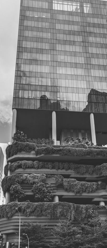

125 West 18TH Street
New York, NY 10011
Brought to you by the IESNYC and DLFNY, NYControlled is the controls trade show for professionals looking to see the latest lighting controls technology and products, learn about the rapidly changing industry through a series of technical lectures from respected experts, and interact with the top manufacturers and minds in the industry. Attendees can gain a deep understanding of the latest technology, weigh the costs and benefits of various systems, and attend accredited classes.
EXHIBITORS AS OF AUGUST 28th






By

Since gaining traction in a serious way about 15 years ago, LEDs have become the uncontested heroes of energy efficiency in commercial and industrial lighting. Now dominating the market, LEDs use at least 75 percent less energy than legacy products and, according to the US Department of Energy, could spur energy savings of 569 terawatt hours by 2035, avoiding carbon emissions from fossil fuel plants as well as conserving precious renewable resources and battery capacity.
We’ve witnessed another change in the last decade or so, too – one also related to lighting, but with a less positive result. Accelerating at a rate of about 10 percent per year, sky glow and other aspects of light pollution have robbed more than a third of Earth’s population – including 60 percent of Europeans and nearly 80 percent of North Americans – of their ability to see the Milky Way, while fueling an array of harm to natural ecosystems around the world.
As awareness about issues associated with artificial light at night grows, the lighting industry as a whole has an opportunity to course correct. Now is the time to recharge efforts to educate lighting decision-makers about which products are right for
which settings and to increase the number of product lines that include controls and feature lower light outputs and lower color temperatures (CCT).
To the latter point, lighting manufacturers have an opportunity to not just capitalize on growing interest in light pollution mitigating products, but to take action that actually sparks demand for luminaires that are better for human wellbeing, as well as for wildlife and the environment. And, we don’t need to compromise on safety.
Growing interest in reducing the adverse impacts of outdoor lighting was evident at LightFair 2023 in May, where Karen Trevino, director of the National Park Service’s Natural Sounds and Night Skies Division, presented a keynote titled “Chasing Darkness into the Light: Preserving Night Skies in National Parks.” Noting how light from park facilities and sky glow of local towns and cities have diminished the night sky, Trevino explained the NPS’ efforts to preserve “natural lightscapes” to minimize the unintended impact outdoor lighting can have on wildlife, visitor enjoyment, health and safety, cultural resources and the wilderness character of parks.
At the same meeting, DesignLights Consortium (DLC) Senior Lighting Scientist Leora Radetsky joined Tony Esposito of Lighting Research Solutions for “Blinded by the Light (Pollution): How to Select Non-White Outdoor Lighting to Minimize Sky Glow.” Their session touched on the adverse impacts of artificial light at night on wildlife ranging from turtle hatchlings and nocturnal insects to migratory birds and bats before diving into a range of solutions to address the absence of industry standards for non-white (i.e. amber) light sources often cited as better for sensitive wildlife areas.
It's worth pointing out the enthusiasm some lighting designers and specifiers conveyed during that session for low CCT products associated with less environmental impact, voicing their desire for lighting manufacturers to put more emphasis on
with the need for more outdoor lighting products that mitigate wasted light. Like heat and air conditioning that escape from inefficient buildings, light pollution represents wasted energy. The need to pursue solutions for continued decreases in energy consumption, as well as mitigating impacts on biodiversity and implications for human sleep cycles, is compelling with outdoor lighting.
The DLC launched its LUNA Technical Requirements to address these issues, and we have been steadily increasing the number of products on our LUNA Qualified Products List (QPL). LUNA is a specification that includes light pollution mitigation features, while meeting the DLC’s time-tested energy efficient requirements for high performance LEDs. The LUNA program provides steps for decision makers to consider

developing and marketing such products. Another comment heard from the lighting design community was that cities and towns need more education and guidance about light pollution and what they can do about it.
In fact, it’s the public sector that is beginning to create more demand for outdoor lighting products that minimize sky glow, light trespass and other elements of light pollution. Hundreds of North American counties and municipalities have passed some type of light pollution law or ordinance, and 19 states, the District of Columbia and Puerto Rico have adopted laws to mitigate light pollution
In some cases, public sector agencies are seeking to protect sensitive ecosystems, especially for listed endangered species. In others, municipalities and their constituents are concerned with quality-of-life issues affected by light trespass into homes and neighborhoods from overly bright or improperly shielded streetlights and other luminaires.
Simultaneously, many communities across the country have adopted climate goals – another circumstance that dovetails
in lighting policies and applications, and the specification enables qualified products to be controlled with timers, motion detectors and other technology that allows them to dim or turn off when not needed – preventatives to inadvertent all-night lighting.
For lighting decision-makers looking to reach carbon goals and save energy dollars, the LUNA QPL also provides assurance that listed products qualify for efficiency rebates.
There are currently 50 products on our LUNA QPL and hundreds in the queue, and the DLC is eager to expand the list, providing cities, towns, states and private sector entities with more choices for energy efficient luminaires that minimize light pollution, are controllable, provide appropriate visibility for people and limit negative impacts to the environment.
We encourage lighting manufacturers to seize this moment and take a proactive stance by expanding product lines designed to mitigate light pollution. To paraphrase Albert Einstein, we cannot solve our problems with the same thinking we used to create them.■
Having spent almost 4 decades marketing lighting products as a rep and agency principal in a small market, as often occurs on the rep landscape these days, my agency was asked to consider a joint-venture arrangement with a much larger agency in an adjacent territory. As any agency principal would tell you, a commission-only business model has to expand the sales base to remain a viable player, whether by additional staff or, as seems more common these days, through merger or acquisition of what had previously been a competing agency. Being keenly aware of our “dinosaur” status, a small rep agency in a small market, we joined forces with a nearby much larger agency and, by mutual consent, were given the opportunity to operate with a pleasant level of autonomy within our territory.
It’s not unfair to say that a sort of “veteran” status has been reached following the aforementioned 4 decades of accumulated experience and knowledge. In my case, I felt a need to offer my knowledge of the use of design software to assist reps (and later, manufacturers and electrical distributors) with their normal design requests, typically to confirm light levels for a proposed lighting system, though in some cases to be able to show the resulting visual impacts of the lighting products they were recommending.
Given the past ten to twelve years of LEDs’ explosive growth into mainstream acceptance, better information is ever more critical, and it is imperative for the rep to provide accurate, more meaningful information to their client base. In referencing the old sales saw, “You eat what you kill,” as a commission-only company, many agency principals would probably prefer that their salespeople are actively selling to their client bases and not in the office trying to figure out how to use the design software. Finally, I thought, a potential place to apply “all this knowledge!”
Of course not, but if providing better, more thorough information than the “other guys” counts for anything, it should sure as heck improve your odds! In the example to the right, we were asked to help with providing rendered images for a 7-story boutique hotel remodel. The experienced rep salesman suggested to the architect a possible design solution using a very narrow beam LED floodlight mounted just below the building parapet, aimed directly downward. He then engaged the manufacturer’s applications staff and received their resulting calculated illuminance on the vertical plane of a section only of the building facade. Certainly meaningful to a point, but the architect was looking for much greater detail as it applied to a specific exterior paint finish and the need to understand any potential issues of glare for guests.
We were asked to expand the details of the manufacturer’s presentation. We did so by considering the entire building facade and even added the arched window openings to provide further architectural context. By “seeing” the 5°
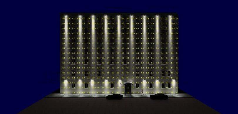
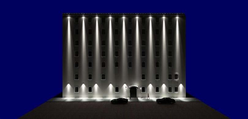
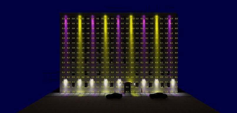

floodlight beam’s virtual performance, the architect then had an assurance of this product’s capabilities, justifying the luminaire cost, and eliminating the need for any physical mock-up.
Mostly yes, but sometimes, no. In the re-purposed bank space below, for example, the horizontal foot-candle values are indeed minimal (<5FC), though this setting is one for evening entertaining, and thus the lighting focus is on the wall hangings and the piano in the center of the space. Telling this lighting story with the resulting foot-candle calculation only would tell nothing of the ambient effect of the entire lighting system, particularly when the color-changing and fresco backlighting impacts are revealed.
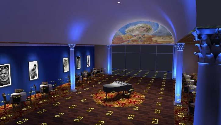
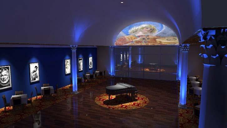
As often might be the case, a rep may be asked to recommend a product for a specific design need, with the follow-up request to confirm the specifier’s luminaire placements are adequate to the task. At this point, a design software, such as Lighting Analysts’ AGi32TM, would typically be utilized to provide the calculated empirical results, normally in foot-candles.
In years past, however, these results would have rarely included details such as interior walls, office windows, exterior (perimeter) glazing, or varying ceiling heights, all of which can dramatically impact resulting lighting levels. Today’s design software provides the capability for these details and many more, thus telling a more accurate and meaningful lighting performance story.
In the example to the right of a single floor of an office tower LED upgrade, we thought it critical to the empirical ‘story-telling’ to be sure any items which might obscure (or

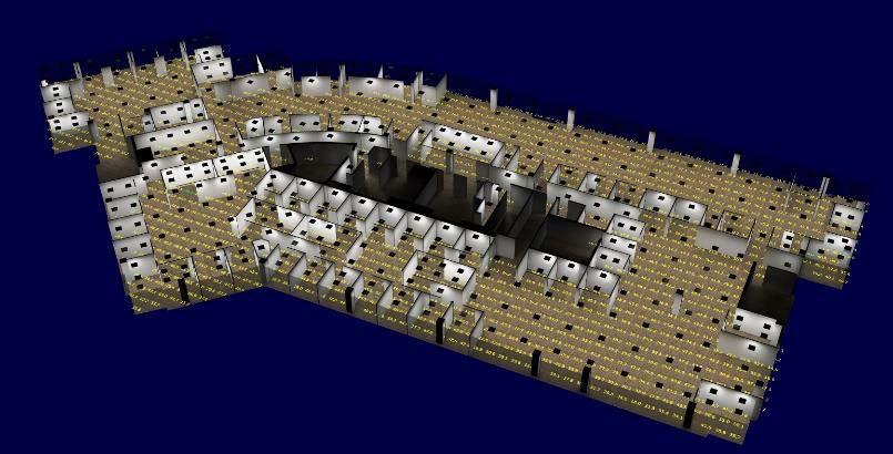
sometimes enhance) the resulting light levels be considered for the client, a large real estate management company. Thus, all the interior walls, structural columns, office, and perimeter windows were considered in the calculated results. The simple addition of a carpet texture (with an adjusted reflectance to the standard 20%) on the floor provides some architectural context, particularly in the generated rendered images.
As a lighting professional, it’s incumbent upon everyone to be accurate, especially as it applies to not only marketing lighting products, but to telling a more holistic lighting performance story. By delivering lighting information beyond merely single product or package cost, you raise your professional quotient to your customer base, from specifier to end-user, all while dramatically improving those elusive odds time and again to secure the order. ■
designing lighting (dl)
Spotlights
Two of the Mentor-Mentee
Pairs from Season Two of the Silhouette Awards


Walesca and Kristina have tea together (decaf for Kristina) during one of their early morning/late night chats.
Credit: Walesca Zanonato and Kristina Allison
The second season of the Silhouette Awards is coming to a close. Journeys that began at the beginning of March will wrap up – officially, at least – at the end of August. For those unfamiliar, the Silhouette Awards program pairs 20 up-andcoming lighting designers with 20 experienced lighting professionals for a 6-month mentorship journey.
The program continues to unite lighting professionals from around the globe. This season featured mentors and mentees from 26 different countries. We at designing lighting (dl) have followed the program closely since its inception. Here, we take a deep dive into two of the pairings from this season to learn more about their mentorship journeys.
Walesca Zanonato first heard of the program when it was launched in 2021, but she was unable to apply for the first season due to the age restriction.
The program removed that restriction for the second season, and Walesca wasted no time in applying. Feeling like she was late to the lighting game, at least relative to some of her peers, Walesca was looking for a way to expand upon her experience and education, and the Silhouette Awards provided the perfect opportunity.
When Kristina Allison was approached by co-founder Eve Gaut about becoming a mentor for season two, she initially questioned what she could offer a mentee. Reassurance from friend and fellow mentor Florence Lam convinced her that, with her years of experience, she had plenty to offer. And, in Walesca, she saw a bit of herself, noting, “I was really inspired by her story. A bit like myself – I didn’t officially study lighting. She’s got this background that wasn’t typical. I love people who don’t just train in lighting – I think they have so much to offer.”
The pairing was a natural fit, and they hit the ground running, first constructing a mind map to help plan the journey and set objectives.
Walesca sought to develop a more structured approach to creative lighting design. “I have a very artistic, creative way of thinking,” she noted. Lighting design starts with concepts, but, in the end, you have to get to a technical, workable description of the project. Kristina has helped her to successfully bridge both the creative and the technical aspects of the job. “She has helped me become friends with the standards,” Walesca joked.
The relationship hasn’t been without challenges, and the pair has had to adjust on the fly. The original plan for weekly meetings proved unworkable, mainly due to the time
difference between the two, with Kristina in England and Walesca in Australia.
They had the timing worked out – Walesca would wake up and begin her day with a call to Kristina, who was just putting her kids to bed. But, at the end of March, clocks spring forward an hour in England, just as they are put back an hour in Australia, making the mornings even earlier for Walesca and the nights even later for Kristina.
An unusual aspect of their pairing is the fact that Kristina and Walesca are the same age, though at different stages of their respective careers. Walesca noted that this has caused them to reflect on the unique journey every designer takes and appreciate how far they have both come. It was clear from our conversation that the two have developed a deep friendship, and I suspect this is one reason why.
Being across the world from one another, they have yet to meet in person, though they plan to at some point, and they intend to stay in touch.
When I commented that season two was coming to a close, Kristina, somewhat surprised, replied, “Is it? We’ve just been talking all the time. I didn’t even think about when this was ending.” Walesca added, “We are just getting started.”
Danai Lytra heard about the Silhouette Awards through a friend in Sweden who had participated in season one. When the applications for season two opened, she was venturing out into uncharted territory for herself, both creatively, by beginning to explore public light art installations, and professionally, by starting her own company. In the midst of these challenges, she felt it was the perfect time for a mentor.
Prior to season two, the Silhouette Awards team reached out to Claudia Paz about being a mentor – an opportunity she gladly accepted. “Our community is so small. I always try and help. I think it’s the best way to leave a trace of what we are doing,” she explained. She has run her own studio for more than a decade, working on unique projects integrating light, art, and technology.
Claudia’s experience and Danai’s goals synergized perfectly. They began with Danai listing those goals and how she felt Claudia could help. Quickly, an idea for a public light art installation in Stockholm was born.
The Silhouette Awards team put them in contact with GVA Lighting, who wanted to sponsor the project.

Awards.
“I know what it’s like to be scared, to be uncertain. But, if you don’t move forward, you are never going to know. So, you need to jump into it.”
— Claudia Paz
Claudia helped Danai refine the design concepts and prepare her presentation. She explained, “One important thing when doing installations in an urban space is to prepare the presentation in a way that you can sell it to the public - not because they are going to buy it, but so they will believe in it.” A fully formed and easily presentable concept, with all the necessary views and renders, can be the difference between a successful installation and a project that ends up on the shelf.
On the professional side, the primary fruit of their collaboration has been guiding and inspiring Danai in the early steps of her career as an independent lighting designer.
When Claudia began her own studio in Peru, she recalled
fellow designers telling her it wasn’t going to work – the market didn’t exist, it was impossible to make a living, etc. In their discussions, Claudia noted, “I know what it’s like to be scared, to be uncertain. But, if you don’t move forward, you are never going to know. So, you need to jump into it.”
Through their time together, Danai’s lighting design circle has expanded. She has been in contact with several of the other mentees and connected with fellow Sweden-based lighting designer Beata Denton, who has served as a mentor in both seasons of the program. And, Claudia even put Danai in touch with David Gilbey, a mentor from season one, who shares a love for this type of installation Danai is working on.
“This is the beginning of a journey,” Danai noted. A fruitful one, at that. ■
Seasons one and two have been resounding successes. Entries for the next iteration of the program begin in September of this year. Stay tuned for the upcoming season’s list of mentors, and make sure to follow the program on social media for the latest updates.

The brand-new Mosaic Bell combines tunable white, color mixing, and high CRI in one sleek package. Suitable for museums, retail, theaters, and theme parks, it features tunable white from 16508000K at 90+ CRI plus rich blues, ambers, reds, violets, and greens. Interchangeable reflectors allow beam angles between 10° and 60°. Accepts multiple accessories.

Midnight Zone(s) (2023)
ANYA TISH GALLERY
Houston, Texas
In pursuit of new discoveries, Midnight Zone(s) is based on fictional oceanscapes and creatures, a reinterpretation of nature that allows imagination to flourish. The title refers to a layer in the ocean which is lightless, under high pressure, between 3,000 and 10,000 feet deep. The most bizarre and fascinating creatures have adapted to survive under those conditions. Oceans are the most beautiful and, at the same time, the most terrifying unexplored places. Underwater bioluminescence phenomena continue to be an inspiration for the artworks illuminated from the inside and outside.
Tell me about your background. When did you begin creating art?
My usage of light as a medium, with a lot of bright colors, provides a personal psychoanalytical perspective – that of my childhood and adolescence in Romania. It is a reaction to the harshest years of communism. The standard of living was well below any technological progress claimed by the system. We didn’t have electrical power or enough heat in the apartments.
I was born in Romania in 1976. At the age of 13, I was a direct witness to the bloody Romanian Revolution of 1989, which started in my hometown and ended with the overthrow of the totalitarian regime in Romania. All the bright lights and
colors represent my new-found optimism and personal growth out of the darkest time of my life. Considering how my career turned to light installation art, I think my appreciation for light started then.
Tell me about your journey as an artist and how you began using light as a medium.
I began as a painter. I always wanted always to paint - that was my dream. I got into the painting program at University of Houston, and I slowly moved to sculpture. At that point, I was making art objects - I didn't call them sculptures. I was painting them the same way I would a painting. The objects were becoming more three-dimensional, but I was a little frustrated with the medium because it was never bright enough. It was missing something.
That's when I went to the source. You cannot enjoy a painting, drawing, or sculpture without having light. I also studied art history, and I
began looking into what happened in the light movement. I was already familiar with some of the well-known light artists. But, I thought, “I need to bring something new.” What is new? I looked at the computer industry, and that was when I had a breakthrough using light. If you look at the computer, there is a CCFL light inside. In a way, I made the computer “explode” instead of containing it in a box.
The other issue that I was concerned with was consumption. Society moves forward, and many new technologies consume less energy. This is in contrast with nature, because we are destroying nature using too much technology. I said, “No, you marry both of them.”
My work also reflects on the culture of consumerism by introducing materials that serve as examples of ways to improve the environment by consuming less energy. The installations created with these materials provide new types of environments, visually

Various locations
and power sources is meant to suggest the latest computer technologies presented from the inside out in the space of the viewers, multiplied and fragmented in the space of the gallery.
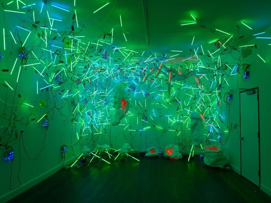
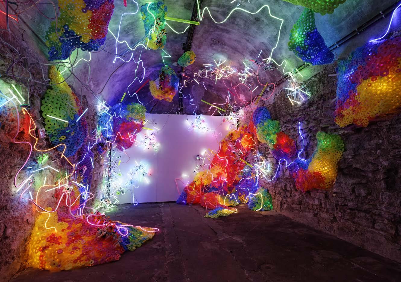
Chaos Exstructa is an interdimensional space through which future technological chaos seeps into our reality. The installation contains an abundance of light energy that infuses in all directions, bouncing electronic elements into the surfaces of the historical architecture of the museum. A mélange of geometrical and organic elements hint at the true definition of chaos. Andea’s installations use a unique visual vocabulary and rely on the reinterpretation of our current perception of nature seen through the eyes of new media art using the latest technologies. imitating nature, thus transplanting the idea of nature into a new artificial form.
I am not a painter. I am not a sculptor, so what am I? I am an installation artist. Basically, installation art is not something like a sculpture you walk around – you are inside the art itself. A fantastic aspect of the installations is that they are constrained by the space – either you are in a traditional white cube gallery or a historical building like the Center for International Light Art in Germany.
I visualize the installation through the challenges of the
space – the more interesting the building, the better the installation. I have to be physically present, and sometimes I work in the space 12-16 hours a day. I spend anywhere from one to six weeks on an installation, working without interruption, because finding the creative moments takes time. I have to feel the space and the flow of the future audience in order to create a truly immersive installation. The main units of the installation are created in advance (months and years of work on some), and then they get transported to the location. However, interconnecting the units and arranging them to create a certain flow takes longer than hanging an exhibition. Most art spaces offer 5-7
days because of business constraints. Finding the privacy to create in a public space is the biggest challenge of my big installations.
I do rely on nature, but I am embracing the idea of a surrogate nature. My installations rely on a reinterpretation of nature that allows imagination to flourish. A lot of the materials and the forms that I started to use look like something underwater. The bioluminescence phenomenon. I created a large installation, based on that, made with pool noodles. I thought, “I'll make one show on it.” And, ten years later, I have many variations of it, and the installations have grown larger and larger.
That's how I arrived basically to the medium of light. I did get my Masters of Fine Arts at University of North Texas. When I enrolled, they accepted me in sculpture. I was one year into the sculpture program, and I was ready to pack my bags. I said, “I'm not a sculptor. That's not what I want to
do.” I want to work with light. I'm an installation artist. The new media department had just started at the master's level. I transferred there, and I was one of the first to graduate in the new media studio arts. It was the right place at the right time. I was doing the type of work that the new media department was looking to convey. You have to bring that virtual world into the physical world and have the audience experience that, feel that environment.
If our readers wanted to stay tuned, where would be the best way for them to find information about you?
My website and social media are the best places to keep up with my work. You can also find my work in the galleries where I exhibit:
• Anya Tish Gallery, Houston, TX
• Cris Worley Fine Arts, Dallas, Texas
• Samuelis Baumgarte Galerie, Bielefeld, Germany

FINAL SUBMITTAL DATE Closed
ANNOUNCEMENT DATE
13 September 2023 Click
FINAL SUBMITTAL DATE
21 August 2023
ANNOUNCEMENT DATE 9 October 2023
FINAL SUBMITTAL DATE 22 October 2023
ANNOUNCEMENT DATE EST November 2023

FINAL SUBMITTAL DATE Est November 2023
ANNOUNCEMENT DATE Est 18 January 2024
FINAL SUBMITTAL DATE Closed
AWARD PRESENTATION
Est 15 or 16 August 2024
FINAL SUBMITTAL DATE 22 January 2024
ANNOUNCEMENT DATE 14 March 2024
FINAL SUBMITTAL DATE







Brian Wiley and Drew Miner joined as Senior Lighting Designers. Leo McIlvain joined as Designer. Pomme Lee and Thomas Bergeron have been promoted to Associate Principals.


Domingo Gonzalez Associates
DGA welcomed new Designers Ajin and Tzu-Hsin.


Gillian Wright started a new position as Lighting Designer.

Chelsie Cocjin started a new position as Architectural Lighting Designer.

Pei-Chun Yang joined as Design Principal.

Alana Shepherd started a new position as Lecturer of Lighting Design and Technology.
Chris Hoyman was promoted to Associate Principal.
Eda Muco was promoted to Associate.
Stephanie Valencia was promoted to Associate.

L’Observatoire
Liyi PanLiy was promoted to Associate.

Monica Llamas joined as Senior Lighting Designer
Dan Weissman was promoted to Associate Principal/Director of Lam Labs. Penn Whitlow was promoted to Associate.




Project Focus: Museums Controls and Commissioning

salutes and thanks its advertisers for their support. We applaud the achievements of lighting practitioners and recognize the importance of their work in architecture and design.
salutes and thanks its advertisers for their support. We applaud the achievements of lighting practitioners and recognize the importance of their work in architecture design.





COYLE, LC
this magical and transformative medium that was very different than a physical object [although he still loves scenic design, and practices it as a hobby]. Lighting also had a faster pace –you could screw up and fix it in seconds…that gave you some freedom to explore, experiment, and be more fluid. The thing that kept me from going back to school to become an architect was seeing all these people my age slaving away on one or two projects – here I was in a firm of four people when I started, and we had over a hundred projects. So much variety – one day a church, the next day a convention center, then a hotel – working in-depth on all of these at the same time!”
Asked about challenges, David speaks of the current state of design trades broadly within a growing construction industry where there is more demand and respect for design services, but also at a time where the power has shifted to the constructors, with quality and design becoming a commodity. “This shift requires a lot more defence of your design – for many reasons, including budgetary concerns and a simple power struggle over who gets to drive the narrative, deciding what product goes in. We try to create a collaborative atmosphere with everyone we work with – contractors, architects, interior designers, and owners, and try to educate on why we make certain choices along the way – and why those choices might not just be driven by the lowest cost. I think there is a lack of trust and respect for each group’s expertise and what they bring to the table – across the architecture and construction professions.”
By
As a kid building cities out of LEGO bricks, David Ghatan was determined to become an architect – but the theatre had other plans for him, capturing him during high school with its camaraderie and joy. Growing up in Boston for most of his childhood, David spent summers in Israel with extended family. In 1996, he headed off to The George Washington University in D.C., where he was able to study design and architecture, in a broad sense. With no formal architectural program, GW allowed David to create a program that combined Fine Art, Art History, Theatre Design and Architecture. He laughs: “The way I paid for college was building professional sets – big trade shows, newsroom sets, touring shows…I love working with my hands.”
Deciding he wanted to branch out from scenery design, David asked an architect who was a family friend what he knew about architectural lighting and was given a list of a few lighting design firms. Just finishing up a year of studying abroad, he called the only DC-based firm on the list. His voicemail, asking if the firm was looking for a summer intern, was left for Candy Kling, at CM Kling + Associates. David was hired in 1999 as a summer intern, continued working part-time through his senior year of college… and 24 years later, he is still there - leading the firm.
A legendary lighting designer, Candace “Candy” Kling unfortunately passed away in 2013. David reflected on Candy: “You find these moments in your life when you are just fortunate with opportunity or the people you meet.” They had theatre in common, as Candy had worked for, and been mentored by, Broadway lighting designer Jean Rosenthal – a pioneer in theatrical lighting design. For David, Candy was a “mentor, big sister, mother – all tied into one. There’s a lot of her personality that comes into my design sense but also in who we are as a company and how we choose to approach things.”
Once inside the world of architectural lighting design, David quickly became aware of several things about it that appealed to him compared to his original goal to be an architect: “Lighting is
More specific to lighting design, David sees we are now in a place where firms are maturing and need to become better businesses – continue to be great lighting designers, but also raise the bar on running professional businesses. David is on the Board of a new not-for-profit organization aimed at achieving this goal: Business of Light (BOL) – initially started as a way to honor Barbara Horton and Stephen Lees as great friends and mentors to the lighting design community.
Very committed throughout his career to the lighting design community, David is a Past President and ten-year Board member of IALD (International Association of Lighting Designers) and started the local DC chapter with another lighting designer. “Yes, it was time out of my life, my schedule, but it was extremely fulfilling…the friendships, the knowledge, the depth of conversations – things I apply every day still!” David’s mentor Candy Kling signed him up for IALD and IES during his intern days, making it clear that participating and giving back was part of the professional commitment – that legacy continues at CM Kling + Associates today.
Considering advice to those coming into lighting design, David offers: “Be curious, ask the question, do the research – don’t expect it to be handed to you. It’s all out there, it just takes that curiosity. You can tell people who get it - they chase the idea. And we always encourage people to get involved. We make membership in the lighting associations available. We also try to find ways to give people opportunities for trade shows, like LightFair.” Asked about the value of an in-person trade show these days, David is firm that it’s not only about seeing product. The in-person experience is hugely important – you can’t make those connections on a Zoom call. “As a designer, I need those connections with manufacturers – honestly, the physical product is almost less important than the relationship. Yes, I want the product, and I want it to function in a certain way, but I need the phone number to know that if I have an issue to solve in order to realize our design vision, that person at the manufacturer will know who I am and will pick up the phone.”
In the precious time when David is way from lighting, he and his wife enjoy travel, often to Northern California’s wine country, or you will find him reading books - everything from fiction to biographies to business. And, there is always the pull of local theatre productions! ■

EdisonReport.tv serves as a hub for all digital content in the lighting industry. A premier source for critical information surrounding lighting, EdisonReport.tv is dedicated to delivering industry news by way of video and serving its audience by spotlighting product launches and up-to-date educational videos, as well as information about upcoming webinars.
Janet Lennox Moyer Key Landscape Lighting Technique


Amerlux | Commitment to Best-In-Class, US Made Lighting Design Solutions

Verozza | A Testimonial from a Lighting Designer


Sterling Lighting’s Danville Summit 2023 Highlights

Cooper Lighting Solutions | Neo-Ray: Manufactured in America

Innerscene | CEO Jonathan Clark Discusses Key Products
