4 minute read
Sweet Color Combo


ARTS&LIFE
AT HOME
Advertisement
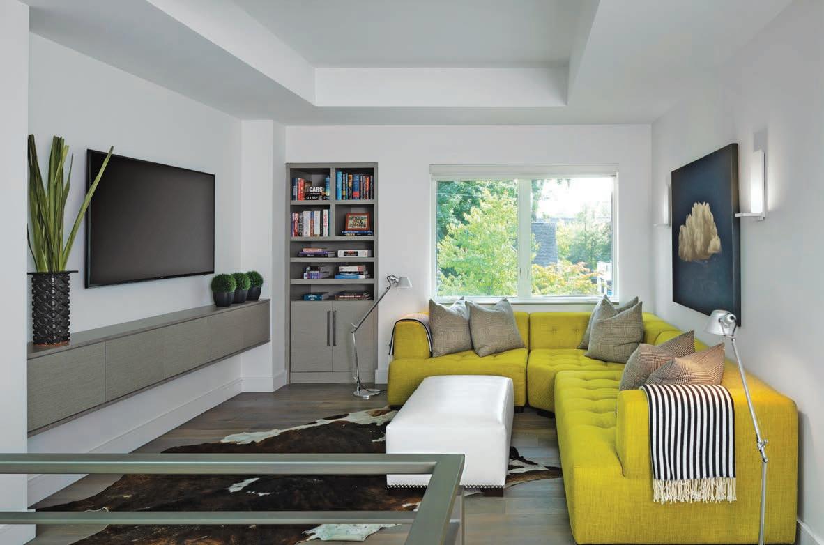
A children’s lounge space designed by Amy Miller Weinstein pops with illuminating yellow.
BETH SINGER
Color Combo
In Ultimate Gray and Illuminating, Pantone’s new dual colors of the year break free from a pandemic state of mind.
LYNNE KONSTANTIN CONTRIBUTING WRITER
Most of us have been happy to say “so long” to 2020. Close to a year of a global pandemic has had an effect on almost everyone — and almost everything — including the world of design.
Pantone is best-known in the fashion, beauty, graphic design and home design industries for its colormatching system — and the Pantone Color Institute has provided color reports and forecasts since 1962 (the year of Cerulean Blue).
The recently revealed Pantone Color of the Year for 2021 is a direct reaction to the mood of 2020 and a hopeful look forward to 2021. And for the second time in its history, the color is actually two colors. “Ultimate Gray” reflects on 2020 as a year — while also bringing a sense of comfort — and “Illuminating” is full of hope and positivity for the future.
“It is a pairing of two independent colors that come together to create an aspirational color pairing conjoining deeper feelings of thoughtfulness with the optimistic promise of a sunshine-filled day,” according to the institute.
“The selection of two independent colors highlight how different elements come together to express a message of strength and hopefulness that is both enduring and uplifting, conveying the idea that it’s not about one color or one person — it’s about more than one. The union of an enduring Ultimate Gray with the vibrant yellow Illuminating expresses a message of positivity supported by fortitude,” says Leatrice Eiseman, executive director of the Pantone Color Institute. “Practical and rock solid but at the same time warming and optimistic, this is a color combination that gives us resilience and hope.” Amy Miller Weinstein, owner of AMW Design Studio in Birmingham, agrees that the shades have an emotional impact.
“For me, the 2021 Pantone Colors of the Year evoke a ’60s vibe,” she says. “With the world in such upheaval, it feels synchronistic to be drawing on emotions that were so much a part of that era — and pursuing a hopefulness that in our differences, we can find our connections.” In a children’s lounge space in a client’s home, Weinstein anchored the room in tones of soft, soothing gray — brushed metals, cloudy cabinetry and ashy-finished flooring — but contrasts with a pop of lemony yellow in the form of a sink-
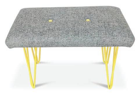
3 1 2
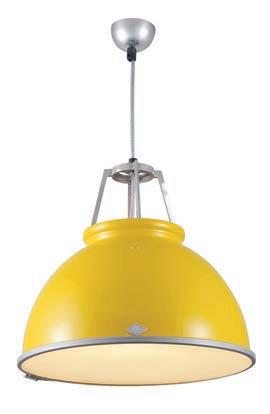
1 Original BTC brand light fixture. 2 Even subtle splashes of color can evoke the emotions of the Pantone combination, seen here in a throw from Heating-and-plumbing.com. 3 Harris Tweed bench with yellow hairpin legs.
PHOTOS - PRESS LOFT

in soft sectional.
“These colors intermingle well and lend themselves to bold graphic statements. The energy of the yellow is given additional power because it is juxtaposed to the quiet strength of the gray, and in this case, also the black and white.”
Jill Schumacher, founding partner of Rariden Schumacher Mio, in Birmingham, agrees with Weinstein that the dual palette has a vintage vibe. “This year’s colors are so fresh and current, yet feel retro and fun,” she says. “Illuminating yellow screams 1960s fashion — think Italy and London — so chic.
“The bright yellow is a muchneeded lift for our eyes as we lean into 2021,” Schumacher says. “And the Ultimate gray is anything but a standard gray — it has a crispness that makes its combination with the Illuminating really snap. The color combination is ready for a children’s space yet sophisticated for a family room or stylish new office space.”
Or a kitchen, which is where she recently used this color-combo for a client.
“I created a built-in banquette seat covered in a textured gray performance fabric and accented it with back cushions with a small triangle pattern of citron yellow and gray,” Schumacher says. “The cabinets were a medium-gray topped with white porcelain and we made a custom table with a criss-cross ‘pick-up sticks’ style table base in a powder-coated white — creating a crisp, coordinated look.”
“The Pantone Color of the Year reflects what is taking place in our global culture, expressing what people are looking for that color can hope to answer.” added Laurie Pressman, vice president of the Pantone Color Institute. “As society continues to recognize color as a critical form of communication, and a way to symbolize thoughts and ideas, many designers and brands are embracing the language of color to engage and connect.”
In other words, let’s look forward to a sunshiny-yellow future on the horizon — or at least a return to normalcy.
Sunshiny ’60s fashions

Polka dot wall stickers


