3 minute read
a collec Tor’s Feas T oF Fun, Funky, anD Bizarre
from Hot Stuff 12
by discopatrick
By SpaNKIE HazaRD aND SwIFFT EDITS (SEDGwICK RECORDS)
Eye-popping colors, trippy graphics, and sleeve after sleeve of funky cartoon hipsters: Welcome to the world of vintage Japanese record art. Long-term Japan residents, diggers and art aficionados Spankie Hazard and Swifft Edits break down what’s special about nuttily-illustrated Japan-market seven-inch and LP covers.
Advertisement


Seven Inch Wonders
In many countries, the humble seven-inch single was a visually simple product. A sleeve of plain paper. Or a company sleeve printed in the record label’s signature color–or maybe two colors, if the label had the cash. Such austerity was particularly common in America, where many of the most desirable 45s were pressed. yet in some markets, particularly eastern Europe and Japan, record buyers were treated to far more flash. Sevens came with picture sleeves whose art could rival that of LPs in its originality and flair. As the popularity of sevens has exploded over the past few decades, so has collectors’ desire to pick up these visually exceptional records.
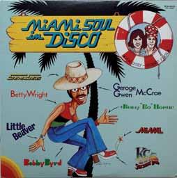
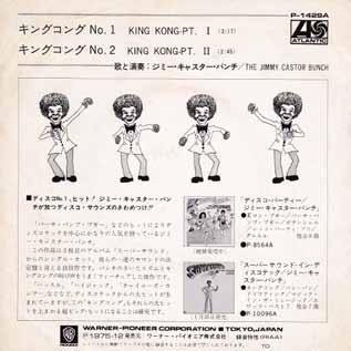
Japanese sevens are particularly alluring. There’s the exotic script, of course, gorgeously indecipherable to most Westerners (but usually with some helpful English alongside the Japanese). And then there are the pictures. The most striking are hand-illustrated and feature dancers, singers and disco scenesters partying like 1975 would last forever. Psychedelic cityscapes and the occasional absurdist scenario–like the finger jabbing straight through the head of the character on Cream de Coco’s “Wiggle, Wiggle, Wiggle,” or the naked figure leaping from the Afro of the character on Olympic Runners’ “Exit City”–only add to the fun. For diggers of funk, soul and disco, there is an incredibly deep trough of grooves with equally funky covers.
Like their cousins in Europe, Japanese distributors used existing photography or typography when they could, even if they felt the need to change song titles to appeal to local record buyers and DJs. Jabara’s “One Man Ain’t Enough” became “Funky Driver” and Armada Orchestra’s “Tell Me What you Want” became “New were rock stars (or, in most cases, aspiring rock stars in need of side gigs). Perhaps the best known and most recognizable funky Japanese seven artwork is by Emori Ai. Emori started as a young club-goer in Tokyo in the early 1970s, getting his fill of funk and soul. He gained a reputation as a talented dancer, but what he really wanted to be was an illus -

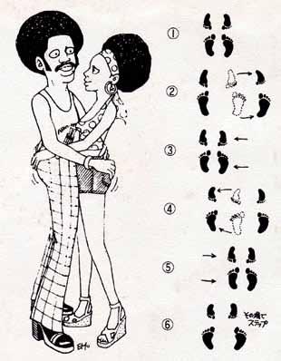
Things got more interesting when companies created their own picture sleeves, either because they couldn’t source outside artwork or their new song titles required matching visuals. The demand for imaginative local packaging intersected nicely with an oversupply of talented artists in a country where manga illustrators trator. His murals for a large disco in the Shinjuku district of Tokyo got people talking, and soon requests started coming in for artwork for local releases of funk and soul records. His recurring cast of stylish Black hipsters appeared on records from a wide range of labels–Motown, Philips, Avco, Mercury, A&M–in a branding freefor-all that would be unthinkable these days. Emori’s artwork made the music look simultaneously exotic and approachable, and above all fun. An Emori record often included dance-step instructions in the liner notes, again using the familiar characters–a feature made possible by the artist’s skill as both dancer and illustrator.
Emori often collaborated with a second artist, known only as Gangster, whose specialty was bizarre backgrounds, typography and framing. Emori-Gangster collaborations feature city skylines that range from the rudimentary to the detailed to the freakishly abstract.
“REMIXING” LP ART
Sevens weren’t the only record format to get the make-over treatment in Japan.


With LPs, local distributors had art from the original overseas release to choose from. But they sometimes made changes or added flourishes to meet the needs of the Japanese market. A good example: “Food for Thought” by the JBs. The original US artwork is simple and text-based–just the song titles printed over a black and red background. That didn’t exactly


“Pass the Peas” in some markets in Europe and South America, complete with a distinctive photo of green peas on the cover.
In Japan, the local distributor kept the original album title but ditched the art in favor of photos of the band playing live. It also plastered the title of one of the songs, “Wine Spot,” prominently in the center of the sleeve, like a second title, and in Japanese on the obi and insert–wine being, one assumes, universally recognized as an ingredient of a good party. The overall effect conveys the funkiness and energy of the music inside.
Emori Ai and Gangster were also heavily active in LP design, with some of their greatest work on compilations for Motown, RCA, All Platinum and others. Other stunning LP artwork was produced for Ultra help sell the record to non-English-speakers, which is probably why it was re-titled


So, enjoy this selection of LP and 45 cover artwork


