COVER AND SPREAD GALLERY
SOAK IT ALL IN.
Take your seats and get comfy in this carefully curated gallery. You might find yourself taking notes on new ways to yearbook at every turn.
That’s exactly why we’re here. Enjoy as you discover that each entry is a work of art in its own right — and all still manage to capture the essence of the school year.
They’ll make your yerdy little heart skip a beat.

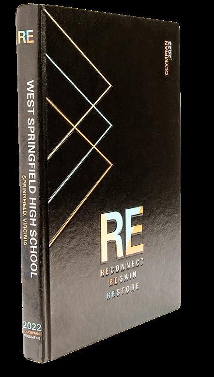
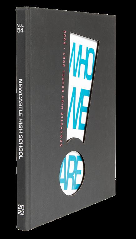
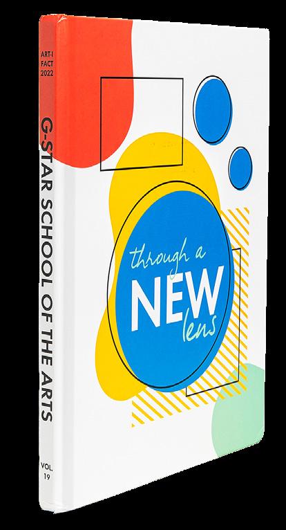

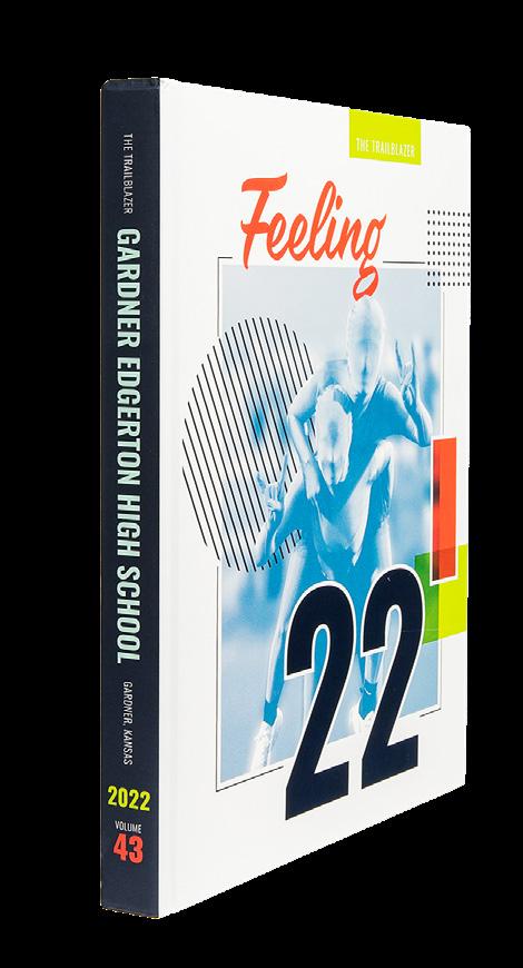



 HERNDON HS The Hornet | HERNDON, VA
G-STAR SCHOOL OF THE ARTS Art-i-fact | PALM SPRINGS, FL
WEST SPRINGFIELD HS Olympian | WEST SPRINGFIELD, VA
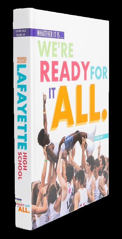
LAFAYETTE HS Legend | WILDWOOD, MO
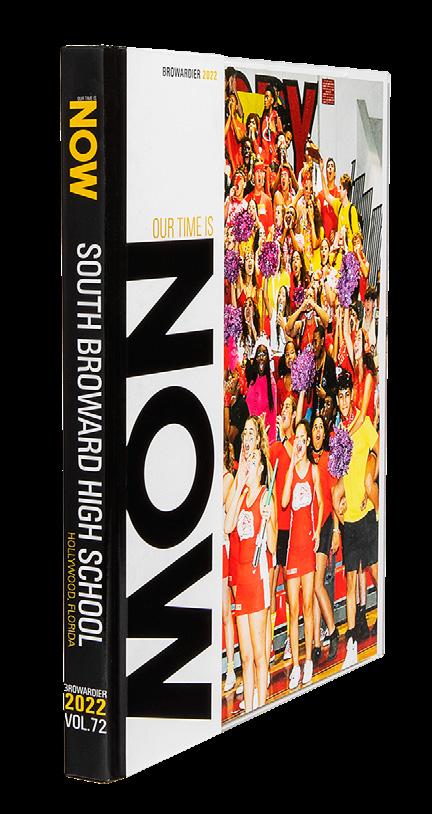
SOUTH BROWARD HS Browardier | HOLLYWOOD, FL
VANCOUVER SCHOOL OF ARTS AND ACADEMICS Ars Longa | VANCOUVER, WA
NEWCASTLE HS NEWCASTLE, OK
HASBROUCK HEIGHTS HS Coronian | HASBROUCK HEIGHTS, NJ
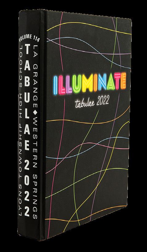
LYONS TOWNSHIP HS Tabulae | LA GRANGE, IL
GARDNER EDGERTON HS The Trailblazer | GARDNER, KS
CARMEL HS Pinnacle | CARMEL, IN
MELBOURNE HS Stepping Stone | MELBOURNE, FL
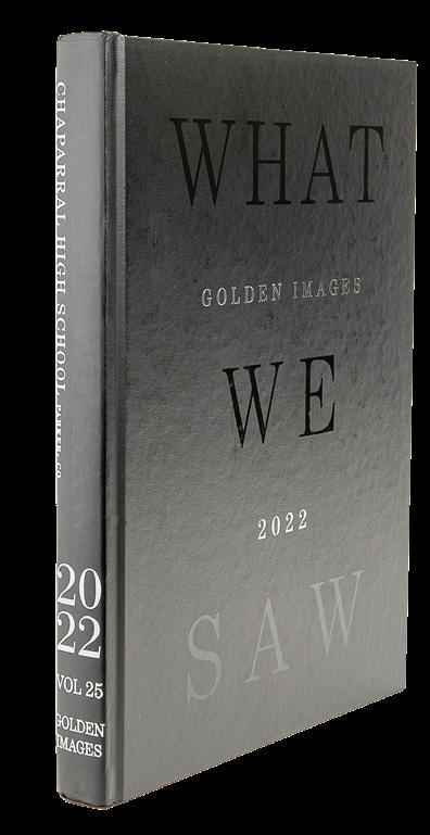
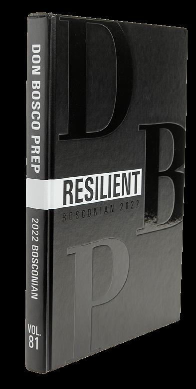

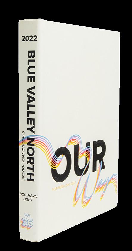
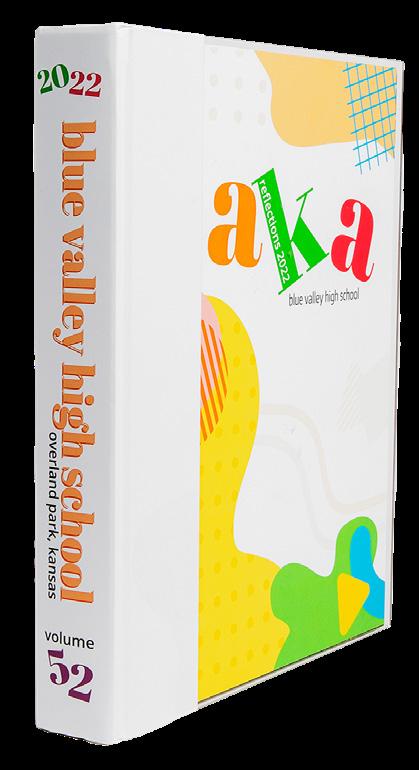










 MIAMI LAKES EDUCATIONAL CENTER Alpha Omega | MIAMI LAKES, FL
SCHOOL OF THE HOLY CHILD Traces | RYE, NY
ROBINSON SECONDARY SCHOOL Above & Beyond | FAIRFAX, VA
MAST ACADEMY Mako Fuka | MIAMI, FL
WARREN TOWNSHIP HS Blue Devil | GURNEE, IL
SKYVIEW HS Storm Chaser | VANCOUVER, WA
MIAMI ARTS STUDIO 6-12 @ ZELDA GLAZER Enchanted | MIAMI, FL
ROCKWOOD SUMMIT HS Pinnacle | FENTON, MO
SALISBURY SCHOOL Pillar | SALISBURY, CT
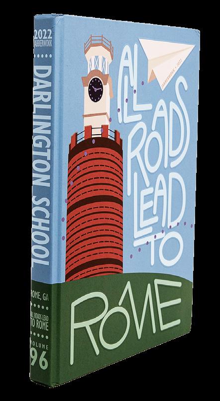
DARLINGTON SCHOOL Jabberwokk | ROME, GA
NORTH PAULDING HS Legend | DALLAS, GA
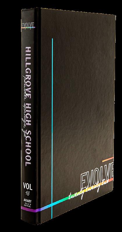
HILLGROVE HS Aviary | POWDER SPRINGS, GA


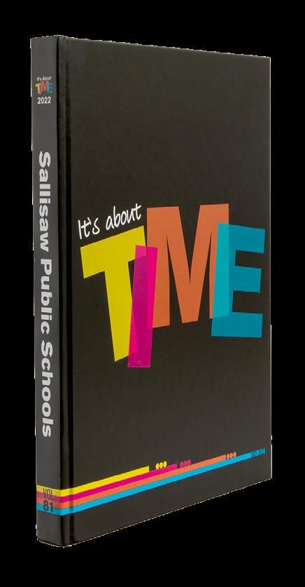
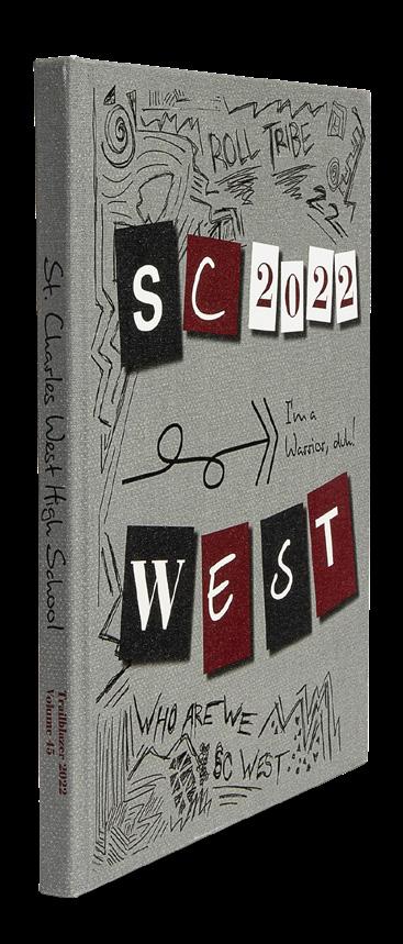




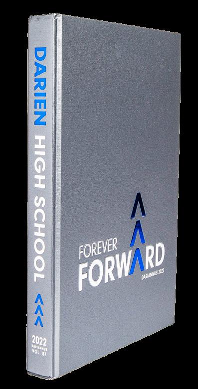








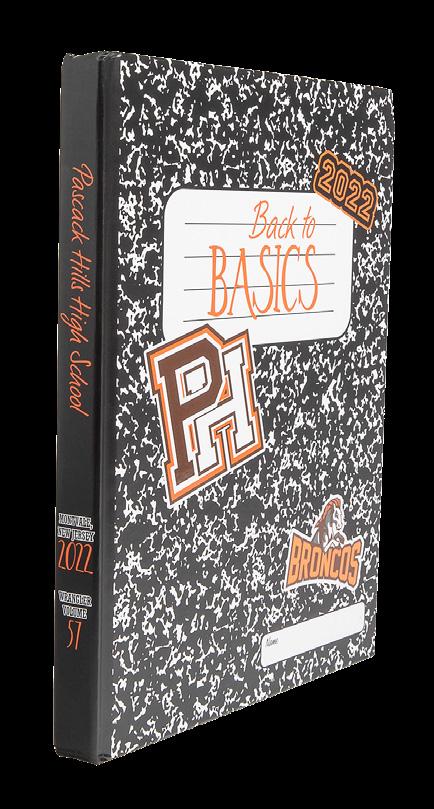


 PUTNAM CITY NORTH HS Panther Tracks | OKLAHOMA CITY, OK
AUBURN UNIVERSITY Glomerata | AUBURN, AL
HANOVER HS Aerie | MECHANICSVILLE, VA
ELON UNIVERSITY Phi Psi Cli | ELON, NC
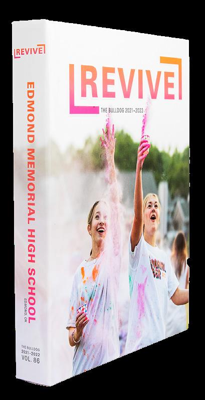
EDMOND MEMORIAL HS The Bulldog | EDMOND, OK
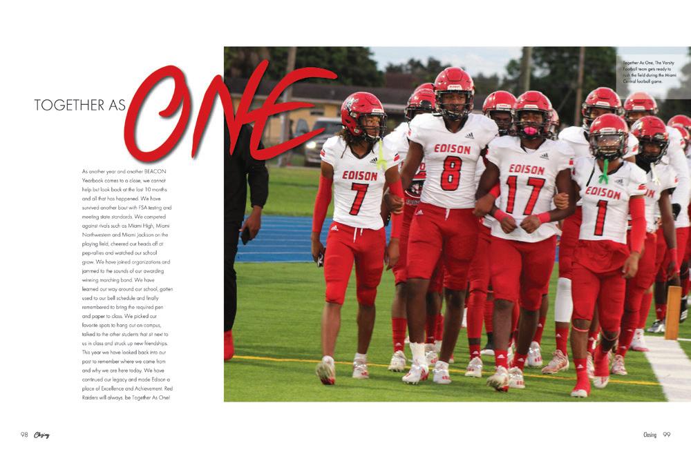
MIAMI EDISON SENIOR HS Beacon | MIAMI, FL
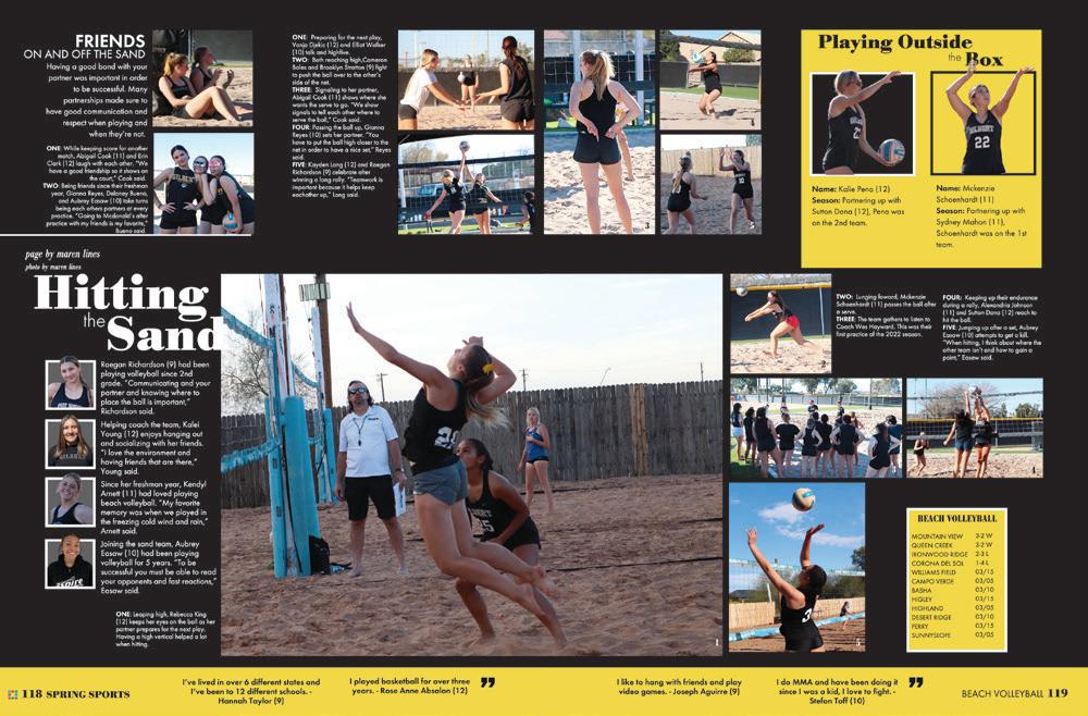
CAMPO VERDE HS Reflections | GILBERT, AZ
PASCACK HILLS HS Wrangler | MONTVALE, NJ
DOVER HS The Doverian | DOVER PLAINS, NY
DESERT MOUNTAIN HS Archives | SCOTTSDALE, AZ
CLOVER HS The Eagle | CLOVER, SC PEPPER PIKE, OH




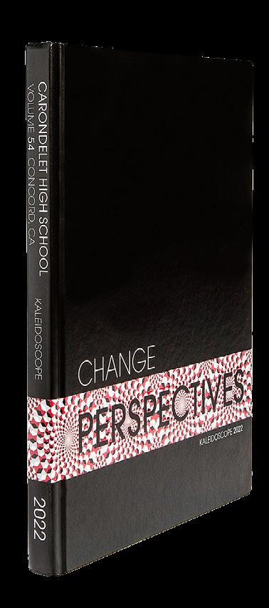






 FIORELLO H. LAGUARDIA HS OF MUSIC & ART AND PERFORMING ARTS NEW YORK, NY
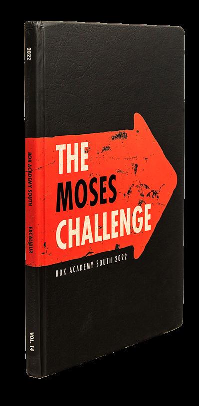
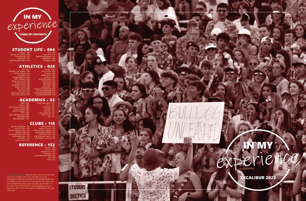
BOK ACADEMY SOUTH Excalibur | LAKE WALES, FL
NATION FORD HS The Ford | FORT MILL, SC
LAWRENCE HS Chrysallis | LAWRENCE, NJ
BLUE VALLEY WEST HS Illumination | OVERLAND PARK, KS
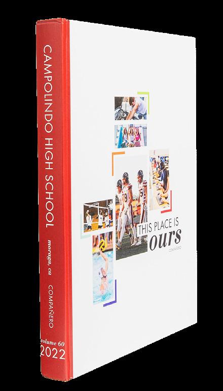
CAMPOLINDO HS Compañero | MORAGA, CA
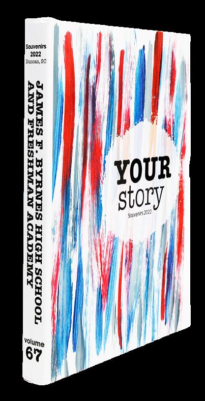
JAMES F. BYRNES HS AND FRESHMAN ACADEMY Souvenirs | DUNCAN, SC
HENDERSONVILLE HS Laureate | HENDERSONVILLE, NC
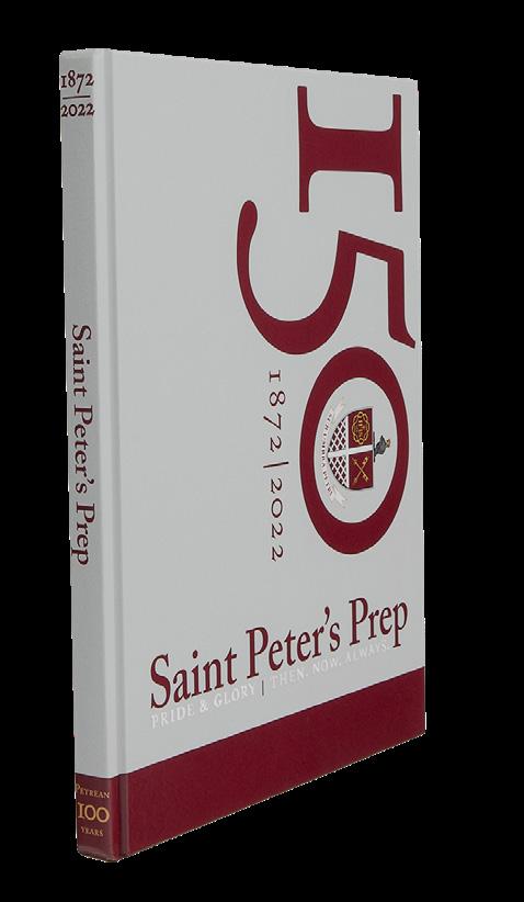
SAINT PETER’S PREPARATORY SCHOOL Petrean | JERSEY CITY, NJ
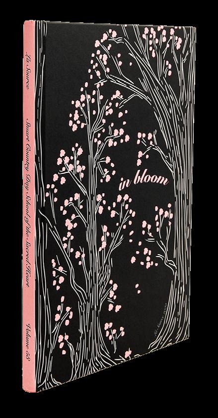
STUART COUNTRY DAY SCHOOL La Source | PRINCETON, NJ
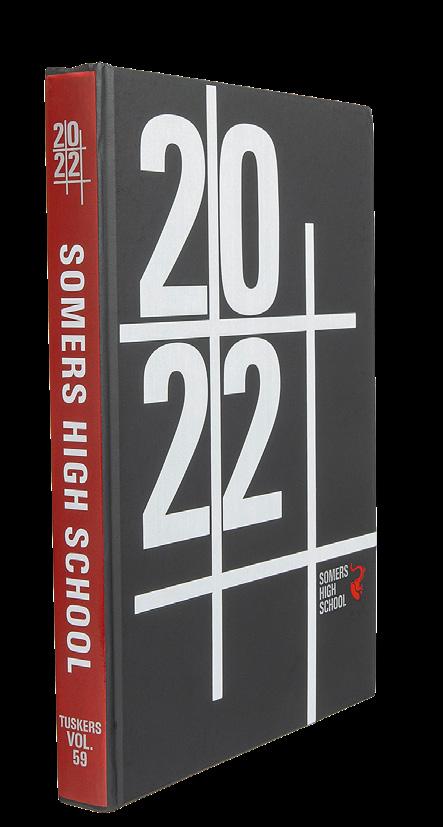
SOMERS HS Tuskers | LINCOLNDALE, NY
ELGIN HS The Owl | ELGIN, OK
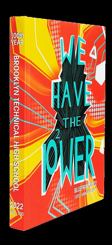
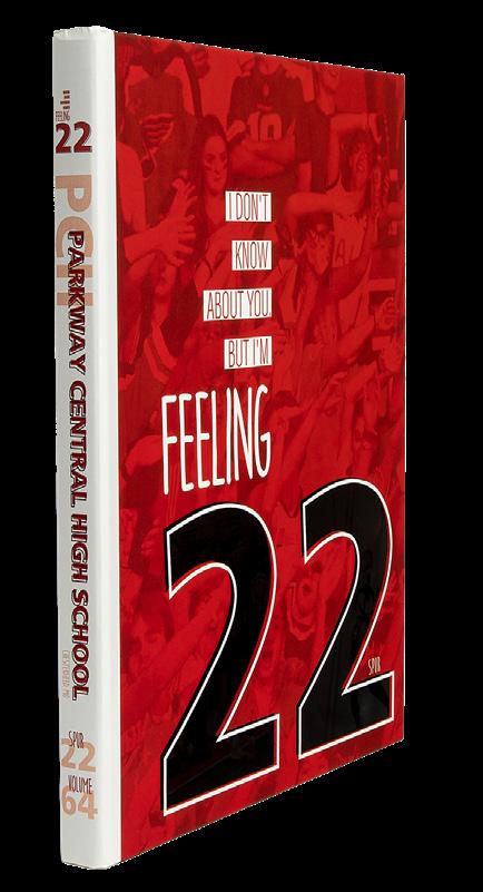

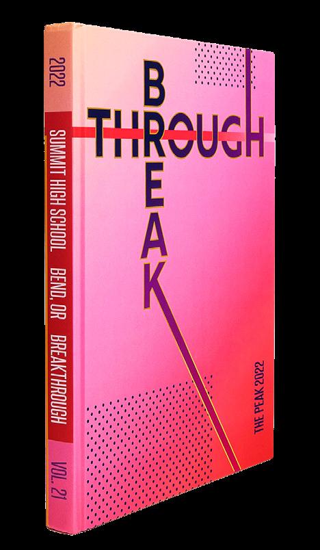
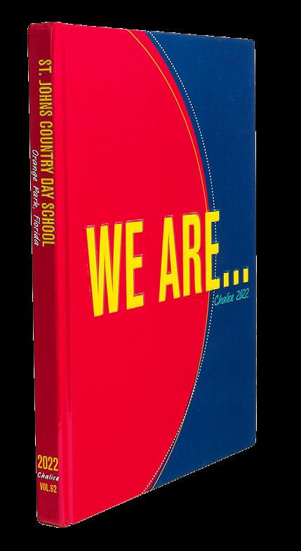

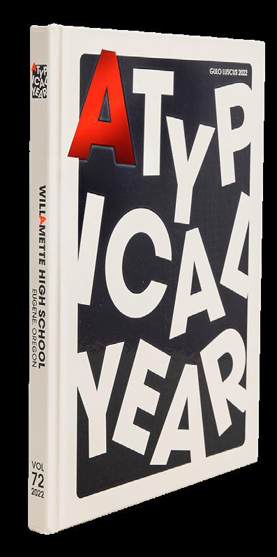

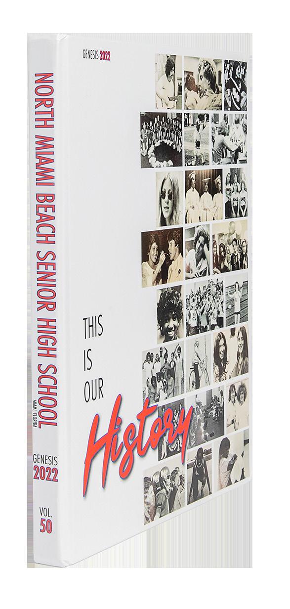





 RED MOUNTAIN HS Pinnacle | MESA, AZ
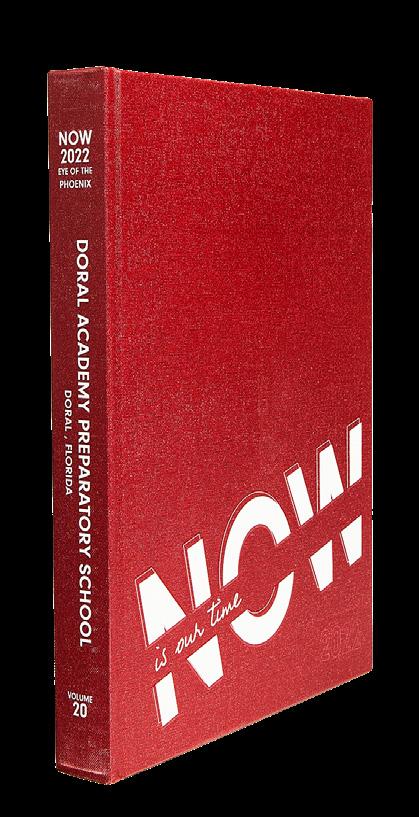
DORAL ACADEMY PREPARATORY Eye of the Phoenix | DORAL, FL
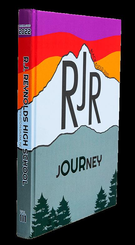
R.J. REYNOLDS HS Black and Gold | WINSTON-SALEM , NC
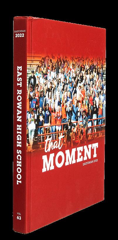
EAST ROWAN HS Eastonian | SALISBURY, NC
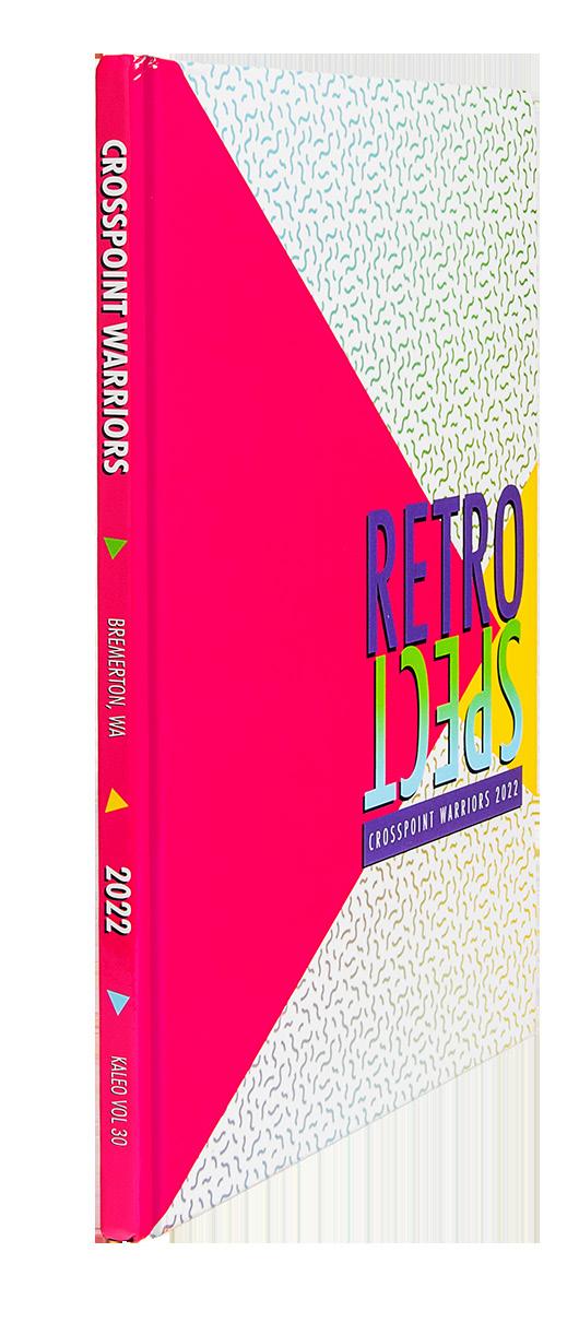
CROSSPOINT ACADEMY Kaleo | BREMERTON, WA
BEEKMAN CHARTER SCHOOL The Beekman Chronicle BASTROP, LA
PARKWAY NORTH HS Saga | SAINT LOUIS, MO
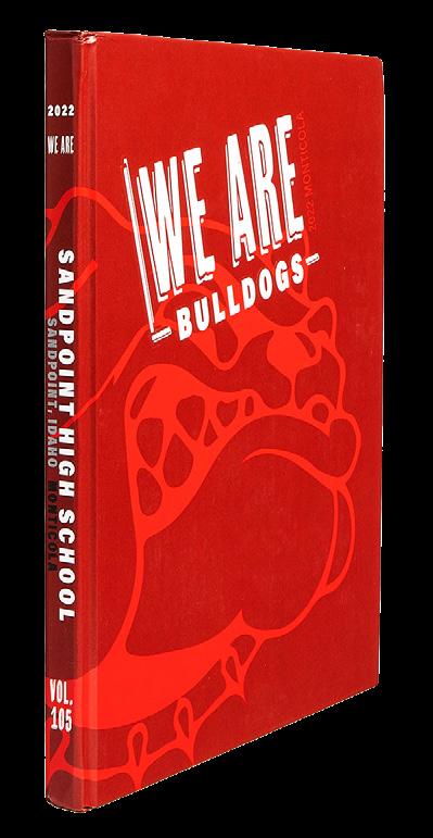
SANDPOINT SENIOR HS Monticola | SANDPOINT, ID
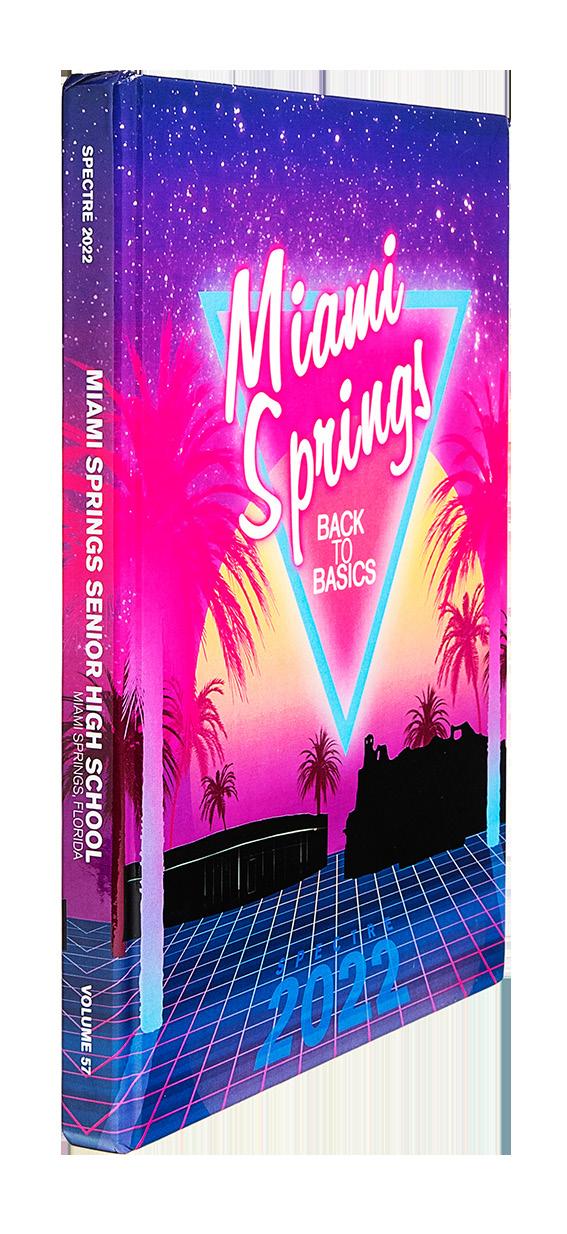
MIAMI SPRINGS SENIOR HS Spectre | MIAMI SPRINGS, FL
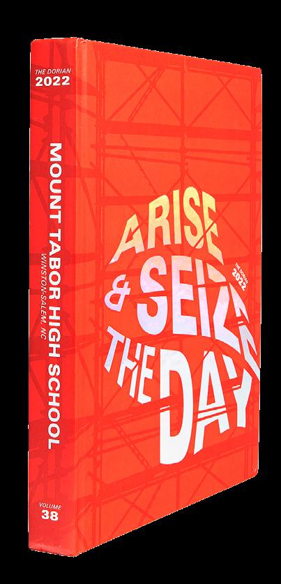
MOUNT TABOR HS The Dorian | WINSTON-SALEM, NC
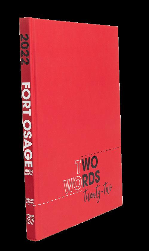
FORT OSAGE HS Indian Legends | INDEPENDENCE, MO
MOORESVILLE HS Wagon Trails | MOORESVILLE, IN



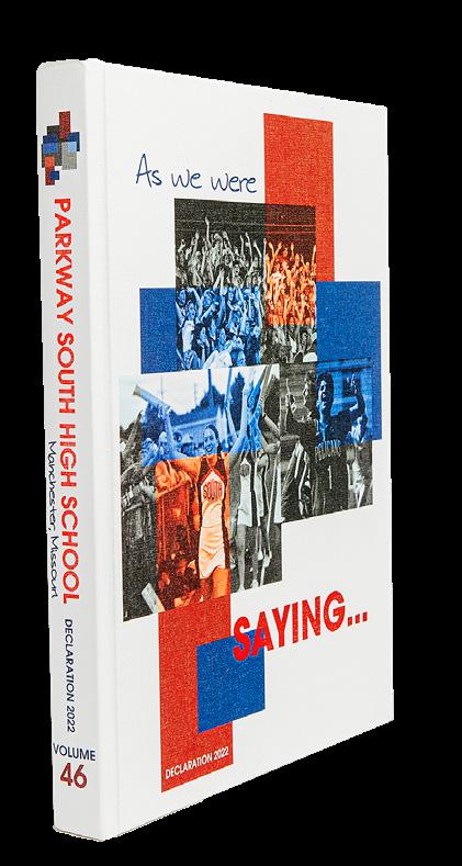





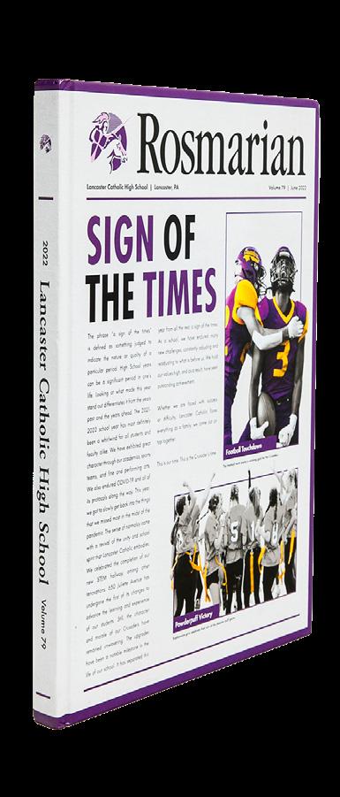
 LANCASTER CATHOLIC HS The Rosmarian | LANCASTER, PA
OLATHE EAST HS Aurora | OLATHE, KS
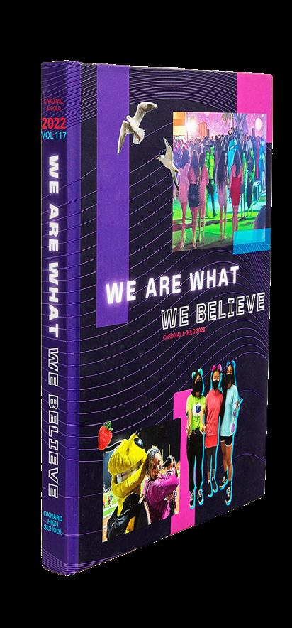
Cardinal & Gold | OXNARD, CA
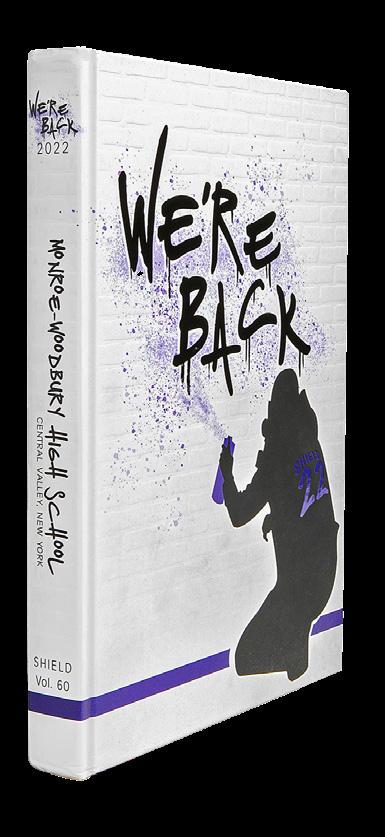
MONROE-WOODBURY HS Shield | CENTRAL VALLEY, NY
AMADOR VALLEY HS Dondays | PLEASANTON, CA
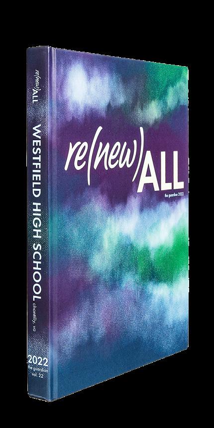
WESTFIELD HS The Guardian | CHANTILLY, VA
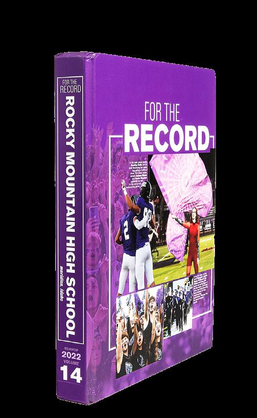
ROCKY MOUNTAIN HS Silvertip | MERIDIAN, ID
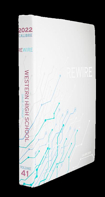
WESTERN HS Calibre | DAVIE, FL
WILLIAM H. TURNER TECHNICAL ARTS HS Technician | MIAMI, FL
LAKE REGION SENIOR HS Legend | EAGLE LAKE, FL
NORTH ARLINGTON HS Chrysalis | NORTH ARLINGTON, NJ
ALONZO AND TRACY MOURNING SENIOR HS Tiburon | NORTH MIAMI BEACH, FL

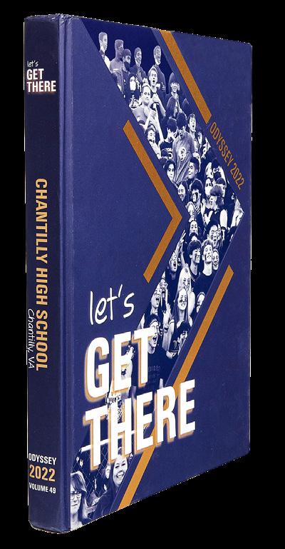
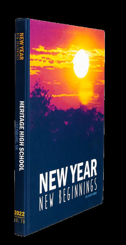











 SAINT CHARLES HS Charlemo | SAINT CHARLES, MO
TIMBERLAND HS Wolf Tracks | WENTZVILLE, MO
NEMAHA CENTRAL HS The Radar | SENECA, KS
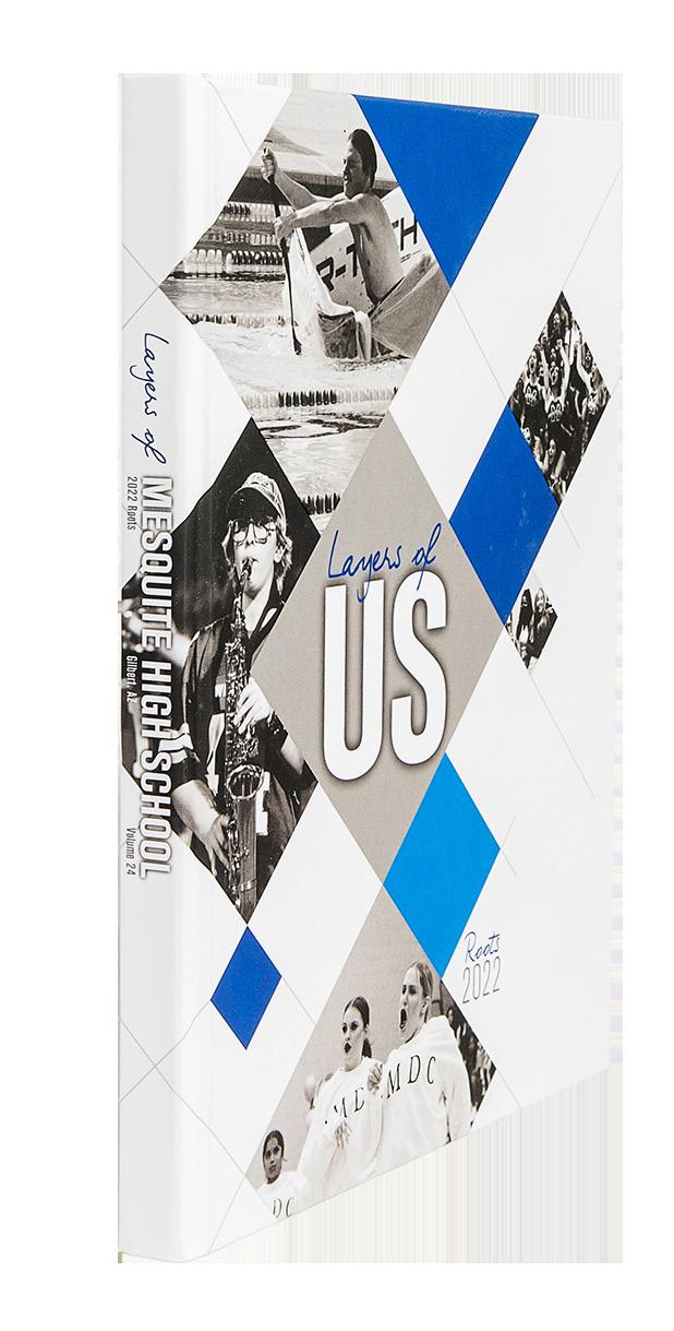
MESQUITE HS Roots | GILBERT, AZ
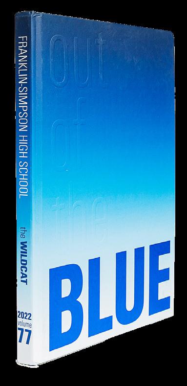
FRANKLIN-SIMPSON HS The Wildcat | FRANKLIN, KY
Equus | MESA, AZ
CHRISTIAN SCHOOL Saltshaker | FAIRFAX, VA
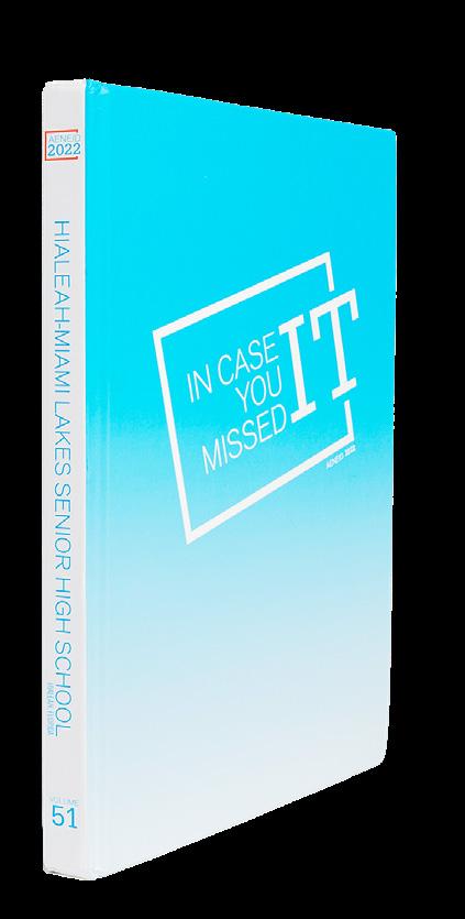
HIALEAH-MIAMI LAKES SENIOR HS Aeneid | HIALEAH, FL
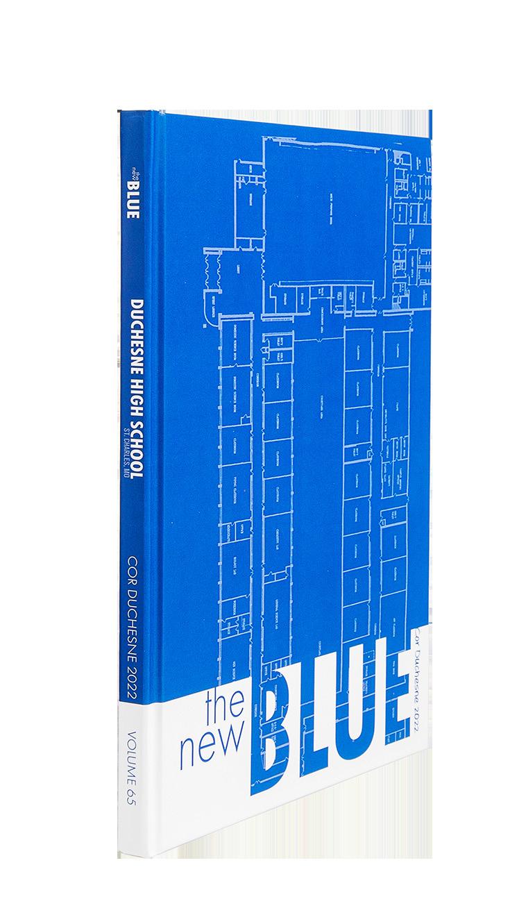
DUCHESNE HS Cor Duchesne | SAINT CHARLES, MO
HILLSBOROUGH HS Ramrod | HILLSBOROUGH, NJ
TOWNS COUNTY HS Hiawassee | HIAWASSEE, GA
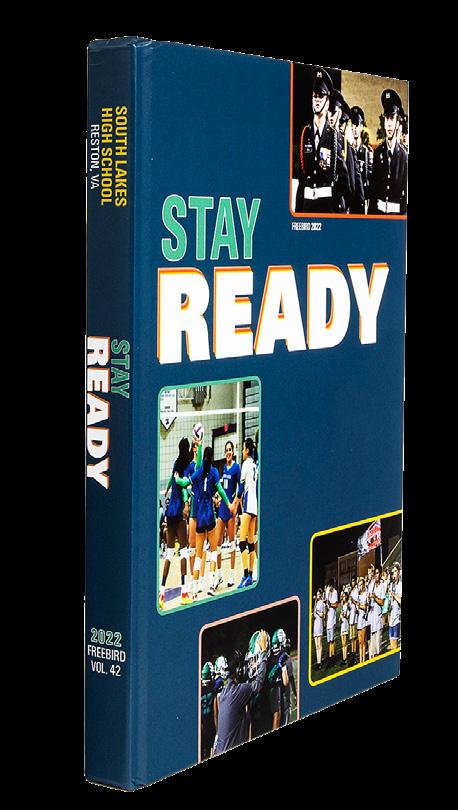
SOUTH LAKES HS Freebird | RESTON, VA




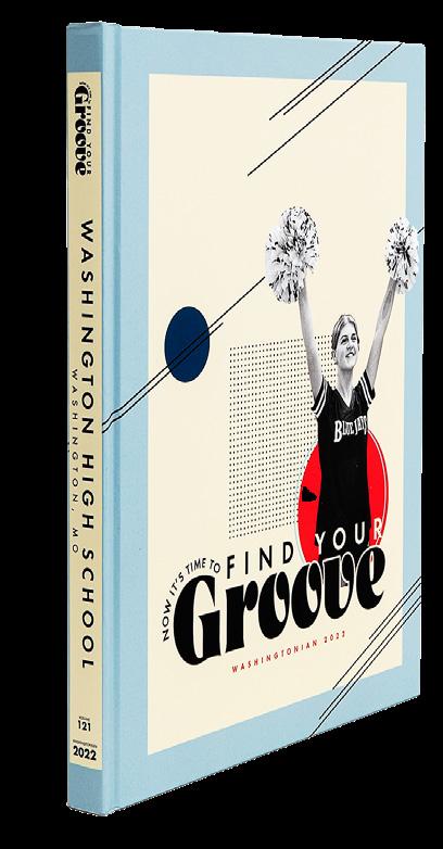

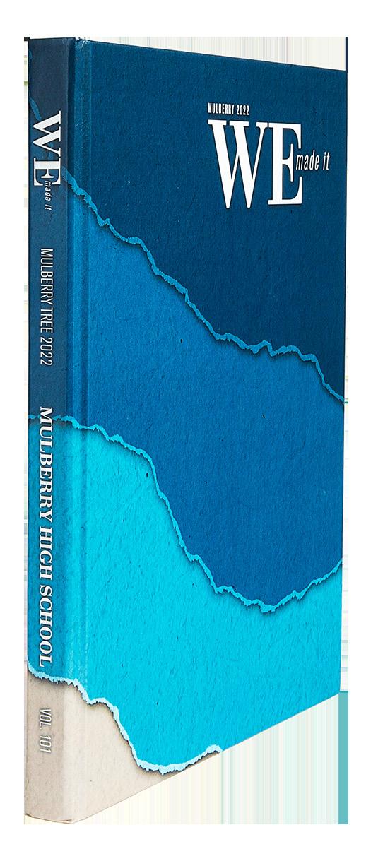
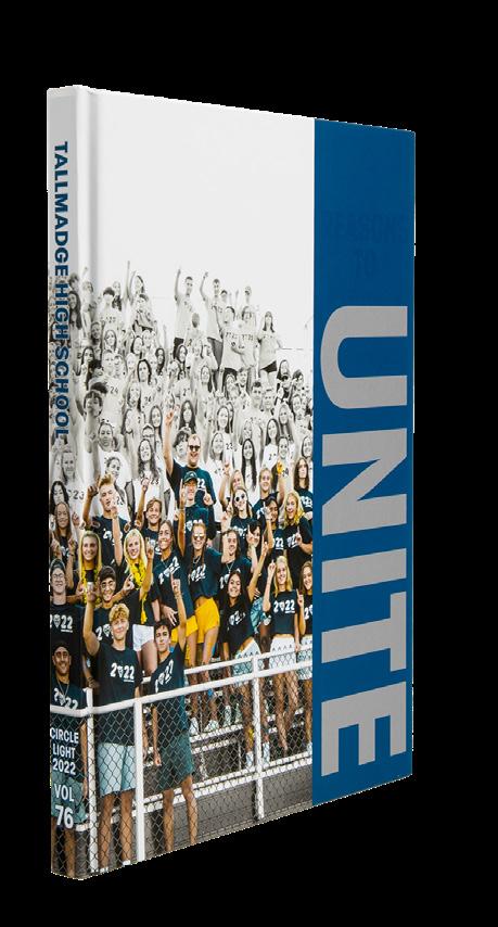
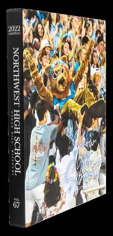


 YORKTOWN HS The Patriot | ARLINGTON, VA
MIDLOTHIAN HS Trojan | MIDLOTHIAN, VA
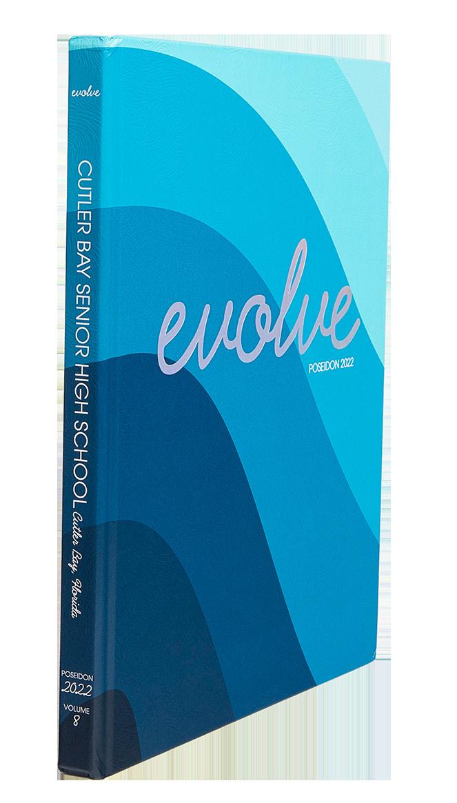
CUTLER BAY SENIOR HS Poseidon | CUTLER BAY, FL
PRINCE GEORGE HS Peerage | PRINCE GEORGE, VA
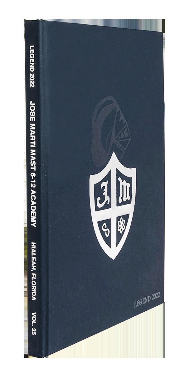
JOSE MARTI MAST (6-12) ACADEMY Legend | HIALEAH, FL
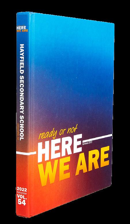
HAYFIELD SECONDARY SCHOOL Harvester | ALEXANDRIA, VA
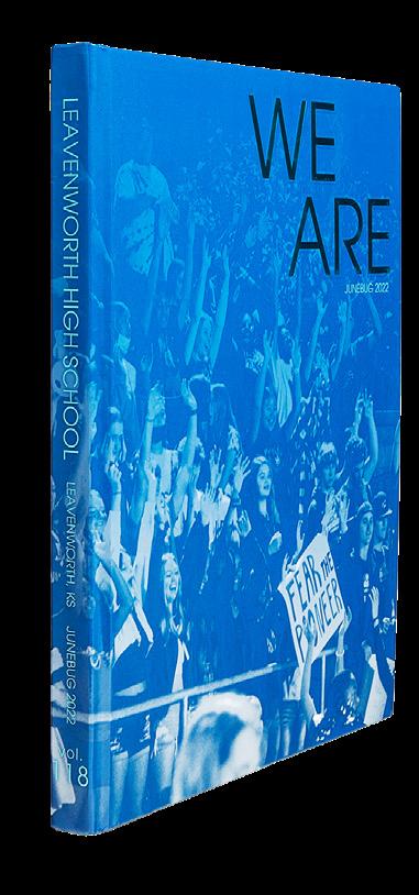
LEAVENWORTH HS Junebug | LEAVENWORTH, KS
LENNARD HS Legacy | RUSKIN, FL
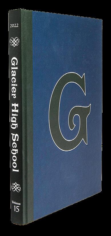
GLACIER HS KALISPELL, MT
THE WOODHALL SCHOOL BETHLEHEM, CT
RONALD W. REAGAN/ DORAL SENIOR HS Tatanka | DORAL, FL
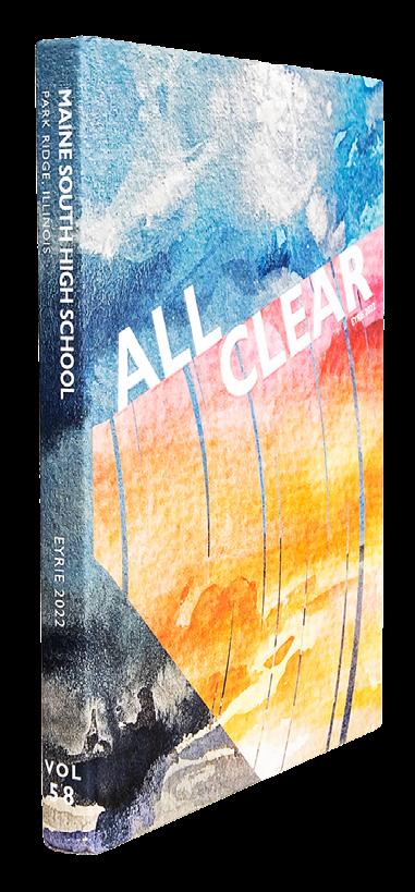
MAINE SOUTH HS Eyrie | PARK RIDGE, IL





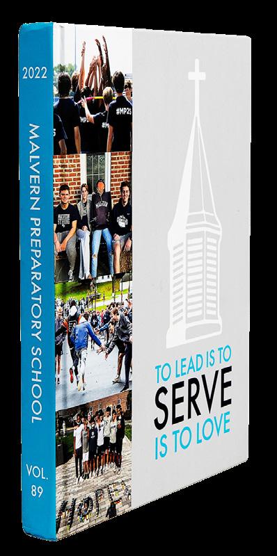



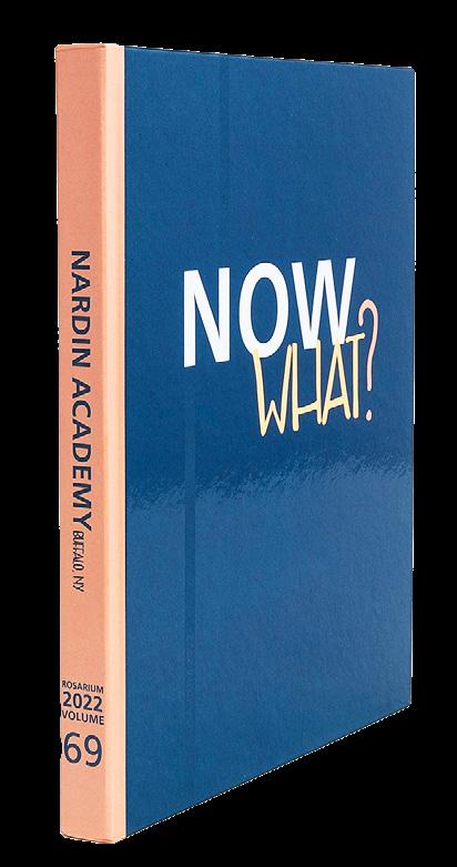

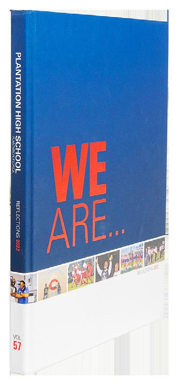
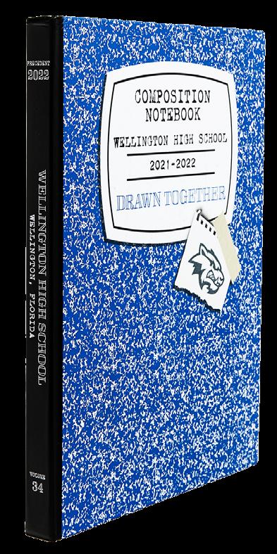
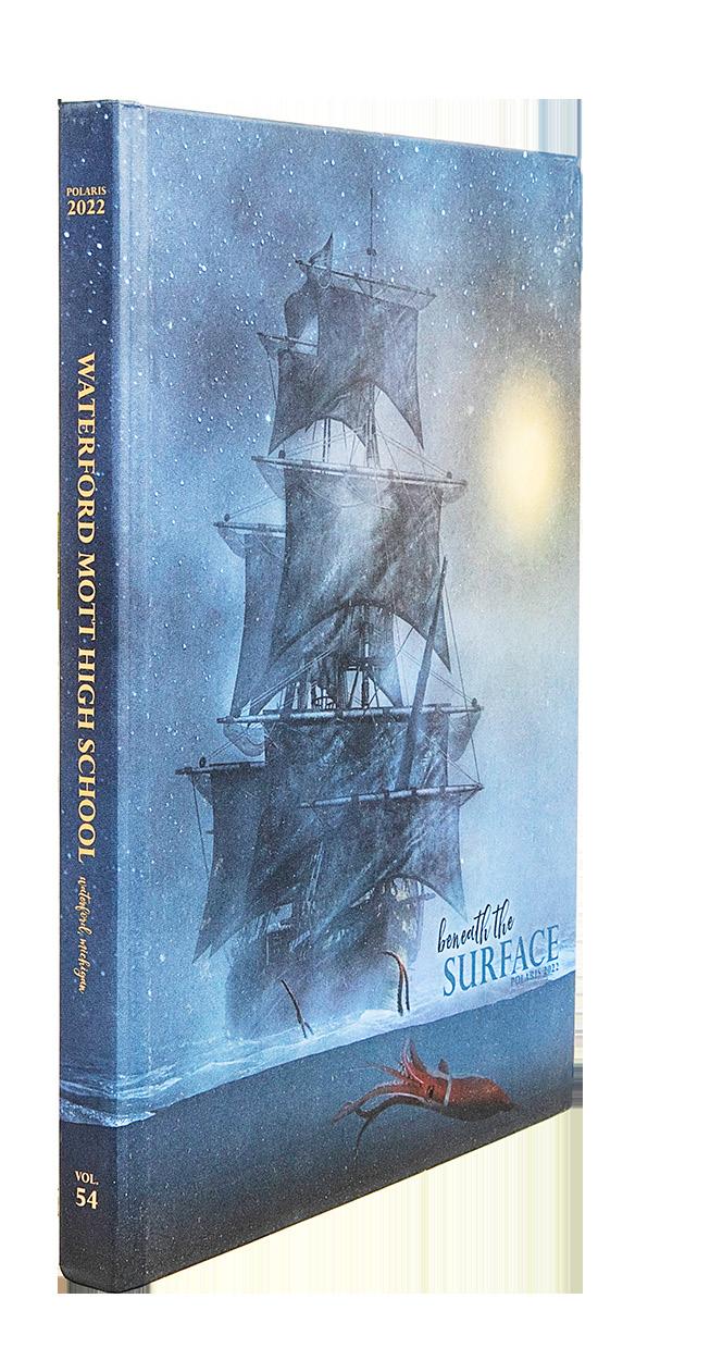
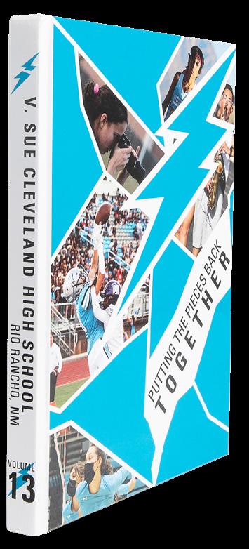
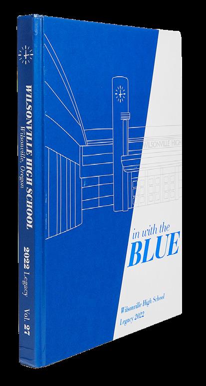
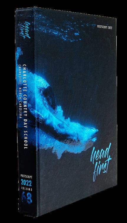


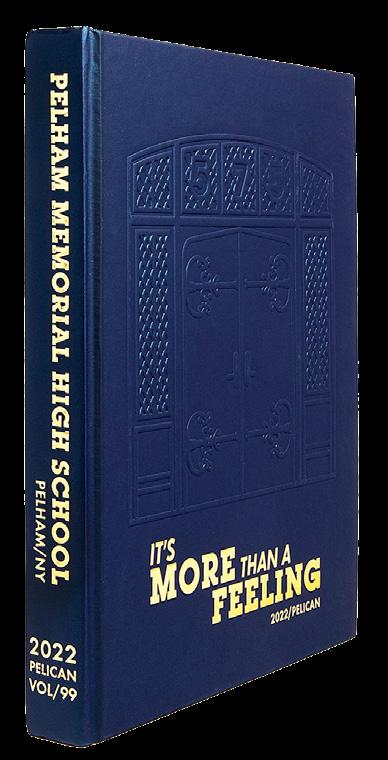
 WATERFORD MOTT HS Polaris | WATERFORD, MI
WILSONVILLE HS Legacy | WILSONVILLE, OR
THE ACADEMY OF THE HOLY ANGELS Echoes | DEMAREST,
V. SUE CLEVELAND HS RIO RANCHO, NM
NORTH POINT HS Claw | WENTZVILLE, MO
CHARLOTTE COUNTRY DAY SCHOOL Postscript | CHARLOTTE, NC
PELHAM MEMORIAL HS Pelican | PELHAM, NY
SLIDELL HS Saga | SLIDELL, LA
COLUMBUS NORTH HS Log | COLUMBUS, IN
WELLINGTON COMMUNITY HS Precedent | WELLINGTON, FL
PLANTATION HS Reflections | PLANTATION, FL
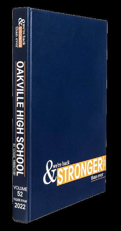
OAKVILLE HS Tiger Paw | SAINT LOUIS, MO



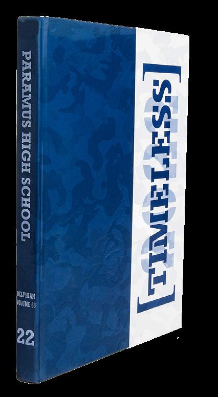



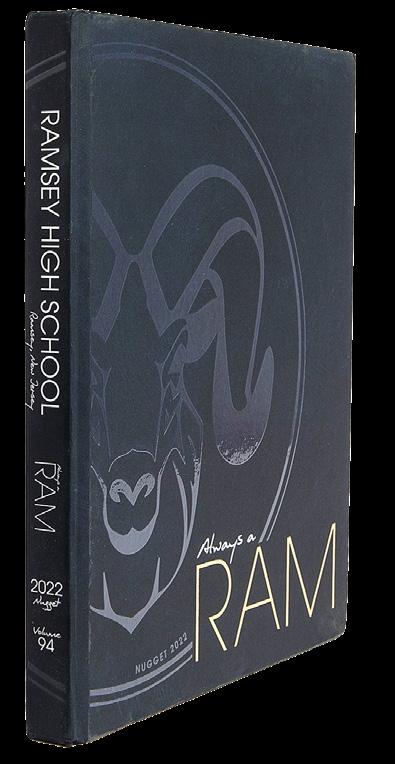

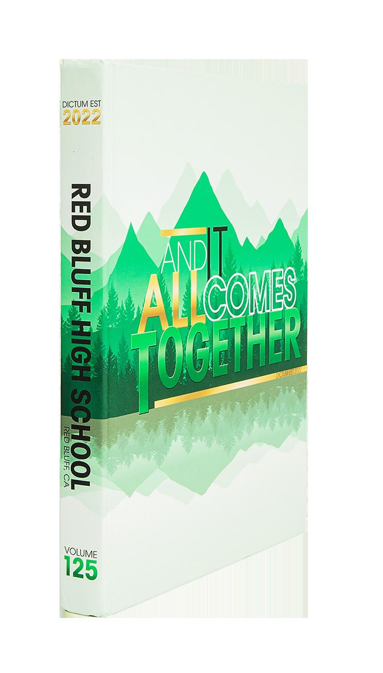
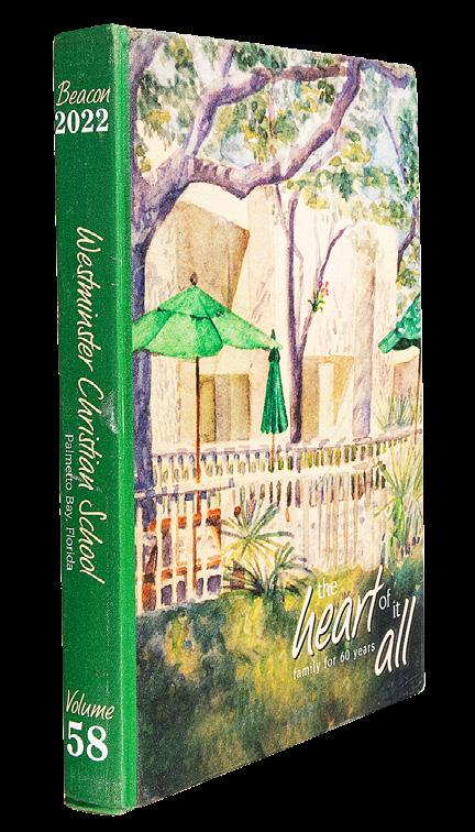


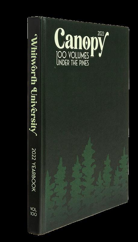
 WHITWORTH UNIVERSITY Natsihi | SPOKANE, WA
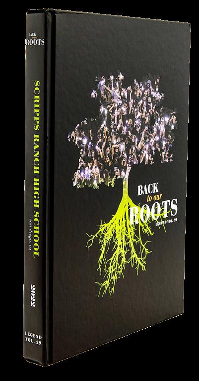
SCRIPPS RANCH HS Legend | SAN DIEGO, CA
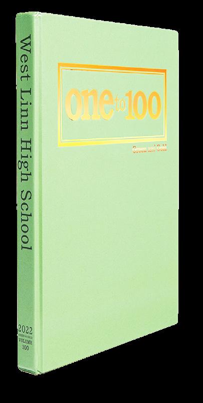
WEST LINN HS Green & Gold | WEST LINN, OR
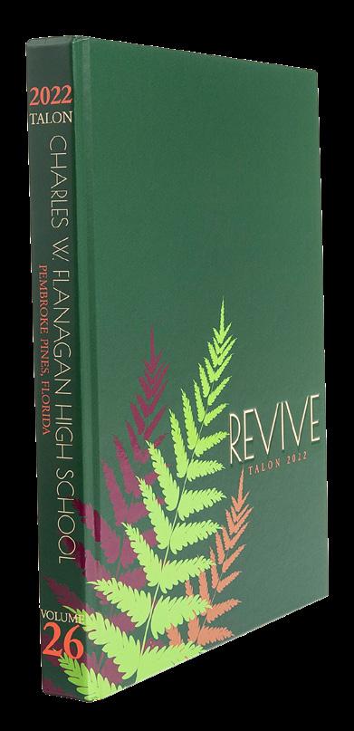
CHARLES W. FLANAGAN HS Talon | PEMBROKE PINES, FL
WESTMINSTER CHRISTIAN SCHOOL Beacon | MIAMI, FL
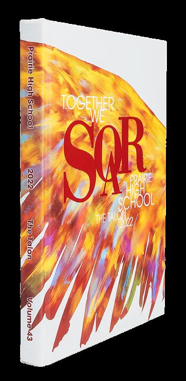
ORCHARD FARM HS The Talon | SAINT CHARLES, MO
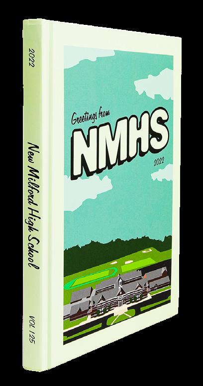
NEW MILFORD HS Green Wave | NEW MILFORD, CT
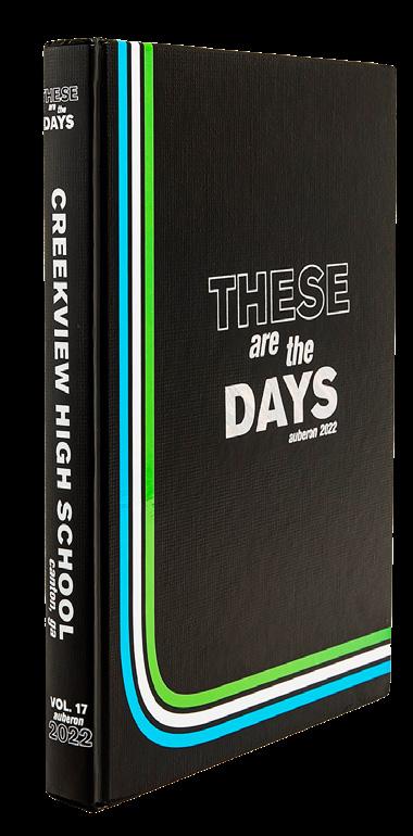
CREEKVIEW HS Auberon | CANTON, GA
VOLCANO VISTA HS The Hawk | ALBUQUERQUE, NM
WESTRIDGE SCHOOL Inlook | PASADENA, CA
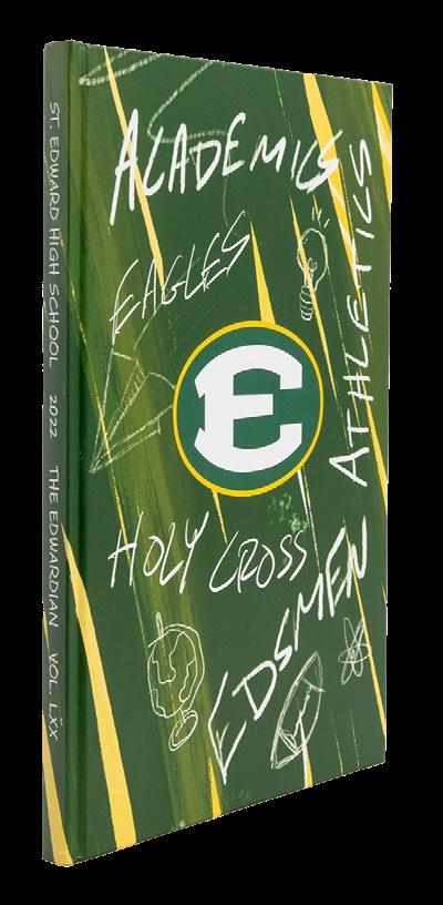
FRANKLIN COUNTY HS Echo | CARNESVILLE, GA Dictum Est | RED BLUFF, CA


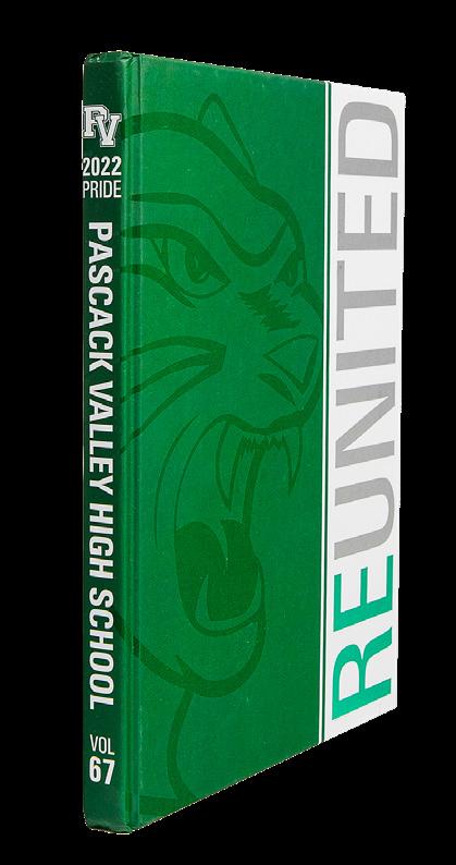




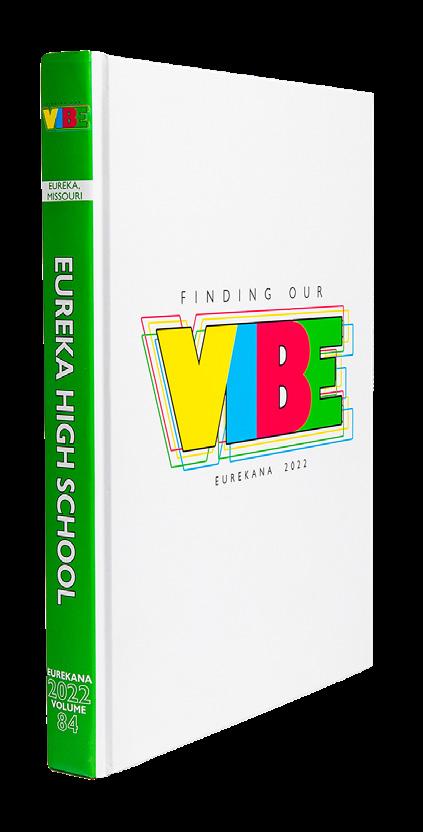
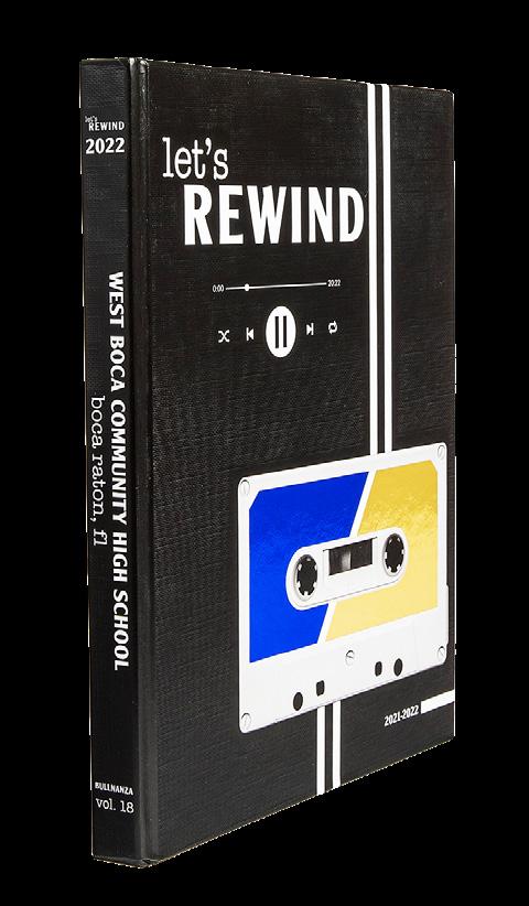
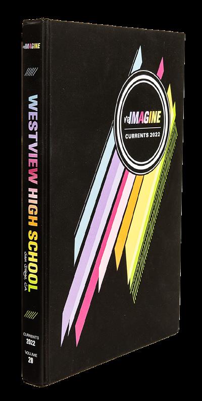
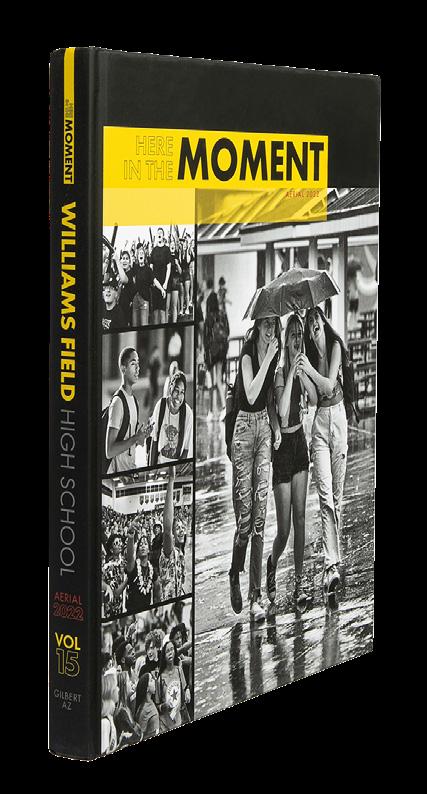




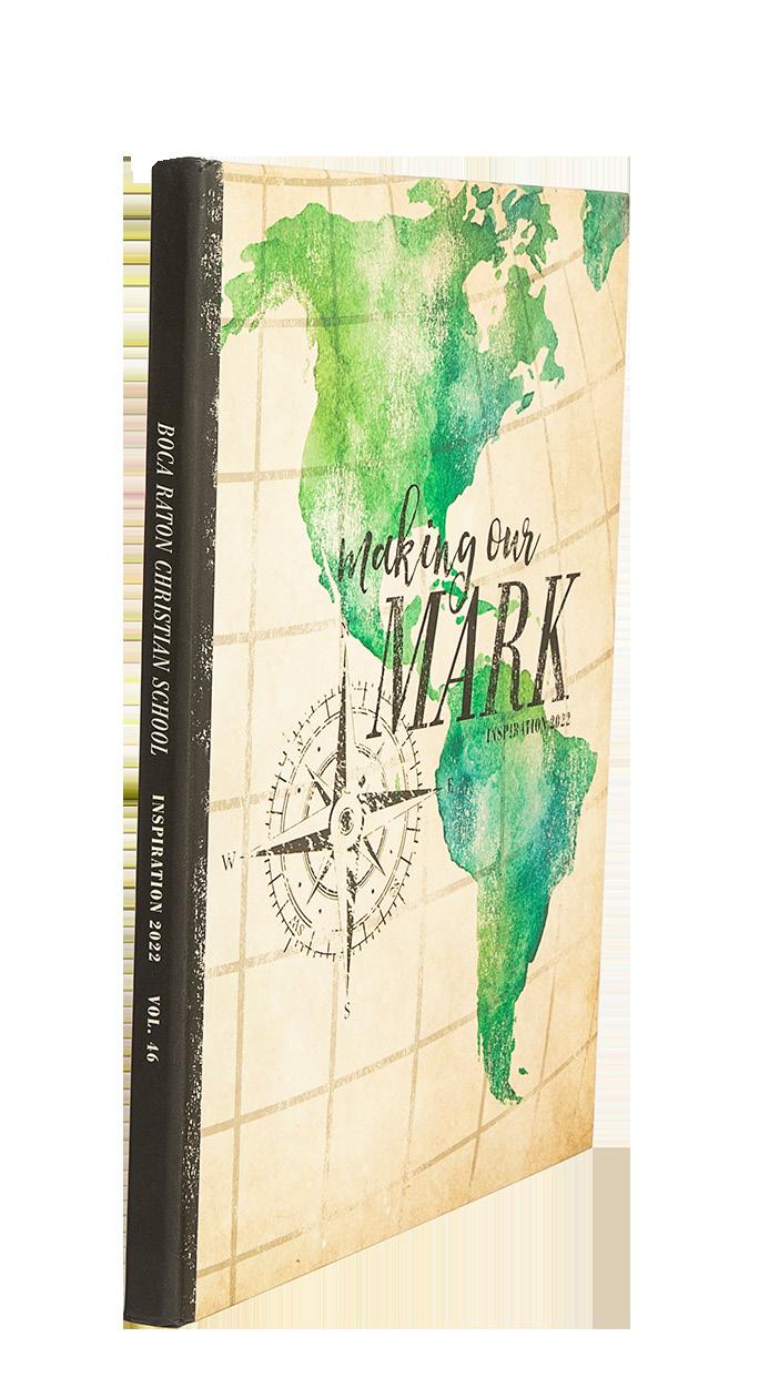
 WEST BOCA RATON COMMUNITY HS Bullnanza | BOCA RATON, F L
WILLIAMS FIELD HS Aerial | GILBERT, AZ
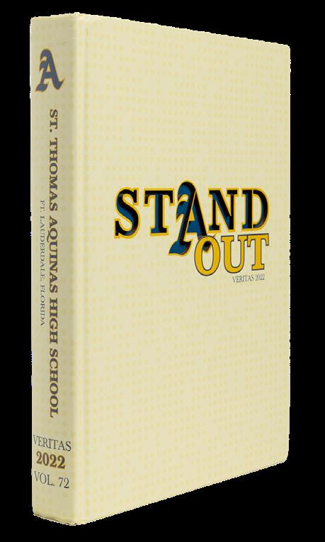
SAINT THOMAS AQUINAS HS Veritas | FT. LAUDERDALE, FL
WESTVIEW HS Currents | SAN DIEGO, CA
CADDO MAGNET HS Odyssey | SHREVEPORT, LA
MOUNTAIN VIEW HS The Pinnacle | BEND, OR
BOCA RATON COMMUNITY HS The Paw | BOCA RATON, FL
MARANA HS El Tigre | TUCSON, AZ
RIVER DELL HS Hawk | ORADELL, NJ
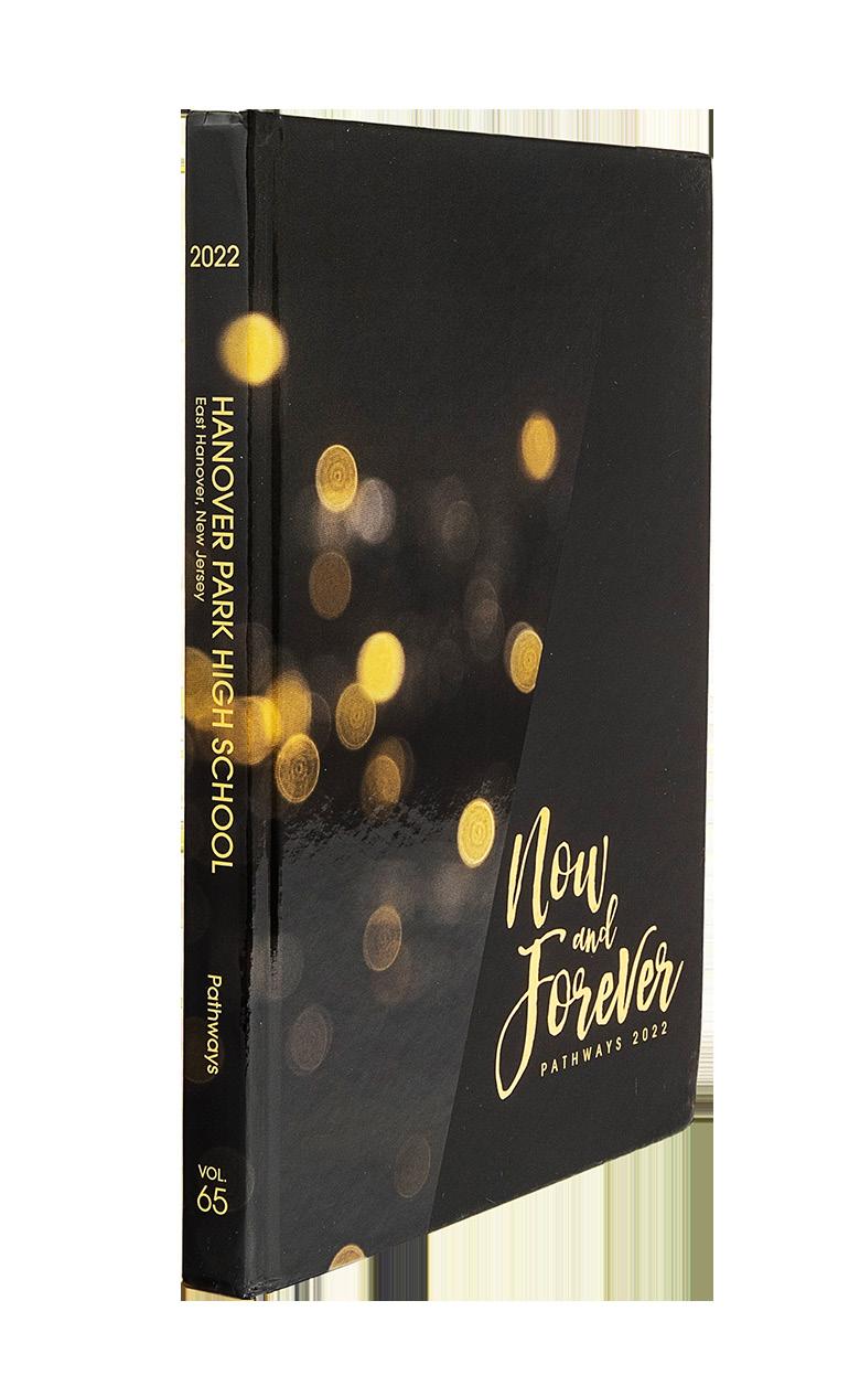
HANOVER PARK HS Pathways | EAST HANOVER, NJ
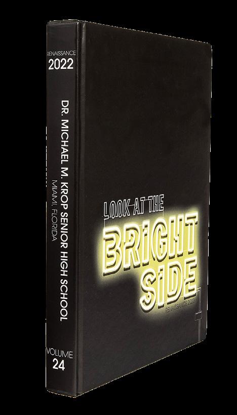
DR. MICHAEL M. KROP SENIOR HS Renaissance | NORTH MIAMI BEACH, FL
CENTRAL GWINNETT HS Camelot | LAWRENCEVILLE, GA



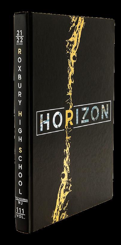

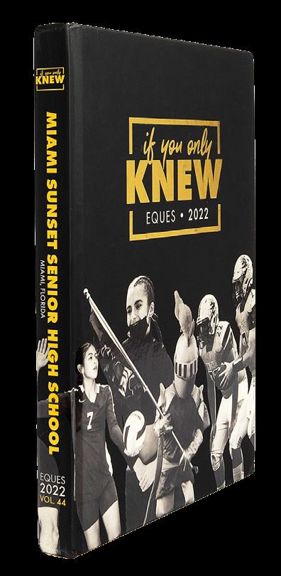
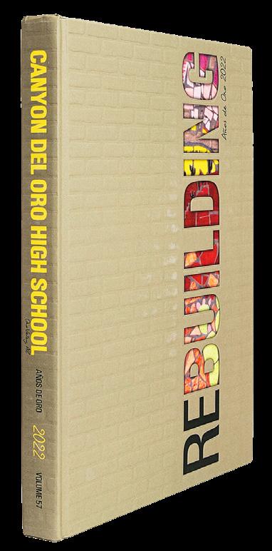









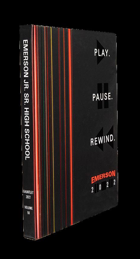
 Aquila | AUSTELL, GA
SOUTH FORK HS Procyon | STUART, FL
THE WALKER SCHOOL Flame | MARIETTA, GA
COCHRANTON JR. SR. HS The Cardinal | COCHRANTON, PA Blue M | MANHATTAN, KS
CORONA DEL SOL HS Sunset | TEMPE, AZ
AFFTON HS The Pride | SAINT LOUIS, MO
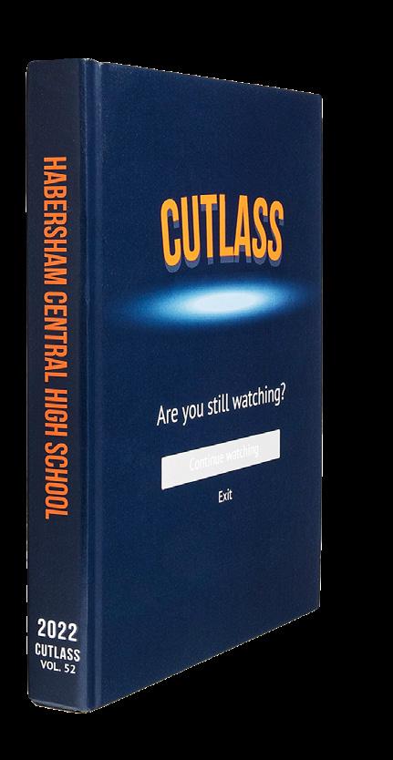
HABERSHAM CENTRAL HS Cutlass | MOUNT AIRY, GA
MANDEVILLE, LA
COOK HS Acorn | ADEL, GA
EMERSON JR. SR. HS Gauntlet | EMERSON, NJ
WARREN EAST HS The Raider | BOWLING GREEN, KY



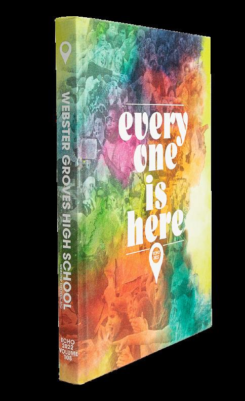
IT’S GIVING: We’re not sure what to call this, but we love it! The color and graphic combo feels simultaneously fresh and familiar — like future nostalgia. And, the endsheet is a delightful evolution of the cover, just as it should be. Plus, all the essential info is easy to navigate.

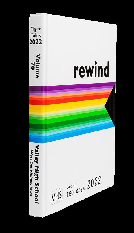
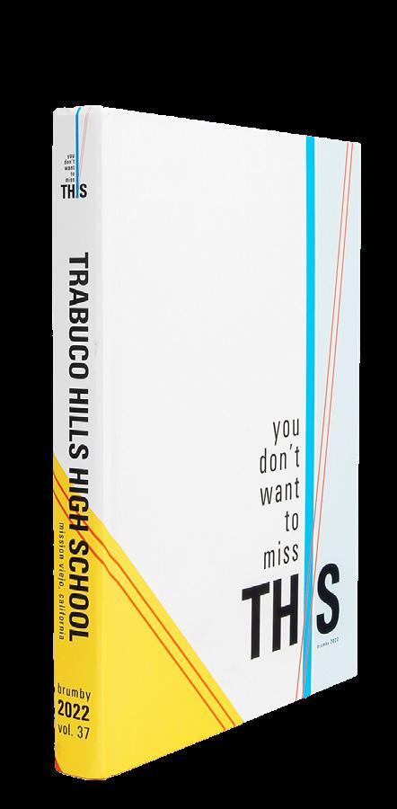
KEEP IT SIMPLE: With school initials like “VHS,” how could you not play off of them like this?! And, of course the endsheet plays off the cover perfectly while still featuring a table of contents.

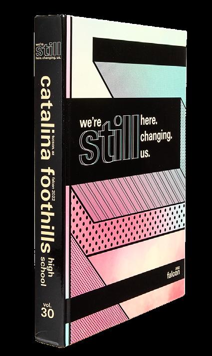
HERE FOR IT:
The colors draw us in. The type is a vibe. The spin-offs are strong. Let’s go inside already! We want to see what everyone is here for.

PLANNING
ACCORDINGLY:
This staff thought ahead and used the grid. The lasercut word has its “counters” knocked out and exposes the crowd photo underneath. Kudos for also designing the left panel to allow for the large laser-cut.
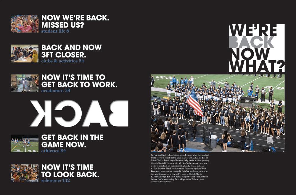
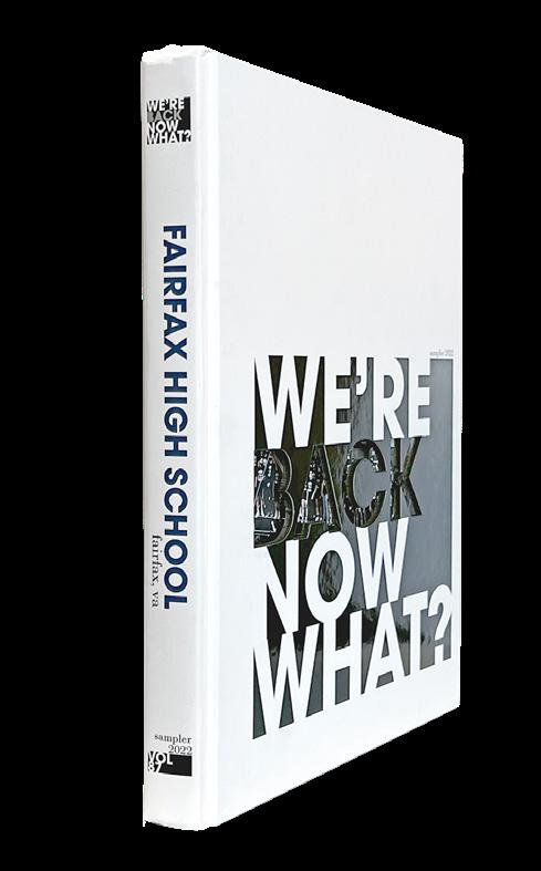
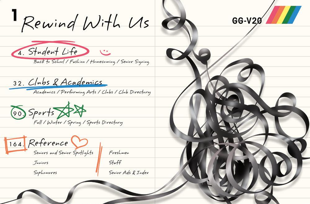
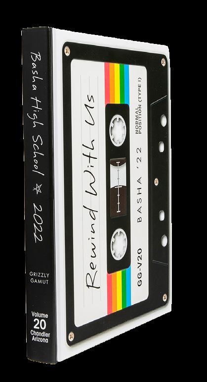
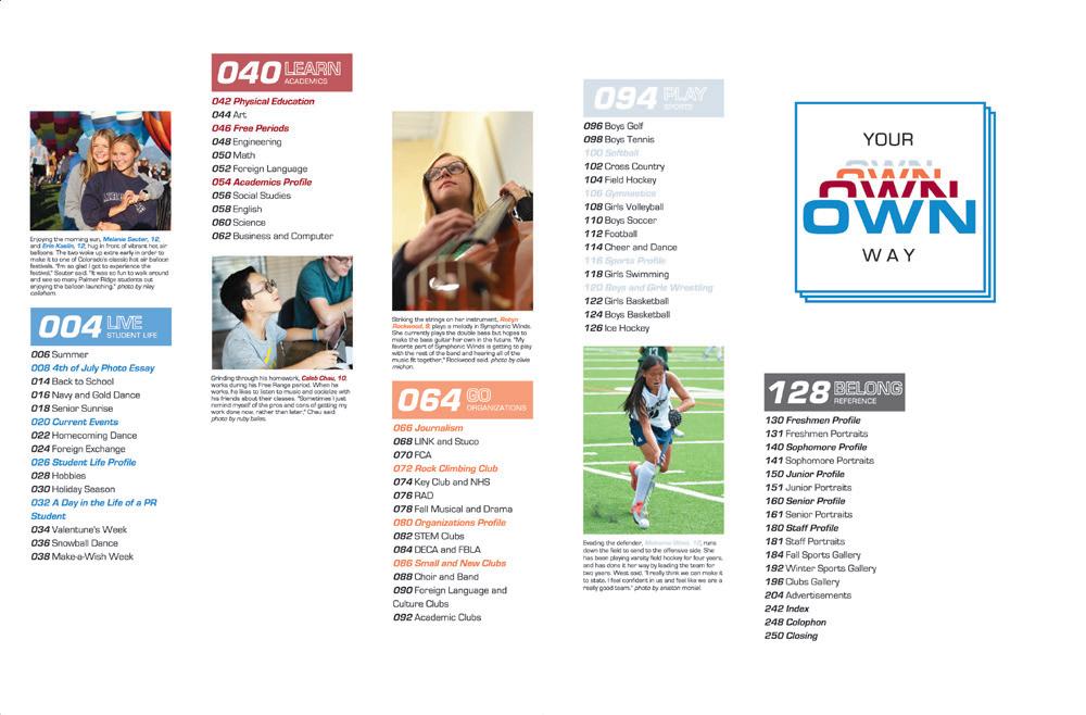
WEBSTER GROVES HS | Echo | WEBSTER GROVES, M O CATALINA FOOTHILLS HS | Falcon | TUCSON, AZ VALLEY HS | Tiger Tales | WEST DES MOINES, IA FAIRFAX HS | Sampler | FAIRFAX, VARETRO REWIND: What a fun and funky way to connect the cover and endsheet. We love how all the typical reader services are included with a nod to the throwback flair.

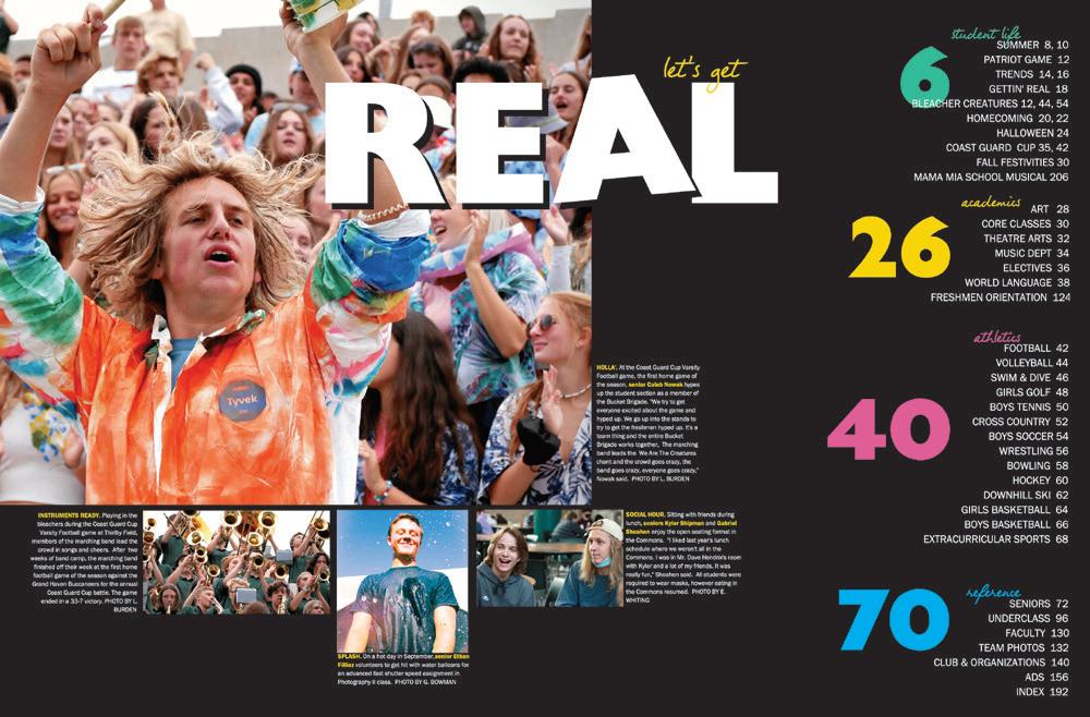
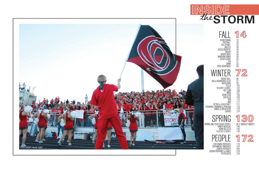
BE REAL: We’re always suckers for high contrast. This cover sets the stage with its four colors for four sections, then the black background takes center stage on the endsheet. Bravo for the complete contents listing of your traditional sections.

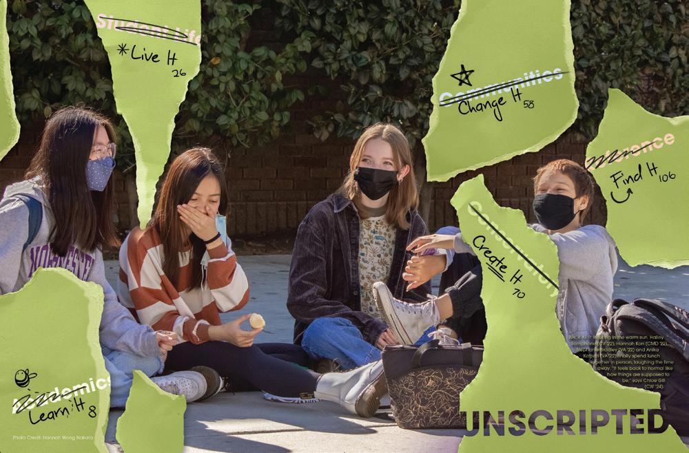
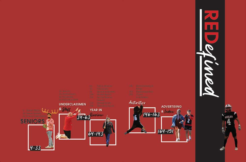
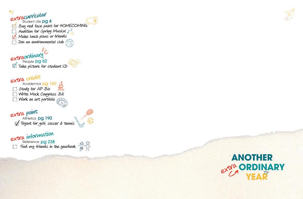
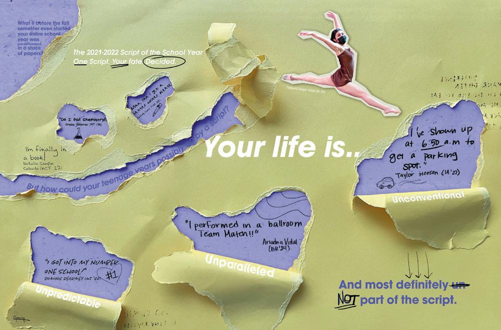
WORK IN PROGRESS: The hand-drawn look adds so much character to this cover and endsheet combo. All the ripped edges, scribbles, doodles and handwriting really bring the theme of “Unscripted” to life!
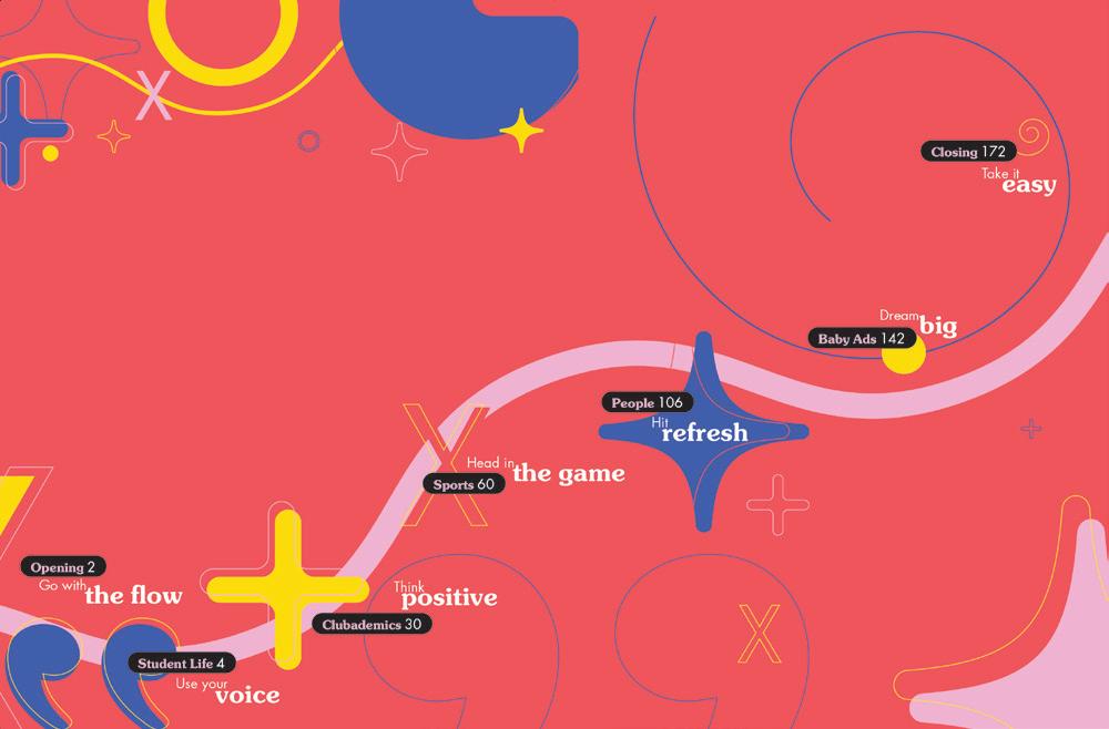
WHIMSICAL WOW: The promises made on the cover evolve on the endsheet. Love the transition from the simple white cover to the bright coral and organic graphics. Great job creating an easy-to-follow path though the book’s renamed sections.



 MESQUITE HS | Roots | GILBERT, AZ
DIAMOND BAR HS | Taurus | DIAMOND BAR, CA
ROCKWOOD SUMMIT HS | Pinnacle | FENTON, M O
CROWN POINT HS | Excalibur | CROWN POINT, IN
PARKWAY NORTH HS | Saga | SAINT LOUIS, MO
SOUTHRIDGE HS | KENNEWICK, WA
PALMER RIDGE HS | Epilogue | MONUMENT, CO
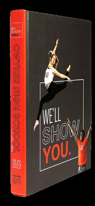
OWYHEE HS | The Eye | MERIDIAN, ID
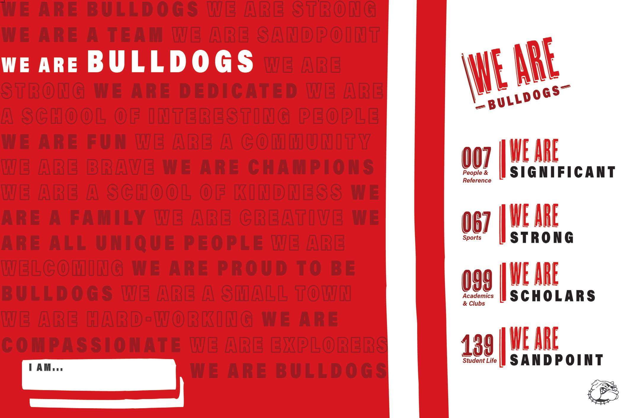
RED ALL OVER: Call we talk about how eye-catching this endsheet is? The schoolcolor red is paired with maroon and, of course, black and white. Great job renaming each section with an ‘S’ word — surely inspired by their school name. And, check out the perfect space for the owner to write their name.

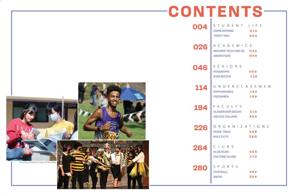
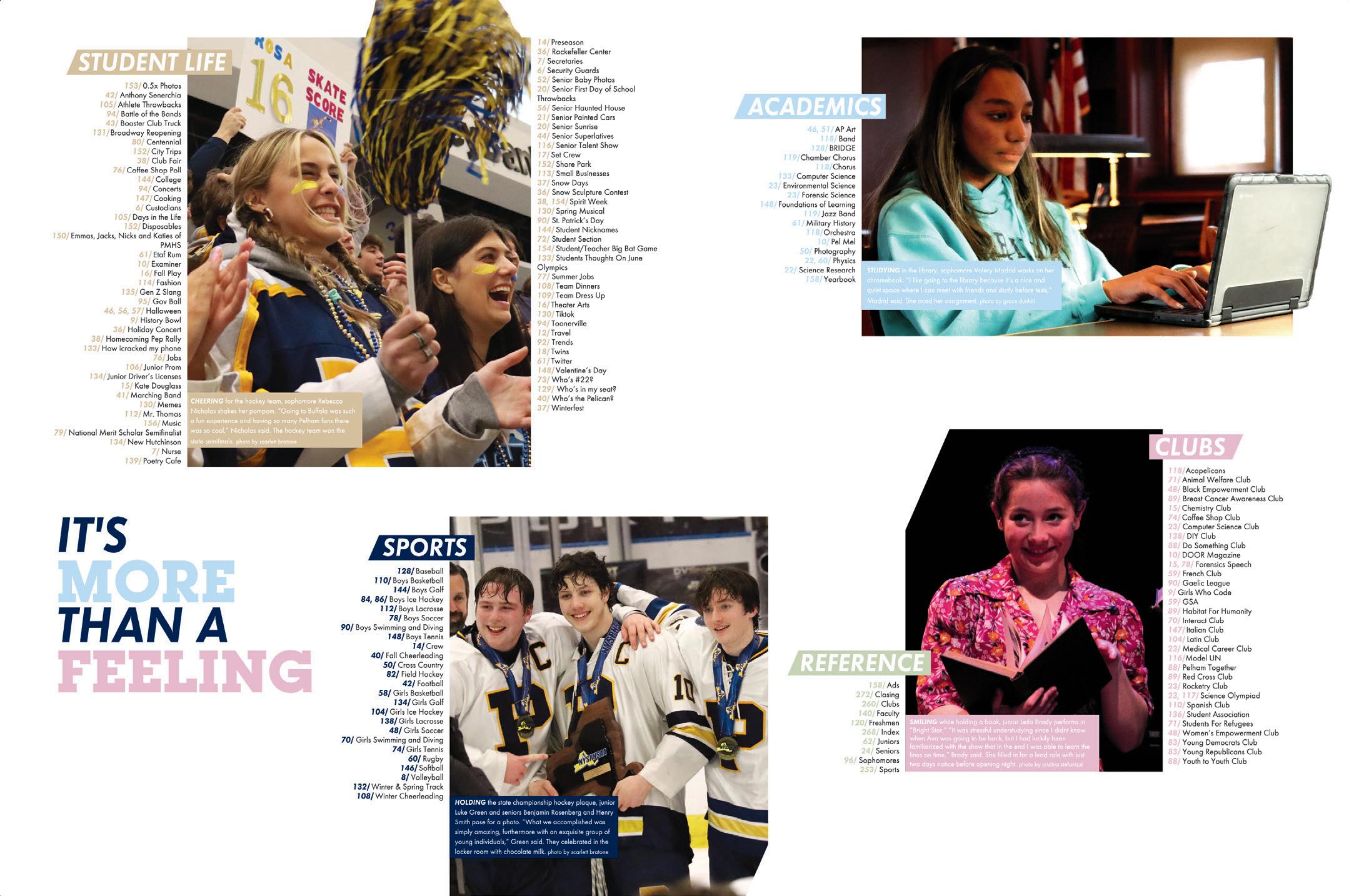
COMPLETE CONTENTS:
Wow! Everything has its place and is easy to find on this endsheet. Not to mention, each photo has a complete caption. We’re also reminded of the theme, “It’s More Than a Feeling ” and introduced to the five sectional colors. Talk about textbook perfect.
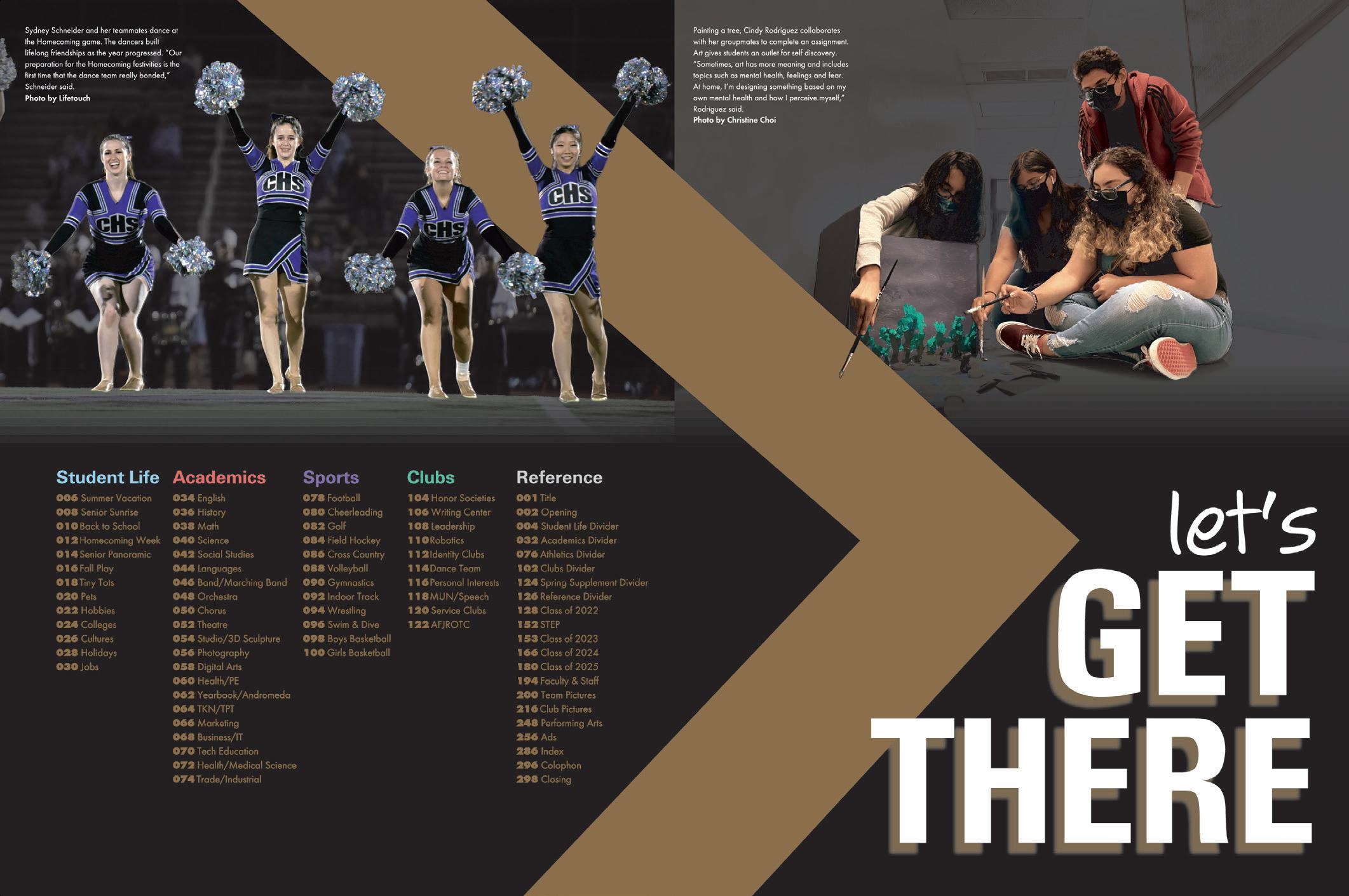
PHOTO-DRIVEN FROM THE JUMP:
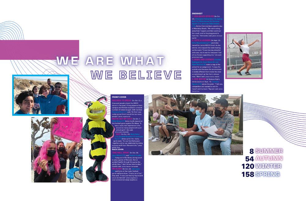
This endsheet lets readers know the yearbook is going to be packed with great photography. It also lets them know that the book is chronological — and just where to find any school activity they’re looking for.
 BISHOP M c GUINNESS CATHOLIC HS | Chi Rho | OKLAHOMA CITY, OK
LECANTO HS | Legacy | LECANTO, FL
WEST SPRINGFIELD HS | Olympian | WEST SPRINGFIELD, VA
OXNARD HS | Cardinal & Gold | OXNARD, CA
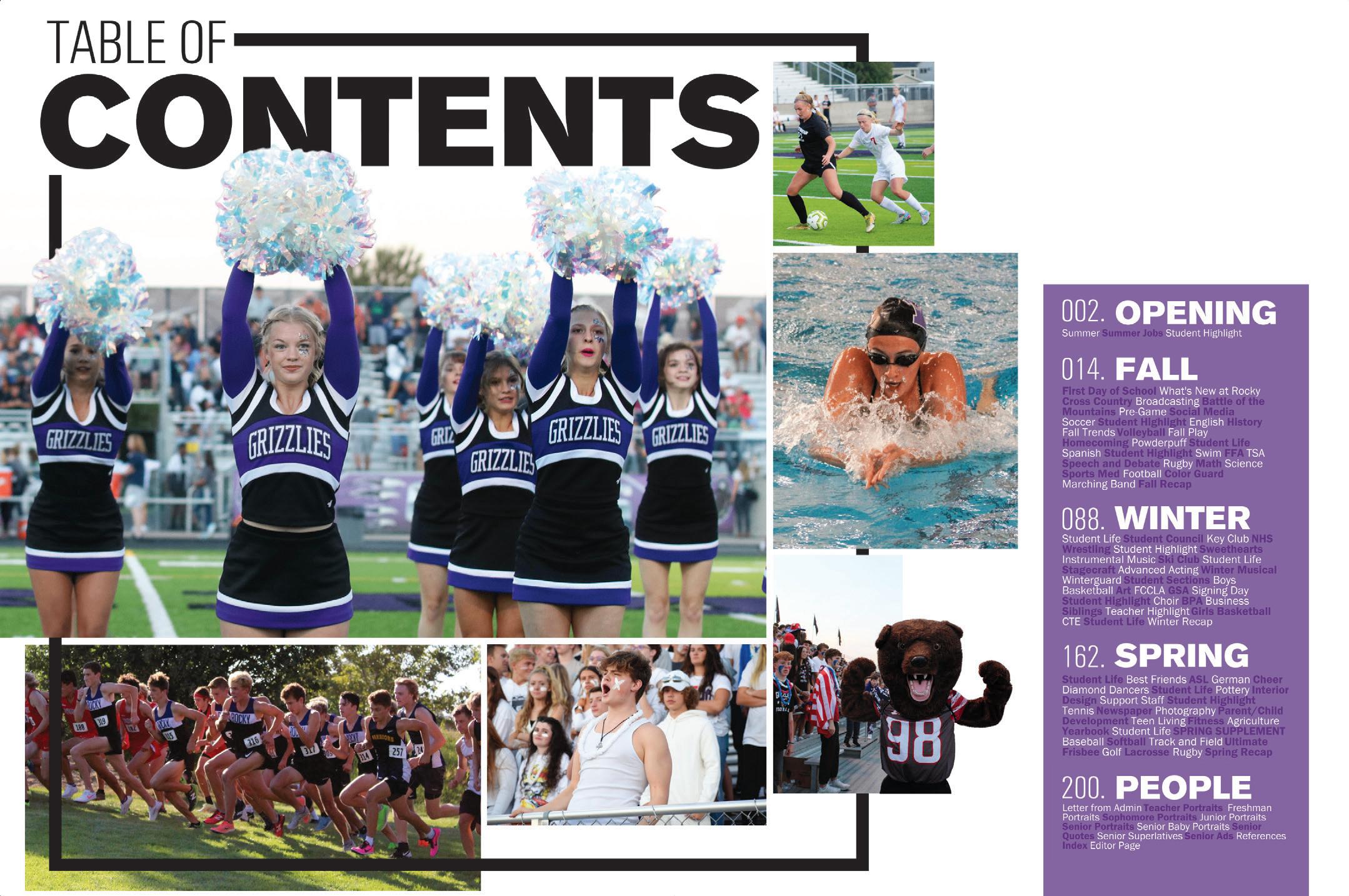
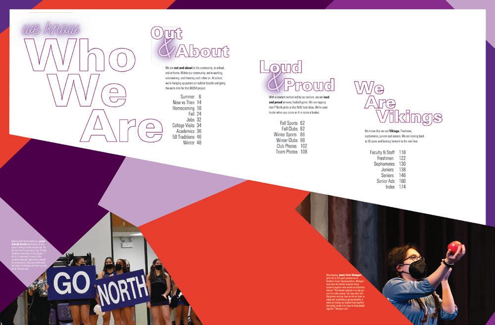
READY TO GO:

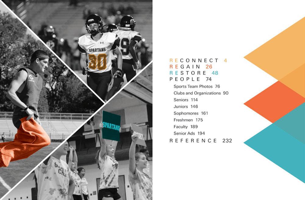
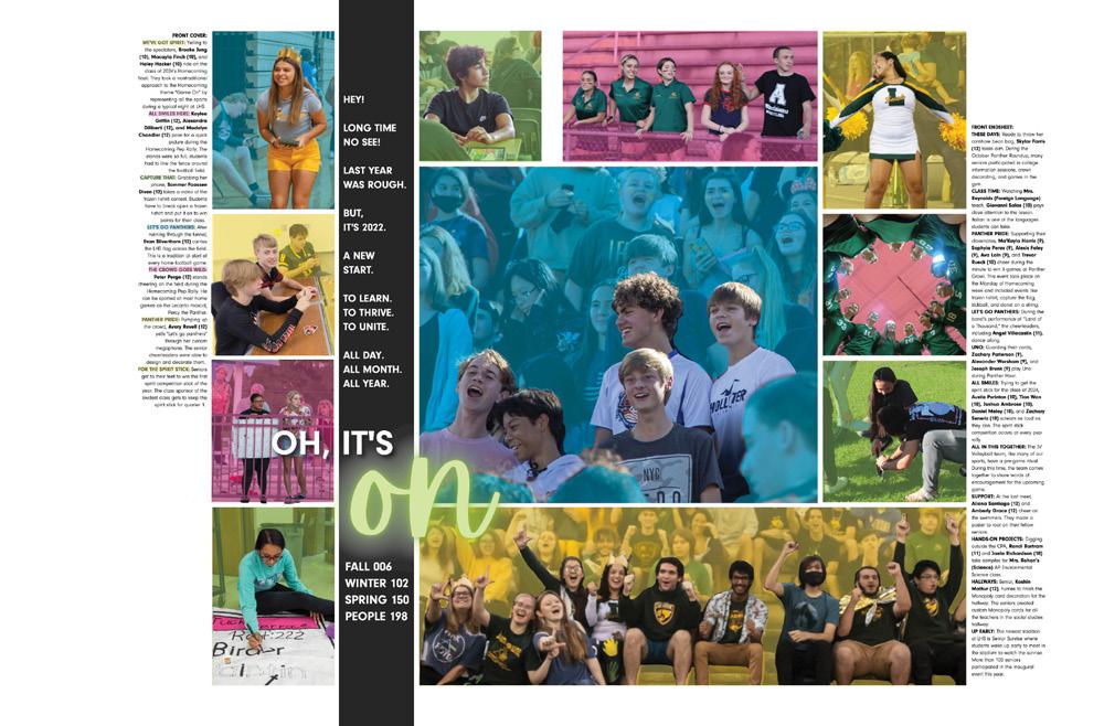
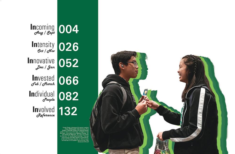
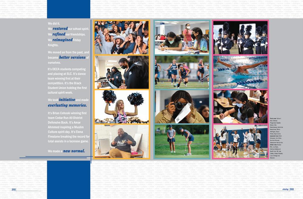
All the pieces are here. We see a repeat of the theme as well as adaptations of the cover graphics. The darkened backgrounds contrast the lighter cover. The cutouts add depth to the spread. And finally, we wrap up with a complete listing of content.

 CHANTILLY HS | Odyssey | CHANTILLY, VA
EAST FORSYTH HS | Aquila | KERNERSVILLE, NC
MIAMI LAKES EDUCATIONAL CENTER | Alpha Omega | MIAMI LAKES, FL


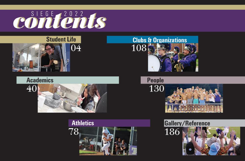
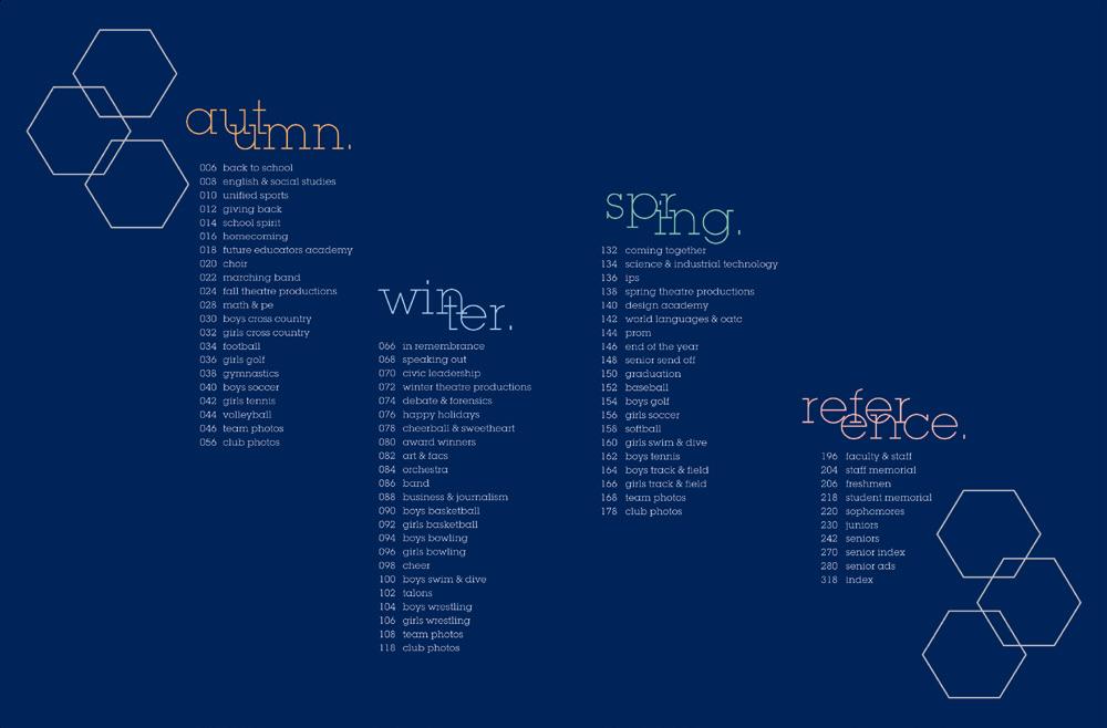

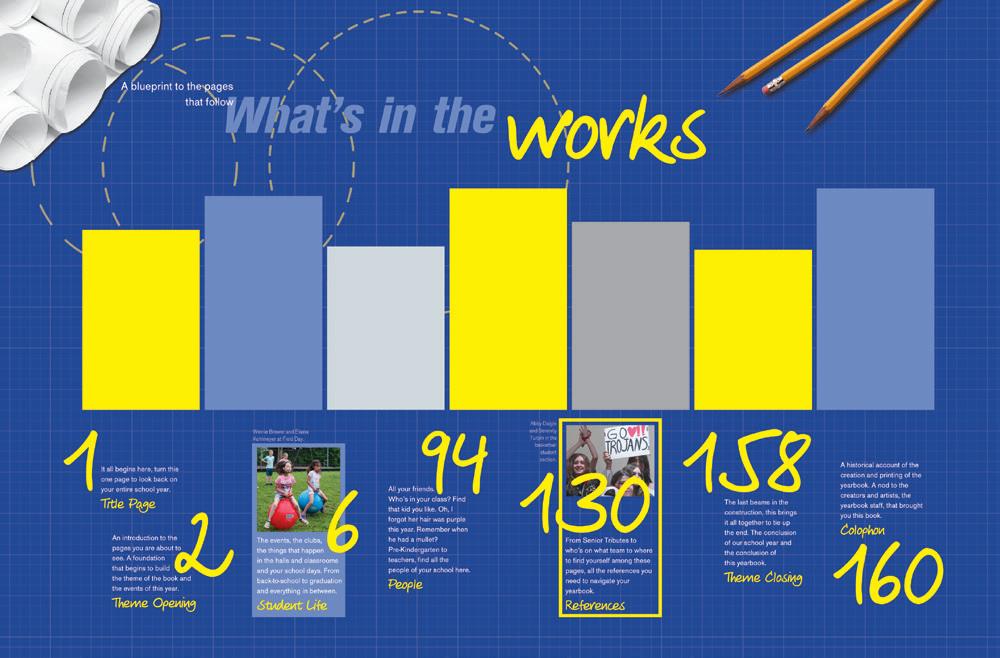

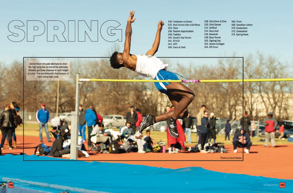
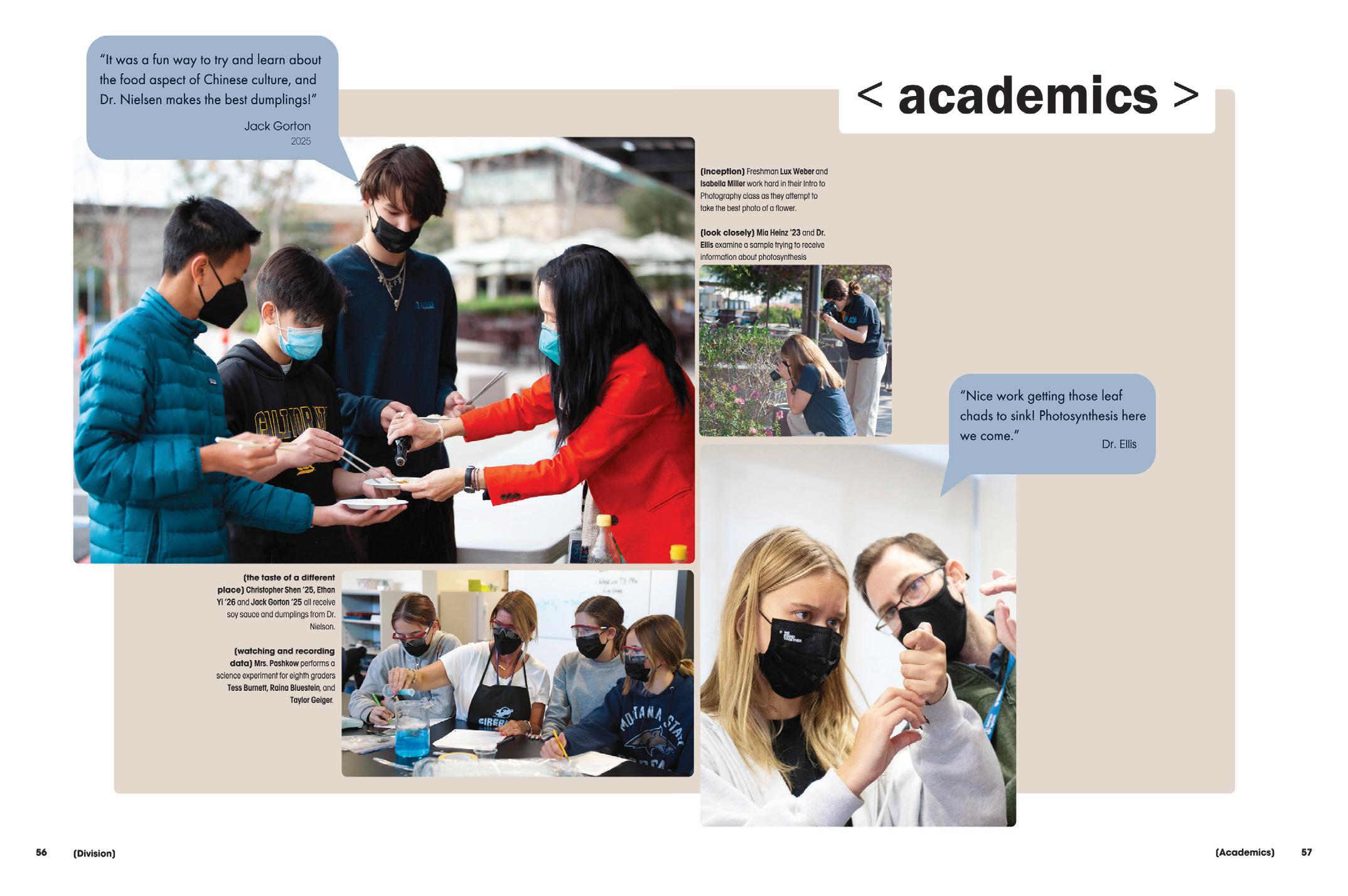
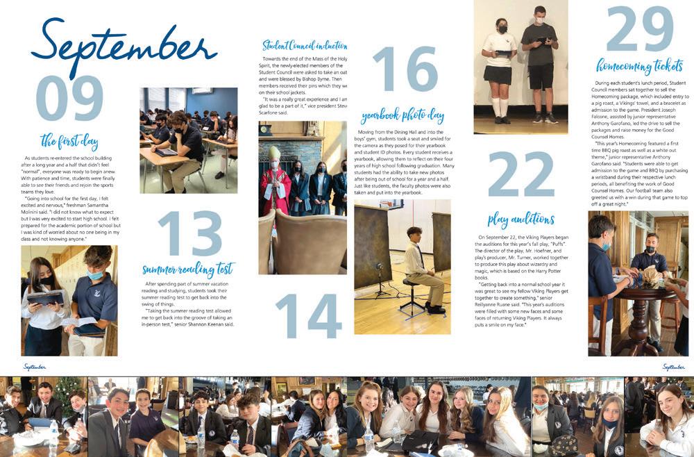
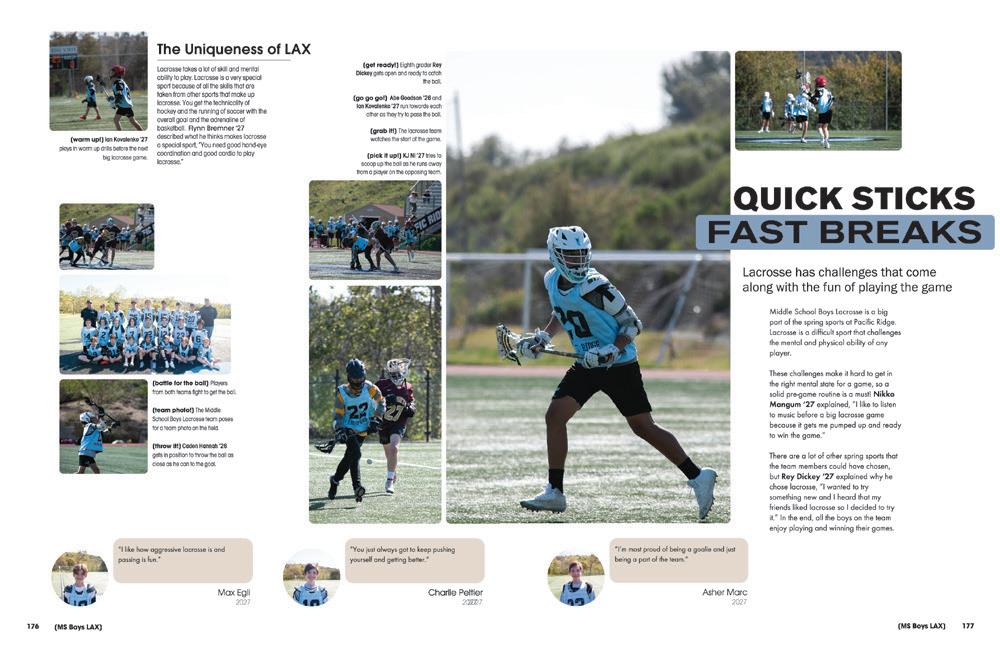
DECONSTRUCTED: Here’s a new take on including quotes and captions with photos. These quote bubbles add interest to the spread but don’t overwhelm the photos. We appreciate the muted color palette and use of white space as well.
 ALONSO HS | Evermore | TAMPA, FL
PACIFIC RIDGE SCHOOL | The Founder | CARLSBAD, CA
LAFAYETTE HS | Legend | WILDWOOD, MO
OLATHE SOUTH HS | Talon | OLATHE, KS
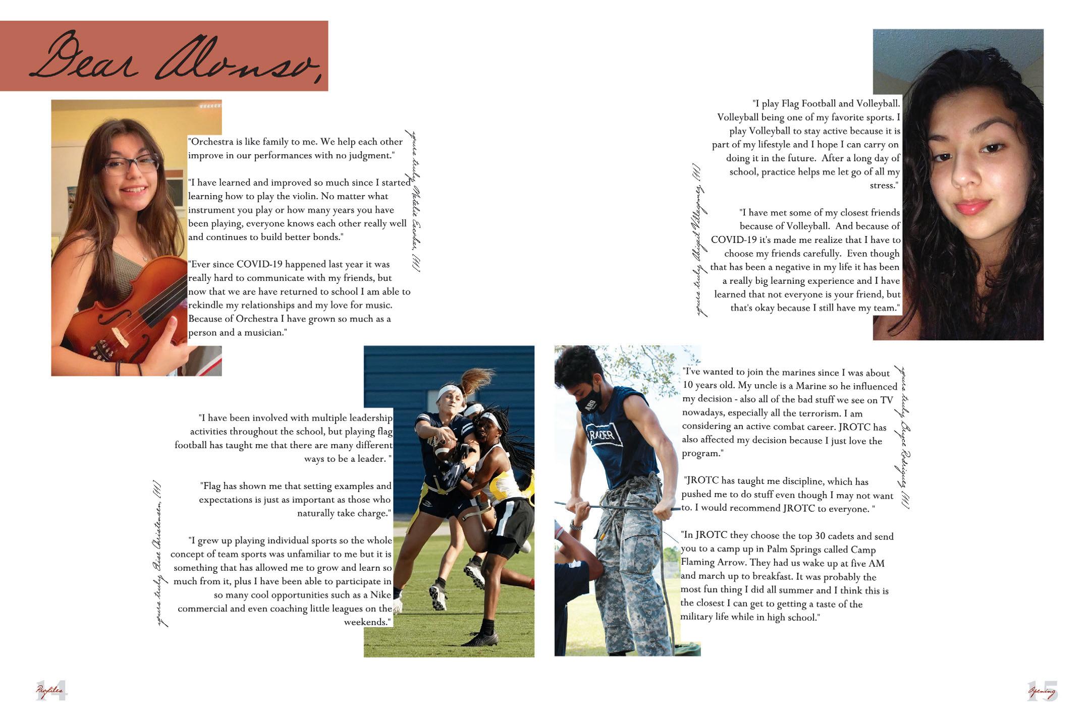
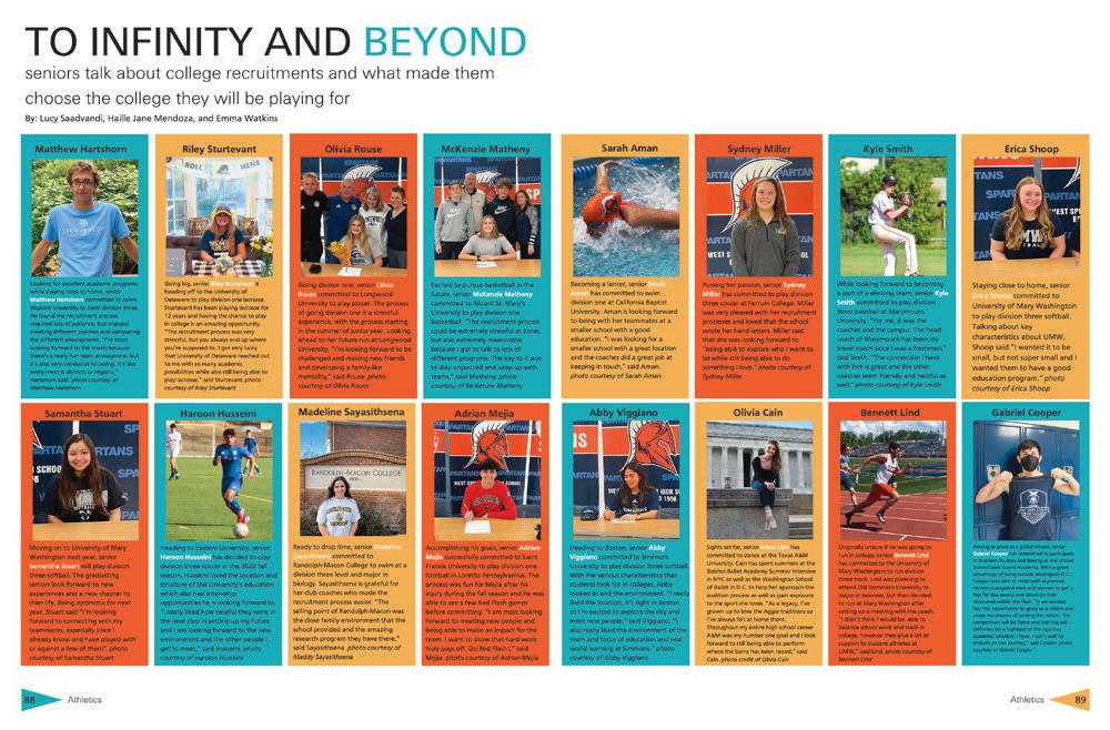
FIRST PERSON: Extended quotes allow these four students to share how involvement in school activities has influenced their lives. These quote-based profiles add a lot of personality to spreads but often require a great interviewer and editor to really work well. Nice job!
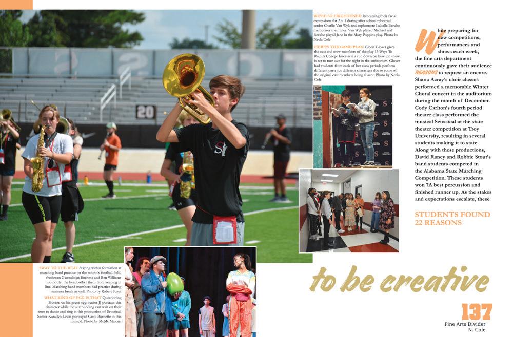


COLOR ME INTERESTED:
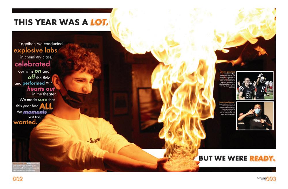
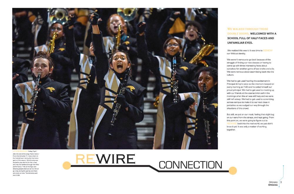
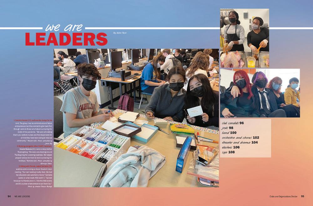
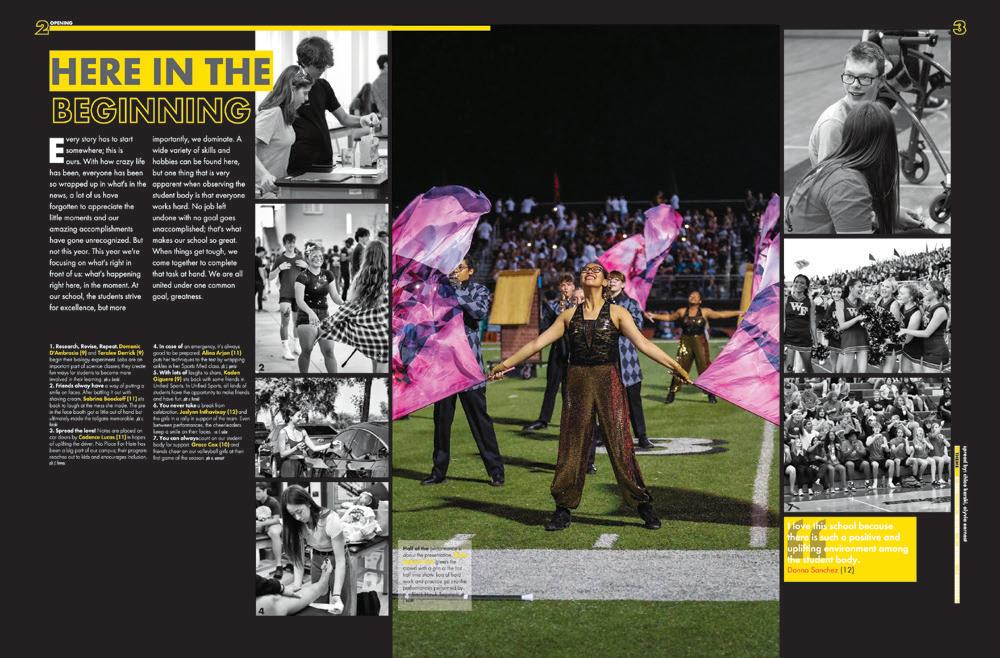
The color palette of this book really lends itself to an opening spread with lots of variety and visual interest. From the highlights in the copy to the color block and stripes in the design, there is a lot for readers to get into.

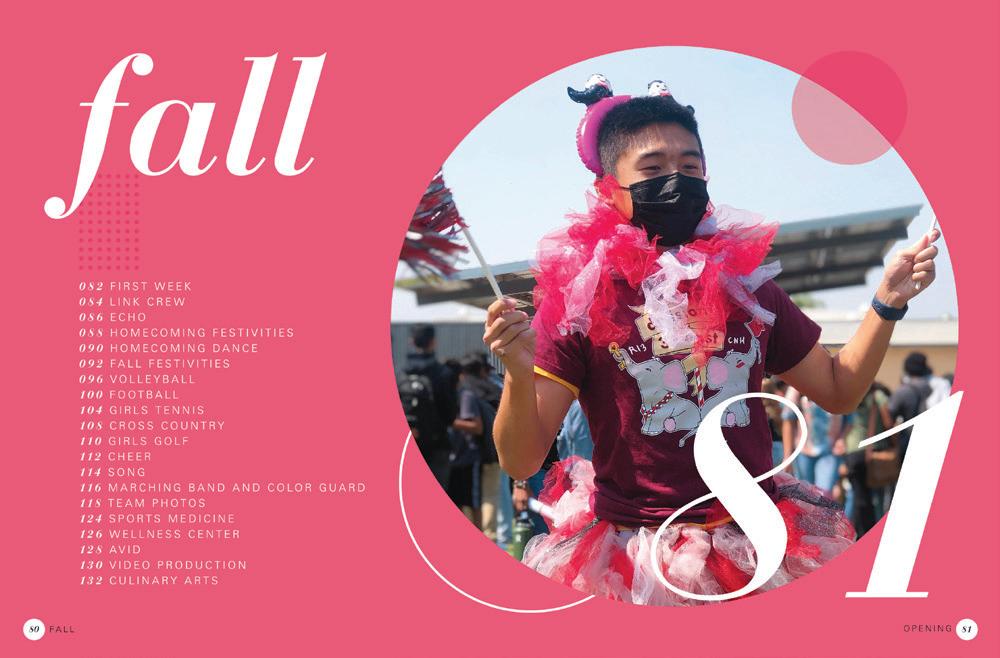
FILTER FINESSE:
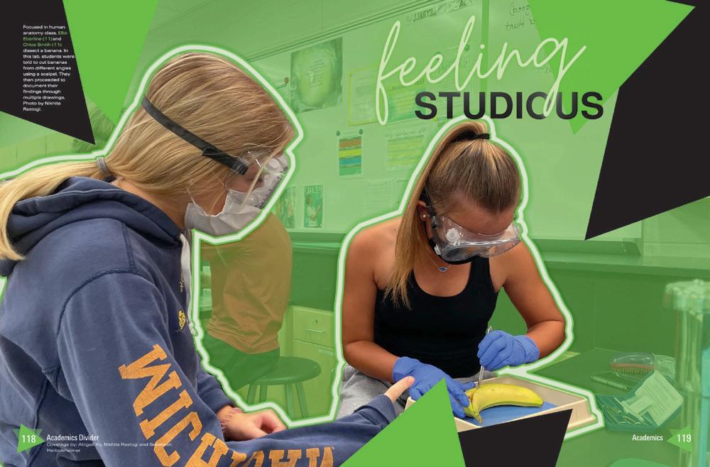
This cool cutout and overlap trend is one we can credit to Canva. The online tools make it easy to drop out the backgrounds, apply filters and put them back together in an attention-grabbing package. Directions are on YearbookDiscoveries.com!
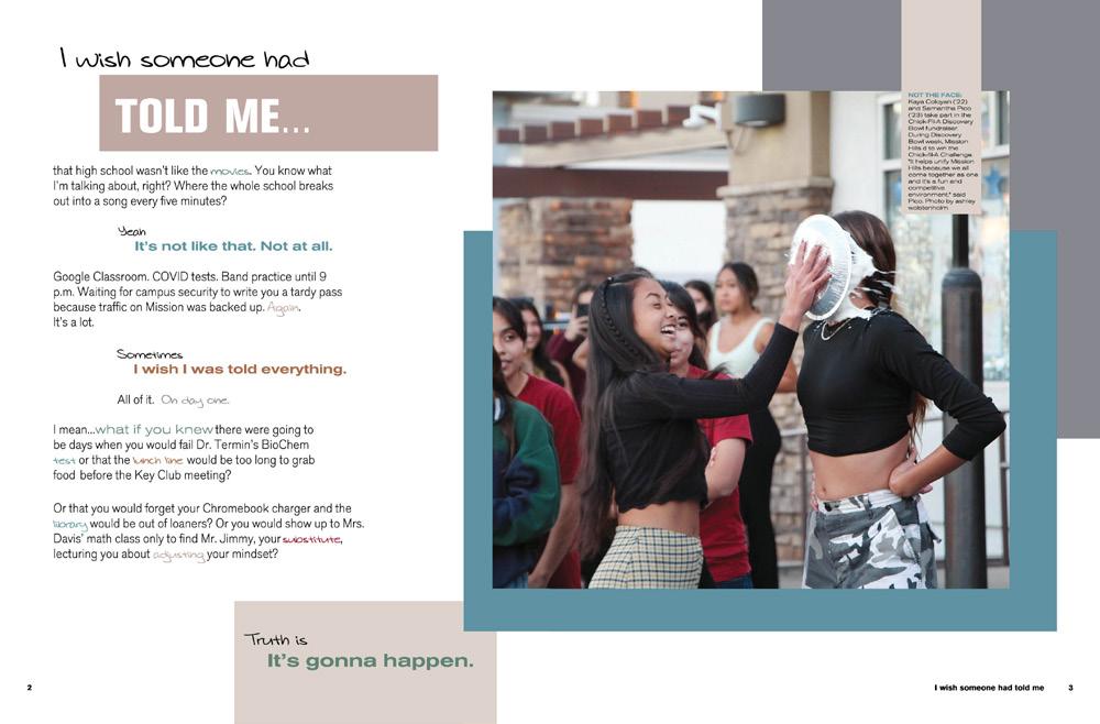
Just search for Canva Wow.
 ATLEE HS | The Legend | MECHANICSVILLE, VA
KENNEDY HS | The Legend | FREMONT, C A
MISSION HILLS HS | Cardinal & Gold | SAN MARCOS, CA
SOUTH HILLS HS | Neomega | WEST COVINA, CA
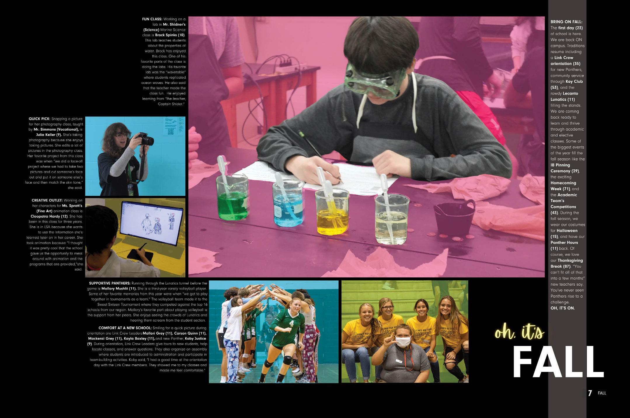

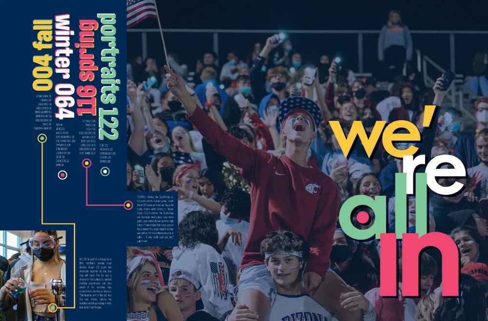
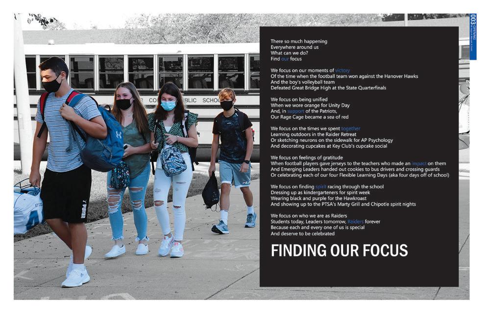
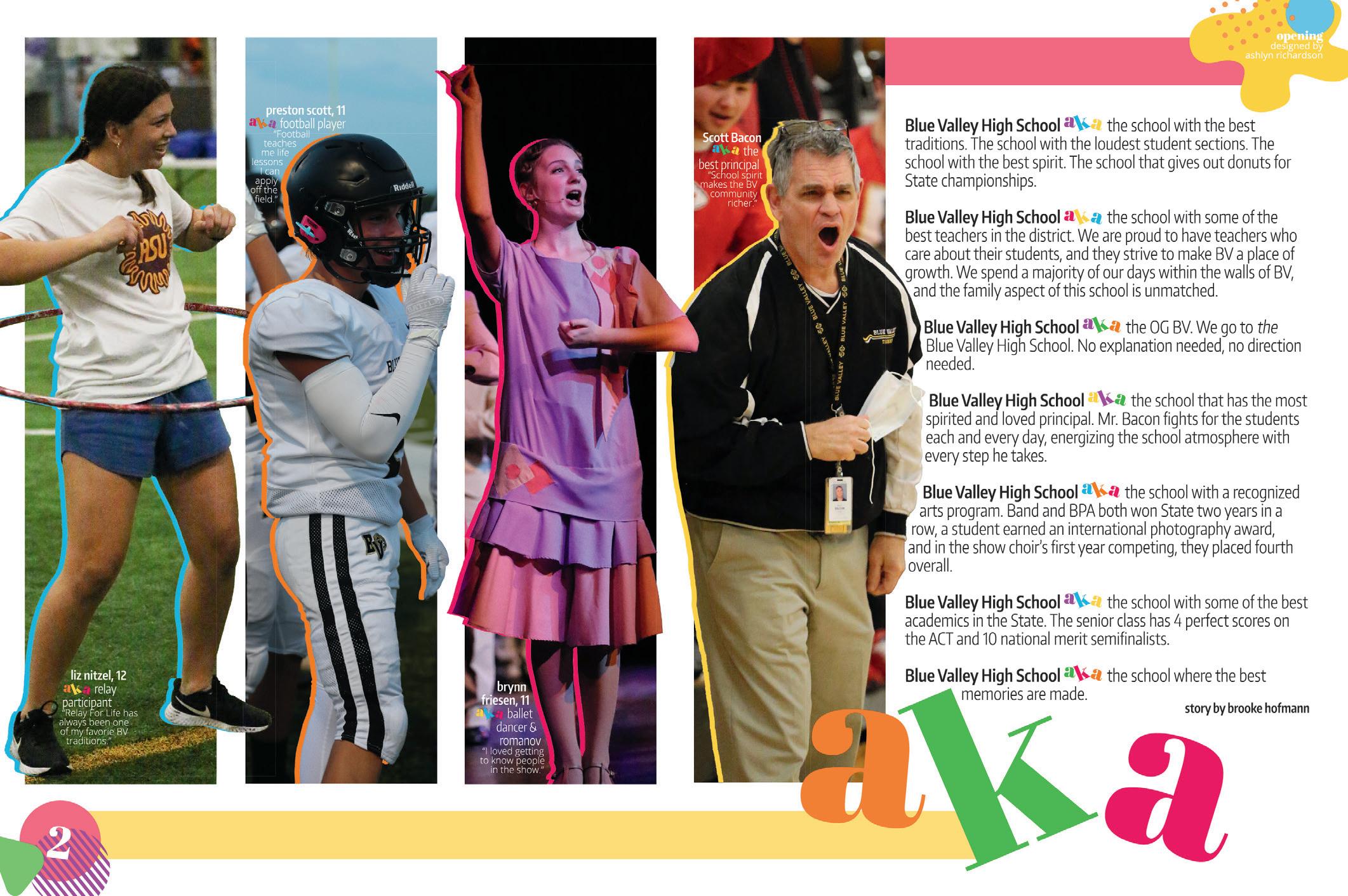
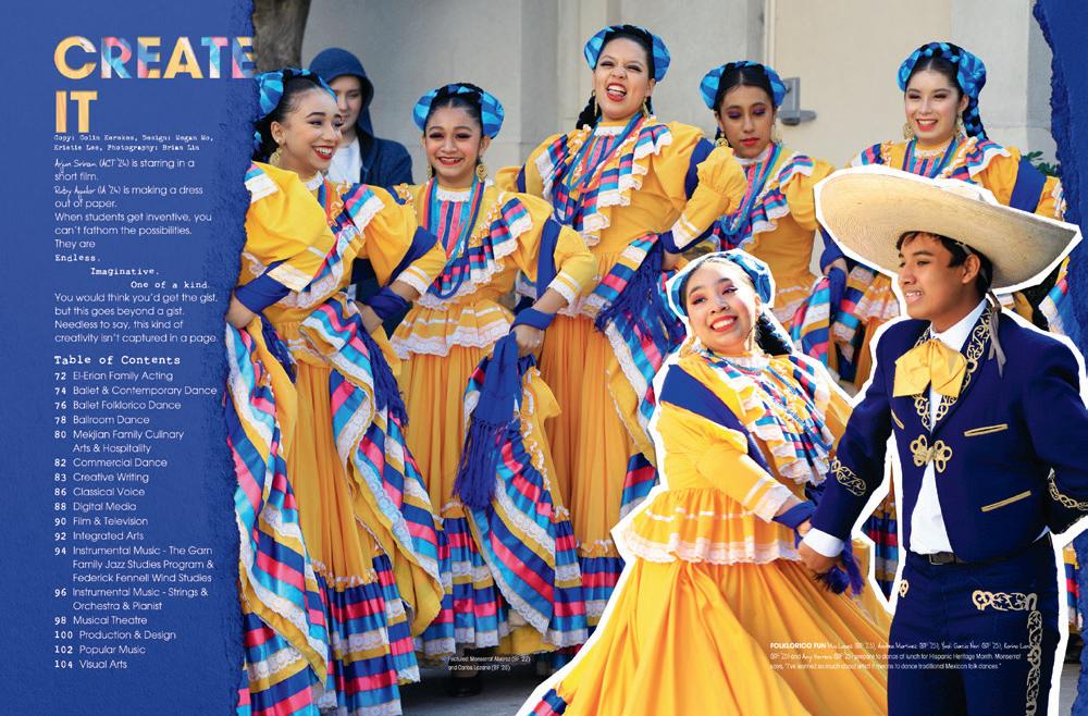
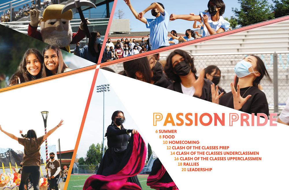
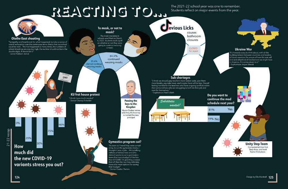
GOING ALL IN: Using theme words throughout your book is important, as are visual elements such as color and design styles. Here’s a great example of how you can make sure the visuals have a voice. This spread is shouting fun, exuberant and happy. From the patterned, overlapping graphics and the multicolored outlines to the tilted type in both the headline and in-line copy, this staff left nothing to chance.
 BLUE VALLEY HS | Reflections | OVERLAND PARK, KS
OWYHEE HS | The Eye | MERIDIAN, ID
ORANGE COUNTY SCHOOL OF THE ARTS | Dreamscape | SANTA ANA, CA

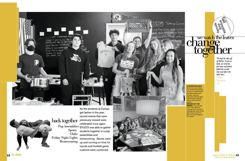


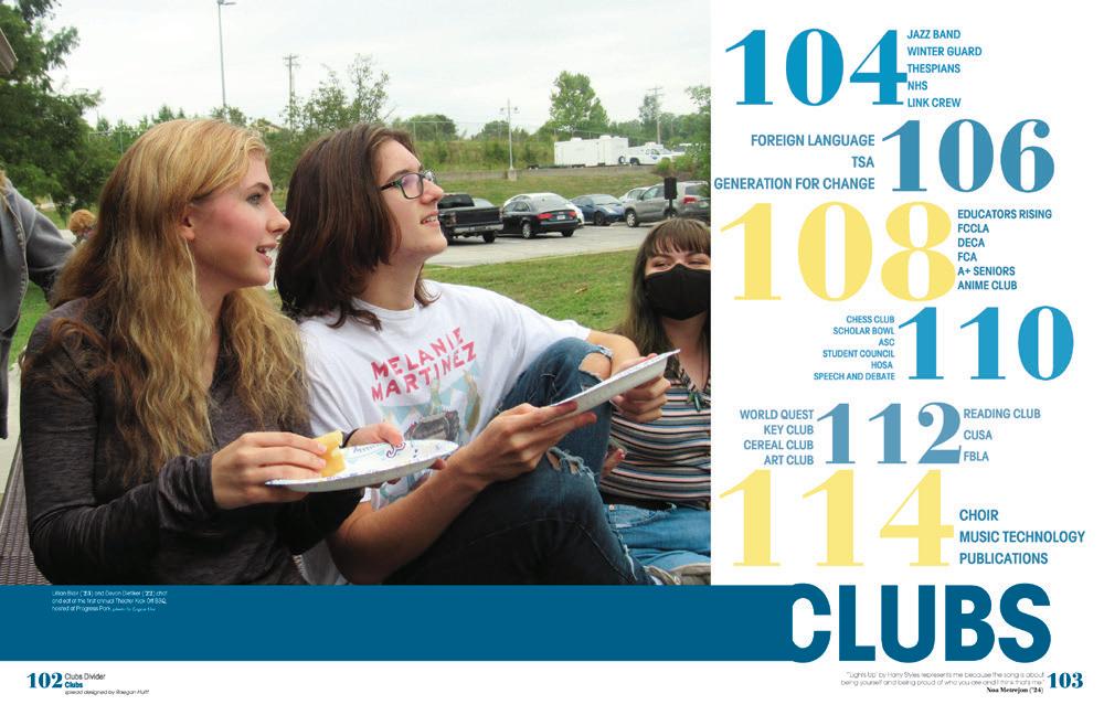
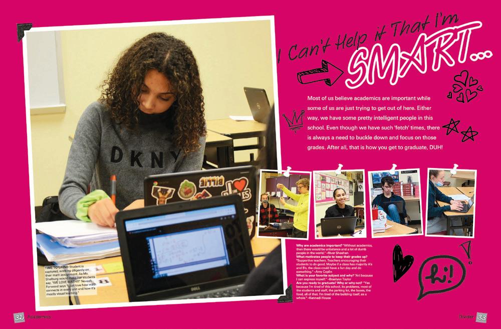
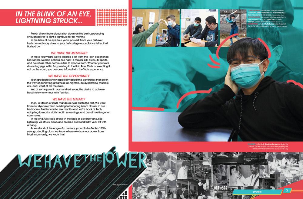
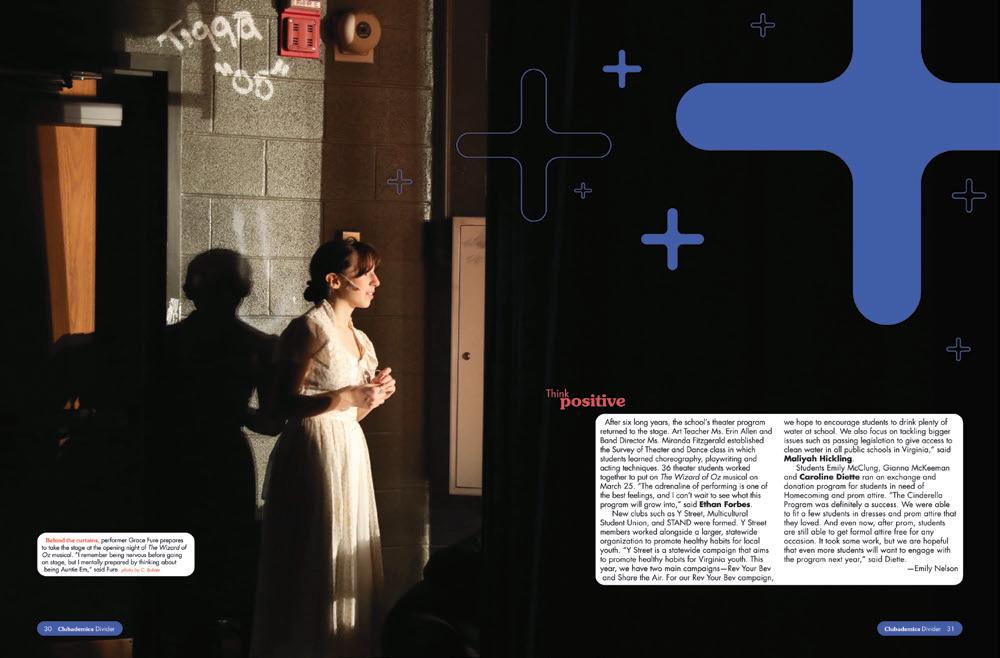
MADE YOU LOOK: It takes a minute to realize that the background of this opening spread is a bird’s eye view of the school. And, if you’ve seen the cover, you might have had an ah-ha moment because an outline drawing of this photo is also there. Our eyes love the pattern presented here, from the photo to the shapes. The gradient also sets the scene for the book ahead, and the copy, well, it reveals the purpose of the photo because it’s all about the place we see.

 BISHOP M c GUINNESS CATHOLIC HS | Chi Rho | OKLAHOMA CITY, OK
ALLEN D. NEASE HS | Impressions | PONTE VEDRA, FL
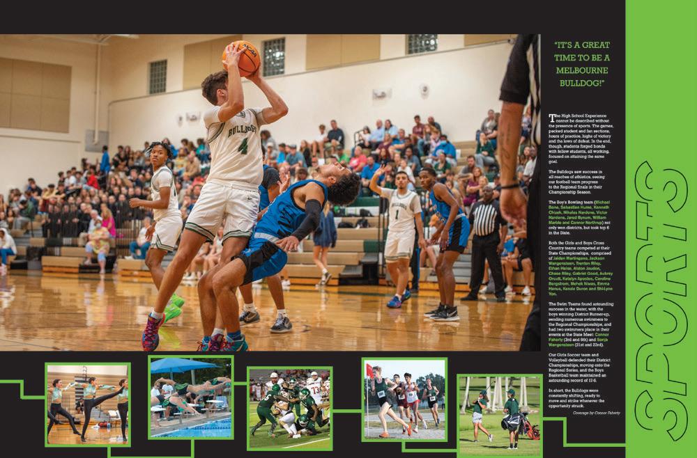
MELBOURNE HS | Stepping Stone | MELBOURNE, FL
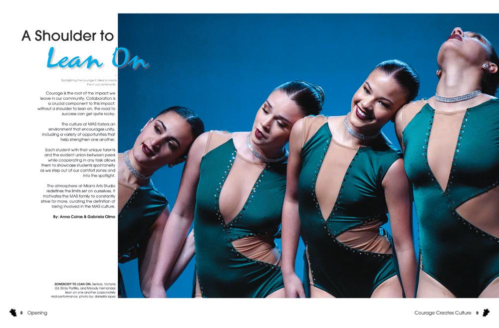
MIAMI ARTS STUDIO 6-12 @ ZELDA GLAZER | Enchanted | MIAMI, FL
GREEN AND WHITE SPACE:
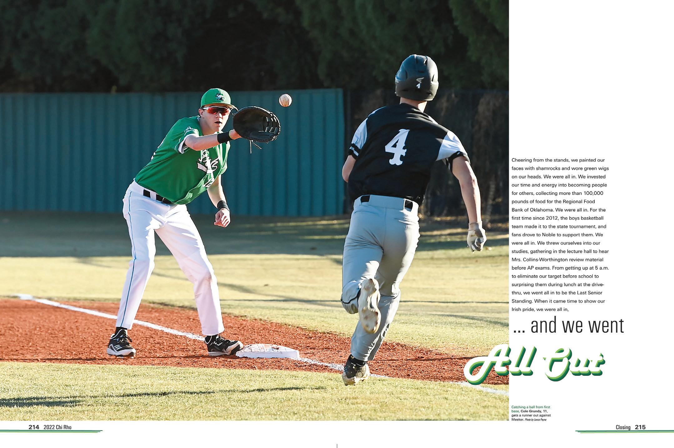
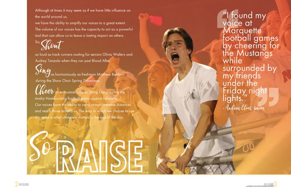
We love the interplay of color on this spread between the player’s uniform, the folio and the text outline, but the white space gets our vote too. While it may seem to simplify the spread, it gives the copy plenty of breathing room and creates the right visual pause for an opening or closing.



 YULEE HS | Vespidae | YULEE, FL
OAKVILLE HS | Tiger Paw | SAINT LOUIS, MO
CLOVER HS | The Eagle | CLOVER, SC
M c LEAN HS | Caledonia | M c LEAN, VA
WILLIAM T. DWYER HS | Panthera | PALM BEACH GARDENS, FL
HAYFIELD SECONDARY SCHOOL | Harvester | ALEXANDRIA, VA
LANGLEY HS | The Shire | M c LEAN, VA
CUPERTINO HS | Nugget | CUPERTINO, CA
SPECIAL CIRCUMSTANCES:

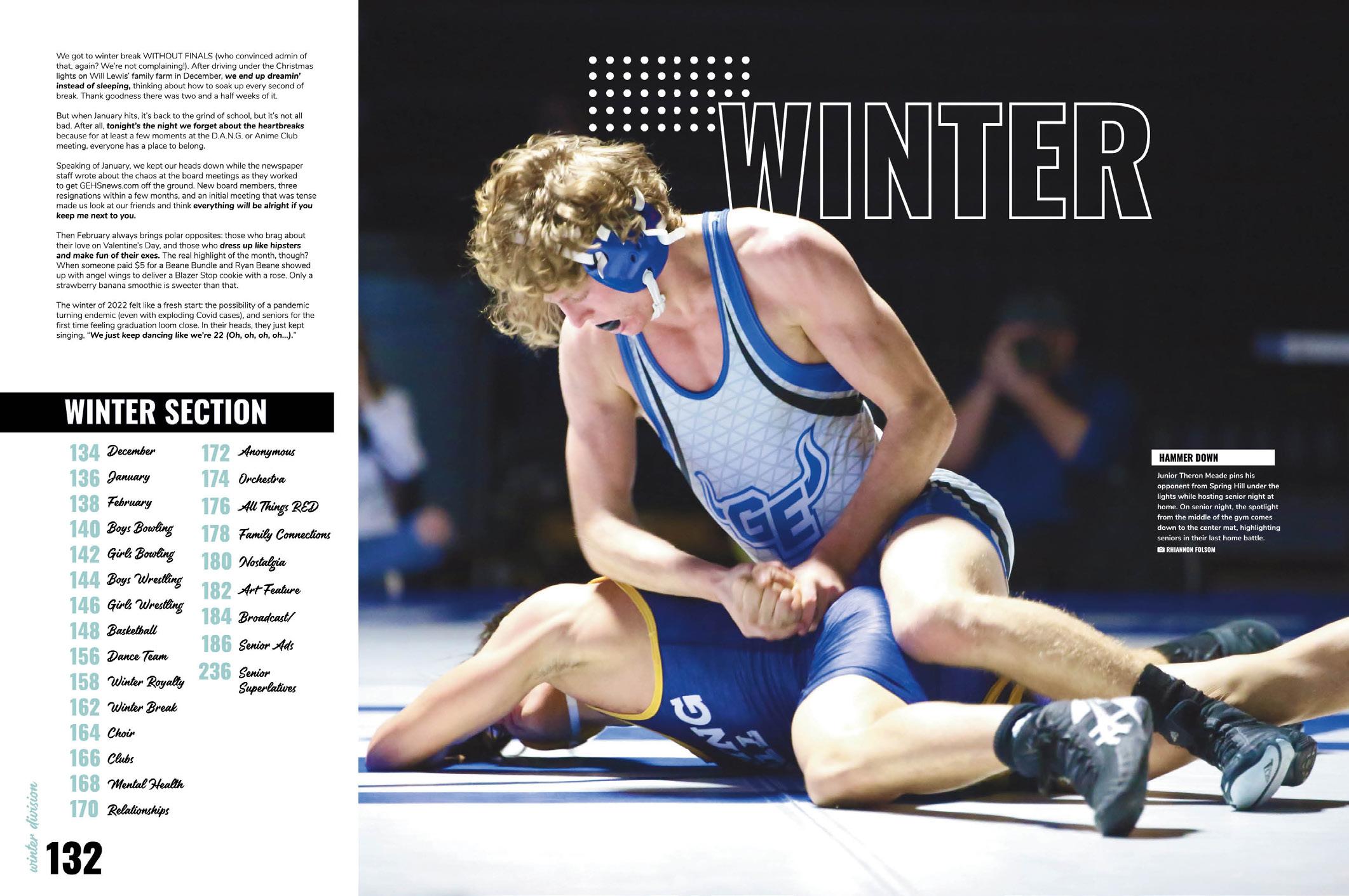
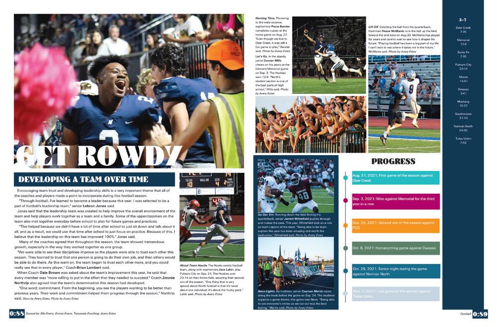
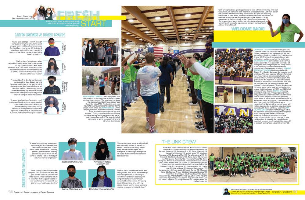
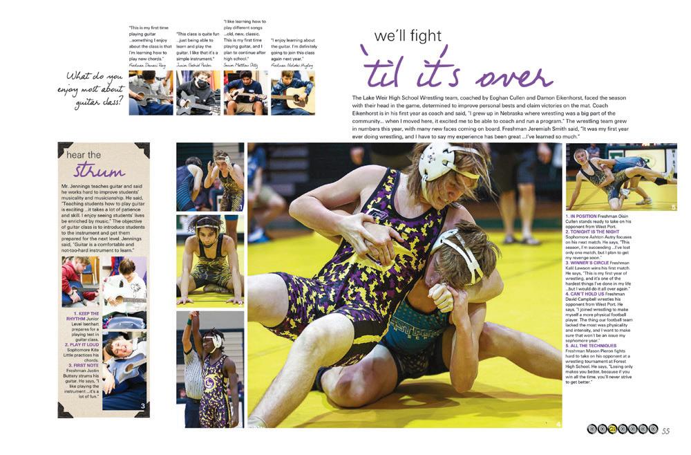
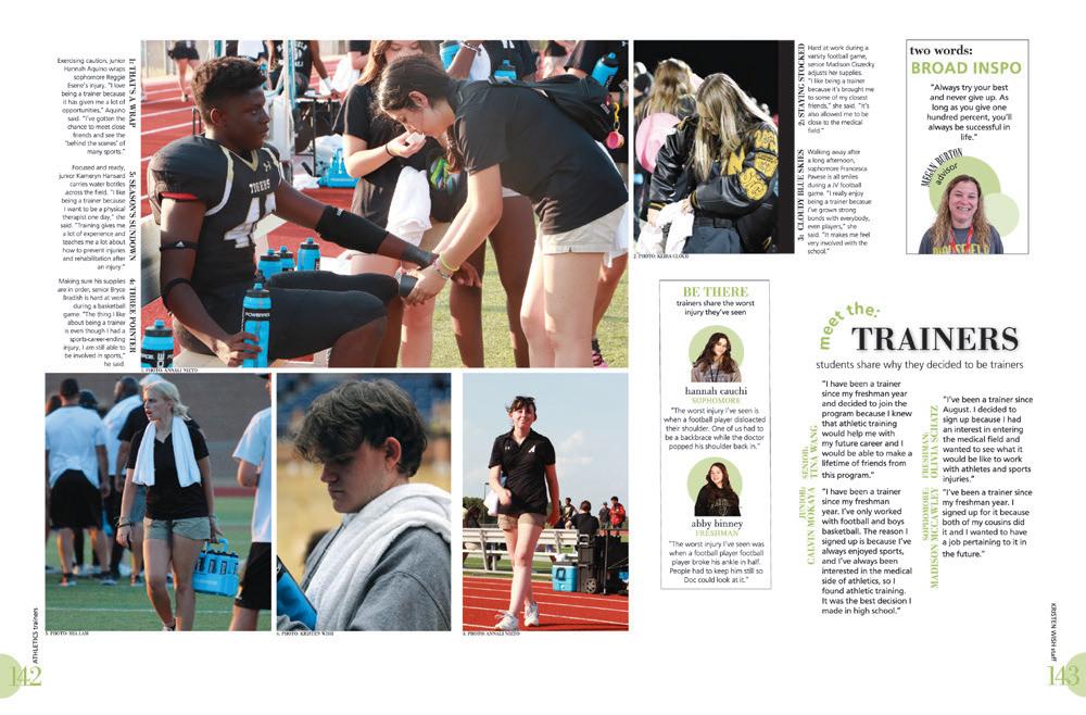
Division pages are special, and they are meant to display the absolute best photography you have to offer. This photo perfectly hosts the section header (we love the overlap of the wrestler’s shoulder) and the caption without taking anything away from the action in the foreground. It’s worth the time spent digging though SD cards to find photos like this one.
 WILLIAMSVILLE EAST HS | Spark | EAST AMHERST, NY
CHRISTOPHER COLUMBUS HS | Adelante | MIAMI, FL
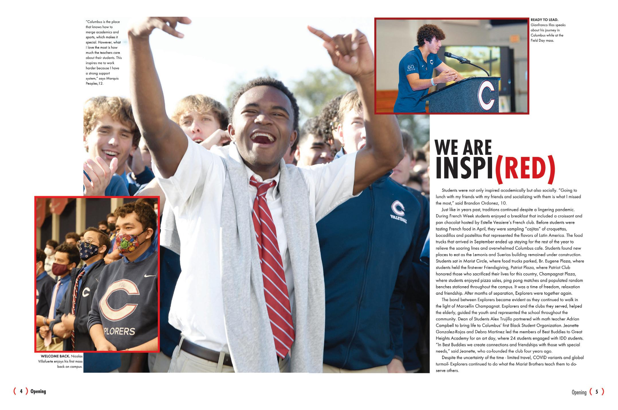
IT’S LIKE A PUZZLE: Visual: red tie, red outline, red emphasized type. Psyched students, inspiring speeches and scenes of school unity. Verbal: We are inspired as the headline, quotes about inspiration, copy about traditions and school spirit. That’s how it’s done.
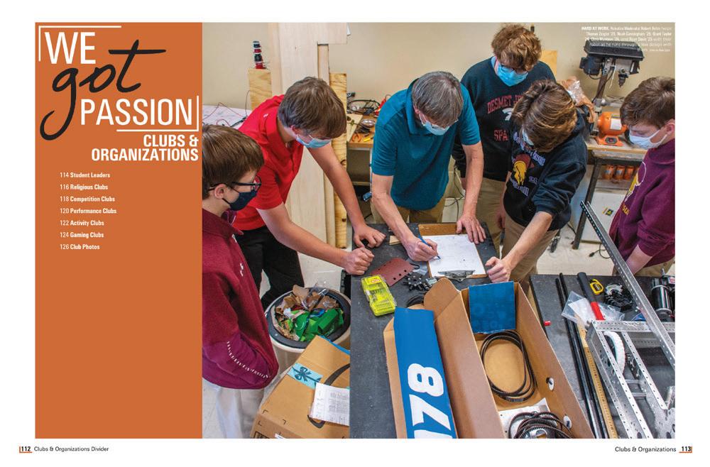
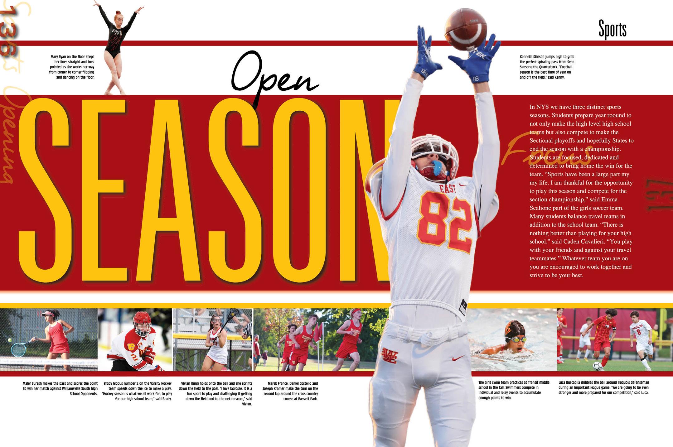
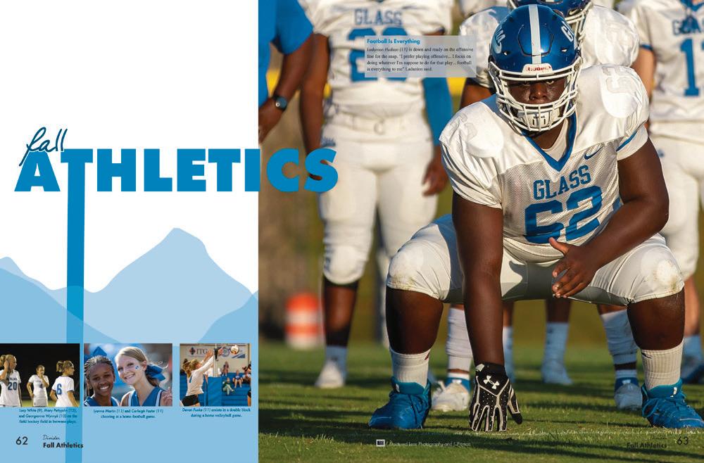
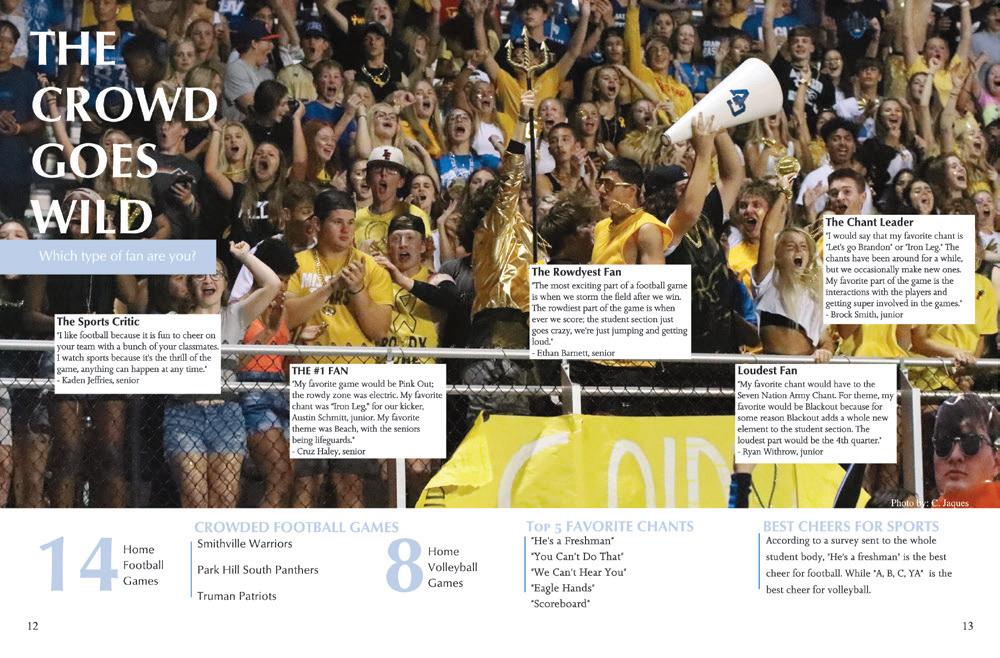
LOVE THESE LAYERS: The contrasts and layering are what make this spread stand out. From the giant football player in the foreground to the tiny gymnast poised atop the mammoth header, our eyes are moving all over. Next, we move on to the stripe of photos below — hello, coverage! — and the body copy pulls us back into focus
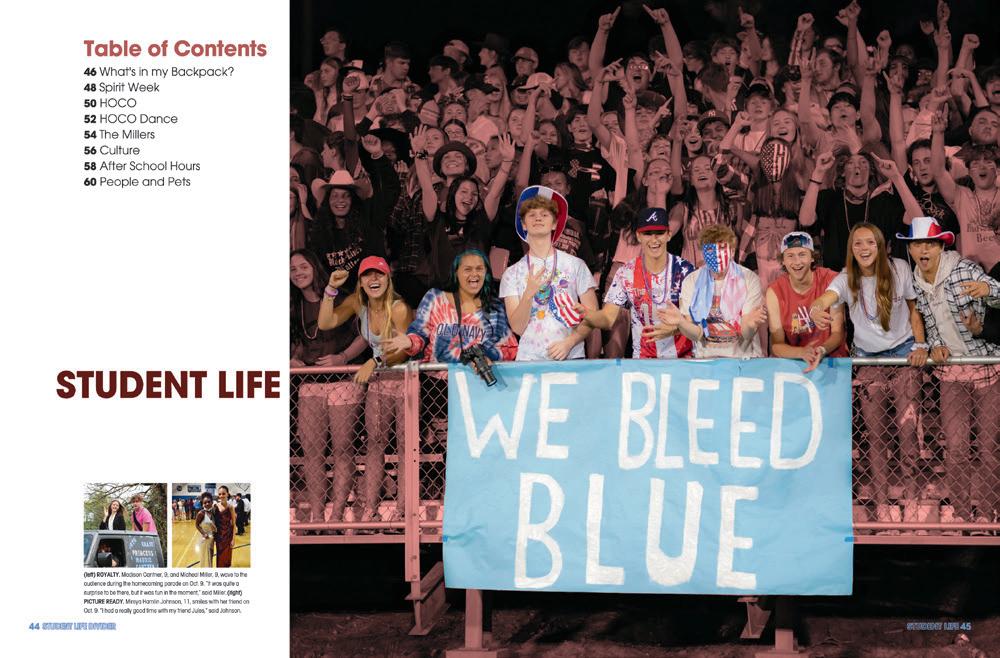
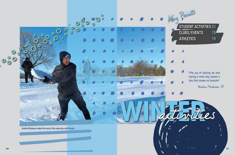
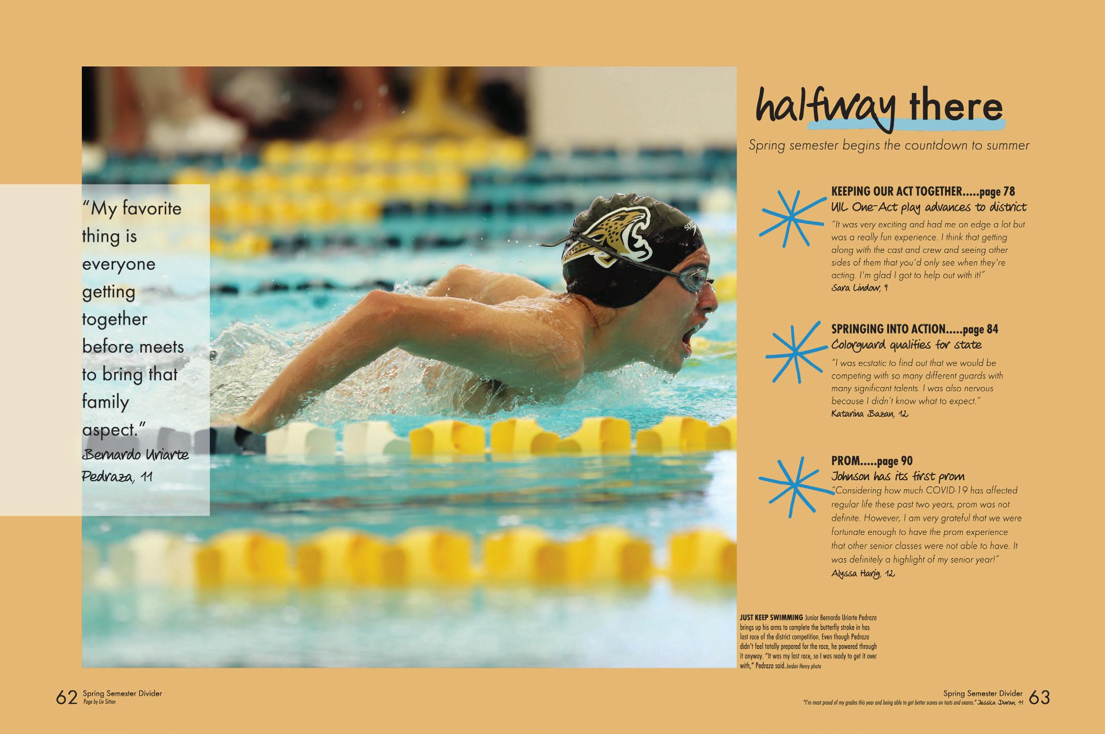
THESE THREE THINGS: In this chronological book, the spring semester divider points out the fact that it marks the halfway point of the school year. Is the swimmer halfway through his race? We don’t know, but we like the connection. The mini table of contents provides highlights for the section ahead, plus three content-rich quotes go with each. The contrast between the blocky layout and the hand-drawn font and asterisks is great for making the spread seem trendy and more modern. Nice job.
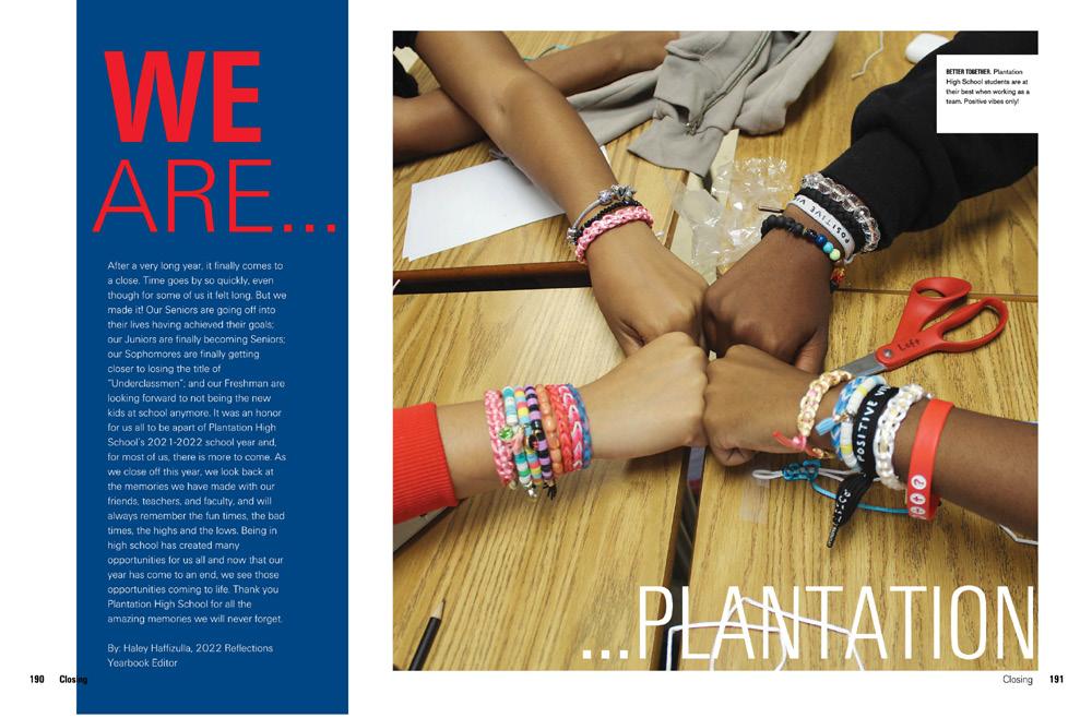
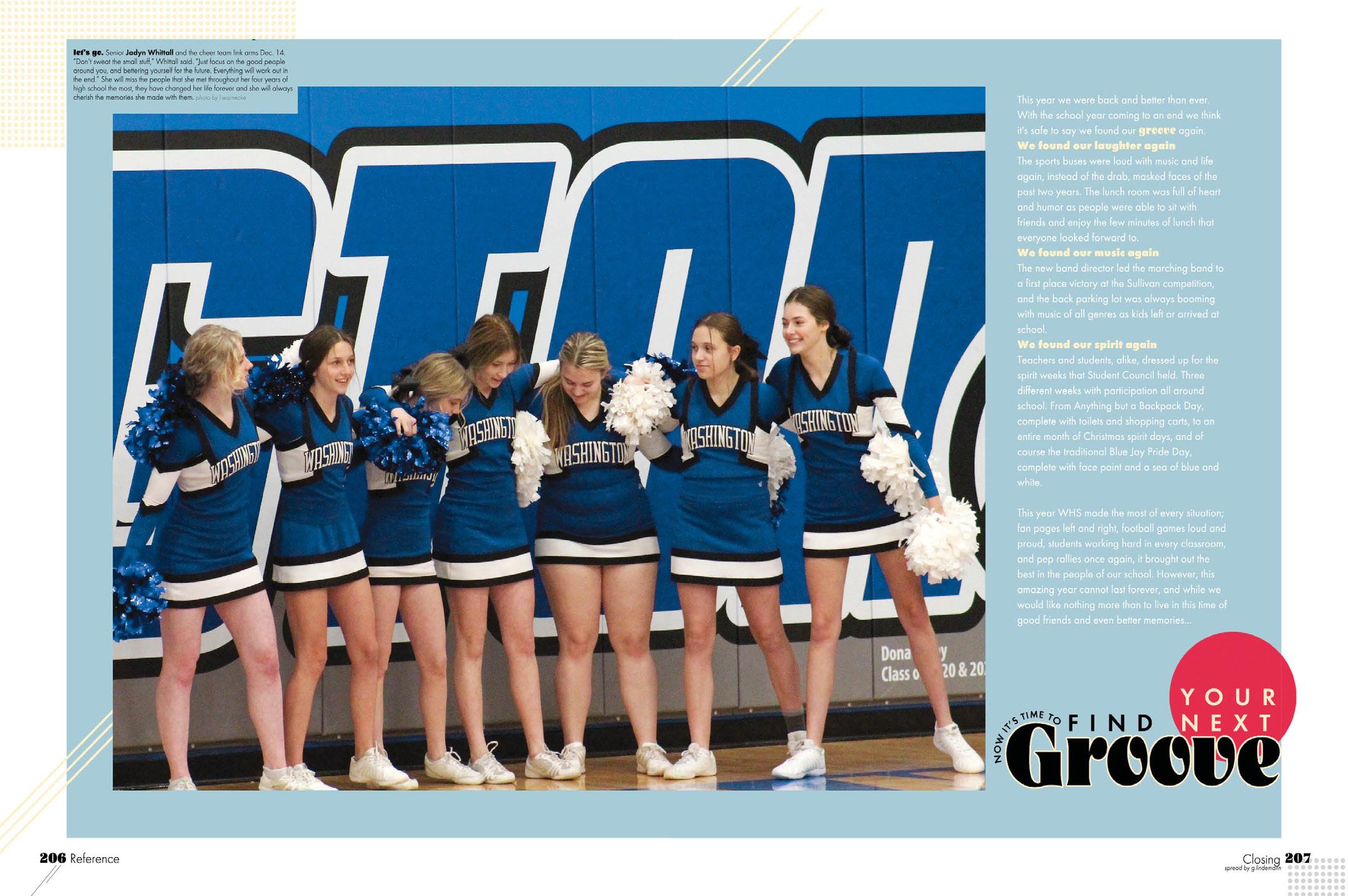
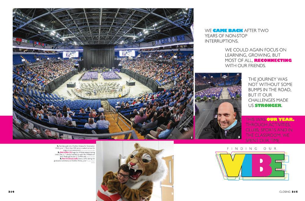
MOVING ON: For their closing spread, the Washingtonian staff chose a photo that conveyed a sense of unity and completion — one that matched the headline, “Now it’s time to find your next groove.” The caption and copy support, as well. We have a feeling this combo left readers with a sense of completion as their year ended.
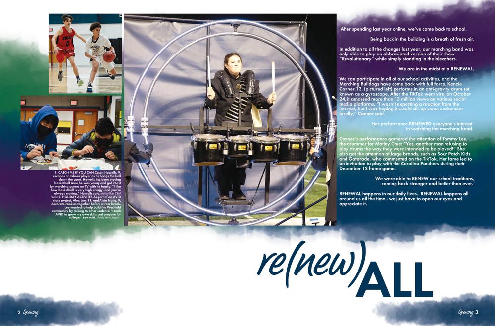
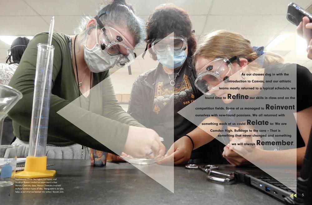


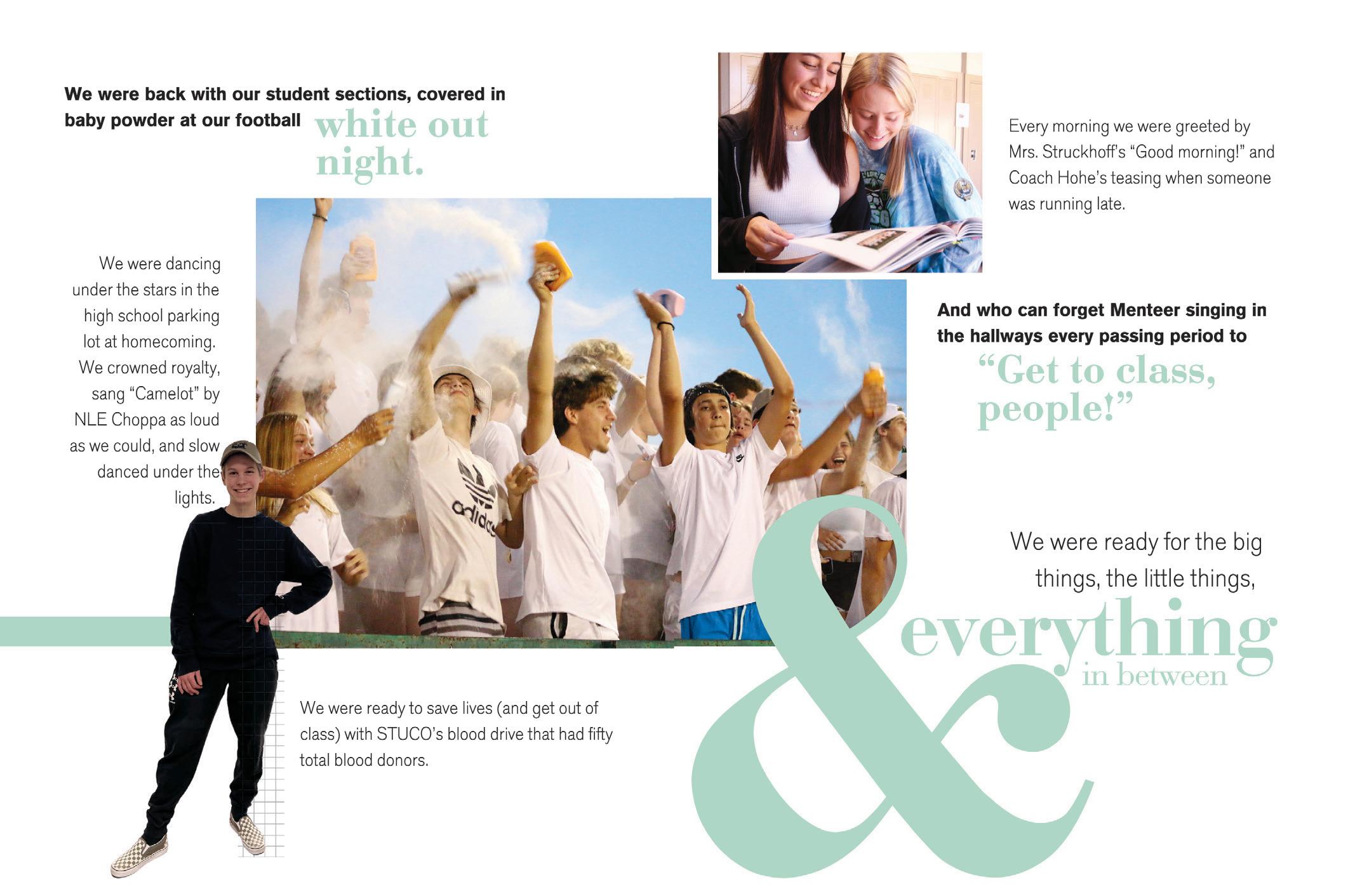
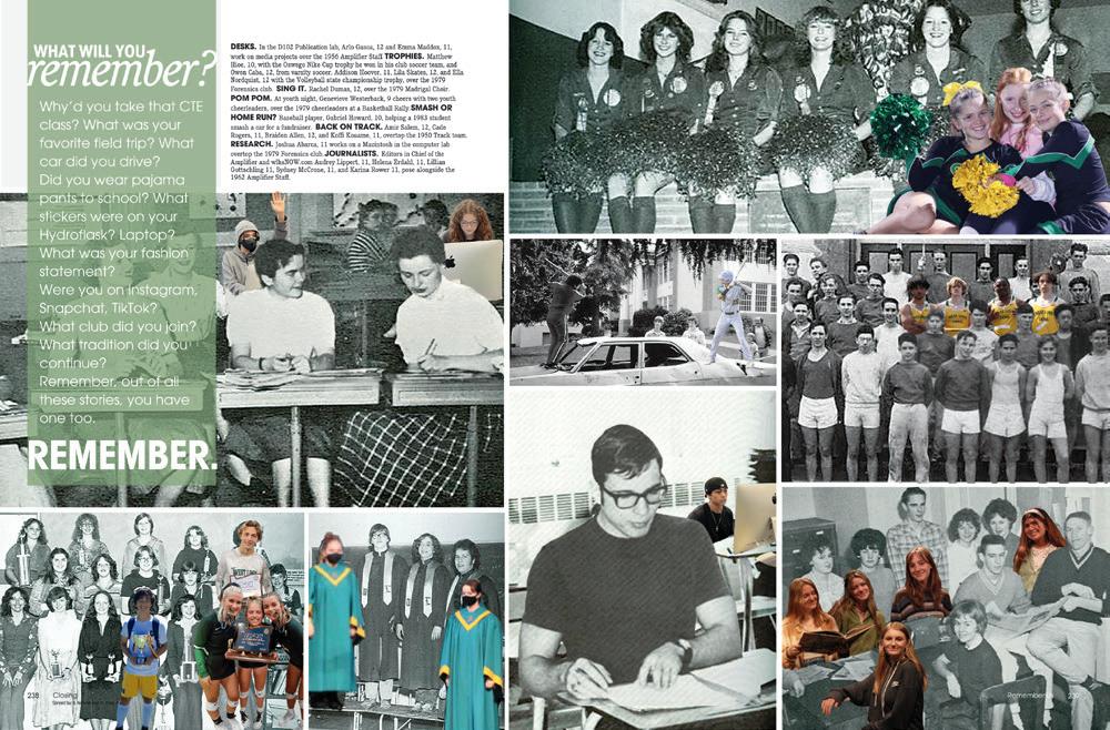
IT’S A MIX: Bringing the previous pages of the book all together and tying them with a bow is the purpose of a closing, and this one does a great job. The contrast between the cut-out individual, the pair at the top and the crowd shot is great for balance. And who can resist a giant ampersand and beautiful type to carry the theme? Oh, and take a peek at how the photo corner is rounded to match the type. That’s good stuff.

 ORCHARD FARM HS | The Talon | SAINT CHARLES, MO
du PONT MANUAL HS | The Crimson | LOUISVILLE, KY
AMADOR VALLEY HS | Dondays | PLEASANTON, CA
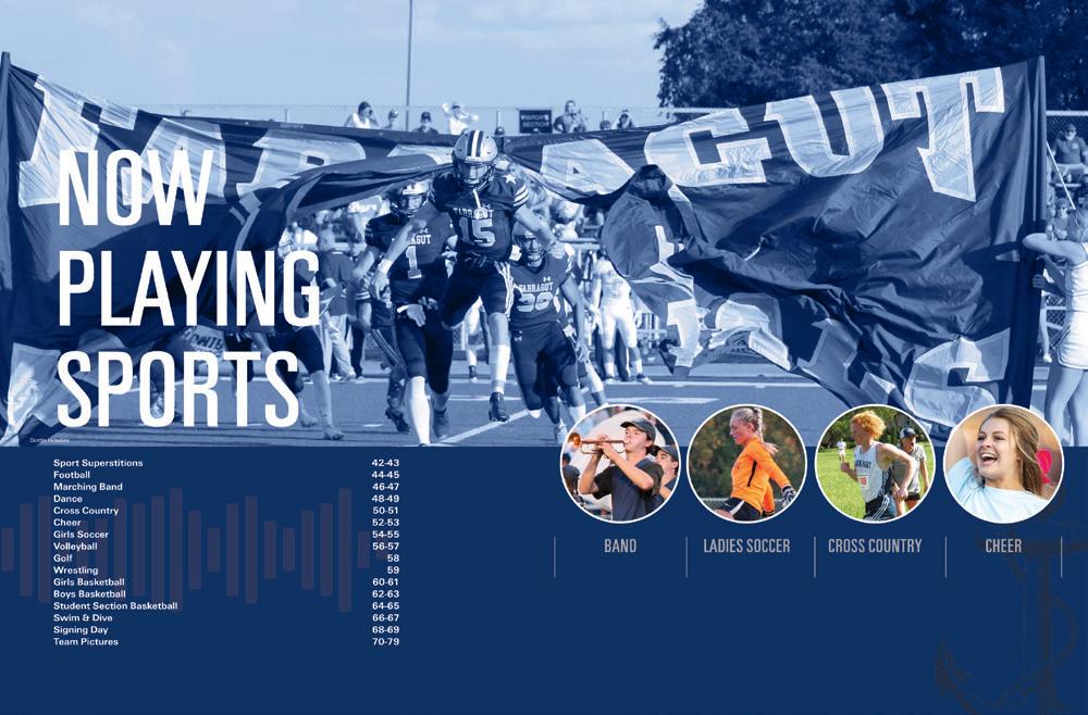
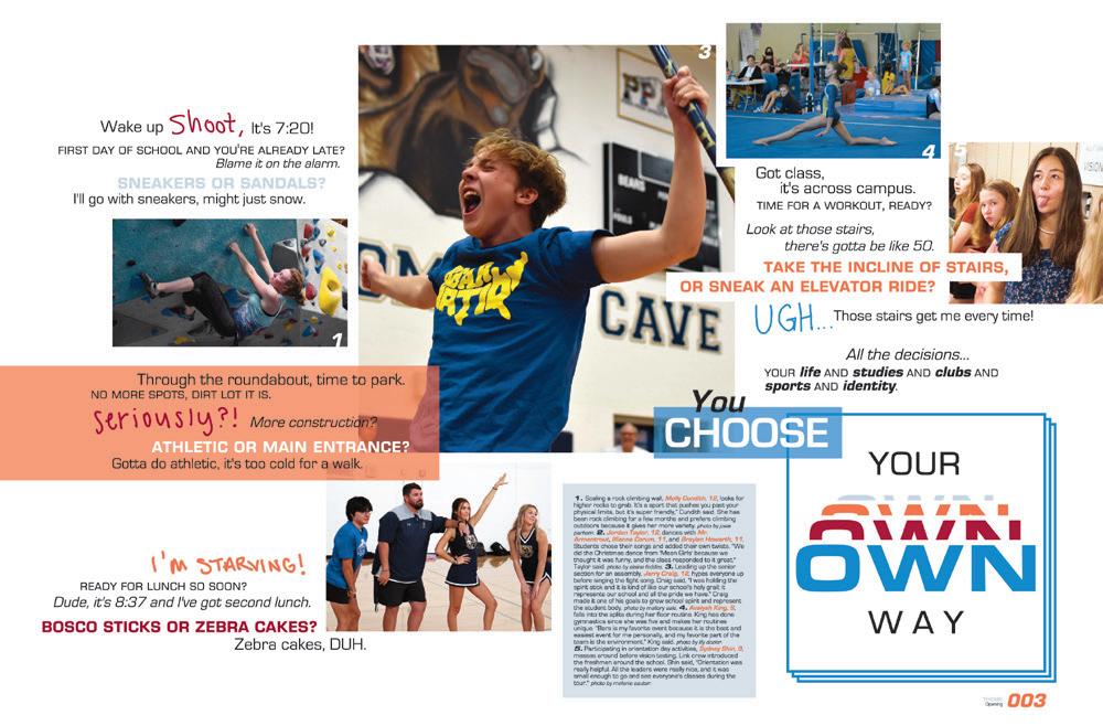

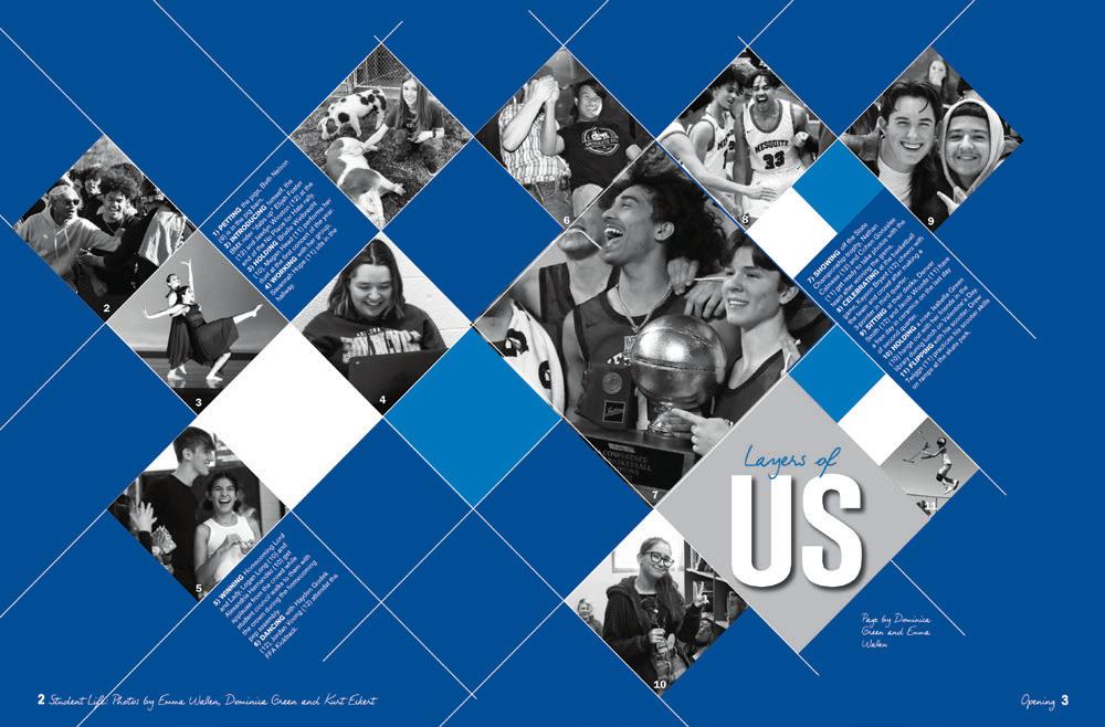
POP-UP BOOK: Gridded layouts are fun and trendy, and this one stands out. Part of the appeal lies in the extra work this staff did to drop out the backgrounds of the photos and place them extending just the right amount over the boxes. It’s a great effect — and one made even better by the bright and well-established color palette.
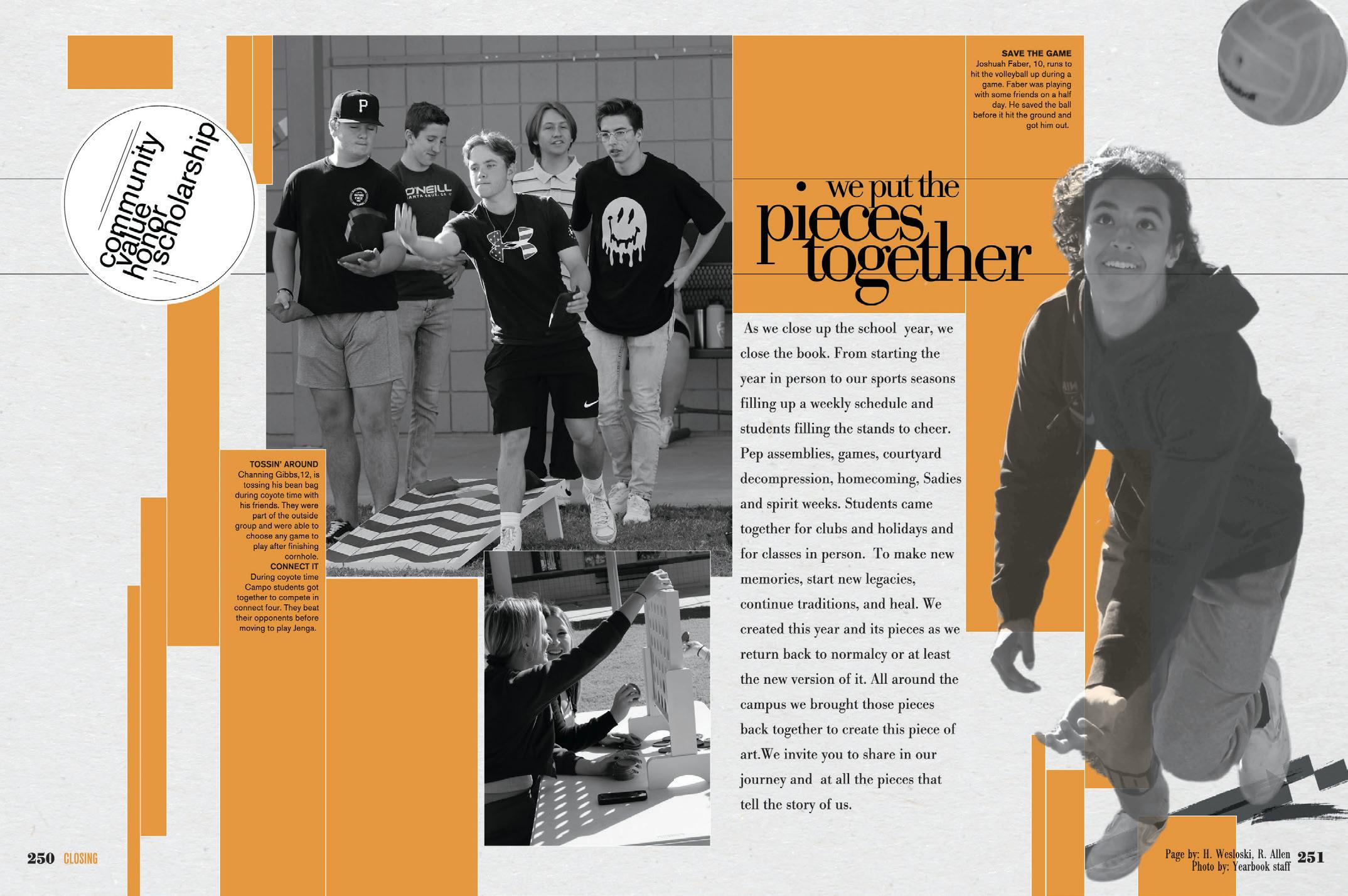
ORANGE YOU GLAD?
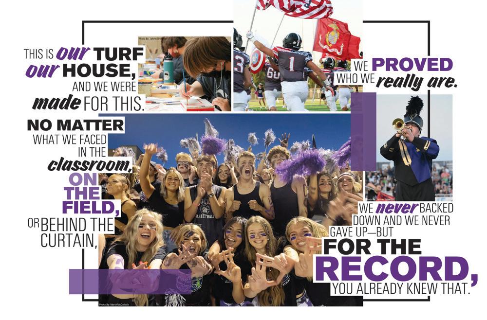
The Reflections staff got their artsy vibe on with this graphic, twotone layout. We love the contrast between the halftone graphics and the bright blocks. The overlapping serif and sans-serif fonts are pretty cool, too. Now, the question is how long they spent putting the pieces together.
 WEST LINN HS | Green & Gold | WEST LINN, OR
RED BLUFF HS | Dictum Est | RED BLUFF, CA
ROCKY MOUNTAIN HS | Silvertip | MERIDIAN, ID
JOHN CHAMPE HS | The Quest | ALDIE, VA

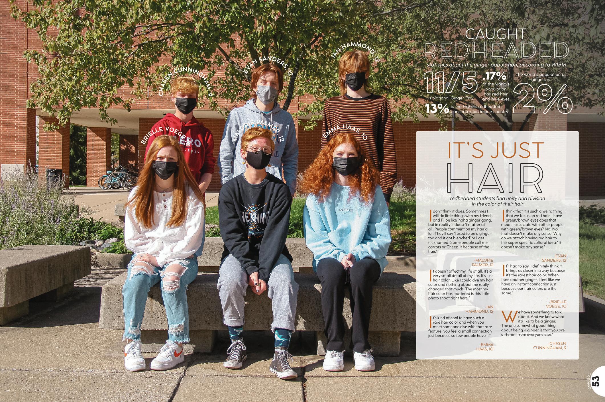
SHINING STARS: You want new coverage angles, but sometimes there’s not an obvious photo to go with the story. Here’s an example of super-cool coverage — the angle and the execution. The photo does a good job of bringing attention to their common trait, and the text wrapped around their heads doesn’t hurt either. Not only does this topic give the staff the opportunity to cover six students who may not have been covered otherwise, but it also gave them an excuse to use this gem of a headline: “Caught redheaded.” So great.

 CARMEL HS | Pinnacle | CARMEL, IN
COLUMBUS NORTH HS | Log | COLUMBUS, IN
COLUMBUS NORTH HS | Log | COLUMBUS, IN
 SPARKMAN HS | The Senator | HARVEST, AL
BLUE VALLEY WEST HS | Illumination | OVERLAND PARK, KS
VANCOUVER SCHOOL OF ARTS AND ACADEMICS | Ars Longa | VANCOUVER, WA
GRAIN VALLEY HS | Heart of the Valley | GRAIN VALLEY, MO
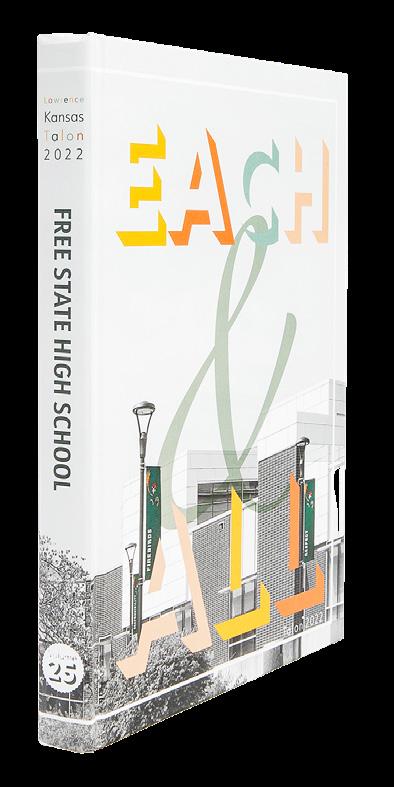
FREE STATE HS | Talon | LAWRENCE, KS
FREE STATE HS | Talon | LAWRENCE, KS
ORCHARD FARM HS | The Talon | SAINT CHARLES, MO
BETHANY HS | The Bronco | BETHANY, OK
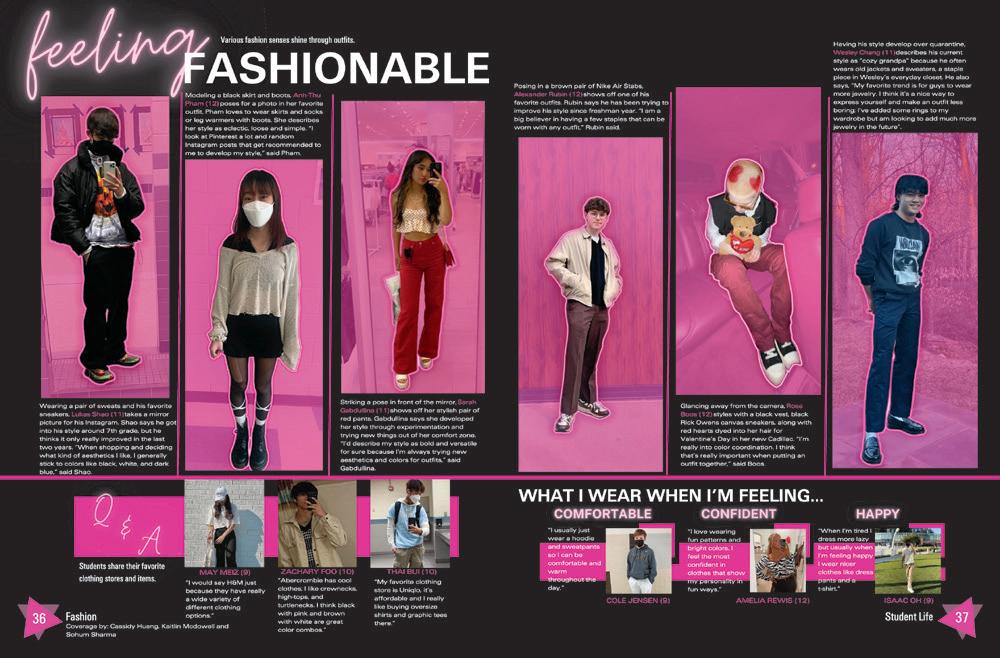
COLOR ME TRENDY:
Edmond North staffers made their trends spread extra special by putting their models of the latest fashions in a different light. The repetition of the color backgrounds in the photos is effective in giving the spread a unified look. Names and quotes complete the package.
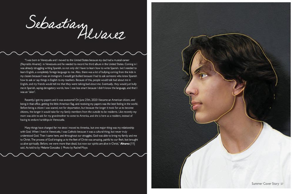


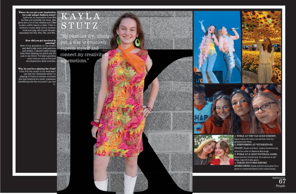
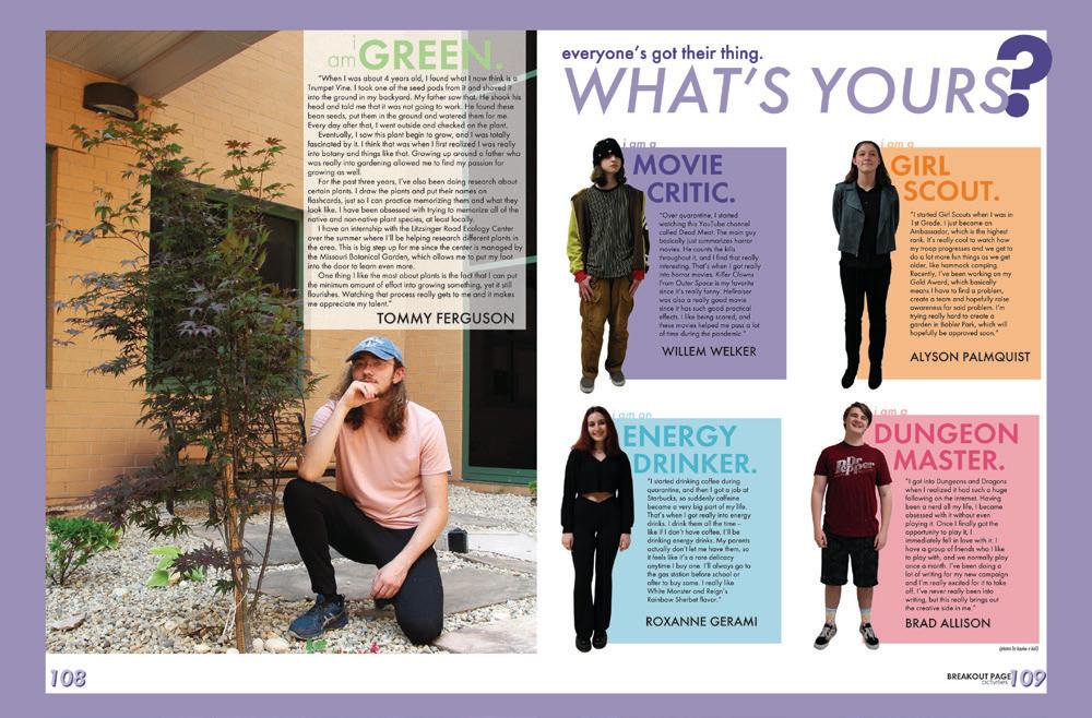
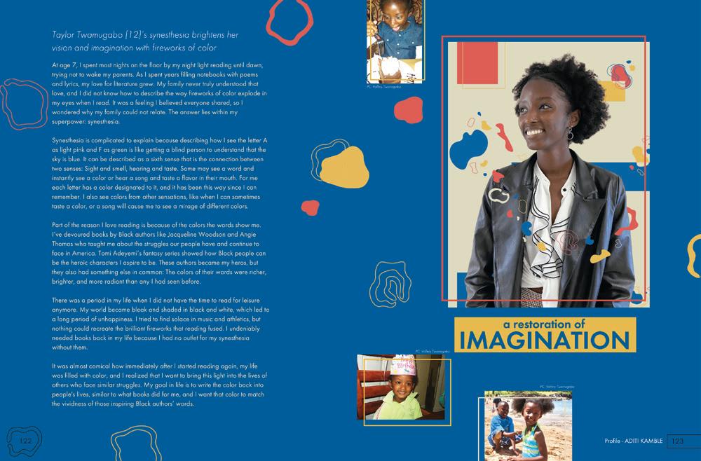
EFFECTIVE EFFECTS: There’s something about a great personal profile and portrait combo that makes a yearbook feel like it really belongs to the students. You get to know people on a different level. Here’s a fresh take on a traditional mode of coverage — the full-bleed color wash makes an impression and the handwriting font and copy in white add the pop we need to become interested in the stories. The extra quotes and accents in the handwritten look help complete the look.
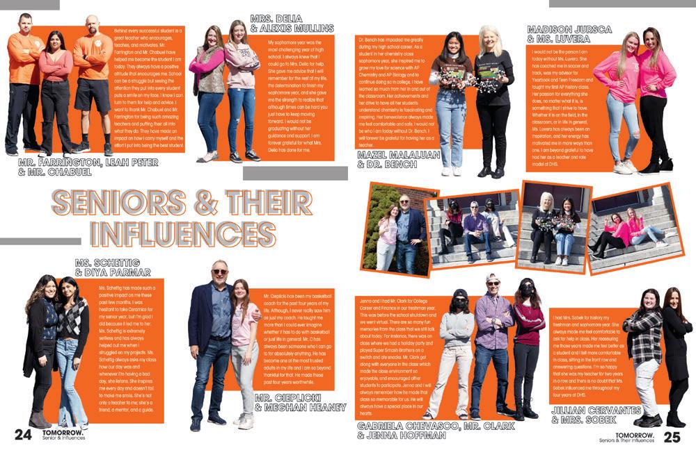
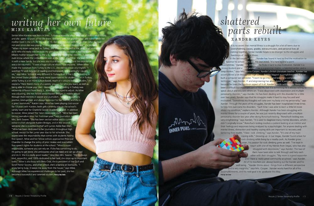

 WEST LINN HS | Green & Gold | WEST LINN, OR
BASHA HS | Grizzly Gamut | CHANDLER, AZ
NATION FORD HS | The Ford | FORT MILL, SC
DUMONT HS | Reveries | DUMONT, NJ
ON THE RIGHT FOOT:
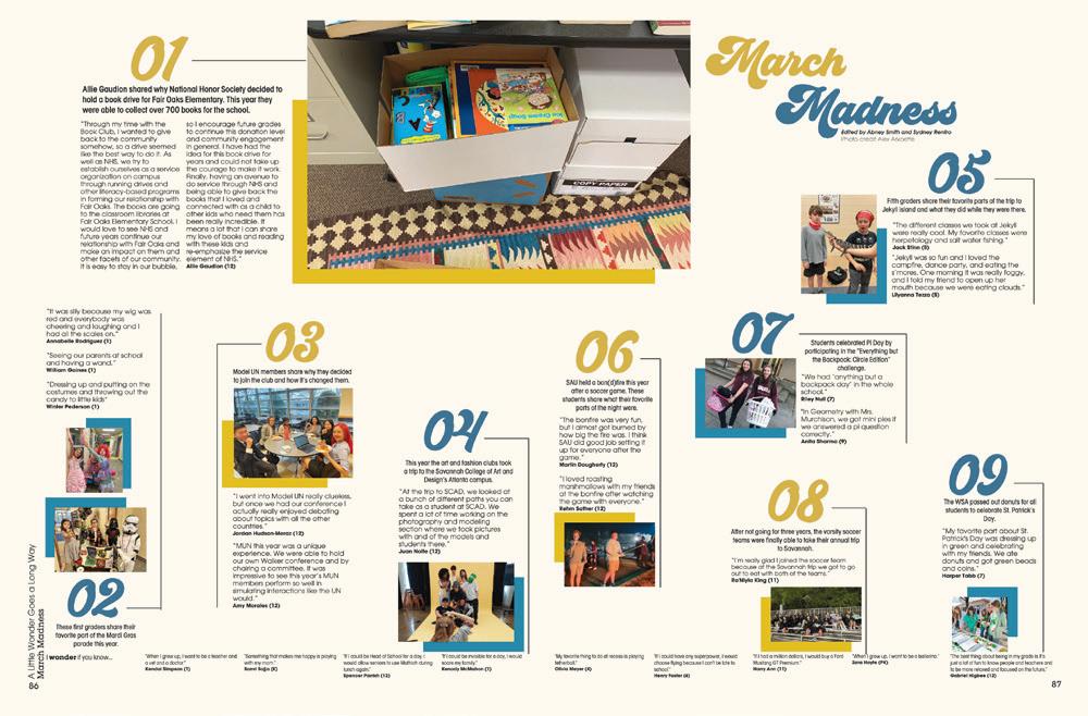
In their coverage of “100 Things,” shoes make sense. But fitting 100 shoes and identifying their owners was a trick. We can imagine students turning this spread into a guessing game. This is just one of many spreads featuring this style to celebrate the 100th volume and school year.
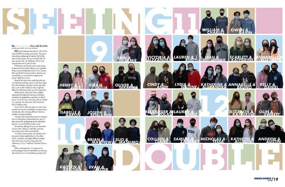
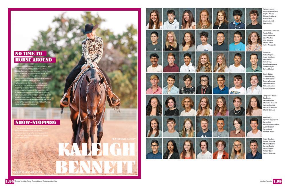


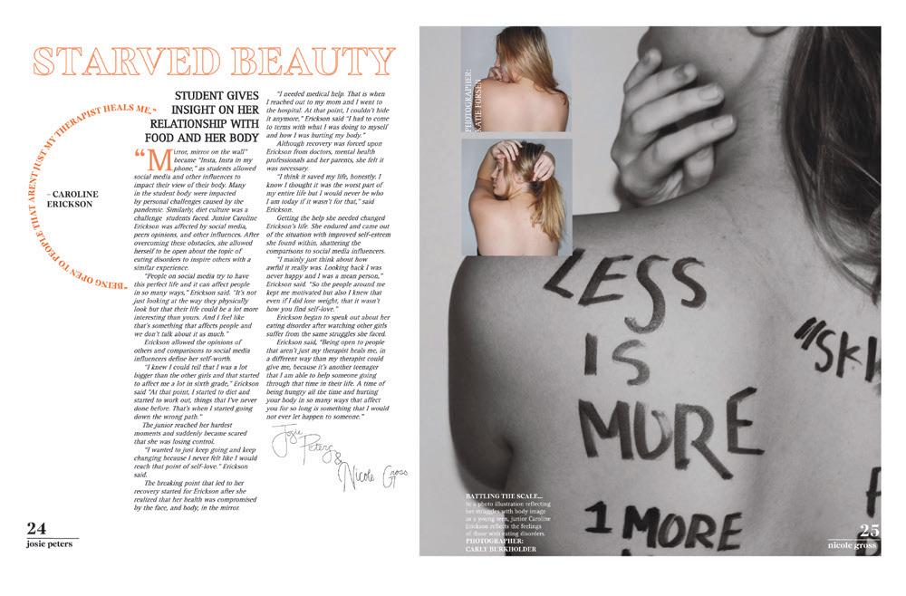
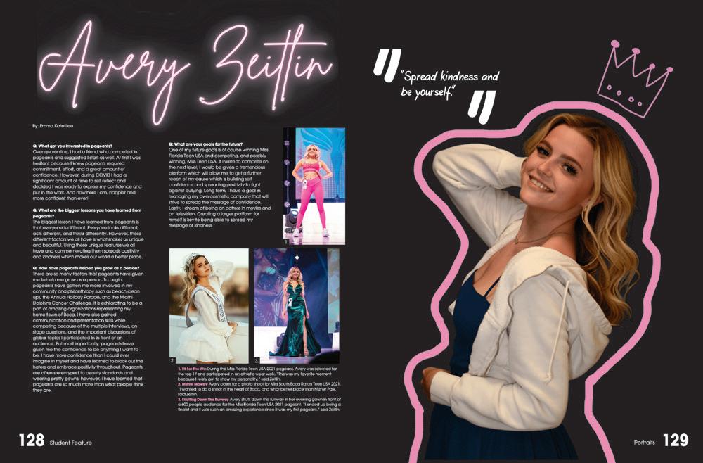
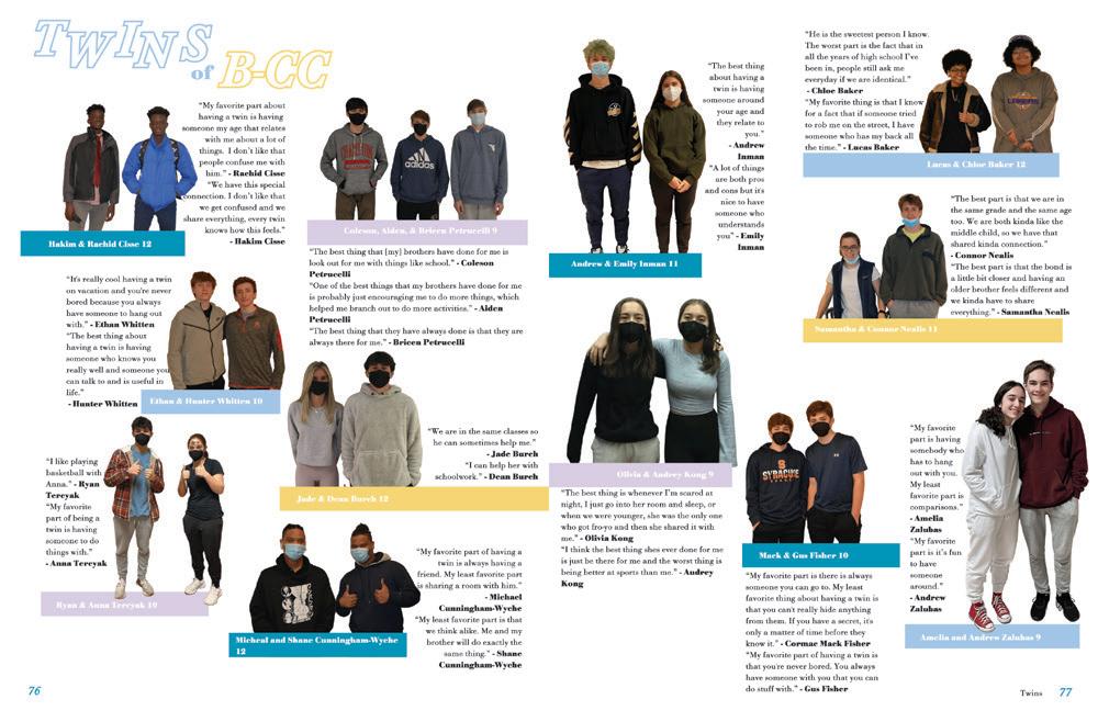
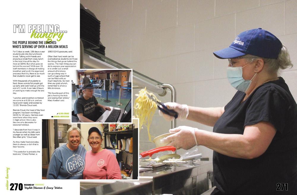
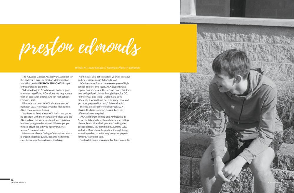
PROUD OF PRIDE: The words tasteful and respectful come to mind when we evaluate this spread on minority and gender identity. They’re not easy topics to approach, but this spread does so many things well. The multiple photos of one person (with different lighting) convey the feelings expressed in the story. And the copy itself gives most of its space to the students and what they have to say. It’s such a great example.
 LAFAYETTE HS | Legend | WILDWOOD, MO
ALBANY HS | The Middle Mile | ALBANY, CA
DIAMOND BAR HS | Taurus | DIAMOND BAR, CA


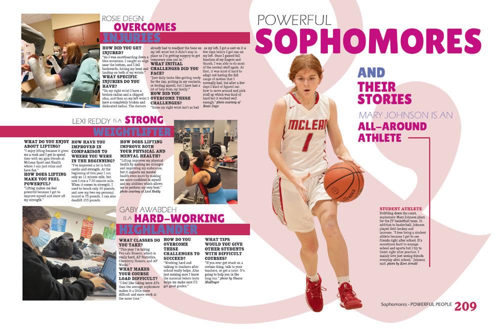
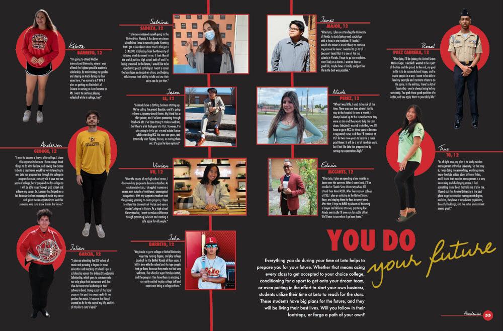
PAPER OR PLASTIC?
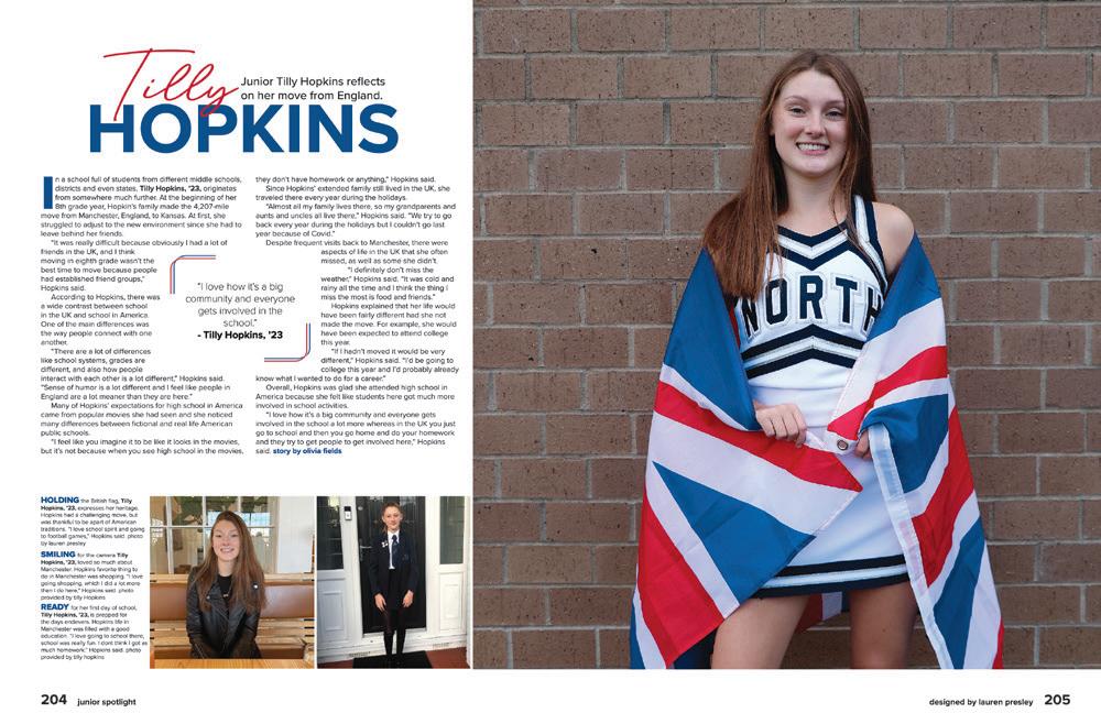
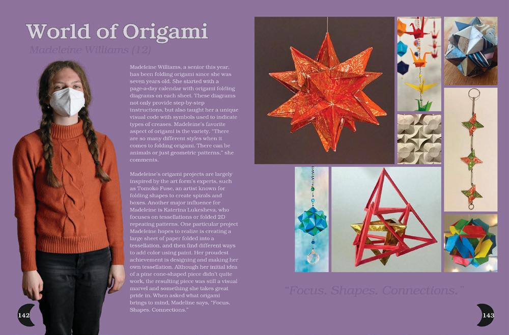
Ripped paper and cutout photos give this spread dimension and visual interest — plus there’s clear separation space and textbook-perfect mod usage. And the marker scribbles add even more to the look. We know they are computer-generated, but they are so realistic that we have to give this staff a thumbs-up for making us believe.
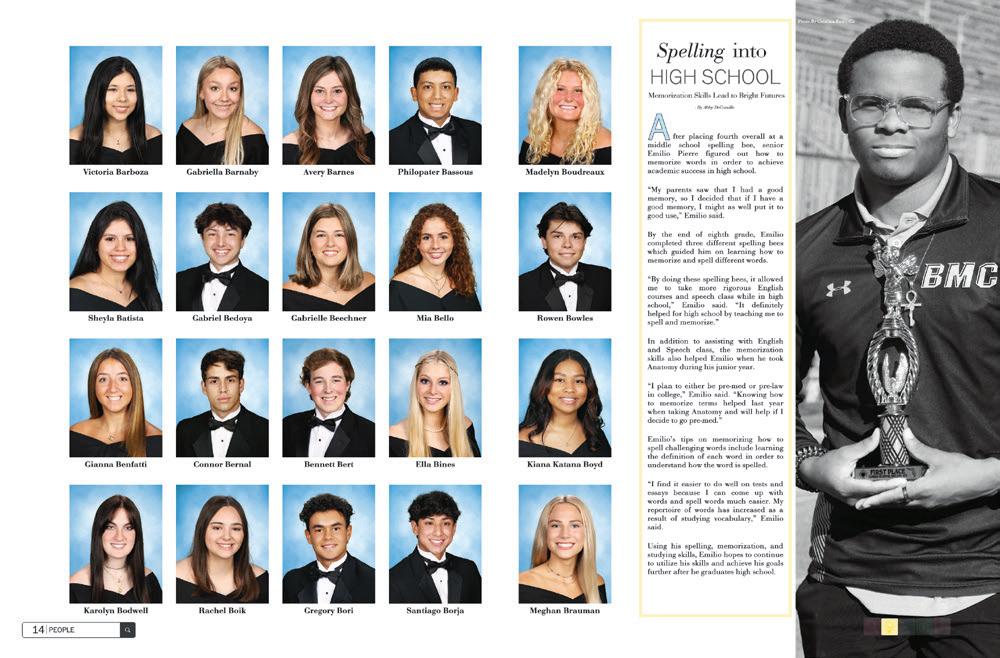
 ORANGE COUNTY SCHOOL OF THE ARTS | Dreamscape | SANTA ANA, CA
BISHOP MOORE CATHOLIC HS | Moore Memories | ORLANDO, FL
BLUE VALLEY NORTH HS | Northern Light | OVERLAND PARK, KS

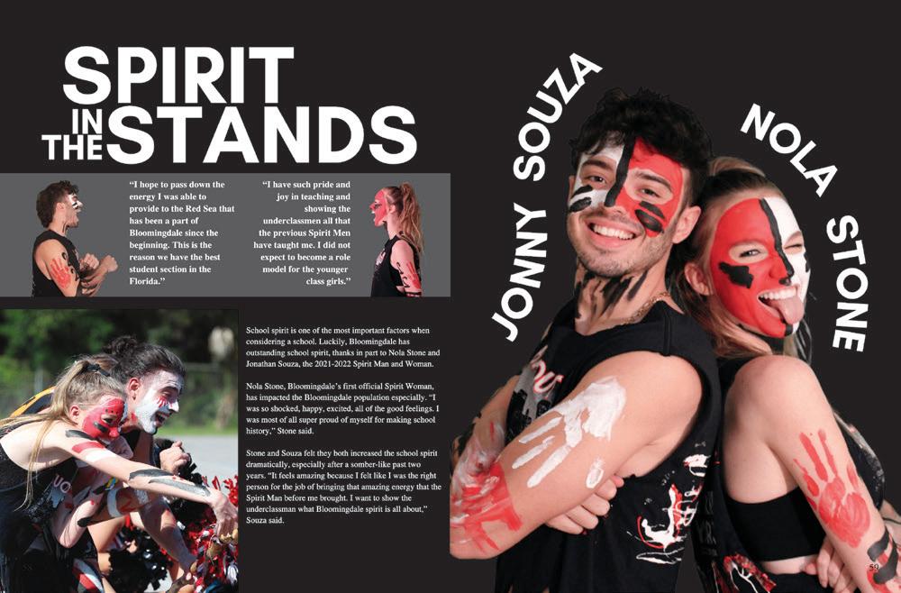
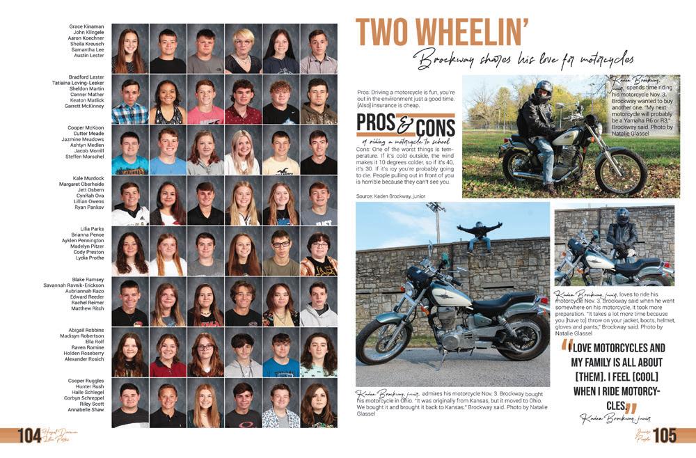
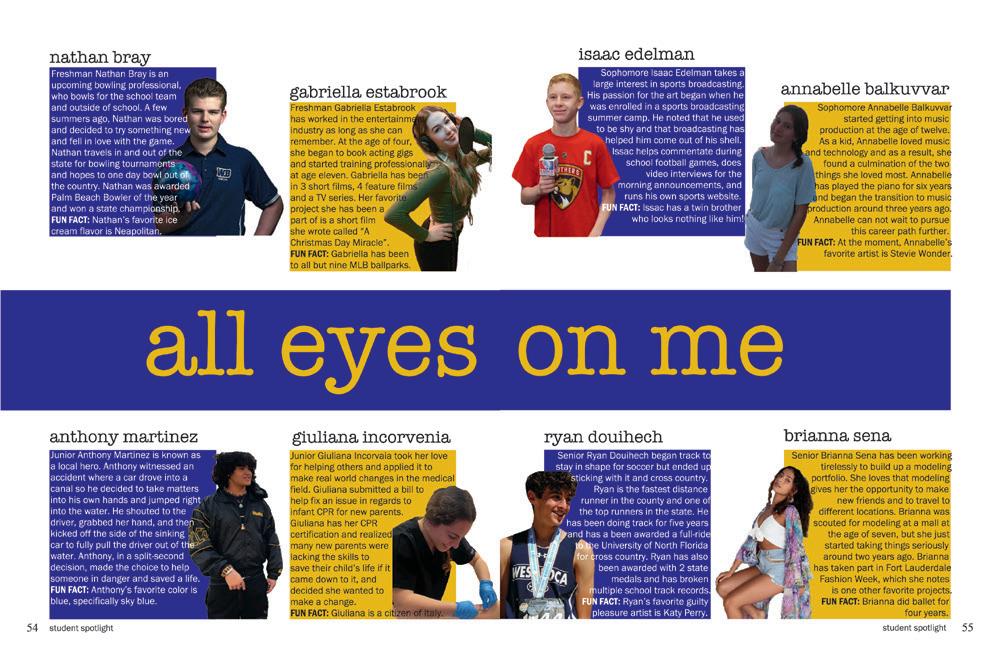
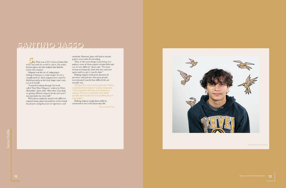
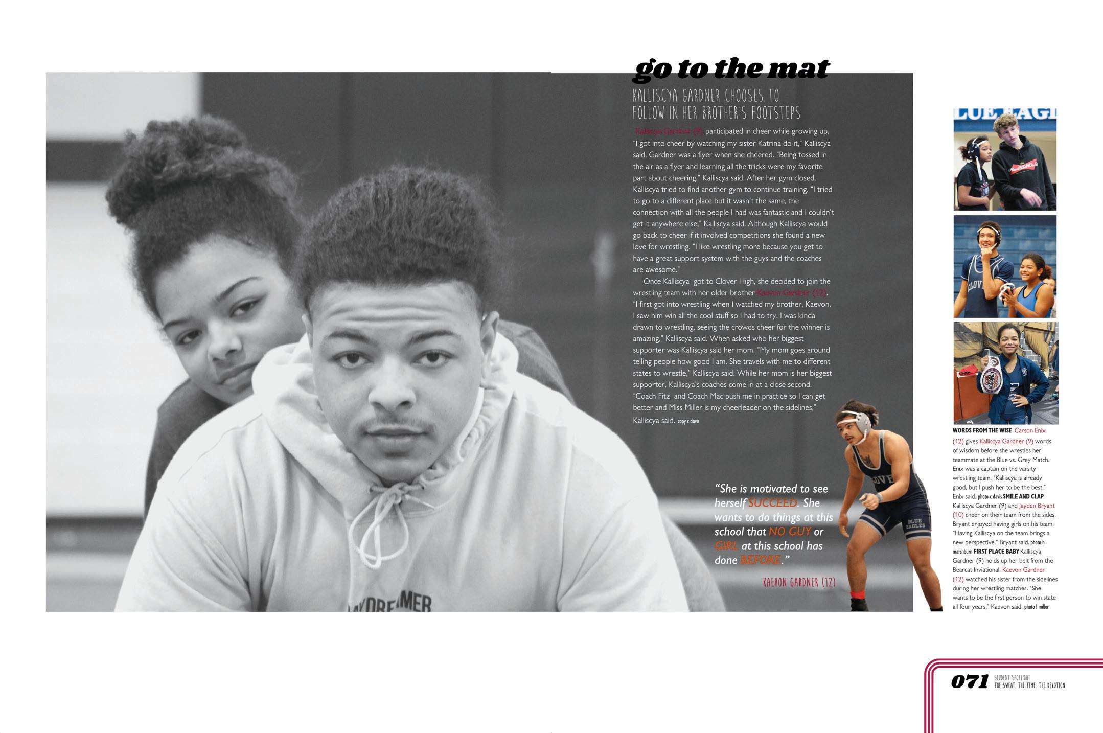
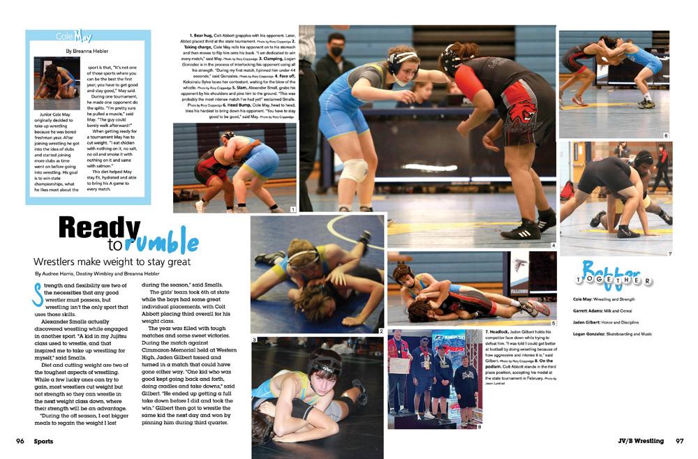
FAMILY TIME: When a story like this comes along — a brother and sister sharing the spotlight on the wrestling team — it’s great to give it special coverage. It’s a timestamp of the year and history of the school. The staff did lots of things right here, and one of the best is how they interviewed not just the two siblings, but their teammates. The combo of the portrait-style photo with the candids is a pro move, too.
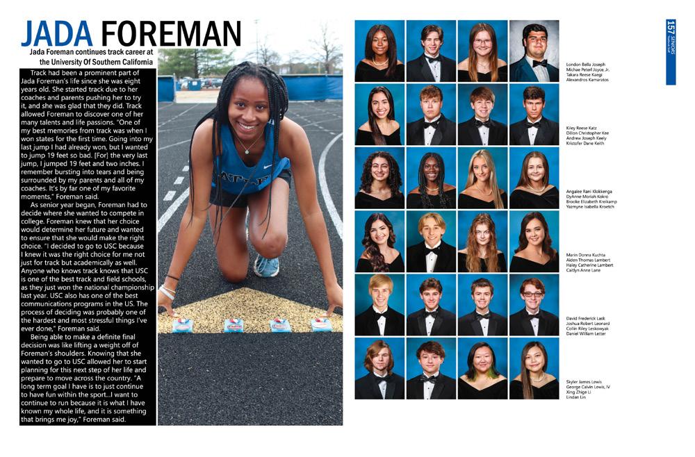
NOTHING NOT COVERED:
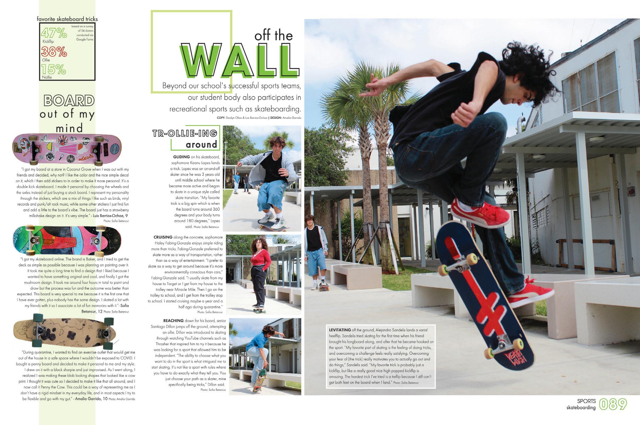
Skateboarding and its enthusiasts don’t often fit into the school landscape, but covering every student applies both on and off campus. Here’s a nice example of a profile that incorporates both action shots and an environmental portrait — as well as a simple color palette and theme graphics. It’s a nice recipe to follow.
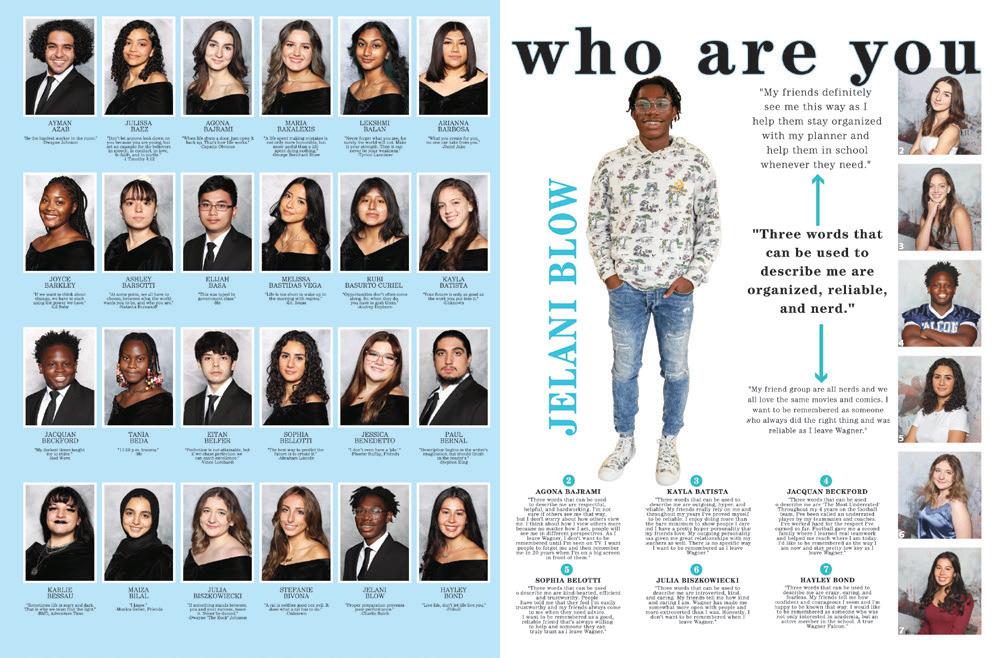
 SUSAN E. WAGNER HS | STATEN ISLAND, NY
ROBINSON SECONDARY SCHOOL | Above & Beyond | FAIRFAX, VA
ATLEE HS | The Legend | MECHANICSVILLE, VA
TRABUCO HILLS HS | Brumby | MISSION VIEJO, CA


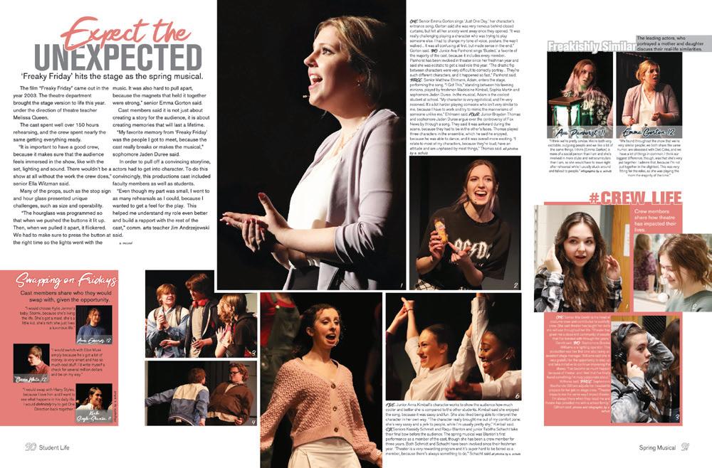
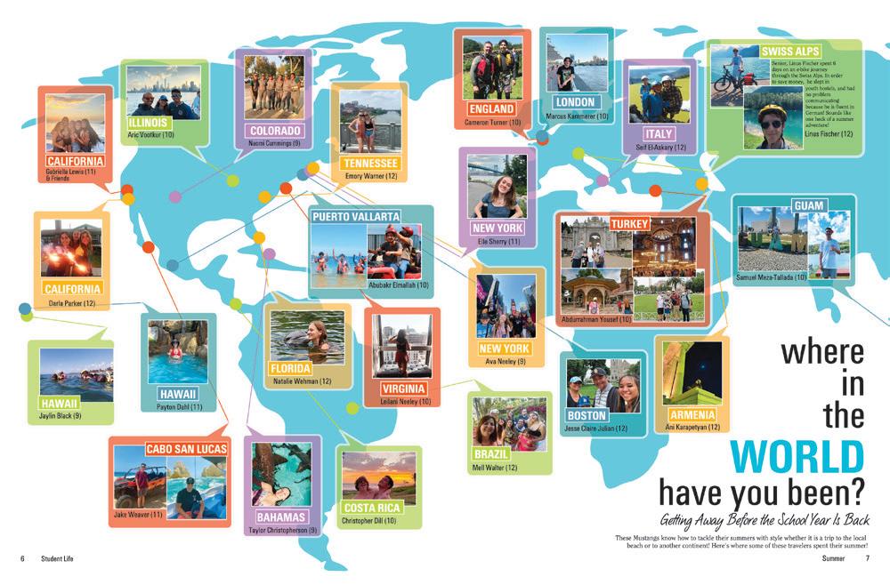
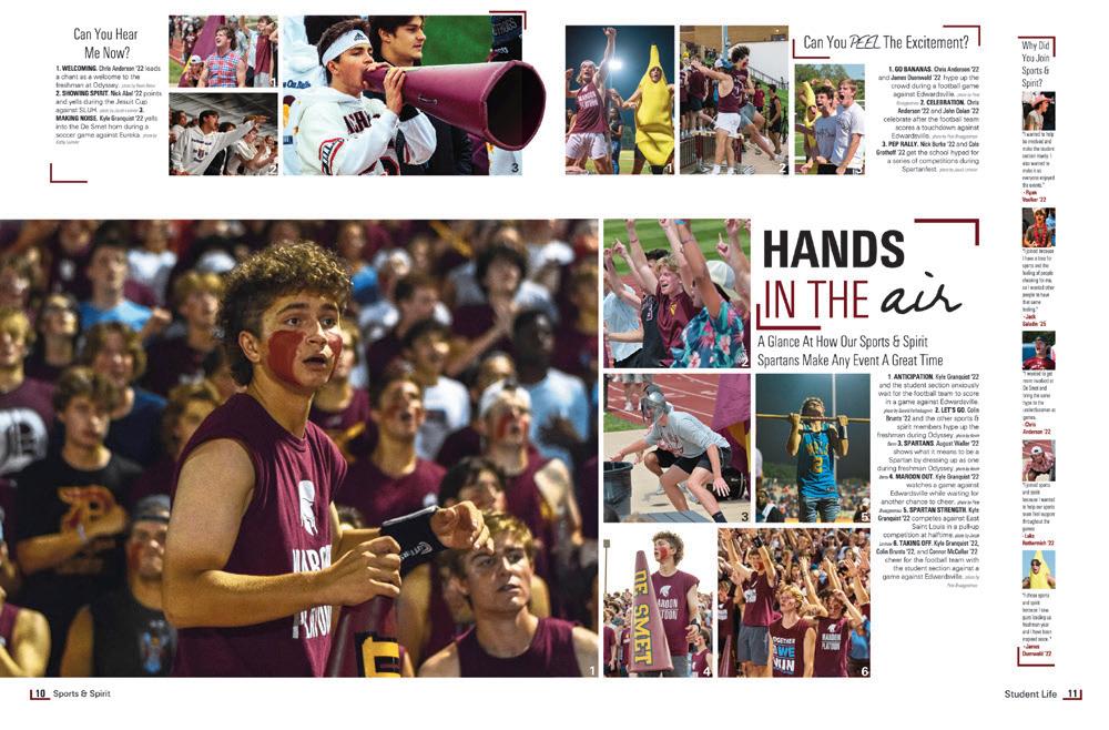 RONALD W. REAGAN/DORAL SENIOR HS | Tatanka | DORAL, FL
HANOVER HS | Aerie | MECHANICSVILLE, VA
SCRIPPS RANCH HS | Legend | SAN DIEGO, CA
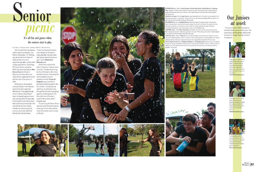
THE WALKER SCHOOL | Flame | MARIETTA, GA
SOUTH MIAMI SENIOR HS | De Capello | MIAMI, FL
BASTROP HS | Bear Tracks | BASTROP, TX
TIMBERLAND HS | Wolf Tracks | WENTZVILLE, MO
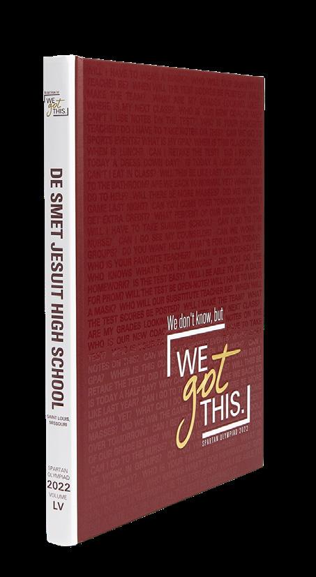
DE SMET JESUIT HS | Spartan Olympiad | SAINT LOUIS , MO
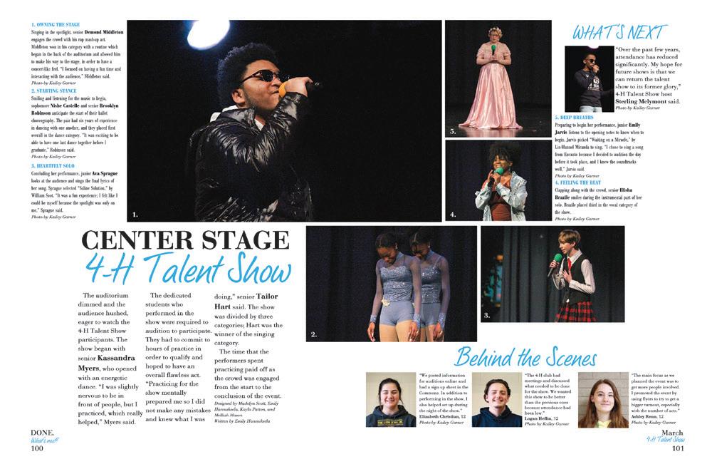
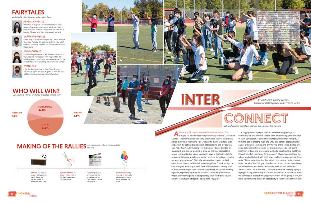
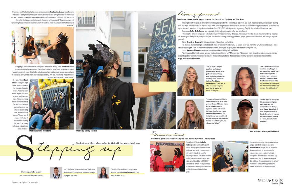
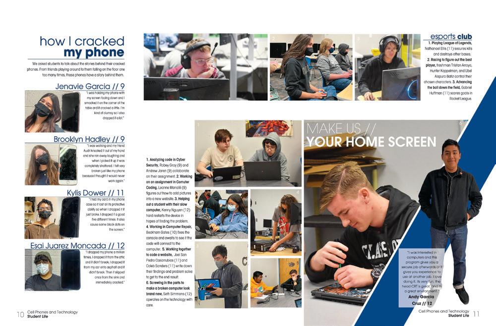 PRINCE GEORGE HS | Peerage | PRINCE GEORGE, VA
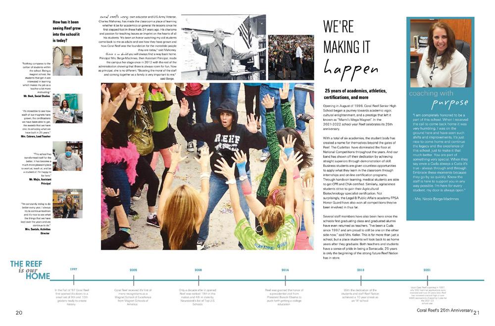
CORAL REEF SENIOR HS | Tsunami | MIAMI, FL
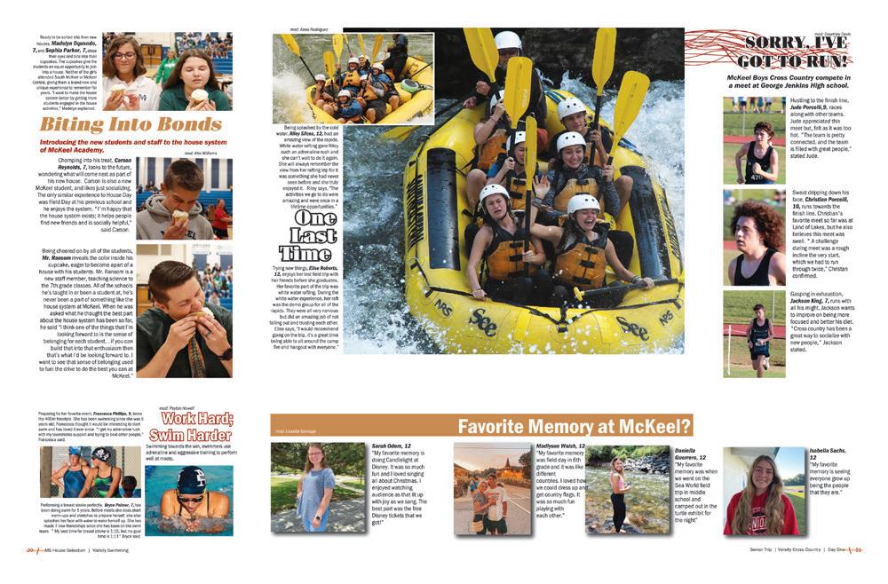
M c KEEL ACADEMY OF TECHNOLOGY | LAKELAND, F L
CUPERTINO HS | Nugget | CUPERTINO, CA
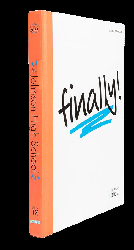
MOE & GENE JOHNSON HS | The Prowl | BUDA, TX
CYPRESS BAY HS | The Storm | WESTON, FL
DOBSON HS | Equus | MESA, AZ
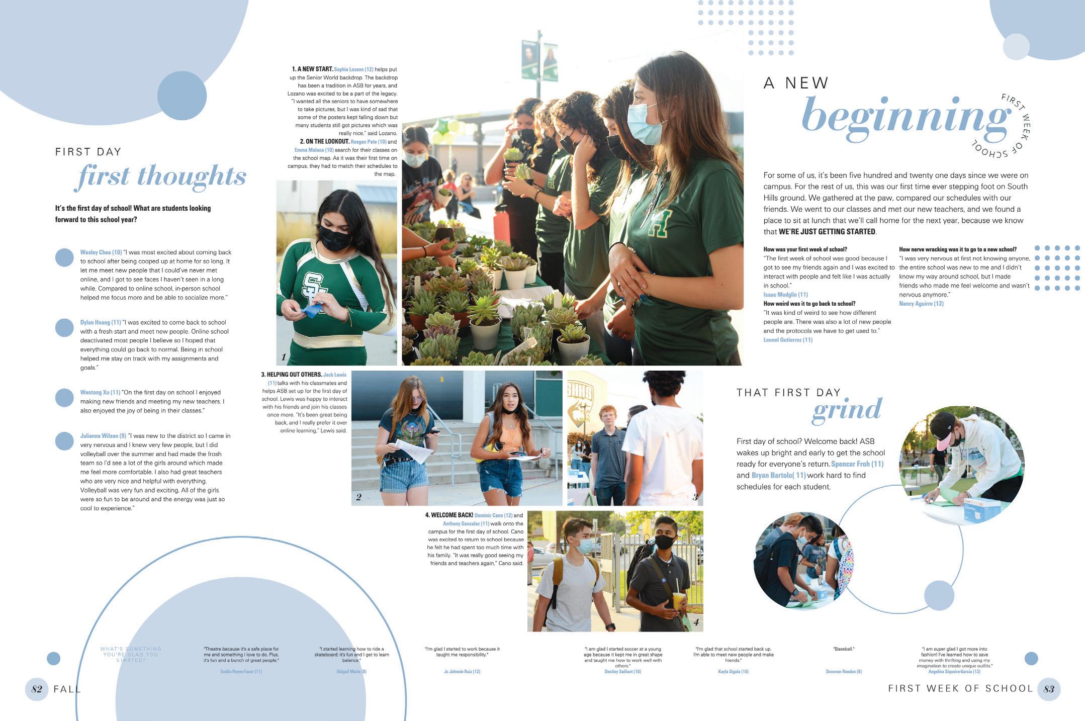
 SOUTH HILLS HS | Neomega | WEST COVINA, CA
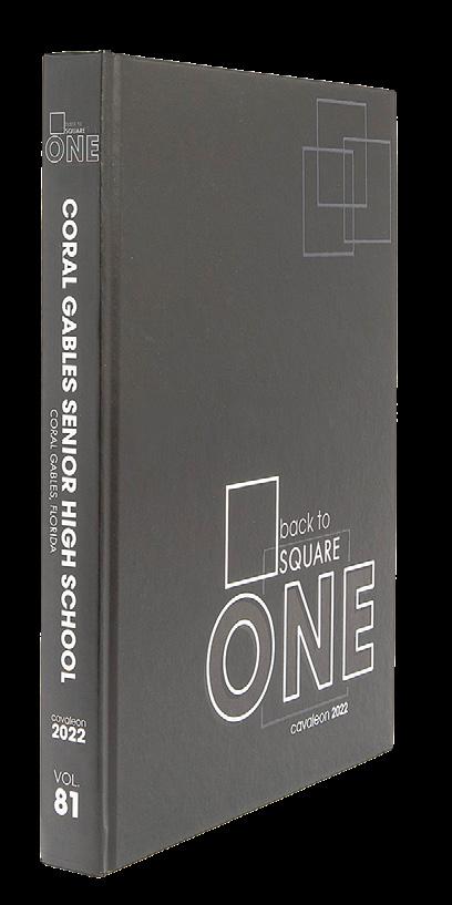
CORAL GABLES SENIOR HS | Cavaleon | CORAL GABLES, FL
MORE IS MORE:
Beyond the killer action photo, which deserves its dominant spot, this spread offers a ton more. Stats, board specs and people profiles combine with how-to and terminology copy without being boring. And the survey results add just a little more.
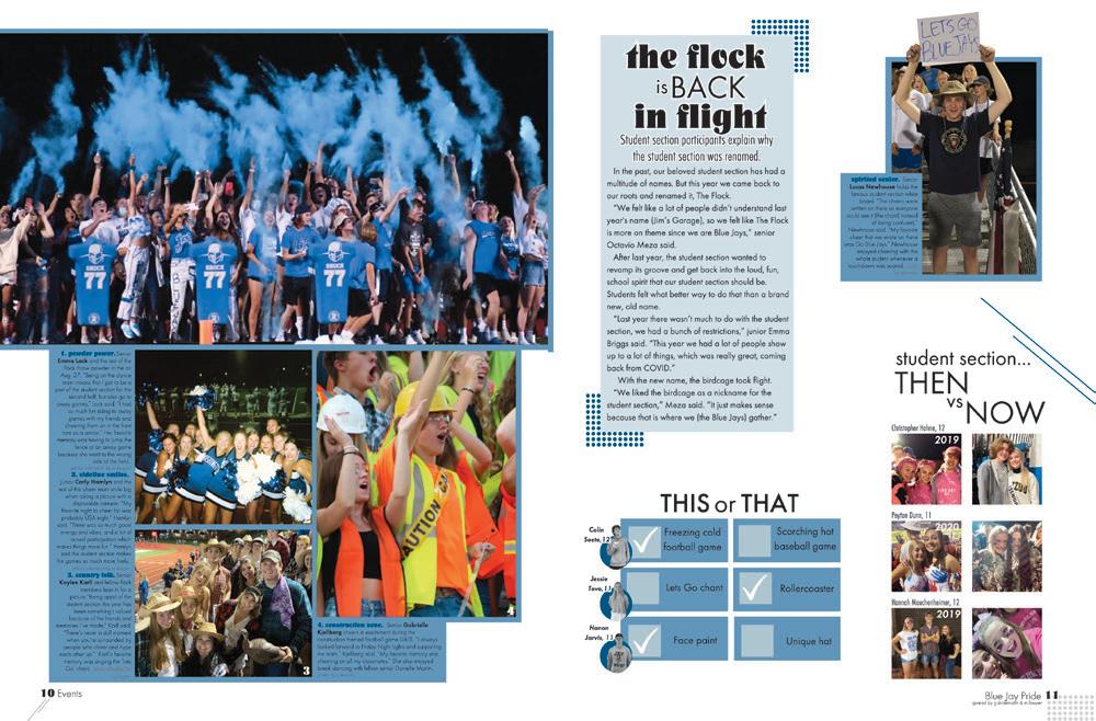
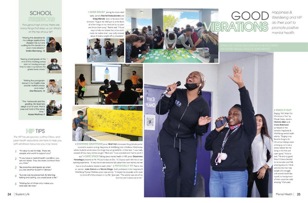
ROUND AND ROUND:
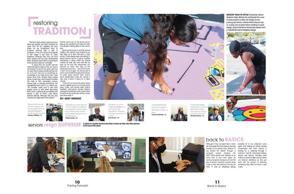
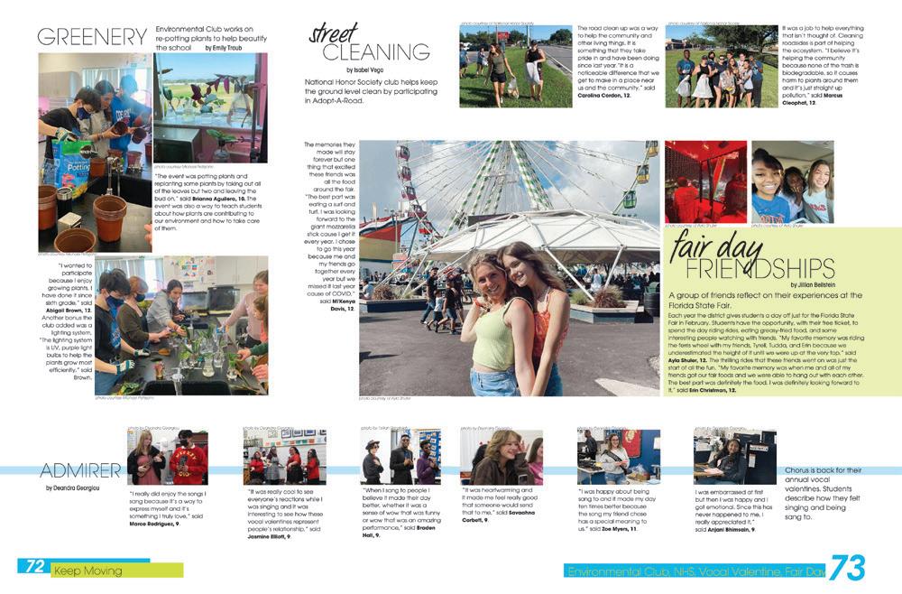
How many ways can you count circles being used on this one spread? Hint: There are a lot. Because the circles are both part of the coverage (bullets, subheads, photo boxes) and a lighter color than any of the other elements, they accent, rather than overtake, the main focus of the spread — student stories, of course.
 RIVERVIEW HS | Selachii | RIVERVIEW, FL
NOVA HS | Olympian | DAVIE, FL
DR. MICHAEL M. KROP SENIOR HS | Renaissance | NORTH MIAMI BEACH, FL
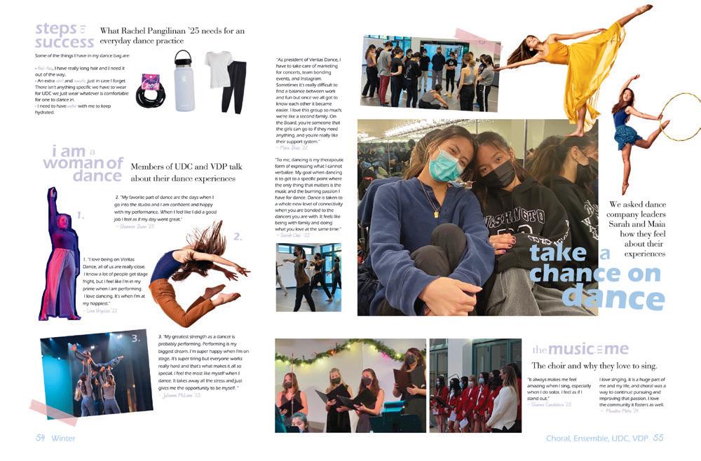
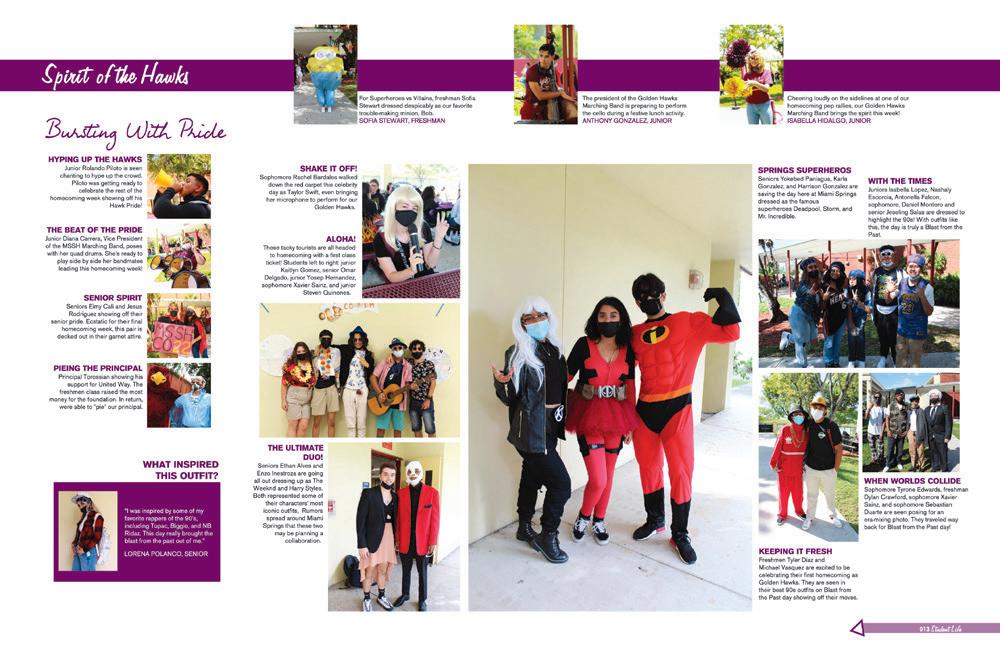

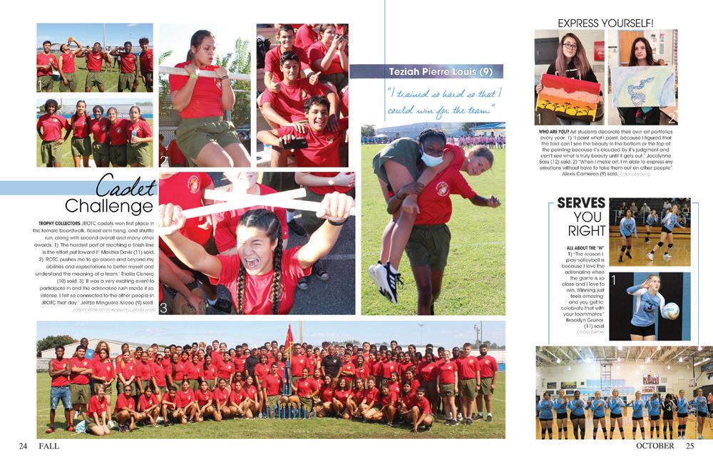
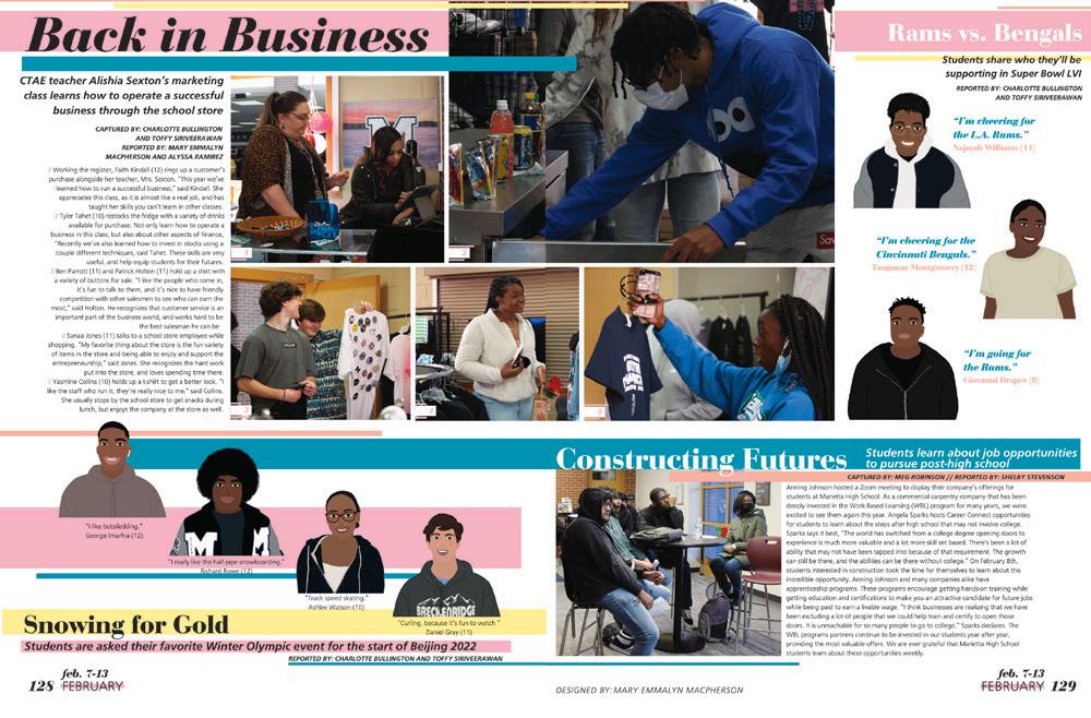
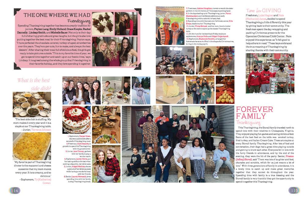
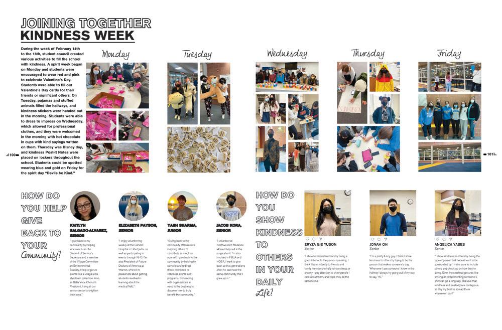
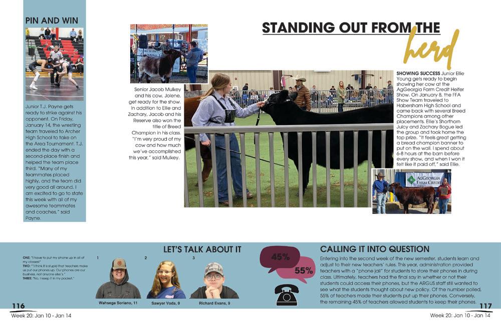 FLINTRIDGE SACRED HEART ACADEMY | Veritas | LA CAÑADA FLINTRIDGE, CA
JAMES CAMPBELL HS | Pohaku Makamae | EWA BEACH, HI
LAKE REGION SENIOR HS | Legend | EAGLE LAKE, FL
MIAMI SPRINGS SENIOR HS | Spectre | MIAMI SPRINGS, FL
MARIETTA HS | Olympian | MARIETTA, GA
ARDREY KELL HS | Excalibur | CHARLOTTE, NC
WARREN TOWNSHIP HS | Blue Devil | GURNEE, IL
LUMPKIN COUNTY HS | Argus | DAHLONEGA, GA
WOULD YOU RATHER...
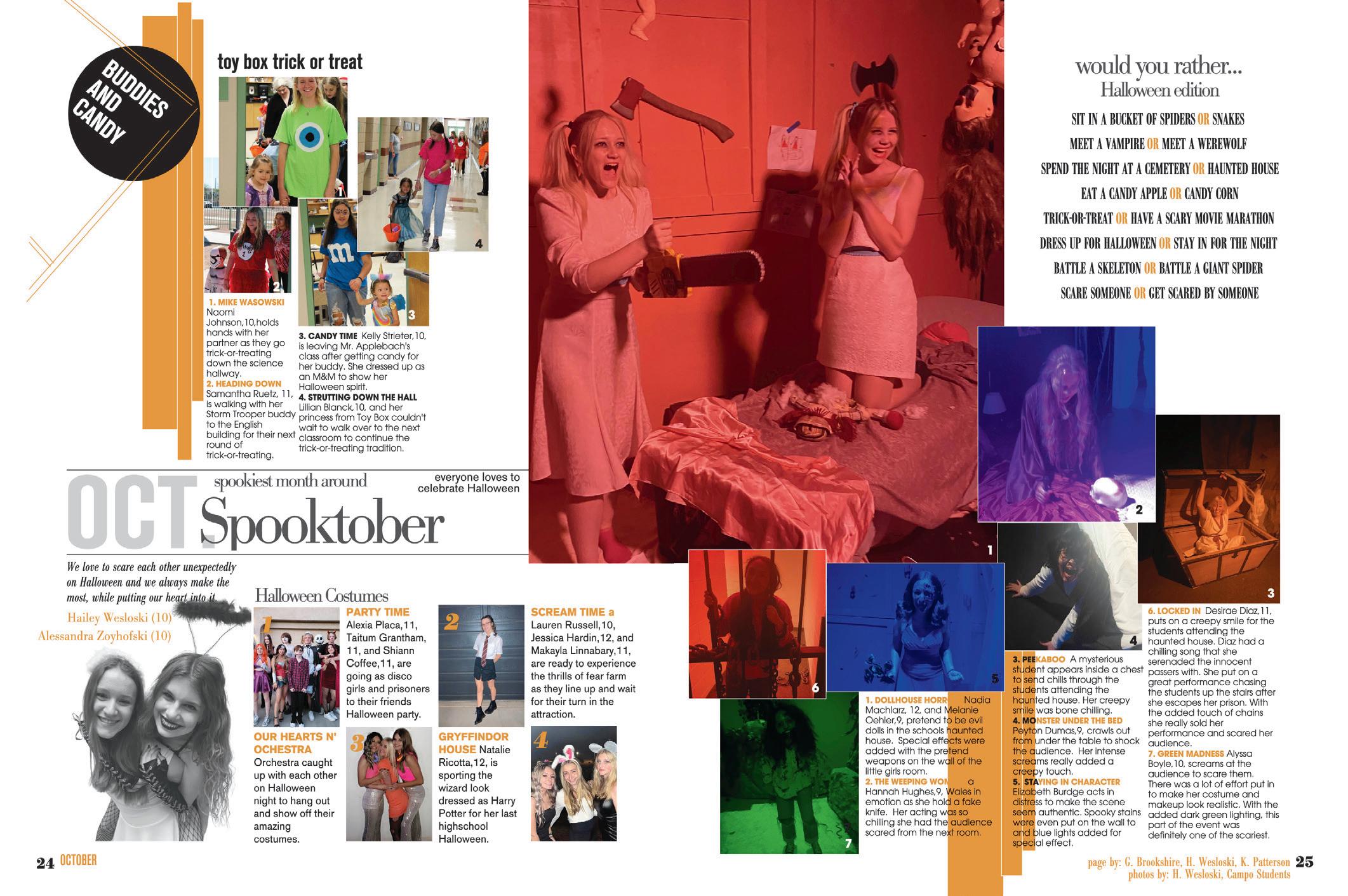
On a Halloween spread, of course you have the best costume examples and special events with little kids. But here’s a new one: A series of photos to match a holiday edition of “Would you rather...” and with added color effects. We can tell the staff had fun with this — and we’re having fun reading it too.
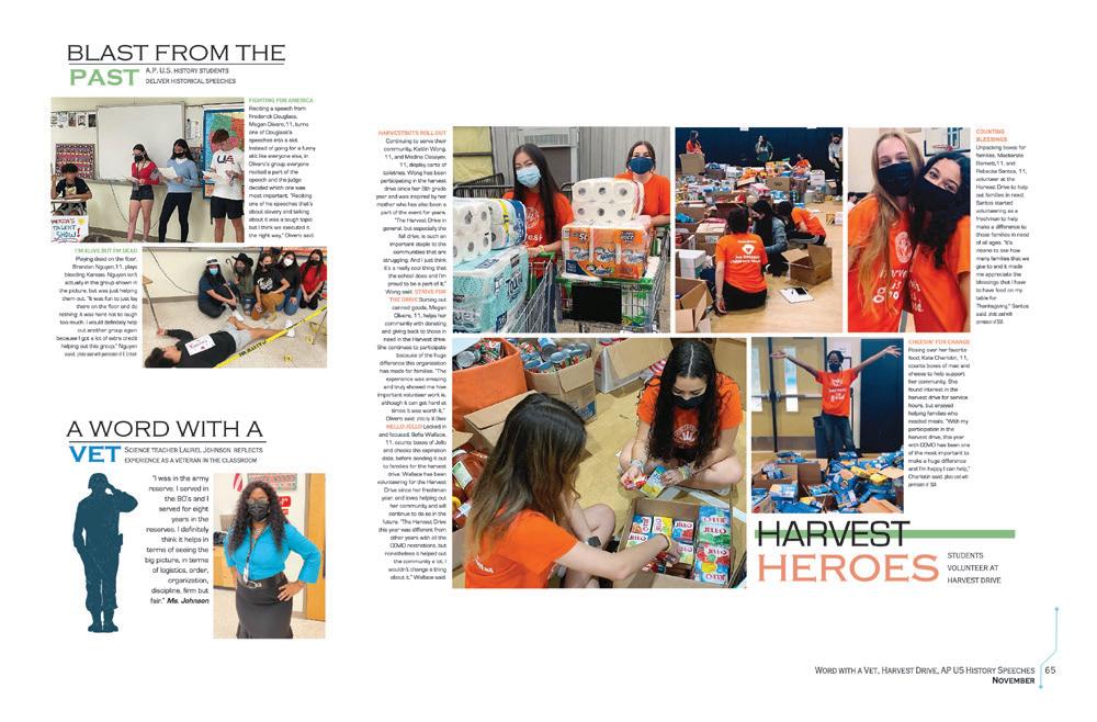
 CAMPO VERDE HS | Reflections | GILBERT, AZ
CHRISTOPHER COLUMBUS HS | Adelante | MIAMI, FL
WESTERN HS | Calibre | DAVIE, FL
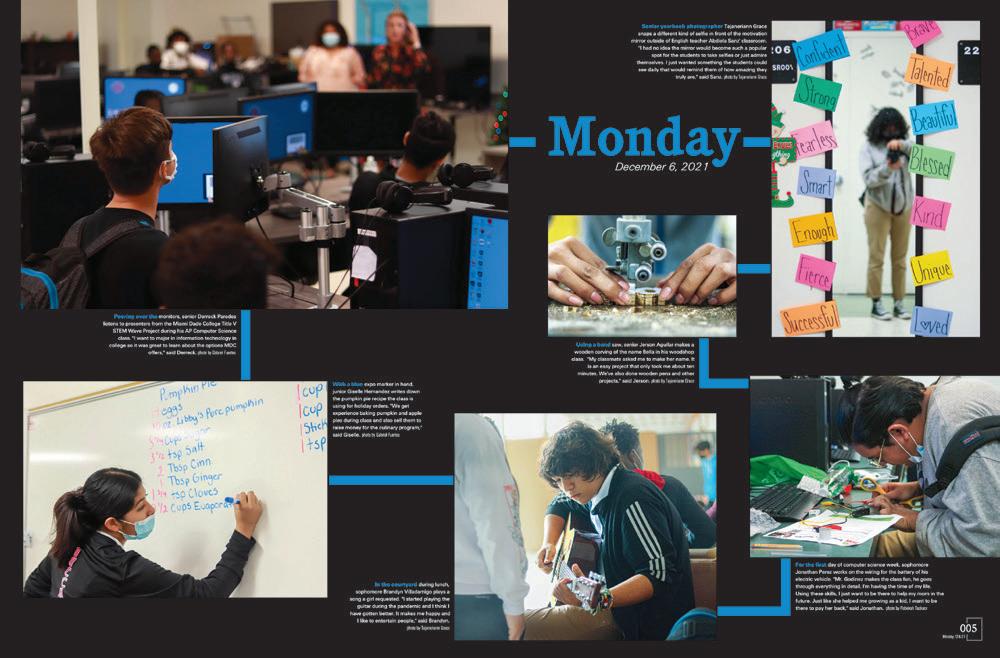
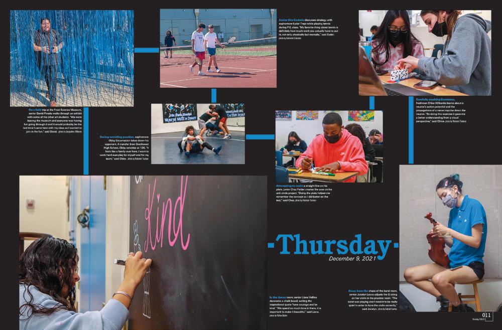
WHAT DAY IS IT?
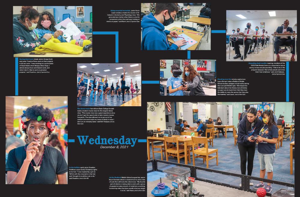
This day-in-the-life series is such a great reminder of how all the seemingly insignificant moments in a normal school week can add up to a set of shared experiences that are quite interesting and meaningful. The layout and blue lines help guide us from one moment to the next, and captions fill in the details we can’t glean from the photos. We have a feeling this section will be a favorite for years to come.
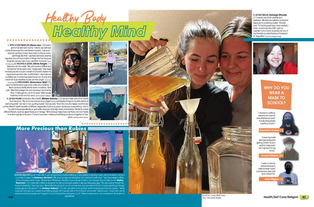
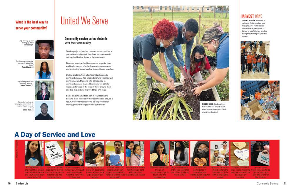 PLANTATION HS | Reflections | PLANTATION, FL
YULEE HS | Vespidae | YULEE, FL
SOUTH DADE SENIOR HS | Southernaire | HOMESTEAD, FL
WATERFORD KETTERING HS | Kismet | WATERFORD, MI
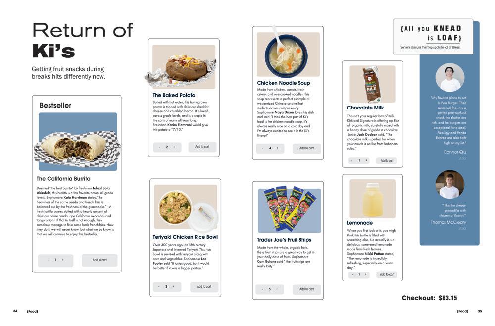
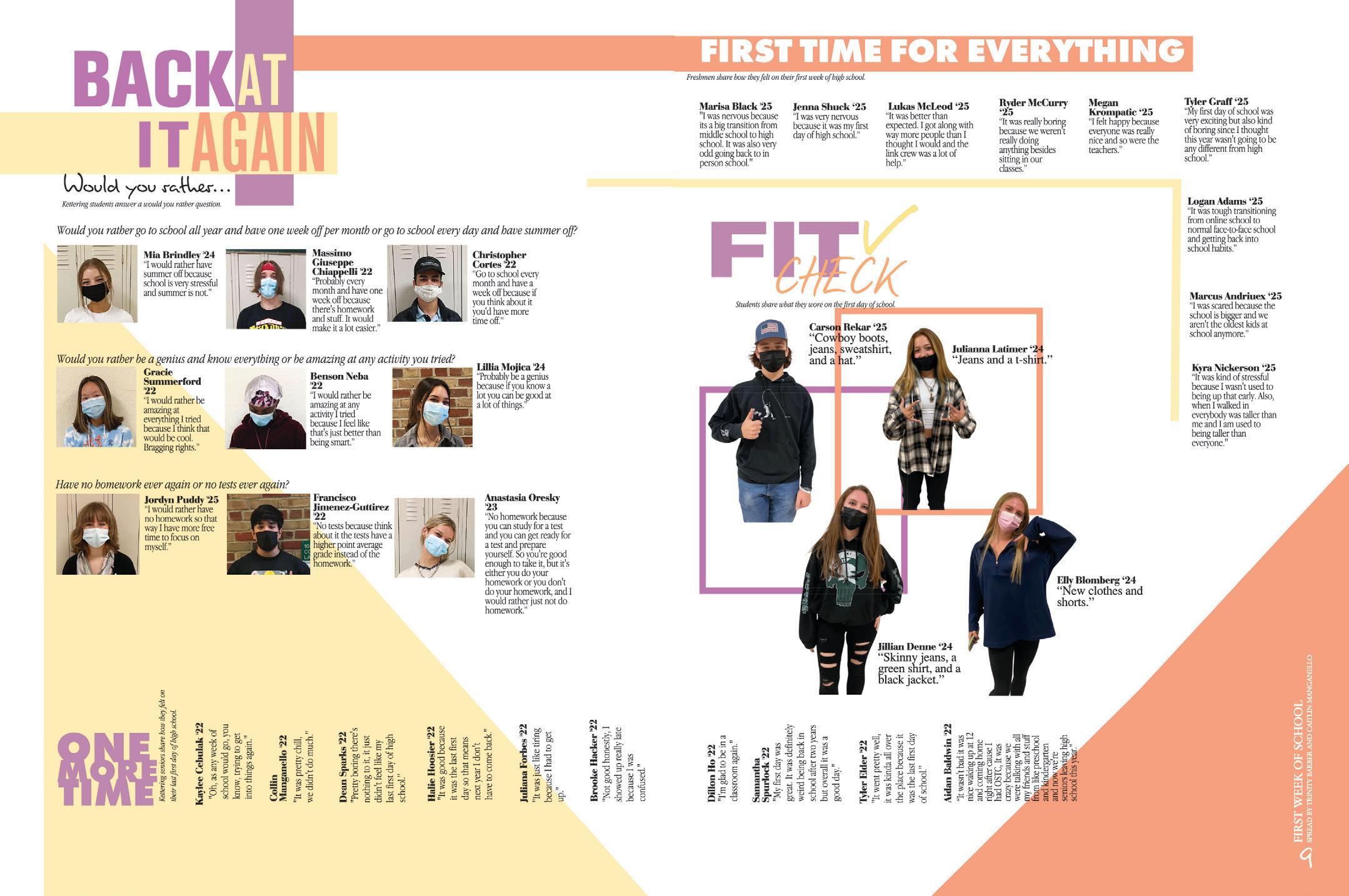
GETTING THE FIRST DAY DONE: Covering the first day of school meant fitting quotes from 32 students all on one spread, and still having room for four OOTD photos and nine talking heads. Pretty impressive. We don’t always salute sideways copy, but if it’s consistent and part of your visual/verbal theme package, we’ll give it the nod.

 CEDARTOWN HS | The Cedar Log | CEDARTOWN, GA
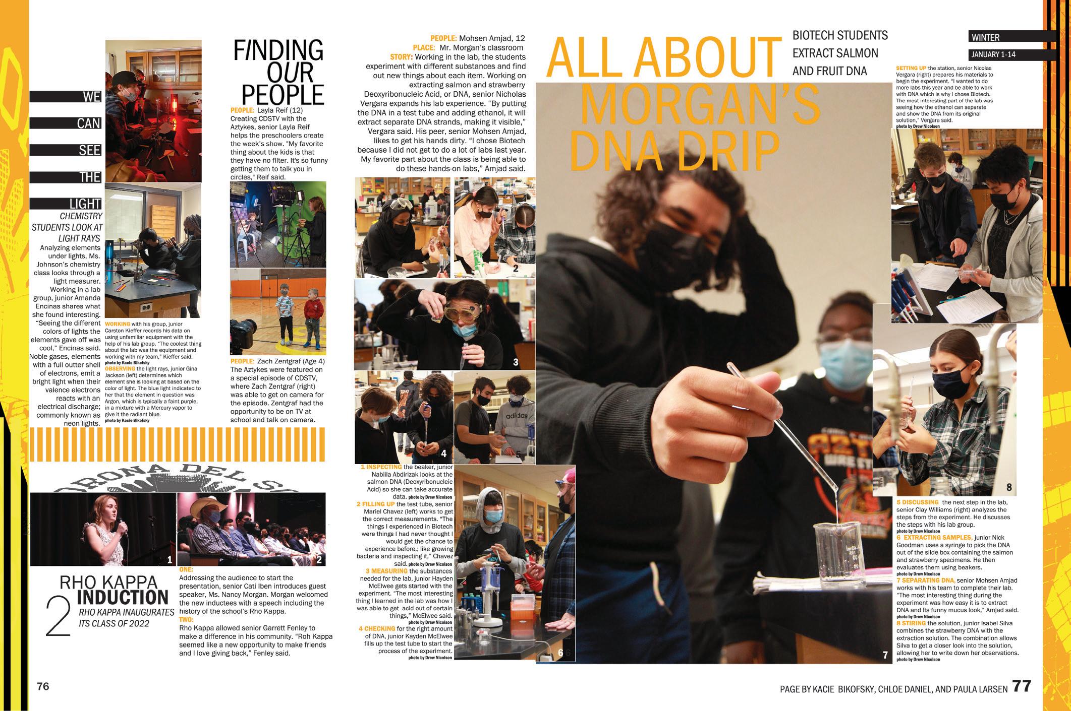
FOCUSING ON THE PEOPLE: The Sunset staff wanted to make sure we knew about the people featured on their spreads, so they started their coverage by naming them — and even included the name of the person in the dominant photo in the dominant headline. Their theme is “Finding Our People,” so it fits. The subheads for all three levels of coverage help ensure that readers know the topic even when the headline is more “punny.”
 CORONA DEL SOL HS | Sunset | TEMPE, AZ
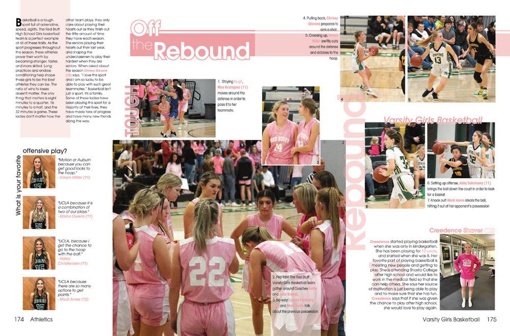
RED BLUFF HS | Dictum Est | RED BLUFF, CA
BLUE VALLEY NORTH HS | Northern Light | OVERLAND PARK, KS
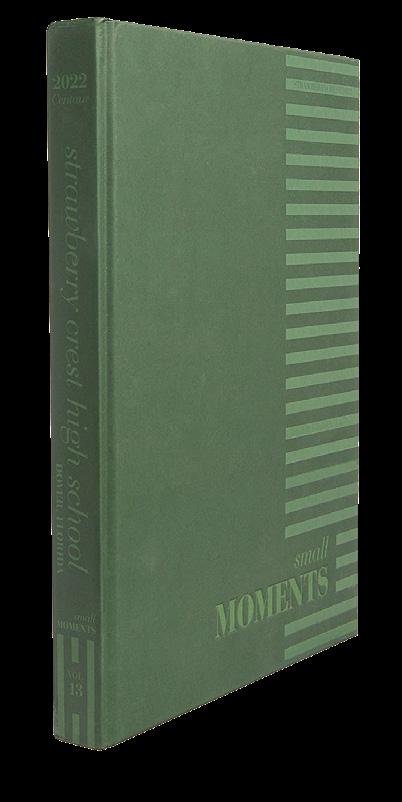
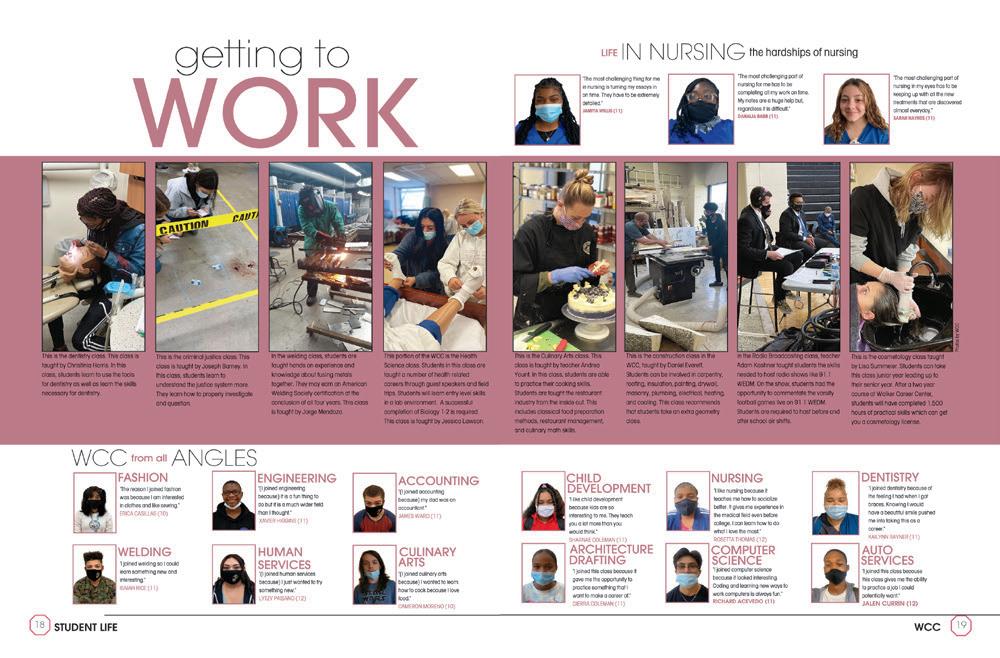 STRAWBERRY CREST HS | Centaur | DOVER, F L
FLORIDA CHRISTIAN SCHOOL | Patriot | MIAMI, FL
CANEY VALLEY HS | The Trojan | RAMONA, OK
STEINBRENNER HS | The Odyssey | LUTZ, FL
SOUTHRIDGE HS | KENNEWICK, WA
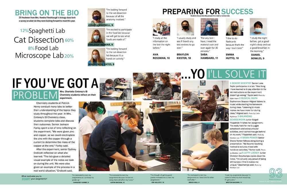
PATRICK HENRY HS | Patriot | ASHLAND, VA
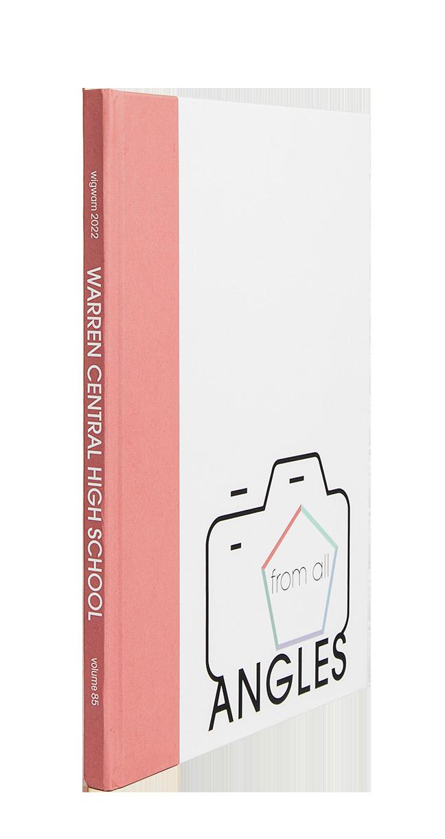
WARREN CENTRAL HS | Wigwam | INDIANAPOLIS, IN
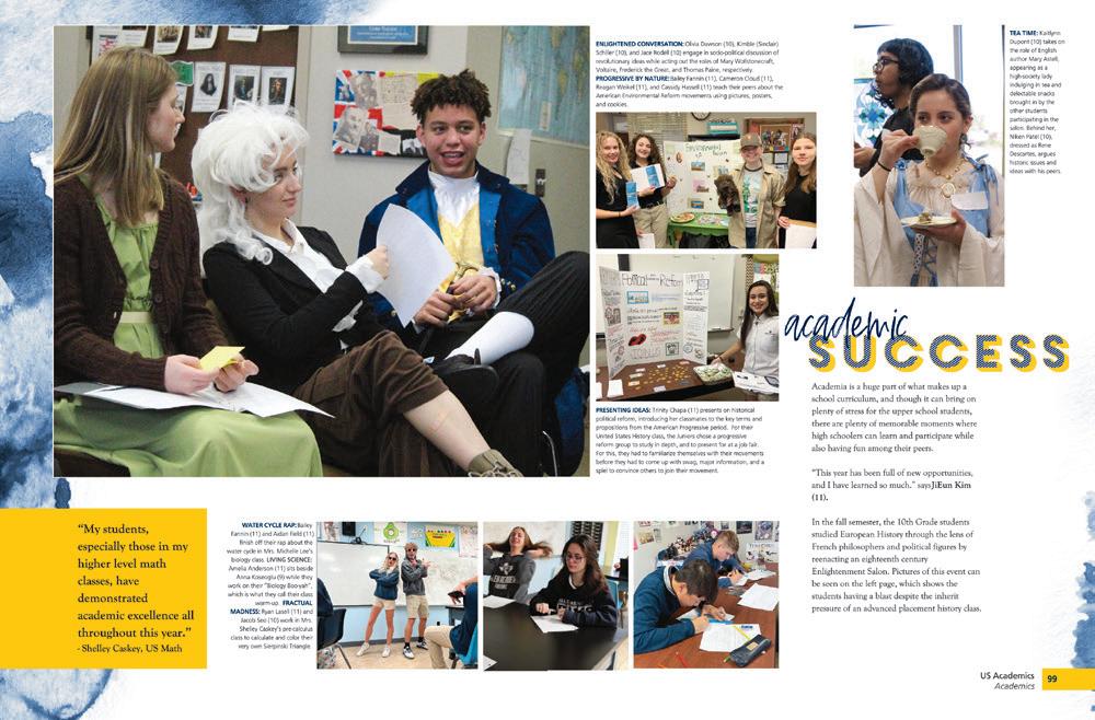
PAINTING WITH BROAD STROKES:
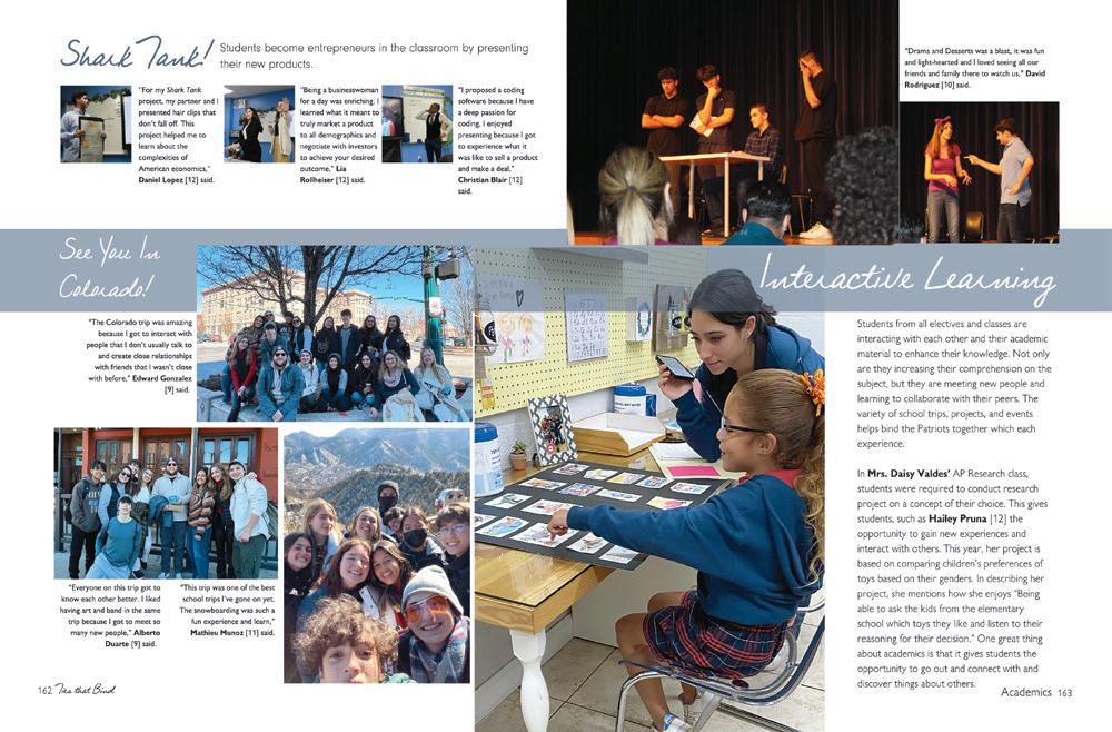
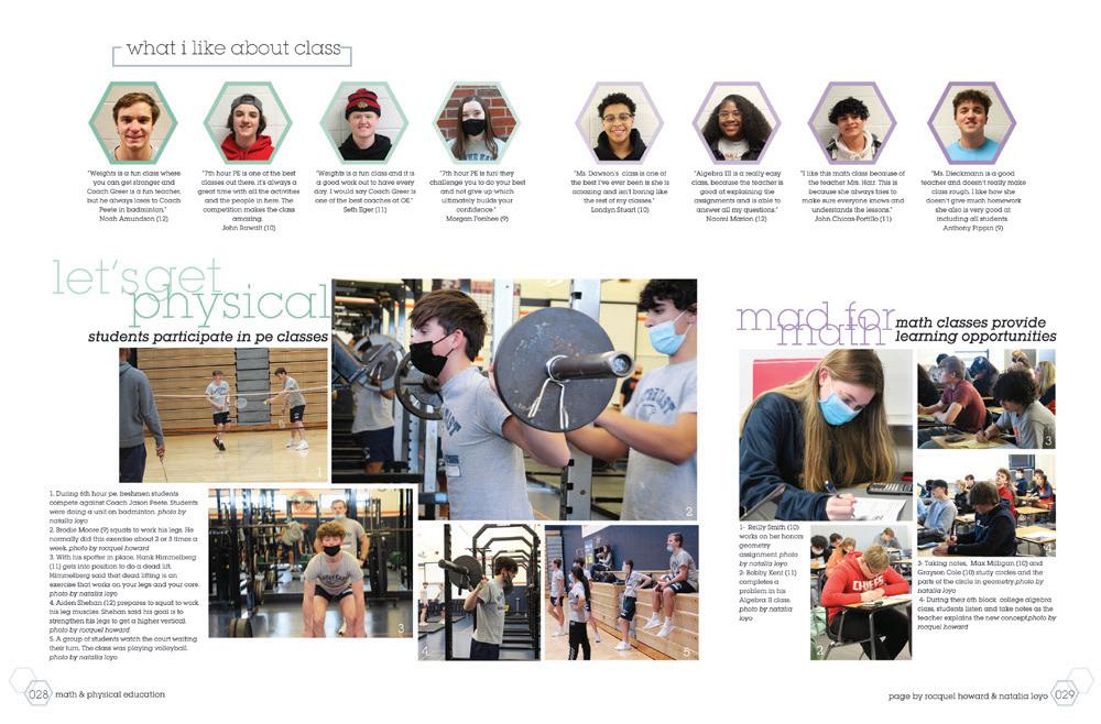
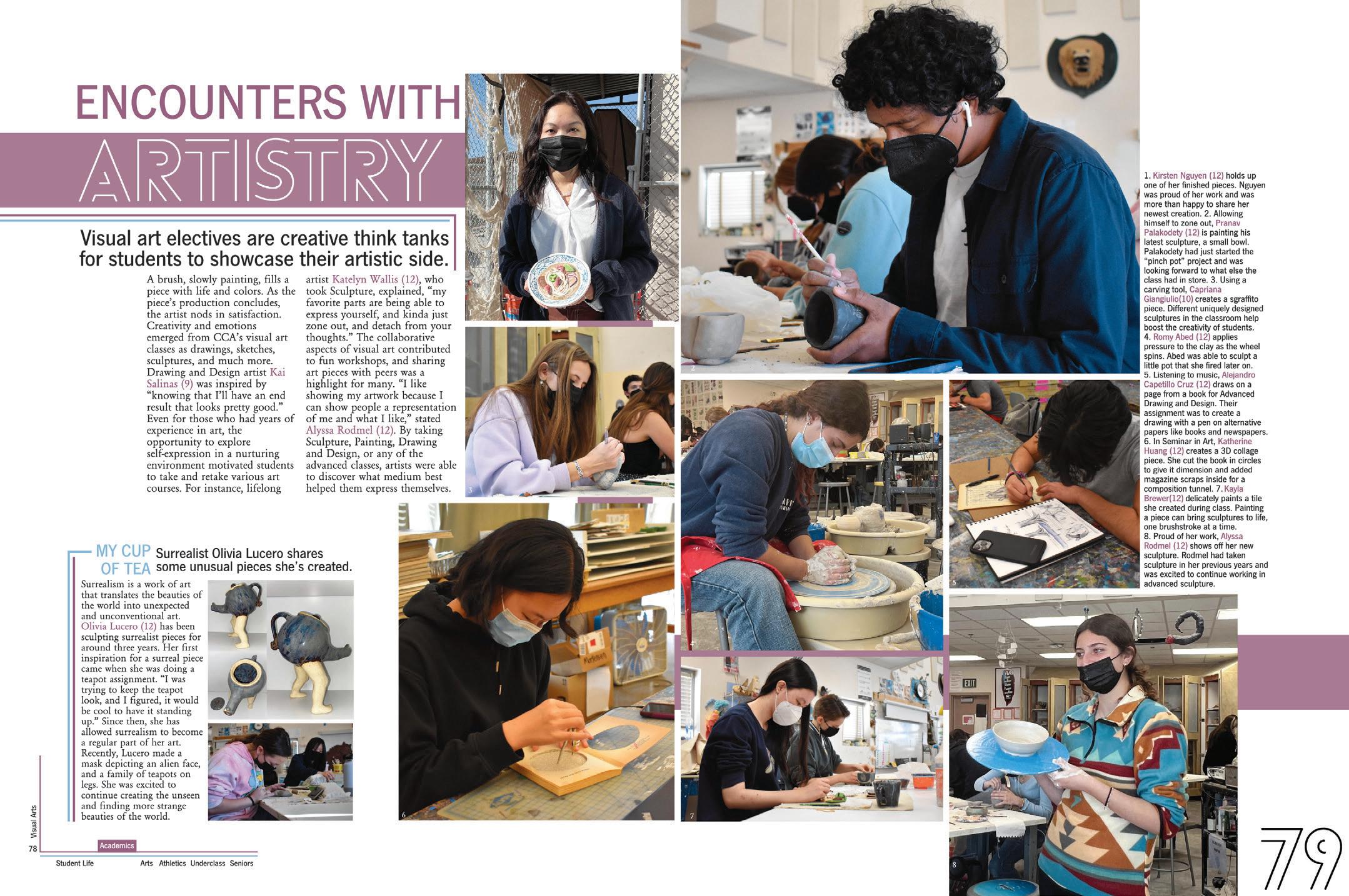
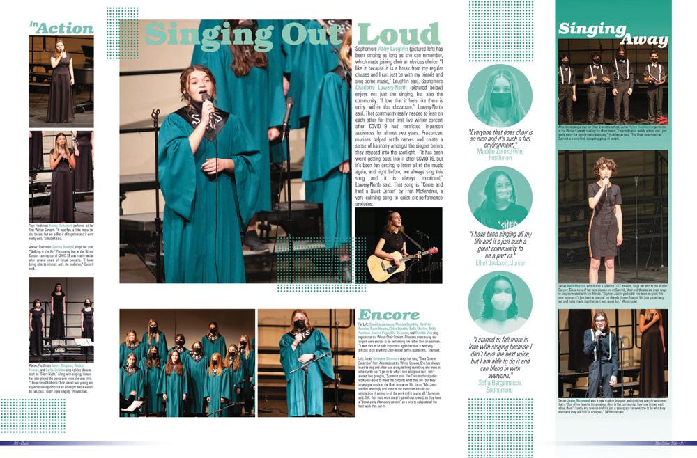
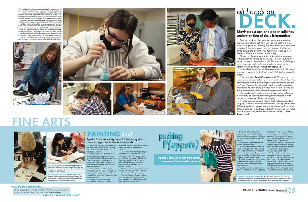
There’s great value in including a wide variety of students who are completing the various tasks of art class in an academics section, even though the temptation might be to focus only on the most accomplished artists. We salute coverage of the surrealist in the mod (look at that cool teapot!)
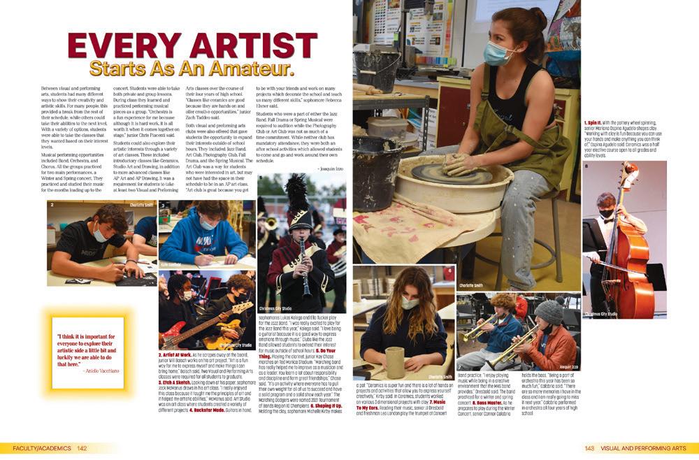
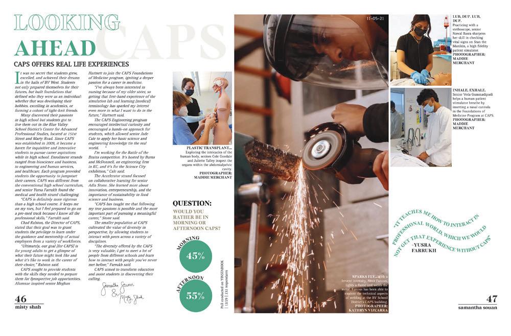
It’s great when staffs strike a balance between covering the stand-out students and covering some of the average everyday scenes.
RIGHT
ANGLES:
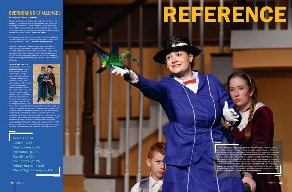
A lot of theatre spreads focus on the performances, which makes sense because that’s what many theatre students focus on. But, the story angles here really stand out as different and appealing: How long it takes to learn lines, the most memorable lines, what acting with friends feels like — these are all stories that will resonate with anyone who has taken, or will take, these classes. And, that’s classy.
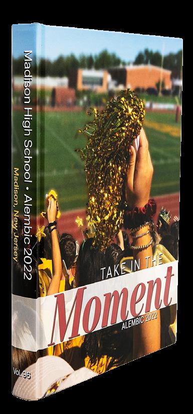
OLATHE EAST HS | Aurora | OLATHE, KS BLUE VALLEY WEST HS | Illumination | OVERLAND PARK, KS ROCKBRIDGE COUNTY HS | Trivium | LEXINGTON, VA MADISON HS | Alembic | MADISON, NJ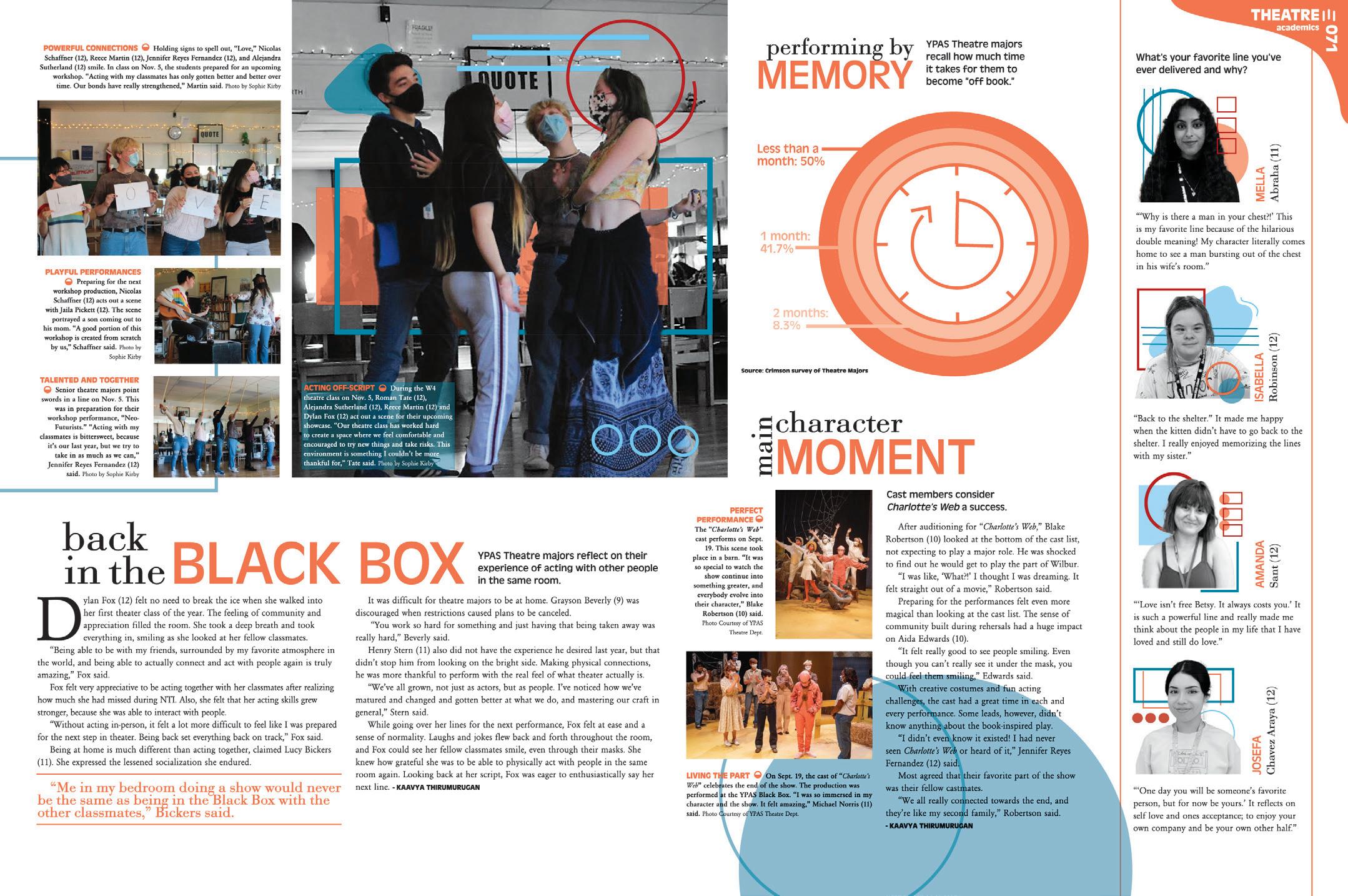
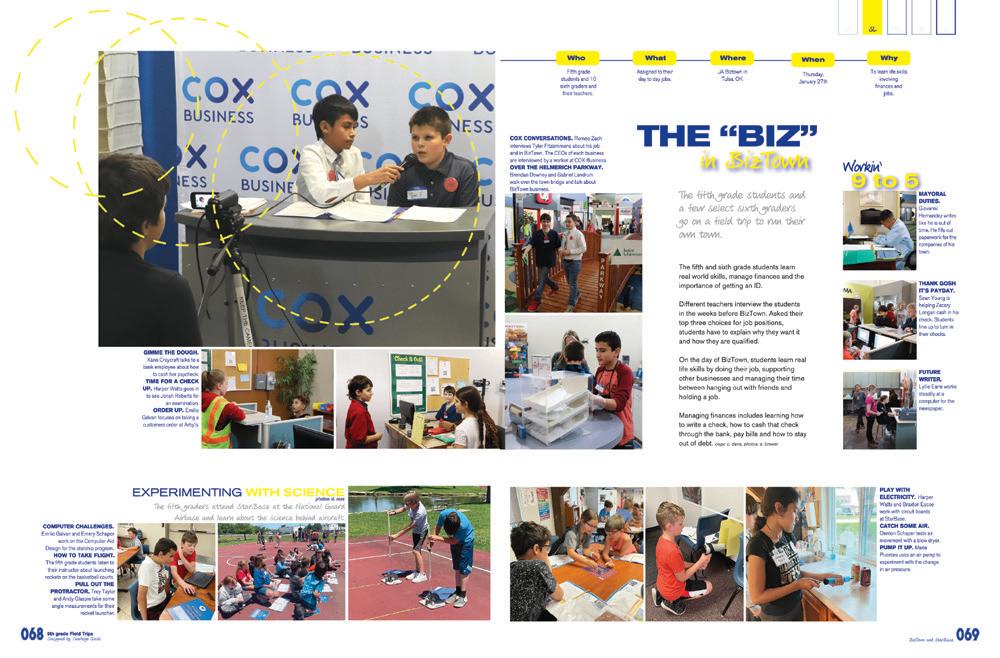
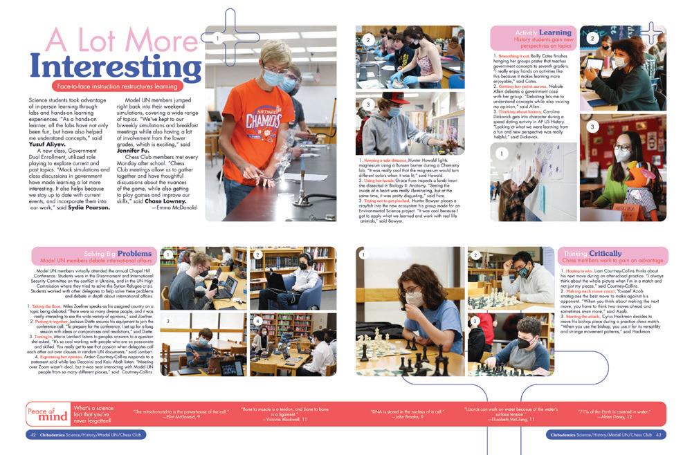
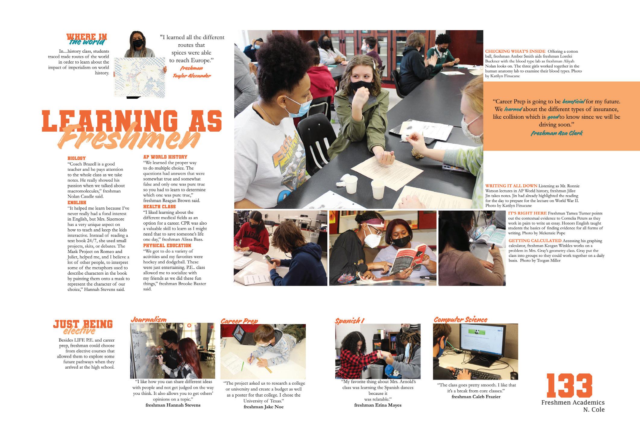
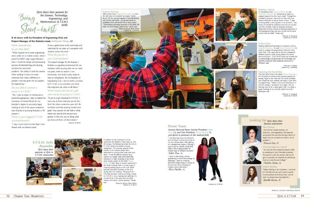
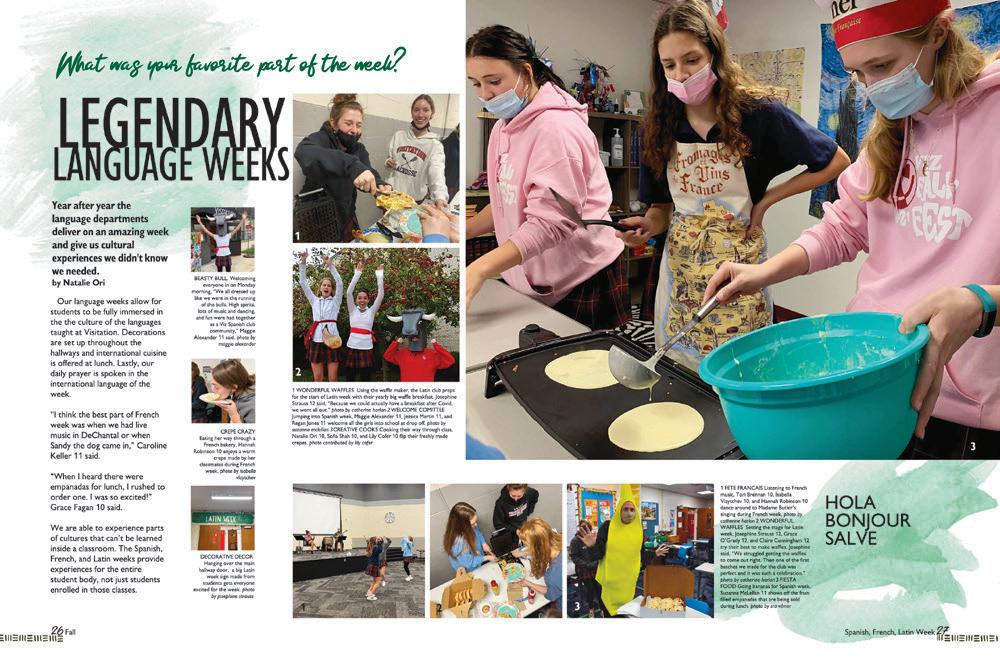
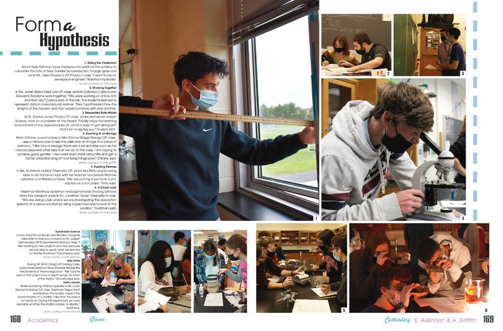
FRESH AS A DAISY: Not only is this spread on freshmen really visually appealing, it’s a cool way to cover a bunch of academic topics at once. It’s a nice snapshot of the first-year academic experience, hitting at least nine of the classes ninth-graders typically take. And, it’s an easy way to include coverage of students who may not be involved in a lot of other activities.
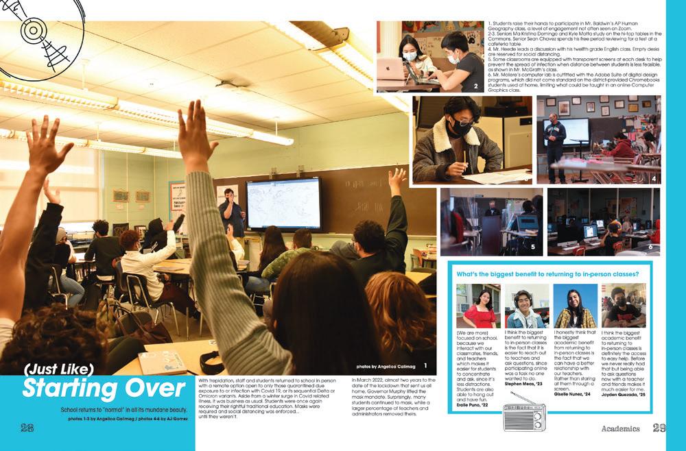
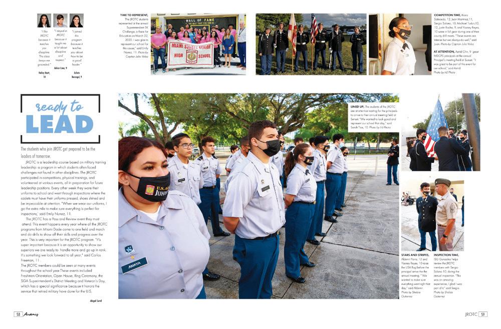
Check-plus!
 SPARKMAN HS | The Senator | HARVEST, AL
MIAMI SUNSET SENIOR HS | Eques | MIAMI, FL
BERGENFIELD HS | Crossroads | BERGENFIELD, NJ
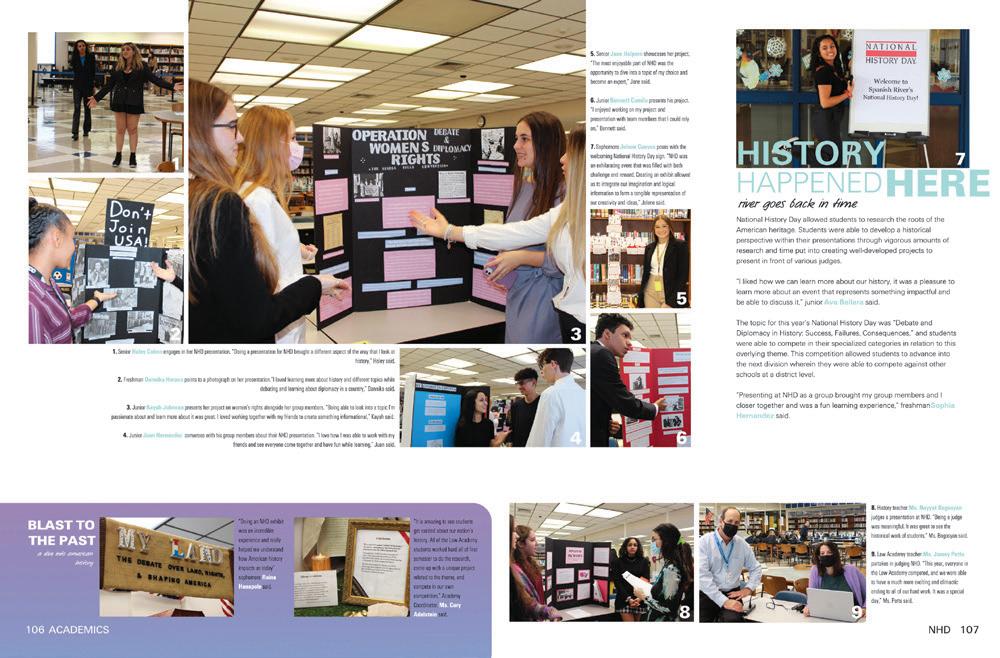

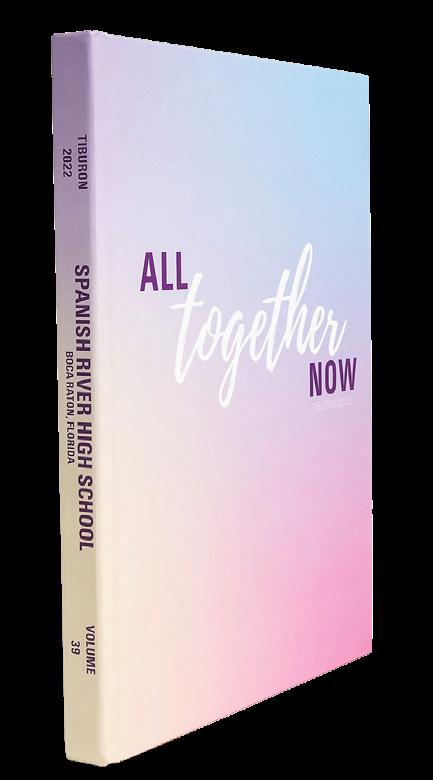
 SPANISH RIVER HS | Tiburon | BOCA RATON, FL
SUMMIT HS | The Peak | BEND, O R
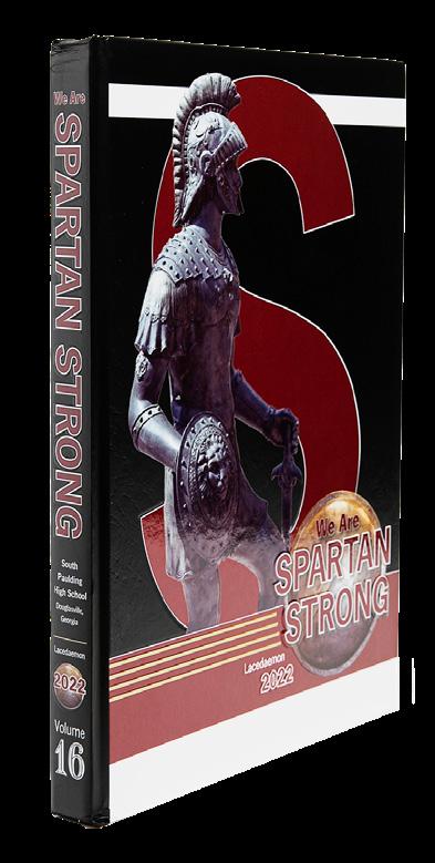
SOUTH PAULDING HS | Lacedaemon | DOUGLASVILLE, GA
IRVINGTON HS | Saga | FREMONT, CA
PUTNAM CITY NORTH HS | Panther Tracks | OKLAHOMA CITY, OK
WEST BROWARD HS | The Edge | PEMBROKE PINES, FL
VISITATION ACADEMY | Crescent | SAINT LOUIS, MO
 NORTH POINT HS | Claw | WENTZVILLE, MO
EAST ROWAN HS | Eastonian | SALISBURY, NC
OAKVILLE HS | Tiger Paw | SAINT LOUIS, MO
FLAGLER PALM COAST HS | PALM COAST FL
HILLSBOROUGH HS | Ramrod | HILLSBOROUGH, NJ
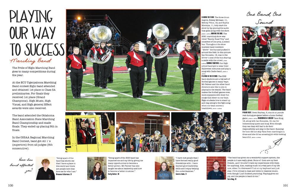
ELGIN HS | The Owl | ELGIN, OK
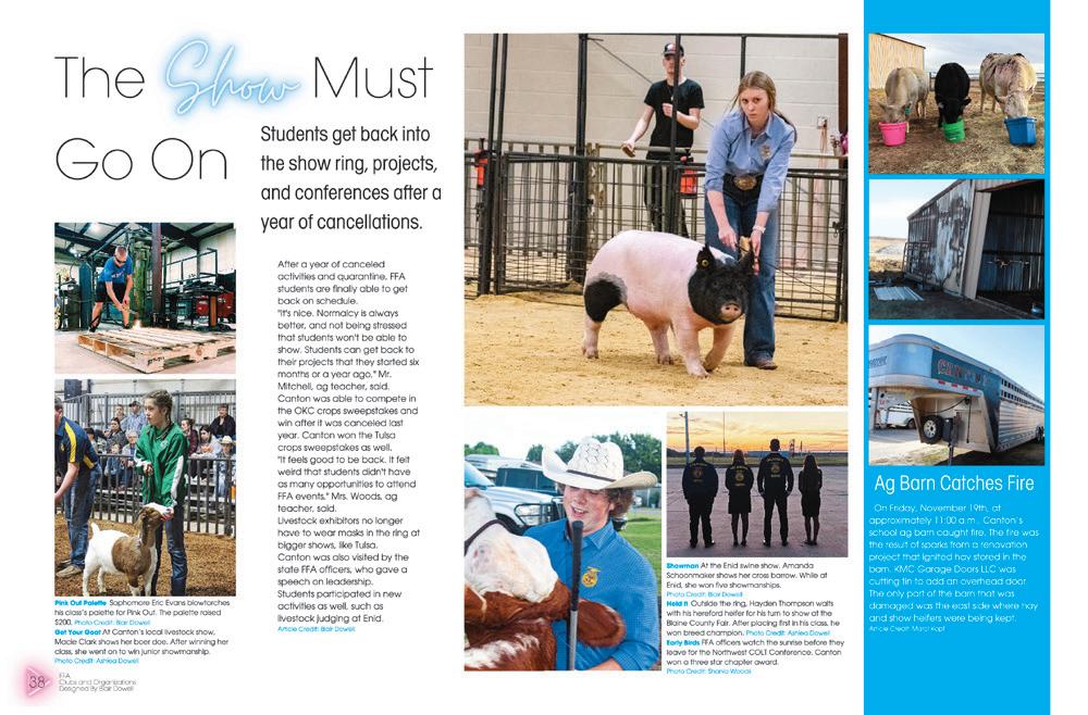
CANTON PUBLIC SCHOOLS | The Tiger | CANTON, OK
HERNDON HS | The Hornet | HERNDON, VA
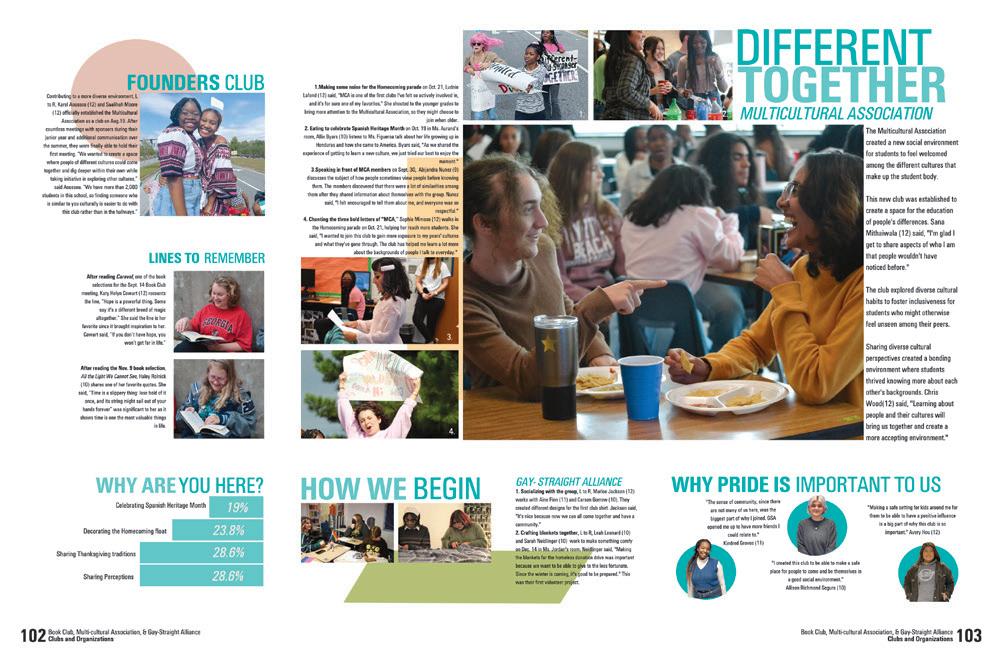
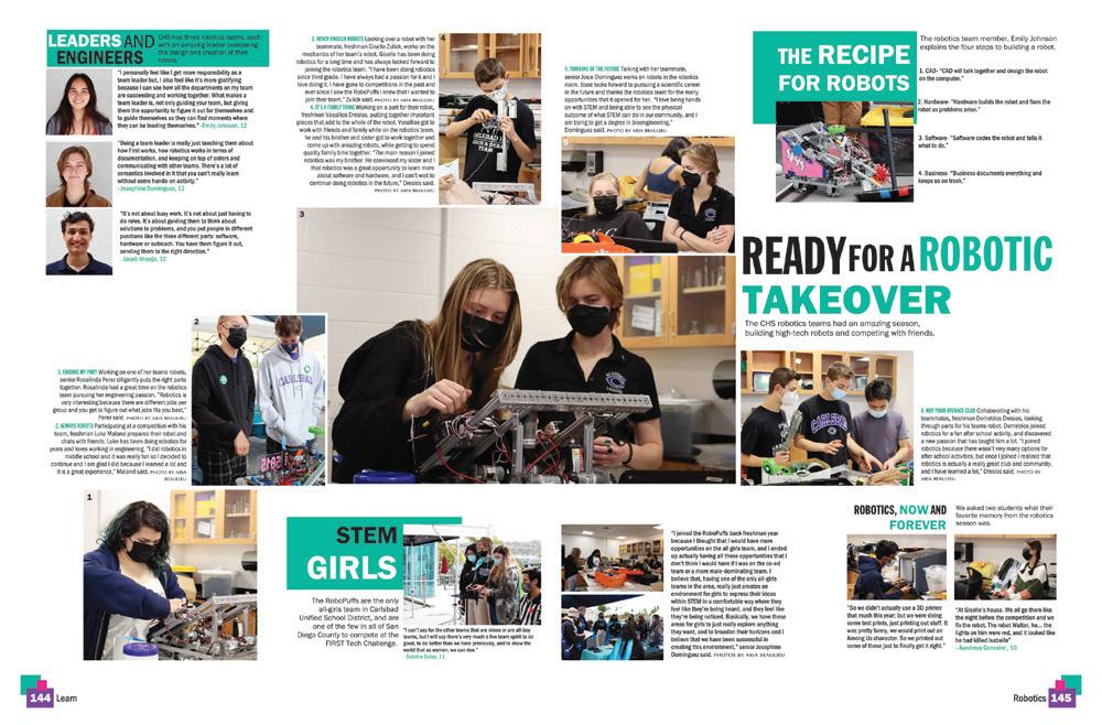
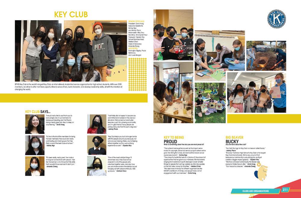
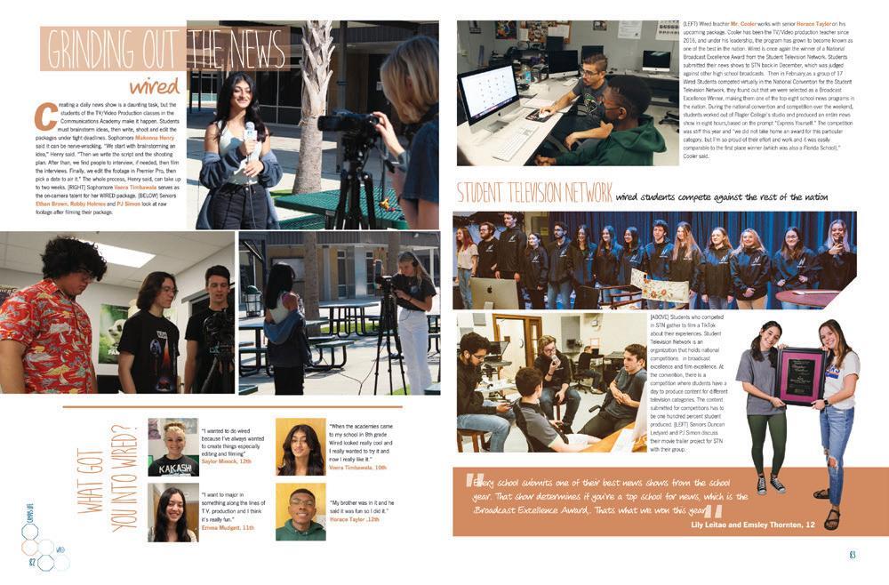
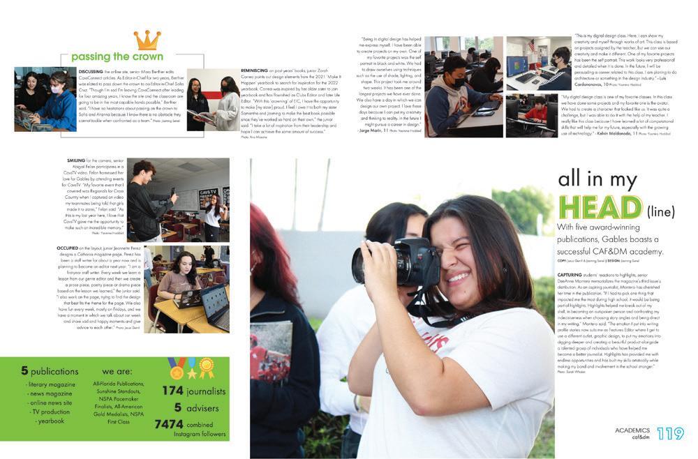
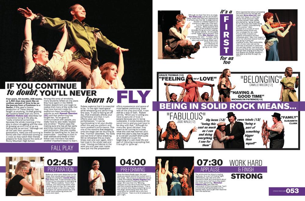
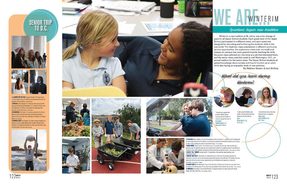
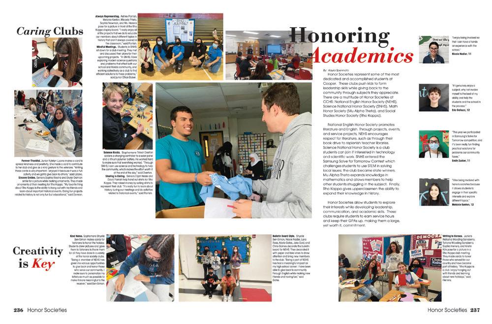
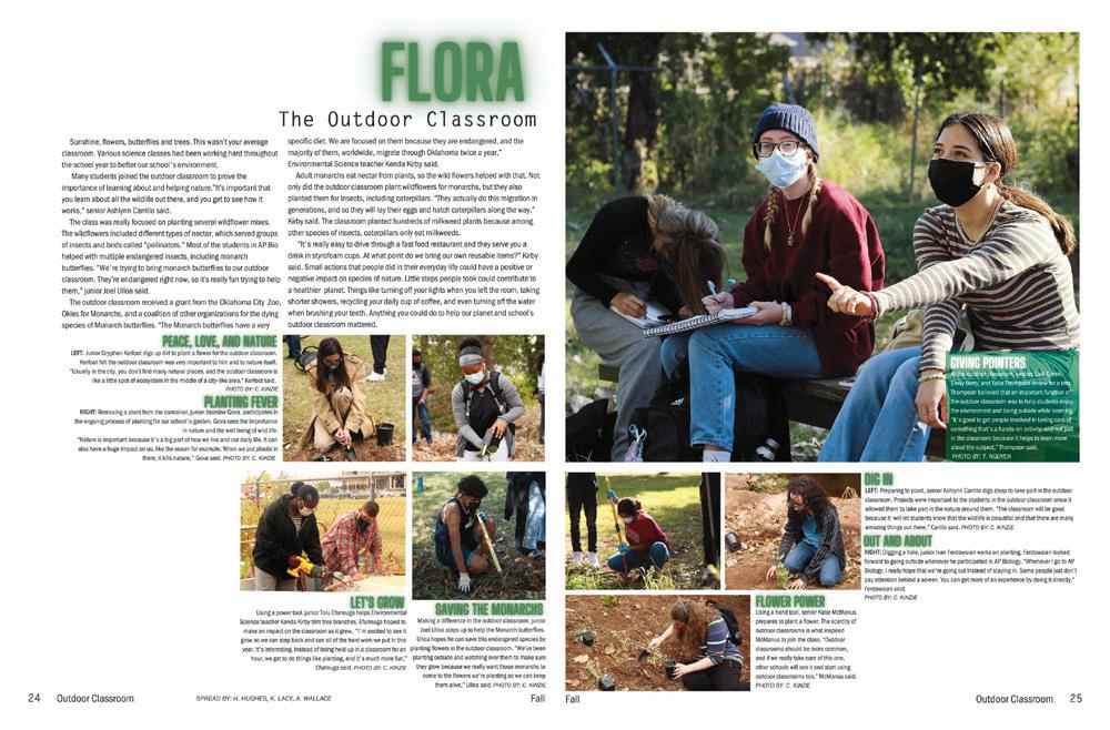
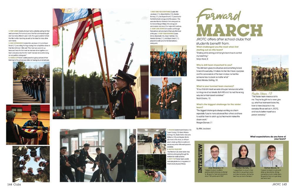
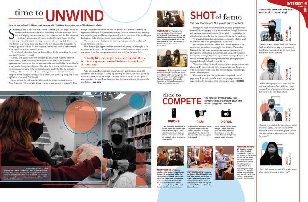
STEP UP TO THESE MARGINS: The architects of this spread used their grid (and possibly Square One) to pack in the coverage while making sure the modules got adequate breathing room. We love the color palette and simple lines that create squares, which is a common photo shape on the spread.
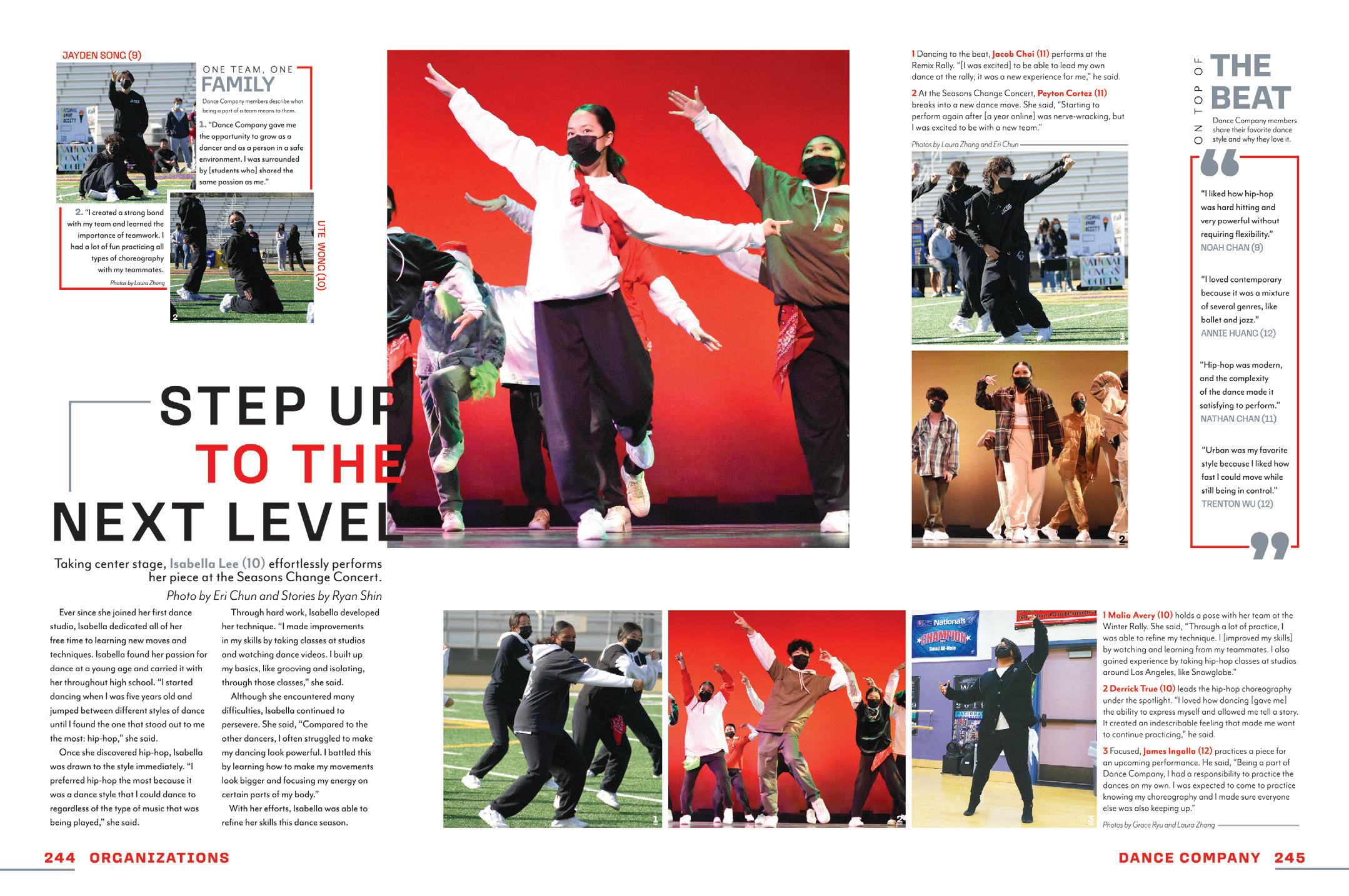
That’s next level!
 STRAWBERRY CREST HS | Centaur | DOVER, F L
DIAMOND BAR HS | Taurus | DIAMOND BAR, CA
BETHANY HS | The Bronco | BETHANY, OK
CAMPO VERDE HS | Reflections | GILBERT, AZ
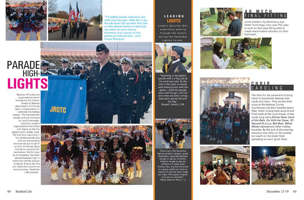
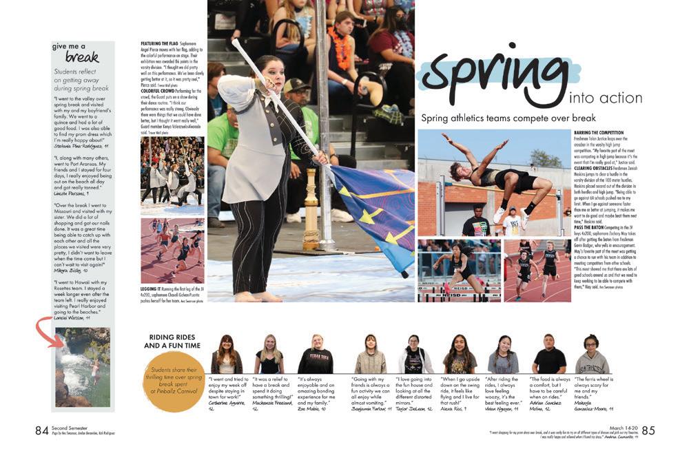
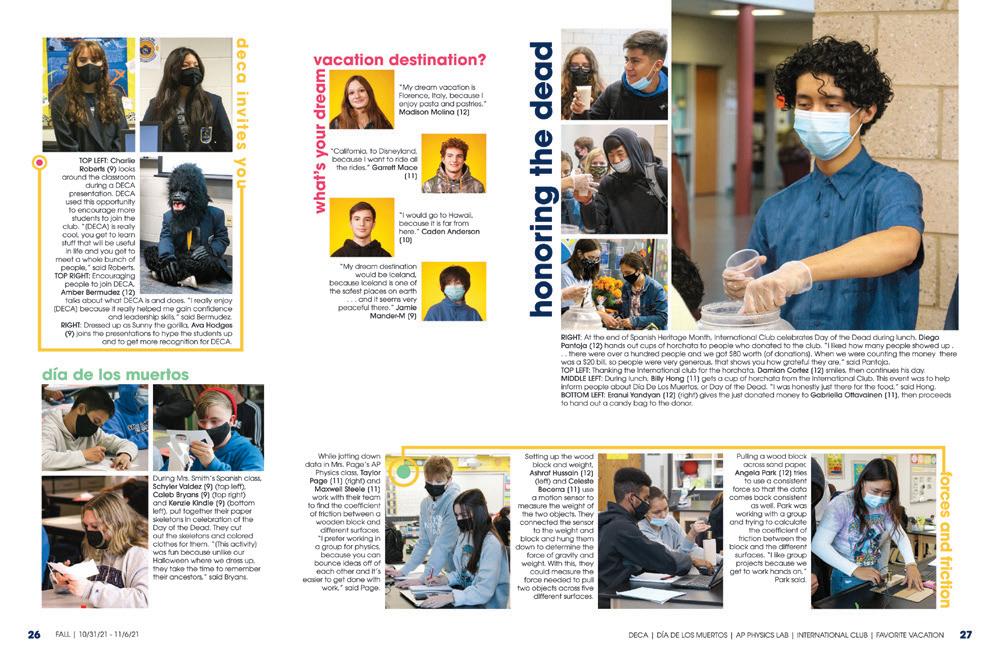
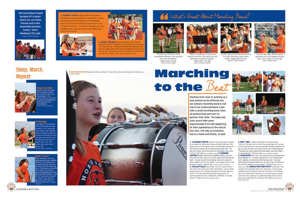
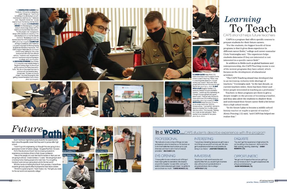
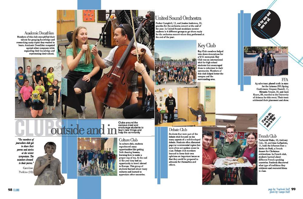
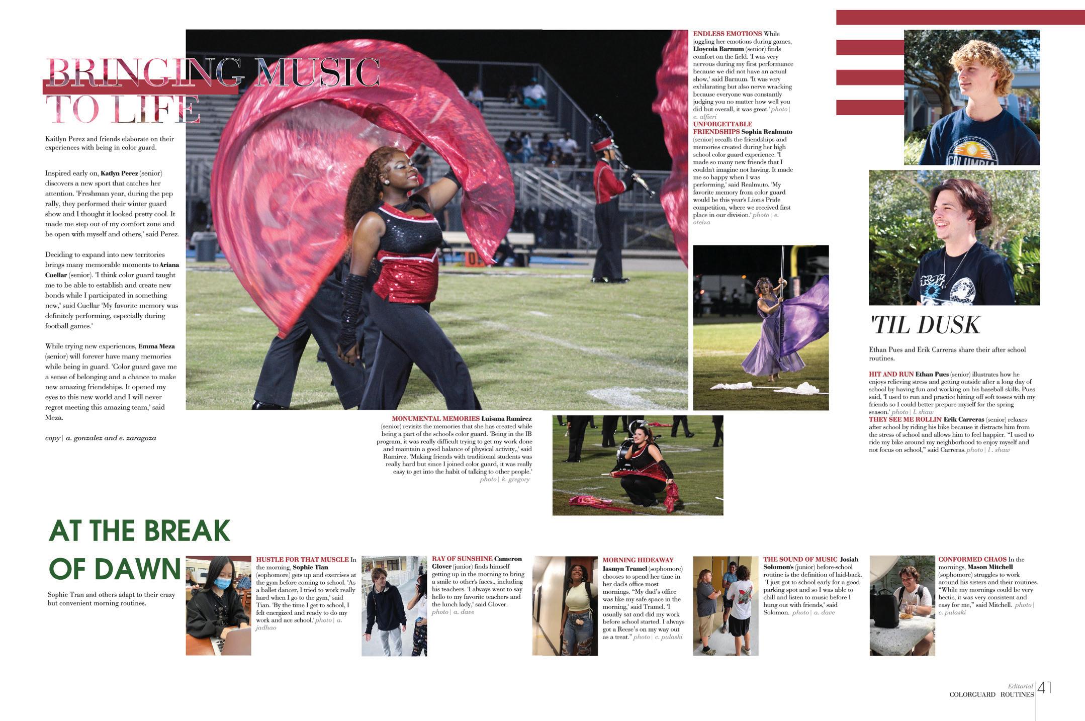
UNDER MY UMBRELLA: Here’s an example of umbrella coverage. You don’t have to guess what the three topics on the spread have in common — just look at the folio. They are all about routines: color guard, after school and morning. The key to umbrella organization is planning. In order to include everything you want to, and not leave out any major group or event, you have to start with an inclusive list and make sure everything finds a place.

 LUGOFF-ELGIN HS | Kaleidoscope | LUGOFF, SC
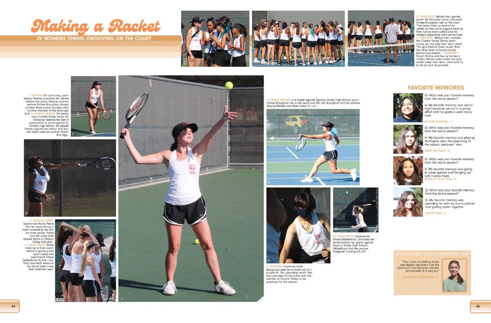
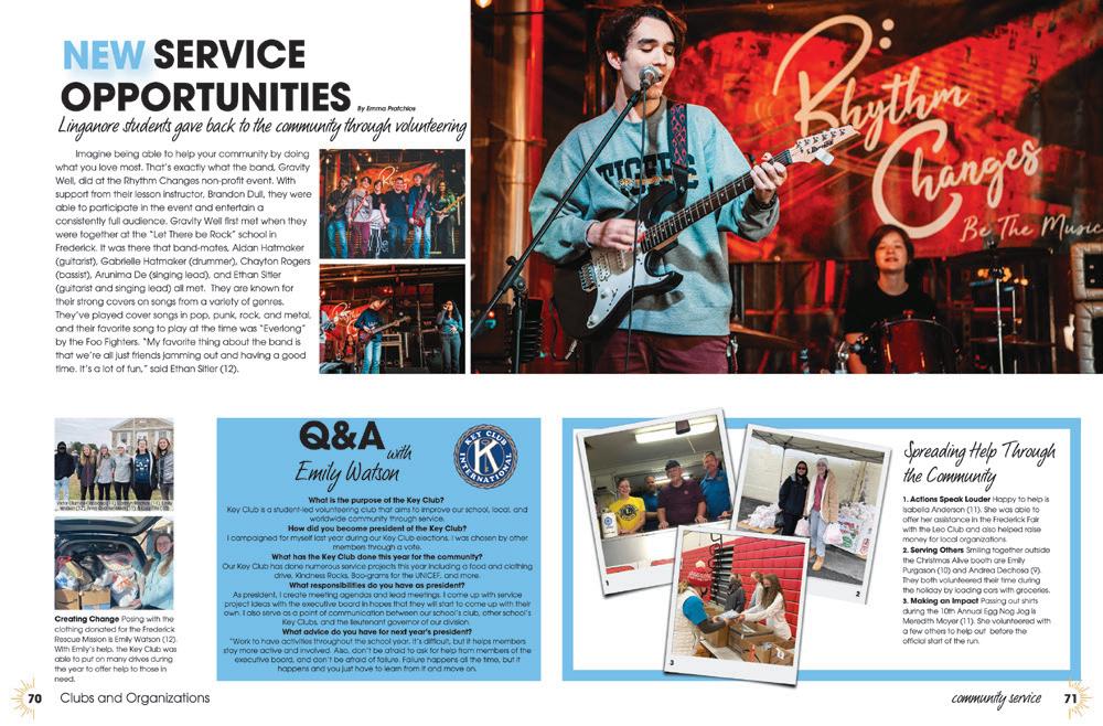
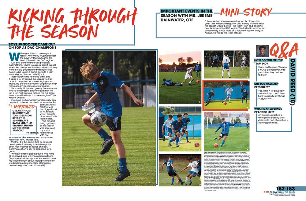
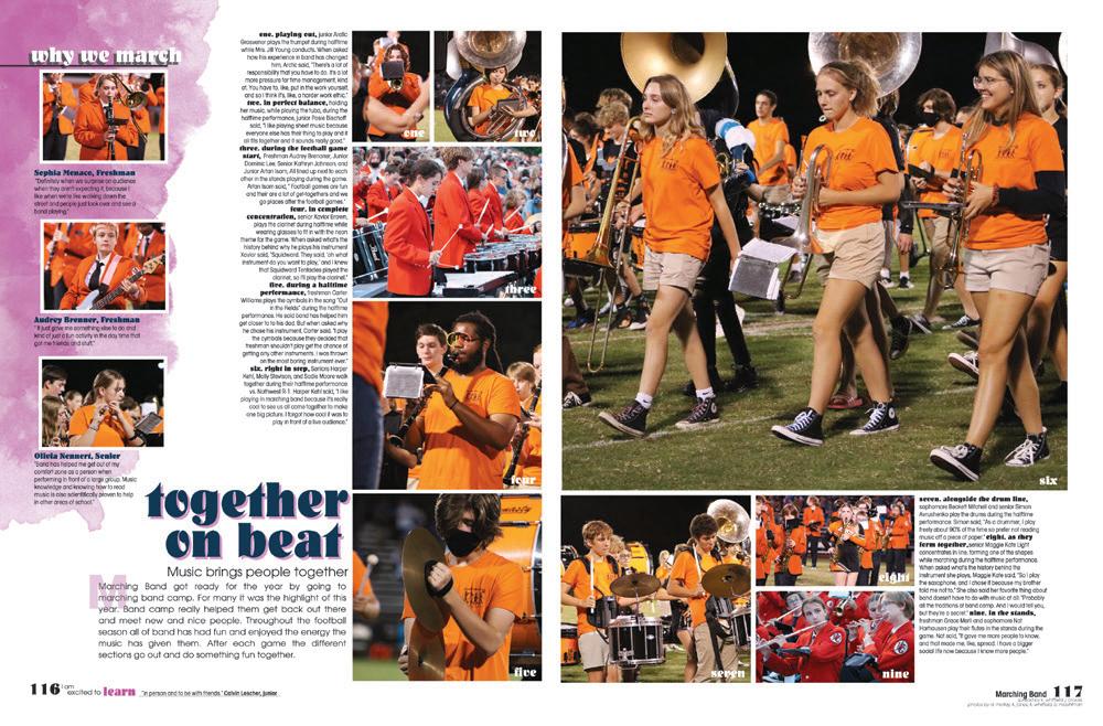
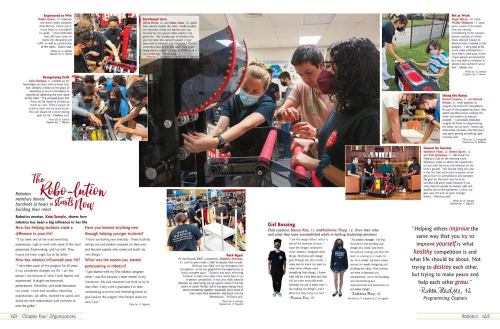 CLAYTON VALLEY CHARTER HS | Aguila | CONCORD, CA
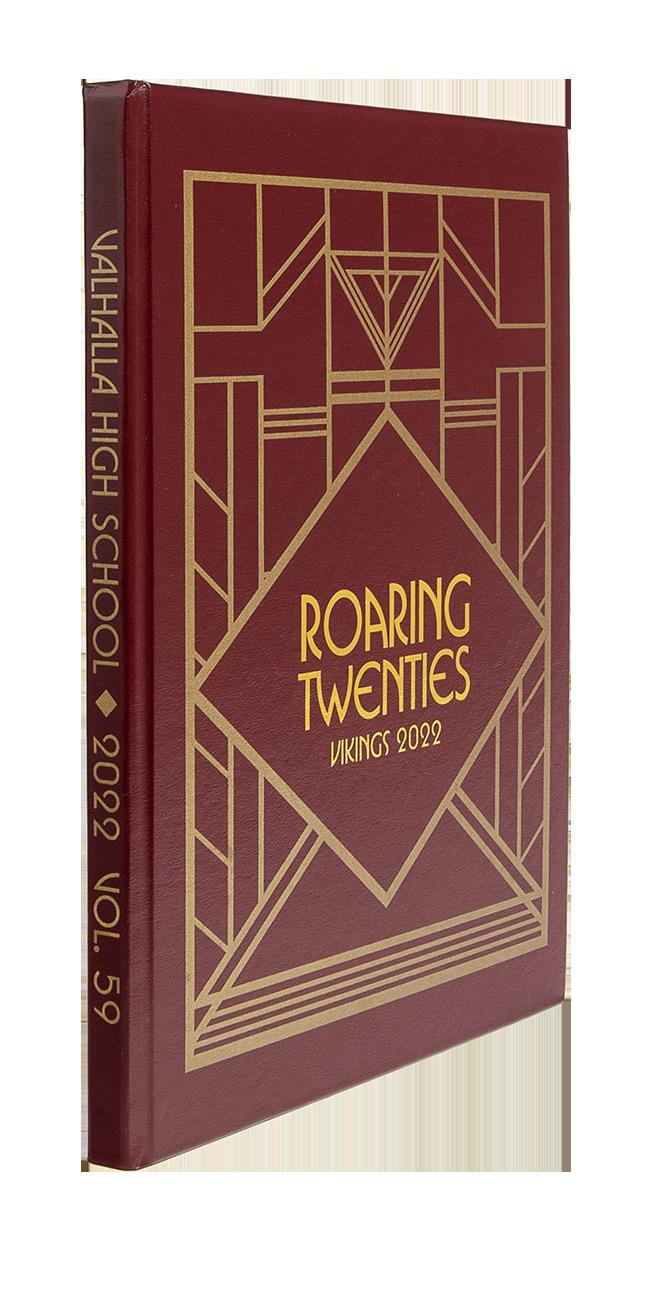
VALHALLA HS | Vikings | VALHALLA, N Y
MULBERRY SENIOR HS | Mulberry Tree | MULBERRY, FL
BISHOP M c GUINNESS CATHOLIC HS | Chi Rho | OKLAHOMA CITY, OK
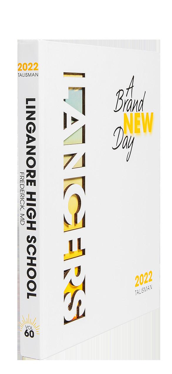
LINGANORE HS | Talisman | FREDERICK, MD
WEBSTER GROVES HS | Echo | WEBSTER GROVES, M O
WEST BROWARD HS | The Edge | PEMBROKE PINES, FL
LAKE CENTRAL HS | Echo | SAINT JOHN, IN
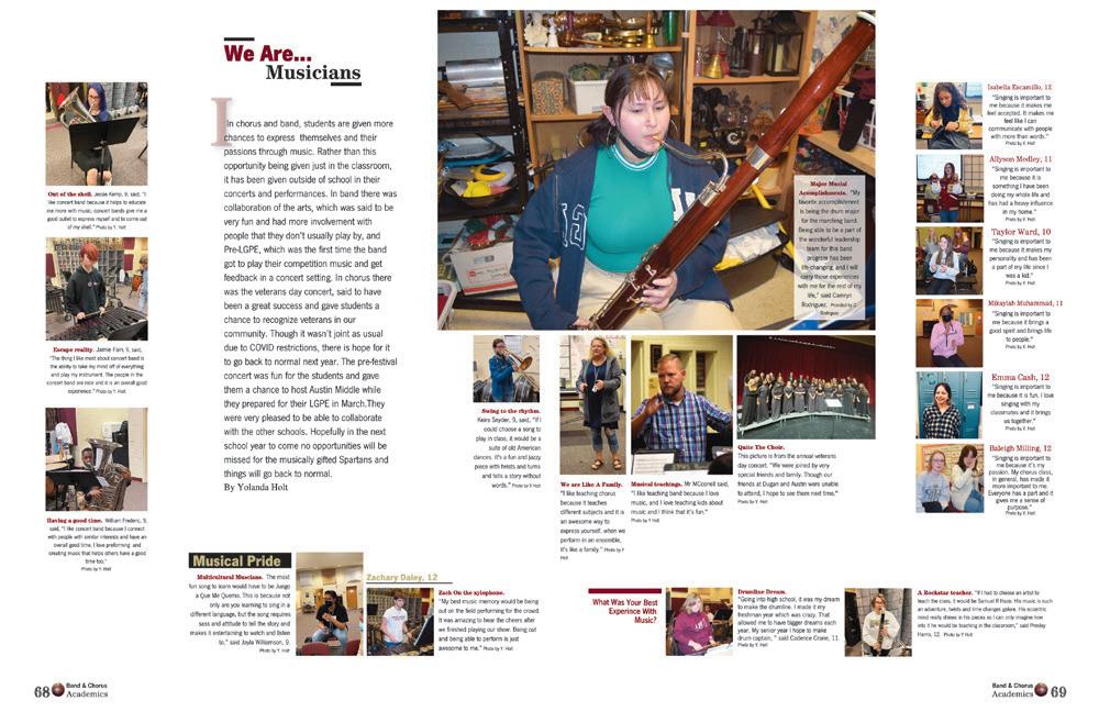
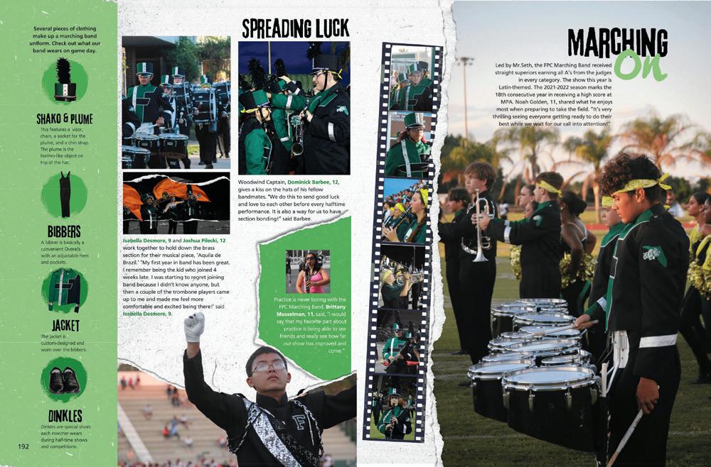
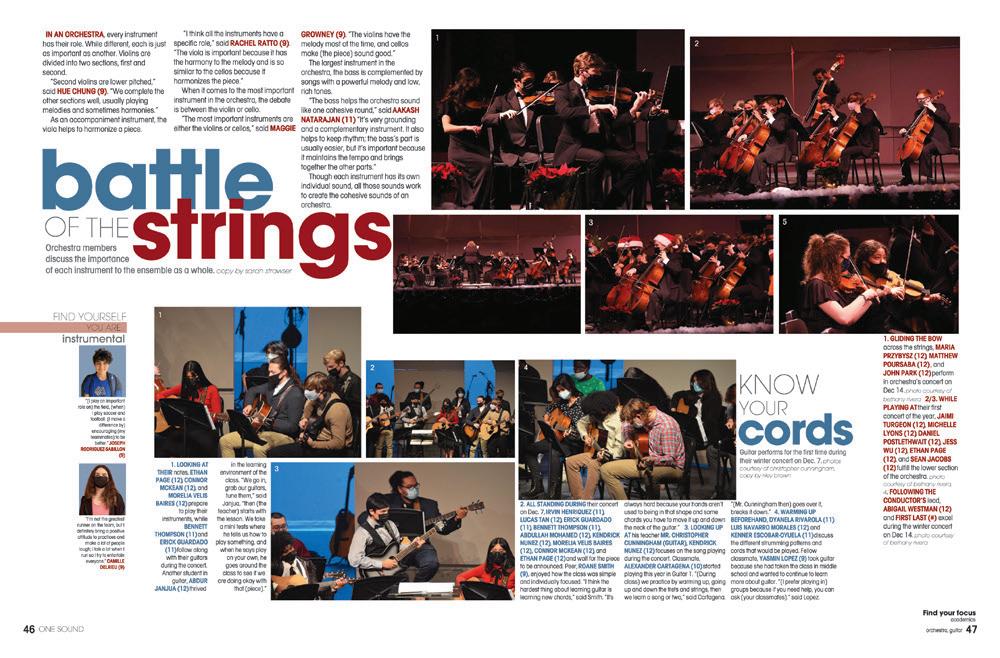
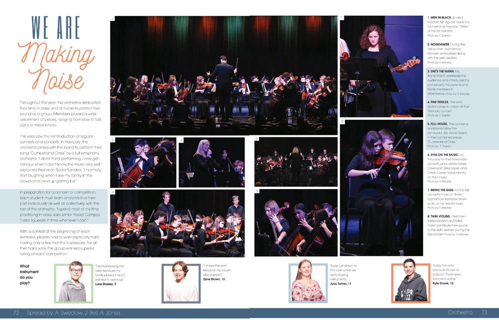
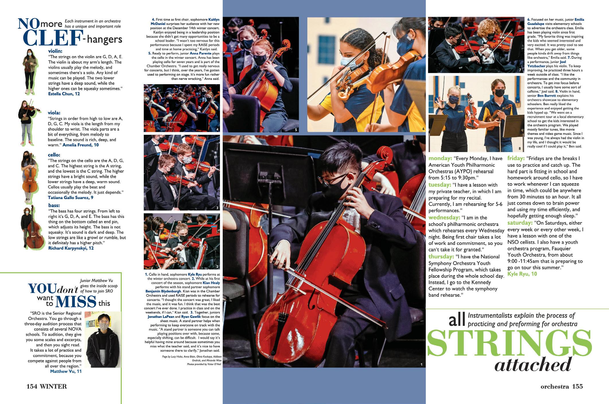
ALL OF THE DEETS: This spread stands out because of the deep level of detail contained in the writing. From the specific information about the stringed instruments to Kyle Ryu’s intense orchestra practice schedule, readers get a lot of insight into to the “hard work and dedication” that is often the initial answer to “what does it take to do well in a high-level orchestra program?” This is an excellent example of why your writing teachers will tell you, “show, don’t tell.” It’s much more interesting!
 ROBINSON SECONDARY SCHOOL | Above & Beyond | FAIRFAX, VA
MAINE SOUTH HS | Eyrie | PARK RIDGE, IL
ALONSO HS | Evermore | TAMPA, FL
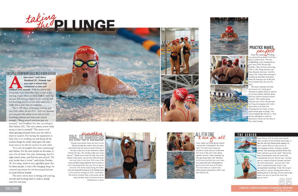
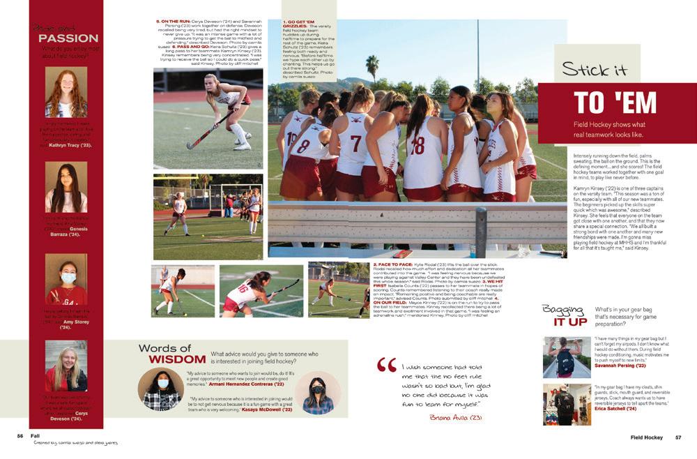
 FOOTHILL HS | Peregerine | HENDERSON, NV
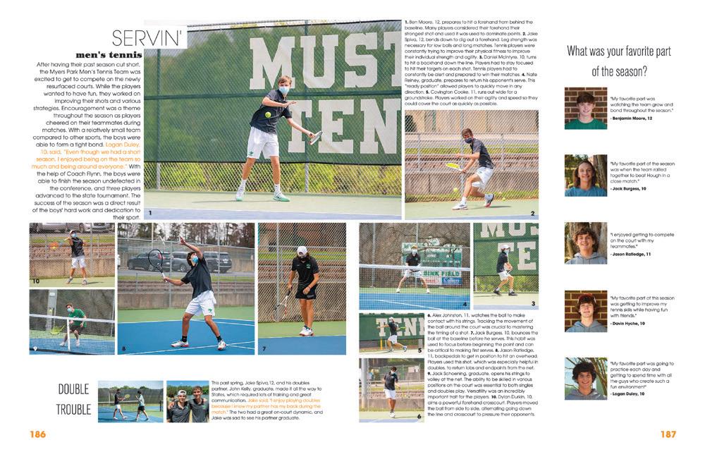
MYERS PARK HS | Mustang | CHARLOTTE, NC
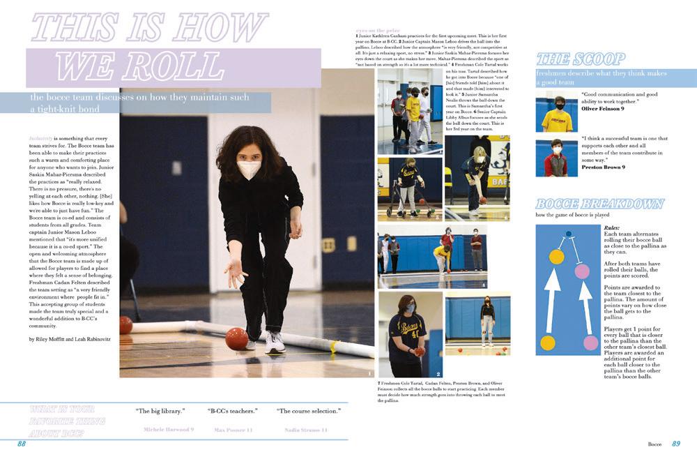
BETHESDA-CHEVY CHASE HS | Pine Tree | BETHESDA, MD
OWYHEE HS | The Eye | MERIDIAN, ID
MISSION HILLS HS | Cardinal & Gold | SAN MARCOS, CA
RED BLUFF HS | Dictum Est | RED BLUFF, CA
NARDIN ACADEMY | Rosarium | BUFFALO, NY
CARLSBAD HS | The Shield | CARLSBAD, CA

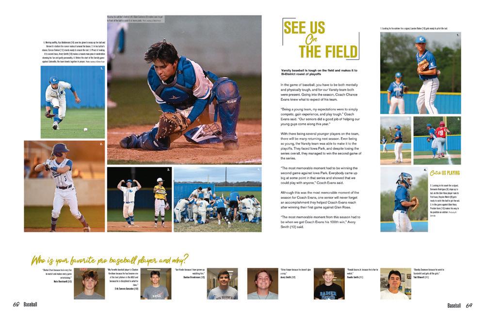
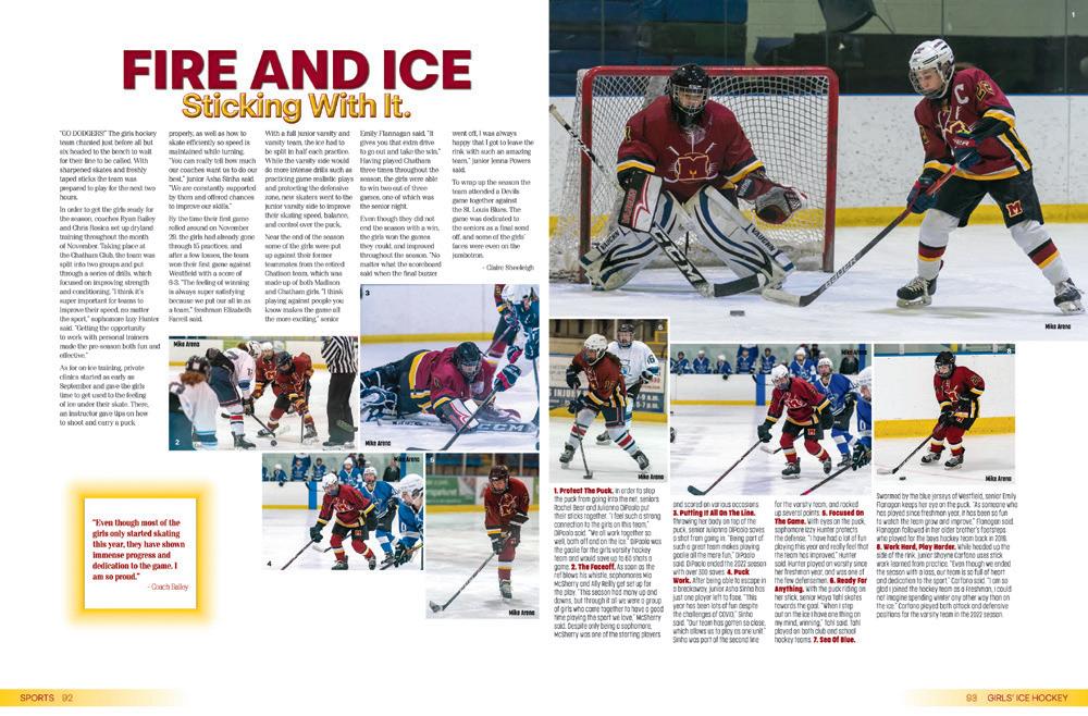 GOVERNOR LIVINGSTON HS | The Claymore | BERKELEY HEIGHTS, NJ
MOUNTAIN VIEW HS | The Pinnacle | BEND, OR
PELHAM MEMORIAL HS | Pelican | PELHAM, NY
DESERT MOUNTAIN HS | Archives | SCOTTSDALE, AZ
PONTE VEDRA HS | Oceanic | PONTE VEDRA, FL
LAMPASAS HS | The Badger | LAMPASAS, TX
MADISON HS | Alembic | MADISON, NJ
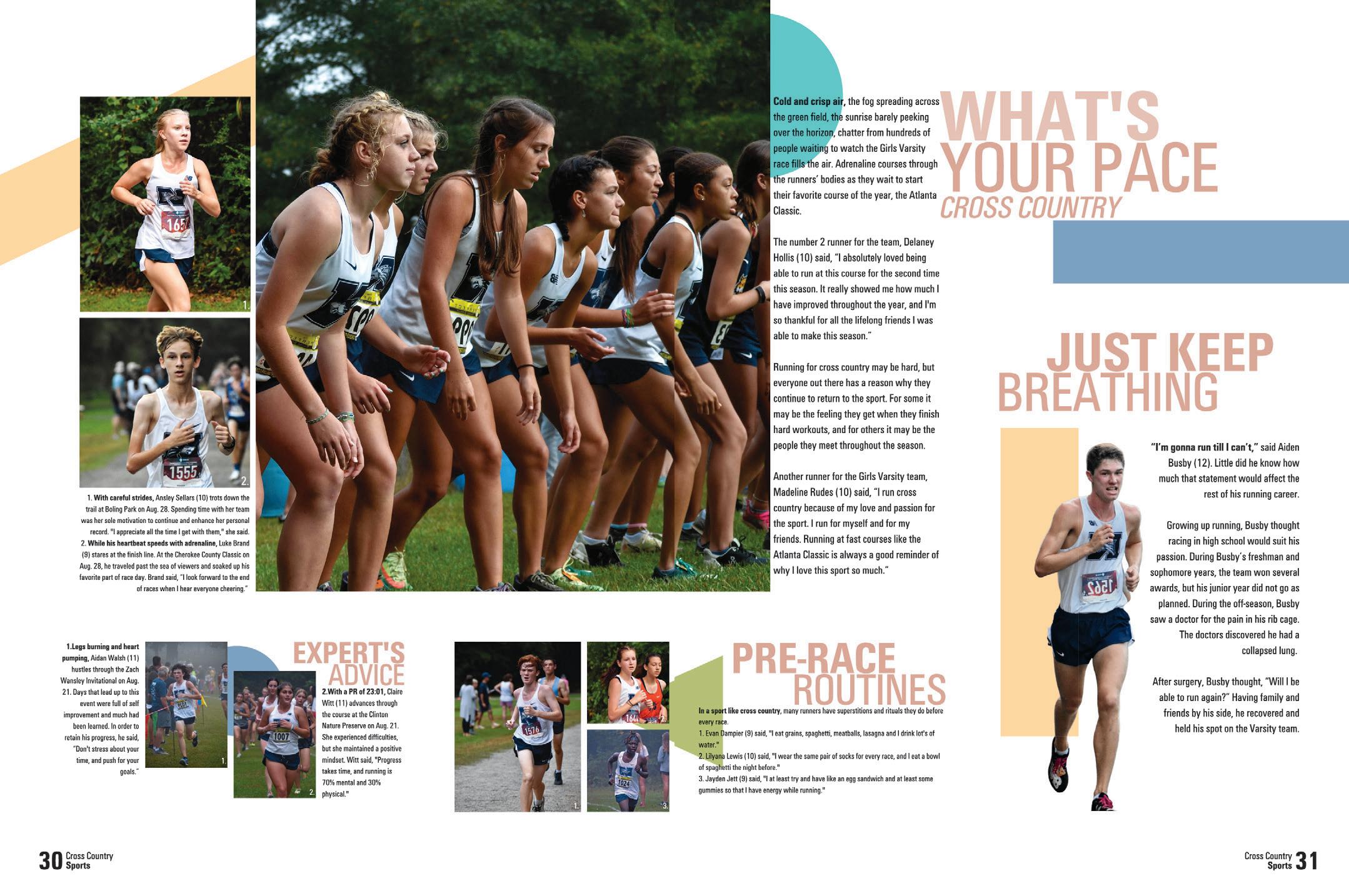
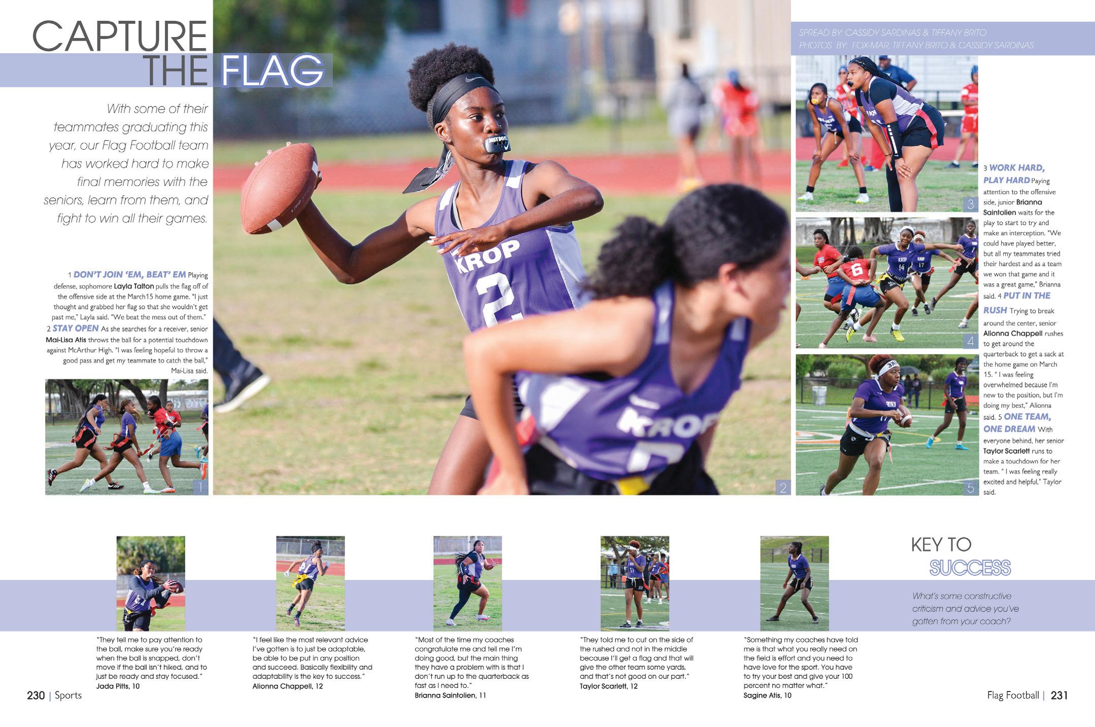 NORTH PAULDING HS | Legend | DALLAS, GA
DR. MICHAEL M. KROP SENIOR HS | Renaissance | NORTH MIAMI BEACH, FL
SO NICE AND NEAT:
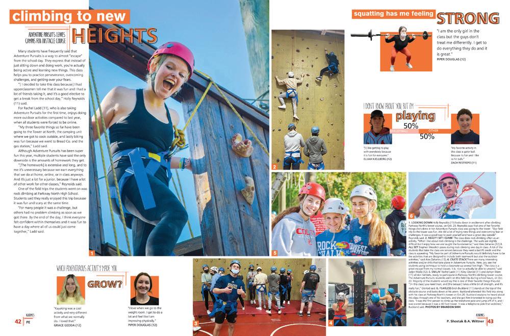
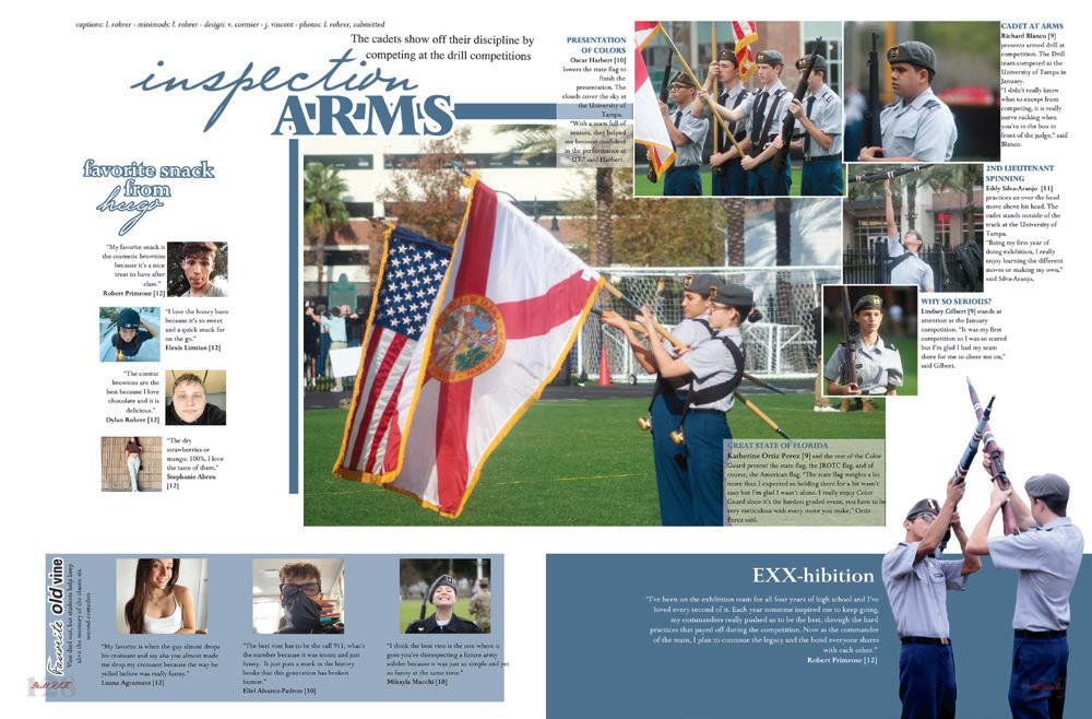
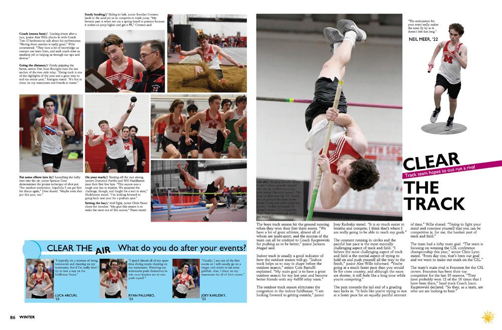
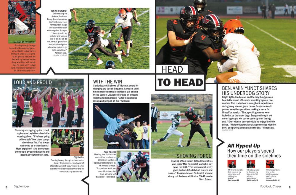
We love a well-organized layout plan, and this is a great example. Check out the obvious hierarchy: The dominant photo, which is awesome and deserves to be that big, has a dominant headline and copy block. Then, we drop down a level to captions, which are set in a smaller and bolder font size. And, it’s finished out with a mod featuring five smaller but easy to see action photos. That’s how it’s done!
COLOR KEEPS IT INTERESTING:
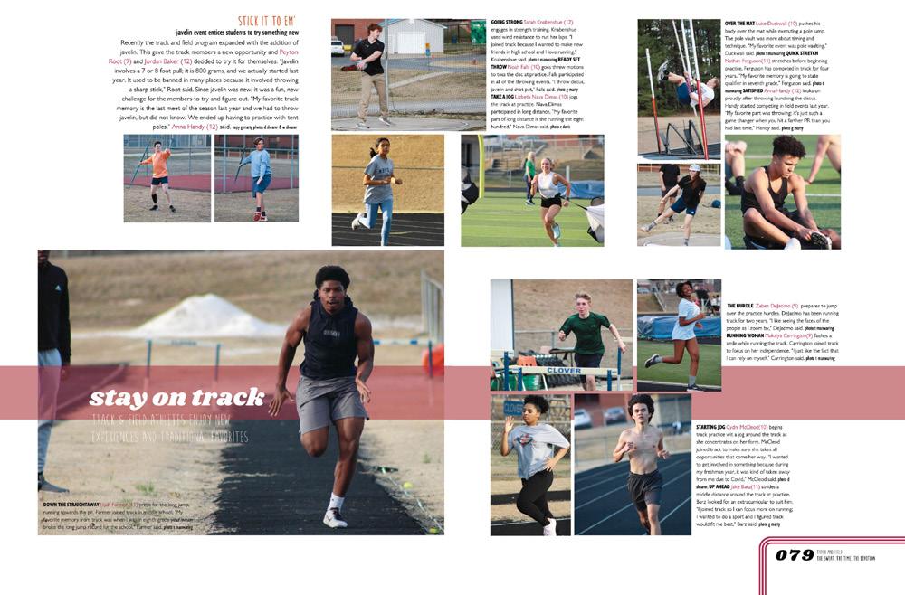
Rookie editors use their theme graphics to decorate, expert editors use graphics to reinforce and support the spread’s content. Here’s what we mean: the horizontal blue bar is like an underline for the dominant headline. The vertical gold bar supports the outlined runner, who needs something to anchor him to the layout. The other shapes don’t detract from the layout but add a subtle pop of color to keep our eyes moving around the spread.
 CLOVER HS | The Eagle | CLOVER, SC
WEST SPRINGFIELD HS | Olympian | WEST SPRINGFIELD, VA
SOUTH BROWARD HS | Browardier | HOLLYWOOD, FL
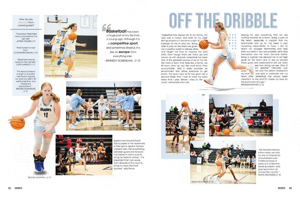
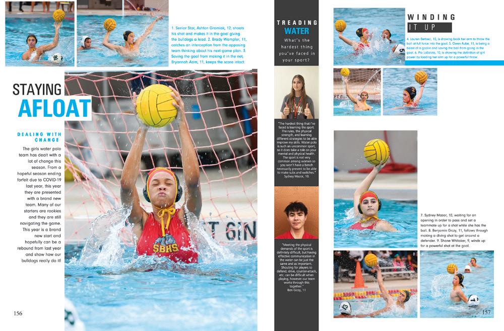
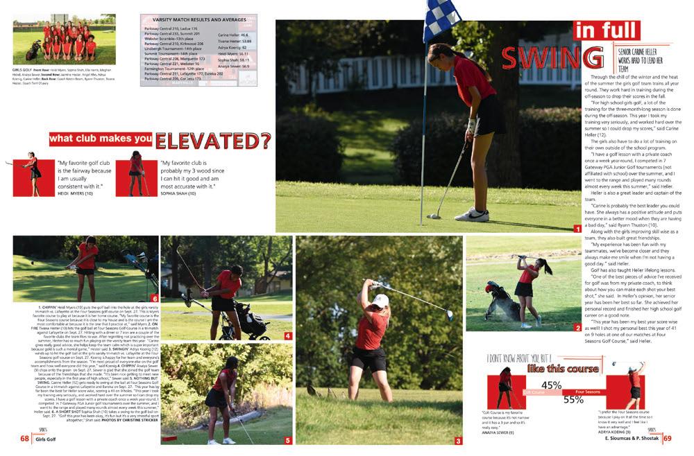
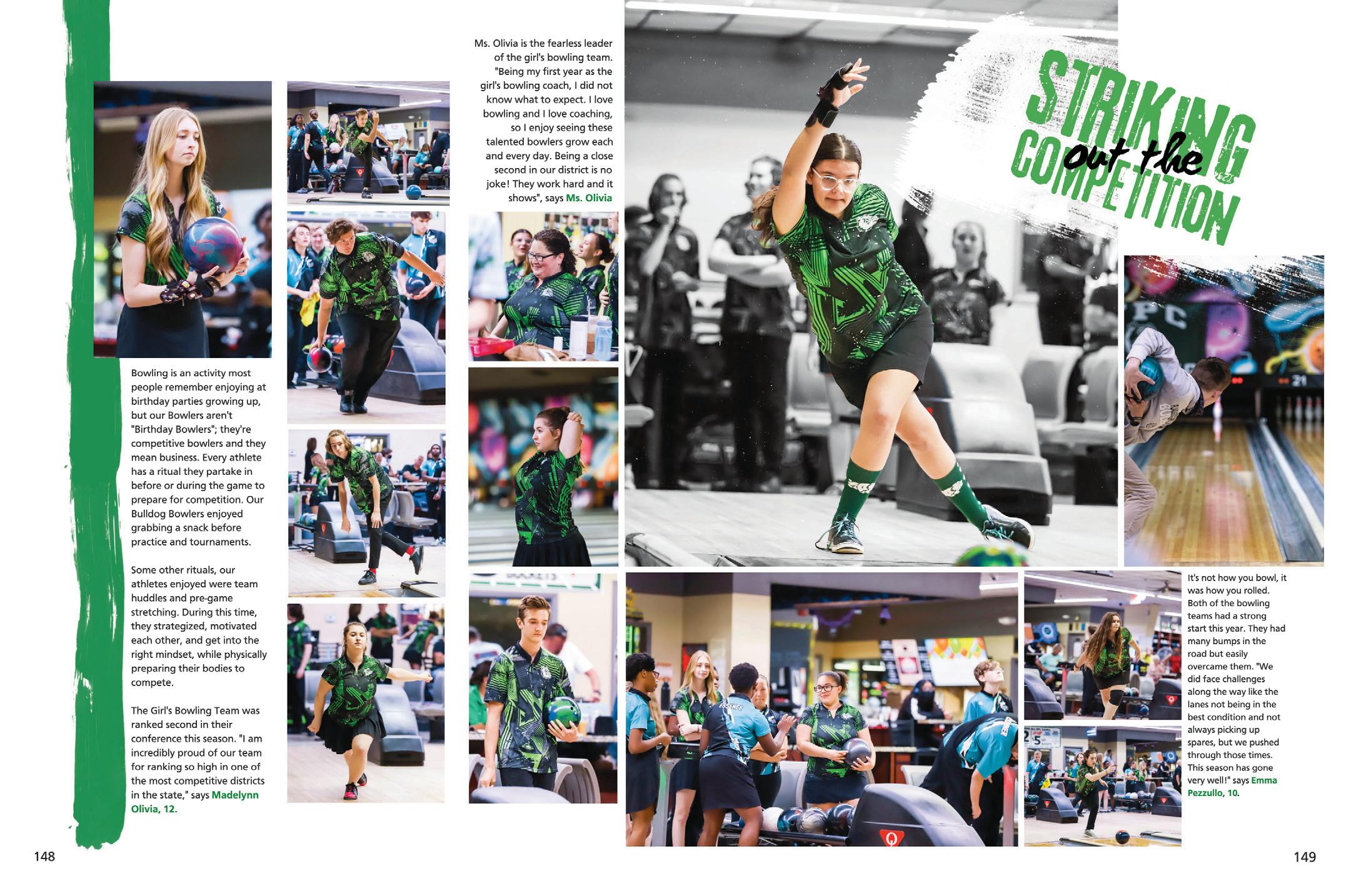
BOWLING FOR PHOTOS: We’ve seen a lot of bowling coverage. The annoying common trait for most of it is that often the photos are taken from behind the bowler — the convenient place to stand. Three cheers for this photographer who gave us faces, body angles, techniques and action. And check out that dominant photo where the bowler (and ball!) is in color and the rest of the scene is in black-and-white. Hit up Canva for that trick!
 SKYVIEW HS | Storm Chaser | VANCOUVER, WA
FLAGLER PALM COAST HS | PALM COAST, FL
FOOTHILL HS | Halcyon | PLEASANTON, CA
PARKWAY CENTRAL HS | Spur | CHESTERFIELD, MO
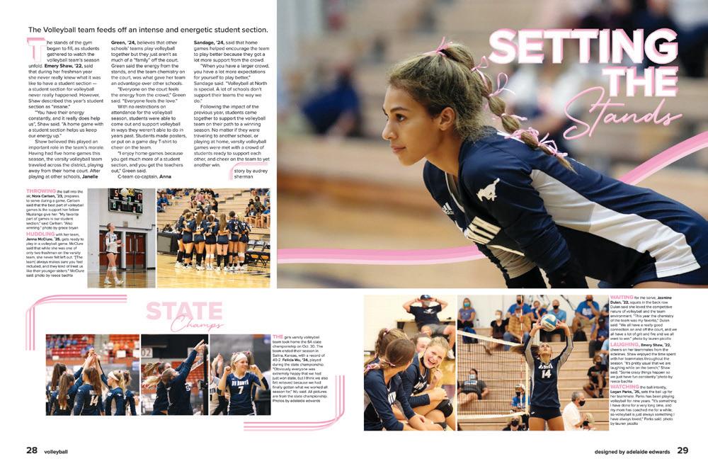
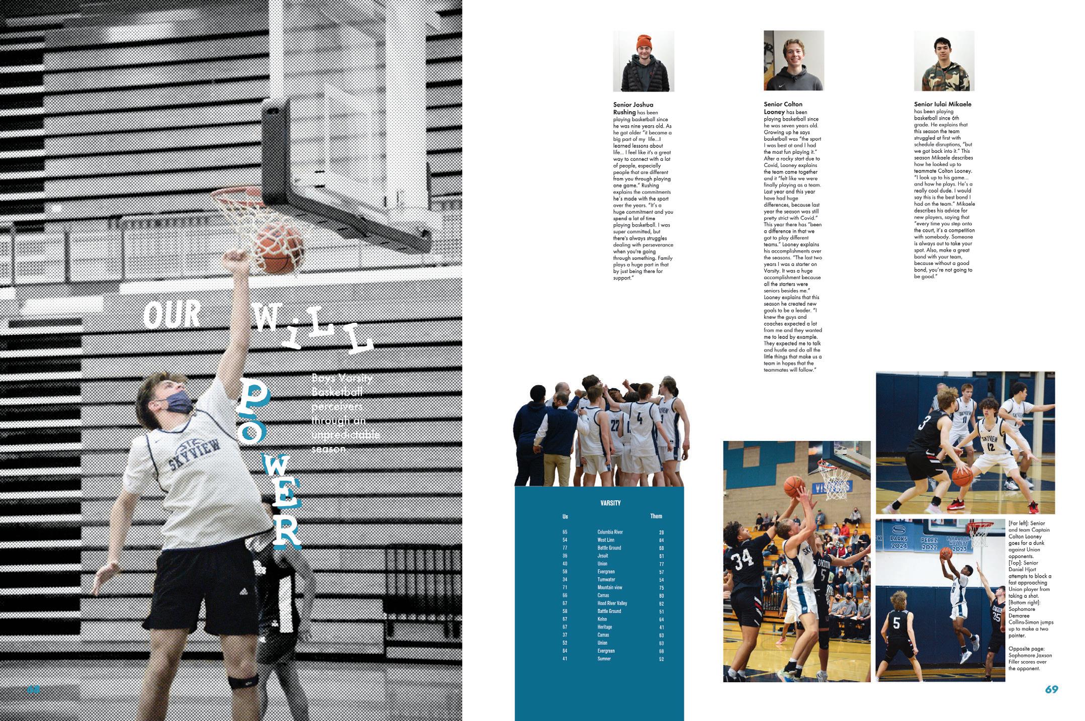
PLAYS WELL WITH LETTERS: These designers kept it interesting with this uber-vertical layout, anchored by the teal scoreboard box. The dominant photo took some time and thought. First, you need to commit to a headline, and then you put each letter into place. And, there are layers and photo filters to take into account. It’s fun and eyecatching — and different.

 KENNEDY HS | The Legend | FREMONT, C A
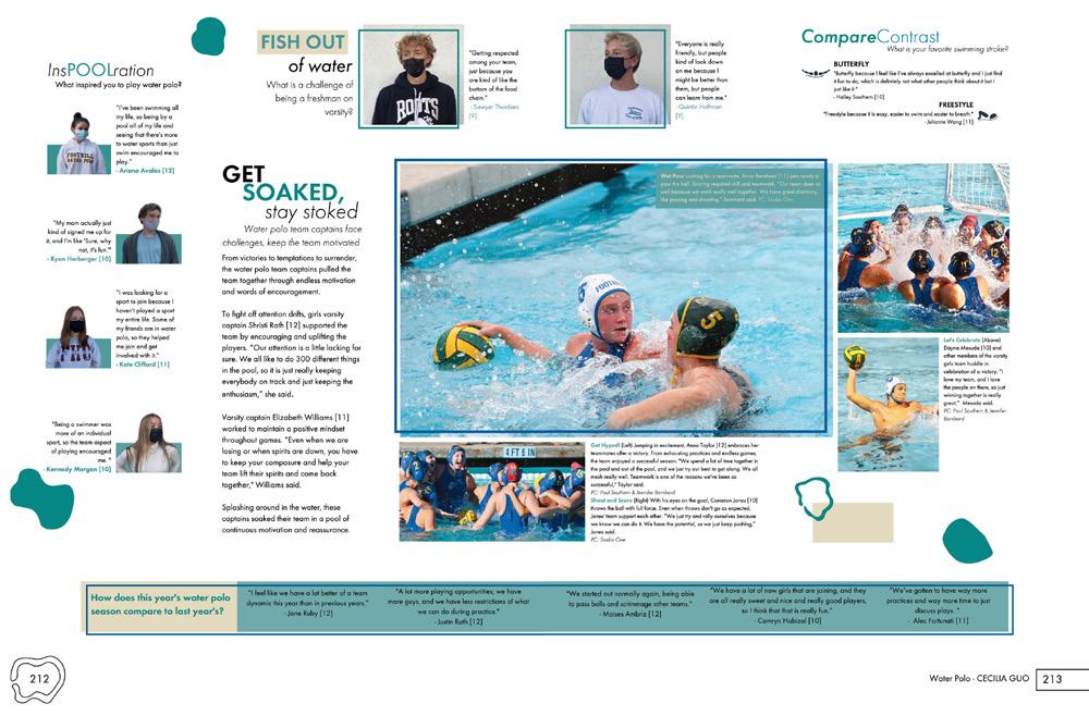
MAKING A SPLASH: Once you’ve taken in the gorgeous photos on this spread (who doesn’t love water splashes frozen in time?), you can pay attention to the well-done, wrap-around layout. The dominant package takes up the majority of the spread as it wraps from top left to middle right and carries your eye with it. Then nicely spaced mods finish out the spread. Lots of coverage and lots to explore.
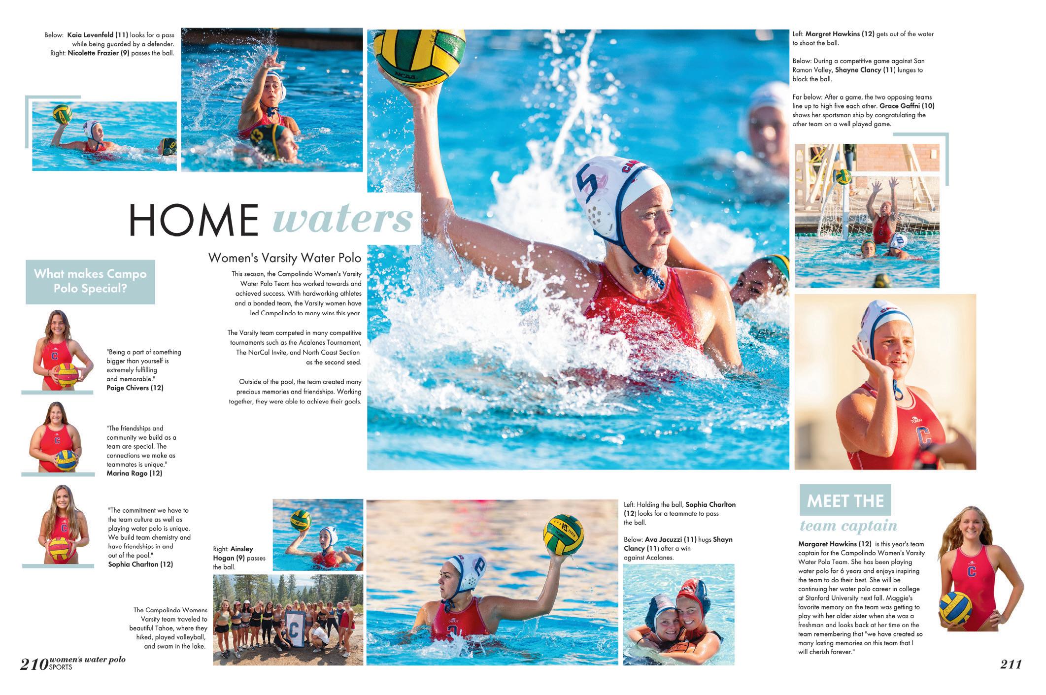 CAMPOLINDO HS | Compañero | MORAGA, CA
THE MANSFIELD HS | The Tiger | MANSFIELD, TX
LAKE WEIR HS | Encore | OCALA, FL
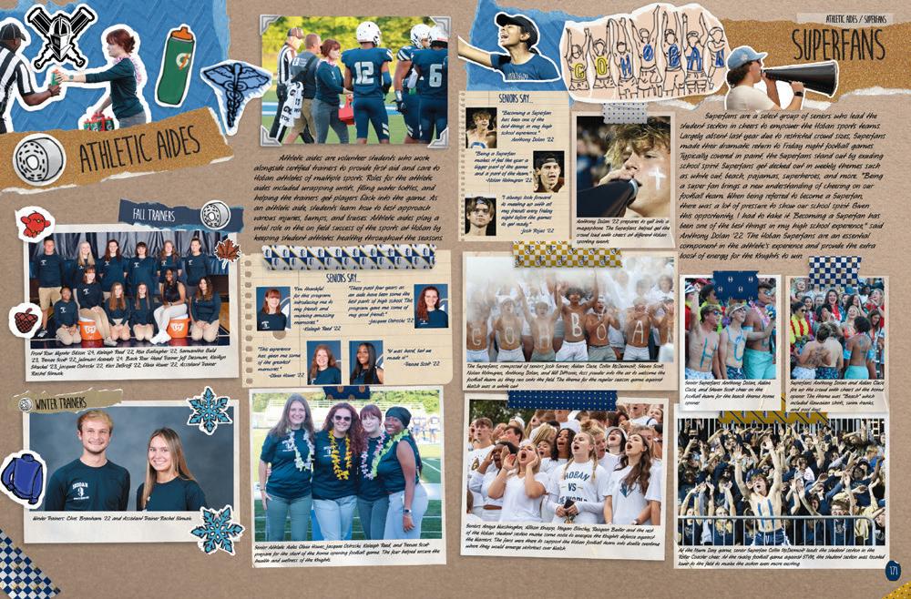
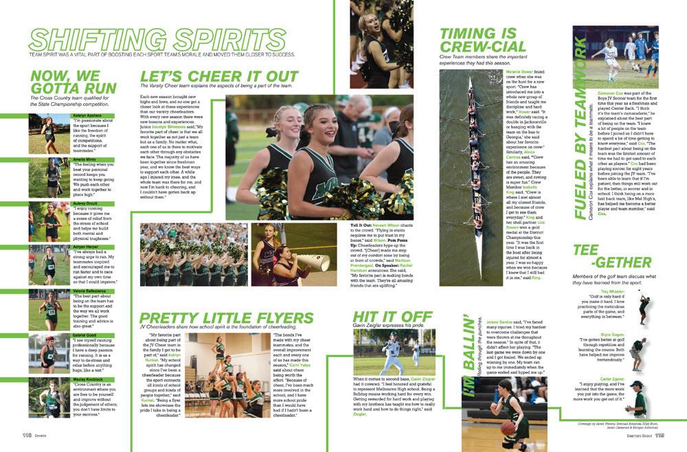
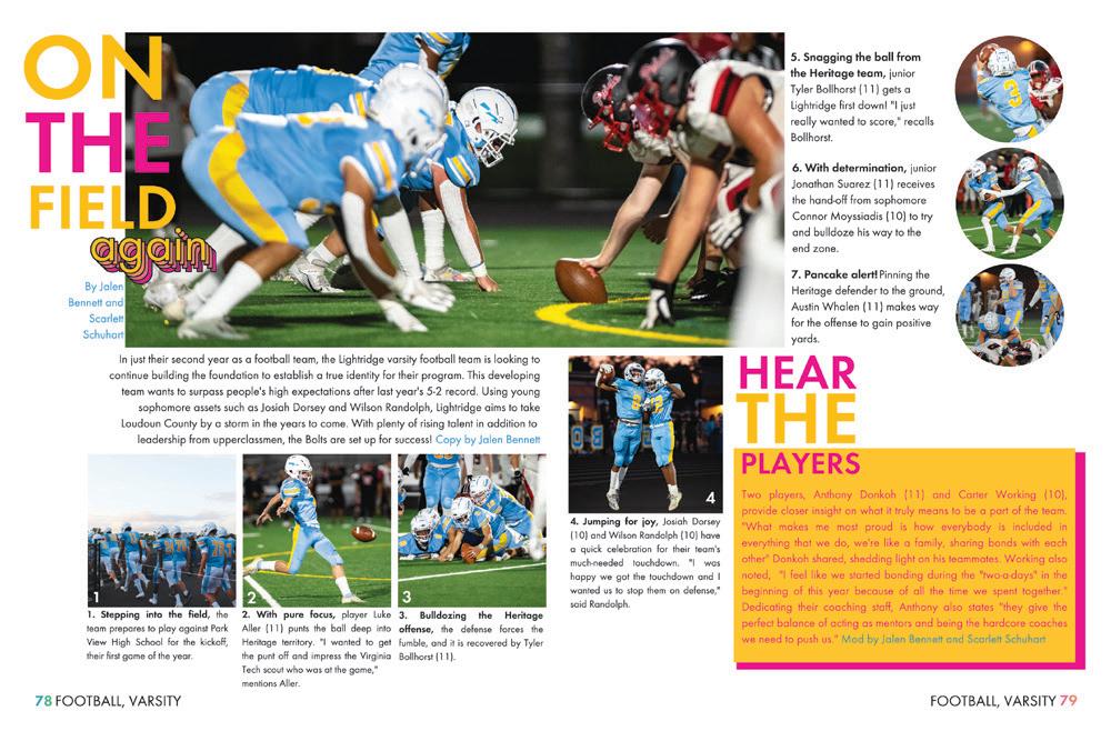
 ARCHBISHOP HOBAN HS | The Way | AKRON, OH
LIGHTRIDGE HS | The Strike | ALDIE, VA
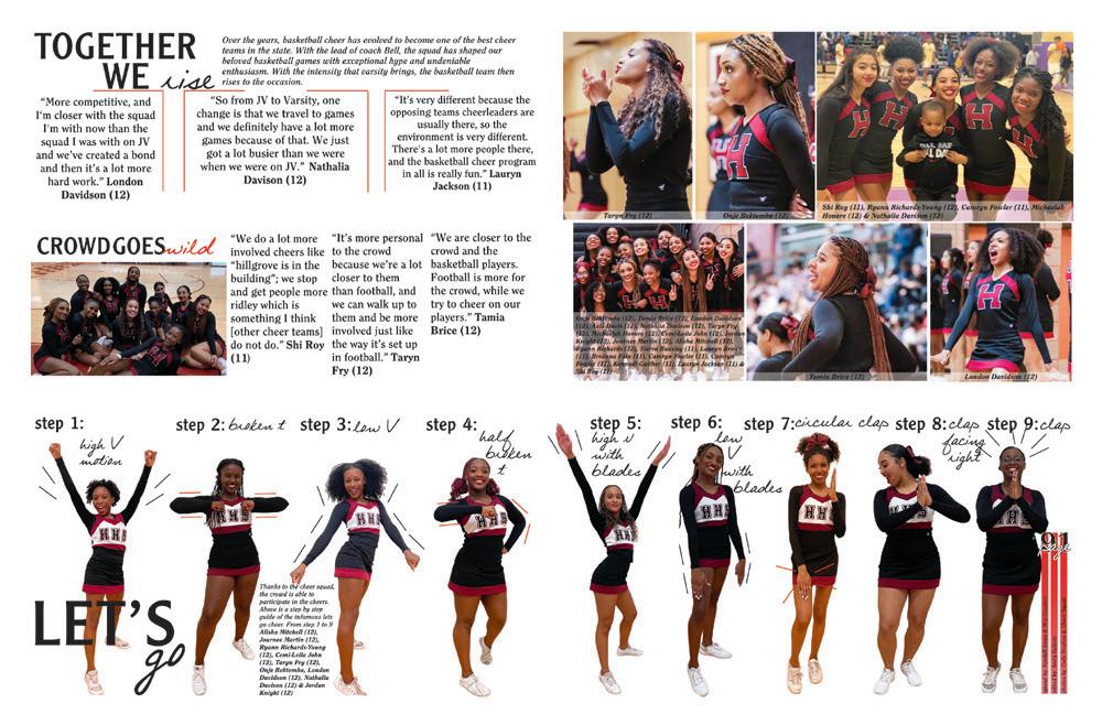
HILLGROVE HS | Aviary | POWDER SPRINGS, GA
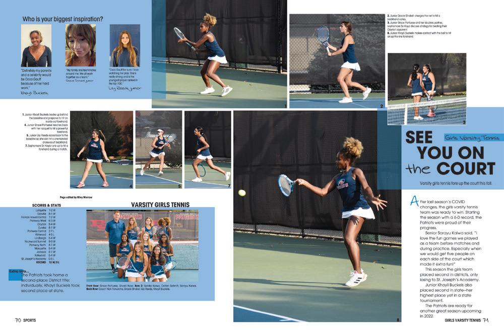
MELBOURNE HS | Stepping Stone | MELBOURNE, FL
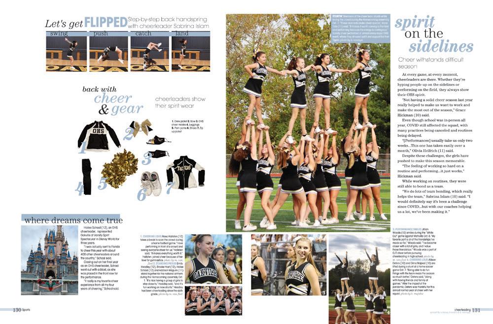
OAKVILLE HS | Tiger Paw | SAINT LOUIS, MO
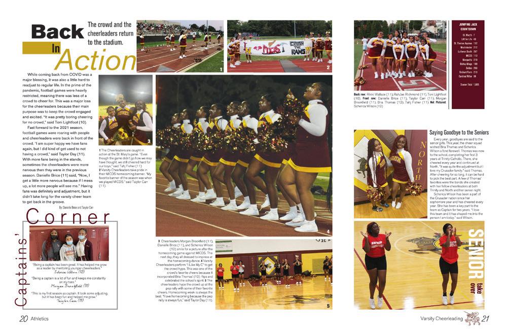
LUTHERAN NORTH HS | Crusader | SAINT LOUIS, MO
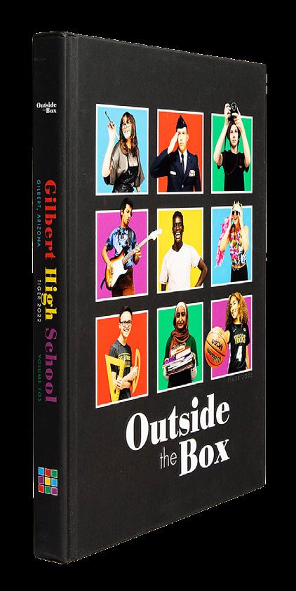
GILBERT HS | Tiger | GILBERT, AZ
DON’T SPACE OUT:
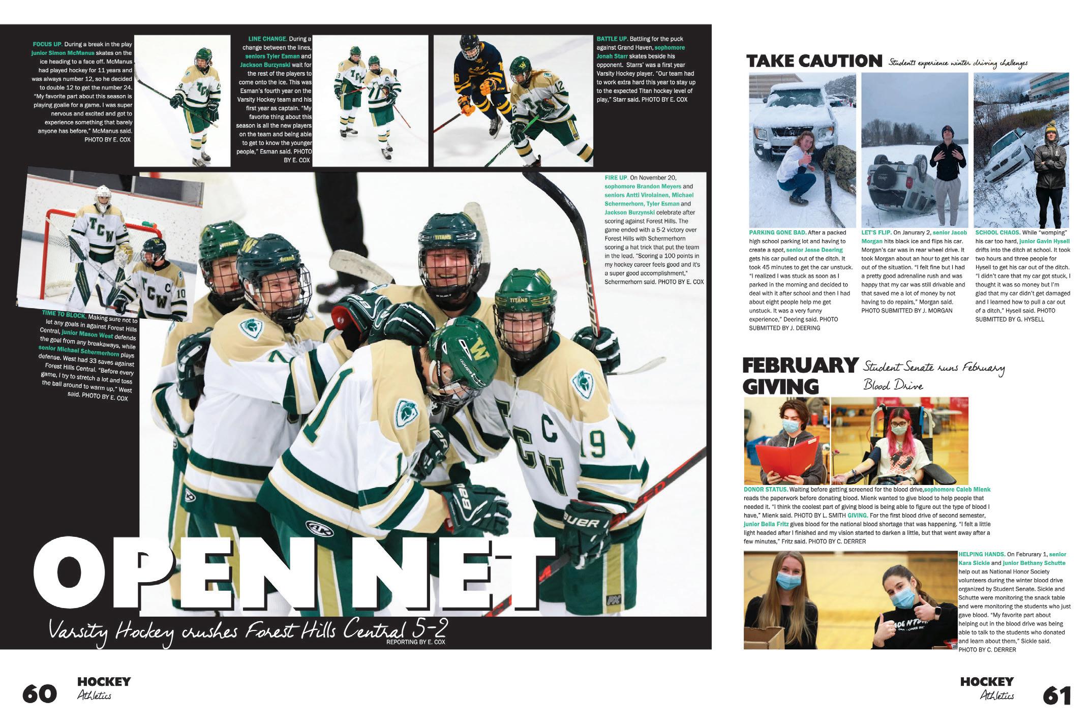
There’s something really appealing about this layout. The hockey coverage is in its nice, neat black box, and the other additional topics stay in their lanes. It’s worth a look because it accomplishes two great goals. First, the hockey team gets to take center stage, with an impressive collection of action shots and complete captions. (Extra credit for the subhead reporting out the result of the game.) At the same time, two other topics and seven additional students get their coverage. It’s a win-win.
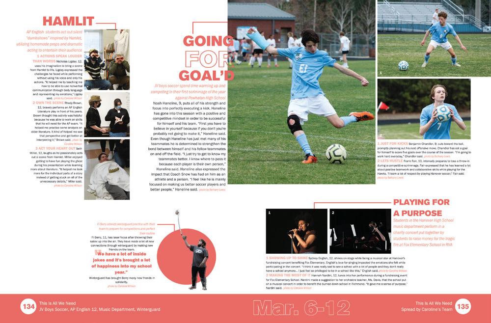
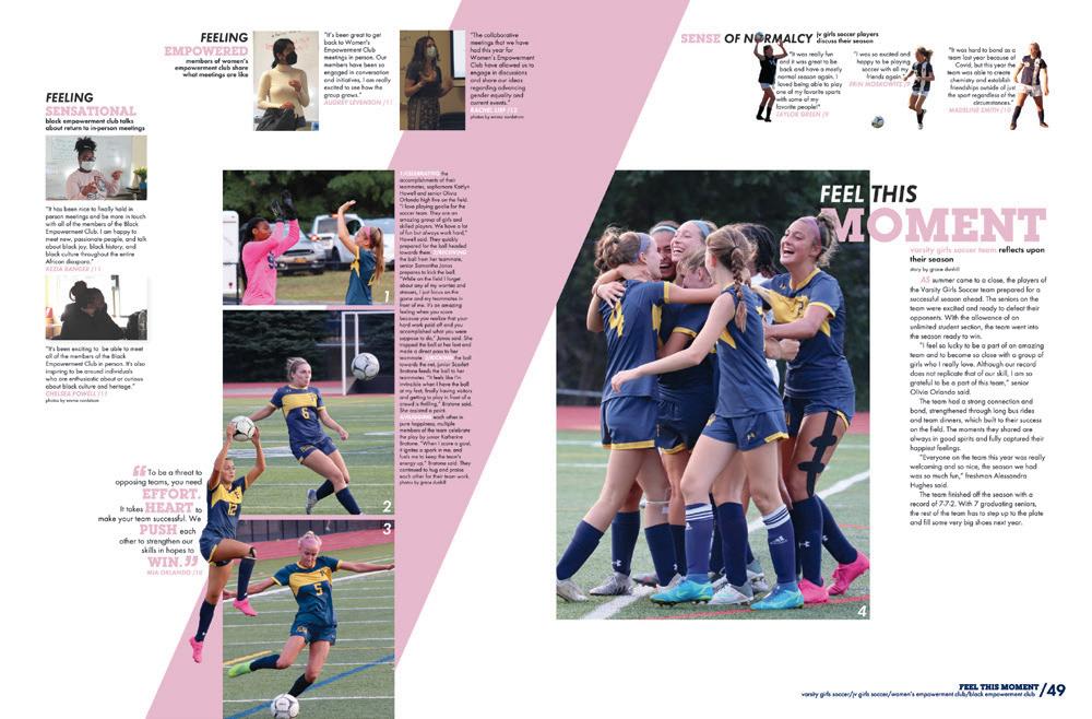
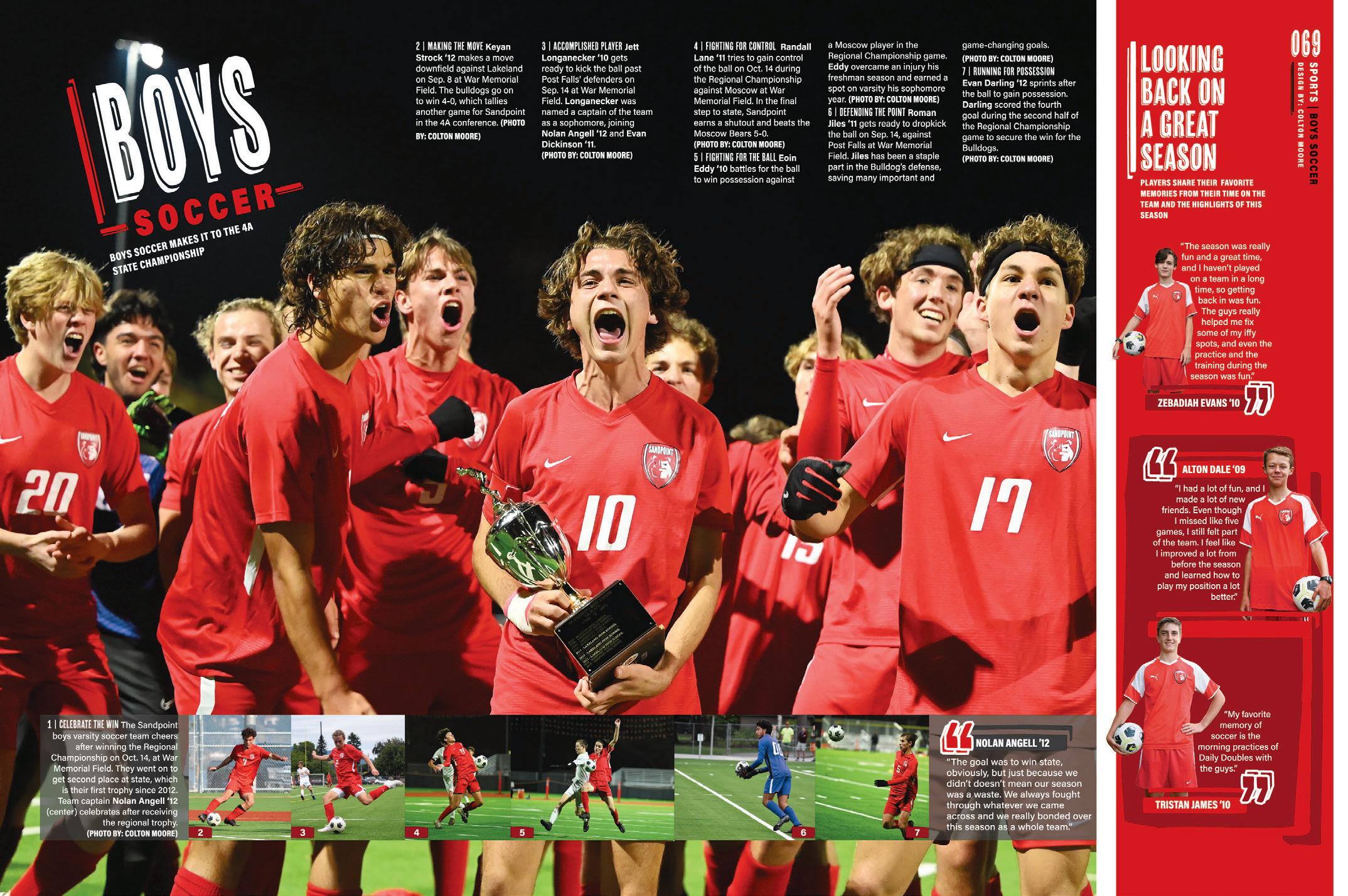
PHOTO-CENTRIC COVERAGE: It’s a phenomenal photo. It catches the players at the peak of emotion, and it deserves a giant piece of soccer-coverage real estate. But, then what do you do with the rest of the soccer coverage? This staff presented their solution: run the regular coverage photos smaller and put their captions in a dead spot of the dominant photo — and leave room for a themebuilding mod with three more talking heads. Goal!
 MIDLOTHIAN HS | Trojan | MIDLOTHIAN, VA
CYPRESS BAY HS | The Storm | WESTON, FL
WARREN CENTRAL HS | BOWLING GREEN, KY
AMHERST COUNTY HS | Amethyst | AMHERST, VA
 SANDPOINT SENIOR HS | Monticola | SANDPOINT, ID
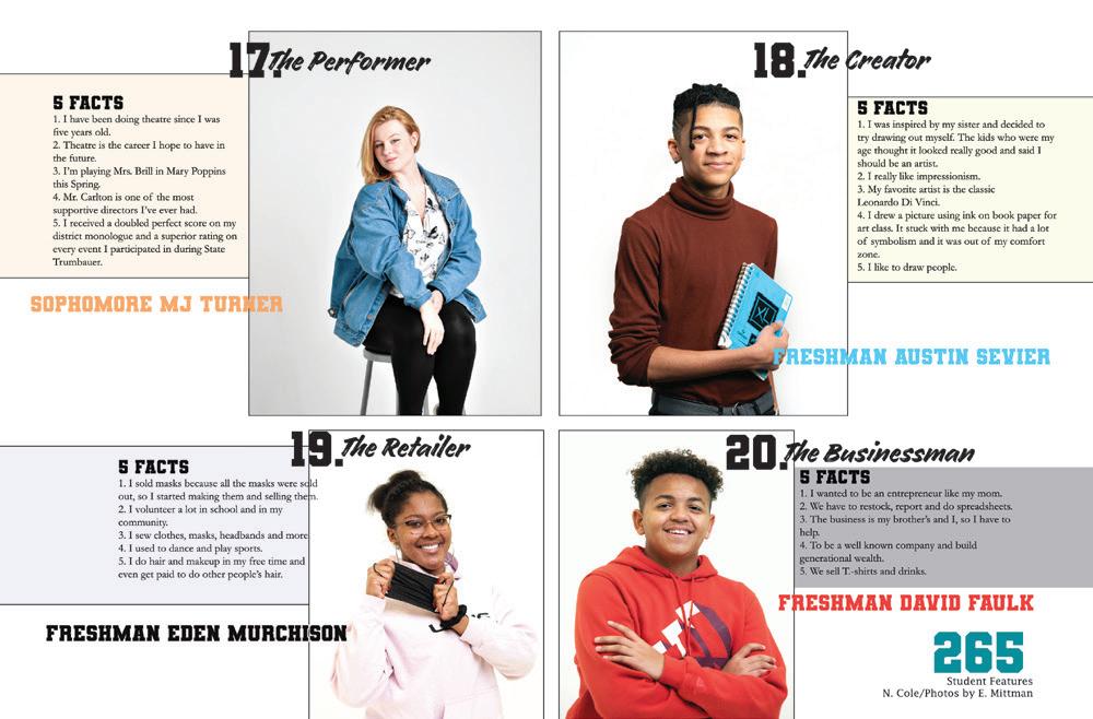
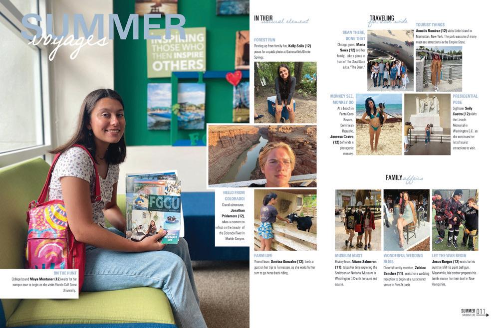
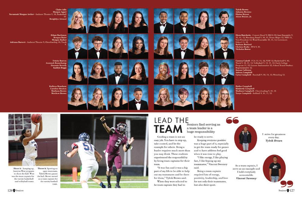
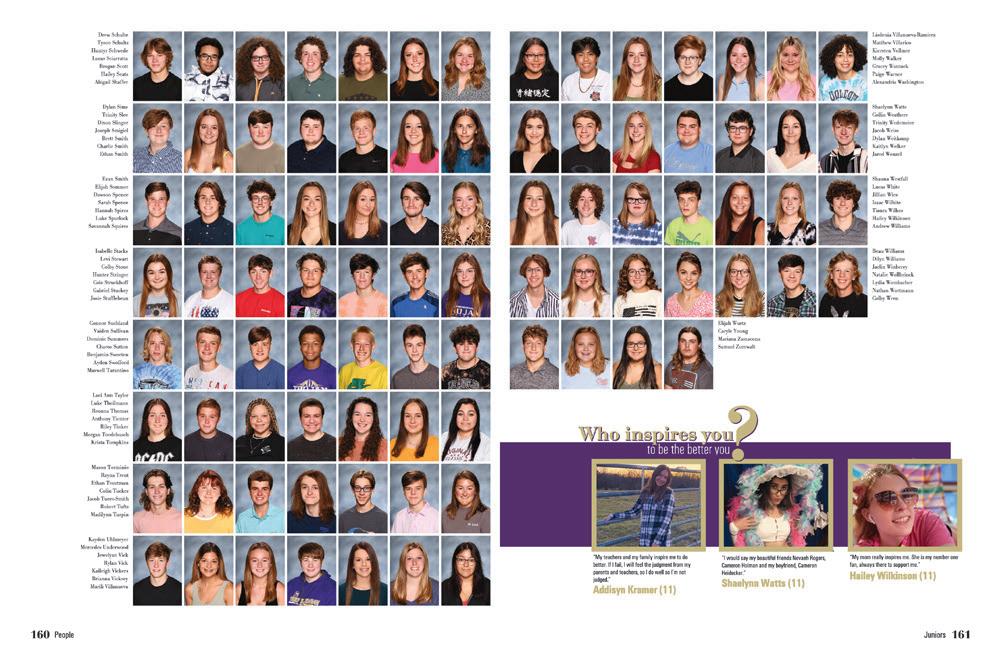
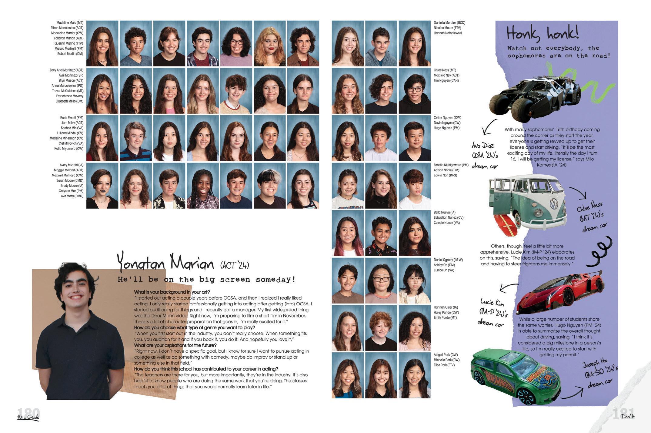
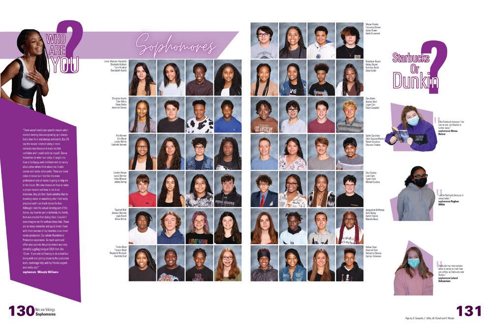
TIME FOR FUN: People section coverage is a great place to incorporate more fun into your spreads. The portrait pages are often where readers go first to find themselves and their friends. Why not reward them with a less-serious brand of coverage? This sidebar linking sophomores with their dream cars is a terrific example of a fun and agespecific bit of info.
 WESTFIELD HS | The Guardian | CHANTILLY, VA
ORANGE COUNTY SCHOOL OF THE ARTS | Dreamscape | SANTA ANA, CA
TROY BUCHANAN HS | Siege | TROY, MO
CAMPO VERDE HS | Reflections | GILBERT, AZ
DON’T FORGET
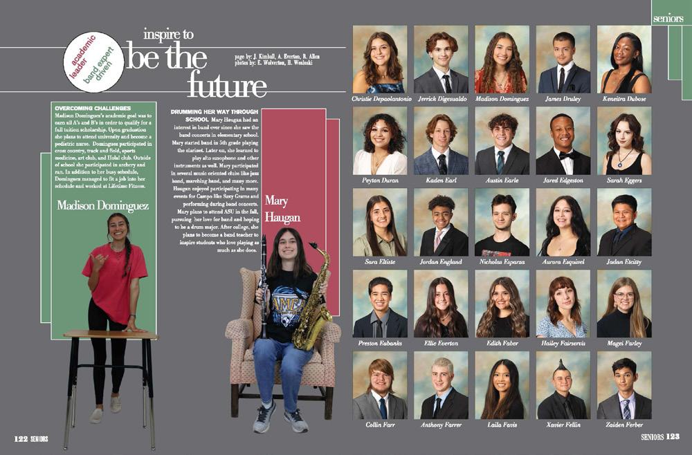
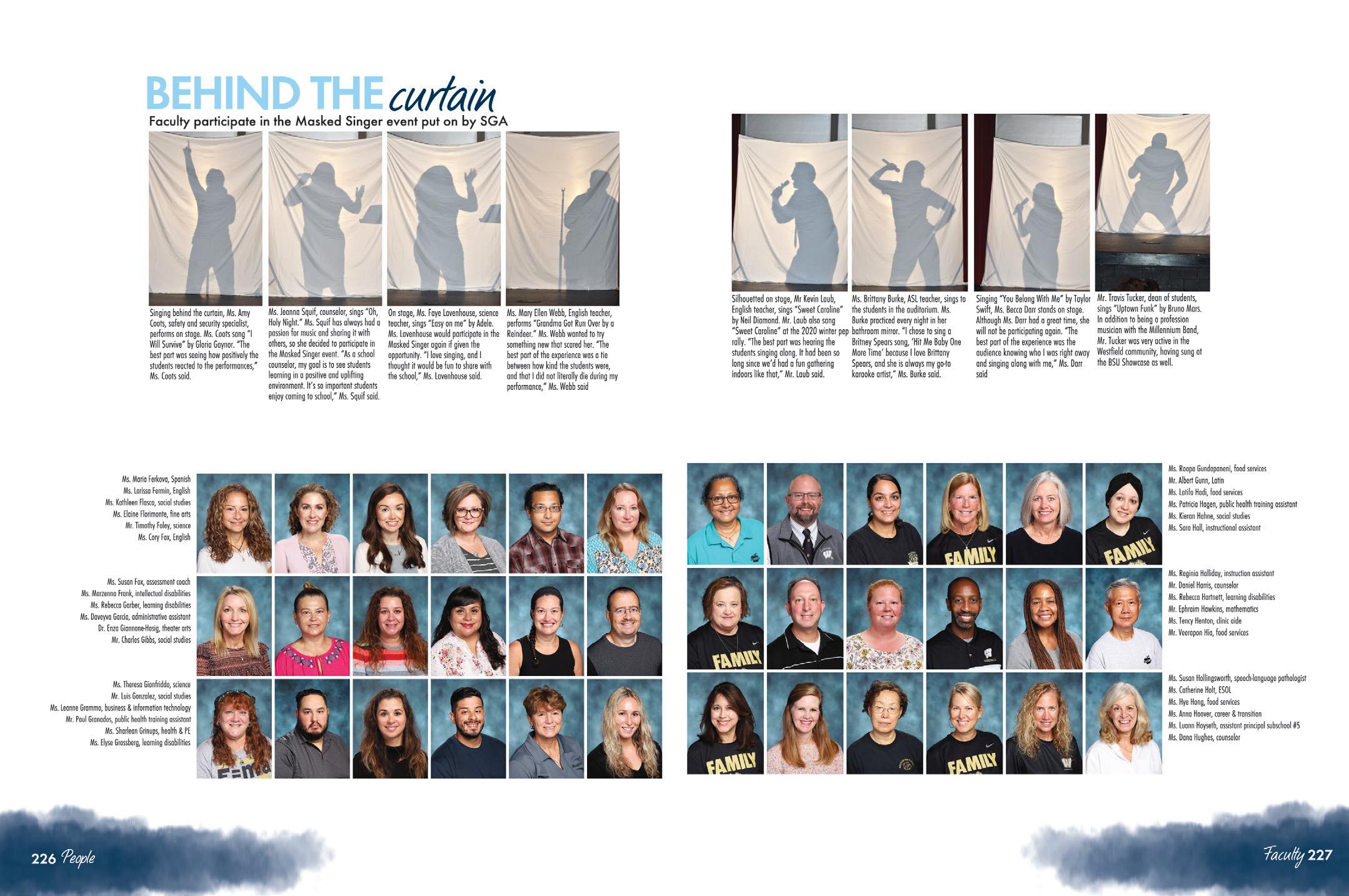
FACULTY: Of all the people in your school, faculty and staff have perhaps the most influence, so don’t give them the short straw when it comes to coverage. The people section is a great place to connect a faculty story with the faces that make the magic happen. Yes, we said magic.
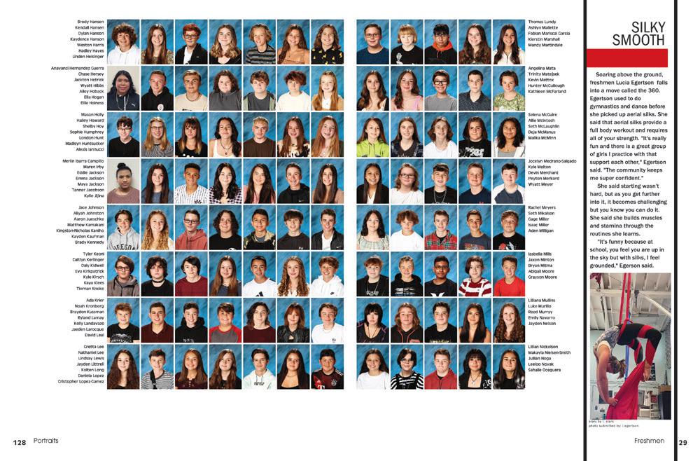

 MOUNTAIN VIEW HS | The Pinnacle | BEND, OR
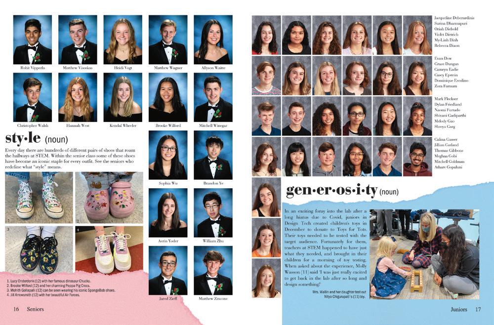
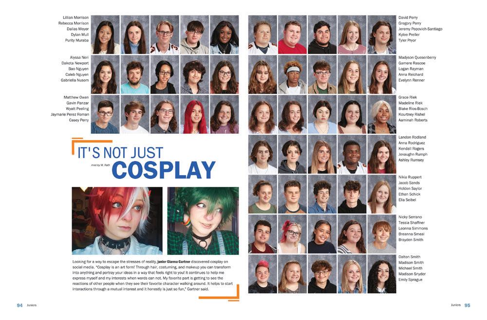
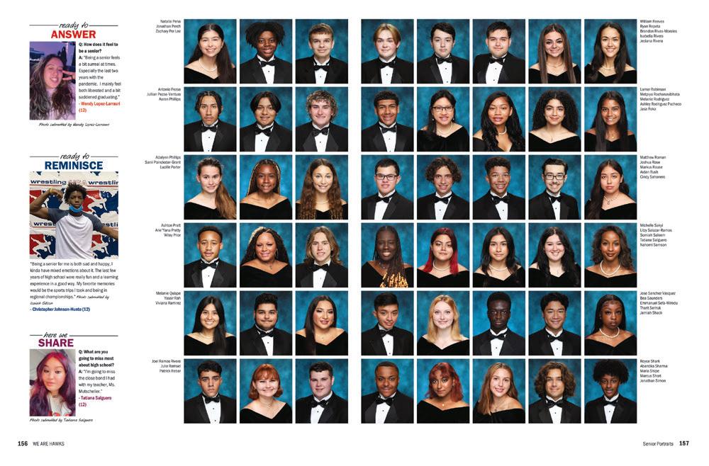
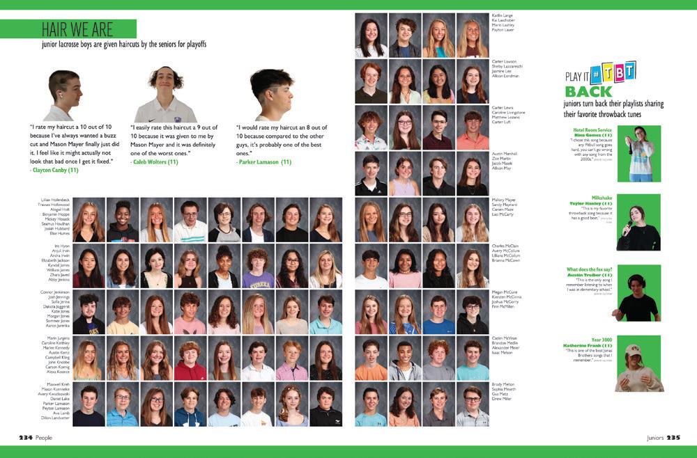
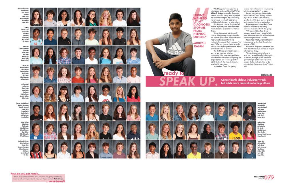
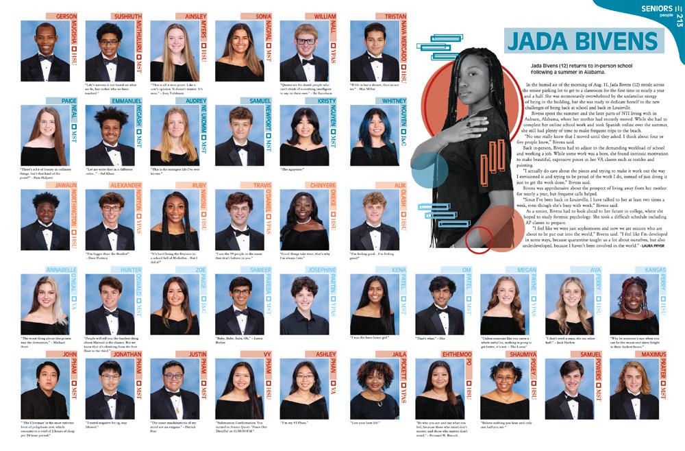
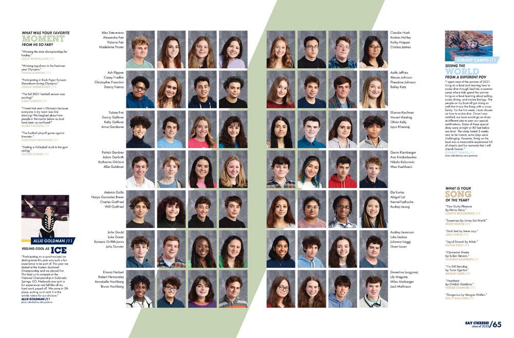
 DOWNINGTOWN STEM ACADEMY | Legacy | Downingtown, PA
HAYFIELD SECONDARY SCHOOL | Harvester | ALEXANDRIA, VA
EUREKA HS | Eurekana | EUREKA, MO
NORTHEASTERN HS | Daedalus | MANCHESTER, PA
LAFAYETTE HS | Legend | WILDWOOD, MO
du PONT MANUAL HS | The Crimson | LOUISVILLE, KY
PELHAM MEMORIAL HS | Pelican | PELHAM, NY
CHARLOTTE COUNTRY DAY SCHOOL | Postscript | CHARLOTTE, NC
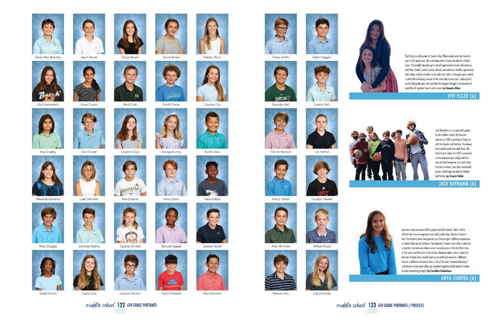
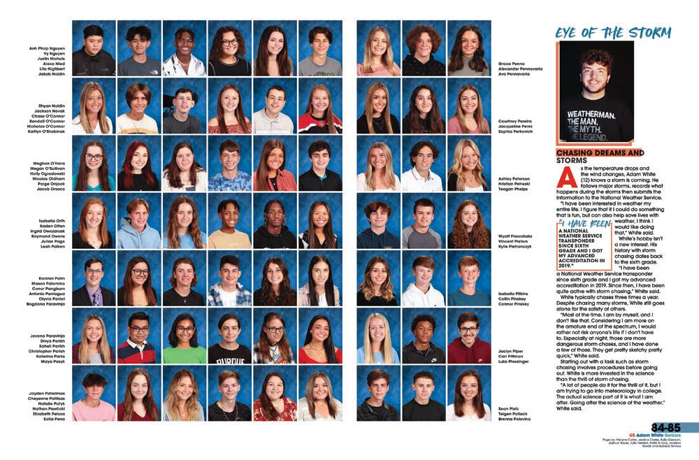
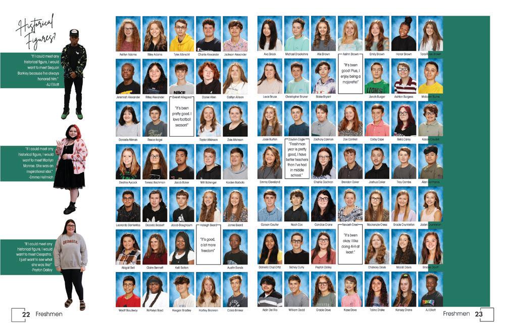
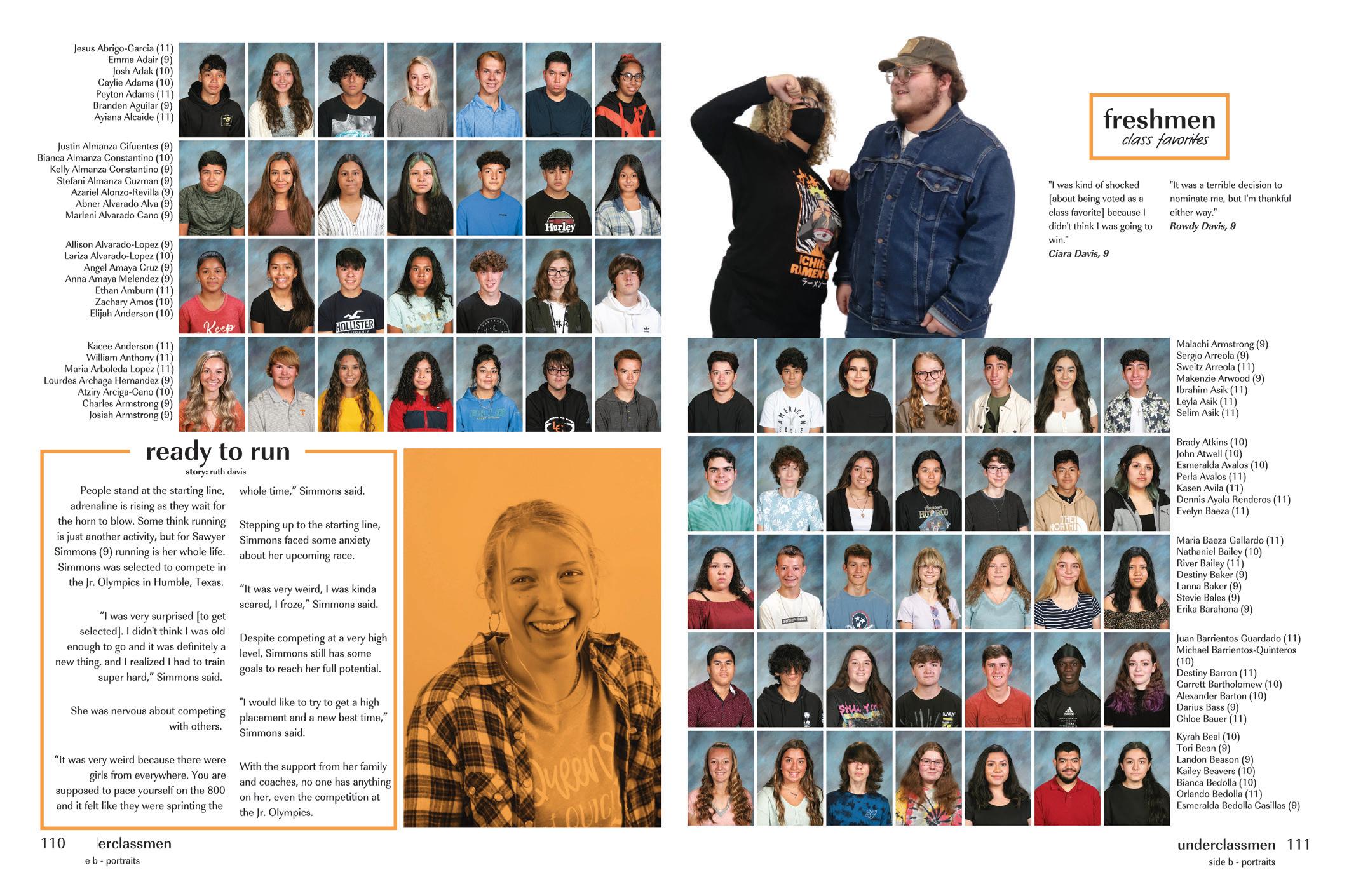
TAKING ADVANTAGE OF THE PEOPLE: Including coverage in your people section is definitely a best practice, and this staff went the extra mile with two styles, both equally compelling. First, there’s the class favorites, which are mixed in with class officer photos and quotes for the underclassmen, kind of like mini senior superlatives. Then, there’s the series of profiles that grace every spread (love that color wash photo effect). The variety of coverage that’s balanced with consistency gets a check from us.
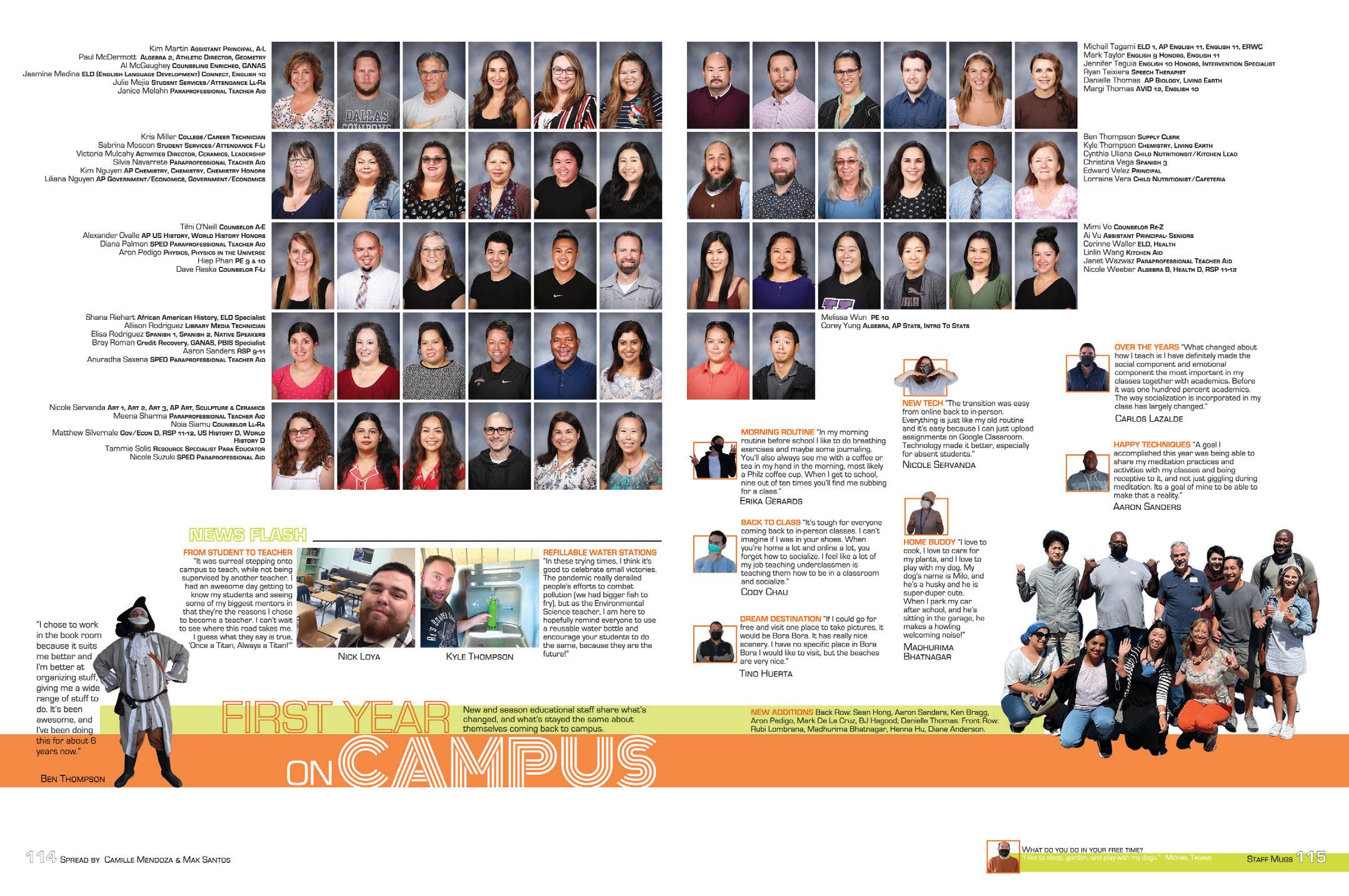
FIRST-YEAR FACULTY:
It’s always great to see additional coverage in the people section. Even better when the teachers have some time to shine.
And, focusing on first-year educators is always an easy and interesting way to get to know the newbies. Teachers buy books too! Make sure they have a reason to.
FULL
CIRCLE:
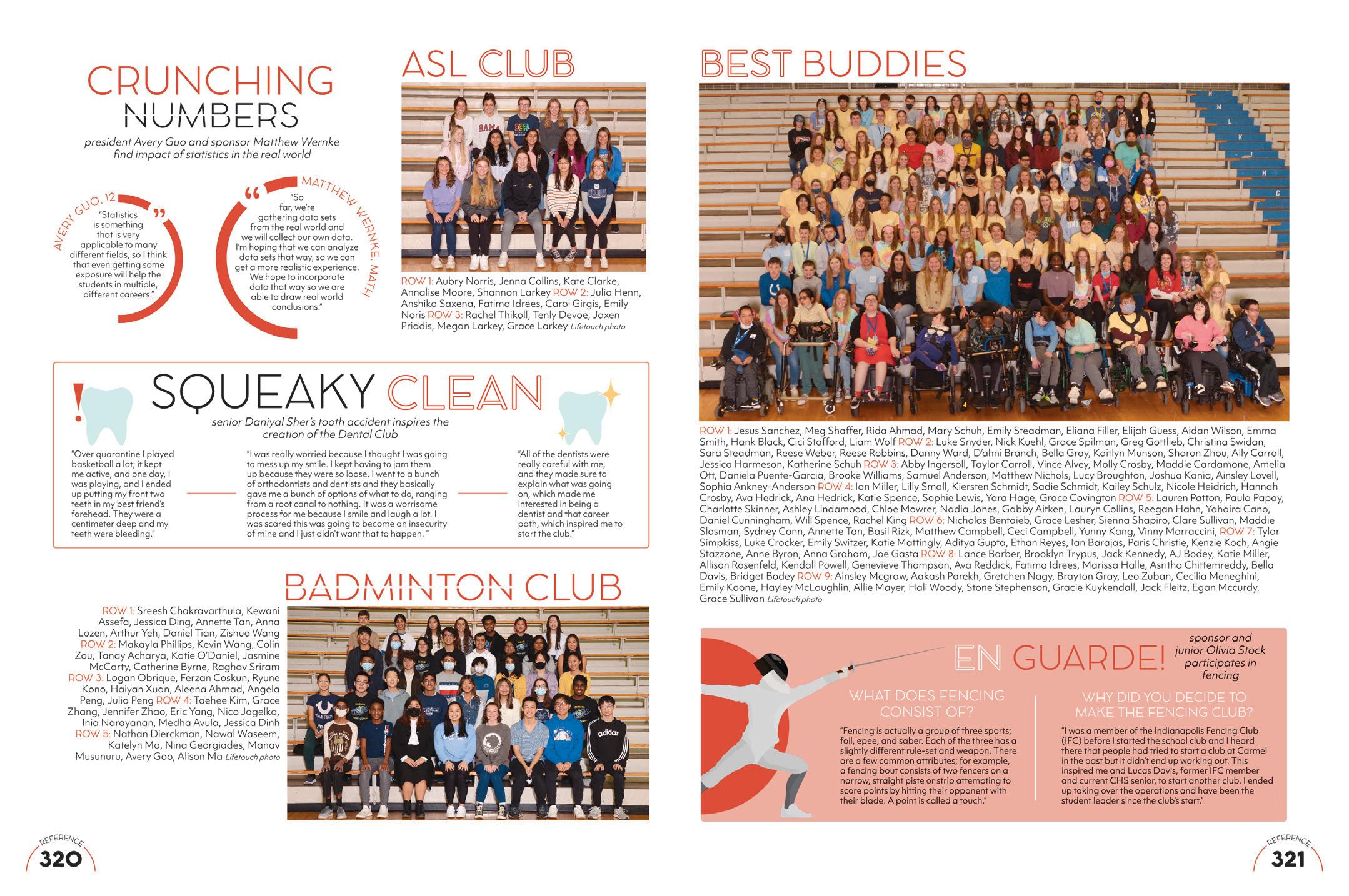
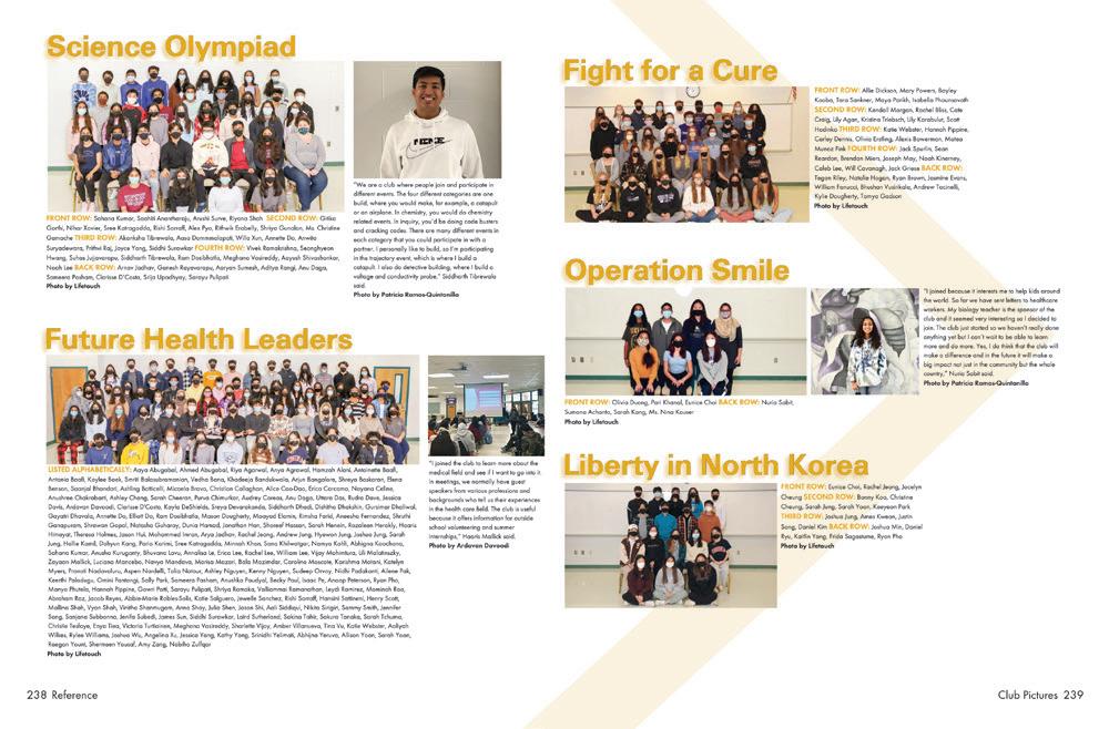
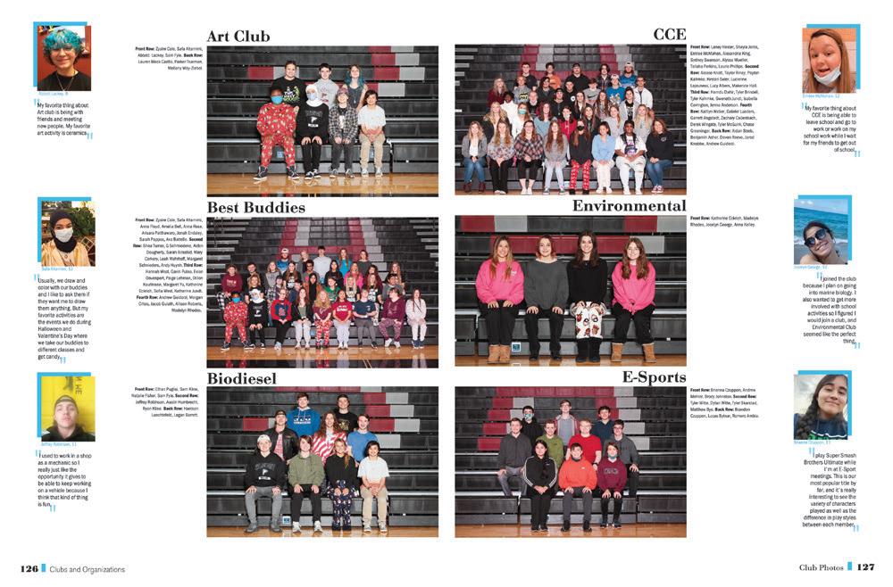
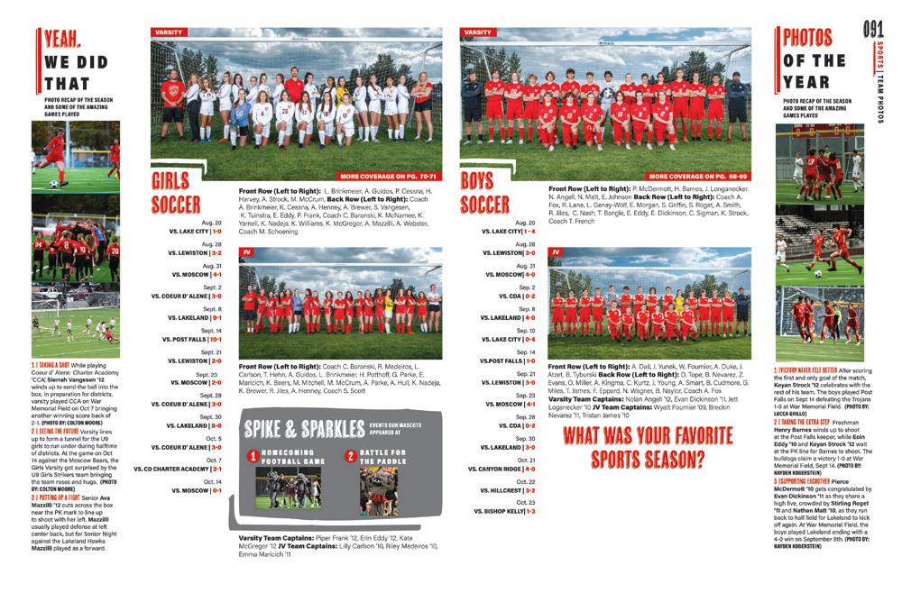
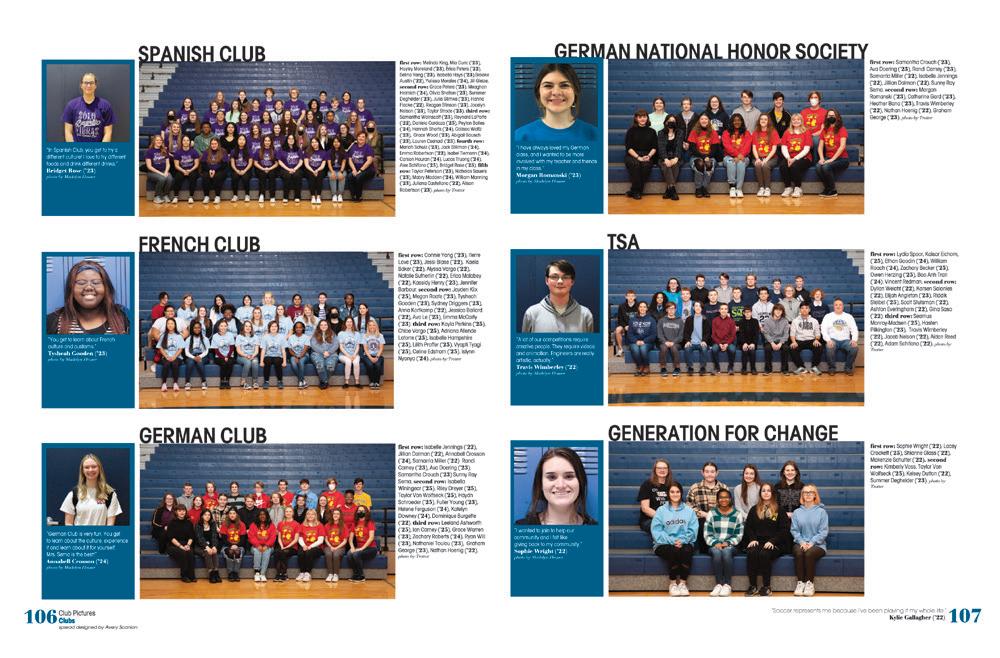
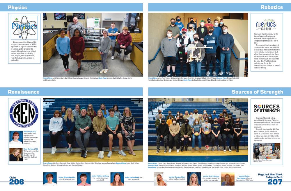
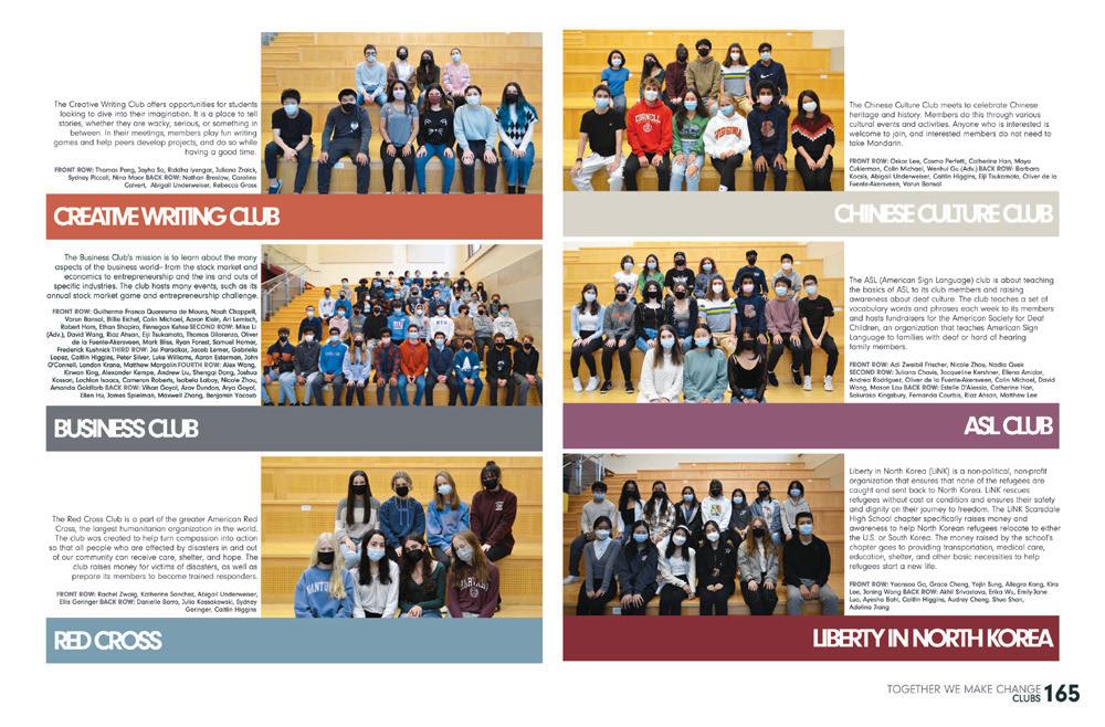
We’ve got six clubs covered in one unique reference section spread. The circle elements from the theme visuals clearly tie the spread into the rest of the book. Love the stylized illustrations and simple type treatments.
 ROCKY MOUNTAIN HS | Silvertip | MERIDIAN, ID
MIDLOTHIAN HS | Trojan | MIDLOTHIAN, VA
PALMER RIDGE HS | Epilogue | MONUMENT, CO
PARKWAY NORTH HS | Saga | SAINT LOUIS, MO
 CHANTILLY HS | Odyssey | CHANTILLY, VA
ROCKWOOD SUMMIT HS | Pinnacle | FENTON, M O
SANDPOINT SENIOR HS | Monticola | SANDPOINT, ID
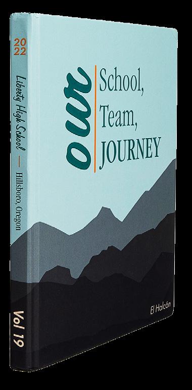
LIBERTY HS | El Halcón | HILLSBORO, OR
HOLT HS | Pow Wow | WENTZVILLE, MO
WASHBURN RURAL HS | Chimes | TOPEKA, KS
ROCKWOOD SUMMIT HS | Pinnacle | FENTON, M O
RIVERVIEW HS | Selachii | RIVERVIEW, FL
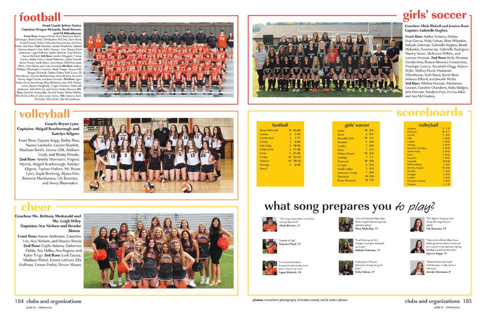

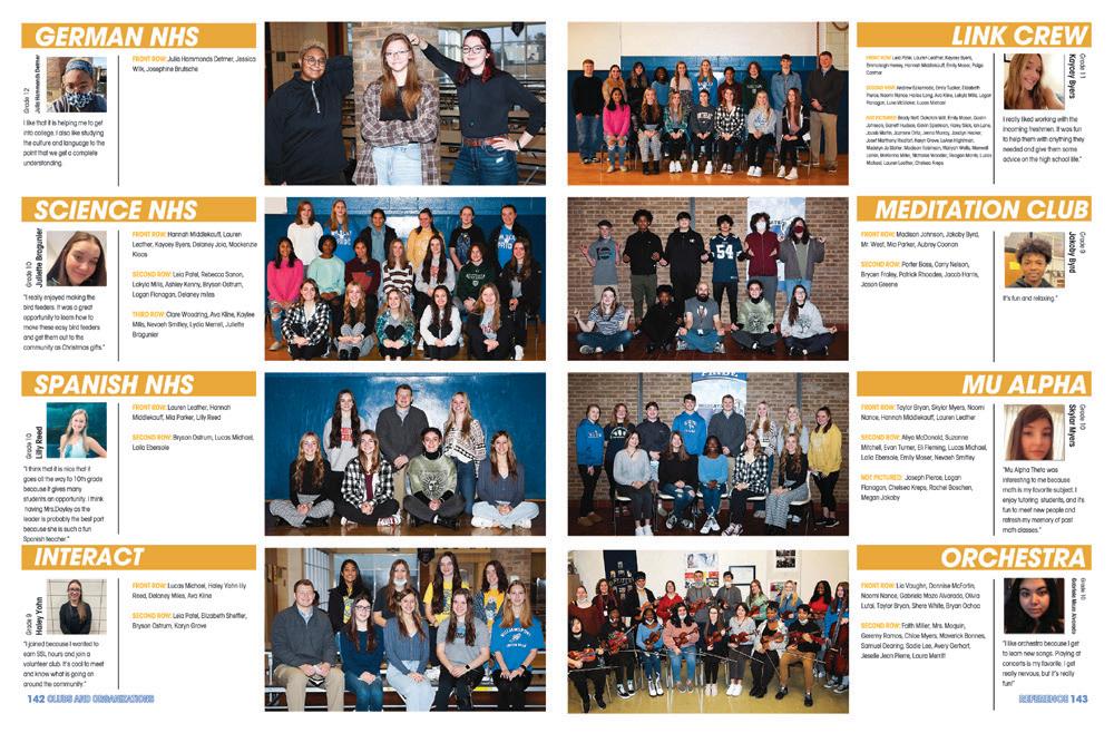

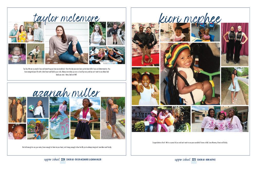
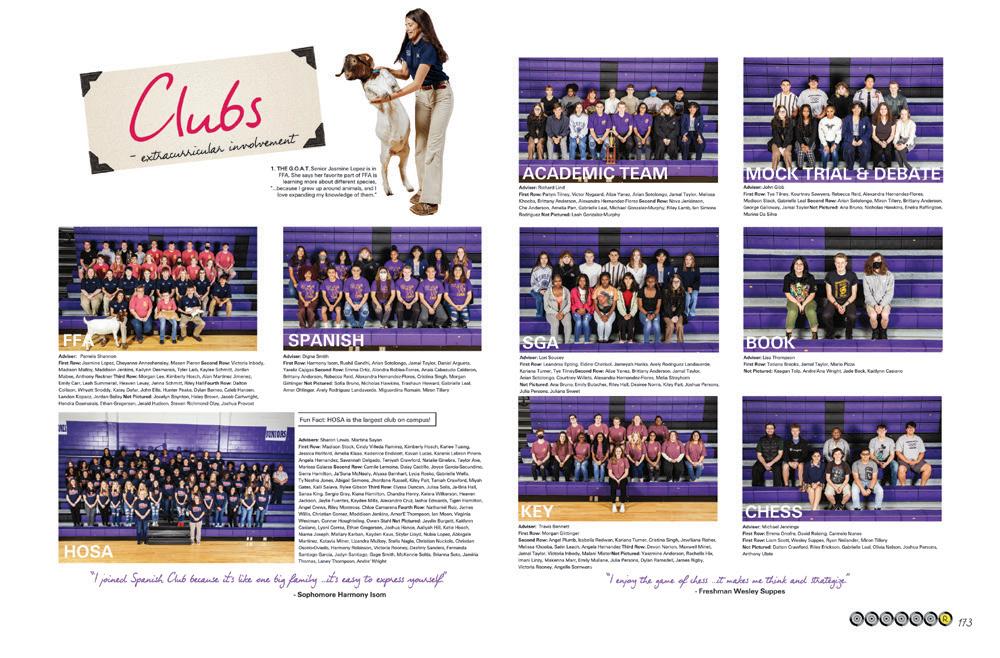 TRAVERSE CITY WEST SENIOR HS | Odyssey | TRAVERSE CITY, MI
LENOIR CITY HS | L’Cean | LENOIR CITY, TN
ALOHA HS | Lehua | ALOHA, OR
SCARSDALE HS | Bandersnatch | SCARSDALE, NY
WILLIAMSPORT HS | Guneukitschik | WILLIAMSPORT, MD
CHARLOTTE COUNTRY DAY SCHOOL | Postscript | CHARLOTTE, NC
LAKE WEIR HS | Encore | OCALA, FL
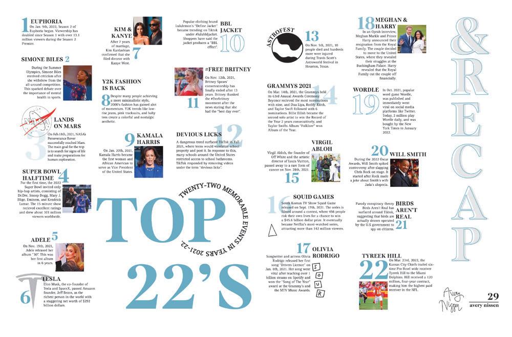
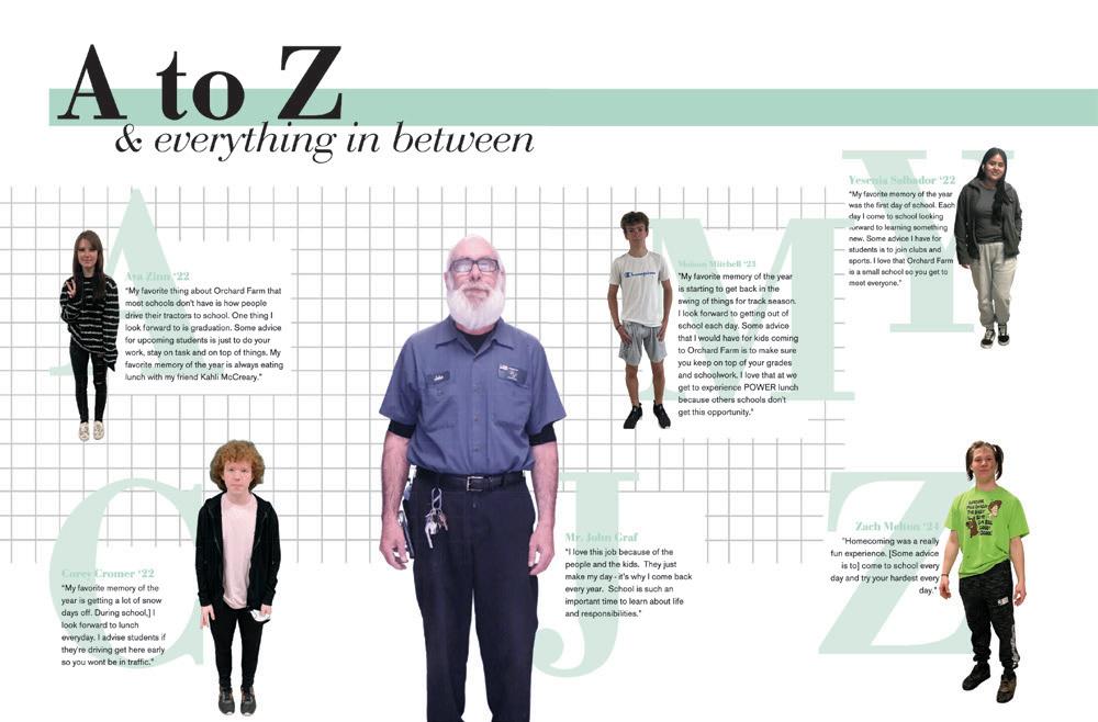
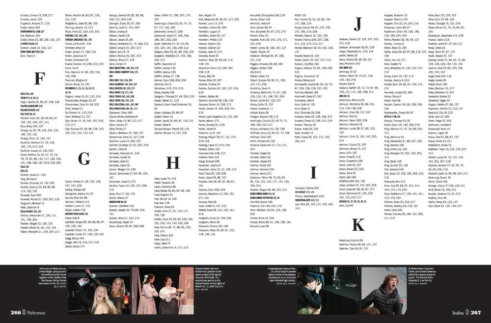
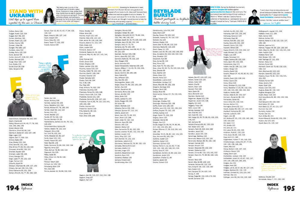
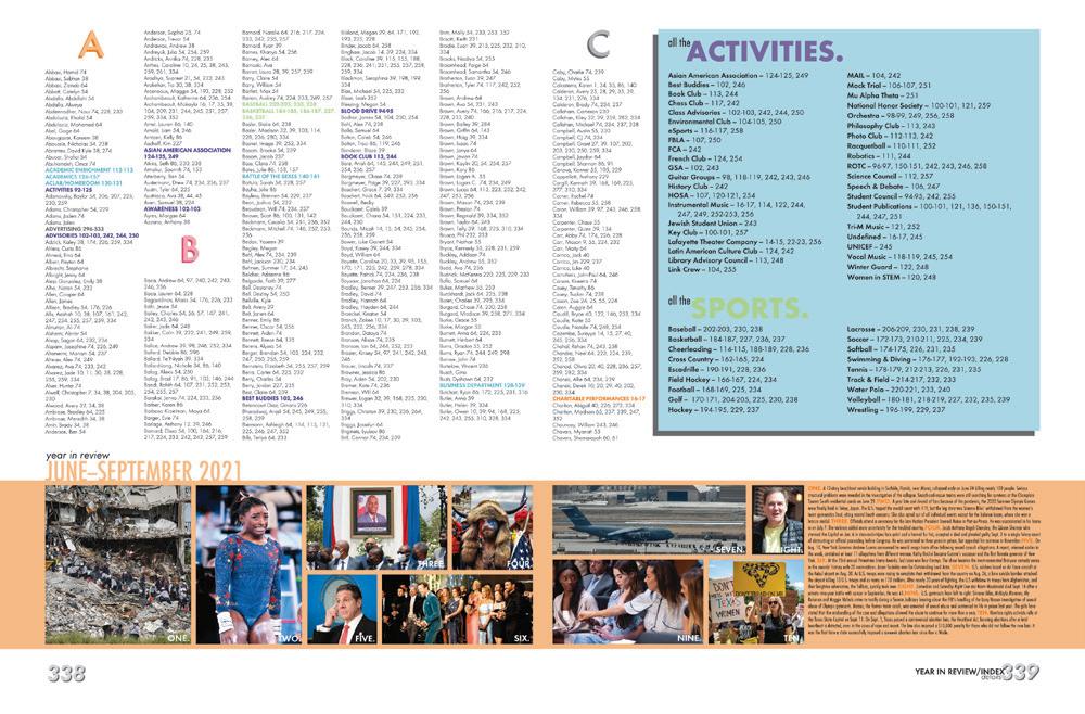
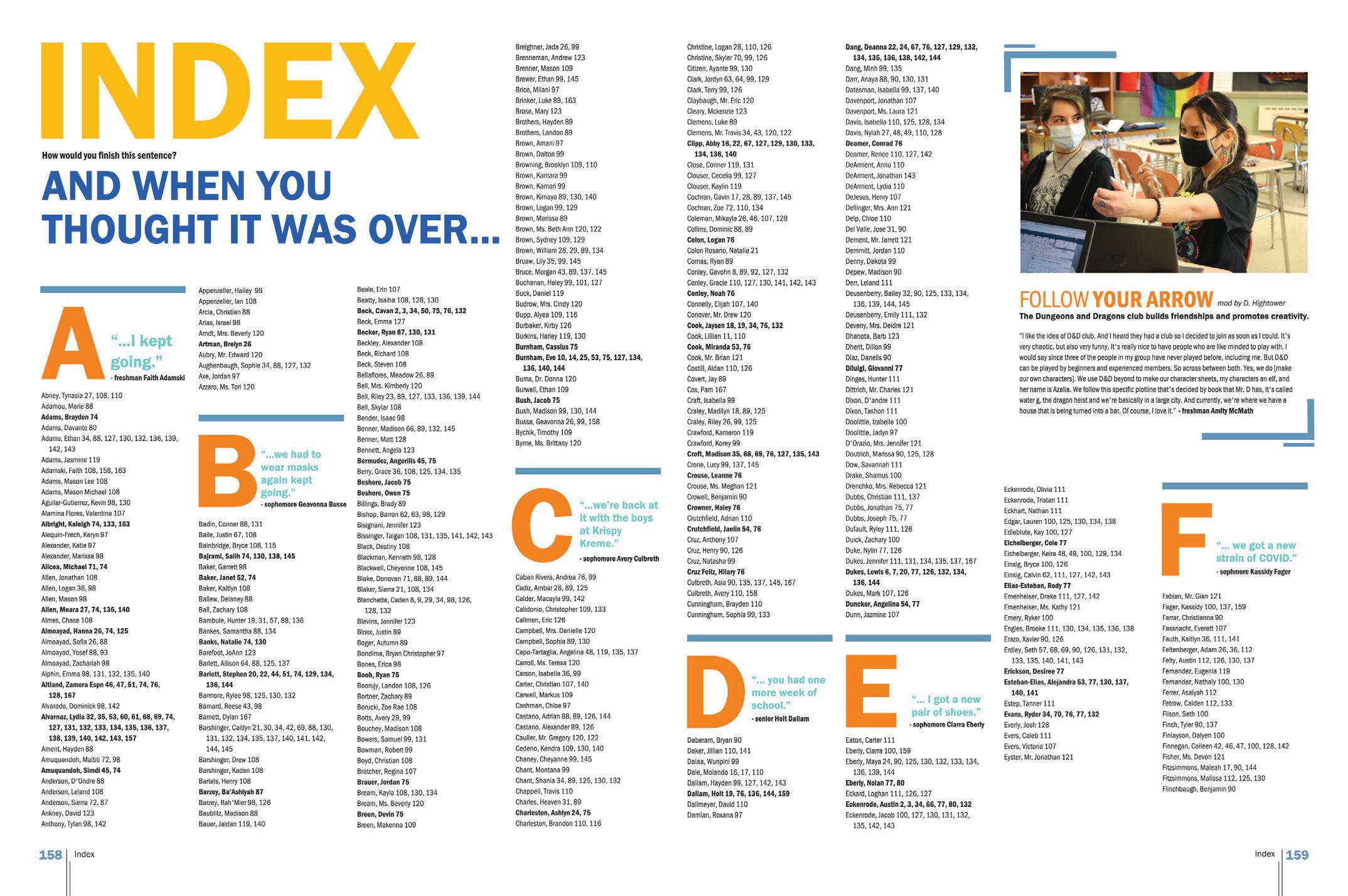
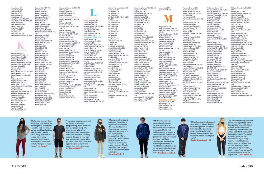
IMMACULATE INDEX: Everyone — and everything — is here. We’ve got a themeadvancing headline. There are large letters for each section that include 26 more quotes in the book. We spy emphasis type and proper indents. Can’t forget the continued use of the color palette. Extra credit for the additional coverage of the D&D club.
 GARDNER EDGERTON HS | The Trailblazer | GARDNER, KS
NORTHEASTERN HS | Daedalus | MANCHESTER, PA
MERRITT ISLAND CHRISTIAN SCHOOL | Pathfinder | MERRITT ISLAND, FL
LAFAYETTE HS | Legend | WILDWOOD, MO
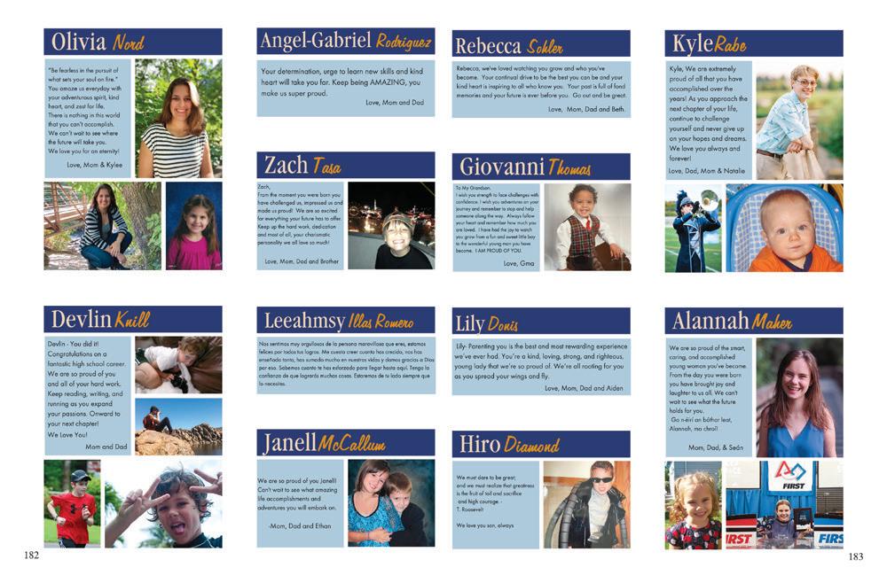
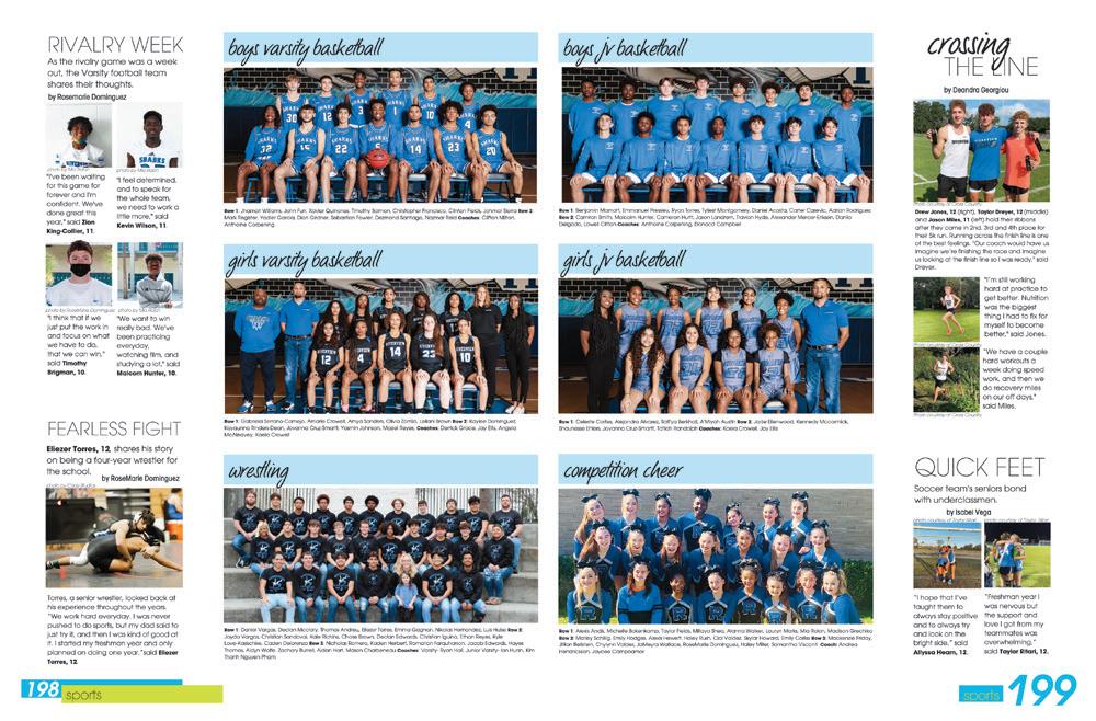
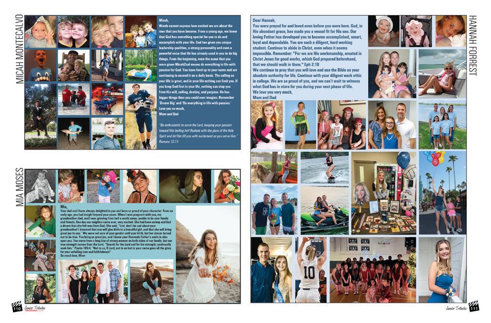
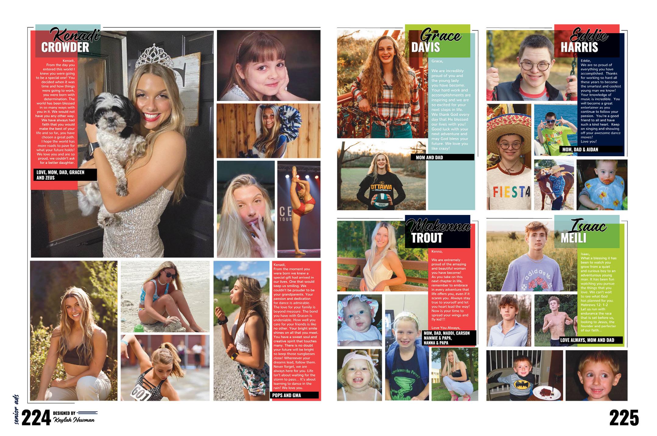
NOTE-WORTHY ADS: These beautifully designed senior tributes clearly take after the rest of the book’s design. Congrats on these stylized and consistent time capsules for the class of 2022. This staff ensured that both these students and their parents felt these ads were worth every penny.


 ROBINSON SECONDARY SCHOOL | Above & Beyond | FAIRFAX, VA
