OK, KIDS. THIS IS WHERE WE GET REALLY YERDY.
Fun facts about cover materials, inks, foils and UV coatings are the yearbooker’s version of pocket protectors, programming languages and algorithms. And, we’re all for it.
We know you can’t do all the things in one year, but we want you to see how brilliant and, yes, innovative your peers have been with some basic materials, a few fonts and a palette of colors. There really is no limit to your creativity. So, get after it.
If you can dream it, we can (probably) do it.
HERITAGE HALL Cavalier | OKLAHOMA CITY, OK
Here’s an unusual way to use foil on a cover — and we love it. Instead of solid foil letters, Heritage Hall chose a textured foil die to create this cool effect. The theme letters start as individual dots and merge to create solids, almost like a gradient. The overlapping and slant of the words give a sense of movement.

MALLARD CREEK HS Unbridled | CHARLOTTE, NC
You know we love an amazing visual/verbal connection. And to that end, if you want to see this cover “In Full Effect,” you better take it out in the sun. That’s where the Photochromic UV changes this cover from white-on-white to red and teal — and that’s when you get to see the almost-hidden mascot. It’s a cool trick and something students will remember.


CORAL REEF SENIOR HS Tsunami | MIAMI, FL
Teal and Silver foils — plus debossing — and Matte Black cover material really “Make It Happen” here. And for us, “It” is a book we keep going back to as an example of another way to use foil. The Silver foil lettering on the spine, set in a super-modern, skinny sans serif is a really nice combination with the blocky version on the cover. Graining adds a little texture — and everybody likes something tactile.


ELGIN MS


The Hoot | ELGIN, OK
Polaroids were cool back in the ’70s and ’80s, and they’re cool again. They’re also the perfect place for Thermo UV, which is black until heat is applied. Rubbing a hand over the hidden photos creates a cool reveal of what’s underneath. We find that Thermo UV coating works best when it covers up smaller spaces and the photos underneath are uncomplicated. We noticed the way these staffers built their visuals around the theme verbal, too. Nice job, Owls!
WHARTON HS
Felidae | TAMPA, FL
These Spectrum gilded edges catch and reflect any color they happen to be near. The book seems plain from the outset, with white linen and a simple foil application on the front lid and spine, but the gilded edges are a big hint that there’s more than meets the eye. See more from this volume on page 26.

CHEROKEE HS
The Sequoyah | CANTON, GA
Just like the feeling of accomplishment students get from lettering in a sport or club, we love the sense of school spirit a book like this brings. Adding a chenille letter is easy and effective. The plant can make a debossing die to match the space the letter will occupy so that it sits down into the coverboard. That also makes it easy to get the placement right. They’ll add a strong adhesive and voila — a yearbook that stands out and is completely self-explanatory. Go team!

MOORESTOWN FRIENDS SCHOOL
The Cupola | MOORESTOWN, NJ
When your cover is a swirl of golds, browns and yellows, Gold gilded edges add an extra touch of class. Sometimes they make a book look more traditional, but in the case of Moorestown, the design is much more modern, so the colored edges tie the front and back covers together as a total package.

THE KING’S CHRISTIAN SCHOOL Suntereo | CHERRY HILL, NJ
Gold corners go great with a retro book look. Here, the gold also helps accentuate the gold colors in the cover design and reinforces the look the school was going for. This add-on is popular to make a book take on the look of a treasured volume — which it, of course, was as soon as students got their hands on it.

CHESTATEE ACADEMY GAINESVILLE, GA
This book is a great example of how graining the cover material adds a 3D texture that students appreciate. In this case, a brick pattern was added to the printed cover, which adds a cool factor that a regular litho cover doesn’t have. It’s a simple add-on with maximum effect.
BELEN JESUIT PREPARATORY SCHOOL Echoes | MIAMI, FL
This cover showcases such an impressive use of a powerful combination: a laser-cut cover and a Spectrum Mylar endsheet. It’s a showstopper — the symbolism of the lasercut graphic sets just the right tone for students to be inspired by all the events and memories of the school year. We can’t imagine a better way to celebrate the school’s 60th anniversary.


CASTILLEJA SCHOOL Paintbrush | PALO ALTO, C A
When they decided to make a composition book yearbook, the staff went all out. From pages with lined paper backgrounds, handwriting fonts and a host of scribbles to “jewel heart” pics placed throughout — this staff committed. And the icing on the cake: a page of real stickers students could place wherever they wanted. Very cool.


BRONXVILLE HS BRONXVILLE, NY
To celebrate the school’s 100th anniversary, the Bronxville staff chose a classy cover design based on the timeless outline of the stainedglass windows that grace the front of their main entrance. The window graphic is embossed and topped with HJ10SF Nickel foil. The base material, Metallic Chrome, sets just the right contrast. The school also opted for a padded cover, which gives this book the feel of a treasured volume from the school’s founding in 1922.

RIVERVIEW HS Selachii | RIVERVIEW, FL
When you have a great photo that sets the tone perfectly, why not show it again? The laser-cut front endsheet allows Riverview students to see the title page photo twice. The square/rectangle combo from the cover and endsheet also established design choices made throughout the book. And, the bright green and blue color palette makes the book feel like the “Fresh Start,” promised by the theme.
GEORGE JENKINS HS Aquila | LAKELAND, FL
You may have already seen this cover around. We chose it as our 2022 example of Glow-in-theDark UV and included it in samples. It caught our eye because the design creates a glowing effect (even in the light) through the use of the UV coatings, bright Pantone spot colors and a bit of a glow effect in the design. Those elements pop when placed on the Suede-laminated black cover. Another wow moment for this book comes quickly — the endsheet is awash with the green and yellow from the cover and there’s a fold-out flap revealing the book’s organization and opening copy.

ALICE B. LANDRUM MS
There are lots of ways to represent the passing of time — and time-related themes have lots of flexibility so they’re really popular. Here’s one that hasn’t been overused. In a series of moon phases, this staff had the perfect excuse to add a laser cut to reveal the theme on the bright gold endsheet. The cover’s blue background conjures up the night sky and brings the whole look together.


CYPRESS BAY HS
This is a really intricate cover, and wow, is it cool! Starting from left to right, the base is a Matte-coated full-color litho-printed cover, which is pretty standard. Then the staff chose Gold foil, which naturally creates an indentation in the cover board, giving the effect of a narrow river of gold. The foil is followed by a tipped-on velvet “end cap.” The Gold foil continues on the endsheets as well. So fancy.
The Storm | WESTON, FL The Pride | PONTE VEDRA BEACH, FLWatchtower | ROCK ISLAND, IL
The crimson and gold worn by a packed student section shine through this laser-cut cover to contrast with the white-on-white. The cover look is created by blind Gloss UV over white cover material. Red and Gold foils on the spine reinforce the look. The staff began the pattern of using RE- words on the front cover with their theme, “Redefine,” and continued them on the back lid and then inside the book. Nice.

Cache | SEATTLE, WA
When your theme is “Outside the Social Bubble,” there’s no better time to use a plexiglass cover to create an actual bubble. Outlined with a thick band of Ombre foil, the plexi panel has a kisscut circle which reveals the theme statement on the endsheet. Bubbles pop up all over the place on endsheets and throughout the yearbook.


OLATHE SOUTH HS
Talon
The Suede lamination, Gloss UV and frosted, etched plexiglass on this cover hint at the school-spirited stories inside, but the reveal comes when you open the cover. We’re treated to a full-color crowd shot complete with clouds of blue and yellow chalk in the background — and it’s game on as stories detail how the school and its students redefined themselves after the pandemic.

SPRINGFIELD HS | Scrivener | SPRINGFIELD, PA
The Springfield staff did a great job with the collage of photos placed under this impressive laser-cut cover. They were strategic in centering “whole heads” under the larger, open letters like Os and As and placed crowd shots under letters with smaller openings. The variety of shots and inclusion of so
many students were also intentional. The staff wrote that they wanted to “encourage readers to savor each moment experienced over the course of the school year” with the theme, and the bright color palette was meant to “highlight the vividness of moments in our lives.”

BISHOP MOORE CATHOLIC HS
Moore Memories | ORLANDO, FL
A classic cover treatment with a modern twist, Bishop Moore used a plexiglass panel to help convey their theme “The Search is On.” The clear cover takes on the look of a computer monitor or tablet screen and combines well with the web-like icons which are used throughout the book to indicate the four sections.

ROME HS Capitolium | ROME, GA
This staff drove home their location theme, “There’s No Place Like Rome,” by adding all of the mile markers — a plexiglass cover etched with a location icon and the name of the school over a Google map of their town. (Of course, the icon points directly to the location of the school!) Inside, stories focus on staycations, summer jobs and other things students loved to do in Rome.

M c KEEL ACADEMY OF TECHNOLOGY | LAKELAND, F L

Giving your buyers more than one cover choice, what we call a “split cover order,” is a fun alternative. Some schools allow students to choose the color that they like best. In McKeel’s case, the staff designed the red cover for seniors only and the tan cover was for underclassmen. Becoming a tradition at some schools, the big cover reveal near the year’s end joins part of the senior celebration. This staff also opted for an embossed “if” on the front endsheet that is visible thanks to the laser-cut square on the front lid. So many details!


MARQUETTE HS
Medallion | CHESTERFIELD, MO
A laser-cut cover and the endsheet showing through must work together to create the right effect. This is a terrific example of that ideal. On its own, the cover is understated — gray litho printing, dark gray type and Suede lamination. The bright orange-toyellow gradient endsheet shining through the word “voice” adds the pop and makes us want to open the cover. We’re greeted by a demonstration of students fulfilling the promise of the theme, “So Raise Your Voice,” by providing meaningful quotes. It’s the perfect visual/verbal.


RONALD W. REAGAN HS Nexus | PFAFFTOWN, NC
Plexi doesn’t have to be a straight-up situation. The cut — where the cover material meets the plexi — can be curved or even an intricate laser cut. We’ve seen everything from rounded cuts to ocean waves. There’s handwork involved in finishing the job, so make sure to plan for extra time if you get really creative.
PEMBROKE PINES CHARTER HS
Prowler | PEMBROKE PINES, FL
It can be dicey to place words on top of pictures, but not so much when you are working with a plexiglass cover placed over the photos underneath. On the cover, you get the full themeplus-photos package, and when you open the cover, you get a better look at how they reinforce the book’s concept. The Brushed Metal cover material provides a nice companion to the plexi as well.


CORAL GLADES HS
Imprint | CORAL SPRINGS, FL
Where many schools using a plexiglass cover want to show as much of the transparent front panel as possible, Coral Glades used just a section of it to highlight the central concept of their book and left the rest of the front lid to show off their specialorder seafoam green cover material. We also love the stripe of black with “Home” knocked out on the back cover to match the printed endsheet. Nice symmetry.
COOPER CITY HS
Roundup | COOPER CITY, FL
A thin laser-cut rectangle reveals a super glossy, bright red endsheet to match the red silkscreened ink on the debossed theme statement. The Matte Black cover material is grained, which adds nice texture, and the page edges are gilded in Silver, which provides a bit of shine. Inside, a special double-gatefold tip-in celebrates the senior class. What’s the overall effect? We think the students of Cooper City would say here’s a book and school year that’s totally “Worth It.”

SHARON HS
The Marsengold | SHARON, MA
It makes perfect sense to document a school under construction as it’s happening, but the staff at Sharon High School treated its students to an extra-special feature. Near the end of the book, a double-gatefold tip-in shows the new spaces and classrooms destined for the school. But, a QR code extends the information even further, leading readers to a series of videos showing the progression of the construction from a bird’s eye view. Even cooler, the videos began in 2020 and continued long after the book itself was published — well into 2023. There’s one for each month of the construction.

CHAPARRAL HS
Golden Images | PARKER, CO
To highlight the changes that had taken place since the school opened 25 years ago, the staff included an eightpage tip-in between pages 8 and 9. Spreads feature thenfading-to-now photos and interesting call-outs about how much prices and times have changed. Special-order paper makes the tip-in really shine.

TUTTLE
HS
The Tiger | TUTTLE, OK
If you want to make your senior superlatives super special, you can take a note from Tuttle. The staff created a tip-in to feature their honorees. Photos with props are coupled with handdrawn illustrations and quotes from the seniors. In addition to the typical categories, the staff added their own versions of superlatives, like Online Entrepreneurs, Caffeine Addicts, Barbeque Dad and Soccer Mom.

To support the theme, “Finding Our People,” this staff included a tip-in with 70 student profiles. They did a great job of creating a tip-in that was fully aligned with the host page, making it look like it was one with the book. Pro tip: With a short-trimmed tip-in like this one, align it to the top or bottom of the spread and create first/last pages on the host spread below it.

WESTMINSTER CHRISTIAN SCHOOL Beacon | MIAMI, FL
To celebrate their 60th anniversary, Westminster Christian School included a double-gatefold tip-in starting with two pages connecting the school’s characteristics with a Bible passage. Inside, the staff paired photos from “back then” with current scenes. And, they included bios and stories about faculty members who have been with the school for decades.

STEINBRENNER HS
The Odyssey | LUTZ, FL
Steinbrenner’s “2 Good 2 Be True,” starts with a bright color palette which continues throughout the volume. The front endsheet rewards clever readers with a bit of a rant found under the flap of a fold-out front endsheet. “They said it would be better,” the staff wrote, “back in the buildings together again. The end of the panic in sight, until it reappears in a different variant. Two weeks became two years.” They’re not wrong. But, rant over, they moved on to a fun and spirited book capturing all of the scenes and voices that made up a vibrant year. It was 2 Good 2 Be 4 Gotten.

BLUE VALLEY WEST HS Illumination | OVERLAND PARK,
The ampersand from the cover graphic made its way into the book, as expected, to convey the theme, “& Life Goes On.” But the staff also incorporated the typographic symbol in other ways: a laser-cut endsheet is our first “And” connection. Then on dividers, smaller laser-cut paper squares are placed to strategically highlight and reveal key photos. It’s a neat idea — and signals to pageflipping readers to stop and take a closer look.


TERRA ENVIRONMENTAL RESEARCH INSTITUTE Lycanthropos | MIAMI, FL
A vellum double-gatefold tip-in is a great place to feature the senior class. We’ve seen this popular trend as a way include all of the senior signatures surrounding the class group photo. This approach works best for smaller schools, of course, but neat effects can be created when you print on the translucent material.


THERE’S SO MUCH TO OOH AND AAH OVER.
Welcome to the visual feast section. Stay awhile and take it all in. We found ourselves being wowed by these expertly composed and perfectly balanced photographs — with their impressive composition and striking use of light — all taken by fellow yearbookers.
Yep, that’s right.
You’ll find that this section is a testament to the talent and creativity of your peers, and it’s definitely worth a closer look.

 MEAD HS | Spencer Sandberg | SPOKANE, WA
CHRIST PRESBYTERIAN ACADEMY | Reesi Nesbitt | NASHVILLE, TN


 SOMERSET ACADEMY CANYONS MS/HS The Pawprint | BOYNTON BEACH, FL
EDMOND MEMORIAL HS | Annabelle Watts | EDMOND, OK


 LINDBERGH HS | McKenzie Brown | SAINT LOUIS, MO
MEAD HS | Eli Ordaz | SPOKANE, WA
MOUNTAIN VIEW HS | Connor Wilson | MESA, AZ
TURNER ASHBY HS | Faith Showalter | BRIDGEWATER, VA


 CORNING-PAINTED POST HS | Leila Ianovici | CORNING, NY
TEXAS HS | Macy Maynard | TEXARKANA, TX


 ARAPAHOE HS | Arianna Evangelista | CENTENNIAL, CO
HABERSHAM CENTRAL HS | Elanor Fontaine | MOUNT AIRY, GA
WALNUT HS Cayuse | WALNUT, CA


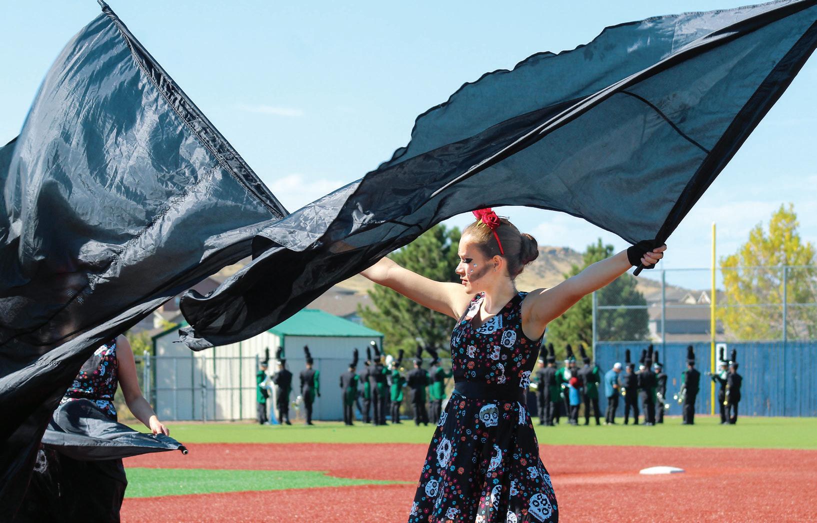 CORNING-PAINTED POST HS | Graham Simons | CORNING, NY
ARVADA HS | Barnaby Atwood | ARVADA, CO
FRANKLIN HS | Laila Ali | ELK GROVE, CA
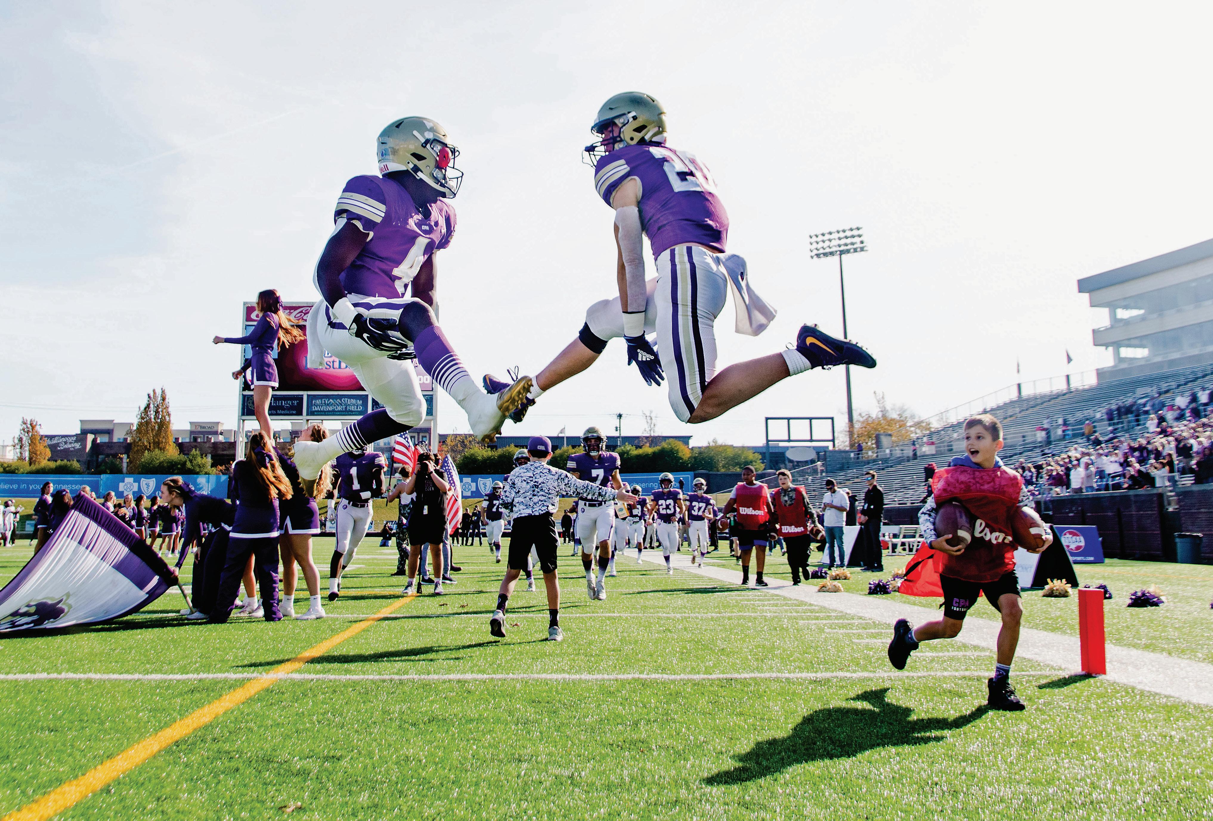


 CHRIST PRESBYTERIAN ACADEMY | Reesi Nesbitt | NASHVILLE, TN
THOMAS JEFFERSON HS FOR SCIENCE AND TECHNOLOGY Grace Kang | ALEXANDRIA, VA


 DARIEN HS | Dariannus | DARIEN, CT
SOUTH DADE SENIOR HS | Tajaneriann Grace | HOMESTEAD, FL
BLUE VALLEY SOUTHWEST HS | Kelsey Schnettgoecke | OVERLAND PARK, KS
MILL VALLEY HS | Attey Field | SHAWNEE, KS


 TRUMBULL HS | Brooke Rubush | TRUMBULL, CT FARRAGUT HS | Hunter Matthews | KNOXVILLE, TN
BLUE VALLEY SOUTHWEST HS Sophia Rose | OVERLAND PARK, KS


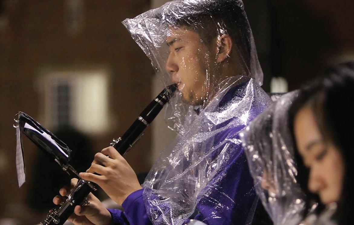


 EDMOND MEMORIAL HS Annabelle Watts | EDMOND, OK


 OLATHE WEST HS | Sydney Brown | OLATHE, KS
TEMPLE CITY HS | Chelsea Lee | TEMPLE CITY, CA


 MEAD HS | Dalyn Springer | SPOKANE, WA
DE SMET JESUIT HS | Evan Proost | SAINT LOUIS MO
LAWRENCE HS Caitlin Mooney | LAWRENCE, KS


 PEARL CITY HS | Hali’a Aloha | PEARL CITY, HI
SUNNY HILLS HS | Yeonji Baek | FULLERTON, CA
PARKWAY WEST HS | Claire Leduc | BALLWIN, MO


 SOUTH DADE SENIOR HS Tajaneriann Grace | HOMESTEAD, FL
CASADY SCHOOL | Holly Burkhart | OKLAHOMA CITY, OK



 CALIFORNIA SCHOOL OF THE ARTS - SAN GABRIEL VALLEY | Alyssa S. Ho | DUARTE, CA
NEWSOME HS | Emily Hall | LITHIA , FL


 BRIGHTON HS | Rose Weidemann | BRIGHTON, CO
WHARTON HS | Amelia Brown | TAMPA, FL
REDONDO UNION HS | Valerie Tiscareno | REDONDO BEACH, CA
