COVER AND SPREAD GALLERY
DREXEL UNIVERSITY COLLEGE OF MEDICINE Aesculapian
PHILADELPHIA, PA


INNOVATION: GATEFOLD TIP-IN
ELON UNIVERSITY
Phi Psi Cli ELON, NC


COVERAGE
EMMANUEL COLLEGE FRANKLIN SPRINGS, GA


OPENING
INDIANA UNIVERSITY
Arbutus BLOOMINGTON, IN


DIVIDER


NORTHWESTERN UNIVERSITY Syllabus EVANSTON, IL
TEMPLE UNIVERSITY Templar PHILADELPHIA, PA
UNIVERSITY OF MICHIGAN Michiganensian ANN ARBOR, MI
WAKE FOREST UNIVERSITY
The Howler WINSTON-SALEM, NC

IN OUR WORLD, EVERYONE JUDGES A BOOK BY ITS COVER. THAT’S WHAT WE WANT.
And so, we are always scouting the next great cover. Here’s a place to start. Look for trends, color combos and themes. See how type and graphics play together and how color creates voice and tone.
When you’re done with the cover section, soak up ideas from the endsheets and inside spreads. Get out your sticky notes and have at it! But, don’t stop here. Go outside the yearbook world and keep looking — magazines, books, album covers, signs and advertising. The world is full of inspiration if you take the time to look for it.


MAGGIE L. WALKER
GOVERNOR’S SCHOOL RICHMOND, VA

PACIFIC HS Warrior | PACIFIC, MO

WINDERMERE HS Limelight | WINDERMERE, FL

STANTON COLLEGE PREPARATORY SCHOOL Phoenix | JACKSONVILLE, FL

FUQUA SCHOOL Peregrine | FARMVILLE, VA

THE ACADEMY OF THE HOLY ANGELS Echoes | DEMAREST, NJ

HS Currents | SAN DIEGO, CA

LANGLEY HS The Shire | M c LEAN, VA


BLUE VALLEY SOUTHWEST HS Vision | OVERLAND PARK, KS

SOUTHRIDGE HS Aurora | KENNEWICK, WA


TERRA ENVIRONMENTAL RESEARCH INSTITUTE Lycanthropos |


SCOTTSDALE PREPARATORY ACADEMY SCOTTSDALE, AZ




MADE YOU LOOK:
Check out this silkscreen cover. Using the Vibra Text Silktouch Gray Flannel material, notice how the Spectrum staff repeated their theme statement “Look Out” over and over. What makes this stand out is the silver foil added for impact with the rest featuring a clear silkscreen ink. This material, foil and ink combo gives a fun visual element to the cover. For a theme that involves “looking,” the design hits the nail on the head. Way to go!




GRAB YOUR SHADES: This bright cover from Allen D. Nease High School has us reaching for our sunglasses. The colors invite us inside to check out what could be behind the laser-cut letters. The theme “Just When You Think You Know Us” elicits a sass-filled vibe, which is what you find inside this volume. Because the Impressions staff knows that there always must be a connection for fun cover treatments, you’ll soon find words knocked out of color blocks — offering a faux-cut type inside the book.


CREEKVIEW






GETTING CENTERED:
With its faux horizontal quarterbind, this Olympian cover has us going around in circles — literally. Starting with the Matte lamination, Gloss UV was added to the light orange circles on the front and back lid and the spine.
To emphasize the navy, Blind Gloss UV was added to the same connecting lines from the top circles. One detail you may not be able to see is the added Sand graining to just the white background — creating a linen-like cover material. We love it!


COVENANT


MIDDLEBRIDGE SCHOOL
RI


TUNED IN: What a breath of fresh air! This is such an appreciated take on a throwback look. Blind Gloss UV pops off the screens of the television illustrations. This retro-inspired cover from Rockbridge County delivers a smile and nostalgic vibe. This promise pays off inside the book, too. The TV motif is nicely carried through the theme packaging of this volume of The Trivium


BRING IT ON: This hybrid organization is a little mix of every coverage type. “We’ll be the fire” includes spreads like summer, the ABC fashion show and the first grade play. What we really love is the light blue line from the cover coming across the endsheet to that same angled theme statement. The simple endsheet — with clearly labeled pages — accentuates the fun cover. A+ on the spine information, too!


SHOW US MORE:
What makes this cover and endsheet combo stand out is how the two designs mirror each other. Notice the “MORE” outline is filled once you get inside. A great way to connect the two while showing off a new way to promote your theme.

IT’S SIMPLY STRIKING:
It’s not always a pop of color that makes for a great cover. This simple, clean and minimalist cover and endsheet still give the proper content: theme package, book name, year and table of contents on the inside. Here’s an example if you want to go lowkey.

CHECK THIS OUT:
This table of contents is one to pay attention to. Not only does it list out the sections, it provides a detailed page listing. Props to this staff for taking their table of contents to the next level. When we see something this complete, we see a staff that’s on the ball — and students see a quick way to find themselves inside the book.


WE HEAR YOU:
Bringing the theme statement inside, we’re also given a table of contents for each traditional section — along with the captions for each photo featured on the cover. We often find this easy content missed, so we’re thankful to the Harvester for doing this photo-heavy combo right.
LAYERED EFFECT:
Building on their two-word theme, the Alpha Omega staff took their traditional sections even further with new section titles. This is a great approach to mixing it up, and it translates nicely to theme-advancing copy and pulls their book together seamlessly. The visuals are established here and showcase how these transparent, layered color blocks will be used elsewhere in their book.
NO 3D GLASSES NEEDED:
Talk about fun type! Notice how the colors on the cover are separated into the renamed traditional sections. The type is repeated throughout the book in small doses, so it doesn’t lose its impact from the cover and endsheet. Headline packages use the outlined text with thematic copy showing off the 3D text. Super cool!
THEY’VE GOT SPIRIT:
Introducing “We are” on the front lid gave The Edge staffers the ability to play with section titles on the inside. It’s obvious that school spirit is at the forefront of this volume with “Spirited” being the renamed student life section. We’re also a fan of the CMYK-themed color palette because we’re yerdy like that.
OUT OF THIS WORLD:
Not only is this cover a cool one with Glow-in-the-Dark UV, its design is one that is out of the ordinary. This mix of skinny and thick letters with the graphic behind introduces a book that will be unlike any other Daedalus volume. The endsheet incorporates that same graphic in two-tone blue and checks the box by including the chronological table of contents.

ALL AROUND:
This combo cover and endsheet is great because of the clear theme motif established. The bubble-like type helps the table of contents stand out with the muted green palette. Head to p. 195, and you’ll find the theme element in action on a feature spread. Thanks for the straight-to-thepoint table of contents for the traditional sections.

LASERED IN: What’s notable about this combo — aside from the fun laser cut — is how the theme “Keep It Simple” is just that. Both the serif type and black-and-white photo make the theme come to life. The caption is perfectly placed to avoid the laser cut, and the renamed traditional sections are still fun and easy to understand.

LET’S GO!: Outlined text was all the rage for 2023, and Bandersnatch continues the trend. Using it consistently in the “Let’s” of the renamed traditional sections emphasizes the excitement for this volume. The small detail of adding the stroke around filled text also makes the connection to the theme statement. Great detail!


VISUAL AND VERBAL STARS:
This cover and endsheet duo give a little throwback to the static of videotape without being too in our faces. The TV- or movie-like theme is reinforced by the renamed traditional sections — with titles like “Streamin’ Now,” “Tunin’ In” and “Changin’ Channels.” You’ll also notice the connection from the cover as you open to the endsheet that the slanted lines are mirrored to keep all angles lined up. Way to pay attention to the details!
WE ARE GRATEFUL: This theme brings to life the school spirit feeling at Sunnyside. The gridded background repeats on not just the endsheet, but also the opening spread. Check that out on p. 176. While it’s not as obvious here, the sections are renamed with visual connections to the photos. “Diverse” is all about clubs and activities while “Family” includes portraits. One more thing to add to the cover would be the book name and year, but this theme statement looks great, too!
LEFT A MARK: Notice that ring around the paw print. It mimics almost a drink ring if you were to leave your coffee mug on this Iditarod We’d prefer if you didn’t put your drink on it, but we do appreciate that the watermark finds its way onto the endsheet. The thick line over the theme statement is replicated while the thin line is found behind the section titles on both chronological listings and on table of contents to the right side of the spread.
WONDER-FUL: This theme opens a lot of doors with the impact of a single word. Look carefully, and you’ll find you’ll find statements like “I wonder if I’ll graduate college” or “I wonder if this year will be fun ” Coming inside, you’re at the endsheet listing renamed traditional sections that play into the “Wonder” statement. “I wonder what’s going on” for student life is a chef’s kiss. Great job!
A COMPLETE PACKAGE:
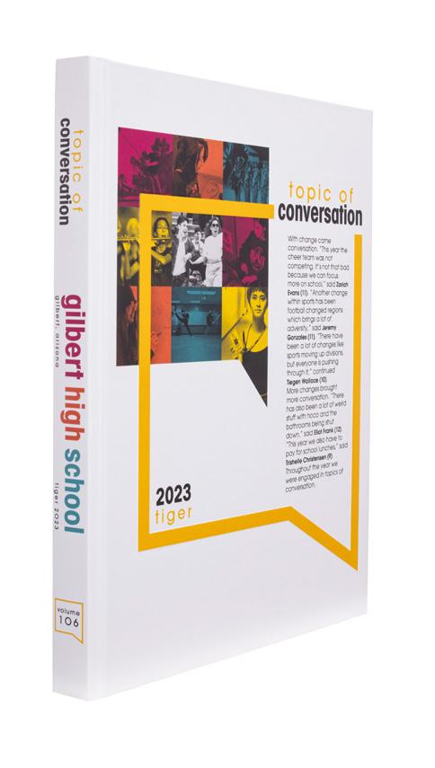
Visual, verbal and conceptual come together on this endsheet as the outlined quote box and photo collage support the theme, “Topic of Conversation.” With these strong graphic elements shown on the cover and endsheet, you can bet they’ll also be found inside the book — giant-sized on dividers and surrounding profile copy blocks and smaller for mods. The package includes consistent colors from the cover/endsheet, as well.


 WEST LINN HS | Green & Gold | WEST LINN, OR
MATOACA HS | The Arrow | CHESTERFIELD, VA
CHEYENNE MOUNTAIN HS | The Talon | COLORADO SPRINGS, CO
GILBERT HS | Tiger | GILBERT, AZ


RETRO RIBBON:
Upvoting a trending look for yearbooks, West Lynn’s 101st volume sports a 1970’s look with the retro color palette complete with creamy tones (vs. pastels or brights) and the ribbon running through pages. The endsheet does a great job of setting the tone with the fun photo and ribbon woven in, and includes a table of contents complete with preview copy for each section.


 LANGLEY HS | The Shire | M c LEAN, VA
HANOVER HS | Aerie | MECHANICSVILLE, VA
HILLSBOROUGH HS | Ramrod | HILLSBOROUGH, NJ
LIGHTRIDGE HS | The Strike | ALDIE, VA
J.C. BERMUDEZ DORAL SENIOR HS | Mjolnir | DORAL, FL
ROCKBRIDGE COUNTY HS | The Trivium | LEXINGTON, VA
SPARKMAN HS | The Senator | HARVEST, AL


NICE TOUCH: We love details, and the student’s finger pointing at the headline on this endsheet makes a great visual/verbal package. And speaking of details, check out this table of contents, which quickly and thoroughly lays out the book’s hybrid chronological organization. Not only does this help ensure readers will be able to find themselves, but it begs them to look inside and see what’s next.


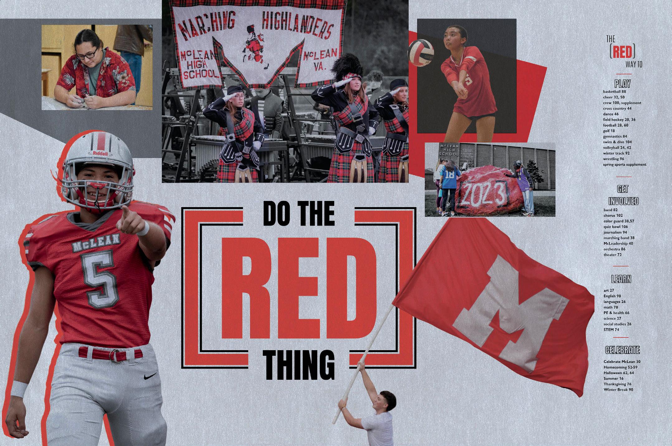 M c LEAN HS | Caledonia | M c LEAN, VA
SO MUCH MORE:
Taking full advantage of the valuable real estate that the front endsheet offers, this staff filled every pica with a big, bold table of contents and a photo gallery — complete with photo IDs and a caption. (Gold star!) But there’s so much more at play here. They used gloss UV coating to make the photos pop, and take a look at the other surprises these endsheets hide. Turn to the Innovations section for more.
MAKE IT SHINY:
In this school-colorsall-the-way volume of Caledonia, the McLean staff started the book off with pizzazz. The front and back endsheets — and entire first signature — are printed on special-order, metallic silver paper. It gives those pages an extra sheen, a different texture — and the school colors, red, white and silver are fully supported in the most literal way possible.


 CATALINA FOOTHILLS HS | Falcon | TUCSON, AZ
CHRISTOPHER COLUMBUS HS | Adelante | MIAMI, FL
SOUTH PAULDING HS | Lacedaemon | DOUGLASVILLE, GA
LA CUEVA HS | Petroglyph | ALBUQUERQUE, NM


 IOWA COLONY HS | The Hearth | ROSHARON, TX
REGIS HS | The Regian | NEW YORK, NY
WESTERN HS | Calibre | DAVIE, FL
LECANTO HS | Legacy | LECANTO, FL
AUSTIN HS | The Onyx | SUGAR LAND, TX
TROY BUCHANAN HS | Siege | TROY, MO
TIMBERLAND HS | Wolf Tracks | WENTZVILLE, MO


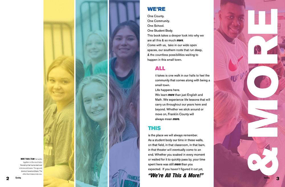
WE HEARD THEM: From its fun theme copy and eye-catching photo, this opening kickstarts the fun and sassy volume. This is a great example of introducing both visual and verbal theme elements while also packaging the opening copy into bite-sized pieces. Each “moment” and its sneak peek callout to content inside the book made us ready to jump in for more.
GRADIENT PROS:
This opening introduces us to all that makes Sunnyside special. In this school-spirited theme, the callout to words “diversity” and “small town with big dreams” were likely a heart-warming and familiar introduction as students jumped into the book. The design — while simple — shows the staff’s knack for details as the gradient on “WE ARE” and the color bar is found within the standout text, too. We are impressed.


 SUNNYSIDE HS | Mirror | SUNNYSIDE, WA
CONTRA COSTA SCHOOL OF PERFORMING ARTS The Script | WALNUT CREEK , CA


 BLUE VALLEY NORTH HS | Northern Light | OVERLAND PARK, KS
SCHOOL OF THE HOLY CHILD | Traces | RYE, NY
CHEYENNE MOUNTAIN HS | The Talon | COLORADO SPRINGS, CO
OVERLAND HS | Trail | AURORA, CO
BISHOP M c GUINNESS CATHOLIC HS | Chi Rho | OKLAHOMA CITY, OK
MARQUETTE HS | Medallion | CHESTERFIELD, MO
STAPLES HS | Stapleite | WESTPORT, CT


CHECKED OFF:
This divider serves its purpose with the straightforward design and section-specific table of contents. The serif type packaging on both the section headline and TOC is clean and legible, but the layered photo and type add some design fun. A job well done for this sophisticated divider. It was a risk to cross the gutter, but the type is big enough to handle it.


 EAST FORSYTH HS | Ortu Solis | GAINESVILLE, GA
BLUE VALLEY NORTH HS | Northern Light | OVERLAND PARK, KS
EDWARDSVILLE HS | The Tiger | EDWARDSVILLE , IL


MORE TO READ: Bravo to this long-form narrative featured on this divider. Acting as a feature spread, the copy is written to add a check in the journalistic coverage box while also providing a guide to what’s to come in the September section. The timeline to the right serves as a mini table of contents and an overview of what happened within the month. Great reader service! And, don’t think we missed the visual link to the cover.
G-STAR SCHOOL OF THE ARTS | Art-I-Fact | PALM SPRINGS, FL EPHRATA HS | The Eye | EPHRATA, WA


 SCHLEY COUNTY HS | Pawprint | ELLAVILLE, GA
E.C. GLASS HS | The Crest | LYNCHBURG, VA
RIDGEWOOD HS | The Arrow | RIDGEWOOD, NJ
MESQUITE HS | Roots | GILBERT, AZ
PARKWAY NORTH HS | SAGA | SAINT LOUIS, MO
TUSCARORA HS | Iditarod | LEESBURG, VA
CARLSBAD HS | The Shield | CARLSBAD, CA


HAVE SOME FUN!
The graphics and illustrations are what stood out on this divider. Not only does it give us exactly what’s needed (a detailed table of contents!), it’s simply fun to look at. The color palette and graphics along the bottom highlight the interactive feelings of this yearbook. Plus, the “did you know?” in the corner adds even more detail and information for the readers about their school championships.
 BROOKLYN TECHNICAL HS | Blueprint | BROOKLYN, NY
MOUNTAIN VIEW HS | The Pinnacle | BEND, OR

 RED MOUNTAIN HS | Pinnacle | MESA, AZ
CAUGHT US SLIPPING:
While the text seems to be sliding down the spread, we had fun with this divider design and type. First, the large arrow brought us to the great pic and headline package. It’s also refreshing to see a table of contents in a new design — especially one that matches the volume’s visuals. The black-and-white photos topped the spread off to make sure eyes weren’t too unsure where to look next. And a chef’s kiss to their captions.
STICK IT: Get it?
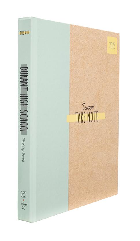
Bringing sticky notes to the forefront of their theme and design, this divider introduces the reference section with wonderful photos and copy. The pull quotes from Heriberto, Jasmine and Lynne are bonus content to “stick” the theme together. And, how can you not want to jump into the next section with this amazing pic? Nice! Don’t miss their cover in the Innovation section.


 ARVADA WEST HS | The Claw | ARVADA, CO
DARLINGTON SCHOOL | Jabberwokk | ROME, GA
SAINT DOMINIC HS | Torch | O’FALLON, MO


 MARY INSTITUTE AND SAINT LOUIS COUNTRY DAY SCHOOL Phoenix | ST. LOUIS MO
STAFFORD HS | Indian Legend | FREDERICKSBURG, VA
HANOVER HS | Aerie | MECHANICSVILLE, VA
BERGENFIELD HS | Crossroads | BERGENFIELD, NJ
CATALINA FOOTHILLS HS | Falcon | TUCSON, AZ
CAPE FEAR ACADEMY | Shoreline Press | WILMINGTON, NC
CORAL GABLES SENIOR HS | Cavaleon | CORAL GABLES, FL


THESE THREE THINGS:
In this chronological book, this spring divider tells us which months are covered along with the perfect mini table of contents that lets us know what’s to come and where to find it. The design and color palette are thoughful and aesthetically pleasing. The captions check off each box with their details and quotes. And to wrap it up, bonus points for their photo credits with its distinct character style.
PATRICK HENRY HS | Encounter | SAN DIEGO, CA LEIGH HS | Vintage | SAN JOSE, CA
NOW YOU KNOW:
For this closing spread, the Inlook staff went heavy on quotes to give us a firsthand, inside look at their students and school community. (Who knew Taylor used an erasable pen?) But what really stands out is their verbal theme weaving its way into the closing copy. The repeated “know” helps bring their “So now you know” statement full-circle.

 WESTRIDGE SCHOOL | Inlook | PASADENA, CA
CAMPO VERDE HS | Reflections | GILBERT, AZ


 HANOVER HS | Aerie | MECHANICSVILLE, VA
HAYFIELD SECONDARY SCHOOL | Harvester | ALEXANDRIA , VA
DE SMET JESUIT HS | Spartan Olympiad | ST. LOUIS, MO
HARTFIELD ACADEMY | The Legacy | FLOWOOD, MS
LEHIGH CHRISTIAN ACADEMY | Aletheia | ALLENTOWN PA
LAMAR HS | The Republic | HOUSTON, TX
PLACER HS | Potpourri | AUBURN, CA


COVERAGE STARS:
Even on the closing spread, the staff opted to include levels of coverage — similar to a design found in the rest of the book. The perfectly framed photo and quote mod at the bottom provides bite-sized content with the photo package taking the main stage. Each caption and quote added to their theme of “… do you know what we can do?” — giving us more detail. And to close out this Lacedaemon, the copy left us feeling motivated to go out into the world.
WE’RE ALL IN: Like their first line says, The Galleon staff made it happen with this closing. The epic dominant photo conveys the final line of the copy — showing off the celebration from everyone as they’re “all in.” The callouts to praise-worthy moments in the copy also bring everything together to close out this book. (And who doesn’t love the bilingual aspect as well?) Nice job.
ARENDELL PARROTT ACADEMY | Patriot | KINSTON NC LUMPKIN COUNTY HS | Argus | DAHLONEGA, GA FORT ZUMWALT SOUTH HS | Southpaw | ST. PETERS, MO


 MARY INSTITUTE AND SAINT LOUIS COUNTRY DAY SCHOOL Phoenix | ST. LOUIS MO
CAMPO VERDE HS | Reflections | GILBERT, AZ
LECANTO HS | Legacy | LECANTO, FL
SAN DIEGO JEWISH ACADEMY | The Roar | SAN DIEGO, CA
BLUE VALLEY WEST HS | Illumination | OVERLAND PARK, KS
BLUE VALLEY SOUTHWEST HS | Vision | OVERLAND PARK, KS
NATION FORD HS | The Ford | FORT MILL, SC


THIS ROCKS: When the staff chose a landscape orientation for their book, they opened up new opportunities for layouts. This example stood out — larger photos are crowd-pleasers.
SHOW, DON’T TELL:
A visual aid is a great way to show readers that these seven students come from all over without saying it. Often, yearbookers are looking for ways to show the diversity of their school culture, and here’s a great example of how you can show that diversity rather than just talking about it. Plus, the stories are interesting and engaging, filled with details and things you’d never know without these little profiles.


 SOUTHRIDGE HS | Aurora | KENNEWICK, WA
PAOLA HS | The Panther | PAOLA, KS
DEPEW HS | Sentinel | DEPEW, NY


TOUCHY SUBJECTS:
Rightfully so, many staffs are compelled to cover not just the bright and shiny parts of their school year, but the tougher lessmentioned parts. Often, of those topics are impossible to take pictures of. Here, the Paola staff opted for a photo illustration to show what anxiety feels like and balanced the coverage with four different sidebars on how students cope with anxiety. We love the creativity — and the extra care for the subject matter.

PHOTO-CENTRIC:
“What’s in your backpack” spreads are popular — and a cool way to timestamp the year. This spread has appeal because it’s yet another take on the topic.
The full-bleed photo shows an array of backpacks — but also the personal style of the owners. The quotes add a bit of explanation and connection for the reader. It’s an appealing way to package the info.

 BLUE VALLEY HS | Reflections | OVERLAND PARK, KS
PORTAGE CENTRAL HS | Roundup | PORTAGE, MI


 FLORIDA CHRISTIAN SCHOOL | Patriot | MIAMI, FL
OVERLAND HS | Trail | AURORA, CO
FLAGLER PALM COAST HS | PALM COAST, FL
BRENTWOOD HS | Eagle | ST. LOUIS, MO
BASHA HS | Grizzly Gamut | CHANDLER, AZ
EAST FORSYTH HS | Ortu Solis | GAINESVILLE, GA


FOUR UP: When your book is bound in landscape orientation, standard layouts take on a new look. The Admiral staff fit four long-form stories onto this spread. Impressive coverage!
WILLIAM T. DWYER HS | Panthera | PALM BEACH GARDENS, FL MECHANICSVILLE HS | Equus | MECHANICSVILLE, VA SKYVIEW HS | Stormchaser | VANCOUVER, WA RIVERVIEW HS | Selachii | RIVERVIEW, FL CHEYENNE MOUNTAIN HS | The Talon | COLORADO SPRINGS, CO


THEME ADJACENT: It makes perfect sense. Rigby’s theme is “Yeah, We’re a Little Bit Extra” and their coverage focuses on the stories that have that same over-the-top angle. On this spread, we have Jayme, who is a bull rider, and Josie, who is working on her third-degree blackbelt in taekwondo. Both are interesting stories and both have that essential element of providing insight into the personalities and pursuits of the people in the school.
IN THE WILD: We photogs love a great environmental portrait, and Newsome’s staff did a great job with their profile portraits. But, it adds so much to the subject’s story when you include related candids. Here, we learn about a student’s passion for running, and also about why he chose the sport and how he uses it for stress-relief and bonding with his buds. It’s a great package. And, three photos is just enough.
BREBEUF JESUIT PREPARATORY SCHOOL | Ignatian | INDIANAPOLIS , IN MELBOURNE HS | Stepping Stone | MELBOURNE, FL LUMPKIN COUNTY HS | Argus | DAHLONEGA, GA


 DOVER HS | Doverian | DOVER PLAINS, NY
COVENANT SCHOOL OF JACKSONVILLE | JACKSONVILLE, FL
CYPRESS BAY HS | The Storm | WESTON, FL
DEL ORO HS | El Aguila | LOOMIS, CA
CARLSBAD HS | The Shield | CARLSBAD, CA
BLUE VALLEY SOUTHWEST HS | Vision | OVERLAND PARK, KS
FRANKLIN COUNTY HS | Echo | CARNESVILLE , GA


 HERNDON HS | The Hornet | HERNDON, VA
HIALEAH-MIAMI LAKES SENIOR HIGH | Aeneid | HIALEAH, FL
FREE STATE HS | The Talon | LAWRENCE, KS
ALONZO & TRACY MOURNING SENIOR HS | Tiburon | NORTH MIAMI BEACH, FL
GOVERNOR LIVINGSTON HS | The Claymore | BERKELEY HEIGHTS, NJ
ELGIN HS | ELGIN, TX
FUQUA SCHOOL | Peregrine | FARMVILLE, VA


LET IT BE … FUN:
This spread is packed with photos that made us smile — and that’s exactly the point. Prom is an iconic milestone of high school, and so much effort goes into making it fun and memorable. Filled with candids and a few posed shots, this spread does exactly what it’s meant to do: include as many students as possible and make sure readers are transported right back into that place in time.


 CANEY VALLEY HS | The Trojan | RAMONA, OK
TRICKS OF THE TRADE:
If you’re a Canva convert, you can see each photo effect and graphic in play here. This is such a great example of what you can do with a few cutouts, some shadows and some hand-drawn graphics. The scrapbook look — when it goes with your theme — can be really cool and unexpected. This staff committed and made it pro-level. Nice job.
OPPOSITES ARE ATTRACTIVE: With the coverage device anchoring the bottom, our eye is drawn to the two bright color boxes placed at opposite sides of the spread. They really pop on this black background and help to carry the eye to the photo package in the center. The outlined and overlapping headline and subheadline packages add an extra element of depth.


GOING BEYOND BASIC: Important topics deserve a spot in the yearbook, even when they might require non-traditional photos. This mental health spread is an example of how we’ve seen staffs cover the topics that matter to them and their peers — self-care, sleep and stress. Photo illustrations are a good path to take, especially when they are easily recognizable as such.

 VILLAGE CHRISTIAN ACADEMY | Excalibur | FAYETTEVILLE, NC
STEINBRENNER HS | The Odyssey | LUTZ, FL


 HINSDALE SOUTH HS | Vespa | DARIEN, IL
SEQUOYAH HS | Paragon | CANTON, GA
EASTMARK HS | The Mark | MESA, AZ
NORTH POINT HS | The Edge | WALDORF, MD
MADISON HS | Alembic | MADISON, NJ
JAMES F. BYRNES HS | Souvenirs | DUNCAN, SC
MORGAN COUNTY HS | Echoes | MADISON, GA


SO MUCH COVERAGE:
What we love about this academics spread is the number of students covered while still maintaining a clean layout and hierarchy. We counted more than 15 students featured — just on page 44! Plus, the mod on the right side of the spread breaks up the cutouts to keep the content engaging. We’d love to see their coverage report!

 WARREN CENTRAL HS | Halcyon | INDIANAPOLIS, IN
WEST BROWARD HS | The Edge | PEMBROKE PINES, FL


 FUQUA SCHOOL | Peregrine | FARMVILLE, VA
WESTFIELD HS | The Guardian | CHANTILLY, VA
TALLULAH FALLS SCHOOL | Legend | TALLULAH FALLS, GA
PROVIDENCE SCHOOL OF JACKSONVILLE | Paragon | JACKSONVILLE, FL
WEST ASHLEY HS | Impressions | CHARLESTON, SC
THOMAS A. EDISON HS | Talon | ALEXANDRIA VA
DARLINGTON SCHOOL | Jabberwokk | ROME, GA


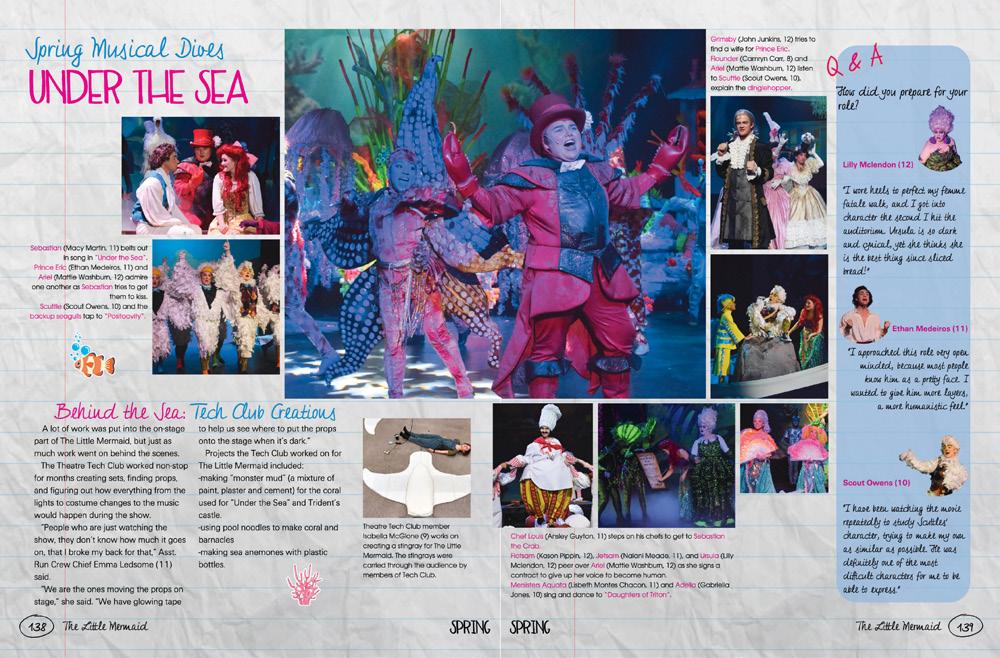

OH WOW:
From its breathtaking full-bleed photo to wellwritten copy, this marching band spread is one to pay attention to. The perfectly lit background photo is dramatic and brought us in to see the photo package to the right. (Normally, we’d want to see the subject’s face, but the way this photo is used to add drama and focus is expert-level. That’s when you get to break rules.) The copy — both in its writing and packaging — tells us all about the new challenges that the marching band faced. Great job!
IN THE LAB: The Shire staff hit each coverage layer with this science spread. We found ourselves enjoying the long-form copy while also reading each detailed caption for the photos in each package. They also used their real estate wisely by adding more photo-caption moments, then thoughtfully placed another talking head mod. Bonus points for using a distinct style for names featured in the copy.
BLUE VALLEY NORTH HS | Northern Light | OVERLAND PARK, KS SOCASTEE HS | The Chief | MYRTLE BEACH, SC RIVER RIDGE HS | Fortress | WOODSTOCK, GA


SPREAD PROS:
With its eyeline and great internal margins, the Talon staff paid attention to their hierarchy while also using other coverage methods. One of our favorites is the use of illustrations while telling their readers about the succulent selling fundraiser. The theme graphic found in the folio making its way behind the cutouts and pull quotes also shows this staff’s ability to pay attention to the details.

 CANYON CREST ACADEMY | Conspiracy | SAN DIEGO, CA
EAST ROWAN HS | Eastonian | SALISBURY, NC


HEADLINE STARS:
While this spread is clean, simple and fresh, we have to hand it to the Dariannus staff for their fun headlines. Putting a playful spin on common squash terms, the spread with its stunning photo packages, cutouts and season recaps provides the perfect amount of coverage for this boys and girls sport. This is also a great example of how white space can be your friend.


 SPARKMAN HS | The Senator | HARVEST, AL
DARIEN HS | Dariannus | DARIEN, CT
BROAD RUN HS | The Shield | ASHBURN, VA


WHAT A PERFECTLY TIMED SHOT!
Beyond the great dominant photo, this spread offers much more. Talking heads, pull quotes and a cutout object mod come together for an engaging girls basketball spread. The parentheses as a theme motif finds its way around the pull quote and in the mod subheadline. The “what’s in my backpack” mod also gave a little more to the spread.


 SECKINGER HS | Rosarium | BUFORD, GA
FREE STATE HS | The Talon | LAWRENCE, KS
GILBERT HS | Tiger | GILBERT, AZ
HALLSVILLE JUNIOR SENIOR HS | HALLSVILLE, MO
WEST POTOMAC HS | Predator | ALEXANDRIA, VA
CORAL REEF SENIOR HS | Tsunami | MIAMI, FL
EAST PAULDING HS | Kaleidoscope | DALLAS, GA


SPLISH SPLASH:
Taking some inspo from the Moments Book Style, this sports spread is full of coverage. The headline package with its handwriting and slab serif type starts off the spread bringing us to the beautiful layered cutout. It’s always refreshing to see a swim photo that includes the face of the swimmer, so props to this photographer. Caption leads are also varied without overuse of “–ing” starters. Job well done, Paragon staff.


 PEKIN COMMUNITY HS | Pekinian | PEKIN, IL
FLIPPING OUT:
While the impressively photo-heavy spread is focused on gymnastics, this chronological spread featured other events that happened the same week. What brings all of this content together is the great use of white space between each topic. Love the use of color bars to unite the design. We also appreciate the sectional color in the folio.
WE’VE GOT SPIRIT:
In this sports and student life combo spread, the Pekinian staff celebrated their Pink Out event while also giving great coverage to the volleyball team. The cutout of Brittyn gave an addition to their coverage by sharing a personal connection to the event. The use of pink in the headlines, background color and brackets brought the content and design together perfectly.


KICKIN’ IT:
This sports spread stood out for its incredible photo package. Notice the dominant photo crosses the gutter (A+) but also how the captions sit perfectly on the shelf created by the two-level package. This is a great example of ensuring trapped white space doesn’t sneak up on you. And we’re always in support of a scoreboard either on the sports spread or reference section.


 WEBSTER GROVES HS | Echo | WEBSTER GROVES, MO
JUSTICE HS | Lustitia | FALLS CHURCH, VA


ORANGE OUT:
The Excalibur staff took a small risk with their dominant copy being a color. What makes it work is its clean and clear eyelines with ample white space between each coverage level. It’s also refreshing to see a pull quote from the dominant copy that gave more of an impact to this basketball spread. We counted more than 15 photos with either a well-written caption or an impactful quote from a team member.


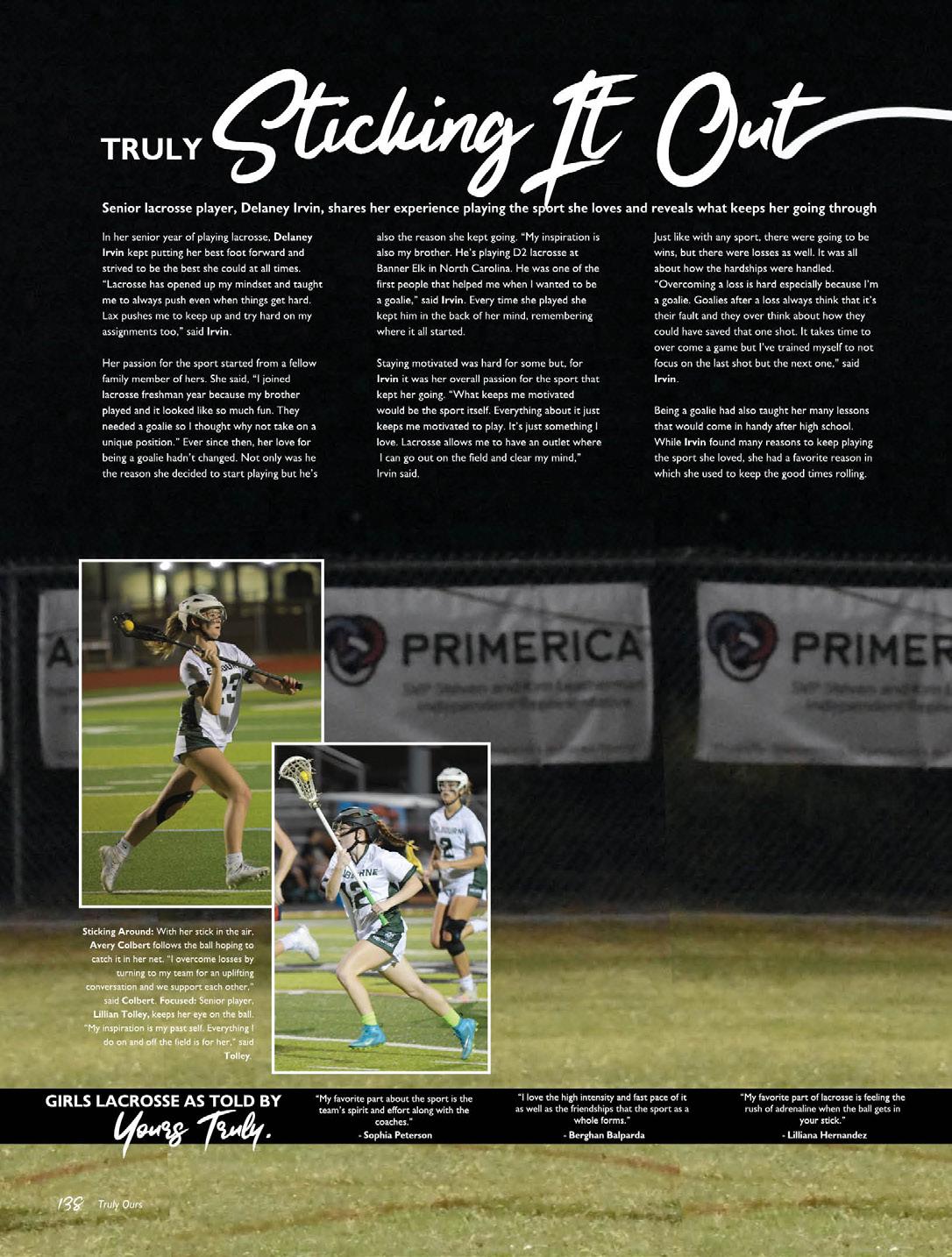 MELBOURNE HS | Stepping Stone | MELBOURNE, FL
VILLAGE CHRISTIAN ACADEMY | Excalibur | FAYETTEVILLE, NC
LYONS TOWNSHIP HS | Tabulae | LA GRANGE, IL


YOURS TRULY:
Handwriting fonts can require a mastermind to ensure their elegance doesn’t get lost with other types or content. On this Stepping Stone spread, we found ourselves impressed with the headline and pull quote that was placed to ensure readers were drawn to it. The full-bleed photo has enough clear space to fill with additional content, which is a testament to the designers’ skill. This example also shows how you don’t necessarily need a talking head for each quote. They managed to squeeze in five more players on this spread. Not to mention the ACD at the bottom. Great coverage!

CHECK THIS OUT:
This wrestling spread from the Pinnacle is another great example of how photoheavy content can work well with a clear internal spacing. Using small caption labels, the copy sits nicely against the photos and doesn’t find itself trapped between coverage. The use of lines and color boxes for their talking heads also places the additional mods to ensure your eye knows where to hit next. Way to go!

 EAST UNION HS | Phenix | MANTECA, CA
THE HARKER SCHOOL | Talon | SAN JOSE, CA


 FLAGLER PALM COAST HS | PALM COAST, FL
NORTH KANSAS CITY HS | Purgold | NORTH KANSAS CITY, MO
RIVERVIEW HS | Selachii | RIVERVIEW, FL
SAINT CHARLES HS | Charlemo | ST. CHARLES MO
SAINT JOSEPH BY-THE-SEA HS | Saga | STATEN ISLAND, NY
LAS LOMAS HS | El Caballero | WALNUT CREEK, CA
SAINT JOHNS COUNTRY DAY SCHOOL | Chalice | ORANGE PARK, FL
PARKWAY CENTRAL HS | Spur | CHESTERFIELD, MO


IN THE MIDDLE:
What makes this portraits spread stand out is the content between portrait panels. It’s always great to see coverage in the people section but offering it in this format is a sure way to get your readers’ attention. Plus, these staffers made sure that the white space in the circles didn’t make your eyes go all over. Way to go!
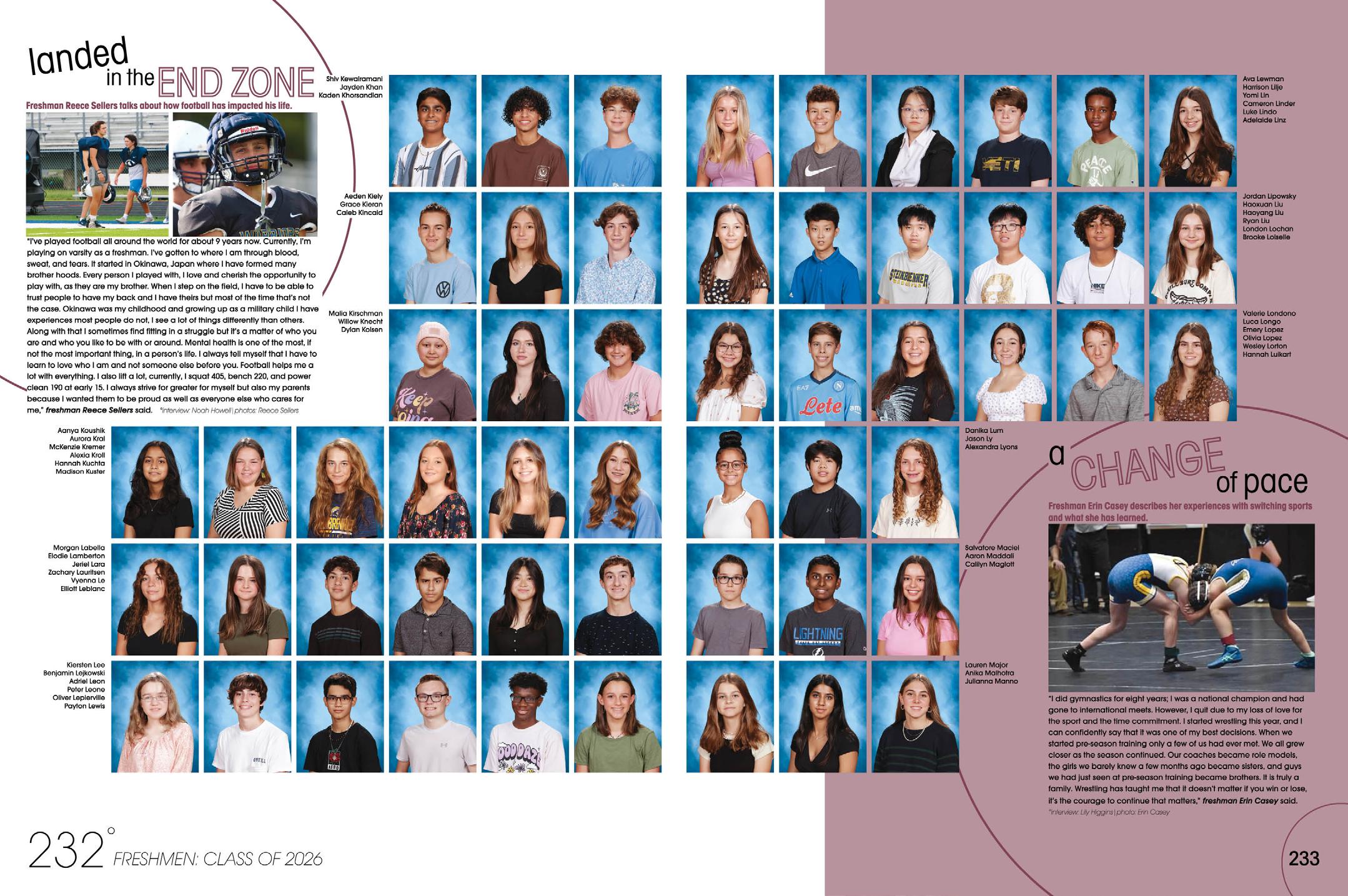
TO THE CORNERS: Using circles as visual anchors, The Odyssey staffers took this extra space on their portrait spreads and used it to their advantage. Highlighting two freshmen sports stars, these mini-profiles give us an inside look into Erin’s wrestling experience and Reece’s life from football. Opting for the long quote gave the staff a little less editing work while still making these worthy reads.



FEATURED MOMENT:
The Indian Legend staff planned accordingly to include profiles in their portrait section. While Jackson is highlighted with the great cutout and duotone effect behind him, you also learn about other freshmen in the text-wrapped copy to the right. Coming to a new (and big!) school can be tough, but this short copy gave an insight into how Stafford feels at home.

HOW FUN: Trendy keychains are all the rage for Baldwin, and staffers made sure to include them. Both with the object and body cutouts, the trendy coverage made us eager to learn more about how Mark needed a keychain since he lost his truck keys the first day he got them. Way to make the people section enjoyable!


WE LOVE THIS:
An index serves an important purpose, and this Legacy example shows how you can offer a reader service while adding coverage. Each “YOU,” “ME,” and “US” adds a fun pull quote from a student while also breaking up the name and page listing. Plus, the “THANK YOU” notes are sweet moments, especially from Blake as he thanked Mr. Whitehead for teaching him patience. So sweet!


SO MANY (GOOD) WORDS:
A great book with a great index is the total package. We love this example because it shows a popular way to make the most of the alphabetical nature of an index. It’s always a great idea to break up a spread filled with tiny little words (or portraits.) And look what this staff did! For each letter, they chose a topic word (Electives) and a student appearing in that section of the index (Reagan Ewers) and made a talking head package. And guess what else? In the case of Reagan, they course-corrected their coverage report by giving her a second spot of coverage. Masterful!
CASHING IN ON ADS: One way to ensure your ad sales stay strong is making them consistently nice to look at. These are suitable for framing — actually that’s not a bad idea for a particularly entrepreneurial business staff. Note that these feature the first name only in the headline font, where the complete name appears below. It’s a nice touch, somehow making the ads more personal.
OVERLAND HS | Trail | AURORA, CO WILLIAMS FIELD HS | Aeriel | GILBERT, AZ RIVERVIEW HS | Selachii | RIVERVIEW, FL


 MARIN CATHOLIC HS | Montestella | KENTFIELD, CA
RIVERVIEW HS | Selachii | RIVERVIEW, FL
HEWITT-TRUSSVILLE HS | Memento | TRUSSVILLE, AL
DARLINGTON SCHOOL | Jabberwokk | ROME, GA
WALTER JOHNSON HS | Windup | BETHESDA, MD
OXNARD HS | Cardinal & Gold | OXNARD, CA
LAMP HS | The Torch | MONTGOMERY AL


LITTLE BABY FACES:
Here’s a way to give seniors an extra little parting gift. Their baby pics are sprinkled through the index. So cute. The Tiger staff also added current events notes to mix it up in the index. We love the extra little touches that will make this book memorable and valuable for decades to come.

WAKE IT UP:
Some of you have been doing your reference section the same way for years and years. Here’s a great example of how the Torch staff applied their theme style to their reference section. The result is a spread of interesting and colorful graphics — with quotes! Gold star. Oh, and look at the ACD adding seven additional points of coverage — even in reference. Another gold star!


 DR. MICHAEL M. KROP SENIOR HS | Renaissance | MIAMI, FL
SAINT DOMINIC HS | Torch | O’FALLON, MO
MANHATTAN HS | Blue M | MANHATTAN, KS


ADDING VARIETY:
Here’s another way you can bolster ad sales: note the top right ad was placed by a class sponsor to honor the class of 2023. There’s no law that says only senior parents can purchase ad space. Consider opening up your ad sales to include clubs or other groups who might want to include this permanent memory in their yearbook. More ads mean more people who want to buy your book!
