
Founded by Dwayne MacEwen, DMAC Architecture & Interiors is a Chicago-based studio with over 23 years experience in architecture, interiors, product and furniture design. We specialize in innovative space, imaginative use of materials and artful details. Our solutions are experiential and transcend functionality. Our work spans a wide range scales and typologies – from Hotels, Health Clubs, Restaurants, Casino and Spas to furnishings, kiosks and door knobs. While we live in Chicago, our work can be seen from New York to London, Barcelona, Miami and Montreal. Our steadfast commitment to the client and the project’s ultimate vision yields experiential solutions by combining design excellence, technology and careful attention to details for a cohesive result. We are known as a fast-paced, nimble firm committed to lasting relationships with our clients and partners.

Approach:
We are an architectural firm. But more than that we are storytellers. From the epics that bring together a series of buildings into a collective experience of a master plan to the anecdote that weaves together the details of an entire building. We design everything that matters: from the vocabulary we use: bricks, mortar and containers; to the punctuations we call remarkable moments; to the swear words or the pieces that remind us of our humanity; to the spaces between the words that make an environment truly poignant. We know that each project is different. Each project has a history, a past, a present, and we know, when crafting its future, we acknowledge the elements. Each project is based on the belief that careful development of ideas is more important than a dependence on a style.
DMAC Architecture & Interiors relies on the diverse experiences of its staff and expert consultants to craft each project. We love to teach, but more importantly we love to learn; teach us what you want to do, and we will weave your stories into reality. We strive to be inventive, test ideas and challenge ourselves because we also know that sometimes the best ideas come from looking at things sdrawkcab.

4
• Midtown Athletic Club - Chicago Boardformed Concrete Landing Pit Screen Chromium Fitness Studios •The Hotel at Midtown Granite Reception Horses Head • Greenwood • Doc B’s • Michael Jordan’s Restaurant Swoop Canopy Frame wall • River’s Casino Van Slyck’s Duke’s Marketplace Splash Spa High Limit Flipt Hugo’s Hugo the Frog Hull Art Walls Canopy Cube Nipple Wall Coffee Spot • Sugarhouse Casino - Marketplace Barrel Art Pizza Box Column Ol’ Glory • Midtown Montreal • Allyu Spa • Anthony Christiano • Roka Akor • Eno Wine Bar Barrel Sculpture • Belly Q • Untitled • Dish + Wall Panels • Bentley + Lamborghini • Concours Club • DMAC East - prince edward island • Old Orchard • 900 N Michigan Ave • 200 Emerson Street • Textures • Publications + Press • Clients + Awards Table of Contents 004 078 090 098 116 154 176 178 194 200 204 208 210 218 212 224 220 228 236 238 232 182 186 052
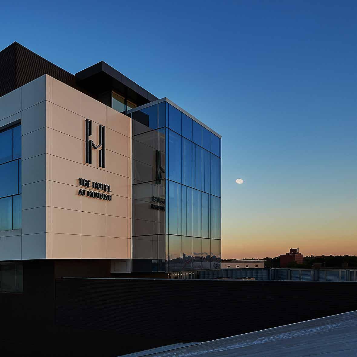
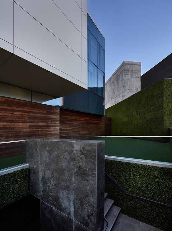
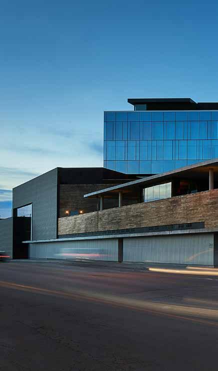
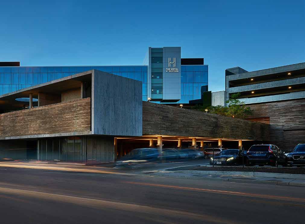
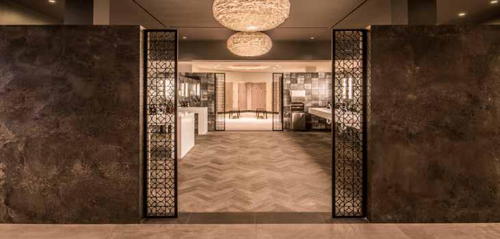
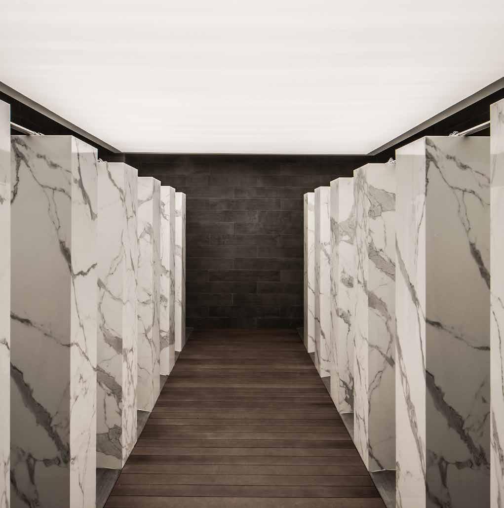
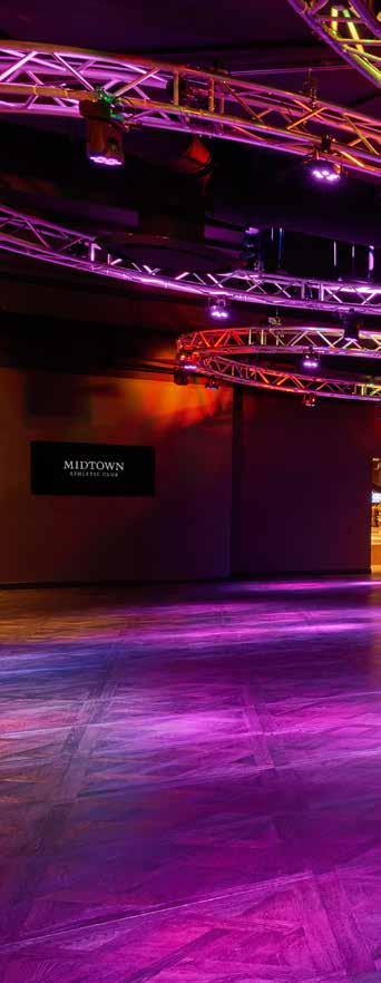
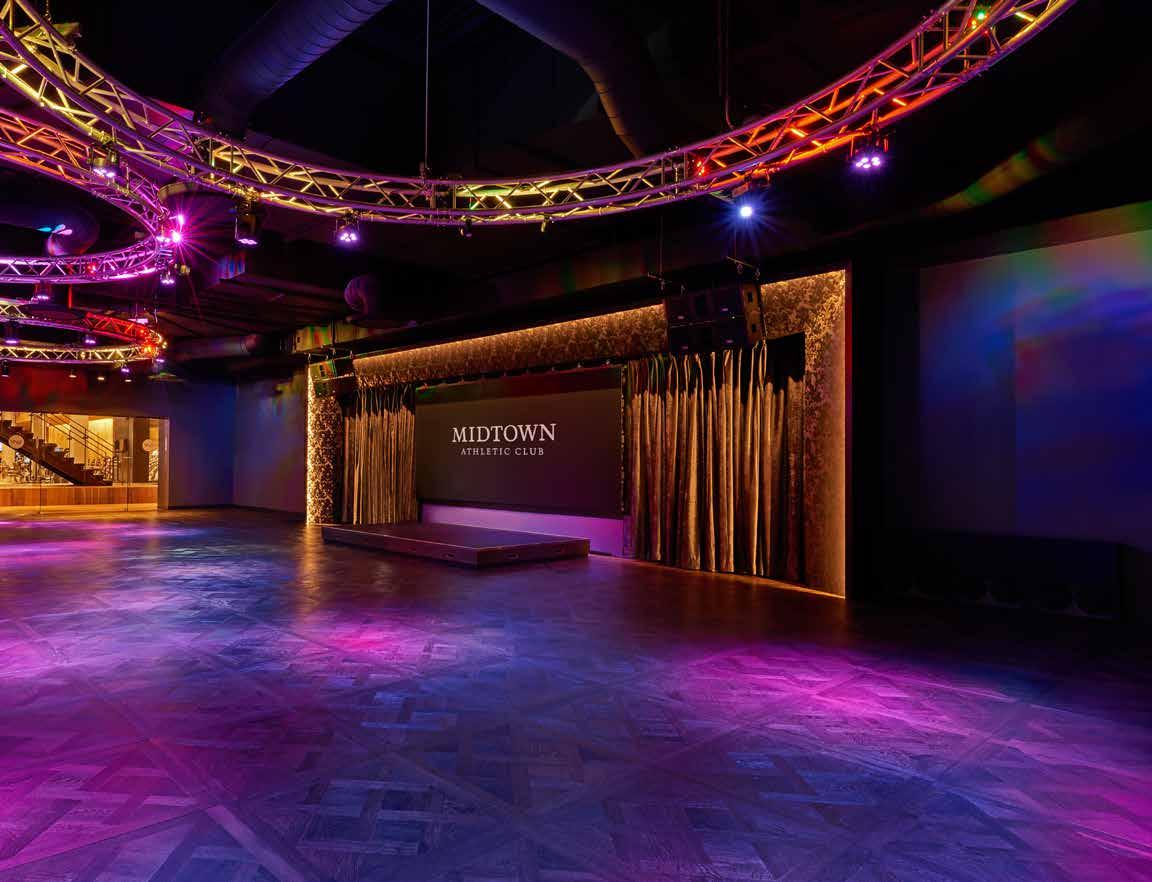
Midtown is not your typical health club. Located off Chicago’s Elston industrial corridor, the 250,000 square foot expansion of Midtown Athletic Club and Hotel transforms what was the largest indoor tennis club in the country to the largest lifestyle center in the country. The game-changing hybrid health club and hotel create a destination for the ultimate experience in fitness, entertainment, relaxation and more.


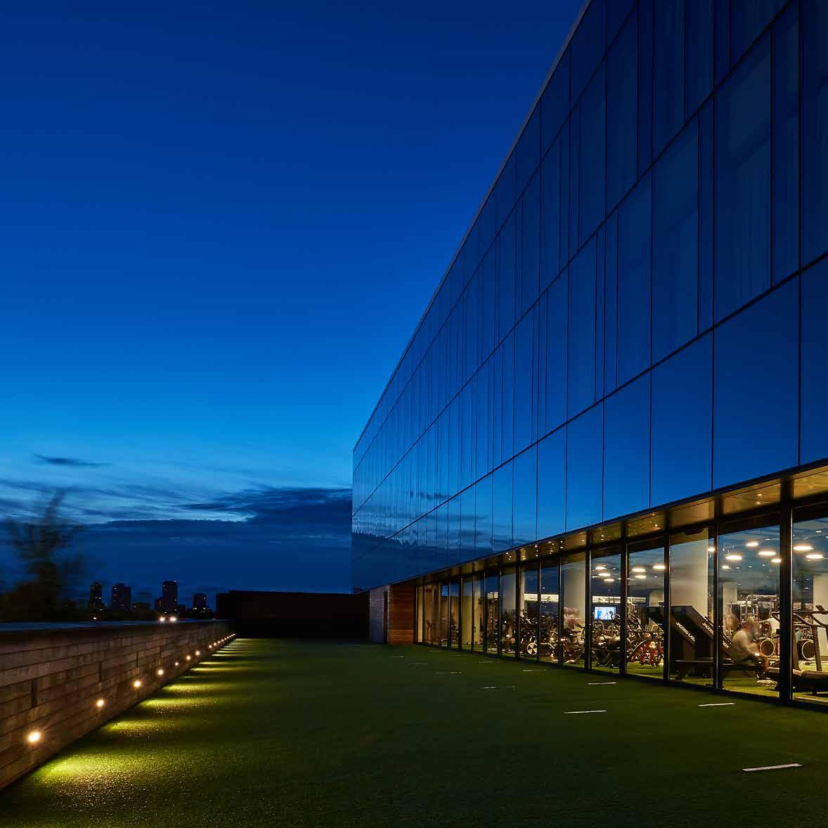
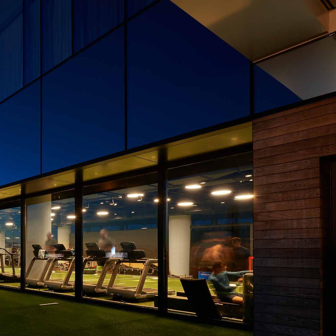
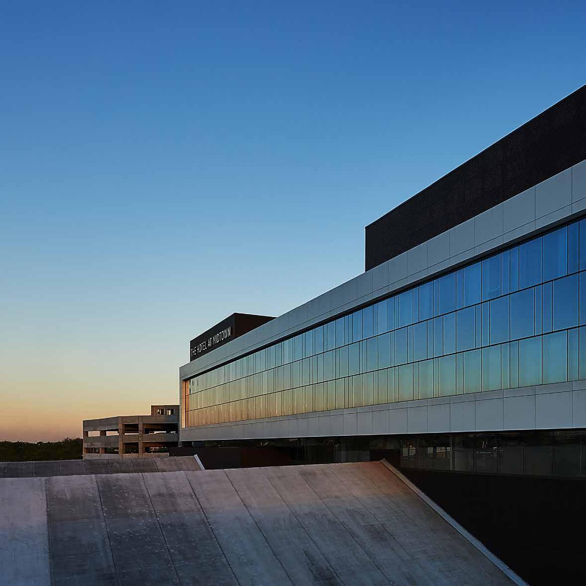
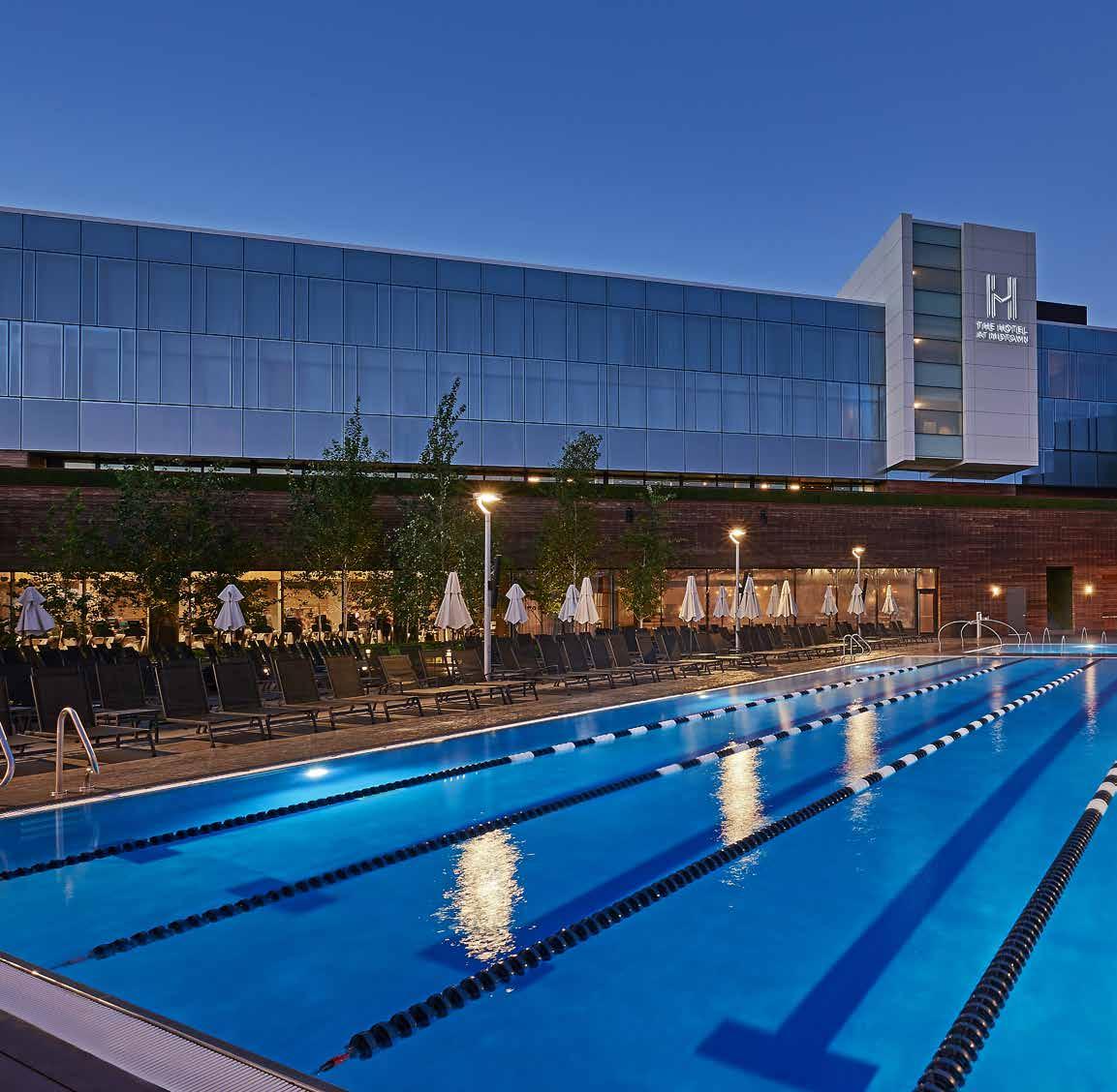
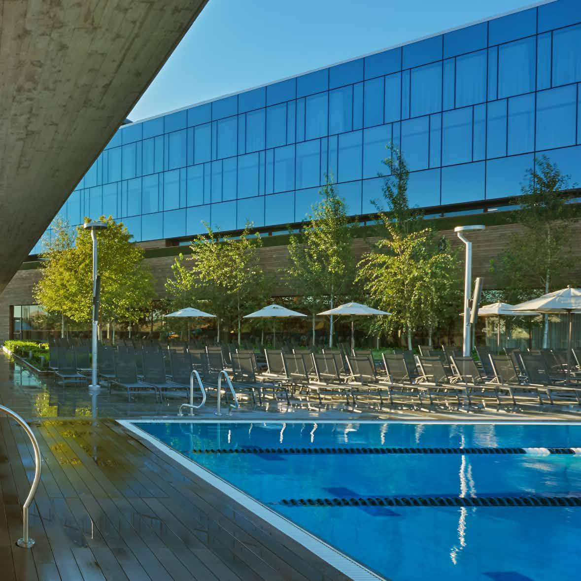
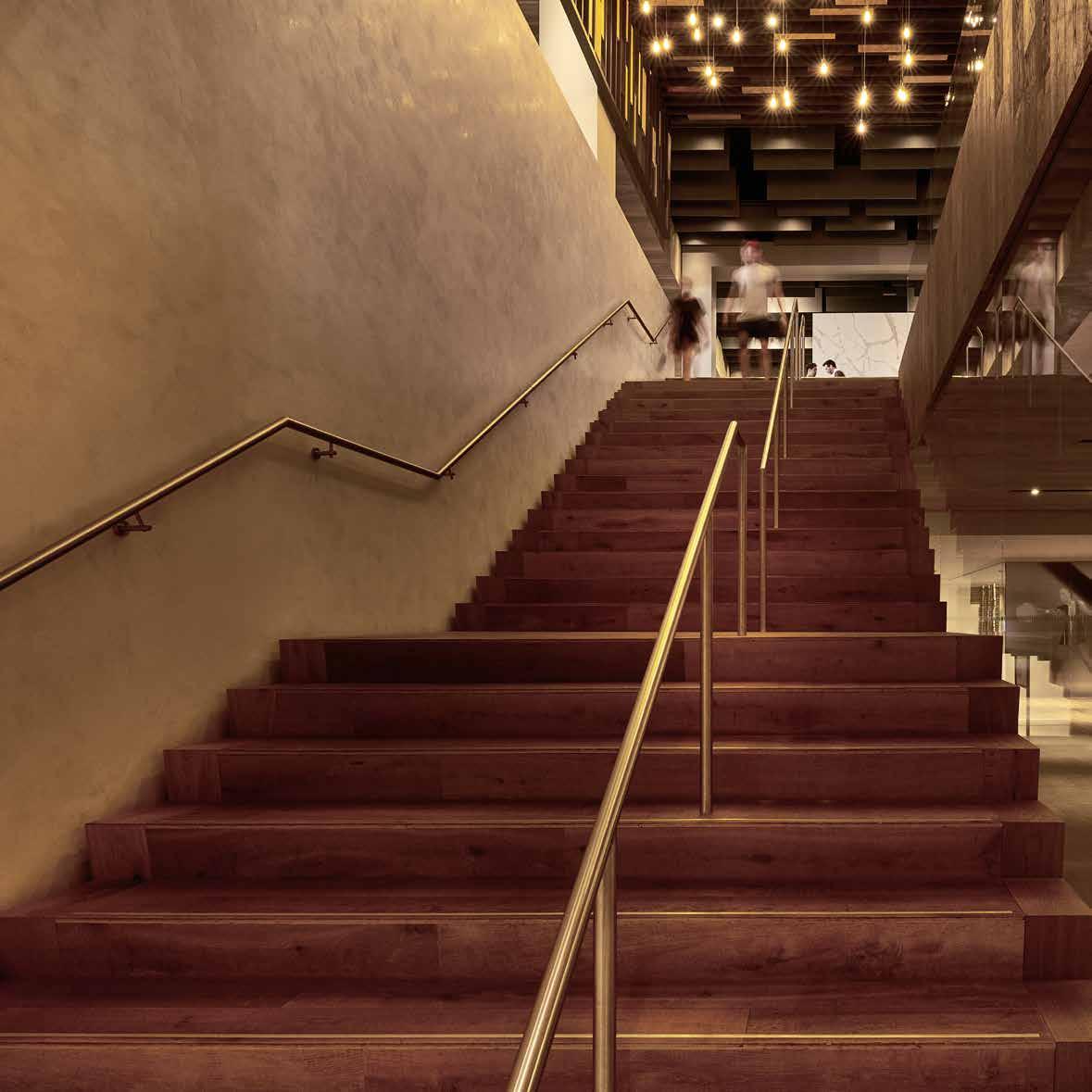
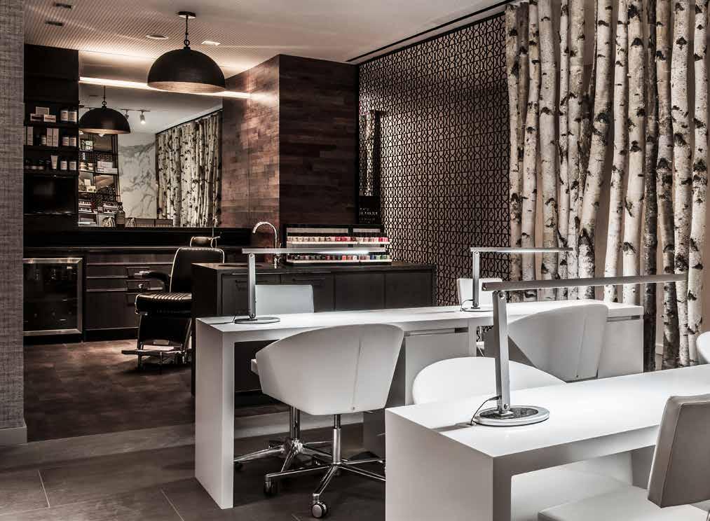
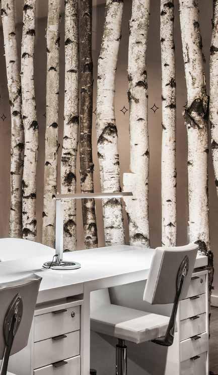
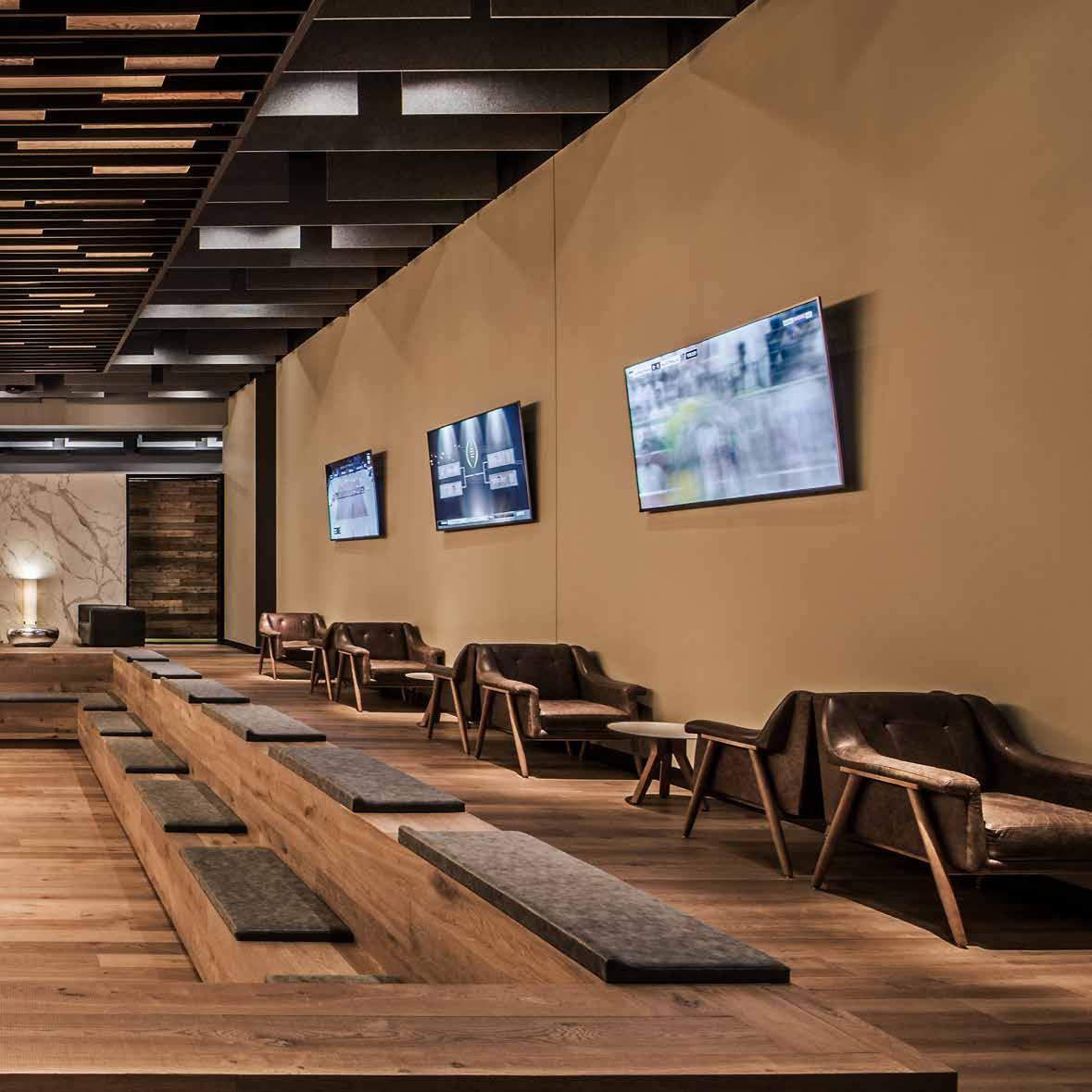
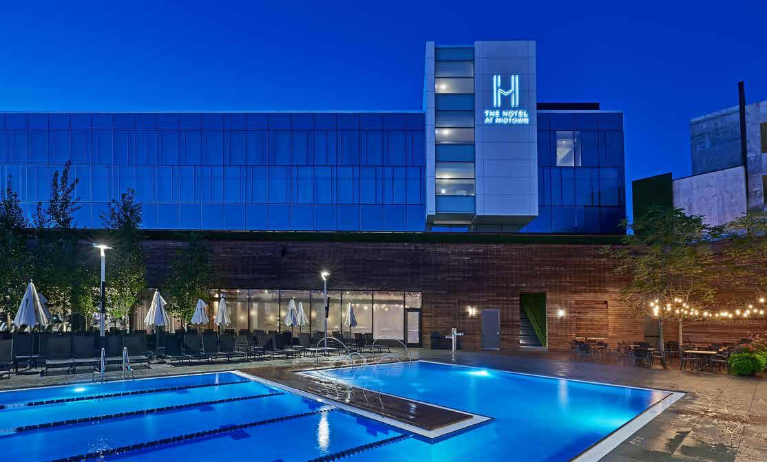
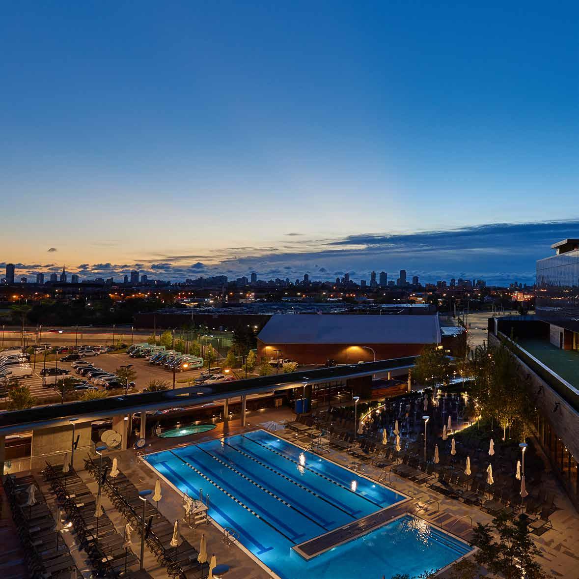
The club spans 3 levels, featuring multiple programs – from boutique studios such as Yoga, group fitness, multimedia spinning, boxing and personal training field with rooftop workout areas – to custom amenities such as a signature restaurant, indoor/outdoor pools, Mind & Body suite, spa, salon and retail. A grand staircase from the lobby leads guests to the hub of the Midtown community, arriving at a large open “landing pit” with comfortable seating, contemporary built-in fireplace and access to the restaurant, outdoor pool and fitness areas. Where fitness is a small amenity to the standard hotel, the Hotel at Midtown flips the paradigm and serves as an amenity to the high-end club. The 55-key Hotel towers over the Club in a glass volume and provides active travelers an exclusive fitness experience and brings a high-end lifestyle center to boutique hospitality.
Human interaction was the measure to design both the interiors and exteriors of the project. Woven with clear intuitive wayfinding, every detail is considered part of the human experience. Staying true to the project concept and requirements of multiple typologies, relentless attention was paid to the overall unification from master planning to the smallest detail. The result is a cohesive collection of memorable spaces and paths, creating a progressive center of modern life where health and wellness are intentional in every detail.


midtown athletic club
10
11

01. 02. 03. 04. 05. 01. 02. 03. 04. 05. 06. 07. 08. 09. 10.
17 LOBBY KID’S CLUB OFFICE RETAIL TENNIS LOUNGE TENNIS COURTS SPA MEN’S LOCKERS WOMEN’S LOCKERS SHOWERS STEAM + SAUNA INDOOR POOL FAMILY LOCKERS 1A 1B 1C 1D 1E 1F 1G 1H 1I 1J 1K 1L 1M LANDING PIT YOGA MIND/BODY PILATES GOLF SIMULATOR RESTARAUNT FITNESS FLOOR GROUP EXERCISE SPIN STUDIO OUTDOOR POOL DECK 2A 2B 2C 2D 2E 2F 2G 2H 2I 2J PERFORMANCE TRAINING BOXING STUDIO STRENGTH TRAINING SUN DECK RIBBON ROOF DECK 3A 3B 3C 3D 3E 08. MEN’S LOCKER 09. WOMEN’S LOCKER 08 07 09 10 11 11 12 NELSTONAVE W FULLERTON AVE N DAMEN AVE 01 LOBBY 02 KID’S CLUB 03 OFFICE 04 RETAIL 05 TENNIS LOUNGE 06 TENNIS COURTS 07 SPA 08 MEN’S LOCKERS 09 WOMEN’S LOCKERS 10 SHOWER 11 STEAM + SAUNA 12 INDOOR POOL 13 FAMILY LOCKERS 09. WOMEN’S LOCKER 10. SHOWER 11. STEAM/SAUNA 12. INDOOR POOL 05 08 09 10 11 11 12 NELSTONAVE W FULLERTON AVE N DAMEN AVE 3’ 10’ 5’ 20’ N FIRST FLOOR PLAN/ SITE PLAN 01 02 03 04 05 06 W FULLERTON AVE 07 08 09 10 11 11 12 13 1C 1E 1G 1I 1J 1K 1K 1L 1M 1F 02 04 01. THE FIELD 02. EVERYBODY FIGHTS 03. STRENGTH TRAINING 04. SUNDECK N 01 PERFORMANCE TRAINING 02 BOXING STUDIO 03 STRENGTH TRAINING 04 SUN DECK 05 RIBBON ROOF DECK 04 04 03 01 02 01 04 06 07 09 04. PILATES 05. GOLF SIMULATORS 06. CHROMIUM 07. FITNESS FLOOR 08. THEATER 09. RIDE 10. OUTDOOR POOL 3’ 10’ 5’ 20’ N THIRD FLOOR PLAN 3E 3A 3C 3B 3D 01 02 03 04 05 06 07 08 01. LANDING PIT 02. SAMADHI 03. MIND/BODY 04. PILATES 05. GOLF SIMULATORS 06. CHROMIUM 07. FITNESS FLOOR 08. THEATER 09. RIDE 10. OUTDOOR POOL 5’ 10’ 20’ 07 10 09 08 05 01 06 04 03 02 01. LANDING PIT 02. YOGA 03. MIND/BODY 04. PILATES 05. GOLF SIMULATOR 06. RESTARAUNT 07. FITNESS FLOOR 08. GROUP EXERCISE 09. SPIN STUDIO 10. OUTDOOR POOL DECK 01 04 06 07 03. MIND/BODY 04. PILATES 05. GOLF SIMULATORS 06. CHROMIUM 07. FITNESS FLOOR 08. THEATER 09. RIDE 10. OUTDOOR POOL 5’ 10’ 20’ 3’ 10’ 5’ 20’ N SECOND FLOOR PLAN 2J 2F 2A 2C 2D 2E 2G 2H 2I LEVEL 3 LEVEL 2 LEVEL 1

Board Formed Concrete
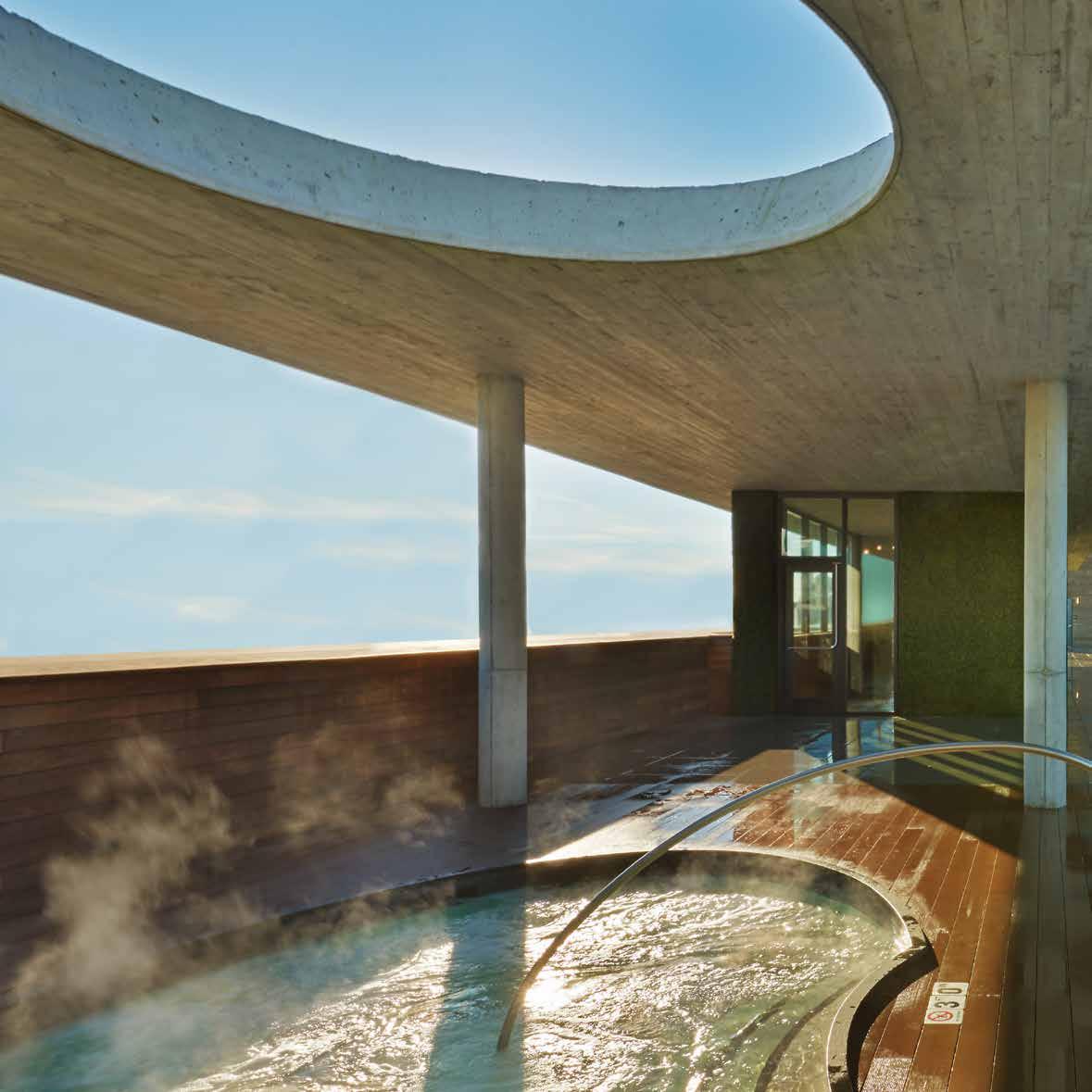
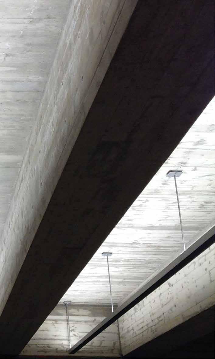
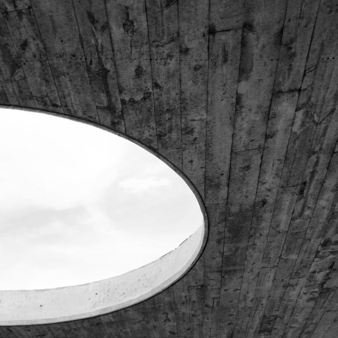
A massive architectural concrete ribbon at the new Midtown Athletic Club flanks the street edge and humanizes the scale of the building along an expansive 400 foot frontage on Elston Avenue. This ribbon folds up and caps the outdoor hot tub and stairways and frames the view out from the second floor pool deck.
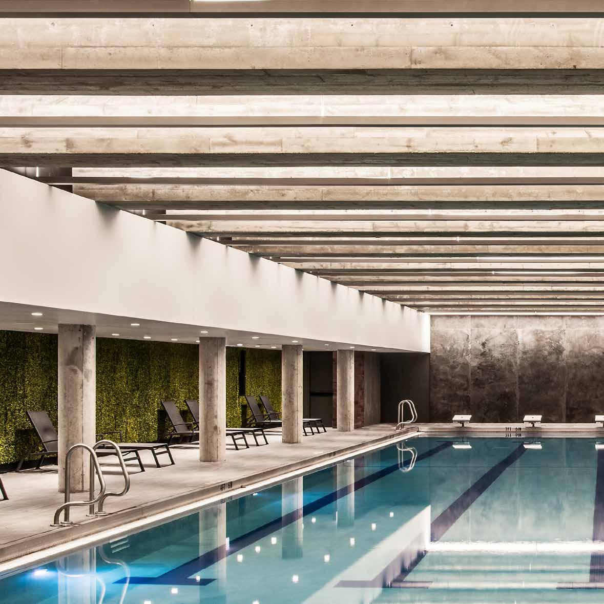
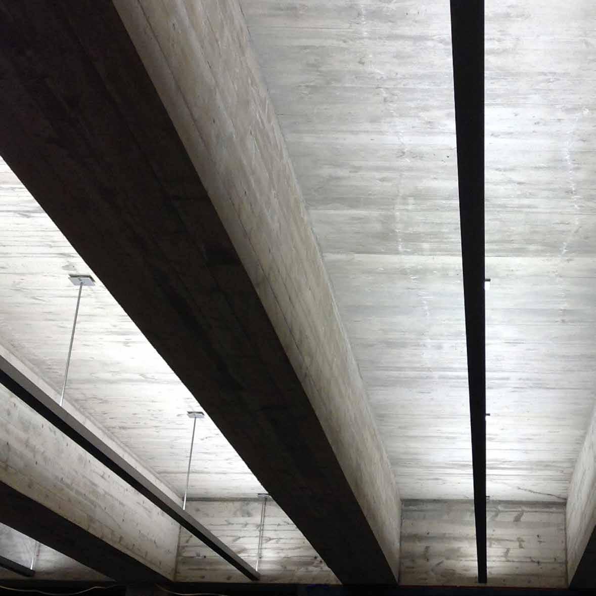
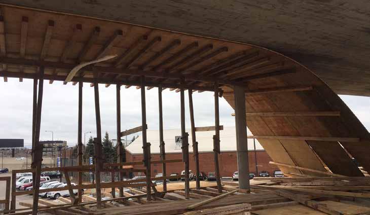
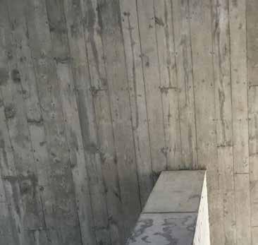
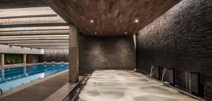
This concrete ribbon, along with the exposed ceilings and beams on the first floor that houses a 100 ft long indoor swimming pool was cast in place using board forms. Pine boards in two widths, 1x6 and 1x8, were the forming material of choice and these boards were painstakingly choreographed to represent an 8 foot module with a repetitive Fibonacci pattern. Joints were staggered with a minimum overlap of 24 inches. All structural cold joints were coordinated to align with the board joints. Mock ups were tested to arrive at the right color, consistency, curing and stripping techniques, that resulted in a rich concrete texture with a subtle grain pattern on the finished face.
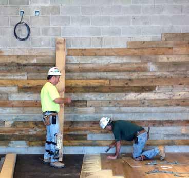
A coverage of almost half an acre of concrete was board formed in place and almost 100% of those forms that were stripped we reused to clad the interior walls of the Athletic club.
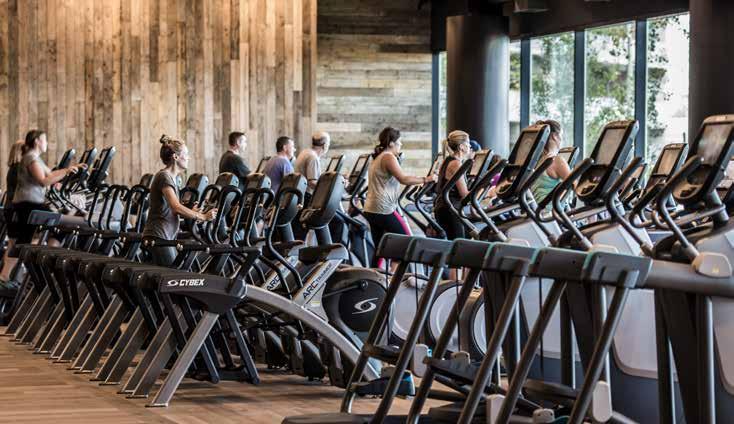
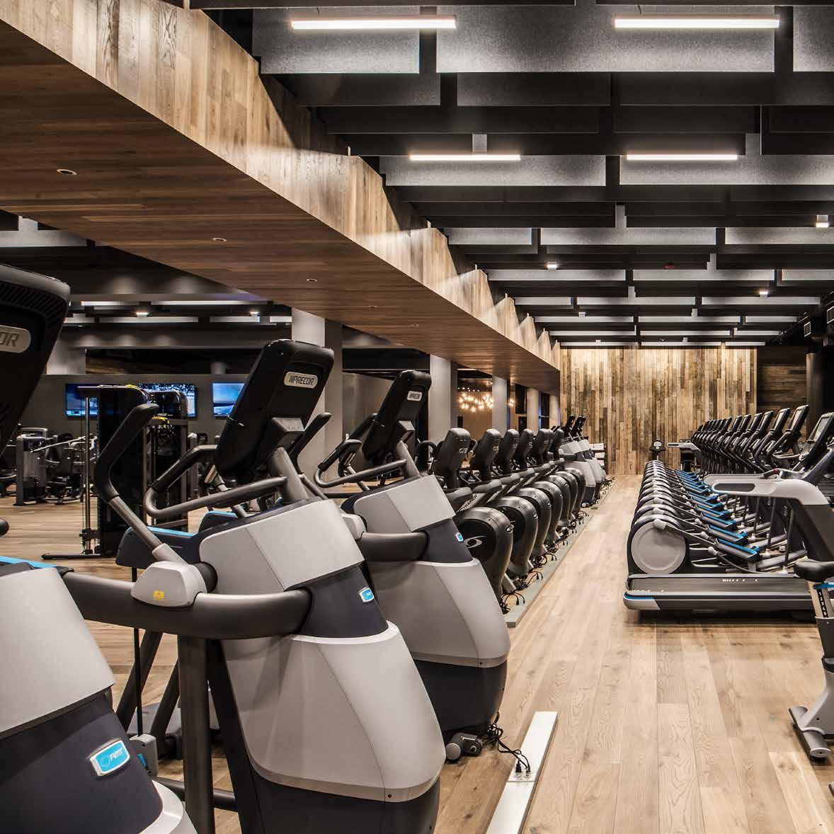
Keeping with the overall design philosophy of “Honesty of Materials”, the design team embraced the texture and inconsistent coloring of the salvaged boards (with fire retardant coating) and clad majority of the expansive fitness floor with it, that it became an archetypal expression of the club.
21
22
more country club than gym...
24
25
26
27
Landing Pit Trellis
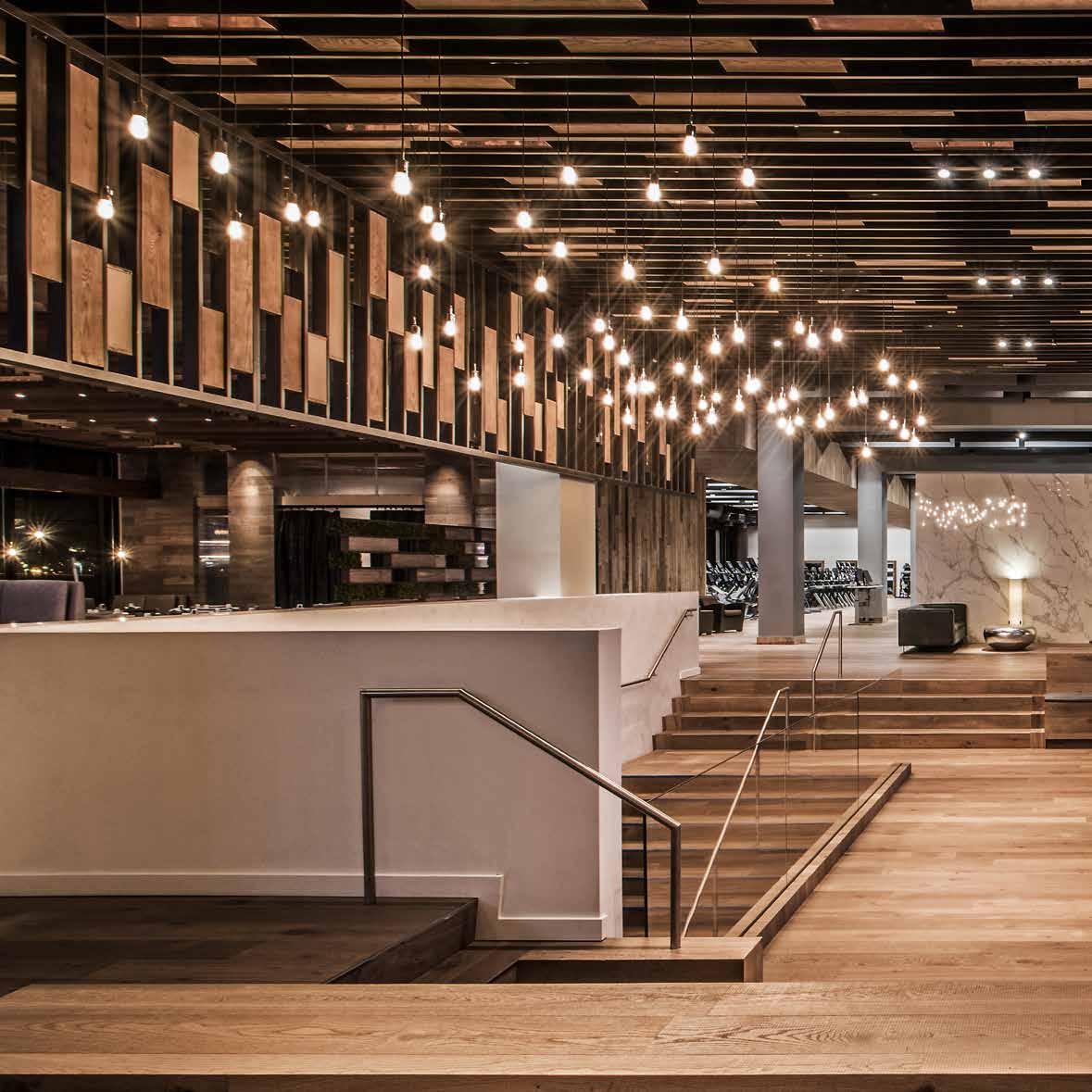
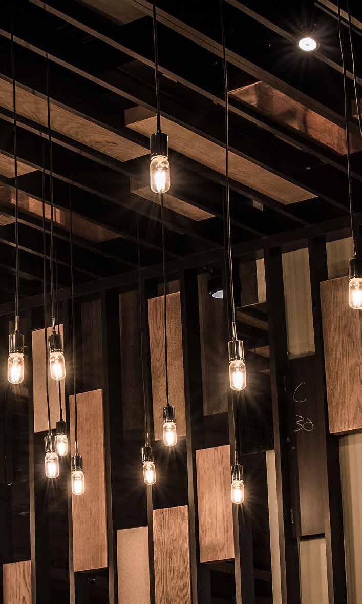
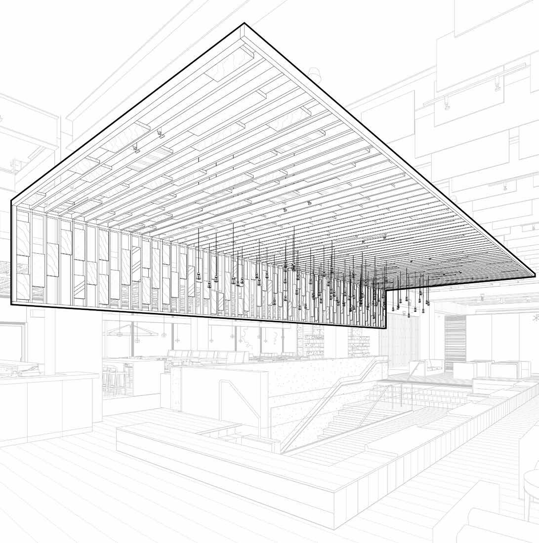
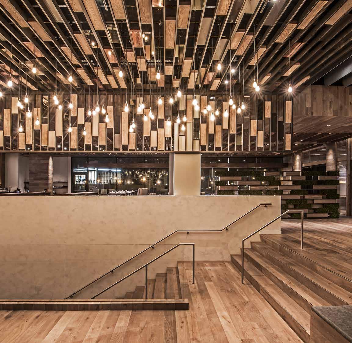
A 40-foot trellis soars over the monumental stair at Midtown, visually choreographing movement through the space and guiding guests upward from the reception lobby to a landing “pit” which is the communal hub of the club. This trellis is designed to honor famed tennis club that stood in the very location, a large portion of which was demolished to make room for the new expansion. The metal trellis is infilled with panels of copper and oak salvaged from the original club prior to demolition.
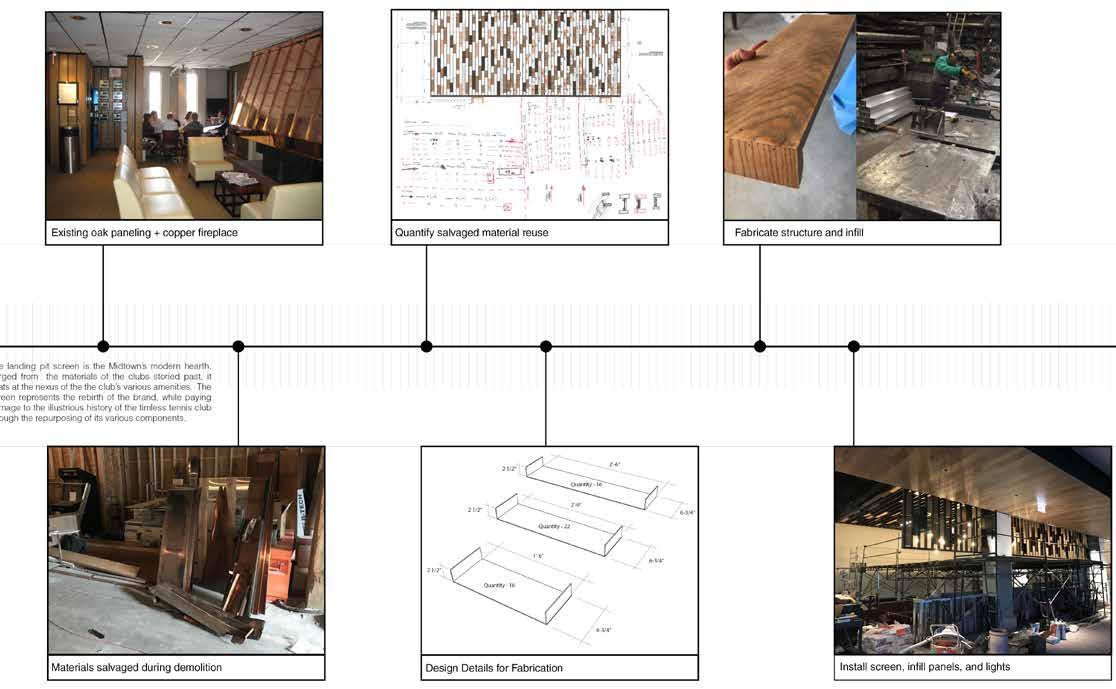
The idea of the trellis was born from Midtown’s history. Oak panels that once lived in the locker rooms of this iconic club frequented by revered professionals like Andre Agassi and John McEnroe, were reclaimed, refinished and cut for infill within the new trellis. Copper panels from the original fireplace hood were also salvaged, cut and folded to fit within the metal screen. The two repurposed materials were arranged in a harmonic pattern like jewels and interspersed with traces of bronze mirror used as additional infill material symbolically representing a “reflection” of the past in the new.
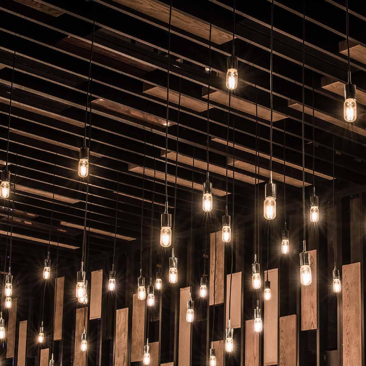
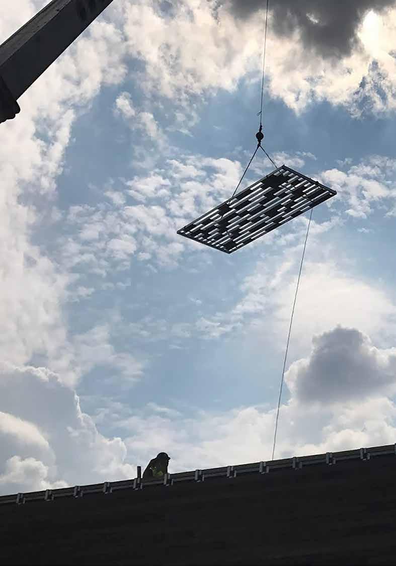
The custom fabricated trellis screen is 40 feet long, 20 feet wide, fabricated in 8 foot modules and installed on site with all bolted connections. An elaborate scaffolding was erected for the installation, and structural hang points were located on site to suspended the 5000 lb frame from the ceiling structure. Seventy Edison lamps are suspended through the gaps of the trellis and reflect up on the mirror and copper infills, providing a sense of lightness to this massive trellis while paying tribute to the storied history of the timeless tennis club.
31
32
33 A5 ( M O D U L E A / B / C1 ) 1 3 / 4 13 - 4" AFF 4 2" 1 3 4 " ( M O D U L E A B C1 ) 3 " ( M O D U L E A / B C2 ) 13 - 4 AFF ( M O D U L E A / B / C2 ) 3 " 7 2-A1 8 2 GL-202, ANTIQUE MIRROR ADHERED TO MDF BACKER 2 x 4" ALUMINUM TUBE PERIMETER FRAME, PAINTED TO MATCH MT-004 1" x 4" ALUMINUM TUBES PAINTED TO MATCH MT-004, TYP MT-203, COPPER SHEET ON MDF BACKER BLIND FASTENED TO SUBSTRATE THROUGH ALUMINUM PLATE WELDED TO TUBES, PROVIDE 1/4" DIA. HOLES @ 12" O.C + 2" FROM EDGE FOR INFILL CONNECTIONS TYP. @ ALL INFILL WD-203 THROUGHBOLT CONNECTION ABOVE ANGLE, TYP. @ ALL MODULE CONNECTION POINTS, SEE VECTOR METALS SK-5 FOR CONNECTION DETAILS THREADED ROD TO UNISTRUT ABOVE, SEE STRUCTURAL SSK-074 FOR DETAILS PAINT ALL EXPOSED HARDWARE, STRUCTURE, OR THREADED ROD ABOVE SCREEN MATTE BLACK (2) 1" x 4" ALUMINUM TUBE MEMBERS @ MODULE CONNECTIONS 6 DETAIL SECTION @ LANDING PIT CEILING SCREEN

Chromium
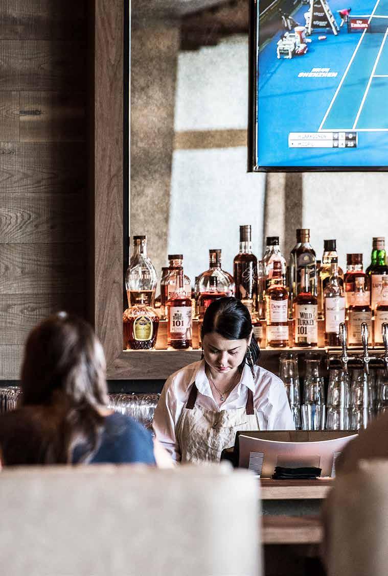
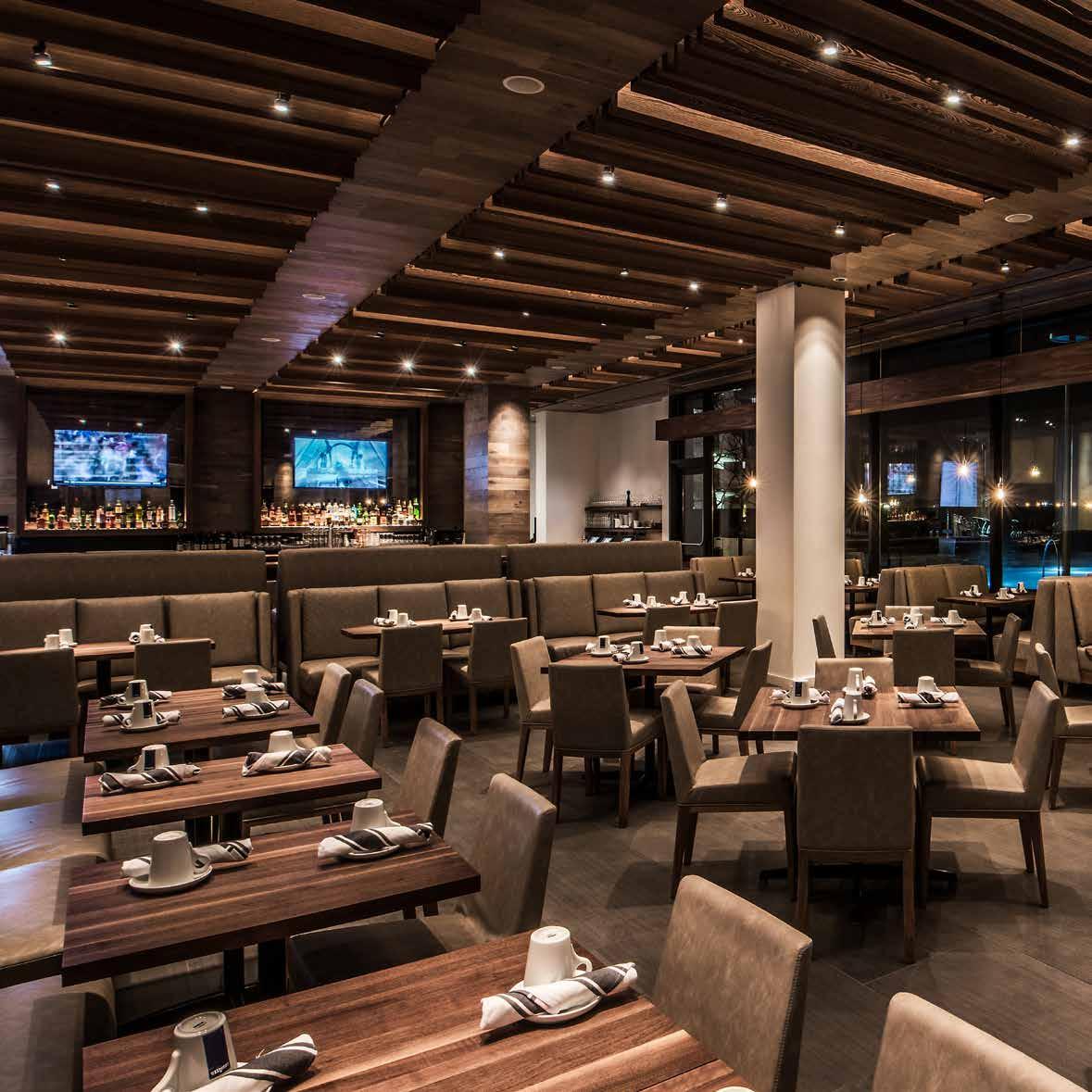
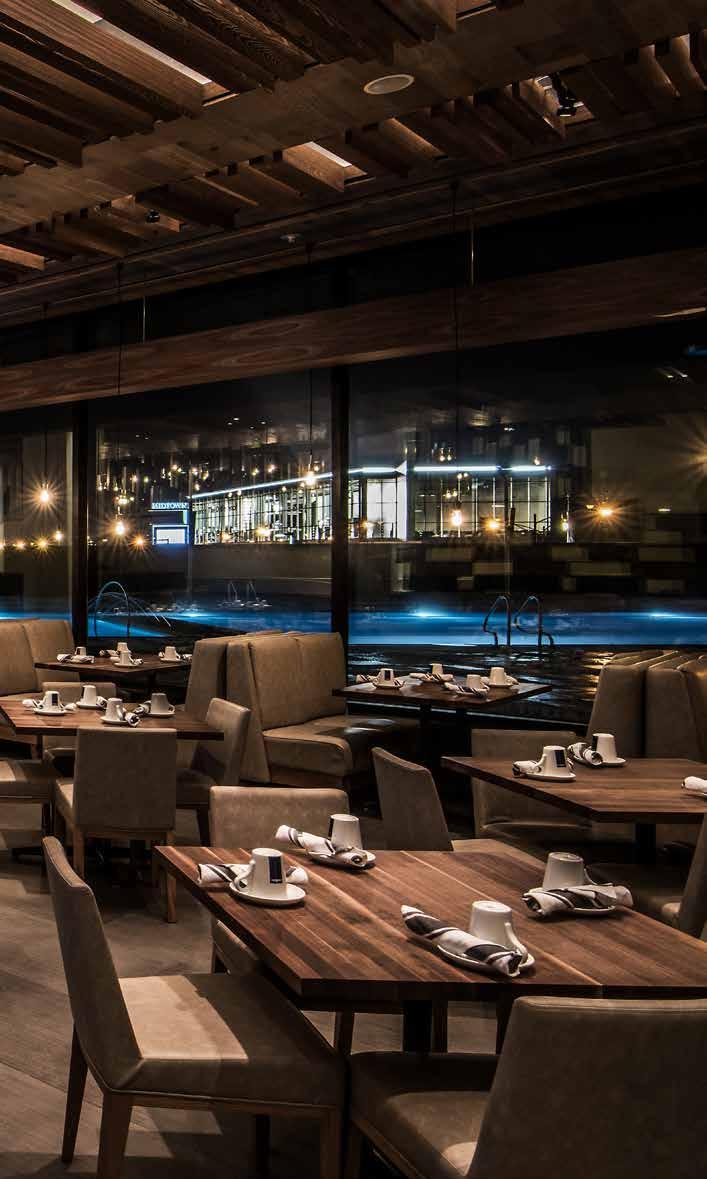
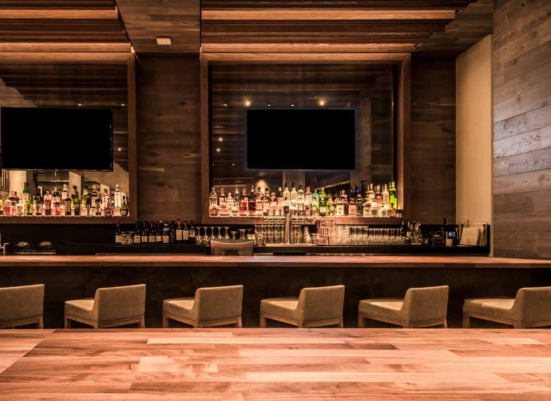
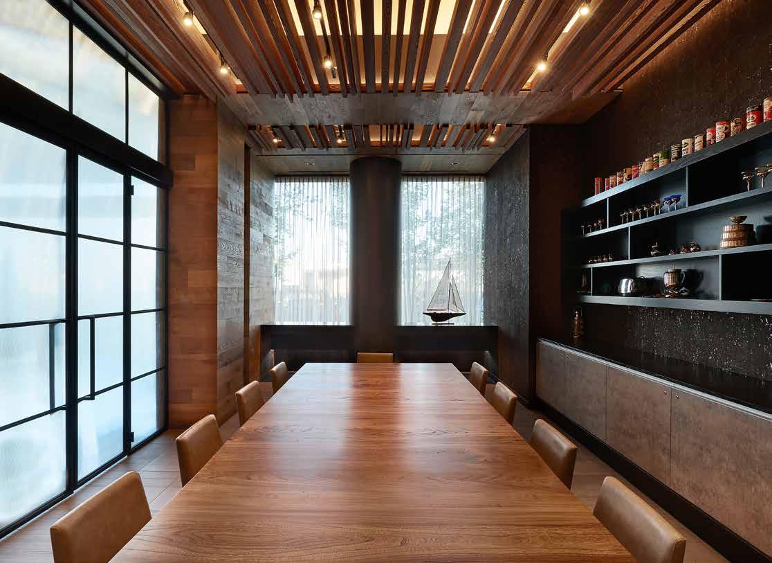
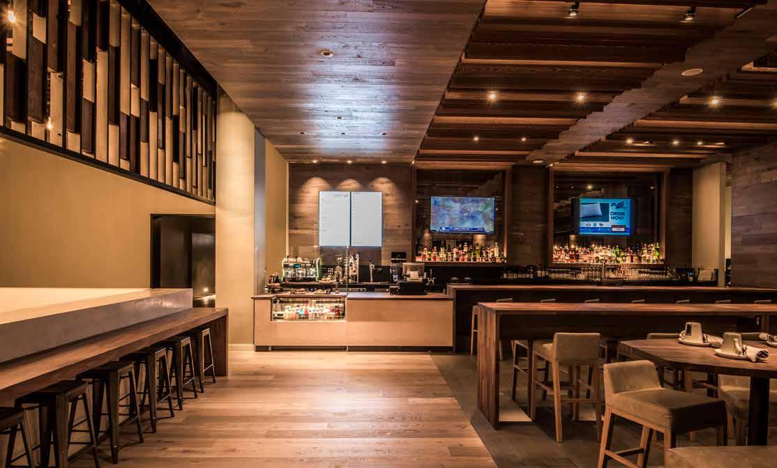
Chromium is a full-service signature restaurant at the new Midtown Athletic Club and Hotel in Chicago. The 220-seat restaurant includes a private dining room, bar, lounge and outdoor poolside cafe. With ten seating options, including communal tables, high banquettes, armchairs and bleachers, Chromium has become an extension of home and office that complements the fitness club and hotel.
Chromium is located at the heart of the club on the main fitness floor. It is visually and functionally an extension of both the spacious lounge we call the “landing pit” and a large outside pool deck. From the landing pit, Chromium welcomes guests through an entryway created by a partial green wall with a subtle sign that reads “Chromium” in vintage lettering. Custom leather seating mixes traditional dining with lounge seating and is paired with solid wood tables for chic comfort. Natural light floods the dining room through a wall of glass with a views of the outdoor pool and cafe. At one end is the full-service bar with the kitchen behind it. At the other end is an elegant private dining room with custom wood finishes and cabinetry.
37
38
39
40
41
Fitness Studios
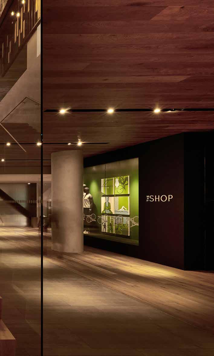
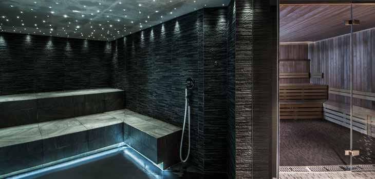
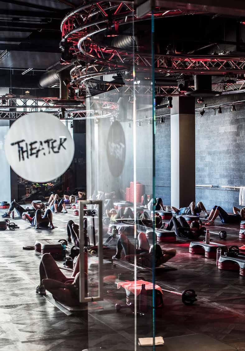
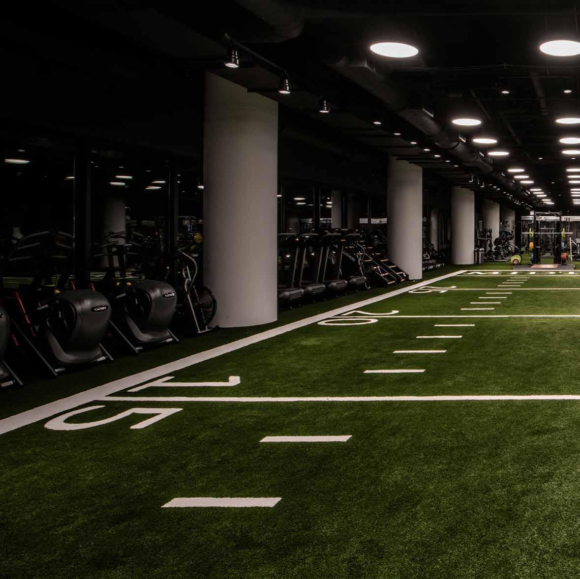
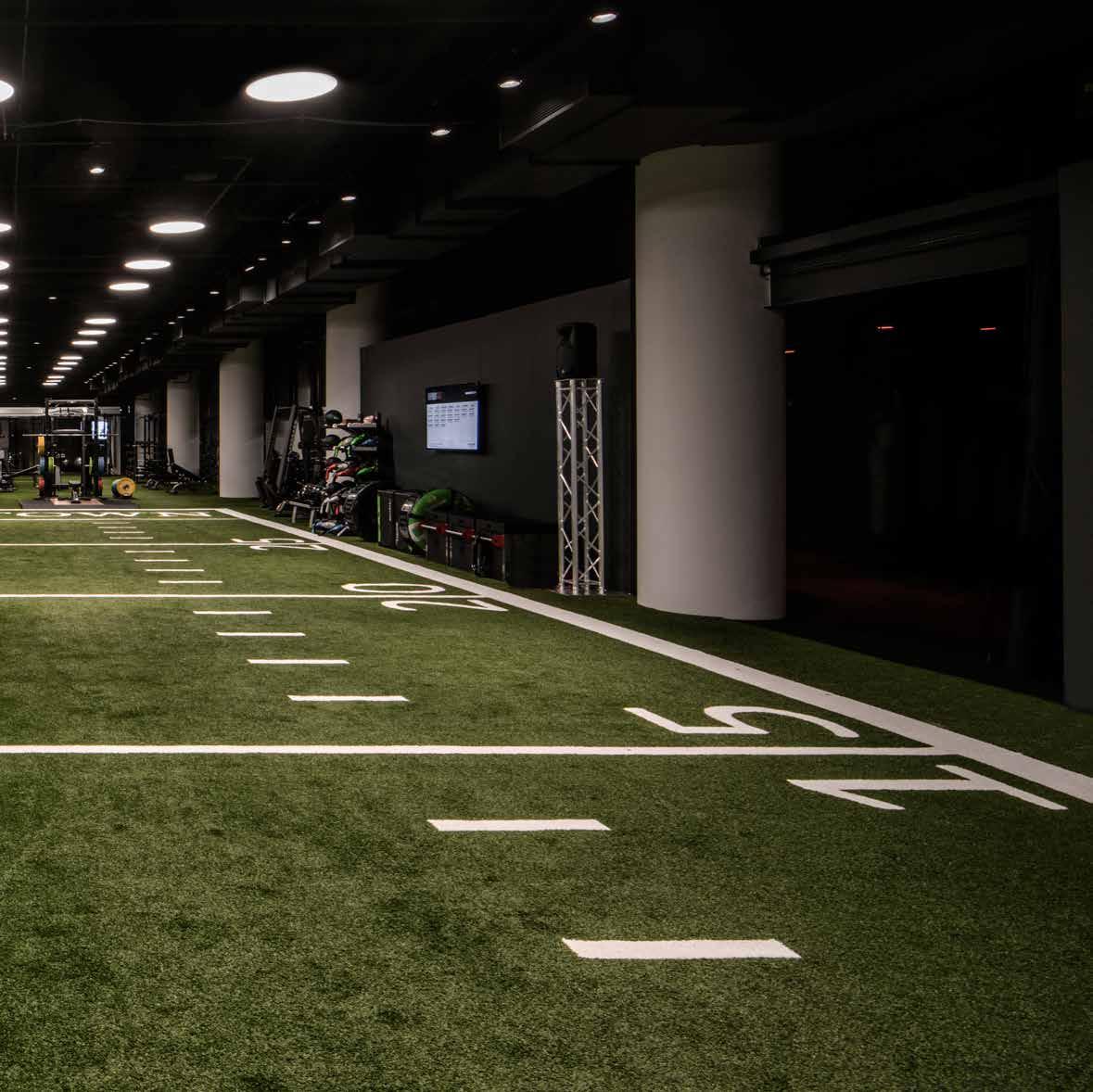
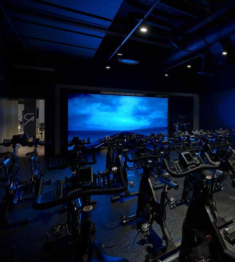
Midtown is not your typical health club. It spans three floors, starting with the quietest programming at ground level where guests can check-in at the reception lobby and head to the spa, salon, locker rooms, indoor pool or retail shop. Climbing a grand staircase to the second floor, guests land at the hub of the club where they can relax, dine, workout on the cardio machines, take a multimedia spin class in the Ride studio, sweat it out in a group fitness class in The Theater, enjoy yoga or pilates in the Mind & Body suite, or swim in the outdoor pool. Moving up to the third level, guests find The Field - a turf surface surrounded by professional training equipment that extends outside to a rooftop workout area with spectacular views of the city. Adding high intensity to the floor is an “Everybody Fights” boxing gym complete with punching bags and a ring. Throughout the club, movement is choreographed between floors and spaces for easy wayfinding and cohesion.
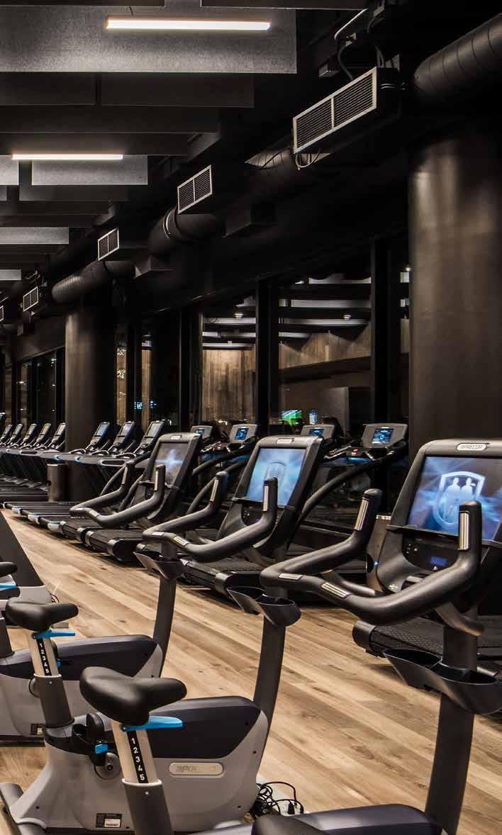
43
Mind + Body
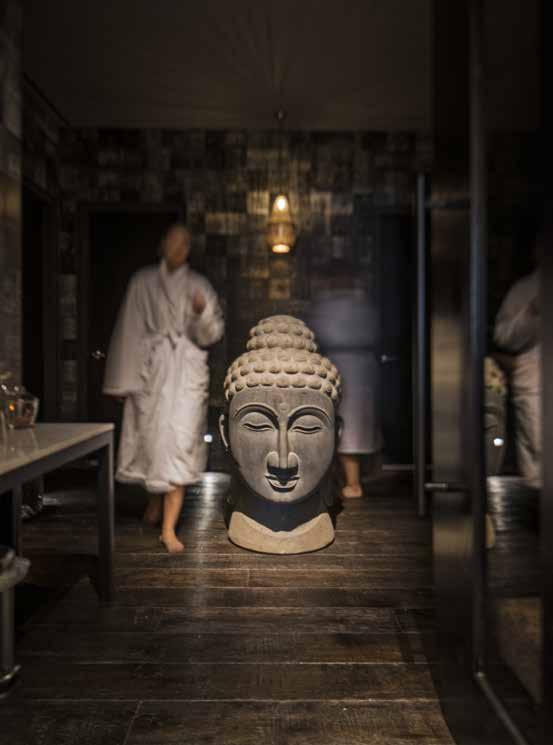
Mind & Body’s spacious relaxation lounge is where the mood dramatically changes, mentally preparing guests for Yoga or Pilates. In a dim room padded with warm blue-gray upholstered acoustic wall panels and a long bench, a constellation of tiny stars sparkle above and behind a Buddha statue sitting in a meditative pose. The “stars” are perforations of specific sizes in the ceiling panel for measured brightness, representing all of the zodiac signs. Originally, a layer of fabric was planned to cover the perforations to diffuse the LED strip light source. But during installation, we discovered the sparkle effect was stronger without the fabric and decided to eliminate it. The lighting completely transformed the lounge to other-worldly.

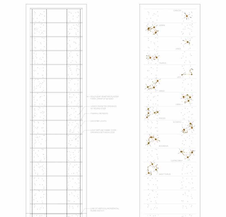
44
led strip lights aquarius pisces virgo taurus gemini capricorn scorpio libra leo aries cancer sagittarius light diffuse fabric over openings between leds line of vertical/horizontal plane switch framing members varied diameter openings w/ roundover Gold leaf venetian plaster finish, wrap up @ sides
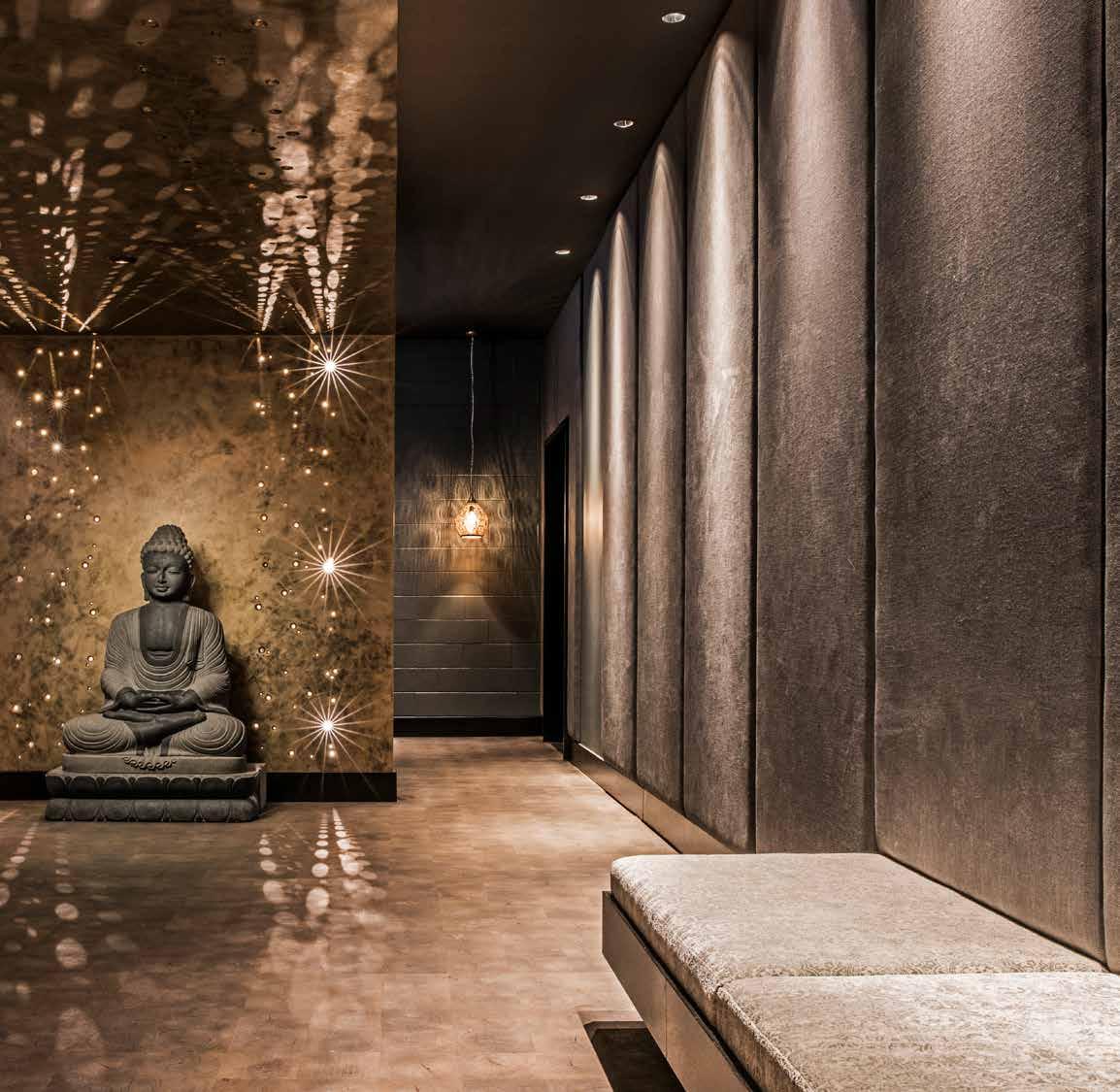
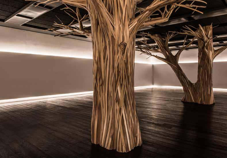
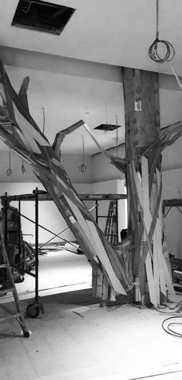
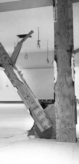
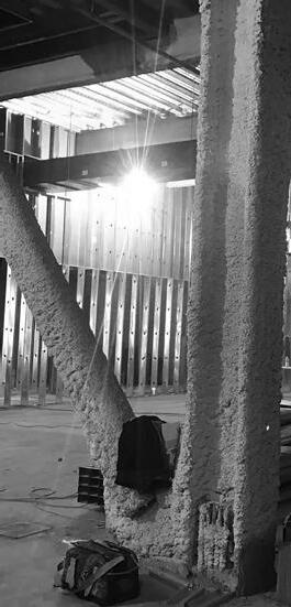
Initially designed to be a 3-story building, the Midtown Athletic Club’s program evolved during construction adding two more floors. The decision required a change from concrete structure to steel framing with diagonal bracing that would support the taller building. As a result, two columns and a diagonal brace were embedded within the Yoga space, forcing architects to come up with a solution to this new challenge. How to transform these intrusive structural elements into a meaningful design feature?
A Bodhi or Wisdom Tree in Buddhism represents the place of Buddha’s enlightenment. Inspired by the symbolism, the steel columns and bracing were clad in strips of repurposed plywood, dressing the trunk in up to six different wood species to provide layering and texture. Branches naturally grow out into limbs, stems and twigs for a delicate balance in space, blurring the boundaries between art and architecture.
The Yoga studio is a mystical place. The walls float with indirect lighting above and below, creating an aura of timelessness, and the Bodhi Trees take you to another world. With a quiet presence, the trees settle the mind and fade into the space.
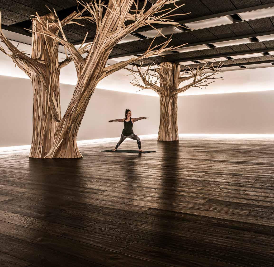



52
53
The Hotel at Midtown
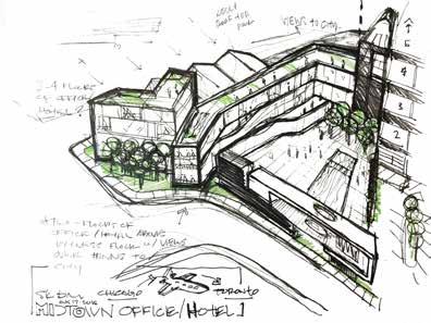
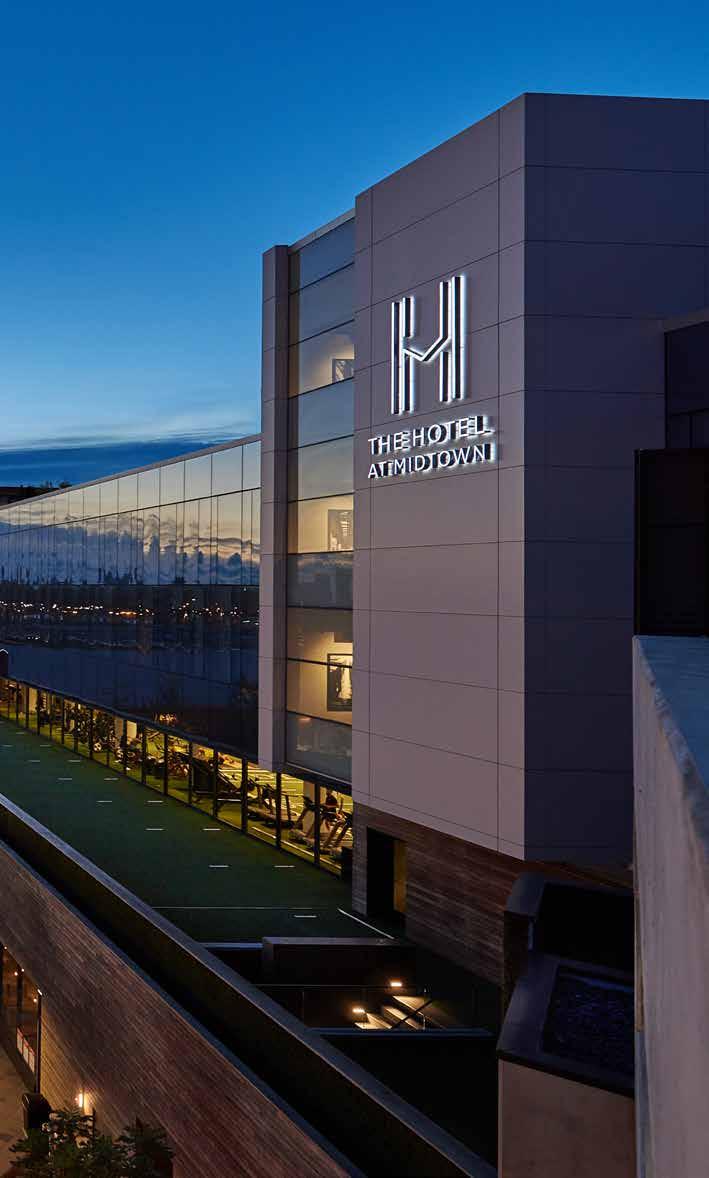
Where fitness is a small fraction of the typical hotel, the Hotel at Midtown flips the paradigm allocating 94% to health club and 6% hotel where guests have all of the perks of Midtown Athletic Club. In a 35,000 square-foot, two-story reflective glass volume above the health club, the Hotel at Midtown is located on the 4th and 5th floors with the most spectacular views of Chicago. There are 51 guestrooms, three deluxe suites, a two-story penthouse, two meeting rooms, a board room, and a rooftop event space. Despite the difference in program, finishes from the health club are brought into the guest rooms to provide a cohesive experience.
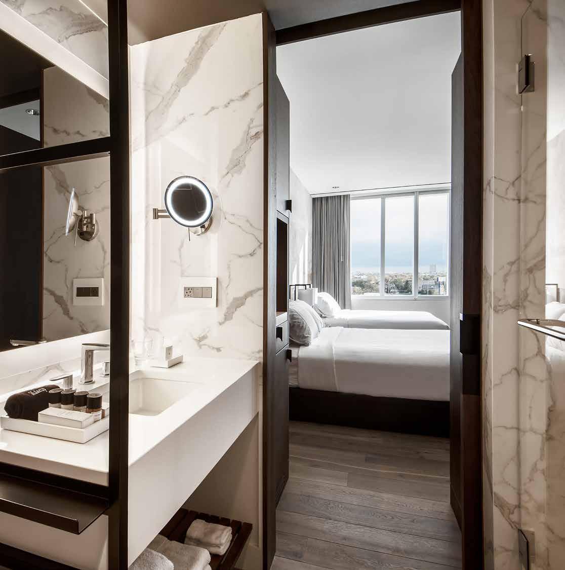
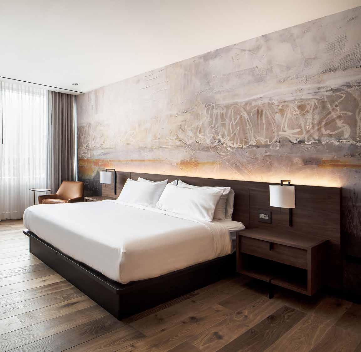
With relaxation and ease in mind, guest rooms are spacious and detailed with custom furnishings and finishes. From the foyer, city views are perfectly framed by walnut panels. Warm hardwood flooring extends into the bedroom where a long walnut desk is delicately supported by a thin vertical frame with a built-in robe hook that also serves as a doorstop. The bed rests against a wall covered in floor to ceiling custom wallpaper, like an abstract painting reflecting the urban context and lit for radiance and warmth.
55
Granite Reception
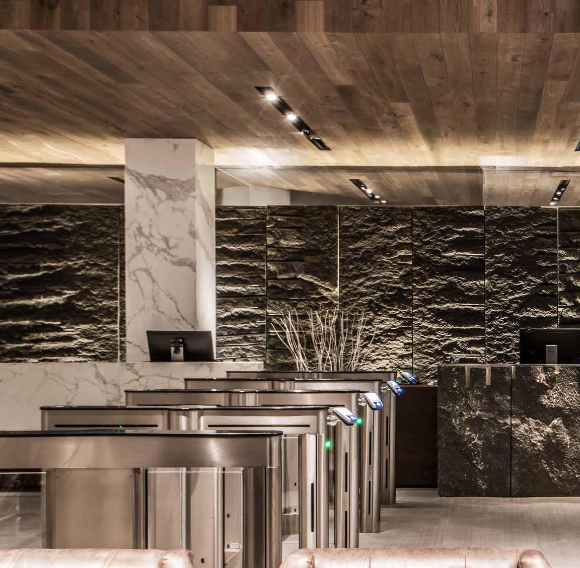
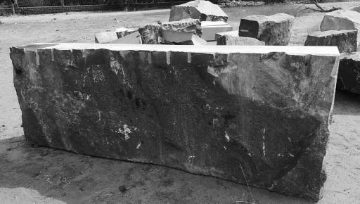
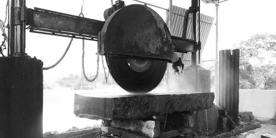
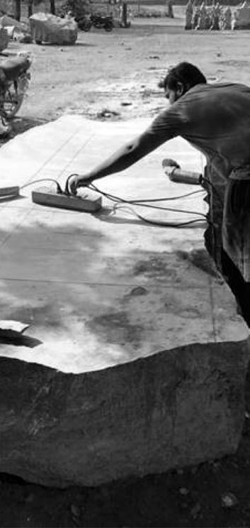
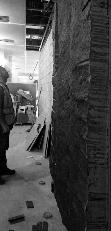
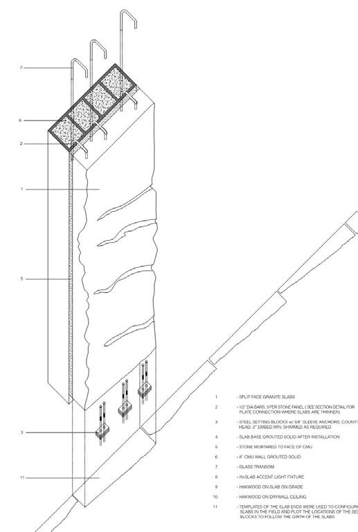
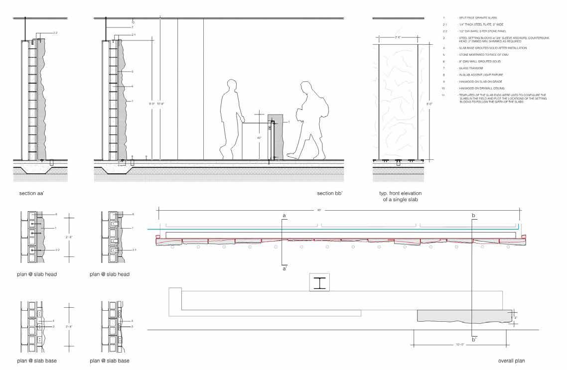
The backdrop of the lobby at Midtown is comprised of large blocks of Absolute Black Granite that made its journey from the Telangana mountains of southern India. The rough texture and drill marks tell its story and reveal the process of drilling into the mountainside to split the stone. While these end blocks are typically discarded, the team chose to use the stone for the raw surface rich with drill marks, preserving its natural, unprocessed aesthetic.
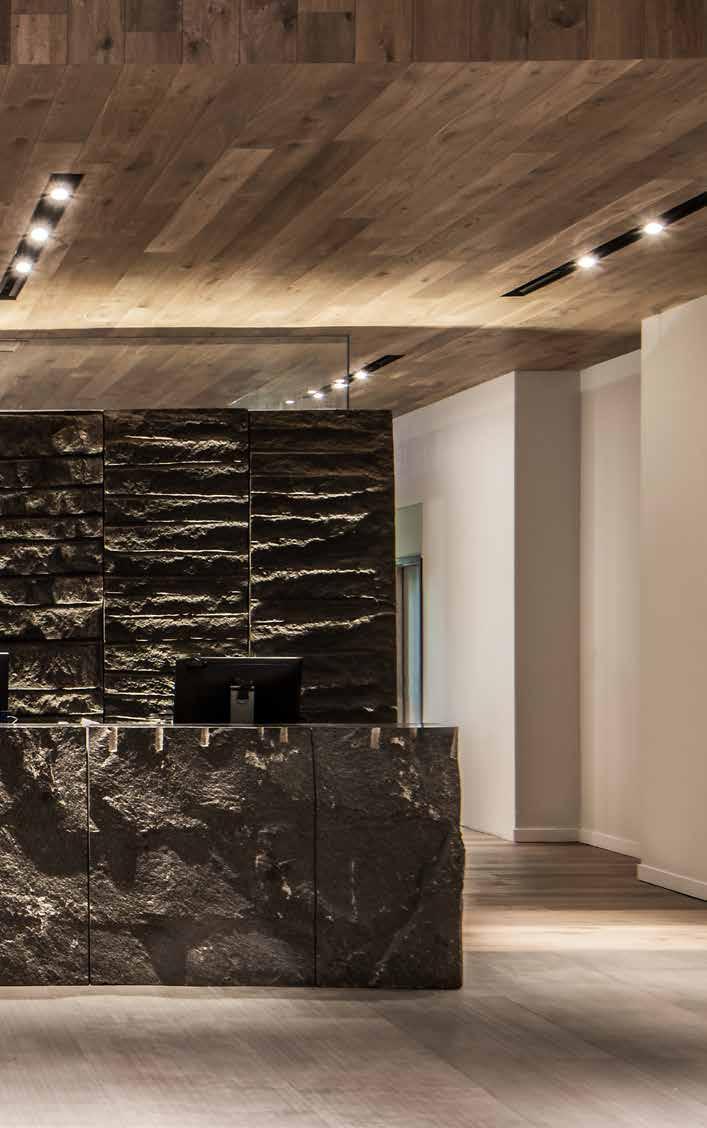
An installation of this magnitude was an ambitious undertaking, The team faced a huge challenge in sourcing the granite from the quarries within U.S. The team located a quarry in Southern India that was willing to engage in this unusual experiment.
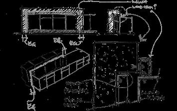
Carefully selected blocks split from mountains were cut into panels that varied in thickness from 2 to 14 inches. The installation into an already finished space required engineering a support system for the stone panels. In total, fourteen panels weighing 15 tons were carefully selected and planned from the design vision that spanned and bridged geographical boundaries. Completing the lobby space, a 10 ft reception desk of the same granite end blocks was hand carved for the milled wood desk nested within.
57

58

59


61
Custom Design of the Hotel
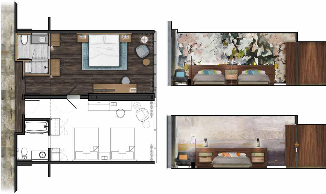
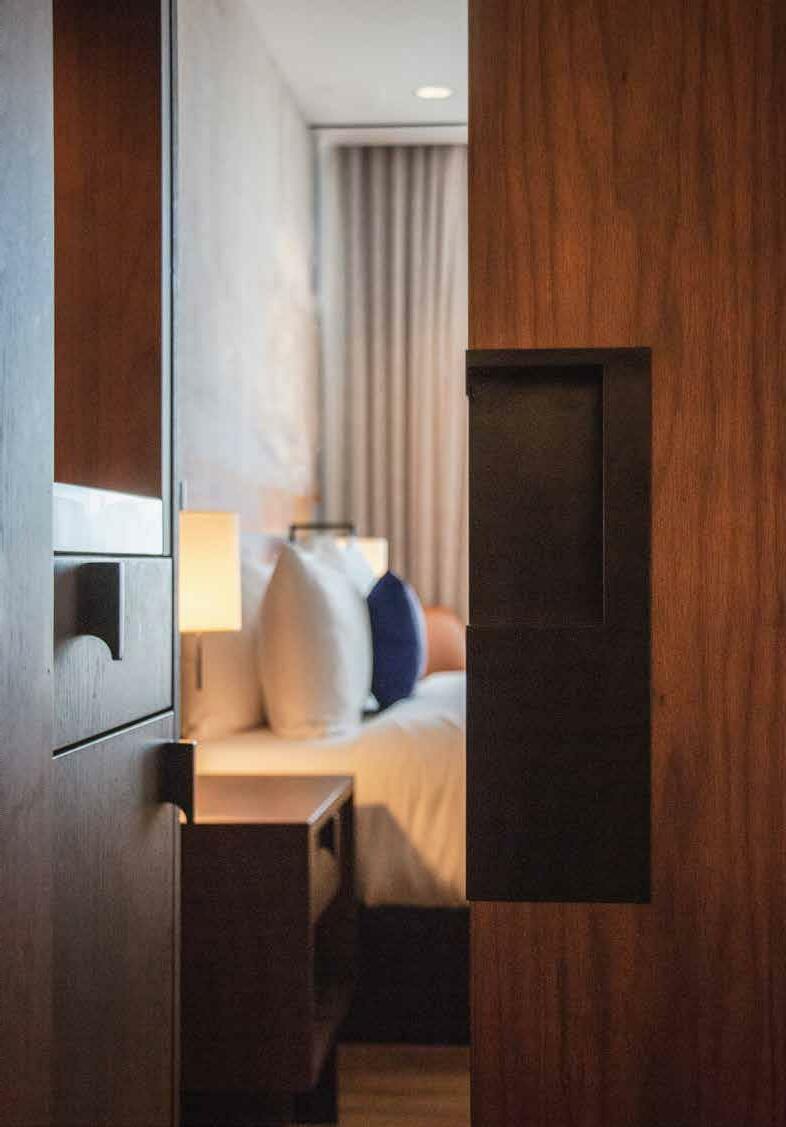
With comfort and ease in mind, thoughtful attention was given to the design of custom built-in furnishings and finishes in each guestroom for the ultimate relaxing stay. All of the hotel case goods are made of natural walnut wood appointed with black iron details, complementing the rustic and refined mood in each room.
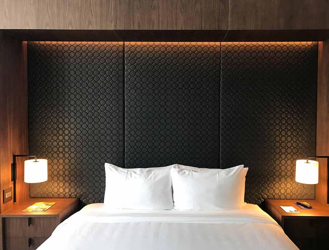
A long walnut desk stretches across a wall seemingly floating above the dresser drawers and lightly supported at one end by a black metal frame designed with a doorstop and robe hook. Opposite the desk is a bed with a low walnut headboard hanging from the wall which is back-lit to give radiance and warmth to the space. Custom walnut nightstands are built into the headboard, floating above the floor, designed with both a drawer and an open shelf for easy and visible storage.
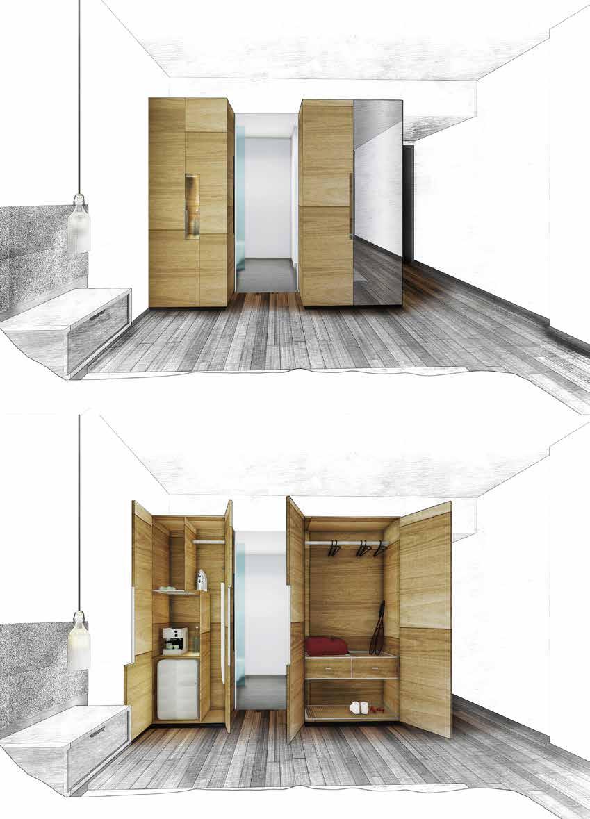
Appearing as wooden boxes inside the guest room, walnut wardrobes provide ample dress and suit storage as well as house a full-size ironing board, shoe cubby and a safe big enough to fit a laptop. One wardrobe is paired with a walnut coffee and amenity cabinet with a quartzite countertop and small refrigerator.
The bathroom entrance is framed by the two wardrobes but blends as one “landscape” when the walnut sliding door is closed. In the bathroom white marble tiles are carefully sequenced so the stone grain continues as it folds from one panel to the next; and similar to the desk, a thin metal frame supports the vanity with builtin features to keep toiletries and towels dry and within arm’s length. All of the knobs and pulls are custom and ergonomic.
62
63

66
67
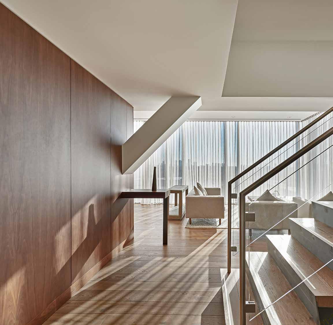
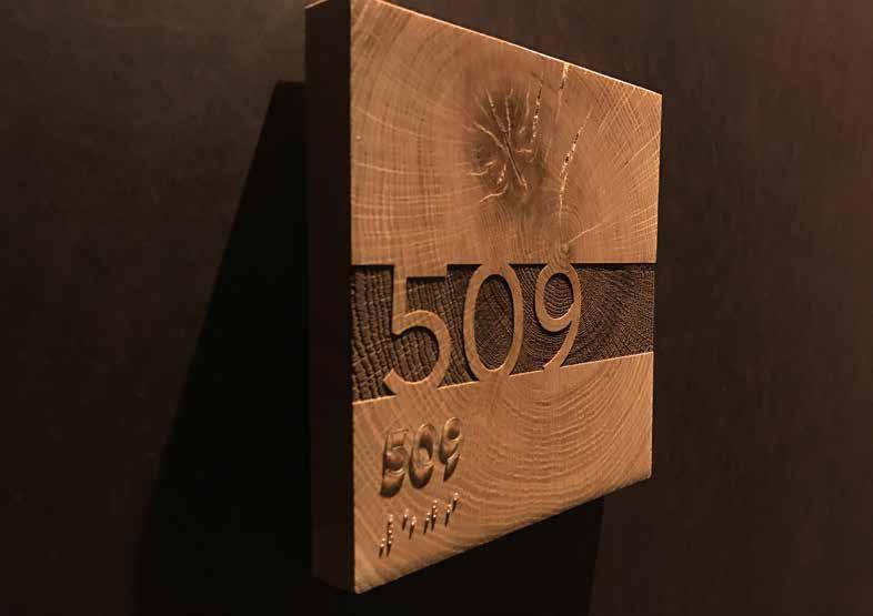
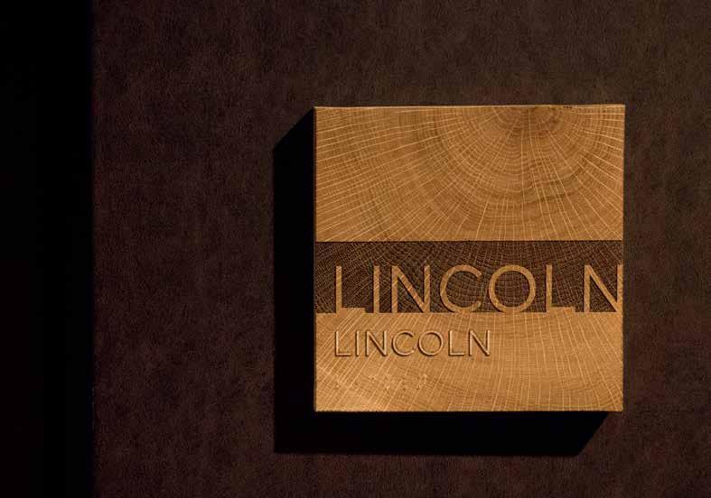
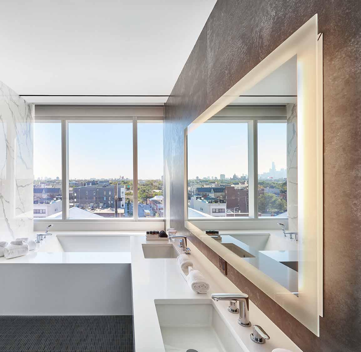
The 2,100 square foot, two-story corner Penthouse Suite is flooded with natural light and opens to iconic views of Chicago’s skyline. Entering into a double height space dominated by a sculptural staircase made of folded steel plates and pipe stringers, a serene volumetric space welcomes guests. With generous 9’-6” ceiling height, the living and dining areas merge with the capacity to seat up to 10 people. To the left, a volumetric glass insert encloses a kitchenette and an adjacent gathering space. To the right is the 530 squarefoot master bedroom with a king sized bed, walk-in closet and a 170 square-foot bathroom that includes a double marble countertop, built in bathtub, and double shower. Upstairs, a 500 square-foot lounge room opens to a private outdoor deck, resulting in a versatile space that can double as a place for relaxation or for a memorable event.



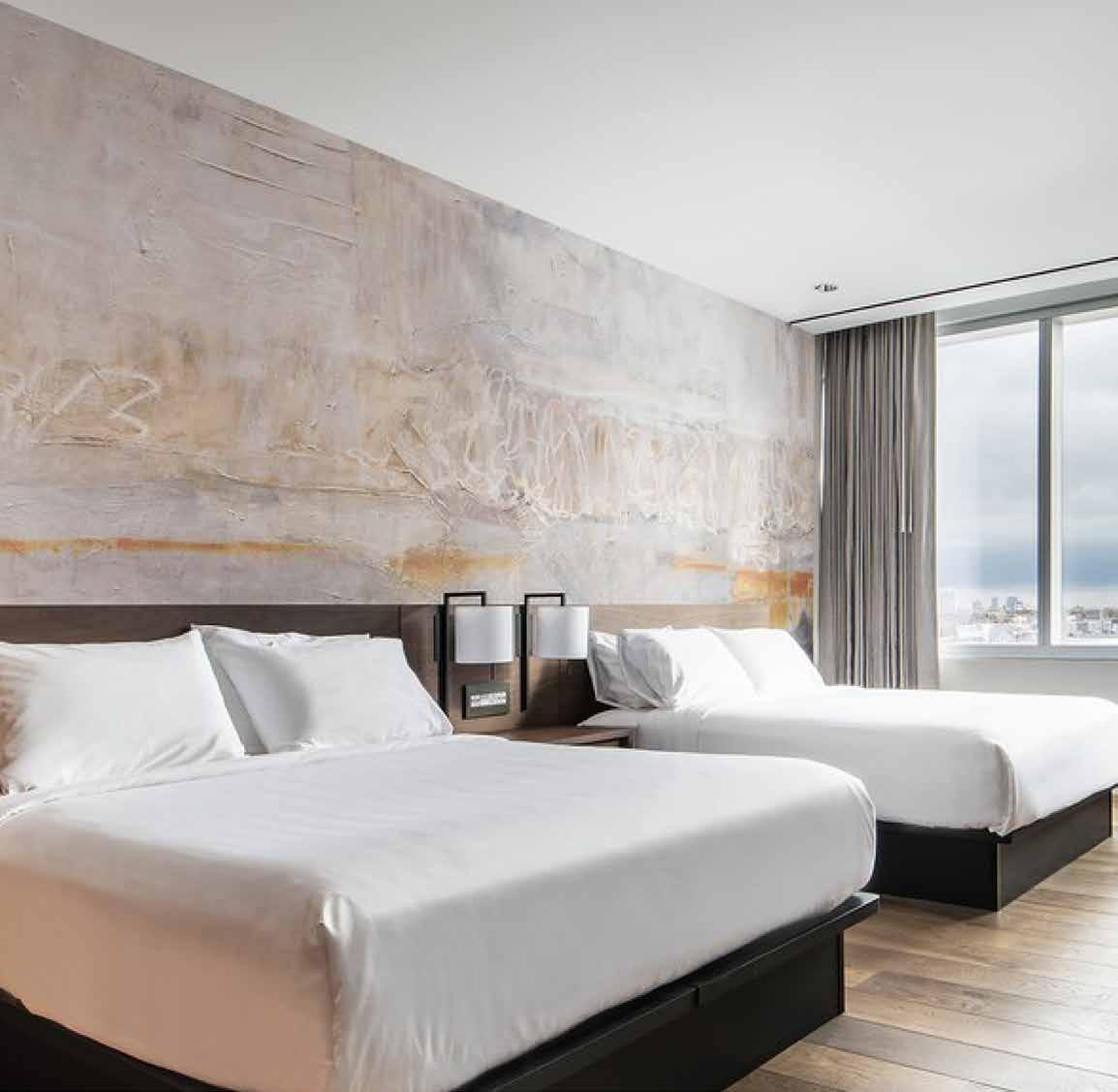
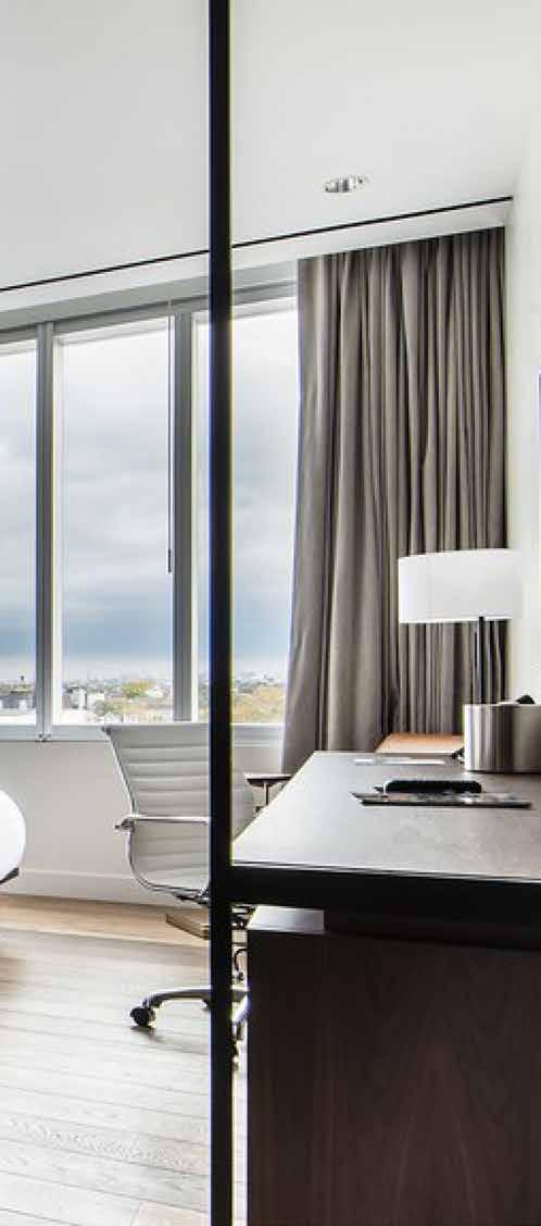
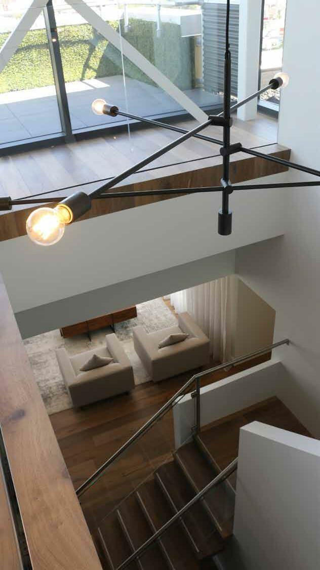 - Condé Nast Traveler, November 2017
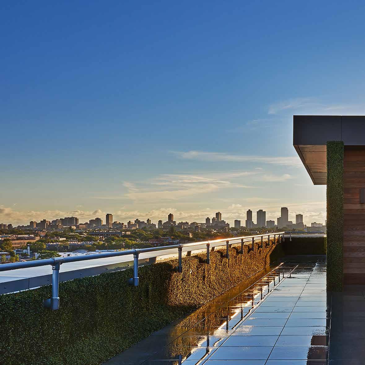
“The Most Exciting New Hotel in Chicago Just Opened Inside a Gym”
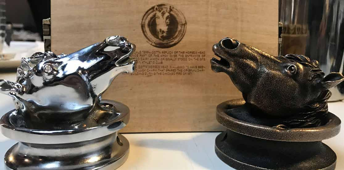
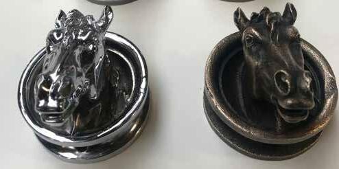
“This terra cotta horse’s head, once part of the arch over the entrance to Bonewood Dairy which originally stood on this site, is alleged to have been the good luck charm that spared the building during the Chicago Fire of 1871. All subsequent structures located on this site have retained the horse’s head, now well over a century old.” -Midtown Tennis Club, 1969 Horse’s Head
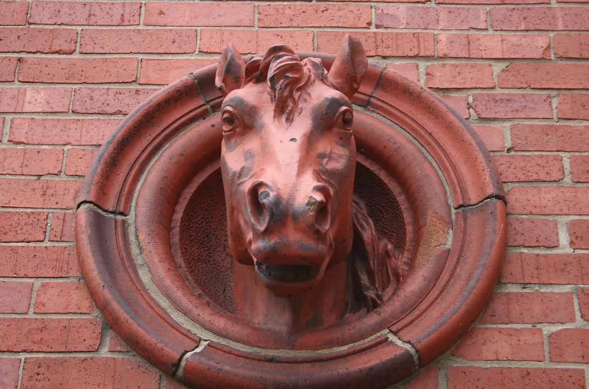
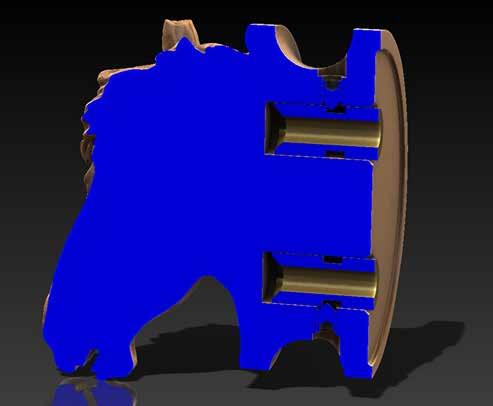
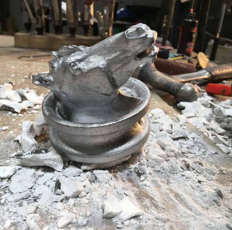
A small terracotta horse head inlayed into the brick wall of the original tennis club was 3D scanned, customized, cast and replicated as coat hooks in all of the guestrooms. The legendary horse head was part of an archway to a former dairy on the site that was spared from the great Chicago fire of 1871. In 1969, when a barn on the site was torn down to build the tennis club, the original horses head was discovered. For more than a century, it had been kept on all subsequent buildings on the site for good luck. Not taking any chances, Midtown and DMAC honored the horse head tradition for its expansion.




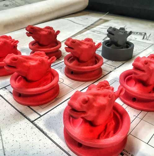
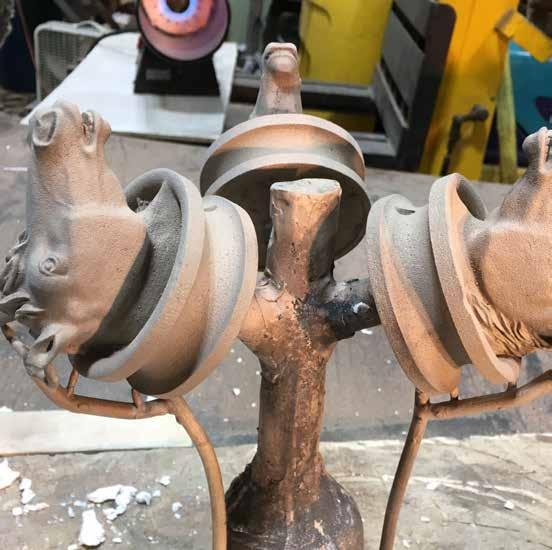
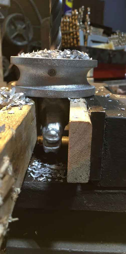
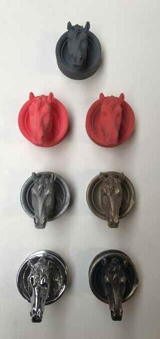
79
greenwood
american kitchen & bar
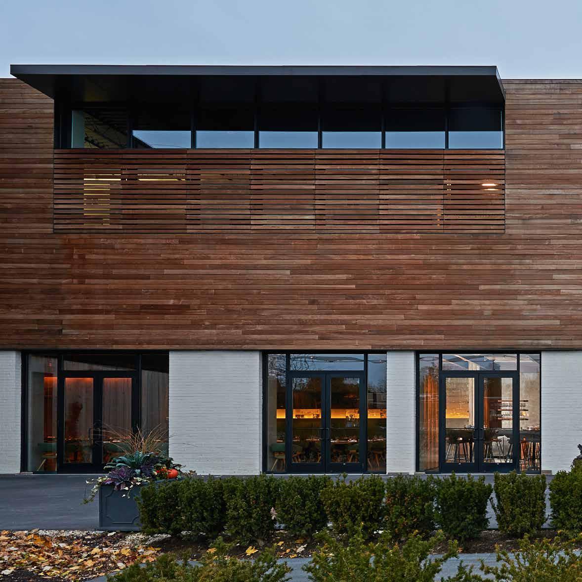
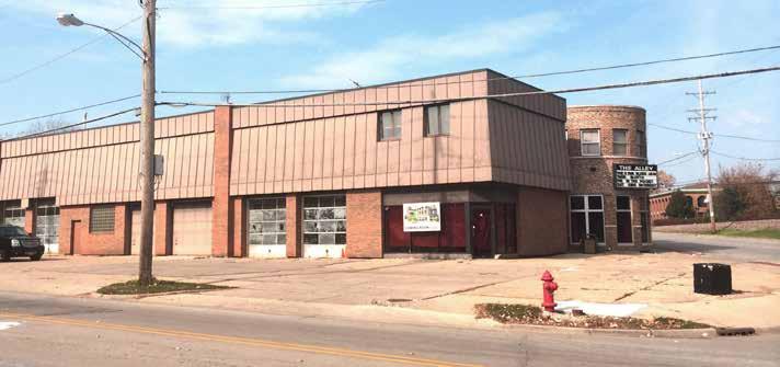
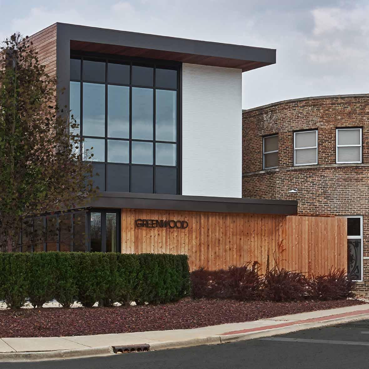
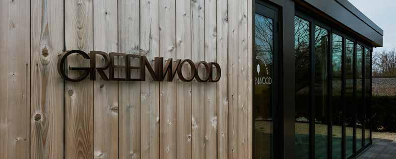
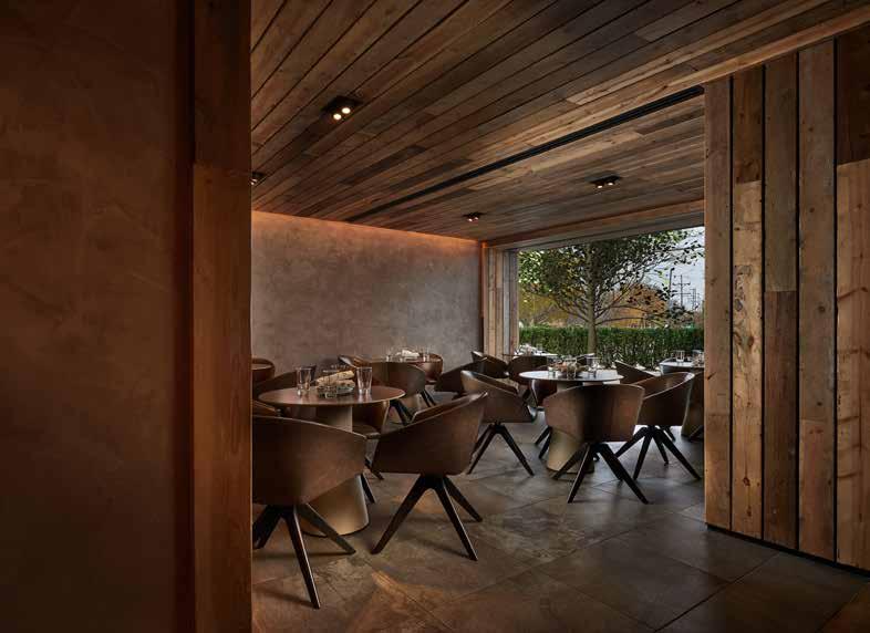
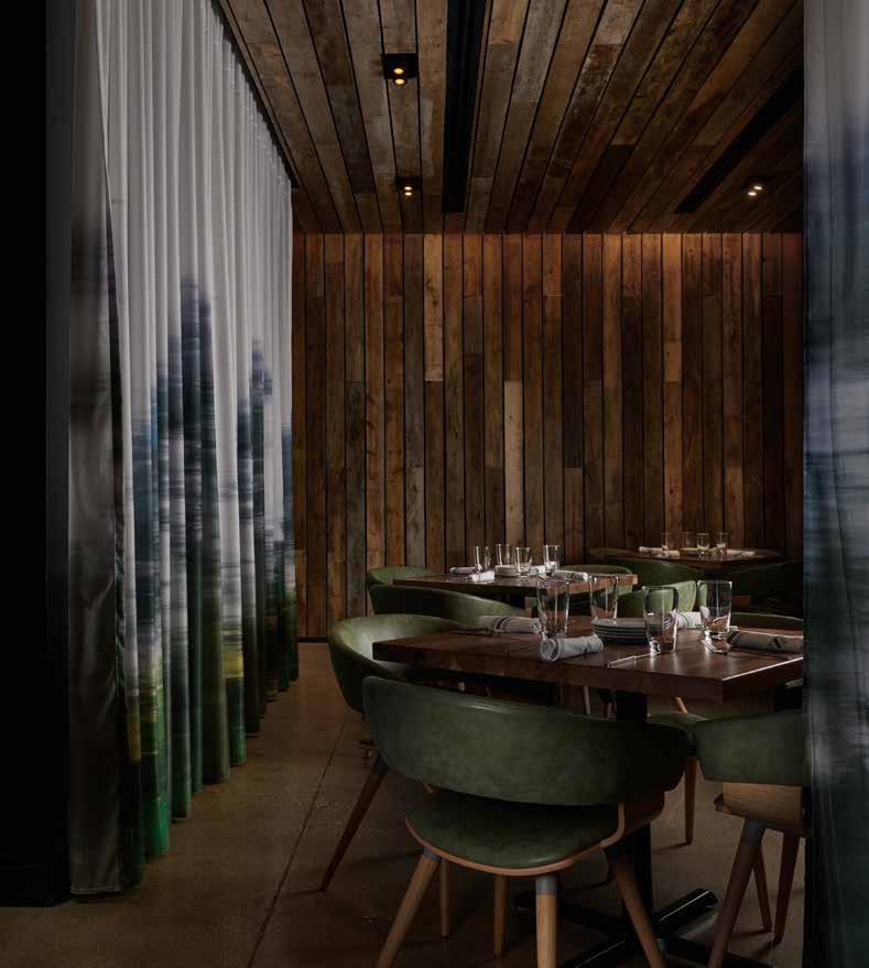
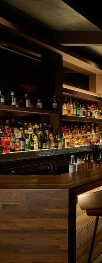
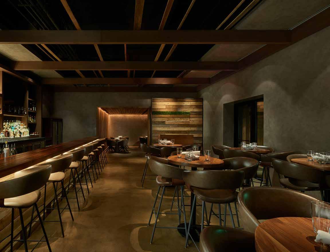
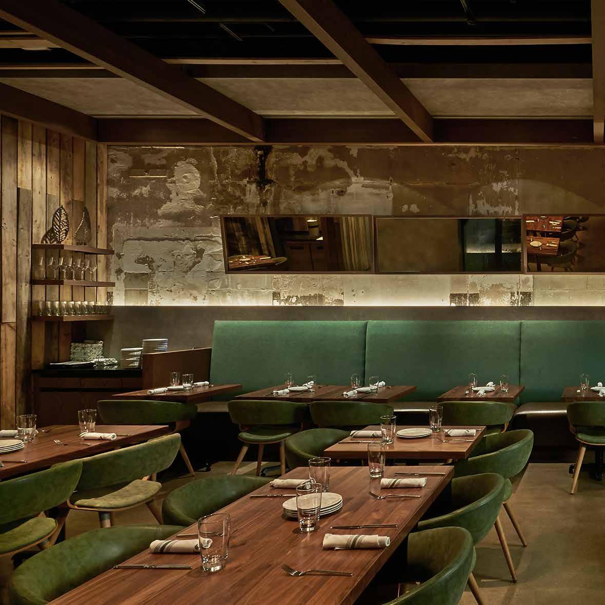
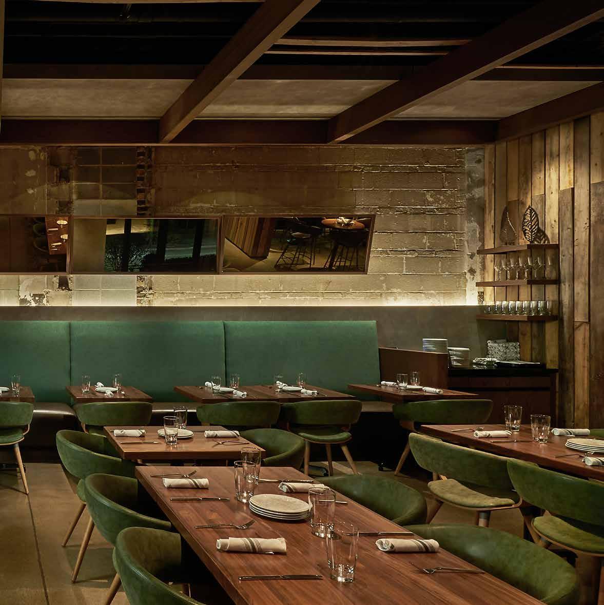
Located in the Chicago suburb of Highwood at the intersection of a busy roadway, commuter rail line and a residential street, DMAC transforms a former 5,300 square foot auto repair shop into an upscale yet casual restaurant, Greenwood American Kitchen & Bar. The design is a modern fusion of adaptive reuse and new construction that plays off the mixed context and becomes a quietly sophisticated gateway to the local epicurean enclave.
Over the years the original building was altered, in places to the detriment of the structural integrity. The base building was reinforced and perimeter walls extended to raise the roof for second-floor comfort. Acoustics also became an issue with many hard surfaces including a key design feature an exposed concrete block wall. The design and selection of finishes, treatments and furnishings became a significant part of the solution.
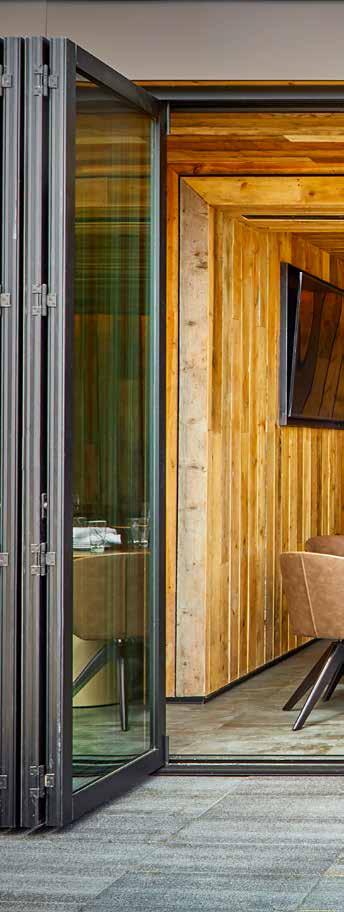
Greenwood is an architectural dialogue between urban and suburban, history and future, public and private, exposed and hidden, indoor and outdoor. It engages locally while drawing diners from all over Chicago. Its interior plays off the visible scarring of an original block wall and a modern aesthetic. Its flexible design seamlessly responds to changing configurations and seasonal dining.Its success is rooted in its vision, design and execution.

82
UPCYCLE
83
86

87
88
89
DOC B’S
restaurant & bar
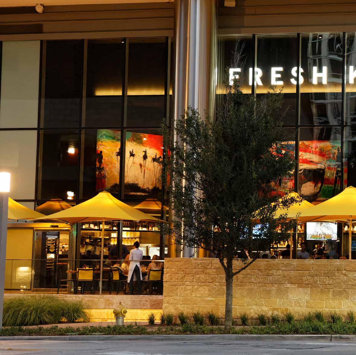
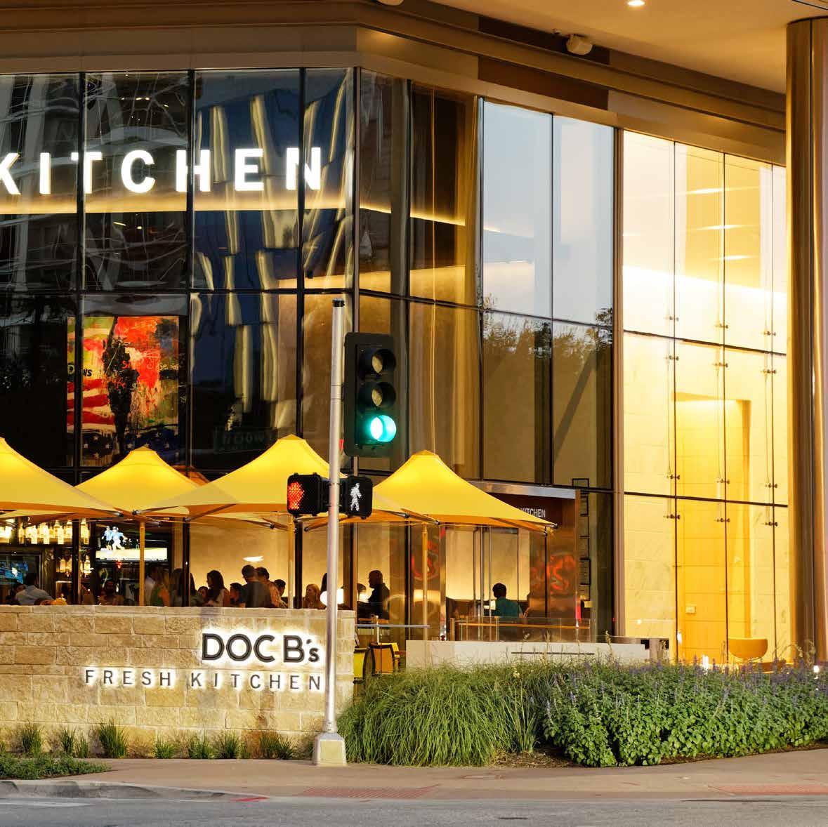
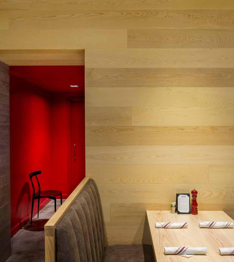
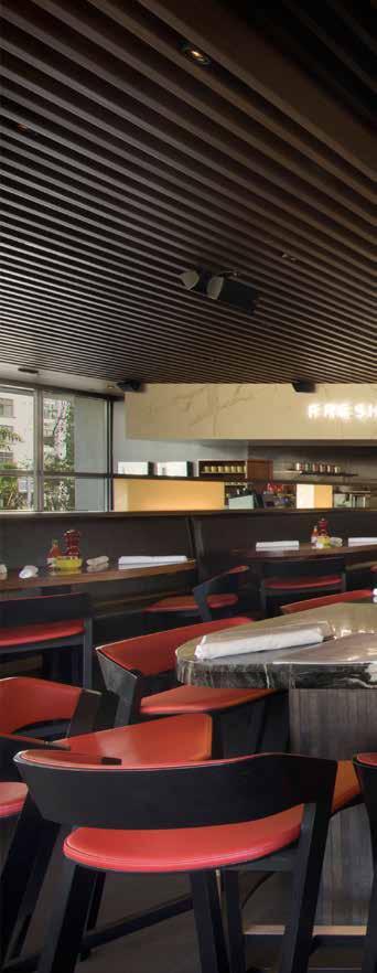
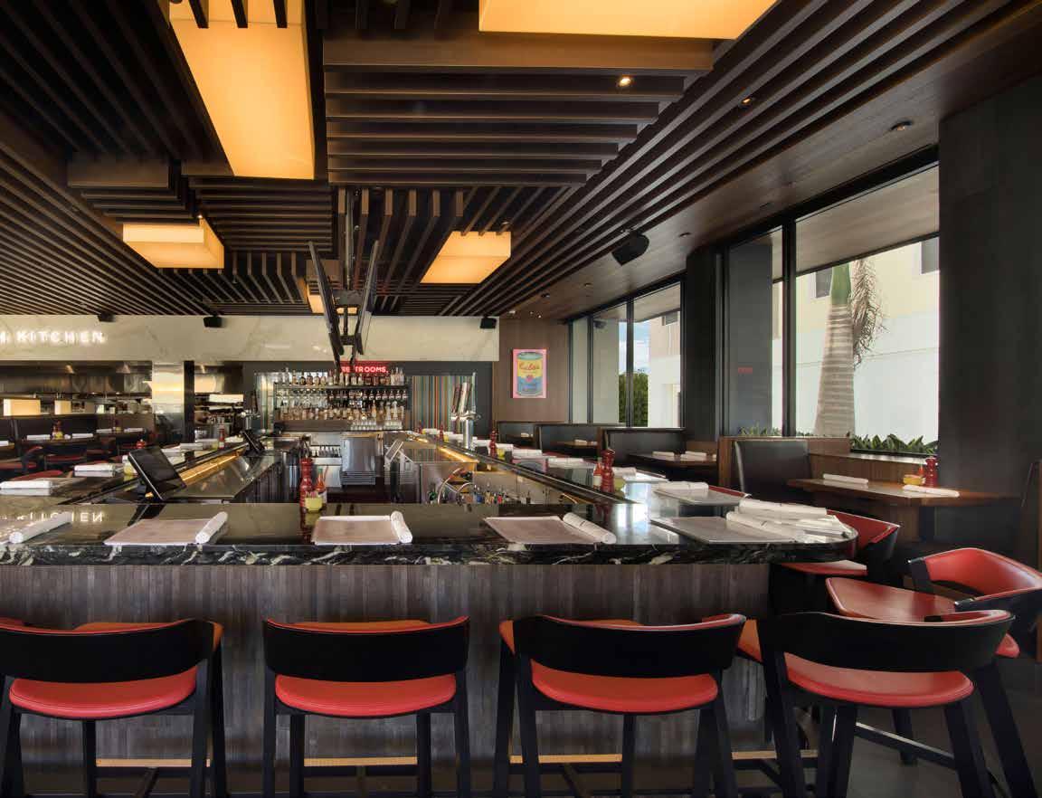
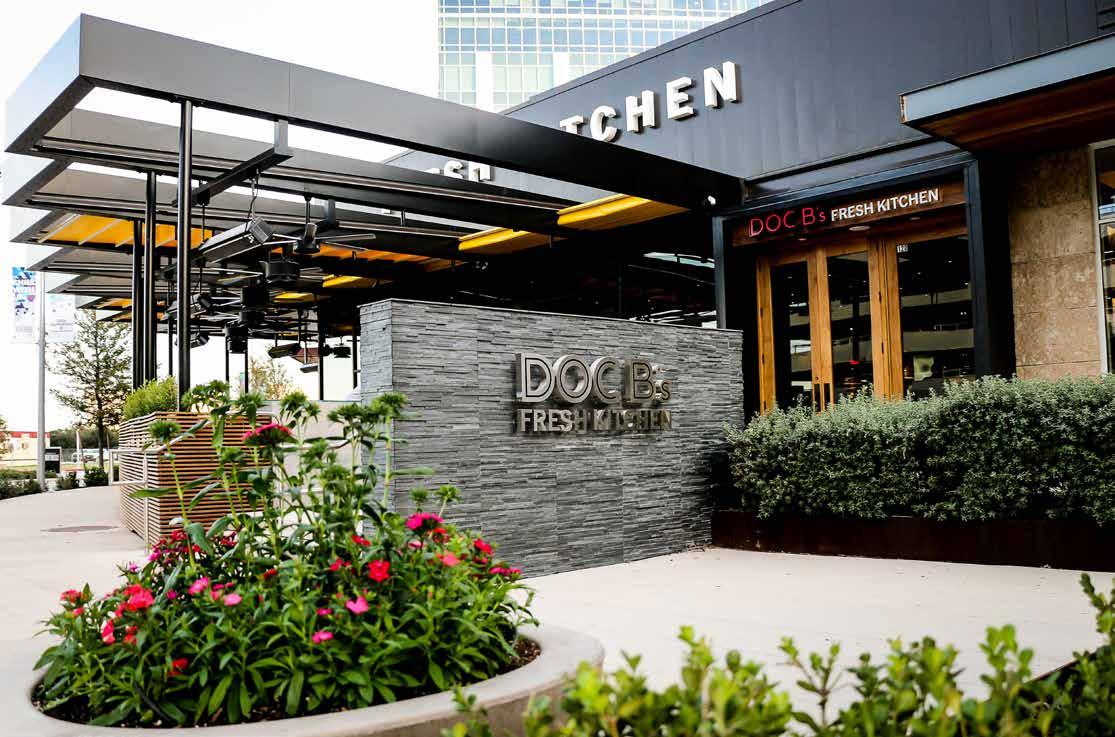
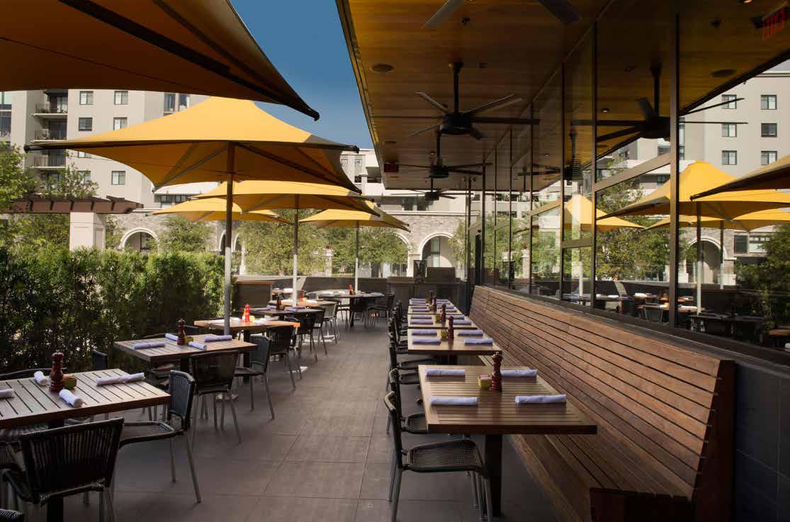
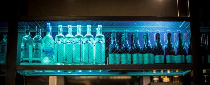
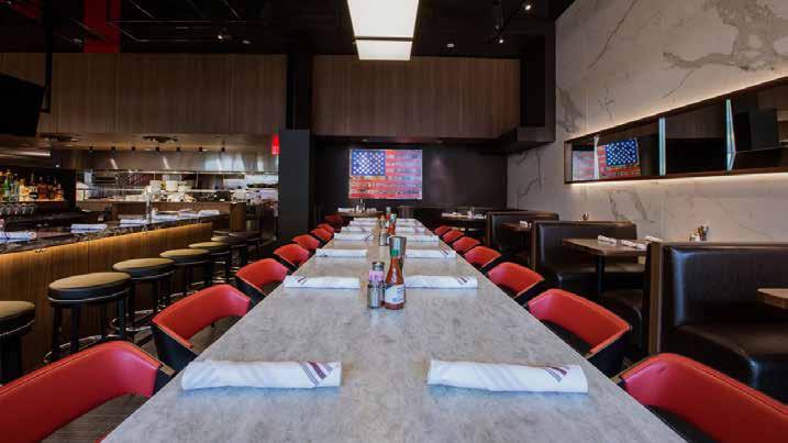
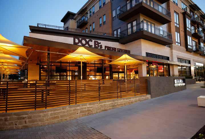
Architecture is experience, and how people experience your business is core to its success. Craig Bernstein, CEO of Doc B’s Restaurant + Bar knew that when he approached DMAC with his concept for the restaurant. Together, Bernstein and DMAC traveled the country learning from customer experiences and formulating ideas that would inform the architecture as well as the brand. Since 2013, DMAC has designed all eight Doc B’s Restaurant + Bar restaurants with the ninth to open in 2019.
Doc B’s is casual dining with fresh, house-made and mindfully sourced dishes. The architecture had to respond by being transparent and honest where the customers not only enjoy the food on their plates but also visibly connect to the kitchen where their food is being prepared. Each location needed to achieve high efficiency through creative design and space planning. These were the essentials.
Despite formal differences, each location at its core is the result of extensive and ongoing research. Each is a laboratory, allowing the design team to experiment with the way people eat and experience the brand, resulting in a brand that is constantly evolving and adapting in pursuit of the best customer experience, yet remains recognizable and consistent in feel.
With its growing success and refined brand, Doc B’s began in Chicago but has expanded to five Florida locations (Miami, Fort Lauderdale, Tampa, Coral Gables and soon Aventura) and three locations in Texas (Austin, Dallas and Fort Worth).
94
95
96
97

98
99
9 Restaurants, 8 cities, 5 years
michael jordan’s restaurant
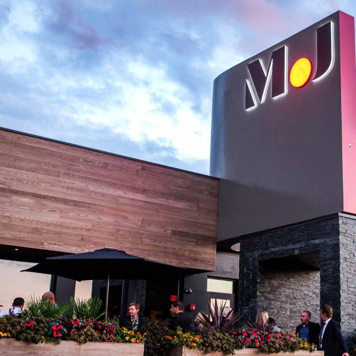
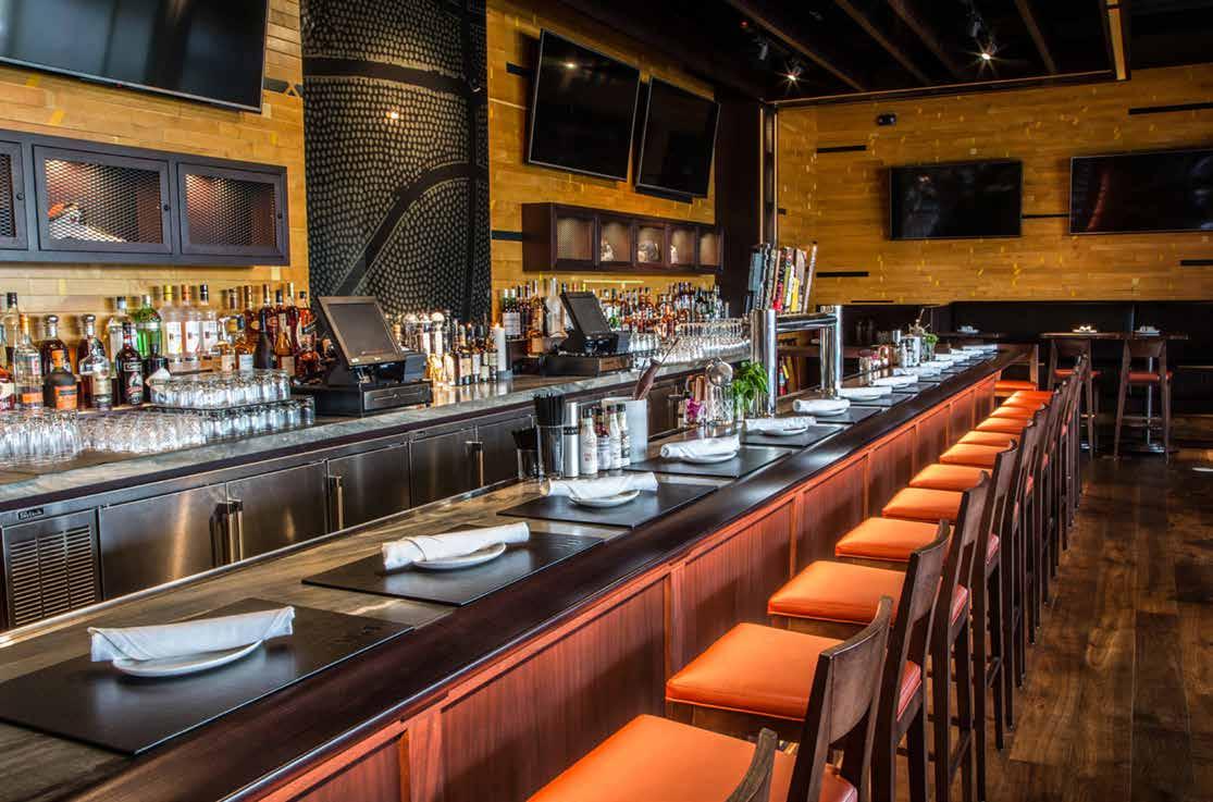
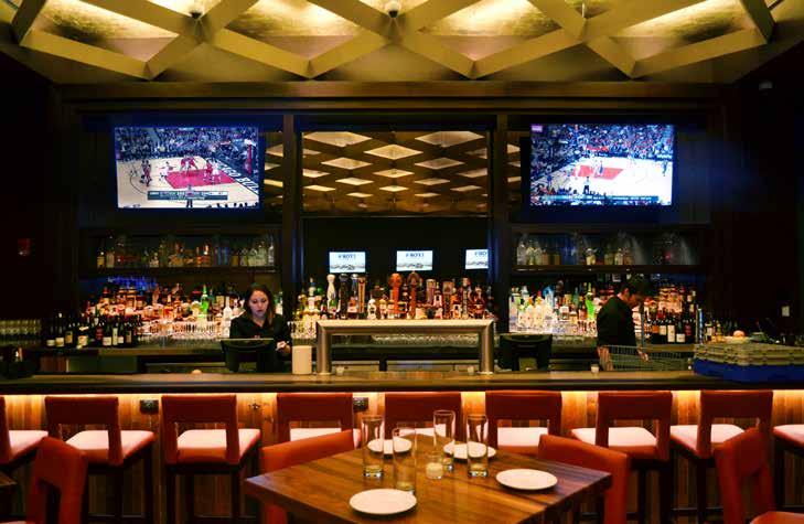
Michael Jordan’s newest restaurants in the outskirts of Chicago and Portland (Oregon) are a melding of his flagship steakhouse in downtown Chicago with his cafe in Connecticut, reimagined as upscale and comfortable dining. Given Jordan’s well documented career, the design could have easily become a kitschy theme of memorabilia. Instead, the design team worked simultaneously on both restaurants to convey an authentic story of Jordan in a simple yet sophisticated way.
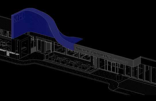
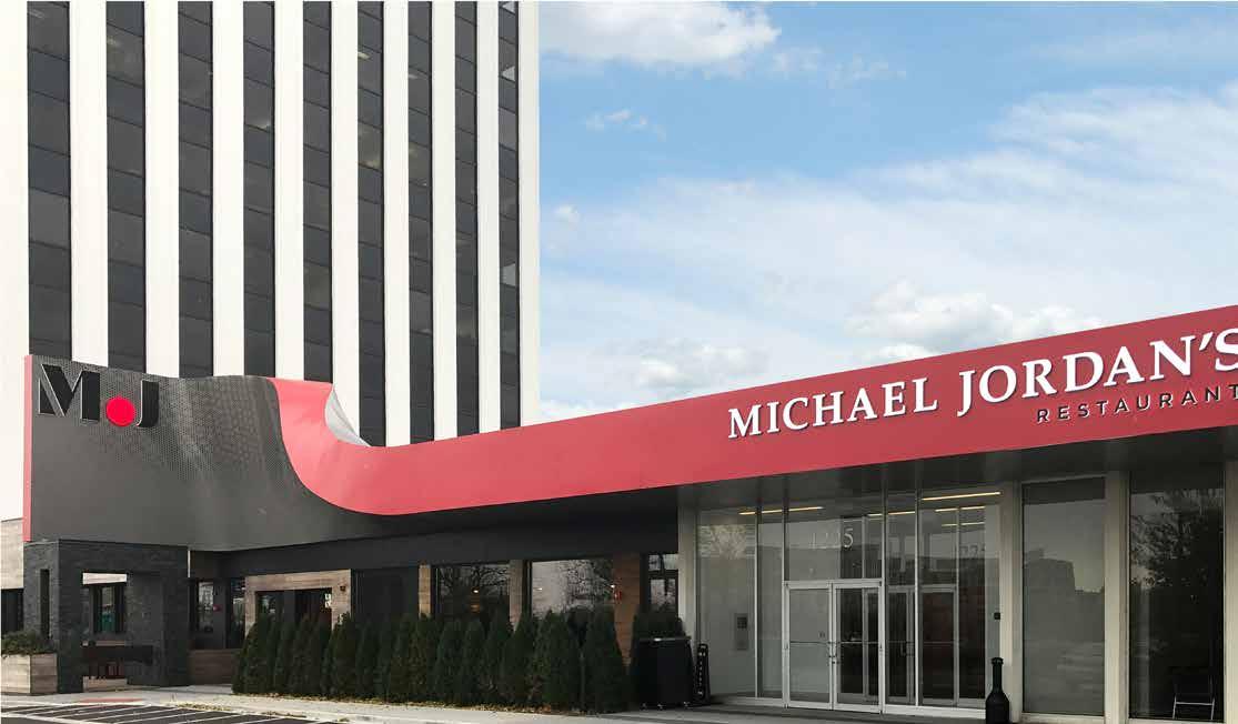
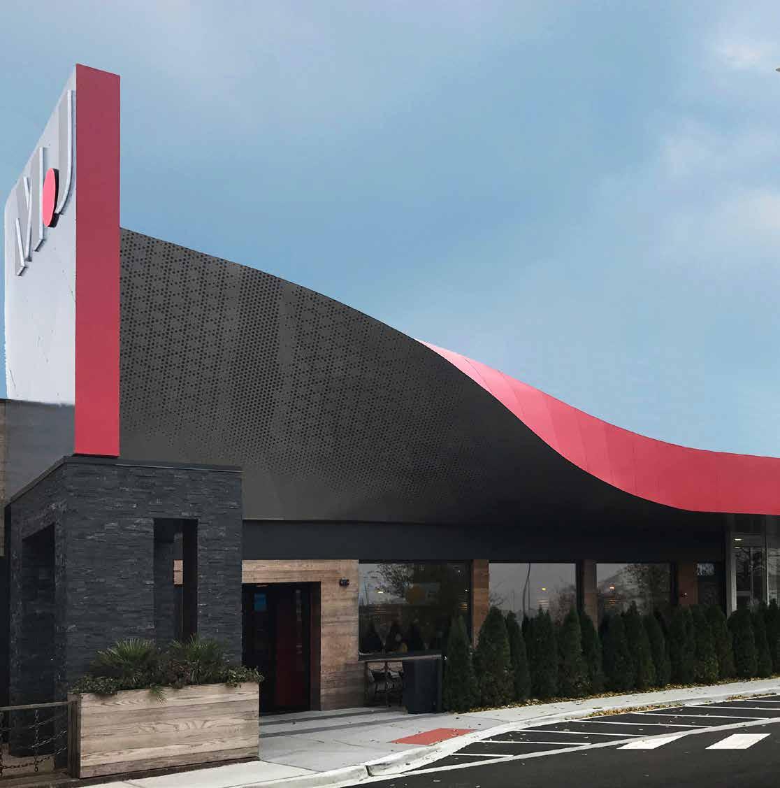
On a busy street in the Chicago suburb of Oak Brook, hidden behind the landscape and sandwiched between two office towers, the location was not ideal. To improve visibility and distinguish the restaurant in a significant way, the facade became a statement piece referencing the basketball icon’s famous flight to the hoop. Inside, the story unfolds with key design features functionally dividing the long space into different seating and service areas. Similarly, the Portland location had its challenges. Located inside a casino, the design needed to woo casino guests inside and, once inside, lead them to the dining rooms with the most spectacular views of three mountain peaks: Mount St. Helens, Mount Rainier and Mount Hood.
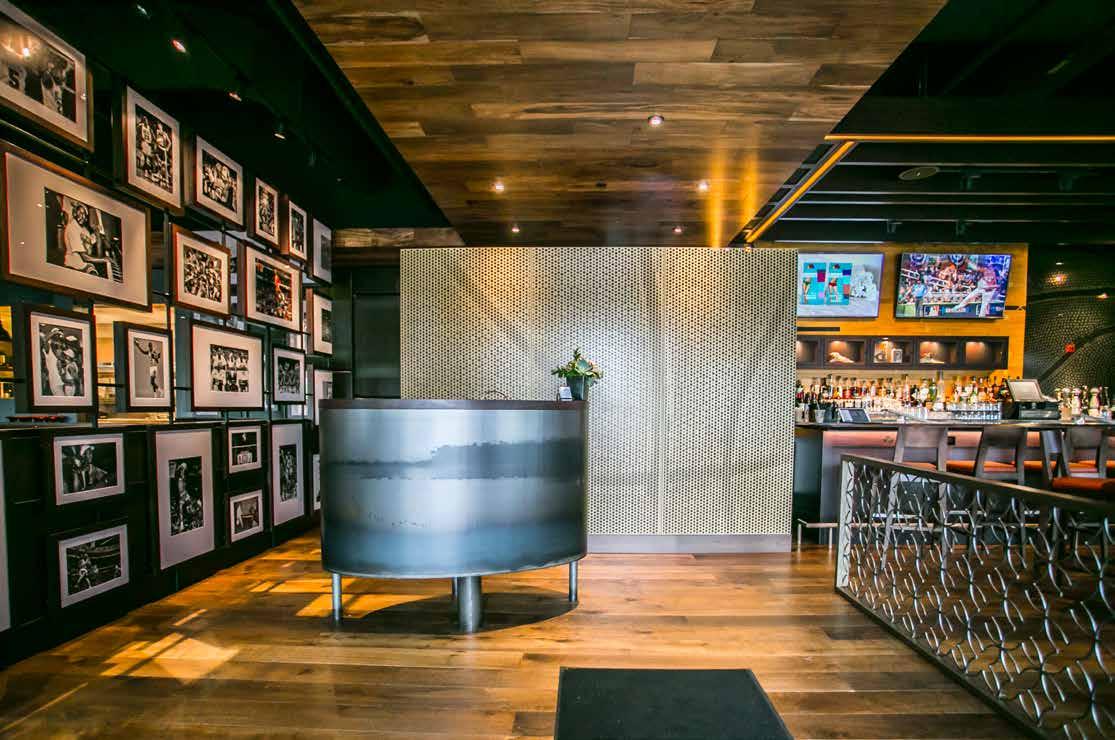
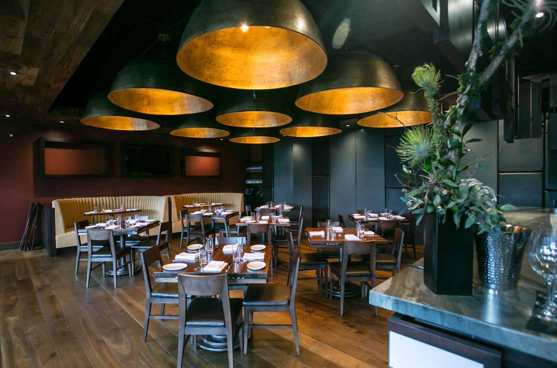
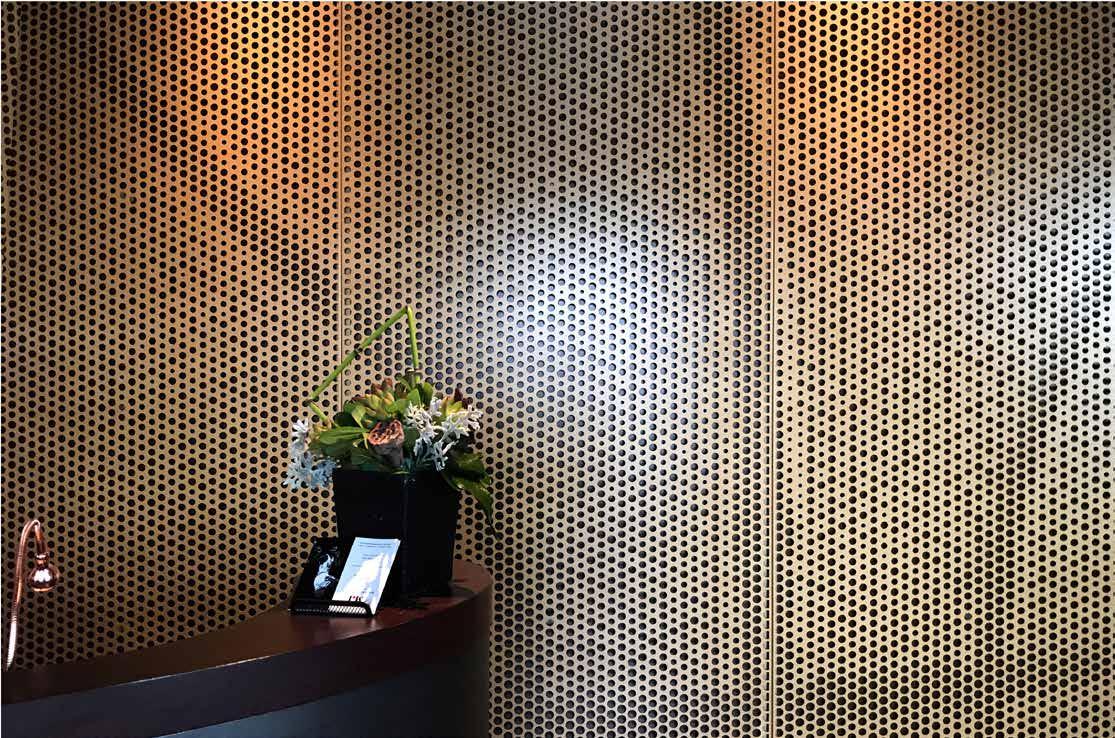
The interiors of both locations are inspired by Jordan’s story and achievements from custom brushed-metal screen punched with random holes for a dimpled basketball effect at the hostess station to custom banquette seating made from ultra soft fabric sewn with “fingers” reminiscent of a baseball mitt. In Oak Brook, the bar walls are clad in salvaged basketball court flooring but in Portland the walls are painted black and bring the eye to the ceiling feature an open crosshatch inspired by hoop netting. Where the bar and hostess station overlap in Oak Brook, a custom metal railing designed with a pattern of unwrapped basketballs divides the two functions, but in Portland the pattern is abstracted into the floor tile. Seen in both restaurants are bar stools upholstered in soft basketball-orange fabric to add visual pop to the space. While both restaurants take similar inspiration, their locations offer different opportunities to make each unique.

101
102
103
104
105

106
107
MJ’s Swoop
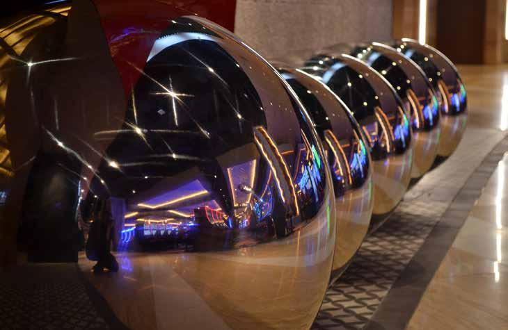
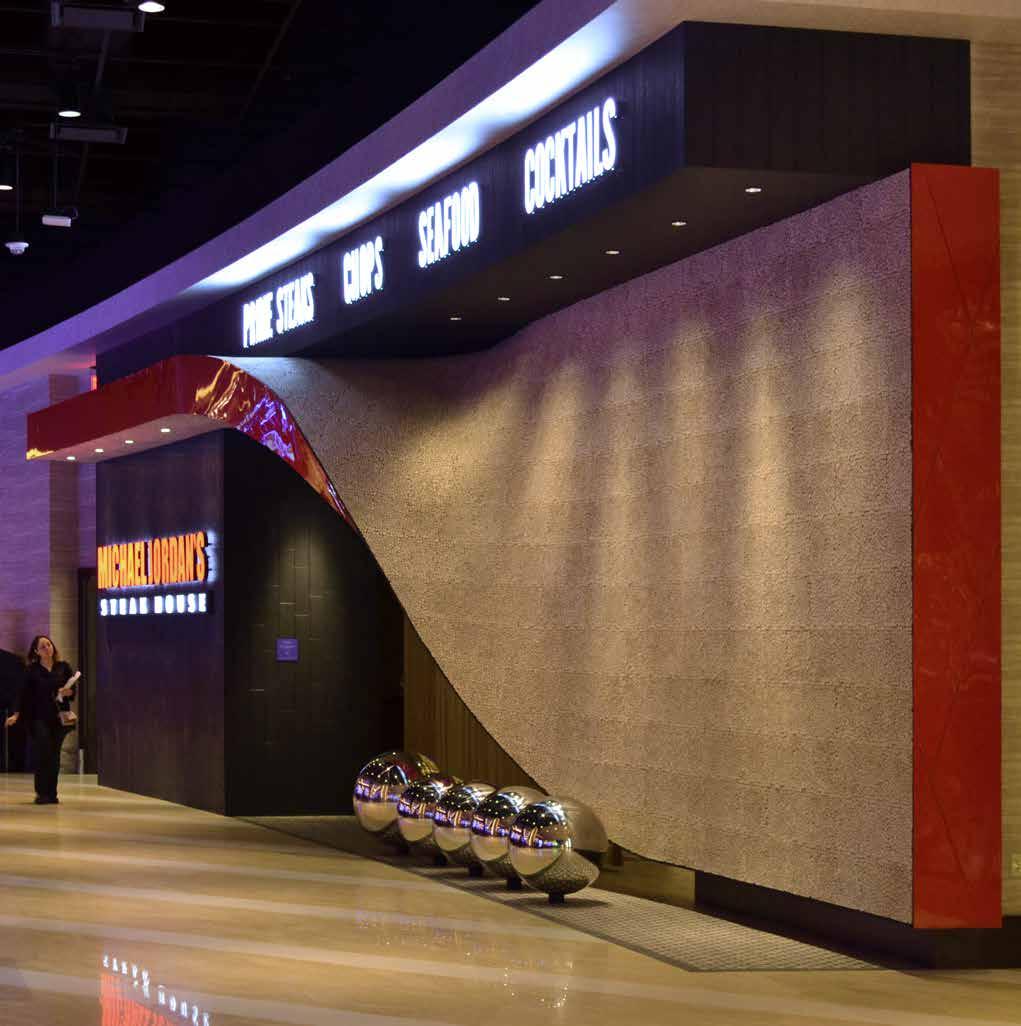
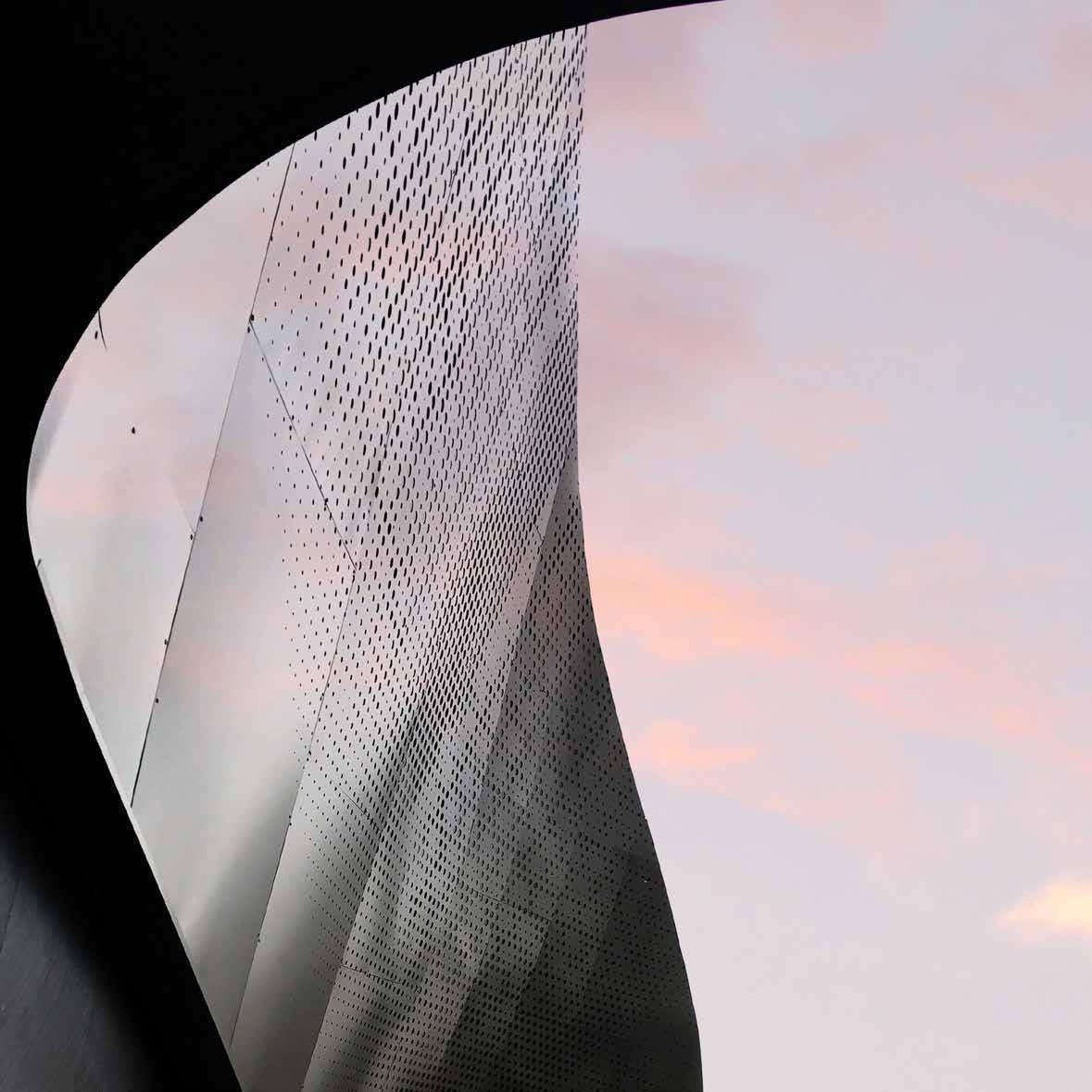
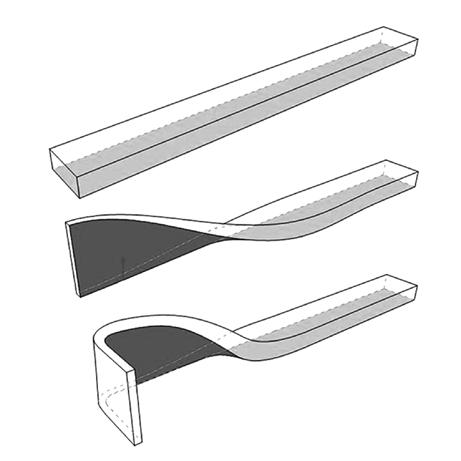
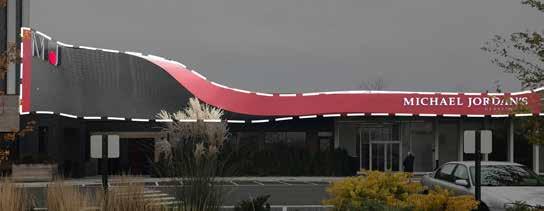
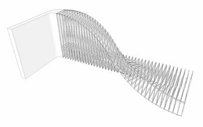
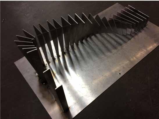
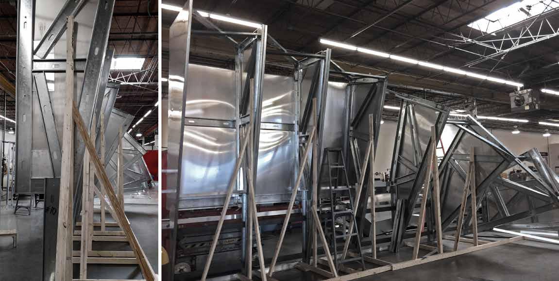
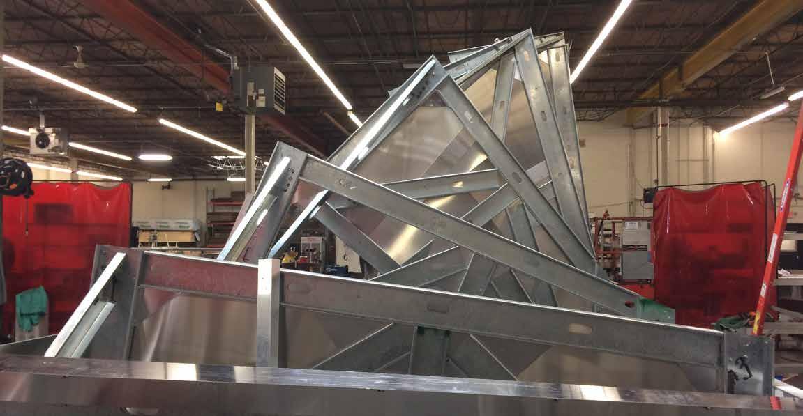
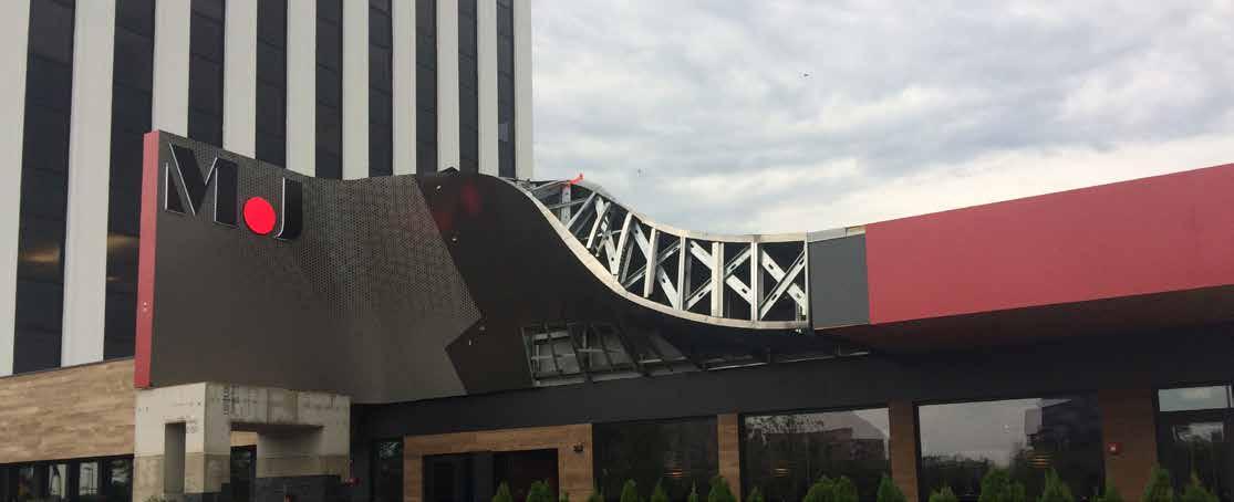
To improve visibility and distinguish the restaurant in a significant way, the facades of both locations became a statement piece with deference to the basketball icon’s famous flight to the hoop. DMAC conceived and modeled each “swoop” then worked closely with a local fabricator during testing, fabrication and assembly. In the Chicago suburb, the “swoop” is supported by metal framework clad in perforated metal sheets resembling the texture of a basketball, and rotated to create an ascendant rhythm. It begins with gentle curving and slow twisting along the patio length then dramatically torques up to a peak above the entry. A ribbon of red appears and disappears within the curvature. The signage simply reads “M.J” in bold letters. As Portland’s is nestled among national forests, its interior “swoop” was clad with wood twigs on end and give the texture of nubs on a basketball. A similar red ribbon follows the twists and curves, ending and hovering just above the entrance. Six stainless steel balls shine and float just above the floor representing the NBA phenoms championship titles. With powerful and recognizable effect, the “swoop” now defines the Michael Jordan’s restaurant brand. People understand what the swoop is before they even know the story.


112
113
Photo Frame Wall
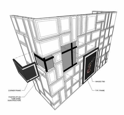
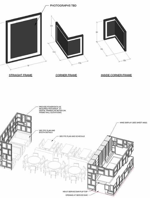
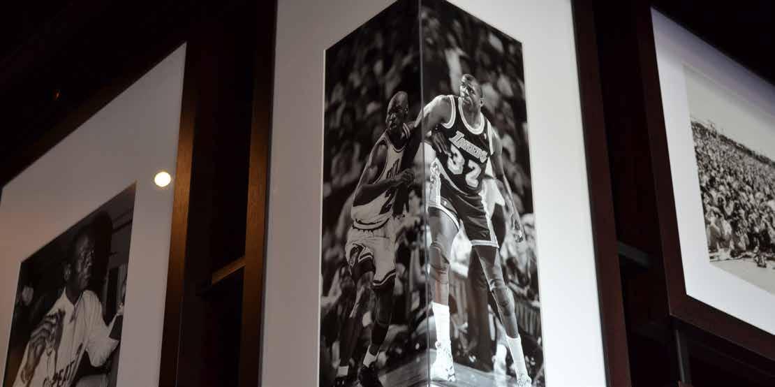
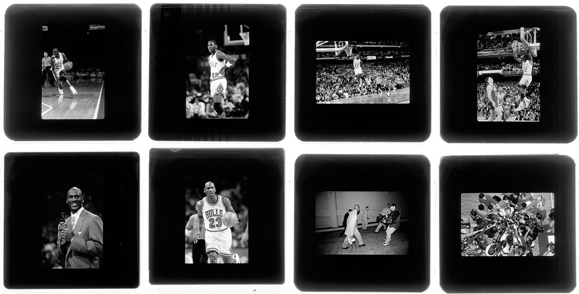
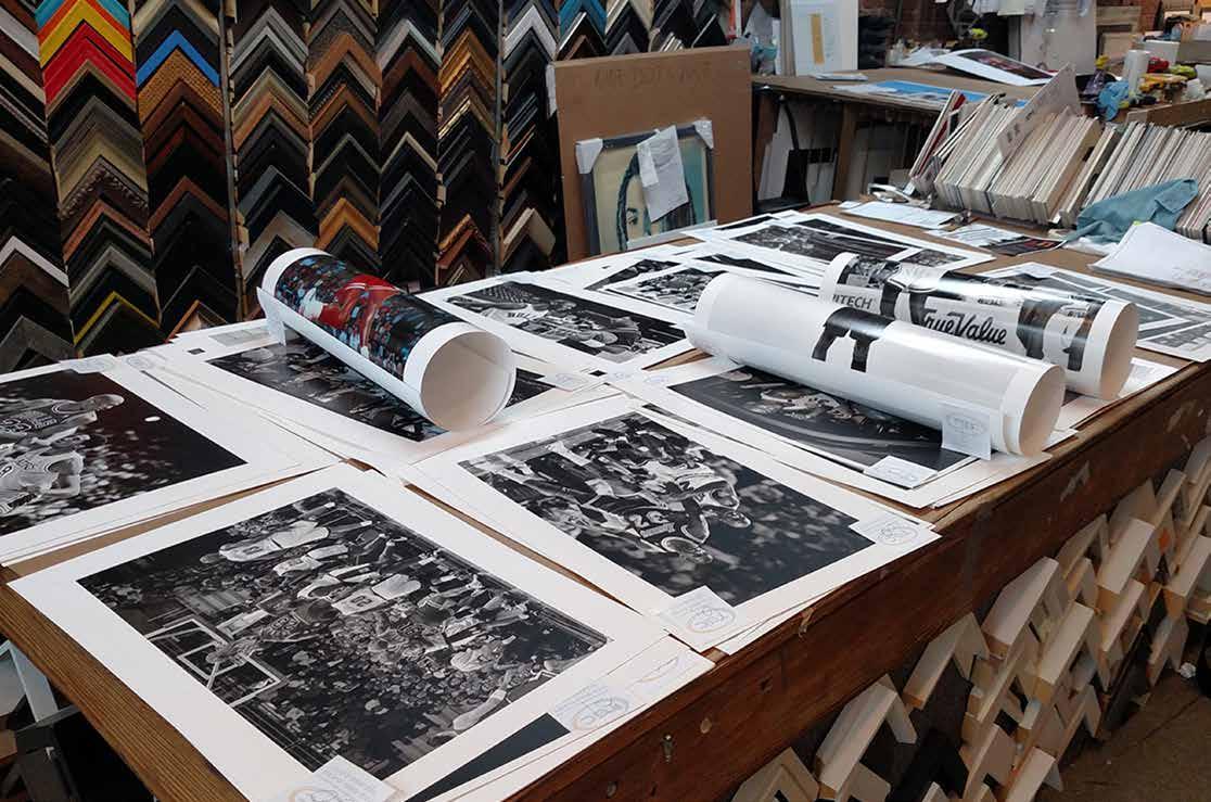
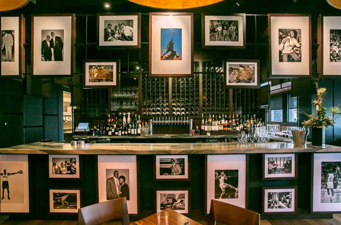
The “wall of fame” became a key feature to organize space, provided critical transparency and a point of interest for guests to muse the stories behind the photos. In fact, the “wall” is not a wall at all. It is a simple metal frame designed to showcase multiple sizes of framed photos that float displaying moments in Jordan’s life, both the ordinary and the extraordinary. The team designed the framing system and worked with a fabricator to build the frame walls. Photos were hand selected from the collection of the Chicago Bulls official photographer, Bill Smith, and carefully detailed the framing, particularly those with a corner condition.
114
115
116
117
RIVERS CASINO
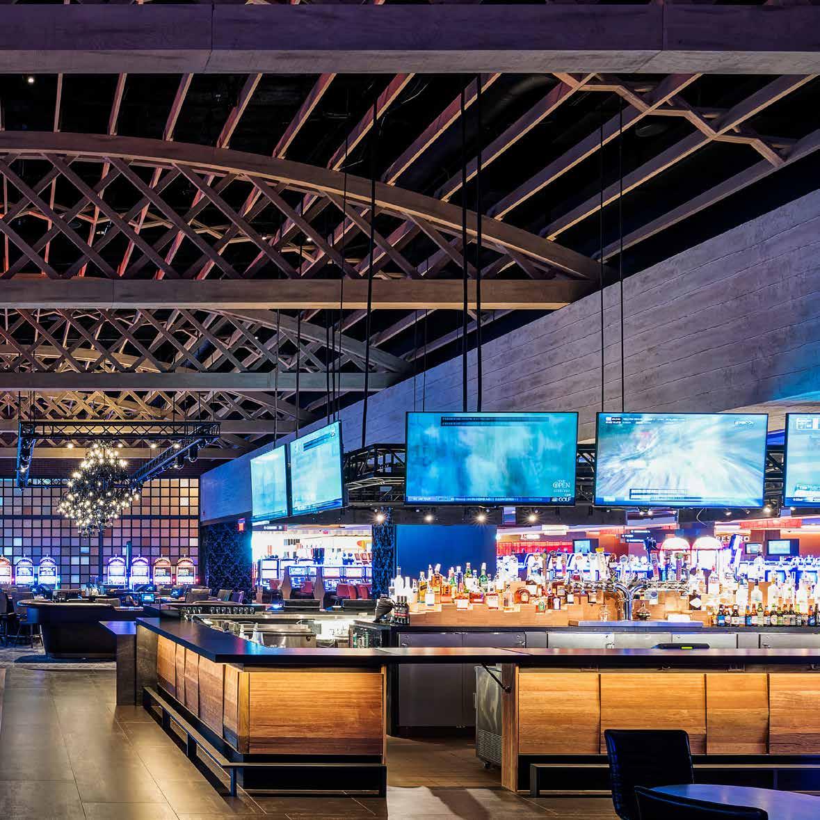
DMAC has been working with Rivers Casino since 2009, a premier entertainment and gaming destination in three locations across the country: Chicago, Pittsburgh and Albany. We have and continue to conceptualize and design the interiors of specialty gaming areas (high limit tables and slots, sports betting), live entertainment venues (nightclubs), private event space (banquet rooms) and many of the restaurant and bars offering all price points (steakhouse, burgers, buffet, pizzeria, coffee shop). Through design, DMAC helped brand and customize the restaurants for each location’s historical context and site conditions, transforming them into exciting and memorable spaces.
Van Slyck’s Lounge
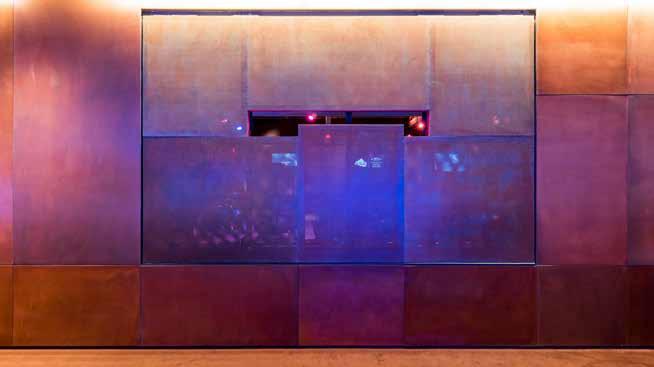
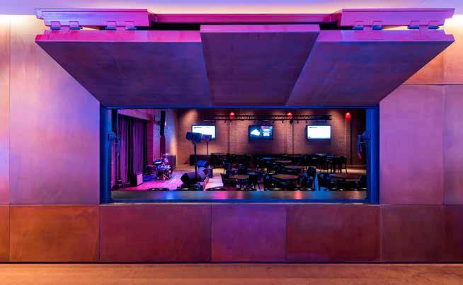
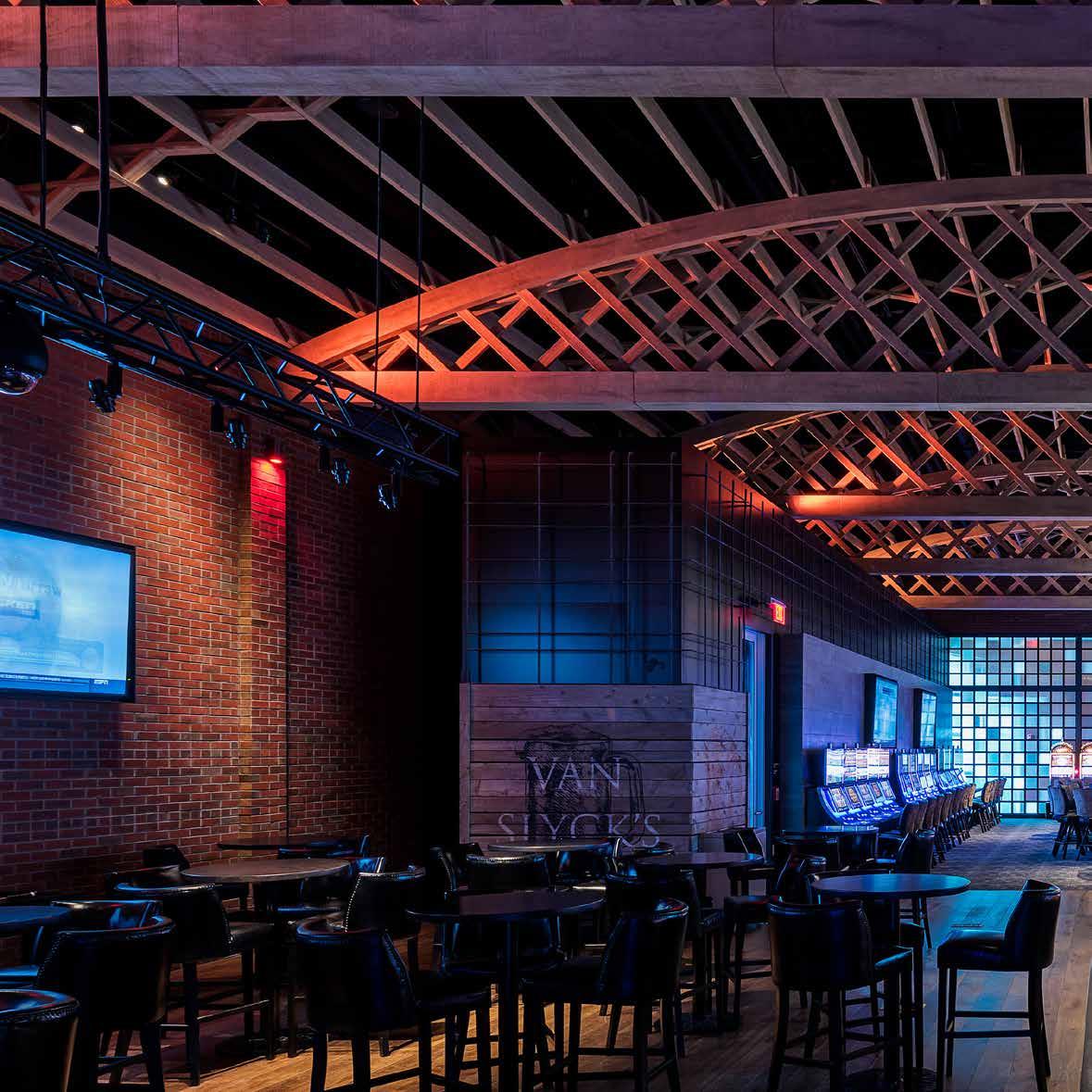
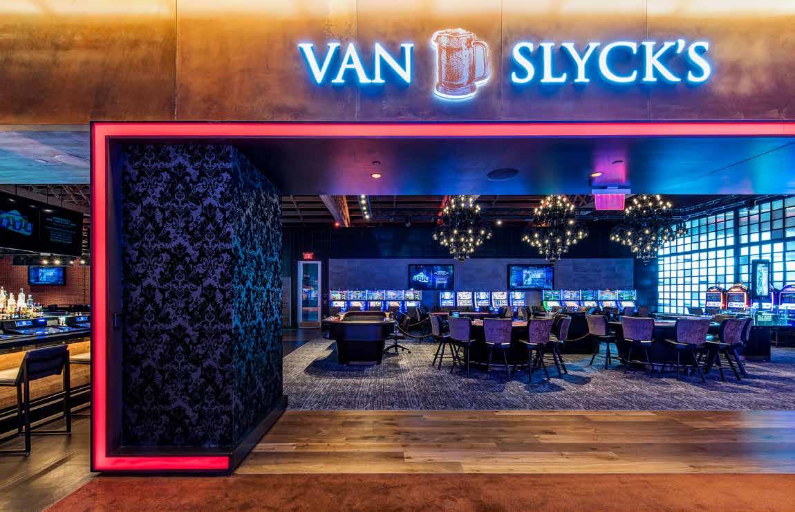
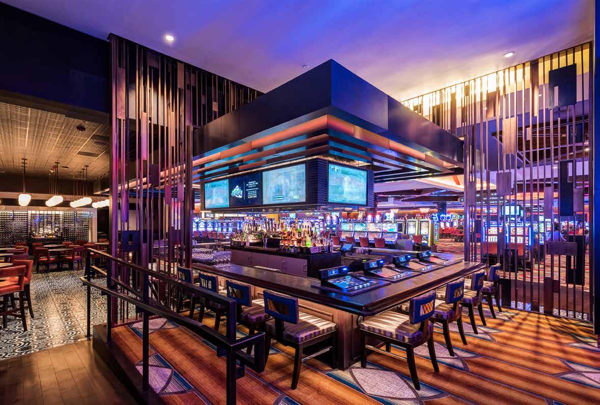
Van Slyck’s Lounge is a lively entertainment area with a full bar, slot machines, gaming tables and stage. Located on the shores of the Mohawk River in a former industrial town, DMAC pairs the rustic with high tech. Exposed wood bow trusses span the floor like the nearby steel trestle-bridges and play off large black chandeliers that resemble dripping tar and dimly light the space. The entrance is marked by a wide opening trimmed in a red neon stripe bending around and hugging a column dressed in black velvet wallpaper. At one end, a glass block wall lit from behind glows with blue and metallic tones while at the other end a stage is revealed for live performances. A full-service bar is located in between for easy access and efficient service.

120
121
Duke’s
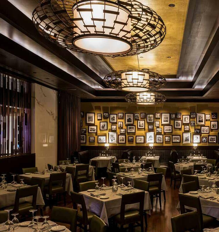
Located at Rivers Casino in New York, Duke’s Chophouse is Hugo’s near-twin brother. Working on a tight budget, DMAC designed Duke’s drawing attention to views of the Mohawk River and worked creatively to maintain the desired upscale dining aesthetic. Where mosaic flooring could be used at Hugo’s, DMAC replicated the look and feel in a tile that was ten time less expensive.
122
123
Mian

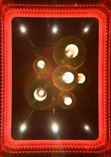
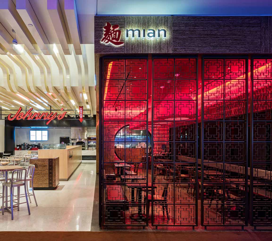
An intimate, jewel-like Chinese noodle shop, Mian is a world unto itself coyly tucked behind a custom metal screen and designed according to feng-shui principles. DMAC worked with an artist to create the screen that makes it visible during hours and glow after hours. Natural reed lanterns float and softly glow within the shimmering red glass-tiled walls. Chinese coins inlayed into the countertop offer attentive guests the rush of discovery.

124
MTL-304, 1" X 2" OUTER GRID FRAME MTL-304, 3/4" 3/4" MTL-304, LATTICE CASTING PIECES (CASTING DONE BY OTHERS) IDc-656 EQ A EQ A EQ A EQ EQ EQ IDc-656 B.O. MIAN ENTRANCE 11' 0" 1' 1/2" 1' 5 1/2" 3/4" 1' 5 1/2" 2' 11" NOTE: MTL SCREEN & MTL CASTING PANELS TO BE DMAC ARCHITECTURE PROPRIETARY ITEM. SEE SPECIFICATIONS ON IDc-205. LINE OF METAL FRAME AROUND CASTING INSERT 1/4" DEPTH MTL CASTING LATTICE PATTERN (SHOWN AS LIGHT GRAY) 1' 3 5/16" 1' 4 1/8" 1/4" EXTRUSION OFF THE FACE OF CASTING. POLISHED FINISH ON TOP FACE OF EXTRUSION ONLY (SHOWN DARKER GRAY) 1/4" EXTRUSION ON BACK-FACE OF CASTING. POLISHED FINISH ON TOP FACE OF EXTRUSION ONLY (SHOWN DASHED) 13/16" 1 13/16" 13/16" 13/16" 13/16" 1/16" 5/8" 1' 7/8" 1/16" NOTE: MTL CASTING PANELS TO BE DMAC ARCHITECTURE PROPRIETARY ITEM. HEADER 831 CHICAGO AVE STE 100 EVANSTON, IL 60202 PHONE: 847.905.0944 FAX: 847.905.0943 www.dmacarch.com DMAC JOB NUMBER: 15005 ISSUED/REVISED NO. DESCRIPTION SD PACKAGE 100% DD/GMP PACKAGE 75% CD PROGRESS CD PROGRESS PACKAGE ISSUE FOR CONSTRUCTION 6" = 1'-0" 3 DETAIL METAL CASTING
125
Flipt
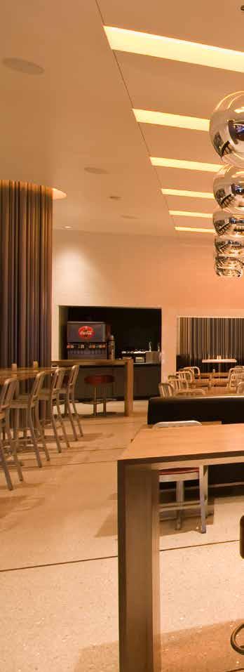
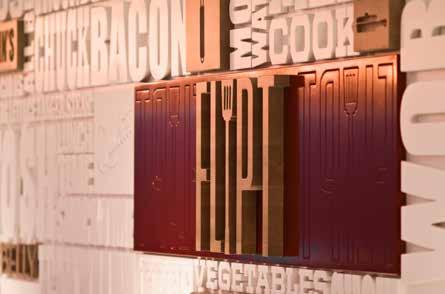
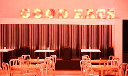
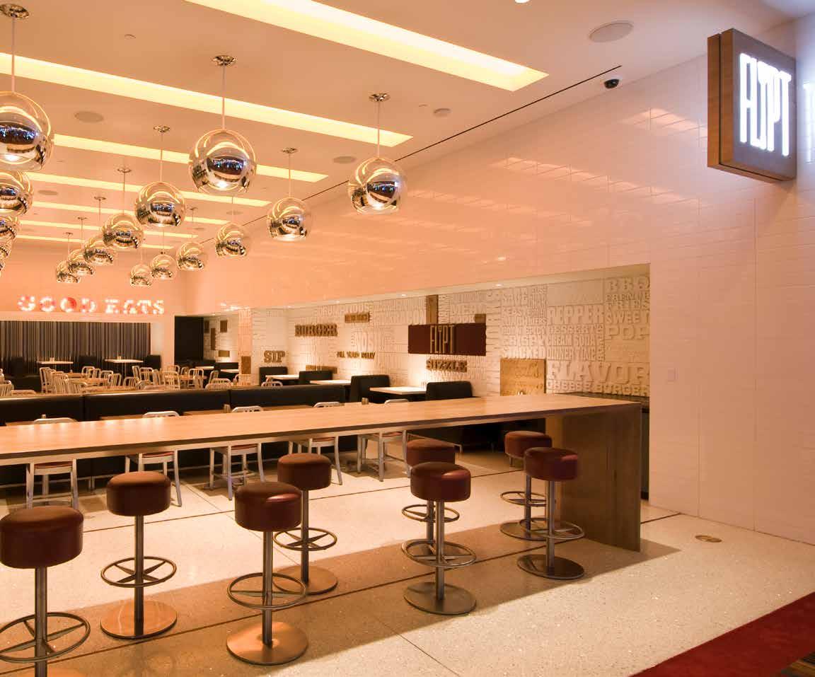
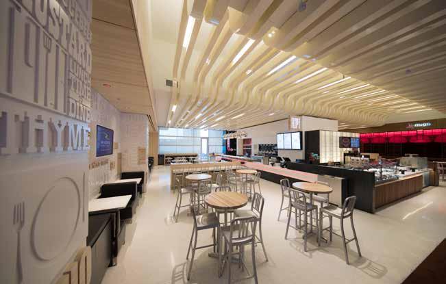
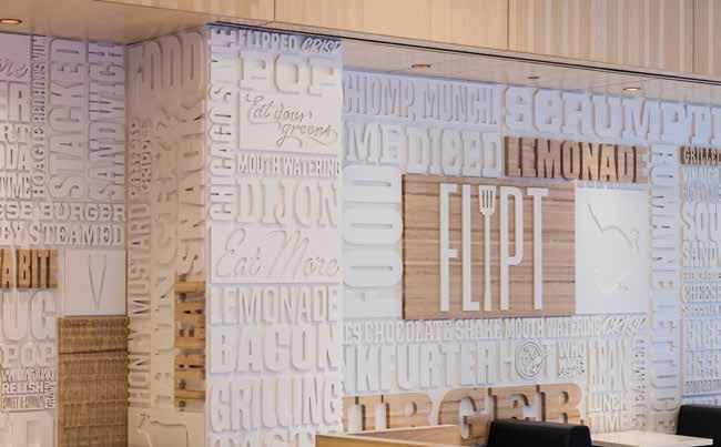
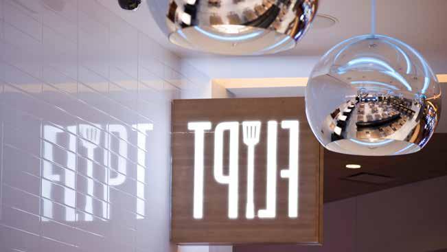
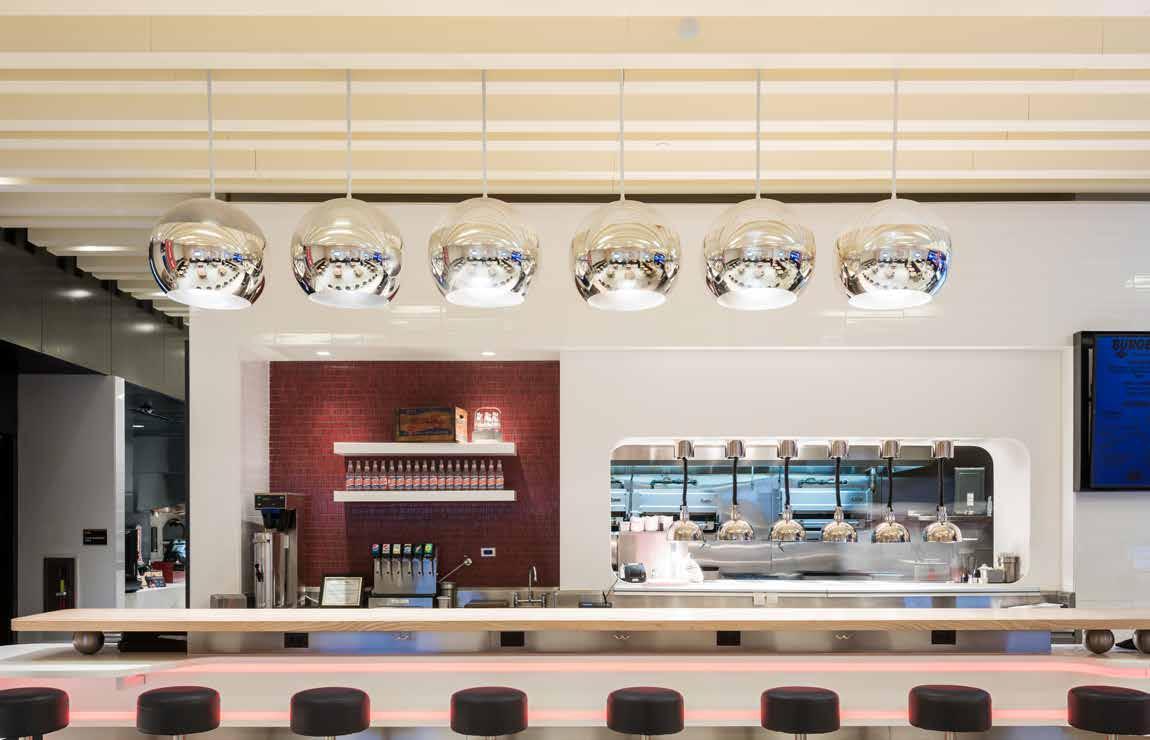
A burger is not just a burger under the flashing lights of the large “Good Eats” sign, visible at all times to welcome guests into the retro-with-atwist, red and white interior of Flipt. Inspired by the Flipt logo, DMAC designed the “word wall” using retro fonts in various sizes and randomly flipping the words on their sides. With the contemporary red bands of light embedded in the ceiling and the creative use of aluminum tubes that encircle the structural columns, all guests and especially those who garner the cozy “box seats” near the rear of the restaurant will certainly travel back to the future in this fresh take on a classic burger joint.

126
127
128
129
Splash Spa
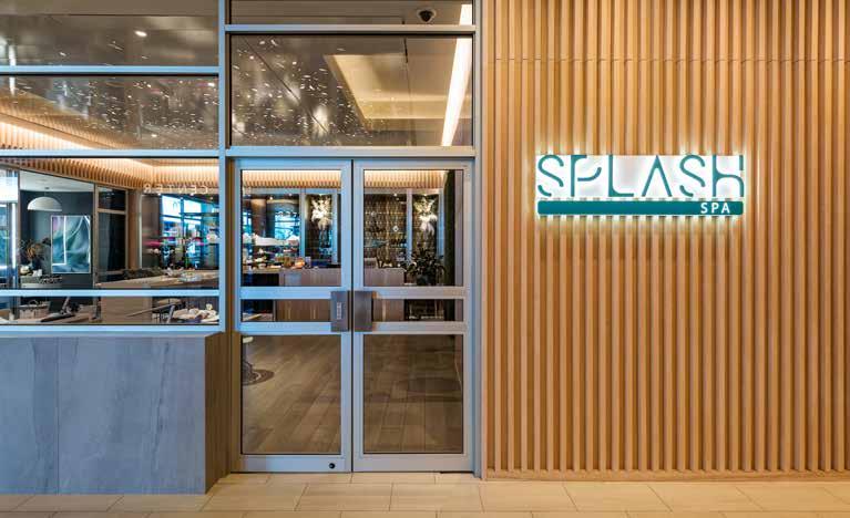
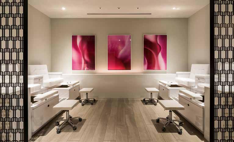
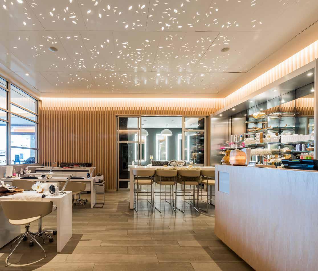
Splash Day Spa is located near the hotel lobby and tucked away from the gaming floor for visitors under twenty-one years old. Given its interior location, drawing visitors in was key. DMAC wanted to give the spa a presence even when it was closed. So, the ceiling panels became a subtle leaf motif where light glows through the small perforations and cast shadows like a porcelain votive candle. Vertical wood slats that define the exterior and support the signage are carried through to the interior for warmth and texture. Custom metal screens help define treatment areas yet allow light and visibility to other spaces. Green walls wrap the hall leading to the massage rooms and absorb noise for peaceful relaxation.
130
131
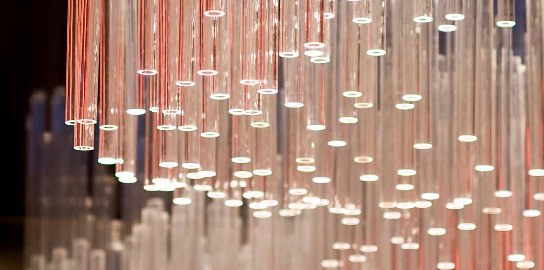
High Limit Poker


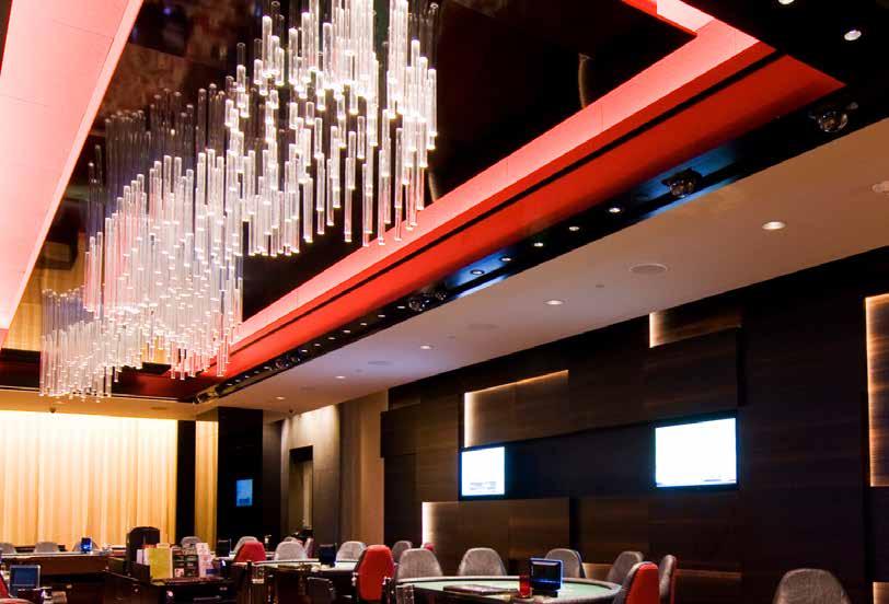
An elegant High Limit Room nested adjacent to the VIP lounge offers an elite experience for the Casino’s high rollers. The room is stretched in custom designed red patterned carpet, inspired by the Pittsburgh river contours. The ceiling is adorned in a 35 ft custom light fixture, inspired by the river terrain with backlit acrylic tubes of varying lengths suspended from the dark ceiling. The millwork walls draped in fumed eucalyptus wood push and pull to reveal beams of light through the slivers. This 2,800 square High Limit room is a crafted jewel-like addition complimenting the rest of the casino programs.
132
Inside of wall (west)
High Limit Slots


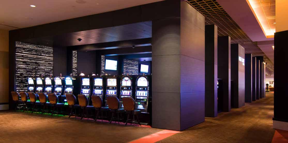
Inspired by the dynamic reflection of moon on the Pittsburgh River that follows the viewer’s eye, these massive wood portals with custom perforations transmit static light and softly glow contrasting the kinetic lights of the games. The portals are aligned like a colonnade but vary in width suggesting a dynamism. As guests move through them, their vantage point of the rippling lights is ever changing. Their large size defines the space of the High Limit Slots and brings attention to the lively slot machines.

133
Inside of wall (west) Inside of wall (east) Re ected Ceiling Inside of wall (west) Inside of wall (east) Re ected Ceiling
Inside of wall (east) Re ected Ceiling Inside of wall (west) Inside of wall (east) Re ected Ceiling
134
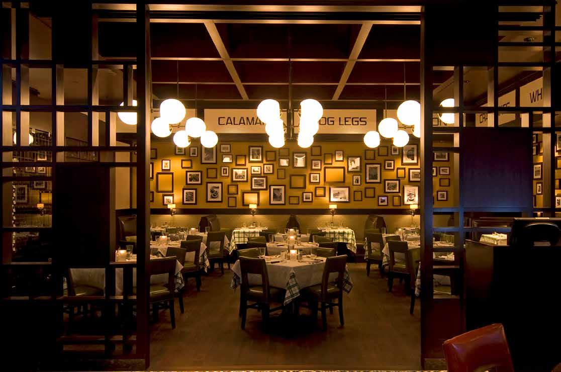
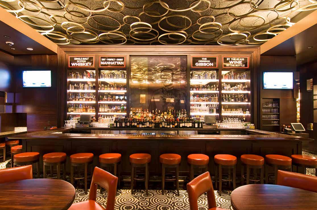
Hugo’s Frog Bar & Chophouse

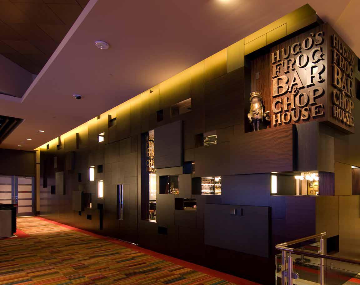
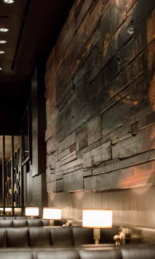
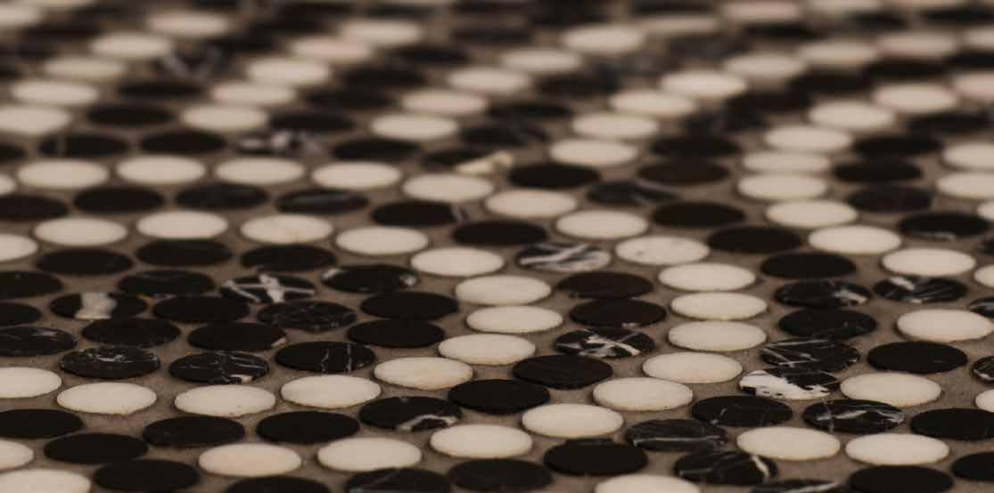
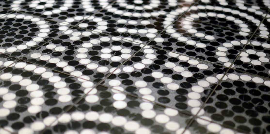
The finest in-house establishment and a destination in itself, Hugo’s Frog Bar departs from its downtown sister through DMAC’s clarification and modernization of the design, featuring a façade of dark wood blocks with openings that offer vignette views of the interior. Echoed by a unique patterning of wood frames installed along the back wall and in the custom-built wine lockers for high rollers, the rectilinear forms find their counterpoint in circular-patterned black and white mosaic flooring and the whiskey barrel-ringed ceiling. The totality is a warm and familiar but more sensuous environment in which to feast and repose.
135
136
137
Hugo Frog Sculpture


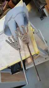

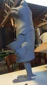

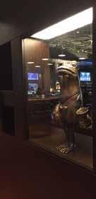
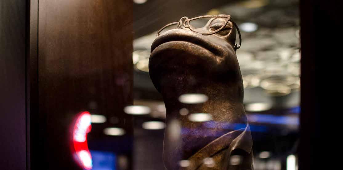
Working with Hugo’s original 2D brand logo, DMAC designed and fabricated a metal 3D frog sculpture to be placed near the restaurant’s entrance. We collaborated with a team of several artists and professionals to sculpt, 3D scan, 3D print and paint the frog. With the final sculpture packaged up for a road trip, we hand delivered and installed the frog on location.

138
139
Hull Art Walls
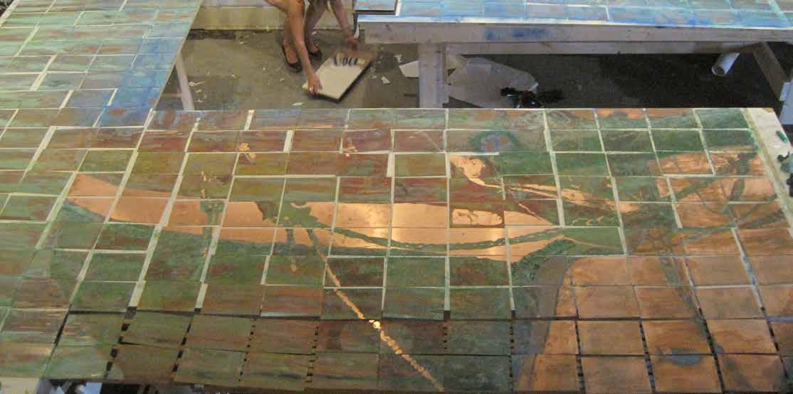
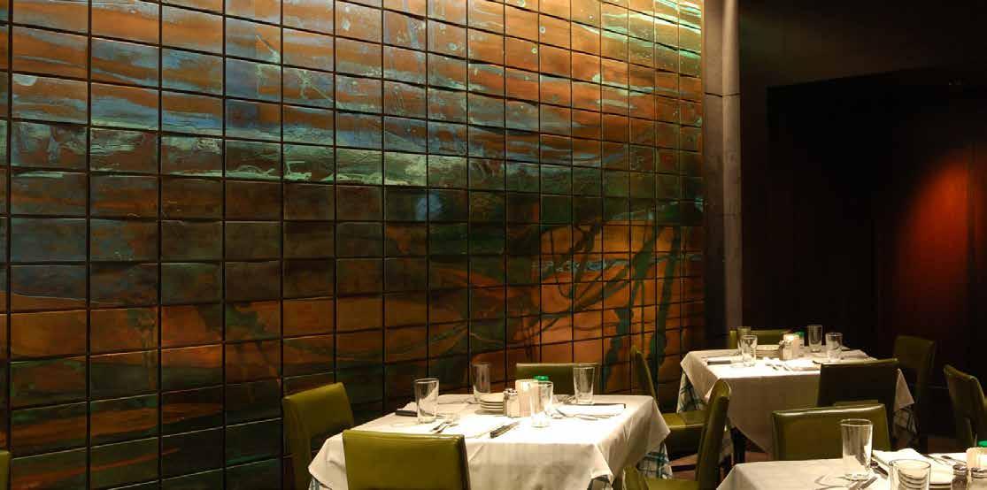
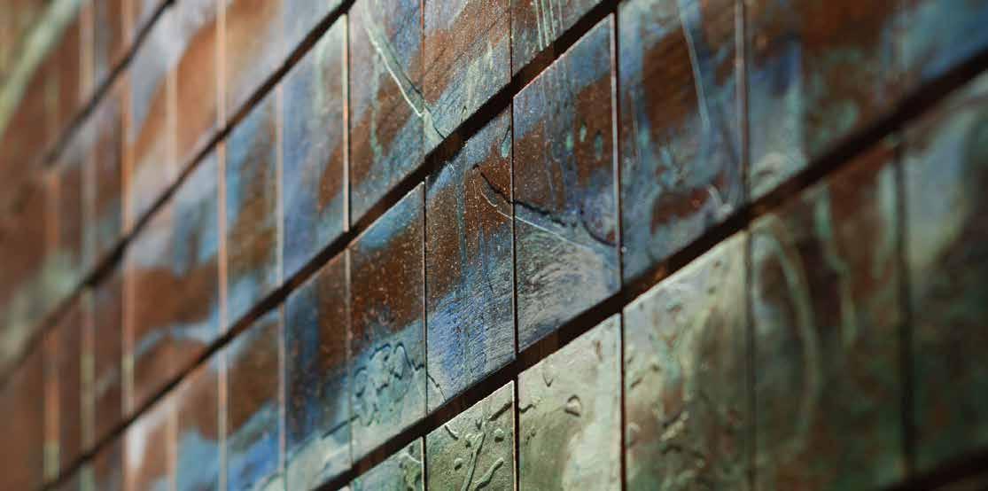
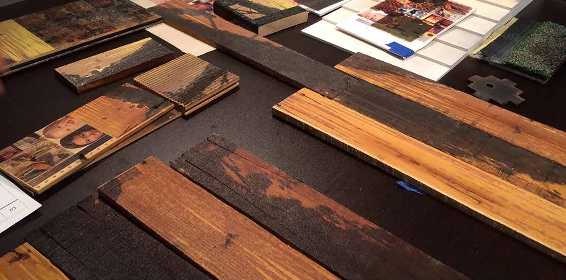
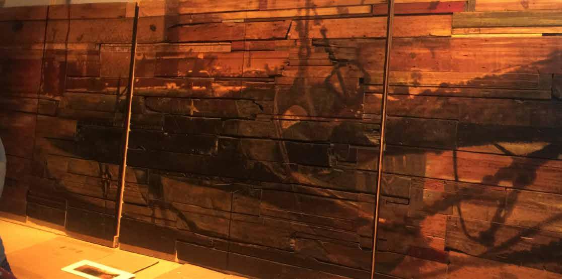
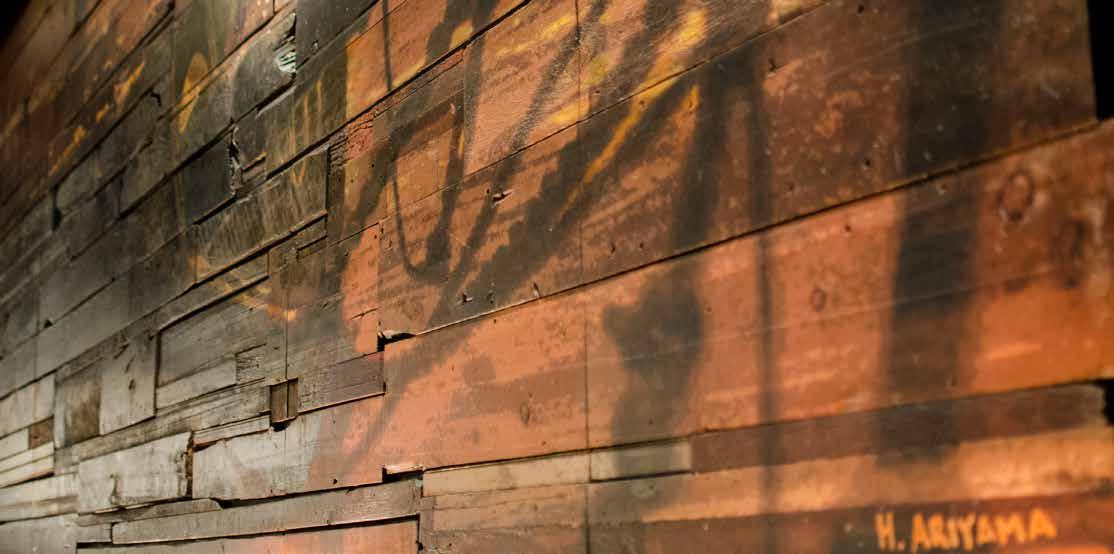
As a focal point of both restaurants, the private dining rooms feature a mural-scale image of an underwater ship, a theme from the original Chicago steakhouse. DMAC worked with two different artists for the mural at each location. At Hugo’s, 256 copper plates with a patina surface were etched with the hull’s image and installed at slightly different depths adding the illusion of being under water. At Duke’s, the artist painted directly on salvaged wood boards for an abstract hull image with a rich and weathered effect.
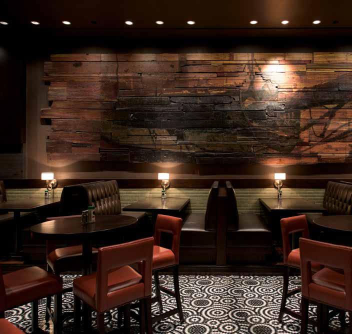
140

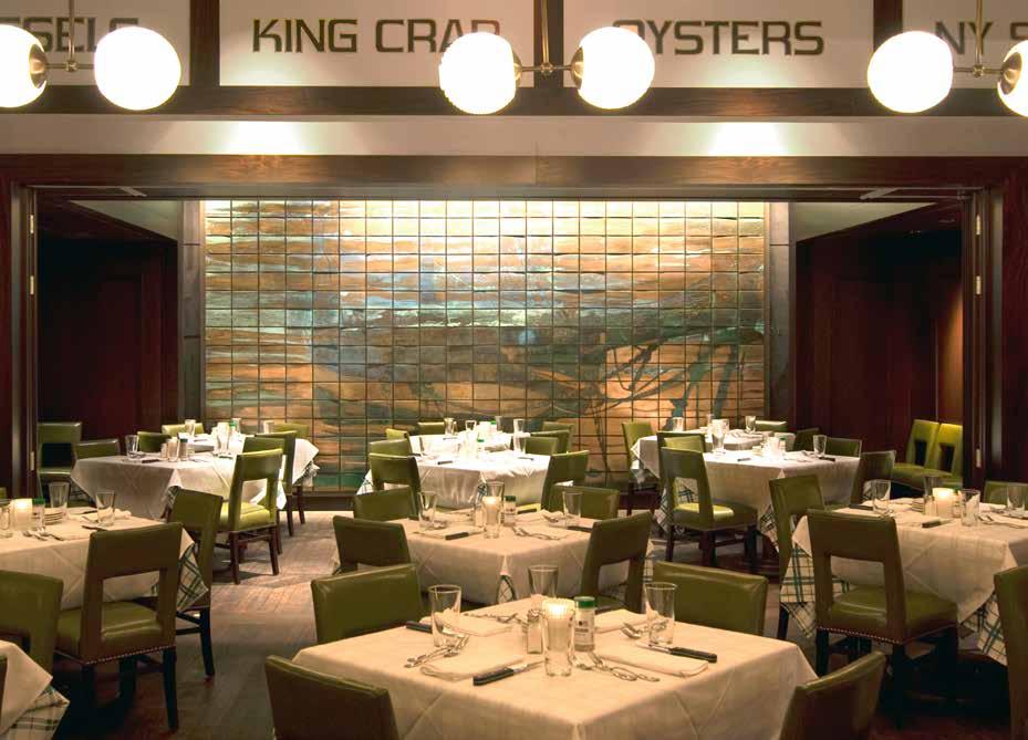
141

142
143
144

145
Canopy
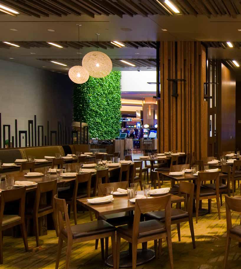
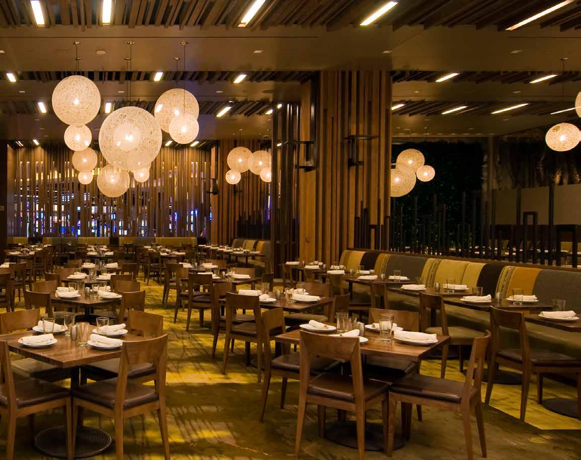
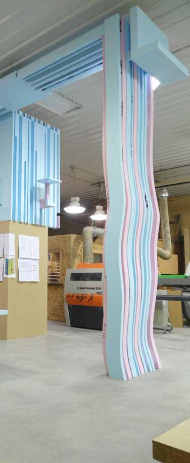
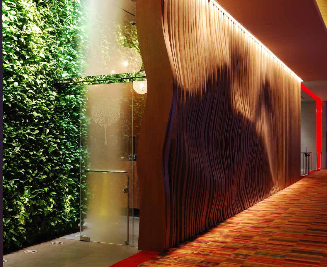
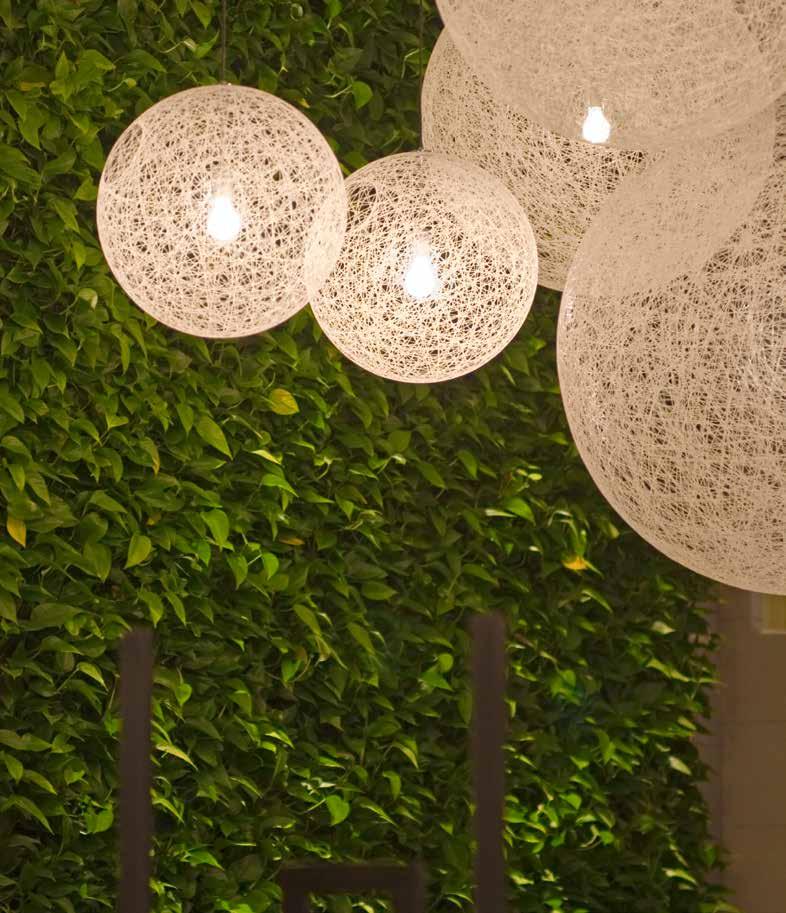
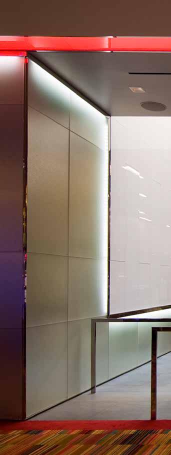
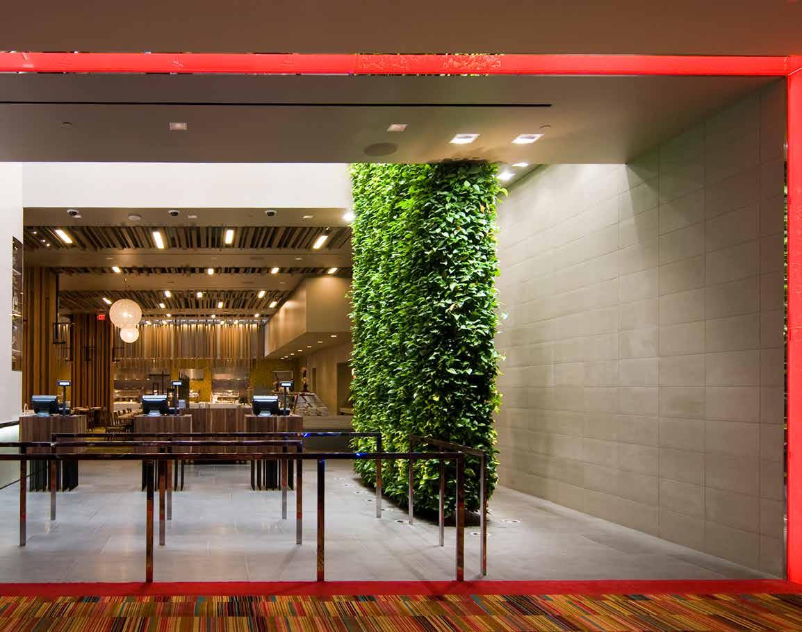
A buffet-style alternative reminiscent of outdoor pavilion in a forest, The Canopy beckons with its exterior wall of floor-toceiling, hand-cut wood ribs that undulate like rippling water. At both the principal and VIP entrances, guests are greeted by dense vertical hedges of live plants sustained by internal irrigation system using saturated coconut shells. The woodland fantasy, which relates to the Casino’s actual forest preserve neighbor, continues inside with natural skylights, a “window” that reveals yellow birch trees, and a DMAC-designed carpet that evokes the filtered, varied light on a forest floor. The natural palette creates an idealized natural environment for a perfect place to recharge.
146
147

148
149
150
151
Cube

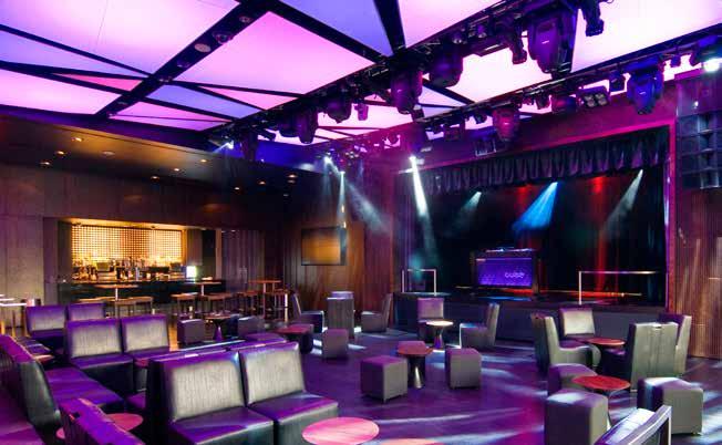
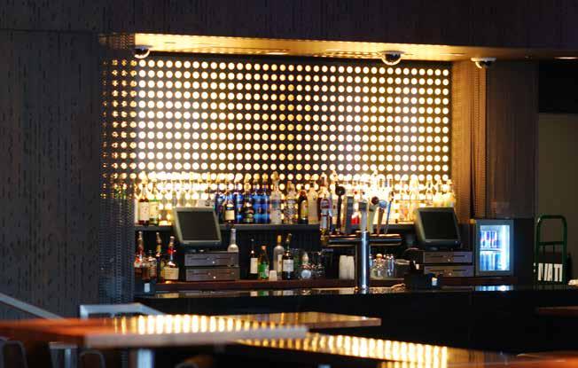
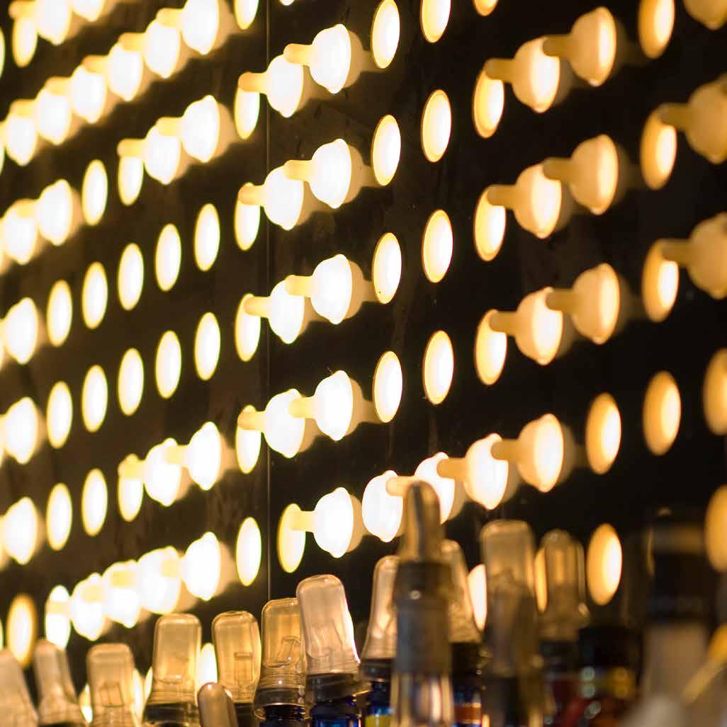
Cube is a nightclub that transforms from a sports bar experience to a full-fledged performance venue. To enter Cube, guests pass through custom-designed heavy dark wood doors that interlock and reveal a rhythmic geometric pattern when closed. Inside, the bar is replete with retractable monitors above and features a countertop of hand-sculpted pine and mesquite wood blocks. Descending a half-flight to the dance floor, a shift in tone and function is palpable. The custom lighting system reflects a street pattern; velvety gray drapes add a soft and sultry texture; chainmail is hung like curtains; and a backlit wall created from inverted baby bottle nipples is both abstract and sophisticated. The stage which is scaled and equipped for A-list performers, draws guests to the dance floor where light reflects images cast from the patterned ceiling. Just beyond stage left, an outdoor terrace offers the vibe of a boutique hotel rooftop, complete with a twelve-foot fireplace. With the attention to technical capabilities and a sleek, sexy design vocabulary, Cube is the hot spot for casino guests and beyond.
152
153
Coffee Spot
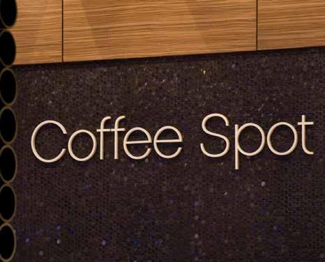
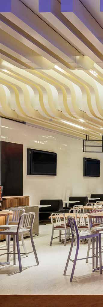
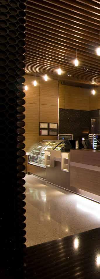
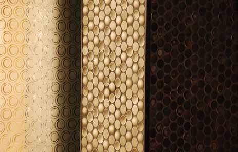
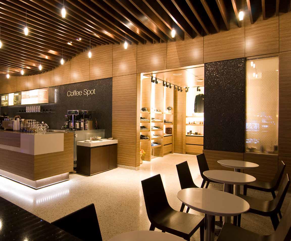
The Coffee Spot is a bright place to revive with zebrawood, quartzite and sparkling terrazzo finishes with a background wall of stainlesssteel penny tiles that surprisingly resemble coffee beans. Even the ceiling is detailed with undulating wood slats where pendant lights slip through the spaces inbetween. Adding more texture, DMAC used stacked metal pipes to clad a structural column and create a low screen wall as a soft boundary of the space.

154
155
the marketplace
AT SUGARHOUSE CASINO
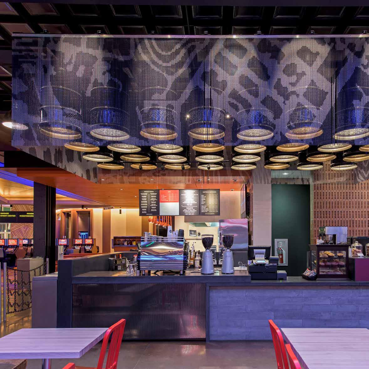
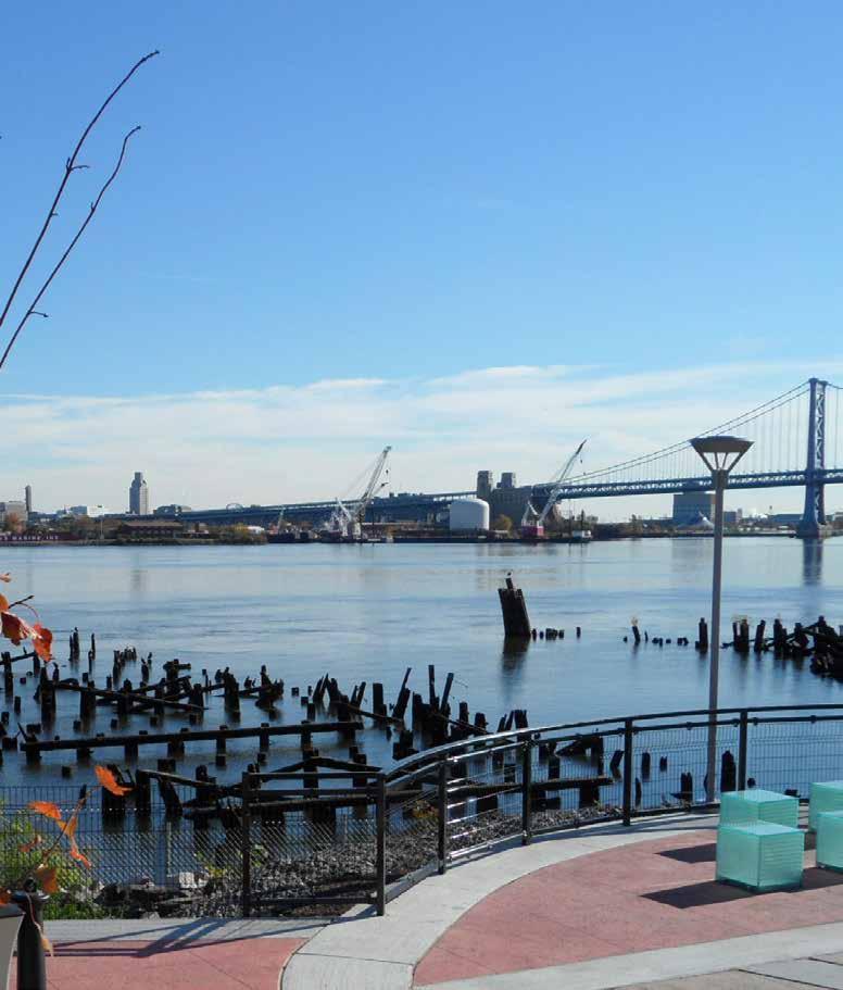
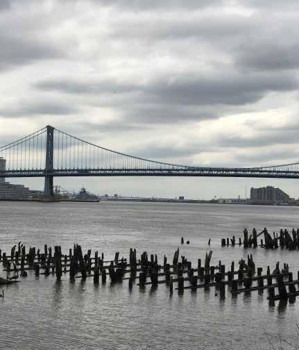
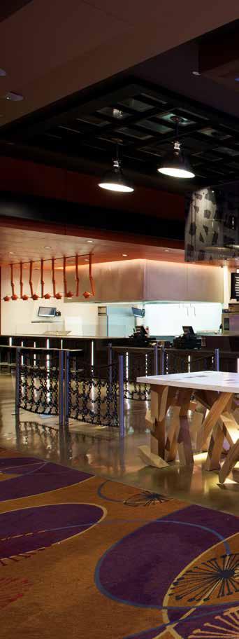
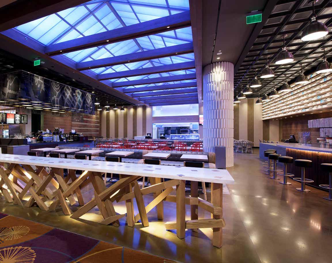
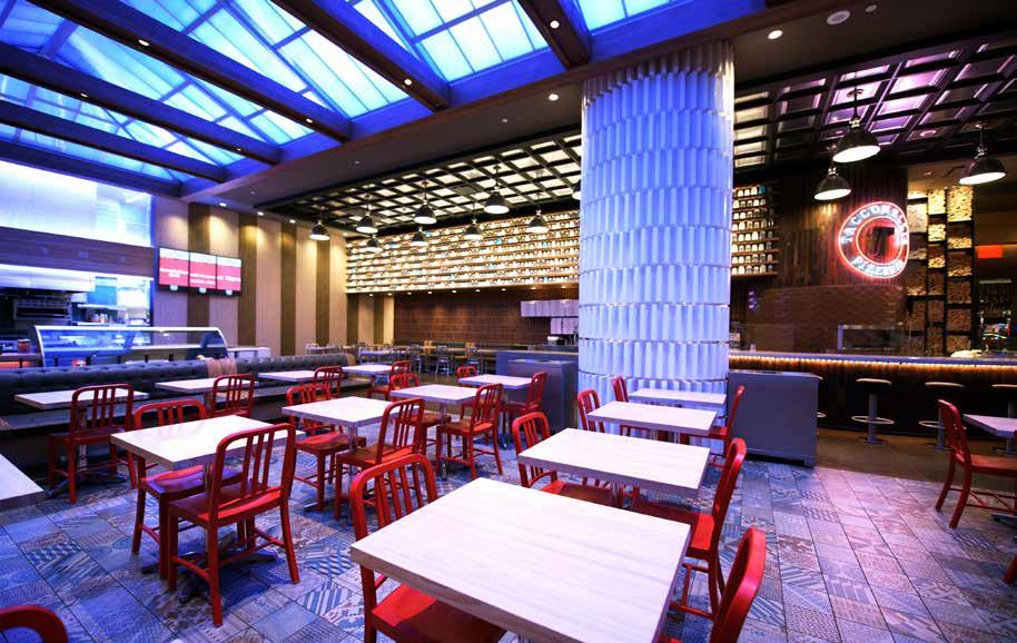
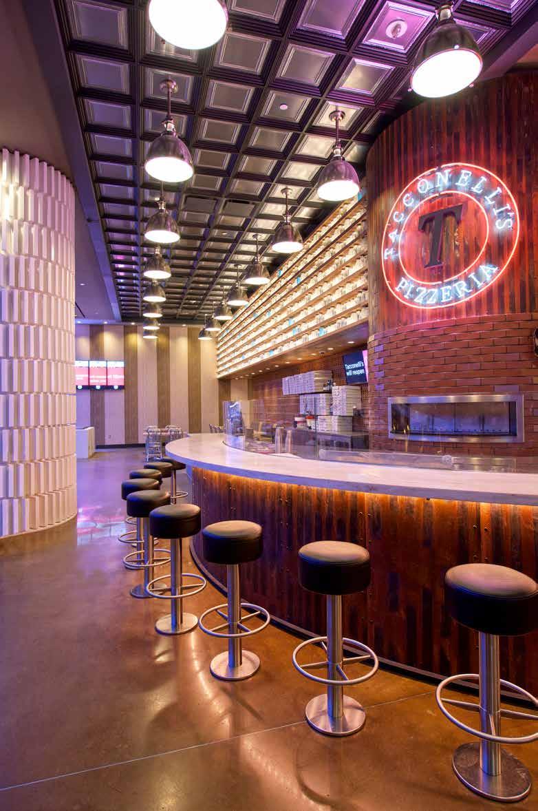
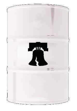
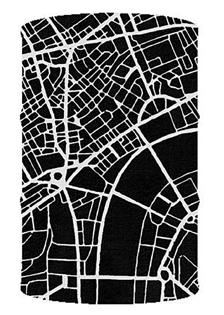
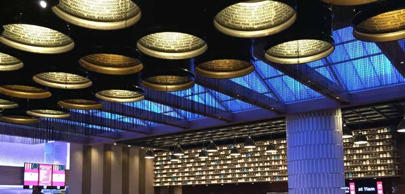
The Marketplace at Sugar House Casino in Philadelphia is the hub of the casino restaurants with distinct identities yet open boundaries that seamlessly flow between each other. Inspired by the industrial neighborhood, DMAC designed and built a barrel light ceiling feature that hangs as a conversation piece in the space. A 4x8 grid of 55-gallon barrels flipped upside are lit from within and reveal inside the interior rim the names of the city boroughs. Wrapped around the cluster of barrels is a metal mesh screen printed with an abstract street map of Philadelphia. The black barrels become the background for the screen map to visually emerge.
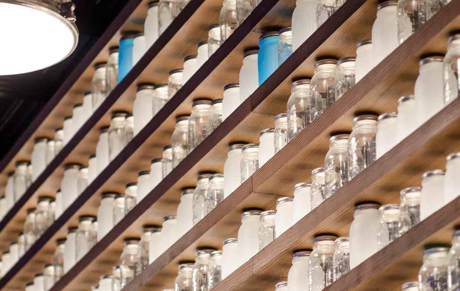
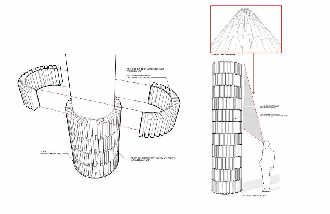
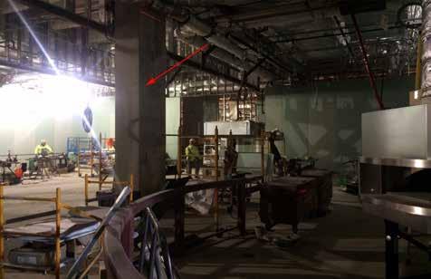
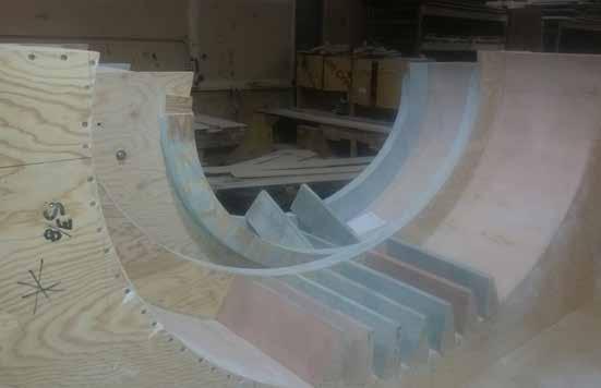
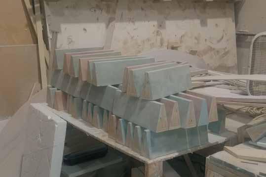
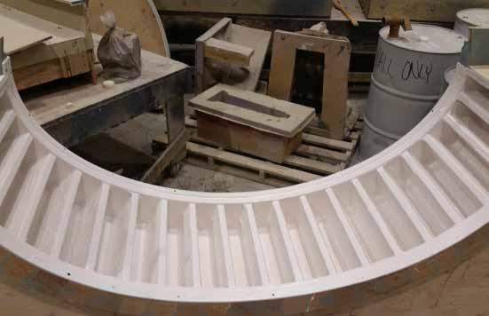
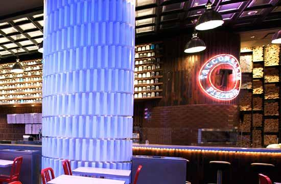
Near the pizza restaurant a large column interrupted the space. DMAC took advantage of the opportunity to cover the column in a bold texture derived from the shape of a slightly opened pizza box. Working with a fiberglass fabricator, DMAC designed the cast and installation details for a whimsical result. Adding another layer of interest to the space, DMAC designed and created a soffit above the pizzeria counter with 880 randomsized Mason jars - some clear, some frosted and a few blue - lit from below to glow and draw attention to the pizzeria. Balls of pizza dough were historically stored in Mason jars to keep them fresh and ready to go. What could have been a shopping mall food court, DMAC makes the Marketplace at Sugar House Casino a vibrant dining space that weaves guests through and keeps them guessing!
157
158
159
160


162


163

164
Ol’ Glory
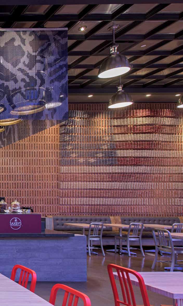
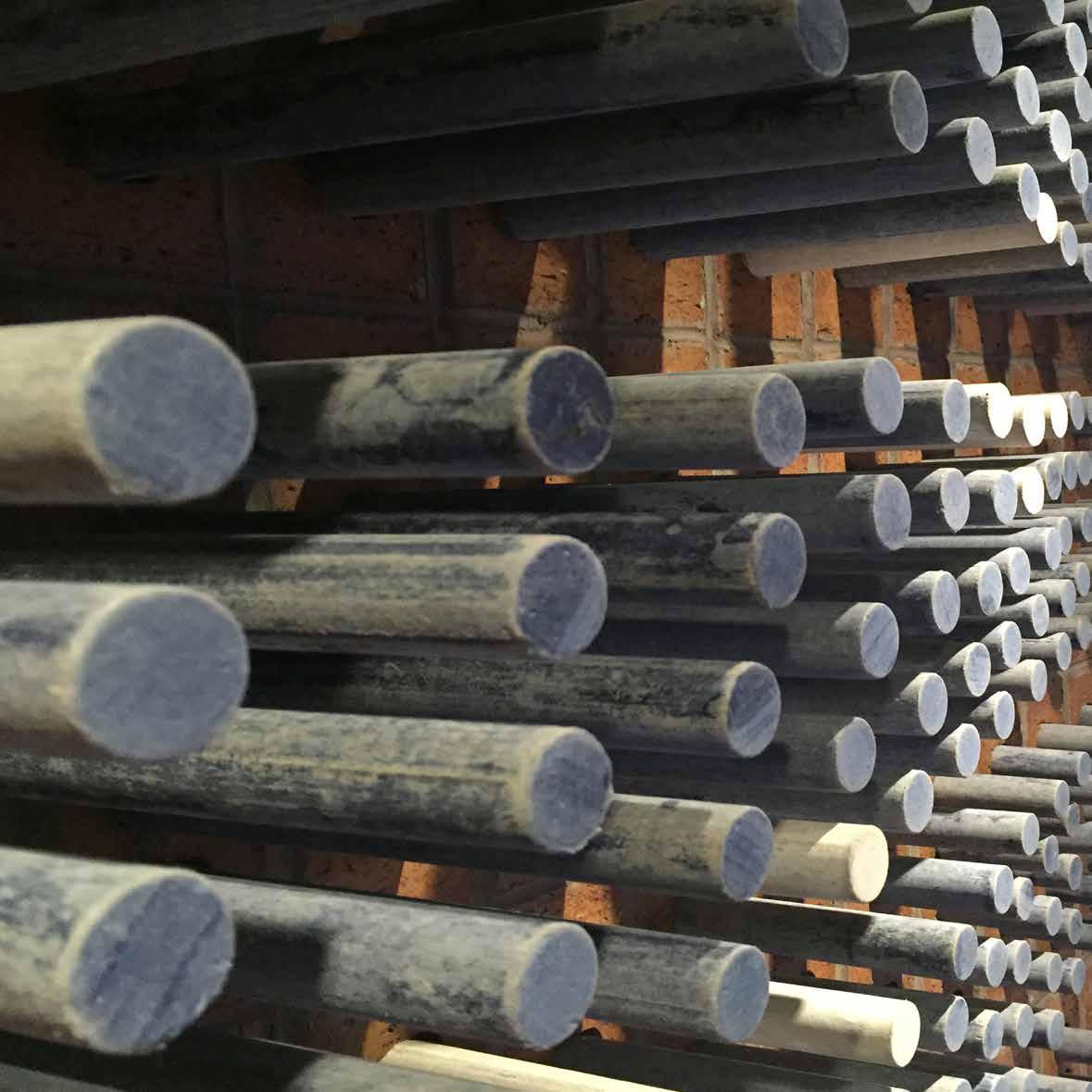
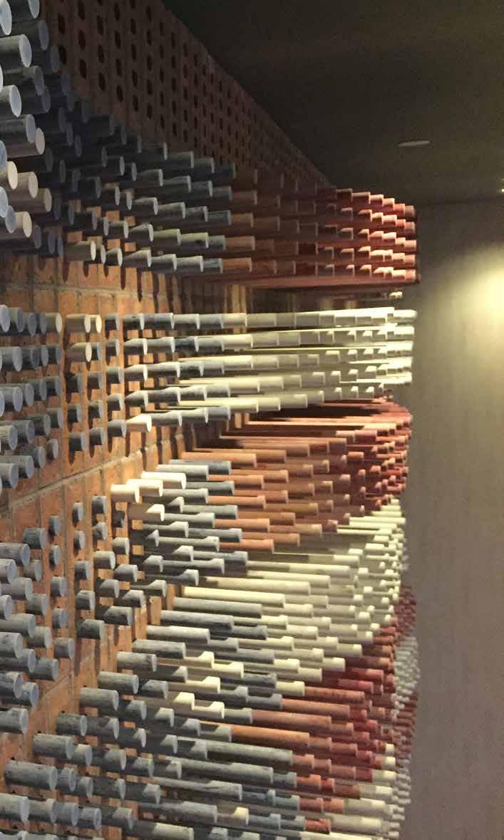
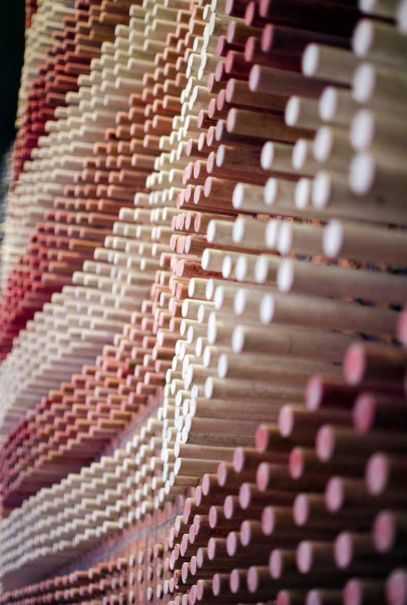
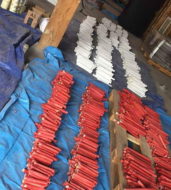
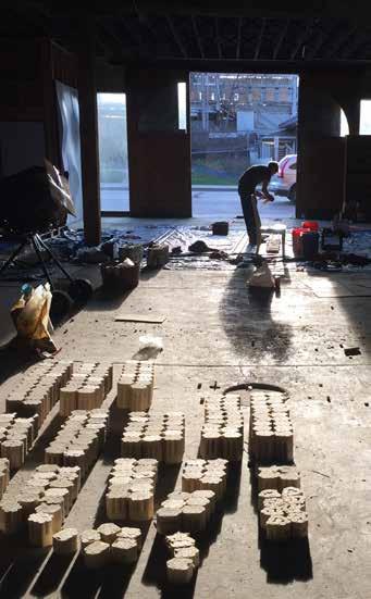
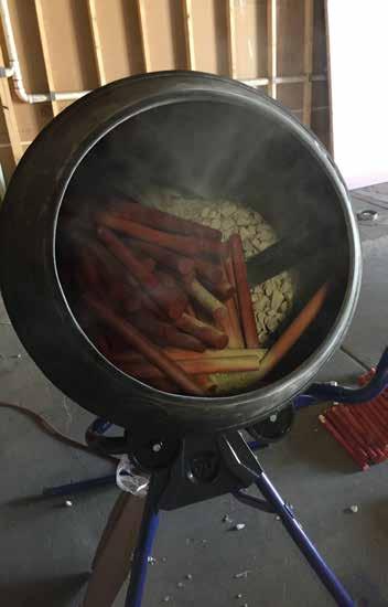
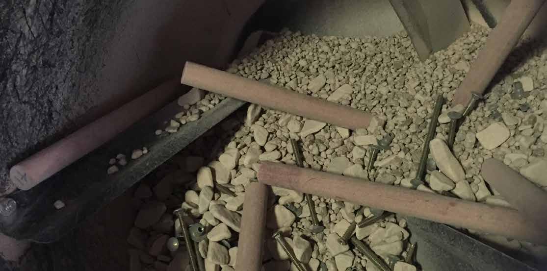
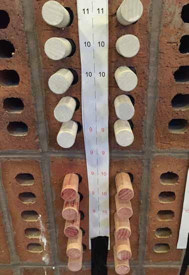
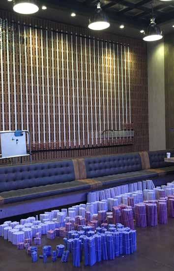
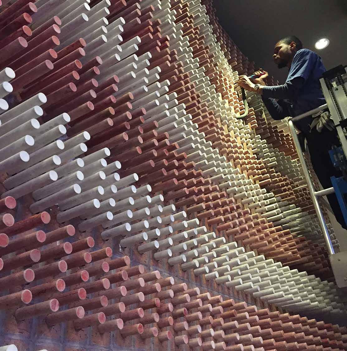
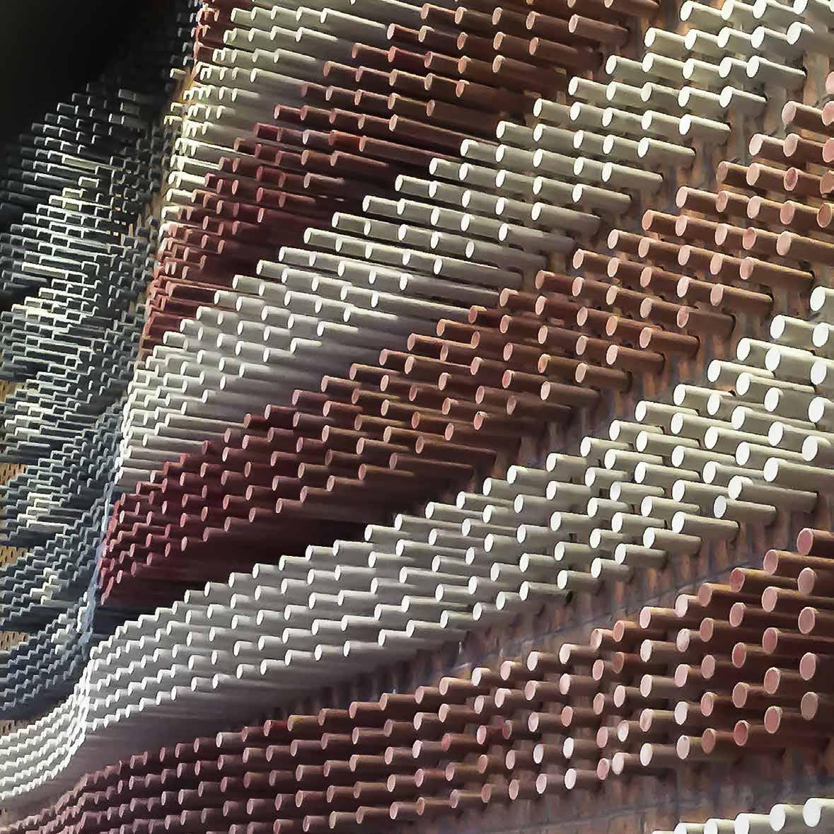
Inherent in the streets of Philadelphia is a history that inspired us to design an installation that would both serve as a cultural marker, and as an architectural element. Ol’ Glory is a reinterpretation of Betsy Ross’ Flag in the city where it was first created. In addition, this installation also acts as an acoustical wall, lowering the reverberation in the marketplace of Sugar House Casino through the brick and wood material properties.
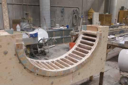
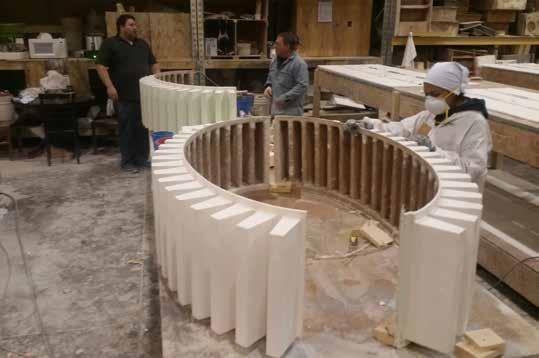
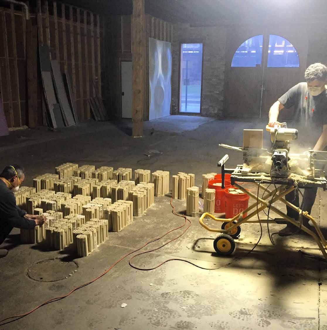
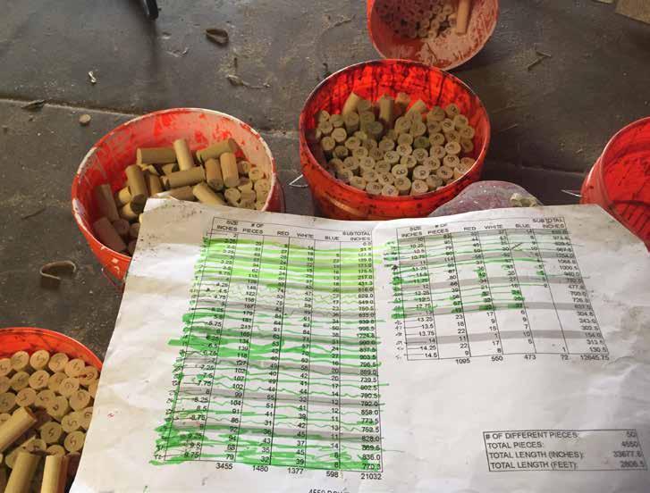
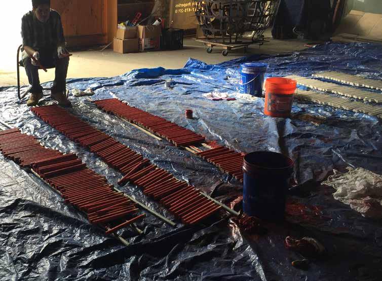
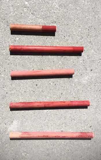
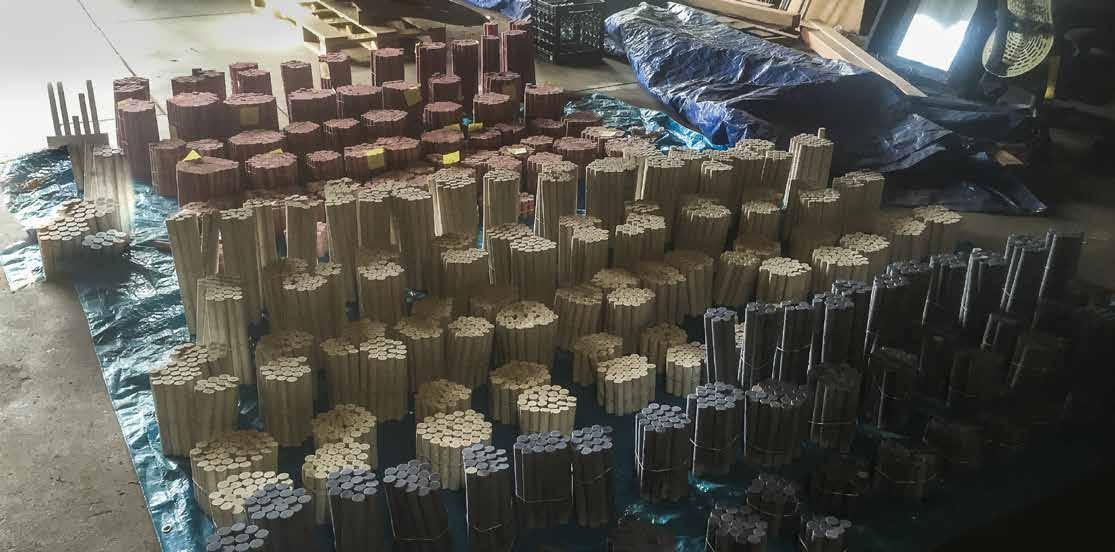
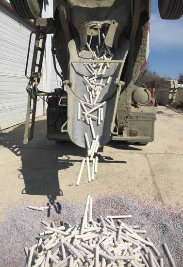
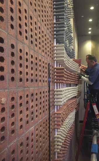
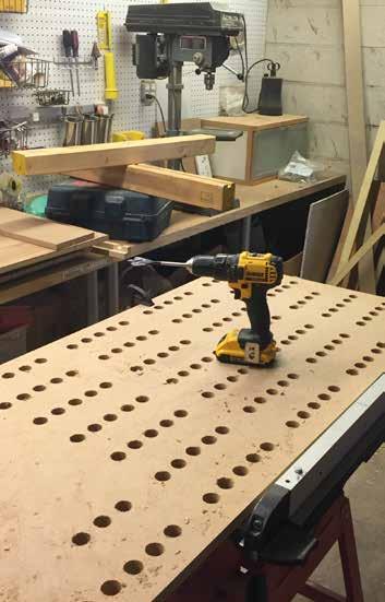
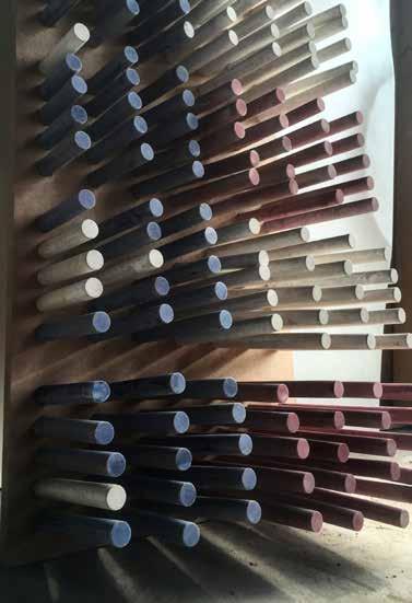
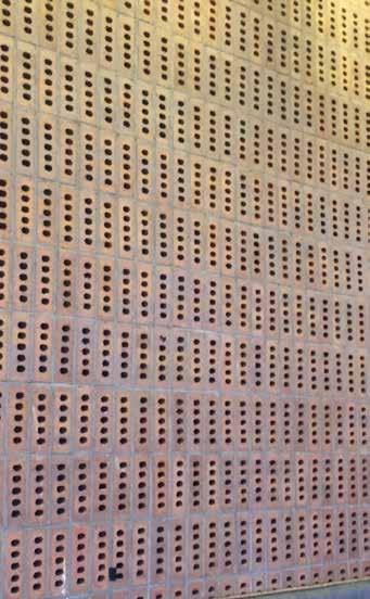
Ol’Glory is composed of 4,550 dowels manually cut by the design team into 50 different lengths. The dowels were then dipped in a bucket of red, white or blue paint, and tumbled in a concrete mixer through a process that weathered them similar to the city’s streets. Each one of the 4550 dowels was manually installed one-by-one into a 20-foot tall wall made of roughly 300 bricks. Normally turned to the backside, the bricks’ perforations are exposed, becoming the support and foundation for each dowel’s installation. From a distance Once installed, the dowels formalize an undulating Betsy Ross Flag. Installed in the casino’s Marketplace, one of the busiest areas, Ol’ Glory brings Philadelphia’s history to the interior of the building and elevates the space through the basic materials of wood and brick.
167

168
170 Cut
Sort
Stain
Too small
Distress

172


173
Sort again
That’s better
Mock-up
Install Organize
175 4550 pieces

Midtown’s Le Sporting Club du Sanctuaire is an existing 180,000 square foot health club and spa located in Montreal, Canada’s ritzy Mount Royal neighborhood. Built in the 1980’s, as the centerpiece of a high-rise condo development, the club had been systematically rehabilitating their facilities.
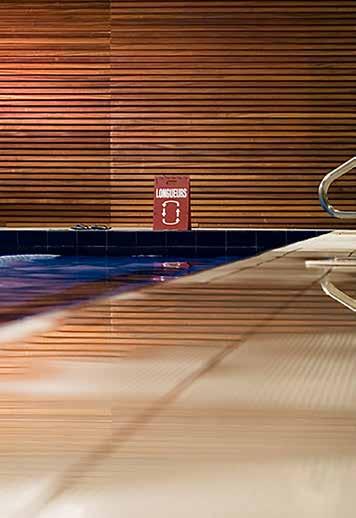
Following the recent remodel of the tennis courts, DMAC developed the master plan for improvements to the balance of the facility including: spa, member’s bistro and lounge, exterior entrance, below-grade garage entry, locker rooms, indoor pool, outdoor pool, banquet hall, reception, juice bar / tennis viewing, outdoor terrace, and all other common areas. Custom-wood walls and ceilings, renewable wood floors, natural stone, and ceramic tile mosaics create a fresh, modern style that is also eco-conscious.
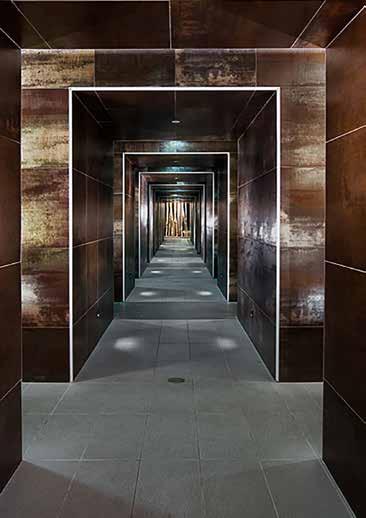
The design achieves fluidity between the club’s indoor amenities and its stunning outdoor elements. The sleek design, from the bistro to the laundry rooms and everywhere in between, nods to the outdoors with natural accents and landscape features. The interior is a prelude to the defining element of the club - the pristine swimming pool and beautiful outdoor terracethat are revealed at corridors’ end. Given its northern climate, natural light was a key consideration for continuity between the interior and outdoor spaces. In between, what was a catacomb leading to a series of services and activities is now is a journey of path and reward.
Surrounded by the condominium, DMAC pushed the non-public or private programmatic elements to the exterior, forming a protective ring at the perimeter of the facility. This allowed the interior spaces to be carved away and dematerialized. As a result, spaces are artfully choreographed for a memorable guest experience.
le sporting club sanctuaire
MIDTOWN

179
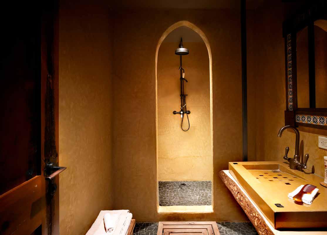
Located in Chicago along the Chicago River, DMAC worked closely with the owner who had a strong vision for Allyu Spa. The name “Allyu” is a Quechua term–pre Spanish South American–and means community, with connotations of the reciprocity necessary for a community to maintain balance and harmony. The project is a Spa but not in the traditional sense.
“The spa experience will be a holding space for the individual experience to occur. This infrastructure creates a feeling of safety and predictability, supporting the entire process of health and healing.”
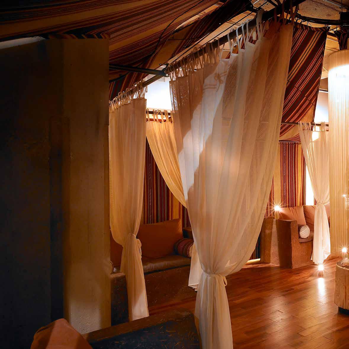
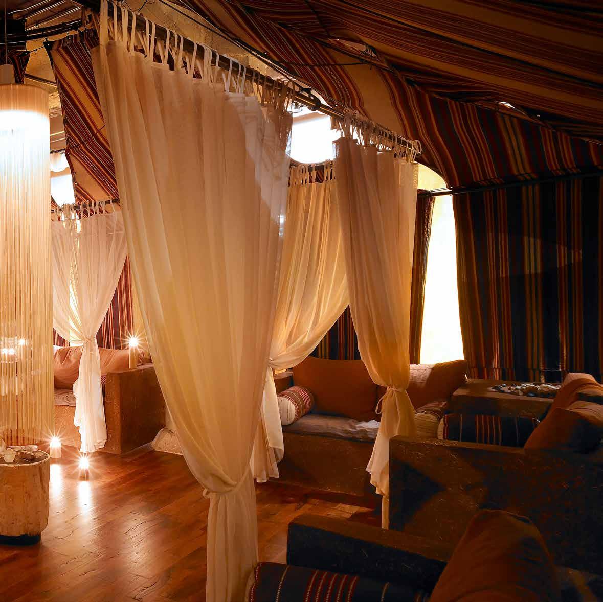
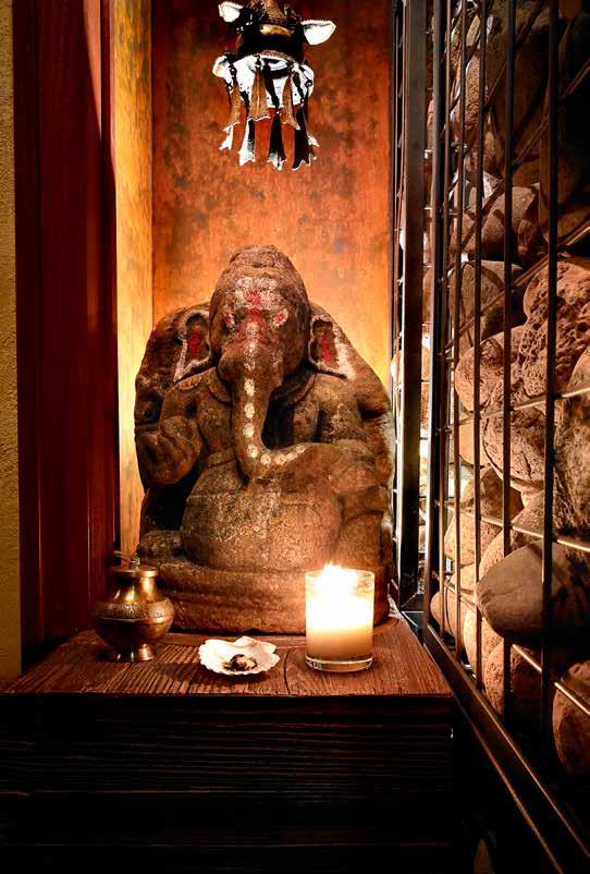
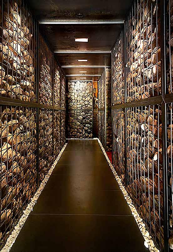
The project was not about trends or design styles but rather was an exploration of how the spaces, defined with lighting, materials, and artifacts were choreographed to allow for an individual experience. The challenge was to develop a multitude of ways to “read” the space. The entry sequence into the spa became a hallway of gabion walls, compressing the space with stacked boulders in metal cages, light creeping between the voids. The path is defined but the destination is yet to be revealed. The only hint is a vertical slot that reveals a fragment of a “Tara” sculpture. As guests navigate this path and turn to enter the spa, they arrive in a vast room with a sense of community and solitude. Layers of woven fabric drape from the ceiling and fan out to form an open tent around tadelakt seating long enough to recline. Suspended within the tent are sheer silk curtains that can be gathered or pulled around the chairs for quiet relaxation and define the “chakana” - a place for the individual experience.
ALLYU
SPA
182
183
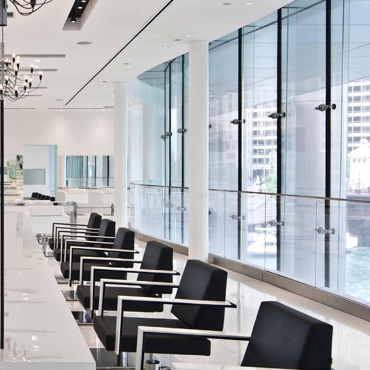
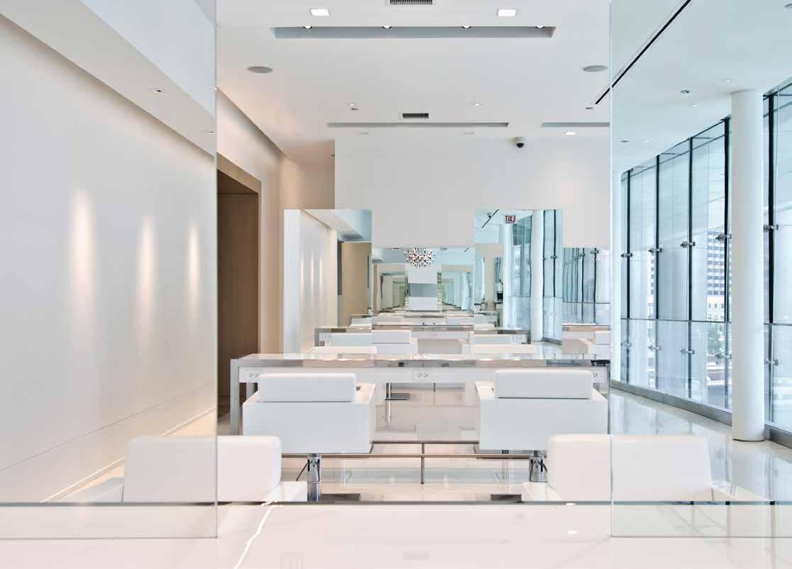
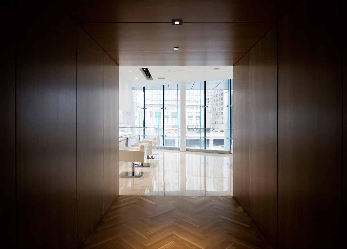
Located on the mezzanine level of Trump Tower in Chicago, the Anthony Cristiano Salon evokes a one of a kind salon experience. Floor-to-ceiling windows frame remarkable views of the Chicago River while the crisp monochromatic interior embodies the nature of what it means to be a salon.
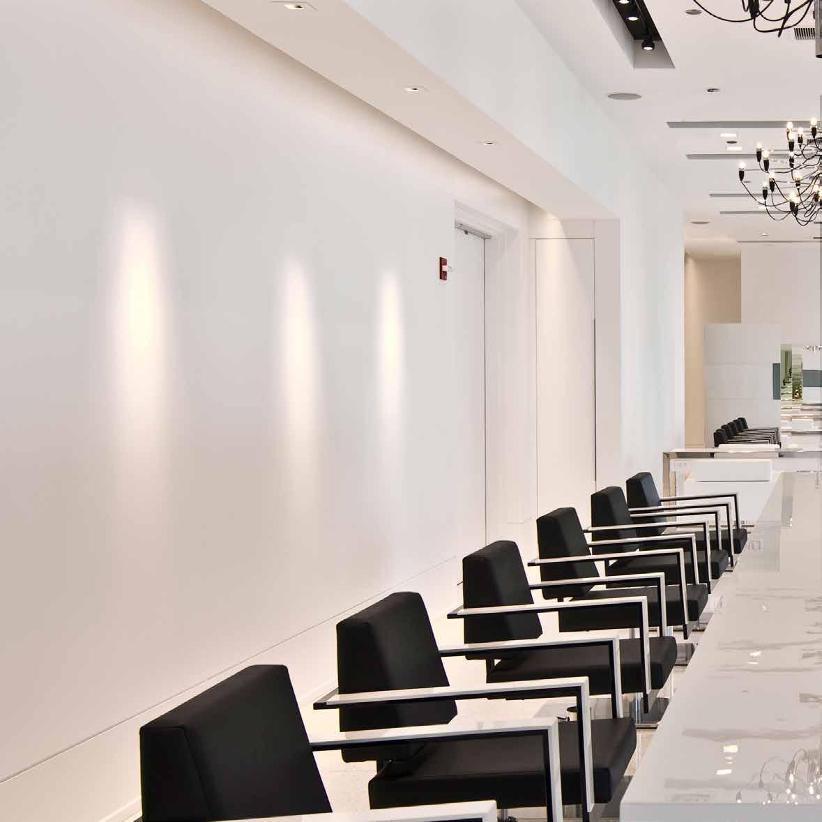
DMAC worked closely with the Cristiano to develop the 3,400 square foot salon into an ideal environment for the client and stylist. Frameless mirrors are strategically placed creating the illusion of an endless space, while views out to the Chicago River pull the experience back to reality. The twenty-four stations are divided up evenly between cutting and coloring. The monochromatic palette was intentionally pushed to designate the functional difference between cutting, white leather chairs, and a coloring, black leather chairs.
The comforts of home are combined with cleanliness and views that only the Trump Tower Chicago can offer. A heavy consideration to detail yet minimalistic approach to design allowed DMAC and the Anthony Cristiano Salon to put the art of hair styling at the forefront. There really is no space like this in Chicago–perfect for the one-of-a-kind talent Anthony Cristiano’s first namesake salon!

anthony cristiano
186
187
roka akor
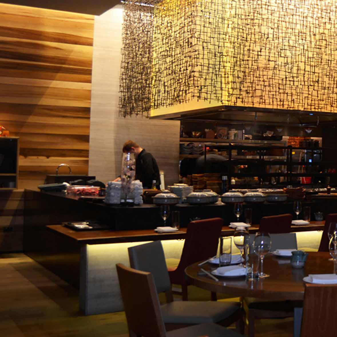
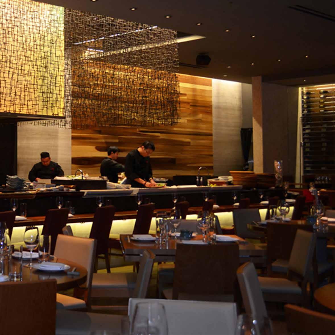
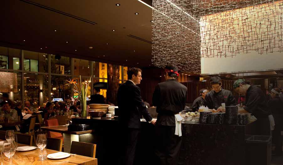
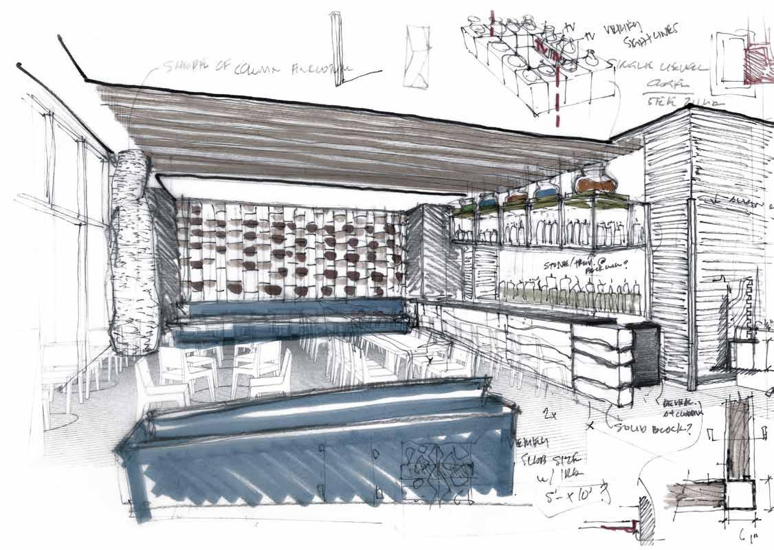
Inspired by the simple flavors, textures, and fresh ingredients of Roka Akor’s sushi and robata menu, DMAC’s design honors the integrity and pleasure of exquisite, contemporary Japanese cuisine. Located in Chicago’s Rivers North thriving restaurant scene, DMAC’s artful and generous use of metal, wood and stone contribute to a choreographed space in which guests are thoughtfully led to discover new experiences throughout the designed environment.
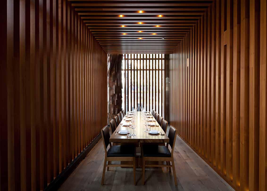
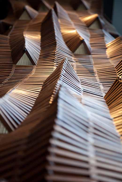
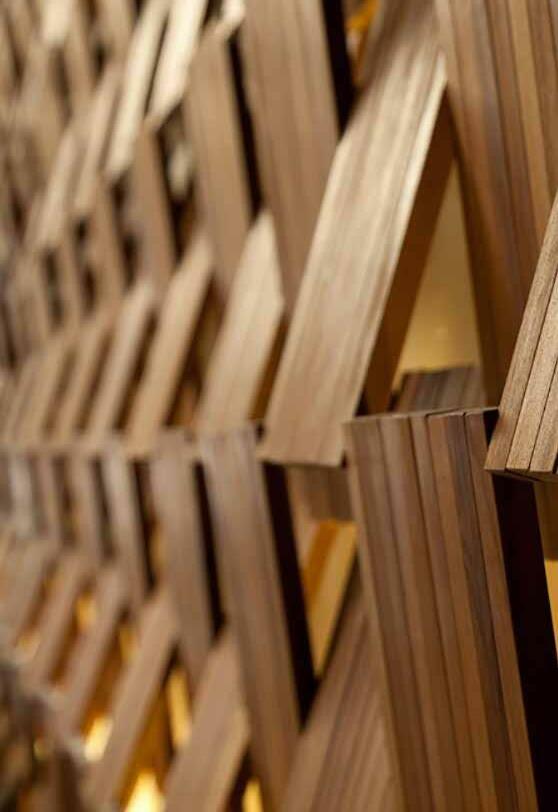
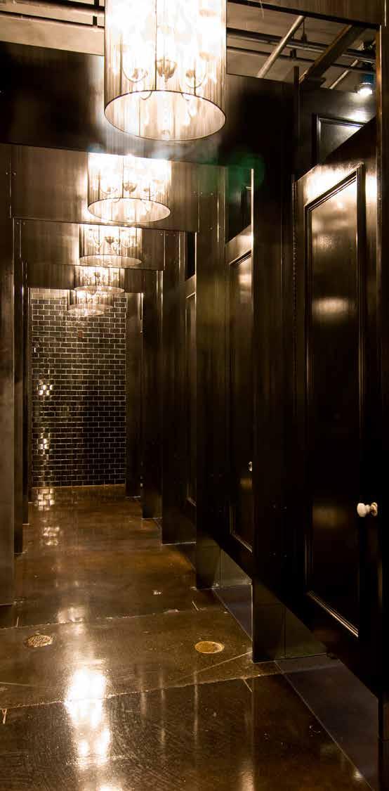
Vertical teak slats at the entrance filter views and frame a progression into the spacious lounge, main dining room and two intimate private dining rooms. The lounge features a custom ceiling system comprised of teak slats in a geometric pattern that are operable to access utilities hidden above. Light spills from the opposite wall through a sculpture of scissoring teak panels. The private dining room embodies its own natural spirit, the heart of which is a dense thicket of willow twig bails at the ceiling. Its walls are clad in both limestone boulders suspended before antique mirror or deep red clay burlap strips. The restrooms transcend their function by idealizing a negative space seemingly subtracted from a thick dark forest. Here mesquite end-grain floors are paired to local Douglas fir stumps overhead; all enclosed by mirror black lacquered walls.
With their emphasis on creativity and craft, DMAC’s use of natural and reclaimed materials yields a warm and sincere, yet highly evocative, space complementing the quality and artful presentation of fine Japanese dining.
190
191
Cut Nail Sculpture
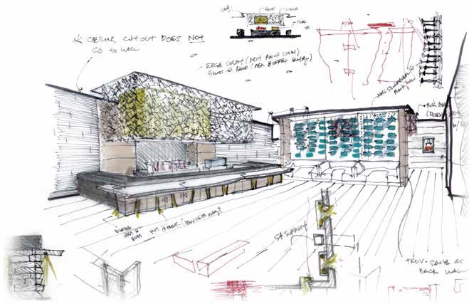
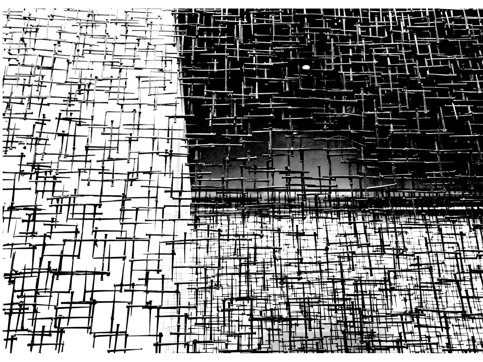
The centerpiece of Roka is a rectangular screen of nails welded together in delicate balance, floating about the sushi bar and robata grill. DMAC designed and directed a local artist (Yuval Awazu) in repurposing over twenty-thousand hand-cut nails salvaged from an old grain elevator (circa 1887) to form the elegant crosshatch. Soft colored light filters through the screen from the illuminated robata hood within, juxtaposing the contemporary and rustic materials.
192
193
194
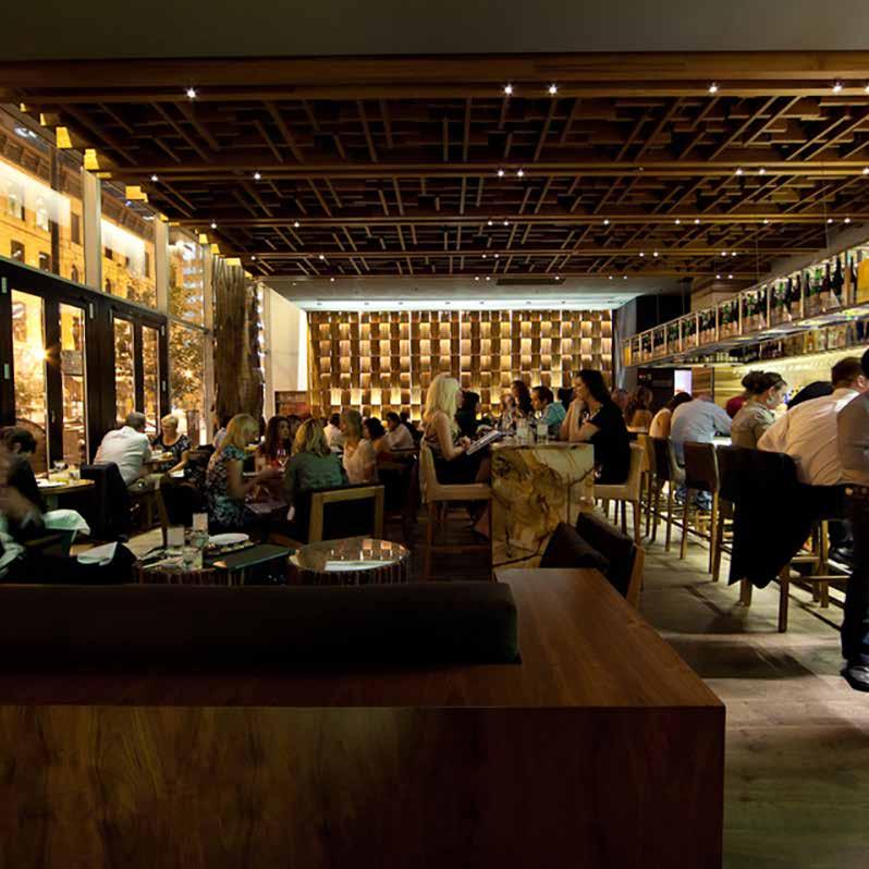
eno wine bar d.c.
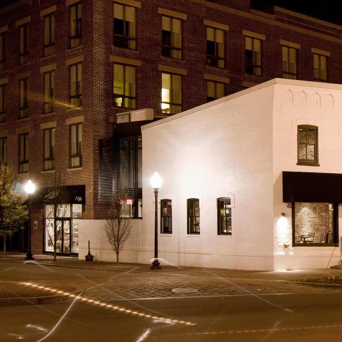
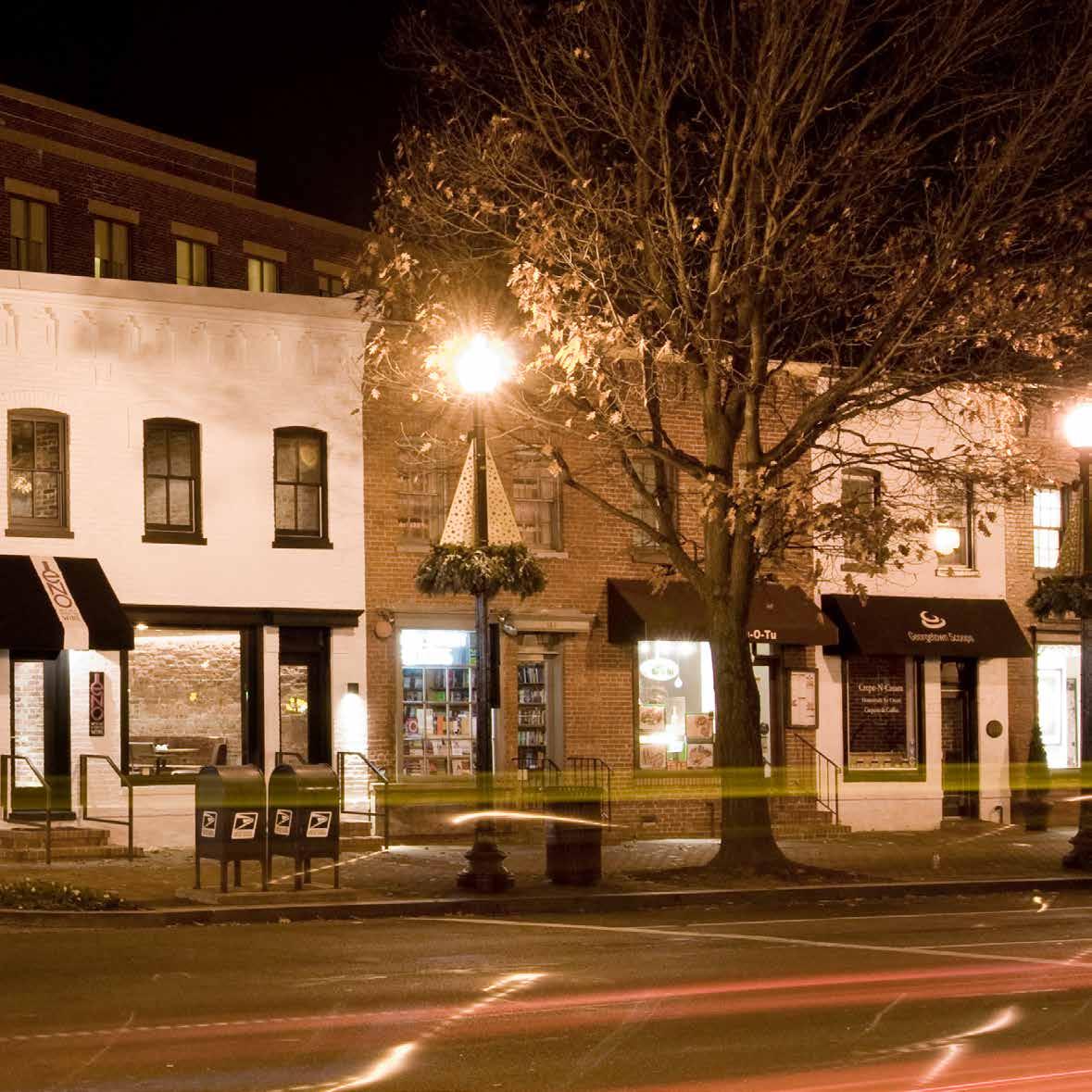
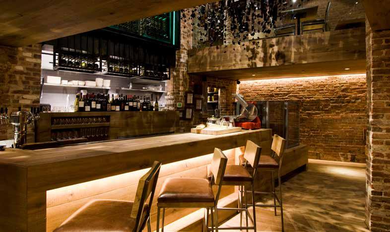
ENO is a wine bar offering small bites and located inside two former townhouses in Washington DC’s historic Georgetown neighborhood. The small footprint called for a minimalist design approach, an open layout and subtle material palette in order to make wine the central focus. The existing structure houses core functional elements: two levels of dining, food prep, and the private dining space on the lower level. The twostory addition along the back alley houses the primary bar circulation, wine storage as well as a more modern front for guests of the adjacent Four Seasons Hotel.
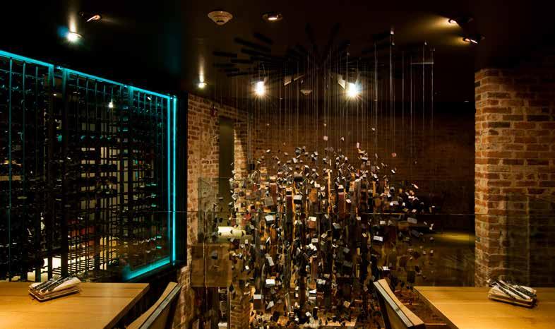
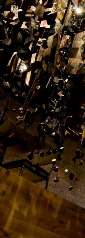
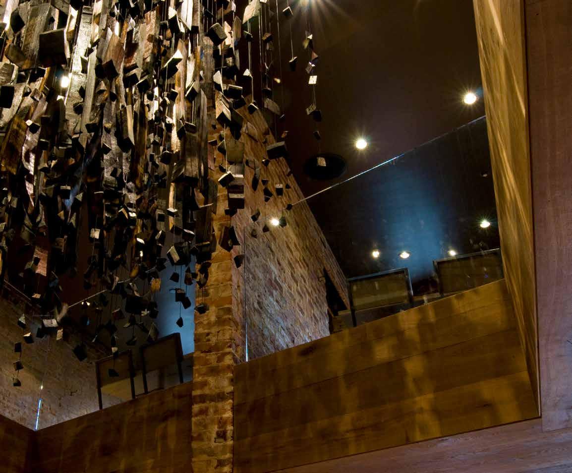
The original masonry walls are exposed and juxtapose new oak flooring and ceiling for a warm and comfortable feel. A central double-height space encourages social interaction and connects the two seating levels while focusing attention on the main wine bar below, the heart of the restaurant. At the center of this double-height space is a large art piece inspired and designed by the DMAC team.
198
199
Wine Barrel Sculpture

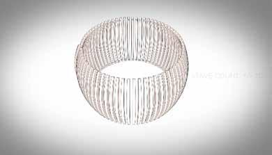
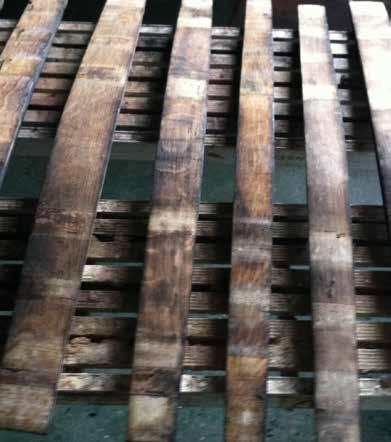
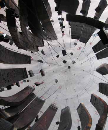

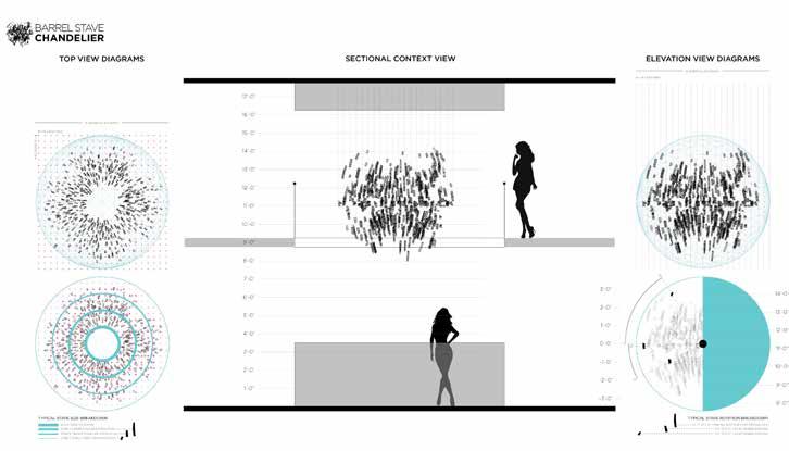
The object is a “freeze-frame” moment of a wine barrel exploding outward from its epicenter. Much in the way the new, rich oak floors, ceiling and millwork are carved within the original structure and call attention to its history and evolution, the wine barrel sculpture, too, becomes an expression of the individual pieces that once made the barrel whole. It transcends its original function with new purpose and energy.

BELLY Q
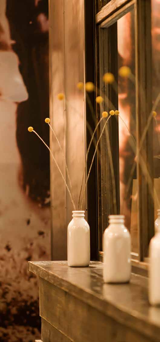
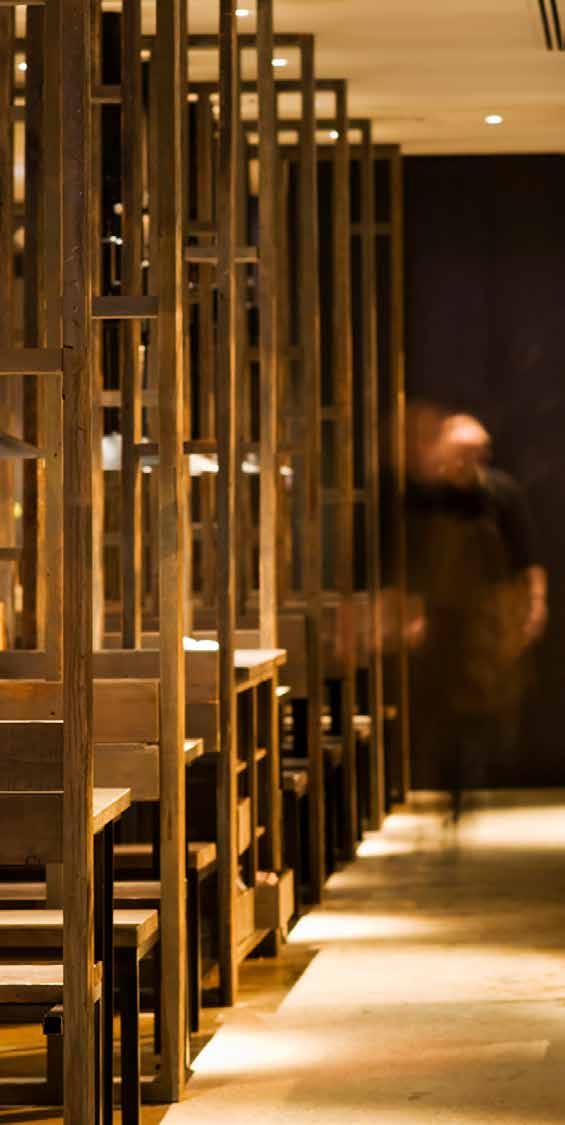
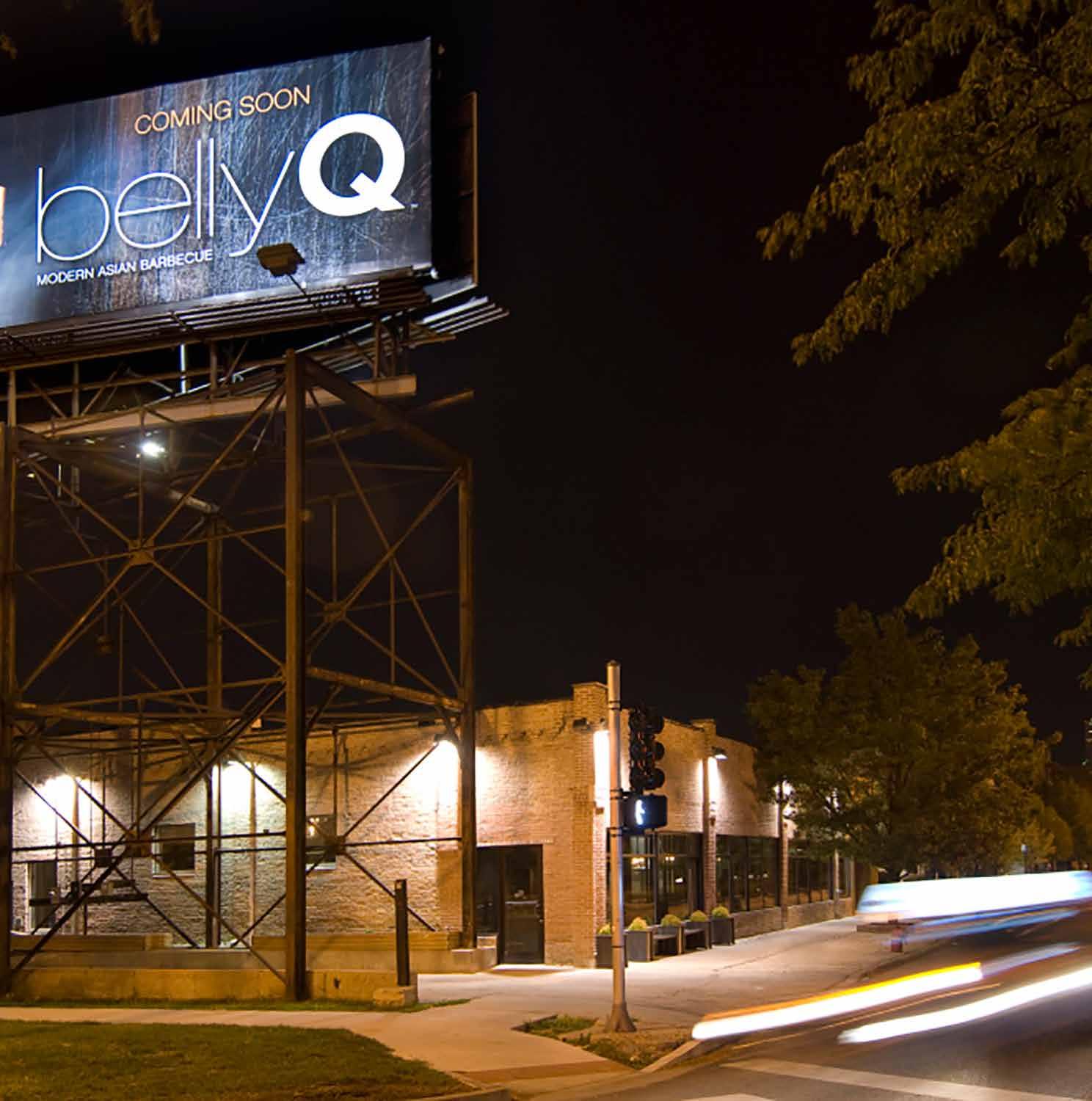
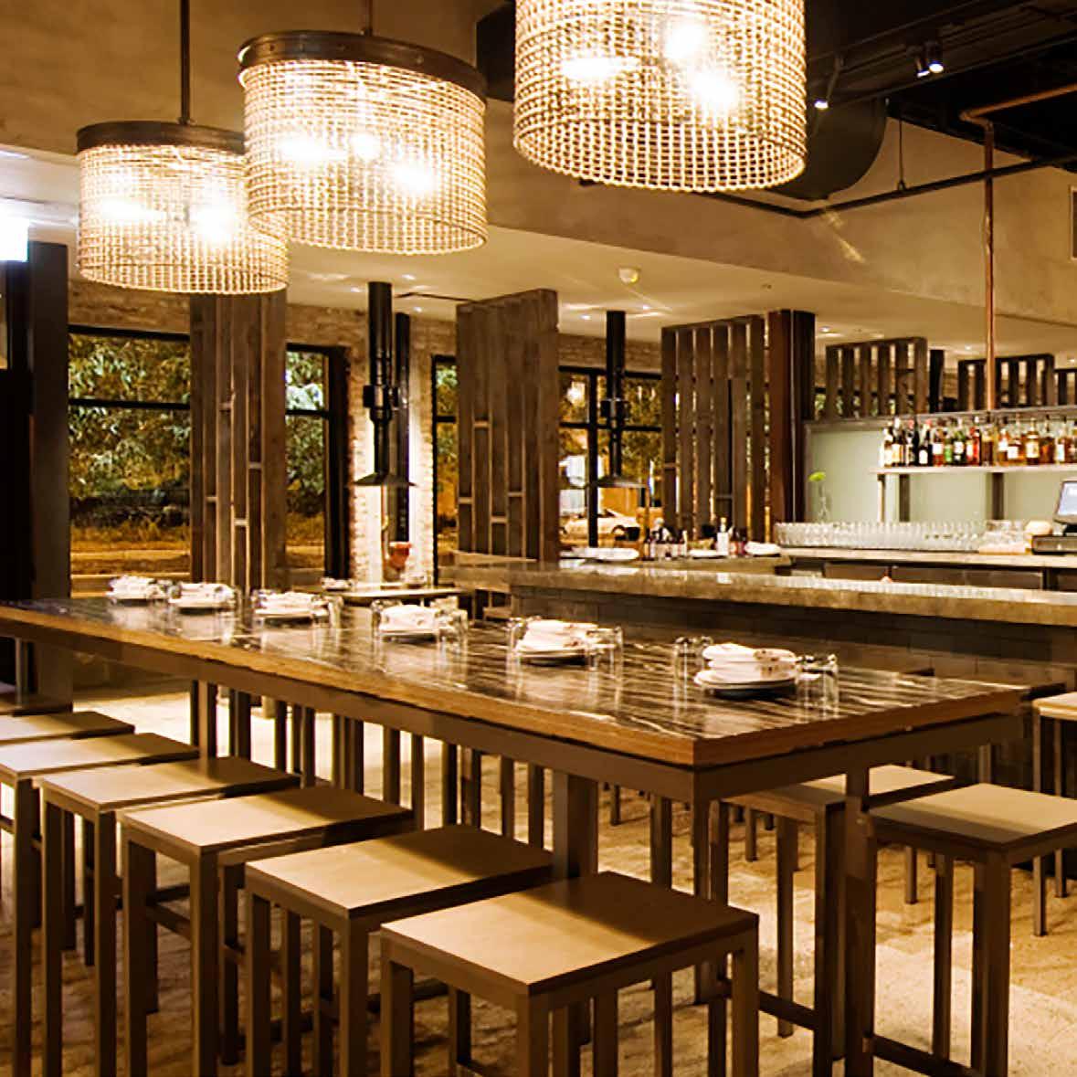
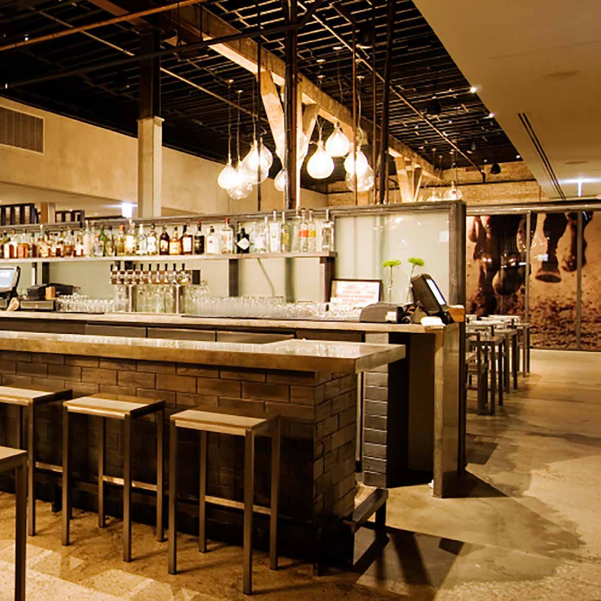
For BellyQ, the goal was to create a space that was an extension of Chef Kim’s private home: calm, luxuriously understated, natural and modern. What they achieved is a purity of design that flawlessly supports the real star of the show – Chef Kim’s food. Among the restaurant’s many features are a full bar, BQ2GO area, built-in hibachi grille tables, a large flexible dining space, bar lounge seating and a separate private area which includes a karaoke room. Subtly nestled along the street, the building injects a new level of energy into the neighborhood. Upon entering one might feel like they’ve walked into a minimalistic garden, with everyday materials like hand-troweled cement, industrial wool felt, Baltic birch plywood, and brushed steel acting as main characters. Everything in the interior is designed to provide a visual hum to an atmosphere of casual luxury. This is a space to congregate, but not feel closed in or crowded. A space to feel comfortable in while enjoying Chef Kim’s dishes, as if eating in his home.
203
untitled supper club
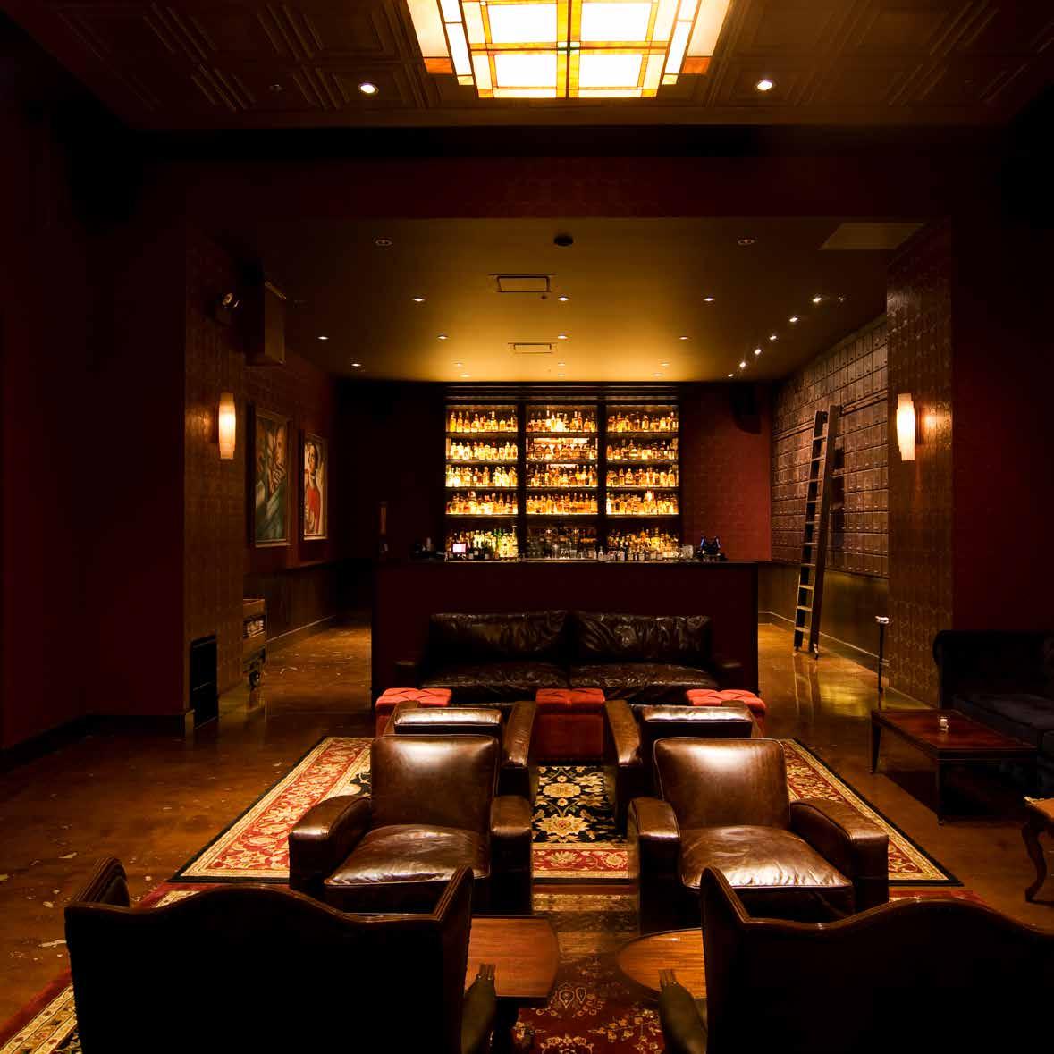
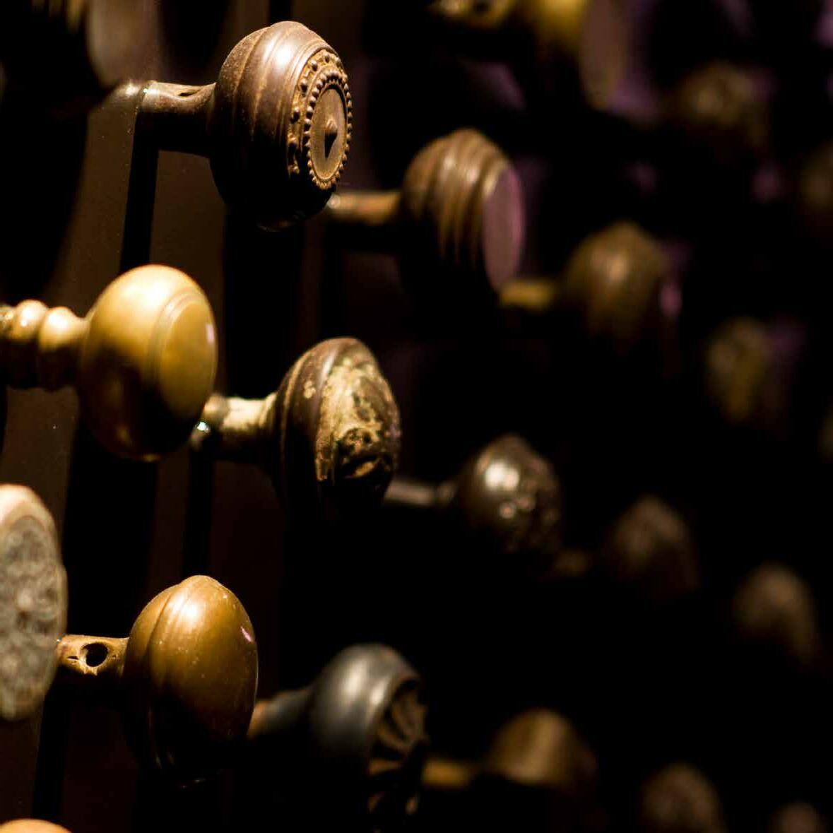
Untitled is a restaurant and lounge evoking a timeless experience. The speakeasy concept allows patrons “in the know” to pass through oversized and unmarked doors only to encounter a fork in the road. A ground-level storefront may appear to be the object of destination, however the lights, sounds, and aromas directed from the downward staircase act as a guide to entertainment.
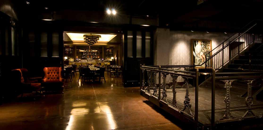
Artfully placed operable doors allow for a variety of experiences depending on the evenings function. DMAC worked with the more than 18,000 square feet to generate maximum flexibility in the design. Whether you are looking for a quiet dinner or to be the centerpiece of the event, Untitled offers a dynamic range of spatial settings with the ability to act as one large venue or several small intimate rooms.
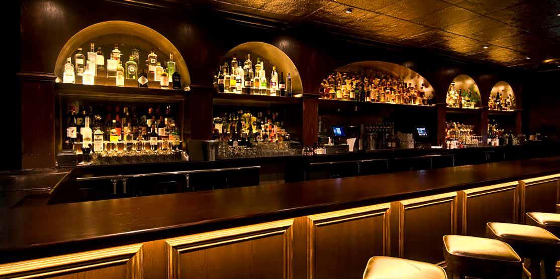
Furthering the experience DMAC used a tasteful tradition of restored furniture and finishes that contrasts with leading edge audio/video equipment. Much like the operable nature of the surrounding environment, tv and projection screens are concealed within oversized mirrors allowing the space to commit to a true prohibition experience or open to the needs of a contemporary venue.
208
210 DISH
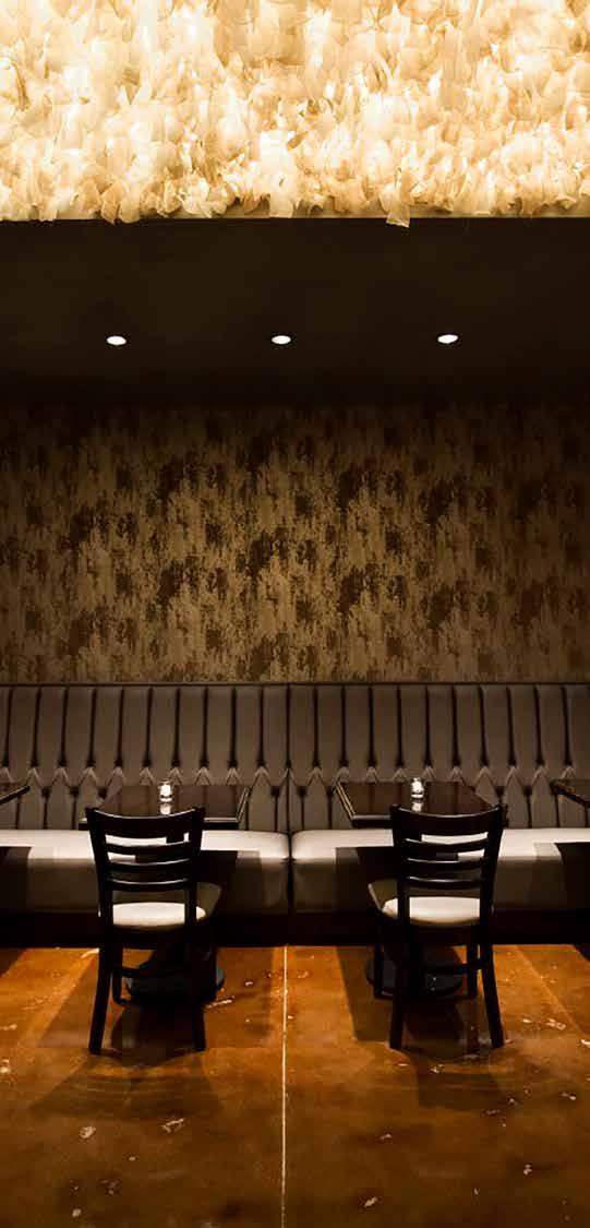
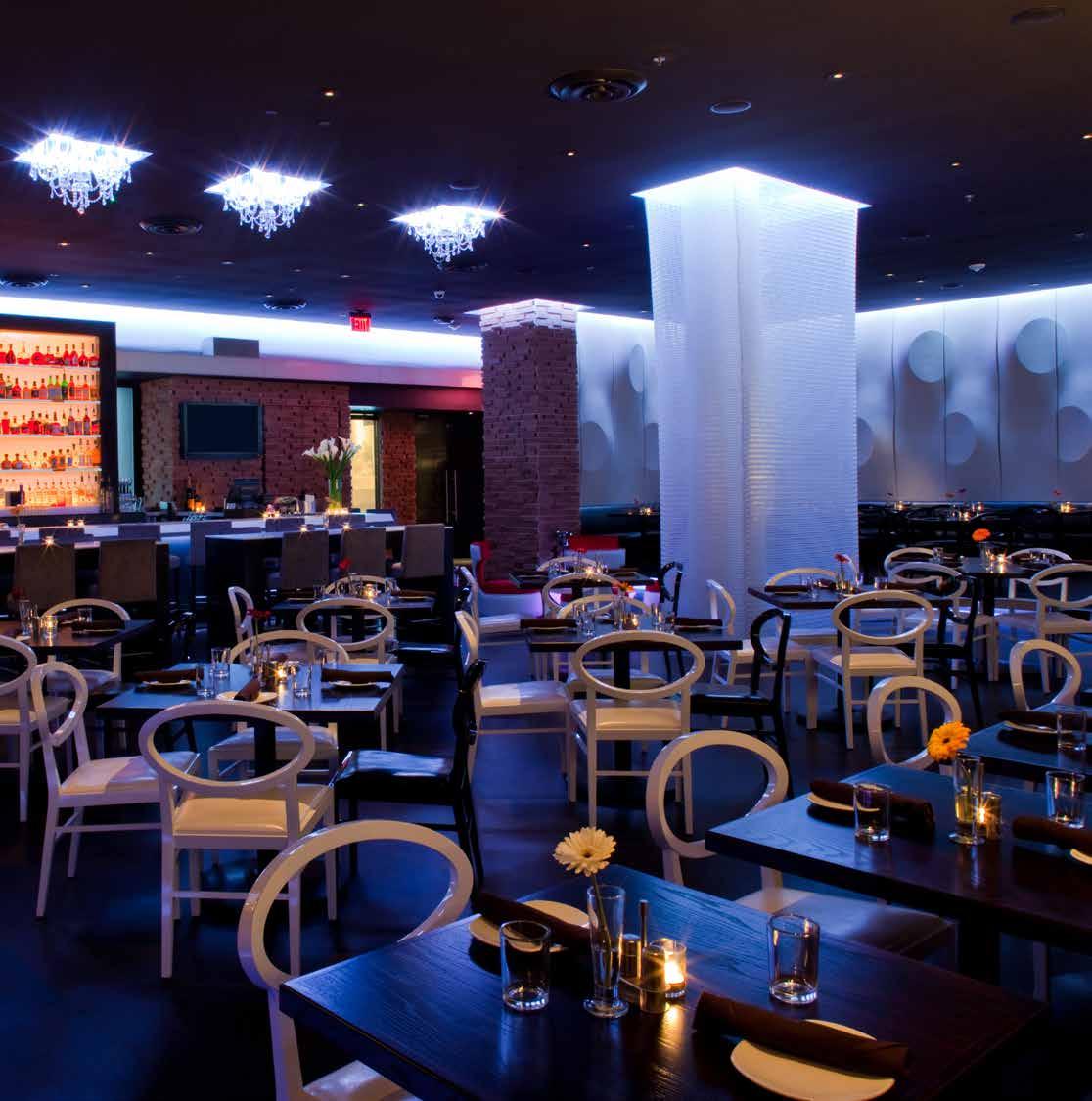
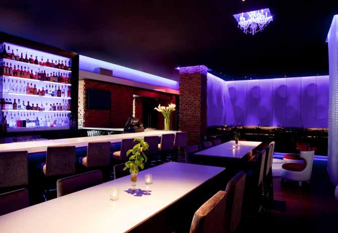
Dish is a contemporary American restaurant and nightclub located in a vibrant Dallas community. Unique fixtures, textiles and furnishings were brought in from around the globe to contrast with a backdrop of durable raw metals and woods.
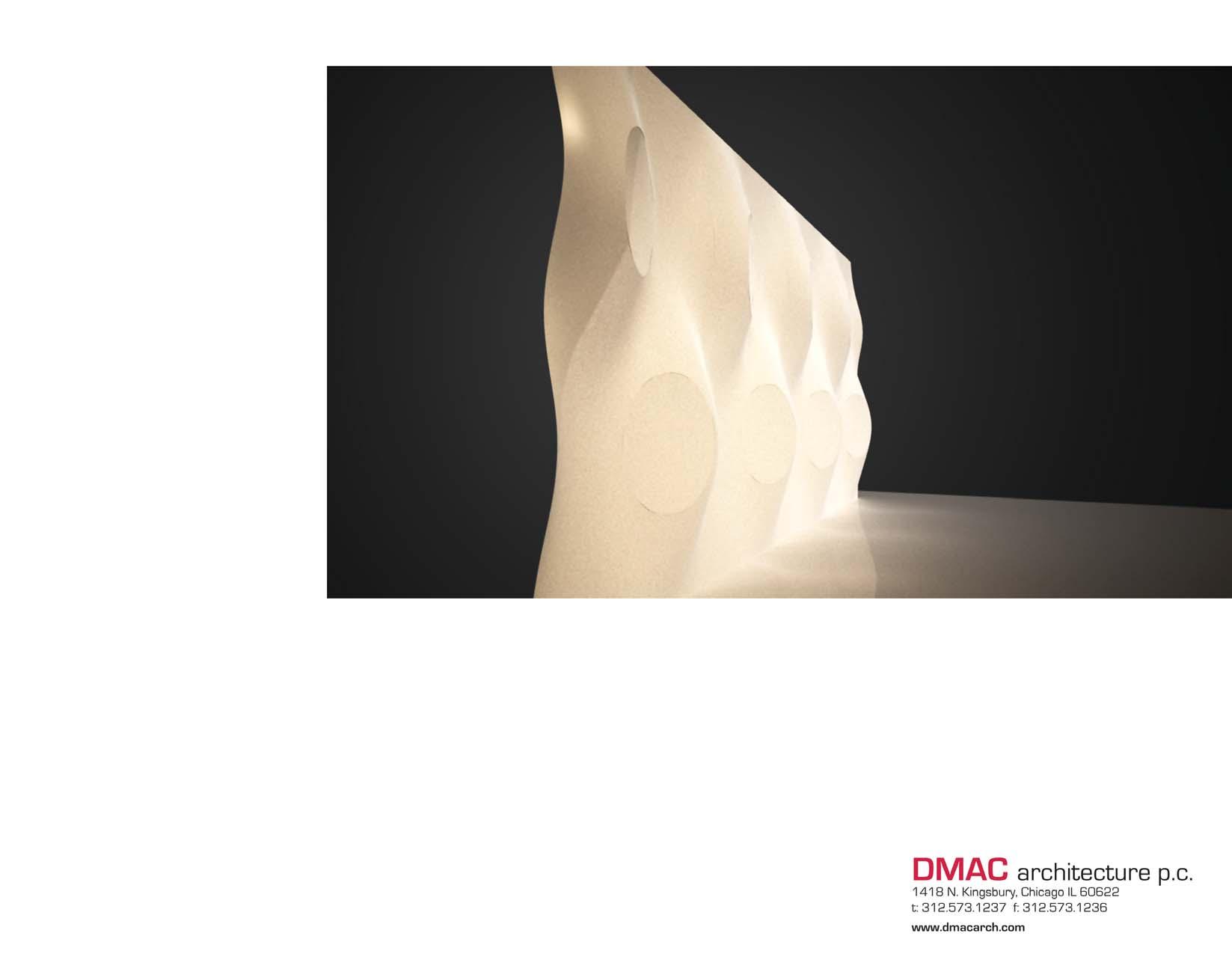
The restaurant transitions from a modern casual restaurant to a DJ hosted nightclub every evening. The space was programmed with no “threshold” to the bar so that no matter where you are in the space you can participate in the energy of the bar. An elevated dining area above the main space functions as both a stage and as an ultra lounge. Although modern in spirit, the materials and design elements used throughout are both familiar and unexpected in there execution. All the elements including colors and sound come together in a kinetic space that is indeed hip and cool.
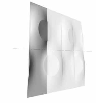
WALL PANEL 119” X 30”
DUPLICATED AND ROTATED 180 DEGREES
COMBINE TO MEET DESIRED CONDITION
FIBERGLASS
PANEL
PANELS
lamborghini & bentley
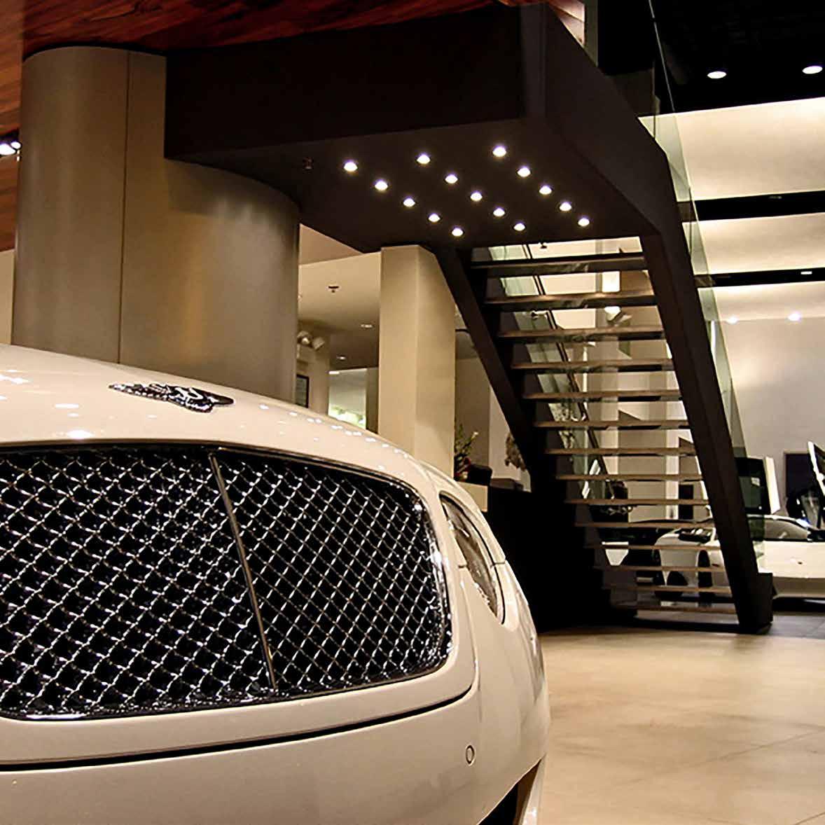
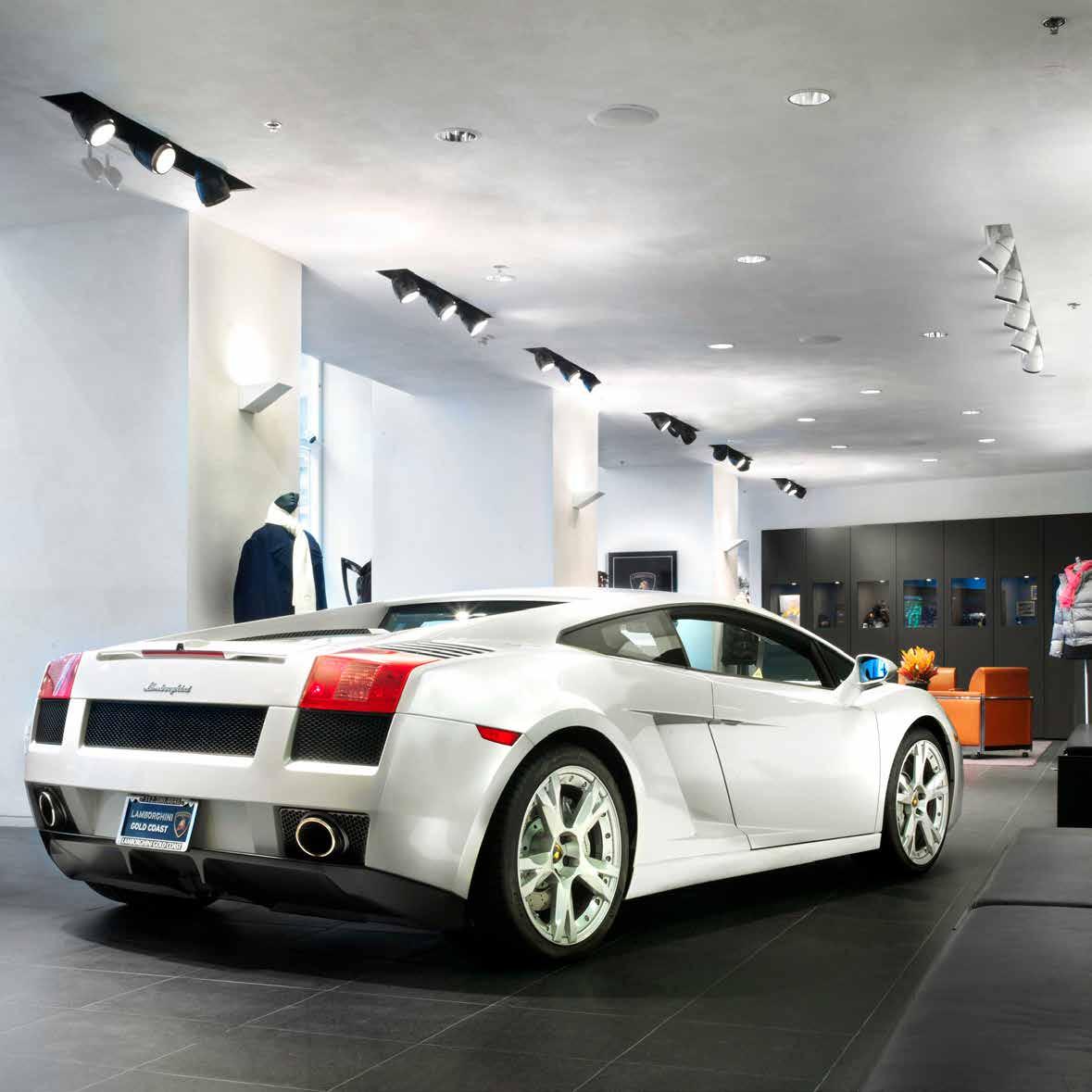 This Lamborghini Showroom is located in the heart of Chicago’s famous Gold Coast - one of the most exclusive shopping and fine dining areas on Chicago’s historic Rush Street. Dwayne MacEwen, Principal and Creative Director at DMAC Architecture, envisioned the space to compliment the beautiful precision automobiles it houses. The design is minimal and impeccably detailed. It takes its cues from modern museums to showcase the luxury brand in a befitting architecture as sleek as the automobiles themselves.
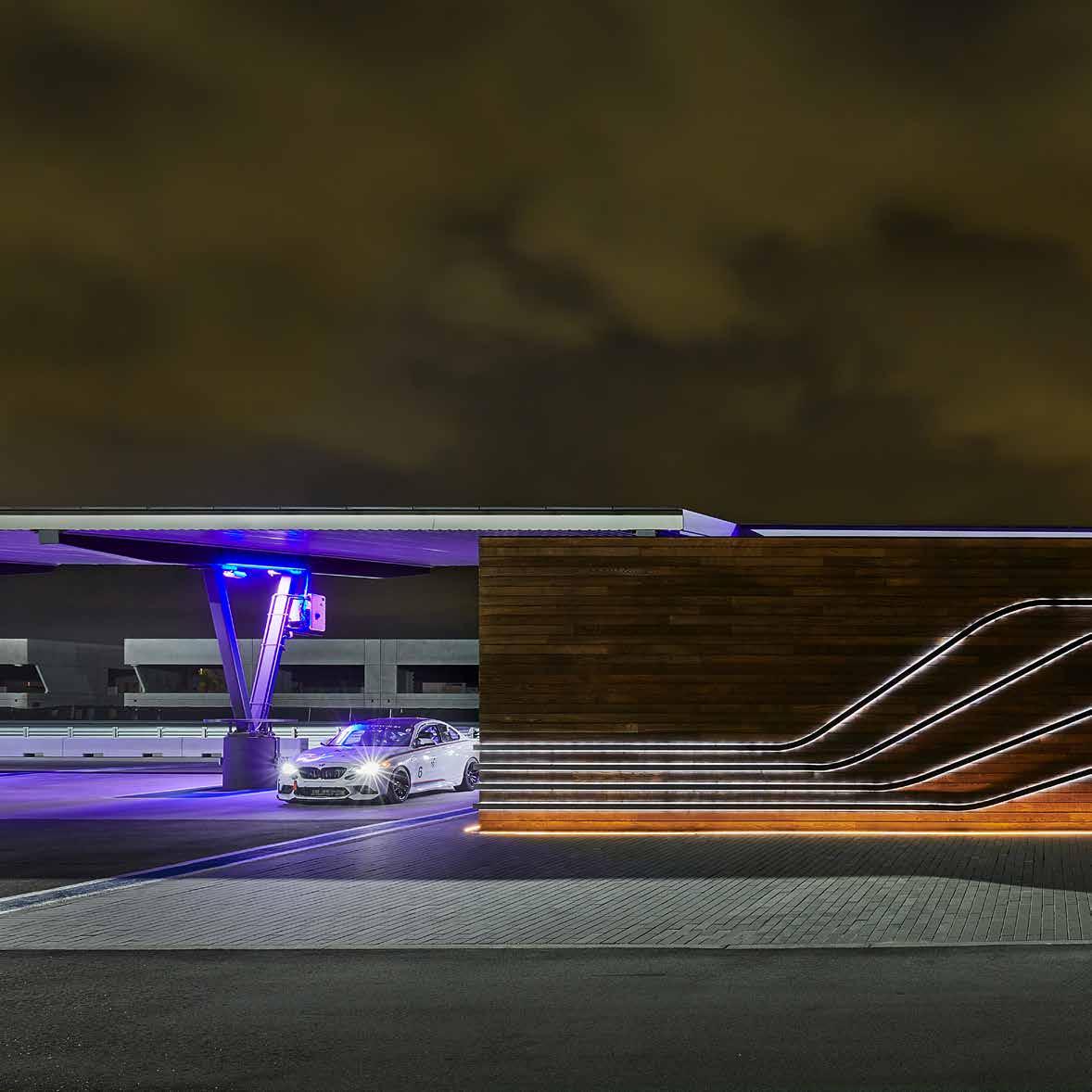
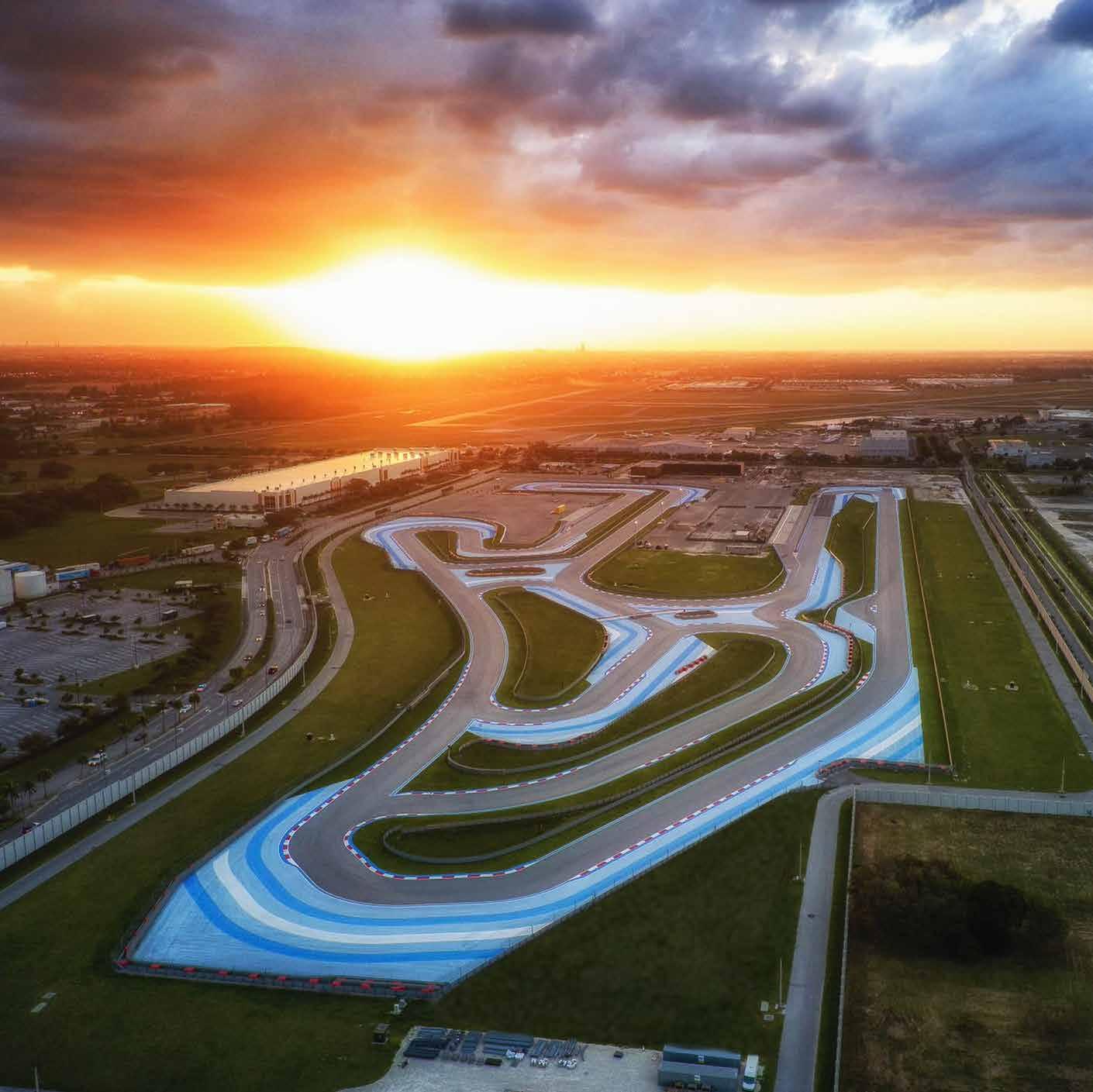
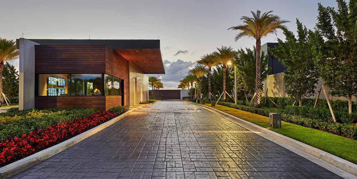
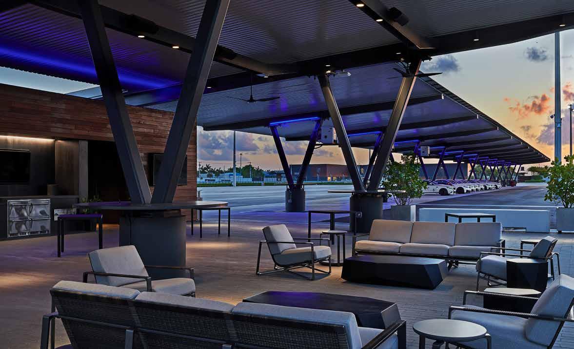
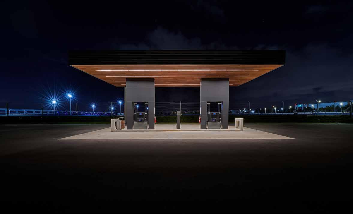
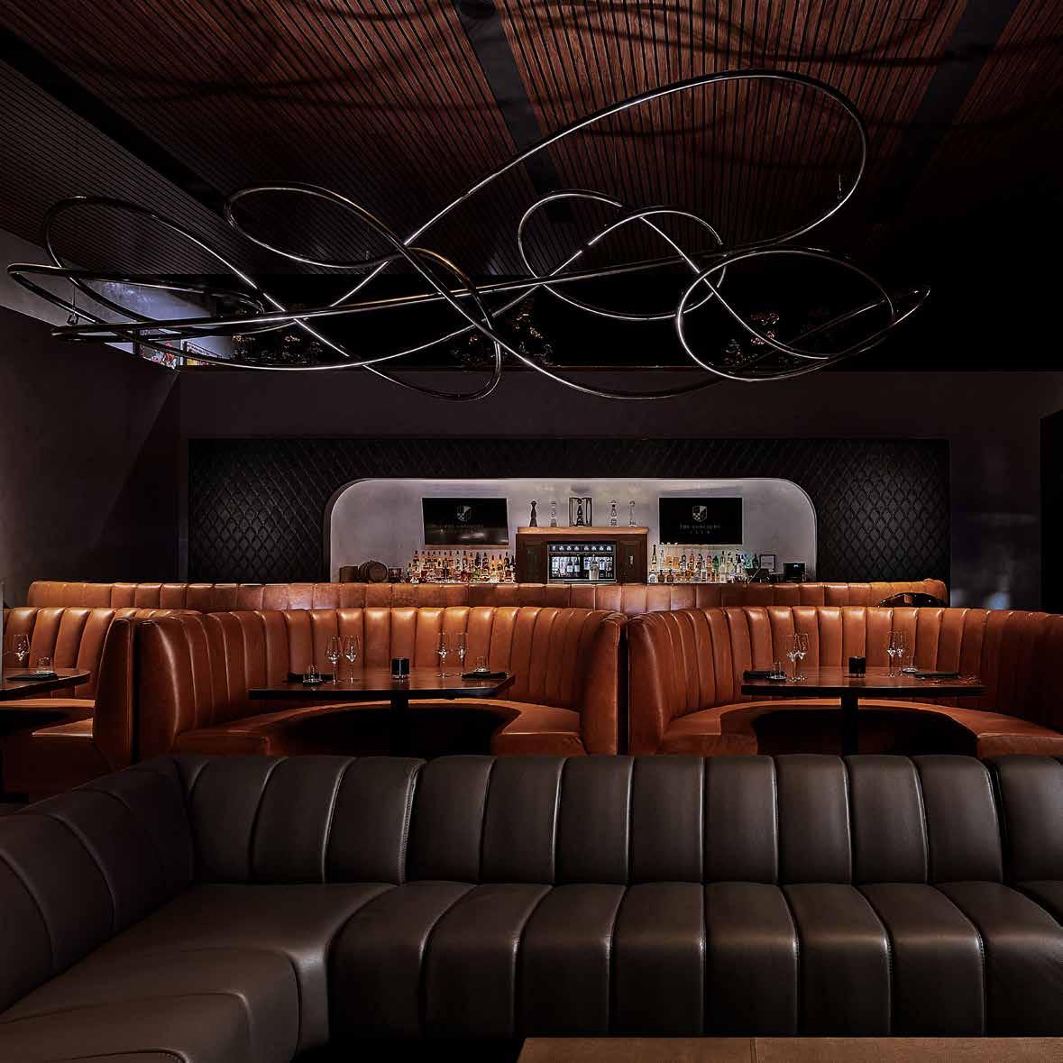
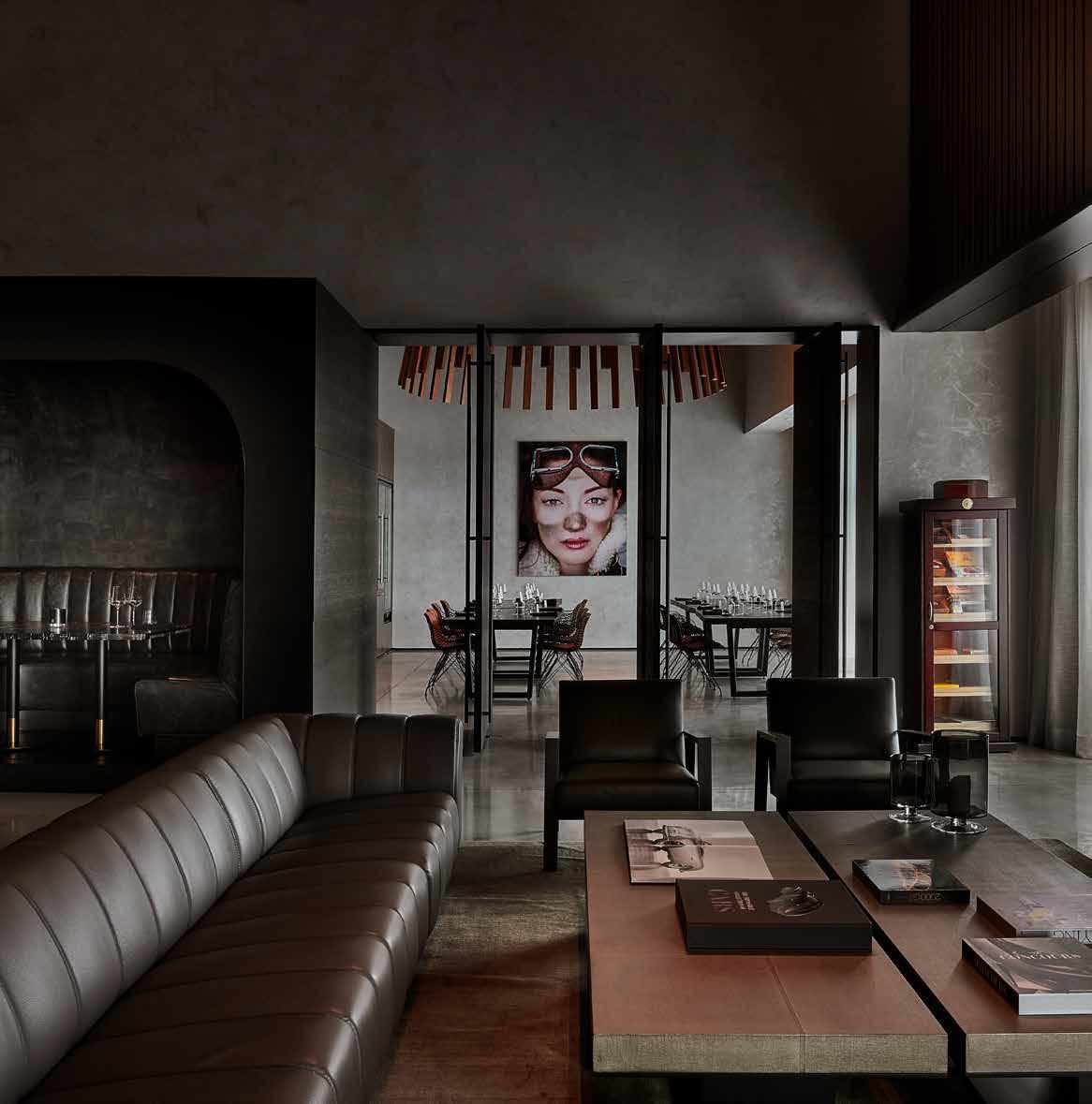
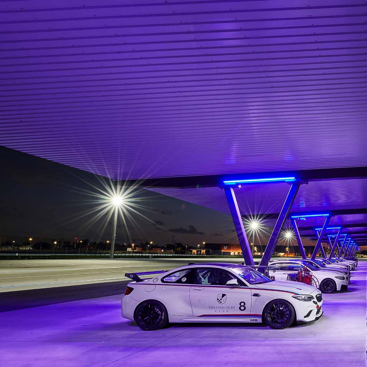
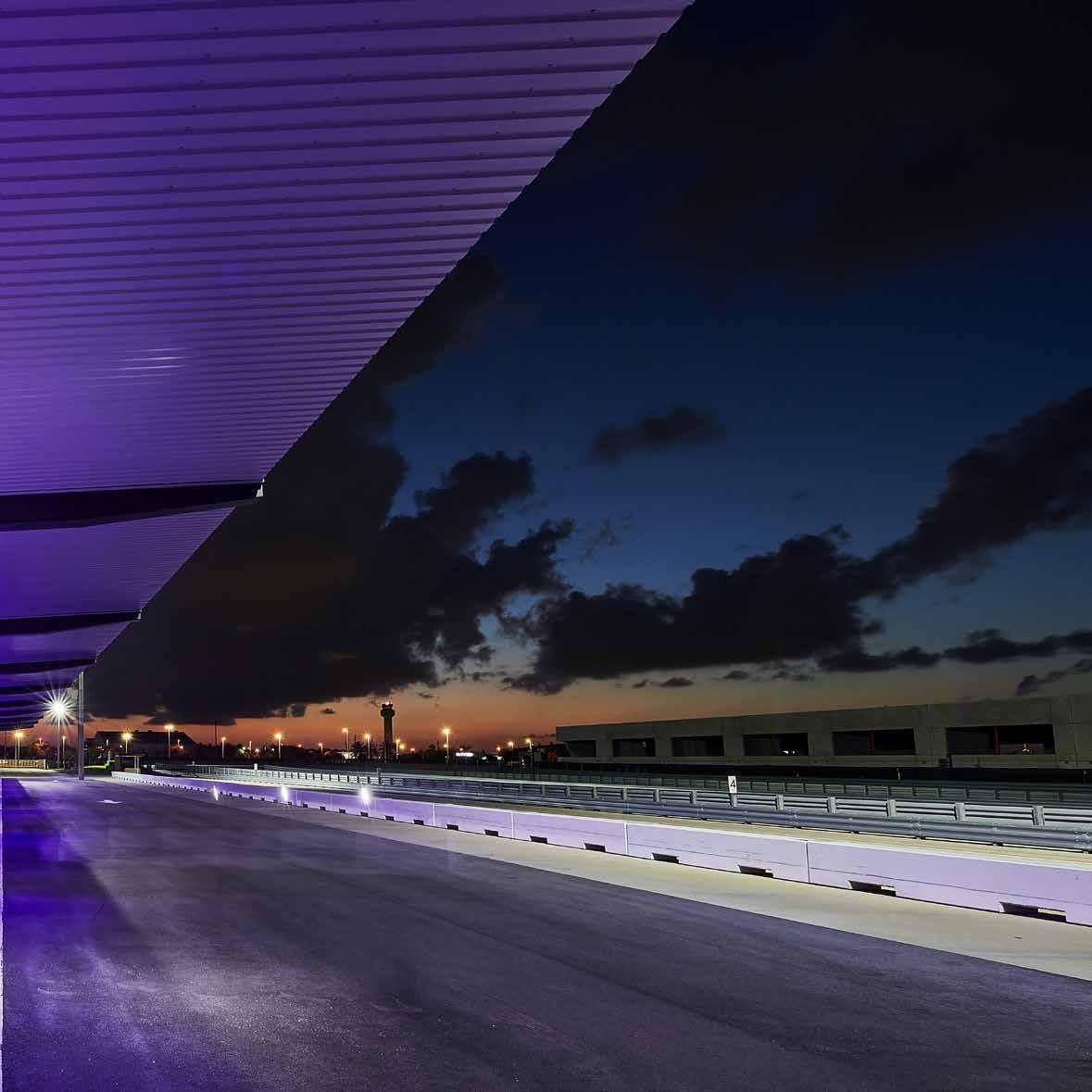
The exclusive Concours Club - a motorsport race track and lifestyle club - is set to open in 2019 in Miami, Florida. Located next to the Miami-Opa Locka Executive Airport and within 15 miles of Miami’s Brickell financial district, the 80-acre Concours Club is currently under construction. Members of the Club will savor the thrill of driving six-figure sports cars and million-dollar hyper cars on a full-service 2-mile road-style course with all the benefits of belonging to a private, on-site, luxury resort club.

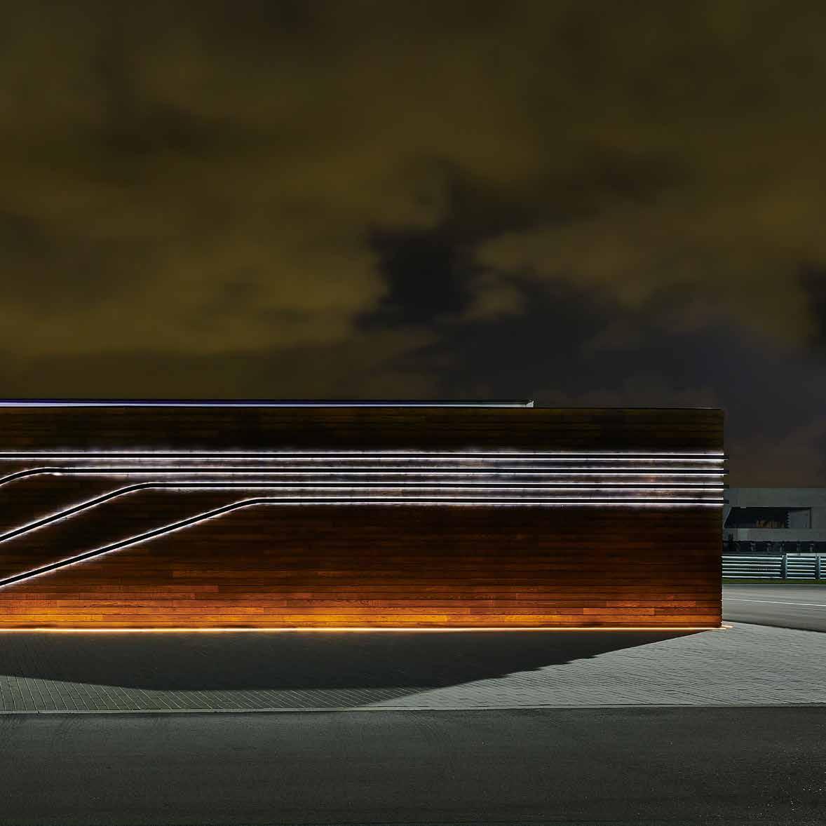
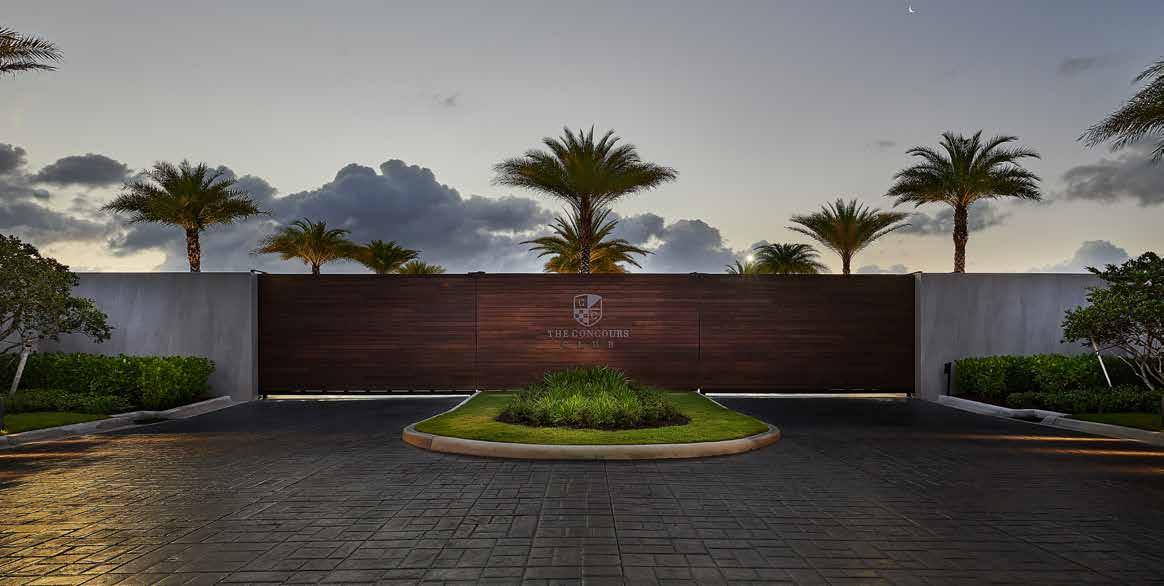
Tasked with developing the master plan and designing all of the major buildings on site, DMAC is taking an urban planning approach. Buildings are located and designed where every encounter is treated with utmost attention for a premier member experience, from the largest of scales to the smallest of details. Beginning at the Guardhouse, the members-only entrance sets the first impression with a rich mix of materials and ultra modern design. Driving along the paddock into the innermost curve of the track is the Club House with the best views of the turbocharged action. Amenities will include a boutique restaurant and bar, lounges, locker rooms, full-service spa, infinity pool, Hammam, wine and cigar storage and more for the finest in luxury, relaxation and entertainment.
The track is designed by Alan L. Wilson of South Africa, renowned designer of over 20 motorsport race tracks across the globe. The 2-mile track has 17 turns including three extreme hairpins and multiple elevation changes, promising to challenge sport drivers of all levels.
concours club


218

219


dmac east prince edward island


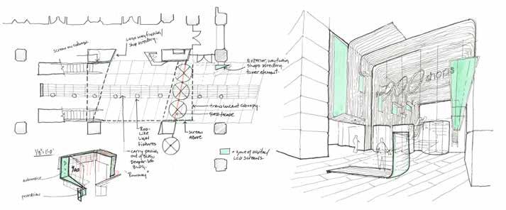
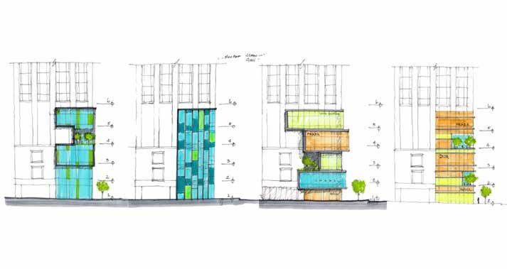
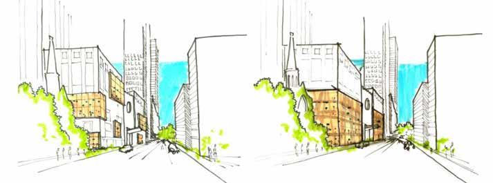
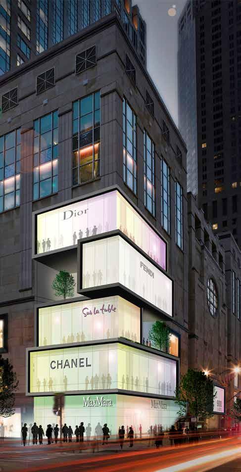
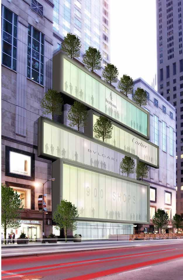
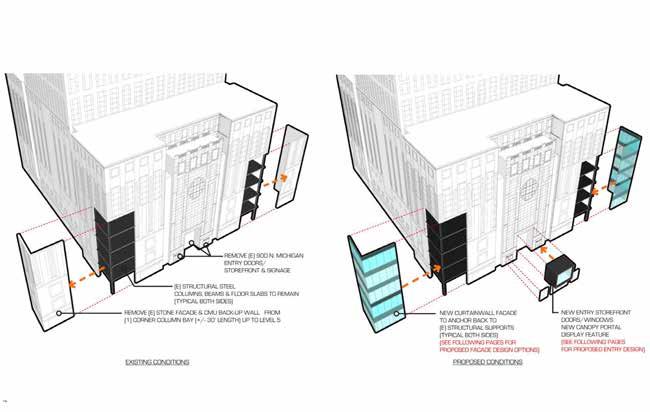
It was the client’s objective to (re)define the six floors of common area as a vertical streetscape that transcends the anticipated “Urban Mall” experience. DMAC’s strategy referenced historical “streets” that have a sense of place looking for the “why,” rather than “how they look”. There should be a sense of promise, anticipation, discovery and sometimes destination. Every successful street has an identity that establishes a sense of place. Las Ramblas in Barcelona thrives from the cafes and restaurants that spill out onto the streetscape, engaging people in a seen and be seen experience. In streets that function well as social gathering spaces, there are repose spaces that exist as parks, plazas, and/or restaurants.


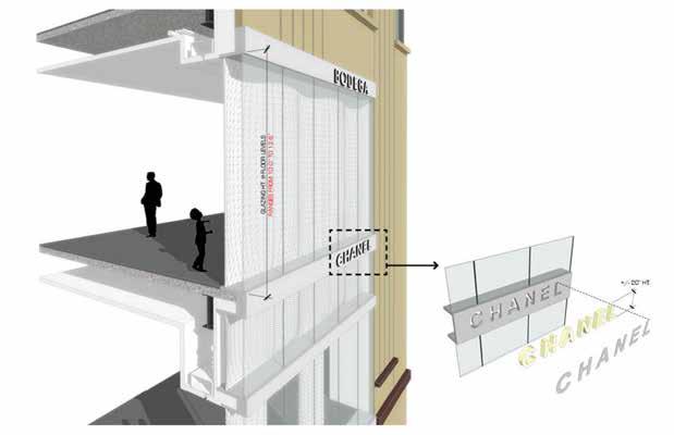
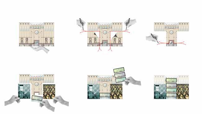
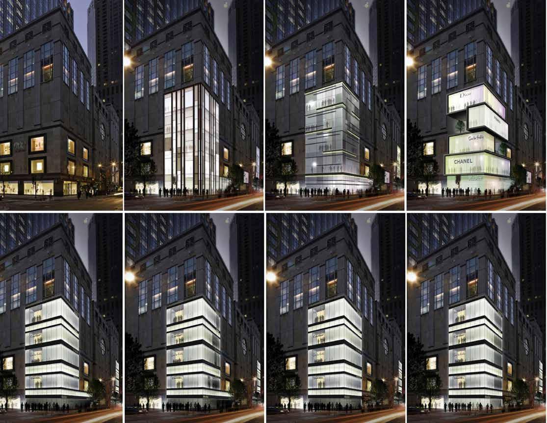
The existing façade at 900 Shops cloaks interior activity, and does not engage the pedestrian from Michigan Avenue. We explored various ways to reveal the internal streetscape and further allow a “seen” or “be seen” connection with the street. By extruding select storefronts beyond the existing lease-line to the zero-lot line, there is a stratification and mixing of the old with the new. The space begins to have density, defines the street experience, and creates a desire to travel vertically. What does it feel like to move between spaces? How can these elements be signifiers that enhance the experience? To transcend the typical high-end mall experience, all architectural and interior components had to serve the street where the “why” is felt in every detail.

226


227 900
n. michigan


228

229
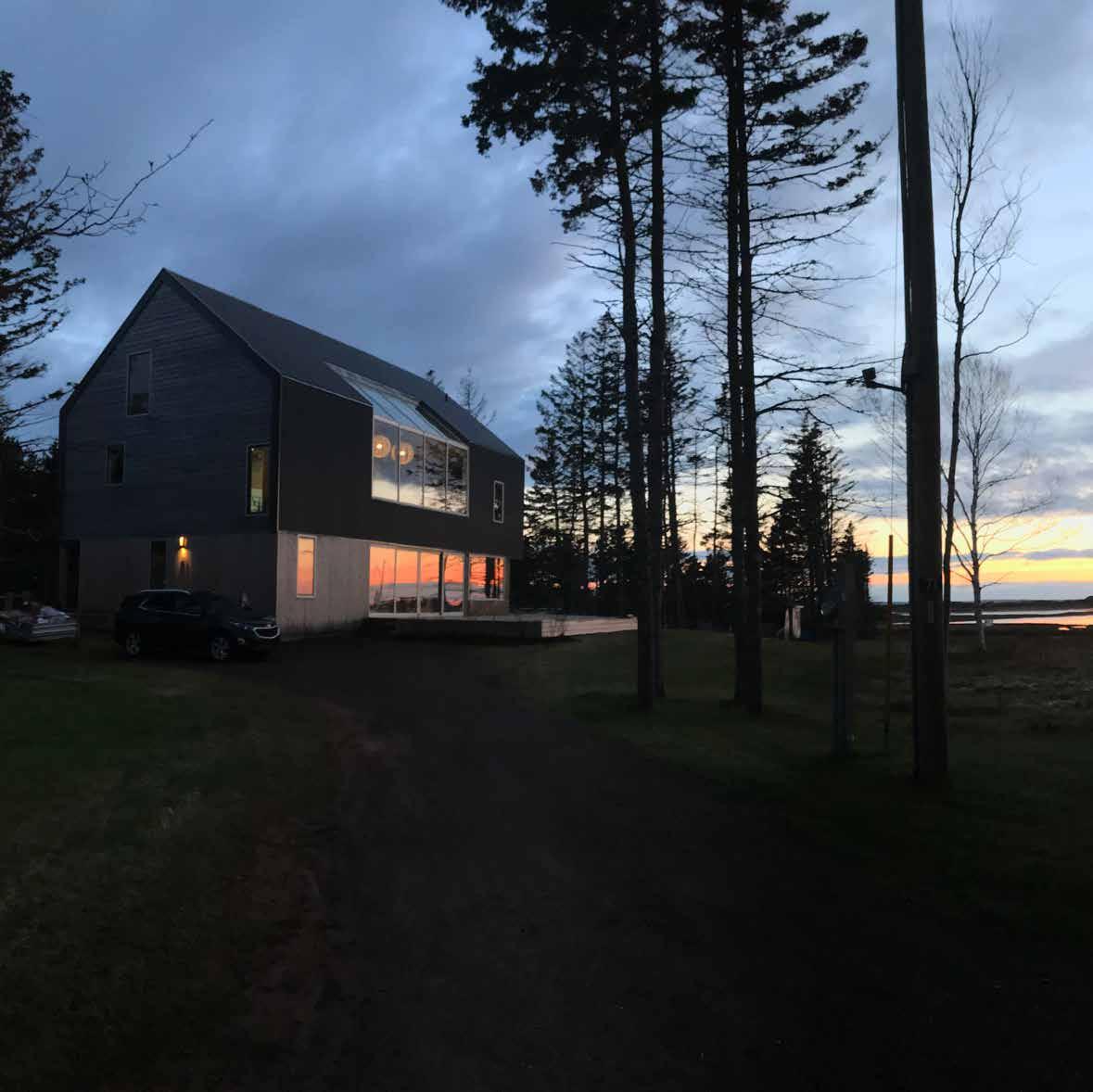
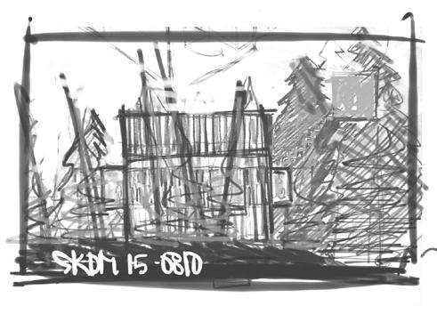
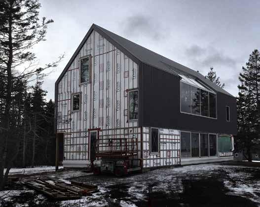
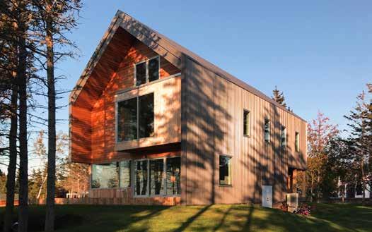
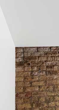
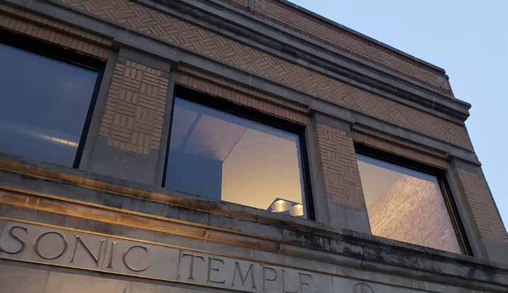
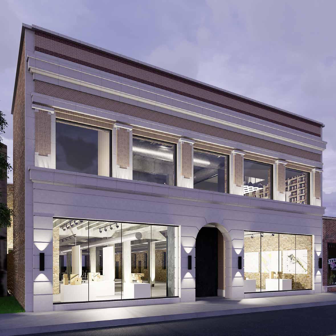
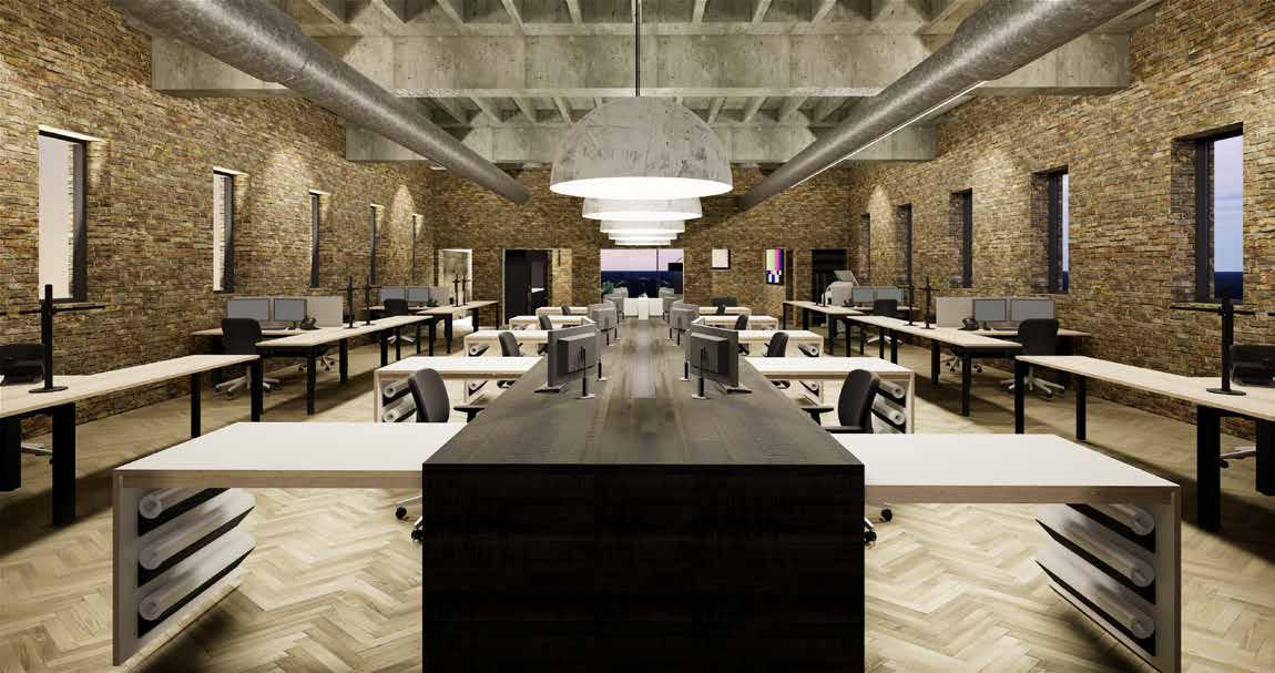
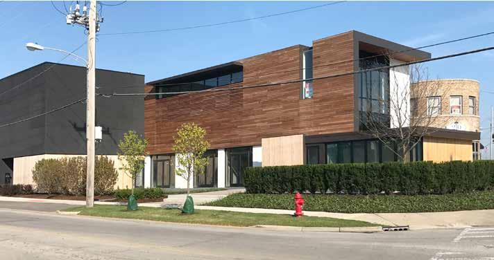
Located at a busy intersection just north of Chicago in Evanston, the former Mount Moriah Masonic Temple building is steeped in social, racial and cultural history dating back to its opening in 1929. Designed and built by Walter T. Bailey, the first African American architect to receive a license in Illinois, the two-story brick structure has a formal front. The ground-floor stone facade is engraved with the Temple’s name while the second-story is faced with a yellow-brick weave resting above the stone frieze.

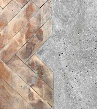
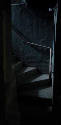
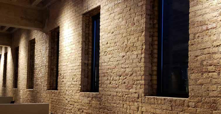
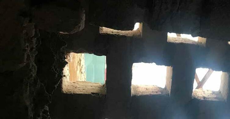
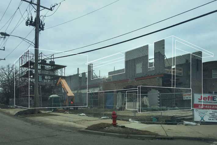
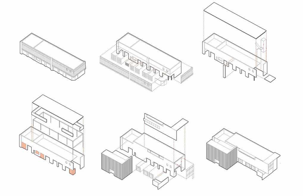
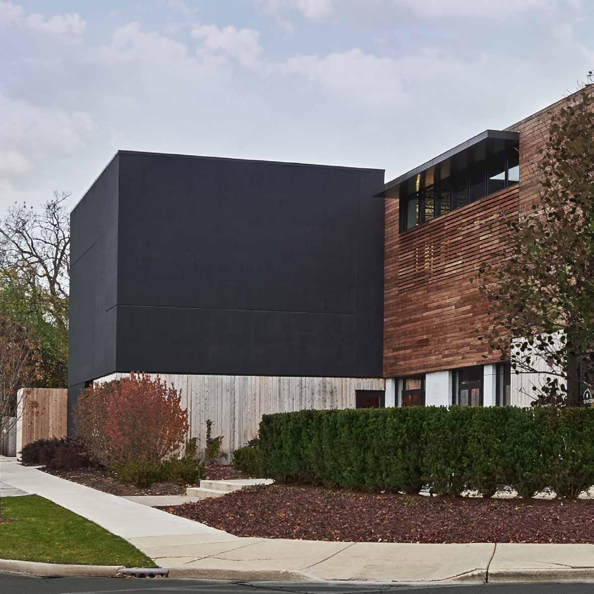
In need of severe updating, DMAC purchased the building in 2015 with the idea of adapting it for our office space on the second floor with open space for community events at street level. Backing into a residential neighborhood, DMAC also wanted to activate the rear of the building into something more casual and engaging. Former window openings are infilled with brick weave that add interest from the outside and add filtered light to the inside. Besides the base structure, an original herringbone parquet floor once used for Temple services and an original cast iron stairway will be refinished as feature elements in the new space.


230

dmac 1229 emerson


232

233


PRESS COVERAGE
South Florida Business Journal

Bloomberg Clad Magazine
Restaurant Development + Design
Conde Nast Traveler
Hotel Business Chicago Tribune
Chicago Tribune
Elle Décor
Chicago Social Chicago Tribune
Hotels Magazine
Chicago Sun Times Hospitality Design
Wall Street Journal
Chicago Tribune
Hakwood Great Flooring Stories Salon + Spa Design & Architecture
Architektur Magazine
Interior Design Magazine American Spa Magazine
Salon Today Magazine
July 2018 June 2018 April 2018 November 2017 November 2017 November 2017 November 2017 August 2017 July 2017 July 2017 June 2017 May 2017 May 2017 May 2017 November 2016 August 2017 August 2015 August 2004 July 2004 June 2003 June 2003 April 2000 June 2000
“The Most Exciting New Hotel in Chicago Just Opened Inside a Gym” - Condé Nast, Traveler, November 2017
“MacEwen’s team looks to create sensory moments throughout a space, such as finding the right lighting, even for the restrooms. It’s all in the details.”
- FE&S, January 15, 2019
To get that true, emotional experience into a space, it needs to somehow move beyond taste….That is something we strive to do in every project. - Dwayne MacEwen, Great Lakes By Design, 2018.
“Subtlety, Layers Add Richness” - Michael Jordan’s, Restaurant Development + Design, April/May 2018
“Simplicity is not simple. Everything matters.”Dwayne MacEwen, Hotel News Now, January 23, 2019
“When you think about hotel design, it’s the amenity spaces that are the hardest to get right and pull off.” - Dwayne, Hotels Magazine, June 2017.
“The amenities are what set us apart.” - The Concours Club co-founder, Bloomberg News, June, 2018
“This is a complete game changer for the hotel and fitness club experience.”Hotel at Midtown, Dwayne, CLAD Mag, 2018
“The Best Places to Book a Healthy Getaway This Year...a 575,000-square-foot urban sports resort.” - SHAPE, October 24, 2018
238


239
CLIENTS
Midtown Athletic Club (Chicago + hotel, Montreal)

Greenwood American Kitchen & Bar (200 GBR LLC)


Doc B’s Restaurant + Bar

Michael Jordan’s Steak House (Cornerstone Restaurant Group)


Rivers Casino

Sugar House Casino

Allyu Spa
Anthony Cristiano Salon

Roka Akor
Eno Wine Bar

BellyQ Dish (NL Group)


Bentley & Lamborghini / Luxury Motors


Stir Crazy 160 Blue Restaurant
Snarf Untitled Concours


Sofitel Luxury Hotels (bar, spa)


Snarfs
Loews Hotel

Elysian

W Hotels
Elizabeth Arden
Mario Tricoci

240
THE HOTEL AT MIDTOWN
AWARDS

2019 Chicago Building Congress Adaptive Reuse Finalist Greenwood
2018 Interior Design Magazine Best of Year Finalist Midtown

2018 Architecture Masterprize Interior Design / Hospitality Midtown 2018 Architecture Masterprize Rooms and Zones Midtown

2018 AIA Chicago Design Excellence Award Midtown 2018 AIA Chicago Divine Detail Award Landing Pit Screen 2018 Chicago Building Congress Finalist Midtown 2018 Crains Chicago Business Best New Event Space Midtown 2017 Chicago Reader Finalist Best Architect 2013 AIA Chicago Interior Architecture Award Anthony Cristiano Salon


241


242


www.dmacarch.com


 - Condé Nast Traveler, November 2017


 This Lamborghini Showroom is located in the heart of Chicago’s famous Gold Coast - one of the most exclusive shopping and fine dining areas on Chicago’s historic Rush Street. Dwayne MacEwen, Principal and Creative Director at DMAC Architecture, envisioned the space to compliment the beautiful precision automobiles it houses. The design is minimal and impeccably detailed. It takes its cues from modern museums to showcase the luxury brand in a befitting architecture as sleek as the automobiles themselves.
